PRELIMINARY DRAFT
Andy Warhol’s prints are not an appendix to his practice. They are its engine. If painting gave him visibility, printmaking gave him scale, system, and permanence. It is through prints that Warhol constructed one of the most coherent, expansive, and liquid bodies of work in modern art. To understand Warhol as a printmaker is to understand how he turned repetition into meaning, and meaning into market. His prints operate simultaneously as artworks, historical documents, and financial instruments. They are instantly recognizable, rigorously catalogued, and continuously traded. Few artists have achieved this trifecta. Warhol built it deliberately.
Introduction
Andy Warhol is not simply one of the most famous printmakers of the twentieth century. He is one of the artists who changed what a print could be. For Warhol, printmaking was never a side practice or a polite annex to painting. The Andy Warhol Foundation states plainly that printmaking techniques were central to his work from his early years as an illustrator through his final works in 1987, and it specifically identifies the late 1960s and early 1970s as the moment when he emerged as a “brilliant and dedicated printmaker,” producing portfolios such as Marilyn Monroe, Flash—November 22, 1963, Campbell’s Soup, Flowers, Electric Chairs, Sunset, and Mao in stunning succession.
That centrality is one of the main reasons Warhol’s print market is so powerful. His prints are not derivative souvenirs of his paintings; they are often the place where his thinking becomes most exact. MoMA’s 1990 print retrospective argued that replication was “the essence” of Warhol’s art and that his prints were at the heart of the flourishing of American printmaking in the 1960s. The same release also noted that Warhol’s printed images had become some of the most memorable and powerful images of their time. That is the key point: Warhol’s prints are not minor echoes of modern culture. They are among its clearest visual records.

This is why Warhol remains one of the top printmakers in the world both artistically and commercially. Sotheby’s describes his work as a centerpiece of the auction market, while Christie’s and other major houses continue to dedicate recurring sales and collecting guides to his editions. The market depth is extraordinary because it combines blue-chip recognition with real breadth of supply: single impressions, rare proofs, complete portfolios, corporate commissions, late unique color trials, and even obscure unpublished works all circulate within the same scholarly framework. That combination of recognizability, scholarship, and volume is what creates liquidity. A Warhol print can be trophy property, but it can also be a highly legible asset class with transparent comparables across decades of public sales.
The Feldman and Schellmann Catalogue
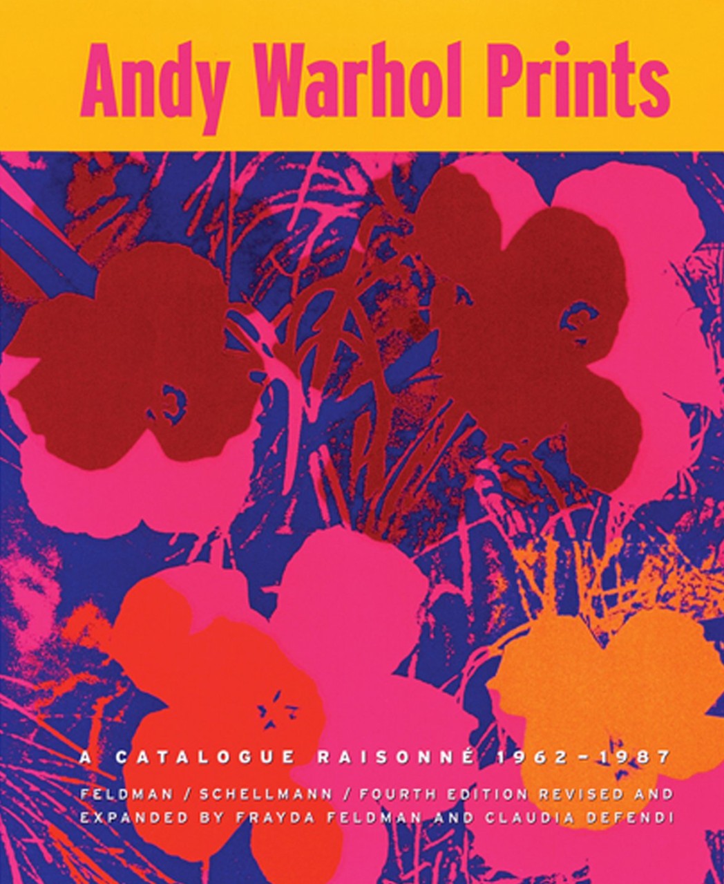
No serious discussion of Warhol prints can begin anywhere other than the Feldman and Schellmann catalogue raisonné. The authoritative print catalogue, supported by the Andy Warhol Foundation, documents Warhol’s prints from 1962 to 1987 and, importantly, includes not only the published editions but also unpublished prints and trial proof editions. The Foundation notes that later editions of the catalogue were revised and expanded, and that the third and fourth editions were published with Foundation support. In practical terms, this catalogue is the language of the market: collectors, auction houses, appraisers, dealers, and scholars all use Feldman and Schellmann numbers—usually abbreviated “F. & S.” or “FS”—to identify individual prints with precision.
The history of that catalogue also matters. Early editions were edited by Frayda Feldman and Jörg Schellmann, and later revised editions were expanded by Feldman and Claudia Defendi with the backing of the Warhol Foundation. The revised editions brought in many works that surfaced only after Warhol’s death, including unpublished prints, trial proofs, and unique edition prints. In other words, the catalogue is not just a checklist. It is one of the reasons the Warhol print market has remained so robust: it gives a sprawling body of work a stable scholarly skeleton. In a market full of color variants, proofs, unusual inscriptions, and late discoveries, that is worth its weight in diamond dust.
Published Prints, Unpublished Prints, and the Warhol Universe
Warhol’s print world is broader than many collectors first assume. There are the published editions that form the backbone of the market: portfolios issued by Factory Additions, Castelli Graphics, Ronald Feldman Fine Arts, Editions Schellmann & Klüser, Gaultney, Klineman Art, and other publishers. These are the prints most collectors know, the prints most often framed on walls and traded at auction, and the prints that built Warhol’s status as a master of screenprint. MoMA’s entries for Marilyn Monroe and Mao show how formal and professional this system already was: publisher, printer, edition, and support are all specified with precision. Marilyn Monroe was published by Factory Additions and printed by Aetna Silkscreen Products in an edition of 250; Mao was published by Castelli Graphics and Multiples, Inc. and printed by Styria Studio, Inc. in an edition centered on 250 impressions.
But the published market is only part of the story. The Warhol Foundation notes that the catalogue also records unpublished prints and trial proof editions, and Ronald Feldman Fine Arts has emphasized that many unpublished works were made in limited numbers for Warhol’s personal use or as gifts. These unpublished works give direct access to process, intimacy, and studio culture. They are often less standardized than the published portfolios, and for precisely that reason they are sometimes among the most revealing. They show a Warhol who was not only a businessman of editions, but also a relentless experimenter who allowed private, provisional, or non-commercial works to survive.
Editions, APs, HCs, and TPs
One of the strengths of Warhol’s market is that it is both highly structured and gloriously unruly. The standard numbered edition is the most straightforward form: for example, Marilyn Monroe was issued in an edition of 250, and Ads in an edition of 190. These are the regular impressions that define the public identity of a portfolio. Alongside them sit artist’s proofs, or APs, which are impressions outside the numbered edition reserved for the artist and closely tied to the production process. Auction-house cataloguing regularly identifies Warhol APs as separate from the main edition—for example, an AP of Joseph Beuys outside the edition of 150, or AP impressions in series such as Endangered Species and Ads.
Then there are hors commerce impressions, usually marked HC or H.C. The phrase means “outside of commerce,” but the market, being the market, eventually found a way to commercialize the anti-commercial. Christie’s and Sotheby’s routinely describe HCs as impressions set aside from the standard edition, often in very small numbers. A Truck HC can sit outside an edition of 60; an Ads HC can sit outside an edition of 190; a Cowboys and Indians HC portfolio can sit outside an edition of 250 plus APs. These impressions are often scarcer than the regular edition and can attract considerable attention, especially when condition and provenance are strong.
The most seductive category, however, is the TP: the trial proof. From roughly 1980 to 1987, Warhol created unique trial proof edition prints, and that each trial proof is a unique print with a distinct color combination and variations in composition. Andy Warhol and Ronald Feldman preserved these unused proofs and grouped them into trial proof portfolios rather than destroying them. This is where Warhol’s print market becomes especially fascinating, because the multiple begins to behave like a unique work. A TP may belong to the same image family as the numbered edition, but its chromatic logic can be entirely singular. In Warhol terms, repetition never excludes surprise; it industrializes it.
Why Warhol’s Prints Feel Unique Even When They Are Editions
Warhol’s genius in printmaking lies in the tension between repetition and mutation. Christie’s notes that his screenprinting process allowed him to experiment freely with scaling, transfer, manipulation, and multiple versions before selecting one for editioning. That method meant that even a highly disciplined portfolio retained the ghost of alternatives. The finished edition looks cool, efficient, and industrial; underneath it sits a restless studio process full of permutations. This is why Warhol prints can feel both mechanically produced and strangely alive. The image repeats, but the color always threatens to misbehave.
That structure also helps explain the market hierarchy. The regular numbered edition tends to provide the deepest liquidity because there are more public comparables. APs and HCs are scarcer and can command premiums depending on the series. TPs, because they are unique color experiments, can become a bridge between editioned print and one-of-one object. In a market increasingly attentive to rarity within established blue-chip categories, Warhol’s proofs are catnip with scholarship attached. Sotheby’s has catalogued trial proofs in unique color combinations for works from Marilyn to Beethoven, underscoring how the market values singularity even inside the world of multiples.
The Portfolios That Built a Century
Warhol’s print portfolios operate as a sharp, unorthodox chronicle of the late twentieth century. Not a neutral history, but a selective and highly stylized one, where celebrity, politics, consumerism, violence, and mass media are distilled into images that feel both immediate and strangely eternal. He does not document events as they happened; he captures how they were seen, circulated, and ultimately remembered.
This visual history begins with Marilyn Monroe in 1967, where fame and death collapse into a single repeating image, at once glamorous and funereal. It expands through works tied to national trauma and collective memory, from the Kennedy assassination to the electric chair, while simultaneously elevating everyday imagery—soup cans, flowers, advertisements—into cultural symbols. With Mao in 1972, Warhol extends this logic globally, transforming political authority into a surface, where ideology becomes image and image becomes commodity.
In his later portfolios, this historical map becomes broader and more reflective. Myths, Ads, Endangered Species, and Cowboys and Indians reveal a world increasingly aware of its own narratives, contradictions, and fragilities. By the time of Moonwalk, produced at the edge of his life, Warhol arrives at a final synthesis: history as image, image as memory, and memory as something both flattened and enduring.
Why the Market Is So Large, So Active, and So Expensive
Warhol’s print market is huge because it sits at the intersection of image familiarity, institutional legitimacy, and transactional clarity. The subjects are globally recognizable. The scholarship is unusually robust. The field of editions is broad enough to create regular trading volume, yet stratified enough to reward rarity and connoisseurship. Major houses sell Warhol constantly, and the language around his market is remarkably stable: publisher, printer, edition size, proof type, and F. & S. number. That kind of consistency builds confidence, and confidence builds liquidity.
Prices follow from that structure. Warhol’s broader market has trophy records at the highest level—Christie’s announced the $195 million sale of Shot Sage Blue Marilyn in 2022—and his prints benefit from that halo while remaining more attainable and more frequently traded. Market commentary has repeatedly noted that Warhol prints can appear everywhere from entry-level collecting contexts to marquee sales, with complete sets and rare proof variants drawing especially strong competition. That elasticity is one of Warhol’s miracles. He is blue-chip at the top, liquid in the middle, and seductive at the entry point. In market terms, that is almost unfair. In Warhol terms, it is simply good business.
Warhol’s Most Democratic Masterpiece
Warhol’s prints matter because they do two things at once. They democratize access to one of the most important artistic languages of the twentieth century, and they preserve within that democracy a sophisticated hierarchy of rarity, quality, and scholarship. They are editioned, but not simple. Repeated, but not identical. Marketable, but not trivial. Their subjects map a century of fame, power, violence, consumption, technology, and fantasy with an accuracy that is less journalistic than symbolic, and in some ways more enduring.
To study Warhol prints is to study modernity in serial form. Marilyn gives us celebrity after death. Jackie gives us public grief. Mao gives us politics as image. Cowboys and Indians gives us America arguing with its own mythology. Moonwalk gives us history televised into legend. Across these portfolios, Warhol did not merely make prints. He built one of the great visual archives of the twentieth century—and then, with typical insolence, made it editioned.
Warhol as Historian of the 20th Century
PLEASE CLICK ON ANY VISUAL TO ACCESS THE CATALOGUE ENTRY
Warhol does not document history. He absorbs it, flattens it, and releases it back into the world as image. His work does not explain events, it reflects how they are seen, repeated, and ultimately remembered. In Warhol’s universe, experience is secondary. What matters is circulation. He is not a historian of facts. He is a historian of images, of their power to replace reality, and of their ability to persist long after the moment has passed.
Marilyn Monroe (1967)
Fame After Death
The Marilyn Monroe portfolio of 1967 stands as one of the most decisive moments in the history of printmaking. Composed of ten screenprints derived from a publicity still for Niagara, the series transforms a single image into a sequence of chromatic variations that oscillate between seduction and disappearance. Marilyn is no longer a person. She is an image subjected to repetition, flattened into surface, saturated with artificial color. Warhol does not attempt to recover her identity. He presents the condition of her afterlife, where visibility replaces presence.
Produced five years after her death, the work reflects a shift from biography to mythology. Marilyn exists only through her reproduction. Each variation destabilizes the image, suggesting that fame does not preserve identity but erodes it through excess exposure. The more the image repeats, the less it reveals. Warhol does not mourn Marilyn. He reveals the system that consumed her.
Campbell’s Soup (1968)
The Portrait of a Consumer Society
The Campbell’s Soup prints extend one of Warhol’s most iconic motifs into the logic of edition. The familiar red and white can is presented with absolute clarity, centered, isolated, and repeated. There is no distortion, no dramatization, only precision.
This neutrality is the point. The soup can is already perfect as an image. It is designed to be recognized instantly, to exist identically across shelves, cities, and lives. Warhol does not transform it. He reveals it. The repetition of the can mirrors the repetition of consumption. Each print reflects a system in which identity is shaped not by individuality but by shared habits. The product becomes a cultural constant, a quiet anchor in a rapidly changing world.
The legacy of Campbell’s Soup is foundational. It defines the relationship between art and commerce in the modern era and establishes Warhol as an artist who does not oppose consumer culture, but understands it from within.
Flowers (1970)
Beauty, Emptied by Repetition
At first glance, Flowers appears as a pause in Warhol’s work, a moment of calm, even of innocence. The image is simple, almost naïve, derived from a photographic source and reduced to flat, repeating forms. The composition is balanced, decorative, and immediately pleasing. Yet this simplicity is deceptive. The repetition strips the flower of its natural identity. It is no longer organic, no longer alive. It becomes a motif, a unit within a pattern. Warhol transforms something inherently ephemeral into something endlessly reproducible, and in doing so, removes its fragility.
The dark background reinforces this transformation. The flowers seem suspended, detached from any environment, existing purely as image. There is no context, no season, no time. Only surface. The legacy of Flowers lies in its ambiguity. It is one of Warhol’s most accessible and widely collected series, yet it quietly articulates one of his most radical ideas. Beauty, when subjected to repetition, loses depth. It becomes decoration, and decoration becomes a form of emptiness.
Electric Chairs (1971)
The Aesthetics of Death Without Witness
The Electric Chair series is one of Warhol’s most unsettling bodies of work, precisely because nothing appears to happen. The image shows an empty execution chamber, silent, static, devoid of human presence. Yet the absence is overwhelming. The viewer is confronted with a space designed for death, stripped of its event but saturated with its implication. Emerging in the early 1970s, during intense debates around capital punishment in the United States, the work engages with a system rather than a moment. Warhol is not interested in the individual condemned, but in the structure that administers death with bureaucratic neutrality. The chair is not an object. It is an institution.
Color plays a crucial role. The use of vibrant, almost seductive tones creates a disturbing contradiction. The image attracts before it repels. This tension is not accidental. Warhol forces the viewer into a position of discomfort, where aesthetic pleasure collides with ethical awareness. The legacy of the Electric Chairs lies in their restraint. Warhol refuses dramatization. He presents the machinery of death with the same neutrality that the system itself claims. The result is more powerful than any explicit statement. It is a confrontation with silence, and with the unsettling possibility that repetition can normalize even the most extreme forms of violence.
Mao (1972)
Power, Painted Like a Celebrity
With Mao, Warhol turns his attention to one of the most reproduced images in human history. Following Nixon’s 1972 visit to China, Mao Zedong re-enters Western consciousness not just as a political leader, but as a global image. Warhol recognizes this immediately and treats Mao exactly as he treated Marilyn. The official portrait is altered, exaggerated, and destabilized. Lipstick-like marks, aggressive color fields, and painterly gestures disrupt the authority of the image. Mao becomes surface, spectacle, and style. The gesture is simple but devastating. Political power is reduced to visual currency.
There is no satire in the traditional sense. Warhol does not mock Mao. He absorbs him into the same system as celebrities and brands. This is where the work becomes radical. It suggests that ideology, no matter how rigid, is vulnerable to reproduction. Once an image circulates, it can no longer control its meaning. The legacy of Mao is decisive. It marks the moment when political imagery fully enters the realm of pop. It also confirms Warhol’s central insight, that power in the twentieth century is inseparable from visibility, and that visibility, once multiplied, becomes unstable.
Mick Jagger (1975)
The Portrait as Performance
The Mick Jagger portfolio of 1975 marks a decisive evolution in Warhol’s printmaking, where portraiture becomes more physical, more gestural, and more intimately tied to the presence of the subject. Composed of ten screenprints, each signed by both Warhol and Jagger, the series occupies a unique position between collaboration and construction. Unlike Marilyn or Mao, Jagger is not appropriated from mass media alone. Warhol works from photographs he took himself, introducing a direct relationship between artist and subject. This proximity changes the tone. The images feel less distant, less mediated, and yet they remain unmistakably Warholian in their fragmentation and repetition.
The compositions are more aggressive, more unstable. Bold blocks of color collide with loose, almost nervous line drawings that trace and distort Jagger’s features. The face appears and dissolves simultaneously, shifting between control and improvisation. There is a physicality here that echoes the energy of Jagger himself, his movement, his presence, his refusal to remain still. Warhol does not fix Jagger into a single identity. Instead, he multiplies him, presenting a series of variations that suggest performance rather than portrait. Jagger becomes a figure in motion, not captured but continually redefined through image. The prints mirror the logic of rock culture itself, where identity is fluid, amplified, and inseparable from spectacle.
The context is crucial. Created in the mid-1970s, at a moment when celebrity culture was expanding beyond cinema into music, fashion, and global media, the portfolio reflects a shift in the nature of fame. Jagger is not just a musician. He is an image, a brand, a presence that extends far beyond performance. The legacy of the Mick Jagger portfolio is both artistic and market-driven. It is one of Warhol’s most sought-after portrait series, prized for its dual signature and its dynamic composition. More importantly, it signals a transition in Warhol’s work, where the portrait is no longer a static image, but an event, a surface where identity is constructed, performed, and endlessly reimagined.
Myths (1981)
The Gods We Invented for Ourselves
In Myths, Warhol constructs a pantheon of contemporary icons drawn from popular culture. Superman, Mickey Mouse, Santa Claus, and Dracula appear not as characters, but as symbols embedded in collective consciousness. Each figure is treated with the same visual intensity, flattened, saturated, and isolated. There is no hierarchy. Fictional characters, commercial mascots, and cultural archetypes coexist on equal terms.
The series reflects a profound shift. Myth is no longer inherited. It is manufactured. These figures are known not through tradition, but through repetition, distribution, and media exposure. The legacy of Myths lies in its clarity and precision. Warhol identifies the new structure of belief in modern society, where recognition replaces reverence, and where the sacred is no longer distant, but familiar.
Ingrid Bergman (1983)
Cinema Frozen, Identity Unfixed
The Ingrid Bergman portfolio of 1983 introduces a quieter, more structured approach to portraiture within Warhol’s practice. Published by Galerie Börjeson, the series is built from three distinct images of Bergman, each developed through multiple color variations, alongside a larger-format print. Rather than reducing the actress to a single, endlessly repeated face, Warhol constructs a portrait through variation itself. The source material is drawn from film stills, most notably Casablanca, anchoring the work in the visual memory of classic cinema. Yet narrative disappears. These are no longer scenes, but fragments. Bergman is not presented as a role, but as a presence that persists beyond the film.
What defines the portfolio is its balance. Warhol does not destabilize the image aggressively. Color shifts are controlled, almost restrained, allowing the structure of the face to remain intact. Identity is not dissolved, but subtly refracted across versions. The result is a different kind of Warhol portrait. Less confrontational, more atmospheric. Fame is no longer a single image repeated to exhaustion, but a sequence of appearances that accumulate over time. Warhol does not fix Bergman into an icon. He lets her remain in motion.
Endangered Species (1983)
Visibility as a Form of Survival
The Endangered Species portfolio introduces a direct engagement with global ecological concerns, yet Warhol approaches the subject through his established visual language. The animals are rendered in intensely vivid colors, their forms simplified yet striking. There is no depiction of threat or destruction. Instead, Warhol amplifies visibility. The animals become icons, their beauty heightened to command attention. The strategy is subtle but effective. What is seen cannot be ignored.
The use of color is crucial. It attracts the viewer, creating an immediate visual impact that contrasts with the underlying theme of fragility. Warhol transforms awareness into image, maintaining his characteristic distance while engaging with urgency. The legacy of the series lies in its duality. It demonstrates that Warhol’s language, often associated with detachment, can also carry meaning that extends beyond aesthetics, without ever becoming didactic.
Sandro Botticelli, Birth of Venus, 1482
(Details of Renaissance Paintings) (1984)
The Return of Beauty, Rewritten by Repetition
With the Details of Renaissance Paintings series, and particularly his reinterpretation of The Birth of Venus, Warhol turns toward one of the most canonical images in Western art history. At first glance, the gesture appears almost reverential. Botticelli’s Venus, symbol of ideal beauty, harmony, and divine proportion, is reintroduced into Warhol’s universe of repetition and color. Yet this is not a return to tradition. It is a transformation of it. Warhol isolates fragments of the original composition, most notably the face of Venus, extracting it from its narrative and spatial context. The figure is no longer part of a mythological scene. She becomes an image, flattened, enlarged, and subjected to the same processes Warhol applied to Marilyn, Mao, or Jagger. The Renaissance dissolves into the logic of modern reproduction.
Sandro Boticelli, Birth of Venus, 1482 from Details of Renaissance Paintings, 1984
Color once again destabilizes meaning. The delicate tonalities of Botticelli’s original are replaced by artificial, often aggressive palettes. Soft flesh becomes electric surface. Subtle shading gives way to bold contrasts. The ideal of beauty is not preserved. It is re-coded. What Warhol reveals is both simple and profound. Even the most sacred images of art history are not immune to reproduction. Once they enter the visual economy of the twentieth century, they behave like any other image. They circulate, they transform, they lose their singularity.
There is also a quiet irony in the choice of Venus. She was already an icon of beauty in her time, endlessly copied, studied, and admired. Warhol simply extends this logic. He does not diminish her. He accelerates her. The legacy of these works lies in their ability to collapse centuries into a single visual language. Botticelli’s Venus, once tied to the intellectual and spiritual ideals of the Renaissance, becomes part of a continuum that includes celebrities, politicians, and brands. High culture and popular culture no longer stand apart. They exist within the same system of images. Warhol does not challenge art history. He absorbs it. And in doing so, he suggests that even beauty, perhaps especially beauty, survives not through preservation, but through repetition.
Ads (1985)
When Brands Replace Meaning
In Ads, Warhol brings his exploration of consumer culture to its logical conclusion. Corporate logos are isolated, enlarged, and presented as autonomous subjects. Chanel, Apple, Paramount, and others are no longer advertisements. They are icons. These images were already designed for maximum visibility. Warhol does not alter them significantly. He reframes them, placing them within the context of art, where their cultural power becomes undeniable.
There is no critique, no irony, only recognition. Warhol acknowledges that branding has become one of the dominant visual languages of the modern world. Logos function as symbols, carrying meaning far beyond their commercial origin. The legacy of Ads is prophetic. It anticipates a world in which identity is shaped through association with brands, and where the distinction between cultural value and commercial value becomes increasingly irrelevant.
Cowboys and Indians (1986)
The Mythology and Reality of America Collide
The Cowboys and Indians portfolio presents one of Warhol’s most layered and complex reflections on American identity. Figures of myth, such as John Wayne and Annie Oakley, are placed alongside historical and cultural figures representing Native American history.
The juxtaposition is deliberate. Warhol reveals the gap between narrative and reality, between the stories a nation tells about itself and the histories it often suppresses. The imagery is familiar, yet its combination creates tension.
There is no resolution. Warhol does not attempt to reconcile these opposing visions. Instead, he presents them within the same visual field, allowing their contradictions to remain visible. The legacy of the series lies in its subtlety and depth. It moves beyond surface recognition to engage with the construction of identity itself, showing that history is not a single narrative, but a collection of competing images.
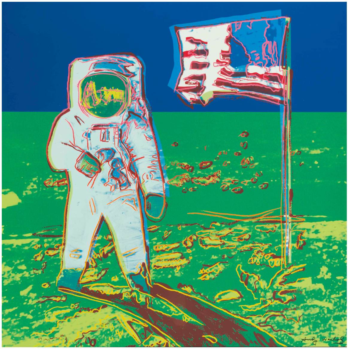
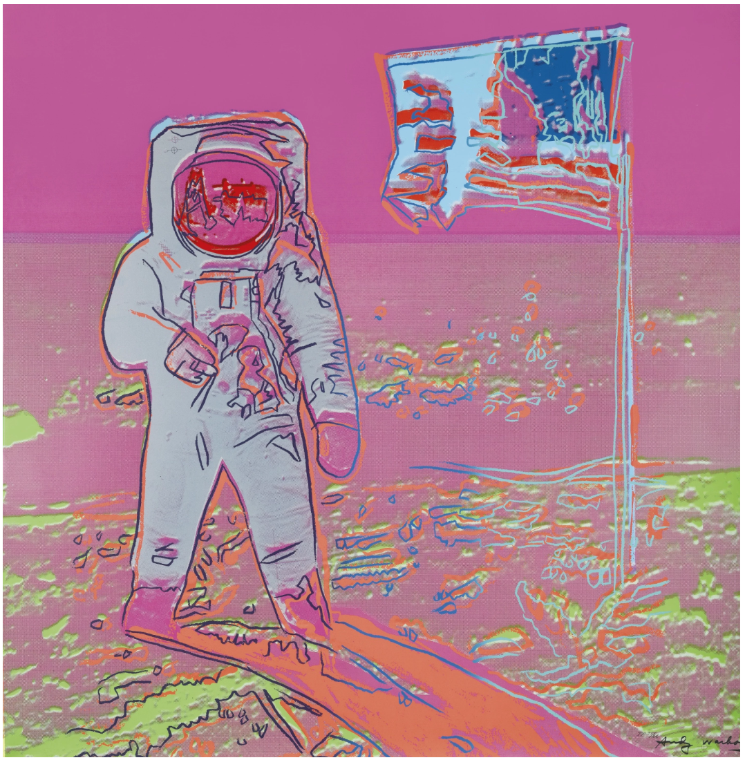
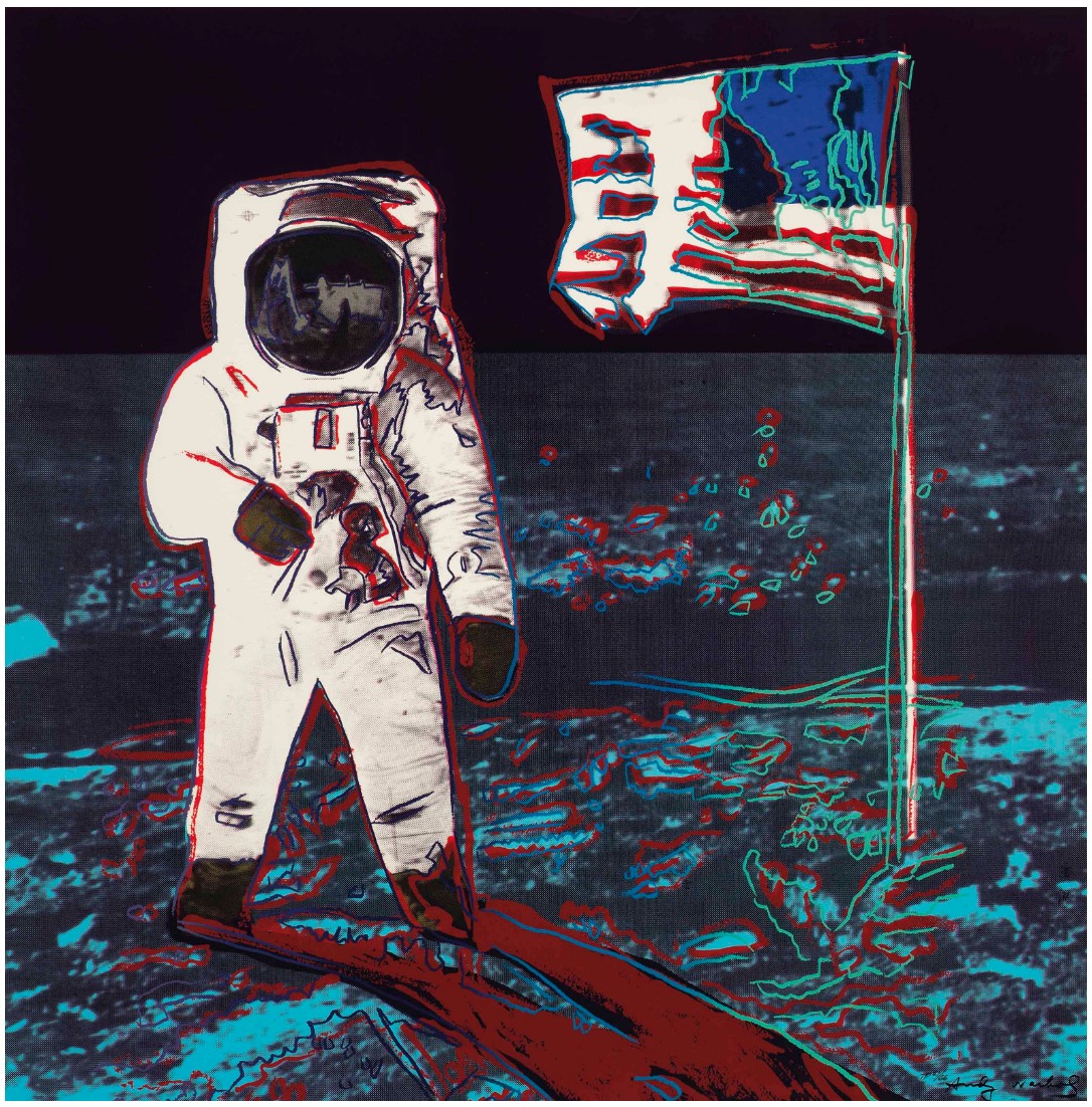
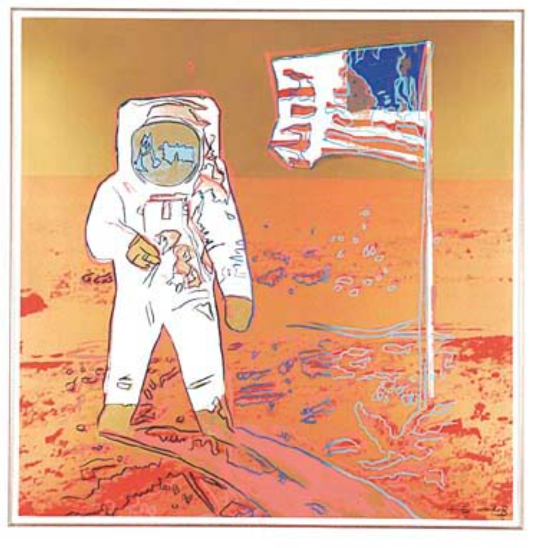
Moonwalk (1987)
The Moment Humanity Became an Image
The Moonwalk prints capture one of the defining achievements of the twentieth century, the first human steps on the moon, yet Warhol treats it not as an event, but as an image already embedded in collective memory.
The astronaut, the flag, the composition are instantly recognizable. The image does not require explanation. It exists as a symbol of technological triumph, national identity, and global spectacle. Warhol reinforces this condition through repetition. The event becomes fixed, not as experience, but as visual certainty. It is known because it has been seen. The legacy of Moonwalk is both quiet and definitive. It closes Warhol’s career with a subject that encapsulates his entire approach. History, at its most monumental, exists through its image, and once that image circulates, it becomes permanent.
The Andy Warhol Prints Catalogue
PLEASE CLICK ON THE PICTURE BELOW TO ACCESS THE ANDY WARHOL CATALOGUE
Overview of Andy Warhol Prints
2026 Upcoming Lots and Auction Results
2025 Auction Results
Auction Market Overview (2022-2025)