Structure, Language, and Market Dynamics
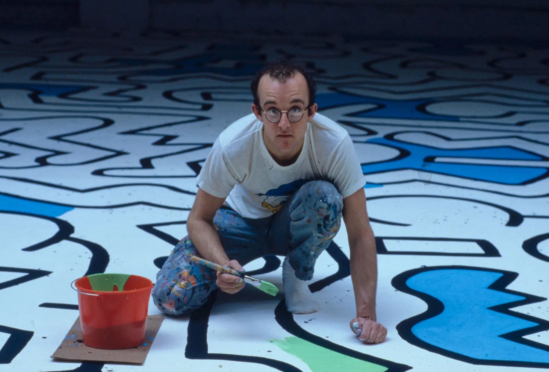
Few artists have aligned artistic intent, visual language, and market structure as coherently as Keith Haring. Emerging from the New York subway system in the early 1980s, Haring developed a graphic vocabulary that was not only instantly recognizable but inherently reproducible—making printmaking a natural extension of his practice rather than a secondary activity. Executed over less than a decade, his prints form a remarkably structured body of work. They are direct, deliberate, and conceptually consistent, reflecting his ambition to create art that was both accessible and socially engaged. Today, this clarity translates into one of the most active and legible markets in contemporary printmaking.
Introduction
A Language Designed for Multiplication
Haring’s visual system—bold contour lines, flat color fields, and rhythmic repetition—was conceived for immediate readability. Whether drawn in chalk on subway advertising panels or printed in editions, the imagery retains the same intensity and communicative power.
Screenprinting became his primary medium, allowing for saturated color, sharp contrast, and efficient reproduction. Unlike artists who adapted their work to print, Haring built a language that functioned seamlessly across formats. The result is a body of prints that feels neither diminished nor derivative, but fully autonomous.
This structural compatibility between image and medium is a key factor in the strength of his print market today.
The Littmann Catalogue Raisonné
A Market Backbone
Any serious engagement with Haring’s print market must begin with the catalogue raisonné established by Klaus Littmann, Keith Haring: Editions on Paper 1982–1990 (1993).
This publication is not merely documentary, it is structural. It establishes the chronology of Haring’s print production, the distinction between independent prints and portfolios, the technical classification of each work, and, crucially, a shared reference system used across galleries, auction houses, and private collections
In a market where Haring’s imagery has been widely reproduced, this framework becomes essential. It allows collectors to distinguish between true editioned works, signed, numbered, and historically grounded, and the broader field of posters and later reproductions.
The strength of Haring’s print market today is directly tied to this clarity. It is a market that remains accessible visually, but rigorous structurally.
Market Dynamics
Liquidity, Iconography, and Global Demand
The market for Haring prints is among the most active in the contemporary segment. Demand is driven by three key factors: (i) immediate visual recognition; (ii) cultural and historical relevance; and (iii) broad accessibility across price points.
Iconic motifs—particularly the barking dog, radiant baby, and dancing figures—anchor the market, while complete portfolios and early works command higher premiums. What distinguishes Haring is the balance between entry-level accessibility and high-end collectability. The market is tiered, but coherent.
Haring’s print market remains one of the most structurally sound in contemporary art. It reflects an artist who understood not only how to create images, but how to circulate them intelligently. His prints are not secondary objects; they are central expressions of a practice that sought to bridge art and life. In a market often driven by opacity, Haring offers something rare: a system that is both open and precise, accessible and rigorous, immediate and enduring.
Early Works (1983–1985)
Early Systems and Symbolic Density
The Fertility Suite (1983)
The Fertility Suite is one of the most intellectually dense and visually complex print portfolios in Haring’s oeuvre. It operates less as a set of individual images and more as a continuous symbolic field, where figures, energy lines, and organic forms interlock in a tightly compressed space. This is Haring at his most “mythological.” The imagery draws from a wide range of visual traditions, pre-Columbian, African, and ancient symbolic systems, filtered through his own graphic language. Figures are not isolated; they are absorbed into cycles of generation, mutation, and transformation.
What is particularly important here is that the compositions resist the later clarity of his iconic works. They require slower reading. The eye moves across the surface, discovering relationships rather than immediately identifying symbols. For collectors, this places the suite in a distinct category: less decorative, more cerebral, and significantly rarer on the market. It is a foundational body of work, both historically and conceptually, and one that often signals a more advanced level of collecting.
Three Lithographs (1985)
With Three Lithographs, Haring begins to transition toward greater formal control and compositional clarity, while still retaining a sense of density. Lithography introduces a subtle but important shift. The line becomes slightly more responsive, less mechanically uniform than in screenprinting. This allows for a more nuanced articulation of movement, even within the constraints of his graphic system.
What matters here is not the technique alone, but the structural refinement. Figures begin to assert themselves more clearly within the composition. The image is no longer a field—it becomes a stage. This moment is critical because it marks the passage from Haring as a producer of symbolic environments to Haring as a creator of iconic, self-contained images.
Free South Africa (1985)
Free South Africa is one of the clearest examples of Haring’s ability to align visual economy with political force. The compositions are deliberately simplified: a dominant white figure, an oppressed black figure, repeated across variations that shift color and emphasis. The message is immediate, but not simplistic. The repetition itself becomes a device: a visual insistence, almost propagandistic in its clarity.
This is not ambiguity; it is declaration. From a market perspective, the series occupies an important intersection between historical relevance and visual accessibility. It is instantly legible, yet anchored in a precise political context, which gives it both emotional resonance and intellectual weight.
Ludo (1985)
Ludo introduces a different dimension: structure as play. The compositions borrow from the logic of board games—grids, pathways, directional movement, yet the figures remain unmistakably Haring’s. Bodies collide, interact, and circulate within a system that suggests both order and unpredictability.
What is interesting here is the tension between control and chaos. The grid implies structure, but the figures disrupt it. Movement is guided, yet never fully contained. For collectors, Ludo sits slightly outside the most iconic imagery, but precisely for that reason it offers a more nuanced entry into Haring’s thinking. It reflects an artist experimenting with systems, not just symbols.
Dog (1985)
The barking dog is not a motif—it is one of the central pillars of Haring’s visual language. In the Dog prints, Haring isolates this figure and allows it to operate at full intensity. The animal is rendered with aggressive angularity, radiating lines that suggest sound, force, or command. It is both comic and threatening, playful and authoritarian.
Interpretations vary, but the strength of the image lies in its ambiguity. The dog can be read as: a symbol of authority or surveillance; a figure of warning or alarm; or a broader metaphor for systems of control What matters is that the image is instantly recognizable and endlessly adaptable. It is one of the motifs that define Haring’s market presence. From a collecting standpoint, works centered on the barking dog tend to perform strongly because they combine iconic clarity with conceptual depth. They are immediately identifiable as Haring, yet far from decorative.
Expansion and Cultural Positioning (1986–1988)
Andy Mouse (1986)
Andy Mouse is one of Haring’s most layered and culturally astute bodies of work. By merging Andy Warhol with the visual structure of Mickey Mouse, Haring constructs a hybrid figure that operates simultaneously as homage, critique, and cultural observation. This is not simply a playful crossover. It is a precise commentary on celebrity, authorship, and commodification. Warhol becomes both artist and product, elevated and flattened at the same time.
The compositions are cleaner than earlier works, more frontal, more emblematic. This reflects Haring’s growing awareness of the power of singular images—images that can circulate, repeat, and embed themselves in collective memory. In the market, Andy Mouse occupies a particularly strong position due to its historical anchoring and cross-referential appeal.
Growing (1988)
Growing is a masterclass in controlled expansion. Figures stretch, multiply, and interlock across the surface, creating compositions that feel both dynamic and tightly organized. Unlike the early dense works, the space here is more legible, yet the sense of movement is heightened.
What Haring achieves is a balance between readability and complexity. The viewer can grasp the image immediately, but the internal rhythm—the way forms echo and extend—reveals itself progressively. This series is often underestimated, but it represents a key moment where Haring fully masters the equilibrium between icon and composition.
Apocalypse (1988)
The Apocalypse suite marks a decisive rupture in tone. Created with William S. Burroughs, the series abandons the clarity and optimism of earlier works in favor of a darker, more chaotic visual language. Text and image collide. Figures fragment. The compositions become dense, almost claustrophobic.
This is Haring confronting themes of destruction, control, and existential anxiety at a moment when the cultural climate—particularly in relation to the AIDS crisis—was becoming increasingly tense. From a collector’s perspective, Apocalypse is less immediately accessible but significantly more conceptually charged. It sits closer to a literary or philosophical work than a purely visual one.
Pop Shop (1987–1989)
Distribution as Ideology, Image as Commodity
Pop Shop I (1987)
The first Pop Shop portfolio marks a decisive shift—not in style, but in strategy. By 1987, Keith Haring had already established a highly recognizable visual language. What changes here is the way he chooses to circulate that language. The opening of the Pop Shop in New York is not anecdotal; it is a structural move. Haring creates a space where his imagery can exist outside the traditional gallery system, in direct contact with a broader audience.
The prints from Pop Shop I reflect this intention with striking clarity. The compositions are reduced to their most legible form: isolated figures, strong color contrasts, and immediate visual impact. Dancing bodies, radiant babies, and interacting figures are no longer embedded in complex fields—they are presented as self-sufficient icons.
What is crucial here is that simplicity is not a simplification of thought. It is a refinement. Haring distills his language to its most efficient communicative form. Each image operates almost like a logo—memorable, repeatable, and instantly identifiable. From a market perspective, Pop Shop I establishes the foundation of what will become the most liquid segment of Haring’s prints. It introduces a model where accessibility and desirability coexist, rather than oppose each other.
Pop Shop II (1988)
With Pop Shop II, Haring expands the system without diluting its clarity. The compositions become slightly more complex, with increased interaction between figures and a greater sense of movement across the surface. There is a heightened rhythm—bodies overlap, repeat, and generate visual momentum.
What distinguishes this second portfolio is the confidence of execution. Haring is no longer refining his language; he is deploying it with full control. The imagery feels both spontaneous and perfectly calibrated. Color plays a more assertive role. Contrasts are sharper, and the relationship between figure and ground becomes more dynamic. This contributes to the strong visual presence of the works, particularly in a collecting context. For collectors, Pop Shop II often represents a balance between the purity of the first portfolio and the increasing complexity of later iterations.
Pop Shop III (1989)
By the time of Pop Shop III, Haring’s system reaches a point of maximum fluency. The figures are fully liberated within the composition. Movement becomes more expansive, less contained. There is a sense of continuous flow—forms echo, extend, and respond to one another across the surface. What is particularly striking is the economy of means. Haring achieves a high level of visual intensity with remarkably few elements. Line, color, repetition—nothing more is needed.
This portfolio demonstrates the extent to which Haring has mastered the relationship between individual motif and overall composition. Each figure is recognizable, yet fully integrated into a larger rhythm. In the market, Pop Shop III maintains strong demand, particularly for collectors seeking works that feel both iconic and compositionally rich.
Pop Shop IV (1989)
Pop Shop IV introduces a subtle but important shift toward greater compositional tension. The images feel slightly more compressed. Figures interact more tightly, and the space becomes more charged. There is less openness, more friction between forms.
This is not a departure from earlier works, but a recalibration. Haring begins to push his system toward denser configurations without sacrificing legibility. The result is a portfolio that retains the clarity of the Pop Shop concept while introducing a more dynamic internal structure. It rewards closer viewing, even as it remains immediately accessible.
Pop Shop V (1989)
With Pop Shop V, Haring continues to intensify the internal dynamics of his compositions. There is a stronger emphasis on interaction and contact. Figures collide, merge, and respond to one another in more complex ways. The imagery feels less isolated, more relational.
This shift reflects a broader evolution in Haring’s work during the late 1980s, where themes of connection—social, physical, and symbolic—become increasingly central. From a collector’s perspective, Pop Shop V often appeals to those looking for works that move beyond pure iconography into more engaged compositional narratives.
Pop Shop VI (1989)
The final Pop Shop portfolio represents both a continuation and a conclusion. The system is fully established, fully controlled, and fully understood. Haring no longer needs to introduce new elements; instead, he refines the balance between clarity, movement, and composition. What emerges is a sense of resolution. The images feel complete, self-assured, and structurally stable.
This closing portfolio reinforces the importance of the Pop Shop series as a whole. Individually strong, the prints gain additional value when understood as part of a coherent, multi-year project: one that redefines the relationship between art, commerce, and accessibility. Complete sets, in particular, carry a significant premium in the market, precisely because they preserve this conceptual unity.
Late Works (1989–1990)
Reduction, Symbol, and Final Clarity
Chocolate Buddha (1989)
Chocolate Buddha introduces a quieter, more introspective dimension to Haring’s work. The compositions are more restrained, with a stronger emphasis on singular forms and symbolic presence. The reference to the Buddha is not literal; it operates as a cultural and spiritual signifier, filtered through Haring’s graphic language.
What is notable is the shift in tone. The urgency of earlier works gives way to a more contemplative rhythm. The imagery is less about movement and more about presence. For collectors, this series represents a more nuanced and less overtly iconic aspect of Haring’s production.
Totem (1989)
In Totem, Haring organizes his motifs vertically, creating stacked compositions that evoke ritual structures or symbolic hierarchies. The verticality is key. It introduces a different reading experience—one that unfolds from bottom to top, rather than across the surface.
The figures become elements within a system of accumulation and order, suggesting both continuity and hierarchy. This aligns with Haring’s ongoing interest in universal symbols and collective imagery.
The Story of Red and Blue (1989–1990)
This series stands apart for its narrative ambition. Across multiple prints, Haring constructs a visual dialogue between two opposing forces, red and blue, using repetition and variation to build meaning over time.
The imagery remains simple, but the structure becomes more complex. The viewer is invited to read the sequence, to follow the transformation of forms and relationships across the series. This is Haring working at the intersection of storytelling and system, using minimal elements to convey a broader conceptual arc.
Flowers (1990)
Flowers introduces a rare softness into Haring’s late work. The compositions are lighter, more decorative, yet still anchored in his graphic system. Organic forms replace human figures, but the rhythm and repetition remain.
This series can be seen as a moment of visual relief, though it retains the structural discipline characteristic of his work.
Blueprint Drawings (1990)
The Blueprint Drawings are among the most conceptually refined works in Haring’s print production. White line drawings on deep blue grounds evoke architectural plans or schematic diagrams. The imagery is stripped to its structural essence, emphasizing construction over expression.
These works offer a rare glimpse into Haring’s thinking process: his ability to reduce complex visual systems to their underlying frameworks. They occupy a more discreet but intellectually significant position within the market.
Icons (1990)
With Icons, Haring reaches a point of absolute reduction. Each print isolates a single motif—radiant baby, barking dog, dancing figure—and presents it with maximum clarity. There is no narrative, no interaction, no background complexity. What remains is the image in its most concentrated form.
This series functions as a lexicon of Haring’s visual language. It defines, almost definitively, the key elements of his work. In the market, Icons holds a particularly strong position due to its immediate recognizability and conceptual clarity.
The Keith Haring Prints Catalogue
PLEASE CLICK ON THE PICTURE BELOW TO ACCESS THE KEITH HARING PRINTS CATALOGUE
Overview of Keith Haring Prints
2026 Upcoming Lots and Auction Results
Auction Market Overview (2022-2025)
2025 Auction Results
2024 Auction Results