Roy Lichtenstein’s prints occupy a distinct place in postwar art because they were never secondary to his practice. They were not decorative extensions of successful paintings, nor convenient reproductions of already familiar images. From the official Roy Lichtenstein Catalogue Raisonné to the Corlett print catalogue, the record makes clear that printmaking was a sustained and central part of his oeuvre, spanning decades and culminating in one of the most coherent print bodies of any major Pop artist. The online RLCR now documents more than 5,000 known works across media, while the Corlett catalogue remains the core reference for the prints themselves.
That distinction matters. Lichtenstein did not use printmaking merely to circulate images; he used it to sharpen them. His art is built on compression, control, and visual syntax. Where other artists pursued spontaneity, Lichtenstein pursued exactness. His prints embody that exactness with exceptional force. The flatness, the contour, the dots, the carefully calibrated color, and the sense of mechanical clarity all find a particularly natural home in print. In many cases, the medium does not dilute the idea. It completes it. Auction-house and market commentary repeatedly emphasize this unusual consistency, a point echoed even by collectors’ guides that describe Lichtenstein as having one of the strongest “batting averages” among major artists.
Introduction
Lichtenstein’s importance in printmaking lies in the way he transformed reproduction into a subject in itself. His work borrows the look of industrial communication, comic strips, advertisements, diagrams, commercial printing, yet it does so with extraordinary deliberation. The image may appear immediate, even impersonal, but beneath that cool surface lies a highly intelligent construction. He did not simply appropriate familiar imagery. He rebuilt it. He converted the language of mass circulation into a new form of high art, one that remains crisp, ironic, elegant, and often surprisingly cerebral. Sotheby’s and Christie’s discussions of his work alike return to this tension between hand-made art and mechanically staged appearance.
This is why Lichtenstein’s prints remain so compelling for collectors and scholars alike. They are instantly legible, yet rarely exhausted by first looking. A blonde heroine, a brushstroke, a mirror, a cathedral, a still life, a modern interior, a water lily pond: each image begins with something recognizable, but Lichtenstein turns that familiarity into a problem of seeing. He asks how images are built, how they are coded, and how they acquire authority. In his hands, even emotion looks designed. Which, one suspects, was rather the point.
Printmaking as an ideal medium
Printmaking suited Lichtenstein unusually well because his art depends on discipline. His famous dots are not casual signatures. They are structural devices. They regulate tone, flatten space, and turn illusion into method. Likewise, the thick black outlines do not merely describe form; they stabilize the picture into an organized visual system. In print, these operations become even more precise. The controlled surfaces, the exact registration, and the deliberate separation of colors align perfectly with an artist who treated image-making almost as a form of engineering. Christie’s and other market sources repeatedly underline how his prints combine multiple techniques with unusual sophistication, from screenprint and lithography to woodcut, embossing, collage, and metallic or industrial supports.
This technical rigor is one of the reasons the print corpus is so important. Lichtenstein was not a printmaker in the casual sense. He worked through the medium with seriousness and invention, often using it to push particular ideas further than painting alone might allow. In late series such as the Reflections or Water Lilies, for example, the medium becomes inseparable from the concept itself. Reflection is not only represented; it is materially staged through surface, layering, metallic elements, embossing, or steel. That union of subject and support is one of the great strengths of his print practice.
A market built on image, medium, and series
Lichtenstein’s print market is unusually structured. It is not driven only by fame, and not only by rarity. It is also driven by the recognizability of individual series, the clarity of the image, the sophistication of the medium, and the place a work occupies within the artist’s larger development. Recent buyers’ and sellers’ guides stress that prices are shaped by medium, rarity, and series demand, while auction data shows a market ranging from comparatively accessible works under USD 50,000 to multi-million results for the most sought-after editions.
The strongest results tend to cluster around works that combine several virtues at once: iconic imagery, historical importance, technical ambition, and unmistakable visual identity. Phillips’ auction records illustrate the range of collector appetite, from major prices for the Water Lilies and Reflections to strong results for Brushstrokes, Landscapes, and other late series. What this shows is that Lichtenstein’s market is not confined to one famous early moment. Collectors continue to reward both the canonical Pop images and the later, more reflective bodies of work in which he revisited his own motifs and the history of painting with increasing sophistication.
A practice of remarkable consistency
One of the striking things about Lichtenstein’s print market is how much it reflects the consistency of the oeuvre itself. Unlike artists whose editioned works fluctuate wildly between masterpieces and afterthoughts, Lichtenstein maintained a very high level across decades. Market commentary repeatedly notes the stability and selective repricing of his print market, where values tend to rise sharply when important works appear and then hold at those higher levels. That pattern suits an artist whose work is deeply serial, highly legible, and unusually resistant to fashion-driven confusion.
This consistency also makes Lichtenstein especially well suited to a series-based understanding. His prints are best approached not as scattered individual images, but as parts of distinct and intelligible groups. That is one of the reasons your IntelArt catalogue structure works so well for him. Once the series are organized chronologically and conceptually, the market becomes far more readable, and so does the art. The collector begins to see not merely isolated pictures, but a sequence of visual arguments.
Toward the major series
That is ultimately the best way to understand Roy Lichtenstein’s prints. They are not minor accessories to a Pop legend. They are a central arena in which his thought becomes especially clear. Through them, one can trace his movement from comic-derived imagery to brushstrokes, mirrors, reflections, interiors, landscapes, nudes, still lifes, and art-historical reinterpretations with remarkable coherence. The series matter because Lichtenstein thought in series. He refined ideas through repetition, variation, quotation, and formal control. He was, in that sense, not only a Pop artist but also a taxonomist of images, which is perhaps a slightly grand way of saying that he liked order very much indeed.
Catalogues Raisonnés
The Corlett catalogue raisonné
For anyone working seriously with Roy Lichtenstein prints, the Corlett catalogue raisonné is indispensable. The official RLCR identifies Mary Lee Corlett’s catalogue as the authoritative print reference, first published in 1994 and revised in 2002. It documents 311 editioned prints and posters produced from 1948 through 1997, along with three posthumous print publications from 1998, and it also records a separate body of posters, announcements, and related printed works in unspecified editions. In practical terms, this is the catalogue through which the print market speaks. Dealers, auction houses, specialists, and collectors regularly identify works by their Corlett numbers.
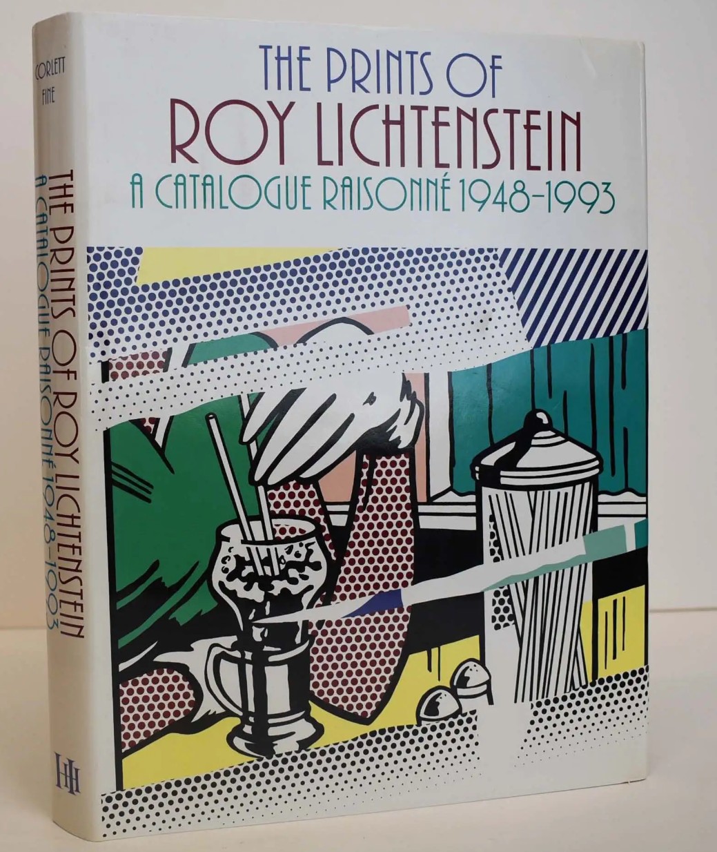
That gives the Corlett catalogue a very specific importance. It is not merely bibliographic. It is transactional. It provides the numbering system that helps structure the market, organize provenance, and anchor discussions of editioned works with precision. For IntelArt, that matters enormously, because a serious print platform should not speak vaguely about “a Lichtenstein print” when the market itself is operating through established catalogue references. Corlett is the language of exactness.
The Roy Lichtenstein Catalogue Raisonné
The online Roy Lichtenstein Catalogue Raisonné serves a broader role. Whereas Corlett is the essential print reference, the RLCR places the prints within the entirety of Lichtenstein’s production. The site documents over 5,000 known works, including paintings, sculpture, drawings, collages, prints, and commissions, making it the wider scholarly and institutional framework through which the artist’s oeuvre can be understood across media. This larger digital architecture is especially useful because it allows one to read the prints not as isolated market objects, but as part of Lichtenstein’s evolving thinking about art history, illusion, design, and representation.
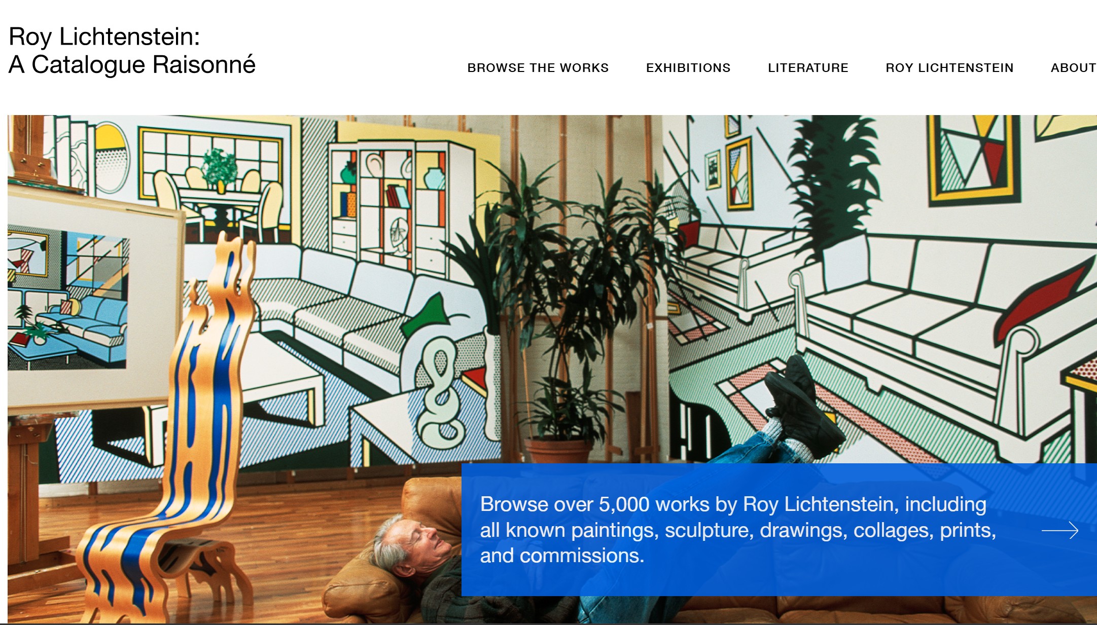
That distinction is subtle but important. Corlett tells you what the print is within the print market. The RLCR helps explain where it sits within Lichtenstein’s total practice. One is the indispensable reference for editioned works; the other is the broader intellectual map. Together, they provide exactly the sort of dual framework a collector should want: one catalogue for precision, another for perspective.
Major Series
Nude Series (1994)
(Corlett 280–284)
The Nude Series marks a refined moment in the late work of Roy Lichtenstein. Created in 1994, it revisits one of the most established subjects in art history, the female nude, through Lichtenstein’s controlled and constructed visual language. Rather than presenting the body through observation or painterly expression, the figures appear mediated, stylized, and deliberately composed. The result is a form of intimacy that is both present and distanced.
Across the series, the body is reduced to contour, flat color, and pattern. Ben-Day dots coexist with areas of solid color and line, creating a surface that is clear, structured, and intentionally artificial. The prints combine multiple techniques, including screenprint and woodcut, allowing Lichtenstein to achieve both precision and subtle variation within a highly controlled system.

The Nudes belong to Lichtenstein’s late period, following series such as Reflections and Interiors, where his work shifts toward a broader engagement with art history. The nude is no longer treated as a purely visual subject, but as an image to be translated and reorganized. For collectors, the series represents a mature phase of his print practice, combining strong visual clarity with conceptual refinement. The Nudes demonstrate Lichtenstein’s ability to take a classical subject and transform it into a system of image-making. The body is no longer modeled—it is constructed.
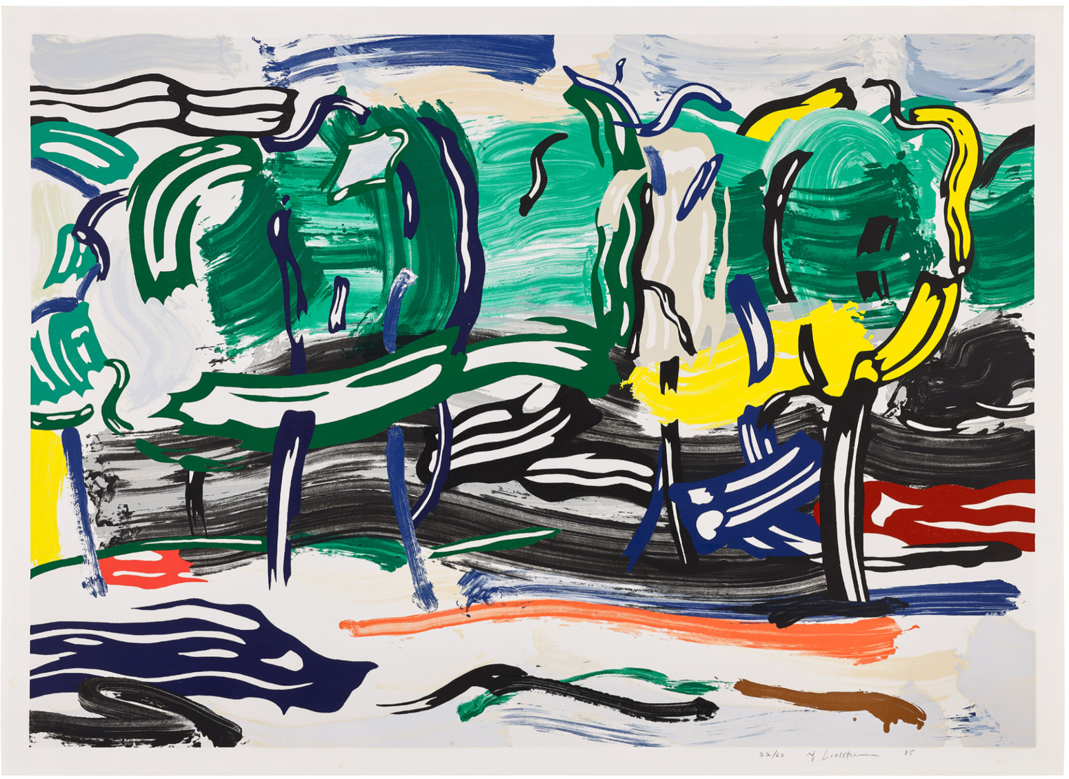
Water Lilies Series (1992)
(Corlett 264–269)
The Water Lilies series represents a major moment in the late work of Roy Lichtenstein. Created in 1992, it revisits Claude Monet’s Nymphéas and translates one of the most iconic subjects in modern painting into Lichtenstein’s precise and controlled visual language. Rather than capturing atmosphere and light in a painterly manner, Lichtenstein reconstructs the image through clarity, structure, and stylization.
Across the series, the pond is organized through bold black contours, flat areas of color, and patterned surfaces that transform natural elements into a system of visual signs. Water, reflections, and vegetation are no longer observed but deliberately composed, giving the works a sense of calm that is entirely constructed. The series is executed in screenprint with enamel on processed and swirled stainless steel, a material choice that introduces real reflection into the work and reinforces the subject itself. The surface interacts with light and subtly shifts the viewer’s perception, aligning the concept of reflection with the physical nature of the print.
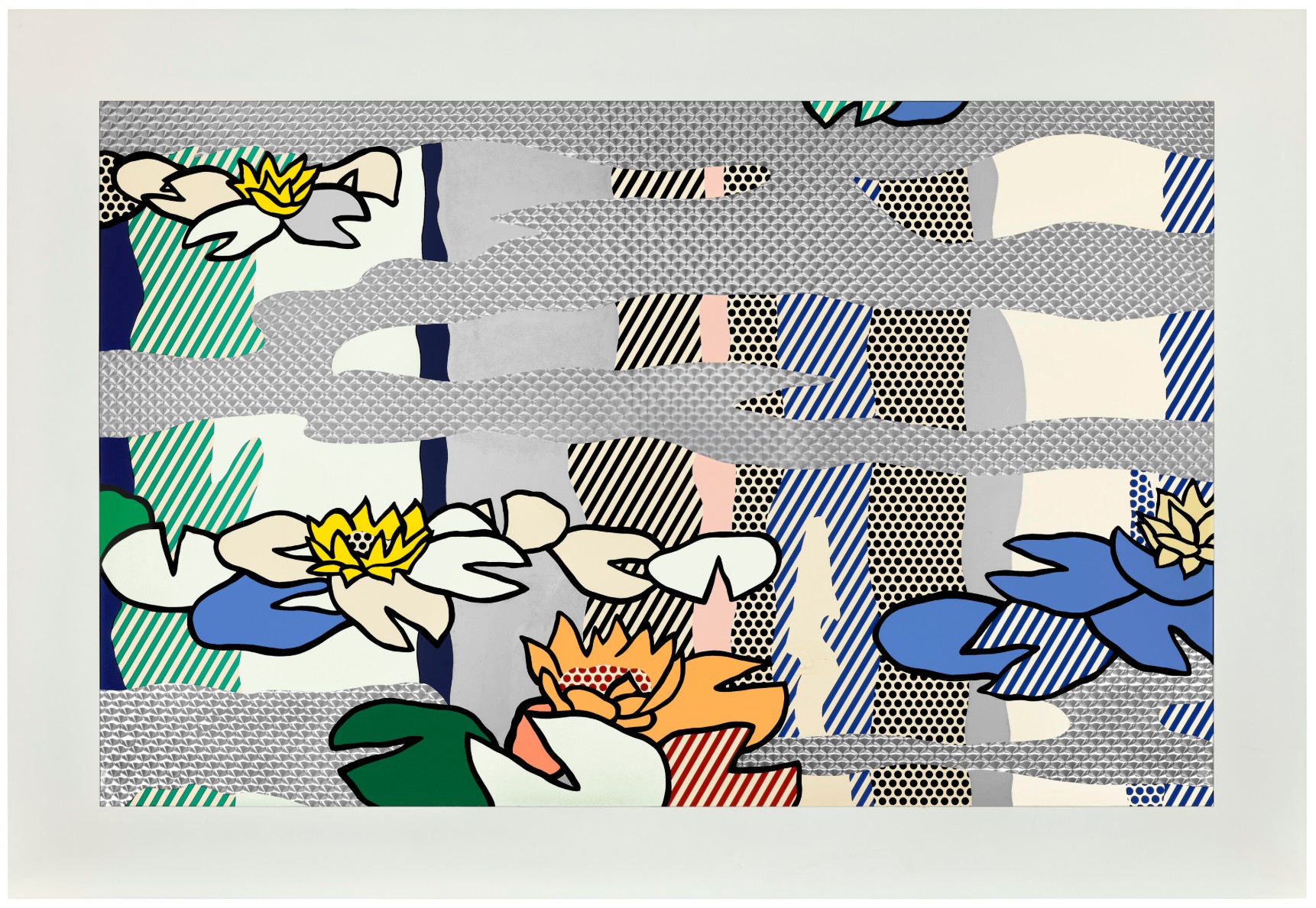
The Water Lilies belong to Lichtenstein’s late period, during which his work increasingly engages with art history rather than popular culture alone. Following earlier reinterpretations of Monet such as the Haystacks and Cathedrals, this series represents a more resolved synthesis of his practice. It combines his long-standing interest in reflection with a direct and mature dialogue with Impressionism, positioning the works between homage and transformation. The series is among the most sought-after groups within Lichtenstein’s late print production. Collectors are drawn to the strength of the imagery, the clear reference to Monet, the distinctive use of stainless steel, and the relatively small edition size. These elements contribute to the series’ strong market position and its recognition as one of the most technically accomplished bodies of work in his print practice.
The Water Lilies demonstrate Lichtenstein’s ability to take a historically significant subject and translate it into his own visual system without losing its presence. Monet dissolves the image into sensation, while Lichtenstein reconstructs it into a language of structure and control.
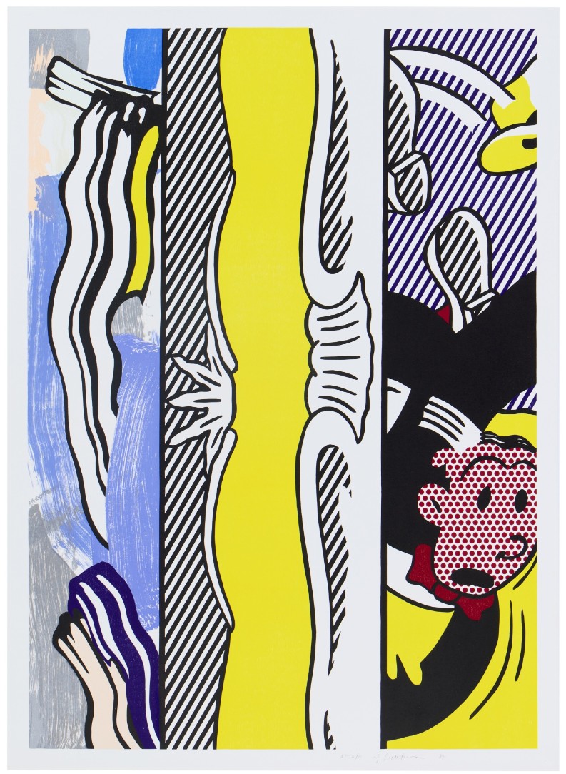
Interiors Series (1990)
(Corlett 250–262)
The Interiors series represents a pivotal moment in the mature work of Roy Lichtenstein. Created around 1990, it shifts the focus from isolated figures and iconic imagery toward constructed domestic spaces, where architecture, furniture, and decoration become the primary subjects. These works no longer reference mass media directly but instead engage with the history of modern painting, particularly with artists such as Matisse and Picasso.
Across the series, interiors are built through a precise system of lines, flat color fields, and patterned surfaces. Walls, floors, windows, and objects are arranged with clarity and balance, creating compositions that feel both ordered and slightly artificial. Perspective is often flattened or subtly distorted, and decorative elements are integrated into the structure of the image rather than treated as secondary details. The spaces appear familiar, yet they are clearly constructed. They function less as lived environments and more as carefully composed images, where each element contributes to an overall visual logic. The prints combine multiple techniques, including screenprint, lithography, and woodcut, allowing Lichtenstein to layer textures and patterns while maintaining overall precision. This technical complexity supports the clarity of the compositions, giving the works a polished, almost architectural quality.
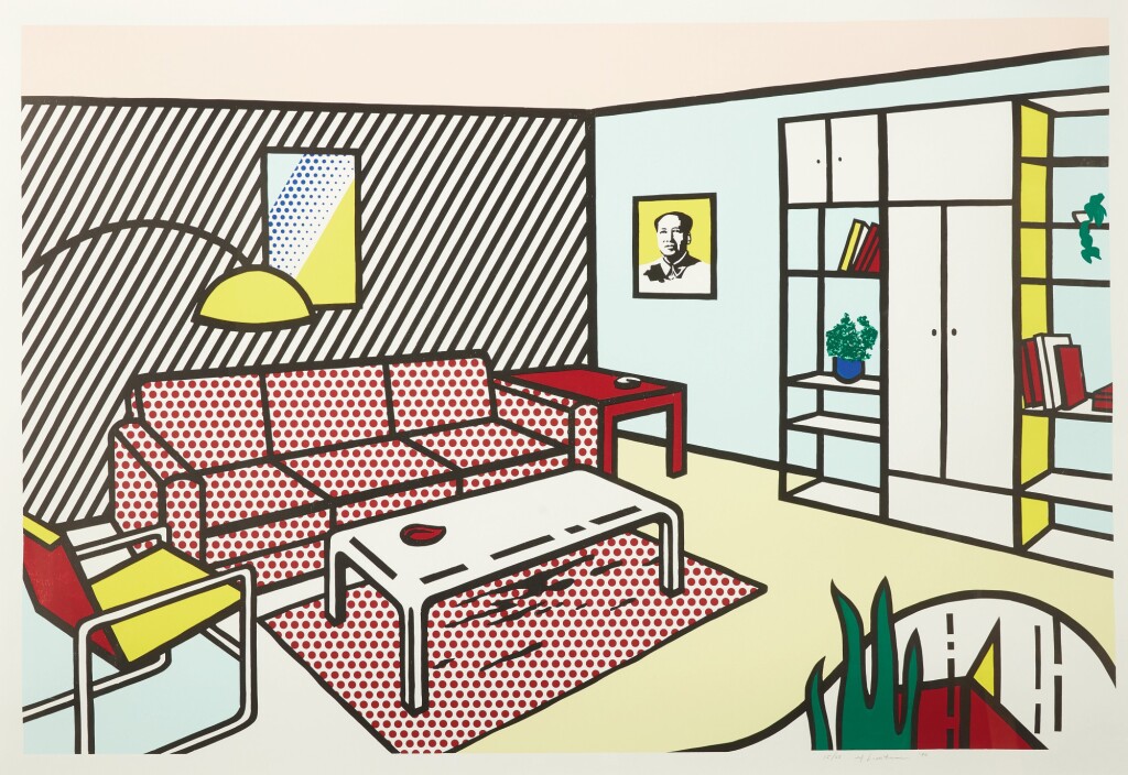
The Interiors are highly regarded within Lichtenstein’s print market for their compositional strength and intellectual depth. Collectors are drawn to the clarity of the images, the balance between abstraction and representation, and the direct dialogue with modernist painting. The series offers a more structured and architectural alternative to earlier Pop imagery. The Interiors transform everyday spaces into systems of composition. Lichtenstein does not depict a room as it is lived in; he reconstructs it as an image, where space, pattern, and form are fully controlled.
Reflections Series (1989–1990)
(Corlett 240–249)
The Reflections series represents one of the most conceptually rigorous moments in the work of Roy Lichtenstein. Created between 1989 and 1990, the series builds on earlier Mirror works but expands the idea of reflection into a more complex visual and intellectual system. Rather than depicting a subject directly, Lichtenstein presents it as partially obscured, fragmented, and seen through layers.
Across the series, images appear interrupted by bands, highlights, and reflective overlays that cut across the composition. These elements do not belong to the depicted scene but act as visual filters, suggesting glare, reflection, or distortion. As a result, the image is never fully accessible. It is presented as something mediated, partially hidden, and reconstructed. This creates a tension between visibility and obstruction. The viewer recognizes the underlying subject, yet cannot fully grasp it, reinforcing Lichtenstein’s interest in how images are perceived rather than simply seen.
The prints combine screenprint, lithography, and other processes to achieve layered surfaces and precise visual effects. The reflective bands are carefully integrated into the composition, not as decorative additions but as structural elements that define the image. The technical execution reinforces the conceptual idea of reflection as both a visual and intellectual device.
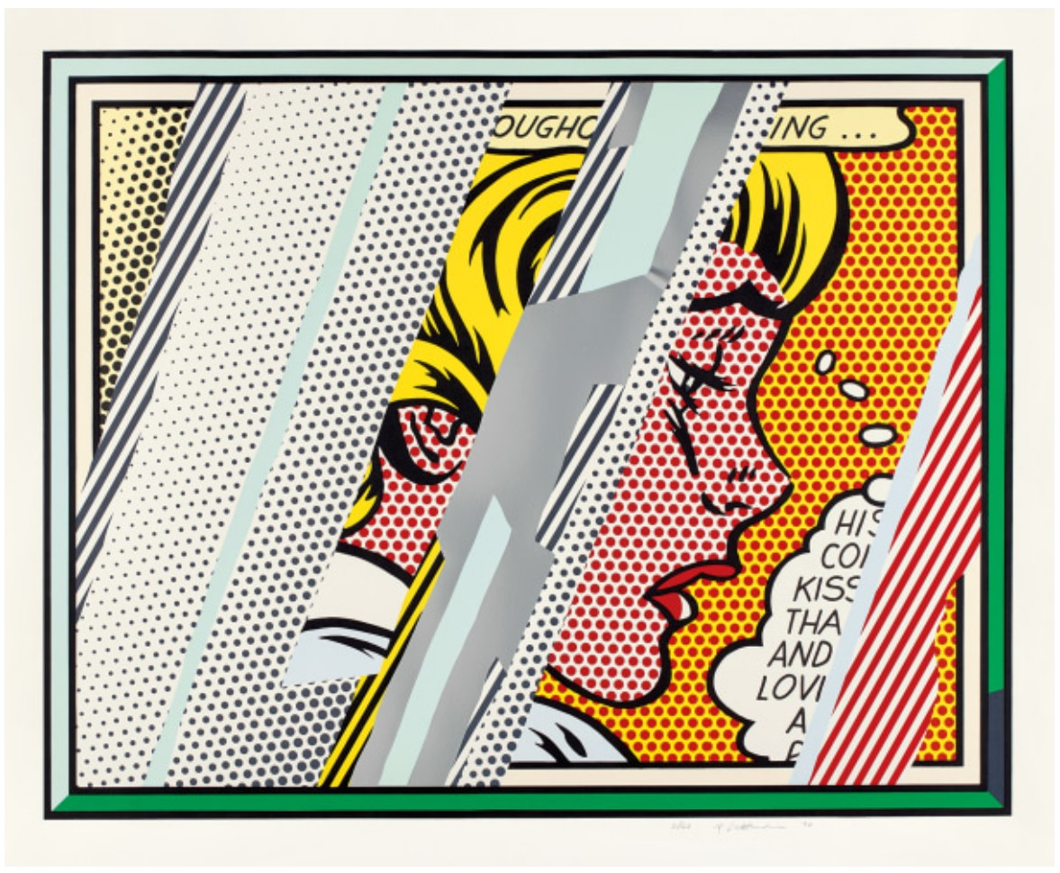
The Reflections series marks a turning point in Lichtenstein’s late work. It moves beyond direct references to popular imagery and toward a broader investigation of perception, representation, and art history. The series sits between the Interiors and later works such as the Nudes and Water Lilies, forming a central bridge in his mature practice. The Reflections transform the act of looking into the subject itself. Lichtenstein does not present an image; he presents an image being seen through interference, reminding the viewer that perception is always mediated.
Brushstroke Figures Series (1989)
(Corlett 232–239)
The Brushstroke Figures series represents a key development in the late work of Roy Lichtenstein. Created in 1989, it extends his long-running exploration of the brushstroke, a motif he had been developing since the mid-1960s, and transforms it into a more complex and figurative structure. What was originally a single ironic gesture becomes here a fully constructed image.
In this series, the brushstroke is no longer an isolated mark but the building block of the composition. Figures emerge from layered, exaggerated strokes that retain their mechanical clarity while suggesting movement and form. The works balance abstraction and representation, as the viewer simultaneously reads the image as a figure and as a collection of stylized marks. The tension is central. The brushstroke, traditionally associated with spontaneity and expression, is here controlled, repeated, and systematized. It no longer expresses emotion; it describes it.
The prints combine multiple techniques, including screenprint, lithography, and woodcut, allowing for a layering of textures and a precise orchestration of color and form. Despite their dynamic appearance, the compositions are carefully engineered, reinforcing Lichtenstein’s interest in structure over gesture.
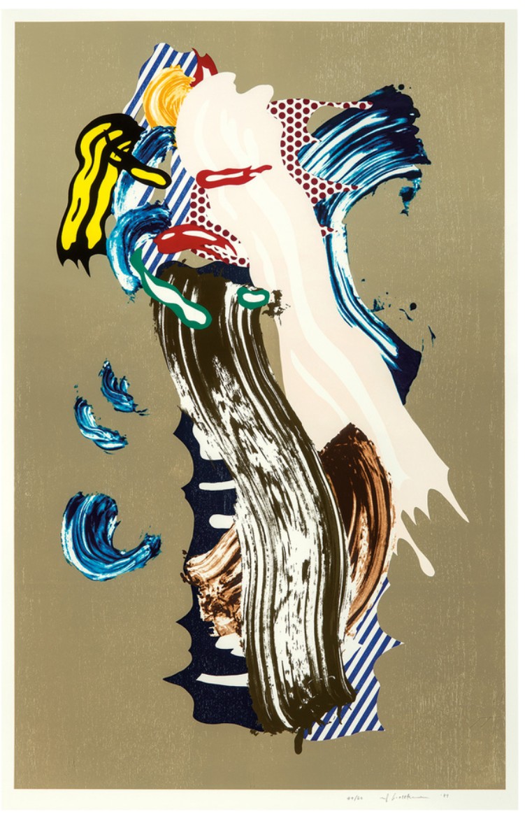
The Brushstroke Figures series builds on earlier Brushstroke works and pushes the idea further by integrating it into figurative imagery. It belongs to a transitional moment leading into the late period, where Lichtenstein increasingly engages with abstraction, art history, and the mechanics of representation. The Brushstroke Figures transform one of the central symbols of modern painting into a structured image. Lichtenstein takes the idea of spontaneous gesture and turns it into a controlled system, revealing that even expression can be constructed.
Imperfect Series (1988)
(Corlett 221–230)
The Imperfect series represents a decisive moment in the evolution of Roy Lichtenstein toward abstraction. Created in 1988, the series moves away from recognizable imagery and focuses instead on geometric structures that appear deliberately irregular, incomplete, or misaligned. These works introduce a controlled disruption into Lichtenstein’s otherwise precise visual system.
Across the series, compositions are built from geometric forms, lines, angles, arcs, that do not fully resolve into stable shapes. Elements appear shifted, interrupted, or slightly “off,” creating a sense of imbalance within an otherwise ordered framework. This tension is essential. The works suggest structure, but refuse perfection. The viewer is presented with a system that appears logical at first glance, yet resists complete coherence upon closer inspection.
The prints combine techniques such as screenprint, woodcut, and collage, allowing for layered surfaces and varied textures. Despite the apparent irregularity of the compositions, the execution remains precise, reinforcing the idea that the “imperfection” is entirely constructed rather than accidental.
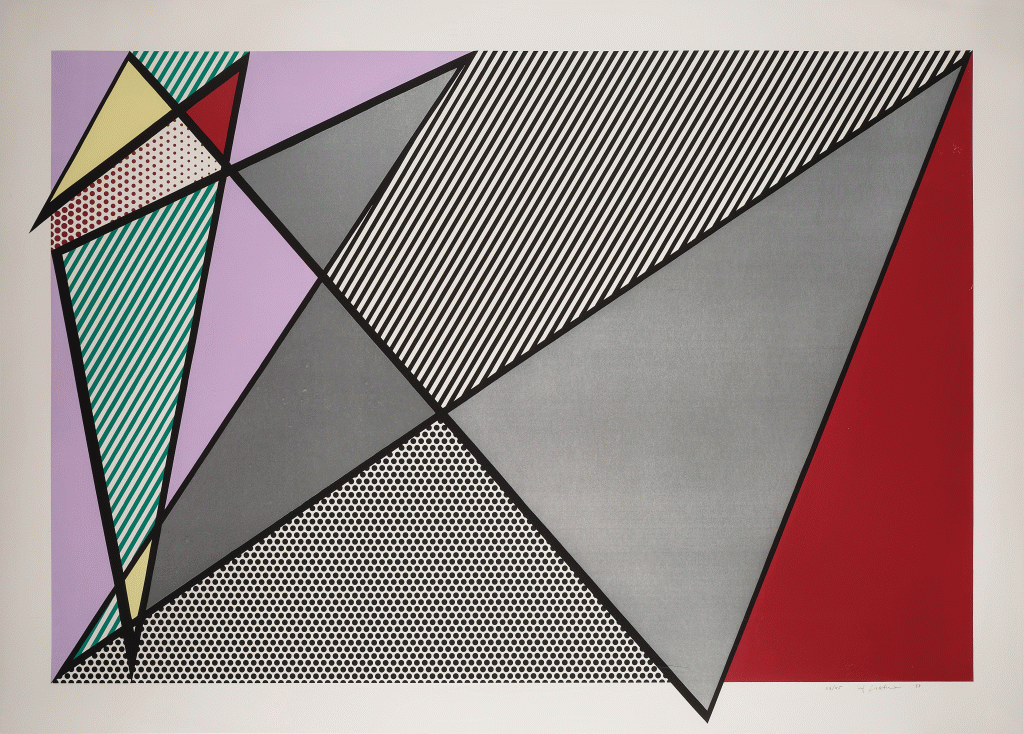
The Imperfect series marks a turning point in Lichtenstein’s late work, where abstraction becomes more central to his practice. It bridges earlier explorations of form and later series such as the Brushstroke Figures and Reflections, in which structure and perception take precedence over direct imagery. The Imperfect series challenges the idea of precision that defines Lichtenstein’s art. It introduces instability into a controlled system, demonstrating that even order can be constructed to appear incomplete.
Landscape Series (1985)
(Corlett 210–218)
The Landscape series marks an important expansion in the work of Roy Lichtenstein. Created in 1985, it revisits the traditional genre of landscape painting and translates it into Lichtenstein’s structured and highly controlled visual language. Rather than depicting nature as an immersive or atmospheric experience, the series presents it as an organized and constructed image.
Across the series, natural elements such as sky, clouds, water, and horizon lines are reduced to simplified forms, bold contours, and flat areas of color. The compositions retain a sense of openness and calm, yet they are clearly artificial, built from a system of lines and patterns rather than direct observation. The landscape becomes less a place and more a visual arrangement, where depth is suggested but often flattened, and where each element contributes to a balanced and deliberate composition.
The prints combine screenprint, woodcut, and other processes, allowing Lichtenstein to layer textures and create variation within a controlled framework. The technical precision reinforces the clarity of the compositions, giving the works a clean and highly resolved surface.
The Landscape series belongs to a mid-career phase in which Lichtenstein broadens his subject matter beyond comic imagery and begins to engage more directly with traditional genres. It anticipates later series such as the Imperfect and Water Lilies, where nature and abstraction are further explored through his visual system.
The series is appreciated for its strong compositions and its reinterpretation of a classical subject. While less iconic than early Pop works, it offers collectors a clear and balanced entry into Lichtenstein’s evolving practice, combining recognizable imagery with formal sophistication.
The Landscape series transforms nature into structure. Lichtenstein does not depict a landscape as it is seen, but reconstructs it as an image governed by clarity, order, and design.
Paintings Series (1984)
(Corlett 203–207)
The Paintings series marks a critical moment in the work of Roy Lichtenstein, where the subject shifts toward painting itself. Created in 1984, the series does not depict external imagery but instead stages fragments of paintings as objects within the composition. Lichtenstein turns his attention inward, examining the structure and language of painting through his own visual system.
Across the series, compositions present cropped or layered “paintings” within the image, often combining different styles, references, and visual elements. These fragments coexist without fully resolving into a single coherent space, creating a sense of overlap and displacement. The viewer is confronted with an image that is both representation and commentary. What appears to be a painting is simultaneously an image of painting, constructed through contour, flat color, and pattern. The result is a controlled complexity, where multiple visual languages intersect within a single frame.
The prints combine screenprint, woodcut, and collage elements, allowing Lichtenstein to layer textures and create subtle variations between different sections of the composition. The technical precision supports the conceptual idea, reinforcing the distinction between the illusion of painting and its constructed reality.
The Paintings series belongs to a phase in which Lichtenstein increasingly engages with art history and the mechanics of representation. It precedes series such as the Imperfect, Landscape, and Reflections, where these concerns are developed further. Here, the focus is explicitly on painting as a subject, marking a shift from external imagery toward a more analytical approach.
The series is valued for its conceptual strength and its place within Lichtenstein’s broader evolution. Collectors appreciate the layered compositions and the direct engagement with the language of painting, which distinguishes these works from more immediately recognizable Pop imagery. The Paintings series transforms painting into an object of analysis. Lichtenstein does not simply create images; he examines how images are constructed, presented, and understood.
Expressionist Woodcut Series (1980)
(Corlett 172–178)
The Expressionist Woodcut series marks an important shift in the work of Roy Lichtenstein. Created in 1980, it engages directly with the tradition of German Expressionism, a movement historically associated with raw emotion and expressive carving. Lichtenstein approaches this tradition through his own controlled and analytical language, transforming it into a constructed image rather than an expressive act.
Across the series, compositions are built from bold black lines, high contrast, and simplified forms that recall the visual intensity of traditional woodcuts. However, the apparent spontaneity of the style is carefully staged. The irregular lines and rough textures are not the result of instinct, but of deliberate design. This creates a tension between expression and control. The works evoke emotional immediacy while simultaneously revealing their own construction, turning the expressive gesture into a visual system.
The use of woodcut is central to the series, allowing Lichtenstein to engage directly with a historically charged medium. He combines traditional woodcut methods with his own precise approach, often integrating additional print techniques to refine the composition. The result is a surface that appears raw yet remains highly controlled.
The Expressionist Woodcut series represents a moment in which Lichtenstein turns explicitly toward art history. It precedes later series such as the Paintings and Imperfect, where the analysis of style and representation becomes even more pronounced. Here, the focus is on translating an entire artistic movement into his own visual language.
The series is valued for its strong visual impact and its direct engagement with a major historical style. Collectors appreciate the contrast between the apparent expressiveness of the imagery and the precision of its execution, as well as its place within Lichtenstein’s broader exploration of art history.
The Expressionist Woodcut series transforms expression into structure. Lichtenstein takes a style defined by spontaneity and reinterprets it through control, demonstrating that even the most emotional forms can be constructed.
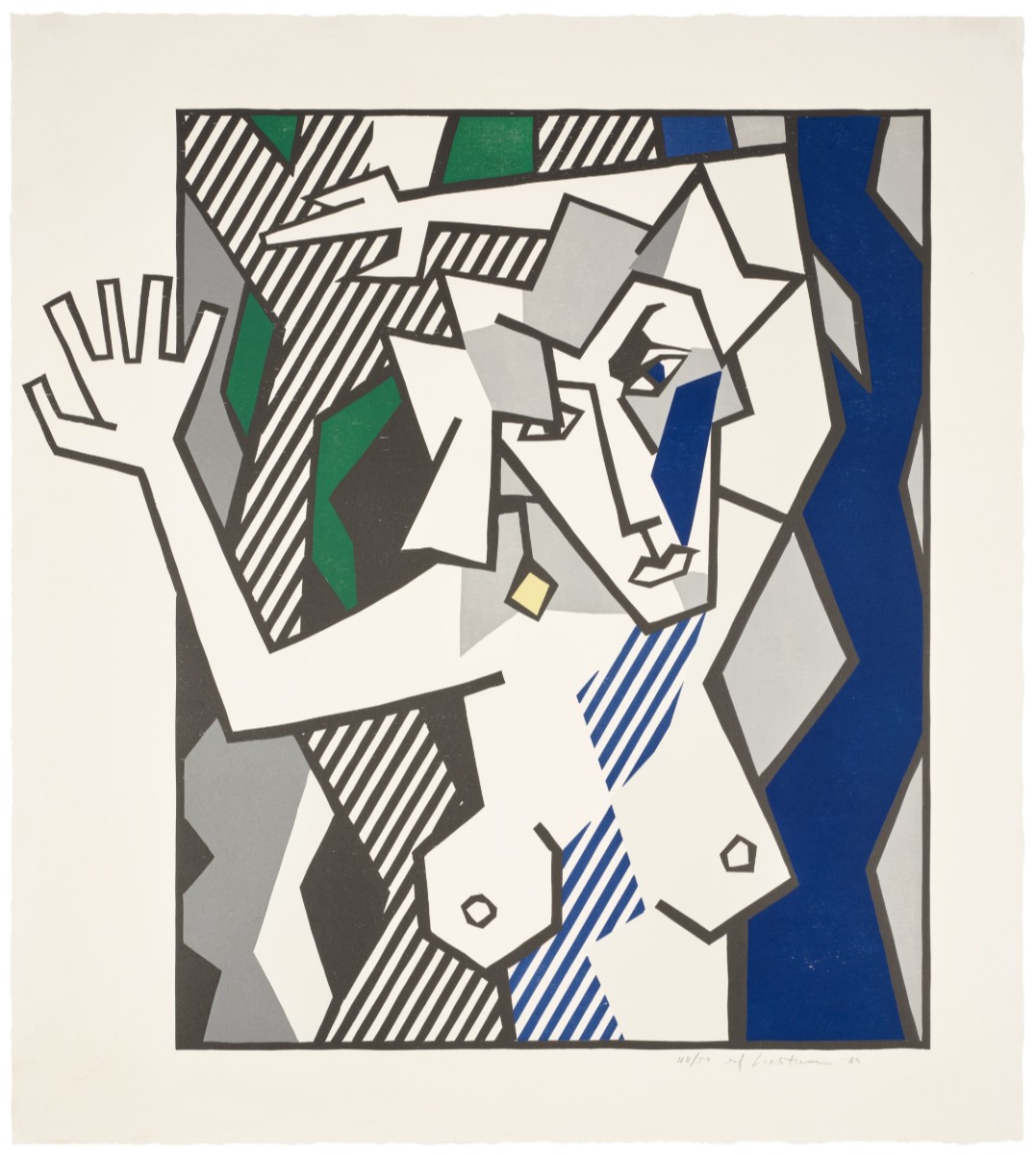
Surrealist Series (1977–1978)
(Corlett 155–161)
The Surrealist series marks a key moment in the development of Roy Lichtenstein toward a direct engagement with art history. Created between 1977 and 1978, the series draws on the visual language of Surrealism, referencing artists such as Picasso and Miró, while translating their forms into Lichtenstein’s controlled and structured system.
Across the series, compositions are built from abstracted figures, biomorphic shapes, and fragmented elements that appear to float within ambiguous spaces. While the imagery evokes the dreamlike quality of Surrealism, it is carefully organized through contour, flat color, and pattern. The works maintain a sense of visual play, but they are never spontaneous. Each element is positioned with clarity, and the compositions resist the instability typically associated with Surrealist imagery. The irrational becomes ordered. The prints combine techniques such as screenprint and lithography, allowing for clean surfaces and precise color separation. The execution reinforces the contrast between the fluid, organic forms and the controlled structure that defines Lichtenstein’s approach.
The Surrealist series represents an early stage in Lichtenstein’s broader exploration of historical styles, which would continue in later series such as the Expressionist Woodcuts, Paintings, and Water Lilies. It marks a transition from direct references to popular culture toward a more analytical engagement with the history of modern art. The series is appreciated for its strong visual identity and its connection to a major artistic movement. Collectors value its position within Lichtenstein’s evolution, particularly as an early example of his reinterpretation of art history through printmaking. The Surrealist series transforms a language of dream and spontaneity into a system of structure and control. Lichtenstein does not reproduce Surrealism; he reconstructs it.
Entablature Series, 1976 (Corlett 133–144)
The Entablature series marks a significant shift in the work of Roy Lichtenstein. Created in 1976, it departs from figures and narrative imagery and focuses instead on architectural detail, specifically the upper sections of classical and Beaux-Arts buildings. The subject is reduced to a horizontal fragment, isolating structure and ornament as the primary elements of the composition.
The prints are executed using screenprint and lithographic processes, allowing for sharp lines, controlled color areas, and subtle variations in texture. The technical clarity reinforces the architectural nature of the subject, emphasizing structure over illusion. The Entablature series belongs to a period in which Lichtenstein expands his subject matter beyond popular imagery and begins to engage more directly with art history and classical forms. It precedes later series such as the Surrealist, Expressionist Woodcut, and Reflections, establishing a foundation for his analytical approach to historical styles.
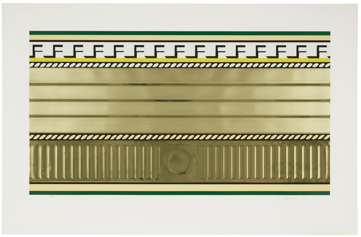
The series is valued for its formal strength and its departure from more iconic Pop imagery. Collectors appreciate its architectural clarity, its balance between abstraction and representation, and its place within Lichtenstein’s broader evolution. The Entablature series transforms architecture into image. Lichtenstein isolates structure and ornament, reconstructing them as a controlled and self-contained composition.
Six Still Lifes Series (1974)
(Corlett 127–132)
The Six Still Lifes series marks an important moment in the development of Roy Lichtenstein, where he turns to one of the most traditional genres in painting. Created in 1974, the series revisits the still life and translates it into Lichtenstein’s precise and constructed visual language, moving away from direct references to popular imagery.
Everyday objects are arranged within a structured composition, combining recognizable elements with stylized forms. The objects are outlined, flattened, and patterned, creating a surface that is clear and controlled. The composition retains the logic of a still life, yet it resists illusion. Depth is reduced, and the relationship between objects becomes more formal than natural. The image functions less as a depiction of objects and more as an arrangement of shapes and signs. The prints combine techniques such as screenprint and lithography, allowing for precise color separation and clean surfaces. This technical clarity reinforces the controlled nature of the composition and supports the transformation of traditional subject matter into a graphic system.
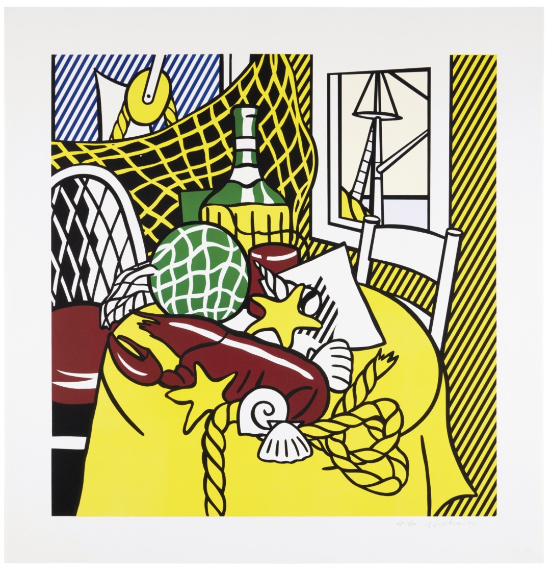
The Six Still Lifes series belongs to a phase in which Lichtenstein engages directly with art history, exploring established genres such as still life and landscape. It precedes series such as the Entablatures and Surrealist works, where this analytical approach becomes more pronounced. The Six Still Lifes series transforms the traditional still life into a structured image. Lichtenstein does not observe objects; he reorganizes them.
Bull Profile Series (1973)
(Corlett 116–121)
The Bull Profile series is one of the most direct and instructive bodies of work in the practice of Roy Lichtenstein. Created in 1973, the series presents a progressive transformation of a bull’s head, moving from a relatively naturalistic image to a highly abstract form. The sequence functions as a visual demonstration of reduction and reconstruction. Across the series, each print simplifies the image further. The bull gradually loses detail, volume, and descriptive elements, becoming a system of lines, shapes, and flat color. The process is deliberate and sequential. The viewer can follow each stage of transformation, from representation to abstraction, making the series both analytical and highly legible. The subject remains identifiable, yet it is increasingly defined by structure rather than depiction.
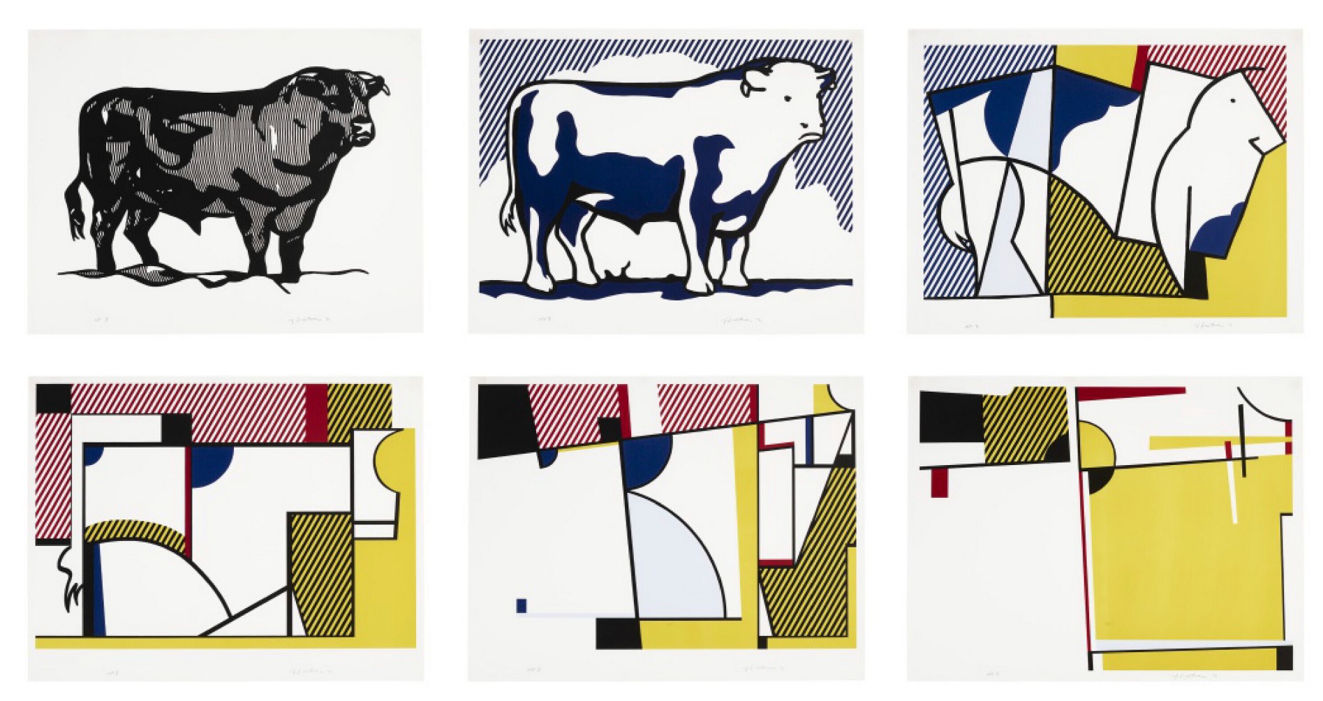
The prints are executed with precision using techniques such as lithography and screenprint, allowing for clean lines and controlled color application. This technical clarity supports the conceptual progression of the series. The Bull Profile series represents a key moment in Lichtenstein’s engagement with abstraction and art history, often associated with the legacy of Picasso and the analytical breakdown of form. It establishes a method that would inform later series, where transformation and reinterpretation become central. The series is highly regarded for its clarity and conceptual strength. Collectors appreciate its sequential nature and its position within Lichtenstein’s broader exploration of form and reduction. The Bull Profile series reveals how an image can be systematically transformed. Lichtenstein does not simply depict the bull; he deconstructs and rebuilds it.
Mirror Series (1970–1972)
(Corlett 92–109)
The Mirror series marks a decisive shift in the work of Roy Lichtenstein. Created between 1970 and 1972, it moves away from narrative imagery and focuses on a single, paradoxical subject: the mirror itself. Instead of reflecting the world, these mirrors present only their own surface, turning representation into a question.
Across the series, mirrors are depicted through curved lines, highlights, and simplified reflections that suggest depth without ever revealing an actual reflected image. The compositions are minimal, often centered on a single form, yet highly structured. The viewer is confronted with an object that should reflect reality but does not. The mirror becomes a constructed image, a surface that imitates reflection while withholding it. This tension between expectation and absence is central to the series.
The prints are executed with a high degree of precision, using techniques such as screenprint and lithography to achieve smooth surfaces and controlled tonal variations. Gradients and highlights are carefully calibrated, reinforcing the illusion of reflection while maintaining the clarity of the composition.
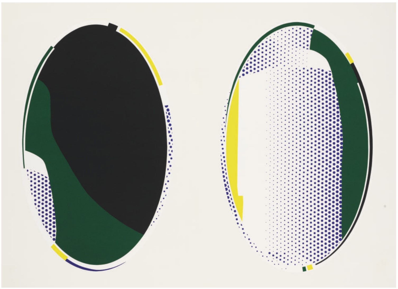
The Mirror series represents an early moment in Lichtenstein’s move toward conceptual and art-historical concerns. It anticipates later series such as the Reflections, where the idea of reflection becomes more complex and layered. Here, the focus is reduced to its essence, establishing a theme that would remain central in his later work.
The Mirror series is highly regarded for its conceptual clarity and strong visual identity. Collectors value its minimalist approach and its importance within Lichtenstein’s development, particularly as a departure from earlier comic-based imagery. The Mirror series transforms reflection into an image without content. Lichtenstein presents a mirror that does not reflect, revealing that even the act of seeing can be constructed.
Haystack Series (1969)
(Corlett 65–70)
The Haystack series marks one of the earliest direct engagements of Roy Lichtenstein with art history. Created in 1969, it revisits Claude Monet’s Meules and translates this iconic Impressionist subject into Lichtenstein’s precise and structured visual language. Rather than capturing shifting light and atmosphere, the series presents a controlled and deliberate reconstruction of the image.
Across the series, the haystack is simplified into bold contours, flat areas of color, and patterned surfaces. Variations in light and time of day, which were central to Monet’s approach, are reduced to systematic changes in color and composition. The image remains recognizable, yet it is clearly artificial. The softness and fluidity of Impressionism are replaced by clarity and structure, transforming a painterly subject into a controlled visual system.
The prints are executed through techniques such as screenprint and lithography, allowing for precise color separation and clean surfaces. This technical clarity reinforces the conceptual shift from atmospheric painting to constructed image.
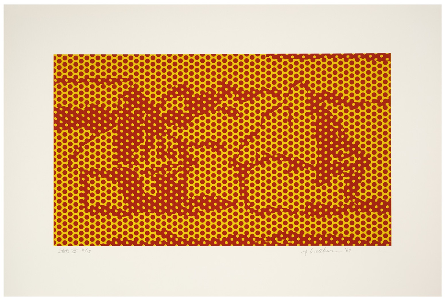
The Haystack series represents a turning point in Lichtenstein’s practice, moving beyond comic-based imagery toward a broader engagement with the history of painting. It anticipates later reinterpretations such as the Cathedrals and, decades later, the Water Lilies, establishing a recurring dialogue with Monet.mThe series is highly regarded for its art-historical significance and its early position within Lichtenstein’s exploration of classical subjects. Collectors value its clarity, its connection to Monet, and its role as a foundation for later developments in his work. The Haystack series transforms Impressionism into a system. Lichtenstein replaces atmospheric perception with structure, demonstrating how even the most fluid forms can be reconstructed through control.
Reverie, from 11 Pop Artists (1965)
(Corlett II.8)
Reverie is a key early print by Roy Lichtenstein, published in 1965 as part of the portfolio 11 Pop Artists. It belongs to the formative moment of his Pop language, where imagery drawn from comic strips is isolated, clarified, and transformed into a self-contained composition. Unlike more overtly dramatic works, Reverie presents a quieter, more introspective image.
The composition focuses on a female figure shown in close-up, her gaze directed outward while her expression suggests thought rather than action. The image is tightly framed, removing any broader narrative context and concentrating attention on the face and its stylized features. As in other early works, the figure is constructed through bold outlines, flat color fields, and Ben-Day dots. The surface is clean and controlled, and the emotional tone is subdued. The sense of reverie is not developed through gesture or atmosphere, but through stillness and simplification.
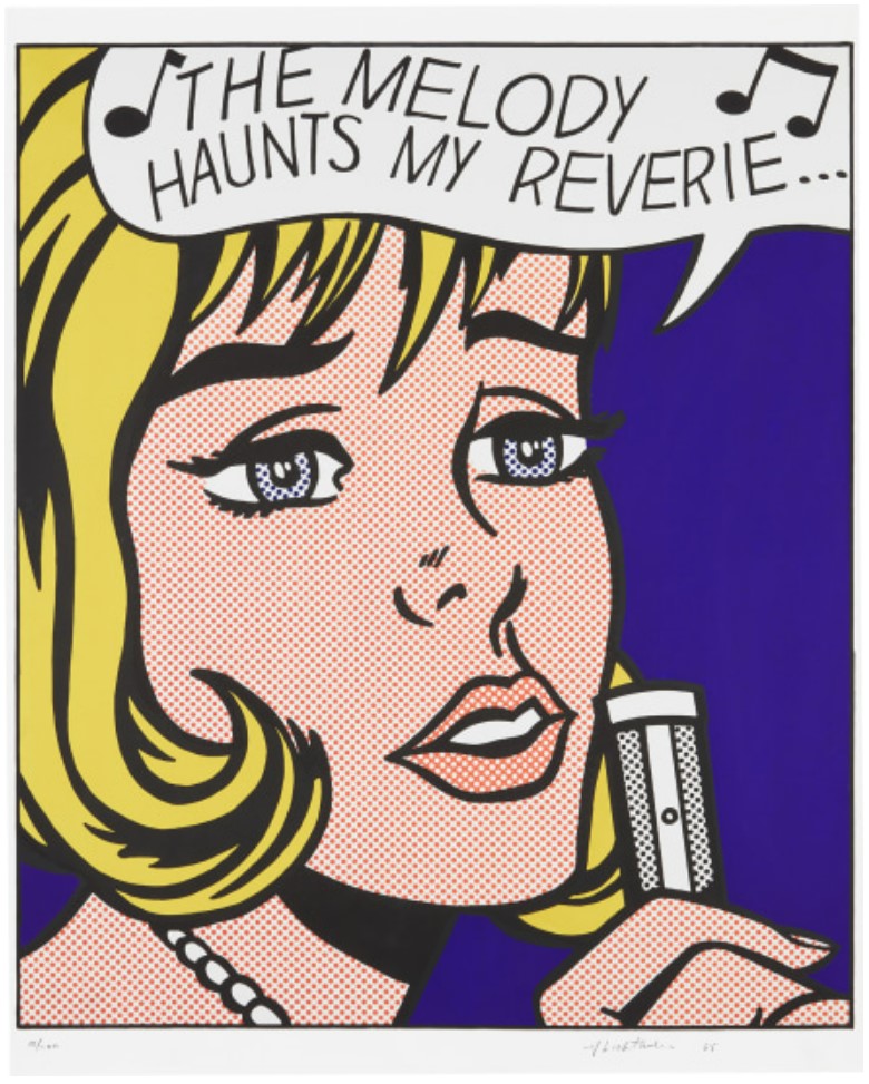
Reverie belongs to the early phase of Lichtenstein’s print production, alongside works such as Crying Girl, but it introduces a more restrained and contemplative tone. It demonstrates that his approach to comic imagery is not limited to dramatic scenes, but can also extend to quieter moments of reflection. Works from this early period are among the most sought-after in Lichtenstein’s print market. Reverie is particularly appreciated for its clarity, its balance between emotion and control, and its place within the foundational years of Pop Art. Reverie shows that Lichtenstein’s language is not only capable of dramatizing emotion, but also of containing it. The image is calm, precise, and entirely constructed.
Crying Girl, 1963
(Corlett II.1)
Crying Girl is one of the earliest and most defining prints by Roy Lichtenstein. Created in 1963, it belongs to the moment when Lichtenstein establishes his signature language, translating imagery from comic strips into a fully autonomous composition. The work condenses narrative, emotion, and visual clarity into a single, tightly controlled image.
The composition is built around a close-up of a female figure, cropped tightly to emphasize facial expression and gesture. Tears, hair, and skin are rendered through bold outlines, flat color fields, and Ben-Day dots, creating a surface that is both immediate and highly constructed. The emotion appears intense, yet it is not spontaneous. The image is carefully staged, with every element simplified and clarified. The dramatic expression becomes less a personal moment than a visual code, recognizable and repeatable.
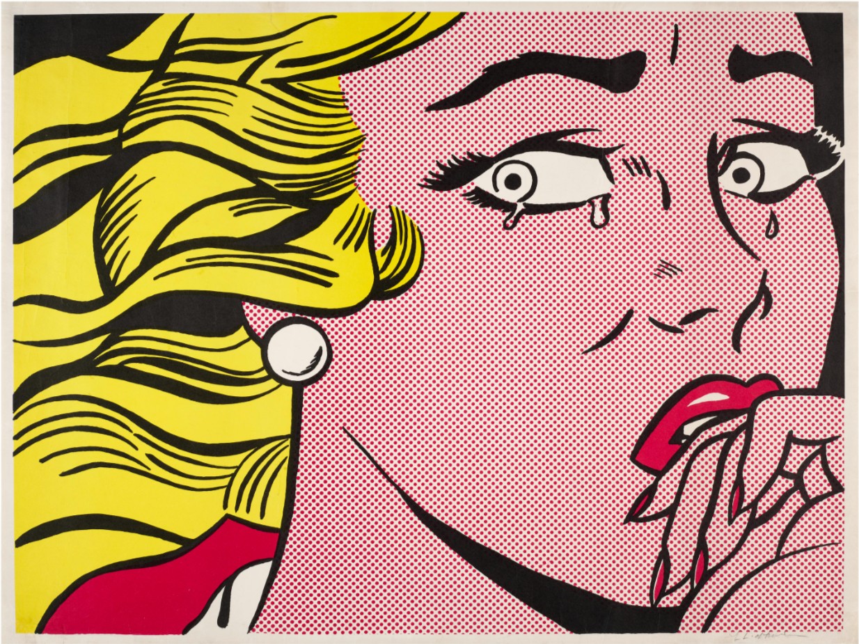
Crying Girl stands at the foundation of Lichtenstein’s Pop language. It demonstrates his shift from traditional painting toward the use of mass-media imagery as subject matter, while already introducing the tension between emotion and control that defines his work. As one of the earliest and most iconic prints, Crying Girl holds a central place in Lichtenstein’s market. Collectors value its historical importance, its strong visual identity, and its direct connection to the emergence of Pop Art. Crying Girl transforms a fleeting comic image into a fixed and enduring composition. Lichtenstein does not depict emotion; he constructs it.
The Roy Lichtenstein Prints Catalogue
PLEASE CLICK ON THE PICTURE BELOW TO ACCESS THE ROY LICHTENSTEIN PRINTS CATALOGUE
Overview of Roy Lichtenstein Prints
2026 Upcoming Lots and Auction Results
2025 Auction Results