MAY 2026 NEW-YORK AUCTIONS
Andy Warhol
Auction Results
33 lots sold for a total turnover of USD 135,873,280. With 3 lots failing to sell, the sell-through rate is 94.3%. The top lot for the week is Double Elvis [Ferus Type], a painting dated 1963, that sold at Christie’s on 18 May 2026 for USD 27,085,000. 3 paintings sold for more than USD 20 million, generating a cumulative turnover of USD 77,850,000, representing 57.3% of the total for the week.
22 paintings sold for a total turnover of USD 127,515,740. Furthermore, 7 lots from the Prints category sold for a total of USD 7,990,700, including 2 complete sets: Endangered Species, a complete trial proofs set sold for USD 4,467,000, and a complete set of Ads sold for USD 2,926,000. Finally, 4 Works on Paper sold for a total of USD 366,840.
XXXXXXXXXX
Double Elvis [Ferus Type], 1963
Property from a Private American Collection
Christie’s New-York: 18 May 2026
Estimated: USD 25,000,000 – 35,000,000
USD 27,085,000
ANDY WARHOL (1928-1987), Double Elvis [Ferus Type] | Christie’s
ANDY WARHOL (1928-1987)
Double Elvis [Ferus Type], 1963
Silkscreen ink and spray paint on linen
81-3/4 x 48 inches (207.6 x 121.9 cm)
Do It Yourself (Violin), 1962
Masterpieces: The Private Collection of S.I. Newhouse
Christie’s New-York: 18 May 2026
Estimated: USD 20,000,000 – 30,000,000
USD 25,935,000
ANDY WARHOL (1928-1987), Do It Yourself (Violin) | Christie’s
ANDY WARHOL (1928-1987)
Do It Yourself (Violin), 1962
Acrylic, graphite, Letraset and crayon on linen
54×72 inches (137.2 x 182.9 cm)
Signed and dated ‘ANDY WARHOL 62’ (on the stretcher)
Brigitte Bardot, 1974
Bardot by Warhol: From the Gunter Sachs Collection
Sotheby’s New-York: 14 May 2026
Estimated: USD 14,000,000 – 18,000,000
USD 24,830,000
Andy Warhol | Brigitte Bardot | The Now & Contemporary Evening
ANDY WARHOL (1928 – 1987)
Brigitte Bardot, 1974
Acrylic and silkscreen ink on canvas
47-1/4 x 47-1/4 inches (120×120 cm)
Signed with the artist’s initials and dated 74 (on the overlap)
USD 20 million
Sixteen Jackies, 1964
Phillips New-York: 19 May 2026
Estimated: USD 15,000,000 – 20,000,000
USD 16,225,000
Andy Warhol Modern & Contemporary Art Evening Sale
REPEAT SALE
Christie’s New-York: 9 November 2023
Estimated: USD 25,000,000 – 35,000,000
USD 25,940,000
ANDY WARHOL (1928-1987) (christies.com)
ANDY WARHOL
Sixteen Jackies, 1964
Silkscreen ink on linen, in 16 parts
Each: 20×16 inches (50.8 x 40.6 cm)
Overall: 80-1/4 x 64-1/8 inches (203.8 x 162.9 cm)
Signed “Andy Warhol” on the overlap of four canvases
USD 10 million
Details of Renaissance Paintings (Sandro Botticelli, Birth of Venus, 1482), 1984
Christie’s New-York: 18 May 2026
Estimated: USD 5,000,000 – 7,000,000
USD 9,103,000
ANDY WARHOL (1928-1987)
Details of Renaissance Paintings (Sandro Botticelli, Birth of Venus, 1482), 1984
Acrylic and silkscreen ink on canvas
48×72 inches (122×183 cm)
Stamped twice with the Estate of Andy Warhol and the Andy Warhol Foundation for the Visual Arts, Inc. stamps
Numbered ‘PA 36.005’ (on the overlap)
4 Colored Marilyns (Reversal Series), 1979-86
Property from an Important Private Collection
Phillips New-York: 19 May 2026
Estimated: USD 4,000,000 – 6,000,000
USD 5,630,000
Andy Warhol Modern & Contemporary Art Evening Sale
ANDY WARHOL
4 Colored Marilyns (Reversal Series), 1979-86
Acrylic and silkscreen ink on canvas
35-7/8 x 27-7/8 inches (91.1 x 70.8 cm)
Signed, stamped by the Andy Warhol Art Authentication Board Inc.
Initialed, numbered and dated “Andy Warhol 79/8 A130.089” on the overlap
USD 5 million
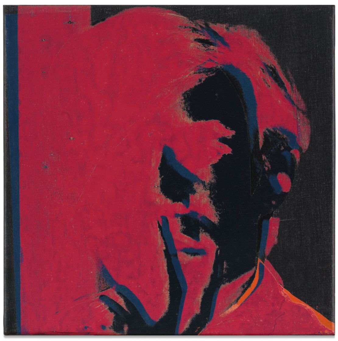
Self-Portrait, 1966
Property from a Distinguished Midwestern Collection
Phillips New-York: 19 May 2026
Estimated: USD 3,000,000 – 5,000,000
USD 4,776,000
Andy Warhol Modern & Contemporary Art Evening Sale
Acrylic and silkscreen ink on linen
22-1/2 x 22-1/2 inches (57.2 x 57.2 cm)
Endangered Species, 1983
Christie’s New-York: 21 May 2026
Estimated: USD 3,000,000 – 5,000,000
USD 4,467,000
COMPLETE SET
TRIAL PROOFS
ANDY WARHOL (1928-1987), Endangered Species | Christie’s
ANDY WARHOL (1928-1987)
Endangered Species, 1983
(F. Feldman and J. Schellmann, nos. II.293-302)
Screenprint in colors on Lenox Museum Board, in ten parts
Signed and numbered ‘Andy Warhol TP 14⁄30’ (variously on the lower edge or reverse of each sheet)
This complete unique trial proof set is number 14 of 30 aside from the edition of 150
Accompanied with the original cardboard portfolio box
Published by Ronald Feldman Fine Arts, Inc., New York
With the artist’s and publisher’s copyright ink stamps on the reverse
The American Indian (Russell Means), 1976
Property from an Important European Collection
Sotheby’s New-York: 14 May 2026
Estimated: USD 1,500,000 – 2,000,000
USD 3,231,000
Andy Warhol | The American Indian (Russell Means) | The Now &
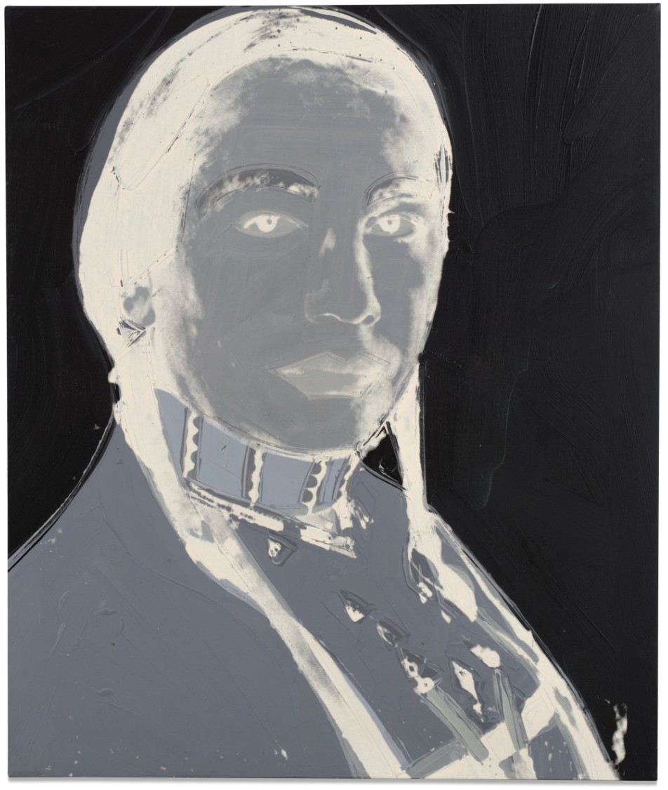
ANDY WARHOL (1928 – 1987)
The American Indian (Russell Means), 1976
Acrylic and silkscreen ink on canvas
50×42 inches (127 x 106.7 cm)
Signed twice, titled, and dated 1976 (on the reverse)
Guns, 1982
Property from an Esteemed West Coast Private Collection
Sotheby’s New-York: 14 May 2026
Estimated: USD 2,000,000 – 3,000,000
USD 2,926,000
Andy Warhol | Guns | The Now & Contemporary Evening Auction | 2026 |
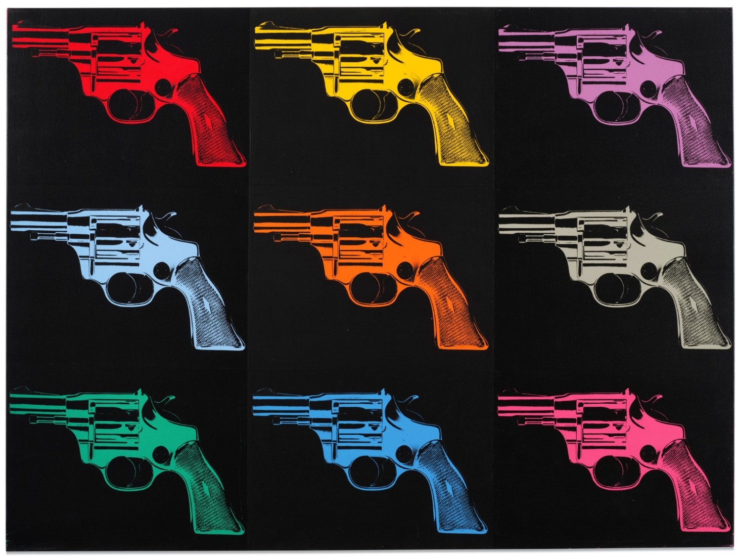
ANDY WARHOL (1928 – 1987)
Guns, 1982
Acrylic and silkscreen ink on canvas
50-1/8 x 70-1/8 inches (127.3 x 178.1 cm)
Signed and dated 82 (on the overlap)
Ads, 1985
Sotheby’s New-York: 15 May 2026
Estimated: USD 2,000,000 – 3,000,000
USD 2,926,000
COMPLETE SET
Andy Warhol | Ads | Contemporary Day Auction | 2026 | Sotheby’s
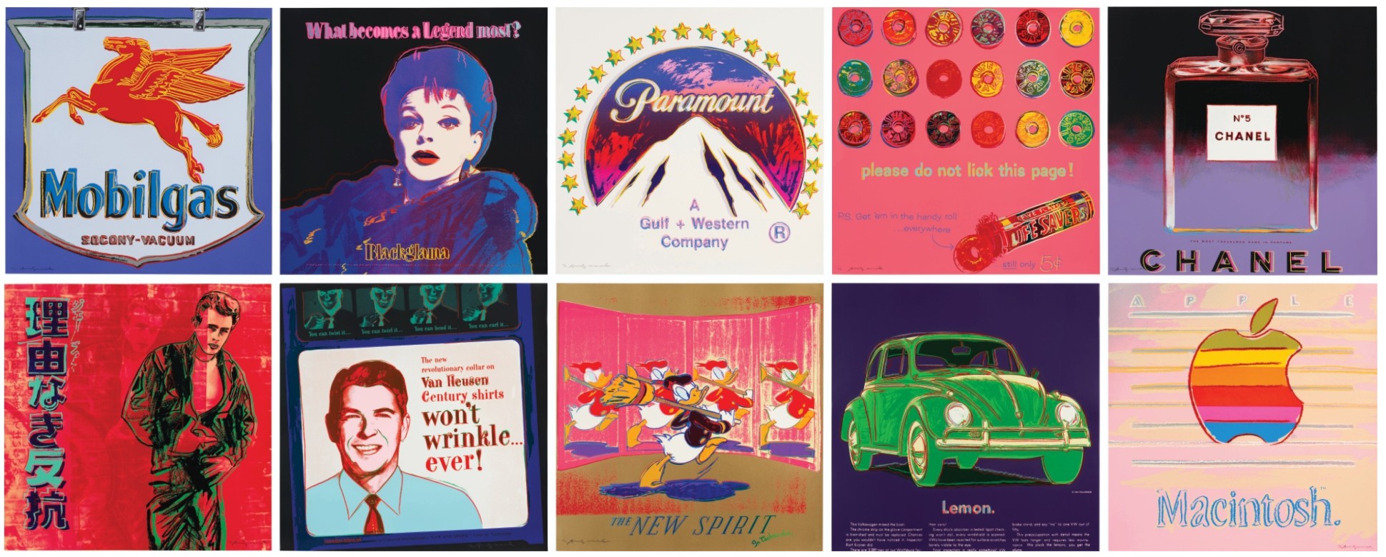
ANDY WARHOL (1928 – 1987)
Ads, 1985
(Frayda Feldman and Jorg Schellmann nos. II.350-359)
The complete set of ten screenprints in colors on Lenox Museum Board
Signed and numbered 57/190 (lower left or lower right of each)
This set is number 57 from the edition of 190 plus 30 artist’s proof sets
Each with the blindstamps of the printer, Rupert Jasen Smith, and the publisher, Ronald Feldman Fine Arts, Inc.
Flowers [Six Works], 1964
Radiant Forms: Works from a Distinguished Private Collection
Sotheby’s New-York: 15 May 2026
Estimated: USD 1,200,000 – 1,800,000
USD 2,232,000
Andy Warhol | Flowers [Six Works] | Contemporary Day Auction | 2026 |
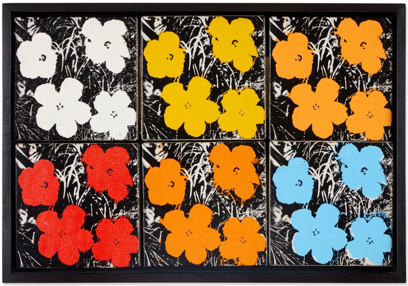
ANDY WARHOL (1928 – 1987)
Flowers [Six Works], 1964
Acrylic and silkscreen ink on canvas, in 6 parts
Each: 5×5 inches (12.7 x 12.7 cm)
i, iii, iv and vi: Signed with the artist’s initials and dated 64 (on the overlap)
ii and v: Signed and dated 64 (on the overlap)
Each work is respectively numbered on the reverse
i and iii: Stamped by the Estate of Andy Warhol
ii, iv, v, and vi: Stamped by the Andy Warhol Art Authentication Board, Inc.
Wayne Gretzky, 1983
Christie’s New-York: 21 May 2026
Estimated: USD 700,000 – 900,000
USD 1,371,600
ANDY WARHOL (1928-1987), Wayne Gretzky | Christie’s
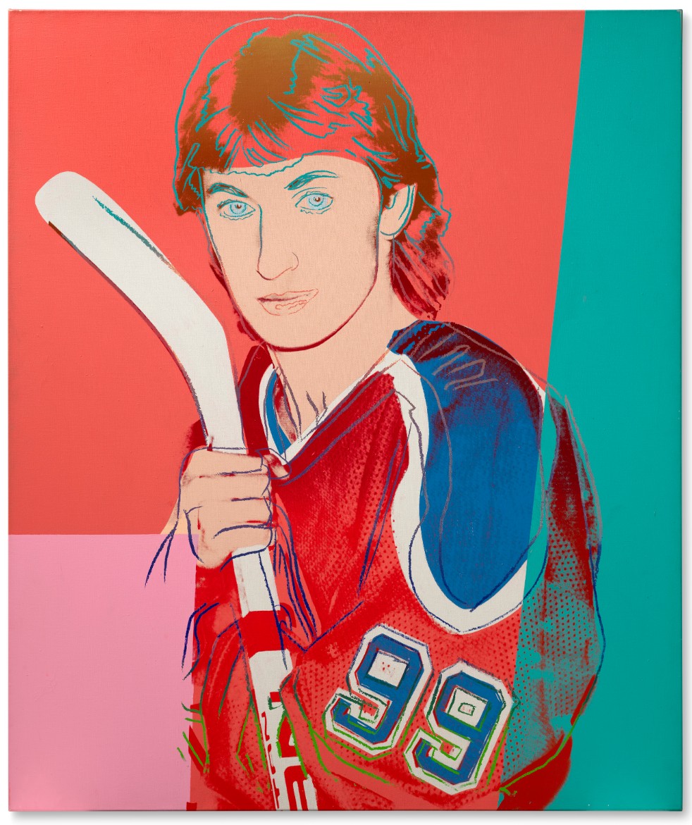
ANDY WARHOL (1928-1987)
Wayne Gretzky, 1983
Acrylic and silkscreen ink on canvas
50×42 inches (127 x 106.7 cm)
Signed and dated ‘Andy Warhol 83’ (on the overlap)
Mao, 1973
Radiant Forms: Works from a Distinguished Private Collection
Sotheby’s New-York: 15 May 2026
Estimated: USD 800,000 – 1,200,000
USD 1,216,000
Andy Warhol | Mao | Contemporary Day Auction | 2026 | Sotheby’s
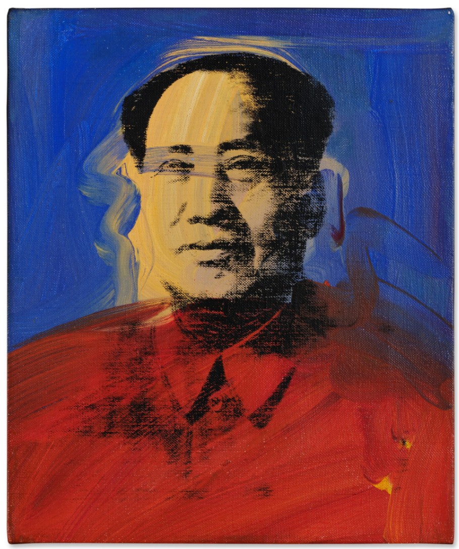
ANDY WARHOL (1928 – 1987)
Mao, 1973
Acrylic and silkscreen ink on canvas
12×10 inches (30.5 x 25.4 cm)
Signed and dated 1973 (on the overlap)
USD 1 million
Gun, 1981
Property Sold to Benefit Diabetes Research
Christie’s New-York: 21 May 2026
Estimated: USD 550,000 – 750,000
USD 711,200
ANDY WARHOL (1928-1987), Gun | Christie’s
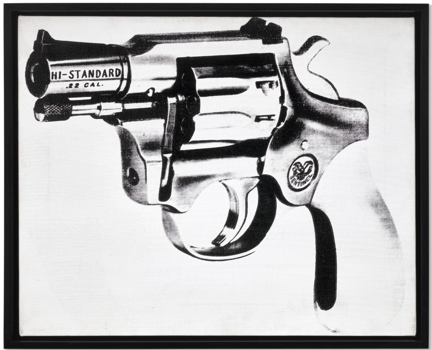
ANDY WARHOL (1928-1987)
Gun, 1981
Acrylic and silkscreen ink on canvas
16×20 inches (40.6 x 50.8 cm)
Signed, stamped with the Andy Warhol Authentication Board, Inc. stamp
Numbered ‘Andy Warhol A109.976’ (on the overlap)
Repent and Sin No More (Negative), 1985-1986
Christie’s New-York: 21 May 2026
Estimated: USD 600,000 – 800,000
USD 635,000
ANDY WARHOL (1928-1987), Repent and Sin No More (Negative) | Christie’s
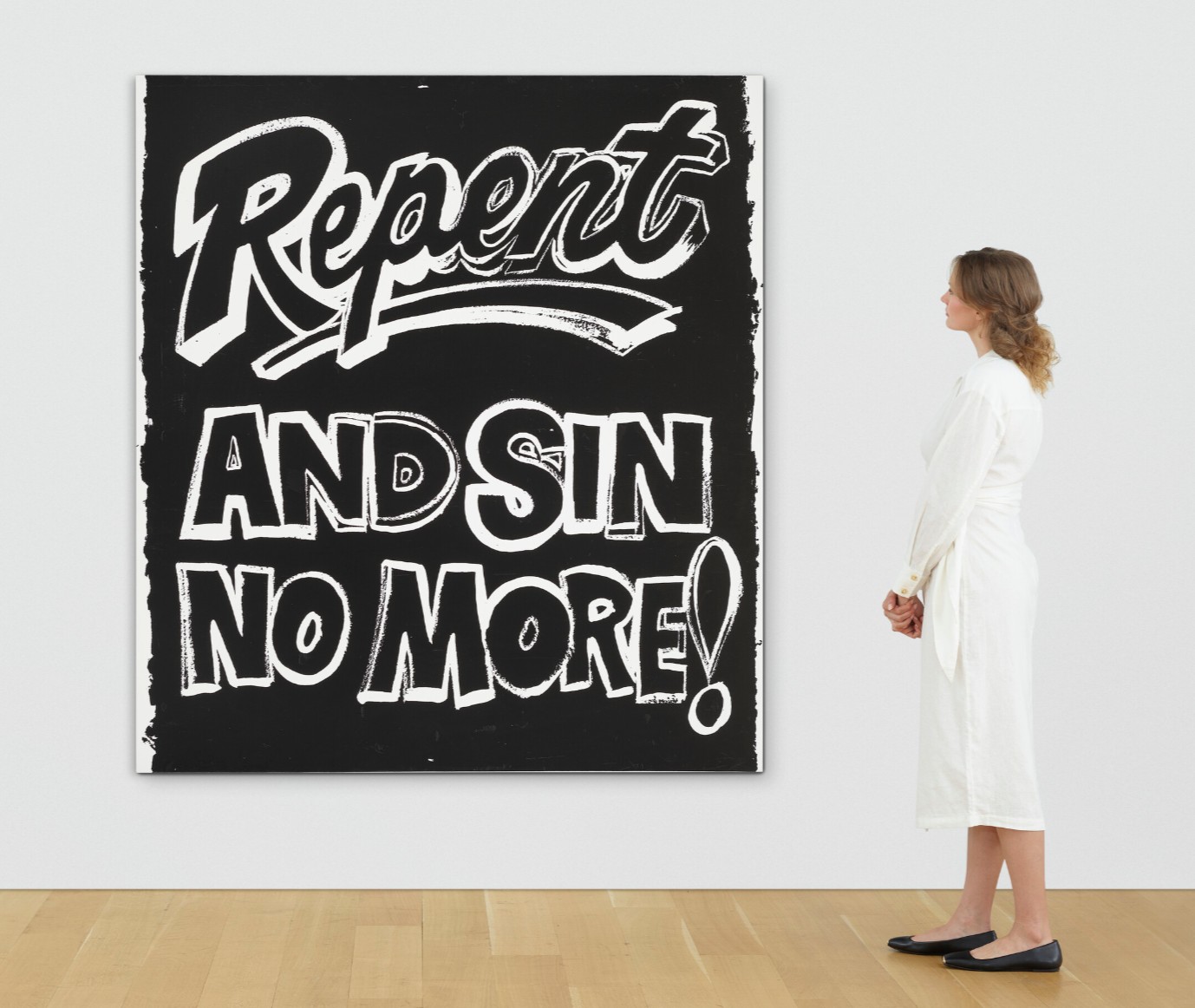
ANDY WARHOL (1928-1987)
Repent and Sin No More (Negative), 1985-1986
Acrylic and silkscreen ink on canvas
80×72 inches (203.2 x 182.9 cm)
Stamped twice with the Estate of Andy Warhol and the Andy Warhol Foundation for the Visual Arts, Inc. stamps
Numbered twice ‘VF PA10.559 VF PA10.559’ (on the overlap)
Numbered again ‘PA10.559’ (on the stretcher)
Blackglama, 1985
Christie’s New-York: 21 May 2026
Estimated: USD 300,000 – 500,000
USD 406,400
ANDY WARHOL (1928-1987), Blackglama | Christie’s
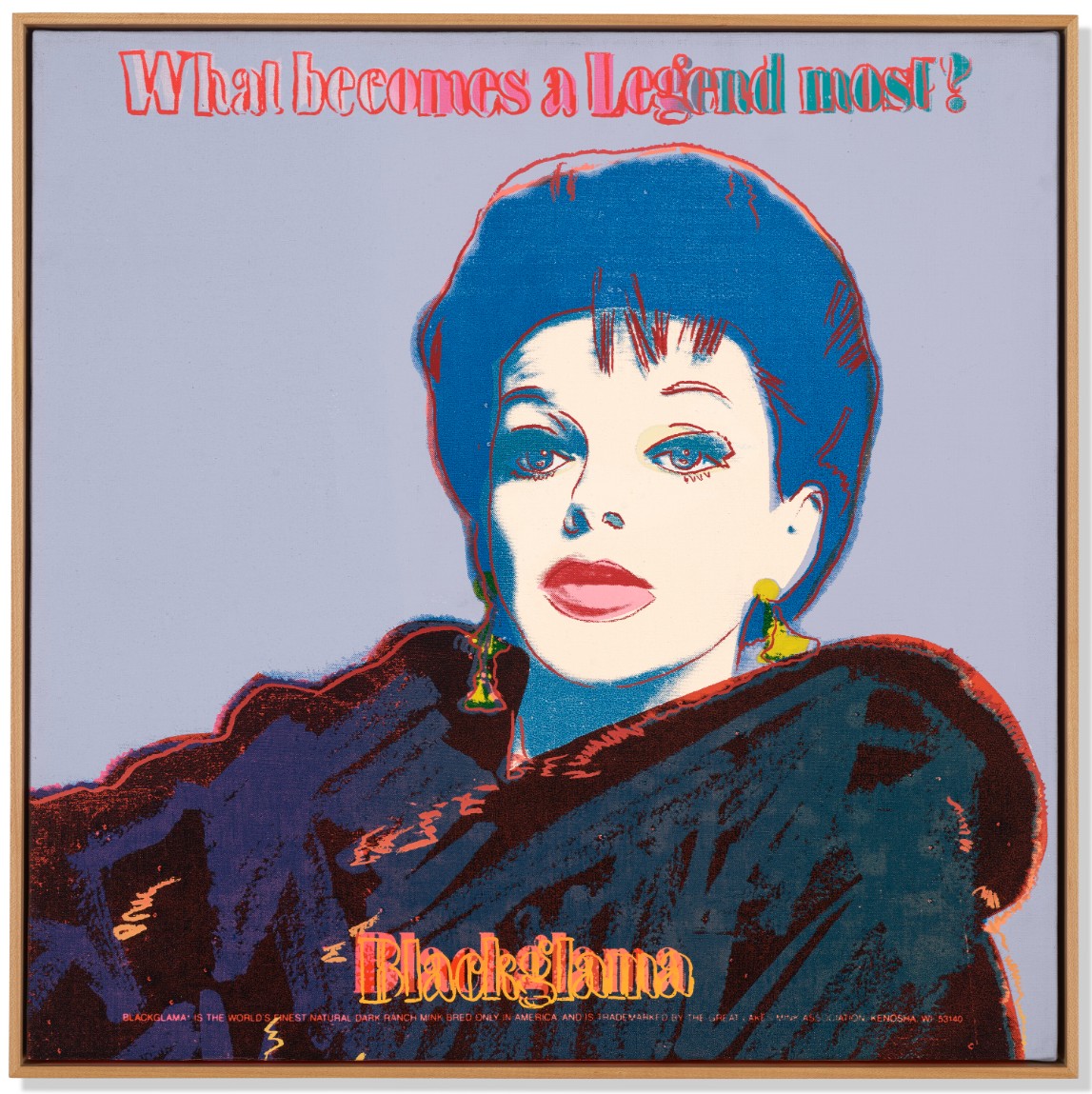
ANDY WARHOL (1928-1987)
Blackglama, 1985
Acrylic and silkscreen ink on canvas
22-1/8 x 22-1/8 inches (56.2 x 56.2 cm)
Signed and dated ‘Andy Warhol ’85’ (on the overlap)
Jon Gould, 1981
Sotheby’s New-York: 15 May 2026
Estimated: USD 150,000 – 250,000
USD 281,600
Andy Warhol | Jon Gould | Contemporary Day Auction | 2026 | Sotheby’s
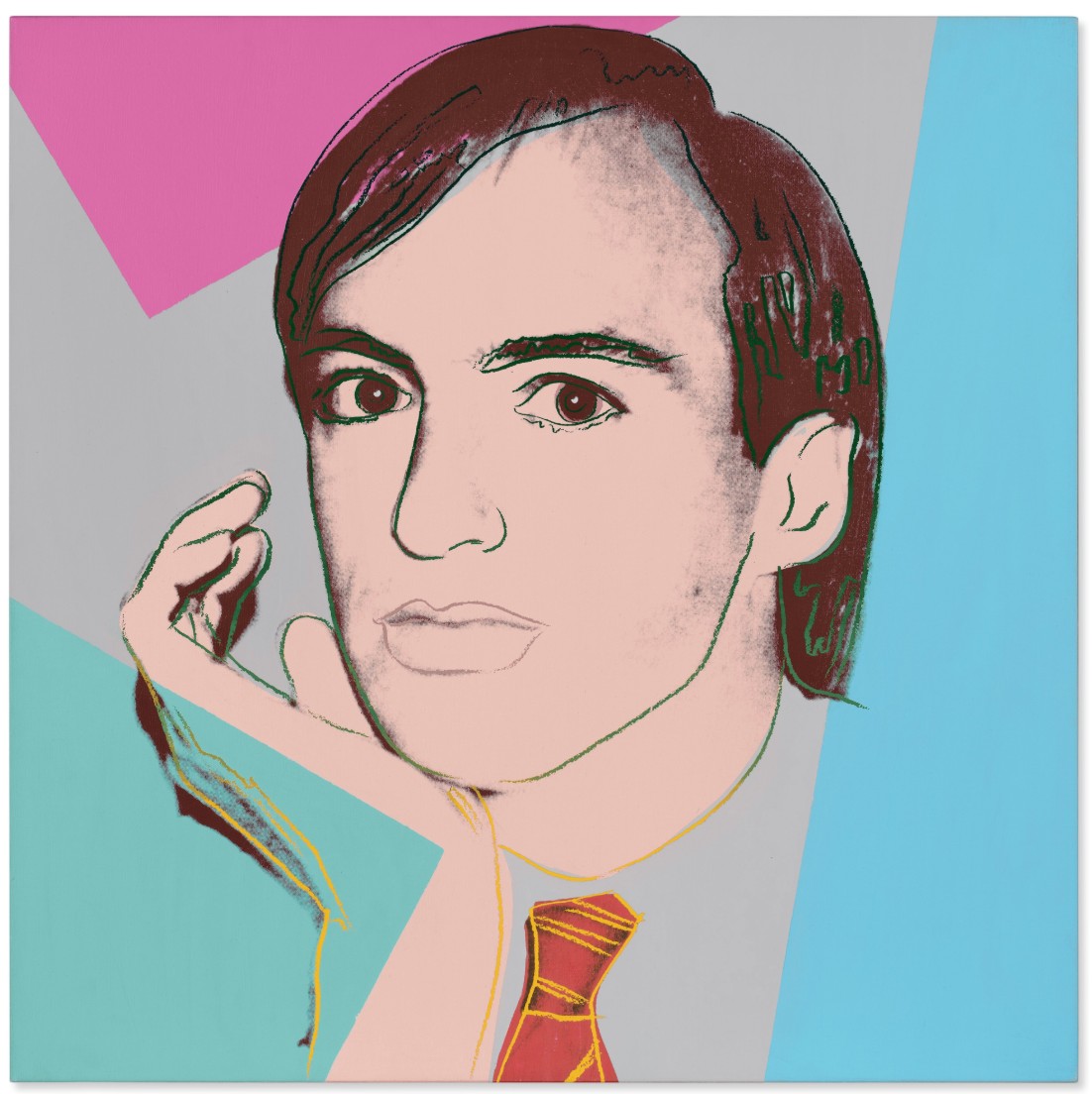
ANDY WARHOL (1928 – 1987)
Jon Gould, 1981
Acrylic and silkscreen ink on canvas
40×40 inches (101.6 x 101.6 cm)
Signed, partially titled Jon and dated 81 (on the overlap)
Herman Hesse, circa 1984
Sotheby’s New-York: 15 May 2026
Estimated: USD 200,000 – 300,000
USD 256,000
Andy Warhol | Herman Hesse | Contemporary Day Auction | 2026 |
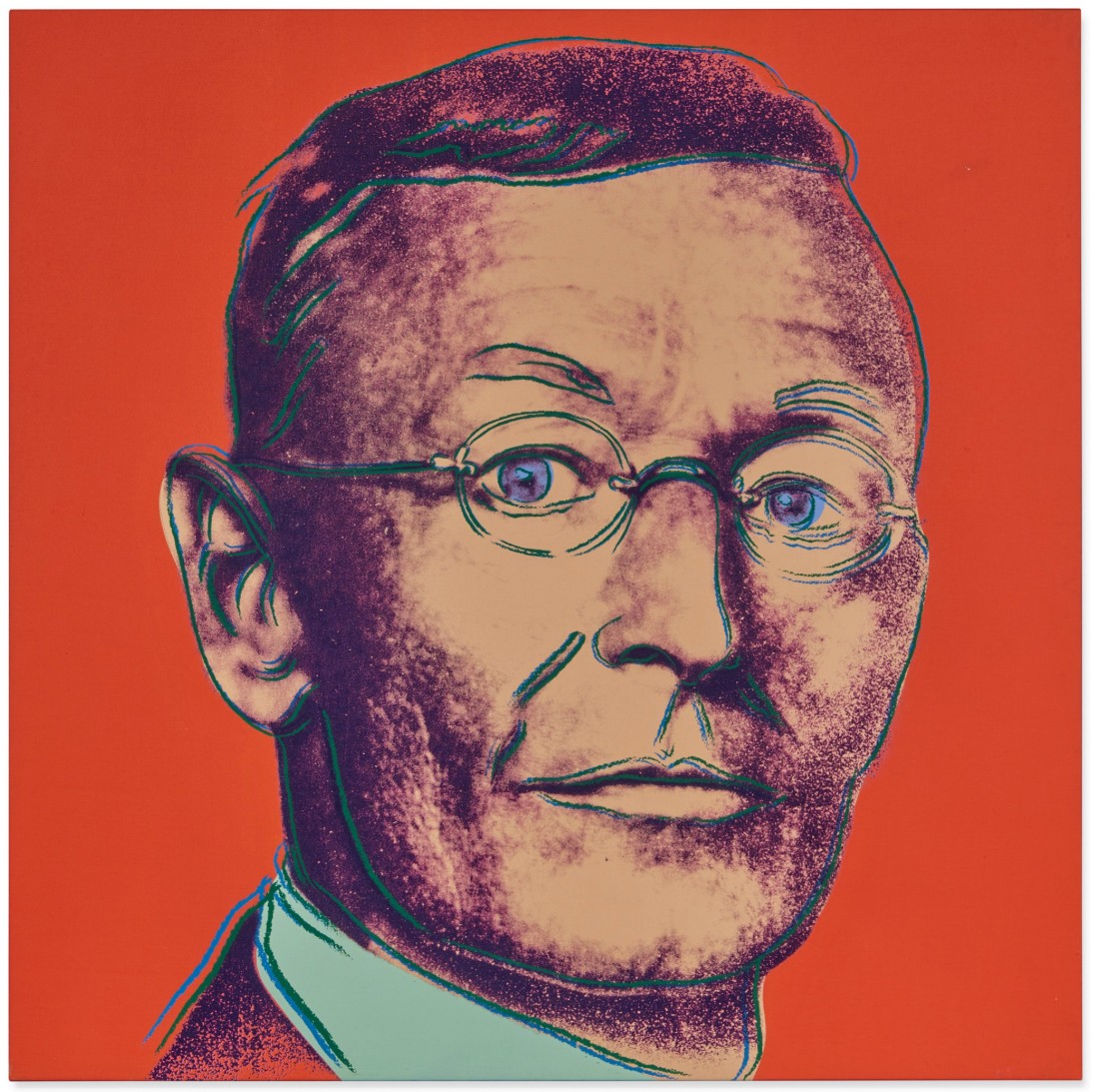
ANDY WARHOL (1928 – 1987)
Herman Hesse, circa 1984
Acrylic and silkscreen ink on canvas
40×40 inches (101.5 x 101.5 cm)
Stamped twice by the Estate of Andy Warhol and the Andy Warhol Foundation for the Visual Arts, Inc.
Numbered PO 50.852 on the overlap and on the stretcher
Details of Renaissance Paintings (Sandro Botticelli, Birth of Venus, 1482)
Christie’s New-York: 21 May 2026
Estimated: USD 80,000 – 120,000
USD 241,300
PRINT
NEW AUCTION RECORD FOR BIRTH OF VENUS 317
ANDY WARHOL (1928-1987)
Details of Renaissance Paintings (Sandro Botticelli, Birth of Venus, 1482)
(F. Feldman and J. Schellmann, no. II.317)
Screenprint in colors on Arches Aquarelle paper
Signed and numbered ‘AP 13⁄18 Andy Warhol’ (lower left)
This work is artist’s proof number 13 of 18 aside from an edition of 70
Published by Editions Schellmann & Klüser, Munich and New York
One Dollar Bill (Front), 1962
Christie’s New-York: 21 May 2026
Estimated: USD 180,000 – 250,000
USD 228,600
ANDY WARHOL (1928-1987), One Dollar Bill (Front) | Christie’s
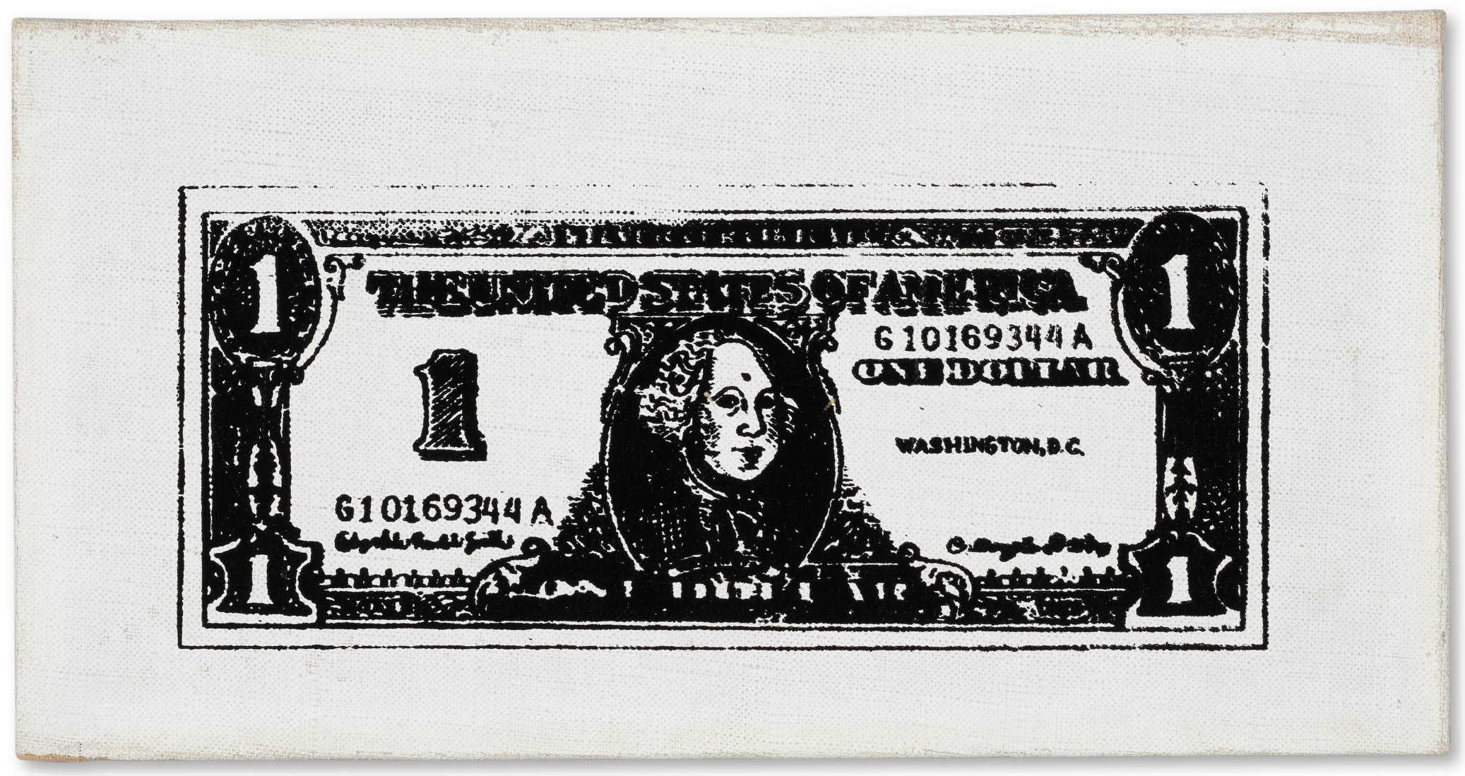
ANDY WARHOL (1928-1987)
One Dollar Bill (Front), 1962
Acrylic and silkscreen ink on canvas
6-1/4 x 12-1/4 inches (15.9 x 31.1 cm)
Signed ‘Andy Warhol’ (on the reverse)
Stamped with the Andy Warhol Authentication Board, Inc. stamp and numbered ‘A112.981’ (on the overlap)
Lenin, 1986
Sotheby’s New-York: 15 May 2026
Estimated: USD 120,000 – 180,000
USD 204,800
WORK ON PAPER
Andy Warhol | Lenin | Contemporary Day Auction | 2026 | Sotheby’s
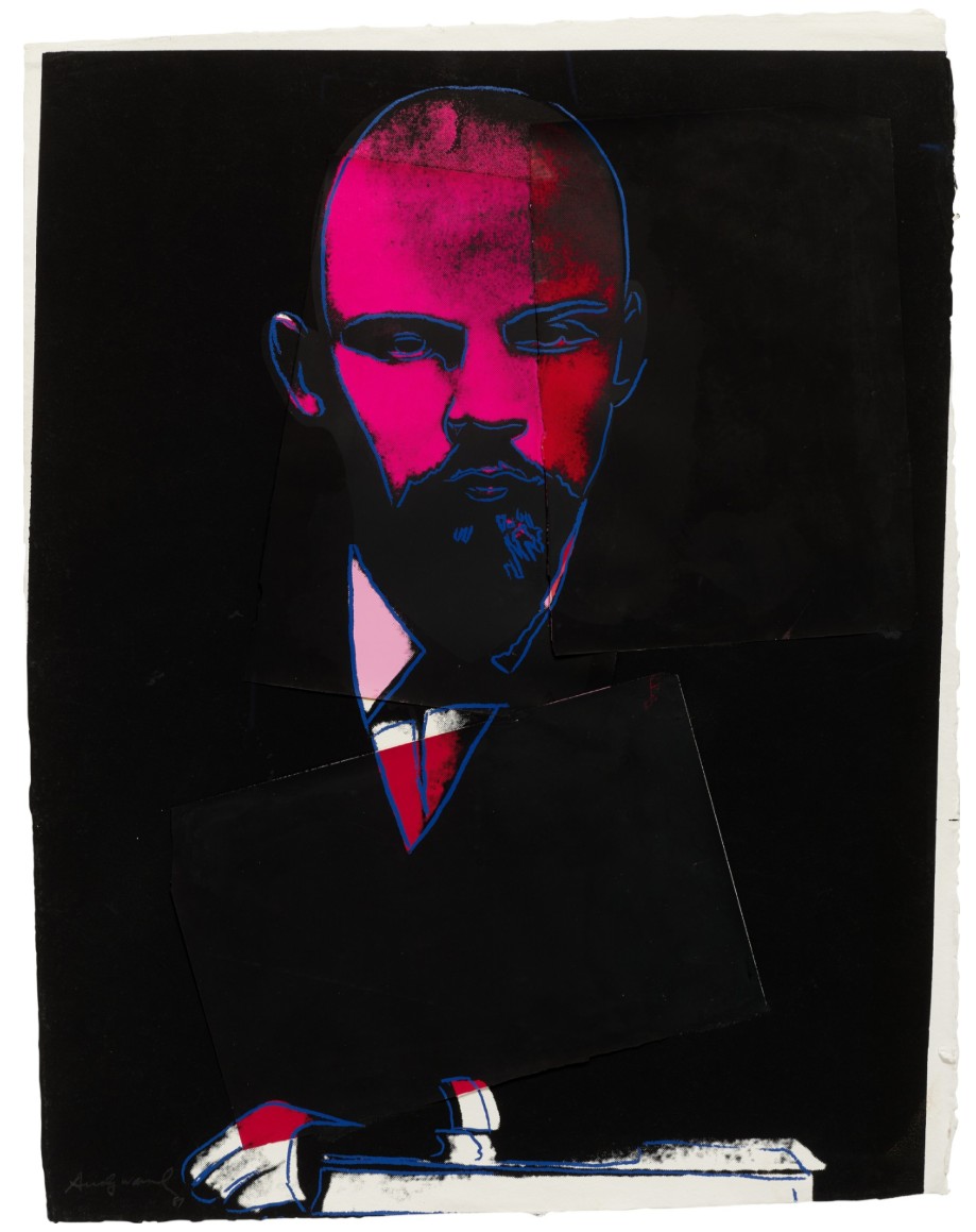
ANDY WARHOL (1928 – 1987)
Lenin, 1986
Acrylic, silkscreen ink and paper collage on paper
40-1/2 x 32 inches (102.9 x 81.3 cm)
Signed and dated 87 (lower left)
Rorschach, 1984
Sotheby’s New-York: 15 May 2026
Estimated: USD 100,000 – 150,000
USD 153,600
Andy Warhol | Rorschach | Contemporary Day Auction | 2026 | Sotheby’s
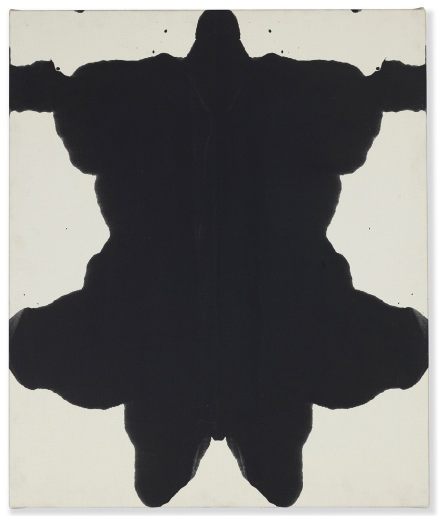
ANDY WARHOL (1928-1987)
Rorschach, 1984
Acrylic on canvas
25-1/8 x 21-1/8 inches (63.8 x 53.7 cm)
Stamped by the Estate of Andy Warhol and the Andy Warhol Foundation for the Visual Arts, Inc.
Numbered VF PA 75.033 on the overlap and on the stretcher
Diamond Candy Box, 1981
Sotheby’s New-York: 15 May 2026
Estimated: USD 80,000 – 120,000
USD 102,400
Andy Warhol | Diamond Candy Box | Contemporary Day Auction | 2026 |
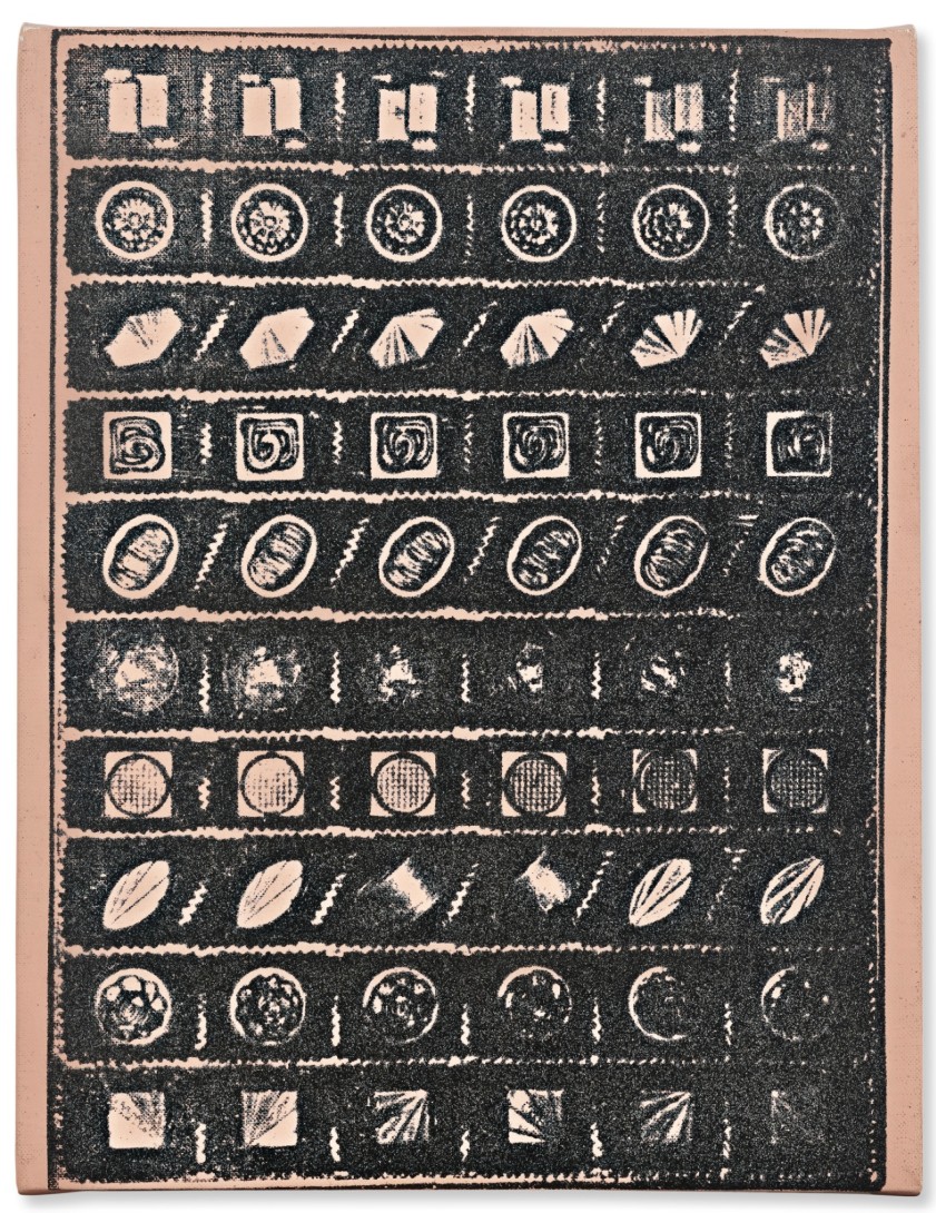
ANDY WARHOL (1928-1987)
Diamond Candy Box, 1981
Acrylic, silkscreen ink and diamond dust on canvas
14-1/8 x 10 inches (35.6 x 25.4 cm)
Signed and dedicated to Jon love Andy (on the overlap)
Tomato Soup, from Campbell’s Soup I, 1968
Sotheby’s New-York: 15 May 2026
Estimated: USD 30,000 – 50,000
USD 102,400
PRINT
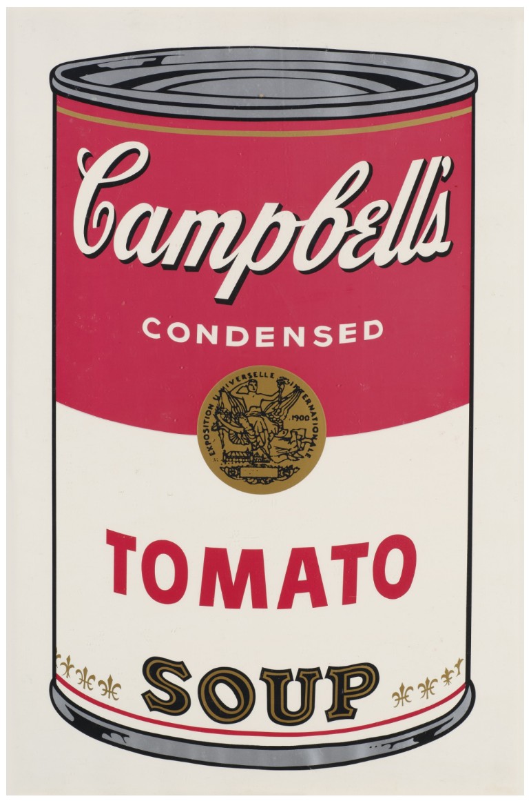
ANDY WARHOL (1928 – 1987)
Tomato Soup, from Campbell’s Soup I, 1968
(Frayda Feldman and Jorg Schellmann, no. II.46)
Screenprint in colors on wove paper
Signed and stamp-numbered 16/250 (on the verso)
This impression is number 16 from the edition of 250 plus 26 artist’s proofs lettered A-Z
Published by Factory Additions
USD 100,000
Cream of Mushroom (from Campbell’s Soup I), 1968
Christie’s New-York: 21 May 2026
Estimated: USD 50,000 – 70,000
USD 95,250
PRINT
NEW AUCTION RECORD FOR CREAM OF MUSHROOM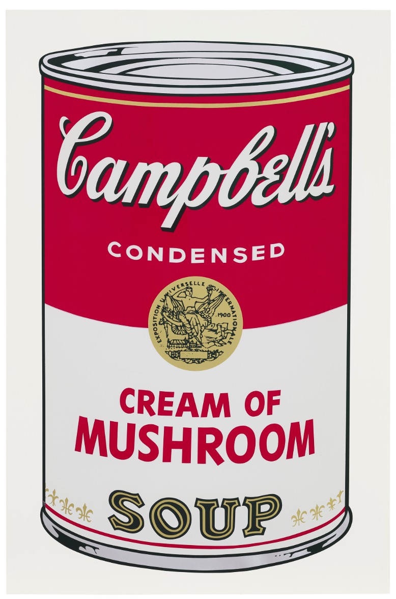
ANDY WARHOL (1928-1987)
Cream of Mushroom (from Campbell’s Soup I), 1968
(F. Feldman and J. Schellmann, no. II.53)
Screenprint in colors on paper
Signed and stamp-numbered ‘Andy Warhol 8⁄250’ (on the reverse)
This work is number eight from an edition of 250 plus 26 artist’s proofs
Shadow, 1979
Christie’s New-York: 21 May 2026
Estimated: USD 60,000 – 80,000
USD 91,440
ANDY WARHOL (1928-1987), Shadow | Christie’s
ANDY WARHOL (1928-1987)
Shadow, 1979
Silkscreen ink and diamond dust on canvas
14×11 inches (35.6 x 27.9 cm)
Stamped with the Estate of Andy Warhol and the Andy Warhol Foundation for the Visual Arts, Inc. stamps
Numbered ‘VF PA65.031’ (on the overlap)
Stamped again with the Andy Warhol Foundation for the Visual Arts, Inc. stamp (on the reverse)
Map of Eastern U.S.S.R. Missile Bases (Negative), 1985-1986
Christie’s New-York: 21 May 2026
Estimated: USD 60,000 – 80,000
USD 88,900
ANDY WARHOL (1928-1987), Map of Eastern U.S.S.R. Missile Bases (Negative) | Christie’s
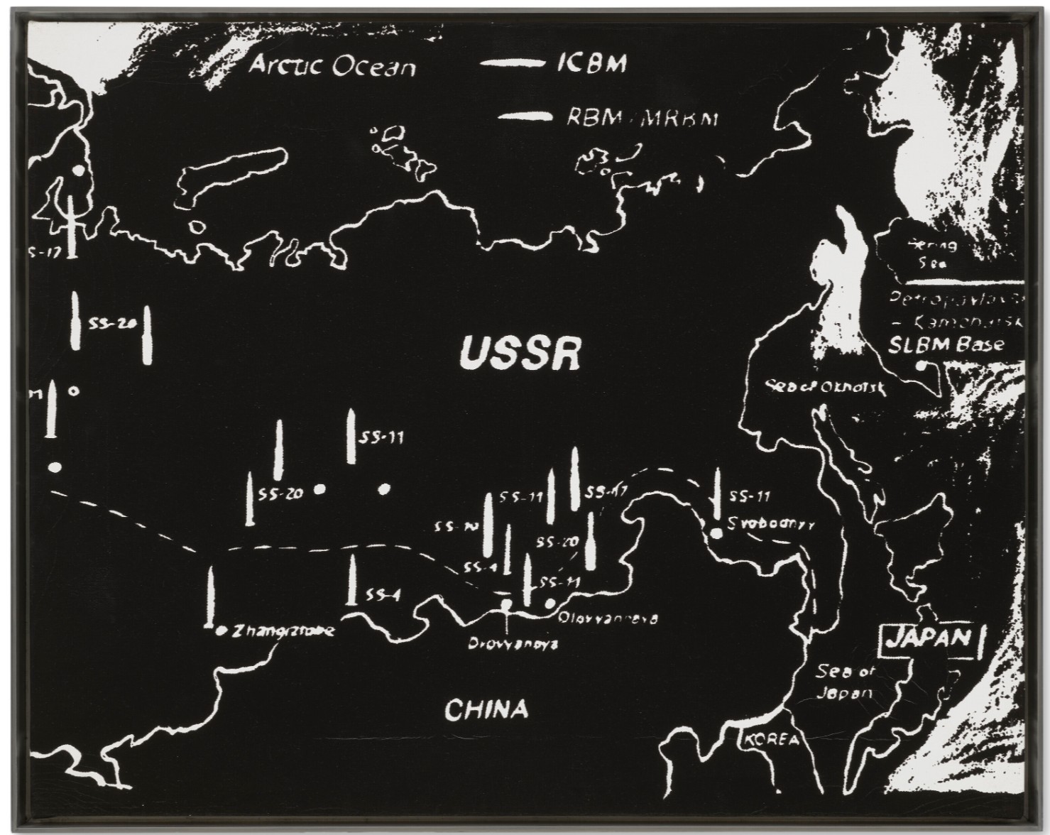
ANDY WARHOL (1928-1987)
Map of Eastern U.S.S.R. Missile Bases (Negative), 1985-1986
Acrylic and silkscreen ink on canvas
16×20 inches (40.6 x 50.8 cm)
Stamped with the Estate of Andy Warhol and the Andy Warhol Foundation for the Visual Arts, Inc. stamps
Numbered ‘VF PA10.172’ (on the reverse)
Stamped again with the Estate of Andy Warhol and the Andy Warhol Foundation for the Visual Arts, Inc. stamps
(on the overlap)
Numbered again ‘PA10.172’ (on the stretcher)
Onion (from Campbell’s Soup I), 1968
Christie’s New-York: 21 May 2026
Estimated: USD 50,000 – 70,000
USD 88,900
PRINT
NEW AUCTION RECORD FOR ONION SOUP
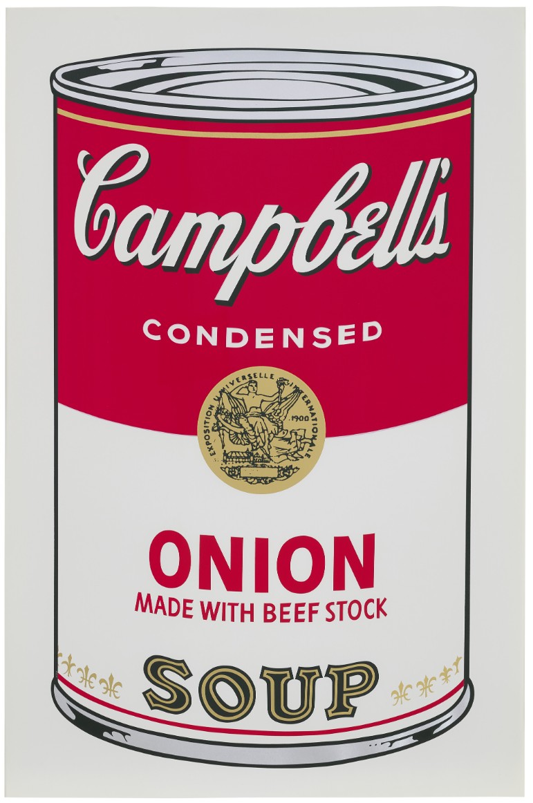
ANDY WARHOL (1928-1987)
Onion (from Campbell’s Soup I), 1968
(F. Feldman and J. Schellmann, no. II.47)
Screenprint in colors on paper
Signed and stamp-numbered ‘Andy Warhol 8⁄250’ (on the reverse)
This work is number eight from an edition of 250 plus 26 artist’s proofs
Black Bean (from Campbell’s Soup I), 1968
Christie’s New-York: 21 May 2026
Estimated: USD 50,000 – 70,000
USD 69,850
PRINT
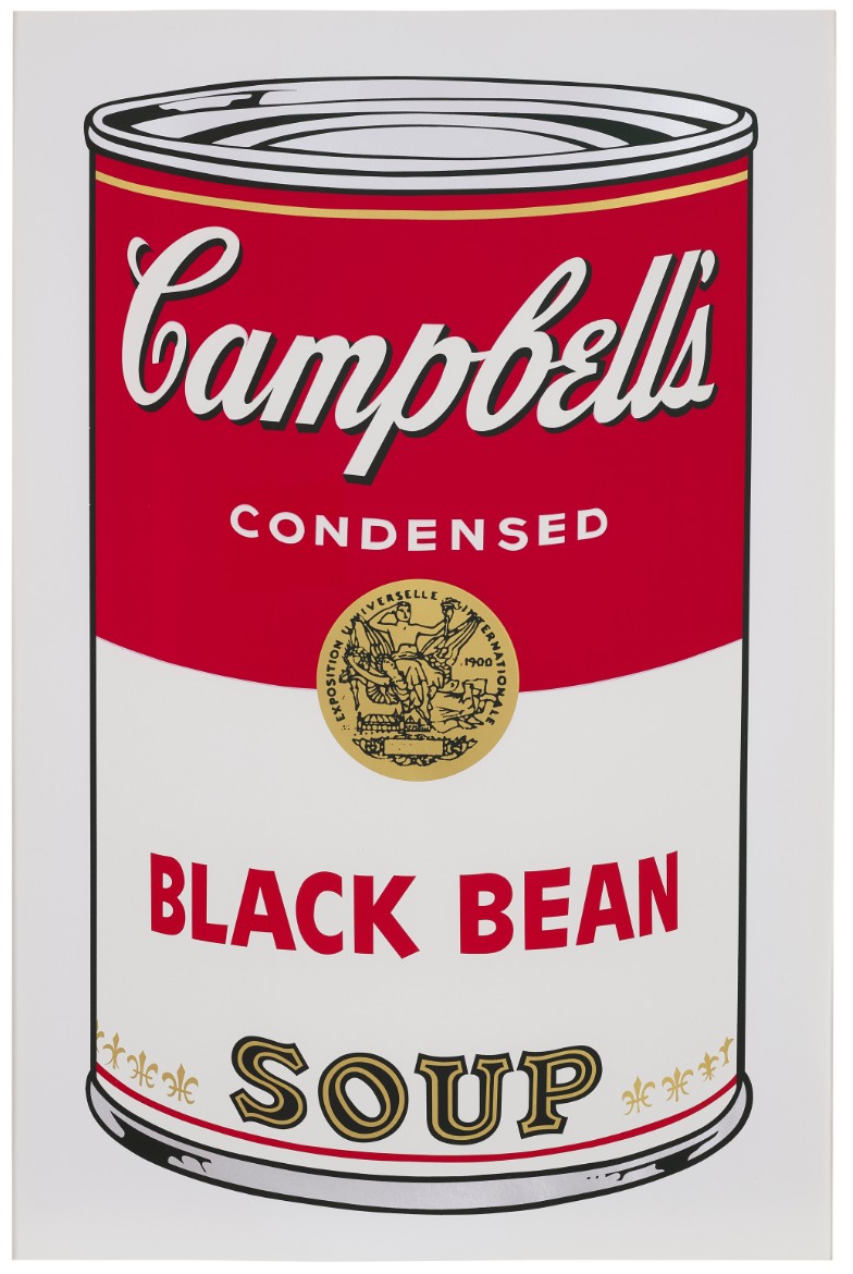
ANDY WARHOL (1928-1987)
Black Bean (from Campbell’s Soup I), 1968
(F. Feldman and J. Schellmann, nos. II.44)
Screenprint in colors on paper
Signed and stamp-numbered ‘Andy Warhol 8⁄250’ (on the reverse)
This work is number eight from an edition of 250 plus 26 artist’s proofs
Untitled (Marilyn), circa 1978
Phillips New-York: 21 May 2026
Estimated: USD 50,000 – 70,000
USD 64,500
WORK ON PAPER
Andy Warhol Modern & Contemporary Art: Morning Session
ANDY WARHOL
Untitled (Marilyn), circa 1978
Silkscreen ink on paper
22-5/8 x 17-1/2 inches (57.5 x 44.5 cm)
Stamped “© Andy Warhol” lower left
Stamped twice by the Estate of Andy Warhol and The Andy Warhol Foundation for the Visual Arts Inc., New York
Initialed “VF” on the reverse
Be a Somebody with a Body, 1985
Haring’s House: Works from the Collection of Kermit Oswald
Sotheby’s New-York: 15 May 2026
Estimated: USD 60,000 – 80,000
USD 64,000
WORK ON PAPER
Andy Warhol | Be a Somebody with a Body | Contemporary Day Auction |
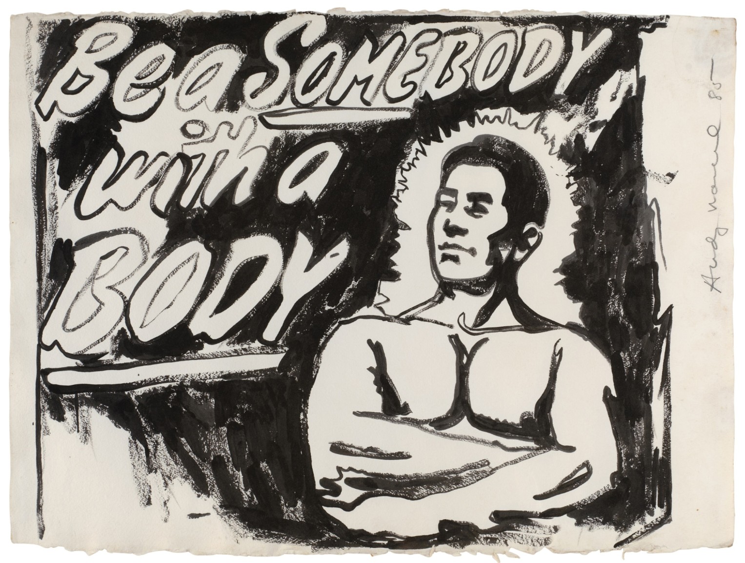
ANDY WARHOL (1928 – 1987)
Be a Somebody with a Body, 1985
Silkscreen ink on paper
24 x 31-5/8 inches (61 x 80.3 cm)
Signed and dated 85 (upper right edge)
Three works: (i-iii) Piss, 1978
Phillips New-York: 21 May 2026
Estimated: USD 60,000 – 80,000
USD 33,540
WORK ON PAPER
Andy Warhol Modern & Contemporary Art: Morning Session
ANDY WARHOL
Three works: (i-iii) Piss, 1978
Urine on HMP paper
Each: 31-1/4 x 23-3/4 inches (79.4 x 60.3 cm)
Each stamped with The Estate of Andy Warhol stamp and the Warhol Foundation for the Visual Arts Inc., New York stamp
Initialed “VF” and numbered “[52.002, 52.004, 52.005]” on the reverse
Lots Passed
Self-Portrait, 1967
Property from an Important American Collection
Sotheby’s New-York: 14 May 2026
Estimated: USD 2,000,000 – 3,000,000
PASSED
Andy Warhol | Self-Portrait | The Now & Contemporary Evening Auction
ANDY WARHOL (1928 – 1987)
Self-Portrait, 1967
Acrylic and silkscreen ink on canvas
22×22 inches (55.9 x 55.9 cm)
Signed indistinctly (on the overlap)
Die Vorburg, 1980
Christie’s New-York: 21 May 2026
Estimated: USD 350,000 – 550,000
PASSED
ANDY WARHOL (1928-1987), Die Vorburg | Christie’s
ANDY WARHOL (1928-1987)
Die Vorburg, 1980
Acrylic and silkscreen ink on canvas
50×50 inches (127×127 cm)
Puma Invader, circa 1985
Sotheby’s New-York: 14 May 2026
Estimated: USD 80,000 – 120,000
PASSED
Andy Warhol | Puma Invader | Contemporary Day Auction | 2026 |
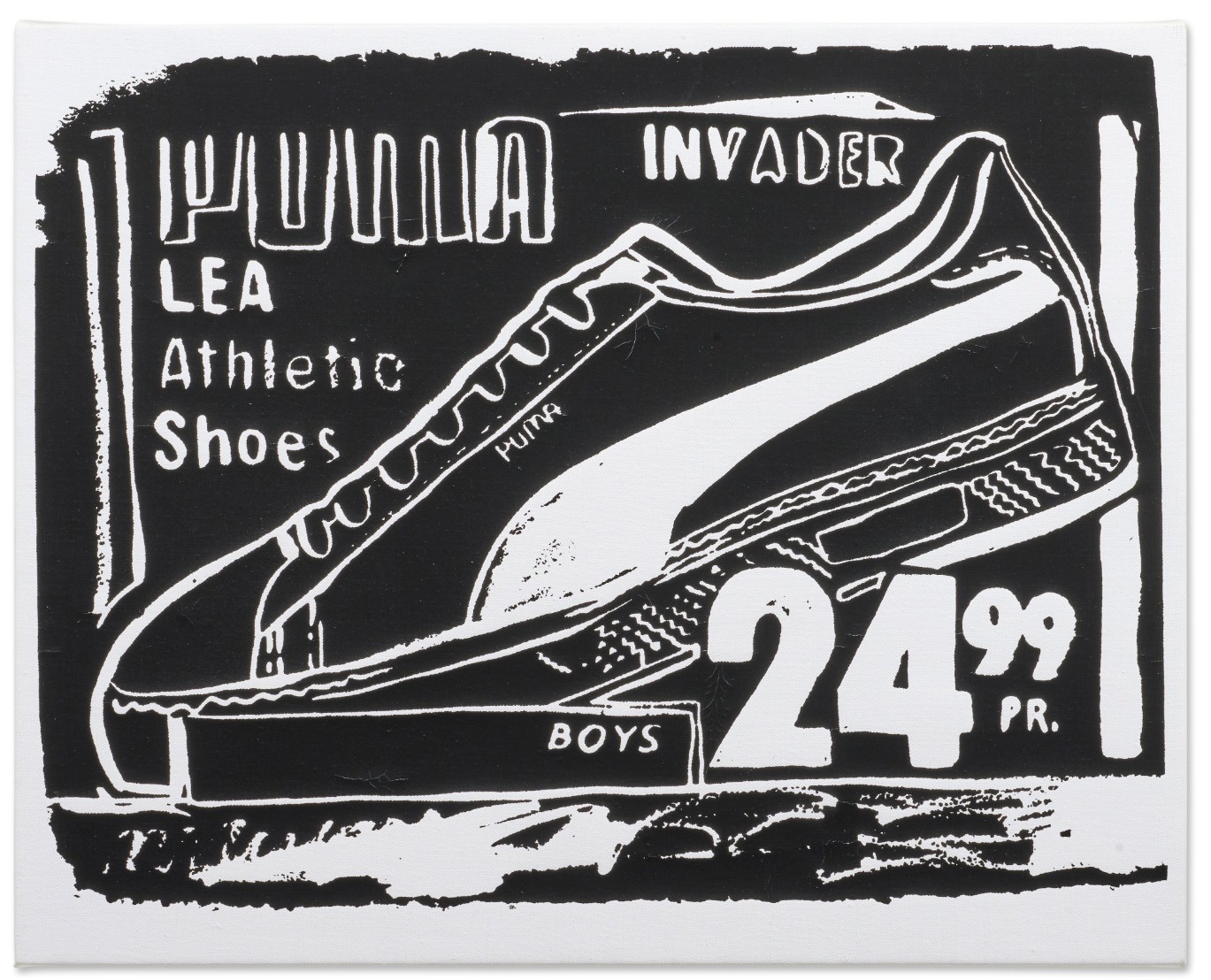
ANDY WARHOL (1928 – 1987)
Puma Invader, circa 1985
Acrylic and silkscreen ink on canvas
16×20 inches (40.5 x 50.8 cm)
Stamped by the Estate of Andy Warhol and the Andy Warhol Foundation for the Visual Arts, Inc. on the overlap
Numbered PA10.464 on the stretcher
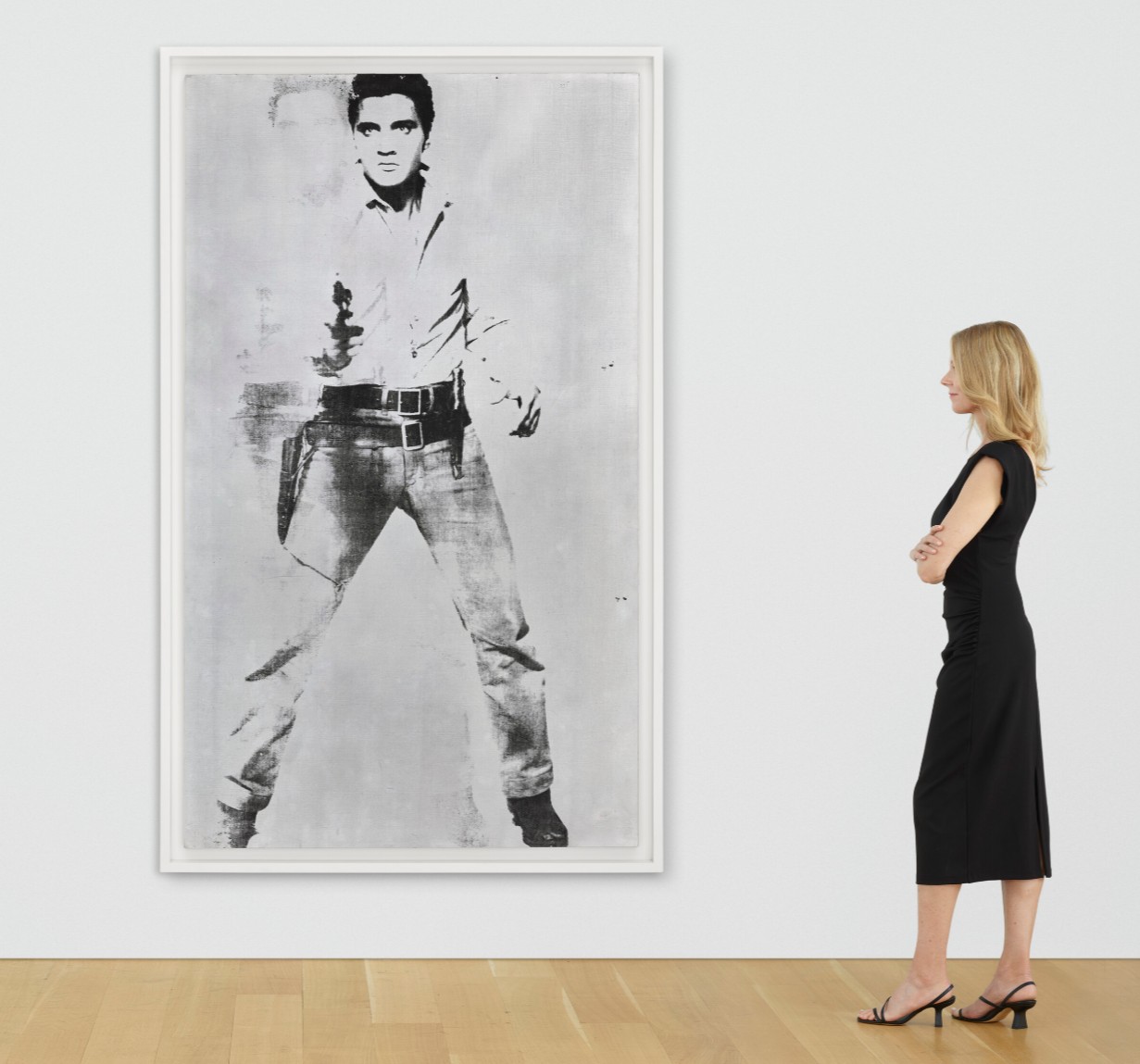
Double Elvis [Ferus Type], 1963
Double Elvis [Ferus Type], 1963
Property from a Private American Collection
Christie’s New-York: 18 May 2026
Estimated: USD 25,000,000 – 35,000,000
USD 27,085,000
ANDY WARHOL (1928-1987), Double Elvis [Ferus Type] | Christie’s
ANDY WARHOL (1928-1987)
Double Elvis [Ferus Type], 1963
Silkscreen ink and spray paint on linen
81-3/4 x 48 inches (207.6 x 121.9 cm)
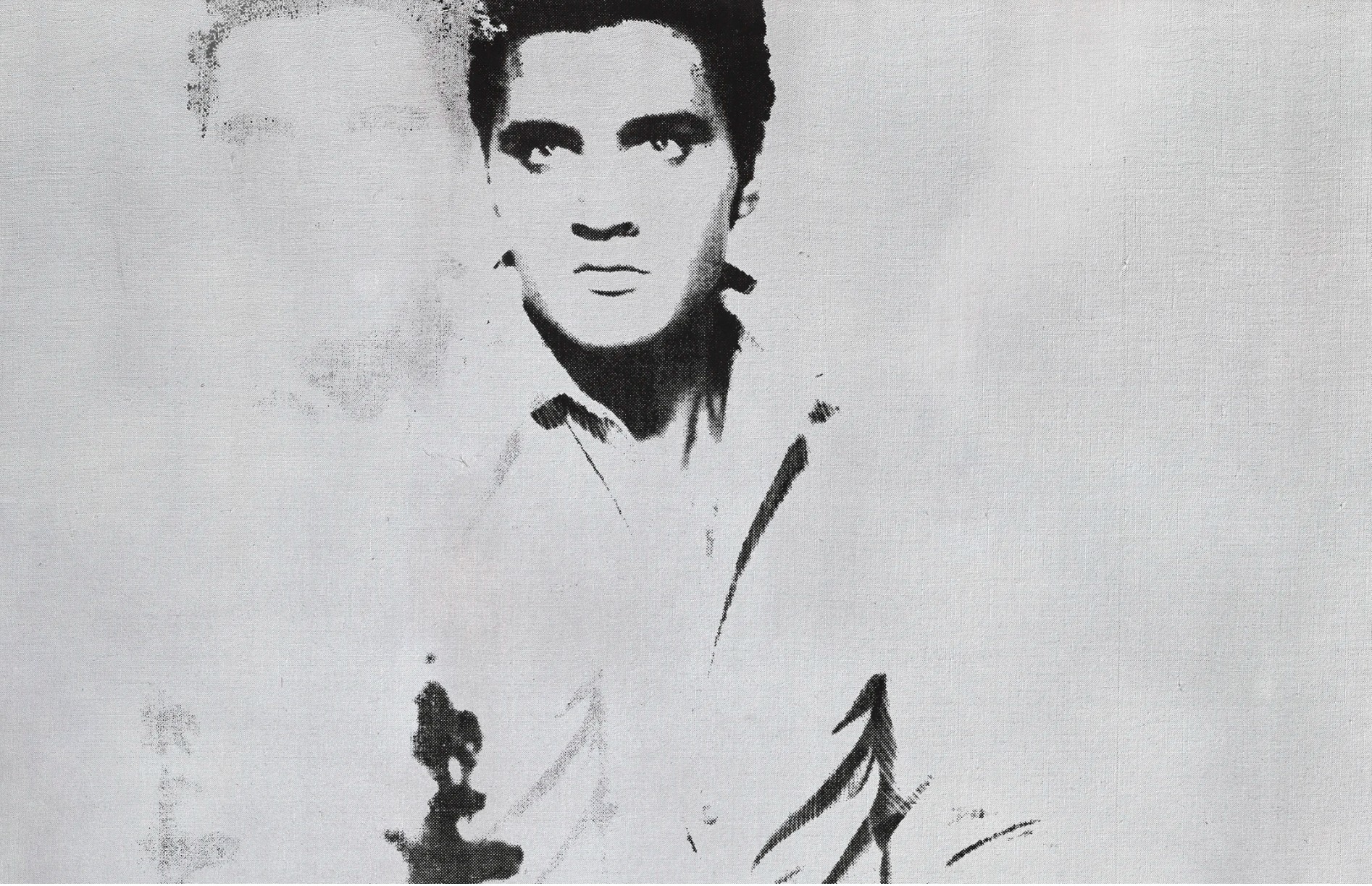
By depicting Elvis Presley as a towering colossus, Andy Warhol not only confirms the singer’s status as the King of Rock and Roll, but also his place in the artist’s own pantheon of Pop icons. Painted in 1963, this large-scale painting is the culmination of a series of portraits in which Warhol not only immortalized Hollywood royalty such as Marilyn Monroe and Elizabeth Taylor, but also considered the precarious nature of their fame. The present work was painted just months after he completed his iconic 32 Campbell’s Soup Cans (1962, Museum of Modern Art, New York) and marks the moment when he began to infuse those previously static images with a dramatic new sense of dynamism and energy. The present work is just one of ten Double Elvis [Feris Type] paintings, four of which are in major museum collections. Together they have come to represent the moment when Warhol emerged from his initial triumph and cemented his reputation as the smartest and most insightful cultural observers of the postwar generation.
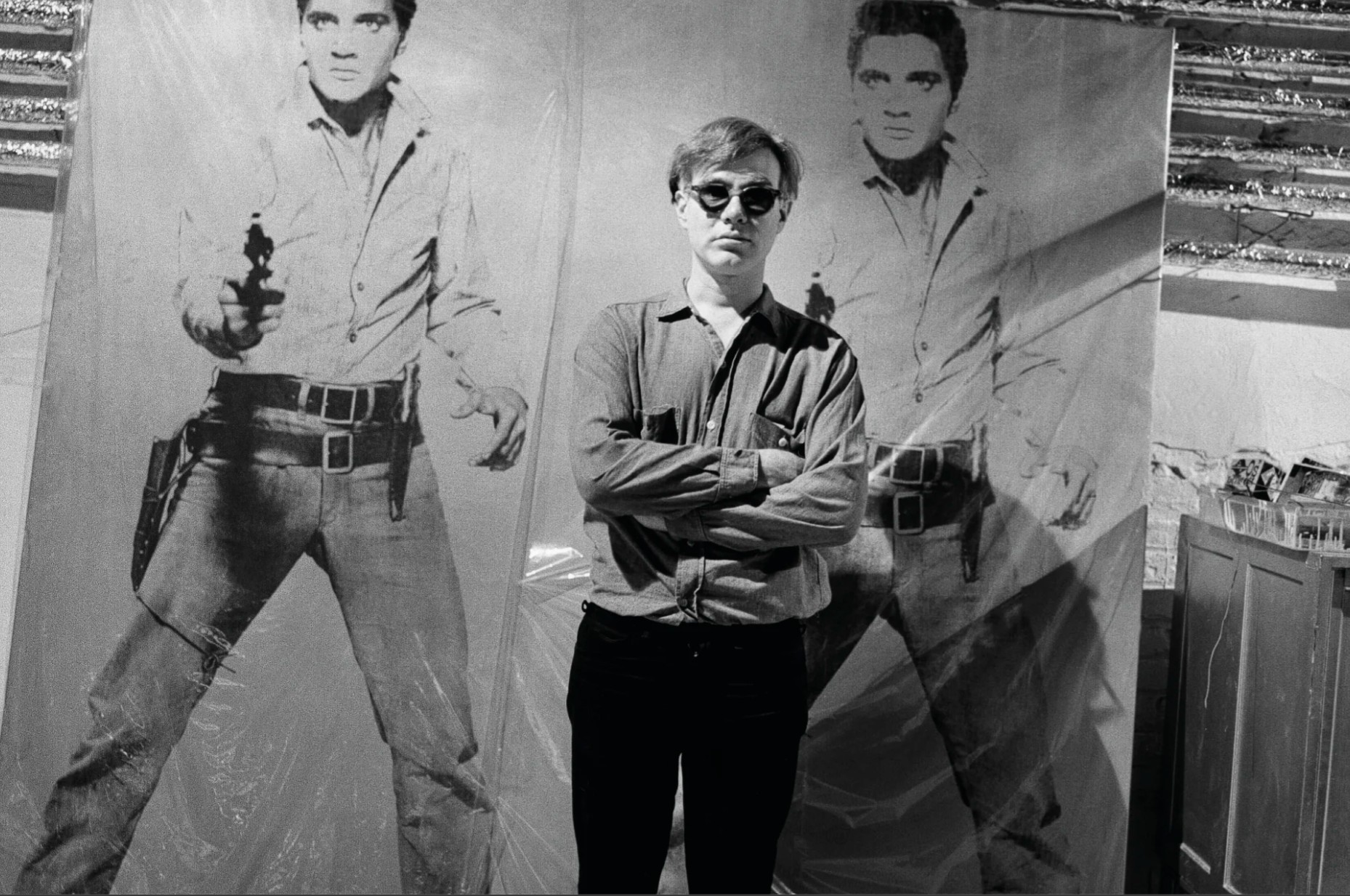
Andy Warhol in his New York studio with Double Elvis, circa 1964. Photo: © Bruce Davidson/Magnum Photos. Artwork: © 2026 The Andy Warhol Foundation for the Visual Arts, Inc. / Licensed by Artists Rights Society (ARS).
Standing nearly seven feet tall, the distinctive figure of Elvis Presley dominates this monumental 1963 Pop classic. The present work is one of only two canvases in the Double Elvis [Ferus Type] series in which the artist renders the second impression of the rock star as a ghostly apparition. This spectral figure acts to enhance the clarity of the central figure: Elvis’s famous pompadour hairstyle, the barrel of his single action Colt revolver, the broad swathes of his belt and holster, and his sturdy boots are all the more prominent for their generous application of jet-black silkscreen ink. The duality between the areas of light and shadow, and between foreground and background, make the present work one of the most striking examples from the series.
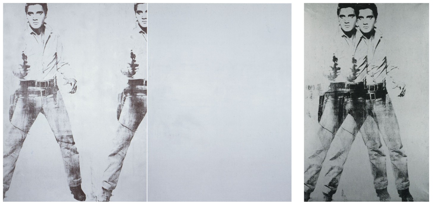
Left: Andy Warhol, Double Elvis, 1963. Museum of Modern Art, New York. © 2026 The Andy Warhol Foundation for the Visual Arts, Inc. / Licensed by Artists Rights Society (ARS).
Right: Andy Warhol, Double Elvis, 1963. Seattle Art Museum. © 2026 The Andy Warhol Foundation for the Visual Arts, Inc. / Licensed by Artists Rights Society (ARS).
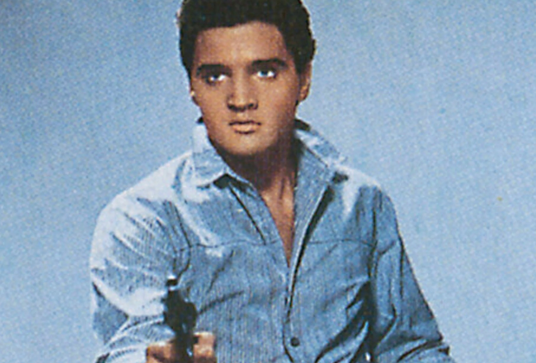
In 1963, Presley’s career was at a turning point and sensing this, Warhol decided it was the perfect moment to turn his cultural gaze towards the singer. Remarkably, however, he decided not to source an image from the King of Rock and Roll’s musical career, but instead used a publicity photograph from his appearance as the star of a 1960 movie called Flaming Star. After his discharge from the army that year, Elvis released several more hit records, but he also resumed his burgeoning film career. His manager, Colonel Tom Parker, arranged a seven motion picture deal with 20th Century Fox, of which Flaming Star was one. This shift away from teen heartthrob to all-round entertainer was an interesting move for Presley as it largely abandoned the teenage market that had obsessively supported him in the early days if his career. By the time the present work was executed, Elvis was regarded as a relatively respectable figure and the cultural landscape was changing. The British invasion of the Beatles was just around the corner and one only needs to look at the photographs of the Velvet Underground, Warhol’s protégés from a few years later, as evidence that they were a far cry from the smooth, homely, chiseled Elvis of the Flaming Star publicity stills.
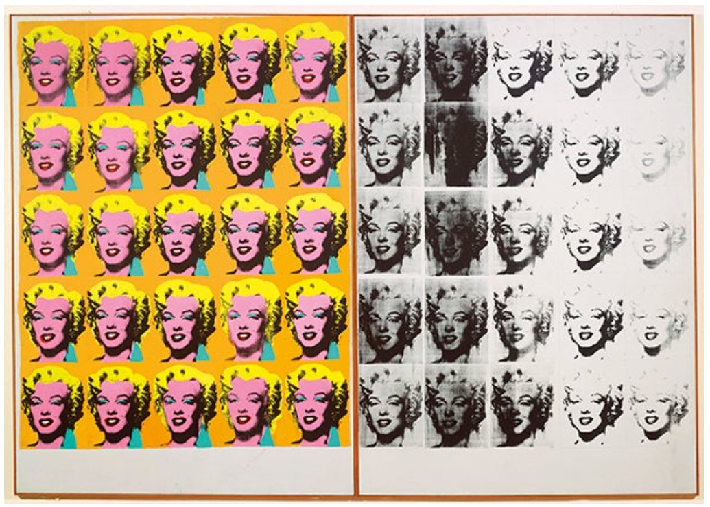
Warhol’s Double Elvis paintings were produced during a prolific period when the artist painted some of most of his most culturally significant works. Following on from his 32 Campbell’s Soup Cans, Warhol turned to another quintessentially American product, Hollywood. Beginning with a series of canvases featuring repeated images of teen stars such as Troy Donahue and Waren Beatty, in August 1962 Warhol began work on his gleaming golden portrait of Marylin Monroe. Regarded as one of the highpoints of the artists’ career, it is one of the first paintings in which Warhol truly understands the emotional power an image can possess.
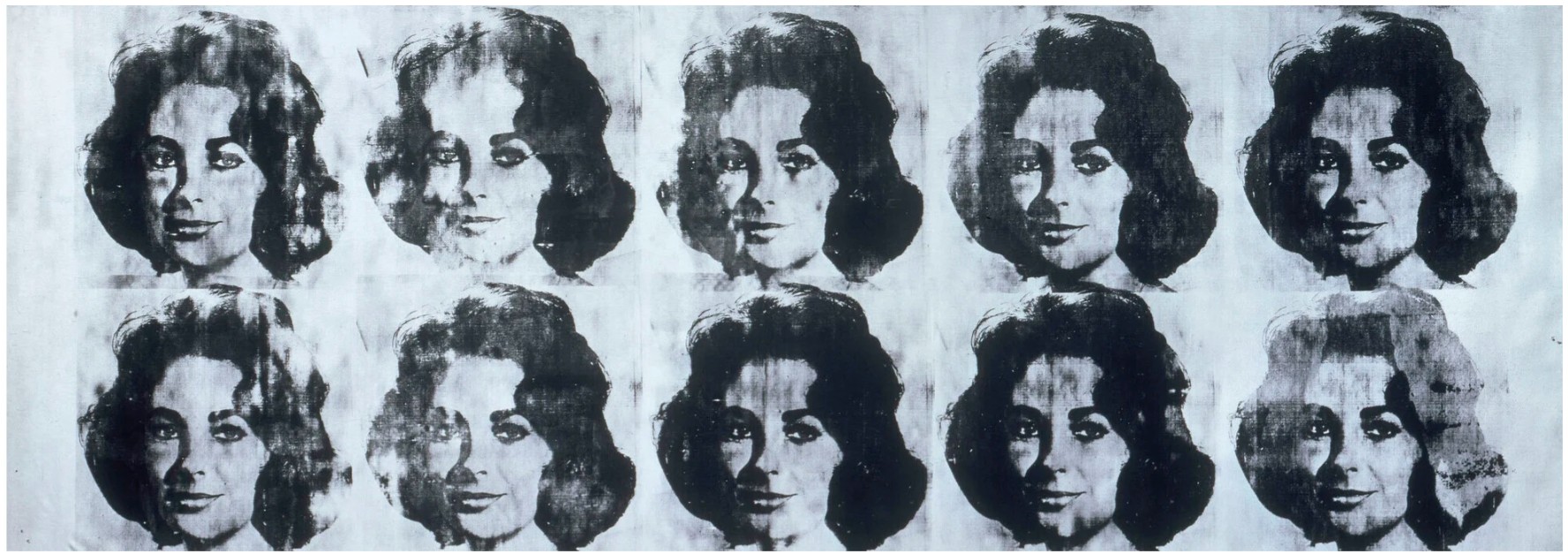
Andy Warhol, Ten Lizes, 1963. Musée National d’Art Moderne, Centre Georges Pompidou, Paris. © 2026 The Andy Warhol Foundation for the Visual Arts, Inc. / Licensed by Artists Rights Society (ARS). Photo: © CNAC/MNAM, Dist. RMN-Grand Palais / Art Resource, NY.
After a brief sojourn to paint his Death and Disaster paintings, in the summer of 1963, Warhol returned to the subject of Hollywood for inspiration. When they were exhibited at the Ferus Gallery in Los Angeles, the Elvis paintings—including the present work—were to be hung edge-to-edge, much like the Soup Cans were in 1962. In a bid to play up on the Hollywood theme, Warhol had arranged for a popular young starlet, Jean Seberg, to be photographed in front of his Elvis paintings for a photoshoot in Glamor magazine. The idea worked, with his Elvis paintings appearing at the forefront of cultural zeitgeist. The attention was now firmly on Warhol, and his choice of Hollywood royalty as subject matter meant that the public’s attention was now firmly focused on the artist once again.
Warhol first depicted Elvis Presley in the fall of 1962 in three canvases that used the pictorial format of repeating an image of the head of Elvis in a all-over grid. Red Elvis (1962), the largest of these early Elvis paintings is also thought to the first example of a new procedure that Warhol would go on to use throughout 1963-64. For it is with this work that, for the first time, the artist abandons his elaborate methods of color registration that he used in his earliest Marilyn and Troy paintings and instead simply painted the background a single color and the screened his chosen image directly on top using black silkscreen ink.
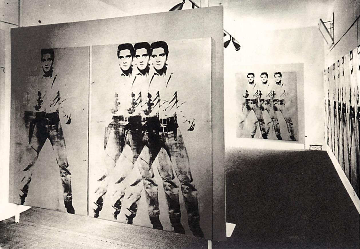
Installation view, Andy Warhol: Elvis Paintings, Ferus Gallery, Los Angeles, 1963. Photograph by Frank J. Thomas, Courtesy the Frank J. Thomas Archives. Artwork: © 2026 The Andy Warhol Foundation for the Visual Arts, Inc. / Licensed by Artists Rights Society (ARS).
The Ferus Elvis canvases were the first time that Warhol had employed the specific type of overlapping images featured in the present work in any of his paintings. Although repetition had been a familiar compositional device in Warhol’s work beginning with 200 Campbell’s Soup Cans in early 1962, he had only overlapped images using the entire frame, never just the subject matter, resulting in blurred and dense arrangements. However, when working on the Elvis canvases with assistant Gerard Malanga, Warhol appeared open to trying something new. “I deliberately moved the image over to create a jump effect, and he liked it,” Malanga explained, “I think, he even did one where there were three or four rapid successions” (quoted in G. Frei and N. Prinz, The Andy Warhol Catalogue Raisonné of Paintings and Sculptures, 1961-1963, vol. 01, New York, 2002, p. 355). The present work is a particularly fine example of this new ‘filmic’ effect. With its repeated, almost flickering, image it replications the effect of the cinematic projection process whereby a single frame of film is projected on a silver screen at 24 frames per second.
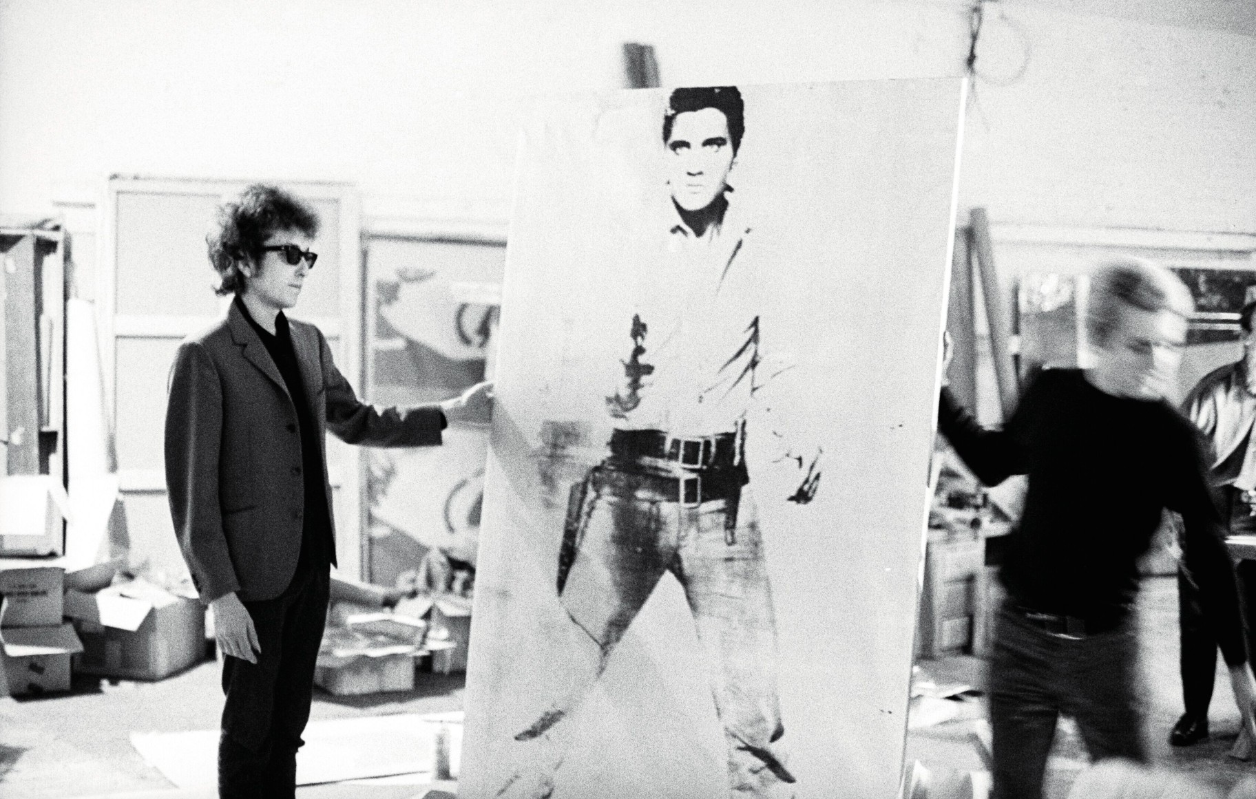
Bob Dylan in The Factory with the present lot, New York, 1963. Photograph by Nat Finkelstein. © Estate of Nat Finkelstein. Artwork: © 2026 The Andy Warhol Foundation for the Visual Arts, Inc. / Licensed by Artists Rights Society (ARS).
Thus, Warhol’s Double Elvis [Ferus Type] stands as a pivotal work within the artist’s vast and expansive body of work. It is one of the central pillars of his pantheon of Hollywood stars, and alongside his portraits of Marilyn Monroe, Elizabeth Taylor, and James Dean, contributes to the artist’s introspective look at the importance of popular culture and the mass media in postwar America. But it also shows Warhol as a highly innovative artist, a constant innovator experimenting with new and audacious modes of visual communication. As with so much of Warhol’s work, this picture is a modern gleaming icon, a shimmering promise of fame, fortune, and eternal celebrity. But it is also a conceptually rich painting at the vanguard of Pop Art that today—fifty years after it was painted–continues to confront, defy and engage its viewer and it is perhaps for this reason that Warhol’s Elvis series has become so iconic in its own right.
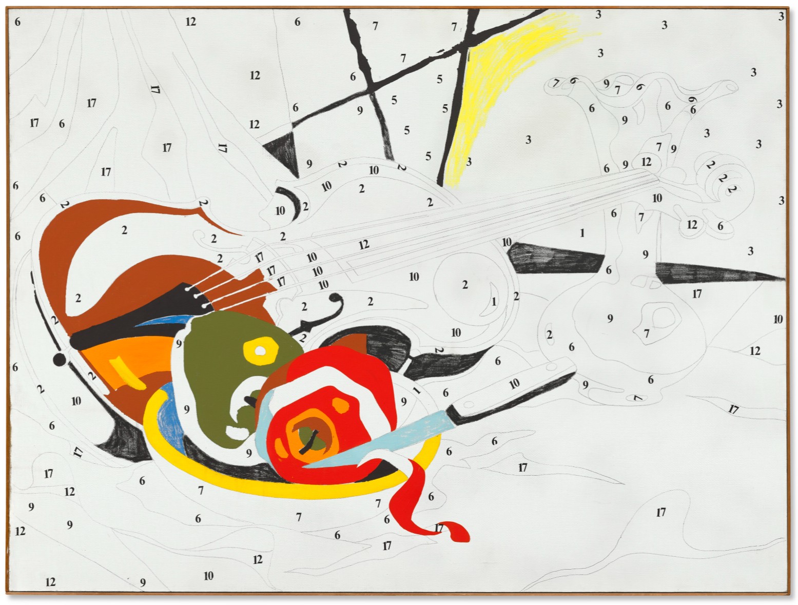
Do It Yourself (Violin), 1962
Do It Yourself (Violin), 1962
Masterpieces: The Private Collection of S.I. Newhouse
Christie’s New-York: 18 May 2026
Estimated: USD 20,000,000 – 30,000,000
USD 25,935,000
ANDY WARHOL (1928-1987), Do It Yourself (Violin) | Christie’s
ANDY WARHOL (1928-1987)
Do It Yourself (Violin), 1962
Acrylic, graphite, Letraset and crayon on linen
54×72 inches (137.2 x 182.9 cm)
Signed and dated ‘ANDY WARHOL 62’ (on the stretcher)
Do It Yourself (Violin), one of Andy Warhol’s last hand-painted works and one of a few pivotal early works, announces the singular artist’s triumphant entry into Pop art. The work emerged in the late spring of 1962, the seminal year where Warhol discovered his mature style and when Pop art was first revealed to the New York public. In the work, one in a series of five Do It Yourself paintings—three of which reside in museum collections, the other in the Daros Collection—Warhol investigates the artistic conceits which would become hallmarks of his iconic oeuvre, debuting his singular grasp of Pop aesthetics. As the critic and curator John Coplans observed, this series “marks the first suggestion of Warhol’s finding means to expunge entirely the use of the artist’s hand from his painting,” a revolutionary discovery for the artist which he would continue to develop through his silkscreen technique (“The Early Work of Andy Warhol,” in Artforum 8, no. 7, March 1970, p. 53). Do It Yourself (Violin) was acquired months after its creation in October 1962 by Emily and Burton Tremaine, who assembled one of the greatest collections of twentieth century art. In the company of fourteen other Warhol works in the Tremaine collection obtained that year, including the renowned Marilyn Diptych, now in the collection of Tate Modern, London, and A Boy for Meg, which the Tremaines later donated to the National Gallery of Art, Washington, D.C., Do It Yourself (Violin) was immediately recognized as one of Andy Warhol’s most innovative and important paintings. “Only an artist as irreverent and ironic as Warhol could have dreamed up the idea of transposing these kitsch, mass-produced images into ‘originals’ for an affluent audience,” the art critic David Bourdon writes of the series, “which prizes them for being among his wittiest and cheekiest artworks” (D. Bourdon, Warhol, New York, 1989, p. 114).
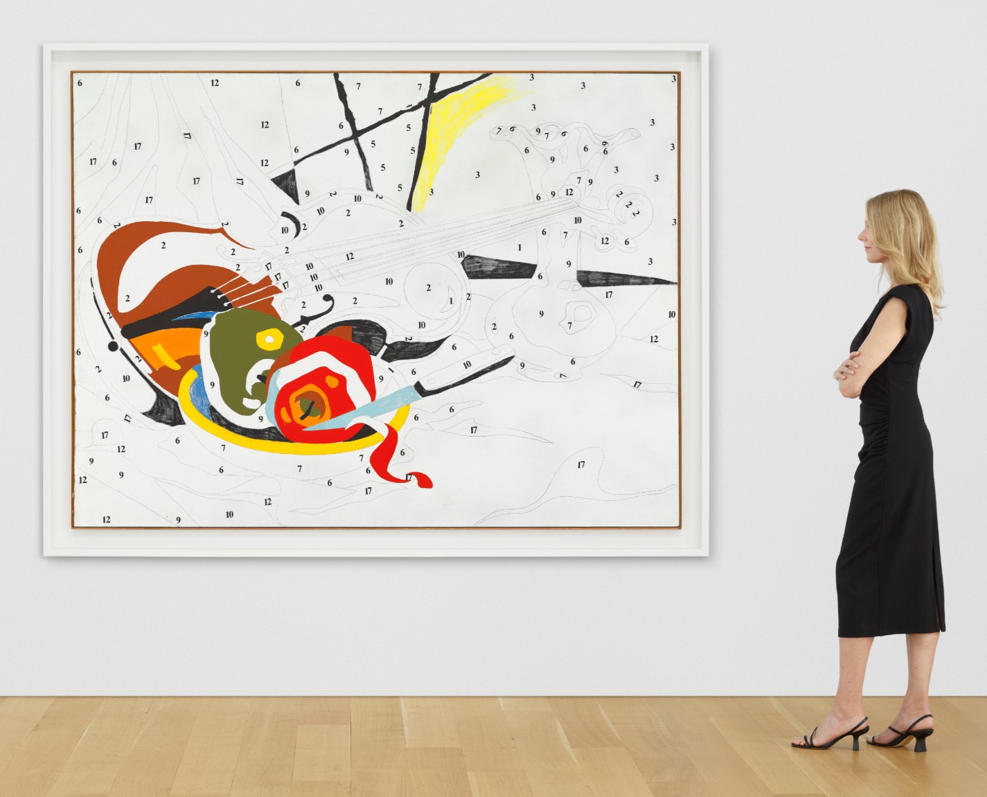
With Do It Yourself (Violin), Warhol explores notions of originality, the handmade, creativity, and invention in the aftermath of Abstract Expressionism and the radical participatory aesthetics conceived by Jasper Johns and Robert Rauschenberg. Warhol here appropriates a ‘color by numbers’ pre-sketched pattern created by Venus Paradise, a colored pencil maker. Warhol adroitly adapts this model, produced for the mass market, into a work of searing originality. Projecting the pattern for a still life including a violin, two apples in a bowl, a knife suspended mid-peel, and a vase onto a canvas, Warhol successfully eliminated any discernable trace of his own artistic hand. Even more innovative was the artist’s decision to leave the majority of the composition uncolored, creating a crisp, deliberate non finito aesthetic while revealing obliquely the source and conceit of the painting. As the scholar Nina Zimmer notes, Warhol “only filled in those fields that he wanted to assign a particular importance and only used those colors he needed to produce an overall compositional balance. Such omissions, as well as the incomplete nature of these pictures, thus constitute the strategies of appropriation that enabled him to undermine the visual concept of the source material and override it with his own pictorial concept” (“Painting by Numbers,” in Andy Warhol: The Early Sixties: Paintings and Drawings, 1961-1964, exh. cat., Kunstmuseum Basel, 2010, p. 73).
Robert Rauschenberg, Erased de Kooning Drawing, 1953. San Francisco Museum of Modern Art.
© 2026 Robert Rauschenberg Foundation / Artists Rights Society (ARS), New York.
Warhol filled in only the most rudimentary forms necessary for the viewer to identify the painting’s apparent subject, leaving the majority of his pictorial field devoid of pigment save for the lingering line of the sketch and the numbers identifying each form’s color. These numbers, applied after the paint fields via the Lestraset process, become a marker of Warhol’s appropriative genius, at once excising Warhol’s culpability in the disegno or invention of the work while simultaneously emphasizing the contrived nature of his appropriation. Warhol here goes beyond even Robert Rauschenberg’s Erased de Kooning Drawing in obliterating the legacies of artistic tradition which had persisted since the Italian Renaissance. Sebastian Egenhofer notes how “the result of this procedure, Warhol’s oddly evacuated or effaced line, can no longer be understood purely in terms of stylistic critique; the inevitable and paradoxical conclusion is that its lack of expressiveness is an expressive quality. In terms of process engineering, the outline drawing has the function of facilitating the subdivision of the process of production” (S. Egenhofer, “Subjectivity and the Production of Meaning in Warhol’s Early Work,” in ibid., p. 39).
Andy Warhol, Do It Yourself (Flowers), 1962. Daros Collection, Switzerland.
© 2026 The Andy Warhol Foundation for the Visual Arts, Inc. / Licensed by Artists Rights Society (ARS).
Benjamin H.D. Buchloh identifies Warhol’s Do It Yourself series as the seminal solution which catapulted the artist from the periphery of New York’s art world to the center. In the early 1960s, Warhol, then a commercial artist, observed the success of Johns and Rauschenberg in dismantling the dominance of Abstract Expressionism via their emphasis on mass participation and dismissal of easel painting. Their insights led to the Pop explosion in 1962. The year was notable for influential solo shows by the leading luminaries of the new Pop aesthetic: Claes Oldenburg, Jim Dine, and James Rosenquist held their first exhibitions in January, while Roy Lichtenstein burst onto the scene with a show at Leo Castelli Gallery in February. Warhol’s first encounter with Lichtenstein’s cartoon creations was on a late spring visit to Castelli with his friend Ted Carey, where Ivan Karp, a gallery director, showed him some of Lichtenstein’s works in a back room. This encounter shook Warhol, as he was then independently creating a series of cartoon-inspired paintings similar to those being shown to him. Warhol realized that he was in danger of being left behind as other Pop artists were attaining solo shows in 1962, and the Do It Yourself series was his successful response. As Buchloh writes, Warhol’s “successful debut as an artist in the sphere of fine art… would depend on his capacity to erase from his paintings and drawings more completely than any of his peers (Jasper Johns and Robert Rauschenberg in particular) the traces of the handmade, of artistry and creativity, of expression and invention” (B. H.D. Buchloh, “Andy Warhol’s One-Dimensional Art: 1956-1966,” in K. McShine, ed., Andy Warhol: A Retrospective, exh. cat., The Museum of Modern Art, New York, 1989, p. 41). In the Do It Yourself series, Buchloh continues, Warhol crystalized his artistic approach: “Warhol’s solution, found in 1962, responded to all of these problems: he isolated, singularized, and centralized representation in the manner of a Duchampian Readymade (and in the manner of John’s Flags and Targets), extracted it, thereby, from the tiresome affiliation of collage aesthetics and the nagging accusation of neo-Dada” (ibid., p. 50). This approach, first laid out in the Do It Yourself works, would continue to be refined in Warhol’s proceeding silkscreen series.
Michelangelo, The Virgin and Child with Saint John and Angels (‘The Manchester Madonna’), circa 1494. National Gallery, London.
Of the works in the series, Do It Yourself (Violin) is unique in Warhol’s addition of crayon, along with his acrylic paint. Warhol devised the series with a sophisticated conceptual unity, with each work in a different state of completion. Do It Yourself (Seascape) (1962, Staatliche Museen zu Berlin, Nationalgalerie, Collection Marx) is the only work which is more or less completely filled in, while Do It Yourself (Sailboats) (1962, Andy Warhol Museum, Pittsburgh) lacks color throughout its foreground.
Andy Warhol, Do It Yourself (Sailboats), 1962. Andy Warhol Museum, Pittsburgh. © 2026 The Andy Warhol Foundation for the Visual Arts, Inc. / Licensed by Artists Rights Society (ARS).
Do It Yourself (Landscape) (1962, Museum Ludwig, Cologne) and Do It Yourself (Flowers) (1962, Daros Collection, Switzerland) have similar degrees of completion, while the present work exhibits the most economical use of pigment. Warhol’s inclusion of crayon here emphasizes the work’s intentionally incomplete state while simultaneously paying homage to his appropriated source—a coloring book intended for colored pencils and crayons. Do It Yourself (Violin) thus attains the most refined state of non finito among the works in the series, recalling masterpieces by ancient artists and Old Masters which became more highly acclaimed by dint of their incomplete status, such as Michelangelo’s Manchester Madonna (circa 1494, National Gallery, London), Leonardo da Vinci’s Adoration of the Magi (circa 1482, Galleria degli Uffizi, Florence), or Albrecht Dürer’s Salvator Mundi (circa 1505, Metropolitan Museum of Art, New York). Even earlier, discussing the legendary unfinished works of the ancient artists Aristides, Nicomachus, and Apelles, the Roman writer Pliny the Elder notes, “they are more admired than those they finished, because in them are seen the artists’ remaining lines and very thoughts” (Natural History, 35.145). Just as works like Michelangelo’s Manchester Madonna become invaluable for their ability to reveal the artist’s hidden techniques and preparatory models, Warhol in the present work knowingly winks at both his audience and his appropriated source.
Andy Warhol, Do It Yourself (Seascape), 1962. Staatliche Museen zu Berlin, Nationalgalerie, Collection Marx.
© 2026 The Andy Warhol Foundation for the Visual Arts, Inc. / Licensed by Artists Rights Society (ARS).
Warhol completed the Do It Yourself series by the end of the summer in 1962. In October, Emily and Burton Tremaine purchased Do It Yourself (Violin), along with their Marilyn Diptych and Close Cover Before Striking (1962, Museum Ludwig, Cologne). The Tremaines were personally introduced to Andy Warhol by Ivan Karp, who had befriended the artist since first meeting him at Leo Castelli and steered potential collectors towards his studio. Emily Tremaine recalls how “we thought he was naïve, a new douanier Rousseau—how wrong we were. We made several visits to Andy’s studio—Andy was usually playing two stereos simultaneously, one belting out Bach, the other blasting rock n’ roll—and came to think of both Andy and his work as perhaps the most enigmatical and complex of any of the artists we were beginning to know” (quoted in D. Bourdon, op. cit., p. 86). After this critical introduction, they soon became some of Warhol’s greatest champions and collectors. In 1980, the Tremaines sold Do It Yourself (Violin) to Harold and Hester Dimond. The work has been included in several of the artist’s most significant exhibitions, including the Louisiana Museum of Modern Art’s groundbreaking 1978 retrospective and Andy Warhol: A Retrospective, which opened at The Museum of Modern Art, New York, before travelling to The Art Institute of Chicago in 1989. The work then ascended into the legendary collection of S.I. Newhouse, where it has remained since. With an impeccable provenance and exhibition history, Do It Yourself (Violin) is one of Warhol’s most important early works still in private hands.
Installation view, Andy Warhol: A Retrospective, February – May 1989, Museum of Modern Art, New York (present lot illustrated).
Photo: © The Museum of Modern Art / Licensed by SCALA / Art Resource, NY.
Artwork: © 2026 The Andy Warhol Foundation for the Visual Arts, Inc. / Licensed by Artists Rights Society (ARS).
The only painting from the series to ever appear at auction, Do It Yourself (Violin) is a conceptual breakthrough and assertion of artistic intent, standing at a critical juncture where Warhol definitively embraced the democratizing, mechanized logic which would define Pop. By translating a mass-market coloring template into a painting, Warhol crystallized the strategies of appropriation, erasure, and distancing that would inform his mature practice. The work’s early acquisition, distinguished exhibition, and exceptional provenance further underscore the painting’s status as a foundational work signaling the emergence of Warhol’s singular voice within the new visual language of the latter half of the twentieth century.
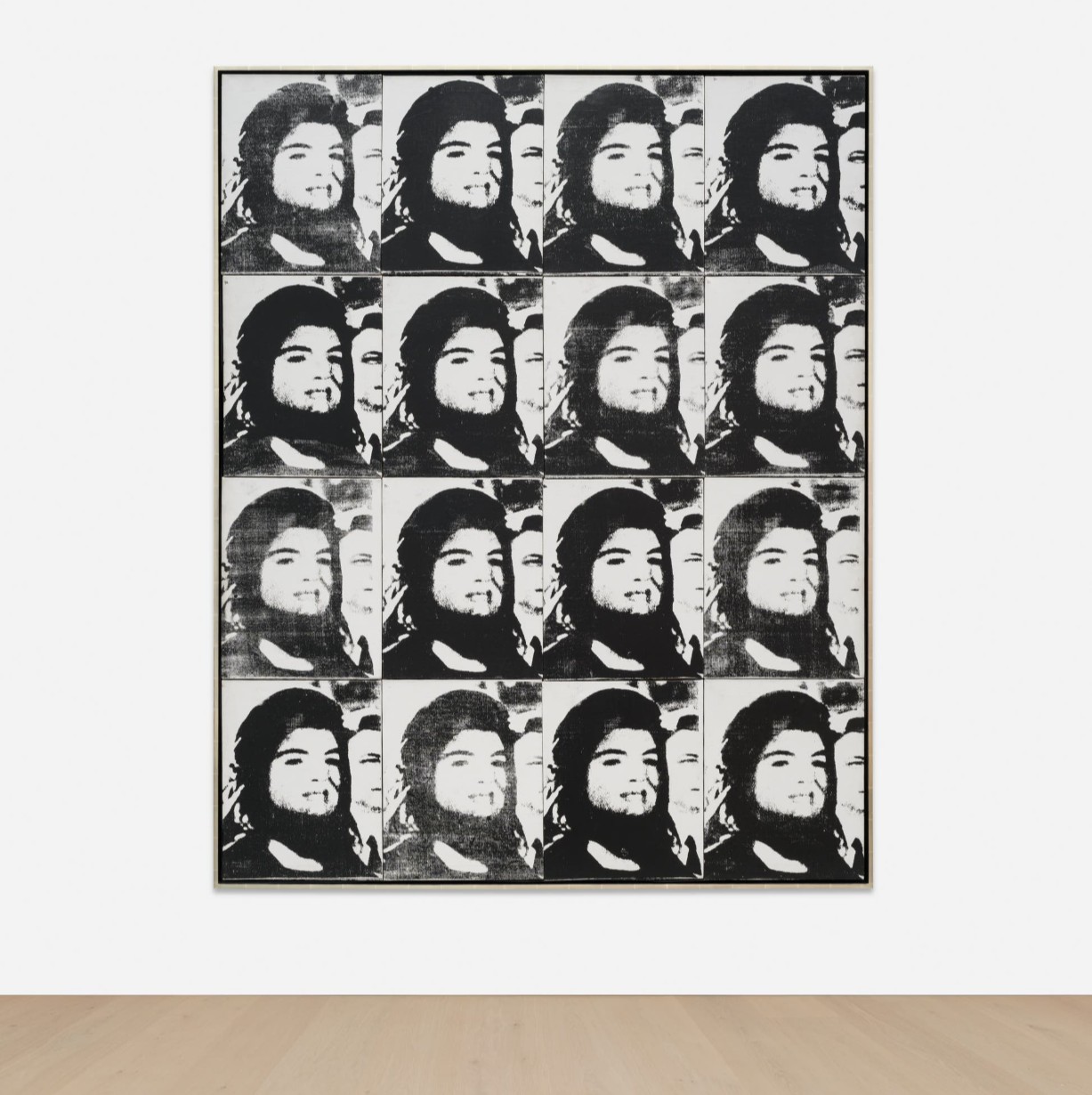
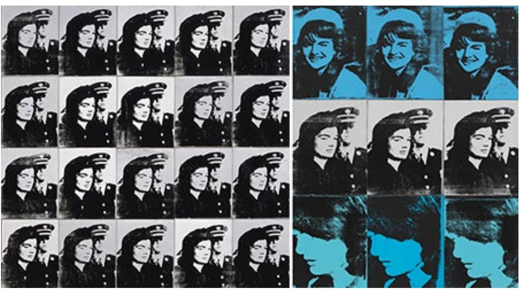
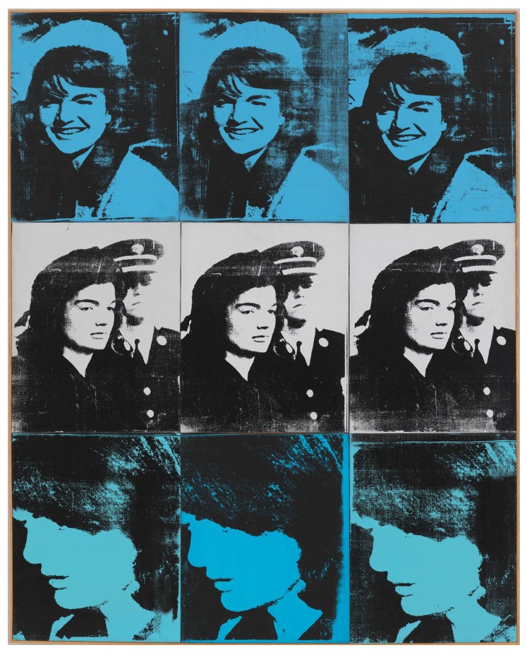
Sixteen Jackies, 1964
Sixteen Jackies, 1964
Phillips New-York: 19 May 2026
Estimated: USD 15,000,000 – 20,000,000
USD 16,225,000
Andy Warhol Modern & Contemporary Art Evening Sale
REPEAT SALE
Christie’s New-York: 9 November 2023
Estimated: USD 25,000,000 – 35,000,000
USD 25,940,000
ANDY WARHOL (1928-1987) (christies.com)
ANDY WARHOL
Sixteen Jackies, 1964
Silkscreen ink on linen, in 16 parts
Each: 20×16 inches (50.8 x 40.6 cm)
Overall: 80-1/4 x 64-1/8 inches (203.8 x 162.9 cm)
Signed “Andy Warhol” on the overlap of four canvases
Few figures are as inseparable from their image as Jacqueline Kennedy, and no artist was as attuned to that phenomenon as Andy Warhol. Executed in 1964, Sixteen Jackies made this very condition its subject. It is one of a small number of multi-paneled Jackie works assembled into a grid format by the artist himself, and one of only six Sixteen Jackies canvases Warhol produced that year—two of which now reside in major museum collections, the Iwaki City Art Museum, Japan, and the Walker Art Center, Minneapolis. Drawn from a press photograph taken at President John F. Kennedy’s funeral by Henri Dauman, the source image is repeatedly silkscreened in stark black and white across a grid of sixteen panels. The composition—cropped tightly to her face—fixes on a moment of composed visibility, poised between private grief and public performance. Warhol’s mechanical reiteration flattens affect even as it intensifies recognition: a fleeting photographic instant is converted into a relentless visual refrain. A vivid articulation of Warhol’s signature method of appropriation and multiplication, Sixteen Jackies is a defining meditation on the production and persistence of images in postwar America.
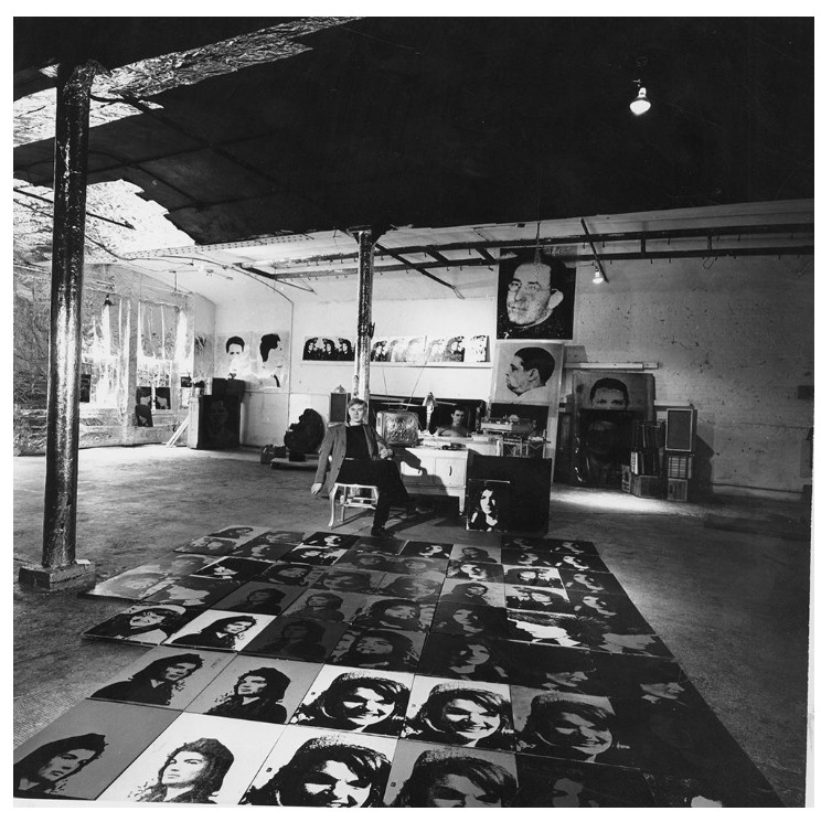
Andy Warhol in his studio, New York, 1964.
The present work is a singular example of Warhol’s large body of work which employed media imagery of Jackie Kennedy, a dignified and photogenic First Lady who quickly became an American icon. Beginning in the winter 1963, in the wake of her husband’s death, Warhol began combing through magazines and newspapers in search of photographs of Jackie Kennedy to use as source material for a new series of paintings. He settled on eight images taken both before and after President Kennedy’s assassination, focusing on the tragic incident that ironically catapulted the widow to global celebrity. Her personal style—coined the “Jackie Look”—inspired fashion trends worldwide and cemented her status as a figure of cultivated elegance and cultural authority. Like his portrayals of Marilyn Monroe and Elizabeth Taylor, Sixteen Jackies presents its subject in a format akin to a publicity headshot, centering on her distinctive and universally recognized visage. In this way, Warhol’s emphasis is not on mourning but on the mechanisms of image-making, as the artist charts the transformation of a public figure into an object of sustained cultural fixation.
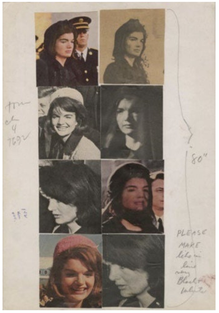
Source material for Warhol’s Jackie Series, 1963-1964. Collection of the Andy Warhol Museum, Pittsburgh.
Created amidst Warhol’s broader Death and Disaster series, Sixteen Jackies reflects a related engagement with images of public trauma, its source photograph taken at a funeral during a moment of national mourning. The series extended from 1962 to 1965 and encompassed his examinations of electric chairs, car crashes, and other scenes of catastrophe, all drawn from the circulating imagery of contemporary mass media. Warhol’s own response to the assassination of John F. Kennedy remains contested, which the detached, repeated imagery of the present work renders even more ambiguous.
Accounts from those close to him diverge: while the artist’s assistant Gerard Malanga recalled that Warhol seemed indifferent to the President’s death, John Giorno remembered watching television coverage of the shooting and crying “great big crocodile tears while Andy said over and over again ‘I don’t know what it means.’” A year after the event, however, Warhol seemed more concerned with its saturation in the media.
“It didn’t bother me that much that he was dead. What bothered me was the way the television and radio were programming everyone to feel so sad. It seemed no matter how hard you tried, you couldn’t get away from the thing.”
In Sixteen Jackies, this perspective manifests as a representation of mourning as a media spectacle which is at once collective, repetitive, and inescapable.
Left: Andy Warhol, Twenty Jackies, 1964. The Broad, Los Angeles
Right: Andy Warhol, Nine Jackies, 1964. Whitney Museum of American Art.
Indeed, although at the first glance the work might appear to depict a moment of supposedly private grief, Sixteen Jackies is not preoccupied with the internal trauma experienced by the First Lady. It was created on the back of Warhol’s success with portraits of Hollywood superstars, such as his Liz and Marilyn series, and similarly positions its subject as a purely allegorical, public symbol. Warhol’s Jackie canvases “seem to penetrate to the real woman behind the public role of the First Lady,” according to the art historian Cécile Whiting. “But in fact Warhol’s elimination of the private took its most extreme form when he adopted this subject since the funeral of the President was the premier instance of the public presentation of private emotion in Warhol’s lifetime.” The funeral itself unfolded as a meticulously orchestrated media event, with gestures and images carefully structured for mass dissemination rather than genuine expressions of personal grief. In this respect, Warhol’s Jackie closely aligns with his Liz and his Marilyn—they are not individuals but public images through which American culture stages and consumes its ideals. His Jackie canvases ultimately reveal far more about society than they do of their subject, challenging every convention of high-art portraiture. In Sixteen Jackies, the bereaved First Lady is recast as a modern icon.
Composed of sixteen canvases joined into a single grid, the present work’s format echoes the repetition inherent to Warhol’s silkscreen process, which had the capacity to re-render the screen image endlessly. This multi-panel arrangement—central to many of his most important works—foregrounded the logic of reiteration that structured his practice, translating a commercial printing technique into a method to produce paintings serially and with minimal intervention. Examples of this multi-canvas format are now held in major institutional collections worldwide, including a smaller example of the same subject (Twelve Jackies, 1964) in the Art Institute of Chicago. A related work in the Walker Art Center, Minneapolis—which is also titled Sixteen Jackies and comprises sixteen panels—incorporates four distinct images to suggest a loose narrative sequence, juxtaposing moments from before and after the assassination. By contrast, the present work refuses such narrative progression altogether, isolating a single image in order to intensify its iconic status. In doing so, it fully articulates Warhol’s commitment to repetition as an end in itself, akin to the recursive logic of his Marilyns.
Andy Warhol, Marilyn Diptych, 1962. Tate Britain.
As the art historian John Blakinger has noted, the gridded structure of Warhol’s multi-panel works such as Sixteen Jackies may have drawn on a 1962 Volkswagen advertisement published in Life magazine, in which nearly identical cars were presented with only slight variations to underscore their uniformity and dependability. A similar logic unfolds in the present work: while the image initially appears wholly uniform, closer scrutiny reveals subtle inconsistencies in the silkscreen impressions which disrupt the illusion of mechanical sameness. The result is a striking tension between uniqueness and standardization, a theme which remained fundamental to Warhol’s entire career.
“The reason I’m painting this way is that I want to be a machine, and I feel that whatever I do and do machine-like is what I want to do.”
The reduced palette of Sixteen Jackies, which is rendered only in black-and-white, further the work’s complex interrogation of the visual production of American mass media. Unlike Warhol’s five other paintings which include sixteen depictions of Jackie Kennedy, the present work is the only one which the artist executed in a single color. On one hand, his decision to utilize a limited palette could be interpreted as an artistic decision to convey the melancholic subject of the original photograph. Warhol was acutely aware of the emotive power of color, and Rainer Crone has noted how his choice of hues “[served] to intensify the effect of alienation created by the realism of the visual content.” On the other hand, the black-and-white scheme of Sixteen Jackies also references the original printed newspaper image which Warhol used for the screen— therefore extending the work’s central concern with mass-mediated imagery in both content and form.
Andy Warhol, Sleep, 1964.
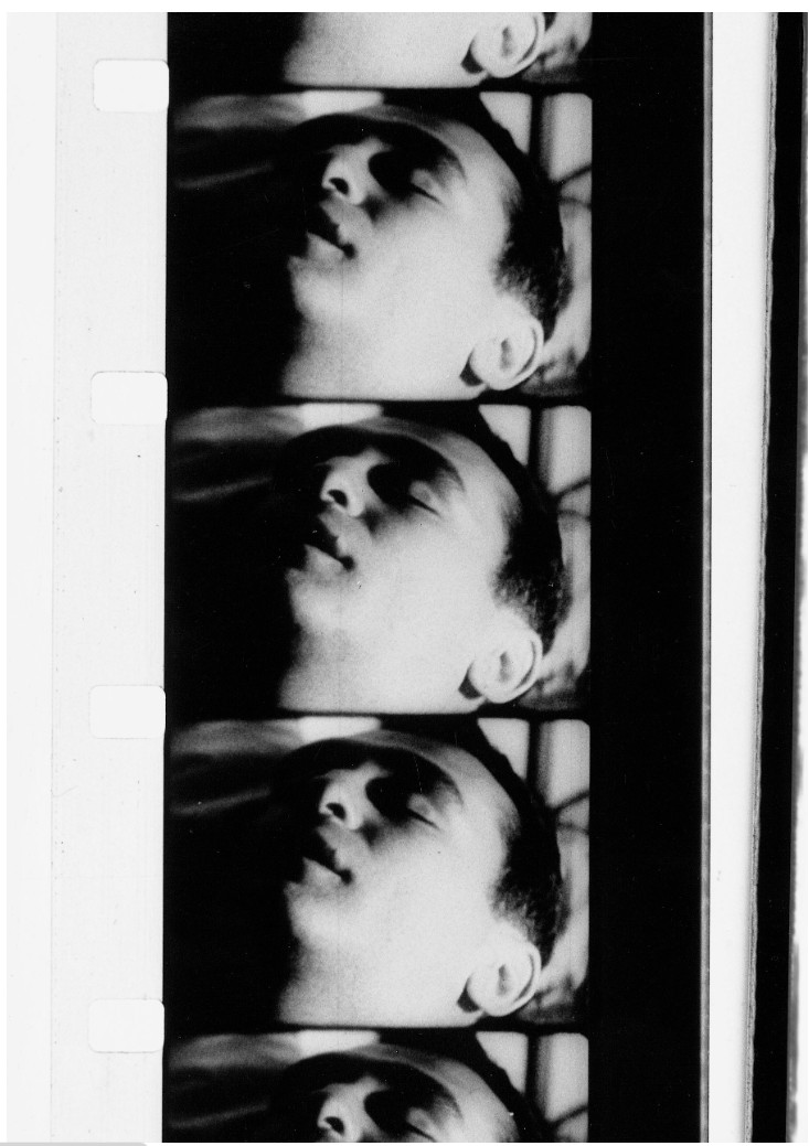
The present work also evokes Warhol’s engagement with video art, which by the early 1960s was beginning to shape his approach to painting. By 1963, Warhol had acquired a 16mm camera and begun experimenting with film, producing his first extended minimalist work, Sleep. The gridded arrangement of Sixteen Jackies recalls the sequential structure of a film strip, while its stark black-and-white palette evokes the tonal range of contemporary cinema and newsreel footage. His enlargement and repetition of a single image operate like a series of close-ups, isolating and intensifying the figure of Jackie Kennedy with a director’s sensibility. Reflecting his concurrent investment in cinematic modes of seeing, the formal strategies at play in Sixteen Jackies resonate with his immersion in the milieu of underground cinema.
In Sixteen Jackies, Warhol has captured not only a moment of national mourning but a key shift in modern American culture, in which public grief and celebrity became inseparable. The composition’s tight crop to Jackie Kennedy’s face reflects the intensity with which she was scrutinized at the funeral of her husband, revealing how mass media informs our consumption of individuals as much as Campbell’s soup cans. Laying bare Warhol’s complex engagement with the icons of post-war American society, Sixteen Jackies is a testament to Warhol’s capacity to distill the mechanisms through which images are circulated, fixed, and endlessly renewed.
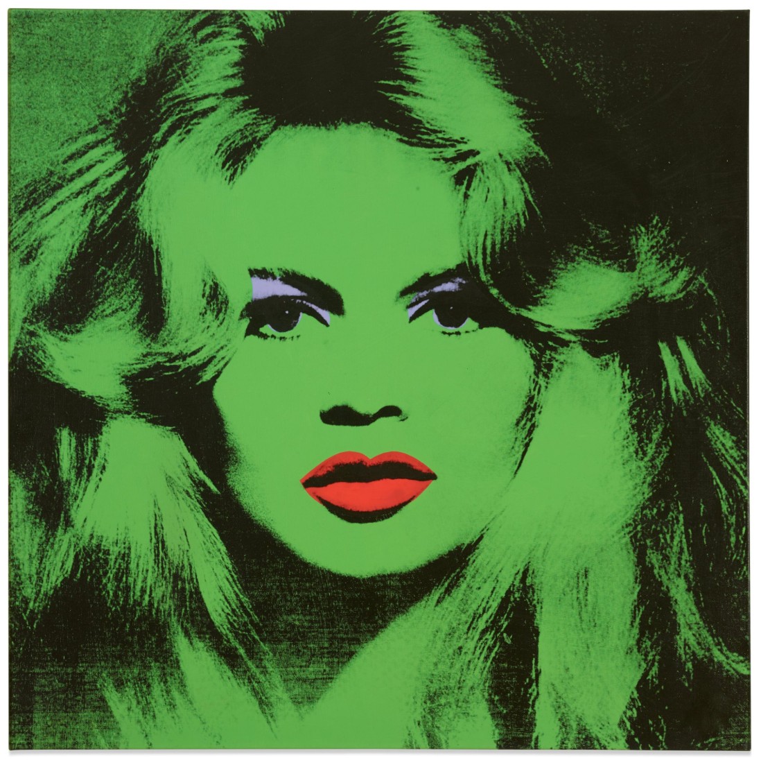
Brigitte Bardot, 1974
Brigitte Bardot, 1974
Bardot by Warhol: From the Gunter Sachs Collection
Sotheby’s New-York: 14 May 2026
Estimated: USD 14,000,000 – 18,000,000
USD 24,830,000
Andy Warhol | Brigitte Bardot | The Now & Contemporary Evening
ANDY WARHOL (1928 – 1987)
Brigitte Bardot, 1974
Acrylic and silkscreen ink on canvas
47-1/4 x 47-1/4 inches (120×120 cm)
Signed with the artist’s initials and dated 74 (on the overlap)
Glamorous, alluring and irresistibly seductive, Andy Warhol’s Brigitte Bardot is an ode to beauty, fame and celebrity. A mid-century cultural phenomenon, Bardot was among the most photographed women in the world, captivating the public with on screen and across the tabloid media as the epitome of stardom and glamour. The present work belongs to Warhol’s legendary series of eight Bardot portraits commissioned by Gunter Sachs, her husband from 1966-69. Here, Bardot’s radiant emerald visage entrances the viewer with a profound hypnotic intensity, her beguiling gaze immortalized by the camera’s flash. Elevated to the status of a modern-day goddess, Brigitte Bardot completes Warhol’s earliest Pop heroine trinity alongside Marilyn Monroe and Liz Taylor—embodying Warhol’s ultimate artistic obsessions: celebrity and popular media. Bardot offered a European counterpart to Marilyn: each iconic actresses who revolutionized the terms of female sexuality as pervasive and enduring symbols of both desire and envy. Warhol’s method and his muses were dictated by the cultural zeitgeist—the most famous figures of popular culture, whose likenesses proliferated across mass media, were deified to an idol-like status through his silkscreens. Brigitte Bardot is a radiant embodiment of Warhol’s visual discourse, masterfully capturing the essence of a 1960s icon.
Left: Andy Warhol, Shot Sage Blue Marilyn, 1964. Private Collection. Sold in New York in May 2022 for $195 million. Image © Christie’s Images / © 2026 The Andy Warhol Foundation for the Visual Arts, Inc. / Licensed by DACS, London / Bridgeman Images. Art © 2026 Andy Warhol Foundation for the Visual Arts / Artists Rights Society (ARS), New York.
Right: Andy Warhol, Liz #3 (Early Colored Liz), 1963. Private Collection. Sold at Sotheby’s New York in November 2014 for $31.5 million. Art © 2026 Andy Warhol Foundation for the Visual Arts / Artists Rights Society (ARS), New York
The Brigitte Bardot portraits followed a decade of extraordinary change for the artist, during which Warhol responded to a new age of representation in media, bringing his subjects from the covers of magazines to the canvas. The European counterpart of Warhol’s most celebrated portraits of Marilyn, Jackie and Liz from the 1960s, the rare Brigitte Bardot paintings iconize a subject who had already entranced a global public. Even prior to the commission, Warhol attempted to persuade Bardot to sit for a painting, but his plea was to no avail. Like Warhol’s Marilyns, which were derived from a publicity still from the film Niagara, his Jackies, which were taken from press images following John F. Kennedy’s assassination, and his portraits of Liz Taylor, which were coopted from an array of movie stills, the Bardot paintings were also based on an external source. This is unusual—for Warhol’s 1970s portraits, he typically captured his subject on his own Polaroid film, enlarging his compositions to a 40-by-40-inch sale.
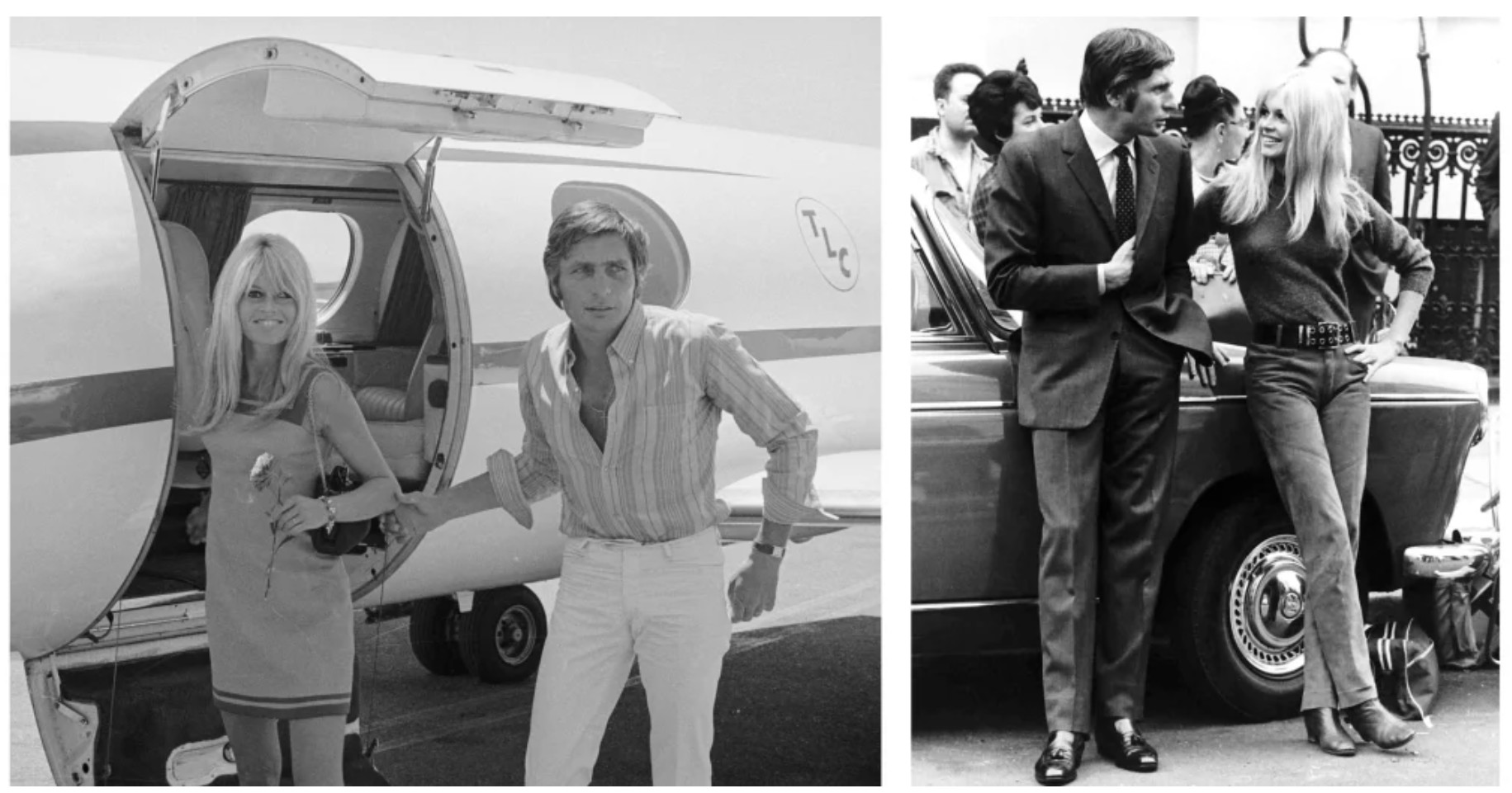
Left: Brigitte Bardot and Sachs deplaning their flight back from their Las Vegas elopement, 1966. Photo from Getty Images.
Right: Brigitte Bardot and Sachs in Paris,1966. Photo by Eric Harlow/Daily Mirror/Mirrorpix via Getty Images
For these works, Bardot refused to sit for the portrait and Warhol used Richard Avedon’s breathtaking 1959 photograph of Bardot. Warhol then augmented the scale to a larger 47-by-47-inches, creating a portrait which captures the bewitching actress at the height of stardom. Just as he had done with the source imagery for his aforementioned Pop trinity, Warhol cropped the Avedon photograph to his own specifications, honing in on Bardot’s perfectly symmetrical face.
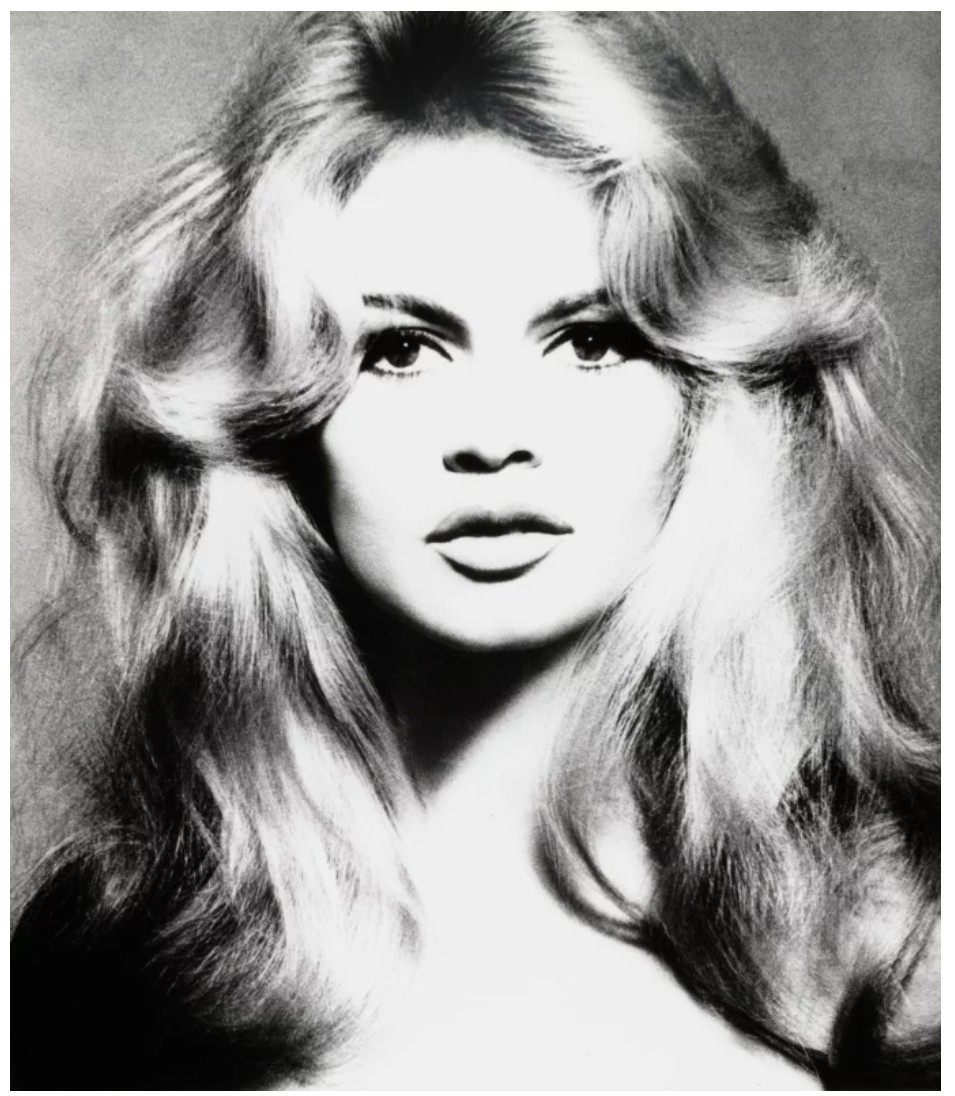
Richard Avedon, Brigitte Bardot, hair by Alexandre, Paris, January 27, 1959. © The Richard Avedon Foundation
Avedon had photographed Bardot fifteen years prior, in January 1959, at his Paris studio. The actress wore a Lanvin dress and had her hair coiffed by Alexandre of Paris, who was then considered the world’s most famous hairdresser. Alexandre had also styled Liz Taylor’s hair for Cleopatra—an image Warhol used in his seminal portraits of the actress. Avedon’s high exposure, black and white photograph is taken to an even further extreme by Warhol: he accentuates the soft variations of the photograph through heightened contrast, amplifying the drama of the composition. Divergent from the brushy and almost expressionistic application of paint familiar to Warhol’s large corpus of society portraits, here, Warhol harkens back to his earlier Pop style, aligning this series with his 60s heroines.
In 1974, Andy Warhol produced a legendary series of eight paintings of international moviestar and cultural icon Brigitte Bardot for her husband from 1966–69, Gunter Sachs, based on Richard Avedon’s 1959 photograph of Bardot. Each of the 47-by-47-inch Bardot paintings is defined by a unique chromatic palette—emerald, cerulean, golden yellow, magenta, and violet. Three of these eight paintings, including the present work, are further distinguished by the presence of a cadmium red lip.
All Art © 2026 Andy Warhol Foundation for the Visual Arts / Artists Rights Society (ARS), New York
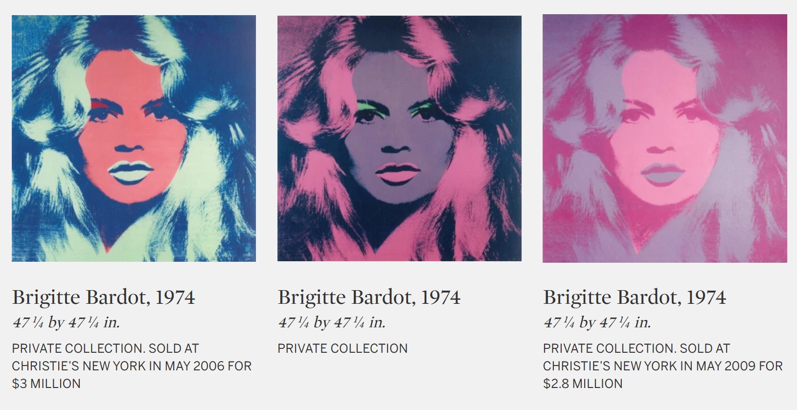
Each defined by a unique chromatic palette, Warhol’s Brigitte Bardot paintings are a jewel box assemblage of emerald, cerulean, amethyst, canary, and pink. The paintings vary in their exposures and the inclusion of secondary colors—indeed, the present work is one of three portraits distinguished from the rest of the series, featuring black pigment contrast, vibrant eyeshadow and a cadmium red lip. Here, Bardot’s voluptuous hair cascades in rolling curls, forming asymmetrical frames against her visage; her gaze accentuated by strokes of vivid purple pigment, filling the space beneath the curve of her eyebrow and a thin halo around her pupils with a striking jolt of color; her full lips are defined by a scarlet red tint. She is goddess-like, gazing towards the viewer with an intoxicating hold. Indeed, Bardot’s stare evokes the visceral power of some of the most canonical art historical portraits: Sandro Botticelli’s Birth of Venus (c. 1485), Leonardo da Vinci’s Mona Lisa (c. 1503-06), Johannes Vermeer’s Girl with a Pearl Earring (c. 1665), Edouard Manet’s Olympia (1863), or Klimt’s Portrait of Adele Bloch-Bauer I (1907). In each of these astonishing works, a single theme runs through: the sitter’s eyes that enchant, mesmerize, and perplex. Their gazes seize the viewer with a strength that extends beyond the picture plane.
The Bardots represent the apex of a long relationship. In serendipitous meeting at Le Gorille bar in Saint-Tropez in the spring of 1967, Warhol and Sachs initiated an enduring friendship and partnership which would enable Sachs to commission and acquire some of Warhol’s most iconic works. Sachs recalled of the encounter: “I was standing with a few friends and girls at the Gorilla Bar in Saint-Tropez, when I noticed he was looking at me… it took a moment before I recognized him.” (Gunter Sachs quoted in: Glenn O’Brien, “Andy Warhol Created Bardot,” in: Exh. Cat., London, Gagosian Gallery, Warhol: Bardot, 2011, p. 17) After their meeting, Sachs invited Warhol back to his home to meet Bardot. David Croland, a member of Warhol’s inner circle who joined the artist to Sachs and Bardot’s home recalled: “I said to Andy, ‘Oh that girl was so pretty!’ and Andy said, ‘David, don’t you know who that is?’ …He said ‘She’s the biggest star in France, in the world practically.” (David Croland quoted in: Glenn O’Brien, “Andy Warhol Created Bardot,” in: Exh. Cat., London, Gagosian Gallery, Warhol: Bardot, 2011, p. 18)
Following this meeting, Sachs championed Warhol’s career in Germany. Sachs organized the artist’s first major exhibition in Hamburg in 1972 at the Galerie Gunter Sachs. The exhibition was a survey of Warhol’s career to date and included a series of eight commissioned portraits of Sachs himself. This series of eight would become pendants to the Bardot paintings of 1974, which Sachs intended to adorn the walls of his home in the tower of the luxurious Palace Hotel in St. Moritz., and subsequently traveled with him to his home in Gstaad. Sachs saw these paintings as capsules of the time—of the glamor of the period, of his whirlwind relationship, and of the 60s writ large.
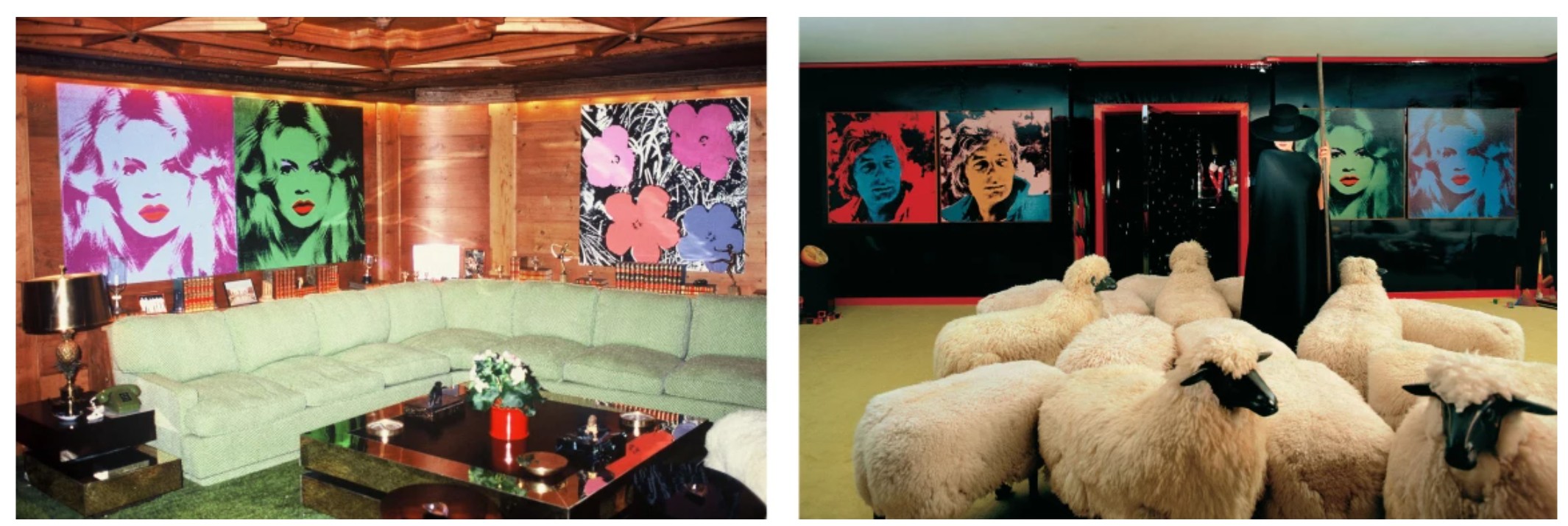
The present work in the homes of Gunter Sachs in Gstaad (left) and St. Moritz (right), 2007. Photo © Wolfgang Kühn. Art © 2026 Andy Warhol Foundation for the Visual Arts / Artists Rights Society (ARS), New York
Warhol’s series was the product of a whirlwind romance between Bardot, the French superstar and siren-like beauty who embodied a new age of sexual revolution, and Sachs, the jet-setting German heir with a passion for art and the most beautiful women of his time. At that moment they were actively shaping the visual and cultural language of modern celebrity, Sachs’s collaboration with Warhol extended beyond patronage into the construction of an enduring public mythology. Bardot was already an icon in her own right—she was the poster for a new generation of women, liberated to express their sexuality. “Bardot was unquestionably the first star of sexual freedom at the very moment when the media began to traffic in private life… she insists upon the original sin of feminine free will, which society seeks to control.” (Oliver Zahm, “Films and Lovers, Nothing Else…,” in: Exh. Cat., London, Gagosian Gallery, Warhol: Bardot, 2011, p. 28)
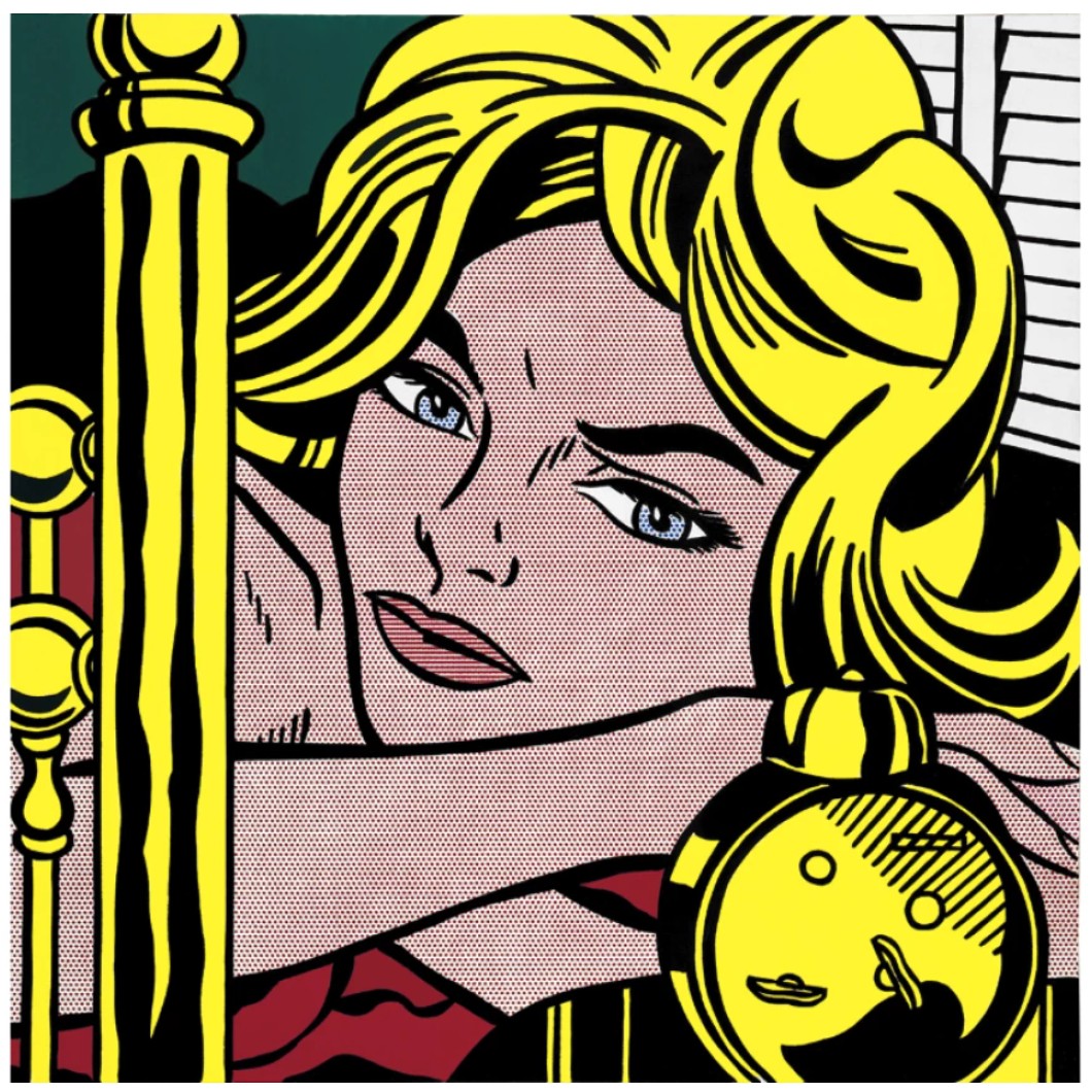
Roy Lichtenstein, Blonde Waiting, 1964. Private Collection. Art © Estate of Roy Lichtenstein
The union between Bardot and Sachs and their chic lifestyle captivated and influenced audiences around the world, who looked to them with a wondrous fascination. Famously, shortly after the two met, Sachs showered her St. Tropez villa with thousands of roses from a helicopter, before diving into the sea himself and emerging to propose. Just a month after meeting, in July 1966, the couple married in Las Vegas to great fanfare; they were photographed by paparazzi as they disembarked their plane and walked down the city’s streets, with Bardot walking down the aisle in bare feet. Their aspirational lifestyle was defined by passion, joie de vivre, and an unmistakable l’esprit. Indeed, the dazzling love story between a French movie star and a jet-setting playboy captivated a global public. Bardot described her love for Sachs: “I have never known a man like him. I feel mad, serene, wonderstruck. I have arrived at the end of a long journey.” (Brigitte Bardot quoted in: Dennis Hevesi, The New York Times,10 May 2011, p. A25)
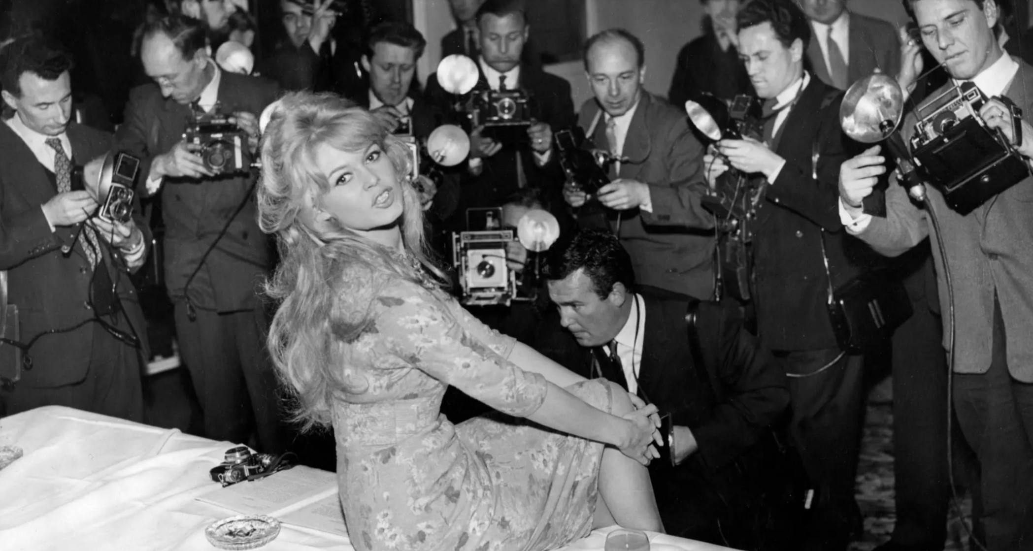
Brigitte Bardot surrounded by paparazzi, 1959. Photo © KEYSTONE Pictures USA
A seminal series in Warhol’s inimitable pantheon, Warhol’s Brigitte Bardot paintings epitomize Warhol’s enduring obsession with the cult of celebrity in popular culture. Held in the Gunter Sachs’ collection for over fifty years and seldom seen in public, the present work is a treasured example within Warhol’s oeuvre. The painting powerfully encapsulates the revolutionization of the visual vernacular of painting at the core of Warhol’s conceptual project. Here, the glamorous European movie star transforms into not just a pop cultural symbol but is immortalized as a symbol of the fixation on and fetishization of fame in contemporary society. Warhol probes the paradigm of an icon’s status through a practice which feels ever more relevant in the present day. More than a portrait, the present work stands as a testament to a defining cultural moment—where art, celebrity and personal mythology converged.
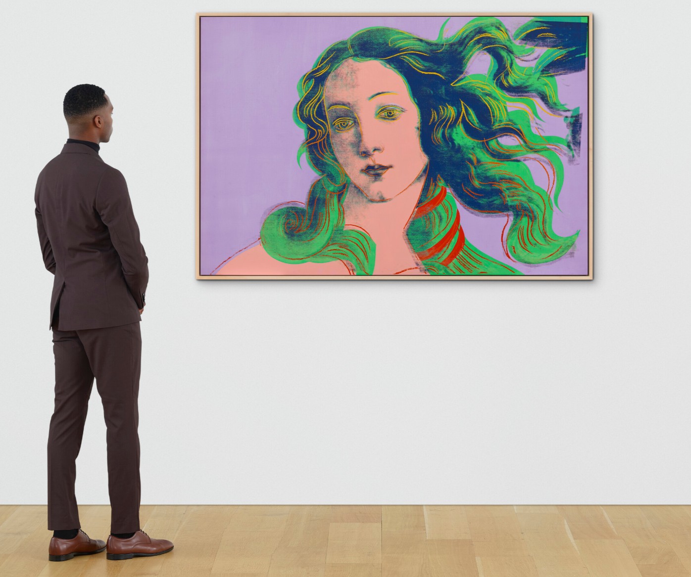
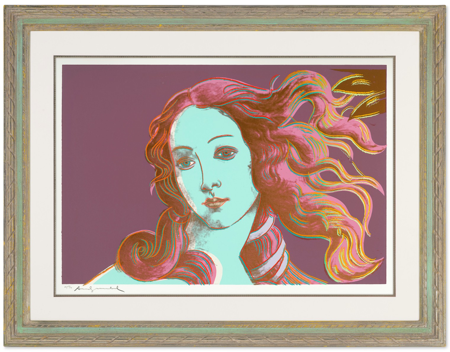
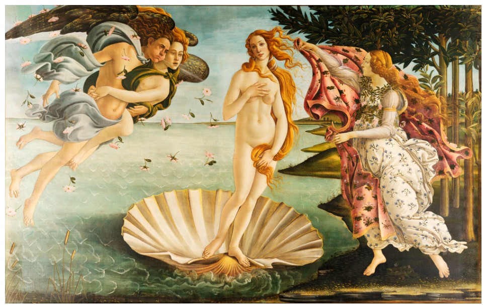
Details of Renaissance Paintings (Sandro Botticelli, Birth of Venus, 1482), 1984
Details of Renaissance Paintings (Sandro Botticelli, Birth of Venus, 1482), 1984
Christie’s New-York: 18 May 2026
Estimated: USD 5,000,000 – 7,000,000
USD 9,103,000
ANDY WARHOL (1928-1987)
Details of Renaissance Paintings (Sandro Botticelli, Birth of Venus, 1482), 1984
Acrylic and silkscreen ink on canvas
48×72 inches (122×183 cm)
Stamped twice with the Estate of Andy Warhol and the Andy Warhol Foundation for the Visual Arts, Inc. stamps
Numbered ‘PA 36.005’ (on the overlap)
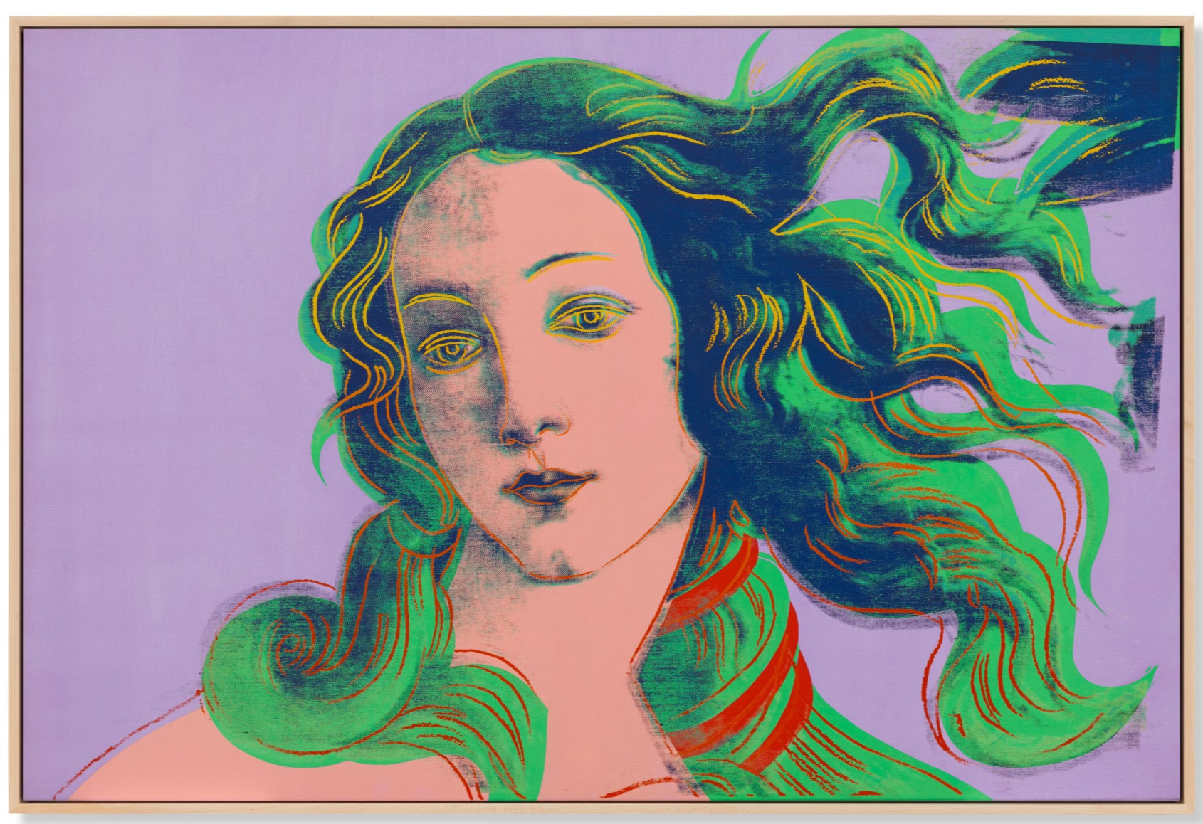
A mesmeric reflection on beauty, fame, and immortality, Details of Renaissance Paintings (Sandro Botticelli, Birth of Venus, 1482) is an enrapturing encapsulation of Andy Warhol’s retrospective and contemplative last decade. Made just over two decades after Warhol’s first forays into silkscreen paintings, the present work witnesses the Pop master return to the historical subjects and femme fatales which first won him acclaim. Like his earlier Mona Lisa works, here Warhol establishes a dialogue between modernity and the past, querying Botticelli’s lasting fame while reinterpreting one of the Old Master’s most renowned compositions. Immortality had an even more potent draw to Warhol as he began to consider his own place in the art historical canon. Warhol isolates the central element from Botticelli’s Birth of Venus, concentrating on Venus’s visage and billowing hair. Emphasizing the original’s contours and implementing his signature Pop colors of pink, green, yellow, and red, the artist rejuvenates the original work, making the enduring icon anew. By introducing his own vernacular symbols, Warhol eliminates the temporal distance formerly separating the work from the present, democratizing Botticelli for a contemporary audience. Warhol’s Details series engages other Old Master compositions—Leonardo da Vinci’s Annunciation and Paolo Uccello’s St. George and the Dragon—as well as Botticelli’s Venus. Throughout the decade, he deepened his engagement with the past, incorporating contemplations on Raphael and Lucas Cranach into his work as well as his continuing engagement with Leonardo. His revitalized interest in the Italian Renaissance explored in this series anticipates his final, ultimate gesture—The Last Supper, widely considered to be Warhol’s most significant series.
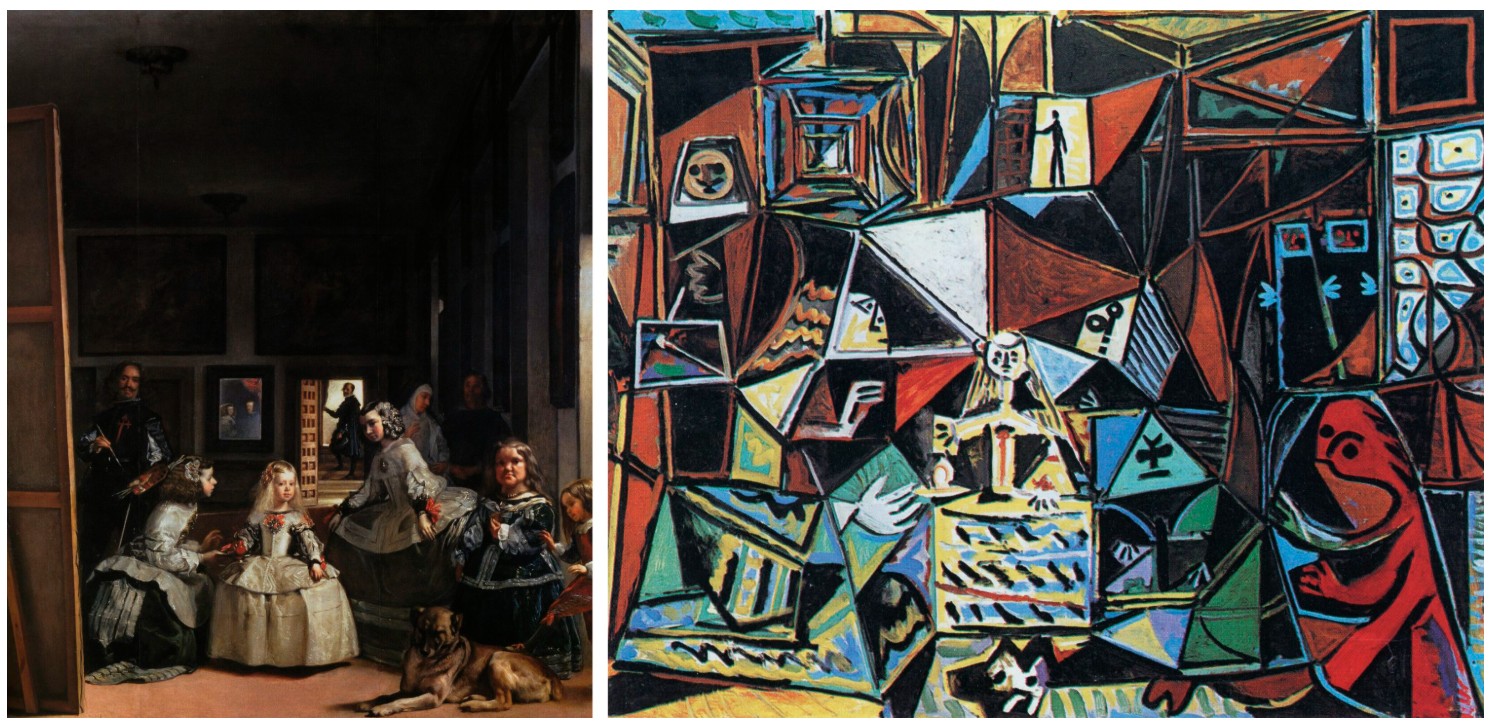
Warhol’s mature engagement with his predecessors parallels the careers of several of his contemporaries, including Pablo Picasso, whose late career is replete with obsessive reinterpretations of Diego Velázquez’s Las Meninas. As Picasso himself noted, “If someone set out to copy Las Meninas… I would try to do it in my way, forgetting Velázquez… So, little by little, I would paint my Meninas which would appear detestable to the professional copyist; they wouldn’t be the ones he would believe he had seen in Velásquez’s canvas, but they would be ‘my’ Meninas” (quoted in C. Rafart I Planas, Museu Picasso Guide, Barcelona, 1998, p. 94). Warhol follows Picasso’s lead, not merely reproducing Botticelli’s famous canvas, but reinterpreting it in his iconic Pop style. In this way, Warhol transforms the original referent into a wholly new and original work incorporating modern concerns.
Sandro Botticelli, The Birth of Venus, circa 1485. Galleria degli Uffizi, Florence.
In Warhol’s version of Venus, the artist divorces the titular subject from the rest of Botticelli’s composition, excising the nymphs and wind god as well as the goddess’s notoriously nude body. By fixating his canvas on Venus’s bust, Warhol recreates the work in the style of his famous female portraits of Marilyn Monroe and Elizabeth Taylor. His ingenuity is further demonstrated his ability to manipulate his silk screen process to replicate Botticelli’s original painted effects. In the original canvas, Botticelli subtly molds the left of Venus’s face in shadow as she turns away from the light. Warhol replicates this effect in his version, creating a blurred crosshatching over aspects of the forehead and cheekbone, reframing Botticelli’s original painterly effects with contemporary processes.
The vibrant colors which Warhol incorporated into Venus’s hair—green, red, and yellow—complete her transformation from Roman goddess to contemporary icon, reimagined within Warhol’s pantheon of celebrities as another Marilyn. As the art historian Laszlo Glozer notes, “In Warhol’s version, Botticelli’s Venus is reduced to a cinemascope close-up of the face. This keeps all the advantages of the noble original though in Warhol’s work it looks as if she is fresh from the beauty salon with an artificial sun illuminating the fiery tints just added to her hair” (“A Guest Performance on the Painters’ Olympus,” in J. Schellmann, ed., Andy Warhol: Art from Art, exh. cat., Edition Schellmann, Cologne, 1994, p. 8).
The yellow highlights added by Warhol are the closest correspondence to Botticelli’s version of Venus, hinting at her golden blonde locks. Botticelli was himself performing a fifteenth-century version of Warhol’s appropriative method with his painting, taking many of his figures from recently excavated antiquities. In this case, the Florentine artist was adapting the ancient Greek sculpture Venus de’ Medici into his classically inspired painting, mimicking the sculpture’s modest posture and tilted head for his painted Venus. The sculpture was then as famous as Leonardo’s Mona Lisa is today, attracting astounding amounts of attention after its rediscovery. It was soon incorporated into the famous collection of the powerful Medici family, who also commissioned Botticelli’s painting. Botticelli’s audience would have immediately recognized his insertion of the sculpture’s form into his painting, just as we today immediately see Botticelli’s Birth of Venus as we view the present work. At the time, Venus—the goddess of love—was her own sort of secular celebrity, constantly appearing in art and poetry as a Renaissance Marilyn Monroe, and Botticelli’s choice to paint her fully nude was a provocative and instantly controversial decision; his painting was the first fully nude female figure since antiquity. Fascinatingly, the sculpture retained its original gold gilding around the figure’s hair when Botticelli was copying the work, paralleling the golden locks of the painted Venus in the fifteenth-century painting, which in turn inspired Warhol’s yellow highlights. Now lost, this golden gilding demonstrates the enduring power of artistic elements throughout millennia, a theme which continually obsessed Warhol in his last decade.
Left: Diego Velázquez, Las Meninas, 1656. Museo del Prado, Madrid.
Right: Pablo Picasso, Las Meninas, 1957. Museu Picasso de Barcelona. © 2026 Estate of Pablo Picasso / Artists Rights Society (ARS), New York.
In 1957, when Warhol was still a successful commercial artist working for fashion magazines, he went on a world tour with his close friend Charles Lisanby. The two alighted to Rome and then Florence, where Warhol visited practically every church and museum, broadening his visual vocabulary to include the Old Masters. His visit to the Uffizi gallery placed him face-to-face with the painting he would go on to reimagine almost thirty years later. For his source imagery, the artist relied upon a 19th-century art encyclopedia which was kept around the Factory. By referencing a much later copy after the original Birth of Venus, Warhol expands his commentary on the immortality of art, incorporating centuries of visual replications, translations, and reinterpretations into a singular tableau. Bridging past and present, with a keen eye towards his own future legacy, Warhol makes Botticelli’s icon his own.
Venus de’ Medici, 1st century BCE. Uffizi Gallery, Florence.
In reimagining Botticelli’s Birth of Venus through the charged immediacy of his silkscreen process, Warhol forges a compelling dialogue between Renaissance ideals and late twentieth-century visual culture. By isolating, enlarging, and chromatically transforming Venus’s visage, he reframes a foundational icon of Western art as a contemporary emblem of fame, beauty, and perpetual reinvention. The work encapsulates Warhol’s late fascination with artistic lineage and the endurance of images across time, revealing how appropriation can both revive and redefine the past. In doing so, Warhol not only pays homage to Botticelli but also affirms his own place within the continuous, ever evolving history of art.
4 Colored Marilyns (Reversal Series), 1979-86
4 Colored Marilyns (Reversal Series), 1979-86
Property from an Important Private Collection
Phillips New-York: 19 May 2026
Estimated: USD 4,000,000 – 6,000,000
USD 5,630,000
Andy Warhol Modern & Contemporary Art Evening Sale
ANDY WARHOL
4 Colored Marilyns (Reversal Series), 1979-86
Acrylic and silkscreen ink on canvas
35-7/8 x 27-7/8 inches (91.1 x 70.8 cm)
Signed, stamped by the Andy Warhol Art Authentication Board Inc.
Initialed, numbered and dated “Andy Warhol 79/8 A130.089” on the overlap
Executed between 1979 and 1986, 4 Colored Marilyns (Reversal Series) emerges from a pivotal moment in Andy Warhol’s practice, when the artist began revisiting and destabilizing the very images that had defined his fame. More than two decades after his elegiac 1962 portraits secured both Marilyn Monroe’s and his own iconic status, Warhol returned to her image in the Reversals, revisiting his most famous subject not to replicate its glamour but to invert it. In doing so, he transformed one of the most recognizable images in postwar art into a spectral afterimage, an uncanny echo of Monroe’s celebrity and his own artistic mythology.
Publicity still of Marilyn Monroe for the film Niagara, showing crop marks made by Andy Warhol, ca. 1953. Photograph by Gene Korman. The Andy Warhol Museum, Pittsburgh; Founding Collection, contribution The Andy Warhol Foundation for the Visual Arts, Inc. Image: © 2026 The Andy Warhol Foundation for the Visual Arts, Inc. / Licensed by Artists Rights Society (ARS), New York
The Reversals are widely regarded as a decisive postmodern turn in Warhol’s practice. Initiated in 1979, the series employed photographic negatives of six earlier motifs: Marilyn, Mona Lisa, Mao, Big Electric Chair, Cow Wallpaper, and the photobooth Self-Portrait. In 1986, Bruno Bischofberger commissioned a second group of Marilyn Reversals, which Warhol signed and dated on the reverse to acknowledge both the original 1979 conception and their later execution. As David Bourdon observed in 1989, “By ransacking his own past to produce the Reversals and Retrospectives, Warhol revealed himself to be one of the shrewdest of the new wave of post-modernists.” Bourdon positioned the series within the pluralist climate of the 1970s, marked by irony and indifference toward traditional hierarchies of ‘high’ and ‘low’ art. In this context, 4 Colored Marilyns emerges not as nostalgic reprise but as calculated self-appropriation: Warhol quoting Warhol.
Andy Warhol, Gold Marilyn Monroe, 1962. The Museum of Modern Art, New York.
Image: © The Museum of Modern Art/Licensed by SCALA / Art Resource, NY
Artwork: © 2026 The Andy Warhol Foundation for the Visual Arts, Inc. / Licensed by Artists Rights Society (ARS), New York
Within a tight two-by-two grid, Monroe’s face—derived from the same 1953 Niagara publicity still used in 1962—appears in negative register. The reversal collapses tonal logic. Illuminated flesh turns to shadow; former shadows flare in electric blues and greens. Lips glow phosphorescent, eyelids shimmer, and her beauty mark punctuates the darkness. Against a dense black ground, the four impressions hover with uncanny stillness. Bourdon described the effect succinctly: “Warhol’s Reversals recapitulate his portraits of famous faces but with the tonal values reversed… The reversed Marilyns, especially, have a lurid otherworldly glow, as if illuminated by internal footlights.” iii That glow suffuses the present canvas. Monroe registers less as corporeal presence than as visual residue, an image impressed upon cultural memory.
“In the early days of film, fans used to idolize a whole star—they would take one star and love everything about that star… So you should always have a product that’s not just ‘you’”
Repetition had long structured Warhol’s vocabulary, yet here it carries a distinct temporal charge. Roberto Marrone noted that the images revisited in the Retrospectives and Reversals were among Warhol’s most celebrated icons. By repeating them in reversed form in 1979, Warhol conferred upon them “a new and altogether darker and more somber mood reflective of the respective distance in time between their original use and the later moment of their re-creation.”
Jasper Johns, White Flag, 1955. The Metropolitan Museum of Art, New York. Image: © The Metropolitan Museum of Art. Image source: Art Resource, NY, Artwork: © 2026 Jasper Johns / Licensed by VAGA at Artists Rights Society (ARS), New York
That distance is materially evident in 4 Colored Marilyns. Though compositionally identical, the four faces are chromatically unstable. Blues drift toward turquoise, greens intensify to radioactive saturation, and a single strip of high-key cosmetic pink punctuates an otherwise cyan-toned coif of hair. The granular silkscreen surface and slight misregistrations interrupt mechanical uniformity. Warhol once remarked, with characteristic understatement, “I sort of half paint them just to give it a style. It’s more fun—and it’s faster to do.” The hybridization of painterly intervention and photographic reproduction, however, produces precisely the friction that animates the work. As Warhol acknowledged, “I started repeating the same image because I liked the way the repetition changed the same image.” In the Reversals, seriality no longer mimics mass production; it registers remembrance, drift, and the gradual erosion of fixity.
From the outset, Monroe functioned in Warhol’s oeuvre as a modern memento mori. Created in the immediate aftermath of her death, the 1962 Marilyns fused glamour and mortality with chilling clarity. Warhol’s oft-quoted observation that “Death can really make you look like a star” distills the paradox at the heart of his fascination.
Andy Warhol, Nine Jackies, 1964. Whitney Museum of American Art, New York.
Image: © Whitney Museum of American Art / Licensed by Scala / Art Resource, NY
Artwork: © 2026 The Andy Warhol Foundation for the Visual Arts, Inc. / Licensed by Artists Rights Society (ARS), New York
Monroe epitomized the dual condition of celebrity as both icon and commodity, a tension Warhol explored across figures such as Elvis Presley, Elizabeth Taylor, Marlon Brando, and Jackie Kennedy, yet nowhere with greater clarity than here. In 4 Colored Marilyns, that dialectic becomes literal: stark tonal reversal evokes both the glare of studio lighting and the void behind it, as features surface only to recede into an enveloping black ground. The image remains legible yet dematerialized, its seriality reinforcing the flattening logic of mass media. By the late 1970s, Warhol’s own images had become cultural shorthand. To revisit Marilyn was to revisit the foundation of his artistic identity. Warhol was no longer appropriating mass media alone; he was appropriating himself. This recursive gesture approaches what French philosopher Jean Baudrillard termed the “hyperreal,” a condition in which images refer not to original referents but to other images. In 4 Colored Marilyns, the chain of mediation is clear: Monroe to publicity still, publicity still to 1962 screenprint, screenprint to reversed iteration. The painting’s true subject is not simply Monroe but Warhol’s prior representation of her.
Marcel Duchamp, L. H. O. O. Q., 1919. Centre Pompidou, Paris. Image: © CNAC/MNAM, Dist. RMN-Grand Palais / Art Resource, NY, Artwork: © 2026 Association Marcel Duchamp / ADAGP, Paris / Artists Rights Society (ARS), New York
Here, reversal functions not only as formal inversion but as continuation of a broader artistic lineage. By re-appropriating an image central to his own oeuvre, Warhol treats his earlier production as a kind of ‘readymade,’ recalling Marcel Duchamp’s repositioning of everyday objects. Just as he once appropriated banal commodities such as soup cans, Warhol now re-appropriates his canonical imagery in a distinctly Duchampian gesture. The painting becomes a postmodern meditation on originality and authorship, simultaneously citation and transformation. In 4 Colored Marilyns, that gesture materializes as self-conscious reworking, rendering the image at once familiar and newly unrecognizable. The Reversals register the psychological gravity of Warhol’s later years, shaped in part by the aftermath of his near-fatal shooting in 1968. The negative space in the present work carries an existential weight absent from the acid-bright 1962 canvases, as reversal operates not only as a formal device but as a meditation on time, distance, and transformation. In 4 Colored Marilyns, the icon does not simply return; it reappears altered, hovering between presence and disappearance. What persists is not the certainty of the image, but its instability. If the early Marilyns announced the triumph of Pop, the Reversals meditate on its aftermath. In reversing Marilyn, Warhol reversed himself, transforming the image that made him famous into an incandescent x-ray of his own legacy.
The Last Supper, 1986
The Last Supper, 1986
Edlis Neeson Collection
Christie’s New-York: 20 May 2026
Estimated: USD 3,500,000 – 5,500,000
ANDY WARHOL (1928-1987), The Last Supper | Christie’s
ANDY WARHOL (1928-1987)
The Last Supper, 1986
Silkscreen ink on canvas
40×40 inches (101.6 x 101.6 cm)
Signed and dated ‘Andy Warhol 86’ (on the overlap)
Andy Warhol labored for over two years on his ultimate and final artistic statement. The Last Supper recapitulates a lifetime of groundbreaking artistic invention into a singular series serving as the apogee to the twentieth-century titan’s irreplicable oeuvre. Here, Warhol places himself in dialogue with Leonardo da Vinci, perhaps the most famous artist in the Western canon, analyzing and distilling his masterpiece mural through hundreds of preparatory drawings and sculptural models in order to completely understand the Old Master’s famously complicated composition. The artist ritualistically spent an hour alone each day of the last year of his life in his studio meticulously drawing details from large projections of the Last Supper. “It’s a good picture,” Warhol deadpanned, “it’s something you see all the time, You don’t think about it” (quoted in C. Thierolf, “All the Catholic Things,” in Andy Warhol: The Last Supper, exh. cat., Staatsgalerie moderner Kunst, Munich, 1998, p. 34).
Andy Warhol with two Dominican priests at Last Supper, Credito Valtellinese, Stelline Foundation, Milan, Italy, 1987. Photo: © Maria Mulas. All rights reserved 2026 / Bridgeman Images. Artwork: © 2026 The Andy Warhol Foundation for the Visual Arts, Inc. / Licensed by Artists Rights Society (ARS), New York.
The results of Warhol’s years-long labors were exhibited at Warhol-Il Cenacolo, which opened directly across from where Leonardo’s painting remained in situ in Milan on January 22nd, 1987, exactly one month before Warhol’s sudden death. “Andy Warhol’s final and arguably one of his greatest series of paintings,” in the art critic Lynne Cooke’s words, found an immediately-captivated audience, with over 30,000 people attending the exhibition (quoted in J. D. Dillenberger, The religious Art of Andy Warhol, New York, 1998, p. 79). In Warhol’s contest against Leonardo’s enduring popularity, the Pop artist handily won, with one critic reporting “only two diligent Germans” who even bothered to view the Old Master’s original across the street in in the convent of Santa Maria delle Grazie (C. Schulz-Hoffmann, “‘Are you serious or delirious’—On the Last Supper and Other Things,” in Andy Warhol: The Last Supper, op. cit., p. 16).
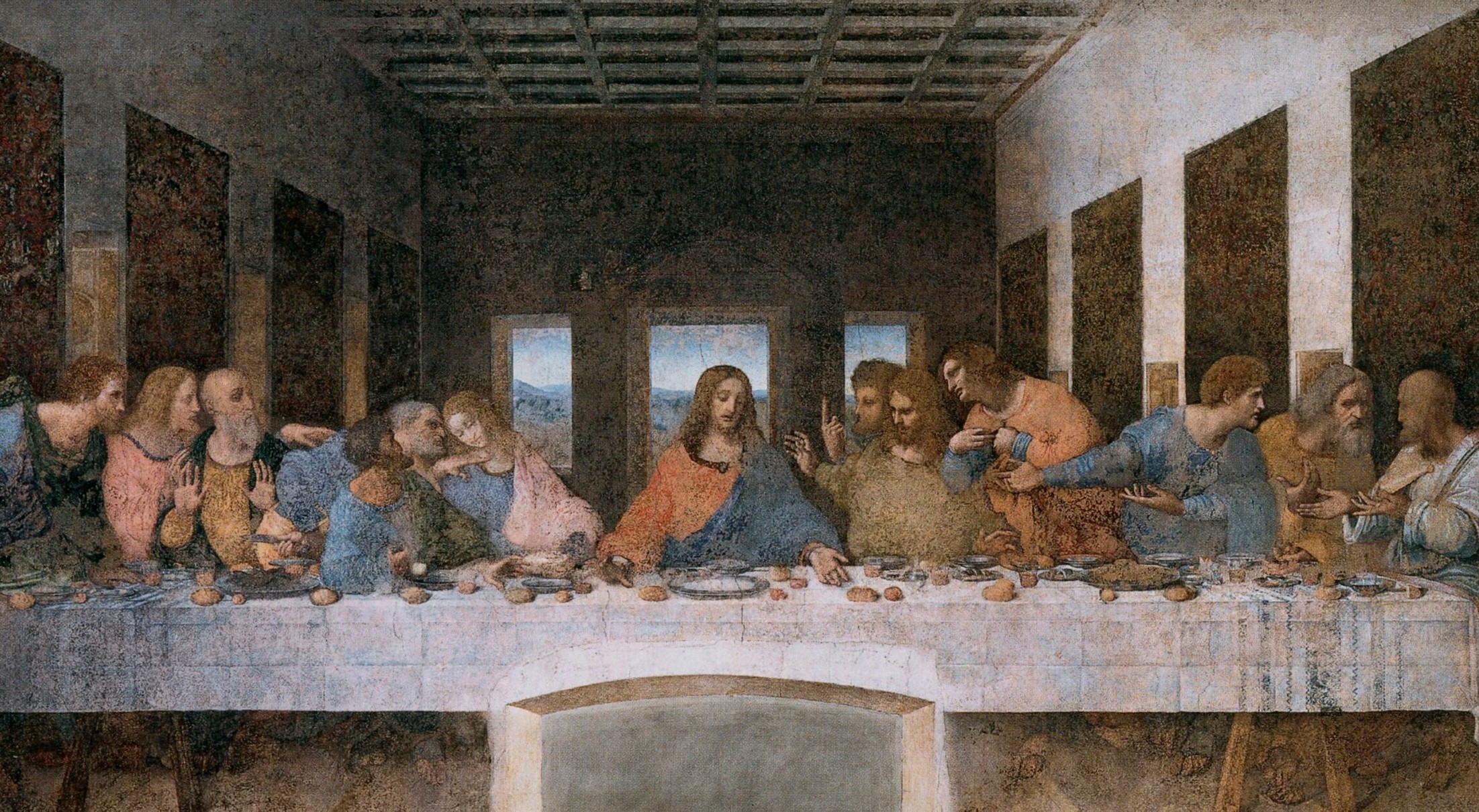
Leonardo da Vinci, The Last Supper, 1495 – 1497. Santa Maria della Grazie, Milan.
Leonardo’s Last Supper is Warhol’s ideal subject, as a decade after completion, the fresco had already deteriorated enough from an unsuitable experimental binding method as to no longer embody the original work. Centuries of restoration and conservation exist alongside thousands of copies of the work, creating a cacophonous array of related images all purporting to represent an idealized yet nonexistent referent. The masterpiece is thus studied and understood more from copies than from the faded original fresco, a fact emphasized through Warhol’s choice of source material for The Last Supper: a clumsy photograph of a widely-circulated nineteenth-century engraving of the work placed upon a raven black field.
Andy Warhol, White Disaster [White Car Crash 19 Times], 1963.
© 2026 The Andy Warhol Foundation for the Visual Arts, Inc. / Licensed by Artists Rights Society (ARS).
The present work is one of the series’ most original, haunting, and imaginative reflections on Leonardo’s Last Supper. Here, Warhol dispensed with the vibrant Pop backgrounds—blue, yellow, pink, or green—of the other works in the series in favor of a deeply saturated black. This choice first parallels his source imagery, replicating the black-and-white reproductions of the mural which Warhol obsessed over for the series. Simultaneously, the choice of color captures the original’s phantasmagoric appearance before it underwent a controversial restoration campaign beginning in 1978. Describing the Last Supper in 1850, the famed art critic Théophile Gautier wrote what could be an ekphrasis of Warhol’s black The Last Supper: “It seems to float on the surface of the wall, which absorbs it as a light vapor. It is a ghost of a painting. The specter of a masterpiece returned to earth. The effect is more solemn and more religious than even if the picture were alive. The body has disappeared but the soul survives in its entirety” (T. Gautier, quoted in S. J. Campbell, Leonardo Da Vinci: An Untraceable Life, Princeton, 2025, p. 27). The rapid degradation of Leonardo’s Last Supper caused the work to darken considerably, making it appear as if it were floating out from its support. Rather than despair at the fading of the irreplaceable masterpiece, aesthetes like Gautier celebrated the work’s present state, appreciating what remained. Warhol concurred, even signing a petition to cease restoration work on the mural. “I only know that it is a mistake to restore the Last Supper: it is unbelievably beautiful just the way it is!” Warhol proclaimed. “The old things are always the better ones and should not be changed” (quoted in C. Schulz-Hoffmann, op., cit., p. 11). Despite these protestations, restoration work was completed, and the Last Supper we see today is radically different from the mural which Warhol conceived of when working on his series.
Andy Warhol, Last Supper, 1985. © 2026 The Andy Warhol Foundation for the Visual Arts, Inc. / Licensed by Artists Rights Society (ARS).
Warhol explained to his assistant Benjamin Liu his goal of making Leonardo’s painting “exciting again,” stating: “it’s a good picture… It’s something you see all the time. You don’t think about it” (A. Warhol, quoted in B. Gopnik, Warhol, New York, 2020, p. 901). The artist aimed to achieve as close to an imitation of the original mural as possible, searching widely for the perfect photographic model for his work. While remaining fidelious to his source image, Warhol complicates the composition by doubling the image onto dueling horizontal planes, arranged one above the other. Christ and his Apostles now appear not once but twice, profoundly capturing the many dualities of Leonardo’s original. This action of duplication reenacts the dual reality of Leonardo’s masterpiece. The art historian Leo Steinberg emphasizes the “incessant” nature of the Renaissance mural, writing, “the Lord’s supper holds more than one still image can show” (L. Steinberg, Leonardo’s Incessant Last Supper, New York, 2001, p. 111). The master infuses his scene with a mind-boggling multiple doubleness, capturing both Jesus’s announcement of his betrayal and the institution of the Eucharist in a single frozen image. In Leonardo’s painting, “duplicity… is the essence of the object itself” (J. L. Koerner, review of L. Steinberg, Leonardo’s Incessant Last Supper, The Art Bulletin, vol. 84, no. 4, 2004, p. 780).
Andy Warhol with Pope John Paul II, Vatican City, 1980. Photo: The Vatican Museum, Vatican City, Foto Felici.
Leonardo’s duality deeply resonated with Warhol, who summarized his own two-sided approach, stating: “I like that idea that you can say the opposite” (A. Warhol, quoted in C. Schultz-Hoffmann, op. cit., p. 10). Warhol’s doubling and stacking of The Last Supper proves an innovative tool for extracting and reimagining the many dualities which Leonardo originally imbued within his composition, Warhol here achieving as well a deliberate conceptual manipulation of the one-point linear perspective into a multiplicity of perspectival effects. Leonardo’s painstaking placement of Jesus at the absolute center of the work is undermined and destabilized. Christ is present not once but twice, simultaneously negating and confirming the integrity of content and composition achieved in Leonardo’s original.
It is fitting that Warhol’s last silkscreen project would return to Leonardo da Vinci, as one of his first silkscreen works produced in the 1960s was of the Florentine master’s Mona Lisa. Beyond the symmetry of initiating and terminating his decades-long exploration of silkscreens with works after Leonardo, The Last Supper is also notable for its religious overtones, depicting Jesus’s last night before his crucifixion. Warhol himself was discreetly religious, attending mass weekly, and the theological component of Leonardo’s work must have moved the artist. Even more prophetic was the artist’s choice of subject—depicting Jesus Christ’s last earthly night would wind up being Warhol’s last series. As his definitive, final statement, The Last Supper is inextricably linked with Warhol, forming a veritable self-portrait of the artist. The work visualizes Warhol’s ascent as one of the greatest and most influential figures of the twentieth century, surpassing even Leonardo in fame. As the critic Arthur C. Danto enthused, “when [Warhol’s] Last Supper was displayed in Milan, in a kind of citywide two-man show with Leonardo, 30,000 people flocked to see it, hardly any of whom went to see the ‘other’ Last Supper… When the final multivolume Popular History of Art is published, ours will be the Age of Warhol” (A. C. Danto, Andy Warhol, New Haven, 2009, p. 167).
Self-Portrait, 1966
Self-Portrait, 1966
Property from a Distinguished Midwestern Collection
Phillips New-York: 19 May 2026
Estimated: USD 3,000,000 – 5,000,000
USD 4,776,000
Andy Warhol Modern & Contemporary Art Evening Sale
Acrylic and silkscreen ink on linen
22-1/2 x 22-1/2 inches (57.2 x 57.2 cm)
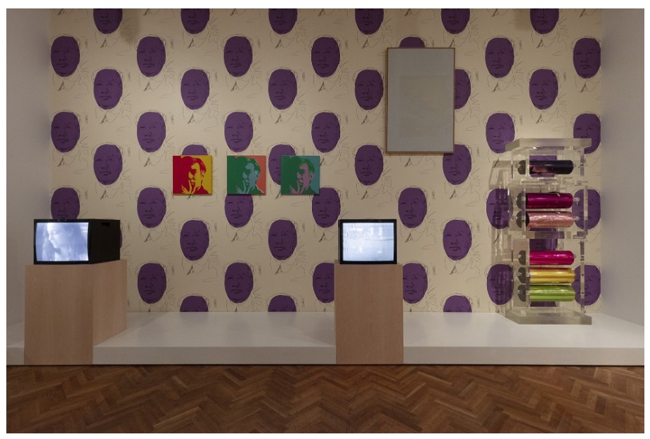
Image: The Art Institute of Chicago / Art Resource, NY
Artwork: © 2026 The Andy Warhol Foundation for the Visual Arts, Inc. / Licensed by Artists Rights Society (ARS), New York
“If you want to know all about Andy Warhol, just look at the surface of my paintings and films and me, and there I am. There’s nothing behind it.”
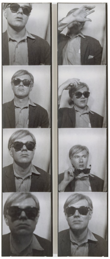
Image: © The Metropolitan Museum of Art. Image source: Art Resource, NY
Artwork: © 2026 The Andy Warhol Foundation for the Visual Arts, Inc. / Licensed by Artists Rights Society (ARS), New York
In the present work, Warhol’s face is rendered in tonalities of green and blue which dissolve into a vertical band on the left side of the composition, pulling the image towards abstraction. “Posed with his fingers against the mouth (long a received symbol of contemplation), his face half hidden in shadow, it is Warhol-as-observer par excellence: he sees us more clearly than we see him,” the renowned MoMA curator Kynaston McShine argued. “In their detachment, these… self-portraits avoid direct, self-confident confrontation with the viewer.” Famously reserved and self-effacing in person, the artist erected through such works as Self-Portrait a highly controlled outward identity. In this way, the work reflects the preoccupation with the disjunction between private interiority and publicly circulated imagery that characterized Warhol’s entire career.
Andy Warhol, Self-Portrait, 1986. The Solomon R. Guggenheim Museum, New York. Image: The Solomon R. Guggenheim Foundation / Art Resource, NY, Artwork: © 2026 The Andy Warhol Foundation for the Visual Arts, Inc. / Licensed by Artists Rights Society (ARS), New York
Self-Portrait also underscores Warhol’s command of color, with the juxtaposition of bold primary tones with secondary hues epitomizing the artist’s highly sophisticated orchestration of chromatic relationships. The resulting palette, vivid and artificial, further betrays the canvas’s status as a carefully fabricated surface rather than a transparent window onto the self. As the critic and Warhol scholar David Bourdon observed, “the self-portraits offered no detailed information about either his physiognomy or his psychological state; instead, they present him as a detached, shadowy, and elusive voyeur. They exemplified his ability to manipulate his public image, one of the recurring themes of his art.” He further elucidated: “There he was… larger than life, yet often so abstract as to be difficult to recognize. The lurid, arbitrary hues suggest a chameleon personality—or a mutating persona—that assumes the coloration of its background. Andy appeared, in fact, to be hiding behind a camouflage of brilliant color.” The heightened palette of Self-Portrait is a manifestation of the centrality of color within Warhol’s oeuvre, which utilized saturated hues to both define and defamiliarize common imagery.
The 1966–1967 Self-Portrait series is today well-represented represented in major institutional collections, with comparable examples to the present work held at the Art Institute of Chicago; Detroit Institute of Arts; and Tate, London. These works not only encapsulate the formal and conceptual concerns that defined Warhol’s iconic Pop style, but also foreshadow the stark, theatrical Fright Wig self-portraits of the late 1980s. By turning repeatedly to his own image across his career, Warhol cultivated a public persona that achieved a visibility comparable to the film stars he depicted—thereby marking the artist’s full transformation into a celebrity in his own right. Bringing Warhol’s practice full circle, Self-Portrait reflects on the packaging and consumption of identity in American society, where persona itself becomes a reproducible and marketable image.
Self-Portrait, 1967
Self-Portrait, 1967
Property from an Important American Collection
Sotheby’s New-York: 14 May 2026
Estimated: USD 2,000,000 – 3,000,000
PASSED
Andy Warhol | Self-Portrait | The Now & Contemporary Evening Auction
ANDY WARHOL (1928 – 1987)
Self-Portrait, 1967
Acrylic and silkscreen ink on canvas
22×22 inches (55.9 x 55.9 cm)
Signed indistinctly (on the overlap)
Warhol’s 1967 Self-Portrait represents one of the artist’s most enduring and enigmatic explorations of identity and self-fashioning. As noted in the catalogue raisonné, it is “the most well-known of the three versions he produced during the 1960s and, with his self-portrait of 1986, one of the most representative and iconic images of the artist.” (Georg Frei and Neil Printz (ed.), The Andy Warhol Catalogue Raisonné, Paintings and Sculptures: 1964–1969, vol. 2B, London 2004, p. 227) Departing from his earlier self-portraits of 1963-64, in which he appears rendered with studied detachment, the present work introduces a figure of heightened presence. Warhol leans into his hand; fingers poised against his lips in a gesture of contemplative restraint. The present work captures Warhol’s pivotal transformation from an observer of celebrity culture to one of its most iconic protagonists. Bathed in saturated scarlet tones, Warhol’s visage, contoured in cobalt and black, appears almost abstract, emerging against the shadows with an arresting immediacy. No longer a distant observer of celebrity culture, Warhol announces his role within it, marking the arrival of the artist as both subject and spectacle.
“If you want to know all about Andy Warhol, just look at the surface: of my paintings and films and me, and there I am. There’s nothing behind it.”
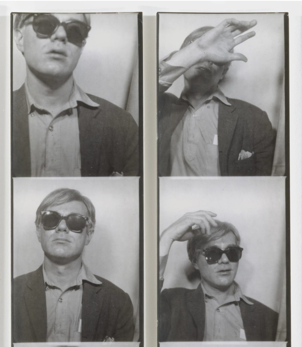
Andy Warhol’s photobooth self-portrait, c. 1963. The Metropolitan Museum of Art, New York. Image © The Andy Warhol Foundation for the Visual Arts/ARS, NY. Image copyright © The Metropolitan Museum of Art. Image source: Art Resource, NY
Warhol’s 1966–67 self-portraits mark a decisive turning point, anticipating the artist’s late Fright Wig series of the 1980s, which would serve as a stark and haunting coda to his career. The Fright Wig series sees Warhol’s raw confrontation with his own mortality, his tightly cropped face skull-like and gaunt. By contrast, the present series represents the moment of revelation: the artist’s first sustained presentation of himself without disguise. In earlier self-portraits, Warhol concealed himself behind sunglasses, within heavy coats, or through an affectless stare, whereas here he relinquishes those layers of concealment. Thus, he not only humanizes his image but also asserts his own status within the very system of fame he had so incisively examined. Produced at the same scale as his celebrated 1964 portraits of Jacqueline Kennedy Onassis, these works deliberately align Warhol with the pantheon of cultural icons he depicted. As Robert Rosenblum observes: “Equating himself with the wealthy, the chic and the famous, he tells us as much about himself as we would know about Marilyn Monroe or Elizabeth Taylor from their images in his earlier paintings. But of course, this disguise as a celebrity can also be read as a revelation of Warhol’s personal and professional ambitions in 1963 to become a star, his private persona hidden, his public persona only to be caught on the wing by a lucky photographer.” (Robert Rosenblum, “Andy Warhol’s Disguises” in Dietmar Elger, ed., Andy Warhol: Self-Portraits, Ostfildern-Ruit, 2004, p. 22)
Left: Rembrandt Harmensz. van Rijn, Portrait of Rembrandt with Overshadowed Eyes. Gemaeldegalerie Alte Meister, Kassel. Image © Hessen Kassel Heritage / Bridgeman Images. Right: Pablo Picasso, Self Portrait, 1907. Narodni Muzeum, Prague. Image © Luisa Ricciarini / Bridgeman Images. Art © 2026 Estate of Pablo Picasso / Artists Rights Society (ARS), New York
Here, even in this act of self-exposure, Warhol remains elusive. In Self Portrait, his three-quarter gaze meets the viewer with apparent directness but reveals little of his inner life. Instead, the viewer encounters a carefully constructed image, one defined by contrast and artifice. Half his face is illuminated in scarlet, pink, while the other recedes into shadowy blue, dissolving his features into a chromatic mask. As Kynaston McShine notes: “Posed with his fingers against the mouth (long a received symbol of contemplation), his face half hidden in shadow, it is Warhol-as-observer par excellence: he sees us more clearly than we see him. The mottled paint accentuates the notion of the picture as an impenetrable surface. In their detachment, these 1967 self-portraits avoid direct, self-confident confrontation with the viewer.” (Exh. Cat., New York, Museum of Modern Art, Andy Warhol: A Retrospective, 1989, pp. 20–21)
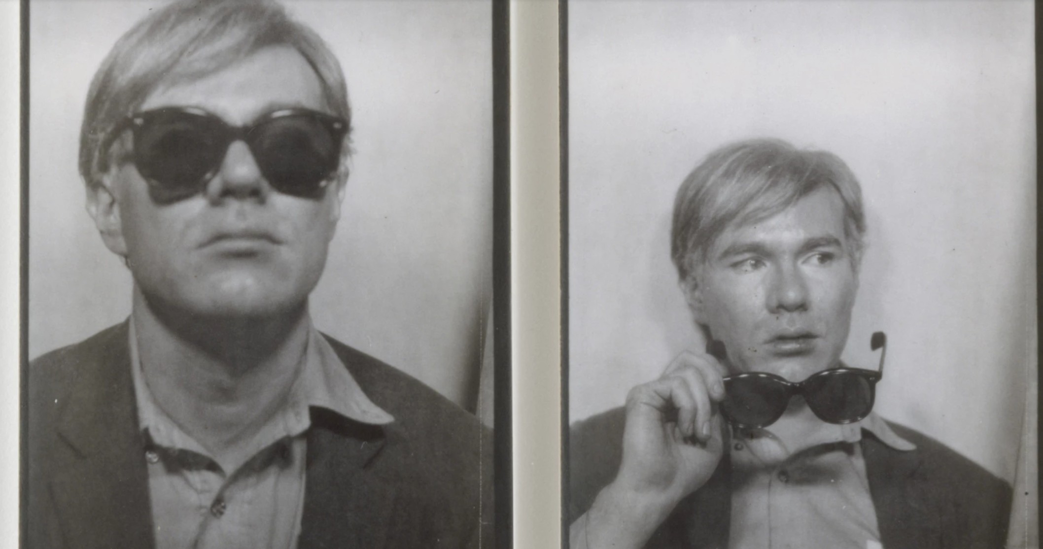
Andy Warhol’s photobooth self-portrait, c. 1963. The Metropolitan Museum of Art, New York. Image © The Andy Warhol Foundation for the Visual Arts/ARS, NY. Image copyright © The Metropolitan Museum of Art. Image source: Art Resource, NY
Within the context of self-portraiture as subject, Warhol’s approach is both referential and subversive. Like Rembrandt or van Gogh, he returns repeatedly to his own image, using it to register shifts in identity and circumstance. Yet, where his predecessors sought psychological depth, Warhol foregrounds surface, performance, and reproducibility. In the present work, his pose, chin resting lightly on his hand, fingers raised toward closed lips, suggests introspection. This gesture itself feels staged, a carefully calibrated signifier of thought rather than its spontaneous expression. The vivid, artificial pink palette both sharpens and dissolves his features, oscillating between clarity and abstraction. Like his Abstract Expressionist contemporaries, Barnett Newman and Clyfford Still, Warhol probes the limits of form and line: at close range, his face evolves into line and form coming nearly illegible, while from a distance it resolves with striking immediacy.
Andy Warhol, Self-Portrait, 1986. Tate Gallery, London. Image © Tate, London / Art Resource, NY. Art © 2026 Andy Warhol Foundation for the Visual Arts / Artists Rights Society (ARS), New York
Self-Portrait exemplifies Warhol’s mastery of silkscreen in its vibrancy and layered palette. Constructed from three distinct layers, the composition unfolds through a precise orchestration of color and form. A vivid blue contour delineates Warhol’s features, a dominant fuchsia field defines the left side of the composition, and a final black layer both anchors and obscures the composition, extending across the background and into the face itself. The prominence of the black in the present work reverses conventional relationships between light and shadow, further heightening its sense of ambiguity and impenetrability. Executed at a moment when Warhol’s cultural prominence had fully converged with his artistic production, the 1966–67 self-portraits signal a profound shift. No longer content to mediate fame through the images of others, Warhol places himself squarely within its frame. Created on the cusp of his temporary withdrawal from painting to pursue filmmaking, Self-Portrait stands as both culmination and declaration: an assertion of the silkscreen as a vehicle for self-invention, and a bold acknowledgment of the artist’s own transformation into an icon.
Guns, 1982
Guns, 1982
Property from an Esteemed West Coast Private Collection
Sotheby’s New-York: 14 May 2026
Estimated: USD 2,000,000 – 3,000,000
USD 2,926,000
Andy Warhol | Guns | The Now & Contemporary Evening Auction | 2026 |
ANDY WARHOL (1928 – 1987)
Guns, 1982
Acrylic and silkscreen ink on canvas
50-1/8 x 70-1/8 inches (127.3 x 178.1 cm)
Signed and dated 82 (on the overlap)
In his signature style of the multi-colored iterative meditation, Andy Warhol’s Guns from 1982, bold, graphic, and hauntingly suspended in stillness, epitomize his iconic silkscreen style and artistic philosophy. This work is a powerful example of Warhol’s ability to transform everyday objects into compelling visual icons, merging personal history with broader cultural commentary. Following his Death and Disaster series of the 1960s, the present work showcases Warhol’s fascination with themes of mortality, violence, and the aesthetics of consumerism and his newfound focus on the symbols and modes by which such tragedies occur. Testament to their significance within Warhol’s oeuvre, works from this series are held in important private and public collections, including at the Museum of Modern Art in San Francisco. Far from being purely somber, Guns captures the paradoxes at the heart of Warhol’s art: seductive yet morbid, glossily unsettling. Warhol invites viewers to confront life’s darker realities through the brightly colored lens of Pop Art.
“Since I was shot, everything is such a dream to me.
I don’t know whether or not I’m really alive, whether I died.”
Andy Warhol at the Factory, 1971. Photo by David Gahr/Getty Images.
Art © 2026 Andy Warhol Foundation for the Visual Arts / Artists Rights Society (ARS), New York
The theme of death runs as an undercurrent throughout Warhol’s work from the early 1960s until his own passing in 1987, manifesting in a variety of forms. This preoccupation first emerged in 1962 with his Death & Disaster series, depicting plane crashes, suicides, and the electric chair. In 1968, Warhol’s engagement with mortality became intensely personal when he was shot three times by Valerie Solanas at his studio, The Factory. Notably, the .32 caliber gun depicted in the present work is the same model used in that attack. Warhol’s fascination with mortality persisted until his death, culminating in the ominously titled Heaven and Hell series, among his final works. Here, he revisited motifs such as the electric chair and skulls, while introducing religious imagery — including depictions of the Last Supper and Christian crosses — underscoring a contemplative detachment that defines Warhol’s artistic and personal engagement with mortality.
Left: Philippe de Champaigne, Vanitas Still Life with a Tulip, Skull and Hour-Glass, 17th century. Musée de Tesse, Le Mans. Image © G. Dagli Orti /© NPL – DeA Picture Library / Bridgeman Images. Right: René Magritte, Ceci n’est pas une pipe, 1929. Los Angeles County Museum of Art. Bridgeman Images. Art © 2026 C. Herscovici, Brussels / Artists Rights Society (ARS), New York
Warhol’s Guns occupy a precise, contemporary iteration of the art-historical explorations of death and the memento mori that have inspired artists for centuries. While the present work looks nothing like a traditional vanitas painting, such as Pieter Claesz’s 1628 Vanitas Still Life with the Spinario, both works carry similar metaphorical weight. Claesz’s painting, with its scattered musical instruments, sketchbook, jeweled pocket watch, and the ominous presence of human bones, reminds viewers of the fleeting and ultimately futile nature of human endeavor. In this sense, Warhol’s work participates in the same lineage, translating the vanitas tradition into a modern idiom that continues to meditate on mortality and the impermanence of life.
Ellsworth Kelly, Colors for a Large Wall, 1951. The Museum of Modern Art, New York.
Image © The Museum of Modern Art/Licensed by SCALA / Art Resource, NY. Art © 2026 Ellsworth Kelly
The iconic silkscreen process used by Warhol harkens back to the booming commercialism of mid-twentieth-century America. In adopting this commercial technique used for mass production, the viewer is both confronted with the violence of the imagery, yet detached from it in the glossy, colorful surface. In its stillness and visual vacuity, Warhol sought to replicate the feelings of death, of his own near-fatal shooting: “People sometimes say the way things happen in movies is unreal, but actually it’s the way things happen to you in life that’s unreal. The moves make emotions look so strong and real, whereas when things really do happen to you, it’s like watching television — you don’t feel anything.” (the artist quoted in Hal Foster, “Death in America”, October, vol. 75, Boston 1996, p. 58) It is this emotionless reality of death that Guns clarifies so well. In many ways, the repetitive way one confronts them neutralizes their initial impact, translating our modern desensitization to violence so succinctly within the style so iconically employed across Warhol’s entire output.
Eadweard Muybridge, Horse in Motion, 1879. Image © Universal History Archive/UIG / Bridgeman Images
In his distinctive Pop Art style, Warhol’s Guns crystallizes personal trauma, cultural violence, and artistic detachment into a stark meditation on life and death. Though rooted in his personal experiences, Warhol’s work resonates with centuries-old artistic traditions. In doing so, Guns stands not only as a reflection of Warhol’s own psychological scars but as a chillingly detached contemplation of death in the age of mass media: a powerful reminder that in a world of endless reproduction, even mortality can be commodified.
Little Electric Chair, 1964-65
Little Electric Chair, 1964-65
Property from an Esteemed Private Collection
Christie’s New-York: 21 May 2026
Estimated: USD 2,000,000 – 3,000,000
ANDY WARHOL (1928-1987), Little Electric Chair | Christie’s
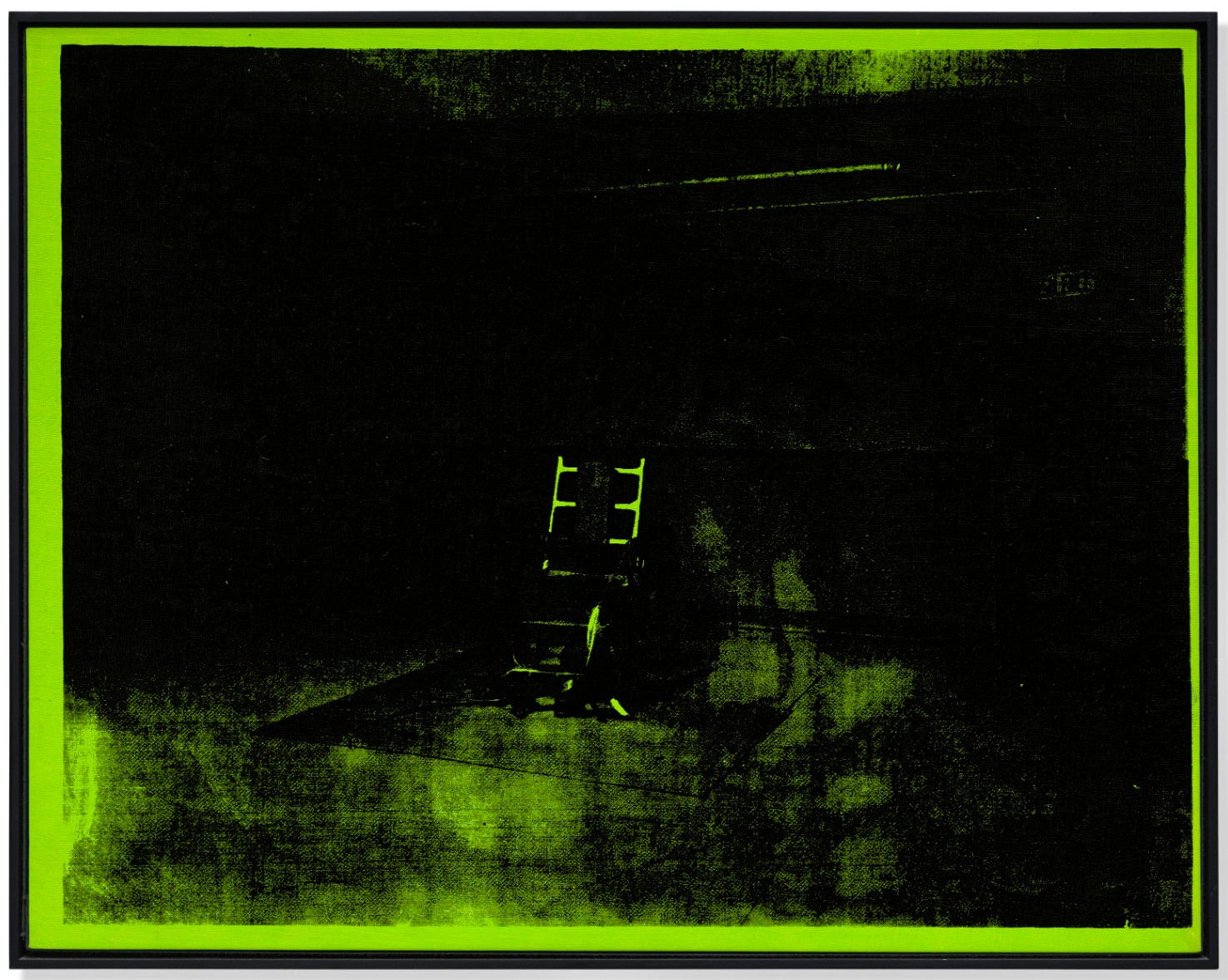
ANDY WARHOL (1928-1987)
Little Electric Chair, 1964-65
Acrylic and silkscreen ink on canvas
22×28 inches (55.9 x 71.1 cm)
Stamped twice with the Estate of Andy Warhol and the Andy Warhol Foundation for the Visual Arts, Inc. stamps
Numbered twice ‘VF PA57.007 VF PA57.007’ (on the overlap)
Stark and quietly unsettling, Little Electric Chair by Andy Warhol stands among the artist’s most iconic images. Executed in a vivid, distinctly unnatural green, the work transforms a journalistic photograph of the electric chair into a spectral scene that oscillates between documentation and abstraction. Isolated, silent, and devoid of human presence, the chair emerges from a murky field of shadow, its form at once legible and obscured. Rare and increasingly scarce, the Little Electric Chair paintings are among the most sought-after works in Warhol’s oeuvre, with nine examples now housed in major museum collections, including the Philadelphia Museum of Art, the Yale University Art Gallery, the San Francisco Museum of Modern Art, and the Menil Collection, Houston. At once inherently provocative and iconic within Warhol’s serial practice, Little Electric Chair distills the quiet, bureaucratic machinery of death in modern America into a single, unforgettable image.
Source image for Electric Chair series. Archives of the Andy Warhol Museum, Pittsburgh.
© 2026 The Andy Warhol Foundation for the Visual Arts, Inc. / Licensed by Artists Rights Society (ARS).
The genesis of the Death and Disaster series is often traced to June 1962, when Henry Geldzahler presented Warhol with a copy of the day’s newspaper over lunch, the headline “129 DIE IN JET” emblazoned across the front page. “I wanted Andy to get serious,” Geldzahler later recalled. “I said, ‘It is enough life. It is time for a little death’” (H. Geldzahler, quoted in S. Watson, Factory Made: Warhol and the Sixties, New York, 2003, p. 104). Soon after, Warhol transferred the image of the plane wreckage onto canvas, initiating a sustained exploration of death across a range of subjects. Over the following two years, he developed a powerful body of work encompassing suburban car crashes, suicides, the atomic bomb, and race riots in the American South. These works were originally intended for an exhibition at the Ileana Sonnabend Gallery in Paris in the spring of 1964—his first presentation in Europe—which he planned to title Death in America. In contrast to the cool commercialism of his Coca-Cola bottles and Campbell’s soup cans, these works reveal a darker underside of American life, exposing the ways in which tragedy had become a consumable spectacle within the mass media.
Gerhard Richter, Tote, 1988. Museum of Modern Art, New York. © Gerhard Richter 2026 (0111).
Among these works, the Little Electric Chair paintings stand as the most distilled and emblematic. Depicting a uniquely American mode of execution—one that originated in New York and struck Warhol as a “typically American way to go” (D. Bourdon, Warhol, New York, 1989, p. 154)—the series draws from a press photograph of the electric chair, known as “Old Sparky,” at Sing Sing State Penitentiary in Ossining, New York. When Warhol began the group in 1963, electrocution was once again at the forefront of public consciousness, and by the time he executed the present work in 1964–1965, debates surrounding capital punishment had re-emerged with renewed intensity.
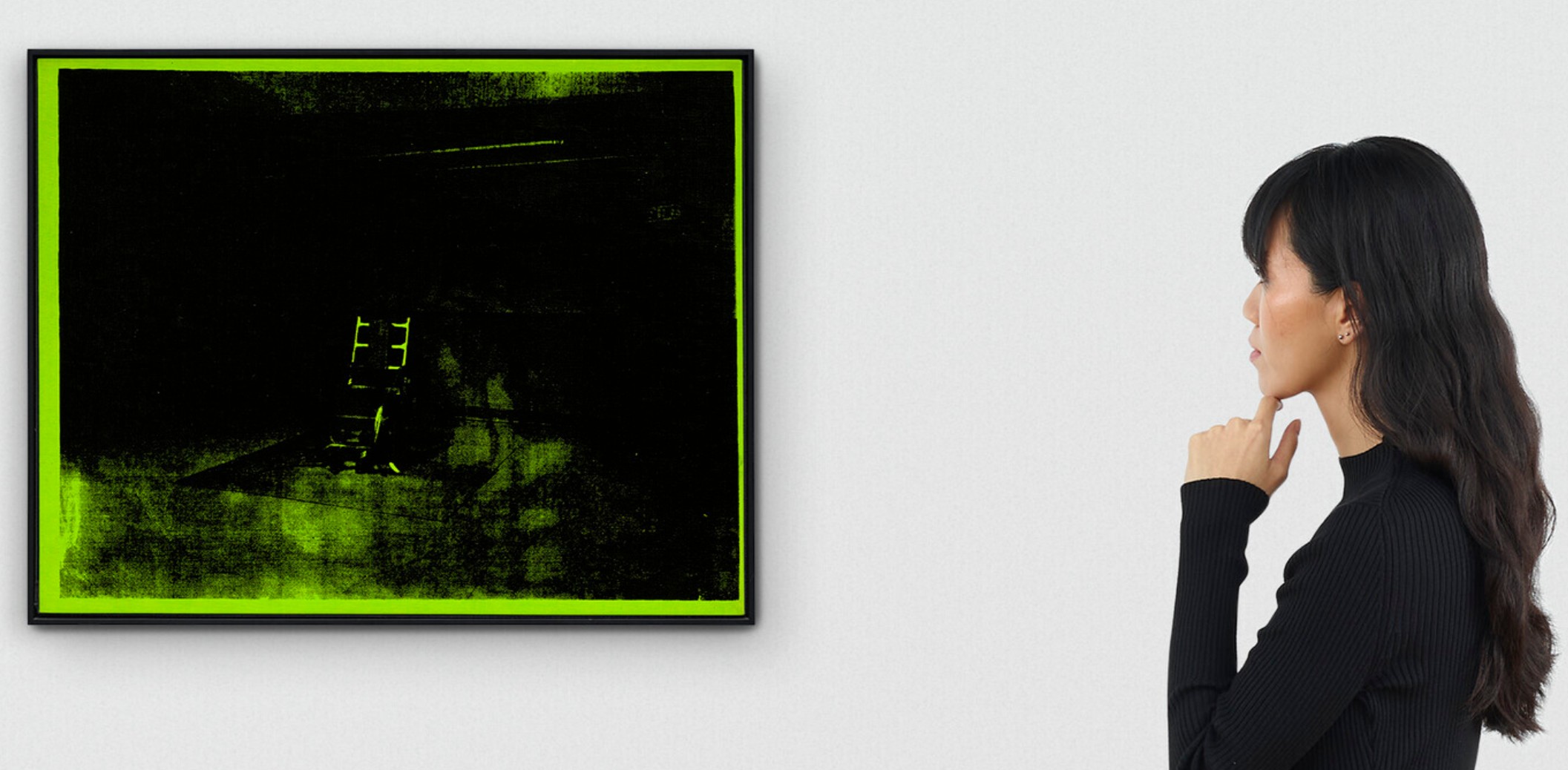
Among these works, the Little Electric Chair paintings stand as the most distilled and emblematic. Depicting a uniquely American mode of execution—one that originated in New York and struck Warhol as a “typically American way to go” (D. Bourdon, Warhol, New York, 1989, p. 154)—the series draws from a press photograph of the electric chair, known as “Old Sparky,” at Sing Sing State Penitentiary in Ossining, New York. When Warhol began the group in 1963, electrocution was once again at the forefront of public consciousness, and by the time he executed the present work in 1964–1965, debates surrounding capital punishment had re-emerged with renewed intensity.
While this mode of production and repetition might seem to affirm Warhol’s well-known assertion that “when you see a gruesome picture over and over again, it doesn’t really have any effect” (A. Warhol, quoted in G. Swenson, op. cit., p. 19), the result here is the inverse. It is precisely this apparent indifference that heightens the image’s quiet horror. Warhol neither dramatizes nor diminishes his subject; instead, he presents it with a dispassionate clarity that compels sustained looking. The electric chair becomes one of the many “open sores” of American life at the time (T. Crow, “Saturday Disasters: Trace and Reference in Early Warhol,” Art in America, May 1987).
Robert Campin, Seilern Triptych, circa 1425 (detail). The Courtauld, London.
Despite its static composition, the work is charged with a profound sense of anticipation. The chair sits empty, its restraints hanging loosely, awaiting its next occupant. This vacancy is crucial: it is precisely this void that generates the image’s psychological intensity. In this respect, the work recalls early Netherlandish depictions of the Crucifixion after the Deposition, in which the cross remains standing, emptied of its body, with only the ladder and surrounding landscape bearing witness to what has already occurred. Like these images, Warhol’s electric chair persists as a structure without its subject, shifting attention from the spectacle of death to its lingering, institutional presence. Unlike the Car Crash or Race Riot works, which depict moments of violent action, the Little Electric Chair paintings are defined by stillness, silence, and suspension. The viewer is left to imagine the unseen event, projecting their own fears and associations onto the scene. In this sense, the work operates as what has been described as a “conjured void,” a representation of death not as spectacle, but as condition. As Neil Printz has observed, “The photograph selected by Warhol represents death as absence and silence, a conjured void” (N. Printz, “Painting Death in America,” in Andy Warhol: Death and Disasters, exh. cat., Houston, 1988–1989, p. 16). It is in this absence of human presence that the work most powerfully embodies Warhol’s meditation on death. Little Electric Chair confronts the viewer not with action, but with possibility—with the knowledge of what has occurred, and what will inevitably occur again. In its stark stillness, the image holds time in suspension, transforming a moment of institutional violence into an enduring and unsettling meditation on representation, memory, and the condition of modern life.
The American Indian (Russell Means), 1976
The American Indian (Russell Means), 1976
Property from an Important European Collection
Sotheby’s New-York: 14 May 2026
Estimated: USD 1,500,000 – 2,000,000
USD 3,231,000
Andy Warhol | The American Indian (Russell Means) | The Now &
ANDY WARHOL (1928 – 1987)
The American Indian (Russell Means), 1976
Acrylic and silkscreen ink on canvas
50×42 inches (127 x 106.7 cm)
Signed twice, titled, and dated 1976 (on the reverse)
Rendered in a commanding grisaille palette, The American Indian (Russell Means) from 1976 is a stirring synthesis of Andy Warhol’s unparalleled devotion to popular culture and his adoption of political imagery in his artistic output. Encompassing the dual definitions of individual and archetype, The American Indian (Russell Means) embodies Warhol’s most daring explorations of the seriality and portraiture which define the core of his oeuvre. The work, alongside the remainder of The American Indian series, is impressive in scale and intellectually rigorous in theme, revealing Warhol’s incisive and endless fascination with the cultural forces that define the American image. Conceived as a project with West Coast dealer and Ace Gallery owner Doug Chrismas, the present work, in its striking black and white palette, distinguishes it as among the very best from the series.
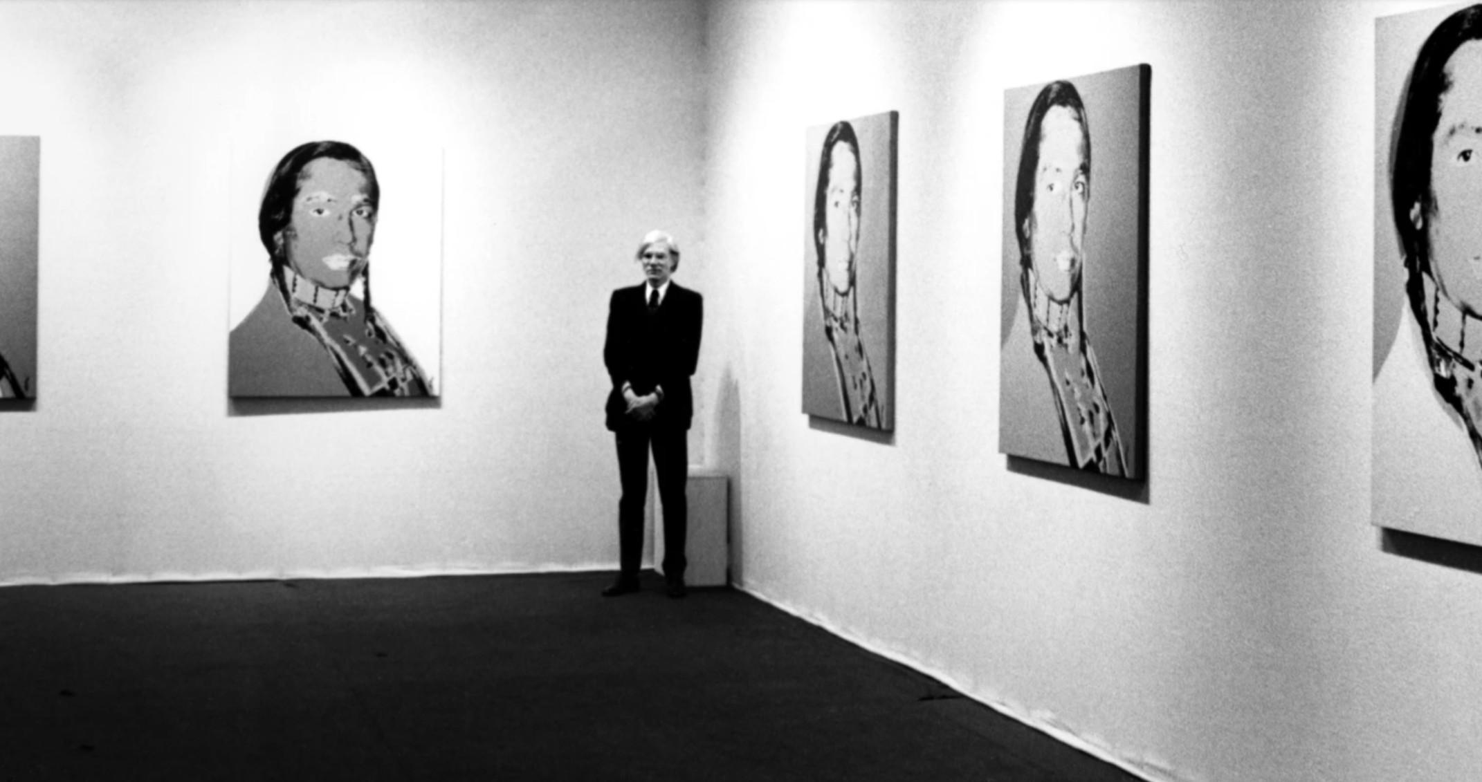
Andy Warhol at the opening of The American Indian Series at ACE Gallery, Paris 1976.
Photo © Courtesy of Ace Gallery. Art © 2026 Andy Warhol Foundation for the Visual Art / Artists Rights Society (ARS), New York
In the series, Means is depicted wearing a calico print shirt, four beaded necklaces and a bone hairpipe choker, with his hair braided with brown leather wraps. His manner of dress was not particularly specific to his Lakota ancestry, but rather “contemporary and generically Indian in a sense, having come into fashion during the 1970s as an expression of American Indian pride.” (Neil Printz and Sally Kind-Nero, eds., The Andy Warhol Catalogue Raisonne, Vol. 4: Paintings and Sculpture late 1974-76, New York 2014, p. 495) Means’ typified manner of dress, refracted through Warhol’s characteristic use of seriality, contrasts with Means’ role as an individual community activist.
Jasper Johns, White Flag, 1955. The Metropolitan Museum of Art, New York. Image © The Metropolitan Museum of Art. Image source: Art Resource, NY. Art © 2026 Jasper Johns / Licensed by VAGA at Artists Rights Society (ARS), NY
Taken together, these factors form a complex identity for the “contemporary Indian,” who is both undeniably individual and apparently generic; as Rainer Michael Mason remarks on Warhol’s execution of the series, “The master of indifference, with a sureness that is less somnambulistic than it appears, has once more adopted a theme that is simultaneously captivating and banal. The Indian is a conventional accessory of the American scene, for the same reason as its counterpart, the cowboy, or as Coca-Cola, the electric chair, the movie star. The title of the series, moreover, ‘The American Indian’ takes this anonymous and communal dimension into account. At the same time, however, the Indian is the face of a real political problem, of a singular minority, and beyond that of all the American minorities.” (Rainer Michael Mason cited in: Neil Printz and Sally Kind-Nero, eds., The Andy Warhol Catalogue Raisonne, Vol. 4: Paintings and Sculpture late 1974-76, New York 2014, p. 493)
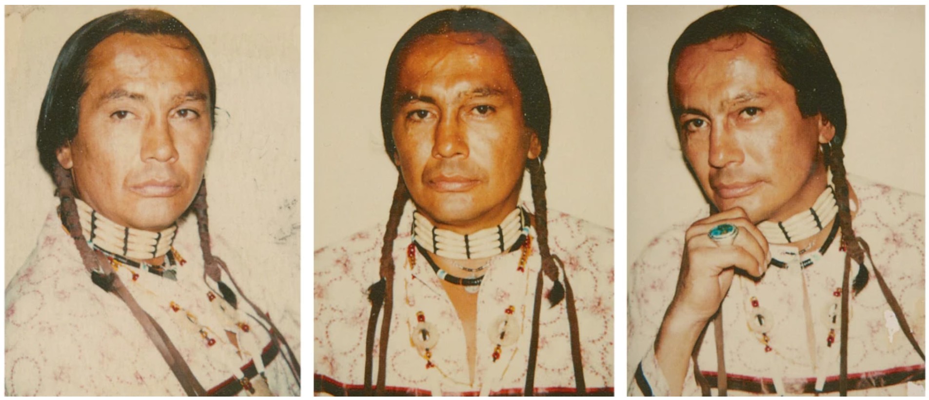
Polaroid studies of Russell Means, 1976. Art © 2026 Andy Warhol Foundation for the Visual Arts / Artists Rights Society (ARS), New York
Executed in the years following Russell Means’ siege of Wounded Knee, The American Indian series naturally assumes a political dimension. The lush setting of the American West becomes simultaneously associated with Hollywood myth-making, a force that often contributes to the stereotyping of the Indian and his character. This stereotype is often characterized by face paint, an image that seems commonplace, but in reality possesses a specific cultural meaning: as Means explains, face paint “was put on only those willing to die,” so those who wore such paint “were all the soldiers, the defenders inside Wounded Knee.” (Russell Means cited in: Neil Printz and Sally Kind-Nero, eds., The Andy Warhol Catalogue Raisonné, Vol. 4: Paintings and Sculpture, Late 1974-76, New York 2014, p. 498)
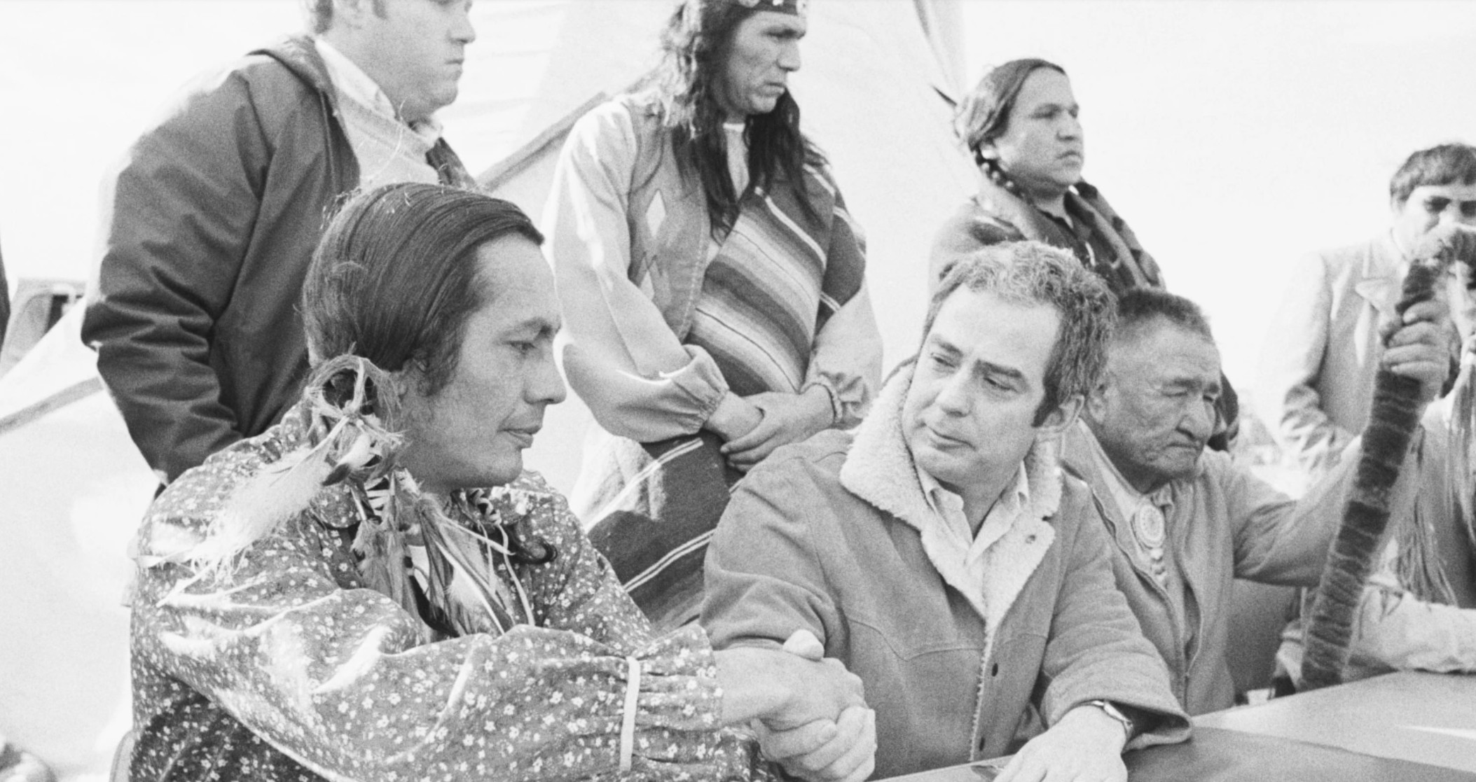
Russell Means and Kent Frizzell shaking hands, 1973. Image © Getty Images / Bettman
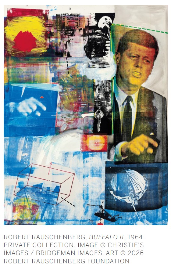
In this context, Warhol’s use of black-and-white paint to portray Means’ face throughout the series is especially striking. In doing so, Warhol lends the image as a whole a sense of ambiguity: oscillating between a dignified individual and a flattened archetype, and playing upon the language of media culture while presenting a sincere artistic representation.
The rich painterly texture and thick application of monochrome hues that subtly sweep across the canvas distinguish the present work as an exceptional example of the series. The shades of charcoal, stone, and white are beautiful. A fascination of American culture: The Wild West, cowboys, and Indians, became central to American culture, providing new archetypes of American myth, yet they proliferated stereotypes. The progenitor of Pop, the arbiter of Consumerism, Andy Warhol artistically examined the Wild West, and it notably became a source of his inspiration in his pictures of Elvis. Although he sometimes used these subjects to undermine the Machismo of the West, here the apolitical, ambiguous artist produces The American Indian (Russell Means) an image which directly explores the discrepancies between content and context, paying homage to the political activism of Russell Means and particularly his significance during the 1970s.
Flowers [Six Works], 1964
Flowers [Six Works], 1964
Radiant Forms: Works from a Distinguished Private Collection
Sotheby’s New-York: 15 May 2026
Estimated: USD 1,200,000 – 1,800,000
USD 2,232,000
Andy Warhol | Flowers [Six Works] | Contemporary Day Auction | 2026 |
ANDY WARHOL (1928 – 1987)
Flowers [Six Works], 1964
Acrylic and silkscreen ink on canvas, in 6 parts
Each: 5×5 inches (12.7 x 12.7 cm)
i, iii, iv and vi: Signed with the artist’s initials and dated 64 (on the overlap)
ii and v: Signed and dated 64 (on the overlap)
Each work is respectively numbered on the reverse
i and iii: Stamped by the Estate of Andy Warhol
ii, iv, v, and vi: Stamped by the Andy Warhol Art Authentication Board, Inc.
Emerging at the pinnacle of the artist’s Pop ascendancy, Andy Warhol’ s Flowers mark a decisive turning point in his revolutionary artistic practice, crystallizing the formal and conceptual concerns that had come to define his engagement with mass culture. Created in 1964, the same year as the artist’s landmark debut at Leo Castelli Gallery, this set of six five inch Flowers belong to the celebrated series that helped cement Andy Warhol’s position at the forefront of American Pop Art.
“I want to be a machine,
and I feel that whatever I do and do-machine-like is what I want to do.”
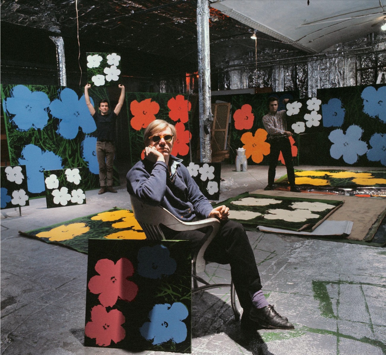
Andy Warhol, Philip Fagan and Gerard Malanga, New York, 1964. Photo Ugo Mulas © Ugo Mulas Heirs. All rights reserved. Art © 2024 Andy Warhol Foundation for the Visual Arts / Artists Rights Society (ARS), New York
Testament to the visual impact of the intimately scaled pieces and the importance of the Flowers within the canon of art history, similar works from the series reside in the collection of esteemed institutions including the Metropolitan Museum of Art, New York; and Museum Brandhorst, Munich.
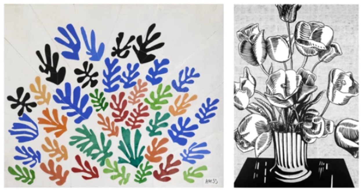
LEFT: Henri Matisse, La Gerbe, 1953. Los Angeles County Museum of Art. Image © 2024 Museum Associates / LACMA. Licensed by Art Resource, NY. Art © 2024 Succession H. Matisse / Artists Rights Society (ARS), New York.
RIGHT: Roy Lichtenstein, Black Flowers, 1961. Image © 2024 The Broad, Los Angeles. Art © Estate of Roy Lichtenstein
Warhol first approached flowers as a subject matter at the suggestion of the legendary Henry Geldzahler, then assistant curator at the Metropolitan Museum of Art, who encouraged the artist to engage directly in the art historical tradition of still-life painting. The crisply rendered screen and vivid, highly saturated color give his Flowers an unparalleled clarity and graphic force. The flower motif’s resounding significance in the history of art, from Claude Monet’s water lilies to Van Gogh’s sunflowers, proved a fitting, intellectual subject for Warhol’s Pop idiom. As with the Modernist innovations of Henri Matisse, Warhol considers the floral subject as a vehicle for chromatic exploration and formal abstraction. Produced in multiple scales and an array of color combinations, the Flowers were frequently exhibited in rhythmic, grid-like arrangements seen in the present work. “With the Flowers, Andy was just trying a different subject matter. In a funny way, he was kind of repeating the history of art. It was like, now we’re doing my Flower period! Like Monet’s water lilies, Van Gogh’s flowers, the genre,” describes Warhol’s collaborator Gerard Malanga (Gerard Malanga quoted in: David Dalton and David McCabe, A Year in the Life of Andy Warhol, New York, 2003, p. 74).
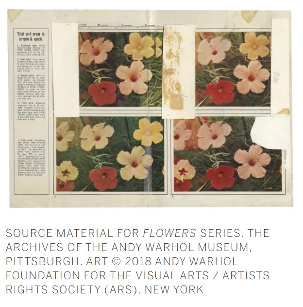
Employing his archetypical appropriation of mass-produced source material, Warhol derived the series from a sequence of photographs printed in the June 1964 issue of Modern Photography which were by executive editor Patricia Caulfield and repeated to illustrate chromatic variations corresponding to the various chemical processes. Warhol cropped and isolated this image into a square composition with four flowers and then polarized its tonal range to increase sharpness and provide the optimum template for the silkscreen mechanical to be made. The act of selection and repetition, rather than invention, becomes the primary creative gesture, reinforcing Warhol’s ongoing interrogation of authorship and originality. “I want to be a machine,” said the artist, “and I feel that whatever I do and do-machine-like is what I want to do” (Andy Warhol in conversation with Gene R. Swenson in: “What is Pop Art? Answers from 8 Painters, Part 1,” ARTnews, vol. 62, November 1963, p.748). Repeated six times, the present work consummates this seriality and mass production, standing as a poignant reflection of popular culture and postmodern appropriation.
Ellsworth Kelly, Colors for a Large Wall, 1951.
Image © The Museum of Modern Art/Licensed by SCALA / Art Resource, NY. Art © 2024 Ellsworth Kelly
Warhol’s shrewd recontextualization of the photograph evinces a nascent interest in a more abstract, philosophical vernacular, one preceded by his Death and Disaster series and extended through the skulls, shadows, and religious iconography of his mature corpus. “The flower pictures were for Everyman, they embodied Warhol’s power of concretization, the shortest possible route to stylization, both open to psychological interpretation and an ephemeral symbol”, describes Heiner gallerist Bastian. But the flowers “were also to be read as metaphors for the flowers of death. Warhol’s Flowers resist every philosophical transfiguration as effectively as the pictures of disasters and catastrophes which they now seem ever closer to” (Heiner Bastian cited in: Exh. Cat., Berlin, Neue Nationalgalerie, Andy Warhol: Retrospective, 2002, p. 33). As curator John Coplans notes, “The garish and brilliantly colored flowers always gravitate toward the surrounding blackness and finally end in a sea of morbidity. No matter how much one wishes these flowers to remain beautiful they perish under one’s gaze, as if haunted by death” (John Coplans, Andy Warhol, New York 1978, p. 52). Warhol’s Flowers recast the classical Vanitas through a Pop lens, effecting a detachment and impermanence that underscores Warhol’s preoccupations with mortality, beauty, and repetition.
Mao, 1973
Mao, 1973
Radiant Forms: Works from a Distinguished Private Collection
Sotheby’s New-York: 15 May 2026
Estimated: USD 800,000 – 1,200,000
USD 1,216,000
Andy Warhol | Mao | Contemporary Day Auction | 2026 | Sotheby’s
ANDY WARHOL (1928 – 1987)
Mao, 1973
Acrylic and silkscreen ink on canvas
12×10 inches (30.5 x 25.4 cm)
Signed and dated 1973 (on the overlap)
Incandescent in color and psychologically arresting in effect, Andy Warhol’s Mao from 1973 stands among the most incisive meditations on image, fame, and power in postwar art. At just 12 by 10 inches, the present work compresses the full force of Warhol’s monumental Mao project into an intimate scale, heightening its unsettling intensity. Against a field of electric blue, Mao’s face emerges in a blaze of ochre and black, while his tunic ignites in sweeping passages of red that verge on abstraction. The result is at once portrait and apparition: a state-sanctioned likeness transformed into a volatile, painterly icon. Produced at the height of Warhol’s return to painting in the early 1970s, the present canvas demonstrates with exceptional clarity how he could seize upon the most ubiquitous image in the world and subject it to the twin mechanisms of glamour and destabilization.
“I’ve been reading so much about China. They’re so nutty. They don’t believe in creativity. The only picture they have is Mao Zedong.
It’s great. It looks like a silkscreen.”
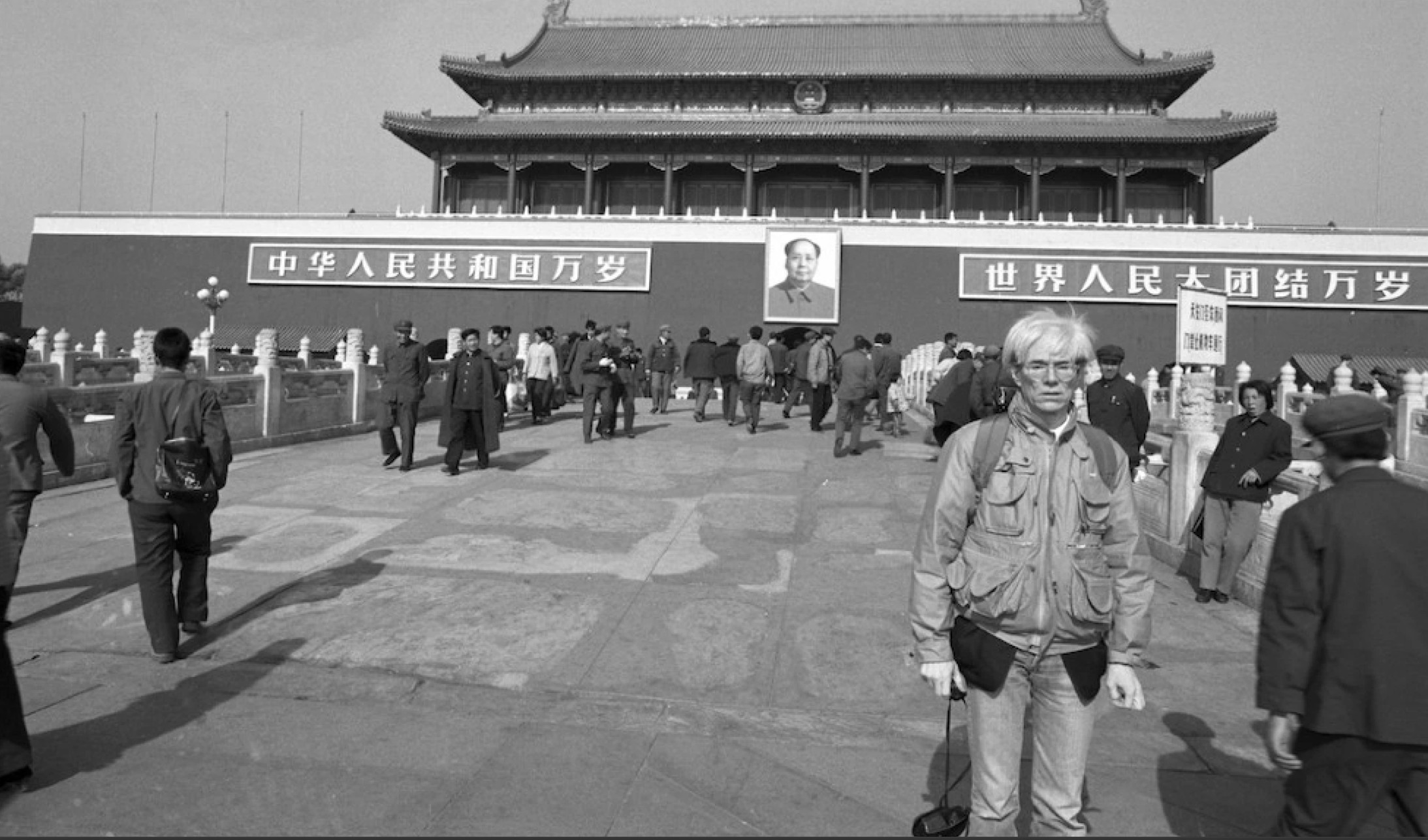
Andy Warhol in front of Tiananmen Square, Beijing, 1982. Image © Christopher Makos, 1982
Few twentieth-century likenesses rivaled Mao’s for ubiquity. Reproduced endlessly in schools, offices, public buildings, and on the first page of Quotations from Chairman Mao Tse-tung—the so-called Little Red Book—his official portrait became one of the most extensively circulated images in modern history. If Warhol had already exposed the machinery of celebrity through Marilyn, Jackie, and Elvis, the Mao series carried that inquiry into a different register altogether. Here was a face shaped not by Hollywood or tabloid publicity but by a centrally controlled propaganda apparatus, no less dependent on repetition, idealization, and mass distribution. As curator Kynaston McShine later remarked, “if Warhol can be regarded as an artist of strategy, his choice of Mao as a subject—as the ultimate star—was brilliant. The image of Mao… is probably the one recognized by more of the earth’s population than any other—a ready-made icon representing absolute political and cultural power. In Warhol’s hands, this image could be considered ominously and universally threatening, or a parody or both” (Andy Warhol Retrospective, exh. cat., The Museum of Modern Art, New York, 1989, p. 19). That doubleness—ready-made icon and political threat, surface decoration and ideological weapon—remains the animating tension of the series.

Raising Chairman Mao’s Portrait during the Cultural Revolution in Beijing, China, 1949. Photo by ChinaFotoPress via Getty Images
Conceived at the time of President Nixon’s historic trip to China in February 1972 and developed in its immediate aftermath, the Mao paintings represent Warhol’s return to painting with tremendous force and conceptual brilliance. Bob Colacello famously recalled the genesis of the project in a conversation with Bruno Bischofberger, who encouraged Warhol to paint the most important figure of the twentieth century. Warhol’s response was characteristically precise: “That’s a good idea. But I was just reading in Life magazine that the most famous person in the world today is Chairman Mao. Shouldn’t it be the most famous person, Bruno?” (Bob Colacello, Holy Terror: Andy Warhol Up Close, New York, 1990, p. 111). That distinction—between importance and fame—goes to the core of the series. Warhol was not painting political theory; he was painting the mechanism by which power becomes image and image becomes fame.
American President Richard Nixon at Beijing airport upon his arrival in China, 1972. Sovfoto / Universal Images Group/Rex/REX USA
By 1973, the Mao project had already become one of the most ambitious undertakings of Warhol’s career. Between 1972 and 1973, he produced 199 paintings across five scales and five related groupings, ranging from the colossal Giant Mao canvases, conceived to rival the public authority of the image in Tiananmen Square, to more intimate examples such as the present work. This graduated structure was itself deeply Warholian: the image could be encountered as spectacle, decoration, private possession, or luxury commodity. The 12 by 10 inch format is especially compelling in this regard. It turns an image of state surveillance into an object of intimate contemplation—portable, collectible, almost devotional in scale. If the giant Maos evoke mass politics and public theater, these smaller paintings are sharper, stranger, and in some ways more subversive. They reveal the full audacity of Warhol’s premise: that the supreme image of communist authority could be absorbed seamlessly into the capitalist economy, no more exempt from fashion than a can of Campbell’s soup.
Robert Rauschenberg, Buffalo II, 1964. Private Collection. Art © 2026 Robert Rauschenberg Foundation/Licensed by VAGA, New York, NY
Yet the Mao paintings are not compelling only because of their timing or their conceptual acuity; they also mark a decisive shift in Warhol’s handling of paint. If the portraits of Marilyn and Liz in the 1960s often embraced the cold precision of silkscreen, the Maos invited the artist’s hand back into the work with renewed urgency. The present painting demonstrates that shift with particular vividness. Mao’s tunic is dragged across in broad, nervous red sweeps, while the face—split between light and shadow—takes on an almost theatrical instability beneath the authority of the black screen. The result is a charged balance between precise control and free-flowing gesture. The official portrait remains legible, but only just; it has been made unstable, fashionable, and strangely human. In this sense, the Maos radically broke with the hard-edged facture of Warhol’s 1960s paintings and instead invited a more expressionistic hand into the core aesthetic of the work. That stylistic opening would prove crucial to his later oeuvre.
The broader implications of the series are what make it so enduring. The juxtaposition of this mythic, deified image of the communist leader with an art form that fetishized consumerist objects is wonderfully seditious. Warhol recognized that Mao’s portrait already possessed all the characteristics of a brand: ubiquity, legibility, repetition, and unquestioned authority. As he remarked to David Bourdon, “I’ve been reading so much about China. They’re so nutty. They don’t believe in creativity. The only picture they have is Mao Zedong. It’s great. It looks like a silkscreen” (Andy Warhol quoted in David Bourdon, Warhol, New York, 1989, p. 317). Neil Printz and Sally King-Nero have rightly noted that, in this sense, “Mao’s portrait was, in effect, already a Warhol” (The Andy Warhol Catalogue Raisonné: Paintings and Sculpture 1970–1974, vol. 3, New York, 2010, p. 166). Warhol did not invent the commodity status of Mao’s image; he revealed it.
Left: Andy Warhol, Shot Sage Blue Marilyn, 1964. Private Collection. Art © 2026 Andy Warhol Foundation for the Visual Arts / Artists Rights Society (ARS), New York.
Right: Jean Auguste Dominique Ingres, Napoleon I on his Imperial Throne, 1806. Musée de l’Armée, Hôtel des Invalides. Paris / Bridgeman Images
That revelation was recognized almost immediately. From Basel in 1972 to Turin in 1973 and the grand 1974 presentation at the Palais Galliera in Paris, the Mao paintings were greeted as Warhol’s first major new body of paintings since Flowers and as a triumphant painterly return. Installed in sequence and set against Mao wallpaper, they transformed the gallery into an extravaganza of repetition, color, and political daring. As Colacello later wrote, “The Mao paintings… were controversial, commercial, and important… And they were all about power: the power of one man over the lives of one billion people” (Colacello, op. cit., p. 112). That formulation still cuts to the heart of the matter. These are paintings about authority, certainly—but just as crucially, they are about the conditions through which authority becomes visible, seductive, and endlessly reproducible. In the present Mao, all of these stakes are condensed with uncommon clarity. Its scale invites intimacy, yet its subject remains unavoidably public. Its brushwork introduces freedom, yet the image remains tethered to the authority of the source portrait. Its color is seductive, yet its political implications remain unresolved. It is precisely that irresolution—between critique and complicity, glamour and menace, politics and pictorial artifice—that gives Warhol’s Mao paintings their enduring force. In the present work, that force is distilled into one of the artist’s most incisive inventions: a portrait in which the machinery of modern power is transformed into the language of modern painting, and in which the image, once seen, cannot be unseen.
Wayne Gretzky, 1983
Wayne Gretzky, 1983
Christie’s New-York: 21 May 2026
Estimated: USD 700,000 – 900,000
USD 1,371,600
ANDY WARHOL (1928-1987), Wayne Gretzky | Christie’s
ANDY WARHOL (1928-1987)
Wayne Gretzky, 1983
Acrylic and silkscreen ink on canvas
50×42 inches (127 x 106.7 cm)
Signed and dated ‘Andy Warhol 83’ (on the overlap)
In 1983, British Columbia art collector Frans Wynans commissioned Andy Warhol to create a series of paintings and prints of hockey player and Ontario native Wayne Gretzky. 23-years old at the time, Gretzky was already recognized as the best hockey player in the National Hockey League and in the running for the greatest of all time. He had won the league MVP award three years in a row, set numerous scoring records, and would soon win his first of four Stanley Cup championships. For the Wynans commission, Warhol produced six canvases. The present lot, unseen in public or at auction for almost twenty years, is arguably the best in the series. The complexity of the silkscreen is notable and stands out from the commissioned portraits of the mid and late 1970s, and the harmony of color resembles the Edmonton Oiler’s jersey colors. Photos from 1983 show Gretzky, Warhol, and Canadian Ambassador Ken Taylor posing in front of the present lot during Warhol’s unveiling of the Gretzky portraits. One can surmise this painting was selected for the purpose due to its quality and coloration. The Gretzky commission was not the first time Warhol painted a portrait of a hockey player. Six years earlier, Richard Weisman had commissioned Warhol to complete a set of athlete paintings, and Rod Gilbert, a Quebec native and then captain of the New York Rangers, was recommended. But Gilbert is no match for Gretzky – on the ice at least. At the time of his retirement in 1999, Gretzky, also known as “The Great One,” held 61 NHL records, and to this day, he still holds the record for most goals, assists, and points in a single season.
Prints
Endangered Species, 1983
Christie’s New-York: 21 May 2026
Estimated: USD 3,000,000 – 5,000,000
USD 4,467,000
COMPLETE SET
TRIAL PROOFS
ANDY WARHOL (1928-1987), Endangered Species | Christie’s
ANDY WARHOL (1928-1987)
Endangered Species, 1983
(F. Feldman and J. Schellmann, nos. II.293-302)
Screenprint in colors on Lenox Museum Board, in ten parts
Signed and numbered ‘Andy Warhol TP 14⁄30’ (variously on the lower edge or reverse of each sheet)
This complete unique trial proof set is number 14 of 30 aside from the edition of 150
Accompanied with the original cardboard portfolio box
Published by Ronald Feldman Fine Arts, Inc., New York
With the artist’s and publisher’s copyright ink stamps on the reverse
Rendered in searing color and produced only four years before the artist’s death, Endangered Species stands among the most prescient works of Andy Warhol’s late career. Published in 1983, ten years after the passage of the Endangered Species Act, the series is often situated within the rise of environmental consciousness in the United States. In these images, the bright and seductive language of the artist’s celebrity portraiture is turned to the natural world. Warhol referred to the Endangered Species as “animals with make-up”, connecting the subject to his fascination with Hollywood starlets. What emerges is not simply a conservationist statement, but a major late series of works in which the artist’s longstanding fascination with death and disaster finds a newly charged theme.
Andy Warhol with the Endangered Species portfolio, 1983.
Photo: Courtesy of Christopher Makos and Ronald Feldman Fine Arts, New York. Artwork: © 2026 The Andy Warhol Foundation for the Visual Arts, Inc. / Licensed by Artists Rights Society (ARS) / Courtesy Ronald Feldman Fine Arts, New York.
The Endangered Species complete portfolio comprises ten screenprints of animals identified as endangered or threatened, among them the Giant Panda, Siberian Tiger, African Elephant, Grevy’s Zebra, and the Pine Barrens Tree Frog. Working from hundreds of photographs sourced by his publisher Ronald Feldman, Warhol selected and transformed his subjects through the stylized palette and sharp formal compression that had long defined his practice. Each animal is cropped tightly, enlarged, and brought close to the picture plane, a compositional strategy that recalls his iconic portraits of Marilyn Monroe and Liz Taylor. As in those earlier screenprints, the subject is removed from any descriptive setting and translated into a constructed image. The animals are not presented as zoological specimens so much as recast as Warholian icons.
Source for Black Rhinoceros screenprint in the New York Times. Photo: World Wildlife Fund.
“Andy really loved these proofs, and of course we did too, but we had to come up with something to call them. That’s when we decided to put these unique proofs into unique portfolios which we called trial proof portfolios. We spent a lot of time deciding which uniques belonged together as we wanted each portfolio to be cohesive. There is very little difference in the quality between these color proofs and the paintings, only that they are different colors and on paper not canvas.”

Left: Andy Warhol, African Elephant, from Endangered Species. screenprint in colors, on Lenox Museum Board, 1983, signed in pencil, numbered 131/150 (there were also 30 artist’s proofs). Sold at Christie’s New York, April 14, 2026, lot 35. © 2026 The Andy Warhol Foundation for the Visual Arts, Inc. / Licensed by Artists Rights Society (ARS) / Courtesy Ronald Feldman Fine Arts, New York.
Right: Present lot illustrated (detail).
To determine the final colorways for the edition, Ronald Feldman printed each screenprint in 30 different unique combinations, from which Warhol selected one version for the standard portfolio. The selection of color variants was a key element of the artist’s process by the 1980s, especially for complete sets of screenprints. Warhol chose the final versions based on how the colors worked together in sequence rather than within individual compositions. The remaining impressions were designated and organized as unique Trial Proof sets for commercial sale, preserving the wider range of chromatic variation. Initially collectors assumed the term meant a progress proof or a version inferior to the edition. This market misconception only changed in 1997 when Warhol’s print catalogue raisonne illustrated the various color versions as unique portfolios. Most sets were already broken up by this period for sale. The trial proof sets as a result have seldom been kept complete, making intact portfolios such as the present example, exceptionally rare. Only one other complete trial proof Endangered Species has been to auction in twenty-five years.
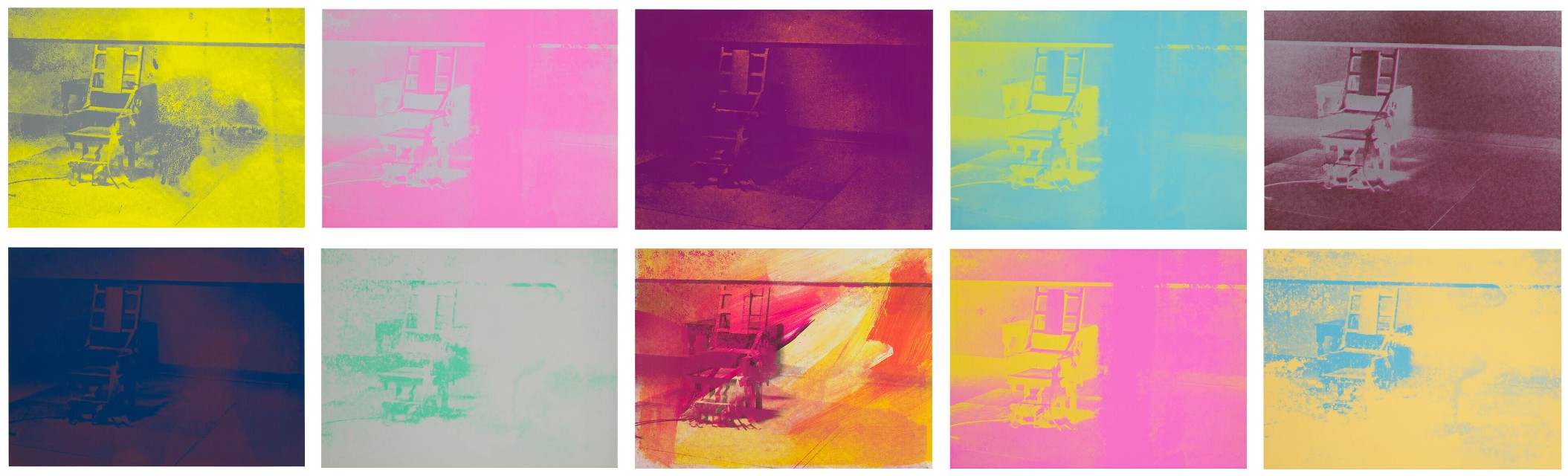
Andy Warhol, Electric Chairs. The complete set of ten screenprints in colors, on wove paper, 1971, each signed and dated in ball-point pen on the reverse, each stamp-numbered 90/250. Sold at Christie’s New York, April 14, 2026, lot 17. © 2026 The Andy Warhol Foundation for the Visual Arts, Inc. / Licensed by Artists Rights Society (ARS), New York.
These color choices play an important role in our reading of the portfolio. Warhol’s scorching oranges, sunlit yellows, and fiery reds, even more vibrant than the standard edition, do not render these creatures as in nature. Instead, they lift them into the realm of artifice and mass-media celebrity that consumed Warhol’s earlier practice. Their surfaces flare with the synthetic intensity of his most famous portraits, but that brilliance carries a darker charge. These animals are made unforgettable precisely by being translated into a visual language already bound up with artifice.
“I think having land and not ruining it is the most beautiful art that anybody could ever want to own.”
For that reason, Endangered Species can also be understood in relation to Warhol’s Death and Disaster series of the early 1960s. The difference in subject matter is obvious: the earlier works drew upon images of car crashes, race riots, and electric chairs rapidly circulating in the press. Endangered Species is quieter and less explicit, but still remains shaped by the problem of loss. The animals are not directly shown as victims of visible violence; instead, their beauty looms under the cloud of possible extinction. The series grants these animals the scale, glamour, and immediacy of his most famous icons, even as their endangered status presses another reality into view.
Ads, 1985
Sotheby’s New-York: 15 May 2026
Estimated: USD 2,000,000 – 3,000,000
USD 2,926,000
COMPLETE SET
Andy Warhol | Ads | Contemporary Day Auction | 2026 | Sotheby’s
ANDY WARHOL (1928 – 1987)
Ads, 1985
(Frayda Feldman and Jorg Schellmann nos. II.350-359)
The complete set of ten screenprints in colors on Lenox Museum Board
Signed and numbered 57/190 (lower left or lower right of each)
This set is number 57 from the edition of 190 plus 30 artist’s proof sets
Each with the blindstamps of the printer, Rupert Jasen Smith, and the publisher, Ronald Feldman Fine Arts, Inc.
Details of Renaissance Paintings (Sandro Botticelli, Birth of Venus, 1482)
Christie’s New-York: 21 May 2026
Estimated: USD 80,000 – 120,000
USD 241,300
NEW AUCTION RECORD FOR BIRTH OF VENUS 317
ANDY WARHOL (1928-1987)
Details of Renaissance Paintings (Sandro Botticelli, Birth of Venus, 1482)
(F. Feldman and J. Schellmann, no. II.317)
Screenprint in colors on Arches Aquarelle paper
Signed and numbered ‘AP 13⁄18 Andy Warhol’ (lower left)
This work is artist’s proof number 13 of 18 aside from an edition of 70
Published by Editions Schellmann & Klüser, Munich and New York
Cream of Mushroom (from Campbell’s Soup I), 1968
Christie’s New-York: 21 May 2026
Estimated: USD 50,000 – 70,000
USD 95,250
NEW AUCTION RECORD FOR CREAM OF MUSHROOM
ANDY WARHOL (1928-1987)
Cream of Mushroom (from Campbell’s Soup I), 1968
(F. Feldman and J. Schellmann, no. II.53)
Screenprint in colors on paper
Signed and stamp-numbered ‘Andy Warhol 8⁄250’ (on the reverse)
This work is number eight from an edition of 250 plus 26 artist’s proofs
Black Bean (from Campbell’s Soup I), 1968
Christie’s New-York: 21 May 2026
Estimated: USD 50,000 – 70,000
USD 69,850
ANDY WARHOL (1928-1987)
Black Bean (from Campbell’s Soup I), 1968
(F. Feldman and J. Schellmann, nos. II.44)
Screenprint in colors on paper
Signed and stamp-numbered ‘Andy Warhol 8⁄250’ (on the reverse)
This work is number eight from an edition of 250 plus 26 artist’s proofs
Onion (from Campbell’s Soup I), 1968
Christie’s New-York: 21 May 2026
Estimated: USD 50,000 – 70,000
USD 88,900
NEW AUCTION RECORD FOR ONION SOUP
ANDY WARHOL (1928-1987)
Onion (from Campbell’s Soup I), 1968
(F. Feldman and J. Schellmann, no. II.47)
Screenprint in colors on paper
Signed and stamp-numbered ‘Andy Warhol 8⁄250’ (on the reverse)
This work is number eight from an edition of 250 plus 26 artist’s proofs
Tomato Soup, from Campbell’s Soup I, 1968
Sotheby’s New-York: 15 May 2026
Estimated: USD 30,000 – 50,000
USD 102,400
ANDY WARHOL (1928 – 1987)
Tomato Soup, from Campbell’s Soup I, 1968
(Frayda Feldman and Jorg Schellmann, no. II.46)
Screenprint in colors on wove paper
Signed and stamp-numbered 16/250 (on the verso)
This impression is number 16 from the edition of 250 plus 26 artist’s proofs lettered A-Z
Published by Factory Additions