Yayoi Kusama Prints and Multiples:
A Reference Guide for Collectors
PRELIMINARY DRAFT
WORK IN PROGRESS
Introduction
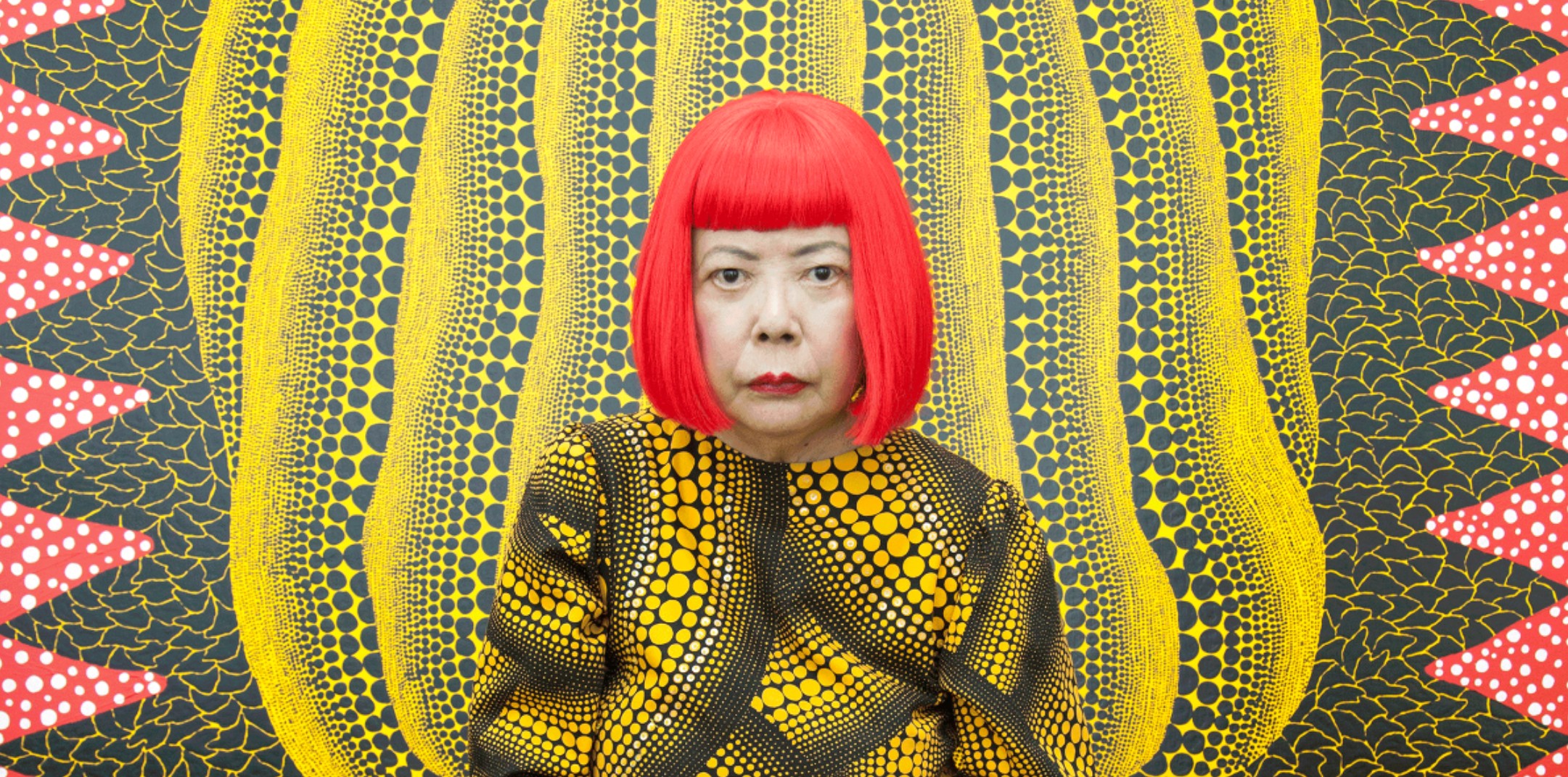
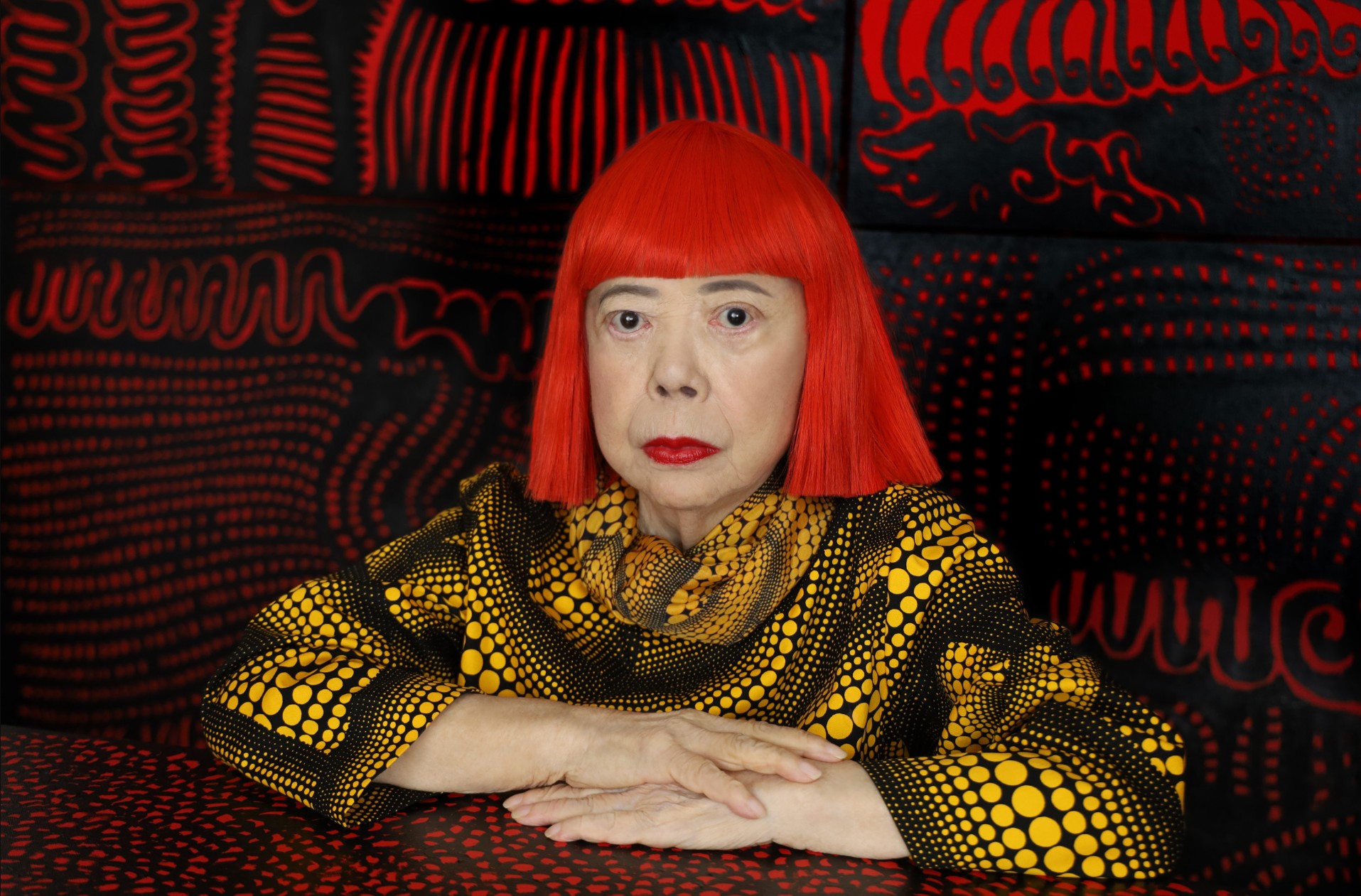
Yayoi Kusama’s print market is not a secondary footnote to her painting and installation practice. It is one of the clearest ways to understand how her core visual language—nets, dots, pumpkins, flowers, mirrored repetition, and a strange alliance between obsession and delight—was translated into works that could circulate more widely without losing conceptual force. Kusama was born in 1929, built her early reputation through the Infinity Nets paintings and radical installations of the late 1950s and 1960s, returned to Japan in 1973, and has continued to work across painting, sculpture, installation, performance, film, and literature for decades. Museums and galleries consistently present her as an artist whose central ideas move across media rather than remain trapped in one format.
For collectors, that matters enormously. Kusama’s prints are not merely reduced versions of “bigger” works. They often function as distilled statements of her principal motifs, and in some cases they provide one of the most direct entries into themes that also animate her paintings, mirror rooms, and sculptures. The same can be said, with some nuance, for her multiples: selected editioned sculptural or collaborative objects extend her language of repetition and self-obliteration into three dimensions, sometimes with surprising elegance, sometimes with calculated accessibility.
The ABE catalogue raisonné: the backbone of the market
Any serious discussion of Kusama prints should begin with the catalogue raisonné generally cited in the market as Yayoi Kusama Prints 1979–2017, published in 2017 by ABE Books / ABE Publishing. Auction houses, galleries, and dealers repeatedly reference it when identifying editioned works, usually by plate number and page, and many market participants shorthand the entries as “Kusama” numbers or “ABE” references. In practical terms, it is the standard bibliographic backbone for authenticating, cataloguing, and comparing Kusama’s print output from the late 1970s through 2017.
It is also worth noting what this means—and what it does not mean. The ABE volume is indispensable for editioned prints within that date span, but it should not be treated as a mystical totality covering every poster, ephemera item, or every object bearing Kusama imagery. Collectors still need to distinguish between proper signed and numbered editions, later posters, exhibition material, commercial derivatives, and sculptural editions issued through gallery channels or collaborations. In Kusama’s market, this distinction is not pedantic; it is the difference between collecting art and collecting merchandise dressed in respectable shoes.
Where the print history really begins
Although Kusama’s artistic language was forged much earlier—in the 1950s Infinity Nets, accumulations, and the 1960s installations—her catalogue raisonné of prints begins in 1979. One of the earliest key editions, Standing in the Visionary Field (1979), is listed as ABE 002 and already shows how her print practice could condense painting, hallucination, decorative rhythm, and a highly controlled edition process into one sheet. The early print years of the late 1970s and early 1980s are especially important because they establish the motifs and technical variety that later define the market: screenprints, lithographs, occasional collage elements, and a growing fluency between still life, floral imagery, net structures, and the first pumpkins.
The early editions from 1982 are particularly revealing. Works such as Flower, Hat, Red Mt. Fuji, and early Pumpkin compositions show a Kusama who is already unmistakably herself, yet not yet locked into the market’s later simplification of her into “the pumpkin artist.” These sheets often combine lithography, screenprint, and collage, and they demonstrate that her print practice was never purely graphic in a flat Pop sense; it was also tactile, layered, and often quietly inventive in technique.
Prints versus multiples
When speaking of Kusama “multiples,” collectors should be careful. Some editioned objects and collaborations are fully legitimate parts of her practice, while others sit closer to the commercial halo surrounding it. A good example of a serious multiple is her edition for Parkett: Infinity Nets, 2000, a silkscreen print on mirror in an edition of 70. This work is a multiple in the best sense, because the support is not incidental; the mirror extends one of the artist’s central perceptual ideas.
At the higher end of the object market, editioned pumpkin sculptures issued through major galleries such as Victoria Miro or sold through Sotheby’s show how her sculptural language also entered controlled edition structures. These works belong to a different market from the paper editions: scarcer, more expensive, more dependent on gallery provenance, registration cards, and sculptural condition. They are multiples, yes, but not in the same way as a screenprint numbered from 100 or 150. Conflating the two is a fine way to buy the wrong thing confidently.
The market: where Kusama trades and why
Kusama’s market is one of the strongest in contemporary art, and not only among living women artists. Sotheby’s has highlighted a run of major seven- and eight-figure auction results for paintings and sculptures, while Christie’s and Phillips continue to handle significant Kusama material across categories. The top public prices are driven by major paintings and sculptures rather than prints, but that top-end success radiates downward into the editions market by reinforcing brand recognition, institutional credibility, and cross-category demand.
For prints specifically, the principal public-market houses are Christie’s, Sotheby’s, Phillips, and strong Asian salerooms, especially in Hong Kong and Tokyo-linked circuits. Phillips regularly handles Kusama editions, including Pumpkin 2000 (Yellow), A Pumpkin RB-B, Pumpkin ST, and Dancing Pumpkin (YOR), while Christie’s has sold works like A Pumpkin (RT) and Sotheby’s maintains a very active Kusama pipeline overall. The market is particularly strong in Asia, which is hardly shocking: the artist is globally famous, but the regional cultural and collector base around her remains exceptionally deep.
At gallery level, Victoria Miro, Ota Fine Arts, and David Zwirner are central names in the contemporary Kusama ecosystem. Ota Fine Arts in particular has been deeply tied to exhibitions of her prints and series development, while Victoria Miro and David Zwirner frame her within the upper institutional-commercial tier. This gallery context matters because it supports confidence in provenance, reinforces the hierarchy between serious editions and secondary decorative material, and helps stabilize the broader market.
What collectors should watch
For Kusama prints, the most important factors are subject, date, ABE reference, edition size, medium, publisher/printer, colorway, condition, and provenance. Pumpkins and Infinity Nets remain the most liquid and internationally legible categories. Early prints from 1979–1980s material are often more art-historically compelling and sometimes scarcer. Later editions can be visually stronger in a decorative sense and easier to place, but the collector should always ask whether a work is sought because it is truly strong, or simply because the room needed a famous vegetable.
The Kusama market is unlikely to reward vagueness. One should know whether the work is a signed edition, whether it appears in ABE, whether the sheet retains full margins, whether metallic pigments or collage elements are intact, and whether there is any registration or gallery documentation for sculptural multiples. With an artist this famous, sloppy buying is still possible; it is just more expensively sloppy.
Conclusion
Yayoi Kusama’s prints and multiples form one of the most coherent and compelling edition markets in contemporary art. They are rooted in the same artistic DNA as her paintings and installations: repetition, self-obliteration, optical excess, childhood memory, decorative seduction, and psychological intensity. The ABE catalogue raisonné gives this field essential structure, the Infinity Nets provide its conceptual foundation, and the pumpkins supply its most powerful and enduring symbol. Around them orbit flowers, visionary landscapes, butterflies, mirror-based objects, and later series that show just how tirelessly Kusama has reworked her own language without entirely repeating herself.
For IntelArt, the strongest position is not to present Kusama’s prints as merely charming icons, but as a serious edition history with internal periods, technical distinctions, bibliographic discipline, and meaningful market segmentation. That is where the collector’s eye begins. The dots come later.
Major Themes and Series
Pumpkins: The Dominant Print Kingdom
No motif is more commercially and emotionally central to Kusama’s editions than the pumpkin. David Zwirner notes that pumpkin forms appeared in her work as early as her art studies in Japan, while also stressing that the motif became central across her practice from the late 1980s onward. Kusama herself has described pumpkins as a source of comfort since childhood, calling them humble, amusing, and full of the joy of living. This combination—childhood memory, anthropomorphic tenderness, and formal regularity—helps explain why the pumpkin became not merely a recurring subject, but a full ecosystem within her print and multiples market.
PLEASE CLICK ON THE PICTURE BELOW TO ACCESS THE PUMPKIN PRINTS CATALOGUE
The brilliance of the pumpkin in print is that it allows Kusama to merge two of her most powerful systems at once: the rounded organic body of the gourd and the repetitive structures of dots and nets. In many of the best-known screenprints, the pumpkin is never simply described; it is converted into a pulsating architecture. The ribs of the vegetable become channels for dots, the skin becomes a patterned field, and the background often turns into an Infinity Nets scaffold. David Zwirner explicitly points out this fusion in works where the dot-covered pumpkin sits against a net-covered ground. It is one of the great marriages in contemporary art: botany meets compulsion, and both leave the room looking improved.
The pumpkin print market is broad enough that it really needs internal subdivisions. There are early 1980s pumpkins, including rare and small editions; early 1990s pumpkins such as Pumpkin (2) and related works, often in stronger classic Kusama palettes; mid-1990s variants like Pumpkin (GT) and Pumpkin (YY)/(YT); 2000s prints enriched by metallic pigments or more decorative grounds; and later works where the motif becomes even more polished, more iconic, and more globally legible. ABE references and auction-house entries show a steady recurrence of these editions across the market.
What makes the pumpkin prints so durable in the market is not only recognizability. It is structural flexibility. A Kusama pumpkin can be intimate or monumental, black-and-yellow or red-and-yellow or green, severe or playful, graphically simple or optically dense. It can also sit comfortably in several collector categories at once: postwar abstraction, Pop-adjacent contemporary printmaking, Japanese contemporary art, trophy icon collecting, and design-friendly blue-chip decor for people who would prefer their existential dread in excellent framing.
Which pumpkin prints matter most?
Historically, the early pumpkin prints matter because they establish the motif in editioned form and often carry greater rarity. Visually, the classic yellow-and-black examples remain the strongest emblem of Kusama’s public image, and these are often the first sheets that general collectors recognize. Market-wise, editions from the 1990s and early 2000s have proven especially resilient, with works such as A Pumpkin (RT), Pumpkin 2000 (Yellow), Pumpkin ST, Pumpkin Army, and related compositions appearing regularly at Christie’s and Phillips. Recent auction records at those houses show healthy demand for these editions, often with results in the tens of thousands of pounds or Hong Kong dollars depending on rarity, format, and condition.
There is also a subtle conceptual point here. The pumpkin is frequently treated as Kusama’s most “accessible” motif, but that is only half true. It is accessible because it is lovable. It is important because it allows Kusama to reconcile body and pattern, individuality and repetition, still life tradition and modern seriality. The best pumpkin prints are not cute. They are disciplined acts of control masquerading as charm. That is a far more dangerous and therefore far more collectible quality.
Infinity Nets in print: the foundational motif
If one motif anchors Kusama’s entire practice, it is the net. MoMA identifies Infinity Nets among her earliest and most important works from the 1950s onward, and later institutions have repeatedly framed the mirror rooms as developments of the repetition already present in those paintings and works on paper. In print form, Infinity Nets become one of the most compelling parts of her edition history because they carry the genetic code of almost everything else.
Printed Infinity Nets are especially interesting because they reverse expectations. One might assume that a motif based on repetitive hand-painted accretion would lose intensity when translated into editioned media. In fact, the opposite often happens. The print process sharpens the serial logic of the form. Editions such as Infinity Nets (1986) and later variants show how Kusama could use screenprint not to soften obsession, but to give it a cleaner, more merciless rhythm. The image becomes at once decorative, hallucinatory, and conceptually severe.
Collectors tend to prize these works for several reasons. First, they connect directly to Kusama’s earliest and most critically important body of work. Second, they can feel more abstract, and therefore more art-historically anchored, than some of the later icon-driven prints. Third, they often reveal her handling of color with greater subtlety than the market stereotype allows: while many collectors associate Kusama primarily with black/yellow pumpkins or loud chromatic saturation, the net prints frequently produce tension through restrained palettes, optical density, and compositional breathing room.
Flowers: A Secondary Motif with Growing Market Significance
Kusama’s flower works occupy a singular position within her practice, situated at the intersection of decoration, psychological projection, and formal repetition. While often perceived as more accessible than her pumpkins or Infinity Nets, these compositions reveal a highly controlled visual system in which organic forms are subjected to the same logic of accumulation and rhythmic expansion. The flower is not treated as a natural subject, but as a structure—one that can be repeated, saturated, and ultimately absorbed into a larger field. In this sense, the motif participates fully in Kusama’s lifelong exploration of what she has described as self-obliteration, where individual forms dissolve into an infinite continuum of pattern.
Within her broader oeuvre, the flower should therefore be understood not as a secondary theme, but as a continuation of her core language. The petals extend the logic of the dot, the surrounding fields echo the Infinity Nets, and the repetition of floral elements generates a visual environment that oscillates between seduction and excess. This duality is central to the strength of these works: they draw the viewer in through color and familiarity, only to destabilize perception through density and repetition. What initially appears decorative gradually reveals itself as a controlled system, governed by balance, saturation, and visual tension.
Kusama’s flower prints are documented in the catalogue raisonné Yayoi Kusama Prints 1979–2017, commonly referred to as the ABE catalogue, which provides the primary reference framework for her editioned works. Their inclusion within this corpus confirms their status as part of her formal print practice and distinguishes them from exhibition posters or derivative imagery. For collectors, this reference is essential, as it situates each work within a structured and verifiable body of production, where authorship, technique, and edition are clearly defined.
Visually, these prints are constructed through a deliberate tension between organic curvature and graphic control. Bold outlines define simplified floral forms, while interior surfaces are activated by dense patterns—dots, lines, or chromatic variations—that disrupt any illusion of naturalism. Color plays a decisive role: highly saturated palettes reinforce the immediate appeal of the image, yet simultaneously flatten it, pushing the composition toward abstraction. The flower becomes less an object than a surface, less a subject than a system. Each variation in color or pattern subtly alters the equilibrium of the image, demonstrating Kusama’s precise control over perception.
While less universally iconic than the pumpkin series, Kusama’s flower prints have gained increasing attention within the market, particularly among collectors seeking works that retain her visual language while offering greater compositional diversity. These editions appear regularly at major auction houses such as Christie’s and Phillips, where they perform with notable consistency. Their strength lies in this balance between recognizability and variation, offering a more nuanced entry point into Kusama’s print market without sacrificing the intensity of her visual identity.
Ultimately, Kusama’s flower prints reveal a quieter but no less rigorous dimension of her practice. Beneath their apparent lightness lies a disciplined exploration of repetition, surface, and visual expansion. Positioned between the structural severity of the Infinity Nets and the iconic clarity of the pumpkins, they demonstrate the flexibility of her system—capable of transforming even the most familiar subject into a field of controlled intensity.
Fashion Objects: Identity Dissolved into Pattern
Kusama’s representations of hats, shoes, dresses, and other fashion-related objects occupy a distinctive place within her practice, extending her exploration of accumulation, repetition, and identity into the realm of the body and its accessories. These works should be understood in direct continuity with her early Accumulation sculptures of the 1960s, where everyday objects—often linked to domesticity or personal use—were covered with proliferating forms. In this context, clothing and accessories are not treated as decorative subjects, but as structured supports onto which Kusama projects her obsessive visual language.
Across these compositions, each object—whether a hat, a shoe, or a garment—retains its recognizable form while simultaneously being absorbed into a system of repetition. Patterns of dots, nets, or dense surface activations override their original function, transforming them into visual fields. The familiarity of the object is essential, as it creates an immediate point of entry, yet this recognition is gradually destabilized as the form dissolves into pattern. What remains is not the object itself, but its transformation into a site of visual expansion.
These works also carry a subtle psychological and social dimension. Fashion objects are inherently linked to identity, appearance, and the presentation of the self. By subjecting them to processes of saturation and repetition, Kusama effectively neutralizes their individuality, echoing her broader concept of self-obliteration. The personal becomes impersonal, the intimate becomes systemic, and the object ceases to signify the individual, instead participating in a larger, infinite structure.
Kusama’s prints depicting fashion objects are documented within the ABE catalogue raisonné (Yayoi Kusama Prints 1979–2017), confirming their place within her formal print practice. Their inclusion reinforces the importance of these works beyond their subject matter, situating them within a coherent and rigorously defined body of editions. As with all areas of Kusama’s production, this catalogue reference remains essential in distinguishing authenticated prints from decorative or derivative imagery.
From a market perspective, these works remain less dominant than the pumpkin or Infinity Nets series, yet this relative discretion contributes to their appeal. They offer a more nuanced and often more intimate entry into Kusama’s universe, combining conceptual depth with visual diversity. While they appear less frequently at auction, they benefit from the broader strength of Kusama’s market, regularly supported by major houses such as Christie’s and Phillips.
Ultimately, Kusama’s fashion-related works reveal a particularly refined aspect of her practice. Through the transformation of familiar objects—hats, shoes, dresses—into fields of repetition, she extends her investigation of identity and perception into the everyday. As in the rest of her work, recognition is only the beginning; what follows is its gradual dissolution into pattern and infinity.
Creatures: Organic Forms within a System of Repetition
Kusama’s depictions of butterflies, fish, and various creatures introduce a more fluid and organic dimension within her print practice, while remaining firmly anchored in her core language of repetition and pattern. These motifs expand her visual universe beyond objects and plants, bringing movement, transformation, and a subtle sense of vitality into compositions that are otherwise governed by strict formal control. Yet, as with all of Kusama’s work, these creatures are never rendered naturalistically; they are absorbed into a system that reshapes them into patterned entities.
Butterflies in particular carry a strong symbolic charge. Traditionally associated with transformation and fragility, they are here multiplied, flattened, and structured through dots and graphic outlines, losing their individuality in favor of a collective presence. The same logic applies to fish and other creatures, whose fluid forms are ideally suited to Kusama’s repetitive vocabulary. Their bodies become surfaces for pattern, their movement becomes rhythm, and their natural environment is replaced by an abstract field of visual saturation.
Butterfly, Fish and Various Sea and Earth Creatures in Kusama’s Prints
What distinguishes these works is the tension between implied movement and formal control. The motifs suggest life, motion, and organic development, yet they are held within a rigid compositional framework that neutralizes spontaneity. This contrast reinforces Kusama’s broader investigation into self-obliteration: even the most dynamic forms are ultimately stabilized, repeated, and dissolved into an infinite system.
These prints are documented within the ABE catalogue raisonné (Yayoi Kusama Prints 1979–2017), confirming their place within her structured body of editioned works. Their inclusion underscores the coherence of Kusama’s practice across different subjects, where each motif—whether plant, object, or creature—operates within the same underlying logic of repetition and expansion.
From a market perspective, these works remain more selective and less ubiquitous than the pumpkin series, which contributes to their distinct appeal. They are often sought by collectors looking for variations within Kusama’s visual language, offering compositions that are more dynamic and less immediately standardized. While they appear less frequently at auction, they benefit from the broader strength of Kusama’s market, supported by major houses such as Christie’s and Phillips.
Ultimately, Kusama’s creatures reveal a nuanced extension of her practice, where life and movement are introduced only to be absorbed into pattern. What appears organic is carefully controlled, and what seems animated is ultimately stabilized. As in the rest of her work, the image does not represent the world—it reorganizes it into a system of repetition without end.
The Yayoi Kusama Prints Catalogue
PLEASE CLICK ON THE PICTURE BELOW TO ACCESS THE YAYOI KUSAMA PRINTS CATALOGUE
Overview of Yayoi Kusama Prints
2026 Upcoming Lots and Auction Results
2025 Auction Results