Kiss III, 1962
Kiss III, 1962
Christie’s New-York: 15 May 2019
Estimated: USD 30,000,000 – 50,000,000
USD 31,135,000
Roy Lichtenstein (1923-1997), Kiss III | Christie’s
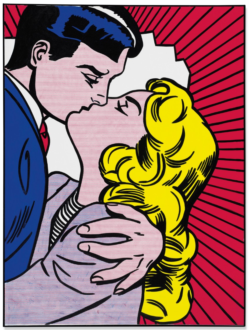
ROY LICHTENSTEIN (1923-1997)
Kiss III, 1962
Magna on canvas
64×48 inches (162.6 x 121.9 cm)
Signed and dated ‘rf Lichtenstein ’62’ (on the reverse)
Provenance
Leo Castelli Gallery, New York
Dwan Gallery, Los Angeles
Acquired from the above by the present owner, 1964
Painted by one of the foremost figures of American Pop Art, Kiss III (1962) is a pivotal work from one of Roy Lichtenstein’s most lauded bodies of work—diverging from his Abstract Expressionist compatriots—as the artist brought together the previously divergent worlds of popular culture and high art. Painted the same year as the artist’s inaugural solo exhibition at the legendary Leo Castelli Gallery in New York, works such as this began pulling from the pages of comic books and enlarging the sampled imagery with meticulous detail. While effectively reproducing extant imagery, Lichtenstein was clear that his works should be viewed for their formal qualities rather than their enticing subject matter.
“My use of evenly repeated dots and diagonal lines and uninflected color areas suggest that my work is right where it is, right on the canvas, definitely not a window into the world”
By positioning himself as a crossover between the formalist doctrines of Clement Greenberg and the populist materials of periodicals and advertisements, Lichtenstein established a dichotomy between the perception of high and low art as one of the essential points of his expansive oeuvre, and firmly cemented himself as a figurehead of American art in the latter half of the twentieth century.
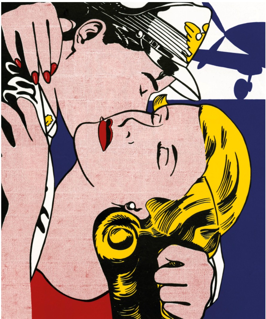
Clearly depicted with bold black outlines, on the surface Kiss III depicts a man and woman sharing a close embrace. Both figures have their eyes closed as the man’s large hand presses down on the woman’s shoulder. Their lips are planted in a passionate kiss that is echoed in the energetic shapes making up the explosive background. Rendered in primary colors with black and white additions, the composition mirrors the color scheme of mass market printing. By creating halftones through the use of small dots of color, Lichtenstein is able to further mimic these processes that rely on a restricted ink palette. While the areas of blue, red and yellow are flat and pure in their application, the peach skin and violet of the woman’s jacket show evidence of the artist’s replication of the Ben-Day dots used to create subtle shifts in color with a four-color printing process. Bands of intensity create subtle striping in these areas and further allude to cheap printing and the color illustrations of comics and newspaper advertisements. Rather than creating his own tableaus in the style of other comic artists, Lichtenstein investigated the processes by which these reproducible arts were made and distributed to a wide audience. Carefully selecting scenes like that of Kiss III, with its white starburst and bold black rays on a red ground behind the titular kiss, the artist engaged the audience immediately with the representative subject matter, and then asked them to further investigate the process through intense framing choices and the translation of printed matter into an exacting homage in acrylic on canvas.
Although not initiated by a concrete group of artists, Pop was characterized in the United States by a common reaction to the images employed by mass media and entertainment in the mid-20th century. Artists like Lichtenstein, Andy Warhol and James Rosenquist all approached the issue in different modes, but were united by their fascination with, and inevitable hesitance to accept without question, the inundation of advertisements and pop culture in America. Lichtenstein’s tact was to focus on images that were prevalent and cheap, but to paint them outside of their original tabloid context in order to highlight the artist’s hand as it converged nearly seamlessly with the bold, graphic style. While often categorized as a painter of comic-style panels, Lichtenstein’s actual appropriation from artists like Jack Kirby and other mainstays of American comics was primarily limited to the early 1960s period from which Kiss III hails. The printed originals were never copied exactly, but were instead used as a point of departure to explore framing, composition and to create a visual point of reference for audiences that would already have been aware of the style being employed by comic book artists. From these works, Lichtenstein established a recognizable iconography that easily traversed the boundary between gallery and supermarket pulp. The artist was interested less in creating new images than in starting a conversation about the proliferation of certain types of imagery within a broader cultural context.
During the 1940s and 50s, Lichtenstein dabbled in Cubism and the omnipresent Abstract Expressionism. Paradoxically, out of this deeply personal tendency the artist arrived at his detached, seemingly anonymous signature style. “I was sort of immersed in Abstract Expressionism,” Lichtenstein noted. “It was a kind of Abstract Expressionism with cartoons within the expressionist image. It’s too hard to picture, I think, and the paintings themselves weren’t very successful. […] I did abstract paintings of sort of striped brushstrokes and within these in a kind of scribbly way were images of Donald Duck and Mickey Mouse and Bugs Bunny. In doing these paintings I had, of course, the original strip cartoons to look at, and the idea of doing one without apparent alteration just occurred to me. […] I had this cartoon painting in my studio, and it was a little too formidable. […] Having been more or less schooled as an Abstract Expressionist, it was quite difficult psychologically to do anything else” (R. Lichtenstein “BBC Interview with David Sylvester,” recorded in New York, January 1966, and reproduced in Some Kind of Reality: Roy Lichtenstein, exh. cat., Anthony D’Offay, London, 1997, p. 7). Even though works like Kiss III seem like mechanical productions, further enhanced by Lichtenstein’s use of even coats of Magna (an early acrylic paint), his precision in application belies a deft hand and a unified formal vision. Furthermore, by adopting the simplified style of mass market imagery, Lichtenstein merged the idea of the printed material with the physical picture plane. He was quick to note that the subjects were secondary to him in the overall process of his work, saying, “I don’t think the importance of the art has anything to do with the importance of the subject matter. I think importance resides more in the unity of the composition and in the inventiveness of perception” (R. Lichtenstein, quoted in Roy Lichtenstein Beginning to End, Fundación Juan March, Madrid, 2007, p. 128). Drawing on the all-over aesthetic of his Abstract Expressionist contemporaries, and by filling the canvas to the very edge, the artist placed emphasis not so much on the subject matter but on the literal structure of a painting as a flat surface.
In 1961, Lichtenstein broke with his earlier practice and began to reproduce the visual qualities of printed ephemera. Among his subjects were works based on advertisements (like Girl with Ball [1961]) and comics that featured war stories and romantic themes (of which Kiss III is a prime example). “At that time,” Lichtenstein later recounted, “I was interested in anything I could use as a subject that was emotionally strong—usually love, war, or something that was highly charged and emotional subject matter to be opposite to the removed and deliberate painting techniques. Cartooning itself usually consists of very highly charged subject matter carried out in standard, obvious, and removed techniques” (R. Lichtenstein, quoted in J. Coplands, (ed.), Roy Lichtenstein, New York, 1972, p. 89). In these paintings, he preferred the flat, simple colors of commercial printing as well as the thick black outlines that were used to hide the imperfections inherent to offset printing on a massive scale. Arguably the most recognizable aspect the artist borrowed from his mainstream source material was the use of Ben-Day dots on a scale that rendered their original purpose of blending colors and half tones useless and instead evolved into a stylistic trope that became one of Lichtenstein’s calling cards. In early works like Kiss III, the dots are small and still hint at their origin, however in later works, the dots become visual indicators of the artist’s origins and his sly tribute to mechanical processes. By using stencils to fill his compositions with these tightly ordered points of color, Lichtenstein made sure that his paintings were obvious in their reference to mass-produced printing techniques. He wanted to make sure viewers knew that the works were not representative of the immediate subject matter, but rather the printed material from which he had borrowed.
Particularly influential to Lichtenstein’s career was his tutelage under the painter Hoyt T. Sherman who introduced his pupils to modernism during the early 1940s. Sherman was interested in ideas of perception, especially as they related to the everyday and the separation of pictorial representation from the real world. Thinking about a scene’s formal qualities over its context or perceived meaning was central to these teachings, and became one of the core tenets of Lichtenstein’s early practice. Sherman employed a “Flash Room” in his classes which Lichtenstein described as “a darkened room where images would be flashed on a screen for very brief intervals-about a tenth of a second. Something very simple to start, maybe just a few marks. And you would have a pile of paper, and you’d try to draw it. You’d get a very strong afterimage, a total impression, and then you’d draw it in the dark-the point being that you’d have to sense where the parts were in relation to the whole. The images became progressively more complex, and eventually you would go out and try to work the same way elsewhere-would try to bring home the same kind of sensing to your drawing without the mechanical aid of a flash room” (R. Lichtenstein, quoted in C. Tomkins, The Art of Roy Lichtenstein: Mural with Blue Brushstroke, New York, 1987, p. 14). Creating vivid compositions from the briefest of glances helped Lichtenstein to hone in on the strongest elements of his appropriated material and successfully frame them in a way that created powerful connections without the aid of text, extraneous context, or extensive narrative structure.
Maybe the most perplexing but telling aspect of Lichtenstein’s storied career was his ability to translate a near-universal mode into one of the most iconic personal styles of the 20th century. The artist, commenting on his approach, noted, “All painters take a personal attitude toward painting. What makes each object in the work is that it is organized by that artist’s vision. The style and the content are also different from anyone else’s. They are unified by the point of view—mine. This is the big tradition of art” (R. Lichtenstein, quoted in C. Tomkins, op. cit., p. 42). Keenly aware of art historical traditions as well as the influx of the mass media of capitalist advertising and entertainment, Lichtenstein’s ability to traverse the edges of these two mainstream modes resulted in a perfect fusion that grew into one of the most important American art movements.
The Kiss, 1962
The Kiss, 1962
Christie’s New-York: 12 May 2025
Estimated: USD 7,000,000 – 9,000,000
USD 5,495,000
ROY LICHTENSTEIN (1923-1997), The Kiss | Christie’s
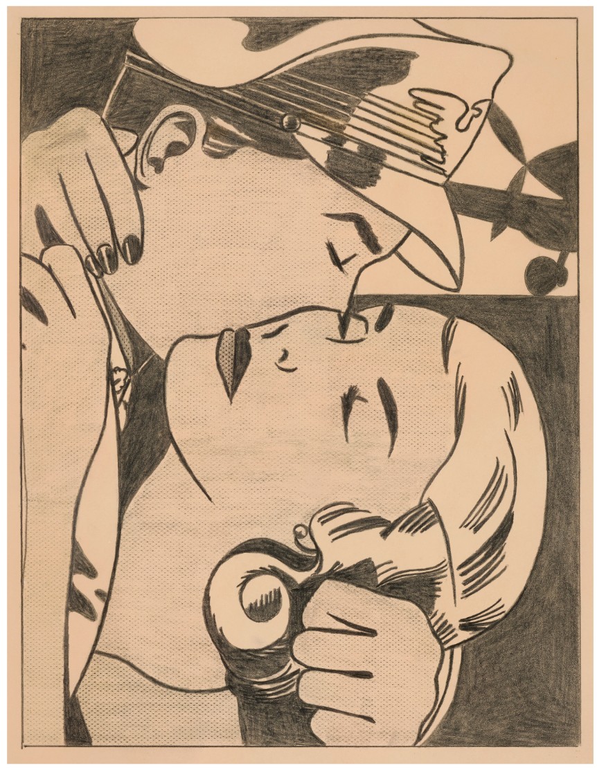
ROY LICHTENSTEIN (1923-1997)
The Kiss, 1962
Graphite on paper
Image: 18 1/2 x 14 inches (47 x 35.6 cm)
Sheet: 21 x 16 1/4 inches (53.3 x 41.2 cm)
Signed and dated ‘rf Lichtenstein ’62’ (on the reverse)
With commanding linear clarity and graphic intensity, Roy Lichtenstein’s The Kiss is a striking masterpiece heralding the beginning of the American Pop artist’s famed mature style. One of the few highly-finished independent presentation drawings made by the artist, The Kiss is also one of the first instances of Lichtenstein’s iconic Ben-Day dot patterns, magisterially used to indicate light and shadow across the couple’s faces, unveiling the artistic process which would later inform his most important works. Executed in graphite pencil, The Kiss is a rare opportunity to examine the hand of an otherwise mechanically pristine artist. Initially acquired directly from the artist by his friend, the prominent art critic and curator David Whitney, the work has been a highlight of several prestigious collections. The related painting, which follows a similar composition, has similarly been prodigiously exhibited, making the image one of the most well-known from the artist’s oeuvre. The impact of Lichtenstein’s first drawings on the art world were immediate.
The fervent embrace between the pilot and the woman is searingly rendered, the intimate moment poignantly encapsulated within the contours of the composition. Here, Lichtenstein created an entirely new system of drawing by synthesizing two apparently diametrical opposites, bringing together a parody of Pablo Picasso’s graphic drawing with the uniform representational drawing made by commercial illustrators for comic books and popular ads. Lichtenstein ingeniously translates an image taken from a comic into a complex composition, elevating the protean subject to the status of high art. The artist eliminates any extraneous detail, completely flattening the image against the paper sheet, doing without perspective or illusionistic natural space to focus intensely on the internal drama between the two figures. His carefully adjusted framing edges, compressing the composition into a cropped close-up, makes the image appear more the a film still than a cartoon.
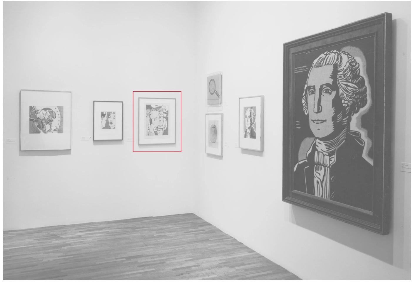
Installation view, The Drawings of Roy Lichtenstein, March-June 1987. Museum of Modern Art, New York (present lot illustrated). Photo: © The Museum of Modern Art/Licensed by SCALA / Art Resource, NY. Artwork: © Estate of Roy Lichtenstein.
Lichtenstein’s bold innovation in Pop Art reexamined representational drawing, one of the most established aspects of the Western artistic tradition, into a radical exercise, parodying the traditional forms which it illustrated with a certain ironic and humorous aloofness. The probing, hard-edge lines and sharp edges in the work reveal Lichtenstein first working out the style and technique which he would later adapt across his entire oeuvre.
Roy Lichtenstein, The Kiss, 1961. Private collection. © Estate of Roy Lichtenstein.
Amid the many linear and textural inventions evinced in The Kiss, the tightly weaved lines and patterns spread across both visages are perhaps the most important. The artist had first experimented with recreating the Ben-Day dots from comic books the prior year, rubbing a dog-grooming brush dipped in ink over a sheet of aluminum drilled through with holes. He was discontented with his first attempts, desiring for their effect to appear less hand-made and more mechanical. His innovation here is using a frottage technique, placing the paper over a window screen and rubbing the graphite into the grains of the paper, thus creating the pattern. Varying the pressure on his tool allowed him to create subtle changes in tone, the effortless appearance of the result acquired through a great degree of precision and experimentation.
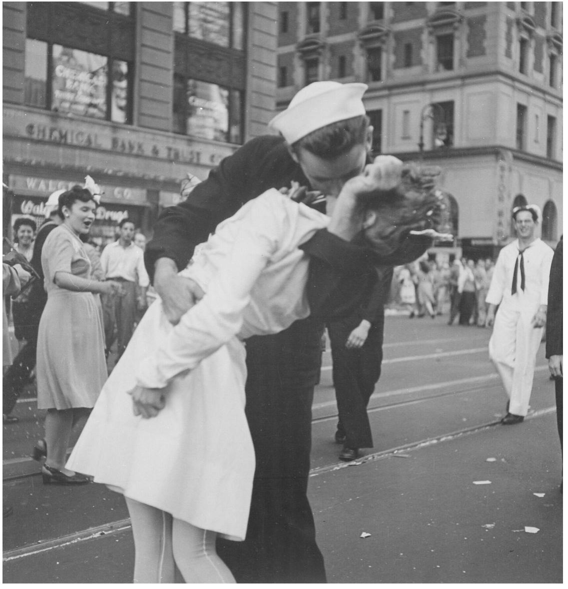
Victor Jorgensen, New York City celebrating the surrender of Japan. They threw anything and kissed anybody in Times Square, 1945. National Archives at College Park, Maryland.
The subject matter is of great import to the artist, and functions both as a broadly autobiographical gesture and as a unifying motif across several of his drawings. Lichtenstein had trained as a U.S. Army pilot during World War II before being transferred to make cartoons for the Army magazine. Pilots are a recurring motif in both his first drawings and across his career, appearing in Jet Pilot (1962, Yale University Art Gallery, New Haven), as well as the paintings Brattata (1962, Tehran Museum of Contemporary Art) and Wham! (1963, Tate Modern, London). While the other works focus more on the action of flying, The Kiss removes the pilot from his plane, seen only as a two-dimensional form barely abutting the upper right. Lichtenstein was exacting in his choice of materials, utilizing only the highest quality supplies in contrast to his cheaply produced source images. The Kiss is on neutral toned white hot pressed Arches paper, which had a smooth texture and refined finish which allowed him to create his precise images. Its thickness and quality meant that the support withstood the heavily reinforced pencil lines, scraping, and frottage which entailed his intense drawing technique.
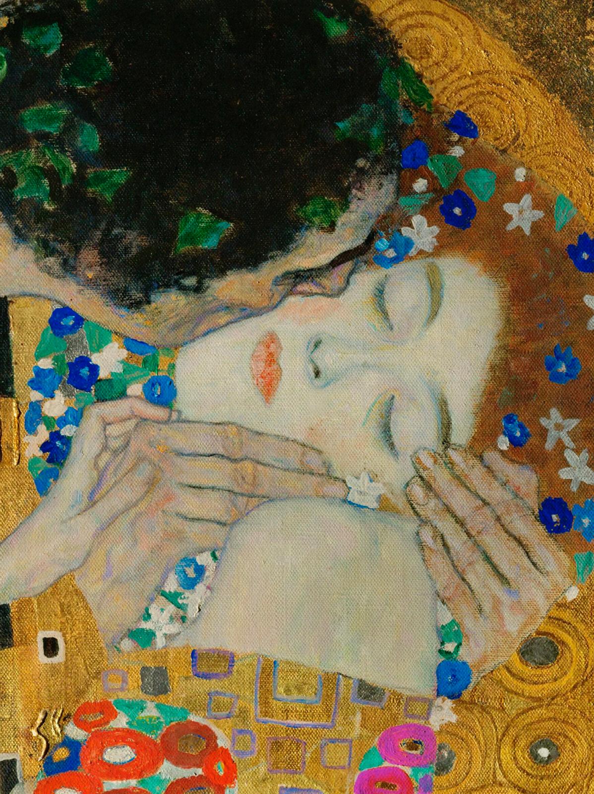
Gustav Klimt, The Kiss (detail), 1907-1908. Österreichische Galerie Belvedere, Vienna.
The Kiss, along with Lichtenstein’s other early drawings, had a vast impact on the course of the artist’s career as well as on the development of Pop Art. The work is perhaps most important in the way that it exposes the artistry which lays latent behind all of the artist’s works, but is often obscured in his larger paintings.