Ed Ruscha’s prints occupy a quiet but decisive place in the postwar American canon. Stripped of narrative excess and emotional display, they distill the visual language of the West, gas stations, empty roads, distant mountains, into images that are at once familiar and oddly detached. What appears neutral is, in fact, highly constructed.
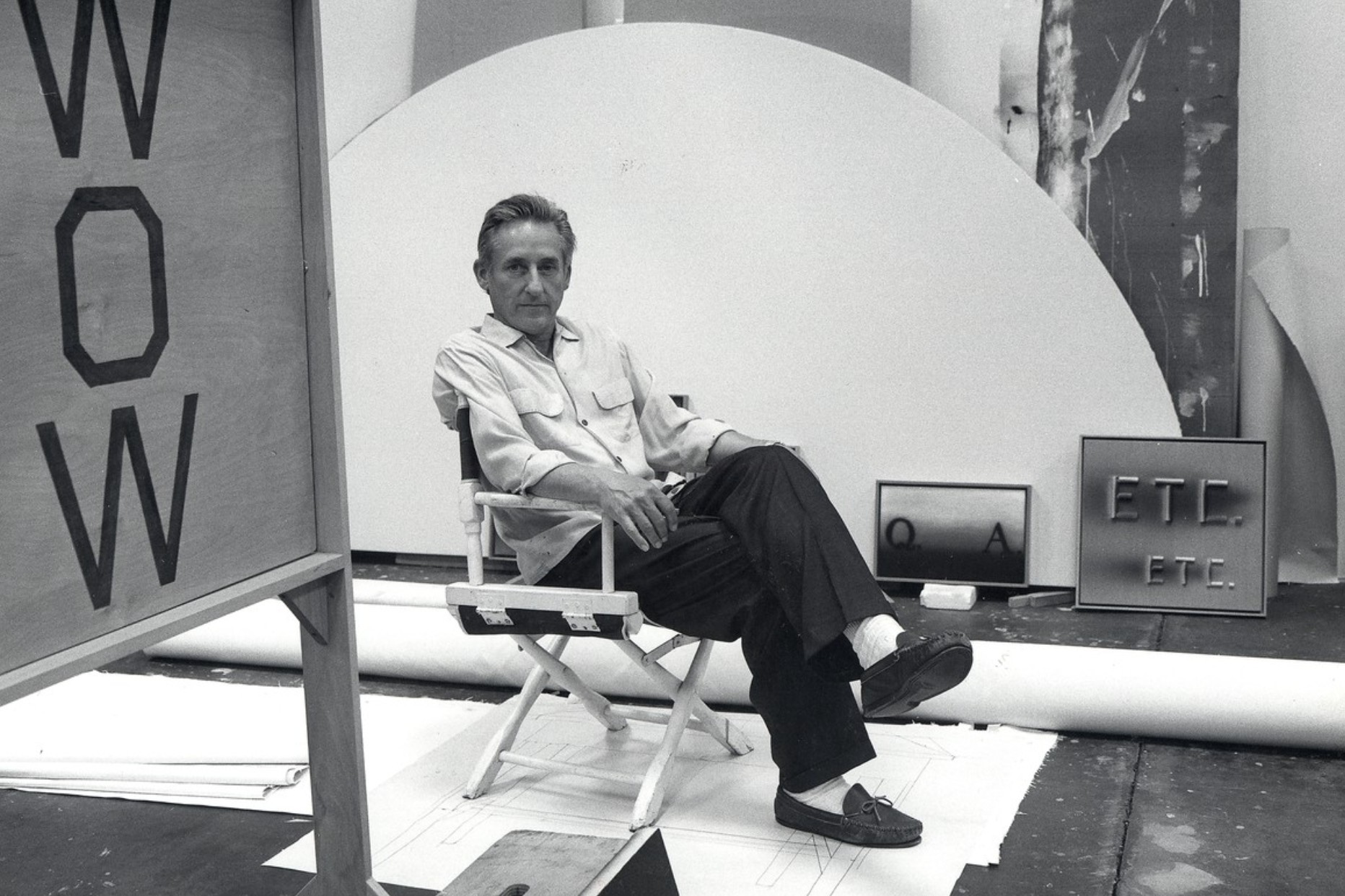
From the iconic Standard Station prints to the understated mountain and landscape works, Ruscha’s editions translate his conceptual rigor into reproducible form without diluting its force. These images operate on restraint: flat perspectives, controlled palettes, and an almost deadpan approach to subject matter. The result is a body of work that resists spectacle while remaining instantly recognizable.
WORK IN PROGRESS
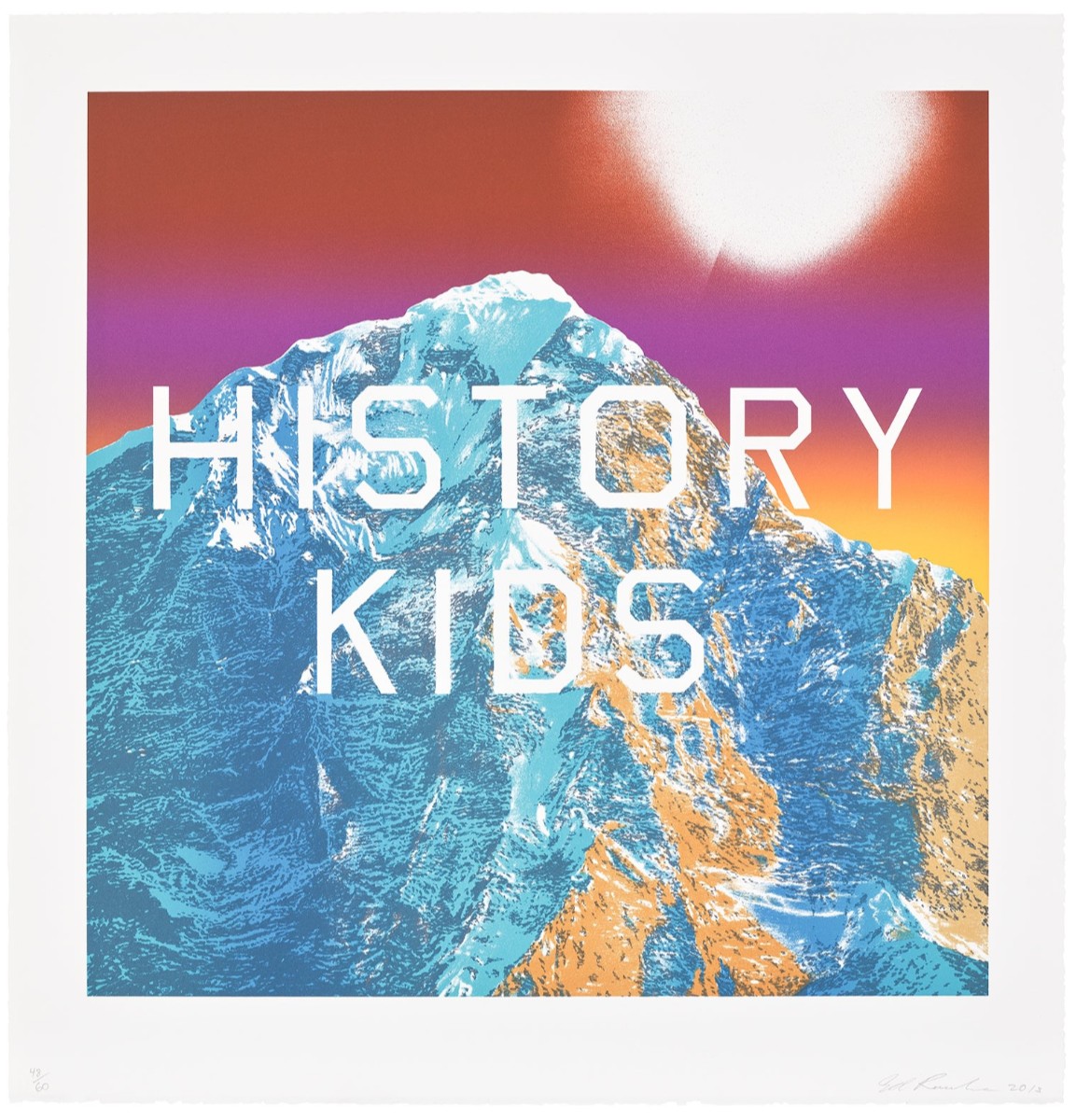
History Kids, 2013
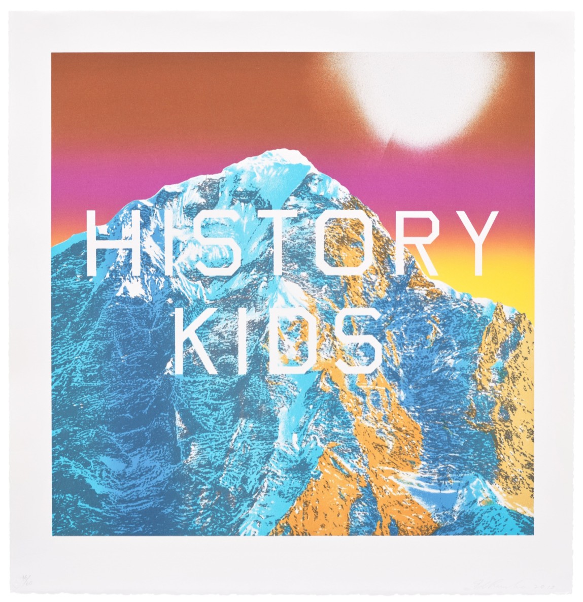
History Kids
from Mountain Prints
Medium: Lithograph in colors on BFK Rives paper
Year: 2013
Image: 24×24 inches (61.1 x 61 cm)
Sheet: 29×28 inches (73.7 x 71.2 cm)
Edition: 60
Artist’s Proofs: 21 AP
Color Trial Proofs: 18 CTP
Publisher: Hamilton Press, Santa Monica, and Tate Modern, London
Signed, dated and numbered in pencil on the front
With the publisher’s blindstamp
History Kids explores the relationship between the verbal and the visual. For Ruscha, word and image are inextricably linked, equating them as mutually interdependent like an actor and stage, or a car and road. Ruscha’s work, however, does not adhere to such clearly defined boundaries; in the artist’s hands, words transform into both visual image and material object.
“When I began painting, all my paintings were of words which were guttural utterances like Smash, Boss, Eat. Those words were like flowers in a vase.”
In History Kids, Ruscha employs his recurring motif of a mountainous background, snow-capped and icy blue. Patches of orange cascade across the crevasses, reflecting the rays of the burning red sky. Ruscha’s affinity to the recurring image is perhaps due to its synesthetic quality.
“Mountains have their own orchestration,
you know, you can almost hear trumpets playing.”
In Ruscha’s work, the boundaries between word, image, and even sound, are constantly shifting, interchanging, and deteriorating. Emblazoned in large typography across this mountain is the capitalized phrase “HISTORY KIDS”. The neutral font used is the artist’s own invention called “Boy Scout Utility Modern”, designed to be as neutral, straight-lined and plain as possible. In this font, the condensed phrase recalls the straightforward legibility of a newspaper headline or advertising slogan. However, quite the opposite is true.
“I’m dead serious about being nonsensical.”
Ruscha’s use of language is characteristically ambiguous and playful, gravitating towards bold and onomatopoeic words such as “OOF”, “HONK”, “BABY JET” and “FAT BOY”. History Kids is no exception. Ruscha separates the words onto two different lines, deliberately splitting the pairing to emphasize the ambiguous meaning. With this line break, the emphasis falls on the first word “HISTORY”. The effect is authoritative, a knowing voice telling us that it’s all history, kids. An alternative reading is that the word “KIDS” is not a noun but a verb: history kids, it laughs at us as we repeat our old mistakes. Alternately, there may be no relationship between the two words other than their compositional proximity. The more time we spend grasping at each new interpretative possibility, the more meaning seems to slip away from our touch – which is exactly the artist’s intention. Without clear definition, Ruscha’s gnomic phrases become empty, both a physical thing and a conveyor of meaning, simultaneously a pictorial image and a bearer of knotty linguistic referentiality.
“I had a notion to make pictures by using words and presenting them in some way and it seemed like a mountain was an archetypal stage set. It was a perfect foil for whatever was happening in the foreground.”
A master of vernacular and form, Ed Ruscha has been well regarded for his superimposition of text upon landscape since the 1980s, when the artist developed a visual language of juxtaposing the symbolic stimulus of the image with text that generates an atmosphere of speech, sound, and shape. Long associated with the vast flatness of the western plains, the buildings cluttered on Sunset Boulevard, or the monumental horizontality of the Hollywood sign, Ruscha’s Mountain Prints see him embrace a new kind of landscape: glistening, snowcapped summits set against his signature gradated sunsets captured in photorealist detail. While these peaks are based on photographs, Ruscha described them as “mountains of the mind,” elaborating that they function as “anonymous backdrops for the drama of words.”
“Words have temperatures to me. When they reach a certain point and become hot words, then they appeal to me. Sometimes I have a dream that if a word gets too hot and too appealing, it will boil apart, and I won’t be able to read or think of it.”
In his mountain prints, Ruscha’s cryptic and humorously banal phrases rendered in his hallmark “Boy Scout Utility Modern” typeface interrupt the harmony of the scenic backdrop and obfuscate its view. The positioning of these enigmatic words, on square-format paper that accentuates the central placement of the text, is reminiscent of the mundanity of road signage in a picturesque landscape, a reassurance of human presence: “I like the oddity of nature in the background,” Ruscha remarked. At once sublime and absurd, these works grow from the Romantic canon of mountain scenes, like the canvases of Caspar David Friedrich, the landscapes of the Hudson River School, or the photographs of Ansel Adams; Ruscha undercuts the accustomed spiritualism of these pictures with his punchily “hot” two-word phrases.
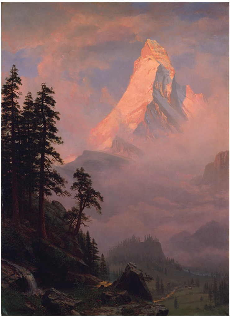
Albert Bierstadt, Sunrise on the Matterhorn, after 1875, The Metropolitan Museum of Art, New York.
Image: © The Metropolitan Museum of Art, New York, Gift of Mrs. Karl W. Koeniger, 1966, 66.114
After collaborating for many years, in 1990 Ruscha established Hamilton Press together with Ed Hamilton, the master printer of the renowned Tamarind lithography workshop. Having worked on about forty prints together, they collaborated to create a fine art publishing house where artists can produce original editioned artworks. While technically focused on the medium of lithography, it is the spirit of collaboration between artist and printmaker that Hamilton Press is inspired by and dedicated to. In the History Prints, we see this collaboration materialize through the expert coalescence of content and technique: the print process augments Ruscha’s distinct landscapes with a graphic tactility and a rich profusion of color, from deep plums and fiery tangerines to icy blues and crisp whites. Through lithography, we see Ruscha transform these monumental mountain scenes into his distinctive vernacular visual language.
Auction Results
Estimated: USD 40,000 – 60,000
USD 40,640
ED RUSCHA (b. 1937)
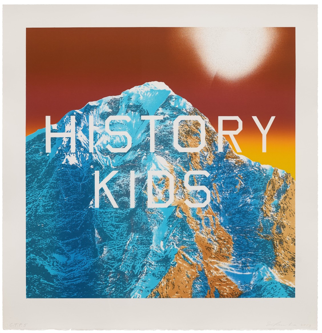
History Kids, 2013
Lithograph printed in colors on BFK Rives paper
Signed in pencil, dated and inscribed C.T.P. 5
This impression is a color trial proof aside from the numbered edition of 60 plus 18 artist’s proofs
Estimated: GBP 25,000 – 35,000
GBP 25,800 / USD 34,970
Lithograph in colors on BFK Rives paper
Signed, dated and numbered 46/60 in pencil on the front
Dedicated ‘For the History Kid Nick’ (Nicholas Serota, former director of the Tate) in pencil on the reverse
Phillips London: 24 January 2025
Estimated: GBP 25,000 – 35,000
GBP 60,960 / USD 75,305
Ed Ruscha Evening & Day Editions
Lithograph in colours, on BFK Rives paper
Signed, dated and numbered 48/60 in pencil on the front
Dedicated ‘For the History Kid Nick’ (Nicholas Serota, former director of the Tate) in pencil on the reverse
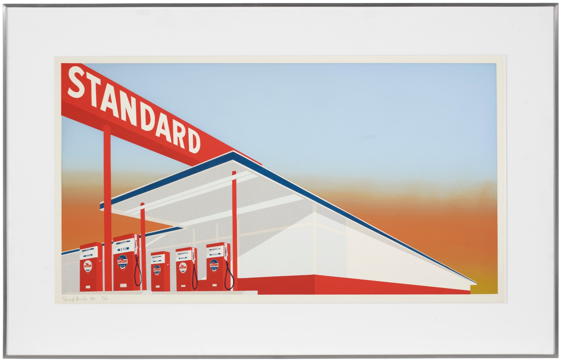
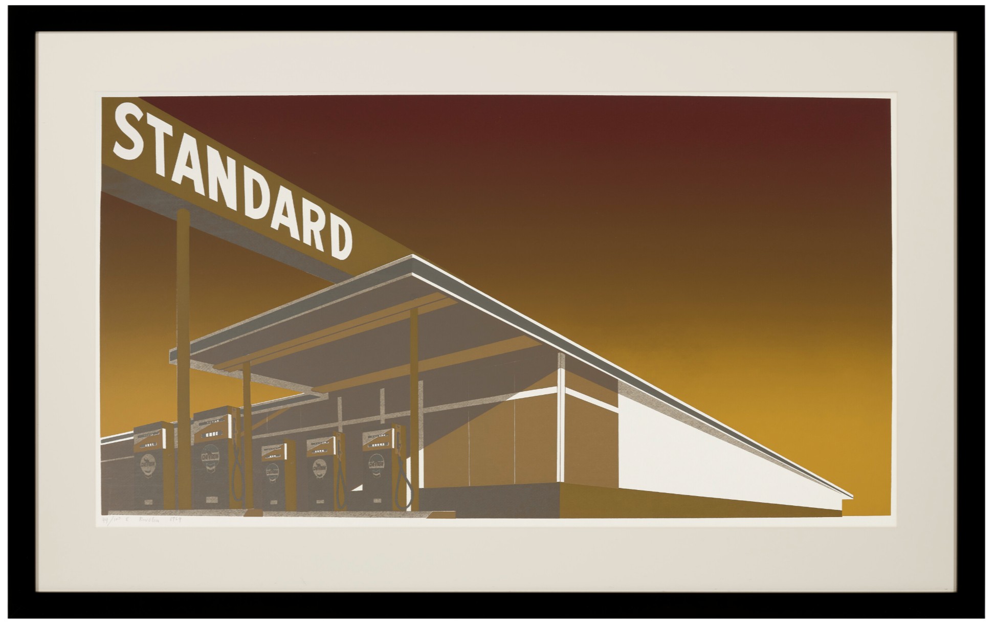
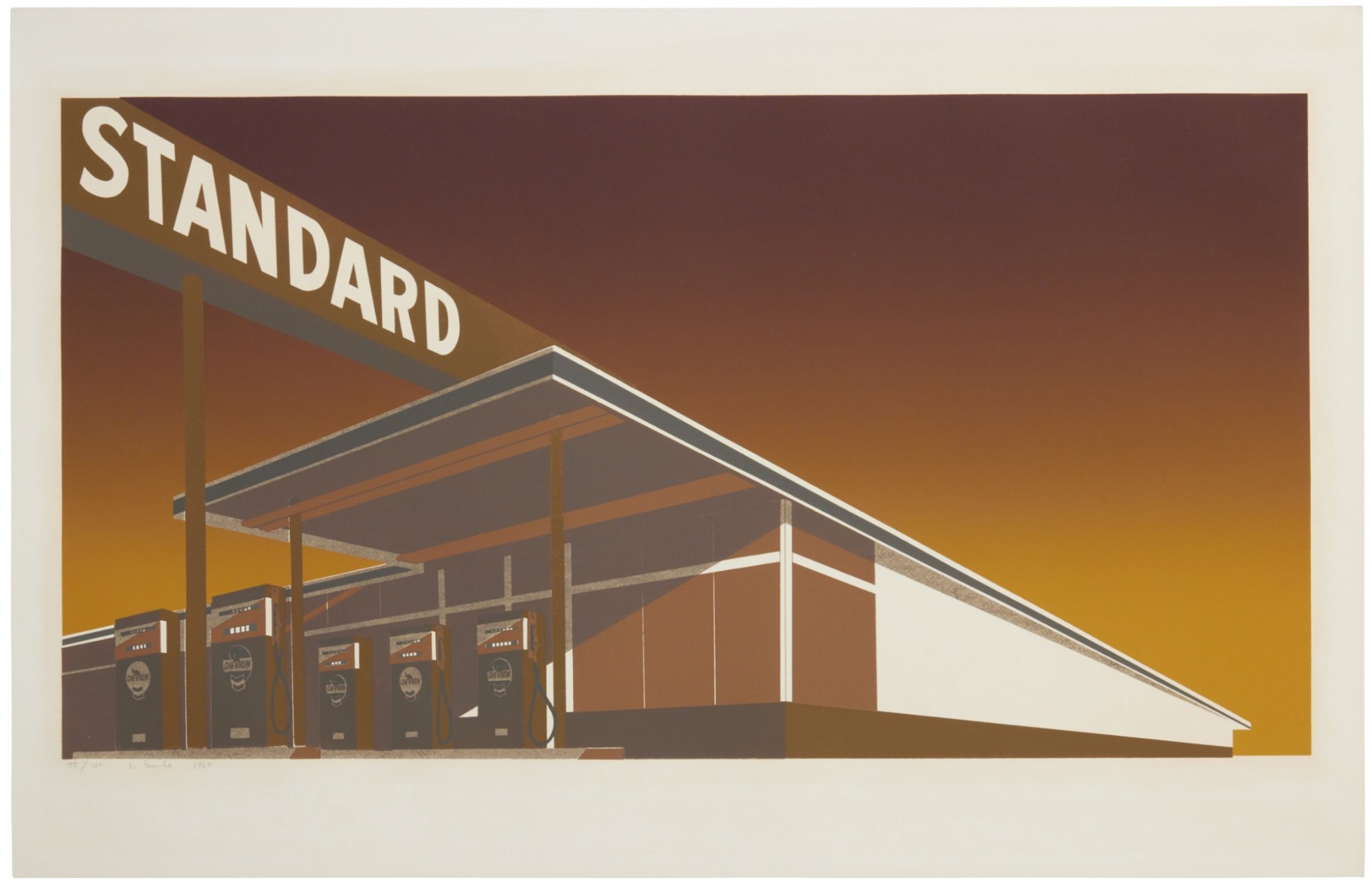
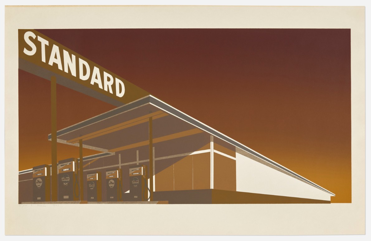
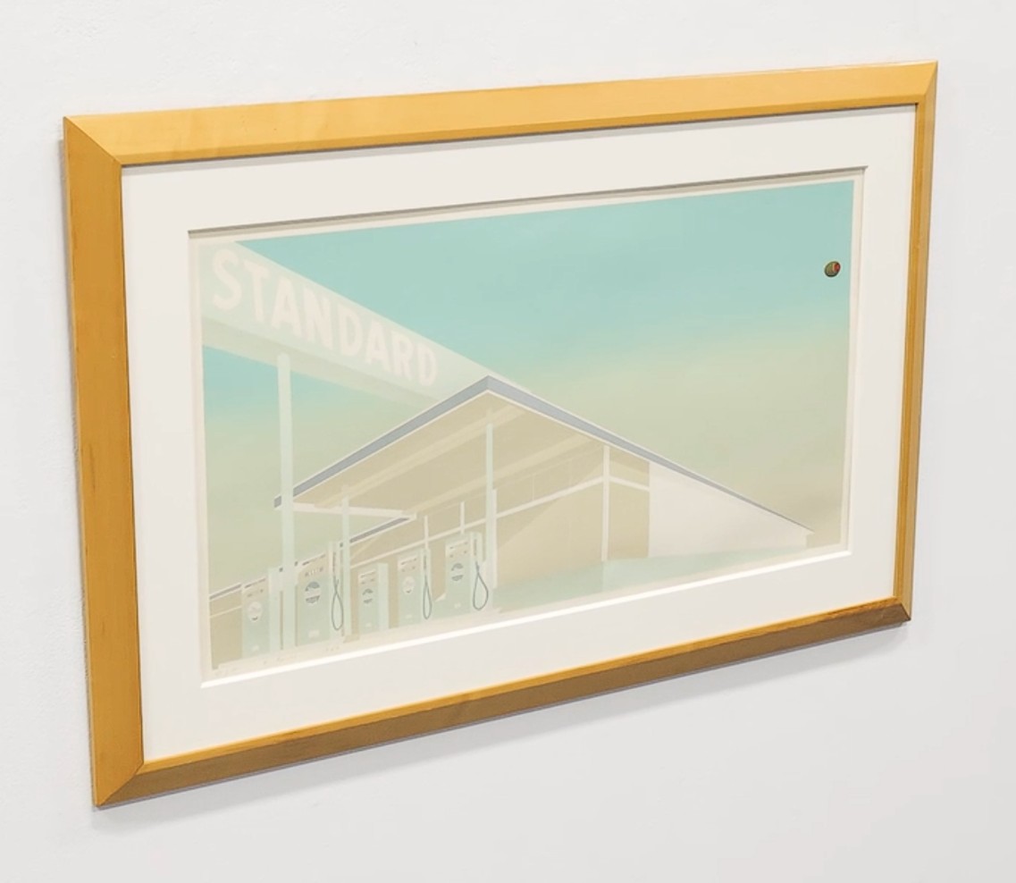
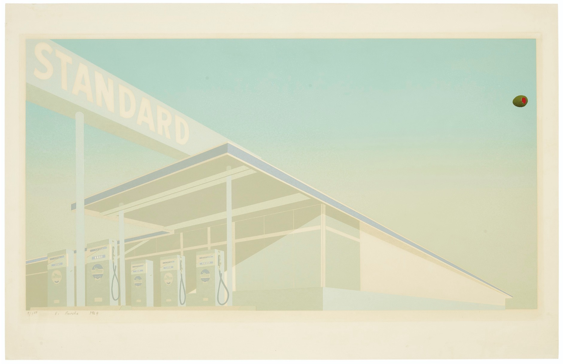
Standard, 1966
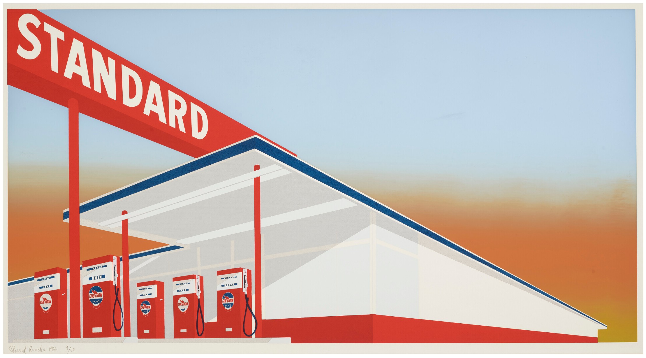
Standard
Medium: Screenprint in colors on commercial buff paper
Year: 1966
Image: 19 1/2 x 37 inches (49.5 x 93.9 cm)
Sheet: 25 5/8 x 40 1/8 inches (65.1 x 101.9 cm)
Edition: 50
Artist’s Proofs: 2 AP
Printer: Art Krebs Screen Studio
Publisher: Audrey Sabol, Villanova, Pennsylvania
Literature: Engberg 5
Signed, dated and numbered in pencil
Standard, most probably Ed Ruscha’s most iconic limited-edition screenprint, is based on a photograph from his 1963 artist’s book, Twentysix Gasoline Stations. It dramatically renders a gas station at a sharp, cinematic angle. A deep, plunging diagonal perspective, typical of Ruscha’s work, makes the station appear to hurtle into the viewer’s space. The graphic is flat and minimalist, reducing the mundane roadside architecture to its essential geometric forms. The image is devoid of people and cars, which lends it a sense of quiet isolation. A vibrant and contrasting color scheme defines Standard. The crisp, geometric lines of the gas station are set against a surreal and colorful gradient sky, which Ruscha created using the “split-fountain” technique.
Ruscha’s Standard Station print synthesizes Pop Art, Conceptual Art, and the romantic mythology of the American West. Influenced by pop culture and commercial design, Ruscha elevates an everyday, banal object into the realm of fine art, much like Andy Warhol did with his Campbell’s soup cans.
While the artwork directly references the Standard Oil company logo, the word “standard” takes on deeper significance. It alludes to the homogenization of the American landscape and culture brought on by corporate expansion and consumerism. Ruscha himself has downplayed overly academic readings, suggesting any deeper meanings are in the eye of the beholder. He claimed to simply be celebrating the “beautiful design” of the gas stations.
The artwork is steeped in the context of American car culture and the experience of the open road. It originated from Ruscha’s personal drives along Route 66 between Los Angeles and Oklahoma City.
It was created in collaboration with print publisher Audrey Sabol, who funded the project. The screenprint was a significant work for Ruscha, marking one of his first collaborative print projects and a notable fine-art use of the “split-fountain” technique.
This image has become one of Ruscha’s most recognizable works and an iconic image of post-war American art. Ruscha’s practice of appropriating mundane subjects and commercial techniques like screenprinting influenced a generation of artists. Ruscha has returned to the theme repeatedly over his career, creating variations of the print in different colors, mediums, and formats, such as Mocha Standard and Ghost Station.
Impressions of the print are held in major museum collections, including the Museum of Modern Art (MoMA), the Tate Britain, and the Los Angeles County Museum of Art (LACMA).
Auction Results
Christie’s New-York: 28 October 2022
Estimated: USD 400,000 – 600,000
USD 554,400
ED RUSCHA (B. 1937), Standard Station | Christie’s
ED RUSCHA (B. 1937)
Standard Station (Engberg 5), 1966
Screenprint in colors on commercial buff paper
Signed and dated in pencil, numbered 9/50
Mocha Standard, 1969
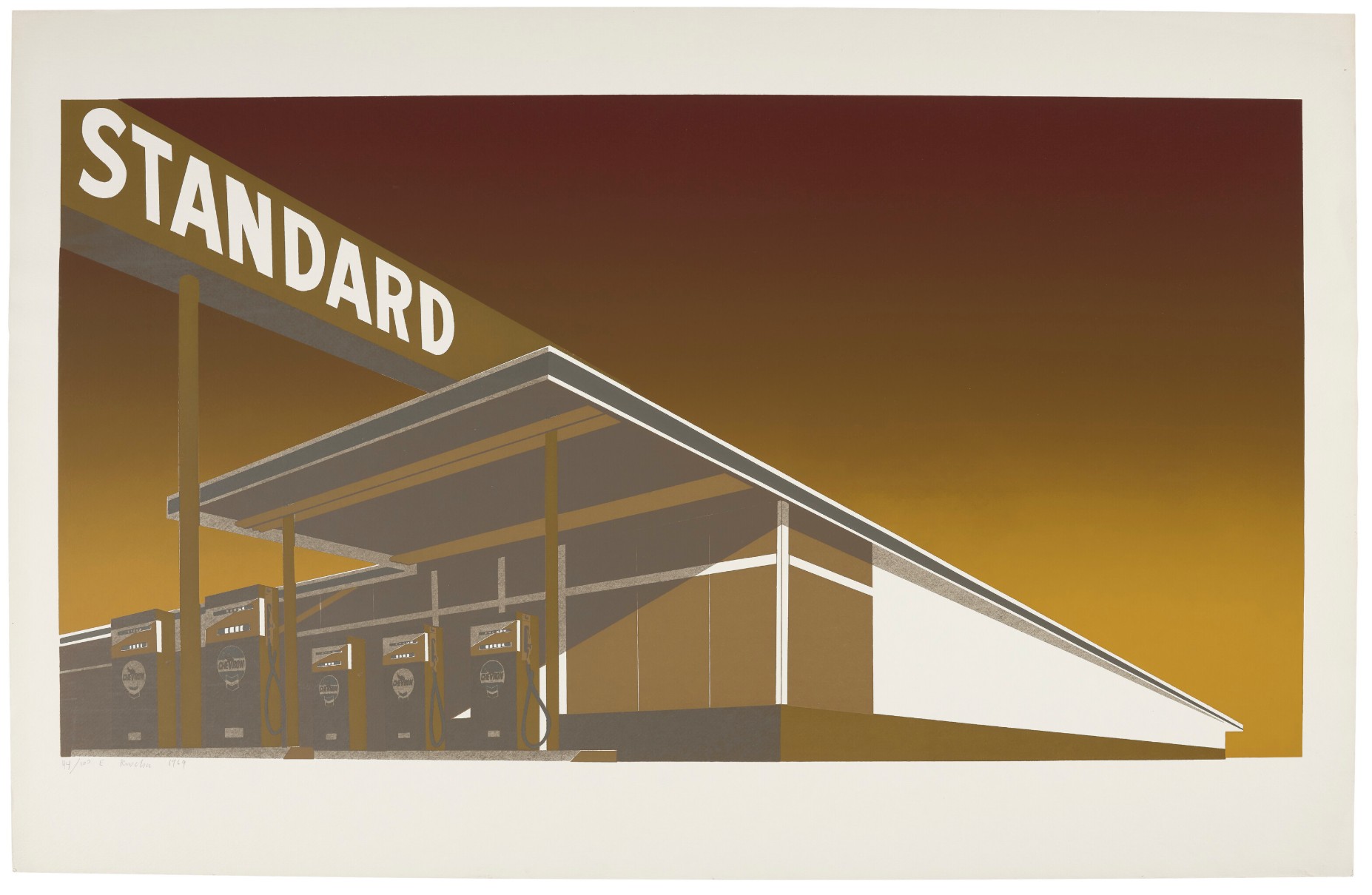
Mocha Standard
Medium: Screenprint in colors on cream wove paper
Year: 1969
Image: 19 5/8 x 37 inches (49.8 x 93.9 cm)
Sheet: 25 3/4 x 40 1/8 inches (65.4 x 101.9 cm)
Edition: 100
Artist’s Proofs: 3 AP
Printer: Jean Milant and Daniel Socha
Publisher: The Artist
Literature: Engberg 30
Signed, dated and numbered in pencil
Mocha Standard depicts a Standard Oil gas station in a cinematic style, using commercial art techniques to elevate a mundane subject into an icon of American culture. It is part of a series of prints that solidified Ruscha’s reputation as a leader in both Pop and Conceptual art. The print is a dynamic and dramatically foreshortened view of a Standard Oil gas station, based on a 1963 painting and earlier photography. The perspective is from below, making the station and its iconic sign appear powerful and monumental against a wide, empty sky.
Mocha Standard was released in 1969 as part of a series revisiting his 1966 Standard Station print. The 1969 series also included Double Standard and Cheese Mold Standard with Olive, each exploring the same imagery with a different color palette. The print’s name refers to its color palette, which gives the image a monochromatic, sepia-toned—or “mocha”—effect. The sky, in particular, features a soft, gradient fade achieved with the “split-fountain” printing technique, a method taken from commercial printing.
Ruscha’s subject matter, an everyday commercial gas station, aligns with the Pop Art movement’s interest in mass media and consumer culture. The piece captures the homogenization of the American landscape brought on by corporate branding. Beyond its Pop Art elements, the work has a conceptual depth. Ruscha’s long-standing interest in the relationship between words, things, and ideas is evident in his depiction of the word “Standard”. The word evokes both a corporate brand name and the idea of an established, everyday “standard”.
The work originates from Ruscha’s 1963 painting, which in turn was inspired by a photograph of a Standard station in Amarillo, Texas, from his 1964 artist’s book, Twenty six Gasoline Stations. The image of the Standard gas station is arguably Ruscha’s most famous and recognizable motif, defining his decades-long career. Ruscha’s use of the split-fountain technique in fine art helped popularize the effect, though it became somewhat of a cliché among other artists by the late 1960s. This print is held in major museum collections, including the Whitney Museum of American Art, the Museum of Modern Art, and the Tate Gallery.
Auction Results
Christie’s New-York: 24 October 2025
Estimated: USD 120,000 – 180,000
USD 228,600
ED RUSCHA (B. 1937), Mocha Standard | Christie’s
ED RUSCHA (B. 1937)
Mocha Standard (Engberg 30), 1969
Screenprint in colors on wove paper
Signed and dated in pencil, numbered 44⁄100
Sotheby’s New-York: 26 September 2025
Estimated: USD 100,000 – 150,000
USD 127,000
Mocha Standard | Contemporary Curated | 2025 | Sotheby’s
ED RUSCHA (b. 1937)
Mocha Standard, 1969
Screenprint on wove paper
Image: 19 1/2 x 37 inches (49.7 x 93.8 cm)
Sheet: 25 3/4 x 40 inches (65.3 x 101.6 cm)
Signed, dated 1969 and numbered 75/100 (lower left)
This impression is number 75 from the edition of 100 plus 3 artist’s proofs
LA Modern: 11 January 2023
Estimated: USD 80,000 – 120,000
USD 151,200
ED RUSCHA (b.1937)
Mocha Standard, 1969
Screenprint in colors
Signed, dated and numbered to lower left ‘51/100 E. Ruscha 1969’
Cheese Mold Standard with Olive, 1969
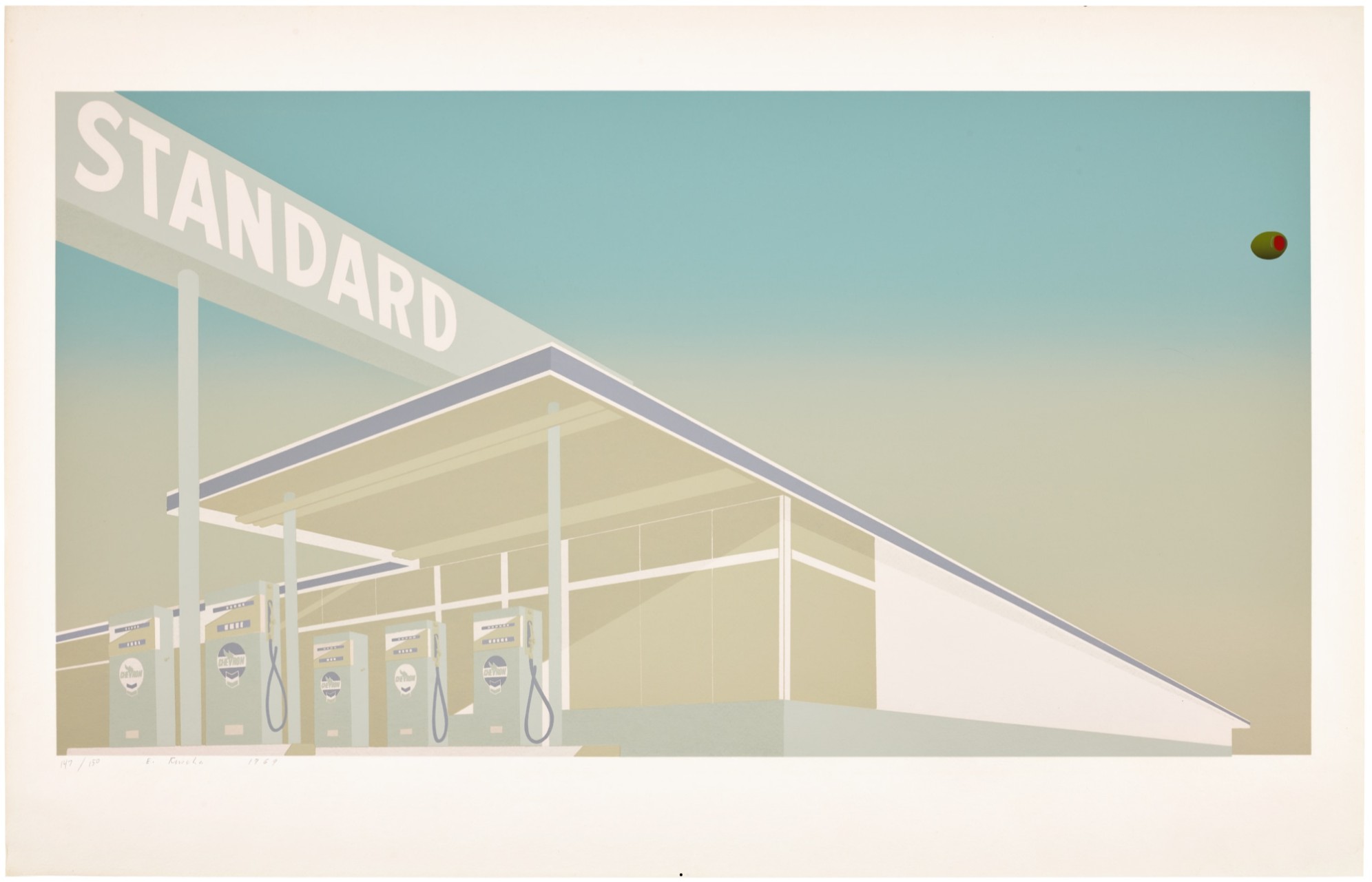
Cheese Mold Standard with Olive
Medium: Screenprint in colors on cream wove paper
Year: 1969
Image: 19 1/2 x 37 inches (49.5 x 94 cm)
Sheet: 25 5/8 x 40 inches (65.1 x 101.6 cm)
Edition: 150
Artist’s Proofs: 10 AP
Printer: Jean Milant and Daniel Socha
Publisher: The Artist
Literature: Engberg 31
Signed, dated and numbered in pencil
As the most iconic image of his career, Ed Ruscha has repeatedly revisited this subject of the Standard gas station, exploring Americana through the topography of the highway. As a young man, driving back and forth in his 1950 Ford Sedan, along route 66 between his hometown of Oklahoma City and his new residence in Los Angeles, Ruscha first turned his camera out onto these fuel stops. The resulting black and white photographs became Ruscha’s first artist book, the groundbreaking Twentysix Gasoline Stations. From this collection, Ruscha selected one image which he would come to reinterpret for over fifty years: A Standard station in Amarillo, Texas.
“I don’t have any Seine River like Monet.
I just have U.S. 66 between Oklahoma and Los Angeles.”
Evoking perhaps the inverse of a dramatic sunset, the cool-tones gradient background of Cheese Mold Standard with Olive was executed through a ‘split fountain’ screenprinting technique whereby two or more pools of different colored inks are pulled across the stencil and through the screen until the colors blend together under the pressure of the squeegee. Though the technique was commonplace in commercial printing at this time, Ruscha had become one of the first artists to deploy it in fine art printing; as the artist had been working on drawings at the time that used easily blended materials like pastel, he found the split fountain method useful in achieving the modulations of tone that were becoming a trademark of his style of draftsmanship. (Siri Engberg, “Out of Print: The Editions of Edward Ruscha, in Edward Ruscha Editions 1959-1999, 1999, p. 19) While Ruscha would later occasionally use foodstuff in place of inks for his prints, the title of this iteration of the Standard station comes from an association with the colors used, eliciting the tones that inflict a spoiled – or intentionally aged – block of cheese. Meanwhile, the titular olive is more directly engaged, floating inscrutably at the right edge of the image and rendered in a trompe l’oeil effect that punctures the deliberate flatness of Ruscha’s Standard composition.
Auction Results
Phillips New-York: 21 October 2025
Estimated: USD 70,000 – 100,000
USD 129,000
Ed Ruscha Editions & Works on Paper
Signed, dated and numbered 147/150 in pencil
Christie’s New-York: 27 September 2019
Estimated: USD 70,000 – 100,000
USD 150,000
Ed Ruscha, Cheese Mold Standard with Olive | Christie’s
ED RUSCHA
Cheese Mold Standard with Olive, 1969
Screenprint in colors on laid paper
Signed and dated in pencil, numbered 9/150
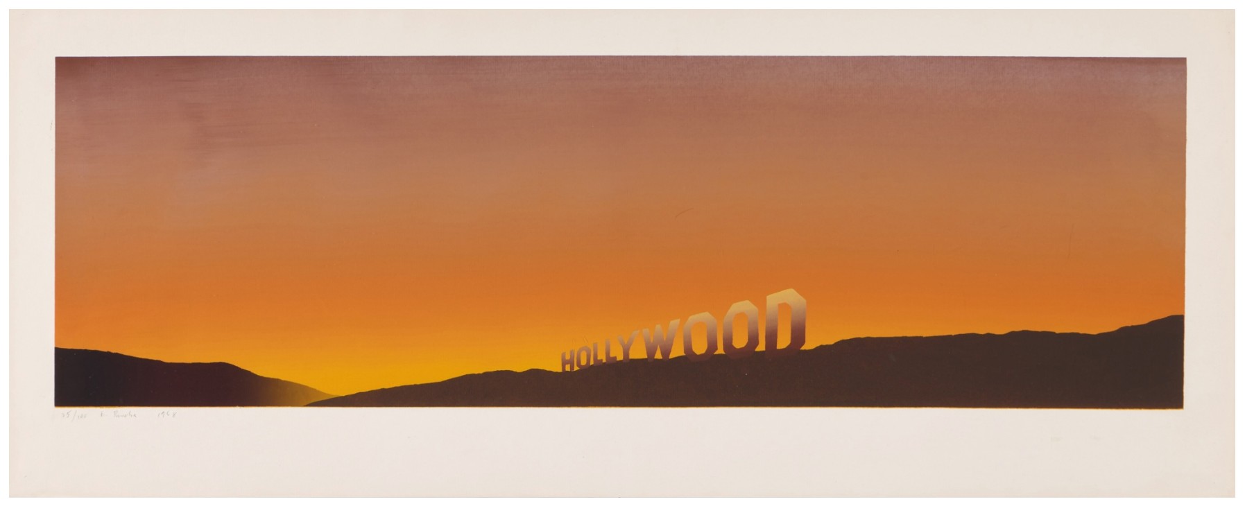
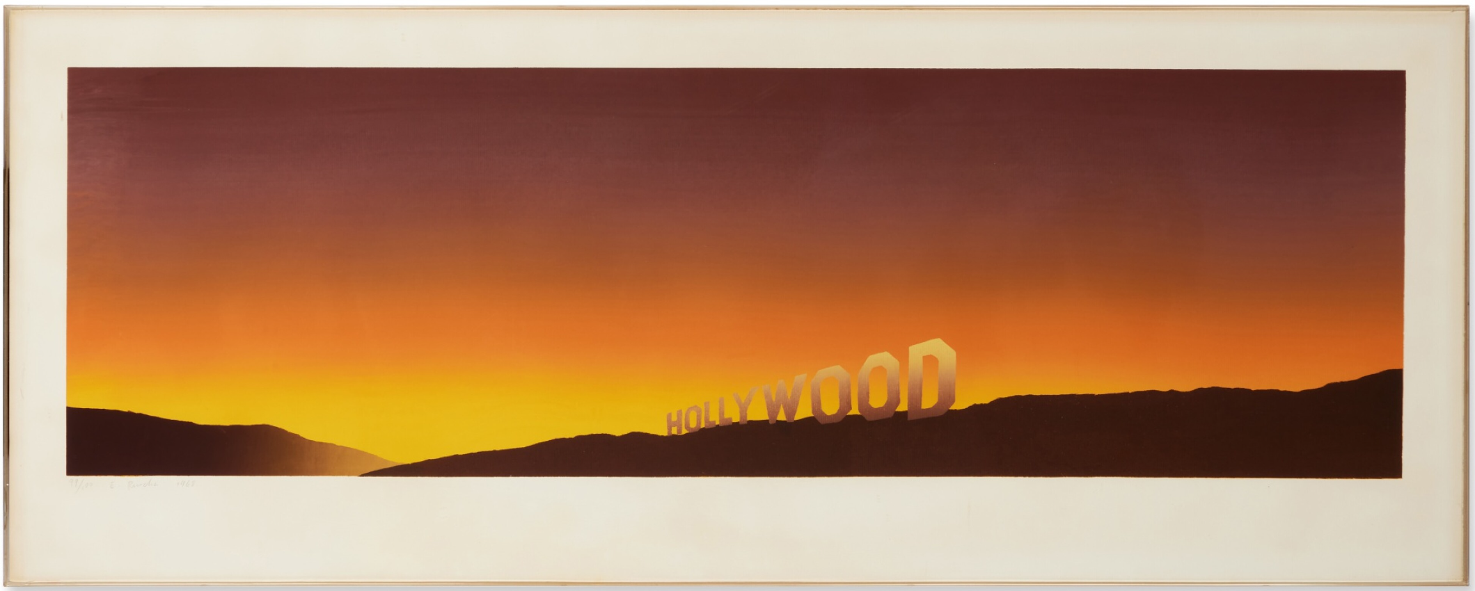
Hollywood, 1968
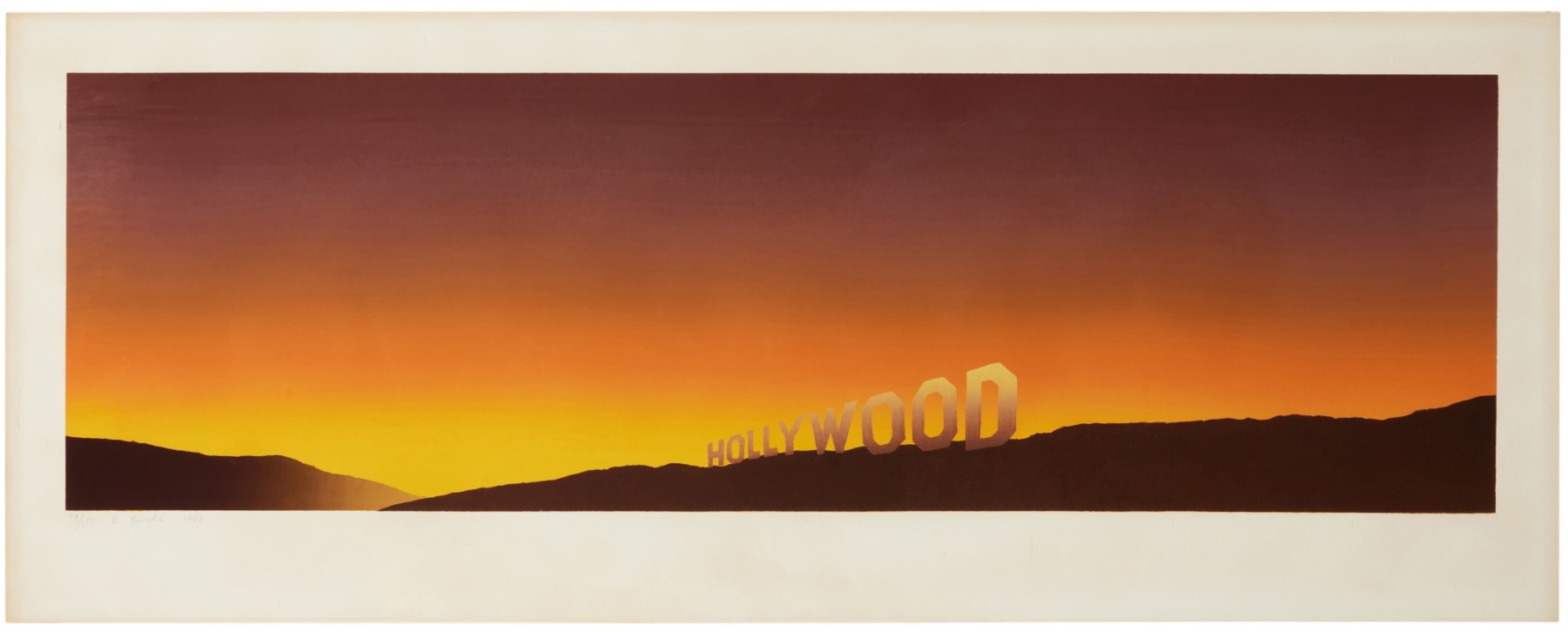
Hollywood
Medium: Screenprint in colors on laid paper
Year: 1968
Image: 12 1/2 x 40 3/4 inches (31.9 x 103.7 cm)
Sheet: 17 1/2 x 44 3/8 inches (44.5 x 112.7 cm)
Edition: 100
Artist’s Proofs: 2 AP
Publisher: The Artist
Literature: Engberg 7
Signed, dated and numbered in pencil
Hollywood is one of Ed Ruscha’s most distilled statements about place, image, and illusion. Created in 1968, it presents the Hollywood sign at dusk, stretched across a panoramic format that emphasizes distance rather than spectacle. The famous letters appear slightly blurred, hovering between legibility and disappearance, as if already receding into myth. Formally, the composition is restrained to the extreme. A low horizon line anchors the image, while the sky dominates the surface through a smooth gradient shifting from deep orange to muted brown. The hills are rendered as dark silhouettes, stripped of detail, functioning almost as cutouts. Ruscha removes all anecdotal information: no cars, no people, no narrative, only atmosphere and typography embedded in landscape.
Conceptually, the work reflects Ruscha’s ongoing demystification of American icons. Hollywood, here, is not the glittering engine of dreams but a distant sign, physically present yet emotionally neutral. By softening the image and elongating the format, Ruscha transforms a symbol of ambition into something oddly quiet, even fragile. The promise remains, but it is suspended, unresolved.
Within Ruscha’s printed oeuvre, this image sits at the intersection of photography, painting, and conceptual art. It exemplifies his ability to turn familiar subjects into cool, analytical observations. For collectors, the print is emblematic of Ruscha’s West Coast sensibility: understated, precise, and enduring: an image that says very little, and therefore lasts.
Auction Results
Works Sold to Benefit Student Scholarships at California College of the Arts
Sotheby’s New-York: 26 February 2025
Estimated: USD 60,000 – 80,000
USD 107,950
Hollywood | Contemporary Curated | 2025 | Sotheby’s
ED RUSCHA (b. 1937)
Hollywood, 1968
Screenprint in colors on laid paper
Signed in pencil, dated 1968 and numbered 25/100 (lower right)
Sotheby’s New-York: 22 October 2024
Estimated: USD 60,000 – 80,000
USD 120,000
Hollywood (Engberg 7) | Prints & Multiples | Prints | Sotheby’s
ED RUSCHA (b. 1937)
Hollywood (Engberg 7), 1968
Screenprint in colors on laid paper
Image: 12 1/2 x 40 3/4 inches (31.9 x 103.7 cm)
Sheet: 17 1/2 x 44 3/8 inches (44.5 x 112.7 cm)
Signed in pencil, dated and numbered 99/100
This impression is number 99 from the edition of 100 plus two artist’s proofs
Published by the artist