WORK IN PROGRESS
Agenda
Sotheby’s
Modern & Contemporary Art Evening Auction
4 March 2025
Modern & Contemporary Evening Auction | 2025 | Sotheby’s
Contemporary Day Auction
5 March 2025
Contemporary Day Auction | 2025 | Sotheby’s
Modern Day Auction
5 March 2025
Modern Day Auction | 2025 | Sotheby’s
Christie’s
20th/21st Century London Evening Sale
5 March 2025
20th / 21st Century: London Evening Sale
The Art of the Surreal Evening Sale
5 March 2025
The Art of the Surreal Evening Sale
Post-War and Contemporary Art Day Sale
6 March 2025
Post-War and Contemporary Art Day Sale
Impressionist and Modern Art Day and Works on Paper Sale
7 March 2025
Impressionist and Modern Art Day and Works on Paper Sale
Phillips
Modern & Contemporary Art Evening Sale
6 March 2025
Modern & Contemporary Art Evening Sale: London Auction March 2025
Modern & Contemporary Art Day Sale
7 March 2025
Modern & Contemporary Art Day Sale: London Auction March 2025
PART II: AUCTION RESULTS
Sotheby’s
Modern and Contemporary Evening Auction
4 March 2025
Modern & Contemporary Evening Auction | 2025 | Sotheby’s
TOTAL
GBP 62,506,800 / USD 80,008,704
# Lots: 41
# Lots withdrawn: 3
# Lots unsold: 4
# Lots sold: 34
Sell-Through Rate: 89.5%
#1. Yoshitomo Nara
Sotheby’s London: 4 March 2025
Estimated: GBP 6,000,000 – 8,000,000
GBP 9,027,500 / USD 11,555,200
Cosmic Eyes (in the Milky Lake) | Modern & Contemporary Evening Auction | 2025 | Sotheby’s
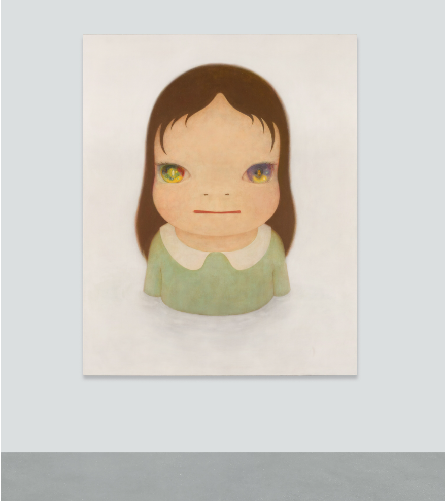
YOSHITOMO NARA (b. 1959)
Cosmic Eyes (in the Milky Lake), 2005
Acrylic and glitter on canvas
162 x 130.2 cm (64 3/4 x 51 1/4 inches)
Signed, partially titled and dated 2005 (on the reverse)
#2. Lisa Brice
Sotheby’s London: 4 March 2025
Estimated: GBP 1,000,000 – 1,500,000
GBP 5,408,000 / USD 6,922,240
After Embah | Modern & Contemporary Evening Auction | 2025 | Sotheby’s
LISA BRICE (b. 1968)
After Embah, 2018
Synthetic tempera, gesso and ink on canvas
244×205 cm (96 x 80 3/4 inches)
Signed and dated 2018 (on the overlap)
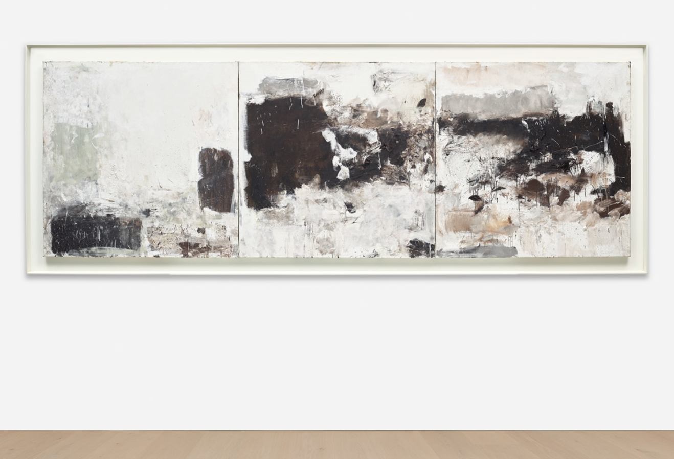
#3. Alberto Burri
Sotheby’s London: 4 March 2025
Estimated: GBP 2,500,000 – 3,500,000
GBP 4,920,000 / USD 6,297,600
Sacco e Nero 3 | Modern & Contemporary Evening Auction | 2025 | Sotheby’s
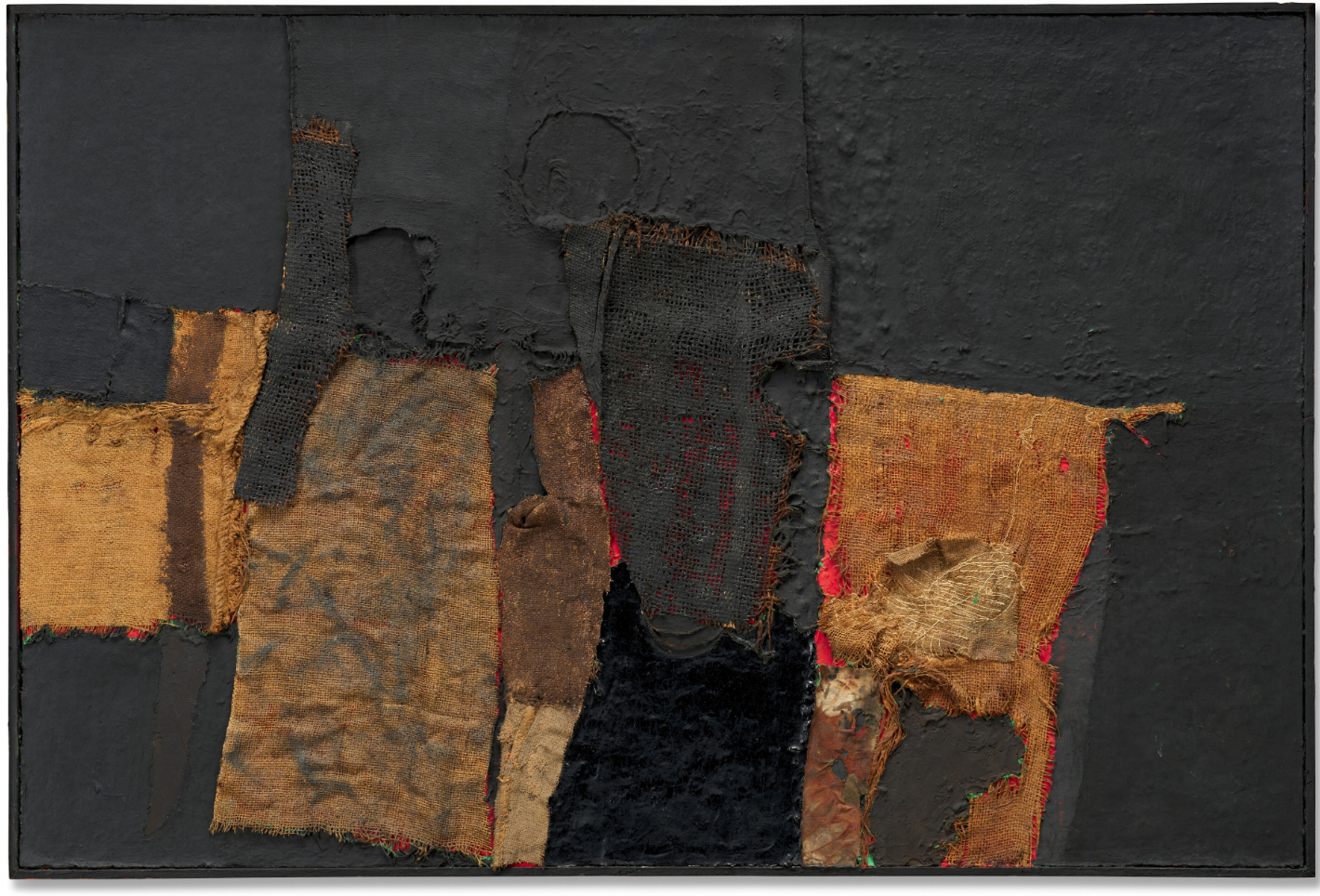
ALBERTO BURRI (1915 – 1995)
Sacco e Nero 3, 1955
Fabric, burlap, canvas, oil and Vinavil on board
100×150 cm (39 3/8 x 59 inches)
Signed (on the reverse)
#5. BANKSY
Sotheby’s London: 4 March 2025
Estimated: GBP 3,000,000 – 5,000,000
GBP 4,260,000 / USD 5,452,800
Crude Oil (Vettriano) | Modern & Contemporary Evening Auction | 2025 | Sotheby’s

BANKSY (b. 1974)
Crude Oil (Vettriano), 2005
Oil on canvas, in artist’s frame
Canvas: 91×122 cm (35 7/8 x 48 inches)
Tagged (lower right)
Signed, partially titled and dated Oct 2005 (on the overturn edge)
#8. Andy Warhol
Sotheby’s London: 4 March 2025
Estimated: GBP 1,800,000 – 2,500,000
GBP 2,480,000 / USD 3,174,400
Camouflage | Modern & Contemporary Evening Auction | 2025 | Sotheby’s
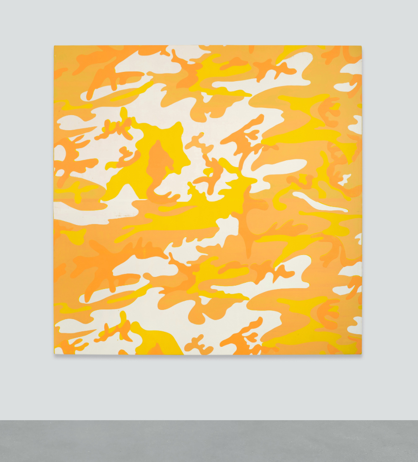
ANDY WARHOL (1928 – 1987)
Camouflage, 1986-87
Acrylic and silkscreen ink on canvas
76 1/4 x 76 1/4 inches (193.7 x 193.7 cm)
Stamped by The Estate of Andy Warhol and by The Andy Warhol Foundation for the Visual Arts
Numbered PA85.040 three times on the overlap
Christopher Wool
Sotheby’s London: 4 March 2025
Estimated: GBP 2,000,000 – 3,000,000
GBP 2,419,000 / USD 3,096,320
Untitled | Modern & Contemporary Evening Auction | 2025 | Sotheby’s
CHRISTOPHER WOOL (b. 1955)
Untitled, 2008
Enamel on linen
106×96 inches (269.2 x 243.8 cm)
Signed, dated 2008 and numbered (P572) (on the overlap)
Signed, dated 2008 and numbered (P572) (on the backing board)
#18. Roy Lichtenstein
Sotheby’s New-York: 4 March 2025
Estimated: GBP 1,000,000 – 1,500,000
GBP 1,019,000 / USD 1,304,320
Peanut Butter Cup | Modern & Contemporary Evening Auction | 2025 | Sotheby’s
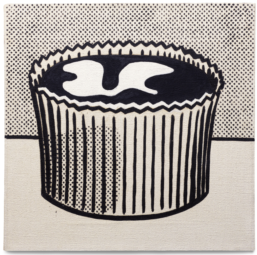
ROY LICHTENSTEIN (1923 – 1997)
Peanut Butter Cup, 1962
Oil on canvas
14×14 inches (35.6 x 35.6 cm)
Titled (on the overlap)
Signed and dated ’62 (on the reverse)
#20. Adrian Ghenie
Sotheby’s London: 4 March 2025
Estimated: GBP 500,000 – 700,000
GBP 762,000 / USD 975,360
Lidless Eye | Modern & Contemporary Evening Auction | 2025 | Sotheby’s
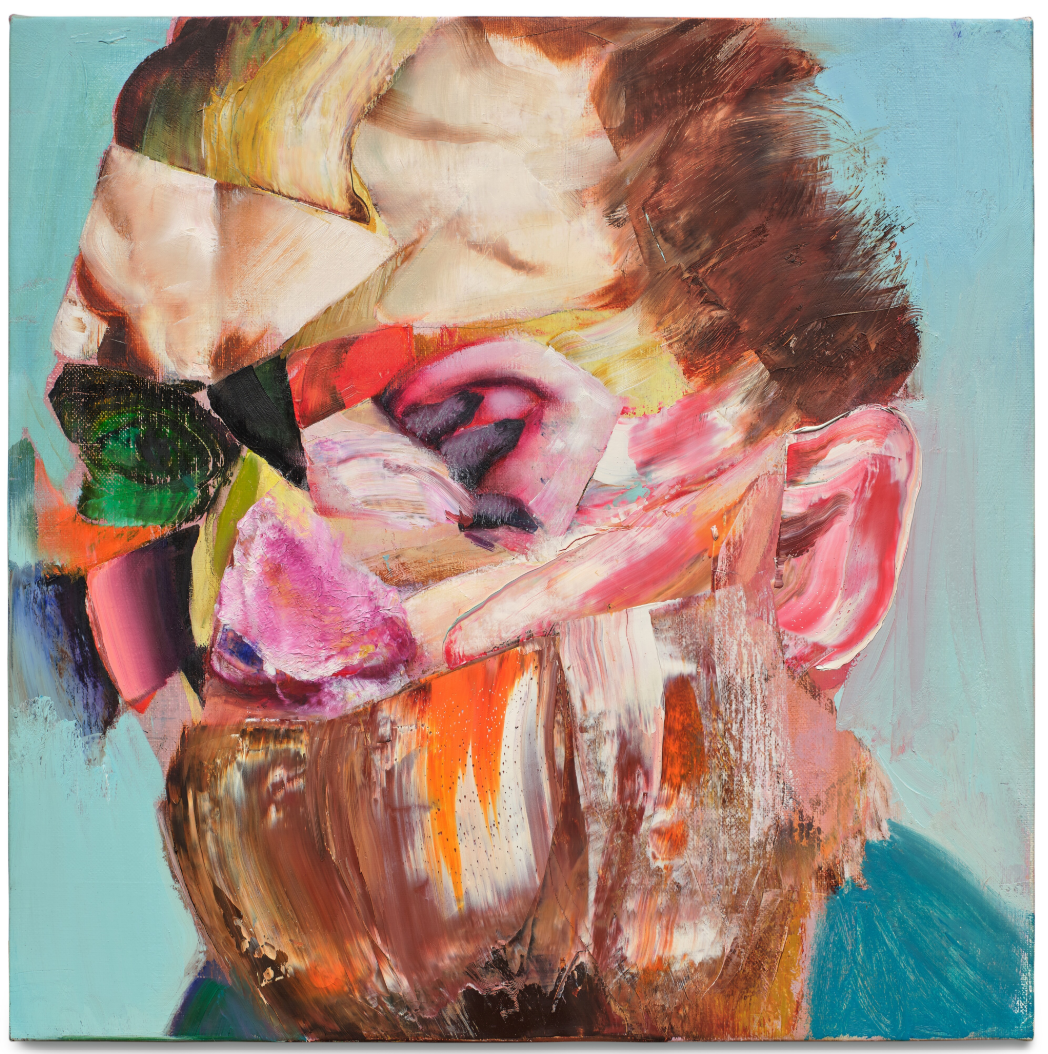
ADRIAN GHENIE (b. 1977)
Lidless Eye, 2016
Oil on canvas on board
41.3 x 41 cm (16 1/4 x 16 1/8 inches)
Signed and dated 2016 (on the reverse)
#28. Roy Lichtenstein
Sotheby’s New-York: 4 March 2025
Estimated: GBP 300,000 – 400,000
GBP 381,000 / USD 487,680
Modern Tapestry (Study) | Modern & Contemporary Evening Auction | 2025 | Sotheby’s
ROY LICHTENSTEIN (1923 – 1997)
Modern Tapestry (Study), 1967
Printed paper, marker, ink, graphite, and paint color swatches on board
21 x 26 3/8 inches (53.5 x 67 cm)
Signed (lower right)
Variously inscribed (in the margins)
#31. Portraits, 2015
Sotheby’s London: 4 March 2025
Estimated: GBP 400,000 – 600,000
GBP 266,700 / USD 341,376
Portraits | Modern & Contemporary Evening Auction | 2025 | Sotheby’s
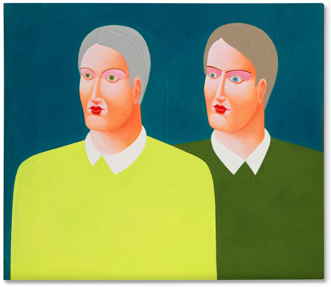
NICOLAS PARTY (b. 1980)
Portraits, 2015
Soft pastel on linen
150×170 cm (59×67 inches)
Signed and dated 2015 (on the reverse)
#33. Christopher Wool
Sotheby’s London: 4 March 2025
Estimated: GBP 250,000 – 350,000
GBP 215,900 / USD 276,352
Untitled | Modern & Contemporary Evening Auction | 2025 | Sotheby’s
CHRISTOPHER WOOL (b. 1955)
Untitled, 2000
Enamel on rice paper
66×48 inches (167.6 x 121.9 cm)
Signed, dated 2000, and numbered D103 (on the reverse)
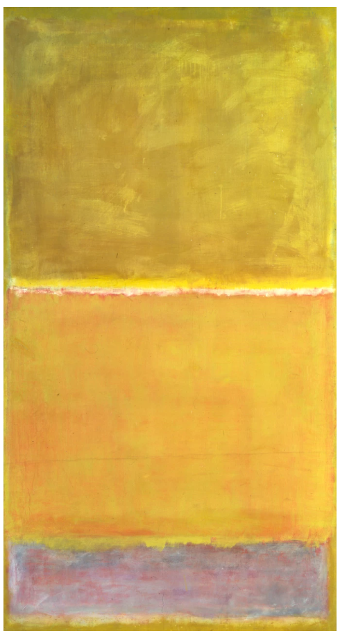
Gerhard Richter
Sotheby’s London: 4 March 2025
Estimated: GBP 5,000,000 – 7,000,000
WITHDRAWN
Heu | Modern & Contemporary Evening Auction | 2025 | Sotheby’s
GERHARD RICHTER (b. 1932)
Heu, 1995
Oil on canvas
200.3 x 140 cm (78 7/8 x 55 1/8 inches)
Signed, dated 1995 and numbered 831-1 (on the reverse)
Contemporary Day Auction
5 March 2025
Contemporary Day Auction | 2025 | Sotheby’s
KAWS
Sotheby’s London: 5 March 2025
Estimated: GBP 500,000 – 700,000
GBP 508,000 / USD 650,240
CHUM (KCB2) | Contemporary Day Auction | 2025 | Sotheby’s

KAWS (b. 1974)
CHUM (KCB2), 2012
Acrylic on canvas mounted on panel
84×68 inches (213×172 cm)
Signed, titled and dated 12 (on the reverse)
Takashi Murakami
Sotheby’s London: 5 March 2025
Estimated: GBP 300,000 – 400,000
GBP 546,100 / USD 699,008
Panda | Contemporary Day Auction | 2025 | Sotheby’s

TAKASHI MURAKAMI (b. 1962)
Panda, 2003
Fiberglass with antique Louis Vuitton trunk
Overall: 231x163x113 cm (91 x 61 1/8 x 44 1/2 inches)
Signed, numbered 3/3 and variously inscribed (on the underside of the left ear)
This work is number 3 from an edition of 3, each with a unique Louis Vuitton trunk
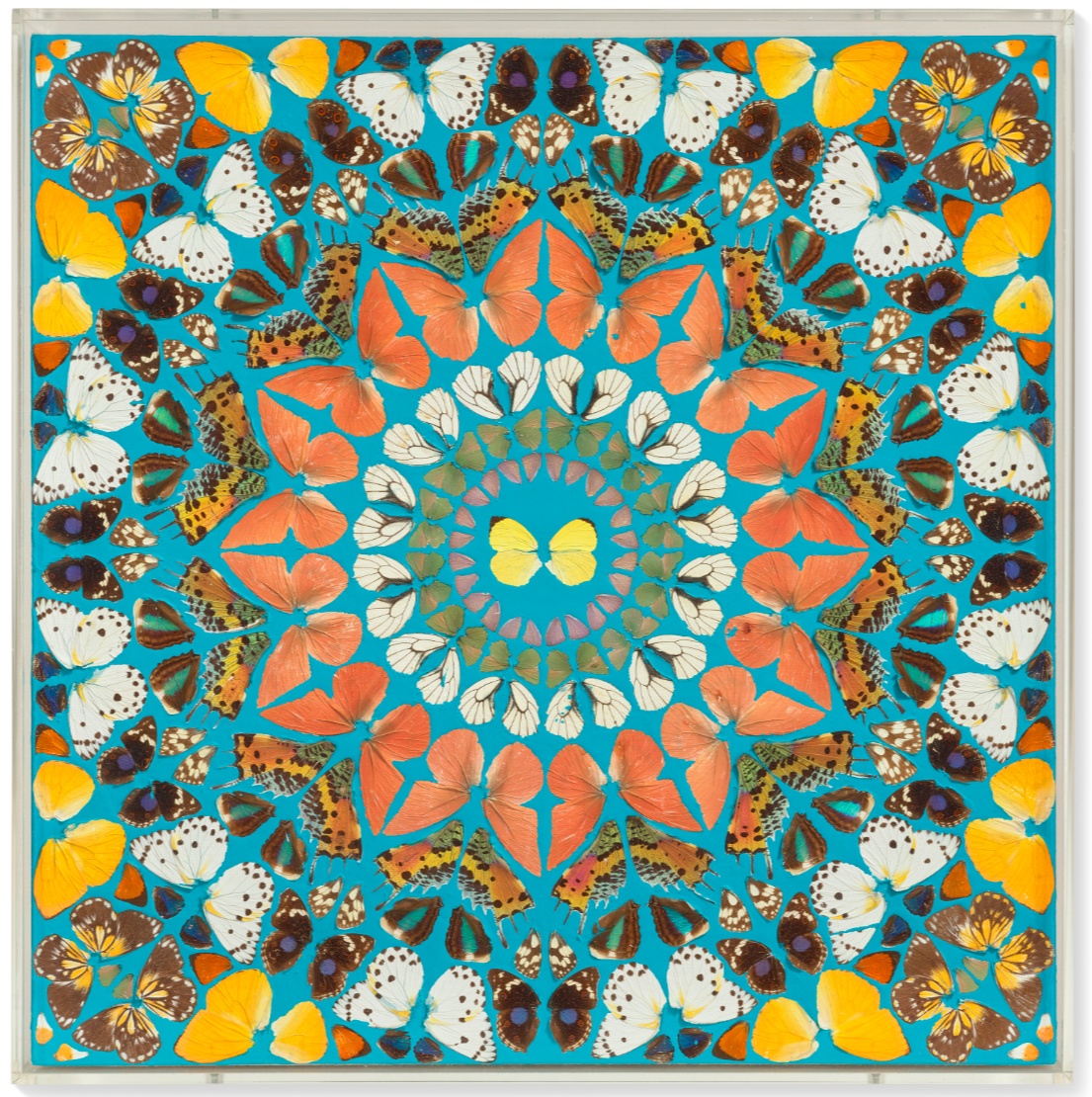
Damien Hirst
Sotheby’s London: 5 March 2025
Estimated: GBP 200,000 – 300,000
GBP 254,000 / USD 325,120
Butcher’s Love | Contemporary Day Auction | 2025 | Sotheby’s
DAMIEN HIRST (b. 1960)
Butcher’s Love, 2008
Butterflies and household gloss on canvas
36×36 inches (91.4 x 91.4 cm)
Signed twice, titled, dated 2008 and dedicated for Martin (on the reverse)
Christie’s
20th/21st Century London Evening Sale
5 March 2025
20th / 21st Century: London Evening Sale
TOTAL
GBP 82,180,500 / USD 105,191,040
# Lots: 51
# Lots withdrawn: 0
# Lots unsold: 7
# Lots sold: 44
Sell-Through Rate: 86.3%
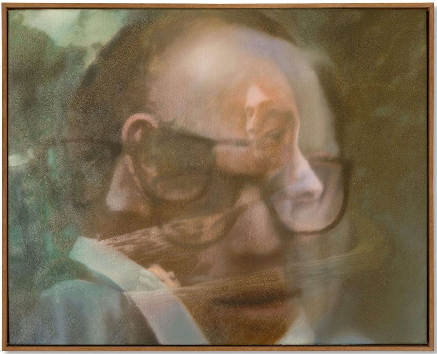
#1. Francis Bacon
Christie’s London: 5 March 2025
Estimated: GBP 6,000,000 – 9,000,000
GBP 6,635,000 / USD 8,492,800
FRANCIS BACON (1909-1992), Portrait of Man with Glasses III | Christie’s
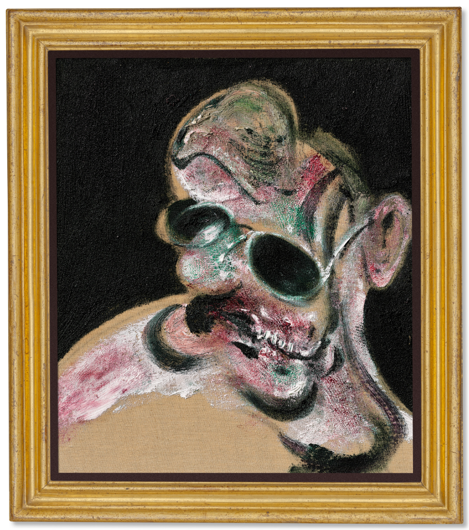
FRANCIS BACON (1909-1992)
Portrait of Man with Glasses III, 1963
Oil and silver sand on canvas
14 1/8 x 12 1/8 inches (36 x 30.7 cm)
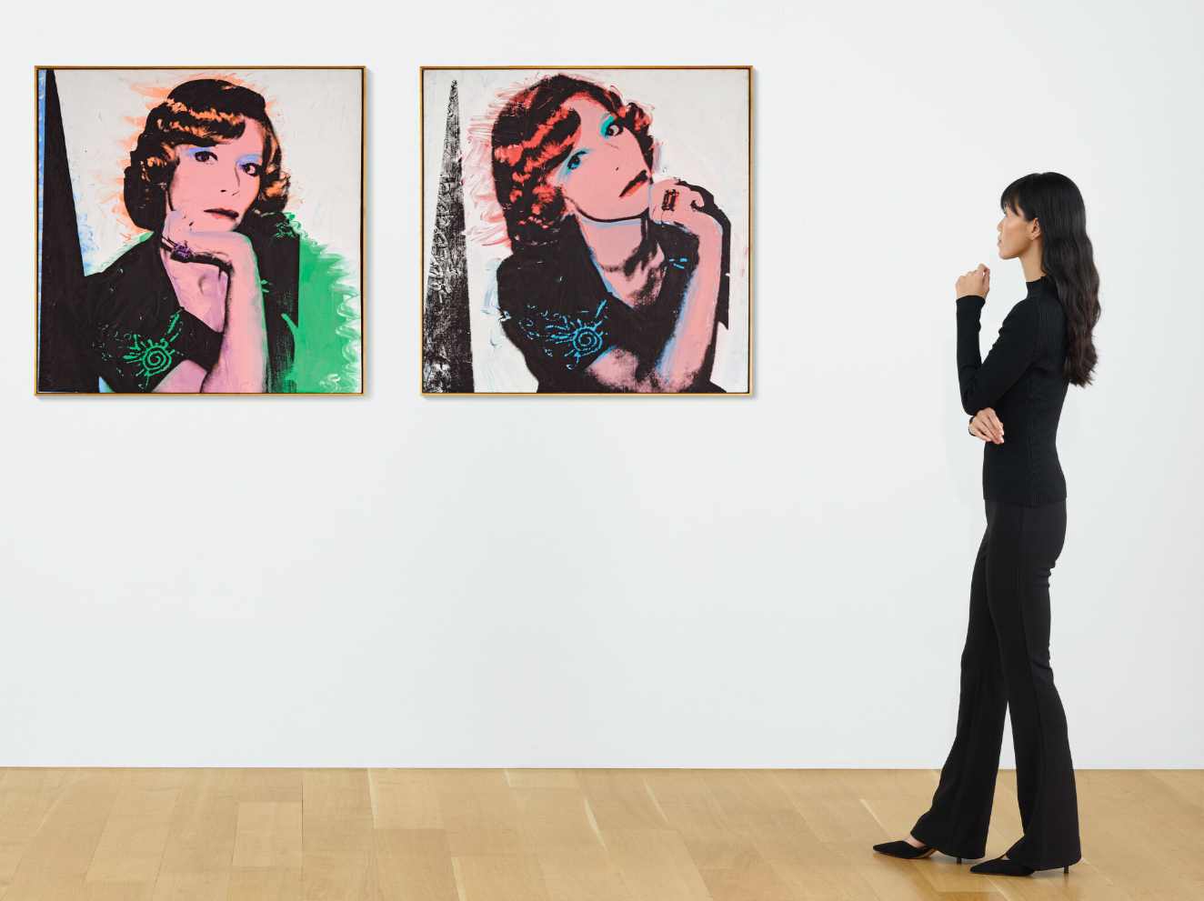
#1. Tamara de Lempicka
Christie’s London: 5 March 2025
Estimated: GBP 5,000,000 – 8,000,000
GBP 6,635,000 / USD 8,492,800
TAMARA DE LEMPICKA (1898-1980), Portrait du Docteur Boucard | Christie’s
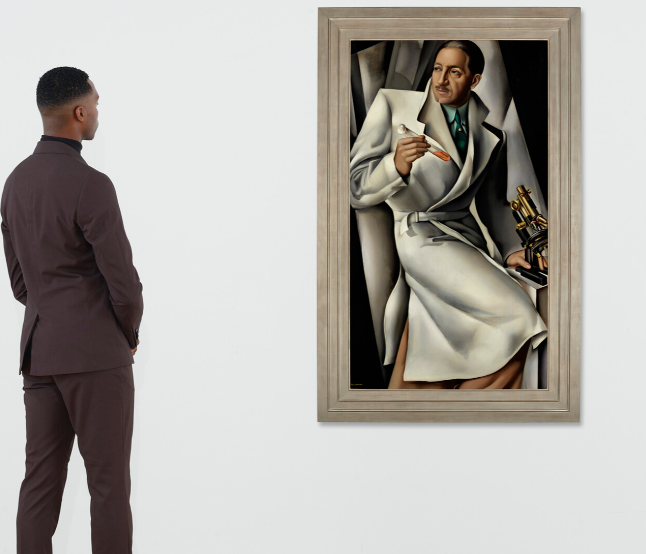
TAMARA DE LEMPICKA (1898-1980)
Portrait du Docteur Boucard, 1928
Oil on canvas
137×78 cm (53 7/8 x 30 3/4 inches)
Signed ‘T. DE LEMPICKA’ (lower left)
#3. Amedeo Modigliani
Christie’s London: 5 March 2025
Estimated: GBP 4,000,000 – 7,000,000
GBP 6,290,000 / USD 8,051,200
AMEDEO MODIGLIANI (1884-1920), Portrait de Lunia Czechowska | Christie’s
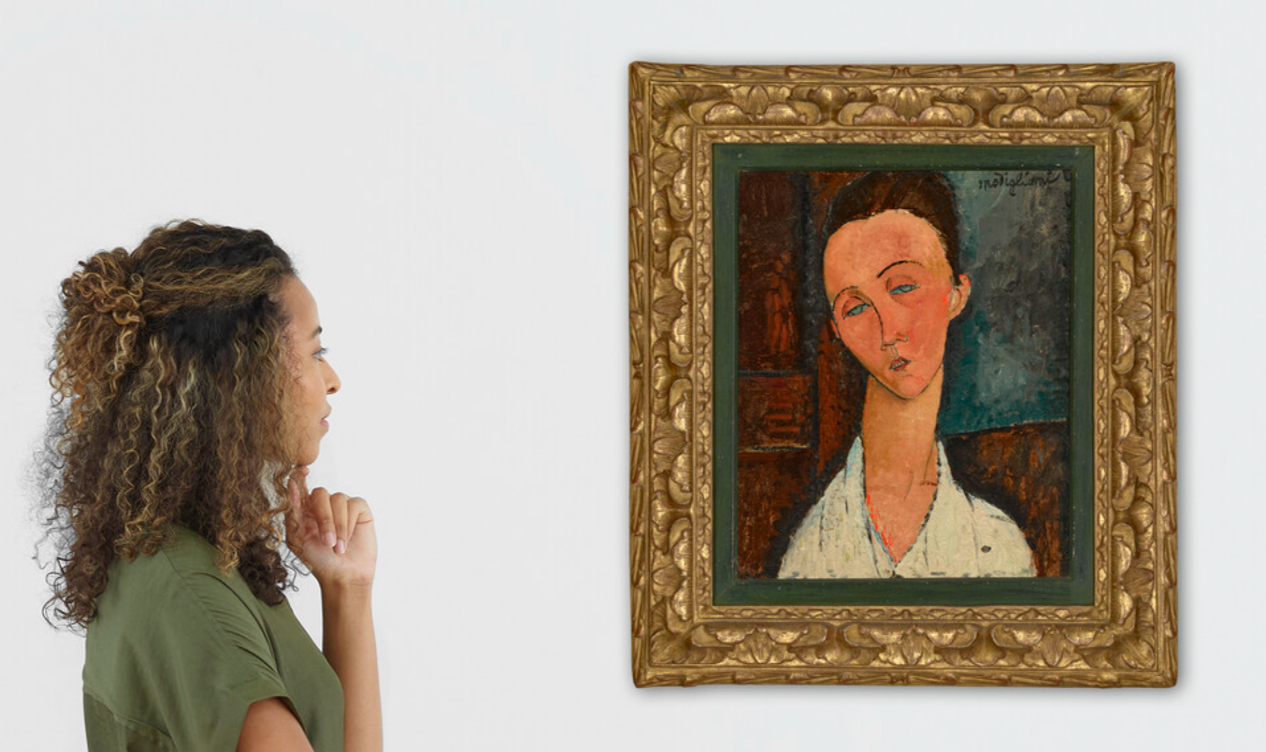
AMEDEO MODIGLIANI (1884-1920)
Portrait de Lunia Czechowska, circa 1917-1918
Oil on canvas laid on board
46 x 37.8 cm (18 1/8 x 14 7/8 inches)
Signed ‘Modigliani’ (upper right)
#5. David Hockney
Christie’s London: 5 March 2025
Estimated: GBP 4,000,000 – 6,000,000
GBP 5,122,000 / USD 6,556,160
DAVID HOCKNEY (B. 1937), Between Kilham and Langtoft | Christie’s
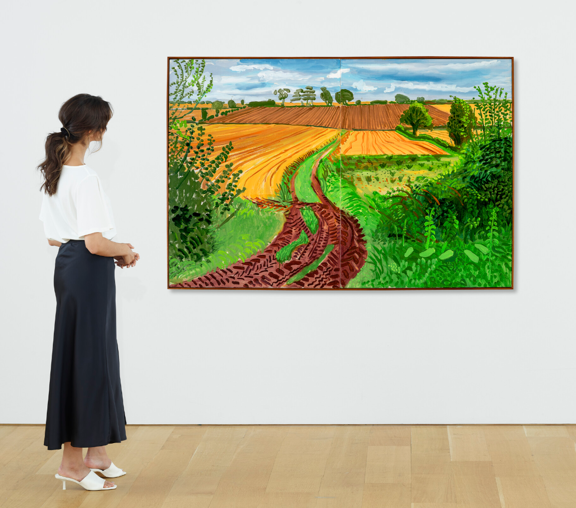
DAVID HOCKNEY (B. 1937)
Between Kilham and Langtoft, 2006
Oil on canvas, in two parts
48×72 inches (121.9 x 182.9 cm)
Signed, titled and dated ‘between Kilham and Langtoft Sept 6th 06 David Hockney’ (on the reverse)
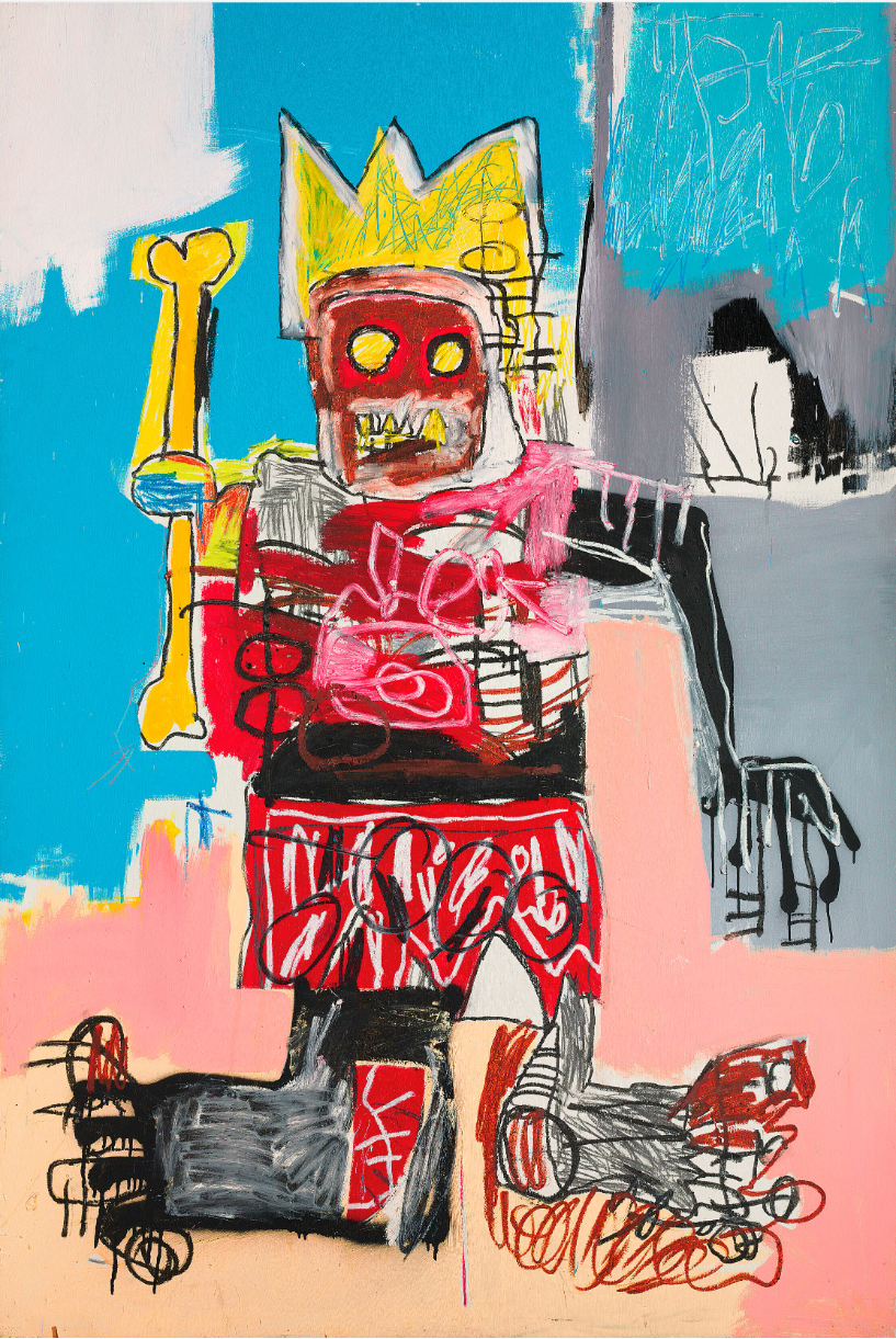
#7. Jean-Michel Basquiat
Christie’s London: 5 March 2025
Estimated: GBP 2,500,000 – 3,500,000
GBP 3,851,500 / USD 4,929,920
JEAN-MICHEL BASQUIAT (1960-1988), Untitled | Christie’s
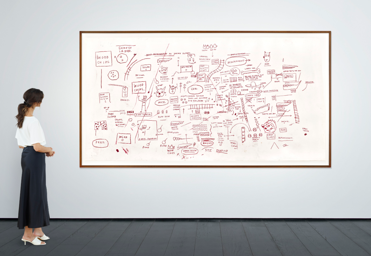
JEAN-MICHEL BASQUIAT (1960-1988)
Untitled, 1983
Oilstick on paper
50 1/3 x 98 1/2 inches (127.7 x 250.2 cm)
#21. Gerhard Richter
Christie’s London: 5 March 2025
Estimated: GBP 1,500,000 – 2,000,000
GBP 1,250,000 / USD 1,600,000
GERHARD RICHTER (B. 1932), Gilbert & George | Christie’s
GERHARD RICHTER (B. 1932)
Gilbert & George, 1975
Oil on canvas
80×100 cm (31 1/2 x 39 3/8 inches)
Signed, numbered and dated ‘379 Richter, 1975’ (on the reverse)
#27. Ed Ruscha
Christie’s London: 5 March 2025
Estimated: GBP 600,000 – 800,000
GBP 945,000 / USD 1,209,600
ED RUSCHA (B. 1937), Dry Frontier | Christie’s
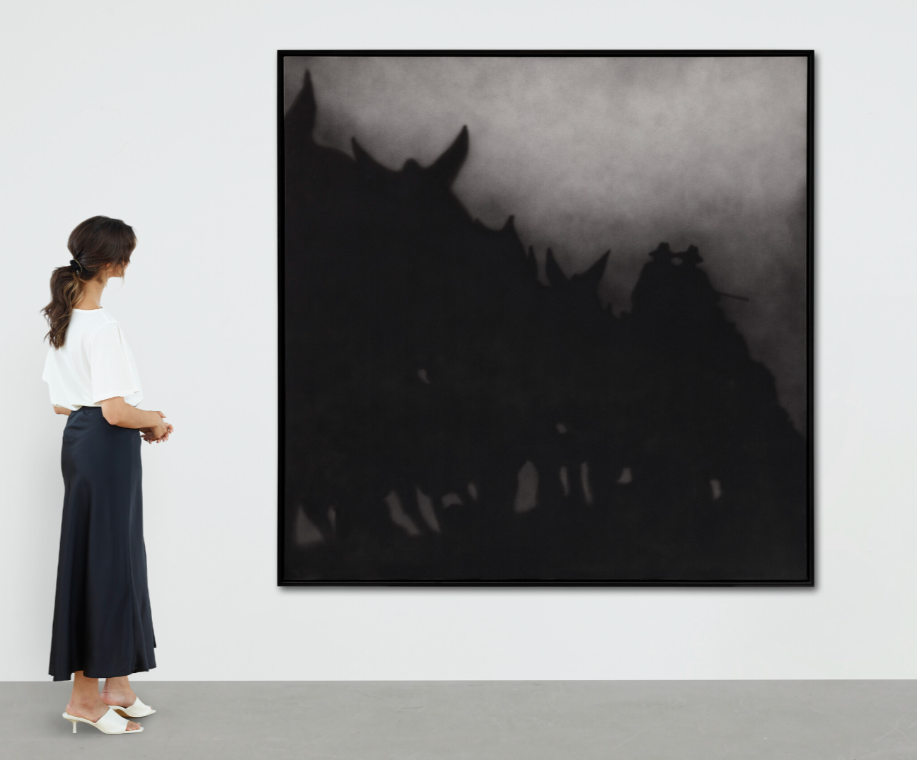
ED RUSCHA (B. 1937)
Dry Frontier, 1987
Acrylic on canvas
72x 72 inches (182.9 x 182.9 cm)
Signed and dated ‘Ed Ruscha 1987’ (on the reverse)
Signed, titled and dated ‘ED RUSCHA “DRY FRONTIER” 1987’ (on the stretcher)
#31. David Hockney
Christie’s London: 5 March 2025
Estimated: GBP 800,000 – 1,200,000
GBP 819,000 / USD 1,048,320
DAVID HOCKNEY (B.1937), Woldgate Woods, Winter, 2010 | Christie’s
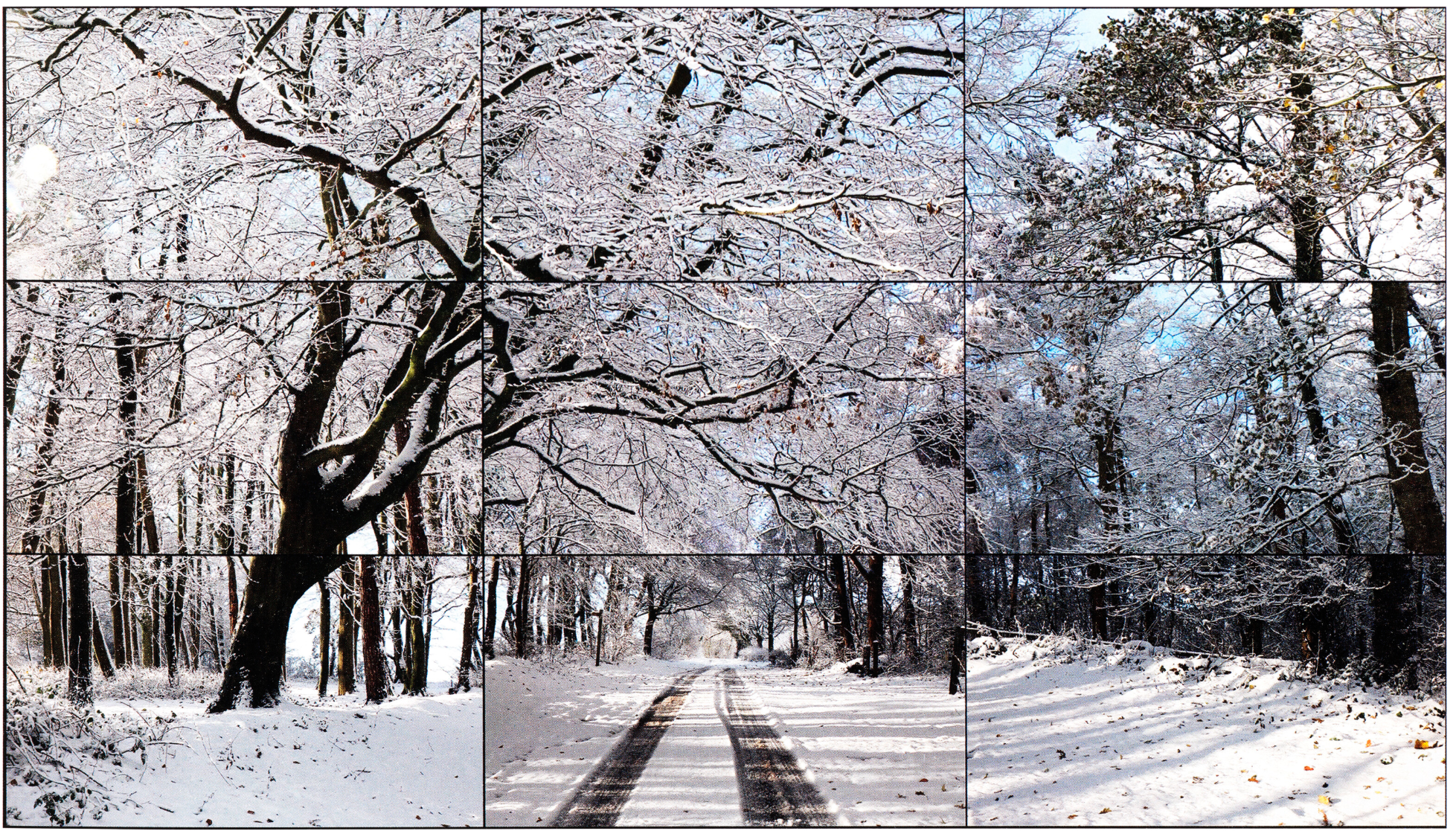
DAVID HOCKNEY (B.1937)
Woldgate Woods, Winter, 2010
Nine synchronised digital videos
Overall: 81 x 142 1/2 inches (206×362 cm)
This work is number seven from an edition of ten plus two artist’s proofs
Gerhard Richter
Christie’s London: 5 March 2025
Estimated: GBP 700,000 – 1,000,000
GERHARD RICHTER (B. 1932), Abdu | Christie’s
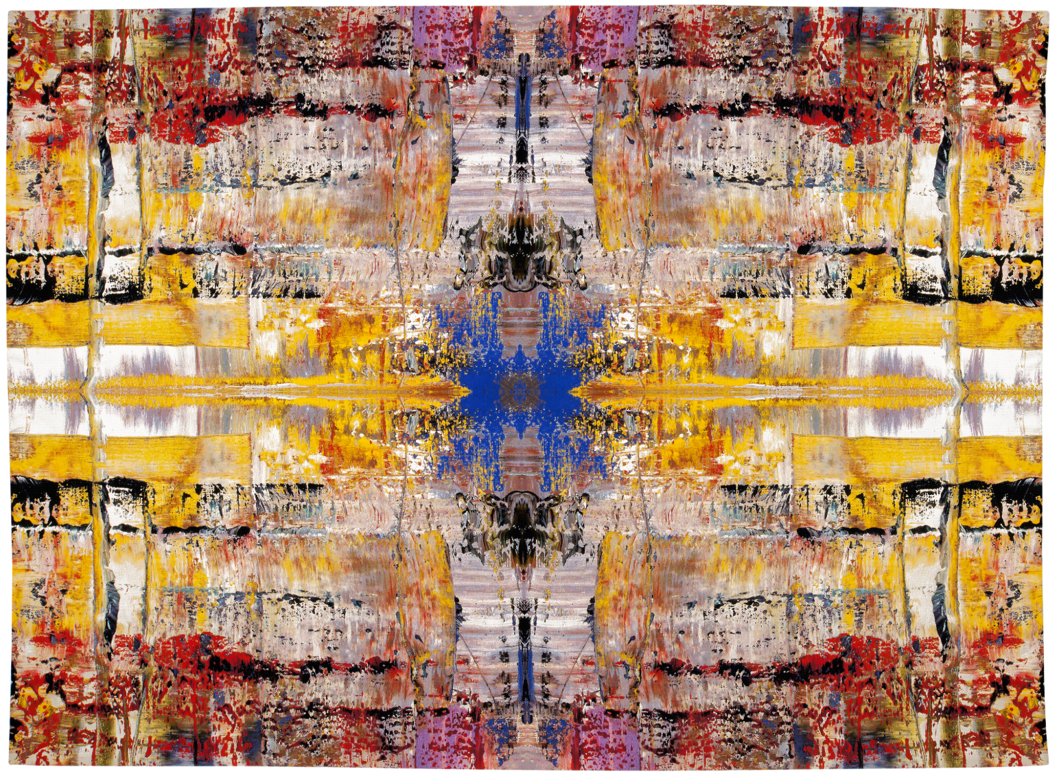
GERHARD RICHTER (B. 1932)
Abdu, 2009
Trevira CS, cotton, wool, silk and acrylic Jacquard-woven tapestry
276×378 cm (108 5/8 x 148 7/8 inches)
Signed and numbered ‘5⁄8 Richter’ (on a label affixed to the reverse)
This work is number five from an edition of eight plus two artist’s proofs
Fernando Botero
Christie’s London: 5 March 2025
Estimated: GBP 500,000 – 800,000
PASSED
FERNANDO BOTERO (1932-2023), The Botero Exhibition | Christie’s
FERNANDO BOTERO (1932-2023)
The Botero Exhibition, 1975
Oil and photo collage on canvas
52.4 x 195.8 cm (20 5/8 x 77 1/8 inches)
Signed and dated ‘Botero 75’ (lower right)
Post-War and Contemporary Art Day Sale
6 March 2025
Post-War and Contemporary Art Day Sale
#1. Anselm Kiefer
Christie’s London: 6 March 2025
Estimated: GBP 400,000 – 600,000
GBP 655,200 / USD 838,656
ANSELM KIEFER (B. 1945), Velimir Chlebnikow | Christie’s
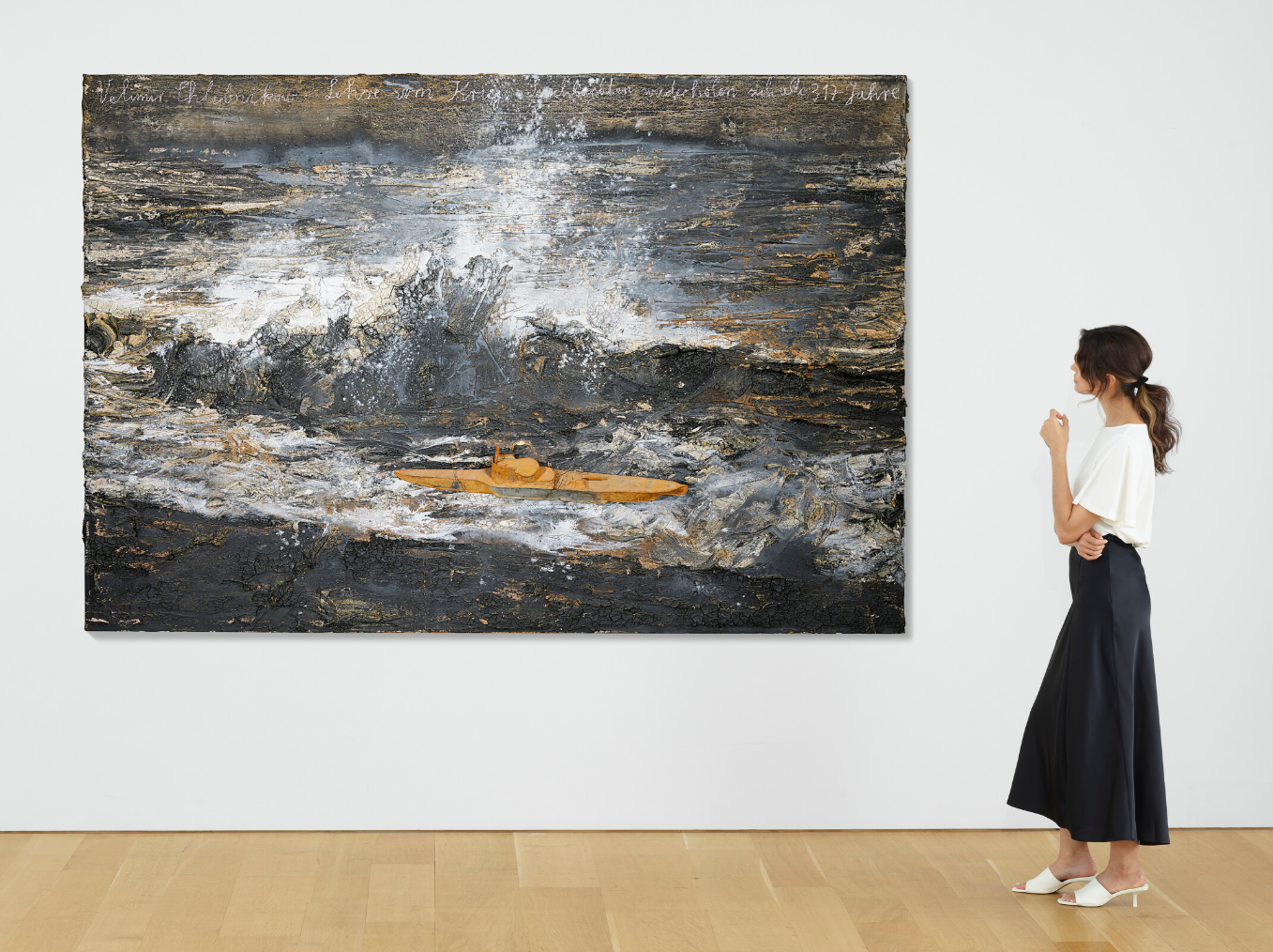
ANSELM KIEFER (B. 1945)
Velimir Chlebnikow, 2005
Oil, emulsion, acrylic, charcoal, lead and plaster on canvas
190×280 cm (74 3/4 x 110 1/4 inches)
Titled and inscribed
‘Velimir Chlebnikow: Lehre vom Krieg: Seeschlachten widerholen sich alle 317 Jahre’
(upper edge)
#2. Cy Twombly
Christie’s London: 6 March 2025
Estimated: GBP 300,000 – 500,000
GBP 604,800 / USD 774,144
CY TWOMBLY (1928-2011), Untitled (Rome) | Christie’s
CY TWOMBLY (1928-2011)
Untitled (Rome), 1962
Graphite, wax crayon, pastel, gouache and ballpoint pen on paper
19 5/8 x 27 1/2 inches (49.8 x 69.8 cm)
Signed, inscribed and dated ‘Cy Twombly Roma 1962’ (lower right)
#3. Peter Doig
Christie’s London: 6 March 2025
Estimated: GBP 250,000 – 350,000
GBP 529,200 / USD 677,376
PETER DOIG (B. 1959), Lion in the Road (Port of Spain) | Christie’s
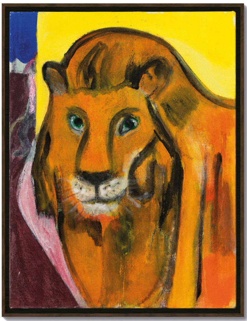
PETER DOIG (B. 1959)
Lion in the Road (Port of Spain), 2020
Dispersion on linen
19 7/8 x 15 1/8 inches (50.5 x 38.4 cm)
Signed, titled and dated ”Lion in the ROAD’ (Port of Spain) Peter Doig 2020′ (on the reverse)
#5. Damien Hirst
Christie’s London: 6 March 2025
Estimated: GBP 250,000 – 350,000
GBP 504,000 / USD 645,120
DAMIEN HIRST (B. 1965), A Summers Day | Christie’s
DAMIEN HIRST (B. 1965)
A Summers Day, 2002
Household gloss and butterflies on canvas
96×108 inches (243.8 x 274.3 cm)
#6. Jean-Michel Basquiat
Christie’s London: 6 March 2025
Estimated: GBP 300,000 – 500,000
GBP 466,200 / USD 596,736
JEAN-MICHEL BASQUIAT (1960-1988), Untitled | Christie’s
JEAN-MICHEL BASQUIAT (1960-1988)
Untitled, 1981
Oilstick on paper
42 3/8 x 27 1/2 inches (100.3 x 70 cm)
Signed, inscribed and dated ‘SAMO © MODENA 1981’ (on the reverse)
#7. Jean-Michel Basquiat
Christie’s London: 6 March 2025
Estimated: GBP 250,000 – 350,000
GBP 453,600 / USD 580,608
JEAN-MICHEL BASQUIAT (1960-1988), Untitled | Christie’s
JEAN-MICHEL BASQUIAT (1960-1988)
Untitled, 1981
Oilstick on wood
20×20 inches (50.9 x 50.9 cm)
Jade Fadojutimi
Christie’s London: 6 March 2025
Estimated: GBP 350,000 – 450,000
GBP 428,400 / USD 548,352
JADÉ FADOJUTIMI (B. 1993), Untitled | Christie’s
JADÉ FADOJUTIMI (B. 1993)
Untitled, 2024
Acrylic, oil pastel and oil bar on canvas
250 x 175 cm (98 3/8 x 68 7/8 inches)
Signed ‘Jadé Fadojutimi’ (on a label affixed to the stretcher)
Andy Warhol
Christie’s London: 6 March 2025
Estimated: GBP 400,000 – 600,000
ANDY WARHOL (1928-1987), (i) Cardi Smith (Madame Smith)(ii) Cardi Smith (Madame Smith) | Christie’s
ANDY WARHOL (1928-1987)
(i) (ii) Cardi Smith (Madame Smith), 1974
Each: acrylic and silkscreen ink on linen
Each: 39 3/8 x 39 3/8 inches (100×100 cm)
(i) Stamped with the artist’s signature ‘Andy Warhol’ (on the overlap); signed, inscribed and numbered by Frederick Hughes ‘#A1290.10 CERTIFIED © 1974 Frederick Hughes’ (on the overlap)
(ii) Stamped with the artist’s signature ‘Andy Warhol’ (on the overlap); signed, inscribed and numbered by Frederick Hughes ‘CERTIFIED Frederick Hughes A1290.11© 1974’ (on the overlap)
George Condo
Christie’s London: 6 March 2025
Estimated: GBP 350,000 – 550,000
GEORGE CONDO (B. 1957), Mr Twiddle | Christie’s
GEORGE CONDO (B. 1957)
Mr Twiddle, 2010
Acrylic, charcoal and pastel on canvas
64 5/8 x 65 1/8 inches (164.2 x 165.4 cm)
Signed and dated ‘Condo 2010’ (on the reverse)
Damien Hirst
Christie’s London: 6 March 2025
Estimated: GBP 70,000 – 100,000
DAMIEN HIRST (B. 1965), Psalm 45: Eructavit cor meum | Christie’s
DAMIEN HIRST (B. 1965)
Psalm 45: Eructavit cor meum, 2008
Butterflies and household gloss on canvas
18 1/8 x 18 1/8 inches (46×46 cm)
Signed, inscribed and dated ’45th Psalm Damien Hirst 2008′ (on the reverse)
Phillips
Modern & Contemporary Art Evening Sale
6 March 2025
Modern & Contemporary Art Evening Sale: London Auction March 2025
#1. Joan Mitchell
Phillips London: 6 March 2025
Estimated: GBP 3,000,000 – 5,000,000
GBP 2,710,000 / USD 3,468,800
Joan Mitchell – Modern & Contemporary A… Lot 9 March 2025 | Phillips
JOAN MITCHELL
Canada II, 1975
Oil on canvas, triptych
Overall 100 x 300.4 cm (39 3/8 x 118 1/4 in.)
Signed ‘Joan Mitchell’ lower right of the third part
#2. Jean-Michel Basquiat
Phillips London: 6 March 2025
Estimated: GBP 2,000,000 – 3,000,000
GBP 1,681,500 / USD 2,152,320
Jean-Michel Basquiat – Modern & Contem… Lot 18 March 2025 | Phillips
JEAN-MICHEL BASQUIAT
Pattya, 1984
Acrylic and oilstick on canvas
80 3/8 x 106 5/8 inches (204.2 x 270.8 cm)
#3. Christopher Wool
Phillips London: 6 March 2025
Estimated: GBP 1,200,000 – 1,800,000
GBP 1,379,000 / USD 1,765,120
Christopher Wool – Modern & Contempora… Lot 16 March 2025 | Phillips
CHRISTOPHER WOOL
Lester’s Sister (My Brain), 2000
Enamel and silkscreen on linen
108 1/8 x 71 7/8 inches (274.7 x 182.8 cm)
Signed, numbered and dated ‘Wool 2000 (P335)’ on the overlap
Signed, numbered and dated ‘Wool 2000 (P335)’ on the stretcher
#4. Christopher Wool
Phillips London: 6 March 2025
Estimated: GBP 600,000 – 800,000
GBP 927,100 / USD 1,186,688
Christopher Wool – Modern & Contemporar… Lot 6 March 2025 | Phillips
CHRISTOPHER WOOL
Untitled, 1997
Enamel on aluminium
17 7/8 x 11 3/4 inches (45.5 x 30 cm)
Signed, inscribed and dated ‘Wool 1997 (S145) For Richard Hell Who Wrote It’ on the reverse
#5. Yayoi Kusama
Phillips London: 6 March 2025
Estimated: GBP 700,000 – 1,000,000
GBP 762,000 / USD 975,360
Yayoi Kusama – Modern & Contemporary A… Lot 14 March 2025 | Phillips
YAYOI KUSAMA
INFINITY-NETS [APPGF], 2017
Acrylic on canvas
100.3 x 100.3 cm (39 1/2 x 39 1/2 inches)
Signed, titled and dated ‘YAYOI KUSAMA 2017 INFINITY NETS APPGF’ on the reverse
#7. Yayoi Kusama
Phillips London: 6 March 2025
Estimated: GBP 400,000 – 600,000
GBP 635,000 / USD 812,800
Yayoi Kusama – Modern & Contemporary A… Lot 20 March 2025 | Phillips
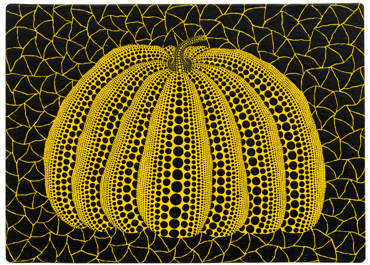
YAYOI KUSAMA
Pumpkin, 2006
Acrylic on canvas
24.2 x 33.3 cm (9 1/2 x 13 1/8 inches)
Signed, titled and dated ‘Yayoi Kusama 2006 Pumpkin [in Japanese]’ on the reverse
#8. Jean-Michel Basquiat
Phillips London: 6 March 2025
Estimated: GBP 400,000 – 600,000
GBP 609,600 / USD 780,288
Jean-Michel Basquiat – Modern & Contemp… Lot 5 March 2025 | Phillips
JEAN-MICHEL BASQUIAT
Untitled, 1982
Oilstick and pencil on paper
24 x 19 1/8 inches (61 x 48.5 cm)
#9. KAWS
Phillips London: 6 March 2025
Estimated: GBP 600,000 – 800,000
GBP 571,500 / USD 731,520
KAWS – Modern & Contemporary Art Eveni… Lot 27 March 2025 | Phillips
KAWS
GONE, 2018
Painted bronze
71 x 71 1/2 x 29 3/4 inches (180.3 x 181.6 x 75.6 cm)
Inscribed with the artist’s signature, numbered and dated ‘3/5 KAWS..18’ on the underside
This work is number 3 from an edition of 5 plus 2 artist’s proofs
#10. BANKSY
Phillips London: 6 March 2025
Estimated: GBP 400,000 – 600,000
GBP 508,000 / USD 650,240
Banksy – Modern & Contemporary Art Eve… Lot 17 March 2025 | Phillips

BANKSY
Kids on Guns, 2004
Spray paint on canvas
50 x 49.7 cm (19 5/8 x 19 5/8 inches)
Stenciled with the artist’s name ‘BANKSY’ on the lower right turnover edge
Signed, numbered and dated ‘Banksy 23/25 2004’ on the stretcher
This work is number 23 from an edition of 25
Damien Hirst
Phillips London: 6 March 2025
Estimated: GBP 400,000 – 600,000
GBP 444,500 / USD 568,960
Damien Hirst – Modern & Contemporary A… Lot 30 March 2025 | Phillips
DAMIEN HIRST
Cesium Fluoride, 2004-2011
Household gloss on canvas
57 7/8 x 138 1/4 inches (147.2 x 351 cm)
Signed, titled and dated ‘Cesium Flouride’ Damien Hirst 2004-2011′ on the reverse
Signed ‘D Hirst’ and stamped twice with the artist’s stamp on the stretcher
Damien Hirst
Phillips London: 6 March 2025
Estimated: GBP 500,000 – 700,000
PASSED
Damien Hirst – Modern & Contemporary A… Lot 26 March 2025 | Phillips
DAMIEN HIRST
Ascent, 2018
Butterflies and household gloss on canvas
Diameter: 83 7/8 inches (213 cm)
Signed, titled, inscribed and dated
‘Onward and Upward Baby Fuck ’em All! ‘Ascent’ D Hirst Damien Hirst 2018′
Stamped twice with the artist’s stamp on the reverse
PART III: FOCUS
Ultra-Contemporary
BANKSY
Sotheby’s London: 4 March 2025
Estimated: GBP 3,000,000 – 5,000,000
GBP 4,260,000 / USD 5,452,800
Crude Oil (Vettriano) | Modern & Contemporary Evening Auction | 2025 | Sotheby’s
BANKSY (b. 1974)
Crude Oil (Vettriano), 2005
Oil on canvas, in artist’s frame
Canvas: 91×122 cm (35 7/8 x 48 inches)
Tagged (lower right)
Signed, partially titled and dated Oct 2005 (on the overturn edge)
Crude Oil (Vettriano) stands as one of the most instantly recognizable and audacious works in Banksy’s provocative oeuvre – a rare, entirely hand-painted canvas that epitomises the artist’s role as a cultural agitator and sharp-witted social commentator. Rooted in the anti-establishment ethos of punk, Banksy’s output has always been a performative act of defiance; a rejection of the rigid structures of the art world and the institutions that dictate taste, cultural and commercial value. From his early days tagging the streets of Bristol to the guerrilla-style interventions that catapulted him into the international spotlight, his practice has remained a direct challenge to authority, hierarchy, and convention. Crude Oil (Vettriano) was first unveiled in Banksy’s landmark exhibition in 2005, Crude Oils: A Gallery of Re-mixed Masterpieces, Vandalism and Vermin, and sees Banksy remix an image deeply embedded in the canon of Modern British Painting: Jack Vettriano’s The Singing Butler from 1992: a scene of desirable elegance and a vision of romance set against the elemental force of wind and rain. Then and now, Banksy continues to teeter on the periphery of institutional acceptance. Fittingly bearing provenance worthy the rock and roll hall of fame, Crude Oil (Vettriano) has resided in the collection of blink-182 frontman Mark Hoppus since 2011: a performer whose own thirty-year long career has been shaped by the same irreverent, outsider spirit that defines Banksy’s work.

Jack Vettriano, The Singing Butler, 1992
A couple, dressed in evening attire, waltz barefoot across a desolate beach, their poised movements seemingly impervious to the storm that rages around them. Bathed in a golden light that defies the overcast sky. The Singing Butler captures an atmosphere of escapist fantasy, its dreamlike quality resonating with an audience drawn to its fusion of nostalgia, glamour, and quiet defiance of reality. Here, recasting Vettriano’s elegantly attired dancers against a backdrop of environmental devastation, Banksy replaces Vettriano’s genteel nostalgia with a dystopian vision that speaks to contemporary anxieties. Vettriano’s popular painting has been painstakingly re-invented by Banksy, now featuring a sinking oil liner and two men in hazmat suits wheeling a barrel of toxic waste. Scalding the art world with humour and irony, Banksy delivers a complex dialogue that tackles prescient issues of our time, such as the environment, pollution, and the capitalist landscape. In this act of visual disruption, Crude Oil (Vettriano) embodies the very principles that define Banksy’s practice: an irreverent yet deeply considered challenge to the structures of power, taste, and authority that govern the art world and beyond.
“If you want to survive as a graffiti writer when you go indoors your only option is to carry on painting over things that don’t belong to you there either.”
By appropriating The Singing Butler and subverting its idyllic imagery, Crude Oil (Vettriano) operates as a wry commentary on both the sanitisation of popular culture and the selective validation of artistic legitimacy. One of the most widely disseminated pictures of a generation, The Singing Butler became the most expensive painting ever sold at auction by a Scottish artist when it achieved £744,800 at Sotheby’s in 2004, the record price for any painting sold in Scotland at the time. The sale, however, was met with an air of ambivalence from the art world establishment, a sentiment captured in The Guardian’s headline the following day: “Painting by ridiculed but popular artist sells for £744,800” (The Guardian, 20 April 2004, online). Vettriano’s disconnection between his enthusiastic reception by the masses – confirmed by the longevity of the picture and the myriad of paraphernalia emblazoned with The Singing Butler – and rejection by the art establishment struck a nerve with Banksy, who has long assailed the hegemony of the art world elite.

London, 100 Westbourne Grove, Crude Oils: A Gallery of Re-mixed Masterpieces, Vandalism and Vermin, October 2005 © Banksy
In 2005, Banksy staged his first conventional gallery exhibition, the now seminal Crude Oils: A Gallery of Re-mixed Masterpieces, Vandalism and Vermin, a radical intervention in the traditional exhibition format that remains a defining moment in his career. Held in a disused shop on Westbourne Grove in Notting Hill, the show marked Banksy’s transition into a more formal gallery setting while maintaining the subversive ethos of his antics in the streets. Crude Oil (Vettriano) was prominently displayed in the window, immediately setting the tone for an exhibition that challenged the hierarchies of the art world. Now considered a milestone in the artist’s oeuvre, the show featured Crude Oil (Vettriano) alongside three other fully hand-painted ‘remixes’ of canonical works: a despondent, bloomless version of Van Gogh’s Sunflowers; a reinterpretation of Edward Hopper’s Nighthawks in which a Union Jack-clad hooligan shatters the bar’s glass window; and Show Me the Monet, a caustic reimagining of Claude Monet’s idyllic Japanese footbridge, transformed into a scene of contemporary detritus. Despite his immense popularity, Vettriano, much like Banksy, remains conspicuously absent from major institutional collections, a disconnect that sharply highlights the enduring schism between mass appeal and critical discord. For Banksy, this cultural paradox – where an artist’s work is revered by the public yet dismissed by the art world elite – has long served as a source of fascination and critique. By placing Vettriano’s The Singing Butler in direct dialogue with Van Gogh, Hopper, and Monet – artists firmly embedded in the institutional canon – Banksy staged a deliberate provocation, questioning the arbiters of taste and the exclusionary nature of the art establishment.
Across the gallery’s back wall of the shop, these large-scale reinterpretations were juxtaposed with a series of modified found paintings; traditional oil canvases sourced from flea markets and altered by Banksy to reflect the social anxieties of contemporary Britain. Quaint pastoral landscapes were interrupted by burning cars and police tape; a Renaissance Madonna and Christ child casually listened to an iPod; refined portrait sitters were recast as gas mask-clad figures. Further extending this anarchic approach, Banksy also ‘vandalised’ classical sculpture, transforming a serene Venus into a tattooed figure with a traffic cone over her head and outfitting a marble bust with a military-style balaclava. Yet perhaps the exhibition’s most outrageous gesture lay not in its visual content, but in its live component: 164 rats released into the space, their scurrying presence reinforcing the exhibition’s underlying spirit of disorder and defiance. Crude Oils was not simply an exhibition but an irreverent and punk manifesto, a statement that art, much like the rodents that roamed its floors, refuses to be contained by convention.

Louise Jury, “Rats to the Arts Establishment,” The Independent, 14 October 2005
In his Sunday Times Culture review of the 2005 exhibition, Waldemar Januszsak compared Banksy’s Crude Oils to a Surrealist or situationist happening, describing the production as an elaborate and engaging mise en scene: “So, the scene has been set, the evocation evoked. We’re in a dilapidated museum overrun by rats that have eaten the attendant and set a melodramatic post-Holocaust mood that continues into the paintings” (Waldemar Januszsak, ‘Who’s afraid of the big bad guy?’, The Sunday Times, 23 October 2005, p. 9).

Waldemar Januszczak, “Who’s afraid of the big bad guy?” The Sunday Times, 16 October 2005
Couched in humor, it is precisely this mood that pits Banksy beyond the cynical punster he is often perceived to be. Crude Oil (Vettriano) and the wider Crude Oils brilliantly attest to this. Indeed, from the mid-2000s onwards, Banksy began tackling an overt geopolitical agenda with increasing intent. Despite the cynical puns and sharp punchlines, there is an authenticity to Banksy’s project. This is what makes his work so powerful, appealing, and ultimately what will see him stand the test of time. Though retaining anonymity in order to continue making street art that is deemed illegal, he is widely discussed in the media and appreciated well beyond the usual confines of the art world. A vigilante painter of our times, Banksy has adopted a heroic position for his own generation and those to come.

MARCEL DUCHAMP, MONA LISA (L.H.O.O.Q.), 1919
PHILADELPHIA MUSEUM OF ART, PHILADELPHIA
IMAGE: © 2020 THE PHILADELPHIA MUSEUM OF ART/ART RESOURCE/SCALA, FLORENCE
ARTWORK: © ASSOCIATION MARCEL DUCHAMP / ADAGP, PARIS AND DACS, LONDON 2025 www.scalarchives.com
Via an unapologetic appropriation of its established icons and historical movements, Banksy engages a direct dialogue with other punk and provocative players throughout art history. Banksy’s appropriation and subversion of Vettriano’s The Singing Butler finds its conceptual precedent in the work of Marcel Duchamp, particularly his seminal 1919 piece L.H.O.O.Q. In this infamous intervention, Duchamp defaced a mass-produced postcard of Leonardo da Vinci’s Mona Lisa by adding a moustache and goatee, undermining the sanctity of one of Western art’s most revered icons. The work’s title, when vocalized in French, forms a crude pun, further destabilizing traditional notions of beauty and cultural veneration. By targeting the Mona Lisa, Duchamp satirized the bourgeois cult of Jocondisme – a phenomenon of early twentieth-century France in which the Mona Lisa was idolized as a symbol of artistic and national heritage.

John Higginson, “A warning for the ratist in residence,” Metro, 14 October 2005
Banksy’s engagement with Vettriano operates within this same lineage of irreverent critique, aligning with the Dadaist tradition of dismantling artistic hierarchies. Much like Punk, Dada is a rejection of rationality and logic, a movement that praises intuition, and that relinquishes, opposes, negates all forms of control from art critiques to politicians.

Mark Hoppus photographed with the present work in his home in Los Angeles, February 2025
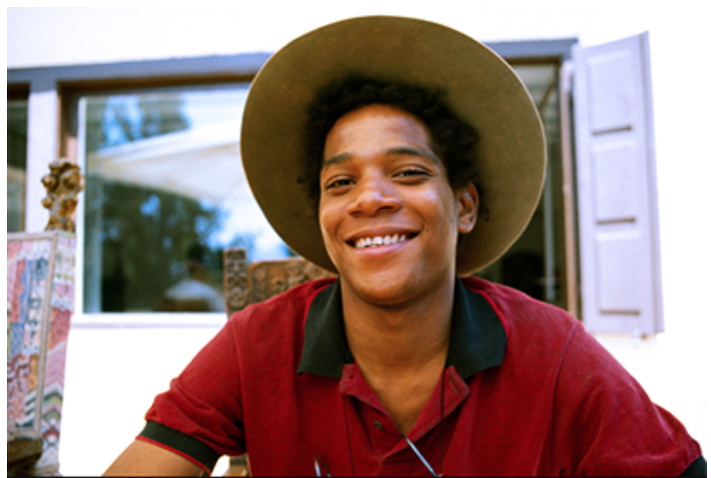
Growing up in Southern California, Mark Hoppus found a sense of belonging in the countercultural communities of skateboarding and punk music, where self-expression and rebellion against the mainstream were central tenets. His first significant encounter with fine art came through an art history course in college, where a passionate professor illuminated punk rock radicalism embedded in works from Caravaggio to Jackson Pollock. A field trip to LACMA and MOCA introduced him to the broader possibilities of contemporary art, but it was the Helter Skelter: LA Art in the 90s exhibition that delivered a pivotal revelation – Raymond Pettibon who was behind American punk rock band Black Flag’s iconic album covers, was featured in a major museum show. This moment crystallised for Mark the interconnectedness of punk, street art, and the institutional art world.Years later, this connection was reaffirmed when he attended Art in the Streets at MOCA in Los Angeles, an exhibition that marked a turning point in the legitimisation of graffiti and street art. The show included work by Shepard Fairey, Kenny Scharf, and Banksy, among others, celebrating artists who had transitioned from the underground to the institutional stage. In Mark’s home, surrounded by music, skateboarding, and counterculture, Crude Oil (Vettriano) became more than an artwork; it was a lived presence and daily reminder of the shared lineage between punk, street art, and the DIY ethos that unites them. In Mark’s collection, over time, Crude Oil (Vettriano) came to encapsulate the very notion of life imitating art, a testament to the enduring power of subversion, rebellion, and the refusal to conform.
Kids on Guns, 2004
Phillips London: 6 March 2025
Estimated: GBP 400,000 – 600,000
GBP 508,000 / USD 650,240
Banksy – Modern & Contemporary Art Eve… Lot 17 March 2025 | Phillips
BANKSY
Kids on Guns, 2004
Spray paint on canvas
50 x 49.7 cm (19 5/8 x 19 5/8 inches)
Stenciled with the artist’s name ‘BANKSY’ on the lower right turnover edge
Signed, numbered and dated ‘Banksy 23/25 2004’ on the stretcher
This work is number 23 from an edition of 25
Complete with his iconic stenciled imagery, brazen political satire and signature red heart balloon, Kids on Guns is prime example of Banksy’s controversial visual practice. Executed in 2003, the same year as his first major exhibition in the UK, Kids on Guns is one of the British street artist’s most recognizable early compositions, and part of an edition of just 25 works. The stark, shocking composition is in keeping with the artist’s enduring anti-war imagery, plainly delivering a universal commentary on contemporary issues such as terrorism, authority and capitalism.
“I like to think I have the guts to stand up anonymously in a western democracy and call for things no-one else believes in – like peace and justice and freedom.”
The contrasting, punchy visuals barely conceal a more somber, hard-hitting reality, giving way to reveal the visual paradox of the two young children – the epitome of innocence – amidst the overflowing, violent weaponry. The young boy, clutching his teddy bear to his chest, appears to console the young girl, who carries the infamous red heart balloon that has since become a hallmark of Banksy’s trade. Their emotive depiction, juxtaposed against the sharp, jutting edges of the various guns and artillery at their feet, serves as a blatant critique of a global society riddled with conflict and aggression. The compositional arrangement, with the figures standing at the apex of a towering pile of symbolic violence, draws pronounced visual parallels with Eugène Delacroix’s Liberty Leading the People, the July 28th, 1830, inspired by the bloody July revolution in Paris that saw the overthrow of Charles X. A renowned depiction of heroic rebellion, it became one of the artist’s most well-known and recognizable paintings, held in the permanent collection at the Louvre and, to this day, remains a work synonymous with themes of liberation, democracy and victory over oppression. The leading figure, a classical personification of liberty, brandishes a Tricolour, the crimson red of the flag recalling that of the balloon in the present work, and the tumultuous scene rises in a similar pyramidal arrangement of death and violence, delineated by the sharp protrusion rifles and bayonets. Kids on Guns bears a marked comparison with the 19th Century masterpiece, both visually and conceptually, a contemporary reinterpretation that reiterates the same socio-political concerns that, tragically, endure nearly two centuries later with modern warfare. Laced with inherent undertones of violence, the iconography of the innocent children perhaps also provides an element of hope that humanity and compassion have the power to overcome conflict in the same way that liberty presided over Paris in Delacroix’s time.

Eugène Delacroix, Liberty Leading the People, the July 28th, 1830, 1830, Musée du Louvre, Paris. Image: Photo Josse/Scala, Florence
“Art should comfort the disturbed and disturb the comfortable.”
In October 2013, Banksy took part in an artist’s residency in New York City titled Better Out Than In, during which he set up a pop-up stall in Central Park that sold his works to oblivious tourists and passersby. An edition of Kids on Guns was one of the stenciled black and white canvases available, alongside a variety of other recognizable pieces such as Laugh Now and Love Is In the Air. The accessibility and availability of the works – priced at just $60 each – throws into sharp relief the artist’s witty and ironic take on the art market and wider art establishments. This exemplifies the artist’s militant attitude towards the workings of capitalist society more generally. Emerging from the upheaval of the political urban landscape on the ground in Bristol during the 1980s and early 1990s, Banksy’s practice was shaped by his rejection of authoritarian structure and societal brutality; radical and disruptive in his approach, these counter-culture ideologies define every aspect of his immensely satirical practice. Arguably one of the world’s most recognizable and renowned graffiti artists, his adopted, spray-painted visual language is born out of an institutional critique that retains its distinctive, anti-establishment energy.
Jade Fadojutimi
Christie’s London: 6 March 2025
Estimated: GBP 350,000 – 450,000
GBP 428,400 / USD 548,352
JADÉ FADOJUTIMI (B. 1993), Untitled | Christie’s
JADÉ FADOJUTIMI (B. 1993)
Untitled, 2024
Acrylic, oil pastel and oil bar on canvas
250 x 175 cm (98 3/8 x 68 7/8 inches)
Signed ‘Jadé Fadojutimi’ (on a label affixed to the stretcher)
Jadé Fadojutimi’s Untitled (2024) has been generously donated by the artist as part of BUILD IT, BEAT IT, a selection of artworks sold to raise funds towards the building of the Children’s Cancer Centre at Great Ormond Street Hospital. Two and a half metres tall and just under two metres wide, this radiant, enveloping canvas pulsates with chromatic fervor. Paint blooms across the surface of the canvas, as fluent swathes of periwinkle blue and teal mingle with warm washes of cadmium orange and magenta. The effect suggests a gently receding river valley, below piles of fluffy cumulus clouds caught in the glow of a setting sun. Oil-bar strokes evocative of butterflies’ wings or rugged natural formations provide a striking graphic foil to the profusion of broad, brushy strokes. Born in London in 1993, Fadojutimi has received extraordinary critical acclaim in recent years for paintings which hover between figuration and abstraction. A self-professed synesthete, the artist is particularly attuned to color and sound; each painting captures the fleeting impression of an indescribable emotional environment, specific to the moment of its making.
Joan Mitchell, Weeds, 1976. Hirshhorn Museum and Sculpture Garden, Washington, D.C. Artwork and photo: © Estate of Joan Mitchell.
Fadojutimi works quickly, with an urgency felt keenly in the present work’s vital, expressive brushstrokes, and without any prior conception of the final composition. Working intuitively, she draws from a plethora of visual sources, from Japanese anime—an obsession discovered in childhood upon watching Sailor Moon, a television adaptation of a popular manga series—to fashion, video games and plush soft toys. In her studio, an office hung with racks of brightly coloured and patterned clothes serves as visual inspiration for her paintings. She paints accompanied by a medley of fast dance and sweeping classical music, and soundtracks from her favorite films, interspersed with the patter of rain as it hits the corrugated-metal roof of her vast South East London studio. This soundscape infiltrates her work, each canvas punctuated by a sense of steady rhythm, as well as moments of crescendo and repose.
‘When I was really young I wanted to be a fashion designer. And my dream is to be a composer. So now I call myself a composer of color.”
Vincent van Gogh, Japonaiserie: Flowering Plum Orchard (after Hiroshige), 1887. Van Gogh Museum, Amsterdam.
Digital image: Van Gogh Museum.
While studying at London’s Slade School of Art and the Royal College of Art, Fadojutimi looked to the paintings of Claude Monet and Paul Cézanne, Joan Mitchell and Lee Krasner, adding a profound admiration for art history’s masters of color to her own deeply personal visual education. Her paintings display an adept command of materials, often layering paint, oil stick and pastel in a single canvas. She is particularly fond of Interference oil paint, made by New York-based brand Williamsburg, which changes color according to the slant of surrounding light, forming a pearlescent sheen across the surface of the canvas. In the present work, each rococo flourish of the artist’s brush is laden with paint applied wet on wet, forging a gently shimmering, animate patina suggestive of a softly glowing stained-glass window. It is with such evocative, alluring canvases that Fadojutimi conjures fantastic, phantasmagorical other worlds, and invites the viewer to join her within them.
Lidless Eye, 2016
Sotheby’s London: 4 March 2025
Estimated: GBP 500,000 – 700,000
GBP 762,000 / USD 975,360
Lidless Eye | Modern & Contemporary Evening Auction | 2025 | Sotheby’s
ADRIAN GHENIE (b. 1977)
Lidless Eye, 2016
Oil on canvas on board
41.3 x 41 cm (16 1/4 x 16 1/8 inches)
Signed and dated 2016 (on the reverse)
Executed in 2016, Lidless Eye stands as a masterful and superlative work, imbued with a commanding gestural bravura and a profound psychological intensity that typifies Adrian Ghenie’s acclaimed self-portrait series centred on the image of Vincent van Gogh. Throughout his career, Ghenie has traversed the spectrum of art history – engaging with figures as influential as Charles Darwin, Vincent van Gogh, and Marcel Duchamp, as well as those whose notoriety has defined tumultuous epochs, including Hitler, Lenin, and Stalin, alongside popular cultural icons such as Elvis, Stan Laurel, and Oliver Hardy. Among these varied subjects, his self-portraits invoking the effigy of Van Gogh hold a particularly personal resonance, forming a crucial structural pillar in his rigorous dialogue with both historical and contemporary global narratives. Indeed, while the title Lidless Eye recurs across many of Ghenie’s pictures evoking the piercing stare of a Modern master, the phrase itself has a fantastical origin: it is a name used to refer to Sauron, the Dark Lord and title character of J. R. R. Tolkien’s iconic novels The Lord of the Rings. In this vivid tableau of blazing color and palpable texture, Ghenie both pays homage to Van Gogh and intimates a subtle self-portrait, with his own dark, penetrating eye through history, both imaginary or otherwise, staring resolutely from the very heart of the composition.
ADRIAN GHENIE IN HIS STUDIO. IMAGE © MARK OLIVER. ART © 2022 ADRIAN GHENIE
The close-cropped visage, rendered in sweeping, marbled facets of crimson, pink, orange, and umber, dominates the canvas, commanding attention with a powerful presence. The background, imbued with blue-green hues reminiscent of Van Gogh’s palette, provides a dynamic counterpoint, while one eye contrasts sharply with the other. Ghenie’s mark-making is exceptionally varied, spanning from soft, vaporous blooms to sculptural, palette-knifed sweeps of thick impasto; dry-brushed skeins of upward motion evoke Van Gogh’s swirling arabesques, while whiplash scribbles cut through sharply defined, red-rimmed planes of masked-off paint, producing an almost collage-like effect. Delicate freckles and blushes converge with more visceral tones of bleeding and bruising, as if to lay the subject bare from within. Indeed, if the present work exalts the vital life-force of painting, it simultaneously manifests a state of distortion and flux, with latent danger simmering beneath its surface; a potent reflection of both artistic and historical tumult.
As a youth Ghenie was famously captivated by Van Gogh’s iconic Sunflowers and fascinated by the story of a great artist and his affliction with mental illness. His own relationship with the present work’s source dates back to childhood memories of a magazine article entitled “The Tragic Life of Vincent van Gogh.” The lack of art books in the Ghenie household meant that this magazine would stay with the artist for years; on the front was an off-colour image of Van Gogh’s Sunflowers, while the article itself illustrated a black and white image of the 1889 Van Gogh self-portrait in the Musée d’Orsay in Paris. In 1998, when visiting this museum for the first time, Ghenie’s encounter with Van Gogh’s self-portrait affected him deeply. Finding himself unexpectedly under the scrutiny of Van Gogh’s penetrating stare, Ghenie’s uneasiness descended into a violent fit of nausea. In his subsequent explorations of one of the most recognizable faces in art history, Ghenie draws from a multitude of historical genres.
“You can’t invent a painting from scratch; you are working with an entire tradition… The pictorial language of the 20th century, from Kurt Schwitters’s collages to Jackson Pollock’s drip paintings, makes up a range of possibilities that I utilize in order to create a transhistorical figurative painting–a painting of the image as such, of representation.”
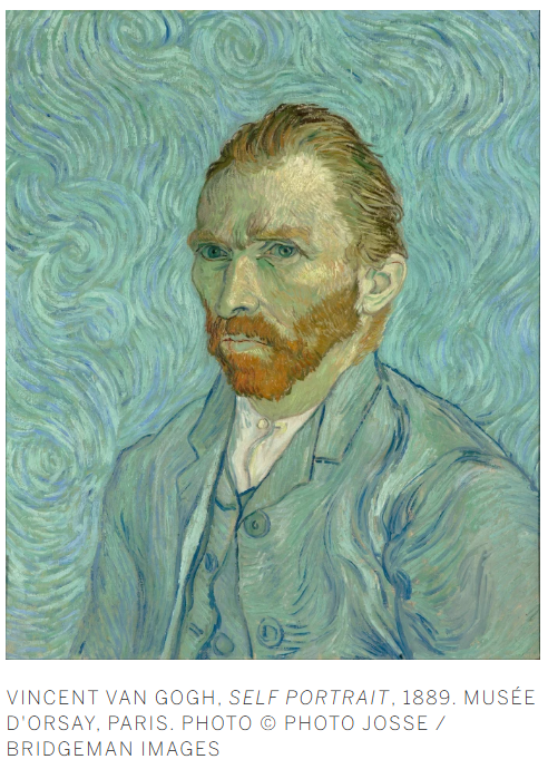
Lidless Eye is a landmark work that not only pays tribute to Van Gogh but also engages with an expansive array of artistic influences. It evokes the consummate chiaroscuro of Renaissance painting, the raw psychological power of Francis Bacon’s portraiture, and the sophisticated surface manipulations characteristic of Gerhard Richter, which together create and dissolve the boundaries of illusory space. Bacon’s reinterpretation of Van Gogh’s self-portrait – embodied in his 1960 work Homage to Van Gogh (Gothenburg Museum of Art, Sweden) – stands as a pivotal moment in the recontextualisation of art history. In the late 1950s, Bacon also produced a series inspired by Van Gogh’s The Painter on the Road to Tarascon (1888), a work whose original is now lost; destroyed or possibly looted during the 1945 Allied bombings of Magdeburg when it was held in the Kaiser-Friedrich Museum. Consequently, the vanished original is known solely through reproductions and its transformative afterlife in the works of both Bacon and Ghenie. These spectral histories, haunted by what might have been, underpin Ghenie’s enduring preoccupation with Van Gogh.
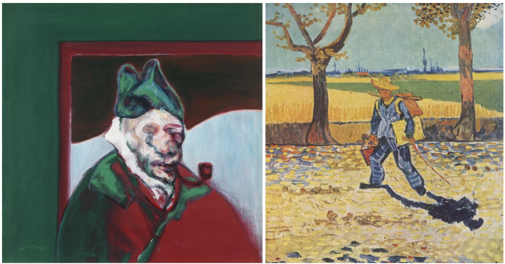
Left: Francis Bacon, Homage to Van Gogh, 1960. Private Collection. Photo: Prudence Cuming Associates Ltd 2025 © The Estate of Francis Bacon. All rights reserved. DACS 2025
Right: Vincent van Gogh, The Painter on the Road to Tarascon, 1888.
Painted one year after Ghenie represented his native Romania in the 56th Venice Biennale, Ghenie’s Lidless Eyes testifies to his fluency over the medium of painting as a revelatory expression of the artist’s own mind. In the radical distortion and effacement of the artist’s imagery lies a prevailing theme of the collective unconscious.
“I am particularly interested in the state of exceptionality that characterizes everyday life in totalitarian regimes, not just Communism. In such circumstances, everything is being distorted.”
Rendered in richly layered, pastose strokes, the present work emerges as a painterly palimpsest – a composite of masked identities and fragmented self-representation that alludes to the darker chapters of twentieth-century history and their lingering ramifications. In this extraordinary synthesis of the historical and the personal, Ghenie channels his lifelong adulation for Van Gogh and his preoccupation with the epoch’s most troubling events, manifesting Lidless Eye as an emblematic testament to his challenging revival of both history painting and the self-portrait.
Portraits, 2015
Sotheby’s London: 4 March 2025
Estimated: GBP 400,000 – 600,000
GBP 266,700 / USD 341,376
Portraits | Modern & Contemporary Evening Auction | 2025 | Sotheby’s
NICOLAS PARTY (b. 1980)
Portraits, 2015
Soft pastel on linen
150×170 cm (59×67 inches)
Signed and dated 2015 (on the reverse)
Portrait from 2015 stands as a paradigmatic example of Nicolas Party’s unparalleled interrogation of portraiture. Executed with a strikingly saturated, high-contrast palette of acid green and bold azure, the present work features a twinning duo whose dynamic arrangement and graphic clarity immediately command the viewer’s attention. In Portrait, Party’s deliberate economy of form, achieved through pared-down compositions and a meticulous application of pastel, establishes a tactile surface that oscillates between the immediacy of representation and the ambiguity of abstraction. Central to Party’s technique is a methodical reduction of extraneous detail, thereby foregrounding the inherent qualities of shape, color, and texture. His background as a 3-D animator is evident in the bold, flat forms that structure the composition, lending the work a distinctive, almost digital precision. This disciplined approach to mark-making creates a surface rich in nuance, where each stroke contributes to an overall sensory and emotional resonance.
Through its layered, expressive mark-making, Portrait embodies a visual palimpsest; one that invites a re-examination of traditional iconography through a lens informed by surrealist and modernist sensibilities. Educated in Lausanne and at The Glasgow School of Art, Party’s classical training is evident in his rigorous approach to composition and technique, as he subverts the notion of originality by re-engaging with familiar subjects.
“I’m trying to work with subjects that are not original. Subjects that have been, and still are, painted all the time. Like a portrait, or a cat. What fascinates me about these topics is their capacity to regenerate themselves at any period of history, and still be relevant to us. I also believe some subjects are always painted because they are an infinite source of meaning and inspiration.”
In Portrait, Party’s synthesis of diverse artistic influences becomes apparent. His compositions draw upon the enigmatic constructs of René Magritte and Giorgio de Chirico, the transformative reworkings of Pablo Picasso, and the precise figuration exemplified by Hans Emmeneger and Alex Katz. Indeed, Party’s encounter with Pablo Picasso’s Tête de Femme (1921) at the Foundation Beyeler, which he describes as a revelatory moment, has since informed his subsequent reconfigurations of the genre. Moreover, subtle allusions to ancient Egyptian funerary portraiture further enrich the work’s complex visual vocabulary, drawing from a rich cultural history of representation. Party consolidates his varied influences into a singular, resonant visual statement. The deliberate interplay between vivid, saturated colors and the restrained, calculated composition invites a re-assessment of the portrait as both a historical tradition and a contemporary vehicle for self-expression.
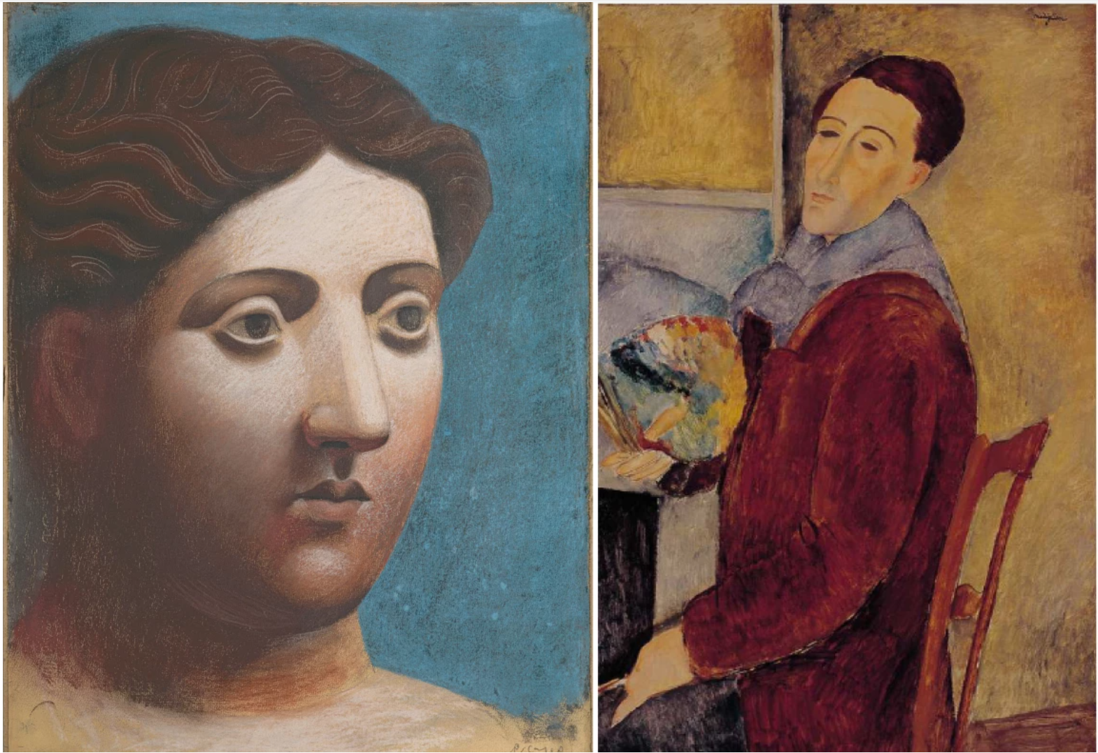
Left: Pablo Picasso, Tête de Femme, 1921 © Successsion Picasso/DACS, London 2025
Right: Amedeo Modigliani, Self Portrait, 1919, Museu de Arte Contemporanea da Universidade de Sao Paulo, Sao Paulo, Brazil © Bridgeman Images 2025
The present work not only encapsulates the transformative potential of materiality and technique but also reaffirms Party’s stature as a leading exponent of modern figurative art, whose imaginative recontextualisations continue to challenge and expand the boundaries of established artistic practice. Beyond the painted canvas, Party’s oeuvre extends to large-scale public murals, sculptures, and installations, each work an immersive exploration of color and intervention. Party’s work has been widely exhibited in leading institutions worldwide over the last ten years, including solo presentations at the Museum Frieder Burda in Baden-Baden (2023-24), the Frick Collection in New York (2023-24), the Masi Museo d’arte (2021-22), the Magritte Museum in Brussels (2018), the Hirshhorn Museum and Sculpture Garden in Washington, D.C. (2017), the Hammer Museum in Los Angeles (2016), and the Modern Institute in Glasgow (2016). Such critical and institutional recognition underscores his rapid ascent within the global art scene and his capacity to redefine contemporary figurative painting.
Contemporary Art
Yoshitomo Nara
Cosmic Eyes (in the Milky Lake), 2005
Sotheby’s London: 5 March 2025
Estimated: GBP 6,000,000 – 8,000,000
GBP 9,027,500 / USD 11,555,200
Cosmic Eyes (in the Milky Lake) | Modern & Contemporary Evening Auction | 2025 | Sotheby’s
YOSHITOMO NARA (b. 1959)
Cosmic Eyes (in the Milky Lake), 2005
Acrylic and glitter on canvas
162 x 130.2 cm (64 3/4 x 51 1/4 inches)
Signed, partially titled and dated 2005 (on the reverse)
A serene example of Yoshitomo Nara’s mature practice, Cosmic Eyes (in the Milky Lake) emerges from a pivotal moment in 2005 that marks Nara’s transition beyond the flat, manga-inspired characters of his early works towards depictions of more soulful and human subjects. The young female protagonist, depicted wading in a rippling white expanse, gazes at the viewer with vast, shimmering eyes that not only stare out but draw the audience in. Her glittering irises evoke an expansive galaxy, as suggested by the work’s title. Cosmic Eyes (in the Milky Lake) belongs to a suite of twelve large-scale portraits Nara painted between 2004 and 2005 and is one of only four in this group to introduce his cosmic-eye motif, signifying a crucial milestone in Nara’s artistic journey. Befitting the artist’s critical importance, Nara will be the subject of a landmark retrospective at the Hayward Gallery in London, opening in June 2025. Never before offered at auction and not seen in public for 20 years, the present work is a rare exemplar of the singular visual language that has cemented Nara’s position as a titan of the twenty-first century.
“Rather than merely offering the work for the viewers to see face-on, I want to trigger their imaginations… an experimental place where visitors find an opportunity to see themselves reflected as though my work were a mirror or a window. For people who cannot, or will not, really look, there will be nothing.”
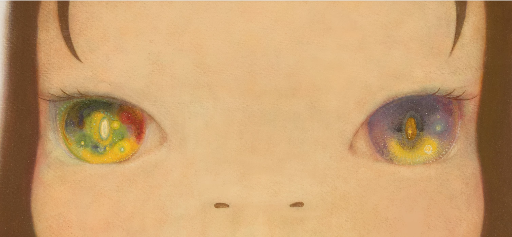
Nara’s masterful focus on the eyes offers a profound glimpse into his subject’s inner world. The girl’s entrancing gaze invites viewers to contemplate not only her psychological state but also Nara’s own emotions as he paints late into the night, reminiscent of Van Gogh’s introspective nocturnal gaze in Starry Night over the Rhone (1888). Nara recognises eyes as a bridge between subject and viewer – a gateway to one’s soul. By rendering the irises with uncanny depth and kaleidoscopic glittering detail, he transforms the painting from a mere image to an emotional landscape, transcending visual representation. Nara’s treatment of flesh in this work further showcases remarkable nuance, with delicate hints of green, pink, and blue subtly emerging through the soft peach surface. The painting’s texture evokes a modernist sensibility, reminiscent of the rosy-cheeked women in Modigliani’s and Klimt’s portraits, as well as the tenderly painted surfaces of Impressionist works.
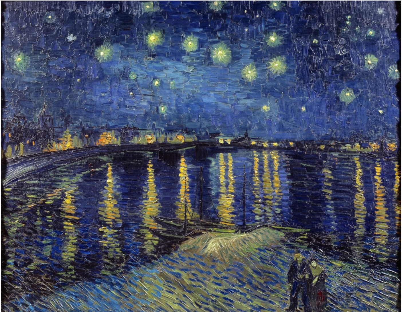
Vincent van Gogh, Starry Night Over the Rhône, 1888. Musee d’Orsay, Paris. Image: Bridgeman Images © Photo Josse
During this experimental period, characterized by softer palettes and dissolved harsh outlines, Nara transitioned from his earlier method of “drawing a line like in a drawing” towards a more painterly technique. He aimed to create works by “pressing like the French modernists,” reflecting his growing interest in texture and depth, as well as his engagement with Western art traditions following his time in Europe (Los Angeles County Museum of Art, Virtual Conversation with Yoshitomo Nara and Mika Yoshitake, 11 October 2020 (video)). This shift in Nara’s approach toward a more tender and impressionistic handling of paint results in subjects that exhibit a profound transformation.
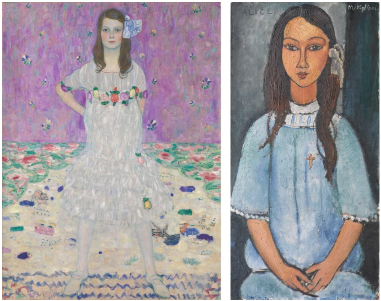
LEFT: Gustav Klimt, Mada Primavesi, 1912-13. Metropolitan Museum of Art, New York. Image: Bridgeman Images.
RIGHT: Amedeo Modigliani, Alice, circa 1918. Statens Museum for Kunst, Copenhagen. Image: Bridgeman Images.
As noted by Midori Matsui, these figures now display “visible signs of humanization: their heads grew smaller, their expressions gentler, their body proportions approaching that of a real child, and their attitudes reflecting that of a thoughtful adolescent” (Midori Matsui, “A Child in the White Field: Yoshitomo Nara as a Great ‘Minor’ Artist”, in Yoshitomo Nara: The Complete Works, Paintings, Sculptures, Editions, Photographs, Vol. 1, Tokyo 2011, p. 344). Cosmic Eyes (in the Milky Lake) exemplifies this humanization with its more worldly proportions and subtle flesh tones. The subject’s tousled fringe imparts a childlike quality and innocence, further humanizing Nara’s subject. These elements showcase Nara’s transition from stylized representations to more nuanced, emotionally resonant depictions of young children.
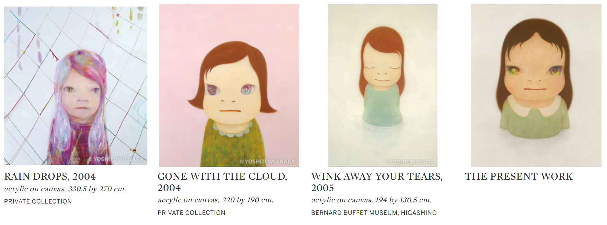
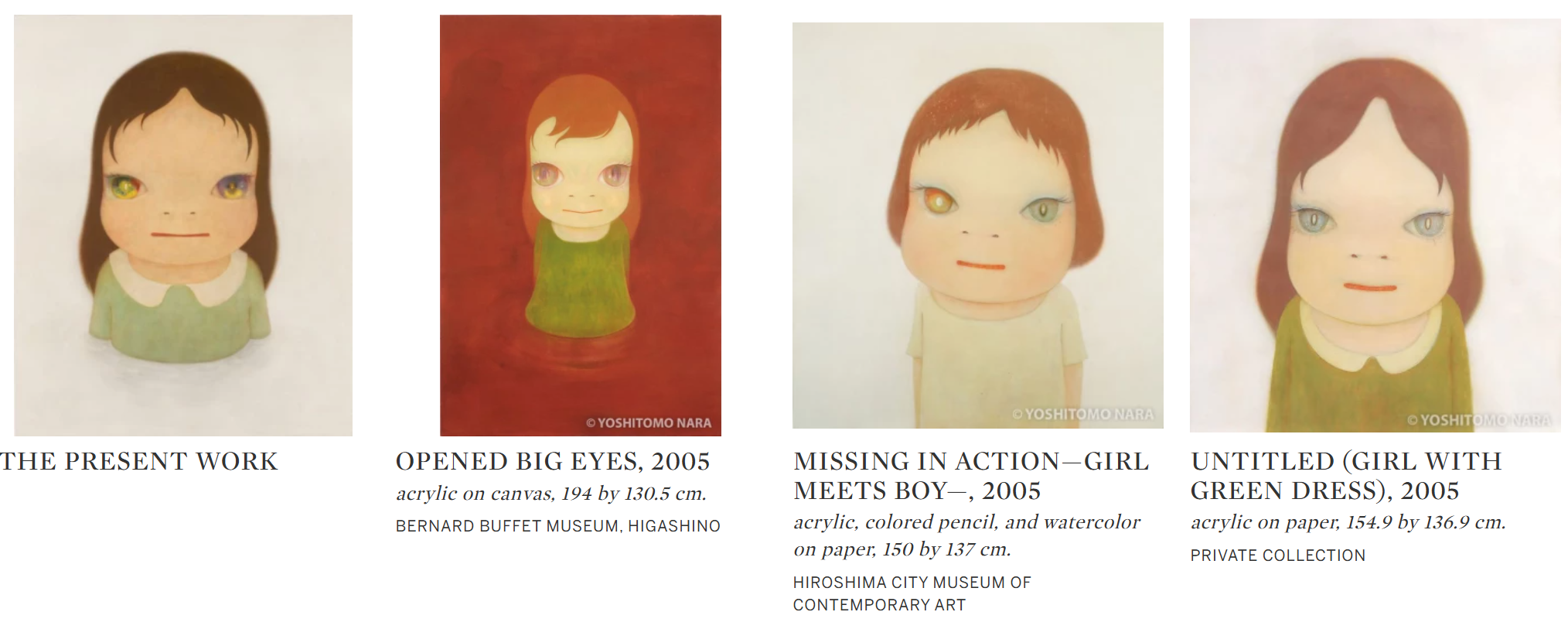
Nara’s “rainbow” or “starry” eyes first appear in his practice in 2004, making the present work one of the very first examples. Of the 7 large-scale “big-headed girl” paintings created between 2004 and 2005, half are already held in museum collections, further underscoring the rarity of Cosmic Eyes (in the Milky Lake).
Art © 2025 Yoshitomo Nara
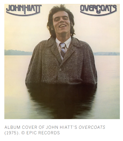
Cosmic Eyes (in the Milky Lake) showcases yet another recurring motif in Nara’s oeuvre – the subject wading in water. This imagery places Nara within an art historical and religious lineage while subtly referencing his passion for music. The puddle motif, appearing in Nara’s works since the 1980s, draws inspiration from the cover of singer John Hiatt’s 1975 album Overcoats, which depicts the musician half-submerged in water. Water holds profound symbolism across cultures, from the Christian rite of baptism to the Buddhist ritual of pudu. In Nara’s work, the milky lake carries a universal resonance, embodying healing, deliverance, and rebirth. For Nara, this imagery also serves as a metaphor for the relationship between an individual’s inner world and external reality, with the subject suspended in an ethereal space, seemingly floating in and out of dream-like trance. In this painting, the lake stretches infinitely beyond the confines of the canvas as an allegory for a world of boundless expanse, mirrored in the seemingly endless space of the subject’s cosmic eyes, which transport the viewer into a realm beyond the physical.
Mark Rothko, Untitled, circa 1950-52. Tate, London.
ART © 1998 KATE ROTHKO PRIZEL & CHRISTOPHER ROTHKO / DACS, London / ARS, NEW YORK
Standing up close, one experiences an almost spiritual engagement with the shimmering surface of her eyes and immaculately rendered skin. This effect recalls Rothko’s color fields or Monet’s Nymphéas, creating a dynamic interplay between viewer and painting where the surface continually evolves. As Nara has described in direct reference to his connection with Rothko:
“It’s not about it being an image of a young girl, it’s about the many levels of paint that have built up. Those layers draw out the sensibility of each person who looks at it. I think it provokes you to have a conversation with yourself. That’s what makes the color paintings very different from the black-and-white line drawings.”
Cosmic Eyes (in the Milky Lake) represents a pivotal moment in Nara’s artistic journey, harmoniously combining his signature motifs into a complex yet serene visual experience. The work bridges diverse artistic elements, connecting “high, low and kitsch; East and West,” as described by New York Times critic Roberta Smith. By integrating Western modernist techniques with his distinctive manga-inspired aesthetic, Nara creates a painting that invites deeper contemplation of both the subject’s psyche and our own emotional responses.
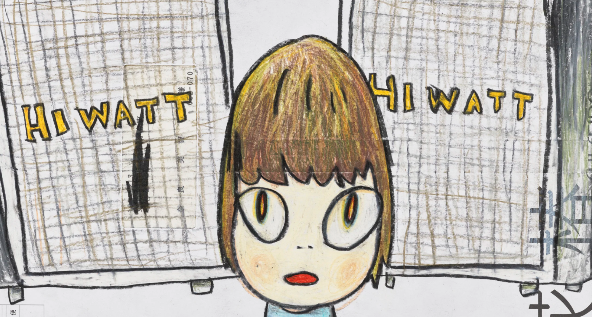
Untitled (Hi Watt Hi Watt), 2005
Christie’s London: 6 March 2025
Estimated: GBP 80,000 – 120,000
GBP 138,600 / USD 177,408
YOSHITOMO NARA (B. 1959), Untitled (Hi Watt Hi Watt) | Christie’s
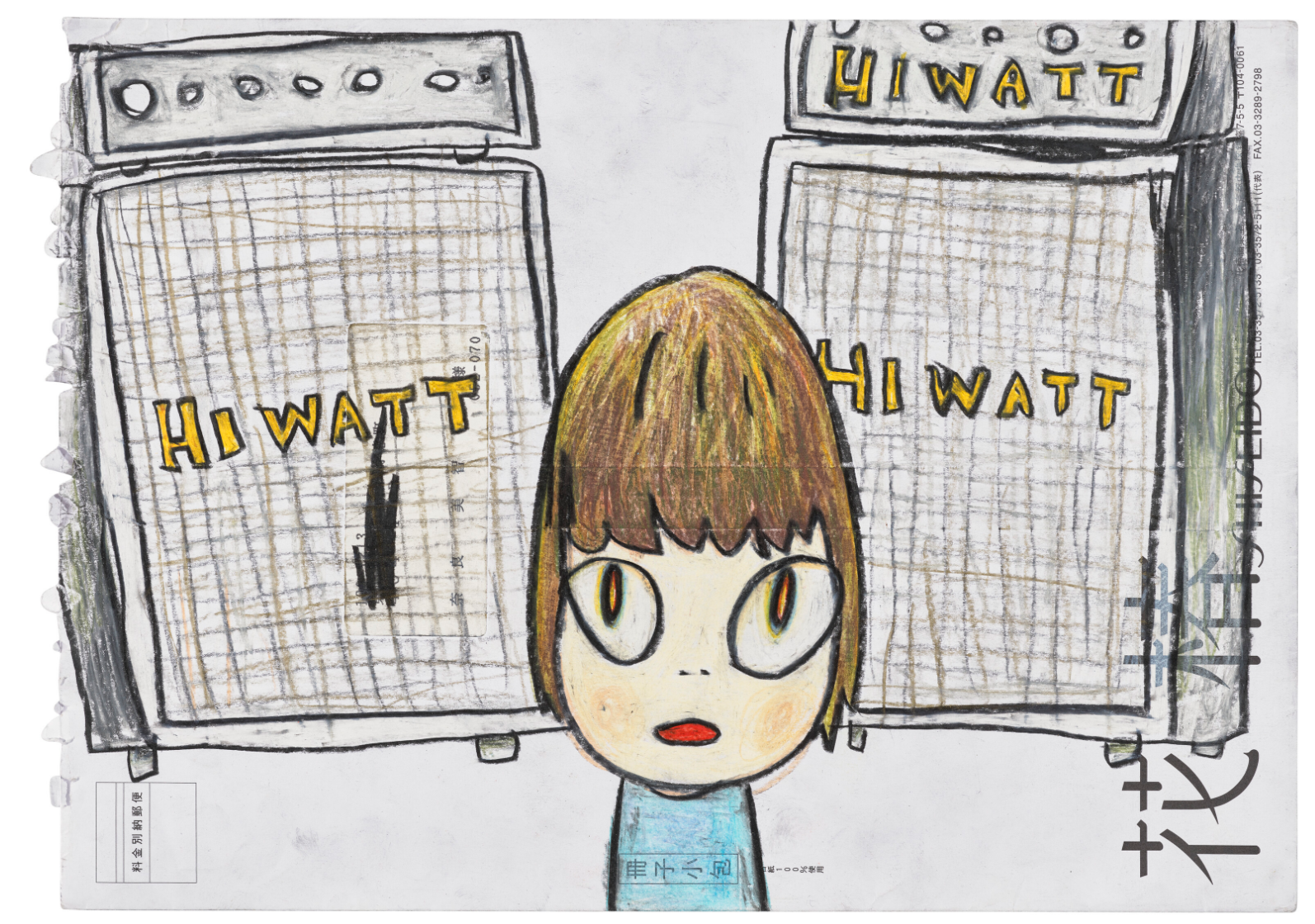
YOSHITOMO NARA (B. 1959)
Untitled (Hi Watt Hi Watt), 2005
Colored pencil, crayon and acrylic on envelope
24×33 cm (9 1/2 x 13 inches)
Signed with the artist’s initials and dated ‘Y N. 2005’ (on the reverse)
“When I’m working on drawings, music just comes into my ear and goes straight out of my hand.”
Untitled (Who Snatched the Babies), 2002
Christie’s London: 6 March 2025
Estimated: GBP 40,000 – 60,000
GBP 44,100 / USD 56,448
YOSHITOMO NARA (B. 1959), Untitled (Who Snatched the Babies) | Christie’s
YOSHITOMO NARA (B. 1959)
Untitled (Who Snatched the Babies), 2002
Colored pencil and graphite on envelope
26.2 x 12 cm (10 1/4 x 4 3/4 inches)
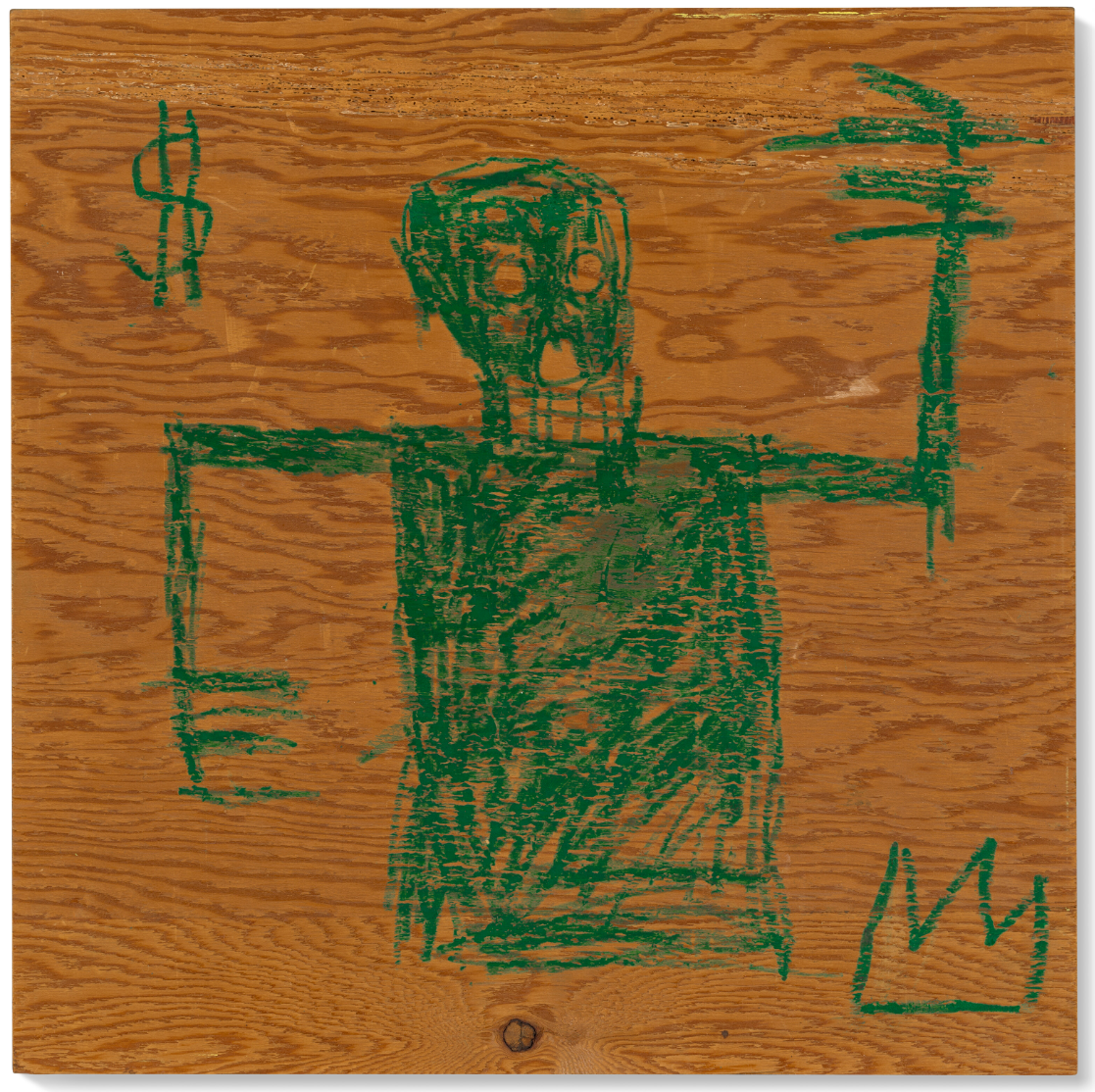
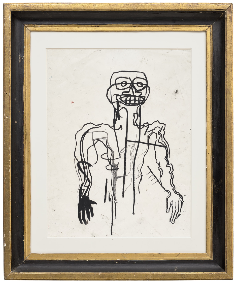
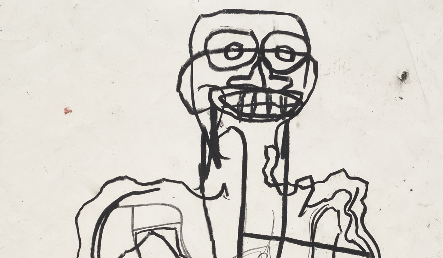
Jean-Michel Basquiat
Untitled, 1981
Christie’s London: 6 March 2025
Estimated: GBP 250,000 – 350,000
JEAN-MICHEL BASQUIAT (1960-1988), Untitled | Christie’s
JEAN-MICHEL BASQUIAT (1960-1988)
Untitled, 1981
Oilstick on wood
20×20 inches (50.9 x 50.9 cm)
Created in 1981, the year of the artist’s celebrated first exhibition in New York/New Wave at MoMA PS1, Untitled marks a decisive moment in Jean-Michel Basquiat’s career as he leapt from pseudonymous street artist to international celebrity. At the beginning of this year he was still signing his work with the tag SAMO: by the following summer, at just twenty-one years old, Basquiat would be exhibiting alongside such artists such as Keith Haring, Anselm Kiefer, and Andy Warhol. In the present work Basquiat has drawn a vivid green figure, bold and assertive, atop a piece of found wood. Its grinning, skull-like face would become an enduring image within his oeuvre. Recalling a king on a playing-card, the character is flanked by a dollar sign and crown, two of the artist’s most iconic motifs. Shown together, they suggest Basquiat’s artistic supremacy.
Jean-Michel Basquiat, Untitled, 1982. Private collection. Artwork: © Estate of Jean-Michel Basquiat. Licensed by Artestar, New York.
Although he became known amongst New York City’s graffiti artists for his streetwise and poetic wordplay, by this juncture, Basquiat’s art had begun to embrace the human figure. His fascination with the body—its sinews, bones, and musculature—dated from childhood: as a young boy, he was given a copy of the medical textbook Gray’s Anatomy to entertain himself with while he recuperated from surgery. The tome became a lasting source of inspiration and Basquiat would later fill his canvases with scientific annotations and diagrams that recalled its illustrations. This influence can be seen in the sharp intensity of the skull in the present work, whose graphic force captures the vigor of Basquiat’s meteoric rise.
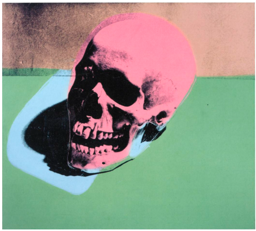
Andy Warhol, Skull, 1976. Andy Warhol Museum, Pittsburgh.
Artwork: © 2025 The Andy Warhol Foundation for the Visual Arts, Inc. / Licensed by DACS, London.
To create the fierce protagonist of the present work, Basquiat used oilstick, his medium of choice for many of his figurative paintings. Oilstick enabled the artist to quickly lay down his visions: alchemical combinations of image, text and symbol, blazing and visceral. While Basquiat would go on to riff on a variety of themes, including contemporary politics, art history, and music, he remained deeply informed by New York City’s streets. The works dating from 1981 refract aspects of the various neighborhoods he had lived in, expressing visually the sensations and rhythms in which the artist was immersed. The present work seems to have emerged directly from the city, a connection underscored by the use of found wood. Basquiat’s reign over New York was brief but tremendous. Intimate in scale yet monumental in feeling, the work speaks to this early moment in Basquiat’s career and captures the artist’s already prodigious talent. The world did not know what was coming.
Untitled, 1982
Phillips London: 6 March 2025
Estimated: GBP 400,000 – 600,000
Jean-Michel Basquiat – Modern & Contemp… Lot 5 March 2025 | Phillips
JEAN-MICHEL BASQUIAT
Untitled, 1982
Oilstick and pencil on paper
24 x 19 1/8 inches (61 x 48.5 cm)
Jean-Michel Basquiat’s Untitled is a masterful example of the artist’s instinctive yet conceptually rigorous drawing practice, a fundamental element of his oeuvre. An imposing, arresting figure dominates the composition, arms by its side, staring directly out at the viewer with bulging eyes and teeth bared. Expressionistic vertical and horizontal lines of thick black oilstick intersect with scrawled forms, congregating and coagulating against the off-white paper; there is a frenetic, fizzing urgency to the mark-making. As is typical, there is an immediacy and rawness to the composition that belies a particularly painterly kind of complexity. Deploying his signature pentimento technique, layers of grey graphite and black oilstick clot and emerge from the paper, culminating in a coolly graphic pictorial icon that evinces Basquiat’s enduring, bombastic genius. Executed in 1982, Untitled dates to the very year that Basquiat’s meteoric ascension from unknown to icon began. He received his first solo exhibitions with Annina Nosei in New York, Larry Gagosian in Los Angeles, and Bruno Bischofberger in Zurich, and was invited to participate in the international exhibition Documenta 7 in Kassel, becoming the youngest artist to do so. In the autumn of 1982, the artist moved to Southern California at the invitation of Larry Gagosian, living and working at the dealer’s Market Street residence in Venice, California between November 1982 and May 1984; this heralded a highly productive period of creativity.
Basquiat’s rendering of the figure in Untitled oscillates between interior and exterior forms in a kind of pseudo-Cubist visual game, emphatically demonstrating the signature figuration that would come to define his output. Where the left hand is carefully drawn with an element of foreshortening to the fingers, a black mass pools in the right hand, pulled through veins and arteries towards the figure’s shoulder. Ribs, teeth, spine all appear fleetingly as if X-rayed, with quick gestural mark-making generating an overarching sense of brittle energy. This interest in anatomy can be traced back to the artist’s youth, when he was given a copy of the medical textbook, Gray’s Anatomy, by his mother whilst recovering from a car accident, and can be seen in the recurring skulls and skeletons throughout his oeuvre. In the present work, the figure appears as a composite of forms, a coalescing of geometries and schemes effected by Basquiat’s confident line. It is in this ambiguous tension between internal and external that the psychological power of the work resides. In the present work, aesthetic references to the African masks seen by the artist at the Metropolitan Museum of Art are linked through line to a kind of anatomical drawing found in Leonardo Da Vinci’s sketchbooks. In another way, the primarily monochromatic palette and highly gestural draughtsmanship also draw comparison with Abstract Expressionist artists such as Franz Kline. Confident, creative control over signs and symbols, forms and figures, drawn from a broad range of everyday, art historical and sociocultural sources defines Basquiat’s oeuvre: ‘Basquiat’s work, like that of most of his peers, was based on appropriation… the images he appropriated whether they were from the Bible or a chemistry textbook – became part of his original vocabulary… Basquiat combined and recombined these idiosyncratic symbols throughout his career: the recursive references to anatomy, black culture, television and history are his personal hieroglyphics’. In his works, visual idioms are recast and remixed to form a new language. Here, the so-called ‘primitivism’ of these skull-like forms and skeletal figures in Basquiat’s iconography gesture towards artists such as Jean Dubuffet and Pablo Picasso, demonstrating the complex and dynamic way in which he used and reused art historical precedent within his practice, reclaiming a cultural, racial identity for himself through his art.
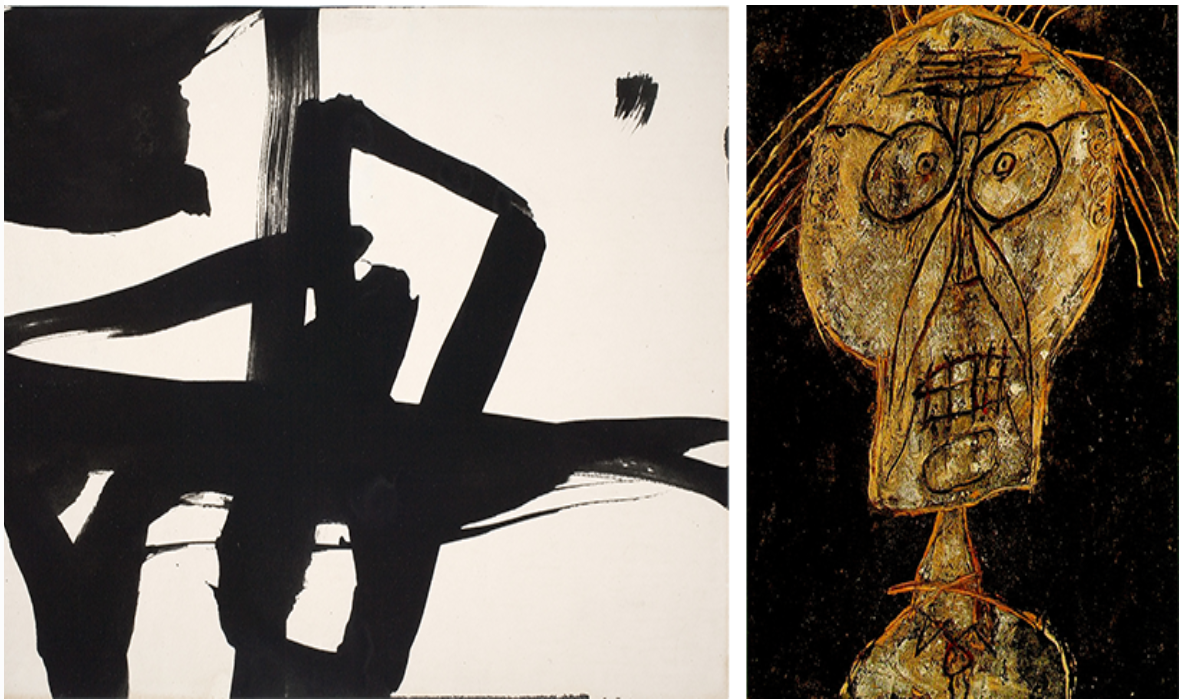
[Left] Franz Kline, Untitled, c. 1950, Davis Museum, Wellesley College. Image: © Davis Museum at Wellesley College / Given in memory of Mary Simpkins Lovell (Class of 1951) by her classmates / Bridgeman Images, Artwork: © ARS, NY and DACS, London 2025
[Right] Jean Dubuffet, Portrait of Dhotel, 1947, Private Collection. Image: Bridgeman Images, Artwork: © ADAGP, Paris and DACS, London 2025
Talismanic in its potency, Untitled stands as a paragon of Basquiat’s singularly electric artistic practice. In a different way to his paintings, the frenetic energy of Basquiat’s works on paper and the immediate freedom with which he draws and scrawls, carves and contours, synthesize his instinctive understanding of composition with his unique iconographic lexicon. As described by curator Diego Cortez, in his drawings ‘[Basquiat] constructs an intensity of line which reads like a polygraph report, a brain-to-hand “shake”. The figure is electronic-primitive-comic’. Teeth bared, eyes wide open, this figure transfixes every viewer, delivering a shock that reverberates off the paper.
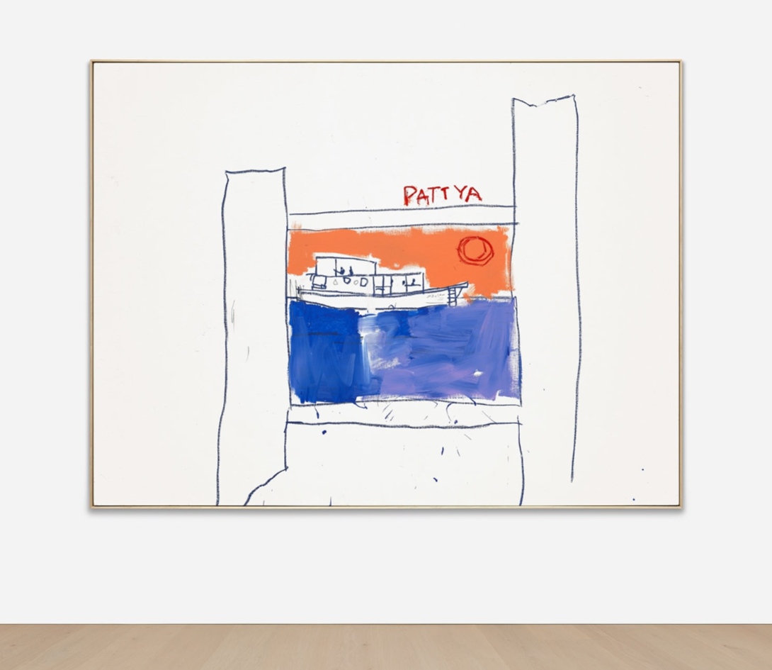
Pattya, 1984
Phillips London: 6 March 2025
Estimated: GBP 2,000,000 – 3,000,000
Jean-Michel Basquiat – Modern & Contem… Lot 18 March 2025 | Phillips
JEAN-MICHEL BASQUIAT
Pattya, 1984
Acrylic and oilstick on canvas
80 3/8 x 106 5/8 inches (204.2 x 270.8 cm)
Painted in 1984, at the creative height of ‘radiant child’ Jean-Michel Basquiat’s meteoric rise to fame, Pattya opens a window onto another world, serenely still and seemingly far removed from the raw energy and frenetic activity of New York’s downtown art and club scenes with which the artist is so closely associated. A deeply personal reflection on the globe-trotting tour taken through Japan, Thailand, and Switzerland taken by Basquiat and the interdisciplinary artist, poet, and photographer Lee Jaffe the previous year, Pattya is a rich record of this once-in-a-lifetime adventure, and of the intellectual range and depth of Basquiat’s thinking. Coming to auction for the first time, having previously been held in the personal collection of Basquiat’s friend and collaborator Andy Warhol, Pattya was included in the significant 2013 exhibition Jean-Michel Basquiat mounted by Gagosian Gallery in Hong Kong, representing the first solo presentation of paintings by the artist in the region. Basquiat and Jaffe first met in July 1983 at the Los Angeles County Museum of Art at the opening of an exhibition of work by mutual friend and sculptor Italo Scanga. An accomplished poet and photographer, Jaffe had also been a member of Bob Marley’s band in the mid-70s, and had produced Peter Tosh’s legendary 1976 album Legalize It – a record that young painter had played so often he had worn out the grooves on the vinyl. Striking up an immediate rapport and bonding over their shared passion for reggae music, Basquiat spontaneously invited Jaffe to join him on a flight to Japan the following day, kick-starting an extended tour through Japan and Thailand before culminating in the glamorous Swiss ski resort of San Moritz. Unguarded, playful, and brimming with warmth, tender affection, and a sense of excited wonder at the world they were discovering for the first time, Jaffe’s photographs stand as a remarkable visual record of this mind-expanding and inspirational trip, offering us a candidly intimate portrait of the young and sensitively attuned artist at this pivotal moment in his career.
Jean-Michel Basquiat photographed by Lee Jaffe, 1983. Image: © Lee Jaffe
After taking the bullet train from Tokyo to Kyoto where the conversation roamed from Jaffe’s time spent in Jamacia with some of Basquiat’s musical heroes, to art history and its more complex relationship to concepts of race and colonialism, the two travelled on to Thailand. Arriving in a hot and humid Bangkok, a quest to source locally grown cannabis unraveled into a descent into the city’s darker criminal underbelly. As Jaffe vividly describes: ‘The driver knocked on the door and a thuggish scowling bouncer walked us into a club. It was one of the most indelible and depressing scenes– etched like a grim sordid nightmare in my memory. The club was dimly lit. There was a stage– like a bandstand– but there was no band. About 20 girls with signs hanging around their necks with bold numbers printed on them were spotlighted […] Shocked and disgusted, we turned round and exited, furious at the drive(r). The next day we wanted to get out of Bangkok as quickly as possible—anxious to put the experience behind us. When we asked the guy at the front desk where we could find a beach, he replied ‘Go to Pattaya.’
Jean-Michel Basquiat, Bangkok, photographed by Lee Jaffe, 1983. Image: © Lee Jaffe
Even in this idyllic oasis, the long shadow of globalization and American Imperialism that they had first observed in Tokyo made its presence felt, Jaffe recalling the looming presence of a US Navy destroyer anchored just offshore. Their arrival coinciding with a national holiday, a throng of tourists and soldiers mingled on the crowded beach ‘like a scene from Apocalypse Now’. Respite finally came when they learned that there was a small island accessible by boat just an hour from the mainland with a small fishing village and, most importantly, no tourists. Seen as if glimpsed beyond the small, shuttered windows of a beach cabin, one such small fishing vessel passes in front of the horizon in Pattya, referenced too in a small suite of photographs captured by Jaffe while the pair were out on the water on a boat of their own. Rendered in a confidently reduced palette of cobalt blues and bright, burnt orange, the deceptively simple composition reinforces our understanding of Basquiat’s remarkably expressive skill as a colorist and draughtsman. With these formal elements of line and color concentrated powerfully in the center of the composition, Pattya especially recalls Marc Mayer’s evocative description of the artist’s practice and his tendency to work with ‘direct and theatrically ham-fisted brushwork’, using ‘unmixed color structurally, like a seasoned abstractionist, but in the service of a figurative and narrative agenda. Basquiat deployed his color architecturally, at times like so much tinted mortar to bind a composition, at other times like opaque plaster to embody it. Color holds his pictures together, and through it they command a room.’
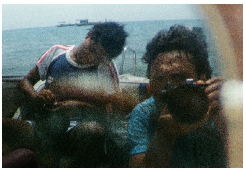
Lee Jaffe and Jean-Michel Basquiat, Pattaya, 1983. Image: © Lee Jaffe
With the single scrawled inscription ‘Pattya’, Basquiat transforms the expanse of white surrounding the central motif into a zone of possibility. Evoking the processes of memory and semiotic theory, the canvas and bare wall it stands in for are both reimagined here as surfaces for tracing signs upon, especially resonant given Basquiat’s early and collaborative activities tagging the walls of downtown Manhattan under the cipher SAMO©. As established in the field of semiotics, the separation of sign into its two constitutive elements of signifier and signified allows us to distinguish between its denotive and connotative qualities – that is, both what that sign describes in a literal sense, and its more associative meanings. Here ‘Pattya’ of course records a literal place, and the time passed there by Jaffe and Basquiat; but it also signifies the far more nebulous and complex series of mental associations that represent the very idea of Pattaya for the artist. Although Basquiat and Jaffe reached their remote paradise, the trip also exposed the effects of rapid, mass globalization in the last decades of the 20th century, revealing a much longer and more troubled history of colonial and cultural imperialism and the exploitation of peoples under capitalism to the sensitive, intellectually searching, and socio-politically engaged pair. As Jaffe noted, as well as sharing a keen engagement with cultural politics and a history of ideas, one significant point of convergence for the two artists was on the appropriation and ‘integration of words within our visual practice.’ It is on this point that Basquiat’s practice is most frequently discussed in relation to the calligraphic mark-making of Cy Twombly, who similarly differentiated between the more literal depiction or imitation of experience, and painting’s ability to become records of the emotion or sensation generated by these experiences. For Twombly – as for Basquiat here – each mark is ‘the actual experience with its own innate history. It does not illustrate – it is the sensation of its own realization. The imagery is one of the private or separate indulgences rather than an abstract totality of visual perception’
Cy Twombly, Untitled, 1958, Private Collection. Image: © Christie’s Images / Bridgeman Images, Artwork: © Cy Twombly Foundation
Just as Basquiat’s experiences travelling through Asia, Africa, and Europe would find themselves inscribed into his work, travel and the notion of place was of fundamental importance to Twombly. His later works especially bear direct references to the city of Rome which the artist first visited in a pivotal 1952 trip with Robert Rauschenberg and would go on to make his home in 1957. Extending his own gestural, calligraphic sense of line with reference to the ancient graffito carved into the walls of the Eternal City, Twombly’s canvases frequently bear the ghostly trace of words or textual fragments. Often referring to mythological figures and themes, Twombly was also more direct in his use of text, the scattered letters R O M E, especially prominent in a work like the 1958 Untitled (Rome) where, even more compellingly, the vague outline of an open window is discernible towards the center of the composition. Painted in 1984, after the conclusion of this international tour, the window and scene beyond recorded in Pattya serves the dual purpose of anchoring the work in a very specific place and time, and of activating this more complex, internal network of associations that exist beyond the simple fact of its existence.
Untitled, 1983
Christie’s London: 5 March 2025
Estimated: GBP 2,500,000 – 3,500,000
JEAN-MICHEL BASQUIAT (1960-1988), Untitled | Christie’s
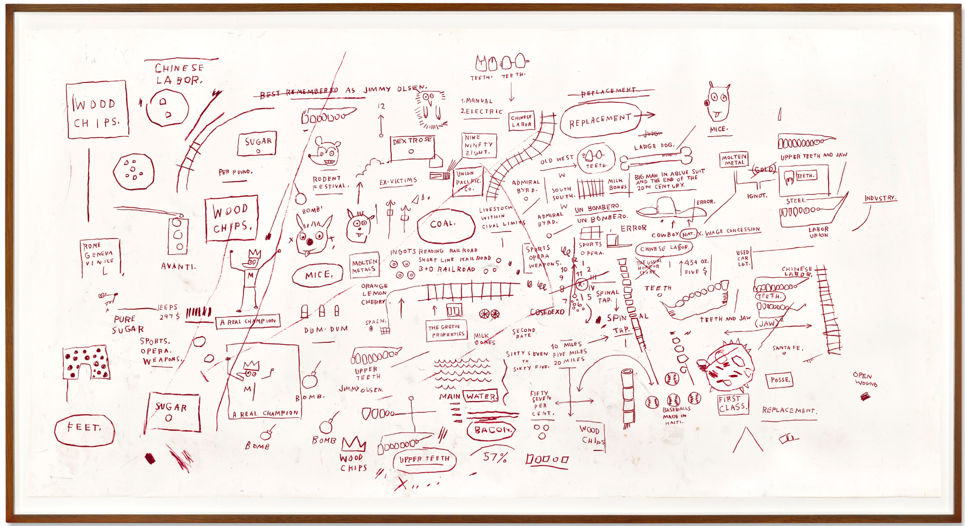
JEAN-MICHEL BASQUIAT (1960-1988)
Untitled, 1983
Oilstick on paper
50 1/3 x 98 1/2 inches (127.7 x 250.2 cm)
Stretching two and a half metres wide, Jean-Michel Basquiat’s Untitled (1983) is amongst the largest of the artist’s works on paper, impressively laden with his iconic, mesmeric visual poetry. Onto a vast surface spill the interior workings of Basquiat’s remarkable mind, a frenetic chorus of text and image which excavates popular culture and repressed history. The artist culls liberally from networks of movement, raw commodities, cartoons, sports, motifs of violence and anatomical drawings of the human body. The crown, Basquiat’s trademark assertion of presence and power, glints out several times across the sheet.
A frieze-like panel in monochrome red oilstick, the present work evokes Basquiat’s legendary graffiti origins, a medium which in the early 1980s was beginning a migration within public consciousness towards high art form. Basquiat, included in the influential 1981 exhibition ‘New York/New Wave’ at MOMA PS1, would become emblem and exemplar of this shift. Early practitioners of graffiti considered themselves writers rather than artists, and Basquiat’s inscriptions on the subway lines of the ‘D’ train were—from the start—socially engaged, intentional and astute. Throughout his storied career, as is exemplified in the present work, Basquiat would produce ‘work that is information, not work that is about information’ (R. Richard, ‘The Radiant Child’, Artforum, Vol. 20, No. 4, December 1981).
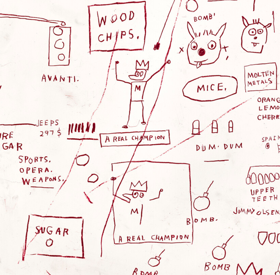
Across Basquiat’s oeuvre, sport recurs as a means by which individuals might raise themselves to positions of global visibility in an era of racism and discrimination. The figure of the black boxer becomes a powerful avatar of self-made power within a world premised on racial prejudice and endlessly stacked odds. Here, a triumphant boxer—perhaps the legendary Muhammad Ali, as suggested by the ‘M’ branded on the figure’s chest—lifts his gloved arms and crowned head in jubilation.
This is ‘A REAL CHAMPION,’ Basquiat tells us, not only for the match he has just won but the system he defeated to reach the ring. In the present work the boxer is depicted twice, once free and once confined within a box, as bombs rain down around him. While figures such as Muhammad Ali, Jesse Owens or Jackie Robinson propelled themselves to greatness, Basquiat reminds us that their pedestal was often a gilded cage, trapped as they were in the systematic bigotry of the industry, the cruelty of its fans, and the inordinate pressures which followed victory.
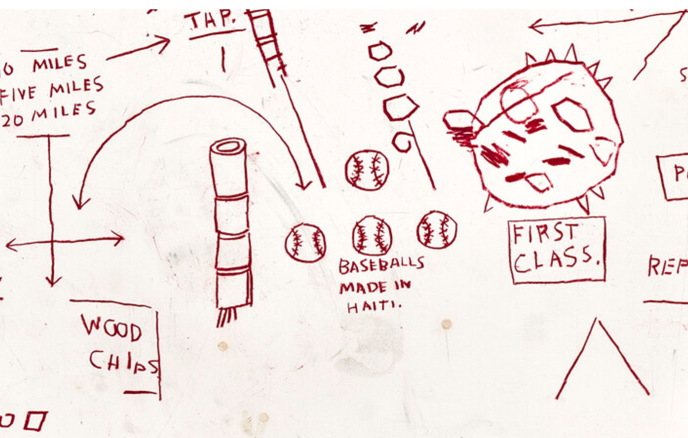
‘BASEBALLS MADE IN HAITI,’ Basquiat captions an illustration of four baseballs in the lower right corner. Here, his coded criticisms continue to reveal the injustices woven into the fabric of the sports industry in the United States. In the second half of the twentieth century Haiti—a country that didn’t play baseball—was a ‘giant baseball industry plantation’ shamelessly exploited for low wages and harsh working conditions by American manufacturers and Major League partners (K.B. Blackistone, ‘Baseball has a debt to Haiti, and it’s time the sport repaid it,’ The Washington Post, 22 September 2021). While black sportspeople were touted as examples of what could be achieved in America, they caught baseballs forged through the oppressed labor of thousands. For Basquiat, half-Haitian through his paternal side, the irony would not have been lost.
Diagrams of teeth and jaws recur across the present work, a reference to the iconic medical textbook Gray’s Anatomy. Received as a gift from his mother following a childhood car accident, Basquiat’s early exposure to this text—and to a book of drawings by Leonardo da Vinci—prompted a life-long interest in the inner workings of the human form. Basquiat pored over Gray’s Anatomy, drawing phrases and imagery from its pages onto his own, and adopting its title for the name of his experimental noise band, Gray, which was active from 1979 to 1981. Particularly affected by the brutal murder of black graffiti artist Michael Stewart in the year the present work was executed, Basquiat understood anatomy as a metaphor for the essential commonality of people. His anatomical drawings of skulls, bones, muscles and organs cut against the racism and discrimination of the time, which looked only skin-deep.
If the service of justice is to be lauded, it is its reverse—the perpetuation of injustice—which constitutes ‘THE USUAL HORROR STORY.’ This phrase, crossed out to the center-right of the composition, is no less important for its elimination.
“I cross out words so you will see them more. the fact that they are obscured makes you want to read them.”
The story Basquiat lays out is one of injustice and discrimination, of odds perpetually stacked against the deserving and disenfranchised. Railway tracks, leading the viewer through the composition, are adopted by Basquiat as a motif of embedded history, while at the same time recalling his first canvas of choice: New York City’s ‘D’ Train. In the late nineteenth century, thousands of Chinese railroad labourers forged through forests, canyons and mountains to build America’s Transcontinental Railroad. Companies such as ‘READING RAILROAD’ listed in Basquiat’s hand employed them for less than half the wage paid to white workers; they were in constant danger from explosives, rockslides and avalanches, and the death toll reached thousands. Juxtaposed against bombs, open wounds, and exploding ‘DUM DUM’ bullets, Basquiat reveals the violence which persists just beneath social consciousness as no less heinous for its veneer of industry and progress. To this day railways carry the raw materials of capitalist production—wood chips, coal, sugar—as the layers of injustice pile up.
Cy Twombly, Untitled (Bolsena), 1969. Art Institute of Chicago.
Artwork: © Cy Twombly Foundation.
Digital image: © 2025 The Art Institute of Chicago / Art Resource, NY/ Scala, Florence.
Basquiat’s oeuvre betrays a sweeping, multisensory mode of perception, through which the colour and noise of life seeps onto canvas and sheet. Beside a simple sketch of spinal vertebrae Basquiat transcribes ‘SPINAL TAP’ twice, perhaps a nod to Gray’s Anatomy, but equally possibly an allusion to the fictional band Spinal Tap, of the popular early-1980s television programme The T.V. Show starring Rob Reiner. Every word carries a prompt to look, and look again. In places he catches the viewer off-guard: in a light-hearted provocation a large bone in the upper left—rather than a human specimen—is revealed to be a simple ‘MILK BONES’ dog biscuit.
Taking inspiration from newsreels, cereal packets, comic books and cartoons, Basquiat peopled his works with a cast of fictional as well as real-life heroes, such as pioneering polar explorer Admiral Byrd, or Superman’s best friend and journalist Jimmy Olsen. The comic and cartoon character Mighty Mouse is accompanied by a ‘RODENT FESTIVAL’ of mouse peers, whose profiles gaze out at the viewer from across the vast page. Perhaps Basquiat had been watching ‘The Champion of Justice,’ a Terry Toons cartoon episode in which Mighty Mouse defeats a scheming villain to the relief of a colony of adoring mice. As he walked through grocery stores and billboard-lined sidewalks, or flicked through magazines and textbooks with the television blaring in the background and a jazz album filling gaps in the script, Basquiat forged a new way of looking and listening to the world around him. The result was an evocative, urgent visual idiom.
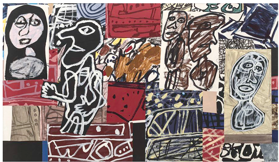
Jean Dubuffet, The Misunderstanding (La Mésentente), 1978. The Solomon R. Guggenheim Foundation, New York.
Artwork: © Jean Dubuffet, DACS, 2025.
Digital image: © 2025 The Solomon R. Guggenheim Foundation/Art Resource, NY/ Scala, Florence.
Within the present work words are revealed as raw material, oilstick put to paper as a painter wields his brush. Arranged intentionally—alone, in sentences and scatterings, boxed off or struck through—words come together and disperse like flecks of paint upon the surface of a canvas, evolving new sparks of inspiration or contemplation in their viewer. Traces of thought, phrases struck through but not erased, emerge as a kind of graphic pentimenti. Blank spaces become moments of silence and repose. Evolving Basquiat’s singular and iconic artform, the present work is intended to be read as much as seen, heard as much as read, a visual euphony of graffiti, fine art, jazz and concrete poetry.
Untitled, 1981
Christie’s London: 6 March 2025
Estimated: GBP 300,000 – 500,000
JEAN-MICHEL BASQUIAT (1960-1988), Untitled | Christie’s
JEAN-MICHEL BASQUIAT (1960-1988)
Untitled, 1981
Oilstick on paper
42 3/8 x 27 1/2 inches (100.3 x 70 cm)
Signed, inscribed and dated ‘SAMO © MODENA 1981’ (on the reverse)
Created on a formative visit to Modena, Italy, in 1981, the present work is an animated and effusive vision from Jean-Michel Basquiat. Across a large cream surface, Basquiat illustrates a medley of motifs drawn from both Classical antiquity and his contemporary world. A fluted column topped with a laurel wreath—a nod to ancient Greco-Roman architecture—stands next to a roadworks barricade, the clash of old and new evoking the layered histories of the city. Rendered in Basquiat’s characteristic oilstick, the palette is vivid, each color bursting off the paper with vivacious intensity. A trio of yellow faces and an alien-like green head gather over the scene, like figures on a billboard. The picture holds what critic Cathleen McGuigan referred to as the ‘seemingly contradictory forces’ that define so much of Basquiat’s art: ‘control and spontaneity, menace and wit, urban imagery and primitivism’ (C. McGuigan, ‘New Art, New Money’, New York Times, 10 February 1985, p. 20). It has been held in the same private collection for almost three decades.
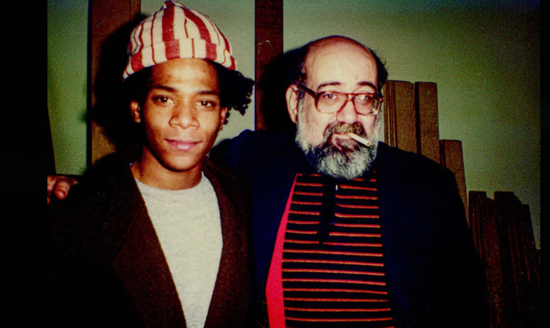
Jean-Michel Basquiat and Emilio Mazzoli, 1981. Photographer unknown.
In the wake of his participation in the now legendary Times Square Show in 1980, Basquiat was invited by the curator Diego Cortez to exhibit at P.S. 1 Contemporary Art Center in Queens. New York/New Wave opened in 1981, featuring more than twenty of Basquiat’s drawings and paintings, which were installed alongside works by Andy Warhol, Keith Haring, and Robert Mapplethorpe, among others. Basquiat’s contribution was enthusiastically received, and Cortez began to discuss the organization of a future exhibition with Emilio Mazzoli, whose gallery was located in Modena. That spring, Mazzoli came to New York and, after viewing Basquiat’s most recent compositions, bought several works. The plan for a solo show at Galleria Mazzoli quickly came together.
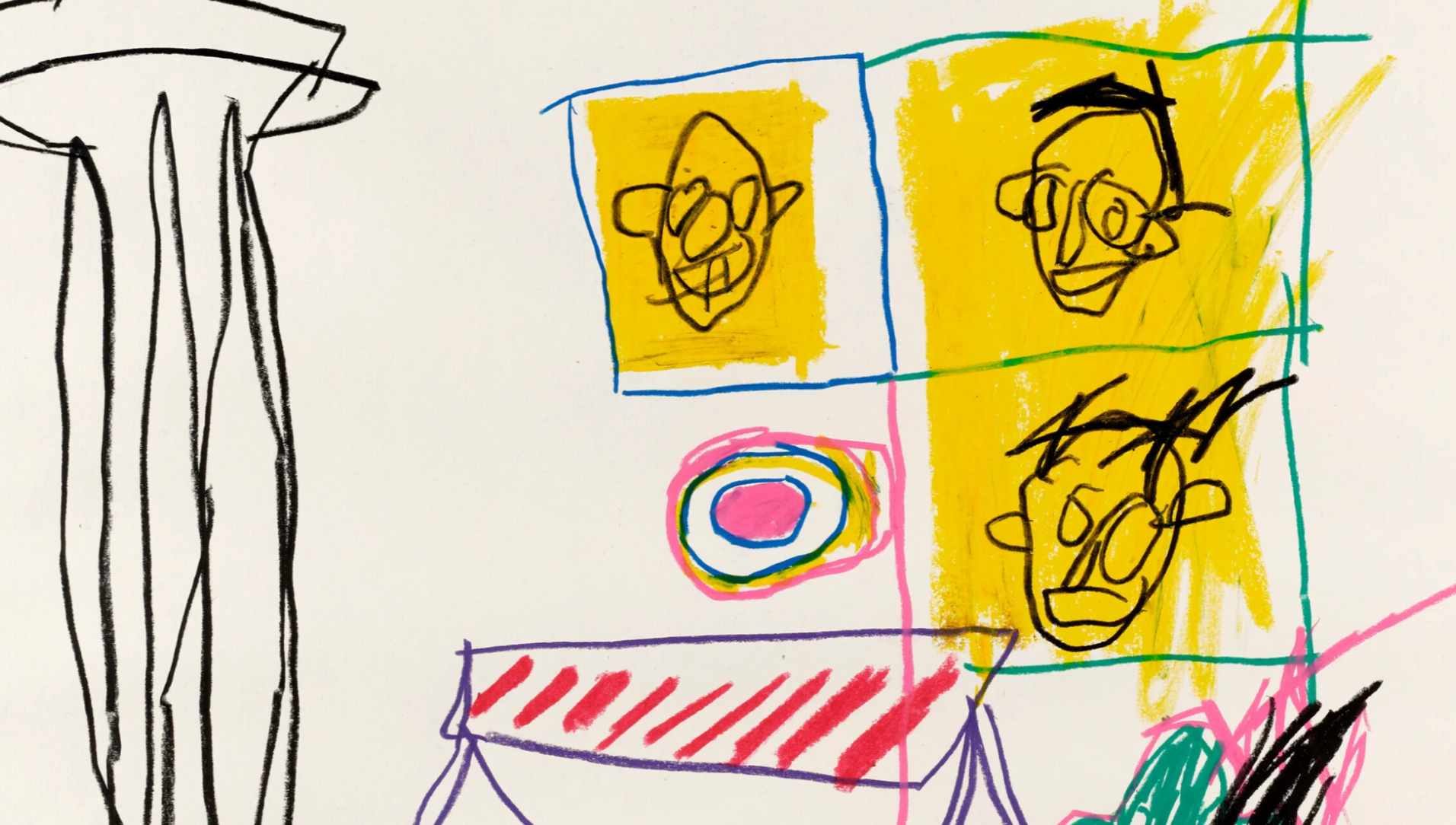
In May, Basquiat travelled to Modena. It was the first time he had been to Europe. He made drawings and paintings there, showing his art under his tag SAMO: the reverse of the present work is inscribed ‘SAMO © MODENA 1981’. Italy must have been fascinating for an artist so transfixed by history. Back in New York, Basquiat spent his days examining artefacts at The Metropolitan Museum of Art, trawling through encyclopaedias, and reading up on his artistic predecessors. Although decidedly of his era, Basquiat kept an eye firmly rooted in the past, and in both oil paint and oilstick, he captured the many ways that history made itself known within his own life.
Cy Twombly, Apollo and the Artist, 1975. Artwork: © Cy Twombly Foundation.
In 1982, Basquiat would again travel to Modena to prepare for a second exhibition at the Galleria Mazzoli. There he painted a cycle of eight monumental canvases which, like the present work, juxtapose Classical imagery with contemporary motifs. The 1982 exhibition was never realized, and the works were subsequently scattered across the globe. In 2023, the Modena paintings were finally reunited and shown together in a landmark exhibition at the Fondation Beyeler, Basel. These two visits to Italy were transformative for Basquiat, who was swiftly becoming an international celebrity. His life had forever changed and works such as the present capture the urgency and excitement of this experience, one that was only just beginning to gather strength.
Christopher Wool
Untitled, 2008
Sotheby’s London: 4 March 2025
Estimated: GBP 2,000,000 – 3,000,000
Untitled | Modern & Contemporary Evening Auction | 2025 | Sotheby’s
CHRISTOPHER WOOL (b. 1955)
Untitled, 2008
Enamel on linen
106×96 inches (269.2 x 243.8 cm)
Signed, dated 2008 and numbered (P572) (on the overlap)
Signed, dated 2008 and numbered (P572) (on the backing board)
Reverberating with chaotic tension and kinetic atmosphere, Untitled is a superb testament to Christopher Wool’s Gray Paintings. Whipping and lashing across the surface, the arabesque lines – sprayed in black enamel – drip like an electrified live wire and disrupt the surface. Wool erases some of these lines with broad strokes of turpentine-soaked rags, as the ghost-like residue turns to clouds of hazy grays, conjuring up extraordinary atmospheric depth. Precise yet uncontrolled, Wool’s exposes the construction and deconstruction through the traces of his mark making. In doing so, his Gray Paintings defy the canonical tradition of painting as they become oxymoronic images of definitive uncertainty in which addition is levied by subtraction to depict the ultimate post-modern condition: doubt. Executed for the artist’s 2008 exhibition at Luhring Augustine Gallery in New York, the present work is among his most celebrated works, some of which are in the collection of The Museum of Modern Art, New York; The Art Institute of Chicago; and the Tate, London.
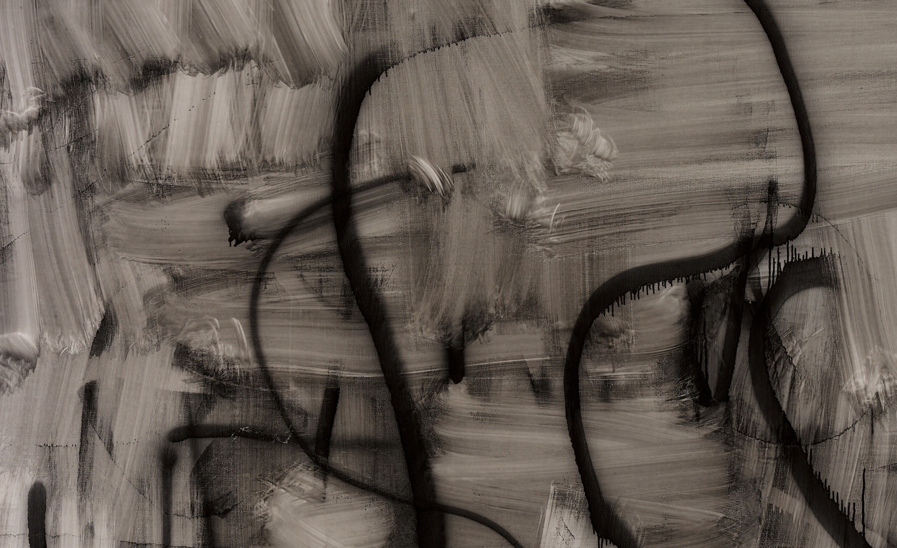
Born in Chicago in 1955, Wool rose to prominence in New York during the mid-1980s. Caught between the gesture of Abstract Expressionism, the inward-looking reduction of Minimalism, the readymade immediacy of Pop art, and the intellectual piety of conceptualism, Wool’s work resists codification and interpretation. As curator of Wool’s 2007 Guggenheim retrospective, Katherine Brinson, has stated: “A restless search for meaning is already visualised within the paintings, photographs, and works on paper that constitute the artist’s nuanced engagement with the question of how to make a picture” (Katherine Brinson, “Trouble is my Business” in: Exh. Cat., New York, Solomon R. Guggenheim Museum (and travelling), Christopher Wool, 2014, p. 35). Wool developed his practice during the height of the Pictures Generation; a group of artists who used appropriation and photography to challenge the relevance of painting in contemporary art. In response, Wool sought to demonstrate painting’s critical potential by redefining its boundaries. Despite influential critic Douglas Crimp’s 1981 declaration of “The End of Painting,” Wool pursued a path that rejected the expressive decision-making typically linked to the medium since the Abstract Expressionists. Wool’s work is a rebuttal to the total image prized by this group; he almost satirizes this group by borrowing archetypal features such as the fluid coils of Jackson Pollock or the concentric loops of Cy Twombly. It was however not until the early 2000s that Wool shifted toward working almost exclusively with abstract forms, exploring expression through repetition, erasure, mechanical processes, and his monochromatic palette.
Christopher Wool’s Gray Paintings in Prominent Museum Collections
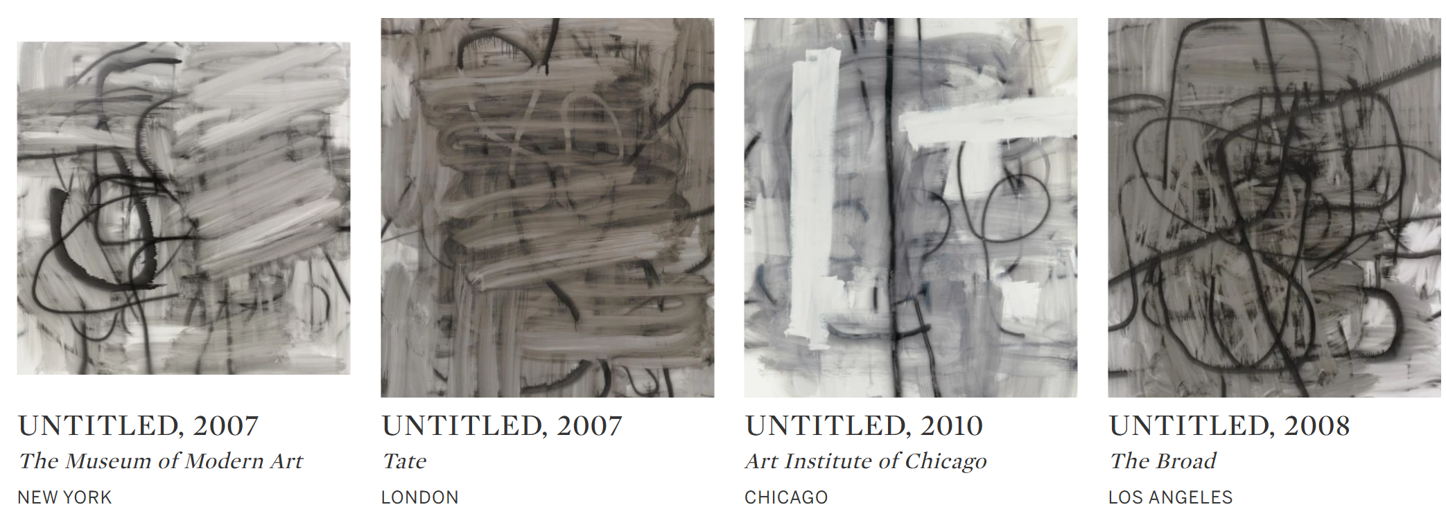
In 2000, after accidentally discovering the interaction between turpentine and enamel paint, Wool developed the erasure technique that would become the signature of his celebrated abstract paintings series. Originating from a moment of frustration when Wool attempted to erase a yellow enamel composition using a soaked rag, which in turn created a chaotic yet captivating blurred mass, Untitled signifies a spontaneous and radical process of self-editing, in which Wool first smeared and partially erased his existing black linear strokes, after which he painted over the faint traces left behind, embracing chance and reasserting the role of the artist’s hand.
“It starts someplace and reacting to itself progresses.”
The chaotic, gestural energy at the heart of this work echoes the visual language of graffiti, transforming the painting into an act of vandalism. Wool’s abstractions are deeply influenced by the urban landscape of New York, reflecting the raw, punk ethos shaped by his involvement in the city’s underground film and music scenes of the 1970s and 1980s. At the height of New York’s graffiti movement, where densely adorned letters often prioritized graphic impact over legibility, communication was pushed to its breaking point. In Untitled, legibility is abstracted even further, prompting a search for recognizable forms yet continually withholding resolution.
“With the paintings the inspiration is really internal. I get inspiration from the work and from the process of working. Painting is a visual medium, there to be looked at. For me, like listening to music, it’s an emotional experience.”
Left: Franz Kline, Chief, 1950. The Museum of Modern Art, Art: © ARS, NY and DACS, London 2024
Right: Willem de Kooning, Untitled, 1948-49. Art Institute of Chicago, Image: Art Resource, NY/ Scala, Florence. Art © The Willem de Kooning Foundation / Artists Rights Society (ARS), New York and DACS, London 2025
Like Robert Rauschenberg with his Erased de Kooning Drawing, Wool advances visual and conceptual discourse through the act of effacement, channeling Punk and Dada discourses to affect a form of nihilism, which unlike Rauschenberg he directs upon his own works, rather than that of others. In this way, Wool attains a form of transcendence in his abstraction. In effacing and erasing his previous work, Wool projects an almost spiritual clarity as he choreographs an exhilarating collision between mark and mistake, beauty and defacement, chaos and grace. Achieving a distinctly post-Punk attitude of intentional indifference, the slick coils and drips of Untitled powerfully invoke the gritty crucible of 1990s downtown Manhattan.
Untitled, 2000
Sotheby’s London: 4 March 2025
Estimated: GBP 250,000 – 350,000
Untitled | Modern & Contemporary Evening Auction | 2025 | Sotheby’s
CHRISTOPHER WOOL (b. 1955)
Untitled, 2000
Enamel on rice paper
66×48 inches (167.6 x 121.9 cm)
Signed, dated 2000, and numbered D103 (on the reverse)
Presenting a masterful manifestation of Christopher Wool’s unbridled exploration of abstraction, Untitled exemplifies the artist’s radical process of construction and erasure that continues to subvert conventions of artistic authorship. Sitting within Wool’s 9th Street Run Down series painted in 2000, Untitled extends upon the artist’s dynamic series of abstract monochrome paintings that he first started in the early 1980s. From spray painting to stencilling, screen printing to stamping, Wool’s oeuvre is expansive in the varied approaches he has taken to mark-making. Painted with the artist’s refined enamel technique, in Untitled, Wool has created a surface that simultaneously exposes its making and undoing. Broad swathes of pale taupe sweep across the canvas, with textures recalling a screen-printing squeegee, that partially veil an underlying expanse of bubble gum pink, vivacious in its drips and splatters. Evoking that of weathered graffiti, or a palimpsest of eroded histories, Untitled underscores Wool’s ongoing dialogue with the fragility of abstraction.
Robert Rauschenberg, Heroes / Sheroes (Night Shade), 1991. Faurschou Foundation, New York.
Art © The Pollock-Krasner Foundation ARS, NY and DACS, London 2025
Marking a critical inflection point within the artist’s aesthetic development, Wool initially painted 9th Street Run Down as studio sketches following a slew of major retrospectives in 1998-99 at the Museum of Contemporary Art, Los Angeles, the Carnegie Museum of Art, Pittsburgh, and the Kunsthalle Basel. Composed of forty-four large scale works on paper, the series narrates a complex fiction in which Wool questions a string of artistic dichotomies: that of original and copy, and of appropriation and appreciation. Within the series, Untitled stands as one of only two painted-over magenta works, amongst the larger group of eight taupe-veiled works. Beginning in 1998, Wool produced his first painted silkscreens by incorporating his past paintings and studies into new compositions. Any semblance of boundary between primary work, copy, and new composition was shattered. Springboarding from Warhol’s incendiary use of photographic screen printing, Wool transferred his past compositions to new canvases atop which he (re)paints in order to build ever-evolving painterly structures. Adding subtle motion or grand movement with each iteration, Wool creates a dizzying narrative, confounding the idea of where one work ends and the other begins.
Sigmar Polke, Untitled, 1989. Städelsches Kunstinstitut und Städtische Galerie, Frankfurt am Main. Image: © Städel Museum – ARTOTHEK Art © The Estate of Sigmar Polke, Cologne / DACS 2025 St?del Museum/ARTOTHEK
Wool’s artistic output since 9th Street Run Down has been comprised almost entirely of abstract forms, harnessing his ceaseless desire to fracture visions of abstraction to continually question and challenge preconceived notions of contemporary painting – particularly his own. Though never completely concealing the cerise hue, in obstructing its marks in Untitled – muting its presence and challenging his own artistic identity – Wool shifts the chromatic hierarchy within the painting. In so doing, Wool reveals a deeper ambition that informs his entire oeuvre, that which is defined by constructing an oxymoronic image of definitive uncertainty, in which addition is levied by subtraction to depict the ultimate post-modern condition: doubt.
“I became more interested in ‘how to paint it’ than ‘what to paint.’”
Reflecting the artist’s iconic breakdown of formal systems, in Untitled, abstract forms are negated under overpainting, celebrating process as the primary means of production.
Yves Klein, Le Rose du Bleu (RE 22), 1960.
Image: Christie’s Images, London/Scala, Florence Art © Succession Yves Klein c/o ADAGP, Paris and DACS, London 2025
Prescient to Untitled, Wool’s application of the iconic bubble gum pink is evident in his early and prized work, I Can’t Stand Myself When You Touch Me (1994), with its dynamic overlaying and rolling of pink as the centrifugal force within the composition. An iconic color deeply embedded in the lineage of contemporary art, pink flourished with the advent of Pop Art and its melding of high art and mainstream culture; from Andy Warhol’s Marilyns to David Hockney’s Bathers to Dan Flavin’s fluorescent lights. Within Wool’s oeuvre, pink stands as one of two colours the artist is known to paint with, establishing itself as a chromatic signature. Unlike his early text-based works or stark black-and-white compositions, Untitled introduces a visceral chromatic tension, where color is not merely an aesthetic choice but a conceptual force. Boldly painting over the magenta in Untitled, Wool demonstrates his capacity for renewal and re-conceptualization.
From the outset of his career, Wool has reassessed and expanded on the process of painting, exploring the production techniques of urban industry, and grappling with concepts of authenticity, yet few works encapsulate these ambitions as powerfully as Untitled. As an outstanding example of his seminal Run Down series – one of his most conceptually rigorous and visually arresting bodies of work – Untitled embodies Wool’s restless pursuit of reinvention. Heavily influenced by the sub-cultures he encountered upon moving to New York in the 1970s, Wool embraces their anarchic spirit as painterly ethos. Cementing Wool’s status at the vanguard of contemporary painting, Untitled stands as an indelible testament to Wool’s ability push the medium to its very limits.
Lester’s Sister (My Brain), 2000
Phillips London: 6 March 2025
Estimated: GBP 1,200,000 – 1,800,000
Christopher Wool – Modern & Contempora… Lot 16 March 2025 | Phillips
CHRISTOPHER WOOL
Lester’s Sister (My Brain), 2000
Enamel and silkscreen on linen
108 1/8 x 71 7/8 inches (274.7 x 182.8 cm)
Signed, numbered and dated ‘Wool 2000 (P335)’ on the overlap
Signed, numbered and dated ‘Wool 2000 (P335)’ on the stretcher
“Painting, for me, is often a struggle between the planned and the unforeseen. The best paintings are the ones that you could not have imaged before you began […] Of course the worst paintings are created in this way as well.”
A monumental and electrifying testament to Christopher Wool’s radical reinvention of painting at the turn of the millennium, Lester’s Sister (My Brain) stands as an emblem of the artist’s signature fusion of mechanical reproduction and gestural abstraction. Executed in 2000, the work epitomizes Wool’s masterful command of the silkscreen process, a technique that he has wielded to dismantle traditional hierarchies of painting and redefine the very act of mark-making. With its stark monochromatic palette, rich textural complexity, and arresting interplay of erasure and assertion, Lester’s Sister (My Brain) is an essential example of Wool’s oeuvre, a compelling link between his earlier text-based works and his later, more gestural abstractions.
After years of working with mechanical techniques and imagery, notably stencilled patterns and letters, Wool reintroduced gestural mark-making into his practice in 1995 with works like Maggie’s Brain, located in The Art Institute of Chicago. In 1998, the artist began appropriating his own paintings as the base images for autonomous works—taking a finished picture, using it to create a silkscreen, and then reassigning the image onto a new canvas. The original painting is metamorphosized into a crisp, flattened image, which Wool either leaves as such or builds upon with enamel paint and further screen printing. Executed in 2000, Lester’s Sister (My Brain) is a masterful product of this transition in style and technique, representing the artist’s unique approach to the painterly medium.
At first glance, Lester’s Sister (My Brain) presents a field of seemingly frenetic forms, layered and distorted across the linen surface. Wool divides his source painting into four screens placed with the edges slightly misaligned, dissecting the flow of the original work into disjunctive quadrants. His use of silkscreened imagery—a hallmark of his practice—injects an industrial, mechanized quality into the work, recalling the serial production techniques of Andy Warhol’s Pop practice. Going considerably further than Warhol’s serial repetitions of consumerist and cultural icons, Wool embraces imperfection and misalignment, deliberately allowing slips, drips, and overpainted layers to disrupt the regimented order of the silkscreened motifs. This disorientation is taken further as Wool draws over the screen-printed image with enamel spray paint. The result is a work in flux, its compositional structure constantly wavering between control and chaos, a fundamental tension that has defined the artist’s career.
Andy Warhol, Sixteen Jackies, 1964, Walker Art Center, Minneapolis. Artwork: © 2025 The Andy Warhol Foundation for the Visual Arts, Inc. / Licensed by DACS, London
Wool’s work exists within a stylistic and technical space between Pop Art and Abstract Expressionism. A crucial touchstone for his practice is the legacy of Jackson Pollock’s all-over compositions, where gesture is both spontaneous and highly orchestrated. In Lester’s Sister (My Brain), Wool channels the physical immediacy of Pollock’s drip paintings while subverting their heroic individualism with a process more akin to mechanical reproduction. This dissolution of the ‘authentic mark’ places Wool’s work in dialogue not only with Pollock but also with contemporaries like Richard Prince, whose appropriations of mass-media imagery interrogate authorship and cultural memory.
Jackson Pollock, One: Number 31, 1950, 1950, The Museum of Modern Art, New York.
Image: The Museum of Modern Art, New York/Scala, Florence, Artwork: © Pollock-Krasner Foundation ARS, NY and DACS, London 2025
The raw, urban energy of Lester’s Sister (My Brain) is deeply rooted in Wool’s early influences. Growing up in Chicago in the 1960s before moving to New York in the 1970s, Wool was profoundly shaped by the visual and political landscape of the city. The aesthetics of street art, graffiti, and industrial signage infiltrate his work, giving it a distinct edge that speaks to a broader urban consciousness. In Lester’s Sister (My Brain), this tension is fully realized: the silkscreened patterns provide a structured framework, but Wool’s intervention—through misaligned printing and expressive spray paint—infuses the work with raw spontaneity, challenging the viewer’s perception of painterly intent. An exceptional example of Wool’s practice, Lester’s Sister (My Brain) is a work of striking visual dynamism and conceptual depth. The artist himself has described his method as ‘a struggle between the planned and the unforeseen,’ an ethos that manifests palpably in the intricate layering and spontaneous line-work at play in this piece. For collectors and institutions alike, Lester’s Sister (My Brain) represents not only a critical moment in Wool’s artistic trajectory but also a broader meditation on the language of painting in the contemporary era.
Untitled, 1997
Phillips London: 6 March 2025
Estimated: GBP 600,000 – 800,000
Christopher Wool – Modern & Contemporar… Lot 6 March 2025 | Phillips
CHRISTOPHER WOOL
Untitled, 1997
Enamel on aluminium
17 7/8 x 11 3/4 inches (45.5 x 30 cm)
Signed, inscribed and dated ‘Wool 1997 (S145) For Richard Hell Who Wrote It’ on the reverse
Visually imposing and immediately disarming, Christopher Wool’s Untitled, 1997 is an image indebted to its time – the grit of the New York punk and art scene, the angst of the Bowery’s CBGB music club and the graffiti-covered walls of the Lower East Side. Featuring the starkly stenciled words ‘YOU MAKE ME’, Untitled exemplifies Wool’s text-based practice that defined his rise to prominence in the 1980s and 1990s downtown scene. Employing raw materials such as metal and using bold, blocky lettering reminiscent of urban signage, Wool’s word paintings challenge immediate legibility, delving into the ambiguity of language whilst pushing the limits of painting itself. Drawing from a wide range of cultural influences, Wool’s inspiration here is the 1977 album Blank Generation by Richard Hell & the Voidoids. Wool’s chosen words are those scrawled across Hell’s bare chest on the album cover, his direct gaze echoed in Wool’s own confrontational address here. Central to the early punk scene in Lower Manhattan alongside contemporaries such as Patti Smith, Hell’s Blank Generation is a deliberately messy uproar of angst. In Hell’s version of the phrase, he invites the viewer to complete the phrase with an underlined blank. Wool’s version, typical of his word painting syntax, confines the words to a four-by-four grid and stacks them one on top of the other, leaving the phrase unpunctured with a blank space underneath, a gap for the viewer to complete.
Unlike other word paintings where Wool appropriates fragments of text, his meeting with Richard Hell was a deliberate act of collaboration. Wool approached Hell to request consent to use the words, a gesture Hell appreciated, noting, ‘Which of course he didn’t have to do. I mean, that was really courteous. It’s not like I own those words.’ This initial encounter revealed a mutual artistic respect, highlighting their shared fascination with semantics and syntax. A few years after rising to fame, Hell retired from music to focus on writing. More recently, the pair collaborated on a project called Psychopts, in which they turned pairs of words into images that appeared to trick the eye into anticipating another word.
“Our project didn’t have anything to do with changing those words, or reassessing those words. They were just images we started with.”
Wool’s word paintings can be traced back to an encounter in the early 1980s with a truck bearing the graffiti ‘SEX LUV’ on its powdery white surface. Moved by the raw simplicity of the letters, stripped of context and exposed to the urban fabric, Wool chose to use text as a medium to explore the boundaries of painting. Similar text-based interventions were undertaken by artists such as Joseph Kosuth a decade earlier. Kosuth’s minimalist, uniform text works sought to make language the content of the art, collapsing description and image into each other. The careful construction of Wool’s paintings, often arranged on aluminum with a geometric grid, transforms each sloping letter into a painterly object. The stray drips and splashes of paint on each letter imbue a sense of urgency, recalling the graffiti artists of downtown New York.
Joseph Kosuth, Self-defined object, 1966. Artwork: © ARS, NY and DACS, London 2025
Composed a decade after the start of his first experimentation with word paintings, Untitled seems unique in its duality, a powerful example of Wool’s exploration of the limits of painting and the ambiguity of syntax as well as the burst of punk energy that projected Hell and Wool to prominence in 1980s. The present work also stands as a testament to the friendship and continued artistic collaboration between the pair, both figures having pushed the boundaries of the visual and musical fields reflecting the experiences of young artists working in the urban environment of the early 1990s.
KAWS
CHUM (KCB2), 2012
Sotheby’s London: 5 March 2025
Estimated: GBP 500,000 – 700,000
CHUM (KCB2) | Contemporary Day Auction | 2025 | Sotheby’s
KAWS (b. 1974)
CHUM (KCB2), 2012
Acrylic on canvas mounted on panel
84×68 inches (213×172 cm)
Signed, titled and dated 12 (on the reverse)
Using the visual culture that surrounds him, Brian Donnelly, known as KAWS has established himself as one of the leading figures in a new iteration of Pop sensibility of the 21st Century. KAWS combines his characters with popular cartoons, mascots, and logos, creating a new visual language, and building upon a legacy of artists who famously questioned the consumerist tendencies of modern society. Whilst studying illustration at the School of Visual Arts in New York, KAWS entrenched himself in the rebellious New York Graffiti counterculture. His iconic “KAWS” tag became a symbol seen throughout Jersey City and his bold and iconic graffiti would go on to shape much of his artistic career. These public art interventions marked the beginning of KAWS’s exploration of themes related to consumerism and cultural iconography. In the early 1990s, KAWS started to parody and subvert corporate and political advertisements, often on bus shelters and billboards. As his practice expanded beyond graffiti, KAWS began appropriating recognizable cartoon characters from popular culture, creating his own cast of characters, one of the most iconic of which is CHUM.

CHUM (KCB2) was born from the iconic Michelin Man image, internationally recognised as the mascot of the Michelin tire company. The present work perfectly demonstrates KAWS’s meticulous handling of paint, with smooth, uniform planes of vibrant blue. These controlled lines and fluidity of colour seem to give the rounded figure a sense of movement as if he were striding toward the viewer from the wall. KAWS blends familiar cultural icons with his own unique style, he crafts a new visual dialogue that reflects both the era’s mass media landscape and his unique artistic evolution. CHUM (KCB2), with its ties to the Michelin Man, exemplifies this fusion of nostalgia and innovation, inviting viewers to engage with familiar imagery in a deeply emotional way. The exaggerated masculinity of the figure, as the artist describes, allows the viewer to “compare body postures and assertiveness–or lack of it–in front of a CHUM… we are using it as an excuse to see ourselves…If, for the Pop artists of the 1960s, the premise was, ‘You are what you buy,’ for KAWS it would be, ‘You are what you see.'” (Mónica Ramírez-Montagut, “KAWS: SEEING YOU SEEING YOURSELF,” KAWS, New York 2010, p.133). In infiltrating the worlds of mass consumerism and popular culture, KAWS’s work constitutes a new paradigm in art history in which his work functions less as a commentary on consumer culture, but as a continuous enactment of the complex role of art and popular media in everyday lives within capitalist culture.
Philibert Gilbert, Advertisement for Michelin, c. 1935
Images/Artwork: © Bridgeman Images
KAWS forces the viewer to reconsider their relationship with the symbols that shape modern culture. CHUM (KCB2) is a testament to this ideology. By reimagining this well-known character, he transforms him and gives him new meaning. His work not only disrupts the simplicity of consumer-driven imagery but also encourages deeper reflection on how these images shape our identities. Through this dynamic interplay, KAWS establishes a powerful, innovative language that resonates with the complexities of 21st century art.
GONE, 2018
Phillips London: 6 March 2025
Estimated: GBP 600,000 – 800,000
KAWS – Modern & Contemporary Art Eveni… Lot 27 March 2025 | Phillips
KAWS
GONE, 2018
Painted bronze
71 x 71 1/2 x 29 3/4 inches (180.3 x 181.6 x 75.6 cm)
Inscribed with the artist’s signature, numbered and dated ‘3/5 KAWS..18’ on the underside
This work is number 3 from an edition of 5 plus 2 artist’s proofs
Few contemporary artists have successfully navigated the intersection of high art and popular culture with the precision and impact of KAWS. Born Brian Donnelly in 1974, KAWS has spent the last three decades reshaping the way audiences engage with art, seamlessly merging the visual languages of street culture, consumerism, and fine art. His instantly recognizable characters—hybrid figures that reference cartoon nostalgia while carrying deep emotional resonance—have solidified his status as one of the most influential artists of his generation.

Among these, GONE stands as one of KAWS’ most poignant and sophisticated works, distilling the essence of his practice into a single sculptural moment. Debuting at Skarstedt Gallery in New York as part of KAWS’ inaugural exhibition with the gallery – also titled GONE – the work depicts his iconic ‘COMPANION’ figure carrying the lifeless body of ‘BFF’ in an unmistakable reference to Michelangelo’s Pietà. This powerful composition transforms KAWS’ familiar characters into a meditation on grief, loss, and the passage of time—an evolution of his practice that deepens the emotional weight behind his work.
“When I was younger, I wasn’t going to galleries, I wasn’t going to museums […] There was a lot of ‘this is fine art’ or ‘this is not fine art’; ‘this is commercial’, ‘this is high art’. In my mind I thought, art’s purpose is to communicate and reach people. Whichever outlet that’s being done through is the right one.”
Michelangelo Buonarroti, Pietà, 1497–1499, St Paul’s Basilica, Vatican City. Image: wikicommons
Since the late 1990s, KAWS’ artistic trajectory has been shaped by a commitment to reimagining mass culture. Beginning as a graffiti artist known for subverting advertisements on billboards and bus shelters, KAWS quickly developed a signature visual language: rounded forms, bold color palettes, and the ever-present X-ed-out eyes that imbue his figures with a unique blend of melancholy and universality. COMPANION, first introduced in 1999 as a limited-edition vinyl figure, has served as the linchpin of his oeuvre—a character who, despite its cartoon-like origins, speaks poignantly to the human condition. In scaling-up his originally toy-sized figures, KAWS shifts the dynamic between the viewer and the work.
“Something somebody could hold in their hand at one point […] can probably now hold you.”
This change in scale dramatically alters the way we relate to KAWS’ sculptures, especially works like GONE which not only reflect human emotions but also mirror a human-like scale. In stark contrast to earlier iterations of COMPANION—who has often been depicted covering its eyes in shame or sitting in introspective repose—here, the character takes on a tragic heroism. By cradling BFF’s limp body, COMPANION shifts from a symbol of personal anguish to one of collective mourning. The evocation of the Pietà lends the work an art-historical gravity, situating KAWS within a lineage of artists who have explored themes of sacrifice and loss. This sculptural composition does more than monumentalize his characters—it elevates them to the realm of universal myth.
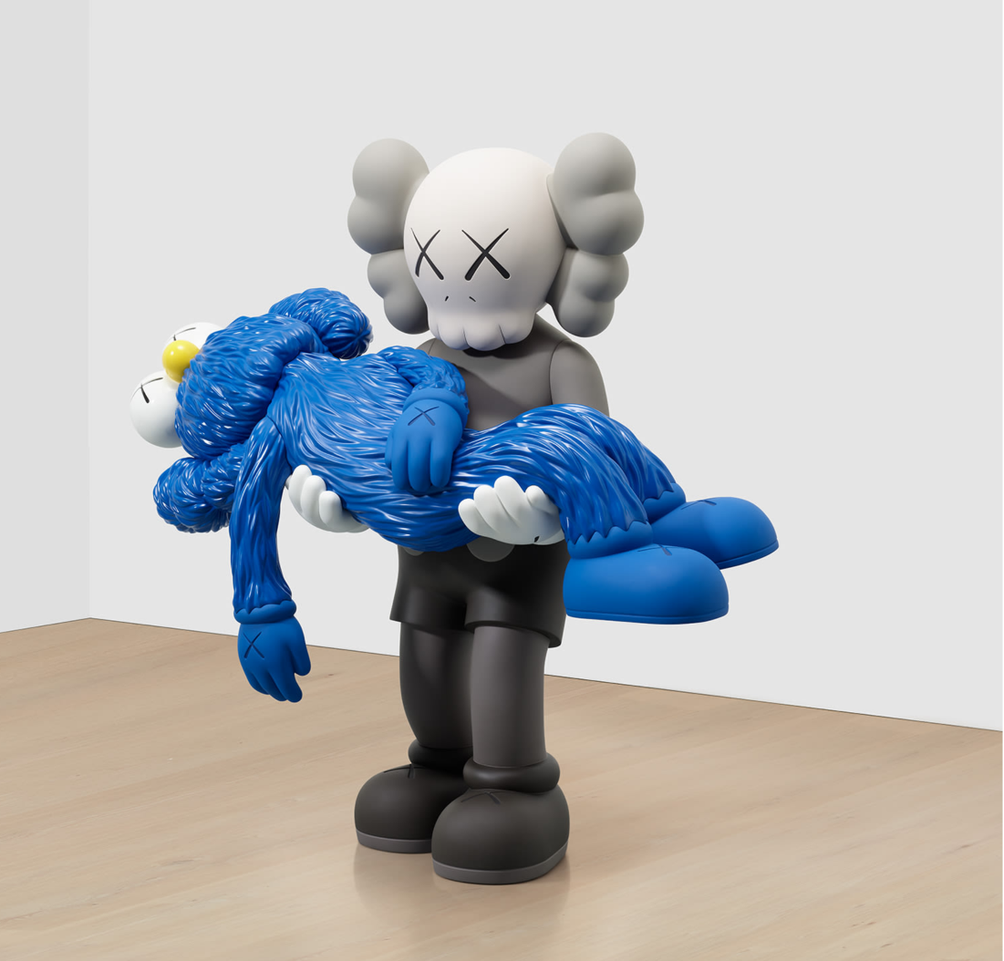
While GONE speaks to the depth of KAWS’ conceptual framework, it also underscores his unique ability to reach audiences beyond the traditional art world. His practice exists at the intersection of multiple cultural spaces: fine art, fashion, collectible design, and street culture. KAWS has successfully maintained his integrity across these platforms, producing work that is as at home in the Brooklyn Museum as it is in a Supreme collection. His collaborations with brands like Dior and Uniqlo have only further cemented his role as a cultural force—one whose appeal spans generations and demographics. GONE encapsulates the artist’s ability to bridge high and low culture while maintaining an acute sense of emotional truth. It shares a thematic lineage with works like the 2011 PASSING THROUGH, where COMPANION sits in dejection, and KAWS’ 2019 Art Basel installation, where his figure lays in a sea of existential dread, afloat in Hong Kong’s Victoria Harbour. Yet, unlike these works, GONE possesses a cinematic drama that propels KAWS’ work into the realm of narrative potency. The sculpture invites viewers share in a moment of loss, to feel the weight—both literal and figurative—of COMPANION’s grief. As Anne Pasternak remarks, ‘[KAWS] emphasizes that even within a world shaped by image and consumption, universal emotions–from love and friendship to loneliness and alienation–are what binds us.’
KAWS’ inflatable COMPANION figure installed in Hong Kong’s Victoria Harbour in conjunction with Art Basel, 2019.
Image: Imaginechina Limited / Alamy Stock Photo, Artwork: © KAWS
KAWS’ enduring impact stems from his ability to distil human emotion into forms that are simultaneously playful and reflective. GONE is a testament to this rare alchemy, a work that transcends its materiality to become a symbol of contemporary pathos. As collectors and institutions continue to embrace his work, pieces like GONE will be recognized not just as striking sculptures, but as touchstones of an era—one in which art, culture, and commerce collide in ways that redefine the landscape of contemporary visual expression.
Damien Hirst
Tridodecylamine, 2016
Phillips London: 7 March 2025
Estimated: GBP 20,000 – 30,000
Damien Hirst – Modern & Contemporary … Lot 172 March 2025 | Phillips
DAMIEN HIRST
Tridodecylamine, 2016
Household gloss on canvas
5 1/2 x 5 1/2 inches (14.1 x 14.1 cm)
Signed, titled and dated ‘Tridodecylamine 2016 Damien Hirst’ on the reverse
Stamped with the artist’s stamp on the overlap
Typhoid, 2003
Phillips London: 7 March 2025
Estimated: GBP 40,000 – 60,000
Damien Hirst – Modern & Contemporary … Lot 173 March 2025 | Phillips
DAMIEN HIRST
Typhoid, 2003
Flies and resin on canvas
54×40 inches (137.2 x 101.6 cm)
Signed ‘Damien Hirst’ on a label affixed to the reverse
Cesium Fluoride, 2004-2011
Phillips London: 6 March 2025
Estimated: GBP 400,000 – 600,000
Damien Hirst – Modern & Contemporary A… Lot 30 March 2025 | Phillips
DAMIEN HIRST
Cesium Fluoride, 2004-2011
Household gloss on canvas
57 7/8 x 138 1/4 inches (147.2 x 351 cm)
Signed, titled and dated ‘Cesium Flouride’ Damien Hirst 2004-2011′ on the reverse
Signed ‘D Hirst’ and stamped twice with the artist’s stamp on the stretcher
“People are afraid of change, so you create a kind of belief for them through repetition. It’s like breathing. I’ve always been drawn to series and pairs. A unique thing is quite a frightening object.”
One of the most infamous and controversial figures of contemporary culture, Damien Hirst has built a career on challenging conventions and exploring the intersections of art, science, and commercial culture; themes which collide in his defining series of Spot Paintings. A striking example of the series in a monumental format, Cesium Fluoride showcases Hirst’s ability to transform simple forms into complex visual experiences.
Hirst rose to fame alongside other fellow so-called ‘Young British Artists’ in the late 1980s and 1990s, executing his first Spot Painting in 1986 while completing his Fine Art degree at Goldsmiths. Since that initial canvas—a medley of colorful, paint-dripping dots—the series has expanded to include over a thousand hand-painted, meticulously executed works. The Spot Paintings went global in 2012, when over three-hundred pieces were simultaneously exhibited across Gagosian’s eleven locations worldwide, infiltrating the cultural hotspots of London, New York and Hong Kong. This momentous exhibition, The Complete Spot Paintings 1986—2011, affirmed Hirst’s Spots as his most enduring motif. ‘Showing them all over the world at the same time becomes part of their content and meaning,’ Adrian Searle writes, ‘they’re infiltrating everywhere, their field expanding to cover the world.’ Cesium Fluoride was exhibited in the New York leg of Hirst’s major Gagosian exhibition, solidifying its importance in his oeuvre.
Formally, Cesium Fluoride is a masterpiece of precision and vibrancy. The work is composed of an extensive grid of uniformly sized, meticulously painted coloured spots, each measuring exactly two-inches in diameter, spaced two-inches apart. Executed in household gloss on canvas, the surface shimmers with a polished finish, enhancing the saturation and intensity of the colours. Each spot is distinct, with no two colors repeating, a hallmark of Hirst’s commitment to the idea of infinite variation within a structured system. This careful orchestration of form and colour creates a rhythmic, almost hypnotic visual effect, drawing the viewer into an immersive experience of machine-like perfection. The vertical composition of Cesium Fluoride adds to its dynamic and seemingly infinite presence, accentuating the repetition and uniformity of the spots. This format challenges more conventional readings of these paintings, inviting viewers to engage with the work in a more active gaze that mirrors the human body’s own upright stance. As a result, the painting feels both monumental and intimate, vast in scale yet approachable in its simplicity.
Cesium Fluoride exists within Hirst’s longstanding Pharmaceuticals series, a subset of his Spot Paintings. Referencing a chemical compound, this nod to scientific nomenclature is not merely decorative; it reflects Hirst’s deep interest in the relationship between art and science which first came to the fore in his 1989 medicine cabinet, Bodies. By naming his works after chemical substances, the artist draws parallels between the systematic nature of scientific inquiry and the methodical process of creating art. The clinical, almost sterile connotation of ‘cesium fluoride’ contrasts sharply with the vibrant, joyful palette of the painting, creating a tension that is both intellectually stimulating and visually captivating.

Damien Hirst, Bodies, 1989, Private Collection. Artwork: © Damien Hirst and Science Ltd. All rights reserved, DACS 2025
The Spot Paintings are central to Hirst’s practice not just for their aesthetic appeal but for their conceptual depth. They represent a radical departure from more traditional art-making practices, following in the lineage of artists such as Marcel Duchamp and Andy Warhol in their embrace of mechanical repetition and the erasure of the artist’s hand. Hirst openly acknowledges that many of these works were executed by his assistants under his direction: ‘a mechanical way to avoid the actual guy in a room, myself, with a blank canvas.’ His Spot Paintings challenge conventional notions of authorship and authenticity in art, prompting critical discussions about the role of the artist in the creative process. Hirst’s success as an artist is inextricably linked to his ability to provoke, to question, and to redefine the boundaries of art. From his early days with the YBAs to his record-breaking auctions and global exhibitions, Hirst has maintained a fearless approach to art-making. The Spot Paintings epitomize this spirit. They are works that are as much about the process and the ideas behind them as they are about the final visual outcome. For collectors and art enthusiasts alike, Cesium Fluoride represents more than just a beautiful composition of colorful dots. It is a piece of contemporary art history, a celebration of color, structure, and the boundless possibilities of artistic expression. As part of the iconic Spot Paintings series, it stands as a powerful testament to Hirst’s lasting impact on the contemporary art world.
Ascent, 2018
Phillips London: 6 March 2025
Estimated: GBP 500,000 – 700,000
Damien Hirst – Modern & Contemporary A… Lot 26 March 2025 | Phillips
DAMIEN HIRST
Ascent, 2018
Butterflies and household gloss on canvas
Diameter: 83 7/8 inches (213 cm)
Signed, titled, inscribed and dated
‘Onward and Upward Baby Fuck ’em All! ‘Ascent’ D Hirst Damien Hirst 2018′
Stamped twice with the artist’s stamp on the reverse
“People are afraid of change, so you create a kind of belief for them through repetition. It’s like breathing. I’ve always been drawn to series and pairs. A unique thing is quite a frightening object.”
Possessing an astonishing medley of cool-toned, earthy hues, Damien Hirst’s Ascent is a profound and deeply meditative example of the artist’s renowned Kaleidoscope paintings. Part of his Mandalas series, the tondo composition—constructed with meticulously arranged butterfly wings and household gloss on canvas—resonates with themes of sacred geometry, celestial ascent, and mortality. Vibrant, iridescent wings are set in a meticulous pattern of concentric circles, with a single yellow butterfly placed brilliantly at the work’s centre. In its scale and kaleidoscopic Ascent evokes the grandeur and awe-inspiring effects of stained-glass windows, calling to mind the religious sanctuary of Gothic cathedrals. Hirst first began manipulating the butterfly motif into dizzying geometric compositions in 2001. These early Kaleidoscope paintings directly referenced Christian iconography—the artist went so far as to produce a collection of works named after entries in the Book of Psalms.
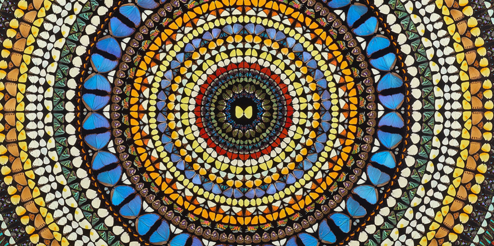
Yet, in this more recent series beginning in 2018, Hirst turns his attention to Eastern philosophical traditions, finding inspiration in the mandala: a highly patterned spiritual diagram representing the cosmos or universe in Hindu, Buddhist, Jain or Shinto traditions. In Ascent, Hirst’s use of a circular pattern billowing outwards from a central point mirrors the sacred geometries of the mandala. The repetition of symmetrical forms creates a visual rhythm that both captivates and invites contemplation. Michael Bracewell describes Hirst’s Mandala paintings as possessing a ‘mesmeric composition seeming to radiate concentrically inwards or plunge towards a central point.’ This optical dynamism aligns with the meditative purpose of mandalas, guiding the viewer into a contemplative state.
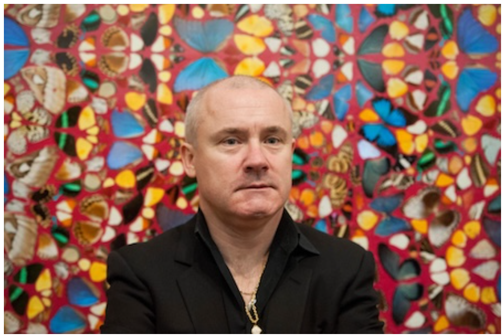
Damien Hirst in front of one of his butterfly canvases exhibited at his retrospective at Tate Modern, London, 2012.
Image: Guy Bell / Alamy Stock Photo, Artwork: Artwork: © Damien Hirst and Science Ltd. All rights reserved, DACS 2025
Visually, Ascent bears a strong resemblance to the stained-glass windows decorating the interiors of Gothic cathedrals. The rose window in the west façade of Notre Dame Cathedral, for example, shares Hirst’s symmetrical intricacy and illuminating interplay of color. These medieval stained-glass windows were designed to elevate the soul and train our sights on heaven, their luminous compositions acting as conduits of divine presence. Hirst’s butterflies, with their jewel-like colors and fragile beauty, mimic the effect of stained glass but introduce the concept of our own mortality. Unlike the eternal glow of colored glass, Hirst’s butterflies were once living, breathing creatures—a reminder of the inevitable passage of time.
The rose window in the west façade of Notre Dame Cathedral, Paris. Image: imageBROKER.com / Alamy Stock Photo
The title Ascent further enriches the work’s spiritual dimension, seemingly referencing the mystical concept of the soul’s ascent through celestial spheres. This idea is explored in medieval philosophy and Dante’s Paradiso, where the protagonist journeys through nine spheres of heaven, each representing a stage of enlightenment. Ascent echoes this structure, with its concentric arrangement symbolizing the gradual transcendence from material existence to a higher spiritual plane. This understanding of ascension similarly finds roots in Eastern philosophy, seen as a process of transcending the human condition to reach a higher universal. Hirst masterfully engages themes of spirituality, mortality and the afterlife through a distinctly contemporary visual language.
Paradiso assumes the medieval view of the universe, with the Earth surrounded by concentric spheres containing planets and stars
The butterfly, historically associated with metamorphosis, rebirth, and fragility, is an ideal symbol for Hirst’s career-long reflection on mortality. As Rod Mengham observes, ‘In the classical tradition, the butterfly was identified with the soul, its physical beauty an indication of divine potential.’ In Ascent, the delicate, iridescent wings—once living creatures—are eternally preserved within a rigid, geometric design. This contrast between organic ephemerality and structured permanence is central to Hirst’s exploration of life’s transience and art’s ability to suspend time. As Hirst himself once remarked, ‘Art’s about life, and it can’t really be about anything else […] there isn’t anything else.’Ascent embodies this philosophy, capturing the ephemeral beauty of existence while inviting us to contemplate what lies beyond. In doing so, it stands as a contemporary memento mori, a reminder of the delicate balance between life and death, chaos and order, the material and the divine.
A Summers Day, 2002
Christie’s London: 6 March 2025
Estimated: GBP 250,000 – 350,000
DAMIEN HIRST (B. 1965), A Summers Day | Christie’s
DAMIEN HIRST (B. 1965)
A Summers Day, 2002
Household gloss and butterflies on canvas
96×108 inches (243.8 x 274.3 cm)
Across a flawless, pale blue sky flutter a kaleidoscope of butterflies in Damien Hirst’s A Summers Day (2002). Caught mid-flight upon the painted surface, several large, brilliant blue morpho butterflies interlace with smaller tropical species in shades of red, orange and yellow. This monumental canvas, spanning over two and a half meters, fills the viewer’s field of vision in a mesmeric monochrome bejeweled with gossamer wings. The effect is of time stood still, a hazy summer moment captured and preserved. From Hirst’s earliest adoption of the butterfly motif in the early 1990s, these fragile creatures have become emblematic of the artist’s practice. Examples of Hirst’s celebrated butterfly monochromes are held in the permanent collections of museums including Tate, London and the Yale Center for British Art, New Haven. A Summers Day has been held in the same private collection for almost two decades.
Odilon Redon, Butterflies, circa 1910. Museum of Modern Art, New York.
Digital image: © 2025 Museum of Modern Art / Licensed by Scala.
Hirst’s fascination with the butterfly motif stems from the universal significance of these fragile, beautiful creatures.
“You have to find universal triggers. Everyone’s frightened of glass, everyone’s frightened of sharks, everyone loves butterflies.”
Hirst first used butterflies in his debut solo exhibition, In and Out of Love, staged in 1991 at the Woodstock Street Gallery, London. His earliest butterfly paintings—monochrome canvases adorned with insects as in the present work—hung in the downstairs gallery space, while the upper floor became a theatre for the cycle of life, as butterfly pupae glued to white canvases hatched, matured, and died within the confines of the gallery’s white walls. At the time, Hirst didn’t have a studio and had been breeding butterflies in his bedroom. With this exhibition, art and life could evolve within the gallery space itself, which became both studio and vitrine.
Installation view, In and Out of Love (White Paintings and Live Butterflies), 1991. Yale Center for British Art, New Haven.
Photograph by Richard Caspole. Artwork: © Damien Hirst and Science Ltd. All rights reserved, DACS 2025.
Digital image: Yale Center for British Art, photo by Richard Caspole.
Underlying Hirst’s entire oeuvre is the artist’s well-chronicled obsession with mortality.
“I am going to die and I want to live forever.
I can’t escape the fact, and I can’t let go of the desire.”
Throughout his infamous ‘Natural History’ series, medicine cabinets and canvases, Hirst adopts the theme of preservation as a means of dissecting the thin line between life and death. The final, mature stage of a butterfly’s lifecycle, known as the ‘imago,’ translates from Latin as ‘image’. Preserved upon a clear, glossy sky, in A Summers Day the butterflies reveal the essential joy and beauty of life as richer, not poorer, for all its brevity and inevitable conclusion.
Psalm 45: Eructavit cor meum, 2008
Christie’s London: 6 March 2025
Estimated: GBP 70,000 – 100,000
DAMIEN HIRST (B. 1965), Psalm 45: Eructavit cor meum | Christie’s
DAMIEN HIRST (B. 1965)
Psalm 45: Eructavit cor meum, 2008
Butterflies and household gloss on canvas
18 1/8 x 18 1/8 inches (46×46 cm)
Signed, inscribed and dated ’45th Psalm Damien Hirst 2008′ (on the reverse)
Butcher’s Love, 2008
Sotheby’s London: 5 March 2025
Estimated: GBP 200,000 – 300,000
Butcher’s Love | Contemporary Day Auction | 2025 | Sotheby’s
DAMIEN HIRST (b. 1960)
Butcher’s Love, 2008
Butterflies and household gloss on canvas
36×36 inches (91.4 x 91.4 cm)
Signed twice, titled, dated 2008 and dedicated for Martin (on the reverse)
Executed in 2008, the present work is a vivid example of Damien Hirst’s Butterfly Paintings, scattered with the immaculate, delicate wings of the jewel-like insects frozen in a glossy embrace of household paint. A central motif of Hirst’s 30-year career, the butterflies are iconic within the artist’s practice – the contradiction of the British artist’s oeuvre is nowhere better exemplified than in his celebrated Butterfly Paintings. Deliberating on life, love, death and art, Hirst’s spectacular installations have advanced the grand, epistemological and existential investigations that are at the core of his artistic endeavor. Poised with the stillness of death, the radiant butterflies provoke debate on issues of contemporary existence as the viewer makes subtle links between the transient fragility of life and the simultaneous imminence of death.
“It’s a recurring image in art history, the butterfly as the soul […] Fragility. Mortality. The fragile beauty of life.”
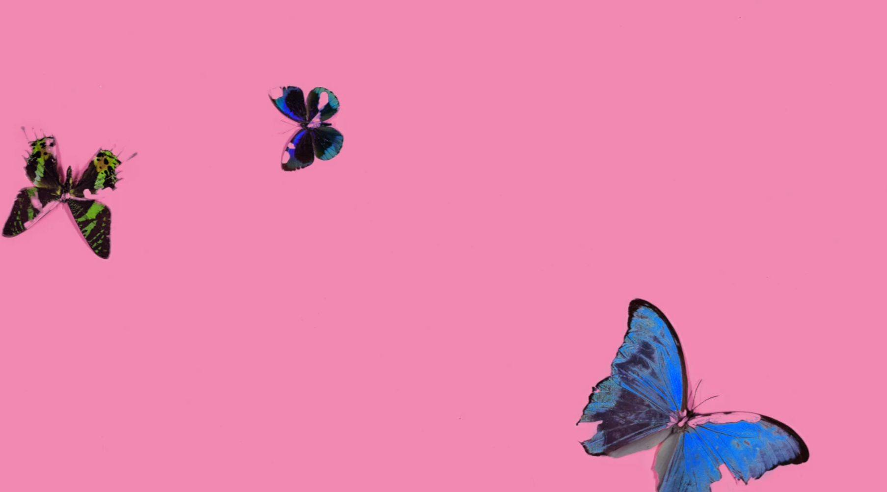
Butterflies were one of Hirst’s first and most recognizable masterpieces in his career. For the artist, the brevity of a butterfly’s life, the way in which it almost magically appears to animate and the magnificent color it brings to the world, render it as nature’s ultimate symbol of love and beauty.
“I had butterflies in my bedroom… I got wooden frames and nylon mesh and I made a huge box in my bedroom.”
Hirst’s use of exotic butterflies dates back to his first solo exhibition in 1991, In and out of Love, which took place in an empty shop split over two floors. Downstairs, Hirst presented his first series of monochrome butterfly paintings alongside ashtrays containing cigarette butts, the inherent natural beauty of the butterflies juxtaposed by the chemical toxicity of the cigarettes. Upstairs, white paintings covered with pupae of Malaysian butterflies were hung about the room. Butterflies would hatch and flutter around the room, feeding on nectar from potted plants before eventually dying in the very same room wherein they were born. Presenting life and death for all to witness and experience, Hirst’s butterflies became a potent symbol for both the beauty and fragility of life.
“I remember painting something white once to flies landing on it, thinking “Fuck!” but then thinking it was funny. This idea of an artist trying to make a monochrome and being fucked up by flies landing in the paint or something like that. Then you get the beauty of the butterfly, but it is actually something horrible. It is like the butterfly has flown around and died horribly in the paint. The death of an insect that still has this really optimistic beauty of a wonderful thing.”
Whereas Hirst’s sharks and cattle monumentalize the drama of death by their sheer scale, the butterfly paintings embrace a subtler effect, calling to mind the historical-spiritual intimations of butterflies that appear in the still life paintings of the Dutch Golden Age by the likes of Ambrosius Bosschaert, often as symbols of passing beauty and the resurrection of Christ. In the present work, Hirst preserves the delicate frames of the butterflies’ wings, casting their perpetual flight from life to death and beyond in a painterly reflection on existence. Bringing into play art, religion and science, Hirst’s Butterfly Paintings represent a sympathetic and elegant contemplation on existentialist themes, and the present work – with specimens of turquoise and orange composed over a rich umber ground – is an exemplary work from one of the most longstanding and iconic series by the artist.
Alemethicin, 2012
Sotheby’s London: 5 March 2025
Estimated: GBP 80,000 – 120,000
Alemethicin | Contemporary Day Auction | 2025 | Sotheby’s
DAMIEN HIRST (b. 1965)
Alemethicin, 2012
Household gloss on canvas
18 1/8 x 26 1/8 inches (46 x 66.2 cm)
Signed, titled and dated 2012 (on the reverse)
“Art doesn’t purport to have all the answers; the drug companies do. Hence the title of the series, The Pharmaceutical Paintings, and the individual titles of the paintings themselves… Art is like medicine, it can heal.”
Lactic Dehydrogenase, 2013
Sotheby’s London: 5 March 2025
Estimated: GBP 40,000 – 60,000
Lactic Dehydrogenase | Contemporary Day Auction | 2025 | Sotheby’s
 DAMIEN HIRST (b. 1965)
Lactic Dehydrogenase, 2013
Household gloss on canvas
18 x 12 1/8 inches (45.8 x 30.7 cm)
Signed, titled and dated 2013 (on the reverse)
“If you look closely at any one of these paintings a strange thing happens; because of the lack of repeated colors there is no harmony… in every painting there is a subliminal sense of unease; yet the colors project so much joy it’s hard to feel it, but it’s there. The horror underlying everything. The horror that can overwhelm everything at any moment.”
Contemporary Art: Other Artists
George Condo
Christie’s London: 6 March 2025
Estimated: GBP 350,000 – 550,000
GEORGE CONDO (B. 1957), Mr Twiddle | Christie’s
GEORGE CONDO (B. 1957)
Mr Twiddle, 2010
Acrylic, charcoal and pastel on canvas
64 5/8 x 65 1/8 inches (164.2 x 165.4 cm)
Signed and dated ‘Condo 2010’ (on the reverse)
Painted in 2010, Mr Twiddle is a vibrant work from George Condo’s series of ‘Cartoon Abstractions’, which feature figures from mid-century Looney Tunes, Hanna-Barbera and Tex Avery animations warped and fractured in the artist’s signature style. Mr Twiddle himself is a zookeeper from the Hanna-Barbera show Wally Gator (1962-1963). Here, the simple, graphic form of the cartoon character—the flat blues, yellows and blacks of his uniform, his cheerful grin and five-o’clock shadow—is seen as if through a funhouse mirror. Parts of his nose, mouth and hat repeat in a glitchy reflection. The background’s soft yellows reveal ghostly pentimenti of other figures, eyes and teeth. Deliberate spatters and marks and in paint, charcoal and pastel bedeck the painting’s surface, like patina on an archaeological relic.
“It’s about dismantling one reality and constructing another from the same parts”
Since emerging as an artist in 1980s New York, Condo has plundered a kaleidoscopic array of art-historical references from Rembrandt to Picasso. He has focused particularly on traditions of portraiture, offering a new, postmodern way of seeing our inner lives. He renders his subjects in multifaceted, chimeric forms that, for all their outlandishness, resonate with universal experiences of shifting selfhood. He has described this practice ‘as psychological cubism. Picasso painted a violin from four different perspectives at one moment. I do the same with psychological states’ (G. Condo, quoted in S. Jeffries, ‘George Condo: “I was delirious. Nearly died”’, The Guardian, 10 February 2014). Mr Twiddle is refracted through the same existential lens.
Roy Lichtenstein, Look Mickey, 1961. National Gallery of Art, Washington, D.C.
Artwork and digital image: © Board of Trustees, National Gallery of Art.
In their use of cultural archetypes, Condo’s ‘Cartoon Abstractions’ evoke the comic-based language of artists such as Roy Lichtenstein. They also introduce a Pop element of societal critique. ‘Often these paintings insinuate a landscape of decaying beliefs and failing mythologies’, wrote Ralph Rugoff of the artist’s post-2000s work. ‘… As our surrogates, the artist’s subjects appear to embody both the cartoonishness of contemporary media culture and the pervasive sense of inadequacy and failure that it engenders’ (R. Rugoff, ‘The Mental States of America’ in George Condo: Mental States, exh. cat. New Museum, New York, 2011, p. 19). The character in Mr Twiddle dates to Condo’s own childhood and evokes nostalgia for a simpler, more innocent age, when hierarchies and images could be relied upon. Distorted, beset by spectres and worn as if by the passage of time, in Condo’s painting he is transformed into a startlingly honest portrait of contemporary life.
Takashi Murakami
Sotheby’s London: 5 March 2025
Estimated: GBP 300,000 – 400,000
GBP 546,100 / USD 699,008
Panda | Contemporary Day Auction | 2025 | Sotheby’s
TAKASHI MURAKAMI (b. 1962)
Panda, 2003
Fiberglass with antique Louis Vuitton trunk
Overall: 231x163x113 cm (91 x 61 1/8 x 44 1/2 inches)
Signed, numbered 3/3 and variously inscribed (on the underside of the left ear)
This work is number 3 from an edition of 3, each with a unique Louis Vuitton trunk
Undeniably joyful and fantastically whimsical, Takashi Murakami’s larger-than-life sculptural work Panda explores the boundaries between fine art and commercial product, high culture and luxury fashion. The artist’s transgression of traditional Japanese high art is profoundly present throughout his visual practice as a whole, for Murakami is as much mega-celebrity, curator, designer and brand manager as he is an artist. This ground-breaking marriage between high art and commercial culture has its foundation in Murakami’s commercially successful 2002 collaboration with the illustrious fashion house Louis Vuitton, when the brand’s then-creative director Marc Jacobs invited Murakami to reinvigorate Vuitton’s accessories line. This collaboration is central to the present work, as the adorable, cartoon-like panda stands en pointe atop a vintage Louis Vuitton monogrammed trunk. In January 2025, Louis Vuitton and Murakami celebrated the 20th anniversary of their collaboration, by releasing a re-edition collection featuring over 200 items adorned with Murakami’s signature colourful motifs. To coincide with this release, pop-up stores were set up in key cities worldwide and Murakami’s art was integrated into immersive installations at major cultural and fashion hubs globally.
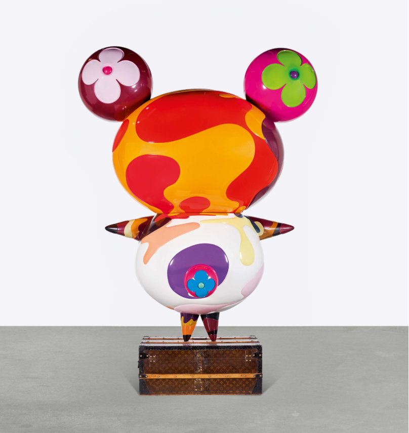
Here, Murakami pays homage to the brand’s distinguished history as a Parisian luggage company, as well as to their visionary branding that has evolved around a storyline of travelling on a surreal journey through time – ideas of which Murakami touches upon throughout the collaboration. The artist’s project with Vuitton in 2002 was received with controversy, for Murakami himself asserts, “Japanese people accept that art and commerce will be blended; and in fact, they are surprised by the rigid and pretentious Western hierarchy of ‘high art’. In the West, it certainly is dangerous to blend the two because people will throw all sorts of stones. But that’s okay – I’m ready with my hard hat” (the artist quoted in: Exh. Cat., Doha, Al Riwaq, Murakami: Ego, 2012, p. 228). Executed only one year after Murakami’s first project with Vuitton, Panda stands defiantly against convention, and delivers a powerful critique on the merging of high art and luxury fashion.

Murakami’s panda – known as Panda Geant within the artist’s vibrant, Louis Vuitton monogrammed world – first featured in the animation Superflat Monogram, which Murakami created in collaboration with the fashion house in 2003. In the short film, a young girl’s daydream is disrupted by the sight of a giant, towering panda. As she gazes up at the creature, he bends forward and consumes her, after which the girl quickly finds herself thrust into a whimsical adventure inside the panda’s body. The animation presents a nihonga and kawaii-inspired version of Alice in Wonderland, in which the little girl journeys through an enchanting time machine of swirling, multicoloured Louis Vuitton logos, which are juxtaposed against the artist’s trademark iconography of cherry blossoms – a traditional symbol in Japanese culture. Panda Geant makes a bold appearance within this psychedelic universe, as the girl spots him magically standing atop a small leather Louis Vuitton trunk. Thus the present work fantastically brings Murakami’s animation to life, as here the artist’s audience can view the playful character and its vintage Vuitton case in the round and in larger than life size.
While Murakami’s charming panda became an identifiable mascot for the Louis Vuitton brand around the time of the 2002 collaboration, the character also became a crucial signifier for the artist, and one that would recur throughout Murakami’s wider oeuvre. Indeed, Panda Geant is deeply encoded within the aesthetics of the Murakami brand, for the character – whether rendered in fiberglass or stamped on a leather handbag – indefinitely lies at the intersection between high art and commerce. Murakami’s Panda is therefore undoubtedly reminiscent of the work of Jeff Koons and KAWS, as for both artists, the kitsch, the commercial and the prosaic are powerfully transformed.
Significantly however, there is a deeper side to Murakami’s practice in his postmodern conception of Superflat, which not only explores the flattening and superficiality of traditional Japanese aesthetics, but also remarks on the flat and shallow nature of consumer culture – the latter of which Murakami seems to equally celebrate and critically exploit. Superflat has become a cultural phenomenon that spans all spheres of commercial culture in both the East and West. Indeed, yet another vital impulse in Murakami’s work is his profound effort to marry Eastern and Western aesthetics and taste: “Gradually, Murakami has erased the distinction between himself and the cultural position he inhabits. The complex iconography he has built may have been extracted from Japanese entertainment, but these images have become Murakami’s own icons – or better yet, avatars – which he uses to negotiate the relationship between East and West” (Gary Carrion-Murayari quoted in: Ibid., p. 119). Panda therefore couples a beguiling cuteness with a profound understanding of contemporary culture in both Japan and the West, in turn presenting a spectacular example of Murakami’s visionary practice – one that interprets and defines the cultural spirit of our time.
Post-War
Gerhard Richter
Heu, 1995
Sotheby’s London: 4 March 2025
Estimated: GBP 5,000,000 – 7,000,000
Heu | Modern & Contemporary Evening Auction | 2025 | Sotheby’s
GERHARD RICHTER (b. 1932)
Heu, 1995
Oil on canvas
200.3 x 140 cm (78 7/8 x 55 1/8 inches)
Signed, dated 1995 and numbered 831-1 (on the reverse)
“What I am trying to do in each picture is to bring together the most disparate and mutually contradictory elements, alive and viable, in the greatest possible freedom.”
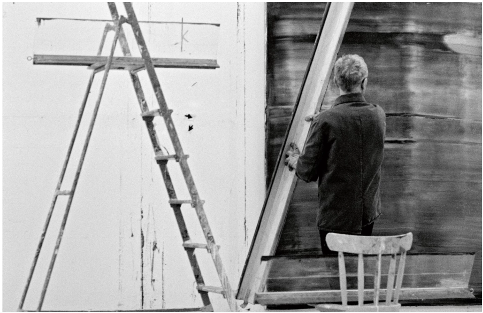
Gerhard Richter in his studio, 1994. Image: Benjamin Katz / DACS 2022. Art © Gerhard Richter 2022
Vibrant, expansive, and utterly captivating, Gerhard Richter’s masterful Heu stands as a paragon of the artist’s treatise on the aesthetic and conceptual capacities of painting. Executed in 1995, the present work dates to the apex of Richter’s legendary career and epitomises the artist’s epoch-defining Abstrakte Bilder, a series of paintings widely recognised as the preeminent venture in abstraction of the last fifty years. Even within this rarified group, Heu is distinguished by its impressive scale: at two metres high, this canvas is one of only five similarly sized abstract works completed in 1995. It is amongst the largest formats to be used during this period and its human scale makes for a deeply engaging visual experience. The towering picture plane delivers a breathtakingly symphonic and utterly enveloping field of pigment that is dazzling in its execution and riveting in its chromatic complexity. Simultaneously concealing and revealing spectacular accents of ruby, emerald, and sapphire, a sublime white veil of lusciously viscous oil paint streaks and shimmers across the canvas like a storm of snow surging across the geological strata of a cliff face. Heu is further notable for its evocative title: for this series of large-scale works in 1995, Richter used words with natural associations prompted by each painting’s resultant presence; the present “Straw” echoes the fine hatches and striations that traverse the vast expanse. In this picture, as evident in the very best of the Abstrakte Bilder from this period, Richter demonstrates the unique painterly and intellectual mastery that has come to define him as one of the most celebrated artists of the past century.
Emanating a shimmering fluidity that evokes a landscape shrouded in mist, the colouristic harmony and lyrical resonance of Heu broadcasts an atmosphere of density, chaos and romance. As a spectacular torrent of brilliant white paint skitters across the canvas, both covering and uncovering strata of bold crimson, turquoise, and lime green, Heu exhibits the ultimate painterly palimpsest: the exuberant strata of paint bear the ghosts of previous accretions, of colour juxtapositions obsessively applied, erased, remade, and obliterated over again, only to beget fresh cogitations of their own. Here, we see Richter revel in the chance slippages of his signature squeegee tool, which the artist uses to simultaneously build and erode his mesmerising surface, superbly exhibiting Richter’s command of medium. Streaked and smeared tides of once-semi-liquid material have been fixed on the surface; the shadows of their former malleability caught in a perpetually dynamic stasis. The all-over mask of white, with its inherent ability to reflect rather than absorb light, lends this canvas a shimmering quality, whilst its augmentation of blues and greens bestows a ravishing beauty that is redolent of Caspar David Friedrich’s sublime landscapes, or Claude Monet’s Nymphéas.
Claude Monet, The Waterlilies – The Clouds (right side), 1914-18. Musée de l’Orangerie, Paris. Image: Bridgeman Images
Within its sheer excess of layering and dynamic compositional facture, this painting emits an extraordinary wealth of enigmatic yet recognizable evocation. The incessant erasure and denial of formal resolution readily evokes natural phenomena, deriving at least part of its effect from a spontaneous naturalism. Evocative of color theories that Neo-Impressionists such as Georges Seurat and Paul Signac utilized to create vibrating painted surfaces, the continually varied tonality and intensely numerous variations of contrasting hues within every inch of the canvas create an intensely unstable perceptive field. We become immersed in color and movement as if confronting a natural phenomenon of the sea or sky. Forming a conceptual keystone of his oeuvre since the late 1960s, Richter’s iconic Abstrakte Bilder have performed a prolifically sustained philosophical enquiry into the medium of painting and the foundations of our contemporary visual understanding. Continuing the twentieth century’s legacy of erasure and radical reduction as a mode of interrogatory image-making – at once redolent of the work of early Modernists such as Mondrian and Malevich, through to Minimalism and Abstract Expressionism – Richter’s Abstrakte Bilder confront the contemporary currency of painting against a prevailing doubt over its artistic claims to ‘truth.’
“Abstract paintings are fictitious models because they visualize a reality which we can neither see nor describe but which we may nevertheless conclude exists.”
Caspar David Friedrich, Morning in the Mountains, circa 1823. State Hermitage Museum, St. Petersburg. Image: Bridgeman Images
Wielding his iconic squeegee, Richter’s technique affords an element of chance that is necessary to facilitate the artistic ideology of the abstract works. As he has explained, “I want to end up with a picture that I haven’t planned. This method of arbitrary choice, chance, inspiration and destruction may produce a specific type of picture, but it never produces a predetermined picture… I just want to get something more interesting out of it than those things I can think out for myself” (the artist interviewed in 1990 in Hubertus Butin and Stefan Gronert, eds., Gerhard Richter. Editions 1965-2004: Catalogue Raisonné, Ostfildern 2004, p. 36). The sum of repeated accretions and reductions, of Richter’s tireless process of addition and subtraction, is a record of time itself within the paint layers: the innumerable levels of application and eradication have left their traces behind to accumulate and forge a portrait of temporal genesis.
A glimmering blizzard of kaleidoscopic hues and surging power, Heu represents the epic crescendo of Richter’s tireless aesthetic project at its most refined. Evoking the lush surfaces of artists such as Robert Ryman and Willem de Kooning, Richter here negotiates fields of stunningly vibrant colour against the reductive purity of white, resulting in a deeply worked composition that interrogates the limits of colour altogether. In the words of Roald Nasgaard, “The character of the Abstract Paintings is not their resolution but the dispersal of their elements, their coexisting contradictory expressions and moods, their opposition of promises and denials. They are complex visual events, suspended in interrogation, and fictive models for that reality which escapes direct address, eludes description and conceptualization, but resides inarticulate in our experience” (Exh. Cat., Chicago, Museum of Contemporary Art, Gerhard Richter: Paintings, 1988, p. 110).
Gilbert & George, 1975
Christie’s London: 5 March 2025
Estimated: GBP 1,500,000 – 2,000,000
GERHARD RICHTER (B. 1932), Gilbert & George | Christie’s
GERHARD RICHTER (B. 1932)
Gilbert & George, 1975
Oil on canvas
80×100 cm (31 1/2 x 39 3/8 inches)
Signed, numbered and dated ‘379 Richter, 1975’ (on the reverse)
Held in the same private collection for more than two decades, Gerhard Richter’s Gilbert & George (1975) represents an extraordinary meeting of minds. The eponymous British duo, famed for their radical collaborative practice, are captured in one of the most visually intriguing photo-paintings in Richter’s oeuvre. Based on a photograph of five exposures, it shows George twice—close-up, his doubled spectacles intersecting at different angles—coalescing with three images of Gilbert, who appears in profile, seated in a wicker chair, and as a small silhouette behind George’s ear. Richter’s soft, translucent brushwork creates a virtuoso mirage of overlaid features, and a superb portrait of two artists whose merged identities are central to their life’s work.
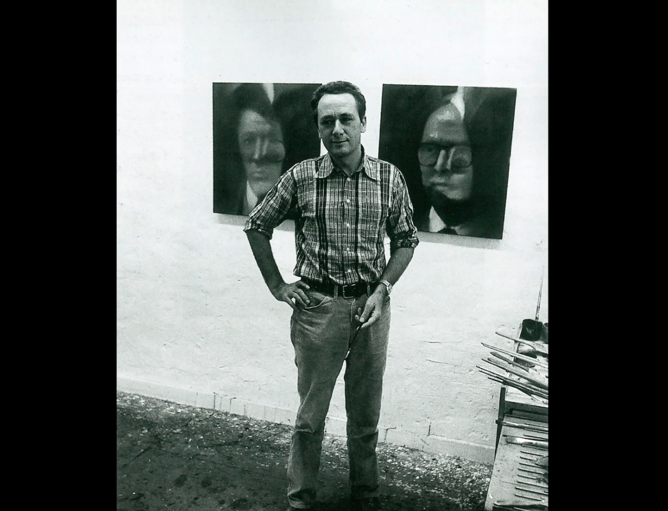
Gerhard Richter with Gilbert and George in his studio, 1975.
Photo: Axel Hinrich Murken, Aachen. Artwork: © Gerhard Richter 2025 (21022025).
Richter had met Gilbert & George in 1970, at their first exhibition in the Düsseldorf gallery of Konrad Fischer. When they returned for another show four years later, they asked him to paint their portraits. The project resulted in eight paintings, which Fischer exhibited at his gallery in 1975. Among these, two were acquired by Gilbert & George themselves; two are now part of the Artist Rooms Collection at Tate and the National Galleries of Scotland; and another is in the National Gallery of Australia, Canberra.
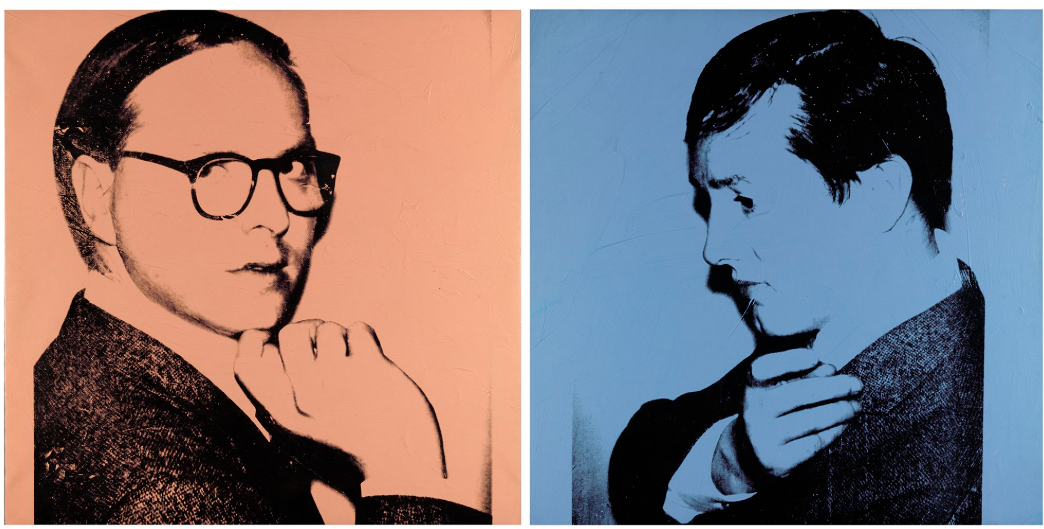
Andy Warhol, Gilbert & George, 1975. National Galleries Scotland, Edinburgh.
Artwork: © 2025 The Andy Warhol Foundation for the Visual Arts, Inc. / Licensed by DACS, London.
Digital Image: © National Galleries Scotland.
Richter has been investigating the truth-claims of painting and photography since the 1960s. For him they are equally unreliable as ways of comprehending reality: both no more than arrangements of color which, examined closely, dissolve into abstraction. The characteristic blurring of his photo-paintings—which operate in tandem with his abstract pictures—serves as a reminder of the illusory nature of appearance, making his portraits particularly enigmatic. In his landmark greyscale series 48 Portraits (1971-1972, Museum Ludwig, Cologne), made for the 1972 Venice Biennale, he showcased the anonymising effect of his technique on a line-up of great personalities from history. He included no artists, because, he said, they would have been too close to himself. Across his career he made a few rare exceptions. Artists he has painted include the Warhol superstar Brigid Polk, his friend Günther Uecker, his second wife, Isa Genzken, and Gilbert & George.
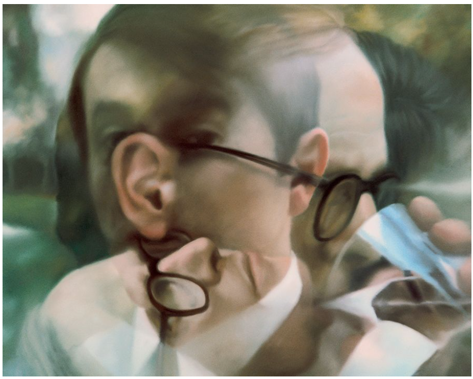
Gerhard Richter, Gilbert & George, 1975. National Gallery of Australia, Canberra. Artwork: © Gerhard Richter 2025 (0018).
In London in 1969, just a few years after Richter made his first photo-painting, Gilbert & George declared themselves to be ‘living sculptures.’ Wearing a uniform of near-identical suits, they have rarely been seen apart since. They are the primary subject of their own performances, drawings and photographic constructions—all of which they regard, too, as sculptures. Centred around their stylised partnership, they have created a Gesamtkunstwerk that collapses the distinctions between art and life, and blurs the two men into a single artist-figure. By the time Richter painted them in 1975, Gilbert & George were taking place on the world stage. Andy Warhol would make three silkscreened double portraits of the pair—based on his own Polaroid photographs—the following year.
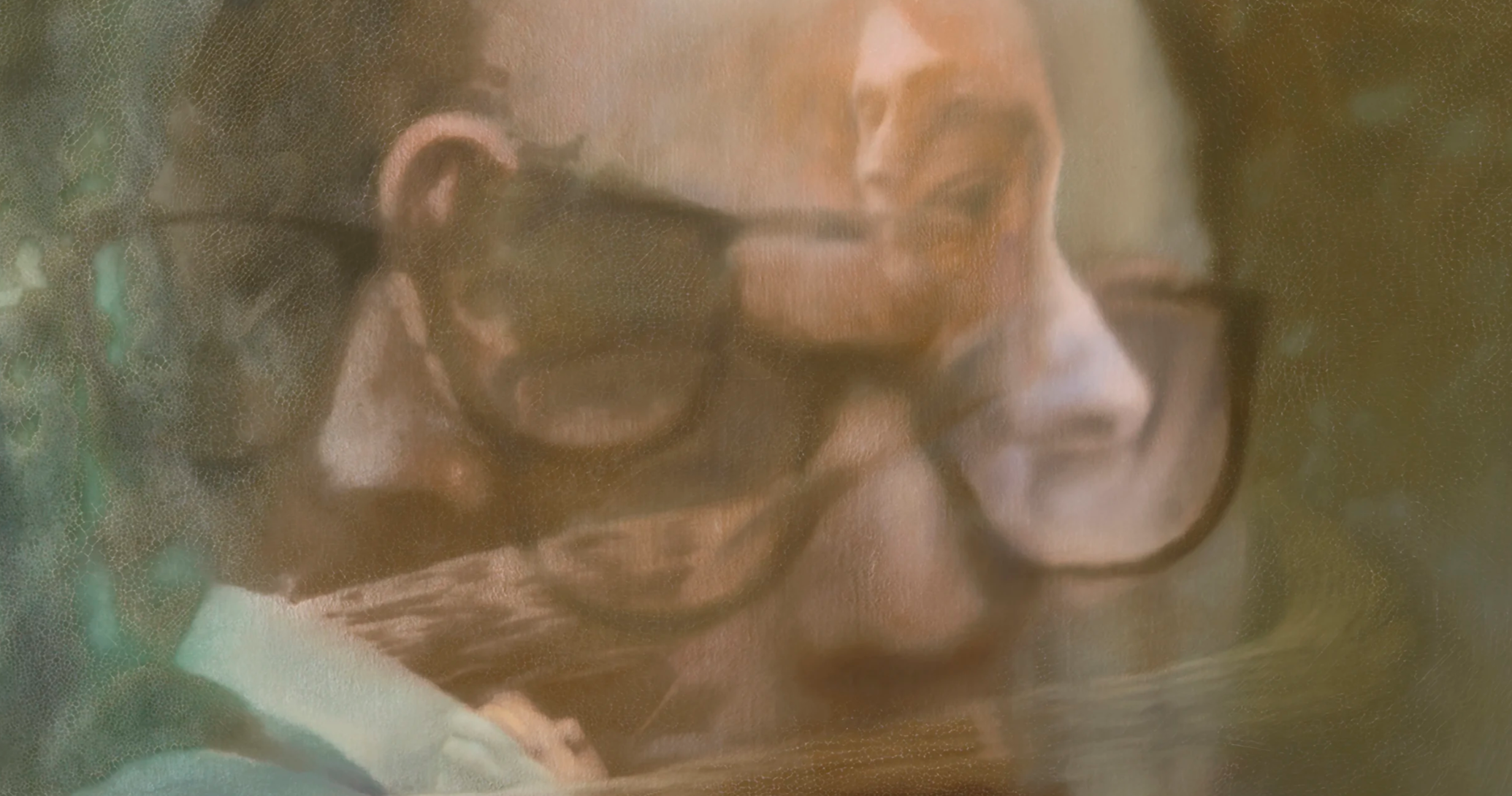
Gilbert & George visited Richter at home in Düsseldorf, where they held a photography session in the garden. Approaching his subjects from different angles and at varied distances, he repeatedly exposed the same section of film—rather than advancing the film in the camera after each shot—to create double or multiple exposures that would form the basis for his paintings. This technique had been used in early photographic works by avant-garde artists including El Lissitzky, Man Ray and Laszlo Moholy-Nagy, and—more recently, and to richly psychedelic effect—by Richter’s colleague Sigmar Polke. In 1970 Richter had made his own double photo-portraits with Polke that superimposed the two artists’ faces, in a statement of fused identity that foreshadowed the Gilbert & George paintings.
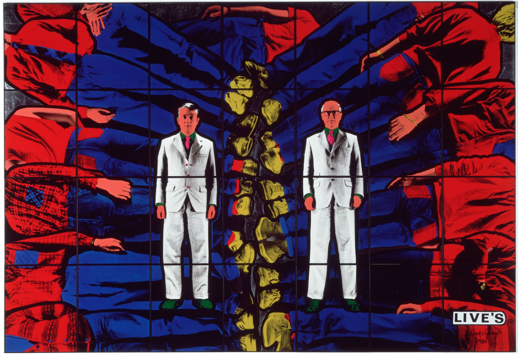
Gilbert & George, Live’s, 1984. Museum of Modern Art, New York. Artwork: © Gilbert & George. Digital image: © 2025 The Museum of Modern Art, New York/Scala, Florence.
‘I liked them as outsiders, above all’, Richter recalled. ‘… With Gilbert & George, too, I liked the very nostalgic side. They were the first people who liked my landscapes’ (G. Richter in conversation with H. U. Obrist, 1993, in D. Elger and H. U. Obrist, eds., Gerhard Richter: Text: Writings, Interviews and Letters 1961-2007, London 2009, p. 298-299). The couple, like Richter, were working against the tide in a period dominated by Minimal and Conceptual art. Self-declared traditionalists, they had depicted themselves wandering through bucolic scenery in works such as The Nature of Our Looking (1970, Tate, London). Richter’s own landscape and seascape paintings of this time, based on his photographs, played provocatively with echoes of nineteenth-century German Romanticism. The Gilbert & George portraits allowed him to take up another Romantic motif: friendship, as celebrated by artists such as Caspar David Friedrich, who depicted paired figures sharing aesthetic experiences in nature.
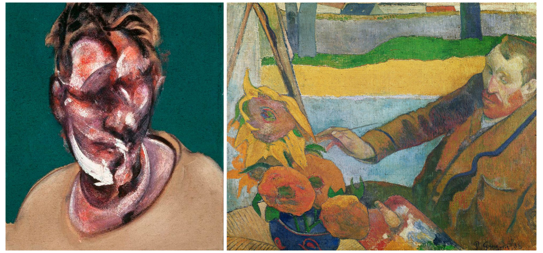
Left: Francis Bacon, Portrait of Lucian Freud, 1965. Private Collection. Artwork: © The Estate of Francis Bacon. All rights reserved, DACS/Artimage. Photo: Prudence Cuming Associates Ltd.
Right: Paul Gauguin, Vincent van Gogh Painting Sunflowers, 1888. Van Gogh Museum, Amsterdam. Digital image: Bridgeman Images.
With its synthesis of melding, interlocking and overlaid visages, Richter’s photo-painting perfectly pictures Gilbert & George’s compound identity. Their union, of course, is part of their own artistic scheme: a formalized construction, complete with matching suits, that creates an artificial image around which their wider project revolves. In that sense, like all appearances, it is an illusion. Gilbert & George thus introduces further complexity to the dialogue between the camera’s vision, the painted mark and our sensory apprehension of the world that lies at the heart of Richter’s own practice. An elegant emblem of a unique artistic relationship, it is also a remarkably multi-layered example of his work.
Abdu, 2009
Christie’s London: 5 March 2025
Estimated: GBP 700,000 – 1,000,000
GERHARD RICHTER (B. 1932), Abdu | Christie’s
GERHARD RICHTER (B. 1932)
Abdu, 2009
Trevira CS, cotton, wool, silk and acrylic Jacquard-woven tapestry
276×378 cm (108 5/8 x 148 7/8 inches)
Signed and numbered ‘5⁄8 Richter’ (on a label affixed to the reverse)
This work is number five from an edition of eight plus two artist’s proofs
A vast, kaleidoscopic vision stretching nearly four meters in width, Abdu belongs to Gerhard Richter’s groundbreaking series of tapestries. Created in 2009, these four works represent an extraordinary chapter in the artist’s six-decade practice, demonstrating a bold embrace of new media in his long-running inquiry into abstraction. Woven on a jacquard loom, the tapestries are based on his 1990 painting Abstraktes Bild 724-4, which became the wellspring for a number of innovative projects during the 2000s. In each of the four works, a section of the painting is reproduced in one of the lower corners and mirrored in rotation across the remaining three quadrants of the tapestry. The result is a scintillating new pattern, structured like a mandala or Rorschach test. In Abdu, a core of blue bursts from the center into gleaming, hallucinogenic reflections of red and gold. Spun from acrylic, wool and silk, its shimmering textures evoke the traditional handiwork of weaving even as Richter takes his work to new technical frontiers.
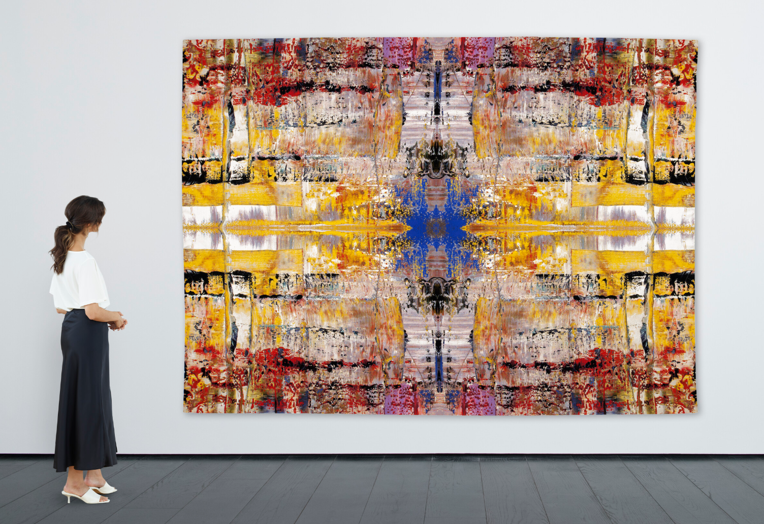
Abdu takes the upper left quadrant of Abstraktes Bild 724-4 as its base image: the painting’s azure corner becomes the starburst at the tapestry’s heart. The weaving captures painterly texture and colour with extraordinary precision, translating these qualities into a unique and tactile new object. For Richter, the tapestries marked a new phase in his investigation into the relationship between chance and control, previously explored through his signature squeegeed canvases. Drawing upon the artist’s much-discussed affinity with music, Francesco Bonami likens their elegant repeated structures to a Schoenberg quartet. Indeed, three examples featured as part of a joint installation project with composer Arvo Pärt at The Shed, New York, in 2019. Merging a centuries-old decorative craft with boundary-pushing abstraction, Abdu is a masterful enigma that—like so much of Richter’s art—hovers elusively between languages.
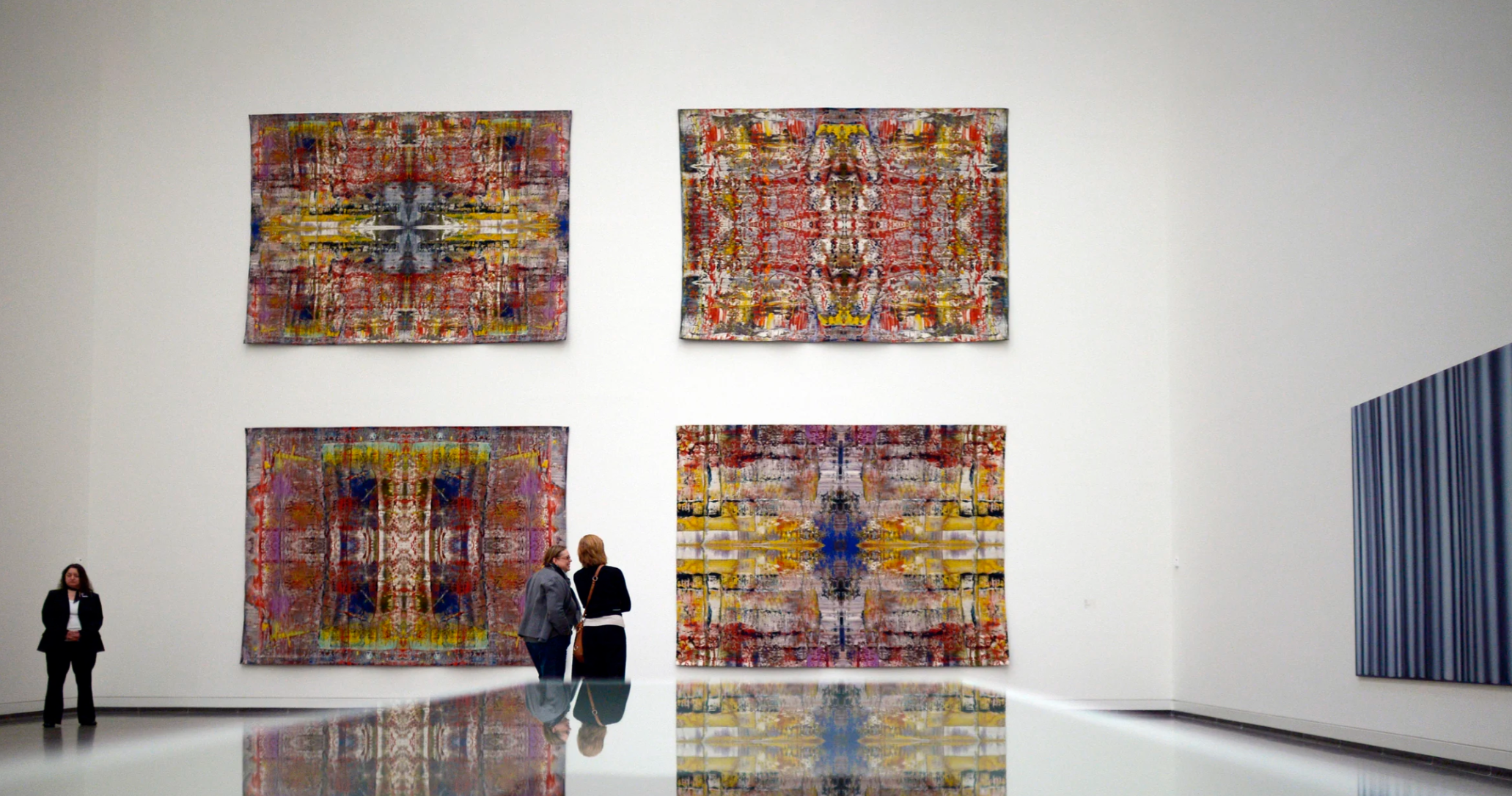
Gerhard Richter: Art in the Plural, exhibition view at K20 Kunstsammlung NRW, 2014. Another edition of the present lot illustrated. Photo: dpa picture alliance / Alamy Stock Photo. Artwork: © Gerhard Richter 2025 (21022025).
Between 2008 and 2013, as he approached his eightieth birthday, Richter undertook some of his most complex technical experiments. Taking Abstraktes Bild 724-4 as his muse, he made a number of diverse editioned works that sought to analyze various aspects of the painting’s DNA. In Sieben Zwei Vier (2008), he reproduced an out-of-focus color photograph of the work; in Patterns (2011), he made an artist’s book documenting the various permutations that could be created by dividing the painting into different-sized vertical sections. In his four Strip works, created between 2011 and 2013, he made digital inkjet prints based on details of the painting that were fragmented and mirrored multiple times. Through these endeavors, the artist sought to extract meaning from the endless complexity of the painting’s original surface, transforming it into a series of rhythmic calculations.
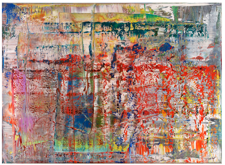
Gerhard Richter, Abstraktes Bild, 1990. © Gerhard Richter 2025 (0016).
The tapestries, in particular, invite comparison with the work of Alighiero Boetti, whose own textile works played with the relationship between order and chaos. With their mandala-like structure, they might also be seen to echo Boetti’s interest in mysticism. ‘The hand of the artist has disappeared to make room for the mechanics of a mystical experience’, writes Bonami. ‘In the future these tapestries may be seen not as art but as spiritual vessels with symbolic meaning, like that carried by Native American weavings.
Alighiero Boetti, The New Autonomies, 1988. Philadelphia Museum of Art. Artwork: © Alighiero Boetti, DACS 2025. Digital image: Philadelphia Museum of Art / Gift (by exchange) of Mr. and Mrs. Arthur A. Goldberg, 1998 / Bridgeman Images.
Their titles add another layer of complexity. Musa, Yusuf, Iblan, and Abdu seem to refer to Sufism and the culture of Persia and the Middle East’ (F. Bonami, ‘The Accidental Healer’, in Gerhard Richter: Tapestries, exh. cat. Gagosian Gallery, London 2013, p. 11). The dialogue between process and visual effect had been at the core of Richter’s practice since the 1960s: here, the artist weaves mystery and magic from the loom.
David Hockney
Between Kilham and Langtoft, 2006
Christie’s London: 5 March 2025
Estimated: GBP 4,000,000 – 6,000,000
DAVID HOCKNEY (B. 1937), Between Kilham and Langtoft | Christie’s
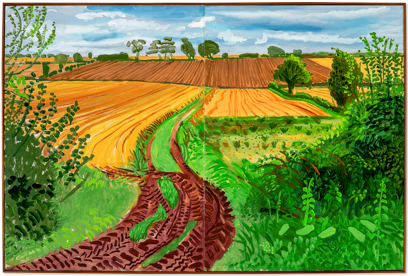
DAVID HOCKNEY (B. 1937)
Between Kilham and Langtoft, 2006
Oil on canvas, in two parts
48×72 inches (121.9 x 182.9 cm)
Signed, titled and dated ‘between Kilham and Langtoft Sept 6th 06 David Hockney’ (on the reverse)
luminous large-scale painting, David Hockney’s Between Kilham and Langtoft (2006) captures the abundance of the harvest season in the artist’s native Yorkshire. The canvas is radiant with a palette of verdant green, pale blue, rich brown and yellow ochre. A trail through long grasses in the foreground, imprinted by the ridged wheels of a tractor, leads the viewer’s eye from their high vantage point through sloping wheatfields. In the distance, a fallow field rises dramatically upwards towards a pearlescent sky. A row of trees at the horizon, their contours rendered smooth and topiary-like by distance, recall the quivering, illuminated objects in Hockney’s early still life tablescapes. This painting forms part of Hockney’s vast, celebrated study of the Yorkshire landscape, charting the ways in which its colours and contours are perpetually transformed by shifting seasons, light and weather. In early 2006 a landmark retrospective of the artist’s portrait practice opened at the Museum of Fine Arts, Boston, travelling to the Los Angeles County Museum of Art and reaching the National Portrait Gallery, London, a month after the present work’s execution. While this exhibition charted some five decades of Hockney’s observation of the human form, his triumphant career as a landscape artist was also in full bloom. In 2009, Between Kilham and Langtoft was included in Hockney’s first museum presentation of Yorkshire landscapes, at the Kunsthalle Würth, Schwäbisch Hall.
Hockney was born in Bradford, in West Yorkshire, but felt a close affinity to the East Riding of Yorkshire. As a boy he had spent two summers working on farms during the harvest there, immersed in its rolling hills and valleys. Although he would return to the county at various points throughout his career, it was not until the late 1990s that he began to paint it—initially at the request of his friend Jonathan Silver, who was battling the final stages of cancer at the time. Silver’s death in 1997, closely followed by that of Hockney’s mother, would ultimately give rise to a newfound yearning for northern England. Inspired by the dramatic potential of landscape, first explored through the artist’s monumental A Bigger Grand Canyon (1998), Hockney toured Norway, Iceland, Spain and Italy during the early 2000s, before realising that he was simply ‘painting views … sight-seeing’. Returning to Yorkshire in 2004, he began to depict his surroundings in earnest. Finally, he recalls, ‘I was painting the land, land that I myself had worked. I had dwelt in those fields, so that out there, seeing, for me, necessarily came steeped in memory’ (D. Hockney, quoted in L. Weschler, True to Life: Twenty-Five Years of Conversation with David Hockney, Berkeley 2008, p. 199).
Vincent van Gogh, The Harvest, 1888. Van Gogh Museum, Amsterdam.
Hockney’s study of landscape places him within a lineage of British artists such as J. M. W. Turner and John Constable, who found rich artistic inspiration in their native soil and whose paintings were pivotal in cultivating Britain’s modern sense of place. In the summer of 2006, an exhibition of Constable’s large-scale landscapes was staged at Tate Britain, London, closing just one week before Hockney completed the present painting. For the first time, this exhibition assembled Constable’s seminal ‘six footers,’ the artist’s celebrated views of the River Stour in his native Suffolk. Hockney was impressed by the loose brushwork of Constable’s full-scale oil sketches, which were also exhibited. Their echoes can be felt in the overgrown foliage that borders Between Kilham and Langtoft, which itself is six feet wide. These paintings marked a crucial juncture in Constable’s practice; he saw how a progression of large-scale views on a single theme might invest the landscape he had known since boyhood with a sense of drama and narrative weight. This ambitious project is mirrored across Hockney’s expansive study of his own corner of England.
Pieter Brueghel the Elder, The Harvesters, 1565. The Metropolitan Museum of Art, New York.
With its sweeping golden fields, Between Kilham and Langtoft recalls such iconic seasonal views as Vincent Van Gogh’s The Harvest (1888, Van Gogh Museum, Amsterdam)—one of Hockney’s own favourite paintings—as well as Peter Brueghel’s earlier The Harvesters (1565, Metropolitan Museum of Art, New York). In the tradition of these harvest scenes, the work traces the ways in which human activity has shaped and reshaped landscape over time. The painting’s delineated fields and neat rows of planted wheat impart a sense of order, echoed by its diptych format. As late summer gives way to early autumn, laden wheatfields anticipate those who will harvest its golden bounty. Yet where Van Gogh and Brueghel include field workers in their depictions, Hockney’s painting is seemingly void of human presence. ‘I call these my figure paintings,’ Hockney once jested of his early East Riding landscapes: the figure, he went on to explain, is the viewer (L. Weschler, “David Hockney: Painting again in East Yorkshire,” in David Hockney: Recent Paintings, exh. cat., Pace Wildenstein, New York, 2009, p. 11). Setting up his easel en plein air, like the painters of the Barbizon school and the Impressionists before him, Hockney conceives of the painting as both a window onto the world, and a portal through which to enter it. In the present work, enveloping perspectival shifts elicit a sense of both distance and immersion: the viewer surveys the landscape and is also one with it.
John Constable, Wivenhoe Park, Essex, 1816. National Gallery of Art, Washington, D.C.
Hockney’s biographer Marco Livingstone suggests that the artist’s paintings of Yorkshire from the period of the present work are ‘in purely technical terms—but also in their observational accuracy and evocation of space—the most commanding he has ever made’ (M. Livingstone, ‘Home to Bridlington: Routes to a Private Paradise’, in David Hockney: Just Nature, exh. cat. Kunsthalle Würth, Schwäbisch Hall 2009, p. 188). Like Claude Monet, who famously captured the ‘effects’ of light and weather on the monumental haystacks near his home in Giverny, Hockney returns often to the same views of Yorkshire, tracing their dramatic metamorphosis across time—bare branches becoming bejewelled, freshly seeded turf transformed into a gently swaying ocean of hay. The result is a kind of visual diary of place, and proof of an extraordinary attentiveness to the natural world. Depicting a moment of renewal and abundance, Between Kilham and Langtoft is Hockney’s joyful paean to people and the land they tend.
Woldgate Woods, Winter, 2010
Christie’s London: 5 March 2025
Estimated: GBP 800,000 – 1,200,000
DAVID HOCKNEY (B.1937), Woldgate Woods, Winter, 2010 | Christie’s
DAVID HOCKNEY (B.1937)
Woldgate Woods, Winter, 2010
Nine synchronised digital videos
Overall: 81 x 142 1/2 inches (206×362 cm)
This work is number seven from an edition of ten plus two artist’s proofs
David Hockney’s Woldgate Woods, Winter, 2010 is a dazzling continuation of the artist’s career-consuming project to better see the world around him. Filmed as part of a yearlong immersion in the landscape of the Yorkshire Wolds, this exquisite, sunbathed snowscape takes the viewer on a cinematic pilgrimage of sight. Against a clear blue sky a thick blanket of snow carpets the ground and encrusts the canopied branches of the trees. In places sun floods the frame, hanging low and out of sight, and casting long, dramatic shadows across the woodland floor as tones of cool, pale blue give way to shimmering bright whites. Part of a seasonal quartet documenting the effects of light and time on place, the film combines archetypal themes of Hockney’s practice with his insatiable pursuit of new technologies.
Woldgate Woods, Winter, 2010 has been exhibited in numerous surveys of the artist’s work, including the major travelling retrospective David Hockney: A Bigger Picture, which opened at the Royal Academy, London in 2012; David Hockney: A Bigger Exhibition at the de Young Museum, San Francisco, in 2014; and Hockney’s Eye: The Art and Technology of Depiction at the Fitzwilliam Museum, Cambridge, in 2022. Others from the edition of the present work are held in the permanent collections of the Toldedo Museum of Art, the Smithsonian American Art Museum, Washington, D.C. and The David Hockney Foundation.
Claude Monet, Haystacks (Effects of Snow and Sun), 1891. Metropolitan Museum of Art, New York.
Digital image: © 2025 The Metropolitan Museum of Art/Art Resource/Scala, Florence.
If Hockney’s early career is defined by the sun-kissed pools and vast canyons of the American West, his later years are typified by bucolic views of Yorkshire’s shifting light and gently rolling fields. Born in Bradford, Hockney’s Odyssean return to Yorkshire in the late 1990s was precipitated by the illnesses and later deaths of his mother and his close friend Jonathan Silver. Staying near to his mother, then in Bridlington, Hockney moved back from Los Angeles for what would be the first extended period he had spent in Yorkshire in two decades. He drove frequently across the moors, valleys and hills of East Yorkshire to visit Silver in Wetherby, and identified an untapped and fertile subject in the landscape of his youth. He recalled summers as a boy spent working on farmlands near Bridlington, and thought about the ways in which agriculture had shaped and reshaped the contours of his native soil. ‘I was painting the land, land that I myself had worked’ explained Hockney. ‘I had dwelt in those fields, so that out there, seeing, for me, necessarily came steeped in memory’ (D. Hockney quoted in L. Weschler, ‘Sometime Take the Time’ in David Hockney: Hand Eye Heart, exh. cat. L.A. Louver Gallery, Venice, CA 2005, p. 51). Pulsating with a quiet grandeur, Woldgate Woods, Winter, 2010 evokes an anticipatory nostalgia for the present.
The idea of the camera as a drawing tool is not novel within Hockney’s practice, recalling an important precursor to the present work. In the 1980s Hockney had produced a series of composite photographs and photo-collages which he referred to as ‘joiners’, exhibiting the series under the title Drawing with a Camera (Andre Emmerich Gallery, New York, 1982). Initially made with Polaroid photographs, and later 35mm prints from a Pentax 110, these post-Cubist collages were an attempt to replicate true sight. This early adoption of the photographic medium would exert enormous influence on Hockney’s wider oeuvre, demonstrably in the vast, 60-canvas composite painting A Bigger Grand Canyon (1998, National Gallery of Australia, Canberra). ‘The joiners were much closer to the way we actually look at things,’ Hockney explains, ‘closer to the truth of the experience’ (D. Hockney, artist’s website).
“The camera is a medium is what I suddenly realised. It’s neither an art, a technique, a craft, nor a hobby—it’s a tool. It’s an extraordinary drawing tool”
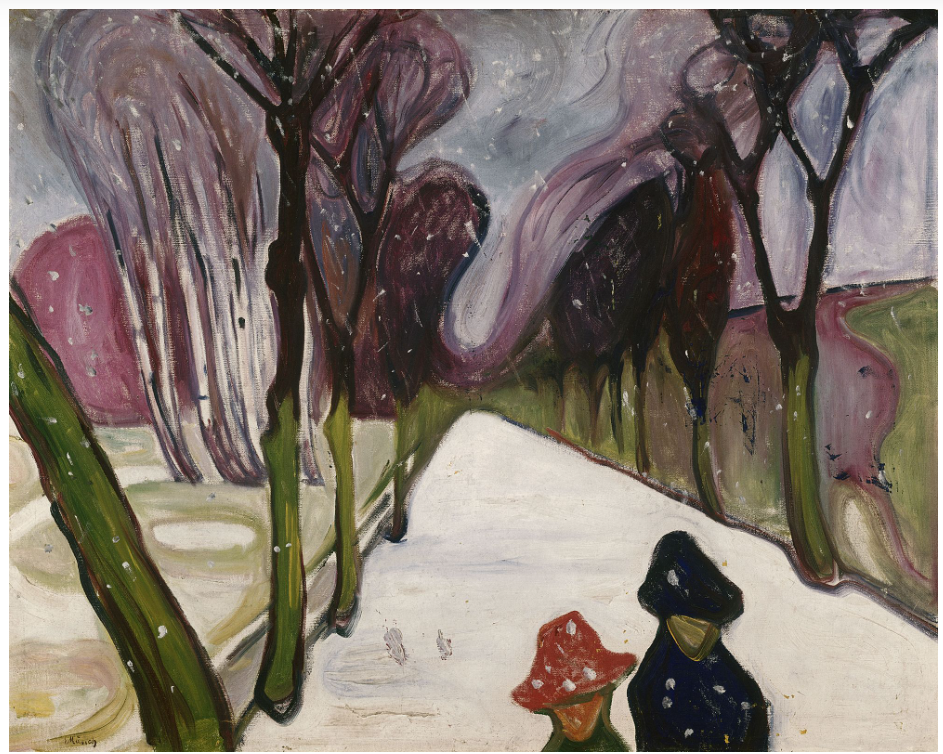
In his career as a landscape artist, Hockney has turned his finely-tuned gaze—which from the 1960s has so remarkably captured the essence of his portrait sitters—to the world around him, invariably perceptive to traces of agriculture and progress, as well as the slightest modulations in hue, light and shadow, on the ever-shifting contours of the land. Begun in earnest in 2004, his drawings, paintings, photographs, and iPad pictures of East Yorkshire comprise a poignant, radiant tribute to the landscape which produced one of the past century’s most significant and beloved artists. Woldgate Woods, Winter, 2010, in its mastery of modern media, is one of Hockney’s remarkable contributions to the history of visual and artistic innovation.
Yayoi Kusama
INFINITY-NETS [APPGF], 2017
Phillips London: 6 March 2025
Estimated: GBP 700,000 – 1,000,000
Yayoi Kusama – Modern & Contemporary A… Lot 14 March 2025 | Phillips
YAYOI KUSAMA
INFINITY-NETS [APPGF], 2017
Acrylic on canvas
100.3 x 100.3 cm (39 1/2 x 39 1/2 inches)
Signed, titled and dated ‘YAYOI KUSAMA 2017 INFINITY NETS APPGF’ on the reverse
Subtle and refined, this elegant work with its softly luxurious, neutral color palette is an exquisite example of Yayoi Kusama’s revered Infinity Nets series. The intricate loops and swirls create a textured, meditative surface to the canvas; a particularly sophisticated iteration of her ongoing series, the natural tone is both opulent and understated, the faint white-ecru of the painted layer blending delicately with the light ground. Open about her own deeply personal experiences of hallucinations and obsessive-compulsive disorder, painting was both a creative force and a cathartic outlet for the artist, with her visions fueling her persistent search for cosmic themes of eternity, obliteration and the infinite in her practice.
“I would cover a canvas with nets, then continue painting them on the table, on the floor, and finally on my own body. As I repeated this process over and over again, the nets began to expand to infinity. I forgot about myself as they enveloped me, clinging to my arms and legs and clothes and filling the entire room.”
In 1957, Kusama left Japan for America, where she became immersed in the American contemporary post war art scene thriving during mid-century New York City. It was here that she first began working on her Infinity Nets, a series that she would continue to develop throughout the subsequent decades of her career. On the heels of the legacy of Abstract Expressionism, Kusama undoubtedly took some of the key tenets of gestural mark-making, large-scale immersive canvases and process-orientated painting that had dominated in recent years as a point of departure, elements of which can be seen translated and embedded into her practice to this day. Yet, at her debut solo exhibition at Brata Gallery in 1959, her early, white Infinity Nets – exclusively white and the epitome of simplicity and refinement – were received with admiration and revelation; their contained, uniform simplicity was a remarkable deviation from the untamed overtness of the Abstract Expressionists.
Introspective and serene, Kusama’s Infinity Nets marked a stark contrast to the explosive, raw intensity of Action Painting popularized by the likes of Jackson Pollock and Willem de Kooning. Instead, the tight, meticulous brushstrokes and subtle, monochromatic palettes evoke a more calming, contemplative effect. With an emphasis on her chosen medium of paint and the labour-intensive process of application, layer upon layer, to create an undulating surface rich with peaks of impasto and smoother, fluid lines, Kusama’s Infinity Nets presaged many of the principles subsequently upheld by the Minimalists. On her flight from Japan to New York, the artist was struck by the endless, rippling Pacific Ocean beneath her, a birds-eye view of the great expanse of water that informed her artistic vision, she endeavored to capture and distil the essence of its vastness in her work. This is reflected in the sensory unity of her painting, breaking down elements of colour, form, mass, figure and ground into a boundless, reverberating whole. The Minimalists placed a similar emphasis on medium and process, resulting in pared back, monochromatic abstraction in its most distilled, purest form. The artist’s 1959 Brata exhibition, for example, caught the attention of Donald Judd, who wrote in his review of the exhibition for Art News: ‘the five white, very large paintings in this show are strong, advanced in concept and realized. The space is shallow, close to the surface and achieved by innumerable small arcs superimposed on a black ground overlain with a wash of white. The effect is both complex and simple. Essentially it is produced by the interaction of the two close, somewhat parallel, vertical planes, at points merging at the surface plane and at others diverging slightly but powerfully…The strokes are applied with a great assurance and strength which even a small area conveys. The total quality suggests an analogy to a large, fragile, but vigorously carved grill or to a massive, solid lace.’
[Left] Brice Marden, Untitled (Black and Cream Grid), c. 1964, Whitney Museum of American Art, New York. Artwork: © ARS, NY and DACS, London 2025
[Right] Brice Marden, Cold Mountain 6 (Bridge), 1989–91, San Francisco Museum of Modern Art. Artwork: © ARS, NY and DACS, London 2025
Infinity Nets (APPGF), with its neutral, muted palette also draws distinct visual parallels with the work of Brice Marden who, like Kusama, was a figure who referenced many of the artistic tendencies that were percolating at the time, whilst also crucially resisting any definitive sort of categorization. He, too, was interested in the potential held by the inherent materiality of his works: ‘he was a painter of rare insight into the pleasure and poetry of his medium, always dedicated to gesture, chance, substance—the elemental matters of art.’ In Marden’s earlier monochromatic works, there is a more pronounced emphasis on repetition and pattern, and the formal matter of art making; later, he adopted a more spontaneous and meandering approach, creating a sense of movement that recalls the natural ebb and flow of the landscape, both of which can be likened to aspects of Kusama’s labyrinthine nets. His Cold Mountain series (1988-91), for instance, deeply influenced by the poetry of Han Shan, a hermit and poet from the Tang Dynasty, explores wide-reaching themes surrounding spirituality and the relationship between humankind and the natural world – the fluidity of these works, in a departure from the earlier rigidity of his geometric works from the 60s, lends them a tranquil quality that visually recall Kusama’s introspective paintings, synchronously considering both the physical landscape and the interior landscape of the mind. Transcending the intersections between any distinct movement, the breadth and depth of Kusama’s unique visual language – spanning a remarkable seven decades – is testament to the enduring nature of her complex and singular approach to art making. Painted in 2017, and coming to auction for the first time, Infinity Nets (APPGF) represents a culmination of decades of refinement and serves as a perfect example of the timelessness of her practice, as she ‘continues to produce compelling and challenging work, and should not be beholden to a single historical moment.’
Pumpkin, 2006
Phillips London: 6 March 2025
Estimated: GBP 400,000 – 600,000
Yayoi Kusama – Modern & Contemporary A… Lot 20 March 2025 | Phillips
YAYOI KUSAMA
Pumpkin, 2006
Acrylic on canvas
24.2 x 33.3 cm (9 1/2 x 13 1/8 inches)
Signed, titled and dated ‘Yayoi Kusama 2006 Pumpkin [in Japanese]’ on the reverse
Now seen as utterly synonymous with the artist herself, the bright yellow pumpkin is undoubtedly Yayoi Kusama’s most iconic motif, its roots deeply seated in her artistic oeuvre and biography. Born in 1929, Kusama grew up on her family’s seed farm in Matsumoto, Nagano, a rural provincial town in central Japan. The artist, who voluntarily has lived in a psychiatric facility in Tokyo since 1977, traces her lifelong experience with visual and auditory hallucinations as well as obsessive neurosis to these formative years of her childhood. However, while the accumulating flowers or other talking plants encountered in these visions threatened to overwhelm and obliterate her, the gourd represented an altogether more comforting personae, established in her earliest encounter with a pumpkin in elementary school which ‘immediately began speaking to me in a most animated manner.’ To express and process these disturbing yet fascinating experiences, Kusama sought refuge in art. The naturally recurring forms and patterns embedded in the landscape of Kusama’s childhood home quickly seeped into her visual repertoire. However, unlike the more terrifying aspects of her visions, the pumpkin still engenders feelings of peace and solidity. As she explains: ‘I was enchanted by their charming and winsome form. What appealed to me most was the pumpkin’s generous unpretentiousness. That and its solid spiritual balance.’ Kusama produced her first Kabocha (Pumpkin) as early as 1946 when she was still in her teens, although it was in the early 1980s that the motif became more firmly established in her visual language as she developed a highly stylized series of Pumpkin paintings, the yellow and black polka-dotted gourds set against net-like backgrounds. It was during this period that the pumpkin evolved into what it is today: Kusama’s most recognizable symbol.
Yayoi Kusama, Pumpkin, 1989, Private Collection. Artwork: © YAYOI KUSAMA
Painted in 2006, Kusama’s Pumpkin stands within the legacy of her career-long exploration of the motif. The yellow gourd floats in the center of the composition, occupying nearly the entirety of the canvas. Skillfully painted black dots reduce in size as they near each undulating curve of the form, adding optical dimension to its bulbous shape. The bright yellow pumpkin contrasts excellently with Kusama’s characteristic net-like background, recalling these earlier 1980s works. With its unique and animated form, Pumpkin exudes joy and stability, grounding viewers in its ‘unpretentious’ simplicity.
Andy Warhol
Camouflage, 1986-87
Sotheby’s London: 4 March 2025
Estimated: GBP 1,800,000 – 2,500,000
Camouflage | Modern & Contemporary Evening Auction | 2025 | Sotheby’s
ANDY WARHOL (1928 – 1987)
Camouflage, 1986-87
Acrylic and silkscreen ink on canvas
76 1/4 x 76 1/4 inches (193.7 x 193.7 cm)
Stamped by The Estate of Andy Warhol and by The Andy Warhol Foundation for the Visual Arts
Numbered PA85.040 three times on the overlap
Camouflage from 1987 stands as a seminal example of Andy Warhol’s final forays into abstraction. Executed in the twilight of his career, shortly before his untimely death – and after a decade dominated by celebrity portraiture (1978–1987) – the present work embodies a series of audacious experiments in reconfiguring the utilitarian motif of military camouflage into an exuberant declaration of aesthetic ingenuity. Employing a four-colour pattern derived from a swatch of camouflage netting procured at an Army and Navy store on Fifth Avenue, Warhol elevates a design originally intended for concealment and survival into a bold emblem of contemporary culture. Presenting an ostensibly endless expanse of yellow and orange, the composition evokes both the brilliance of military insignia and the playful optimism that characterises Warhol’s later oeuvre. Meticulous layering of paint and ink, combined with deliberate variances in the repetition of the pattern, produces a dynamic surface in which uniformity is subverted by the interplay of chance and process, thereby underscoring the intrinsic tension between control and spontaneity inherent in Warhol’s signature silkscreen medium. Acting as an enigmatic and unifying ground, Warhol’s Camouflage appears in other significant paintings including the iconic self-portraits from the same year, versions of which reside in the Metropolitan Museum of Art New York and the Philadelphia Museum of Art.
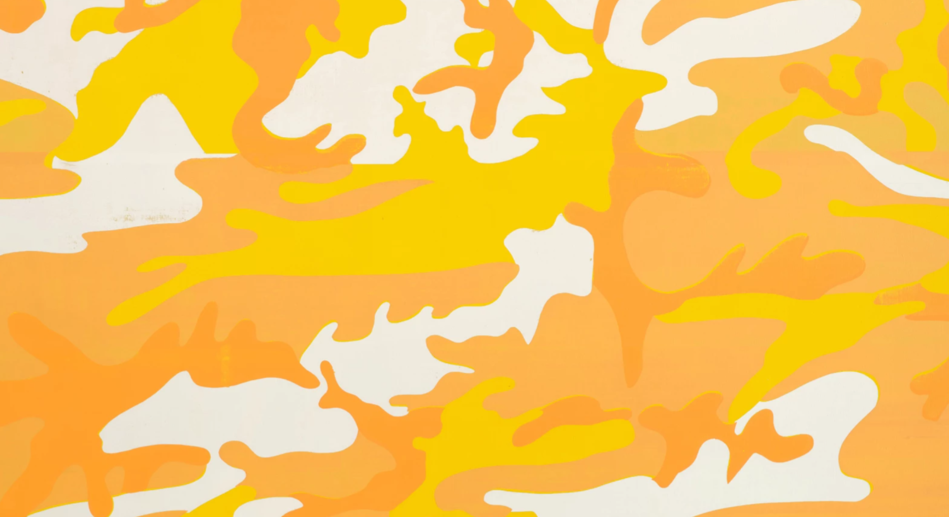
The Camouflage paintings are among Warhol’s most technically demanding works. Warhol’s initial inspiration for using the ubiquitous print came from his studio assistant Jay Shriver who had been experimenting with the material. Later executed at Rupert Smith’s silkscreening studio under the artist’s exacting supervision, Warhol personally placed the screens upon each canvas – intentionally positioning them off center and allowing their edges to overlap – before selecting four distinct ink colors, which were then either squeezed or brushed on by hand. The resulting interplay of vivid warm and acid yellows, and carefully orchestrated patterning not only exemplifies Warhol’s masterful draughtsmanship but also reflects his ongoing fascination with the potential for variation inherent in the silk-screening process.
“With silkscreening, you pick a photograph, blow it up, transfer it in glue onto silk, and then roll ink across it so the ink goes through the glue. That way you get the same image, slightly different, each time. It was all so simple – quick and chancy. I was thrilled with it”
For Warhol, the silk screening possessed an immediacy that imbued each work with an ephemeral quality; a fleeting glimpse into a moment of artistic spontaneity that, paradoxically, achieves a sense of enduring permanence. This duality, of precision and chance, of order and disruption, lies at the very heart of Warhol’s creative vision.
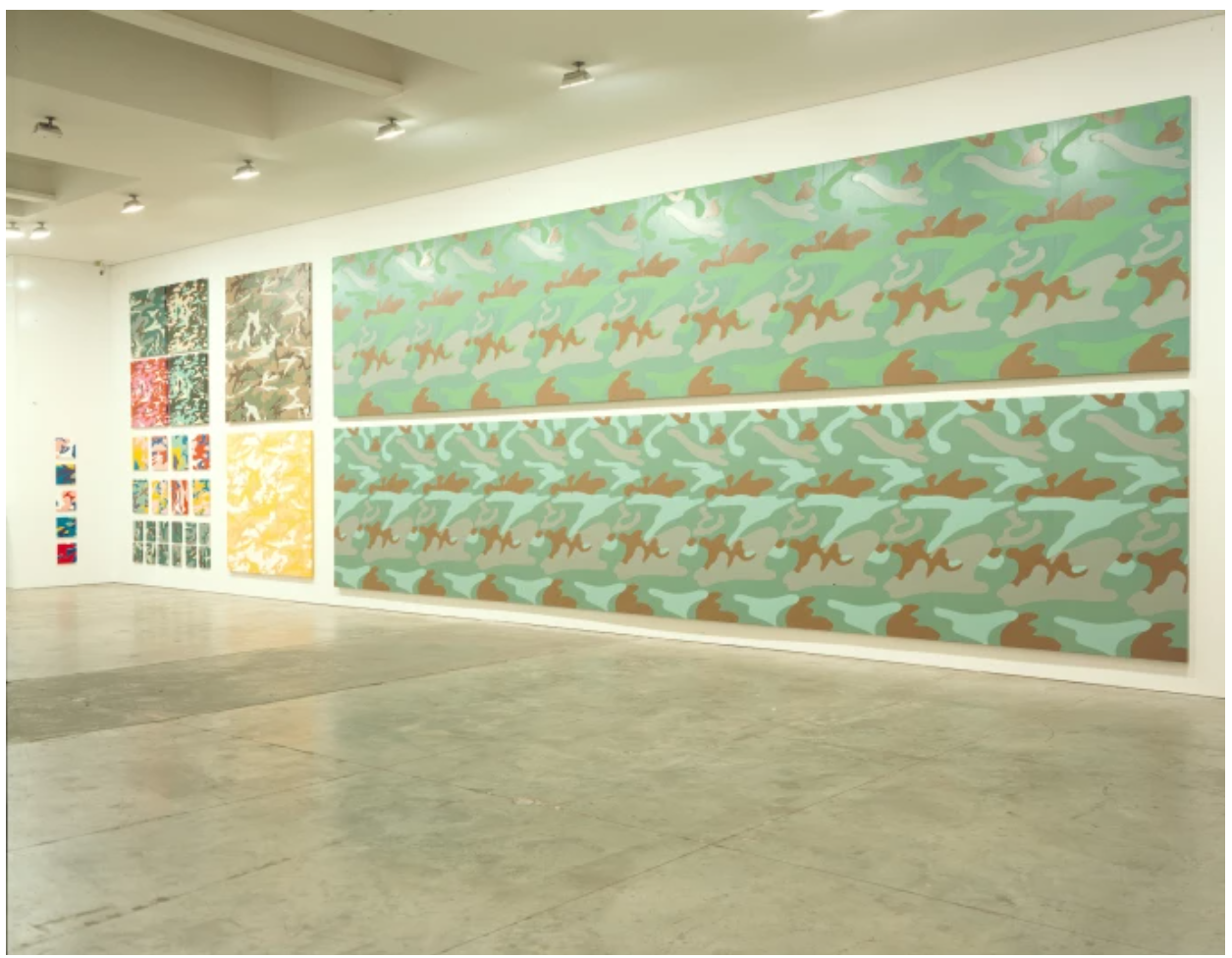
The present work exhibited in New York, Gagosian Gallery, Andy Warhol Camouflage, November 1998 – January 1999.
Photo: Rob McKeever. Courtesy Gagosian Robert McKeever
Deeply intrigued by the near-religious veneration afforded to painters such as Jackson Pollock and Mark Rothko, Warhol’s Camouflage series can be conceptually linked to his earlier Rorschach paintings and Oxidation series. Together, these bodies of work challenge the mystique of a self-proclaimed “non-referential” Abstract Expressionism; a movement that Warhol famously lampooned in the 1960s. In a masterful instance of visual wordplay, he repurposes the utilitarian army print to mount a sardonic critique of Abstract Expressionism, embracing an elemental pattern laden with associations of its original militaristic function and its subsequent adoption in fashion – Pop’s greatest ally. Much like Jasper Johns’ iconic Flag paintings, Camouflage functions within a paradoxical framework, simultaneously abstract and overtly referential. This duality reinforces Warhol’s persistent engagement with and exploration of a shared, mass-produced, and commercially driven visual language, highlighting his continued investment in the interplay between high art and popular culture.
Henri Matisse, Mimosa, 1949. Ikeda Museum of 20th Century Art.
Warhol’s Camouflage series reveals a profound indebtedness to the aesthetic innovations of Henri Matisse. From his early days at Carnegie Tech – where he first encountered Matisse’s later cut-outs, notably Le Gerbe (1953) – Warhol absorbed the vibrant, curving lines and bold decorative patterns that would later inform his reimagining of the camouflage motif. The luminous, dynamic qualities of Matisse’s cut-outs find a resonant echo in Warhol’s layered silkscreen approach, where the interplay of ink produces a collage-like effect reminiscent of Matisse’s expressive environments. Frequent visits to New York, even while he resided in Pittsburgh, allowed Warhol to immerse himself in Matisse exhibitions, further cementing the influence of the French master on his evolving output. Warhol’s lyrical line drawings, intense use of color, and penchant for pattern-on-pattern designs attest to an enduring admiration for Matisse, a legacy indelibly woven into the fabric of his Camouflage series.
Left: Willem de Kooning, Untitled, 1958. Solomon R. Guggenheim Museum, New York. Image The Solomon R. Guggenheim Foundation Peggy Guggenheim Collection, Venice, 1976 Art © 2023 The Willem de Kooning Foundation/Artists Rights Society (ARS), New York
Right: Clyfford Still, Untitled, 1960. Metropolitan Museum of Art, New York.
Image: The Metropolitan Museum of Art/Art Resource/Scala, Florence
The last two years of Warhol’s life were arguably both his busiest and his most trying, as he faced declining health; a stark reminder of the mortality which had been a longstanding obsession of his career.
Cardi Smith (Madame Smith), 1974
Christie’s London: 6 March 2025
Estimated: GBP 400,000 – 600,000
ANDY WARHOL (1928-1987), (i) Cardi Smith (Madame Smith)(ii) Cardi Smith (Madame Smith) | Christie’s
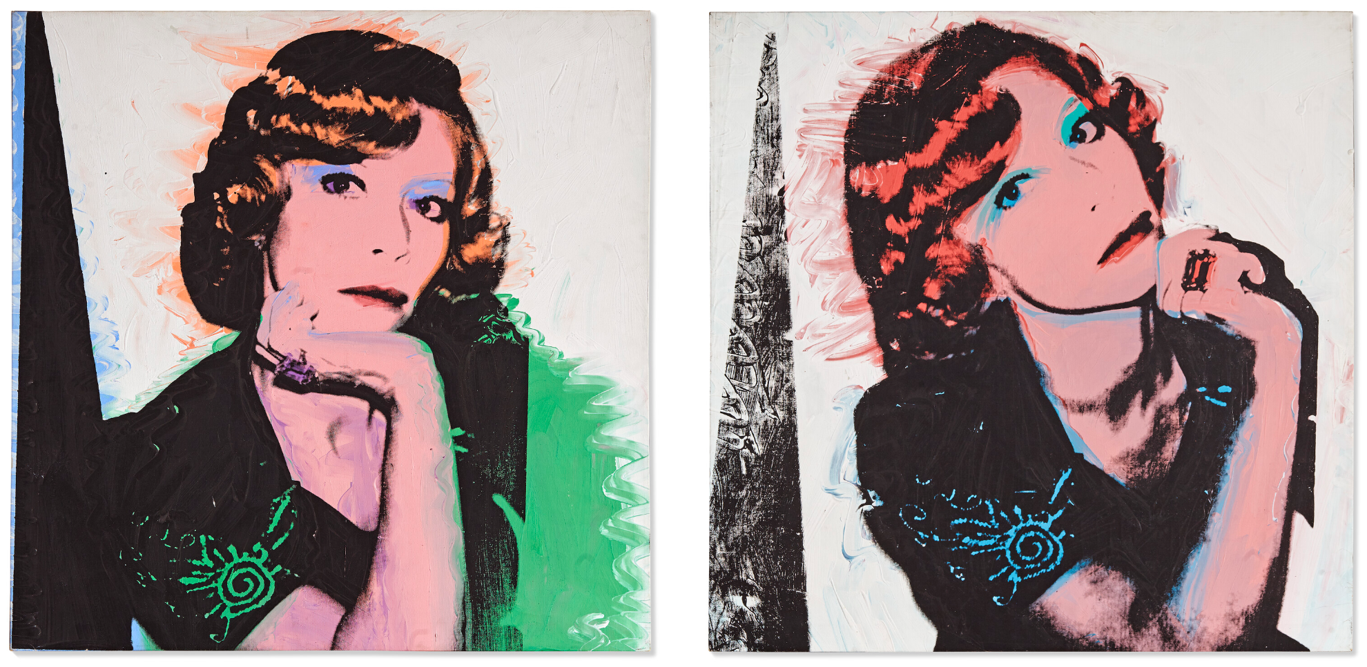
ANDY WARHOL (1928-1987)
(i) (ii) Cardi Smith (Madame Smith), 1974
Each: acrylic and silkscreen ink on linen
Each: 39 3/8 x 39 3/8 inches (100×100 cm)
(i) Stamped with the artist’s signature ‘Andy Warhol’ (on the overlap); signed, inscribed and numbered by Frederick Hughes ‘#A1290.10 CERTIFIED © 1974 Frederick Hughes’ (on the overlap)
(ii) Stamped with the artist’s signature ‘Andy Warhol’ (on the overlap); signed, inscribed and numbered by Frederick Hughes ‘CERTIFIED Frederick Hughes A1290.11© 1974’ (on the overlap)
Bringing the sitter to life across two radiant canvases, the present pictures of Cardi Smith (Madame Smith) (1974) are a striking pair of Andy Warhol’s celebrated ‘society portraits.’ The subject is Cardi Smith, the wife of Danish businessman and collector Hans Smith. Warhol had met the couple at a gallery they owned in Monte Carlo in May 1974: they were later photographed with the artist beneath their finished portraits in their home. Cardi appears here in two slightly different poses derived from Warhol’s Polaroid photographs, her chin resting on her hand. Luminous underpainting in blue, green, pink and purple glows through the black ink of the silkscreen, emerging in zigzagging wet-on-wet strokes against a white ground. Warhol highlights her lips and eyeshadow with Marilyn-esque drama: bright colors accentuate an embroidered pattern in her sleeve, a huge, square-cut jewel on her finger, and the reddish waves of her hair. With their courtly echoes—Smith’s pose recalls Ingres’ bejewelled portrait of Madame Moitessier (1856, National Gallery, London)—the works are a vision of decadent glamour.
Warhol made his first commissioned portrait in 1963, for the collector Ethel Scull. Ethel Scull 36 Times (Whitney Museum of American Art, New York), shows the sitter in multiple images across a large, multi-coloured silkscreen grid. The source photographs were taken by Scull herself: Warhol had her pose in a Photomat in Times Square, snapping over a hundred from which he made his selection. By the time he made Cardi Smith (Madame Smith), Warhol had codified a different method for his ‘society portraits’, which formed a major part of his output from the 1970s onwards. He would begin by taking Polaroids—sometimes asking his subjects to wear pale make-up that would heighten the image’s contrast—before blowing the negatives up to create silkscreens, which were then printed onto painted canvases. Having employed the medium since the early 1960s, Warhol was able to create sophisticated effects in these later works, layering different colours and electrifying their features with hand-painted details.
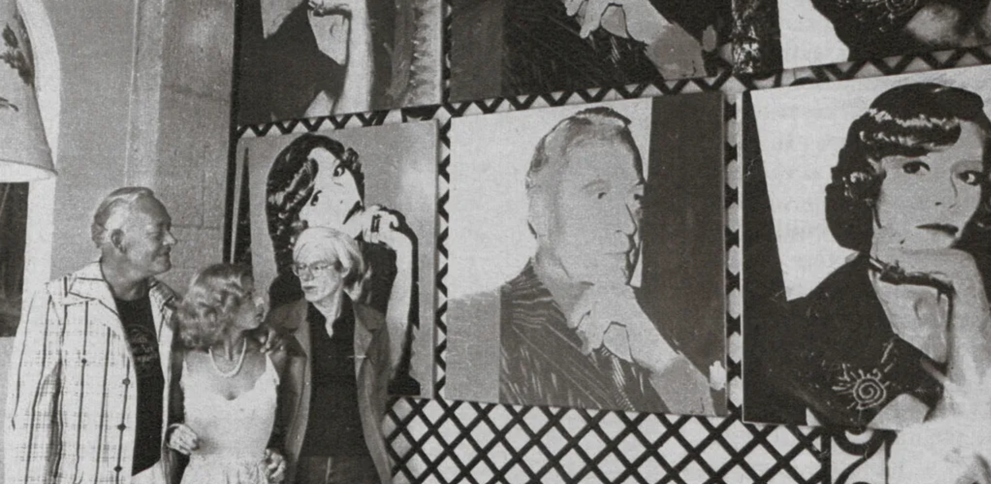
Hans Smith, Cardi Smith and Andy Warhol admire the present lot in the Smiths’ private home in Cap-Martin. Jour de France, August 1974. Photographer unknown. Artwork: © 2025 The Andy Warhol Foundation for the Visual Arts, Inc. / Licensed by DACS, London.
Warhol, who sometimes wryly referred to himself as ‘just a travelling society painter’, always used the same 40-by-40-inch format for these works, explaining that they needed to be of identical size so that they could all be displayed together as one enormous ‘portrait of society.’ This tongue-in-cheek idea conveys an important truth about Warhol’s practice. By fashioning himself as a modern-day court artist—not unlike the Singer Sargents and van Dycks before him who pictured the great and good of their time—he disavowed the ascetic Minimal and Conceptual tendencies that dominated the American art world during the 1970s. He instead struck a pose of unabashed fascination with celebrity and splendor, and captured a unique record of the people who defined his own era.
Jean-Auguste-Dominique Ingres, Madame Moitessier, 1856. The National Gallery, London.
Digital image: © 2025 The National Gallery, London/Scala, Florence.
The ‘society portraits’ feature a diverse range of luminaries, from Albert Einstein and Truman Capote to Prince, Diana Ross, Yves Saint Laurent, Joseph Beuys, Keith Haring, and Warhol’s own mother, Julia Warhola. He made his sitters into icons, commodities ready to be bought and sold, in a way that mirrored the workings of celebrity itself. Unlike his early Pop screenprints of figures such as Marilyn Monroe, however—which were based on found images—these works were all lensed in person by Warhol, who was by this time a star in his own right and sought after for commissions by clients worldwide. Accordingly they take on a self-reflexive quality, testifying to the position the artist himself had attained among the leading lights of the age. Cardi Smith joins Warhol’s pantheon in blazing color, under the immortalizing spell of the artist’s gaze.
Ed Ruscha
Christie’s London: 5 March 2025
Estimated: GBP 600,000 – 800,000
ED RUSCHA (B. 1937), Dry Frontier | Christie’s
ED RUSCHA (B. 1937)
Dry Frontier, 1987
Acrylic on canvas
72x 72 inches (182.9 x 182.9 cm)
Signed and dated ‘Ed Ruscha 1987’ (on the reverse)
Signed, titled and dated ‘ED RUSCHA “DRY FRONTIER” 1987’ (on the stretcher)
Two frontiersmen drive their horse-drawn Conestoga wagon ever-westward in Ed Ruscha’s Dry Frontier (1987), one of the artist’s iconic silhouette paintings. An atmospheric twilight is evoked through Ruscha’s careful layering of airbrushed paint, a medium he adopted in the mid 1980s seeking ‘stroke-less’ paintings for inscrutable, text-free images. A sharp diagonal cuts dramatically across the picture plane, formed by the dense blackness of the convoy against a pale, smoky sky.
Assuming a low, cinematic vantage point, the viewer becomes a silent witness to the scene, like a spectator to a film. Since the early 1960s Ruscha has examined the powerful semiotic function of the stereotype, playfully yet poignantly probing the words, phrases and imagery of American mass culture. In the present work, Ruscha looks to the ‘West’ as a carefully cultivated national mythology. Ruscha’s silhouette paintings are held in several major museum collections, including a variation on the theme of the present work, Uncertain Frontier (1987), in the collection of the Orange County Museum, Newport Beach. A recent major retrospective of the artist’s work, Ed Ruscha / Now Then, travelled from the Museum of Modern Art, New York, to the Los Angeles County Museum of Art across 2023-2024.
Ruscha’s silhouette series drew closely on the Los Angeles-based artist’s proximity to the film industry, featuring imagery that conjured old Hollywood Westerns: howling coyotes, horses, desert cacti and desolate houses. As a young man Ruscha had journeyed from Oklahoma City to Los Angeles, and the significance the word ‘Western’ held additional resonance for the artist. His first California studio was located on Western Avenue, Hollywood. Despite their cinematic, even photographic feel, Ruscha’s sources for the silhouettes were most often imaginary, indebted to the overall spirit of the Western genre rather than any one image or film. The composition of the present work could be a film-still from any number of movies, in which the camera lies low as a horse and wagon rattle through the frame. The effect is heroic and otherworldly, and at the same time intimately familiar. The horses and their cargo will charge onwards, beyond the picture, so despite the fullness of its composition the canvas contains a sense of expectant spaciousness: the vast and liberatory possibility of the West.
Jasper Johns, Three Flags, 1958. Whitney Museum of American Art, New York. Artwork: © Jasper Jones, DACS 2025. Digital image: © 2025 Whitney Museum of American Art / Licensed by Scala.
The critic Christopher Knight suggests that ‘a primary difference between Ruscha’s word-paintings and his silhouettes is the difference between speaking and listening’ (C. Knight, ‘Against Type: The Silhouette Paintings of Edward Ruscha’, Parkett, No. 18, 1988, p. 84). In the present work, there is a sense of the artist mining his own visual library. The diagonal which cuts across the composition, while accentuating the convoy’s forward-driving momentum, also recalls such iconic early Ruscha works as Large Trademark with Eight Spotlights (1962) and his Standard Station series. The latter were themselves inspired by earlier photographs, collated in the artist book Twentysix Gasoline Stations (1963), which documented Ruscha’s own westward voyage along Route 66—the storied highway to the modern American West.
“I don’t have any Seine River like Monet.
I’ve just got US 66 between Oklahoma and Los Angeles.”
Two decades later that road no longer existed, having been formally decommissioned two years before Ruscha painted the present work, and replaced with a series of new, high-speed interstate superhighways. With its vision of American pioneers of the past, Dry Frontier haunts its contemporary moment like a lost photograph emerging gradually from a national subconscious.
Fernando Botero
Christie’s London: 5 March 2025
Estimated: GBP 500,000 – 800,000
FERNANDO BOTERO (1932-2023), The Botero Exhibition | Christie’s
FERNANDO BOTERO (1932-2023)
The Botero Exhibition, 1975
Oil and photo collage on canvas
52.4 x 195.8 cm (20 5/8 x 77 1/8 inches)
Signed and dated ‘Botero 75’ (lower right)
Painted in 1975 while the artist was living in Paris, Fernando Botero’s monumental The Botero Exhibition stretches across a canvas just under two meters in width. In this richly detailed composition, Botero transports the viewer into an exhibition space, where ten of his own works adorn the central wall. Perusing the gallery are eight figures – characters who recur throughout Botero’s paintings; smoking gentlemen, bourgeois women, Renaissance-style religious figures, and a family group. Each appears to have a foil, a correlating, reflected presence in the same scale, with the exception of the central figures – a jacketed man, who, mirroring the onlooker, stands square to the painting in front of him, and his infant daughter, who, wide-eyed with a child’s curiosity, gazes out over his shoulder at the viewer.
The Botero Exhibition pays homage to the tradition of Kunstkammer paintings, which showcased an individual’s collection with replicas of the artworks they owned displayed together. In the present work, Botero has used printed images of his own paintings, collaging the cut-outs onto the canvas. These juxtaposed reproductions are not reflective of the scale of their original counterparts, should they be hung together, which imbues the work with a surreal quality. Botero took the print copies from contemporary literature and exhibition catalogues featuring his works, some of which were reproduced in print in monochrome, while others have changed colour over time, with only the blue and white ink remaining. The small ‘36’ in the lower right corner of the reproduction of Pope Leo X (after Raphael) suggests that this image in particular was taken from the 1970 Galerie Buchholz publication, Fernando Botero, where the photograph and layout match the picture in The Botero Exhibition.

Giovanni Paolo Panini, Interior of a Picture Gallery with the Collection of Cardinal Silvio Valenti Gonzaga, 1749. Wadsworth Atheneum Museum of Art, Hartford. Digital Photo: © 2025 Wadsworth Atheneum Museum of Art. All Rights Reserved.
Botero appears to have created the composition through a thoughtful layering process; the frames and mounts of the exhibited pictures were painted before the pasting of the reproductions, which have been cut to the silhouette of the character who stands in front of them. Yet, some of these figures were finalised after the addition of the collage elements, as the peak of a hat, or a lock of hair, skirts onto the reproduced image. For the artist, whose recognisably voluptuous figures have always attracted attention, volume and depth were of incessant significance, and he sought to ‘create a language of plasticity that would be effective and that people would be touched by’ (Botero, quoted in an interview with I. Sischy, ‘An Interview with Fernando Botero,’ Artforum, May 1985, p. 72). In The Botero Exhibition, the artist’s inventive use of media not only acts as modernising take on an art historical tradition, but furthers his exploration of plasticity in his work. A vivid three-dimensionality is created by the dialogue between the glossy sheen of the collaged reproductions, and the rich, curving brushstrokes of the oil paint.
Vincent van Gogh, Les Tournesols, 1888. The National Gallery, London. Digital image: Bridgeman Images.
Art history was of significant interest and importance to Botero, who felt that any artist is a collector of all the art that preceded them. As a child, he had been transfixed by the copies of European paintings that hung in his local church. His interest in Western art history was later spurred on by friends from the Medellín literary supplement he illustrated, who introduced him to the modernist works of Pablo Picasso and Georges Braque. Aged eighteen, Botero embarked on a European ‘grand tour,’ spending a year at the prestigious Academia San Fernando in Madrid, although he preferred to study directly from the Spanish masters, Diego Velázquez and Francisco de Goya, whose works hung in the Prado. It was also in Madrid that he discovered the artists of the Early Renaissance, and so, after a pitstop in Paris, Botero continued his tour in Northern Italy by motorcycle.
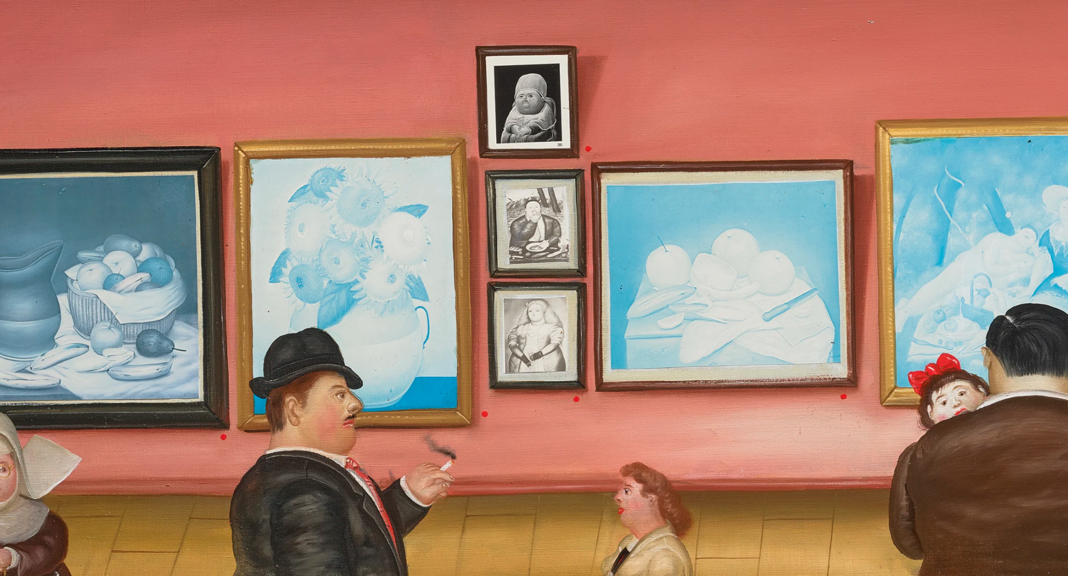
As a result of Botero’s passionate interest and study of art history, the artist often consciously recalled his artistic forebearers in his compositions. In the present work, the central collaged painting, Le déjeuner sur l’herbe is Botero’s direct reference to Edouard Manet’s famous painting from the mid-nineteenth century, while topping the column of monochrome cut-outs is the artist’s Pope Leo X (after Raphael), a reinterpretation of Raphael’s 1518 portrait of the Pope, and to the left, Botero’s Sunflowers remembers Vincent van Gogh’s Les Tournesols series.
Raphael, Ritratto di Leone X tra i cardinali Giulio de’Medici e Luigi de’ Rossi, 1518. Le Gallerie degli Uffizi, Florence.
Digital image: Bridgeman Images.
In addition to invoking iconic artworks, Botero depicted art historical subject matters and ideas throughout his oeuvre, and all the pictures that hang in The Botero Exhibition exemplify the constant conversation in his work between the art of the past and the present. For Botero, his own exhibitions offered the platform to continue this dialogue, as well as the opportunity for reflection and redirection. As Klaus Gallwitz has noted, the artist often went ‘to see his own shows… he says the “focus” an exhibition gives him on his recent work helps him decide where to go next’ (quoted in Fernando Botero, London, 1976, p. 21). In depicting an exhibition of his own paintings which consciously reference the Western art historical canon, Botero not only aligned himself with the annals of European art history, but he also created an open invitation to the conversation on the very concept and purpose of art.
Roy Lichtenstein
Peanut Butter Cup, 1962
Sotheby’s New-York: 4 March 2025
Estimated: GBP 1,000,000 – 1,500,000
Peanut Butter Cup | Modern & Contemporary Evening Auction | 2025 | Sotheby’s
ROY LICHTENSTEIN (1923 – 1997)
Peanut Butter Cup, 1962
Oil on canvas
14×14 inches (35.6 x 35.6 cm)
Titled (on the overlap)
Signed and dated ’62 (on the reverse)
Created during the most pivotal and critically lauded moment in Roy Lichtenstein’s inimitable career, Peanut Butter Cup from 1962 is an early Pop art masterpiece, in which the artist’s signature Ben Day dots lend this mass-market sweet treat a bold visual power. Recognized as a master of graphic clarity and a genius of image appropriation, Lichtenstein redefined the boundary between ‘high’ and ‘low’ art through an ironic interplay of popular culture, everyday objects and fine art. Alongside similar monochrome object paintings of the early 1960s – such as Portable Radio (1961, San Francisco Museum of Modern Art), Bread in Bag (1961, Städtisches Museum, Mönchengladbach), Tire (1962, Museum of Modern Art, New York), and The Grip (1962, Museum of Contemporary Art, Los Angeles) – Peanut Butter Cup is a seminal example of the artist’s pioneering aesthetic, in which he wittily appropriated comic book imagery and the language of mass printing. These single object paintings from 1961 to 1962 mark the precise moment of conception for Lichtenstein’s entire mature praxis, the earliest iteration of his now legendary aesthetic.
“I’m never drawing the object itself; I’m only drawing a depiction of the object – a kind of crystallized symbol of it.”
The artist in his studio in front of the present work, 1962. Photo: Ben Martin. Art © Estate of Roy Lichtenstein/DACS 2025
Underscoring its importance, the present work was painted at the same moment as many of Lichtenstein’s most iconic masterpieces, indelibly stamped on Western cultural consciousness: Girl with Ball (1961, MoMA, New York), Masterpiece (1962, sold for $165 million in 2017), and Drowning Girl (1963, MoMA, New York), among many others. Sourced from mass-printed imagery constructed from industrially-produced dots, these early compositions can be seen as Lichtenstein’s witty retort to the visual mechanics of artistic creation, as well as an ironic riposte to the burgeoning Minimalist movement. Sourced as a Duchampian ‘ready-made,’ such found imagery had little association with narrative subject matter or painterly mark-making, allowing Lichtenstein to render the act of making art the ultimate subject of his oeuvre. Having remained in the same private collection for over 60 years, since it was acquired by distinguished Australian collector and philanthropist John Kaldor shortly after it was painted, the present work is a rare and significant exemplar of the artist’s praxis. Indeed, the artist favored this image so much that he created a second example in blue; that sister painting is today held in the renowned Sonnabend Collection. With its bold monochrome palette, starkly rendered lines, and trademark Ben Day dots, Peanut Butter Cup encapsulates the essence of Lichtenstein as a Pop innovator, and showcases the inventive mind of an artist at the apex of his extraordinary career.

Painted in 1962, Peanut Butter Cup marks a breakthrough year for Lichtenstein, when the fundamental attributes of his Pop art style crystalized into its mature form. At the time, Lichtenstein was creating a series of black-and-white paintings of common household objects, using simple, crisp black outlines and Ben Day dots, along with some of his earliest comic book paintings. This moment marks the beginning of Lichtenstein’s interest in replicating the look of the half-tone printing process, in which he appropriated the Ben Day dots for his own purposes. His single-object paintings of 1961 to 1963, epitomised by the current example, are the purest form of image-making to be found anywhere in Lichtenstein’s oeuvre. With all the visual impact of a logo, sign-post or religious icon, they reduce consumer and mass culture to a common denominator. While artists such as Jasper Johns might choose ‘found’ images as a means to focus on the formal properties of paint, others like Robert Rauschenberg, Andy Warhol, and Lichtenstein were fully aware that the viewer’s preconceptions of objects would be as integral a part of their perception of the work as color, composition or technique. The sugary, inviting subject of Peanut Butter Cup has a strong cultural resonance, particularly for Lichtenstein’s audience of the 1960s. By 1956, Reese’s Peanut Butter Cups were among the most popular sweets in America, with sales worth today’s equivalent of $125 million; by 1963, after merging with the Hershey Company, peanut butter cups were Hershey’s top seller. Advertisements to “Try them chilled or frozen!” were ingrained in the American consciousness, a staple of every five-and-dime and corner store. Like Warhol’s Soup Cans, Lichtenstein’s Peanut Butter Cup defamiliarizes a mundane, instantly recognizable image by elevating it to the realm of a fine art still life.
The least conspicuous yet the most subliminally impactful of Lichtenstein’s method is his economic and extremely subtle editorship of the readymade source. Lichtenstein collected and collated imagery from the plethora of printed sources available to American consumerist society in the economic hey-day of the late 1950s and 1960s – from the comic strips, magazines and newspapers to the copious world of print advertising. The present work features the brilliantly economic rendition of a consumer product, enlarged and exhibited devoid of context.
The present work installed in John Kaldor’s Australia home, as published in Art & Australia, 1971. Image © Art & Australia.
Here, the titular candy is rendered purely in a configuration of lines and dots, effectively demonstrating the tension inherent in the illusion of depth and volume against the two-dimensional picture plane. Adding to the effect is the radically simplified palette, inspired by the standardized colours of mechanical printing as well as the chromatic reduction pursued by early Modernists such as Piet Mondrian. Lichtenstein constructs his image using the most rudimentary visual building blocks – line, dot, and hue – at once presenting an immediately recognizable object while also hinting at the boundaries of abstraction. Concisely contoured in bold lines, afloat above a regularized Ben Day-dotted ground, the magnified form of a popular child’s sweet imposes upon the viewer all the dignities of a still-life and the efficiency of advertising’s visual vocabulary.
By reducing all extraneous pictorial detail and traces of narrative to an absolute minimum, Lichtenstein bestows on Peanut Butter Cup an emblematic fixity that transcends specificity and temporality to create a monolithic image of monumental and enduring presence. Through Lichtenstein’s process of manipulation and reframing, his image of the solitary chocolate candy becomes a universal emblem for mass consumer culture. Peanut Butter Cup is an exemplar of Lichtenstein’s early 1960s praxis: a bold, graphic depiction of an instantly recognizable subject, executed in the classic comic book style that became his hallmark and cemented him as a master of twentieth century art history. The present work thus stands as a quintessential masterwork of Pop painting.
Modern Tapestry (Study), 1967
Sotheby’s New-York: 4 March 2025
Estimated: GBP 300,000 – 400,000
Modern Tapestry (Study) | Modern & Contemporary Evening Auction | 2025 | Sotheby’s
ROY LICHTENSTEIN (1923 – 1997)
Modern Tapestry (Study), 1967
Printed paper, marker, ink, graphite, and paint color swatches on board
21 x 26 3/8 inches (53.5 x 67 cm)
Signed (lower right)
Variously inscribed (in the margins)
Executed in 1967, Roy Lichtenstein’s Modern Tapestry (Study) was created as the principal study for the artist’s first two recorded tapestries, both woven on a monumental scale in 1968. Marking a pivotal moment in Lichtenstein’s exploration of new mediums and artistic language, the present work stands as an outstanding example of his radical creative vision and meticulous compositional planning. Featuring his signature Ben Day dots and bold primary hues, the present work belongs to Lichtenstein’s celebrated Modern series that he began in the summer of 1966 with his poster for the Lincoln Center in New York, and which he continued to explore for the following half-decade. Inspired by the grandeur of New York’s Art Deco architecture, particularly the iconic Radio City Music Hall, Lichtenstein has constructed a composition that fractures and reassembles the visual language of Cubism. The result is a witty fusion of archetypal styles – parodying and championing the pervasive modernist aesthetics of the 1920s and 30s. Declaring an undaunted departure from the iconic imagery of his earlier Pop and comic-strip paintings, Lichtenstein reinterprets the modern metropolis of New York, characterized by stylized zigzags, chevrons and geometric shapes. Through his observant eye, Modern Tapestry (Study) is imbued with the opulence and technological optimism that accompanied the prosperity of American interwar technological progression.
Piet Mondrian, Composition with Red, Blue and Yellow, 1930. Image: Bridgeman Images. Art © 2025 Mondrian/Holtzman Trust
Lichtenstein often conceptualized works with a pencil sketch, before beginning his more refined collages that employed printed and felt-tip pen colored papers as the basis for his image matrix. These materials, with their rigid lines and flat layers, offered him the flexibility to experiment with composition and color without the commitment of more permanent media. Annotations along the upper and lower border offer Lichtenstein’s specific instructions on his desired scale and color tone, functioning as directives for the weavers. He specifies that the length of the carpet should span a monumental 12 feet, or 365 cm, and notes that the colours in the collage are “inaccurate,” advising the weavers to instead match the samples he has cut from color swatches to achieve a vibrancy and chromatic richness deeper than the ink of his markers – specifications that all four weavers honored in their production. Lichtenstein’s precise artistic control is wholly observable in the present work, even in the collaborative production of the tapestries. Known to produce works for nontraditional or unconventional purposes, Lichtenstein made only a handful of tapestries during his lifetime, and as such, the present work occupies a unique position in his wide-spanning oeuvre.
The present work installed in Roy Lichtenstein: Collages at the Visual Arts Museum, New York 1976.
Image courtesy of the School of Visual Arts. Art © Estate of Roy Lichtenstein/DACS 2025
Functioning as a pastiche of Art Deco’s visual tropes, while also engaging with ancient history, the present work collages Lichtenstein’s felt-tip pen drawn motifs: a fragment of a brushstroke in the upper left quadrant self-references the artist’s then ongoing Brushstroke series (1965-71), while the ancient Greek Ionic column and painter’s palette speak to the eternal Hellenistic quest for balance and harmony; a blond ‘Classical head’ dominates the composition, presaging his later interest in the subject explored through his series of Head sculptures (1974-1991). Through the Heads, Lichtenstein sought to depict humans as machines possibly in response to the implicit trust placed in technological advancement that pervaded post-war America. Lichtenstein continues this subversive interrogation through the remainder of the collage, pasting together a sun, wings, an aeroplane, large pipes, and an industrial ship with smoke expelling from its funnels. This last group of motifs holds an underlying evocation of Streamline Moderne, a sleeker form of Art Deco which emphasized speed and progress through curved forms and smooth lines – a response to the Great Depression and the subsequent economic realities of the 1930s. Set against the rising sun – a new dawn – Lichenstein’s last set of motifs speak to the aerodynamic design of aeroplanes soaring above and the powerful curves of transatlantic ships cutting through waves. Lichtenstein has rendered an incongruous image from a panoply of historical allusions, where symbols are spliced together and yet, characteristically for the Modern series, they together weave stories of a utopian vision based on American idealism.
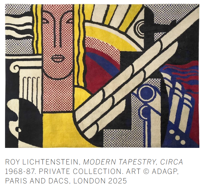
Characteristic of the Modern series, the present work functions as a rejection of monumental post-war abstraction, against the rationale of Abstract Expressionism in its decision to take subjects directly from what Louisiana Museum director Poul Erik Tøjner described as “the riotously proliferating image bank of contemporary American culture” (Poul Erik Tøjner, “I know how you must feel…,” in Roy Lichtenstein: All About Art, Esbjerg 2003, p. 28). Beyond his relationship to the immediate post-war American artistic landscape, there is a thread that can be traced from the present work further back, to that of European artistic traditions: Cubism, recalling the urbanistic compositions of Fernand Léger where forms undergo a process of metamorphosis from figuration to geometry; to Futurism and its celebration of industry and technology; and to the Le Corbusier influenced style of Purism based on a rational and mathematical approach to design. While the Abstract Expressionists focused on answering questions of color and form, driven largely by emotional and spiritual factors, Lichtenstein’s similar concerns with form and composition were motivated by interrogating the American visual lexicon. Much like Léger’s key work The City (1919), Lichtenstein also brings together a framework of vivid hues and clashing shapes to produce a visual intensity that could rival the modern urban environment. The fractured composition of the present work would also act as a prelude to his later Modern works, with compositions that took influence from Picasso’s Cubist portraits of the late 1930s that employed his characteristic curvilinear geometry. With Modern Tapestry (Study), Lichtenstein expands the parameters of his Pop Art vernacular to the illustrious history of modern art history.
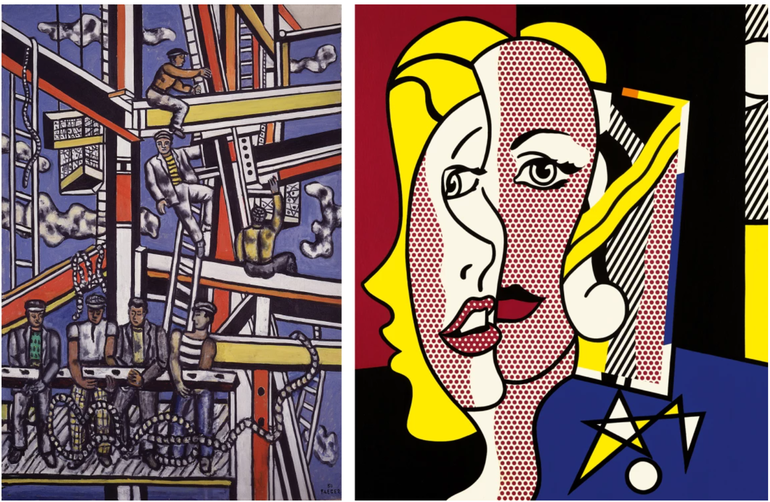
Left: Fernand Leger, Study for The Constructors, Blue Background, 1950-1951. Musee Leger, Biot. Image © Photo Josse / Bridgeman Images. Art © ADAGP, Paris and DACS, London 2025
Right: Roy Lichtenstein, Female Head, 1977. Private Collection. Sold Sotheby’s New York, November 2017 for $24,501,500. Art © 2025 Estate of Roy Lichtenstein/DACS 2025
Modern Tapestry (Study) embodies Lichtenstein’s capability for progress, both within the history of art, and within his own celebrated oeuvre. Lichtenstein demonstrates an ability to reconfigure the language of painting by drawing upon symbolism that is distinctly rooted in the American cultural imagination. Though they appear seemingly disparate, the amalgamation of these motifs to construct a uniquely American composition remains one of Lichtenstein’s lasting legacies. The Modern series, exemplary in Modern Tapestry (Study) are a vivid comment on the decadence of the modern movement; its final accomplishment, however, according to curator Elisabeth Sussman was to be “vital presences of a new art” (Elisabeth Sussman, Roy Lichtenstein: The Modern Work, 1965-1970, Boston 1978, p. 14). Beyond this, his hallmark Ben Day dots, primary tones, and bold linework are instantly recognizable in the present work, encapsulating the enduring potency of the artist’s signature pop aesthetic and visual language. Lichtenstein’s oeuvre is predicated on a semiotic investigation of how systems of representation allow us to conceptualize and interpret the world around us.
Joan Mitchell
Phillips London: 6 March 2025
Estimated: GBP 3,000,000 – 5,000,000
GBP 2,710,000 / USD 3,468,800
Joan Mitchell – Modern & Contemporary A… Lot 9 March 2025 | Phillips
JOAN MITCHELL
Canada II, 1975
Oil on canvas, triptych
Overall 100 x 300.4 cm (39 3/8 x 118 1/4 in.)
Signed ‘Joan Mitchell’ lower right of the third part
Combining stillness and action, tranquility and turbulence, Joan Mitchell’s expansive Canada II unfolds in symphonic waves of rolling, rising brushwork, its highly activated surface stirred by an invisible, elemental energy. Executed in 1975, just one year after Mitchell’s breakthrough solo exhibition at The Whitney Museum of American Art and the year before her first show with prominent art dealer Xavier Fourcade, the work belongs to a period of significant critical and creative growth for the artist, her reputation as one of the great masters of postwar painting secured. Breathtaking in its scale and fierce elegance, this vast triptych is the second of a suite of five numbered works known collectively as her Canada paintings – all held in private collections with the exception of Canada I, now held in the permanent collection of the Solomon R. Guggenheim Museum in New York. Testament to the artist’s deep devotion to the natural world and commitment to capturing its physical sensations, the Canada paintings draw on her memories of bright, bitterly cold winters growing up in the Midwest, and of the various trips taken with her long-term paramour the painter Jean-Paul Riopelle to his homeland. Deeply lyrical and reflective, the quieter palette of Canada II is especially evocative of Mitchell’s unique ability to communicate a polyphonic emotional cadence with precision and exactitude, her pitch-perfect control of color, shape, and gesture all making the ‘painting seem spacious, intuitively balanced, and ephemeral in feeling.’
Joan Mitchell, Canada I, 1975, The Solomon R. Guggenheim Museum, New York. Image/Artwork: © Joan Mitchell Estate
Born in Chicago in 1925 and already a published poet at just ten years old, Mitchell’s young life was infused with music, art, and poetry. Although a dermatologist by trade, Mitchell’s father was himself an amateur painter, while her mother Marion Strobel was a well-regarded poet and literary editor. Against this backdrop Mitchell’s early commitment to the idea of becoming an artist seems almost inevitable, although as a highly accomplished athlete she would go on to push her painting practice into uniquely physical territory, her deeply embodied approach to mark-making and gesture seeing her working on a monumental scale that not only rivalled but even surpassed the scale and ambition of the all-over canvases produced by the first generation of Abstract Expressionists. A champion tennis player, diver, and horse rider, the young Mitchell was also a highly accomplished figure skater, even dubbed ‘Figure Skating Queen of the Midwest’ for her competitive successes in that discipline.
“I think of white as winter. Absolutely. Snow. Space. Cold. I think of the Midwest snow […] ice blue shadows.”
Supremely graceful, figure skating is physically highly demanding, involving a complex blend of speed, power, grace, and balance. Trained by retired Swiss ski-jumper Gustave Lussi, Mitchell learned to focus her attention in the core of her body, and to be deliberate and precise in her movements. In terms that foreshadow later discussions of the artist’s remarkably physical relationship to the canvas, one Chicago Tribune reporter made special mention of Mitchell’s finesse ‘floating over the ice of the Arena like a butterfly over a poppy field – making incredibly beautiful swoops.’ii While this deeply embodied sensibility would directly inform her painting practice in later years, her memories of skating were also deeply interwoven with the dramatic Canadian landscape following an intensive training program there that she undertook in the summer of 1940. She would return to Canada many years later with Riopelle, notably early in the autumn of 1956 in the early days of their long and tempestuous relationship, where the two reconciled at the holiday home of Riopelle’s dealer Gilles Corbeil following a particularly fraught period. Mitchell’s biographer Patricia Albers evokes a sense of the complex interaction between Mitchell’s own, internal emotional landscape and the terrain, detailing one episode from this ‘early-winter interlude on the edge of a dense beech, maple, and evergreen forest carpeted with ferns’ where Riopelle constructed a small cave out of ice which especially delighted Mitchell, the two climbing inside and making love in the snow.
Joan Mitchell, Canada IV, 1975, Private Collection. Image/Artwork: © Joan Mitchell Estate
As Mitchell is often quoted as saying, ‘I paint from remembered landscapes that I carry with me—and remembered feelings of them, which of course become transformed.’ Rather than attempting to convey a physical likeness observed from outside of herself, Mitchell’s landscapes emerge from a more interior space, evoked through her remembrance and summoning of physical sensation such as light, movement, and sound. Bearing particular relevance to the present work and the Canada series more broadly, it was on this 1956 Canadian sojourn that Mitchell completed her magisterial Hemlock, now held in the permanent collection of The Whitney Museum of American Art. Alternating between shorter and longer brushstrokes which activate and agitate the entire surface of the work, the lyrical exchanges between deep, dark greens, pulsing flashes of brighter pigments, and the dominance of more spacious passages of opalescent whites anticipates the concentration of these spatial and tonal relationships in the Canada paintings.
[Left] Joan Mitchell, Hemlock, 1956, The Whitney Museum of American Art, New York. Image: Whitney Museum of American Art / Licensed by Scala, Artwork: © Joan Mitchell Estate
[Right] Piet Mondrian, Grey Tree, 1911, Gemeentemuseum, The Hague. Image: Cameraphoto/Scala, Florence
Borrowing its title from Wallace Stevens’ 1916 poem ‘Domination of Black’, Hemlock visually corresponds to the reeling repetitions of Steven’s lines as inner and outer worlds collide, color, sound, and sensation tumbling together in sonorous, rhythmic unity. Visually recalling the skeletal forms of Piet Mondrian’s early tree paintings, Hemlock retains a strong architectonic structure, expanded and diffused through her gestural and rhythmic brushwork as it builds to its emotional crescendo. Drawing on the strong visual resonances between these works and Mondrian’s trees, curator Paul Schimmel went further still, his 1984 essay ‘The Lost Generation’, privileging Mitchell’s work as epitomising ‘a shift in abstract expressionism from chance, hazard and the uncontrolled freedom of the unconscious to a new direction with breath, freshness, and light within a highly structured armature.’Placing white both beneath and in front of these more dominant, darker colours Mitchell confounds any easy distinction between foreground and background here, a stylistic feature of Mitchell’s work that is radically extended across the wide horizontal expanse of Canada II which – like its sister paintings from this small series – loosen the more rigid structures of these earlier works, appearing more delicately ‘diffuse in their dissolution of forms into a luscious impasto of blues, browns, and whites.’
By the 1970s, Riopelle had started extending his Canadian visits, investing in a home and business ventures in the mountain village of Sainte-Marguerite-du-Lac-Masson. Travelling out to meet him in the autumn of 1974, Mitchell was taciturn, feeling her partner become increasingly emotionally distant. Given the close emotional connections between her lover and this rugged terrain, and her notion of landscape itself as offering her ‘enormous protection from people who were hurting me’, the breathtaking Canada paintings are especially poignant in their high-keyed lyricism. Mitchell in fact gifted one of the works – a stunning, smaller four-panel work dominated by the rhythmic interchanges between ethereal, creamy whites and softly vibrating shapes – to Riopelle, renamed Returned after his rejection of it.
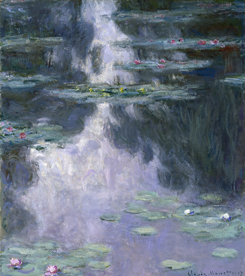
Claude Monet, Nymphéas, 1907, Museum of Fine Arts, Houston
Having spent much of her career living between France and New York, in 1967 Mitchell relocated permanently to Vétheuil, where Impressionist master Claude Monet had lived and painted between 1878 and 1881, a period especially notable for his own attempts to capture the physical sensation and distinct atmospheric effects of winter light and snow. In her enormous, light-filled studio Mitchell lived in close communion with the elements and seasons, creating vast, multi-panelled canvases that place her within a grand tradition of French landscape painting and in especially close dialogue with Monet, whose triumphant late Nymphéas operate in the same complex emotional register as Mitchell’s work from this period, recording their deeply sensitive response to the natural world and translating those sensations in paint.
Modern Art
Francis Bacon
Christie’s London: 5 March 2025
Estimated: GBP 6,000,000 – 9,000,000
GBP 6,635,000 / USD 8,492,800
FRANCIS BACON (1909-1992), Portrait of Man with Glasses III | Christie’s
FRANCIS BACON (1909-1992)
Portrait of Man with Glasses III, 1963
Oil and silver sand on canvas
14 1/8 x 12 1/8 inches (36 x 30.7 cm)
A vision in jewel-like color and vital, dynamic form, Portrait of Man with Glasses III (1963) is a masterwork from a pivotal moment in Francis Bacon’s career. Part of a key early group of his iconic 14×12-inch portraits, it displays the new flowering of formal freedom that defined his works of 1963. Swift, energetic brushstrokes coalesce to form the head of a man in dark spectacles, revealing flashes of raw canvas beneath. Stark whites are blushed with tones of pink and teal, pressed into the wet paint with textured fabric. Drama builds in the interplay between positive and negative space. The man’s glasses are dark, slanted voids: the black backdrop, with silver sand mixed into the pigment, sparkles like coaldust. Perhaps most arresting is the figure’s mouth. With a delicate impasto of bared teeth and sensual, diaphanous color, its startling beauty might be said to realize Bacon’s ambition—stated in 1962—
“to paint the mouth like Monet painted a sunset”
Bacon created four ‘Man with Glasses’ paintings in 1963, debuting them at Marlborough Gallery in London that summer. Martin Harrison, author of Bacon’s catalogue raisonné, describes them as ‘among the most potent, if disquieting, of his portrait busts’ (M. Harrison, Francis Bacon: Catalogue Raisonné, Volume III, London 2016, p. 724). While Portrait of Man with Glasses I resides in the Seattle Art Museum, none has received as much critical attention as Portrait of Man with Glasses III, which curator Dennis Farr singled out as ‘the most dramatic and disquieting of the series’ (D. Farr, ‘Catalogue of the Works’, in Francis Bacon: A Retrospective, exh. cat. Yale Center for British Art, New Haven 1999, p. 130). The work has been included in a suite of major Bacon exhibitions during the past three decades, appearing in seventeen cities across the world. Notably, it served as the catalogue cover for Francis Bacon/Henry Moore: Flesh and Bone, which opened at the Ashmolean Museum, Oxford in 2013: most recently it was seen in London, as part of the National Portrait Gallery’s acclaimed 2024-2025 retrospective Francis Bacon: Human Presence.
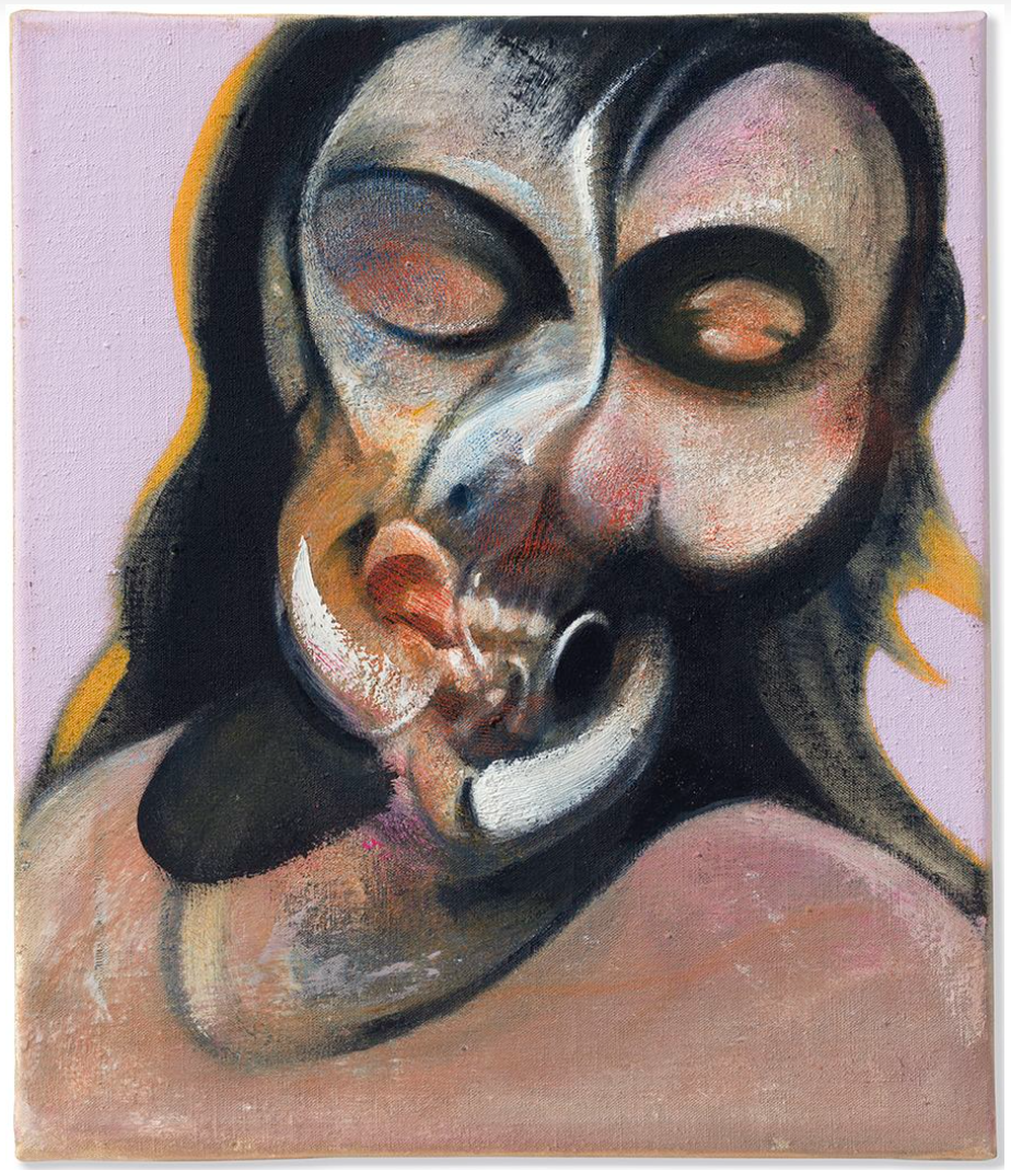
Francis Bacon, Study of Henrietta Moraes Laughing, 1969. Private collection. Artwork: © The Estate of Francis Bacon. All rights reserved. DACS 2025
1963 was a watershed year for Bacon. He had held his first museum retrospective at the Tate in London the previous year. On the day of its opening, he learned that his lover, Peter Lacy, had passed away in Tangier. Their turbulent relationship, seared into so much of Bacon’s work since the early 1950s, had ended in 1961, and the artist was left haunted by his loss. Towards the anniversary of his death, Bacon painted a memorial to Lacy: Landscape Near Malabata, Tangier (1963), an extraordinary image of grief, desire and longing in which shadows flit round a desert vortex beneath a dark, heated sky. One of Bacon’s most important paintings, this work’s whirling, elliptical forms foreshadow the distinctive torsion seen in Portrait of Man with Glasses III, which was made within weeks of Landscape Near Malabata, Tangier.
Francis Bacon, Landscape near Malabata, Tangier, 1963. Private collection.
Artwork: © The Estate of Francis Bacon. All rights reserved. DACS 2025.
In the wake of his triumph and tragedy, Bacon was beginning to explore new colors, techniques and subjects. The dark, existentialist tenor of the previous decade gave way to a mood of openness and vigour that suffuses the works of 1963. The ‘Man with Glasses’ series was where the 14 x 12” head—‘the scene of some of Bacon’s most ferocious investigations’—‘really got under way’, writes John Russell (J. Russell, Francis Bacon, rev. ed., London 2010, pp. 99, 123). Embracing this concentrated format, which he had first experimented with in 1961, Bacon created seminal triptych portraits of his friend Henrietta Moraes, and—following their meeting in autumn 1963—his new partner George Dyer, who would soon become one of his principal sitters. The year concluded with the October opening of Bacon’s first major American exhibition at the Solomon R. Guggenheim Museum, New York.
Left: Peter Lacy, late 1950s–early 1960s. © The Estate of Francis Bacon. All rights reserved, DACS/Artimage 2025. Photograph by John Deakin.
Right: Bacon studio material, ‘Screaming Woman’ from Sergei Eisenstein, Battleship Potemkin, 1925. Illustration of film still from unknown source. Collection: Dublin City Gallery The Hugh Lane © The Estate of Francis Bacon. All rights reserved, DACS 2025.
The mouth in Portrait of Man with Glasses III represents the climax of a theme that had fascinated Bacon for decades. As a young man in 1920s Paris, he had become mesmerized by a ‘second-hand book which had beautiful hand-coloured plates … of the mouth open and of the examination of the inside of the mouth’: around the same time, he saw Sergei Eisenstein’s 1922 film Battleship Potemkin, in which a famous close-up shot captures the open-mouthed scream of an injured woman. ‘I did hope one day’, he said, ‘to make the best painting of the human cry’ (F. Bacon quoted in D. Sylvester, ibid., p. 40). These images, fused in Bacon’s fascination, would resound through his early paintings. They are there in the toothy maws of Three Studies for Figures at the Base of a Crucifixion (1944, Tate, London), and in his crucial first ‘Heads’, howling Popes and animal studies of the 1940s and 1950s.
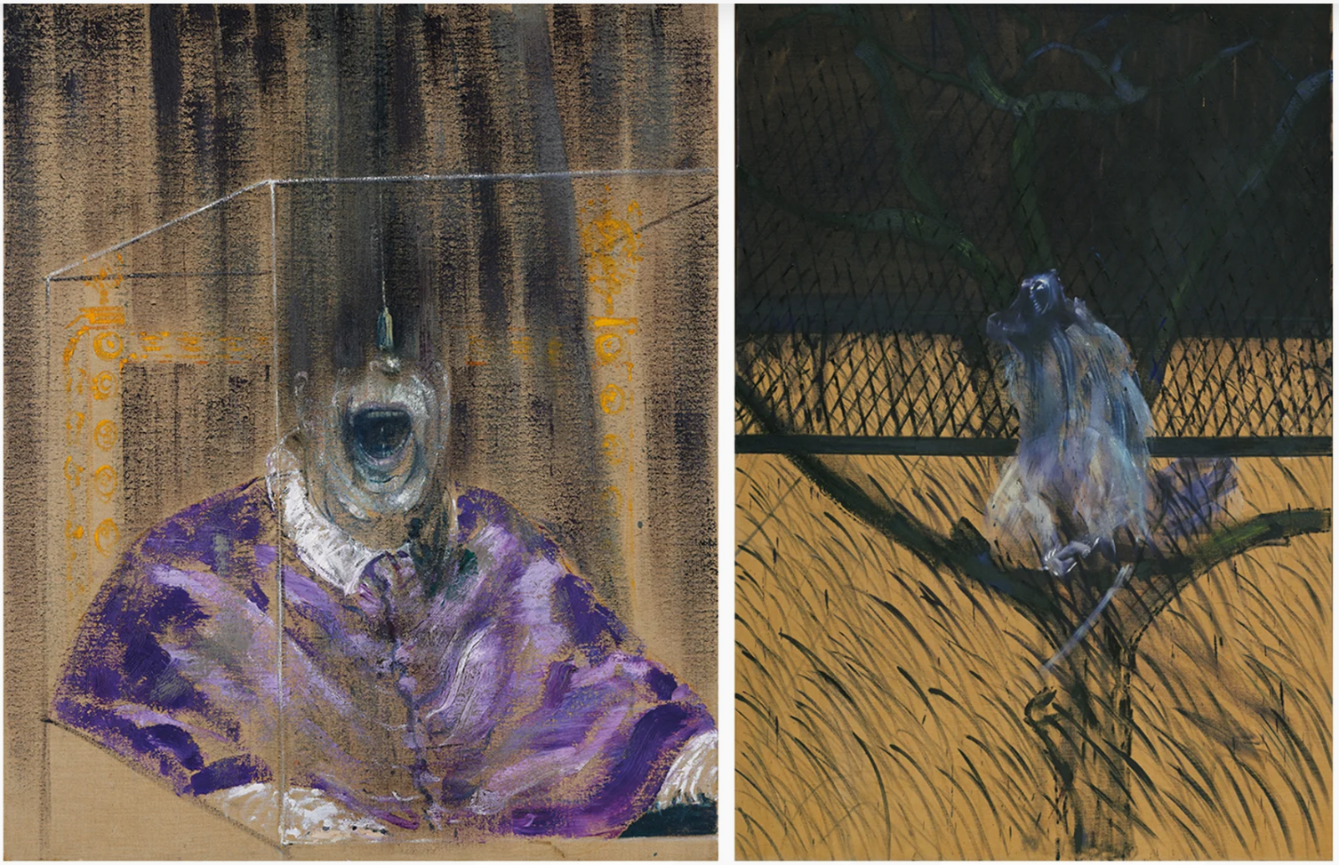
Left: Francis Bacon, Head VI, 1949. Arts Council Collection, Southbank Centre, London. Artwork: © The Estate of Francis Bacon. All rights reserved. DACS 2025. Photo: Prudence Cuming Associates Ltd.
Right: Francis Bacon, Study of a Baboon, 1953. Museum of Modern Art, New York. Artwork: © The Estate of Francis Bacon. All rights reserved. DACS 2025. Digital image: The Museum of Modern Art, New York/Scala, Florence.
In a Europe ravaged by conflict, Bacon’s post-war work was conversant with the era’s darkness. Drawing on existential philosophy and literature, his early mouths were voids of mortal loneliness, sounding the animal cries of trapped and tormented beings. By the time of the present work—painted amid the rise of Swinging London, Pop Art and Bacon’s own buoyant critical success—his motifs had become freer and more multivalent. Portrait of Man with Glasses III realizes his ambition to match Monet in capturing ‘the glitter and color that comes from the mouth’, alive with movement and subtle light. At the same time Bacon was deepening his interest in Pablo Picasso, who, he said, had suggested a whole area ‘which in a way has been unexplored, of organic form that relates to the human image but is a complete distortion of it’ (F. Bacon quoted in D. Sylvester, ibid., pp. 40, 9). In Portrait of Man with Glasses III the face itself twists like a chrysalis, as if physically enacting a metamorphosis in Bacon’s art.
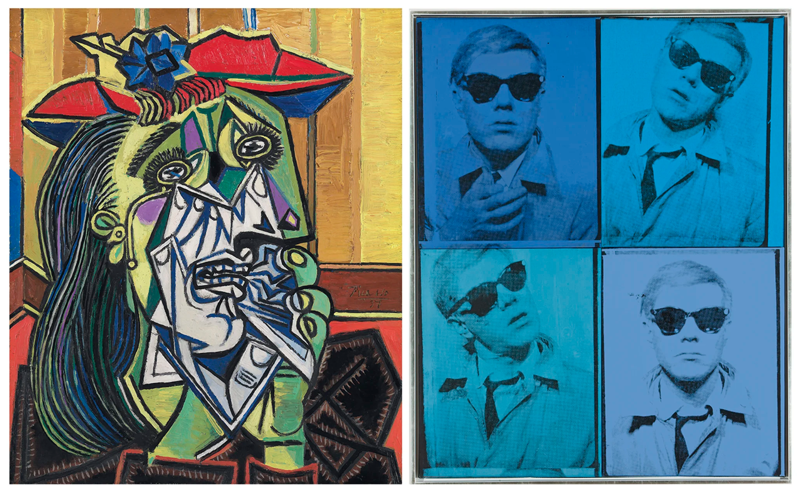
Left: Pablo Picasso, Weeping Woman, 1937. Tate, London. Artwork: © Succession Picasso/DACS, London 2025. Digital image: Tate.
Right: Andy Warhol, Self-Portrait, 1963-1964. Private collection. Artwork: © 2025 The Andy Warhol Foundation for the Visual Arts, Inc. / Licensed by DACS, London. Digital image: © 2025 Christie’s Images, London/Scala, Florence.
Picasso’s Primitivist and Cubist reworkings of the human head—the features distorted and rearranged, and seen from multiple angles at once—were foundational for Bacon. Portrait of Man with Glasses III bears fractured echoes of Picasso’s ‘Weeping Women’, and David Sylvester noted a similarity with two wartime portraits made in 1939. The man’s glasses slip, glinting, down a warped face with the mouth swept round to one side. His hairline, skull and shoulders morph into liquid silhouettes, adorned with the vortical shape of an ear. While indebted to Picasso’s faces, however, Portrait of Man with Glasses III has none of their mask-like fixity. The subject instead seems—paradoxically—caught in the act of refusing to be pinned down. Where Picasso’s heads might happily be reproduced as sculptures, writes Russell, ‘… Bacon’s heads by contrast are pure painting and could not be transposed into any other medium: the thing said and the way of saying it interlock completely’ (J. Russell, ibid., p. 123).
Francis Bacon, Three Studies for Portrait of George Dyer (on light ground), 1964
Artwork: © The Estate of Francis Bacon. All rights reserved, DACS/Artimage. Photo: Prudence Cuming Associates Ltd.
This fusion of medium and message was central to Bacon’s outlook. He strove constantly to combine what he referred to as ‘fact’, or recognisable, figurative reality, with the radical artistic risk of his painterly technique. ‘It’s a very, very close and difficult thing to know why some paint comes across directly onto the nervous system’, he said, ‘and other paint tells you the story in a long diatribe through the brain’ (F. Bacon quoted in D. Sylvester, ibid., p. 18). To achieve this elemental directness, Bacon painted the present work on the reverse of the canvas, as he had done since the 1940s. The tooth of the unprimed surface enabled dry paint to be dragged into broken, lucent strokes. The black background’s profound darkness, impregnated with sand, contrasts vividly with the fabric striations—Bacon commonly used a scrap of corduroy, or a cashmere jumper—which touch the paint, like skin, with a final delicate caress.
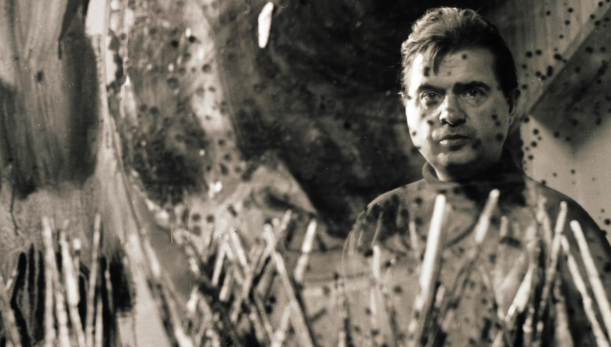
Francis Bacon in his studio at 7 Reece Mews, London, 1963.
Photograph by Jorge Lewinski. Photo: © The Lewinski Archive at Chatsworth / Bridgeman Images.
Engaged with diverse modes of image-making, Bacon drew upon photographs from a wide range of genres, including film stills, reproductions of paintings and sculptures, contemporary newsprint, Eadweard Muybridge’s 19th-century motion studies, and portraits of his Soho circle taken by the photographer John Deakin. Among his early inspirations was the 1939 book Positioning in Radiography by T. C. Clark, whose early X-ray images unveiled—as T. S. Eliot had written— ‘the skull beneath the skin’ (T. S. Eliot, ‘Whispers of Immortality’, Poems, New York 1920, p. 31). The way in which the X-ray showed the teeth, quoted in Portrait of Man with Glasses III, appears to have been a source of special attraction for Bacon. The man’s light-ringed black lenses also recall the diagrammatic, circular photographs seen in the book. Further abstracted, these dark discs would appear increasingly in Bacon’s introspective self-portraits of the mid-1970s, punching ocular holes in the artist’s own image.
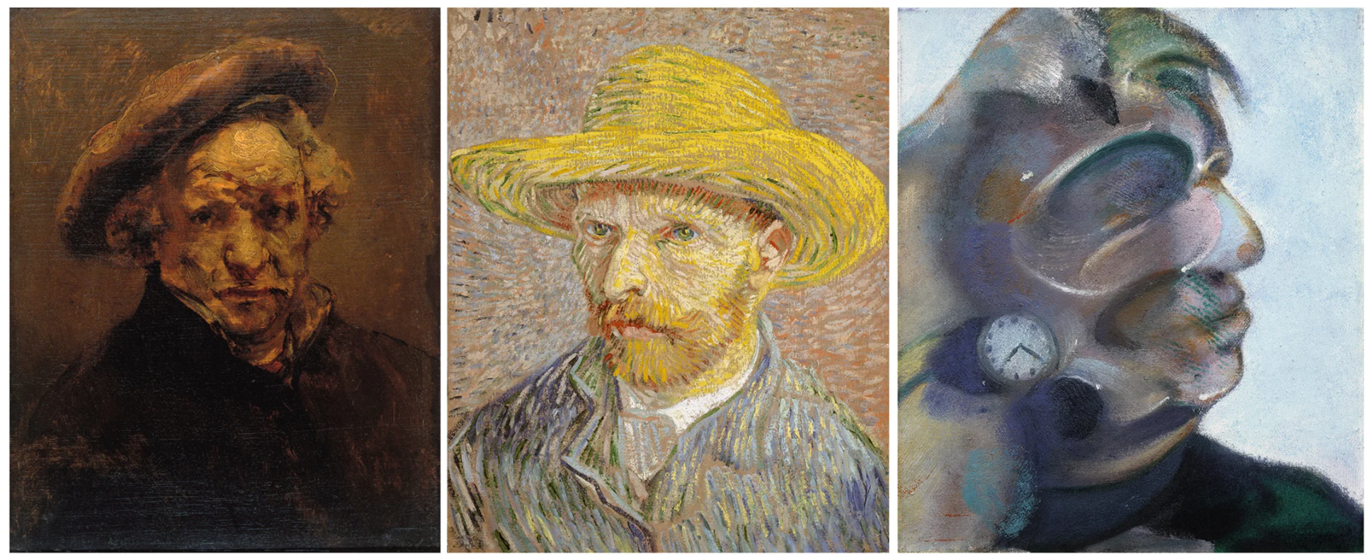
Left: Rembrandt van Rijn, Self-Portrait with Beret, circa 1659. Musée Granet, Aix-en-Provence.
Centre: Vincent Van Gogh, Self-Portrait with a Straw Hat, 1887. Metropolitan Museum of Art, New York. Digital image: © 2025 The Metropolitan Museum of Art/Art Resource/Scala, Florence.
Right: Francis Bacon, Study for Self-Portrait, 1973. Private collection. Artwork: © The Estate of Francis Bacon. All rights reserved. DACS 2025.
Indeed, while the ‘Men with Glasses’ depict no known sitter—suggestions have included the ophthalmologist Patrick Trevor-Roper, and the author James Joyce—all of Bacon’s works contain an aspect of self-portraiture. Bacon saw himself as part of a lineage of painters who had truly put themselves into their work, including Vincent van Gogh, Diego Velázquez and his own contemporary Lucian Freud. Greatest of all, he believed, was Rembrandt. The Dutch master’s Self-Portrait with Beret (circa 1659), Bacon enthused, was ‘almost completely anti-illustrational … there is a coagulation of non-representational marks which have led to making up this very great image.’ He saw these mysterious, impulsive marks as more powerful than anything achieved in abstract art, because they were allied with the recording of visual ‘fact’: a tension held together by Rembrandt’s ‘profound sensibility’ (F. Bacon quoted in D. Sylvester, ibid., p. 67). In the free brushwork of Portrait of Man with Glasses III, we see Bacon’s own sensibility come to the fore.
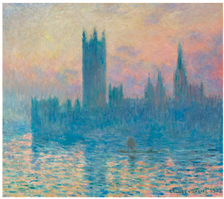
Claude Monet, The Houses of Parliament, Sunset, 1903. National Gallery of Art, Washington, D.C.
Digital image: © DeAgostini Picture Library/Scala, Florence.
Painting, Bacon said, ‘is the pattern of one’s own nervous system being projected on canvas’ (F. Bacon quoted in ‘Art: Survivors’, Time, Vol. 54, No. 21, 21 November 1949, p. 44). Portrait of Man with Glasses III offers this insight in more ways than one. Situated at a fulcrum in his practice, it calls upon the most dark, visceral achievements of Bacon’s early paintings while also looking forward to a phase of optimism and exploration: to his portraits of his friends, himself and George Dyer that would define the work of the coming decade, and to a fresh unfurling of daring form and colour. At its centre is the mouth, which—no longer the rictus of the skull—becomes a thing of mobile, shimmering splendor. The mouth, for Bacon, was also a site of sensuality, laughter and conversation. Here, he speaks with all the eloquence of a new painterly language.