PRELIMINARY DRAFT
WORK IN PROGRESS
Agenda

Monsoon: The Peter Simon Collection Evening Sale
14 October 2026
Monsoon: The Peter Simon Collection Evening Sale
20th/21st Century: London Evening Sale
14 October 2026
20th/21st Century: London Evening Sale
Post-War and Contemporary Art Day Sale
15 October 2026
Post-War and Contemporary Art Day Sale

Contemporary Evening Auction
15 October 2026
Contemporary Evening Auction | 2026 | Sotheby’s
The David Hockney Sale: 20 Flowers from Normandy
16 October 2026
The David Hockney Sale: 20 Flowers from Normandy | Prints | Sotheby’s
Contemporary Day Auction, including Works on Paper from the Duerckheim Collection
16 October 2026
Contemporary Day Auction, including Works on Paper from the Duerckheim Collection | 2026 | Sotheby’s

Modern & Contemporary Art Evening Sale
15 October 2026
Modern & Contemporary Art Evening Sale Thursday, October 15, 2026
Modern & Contemporary Art
17 October 2026
Modern & Contemporary Art Saturday, October 17, 2026
20th/21st Century: London Evening Sale
14 October 2026
20th/21st Century: London Evening Sale
XXXXXXXXXX
Total:
GBP 111,094,600 / USD 146,989,265
# Lots: 46 Lots
# Lots sold: 39 Lots
Sell-Through Rate: 84.6%
XXXXXXXXXX
#1. Das bunte Leben (La vie mélangée), 1907
PROPERTY FROM THE HEIRS OF HEDWIG LEWENSTEIN-WEYERMANN
Christie’s London: 14 October 2026
Estimated: GBP 18,000,000 – 25,000,000
GBP 31,560,000 / USD 41,757,035
WASSILY KANDINSKY (1866-1944), Das bunte Leben (La vie mélangée) | Christie’s
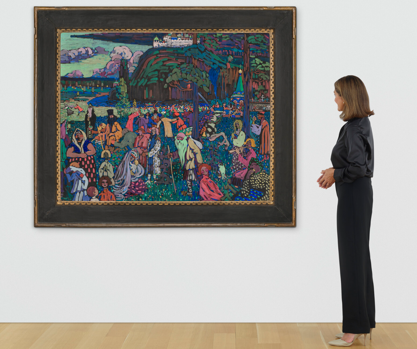
WASSILY KANDINSKY (1866-1944)
Das bunte Leben (La vie mélangée), 1907
Tempera and gouache on canvas
130.5 x 162.6 cm (51-3/8 x 64-1/8 inches)
Signed and dated ‘KANDINSKY 1907.’ (lower left)
Signed, titled and numbered ‘KANDINSKY – La vie mélangée No. 46’ (on the stretcher)
Painted in Paris in March 1907
#2. Composition III (Komposition No.XIII), 1920
Christie’s London: 14 October 2026
Estimated: GBP 20,000,000 – 30,000,000
GBP 25,235,000 / USD 33,388,430
PIET MONDRIAN (1872-1944), Composition III (Komposition No.XIII) | Christie’s
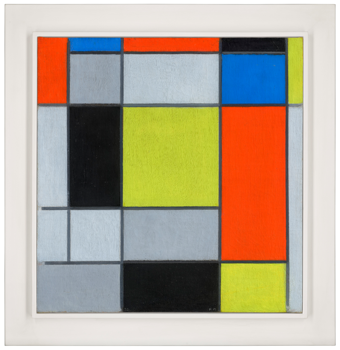
PIET MONDRIAN (1872-1944)
Composition III (Komposition No.XIII), 1920
Oil on canvas
53.4 x 51.2 cm (21 x 20-1/8 inches)
Signed with initials and dated ’20 PM’ (lower centre)
Signed again and titled ‘Composition III PiET MONDRiAN.’ (on the stretcher)
Inscribed ‘HAUT’ (on the canvas turnover)
#3. 5 Deaths Twice II, 1963
Christie’s London: 14 October 2026
Estimated: GBP 6,000,000 – 8,000,000
GBP 4,360,000 / USD 5,768,715
ANDY WARHOL (1928-1987), 5 Deaths Twice II | Christie’s
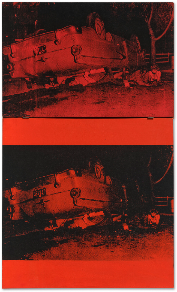
ANDY WARHOL (1928-1987)
5 Deaths Twice II, 1963
Acrylic and silkscreen ink on canvas, in two parts
(i) 20-1/8 x 30-1/4 inches (51.2 x 76.7 cm)
(ii) 30 x 30-1/4 inches (76.2 x 76.7 cm)
Overall: 50-1/8 x 30-1/4 inches (127.4 x 76.7 cm)
Signed, titled and dated ‘5 DEATHS TWICE Andy Warhol / 63’ (on the reverse)
#4. Sainte-Anne (Saint-Tropez), 1905
Christie’s London: 14 October 2026
Estimated: GBP 4,500,000 – 6,500,000
GBP 4,360,000 / USD 5,768,715
PAUL SIGNAC (1863-1935), Sainte-Anne (Saint-Tropez) | Christie’s
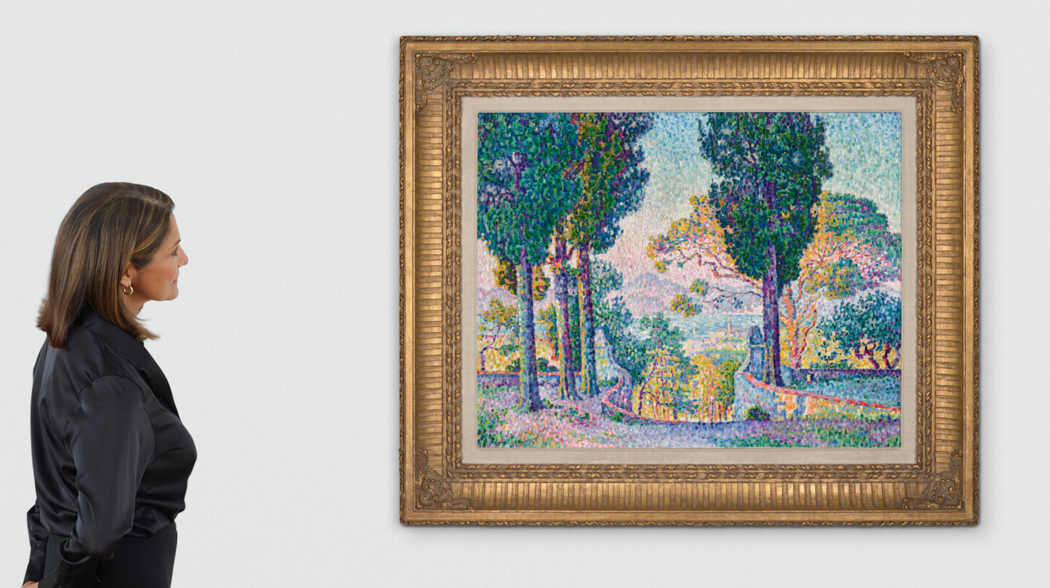
PAUL SIGNAC (1863-1935)
Sainte-Anne (Saint-Tropez), 1905
Oil on canvas
73.1 x 92 cm (28-3/4 x 36-1/4 inches)
Signed and dated ‘P Signac 1905’ (lower left)
#5. Dog Painting 17, 1995
Christie’s London: 14 October 2026
Estimated: GBP 1,500,000 – 2,500,000
GBP 3,506,000 / USD 4,638,790
DAVID HOCKNEY (1937-2026), Dog Painting 17 | Christie’s
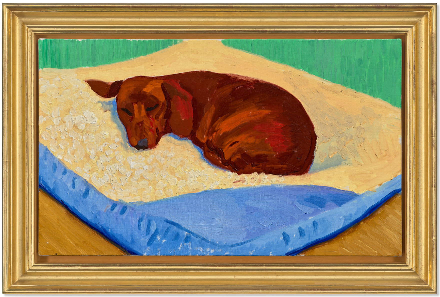
DAVID HOCKNEY (1937-2026)
Dog Painting 17, 1995
Oil on canvas
33×55 cm (13 x 21-5/8 inches)
Signed, titled, inscribed and dated
‘Dog Painting #17 (Stanley) David Hockney 95.’
(on the reverse)
XXXXXXXXXX
Abstraktes Bild, 1988
Christie’s London: 14 October 2026
Estimated: GBP 2,500,000 – 3,500,000
GBP 3,262,000 / USD 4,315,950
GERHARD RICHTER (B. 1932), Abstraktes Bild | Christie’s
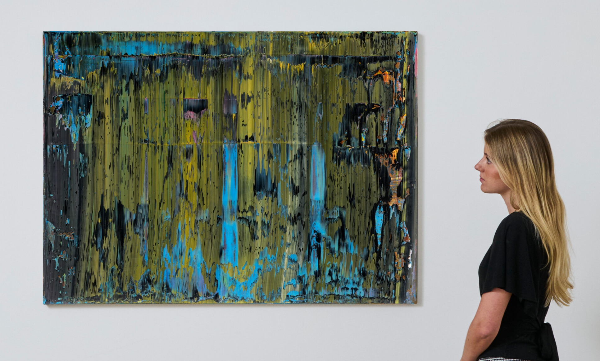
GERHARD RICHTER (B. 1932)
Abstraktes Bild, 1988
Oil on canvas
92.1 x 126.2 cm (36-1/4 x 49-3/4 inches)
Signed, numbered and dated ‘678-3 Richter 1988’ (on the reverse)
XXXXXXXXXX
Orange and Green Diagonal Portrait, 2016
Christie’s London: 14 October 2026
Estimated: GBP 1,800,000 – 2,500,000
PASSED
GEORGE CONDO (B. 1957), Orange and Green Diagonal Portrait | Christie’s
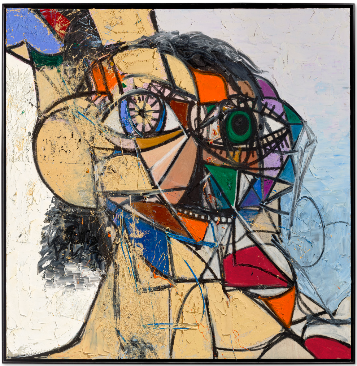
GEORGE CONDO (B. 1957)
Orange and Green Diagonal Portrait, 2016
Acrylic, oil and oil stick on canvas
83-7/8 x 81 7/8 inches (213×208 cm)
Signed and dated ‘Condo 2016’ (lower left)
Post-War and Contemporary Art Day Sale
15 October 2026
Post-War and Contemporary Art Day Sale
#1. Twice Told Tales I, 1998
Christie’s London: 15 October 2025
Estimated: GBP 600,000 – 800,000
GBP 998,400 / USD 1,320,985
CECILY BROWN (B. 1969), Twice Told Tales I | Christie’s
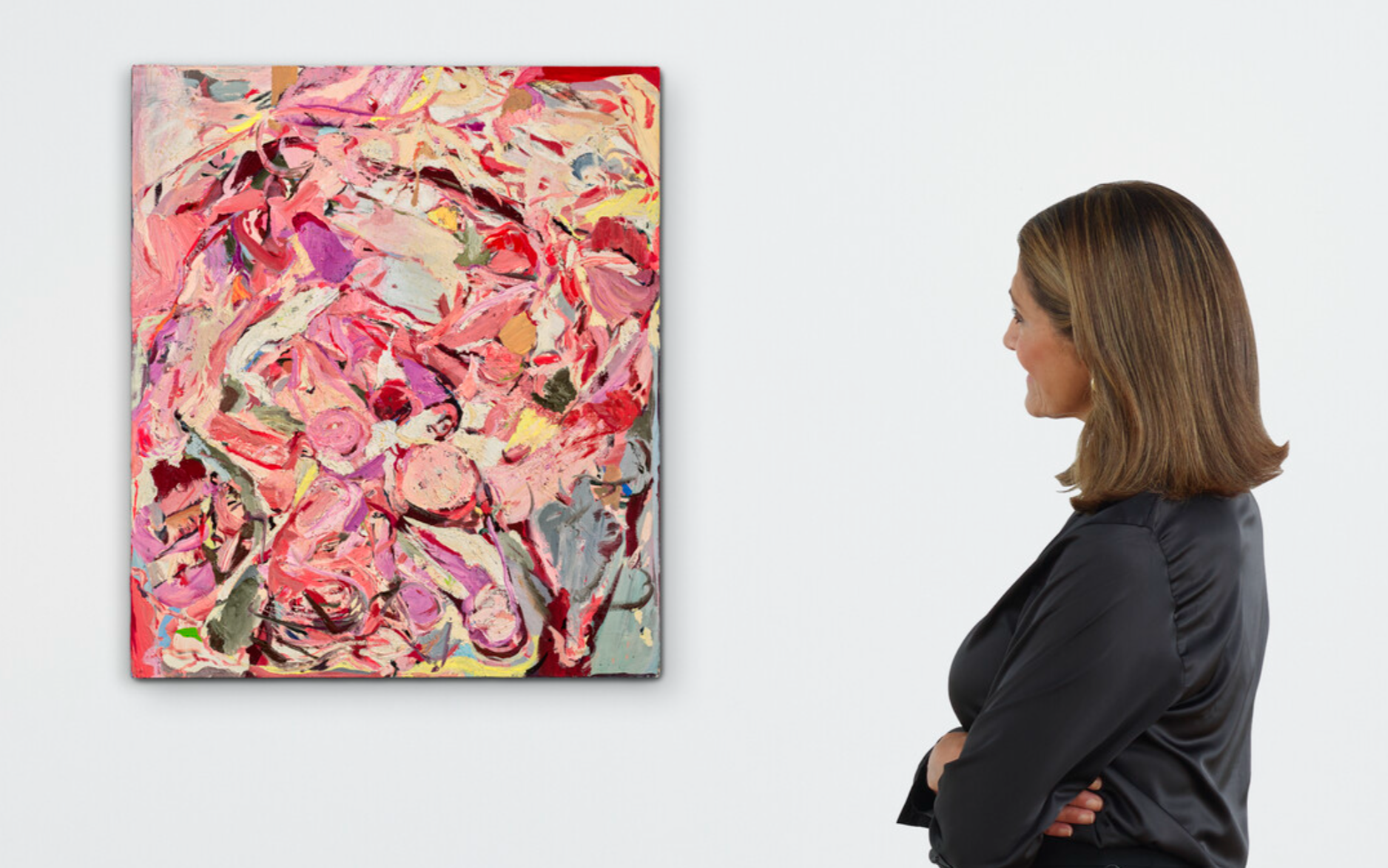
CECILY BROWN (B. 1969)
Twice Told Tales I, 1998
Oil on linen
28×24 inches (71×61 cm)
Signed and dated ‘Cecily Brown ’98’ (on the reverse)
XXXXXXXXXX
Wall of Light Reef, 2012
Christie’s London: 15 October 2025
Estimated: GBP 400,000 – 600,000
GBP 512,000 / USD 677,425
SEAN SCULLY (B. 1945), Wall of Light Reef | Christie’s
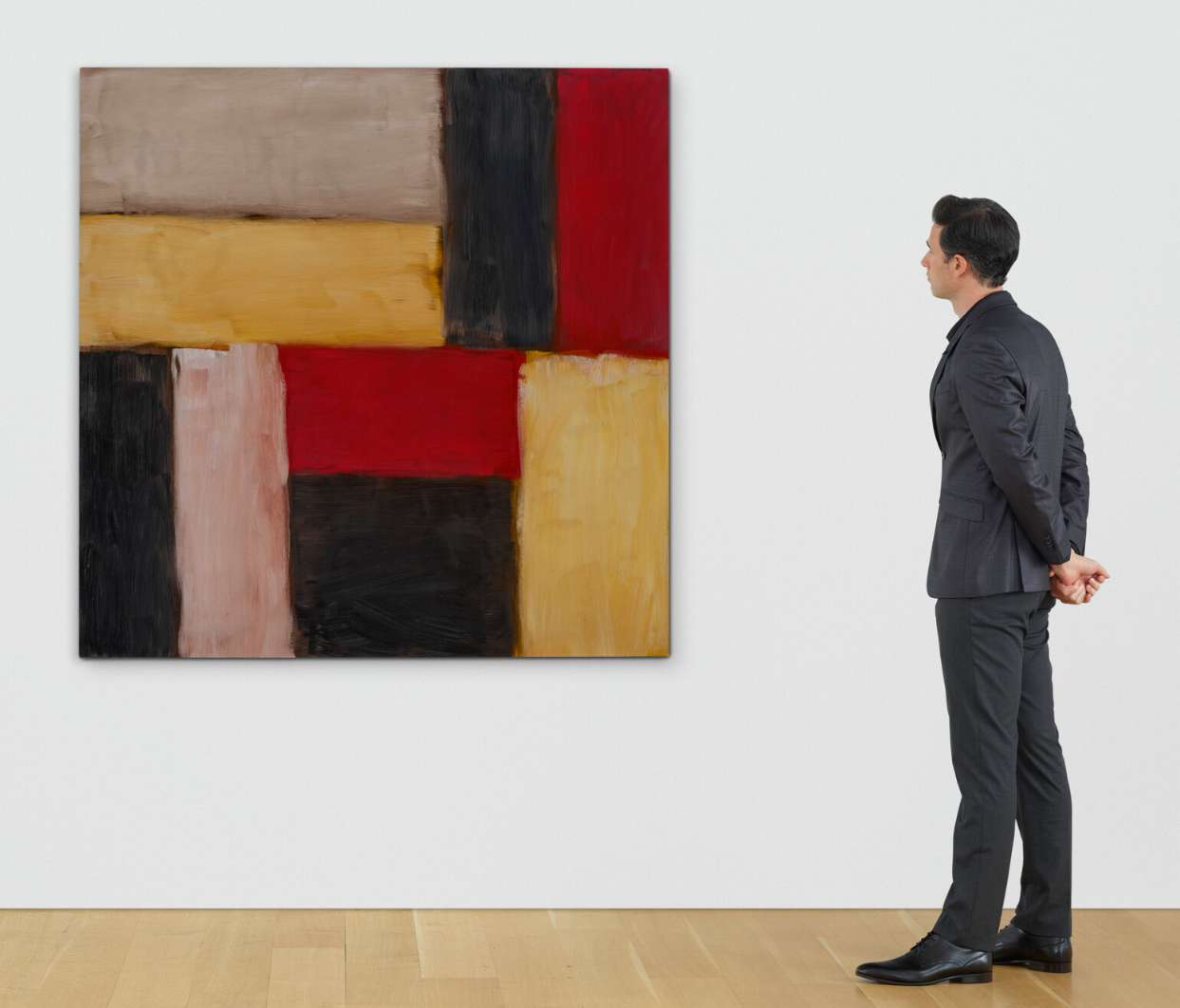
SEAN SCULLY (B. 1945)
Wall of Light Reef, 2012
Oil on canvas on board
63×63 inches (160×160 cm)
Signed, titled and dated ‘WALL OF LIGHT REEF Sean Scully 2012’ (on the reverse)
XXXXXXXXXX
Vanité Composition, 1991
Christie’s London: 15 October 2026
Estimated: GBP 200,000 – 300,000
GBP 281,600 / USD 372,585
GEORGE CONDO (B. 1957), Vanité Composition | Christie’s
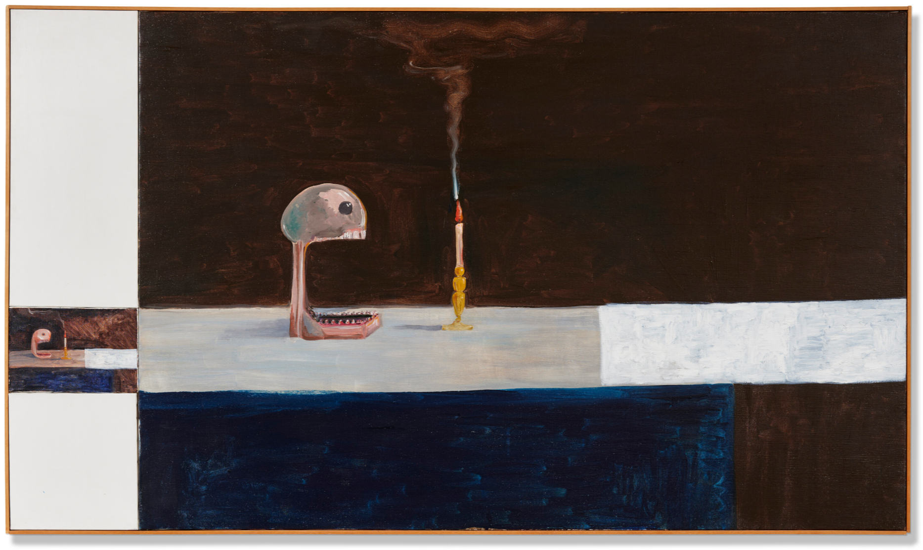
GEORGE CONDO (B. 1957)
Vanité Composition, 1991
Oil on canvas, in four parts
Overall: 53-1/4 x 91-7/8 inches (135.4 × 233.4 cm)
Contemporary Evening Auction
15 October 2026
Contemporary Evening Auction | 2026 | Sotheby’s
#1. Untitled, 1977
Sotheby’s London: 15 October 2026
Estimated: GBP 8,000,000 – 12,000,000
GBP 9,753,863 / USD 12,905,335
Willem de Kooning | Untitled | Contemporary Evening Auction | 2026 |
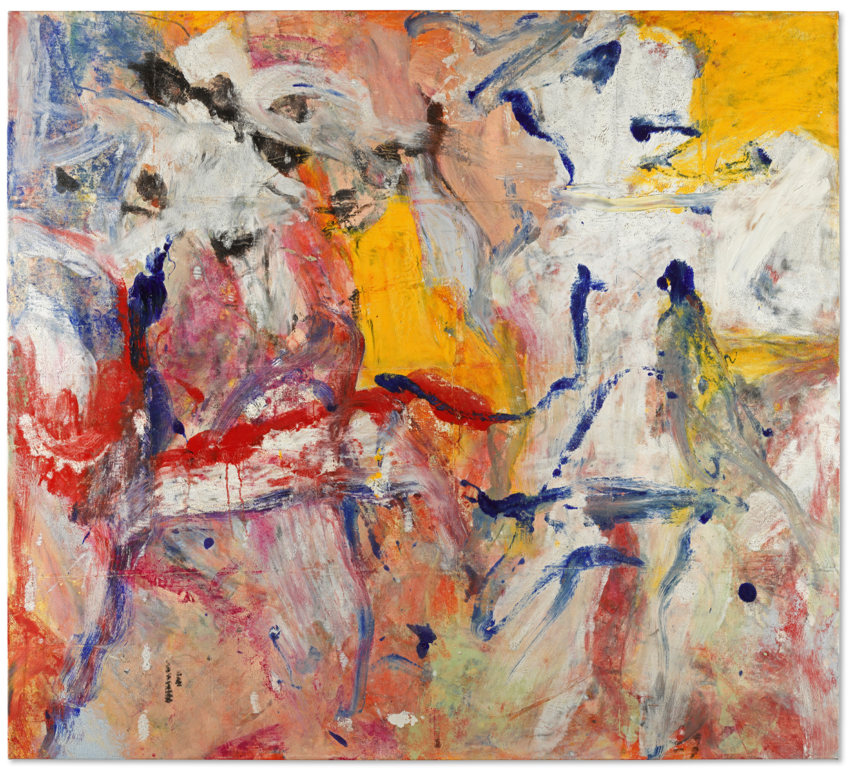
WILLEM DE KOONING (1904 – 1997)
Untitled, 1977
Oil on canvas
53-7/8 x 59-3/4 inches (136.8 x 151.7 cm)
#2. Abstraktes Bild, 1992
Sotheby’s London: 15 October 2026
Estimated: GBP 6,000,000 – 8,000,000
GBP 6,678,000 / USD 8,835,660
Gerhard Richter | Abstraktes Bild | Contemporary Evening Auction |
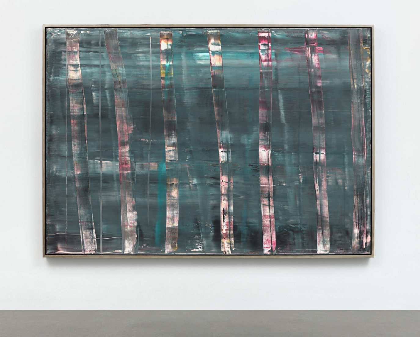
GERHARD RICHTER (b. 1932)
Abstraktes Bild, 1992
Oil on canvas
175 x 250.8 cm (68-7/8 x 98-3/4 inches)
Signed twice, dated 1992 and numbered 757 (on the reverse)
#3. Untitled, 1969
Sotheby’s London: 15 October 2026
Estimated: GBP 3,000,000 – 4,000,000
GBP 3,750,000 / USD 4,961,625
Mark Rothko | Untitled | Contemporary Evening Auction | 2026 |
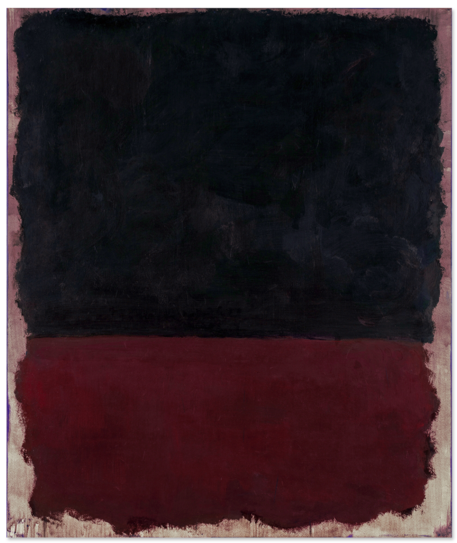
MARK ROTHKO (1903 – 1970)
Untitled, 1969
Acrylic and ink on paper mounted on board
48-1/4 x 40-1/2 inches (122.6 x 102.9 cm)
#4. Henry Reading, 1985
Sotheby’s London: 15 October 2026
Estimated: GBP 2,200,000 – 2,800,000
GBP 2,821,000 / USD 3,732,465
David Hockney | Henry Reading | Contemporary Evening Auction | 2026 |
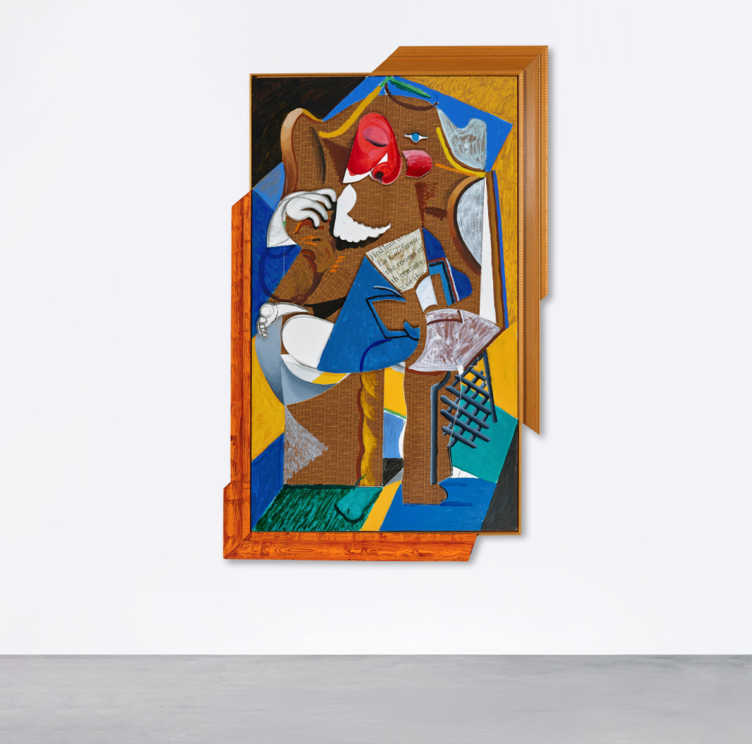
DAVID HOCKNEY (1937 – 2026)
Henry Reading, 1985
Acrylic, charcoal, contact paper and paper collage on gatorboard, in artist’s frame
92 x 57-1/2 inches (233.7 x 146.1 cm)
Signed, titled and dated 1985 (on the reverse)
#5. Four Marilyns (Reversal Series), 1979-86
Sotheby’s London: 15 October 2026
Estimated: GBP 2,200,000 – 2,800,000
GBP 2,713,000 / USD 3,589,570
Andy Warhol | Four Marilyns (Reversal Series) | Contemporary Evening
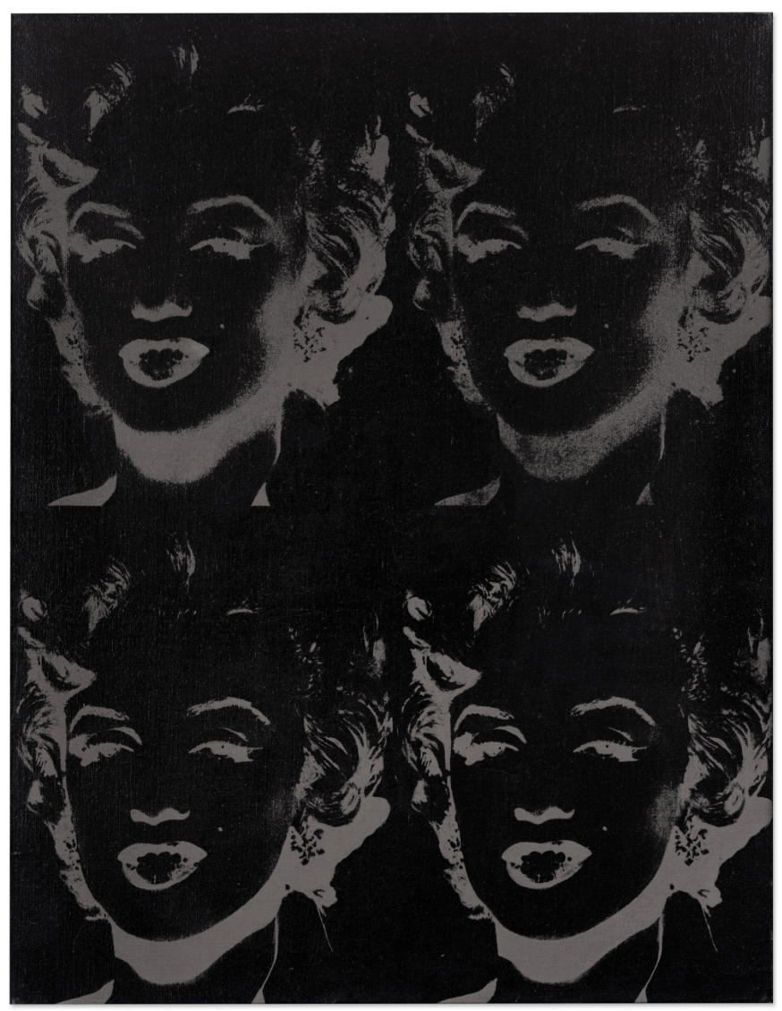
ANDY WARHOL (1928 – 1987)
Four Marilyns (Reversal Series), 1979-86
Acrylic and silkscreen ink on canvas
36-1/4 x 28 inches (92.1 x 71.1 cm)
Signed (on the overlap)
Signed (on the reverse)
Water Lilies in the Pond with Pots of Flowers, 2021
Sotheby’s London: 15 October 2026
Estimated: GBP 450,000 – 650,000
GBP 1,920,000 / USD 2,540,350
David Hockney | 10th – 22nd June 2021, Water Lilies in the Pond with
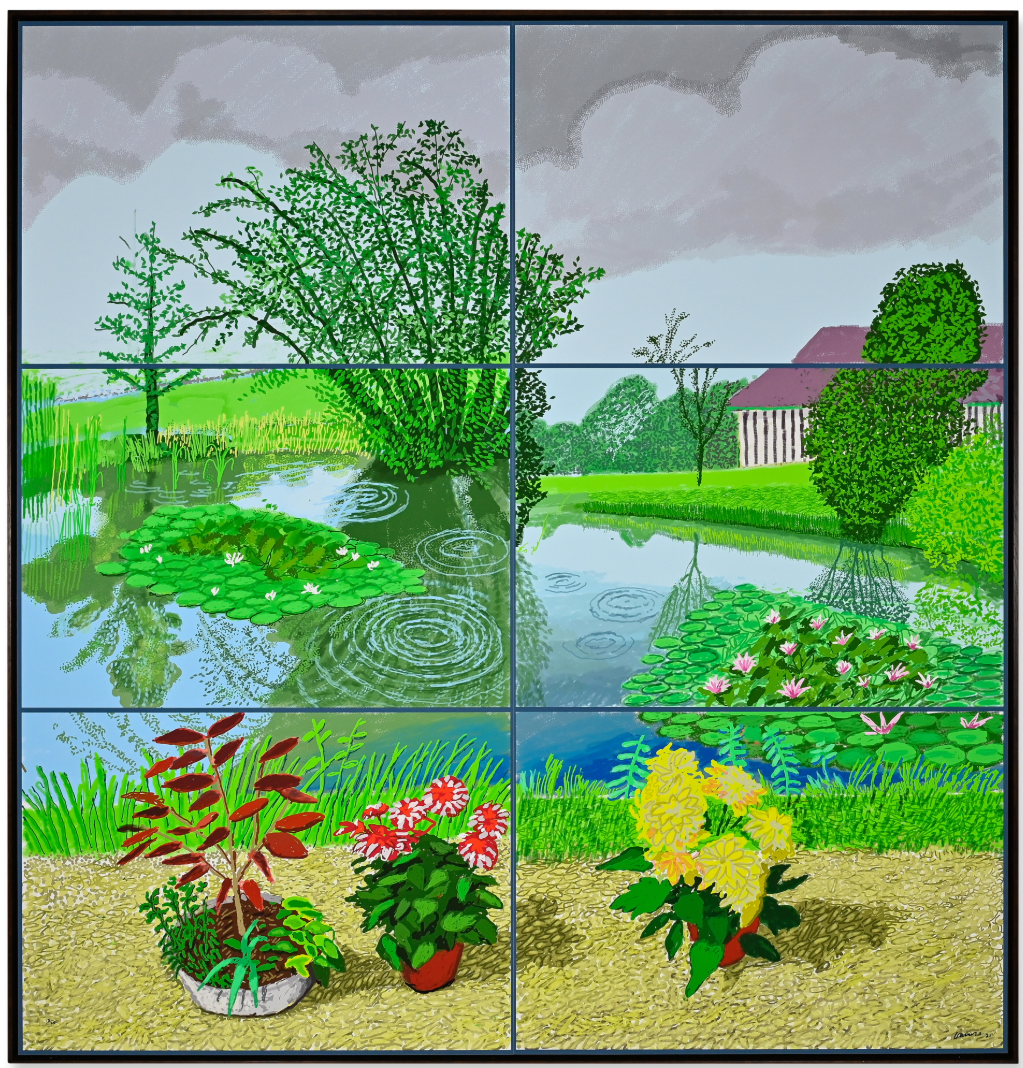
DAVID HOCKNEY (1937 – 2026)
10th – 22nd June 2021, Water Lilies in the Pond with Pots of Flowers, 2021
Six iPad paintings printed on two sheets of paper, mounted on two sheets of Dibond
Overall: 82-1/2 x 78-1/2 inches (209.5 x 199.4 cm)
Numbered 13/25 (lower left)
Signed and dated 21 (lower right)
Executed in 2021, this work is number 13 from an edition of 25
Portrait of Johann Wolfgang von Goethe, 1981
Sotheby’s London: 15 October 2026
Estimated: GBP 1,200,000 – 1,800,000
GBP 1,472,000 / USD 1,947,605
Andy Warhol | Portrait of Johann Wolfgang von Goethe | Contemporary
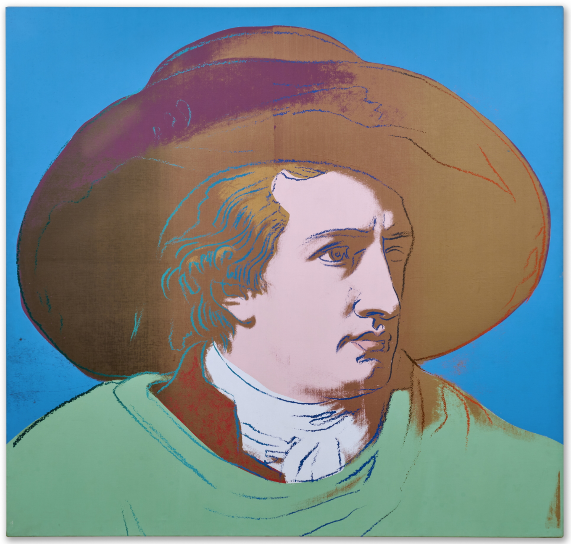
ANDY WARHOL (1928 – 1987)
Portrait of Johann Wolfgang von Goethe, 1981
Acrylic and silkscreen ink on canvas
79 x 82-7/8 inches (200.5 x 210.5 cm)
Signed and dated 1981 (on the overlap)
The Objective Idealist, 1994
Sotheby’s London: 15 October 2026
Estimated: GBP 400,000 – 600,000
GBP 832,000 / USD 1,100,820
George Condo | The Objective Idealist | Contemporary Evening Auction
GEORGE CONDO (b. 1957)
The Objective Idealist, 1994
Oil on canvas
40 x 29-7/8 inches (101.5 x 76 cm)
Signed and dated 94 (upper left)
Signed, titled and dated 1994 (on the reverse)
The Wall, 2019
Sotheby’s London: 15 October 2026
Estimated: GBP 600,000 – 800,000
GBP 640,000 / USD 846,785
Adrian Ghenie | The Wall | Contemporary Evening Auction | 2026 |
ADRIAN GHENIE (b. 1977)
The Wall, 2019
Oil on canvas
250 x 240.5 cm (98-3/8 x 94-3/4 inches)
Signed and dated 2019 (on the reverse)
Nude on Orange Chair, 2007
Sotheby’s London: 15 October 2026
Estimated: GBP 350,000 – 450,000
GBP 384,000 / USD 508,070
George Condo | Nude on Orange Chair | Contemporary Evening Auction |
GEORGE CONDO (b. 1957)
Nude on Orange Chair, 2007
Oil on canvas
53-1/8 x 46 inches (134.8 x 116.8 cm)
Signed and dated 07 (on the reverse)
Modern & Contemporary Art Evening Sale
15 October 2026
Modern & Contemporary Art Evening Sale Thursday, October 15, 2026
#1. Mathis, 1983
Phillips London: 15 October 2026
Estimated: GBP 6,000,000 – 8,000,000
GBP 5,839,000 / USD 7,725,580
Gerhard Richter Modern & Contemporary Art Evening Sale
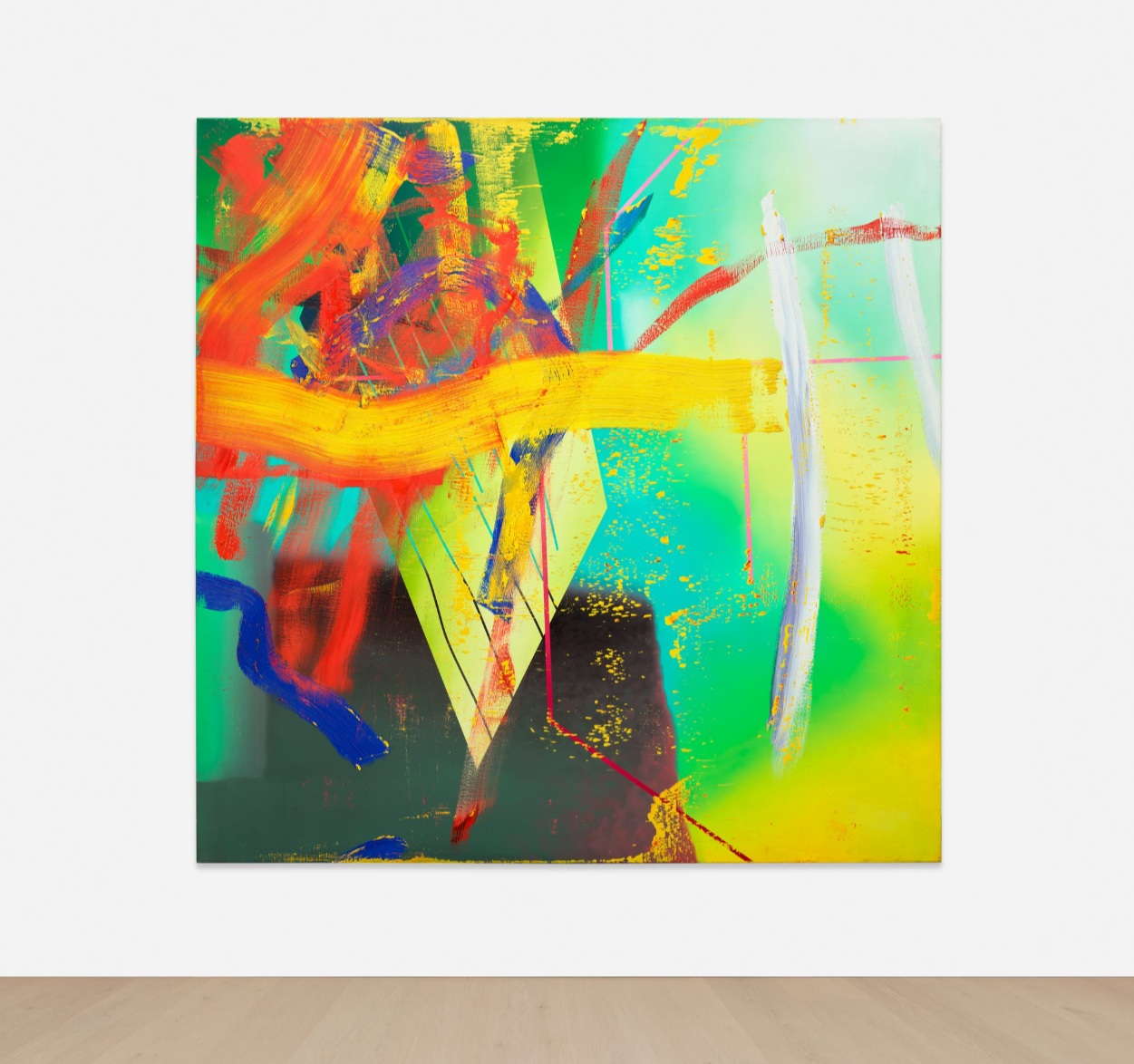
GERHARD RICHTER
Mathis, 1983
Oil on canvas
200×200 cm (78-3/4 x 78-3/4 inches)
Signed, numbered and dated ‘544-1 Richter 1983’ on the reverse
#2. Keep Ou T, 2019
Phillips London: 15 October 2026
Estimated: GBP 1,200,000 – 1,800,000
GBP 1,612,500 / USD 2,133,500
Banksy Modern & Contemporary Art Evening Sale
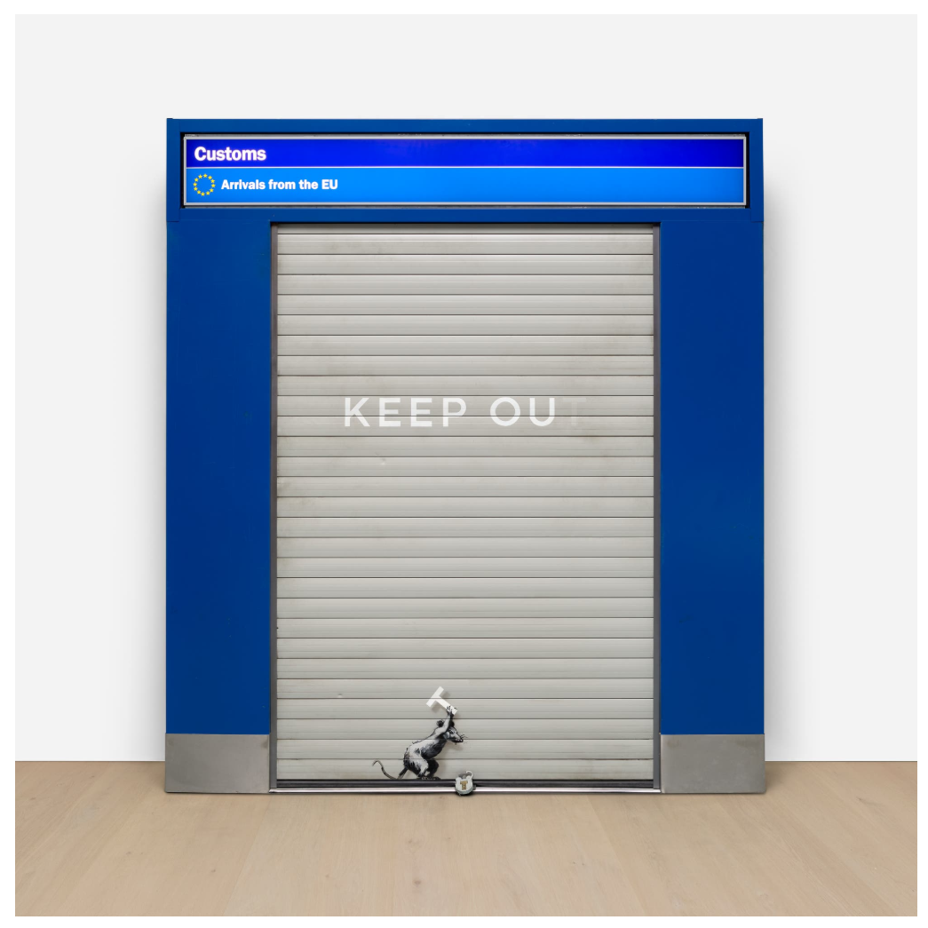
Reclaimed airport customs arch, wood, metal and spray paint
266x236x42 cm (104-3/4 x 92-7/8 x 16-1/2 inches)
#3. Red and Black Fruit, 1988
Phillips London: 15 October 2026
Estimated: GBP 500,000 – 700,000
GBP 993,000 / USD 1,313,840
David Hockney Modern & Contemporary Art Evening Sale
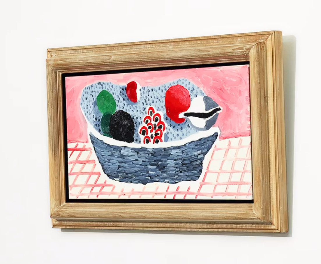
DAVID HOCKNEY
Red and Black Fruit, 1988
Oil on canvas
12 1/8 x 24 1/4 inches (30.7 x 61.5 cm)
Signed, titled and dated ‘red and black fruit David Hockney 1988’ on the reverse
XXXXXXXXXX
Profile, 2016
Phillips London: 15 October 2026
Estimated: GBP 250,000 – 350,000
GBP 335,400 / USD 443,770
Nicolas Party Modern & Contemporary Art Evening Sale
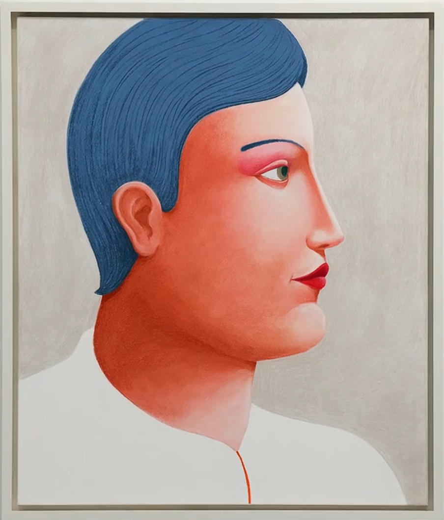
NICOLAS PARTY
Profile, 2016
Soft pastel on linen
95.2 x 80 cm (37-1/2 x 31-1/2 inches)
Signed and dated ‘Nicolas Party 2016’ on the reverse
Red Leather Chair, 2003
Phillips London: 15 October 2026
Estimated: GBP 500,000 – 700,000
GBP 645,000 / USD 853,400
David Hockney Modern & Contemporary Art Evening Sale
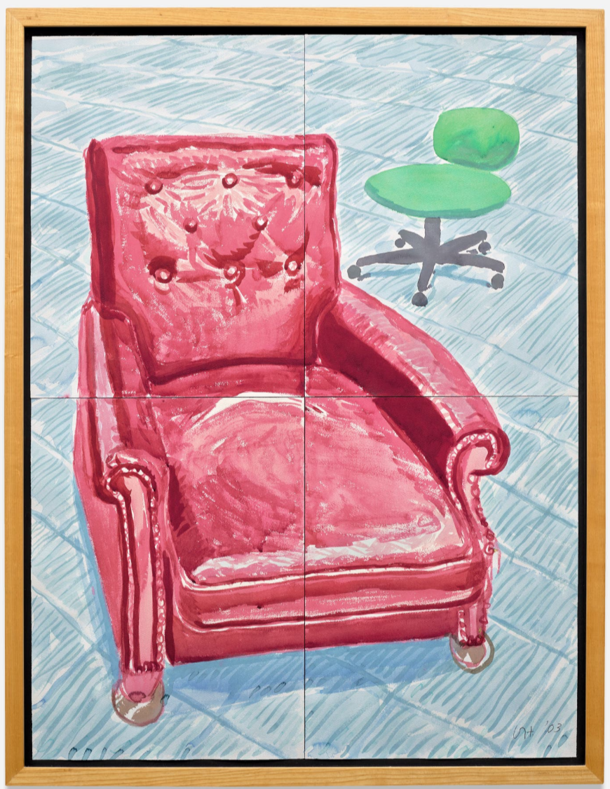
Watercolor on 4 joined sheets of paper
48 x 36-1/4 inches (122 x 92.2 cm)
Signed with the artist’s initials and dated ‘DH. ’03’ lower right
Portrait of Peter Langan and Jean-Marc Moussis, 1975
Phillips London: 15 October 2026
Estimated: GBP 200,000 – 300,000
GBP 232,200 / USD 307,225
David Hockney Modern & Contemporary Art Evening Sale
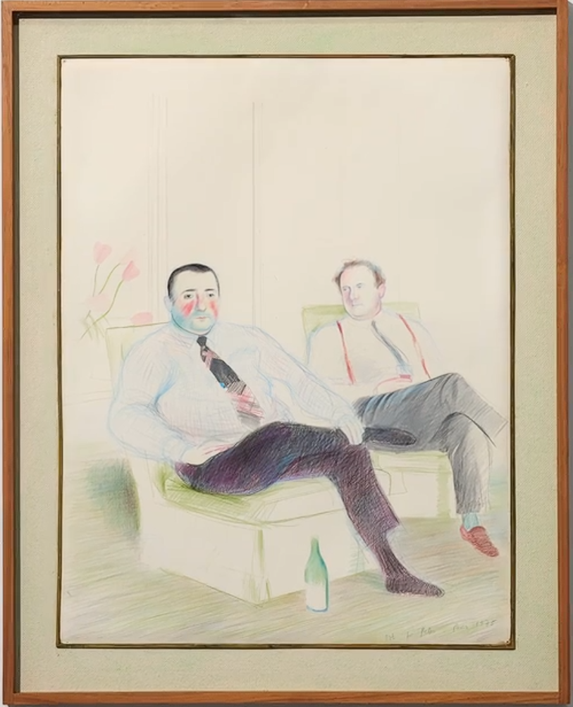
DAVID HOCKNEY
Portrait of Peter Langan and Jean-Marc Moussis, 1975
Crayon on paper
25 1/4 x 19 1/4 inches (64.2 x 49 cm)
Signed with the artist’s initials, inscribed, dedicated and dated ‘DH. for Peter Paris 1975’ lower right
Adrian Ghenie
The Wall, 2019
Sotheby’s London: 15 October 2026
Estimated: GBP 600,000 – 800,000
GBP 640,000 / USD 846,785
Adrian Ghenie | The Wall | Contemporary Evening Auction | 2026 |
ADRIAN GHENIE (b. 1977)
The Wall, 2019
Oil on canvas
250 x 240.5 cm (98-3/8 x 94-3/4 inches)
Signed and dated 2019 (on the reverse)
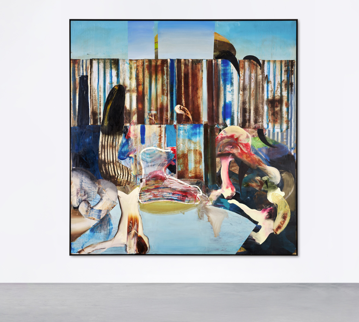
Executed in 2019, The Wall presents the viewer with a scene that refuses to resolve into a single, legible genre. A corrugated metal barrier, rusted through in bands of ochre and streaked with patches of surviving blue paint, stretches the full width of the canvas, closing off the pale sky behind it. Before this barrier, in a shallow, indeterminate foreground of pooled turquoise water, a cluster of forms gathers — part bone, part flesh, part bird — rendered with the same unstable, half-dissolved brushwork throughout. A dark, beak-like shape rears up on the left; on the right, pink and white anatomical fragments, faintly suggestive of a flamingo’s neck and skull, are worked into the paint alongside outlined, ghostly white passages that read as both skeletal remains and abandoned architectural fragments. Nothing in the composition sits comfortably as itself. The painting behaves less like a landscape or a still life than like an image caught mid-decomposition, its constituent parts sliding into and out of legibility.
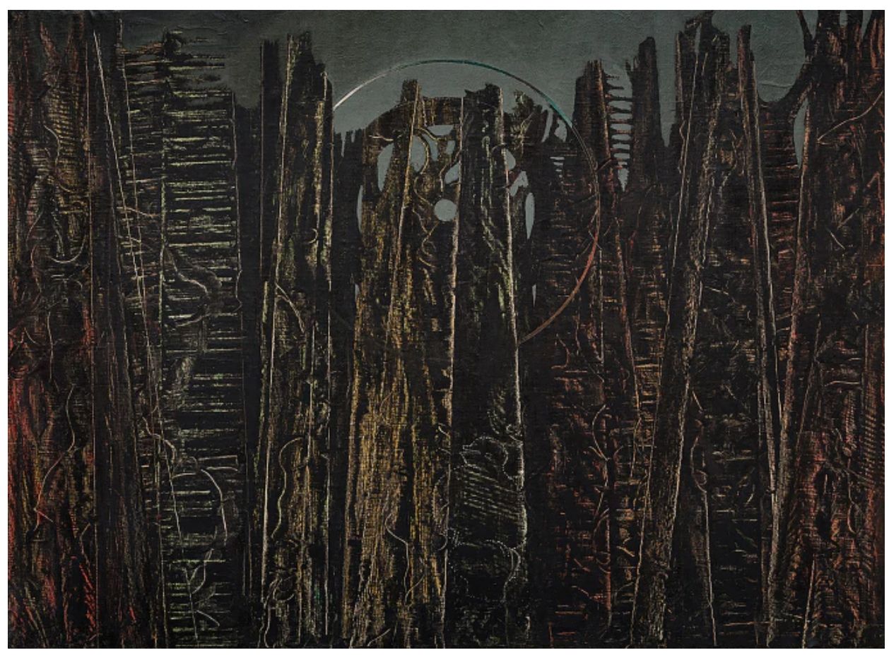
Max Ernst, The Forest, 1927-28. Peggy Guggenheim Collection, Venice.
Image/Art: © 2026 Max Ernst. Artists Rights Society (ARS), New York/ADAGP, Paris/DACS
That instability is entirely characteristic of Adrian Ghenie’s method, in which images are built up through scraping, layering and collaging painted fragments rather than through conventional description, so that a form only fully declares itself, if at all, once the process of construction has already begun to undo it. Referring to the present work, Luca Massimo Barbero identifies the corrugated barrier as rusted by an “imperialist and poor” sun, and reads in the painting’s compromised water and rigid, suffocating fencing a quiet register of confinement (Exh. Cat., Venice, Palazzo Cini, Adrian Ghenie: The Battle Between Carnival and Feast, 2019, p. 10). The wall itself resists specific geographic identification — it could belong equally to a border checkpoint, a refugee encampment, or an industrial yard left to rust — and that very refusal to locate itself is the point. Ghenie’s barrier stands for the generic apparatus of exclusion itself, a structure recognisable the world over precisely because it has been stripped of any single, particular history.
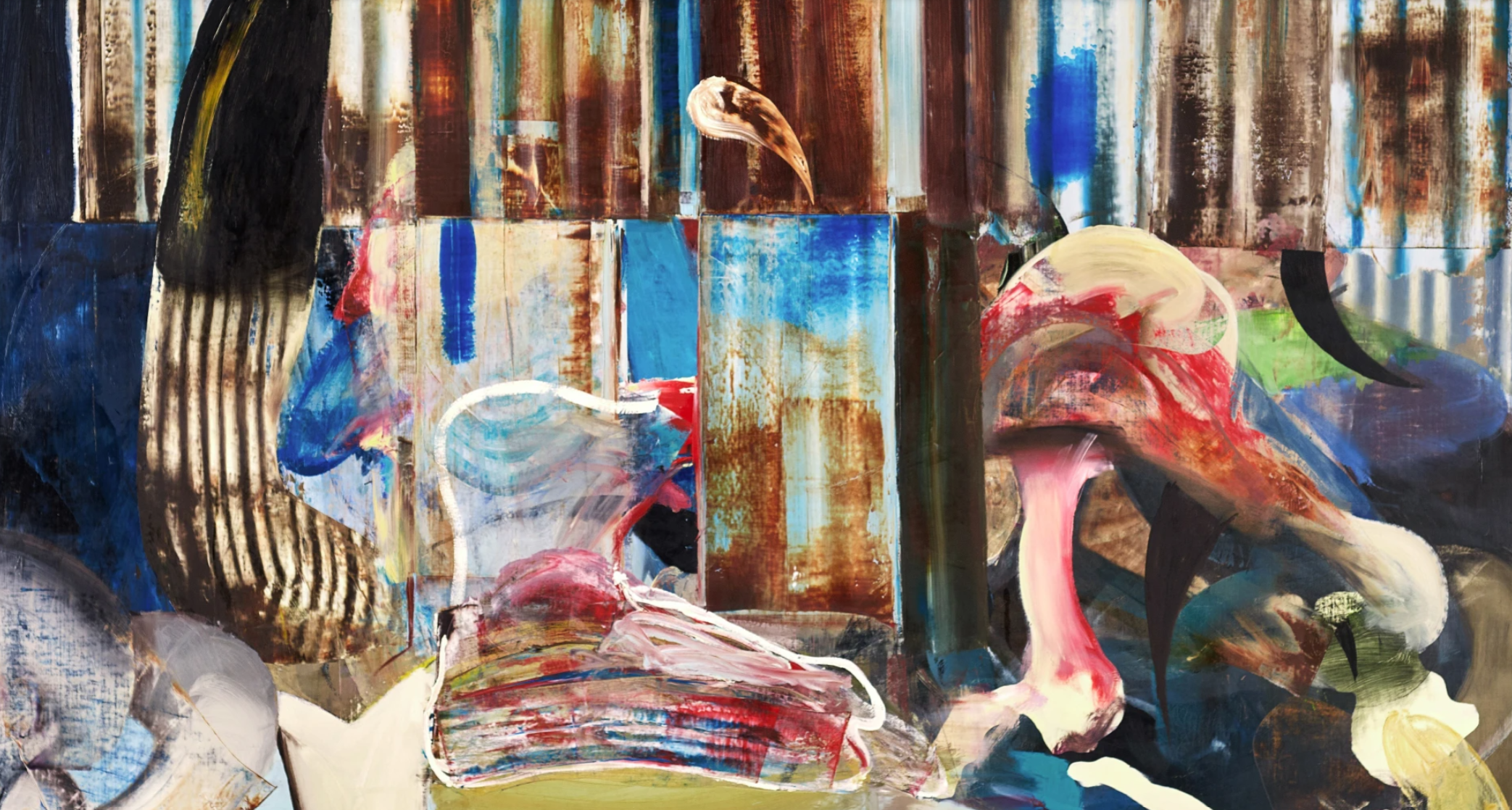
This ambiguity sits within a broader tension that runs through Ghenie’s practice. Barbero frames Ghenie’s project through an epigraph drawn from Rousseau’s Reveries of a Solitary Walker, in which “everything is in constant flux on this earth” and “nothing keeps the same unchanging shape” (Jean-Jacques Rousseau, Reveries of a Solitary Walker, 1778, quoted in Ibid., p. 7). The Wall, with its forms perpetually on the verge of dissolving back into abstract paint, enacts precisely this condition of flux: a barrier built to hold a boundary fixed is itself shown corroding, its solidity undermined by the very substance — rust, water, decay — that time inevitably visits upon it.
“I’m interested in history that’s linked to the human figure. A certain type of deconstruction interests me, the same way it interested Picasso and Bacon.”
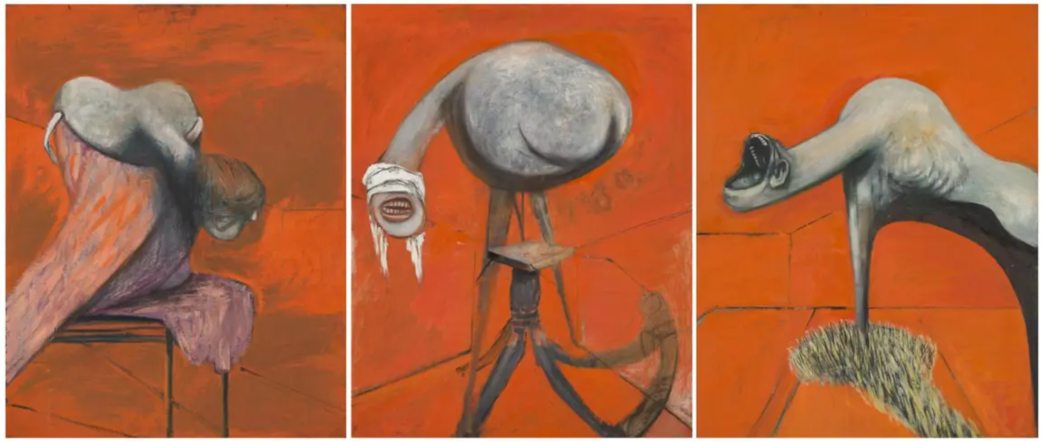
Francis Bacon, Three Studies for Figures at the Base of a Crucifixion, 1944. Tate, London.
© Estate of Francis Bacon. All Rights Reserved. DACS 2026
Ghenie has spoken of wanting his painted subjects to possess a kind of physical presence beyond mere illustration, insisting that his characters “should somehow stink, should be felt, possess something juicy” (the artist quoted in Exh. Cat., Venice, Venice Biennale, Adrian Ghenie: Darwin’s Room, 2015, p. 83). That insistence on visceral, almost olfactory presence is legible in the painting’s foreground, where the pale, fleshy debris scattered before the barrier carries a distinctly bodily charge, as though the painting’s real subject were not the fence at all but what has been left to rot in front of it. It is a strategy consistent with the artist’s wider engagement with the twentieth century’s unresolved traumas — his paintings of dictators, of Darwin, of an angst-ridden Van Gogh reimagined as a self-portrait — in which historical horror is approached not through documentary illustration but through the corrupted, half-remembered texture of the painted surface itself.
Born in Baia Mare, Romania, in 1977 and now based in Berlin, Ghenie represented Romania at the 56th Venice Biennale in 2015 with the exhibition Darwin’s Room, and has since become one of the most closely watched painters of his generation for precisely this capacity to fuse historical unease with a technique of active pictorial disintegration. The Wall extends that project into the present moment: a meditation on the barriers — political, physical, historical — that societies erect and then, inevitably, watch corrode. In its rusted fencing and its foreground of scattered, unresolved remains, the painting offers not a specific accusation but a broader, unsettled image of containment itself: a wall that, for all its apparent solidity, is already dissolving back into the elements from which it was made.
Nicolas Party
Profile, 2016
Phillips London: 15 October 2026
Estimated: GBP 250,000 – 350,000
GBP 335,400 / USD 443,770
Nicolas Party Modern & Contemporary Art Evening Sale
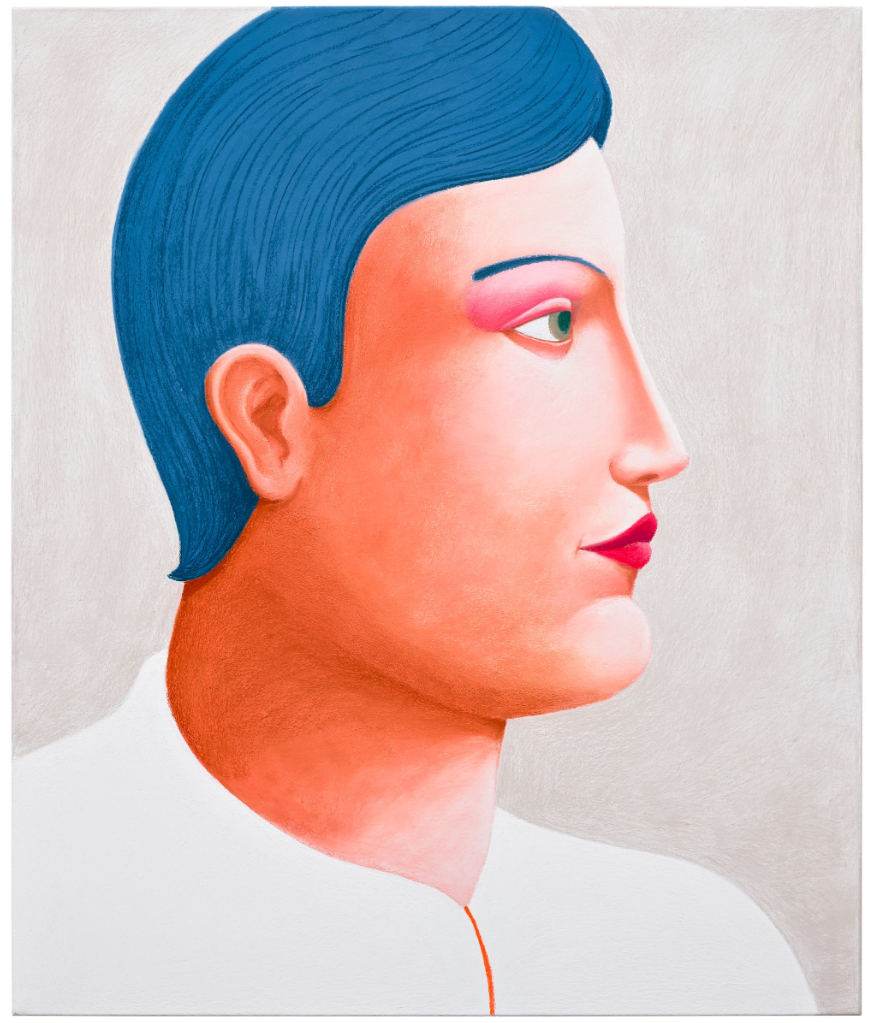
NICOLAS PARTY
Profile, 2016
Soft pastel on linen
95.2 x 80 cm (37-1/2 x 31-1/2 inches)
Signed and dated ‘Nicolas Party 2016’ on the reverse
Displaying his distinctive graphic richness and delicacy, Profile illuminates Nicolas Party’s flair for composition and colour. Utilising pure, velvety sweeps of cerulean to define the sitter’s hair and eyebrow, illuminating the skin with flushes of peach pinks and reds, in portraits like the present one, Party’s sitters are idealised as they are mediated through the lens of history. Making its first institutional appearance during the exhibition Cimaise at the Centre d’art Neuchâtel in 2016, Profile reveals Party’s technical ability and fluency with the art historical continuum, re-interpreting pastel as a new mode of expression for the contemporary world.
Bestowed with the striking features of ancient statues and classical profile, rendered with greater definition against the single-toned ground, Party encourages his work to be considered in relationship to their settings. Cimaise was the first exhibition where Party incorporated painted trompe-l’œil on the walls — a hyper-realistic painting technique used to create optical illusions — and Profile was hung against a surface that appeared it was made from wood. This desire to create an immersive, complete environment translates to Party’s two-dimensional work. Treating his subject as if a sculpture, Profile embodies the same striking, graceful qualities of Roman and Greek exemplar with bow-shaped lips, recessed, almond-shaped eyes and smoothly rendered skin.
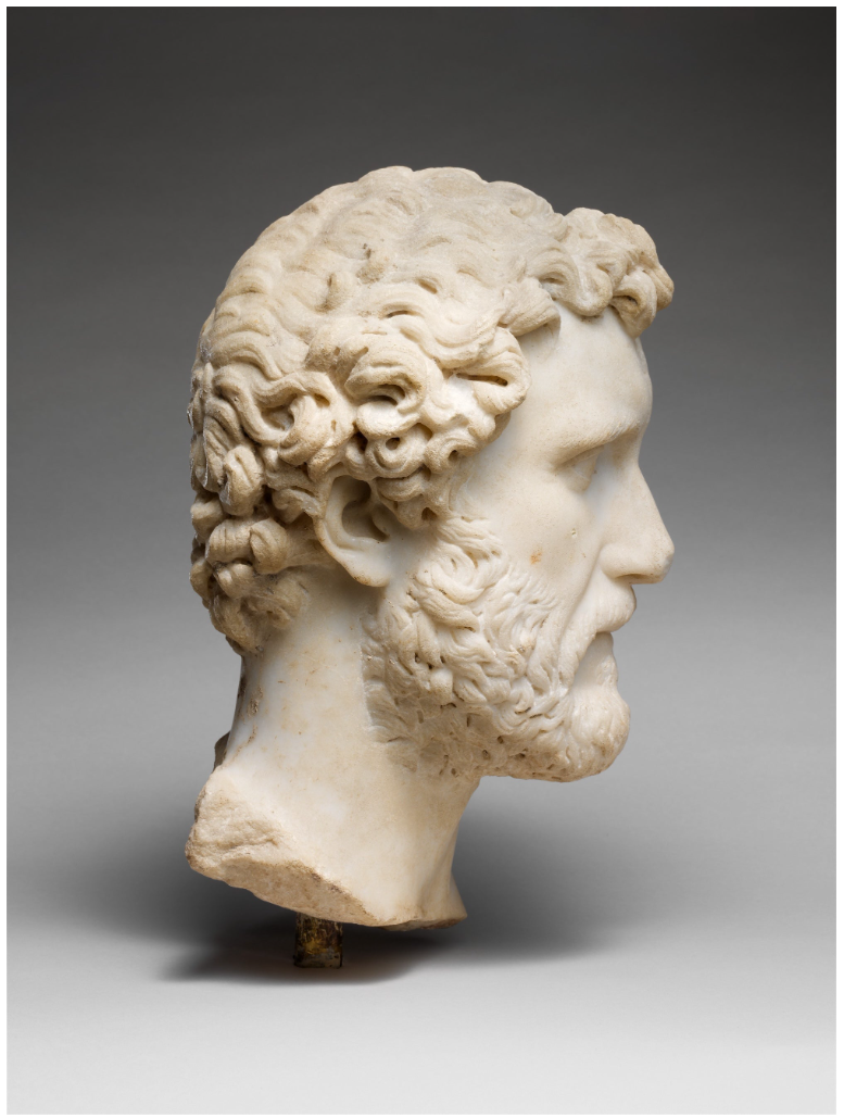
Marble portrait of the emperor Antoninus Pius, circa 138–161 CE, The Metropolitan Museum of Art.
Image: © The Metropolitan Museum of Art, Fletcher Fund, 1933, 33.11.3
Emerging from his academic training and early background in graffiti, the medium of pastel became central to Nicolas Party’s modus operandi. Following his BFA at the École cantonale d’art de Lausanne and MFA at Glasgow School of Art, it was during these years that Party began to develop his signature pastel technique. Moments such as encounters with one of the pastel versions of Pablo Picasso’s Tête de femme (1921) were transformative — ‘this is exactly what I want to do’, Party proclaimed on uncovering the neo-classical work. Pastel’s immediacy contrasted to his arduous, ‘very slow’ ruminations in oil paint. Whereas ‘oils allow you to endlessly retouch’, with pastels Party was able to work ‘much more direct’, overcoming the temptation to continuously edit his compositions and allowing him to continue advancing his working method. Echoing the volume and contours of Picasso’s visage, Party amplifies the artist’s use of colour in Profile, working with high-key, saturated hues.
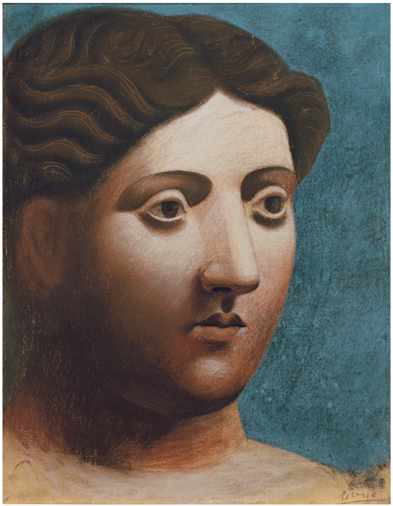
Pablo Picasso, Tête de femme, 1921, Collection of Fondation Beyeler, Riehen/Basel. Image: akg-images.
Artwork: © Succession Picasso / DACS, London 2026
By using pastel, Party evokes the medium’s historical associations, in dialogue with eighteenth-century artists like Rosalba Carriera. The Venice-born artist was at the forefront of the genre’s popularisation and propelled pastel into contemporary discourse because of her technical command of the material, recording members of the French aristocracy and court. Party brings forth similar aspects of Rosalba’s iconography in Profile, particularly her Portrait of a Man in Pilgrim’s Costume.
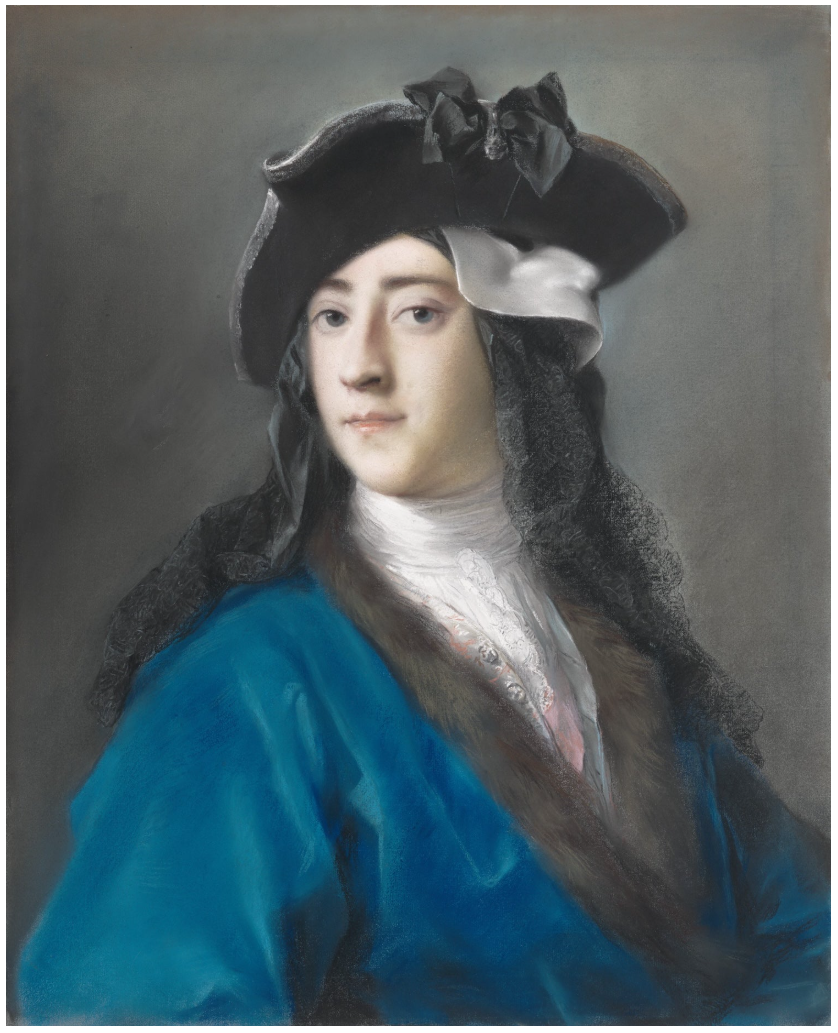
Rosalba Carriera, Gustavus Hamilton (1710–1746), Second Viscount Boyne, in Masquerade Costume, 1730–1731, The Metropolitan Museum of Art, New York. Image: © The Metropolitan Museum of Art, George Delacorte Fund Gift, in memory of George T. Delacorte Jr., and Gwynne Andrews, Victor Wilbour Memorial, and Marquand Funds, 2002.22
Though Party uses sharper iconography in contrast to Rosalba’s powdery, diffuse handling, both depict figures with androgynous features. Conscious of the fashion during the Rococo period for men and women to wear make-up, Party has retroactively reflected on how the powders used to decorate faces ‘could be bought in the same shop as pastels and were often made out of the same pigment’.v In this way, Party retrieves this play and connection between pastel and cosmetics during the time of Rosalba — ‘the model was already a painting when posing for the artist’, Party has noted. Party pays homage to pastel’s cultural legacy, countering critical reaction against the medium considered outmoded.
Portrait, 2020
Christie’s London: 15 October 2025
Estimated: GBP 250,000 – 350,000
GBP 281,600 / USD 372,585
NICOLAS PARTY (B. 1980), Portrait | Christie’s
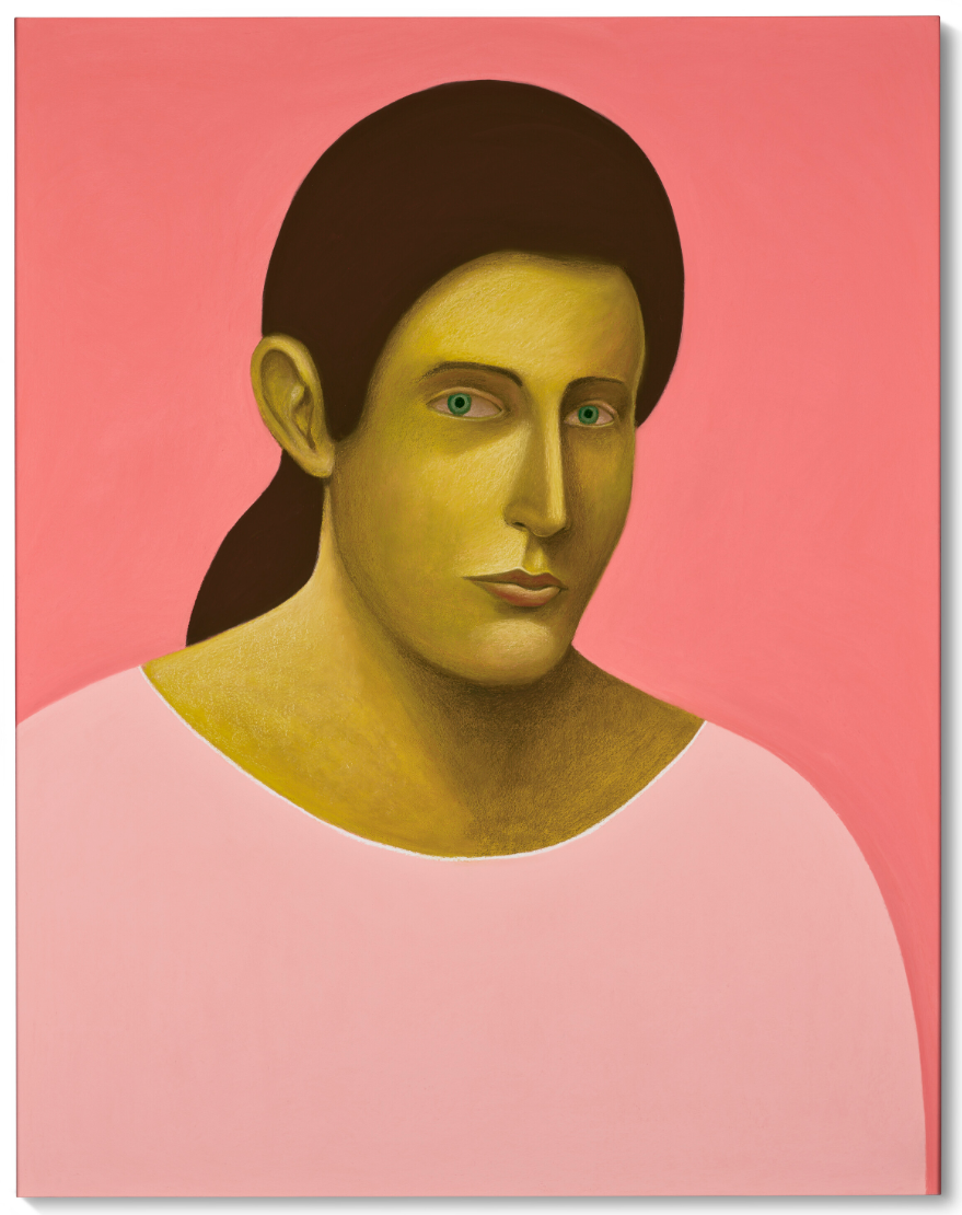
NICOLAS PARTY (B. 1980)
Portrait, 2020
Soft pastel on linen
140×110 cm (55-1/8 x 43-1/4 inches)
Signed and dated ‘Nicolas Party 2020’ (on the reverse)
Exhibited in Nicolas Party’s 2021 mid-career survey at the Museo d’arte della Svizzera italiana, Lugano, Portrait (2020) subtly reinvents both the medium of pastel and the genre of portraiture. It depicts an unnamed figure before a hot pink background. While the character’s long black hair and the blush colour of their garment are typically feminine signifiers, Party has rendered the face androgynous. The skin is a rich golden yellow, adding an element of the uncanny. The face is rendered in delicate detail, capturing vivid green eyes, a slightly protruding chin and the fall of velvety light across the fine features. By contrast, the background, garment and hair are captured as crisp, almost Pop Art-esque fields of colour, forgoing pastel’s usual tendency for soft gradation. The figure’s eyes interrogate the beholder, like those in Vincent van Gogh’s celebrated self-portraits.
Born in French-speaking Switzerland and based between New York City and Brussels, Party is celebrated for his dreamlike pastels. Inspired by the musical technique of sampling and his youthful practice as a graffiti artist, he likes to pull in disparate references from across the history of art into his own work. He draws on traditional genres of painting such as landscape and still-life, but subtly defamiliarises and anthropomorphises the subjects he depicts. Fruits curl together like bodies seeking warmth, coffee pots consort and trees solicit empathy like human figures. The inverse process happens in his portraits, as people transform into art objects. ‘We ask ourselves,’ writes Stefan Banz, ‘whether the depicted figures are not in fact portraits of portraits or sculptures’ (‘Nicolas Party: Maker of Paradise’, in S. Aquin et al., eds., Nicolas Party, New York, 2022, p. 62).
Party’s use of soft pastel also disrupts expectations. It was a medium that enjoyed its heyday in the Rococo age, mastered by artists such as the Venetian miniaturist and portrait painter Rosalba Carriera. Made from pure pigment with a binder, pastel is characterised by its intense, natural colours. Party adopted it after an encounter with a Tête de femme (1921) by Pablo Picasso at the Fondation Beyeler near Basel, an artwork whose impact has reverberated through his practice since. As Francesca Bernasconi writes: ‘The facial features that Party uses are those of the classical Picasso, with an eye to ancient statuary, to an ideal capable of blending male and female in order to breathe life into a substantially androgynous physiognomy’ (‘Portraits’, in Nicolas Party, Rovine, exh. cat., Museo d’arte della Svizzera italiana, Lugano, 2021, p. 76). While Portrait playfully draws on these influences, it stands on its own as a beguiling, playful and idiosyncratic artwork by one of the most distinctive artists of our time.
Cecily Brown
Twice Told Tales I, 1998
Christie’s London: 15 October 2025
Estimated: GBP 600,000 – 800,000
GBP 998,400 / USD 1,320,985
CECILY BROWN (B. 1969), Twice Told Tales I | Christie’s
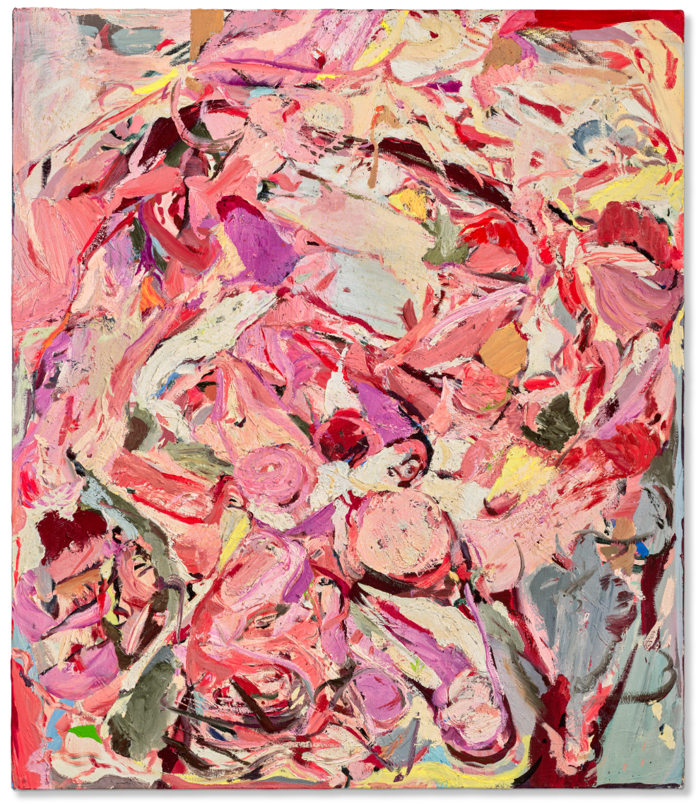
CECILY BROWN (B. 1969)
Twice Told Tales I, 1998
Oil on linen
28×24 inches (71×61 cm)
Signed and dated ‘Cecily Brown ’98’ (on the reverse)
A riot of color and texture, Twice Told Tales I is an intoxicating canvas from Cecily Brown’s breakthrough period. Painted in 1998, and held in the same private collection since 2000, it captures the electrifying palette and enigmatic flesh-like forms that came to define her practice after her arrival in New York a few years earlier. Brief visions of intertwined limbs and bodies emerge from a tapestry of peach, fuchsia, yellow and crimson. Shapes morph and mutate through the artist’s rich, tactile brushwork. The surface appears to undulate, its mercurial drama suspended in a constant state of flux. The overall impression is one of translucency, like light breaking through a stained-glass window. Twice Told Tales I was painted the year of Brown’s pivotal second solo show High Society at Jeffrey Deitch’s Projects Gallery in Manhattan, and has much in common with the 1997-1998 masterpiece of the same name. With examples held in The Broad, Los Angeles, the Solomon R. Guggenheim Museum, New York and Tate, London, the artist’s works from this period carved out thrilling new territory for abstraction, propelling her onto the global stage.
The work’s title likely came from the 1963 horror film Twice Told Tales, starring Vincent Price and based upon a short story collection by Nathaniel Hawthorne. In tune with this suggestion of repeated or reimagined narratives, it is the first of a trio of paintings by the same name. Many of Brown’s canvases created during this period take their titles from films, which she often found in Halliwell’s Film Guide. Brown is famous for her eclectic influences and also finds inspiration in the names of books, songs, and pubs, among countless other sources. Whatever their origin, these titles are not meant to offer clues to the image at hand. Rather, Brown hopes the words will allow her paintings to unfold multiple interpretations and associations. Indeed, her art is replete with marks that gesture towards other images, be those scenes in television programs, Sienese frescoes or Hieronymus Bosch’s The Garden of Earthly Delights, a copy of which she has long displayed in her studio.
Having grown up in London, and completed her studies at the Slade School of Art, Brown moved to New York in 1994 in part to escape the weight of the British art world. At the time, the London scene was dominated by an anti-painting attitude espoused primarily by the Young British Artists. She greatly admired the work of Francis Bacon, and had spent hours poring over the works of the Old Masters. Brown observed that her enduring desire to paint the human figure was seen as somewhat ‘perverse’.
“I was ashamed of my pleasure in painting, my predilection for emotionally charged subjects, and for my love of dead painters’ (‘Happy Days are Where, Again?”
In New York, however, the medium was experiencing a revival of sorts, and Brown exulted in its possibilities. In 1998, she featured on the cover of Flash Art in an image by Damian Loeb, securing her place—according to editor Helena Kontova—as ‘the new face of American painting’. The magazine featured an article written by Brown herself: in it, she enthused:
“This is an intoxicating time to be painting, and New York an exhilarating and sympathetic climate; the mood is generous and open and eclectic.”
For the first time, Brown felt a connection to the art made by her peers, a cohort which included John Currin and Rita Ackermann, and her work was enthusiastically received following its early presentations at Deitch Projects, which catapulted her career to new heights. During these months, Brown moved away from her earlier depictions of cartoonish rabbits and instead began painting teeming bodies whose fluctuating forms recalled the work of Willem de Kooning. Like her Abstract Expressionist predecessor, Brown’s works from this period are driven by colour, particularly the flesh tones, pinks, and reds that fill Twice Told Tales I.
“I think that’s what I call painterly—the paint itself telling the story.”
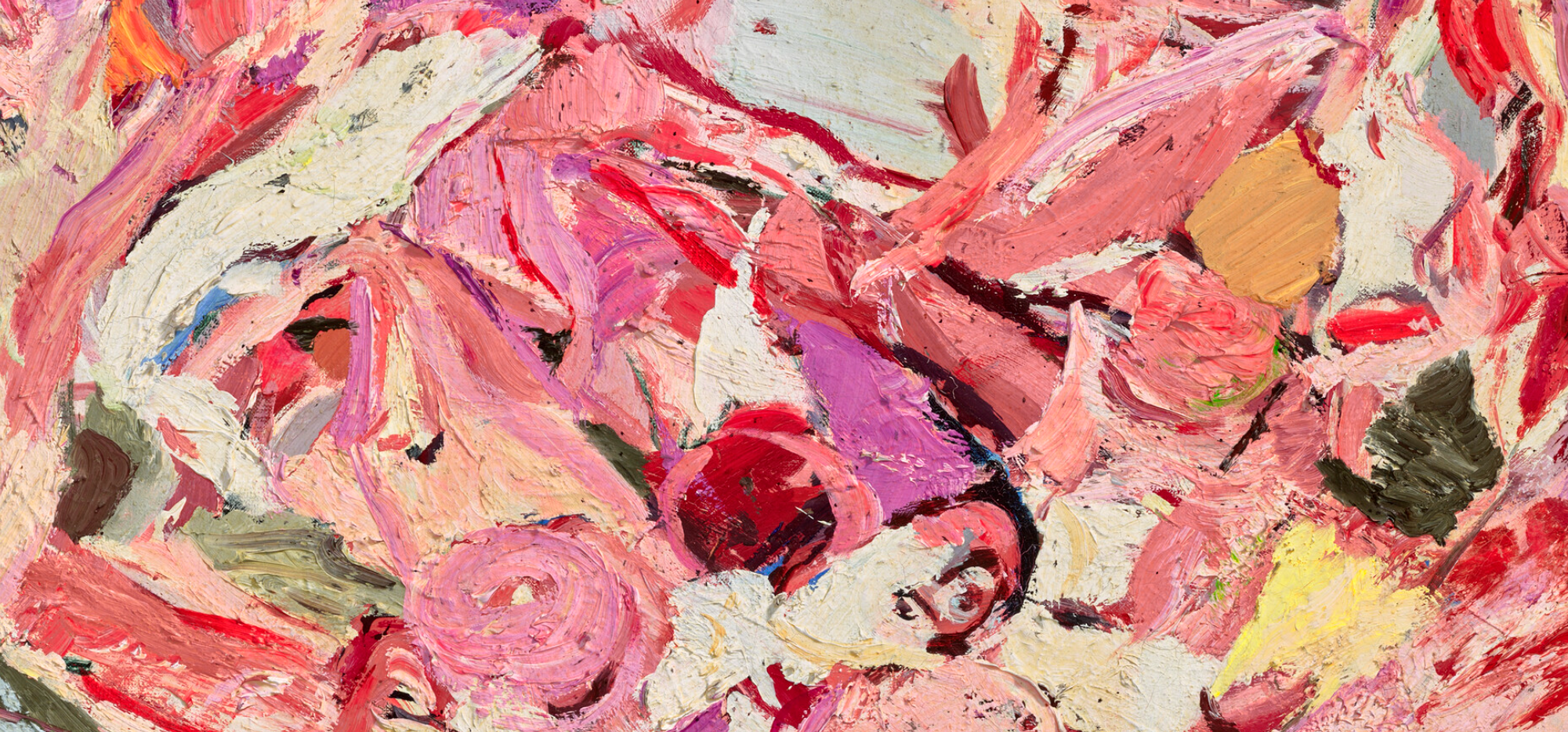
In her studio in New York, she regularly works on multiple canvases simultaneously, and as a result, the images often speak to one another. Marks are mirrored and colours repeat themselves, but the throughlines are not always obvious. Indeed, while Brown always begins a painting with a specific motif in mind, she is consciously constructing an image that leaves this initial inspiration behind. Enchanted by the materiality of paint itself, her practice captures the medium’s physical qualities through gestural, looping brushwork and sensual surfaces. Works such as Twice Told Tales I evince this dedication to painting, which, Brown says, ‘is the highest form of hope’ (in conversation with H-U. Obrist, Cecily Brown: Picture Making, exh. cat., Serpentine Gallery, London, 2026, p. 76).
Sean Scully
Wall of Light Reef, 2012
Christie’s London: 15 October 2025
Estimated: GBP 400,000 – 600,000
GBP 512,000 / USD 677,425
SEAN SCULLY (B. 1945), Wall of Light Reef | Christie’s
SEAN SCULLY (B. 1945)
Wall of Light Reef, 2012
Oil on canvas on board
63×63 inches (160×160 cm)
Signed, titled and dated ‘WALL OF LIGHT REEF Sean Scully 2012’ (on the reverse)
Radiant bands fill Sean Scully’s monumental Wall of Light Reef, together forming an architectural lattice of rich, sumptuous colour. Soft and yielding, the surface of the painting is arranged in a loose construction of vertical and horizontal rectangles. The painterly blocks of cranberry, cream, black and pale pink are simultaneously controlled and expressive, self-contained yet united, each evincing the gestural traces of the artist’s hand. Scully’s characteristically energetic brushwork adds a tactile dimension to a pictorial field that rejects any sense of narrative hierarchy. Even without recognisable imagery, however, Wall of Light Reef possesses a complex, almost sublime sense of presence.
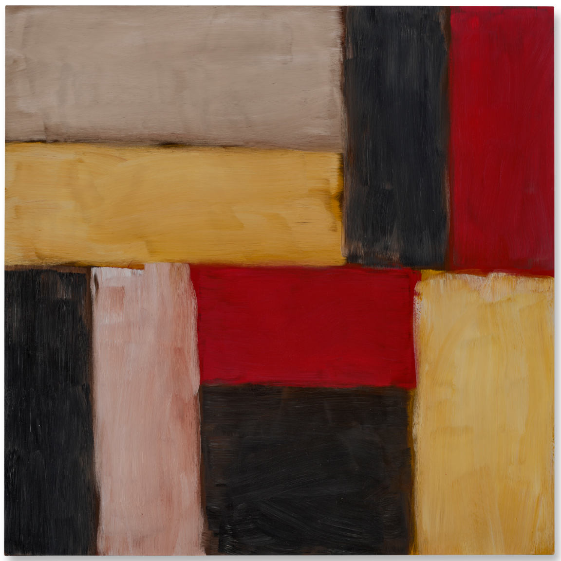
Painted in 2012, Wall of Light Reef forms part of the artist’s celebrated series Wall of Light, which emerged following trips to Mexico in the early 1980s. While there, Scully found himself captivated by the play of light and shadow across the many ancient Mayan ruins. One day, while sitting on a beach in Zihuatanejo, a city on the Pacific coast, he made a small watercolor of his impressions, writing, beneath the image, ‘Wall of Light’. Yet upon returning to New York, Scully chose not to take up the subject, focusing instead on the sculptural canvases he was already in the process of creating. It was not until 1998 that he finally returned to the theme, embarking upon a more formal, and extensive, exploration of the vibrant motif.
Scully was far from the first to be seduced by Mexico’s architectural heritage. Artists such as Josef Albers and Donald Judd had previously created works of art in response to the built environment they encountered while traveling through the country. The interaction of colour in Albers’ Homage to the Square and Variant/Adobe series, especially, seems to be echoed in Scully’s Wall of Light: both painters teased out a chromatic dynamism based on light and geometry. Although Mexico inspired the series, many of the Wall of Light canvases allude to other locales. They were painted primarily in Barcelona, New York, London, and the countryside outside of Munich. Utopian in aim, Scully sees his series as an attempt to ‘make a wall that is not a brutal divider’ (in conversation with D. Carrier, The Brooklyn Rail, March 2018). This series has achieved wide acclaim and was the subject of a 2005 exhibition organised by The Phillips Collection, Washington, D.C., that travelled to The Metropolitan Museum of Art, New York, among other institutions.
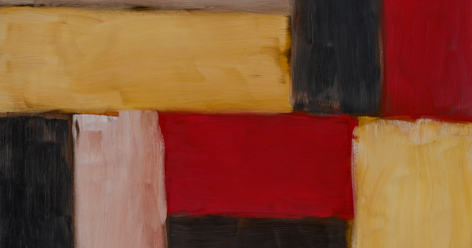
Scully’s practice is often discussed within the context of Color Field painting. Such an inheritance is evident in Wall of Light Reef, in which the chromatic bands recall canvases by Mark Rothko: both artists used color as a structural force. Scully, however, has been influenced not just by post-war abstraction but also by European painting traditions, and he has cited artists such as Cimabue, Henri Matisse and Pierre Bonnard as equally inspirational. Instead of a dogmatic abstraction, Scully believes in art’s ability to generate its own narrative, and he endeavors to imbue his paintings with sensations and connotations, explaining that, in his work, ‘you have associations with the horizon, with blood, with earth, with grey mist, with the sky in the morning and the sky at night, and then this very somber black bar, which is about finality’ (quoted in F. Nayeri, ‘Sean Scully Is an Art Star, but He “Won’t Bend the Knee for Anyone”’, New York Times, 29 August 2024). In Wall of Light Reef, the warm tonalities evoke the solidity of stone glowing under a warm, late afternoon sun, their almost sculptural presence blurring the line between abstraction and image, invention and reality.
George Condo
The Objective Idealist, 1994
Sotheby’s London: 15 October 2026
Estimated: GBP 400,000 – 600,000
GBP 832,000 / USD 1,100,820
George Condo | The Objective Idealist | Contemporary Evening Auction
GEORGE CONDO (b. 1957)
The Objective Idealist, 1994
Oil on canvas
40 x 29-7/8 inches (101.5 x 76 cm)
Signed and dated 94 (upper left)
Signed, titled and dated 1994 (on the reverse)
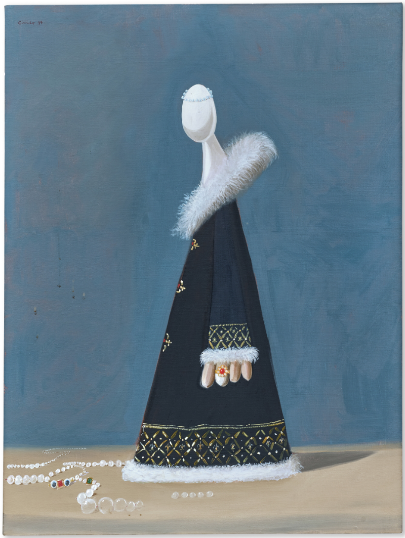
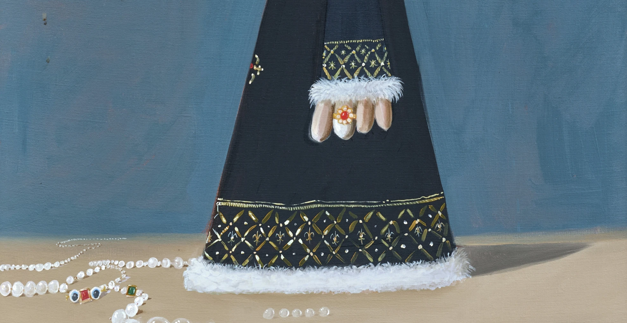
Painted in 1994, The Objective Idealist belongs to the group of faceless portraits with which Condo changed what a figurative painting could do in the mid-1990s. A single conical form in black velvet and gold brocade rises from a scatter of loose pearls and jewels on a bare tabletop, narrowing into a smooth, featureless white head marked only by a thin band of pearls at the crown. One gloved-looking hand, wearing a single ring, emerges from a fur-trimmed cuff; a sweep of white feathers crosses the shoulder like an ermine stole.
“Could I be the court painter for an Alien King?”

This device of the faceless sitter had its roots earlier in Condo’s career, in the small, deadpan cartoon-derived heads and pod-like figures of his 1980s work, but it was only in paintings such as this one that it was brought fully into dialogue with the grand manner of European portraiture, giving the joke a far greater art-historical weight. Since its first public showing at Pace Gallery, New York, in 1995, The Objective Idealist has travelled through One Hundred Women in Salzburg and Bielefeld in 2005, the touring retrospective Mental States — shown at the New Museum, Museum Boijmans Van Beuningen, the Hayward Gallery and the Schirn Kunsthalle between 2011 and 2012 — and, more recently, Humanoïdes at the Nouveau Musée National de Monaco in 2023 and the major retrospective at the Musée d’Art Moderne de la Ville de Paris in 2025–26. Few paintings of this date and scale have travelled so consistently across the defining exhibitions of an artist’s career, and this sustained presence marks The Objective Idealist out as one of the most fully achieved and widely recognised examples of Condo’s faceless portraiture — as iconic and immediately identifiable an image as this body of work has produced.
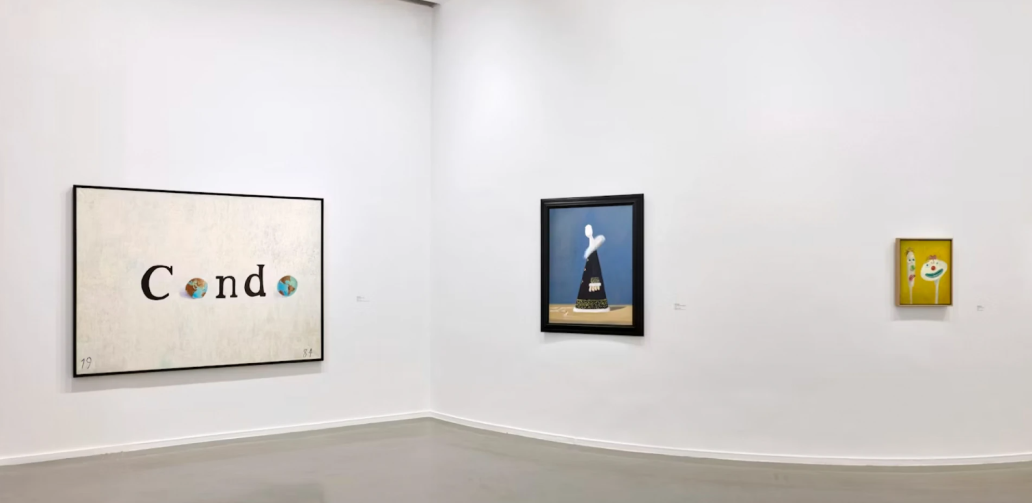
The present work installed in the exhibition George Condo, Musée d’Art Moderne de la Ville de Paris, Paris, 2025-26
The Objective Idealist sits within a wider group of works Condo made between 1994 and 1996 that took portraiture right up to the edge of disappearing altogether. As Simon Baker has written of this period, Condo made “various kinds of portrait… from a vast array of faceless figures such as The Objective Idealist, The Effervescent Pope, The Accountant, The Philosopher and Cocktails in Space, to more plausible figures like The Magician and The Psychoanalytic Puppeteer Losing His Mind” (Simon Baker, George Condo: Painting Reconfigured, London 2015, p. 69). In each case, Baker notes, “there is no subject of the portrait as such” — Condo empties out the genre’s usual promise of likeness and replaces it with costume, gesture and pose alone.
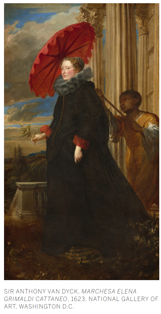
This was also the period in which Condo was most openly engaged with the history of European portraiture, looking closely at the courtly conventions of Old Master painting — its formal poses, its use of costume and attribute to signal rank, its careful construction of the sitter’s authority — and reworking them from within. That he should strip his sitters of their faces at exactly this moment is not incidental: it is precisely because the face is the one element that traditional portraiture depends on to establish identity and likeness that removing it while retaining every other courtly convention becomes such a pointed act, turning a genre built on the individuality of its sitters into a study of the empty forms that are left once that individuality is taken away. The move reads, as Baker puts it, as “deliberately provocative” given the figure’s exclusion from the abstract tradition running from Malevich to Ad Reinhardt. Condo’s faceless aristocrats put the figure back into that lineage, only to hollow it out from the inside.
The title points to an idea as much as an image. Writing on this body of work, Donald Kuspit and Ralph Rugoff both described the portrait, for Condo, as “a series of ciphers or symbolic containers for assumed or expected information” (Donald Kuspit quoted in Ibid., p. 69). For a painter who very rarely paints directly from life, the imaginary portrait becomes exactly this kind of container: the viewer supplies whatever psychology or history the picture withholds. The Objective Idealist — aristocratic in bearing, closer in shape to a chess piece or a dressmaker’s mannequin than to any real body — plays this emptiness for both wit and unease. A title that suggests firm conviction and principle is attached to a smooth, blank form onto which any conviction at all might be projected.
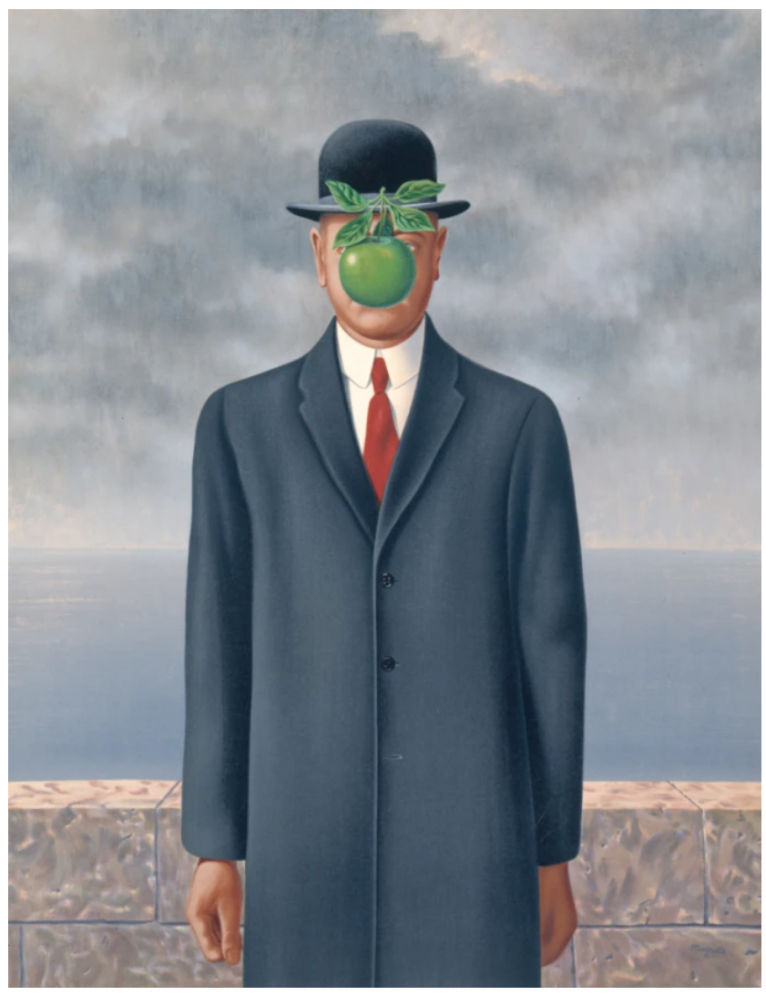
René Magritte, Le Fils de l’homme (The Son of Man), 1964. Private Collection. © ADAGP, Paris and DACS, London 2026
Technically, the painting shows the careful, old-master finish typical of Condo’s artificial realism of the early-to-mid 1990s, before his work loosened into the more gestural psychological cubism that followed. The velvet cloak is painted with a descriptive precision that recalls Van Dyck or Velázquez, its gold thread and quilted pattern picked out stroke by stroke, while the pearls and loose gems on the table nod to the vanitas still lifes of seventeenth-century Northern European painting. Setting this historical fluency against a figure with no face — and no clear body beneath the costume — produces the dry comedy typical of Condo’s best work from this period: the trappings of status and taste are painted with complete conviction, even as the figure meant to carry them dissolves into abstraction.
The Objective Idealist is a work about the theatre of authority: a costume of rank and refinement painted with total belief, worn by a figure who was never really there to begin with.
Tom and Jerry No. 1, 1985-86
Sotheby’s London: 16 October 2026
Estimated: GBP 250,000 – 350,000
GBP 486,400 / USD 643,555
George Condo | Tom and Jerry No. 1 | Contemporary Day Auction,
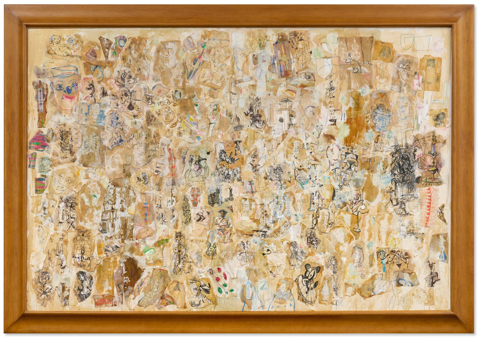
GEORGE CONDO (b. 1957)
Tom and Jerry No. 1, 1985-86
Oil and paper collage on canvas
51 x 76-3/4 inches (129.5 x 195 cm)
Signed and dated 85.5 twice and Köln 5.86 (center)
Signed, titled and dated Paris 86 (on the reverse)
George Condo’s Tom and Jerry No. 1 is a riotous composition of faces, figures, animals and objects, connected through Condo’s fluency of line. At first glance, the painting appears chaotic as caricatural heads crowd the canvas, forms accumulate and collide, while eyes, teeth, and ears emerge from an entanglement of geometric shapes. Yet beneath this apparent commotion lies a remarkably controlled pictorial structure. Condo restricts his palette to earthy ochres and browns, punctuated by flashes of red, green and blue, while expanses of white allow forms to pull in focus before receding into the background. Faces distort into bulbous noses, oversized eyes, and exaggerated mouths, while human and animal forms become almost impossible to distinguish.
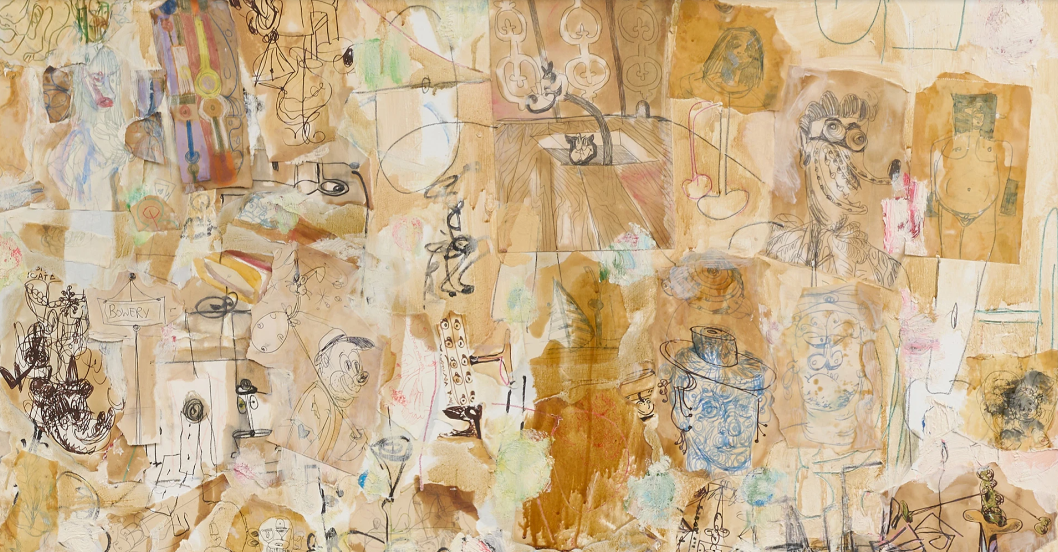
The title is an explicit ode to the famous cartoon series Tom and Jerry, whose enduring humour derives from the unlikely relationship between its cat and mouse protagonists: natural enemies locked in a perpetual cycle of pursuit, conflict and companionship. Condo takes this familiar premise as a point of departure, creating a painting in which categories that we instinctively expect to remain separate coexist. The recognisable title introduces humour and nostalgia, yet the image itself refuses the simplicity of its source. Instead, Condo transforms the familiar world of Tom and Jerry into something psychologically ambiguous, using his distinctive cartoon-inflected idiom to explore the instability of the human consciousness. The result is a painting that rewards prolonged looking.
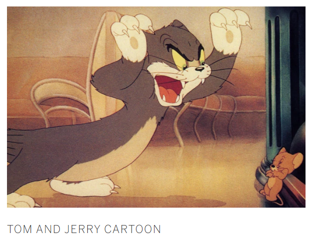
Tom and Jerry No. 1 occupies a particularly revealing position within Condo’s early œuvre, belonging to a period of experimentation that would prove fundamental to the development of his mature practice. Condo had begun incorporating collage into his paintings, bringing together fragments of imagery and allowing disparate visual languages to coexist within a single composition. Here, cartoon characters, grotesque portraits, animals and Condo’s use of line are treated with equal importance. The work also anticipates Condo’s subsequent formulation of “Artificial Realism”, the term he developed to describe the realistic representation of artificial things. While the concept postdates Tom and Jerry No. 1, its underlying principles are already visible. Recognisable forms are transformed until they oscillate between the real and the imagined. As Condo observed, “my paintings are a reflection of the world, and there’s a lot of absurdity out there” (The artist quoted in: Gareth Harris, “Interview with George Condo: Finding a Theatre for the Absurd,” The Art Newspaper, 2011).
The extraordinary inventiveness of Tom and Jerry No. 1 becomes clearer when situated within Condo’s dialogue with the history of modern painting. The fragmented composition recalls Pablo Picasso’s Cubist compositions, where planes of colour and shifting viewpoints dissolve the boundaries between individual bodies and the surrounding space. Yet Condo’s work remains unmistakably his own, with his interest extending beyond perspective to the complexity of psychological experience. As he explained, “Picasso painted a violin from four different perspectives at one moment. I do the same with psychological states” (The artist quoted in Stuart Jeffries, “George Condo: I was delirious. Nearly died,” The Guardian, 2014). From this emerges a distinctly Condo-like form of “psychological Cubism”, in which the fragmentation of the body becomes a visual metaphor for the multiplicity of the mind.
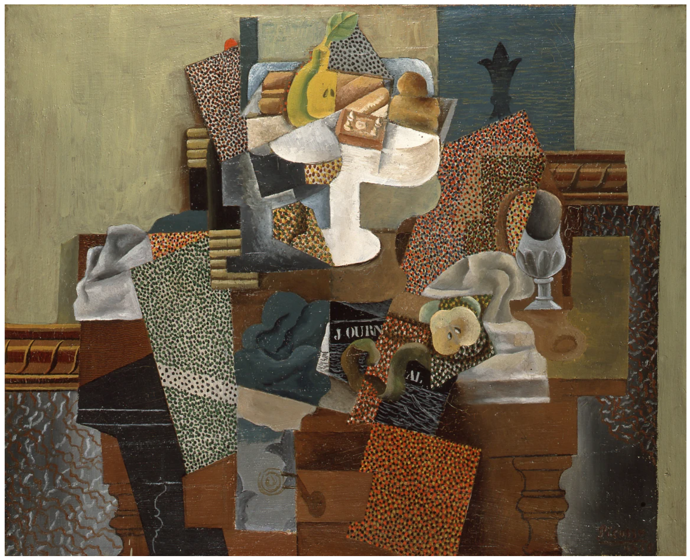
Pablo Picasso, Nature morte au compotier (Still Life with Compote and Glass), 1914-15, Columbus Museum of Art, Ohio.
Art: © 2026 Succession Picasso/DACS, London
The work’s deliberately comic physiognomies and graphically drawn, cartoon-like figures complicate the distinction between popular culture and the traditions of high art. Condo places the visual language of Tom and Jerry alongside the conventions of portraiture and Cubist fragmentation, transforming something familiar into something psychologically ambiguous. Just as the cartoon’s cat and mouse repeatedly disrupt the natural order of predator and prey, Condo’s figures resist the categories through which we ordinarily understand the world. In this sense, Condo belongs to the generation of 1980s artists who reasserted the possibilities of figuration while refusing to separate it from the visual culture of everyday life. His approach places him in dialogue with artists such as Andy Warhol and Jean-Michel Basquiat, who similarly recognised the expressive potential of popular imagery. Yet where Warhol isolates and repeats the commercial image, Condo fragments and redefines it.
Tom and Jerry No. 1 captures Condo at a formative moment, when his engagement with art history, popular culture and the expressive potential of drawing began to coalesce into the distinctive language that would define his career. Its energy, humour and abundance make it both rooted in the culture of the 1980s and strikingly inventive. The work demonstrates an artist operating with confidence and freedom, unencumbered by stylistic constraint and fully engaged in testing the expressive limits of painting.
Nude on Orange Chair, 2007
Sotheby’s London: 15 October 2026
Estimated: GBP 350,000 – 450,000
GBP 384,000 / USD 508,070
George Condo | Nude on Orange Chair | Contemporary Evening Auction |
GEORGE CONDO (b. 1957)
Nude on Orange Chair, 2007
Oil on canvas
53-1/8 x 46 inches (134.8 x 116.8 cm)
Signed and dated 07 (on the reverse)
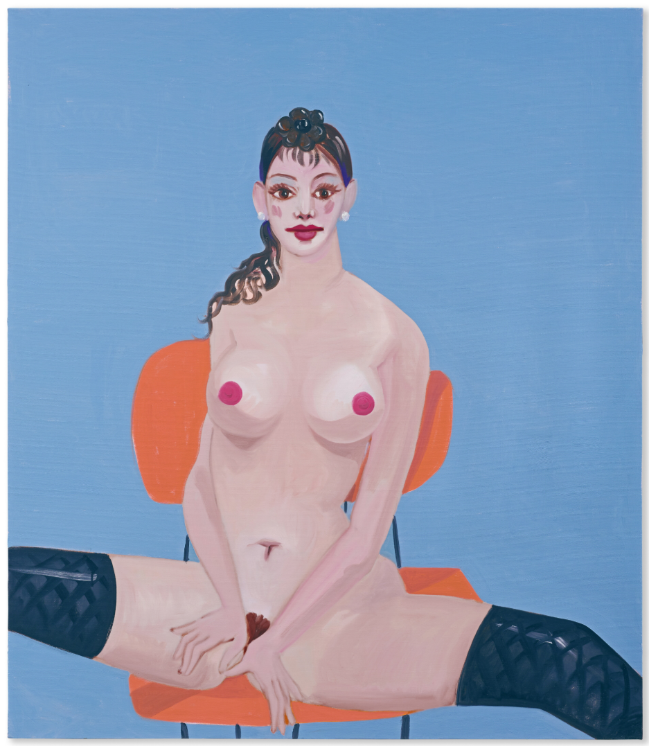
Executed in 2007, Nude on Orange Chair stands among the most refined and compelling figurative works from George Condo’s mature oeuvre. In this painting, Condo chose to engage with one of the most enduring subjects in the history of Western art: the female nude. Yet while Condo approaches this venerable tradition with a profound awareness of its historical precedents, he simultaneously reimagines it through his own distinctive visual language, producing a work that is both timeless and dynamically contemporary.
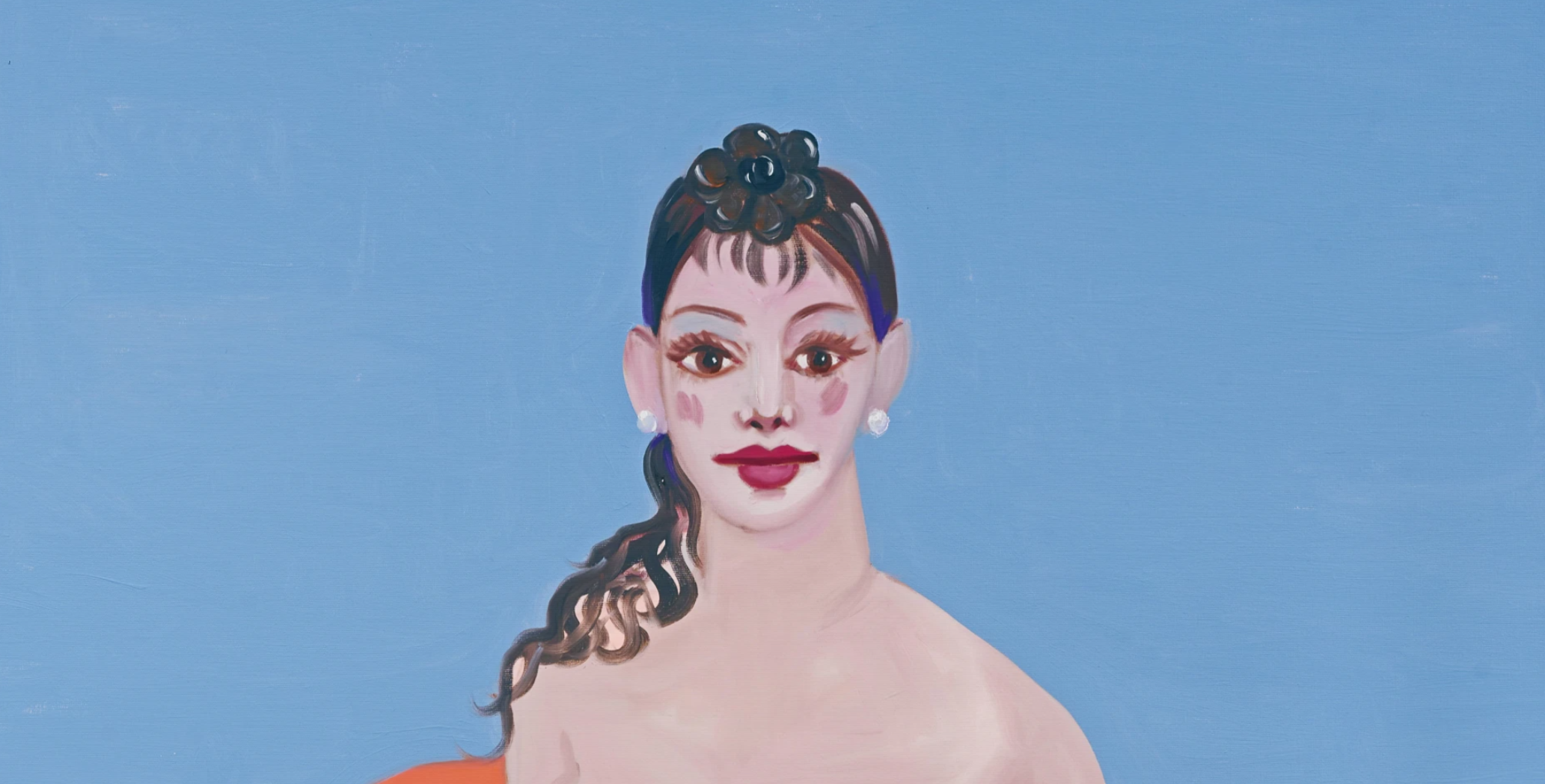
The female nude has occupied a central position in painting for centuries, serving as a vehicle through which artists have explored beauty, sensuality, psychology, and the expressive possibilities of the human form. From the intimate humanity of Rembrandt van Rijn’s late nudes to the elegant elongations of Amedeo Modigliani and the radical reinventions of Pablo Picasso, each generation has redefined the genre according to its own concerns. Condo’s Nude on Orange Chair belongs to this lineage, entering into dialogue with these historic precedents while asserting a wholly original vision. Condo here reinvents the canon and merges art history with contemporary culture in a way only he has achieved.
“There is no real meaningful linearity or chronology when it comes to art… You could include five or ten languages from different periods of art simultaneously in your own paintings. And why not – who said you can’t?”
Unlike many of Condo’s best-known compositions, however, the present work is remarkable for its restraint. The figure is not subjected to the extreme fragmentation or grotesque distortions that characterise certain examples of the artist’s celebrated “psychological cubism.” Instead, the sitter is rendered with an unusual degree of naturalism. Seated confidently against the vivid orange chair that gives the painting its title, she possesses a physical presence and psychological immediacy that recall the great tradition of portraiture. She remains largely intact and recognisably human, her gaze directed to the viewer, blurring the lines between nude and naked. While not overtly cartoonish, the work nevertheless bears the traces of the graphic vocabulary that has become synonymous with the artist’s practice – the influence of popular imagery and comic illustration is present.
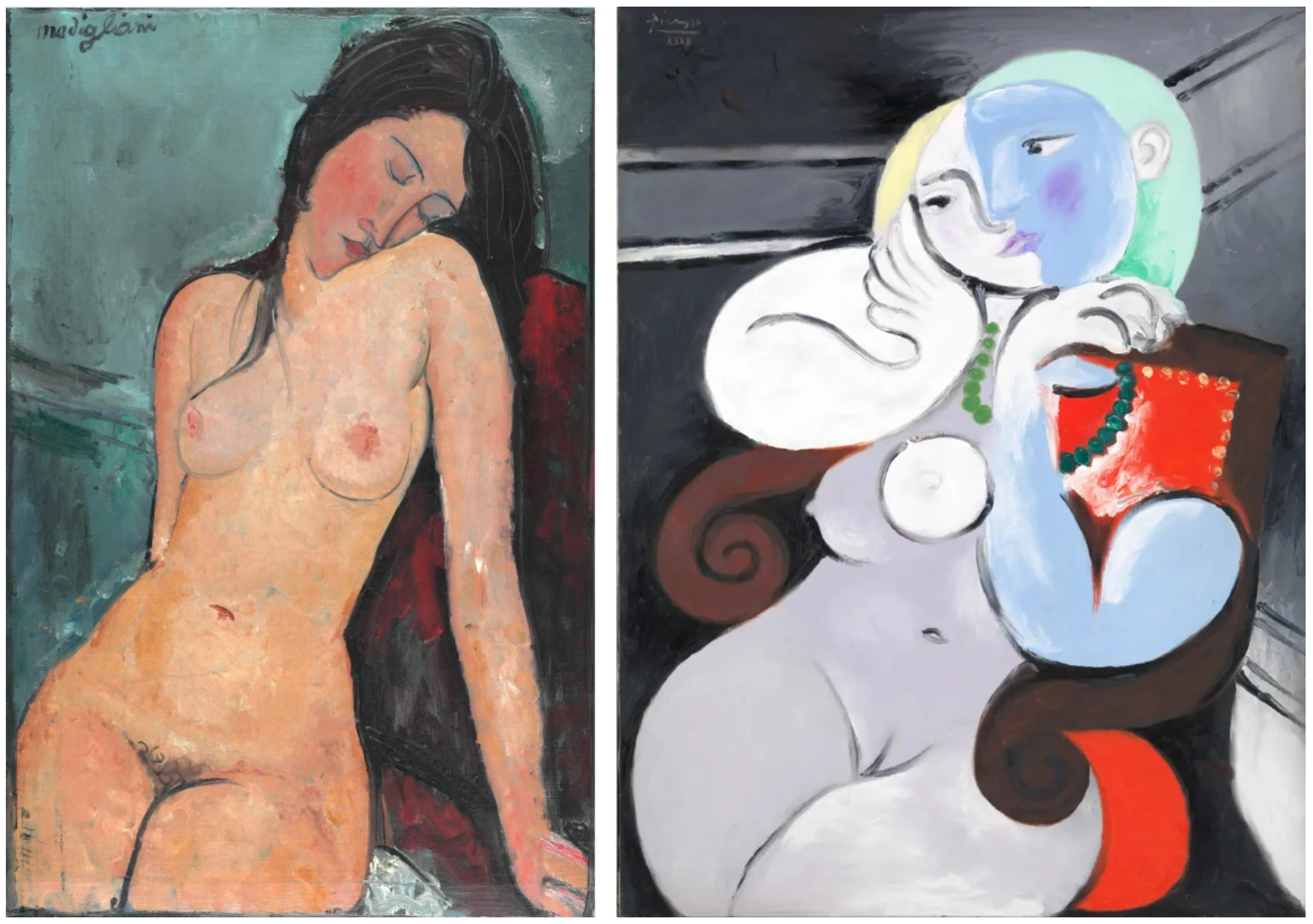
Left: Amadeo Modigliani, Female Nude, circa 1916. The Courtauld, London. Image: © The Courtauld
Right: Pablo Picasso, Nude Woman in Red Armchair, 1932. Tate Museum, London. © 2026 Tate London. Image/Art: © 2026 Estate of Pablo Picasso / DACS
While Nude on Orange Chair initially appears to revel in the traditions of visual pleasure and erotic fantasy, the work in fact engages with one of Condo’s central artistic preoccupations: the unstable nature of reality in the contemporary age. When interviewed the artist described his practice as one of “artificial realism,” (the artist quoted in: Emily Nathan, “artnet Asks: George Condo Sees Faces and Screaming Heads Everywhere,” ArtNet News, 24 October 2015, online) Condo has long explored the psychological consequences of a world increasingly shaped by human invention and mediation. In an era dominated by social media, digital manipulation, and idealised self-presentation, perceptions of the body have become progressively detached from lived reality. The female figure in Nude on Orange Chair embodies this tension. Her exaggerated features, distorted proportions, and theatrical presence evoke an image that is at once familiar and estranged, seductive yet uncanny. Rather than depicting an idealised nude, Condo presents a psychologically charged figure that reflects the artificial constructions through which contemporary identity is increasingly perceived and performed.
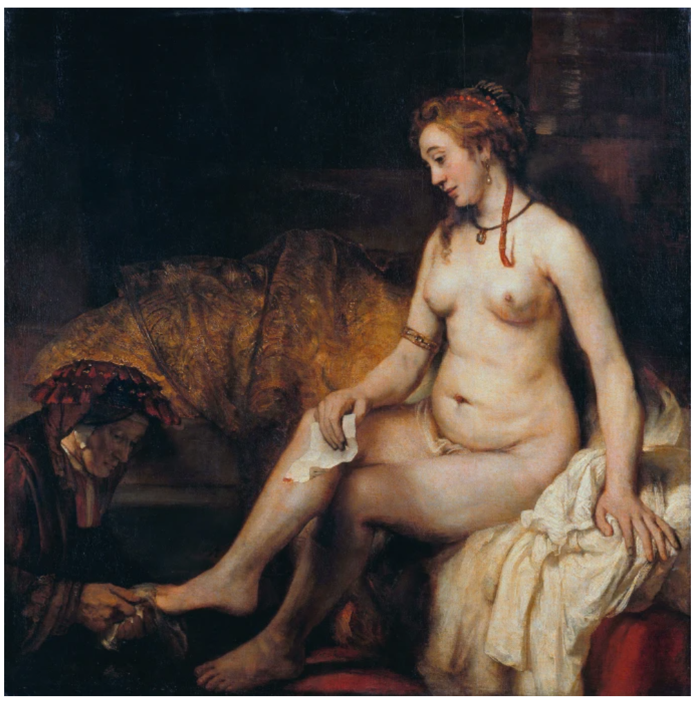
Rembrandt van Rijn, Bethsabée au bain tenant la lettre du roi David, 1654. The Louvre Museum, Paris.
Created during a period of widespread acclaim for the artist, Nude on Orange Chair exemplifies Condo’s unique ability to reconcile art historical tradition with contemporary invention. More than a reinterpretation of a classical subject, the painting is a sophisticated meditation on the enduring relevance of figurative art itself. By placing his singular vision within the long continuum of representations of the female nude, Condo affirms the vitality of painting as a living tradition. Elegant, self-assured, and deeply engaging, Nude on Orange Chair reveals an artist at the height of his powers, demonstrating how one of art’s oldest subjects can be made newly resonant for the twenty-first century.
Vanité Composition, 1991
Christie’s London: 15 October 2026
Estimated: GBP 200,000 – 300,000
GBP 281,600 / USD 372,585
GEORGE CONDO (B. 1957), Vanité Composition | Christie’s
GEORGE CONDO (B. 1957)
Vanité Composition, 1991
Oil on canvas, in four parts
Overall: 53-1/4 x 91-7/8 inches (135.4 × 233.4 cm)
A pearlescent skull gapes next to a smoking candle in George Condo’s Vanité Composition (1991). The objects rest upon a stony surface before a backdrop rich in Old Masterly darkness: the setting divides into richly worked sections of grey, white, brownish black and navy blue, recalling a Colour Field abstraction. To the left, Condo has nested a replica of the composition in miniature within the picture plane. As Simon Baker writes, ‘Vanité Composition is an almost impossible mise en abyme’ (George Condo: Painting Reconfigured, London, 2015, p. 55). The effect is achieved not within a single canvas but by combining four separate panels: a hallmark of Condo’s ‘combination paintings’, which he worked on between 1989 and 1992. Self-referentiality is, as such, built into both the work’s construction and its potentially infinite regression.
As its title suggests, Vanité Composition plays with the genre of the vanitas, which first emerged in the sixteenth century. These allegorical still lifes contain a variety of objects representing death and earthly pleasure as they remind the viewer of the brevity of existence. Skulls were an powerful way of conveying these messages. While the vanitas was especially popular during the Dutch Golden Age, artists including Gustav Klimt, Georges Braque, James Ensor, and Gerhard Richter continued to explore its themes and motifs across the centuries. This long and layered past would have appealed to Condo, for whom art’s history remains ever present and ripe for plundering. He was particularly engaged with Old Masterly tropes during the 1980s and early 1990s. The cartoonishly yawning cranium seen in Vanité Composition reappears in works such as Contaminated Skull (1992, Museu d’Art Contemporani de Barcelona) and Still-life with Skull and Snowman (1992).
Condo painted Vanité Composition while living in Paris, having moved there in 1985. He would remain in the French capital for ten years, living on the Rue de Condé, just to the north of the Jardin du Luxembourg. Condo had long admired French literature and art and had papered the walls of his teenage bedroom with posters of works by Paul Cezanne and Pablo Picasso. Both titans of Modernism used skulls in their still life paintings, and the present work seems as much a nod to Condo’s French heroes as it does to the seventeenth-century Netherlands. Yet Vanité Composition is very much Condo’s own creation, an amalgamation of his many intellectual and formal interests. ‘I don’t want to just paint someone else’s painting’, he has said. ‘The idea is to take all the information from every painting I like in history and put it back in an original way’ (quoted in ibid., p. 14).
Orange and Green Diagonal Portrait, 2016
Christie’s London: 14 October 2026
Estimated: GBP 1,800,000 – 2,500,000
PASSED
GEORGE CONDO (B. 1957), Orange and Green Diagonal Portrait | Christie’s
GEORGE CONDO (B. 1957)
Orange and Green Diagonal Portrait, 2016
Acrylic, oil and oil stick on canvas
83-7/8 x 81 7/8 inches (213×208 cm)
Signed and dated ‘Condo 2016’ (lower left)
Orange & Green Diagonal Portrait (2016) is a spectacular expression of George Condo’s energetic and intellectually rich practice. Monumental in scale, it straddles the border between figuration and abstraction. An immense human head is anatomised into facets of vibrant colour. Condo captures his subject with explosive, frenzied drips, scrapes, looping lines and brushstrokes. There are sections where the paint is so light as to be diaphanous, and others with thickly textured impasto that makes the picture seem to crackle and spark. Bicoloured eyes stare out above a zip of grinning teeth. The sky-blue background has an almost sculptural quality, strafed with strokes of the palette-knife. Graphic lines in oilstick carve through the pigment. The portrait is fractured, as the title implies, along a diagonal line, with kaleidoscopic and more naturalistic colours split between its two halves.
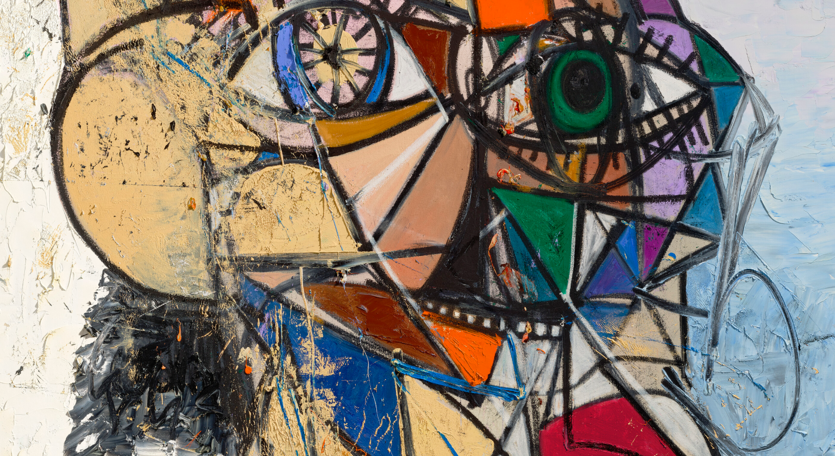
The intensity of this work might reflect an upheaval in Condo’s life. In 2015 he underwent surgery for a serious illness: a brush with mortality that changed his perspective. ‘I was starting to feel very scrambled up’, he said of this period. ‘… I was just freaking out doing these paintings. I was in five different places in my mind at the same time’ (G. Condo, quoted in J. Riefe, ‘Interview with George Condo’, The Guardian, 20 April 2016). Orange & Green Diagonal Portrait emerged from Condo’s confrontation with these demons. The figure is broken and fragmented, but also metamorphosed into a new, vital and polymorphic incarnation. It represents a powerful expansion of Condo’s ‘psychological cubism’, which seeks to depict human nature from all angles: the good and bad, the conscious and the subconscious, the intentional and the accidental.
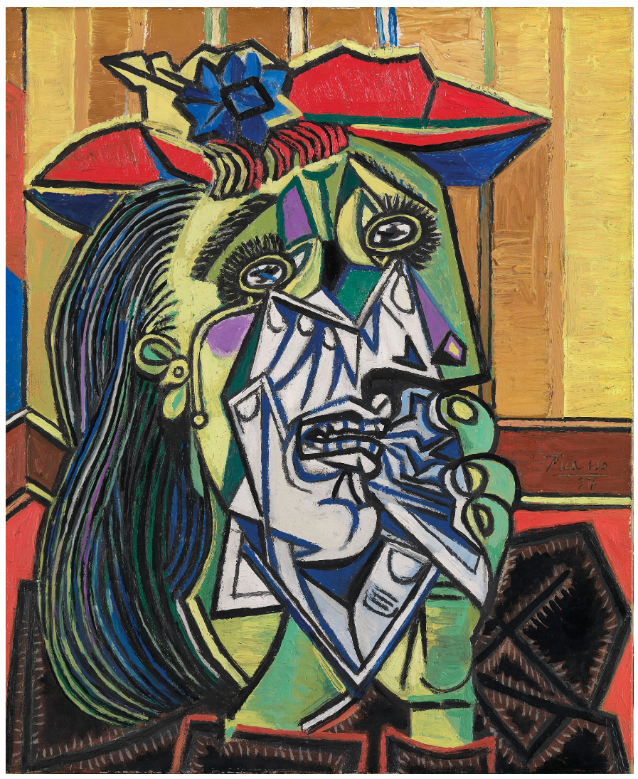
Pablo Picasso, Femme en pleurs (Weeping Woman), 1937. Tate, London.
Artwork: © 2026 Succession Picasso/DACS, London. Digital image: © Tate.
Condo’s practice exists in fervent dialogue with art history, from the portraiture of the Old Masters to Cubism, action painting and the Pop and Neo-Expressionist work he encountered during his early years in New York. In the early 1980s Condo worked applying diamond dust onto silkscreens at Andy Warhol’s Factory. Warhol is said to have starting painting Campbell’s soup cans after his mother told him to paint what he liked best. Condo asked himself the same question. ‘Contrary to Warhol,’ writes Didier Ottinger, ‘Condo chose the museum, not the supermarket … His encyclopaedic knowledge of art history became the reservoir from which to extract an iconography’ (‘George Condo’s Schizo-Frenzy’, in George Condo: Humanoids, exh. cat., Nouveau Musée National de Monaco, 2023, p. 130).
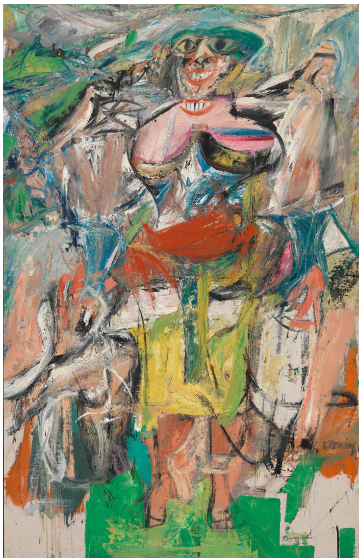
Willem de Kooning, Woman and Bicycle, 1952-1953. Whitney Museum of American Art, New York.
Artwork: © The Willem de Kooning Foundation / Artists Rights Society (ARS), New York and DACS, 2026.
Digital image: © 2026 Whitney Museum of American Art / Licensed by Scala.
Orange & Green Diagonal Portrait riffs on the Cubist deconstruction and bold black lines of Pablo Picasso, the forceful gestures of Willem de Kooning, and the fleshy fantasias of late Philip Guston. It is also inspired by music, in particular jazz: at the time he composed this work, Condo was under the influence of John Coltrane’s final studio album Expression (1967). ‘The way he digs into his saxophone,’ says Condo, ‘and just tears it up is the expression I have been after with these paintings … to just unleash absolute freedom of style, line, colour, and power’ (quoted in M. Bedard, ‘George Condo’, Flaunt, May/June 2016). Condo’s method can be compared to a musical jamming and improvisation, drawing surprising new ideas out of established elements. Orange & Green Diagonal Portrait takes this approach to exhilarating new heights.
Gerhard Richter
Mathis, 1983
Phillips London: 15 October 2026
Estimated: GBP 6,000,000 – 8,000,000
GBP 5,839,000 / USD 7,725,580
Gerhard Richter Modern & Contemporary Art Evening Sale
GERHARD RICHTER
Mathis, 1983
Oil on canvas
200×200 cm (78-3/4 x 78-3/4 inches)
Signed, numbered and dated ‘544-1 Richter 1983’ on the reverse
Foregrounding the sheer magnetism of paint and colour in electric, luminous hues, Mathis dates to a critical moment in Gerhard Richter’s career. Exemplifying the powers the German master is known to possess, encompassing his understanding of medium and lifelong inquiry into the painterly process, Mathis hails from his so-called ‘Wild Abstracts’ and was begun less than ten years after the creation of his first Abstraktes Bild. Acquired by the celebrated French collector Marcel Brient, Mathis has remained a key focus of his distinguished collection for over twenty-five years.
The first and formally most complex of a subset of four abstract canvases painted on the same large, square format in 1983 and each named after people (Marian, Martha, Maria and Mathis), the present work has a profound intensity and potency. While each canvas possesses a beguiling beauty, broad spectrum of colour, the heat and strength of marks on the surface, deliberate, geometric sections paired with quicker, spontaneous passages, Mathis is especially distinguished through Richter’s ability to balance composition, material, gesture and tone. Across the underlying coat, vaporous cascades of acidic yellows, viridian and greens imperceptibly shift, painted with an extreme subtlety and diffusion. Introducing hard-edged, almost architectural lines that slice across the gradient surface in bands of pink, red and blue, Richter oscillates between bringing to light and concealing form. Like his Maria, the exactitude of the central lozenge is counterpoised by bold paint slashes that leave a tangible trace of Richter’s tools, from the sweeping brush mark to the raking motion of his most consequential apparatus: the squeegee.
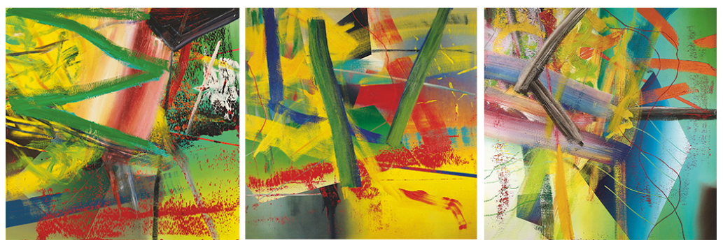
Left: Gerhard Richter, Marian, 1983, Private Collection.
Centre: Gerhard Richter, Martha, 1983, Private Collection.
Right: Gerhard Richter, Maria, 1983, Private Collection.
Images/Artworks: © Gerhard Richter 2026 (0177)
The entry point into Richter’s practice is occupied by Tisch from 1962 in his catalogue raisonné. Looking past these self-proclaimed beginnings, the duality that is prevalent throughout Richter’s work and shaped Mathis’ creation may be traced before — a life lived at the juncture between systems, new and old, in the shadow of a fragmented Europe. Born in Dresden in 1932, as a child Richter faced the violence and volatility of the Second World War that ushered in a Germany divided by two opposing political ideologies. Richter first gained his artistic education in the Dresden Academy of Fine Arts in 1951, a city that at the time was part of the Communist German Democratic Republic (GDR). Training within the confines of social realism and the prescribed aesthetic doctrine that precluded the expression of the personality or soul on the canvas, by 1961 Richter had defected to West Germany just before the Berlin Wall was raised. Enrolling in the Dusseldorf Academy, Richter faced another political system, influenced by the pervading consumer and media culture.

Gerhard Richter, Tisch, 1962, Private Collection. Image/Artwork: © Gerhard Richter 2026 (0177)
The ideological divide between East and West Germany and Richter’s experience of both systems underscored the fallibility of stances perceived as absolute, instilling in the artist a deep suspicion towards any claims of universal or final truths. This profoundly impacted Richter’s artistic practice and his subsequent sustained interest in the relationship between the photograph and painting. Amassing a vast amount of pictorial source material from press images to photographs from family albums, all now compiled in Richter’s collection Atlas, his enlarged reproductions of photographs in oil served as an apt device to challenge photography’s and painting’s assumed veracity. As he brought to the forefront of his first photorealist work, Tisch, Richter comprised multiple painting techniques, complicating our reading of the immediately legible table form with gestural overpainting. Challenging the perceived axiomatic truth of the camera, realism in art and our own perception, Richter has summarised, ‘we can’t rely on the picture of reality that we see, because we see it mediated through the lens apparatus of the eye, and corrected in accordance with past experience’.
Richter has been celebrated for the scope of his painting that when viewed chronologically can seem in opposition or antithetical. Despite the tendency to suggest a clean, definitive break when an artist evolves stylistically, Richter’s transformation from the muted, gradations of grey in his photo-realist paintings to the vivid, expressive abstractions of his mature career was not linear, and cannot be clearly demarked by his works first titled as Abstraktes Bilder in 1976. Richter encouraged these complex exchanges and dialogues as it strengthened his thesis on the subjectivity of perception and the inherent deception of all images, bringing abstraction and representation in closer proximity.
When Richter embarked on his Abstract Paintings by the 1980s, photography remained an integral part of his artistic production. In 1977 Richter embarked on the so-called ‘Soft Abstracts’ series, where he projected enlarged images of brushstrokes onto the canvas that he then painted, a process that obscured the original source material’s scale and composition. While Richter evolved beyond the need for photographic support, as Camille Morineau argues, Richter’s works produced in the early 1980s still had these origins and represent a narrow window before the squeegee became one of his primary instruments. As Morineau wrote, ‘what we tend to find in the abstract paintings of 1981 to 1984, the years following the Soft abstracts, Stroke, and the first squeegee paintings, is that the three aspects of the blow-up process can be combined into the same work. In a single painting we might find a ‘soft’ form that seems to be based on an enlarged image of an abstract sketch; an inflated single brushstroke; and a portion of the canvas that has been traversed by a squeegee’.ii
The interplay between realism, the photograph and abstraction continue to guide Richter between 1982 and 1983 as he commenced his celebrated photorealist Kerzen (Candles) and Schädel (Skulls) while continuing his ‘Wild Abstracts’ like Mathis. Exemplifying Richter’s academic facility, the subdued atmosphere of these highly refined compositions offers a striking counterpoint to the loaded pigment and radiant hues of Richter’s abstractions realised during the same time. Yet, with closer study, semblances between each body of work may be deduced. The denuded backgrounds found in Richter’s Kerzen and Schädel are reminiscent of the darker passage in the lower left quadrant of Mathis, while the flame of the candle might be echoed by the warm glow of the diamond form at the composition’s centre.
Abstraktes Bild, 1988
Christie’s London: 14 October 2026
Estimated: GBP 2,500,000 – 3,500,000
GBP 3,262,000 / USD 4,315,950
GERHARD RICHTER (B. 1932), Abstraktes Bild | Christie’s
GERHARD RICHTER (B. 1932)
Abstraktes Bild, 1988
Oil on canvas
92.1 x 126.2 cm (36-1/4 x 49-3/4 inches)
Signed, numbered and dated ‘678-3 Richter 1988’ (on the reverse)
Acquired by Barbara and Thomas F. Eagleton in 1991, Abstraktes Bild (1988) is a captivating and vibrant work from the height of Gerhard Richter’s abstract practice. Striated veils of olive green are swept before a cyan ground that flickers like flame, marbled with deep black fissures. Pink streaks illuminate the painting from within. Towards the right-hand edge is a chasm of heated colour, with the tooth of the canvas visible beneath its abraded surface. Richter made this work using the squeegee technique typical of his late-1980s abstracts, dragging a scraping tool across the still-wet paint to produce variegated, unpredictable chromatic and textural effects. In this surrender of his process partly to chance, he sought to create a visual analogy for the irreconcilable complexities and contradictions of reality itself.
Abstraktes Bild, 1992
Sotheby’s London: 15 October 2026
Estimated: GBP 6,000,000 – 8,000,000
GBP 6,678,000 / USD 8,835,660
Gerhard Richter | Abstraktes Bild | Contemporary Evening Auction |
GERHARD RICHTER (b. 1932)
Abstraktes Bild, 1992
Oil on canvas
175 x 250.8 cm (68-7/8 x 98-3/4 inches)
Signed twice, dated 1992 and numbered 757 (on the reverse)
David Hockney
Henry Reading, 1985
Sotheby’s London: 15 October 2026
Estimated: GBP 2,200,000 – 2,800,000
GBP 2,821,000 / USD 3,732,465
David Hockney | Henry Reading | Contemporary Evening Auction | 2026 |
DAVID HOCKNEY (1937 – 2026)
Henry Reading, 1985
Acrylic, charcoal, contact paper and paper collage on gatorboard, in artist’s frame
92 x 57-1/2 inches (233.7 x 146.1 cm)
Signed, titled and dated 1985 (on the reverse)
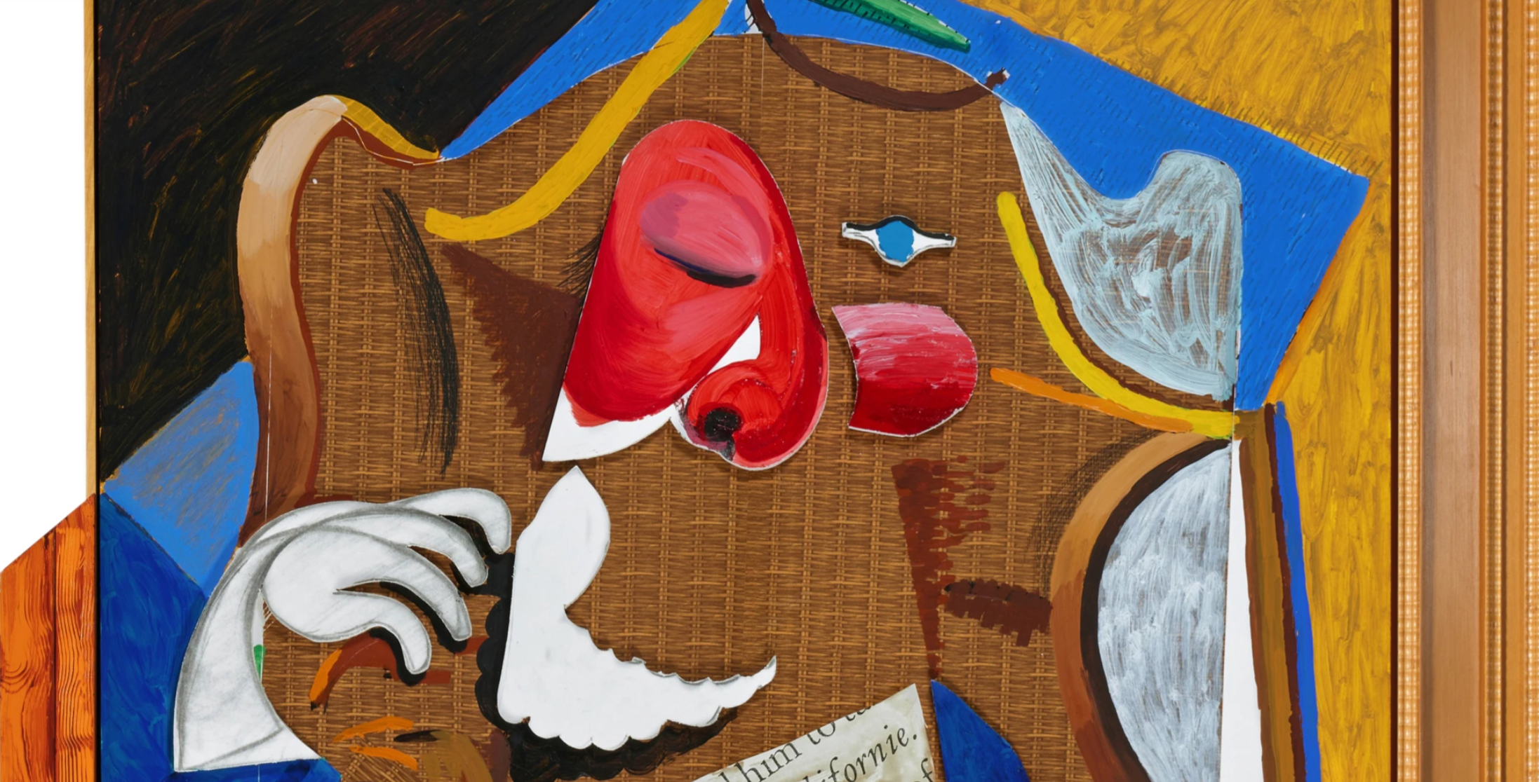
Monumental in scale and built up from an accumulation of collaged media, Henry Reading is a work of playful and deeply felt homage, in which Hockney pays tribute to two of the most important presences in his artistic life: Pablo Picasso, whose influence had preoccupied him for decades, and Henry Geldzahler, the curator and friend who appears here absorbed in a book. Painted in a loosely Cubist idiom that recalls Picasso’s own collaged constructions from the turn of the century, the work shows Hockney at his most inventive, folding two forms of tribute — to an artistic hero and to a cherished friend — into a single, riotously coloured composition.
“One reason, among others, why I think Picasso is so crucial is because he brings very much to the fore the question of verisimilitude versus the remaking of appearance. And what led me into questioning the verisimilitude of naturalism was that it was not real enough. Because the problem is not that naturalism is too real, but that it is not real enough.”
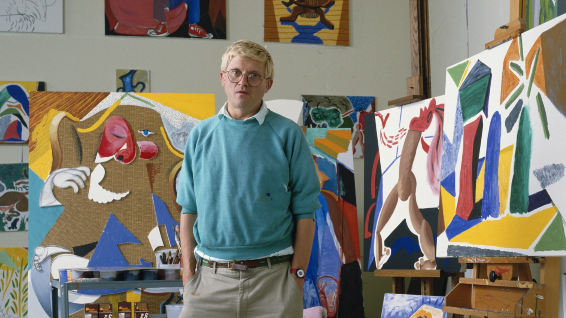
David Hockney in his studio while working on the present work (in the background).
Art: © David Hockney 2026. Image: © David Montgomery/Getty Images 2026
Henry Geldzahler was, for much of the twentieth century, one of the most influential curators of contemporary art in America, serving at the Metropolitan Museum of Art in New York and forming close friendships with many of the leading artists of his generation, Hockney chief among them. Hockney had painted and drawn Geldzahler many times over the years, from the celebrated 1969 double portrait showing him seated on a sofa beside his then partner Christopher Scott, to the deathbed portraits made at Geldzahler’s own request in 1994. Henry Reading sits within this long-running dialogue, offering an intimate glimpse of Geldzahler absorbed in a new book on Picasso — a projection, in effect, since the picture’s true subject is not so much the man himself as the way that his act of reading allows the contents of the book to take over and dictate the composition around him.
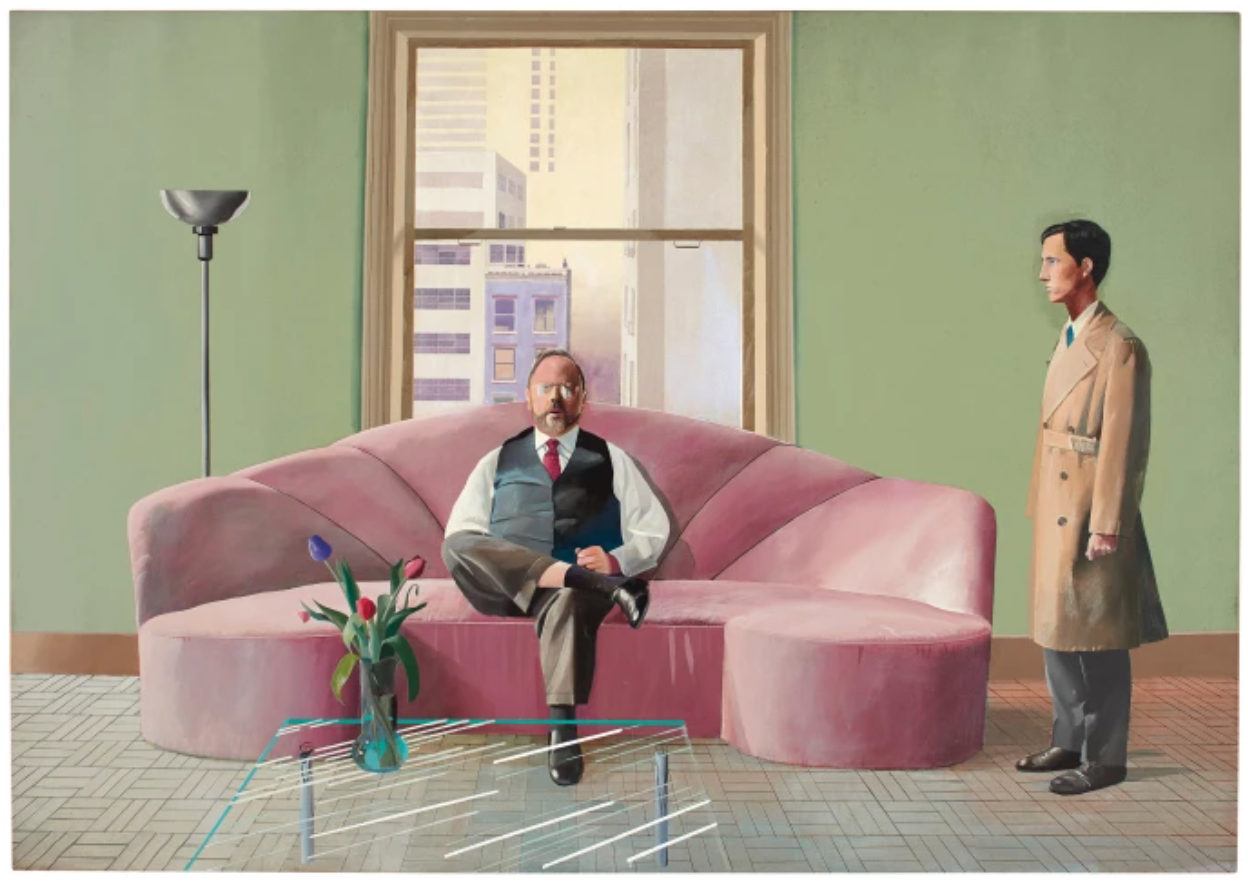
David Hockney, Henry Geldzahler and Christopher Scott, 1969. Private Collection. © David Hockney 2026
The choice of subject is a fitting one. The quotation from Klaus Gallwitz’s influential 1985 study of Picasso’s late years, from which the collaged text in the composition is drawn, refers to the Spanish master’s time in the South of France, when he had acquired a villa called La Californie — a name with an obvious resonance for an artist who had himself decisively relocated to California and whose work had, since the late 1970s, become increasingly preoccupied with questions of perception and representation. Hockney’s engagement with Picasso ran deep: he had studied the artist’s entire output, working page by page through the thirty-three-volume catalogue raisonné compiled largely during Picasso’s lifetime. While Henry Reading draws most directly on the visual language of Picasso’s Cubist period, it is the energy of the artist’s late work that seems to have left the deepest mark, not least Picasso’s own return, in the studio-paintings of his final years, to the theme of the artist’s working space itself.
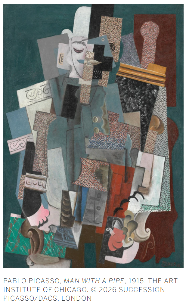
The mid-1980s saw Hockney produce a number of works in overt dialogue with Picasso’s style, among them A Visit with Christopher and Don, Santa Monica Canyon from 1984, a panoramic Cubist landscape painted for his friend Celia Birtwell, made the same year Hockney had visited an exhibition of Picasso’s work in Paris drawn from the collection of the dealer Daniel-Henry Kahnweiler. Henry Reading, produced shortly following these encounters, channels this same interest into portraiture, using Picasso’s own collage-based Cubism as the vehicle through which to represent a friend rather than a landscape or still life.
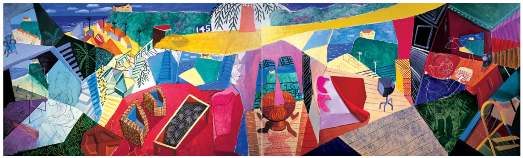
David Hockney, A Visit with Christopher and Don, Santa Monica Canyon, 1984. Museum Ludwig, Cologne. © David Hockney 2026
What distinguishes Henry Reading most, however, is the way its underlying concerns connect to a much longer preoccupation in Hockney’s work: the mechanics of vision itself. As Hockney explained of his engagement with Cubism during this period, the realisation that Picasso worked with an awareness of time as much as space — showing, in effect, “the back of the body as well as the front” — was for him “a very profound experience,” one that revealed naturalism to be not “too real”, but “not real enough” (David Hockney, That’s the way I see it, London 1993, p. 102). This same investigation runs through Hockney’s photomontages of the period, in which multiple photographs taken over time were assembled like fragments of a single experience, conveying more than any single image could alone. Henry Reading, though not itself photographic, shares this same underlying ambition: the compositional planes of bold colour that fracture and reconstitute Geldzahler’s form, the fragment of printed text lifted directly from Gallwitz’s book and pasted into the picture, and the wicker-effect background left deliberately open at the centre of the composition, all work together to build a portrait assembled through accumulation rather than a single fixed vantage point.
Executed on a scale that allows its Cubist planes and collaged fragments to unfold with real theatrical presence, Henry Reading stands as one of the most personal and art-historically resonant works of Hockney’s mid-1980s exploration of collage, a picture in which friendship, curatorship and the enduring example of Picasso are woven into a single, exuberant image.
Dog Painting 17, 1995
Christie’s London: 14 October 2026
Estimated: GBP 1,500,000 – 2,500,000
GBP 3,506,000 / USD 4,638,790
DAVID HOCKNEY (1937-2026), Dog Painting 17 | Christie’s
DAVID HOCKNEY (1937-2026)
Dog Painting 17, 1995
Oil on canvas
33×55 cm (13 x 21-5/8 inches)
Signed, titled, inscribed and dated
‘Dog Painting #17 (Stanley) David Hockney 95.’
(on the reverse)
Bathed in golden light and vibrant colour, Dog Painting 17 is a beautifully executed portrait of David Hockney’s beloved dachshund Stanley. Painted from life in a single sitting, the artist’s swift brushstrokes masterfully capture his companion’s smooth, rounded form, nestled in peaceful repose in the hollow of a cushion. The work belongs to Hockney’s series of Dog Paintings, created between 1994 and 1995: an extraordinary suite of canvases depicting Stanley and his companion Boodgie. With the majority held in the David Hockney Foundation, the present work is one of only a handful in private hands, having being acquired by the current owner in 1996. The Dog Paintings remain some of Hockney’s most intimate, personal and tender works: painted during a period of loss and grief, they are fundamentally portraits of life and love.
“I did really love them… I loved painting them … they were my best pals.”
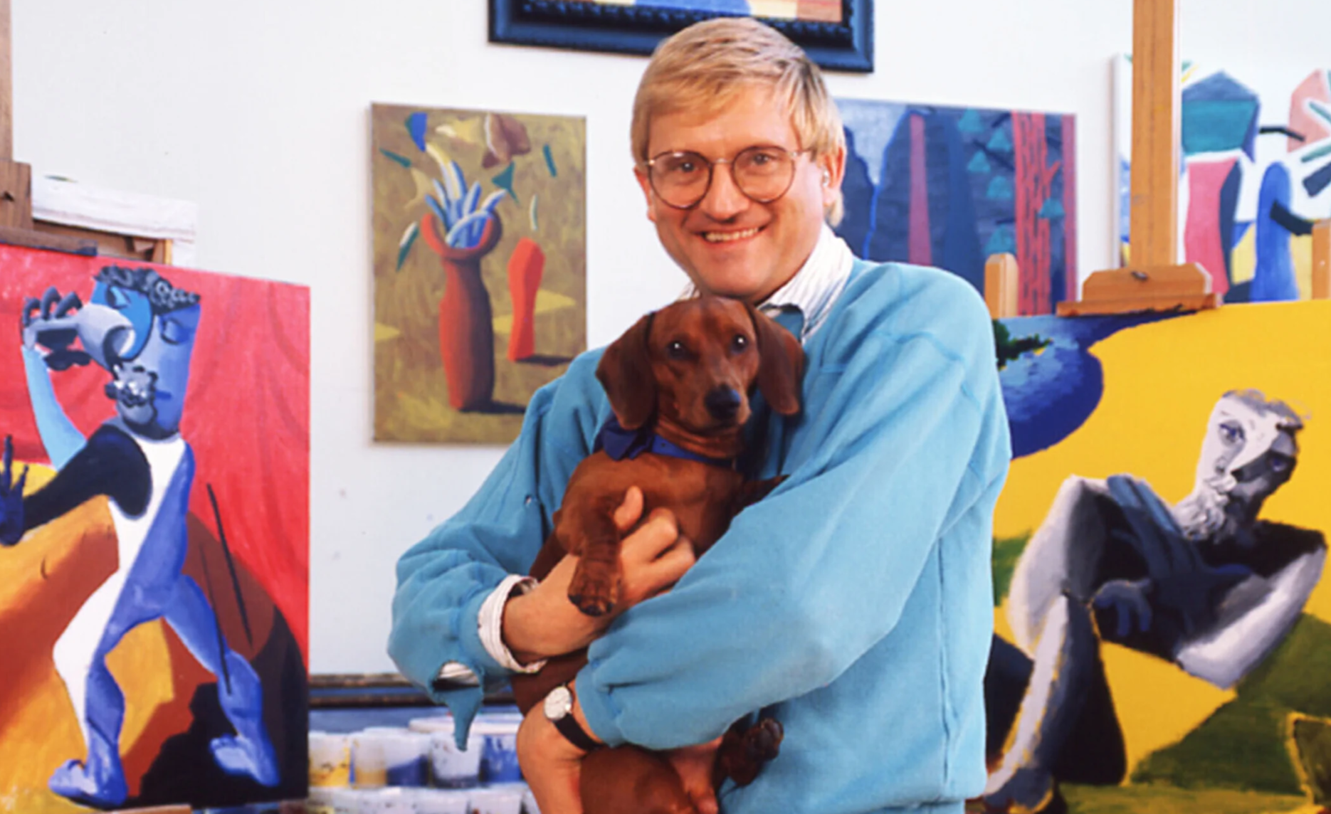
David Hockney with one of his dachshunds, 1987. Photo: Anthony Barboza/Getty Images. Artwork: © Estate of David Hockney.
Hockney’s Dog Paintings occupy an important place in his work. The artist recalled the unveiling of the series in Los Angeles: ‘We had over 7,000 people in four days,’ he explained. People were so happy. They were even coming to see the pictures with their own dogs’ (quoted in J. Stock, ‘A Dog’s Life’, The Independent, June 1995, online). More recently, the Wallace Collection crowned its 2023 exhibition Faithful Friends: Portraits of Dogs with a final room dedicated entirely to Hockney’s Dog Paintings. More than any other portraits in his work, these paintings radiate character, energy and a sense of devotional harmony. In the present painting, luminous tones of blue and green border the composition, while daubs of brilliant yellow reflect the sunlight to the left. Stanley sleeps just to the right in a patch of delicately drawn shade. Though captured in a state of repose, his entire body quivers with movement. His right ear is caught mid-air by a few, brisk strokes of paint, perking up to listen to a slight disturbance—perhaps the sound of Hockney picking up a new paintbrush.
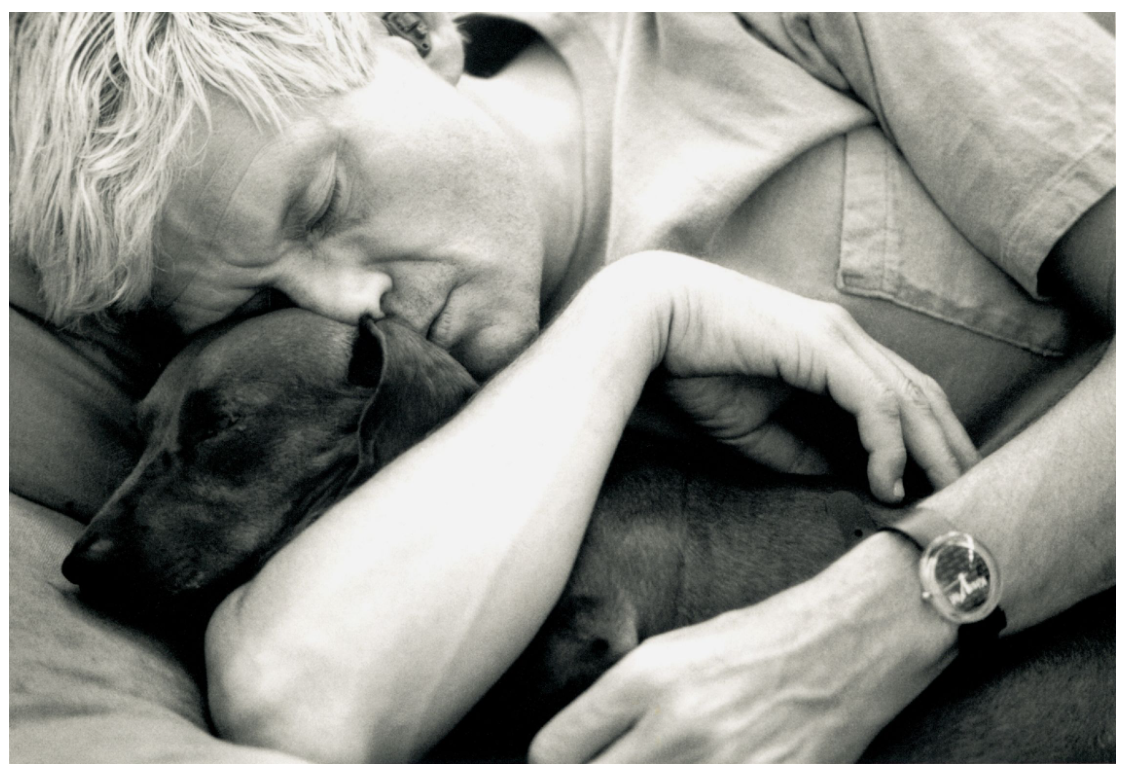
David Hockney holding one of his dauschands, 1993. Photo: Basil Langton/Photo Researchers History/Getty Images.
Stanley entered David Hockney’s life in 1987, shortly followed by Boodgie in 1989. He was named after the English comedian Stan Laurel, who formed half of the iconic comedic duo Laurel and Hardy. Stanley certainly had an attitude, Hockney recalled, constantly following him around in comparison to the more reserved Boodgie. He also had the peculiar habit of sitting up on his hind legs, which Hockney affectionately captured in Dog Painting 41 (1995, David Hockney Foundation). The artist and his dachshunds were inseparable; he observed them daily, and they him. In addition to the Dog Paintings, Hockney depicted them in the major work Montcalm Interior with Two Dogs (1988), as well as a number of other paintings and drawings during this period.
“These two dear little creatures are my friends.They are intelligent, loving, comical, and often bored. They watch me work; I notice the warm shapes they make together, their sadness and their delights. And, being Hollywood dogs, they somehow seem to know that a picture is being made.”
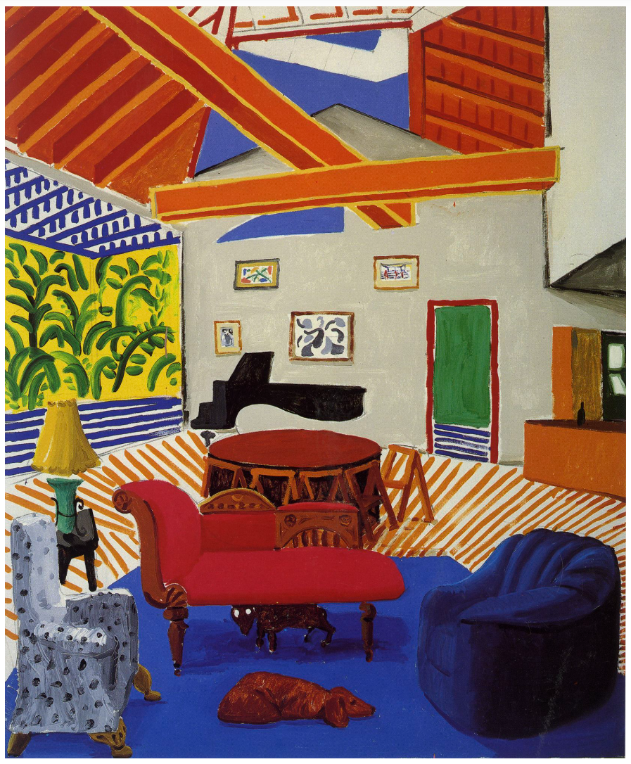
David Hockney, Montcalm Interior with Two Dogs, 1988. Private Collection. Artwork: © Estate of David Hockney.
The dogs offered Hockney a great deal of solace during a difficult time in his life, marked by the death of several close friends in 1994. Most notable among these was the celebrated critic and curator Henry Geldzahler, who had been a great comrade of Hockney’s. The artist Sandra Fisher, wife of R. B. Kitaj, also died that year, along with two other dear friends.
“In January I desperately wanted to paint something loving … I felt such a loss of love I wanted to deal with it in some way. I realized I was painting my best friends, Stanley and Boodgie. They sleep with me: I’m always with them here. They don’t go anywhere without me and only occasionally do I leave them. They’re like little people to me. The subject wasn’t dogs but my love of the little creatures.”
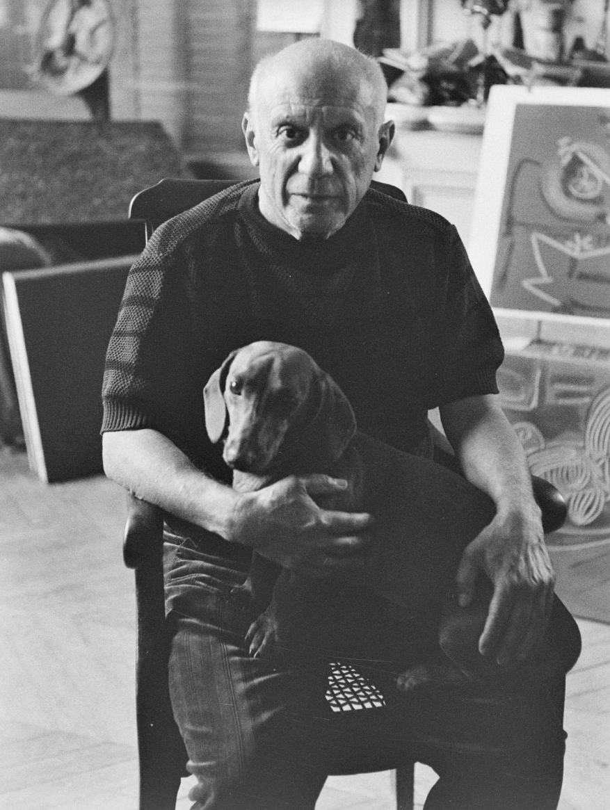
Pablo Picasso with his dachshund Lump. La Californie, Cannes 1959.
Photo: Edward Quinn, © edwardquinn.com. Artwork: © 2026 Succession Picasso/DACS, London.
After a decade of experimentation with photography, digital media and set design, the Dog Paintings formed part of Hockney’s triumphant return to painting. More specifically, they marked his renewed engagement with figurative subjects: ‘I was painting a lot of big [abstract] pictures at the same time, internal worlds,’ he explained. ‘These are the external world because it was the one immediately in front of me. I rather enjoyed that contrast’ (quoted in J. Stock, op. cit.). Painting his dachshunds proved a new technical challenge. In order to accommodate his unpredictable, canine sitters, Hockney would arrange sheets of paper all over the house and studio to catch the dogs in moments of repose. He had fresh paints and canvases ready in order to cause minimal disturbance, and constructed elevated platforms to place their cushions and study them at eye-level. Hockney affectionately remembered how even if they had settled, ‘they would always have the eye checking if I got up. So I had to stay still’ (Wallace Collection, op. cit.).
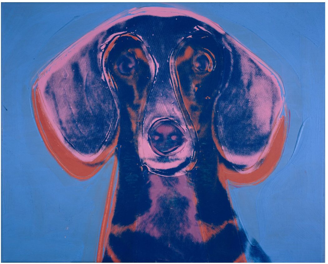
Andy Warhol, Portrait of Maurice, 1976. National Galleries of Scotland, Edinburgh. Artwork: © 2026 The Andy Warhol Foundation for the Visual Arts, Inc. / Licensed by DACS, London. Digital image: National Galleries of Scotland. Bequeathed by Gabrielle Keiller 1995.
Dogs have long occupied a prominent position in art history: not only as subjects, but also as faithful studio companions. Pierre Bonnard, Pablo Picasso and Andy Warhol were all proud dachshund owners. Lucian Freud, meanwhile, depicted his beloved whippets Pluto and Eli in paintings, drawings and etchings. For Hockney, the tiny creatures offered not only a source of comfort but also a wellspring of artistic inspiration, fuelling his love of painting from life. As he continued to deal with personal loss throughout the 1990s, the artist would channel his emotions into a similarly radiant series of sunflower paintings. Following the death of his mother in 1999, he began to return gradually to his roots in Yorkshire, taking his native landscape as his subject in what would become one of his most extensive series of paintings. The immediacy and spontaneity of the Dog Paintings would nourish these bodies of work. With its dappled golden light and brushwork alive with motion, the present example heralds the birth of this vital new chapter in Hockney’s art.
Water Lilies in the Pond with Pots of Flowers, 2021
Sotheby’s London: 15 October 2026
Estimated: GBP 450,000 – 650,000
GBP 1,920,000 / USD 2,540,350
David Hockney | 10th – 22nd June 2021, Water Lilies in the Pond with
DAVID HOCKNEY (1937 – 2026)
10th – 22nd June 2021, Water Lilies in the Pond with Pots of Flowers, 2021
Six iPad paintings printed on two sheets of paper, mounted on two sheets of Dibond
Overall: 82-1/2 x 78-1/2 inches (209.5 x 199.4 cm)
Numbered 13/25 (lower left)
Signed and dated 21 (lower right)
Executed in 2021, this work is number 13 from an edition of 25
Beneath a canopy of silver-grey clouds, concentric ripples disturb the mirrored surface of a pond where water lilies drift in floating clusters, their white and pink blossoms echoing the potted flowers that line the foreground. In David Hockney’s 10th–22nd June 2021, Water Lilies in the Pond with Pots of Flowers, the domestic garden becomes a theatre of looking, where sky, foliage, and water are observed, reflected, and reinvented across a six-part composition held together by a slate-blue grid. Combining the intimacy of still life with the encompassing scale of landscape, the work crystallizes the pictorial inventiveness and sustained delight in nature that distinguish his Normandy years.
“Artists thought the optical projection of nature was verisimilitude, which is what they were aiming for, but in the twenty-first century, I know that is not verisimilitude. Once you know that, when you go out to paint you’ve got something else to do. I do not think the world looks like photographs. I think it looks a lot more glorious than that.”
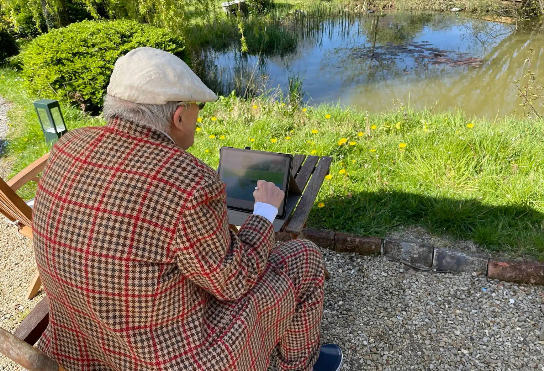
David Hockney working on iPad: David Hockney, Normandy, 2021 © David Hockney Photo: Jonathan Wilkinson
Hockney settled in Normandy’s Pays d’Auge in 2019, shortly before the pandemic transformed his rural retreat into a place of prolonged seclusion. Working through lockdown, he immersed himself in the rhythms of the landscape around his house, paying close attention to its seasonal transformations. The present work emerged from this fertile period, alongside the panoramic A Year in Normandie, whose unfolding cycle of seasons drew inspiration from the Bayeux Tapestry. Exhibited at the Musée de l’Orangerie in Paris in 2021-22 and later at the Serpentine Gallery in London in 2026, that monumental frieze demonstrated the scale of Hockney’s Normandy project, transforming a familiar garden into a vast meditation on time and change.
David Hockney: A Year in Normandie and Some Other Thoughts about Painting, installation view, Serpentine North, 2026
© David Hockney. Photo: George Darrell
The iPad, which Hockney began using in 2010, was fundamental to this renewed attention. Its portability and immediacy allowed him to register fleeting effects of light, weather, and seasonal change, extending the possibilities of painting en plein air. By the Normandy period, a specially adapted application offered brushes developed to his own requirements. Here, varied digital marks differentiate the stippled foliage, looping ripples, and dense granular texture of the foreground. Enlarged into a print over two meters high, these gestures retain the vitality of the drawing hand. Far from a departure from painting, the iPad works represent a natural extension of Hockney’s practice, giving him a new way to describe the world as it is seen and experienced.
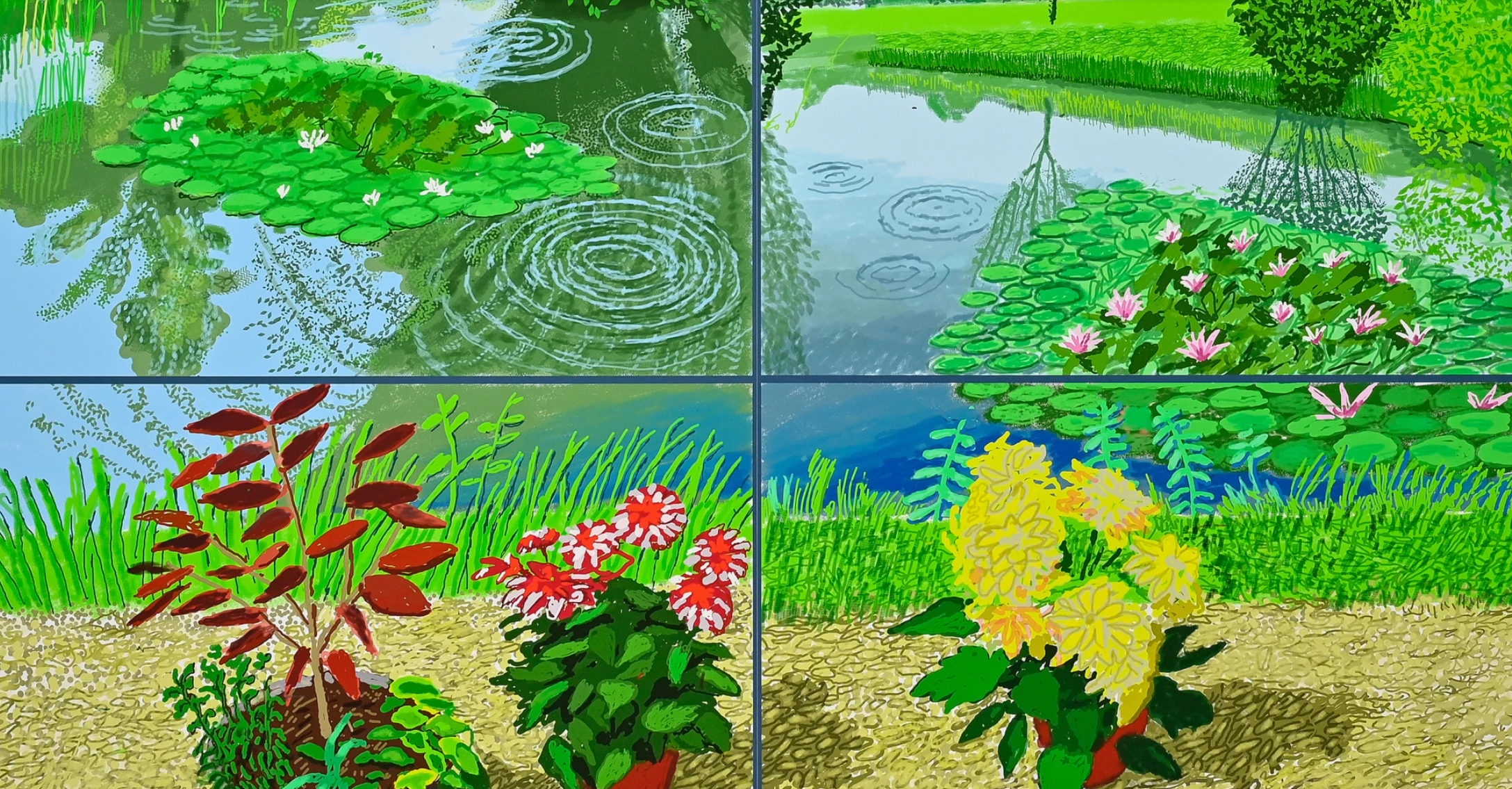
Hockney’s sustained attention to the garden finds one of its most resonant precedents in Monet’s Nymphéas. The affinity extends beyond a shared motif to a sustained engagement with an intimately known landscape, through which reflection, light, and seasonal change become inexhaustible subjects. Monet’s late Nymphéas frequently suppress the horizon, immersing the viewer in a world of water and reflected sky. Hockney, by contrast, retains the far bank, the building, and the shifting canopy of clouds above, situating the pond within a recognizable, inhabited landscape.
Claude Monet, Bridge over a Pond of Water Lilies, 1899. Metropolitan Museum of Art, New York.
The foreground also recalls Henri Matisse’s Open Window, Collioure of 1905. In Open Window, flowerpots arranged along the windowsill mediate between the viewer and the harbor beyond. Hockney employs a similar device, using pots of vivid yellow and vermilion flowers to frame the pond and draw the eye into the landscape beyond. Hockney long admired this balance in Matisse, observing that while much of his work is discussed in terms of color and form, “to deny the poetry and the sentiment in his painting is to deny some of the art, to diminish it” (David Hockney quoted in C. Simon Sykes, David Hockney. The Biography, 1975-2012: A Pilgrim’s Progress, London, 2014, p. 53). The same balance animates the present work, where compositional order heightens rather than restrains the vitality of nature.
Henri Matisse, Open Window, Collioure, 1905. National Gallery of Art, Washington D.C.
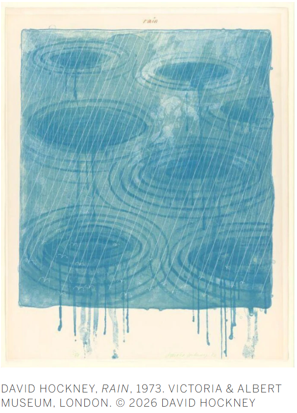
Water itself connects this garden to a preoccupation that runs throughout Hockney’s career, from the Californian pools of the 1960s, through the Weather Series of 1973, to his most recent Rain animations. Again and again, Hockney returned to the challenge of depicting something transparent, reflective, and constantly changing. Here, the pond becomes a shifting field of reflections, carrying images of the sky and surrounding trees while never fully surrendering its own surface. The ripples spreading across the water introduce a more immediate sense of time, fixing fleeting moments that would otherwise vanish almost at once.
Created amid the restrictions of the pandemic, 10th–22nd June 2021, Water Lilies in the Pond with Pots of Flowers belongs to a remarkable period of sustained observation and invention in Hockney’s career. Leaves, flowers, clouds and water are rendered with extraordinary attentiveness, yet continually transformed through color, pattern, and structure. Rooted in the familiar surroundings of his Normandy garden, the work demonstrates Hockney’s enduring ability to find renewal in the act of sustained looking.
Red and Black Fruit, 1988
Phillips London: 15 October 2026
Estimated: GBP 500,000 – 700,000
GBP 993,000 / USD 1,313,840
David Hockney Modern & Contemporary Art Evening Sale
DAVID HOCKNEY
Red and Black Fruit, 1988
Oil on canvas
12 1/8 x 24 1/4 inches (30.7 x 61.5 cm)
Signed, titled and dated ‘red and black fruit David Hockney 1988’ on the reverse
Painted in 1988, Red and Black Fruit reveals the artifice of both technology and material at a critical turning point in David Hockney’s career. Coinciding with the opening of his global touring retrospective which commenced at the Los Angeles County Museum the same year before travelling to the Metropolitan Museum of Art in New York and the Tate in London, Hockney had been inspired by the potential of the machine and its intersection with the realm of art. Driven by a relentless curiosity to probe the boundaries of illusionism, Hockney’s critical engagement with new techniques during the eighties had an equally powerful and illuminating impact on his painting. Against the gingham tablecloth, animated dots, loops and bands of oil contrast and combine, distinguishing the textures of the ruby-red fruits that shimmer within the basket’s weave. Defying the conventions of single-point perspective, shading and modelling, Red and Black Fruit fits stylistically into the art historical continuum and legacy of Cubism as it is filtered through Hockney’s experience of the contemporary condition — an expression of life’s joys and the pure gratification to be gained through the essential act of painting.
“I have always believed that art should be a deep pleasure.”
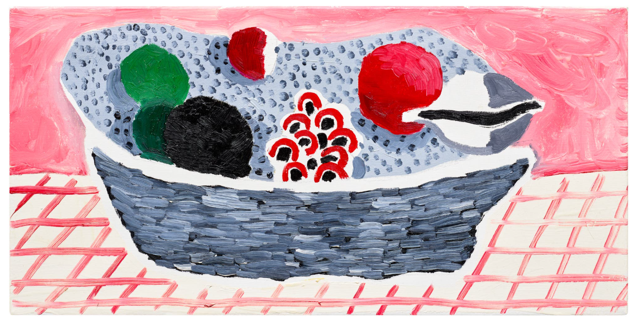
Though from the beginnings of his career Hockney had explored sight’s broad parameters, by the late 1970s the artist increasingly felt constrained by naturalistic representation and its limitations. The discovery of Wallace Stevens’ poem, The Man with the Blue Guitar, at the height of the summer of 1975 was revelatory, causing Hockney to more closely contemplate the poet’s musings on ‘Picasso, about the imagination transforming things, the way you see’, in relation to his own work.i In the productive, transformative months that ensued, etchings and major paintings like Self-Portrait with Blue Guitar (1977) reflected Hockney’s growing confidence in his break from naturalism and the dissolution of a fixed vantage point to render the subject.
“I became aware that Picasso’s way was far more real than anything else, and I also began to understand why it was more vivid.”
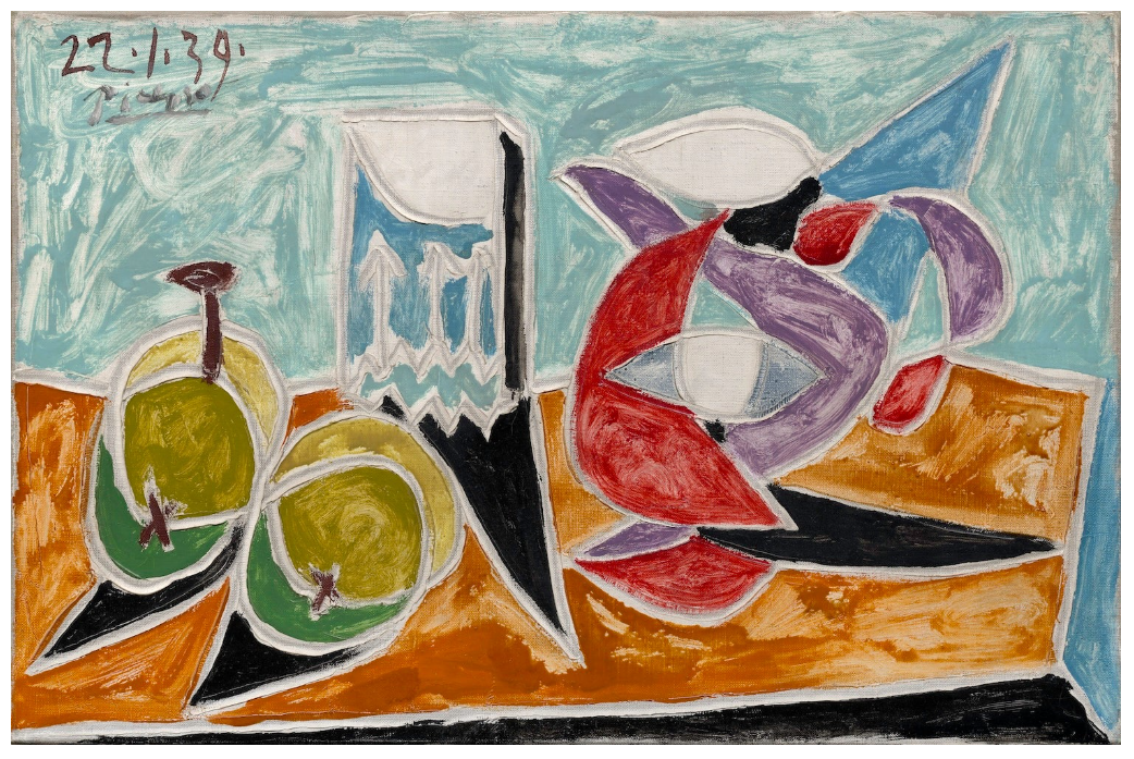
Pablo Picasso, Still Life: Fruits and Pitcher, 1939, Solomon R. Guggenheim Museum, New York. Image: The Solomon R. Guggenheim Foundation/Art Resource, NY/ Scala, Florence. Artwork: © Succession Picasso / DACS, London 2026
Though Hockney’s choice of subject is indebted to the seventeenth-century Dutch masters who popularised the western still-life genre, Pablo Picasso’s outlook also served as an imperative guide for the British painter to explore the malleability of space. Hockney by his own admission had ‘always had a great interest in Picasso’.ii However, moments like Hockney’s visit to Picasso’s New York retrospective at the Museum of Modern Art in 1980 and in December 1984 to a Pompidou exhibition on Daniel Kahnweiler’s collection foregrounding Picasso prompted a deeper pause and reflection on the Spanish master in the lead up to Red and Black Fruit’s creation. Utilising the same compression and foreshortening of ground as Picasso’s Still Life: Fruits and Pitcher, Hockney animates the canvas of Red and Black Fruit with an equally resonant yet condensed range of colours: greens, pewter greys paired with deep and pink-hued reds. Modulating viewpoints imperceptibly, for the fruits and the interior Hockney carefully shifts from three-dimensional shading to schematic, flattened shapes, collapsing the architecture of the environment. Though Hockney’s form is more supplely modelled in comparison to the geometric planes of Picasso, both place emphasis on observation as an active process of discovery, creating scenes that gradually reveal themselves as the eye deciphers and navigates the construction of space.
“Technology always has contributed to art.
The brush itself is a piece of technology, isn’t it?”
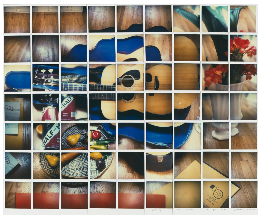
David Hockney, Still Life Blue Guitar 4th April 1982, 1982, Private Collection. Image/Artwork: © Estate of David Hockney.
Hockney’s turn away from purely literal expression was coupled with the artist’s increasing engagement with technological innovation as he created Red and Black Fruit. Such concerns informed his painting in novel ways and broadened his understanding of vision, in turn enlivening the legacy of the still-life genre. Though the process of instant photography was invented in 1948 and had already been utilised by artists including Andy Warhol, Hockney in 1982 developed an entirely new way to overcome the static, single-point perspective of the photograph. By collaging multiple photographs of the same subject recorded from different positions as in Still Life Blue Guitar 4th April 1982, Hockney overcame the constraints of optics built into the camera — frameworks that could be paralleled in paint to reappraise a purely naturalistic paradigm. Continuing his exploration of reproduction during the 1980s, his discovery of color photocopying led to his first trials in 1986 and production of ‘home-made prints’. This process allowed Hockney to ‘work with great speed and responsiveness’ that at the time he described was ‘the closest I’ve come in printing to what it’s like to paint’. In the process of reproduction, the method seems to have convinced Hockney of the impact of the planar, vividly hued images, resulting in a similar economy as he painted to test the image’s legibility. Remaining fundamentally engaged with the physicality of painting, the result in Red and Black Fruit is a composition of rich, internal balance and remarkable joie-de-vivre, comprising the fullness of lived perception with the spatial ingenuity of twentieth-century modernism and the innovations of contemporary mechanization.
Red Leather Chair, 2003
Phillips London: 15 October 2026
Estimated: GBP 500,000 – 700,000
GBP 645,000 / USD 853,400
David Hockney Modern & Contemporary Art Evening Sale
Watercolor on 4 joined sheets of paper
48 x 36-1/4 inches (122 x 92.2 cm)
Signed with the artist’s initials and dated ‘DH. ’03’ lower right
In his observation of human nature, David Hockney’s series of double portraits stand among the greatest achievements of his career. Rendered with full and fluid brushstrokes of watercolour, Red Leather Chair calls to mind these celebrated portrayals with a surprising effect: the sitter is absent. Two chairs — crimson and bottle green — appear in an anonymous space, the trace of humankind betrayed only by the subtle impression across the larger chaises’ smooth leather surface. Conceived as a poignant homage, Red Leather Chair was created in 2003 by Hockney in memory of Eduardo Chillida who had died the year before. The painting belonged to a larger presentation of works produced by fellow artists from Cy Twombly and Ellsworth Kelly to Georg Baselitz in honour of the Basque sculptor’s legacy, celebrated in an exhibition held at the Guggenheim Bilbao in 2006. Exultated by Hockney’s talent for rendering light, colour and mood undiminished in his later years, Red Leather Chair is a tender tribute to the departed as it is a pithy re-interpretation of the venerable tradition of portraiture seen through the British painter’s eyes.
“It’s the most direct method of laying in a mark, flowing from the eye, the heart, down the arm to the hand […] Watercolour just flows.”
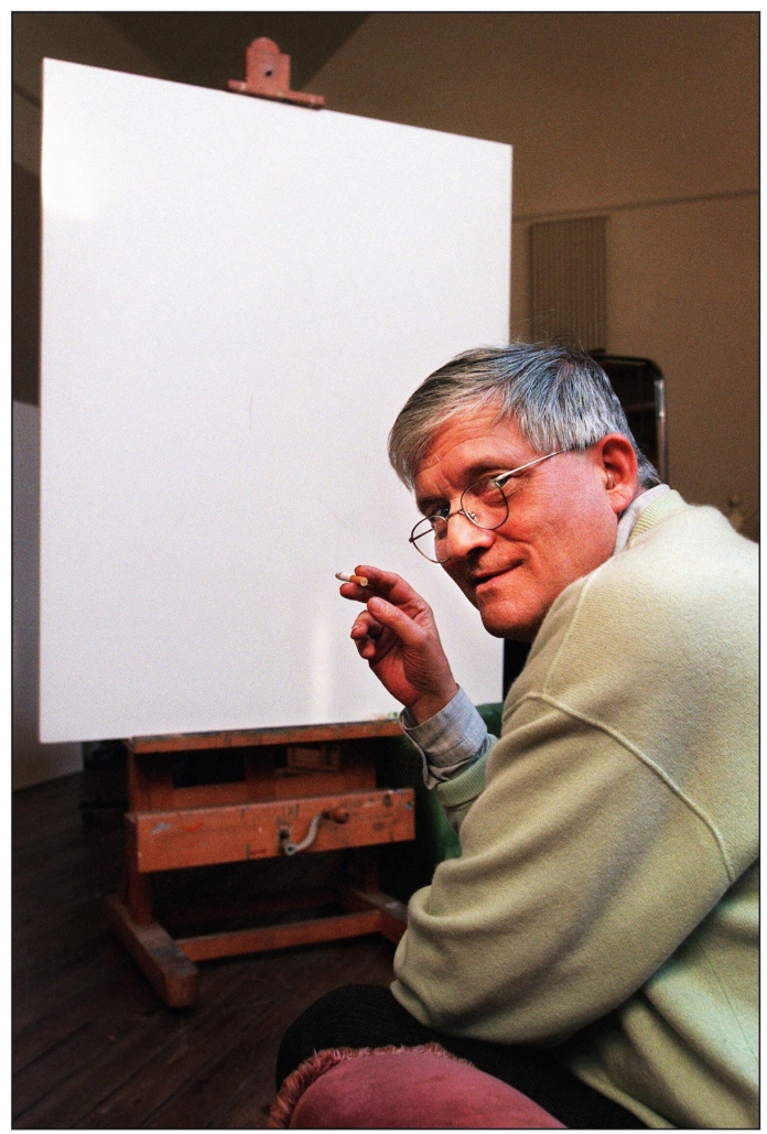
David Hockney in his studio, 2000. Image: Alamy / David Sandison
First began in 1968, Hockney’s double portraits have been celebrated for their cogent ability to reveal his sitter’s likeness and character. From his fashionable portrayals of his friends like Celia Birtwell and Ossie Clark now housed in the Tate in London to the commissions of the collectors Fred and Marcia Weisman displayed at the Art Institute of Chicago, these works are admired for their vividness, complexity and charisma, securing Hockney’s place as one of the most revered British painters. In the staging of the interiors or outside environments and subtle manipulations of his sitter’s stance or expression, Hockney was able to imbue his images with a psychological depth and charge. Painted over three decades later, in Red Leather Chair Hockney recalls the compositional devices and props of these great compositions, a topic that was on his mind following his exhibition of Five Double Portraits: New Work by David Hockney at the National Portrait Gallery in London. Occurring in 2003, the same year as Red Leather Chair’s execution, the sitters included in the presentation were depicted on office chairs across four-adjoined sheets. The forms of the chair — with their sloping arms, broad backs and full-bodied cushioning — functioned as the perfect object to lengthen Hockney’s exploration of the portrait genre. Typically fulfilling the roles as compositional devices that go unnoticed and are viewed as auxiliary, the chair is turned by Hockney into a deeply felt, emotional article. These pieces of furniture with their hard-worn creases allude to human contact, honouring Chillida here as they serve as a universal, anthropomorphic metaphor for absent sitters that when paired, can reflect on the hidden dynamics between two people.
“The perspective is terrific. It’s a very personal view. You couldn’t take a photograph like this. I’ve always loved this painting. Whenever my father came to London, he always wanted to see Van Gogh’s Chair. He thought it was marvellous.”
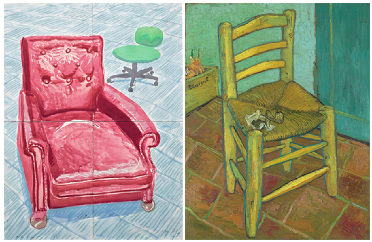
Left: The present work
Right: Vincent van Gogh, Van Gogh’s Chair, 1888, National Gallery, London. Image: Bridgeman Images
Having experimented with watercolour as early as 1961 and returning to the medium intermittently throughout his career, by the turn of the millennium Hockney experienced a surge of creativity and interest in the material. An exhibition of Chinese ink paintings at the Metropolitan Museum of Art in New York in 2002 brought its intricate qualities and optical play into greater focus, resulting in a renewed desire to harness the flows and amorphous properties of watercolour for an extended period. Reflecting on this experience, Hockney emphasised ‘Here was a medium I had been exploring for a few months, for the first time in my life. It required speed and discipline’.i By the time Hockney had painted Red Leather Chair, he had overcome the technical challenges of working with watercolour on scale, fully mastering the medium’s fluid and capricious qualities, from the elaborate detail of the chair’s studding, the mirrored shading of the leather surface, to pooling the medium to generate large sections of intense, fauve-like colouring. In the context of European painting, the subject of the chair particularly resonates with the unoccupied, roughly hewn frame of Van Gogh’s tour de force, Van Gogh’s Chair. Hockney had been profoundly moved by Van Gogh’s work that he ‘always loved’, re-interpreting the chair composition with his own canvases in 1988.ii As Van Gogh was inspired by domestic interiors and imbued the most humble and homespun with a sense of the sublime and personal resonance, Hockney worked with the same palpable materiality and symbolism, transforming in Red Leather Chair the functional into the poetic.
Portrait of Peter Langan and Jean-Marc Moussis, 1975
Phillips London: 15 October 2026
Estimated: GBP 200,000 – 300,000
GBP 232,200 / USD 307,225
David Hockney Modern & Contemporary Art Evening Sale
DAVID HOCKNEY
Portrait of Peter Langan and Jean-Marc Moussis, 1975
Crayon on paper
25 1/4 x 19 1/4 inches (64.2 x 49 cm)
Signed with the artist’s initials, inscribed, dedicated and dated ‘DH. for Peter Paris 1975’ lower right
Minutely observed and rendered, Portrait of Peter Langan and Jean-Marc Moussis reveals the intricacies of David Hockney’s draughtsmanship. Created through indiscernible, translucent shades of coloured crayon, in 1975 Hockney drew the restauranteur Peter Langan and his wine merchant, Jean-Marc Moussis. An outrageous figure of the eighties culinary scene who opened the celebrity haunt Langan’s Brasserie in 1976 with the actor Michael Caine and later, chef Richard Shepherd, Hockney revisited the figure of Langan over several decades with varying degrees of scrutiny. Created among the consummate drawings that included fellow artists, friends and fashion designers after the artist moved to Paris in 1973, Portrait of Peter Langan and Jean-Marc Moussis belongs to Hockney’s celebrated double portraits that he began in the late 1960s and continued to produce throughout much of his lifetime.
“I’d done a drawing of Peter with a wine merchant in Paris […] and he’d written at the top in his kind of mad Irish handwriting ‘An evening of excess’, and I must say it was, a wonderful one.”
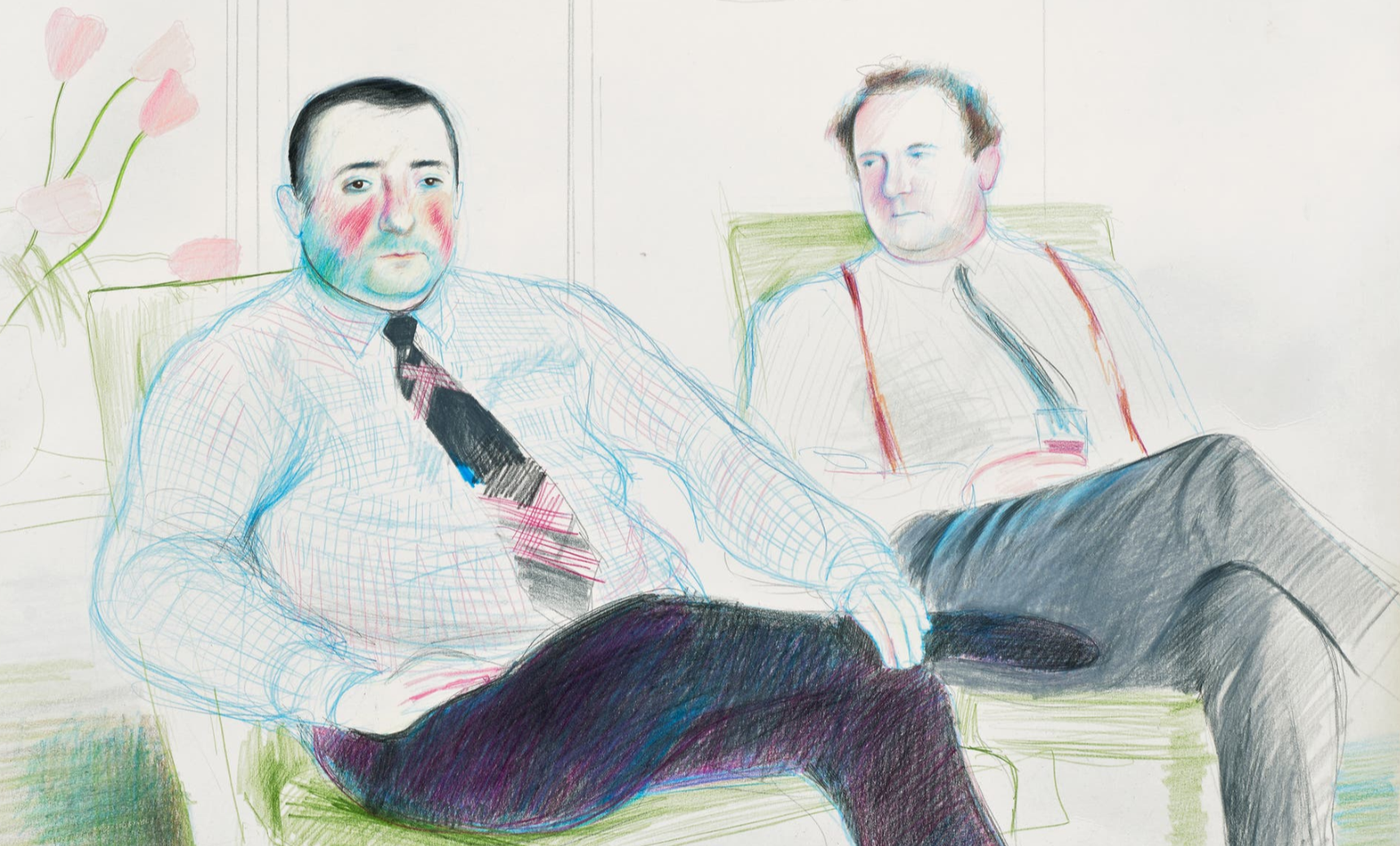
Hockney’s chosen subjects for his double portraits like with his landscapes or still lifes were often autobiographical — responding to his immediate surroundings and social circles. As with the accomplished drawings created following his move to the French capital in 1973, Hockney’s subjects were recent and old friends including designers Celia Birtwell and Jean Léger, fashion student Gregory Evans and Yves-Marie Hervé. At this time Hockney approached drawing as a lengthy and arduous exercise, a process that allowed him to closely study and capture the essence of his sitter’s likeness. ‘I did them slowly. I would spend two or three days drawing the person slowly, rather academically, sort of ‘accurately’ in an ordinary sense’, the artist noted. Hockney could examine through the portrait genre the human condition and in turn with the inclusion of two figures, relationships, with all their particularities. While in Paris, Hockney continued his development of the double portrait format, painting the two American artists Shirley Goldfarb and Gregory Masurovsky in 1974, a work now housed in the San Francisco Museum of Modern Art. Made the following year while still residing in France, for the present work Hockney paired Peter Langan alongside Jean-Marc Moussis.
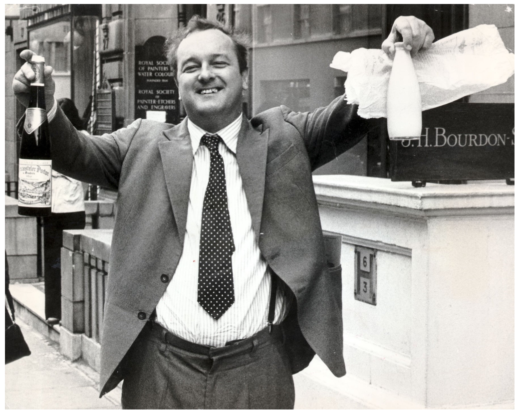
Peter Langan, co-owner of Odin’s and co-founder of Langan’s Brasserie, 1975. Image: Bill Cross/Daily Mail/Shutterstock
Hockney is first known to have drawn Peter Langan in the late sixties, before he had opened Langan’s Brasserie in 1976 yet was still involved in his first restaurant Odin’s located in Marylebone. Hockney was among the artists like Patrick Procktor who would at times exchange pictures with Langan for food: paintings and drawings that surrounded sitters of his brasserie. Langan became known as a wild, outrageous figure, simultaneously drawing in and horrifying clientele for his boorish behaviour that included sleeping under tables imbibed, biting customers ankles or trying to put out a kitchen fire with champagne. By the mid-1980s Langan’s Brasserie in Mayfair had nonetheless become one of London’s most in vogue and fashionable meeting points for celebrities, actors, musicians and artists from Princess Grace of Monaco, Elizabeth Taylor to Mick Jagger, Francis Bacon and Mohammed Ali. Recognising the talent of Langan, Hockney had him organise a celebratory picnic on the lawn of Glyndebourne for premiere of The Rake’s Progress which the artist designed the sets and costumes for in 1975. A decadent banquet on Midsummer Day, Hockney recalled ‘Peter Langan had realized […] he was bringing 120 bottles of champagne for about 30 people […] The food was marvellous and there was so much of it I invited the orchestra and chorus, after the performance’. Hockney also included the drawing of Langan and Moussis on the cover of the menu.
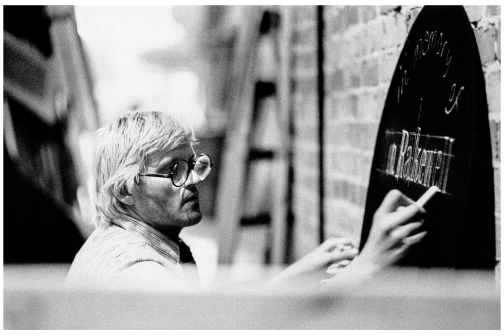
David Hockney working on stage designs for The Rake’s Progress at Glyndebourne Festival Opera, 1975. Image: Alamy/Donald Cooper
The present work memorializes the relationship between the Moussis and the restauranteur, around the time Langan was running his first restaurant Odin’s. During the summer of 1975 while Langan spent much of his time in France, he met in Paris the French wine merchant Jean-Marc Moussis through the sculptor Michael Goldman. Striking a deal for a house white for Odin’s despite Langan’s inability to speak French, Peter was nonetheless excited by the prospect Hockney might design the wine label. It was only when the first delivery arrived that Langan realised his unwitting expenditure, purchasing 30,000 bottles instead of 3,000. To make matters worse, the wine had not travelled well, becoming so sweet it could only be sold in Odin’s as a dessert wine while Hockney ultimately did not design the label. Alluding to this impasse, with Moussis’ bright red cheek and bottled wares centred beneath him, Hockney vividly captures the eccentric personalities of these two men. Despite the unfortunate predicament, the image seems to have been to Langan’s likeness as he also used the drawing for his menu of Odin’s.
Andy Warhol
5 Deaths Twice II, 1963
Christie’s London: 14 October 2026
Estimated: GBP 6,000,000 – 8,000,000
GBP 4,360,000 / USD 5,768,715
ANDY WARHOL (1928-1987), 5 Deaths Twice II | Christie’s
ANDY WARHOL (1928-1987)
5 Deaths Twice II, 1963
Acrylic and silkscreen ink on canvas, in two parts
(i) 20-1/8 x 30-1/4 inches (51.2 x 76.7 cm)
(ii) 30 x 30-1/4 inches (76.2 x 76.7 cm)
Overall: 50-1/8 x 30-1/4 inches (127.4 x 76.7 cm)
Signed, titled and dated ‘5 DEATHS TWICE Andy Warhol / 63’ (on the reverse)
Originally owned by the legendary collectors Robert and Ethel Scull, and subsequently a centrepiece of the prestigious Matthys-Colle Collection, 5 Deaths Twice II is an extraordinary work from one of Andy Warhol’s most powerful series. Executed in 1963, it is one of just two intact diptychs from his landmark cycle 5 Deaths, and the only example in which the images are stacked vertically. It is also the last remaining example with its original hinges still attached—a rare feature of Warhol’s practice. Based on a photograph of a horrific car accident, 5 Deaths formed part of his seminal Death and Disaster series. Encompassing some of the artist’s most iconic and unsettling images, these works tapped into the dark undercurrents of contemporary American life, probing themes of voyeurism, mass-media consumption and the inevitability of death. The car crash, in particular, was a subject that haunted Warhol, giving rise to masterpieces including Green Car Crash (Green Burning Car I) (1963) and Silver Car Crash (Double Disaster) (1963). Confronting the viewer with a dazzling infra-red glow, the present work represents a modern-day memento mori: a devotional altarpiece to life’s fleeting flame.
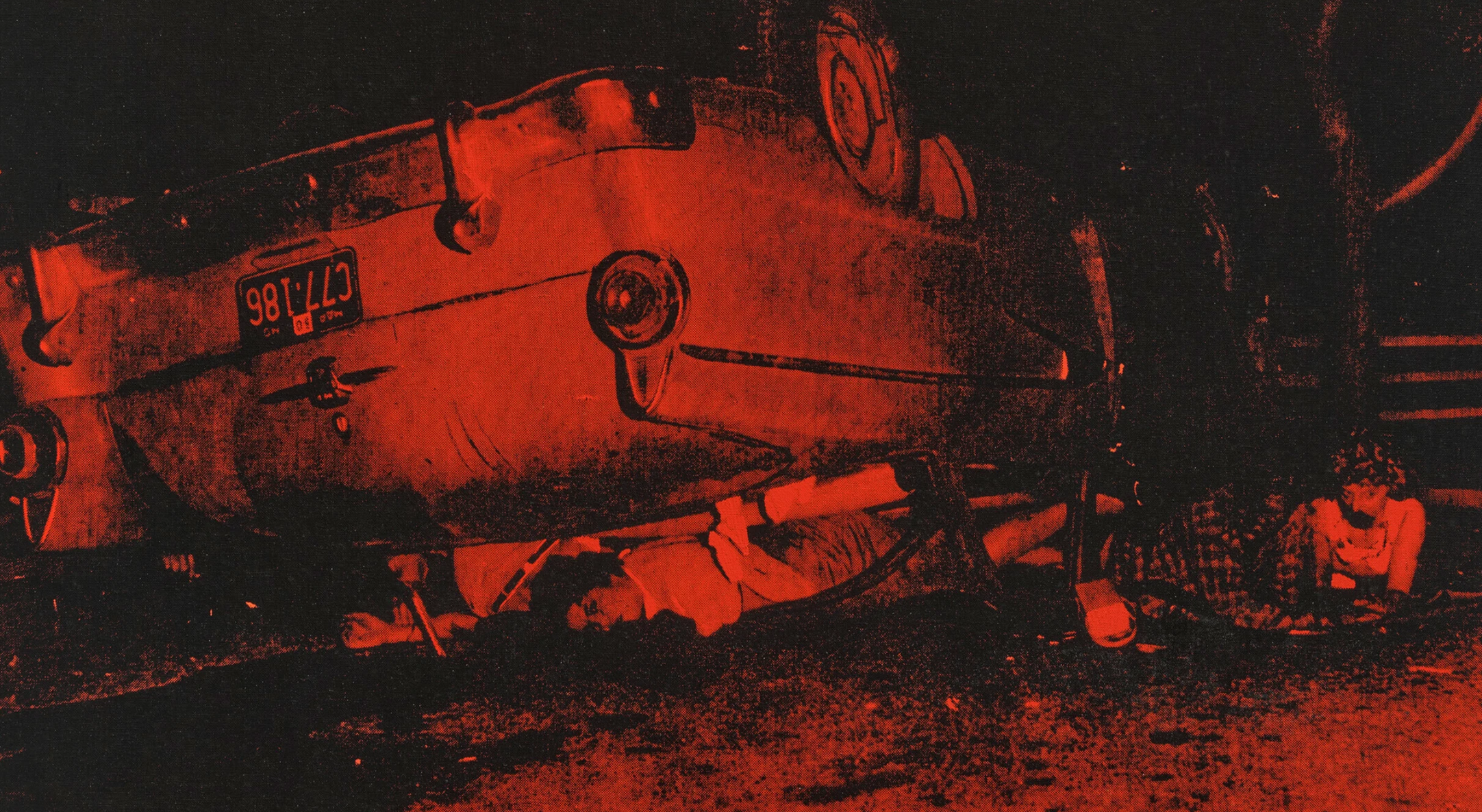
The work’s provenance is exceptional. Warhol worked on the painting during the summer of 1963, while he was completing his landmark portrait Ethel Scull 36 Times (1963). The Sculls were among the most significant contemporary art collectors of their day, and the portrait represented Warhol’s first ever commission: it is now owned jointly by the Whitney Museum of American Art and the Metropolitan Museum of Art. The present work was originally intended for the artist’s landmark exhibition of Death and Disaster silkscreens at Galerie Ileanna Sonnabend in 1964—his first ever show in Paris. The Sculls, however, acquired it prior to the opening. Warhol had created two other hinged multi-panel versions of 5 Deaths for the show, but these were dismantled into single works by Sonnabend. The only other surviving diptych, 5 Deaths Twice I (1963), is also unhinged, thus making the present work unique. Among the few surviving hinged multi-panel works in his oeuvre, notably, is a triptych portrait of Ethel Scull.
Andy Warhol, Ethel Scull 36 Times, 1963. Whitney Museum of American Art, New York. Artwork: © 2026 The Andy Warhol Foundation for the Visual Arts, Inc. / Licensed by DACS, London. Digital image: © 2026 Whitney Museum of American Art / Licensed by Scala.
In 1969, the work entered the Matthys-Colle Collection, acquired from the distinguished collection of the art dealer Serge de Bloe. Dr Roger Matthys, a noted Belgian neuropsychiatrist, and his wife Hilda Colle assembled what would become one of Europe’s most important and influential private collections, fuelled by a visionary passion for international contemporary art. The breadth and depth of their engagement with the art of their time was remarkable, and their collection encompassed pioneering examples of Minimalism, Conceptualism and Pop Art. In 1957, Matthys co-founded the Friends of the Museum of Contemporary Art in Ghent, whose acquisitions would later form the basis of the Stedelijk Museum voor Actuele Kunst (S.M.A.K.).
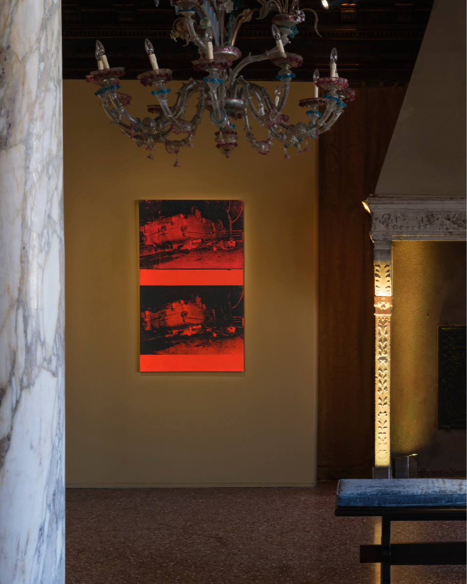
The organisation transformed the Belgian cultural scene, championing living artists at a time when their work was largely disregarded by local institutions and the public. The present work was included in two exhibitions at the institution between 2021 and 2022, marking its first public appearance for half a century. Matthys had previously loaned the work to Warhol’s landmark international retrospective between 1970 and 1971, which toured six museums including the Tate Gallery, London, the Musée d’Art Moderne de la Ville de Paris.
“I thought it would be nice for these unknown people to be remembered.”
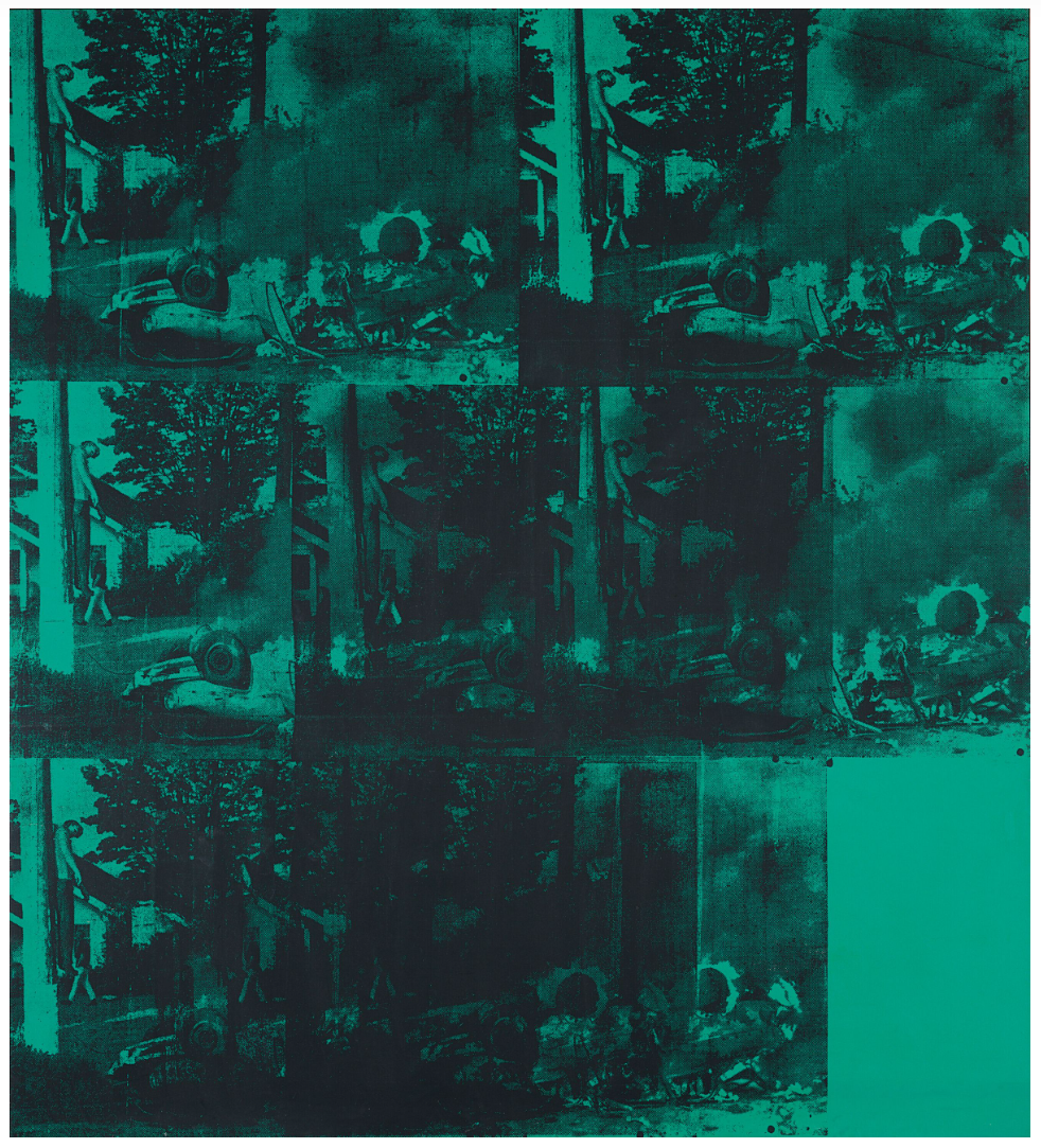
Andy Warhol, Green Car Crash (Green Burning Car I), 1963.
Private collection. Artwork: © 2026 The Andy Warhol Foundation for the Visual Arts, Inc. / Licensed by DACS, London.
Begun in the summer of 1962, the Death and Disaster works represented a profound new direction for Warhol. Two months earlier, the curator Henry Geldzahler had encouraged him to dispense with his Campbell’s Soup cans and Coca-Cola bottles in favour of more macabre muses. ‘Maybe everything isn’t always so fabulous in America’, he had suggested. ‘It’s time for some death’ (quoted in V. Bockris, The Life & Death of Andy Warhol, London, 1998, p. 169). Geldzahler gave him a copy of the day’s New York Mirror, dated 4 June 1962, which bore the headline ‘129 Die in Jet’. The newspaper clipping paved the way for a series that would irrevocably transform his practice. Warhol stopped using his own drawings as sources for his silkscreens, turning instead to pre-existing photographs. The move dramatically expanded both the technical and conceptual scope of his art. These works, wrote the critic David Bourdon, were to become ‘the greatest things he ever did’, holding a mirror up to society in a way that nothing else had done before (quoted in V. Bockris, Warhol: The Biography, Cambridge MA, 1997, p. 161).
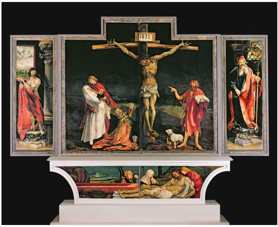
The Isenheim Altarpiece, circa 1512-1515. Musee d’Unterlinden, Colmar. Digital image: Bridgeman Images.
Among the earliest subjects in the series was Marilyn Monroe. Her suicide in August 1962 gave rise to a groundbreaking suite of portraits that confronted the entwinement of fame and tragedy. As the cycle evolved, however, Warhol began to shift his attention away from the trappings of celebrity. He became particularly fascinated by the way in which images of catastrophes circulated within the media, their horrors numbed by repetition. As Hannah Arendt’s report on the ‘Banality of Evil’ was being serialised in the New Yorker magazine—and at a time when commercial advertising sought to perpetuate the dream of ‘normal’ American middle-class life—the deaths of unsung civilians were being broadcast on a daily basis. ‘When you see an image over and over again, it doesn’t really have any effect,’ he explained. He began to focus on images of ‘people who nobody had ever heard of,’ noting that ‘I thought it would be nice for these unknown people to be remembered’ (interviewed by G. Swenson, ‘What is Pop Art?’, in Art News, Vol. 62, November 1963, pp. 60-61).
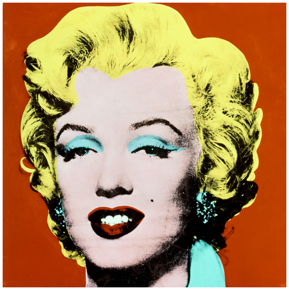
Andy Warhol, Shot Red Marilyn, 1964. Private collection.
Artwork: © 2026 The Andy Warhol Foundation for the Visual Arts, Inc. / Licensed by DACS, London.
From electric chairs to race riots, ambulance disasters and even a case of fatal food poisoning, the Death and Disaster series quickly gathered pace. The car crash, however, was a subject that preyed upon Warhol’s psyche more than any other. Throughout his life, the artist harbored an obsessive dread of accidental death, and readily admitted to a fear of drivers falling asleep at the wheel. He amassed a vast collection of newspaper photographs depicting car accidents, some culled from tabloid-style publications and others that were too shocking to have ever been printed. The specific source for 5 Deaths was one such image: a discarded 8 x 10 United Press International photograph which his studio assistant Gerald Malanga found in a bookstore on 7th Avenue and 23rd Street. The picture’s caption read, in part, ‘Two Die in Collision. Los Angeles, Calif.: Three Survivors of a car-truck collision, pinned beneath their overturned automobile, wait to be freed by rescue squads here, June 17th. Two other passengers in the car, both sailors from the USS Maddox at San Diego, were killed.’
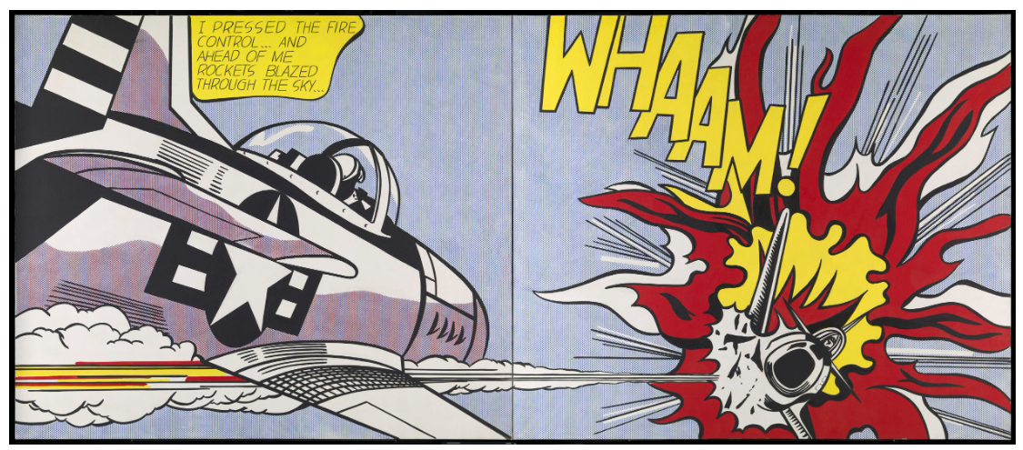
Roy Lichtenstein, Whaam!, 1963. Tate, London. Artwork: © 2026 Estate of Roy Lichtenstein/DACS. Digital image: © Tate.
Printed in high-contrast for easy dissemination and legibility, the image was readily adaptable to Warhol’s silkscreen process. The artist’s catalogue raisonné records a total of 16 works based on this photograph, with one held in the Galleria Civica d’Arte Moderna e Contemporanea, Turin and two others held in the Andy Warhol Museum, Pittsburgh. Using a flat back silkscreen base, the image was screen-printed onto backgrounds painted in a single flat colour. Despite the mechanical nature of this method, however, the trace of the artist’s hand is still prevalent. As Malanga remembers, ‘[The car crashes] had a shock value that kind of excited him. Andy liked to think of it as mechanical, but it really was a hands-on approach, not an assembly line approach … they were always original, each painting; mistakes were inevitable and he accepted them for what they were: he called them “divine accidents”’ (‘Death and Disaster: Gerald Malanga Discusses Warhol’, Christie’s, 2007, online).
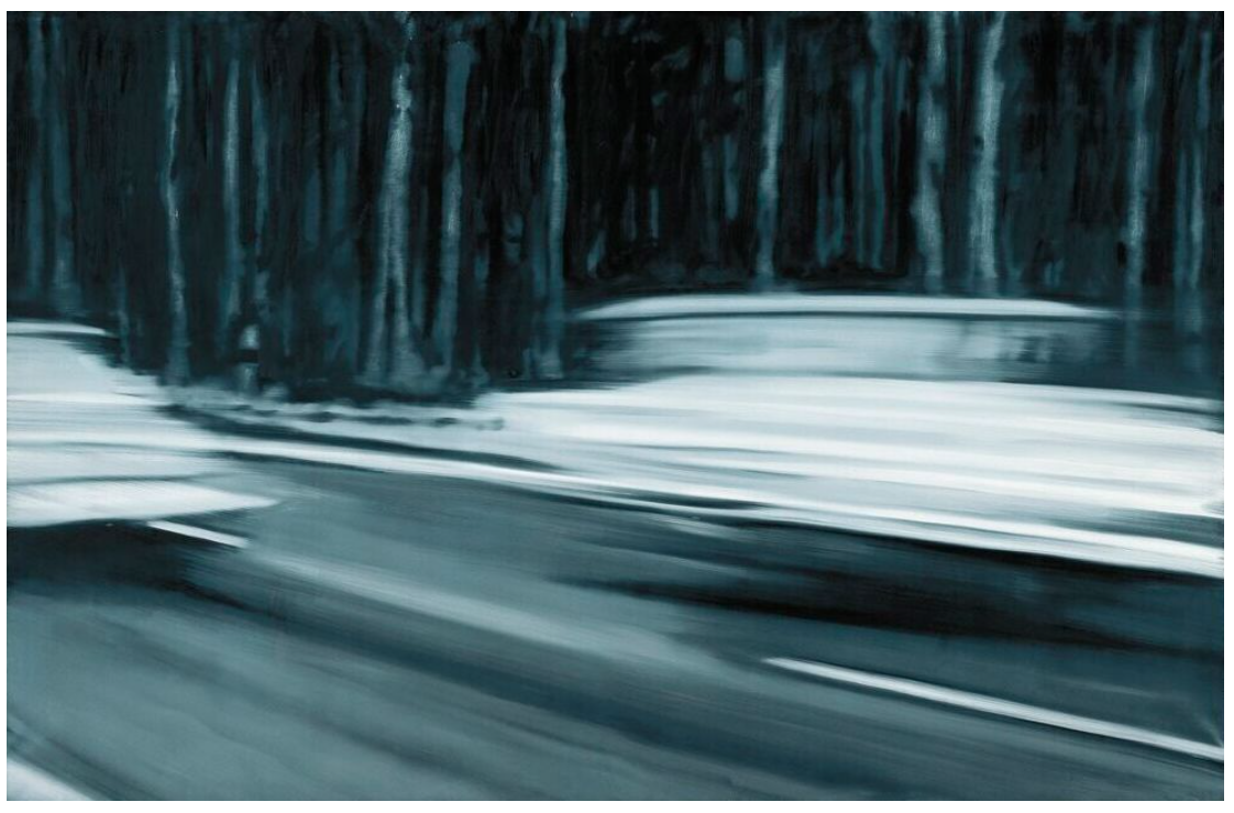
Gerhard Richter, Zwei Fiat, 1964. Museum Frieder Burda, Baden-Baden. Artwork and digital image: © Gerhard Richter 2026 (0185).
Throughout the Death and Disaster series, Warhol consistently teased out moments of irony. Here, the implications of the automobile—a vehicle of leisure and social mobility proudly attained by the middle class during America’s prosperous postwar years—are quite literally flipped on their head. The ultimate symbol of the American Dream becomes, instead, a machine of banal catastrophe, its promises subverted in the blink of an eye. Malanga recalls that ‘When we were making the 5 Deaths with the car upside down and the people underneath, Andy asked, “Are they still alive?” as if the accident had actually occurred in front of us’ (‘Photograph of a Painted Photograph: 5 Deaths’, in Andy Warhol 5 Deaths, exh. cat., Stellan Holm Gallery, New York, 2002, p. 29). The present work’s diptych format imbues the work with a sense of near-religious grandeur—a vivid memorial to the macabre irony of life’s ill-fated end. ‘The faces now nameless,’ writes Malanga. ‘The situation of the death and disaster receding in time and memory … A midsummer night on a lonely road to nowhere. The characteristics traits of what we have called modernity’ (ibid., p. 12).
Portrait of Johann Wolfgang von Goethe, 1981
Sotheby’s London: 15 October 2026
Estimated: GBP 1,200,000 – 1,800,000
GBP 1,472,000 / USD 1,947,605
Andy Warhol | Portrait of Johann Wolfgang von Goethe | Contemporary
ANDY WARHOL (1928 – 1987)
Portrait of Johann Wolfgang von Goethe, 1981
Acrylic and silkscreen ink on canvas
79 x 82-7/8 inches (200.5 x 210.5 cm)
Signed and dated 1981 (on the overlap)
Turned away from the viewer, his profile lent a dark halo by the brim of his hat, the Goethe of Warhol’s 1981 portrait gazes off into a middle distance the picture never reveals. It is a striking departure from the frontal, direct-address format that defines so much of Warhol’s celebrity output, and one made all the more pointed by the fact that many of the eighteenth-century portraits of Goethe by his contemporaries show him looking straight out at the viewer. Warhol’s choice to retain this averted gaze, rather than adjust it to fit his usual mode, imports something of the wistful, Romantic sensibility of Goethe’s own age directly into the picture — a mood that Warhol’s bright, synthetic colour and mechanical silkscreen process then proceeds to disrupt entirely.
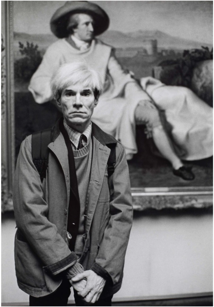
Barbara Klemm, Andy Warhol standing in front of Johann Heinrich Wilhelm Tischbein’s Goethe in the Roman Campagna, 1981.
Städel Museum, Frankfurt.
Warhol’s source for the image was not a photograph, as it was for the vast majority of his sitters, but a painted likeness: a detail cropped from the celebrated portrait of Goethe by Johann Heinrich Wilhelm Tischbein, itself widely regarded as one of the most famous portraits in Germany. Of the original, the former Director of the British Museum Neil MacGregor has observed that Tischbein’s Goethe, “larger than lifesize,” is painted “as something more” than a mere likeness — “a man embracing the culture of the whole world… Tischbein shows us Goethe as a monument” (Neil MacGregor, ‘One Nation Under Goethe,’ Germany: Memories of a Nation, London 2014). Warhol’s decision to work from an existing oil painting rather than a photograph or a sitting of his own gives the resulting portrait an unusual double remove: a silkscreen derived from a painted appropriation, a likeness built upon a likeness, in what amounts to a distinctly Duchampian gesture. Where Warhol’s contemporary subjects typically submitted to his camera or his Polaroid, Goethe — dead since 1832 — could offer him only the mediated record left by another artist’s hand, and Warhol’s evident willingness to work within that constraint underscores how deliberately he was reaching, by this stage in his career, beyond the world of living celebrity altogether.
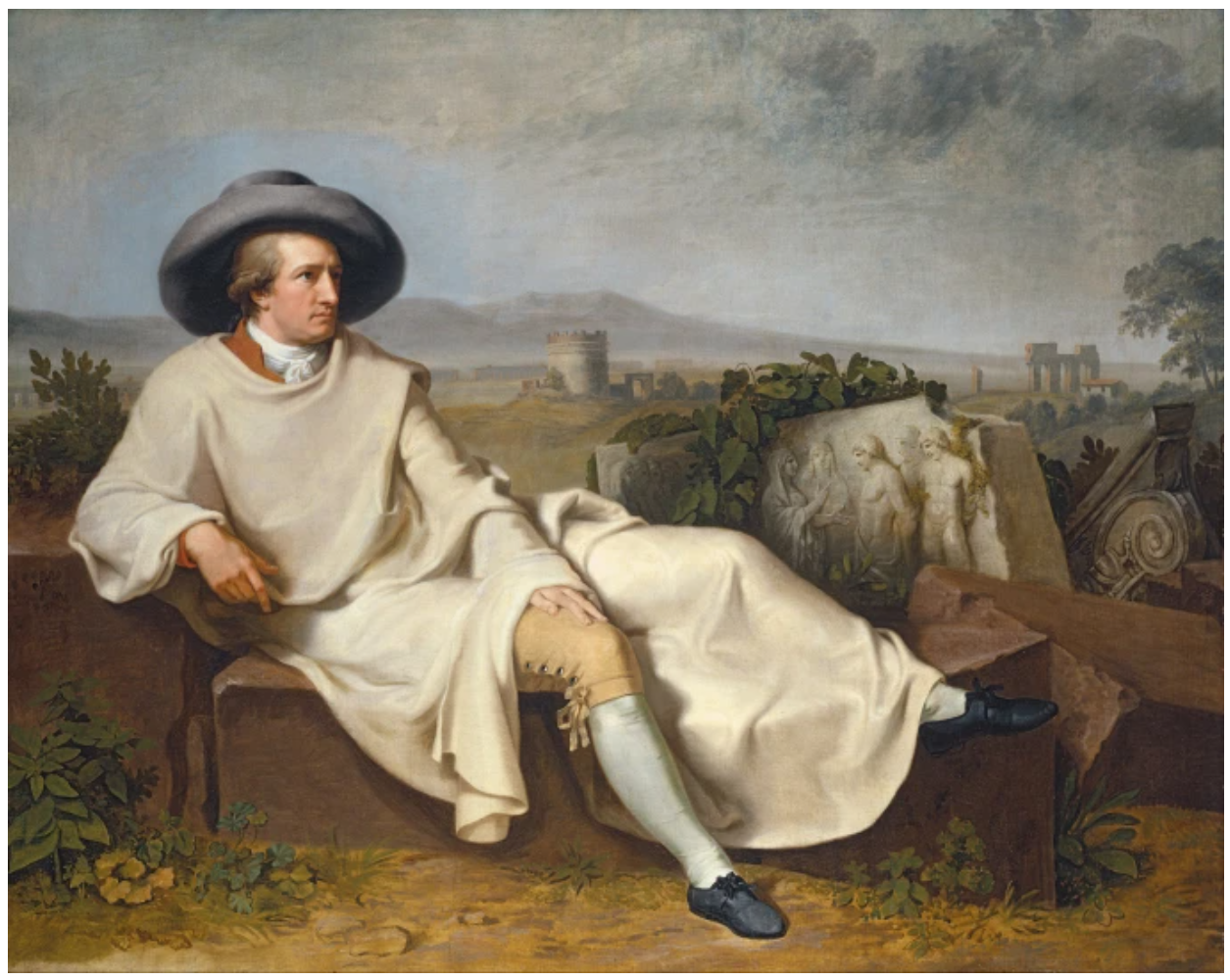
Johann Heinrich Wilhelm Tischbein, Goethe in the Roman Campagna, 1787. Städel Museum, Frankfurt.
Warhol’s interest in Goethe belongs to a broader shift that took hold of his practice in the late 1970s and early 1980s, as he began to look beyond the icons of his own era towards the enduring figures of earlier ages — Lenin, Einstein, Kafka and Alexander the Great among them. This expanding interest was not confined to historical individuals alone, but extended to cultural landmarks more broadly, so that a work like the Goethe portrait sits comfortably alongside Warhol’s engagements with the Mona Lisa, the Last Supper, and the paintings of Munch and Botticelli, as much as with his portraits of Beethoven or Frederick the Great. Considering the extraordinary breadth of Goethe’s own achievements — poet, playwright, scientist, statesman, a genuine polymath whose Faust remains a touchstone of world literature nearly two centuries after its publication, and whose colour theory shaped the work of painters from Turner to Kandinsky — Warhol’s decision to induct him into this pantheon reads less as an act of straightforward homage than as a deliberate measuring of his own age’s celebrities against a far older and more exacting standard, one against which they might well be found wanting.
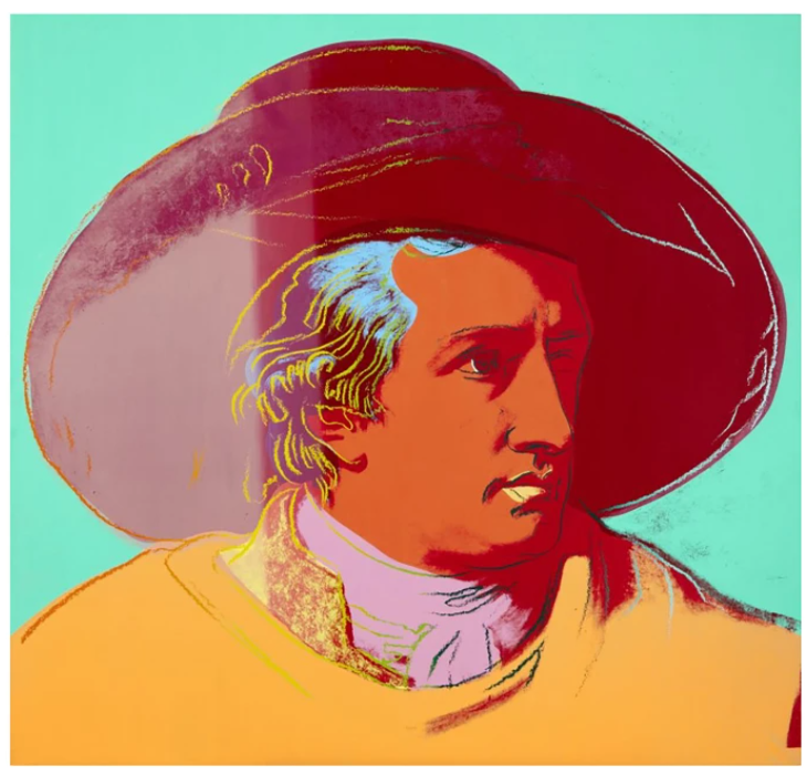
Andy Warhol, Johann Wolfgang von Goethe, 1982. Städel Museum, Frankfurt.
© 2026 The Andy Warhol Foundation for the Visual Arts, Inc. / Licensed by DACS, London
Warhol’s practice — built on mechanical reproduction, on the silkscreen’s deliberate erasure of the artist’s touch, on a relentless and often cynical fascination with fame’s brevity — sits in pointed opposition to Goethe’s own belief in the subjective, deeply felt nature of perception and colour, articulated at length in his 1810 Theory of Colours. Where Goethe understood colour as a matter of individual, embodied experience, Warhol’s psychedelic palette of blues, greens and pinks is manufactured, repeatable and entirely detached from any single act of looking. The portrait can be read, in this light, as both tribute and quiet rebuttal: an enshrinement of Goethe on a plinth of Warhol’s own making, but one whose values — mass production, surface, the deliberate flattening of genre and hierarchy — Goethe himself, who once warned that “one of the most striking signs of the decay of art is the intermixing of different genres” (Johann Wolfgang von Goethe, Propylaea, 1798), would in all likelihood have resisted.
Executed on a scale that exceeds human proportions, much as Tischbein’s original had done before it, Portrait of Johann Wolfgang von Goethe stands as one of the more unexpected and art-historically layered subjects in Warhol’s late body of celebrity portraiture — a work in which two very different ages, and two very different theories of how an image comes to mean something, are made, however uneasily, to coexist.