MAY 2026 NEW-YORK AUCTIONS
Mark Rothko
Auction Results
6 lots sold for a total turnover of USD 231,729,000. With no lot failing to sell, the sell-through rate is 100%.
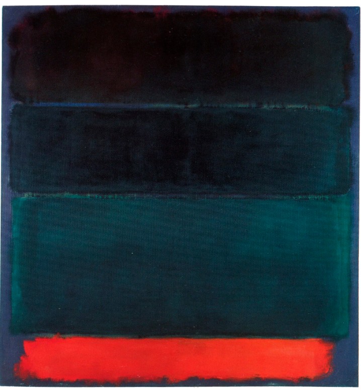
No.15 (Two Greens and Red Stripe), a painting dated 1964, from The Collection of Agnes Gund, sold at Christie’s on 18 May 2026 for USD 98,385,000, setting a new auction record for the artist. Furthermore, Brown and Blacks in Reds, a painting dated 1957 from The Collection of Robert Mnuchin, sold at Sotheby’s on 14 May 2026, for USD 85,780,000, becoming the fourth most expensive Rothko painting to ever sell at auction.
XXXXXXXXXX
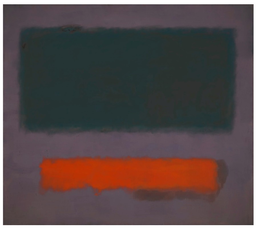
#1. No. 15 (Two Greens and Red Stripe), 1964
The Collection of Agnes Gund
Christie’s New-York: 18 May 2026
Estimate on Request
USD 98,385,000
NEW AUCTION RECORD FOR MARK ROTHKO
MARK ROTHKO (1903-1970), No. 15 (Two Greens and Red Stripe) | Christie’s
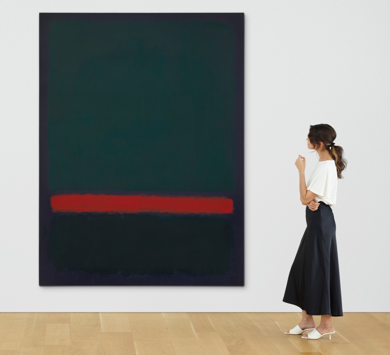
MARK ROTHKO (1903-1970)
No. 15 (Two Greens and Red Stripe), 1964
Oil on canvas
93×69 inches (236.2 x 175.3 cm)
Signed, partially titled and dated ‘MARK ROTHKO 1964 #15’ (on the reverse)
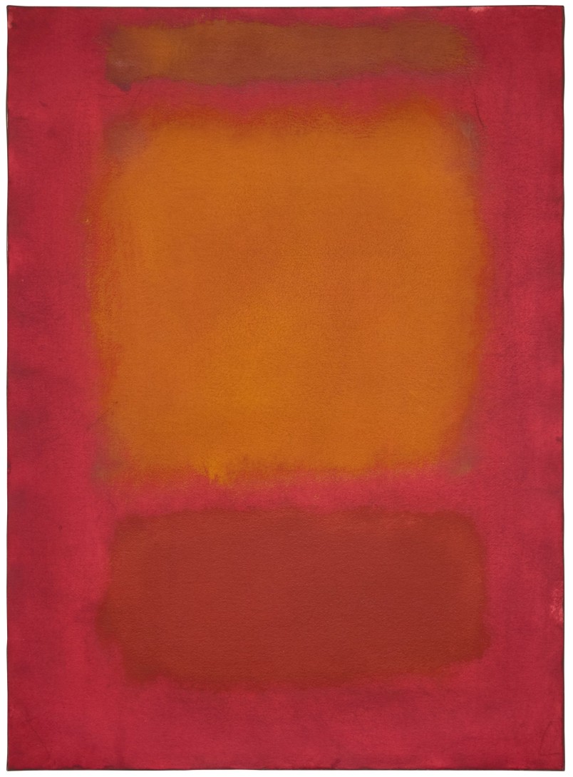
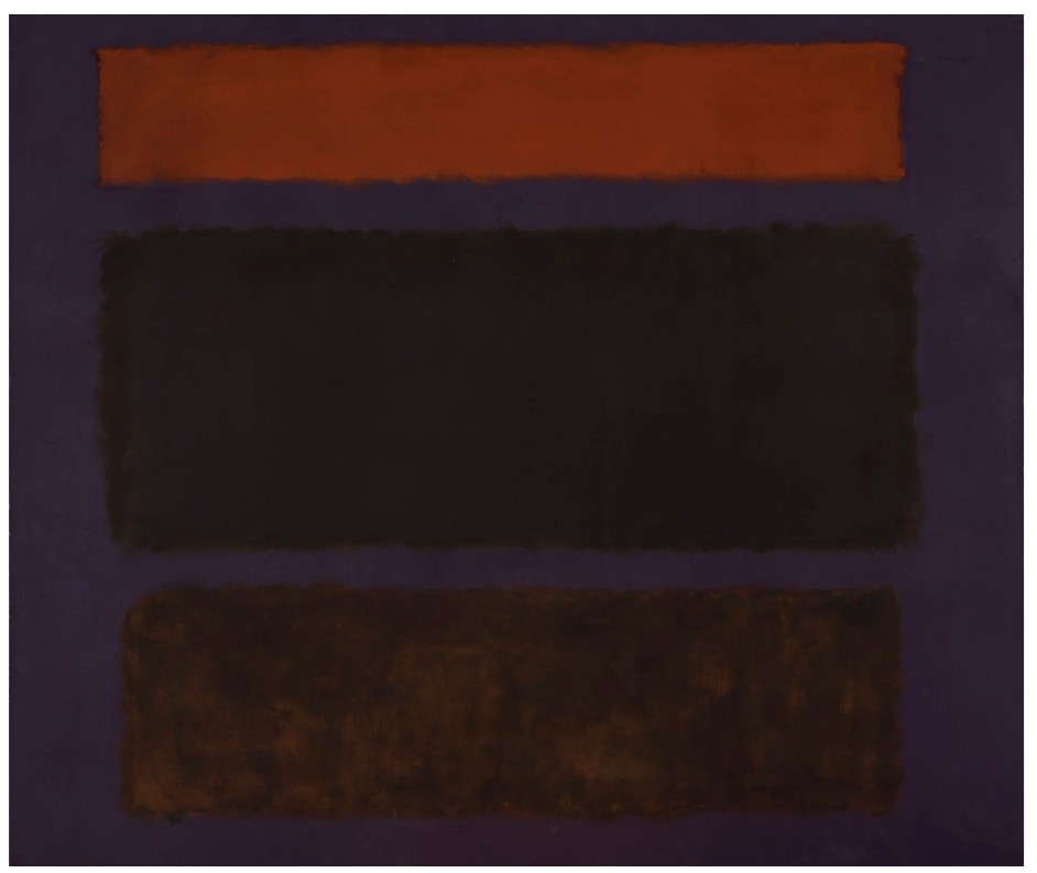
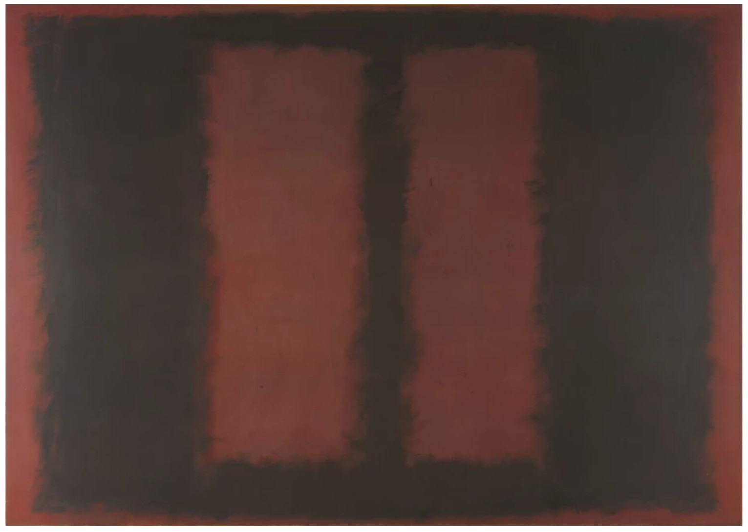
#2. Brown and Blacks in Reds, 1957
Robert Mnuchin: Collector at Heart
Sotheby’s New-York: 14 May 2026
Estimated: USD 70,000,000 – 100,000,000
USD 85,780,000
Mark Rothko | Brown and Blacks in Reds | Robert Mnuchin: Collector at
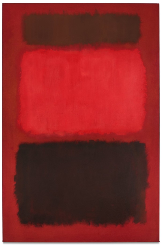
MARK ROTHKO (1903 – 1970)
Brown and Blacks in Reds, 1957
Oil on canvas
90-1/2 x 60-5/8 inches (229.9 x 154 cm)
Signed and dated 1957 (on the reverse)
#3. No. 1, 1949
Robert Mnuchin: Collector at Heart
Sotheby’s New-York: 14 May 2026
Estimated: USD 15,000,000 – 20,000,000
USD 20,805,000
Mark Rothko | No. 1 | Robert Mnuchin: Collector at Heart Evening
MARK ROTHKO (1903 – 1970)
No. 1, 1949
Oil on canvas
78-1/4 x 38-5/8 inches (198.8 x 98.1 cm)
Signed and dated 1949 (on the reverse)
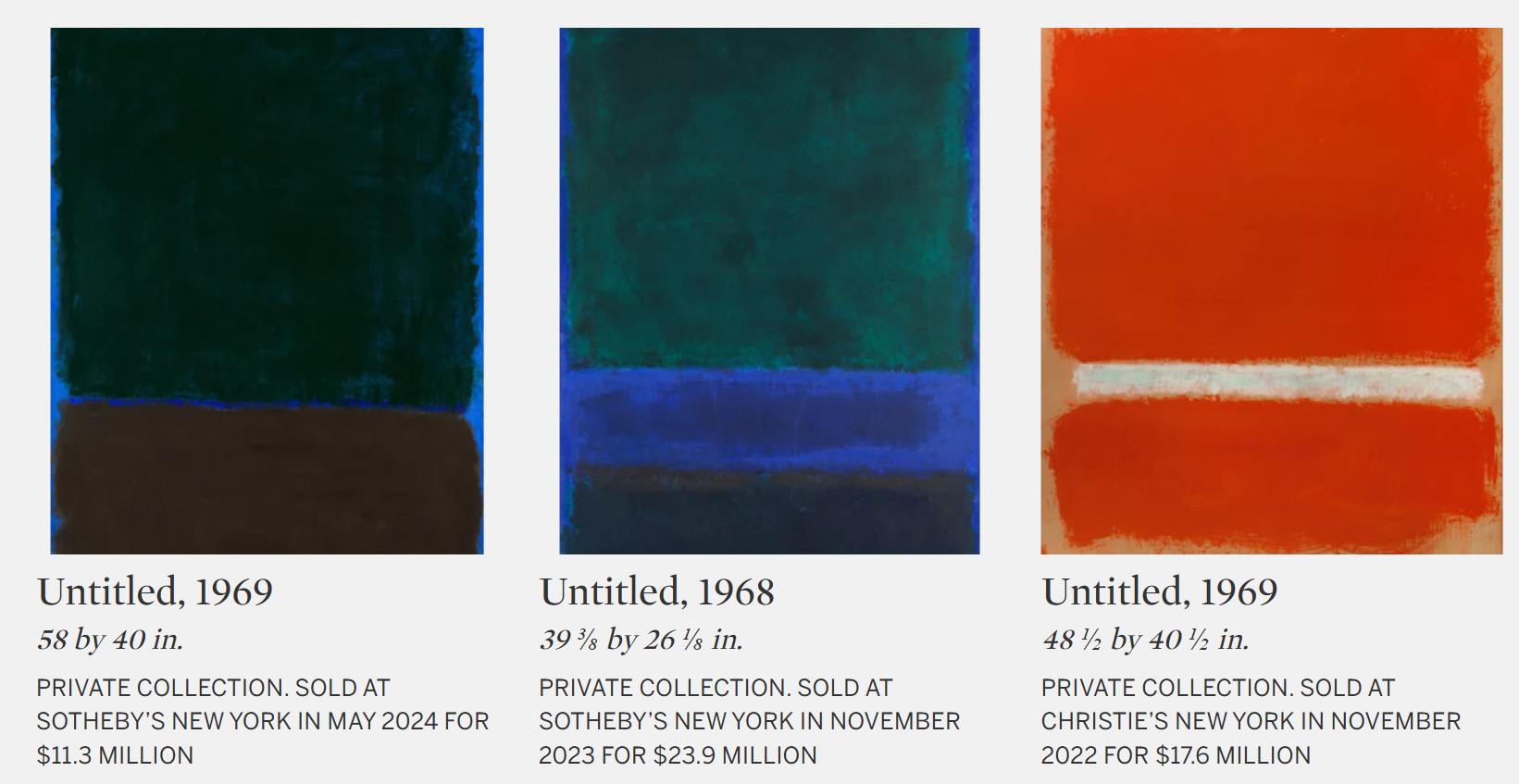
#4. Untitled, 1969
Collection of Jean & Terry de Gunzburg
Sotheby’s New-York: 14 May 2026
Estimated: USD 10,000,000 – 15,000,000
USD 16,465,000
Mark Rothko | Untitled | The Now & Contemporary Evening Auction |
MARK ROTHKO (1903 – 1970)
Untitled, 1969
Acrylic on paper mounted on canvas
78-1/2 x 58-1/2 inches (198.8 x 148.6 cm)
Signed (on the reverse)
#5. Untitled, circa 1959
A New Vista: The David and Shoshanna Wingate Collection
Sotheby’s New-York: 19 May 2026
Estimated: USD 5,000,000 – 7,000,000
USD 9,270,000
WORK ON PAPER
Mark Rothko | Untitled | Modern Evening Auction | 2026 | Sotheby’s
MARK ROTHKO (1903 – 1970)
Untitled, circa 1959
Oil and watercolor on paper mounted on canvas
30-3/8 x 22 inches (77.2 x 55.9 cm)
#6. The Journey, 1946
Property Sold to Benefit Jonas Philanthropies
Sotheby’s New-York: 15 May 2026
Estimated: USD 300,000 – 400,000
USD 1,024,000
WORK ON PAPER
Mark Rothko | The Journey | Contemporary Day Auction | 2026 |
MARK ROTHKO (1903 – 1970)
The Journey, 1946
Watercolor and ink on paper mounted on canvas
39-7/8 x 26 inches (101.3 x 66 cm)
Signed (lower right)
Brown and Blacks in Reds, 1957
Brown and Blacks in Reds, 1957
Robert Mnuchin: Collector at Heart
Sotheby’s New-York: 14 May 2026
Estimated: USD 70,000,000 – 100,000,000
USD 85,780,000
Mark Rothko | Brown and Blacks in Reds | Robert Mnuchin: Collector at
MARK ROTHKO (1903 – 1970)
Brown and Blacks in Reds, 1957
Oil on canvas
90-1/2 x 60-5/8 inches (229.9 x 154 cm)
Signed and dated 1957 (on the reverse)
Mark Rothko sought many aims in painting: clarity, contemplation, a purity and honesty in the picture’s ability to convey human emotion. The canvases that poured forth in his “Classic Years,” what David Anfam calls the artist’s mature period beginning around 1951 and continuing until his death in 1970, were epic, beautiful, literally and figuratively monumental, but were—above all else—conduits for accessing the fullest range of feeling. Each chronicles a fundamental state of being: hope flung into ecstasy; melancholy plummeting toward despair; the vulnerable, brooding, romantic, and sublime. Yet it is a rare few paintings that Rothko created in his life that see the whole spectrum of human drama cleaved open at once. In Brown and Blacks in Reds, the singular masterpiece at the heart of Robert Mnuchin’s collection, we see his aims realized, simultaneously and operatically announcing what it is to paint, to perceive, to live, and to feel.
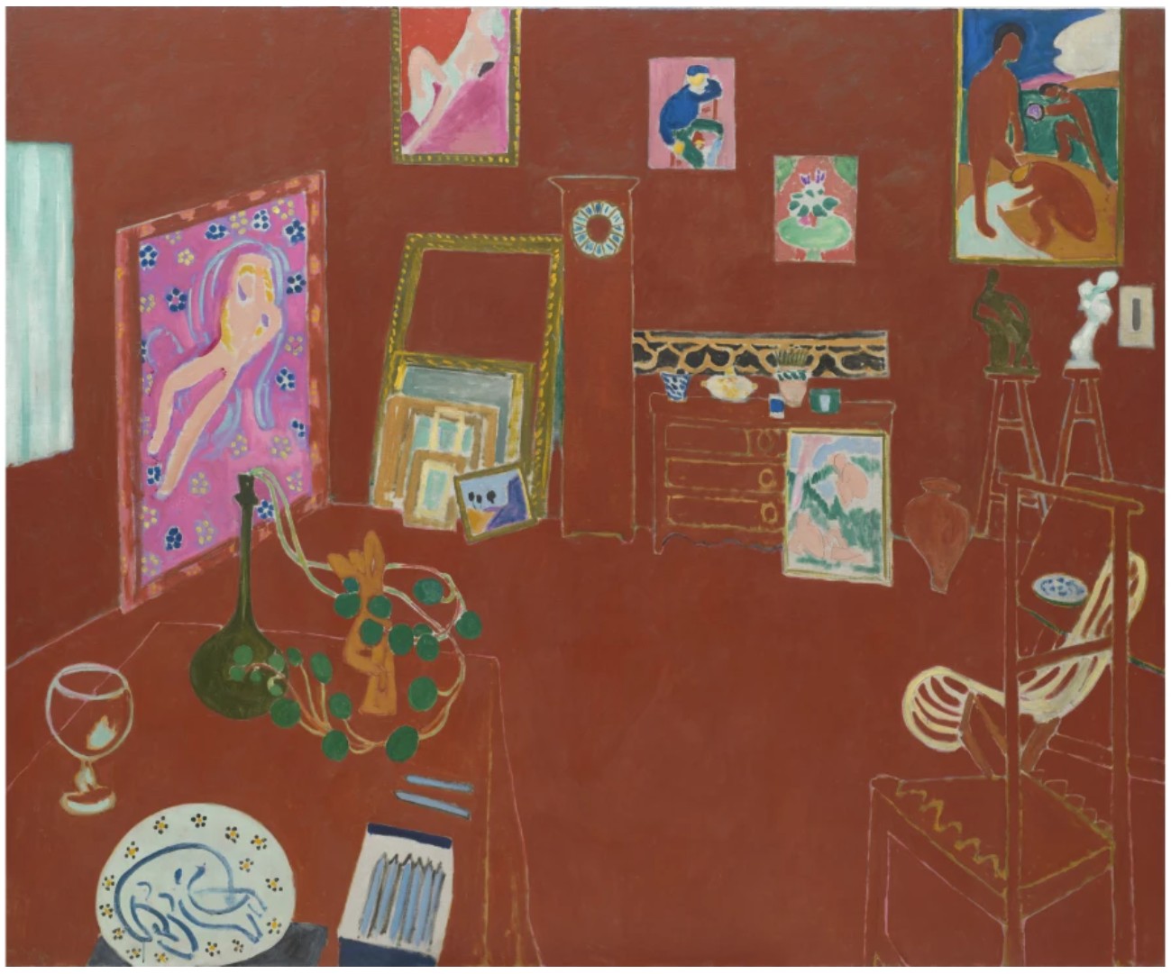
Henri Matisse, The Red Studio, 1911. The Museum of Modern Art, New York. Image © The Museum of Modern Art/Licensed by SCALA / Art Resource, NY. Art © 2026 Succession H. Matisse / Artists Rights Society (ARS), New York
By 1957, Rothko had well mastered the format that would define his life and work—feathered, atmospheric fields of color caught in exquisite, inimitably precise suspense—and for the first time could earn a living from his painting alone. The thirty-seven paintings executed that year offer a remarkable, wholly abstracted exploration of the human condition, and in only fifteen of these canvases did Rothko soar to the Herculean scale of the present work, measuring over ninety inches. Here, black and radiant red pose not the image of but an encounter with the artist at the height of his powers, giving a material identity to the extraordinary, often ineffable sense of passion felt by humanity. So successful and intense was the effect engendered by the palette and tripartite compositional structure seen here that Rothko explored this in three crimson, maroon, and black works that year: Black Over Reds {Black on Red}, Light Red Over Black, and the present work, the former two held by the Baltimore Museum of Art and the Tate in London, respectively.
Arshile Gorky, Water of the Flowery Mill, 1944. The Metropolitan Museum of Art, New York. Image © The Metropolitan Museum of Art. Image source: Art Resource, NY. Art © 2026 The Arshile Gorky Foundation /Artists Rights Society (ARS), New York
Of all its technical and psychological accomplishments, which place it alongside the greatest masterworks by Rothko, Brown and Blacks in Reds ranks incomparable for its storied provenance and place in the artist’s career. Brown and Blacks in Reds was first owned by Joseph E. Seagram & Sons, Inc., who acquired the work from Sidney Janis Gallery in New York and proudly installed it in the lobby of the eponymous Seagram building in Manhattan—the only work by the artist to bear the honor of hanging in the Mies van der Rohe and Philip Johnson-designed space. This fortuitous accession would prompt the Seagram Corporation to commission the Seagram Murals, the staggering series of red and black paintings originally meant to line the walls of the Four Seasons restaurant in their lobby. Rothko, however, eventually grew disturbed by the potential reduction of these works as decoration, as opposed to experiences unto themselves. He ultimately withdrew, retained the works, and presented nine canvases to the Tate, whose galleries could honor their sovereignty and aural authority. Other groupings from the commission today reside in the National Gallery of Art in Washington, D.C., and the Kawamura Memorial Museum of Art in Japan.
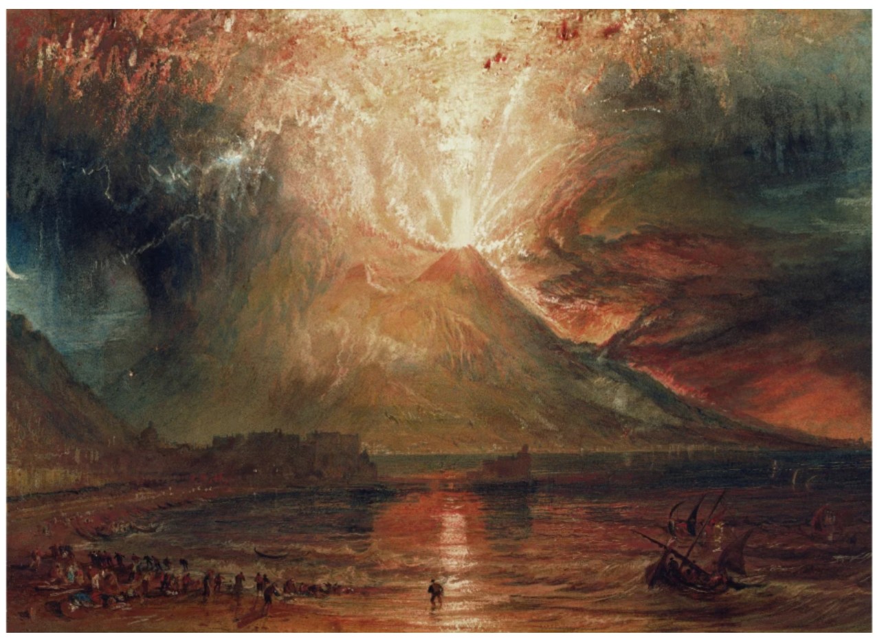
Joseph Turner, Mount Vesuvius in Eruption, 1817. Yale Center for British Art, New Haven. Image © Bridgeman Images
Though the palette anticipates that of the Seagram Murals, the effect of the present work hardly mimics the somber, sepulchral profundity of that series, here, rather, Rothko summons a heady panoply of emotion, channeling apprehension in maroon and peril in black; what triumphs, however, is the brilliance of hope, impressed upon the viewer in innumerable diaphanous veils of incandescent and incomprehensibly luminous red. “Pictures must be miraculous,” Rothko concluded, “the instant one is completed, the intimacy between the creation and the creator is ended. He is an outsider. The picture must be for him, as for anyone experiencing it later, a revelation, an unexpected and unprecedented resolution of an eternally familiar need.” (Mark Rothko, “The Romantics were Prompted…,” Possibilities, No. 1, Winter 1947-48, p. 84)
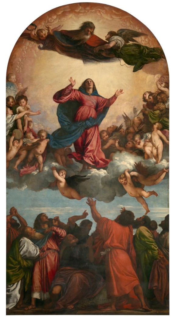
Titian, Assunta, 1516-18. Santa Maria Gloriosa Dei Frari, Venice.
Image © Mondadori Portfolio/Archivio Mauro Magliani/Mauro Magliani / Bridgeman Images
The feathered perimeters of each rectangle, organized in his characteristic tripartite structure, embody this revelation entirely, taking on a kind of autonomy unbeknownst to artists or artworks prior. The longer one looks, the longer one feels, as ruby, mahogany, smoldering crimson and exuberant raspberry hues oscillate into a field beyond the surface of the picture plane, as though hovering and receding in real time. “For me,” art historian and curator Katherine Kuh wrote, Rothko’s work possesses “a kind of ecstasy of color which induces different but always intense moods. I am not a spectator—I am a participant.” (Katherine Kuh, letter written 18 July 1954, n.p.)
The spirit, composition, and coloration of Brown and Blacks in Reds invite a wealth of art historical comparisons. The obsessive choreography of light and color echoes that of Claude Monet’s incendiary sunrises; the unshakeable belief in the divine possibilities of paint recalls the Romantics’ pursuit of the sublime. None, though, proved so impactful as Henri Matisse’s The Red Studio, which hung in The Museum of Modern Art and was often visited by Rothko himself. The absorptive, abstracted treatment of space was indelible: there, space and object were collapsed, and in Rothko’s own work, he set out to collapse that distance between the painting and the person before it. We thus cease to perceive the present work as a dialogue between medium and support. “The progression of a painter’s work, as it travels in time from point to point, will be toward clarity: toward the elimination of all obstacles between the painter and the idea and between the idea and the observer… To achieve this clarity is, inevitably, to be understood.” (Mark Rothko quoted in: Exh. Cat., New York, Museum of Modern Art, 15 Americans, 1952, p. 18)
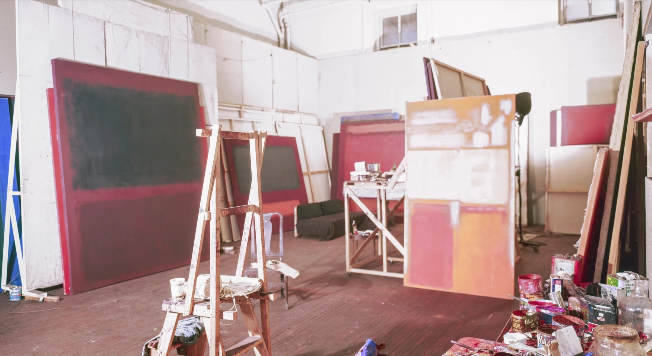
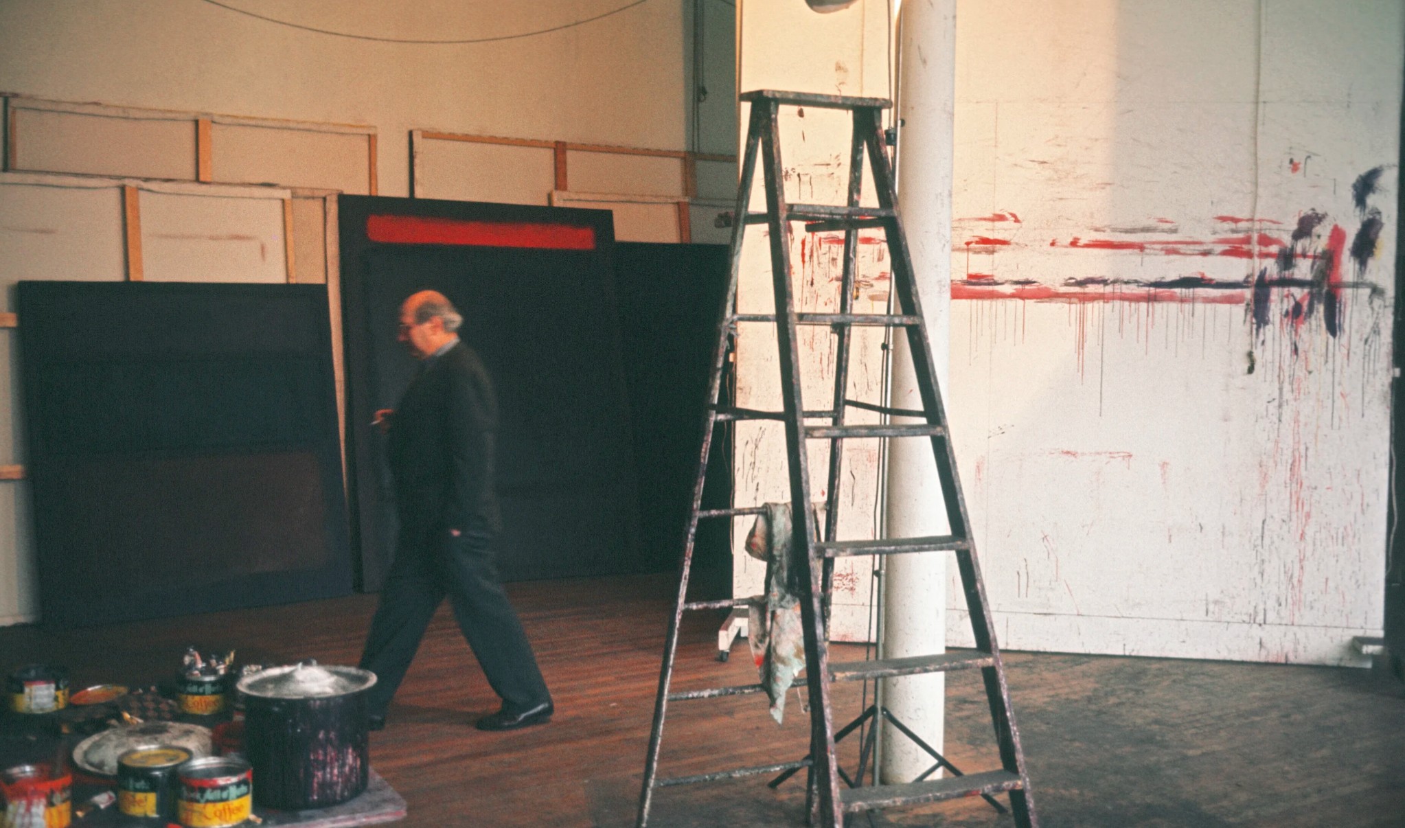
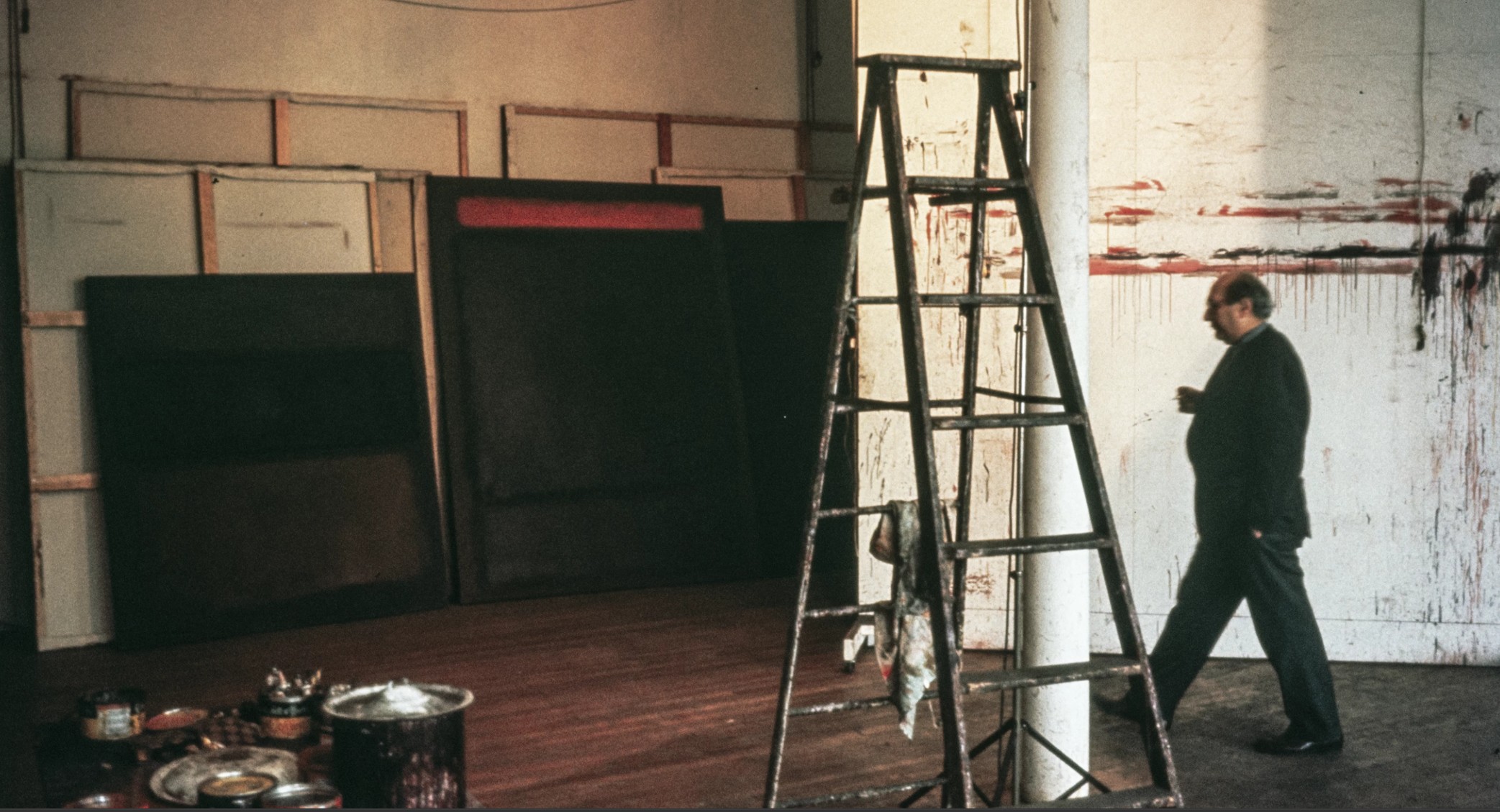
Mark Rothko’s studio at 222 Bowey. Photo by Herbert Matter. Courtesy of the Department of Special Collections, Stanford University Libraries (M1446 Herbert Matter papers, circa 1937-1984, box 153, folder 33, Dept. of Special Collections and University Archives, Stanford University Libraries, Stanford, CA). Art © 1998 Kate Rothko Prizel & Christopher Rothko / Artists Rights Society (ARS), New York
Alongside his contemporaries, Rothko, a name and lion figure inseparable from the achievements of the Abstract Expressionists, did not share the Greenbergian ethos of painting for paint’s sake. By no means a Formalist, Rothko sought not to strike representation or any tangible, lived experience from the surface of his pictures but rather labored tirelessly to intensify them. The radical aesthetic distillation he arrived at was an effort to translate man’s very “eternally familiar needs,” and while Rothko did not mimic or describe those subtleties of human sentiment, it remained a chief and principal aim of his work. “His pictures,” John Elderfield describes, “are designed to deliver transcendence… to provide access to hidden but immanent truths of the universe—not merely to struggle with that transcendence, those truths (what would be a doubter’s way), but to actually convey them. For Rothko, in an interpretation that we can scarcely fathom now, a picture could offer immediate access to the divine.” (John Elderfield, “Transformations” in: Glenn Phillips and Thomas Crow, eds., Seeing Rothko, Los Angeles, 2002, p. 101)
The Seagram Murals at the Tate, London. Image © Tate, London / Art Resource, NY.
Art © 1998 Kate Rothko Prizel & Christopher Rothko / Artists Rights Society (ARS), New York
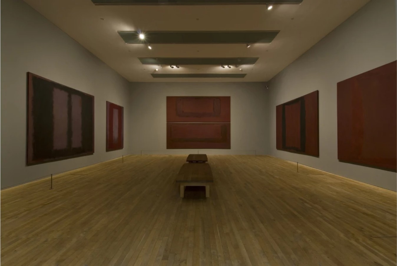
In a 1959 Life magazine article, Dorothy Seiberling described Rothko’s mystifying output: “Just as the hues of a sunset prompt feelings of elation mingled with sadness or unease as the dark shapes of our night close in, so Rothko’s colors stir mixed feelings of joy, gloom, anxiety or peace. Though the forms in the painting seem simple at first glance, they are in fact subtly complex. Edges fade in and out like memories; horizontal bands of ‘cheerful’ brightness have ‘ominous’ overtones of dark colors.” (Dorothy Seiberling, “Abstract Expressionism, Part II,” Life, 16 November 1959, p. 82) For the majesty of its scale, the myth of its provenance, and the miracle that is, in Seiberling’s worlds, stirring such acute and fiercely primal feelings, Brown and Blacks in Reds is an utter and unequivocal masterwork. Toured internationally in most of the artist’s seminal presentations—from the 1978-79 traveling retrospective organized by the Solomon R. Guggenheim Museum in New York; the Rothko exhibition at the Tate in London; to the celebrated recent show at the Fondation Louis Vuitton in Paris—Brown and Blacks in Reds marks a historic accomplishment, conjuring in oil the “language of feeling” that no artist has ever dared to replicate since. (Robert Motherwell quoted in: Exh. Cat., Paris, Fondation Louis Vuitton, Mark Rothko, 2023, p. 12)
No. 15 (Two Greens and Red Stripe), 1964
No. 15 (Two Greens and Red Stripe), 1964
The Collection of Agnes Gund
Christie’s New-York: 18 May 2026
Estimate on Request
USD 98,385,000
NEW AUCTION RECORD FOR MARK ROTHKO
MARK ROTHKO (1903-1970), No. 15 (Two Greens and Red Stripe) | Christie’s
MARK ROTHKO (1903-1970)
No. 15 (Two Greens and Red Stripe), 1964
Oil on canvas
93×69 inches (236.2 x 175.3 cm)
Signed, partially titled and dated ‘MARK ROTHKO 1964 #15’ (on the reverse)
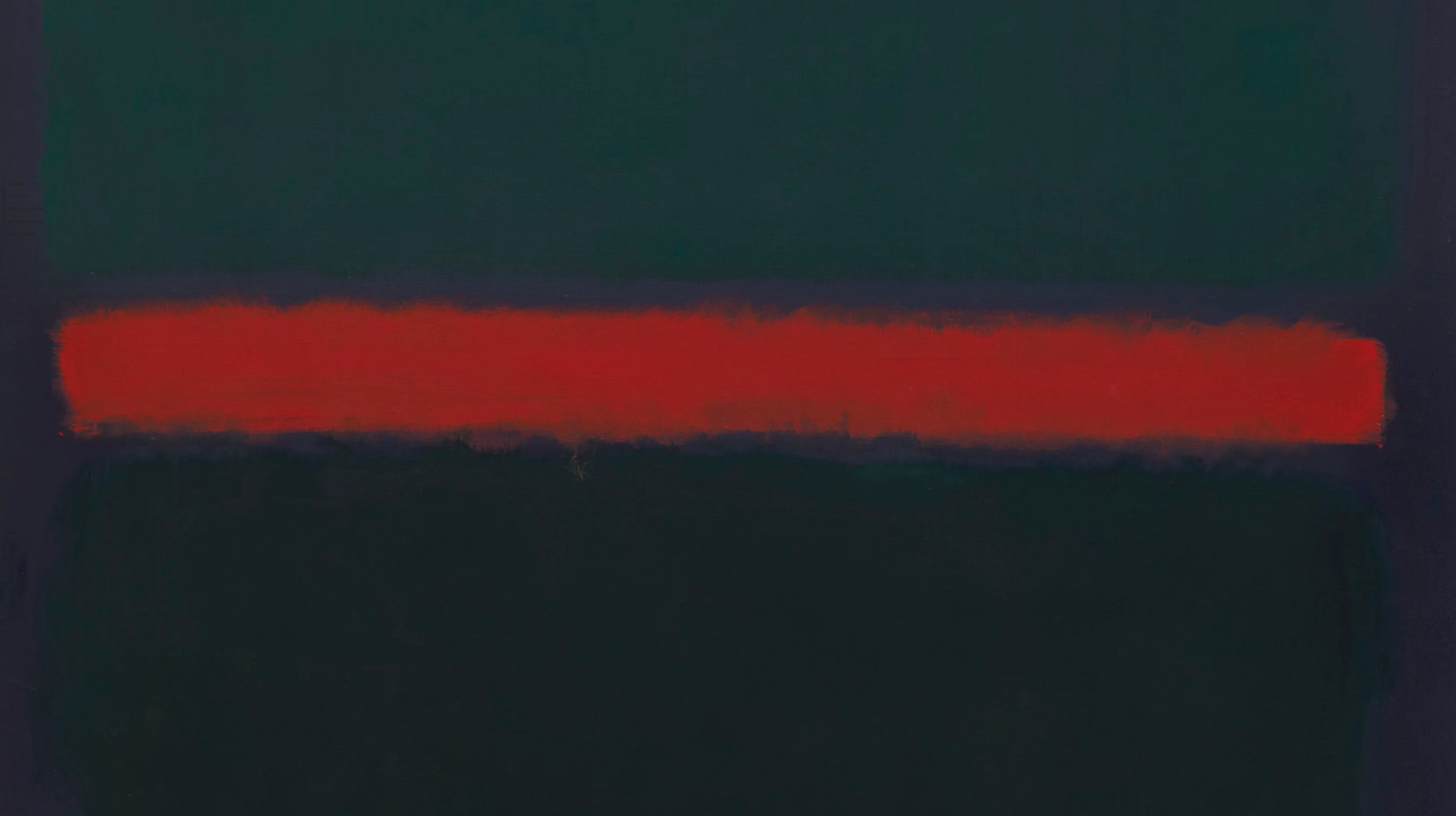
With its grand, all-encompassing scale and serene, meditative tones, Mark Rothko’s No. 15 (Two Greens and Red Stripe) stands as one of Abstract Expressionism’s greatest accomplishments. Painted at a critical juncture in the artist’s career, following his Seagram Murals and Harvard commission and just before he devoted the remainder of his career to the Rothko Chapel in Houston, No. 15 (Two Greens and Red Stripe) demonstrates the artist’s embrace of darker, more saturated colors; here, two different green rectangular forms—a central warm emerald color which dissolves into a cooler jade in the peripheries—operate in tandem to grant the work a mesmeric inner glow, providing a superb exemplar of what the critic Robert Rosenblum defines as Rothko’s “abstraction of the Sublime” (“The Abstract Sublime,” ARTnews, 59, no. 10., February 1961, p. 41). These greens are divided by a brilliant horizontal shot of red against an ethereal ground of royal violet and ultramarine blue. Rothko’s use of his most important color—red—and his favored color combination of green and violet articulates his artistic enterprise at its most intense and contemplative, adducing a contracted, meditative, and somber aura into the work which expresses itself to the viewer in terms of slow, ritualistic rhythms of pauses and lulls. Discussing Rothko’s large scale, darker works from the early 1960s, the artist’s son Christopher Rothko acclaims that “they are also some of his greatest works, their subtle shading and deeply saturated colors coming to the fore for the patient viewer who allows them to unfold their entire visual splendor” (C. Rothko, “The Experience Behind the Icon,” in K. Rothko Prizel and C. Rothko, Mark Rothko, New York, 2022, p. 27).
Mark Rothko in his 1485 First Avenue studio, New York, 1964. Photograph by Dan Budnik. © 2020 The Estate of Dan Budnik, All Rights Reserved. Artwork: © 2026 Kate Rothko Prizel & Christopher Rothko / Artists Rights Society (ARS), New York.
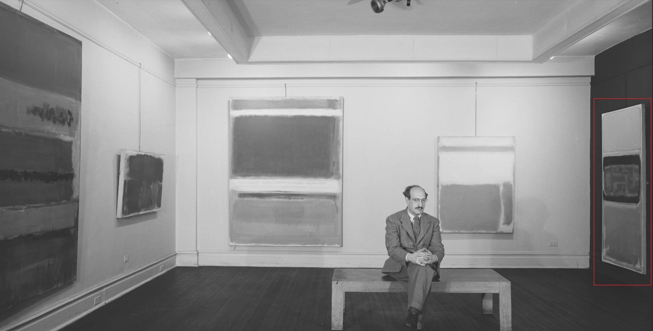
No. 15 (Two Greens and Red Stripe) was one of the first masterpieces to enter Agnes Gund’s celebrated collection. She made her first major acquisition in 1966, obtaining Henry Moore’s Three-Way Piece No. 2: Archer from Sidney Janis Gallery, then donating the work to the Cleveland Museum of Art just four years later. In 1967, Agnes joined the Museum of Modern Art’s International Council, befriending many of the most significant collectors and patrons of the twentieth century. Agnes’ relationship with Emily Tremaine was especially close. Emily, with her husband Burton, assembled perhaps the greatest collection of modern and postwar art, bringing together masterpieces by modern luminaries including Juan Gris, Pablo Picasso, Alberto Giacometti, and Piet Mondrian as well as contemporary works by Jackson Pollock, Willem de Kooning, Barnett Newman, Jasper Johns, Robert Rauschenberg, and Andy Warhol. The Tremaines were some of Rothko’s earliest supporters, acquiring his early Number 8, 1952, from Betty Parsons Gallery in 1953. Agnes spotted the work while visiting the Tremaines and immediately fell in love with the artist. “Let’s go to Rothko’s studio,” Emily immediately suggested, and Agnes soon found herself personally introduced to the legendary artist in his studio (quoted in “Tremaine Timeline,” The Tremaine Collection, online, [accessed 3/6/25]).
While Agnes initially desired an earlier work with a similarly bright palette to the Tremaine Rothko, the artist instead recommended the present work. Acquiring No. 15 (Two Greens and Red Stripe) directly from Rothko just three years after he painted the work, Agnes rapidly fell in love, only allowing the painting to leave her apartment on one occasion, for an exhibition at her beloved Cleveland Museum of Art. “I love to live with things, because I can see the works in different lights, at different times of day,” Agnes described of No. 15 (Two Greens and Red Stripe). “When I was pregnant, I fell asleep, and when I got up, the whole Rothko had changed, and I wrote Rothko, and I said how much I loved the picture, and Rothko called up, and said ‘I really like hearing that about my art’” (quoted in “Tour Agnes ‘Aggie’ Gund’s Art-Filled New York City Apartment,” Aubin Pictures, Vimeo, March 22, 2021, online).
Mark Rothko, Number 8, 1952. Private collection, formerly in the collection of Emily Hall and Burton Tremaine, Madison, Connecticut. © 1998 Kate Rothko Prizel & Christopher Rothko / Artists Rights Society (ARS), New York.
No. 15 (Two Greens and Red Stripe) is a masterful example of Rothko’s mature sectional abstractions, made just before Rothko’s transition into a more architectural style for the Rothko Chapel. In the later 1950s, the bright expanses of color of Rothko’s earlier work were gradually giving way to a more introspective palette of dark hues incorporating maroons, dark greens, blues, and violet. The present work pronounces the completion of the artist’s chromatic metamorphosis, lavishly expressing the deepened emotion which Rothko wrought from his darkened palette in pursuit of the Sublime. The three color forms expand almost the entire width of the canvas, balanced against the cool, deep ground. While the green areas dissolve into the dark ground, the narrow red band provides an electric shot through the composition, enlivening the canvas with a chromatic intensity not found in his Black Form series of dark blocks made later in 1964. Rothko’s ground here demonstrates his magisterial commitment to color—the turning edges of the canvas are painted in a pure ultramarine, recalling the deep blues of Giotto or Fra Angelico and adducing a deepened sense of spatial depth as the surface of the canvas appears to levitate out from the wall. This ultramarine intermixes with a royal violet at the margins of the picture plane in a complex interplay of pigments, with hints of rose madder, ochre, cadmium orange, and dark yellow also observable. The use of two of the most historically significant, revered, and valuable colors in the Western canon—ultramarine was reserved for depictions of the Virgin Mary, whilst violet was used solely for prelates of the Catholic Church and for the imperial family in Roman and later Byzantine art—underscores the reverence which Rothko held for the pigments he utilized. The present work articulates Rothko’s desire for color to elicit deep emotions inside his viewers and is among his most hermetic and awe-inspiring works.
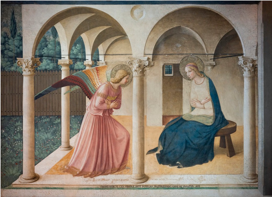
Fra Angelico, Annunciation, 1438-1450. Museum of San Marco, Florence.
No. 15 (Two Greens and Red Stripe) witnesses Rothko achieving the full potential of his materials and surface. Rather than leaving his canvas ground as a neutral space, the artist exploits the visual potential of this priming layer of pigment, emulating the technique of the old masters Titian and Velázquez. The ultramarine-violet expanse participates within the broader composition, unifying the surface of the painting by holding the three bands of color together. The noted Rothko expert and former Chief Conservator of the Menil Collection Carol Caruso Mancusi-Ungaro elaborates how in Rothko’s muted pre-chapel paintings of 1964, the artist achieves “a masterful engagement of color in which somber tones are painted on top of dark tones to create an ethereal effect” which exhibits the artist at the height of his technical talent (C. Mancusi-Ungaro, “Material and Immaterial Surface: The Paintings of Rothko,” in Mark Rothko, exh. cat., National Gallery of Art, Washington, D.C., 1998, p. 292).
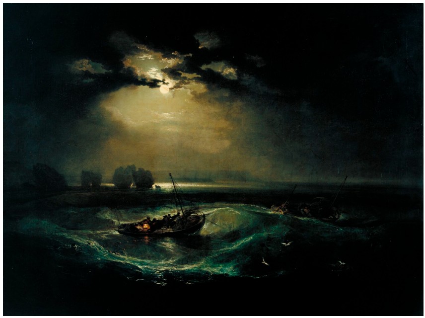
J. M. W. Turner, Fisherman at Sea, 1796. Tate, London.
The ethereal experience which Rothko garners through the sophisticated versatility of his multilayered pigments embodies the artist’s pursuit of a transcendental, almost religious experience which achieved the Sublime, “The strongest of all passions” according to the philosopher Edmund Burke (On the Sublime and Beautiful, London, 1757, p. 32). This sublimity, for Robert Rosenblum, had only previously been approached by the Northern Romantic tradition. “Rothko, like Friedrich and Turner, places us on the threshold of those shapeless infinities discussed by the estheticians of the Sublime… the floating, horizontal tiers of veiled light” seen in paintings like No. 15 (Two Greens and Red Stripe) “seem to conceal a total, remote presence that we can only intuit and never fully grasp” (R. Rosenblum, op. cit., pp. 41, 56). The artist’s sophisticated cultural immersion, closely reading Dostoevsky, Kierkegaard, and most notably Nietzsche, whose Birth of Tragedy proved deeply affective, is apparent in Rothko’s definition of his painterly practice: “the way in which I could achieve the greatest intensity of the tragic irreconcilability of the basic violence which lies at the bottom of human existence and the daily life which must deal with it” (quoted in B. Novak and Brian O’Doherty, “Rothko’s Dark Painting: Tragedy and Void,” in Mark Rothko, op. cit., p. 267). The celebrated curator Nancy Spector identifies the milieu in which the present work was made as when Rothko most closely achieved his Nietzschean ideal, expressing in paint a union of the Apollonian and Dionysian: “Other, darker paintings from the early 1960s impact through intense chromatic contrast, and could be interpreted as more readily substantiating Rothko’s often cryptic commentary on the archetypical tensions in the paintings… In these canvases, deep brown to inky black quadrilaterals yield to high-keyed flashes of brilliant orange and red forms. The ‘drama’ that Rothko describes as inherent to his art in the 1947 statement intensifies with the muting of his overall palette and the simultaneous sharpening of its complementary color distinctions. However, the paintings—conceived as allegorical theaters of human emotion or states of being—can never be reduced to specific affects, despite the feelings they may elicit in a viewer” (N. Spector, “Mark Rothko’s Classic Paintings: Theaters of the Mind,” in Mark Rothko, exh. cat., Fondation Louis Vuitton, Paris, 2023, p. 234).
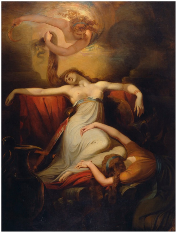
Henry Fuseli, Dido, 1781. Yale Center for British Art, New Haven.
Rothko conceived of his paintings as performed dramas enacting timeless tragedy. Like the ancient Greek and Roman playwrights and poets, Rothko sought through paint to engage his viewer with great emotional force, through which he could inspire a state of contemplative meditation. Just as a thespian stages all elements of a play, Rothko too was highly attuned to the installation and lighting of his works. In 1961, three years prior to No. 15 (Two Greens and Red Stripe), Rothko had personally overseen the hang of his retrospective at the Museum of Modern Art, the first major one-person show devoted to a New York School artist. His close supervision of the exhibition’s installation, where he insisted on placing each painting in close proximity under diffuse lighting, allowed him to contemplate his completed oeuvre, heralding his shift in styles towards the more reserved, opaque tones seen in the present work, where he attained what Nietzsche describes as “the supreme goal of tragedy and of art in general” (The Birth of Tragedy, New York, 1993 [1872], p. 104).
Mark Rothko, Untitled (Red-Brown, Black, Green, Red), 1962. Fondation Beyeler, Basel.
© 1998 Kate Rothko Prizel & Christopher Rothko / Artists Rights Society (ARS), New York.
The grand scale of the present work—the largest from this essential period still in private hands—is likewise an articulation of Rothko’s intent to control the atmosphere and environment in which his works were viewed and perceived. His daughter, Kate Rothko Prizel, notes how the increase in scale in the early to mid-1960s evolved from how “[her] father was interested in surrounding the viewer with his artwork and creating the opportunity for the viewer to sit and truly experience it” (K. Rothko Prizel, “Mark Rothko: A Daughter’s Sketch,” in K. Rothko Prizel and C. Rothko, Mark Rothko, op. cit., p. 46). No. 15 (Two Greens and Red Stripe), at almost eight feet tall the second-highest format in Rothko’s oeuvre, establishes a painterly expanse symbolically bridging imaginary and real space. This space allows the viewer to grasp the nuanced tragic narratives Rothko veils behind his serene surface, enveloping them in a profound sense of embodiment. At once monumental and intimate, the present work offers a revelatory experience, defeating the space in which it is placed in order to become an all-consuming experience.
Mark Rothko, No. 16, 1960. Metropolitan Museum of Art, New York.
© 1998 Kate Rothko Prizel & Christopher Rothko / Artists Rights Society (ARS), New York.
No. 15 (Two Greens and Red Stripe) emerges as the very fulcrum of Rothko’s legendary career. In 1961, the artist had his first retrospective at the Museum of Modern Art in New York, which then toured across Europe, landing in London, Amsterdam, Brussels, Basel, Rome, and Paris. The next year, he was commissioned by Harvard University for a series of murals, which were completed in 1963 and exhibited at the Solomon R. Guggenheim Museum before their final installation. At the end of 1963, Rothko’s second child, Christopher, was born. Notwithstanding Rothko’s personal and professional triumphs, the artist admitted to friends feeling trapped and stuck at an artistic impasse by the end of 1963. No. 15 (Two Greens and Red Stripe) signals the triumphant overcoming of this stalemate, revealing the formal directions which the artist would continue to explore throughout the remainder of his career by precipitating the style of his later dark paintings. His deemphasis of bright, vibrant color and concentration on surface and immaterial affects in the present work would continue into his famed murals for the Rothko Chapel, commissioned in April 1964 by the Houston collectors John and Dominique de Menil and fully realized posthumously in 1971. Absorbing the manifold lessons gleaned through his work on the Seagram and Harvard commissions, Rothko unleashes new perceptual strategies in No. 15 (Two Greens and Red Stripe) which, drawing on conceptions of religious contemplation, draw his spectator into what Barbara Novak and Brian O’Doherty describe as the “penumbra of a powerful idea.” (B. Novak and B. O’Doherty , op. cit., p. 273). The two art historians continue, poignantly describing Rothko’s profound achievement in his works produced in 1964: “[T]here is nothing else like them, nothing that issues so resolutely from an obsession with the grand irony of existence. And of course they are, as Rothko’s work often is, very close to nothing. Poised near this void, which is their content and their abstract substance, forced to be assertive through negative cancellations, they are profound and vulnerable” (ibid., p. 281).
Mark Rothko, Grey, Orange on Maroon, No. 8, 1960. Museum Boijmans Van Beuningen, Rotterdam.
© 1998 Kate Rothko Prizel & Christopher Rothko / Artists Rights Society (ARS), New York.
Of seminal artistic importance to Rothko’s career, the present work is similarly exceptional in its provenance, being one of three pure color field paintings acquired directly from the artist which still remains with their original owner. Having appeared only once in public since its acquisition in 1967, No. 15 (Two Greens and Red Stripe) is an exceptionally rare example of the artist’s celebrated sectional abstractions before his transition into an almost entirely dark palette in the second half of 1964. Rothko would paint no more independent canvases the following year, devoting himself entirely to the Rothko Chapel. Incorporating his earlier style within the grand scale and contemplative, enrapturing palette of his darker works, the present work represents the zenith of Rothko’s painterly career, encapsulating both his earlier achievements from the 1960s and anticipating his ritualistic, deeply emotive production inspired by Nietzsche which would follow the remainder of the decade. The work articulates what Spector celebrates as “the ethereal beauty of his canvases, a union in his mind of the Apollonian and Dionysian,” which “gave cover for Rothko to ‘achieve the greatest intensity of the tragic, [the] irreconcilability of the basic violence which lies at the bottom of human existence and the daily life which must derail with it’” (N. Spector, op. cit., p. 235).
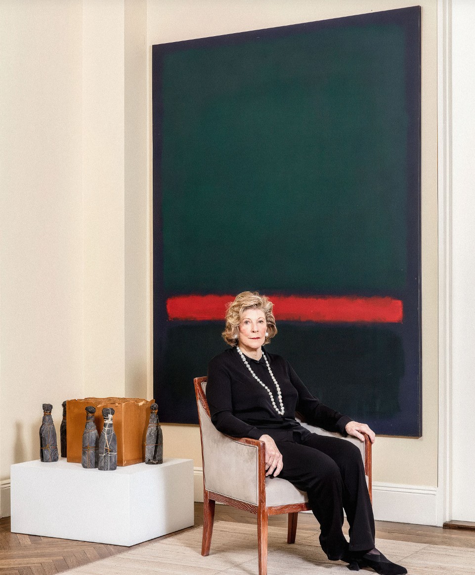
Agnes Gund in her New York apartment. Photo: Stefan Ruiz for Vogue © Condé Nast.
Artwork: © 2026 Kate Rothko Prizel & Christopher Rothko / Artists Rights Society (ARS), New York; © Christo 2000.
Agnes Gund dedicated her life to art: she loved it, she collected it, and she was generous in sharing it with others. She worked hard on its behalf and used it to galvanize support for the causes she championed, gaining a reputation as a generous philanthropist, a devoted patron, and a staunch advocate for arts education and social justice. She was that rare person who sought to do good in the world without reward or recognition. In 2020, Bryan Stevenson, founder and executive director of the Equal Justice Initiative, told Town & Country magazine: “Philanthropy for some people is not so hard. Some have more than they’ll ever use, so they give away the excess. Many give only if everyone will applaud their charity and their quality of life won’t be compromised. But there are also rare philanthropists like Agnes Gund who do difficult things: they use resources to confront injustice and oppression; they seek to disrupt the status quo and pursue change that not everyone values; they are ‘philactivists’” (“Agnes Gund Puts Her Money Where Her Mouth Is,” quoted in Town & Country, June 17, 2020, online [accessed: 3/5/2026]).
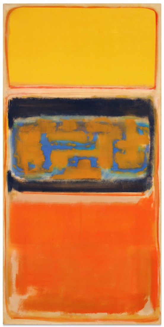
No. 1, 1949
No. 1, 1949
Robert Mnuchin: Collector at Heart
Sotheby’s New-York: 14 May 2026
Estimated: USD 15,000,000 – 20,000,000
USD 20,805,000
Mark Rothko | No. 1 | Robert Mnuchin: Collector at Heart Evening
MARK ROTHKO (1903 – 1970)
No. 1, 1949
Oil on canvas
78-1/4 x 38-5/8 inches (198.8 x 98.1 cm)
Signed and dated 1949 (on the reverse)
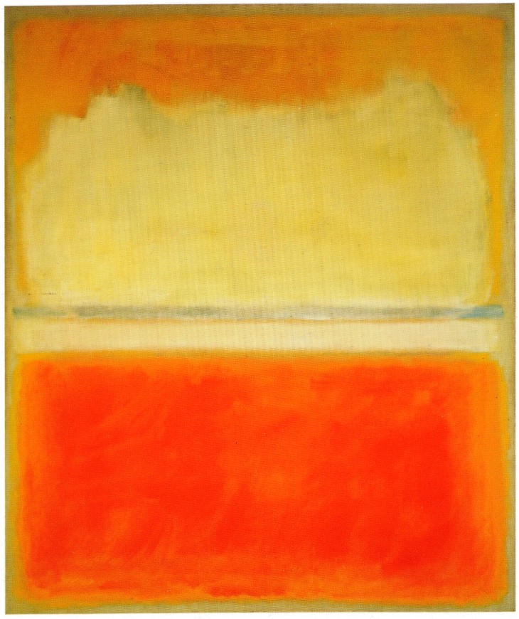
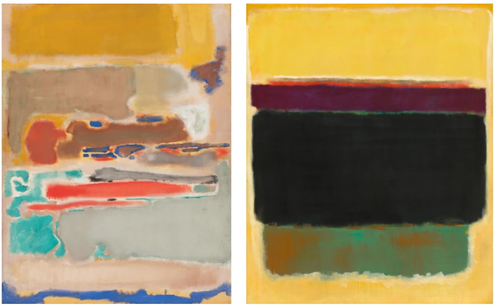
Exuding the metaphysical, majestic quality of his classical period, Mark Rothko’s 1949 masterwork No. 1 marks the watershed moment in which the artist ascended to his signature mode of artistic expression. The cosmic, flaming glow of the painting’s upper and lower strata juxtaposed with the central register of aqueous, azure blue, forms a sublime paradox encapsulating the supernatural beauty of Rothko’s pioneering corpus. Executed at the inflection point of Rothko’s transition from his Multiforms (1946-1949) to the development of his signature abstractions, No. 1 is the confluence of the artist’s two greatest bodies of work. First unveiled at the legendary Betty Parsons Gallery in January 1950, No. 1 was exhibited alongside eleven paintings from the same year in a revolutionary solo exhibition. Among these works, No. 1 is one of only three executed at a monumental scale, exceeding 70 inches, and engulfing the viewer in a chromatic expanse of profound optical transcendence. Of these twelve seminal works exhibited together at Betty Parsons Gallery, all but three now reside in major institutional collections, including The Museum of Modern Art, New York; The National Gallery of Art, Washington, D.C.; and the Los Angeles County Museum of Art, among others.
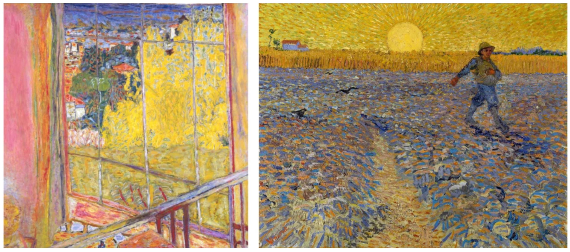
Left: Pierre Bonnard, The Studio with Mimosa, 1939-46. Musee National d’Art Moderne, Centre Pompidou, Paris. Image © Bridgeman Images. Art © 2026 Artists Rights Society (ARS), New York / ADAGP, Paris.
Right: Vincent van Gogh, The Sower, 1888. Rijksmuseum Kröller-Müller, Otterlo. Image © Bridgeman Images
Composed of emblazoned fields of resplendent color, No. 1 radiates as if ignited from within. Saturated strata of scorched, golden yellow, primordial cerulean blue, and fiery orange reverberate from the composition in three registers. Each segment of the composition is defined by lyrical strokes of orange and white, as if each register is a window. As observed by David Anfam, the composition of No. 1 vividly harkens back to late Bonnard paintings. He writes in the introduction to the Catalogue Raisonné: “…the yellow, cinnamon, gold, cerulean blue, white and black of No. 1—the quintessential palette of late Bonnard.” In the central form, interlocking, Multiform-like elements are suspended in a galactic expanse, circumscribed by a halo of rich black pigment deep as the night sky. The tripartite vertical composition of No. 1 foreshadows Rothko’s mature corpus, forming a composition which evokes the proportions of the human body. Soaring nearly 80 inches tall, the radiant chromatic surface of the composition wholly submerges the viewer into an epic and limitless vista. With its monumental scale, No. 1 heralds Rothko’s classical works and installations designed to completely immerse the viewer.
Mark Rothko with the present work installed in Mark Rothko at Betty Parsons Gallery, New York, 1950. Image by © Aaron Siskind/Virginia Museum of Fine Arts. Art © 1998 Kate Rothko Prizel & Christopher Rothko / Artists Rights Society (ARS), New York
Painted at a moment of profound transformation in Rothko’s aesthetic evolution, No. 1 is the nexus of Rothko’s Multiform paintings and his later towering abstractions. Indeed, No. 1 marks a culmination of nearly two decades of artistic development as Rothko progressed from a figurative painter to a paragon of abstraction. Up until 1940, Rothko worked primarily in figuration, focusing primarily on the human form. Then, radically at the beginning of the decade, he abandoned the human subject.
“I belong to a generation that was preoccupied with the human figure, and I studied it. It was with the most reluctance that I found that it did not meet my needs. Whoever used it mutilated it…. I refuse to mutilate it, and had to find another way of expression.”
After a brief hiatus from painting and coinciding with the United States entering World War II, Rothko turned towards a Surrealist period, embarking on a body of dreamlike, biomorphic work inspired by myth, tragedy and ancient dramas.
Then, beginning in 1946, Rothko evolved his practice even further towards abstraction: “These works, the multiforms… they paved the way for the much simpler, more unified compositions of rectangles that Rothko unveiled at the Betty Parsons Gallery in January 1950.” (Harry Cooper, “Rothko’s Multiforms,” in: Exh. Cat., Paris, Fondation Louis Vuitton, Mark Rothko, 2023-24, p. 227) In this period, Rothko distilled his compositions into cloud-like fields of color suspended in the canvas plane, hovering in tension with one another. Still, Rothko considered these paintings as theatrical expressions.
“I think of my pictures as dramas; the shapes in the pictures are the performers.”
In the historic January 1950 exhibition at Betty Parsons Gallery, the twelve works on display encapsulated the epic transformation of Rothko’s practice. A centerpiece of the exhibition, No. 1 embodied the culmination of his experimentation with the Multiforms, realizing what would become his iconic tripartite format.
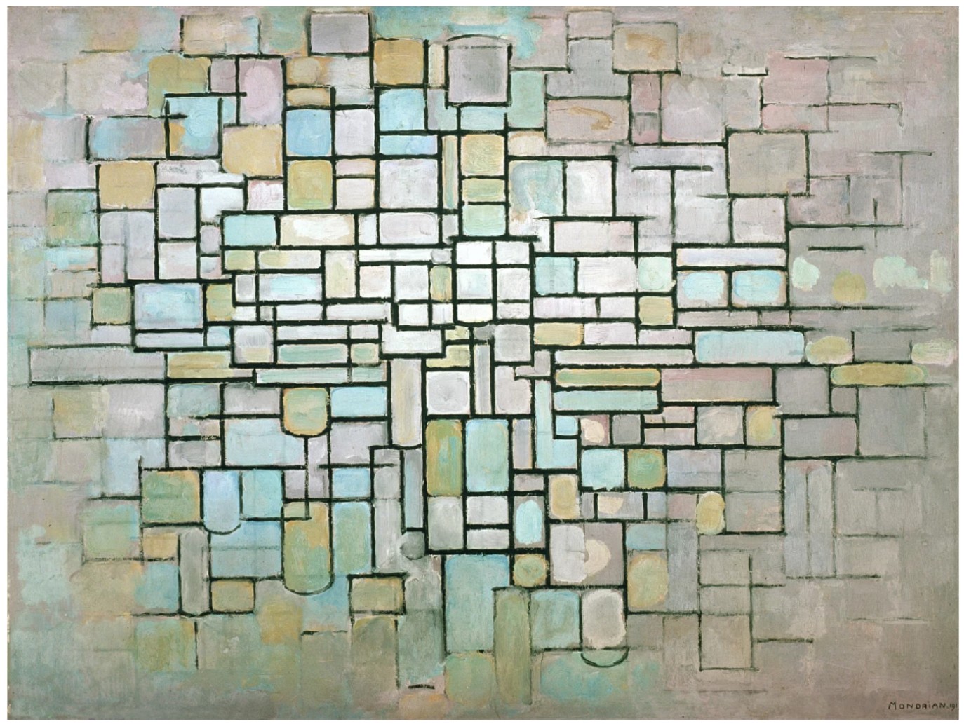
Piet Mondrian, Composition No. II, 1913. Rijksmuseum Kröller-Müller, Otterlo. Image © Mondrian/Holtzman Trust / Bridgeman Images
Indeed, the years between 1948 to 1950 marked a historic turning point not only for Rothko, but also for the course of Contemporary art. As Rothko was on the precipice of realizing his signature mode of abstraction, Barnett Newman had achieved his iconic “Zip” form with Onement, I (1948); Willem de Kooning had painted his early masterpiece Attic (1949) and would soon begin Woman I (1950-52); and Pollock, who was also exhibiting with Parsons at the time, was reaching the pinnacle expression of his Drip paintings with works like One: Number 31, 1950 (1950). This was a moment of radical invention in abstraction in the United States. The transformations of this moment would dramatically alter the course of Contemporary art.
Left: Mark Rothko, Multiform, 1948. National Gallery of Australia, Canberra. Art © 1998 Kate Rothko Prizel & Christopher Rothko / Artists Rights Society (ARS), New York. Right: Mark Rothko, Untitled, 1949. National Gallery of Art, Washington, D.C. Photo courtesy National Gallery of Art, Washington, D.C. Art © 1998 Kate Rothko Prizel and Christopher Rothko
Rare, ethereal and utterly entrancing, Rothko’s No. 1 is a masterpiece which marks the onset of not only the artist’s classical period but also his revolutionization of abstraction.
“A picture lives by companionship, expanding and quickening in the eyes of the sensitive observer. It dies by the same token.”
For the artist, the participation of the viewer was intrinsic to the realization of his work. Therefore, Rothko’s paintings and the viewer are mutually dependent: his abstractions are brought to life by the eyes of the viewer and the viewer too is enlivened by his work. No. 1’s golden yellow, sun-drenched orange, and cerulefiean blue pigments emanate from the surface, engulfing the viewer in a sea of light. The chromatic brilliance of Rothko’s work resonates beyond two dimensions, transporting the viewer into an atemporal, enlightened world beyond the confines of the picture plane.
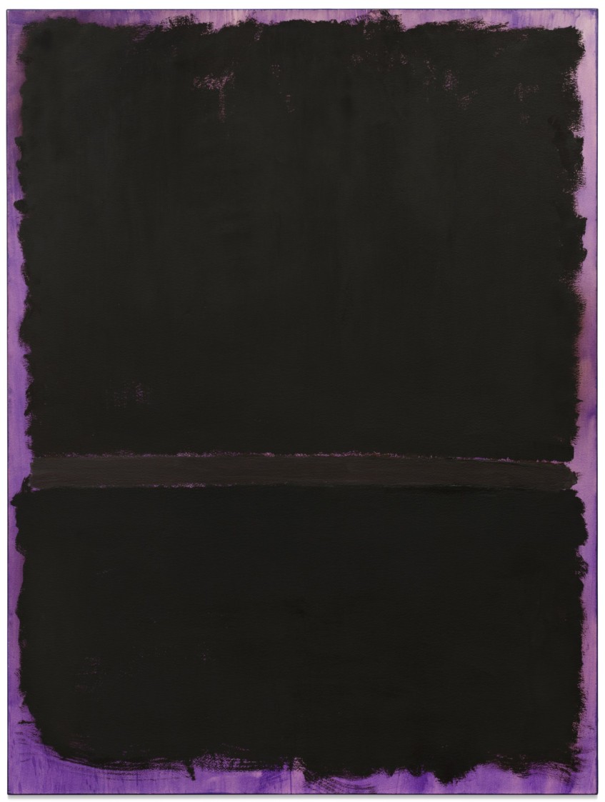
Untitled, 1969
Untitled, 1969
Collection of Jean & Terry de Gunzburg
Sotheby’s New-York: 14 May 2026
Estimated: USD 10,000,000 – 15,000,000
USD 16,465,000
Mark Rothko | Untitled | The Now & Contemporary Evening Auction |
MARK ROTHKO (1903 – 1970)
Untitled, 1969
Acrylic on paper mounted on canvas
78-1/2 x 58-1/2 inches (198.8 x 148.6 cm)
Signed (on the reverse)
Radiating an amethyst incandescence reverberating against three registers of velvety onyx pigment, Mark Rothko’s Untitled is a uniquely poignant and monumental example of the artist’s celebrated paintings on paper. Among the largest paintings on paper that Rothko created, Untitled adopts the presence of a expansive canvas painting, enveloping the viewer in a sea of feathered brushstrokes and encouraging sustained contemplation.
The artist in his studio, 1964. Photo by Dan Budnik
Executed in 1969, the penultimate year of Rothko’s life, Untitled emits both the ethereal metaphysicality and immersive intimacy of the artist’s most celebrated, large-scale works, reigning as one of the most accomplished examples of the artist’s paintings on paper. Although Rothko completed works on paper throughout his career, it was in the final two years that paintings on paper became a central focus of his output. Reaching nearly 80 inches, the dramatic scale of Untitled mirrors the proportions of the human body and immerses the viewer in a transcendent, majestic expanse.
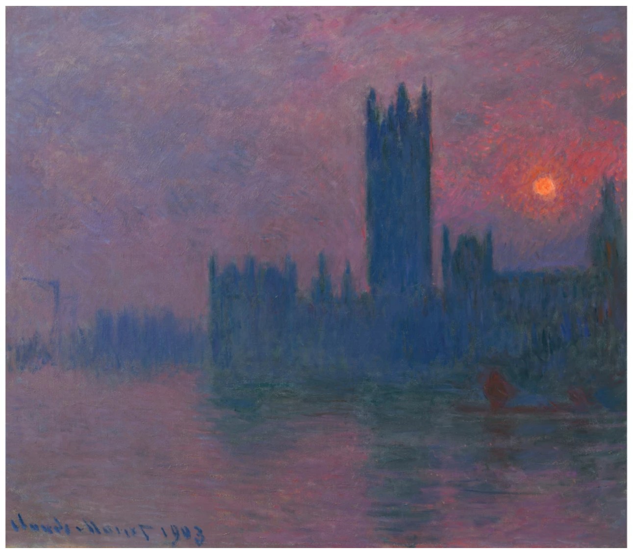
Claude Monet, Parliament, Setting Sun, 1900-03. Private Collection. Image © Christie’s Images / Bridgeman Image
Through generous swathes of inky black emerges a phosphorescent violet glow, illuminating the composition’s surface. Composed of three rich sable registers which float in tension with one another against a jewel-like, purple field, Untitled evokes the dramatic palettes and spiritual, meditative quality of Rothko’s late masterworks commissioned by Dominique and John de Menil for the Rothko Chapel in Houston, Texas. Adam Greenhalgh notes of Rothko’s 1968-69 paintings on paper, such as Untitled: “Deep, rich fields painted with bravura brushstrokes against radiant backgrounds create striking paintings that blaze from within. They display vigor and vitality, erupting with volcanic energies and compositional tension” (Adam Greenhalgh, “Into the World: Mark Rothko’s Paintings on Paper,” in: Exh. Cat., Washington D.C., National Gallery of Art (and traveling), Mark Rothko: Paintings on Paper, 2023-24, p. 39)
Mark Rothko, Black on Maroon, 1958. Tate Gallery, London. Image © Tate, London / Art Resource, NY. Art © 1998 Kate Rothko Prizel & Christopher Rothko / Artists Rights Society (ARS), New York
Dating to 1969, Untitled embodies a culminating moment in Rothko’s career, in which he experienced a surge of unrelenting creativity and devoted his practice primarily to paintings on paper. In the spring of 1968, Rothko fell ill and was thereafter advised by his doctors to avoid handling large, heavy canvases. At this counsel, Rothko shifted his focus to the versatile medium of paper, exploring the absolute limits of painting in the media. While many of the works from this period are intimately scaled works on paper, Untitled is a uniquely monumental example, rivaling the artist’s major paintings in its larger-than-life scale. Although Rothko indeed produced works on paper throughout his career, the paintings on paper from the late 1960s encapsulate the profundity of his technical mastery as a painter.
Adam Greenhalgh notes of the importance of the paper medium to Rothko: “The largest paintings Rothko made on paper are on par with the dimensions of any of his abstract canvases made after 1949. Paintings on paper at this scale belie the widely held perception that paintings are on canvas and drawings are on paper, that paintings are big and major and drawings are small and minor… Paper, it would seem, had supplanted canvas as his preferred support.” (Adam Greenhalgh, “Into the World: Mark Rothko’s Paintings on Paper,” in: Exh. Cat., Washington D.C., National Gallery of Art (and traveling), Mark Rothko: Paintings on Paper, 2023-24, pp. 38-39) In his final years, Rothko’s artistic ambition reached its apex, resulting in a body of works on paper as meditative, captivating and vital as any of his paintings on canvas that defined his early career.
Left: Francis Bacon, Study after Velazquez, 1953. Private Collection. Image © Bridgeman-Giraudon / Art Resource, NY. Art © 2026 Estate of Francis Bacon / Artists Rights Society (ARS), New York / DACS, London.
Right: Yves Klein, Untitled (fire-color painting), 1962. The Museum of Modern Art, New York. Image © The Museum of Modern Art/Licensed by SCALA / Art Resource, NY. Art © 2026 Artists Rights Society (ARS), New York / ADAGP, Paris
These last years devoted primarily to paintings on paper were preceded by Rothko’s magnum opus, his most significant and defining artistic legacy: the commission for the Rothko Chapel at the University of St. Thomas, Houston, Texas. In April 1964, Dominique and John de Menil commissioned Rothko to create a suite of paintings to fill the walls of an octagonal, nondenominational chapel space. Over the course of three years, Rothko executed twenty-three paintings, fourteen of which were ultimately installed in the Chapel in 1971, completed shortly after the artist’s passing in 1970. The soaring, revelatory canvases created for the Chapel invite an even more profound contemplation than his earlier works afforded.
Market Precedents
Through their deep hues and somber elegance, the Chapel paintings created a boundless, transcendent atmosphere. Rothko’s use of darker pigments continued through his subsequent series of works on paper, including Untitled, which engulfs the viewer in a mesmeric expanse of rich black punctuated by a radiant amethyst glow. Diane Waldman writes of Rothko’s seminal final works: “No longer is his art earthbound, sensual, corporeal. He had attained a harmony, an equilibrium, a wholeness, in the Jungian sense, that enabled him to express universal truths in his breakthrough works, fusing the conscious and the unconscious, the finite and the infinite, the equivocal and the unequivocal, the sensuous and the spiritual.” (Diane Waldman, in: Exh. Cat., New York, The Solomon R. Guggenheim Museum, Mark Rothko, 1903-1970: A Retrospective, 1978, p. 69)
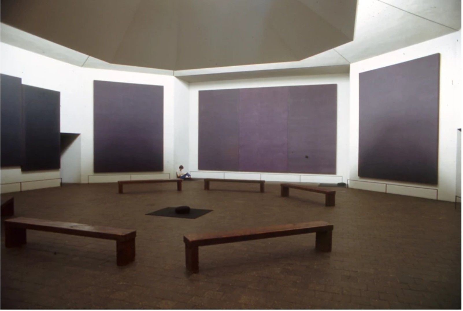
The Rothko Chapel, Houston. Image © Nicolas Sapieha / Art Resource, NY.
Art © 1998 Kate Rothko Prizel & Christopher Rothko / Artists Rights Society (ARS), New York
Although the execution of Untitled followed Rothko’s Chapel commission, there is an undeniable visual harmony between the painting and its legendary precedents. Indeed, in 1996-97, the present work was included in a seminal exhibition at The Menil Collection, Houston, which revisited the Chapel commission. Inclusion in this exhibition solidifies Untitled’s close visual ties to Rothko’s most enduring and iconic project. Untitled is anchored in the sublime potency and pure painterly fortitude emanating from the deep palettes of the Chapel paintings. Through feathered layers of amethyst purple and silky black, Untitled achieves an atemporal chromatic brilliance and enduring visual resonance.
Untitled, circa 1959
Untitled, circa 1959
A New Vista: The David and Shoshanna Wingate Collection
Sotheby’s New-York: 19 May 2026
Estimated: USD 5,000,000 – 7,000,000
USD 9,270,000
Mark Rothko | Untitled | Modern Evening Auction | 2026 | Sotheby’s
MARK ROTHKO (1903 – 1970)
Untitled, circa 1959
Oil and watercolor on paper mounted on canvas
30-3/8 x 22 inches (77.2 x 55.9 cm)
Exuding the ethereal radiance of a precious gem and the majestic drama of a sky emblazoned by the setting sun, Mark Rothko’s Untitled is a profound example of the artist’s enchanting corpus of paintings on paper from the late 1950s. Bursting with chromatic vibrancy, Untitled entrances the viewer into a mesmeric expanse of raspberry, amber and plum—an exquisite evocation of Rothko’s transcendent abstractions. Executed circa 1959, Untitled encapsulates the prismatic potency and sublime expression of Rothko’s large canvases, yet through its intimate, jewellike scale, it encourages a highly personal form of engagement and contemplation. Untitled was notably featured in the first exhibition dedicated to Rothko’s seminal paintings on paper: the historic 1984-86 traveling exhibition, Mark Rothko: Works on Paper, which originated at the National Gallery of Art and traveled around the United States. The work has been a treasured centerpiece of the esteemed collection of David and Shoshanna Wingate for fifty years.
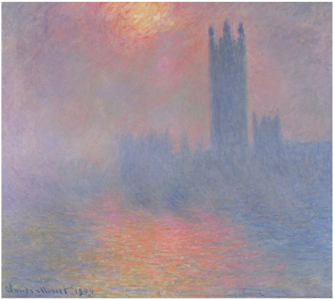
Claude Monet, Londres, le Parlement, Trouée de soleil dans le brouillard, 1904. Musée d’Orsay, Paris. Image © Bridgeman Images
Untitled was executed at the conclusion of a watershed decade for Rothko in which he cultivated his revolutionary abstract vernacular. In these years, Rothko performed the sublime: harnessing the effervescent splendor and intangible divinity of light and color through the methodical articulation of luminous fields of pigment. Applying numerous thin veils of pigment through a nuanced feathering technique, Rothko eliminated hard edges from his compositions in favor of a subtle blending of color. The resulting compositions radiate magnificent weightlessness. The edges of Rothko’s forms are suspended in halos, which afford his painted surfaces a heavenly aura. Thereby, his paintings at once evoke stillness and motion, as if the pigments on the surface have been freshly applied yet are eternally fixed. While Rothko’s Abstract Expressionist peers like Franz Kline and Willem de Kooning deconstructed the picture plane through an ostensibly unbridled gestural fortitude, Rothko tested the absolute limits of abstraction through radiant zones of pure color, hovering in metaphysical tension with each other. Indeed, Rothko’s compositions achieve a transformative sense of harmony and balance through the subtle asymmetries and idiosyncrasies of their forms. Devoid of representation, the subject of Rothko’s work becomes the pure expression of color and light.
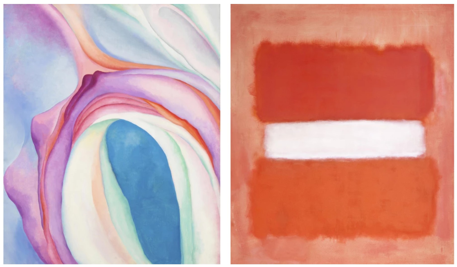
Left: Georgia O’Keeffe, Music, Pink and Blue No. 2, 1918. Whitney Museum of American Art, New York. Image © Whitney Museum of American Art / Licensed by Scala / Art Resource, NY. Art © 2025 Georgia O’Keeffe Museum / Artists Rights Society (ARS), New York.
Right: Mark Rothko, White Center, 1957. Los Angeles County Museum of Art. Image © 2026 Museum Associates / LACMA. Licensed by Art Resource, NY. Art © 1998 Kate Rothko Prizel & Christopher Rothko / Artists Rights Society (ARS), New York
Paper was a foundational medium for Rothko throughout his career, operating as an essential vessel for channeling chromatic force. As Dore Ashton observed, Rothko more than any artist I have known succumbed to the lure of light… light that envelops us and is all things that are not… It was most certainly his experience with the paradoxical nature of paper—absorbing and reflecting at the same time—that set him on his course to the great clearing away that his life’s work represents.” (Dore Ashton, “Introduction,” in: Exh. Cat., Washington, D.C., National Gallery of Art (and traveling), Mark Rothko: Works on Paper, 1984-86, p. 9) Rothko’s paintings on paper from the 1950s are unique within his corpus for the astonishing vibrancy of their palettes. In the present work, Rothko juxtaposes three registers of varying scales against a rich, berry-colored expanse, forming a composition which evokes the proportions of the human body.
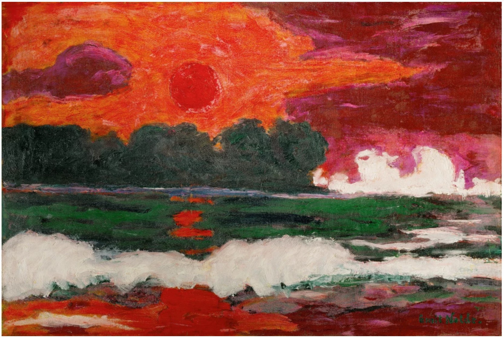
Emil Nolde, Tropensonne, 1914. Louisiana Museum of Modern Art, Humlebaek. Art © Nolde Stiftung Seebüll, Germany
In 1958, nearing the end of a radically prolific and formative decade for Rothko, he was commissioned to create a historic series of paintings for the Seagram Building in New York—today known as the Seagram Murals. Over the following two years, as he produced these paintings, his output evolved from saturated, bright hues to a deeper, more somber palette. Untitled sits at the nexus of this moment, radiating a sumptuous, jewellike glow while also anticipating the rich maroon palette of Rothko’s landmark Seagram Murals. The orange center of Untitled radiates as if illuminated from within, bestowing the composition an effervescent, extrasensory quality shared with Rothko’s most successful paintings on canvas. The present work embodies the profound visual resonance and transcendent essence of Rothko’s acclaimed large-scale canvas works encapsulated in an intimate, immersive format.
The Journey, 1946
The Journey, 1946
Property Sold to Benefit Jonas Philanthropies
Sotheby’s New-York: 15 May 2026
Estimated: USD 300,000 – 400,000
USD 1,024,000
WORK ON PAPER
Mark Rothko | The Journey | Contemporary Day Auction | 2026 |
MARK ROTHKO (1903 – 1970)
The Journey, 1946
Watercolor and ink on paper mounted on canvas
39-7/8 x 26 inches (101.3 x 66 cm)
Signed (lower right)
Mark Rothko’s The Journey from 1946 stands as a rare and poignant document of one of the most consequential pivots in the history of twentieth-century art. Occupying the precise threshold between mythology and pure abstraction, this luminous watercolor and ink on paper captures Rothko at the very nascency of his signature, arresting abstraction.
Testament to the art-historical significance of the present work, The Journey was included in the exhibition Mark Rothko: Paintings on Paper at the National Gallery of Art in Washington D.C., one of the most important focused examinations of the artist’s works on paper ever mounted by a major institution. Within the show, The Journey was presented as a key example of Rothko’s transitional vocabulary, contextualized among the full arc of his output in the medium. The Journey is also a rare opportunity to unite exceptional connoisseurship with meaningful impact; all funds raised from the sale of The Journey will go to support the work of Jonas Philanthropies Fund at Impact Assets, the foundation founded by Barbara and Donald Jonas almost 20 years ago, which has done and continues to do incredible work supporting Nursing, Children’s Vision Care, and Climate Health.
By 1946, Rothko had spent the better part of a decade drawing on the imagery of ancient myth, Jungian psychology, and Surrealist automatism to construct a distinct pictorial language. Populated by primordial aquatic environments and totemic presences, the works from this period reflect his deep engagement with the universality of human experience. The Journey carries clear traces of this mythic ambition in its title and in the lingering suggestion of forms that seem almost figurative, almost narrative, yet dissolving. The watercolor medium, with its inherent luminosity and resistance to rigid contour, was the ideal vehicle for this dissolution. Rothko had worked extensively in watercolor throughout his transitional years, finding in its translucency a natural analog to the atmospheric effects he was beginning to pursue in paint. Here, washes of color breathe and bleed into one another with an almost sovereign indifference to the boundaries they briefly suggest. Within a year of completing The Journey, Rothko would abandon mythological subject matter entirely to create his Multiforms, and, shortly after, the iconic Color Field paintings. The Journey, as its title so aptly suggests, is the passage between the artist’s early figuration and the solemn, radiant rectangles of hovering color that would distinguish Rothko’s legendary oeuvre. Color and light have begun their insurrection, trembling on the edge of pure sensation.
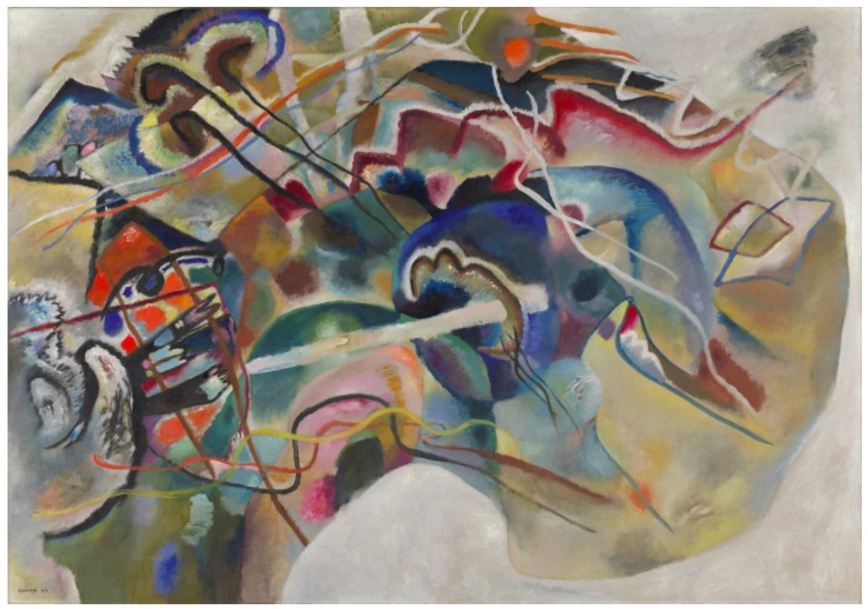
Wassily Kandinsky, Bild mit weissem Rand (Painting with White Border), 1913, Solomon R. Guggenheim Museum, New York.
Art © 2024 Wassily Kandinsky / Artists Rights Society (ARS), New York.
Vaporous washes of paint enmesh in a field of silvery, smoke-toned gray applied with the atmospheric diffusion unique to watercolor. A luminous vertical axis descends through the center of the composition, anchored near its upper third by a single blazing node of crimson and orange, a concentrated ember of color that functions as the work’s emotional center of gravity. Around this fiery point, pale biomorphic shapes and curvilinear passages suggesting fins, tendrils, or perhaps wings, hover in the gray ground like forms glimpsed beneath still water.
“I do not believe that there was ever a question of being abstract or representational. It is really a matter of ending this silence and solitude, of breaching and stretching one’s arms again.”
Horizontal registers of faint, ladder-like marks create a structural rhythm that anticipates, unmistakably, the stacked color zones of the later paintings. The overall effect is one of profound quietude, a world in the process of becoming. Not merely a beautiful object, The Journey is a turning point made visible, the moment before one of painting’s greatest voices found, at last, its defining register.
“Freed from a false sense of security and community, the artist can abandon his plastic bankbook, just as he has abandoned other forms of security. Both the sense of community and security depend on the familiar. Free of them, transcendental experiences become possible. I think of my pictures as dramas; the shapes in the pictures are the performers. They have been created from the need for a group of actors who are able to move dramatically without embarrassment and execute gestures without shame.”
The Journey is an incandescent testament to Rothko’s exploration and arrival at the inimitable and innovative union of color and form that established his place within the canon of American Abstraction of the mid-Twentieth Century.