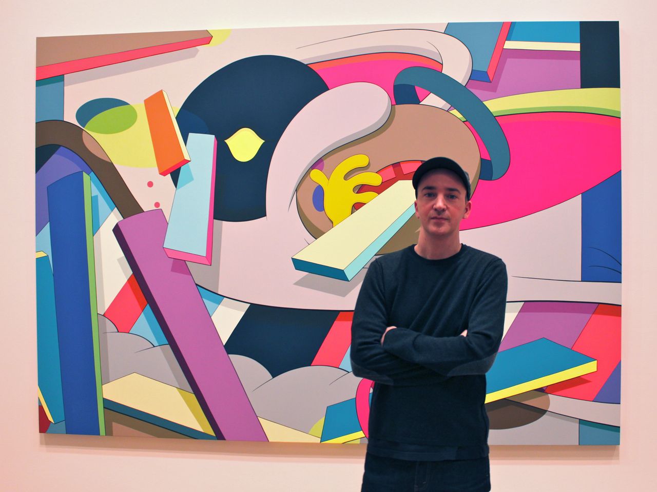
KAWS’s print and multiples practice occupies a central position within his broader oeuvre, functioning as a primary vehicle for the dissemination of his visual language. Unlike many artists for whom editions serve as secondary outputs, KAWS has developed a highly structured and intentional body of prints and objects that translate his universe—rooted in appropriation, character design, and graphic precision—into reproducible formats without losing their cultural impact. His work operates at the intersection of fine art, popular culture, and design, and his editions reflect this hybridity with particular clarity.
Introduction
Emerging from a background in graffiti and commercial intervention, KAWS built his early reputation through the alteration of advertising imagery, introducing his now-iconic visual vocabulary—crossed-out eyes, simplified forms, and reconfigured characters—into the public sphere. This origin is essential to understanding his editions. The language of reproduction, circulation, and visibility is not incidental; it is foundational. His prints and multiples extend this logic, allowing his imagery to exist simultaneously within the art market and a broader cultural ecosystem.
Visually, KAWS’s prints are defined by a high degree of graphic control. Compositions are often built from bold contours, flat color fields, and carefully calibrated palettes that emphasize clarity and immediacy. His recurring characters—Companion, BFF, Chum—are not merely figures, but structured forms that can be endlessly recomposed, isolated, or repeated. Each variation in color or pose produces a distinct emotional register, while maintaining a strict formal consistency. This balance between repetition and variation is central to the strength of his editioned works.
KAWS’s multiples extend this system into three dimensions, where his characters take on sculptural presence while retaining their graphic identity. These objects, often produced in controlled editions, blur the boundaries between collectible design and fine art sculpture. The surfaces remain smooth, the colors saturated, and the forms simplified, reinforcing the sense of a universe governed by precision and consistency. Unlike traditional sculpture, which often emphasizes materiality and gesture, KAWS’s multiples prioritize finish, reproducibility, and visual impact.
From a conceptual standpoint, KAWS’s work engages with themes of appropriation, identity, and emotional ambiguity. His early interventions into familiar cultural figures—most notably his reinterpretations of cartoon characters—transform recognizable imagery into something both familiar and estranged. Over time, his own characters have achieved a similar status, becoming globally recognizable icons that carry a surprisingly introspective dimension. Beneath their simplified appearance lies a recurring sense of melancholy, isolation, or introspection, which distinguishes his work from purely decorative or commercial production.
The market for KAWS prints and multiples is among the most dynamic in the contemporary field. His editions are regularly offered at major auction houses such as Sotheby’s, Christie’s, and Phillips, often achieving strong and consistent results. Demand is driven by a broad collector base that spans contemporary art collectors, design enthusiasts, and a younger audience engaged with his cultural presence. This wide appeal has contributed to both the liquidity and volatility of his market, where certain editions can experience rapid fluctuations in value depending on rarity, colorway, and timing.
Within this landscape, distinctions between different types of editions are essential. Signed and numbered prints, limited sculptural multiples, open editions, and commercial releases all coexist within KAWS’s production, but they do not occupy the same position in terms of value or collectibility. For collectors, understanding these differences—edition size, production context, and distribution channel—is critical in navigating a market where visual similarity can mask significant variations in importance.
Ultimately, KAWS’s prints and multiples form a coherent and highly controlled system, where repetition, variation, and circulation are not secondary concerns but defining principles. His work reflects a contemporary condition in which images move fluidly between contexts, retaining their identity while adapting to new formats. In this sense, his editions do not merely reproduce his work—they are its natural extension, operating within a universe where art, design, and mass culture are inseparable.
Prints: Graphic Language and Controlled Variation
KAWS’s print practice is structured around a series of distinct bodies of work that translate his characters and visual language into tightly controlled graphic compositions. Unlike his multiples, where variation is expressed through volume and scale, his prints operate through compression: flat surfaces, sharp contours, and carefully calibrated color relationships. Each series introduces a specific formal logic, while remaining anchored in the same system of repetition and clarity.
Color and Composition: The Core Mechanism
Across all print series, KAWS employs a highly disciplined approach to color and composition. Flat, saturated tones dominate, with sharp separations between forms and minimal modulation. This clarity enhances the immediacy of the image while reinforcing its reproducibility.
Color functions as a primary variable within a fixed structure. A change in palette can alter the entire perception of a composition, shifting emphasis, depth, and emotional tone without modifying the underlying form. This approach aligns his print practice with a broader logic of controlled variation, where repetition is never identical but always regulated.
Prints vs Multiples: Compression and Expansion
The distinction between prints and multiples is fundamentally one of spatial logic. Prints operate through compression, reducing the figure to a flat, graphic system where color and composition dominate. Multiples, by contrast, expand the same forms into physical space, introducing volume and presence.
Despite this difference, both mediums are governed by the same principles: clarity, repetition, and controlled variation. The transition from print to object is not a conceptual shift, but a change in dimension, reinforcing the coherence of KAWS’s overall practice.
What Party: Collective Presence and Isolation
What Party presents a grouping of figures that, at first glance, suggests proximity and shared presence. Yet, the composition quickly reveals a more complex dynamic: the characters coexist within the same space without truly interacting. Their postures remain closed, their gazes withdrawn, and the repetition of identical forms reinforces a sense of detachment rather than connection. The title itself introduces a quiet irony, as the expected energy of a gathering is replaced by a muted, almost introspective stillness.
Formally, the work relies on KAWS’s characteristic clarity—bold contours, flat color fields, and precise arrangement—but uses these elements to produce emotional distance rather than cohesion. The repetition of the figure does not create unity; it amplifies separation. Each character becomes a variation within a system that is visually consistent yet psychologically fragmented, suggesting a condition in which presence does not guarantee connection.
Ups and Downs: Instability and Vertical Tension
In Ups and Downs, KAWS introduces a more dynamic compositional structure, where the orientation of the figures disrupts any sense of equilibrium. Characters appear inverted, suspended, or misaligned, creating a visual instability that contrasts with the controlled precision of the drawing. The vertical movement implied by the composition suggests fluctuation rather than balance, as if the figures are caught in a continuous state of transition.
This instability is reinforced through repetition. The same figure, repeated across different orientations, becomes a unit of variation within a shifting system. Despite the clarity of each individual form, the overall composition resists resolution, producing a subtle tension between order and imbalance. The work demonstrates how KAWS can maintain strict formal control while introducing a sense of uncertainty, where stability is never fully achieved.
Tension: Compression and Confrontation
Tension marks a further intensification of KAWS’s compositional approach, where the figures are brought into closer proximity, creating a sense of compression within the image. Unlike the more open structures of other series, the space here feels constrained, with characters positioned in ways that suggest pressure rather than separation. The result is a composition that appears controlled, yet charged with an underlying sense of confrontation.
The repetition of forms plays a critical role in reinforcing this effect. Rather than dispersing across the surface, the figures are concentrated, their presence amplified through density. This creates a visual field in which the relationships between elements become more immediate and more forceful. The work remains formally consistent with KAWS’s broader practice, yet introduces a heightened emotional intensity, where repetition no longer stabilizes the image but instead generates friction.
The News: Saturation and Media Noise
The News introduces a more complex and layered composition, where KAWS departs from isolated figures and moves toward a dense accumulation of visual elements. Fragments of characters, overlapping forms, and graphic interruptions create a surface that feels saturated, almost overwhelmed. The reference to news is not literal, but structural—the image mimics the constant flow, fragmentation, and repetition associated with contemporary media environments.
Formally, the work remains tightly controlled, yet its density produces a sense of visual noise. Elements compete for attention, and the eye is forced to navigate a composition that resists a single focal point. Repetition no longer stabilizes the image, but contributes to its overload, reinforcing the idea of a system in which information accumulates without resolution. The result is a composition that is both precise and disorienting, reflecting a condition of continuous visual consumption.
Blame Game: Fragmentation and Identity
The Blame Game series marks a significant moment in KAWS’s print practice, where the figure is fragmented and reassembled into a tightly structured composition. Rather than presenting a complete character, the image is broken into sections—heads, hands, and partial forms—creating a visual tension between unity and dislocation.
This fragmentation introduces a more complex reading of identity. The character is no longer stable or self-contained; it becomes a set of interchangeable parts, reorganized within the frame. The composition remains highly controlled, yet the viewer is forced to reconstruct the image mentally, reinforcing the idea that identity within KAWS’s universe is both fixed and unstable.
Urge: Repetition and Visual Saturation
The Urge series pushes KAWS’s logic of repetition to its most intense expression. Figures are multiplied across the surface, overlapping and interlocking to create dense, almost overwhelming compositions. The image becomes less about individual characters and more about accumulation, where repetition itself becomes the subject.
Despite this density, the structure remains precise. Each figure is clearly defined, and the overall composition is carefully balanced, avoiding chaos while maintaining a sense of visual pressure. The result is a controlled saturation, where the viewer is confronted with an image that is both immediate and exhaustive.
Man’s Best Friend: Isolation and Emotional Tone
In Man’s Best Friend, KAWS returns to a more focused composition, often centering on a single figure or a limited interaction between characters. The series introduces a quieter, more introspective dimension, where posture and spacing play a crucial role.
The figures appear more isolated, and the surrounding space becomes an active element of the composition. This restraint allows for a clearer reading of gesture and emotional tone, reinforcing the underlying ambiguity that characterizes KAWS’s work. Even within a simplified format, the balance between familiarity and detachment remains central.
Companion Prints: Icon and Variation
The Companion figure appears extensively in KAWS’s print practice, often isolated or repeated within highly structured compositions. Unlike the sculptural versions, where posture drives variation, the prints rely primarily on color and arrangement to create differentiation.
Each iteration maintains the same underlying structure, yet shifts in palette—sometimes subtle, sometimes bold—produce distinct visual and emotional effects. This controlled variation reinforces the idea of the Companion as a modular unit, capable of endless recombination without losing its identity.
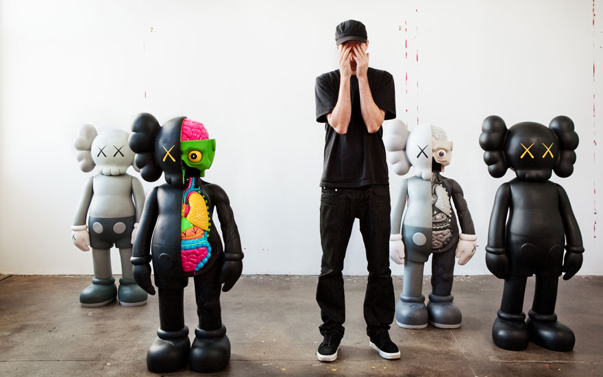
Multiples: Structure, Scale, and Repetition
KAWS’s multiples extend his visual language into three dimensions, transforming his characters into controlled, reproducible objects. Unlike traditional sculpture, which often emphasizes materiality and gesture, these works are defined by precision, finish, and scalability. Each figure operates as a fixed structure that can be reproduced across different sizes and materials without losing its identity, reinforcing the idea of a system rather than a singular object.
One of the defining features of KAWS’s multiples is their scalability. A single character can exist simultaneously as a small editioned object, a mid-scale sculpture, and a monumental installation. This fluidity between formats is central to his practice, allowing his work to circulate across contexts while maintaining a consistent identity. Rather than producing unique sculptural statements, KAWS develops a modular system in which variation occurs through size, color, and context. This approach aligns his work more closely with design and industrial production than with traditional sculptural practice, while still operating fully within the contemporary art market.
It is essential to distinguish between KAWS’s editioned multiples and his unique or large-scale sculptural works. While visually similar, these categories operate under different conditions of production, distribution, and value. Editioned multiples are produced in controlled quantities and circulate widely within the market, forming the core of his collectible output. Larger sculptures, particularly those associated with the Holiday series or major exhibitions, function more as institutional or site-specific works. Understanding this distinction is critical for collectors navigating a market where visual consistency can obscure structural differences.
Companion: The Central Figure
The Companion is the most developed and widely recognized figure within KAWS’s sculptural practice. Defined by its rounded anatomy, skull-like head, and crossed-out eyes, it appears across a wide range of multiples that explore posture, scale, and emotional nuance. Variations such as standing figures, seated versions, or the recurring gesture of covering the face introduce subtle shifts in meaning while preserving the structural integrity of the character.
In sculptural form, Companion becomes a physical presence while maintaining its graphic clarity. The smooth surfaces, saturated colors, and simplified contours reinforce its reproducibility, positioning the figure between collectible object and autonomous sculpture. Its consistency across editions is precisely what allows it to function as the core unit of KAWS’s visual system.
Chum: Appropriation as Foundation
The Chum figure represents an earlier and more explicitly referential phase of KAWS’s work. Derived from the Michelin Man, it retains a visible connection to its source while incorporating the artist’s defining interventions, most notably the crossed-out eyes.
In multiples, Chum operates as a transitional figure. It still carries the logic of appropriation, yet it is already absorbed into KAWS’s broader system of repetition and simplification. Compared to Companion, it feels more rigid and more directly tied to its origin, but this is precisely what makes it historically important within the development of the artist’s practice.
BFF: Texture and Emotional Variation
The BFF figure introduces a distinct variation within KAWS’s sculptural language. Unlike the smooth surfaces of Companion and Chum, BFF often features a textured, almost fur-like treatment, creating a more tactile and visually dense presence.
This shift in surface is accompanied by a change in tone. BFF tends to convey a more expressive or vulnerable dimension, reinforced by posture and color. Despite this, it remains governed by the same principles of clarity and repetition, fully integrated within KAWS’s controlled system of forms.
Holiday Series: Monumentality and Global Circulation
The Holiday series represents one of the most significant developments in KAWS’s sculptural practice, extending his characters into monumental, site-specific installations across global locations. From Hong Kong to Seoul, Tokyo, and beyond, these large-scale inflatable or sculptural figures transform the Companion into a public presence, interacting with architecture, landscape, and cultural context.
While distinct from smaller editioned multiples, the Holiday works reinforce key aspects of KAWS’s practice: scalability, reproducibility, and circulation. The figure remains unchanged in structure, yet its meaning shifts dramatically depending on context—floating on water, reclining in open landscapes, or positioned within urban environments. This series demonstrates the ability of KAWS’s characters to operate across radically different scales without losing coherence.
Karimoku Versions: Craftsmanship, Rarity, and Material Elevation
KAWS’s collaboration with Karimoku represents one of the most refined and technically accomplished aspects of his multiples production. Unlike his more widely distributed vinyl editions, these wood sculptures are produced in extremely limited editions, often in the range of 100 or fewer, and are distinguished by their material quality, craftsmanship, and finish. Executed in carved and polished wood—typically maple or walnut—the works translate KAWS’s graphic language into a medium historically associated with design, furniture, and Japanese artisanal tradition. The result is a striking shift: the same characters are preserved, but their presence becomes quieter, more precise, and significantly more elevated.
Works such as Good Intentions, Better Knowing, and Pinocchio exemplify this approach. The familiar forms—Companion figures or reinterpreted characters—are stripped of surface excess and rendered through the natural tones and grain of the wood. The absence of bright color, which is so central to KAWS’s vinyl works, introduces a different reading altogether. The figures appear more introspective, almost contemplative, as if removed from the immediacy of popular culture and repositioned within a more timeless, object-based tradition. The precision of the carving, the seamless joins, and the immaculate surface treatment reinforce the sense of control that defines KAWS’s practice, while elevating the work into a different category of collectibility.
These editions occupy a distinct position within the market. Their scarcity, combined with the reputation of Karimoku’s craftsmanship, places them among the most sought-after KAWS multiples. They appeal not only to collectors of contemporary art, but also to those interested in design and high-end objects, effectively bridging two markets. Auction results consistently reflect this desirability, with these wood editions often outperforming more common vinyl releases, particularly when complete and in pristine condition.
Ultimately, the Karimoku works reveal a more restrained and sophisticated dimension of KAWS’s practice. By removing color and emphasizing material, they expose the underlying structure of his characters with greater clarity. What remains is not simply an icon, but an object—precisely crafted, carefully controlled, and positioned at the intersection of art, design, and collectible form.
The KAWS Prints Catalogue
PLEASE CLICK ON THE PICTURE BELOW TO ACCESS THE KAWS PRINTS CATALOGUE
The KAWS Multiples Catalogue
PLEASE CLICK ON THE PICTURE BELOW TO ACCESS THE KAWS MULTIPLES CATALOGUE
2026 Upcoming Lots and Auction Results
KAWS Prints & Multiples 2026 Upcoming Lots and Auction Results