WORK IN PROGRESS
Agenda

20th/21st Century: London Evening Sale
15 October 2025
20th/21st Century: London Evening Sale
Post-War and Contemporary Art Day Sale
16 October 2025
Post-War and Contemporary Art Day Sale

Contemporary Evening Auction
16 October 2025
Contemporary Evening Auction | 2025 | Sotheby’s
Contemporary Day Auction
17 October 2025
Contemporary Day Auction | 2025 | Sotheby’s

Modern and Contemporary Art Evening Sale: London
16 October 2025
Modern & Contemporary Art Evening Sale Thursday, October 16, 2025
Modern and Contemporary Art Day Sale: London
18 October 2025
Modern & Contemporary Art Day Sale Saturday, October 18, 2025

20th/21st Century: London Evening Sale
15 October 2025
20th/21st Century: London Evening Sale
Total:
GBP 106,925,400 / USD 143,280,036
# Lots: 61 Lots
# Withdrawn: 0 Lot
# Passed: 6 Lots
# Sold: 55 Lots
Sell-Through Rate: 90.2%
#1. Ski Jacket, 1994
Christie’s London: 15 October 2025
Estimated: GBP 6,000,000 – 8,000,000
GBP 14,270,000 / USD 19,121,800
PETER DOIG (B. 1959), Ski Jacket | Christie’s
PETER DOIG (B. 1959)
Ski Jacket, 1994
Oil on canvas
182.5 x 213 cm (71 7/8 x 83 7/8 inches)
Signed twice, inscribed and dated ‘PETER DOIG 1994 London Peter Doig’ (on the reverse)
#2. Country Rock, 1998-1999
Christie’s London: 15 October 2025
Estimated: GBP 7,000,000 – 10,000,000
GBP 9,210,000 / USD 12,341,400
PETER DOIG (B. 1959), Country Rock | Christie’s
PETER DOIG (B. 1959)
Country Rock, 1998-1999
Oil on canvas
200 x 300cm (78 3/4 x 118 1/8 inches)
Signed twice, titled and dated ‘Peter Doig. “country-rock” ’98-’99 PETER DOIG’ (on the overlap)
#3. Self-portrait Fragment, circa 1956
Christie’s London: 15 October 2025
Estimated: GBP 8,000,000 – 12,000,000
GBP 7,600,000 / USD 10,184,000
LUCIAN FREUD (1922-2011), Self-portrait Fragment | Christie’s
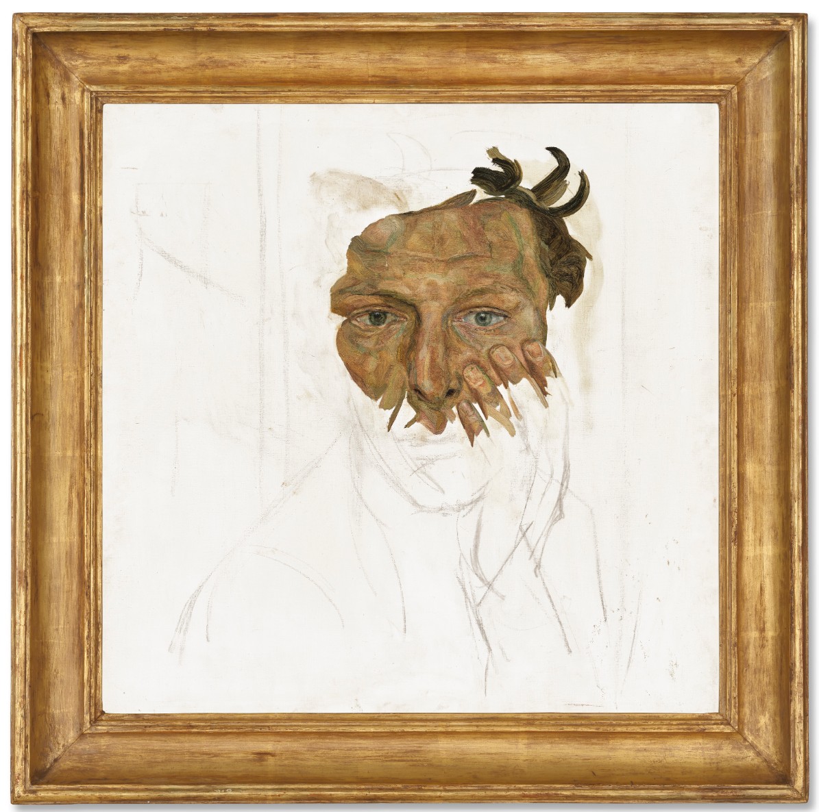
LUCIAN FREUD (1922-2011)
Self-portrait Fragment, circa 1956
Oil on canvas
24×24 inches (61×61 cm)
#4. Tulpen (Tulips), 1995
Christie’s London: 15 October 2025
Estimated: GBP 3,000,000 – 5,000,000
GBP 6,150,000 / USD 8,241,000
GERHARD RICHTER (B. 1932), Tulpen (Tulips) | Christie’s
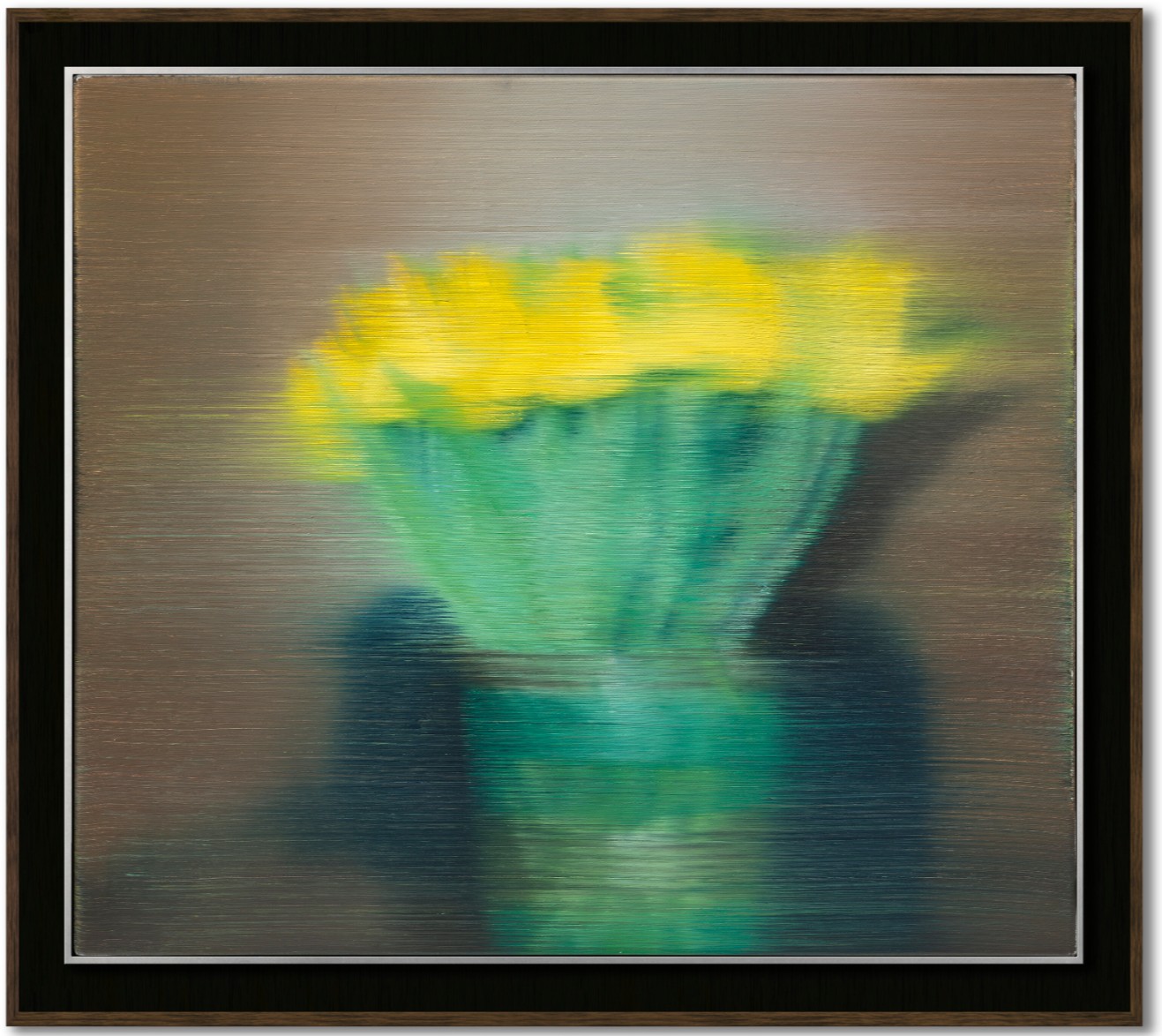
GERHARD RICHTER (B. 1932)
Tulpen (Tulips), 1995
Oil on canvas
36×41 cm (14 1/8 x 16 1/8 inches)
Signed, numbered and dated ‘825-1 Richter 1995’ (on the reverse)
#5. Maison de Bellevue et pigeonnier, circa 1890
Christie’s London: 15 October 2025
Estimated: GBP 4,000,000 – 6,000,000
GBP 5,540,000 / USD 7,423,600
PAUL CEZANNE (1839-1906), Maison de Bellevue et pigeonnier | Christie’s
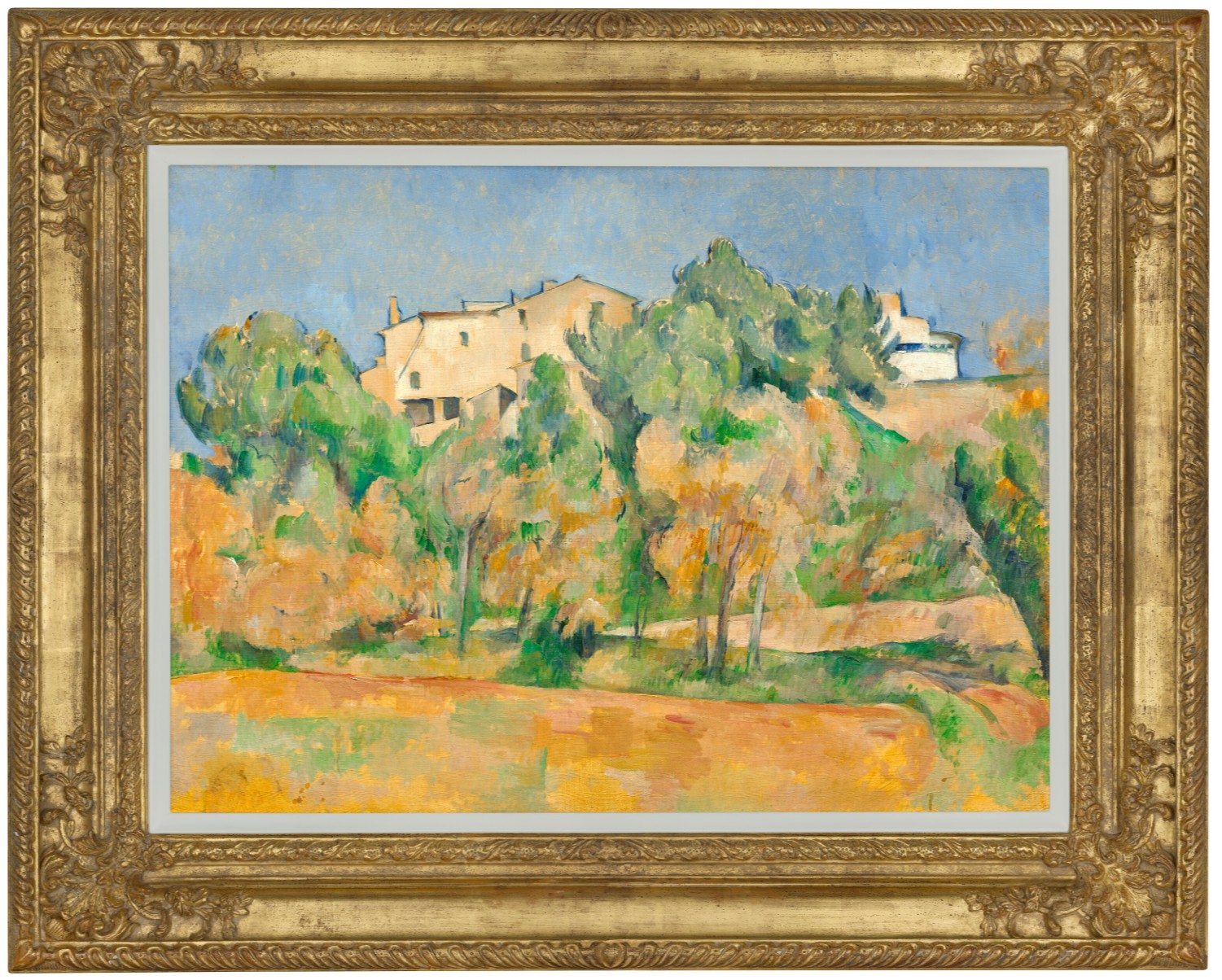
PAUL CEZANNE (1839-1906)
Maison de Bellevue et pigeonnier, circa 1890
Oil on canvas
54×73 cm (21 1/4 x 28 3/4 inches)
#6. L’Arc-en-ciel (Venise), 1905
Christie’s London: 15 October 2025
Estimated: GBP 4,000,000 – 6,000,000
GBP 4,930,000 / USD 6,606,200
PAUL SIGNAC (1863-1935), L’Arc-en-ciel (Venise) | Christie’s
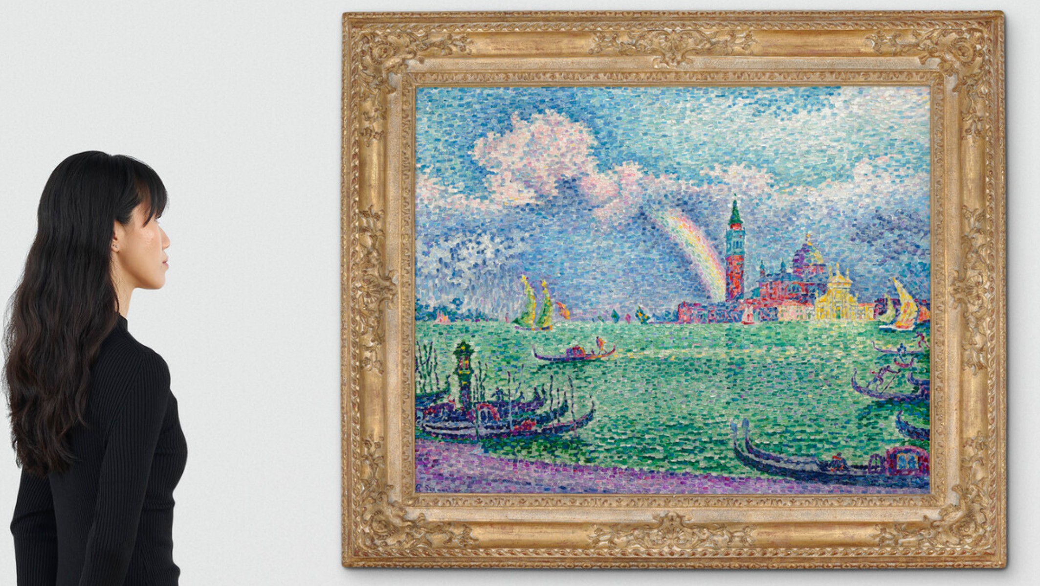
PAUL SIGNAC (1863-1935)
L’Arc-en-ciel (Venise), 1905
Oil on canvas
73.3 x 91.8 cm (28 7/8 x 36 1/4 inches
Signed and dated ‘P Signac 05’ (lower left)
XXXXXXXXXX
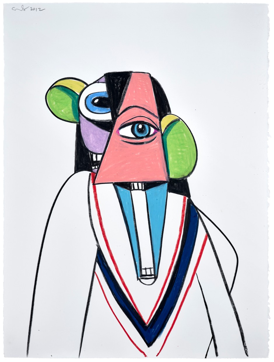
#24. The Banker’s Wife, 2011
Christie’s London: 15 October 2025
Estimated: GBP 800,000 – 1,200,000
GBP 1,331,000 / USD 1,783,540
GEORGE CONDO (B. 1957), The Banker’s Wife | Christie’s
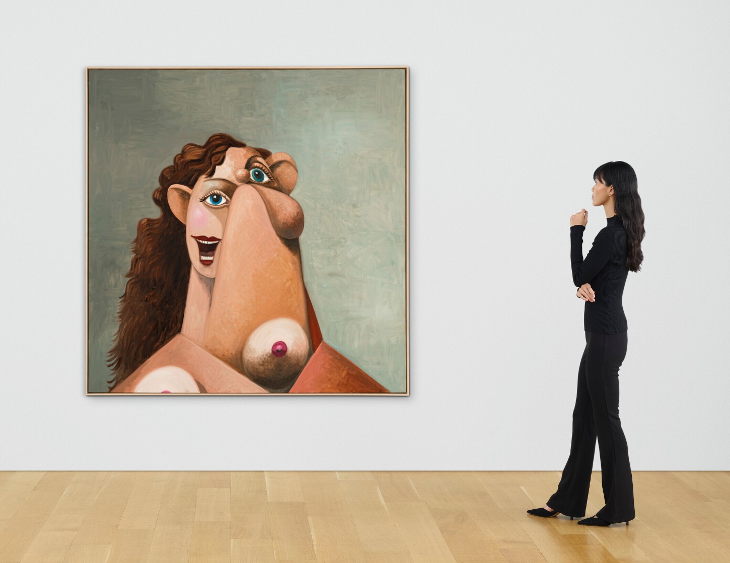
GEORGE CONDO (B. 1957)
The Banker’s Wife, 2011
Oil on linen
74×72 inches (188 x 182.9 cm)
Signed, titled and dated ‘Condo 2011 The Bankers Wife’ (on the overlap)
XXXXXXXXXX
#28. Mao, 1973
Christie’s London: 15 October 2025
Estimated: GBP 600,000 – 800,000
GBP 952,500 / USD 1,276,350
ANDY WARHOL (1928-1987), Mao | Christie’s
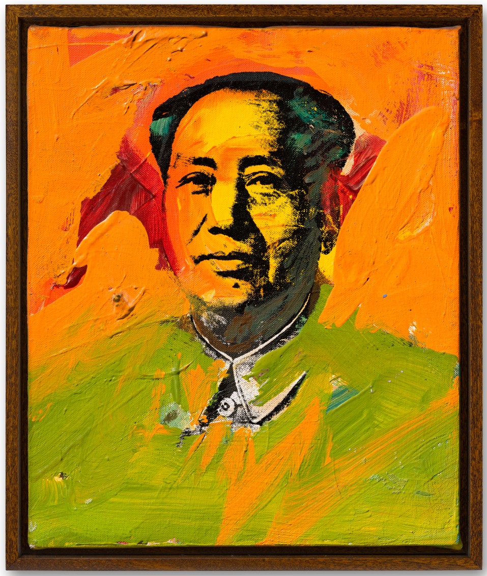
ANDY WARHOL (1928-1987)
Mao, 1973
Acrylic and silkscreen ink on linen
12×10 inches (30.6 x 25.5 cm)
Signed and dated ‘Andy Warhol 73’ (on the overlap)
#29. ONE Through ZERO (The Ten Numbers), 1978-2003
Christie’s London: 15 October 2025
Estimated: GBP 700,000 – 1,000,000
GBP 889,000 / USD 1,191,260
ROBERT INDIANA (1928-2018), ONE Through ZERO (The Ten Numbers) | Christie’s
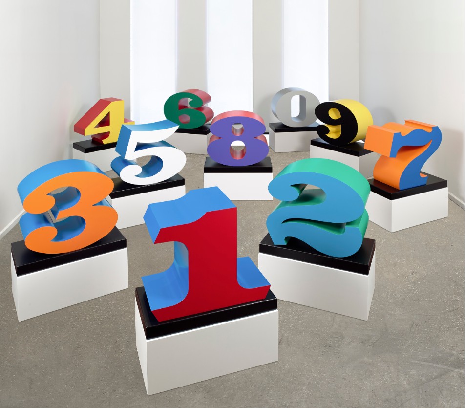
ROBERT INDIANA (1928-2018)
ONE Through ZERO (The Ten Numbers), 1978-2003
Polychrome aluminum on painted aluminum base, in ten parts
Each overall: 33 1/4 × 33 1/4 x 17 inches (84.5 × 84.5 × 43.2 cm)
Each: stamped with the artist’s signature, number and date ‘1978-2003 R INDIANA 2⁄3’ (lower side)
Conceived in 1978 and executed in 2003
This work is number two from an edition of three plus two artist’s proofs
XXXXXXXXXX
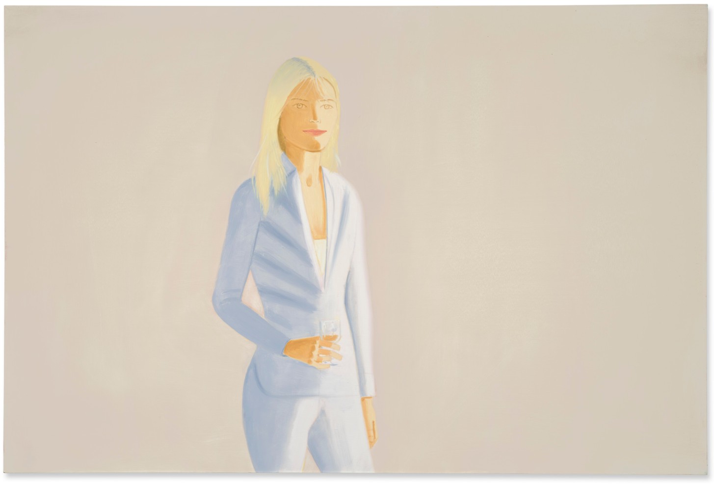
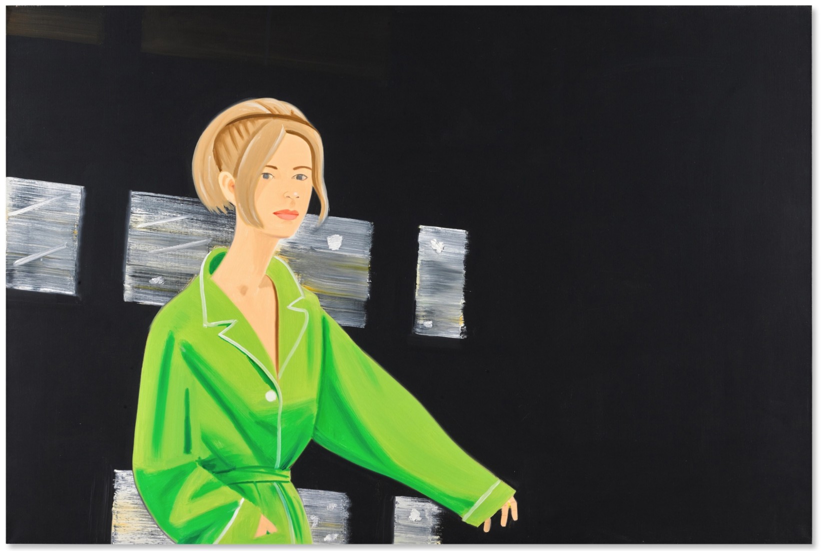
#32. Kym 2, 1989-1990
Christie’s London: 15 October 2025
Estimated: GBP 600,000 – 800,000
GBP 736,600 / USD 987,044
ALEX KATZ (B. 1927), Kym 2 | Christie’s
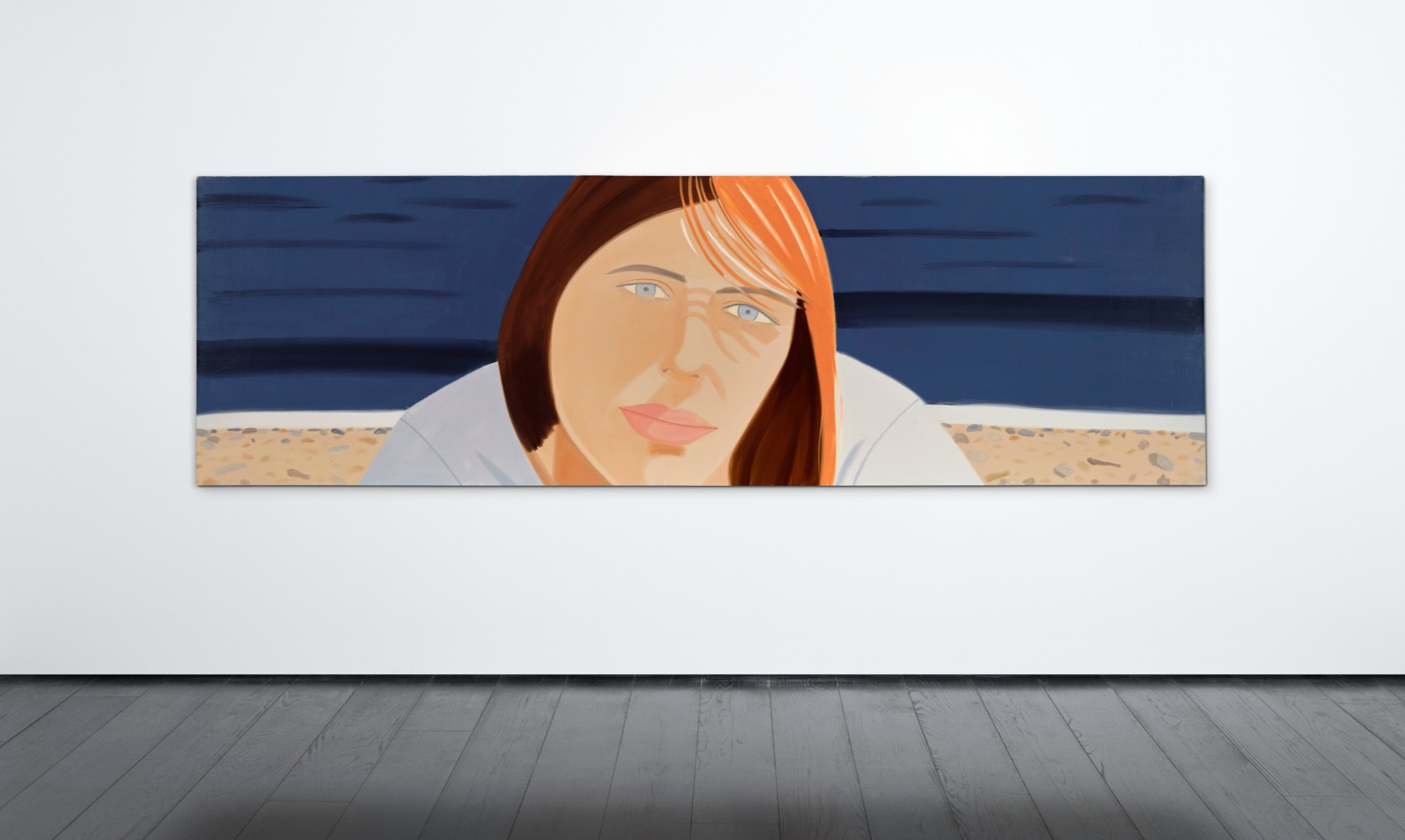
ALEX KATZ (B. 1927)
Kym 2, 1989-1990
Oil on linen
40 x 129 7/8 inches (101.5 x 330 cm)
Signed and dated ‘Alex Katz 90’ (on the overlap)
XXXXXXXXXX
#40. Untitled, 1982
Christie’s London: 15 October 2025
Estimated: GBP 300,000 – 500,000
GBP 508,000 / USD 680,270
JEAN-MICHEL BASQUIAT (1960-1988), Untitled | Christie’s
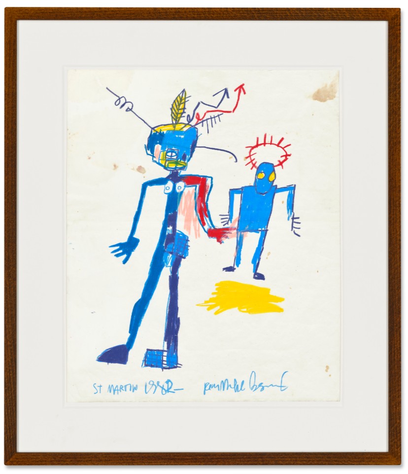
JEAN-MICHEL BASQUIAT (1960-1988)
Untitled, 1982
Oilstick on paper
17 x 13 7/8 inches (43 x 35.3 cm)
Signed, inscribed and dated ‘ST MARTIN 1982- Jean-Michel Basquiat’ (lower edge)
#41. Never Mind, 1990-1991
Christie’s London: 15 October 2025
Estimated: GBP 600,000 – 900,000
GBP 508,000 / USD 680,270
DAMIEN HIRST (B. 1965), Never Mind | Christie’s

DAMIEN HIRST (B. 1965)
Never Mind, 1990-1991
Glass, MDF, ramin, plastic, aluminium, resin and pharmaceutical packaging
54x40x9 inches (137.2 x 101.5 x 23 cm)
#42. The Trappings, 2012
Christie’s London: 15 October 2025
Estimated: GBP 400,000 – 600,000
GBP 482,600 / USD 646,684
LYNETTE YIADOM-BOAKYE (B. 1977), The Trappings | Christie’s
LYNETTE YIADOM-BOAKYE (B. 1977)
The Trappings, 2012
Oil on canvas
200×130 cm (78 3/4 x 51 1/4 inches)
Signed with the artist’s initials, titled and dated ‘The Trappings LYB 2012’ (on the reverse)
XXXXXXXXXX
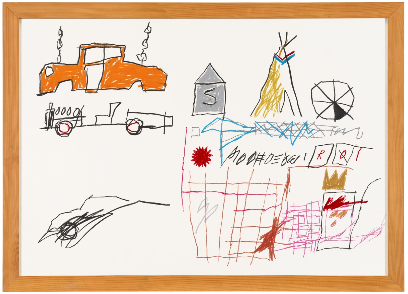
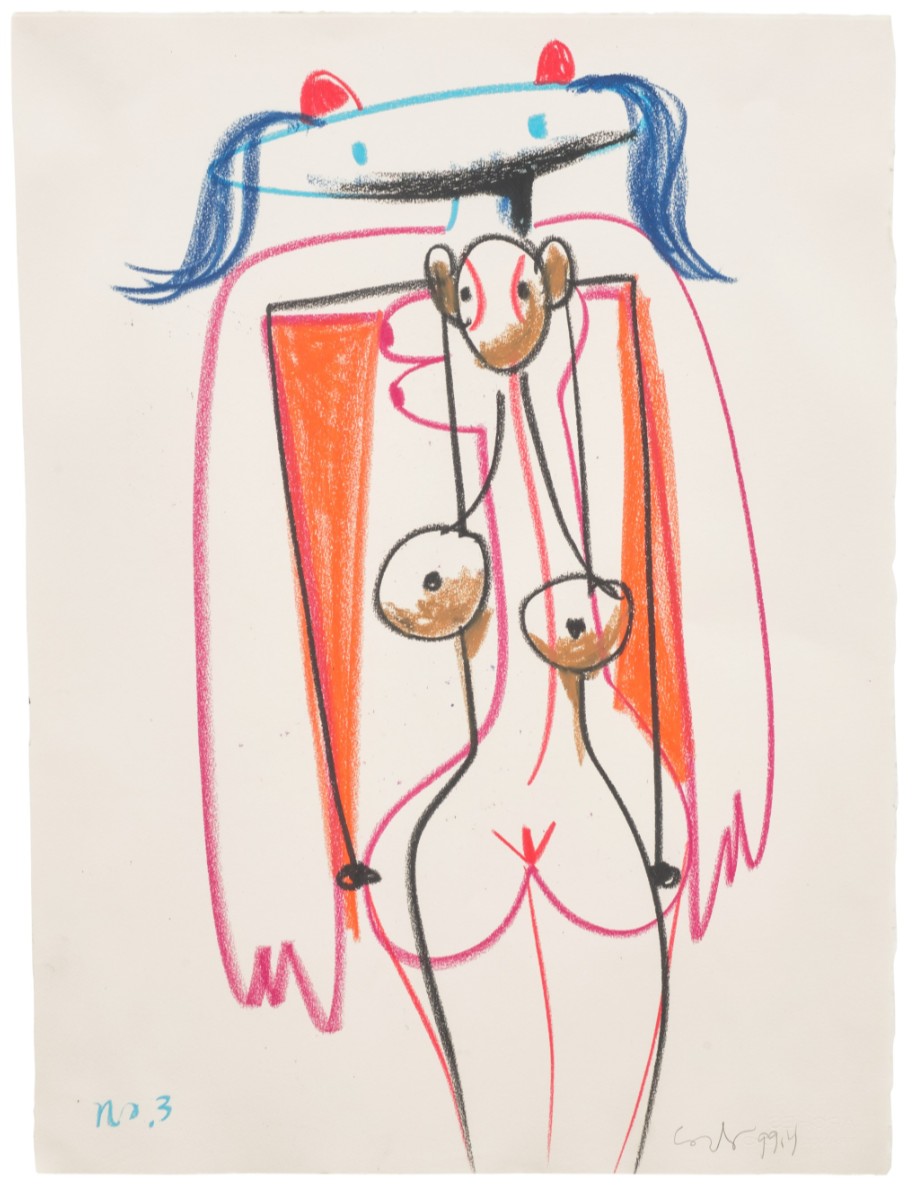
#54. Well Aged, 2005
Estimated: GBP 40,000 – 60,000
GBP 76,200 / USD 102,108
Well Aged, 2005
Oil, acrylic, gouache, charcoal, sand and glitter on paper
30 1/4 x 22 5/8 inches (76.8 x 57.5 cm)
Signed with the artist’s initials and dated ‘HB 05’ (lower left)
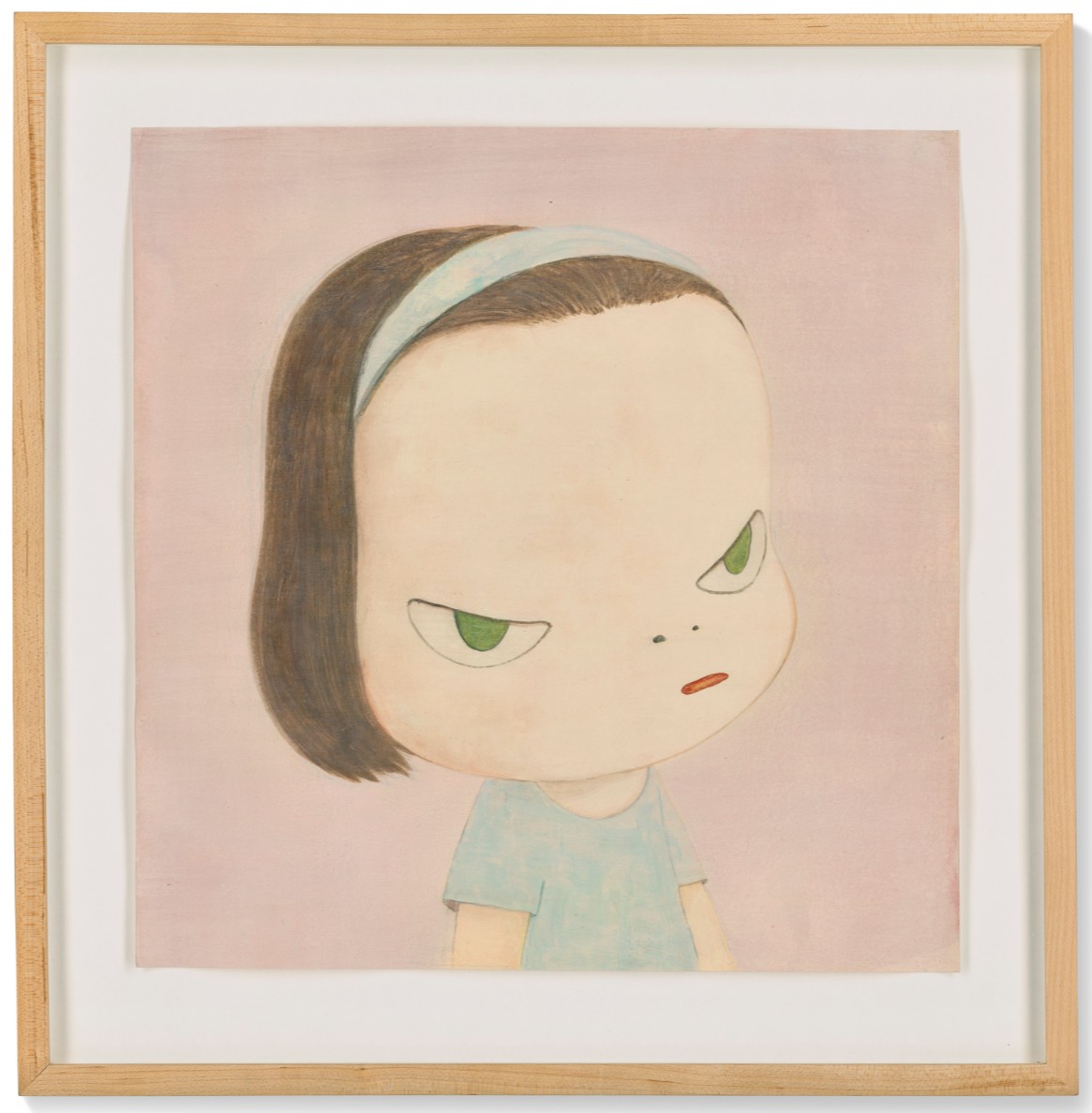
Lots Passed
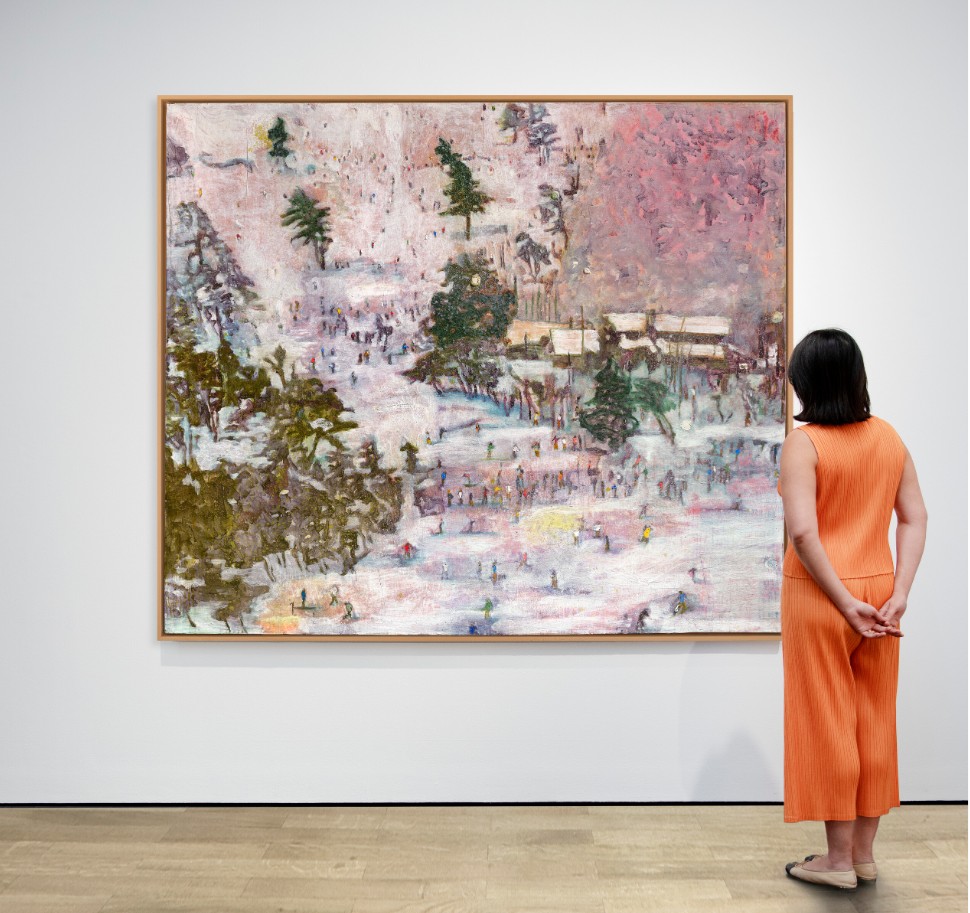
Haze Days, 1998
Christie’s London: 15 October 2025
Estimated: GBP 6,500,000 – 8,500,000
PASSED
YOSHITOMO NARA (B. 1959), Haze Days | Christie’s
YOSHITOMO NARA (B. 1959)
Haze Days, 1998
Acrylic on canvas
180.3 x 164.5cm (71 x 64 3/4 inches)
Signed in Japanese, titled and dated ‘’98 HAZE DAYS’ (on the reverse)
Tree Trunks, 2015
Christie’s London: 15 October 2025
Estimated: GBP 800,000 – 1,200,000
PASSED
NICOLAS PARTY (B. 1980), Tree Trunks | Christie’s
NICOLAS PARTY (B. 1980)
Tree Trunks, 2015
Soft pastel on linen
150×80 cm (59 x 31 1/2 inches)
Signed and dated ‘Nicolas Party 2015’ (on the reverse)
Grau (Grey), 1974
Christie’s London: 15 October 2025
Estimated: GBP 600,000 – 800,000
PASSED
GERHARD RICHTER (B. 1932), Grau (Grey) | Christie’s
GERHARD RICHTER (B. 1932)
Grau (Grey), 1974
Oil on canvas
250 x 195.5 cm (98 3/8 x 77 inches)
Signed, numbered and dated ‘Richter 1974 363⁄4’ (on the reverse)
Post-War and Contemporary Art Day Sale
16 October 2025
Post-War and Contemporary Art Day Sale
Total:
GBP 12,235,180 / USD 16,395,140
# Lots: 140 Lots
[# Withdrawn: 0 Lot]
# Passed: 16 Lots
# Sold: 123 Lots
Sell-Through Rate: 87.9%
#1. Fuji, 1996
Christie’s London: 16 October 2025
Estimated: GBP 300,000 – 500,000
GBP 584,200 / USD 782,830
GERHARD RICHTER (B. 1932), Fuji | Christie’s
GERHARD RICHTER (B. 1932)
Fuji, 1996
Oil on Alucobond
37×29 cm (14 5/8 x 11 3/8 inches)
Signed ‘Richter’ (on the reverse)
Numbered ‘839-85’ (on a label affixed to the reverse)
XXXXXXXXXX
Sissel, 2000
Christie’s London: 16 October 2025
Estimated: GBP 350,000 – 550,000
GBP 444,500 / USD 595,630
ALEX KATZ (B. 1927), Sissel | Christie’s
ALEX KATZ (B. 1927)
Sissel, 2000
Oil on linen
48×72 inches (122×183 cm)
Signed and dated ‘Alex Katz 00’ (on the overlap)
Frog, 1998
Christie’s London: 16 October 2025
Estimated: GBP 300,000 – 500,000
GBP 444,500 / USD 595,630
YOSHITOMO NARA (B. 1959), Frog | Christie’s
YOSHITOMO NARA (B. 1959)
Frog, 1998
Acrylic on paper
36×35 cm (14 1/8 x 13 3/4 inches)
Signed in Japanese, titled and dated ‘FROG 98’ (on the reverse)
XXXXXXXXXX
Untitled, 1980
Estimated: GBP 250,000 – 350,000
GBP 304,800 / USD 408,430
Untitled, 1980
Sumi ink, acrylic and spray paint on paper
61 3/8 x 48 inches (155.8 x 122 cm)
Signed, inscribed, numbered and stamped with the date
‘JUL 18 1980 K. Haring 22ND ST. STUDIO NYC 1of 16’
(on the reverse)
Two cowards at the monument to courage, 2010
Estimated: GBP 250,000 – 350,000
GBP 292,100 / USD 391,415
Two cowards at the monument to courage, 2010
Acrylic, airbrush, household gloss, metallic paint and block print on linen
72 x 60 1/8 inches (182.8 x 152.8 cm)
Signed with the artist’s initials and dated ‘HB 10’ (lower right)
Signed with the artist’s initials, titled and dated
‘HB 2010 Two Cowards at the monument to courage’
(on the reverse)
Study for Chance, 1990
Christie’s London: 16 October 2025
Estimated: GBP 130,000 – 180,000
GBP 292,100 / USD 391,415
ALEX KATZ (B. 1927), Study for Chance | Christie’s
ALEX KATZ (B. 1927)
Study for Chance, 1990
Oil on linen
19 1/8 x 21 1/4 inches (48.5 x 64 cm)
Signed and dated ‘Alex Katz 90’ (lower right)
Three Kings, 2005
Christie’s London: 16 October 2025
Estimated: GBP 200,000 – 300,000
GBP 279,400 / USD 374,395
LYNETTE YIADOM-BOAKYE (B. 1977), Three Kings | Christie’s
LYNETTE YIADOM-BOAKYE (B. 1977)
Three Kings, 2005
Oil on linen
243.6 x 196 cm (95 7/8 x 77 1/8 inches)
Signed with the artist’s initials, titled and dated ‘LYB ‘Three Kings’ 2005′ (on the reverse)
XXXXXXXXXX
Nalorphine, 1995
Christie’s London: 16 October 2025
Estimated: GBP 150,000 – 200,000
GBP 266,700 / USD 357,380
DAMIEN HIRST (B. 1965), Nalorphine | Christie’s
DAMIEN HIRST (B. 1965)
Nalorphine, 1995
Household gloss on canvas
34 7/8 x 57 1/8 inches (88.5 x 145 cm) (2 inch spot)
Titled ‘NALORPHINE’ (on the stretcher)
XXXXXXXXXX
Abstract Head, 2012
Christie’s London: 16 October 2025
Estimated: GBP 80,000 – 120,000
GBP 146,050 / USD 195,705
GEORGE CONDO (B. 1957), Abstract Head | Christie’s
GEORGE CONDO (B. 1957)
Abstract Head, 2012
Oil pastel on paper
30 x 22 1/2 inches (76.1 x 57 cm)
Signed and dated ‘Condo 2012’ (upper left)
XXXXXXXXXX
Beautiful, enemies, denenomies, tornado, hurricane, mad, fuzzy, fiz painting, 1995
Christie’s London: 16 October 2025
Estimated: GBP 80,000 – 120,000
GBP 114,300 / USD 153,160
DAMIEN HIRST (B. 1965)
Beautiful, enemies, denenomies, tornado, hurricane, mad, fuzzy, fiz painting, 1995
Household gloss on canvas
Diameter: 47 3/4 inches (121.4 cm)
Signed and dated ‘Hirst 1995’ (on the stretcher)
XXXXXXXXXX
Queen Elizabeth, circa 1977
Christie’s London: 16 October 2025
Estimated: GBP 50,000 – 70,000
GBP 107,950 / USD 144,655
ANDY WARHOL (1928-1987), Queen Elizabeth | Christie’s
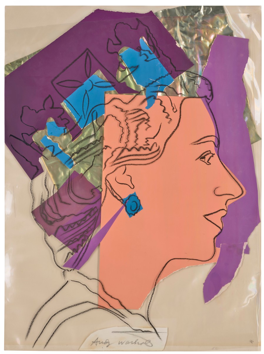
ANDY WARHOL (1928-1987)
Queen Elizabeth, circa 1977
Silkscreen ink, acetate and colored paper collage on paper
41 1/4 x 31 inches (104.7 x 78.9 cm)
Signed ‘Andy Warhol’ (lower centre)
XXXXXXXXXX
Over it & Under it, 2017
Christie’s London: 16 October 2025
Estimated: GBP 100,000 – 150,000
GBP 101,600 / USD 136,145
CHRISTINA QUARLES (B. 1985), Over it & Under it | Christie’s
CHRISTINA QUARLES (B. 1985)
Over it & Under it, 2017
Acrylic on canvas
60×48 inches (152.5 x 121.8 cm)
Signed, titled and dated ‘Christina Quarles 2017 “OVER IT & UNDER IT”‘ (on the reverse)
XXXXXXXXXX
N-t-Boc-I-Alanine, 1995
Christie’s London: 16 October 2025
Estimated: GBP 80,000 – 120,000
GBP 38,100 / USD 51,055
DAMIEN HIRST (B. 1965), N-t-Boc-I-Alanine | Christie’s
DAMIEN HIRST (B. 1965)
N-t-Boc-I-Alanine, 1995
Household gloss on canvas
5 1/8 x 4 1/2 inches (13 x 11.5 cm) (1 inch spot)
Signed twice ‘Damien Hirst D Hirst’ (on the overlap)
Bubonic Plague; Flies; The Martyrdom of Saint James the Greater, 2003
Christie’s London: 16 October 2025
Estimated: GBP 45,000 – 65,000
GBP 24,130 / USD 32,335
DAMIEN HIRST (B. 1965), Bubonic Plague; Flies; The Martyrdom of Saint James the Greater | Christie’s
DAMIEN HIRST (B. 1965)
Bubonic Plague; Flies; The Martyrdom of Saint James the Greater, 2003
Flies and resin on canvas
54 x 39 3/4 inches (137.2 x 101 cm)
Signed and inscribed ‘DHirst James the Great’ (on the reverse)
Untitled, 1984
Christie’s London: 16 October 2025
Estimated: GBP 50,000 – 70,000
SALVO (1947-2015), Untitled | Christie’s
SALVO (1947-2015)
Untitled, 1984
Oil on canvas
80×60 cm (31 1/2 x 23 5/8 inches)
Registered in the Archivio Salvo, Turin, under no. S1984-100
Lots Passed
Untitled (Spiritual Awakening), 2022
Christie’s London: 16 October 2025
Estimated: GBP 60,000 – 80,000
PASSED
JOEL MESLER (B. 1974), Untitled (Spiritual Awakening) | Christie’s

JOEL MESLER (B. 1974)
Untitled (Spiritual Awakening), 2022
Acrylic and pigment on linen
80×70 inches (203.3 x 177.9 cm)
Signed and dated ‘Joel Mesler 2022’ and stamped twice ‘The Estate of Joel Mesler’ (on the overlap)

Contemporary Evening Auction
16 October 2025
Contemporary Evening Auction | 2025 | Sotheby’s
Total:
GBP 48,212,740 / USD 64,605,072
# Lots: 27 Lots
# Withdrawn: 0 Lot
# Passed: 4 Lots
# Sold: 23 Lots
Sell-Through Rate: 85.2%
#1. Portrait of a Dwarf, 1975
Sotheby’s London: 16 October 2025
Estimated: GBP 6,000,000 – 9,000,000
GBP 13,110,000 / USD 17,567,400
Portrait of a Dwarf | Contemporary Evening Auction | 2025 | Sotheby’s
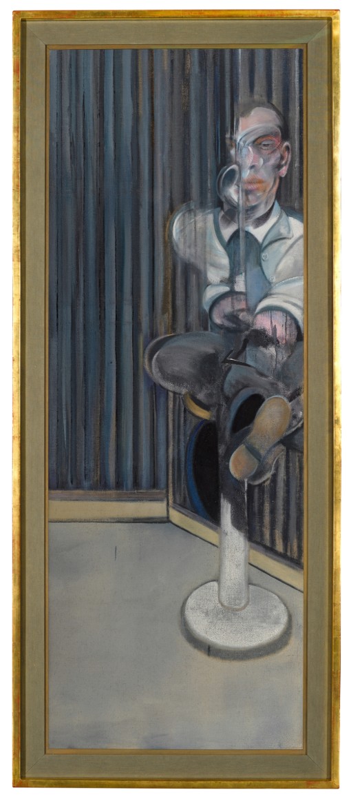
FRANCIS BACON (1909 – 1992)
Portrait of a Dwarf, 1975
Oil on canvas
159 x 58.4 cm (62 5/8 x 23 inches)
Signed twice, titled and dated 1975 (on the reverse)
#2. Study for Self-Portrait, 1980
Sotheby’s London: 16 October 2025
Estimated: GBP 5,000,000 – 7,000,000
GBP 5,774,000 / USD 7,737,160
Study for Self-Portrait | Contemporary Evening Auction | 2025 | Sotheby’s
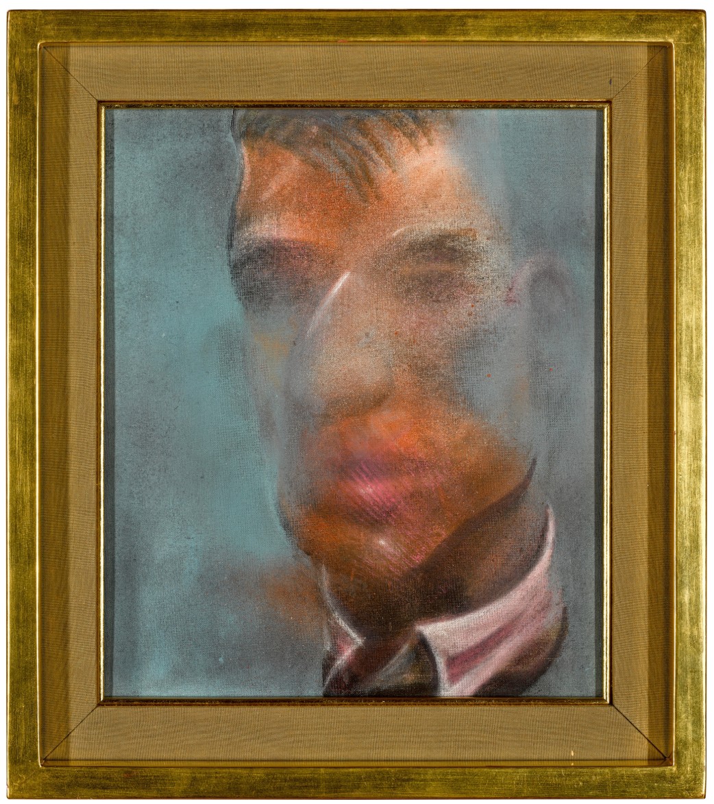
FRANCIS BACON (1909 – 1992)
Study for Self-Portrait, 1980
Oil on canvas
35.5 x 30.5 cm (14×12 inches)
Signed, titled and dated 1980 (on the reverse)
#3. Untitled (The Arm), 1982
Sotheby’s London: 16 October 2025
Estimated: GBP 4,500,000 – 6,500,000
GBP 5,530,000 / USD 7,410,200
Untitled (The Arm) | Contemporary Evening Auction | 2025 | Sotheby’s
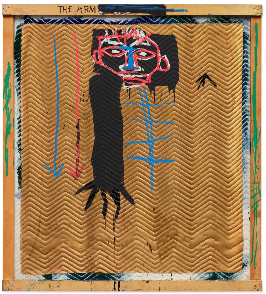
JEAN-MICHEL BASQUIAT (1960 – 1988)
Untitled (The Arm), 1982
Acrylic, oilstick and ink on quilted fabric mounted on wood supports
66 5/8 x 60 inches (169.2 x 152.4 cm)
Partially titled (on the wooden support)
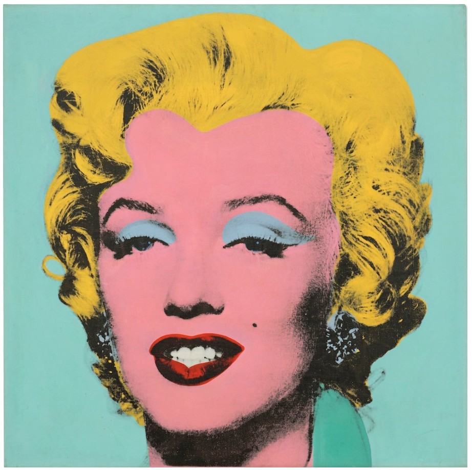
#4. Four Pink Marilyns (Reversal Series), 1986
Sotheby’s London: 16 October 2025
Estimated: GBP 3,000,000 – 5,000,000
GBP 4,326,000 / USD 5,796,840
Four Pink Marilyns (Reversal Series) | Contemporary Evening Auction | 2025 | Sotheby’s
REPEAT SALE
Sotheby’s New-York: 11 November 2015
Estimated: USD 3,000,000 – 4,000,000
USD 4,506,000
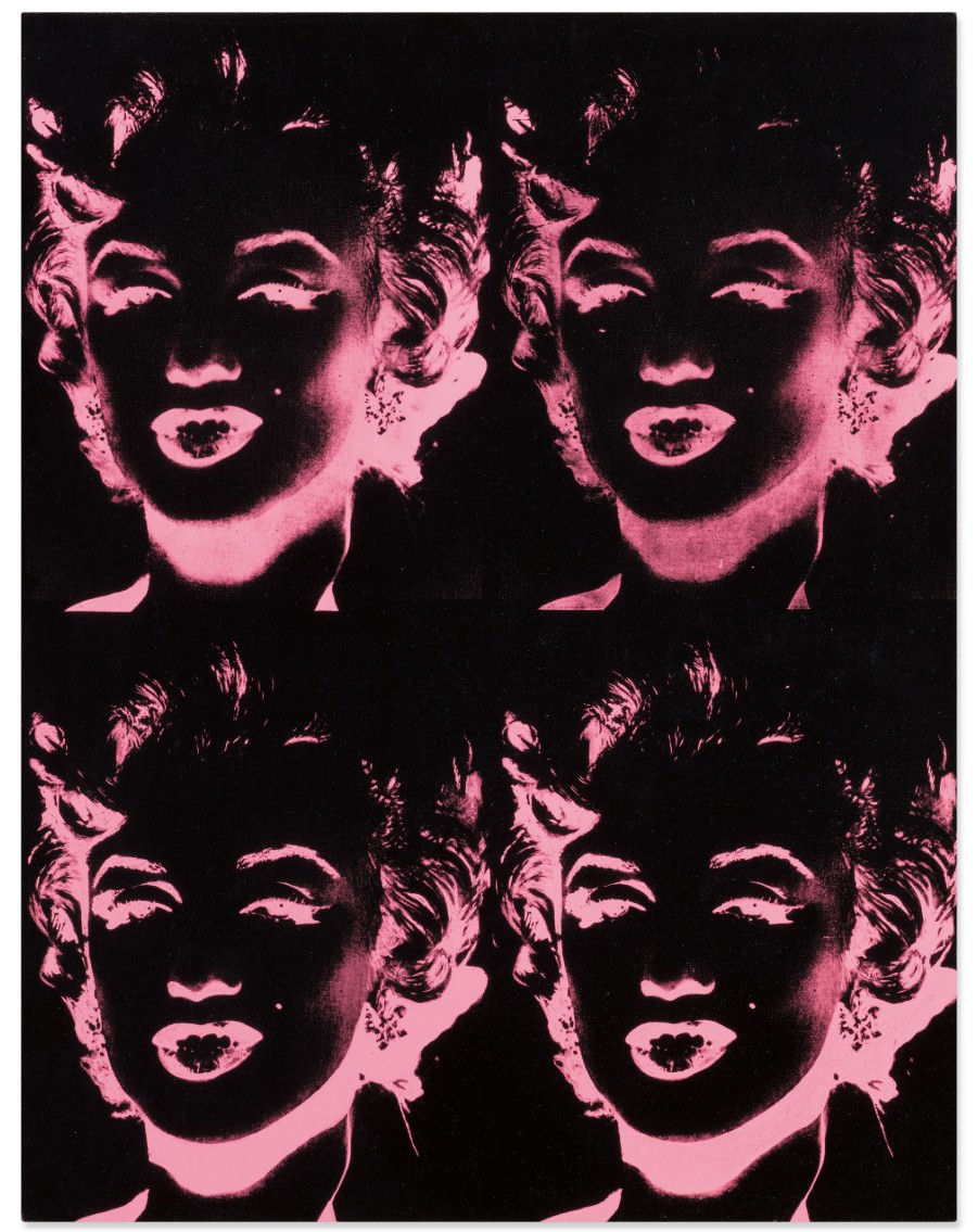
ANDY WARHOL (1928 – 1987)
Four Pink Marilyns (Reversal Series), 1986
Acrylic and silkscreen ink on canvas
36 1/8 x 28 inches (91.7 x 71 cm)
Signed and dated 86 (on the overlap)
Stamped by the Andy Warhol Art Authentication Board, Inc., and numbered A107.999 on the overlap
XXXXXXXXXX
9:59, 2021
Sotheby’s London: 16 October 2025
Estimated: GBP 300,000 – 500,000
GBP 1,260,000 / USD 1,688,400
9:59 | Contemporary Evening Auction | 2025 | Sotheby’s
LUCY BULL (b. 1990)
9:59, 2021
Oil on canvas
96×54 inches (244×137 cm)
Signed and dated 2021 (on the reverse)
XXXXXXXXXX
The Visit, 2017
Sotheby’s London: 16 October 2025
Estimated: GBP 1,500,000 – 2,000,000
GBP 914,400 / USD 1,225,296
The Visit | Contemporary Evening Auction | 2025 | Sotheby’s
MATTHEW WONG (1984 – 2019)
The Visit, 2017
Oil on canvas
36×48 inches (91.4 x 121.9 cm)
XXXXXXXXXX
Rotten Apple, 2009
Sotheby’s London: 16 October 2025
Estimated: GBP 250,000 – 350,000
GBP 254,000 / USD 340,360
Rotten Apple | Contemporary Evening Auction | 2025 | Sotheby’s
HERNAN BAS (b. 1978)
Rotten Apple, 2009
Acrylic on canvas on board
48×60 inches (121.9 x 152.3 cm)
Signed with the artist’s initials and dated 09 (lower left)
Contemporary Day Auction
17 October 2025
Contemporary Day Auction | 2025 | Sotheby’s
Total:
GBP 9,774,555 / USD 13,097,905
# Lots: 95 Lots
[# Withdrawn: 0 Lot]
# Passed: 15 Lots
# Sold: 80 Lots
Sell-Through Rate: 84.2%
#1. Stack 9, Ultramarine Blue, 2018
Sotheby’s London: 17 October 2025
Estimated: GBP 120,000 – 180,000
GBP 635,000 / USD 850,900
Stack 9, Ultramarine Blue | Contemporary Day Auction | 2025 | Sotheby’s
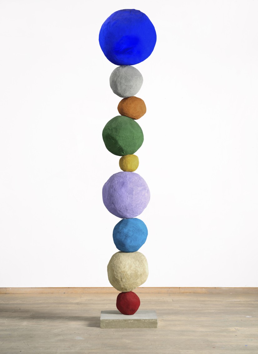
ANNIE MORRIS (b. 1978)
Stack 9, Ultramarine Blue, 2018
Foam core, plaster, sand and pigment on concrete base, in ten parts
225x45x40 cm (88 5/8 x 17 3/4 x 15 3/4 inches)
#2. Untitled, 2008
Sotheby’s London: 17 October 2025
Estimated: GBP 350,000 – 450,000
GBP 584,200 / USD 782,830
Untitled | Contemporary Day Auction | 2025 | Sotheby’s
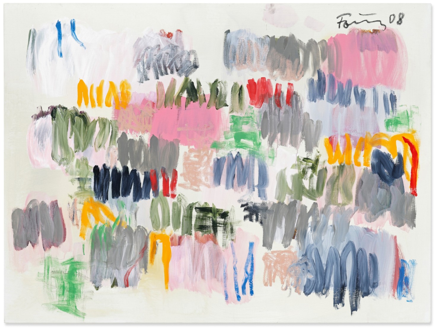
GUNTHER FORG (1952 – 2013)
Untitled, 2008
Acrylic and oilstick on canvas
120.6 x 160.5 cm (47 1/2 x 63 1/4 inches)
Signed and dated 08 (upper right)
Recorded in the archive of Günther Förg as No. WVF.08.B.0089
#3. Untitled, 1981
Sotheby’s London: 17 October 2025
Estimated: GBP 300,000 – 400,000
GBP 495,300 / USD 663,700
Untitled | Contemporary Day Auction | 2025 | Sotheby’s
JEAN-MICHEL BASQUIAT (1960 – 1988)
Untitled, 1981
Oilstick on paper
27 1/2 x 39 3/8 inches (70×100 cm)
#4. Yvonne in Green, 1995
Sotheby’s London: 17 October 2025
Estimated: GBP 300,000 – 400,000
GBP 444,500 / USD 595,630
Yvonne in Green | Contemporary Day Auction | 2025 | Sotheby’s
ALEX KATZ (b. 1927)
Yvonne in Green, 1995
Oil on canvas
48 1/8 x 71 7/8 inches (122.3 x 182.5 cm)
XXXXXXXXXX
#7. Abstraktes Bild, 1992
Sotheby’s London: 17 October 2025
Estimated: GBP 200,000 – 300,000
GBP 406,400 / USD 544,575
Abstraktes Bild | Contemporary Day Auction | 2025 | Sotheby’s
GERHARD RICHTER (b. 1932)
Abstraktes Bild, 1992
Oil on canvas
36 x 40.8 cm (14 1/8 x 16 inches)
Signed, dated 92 and numbered 763-2 (on the reverse)
#8. Duke of Malta, 2009
Sotheby’s London: 17 October 2025
Estimated: GBP 200,000 – 300,000
GBP 406,400 / USD 544,575
Duke of Malta | Contemporary Day Auction | 2025 | Sotheby’s
GEORGE CONDO (b. 1957)
Duke of Malta, 2009
Oil on canvas
27×26 inches (68.6 x 66 cm)
Signed and dated 09 (on the reverse)
XXXXXXXXXX
#10. Blackbeard (White), 2003
Sotheby’s London: 17 October 2025
Estimated: GBP 150,000 – 200,000
GBP 317,500 / USD 425,450
Blackbeard (White) | Contemporary Day Auction | 2025 | Sotheby’s
TAKASHI MURAKAMI (b. 1962)
Blackbeard (White), 2003
Acrylic on canvas mounted on panel
150×150 cm (59×59 inches)
Signed, signed with the artist’s monogram, dated 03 and variously inscribed (on the reverse)
XXXXXXXXXX
#12. Untitled, 2009
Sotheby’s London: 17 October 2025
Estimated: GBP 200,000 – 300,000
GBP 254,000 / USD 340,360
Untitled | Contemporary Day Auction | 2025 | Sotheby’s
GEORGE CONDO (b. 1957)
Untitled, 2009
Oil on canvas
48×44 inches (121.9 x 111.8 cm)
#13. Out Into the Open, 2003
Sotheby’s London: 17 October 2025
Estimated: GBP 120,000 – 180,000
GBP 241,300 / USD 323,340
Out Into the Open | Contemporary Day Auction | 2025 | Sotheby’s
STANLEY WHITNEY (b. 1946)
Out Into the Open, 2003
Oil on canvas
40 1/4 x 40 1/8 inches (102.4 x 102 cm)
Signed, titled and dated 2003 (on the reverse)
XXXXXXXXXX
#17. UNTITLED (MBFV5), 2016
Sotheby’s London: 17 October 2025
Estimated: GBP 150,000 – 200,000
GBP 177,800 / USD 238,250
UNTITLED (MBFV5) | Contemporary Day Auction | 2025 | Sotheby’s
KAWS (b. 1974)
UNTITLED (MBFV5), 2016
Acrylic on shaped canvas mounted on panel
60 3/8 x 36 1/4 inches (153.5 x 92 cm)
Signed and dated 16 (on the reverse)
XXXXXXXXXX
#19. Table Laying, Late Morning, May, 2020
Sotheby’s London: 17 October 2025
Estimated: GBP 100,000 – 150,000
GBP 165,100 / USD 221,235
Table Laying, Late Morning, May | Contemporary Day Auction | 2025 | Sotheby’s
CAROLINE WALKER (b. 1982)
Table Laying, Late Morning, May, 2020
Oil on canvas
185×250 cm (73 x 98 1/2 inches)
Signed, titled and dated 2020 (on the reverse)
#20. Studio Vases, 2022
Sotheby’s London: 17 October 2025
Estimated: GBP 150,000 – 200,000
GBP 152,400 / USD 204,215
Studio Vases | Contemporary Day Auction | 2025 | Sotheby’s
HILARY PECIS (b. 1979)
Studio Vases, 2022
Acrylic on linen
54×44 inches (137.2 x 111.8 cm)
Signed, titled and dated 2022 (on the reverse)
Lots Passed
Guns, 1981-82
Sotheby’s London: 17 October 2025
Estimated: GBP 450,000 – 650,000
PASSED
Guns | Contemporary Day Auction | 2025 | Sotheby’s
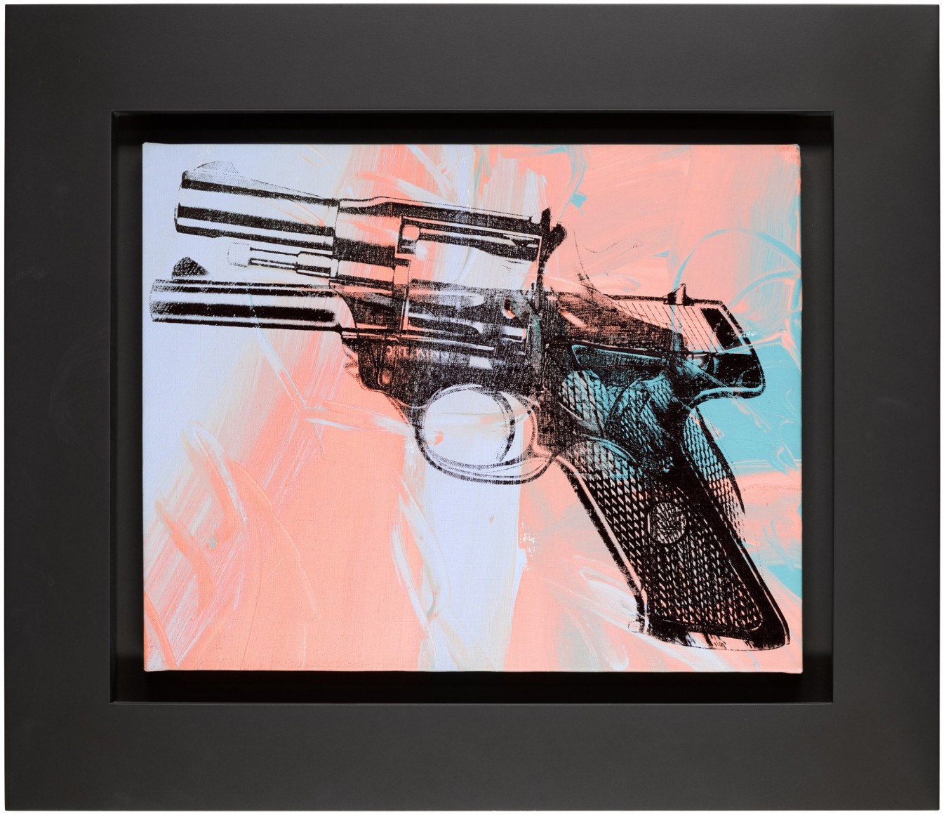
ANDY WARHOL (1928 – 1987)
Guns, 1981-82
Acrylic and silkscreen ink on canvas
16×20 inches (40.5 x 50.7 cm)
Stamped by the Estate of Andy Warhol and the Andy Warhol Foundation for the Visual Arts, Inc. on the overlap
Numbered PA15.043 on the stretcher
My Bull, 2002
Sotheby’s London: 17 October 2025
Estimated: GBP 80,000 – 120,000
PASSED
My Bull | Contemporary Day Auction | 2025 | Sotheby’s
LYNETTE YIADOM-BOAKYE (b. 1977)
My Bull, 2002
Oil on canvas
101.6 x 71 cm (40×28 inches)
Signed, titled and dated 2002 (on the reverse)

Modern and Contemporary Art Evening Sale
16 October 2025
Modern & Contemporary Art Evening Sale Thursday, October 16, 2025
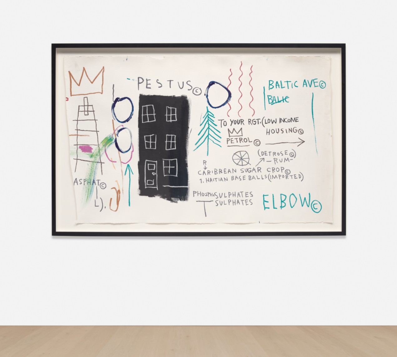
Untitled (Pestus), 1982
Phillips London: 16 October 2025
Estimated: GBP 2,000,000 – 3,000,000
GBP 2,374,000 / USD 3,181,160
Jean-Michel Basquiat Modern & Contemporary Art Evening Sale
Peinture 202 x 143 cm, 14 août 2015
Estimated: GBP 600,000 – 800,000
GBP 645,000 / USD 864,300
Calcium Hydroxide, 2004-2011
Estimated: GBP 400,000 – 600,000
GBP 412,800 / USD 553,150
Conceptual Artist #6 (by combining different grave rubbings he invents lives that never existed), 2022
Estimated: GBP 300,000 – 500,000
GBP 412,800 / USD 553,150
Titled and dated
‘HB 2022 Conceptual Artist #6 (by combining different grave rubbings he invents lives that never existed)’
on the reverse
Pest Control – Banksus Militus Vandalus, 2004
Phillips London: 16 October 2025
Estimated: GBP 350,000 – 450,000
GBP 348,300 / USD 466,720
Banksy Modern & Contemporary Art Evening Sale
Lots Passed
Kate Moss, 2005
Phillips London: 16 October 2025
Estimated: GBP 700,000 – 1,000,000
PASSED
Banksy Modern & Contemporary Art Evening Sale
Kate Moss, 2005
Screenprint on canvas
Giorgio Armani, 1981
Estimated: GBP 600,000 – 800,000
PASSED
Giorgio Armani, 1981
Synthetic polymer paint, silkscreen ink and diamond dust on canvas
Stamped by the Andy Warhol Art Authentication Board Inc. and the Estate of Andy Warhol
Numbered ‘PO50.665 vf’ on the overlap
Lots Withdrawn
Untitled, 1985
Phillips London: 16 October 2025
Estimated: GBP 1,200,000 – 1,800,000
WITHDRAWN
Jean-Michel Basquiat Modern & Contemporary Art Evening Sale
Untitled, 1985
Acrylic, oilstick and Xerox collage on canvas
The Tree of Life, 2007
Phillips London: 16 October 2025
Estimated: GBP 400,000 – 600,000
WITHDRAWN
Damien Hirst Modern & Contemporary Art Evening Sale
The Tree of Life, 2007
Butterflies and household gloss on canvas
CHUM (KCA4), 2012
Estimated: GBP 300,000 – 500,000
WITHDRAWN

Acrylic on canvas laid down on panel
Modern and Contemporary Art Day Sale
18 October 2025
Modern & Contemporary Art Day Sale Saturday, October 18, 2025
Love-Blue-Green, 1966/1997-1999
Phillips London: 18 October 2025
Estimated: GBP 180,000 – 250,000
GBP 490.200 / USD 656,870
Robert Indiana Modern & Contemporary Art Day Sale

Polychrome aluminum
This work is number 6 from an edition of 8 plus 4 artist’s proofs
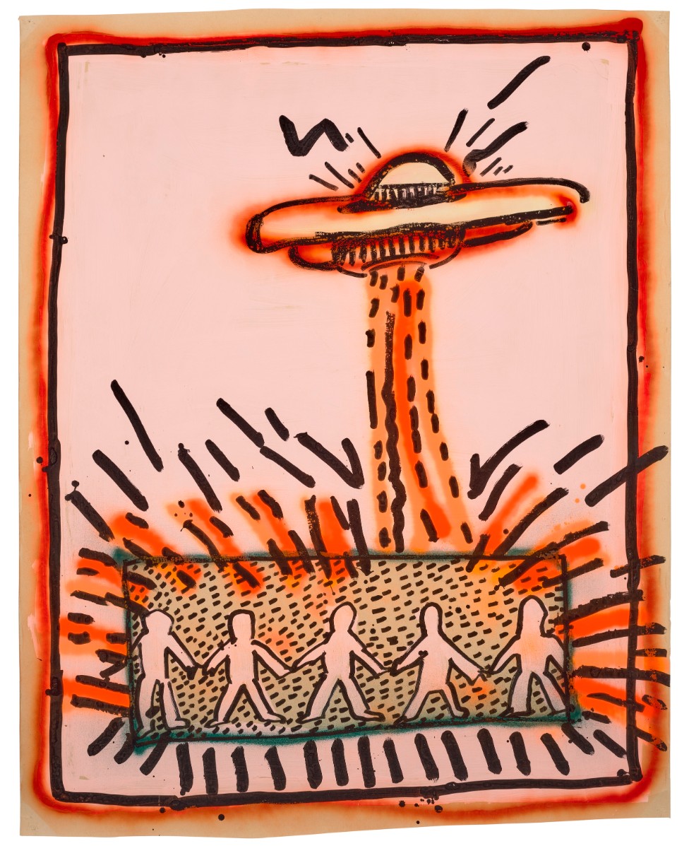
Panel, 1990
Phillips London: 18 October 2025
Estimated: GBP 180,000 – 250,000
GBP 193,500 / USD 259,290
Keith Haring Modern & Contemporary Art Day Sale
Panel, 1990
Bronze with white patina
Stamped with the number and the foundry mark ‘2/9’ lower right
Cold Side, 1995
Estimated: GBP 100,000 – 150,000
GBP 193,500 / USD 259,290
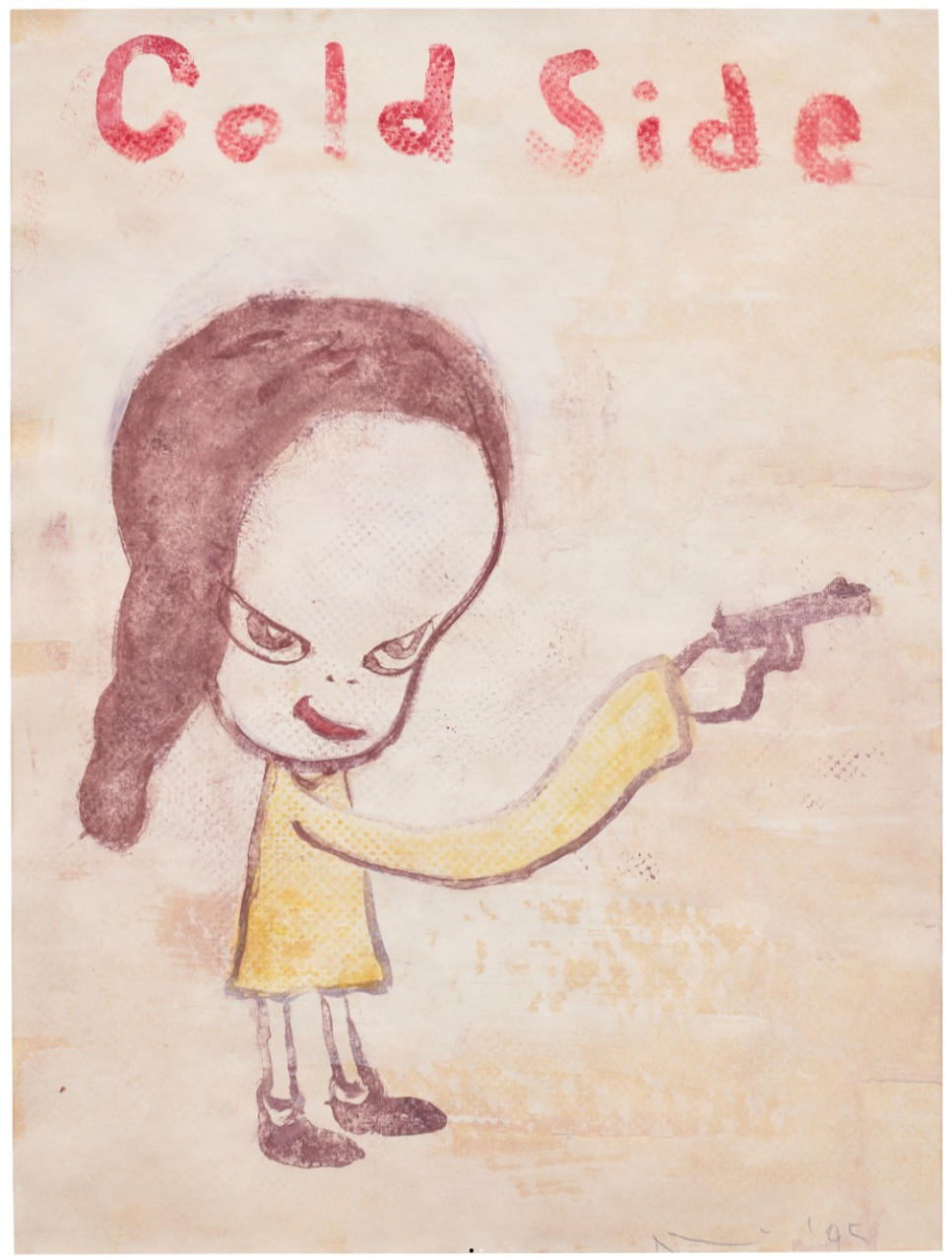
Cold Side, 1995
Acrylic on paper
Portrait Composition, 2018
Estimated: GBP 80,000 – 120,000
GBP 103,200 / USD 138,290
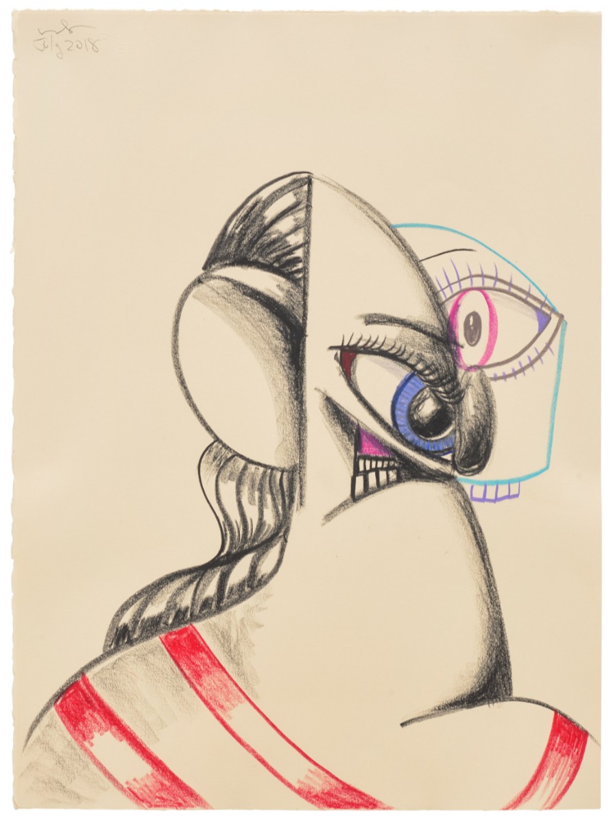
Portrait Composition, 2018
Charcoal and wax crayon on paper
Untitled no. 3, 1999
Estimated: GBP 30,000 – 50,000
GBP 61,920 / USD 82,975
Untitled no. 3, 1999
Wax crayon on paper
PB880. Glowing Blossom, 2021
Phillips London: 18 October 2025
Estimated: GBP 35,000 – 45,000
GBP 45,150 / USD 60,500
Damien Hirst Modern & Contemporary Art Day Sale
Statistic, 2007
Phillips London: 18 October 2025
Estimated: GBP 80,000 – 120,000
Lynette Yiadom-Boakye Modern & Contemporary Art Day Sale
Hernan Bas
Two cowards at the monument to courage, 2010
Estimated: GBP 250,000 – 350,000
GBP 292,100 / USD 391,415
Two cowards at the monument to courage, 2010
Acrylic, airbrush, household gloss, metallic paint and block print on linen
72 x 60 1/8 inches (182.8 x 152.8 cm)
Signed with the artist’s initials and dated ‘HB 10’ (lower right)
Signed with the artist’s initials, titled and dated
‘HB 2010 Two Cowards at the monument to courage’
(on the reverse)
Museum Oskar Reinhart am Stadtgarten, Winterthur. Digital image: © 2025 DeAgostini Picture Library/Scala, Florence.
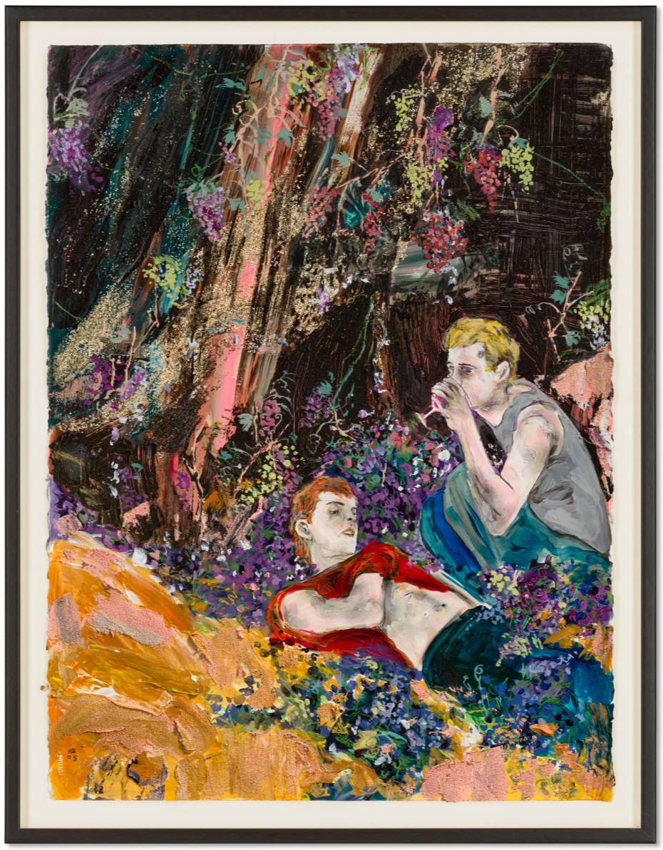
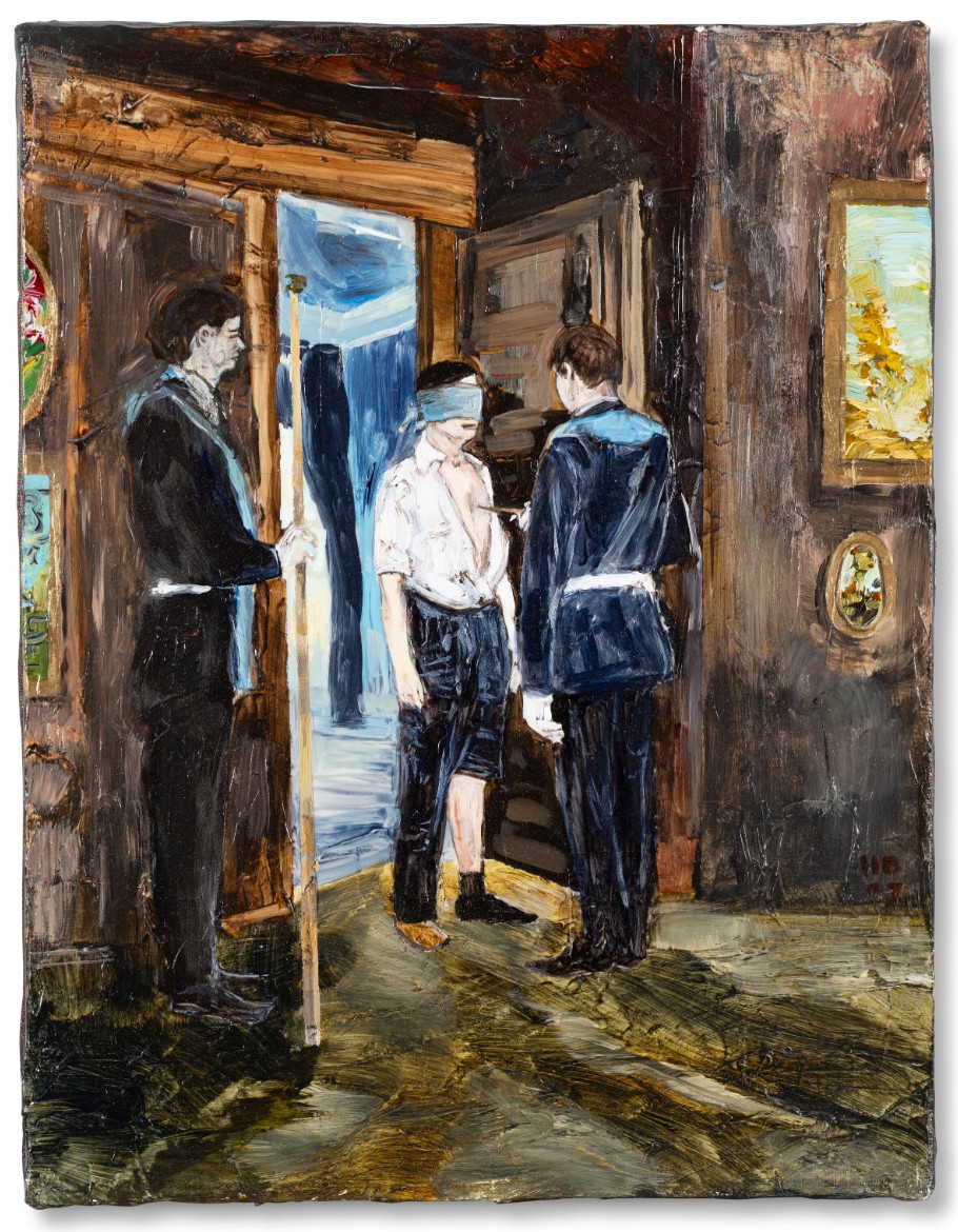
Bas’s oeuvre is suffused with references to literature, and the present painting forms part of a series of works exhibited collectively in 2010 under the title The Hallucinations of Poets. These sublime, escapist canvases explored the preoccupations of Dark Romanticism, and the series was the first by the artist to directly engage with poetry. In these works Bas channels Poe, Melville, Hawthorn and Dickinson, envisioning nature as a shadowy spiritual force steeped in mystery and foreboding. Echoing Poe’s haunting poem ‘Dream-Land’ (1844), the present work brims with ‘Bottomless vales and boundless floods, / And chasms, and caves, and Titan woods’. Across the canvas, sprawling life mutates and hypertrophies in uncanny excess. Bas loved ‘Choose Your Own Adventure’ books as a child, and with works such as the present he offers myriad and overlapping routes through the painting, inviting the viewer to continue its narrative in their mind.
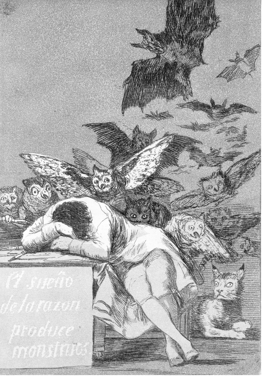
The sleep of reason produces monsters (El sueño de la razon produce monstruos), 1799.
The Metropolitan Museum of Art, New York. Digital image: Image courtesy The Metropolitan Museum of Art, New York.
“I think that overwhelming fear and fascination with the unknown, with what the forests “held”, is embedded in a lot of my work.”
Well Aged, 2005
Estimated: GBP 40,000 – 60,000
GBP 76,200 / USD 102,108
WORK ON PAPER
Well Aged, 2005
Oil, acrylic, gouache, charcoal, sand and glitter on paper
30 1/4 x 22 5/8 inches (76.8 x 57.5 cm)
Signed with the artist’s initials and dated ‘HB 05’ (lower left)
Museum of Fine Arts, Boston. Digital image: © 2025 Museum of Fine Arts, Boston. All rights reserved. / Bridgeman Image.
“I think that overwhelming fear and fascination with the unknown, with what the forests “held”, is embedded in a lot of my work.”
The National Gallery, London. Digital image: © 2025 The National Gallery, London/Scala, Florence.
Knife Passage (Mason), 2007
Estimated: GBP 30,000 – 50,000
GBP 69,850 / USD 93,600
Knife Passage (Mason), 2007
Oil and metallic paint on linen
14×11 inches (35.5 x 27.7 cm)
Signed with the artist’s initials and dated ‘HB 07’ (lower right)
Signed with the artist’s initials, titled and dated ‘Knife Passage (Mason) HB 07’ (on the stretcher)
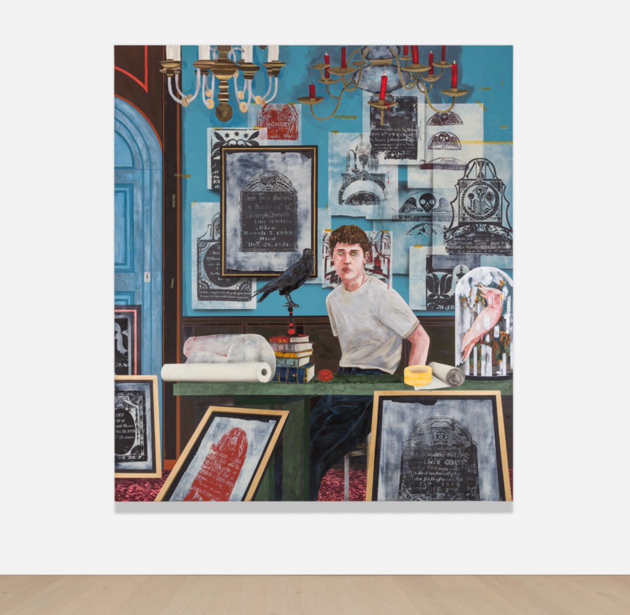
Conceptual Artist #6 (by combining different grave rubbings he invents lives that never existed), 2022
Estimated: GBP 300,000 – 500,000
GBP 412,800 / USD 553,150
Titled and dated
‘HB 2022 Conceptual Artist #6 (by combining different grave rubbings he invents lives that never existed)’
on the reverse
Miami-based artist Hernan Bas is celebrated for his intricately layered and coded works centered around themes of sexuality and identity. Known for incorporating diverse references, spanning the occult, mythology, and religion, The Conceptualists offered Bas the opportunity to explore his idiosyncratic interests in depth. Emerging in 2021, Bas’s series envisions individuals engaged in esoteric and obsessive pursuits, loosely inspired by the hobbies pursued during the pandemic. For Conceptual Artist #6 (by combining different grave rubbings he invents lives that never existed), his passion is grave rubbing, a practice consisting of gently rubbing the surface of the headstone with a soft tool, such as charcoal, to capture the raised design and inscription. Surrounded by the product of his hard work, the protagonist gazes toward the viewer from behind his desk, accompanied by the accoutrements of his practice.
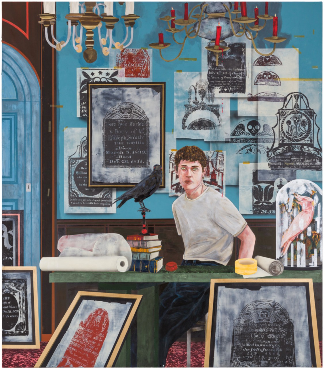
Bas is renowned for producing works with extraordinary narrative detail and this work is no exception. Working in acrylic paint with a bold palette of blues, reds, and greens, Bas favors this medium for its rapid drying time, which enables him to build the depth and layers that define his painterly approach. The large-scale composition is rich in iconographic motifs, giving a crowded effect that is further emphasized by the framing and cropping of architectural details —the door, chandelier, and surrounding artworks. The work’s symbolic program operates on multiple levels. Beyond the obvious morbid associations of headstones, skulls, skeletons, and angel wings, a black crow reinforces these themes while mirroring the artist’s pose and gaze. This avian motif continues with the pink caged bird perched atop the desk—a pointed symbol of constrained freedom. Such darkly playful elements remain characteristic of Bas’s artistic approach. Bas’s iconographic details also serve to elevate the status of conceptual art; the grand interior setting visualized in the ornate chandelier and patterned carpet, alongside the depiction of bound volumes and avian imagery evoke scholarly importance and historical grandeur.
“I started making characters doing bizarre things and called them conceptual artists as a way to excuse their behaviour and to poke fun at art itself—conceptual art is always the butt of jokes.”
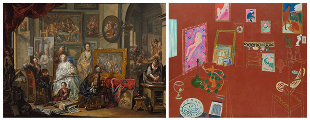
Left: Johann Georg Platzer, The Artist’s Studio,1740s-1750s, The Cleveland Museum of Art. Image: Cleveland Museum of Art, Mr. and Mrs. William H. Marlatt Fund by exchange 2012.41
Right: Henri Matisse, L’Atelier Rouge, 1911, The Museum of Modern Art, New York. Image: The Museum of Modern Art, New York/Scala, Florence
Conceptual art is a movement which privileges the idea or process behind an artwork over its physical form. Bas’s work embodies a tension between conceptual and representational forms of artmaking; whilst his fictive artists create conceptual work, the paintings representing them remain invested in the pictorial art object. Addressing this juxtaposition, Bas notes that the series offered him the opportunity to produce conceptual art without the pressure of authorship. Bas operates through a dual elevation; he dignifies conceptual art forms by exploring them representationally while simultaneously legitimizing his imagined protagonists by designating them as conceptual artists. By framing his characters’ eccentric pursuits as conceptual art, Bas validates and champions interests that might otherwise be dismissed as peculiar. This repositioning establishes conceptual art as a sanctuary for creative behavior and queerness—where ‘queer’ signifies not sexual orientation specifically, but rather a permissive, liberating space beyond conformity’s constraints. Through this framework, Bas redefines absurdity and obsession as foundational elements of artistic practice, challenging conventional fine art hierarchies. Art critic James Voorhies suggests that by synthesizing conceptual and representational art practices, Bas pioneers a ‘conceptual painting’ practice.
“Their unusual interests aren’t in the shadows anymore, and they appear to be comfortable in their curious self-made worlds.”
Although Conceptual Artist #6 invokes portraiture through its central figure, the emphasis falls on the conceptual work being produced rather than the artist himself, made visually manifest through evidence of creative activity including tape, paper, and numerous artworks. This approach recalls the centuries-old tradition of artist studio paintings. Johann Georg Platzer’s eighteenth-century painting The Artist’s Studio provides a resonant example, featuring a similarly dense composition with artworks covering the walls and the floor. Similarly, Henri Matisse’s stylistically radical L’Atelier Rouge with its depiction of the artist’s workspace in the Parisian suburb of Issy-les-Moulineaux and the now iconic paintings and sculptures which he created within it extend this tradition into the modern age, anticipating the more conceptual approaches of artists such as Marcel Duchamp in his 1935-41 assemblage La Boîte-en-valise. Though the traditional oil painting format stands in contrast to the monochromatic grave rubbings, there is a meaningful parallel between the creative space of these artists. Through such art historical references, Bas further elevates conceptual art forms, grounding contemporary practice within historical precedent.
Rotten Apple, 2009
Sotheby’s London: 16 October 2025
Estimated: GBP 250,000 – 350,000
GBP 254,000 / USD 340,360
Rotten Apple | Contemporary Evening Auction | 2025 | Sotheby’s
HERNAN BAS (b. 1978)
Rotten Apple, 2009
Acrylic on canvas on board
48×60 inches (121.9 x 152.3 cm)
Signed with the artist’s initials and dated 09 (lower left)
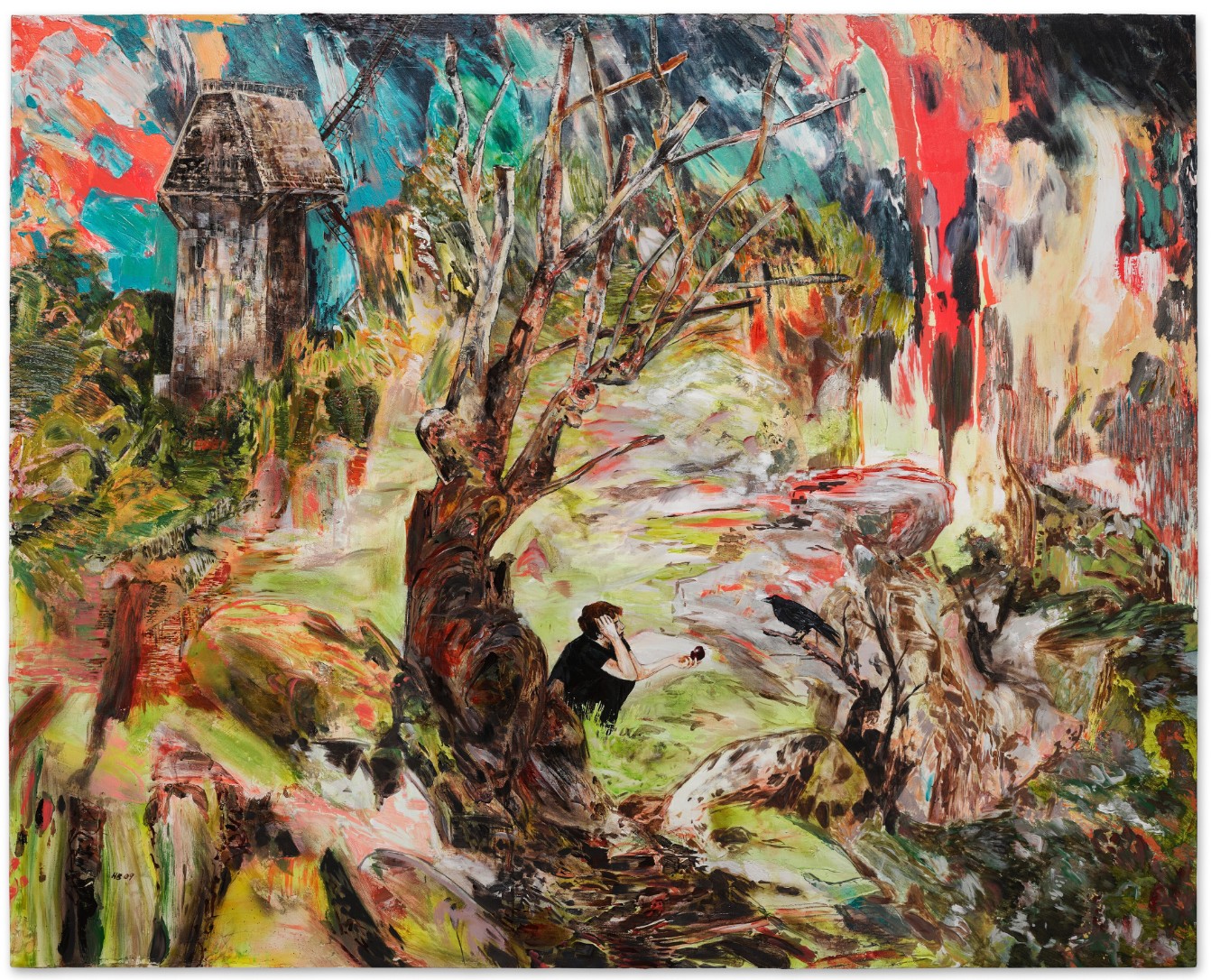
Executed in 2009, Hernan Bas’ Rotten Apple presents a sublime vista of untethered solitude and moral reflection. Amongst a masterful maelstrom of vibrant brushstrokes and saturated hues, Bas’ postlapsarian scene collapses and mesmerizes in its kaleidoscopic dreamlike expanse. Recalling the Fall of Man as told in the Book of Genesis, the protagonist at the heart of the composition perches under a tree, his arm outstretched holding the rotten fruit, offering it to a neighboring crow. Where Adam and Eve submitted to their temptations and ate the forbidden fruit, altering their future, Bas’ Rotten Apple alludes to a similarly transformative moment.

Painted with vigorously gestural brushstrokes, the present painting moves with a violent dynamism that conveys Bas’ depiction of transition. The landscape melts away though features remain discernible – a dilapidated windmill in the distance, a grounding and centering tree that anchors the composition, with luscious foliage throughout that nods to the Garden of Eden. That comparable works are held in such prestigious collections as the Whitney Museum of American Art, New York; Museum of Modern Art, New York; and Hirshhorn Museum and Sculpture Garden, Washington D.C, is a testament to Bas’ status as one of the most important painters of a generation.
LEFT: Vasily Kandinsky, Landscape with Factory Chimney (Landschaft mit Fabrikschornstein), 1910. Solomon R Guggenheim Museum, New York City.
RIGHT: Nicolas Poussin, Et in Arcadia ego, 1638. Louvre Museum, Paris.
Central to Bas’ broader practice is his exploration of queerness, adolescence, and the spaces in which personal narratives intersect with collective history. Drawing inspiration from nineteenth-century Symbolist literature, the Decadent movement, and queer aesthetic traditions, Rotten Apple sits within Bas’ wider output that often features androgynous male figures depicted in states of melancholic reverie or caught in ambiguous rituals of transition. In this respect, the lone figure in Rotten Apple may be read as an avatar of what Bas terms “fag limbo;” a concept he uses to describe the transitional, often precarious state between youth and adulthood (Robert Hobbs, “Hernan Bas’ ‘Fag Limbo’ and the Tactics of Reframing Societal Texts,” in Hernan Bas: Works from the Rubell Family Collection, pp. 55-56). Positioned amongst the mass of electric vegetation, the vacant expression on Bas’ figure recalls the late nineteenth century Les Nabis style, particularly the decadent art of Caspar David Friedrich. Both Friedrich’s Wanderer above the Sea of Fog and The Ash Tree (At Once a Voice Arose Among the Bleak Twigs Overhead) seem to suggest a scene which is both romantic and fragile, much like the process of maturing. Bas’ contemporary version of history painting thus illustrates a coded language of mystery and subversive symbolism.
Caspar David Friedrich, Abtei im Eichwald, 1809-1810. Alte Nationalgalerie, Berlin.
Born in 1978 and raised in Florida, the ethereal dreamscape Bas illustrates is inspired by his lifelong fascination with mythology, religion, paranormal and cult phenomena. Within Bas’ landscape, one can extract fragments of meaning that may reference a nostalgia for childhood fantasies, coming of age adventures, anxiety surrounding the adolescent experience, and burgeoning sexuality. Bas’ contemporary version of history painting illustrates a coded language of mystery and subversive symbolism.
“The very terms: suspicion, mystery, clues, secrets, etc., are closely tied to any gay youth’s experience. It describes the need to cover it up (one’s sexuality). To keep it cloaked to solve these mysteries, to express the charm of ambiguous sexuality.”
Lucy Bull
9:59, 2021
Sotheby’s London: 16 October 2025
Estimated: GBP 300,000 – 500,000
GBP 1,260,000 / USD 1,688,400
9:59 | Contemporary Evening Auction | 2025 | Sotheby’s
LUCY BULL (b. 1990)
9:59, 2021
Oil on canvas
96×54 inches (244×137 cm)
Signed and dated 2021 (on the reverse)
Bull’s compositions emerge through a painstaking layering process, in which successive veils of oil paint – often numbering in the dozens – are applied, scraped back, and reconstituted, revealing spectral traces of earlier marks. The apparent spontaneity of Bull’s technique belies its carefully orchestrated, almost hypnotic effects. Across her canvases, gestural marks and acid-washed whorls of color overlap and dissolve, coalescing momentarily into recognizable forms before slipping once more into kaleidoscopic abstraction. The visual language she constructs draws upon multiple art-historical lineages: the dreamlike terrains of Max Ernst and Surrealism, the chromatic freedom of second-generation Abstract Expressionism as epitomized by Helen Frankenthaler and Joan Mitchell, and the optical intensity of Op art. But rather than recalling the formal precision of Bridget Riley or Victor Vasarely, Bull’s works evoke the immersive perceptual play of 1990s computer-generated “Magic Eye” images, where shifting depth and focus conjure new layers of perception.
Max Ernst, Bryce Canyon Translation, 1946. Museu de Arte Contemporaneo, São Paulo.
Image © Bridgeman Images. Art © 2025 ADAGP, Paris and DACS, London
“I want to titillate the senses. I want to draw people closer. I think people aren’t used to paying much prolonged attention to paintings on walls, and I want to allow people to have more of a sensory experience. I want to draw them in so that there is the opportunity for things to open up and for them to wander.”
Private Collection. Art © 2025 Jasper Johns/VAGA at ARS, NY and DACS, London
Matthew Wong
The Visit, 2017
Sotheby’s London: 16 October 2025
Estimated: GBP 1,500,000 – 2,000,000
GBP 914,400 / USD 1,225,296
The Visit | Contemporary Evening Auction | 2025 | Sotheby’s
MATTHEW WONG (1984 – 2019)
The Visit, 2017
Oil on canvas
36×48 inches (91.4 x 121.9 cm)
Radiant and emotionally compelling, The Visit epitomizes the stark beauty and self-exploration that distinguishes Matthew Wong’s remarkable practice. A mesmerising harmony of stylistic grace, tonal vibrancy, and raw sentiment, Wong weaves a rhapsody of scintillating golden yellow skies, verdant green forests, and tendrils of flourishing roots. Tucked within the lush landscape, a winding road leads a car of passengers towards the house on the hill, where a lone figure awaits their visit. Reflective of the innate poignancy of his works, The Visit brims with anticipation for the charged event and typifies the intimate experience of his paintings for his viewer.
“I would like my paintings to have something in them people across the spectrum can find things they identify with. I do believe that there is inherent loneliness or melancholy to much of contemporary life”.
It is this remarkable emotive quality that distinguishes Wong’s practice within the vaunted bastion of landscape painting. Wong finished The Visit two years before his untimely passing at the age of 35; here, his masterful use of paint draws the viewer into a prismatic landscape, where daubs of color merge into a somber yet luminous scene.
Painted near the end of Wong’s six-year painting career, The Visit stands as a rare and poignant example of the artist’s emotive vision and singular painterly vernacular.
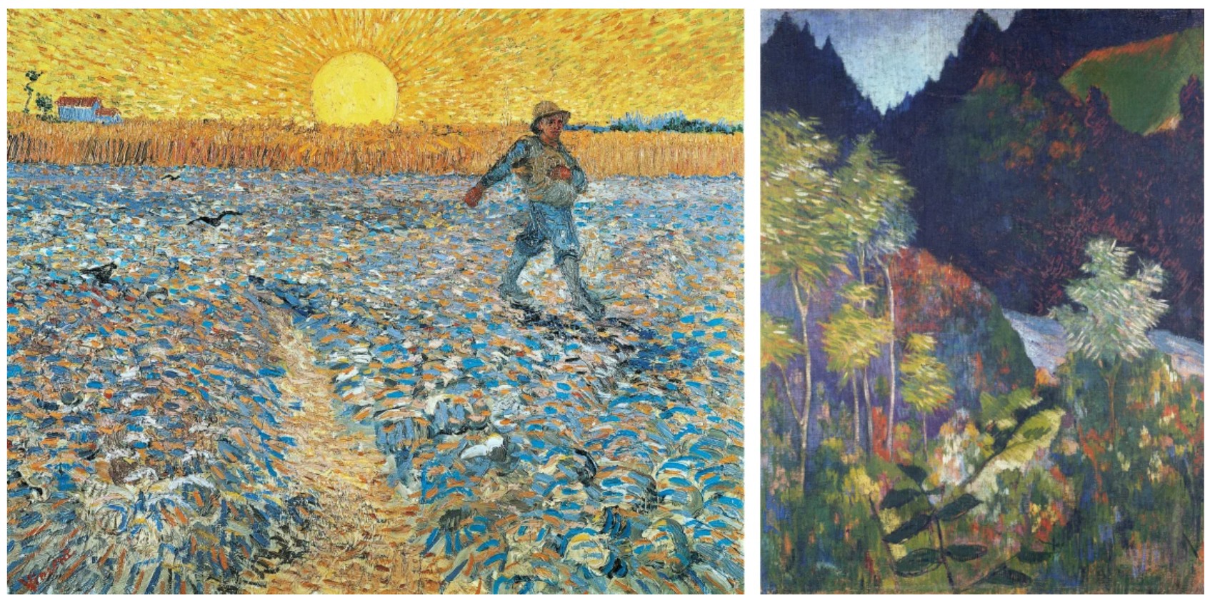
Left: Vincent van Gogh, The Sower, 1888. The Kröller-Müller Museum, Otterlo.
Right: Paul Gauguin, Landscape, circa 1892. Musée Picasso, Paris. Image: Bridgeman Image
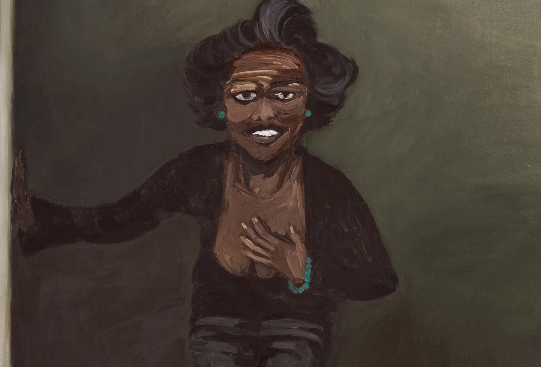
Lynette Yiadom-Boakye
The Trappings, 2012
Christie’s London: 15 October 2025
Estimated: GBP 400,000 – 600,000
GBP 482,600 / USD 646,684
LYNETTE YIADOM-BOAKYE (B. 1977), The Trappings | Christie’s
LYNETTE YIADOM-BOAKYE (B. 1977)
The Trappings, 2012
Oil on canvas
200×130 cm (78 3/4 x 51 1/4 inches)
Signed with the artist’s initials, titled and dated ‘The Trappings LYB 2012’ (on the reverse)
Digital image: © 2025 Photo Josse / Scala, Florence.
Yiadom-Boakye paints quickly, applying thin layers of paint wet on wet without underdrawing. Executed in a single sitting, her canvases display a matte, silky facture; in places, glimpses of raw canvas break through urgent, animated strokes.
“I think seduction is very important, I love painting. I love the surface of it.”
A writer of prose as well as an artist, Yiadom-Boakye’s painterly realms have a distinctly novelistic quality. Discussing the affinity between painting and writing, she explains
“I think with painting there is as much of a language as there is with writing, so for me, a very quick washy mark reads as the same as the shortness of a particular sentence.”
In The Trappings, Yiadom-Boakye’s mastery of gesture is on full display, her deft painterly idiom conjuring with theatrical flair a moment of intimacy between subject and viewer. Posed against a simple painted backdrop, the figure in The Trappings finds art-historical precedents in the nineteenth-century character studies of Édouard Manet or John Singer Sargent. Yet the subjects of Yiadom-Boakye’s impressionistic, emotionally charged paintings are inhabited by a cast of characters drawn from a vast visual library of found images, memory, literature, and art history.
“Although they are not real I think of them as people known to me. They are imbued with a power of their own … I admire them for their strength, their moral fiber.”
The figure in The Trappings, who looks out so convincingly beyond the picture plane, and appears as if he might step out of the painted space of the canvas into the world of the viewer, is made of paint and not flesh, conjured merely from the artist’s imagination.
The title of The Trappings suggests misplaced desire, but also misdirection and false facades. Dressed entirely in black, the subject of Yiadom-Boakye’s painting might allude to the passage from William Shakespeare’s Hamlet in which the protagonist describes the ritual or artificial presentation of grief—the ‘customary suits of solemn black’—as ‘the trappings and the suits of woe,’ a pale imitation of the true weight of his feeling. The painted veneer of the canvas, like the stage of a theatre, is revealed to be a place of artifice and unreality. Drawing on powerful storytelling traditions and masterful command of paint, in The Trappings Yiadom-Boakye weaves narrative from illusion, conjuring a pliable space in which time and place are manipulated and unmoored.
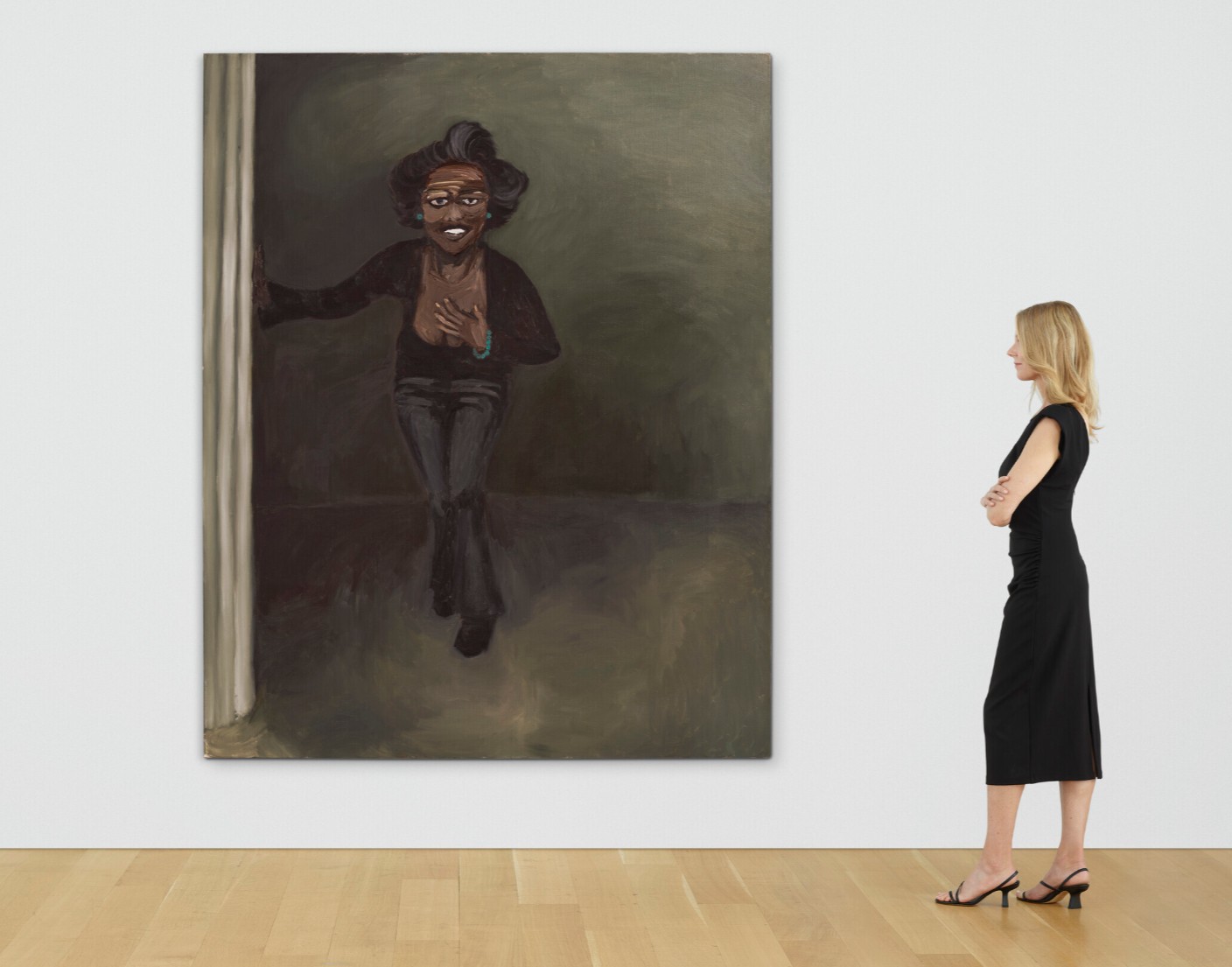
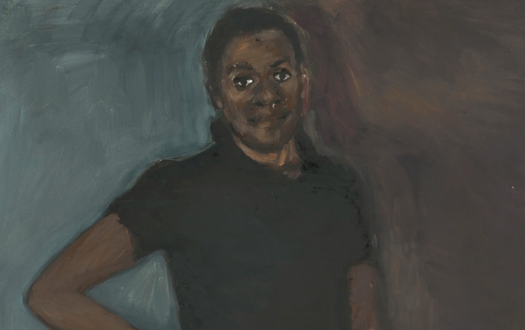
Three Kings, 2005
Christie’s London: 16 October 2025
Estimated: GBP 200,000 – 300,000
GBP 279,400 / USD 374,395
LYNETTE YIADOM-BOAKYE (B. 1977), Three Kings | Christie’s
LYNETTE YIADOM-BOAKYE (B. 1977)
Three Kings, 2005
Oil on linen
243.6 x 196 cm (95 7/8 x 77 1/8 inches)
Signed with the artist’s initials, titled and dated ‘LYB ‘Three Kings’ 2005′ (on the reverse)
Held in the same private collection since the year it was made, Lynette Yiadom-Boakye’s Three Kings (2005) encapsulates a moment of encounter. The protagonist of the painting looks fixedly at the beholder. She is attired in simple dark clothing, enlivened by a cerulean bead bracelet and two earrings of the same hue. While most of the composition is rendered in shimmering, shadowy waves of paint, her face is a mask-like visage of bold impasto strokes.
Her expression is ambiguous, welcoming hospitality mingled with surprise. She places her left hand to her chest as if in astonishment, while her right hand holds onto a partially-visible curtain, or perhaps a fluted column, as if steadying herself. Yiadom-Boakye graduated from the Royal Academy of Arts in 2003. Four years later writer and curator Ekow Eshun chose her as an artist to watch. She has since exhibited at the Venice Biennale (2013 and 2019) and her work has entered major museum collections. In 2020, she became the first Black British woman artist to have a monographic exhibition at Tate Britain, London.
Nicolaes Maes, An Eavesdropper with a Woman Scolding, 1655. Guildhall Art Gallery, London.
Digital image: Guildhall Art Gallery / Harold Samuel Collection / Bridgeman Images.
In Three Kings, the setting is suggestive of the theatre, a world of make-believe detached from mundane reality. It evokes the heavy textile dividers of Dutch Golden Age paintings such as Nicolaes Maes’ 1650s ‘eavesdropper’ series and the sumptuous scarlet curtain in John Singer Sargent’s Dr. Pozzi at Home (1881), a painting that Yiadom-Boakye has repeatedly referenced. The artist exclusively paints black protagonists, but her project is not simply to insert them into the Western canon.
Édouard Manet, Portrait de Berthe Morisot au Soulier Rose, 1872. Hiroshima Museum of Art.
Digital image: Lefevre Fine Art Ltd., London / Bridgeman Images.
Yiadom-Boakye is a masterful painter of darkness and light, drawing on the Renaissance technique of chiaroscuro as perfected by Caravaggio in the late 16th century. Three Kings’ tenebrous room is distinguished by dappled patches of illumination. The painting’s title itself summons up the specter of art history, evoking the trio of magi who visited the infant Jesus: is this a modern-day Mary? Although her paintings have a veneer of verisimilitude, Yiadom-Boakye’s figures are purely imaginary. The world they inhabit seems to exist outside any single historical moment. She is a writer as well as a painter, and author Zadie Smith has compared her subjects to fictional characters. Yet she also avoids obvious narrative.
My Bull, 2002
Sotheby’s London: 17 October 2025
Estimated: GBP 80,000 – 120,000
PASSED
My Bull | Contemporary Day Auction | 2025 | Sotheby’s
LYNETTE YIADOM-BOAKYE (b. 1977)
My Bull, 2002
Oil on canvas
101.6 x 71 cm (40×28 inches)
Signed, titled and dated 2002 (on the reverse)
Statistic, 2007
Phillips London: 18 October 2025
Estimated: GBP 80,000 – 120,000
Lynette Yiadom-Boakye Modern & Contemporary Art Day Sale
Joel Mesler
Untitled (Spiritual Awakening), 2022
Christie’s London: 16 October 2025
Estimated: GBP 60,000 – 80,000
PASSED
JOEL MESLER (B. 1974), Untitled (Spiritual Awakening) | Christie’s
JOEL MESLER (B. 1974)
Untitled (Spiritual Awakening), 2022
Acrylic and pigment on linen
80×70 inches (203.3 x 177.9 cm)
Signed and dated ‘Joel Mesler 2022’ and stamped twice ‘The Estate of Joel Mesler’ (on the overlap)
Untitled (Spiritual Awakening) is a superb example of the vivid—and often wry—fusion of text and image that forms the basis of Joel Mesler’s artistic practice. Painted in 2022 and spanning an impressive width of over two meters, the work pulsates with tropical heat and is emblazoned with the titular words ‘Spiritual Awakening’. Rendered in plump curlicued twists, the letters float against a verdant dreamscape of palm leaves and fronds. Like many of the Los Angeles-born artist’s most celebrated paintings, the scene is conjured from fraught memories of his own childhood—namely the traumatic breakdown of his parents’ marriage. Here, childlike imagination runs wild against a beguiling backdrop of warm Californian sun and glimpses of a glittering swimming pool. A snake coils over the canvas, forming a typography of its own, and staring out from the center of the composition is a pair of pale yellow eyes. Untitled (Spiritual Awakening) bears the strange and fantastical quality of a dream, melding real and imagined images, words, and symbols within hypnotic swirls. At the base of the canvas, a chocolate sprinkle doughnut floats like an inflatable pool ring over turquoise water. While the luscious environments of his paintings evoke the Tahitian landscapes of Paul Gauguin or exotic jungles by Henri Rousseau, Mesler’s graphic use of text forms a strong dialogue with American Pop and conceptual artists of the twentieth century. The bold, tubular lettering displays the influence of advertising typography and, employing quippy, satirical adages, he draws parallels with Ed Ruscha and Christopher Wool—the former was also strongly inspired by cool Southern Californian aesthetics and tropes. For Mesler, ‘Spiritual Awakening’ constitutes both a play on a contemporary, highly therapeutic Los Angeles vernacular, and his own recovery from alcoholism.
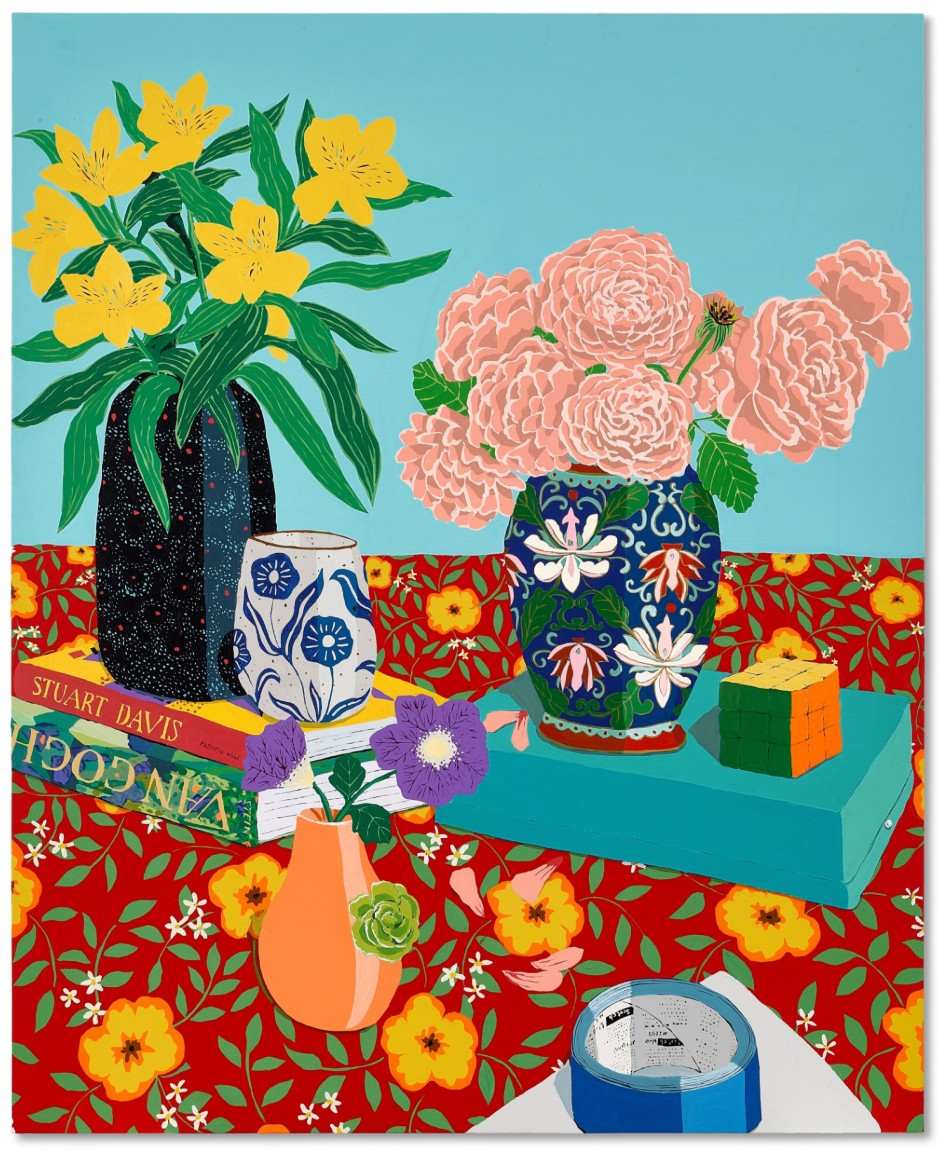
Hilary Pecis
Studio Vases, 2022
Sotheby’s London: 17 October 2025
Estimated: GBP 150,000 – 200,000
GBP 152,400 / USD 204,215
Studio Vases | Contemporary Day Auction | 2025 | Sotheby’s
HILARY PECIS (b. 1979)
Studio Vases, 2022
Acrylic on linen
54×44 inches (137.2 x 111.8 cm)
Signed, titled and dated 2022 (on the reverse)
Executed in 2019, Studio Vases is a delightful example of Hilary Pecis’ portrayal of sun-drenched domestic spaces, in which she finds exquisite beauty and pleasure in quotidian, every-day objects. The LA based artist’s compositions are often filled with decorative items such as brightly patterned tablecloths, blooming flowers, multicolored vases, stacks of artbooks, luscious bowls of fruit, and, in the case of the present work, animals. While in some works cats lie lazily on ochre sofas and dogs curl up atop vibrant checkered blankets, in the present, voluminous bunches of flowers sit in vibrantly patterned vases. The table is adorned with an electric floral tablecloth. The saturated hues of Fish and Bird signify a distinctly southern California feel, the composition imparting a world that is at once languid and aesthetically enthralling.
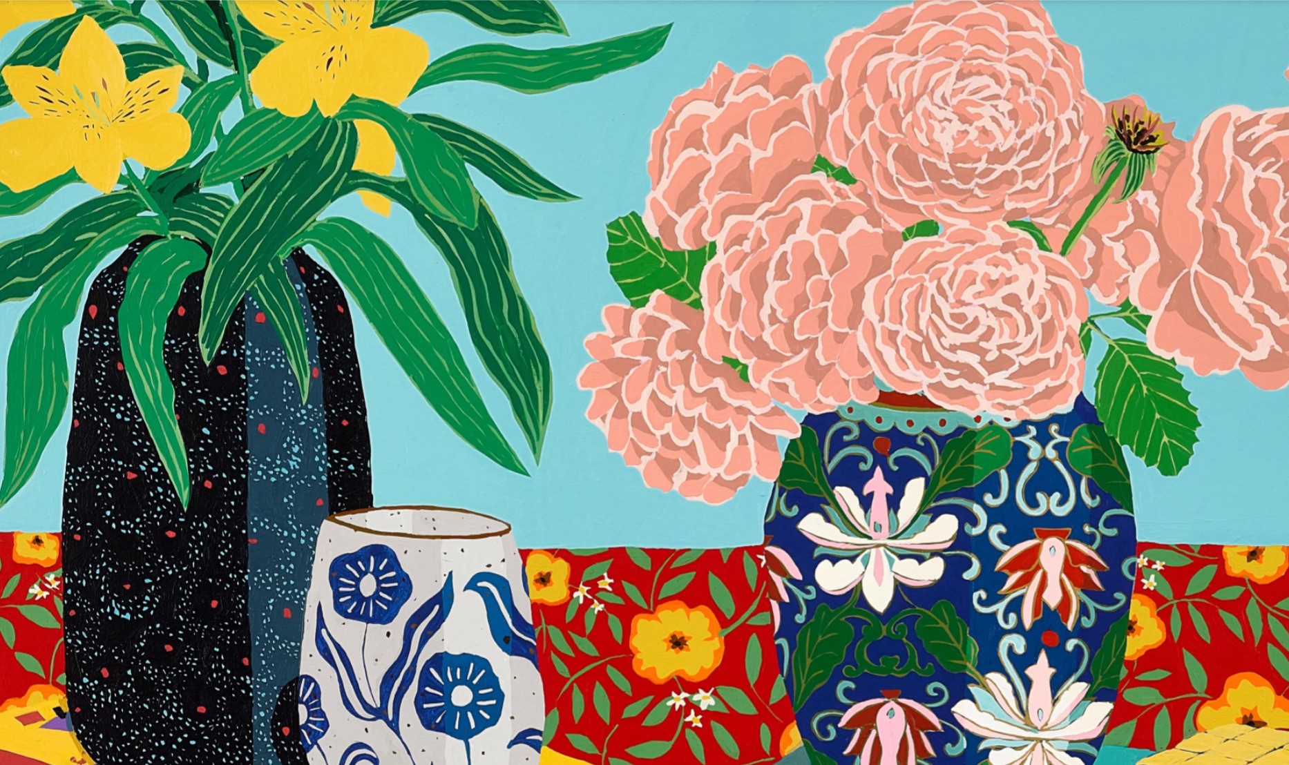
If Pecis’ luscious depiction of Californian interiors is reminiscent of David Hockney’s radiant still lives of the 1990s, her use of color is undoubtedly evocative of the fauvists. Pecis’ patches of saturated, contrasting colour are redolent of Matisse’s celebrated paper cut-outs, or his whimsical mosaic-like domestic scenes such as Red Room (Harmony in Red) (1908), or Odalisque, Blue Harmony (1937), which both exude the very same sense of sumptuous leisure while elevating ordinary, domestic decorative objects such as jugs, fruits, fish and flowers into the realm of fine art. Pecis earned her BA and MFA from California College of the Arts in 2006 and 2009 respectively, and her works now reside in a number of prestigious museum collections, including the National Gallery of Art, Washington D.C., Museum of Contemporary Art, Los Angeles, Aïshti Foundation, Beirut and Yuz Museum, Shanghai. Building upon the art historical tradition of still life painting and refreshing the genre for a contemporary audience, Studio Vases encompasses the very best qualities of Pecis’ painterly practice.
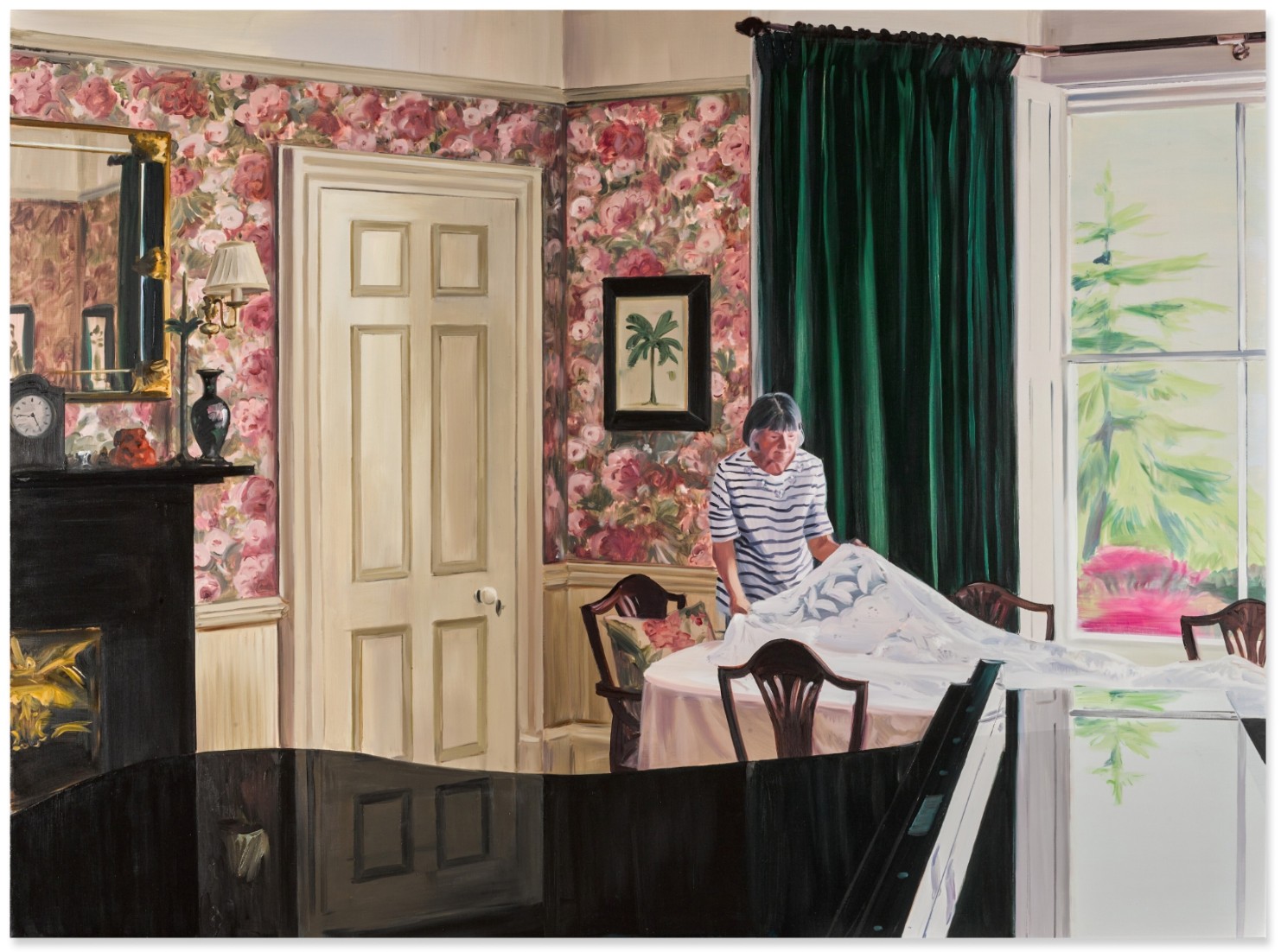
Caroline Walker
Table Laying, Late Morning, May, 2020
Sotheby’s London: 17 October 2025
Estimated: GBP 100,000 – 150,000
GBP 165,100 / USD 221,235
Table Laying, Late Morning, May | Contemporary Day Auction | 2025 | Sotheby’s
CAROLINE WALKER (b. 1982)
Table Laying, Late Morning, May, 2020
Oil on canvas
185×250 cm (73 x 98 1/2 inches)
Signed, titled and dated 2020 (on the reverse)
At the heart of Caroline Walker’s quietly monumental work, Table Laying, Late Morning, May is a seemingly simple act. An elderly woman – the artist’s mother, Janet – carefully lays a lace tablecloth over a dining table in a well-kept domestic interior. In the high ceilinged room, the pink flowery wall paper is bright and busy and yet Walker’s monumental work exudes an undeniable sense of stillness and clarity. Though the brushwork is large and loose, Walker deftly captures the textures of her childhood dining room, from the gloss of the black grand piano, the gossamer lace of the table cloth and the warped glass of the window looking out onto the garden.
“The subject of my paintings in its broadest sense is women’s experience, whether that is the imagined interior life of a glimpsed shop worker, a closely observed portrayal of my mother working in the family home, or women I’ve had the privilege of spending time within their place of work. From the anonymous to the highly personal, what links all these subjects is an investigation of an experience which is specifically female.”
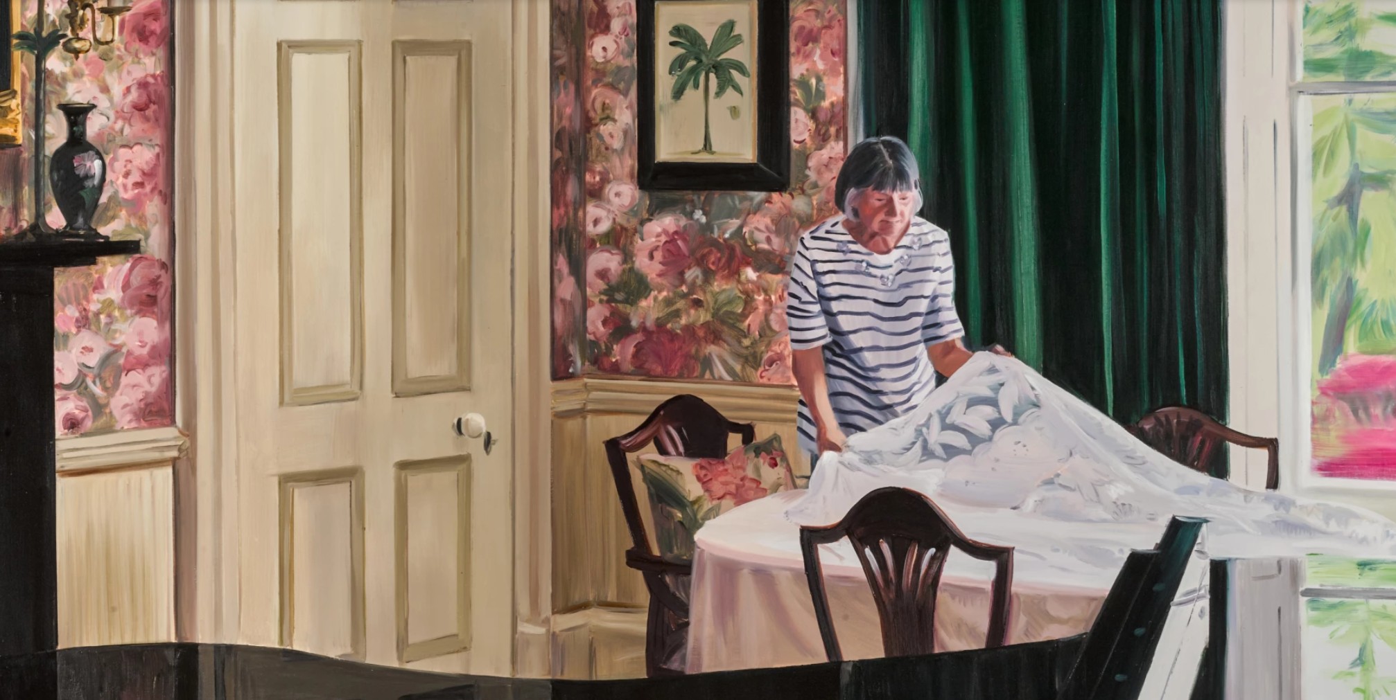
The present work is part of a larger series of paintings showing Janet Walker tending to domestic chores in the family’s home and garden. Walker spent a year photographing her mother doing various tasks – cleaning the bathroom and cooking in the kitchen – before creating a series of small oil studies and large oil canvases, capturing her mother’s labor. This subject matter draws from a long art historical heritage. The treatment of light and space within, Table Laying, Late Morning, May and the series as a whole, harkens to that of Dutch Genre painting which often show women performing domestic labor. Often small-scale, these works glimpse into private domestic settings, often with maidservants or other domestic staff at their center. Walker replicates this quiet interiority at scale, casting her gaze, and brush, over ubiquitous tasks that are often overlooked.
Cornelis Bisschop, Woman Peeling an Apple, 1667 / Rijksmuseum, Amsterdam
Women’s work is a dominant theme in Walker’s oeuvre as a whole; she has historically painted women cleaning hotels, refugee women, highlighting labor that is done quietly, without ostentation and, often, without thanks. However, in the Janet series, Walker sought to highlight the pleasure and care taken in her mother’s homemaking.
“Women still do a lot of unpaid labor in homes, but for my mum, this is the life she wanted. She decided not to work after she married. She got her dream house and has very much enjoyed spending her time looking after it.”
In this vein, Table Laying, Late Morning, May, is imbued with an undeniable tenderness. Walker’s vantage point – by her own admission – often verges on voyeuristic, with a distinct sense of disconnect between the artist and their sitter. By contrast, in the Janet series Walker and her mother were often chatting and ‘gossiping’ as the artist took her preliminary photographs. Thus, the present work is far from passively painted; it is instead infused with the intimate relationship between mother and child. In Table Laying, Late Morning, May, Walker not only documents a quiet moment in her mother’s day — she elevates it. This is not sentimentality, but a clear-eyed tribute to care, choice, and legacy. In placing her mother at the center of the canvas, Walker reclaims the overlooked stage of the home, turning it into a site of dignity and quiet power. This remarkable work reminds us that the most unremarkable acts – setting a table, folding a cloth – can carry the full weight of memory, love, and meaning.
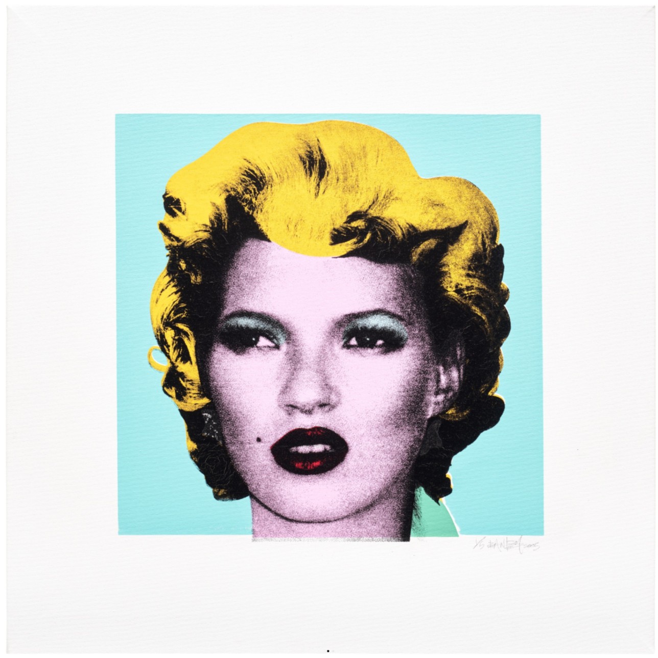
Banksy
Kate Moss, 2005
Phillips London: 16 October 2025
Estimated: GBP 700,000 – 1,000,000
PASSED
Banksy Modern & Contemporary Art Evening Sale
Kate Moss, 2005
Screenprint on canvas
An image utterly synonymous with early 2000s UK culture, Banksy’s Kate Moss stands as a definitive statement on the rebellious anti-establishment spirit of an era where Supermodels, Britpop, and UK street art redefined popular culture on a global scale. Featured on the invite of the now infamous 2005 exhibition Crude Oils: A Gallery of Re-Mixed Masterpieces: Vandalism and Vermin, Kate Moss signaled the extension of the sharp satire and political critique evident in the anonymous street artist’s site-specific graffiti stencil work into a more robust engagement with art historical discourse and exposure of the mechanisms of the art market itself. The first of an edition of just five silkscreened canvases, this tongue-in-cheek homage to Andy Warhol’s iconic portrait of Marilyn Monroe was presented alongside a selection of Banksy’s irreverent hand-painted reworkings of art historical masterworks, including parodies of Claude Monet’s scenes of the Japanese Bridge at Giverny littered with abandoned shopping trollies, Edward Hopper’s Nighthawks disturbed by the violent action of a late-night lout stripped down to his Union Jack boxer shorts, and a bouquet of withered petrol station flowers standing in for Vincent Van Gogh’s iconic sunflowers. Representing the artist’s first presentation in a more conventional gallery space, in typical fashion Banksy nevertheless disrupted the reverence surrounding these art historical masterpieces and the gallery space itself, releasing over one hundred and fifty live rats into the space for the duration of the exhibition.
Selecting some of the most iconic images in Western art history, Banksy at once engaged with and subverted this canon, dismantling certain assumed narratives and weaponizing their familiarity as a means of exposing more uncomfortable contemporary truths related to power, exploitation, and the environmental consequences of capitalism. In his more playful take on Andy Warhol’s definitive silkscreen portraits of Marilyn Monroe, Banksy engages most directly with the themes of originality, appropriation, and celebrity culture that so preoccupied Warhol himself. Indeed, just as Warhol sought to address what he recognized as the determining aspects of 20th century culture – the circulation and mass reproduction of commodities, the rise of mass media and consumer culture, the seductive allure of fame and glamour – Banksy’s work similarly reflects and comments on the society in which it was created. It is with fitting irony that the particular colorway selected by Banksy in his homage to Warhol closely approximates that of the Pop artist’s Shot Sage Blue Marilyn, now infamous as holding the record for the highest price ever paid for a work of 20th century art at auction.
Andy Warhol, Shot Sage Blue Marilyn, 1964, sold for $195 million in 2022.
Image: © Christie’s Images / Bridgeman Images
Artwork: © 2025 The Andy Warhol Foundation for the Visual Arts, Inc. / Licensed by DACS, London
For Warhol, Marilyn Monroe embodied the tragedy and glamour of 20th century celebrity, and the darker underbelly of the American Dream itself. Appropriating and altering a publicity headshot originally taken for her 1953 film Niagara, Warhol amplified the enigmatic allure of her gaze and timeless beauty, creating a modern icon that echoes the enduring power and appeal of Leonardo da Vinci’s Mona Lisa. Fittingly, details of both were featured on the cover of Ulrike Sommer’s The Story of Painting: From the Renaissance to the Present cementing Warhol’s Marilyn screenprints not just as icons of American Pop Art, but as a motif synonymous with 20th century art and culture itself. The nod to Mona Lisa here is not incidental; while Warhol’s Marilyn echoes the iconic aura that radiates from this Renaissance masterpiece, Banksy’s borrowing of Warhol’s motif also repeats Dada pioneer Marcel Duchamp’s acts of appropriation, most notably in relation to the Mona Lisa herself. In what has become one of the most infamous acts of ‘vandalism’ in the history of art, in 1919 Duchamp added a moustache to the infamous face of the Mona Lisa in his irreverent ‘rectified readymade’ L.H.O.O.Q, later reimagined in an edition for Duchamp’s close friend the collector and scholar Arturo Schwarz.
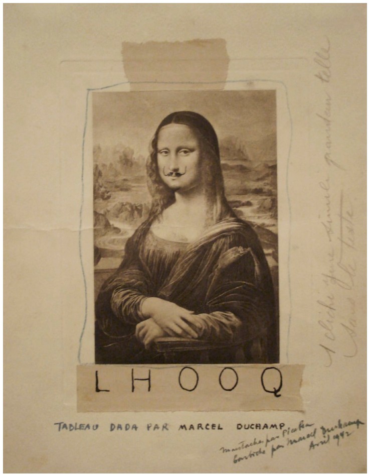
Marcel Duchamp, L.H.O.O.Q, conceived in 1919, originally published in 391, N. 12.
Artwork: © Association Marcel Duchamp / ADAGP, Paris and DACS, London 2025
Like Marcel Duchamp before him, Warhol was intensely interested in the power of the readymade or appropriated image to challenge our perception of what constitutes a work of art, and the ways in which we might fundamentally shift the terms by which we define modern and contemporary art itself, a legacy enthusiastically engaged with by Banksy and the broader culture of politically inflected and decidedly anti-establishment street art to which his work belongs. In aligning himself to Warhol’s methods, most central imagery, and deeper probing of the darker currents underpinning popular culture, Banksy pushes this project into new and exciting territory in works such as Kate Moss. Just as Warhol and Marilyn Monroe defined the consumer culture of mid-century America, Banksy and Kate Moss crystallize the unique cultural climate emanating from the UK at the turn of the 21st century, one that still resonates today.
The definitive face of 90s ‘Cool Britannia’, supermodel Kate Moss embodied the youthful energy, effortless cool and exuberance of an era where UK musicians, models, and artists redefined popular culture on a global stage. Discovered at just fourteen years old and having appeared on every major runway and magazine cover in the intervening four decades Moss not only pioneered shifting trends in the fashion world during these years, but through high profile relationships with actors and musicians personified the hedonistic party lifestyle associated with early 00s ‘Indie Sleaze’ and a new era of celebrity visibility. Playfully appropriating and redefining the language of the icon for the 21st century, in Kate Moss Banksy acknowledges the supreme Supermodel as the defining face of our times, adopting Warhol’s celebrated silkscreen technique complete with bright, bold accents in a clear homage to what is undoubtably the American Pop artist’s most famous and immediately recognizable motif. While Moss’ luminous beauty and elfin features are still unmistakably her own, in incorporating key aspects of Monroe’s appearance including her infamous blonde curled bob and beauty mark, Banksy aligns the two women, drawing on the artwork’s status as one of the most iconic images of the 20th century to redraw lines between celebrity, popular culture, and the visual language of the icon in our own times.
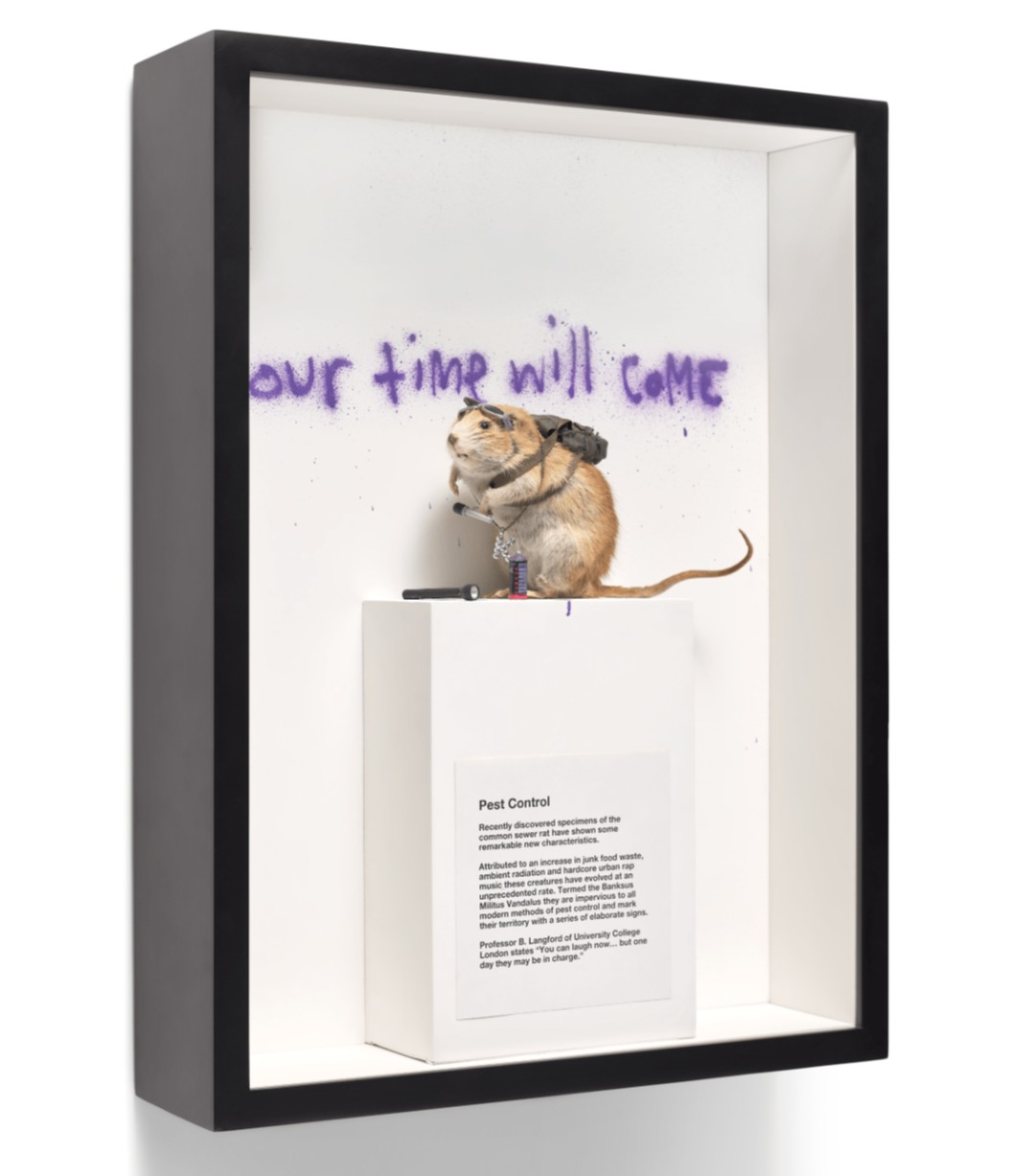
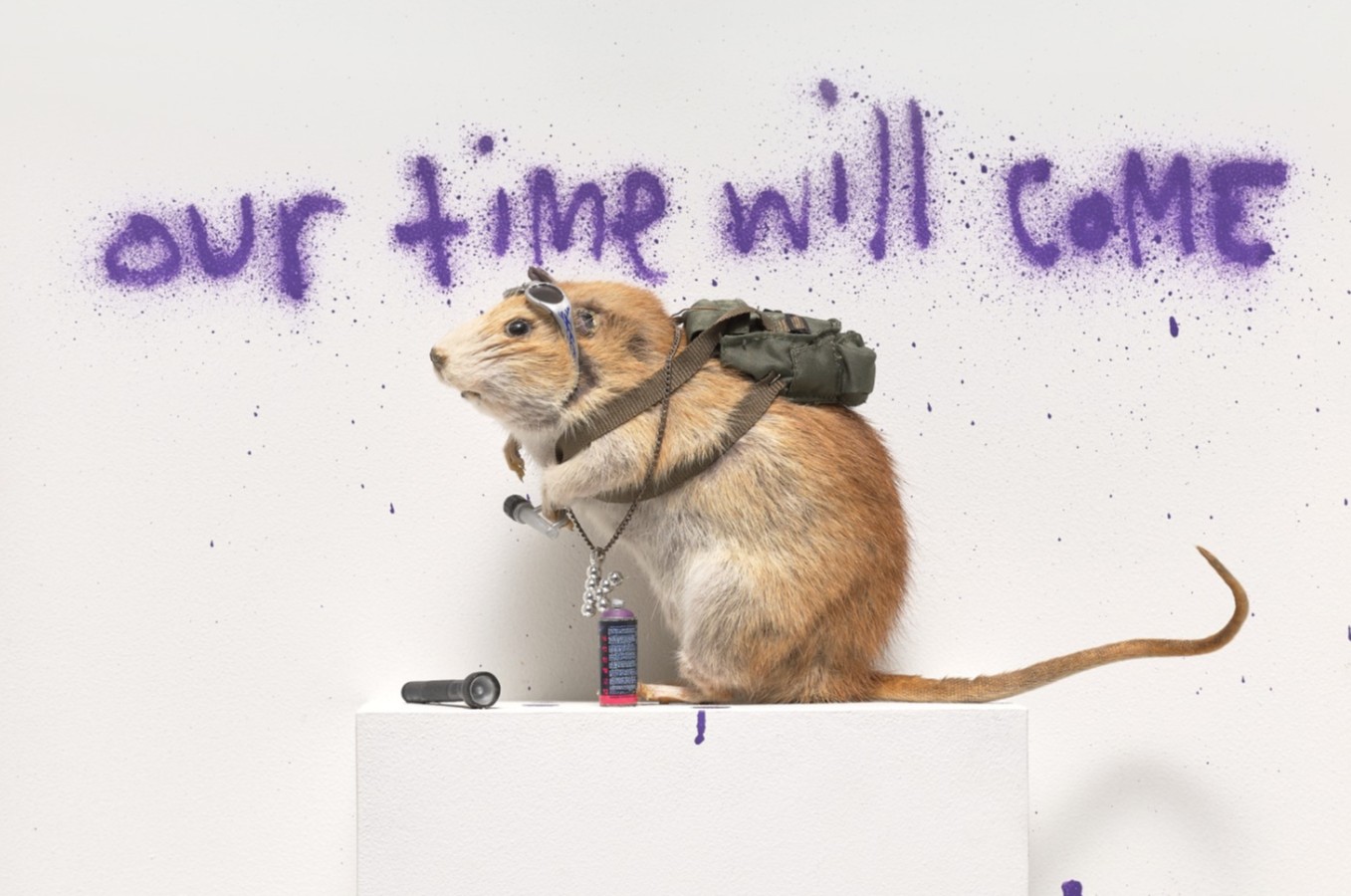
Pest Control – Banksus Militus Vandalus, 2004
Phillips London: 16 October 2025
Estimated: GBP 350,000 – 450,000
Banksy Modern & Contemporary Art Evening Sale
The scourge of cities and urban dwellers, surviving against all the odds at the fringes of society and acting under cover of darkness – there is perhaps no other creature in Banksy’s familiar menagerie of animal avatars that better represents the furtive, underground activities of the street artist than the much-maligned rat. Inspiring a mixture of fear and loathing, rats – like graffiti artists – are fundamentally urban; resilient products of our modern, post-industrial societies, they also reflect certain unpleasant truths about the endless competition and consumerism that characterizes late-stage capitalism, and those that are continually oppressed and exploited by such systems. Armed with a torch and can of spray paint and caught beneath the prophetic message ‘Our time will come’, Banksy’s Pest Control – Banksus Militus Vandalus celebrates the repressed power of the marginalized and poses provocative challenges to conventions surrounding art making and the role of the museum, as well as levelling a more pointed critique to the various oppressive socio-cultural systems in which these institutions have been historically embedded.
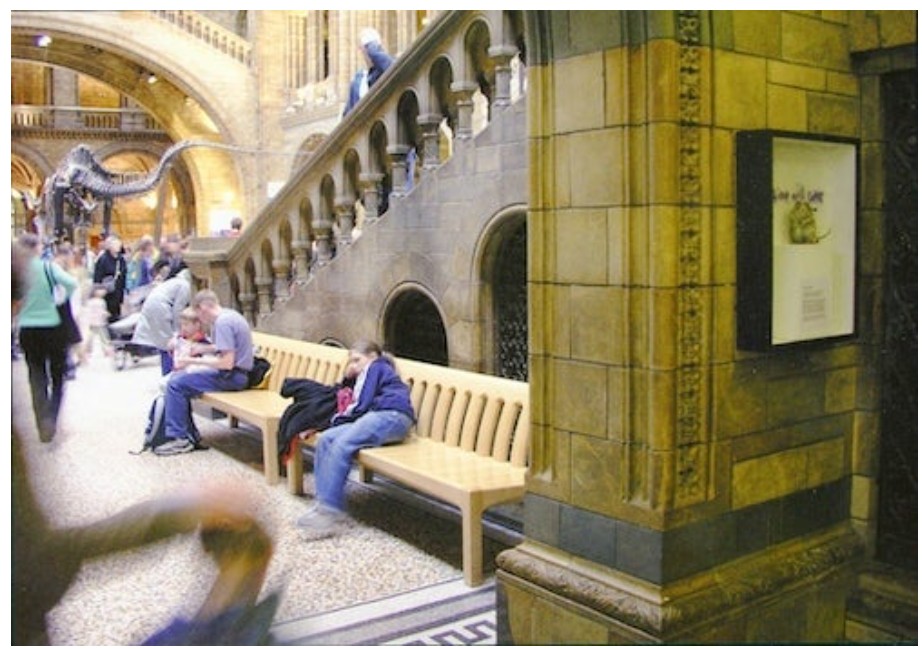
The present work installed in the Natural History Museum, 2004. Image/Artwork: © Pest Control
An audacious and confrontational work, Pest Control – Banksus Militus Vandalus made its first appearance in a short-lived guerilla installation in one of United Kingdom’s most illustrious and historic institutions. Disguised as a museum worker Banksy installed the piece in its glass fronted display case in the lobby of the Natural History Museum alongside the more familiar exhibits of dinosaur fossils and woolly mammoth models where it went undetected for some hours before its removal. Aping the authoritative tone typically employed in zoological or museological exhibits, the accompanying text details the strange and rapid evolution of the common sewer rat into an alarmingly ‘militant’ species of ‘vandal’ which demonstrates an alarming resistance to typical methods of pest control and tends to ‘mark their territory with a series of elaborate signs.’
“They exist without permission. They are hated, hunted, and persecuted. They live in quiet desperation amongst the filth. And yet they are capable of bringing entire civilisations to their knees. If you are dirty, insignificant and unloved rats are the ultimate role model.”
An early and important work, Pest Control – Banksus Militus Vandalus also made an appearance in Banksy’s landmark 2009 exhibition Banksy vs Bristol Museum where the artist transformed the space into a ‘menagerie of Unnatural History’ in a continuation of the themes explored in the earlier Natural History Museum intervention. Exploding in popularity over the course of the 19th century, taxidermy occupies a space between the disciplines of art and science, an extension of the vogue for the Renaissance-era Wunderkammer or ‘cabinet of curiosities’ – visual encyclopaedic collections of treasures and oddities from around the world. As the Enlightenment gathered pace, such objects of fascination were repurposed into classificatory tools, a means of imposing human authority and order onto the natural world. Close ties quickly emerged between colonial expansion, the exploits of Empire, and the legitimizing space of the museum designed to contain and codify the multiple cultural objects and exotic animals encountered abroad, the so-called ‘rationalisation’ of which reflected dominant Imperialist ideologies and deeply embedded exploitative power structures. In introducing his new breed of spray-painting ‘militant vandal’ into the quintessentially Victorian institution, Banksy’s Pest Control – Banksus Militus Vandalus threatens to expose and disrupt not only established conventions around museum curation and their relationship to taxonomies of knowledge, but to the insidious networks and discourses of power that they have historically upheld and reinforced.
Edward Hart, Red Squirrel, 1834, Castle Ward, County Down. Image: © National Trust / Peter Muhly
While taxidermy was employed in all seriousness as an expression of colonial power, it also lent itself to more oddly comedic uses in surreal tableaux arrangements where animals were posed engaged in human activities, often with miniature accessories and garments to match. In this more playful sense, Pest Control – Banksus Militus Vandalus draws on the long satirical tradition of anthropomorphizing animals in allegorical tales of human folly and hubris, a visual tradition whereby artists drew on the metaphoric relationship between certain animals and human characteristics in order to comment on issues of inequality, political resistance, and protest that certainly resonates with Banksy’s own project. An early and important iteration of Banksy’s most iconic and loaded motifs, Pest Control – Banksus Militus Vandalus comes coded with messages from the past and a wry warning for the future. Banksy’s rats – like the anonymous street artist himself – are agents of social critique, disrupting the status quo in their exposure of the injustices and exploitation of modern life, especially felt by those operating at the margins of society.
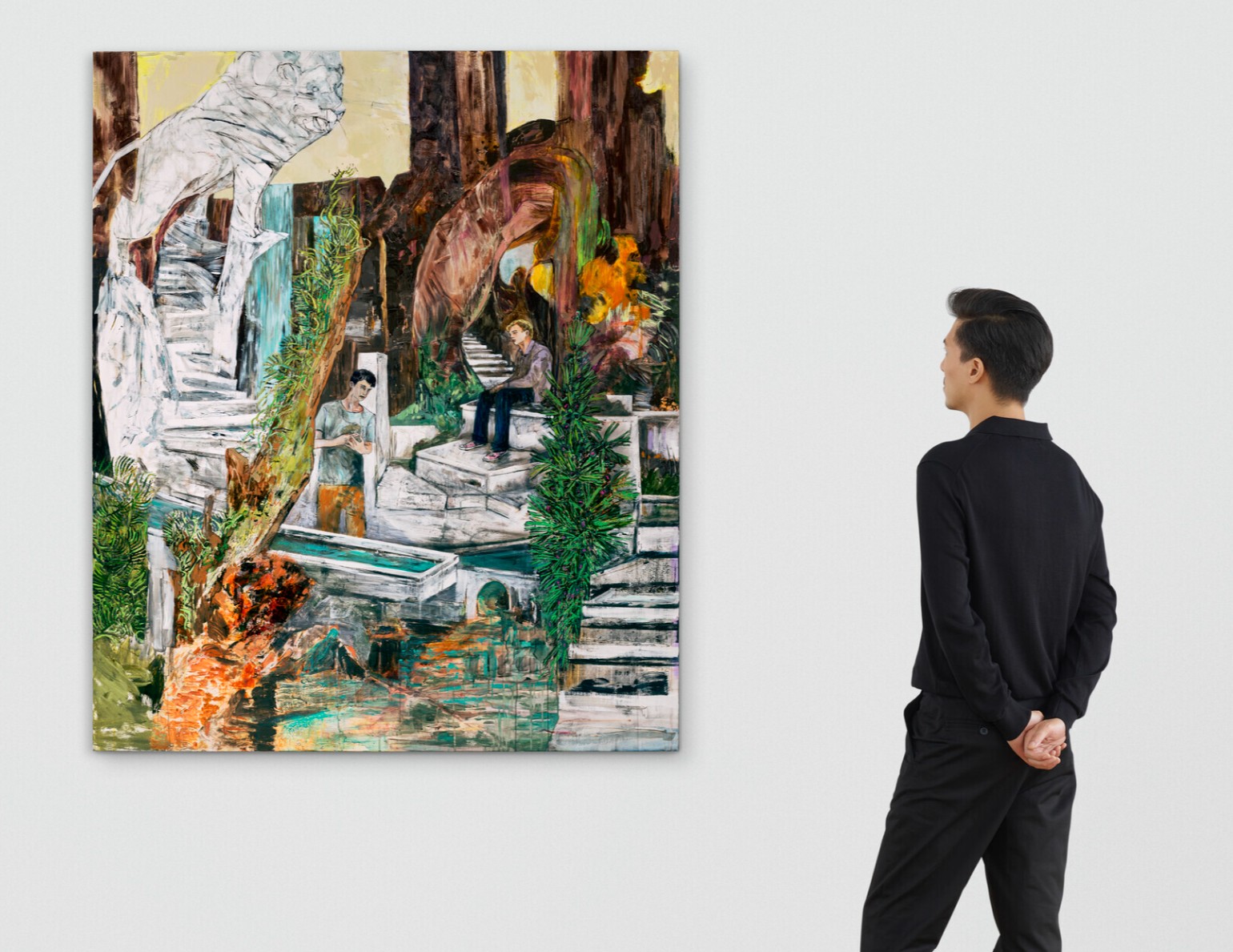
Nicolas Party
Tree Trunks, 2015
Christie’s London: 15 October 2025
Estimated: GBP 800,000 – 1,200,000
PASSED
NICOLAS PARTY (B. 1980), Tree Trunks | Christie’s
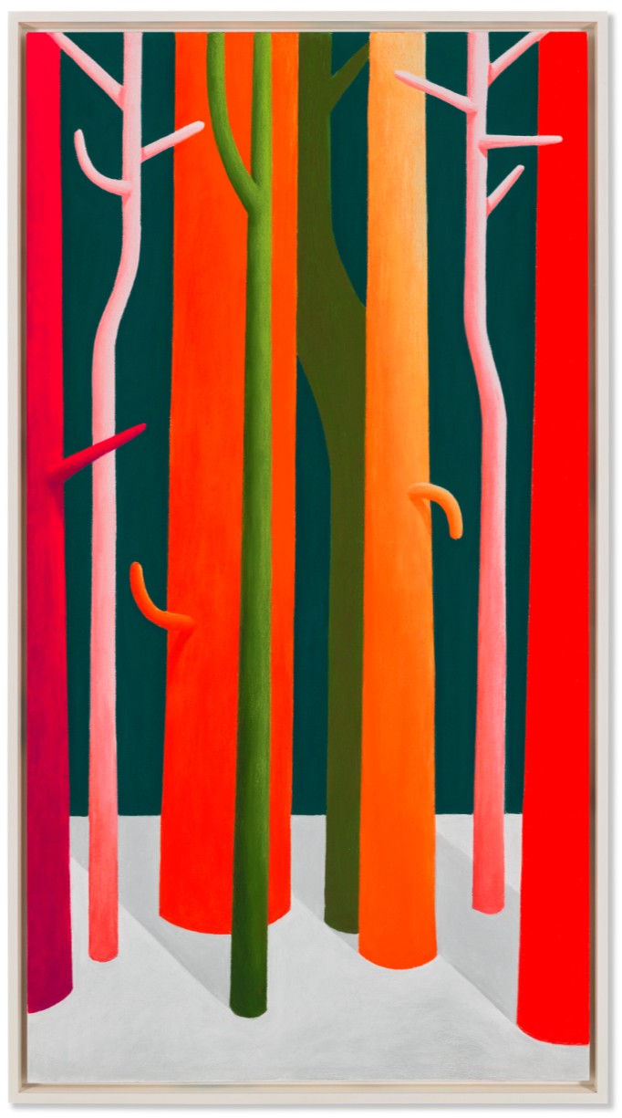
NICOLAS PARTY (B. 1980)
Tree Trunks, 2015
Soft pastel on linen
150×80 cm (59 x 31 1/2 inches)
Signed and dated ‘Nicolas Party 2015’ (on the reverse)
A vivid hymn to nature, Tree Trunks is a spectacular example of Nicolas Party’s celebrated landscapes. Vibrant, sinuous bands of color shoot up the length of the canvas, casting their shadows on the floor below. Rendered in the artist’s signature pastel, rich hues of red, orange, pink and green gleam brightly against the darkness, near-painterly in their intensity.
Executed in 2015, Tree Trunks takes its place within one of Party’s most important bodies of work. Inspired by his childhood in Switzerland, he sees trees as fundamental to both art and life. In his hands they become vehicles for touring art history, evoking the legacies of Romanticism, European Modernism and twentieth-century abstraction. Radiant and alive, they inhabit surreal, timeless hinterlands, each glowing with hyperreal clarity. Held in the same private collection since its creation, the present work featured in Party’s exhibition at the Musée des Beaux-Arts de Montréal in 2022, where his pastel landscapes hung in concert with works by Alberto Giacometti and Ferdinand Hodler.
“I like the idea of walking through a forest made up of every single tree ever painted by humans … It’s in that forest I walk to find inspiration.”
Edvard Munch, Vampire in the Forest, 1916-1918. Munch Museet, Oslo. Digital image: Superstock / Bridgeman Images.
It was Hodler, along with Félix Vallotton and Hans Emmenegger, who first inspired Party’s interest in landscape painting. He deeply admired their depictions of the dramatic Swiss vistas in which he had spent his youth. While his practice would go on to encompass portraiture and still life, themes of nature would become central to his oeuvre. ‘Trees might be the object most frequently painted to represent the natural world, an essential symbol in cultures around the world’, he explains. ‘Today the tree is still the fundamental symbol of the anxiety that we have about the future of our planet’. Party purposefully depicts ‘an environment that belongs either to a time before or long after humanity’, envisioning ‘a time when human culture doesn’t affect the landscape’ (N. Party, quoted in S. Aquin et al., Nicolas Party, London 2021, p. 26). The subject has given rise to some of his most ambitious projects, including large-scale murals for the Dallas Museum of Art and the Marciano Art Foundation, both drawing upon his roots as a graffiti artist.
Georgia O’Keeffe, Bare Tree Trunks with Snow, 1946. Dallas Museum of Art.
Artwork: © Georgia O’Keeffe Museum / DACS 2025. Digital image: Dallas Art Association Purchase / Bridgeman Images.
For Party, trees are also intimately connected to the very act of image-making itself.
“One of the first things that you draw as a child are trees… Trees are nature’s alphabets.”
He has also spoken of the inspiration he derives from walking through the ‘forests’ of art history, finding comfort in depicting something with such a rich visual and cultural lineage. The present work sparks memories of Monet’s poplars, Munch’s foreboding forests and Klimt’s sinuous birches; there are echoes of O’Keeffe, Van Gogh and Magritte. The lessons of abstraction—Newman, Kelly, Stella and others—lurk in the shadows. So, too, do the pastels of Picasso, which inspired Party to commit himself to the medium in 2013. Though no humans are present in the work, the spirits of these artists lingers in their place. The trees quiver with an almost anthropomorphic charge, their branches bathed in the light of the past.
Yellow Pot, 2018
Christie’s London: 16 October 2025
Estimated: GBP 40,000 – 60,000
NICOLAS PARTY (B. 1980), Yellow Pot | Christie’s
NICOLAS PARTY (B. 1980)
Yellow Pot, 2018
Marble
80 x 54.2 x 3 cm (31 1/2 x 21 3/8 x 1 1/8 inches)
Jean-Michel Basquiat
Untitled (The Arm), 1982
Sotheby’s London: 16 October 2025
Estimated: GBP 4,500,000 – 6,500,000
GBP 5,530,000 / USD 7,410,200
Untitled (The Arm) | Contemporary Evening Auction | 2025 | Sotheby’s
JEAN-MICHEL BASQUIAT (1960 – 1988)
Untitled (The Arm), 1982
Acrylic, oilstick and ink on quilted fabric mounted on wood supports
66 5/8 x 60 inches (169.2 x 152.4 cm)
Partially titled (on the wooden support)
Arresting in its stark iconography, Untitled (The Arm) from 1982 confronts the viewer with the apparition of a body reduced to its most urgent elements: a mask-like head suspended above an outstretched arm, both skeletal and visceral, ungrounded within a field of blazing ochre. At once diagram and effigy, the present work reveals the depth of Basquiat’s preoccupation with the body as a site of untethered energy and raw emotion. The composition exemplifies the artist’s characteristically frenzied approach, executed with unmediated spontaneity that nonetheless achieves a striking sense of compositional equilibrium.
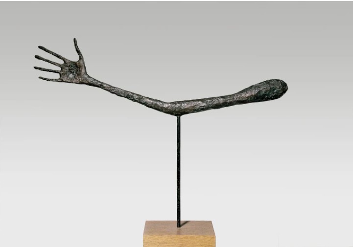
Alberto Giacometti, The Hand 1947 Bronze, Kunsthaus Zürich, Alberto Giacometti Stiftung © Alberto Giacometti Estate, ACS/DACS, 2025
Executed in 1982, the year that Basquiat exhibited at Documenta and gained international recognition, the rarity of the quilted blanket, repurposed as ground for the painting, bears the scars of its utilitarian life. Its chevron ridges are woven into the soul of the protagonist, creating a resistant surface that complicates the act of depiction. Basquiat relishes this resistance: the paint and oilstick move with the fabric’s texture, the figure strains to emerge, the arm seems to break through its confinement. The significance of the arm within Basquiat’s wider practice cannot be overstated. Limbs recur throughout his oeuvre as symbols of both agency and constraint, emblems of a body under duress yet also capable of assertion. The arm can strike, defend, create, or collapse; it is both a site of anatomical study and a cipher for social struggle. In Untitled (The Arm), its disproportionate and downward thrust lends the work a monumental gravity, as if the entire body had been condensed into a single gesture. Here, the arm does not merely illustrate; it acts. It insists upon presence, upon contact, upon the force of Basquiat’s mark.
Michelangelo Merisi da Caravaggio, Testa di Medusa, 1597, Uffizi, Florence
Untitled (The Arm) is imbued with a mood of ancient significance and alchemical reverence. Its metallic surface speaks of precious metal; of prehistoric trade; of a sense of inherent value and gravitas. This sense is exacerbated by Basquiat’s use of gold – an immensely important color and material that, for the artist, signified the sense of triumph, transformation, value, and egotism that was rapidly pervading his career. At once reminiscent of Byzantine icons – where saints and figures of biblical reverence appear flattened against gilded grounds – one might also recall the silhouetted deities and nymphs that animate the surfaces of ancient Greek vases, or the heightened naturalism of Renaissance portraiture. In the curling lines and rhythmic gestures that frame the head, the echo of Caravaggio’s Medusa is particularly vivid – a prototype for the emotional intensity and raw immediacy that Basquiat channeled into his own practice. By 1982, he regarded this intensity as a form of modern alchemy: like the alchemists who sought to draw gold from base matter, Basquiat transformed even the most spontaneous mark into a symbol of value, capable of generating both artistic and material success.
“I was writing gold on all this stuff, and I made all this money right afterwards.”
Andy Warhol, Gold Marilyn Monroe, 1962. The Museum of Modern Art, New York.
Image: © 2025. Digital image, The Museum of Modern Art, New York/Scala, Florence.
Artwork: © 2025 The Andy Warhol Foundation for the Visual Arts, Inc. / Artists Rights Society (ARS), New York and DACS, London. Scala
Basquiat’s fixation on anatomy, and particularly on limbs, can be traced to his formative encounter with Gray’s Anatomy, the 19th-century medical compendium given to him by his mother during a childhood convalescence after a car accident. The clinical diagrams of musculature and bone, encountered in those fragile years, imprinted themselves indelibly on his imagination. Basquiat returned to them throughout his career, translating their detached scientific clarity into a visual vocabulary charged with psychological intensity. Where the medical illustration seeks to classify and contain, Basquiat reanimated these anatomical fragments with fervor and subjectivity, investing the skeletal arm and body in foundationless a frontal depiction that was pioneered in the 1940s and 50s by Willem de Kooning and Jean Dubuffet, artists whom Basquiat admired.
LEFT: Leonardo Da Vinci, The muscles of the shoulder and arm, and the bones of the foot, 1510-11. The Royal Collection Trust. Art © Royal Collection Enterprises Limited 2025 | Royal Collection Trust
RIGHT: LEONARDO DA VINCI, THE PROPORTIONS OF THE HUMAN FIGURE (AFTER VITRUVIUS), C.1492 / GALLERIA DELL’ACCADEMIA, VENICE, ITALY
More than a fragment, the arm thus becomes a synecdoche for the artist himself: reaching, inscribing, struggling, asserting. The singular limb may be read as both an extension of the artist’s body and the literal instrument of his craft, the vehicle through which his vision is materialized. The torso, delineated in thin, electric blue lines, reads less as a corporeal body than as a schematic; an X-ray through which the skeletal frame is revealed. Yet this partial body is also haunted by absence. The missing limbs, the hollow ribcage, the skeletal hand clawing downwards: each evoke both fragility and struggle. The figure appears suspended between life and death as flesh coalesces with bone to reveal a figure in a state of half-living. In this ambiguity lies Basquiat’s unique contribution to figuration – an understanding of anatomy not as an inert structure but as a metaphor for the precarious condition of being. Above this spectral body, the face confronts the viewer with uncompromising force. Unlike the detached gaze of the medical diagram, however, this face brims with affect. It is at once a mask and self-portrait, an archetype of humanity and an index of Basquiat’s presence. The central visage seems directly derived from the ceremonial masks and figures of West Africa, with eyes and mouth abbreviated into hollow ellipses. We are reminded of the Fang Heads of Gabon, which share their powerful dark silhouette with this work, tapering from broad forehead to jutting jaw.
![]()
St. Paraskyeva, icon, Byzantine, 15th century. Private Collection. © Richard and Kailas Icons, London, UK / Bridgeman Images 2025
Born in Brooklyn in 1960 to a Haitian father and a Puerto Rican mother, Basquiat left home at the age of fifteen and immersed himself in the charged cultural landscape of downtown New York. A voracious autodidact, he quickly established himself within the city’s underground milieu: a noise musician with a deep affinity for jazz, and a street poet who inscribed enigmatic aphorisms in marker across lower Manhattan under the pseudonym SAMO. By 1981, Basquiat abandoned this alter ego and turned decisively to painting and drawing – first on found supports salvaged from the urban environment, later on canvas and paper – developing a practice marked by bricolage, speed, and an irrepressible energy. His passion for language and music, combined with a compulsive drive to create, imbued his works with a sense of immediacy that resonated with the Neo-Expressionist boom then reshaping the international art market. Within a year of selling his first painting in 1981, Basquiat’s work was in high demand, and in 1985 he appeared on the cover of The New York Times Magazine as the face of this exuberant new moment.
Power Figure: Male (Nkisi), Democratic Republic of Congo, Songye.
The Metropolitan Museum of Art, New York. Image: © 2025. The Metropolitan Museum of Art/Art Resource/Scala, Florence
This sense of artistic transformation was grounded in a deep awareness of art history. As a child, Basquiat had been a regular visitor to the Metropolitan Museum of Art in New York, where he absorbed the work of artists such as Jasper Johns and Cy Twombly – figures who, like him, sought to collapse the boundaries between language and image. Both Basquiat and Twombly deployed words in painterly contexts, using text not as illustration but as a vehicle for atmosphere and ambiguity. It is telling that in the summer of 1982, Basquiat became the youngest artist to participate in Documenta in Kassel, exhibiting alongside Twombly himself. Equally formative was Jean Dubuffet, the archetypal outsider who mounted a deliberate break with academic traditions in order to forge an art rooted in raw immediacy and invention – an ethos that resonated profoundly with Basquiat’s own.
Jean Michel-Basquiat, Gold Griot, 1985, The Broad, Los Angeles, © The Estate of Jean-Michel Basquiat.
Licensed by Artestar, New York 2025
Within this context, the partially effaced inscription in The Arm acquires layered significance. First inscribed as The Arm of Jasper, the work preserves the spectral trace of its original dedication beneath a veil of black paint – a revision at once deliberate and enigmatic. Jasper Johns provided a crucial precedent for Basquiat’s own interrogation of symbols, repetition, and erasure. Emerging at Leo Castelli’s gallery in the 1960s, Johns destabilized the hierarchies of high art by elevating quotidian imagery – flags, maps, targets – into painterly form. His practice bridged Abstract Expressionism and Pop, creating a critical space for ambiguity, appropriation, and the destabilization of meaning. For Basquiat, working in a New York art world still marked by Johns’ radical strategies, this model was both formative and provocative. By dedicating a work to Johns, Basquiat not only acknowledged this inheritance but also inscribed himself within a lineage that connects the avant-garde innovations of the postwar generation to the Neo-Expressionist urgency of his own practice.
Untitled (The Arm) is a golden exemplar of the unbridled genius and skill with which Basquiat was operating in 1982; the year in which he had produced work for six solo exhibitions and, as a twenty-two year old, exhibited alongside such heavyweights as Gerhard Richter, Joseph Beuys, and Andy Warhol; the year in which he created so many works that were conceived with rich iconographic meaning and executed with unbridled confidence and conviction. As the aforementioned Robert Farris Thompson recounted in an essay in 1993, Basquiat described 1982 simply as the moment when “I made the best paintings ever” (Jean-Michel Basquiat cited in: Robert Farris Thompson, ‘Brushes with Beatitude’, in: Exh. Cat., New York, Whitney Museum of American Art, Jean-Michel Basquiat, 1993, p. 50). For its seamless assimilation of numerous points of influence, sheer aesthetic power, and virtuosic brevity, Untitled (The Arm) is undoubtedly worthy of this description.
Untitled (Pestus), 1982
Phillips London: 16 October 2025
Estimated: GBP 2,000,000 – 3,000,000
GBP 2,374,000 / USD 3,181,160
Jean-Michel Basquiat Modern & Contemporary Art Evening Sale
When asked directly to describe his subject matter in a 1983 interview with renowned curator of The Metropolitan Museum of Art, Henry Geldzahler, Jean-Michel Basquiat paused before replying succinctly: ‘Royalty, heroism, and the streets.’ Created in what would become widely regarded as the artist’s annus mirabilis as he broke through to the New York artworld to widespread and instant acclaim, Untitled (Pestus) deftly encompasses this vision, distilling the immediacy and raw energy of Basquiat’s mark making as he ‘tapped into the zeitgeist, bringing the satirical bite of the Beat writers into a new age’, a street poet whose drew his material from the syncopated urban rhythms and complex contradictions embedded in the social and historical fabric of the city itself in a manner that recalls French pioneer of Art Brut Jean Dubuffet’s celebration of the surfaces, textures, and material realities of postwar Paris.
Basquiat came of age in the gritty, electric atmosphere of 1970s New York in the midst of a cultural revolution defined by an emergent hip hop culture and burgeoning street art scene while experimental, underground artist communities blurred the lines between music, painting, film, and fashion. Downtown Manhattan, especially the Lower East Side, became a crucible for creative rebellion, where nightclubs doubled as galleries and sidewalks served as canvases. Although something of a golden era for the expansion of artistic freedoms and modes of expression, it was also a period of socio-economic crisis, with financial downturns, widespread unemployment, and soaring crime rates were set against a background of strikes, riots, and rampant police corruption For Basquiat, a young Black artist from Brooklyn, the contradictions of this environment were impossible to ignore. He navigated a city shaped by both innovation and inequality, quickly becoming attuned to the divides between visibility and marginalization, privilege and precarity, and the harsh truths of institutional racism that ran through daily life.
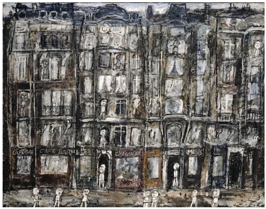
Jean Dubuffet, Apartment Houses, Paris, 1946, The Metropolitan Museum, New York. Image: © The Metropolitan Museum of Art/Art Resource/Scala, Florence, Artwork: © 2025 Artists Rights Society (ARS), New York / ADAGP, Paris
Street art and hip-hop both offered powerful creative outlets for channeling and challenging these power structures, finding new symbolic and linguistic modes for speaking out against the routine silencing of certain communities and individuals existing within such systems. Working with his childhood friend, the graffiti artist Al Diaz in the late 1970s, Basquiat created an enigmatic and politically charged mode of graffiti, tagging walls and sidewalks with the SAMO© insignia in a very literal mode of concrete poetry. The immediacy of graffiti, its ability to carry meaning, and the endlessly inventive combinations of text, image, and symbol that it presented was central in shaping Basquiat’s distinctive visual language, expressed most directly in his works on paper and especially resonant in works like Untitled (Pestus).
The second property featured on the Monopoly Board to which Basquiat made even more direct reference in his notebooks, ‘Baltic Avenue’ is shorthand for a low-income and economically depressed urban area associated with neglect, higher crime rates, and dereliction. Mapped on to the socio-economic geography of Atlantic City, Monopoly’s designation of Baltic Avenue as a lower-cost area also speaks to the historical segregation of the city that took root the 1930s during The Great Migration, where Black communities were barred from the wealthier or more exclusive neighborhoods, and were instead ghettoized in poorer ‘undesirable’ neighborhoods like Baltic Avenue and Mediterranean Avenue.
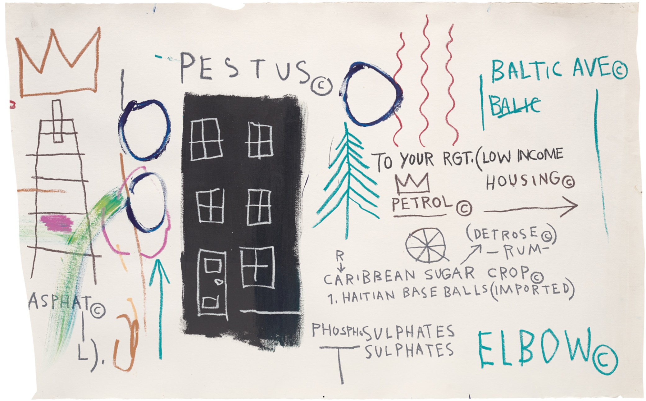
Invoking this history in Untitled (Pestus) alongside the scrawled inscription ‘CARRIBEAN SUGAR CROPS’ Basquiat directly and incisively connects present-day socio-economic realties for these communities with the fraught and deeply interwoven history of American economic success and the slavery of Afro-Caribbean peoples, identifying an ongoing legacy of systemic, structural oppression encoded in the geography of the city itself. The extent to which the legacies surrounding the exploitation of Black labor for the monetary gain, status, and leisure of white Anglo-Americans persists well into the 20th century and beyond is emphasized with the inclusion of ‘1. HAITAN BASE BALLS (IMPORTED)’, a direct reference to the manufacture of the official major league Baseballs by Rawlings factory based in Haiti, where it benefited from cheap labor costs until the 1980s when it relocated to Costa Rica following political unrest. While the mention of Haiti evokes Basquiat’s dual cultural inheritance, it also points to the kinds of conflicts that he might have been navigating during this period, poised between the subversive actions of a street artist exploring and existing within the urban landscape on the one hand, and the more upwardly mobile pathway of a commercially successful painter launched into the heady circles of New York’s cultural elite on the other. In Untitled (Pestus) we see the artist working through these dichotomous contradictions, the streets with their blocks of ‘LOW INCOME HOUSING’ and history of division along lines of race and class reclaimed as the space where true royalty and heroism might be forged, the propulsive upward energy of arrows and tree-like forms indicative of a kind of grittily determined aspiration against all the odds, culminating in the ladder motif to the left of the building, topped with Basquiat’s iconic three-pointed crown.
Undoubtably one of the most immediately recognizable and loaded pictographic symbols in Basquiat’s arsenal of motifs, the three-pointed crown is uniquely important in the artist’s practice, allowing him to directly challenge and subvert persistent racial biases as he generated an alternative pantheon of Black heroes including musicians, athletes, and civil rights activists, honoring their cultural contributions by ‘crowning’ them in his work. As well as acknowledging and honoring his heroes in this way, Basquiat also employed the three-pointed crown as a pictographic signature or self-portrait of sorts. Alongside the prominent inclusion of the motif above the ladder to the left of the building here, the crown also makes a second, more subtle appearance in the composition, significant in its proximity to another frequently employed motif. As a symbol of communication, its inclusion here in relation to the three-pointed crown is significant, emphasizing the warrior-artist’s duty to speak out and share his message with the world.
Untitled, 1985
Phillips London: 16 October 2025
Estimated: GBP 1,200,000 – 1,800,000
WITHDRAWN
Jean-Michel Basquiat Modern & Contemporary Art Evening Sale
Untitled, 1985
Acrylic, oilstick and Xerox collage on canvas
Right: The Venus of Willendorf, circa 30,000 BP, Naturhistorisches Museum, Vienna
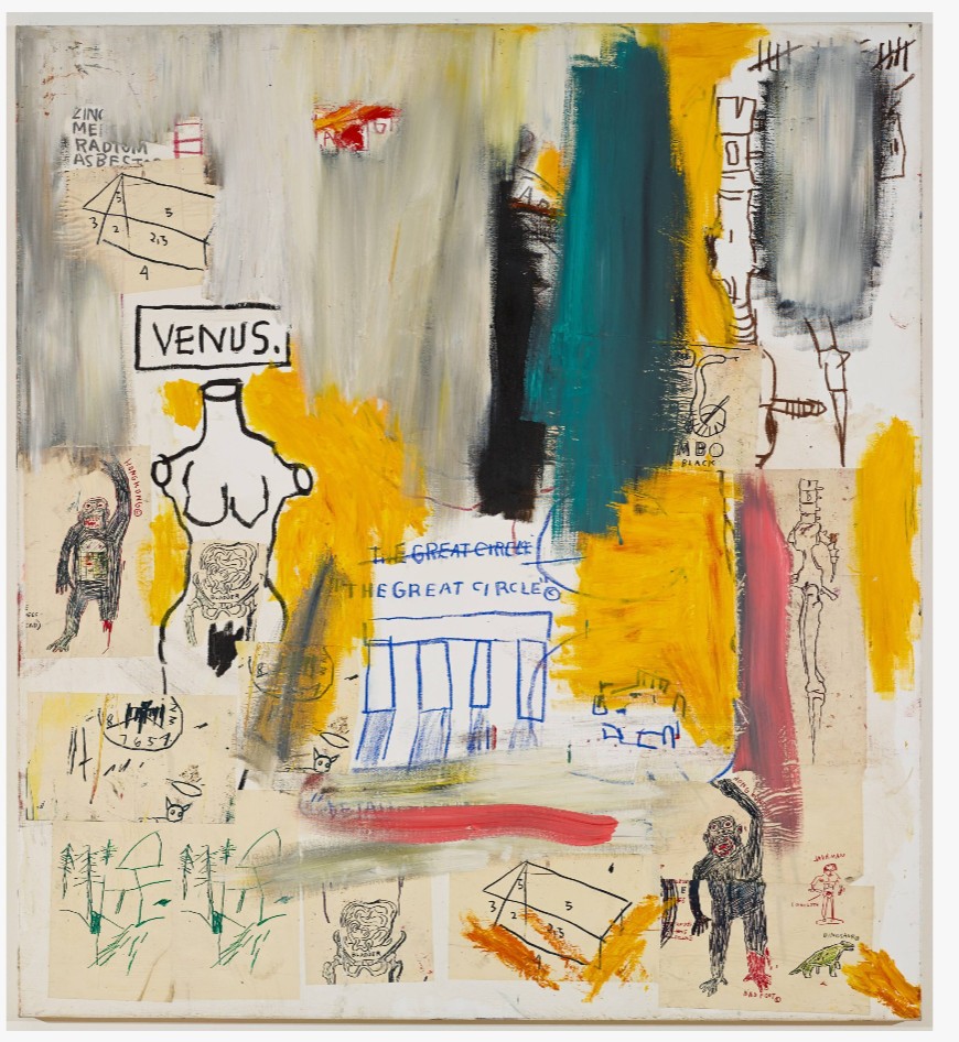
Basquiat’s interest in classical antiquity is well-documented, and Venus is directly evoked as an archetype and art historical touchstone across multiple canvases, typically appearing in the truncated form of a marble Greco-Roman sculpture as in the 1983 work Untitled (Venus / The Great Circle), now held in the permanent collection of the San Francisco Museum of Modern Art. While drawing direct inspiration from mythology and classical representations of this goddess that the young artist would no doubt have been familiar with from his childhood visits to The Brooklyn Musuem and The Metropolitan Museum of Art in New York, the figure of Venus also held deeply personal resonances for the artist. Ahead of his pivotal summer in Modena, Italy on the invitation of art dealer Emilio Mazzoli in 1982, the twenty-one-year-old Basquiat visited Rome with his then-girlfriend Suzanne Mallouk, a beautiful young woman that the artist dubbed ‘Venus’ the very first time they met, an affectionate nickname that persisted throughout their relationship and was no doubt helped to bring to life the world of Roman myth and antiquity discovered on that important trip. Although the relationship between Basquiat and Mallouk was over by 1985 – marked by the artist ripping up sheets of Xeroxed Venuses and presenting them to Mallouk, proclaiming ‘this is you, a ripped-up Venus, the goddess of love’, the iconographic force of the goddess persisted. The extent to which Basquiat deftly combined art historical references and his own deep reverence for classical culture and antiquity with encoded personal references is especially evident across these ‘Venus’ paintings, a tendency that would only become more pronounced during the mid-80’s as he started looking more closely at his immediate circle, producing named portraits of Francesco Clemente, Anthony Clarke, and Larry Gagosian amongst others.
Left: Sandro Botticelli, The Birth of Venus (detail), circa 1485, Galleria degli Uffizi, Florence. Image: Bridgeman Images
Right: Detail of the present work
With her flowing strawberry blond hair, carefully elongated proportions, and delicately modelled facial features the figure in the present work directly recalls Renaissance master Sandro Botticelli’s humanist reinterpretation of the Venus myth, a supreme expression of feminine grace and beauty. While Botticelli’s Venus emerges from the waves in a clam shell, gently guided to shore by the soft winds blown by Zephyr, Basquiat’s composition is kept more open and associative, allowing its ‘rich and varied references [to] participate more broadly in the referential echo chamber of art history’, further emphasized by the cut up and collage approach of the Xeroxed pages to the figure’s left. Tantalizing, another statuesque strawberry blond figure makes an appearance in a 1985 collaboration with his close friend and artistic mentor Andy Warhol, the expansive 6.99 from the Painting Four Hands series. Collaborating on each canvas, Basquiat and Warhol riffed productively off one another, exchanging symbols, motifs, and painterly techniques in a vibrant celebration of the creative rapport and deep friendship that flourished between the two artists during this period, a collaborative practice fondly remembered by fellow artist Keith Haring as ‘two amazing minds fusing to create a third, totally separate, and unique mind.
Left: Andy Warhol, “Portrait of Jean-Michel Basquiat as David,” 1984 © The Andy Warhol Foundation for the Visual Arts, Inc., courtesy of the Collection of Norman and Irma Braman. Artwork: © 2025 The Andy Warhol Foundation for the Visual Arts, Inc. / Licensed by DACS, London
Right: Chris Makos, Altered Image Green, 1985. Image: © Chris Makos
Knowing that Basquiat was referring more closely to his intimate circle in his painting during this period, and given that Warhol had portrayed Basquiat as Michelangelo’s David – the supreme expression of masculine beauty, strength, and fortitude – in 1984, there is a temptation to read the present work as something of a companion piece, imagining Warhol as the goddess of love and beauty herself. While the true identity of the sitter remains a mystery, there is a certain poignance to this reading, chiming as it does with Warhol’s great love of beauty and deep desire to be ‘pretty’. Moreover, there are also compelling visual connections to be made between the present work and Christopher Makos’ 1985 arresting photographic portraits of Warhol in drag immortalized in the collaborative Altered Image project, offering another dimension to the playful gender ambiguties at work here. Showing the artist with heavily powdered face and posing in a series of wigs, the project creatively responded to Man Ray and Marcel Duchamp’s 1920’s artistic collaboration which brought ‘Dada Daddy’ Duchamp’s feminized alter-ego ‘Rrose Sélavy’ to life, challenging gender conventions as well as the notions of artistic collaboration and performance itself. While striking versions of these drag portraits exist in typically Warholian colorways of bold greens and blues, recalling the Pop artist’s 1960s silkscreened portraits of Marilyn Monroe and Jackie Kennedy, the majority are documented in a visually arresting white on white format, with Warhol’s powdered face, blonde wigs, and crisp white shirt set against a white backdrop that recalls Basquiat’s treatment here.
Untitled, 1982
Christie’s London: 15 October 2025
Estimated: GBP 300,000 – 500,000
GBP 508,000 / USD 680,270
JEAN-MICHEL BASQUIAT (1960-1988), Untitled | Christie’s
JEAN-MICHEL BASQUIAT (1960-1988)
Untitled, 1982
Oilstick on paper
17 x 13 7/8 inches (43 x 35.3 cm)
Signed, inscribed and dated ‘ST MARTIN 1982- Jean-Michel Basquiat’ (lower edge)
Two totemic figures dominate the picture plane in this vibrant, emblematic work by Jean-Michel Basquiat, executed in a striking primary palette in the artist’s trademark oilstick medium. A larger, female figure is described with an almost Cubist arrangement of form: simultaneously depicted frontally and in profile, she wears an elaborate headpiece crowned with a single, bright yellow feather.
The second figure is angular and robot-like. Adorned with a bright red nimbus of thorns, its large yellow eyes gleam like beacons. Along the lower edge the sheet is signed and inscribed in Basquiat’s unmistakable graphic scrawl. It was only recently that Basquiat—known initially as the enigmatic street artist SAMO—had taken to signing works with his real name. The present work was executed in 1982, the exhilarating and pivotal year that saw him rise to stardom. His debut solo show at the Annina Nosei Gallery in New York in March precipitated a string of international solo exhibitions across the year, and that summer he was the youngest artist to be included in curator Rudi Fuchs’s documenta VII.
Pablo Picasso, Homme au chapeau de paille et au cornet de glace, 1938. Musée Picasso, Paris. Artwork: © Succession Picasso/DACS, London 2025. Digital image: © Photo Josse / © Succession Picasso/DACS, London 2025 / Bridgeman Images.
Basquiat worked amid a ferment of life and art, and his studio brimmed with drawings, paintings, and source material. From this profusion of inspiration, quickfire images poured fully formed from his mind. Drawing—on paper or canvas—formed the basis of his practice, typically with oilstick. The medium’s slick, tacky sheen suited his bold visual lexicon. There is an immediacy and intimacy to Basquiat’s works on paper, which frequently preserve the traces—coffee stains, footprints—of his daily life.
Jean-Michel Basquiat, Untitled, 1982. Private collection. Artwork: © Estate of Jean-Michel Basquiat. Licensed by Artestar, New York.
Basquiat lifted ideas from art history, popular culture and religious iconography. He pored over the collection catalogues of the Metropolitan Museum of Art and the British Museum, as well as books such as Burchard Brentjes’ African Rock Art (1969), often translating their idols and statuettes into his drawings. His oeuvre is replete with heroic imagery of crowns, halos, and masks, populated by archetypal images of royalty, athletes, warriors, and robots. Both figures in the present work are crowned in some way. One wears an elaborate plumed headpiece that crackles with electric lines, flying arrows, and antennae-like forms, like an exploding feathered war bonnet. For Basquiat crowns were ambiguous, even mocking: an allusion to the Western obsession with being on top, and the ease with which contemporary life could become a game of snakes and ladders. The brilliant red crown of thorns which adorns the second figure is a trademark motif in his work, emblematic of the weight of glory.
Piero della Francesca, Madonna del Parto, circa 1450-1470.
Musei Civici Madonna del Parto, Monterchi. Digital image: © 2025 Photo Scala, Florence.
Basquiat was of Haitian and Puerto-Rican descent, and the present work—inscribed ‘ST MARTIN’—may be a tribute to the island of Saint Martin in the northeastern Caribbean Sea. Another inspiration may have been Saint Martin de Porres, the patron saint of social justice, racial harmony and mixed-race people. Born illegitimately in 1579 to a Spanish aristocrat and freed black slave, Saint Martin struggled to be accepted into a religious order in his home city of Lima. Persevering, he volunteered within a Dominican monastery and eventually became one of the few mixed-race Dominican brothers of the time, widely respected for his devotion and compassion. Canonized in 1962, two decades before the present work was executed, his life and work would have resonated with Basquiat, who was keenly aware of the complexities of colonial history and similarly concerned with the plight of social justice. Through works such as the present, Basquiat constructed a bold new visual realm in which to counter the inequalities and hypocrisies built into the fabric of twentieth-century America.
Untitled, 1981
Sotheby’s London: 17 October 2025
Estimated: GBP 300,000 – 400,000
GBP 495,300 / USD 663,700
Untitled | Contemporary Day Auction | 2025 | Sotheby’s
JEAN-MICHEL BASQUIAT (1960 – 1988)
Untitled, 1981
Oilstick on paper
27 1/2 x 39 3/8 inches (70×100 cm)
Executed in 1981, Untitled, reveals much about Jean-Michel Basquiat’s early visual language, a condensed visual energy shaped by both raw iconography and complex allusion. First handled by Galleria d’Arte Emilio Mazzoli in Modena, the gallery that gave Basquiat his first European exhibition in 1981, the drawing soon entered the collection of Alessandro Grassi. Grassi was among the most perceptive early collectors of Basquiat, acquiring works at a time when the artist was still establishing his reputation outside New York. The work presents a group of cars, a New York skyscraper, a tipi tent, the artist’s signature crown motif, and the letters ROT. Each of these elements carry both literal resonance and symbolic charge. Together they afford us insight into Basquiat’s negotiation of modern urban life, speed, decay, and identity.
1981 was a pivotal year for Basquiat. At this moment he was beginning to consolidate his voice within the New York downtown art scene, having moved from graffiti interventions under the artist’s name SAMO to works that bridged drawing, painting, poetry and collage. He engaged with the energy of street culture, the improvisatory rhythms of jazz, and the layered histories of the African diaspora. References to colonial pasts, contemporary politics and consumer culture interwove with motifs drawn from anatomy, advertising and popular imagery. In this climate, machines, towers and vehicles were not celebrated as triumphant achievements but interrogated as contested symbols of modern life. They embodied both promise and contradiction, mobility and restriction, aspiration and decay.
The cars in Untitled echo the dynamic futurist representations of movement. The Futurists, such as Luigi Russolo in his Dynamism of a Car, sought to capture not only the appearance of automotive speed but its pulsating motion and mechanized vitality. The overlapping planes, the blur, the sense that form is dissolving into motion were all meant to evoke the future, the machine, the modern age. In Basquiat’s work the cars are not rendered with such formally cubistic fragmentation or speed-lines but rather suggested through simpler, almost schematic means. In the context of Basquiat’s New York, the car is not simply a technological marvel but a site of cultural inscription. To draw cars is to evoke streets, to allude to movement through space, to suggest urgency. The sketchiness and immediacy of his lines resist the slick finish of commercial or industrial renderings. Where Futurists celebrated technology in an almost utopian register, Basquiat often situates it with social tension: an urban present defined by inequality and instability.
Luigi Russolo, Racing Car, 1913
Musée National d’Art Moderne, Paris
Alongside the cars stands a vertical structure that oscillates between castle tower and skyscraper. The ambiguity is crucial. The castle tower evokes history, defense and enclosure, while the skyscraper evokes capitalism, ambition and modernity. By refusing to resolve the form, Basquiat situates his imagery between feudal past and capitalist present. A tipi tent further introduces the theme of impermanence. It suggests shelter that is fragile, marginal and easily overturned. Read together, these architectural motifs articulate a city where permanence and fragility coexist, and where social structures are both fortified and unstable.
The iconic crown, which the artist deploys throughout his œuvre, appears here as a marker of recognition. He uses it not simply as a symbol of personal authority but as a divide that confers dignity on overlooked subjects. Crowns elevate the everyday, whether objects or words. In this composition, the crown places authority upon motifs that might otherwise be banal. The cars, the building, and the tent all become worthy of attention.
Basquiat often uses fragments of words and acronyms. The inclusion of the letters ROT can be read literally as decomposition, the erosion of structures and machines, or metaphorically as moral corruption. Its presence alongside symbols of speed and verticality confront the viewer with the inevitability of breakdown. In the world of speed and vertical aspiration there is breakdown. These three letters also carry the cadence of graffiti tags: abrupt and confrontational while commanding attention in the visual field.
Jean Michel Basquiat, Untitled (Yellow tar and feathers), 1982
Sold for $25,925,000 in Sotheby’s New York, 13 November 2013, lot 10
Artwork: © Estate of Jean-Michel Basquiat. Licensed by Artestar, New York.
In the present work, one sees Basquiat’s hybrid approach to symbol, text, and image. The nature of a work on paoer is spontaneous, vulnerable and amplifies immediacy. The spontaneity of line, the layering of marks, the interplay between drawn image and written word all contribute to the work’s urgency. The composition does not resolve into harmony but holds together disparate signs, inviting interpretation while resisting closure. It is precisely this tension that has made Basquiat’s works on paper so resonant, offering a direct view into the restless energy of his imagination.
Seen within the context of his broader trajectory, Untitled encapsulates themes that Basquiat would continue to develop throughout his brief but fruitful career. The machine, the city, the crown, the language of breakdown and decay, the interplay of personal and collective histories are not incidental but foundational. Untitled is both a historical document and an artistic statement. It registers the pulse of 1981 New York, the tensions of modern life, and the brilliance of a young artist finding his form. At once playful and pressing, the present work exemplifies Basquiat’s ability to transform simple motifs into charged symbols of culture, identity and power.
Keith Haring
Untitled, 1980
Estimated: GBP 250,000 – 350,000
WORK ON PAPER
Untitled, 1980
Sumi ink, acrylic and spray paint on paper
61 3/8 x 48 inches (155.8 x 122 cm)
Signed, inscribed, numbered and stamped with the date
‘JUL 18 1980 K. Haring 22ND ST. STUDIO NYC 1of 16’
(on the reverse)
The present work on paper by Keith Haring is a vibrant early example of the American artist’s celebrated visual language. It was executed in 1980 during his residency at P.S. 122—a non-profit arts organization known today as Performance Space New York (PSNY)—on the corner of First Avenue and Ninth Street in the heart of New York City’s East Village. Concluding with an open-studio exhibition, this was a key moment for Haring which saw the arrival of his signature style. He had moved to the city just two years earlier.
Executed on a ground painted pale pink, this large-format work depicts a UFO blasting a beam of energy towards a room or box which holds five silhouetted figures, their hands linked in a chain. Spaceship and earthlings alike emit sparks of energy. Haring’s use of red, orange and green spray paint gives the picture a fluorescent glow. Its soft haze works in tandem with the sharp, comic book-esque lines in black ink to create an image which is both of this world and out of it.
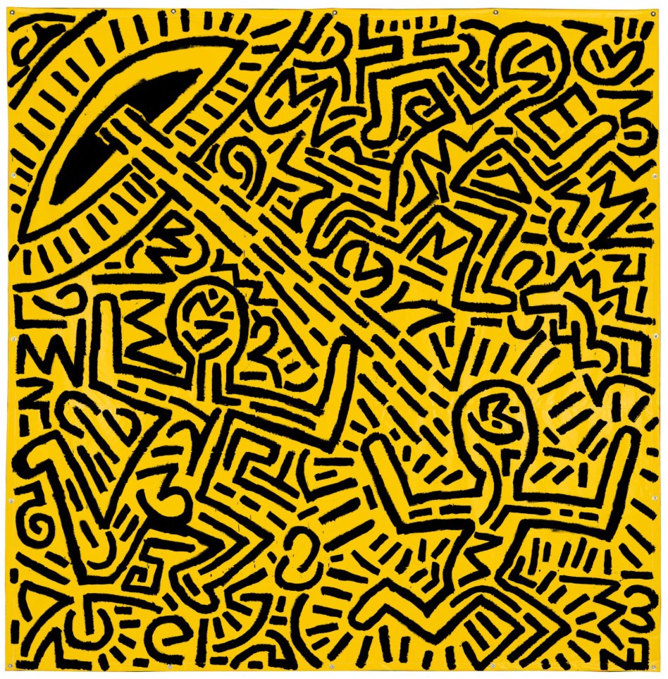
Keith Haring, Untitled, 1981. Carnegie Museum of Art, Pittsburgh. Artwork: © The Keith Haring Foundation.
The flying saucer is one of the defining motifs of Haring’s early practice, which drew equally on contemporary painters such as Pierre Alechinsky and New York’s thriving street-art scene. Haring had grown up in small-town Pennsylvania in the 1960s, a period when the US was gripped and terrified by stories of UFOs. For the young artist, alien spacecraft were not objects of fear but instead symbols of otherness and forbidden desires, shooting energy rays that could endow their receivers with special power. Haring would later claim the UFO motif had a pivotal role in his artistic development.
“Out of these drawings, my entire future vocabulary was born. I have no idea why it turned out like that. It certainly wasn’t a conscious thing. But after these initial images, everything fell into place…”
Keith Haring performing during one of his ‘Acts of Live Art’ nights at Club 57 in 1980. Photo: Joseph Szkodzinski.
In these early years Haring also staged a performance series called ‘Acts of Live Art’ at Club 57, around the corner from P.S. 122. He was fascinated by dance, movement and communal experience, and often brought these themes into his art. The figures in the present work stand together in a room that radiates a yellow incandescence, illuminated like the nightclubs he frequented in downtown New York. Holding hands, they represent a democratizing spirit of friendship and solidarity—a message that would reverberate through the artist’s entire career, even as he came to deal with darker subject matter such as the HIV/AIDS epidemic. Thrumming to an alien rhythm, the present work is a vital example of his effervescent practice.
Panel, 1990
Phillips London: 18 October 2025
Estimated: GBP 180,000 – 250,000
Keith Haring Modern & Contemporary Art Day Sale
Panel, 1990
Bronze with white patina
Stamped with the number and the foundry mark ‘2/9’ lower right
Manifesting form, rhythm and unrestrained movement, Keith Haring’s iconographic compositions generate their own mode of visual choreography, their repeating motifs and pronounced internal patterns closely aligned to movement and the embodied power of music and performance. Panel, executed in 1990, the last year of Haring’s life, is a monumental and dynamic display of the iconic forms that propelled the artist to worldwide fame, exemplifying his multifaceted, ever-evolving oeuvre. Here, his instantly recognizable dancing figures are engraved friezelike across the surface of the work, body and line vibrating with a vital, dynamic energy that contrasts powerfully with the unyielding materiality of the bronze panel. Replete with a diversity of influences that are visible throughout his oeuvre, from Egyptian hieroglyphs and Classical Greek vase painting to the dance and club culture of 1980s New York, Panel embodies two important aspects of Haring’s later artistic practice: his creation of furniture and his use of bronze.
“If I was going to draw, there had to be a reason. That reason, I decided, was for people. The only way art lives is through the experience of the observer. The reality of art begins in the eyes of the beholder and gains power through imagination, invention, and confrontation.”
Created at the encouragement of his friend, collector and fellow artist, Sam Havadtoy, Haring’s foray into furniture marked a period of prolific artistic output at the end of his life. He produced several pieces within the span of a few months, including an edition of writing desks, coffee tables, paneled screens, fireplaces and altarpieces. ‘The whole project came out of when I was decorating [Haring’s] house in December 1989’, Havadtoy has elucidated. ‘In his living room was an old brick fireplace which he hated, so I had it plastered over. The plaster was wet, and I suggested that he draw into it. He thought it was a cool idea. It was as if the plaster were a three-dimensional textured canvas. He loved drawing in the plaster and got very excited about the new medium. When he finished, it was very beautiful’. Haring’s experiments with furniture also coincided with a move towards bronze as a medium. Without making any preliminary sketches, Haring employed a loop knife, rather than a brush, to carve his iconic hieroglyphic figures directly into a clay model. This technique required freedom and spontaneity in seamlessly executing continuous, yet distinct, grooves across the surface, testament to the confidence and technical skill of Haring’s mature practice.
“I don’t think art is propaganda; it should be something that liberates the soul, provokes the imagination and encourages people to go further. It celebrates humanity instead of manipulating it.”
In many ways, Panel draws back to Haring’s early subway drawings of the early 1980s, in which he drew his iconic barking dogs and dancing figures with chalk directly onto expired advertisement boards. Similarly emblematic of his democratizing approach to artmaking, Panel eschews traditional supports and media with a friezelike medley of figures carved directly across the surface. Materializing his figures in a different manner to the enamel-coated aluminum sculptures of the mid-1980s, these bronze works extended the experiential, three-dimensional element of Haring’s aesthetic vernacular, casting the viewer as user and the artist as craftsman. In this sense, Panel realizes his belief that ‘the contemporary artist has a responsibility to continue to celebrate humanity’. Simultaneously spontaneous yet studied, it superbly encapsulates Haring’s ability to distil form and movement to a more essential yet lyrical kind of figuration that remains uniquely his own.
Yoshitomo Nara
Haze Days, 1998
Christie’s London: 15 October 2025
Estimated: GBP 6,500,000 – 8,500,000
YOSHITOMO NARA (B. 1959), Haze Days | Christie’s
YOSHITOMO NARA (B. 1959)
Haze Days, 1998
Acrylic on canvas
180.3 x 164.5cm (71 x 64 3/4 inches)
Signed in Japanese, titled and dated ‘’98 HAZE DAYS’ (on the reverse)
Almost two meters in height, Haze Days (1998) is a luminous and unmistakable painting by Yoshitomo Nara. One of the artist’s iconic girls stands waist-deep in a pool, a bandage tied in a neat bow around her head. She wears a mint-green top with a single gold button. Narrowing her large, otherworldly eyes—irises black and pupils green—she meets our gaze with grumpy defiance. Foreground and background merge in a misty space of pale, pearlescent color: subtle washes drift across the girl’s features, placing her amid the haze of the title. Impressed traces of pigment soften her eyes and mouth. The work exemplifies the unique presence of Nara’s solitary figure paintings, which radiate potent, enigmatic emotion through the most economical of means. It reveals the newly delicate palette and technique that the artist began to explore in the late 1990s, departing from the bolder, more graphic lines of his previous paintings. Nara was recently celebrated in a landmark retrospective that toured the Guggenheim Museum Bilbao, the Frieder Burda Museum, Baden-Baden and the Hayward Gallery, London from 2024 to 2025.
Haze Days dates from a watershed year for Nara. After graduating in 1993 from the Kunstakademie Düsseldorf—where his teachers included the artist A. R. Penck—he had moved to Cologne. He was able to work on a larger scale than ever before and painted prolifically, refining his visual language towards the standalone figures for which he is best known today. 1998 saw his first solo museum show at the Institute of Visual Arts at the University of Wisconsin, Milwaukee: alongside his friend and contemporary Takashi Murakami, he was also invited by the artist Paul McCarthy to the University of California, Los Angeles as a visiting professor. That same year, 124 of Nara’s works were acquired by the preparatory committee for the Aomori Museum of Art, which would open near his Japanese hometown in 2006. These included the important painting Mumps (1996), whose bandage motif anticipates the present work. Nara lived in Cologne until 2000, when he returned to Japan to prepare for a major exhibition at the Yokohama Museum of Art.
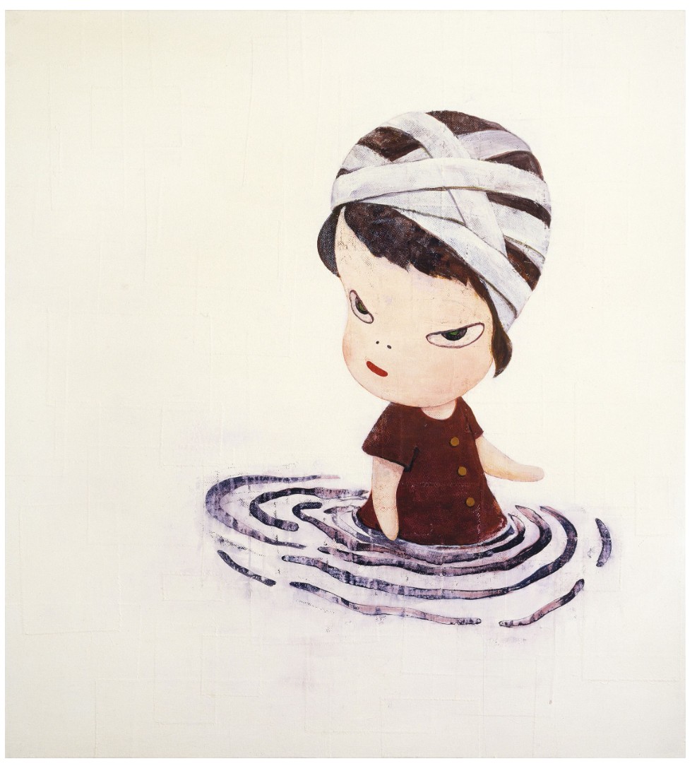
Yoshitomo Nara, In the Deepest Puddle II, 1995. Takahashi Collection, Tokyo. Artwork: © 2025 Yoshitomo Nara.
Born in 1959 in Hirosaki, a traditional castle town in Japan’s rural Aomori Prefecture, Nara was awakened to art through music. He purchased his first single when he was only eight years old, and built his own radio, which allowed him to pick up broadcasts from a nearby US Air Force base. As he grew up, these record covers and foreign sounds—Janis Joplin, The Beatles, The Ramones—allowed him to imagine another world. He was also an avid reader, fascinated by Takeshi Motai’s dreamlike illustrations for the poems and fairytales of Kenji Miyazawa. Nara enrolled at Musashino Art University in Tokyo in 1979, and a few months later embarked on a formative backpacking trip through Europe, where he experienced musical subcultures and saw masterpieces of European art first hand. After graduating from Aichi University of the Arts in 1987, he moved to Düsseldorf to further his studies. It was in Germany—informed by his outsider’s perspective on Western traditions, his training in Japanese Modernism, the Pop-adjacent work of contemporaries such as Murakami and the vigor of German Neo-Expressionism—that his distinctive style took shape.
Roy Lichtenstein, Look Mickey, 1961. National Gallery of Art, Washington, D.C.
Artwork: © Board of Trustees, National Gallery of Art. Digital image: Courtesy of National Gallery of Art, Washington, D.C.
“I think I was looking for a new form of expression through my own history: one that couldn’t be categorized as Japanese, Asian, or Western. When a painting emerged that became a symbol of Nara, I was very excited: This is an original!”
Nara’s 1993 graduation show in Düsseldorf included the seminal painting The Girl with the Knife in Her Hand (1991, San Francisco Museum of Art), which set out the emotive immediacy and playful menace that would come to characterize his famous ‘big-headed girls.’ These figures developed significantly during the Cologne years that followed. As he shed the narrative complication and heavy lines of his earlier work, Nara’s protagonists approached the distilled, enigmatic clarity of the girl in Haze Days, inhabiting spaces whose pastel tones conjured the early Renaissance frescoes he had admired in Italy.
Left: Yoshitomo Nara, The Girl with the Knife in Her Hand, 1991. San Francisco Museum of Modern Art. Collection of Vicki and Kent Logan, fractional and promised gift to the San Francisco Museum of Modern Art. Artwork: © Yoshitomo Nara.
Right: Jean-Michel Basquiat, Self Portrait as a Heel, 1982. Private collection. Artwork: © Estate of Jean-Michel Basquiat. Licensed by Artestar, New York.
Nara sees these characters as a form of self-portraiture, representing aspects of his mood, memories and experience. They emerge to the beat of a constant studio soundtrack that helps to stir his emotions.
‘When I paint, I always think that the canvas is like a mirror, and that I am reflected in it. By tracing myself, I create a picture. It just happens to take the form of a girl, or a dog, or an animal, and almost ninety percent of the time I think I’m drawing a self-portrait, and I’m interacting with it.”
The bandage seen in the present work recurs frequently in Nara’s paintings and drawings of this period, and refers to the compress worn by children with mumps—a common illness during the artist’s childhood. The girl’s frown implies she is in no need of our sympathy.
Utagawa Kuniyoshi, Picture of the Miyato River, 1831-1832. Digital image: Molteni & Motta/UIG / Bridgeman Images.
The figure in a puddle in is another leitmotif, appearing in key works such as In the Deepest Puddle II (1995, Takahashi Collection, Tokyo).
“It’s a state of thinking. Not frozen in thought, but rather thinking about the next action … maybe.”
Unusually, he has identified a direct inspiration for the image in the cover for John Hiatt’s 1975 album Overcoats, which shows the musician partly submerged in a body of water. This record was included in a wall of vinyl LPs from Nara’s vast personal collection that was shown in his recent retrospective. In Haze Days, the pool heightens the painting’s liminal quality: the girl stands poised between one realm and another. She becomes an apt avatar for Nara’s practice as a whole, which merges outlooks drawn from different traditions, and whose forms—irresistibly relatable, and with a universal visual appeal—are ultimately born from a private and complex inner world.
Frog, 1998
Christie’s London: 16 October 2025
Estimated: GBP 300,000 – 500,000
YOSHITOMO NARA (B. 1959), Frog | Christie’s
YOSHITOMO NARA (B. 1959)
Frog, 1998
Acrylic on paper
36×35 cm (14 1/8 x 13 3/4 inches)
Signed in Japanese, titled and dated ‘FROG 98’ (on the reverse)
Equal parts whimsical and uncanny, Frog (1998) is an outstanding example of Yoshitomo Nara’s celebrated and hugely distinctive big-headed girls, the cornerstone of an almost four-decades-long artistic practice. It is a close cousin of major paintings such as Be Happy (1995), as well as many works that featured this year at Nara’s blockbuster retrospective at London’s Hayward Gallery. Frog is a delicately-wrought acrylic painting of a young girl with an oversized head and simple, almost cartoon-like features. Her wide-set green eyes and flat nose bear a mild resemblance to the titular amphibian, while her facial expression suggests malcontent, almost as if she is turning to accuse the viewer. Does this child know something that we do not? An aura of menace hovers in uneasy juxtaposition with her youthful vulnerability. The character exists in an ambiguous field of soft pink.

Frog dates from Nara’s Cologne period. He had moved to Germany in 1988 to study at the prestigious Kunstakademie Düsseldorf under the neo-expressionist painter A. R. Penck, who encouraged Nara to adopt a pared-back style. This advice inspired a process of simplification which led Nara to his signature big-headed characters. These works debuted at the Kunstakademie’s annual student show in 1992 and quickly became a success in Nara’s native Japan. In 1998, his international profile grew with his first US solo exhibition at the Institute of Visual Arts Milwaukee and a role as visiting professor at the University of Los Angeles, where he lived with fellow Japanese artist Takashi Murakami. At the same time his brushwork became more delicate and he began working in a soft, diaphanous palette, leaving behind the cartoonish thick black lines that had characterized his earlier figures.
Katsushika Hokusai, Kingfisher, Irises and Pinks, 1834. Private Collection. Digital Image: The Stapleton Collection / Bridgeman Images.
For all the picture-book clarity of Nara’s aesthetic, it exists in close dialogue with the history of art. Frog is executed in tranquil pastel hues that evoke the tempera favored by early Italian Renaissance artists. Nara has spoken about his interest in these old masters.
“I especially love the translucent colours of Giotto and Piero della Francesca. The surface texture of fresco painting contains a space that I can enter easily.”
It also draws on Japanese culture. The blush-hued empty space around Frog’s main figure is redolent of that found in Edo era ukiyo-e woodblock prints.
Piero del Pollaiolo, Profile Portrait of a Young Woman, circa 1465. Gemäldegalerie – Staatliche Museen zu Berlin. Digital Image: © 2025 Scala, Florence/bpk, Bildagentur fuer Kunst, Kultur und Geschichte, Berlin/ / Jörg P. Anders.
The cuteness of Nara’s protagonists engages with Japan’s contemporary kawaii phenomenon, though the artist imbues his figures with an emotional complexity largely absent in childlike mascots such as Hello Kitty. Nara’s interweaving of innocence and experience can have a potent effect on his viewers. Frog is both a finely-tuned iconic image and a spur to profound contemplation.
Cold Side, 1995
Estimated: GBP 100,000 – 150,000
Cold Side, 1995
Acrylic on paper
Childlike, caricatured and clothed in a simplistic, luminous yellow dress, Yoshitomo Nara’s Cold Side is constructed from his well-established trope of the cartoonish figure as a harbinger of violence. Almost signed in blood red, the title slides towards the figure, hovering ominously and starkly against the white background. These recognizable characters which portentously smirk, and sneer have secured Nara’s reputation, whilst critical reception varies from loneliness to an exposure of humanity’s capacity for violence. As the work’s title suggests, the viewer is given the ‘cold side’ or ‘cold shoulder’ by Nara’s character. The work’s energy is concentrated to its right side, from the turning stance of the figure to the sloping lettering, the arm and gun. It remains ambiguous as to who or what is being targeted, or where the insidious eyes are trained towards. Some comment on Nara’s works as a representation of ‘loneliness and anger but also forgiveness, indicating the simultaneously destructive and restorative power of innocence’. However, Nara remains committed to exposing the violent unpredictability of humanity which bubbles beneath the surface. By harnessing the seemingly innocent female figure, Nara’s composition becomes at once unnerving and universal, where the destructive qualities of humanity are felt in full force.
George Condo
The Banker’s Wife, 2011
Christie’s London: 15 October 2025
Estimated: GBP 800,000 – 1,200,000
GBP 1,331,000 / USD 1,783,540
GEORGE CONDO (B. 1957), The Banker’s Wife | Christie’s
GEORGE CONDO (B. 1957)
The Banker’s Wife, 2011
Oil on linen
74×72 inches (188 x 182.9 cm)
Signed, titled and dated ‘Condo 2011 The Bankers Wife’ (on the overlap)
Dating from one of George Condo’s richest and most exciting periods, The Banker’s Wife is a bold example of his theatrical portraits. Painted in 2011, the year of his landmark solo exhibition Mental States at the New Museum, New York, it has been held in the same private collection ever since. Populated by a motley cast of characters— from sailors and secretaries to businessmen, barbers and butlers—Condo’s portraits depict a society at once familiar and alien. Borrowing the stances, postures and lighting of the Old Masters, his subjects are cut and spliced into strange, disarming caricatures, their features distorted and multiplied.
The Banker’s Wife is an arresting example of this approach, combining subtle chiaroscuro with an outlandish reorganization of body parts and facial features. With nods to Picasso and the Surrealists as well as Rembrandt, Hals and others, it captures the extraordinary hybridized language that defines Condo’s oeuvre.
Condo came of age in 1980s New York, gigging alongside the young Jean-Michel Basquiat, sharing a studio with Keith Haring and working for Andy Warhol’s master printer. He spent ten years in Paris, where he grew close to the writer Allen Ginsberg and nurtured his love of Renaissance and Baroque music. Against the backdrop of these eclectic influences, he undertook intense studies of the artists he loved—from Tiepolo and Caravaggio to Cezanne and de Kooning—copying their works and deliberately tearing them apart in the process. Condo’s admiration for Picasso, in particular, would eventually give rise to an approach he termed ‘psychological Cubism’. It described his attempts to depict multiple emotional states simultaneously, just as Picasso had painted objects from different angles within a single image. Closely related was the notion of ‘artificial realism’: a term coined by Condo to capture his own clashing appropriation of styles, genres and languages. Both concepts became linchpins of a practice at pains to understand image-making from the inside out.
Pablo Picasso, Femme écrivant (Marie-Thérèse), 1934. Private collection. Artwork: © Succession Picasso/DACS, London 2025.
Condo’s portraits represent the sum total of his artistic and intellectual explorations during these years. They evolved from his so-called ‘antipodular’ creatures begun in 1996: strange beings with cartoon features and long flowing hair, based on the figures described in Aldous Huxley’s Heaven and Hell who live ‘at the antipodes of everyday consciousness’. From there Condo began to develop a distinctive line-up of imaginary characters who came to inhabit his practice like actors in a play. Alongside recurring archetypes including ‘Rodrigo’ and ‘Jean-Louis’, he conjures figures drawn from all walks of life: servants, socialites, royalty, reprobates. His subjects are simultaneously courtly and clown-like, archaic and urban, comic and tragic. All are plagued by bouts of mania, ecstasy and anxiety, trapped in an existential crisis between conflicting mental and artistic states.
Untitled, 2009
Sotheby’s London: 17 October 2025
Estimated: GBP 200,000 – 300,000
GBP 254,000 / USD 340,360
Untitled | Contemporary Day Auction | 2025 | Sotheby’s
GEORGE CONDO (b. 1957)
Untitled, 2009
Oil on canvas
48×44 inches (121.9 x 111.8 cm)
At once compelling and disquieting, George Condo’s 2009 painting melds the grotesque, the canonical and the alluring. Against a dark green background, the composition depicts an intimate encounter between a man and a woman, rendered with Condo’s characteristic tension between desire and distortion. The plush red armchair gives the scene both a sense of non-site but also an art-historical specificity, harkening to works by Pablo Picasso, Francis Bacon and many other titans of the art historical canon. Both bodies oscillate between hypersexualized idealism and nightmarish disfigurement; she seems to grab the jagged, square teeth of his mouth with a lobster claw; his skin is ghoulish grey next to hers. The woman’s rounded buttocks, perky breasts and thigh high fishnet tights are a recurrent visual motif in Condo’s works of this period.
The present work is part of Condo’s Lost Civilization series in which a recurring cast of distorted figures – often in a state of undress and engaging in sexual acts – are simultaneously distinctive and referential. Condo has long cited an interest in his Cubist predecessors, layering multiple emotional states and stylistic vocabularies within a single figure: he termed this style ‘Artificial Realism’. Condo’s notion represents a distinctive approach to contemporary painting that blends classical portraiture with surreal, often grotesque distortions of the human figure. Rather than striving for photographic accuracy, Condo creates imaginative, hybrid characters that simultaneously evoke familiarity and alienation. It is this sense of the canonical art historical lexicon that makes his ‘Artificial Realism’ so compelling.
Peter Paul Rubens, Samson and Delilah, 1609-10 / The National Gallery, London
Condo’s work draws on a wide range of influences – from the Italian Renaissance to Cubism and Abstract Expressionism – reconfiguring these traditions through a lens of psychological complexity and humor. Indeed, the range of emotions that Untitled brings to bear shares many similarities to depictions of classical mythology. Peter Paul Ruben’s 1609-10 painting of Sampson and Delilah uses a similar chthonic palette and to depict the tragic embrace of the beautiful, semi-dressed Delilah and the betrayed Samson. In the same way that the story of Sampson and Delilah captures a complex web of human emotion, Condo uses exaggerated facial features reveals the fractured nature of identity in the modern world, capturing the tensions between reality and artifice, between lust and disgust. This inventive synthesis challenges conventional notions of realism, presenting a fractured yet compelling vision of human experience that is both unsettling and deeply human.
Untitled encapsulates the central tensions at the heart of his ‘Artificial Realism’: the grotesque and the beautiful, the historical and the contemporary, the comic and the tragic. Through disfigured bodies and psychologically charged scenes, he dismantles the illusion of stable identity and coherent narrative, offering instead a kaleidoscopic view of human consciousness. Drawing from the deep well of art history while confronting the fractured sensibilities of the present, Condo’s work becomes both homage and critique of both the past and the present.
Duke of Malta, 2009
Sotheby’s London: 17 October 2025
Estimated: GBP 200,000 – 300,000
GBP 406,400 / USD 544,575
Duke of Malta | Contemporary Day Auction | 2025 | Sotheby’s
GEORGE CONDO (b. 1957)
Duke of Malta, 2009
Oil on canvas
27×26 inches (68.6 x 66 cm)
Signed and dated 09 (on the reverse)
Executed in 2009, George Condo’s Duke of Malta exemplifies the artist’s singular ability to conflate art historical traditions and genres with his own dissonant vocabulary of psychological distortion. Throughout his career, Condo has reanimated the genre of Old Master portraiture, engaging with their gravitas while fracturing their authority into a kaleidoscopic vision of human character. Here, the stately presence of an imagined nobleman is at once majestic and absurd, recalling the formal weight of Renaissance portraiture even as it unravels into Condo’s distinctive idiom of invention. In its ceremonial air, Duke of Malta inevitably calls to mind Giovanni Bellini’s iconic Portrait of Doge Leonardo Loredan, a paragon of civic dignity and spiritual majesty. Yet where Bellini sought crystalline serenity, Condo presents a nobleman whose visage splinters into competing registers of elegance and grotesquerie. The noble mask is dismantled and reconstructed, exposing not an eternal ideal but the instability of human identity itself.
Giovanni Bellini, Portrait of Doge Leonardo Loredan, 1501 / National Gallery, London
Condo’s approach is encapsulated in the concept of ‘Artificial Realism’, a term he coined in 1982 to describe “the realistic representation of that which is artificial” (the artist quoted in: Ralph Rugoff, George Condo: Mental States, London, Hayward Gallery, 2011, p. 33). In Duke of Malta, the sitter is not a portrait in the conventional sense but an imagined archetype, a fictional sovereign conjured to embody the contradictions of nobility as both spectacle and illusion.
“What I’m trying to depict is the truth of human nature through artificial means. In order to show what’s real, you sometimes have to show it in the most unreal way possible.”
The work belongs to a pivotal period in Condo’s practice, during which he consolidated decades of experimentation into a seamless dialogue between abstraction and figuration, oscillating between parody and homage. His fictional portraits of the late 2000s achieved a new equilibrium of elegance and disruption, their commanding presence rivaling the authority of their historical forebears while revealing the fragility beneath. “It’s a way of painting people as if you were looking into their mental state, their soul,” Condo has observed (ibid.), a sentiment that reverberates in the fractured gaze of the Duke, teetering between dignity and ridicule.
In Duke of Malta, Condo demonstrates that the portrait remains an arena of profound contemporary relevance. Rather than the static emblem of lineage or power, it becomes a theatre of psychological revelation, where majesty and monstrosity coexist. Drawing on the legacy of Bellini, Velázquez, and Goya, while irreverently undoing it, Condo stages an encounter between the timeless and the contemporary, the ideal and the grotesque. The result is a canvas of extraordinary resonance: at once homage and subversion, a testament to the enduring vitality of portraiture in the twenty-first century.
Abstract Head, 2012
Christie’s London: 16 October 2025
Estimated: GBP 80,000 – 120,000
GBP 146,050 / USD 195,705
GEORGE CONDO (B. 1957), Abstract Head | Christie’s
GEORGE CONDO (B. 1957)
Abstract Head, 2012
Oil pastel on paper
30 x 22 1/2 inches (76.1 x 57 cm)
Signed and dated ‘Condo 2012’ (upper left)
Portrait Composition, 2018
Estimated: GBP 80,000 – 120,000
GBP 103,200 / USD 138,290
Portrait Composition, 2018
Charcoal and wax crayon on paper
Untitled no. 3, 1999
Estimated: GBP 30,000 – 50,000
GBP 61,920 / USD 82,975
Untitled no. 3, 1999
Wax crayon on paper
Damien Hirst
Never Mind, 1990-1991
Christie’s London: 15 October 2025
Estimated: GBP 600,000 – 900,000
GBP 508,000 / USD 680,270
DAMIEN HIRST (B. 1965), Never Mind | Christie’s
DAMIEN HIRST (B. 1965)
Never Mind, 1990-1991
Glass, MDF, ramin, plastic, aluminium, resin and pharmaceutical packaging
54x40x9 inches (137.2 x 101.5 x 23 cm)
With its line-up of boxed and bottled medicaments arranged in neat rows within a glass-fronted cabinet, Damien Hirst’s Never Mind (1990-1991) is among the earliest of the artist’s celebrated Medicine Cabinets. Its title alludes to the 1977 Sex Pistols’ album Never Mind the Bollocks, Here’s the Sex Pistols, ironically juxtaposing a precise, clinical sense of order with the iconic punk band’s rallying cry for chaos. Never Mind belongs to a group of Medicine Cabinets known as the ‘B-sides’, executed after an initial suite of twelve cabinets whose titles each corresponded to one of the album’s tracks: examples from that series include Pretty Vacant, now in the San Francisco Museum of Modern Art, and E.M.I., in Munich’s Museum Brandhorst. A year later Hirst would take this seminal motif to thrilling new heights with Pharmacy, an installation now in the collection of Tate, London.
Following the breakout group show Freeze that Hirst organized along with other Goldsmiths College art students in 1988, Hirst rose to fame in the early 1990s as the enfant terrible of the Young British Artists. His works of this period—including the Spot Paintings and the Natural History vitrines, which featured animals preserved in formaldehyde—have become some of the most iconic in modern art. As with those series, the Medicine Cabinets set out a theme which would endure through Hirst’s entire oeuvre: that of the relationship of art to religion, science, life, and death.
“I’ve always loved the idea of art maybe, you know, curing people. And I have this kind of obsession with the body.”
The Sex Pistols (Johnny Rotten, Sid Vicious, Steve Jones and Paul Cook) during a press conference in London, March 10, 1977.
Unknown photographer. Digital image: Bridgeman Images.
The earliest Medicine Cabinets were filled with pharmaceutical packaging given to Hirst by his grandmother, shortly before she passed away. Hirst sometimes arranged the bottles and boxes of pills and potions according to their purpose, with medications for the head placed on the upper shelf, and those for the remainder of the body arranged in descending order. A poignant memento mori, Hirst’s depleted prescription medications become a record of life, and the ways in which the body is sustained.

Finding a precedent in Andy Warhol’s iconic Brillo boxes and Jeff Koons’s series of ‘new’ consumer products, the Medicine Cabinets combined the Duchampian tradition of the readymade with a postmodern elimination of the line between art and everyday life. Hirst played with the idea of legibility, intrigued at the thought that medical professionals might seek meaning in their arrangement, while others would find their labels—laden with complex chemical compounds—impenetrable. They play, too, with the language of Minimalism, recalling the clean lines of Sol LeWitt or Donald Judd. But the Medicine Cabinets complicated both the modernist grid and Pop’s slick veneer, their carefully-arranged contents a record of something distinctly human.
Gerhard Richter, 180 Farben, 1971. Philadelphia Museum of Art. Artwork and image: © 2025 Gerhard Richter (0106).
Hirst saw the pharmacy as akin to a place of worship, with the sick turning to modern medicine for salvation as they once prayed to the gods. With Never Mind, he erects a pantheon of drugs contained, votive-like, within a vitrine. Simultaneously, he contrasts society’s unfailing faith in medicine against the incredulity and scorn so often expressed towards contemporary art. Juxtaposing different systems of belief, Never Mind binds together threads of religion, medicine, and art.
Phillippe de Champaigne, Vanitas: Still Life with a Tulip, Skull and Hour-Glass, 1646. Musée de Tessé, Le Mans.
Digital Image: G. Dagli Orti /© NPL – DeA Picture Library / Bridgeman Images.
Hirst’s fascination with death, which looms inevitably over life, underlies his entire oeuvre.
“I’d always thought about death since I was seven years old … and every day I think about it, it’s different. It goes from being impossible to the only thing. I remember thinking that, in a way, it’s what gives life beauty.”
Anticipating his later works, from the Natural History series of animals preserved in formaldehyde to the meticulous pill cabinets and the gossamer butterflies which adorn bright, monochrome canvases, Hirst’s early Medicine Cabinets offer a meditation on the fragile line between life and death.
Nalorphine, 1995
Christie’s London: 16 October 2025
Estimated: GBP 150,000 – 200,000
GBP 266,700 / USD 357,380
DAMIEN HIRST (B. 1965), Nalorphine | Christie’s
DAMIEN HIRST (B. 1965)
Nalorphine, 1995
Household gloss on canvas
34 7/8 x 57 1/8 inches (88.5 x 145 cm) (2 inch spot)
Titled ‘NALORPHINE’ (on the stretcher)
Nalorphine is an arresting early example of Damien Hirst’s iconic Pharmaceutical Paintings (1986-2011), popularly known as ‘spot paintings.’ It was executed in 1995, the year Hirst triumphed in the Turner Prize and confirmed his graduation from enfant terrible to leading light of contemporary British art. It belongs to the Controlled Substances, a subset of the almost 1,500 spot paintings, which saw Hirst experiment with arrangements beyond the series’ usual square and rectangular formats, with shaped canvases including triangles and diamonds. Each is titled after a ‘controlled’ drug that cannot be accessed by the non-medical public, and contains the name of the drug spelled out within the painting according to a color code specified by Hirst in his parallel series of so-called ‘Key Paintings’. Nalorphine’s spots, which spell out the title in a diagonal running from the top left to bottom right of the painting, are arranged in a parallelogram. It is one of just three paintings to take this form. The work has been held in the collection of Tiqui Atencio and Ago Demirdjian since 1997: Atencio was a notable early supporter of Hirst and his Young British Artist contemporaries.
“Art is like medicine—it can heal.”
Bridget Riley, Hesitate, 1964. Tate, London. Artwork: © Bridget Riley 2025. All rights reserved. Photo: Tate.
Hirst’s Pharmaceutical Paintings were conceived in 1986, when he was a first-year student at Goldsmiths College, and continued for the next twenty-five years. They were inspired by the artist’s love of snooker—a game whose colored orbs collide and scatter in complex patterns of cause and effect—and his desire to create art that mirrored scientific and medical formulas. Each work in the series is titled after a drug in the 1990 Sigma-Aldrich Catalogue of Chemical Compounds. Nalorphine is an anti-opioid that has been removed from medical use for causing side-effects including anxiety and hallucinations. For an artist later infamous for giddy excesses such as the diamond-encrusted skull For the Love of God (2008) and the gigantic sculpture Demon with Bowl (2017), the spot paintings are works of unstinting, almost monastic discipline. Each spot is hand-painted in household gloss on canvas, and the gaps between the spots are equal in width to the spots themselves.
Frank Stella, Sanbornville III, 1966. Whitney Museum of American Art, New York.
Artwork: © Frank Stella, DACS 2025. Digital image: © 2025 Whitney Museum of American Art / Licensed by Scala.
As in the oeuvre of fellow British painter Bridget Riley, Hirst’s rigorous, repetitive structure creates a hypnotic display, as the spots appear to shimmer and oscillate—in some cases recalling the effects of the drugs they are named after. ‘The steady pulse of the spots’, writes Michael Bracewell, ‘creates a contemplative visual force field. It is as though both the gaze and the painting become magnetized, with the viewer caught up within the tension between their combative currents’ (M. Bracewell, ‘Art Without the Angst—The Pharmaceutical Paintings of Damien Hirst’, in Damien Hirst: The Complete Spot Paintings 1986-2011, exh. cat. Gagosian Gallery, New York 2012, p. 5). Nalorphine’s tilted field of vibrant dots simultaneously provokes bliss and a sense of unease at its machine-like, science-inspired exactitude. It extends Andy Warhol’s idea of art as industrial production while affirming the uncanny precision of the human hand. These contradictions make Nalorphine as conceptually striking as it is hypnotic.
The Tree of Life, 2007
Phillips London: 16 October 2025
Estimated: GBP 400,000 – 600,000
WITHDRAWN
Damien Hirst Modern & Contemporary Art Evening Sale
The Tree of Life, 2007
Butterflies and household gloss on canvas
“I love butterflies because when they are dead, they look alive.”
Hirst’s use of butterflies in The Tree of Life serves as a thoughtful yet disquieting instrument for examining the subject of transformation. This device marks a sophisticated engagement with religious art historical traditions, in line with the artist’s evocation of Gothic cathedral windows. In Christian iconography, the butterfly serves as a symbol of Christ’s second coming, their life cycle – from caterpillar to chrysalis, then butterfly – being perceived to parallel the birth, death and resurrection of Christ. In Albrecht Dürer’s engraving, The Holy Family with the Butterfly, for example, the artist depicts the Virgin Mary, Christ Child and Joseph with a small butterfly in the lower right corner, subtly but potently foreshadowing Christ’s resurrection.
Left: Albrecht Dürer, The Holy Family with the Butterfly, c. 1495-1496, National Gallery of Art, Washington, D.C. Image: National Gallery of Art, Washington, D.C., Rosenwald Collection, 1943.3.3453
Right: 17th-century depiction of the tree of life in Palace of Shaki Khans, Azerbaijan
Hirst escalates the symbolic use of butterflies in The Tree of Life by incorporating actual specimens, rather than mere representations. Beyond theological associations, butterflies are perceived to signify change, while their aerial grace and chromatic brilliance suggest liberation and joy. In Tree of Life, Hirst radically disrupts these connotations. Entombed beneath household gloss, though the butterflies retain their striking coloration, their capacity to purely provide aesthetic delight is forfeited. By preventing the butterflies from decaying, Hirst entirely disrupts the natural order. This effect is amplified by the extreme precision with which the butterflies are arranged, contradicting their uncontainable nature when alive. Through these subversive techniques, Hirst emphasizes the unavoidability of transience in human experience.
“There’s a hole there in people. In everybody. In me. A hole that needs filling, and religion fills it for some people. And art for others. I don’t think religion is the answer, but it helps. I use art in a similar way to fill that hole.”

A potent, pre-Christian motif connecting Norse myth, ancient Mesopotamian, Iranian, and Persian symbology, Hinduism, Chinese mythology, and Judeo-Christian cosmologies, the ‘Tree of Life’ is a fundamental and unifying cultural construct, connecting seemingly disparate cultures and religious practices across time and space. Whether pictured as the source of all knowledge or creation, as a bridge connecting underworld and celestial heavens, or as part of a quest for immortality it remains a powerful and resonant symbol that reminds us of our shared historical roots, and the universal power of myth in expressing and exploring deeper human aspirations and anxieties. The remarkable quality of Hirst’s The Tree of Life lies in its ability to simultaneously showcase an exquisite composition, while drawing deeply from art historical traditions and employing radical techniques, imbuing the work with a profound commentary on the philosophical dimensions of our existence.
Calcium Hydroxide, 2004-2011
Estimated: GBP 400,000 – 600,000
GBP 412,800 / USD 553,150
“I started [the Spot Paintings] as an endless series like a sculptural idea of a painter (myself). A scientific approach to painting in a similar way to the drug companies’ scientific approach to life.”
When trying to focus on the composition as a whole, however, it becomes clear that there is no pattern to the applied colours – there are no ‘chords of color’, as Hirst calls them, the artist crucially withholding any overarching sense of harmony to the composition. Hirst plays with the fact that a work utilizing a bright, multicolored palette evokes an air of joy, juxtaposing this expectation with the more discordant lack of coherence or conformity in the arrangement of color on the canvas. As the viewer steps back from Calcium Hyrdoxide, its spots do not come together to form an impressionistic image – they remain resolutely individual marks. Visually recalling German postwar artist Gerhard Richter’s mathematically generated Farben or ‘color grid’ paintings, which similarly privileged chance and random application in the examination of color as form. In their pixelated abstraction the Spot Paintings draw on both microscopic and cosmic scales, seemingly infinite in their expansion.
Gerhard Richter, 256 Farben, 1974/1984, The San Francisco Museum of Modern Art
Hirst’s Spot Paintings debuted at the legendary 1988 exhibition Freeze, often credited with marking the genesis of the YBA (Young British Artists) generation, within which Hirst was a major player. The exhibition was curated by Hirst himself while attending Goldsmiths College in a warehouse in Surrey Quays, where these first Spot Paintings were made directly onto the venue’s walls. These paintings were inherently more conceptual, sold as an idea with a certificate. In all, there are 13 sub-series of Spot Paintings with Calcium Hydroxide belonging to the coveted Pharmaceutical Paintings series. Hirst’s interest in making works surrounding medicine and pharmaceuticals began in 1987, and his Spot Paintings have developed concurrently with another of his best-known series, his Medicine Cabinets.
“People believe completely in medicine but not in art, without questioning either.”
Calcium Hydroxide itself resembles a blister pill package, full of colored tablets ready to be pushed out and consumed. In Hirst’s metaphor of the microscope, we can also see the dots as cells, or proteins that can be made and re-made into different strands of Spot Paintings DNA. In its meticulous execution, the painting stands as a metaphor for the corporate nature of the pharmaceutical industry, with the spots themselves echoing the standardized logos and product packaging that has infiltrated every aspect of daily life. The grid itself is a symbol of modernity in art – as Rosalind Krauss writes, ‘The grid functions to declare the modernity of modern art […]. It is what art looks like when it had turned its back on nature. In the flatness that results from its coordinates, the grid is the means of crowding out the dimensions of the real and replacing them with the lateral spread of a single surface.’
Drawing on the art historical legacies of Pop and the critical approach to questions of authorship and originality developed by Marcel Duchamp and Andy Warhol alongside the experimental drive of Op-Art and color theory pioneered by the likes of Josef Albers, Bridget Riley, and Gerhard Richter, Calcium Hydroxide is a culmination of and commentary on Hirst’s career-spanning interest in the dialogue between art and science. Visually captivating and conceptually rich, its immaculate and minimalist arrangement epitomizes the ongoing appeal of Hirst’s most definitive series.
Beautiful, enemies, denenomies, tornado, hurricane, mad, fuzzy, fiz painting, 1995
Christie’s London: 16 October 2025
Estimated: GBP 80,000 – 120,000
GBP 114,300 / USD 153,160
DAMIEN HIRST (B. 1965)
Beautiful, enemies, denenomies, tornado, hurricane, mad, fuzzy, fiz painting, 1995
Household gloss on canvas
Diameter: 47 3/4 inches (121.4 cm)
Signed and dated ‘Hirst 1995’ (on the stretcher)
N-t-Boc-I-Alanine, 1995
Christie’s London: 16 October 2025
Estimated: GBP 80,000 – 120,000
GBP 38,100 / USD 51,055
DAMIEN HIRST (B. 1965), N-t-Boc-I-Alanine | Christie’s
DAMIEN HIRST (B. 1965)
N-t-Boc-I-Alanine, 1995
Household gloss on canvas
5 1/8 x 4 1/2 inches (13 x 11.5 cm) (1 inch spot)
Signed twice ‘Damien Hirst D Hirst’ (on the overlap)
Bubonic Plague; Flies; The Martyrdom of Saint James the Greater, 2003
Christie’s London: 16 October 2025
Estimated: GBP 45,000 – 65,000
GBP 24,130 / USD 32,335
DAMIEN HIRST (B. 1965), Bubonic Plague; Flies; The Martyrdom of Saint James the Greater | Christie’s
DAMIEN HIRST (B. 1965)
Bubonic Plague; Flies; The Martyrdom of Saint James the Greater, 2003
Flies and resin on canvas
54 x 39 3/4 inches (137.2 x 101 cm)
Signed and inscribed ‘DHirst James the Great’ (on the reverse)
PB880. Glowing Blossom, 2021
Phillips London: 18 October 2025
Estimated: GBP 35,000 – 45,000
GBP 45,150 / USD 60,500
Damien Hirst Modern & Contemporary Art Day Sale
Takashi Murakami
Blackbeard (White), 2003
Sotheby’s London: 17 October 2025
Estimated: GBP 150,000 – 200,000
GBP 317,500 / USD 425,450
Blackbeard (White) | Contemporary Day Auction | 2025 | Sotheby’s
TAKASHI MURAKAMI (b. 1962)
Blackbeard (White), 2003
Acrylic on canvas mounted on panel
150×150 cm (59×59 inches)
Signed, signed with the artist’s monogram, dated 03 and variously inscribed (on the reverse)
Takashi Murakami’s 2003 painting Blackbeard (White) is an exceptional example of his highly celebrated and iconic Superflat works. Through a brilliantly innovative combination of otaku and manga iconographic lexica, Murakami seamlessly melds a host of wide-ranging art historical traditions from ancient Japanese culture to American Pop of the 1960s. This composition, featuring multiple eyes spinning around each other in colorful hyperactive psychedelic swirls, is one of the most immediately recognizable trademarks of Murakami’s influential oeuvre. In contrasting a monochrome, checkered background with his signature eye motifs – or ‘Jellyfish Eyes’ he draws on imagery of the worlds of Yokai, traditional Japanese monsters, as well as from manga comic graphics, animation and computer games.
“We want to see the newest things. That is because we want to see the future, even if only momentarily. It is the moment in which, even if we don’t completely understand what we have glimpsed, we are nonetheless touched by it. This is what we have come to call art.”
The artist’s fascination with the eye lies in its unique ability to visually communicate whereby one simultaneously sees and is seen. In Blackbeard (White), Murakami’s multiplied ‘Jellyfish Eye’ motifs immediately return our gaze. This double role has fascinated artists for centuries and continues a millennia-old artistic tradition that explores the direct visual connection between the viewer and the viewed. From Velazquez’ Portrait of Pope Innocent X to Duchamp’s Rotoreliefs and Magritte’s The False Mirror, artists have repeatedly employed the iconography of the eye as the implicit portal to hidden truths.
“The image of the eye arouses the sensation of being watched. This sensation often involves a feeling of uneasiness, or even obsessional fear. This is why the Surrealists used the motif of the eye so much in their works…I discovered that the presence of eyes as a motif incites spectators to interact with the work.. Thus I was able to combine two important elements of pictorial language – “design” and “dialogue” – in my work…I place this eye motif in places where I want the spectators’ gaze to pass and, eventually, stop.”
Blackbeard (White) can be considered the ultimate manifestation of Murakami’s Superflat philosophy, which draws on the flat picture planes of traditional Japanese painting from the Edo period as well as the visual forms of modern-day animated films and contemporary culture. By combining these visual traditions and correlating their shared emphasis on flatness, Murakami dismantles the distinction between high and low culture.
Rene Magritte, The False Mirror (Le Faux Miroir), 1928
Image: © Digital image, The Museum of Modern Art, New York/Scala, Florence
Artwork: © ADAGP, Paris and DACS, London 2025
While resolutely opposed to his art being interpreted as derivative from American Pop Art, Murakami’s paintings show undeniable echoes of Pop Art. Forty years prior to the execution of this painting, Pop artists like Andy Warhol and Roy Lichtenstein revolutionized western artistic practices by adopting commercial imagery from mass media, newspaper advertisements and comic strips as the subjects of their paintings. In the present work, Murakami similarly draws on otaku culture, the emergent celebration of ‘geek’ culture that stems from animated movies (anime), science fiction and manga, and embodies a certain kawaii (cuteness) quality that is derived from the world of Walt Disney and of cartoon characters developed in the United States in the early 1950s, as well as Japanese variations such as Hello Kitty and Pokemon. With its vibrant colours, immaculately flat surface, and interplay of historical and contemporary references, Blackbeard (White) inevitably encapsulates Murakami’s distinctive fusion of tradition and popular culture. At once playful and historical, the present work reflects Murakami’s unique and sophisticated engagement with both historical sources and global popular culture.
KAWS
CHUM (KCA4), 2012
Estimated: GBP 300,000 – 500,000
WITHDRAWN
Acrylic on canvas laid down on panel
Bullishly sprinting towards the viewer, CHUM (KCA4) conveys strength and speed in a monochrome world, with pumping arms and a foreshortened fist, foot and knee threatening to break into the viewer’s reality. It is an image hinging on ubiquity, recognizable by its skeletal, clown-like appearance, its Mickey Mouse stylization, its bulky Michelin man identity. However, channeling its energy out towards the viewer in a straight, unflinching line, this character is at once recognizable and personal.
“I was looking at graffiti when I was younger and the impact it has on me is still strong…
People don’t realize that it is a world to collect from and gather information from.”

Earning a degree in illustration from the School of Visual Arts in New York, KAWS worked across animation and graffiti, and the trading of ‘black books’ enabled him to pass on his designs through copying and image reproduction, as they gained further transmutability. This sense of artistic transmission came to define his oeuvre, and CHUM is an example of constant reuse. Its adaptability enables it to be reproduced across media, across surface, in different sizes and color combinations. The collapsing of these boundaries is a recognized aspect of KAWS’s practice: ‘permutability makes it possible to pass from high to low, from elite to popular…from series to playful, from single to multiple’. Despite the visibility of graffiti, KAWS remains a very private artist – he is not recognized by his name, Brian Donnelly. Ironically in 2025, Esquire published an article entitled ‘Who Doesn’t Know KAWS?’, yet in reality, KAWS becomes defined by a brand or image, in this case CHUM, rather than a personal, individual, unique self.

Mickey Mouse in Steamboat Willie, 1928
Not only derivative of themes from popular culture, KAWS also chooses names for his works which are associated with friendship – CHUM, COMPANION, ACCOMPLICE. However, the irony continues upon viewing such a threatening image with its undercurrent of charging violence. Whilst it appreciates mass production in the modern world, CHUM also utilizes trompe l’oeil through its foreshortening, combining modernity with artistic tradition. A key trope across KAWS’s artistic trajectory are the crossed-out eyes: ‘his X-eyed gang of creations’. Perhaps this is a comment on the image’s pervasive visibility in society today, or the clone-like individuals that make up humanity in KAWS’s eyes. Sprinting towards the viewer, carving out its passage with unwavering intent, the blindness contributes to the image’s unnerving forcefulness – the figure has no awareness of its surroundings, its movement is uncertain, and its path is not guaranteed.
“When I do stuff in a gallery, I don’t consider myself a contemporary artist. Hopefully people are at the point where they can let go of these sorts of labels.”
The great paradigm of CHUM is that it is at once recognizable yet personal. It is a comment on the transmutability of imagery, the speed at which art can be mass produced, reproduced and consumed by an eager public. It is an image that the viewer seems to be aware of, one they can relate to popular culture. However, they remain the personal, targeted opposition. Energy is directed outwards, and the viewer can only stand before KAWS’s figure and await its next moves.
UNTITLED (MBFV5), 2016
Sotheby’s London: 17 October 2025
Estimated: GBP 150,000 – 200,000
UNTITLED (MBFV5) | Contemporary Day Auction | 2025 | Sotheby’s
KAWS (b. 1974)
UNTITLED (MBFV5), 2016
Acrylic on shaped canvas mounted on panel
60 3/8 x 36 1/4 inches (153.5 x 92 cm)
Signed and dated 16 (on the reverse)
Executed during a pivotal period in KAWS’ career, Untitled (MBFV5) is a striking example of the artist’s iconic visual language. An almost intoxicating palimpsest of popular iconography, the present work exemplifies KAWS’ ongoing exploration into the boundaries between high and low culture, authorship and appropriation and the emotional resonances of the familiar reimagined. The artist’s signature motifs converge in the present work, depicted in an electric palette that heightens both the visual intensity and subversive nature of the composition. The shaped canvas itself, constituted by the overlapping silhouettes of popular cartoon figures, embodies the artist’s enduring interest in formal and conceptual layering, a notion that has come to define KAWS’ uniquely subversive position in the history of contemporary art.
“The familiar is just a starting point. Even though the images are widely known, they are somehow personal to me. The emotion in the work is just something that comes out as I develop the works I want to make. I try to make honest work that reflects what I’m thinking at the time I’m producing it.”
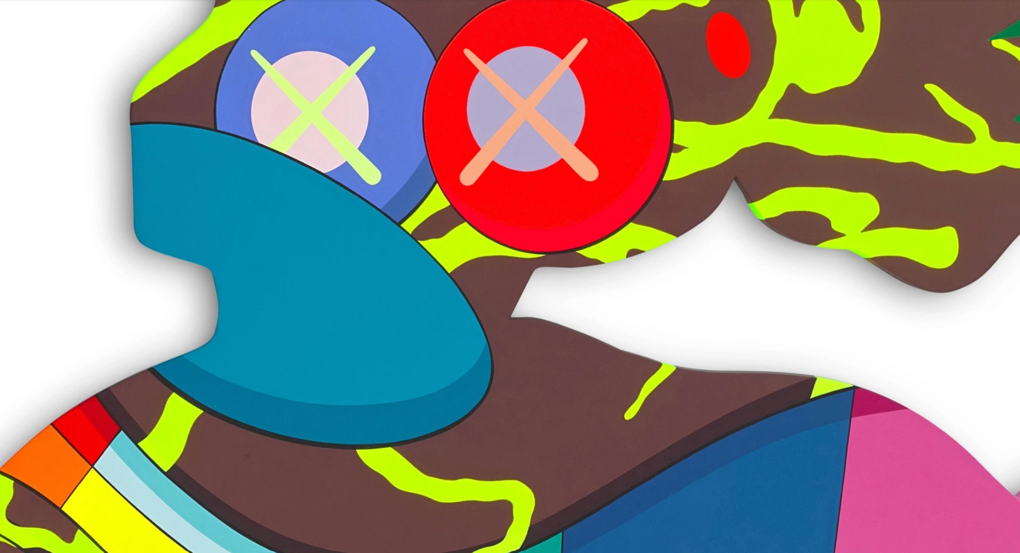
Although simultaneously recalling the emotive dynamism of Abstract Expressionism, the hard-edged precision of Minimalism and the Pop infatuation with mass-media imagery, KAWS remains resolutely idiosyncratic in his visual mode. In approaching the inherent abstraction of cartoons and their visual tropes, KAWS challenges pre-established notions of semiotics. Here, re-envisioning beloved cartoon figures such as Snoopy from Charles M. Schulz’s Peanuts and synthesizing them with his signature X-eye motif and dynamic manipulation of form, KAWS transforms nostalgia into a site of poignant, existential ambiguity. Through deconstructing these widely recognized symbols, he renders the once-comforting and legible strangely elusive, inviting the viewer to reconsider the ways through which meaning is both constructed and perceived. Amplified by its towering scale, Untitled (MBFV5) is an exuberant demonstration of the formal dynamism that has come to position KAWS as one of the most influential and disruptive artists of our cultural zeitgeist.
Peter Doig
Country Rock, 1998-1999
Christie’s London: 15 October 2025
Estimated: GBP 7,000,000 – 10,000,000
PETER DOIG (B. 1959), Country Rock | Christie’s
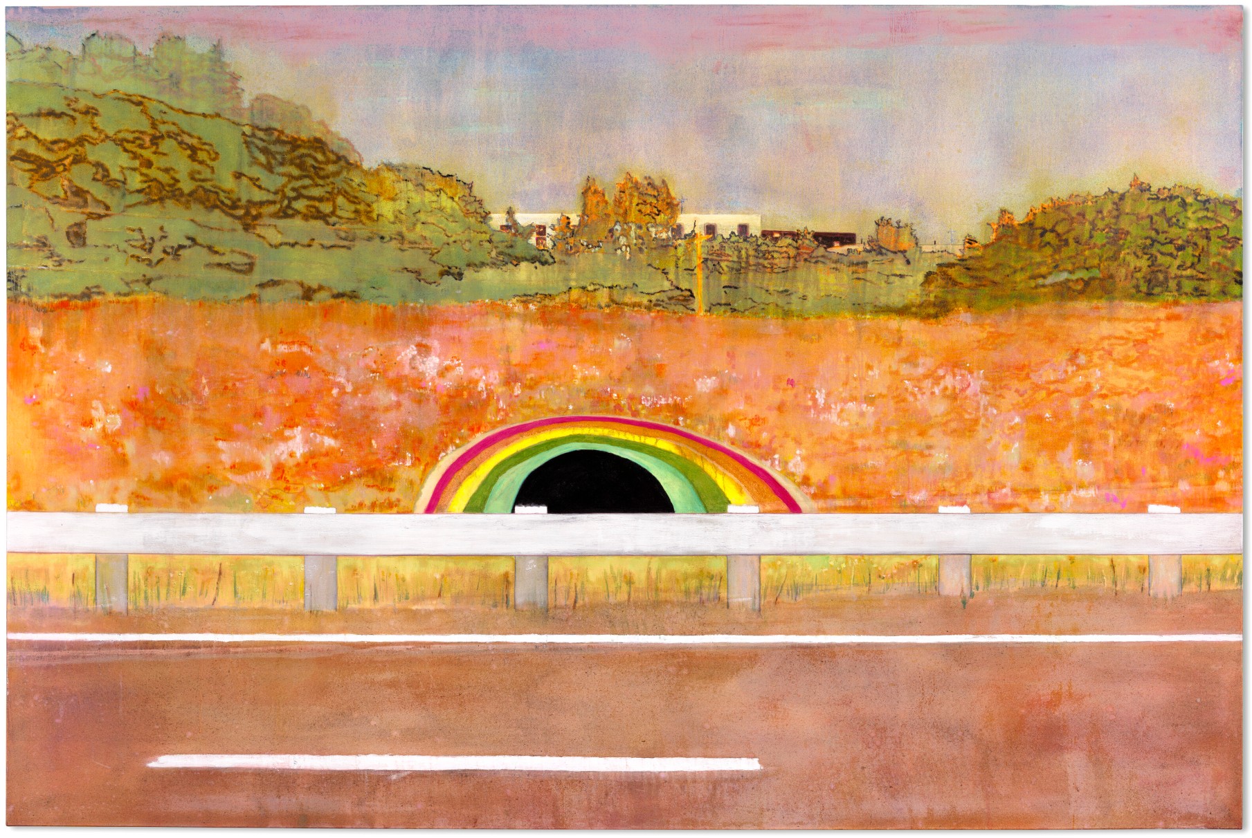
PETER DOIG (B. 1959)
Country Rock, 1998-1999
Oil on canvas
200 x 300cm (78 3/4 x 118 1/8 inches)
Signed twice, titled and dated ‘Peter Doig. “country-rock” ’98-’99 PETER DOIG’ (on the overlap)
Country Rock (1998-1999) is a sumptuous, dreamlike painting that stands among Peter Doig’s most iconic works. Three meters across and two meters high, it is the largest of three monumental canvases he made on the subject of a roadside rainbow—in fact the painted mouth of a tunnel in Toronto, Canada—during the late 1990s. The rainbow gazes like an eye over the white line of a traffic barrier. It is set in a bank of rosy undergrowth that simmers and glows, rising to a horizon of dark, spectral green trees beneath a lavender sky. The painting comes alive in a rich diversity of tones and textures, charged with the elusive sense of place, memory and reverie that defines Doig’s practice. Acquired by Ole Faarup the year it was made, Country Rock has been included in a plethora of major solo exhibitions since, appearing in Glarus, Dublin, Maastricht, Nîmes, Paris, Frankfurt and London, where—in 2008—it starred as the catalogue cover for Doig’s acclaimed mid-career retrospective at Tate Britain. The painting was most recently seen in 2015 as part of his large-scale survey at the Louisiana Museum of Modern Art, Humlebæk.
The enigmatic, dislocated quality of Doig’s work has its roots in a life lived on the move. Born in Scotland in 1959, he spent some of his childhood in Trinidad before moving to Canada. Aged twenty he came to London to study art at Wimbledon and then Saint Martin’s, returning at thirty—after another stint in Canada—to complete his MA at the Chelsea School of Art. The 1990s were marked by a swift rise to fame, including a breakout show at the Whitechapel Gallery (1991), his receipt of the John Moores Painting Prize (1993) and a Turner Prize nomination (1994). Living in London during these years, he embarked on something of a ‘Canadian period’ as he sought to come to terms with the country’s formative role in his youth. Distance is important in Doig’s work: he once tried to paint a landscape en plein air in Canada and found it impossible. His paintings instead take shape through second-hand images—found photographs, or his own—that fuel his imagination.
“I am trying to create something that is questionable, something that is difficult, if not impossible, to put into words.”
The rainbow, which can be seen to the east of the Don Valley Parkway, is a beloved Toronto landmark. Doig was drawn to its bittersweet aura. ‘A lot of the paintings portray a sense of optimism that can often be read as being a little desperate,’ he has said, ‘like the image of a rainbow painted around the entrance to an underpass’ (P. Doig quoted in ‘Peter Doig: Twenty Questions (extract)’, in A. Searle et al. (eds.), Peter Doig, London 2007, p. 139). A local teenager, Berg Johnson, painted the mural in 1972 in memory of a friend who had lost her life in a road accident. He maintained his artwork for two decades in a back-and-forth with local authorities, who continually painted it over in grey, until he was ordered to desist. Officially restored in 2012, it still brightens the journeys of commuters today, who call the road the ‘Don Valley Parking Lot’ for its tedious traffic. Doig took his own drive-by photos of the site, refining Country Rock’s composition across multiple watercolors, oil sketches and etching and aquatint editions.
Detail of the present lot reproduced on the poster for Peter Doig at Tate Britain, 2008. Digital image: © Tate. Photo: Jochen Littkemann.
Invoking this motif under the evocative title of ‘country rock’—the type of music one might hear on one’s car radio in Canada—Doig draws upon personal memories of a particular place. Without knowledge of these specifics, however, the painting still casts its spell.
“My experience is just the spark’, he has explained, ‘… which makes me think about things that are a part of other people’s experience.”
The road, a zone of transit from one place to another, has a liminal quality in common with the rainbow. Both propose routes to elsewhere. For Adrian Searle, this territory was more psychedelic than country rock. ‘Road-markings are already a kind of abstraction, and so is the entrance to the subway. It is a black hole … a break in reality, like Alice’s rabbit hole. I can almost hear Jefferson Airplane’s “White Rabbit” wafting over from that building’ (A. Searle, ‘Wide blue yonder’, The Guardian, 16 April 2002).
Barnett Newman, Horizon Light, 1949. Sheldon Memorial Art Gallery and Sculpture Garden, University of Nebraska.
Artwork: © 2025 The Barnett Newman Foundation, New York / DACS, London.
The picture’s enchanted, in-between atmosphere is heightened by Doig’s contrasting painterly techniques. The road-markings and traffic barrier are stark horizontals, their white pigment cutting through the shimmering, diaphanous treatment of foliage and sky. The tunnel itself is an opaque black. Such tensions between manmade structure and organic form animate much of Doig’s work: his ‘Concrete Cabins’ series, begun in the early 1990s, played Le Corbusier’s geometric Modernist architecture at Briey-en-Forêt against the unruly growth of the encroaching woodland. Doig expresses an awe at nature that is Romantic at heart—Country Rock’s golden telegraph pole even evokes Caspar David Friedrich, who placed reverential crucifixes in his landscapes—and tempered by the melancholy of a world where rainbows are painted on concrete.
Peter Doig, The House that Jacques Built, 1991. Tel Aviv Museum of Art, Tel Aviv. Artwork: © Peter Doig, DACS 2025.
Art-historical echoes abound in Country Rock. One image Doig had in mind was Edward Hopper’s 1946 painting Approaching a City, whose dark railway tunnel—another peripheral place—is a void of urban anonymity. His palette conjures the saturated colours of German Expressionism and Edvard Munch. The bold tripartite composition, meanwhile, relates to the abstract ‘zip’ paintings of Barnett Newman. In his early painting The House that Jacques Built (1991, Tel Aviv Museum of Art), Doig had drawn consciously upon Newman’s ‘zip’ effect in order to create three strips of contrasting visual texture, enacting an interplay between nature and human presence. He would employ similar three-way divisions in major works such as Daytime Astronomy (1998-1999), Echo Lake (1998, Tate, London), Country Rock and, later, 100 Years Ago (2000). Andreas Gursky’s iconic photograph Rhein II (1999), which depicts the Rhine River in Newman-like bands of grey and green, presents a comparable view of the post-industrial sublime.
Edward Hopper, Approaching a City, 1946. The Phillips Collection, Washington, D.C.
Artwork: © Edward Hopper, DACS 2025. Digital image: © 2025 Album/Scala, Florence.
Where his paintings of the early 1990s had involved dense build-ups of pigment, often creating ‘screens’ of depicted snow or foliage, towards the decade’s end Doig began a transition to more open and translucent surfaces.
“I always try to escape my mannerisms… I am always trying to find a way of making something less complicated, more fluent, more fluid.”
This shift is visible in Country Rock, whose lush chromatic veils attain a watercolor-like delicacy. The rainbow runs with a spectrum of fine drips, and soft white splashes bloom on the tarmac. The scrubland sparkles with luminous, blushing hues below the velvet-dark trees, which appear ghostly—almost as if in photographic negative—against the lilac-washed sky. The scene wavers before our eyes like a mirage on the verge of dissolution.
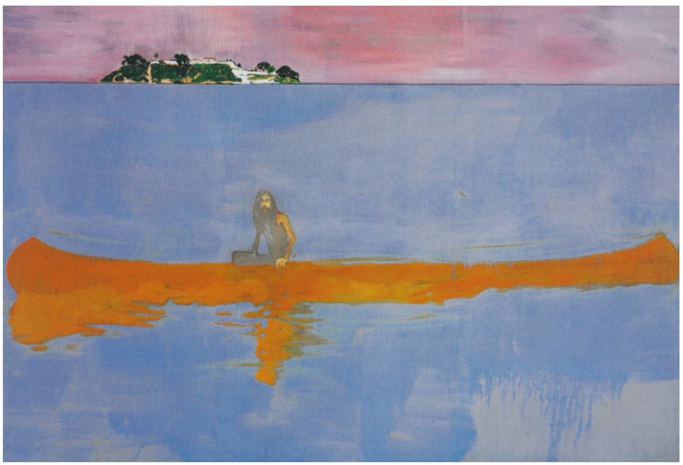
Peter Doig, 100 Years Ago, 2000. The Museum of Contemporary Art, Los Angeles. Artwork: © Peter Doig, DACS 2025.
It is this ambiguity—reveling at once in the splendid, mutable actuality of paint and the illusory nature of the image created—that lends Doig’s works their unique magic and mystery. His painting of a painted rainbow points to the mediated nature of postmodern experience, but it also suggests a hopeful entry into another realm, somewhere beyond the surface of the picture. ‘Like ghost stories,’ wrote Peter Campbell of the works in Doig’s 2008 Tate exhibition, ‘they draw on the potency of matters unresolved; it hangs about them like an unearthed static charge’ (P. Campbell, ‘Peter Doig’, The London Review of Books, vol. 30, no. 5, 6 March 2008). Flickering between past, present, fact, fantasy and personal and collective memory, Country Rock is a wistful vision of painting as possibility: as a way of looking at the world we live in, and a place of imaginative escape.
Ski Jacket, 1994
Christie’s London: 15 October 2025
Estimated: GBP 6,000,000 – 8,000,000
PETER DOIG (B. 1959), Ski Jacket | Christie’s
PETER DOIG (B. 1959)
Ski Jacket, 1994
Oil on canvas
182.5 x 213 cm (71 7/8 x 83 7/8 inches)
Signed twice, inscribed and dated ‘PETER DOIG 1994 London Peter Doig’ (on the reverse)
A luminous vision of memory, place and the shifting splendor of paint, Ski Jacket is a majestic work from a pivotal moment in Peter Doig’s career. It was made in 1994, the year of Doig’s Turner Prize nomination: its sister painting, also titled Ski Jacket, was included in the prize exhibition and acquired by the Tate, London in 1995. More than two meters across, the work depicts a ski slope flushed in glowing, auroral hues of pink, gold and blue. Tiny skiers are peppered among conifers and chalet buildings, bringing together the cabins and trees that are among Doig’s most iconic motifs. Snow veils the scene in a dazzling diversity of texture: paint becomes a mist of white powder, a spray of droplets, a glaze of frost, or impasto dots that wink like sequins. This richly layered snowscape dramatizes the hazy sensations of remembering, and—through skiing—the slippery, thrilling pursuit of painting itself. Acquired by Ole Faarup soon after its completion, Ski Jacket has been unseen in public since 2012, when it was shown at Kunsten Museum of Modern Art Aalborg.
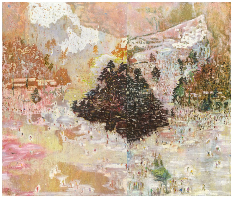
Peter Doig, Ski Jacket, 1994. Tate, London. Artwork: © Peter Doig. All Rights Reserved, DACS 2025. Digital image: © Tate.
Doig’s Turner Prize nomination followed several years of mounting critical acclaim. After graduating from the Chelsea School of Art in 1990, he had been honored with a major solo exhibition at the Whitechapel Gallery, London in 1991, and in 1993 he won the John Moores Painting Prize for Blotter (1993, Walker Art Gallery, Liverpool). The period saw him paint some of his most beguiling canvases. In wintry, enigmatic works such as Blotter, Charley’s Space (1991) and Pond Life (1993), as well as the present painting, he used screens of snow to partially veil his images, visualizing the fugitive qualities of memory. Many dealt with themes or motifs drawn from Doig’s time in Canada, where he had spent much of his youth. They were sparked by photographs, placing his experience at a further remove. While winter sports had personal significance for Doig—he remains a keen ice-hockey player—Ski Jacket began with a typically indirect source: it is based on a photograph of a Japanese ski slope that his father found in a Toronto newspaper.
The photograph, Doig said, reminded him of ‘Japanese landscape painting, the scroll-like form, with all activities coming down’ (P. Doig quoted in M. Matsui, ‘I Am Never Bored with Painting: Peter Doig, Interview’, Bijutsu Techo, vol. 72, no. 1082, June 2020, p. 186). Like the figures in those paintings, Ski Jacket’s tiny skiers beckon the viewer into the landscape as they dart, glide and crowd among the sprawling trees and snowbound cabins. While Doig had long been interested in tensions between human presence and natural phenomena, he had at this stage made relatively few works that featured people. The dozens depicted here—some of them fully legible, others little more than distant flicks of color—introduce a previously unseen sense of scale and activity. The psychedelic palette heightens the drama, with blooming mauve and lilac contrasting with cooler blues and pools of golden light.
Claude Monet, Haystacks (Effect of Snow and Sun), 1891. Metropolitan Museum of Art, New York.
Digital image: © 2025 The Metropolitan Museum of Art/Art Resource/Scala, Florence
“When I was making the “snow” paintings’, I was looking a lot at Monet, where there is this incredibly extreme, apparently exaggerated use of color. the way that you perceive things when you are in the mountains—for example, when you are feeling warm in an otherwise cold environment, and how the light is often extreme and accentuated by wearing different colored goggles … There used to be these rose-tinted goggles that made everything look as pink as cotton candy.”
Doig’s ‘rose-tinted goggles’ evoke both an actual visual experience and the transformative lens of retrospection. While snow was a distinctive element of Doig’s Canadian imaginary, it was also a device with which to picture the white-outs, interruptions and accretions inherent to the act of remembering. He has spoken admiringly of Pieter Bruegel the Elder’s The Adoration of the Magi in the Snow (1563), where ‘the snow is almost all the same size, it’s not perspectival, it’s this notion of the “idea” of snow, which I like. It becomes like a screen, making you look through it’ (P. Doig quoted in L. Edelstein, ‘Peter Doig: Losing Oneself in the Looking’, in Flash Art, Vol. 31, May-June 1998, p. 86). An artist fascinated by moving images, Doig also saw parallels between Bruegel’s work and the ‘snow’ that can beset television screens with poor signal. Gerhard Richter’s squeegeed abstracts and blurred photo-paintings present similar disturbances. Ski Jacket, derived from a found photograph of a distant country, overlays myriad forms of interference and mediation.

Joan Mitchell, Grandes Carrières, 1961-1962. Museum of Modern Art, New York.
Artwork: © Estate of Joan Mitchell. Digital image: © 2025 The Museum of Modern Art, New York/Scala, Florence.
Doig emerged in London at a time when painting was out of fashion. Many of his contemporaries, who became known as the Young British Artists, were engaged with conceptualism, privileging the use of sculpture, installation and found objects. In Ski Jacket, the skiers captured something of his resolve to be a painter. The people in the picture, he noticed, were all beginners, trying to stay on their feet.
“When you start skiing you slip all over the place, yet over a period of time you learn to cope … I think painting is a bit like that. It takes time to actually take control of the greasy stuff, paint.”
Like a skier, Doig’s own technical brilliance emerges against the intrinsic instability of his medium. Ski Jacket shimmers between abstract and figurative registers, alive with endless change. Variously embodying human figures, impacted ice, fresh powder or blizzard, the pigment also lays bare its material presence as paint on a flat plane.
Pieter Bruegel the Elder, The Adoration of the Magi in the Snow, 1563. Sammlung Oskar Reinhart Am Römerholz, Winterthur.
This alchemy is at the heart of why Doig paints. Like snow and like memory, oil paint transforms, changes state; it can be opaque, misty, frozen in place or fluid and melting. In later years the artist would privilege more spare compositions, concerned with not making a mannerism of the ‘screen’ effects that had defined his seminal works. In Ski Jacket, however, an unburdened exuberance is on full display. The painting is bejeweled with color and texture, ornate with metaphorical and physical layers. If memories always lie just beyond reach, painting, in Doig’s hands, creates a new reality to hold on to. As he drifts among the places and images of his past, he becomes the orchestrator of another world.
Gerhard Richter
Tulpen (Tulips), 1995
Christie’s London: 15 October 2025
Estimated: GBP 3,000,000 – 5,000,000
GBP 6,150,000 / USD 8,241,000
GERHARD RICHTER (B. 1932), Tulpen (Tulips) | Christie’s
GERHARD RICHTER (B. 1932)
Tulpen (Tulips), 1995
Oil on canvas
36×41 cm (14 1/8 x 16 1/8 inches)
Signed, numbered and dated ‘825-1 Richter 1995’ (on the reverse)
Acquired directly from the artist the year it was painted, Tulpen (Tulips) (1995) is a rare and beautiful floral still life by Gerhard Richter. It belongs to a series of photo-paintings of flowers Richter made during the 1990s, four of which are held in major museum collections, and was itself recently on long-term loan to the Belvedere in Vienna. The work depicts a vase of yellow tulips, based on a photograph taken by Richter and softly blurred in his characteristic style. It is both luminous and poignant, calling up the ghosts of art history in a meditation on our relationship with painting, photographs and the passage of time.
Gerhard Richter, Blumen (Flowers), 1993. The Art Institute of Chicago. © Gerhard Richter 2025 (0103).
Tulpen has been exhibited widely since its creation, appearing in Gerhard Richter. 100 Pictures at the Carré d’Art, musée d’art contemporain de Nîmes (1996); Richter’s major German retrospective that travelled from Düsseldorf to Munich (2005); a survey of contemporary German painting at the Museu de Arte Moderno de São Paulo (2010-2011); two exhibitions at the Hamburger Kunsthalle (2011, 2012-2013); and the Belvedere’s celebration of flower painting Say it with Flowers! Viennese Flower Painting from Waldmüller to Klimt (2018).
“If the Abstract Pictures show my reality,
then the landscapes and still-lifes show my yearning.”
Gerhard Richter with Tulips, 1995 (CR 825-2). © Gerhard Richter 2025 (07092025), courtesy Gerhard Richter Archiv Dresden.
Richter has been investigating the truth-claims of painting and photography since the 1960s. For him they are equally unreliable as ways of comprehending reality: both no more than arrangements of color which, examined closely, dissolve into abstraction. He has probed these ideas in varied and complex ways across the decades. His first photo-paintings drew upon newsprint and historical sources, examining post-war Germany’s image of itself. His earliest ‘abstract’ works of the 1970s were in fact photo-paintings of close-up brushstrokes: they appear abstract but are representations of things. His squeegeed Abstrakte Bilder, begun the following decade, engaged with chance, attempting to liberate the painting from any predetermined form. Throughout his career he has continued to pursue photo-paintings in parallel to his abstract works. Their blurred uncertainty brings the figurative image into question, highlighting its inherently illusory nature.
Gerhard Richter, Blumen (Flowers), 1994. Neues Museum, Staatliches Museum für Kunst und Design, Nuremberg.
On permanent loan from the Böckmann Collection. © Gerhard Richter 2025 (0103).
Richter’s photo-paintings encompass an almost endless diversity of source imagery, from press clippings to family snapshots and drive-by photographs of landscapes. Tulpen belongs to a subset that consciously echo art-historical motifs. These include his beloved Lesende (Reader) (1994)—a depiction of his wife, Sabine, which recalls the reading women painted by Johannes Vermeer—and his Schädel (Skulls) and Kerzen (Candles) of the 1980s, which conjure the vanitas still-lifes of the Dutch Golden Age.
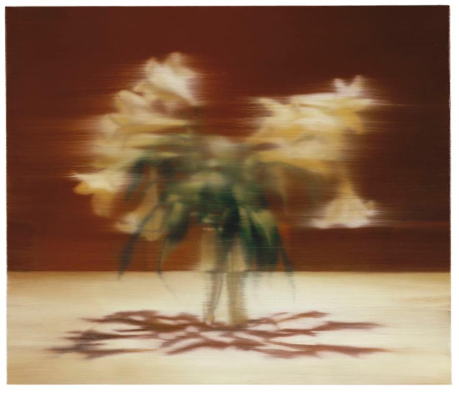
Gerhard Richter, Lilien (Lilies), 1995. National Gallery of Canada, Ottawa. © Gerhard Richter 2025 (0103).
His floral paintings evoke the same genre, wherein flowers—beautiful, but inevitably fading—are used as symbols for the transience of life itself. Richter’s blurring technique heightens this elegiac quality. Tulpen’s photographic sheen dissolves in a sweep of streaked brushstrokes, and the picture slips out of our grasp. No longer simply a metaphor for earthly vanity, these flowers seem to represent the death of painting’s innocence.
Tulips are a historically loaded subject. Cultivated in Persia for over a thousand years, they were introduced to the Netherlands from the Ottoman Empire in the late sixteenth century. They were greatly admired for their beauty, and their trade mounted to a frenzy known as ‘tulip mania’ or tulpenmanie during the 1630s, peaking before an abrupt market crash in 1637. Wealthy buyers fought for the rarest varieties, sometimes paying gargantuan sums for a single bulb—all in pursuit of a flower that bloomed for around a week during springtime. The tulip’s symbolic presence in the vanitas still life has become all the more potent in retrospect. Richter places these echoes at the service of a conceptual commentary on painting itself. Spotlit by the flash of the camera, the yellow petals shine briefly against the background’s darkness.
Andy Warhol, Flowers, 1964. The Broad, Los Angeles.
Artwork: © 2025 The Andy Warhol Foundation for the Visual Arts, Inc. / Licensed by DACS, London.
Tulpen also speaks to more personal preoccupations. The mid-1990s saw rising international acclaim for Richter: a major European retrospective toured Europe across 1993 and 1994, and his fifteen-canvas cycle October 18, 1977 (1988) was acquired by the Museum of Modern Art, New York in 1995. His abstract output was prolific, becoming increasingly exuberant in color and complexity. During the same year Richter married Sabine Moritz, whom he had met in 1994. He painted S. mit Kind (S. with Child) (1995), a group of eight pictures now held in the Hamburger Kunsthalle, Hamburg, which show her holding their newborn son. Drawn from his own photographs of the family’s innermost private life, these are among the most intimate images of Richter’s oeuvre. Tulpen complements their reflection on the preciousness of life and love.
Odilon Redon, Bouquet of Flowers, circa 1900-1905.
The Metropolitan Museum of Art, New York. Digital Image: Image Courtesy The Metropolitan Museum of Art, New York.
Richter painted two versions of Tulpen in 1995, both derived from the same photograph: the present work features a more pronounced blur than its counterpart. This practice of doubling was especially common in Richter’s mid-1990s photo-paintings. He also painted two versions of Lesende, another pair of flower still-lifes in 1994, and two self-portraits in 1996. Such pendant pictures add another twist in the hall-of-mirrors journey from reality to photograph to painting. In this sense the present work recalls the screenprinted Pop flowers of Andy Warhol, whose source photograph was cropped, manipulated, flattened and multiplied into a masterful thesis on the life of the image in the mechanical age. Tulpen addresses these same issues, but also carries the glow of personal feeling. While he is an artist disillusioned by appearances—an unreliable connecting structure between ourselves and the world—Richter continues to find meaning, solace and even romance in his art.
Grau (Grey), 1974
Christie’s London: 15 October 2025
Estimated: GBP 600,000 – 800,000
PASSED
GERHARD RICHTER (B. 1932), Grau (Grey) | Christie’s
GERHARD RICHTER (B. 1932)
Grau (Grey), 1974
Oil on canvas
250 x 195.5 cm (98 3/8 x 77 inches)
Signed, numbered and dated ‘Richter 1974 363⁄4’ (on the reverse)
Painted in 1974, Grau (Grey) is a monumental work from Gerhard Richter’s important series of Grey Paintings. Towering two and a half meters in height, its monochrome surface shifts and shimmers before the viewer, modulated by subtle variations of texture. Begun during the late 1960s, and pursued until 1976, Richter’s Grey Paintings occupied pivotal territory in the transition from his greyscale photorealist paintings to his first gestural abstracts. Together with his Color Charts and Red-Blue-Yellow series, they represent the artist’s attempt to distil visual representation to its most essential components. Richter believed that all painting, whether figurative or abstract, was a lie posing as the truth. By stripping the picture plane of content, he sought to expose this fact: the present work’s grey expanse refers to nothing but itself, yet its surface—like a smoke screen—seems to suggest subtle illusory depths. The work was part of the landmark group of thirty-one Grey Paintings shown at the Städtisches Museum, Mönchengladbach in 1974, and was acquired by the Crex Collection four years later. It has since been widely exhibited, and was on long term loan to the Kunstmuseum Winterthur between 1998 and 2003.
Yves Klein, Untitled blue monochrome (IKB 82), 1959. Solomon R. Guggenheim Museum, New York. Artwork: © Succession Yves Klein c/o ADAGP, Paris and DACS, London 2025. Digital image: © 2025 The Solomon R. Guggenheim Foundation/Art Resource, NY/ Scala, Florence.
For Richter, the indeterminate qualities of grey played directly into his fascination with the instability of all picture-making.
“The color evokes neither feelings nor associations. It is really neither visible nor invisible. Its inconspicuousness gives it the capacity to mediate, to make visible, in a positively illusionistic way, like a photograph. It has the capacity that no other color has, to make “nothing” visible’.”
By choosing a hue seemingly divorced from all external phenomena, Richter sought to demonstrate how even the most basic artistic act harbors the potential for deception. In certain lights, the work’s surface appears to ripple like water or clouds, only to deflect our gaze when we attempt to dig deeper. Like the blurred surfaces of his photo-paintings, or indeed the complex depths of his later abstracts, all sense of meaning and order remains tantalizingly beyond reach.
“Grey is a color—and sometimes, to me, the most important of all.”
Gerhard Richter, Seestück, 1970. Nationalgalerie, Staatliche Museen zu Berlin. © Gerhard Richter 2025 [0110].
The Grey Paintings followed a renewed interest in monochrome painting within the wider art world—from Yves Klein’s distinctive blue canvases, to the elemental creations of Minimalism and the ‘black paintings’ of Robert Rauschenberg. While many of these artists used it as a vehicle for highlighting art’s objective nature, Richter used his monochromes to make important observations about human subjectivity. By deconstructing the painterly surface, he revealed it anew as a site of flawed beauty—a space where fantasies materialized as quickly as they faded away. For Richter, a photograph could never be any more ‘truthful’ than a mass of abstract brushstrokes; each was a collusion of visual elements onto which we, as viewers, were invited to project meaning. In the Grey Paintings, Richter offered an elegant illustration of this fact: only when the picture plane contains nothing do we realize our propensity to fill it with ‘something’. ‘Picturing things, taking a view, is what makes us human’, said Richter; ‘art is making sense and giving shape to that sense’ (G. Richter, ‘Notes 1962’, reproduced in Gerhard Richter: Texts, Writings, Interviews and Letters 1961-2007, London 2009, p. 14). It was a vital revelation in a world that had lost faith in painting, and would come to guide the evolution of Richter’s practice over the ensuing decades.
Fuji, 1996
Christie’s London: 16 October 2025
Estimated: GBP 300,000 – 500,000
GBP 584,200 / USD 782,830
GERHARD RICHTER (B. 1932), Fuji | Christie’s
GERHARD RICHTER (B. 1932)
Fuji, 1996
Oil on Alucobond
37×29 cm (14 5/8 x 11 3/8 inches)
Signed ‘Richter’ (on the reverse)
Numbered ‘839-85’ (on a label affixed to the reverse)
he present work is a spectacular example of Gerhard Richter’s Fuji series. This sequence of 110 unique paintings was conceived in 1996 to aid the Städtische Galerie im Lenbachhaus, Munich, in its purchase of Atlas: the vast archive of photographs, newspaper clippings and sketches that Richter has been assembling since the mid-1960s. Displaying Richter’s distinctive abstract language on an intimate scale, each painting presents an exuberant fusion of red, orange and viridian oil paint on aluminum, overlaid with a squeegeed layer of white that drags the surface into symphonic splendor. Gliding transitions of color are accompanied by abrupt breaks that unveil shimmering gradients beneath, revealing the electric dialogue between chance and control that distinguishes Richter’s abstract work.
Katsushika Hokusai, South Wind, Clear Sky (Gaifū kaisei), also known as Red Fuji
From the series Thirty-six Views of Mount Fuji (Fugaku sanjūrokkei), circa 1830–32. The Metropolitan Museum of Art.
The Fuji paintings echo the hues of Katsushika Hokusai’s iconic woodblock print series 36 Views of Mount Fuji (1826-1833), which is itself a suite of variations on a theme. Where Hokusai depicts the mountain from multiple viewpoints and in varying weather conditions, Richter exults in the infinite chromatic combinations and textural nuances occasioned by his process, which he has compared to a dialogue with the forces of the natural world. In the present work, Richter conjures a range of radiant encounters from his quartet of colours. Tides of seafoam green offset flickering pits of crimson depth; verdant canyons plunge through snowy swathes of white.
“Using chance is like painting nature—but which chance event, out of all the countless possibilities?”
Gerhard Richter, Rot, 1994. The National Museum of Modern Art, Tokyo. Artwork and photo: © Gerhard Richter 2025 (0110).
The mid-1990s is widely regarded as the peak of Richter’s abstract practice. As he enjoyed successive professional triumphs—including a major 1993-1994 European touring retrospective and the acquisition of his cycle October 18, 1977 by the Museum of Modern Art, New York in 1995—his Abstrakte Bilder became ever more self-assured, their colours and textures reaching complex, variegated and volatile new heights. The Fuji works are jewel-like encapsulations of this moment. The involvement of chance, Richter believed, freed the works from his own ‘constructions and inventions’ into an open field of boundless, proliferating potential.
Grau (Grey), 1974
Christie’s London: 15 October 2025
Estimated: GBP 120,000 – 180,000
PASSED
GERHARD RICHTER (B. 1932), Grau (Grey) | Christie’s

GERHARD RICHTER (B. 1932)
Grau (Grey), 1974
Oil on canvas
80.5 x 60 cm (31 3/4 x 23 5/8 inches)
Signed, numbered and dated ‘ 364 / 2 Richter, 1974’ (on the reverse)
An inscrutable, opaque plane of its eponymous color, Grau (Grey) (1974) belongs to a pivotal series in Gerhard Richter’s career. The Graue Bilder or ‘Grey Paintings’, a sequence of entirely grey abstract paintings made between 1968 and 1976, demonstrate an artist seeking a new mode of expression. Executed in a dark grey oil paint applied to the canvas as a seamless color field, the present work was created for a major 1974 exhibition of the Graue Bilder at the Städtisches Museum in Mönchengladbach, which later travelled to the Kunstverein Braunschweig. Celebrated at the time as a ‘manifesto in Grey’, the exhibition was accompanied by a limited edition boxed artist’s book.
Jean Auguste Dominique Ingres, Odalisque in Grisaille, circa 1824-34.
Metropolitan Museum of Art, New York. Digital image: Bridgeman Images.
Richter commenced work on the Graue Bilder after achieving success with his photo-paintings. The color grey was already a feature of his practice. His photorealistic works of the 1960s often featured a grisaille palette inherent to their origins in newsprint imagery or black-and-white photographs. Towards the end of that decade Richter began a gradual turn to abstraction—partly inspired by contemporaries such as the American Minimalist Robert Ryman and his friend Blinky Palermo—in which the Graue Bilder played an important role, culminating in his vibrant canvases of the 1980s. His first grey paintings emerged as an attempt to salvage unsuccessful works by covering them over: a process melding destruction and rebirth. This prompted him to explore the potential of all-grey work. Richter would mix black and white paint with brown and blue pigments to create a spectrum of grey hues, which he would then apply to a canvas with a brush, putty knife or roller. The result is an unparalleled exploration into the variety of expression and nuance that can be achieved with variations upon a single color.
Piet Mondrian, Gray Tree, 1911. Kunstmuseum Den Haag, The Hague. Via Wikimedia Commons.
“Grey is really neither visible nor invisible. Its inconspicuousness gives it the capacity to mediate, to make visible, in a positively illusionistic way, like a photograph. It has the capacity that no other color has, to make “nothing” visible …”
The series also extends Richter’s career-long investigation of painting’s ability to capture truth. The present painting is a profound expression of Richter’s ever-questioning practice.
Abstraktes Bild, 1992
Sotheby’s London: 17 October 2025
Estimated: GBP 200,000 – 300,000
GBP 406,400 / USD 544,575
Abstraktes Bild | Contemporary Day Auction | 2025 | Sotheby’s
GERHARD RICHTER (b. 1932)
Abstraktes Bild, 1992
Oil on canvas
36 x 40.8 cm (14 1/8 x 16 inches)
Signed, dated 92 and numbered 763-2 (on the reverse)
Painted in 1992, Abstraktes Bild is a beautiful example of Gerhard Richter’s mature abstract practice, a period that brought him international acclaim through his radical exploration of chance, control, and the unstable nature of perception. The work, with its vertical veils of muted green and pale lilac, reveals the painter’s method of layering, scraping, and erasing pigment across the canvas, creating an image at once material and elusive. In this intimate format, Richter demonstrates how even small-scale works can carry the density and mystery of his larger Abstrakte Bilder of the same period.
“The unknown simultaneously alarms us and fills us with hope, and so we accept the pictures as a possible way to make the inexplicable more explicable, or at all events more accessible… So, in dealing with this inexplicable reality, the lovelier, cleverer, madder, extremer and more incomprehensible the analogy, the better the picture.”
Richter’s path to abstraction was neither linear nor doctrinaire. Having begun his career with blurred photo-based paintings in the 1960s, he persistently questioned the truth claims of representation. His Color Charts of 1966 and his cityscapes of the early 1970s revealed his interest in the limits of depiction, suggesting that every image was already mediated, every surface already uncertain. By the 1980s and 1990s, abstraction became his principal means of negotiating these concerns. Unlike earlier generations of abstractionists, however, Richter did not pursue transcendence or utopian ideals. Instead, he sought to embody painting’s contradictions.
The present work, executed the same year Richter showed his monumental abstracts at Documenta IX, demonstrates this philosophy with remarkable clarity. Its structure is formed by a series of vertical striations that appear like curtains or drapes, alternately concealing and revealing the underlying layers of paint. At moments, the vertical striations and subtle modulations of color evoke the soft, atmospheric brushwork of Impressionist landscapes, recalling the ways Claude Monet captured light and movement across water and foliage.
Claude Monet, The Four Trees, 1981
The Metropolitan Museum of Art, New York
The squeegee, Richter’s signature tool, plays a decisive role here and chance is essential to this process. Pulled across the surface, it drags pigment in broad gestures, blending colours, scraping away sections, and exposing traces of earlier applications. In places, the paint appears translucent, as if light were filtering through fabric; in others, it thickens into opaque, crusted passages. Yet these accidents are not left untouched. The artist responds to them, deciding what to keep, what to cover, and what to destroy. “Painting happens,” Richter once remarked, emphasizing the balance between accident and judgment that underpins his method (Hans Ulrich Obrist and Gerhard Richter in “Gerhard Richter Interview” Gagosian Quarterly, Spring 2021 issue, 22 February 2021, online).
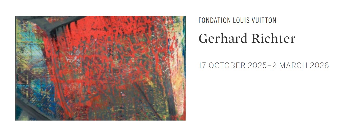
The early 1990s marked a turning point in Richter’s career. Following his major retrospective at the Tate Gallery in 1991 and his triumph at Documenta IX, he achieved unprecedented international recognition. The works of this moment, including Abstraktes Bild, are often considered the purest expression of his abstract language, distilling decades of experimentation into a singular vocabulary of layering, scraping, and revision. This was also the period that laid the groundwork for later cycles such as the Cage paintings of 2006, vast canvases whose dense strata of color were named after the composer whose ideas had long inspired Richter. Ultimately, Abstraktes Bild demonstrates Richter’s achievement as one of the most significant painters of the postwar era. It embodies his conviction that abstraction, far from a retreat into pure form, can serve as a means of grappling with the profound uncertainties of modern existence. In its layered surface, its play of concealment and disclosure, and its delicate balance of accident and control, the work testifies to painting’s enduring ability to engage with the mysteries of perception, memory, and time.
Alex Katz
Yvonne in Green, 1995
Sotheby’s London: 17 October 2025
Estimated: GBP 300,000 – 400,000
GBP 444,500 / USD 595,630
Yvonne in Green | Contemporary Day Auction | 2025 | Sotheby’s
ALEX KATZ (b. 1927)
Yvonne in Green, 1995
Oil on canvas
48 1/8 x 71 7/8 inches (122.3 x 182.5 cm)
Epitomizing Alex Katz’s signature command of flattened pictorial space, simplified form and deft coloristic contrast, Yvonne in Green is an important example of the artist’s large-scale, nocturnal urban scenes. Depicting Yvonne Force Villareal, the public arts leader and one of Katz’s most ubiquitous subjects, the present work exudes an aura of confident, metropolitan elegance. Yvonne in Green reflects the tendency in the artist’s oeuvre through the 1990s towards depicting figures against increasingly abstracted surroundings, the visual vernacular that has come to define not only the artist’s portraiture but, perhaps more importantly, his contribution to the history of contemporary art.
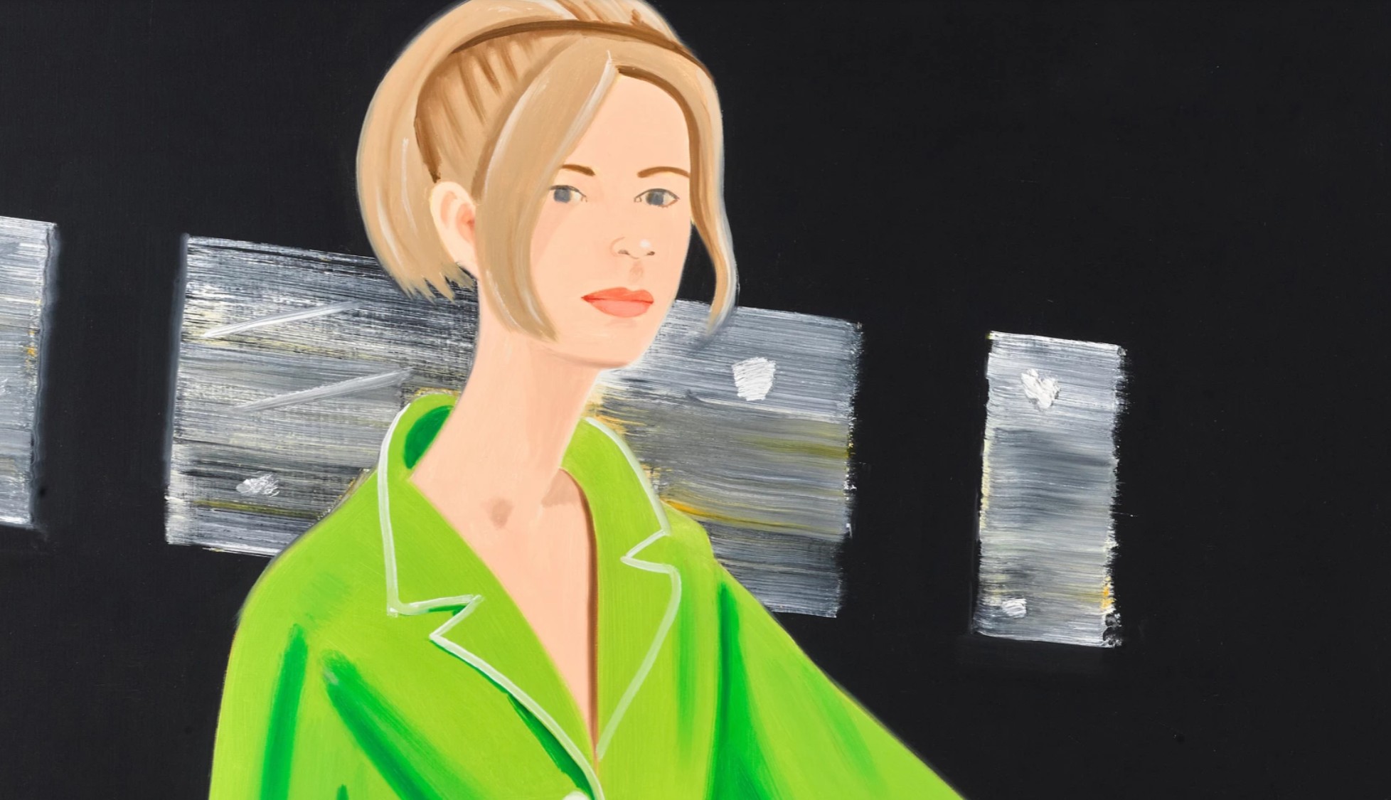
Painted in 1995, this dramatic, widescreen composition stems from the artist’s late series of Black Paintings which spotlight their sitters against intense, dark backdrops to create a cinematic intensity of vision. The work is characterized by a striking tension between vibrancy and darkness, motion and stillness, interiority and exteriority, defying any sense of narrative singularity. Yvonne’s forward stride, suggested by her outstretched arm, appears suspended by Katz’s crisp, irreverently reduced treatment of form. Her outstretched arm and commanding gaze suggest a sense of forward motion that is suspended by Katz’s crisp, irreverently reduced treatment of form. Yvonne, here, is set against an expansive, blackened vista, the ambiguity of setting here deepened by the isolated, eloquently articulated windows which pierce the night sky. A defining motif of Katz’s work from the 1990s, the windows point towards Katz’s lifelong interrogation into the complex dynamics of reflection, representation and reality.
Born in Brooklyn in 1927, Katz came of age as an artist during the heyday of Modernism and the New York School. His oeuvre is defined, however, by its individualism. The artist resisted both the agitated pictorial surfaces of Jackson Pollock, Willem de Kooning and Franz Kline and, in his realist tendencies, the mass-media iconography of Pop art. As the art historian, Donald Kuspit, has noted “Katz’s portraits are true to the way we experience others. They eloquently convey the tension between the determinate outer appearance and the indeterminate inner reality of someone known only from the outside.” (Donald Kuspit, Alex Katz Night Paintings, New York 1991, p.8)
Tamara de Lempika, Girl in Green, 1929 / Centre Pompidou, Paris
Image: © Scala, Florence
Artwork: © Tamara de Lempicka Estate, LCC / DACS Images, London / ADAGP
The present work is imbued with a deep sense of modish, lively energy. Yvonne is the co-founder of the Art Production Fund, a non-profit organization that presents public art to diverse audiences. Amplified by the scale of the work, the subject’s presence here is commanding. Her glowing complexion and bright, cinched green coat situate her as both a unique individual and a universal symbol of the modern woman much akin to Tamara de Lempicka’s stylized depictions of cosmopolitan women or Andy Warhol’s iconic society portraits of the 1960s and 70s. With sharp brushwork rinsed of superfluous detail, Katz’s unwavering interest in the animated moments of daily existence shines through the present work. An excellent example of his iconic painterly mode, this formally seductive painting epitomizes the artist’s lifelong ambition to refine, reassess and reimagine the contours of representation and reality.
Sissel, 2000
Christie’s London: 16 October 2025
Estimated: GBP 350,000 – 550,000
GBP 444,500 / USD 595,630
ALEX KATZ (B. 1927), Sissel | Christie’s
ALEX KATZ (B. 1927)
Sissel, 2000
Oil on linen
48×72 inches (122×183 cm)
Signed and dated ‘Alex Katz 00’ (on the overlap)
In Alex Katz’s Sissel (2000), an elegant figure clothed in a sky-blue suit stands out against a pale, champagne-colored background. The subject is Sissel Kardel, an artist Katz encountered in New York City around the turn of the millennium. Katz is celebrated for his portraits of friends and contemporaries, typically depicted within closely cropped compositions or—as in the present work—isolated against an enveloping painted ground. His figures become ‘types,’ paragons of the studied ease and effortless beauty which suffuses the urbane social world Katz has faithfully chronicled for some seven decades. Painted in 2000 and acquired by Alessandro Grassi the following year, Sissel was included in an exhibition of works from the Grassi collection titled Codice Colore, at the Centro Pecci, Prato in 2018, as well as an exhibition of contemporary portraiture at the Museum of Modern and Contemporary Art of Trento and Rovereto across 2013-2014.
Edward Hopper, Morning Sun, 1952. Columbus Museum of Art.
Artwork: © Edward Hopper, DACS 2025. Digital image: Artothek / Bridgeman Images.
Katz has long been interested in questions of style and fashion. Both of his parents were attentive to aesthetics, and as a child he recalls sitting with his father in the porch of their home in the St. Albans neighborhood of Queens, New York, passing judgements on the style of passersby. His understanding of color was similarly developed at this early age, kindled by the striking combinations—pink and maroon, pale yellow and pale violet—selected by his mother for the walls of their home. As an art student at Cooper Union in the late 1940s, Katz filled sketchbooks with wiry ink drawings of commuters on the New York City subway, in which he was invariably attentive to details of dress and demeanor. Throughout his oeuvre, clothing and hair recur as important markers of temporal specificity, forming a chronology of style across the later decades of the twentieth century and into the new millennium.
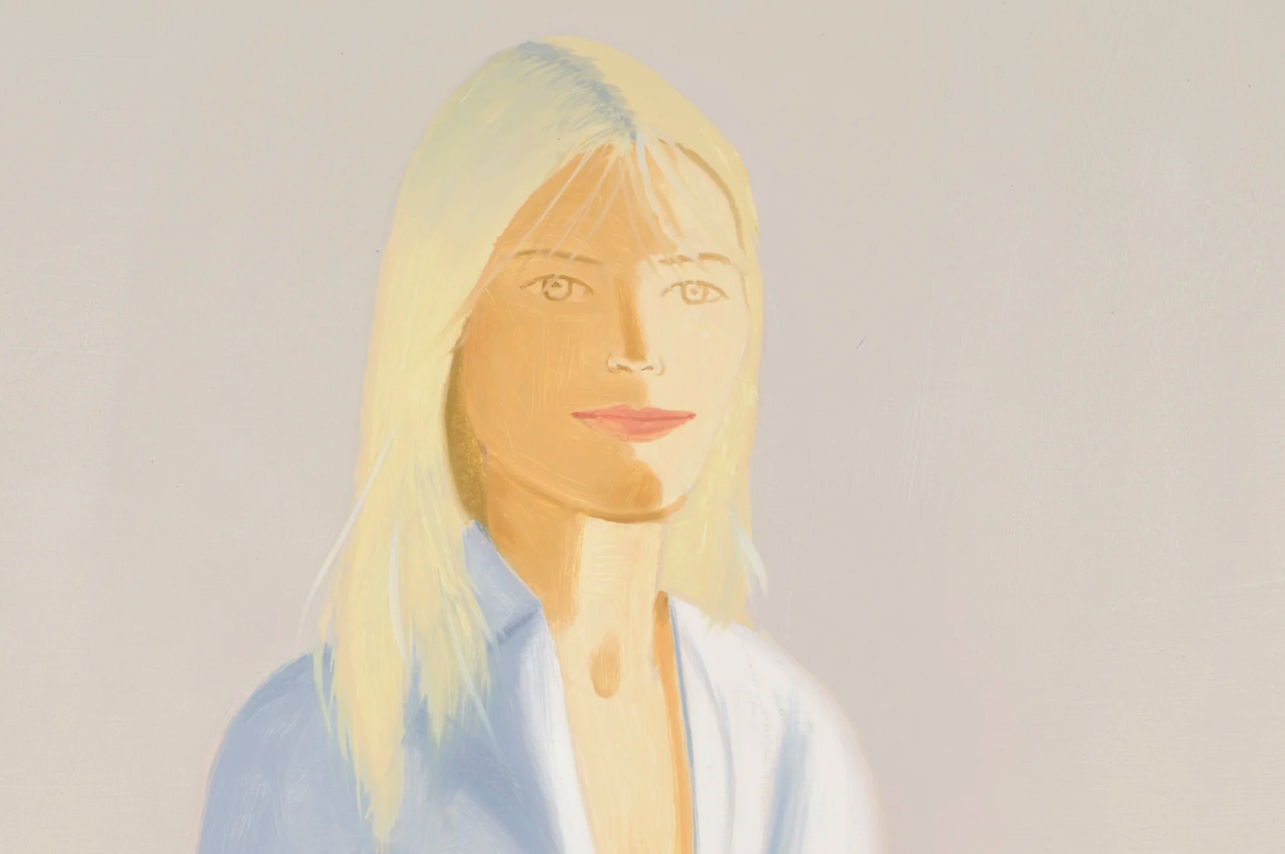
Painting wet-on-wet, Katz’s matte, slick brushwork reflects the surface of the society in which he lives, and the ways in which his subjects present themselves to the world. Often there is a stillness to their form which recalls nineteenth-century portraiture, for which subjects were required to hold their pose throughout long exposures. In Sissel, an unseen light source beams down from beyond the painting’s frame, starkly illuminating her icy blonde hair and pale blue clothing. Captured in a relaxed contrapposto stance and holding a thin-stemmed wine glass in her right hand, Kardel appears as though lifted from a city soirée or an art gallery’s private view, plucked from the crowd by a raking spotlight.
“They come as they are, and you want them that way. I never alter the clothes.”
John Singer Sargent, Lady Agnew of Lochnaw, 1892. Digital image: © National Galleries of Scotland / Bridgeman Images.
Katz’s distinctive monochromatic backgrounds—which would ultimately evolve into the artist’s iconic cutout paintings—serve to foreground these details of individuality, and at the same time impart a sense of endlessness reminiscent of the all-over canvases and color fields of American Abstract Expressionism. They are informed also by the eighteenth-century Japanese painter and printmaker Kitagawa Utamaro, whose work, first encountered by Katz in the 1950s, similarly hovers between stylization and representation. In Sissel, the sweeping champagne background creates a sense of openness, pushing Kardel out into the viewer’s space while simultaneously pulling them into hers. Caught in a painterly snapshot, she emerges radiant and serene, at once timeless and undeniably of our time.
Kym 2, 1989-1990
Christie’s London: 15 October 2025
Estimated: GBP 600,000 – 800,000
GBP 736,600 / USD 987,044
ALEX KATZ (B. 1927), Kym 2 | Christie’s
ALEX KATZ (B. 1927)
Kym 2, 1989-1990
Oil on linen
40 x 129 7/8 inches (101.5 x 330 cm)
Signed and dated ‘Alex Katz 90’ (on the overlap)
Alex Katz’s Kym 2 (1989-1990) is an emblematic cropped portrait by the iconic American painter. It unfolds on a monumental canvas more than three meters in width, its titular subject dominating the center of the composition. Behind her, horizonal bands of sky and sand place the woman at the seaside. She wears a crisp white t-shirt, which draws attention to her pale blue eyes, blushed lips and auburn hair. Against the gently lapping waves and raking sunlight, which illuminates her hair and casts wispy shadows across her face, she wears an expression of serenity and introspection. Depicting a long-time acquaintance of the artist, Kym 2 dates to a period of widespread critical acclaim for Katz, executed a few years following his important mid-career retrospective at the Whitney Museum of American Art, New York. It was acquired by Alessandro Grassi shortly after its completion in 1990 and has remained in his collection ever since. In 2018 it was a highlight of Codice Colore, an exhibition of works from the Grassi collection held at the Centro Pecci, Prato.
Alessandro Grassi with his art collection. Photograph courtesy of the Grassi family.
With its restrained palette of complementary blue and orange, abstracted bands of sand, foam, and sea, and cleanly delineated figure, Kym 2 exemplifies Katz’s deceptively simple style, which has remained remarkably consistent across some seven decades. His subjects are invariably family and friends—the artists, poets, fashion models, and intellectuals whose company he keeps in New York City and in coastal Maine, where he spends his summers. The works painted there are among his most distinctive. Kym’s simple white t-shirt and minimal bobbed hair, indeed, conjure the effortless cool of the late 1980s and ’90s.
Andy Warhol, Liz #3 , 1963. The Chicago Art Institute, Chicago. Artwork: © 2025 The Andy Warhol Foundation for the Visual Arts, Inc. / Licensed by DACS, London. Digital image: © 2025 The Art Institute of Chicago / Art Resource, NY/ Scala, Florence.
Kym is larger than life yet also extraordinarily true to life. Katz paints the world he knows, so that his oeuvre becomes a kind of visual vernacular of people, propelled by this tension between grand scale and the intimacy of looking. His process seeks to capture the immediacy of sight, beginning with initial oil or ink sketches painted en plein air. In the studio he enlarges this sketch, and with charcoal distils the image into clean lines and planes to create a cartoon, in the tradition of European painting. The final work is faithful to the scale of this drawing and typically executed in a single sitting. Kym 2 fills the viewer’s field of vision, but Katz’s cropped, cinematic composition invites a sense of intimacy.
“Degas developed cropping to allow that a world existed outside the picture frame. The modern use of cropping is more like that of a TV. It pushes the forms forward into the room. In my own paintings, cropping is primarily used for drama and forward expansion.”
Edouard Manet, On the Beach, 1873. Musée d’Orsay, Paris. Digital image: © Photo Josse / Bridgeman Images.
As an art student at Manhattan’s progressive Cooper Union in the late 1940s, Brooklyn-born Katz came of age as an artist alongside the growth of New York as the centre of modern art. At Cooper he was trained by Morris Kantor in the theories and practices of Modernism, working largely from drawings and in a post-Cubist idiom. But around him, artists such as Mark Rothko, Barnett Newman, Willem de Kooning and Jackson Pollock were reshaping the cultural landscape. He was inspired by the power of Abstract Expressionism and began to paint on a similarly grand scale, aspiring to match the visual force of billboards. His crisp canvases of uninflected colour also draw on aspects of colour field and hard-edge painting. As Minimal and Conceptual Art took hold across the 1960s and 1970s, however, Katz held firm as a resolutely figurative painter. Fascinated by film and popular culture, his work is often seen as a precursor to Pop, but Katz extends the tradition of Baudelaire more than that of Warhol: he paints, single-mindedly, the world as he sees it. By the time the present work was executed in the late 1980s, painting was back ‘in’ and Katz’s enduring faithfulness to his medium established his name in the canon of contemporary art.
Richard Diebenkorn, Ocean Park No. 79, 1975. Philadelphia Museum of Art. Artwork: © 2025 Richard Diebenkorn Foundation / DACS. Digital image: © 2025 The Philadelphia Museum of Art/Art Resource/Scala, Florence.
Maine, whose silvery light bathes so many of Katz’s most iconic canvases, was formative in his development as a painter and has remained a driving force behind his practice. He first visited as a young artist, having received a scholarship from Cooper Union to spend the summer after graduation at the Skowhegan School of Painting and Sculpture. In the 1950s he purchased a house in nearby Lincolnville, and since that time has worked consistently between the city and the coast. It was in Maine that Katz painted outdoors for the first time, a result of Skowhegan’s longstanding plein air programme. Like the Impressionists, he was seeking to capture the specific effects of light and the sensation of direct sight.
“I found I could paint much faster, painting directly…
It was like feeling lust for the first time.”
In the studio, he preserves this sense of urgency by painting the final canvas within a single session, wet-on-wet. He has spoken about letting his energy ‘pool’ in the leadup to these sessions, so that the painting of each canvases feels akin to a performance. In Kym 2 Katz’s brush carves fluid wisps of hair across the subject’s face, lifting the deeper brown and orange tones over which it travels. The technique creates a subtle blurred effect, as though the stray strands have been unsettled by a light ocean breeze.
“I’m painting the society in which I live. So it has that social identification, but it’s also pretty optical. I’m just trying to paint what I’m looking at.”
As is typical of Katz’s works, Kym 2 is defined by a sense of ease, elegance and beauty. His monumental canvases extend a thread which reaches back to the sixteenth-century canvases of Titian and Veronese, via the ‘big’ painting of American Abstract Expressionism and widescreen movies of the 1950s. Painting on the heroic scale typically reserved for history painting, or depictions of classical or religious themes, Katz evolved a mode of portraiture true to his contemporary time.
Study for Chance, 1990
Christie’s London: 16 October 2025
Estimated: GBP 130,000 – 180,000
GBP 292,100 / USD 391,415
ALEX KATZ (B. 1927), Study for Chance | Christie’s
ALEX KATZ (B. 1927)
Study for Chance, 1990
Oil on linen
19 1/8 x 21 1/4 inches (48.5 x 64 cm)
Signed and dated ‘Alex Katz 90’ (lower right)
Painted in 1990, Study for Chance is an exuberant group portrait by Alex Katz. The painting’s three sitters are Anne Lyon, Vivien Bittencourt and Darinka Chase, each of whom was known personally to the artist; the latter two women remain part of Katz’s studio team to this day. Against a brilliant vermillion ground, the swimsuit-clad figures are depicted in a frieze-like arrangement. Drawing on a distinctly Pop aesthetic, each holds aloft a large, colorful beach ball, and their poses evoke the studied ease of fashion models. Acquired through gallerist Emilio Mazzoli the year following its execution, Study for Chance has been held in Alessandro Grassi’s collection for more than three decades.
Roy Lichtenstein, Girl with Ball, 1961. Museum of Modern Art, New York.
Artwork: © Estate of Roy Lichtenstein/DACS 2025.
Digital image: © 2025 The Museum of Modern Art, New York/Scala, Florence.
From the center of the composition, Vivien Bittencourt looks out coolly into the viewer’s space. Bittencourt is Katz’s daughter-in-law, and her form recurs often within his oeuvre across individual and group portraits. She features in his striking night-time family portrait Ada’s Garden (2000, Des Moines Art Center), and her closely-cropped visage dominates Black Hat 2 (2010), which graced the cover of the catalogue for Katz’s recent retrospective at the Albertina Museum, Vienna, in 2023. Shortly after sitting for the present work, Bittencourt and her husband Vincent filmed Katz in his New York studio, creating an intimate depiction of the artist’s practice. In the present work, Bittencourt is flanked by Lyons and Chase, each of whom look out beyond the edge of the picture plane. Both women also sat for Katz several times, and Chase has worked in Katz’s studio since the 1980s.
Katz would develop the present work into one of his iconic cutouts, which first emerged in his practice in the late 1950s and with which Katz has depicted family, friends and acquaintances from New York’s social milieu across many decades. The cutouts transposed the clean lines and flat planes of unmodulated color which define Katz’s painted works onto smooth, resistant surfaces of aluminum and steel. He is interested in the relations between people, how they style themselves within and against the society they inhabit, and his group portraits latch on to these details. The present work, capturing the cool cropped hairstyles and bold geometric swimsuits of 1990s tastemakers, reflects Katz’s enduring interest in fashion and style as modes of expression and markers of place and time.
Robert Indiana
ONE Through ZERO (The Ten Numbers), 1978-2003
Christie’s London: 15 October 2025
Estimated: GBP 700,000 – 1,000,000
ROBERT INDIANA (1928-2018), ONE Through ZERO (The Ten Numbers) | Christie’s
ROBERT INDIANA (1928-2018)
ONE Through ZERO (The Ten Numbers), 1978-2003
Polychrome aluminum on painted aluminum base, in ten parts
Each overall: 33 1/4 × 33 1/4 x 17 inches (84.5 × 84.5 × 43.2 cm)
Each: stamped with the artist’s signature, number and date ‘1978-2003 R INDIANA 2⁄3’ (lower side)
Conceived in 1978 and executed in 2003
This work is number two from an edition of three plus two artist’s proofs
Robert Indiana’s longstanding fascination with numbers comes to the fore in ONE Through ZERO (The Ten Numbers), which depicts the ten essential numerical digits in brilliant technicolor. The raw materials of language and communication propelled Indiana’s celebrated oeuvre. He was interested in numbers and letters as signifiers, reveling in the meanings and associations they conjure in the mind of the viewer. In ONE Through ZERO (The Ten Numbers), traditionally two-dimensional numbers assume mass and form, leaping out into space. Each of the work’s sculptural elements is painted in one color on the flat planes and a second on its curving contours. The inaugural eight-foot version of this work was executed for a special commission in Indianapolis, and now resides in the Indianapolis Museum of Art.
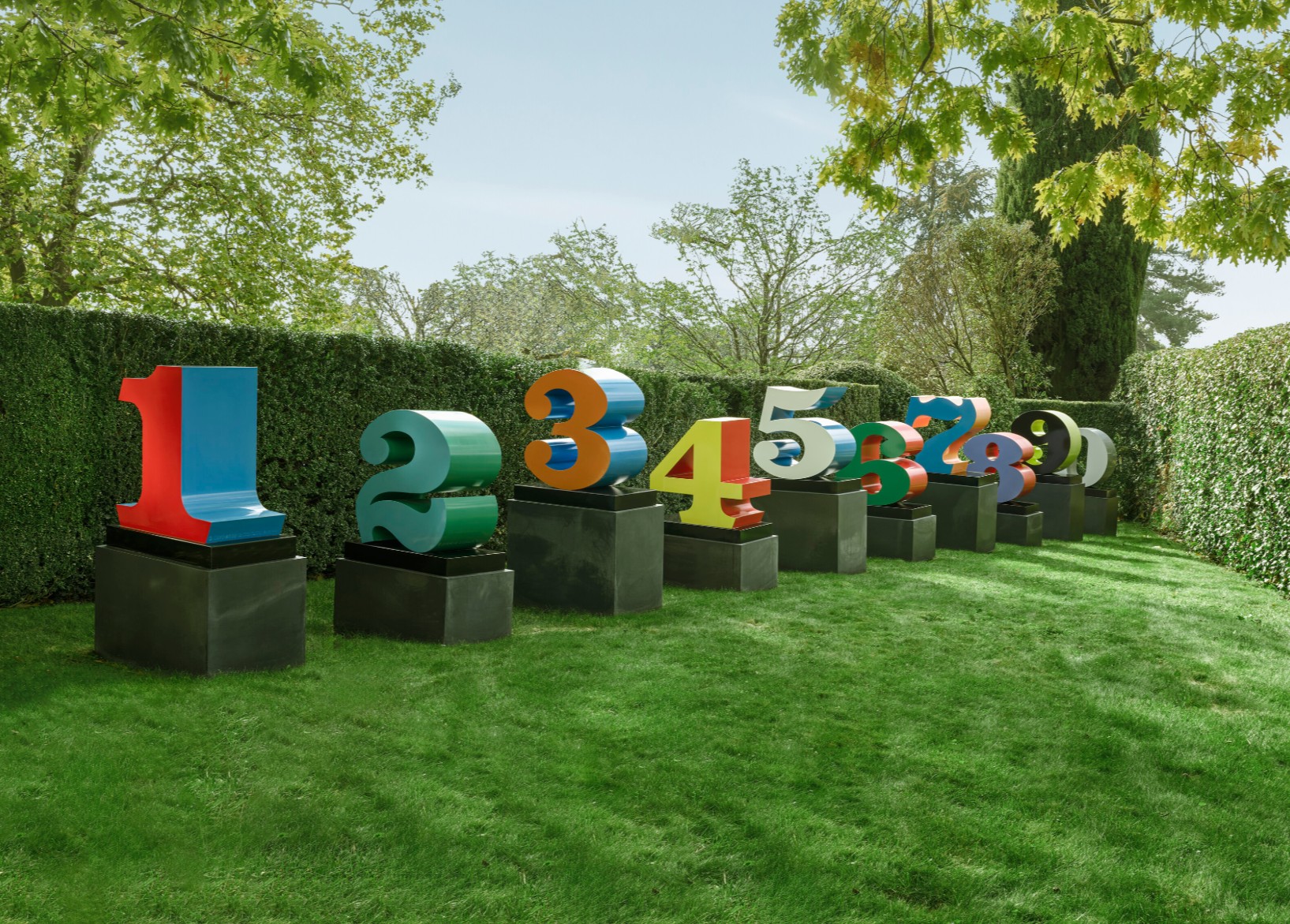
Born Robert Clark, Indiana’s adoption of the name of his native state took up a long-held artistic tradition followed by artists including Leonardo da Vinci. The choice also reflected an unabashed embrace of Americana. As a child, he had been fascinated by the Phillips 66 sign at the service station where his father worked, and later announced himself to be ‘an American painter of signs’. Indiana’s stark, stylized letters and numbers are characterized by bold chromatic impact, glossy patinas and clean lines. His sculpted works have become emblems of American Pop, commensurate with Andy Warhol’s soup cans and Roy Lichtenstein’s comic-book blondes. Indiana began to incorporate numbers into his sculptural assemblages and paintings in the early 1960s, and by the middle of the decade numbers had become a central motif. As with many of his most iconic works, such as LOVE, the development of two-dimensional painting into three-dimensional sculpture is another hallmark of Indiana’s practice.
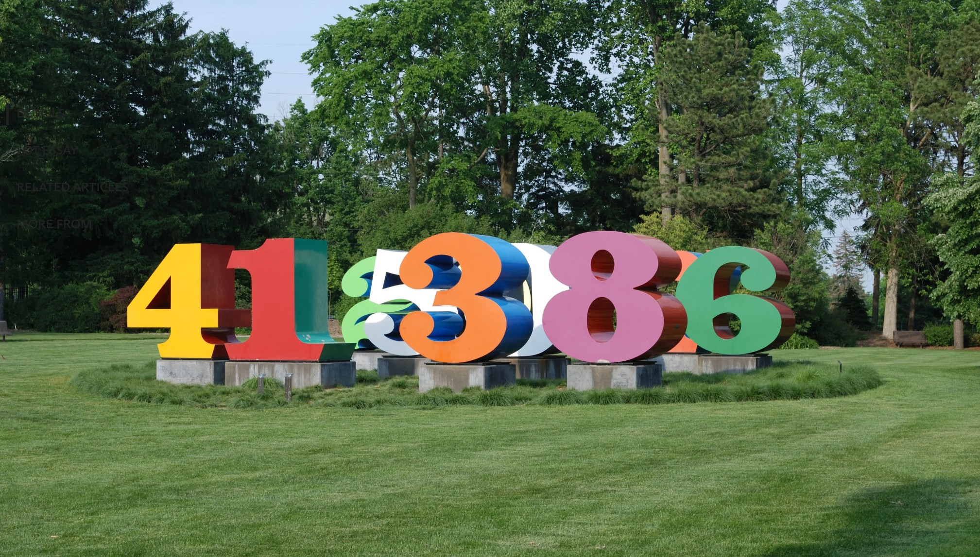
Robert Indiana, Numbers 1-0, 1980-1983. Indianapolis Museum of Art.
Artwork: © Robert Indiana, DACS 2025. Photo: Alamy/Artur Apresyan.
ONE Through ZERO (The Ten Numbers) evidences Indiana’s interest in the formal aspect of sign systems. The work’s numerical elements are approximately half as wide as they are tall, foregrounding each as something solid and autonomous. Indiana’s chosen color palette is also loaded with symbolism. As explained by the artist: ‘red and blue are associated with birth in ONE; green and blue signify infancy in TWO; orange and blue represent youth in THREE; yellow and red are connected with adolescence in FOUR; white and blue signify the pre-prime of life in FIVE; green and red signify the prime of life in SIX; blue and orange suggest early autumn of life in SEVEN; purple and red signal autumn in EIGHT; black and yellow convey a sense of warning in NINE; and shades of grey signal the end of the life cycle in ZERO’ (R. Indiana, quoted at artist’s website).
“Numbers fill my life. They fill my life even more than love. We are immersed in numbers from the moment we’re born.”
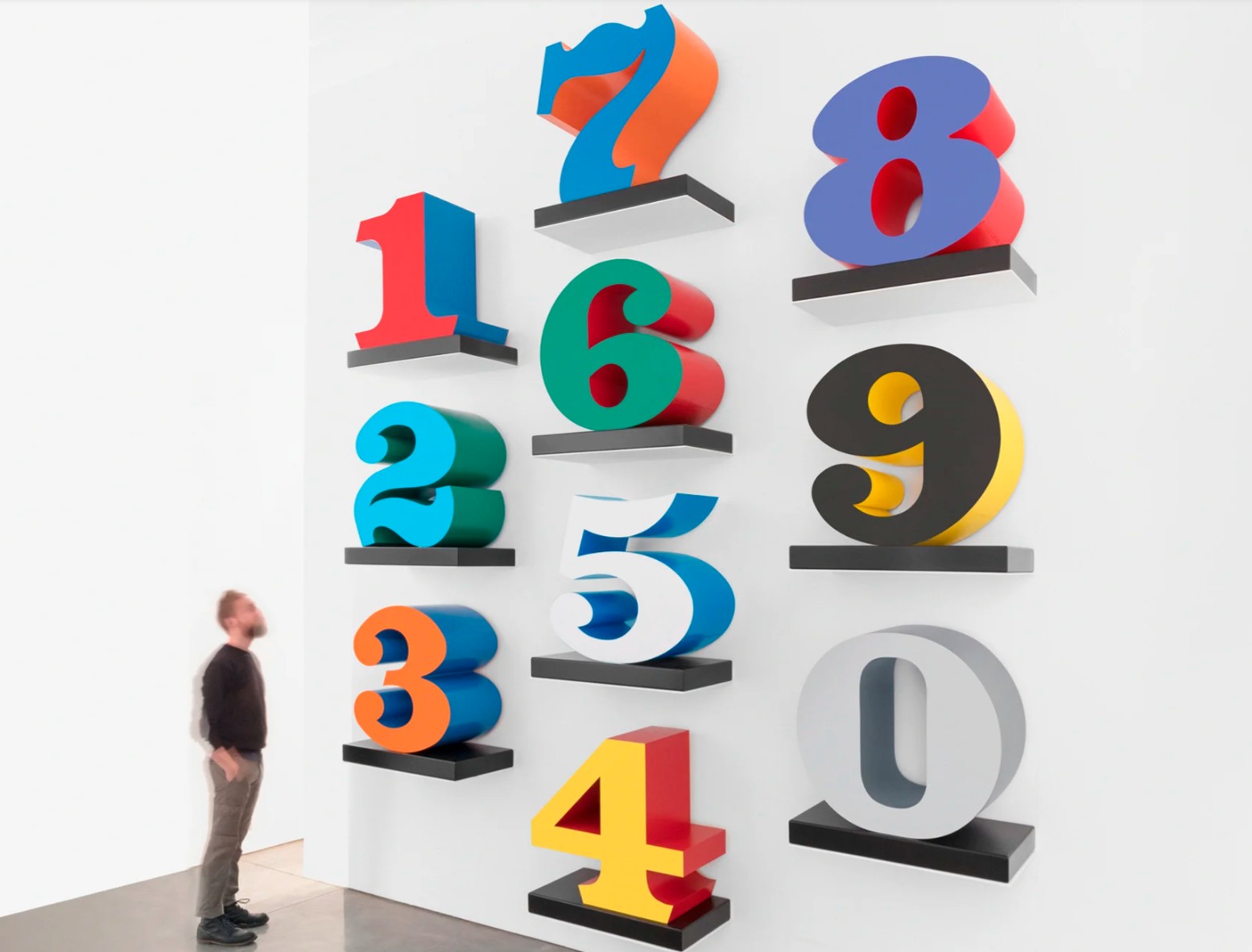
Indiana’s enduring interest in numbers can be traced back to formative childhood experiences. He saw vast networks of significance and meaning embedded in their regular, recognizable forms. He attached them to particular life events and experiences, in the form of ages marked by birthdays, highway routes, or the number of buildings in which he lived: he moved home multiple times as a child, living in twenty-one different homes by the age of seventeen.
Love-Blue-Green, 1966/1997-1999
Phillips London: 18 October 2025
Estimated: GBP 180,000 – 250,000
Robert Indiana Modern & Contemporary Art Day Sale
Polychrome aluminum
This work is number 6 from an edition of 8 plus 4 artist’s proofs
Pierre Soulages
Peinture 202 x 143 cm, 14 août 2015
Estimated: GBP 600,000 – 800,000
Light dances across the black, glossy swathes of acrylic that comprise the surface of Pierre Soulages’ Peinture 202 x 143 cm, 14 août 2015, with its broad, overlapping bands creating delicate, sweeping ridges that continuously catch and reflect the changing light, shifting fleetingly with the slightest movement from the viewer or a subtle shadow. An exquisite late example of one of the artist’s celebrated Outrenoirs, the present work displays a mature culmination of a career spanning eight decades, and the artist’s mastery of light itself as a medium.
Outrenoir – loosely translated as ‘beyond black’ – was a term coined by Soulages to encompass the substantial body of work that exclusively defined the last 40 years of his life’s work. Born in Rodez in the South of France in 1909, the artist was inspired by the region’s rich artistic heritage, from Neolithic standing stones to nearby 20,000-year-old cave paintings, fascinated by the raw origins of primitive art and the idea of ancient man painting in darkness. He had also harbored a partiality for the color black from a very young age, and the combination of these two areas of interest underscores much of his oeuvre. For some time, black served as an important contrast to emphasise other pigments, in dialogue with other colours on the canvas. Then on one significant occasion in 1979 as he was working in his studio in Paris, he completely covered a much worked-upon canvas in black paint in a moment of frustration, eliminating any contrast or compositional arrangement. Returning to the work fresh in the morning light, it was only then that he realised that it was in fact the reflections of the light upon the painted surface that he was working with, as opposed to the colour itself. He’s often referred to this specific moment as a defining point in his practice, inaugurating a technique that would go on to shape his approach to painting for decades to come.
For Soulages, black is not the absence of color but a vehicle for every other imaginable color and radiating light, in a state of constant immutability and flux: ‘In his Outrenoirs, he obtains greys and flashes of white just by using the effects of the raised patterns in the gloss of the oil and, later, the acrylic surface. It is not a question of impressing the viewer with a multitude of dazzling reflections, but rather to draw the attention to discreet, contained phenomena. It is no longer a question of bringing out the contrasts of the confrontation between black and white on the canvas, but of presenting contrasts which shift with the viewer’s position […] It is the onlooker who feels looked at: the canvas and the viewer form part of the same space, he is included in the space of the canvas and it internalizes his position.’
J.M.W. Turner, Fishermen at Sea, 1796, Tate, London. Image: incamerastock / Alamy Stock Photo
Such an intense study of the multiplicities of light and its compositional potential recalls the revolutionary work of J.M.W. Turner, whose emphasis on capturing the qualities of light and shade in his landscapes prefigured the work of the Impressionists, and whose daring compositions foreshadow the subsequent forthcoming shift towards abstraction. For Turner, whose radical later works in particular begin to move towards a rejection of figurative painting altogether, it was his leading approach to rendering the subtle atmospheric conditions and ethereal qualities of light that established him as such an influential artist, challenging the traditional boundaries of landscape painting at the time. Soulages takes this one step further, no longer focusing on just depicting light but actually incorporating the physical light of his surroundings into the work itself.
“The colors change when the light changes, or when the viewer moves. The paintings are alive, mutable and are recreated every second.”
Like Turner, Soulages also used tools to scrape and manipulate the paint, creating structured, layered surfaces that interact with their environment, as well as his later use of acrylic resin to achieve a variety of finishes. The textured Outrenoirs, alternating between rough and smooth, matte and glossy, shimmer in the light which, from his coastal home in Sète, distilled the sparkling essence of his watery, Mediterranean surroundings.
“Some mornings, it is a silvery gray. Sometimes, capturing the light reflected from the sea, it is blue. At other times it can be tinged a coppery brown. In fact, it always corresponds to the light that falls on it. One day, I even saw it green: There had been a storm, and there was a blaze of sun on the trees not far away.”
Vija Celmins, Untitled (Big Sea #1) (detail), 1969, Private Collection. Artwork: © Vija Celmins, Courtesy Matthew Marks Gallery
This also calls to mind the meticulous, monochromatic ocean renderings by Latvian artist Vija Celmins. In particular her intense, closely cropped studies of waves – alongside other natural phenomena such as limitless night skies and desert terrains – share a similar preoccupation with extraordinary, mesmerising surfaces, pushing her compositions to the verge of abstraction. Celmins also emphasises the physical presence of her works, rejecting the notion that they represent anything but themselves, eliminating horizon lines and other space markers. Similarly, Soulages’ absolute rejection of pictorial space, perspective, or form might also appear to align with the contemporaneous surge toward abstraction in the Post-War period—particularly in the States—and Soulages was often grouped alongside the leading figures of Abstract Expressionism such as de Kooning, Rothko and Kline. However, he rejected being confined into any specific movement, and whilst the Abstract Expressionists foregrounded gesture and personal expression, Soulages sought instead to explore light, surface, and materiality beyond any kind of representation. Widely regarded as France’s most successful artist during his lifetime, Soulages established himself amongst the most revered artists of the last century, and he was honored by a retrospective at the Louvre in Paris, a rare lifetime accolade. Yet above all, his pre-eminence lies in his singular vision, tapping into something primal: the power of darkness and light, the raw, elemental qualities of the natural world that underlie the visible. Engaging directly with the viewer, his works reminds us that abstraction can speak as powerfully to our deepest, most archaic sensibilities.
Andy Warhol
Four Pink Marilyns (Reversal Series), 1986
Sotheby’s London: 16 October 2025
Estimated: GBP 3,000,000 – 5,000,000
Four Pink Marilyns (Reversal Series) | Contemporary Evening Auction | 2025 | Sotheby’s
REPEAT SALE
Sotheby’s New-York: 11 November 2015
ANDY WARHOL (1928 – 1987)
Four Pink Marilyns (Reversal Series), 1986
Acrylic and silkscreen ink on canvas
36 1/8 x 28 inches (91.7 x 71 cm)
Signed and dated 86 (on the overlap)
Stamped by the Andy Warhol Art Authentication Board, Inc., and numbered A107.999 on the overlap
Executed in 1986, Four Pink Marilyns (Reversal Series) represents one of the most conceptually charged moments in Andy Warhol’s late career. More than two decades after he first cemented Marilyn Monroe’s status as a cult icon in his elegiac 1962 portraits, Warhol revisited her image in the Reversals series, transforming the familiar visage into something newly spectral and uncanny. Repeated four times in negative register, the present work underscores both the timeless endurance of Monroe’s celebrity and the symbolic power of Warhol’s own artistic mythology. The Reversals marked a decisive shift in Warhol’s practice at the beginning of the 1980s. Following the relative quietude of the previous decade, he turned towards a re-examination of his own pantheon of 1960s icons, aligning himself with the appropriationist strategies of younger contemporaries such as Cindy Sherman and Richard Prince. In doing so, Warhol effectively appropriated himself as a brand, recasting his formative images of Marilyn, Mao, and Campbell’s Soup into what might be understood as incandescent x-ray visions of his earlier career. In this light, Four Pink Marilyns (Reversal Series) can be seen not merely as a return to one of Warhol’s most celebrated inquiries but as a climactic transfiguration of his core concerns – repetition, celebrity, commodification, and mortality – distilled into a late work of haunting resonance.
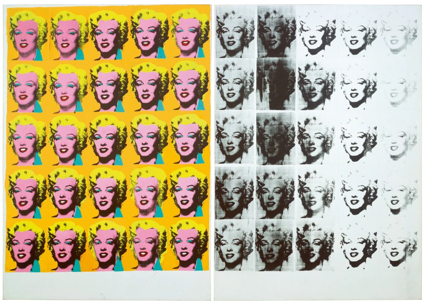
Andy Warhol, Marilyn Diptych, 1962. Tate Modern, London.
Image: © Tate. Artwork: © 2025 The Andy Warhol Foundation for the Visual Arts, Inc./Licensed by DACS, London
Four Pink Marilyns (Reversal Series) stands at the very apex of Warhol’s lifelong project of appropriation. Where, in the years that followed, the artist would turn to the art-historical canon – appropriating motifs from Lucas Cranach, Paolo Uccello, Edvard Munch, and Giorgio de Chirico – here, he turned his gaze inward, lifting directly from his own repertoire. This self-quotation is both typical of Warhol’s subversive strategies and emblematic of the pervasive mood of self-mythologization that permeates his late practice. In revisiting Marilyn Monroe, an image that had already secured him enduring fame in the early 1960s, Warhol not only probed the contemporaneous debates around authorship and authenticity but also implicitly endorsed the very artistic code upon which his reputation was built. In this iteration, Monroe’s visage is presented not through the familiar registers of heightened glamour –lipstick-red mouths or gilded hair – but as a spectral imprint. Rendered in negative, her repeated likeness is suffused with luminous bubble-gum pink, while shadows are exaggerated and mid-tones collapse into darkness. The result is a haunting dematerialization of Monroe, her features reduced to ghostly indices that oscillate between presence and absence. The work thus invokes a duality: both the radiant allure of celebrity and its inevitable fading into spectral memory.
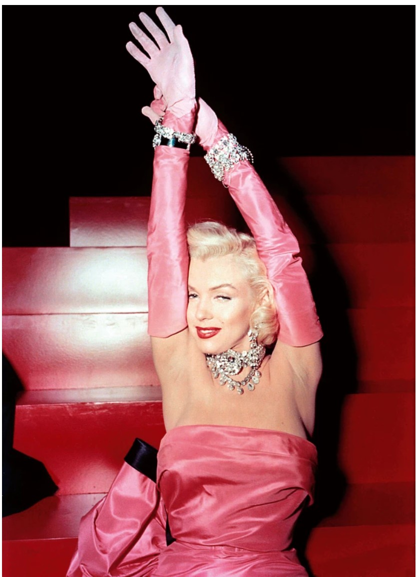
Marilyn Monroe, 1953, TM and Copyright ©20th Century Fox Film Corp. All rights reserved./Courtesy Everett Collection
With Marilyn Monroe, Andy Warhol discovered a modern memento mori that unified the obsessions driving his career: glamour, beauty, fame, and death. In Four Pink Marilyns (Reversal Series), these themes coalesce with renewed force. The image radiates the aura of Monroe as sex symbol and Hollywood legend, while simultaneously presenting the shadow of mortality. The stark dichotomy of black silkscreen ink against a luminous pink ground evokes both the glamour of the silver screen and the spectral fragility beneath its surface. Warhol’s deployment of the silkscreen process, a mechanical technique that effaces the artist’s hand, further serves as metaphor for the operations of mass media and its power to reproduce, disseminate, and ultimately flatten celebrity into consumable commodity. The conceptual brilliance of the work lies in this layering of thematic registers: the seduction of cinema, the artificiality of fame, and the inevitability of decay, all operating simultaneously. As Rainer Crone observed in 1970, Warhol gravitated towards movie stars because they functioned as “representatives of mass culture” (Rainer Crone, Andy Warhol, New York 1970, p. 22). Monroe epitomized this paradox more completely than any other: she was at once the most desirable woman in the world and the tragic victim of her own celebrity. For Warhol, her image encapsulated the unstable balance between personhood and brand, a dialectic he would also explore through Elvis Presley, Elizabeth Taylor, Marlon Brando, and Jackie Kennedy.
“In the early days of film, fans used to idolize a whole star—they would take one star and love everything about that star… So you should always have a product that’s not just ‘you.’”
In Monroe, Warhol recognized the consummate product of mass culture: an actress whose image was at once infinitely reproducible and inexhaustibly desirable, yet ultimately haunted by its own impermanence. Through her, he crystallized the quintessential logic of Pop: the translation of the ephemeral into the iconic, and of personal tragedy into mass spectacle.
Warhol instinctively understood the Marilyn brand as an industrialized construct, designed for mass consumption like a Coca-Cola bottle or Campbell’s Soup Can, and radically revealed it as a precisely composed non-reality. Of course Marilyn offered Warhol the biggest brand of all, and he accentuated this by choosing a manifestly contrived version of Marilyn. Although this image of Marilyn has come to stand as the instantly-recognisable emblem of her global fame, encapsulating as it does so perfectly every aspect of her enduring allure, it is an entirely dehumanised portrait, devoid of any of the psychosomatic realities that proved ultimately fatal for Norma Jeane Mortenson on the night of August 5 1962. Moreover, the negative reversal of her image magnifies the ghostliness of her visage, resulting in a compellingly haunting memorial to the screen siren. Even after the brutal reality and terminal tragedy of her suicide, the artificial veneer of a projected image remains the enduring legacy of a human life.
“Everything is sort of artificial. I don’t know where the artificial stops and the real starts. The artificial fascinates me, the bright and shiny…”
With the further temporal and formal remove of the image’s negative impression, Warhol emphasised the very postmodern notion of image production and circulation through the endlessly reproduced visage of Marilyn Monroe. Warhol celebrated and critiqued the power of the icon like no other artist of the Twentieth Century, and Four Pink Marilyns (Reversal Series) interrogates the limits of the popular visual vernacular, posing vital questions of collective perception in contemporary society.
Mao, 1973
Christie’s London: 15 October 2025
Estimated: GBP 600,000 – 800,000
ANDY WARHOL (1928-1987), Mao | Christie’s
ANDY WARHOL (1928-1987)
Mao, 1973
Acrylic and silkscreen ink on linen
12×10 inches (30.6 x 25.5 cm)
Signed and dated ‘Andy Warhol 73’ (on the overlap)
Arriving in a vision of flaming, calligraphic color, Andy Warhol’s Mao (1973) stems from one of the most important series of the artist’s career. Mao Zedong is screenprinted in black ink against a brilliant backdrop of cadmium yellow, his face surrounded with thick swirling, strokes of orange and red. A vivid green impasto adorns the dictator’s jacket.
“I have been reading so much about China … The only picture they ever have is of Mao Zedong. It’s great. It looks like a silkscreen.”
Announcing his triumphant return to painting after a four-year hiatus, the Mao works saw Warhol restage a figure he called ‘the most famous person in the world’—his chosen image was an official portrait from the frontispiece to Mao’s ‘Little Red Book’ of quotations, which he knew was owned by a billion people at the time—as a dazzling Pop spectacle. They represented the first major new series for Warhol since his Flowers of 1964, and, with their rich painterly surfaces, heralded a lush new direction for his practice. The present example has been held in the same private collection for over twenty-five years.

Raising Chairman Mao’s portrait during the cultural revolution in Beijing, China, circa 1970.
After his shooting by Valerie Solanas in June 1968, Warhol’s painterly output had seen a steep decline, with only a handful of commissioned portraits dating from that time until the start of 1972. The dealer Bruno Bischofberger, trying to push him back into painting, suggested taking on a grand, ambitious new subject: the most important figure of the twentieth century. Bischofberger proposed Albert Einstein.
“That’s a good idea, but I was just reading in Life magazine that the most famous person in the world today is Chairman Mao.
Shouldn’t it be the most famous person, Bruno?’”
The Life cover story Warhol was reading, published on 3 March 1972, detailed US President Richard Nixon’s historic visit to China the previous month: an important diplomatic overture that marked a thaw in Sino-American relations.

Andy Warhol holding a 12” x 10” Mao painting, Musée Galliera, Paris, 1974. Photograph by Andreas Mahl. Photo: © Andreas Mahl. Artwork: © 2025 The Andy Warhol Foundation for the Visual Arts, Inc. / Licensed by DACS, London.
Warhol swiftly identified Mao as a readymade icon. His portrait and uniform—always the same, as reliable as the Coca-Cola logo—were a brand identity, paraded in rallies throughout China, and mass-produced, homogenized and repeated like a silkscreen across global political culture.
“Mao would be really nutty… not to believe in it, it’d just be in fashion.”
This deadpan focus on Mao’s fame as a flat image, emptied of political meaning, belied a typically Warholian irony: he was well aware that for many Americans Mao’s face symbolized an alien, threatening ideology, and that repackaging one of capitalism’s chief antagonists as a Pop commodity would give the works a perverse appeal. Warhol would himself travel to China in 1982, visiting the Great Wall and posing in front of Mao’s monumental portrait in Tiananmen Square.
![]()
Icon with Saint Marina. Benaki Museum, Athens. Digital Image: © 2025 Photo Scala, Florence.
After an initial group of Mao paintings created in early 1972, Warhol went on to produce the series on five discrete scales, following the logic of his Flowers of the previous decade: they would range from the 12” x 10” format of the present work up to ‘giant’ versions more than four meters high. It is in the jewel-like smaller canvases that Warhol’s newly exuberant brushwork comes to the fore. Their scale amplifies the impact of his freehand flourishes of wet-on-wet paint, which fuse the screenprinted impression to the painted field and, in some cases, partly consume Mao’s image. Echoing Abstract Expressionism where his earlier works had tended towards a more hard-edged, mechanical aesthetic, Warhol invigorated his hybrid silkscreen-painting medium with previously unseen dramas of touch and gesture. The interplay of red and yellow in the present Mao shades the Chairman’s face into three dimensions; the surrounding swathes of orange are almost sculptural. With its vibrant color and its subject’s inscrutable gaze, the work exemplifies the series’ enduring, enigmatic power.
Giorgio Armani, 1981
Estimated: GBP 600,000 – 800,000
Giorgio Armani, 1981
Synthetic polymer paint, silkscreen ink and diamond dust on canvas
Stamped by the Andy Warhol Art Authentication Board Inc. and the Estate of Andy Warhol
Numbered ‘PO50.665 vf’ on the overlap
The textures of its delicate lilac surface masterfully catching the light and dancing like the flashing bulbs of a thousand cameras, Andy Warhol’s diamond dust portrait of fashion icon Giorgio Armani strikes a sophisticated balance between old world elegance and ‘80s glamour, a perfect synthesis of this meeting of the worlds of art and fashion in a single image. While Warhol and Armani would each individually express deep admiration and respect for each other as auteurs and masters of their craft, together they also defined the visual language of an era, two rebellious and visionary minds who intuitively understood the cultural zeitgeist and how to elevate the everyday into a work of art. Painted in 1981 and belonging to a small suite of works in varying colorways – one of which was owned by the late Armani himself – the present work is one of only two known diamond dust portraits of the ‘King of Italian fashion’, its dazzling surface the perfect expression of timeless beauty and luxury associated with the Armani name and embodying the new age of fashionable glamour and style that he helped to usher in.
While fashion and glamour had proved to be consistent themes throughout Warhol’s career, guiding his earliest forays as a commercial illustrator for the likes of Harper’s Bazaar and Vogue and underpinning his iconic depiction of mid-century celebrity, these forces had become especially pronounced in his work by the late 1970s. Having been at the epicenter of the achingly cool and epoch-defining ‘youthquake’ scene popularized by legendary Vogue editor and Warhol favorite Diana Vreeland and galvanized by Factory-regulars The Velvet Underground and Edie Sedgewick, Warhol moved seamlessly into the glittering world of celebrities and socialites that frequented Studio 54 and were featured in the pages of Interview magazine – his own now-legendary journal of New York’s fashion, art, and pop culture scene that covered uptown excess and the grittier downtown arts and club scene with equal enthusiasm. The 1980s brought with it a new wave of glamour and fashion that echoed the golden age of style epitomized by icons such as Marilyn Monroe, Cary Grant, and Grace Kelly. Just as Warhol had understood the aura of the icon and the reconfiguration of its visual codes and symbolism for the modern age during the 1960s, as the 1980s gathered pace his work responded to a new era of materialism and consumerism, gravitating to the objects and individuals that embodied and communicated something of their precise cultural moment.
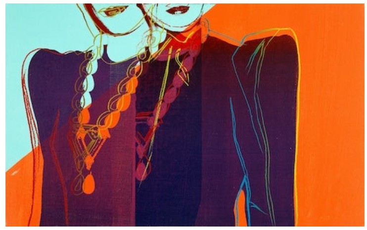
Andy Warhol, Two Female Torsos With Necklaces, circa 1983.
Artwork: © 2025 The Andy Warhol Foundation for the Visual Arts, Inc. / Licensed by DACS, London
As Warhol’s ‘visual diary’ of polaroids attests to, during this period the artist became more directly enmeshed in the world of high fashion, meeting and befriending the likes of Diane von Fürstenberg, Gianni Versace, Yves Saint Laurent, and Carolina Herrera. It was in this context that Warhol first met Armani in 1980, although the Italian designer had long been a by-word for elegance, luxury, and glamour for the Pop artist. Naturally, it was fashion that brought these two trailblazers together, Warhol reaching out to Armani directly to invite him to the opening of a new showroom by Italian company Gruppo Finanziario Tessile (GFT) who specialized in ready-to-wear designer fashion. As Armani would later recall, Warhol stopped him in a corridor to take a quick sequence of polaroids which would later be reinvented in a small suite of silkscreen portraits, one of which would find its way into Armani’s own collection as a gift from GFT.
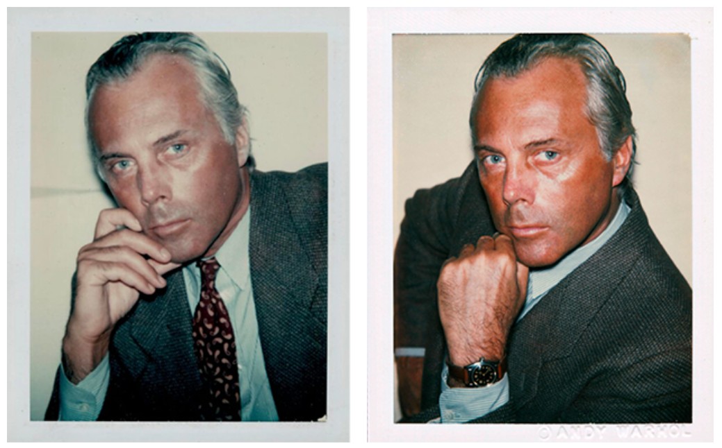
Andy Warhol, Giorgio Armani, Polaroids, 1980.
Artwork: © 2025 The Andy Warhol Foundation for the Visual Arts, Inc. / Licensed by DACS, London
Although closely related to the 1960s Pop portraits in its motifs and iconographic power, in its materiality and direct relationship to Warhol’s extensive archive of polaroids Giorgio Armani belongs to a distinct period of Warhol’s career as he found new and innovative ways to explore, anthologize, and document American cultural consciousness in the late 20th century. True to his long-standing fascination with themes related to idolism, the cult of celebrity, sex, and death, in this period luxurious Society Portraits and images of commodities sit alongside more complex investigations into art historical tradition, sexuality and gender identity. The employment of diamond dust in the present work speaks directly to the more experimental and conceptual dimensions of Warhol’s practice during this period, as well as to his restless investigations into new technologies of image-making. The artist had first been introduced to the new material in 1979 by the printer Rupert Jasen Smith, although he initially found the product too chalky, settling instead on a special blend of inexpensive powdered glass which provided the shimmering surface qualities that he was searching for. Playfully subverting the luxurious nature of its appearance, this mass-produced and readily available must have appealed to Warhol on a conceptual as well as aesthetic level and he began to experiment with its compositional possibilities immediately, creating stunningly textured surfaces that seem to both embody and project the decadence and glamour of the early 1980s.
In these portraits Warhol shows us the artist behind the fashion Empire: elegant, suave, and sophisticated, his piercing blue eyes and sculpted bone structure the perfect counterpoint to the crisp shirt and relaxed tailoring of his soft blazer – a defining feature of his iconoclastic approach to men’s fashion. Just as Warhol had reinvented the visual language of portraiture in the 1960s, Armani ushered in a fashion revolution in the 1980s, starting with the vernacular of the cornerstone of men’s fashion: the suit. Collaborating with director and screenwriter Paul Schrader, the relaxed silhouettes, flowing lines, and effortless elegance of Armani’s tailoring for leading man Richard Gere in the 1980 neo-noir film American Gigolo was instantly iconic, defining an era and launching Armani on a global stage. Coupled with a punchy soundtrack by Blondie and featuring artworks by none other than Warhol himself, American Gigolo reflects Armani’s own comments on the power of artistic collaboration, emphasizing too Warhol and Armani’s shared belief in the indivisibility of fashion from art, culture, and life itself. Together, Warhol and Armani didn’t just record contemporary culture, they created it.
Guns, 1981-82
Sotheby’s London: 17 October 2025
Estimated: GBP 450,000 – 650,000
Guns | Contemporary Day Auction | 2025 | Sotheby’s
ANDY WARHOL (1928 – 1987)
Guns, 1981-82
Acrylic and silkscreen ink on canvas
16×20 inches (40.5 x 50.7 cm)
Stamped by the Estate of Andy Warhol and the Andy Warhol Foundation for the Visual Arts, Inc. on the overlap
Numbered PA15.043 on the stretcher
Atop a luminous interplay of vivid pink, periwinkle, and turquoise, two sleek pistols hover in Andy Warhol’s iconic silkscreen style—bold, graphic, and hauntingly suspended in stillness. Guns (1981–82) is a powerful example of Warhol’s ability to transform everyday objects into compelling visual icons, merging personal history with broader cultural commentary.
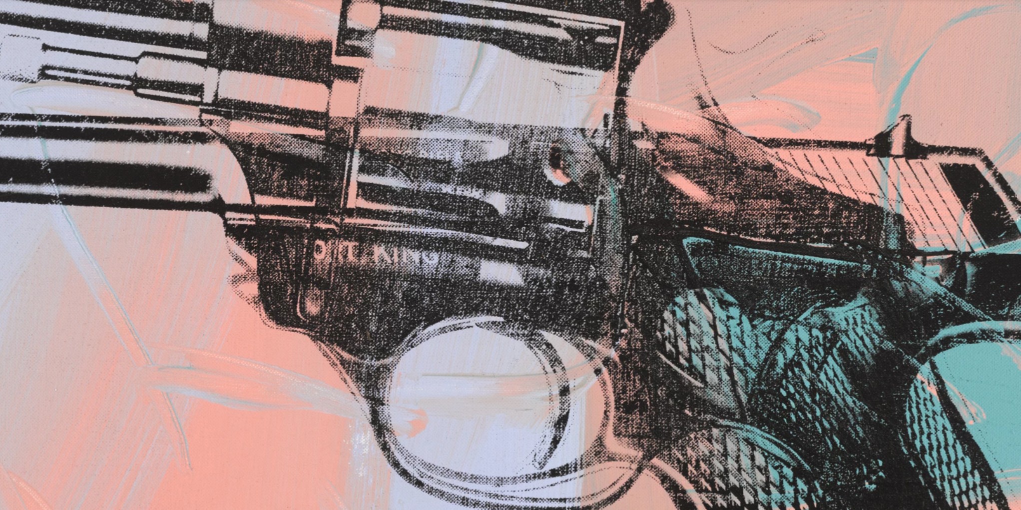
Part of a wider series of Gun Paintings exhibited alongside his Knives and Dollar Signs, the present work showcases Warhol’s fascination with themes of mortality, violence, and the aesthetics of consumerism. Works from this series are held in important private and public collections, including at the Museum of Modern Art in San Francisco and thus form an important part of Warhol’s wider oeuvre. But far from being purely somber, Guns captures the paradoxes at the heart of Warhol’s art: seductive yet morbid, glossily unsettling. Warhol invites viewers to confront life’s darker realities through the brightly colored lens of Pop Art.
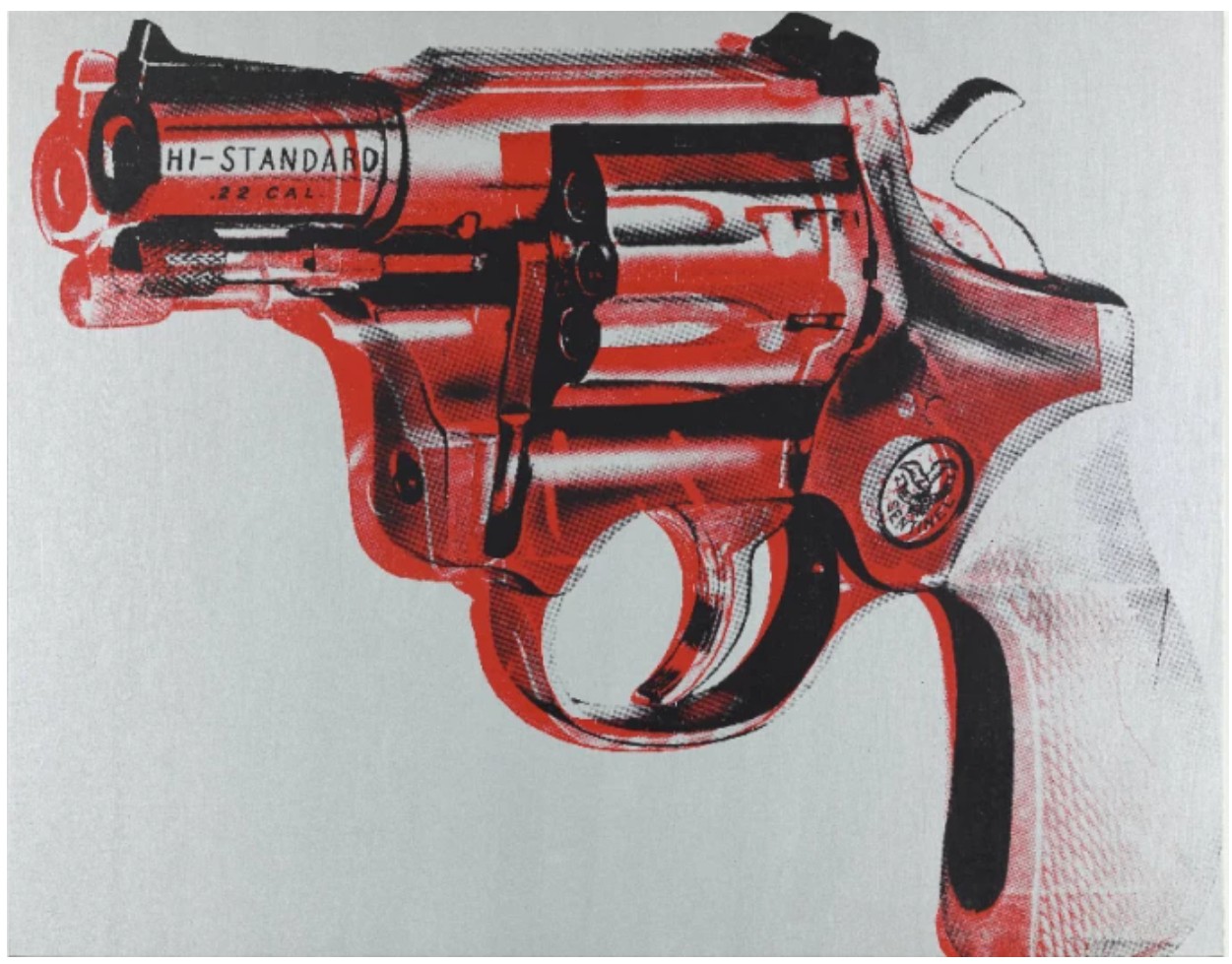
Andy Warhol, Gun, 1981-1982, San Francisco Museum of Modern Art
© The Andy Warhol Foundation for the Visual Arts, Inc. / Artists Rights Society (ARS), New York
The theme of death runs as an undercurrent throughout Warhol’s work from the early 1960s until his own passing in 1987, manifesting in a variety of forms. This preoccupation first emerged in 1962 with his Death & Disaster series, depicting plane crashes, suicides, and the electric chair. In 1968, Warhol’s engagement with mortality became intensely personal when he was shot three times by Valerie Solanas at his studio, The Factory. Notably, the .32 caliber gun depicted in the present work is the same model used in that attack. Warhol’s fascination with mortality persisted until his death, culminating in the ominously titled Heaven and Hell Are Just One Breath Away series, among his final works. Here, he revisited motifs such as the electric chair and skulls, while introducing religious imagery –including depictions of the Last Supper and Christian crosses – underscoring a contemplative detachment that defines Warhol’s artistic and personal engagement with mortality. To suggest that Warhol alone was preoccupied with death would be to overlook a theme that has shaped much of art history for centuries. While Warhol’s Guns looks nothing like a traditional vanitas painting—such as Pieter Claesz’s 1628 Vanitas Still Life with the Spinario—both works carry similar metaphorical weight. Claesz’s painting, with its scattered musical instruments, sketchbook, jeweled pocket watch, and the ominous presence of human bones, reminds viewers of the fleeting and ultimately futile nature of human endeavor. In this sense, Warhol’s work participates in the same lineage, translating the vanitas tradition into a modern idiom that continues to meditate on mortality and the impermanence of life.
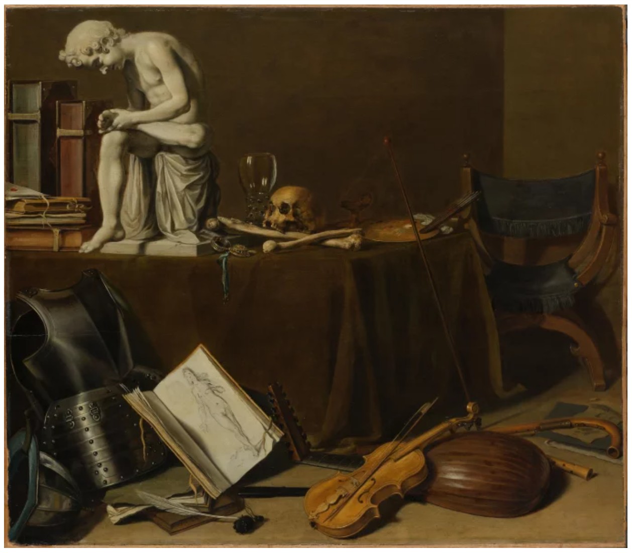
Pieter Claesz, Vanitas Still Life with the Spinario, 1628 / Rijksmuseum, Amsterdam
The iconic silkscreen process used by Warhol harkens to the booming commercialism of mid-twentieth century America. In adopting this commercial technique used for mass-production, the viewer is both confronted with the violence of the imagery, yet detached from it in the glossy, colorful surface. In its stillness and visual vacuity, Warhol sought to replicate the feelings of death, of his own near-fatal shooting.
“People sometimes say the way things happen in movies is unreal, but actually it’s the way things happen to you in life that’s unreal. The moves make emotions look so strong and real, whereas when things really do happen to you, it’s like watching television – you don’t feel anything.”
It is this emotionless reality of death that Guns clarifies so well. In his distinctive Pop-Art style, Warhol’s Guns crystalizes personal trauma, cultural violence, and artistic detachment into a stark meditation on life and death. Though rooted in his personal experiences, Warhol’s work resonates with centuries-old artistic traditions. In doing so, Guns stands not only as a reflection of Warhol’s own psychological scars but as a chillingly detached contemplation of death in the age of mass media: a powerful reminder that in a world of endless reproduction, even mortality can be commodified.
Lucien Freud
Self-portrait Fragment, circa 1956
Christie’s London: 15 October 2025
Estimated: GBP 8,000,000 – 12,000,000
LUCIAN FREUD (1922-2011), Self-portrait Fragment | Christie’s
LUCIAN FREUD (1922-2011)
Self-portrait Fragment, circa 1956
Oil on canvas
24×24 inches (61×61 cm)
Self-portrait Fragment (circa 1956) was first shown in Lucian Freud’s final solo exhibition at the Marlborough Gallery in London in 1968. Forty-five years passed before it was next seen in public as part of his posthumous retrospective at the Kunsthistorisches Museum, Vienna in 2013. It has since been exhibited in the major survey Lucian Freud: The Self-Portraits at the Royal Academy of Arts, London and the Boston Museum of Fine Arts (2019-2020), and the landmark centenary exhibition Lucian Freud: New Perspectives at the National Gallery, London and the Museo Nacional Thyssen-Bornemisza, Madrid (2022-2023). Freud’s face materializes amid open space. The skin’s complexities are mapped in fine, lucent planes of brick red, ochre, blue and green. Sketched lines trace the contours of shoulder, hand and jawline. Painted during the breakdown of the artist’s marriage to Caroline Blackwood, the work might also be seen as an image of dissolution. He touches four fingers to his face as if to verify his presence.
From surreal early works such as Self-portrait (Man with a Feather) (1943) to the vertiginous Reflection with Two Children (Self-portrait) (1965) and the raw, granular full-length nude Painter Working, Reflection (1992-1993), Freud’s self-portraits are formally daring and vary widely in style, marking pivotal moments in his life and work. Self-portrait Fragment is emblematic of Freud’s mid-1950s period, which saw him arrive at the intricate, richly worked technique that would become increasingly pronounced over the following decades.
Lucian Freud, Hotel Bedroom, 1953-1954. The Beaverbrook Art Gallery, Fredericton, Canada. Artwork and Digital image: © The Lucian Freud Archive. All Rights Reserved 2025 / Bridgeman Images.
Since the mid-1940s Freud’s paintings had been defined by a graphic exactitude and heightened attention to detail. He would often sit knee-to-knee with his subjects, the painting held in his lap. By the time he painted Self-portrait Fragment, he had begun instead to stand at an easel, and had substituted his fine sable brushes for coarser hog’s-hair. His gaze remained sharp: ‘Sometimes when I’ve been staring too hard’, he told William Feaver, ‘I’ve noticed that I could see the circumference of my own eye’ (L. Freud quoted in W. Feaver, ‘Lucian Freud: Life into Art’, in Lucian Freud, exh. cat. Tate, London 2002, p. 26). Yet the pictures gained a new vitality as their polish gave way to surfaces of nuanced, varied color, every feature carrying the brushstroke’s charge.
Gustave Courbet, Le Désespéré, 1841. Private collection.
In Freud’s centenary exhibition at the National Gallery, Self-portrait Fragment was hung alongside the contemporaneous unfinished portrait Francis Bacon (1956-1957). The pairing emphasized the impact of Freud’s relationship with Bacon. The two had been friends since the mid-1940s and saw each other almost daily during these years, carousing in Soho, discussing their work and visiting one another’s studios. Freud was living on Dean Street at the time, but also kept his studio in Delamere Terrace in Paddington, where he painted both of these pictures. He was impressed by Bacon’s daring and wit, and by his attitude to paint. It was Bacon who inspired him to loosen the tight control of his early work. ‘He talked a great deal about the paint itself carrying the form,’ Freud remembered, ‘and imbuing the paint with this sort of life; he talked about packing a lot of things into a single brushstroke’ (L. Freud quoted in W. Feaver, The Lives of Lucian Freud: Youth, 1922-68, London 2019, pp. 487-488).
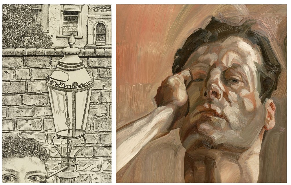
Left: Lucian Freud, Street Scene, 1948. Private collection. Artwork and Digital image: © The Lucian Freud Archive. All Rights Reserved 2025 / Bridgeman Images. Right: Lucian Freud, Man’s Head (Self-Portrait), 1963. Whitworth Art Gallery, The University of Manchester. Artwork and Digital image: © The Lucian Freud Archive. All Rights Reserved 2025 / Bridgeman Images.
The arrival of Freud’s more freely modelled and expressive approach is palpable in both paintings, with the men’s faces blooming into life amid the amplifying space of the blank canvas. In Self-portrait Fragment each shadow, furrow and gleam—the curve of his aquiline nose, the sparkle of his grey-blue eyes rimmed with white—is at once precisely captured and animated by the brushwork’s texture. Licks of paint indicate flame-like locks of hair. In the lines that sketch the unfinished areas, Freud’s early talent as a draughtsman lingers. With his painting hand pressed to his cheekbone, he records a moment of contact, as if in awe at the union of paint and flesh. Echoing Caroline Blackwood’s pose in the double portrait Hotel Bedroom (1953-1954)—begun on the couple’s honeymoon in Paris—it is perhaps also a gesture of farewell. Freud painted his final portrait of Caroline, Girl by the Sea, in 1956.
Francis Bacon
Portrait of a Dwarf, 1975
Sotheby’s London: 16 October 2025
Estimated: GBP 6,000,000 – 9,000,000
Portrait of a Dwarf | Contemporary Evening Auction | 2025 | Sotheby’s
FRANCIS BACON (1909 – 1992)
Portrait of a Dwarf, 1975
Oil on canvas
159 x 58.4 cm (62 5/8 x 23 inches)
Signed twice, titled and dated 1975 (on the reverse)
Executed in Paris in 1975, Portrait of a Dwarf stands alone in Francis Bacon’s oeuvre. Four years after George Dyer’s tragic death on the eve of the artist’s Grand Palais retrospective in the same city, Bacon turned to Velazquez, his ‘God’, once again for inspiration. In the same way as his Popes had been presented on a dais or throne, here his subject is raised up to meet and confront the viewer directly. An amalgamation of Dyer’s hairline, Peter Beard’s face, Lucian Freud’s torso and Bacon’s own foreshortened legs, this figure melds some of his closest friends and greatest loves – yet still recalls Velazquez’s A Dwarf Sitting on the Floor. Purposefully set off-centre, the vertical format is entirely unique in the artist’s oeuvre and heightens the figure’s raw intensity. Reminiscent of his great black triptychs of the same period and the curtained backdrops of his Pope series of the 1950s, the acutely physical presence is underscored by the compressed interior space.
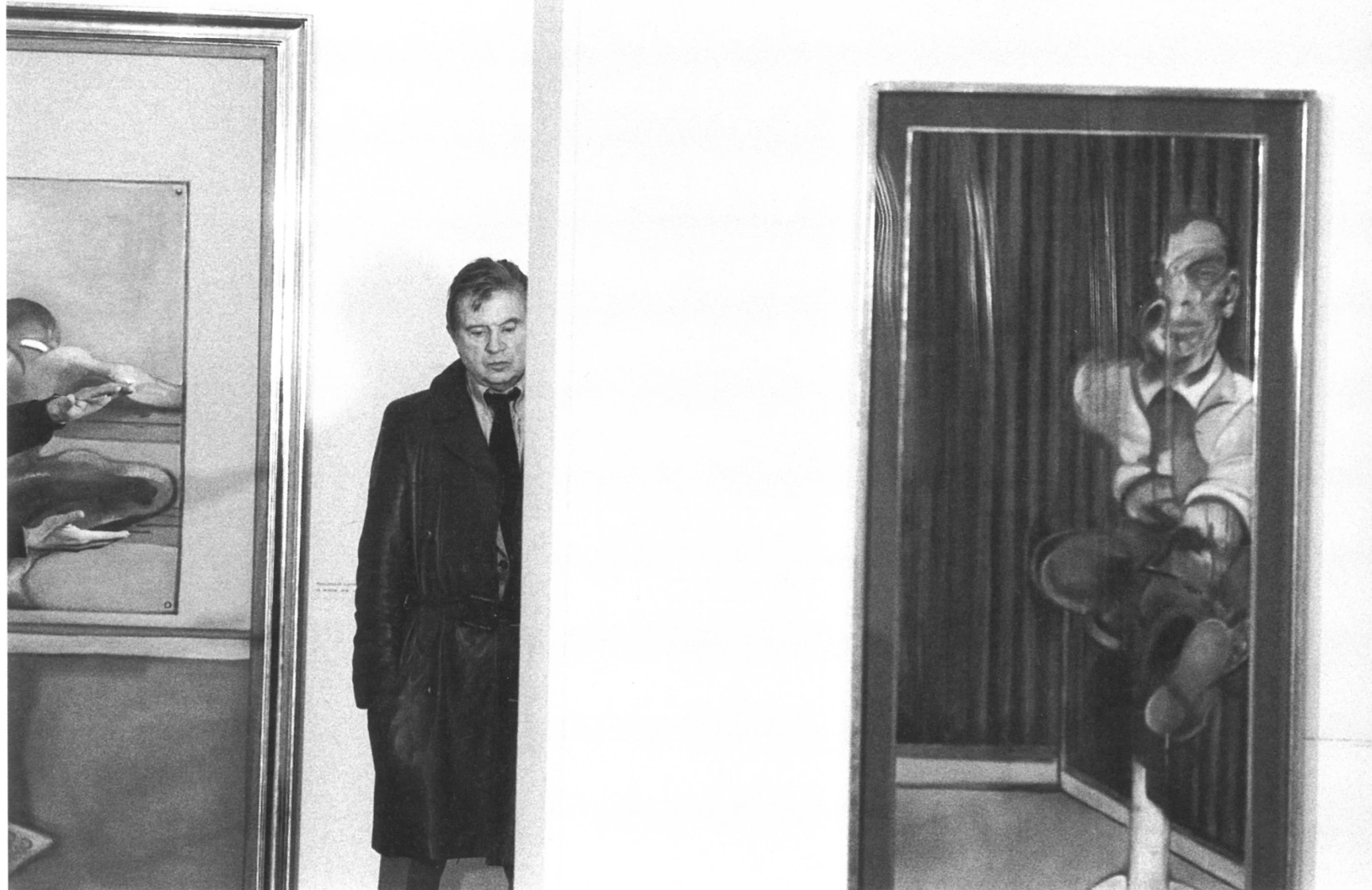
Francis Bacon at Galerie Claude Bernard, Paris, 1977. Photo: Michel Soskine.
Art © The Estate of Francis Bacon. All rights reserved. DACS 2025
The contrapposto pose of the body, expressed in muted tones of black, slate blue, and creamy white, is counterbalanced by the still, arresting gaze of the remarkably rendered face, exquisite in shades of pale pink, lilac, and warm orange, heightened by elegant scumbled impressions of corduroy imprinted onto the surface. In an exceptionally rare step for the artist, Bacon retained Portrait of a Dwarf in his own collection for several years and even exhibited it as ‘property of the artist’ in a series of exhibitions, most notably in the acclaimed Galerie Claude Bernard exhibition in Paris in 1977, a testament to the painting’s personal significance for the artist. Since then, the present work has been widely exhibited and referenced in literature, and has remained in the same private collection since it was acquired from the artist in 1981. A singular and powerful embodiment of Bacon’s inimitable praxis, Portrait of a Dwarf is a masterwork of psychological intensity and personal significance as great as any in the artist’s momentous corpus.
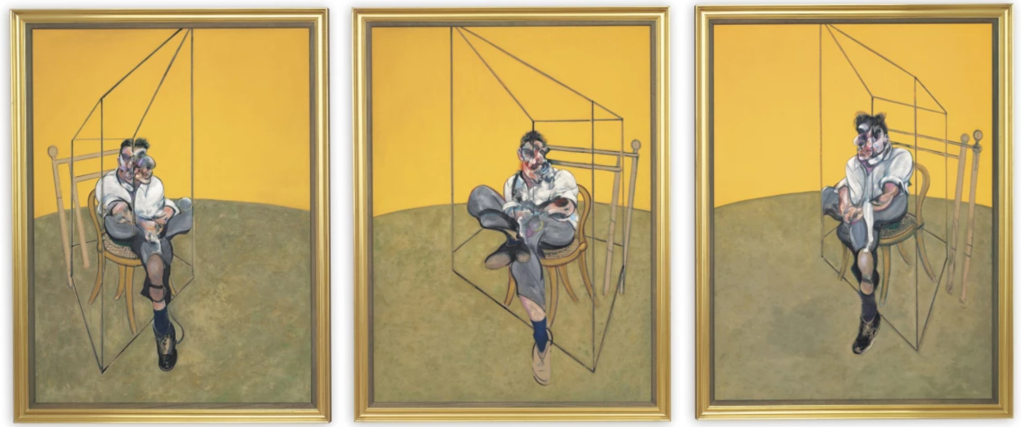
Francis Bacon, Three Studies of Lucian Freud, 1969. Private Collection, USA.
Art © The Estate of Francis Bacon. All rights reserved. DACS 2025
The present work’s unique composition is a result of Bacon’s notoriously relentless self-editing: he not only destroyed many of his paintings, but also reworked and continuously altered some that had already been deemed ‘completed.’ Originally part of a larger canvas, Bacon viewed Portrait of a Dwarf as the entirety of his finished composition, preserving this part and signing it on the back, as was his custom, not once but twice. Eddy Batache – scholar, art historian and close friend of the artist – recounts its creation: “The Dwarf is a very exceptional item in Francis’s work. He never did that format before. The reason is that it was part of a bigger panel. Francis said [to Reinhard Hassert]: ‘I’m a bit uneasy about that composition; it doesn’t seem to work altogether’; to which Reinhard responded: ‘Well, there’s one thing which is absolutely wonderful: it’s that right part with the dwarf on it.’ Francis said: ‘Yes, I agree with you. That works very well. But it doesn’t work with the other half’; to which Reinhard replied: ‘Look for God’s sake whatever you do, save the dwarf.’ Francis responded: ‘I’m going to cut off that painting and throw out the part which is on the left.’ We were convinced that the left part had been destroyed… After he died we saw the left part of the painting in an exhibition in Düsseldorf. No signature on the back. Francis wanted to have The Dwarf on its own and he disregarded the other half.” (Eddy Batache in video conversation, 2025). The resulting format adds a remarkable potency, as the narrow, confining space emphasises the figure’s contorted body with an uneasy, yet unwaveringly intense focus.
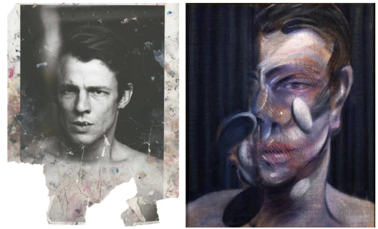
LEFT: Bacon studio material, photograph of Peter Beard. Collection: Dublin City Gallery The Hugh Lane Photo © Peter Beard. Source © The Estate of Francis Bacon
RIGHT: Francis Bacon, Study for Portrait (Peter Beard), 1975. Private Collection. Image: Bridgeman Images. Art © The Estate of Francis Bacon. All rights reserved. DACS 2025
The figure itself is particularly well composed: while the head resembles depictions of both Peter Beard and George Dyer, the torso recalls that of Lucian Freud as seen in the artist’s renowned photographic source images taken by John Deakin, and the lower limbs relate directly to Bacon’s full-body self-portraits. In this painterly ‘collage’ of bodies, Bacon combines elements of his most frequent and cherished subjects into a new and potent figure, at once recapitulating what he had done before yet, as ever, reinventing and reimagining his composition. In this way, the critical importance of photography in Bacon’s working method is brought to the fore; synthesizing a wide range of imagery, memories, and spontaneous invention, Bacon delivers a painting of enigmatic allusion and complex metaphor.
“How can you cut your flesh open and join it with another person? It is an impossibility to do. So it is with art, it is almost like a love affair with images, appearances and sensations. You may love somebody very much but how near can you get to them? You are still always unfortunately strangers.”
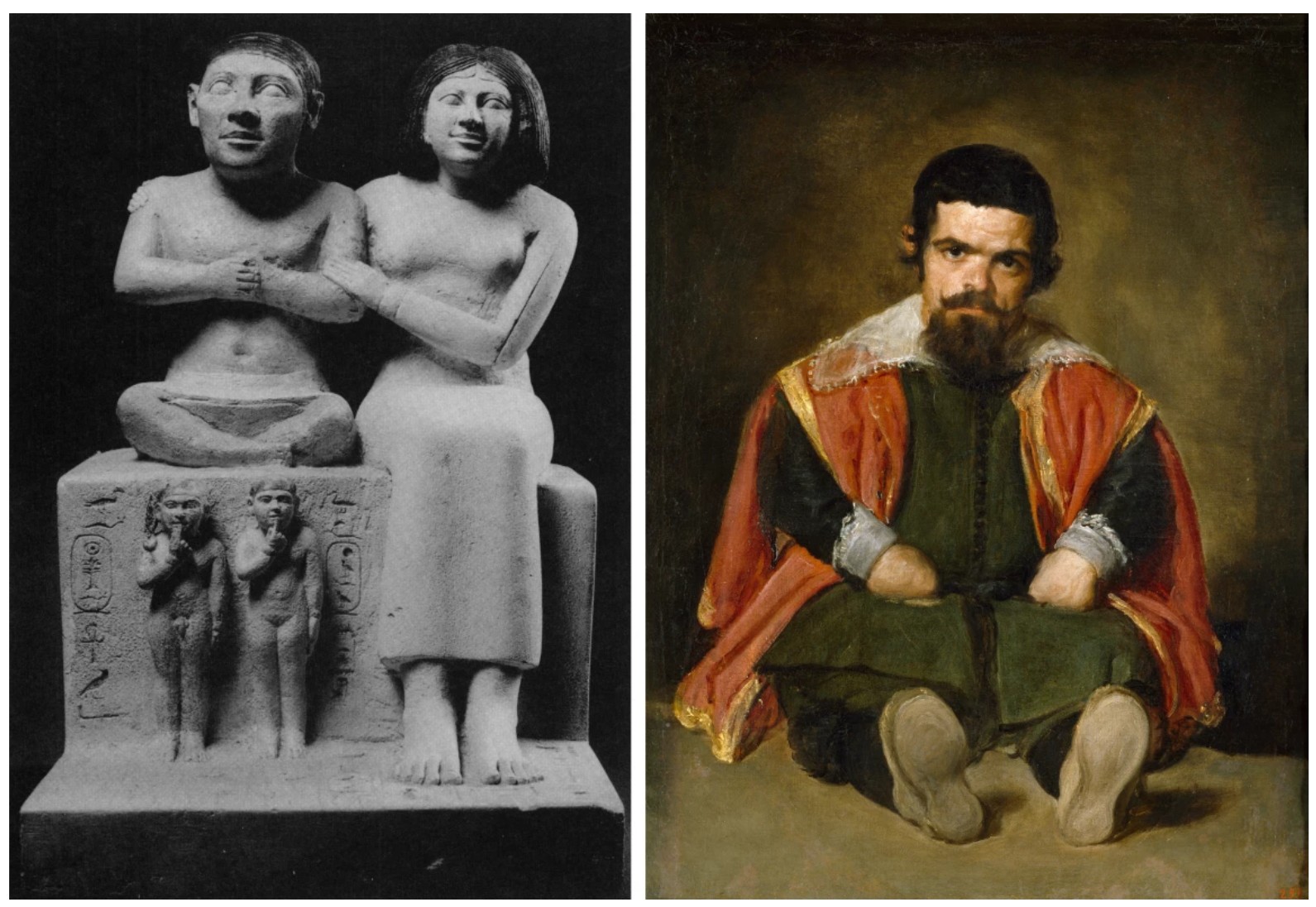
LEFT: Statue of Seneb and his Family, 24th – 23rd Century BC. Egyptian Museum, Cairo
RIGHT: Diego Velázquez, Portrait of Sebastián de Morra, c. 1644. Museo del Prado, Madrid
In its subject, Portrait of a Dwarf reflects Bacon’s passion for Diego Velázquez, who painted the dwarfs who customarily attended the seventeenth-century Spanish court. As noted by author and art historian Martin Harrison, “The dwarf’s seated, cross-legged pose recalls both Velázquez’s A dwarf sitting on the floor (c. 1645) and the ancient Egyptian statue of Seneb, the chief of the palace dwarves, in the National Museum, Cairo; Bacon, who considered Egyptian art to have been mankind’s highest cultural achievement, had visited Cairo in 1951 and is likely to have seen the figure” (Martin Harrison, “Francis Bacon: Lost and Found,” Apollo 161, March 2005, p. 94). Underscoring the connection to Velázquez is the rapid striations of dark blue and black paint that cover the walls of the interior, a ‘shuttering’ effect that Bacon adapted from the pastels of Edgar Degas and incorporated into many of his screaming Papal portraits, themselves inspired by Velázquez’s 1650 Portrait of Innocent X. Used throughout his oeuvre to express a release of tension, these lines create a kind of shuddering optical static that destabilizes the figure-ground relationship, recalling the flickering motion of a Muybridge slideshow, while also emphasizing the work’s sense of psychological distortion. This effect is further heightened by Bacon’s elevation of the figure on a pedestal; similar to his famed cage motif, the dais serves both to focus the viewer’s attention and to emphasize the subject’s carnal physicality. Exposed and vulnerable, his twisted body becomes a symbol of raw emotion and psychic anxiety, characteristic of Bacon’s greatest masterworks.
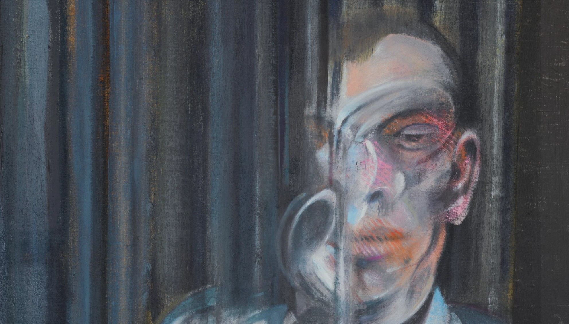
In Bacon’s quintessential style, the present composition is exquisitely balanced between urgent spontaneity and calculated precision. As eloquently described by Eddy Batache, “[T]he element of instinct, though Bacon does not disown it, is far from constituting the essence of his painting. He attaches enormous importance to the details he so lovingly polishes and repolishes, even though he knows that nobody but himself would perceive the subtle transformations he has wrought in them… The Portrait of a Dwarf, one of Bacon’s most successful works in the last few years, is particularly significant for its seemingly paradoxical co-existence of these two elements. Only an impulse welling up from the depths of his being could have drawn the main lines of the character, his attitude, his presence. But apart from this outlining, one cannot fail to appreciate the extraordinary finish of the work, of a perfection that can only be attained through consummate professionalism” (Eddy Batache, “Francis Bacon and the last convulsions of Humanism,” Art and Australia, Summer 1985, pp. 222-23). An instinctual painter, who said he wanted to work as close to the nervous system and unconscious as possible, Bacon employed whatever was at hand in his infamously unkempt studio, from photographic source material to unconventional media. As well as brushes, he used his hands, rags of wool and textile, newspapers and paint tubes to apply and manipulate the paint, exploiting the malleability and tactility of the nearly-dry oils to create chance visual effects, clearly visible here in the pink and orange pigment that has been swiped across the figure’s eye and mouth with a corduroy rag.
Francis Bacon, Study for Self-Portrait, 1963. National Museum and Gallery, Cardiff.
Art © The Estate of Francis Bacon. All rights reserved. DACS 2025
As with all of Bacon’s greatest paintings, the present work confronts us with a body that does not perform as we expect; in its defamiliarization, the figure becomes a cipher for psychological angst and the uncomfortable, even painful truth of the human condition. For centuries, portraiture was a means by which to reach an absolute representation of an individual: direct, unambiguous statements of a person’s character and statehood, categorized by identifiers of dress, ownership, and other iconographic markers. With the onset of Modernism, however, artists displayed their doubt in the truthfulness of this structured view of human personality, turning away from a monolithic view of human nature defined by power, and instead to a variable, contingent expression of individuals characterised by flaws and ambiguity. Unapologetic and strident in its representation and recapitulation of the human form and more broadly the human condition, Portrait of a Dwarf represents a milestone in Bacon’s oeuvre, both for its position in his canon and for the quality of its execution. The only work which he kept and exhibited as his own, Portrait of a Dwarf represents Bacon at the height of his powers and stands as a singularly potent homage to those he loved most.
Study for Self-Portrait, 1980
Sotheby’s London: 16 October 2025
Estimated: GBP 5,000,000 – 7,000,000
Study for Self-Portrait | Contemporary Evening Auction | 2025 | Sotheby’s
FRANCIS BACON (1909 – 1992)
Study for Self-Portrait, 1980
Oil on canvas
35.5 x 30.5 cm (14×12 inches)
Signed, titled and dated 1980 (on the reverse)
Executed in the artist’s eighth decade at the age of 71, Study for Self-Portrait of 1980 ranks amongst the greatest iterations of Francis Bacon’s legendary scrutiny of his own iconic features. Startling in color, bold in gesture, and unmistakably Baconian in effect, this painting is a masterwork of self-interrogation. Wielding the full force of a life’s worth of retrospect, Bacon here looks back at himself as a young man; a translucent blue haze partially occludes his younger visage, giving physical form to the ephemeral, long-past memories and emotions it depicts. In a searching translation and recapitulation of his own physical likeness, Bacon revisits the starched collared and suited figures from his 1950s via a mature, and almost luminescent, mastery of paint. Closely aligned to the captivating and penetrating examples prestigiously housed in the Centre Pompidou, Paris and the Musée Cantini, Marseille, the present work delivers an extraordinary and atmospheric embodiment of Bacon’s abiding engagement with self-portraiture. Deeply meditative and profoundly reflective, Study for Self-Portrait significantly preserves one of the very final depictions of Bacon’s likeness in this uncharacteristically tender, intimate and crucial single-canvas format.
Francis Bacon with the present work. Photo: Eddy Batache. Art © The Estate of Francis Bacon. All rights reserved. DACS 2025
Amid the spectacular color and virtuoso brushwork Bacon here presents an ethereal and unearthly form that is unmistakable: in evidence is the artist’s distinctive forelock of hair, those inimitable diagonal brush marks which the esteemed French poet, and friend of Bacon’s, Michel Leiris once described as “a reckless comma staunchly inscribed across his brow” (Michel Leiris, Francis Bacon Full Face and in Profile, New York 1983, p. 12). Dressed in a formal white collar, Bacon’s features emerge from a soft blue mist – reminiscent of Claude Monet’s late Nymphéas – which serves to heighten the blurred, even nostalgic presence that emanates from the canvas. This painting does not possess the carved tangle of physiognomic forms or time-weariness evident in self-portraits from the 1970s; instead, it emanates an alert youthfulness and contemplative poignancy. His smooth, sculpted features are offset by a single corduroy swipe of bright pink across the mouth and illuminated by accents of white.
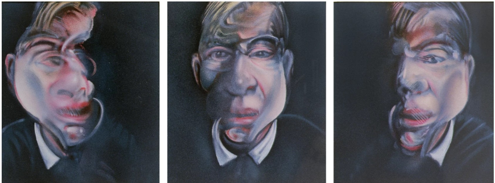
Francis Bacon, Three Studies for Self-Portrait, 1979. The Metropolitan Museum of Art, New York. Jacques and Natasha Gelman Collection. Image: Bridgeman Images. Art © The Estate of Francis Bacon. All rights reserved. / DACS, London 2025
As if attempting to recall a dream or clouded memory of himself, Bacon makes visible the ambiguous slippages of reality through the vaporous spray. Powerfully evincing Bacon’s essential artistic aim, the present example fulfils a compelling visual counterpart to the artist’s own desire for his work: “I would like my pictures to look as if a human being had passed between them, like a snail, leaving a trail of human presence and memory trace of past events, as the snail leaves its slime” (the artist, cited in: David Sylvester, Looking Back at Francis Bacon, London 2000, p. 33).
Claude Monet, Nymphéas, ca. 1916. National Gallery, London. Image: Bridgeman Images
Considered the most introspective and inwardly scrutinizing phase of his career, Bacon’s late production of the 1970s and 80s is characterised by the searing self-images that emerged following the sudden death in 1971 of Bacon’s former lover George Dyer. Whether heroically scaled or intimately proportioned, the self-portraits form a link to Oscar Wilde’s Picture of Dorian Gray: where Bacon’s grief was stoically concealed from life, the canvases became the face of his suffering and pain. Although the major work of Bacon’s mourning came to an end with the black triptychs in ‘74, the spirit of Dyer and practice of self-portraiture endured, fed by an ever-increasing number of bereavements as Bacon grew older. Not long after Dyer in 1971, the artist’s Soho companion and Vogue photographer John Deakin passed away, followed by the Colony Room’s famous matriarch, Muriel Belcher in 1979. These losses famously led Bacon to proclaim: “I’ve done a lot of self-portraits, really because people have been dying around me like flies and I’ve had nobody else to paint but myself” (Ibid., p. 129). By the turn of the decade however, the opening of a retrospective at the Metropolitan Museum in New York, his growing success in Paris, and the increasing prominence of two younger men in his life, Peter Beard and John Edwards, ushered in a tonal change that signalled the beginnings of a late style, exemplified by the unusually kind self-depiction of the present work.
LEFT: Pablo Picasso, Self-Portrait Facing Death, 1972. Fuji Television Gallery, Tokyo. Art © 2025 Estate of Pablo Picasso / DACS, London
RIGHT: Alberto Giacometti, Buste de Diego, c. 1962-64. Fondation Albert & Annette Giacometti. Image: Bridgeman Images. Art © The Estate of Alberto Giacometti / DACS, London / ADAGP, Paris 2025
This painting also narrates a phase of Bacon’s life in which he strengthened his ties to the Parisian avant-garde. An avowed Francophile, Bacon believed Paris to be the epicenter of the artistic world: home to the birth of Modernism, it was in Paris at the end of the 1920s that Bacon, inspired by a Pablo Picasso exhibition, first nurtured his ambitions to become a painter. Many aspects of Study for Self-Portrait – its chromatic subtlety and luminous brilliance – anchor it to the increasingly extended periods Bacon spent living and working in Paris. Inspired by the great masters who notably lived and worked there – from the Impressionist painters and sculptors such as Claude Monet and Auguste Rodin to later Modernists like Pablo Picasso and Alberto Giacometti – Bacon observed, interpreted, and integrated a myriad of source material. In describing Study for Self-Portrait, Bacon himself proclaimed, “This is my Impressionist period” (the artist cited in Martin Harrison, ed., Francis Bacon Catalogue Raisonné, Volume IV, 1971-92, London 2016, p. 1203). Paintings such as this, executed during his most concentrated time in France, are imbued with the essence of great historical precedent.
At first driven by a masochistic impulse to inhabit his guilt more intensely, Bacon was drawn back to the site of Dyer’s suicide, to the very hotel in which he had died only 48 hours prior to the opening of Bacon’s Grand Palais retrospective. Paris, the very centre of Bacon’s artistic aspirations, was thus forever cast under the tragic shadow of Dyer’s demise, and yet it became an incredibly successful location from which to work. With the length of his stay increasing each time, Bacon’s need to paint demanded a proper place in which to work, and in 1974 he took up a studio in the Marais district at 14 rue de Birague. With one large room at the top and a kitchen on the lower level, the Parisian studio possessed the same creative portent and atmosphere as the claustrophobic environs of the now famous 7 Reece Mews; as explained to David Sylvester: “I am very influenced by places – by the atmosphere of a room, you know. And I just knew from the very moment that I came here [Reece Mews] that I would be able to work here. And I felt the same thing about the place in Paris. It’s only one room, but I knew from the moment I went into it that it was a place I could work in” (the artist in: Sylvester, op. cit., pp. 189-90). Bacon’s increasing success and growing legendary status in Paris, set in stone by his wildly successful show at Galerie Claude Bernard in 1977, truly characterise the period: many of the mid-to-late 1970s works exude a curious mix of the intellectually stimulating and exhilarating ambience of Paris with the melancholic introspection that typifies the decade.