WORK IN PROGRESS
Agenda

Leonard & Louise Riggio: Collected Works
12 May 2025
Leonard & Louise Riggio: Collected Works
20th Century Evening Sale
12 May 2025
Impressionist and Modern Works on Paper
13 May 2025
Impressionist and Modern Works on Paper
Impressionist and Modern Art Day Sale
13 May 2025
Impressionist and Modern Art Day Sale
21st Century Evening Sale
14 May 2025
Post-War and Contemporary Art Day Sale
15 May 2025
Post-War and Contemporary Art Day Sale

Modern Evening Auction
13 May 2025
Modern Evening Auction | 2025 | Sotheby’s
Modern Day Auction
14 May 2025
Modern Day Auction | 2025 | Sotheby’s
Selections from The Collection of Barbara Gladstone
15 May 2025
Selections from The Collection of Barbara Gladstone | Contemporary Art | Sotheby’s
Im Spazio: The Space of Thoughts
15 May 2025
Im Spazio: The Space of Thoughts | Contemporary Art | Sotheby’s
The Now and Contemporary Evening Auction
15 May 2025
The Now and Contemporary Evening Auction | 2025 | Sotheby’s
Contemporary Day Auction
16 May 2025
Contemporary Day Auction | 2025 | Sotheby’s

Modern & Contemporary Evening Sale
13 May 2025
Modern & Contemporary Art Evening Sale, New York Tuesday, May 13, 2025 at EDT | Phillips
Modern & Contemporary Art Day Sale (Morning Session)
14 May 2025
Modern & Contemporary Art Day Sale (Afternoon Session)
14 May 2025
Auction Statistics
1. Summary
Total: USD 1,265,046,548
1,255 Lots Sold
Sell-Through Rate: 83.1%
This week generated a total of USD 1,265,046,548 through the sale of 1,255 lots.
This compares to:
USD 1,288,212,426 through the sale of 1,234 lots generated in November 2024
USD 1,388,814,873 generated in May 2024 through the sale of 1,396 lots.
2. Market Shares
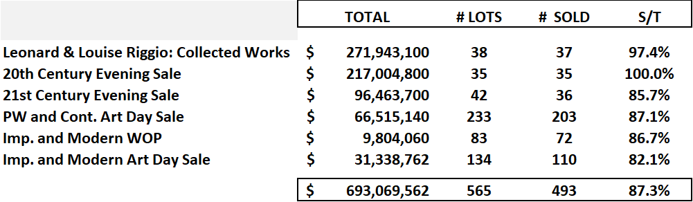
Christie’s realized a total turnover of USD 693,069,562 through the sale of 493 lots.
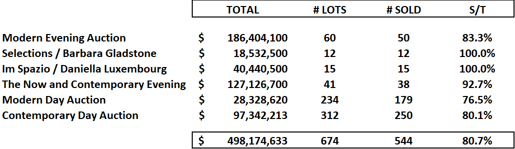
Sotheby’s realized a total turnover of USD 498,174,213 through the sale of 544 lots.
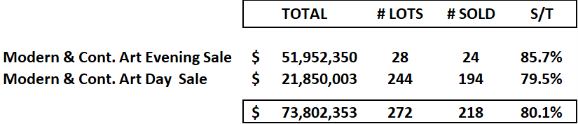
Sotheby’s realized a total turnover of USD 73,802,353 through the sale of 218 lots.
3. Top 10 Lots
#1. Composition with Large Red Plane, Bluish Gray, Yellow, Black and Blue, 1922
Leonard & Louise Riggio: Collected Works
Christie’s New-York: 12 May 2025
Estimate on Request
USD 47,560,000
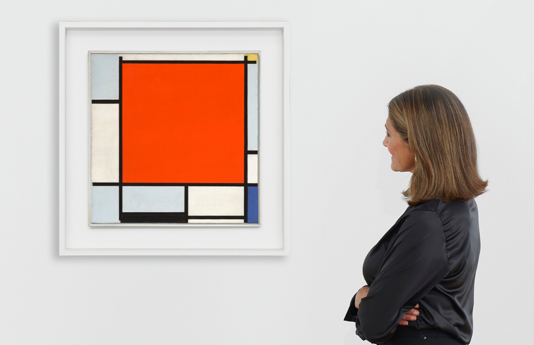
PIET MONDRIAN (1872-1944)
Composition with Large Red Plane, Bluish Gray, Yellow, Black and Blue, 1922
Oil on canvas
54 x 53.3 cm (21 1/4 x 21 inches)
Signed with initials and dated ‘PM ’22’ (lower center)
Painted in Paris in 1922
#2. Peupliers au bord de l’Epte, crépuscule, 1891
Christie’s New-York: 12 May 2025
Estimated: USD 30,000,000 – 50,000,000
USD 42,960,000
CLAUDE MONET (1840-1926), Peupliers au bord de l’Epte, crépuscule | Christie’s
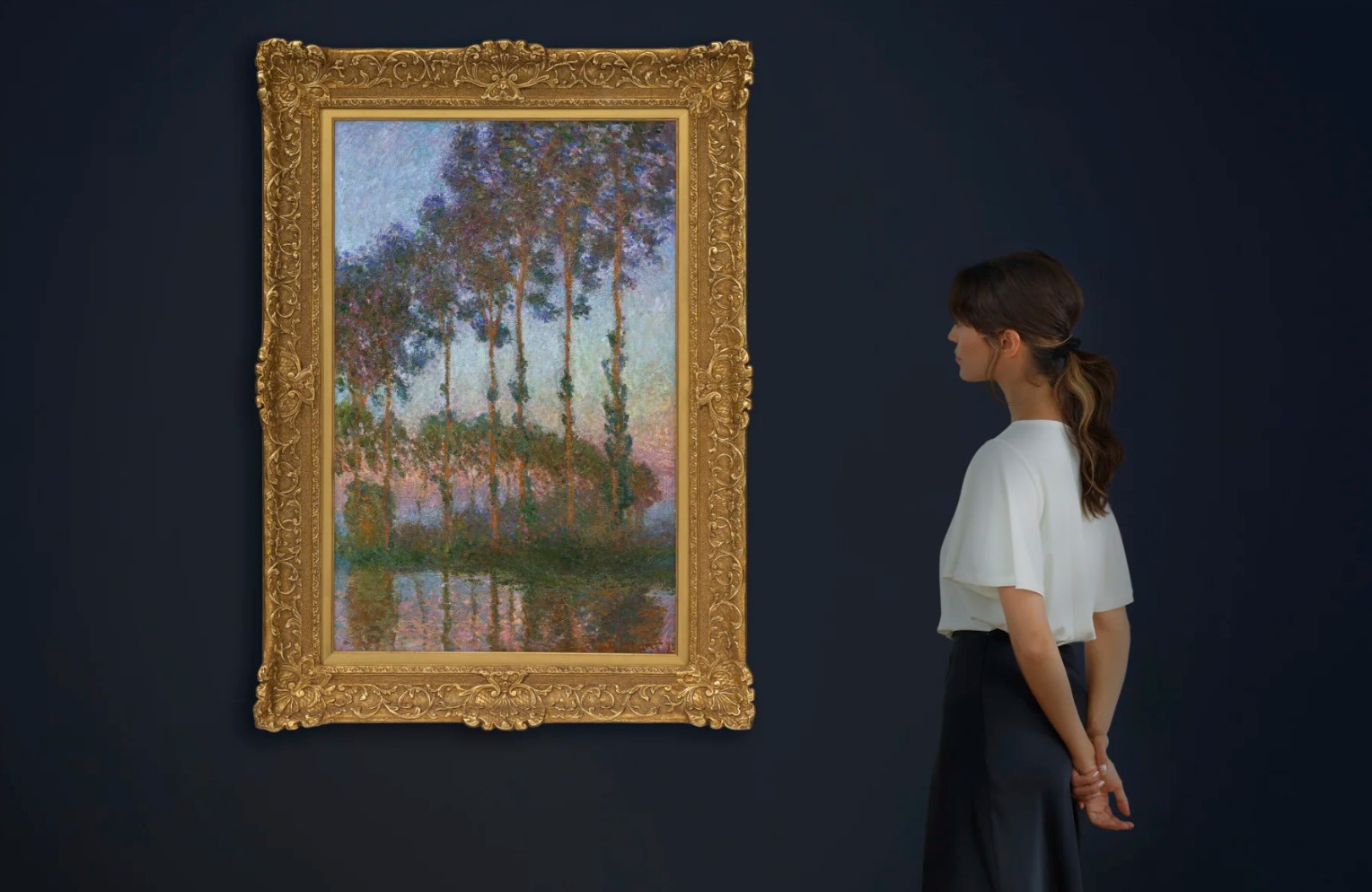
CLAUDE MONET (1840-1926)
Peupliers au bord de l’Epte, crépuscule, 1891
Oil on canvas
100 x 65.1 cm (39 3/8 x 25 5/8 inches)
Signed and dated ‘Claude Monet 91’ (lower right)
#3. No. 4 (Two Dominants) [Orange, Plum, Black], 1950-51
Christie’s New-York: 12 May 2025
Estimate on Request
USD 37,785,000
MARK ROTHKO (1903-1970), No. 4 (Two Dominants) [Orange, Plum, Black] | Christie’s
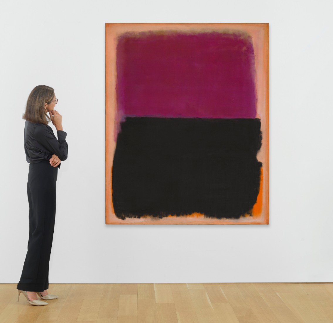
MARK ROTHKO (1903-1970)
No. 4 (Two Dominants) [Orange, Plum, Black], 1950-51
Oil on canvas
67 x 54 3/4 inches (170.2 x 139.1 cm)
Signed twice and dated ‘MARK ROTHKO MARK ROTHKO 1951’ (on the reverse)
#4. L’empire des lumières, 1949
Leonard & Louise Riggio: Collected Works
Christie’s New-York: 12 May 2025
Estimates on Request
USD 34,910,000
RENE MAGRITTE (1898-1967), L’empire des lumières | Christie’s
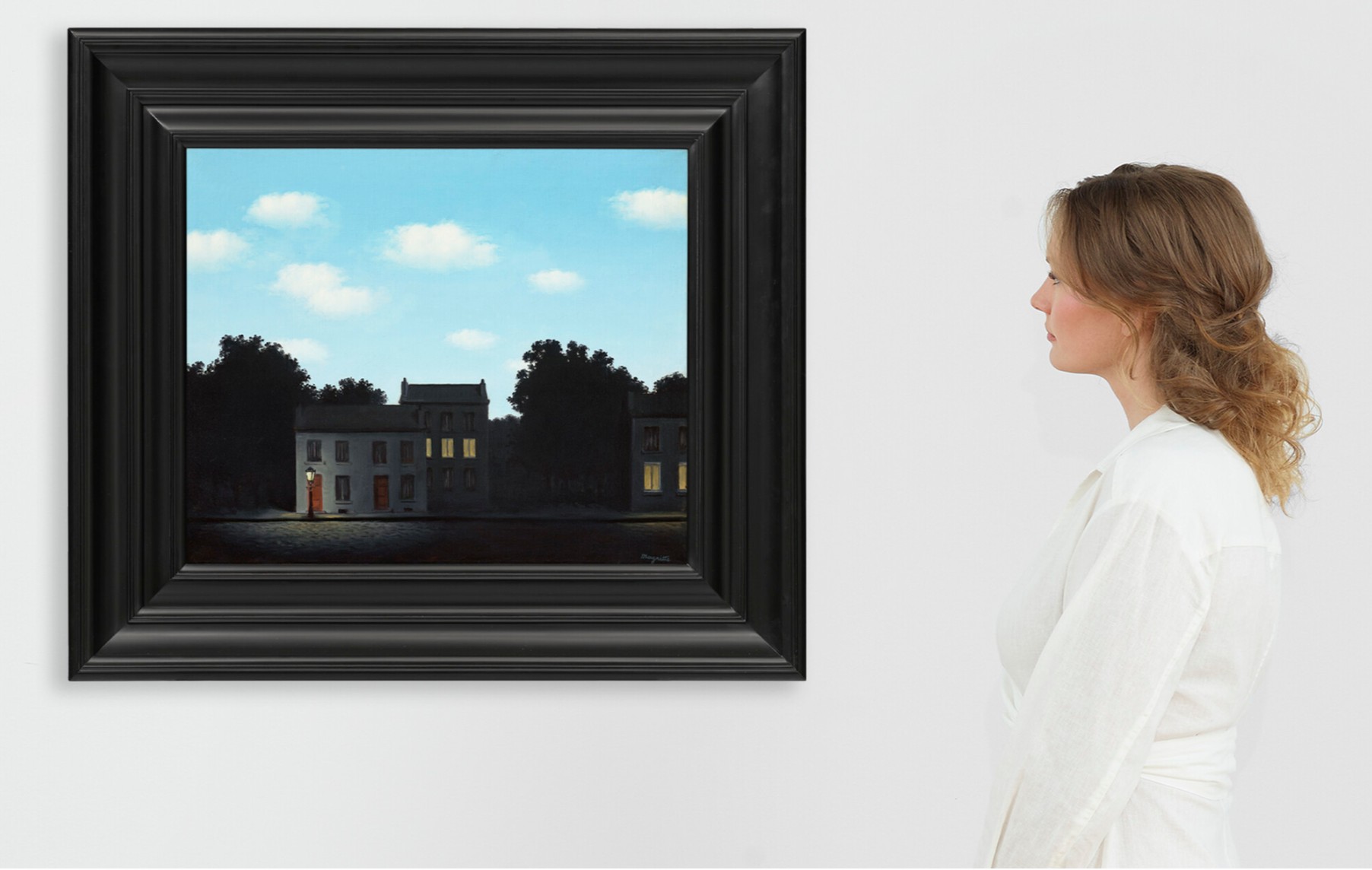
RENE MAGRITTE (1898-1967)
L’empire des lumières, 1949
Oil on canvas
48.2 x 58.7 cm (19 x 23 1/8 inches)
Signed ‘Magritte’ (lower right)
Sated and titled ‘”L’EMPIRE des LUMIÈRES” 1949’ (on the reverse)
#5. Femme à la coiffe d’Arlésienne sur fond vert (Lee Miller), 1937
Leonard & Louise Riggio: Collected Works
Christie’s New-York: 12 May 2025
Estimated: USD 20,000,000 – 30,000,000
USD 28,010,000
PABLO PICASSO (1881-1973), Femme à la coiffe d’Arlésienne sur fond vert (Lee Miller) | Christie’s
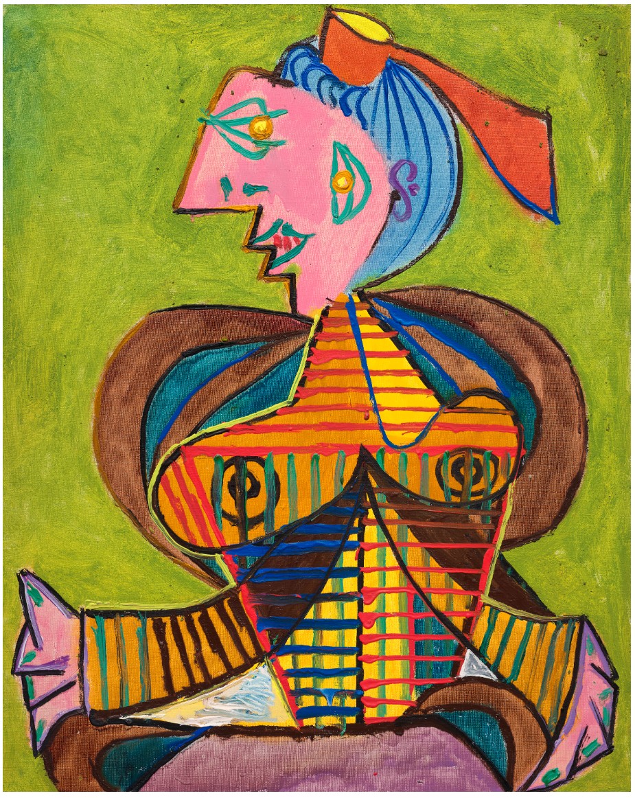
PABLO PICASSO (1881-1973)
Femme à la coiffe d’Arlésienne sur fond vert (Lee Miller), 1937
Oil and Ripolin on canvas
81 x 65.1 cm (31 7/8 x 25 5/8 inches)
Dated and numbered ‘2 septembre 37 II’ (on the stretcher)
Painted in Mougins on 2 September 1937
4. Auction Records
Miss January, 1997
Christie’s New-York: 14 May 2025
Estimated: USD 12,000,000 – 18,000,000
USD 13,635,000
AUCTION RECORD FOR A LIVING FEMALE ARTIST
MARLENE DUMAS (B. 1953), Miss January | Christie’s
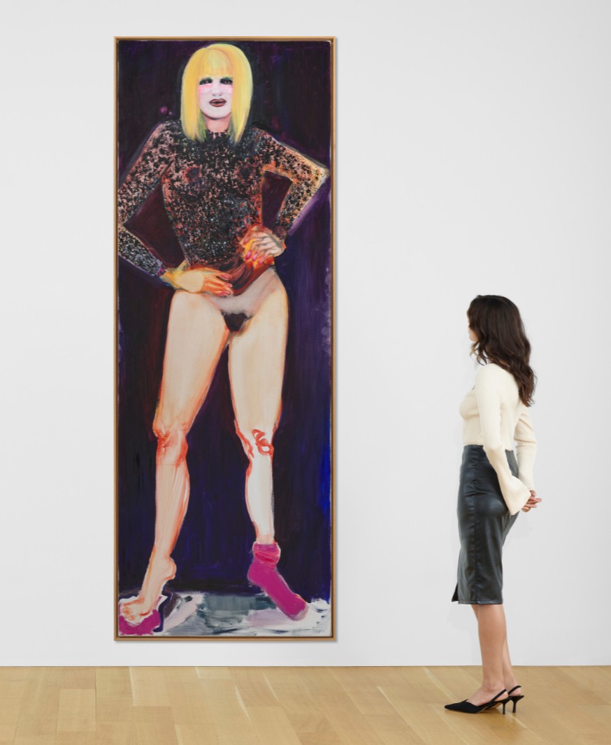
MARLENE DUMAS (B. 1953)
Miss January, 1997
Oil on canvas
280×100 cm (110 1/4 x 39 3/8 inches)
Signed, titled and dated ‘M Dumas Miss January 1997’ (on the reverse)
PART II: AUCTION RESULTS
Leonard & Louise Riggio: Collected Works
12 May 2025
Leonard & Louise Riggio: Collected Works
1. Auction Statistics
TOTAL: USD 271,943,100
# Lots: 39
Withdrawn: 1 Lot
Passed: 1 Lot
Sold: 37 Lots
Sell-Through Rate: 97.4%
Top Lot: USD 47,560,000

Source: LiveArt
2. Top 5 Lots
#1. Composition with Large Red Plane, Bluish Gray, Yellow, Black and Blue, 1922
Leonard & Louise Riggio: Collected Works
Christie’s New-York: 12 May 2025
Estimate on Request
USD 47,560,000
PIET MONDRIAN (1872-1944)
Composition with Large Red Plane, Bluish Gray, Yellow, Black and Blue, 1922
Oil on canvas
54 x 53.3 cm (21 1/4 x 21 inches)
Signed with initials and dated ‘PM ’22’ (lower center)
Painted in Paris in 1922
#2. L’empire des lumières, 1949
Leonard & Louise Riggio: Collected Works
Christie’s New-York: 12 May 2025
Estimates on Request
USD 34,910,000
RENE MAGRITTE (1898-1967), L’empire des lumières | Christie’s
RENE MAGRITTE (1898-1967)
L’empire des lumières, 1949
Oil on canvas
48.2 x 58.7 cm (19 x 23 1/8 inches)
Signed ‘Magritte’ (lower right)
Sated and titled ‘”L’EMPIRE des LUMIÈRES” 1949’ (on the reverse)
#3. Femme à la coiffe d’Arlésienne sur fond vert (Lee Miller), 1937
Leonard & Louise Riggio: Collected Works
Christie’s New-York: 12 May 2025
Estimated: USD 20,000,000 – 30,000,000
USD 28,010,000
PABLO PICASSO (1881-1973), Femme à la coiffe d’Arlésienne sur fond vert (Lee Miller) | Christie’s
PABLO PICASSO (1881-1973)
Femme à la coiffe d’Arlésienne sur fond vert (Lee Miller), 1937
Oil and Ripolin on canvas
81 x 65.1 cm (31 7/8 x 25 5/8 inches)
Dated and numbered ‘2 septembre 37 II’ (on the stretcher)
Painted in Mougins on 2 September 1937
#4. Femme de Venise I, 1956-1958
Leonard & Louise Riggio: Collected Works
Christie’s New-York: 12 May 2025
Estimated: USD 15,000,000 – 20,000,000
USD 17,660,000
ALBERTO GIACOMETTI (1901-1966), Femme de Venise I | Christie’s
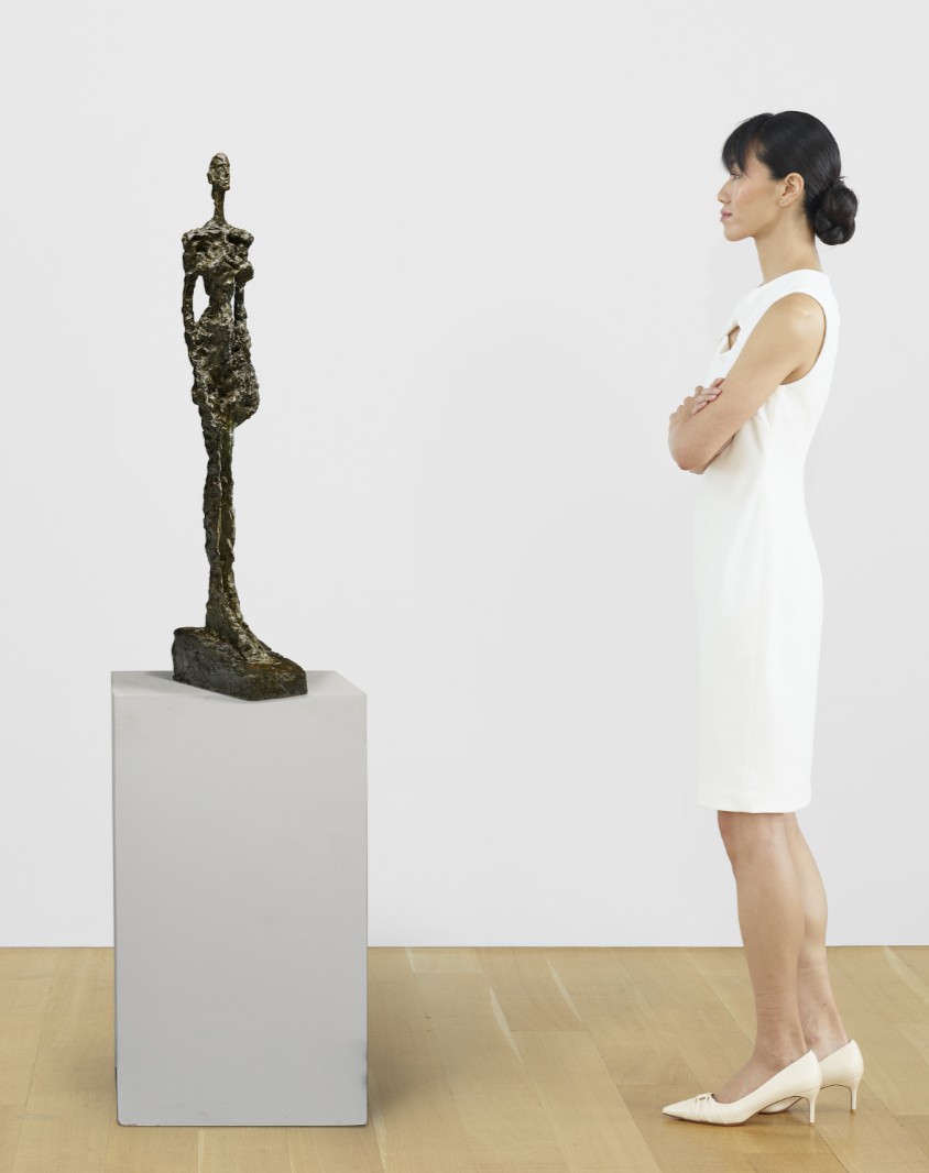
ALBERTO GIACOMETTI (1901-1966)
Femme de Venise I, 1956-1958
Bronze with brown and green patina
Height: 105.1 cm (41 3/8 inches)
Signed and numbered ‘Alberto Giacometti 6⁄6’ (on the left side of the base)
Inscribed with foundry mark ‘Susse Fondeur. Paris’ (on the back of the base)
#5. Les droits de l’homme, 1947-1948
Leonard & Louise Riggio: Collected Works
Christie’s New-York: 12 May 2025
Estimated: USD 15,000,000 – 20,000,000
USD 15,935,000
RENE MAGRITTE (1898-1967), Les droits de l’homme | Christie’s
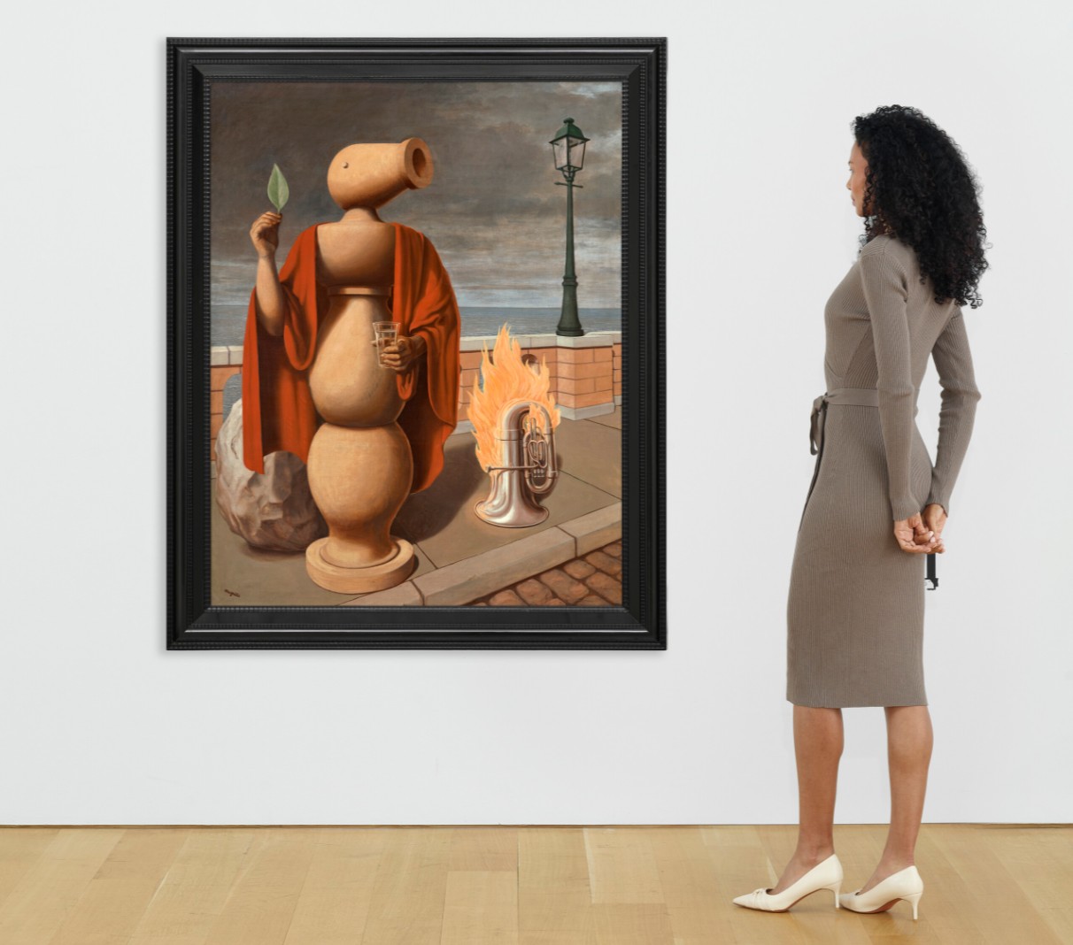
RENE MAGRITTE (1898-1967)
Les droits de l’homme, 1947-1948
Oil on canvas
144.8 x 114.6 cm (57 x 45 1/8 inches)
Signed ‘Magritte’ (lower left)
Dated and titled ‘”LES DROITS DE L’HOMME” 1947-1948’ (on the reverse)
3. Other Highlights
#9. Abstraktes Bild, 2009
Leonard & Louise Riggio: Collected Works
Christie’s New-York: 12 May 2025
Estimated: USD 7,000,000 – 10,000,000
USD 8,460,000
GERHARD RICHTER (B. 1932), Abstraktes Bild | Christie’s
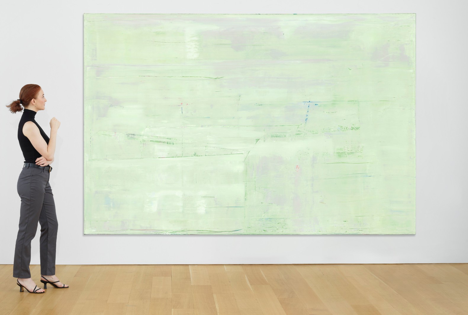
GERHARD RICHTER (B. 1932)
Abstraktes Bild, 2009
Oil on canvas
200×300 cm (78 3/4 x 118 1/8 inches)
Signed, inscribed and dated ‘911-3 Richter 2009’ (on the reverse)
#10. Untitled, 1968
Leonard & Louise Riggio: Collected Works
Christie’s New-York: 12 May 2025
Estimated: USD 8,000,000 – 12,000,000
USD 8,460,000
MARK ROTHKO (1903-1970), Untitled | Christie’s
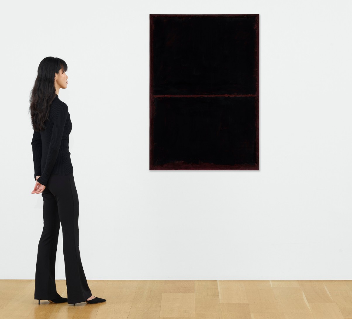
MARK ROTHKO (1903-1970)
Untitled, 1968
Acrylic on paper laid down on panel
57 7/8 x 40 3/4 inches (147 x 103.5 cm)
#13. Mère et enfant, 1922
Leonard & Louise Riggio: Collected Works
Christie’s New-York: 12 May 2025
Estimated: USD 9,000,000 – 12,000,000
USD 7,310,000
PABLO PICASSO (1881-1973), Mère et enfant | Christie’s
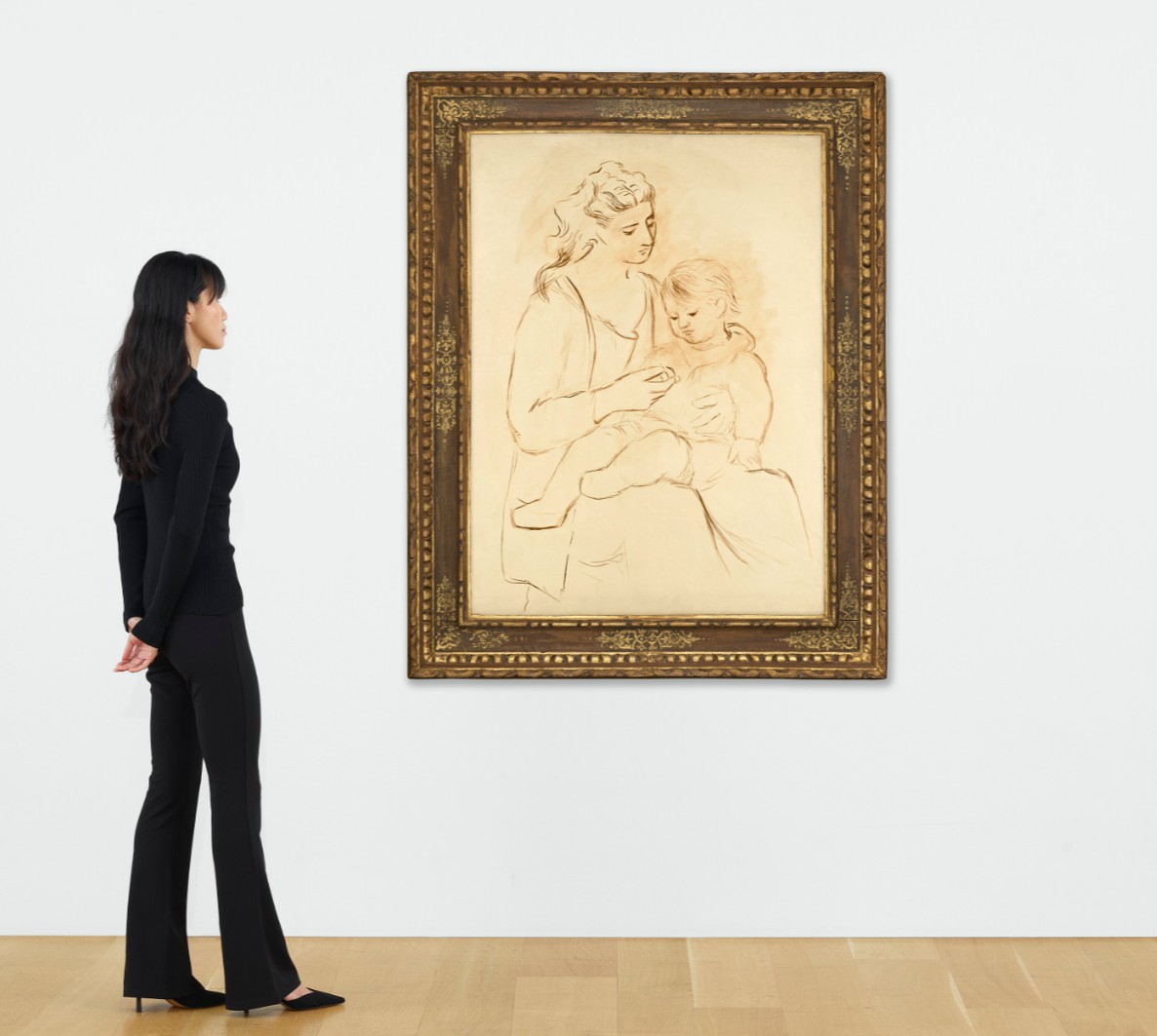
PABLO PICASSO (1881-1973)
Mère et enfant, 1922
Oil on canvas
130.2 x 96.8 cm (51 1/4 x 38 1/8 inches)
Painted in Dinard in summer 1922
#14. Woman and Child, circa 1967-1968
Leonard & Louise Riggio: Collected Works
Christie’s New-York: 12 May 2025
Estimated: USD 4,000,000 – 6,000,000
USD 7,128,500
WILLEM DE KOONING (1904-1997), Woman and Child | Christie’s
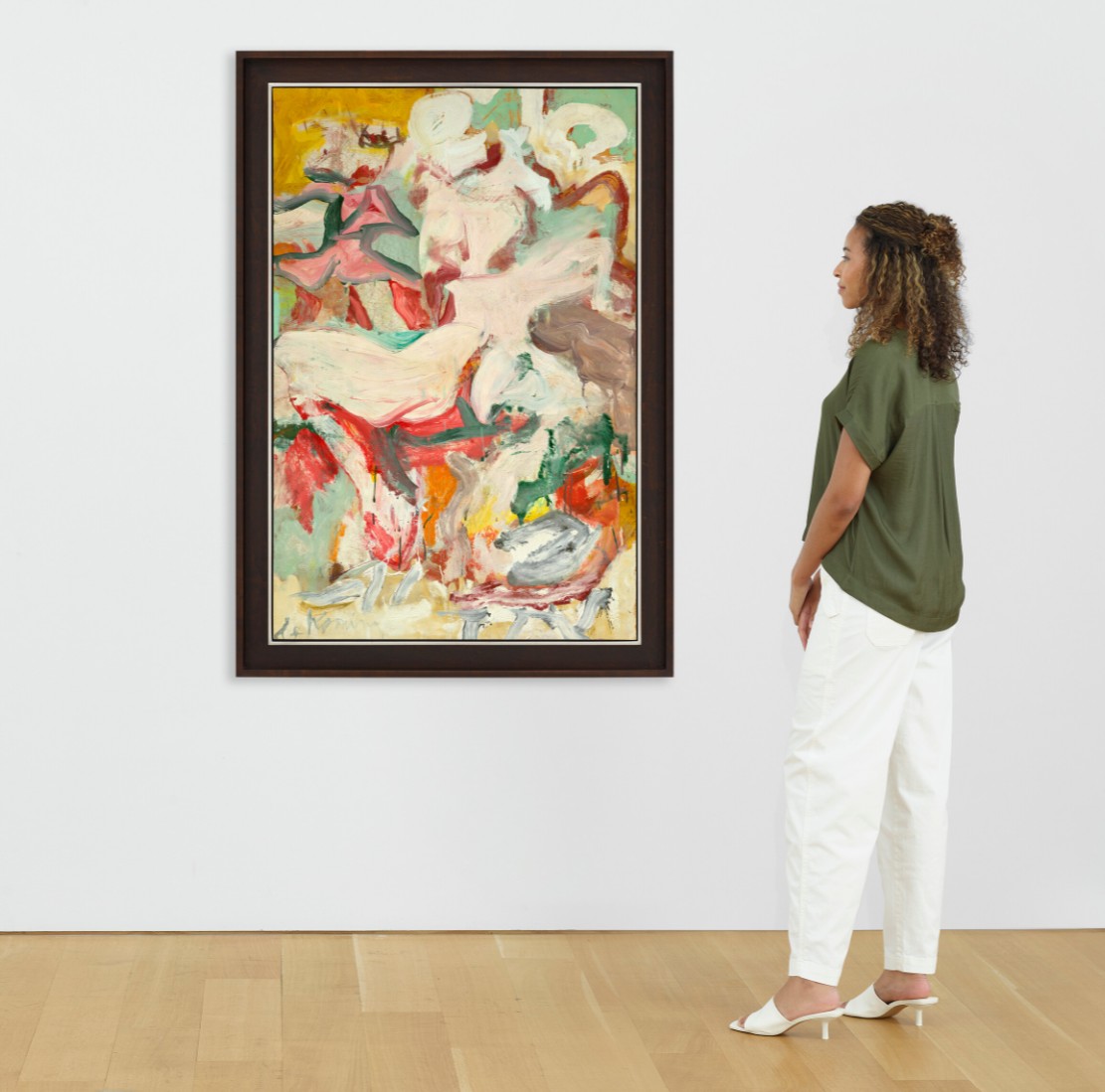
WILLEM DE KOONING (1904-1997)
Woman and Child, circa 1967-1968
Oil on paper mounted on canvas
55×36 inches (139.7 x 91.4 cm)
Signed ‘de Kooning‘ (lower left)
Dedicated ‘to Emilie with Love’ (on the reverse)
#15. The Last Supper, 1986
Leonard & Louise Riggio: Collected Works
Christie’s New-York: 12 May 2025
Estimated: USD 6,500,000 – 8,500,000
USD 7,068,000
ANDY WARHOL (1928-1987), The Last Supper | Christie’s
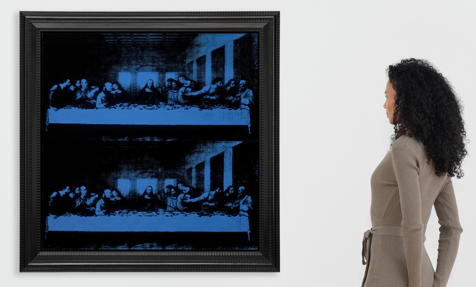
ANDY WARHOL (1928-1987)
The Last Supper, 1986
Acrylic and silkscreen ink on canvas
40×40 inches (101.6 x 101.6 cm)
Stamped with the artist’s signature ‘Andy Warhol ©’ (on the overlap)
Signed and inscribed by Frederick Hughes
‘I certify that this is an original painting by Andy Warhol completed by him in 1986 Frederick Hughes’
(on the overlap)
#18. Mao, 1973
Leonard & Louise Riggio: Collected Works
Christie’s New-York: 12 May 2025
Estimated: USD 4,500,000 – 6,500,000
USD 4,648,000
ANDY WARHOL (1928-1987), Mao | Christie’s

ANDY WARHOL (1928-1987)
Mao, 1973
Acrylic and silkscreen ink on linen
40×34 inches (101.6 x 86.4 cm)
Stamped three times with the Estate of Andy Warhol stamp
Stamped five times with the Andy Warhol Foundation for the Visual Arts, Inc. stamp
Numbered ‘PA 80.021’ (on the overlap and on the stretcher)
#25. Cagney, 1964
Leonard & Louise Riggio: Collected Works
Christie’s New-York: 12 May 2025
Estimated: USD 2,500,000 – 3,500,000
USD 2,349,000
ANDY WARHOL (1928-1987), Cagney | Christie’s
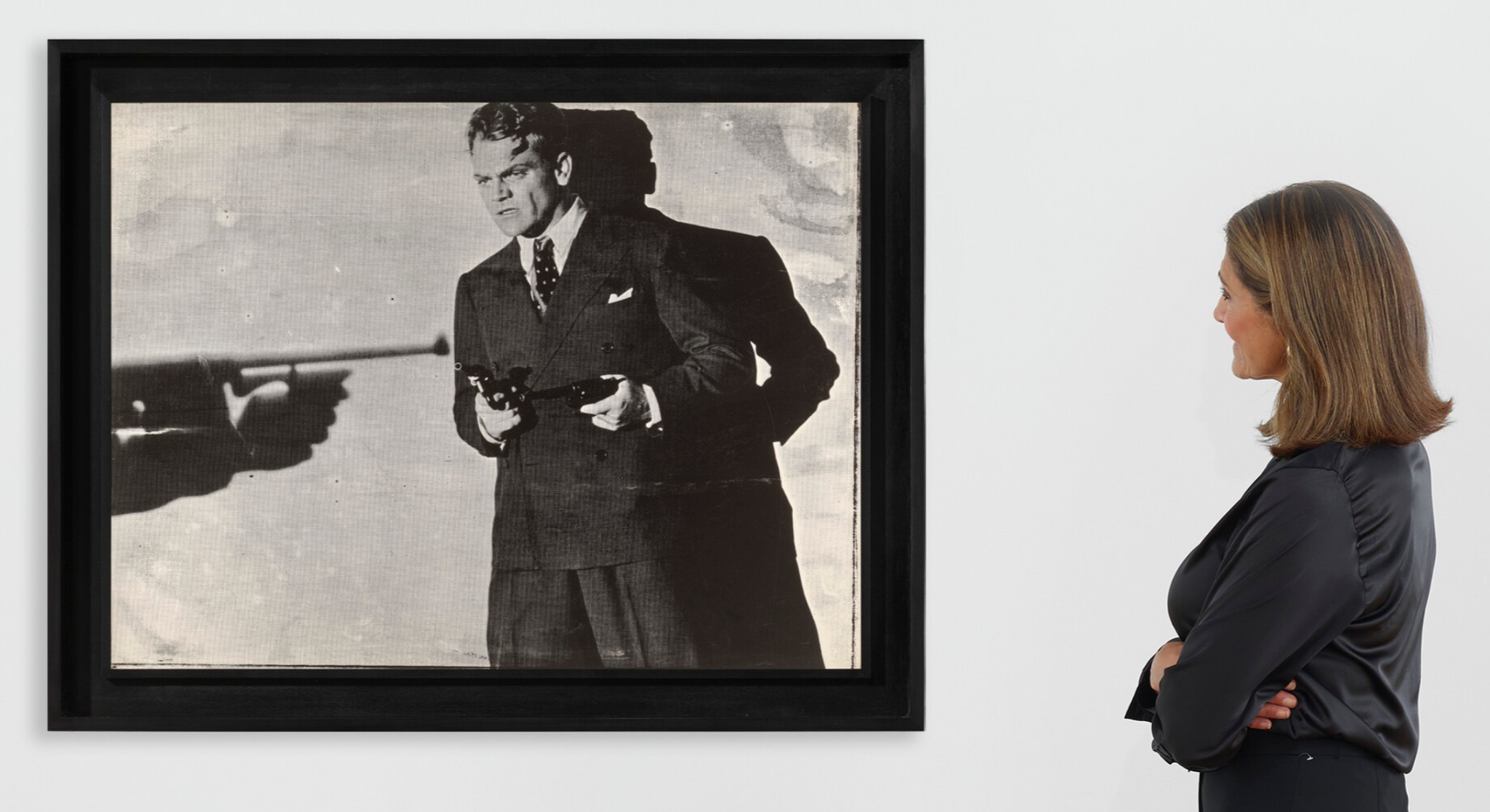
ANDY WARHOL (1928-1987)
Cagney, 1964
Silkscreen ink on paper laid down on paper
30 3/8 x 40 inches (77.2 x 101.5 cm)
Signed and dated ‘Andy Warhol 64’ (on the reverse)
20th Century Evening Sale
12 May 2025
1. Auction Statistics
TOTAL: USD 217,004,800
# Lots: 39
Withdrawn: 1 Lot
Passed: 1 Lot
Sold: 37 Lots
Sell-Through Rate: 97.4%
Top Lot: USD 42,960,000

Source: LiveArt
2. Top 5 Lots
#1. Peupliers au bord de l’Epte, crépuscule, 1891
Christie’s New-York: 12 May 2025
Estimated: USD 30,000,000 – 50,000,000
USD 42,960,000
CLAUDE MONET (1840-1926), Peupliers au bord de l’Epte, crépuscule | Christie’s
CLAUDE MONET (1840-1926)
Peupliers au bord de l’Epte, crépuscule, 1891
Oil on canvas
100 x 65.1 cm (39 3/8 x 25 5/8 inches)
Signed and dated ‘Claude Monet 91’ (lower right)
#2. No. 4 (Two Dominants) [Orange, Plum, Black], 1950-51
Christie’s New-York: 12 May 2025
Estimate on Request
USD 37,785,000
MARK ROTHKO (1903-1970), No. 4 (Two Dominants) [Orange, Plum, Black] | Christie’s
MARK ROTHKO (1903-1970)
No. 4 (Two Dominants) [Orange, Plum, Black], 1950-51
Oil on canvas
67 x 54 3/4 inches (170.2 x 139.1 cm)
Signed twice and dated ‘MARK ROTHKO MARK ROTHKO 1951’ (on the reverse)
#3. Korsika (Schiff), 1968
Christie’s New-York: 12 May 2025
Estimated: USD 8,000,000 – 12,000,000
USD 15,245,000
GERHARD RICHTER (B. 1932), Korsika (Schiff) | Christie’s
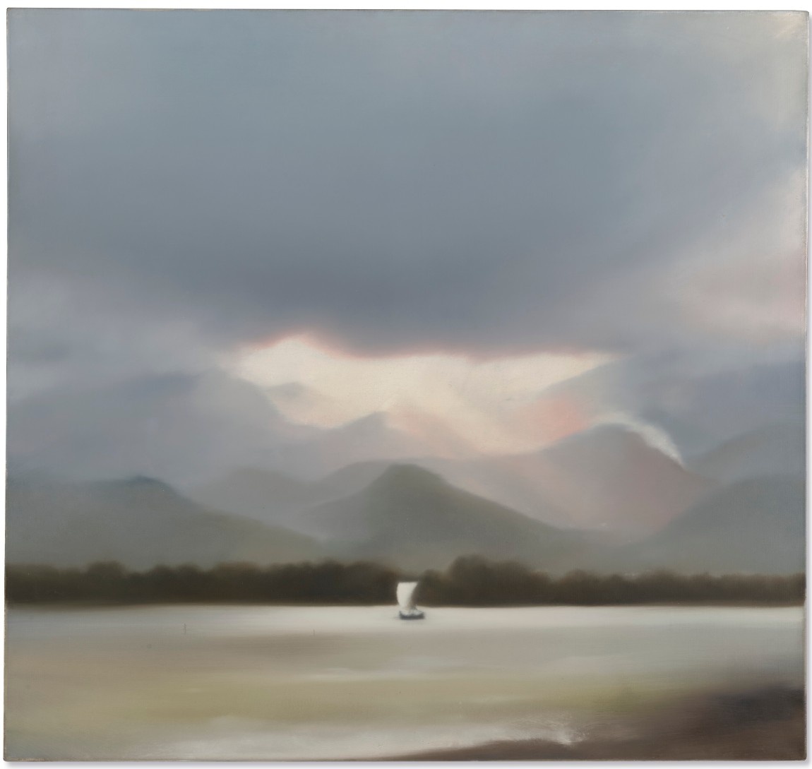
GERHARD RICHTER (B. 1932)
Korsika (Schiff), 1968
Oil on canvas
86 x 91.1 cm (33 7/8 x 35 7/8 inches)
Signed, inscribed, titled and dated ‘KORSIKA (III) Richter 68’ (on the reverse)
#4. Gypsophila, 1949
Christie’s New-York: 12 May 2025
Estimated: USD 6,000,000 – 8,000,000
USD 8,460,000
ALEXANDER CALDER (1898-1976), Gypsophila | Christie’s
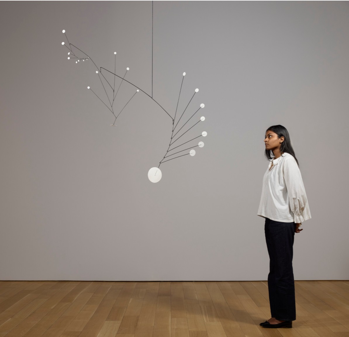
ALEXANDER CALDER (1898-1976)
Gypsophila, 1949
Sheet metal, wire and paint
134.6 x 121.9 x 38.1 cm (53x48x15 inches)
Incised with the artist’s monogram ‘CA’ (on the largest element)
#5. Concetto spaziale, In piazza San Marco di notte con Teresita, 1961
Christie’s New-York: 12 May 2025
Estimated: USD 6,500,000 – 8,500,000
USD 7,540,000
LUCIO FONTANA (1899-1968), Concetto spaziale, In piazza San Marco di notte con Teresita | Christie’s

LUCIO FONTANA (1899-1968)
Concetto spaziale, In piazza San Marco di notte con Teresita, 1961
Acrylic and colored glass stones on canvas
150×150 cm (59×59 inches)
Incised with the artist’s signature ‘l. fontana’ (lower right)
Signed and titled ‘l. fontana Concetto Spaziale, In piazza San Marco di notte con Teresita’ (on the reverse)
3. Other Highlights
The Kiss, 1962
Christie’s New-York: 12 May 2025
Estimated: USD 7,000,000 – 9,000,000
USD 5,395,000
ROY LICHTENSTEIN (1923-1997), The Kiss | Christie’s
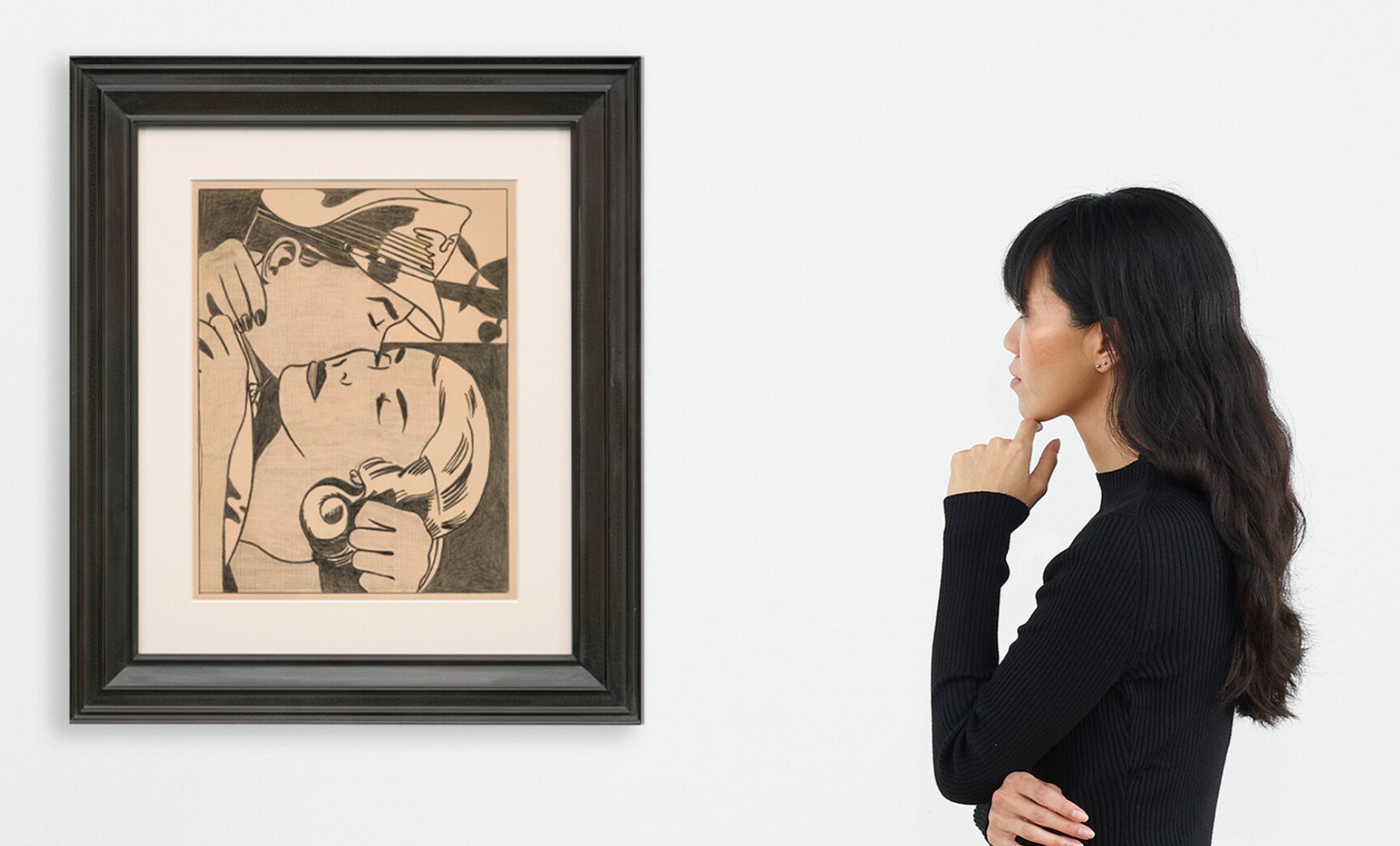
ROY LICHTENSTEIN (1923-1997)
The Kiss, 1962
Graphite on paper
Image: 18 1/2 x 14 inches (47 x 35.6 cm)
Sheet: 21 x 16 1/4 inches (53.3 x 41.2 cm)
Signed and dated ‘rf Lichtenstein ’62’ (on the reverse)
Self-Portrait, 1966
Christie’s New-York: 12 May 2025
Estimated: USD 4,000,000 – 6,000,000
USD 4,285,000
ANDY WARHOL (1928-1987), Self-Portrait | Christie’s
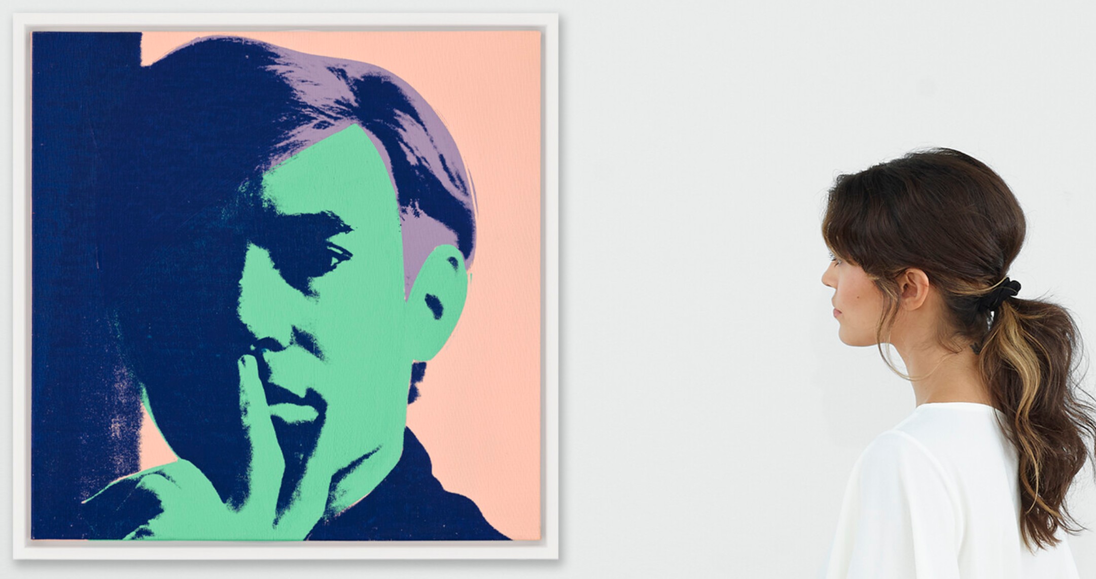
ANDY WARHOL (1928-1987)
Self-Portrait, 1966
Acrylic, silkscreen ink and graphite on linen
22 1/8 x 22 1/8 inches (56.2 x 56.2 cm)
Signed and dated ‘Andy Warhol 66’ (on the reverse)
Signed again and dated again ‘Andy Warhol 1966’ (on a canvas strip affixed to the stretcher)
Diamond Dust Shoes, 1980
Christie’s New-York: 12 May 2025
Estimated: USD 3,000,000 – 5,000,000
USD 2,954,000
ANDY WARHOL (1928-1987), Diamond Dust Shoes | Christie’s
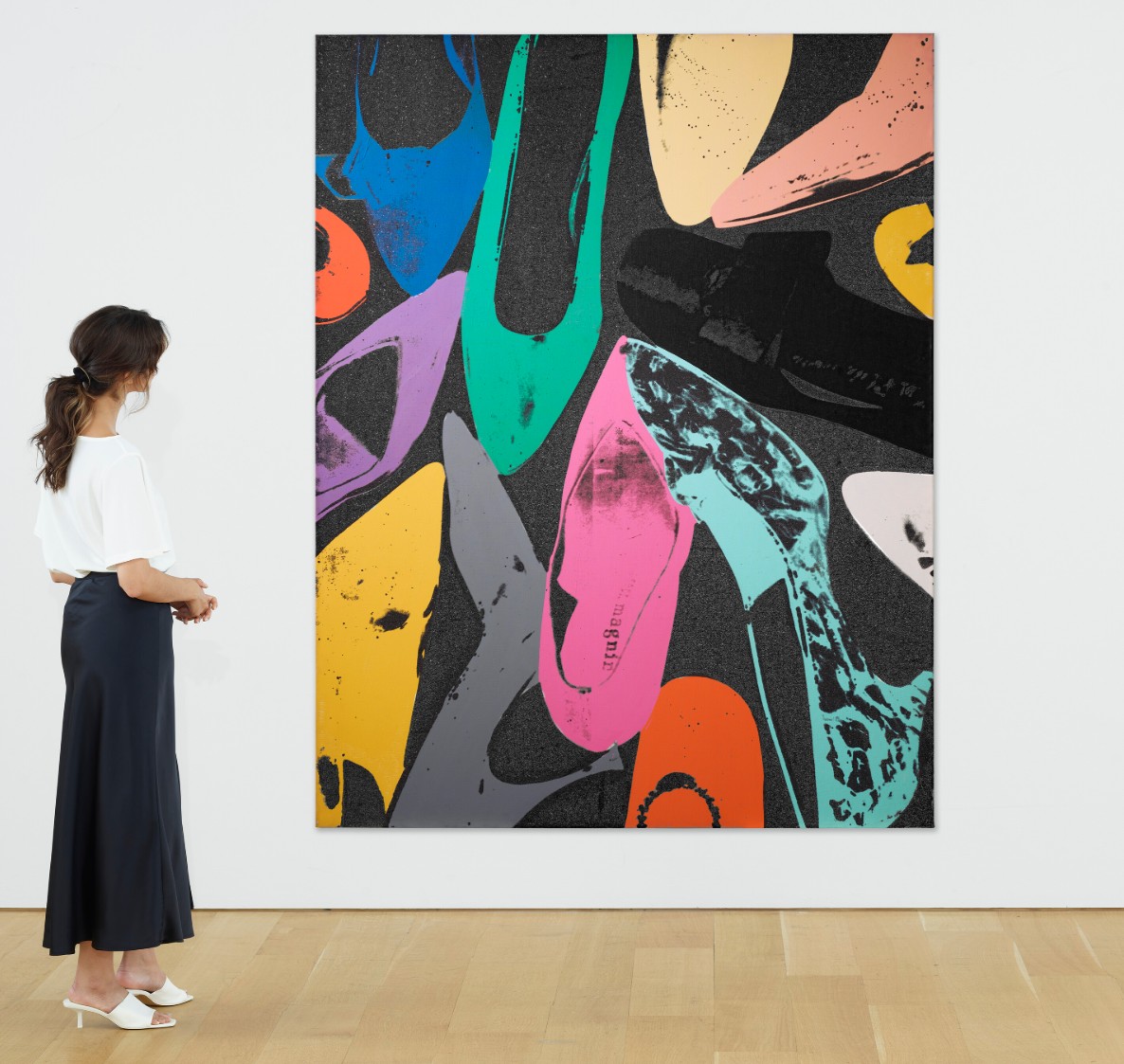
ANDY WARHOL (1928-1987)
Diamond Dust Shoes, 1980
Acrylic, silkscreen ink and diamond dust on canvas
90×70 inches (228.6 x 177.8 cm)
4. Lots Passed/Withdrawn
Big Electric Chair, 1967-1968
Christie’s New-York: 12 May 2025
Estimate on Request
ANDY WARHOL (1928-1987), Big Electric Chair | Christie’s
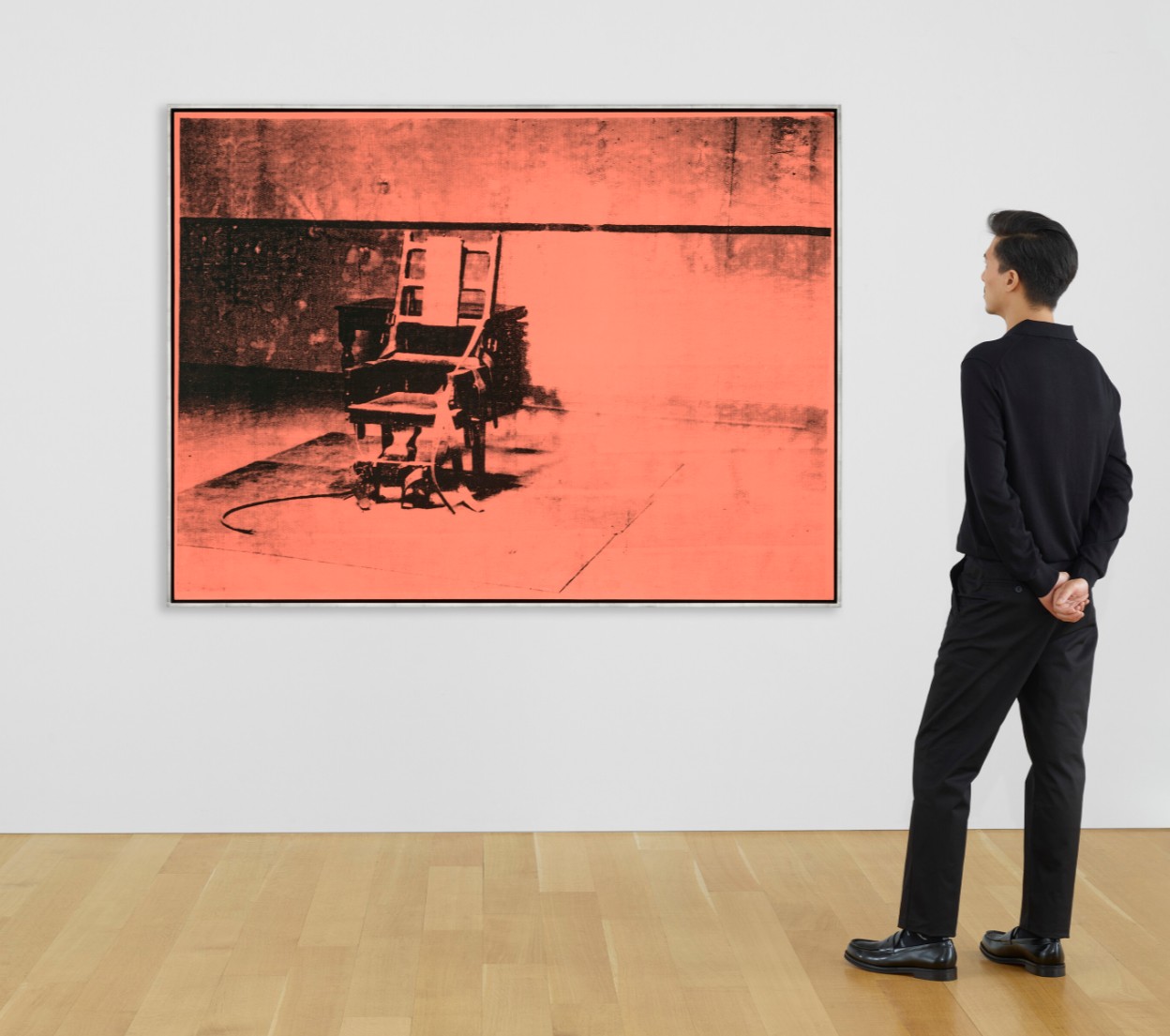
ANDY WARHOL (1928-1987)
Big Electric Chair, 1967-1968
Acrylic and silkscreen ink on canvas
54×74 inches (137.2 x 188 cm)
21st Century Evening Sale
14 May 2025
1. Auction Statistics
TOTAL: USD 96,463,700
# Lots: 42 Lots
Withdrawn: XX Lot
Passed: 6 Lot
Sold: 36 Lots
Sell-Through Rate: 85.7%
Top Lot: USD 24,310,000

Source: LiveArt
2. Top 5 Lots
#1. Baby Boom, 1982
Christie’s New-York: 14 May 2025
Estimated: USD 20,000,000 – 30,000,000
USD 24,310,000
JEAN-MICHEL BASQUIAT (1960-1988), Baby Boom | Christie’s
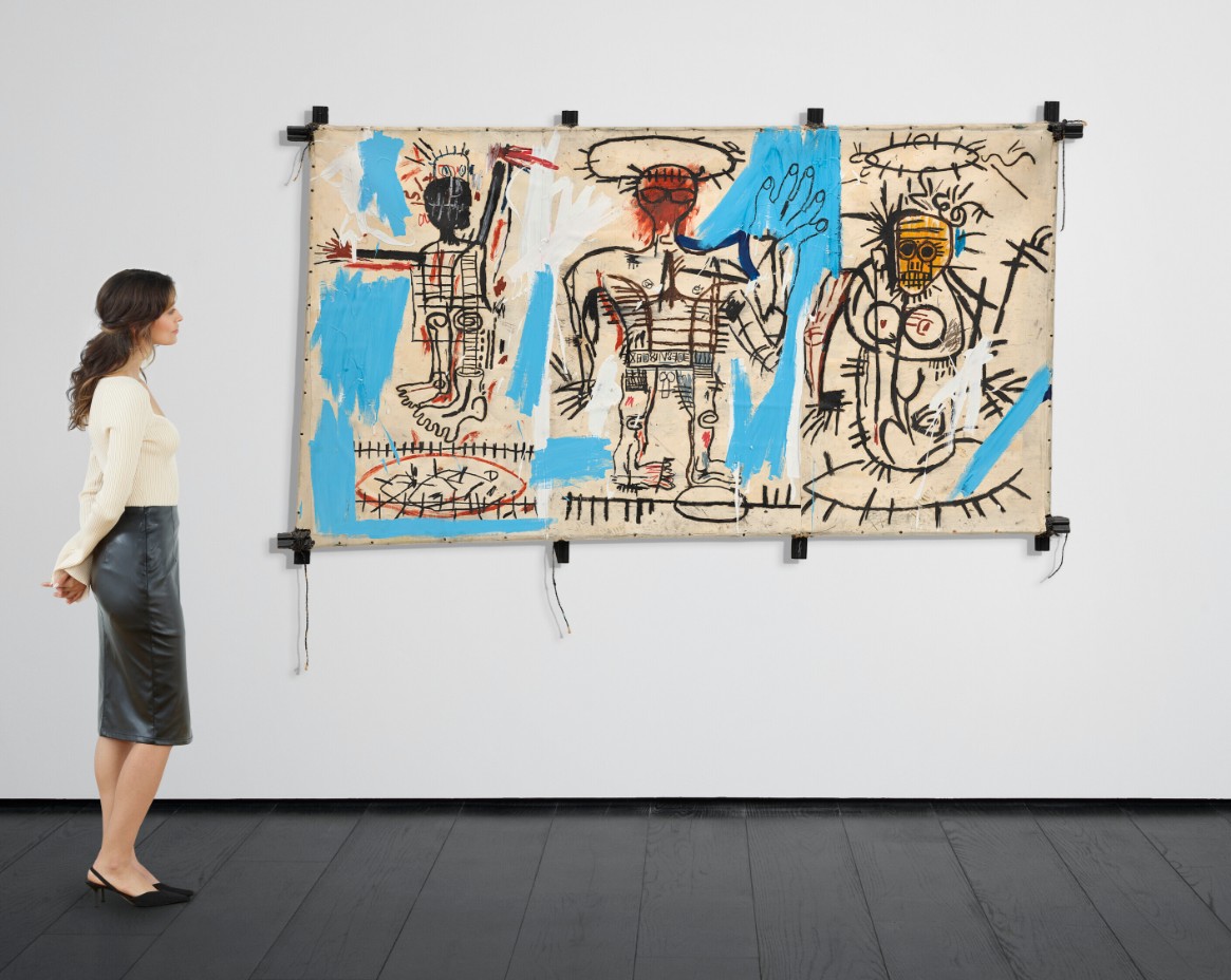
JEAN-MICHEL BASQUIAT (1960-1988)
Baby Boom, 1982
Acrylic, oilstick and paper collage on canvas mounted on tied wood supports
49×84 inches (125 x 213.5 cm)
Signed, titled and dated ‘‘Baby Boom’ Jean-Michel Basquiat Aug. 1982’’ (on the reverse)
#2. Miss January, 1997
Christie’s New-York: 14 May 2025
Estimated: USD 12,000,000 – 18,000,000
USD 13,635,000
MARLENE DUMAS (B. 1953), Miss January | Christie’s
MARLENE DUMAS (B. 1953)
Miss January, 1997
Oil on canvas
280×100 cm (110 1/4 x 39 3/8 inches)
Signed, titled and dated ‘M Dumas Miss January 1997’ (on the reverse)
#3. Bedtime Story, 1999
Christie’s New-York: 14 May 2025
Estimated: USD 4,000,000 – 6,000,000
USD 6,221,000
CECILY BROWN (B. 1969), Bedtime Story | Christie’s
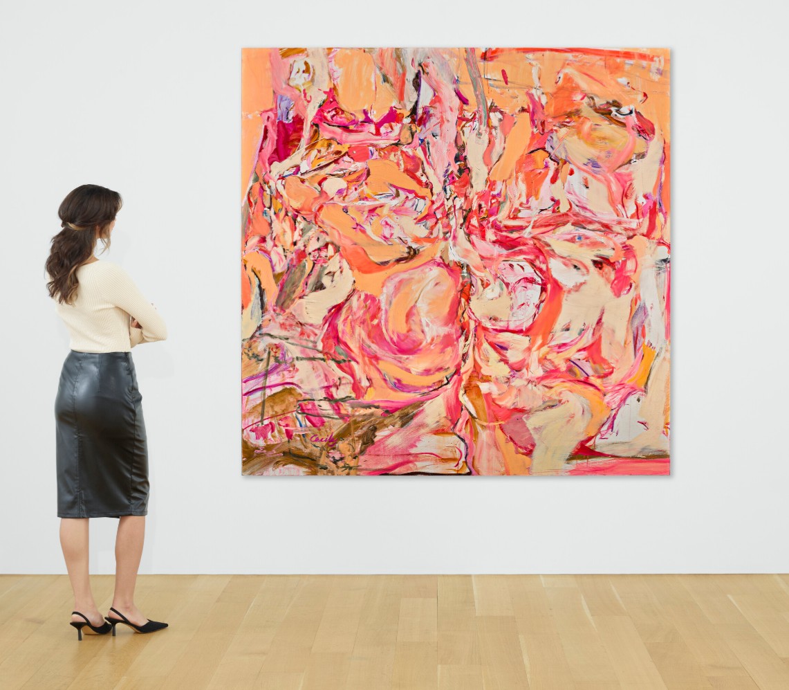
CECILY BROWN (B. 1969)
Bedtime Story, 1999
Oil on linen
75 1/4 x 75 1/4 inches (191.1 x 191.1 cm)
Signed ‘Cecily’ (lower left)
Signed and dated ‘Cecily Brown 1999’ (on the reverse)
#5. Blast Curtain, 1999
Christie’s New-York: 14 May 2025
Estimated: USD 4,000,000 – 6,000,000
USD 5,616,000
ED RUSCHA (B. 1937), Blast Curtain | Christie’s
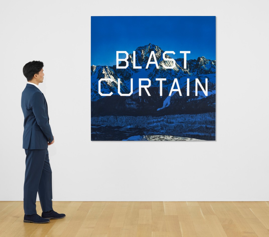
ED RUSCHA (B. 1937)
Blast Curtain, 1999
Acrylic on canvas
64×64 inches (162.6 x 162.6 cm)
Signed and dated ‘Ed Ruscha 1999’ (on the reverse)
3. Other Highlights
#6. Infinity-Nets [HSO], 2016
Christie’s New-York: 14 May 2025
Estimated: USD 2,500,000 – 3,500,000
USD 3,680,000
YAYOI KUSAMA (B. 1929), Infinity-Nets [HSO] | Christie’s
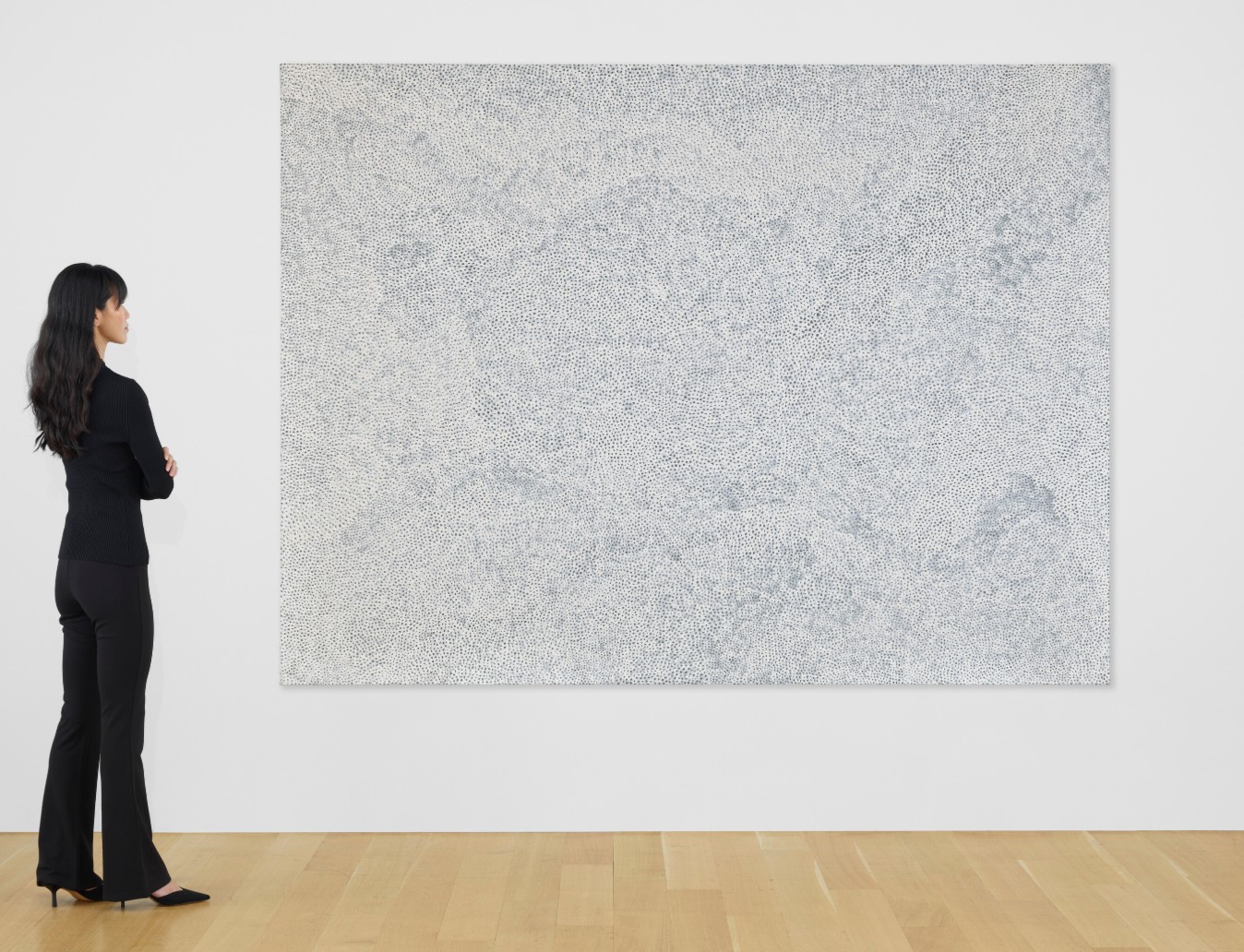
YAYOI KUSAMA (B. 1929)
Infinity-Nets [HSO], 2016
Acrylic on canvas
194×259 cm (76 3/8 x 102 inches)
Signed, titled and dated ‘YAYOI KUSAMA 2016 INFINITY-NETS HSO’ (on the reverse)
#10. Devil or Angel, 1973
Christie’s New-York: 14 May 2025
Estimated: USD 2,500,000 – 3,500,000
USD 2,954,000
ED RUSCHA (B. 1937), Devil or Angel | Christie’s
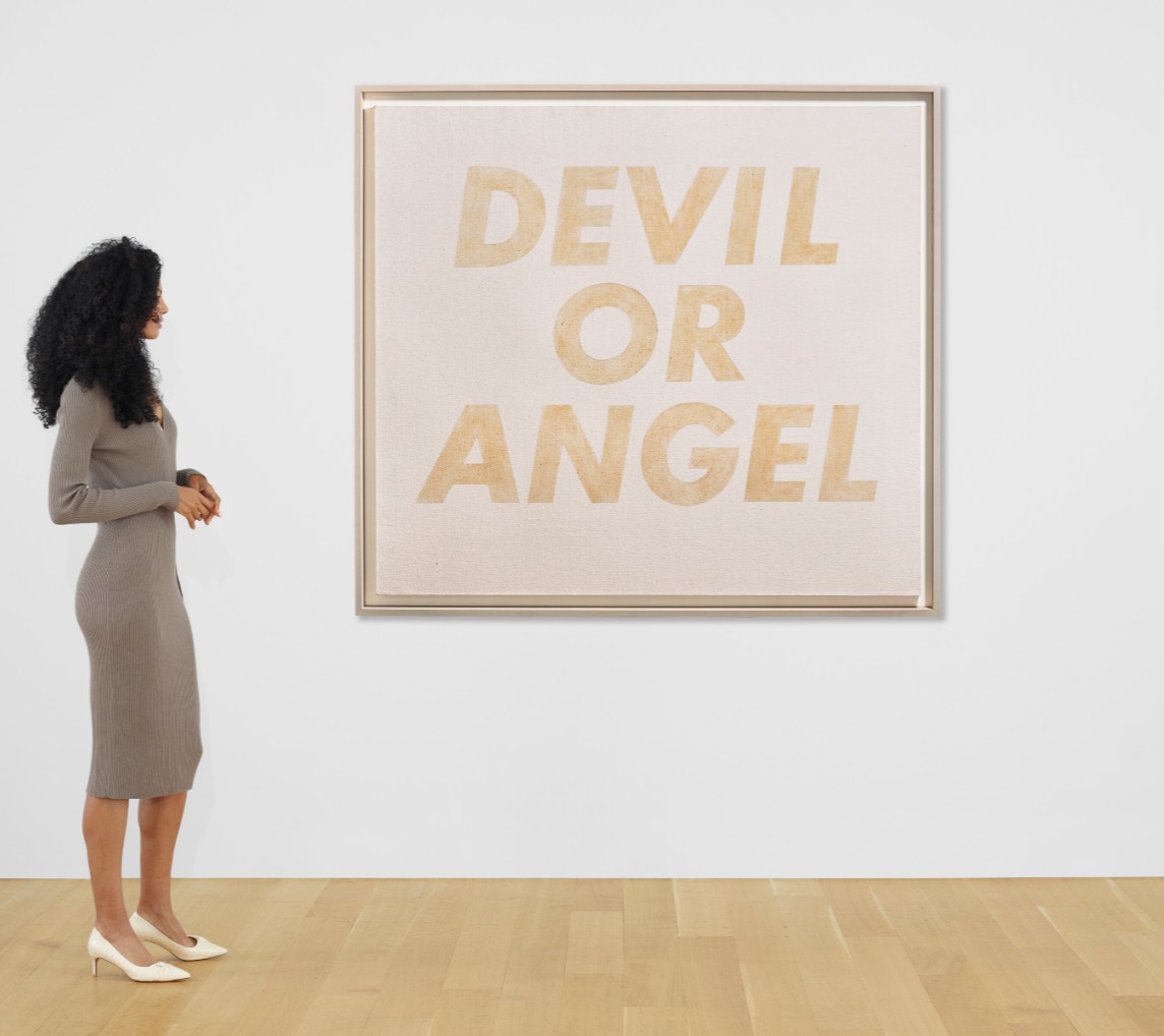
ED RUSCHA (B. 1937)
Devil or Angel, 1973
Red cabbage stain on canvas
54×60 inches (137.2 x 152.4 cm)
#12. Pink and Yellow Sweep, 2011
Christie’s New-York: 14 May 2025
Estimated: USD 1,500,000 – 2,000,000
USD 2,288,500
GEORGE CONDO (B. 1957), Pink and Yellow Sweep | Christie’s
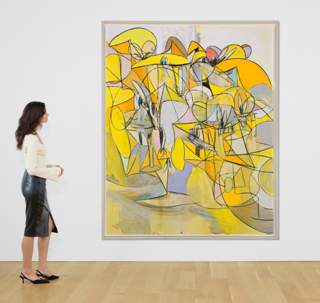
GEORGE CONDO (B. 1957)
Pink and Yellow Sweep, 2011
Acrylic, charcoal and pastel on linen
85×68 inches (215.9 x 172.7 cm)
Signed and dated ‘Condo 2011’ (upper left)
#13. Veil of Life Everlasting, 2017
Christie’s New-York: 14 May 2025
Estimated: USD 1,500,000 – 2,000,000
USD 2,228,000
DAMIEN HIRST (B. 1965), Veil of Life Everlasting | Christie’s
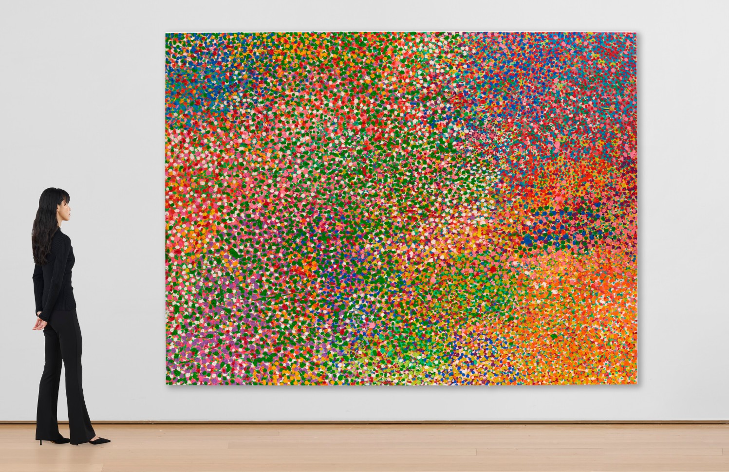
DAMIEN HIRST (B. 1965)
Veil of Life Everlasting, 2017
Oil on canvas
Installation orientation variable
108×144 inches (274.3 x 365.8 cm)
Signed, titled and dated ‘Damien Hirst Veil of Life Everlasting 2017’ (on the reverse)
#16. Jarvis and Liam Smoking, 1997
Christie’s New-York: 14 May 2025
Estimated: USD 800,000 – 1,200,000
USD 1,623,000
ELIZABETH PEYTON (B. 1965), Jarvis and Liam Smoking | Christie’s
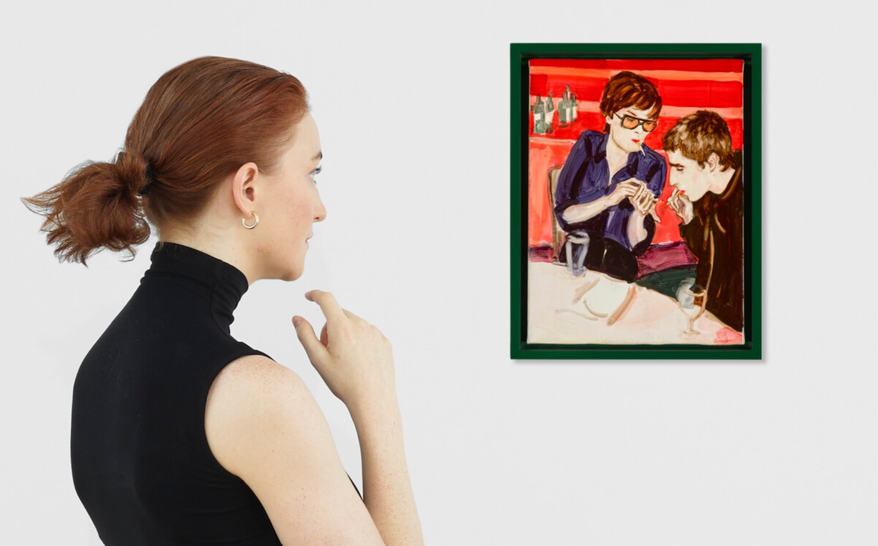
ELIZABETH PEYTON (B. 1965)
Jarvis and Liam Smoking, 1997
Oil on canvas
12 1/8 x 9 1/8 inches (30.8 x 23.2 cm)
Signed, titled and dated ‘Jarvis and Liam Smoking 1997 Elizabeth Peyton’ (on the overlap)
#17. Untitled (cowboy), 2016
Christie’s New-York: 14 May 2025
Estimated: USD 700,000 – 1,000,000
USD 1,502,000
RICHARD PRINCE (B. 1949), Untitled (cowboy) | Christie’s
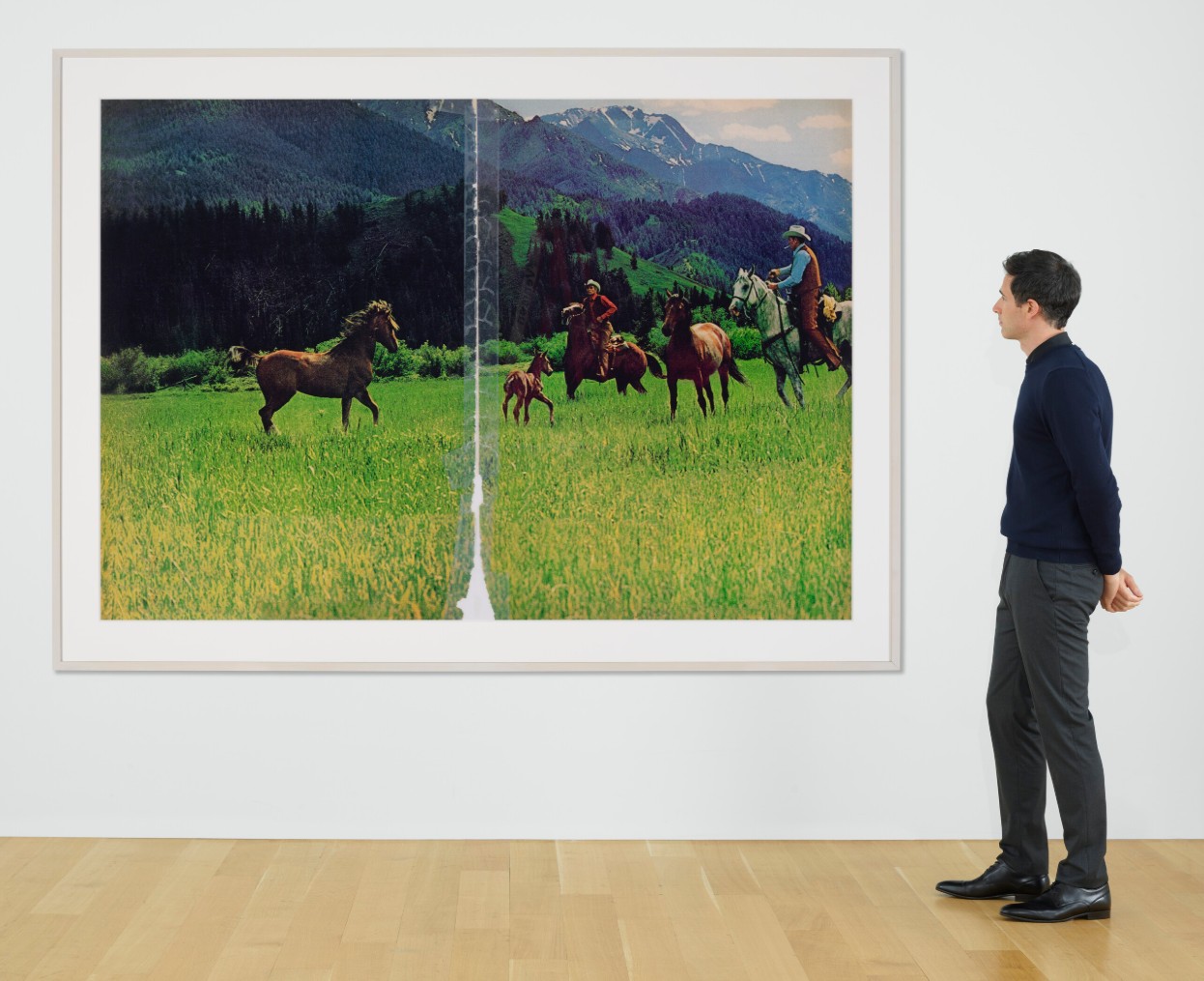
RICHARD PRINCE (B. 1949)
Untitled (cowboy), 2016
Chromogenic print
60×90 inches (152.4 x 228.6 cm)
Signed, numbered and dated ‘R Prince 2016 1⁄2’ (on a label affixed to the reverse)
This work is number one from an edition of two
#27. 1-Chloro-2, 4-Dinitrobenzene, 1997
Christie’s New-York: 14 May 2025
Estimated: USD 600,000 – 800,000
USD 529,200
DAMIEN HIRST (B. 1965), 1-Chloro-2, 4-Dinitrobenzene | Christie’s
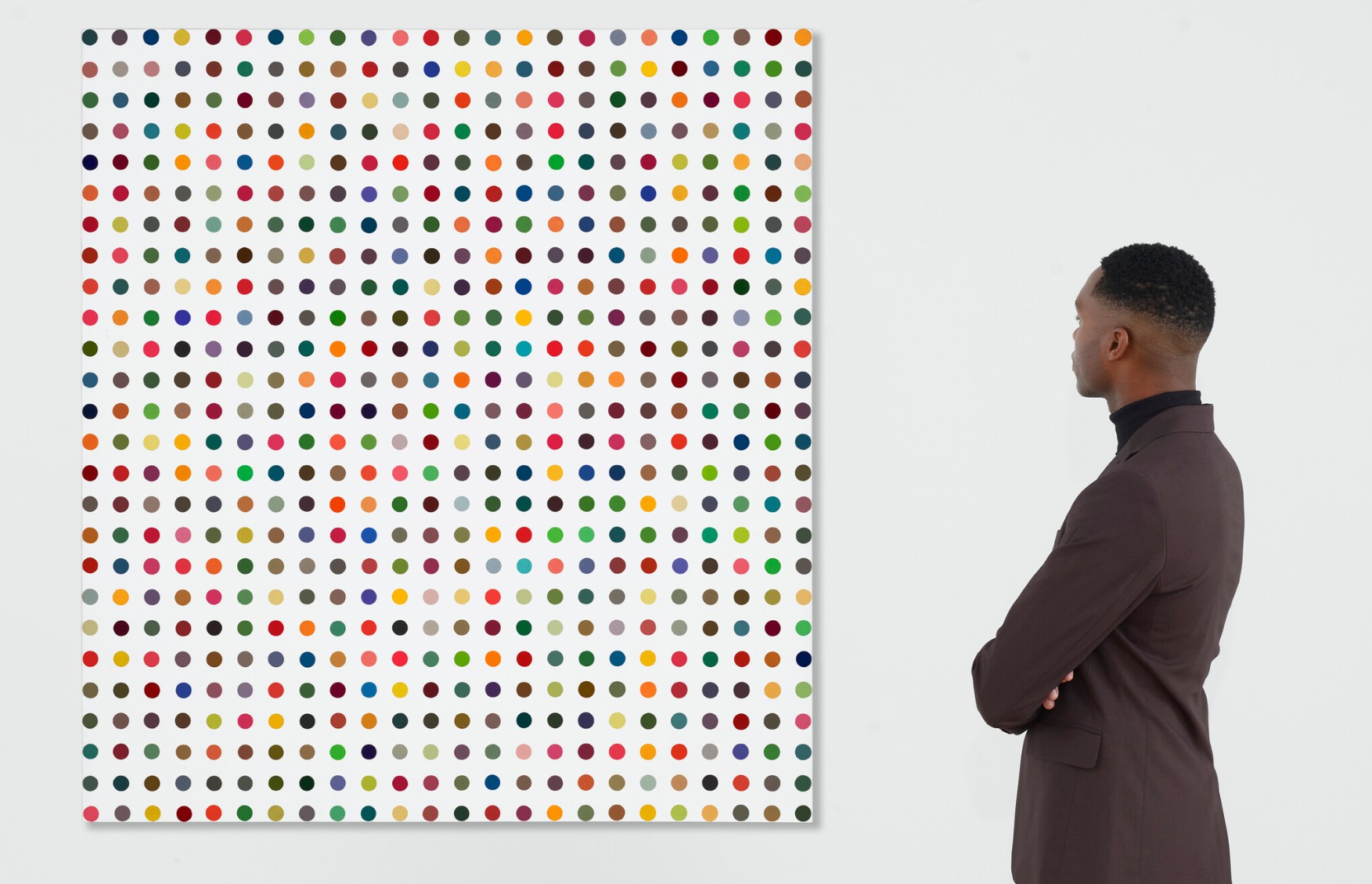
DAMIEN HIRST (B. 1965)
1-Chloro-2, 4-Dinitrobenzene, 1997
Household gloss on canvas
130×120 cm (51 1/4 x 47 1/4 inches)
4. Lots Passed
Untitled, 1988
Christie’s New-York: 14 May 2025
Estimated: USD 3,500,000 – 5,500,000
PASSED
CHRISTOPHER WOOL (B. 1955), Untitled | Christie’s
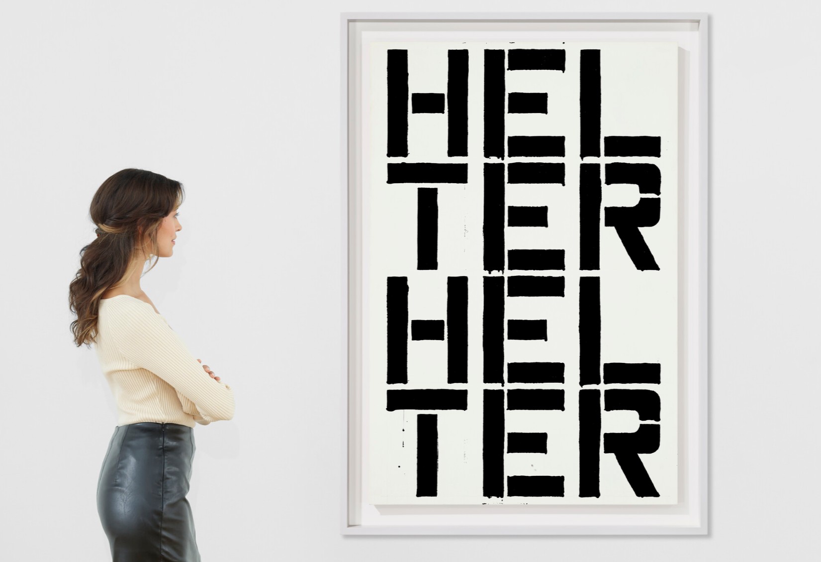
CHRISTOPHER WOOL (B. 1955)
Untitled, 1988
Enamel and Flashe on aluminum
48×32 inches (121.9 x 81.2 cm)
Signed and dated ‘WOOL 1988’ (on the reverse)
Impressionist and Modern Art Day Sale
13 May 2025
Impressionist and Modern Art Day Sale
TOTAL: USD 31,338,762
# Lots: 134 Lots
Passed: 24 Lots
Sold: 110 Lots
Sell-Through Rate: 82.1%
Top Lot: USD 3,196,000
#1. Vétheuil, circa 1901-1902
Christie’s New-York: 13 May 2025
Estimated: USD 1,500,000 – 2,500,000
USD 3,196,000
CLAUDE MONET (1840-1926), Vétheuil | Christie’s
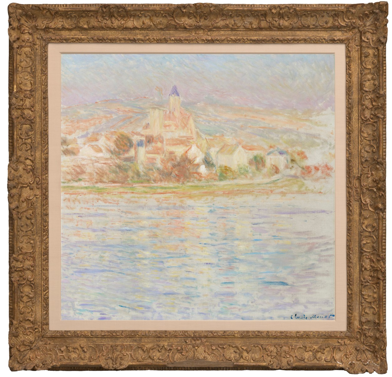
CLAUDE MONET (1840-1926)
Vétheuil, circa 1901-1902
Oil on canvas
89.5 x 92.5 cm (35 1/4 x 36 3/8 inches)
Bears the signature ‘Claude Monet’ (lower right)
#2. Adam, 1880-1973
Christie’s New-York: 13 May 2025
Estimated: USD 700,000 – 1,000,000
USD 2,772,500
AUGUSTE RODIN (1840-1917), Adam, taille originale dit aussi “Grand modèle” | Christie’s
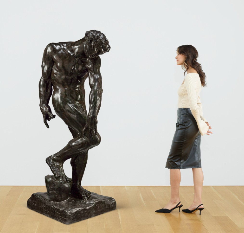
AUGUSTE RODIN (1840-1917)
Adam, taille originale dit aussi “Grand modèle”, 1880-1973
Bronze with dark brown and green patina
Height: 197 cm (77 1/2 inches)
Signed ‘A. Rodin’ (on the top of the base)
Inscribed with foundry mark ‘Georges Rudier. Fondeur. Paris.’ (on the back of the base)
Inscribed and dated ‘© by musée Rodin 1973’ (on the right side of the base)
Conceived in 1880; this bronze version cast in 1973
#3. Matin, soleil d’automne à Eragny, 1900
Christie’s New-York: 13 May 2025
Estimated: USD 1,000,000 – 1,500,000
USD 2,046,500
CAMILLE PISSARRO (1830-1903), Matin, soleil d’automne à Eragny | Christie’s

CAMILLE PISSARRO (1830-1903)
Matin, soleil d’automne à Eragny, 1900
Oil on canvas
65.2 x 81.3 cm (25 3/4 x 32 1/8 inches)
Signed and dated ‘C. Pissarro. 1900’ (lower left)
#4. Le Peintre (Tête), 1964
Christie’s New-York: 13 May 2025
Estimated: USD 1,200,000 – 1,800,000
USD 1,562,500
PABLO PICASSO (1881-1973), Le Peintre (Tête) | Christie’s
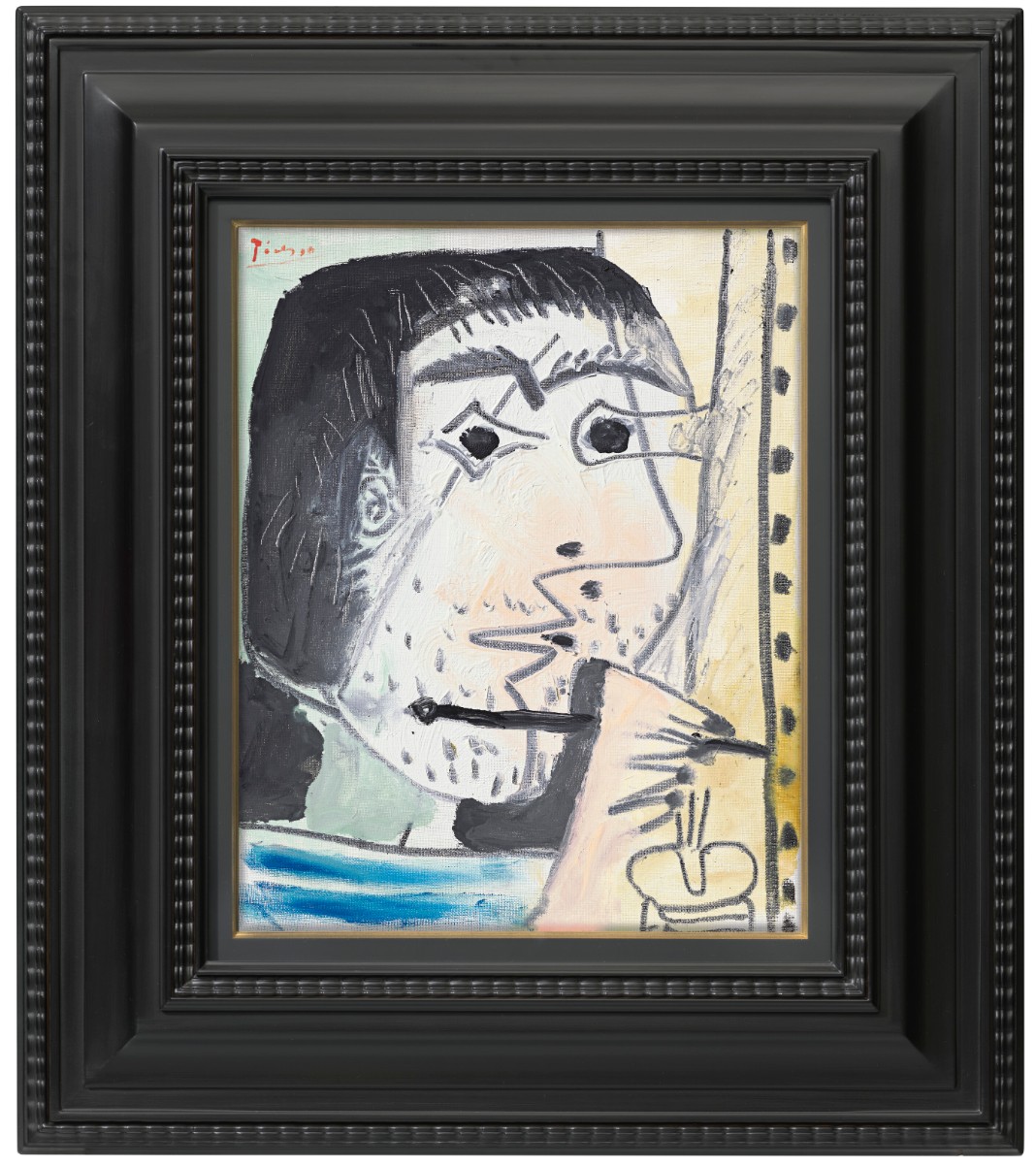
PABLO PICASSO (1881-1973)
Le Peintre (Tête), 1964
Oil on canvas
41×33 cm (16×13 inches)
Signed ‘Picasso’ (upper left)
Dated and numbered ‘I.II.64. IV’ (on the reverse)
Henriette, robe jaune, 1923
Christie’s New-York: 13 May 2025
Estimated: USD 300,000 – 500,000
USD 1,405,200
HENRI MATISSE (1869-1954), Henriette, robe jaune | Christie’s
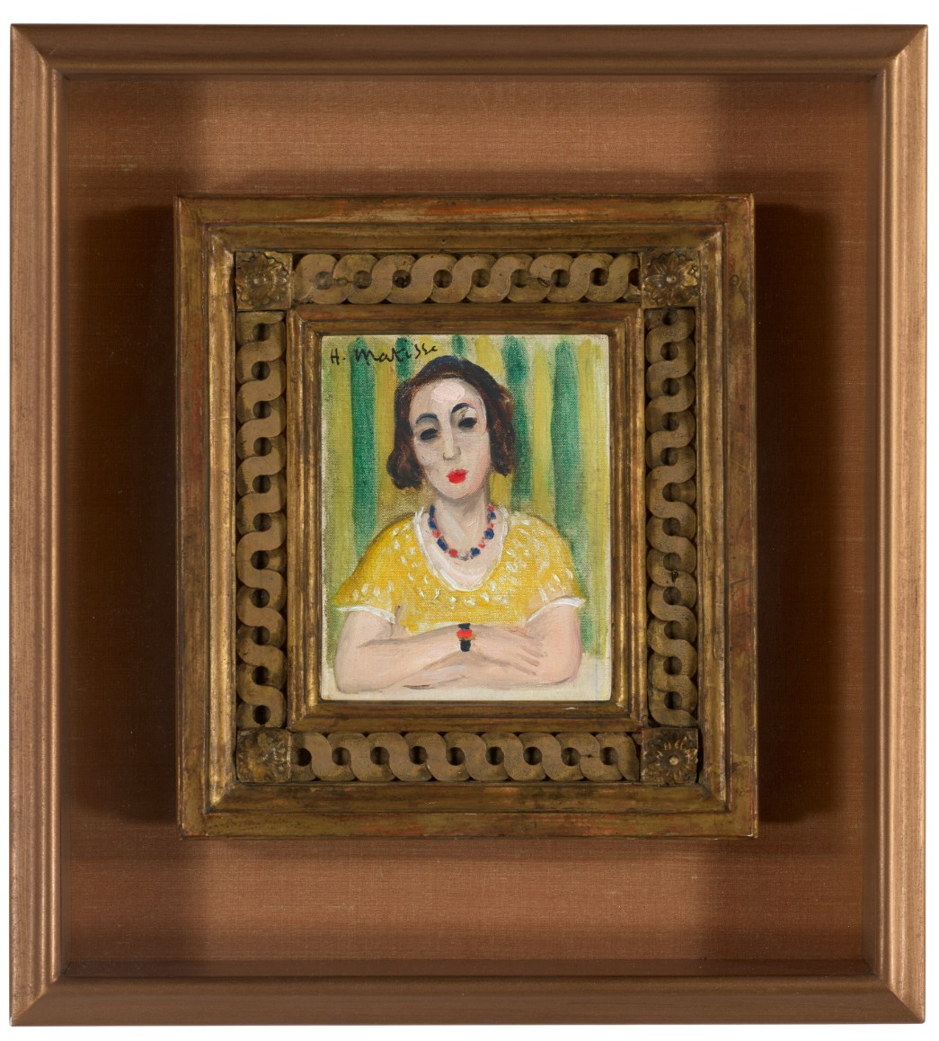
HENRI MATISSE (1869-1954)
Henriette, robe jaune, 1923
Oil on canvas
13×10 cm (5 1/4 x 4 inches)
Signed ‘H. Matisse’ (upper left)
Post-War and Contemporary Art Day Sale
15 May 2025
Post-War and Contemporary Art Day Sale
1. Auction Statistics
TOTAL: USD 66,515,140
# Lots: 233 Lots
Passed: 30 Lots
Sold: 203 Lots
Sell-Through Rate: 87.1%
Top Lot: USD 3,196,000

Source: LiveArt
2. Top 5 Lots
#1. Study for “The Enunciation”, 1992-1993
Christie’s New-York: 15 May 2025
Estimated: USD 300,000 – 500,000
USD 3,196,000
MARK TANSEY (B. 1949), Study for “The Enunciation” | Christie’s

MARK TANSEY (B. 1949)
Study for “The Enunciation”, 1992-1993
Oil on canvas
36×26 inches (91.4 x 66 cm)
Incised with the artist’s inscription ‘ROSE + MARCEL’ (lower left)
Incised with partial title ‘”The Enunciation”‘ (lower right)
Signed again, partially titled again and dated ‘Tansey 1992-93 “The Enunciation”‘ (on the reverse)
#2. Petit Matin, 1982
Christie’s New-York: 15 May 2025
Estimated: USD 2,500,000 – 3,500,000
USD 3,075,000
JOAN MITCHELL (1925-1992), Petit Matin | Christie’s
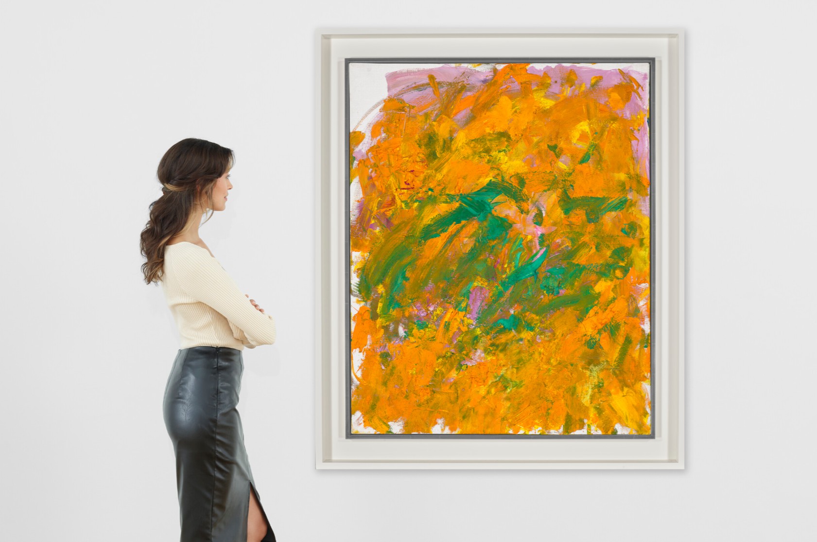
JOAN MITCHELL (1925-1992)
Petit Matin, 1982
Oil on canvas
100×80 cm (39 1/4 x 31 3/4 inches)
Signed ‘Joan Mitchell’ (lower right)
#3. Untitled, 1980
Christie’s New-York: 15 May 2025
Estimated: USD 1,000,000 – 1,500,000
USD 2,228,000
ISAMU NOGUCHI (1904-1988), Untitled | Christie’s
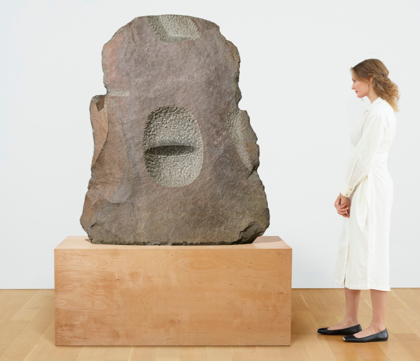
ISAMU NOGUCHI (1904-1988)
Untitled, 1980
Jasper
152.1 x 125.7 x 34.3 cm (59 7/8 x 49 1/2 x 13 1/2 inches)
Incised with the artist’s initials and date ‘I.N. ‘80’ (lower edge)
3. Other Highlights
Series July 25 (V), 1966
Christie’s New-York: 14 May 2025
Estimated: USD 500,000 – 700,000
USD 1,320,700
JOAN MITCHELL (1925-1992), Series July 25 (V) | Christie’s
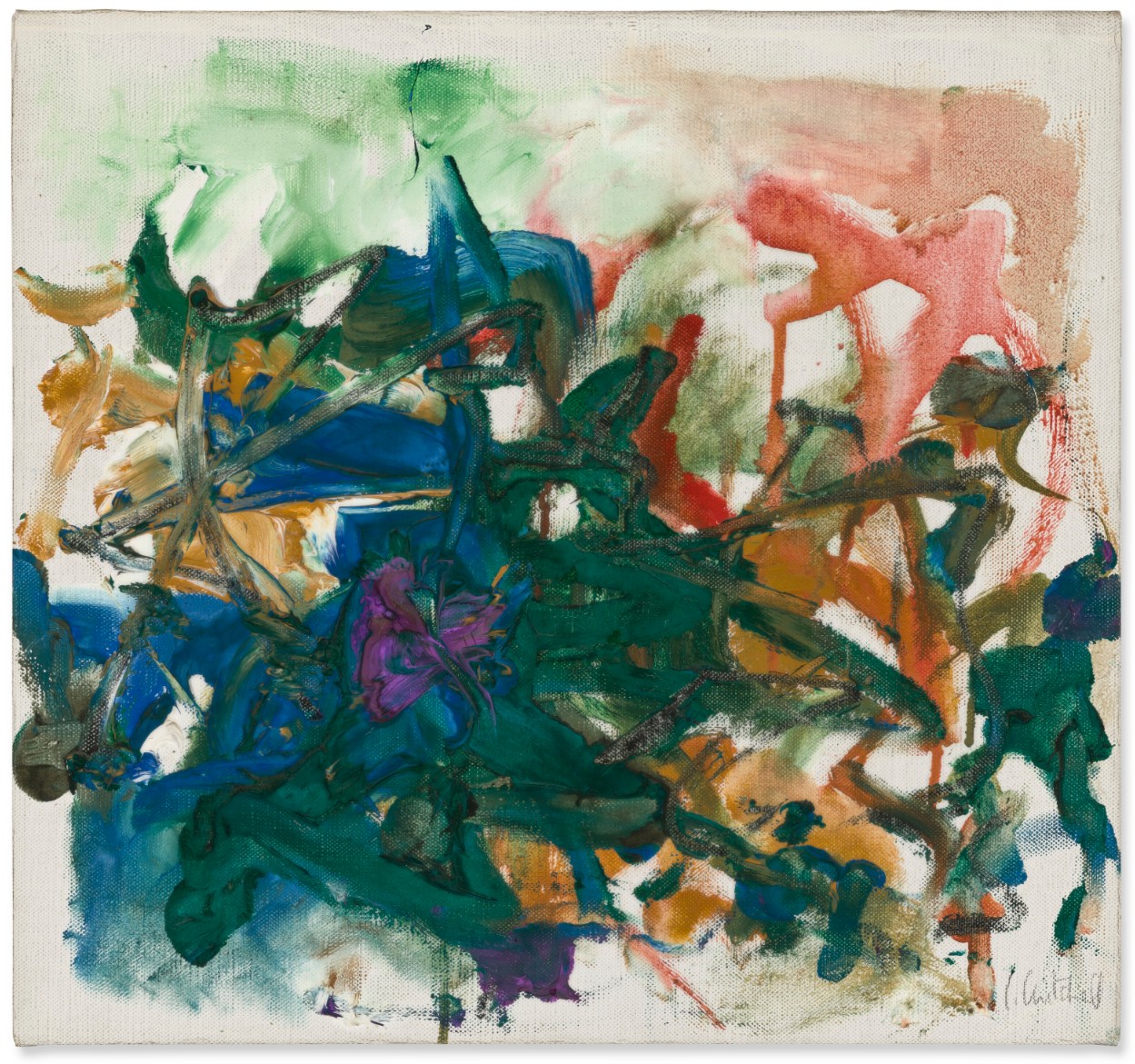
JOAN MITCHELL (1925-1992)
Series July 25 (V), 1966
Oil on canvas
13×14 inches (33 x 35.5 cm)
Signed ‘J. Mitchell’ (lower right)
Brushstrokes in Flight, 1983
Christie’s New-York: 15 May 2025
Estimated: USD 700,000 – 1,000,000
USD 882,000
ROY LICHTENSTEIN (1923-1997), Brushstrokes in Flight | Christie’s
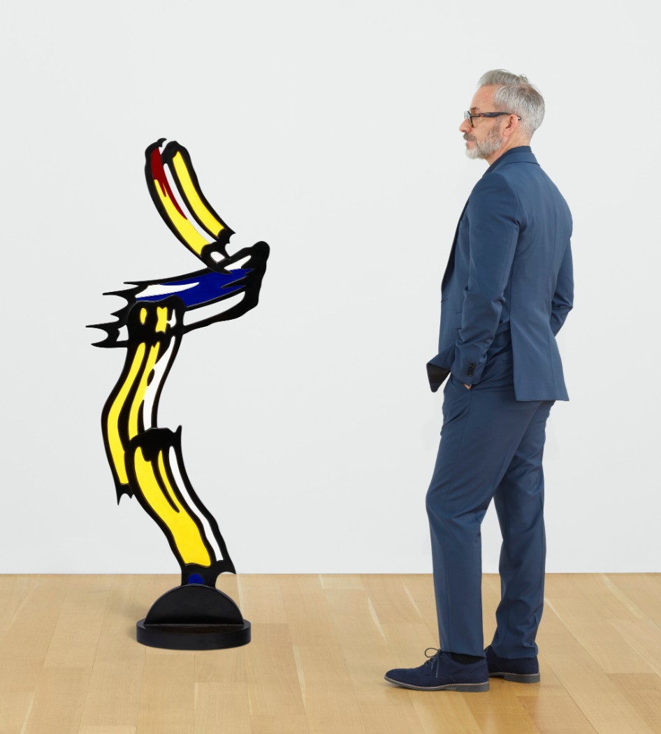
ROY LICHTENSTEIN (1923-1997)
Brushstrokes in Flight, 1983
Painted and patinated bronze
55 1/4 x 21 x 10 inches (140.3 x 53.3 x 25.4 cm)
Incised with the artist’s signature, number and date ‘5⁄6 rf Lichtenstein ’83’ (on the base)
This work is number five from an edition of six plus one posthumous cast
Radar, 1976
Christie’s New-York: 15 May 2025
Estimated: USD 500,000 – 700,000
USD 781,200
ED RUSCHA (B. 1937), Radar | Christie’s
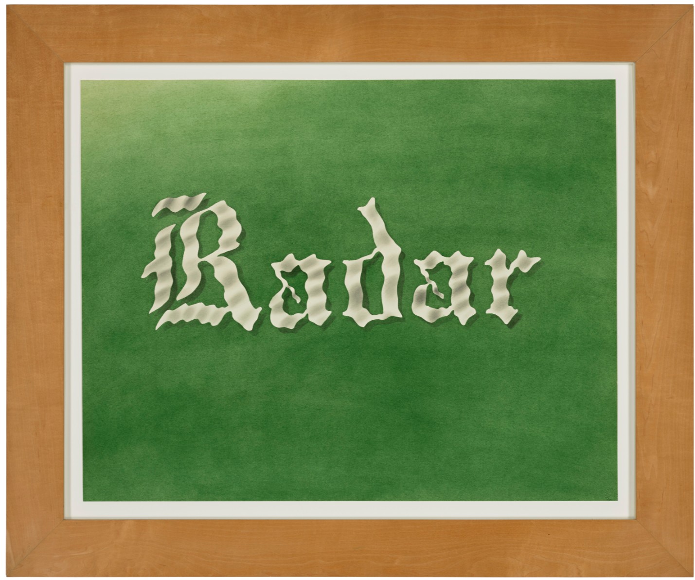
ED RUSCHA (B. 1937)
Radar, 1976
Pastel and graphite on paper
22 1/8 x 28 1/8 inches (56.1 x 71.4 cm)
Signed and dated ‘Edward Ruscha 1976’ (on the reverse)
INFINITY-NETS (FINTTOW), 2007
Christie’s New-York: 15 May 2025
Estimated: USD 500,000 – 700,000
USD 693,000
YAYOI KUSAMA (B. 1929), INFINITY-NETS (FINTTOW) | Christie’s
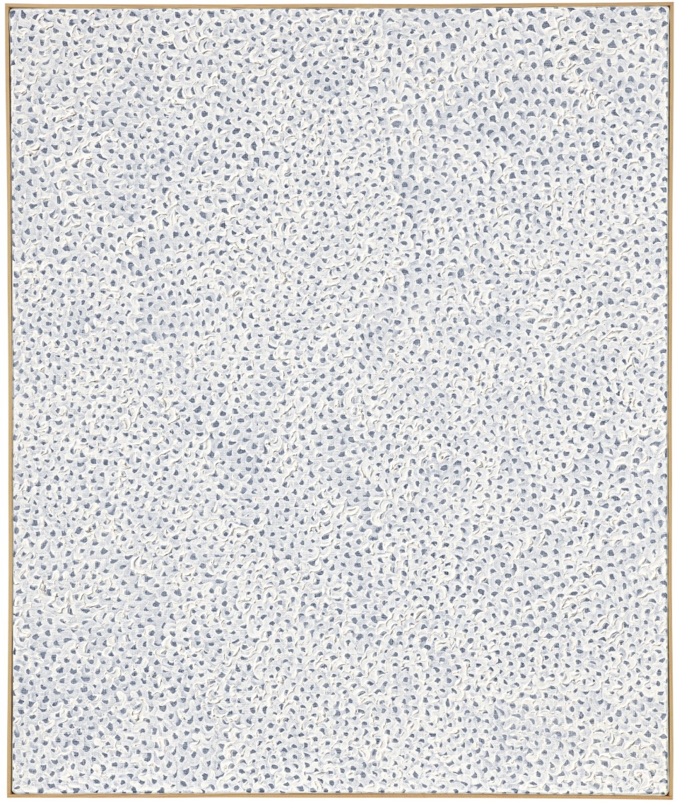
YAYOI KUSAMA (B. 1929)
INFINITY-NETS (FINTTOW), 2007
Acrylic on canvas
72.7 x 60.6 cm (28 1/2 x 23 5/8 inches)
Signed, titled in English and Japanese and dated
‘Yayoi Kusama 2007 INFINITY-NETS FINTTOW’
(on the reverse)
Heads, 1941-1942
Christie’s New-York: 15 May 2025
Estimated: USD 600,000 – 800,000
USD 630,000
MARK ROTHKO (1903-1970), Heads | Christie’s
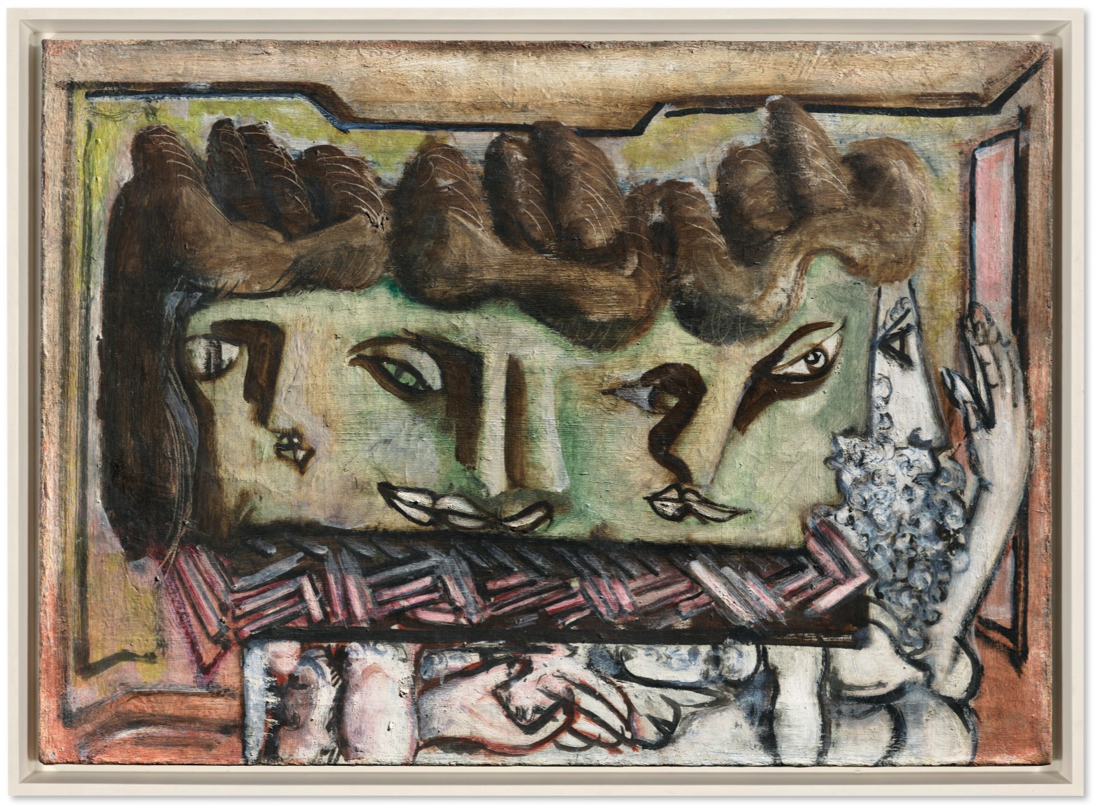
MARK ROTHKO (1903-1970)
Heads, 1941-1942
Oil on canvas
20 1/8 x 28 inches (51 x 71.1 cm)
Baby, 1982
Christie’s New-York: 15 May 2025
Estimated: USD 500,000 – 700,000
USD 630,000
KEITH HARING (1958-1990), Baby | Christie’s

KEITH HARING (1958-1990)
Baby, 1982
Enamel on metal
34 1/2 x 40 x 3 inches (87.6 x 101.6 x 7.6 cm)
Signed, dedicated and dated ‘FOR ANDY K. Haring Sept. 27 – 82’ (on the reverse)
Untitled, 1984
Christie’s New-York: 15 May 2025
Estimated: USD 350,000 – 450,000
USD 567,000
KEITH HARING (1958-1990), Untitled | Christie’s
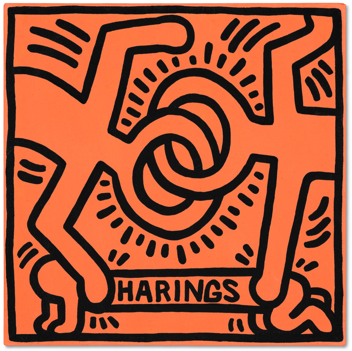
KEITH HARING (1958-1990)
Untitled, 1984
DayGlo and acrylic on canvas
19 1/8 x 19 1/8 inches (48.6 x 48.6 cm)
Signed, inscribed, dedicated and dated twice
‘FOR GRANDMA + GRANDPA DEC 29 1984 N.Y.C. MERRY CHRISTMAS + HAPPY NEW YEAR LOVE, KEITH 1984’
(on the overlap)
4. Lots Passed/Withdrawn
Untitled (Cowboy), 2013
Christie’s New-York: 15 May 2025
Estimated: USD 1,200,000 – 1,800,000
WITHDRAWN
RICHARD PRINCE (B. 1949), Untitled (Cowboy) | Christie’s
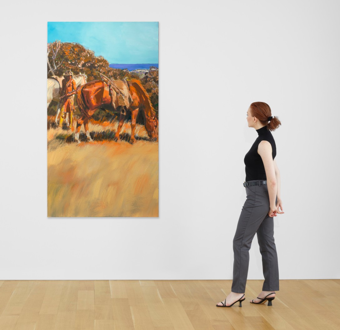
RICHARD PRINCE (B. 1949)
Untitled (Cowboy), 2013
Inkjet and acrylic on canvas
79 1/4 x 45 inches (201.3 x 114.3 cm)
Signed and dated ‘Richard Prince 2013’ (on the overlap)
Modern Evening Auction
13 May 2025
Modern Evening Auction | 2025 | Sotheby’s
1. Auction Statistics
TOTAL: USD 186,404,100
# Lots: 65
Withdrawn: 5 Lots
Passed: 10 Lots
Sold: 50 Lots
Sell-Through Rate: 76.9%
Top Lot: USD 15,100,000

Source: LiveArt
2. Top 5 Lots
#1. Homme assis, 1969
Sotheby’s New-York: 13 May 2025
Estimated: USD 12,000,000 – 18,000,000
USD 15,100,000
Homme assis | Modern Evening Auction | 2025 | Sotheby’s
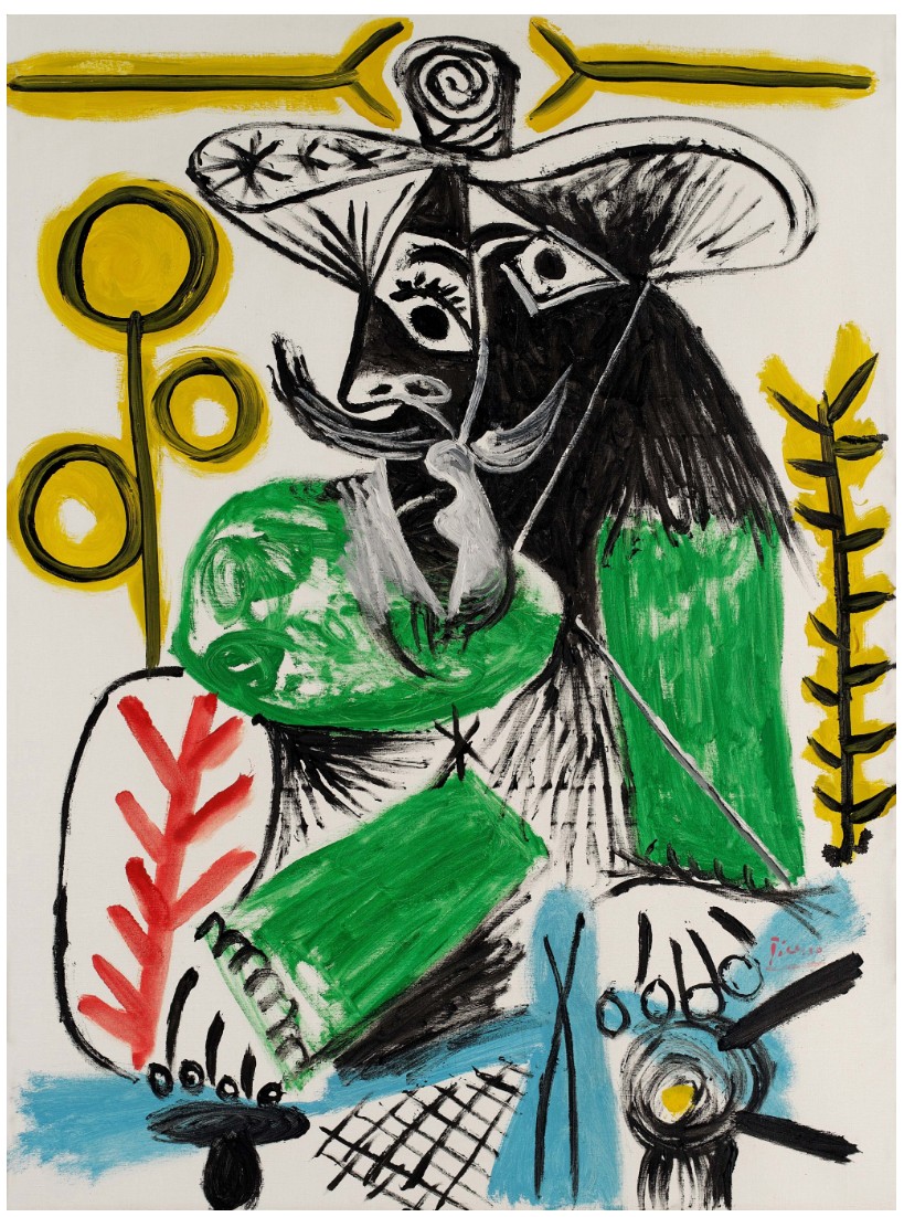
PABLO PICASSO (1881 – 1973)
Homme assis, 1969
Oil and Ripolin on canvas
129.9 x 97.2 cm (51 1/8 x 38 1/4 inches)
Signed Picasso (lower right)
Dated 10.12.69. (on the reverse)
#3. La Traversée difficile, 1963
Sotheby’s New-York: 13 May 2025
Estimated: USD 10,000,000 – 15,000,000
USD 10,040,000
La Traversée difficile | Modern Evening Auction | 2025 | Sotheby’s
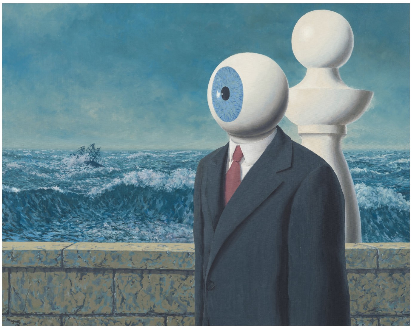
RENE MAGRITTE (1898 – 1967)
La Traversée difficile, 1963
Oil on canvas
81.3 x 100.2 cm (32 x 39 1/2 inches)
Signed Magritte (lower left)
Titled (on the reverse)
3. Other Highlights
Untitled, 1968
Sotheby’s New-York: 13 May 2025
Estimated: USD 3,500,000 – 5,000,000
USD 4,930,000
Untitled | Modern Evening Auction | 2025 | Sotheby’s
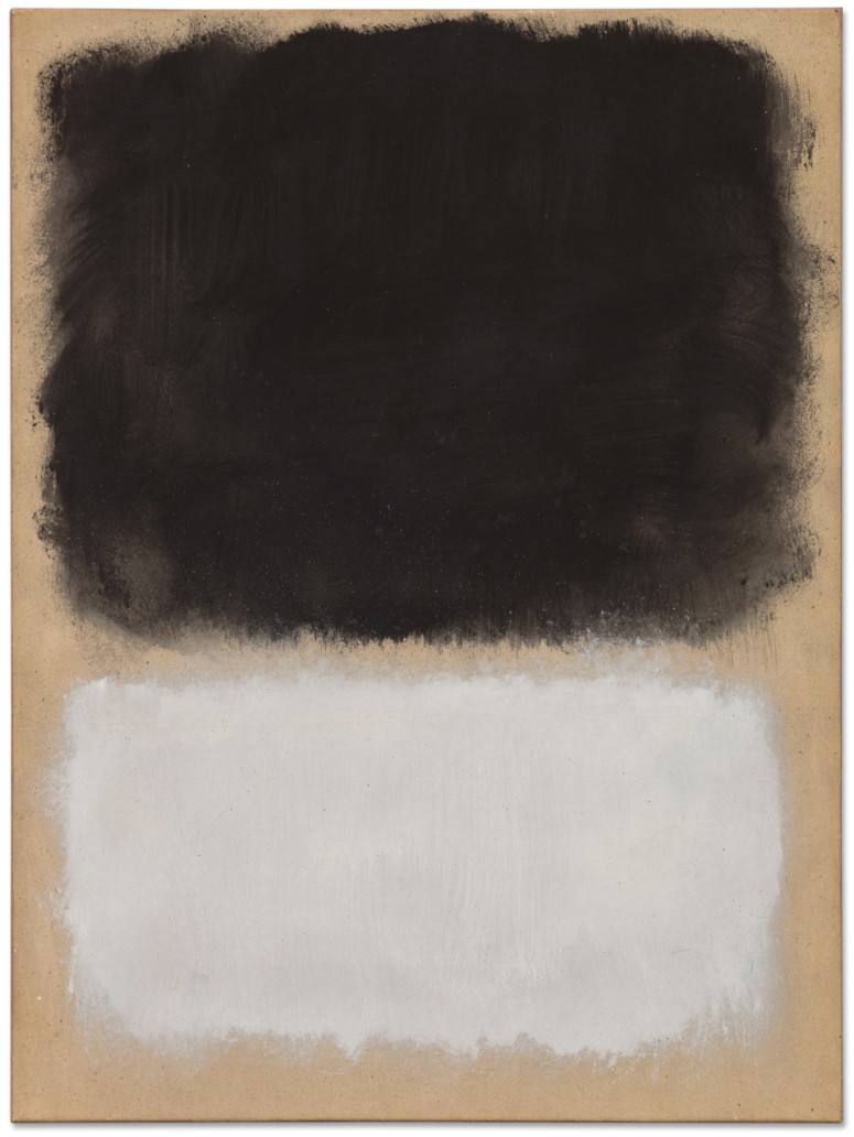
MARK ROTHKO (1903 – 1970)
Untitled, 1968
Oil on paper laid down on canvas
24 x 17 3/4 inches (60.1 x 45.1 cm)
Signed Mark Rothko and dated 1968 (on the reverse)
4. Lots Passed/Withdrawn
Peinture 92 x 73 cm, 30 juin 59
Sotheby’s New-York: 13 May 2025
Estimated: USD 3,000,000 – 5,000,000
PASSED
Peinture 92 x 73 cm, 30 juin 59 | Modern Evening Auction | 2025 | Sotheby’s
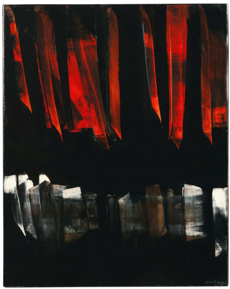
PIERRE SOULAGES (1919 – 2022)
Peinture 92 x 73 cm, 30 juin 59
Oil on canvas
92×73 cm (36 1/4 x 28 3/4 inches)
Signed Soulages (lower right)
Signed again, titled and dated 30 juin 59 (on the reverse)
Dated again (on the stretcher)
Selections from
The Collection of Barbara Gladstone
15 May 2025
Selections from The Collection of Barbara Gladstone | Contemporary Art | Sotheby’s
#1. Man Crazy Nurse, 2002-03
Selections from the Collection of Barbara Gladstone
Sotheby’s New-York: 15 May 2025
Estimated: USD 4,000,000 – 6,000,000
USD 3,967,000
Man Crazy Nurse | Selections from The Collection of Barbara Gladstone | Contemporary Art | Sotheby’s
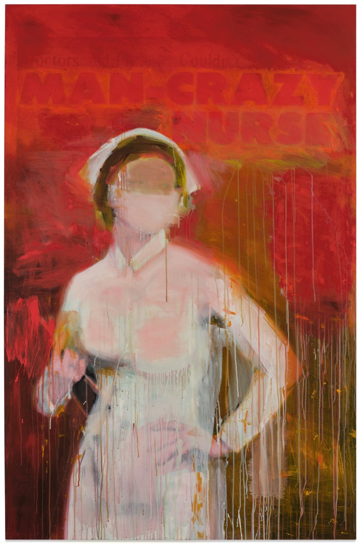
RICHARD PRINCE (b. 1949)
Man Crazy Nurse, 2002-03
Acrylic and inkjet on canvas
80×52 inches (203.2 x 132.1 cm)
Signed, titled and dated 2002-2003 (on the overlap)
#2. Flowers, 1964
Selections from The Collection of Barbara Gladstone
Sotheby’s New-York: 15 May 2025
Estimated: USD 1,000,000 – 1,500,000
USD 3,832,000
Flowers | Selections from The Collection of Barbara Gladstone | Contemporary Art | Sotheby’s
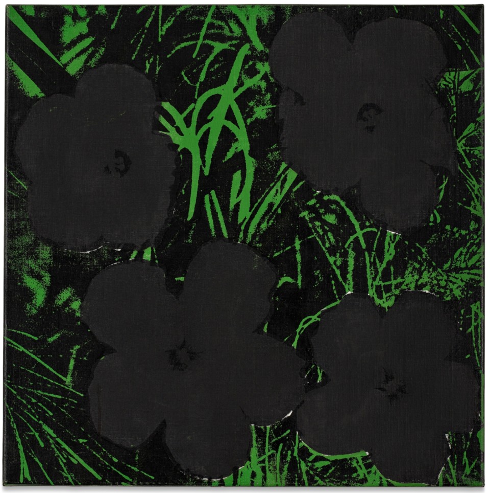
ANDY WARHOL (1928 – 1987)
Flowers, 1964
Acrylic and silkscreen ink on canvas
24×24 inches (61×61 cm)
Signed and dated 1964 twice (on the reverse)
#3. Are You Kidding?, 1988
Selections from the Collection of Barbara Gladstone
Sotheby’s New-York: 15 May 2025
Estimated: USD 2,500,000 – 3,500,000
USD 3,527,000
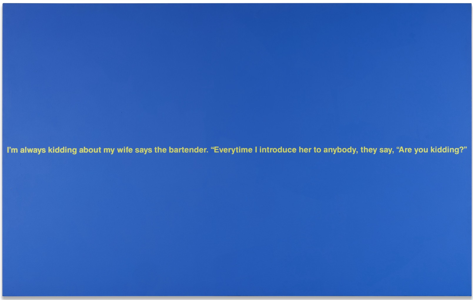
RICHARD PRINCE (b. 1949)
Are You Kidding?, 1988
Acrylic and silkscreen on canvas
56 x 89 1/2 inches (142.2 x 226.1 cm)
Signed, titled and dated 1988 (on the overlap)
The Now and Contemporary Evening Auction
15 May 2025
The Now and Contemporary Evening Auction | 2025 | Sotheby’s
1. Auction Statistics
TOTAL: USD 127,126,700
# Lots: 41
Passed: 3 Lots
Sold: 38 Lots
Sell-Through Rate: 92.7%
Top Lot: USD 16,365,000

Source: LiveArt
2. Top 5 Lots
#1. Untitled, 1981
Sotheby’s New-York: 15 May 2025
Estimated: USD 10,000,000 – 15,000,000
USD 16,365,000
Untitled | The Now and Contemporary Evening Auction | 2025 | Sotheby’s
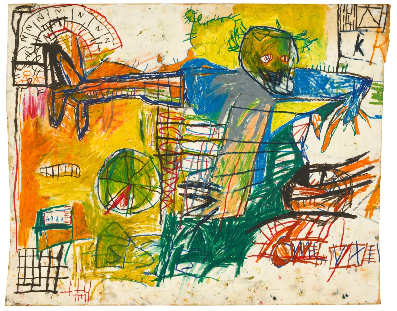
JEAN-MICHEL BASQUIAT (1960 – 1988)
Untitled, 1981
Oilstick on paper
50 1/4 x 63 7/8 inches (127.6 x 160 cm)
Signed (on the reverse)
#2. Rigger, 1961
Sotheby’s New-York: 15 May 2025
Estimated: USD 8,000,000 – 12,000,000
USD 8,000,000
Rigger | The Now and Contemporary Evening Auction | 2025 | Sotheby’s
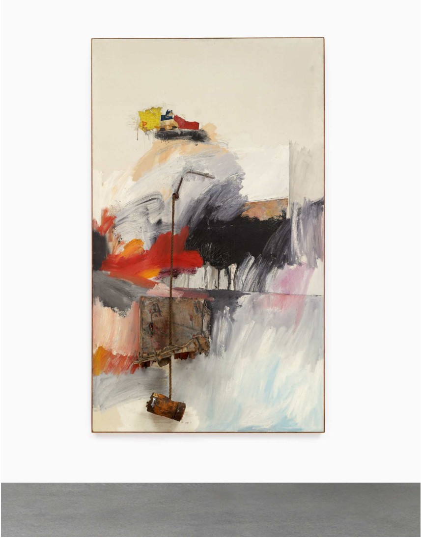
ROBERT RAUSCHENBERG (1925 – 2008)
Rigger, 1961
Oil, metal, rope, wood, fabric, plastic buttons, paper, graphite and sand on canvas
102 x 60 x 10 1/2 inches (259.1 x 152.4 x 26.7 cm)
#3. That Was Then This Is Now, 1989
Sotheby’s New-York: 15 May 2025
Estimated: USD 7,000,000 – 10,000,000
USD 7,795,000
That Was Then This Is Now | The Now and Contemporary Evening Auction | 2025 | Sotheby’s
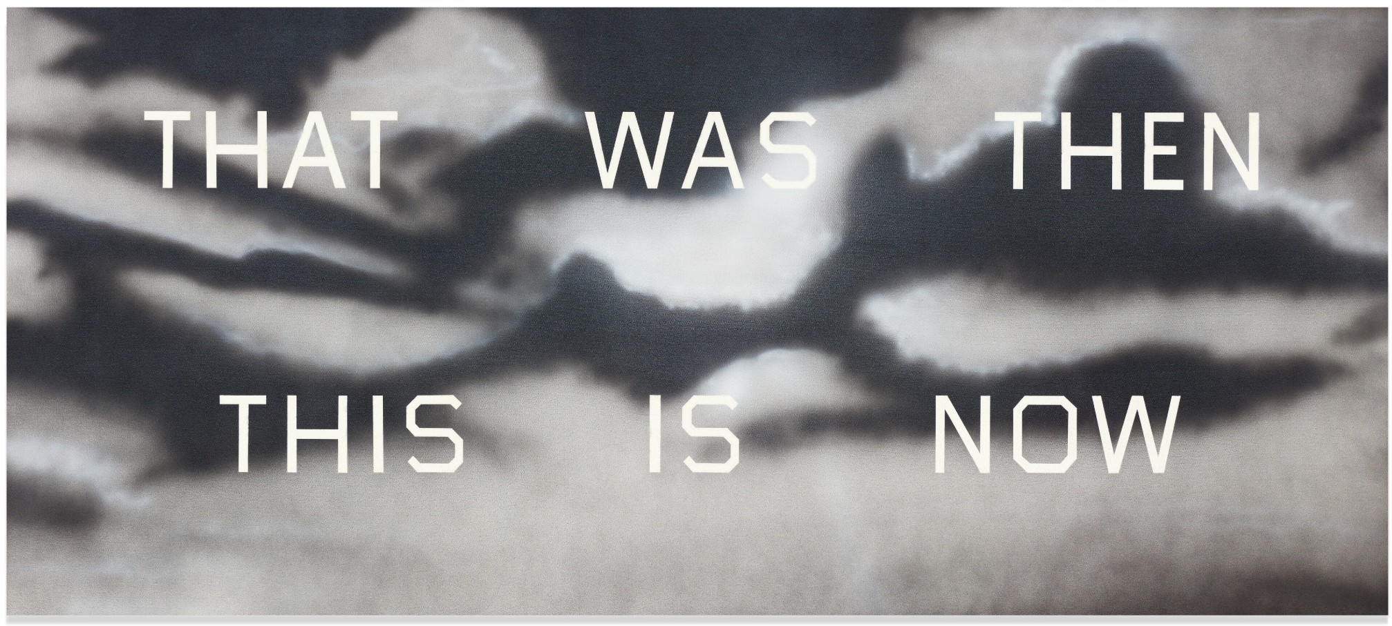
ED RUSCHA (b. 1937)
That Was Then This Is Now, 1989
Acrylic on canvas
42×96 inches (106.7 x 243.8 cm)
Signed and dated 1989 (on the reverse)
Signed, titled and dated 1989 (on the stretcher)
#4. Adelante, 1964
Sotheby’s New-York: 15 May 2025
Estimated: USD 10,000,000 – 15,000,000
USD 7,000,000
Adelante | The Now and Contemporary Evening Auction | 2025 | Sotheby’s
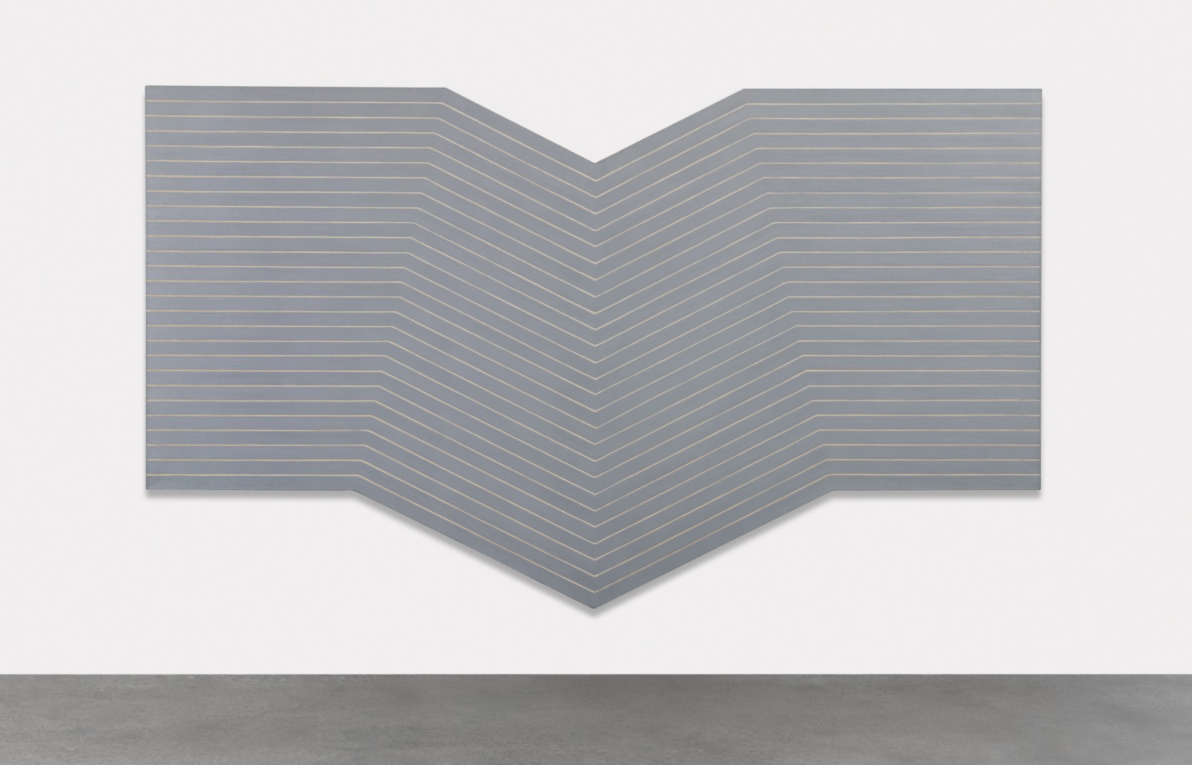
FRANK STELLA (1936 – 2024)
Adelante, 1964
Metallic powder in polymer emulsion on canvas
96 1/2 x 165 1/2 inches (245.1 x 420.4 cm)
#5. Abstraktes Bild, 1990
Sotheby’s New-York: 15 May 2025
Estimated: USD 5,000,000 – 7,000,000
USD 6,943,000
Abstraktes Bild | The Now and Contemporary Evening Auction | 2025 | Sotheby’s
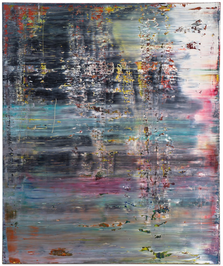
GERHARD RICHTER (b. 1932)
Abstraktes Bild, 1990
Oil on canvas
122×102 cm (48 x 40 1/8 inches)
Signed, dated 1990 and numbered 720-4 (on the reverse)
3. Other Highlights
#6. Reflections: Art, 1988
Works from the Collection of Dorothy and Roy Lichtenstein
Sotheby’s New-York: 15 May 2025
Estimated: USD 4,000,000 – 6,000,000
USD 5,479,000
Reflections: Art | The Now and Contemporary Evening Auction | 2025 | Sotheby’s
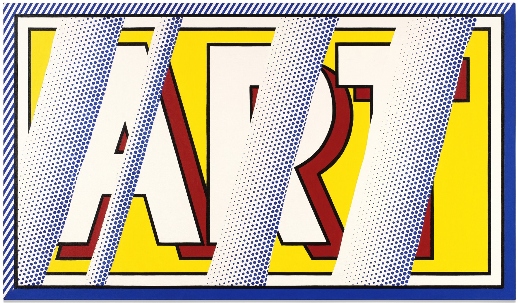
ROY LICHTENSTEIN (1923 – 1997)
Reflections: Art, 1988
Acrylic, oil and graphite on canvas
44 1/2 x 76 1/4 inches (113 x 193.7 cm)
Signed and dated ’88 (on the reverse)
#9. Gravestone, 1987
Property from the Collection of Enrico Navarra
Sotheby’s New-York: 15 May 2025
Estimated: USD 6,000,000 – 8,000,000
USD 5,174,000
Gravestone | The Now and Contemporary Evening Auction | 2025 | Sotheby’s
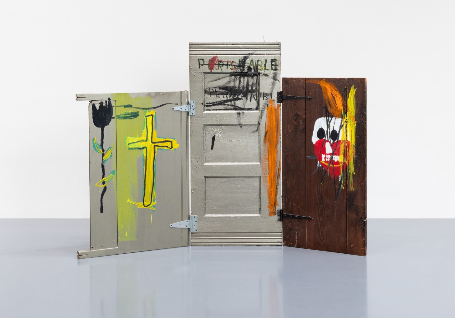
JEAN-MICHEL BASQUIAT (1960 – 1988)
Gravestone, 1987
Acrylic and oilstick on three hinged wood panels
57x69x22 inches (144.8 x 175 x 56 cm)
Signed and titled (on the reverse)
#10. Woman: Sunlight, Moonlight, 1996
Works from the Collection of Dorothy and Roy Lichtenstein
Sotheby’s New-York: 15 May 2025
Estimated: USD 4,000,000 – 6,000,000
USD 4,930,000
Woman: Sunlight, Moonlight | The Now and Contemporary Evening Auction | 2025 | Sotheby’s
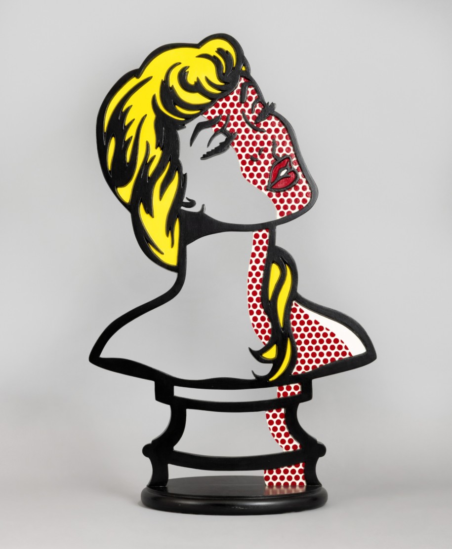
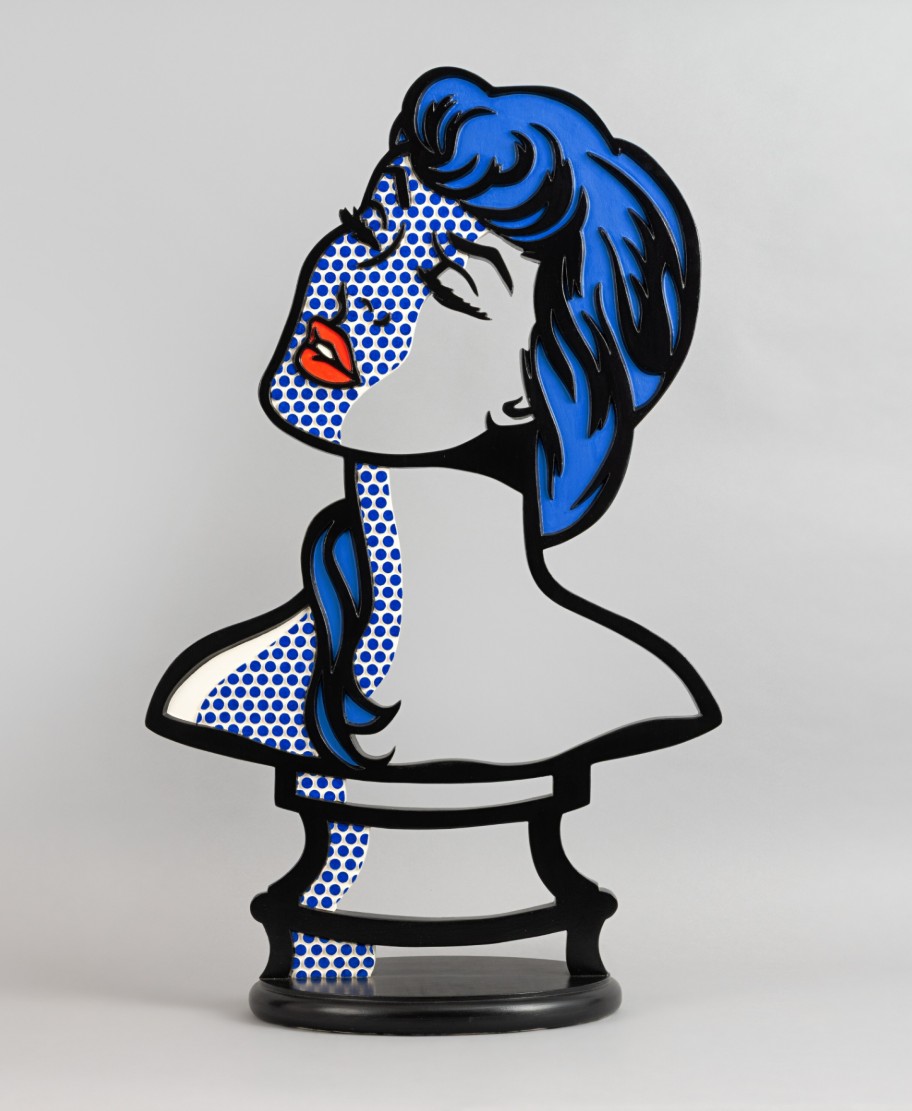
ROY LICHTENSTEIN (1923 – 1997)
Woman: Sunlight, Moonlight, 1996
Acrylic on wood
42 3/4 x 26 x 13 5/8 inches (108.6 x 66 x 35.6 cm)
#11. Stretcher Frame with Cross Bars III, 1968
Works from the Collection of Dorothy and Roy Lichtenstein
Sotheby’s New-York: 15 May 2025
Estimated: USD 2,500,000 – 3,500,000
USD 4,930,000
Stretcher Frame with Cross Bars III | The Now and Contemporary Evening Auction | 2025 | Sotheby’s
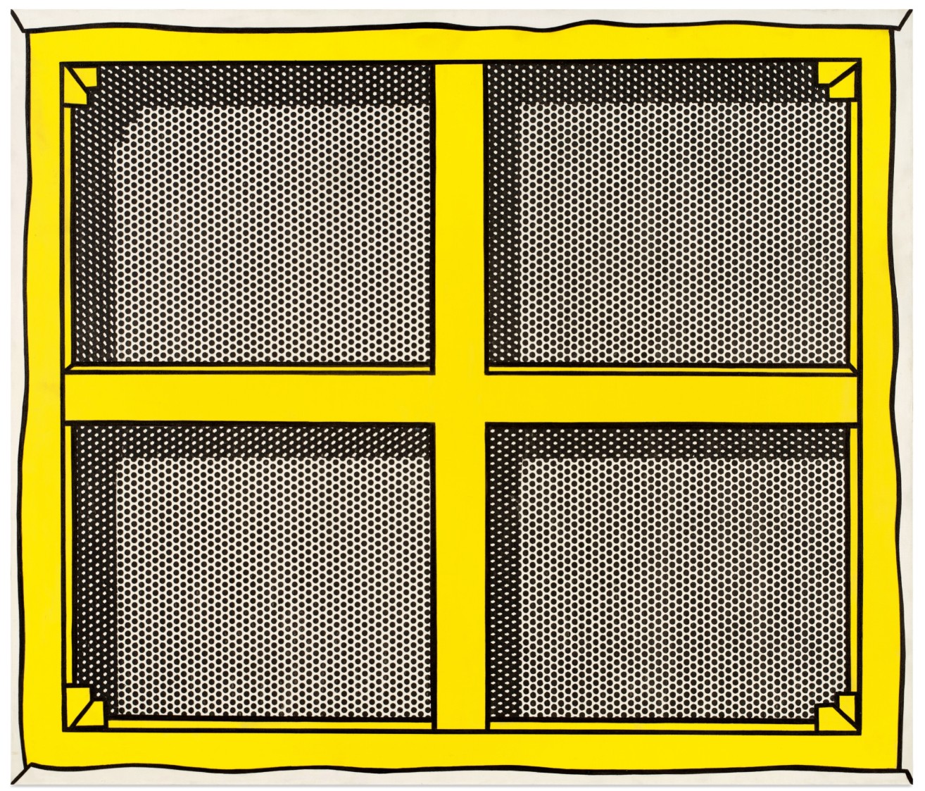
ROY LICHTENSTEIN (1923 – 1997)
Stretcher Frame with Cross Bars III, 1968
Acrylic, oil and graphite on canvas
48 x 56 1/4 inches (121.9 x 142.9 cm)
Signed and dated ’68 (on the reverse)
#12. Bonsai Tree, 1993
Works from the Collection of Dorothy and Roy Lichtenstein
Sotheby’s New-York: 15 May 2025
Estimated: USD 1,500,000 – 2,000,000
USD 4,198,000
Bonsai Tree | The Now and Contemporary Evening Auction | 2025 | Sotheby’s
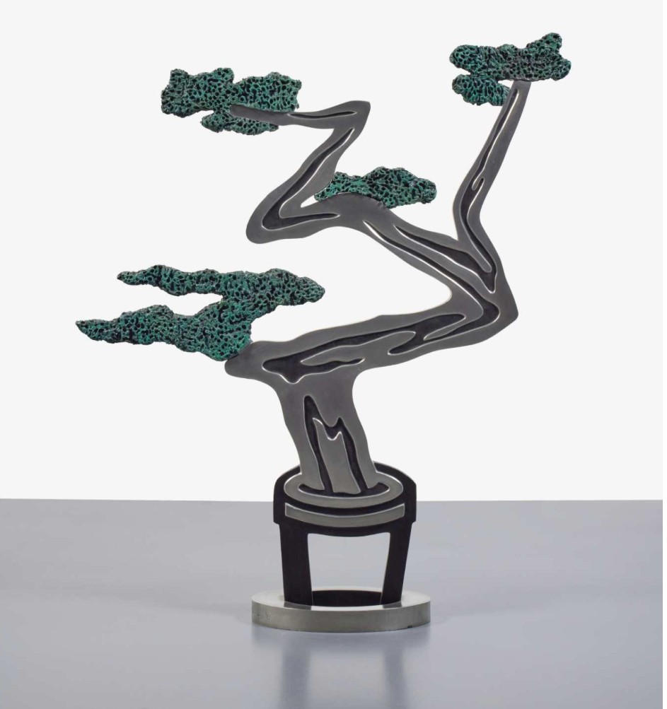
ROY LICHTENSTEIN (1923 – 1997)
Bonsai Tree, 1993
Painted pewter, patinated bronze
50 3/4 x 38 1/2 x 10 1/2 inches (128.9 x 97.8 x 26.7 cm)
Incised with the artist’s signature, numbered 6/6 and dated ’93 (lower edge)
This work is number 6 from an edition of 6 plus 1 artist’s proof
#13. Flowers, 1964
Sotheby’s New-York: 15 May 2025
Estimated: USD 1,000,000 – 1,500,000
USD 4,076,000
Flowers | The Now and Contemporary Evening Auction | 2025 | Sotheby’s
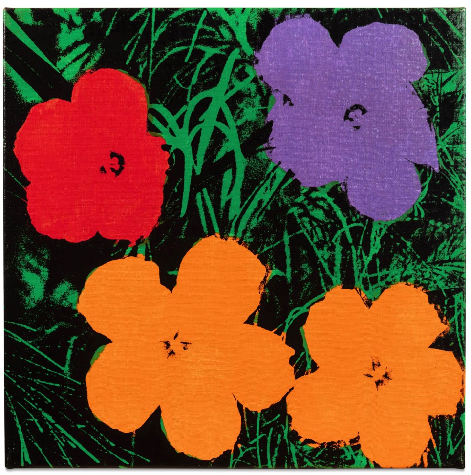
ANDY WARHOL (1928 – 1987)
Flowers, 1964
Acrylic and silkscreen ink on canvas
24×24 inches (61×61 cm)
Signed and dated 64 (on the overlap)
#15. Alpine Retreat 2, 2017
Sotheby’s New-York: 15 May 2025
Estimated: USD 2,500,000 – 3,500,000
USD 3,161,000
Alpine Retreat 2 | The Now and Contemporary Evening Auction | 2025 | Sotheby’s
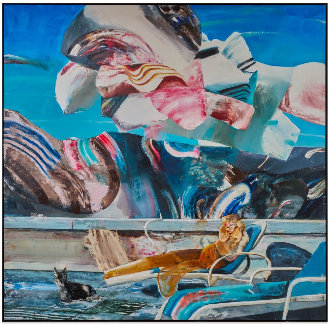
ADRIAN GHENIE (b. 1977)
Alpine Retreat 2, 2017
Oil on canvas
290×300 cm (114 1/8 x 118 1/8 inches)
Signed and dated 2017 (on the reverse)
Nudes in Mirror (Study), 1994
Works from the Collection of Dorothy and Roy Lichtenstein
Sotheby’s New-York: 15 May 2025
Estimated: USD 1,000,000 – 1,500,000
USD 2,405,o00
Nudes in Mirror (Study) | The Now and Contemporary Evening Auction | 2025 | Sotheby’s
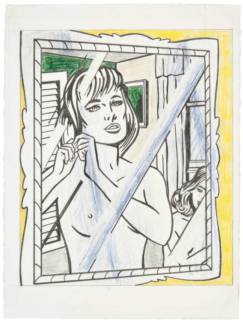
ROY LICHTENSTEIN (1923 – 1997)
Nudes in Mirror (Study), 1994
Colored pencil and graphite on paper
Image: 12 1/4 x 10 1/4 inches (31.1 x 26 cm)
Sheet: 15 1/4 x 11 3/8 inches (38.7 x 28.9 cm)
Signed and dated ’94 (on the reverse)
Portrait Triptych (Studies), 1974
Works from the Collection of Dorothy and Roy Lichtenstein
Sotheby’s New-York: 15 May 2025
Estimated: USD 1,500,000 – 2,000,000
USD 2,246,000
Portrait Triptych (Studies) | The Now and Contemporary Evening Auction | 2025 | Sotheby’s
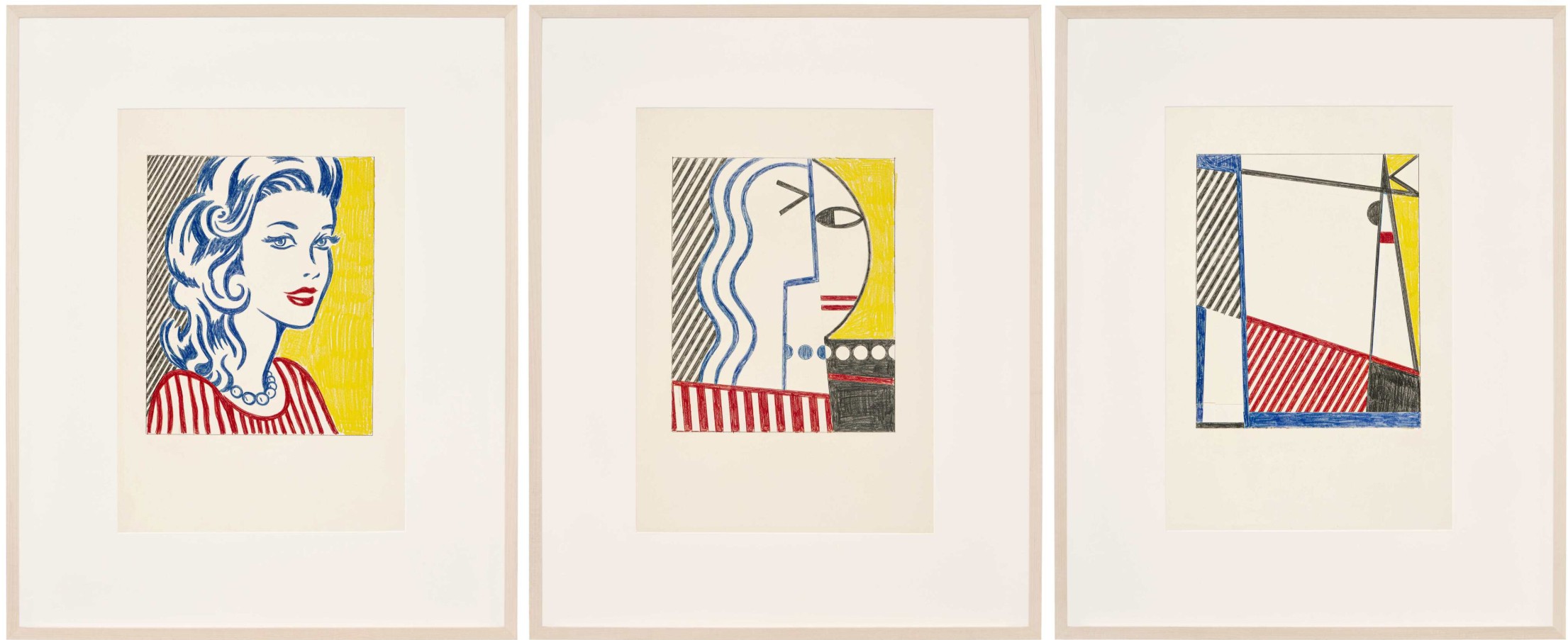
ROY LICHTENSTEIN (1923 – 1997)
Portrait Triptych (Studies), 1974
Left and center sheets: colored pencil and graphite on paper
Right sheet: colored pencil, graphite and paper collage on paper
Each sheet: 22×15 inches (55.9 x 37.9 cm)
Each image: approx. 13 1/2 x 10 3/4 inches (34.3 x 27.3 cm)
Each: signed and dated ’74 (on the reverse)
Still Life Tapestry (Study), 1973
Works from the Collection of Dorothy and Roy Lichtenstein
Sotheby’s New-York: 15 May 2025
Estimated: USD 1,000,000 – 1,500,000
USD 2,063,000
Still Life Tapestry (Study) | The Now and Contemporary Evening Auction | 2025 | Sotheby’s
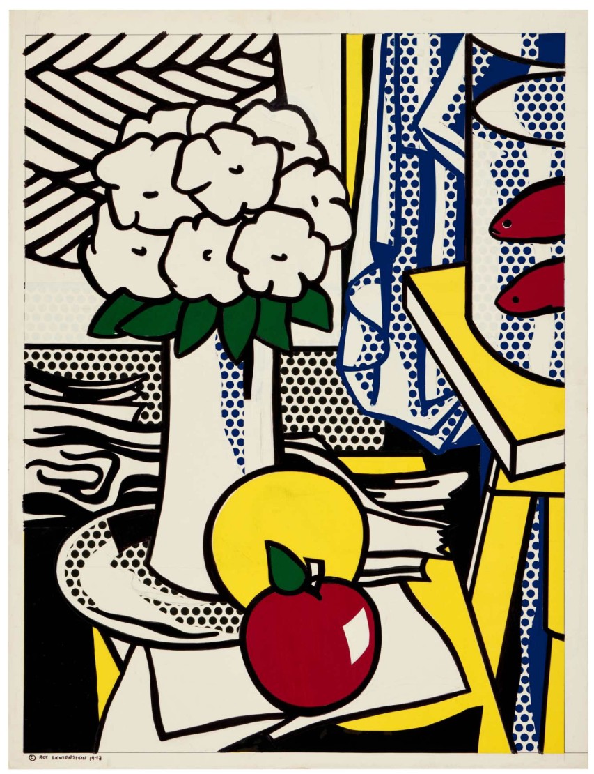
ROY LICHTENSTEIN (1923 – 1997)
Still Life Tapestry (Study), 1973
Cut painted paper, cut printed paper, marker on cut paper, cut paper, marker and graphite on board
Image: 32 5/8 x 24 1/2 inches (82.9 x 62.2 cm)
Board: 34 3/8 x 26 1/4 inches (87.3 x 66.7 cm)
Signed and dated 1973 (lower left)
#26. Two Standing Broken Men, 2018
Sotheby’s New-York: 15 May 2025
Estimated: USD 800,000 – 1,200,000
USD 1,758,000
Two Standing Broken Men | The Now and Contemporary Evening Auction | 2025 | Sotheby’s
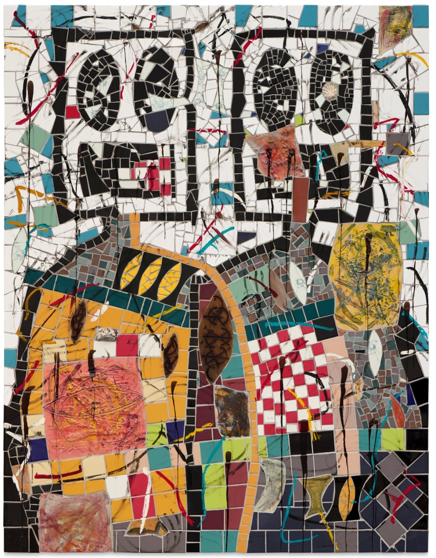
RASHID JOHNSON (b. 1977)
Two Standing Broken Men, 2018
Ceramic tile, mirror tile, oyster shells, branded red oak, spray enamel, oilstick, black soap and wax
95 x 73 1/8 inches (241.3 x 185.4 cm)
Atomic Landscape, 1966
Works from the Collection of Dorothy and Roy Lichtenstein
Sotheby’s New-York: 15 May 2025
Estimated: USD 700,000 – 1,000,000
USD 1,636,000
Atomic Landscape | The Now and Contemporary Evening Auction | 2025 | Sotheby’s
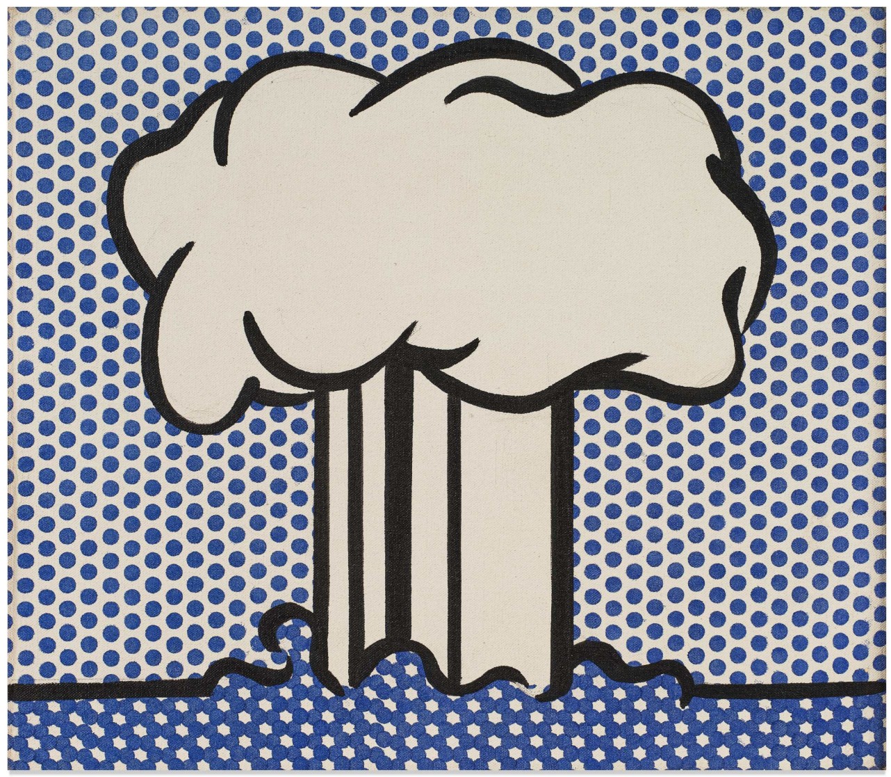
ROY LICHTENSTEIN (1923 – 1997)
Atomic Landscape, 1966
Acrylic, oil and graphite on canvas
14 x 16 1/8 inches (35.6 x 41 cm)
Signed and dated ’66 (on the reverse)
Mirror I, 1976
Works from the Collection of Dorothy and Roy Lichtenstein
Sotheby’s New-York: 15 May 2025
Estimated: USD 1,000,000 – 1,500,000
USD 1,016,000
Mirror I | The Now and Contemporary Evening Auction | 2025 | Sotheby’s
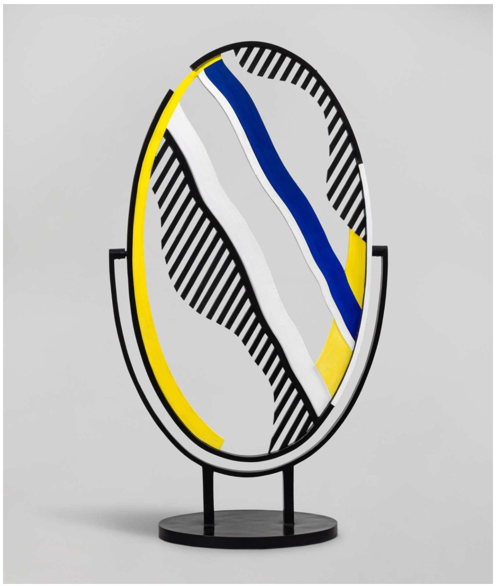
ROY LICHTENSTEIN (1923 – 1997)
Mirror I, 1976
Painted and patinated bronze
44 1/2 x 25 x 11 5/8 inches (113 x 63.5 x 29.5 cm)
Incised with the artist’s signature, numbered 2/3 and dated ’76 (lower edge)
This work is number 2 from an edition of 3 plus 1 posthumous cast
Contemporary Day Auction
16 May 2025
Contemporary Day Auction | 2025 | Sotheby’s
1. Auction Statistics
TOTAL: USD 97,342,213
# Lots: 41
Passed: 3 Lots
Sold: 38 Lots
Sell-Through Rate: 92.7%
Top Lot: USD 2,522,000

Source: LiveArt
2. Top 5 Lots
#1. Interior with African Mask (Study), 1990
Works from the Collection of Dorothy and Roy Lichtenstein
Sotheby’s New-York: 16 May 2025
Estimated: USD 800,000 – 1,200,000
USD 2,522,o00
Interior with African Mask (Study) | Contemporary Day Auction | 2025 | Sotheby’s
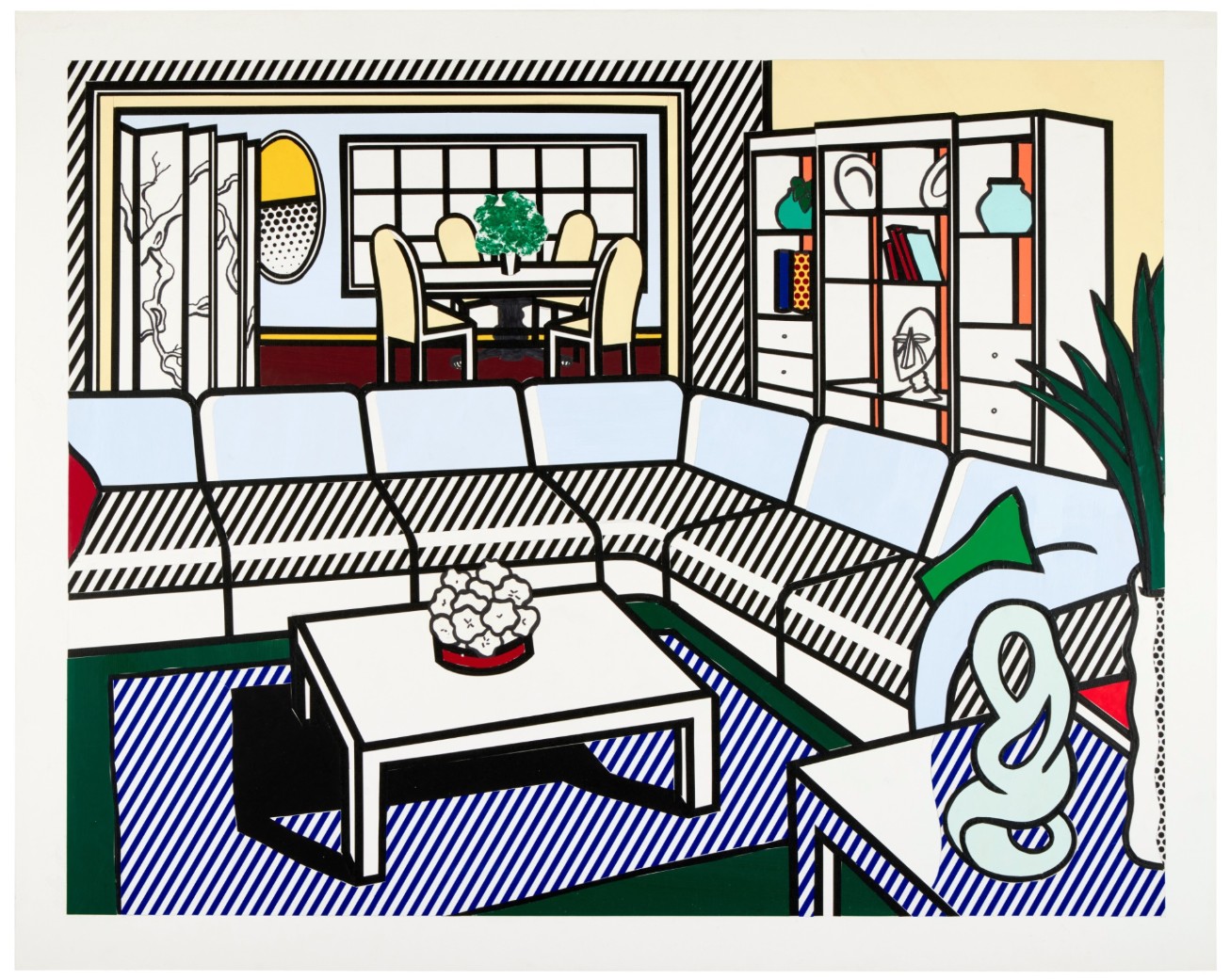
ROY LICHTENSTEIN (1923 – 1997)
Interior with African Mask (Study), 1990
Sut painted paper, cut printed paper, tape, marker and graphite on board
Image: 34 1/4 x 44 inches (86.8 x 111.8 cm)
Sheet: 38 1/2 x 48 1/4 inches (97.6 x 122.6 cm)
#2. Terrace Hollywood Hills House with Banana Tree, 1982
Sotheby’s London: 16 May 2025
Estimated: USD 1,200,000 – 1,800,000
USD 2,487,000
Terrace Hollywood Hills House with Banana Tree | Contemporary Day Auction | 2025 | Sotheby’s
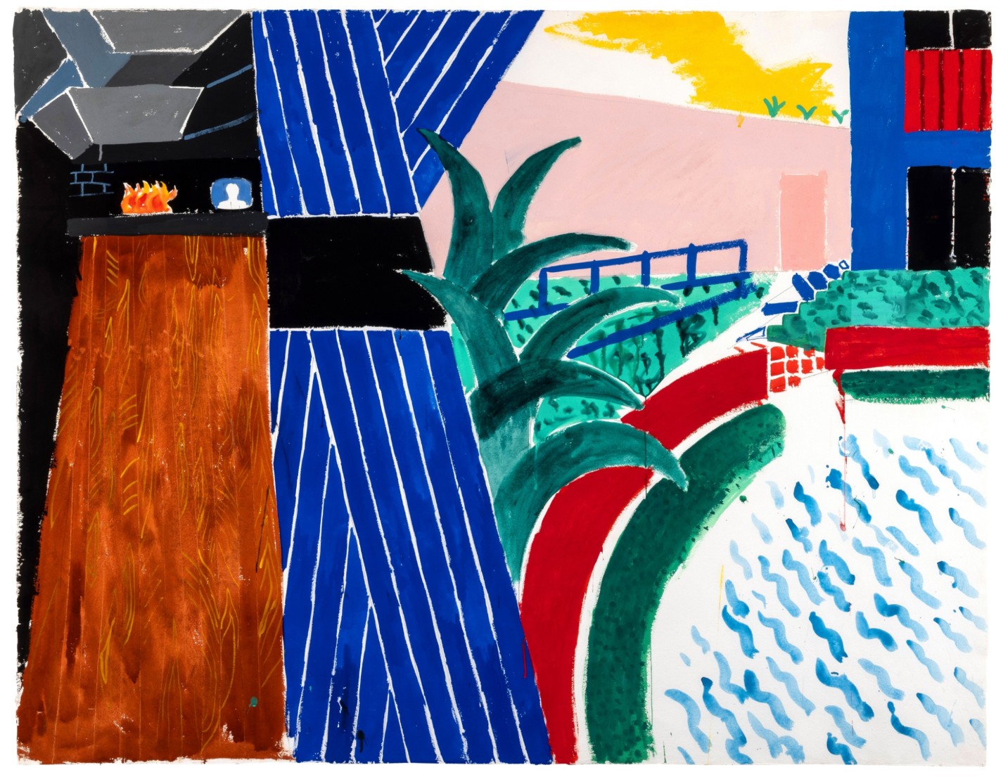
DAVID HOCKNEY (b. 1937)
Terrace Hollywood Hills House with Banana Tree, 1982
Gouache and graphite on paper
51 1/8 x 65 7/8 inches (129.8 by 167.3 cm)
#5. Yip Yip, 1994
Sotheby’s New-York: 16 May 2025
Estimated: USD 600,000 – 800,000
USD 2,246,000
Yip Yip | Contemporary Day Auction | 2025 | Sotheby’s
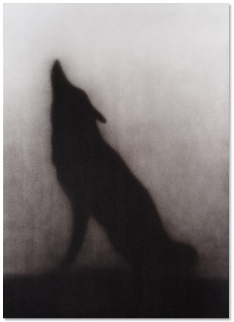
ED RUSCHA (b. 1937)
Yip Yip, 1994
Acrylic on canvas
84×60 inches (213.4 x 152.4 cm)
Signed and dated 1994 (on the reverse)
3. Other Highlights
Water Lily Pond with Reflections (Study), 1992
Works from the Collection of Dorothy and Roy Lichtenstein
Sotheby’s New-York: 16 May 2025
Estimated: USD 500,000 – 700,000
USD 1,941,000
Water Lily Pond with Reflections (Study) | Contemporary Day Auction | 2025 | Sotheby’s
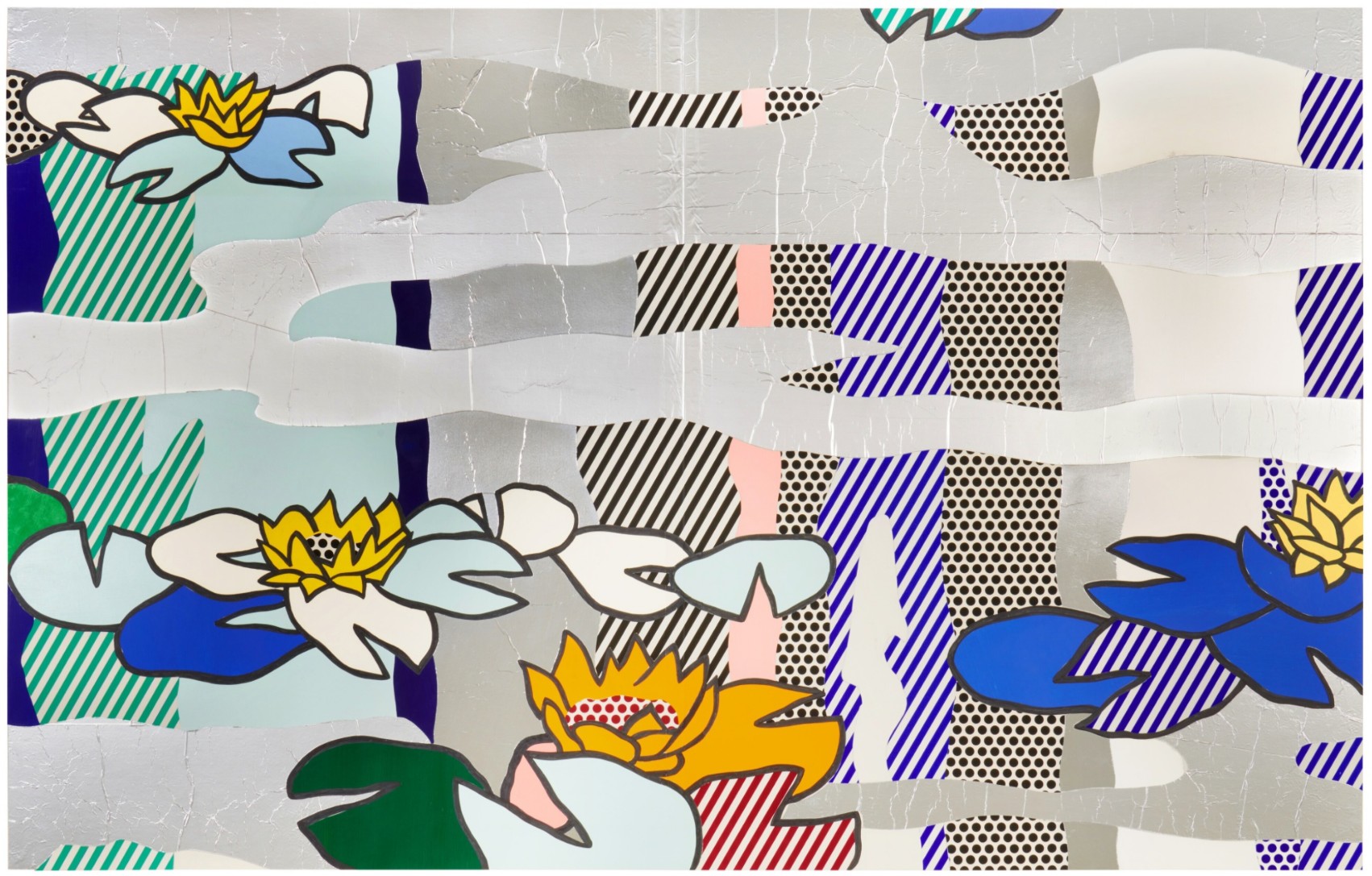
ROY LICHTENSTEIN (1923 – 1997)
Water Lily Pond with Reflections (Study), 1992
Cut painted paper, cut printed paper, aluminum foil, tape, marker and graphite on 2 joined boards
Image: 46 1/8 x 72 1/4 inches (117.2 x 183.5 cm)
Sheet: 60 x 80 1/4 inches (152.4 x 204 cm)
The Endless Journey, 2022
Sotheby’s New-York: 16 May 2025
Estimated: USD 1,500,000 – 2,000,000
The Endless Journey | Contemporary Day Auction | 2025 | Sotheby’s
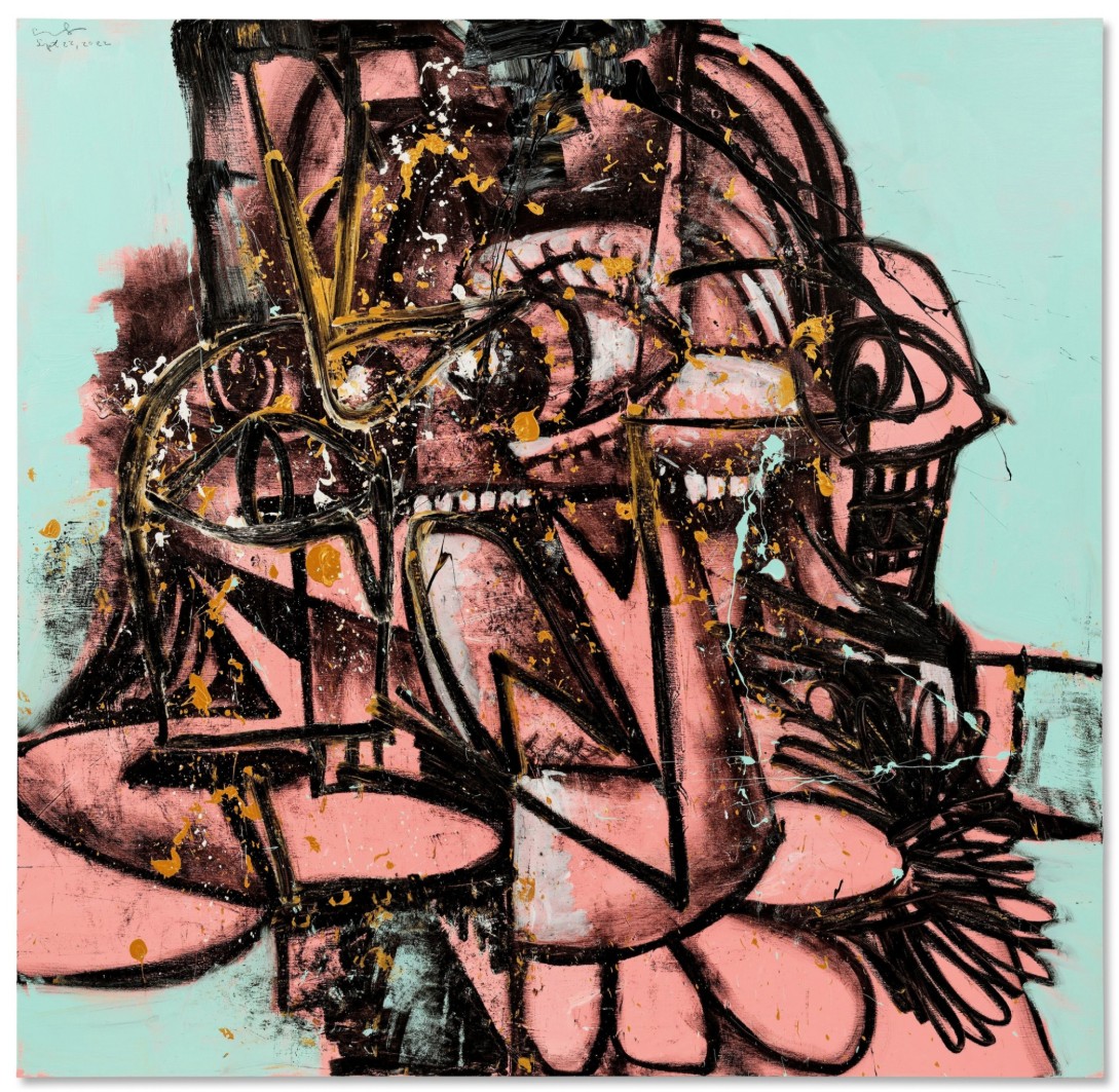
GEORGE CONDO (b. 1957)
The Endless Journey, 2022
Acrylic, oil stick and metallic paint on linen
82×84 inches (208.3 x 213.4 cm)
Signed and dated Sept 22, 2022 (upper left)
Abstraktes Bild, 1992
Sotheby’s New-York: 16 May 2025
Estimated: USD 1,200,000 – 1,800,000
USD 1,514,000
Abstraktes Bild | Contemporary Day Auction | 2025 | Sotheby’s
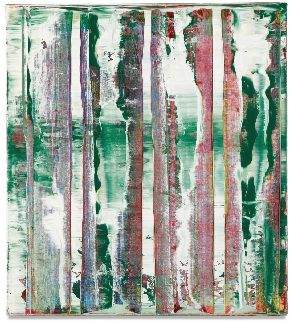
GERHARD RICHTER (b. 1932)
Abstraktes Bild, 1992
Oil on canvas
51 x 46.2 cm (20 x 18 1/8 inches)
Signed, dated 1992 and numbered 775-3 (on the reverse)
Unfurled (After Morris Louis), 1973
Works from the Collection of Dorothy and Roy Lichtenstein
Sotheby’s New-York: 16 May 2025
Estimated: USD 1,000,000 – 1,500,000
Unfurled (After Morris Louis) | Contemporary Day Auction | 2025 | Sotheby’s
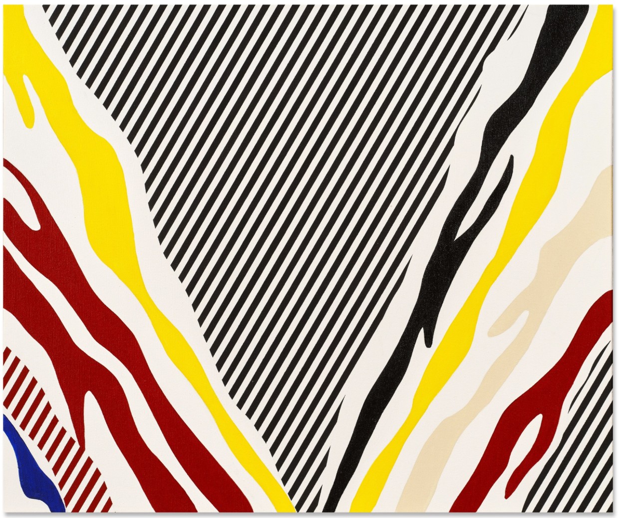
ROY LICHTENSTEIN (1923 – 1997)
Unfurled (After Morris Louis), 1973
Acrylic, oil and graphite on canvas
30 x 36 1/8 inches (76.4 x 91.8 cm)
Signed and dated ’73 (on the reverse)
Roommates (Study), 1993
Works from the Collection of Dorothy and Roy Lichtenstein
Sotheby’s New-York: 16 May 2025
Estimated: USD 600,000 – 800,000
Roommates (Study) | Contemporary Day Auction | 2025 | Sotheby’s
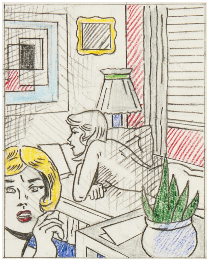
ROY LICHTENSTEIN (1923 – 1997)
Roommates (Study), 1993
Colored pencil and graphite on paper
Image: 4 7/8 x 3 3/4 inches (12.5 x 9.7 cm)
Sheet: 9 5/8 x 8 inches (24.4 x 20.3 cm)
Signed and dated ’93 (on the verso)
Modern & Contemporary Evening Sale
13 May 2025
Modern & Contemporary Art Evening Sale, New York Tuesday, May 13, 2025 at EDT | Phillips
1. Auction Statistics
TOTAL: USD 51,952,350
# Lots: 40
Withdrawn: 4 Lots
Passed: 5 Lots
Sold: 31 Lots
Sell-Through Rate: 86.1%
Top Lot: USD 6,594,000

Source: LiveArt
2. Top 5 Lots
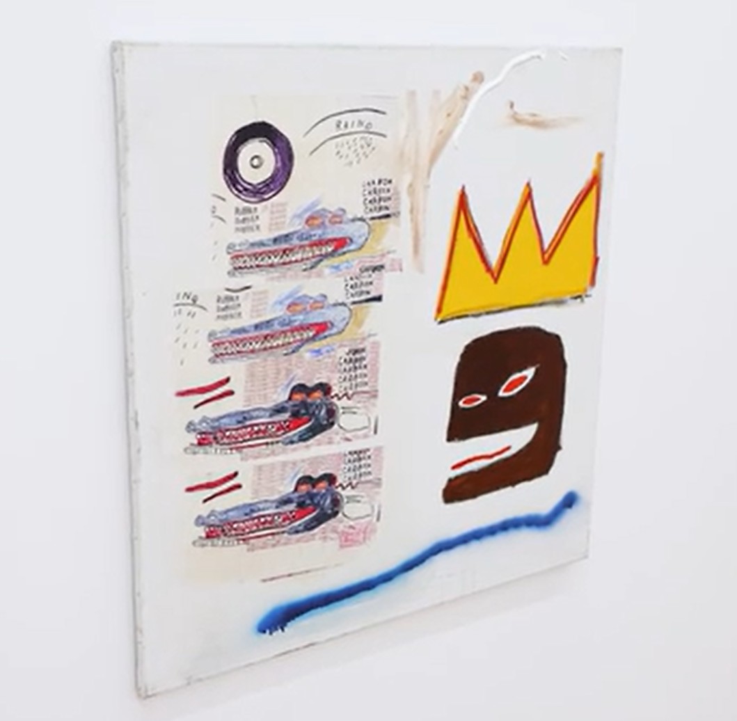
#1. Untitled, 1984
Phillips New-York: 13 May 2025
Estimated: USD 4,500,000 – 6,500,000
USD 6,594,000
Jean-Michel Basquiat Modern & Contemporary Art Evening Sale
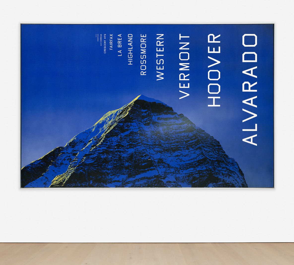
#2. Alvarado to Doheny, 1998
Phillips New-York: 13 May 2025
Estimated: USD 4,000,000 – 6,000,000
USD 4,900,000
Ed Ruscha Modern & Contemporary Art Evening Sale
#3. Untitled, 1988
Estimated: USD 4,000,000 – 6,000,000
USD 4,295,000
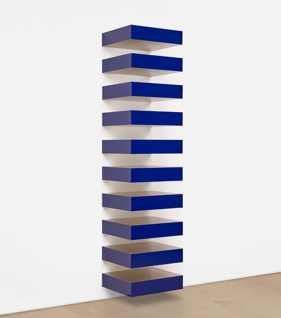
Stainless steel and blue Plexiglas, in 10 parts
Overall: 120 x 27 1/4 x 24 inches (304.8 x 69.2 x 61 cm)
“JO JUDD BERNSTEIN BROS. INC. 88-20”
On the reverse
#4. Mann mit zwei Kindern, 1966
Phillips New-York: 13 May 2025
Estimated: USD 4,000,000 – 6,000,000
USD 4,174,000
Gerhard Richter Modern & Contemporary Art Evening Sale

#5. Killer Nurse, 2009-2010
Phillips New-York: 13 May 2025
Estimated: USD 3,000,000 – 4,000,000
USD 3,206,000
Richard Prince Modern & Contemporary Art Evening Sale
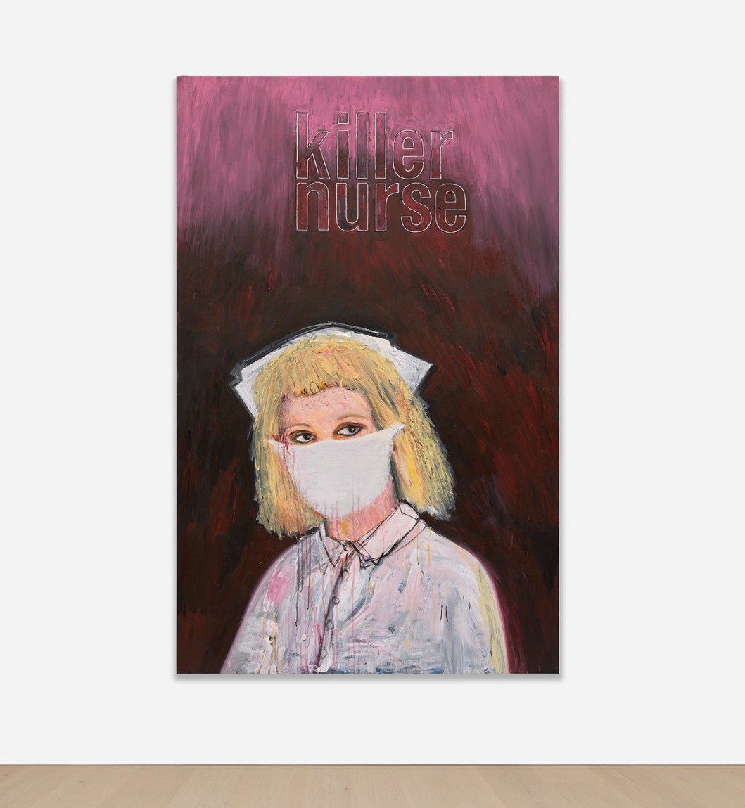
Killer Nurse, 2009-2010
Acrylic and inkjet on canvas
3. Other Highlights
#6. Untitled, 1985-1986
Phillips New-York: 13 May 2025
Estimated: USD 1,500,000 – 2,000,000
USD 2,964,000
Jean-Michel Basquiat Modern & Contemporary Art Evening Sale
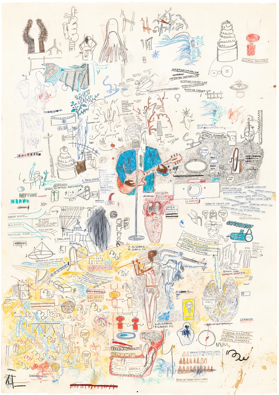
Untitled, 1985-1986
Oilstick and crayon on paper
#7. The Twenty-Sixth V.N. Painting, 1992
Estimated: USD 2,500,000 – 3,500,000
USD 2,722,000
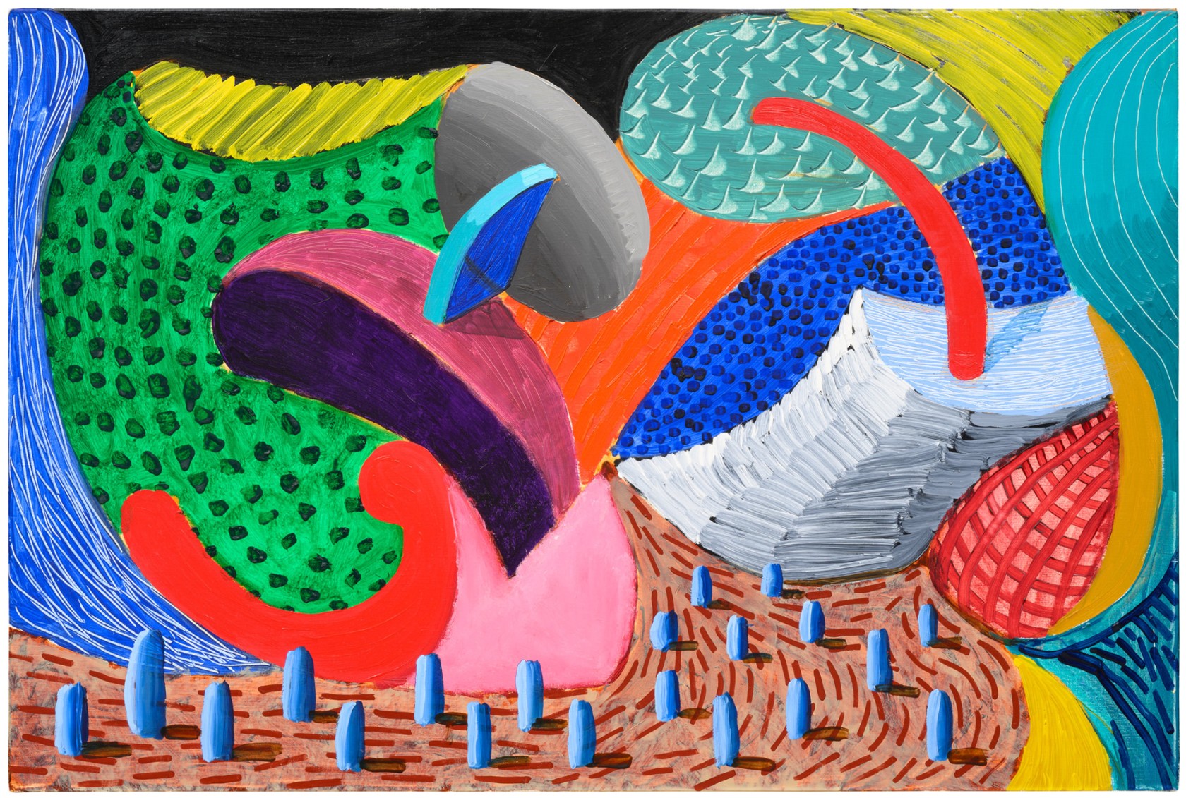
Signed, titled and dated “The Twenty Sixth V.N. Painting David Hockney 1992” on the reverse
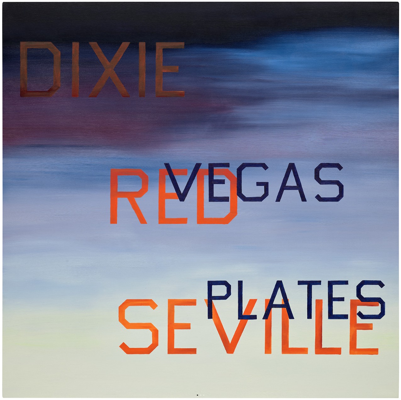
#9. Dixie Red Seville, 1985
Phillips New-York: 13 May 2025
Estimated: USD 1,800,000 – 2,500,000
USD 1,996,000
Ed Ruscha Modern & Contemporary Art Evening Sale
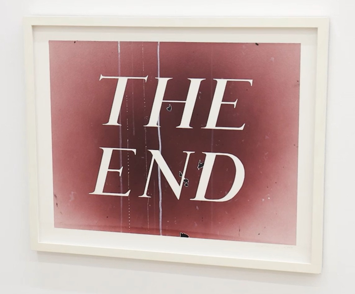
The End #81, 2009
Phillips New-York: 13 May 2025
Estimated: USD 350,000 – 450,000
USD 406,400
Ed Ruscha Modern & Contemporary Art Evening Sale
4. Lots Passed/Withdrawn
Social Media, 2017
Phillips New-York: 13 May 2025
Estimated: USD 2,500,000 – 3,500,000
PASSED
George Condo Modern & Contemporary Art Evening Sale
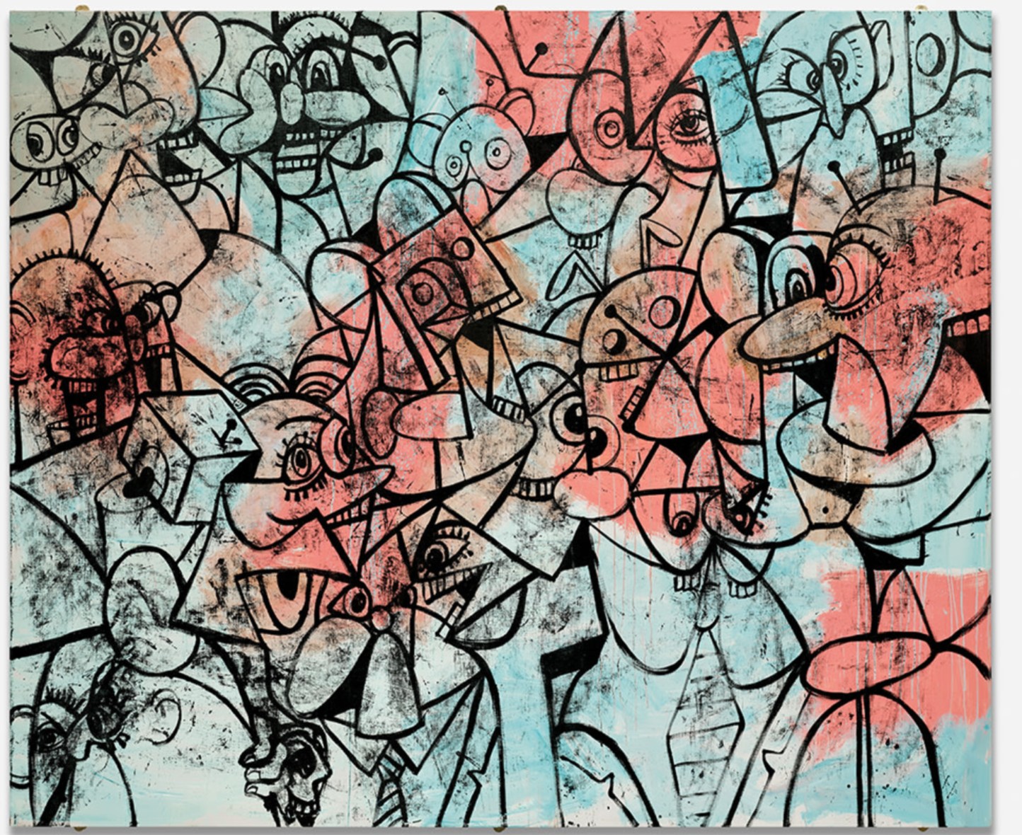
Signed and dated “Condo 2017” upper left
PART III: FOCUS
ULTRA CONTEMPORARY ART
Adrian Ghenie
Alpine Retreat 2, 2017
Sotheby’s New-York: 15 May 2025
Estimated: USD 2,500,000 – 3,500,000
USD 3,161,000
Alpine Retreat 2 | The Now and Contemporary Evening Auction | 2025 | Sotheby’s
ADRIAN GHENIE (b. 1977)
Alpine Retreat 2, 2017
Oil on canvas
290×300 cm (114 1/8 x 118 1/8 inches)
Signed and dated 2017 (on the reverse)
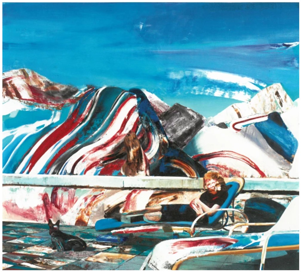
Haunted by the surreal presence of a monumental head lurking above, the protagonist of Adrian Ghenie’s Alpine Retreat 2 lies in repose, only to be obliterated by his signature pastose, magmic drags of cerulean, white, and scarlet paint. Executed in 2017, the present work is the sister painting to The Alpine Retreat, which dates to the year prior and today resides in the collection of The Metropolitan Museum of Art, New York. Together, these works see the artist’s facture, psychological inquiry, and revisionist reconsiderations reach their apogee, representing the apex of Ghenie’s uncompromising subversions of twentieth-century history painting, a subject which served as the focus of the artist’s critically acclaimed presentation at the 56th Venice Biennale in 2015. The present work depicts a pregnant Eva Braun, Adolf Hitler’s mistress, at their Bavarian mountain chalet. Her anachronistic depiction—the pair never conceived a child—proffers an ideological birth more than a literal one: reflecting on a legacy of global extremism, the proliferation of hate speech, and discourse regarding the health of democracy around the world, Alpine Retreat 2 becomes more resonant and relevant with each passing year. Marrying formal gesture and historical heft, Ghenie reconciles allegory and abstraction in one of the most arresting and irrefutably important paintings of his career.
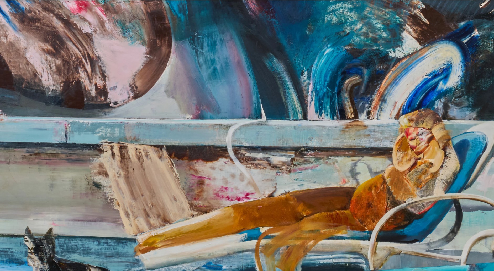
Her visage distorted and obscured by Ghenie’s operatic, indulgent brushstrokes, Eva Braun locks eyes with her viewer as she reclines on the terrace of Berghof, Hitler’s holiday residence in the Alps. A psychedelic, personified cloud swells in the sky above her, reminiscent both of Salvadore Dalí’s mercurial beings and Paul Nash’s nodose cloudscapes; the sky dispenses clear light and cruel shadows on the mountain range stretched across the canvas. Fashioned at the command of his palette knife, Ghenie mars Braun’s face and body, churning out a swirling vortex of unadulterated pigment. Braun as a subject marks an interesting departure for the artist, as the horror of her presentation lies not in her own actions—as it does in Ghenie’s portrayals of Nicolae Ceaușescu or Josef Mengele—but in her proximity and complicity to the crimes of her partner.
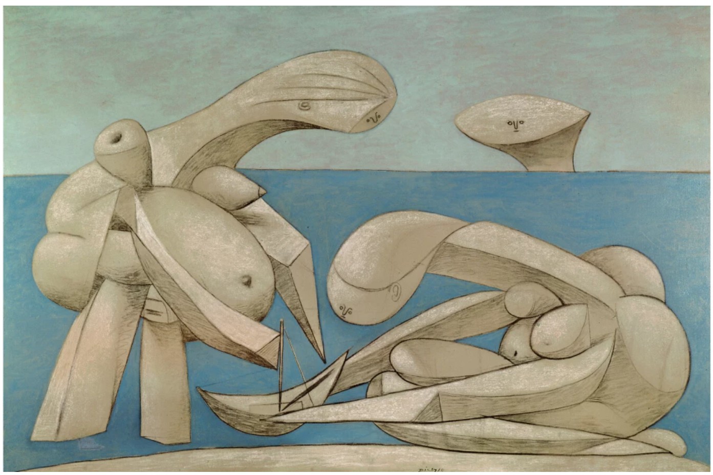
Pablo Picasso, On the Beach (La Baignade), 1937. Peggy Guggenheim Foundation, Venice. Image © Succession Picasso/DACS, London 2025 / Bridgeman Images. Art © 2025 Estate of Pablo Picasso / Artists Rights Society (ARS), New York
Here, the trope of the reclining female figure is completely void of its art historical associations, subjected instead to larger historiographic interrogations: sex and desire is eviscerated in the face of confrontation and atonement, as if translating the docility or submission of the work’s art historical antecedents into a disturbing submission to Hitler’s ideals and actions. Each brushstroke explicitly cites a historic moment yet simultaneously collapses into a kaleidoscopic abstraction: the resulting painting is undercut by both the unnerving calm and the apocalyptic potency portending the downfall of the Nazi regime. Revisited by Ghenie during the politically charged months surrounding the 2016 presidential election, he first resurrects the image of Eva Braun in The Alpine Retreat and revisits her in the present work, impregnating her with the evil that pollutes the history of the last century.
“I’m not a history painter but I am fascinated by what happened in the twentieth century and how it continues to shape today. I don’t feel any obligation to tell this to the world, but for me the twentieth century was a century of humiliation—and through my painting, I’m still trying to understand this.”
Adrian Ghenie, The Alpine Retreat, 2016. The Metropolitan Museum of Art, New York. Art © 2025 Adrian Ghenie
Born in Romania under Nicolae Ceaușescu’s dictatorial Communist regime, Ghenie’s enterprise finds its basis in his acute understanding of the myriad manifestations of totalitarianism and political oppression. Coming of age under a government marked by human rights violations and repression of freedoms of press and assembly, Ghenie and his family in his childhood relocated to Berlin, another city that bears the scars of a turbulent and divided past. Rooted in these formative experiences, the artist interrogates how the traumas of the past continue to trouble, infiltrate, direct, and complicate the present and future. His corporeal manipulations push the limits of portraiture so much so that his figures teeter on the verge of illegibility, a device which invokes the virtuosity of both Pablo Picasso’s Cubist reconstructions and Francis Bacon’s bruised and deformed treatment of flesh. The artist’s acute knowledge of art history, however, goes far beyond these self evident predecessors and reaches across time and space: the sloping hills of the Alps recall the atmospheric perspective of the hills of Golgotha in Andrea Mantegna’s The Crucifixion, whilst Ghenie’s phantasmagoric smears of pigment echo the squeegee scrapes of Gerhard Richter’s post-photographic abstraction. Through Alpine Retreat 2, Ghenie pays homage to Old, Modern, and Contemporary icons while reveling in the formal and emotive possibilities of the medium, rebelling against the exterminatory cultural policies of strongman administrations throughout history.
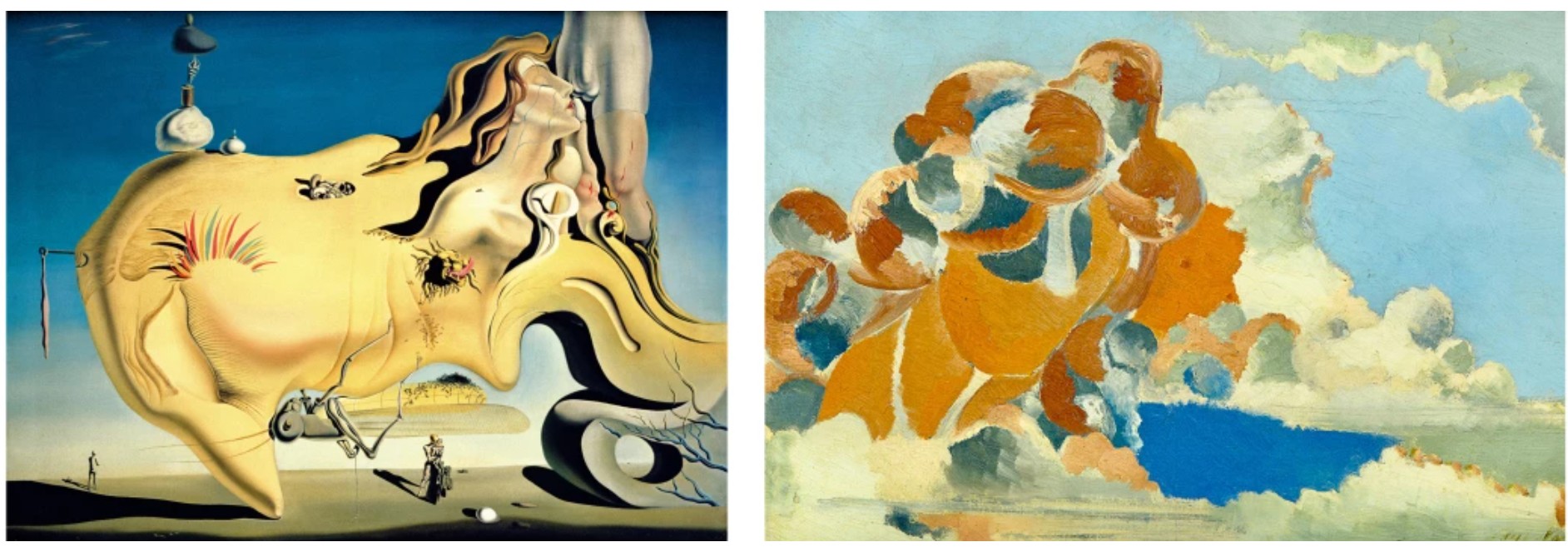
Left: Salvador Dali, The Great Masturbator, 1929. Museo Nacional Centro de Arte Reina Sofia, Madrid. Image © Index Fototeca / Bridgeman Images. Art © 2025 Salvador Dalí, Gala-Salvador Dalí Foundation / Artists Rights Society (ARS), New York. Right: Paul Nash, Cumulus Head, 1944. Private Collection. Art © 2025 Paul Nash
Adrian Ghenie’s celebrated practice can be divided into three discrete phases, each honored with a major Hatje Cantz monograph published in 2009, 2014 and 2019 respectively. The covers of each represent cardinal moments in the artist’s career, with each cover image representing Ghenie’s most famous painting of the period. The first publication features Ghenie’s iconic The Collector I of 2008, widely recognized as one of the most significant paintings from the artist’s early career that portrayed Hermann Göring in an tempestuous drama of mauve and violet. The following catalogue featuring works between 2009 and 2013 centered the painting The Death of Charles Darwin from 2013; this middle chapter of his career found Ghenie heavily featuring significant historical figures such as Darwin or Vincent van Gogh to scrutinize their legacies and the shifting paradigms brought about by their influence. Adrian Ghenie: Paintings 2014-19’s cover is graced by The Alpine Retreat, the present work’s sister painting at the Metropolitan Museum of Art. The Alpine Retreat paintings hold an incomparably important position in Ghenie’s oeuvre, representative of the most recent critical chapter of the artist’s celebrated practice and recognized amongst the most iconic images in his entire body of work. Following the throughline that traces the artist’s meteoric rise, Alpine Retreat 2’s hallucinatory interrogation of historical individuals and imagery is utterly emblematic of Ghenie’s position as one of the most pioneering and daring voices of our generation.
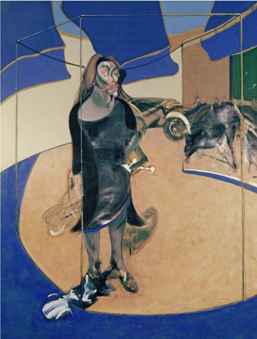
Francis Bacon, Isabel Rawsthorne Standing in a Street in Soho, 1967. Nationalgalerie, Berlin.
Image © Bridgeman Images. Art © 2025 Estate of Francis Bacon / Artists Rights Society (ARS), New York / DACS, London
A bravura demonstration of his technical virtuosity and intellectual heft, Alpine Retreat 2 sees Ghenie meld past and present, reality and surreality, figuration and abstraction at an arresting, monumental scale. Nightmarish yet cathartic, Alpine Retreat 2 reaches its viewers at a physiological, quasi-visceral level, underscoring the profundity of Ghenie’s searing interventions into our shared histories:
“I’m not a history painter but I am fascinated by what happened in the twentieth century and how it continues to shape today. I don’t feel any obligation to tell this to the world, but for me the twentieth century was a century of humiliation—and through my painting, I’m still trying to understand this.”
Pie Fight (Child), 2012
Phillips New-York: 14 May 2025
Estimated: USD 60,000 – 80,000
USD 190,500
Adrian Ghenie Modern & Contemporary Art Day Sale, Afternoon Session
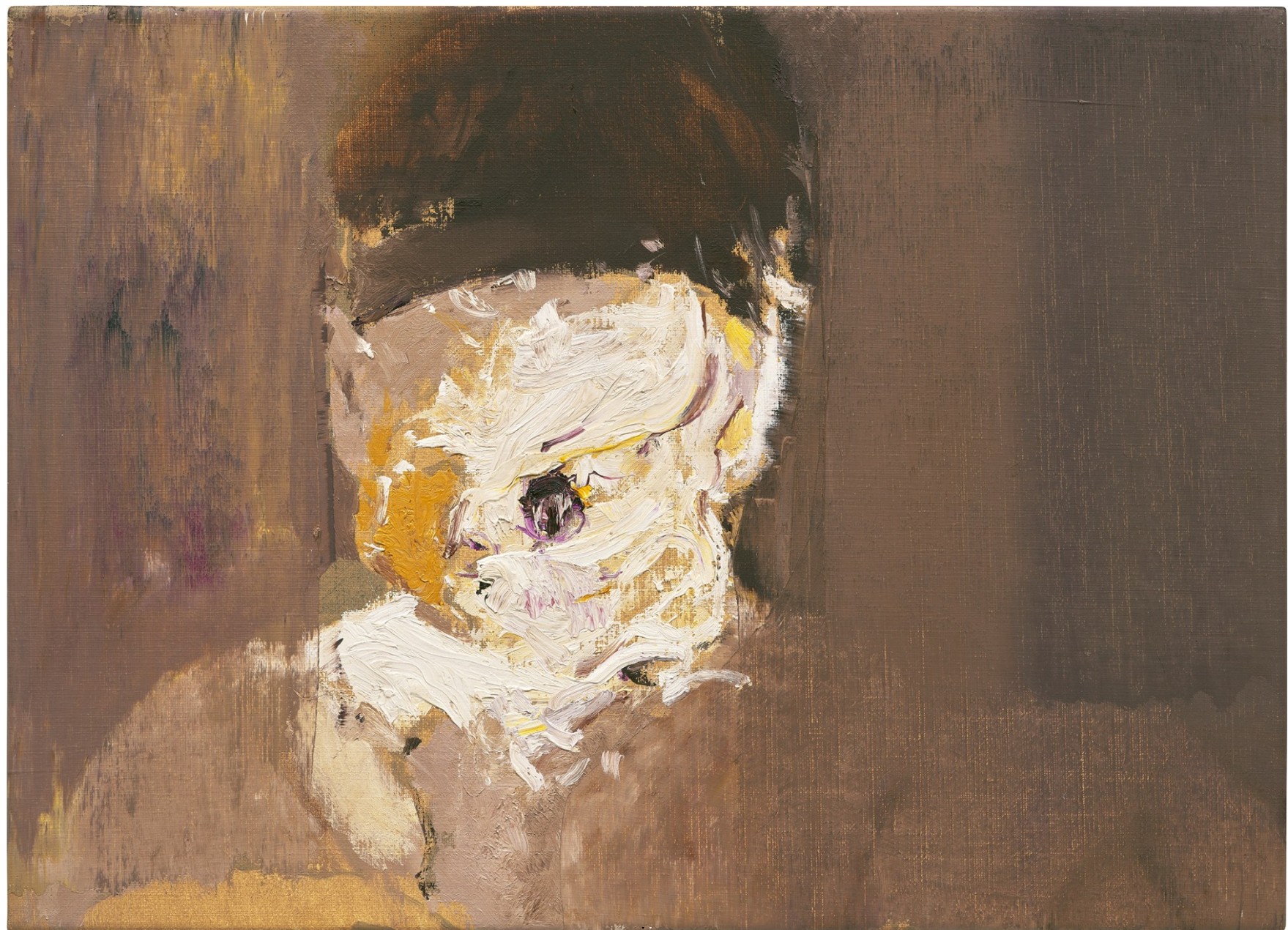 ADRIAN GHENIE
Pie Fight (Child), 2012
Oil on canvas
41.3 x 56.8 cm (16 1/4 x 22 3/8 inches)
Signed and dated “Ghenie 2012” on the reverse
“I want a deconstruction of the portrait. In the 20th century, the people who did it really radically were Picasso and Bacon. They took elements of the face and rearranged it. There is no nose, there is no mouth, there is no eye—no sense of anatomy. The portrait was a landscape, basically.”
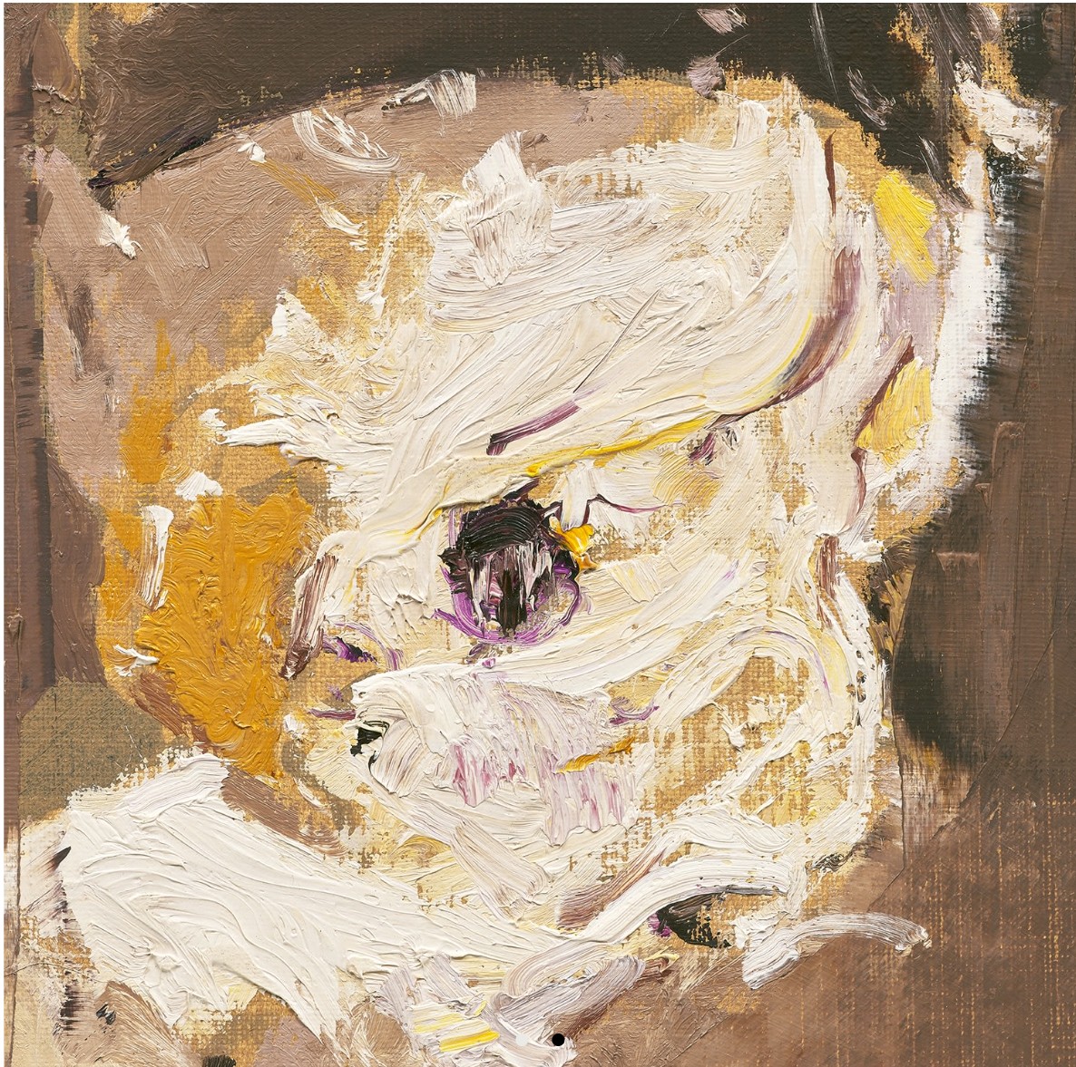
Rashid Johnson
Two Standing Broken Men, 2018
Sotheby’s New-York: 15 May 2025
Estimated: USD 800,000 – 1,200,000
USD 1,758,000
Two Standing Broken Men | The Now and Contemporary Evening Auction | 2025 | Sotheby’s
RASHID JOHNSON (b. 1977)
Two Standing Broken Men, 2018
Ceramic tile, mirror tile, oyster shells, branded red oak, spray enamel, oilstick, black soap and wax
95 x 73 1/8 inches (241.3 x 185.4 cm)
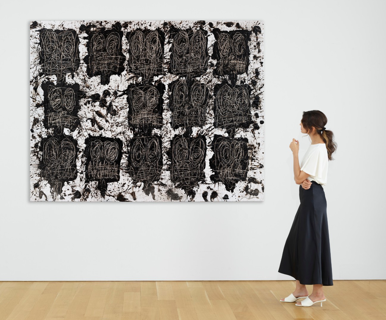
Grinning or grimacing, perhaps screaming through clenched teeth, the couple in Rashid Johnson’s Two Standing Broken Men lament a fraught national history whilst radically suggesting a path toward remediation. A paragon of the Chicago-born and New York-based artist’s critically acclaimed mosaics, Two Standing Broken Men addresses the simultaneous personal and political trauma which charge Johnson’s practice, which appropriately mines his lived experience, collective memory, the art historical canon, and critical history.
“The healing process starts with the negotiation of blunt force trauma…
It’s the story of recovery.”

Rashid Johnson in front of one of his works in his studio in Brooklyn, New York, 2019.
Photo © Chris Sorensen for The Washington Post via Getty Images. Art © 2025 Rashid Johnson
Executed in 2018, Two Standing Broken Men sees the artist approach his long-developed themes of the intersections of race and class with new vigor. Testament to the present work’s significance within the artist’s accomplished career, other Broken works are held in the collections of the Metropolitan Museum of Art, New York; the Whitney Museum of American Art, New York; and the Studio Museum, Harlem, in addition to the two monumental panels he produced for his Metropolitan Opera commissions. In April the Solomon R. Guggenheim Museum, New York opened to great acclaim a mid-career survey of Johnson’s work, Rashid Johnson: A Poem for Deep Thinkers, which will subsequently travel to the Modern Art Museum of Fort Worth. Here, the vast, splintered surface further intensifies the anguish and anxiety which characterize his oeuvre, but his sprawling Two Standing Broken Men bespeaks an enlightened approach to trauma which centers collectivity and community, acknowledging each cleavage in the mosaic as both a scar and a stitch.
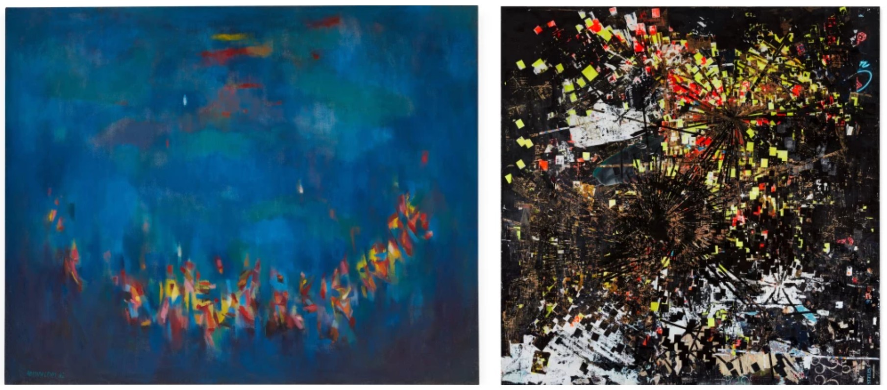
Left: Norman Lewis, Ritual, 1962. Private Collection. Sold at Sotheby’s New York in November 2019 for $2.8 million. Art © Estate of Norman Lewis, Courtesy of Michael Rosenfeld Gallery LLC, New York, NY. Right: Mark Bradford, Method Man, 2004. Private Collection. Sold at Sotheby’s New York in November 2021 for $6 million. Art © 2025 Mark Bradford. Courtesy the artist and Hauser & Wirth.
Johnson’s output of the last few years invokes a range of recent history, from his personal sobriety journey in 2014, the effects of the 2016 U.S. presidential election, to the devastating persistence of police brutality. As if witnesses to this world of unrelenting tumult, Johnson’s crowd stares out, paralyzed and ruptured by the upheavals of the last decade, and their eyes bulge as though recognizing us, too, as collateral victims of such cruelty. Arranged with a kind of shamanistic, stylized frontality, Johnson’s heads are shattered and afflicted by the very world they confront. The frenetic, fractured surface evokes the irrepressible tactility of a Jean Dubuffet or Jean-Michel Basquiat, while the texturally variegated surface addresses the multidisciplinary practice Johnson has cultivated, one which spans painting, sculpture, drawing, video, and installation. Each medium, from black soap to shards of mirror, represent symbolically loaded choices, the former strongly tied to diasporic culture and expectations around Black beauty, and the latter perhaps alluding to the broken reflections we find in the wake of unrest. Johnson’s embrace of unconventional media aligns him with one of his greatest artistic inspirations, David Hammons, who reflected upon the Black experience using chicken grease and basketball backboards as his media, and set the precedent that addressing one’s identity means not merely depicting it but weaving the truth of being into the fibers and process of the work itself.
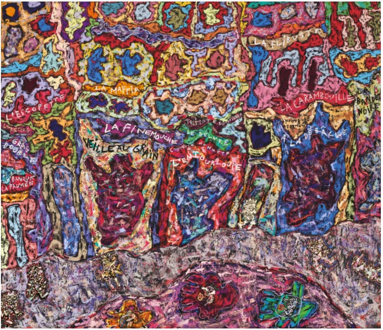
Jean Dubuffet, Paris Polka, 1961. Private Collection. Image © Christie’s Images / Bridgeman Images.
Art © 2025 Artists Rights Society (ARS), New York / ADAGP, Paris
Johnson’s use of tile references a Russian-Turkish bathhouse he frequented during his program at the School of the Art Institute of Chicago. “The tile became one of the signifying materials of that place,” Johnson reflected, “It became kind of a spiritual signifier and theme, representing a place where I got a lot of relief.” (Rashid Johnson quoted in: Claire Barliant, ‘Escape artist – an interview with Rashid Johnson’, Apollo, 8 November 2020, online) Cracked and scrawled upon as they may be, the now effaced tile faces of Johnson’s crowd represent fortitude and congregation, replicating those memories of peace; despite the acuities of their incisions and diversity of their composition, Two Standing Broken Men, notably, takes form not as rubble but as a medium anchored by art historical importance, its strength derived from the amalgamation of its constituent parts. Thus the crowd proposes togetherness as a cure to cruelty, human fallibility, subjugation and disenfranchisement, a great and expansive assertion that the composite whole might be more unimaginably beautiful than the fictive, undamaged alternative. Johnson’s mosaic courageously reconciles mental health and generational struggle, pieces of personal history and the collective fault lines of colonial projects and displacement – through art, Johnson’s resilient monoliths assure us that we can construct a new future in the present.
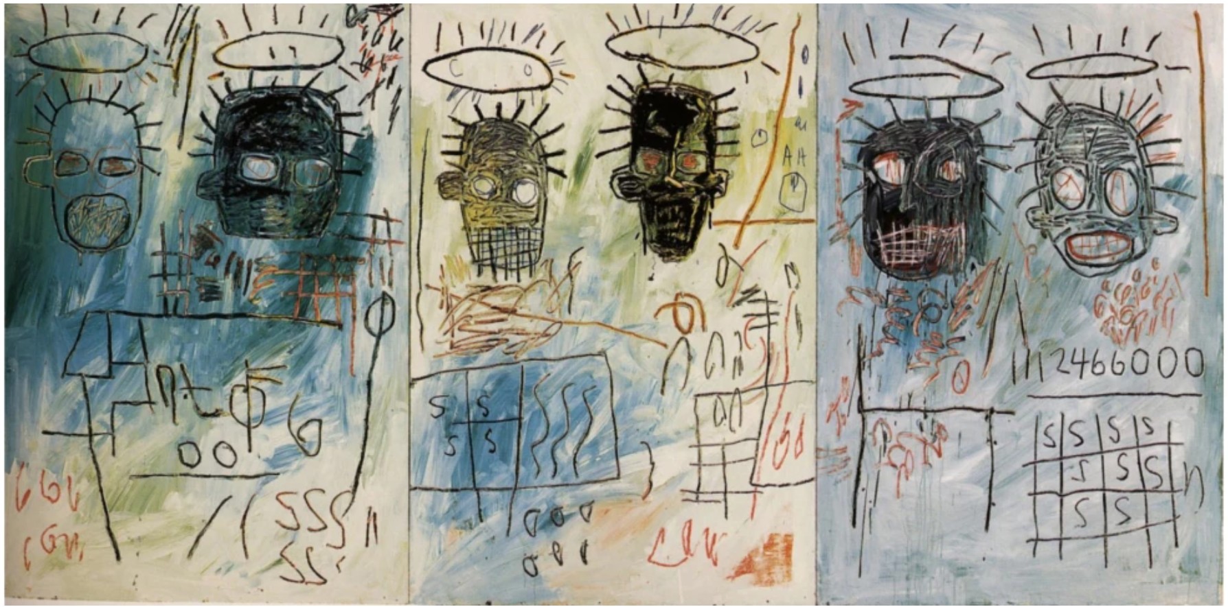
Jean-Michel Basquiat, Six Crimee, 1982. Museum of Contemporary Art, Los Angeles.
Art © Estate of Jean-Michel Basquiat. Licensed by Artestar, New York
Recently the curator of Seven Rooms and a Garden at the Moderna Museet, Stockholm, Johnson’s strength and vulnerability in his worldly – and, at times, autobiographical – body of work have earned him a place as one of Contemporary Art’s leading voices. Johnson not only has defined the scope of aesthetic and conceptual nuances in artmaking today but in his roles as a scholar and mentor for Black creatives. A paragon of his mature corpus, Two Standing Broken Men testifies to his sophisticated negotiations of pain and healing, happiness and grief, bringing to life the “tradition and opportunities of Blackness” that have long galvanized not only Johnson but a generation (Rashid Johnson quoted in: Hillarie M. Sheets, “In Rashid Johnson’s Mosaics, Broken Lives Pieced Together,” The New York Times, 26 September 2021 (online))
Untitled Anxious Audience, 2016
Christie’s New-York: 15 May 2025
Estimated: USD 600,000 – 800,000
USD 604,800
RASHID JOHNSON (B. 1977), Untitled Anxious Audience | Christie’s
RASHID JOHNSON (B. 1977)
Untitled Anxious Audience, 2016
Black soap and wax on ceramic tiles
73 x 94 3/4 x 3 inches (185.4 x 240.7 x 7.6 cm)
Signed ‘Rashid Johnson’ (on the reverse)
Untitled Escape Collage, 2016
Phillips New-York: 14 May 2025
Estimated: USD 300,000 – 500,000
USD 292,100
Rashid Johnson Modern & Contemporary Art Day Sale, Afternoon Session
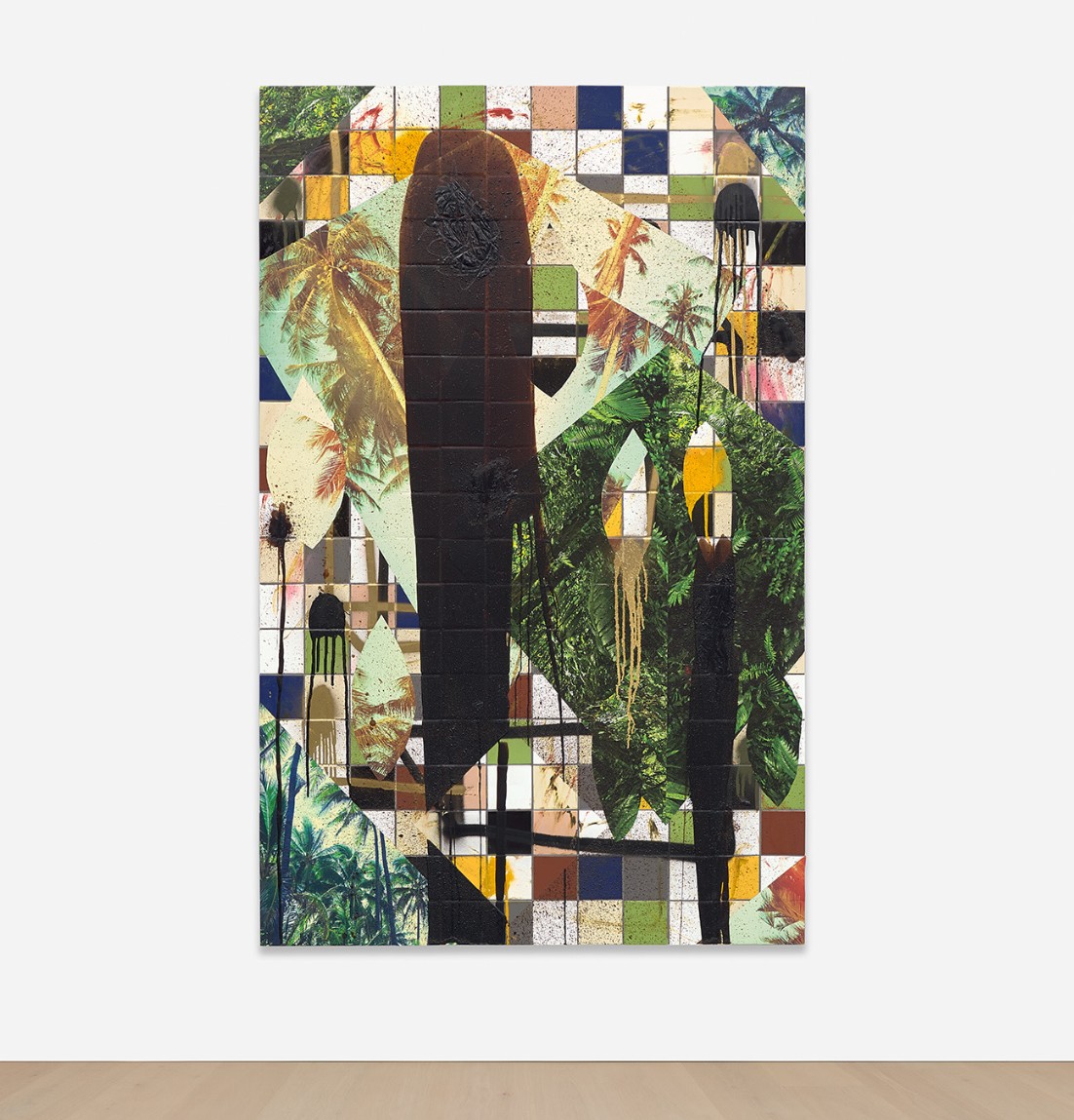
Coinciding with Rashid Johnson’s landmark mid-career survey taking over the Guggenheim Museum’s iconic rotunda, Untitled Escape Collage, 2016, is a fantastic collision of patterns, textures and materials that highlights his distinct Afrofuturist iconography and showcases his ambidexterity across materials. Over the past three decades, Johnson has built one of the most important bodies of work amongst artists working today.
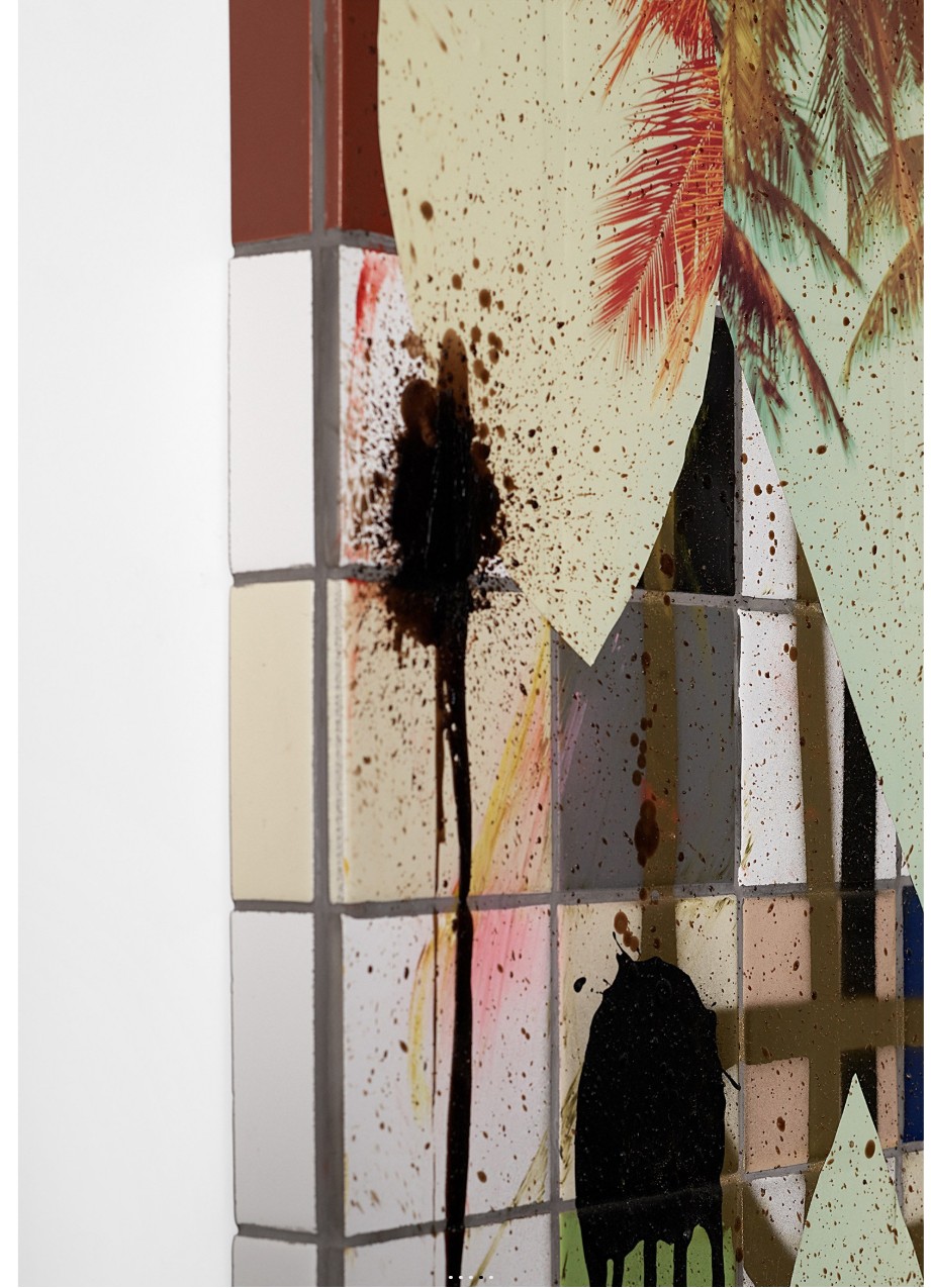
Untitled Escape Collage is grounded in the historical experience of the African diaspora but looks towards an imagined future. The work emblematizes ideas of escape and imagining, visualizing a liberated future through abstracted, symbolic forms. An optimistic and conceptually creative pursuit, Johnson’s work draws from Afrofuturism’s fantastical eclecticism and open-mindedness.
“I really wanted to create a body of work that spoke to the agency of the black character. In order to do that, I started to produce more of an escapist strategy in the way that the work was coming to life,”
Instead of connoting avoidance, Johnson sees “escapism” as an optimistic pursuit that allows for ambition, self-exploration and open-ended questioning.
CONTEMPORARY ART
Cecily Brown
Bedtime Story, 1999
Christie’s New-York: 14 May 2025
Estimated: USD 4,000,000 – 6,000,000
USD 6,221,000
CECILY BROWN (B. 1969), Bedtime Story | Christie’s
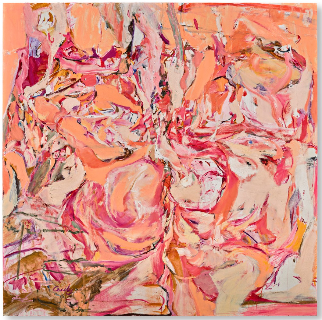
CECILY BROWN (B. 1969)
Bedtime Story, 1999
Oil on linen
75 1/4 x 75 1/4 inches (191.1 x 191.1 cm)
Signed ‘Cecily’ (lower left)
Signed and dated ‘Cecily Brown 1999’ (on the reverse)
Combining painterly rigor with an intuitive sensuality, Bedtime Story is an important early painting from a significant moment Cecily Brown’s career. Exhibited at her debut solo exhibition at Gagosian Gallery in New York in 2000, it was painted in 1999, when Brown was moving away from the ‘hedonistic bunnies’ imagery that had populated her previous major body of work. Her focus began to shift towards eroticism and the human body, and she began to deepen her exploration of abstraction. This pivotal year in Brown’s artistic development is represented in international public collections including the Tate, the Guggenheim Museum, The Broad and Denver Art Museum.
Painted on a canvas measuring just over six feet square, Bedtime Story arrests the attention of the viewer with its mesmerizing interplay of intense fleshy colors. Rendered in a vivid palette of peaches, fuchsias, burnt umbers and creamy whites, the painting is richly suggestive, calling to mind bodies in motion, or dancing flames. Yet, the picture remains deliberately elusive, entrancing the viewer with its evasive meanings and shifting imagery. Our eye oscillates between surface and depth, figurative shapes and abstract forms. Brown is deeply interested in this ambiguity, for it allows the viewer to become complicit in the creation of the painting. “I prefer a state of flux where the process is still in the process of becoming,” she told an interviewer in 2019. “From the beginning I was very aware that people looked at paintings very quickly…so I had the desire to make people stay and look. I am not into hidden imagery, but I do like the sense that something will benefit from long and close looking, convey a sense of movement and move while you look at it, and reveal itself. The meaning is always shifting, just as the paint is.” (C. Brown, quoted in Alain Elkann Interviews, February 24, 2019).
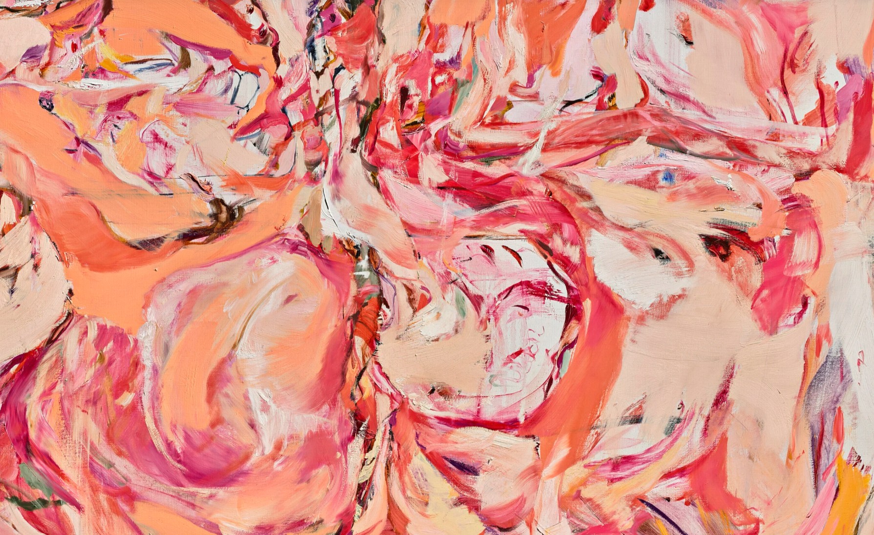
In common with other paintings from the late 1990s, Brown took the title for this work from a Hollywood film—in this instance Bedtime Story, a 1964 film starring Marlon Brando. After moving to New York City from London in 1994, Brown worked briefly in an animation studio and made a short film, which debuted at the Telluride Film Festival in 1995, before shifting her focus back to painting. The reference to cinema in Bedtime Story is not literal, yet the experience of looking at one of Brown’s paintings is not dissimilar to the complex way in which we process moving imagery, bringing our own subjective interpretations to a shape-shifting medley of imaginative visions, fleeting sensations and colored light.
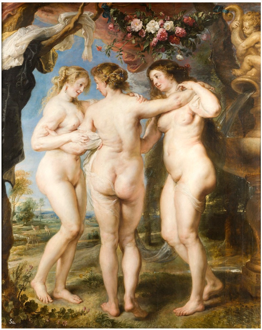
Peter Paul Rubens, The Three Graces, circa 1636. Museo del Prado, Madrid.
Allowing her interest in cinema to influence her painting is characteristic of Brown’s consistent ability to tread the line between contradictory forces, ultimately uniting the strengths of both. Her move to the US in 1994 was in pursuit of a stimulating tension created by being a foreigner in a city she loved; of feeling at home in America while at the same time never quite feeling like she belonged.
“I feel at odds about everything. My natural state is being torn; it would be bad for me if I wasn’t. If I had to narrow the work to one word, it would be ‘conflict’. I don’t like things to go along too happily.”
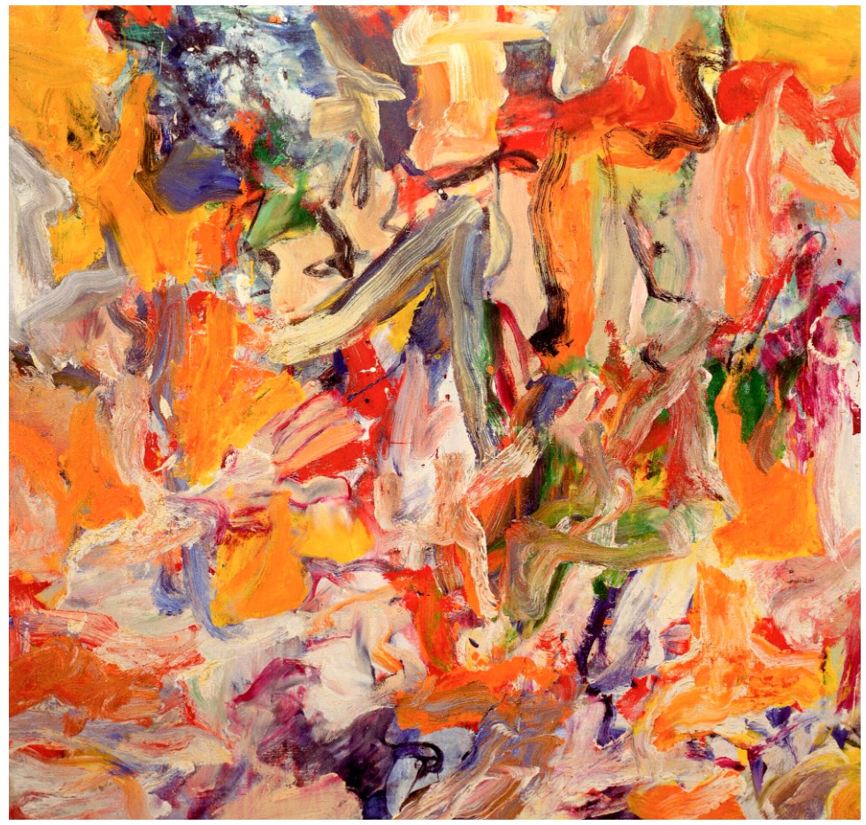
Willem de Kooning, Untitled XIV, 1977. © 2025 The Willem de Kooning Foundation / Artists Rights Society (ARS), New York.
This energizing relationship with conflict is reflected in her work itself. Educated at the Slade School of Art in London in 1990s, her unwavering commitment to painting stood out from many of her contemporaries, some of whom became known as Young British Artists (YBAs). In contrast to their more conceptual and iconoclastic concerns, Brown approached her work with an unquestioning sincerity that was rooted in a profound respect for the history of painting. Citing as influences the European old masters, such as Veronese, Titian, Poussin, Delacroix and Rubens, she has also come to be associated with the American Abstract-Expressionist painters who dominated the art world in the mid-twentieth century. Her paintings carry a kindred sense of vigorous energy and confidence, an enjoyment of the act of painting and its possibilities. Nevertheless, she has maintained that she is not as different from her British peers as might be supposed.
“Subject wise, I’ve always thought I have a lot in common with [the YBAs], I think they’re the children of Gilbert and George and [Francis] Bacon in a way that I feel I am as well. I’ve just got a bit more Turner thrown in.”
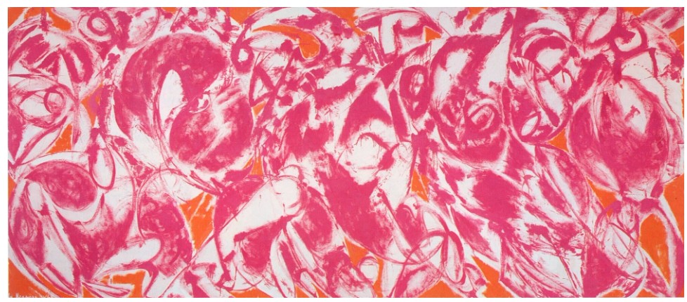
Lee Krasner, Combat, 1965. National Gallery of Victoria, Melbourne.
© 2025 Pollock-Krasner Foundation / Artists Rights Society (ARS), New York.
“I’ve discovered that the more I paint, the more I want to paint. The longer I go on doing it, the more I have to say and do”
Bedtime Story is characteristic of Brown’s bold and uninhibited approach to painting, which unites instinctive talent with an intellectual understanding of her medium. It is an intoxicating combination that continues to motivate Brown to this day.
Elizabeth Peyton
Jarvis and Liam Smoking, 1997
Christie’s New-York: 14 May 2025
Estimated: USD 800,000 – 1,200,000
USD 1,623,000
ELIZABETH PEYTON (B. 1965), Jarvis and Liam Smoking | Christie’s
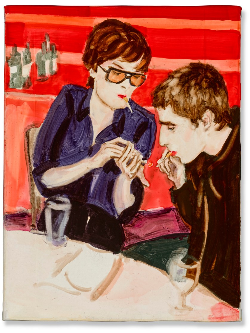
ELIZABETH PEYTON (B. 1965)
Jarvis and Liam Smoking, 1997
Oil on canvas
12 1/8 x 9 1/8 inches (30.8 x 23.2 cm)
Signed, titled and dated ‘Jarvis and Liam Smoking 1997 Elizabeth Peyton’ (on the overlap)
In deft, fluid brushstrokes, Elizabeth Peyton has captured a fleeting moment of intimacy between two musicians at the height of their fame. Painted in 1997—two years after her acclaimed 1995 solo exhibition at Gavin Brown’s enterprise in New York, which itself followed on the heels of the artist’s debut 1993 solo show at the Chelsea Hotel, New York—Jarvis and Liam Smoking is a quintessential example of the portraits that “helped melt the ice that had formed around painting in the early 1990s” (J. Saltz, “Red Lipped Royals”, Artnet magazine, 16 April 1999).
Jarvis and Liam Smoking unites two men–Jarvis Cocker and Liam Gallagher–who helped define the Brit Pop era. By then, Gallagher’s band Oasis had achieved enormous success with their second album, What’s the Story (Morning Glory)?, which entered the UK charts at number one in October 1995 and did not leave the top three for seven months. In 1996, it won Best British Album at the Brit Awards. At that same award ceremony, Jarvis Cocker, the frontman of Pulp, invaded the stage while Michael Jackson was singing to protest the performance—an act that Noel Gallagher, Liam’s brother and bandmate, publicly supported.
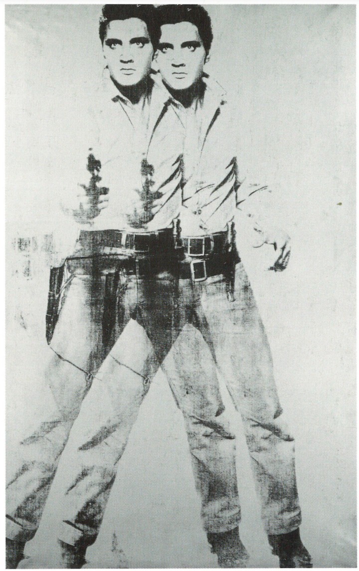
Andy Warhol, Double Elvis [Elvis IV] [Ferus Type], 1963.
© 2025 The Andy Warhol Foundation for the Visual Arts, Inc. / Licensed by Artists Rights Society (ARS).
“I’m interested in making pictures of artists whose work inspires me.”
In an interview with Cocker in 2008, she told him that she decided to paint him after his act of protest at the Brit Awards.
“There aren’t many people who stand up, whether it be in culture or politics, and say: “Listen, this is dumb. It doesn’t have to be like this.” After that awards show, I made a painting of you getting out of jail because I thought what you did was so heroic.”
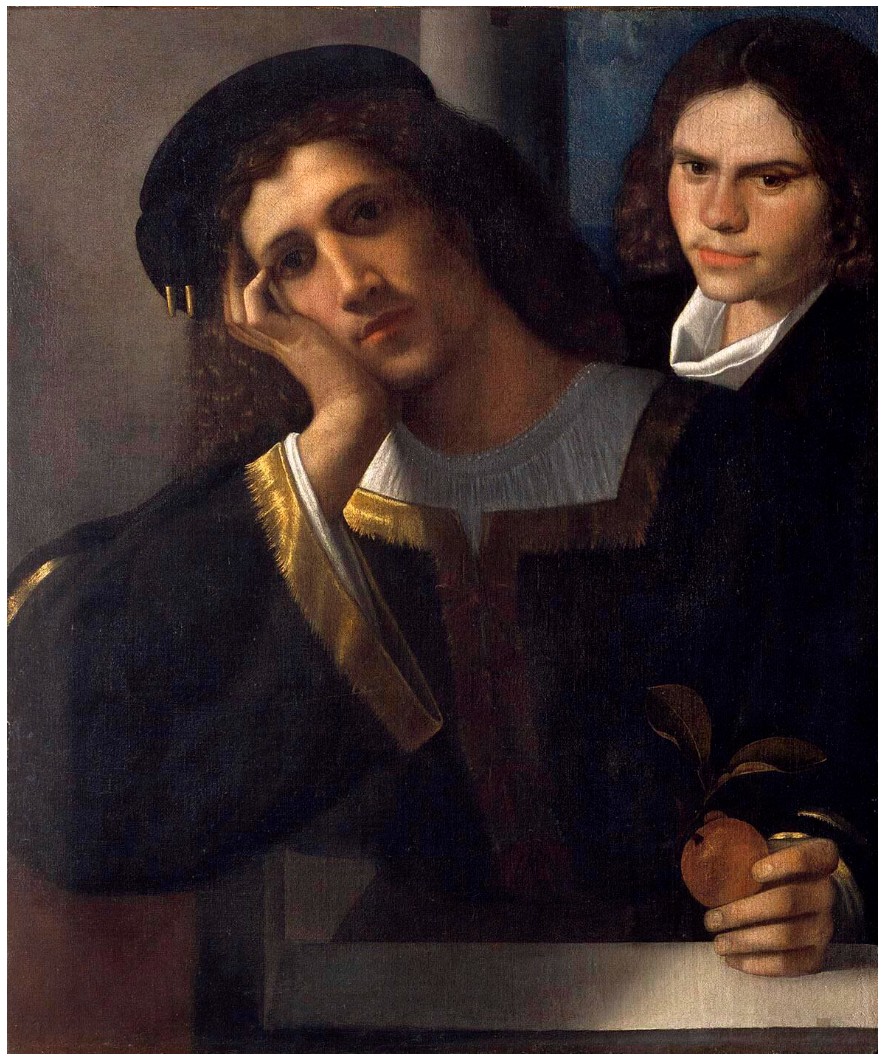
Giorgione, Double Portrait, circa 1502. Castel Sant’Angelo, Rome.
She does not make preparatory sketches before beginning a painting, meaning that the energy and spontaneity that arise from the painting process are retained, resulting in work that is vivid and alive. In this way, the formal qualities of Jarvis and Liam Smoking further underline her tender reverence for her subjects, as well as the beauty of the ephemeral moment that it captures.
What Wondrous Thing Do I See… (Lohengrin, Jonas Kaufmann), 2011-12
Selections from The Collection of Barbara Gladstone
Sotheby’s New-York: 15 May 2025
Estimated: USD 600,000 – 800,000
USD 889,000
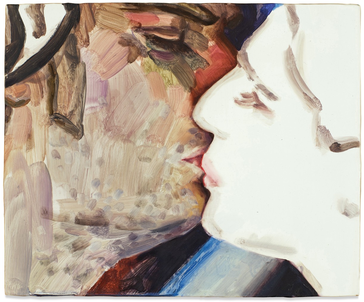
ELIZABETH PEYTON (b. 1965)
What Wondrous Thing Do I See… (Lohengrin, Jonas Kaufmann), 2011-12
Oil on veneered panel
9×11 inches (22.9 x 27.9 cm)
Signed, titled and dated 2011-2012 (on the reverse)
Intimate in both composition and scale, What Wondrous Thing Do I See… (Lohengrin, Jonas Kaufmann) from 2011-12 is a luminous portrayal of a scene from Richard Wagner’s opera Lohengrin, executed in Elizabeth Peyton’s alluring facture and arresting composition.
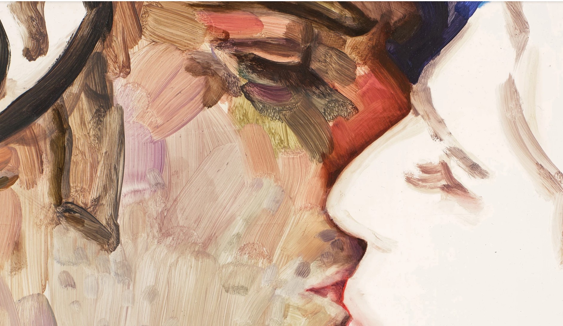
One of the most influential figurative artists working today, Peyton is celebrated for paintings of cultural icons and close friends, and the present work’s tender and observant gaze underscores the artist’s dedication to unearthing the profound essence that lies behind each of her subjects. Removing the two sitters’ surroundings and focusing the composition on the moment they meet for a kiss, Peyton distills emotive potential into the 9-by-11-inch picture frame, urging us to gaze into a moment of love forever frozen in time.
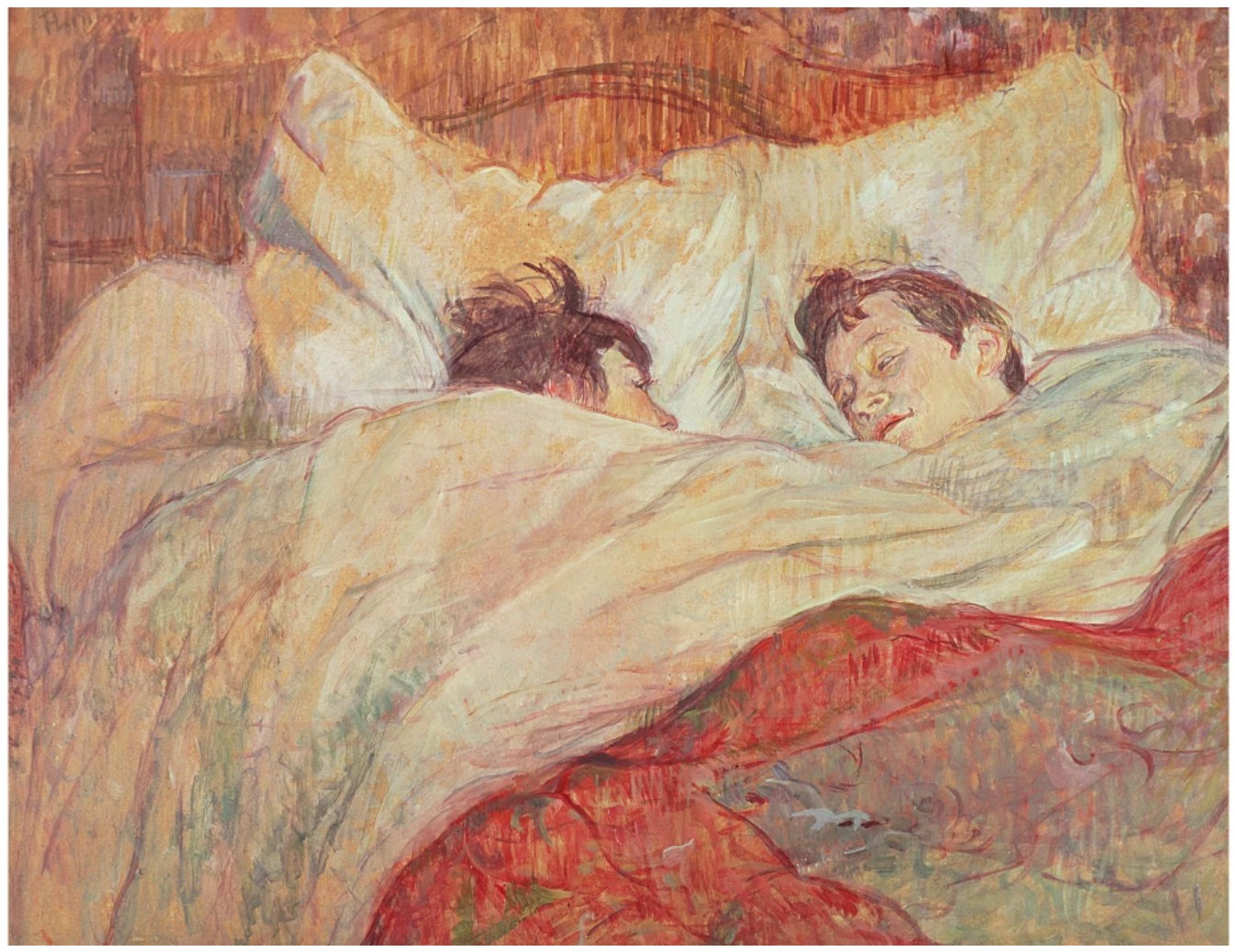
Henri de Toulouse-Lautrec, The Bed, c. 1892-95. Musée d’Orsay, Paris. Image © Bridgeman Images
Peyton’s lush and swift brushstrokes, in the present work, witness its two subjects sharing a kiss, surrounded by a luminous glow. As art historian Thomas Crow adroitly explains, the present work is a masterful exemplar of Peyton’s iconic facture and composition: “The side of Lohengrin’s face fills the opposing, darker portion of the composition, likewise demonstrating how much incident and nuance Peyton can generate from such economically light application of the brush; yet the visage is at the same time veiled, as befits a character who will not voluntarily reveal his name. Once again, their blissful union lasts only minutes before the fateful revelation and the knight leaping to his feet to confront a band of assailants.” (Thomas Crow, “Heroes,” in Exh. Cat., London, National Portrait Gallery, Elizabeth Peyton: Aire and Angels, 2019, Book 4, p. 4)
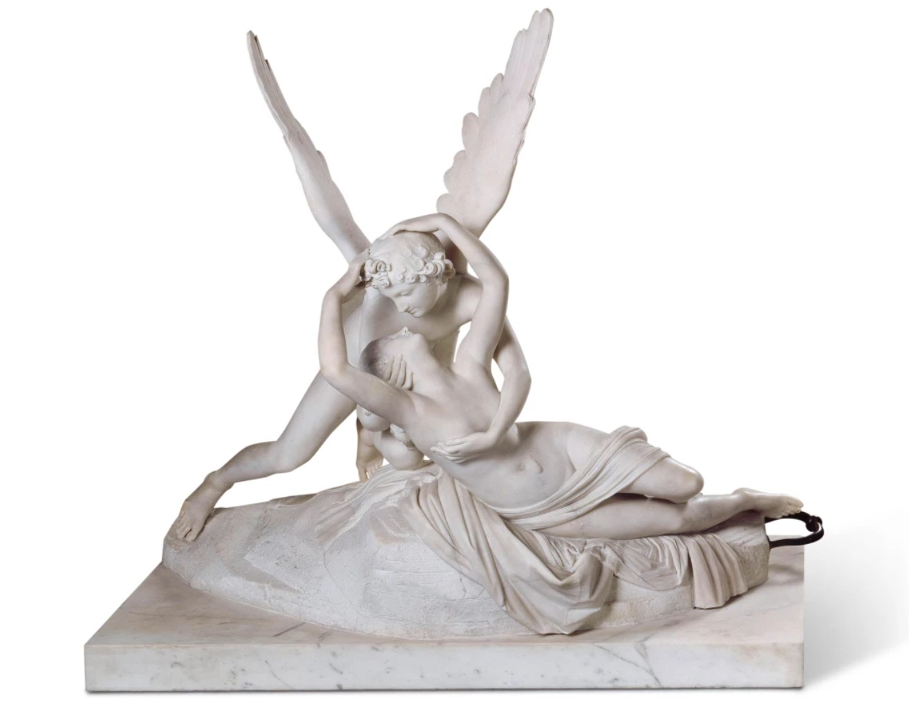
Antonio Canova, Psyche brought back to life by Amor’s Kiss, 1793. Musée du Louvre, Paris. Image © RMN-Grand Palais / Art Resource, NY
What Wondrous Thing Do I See… (Lohengrin, Jonas Kaufmann) captures the titular German-Austrian tenor as Lohengrin in the eponymous opera, composed and written by Richard Wagner, engaged in a tender kiss with noblewoman Elsa von Brabant. In the scene, the Knight of the Swan—Lohengrin in disguise—appears on the River Scheldt, vowing to protect her from Count Friedrich von Telramund’s schemes and professing his love for her. Moved by this decision, the crowds surrounding the couple sing: Welch holde Wunder muss ich sehen? (What wondrous thing do I see?) Since seeing Wagner’s Die Walküre at the Metropolitan Opera, New York, in 2011, Peyton has developed a deep-seated interest in the opera, leading to a series of paintings portraying Jonas Kaufmann.
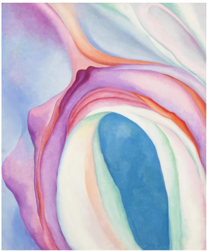
Georgia O’Keeffe, Music, Pink and Blue No. 2, 1918. Whitney Museum of American Art, New York. Image © Whitney Museum of American Art / Licensed by Scala / Art Resource, NY. Art © 2025 Georgia O’Keeffe Museum / Artists Rights Society (ARS), New York
Peyton emerged in the 1990s and immediately captivated the art world with her portraits of friends, artists, musicians, and historical figures rendered with an intimate gaze and vivid palette, parsing the cultural iconography of her generation. Fundamentally, Peyton regards her works as “paintings of people,” capturing an individual’s essence in a manner reminiscent of still life. In Wagner’s opera, despite Lohengrin’s warnings, Elsa breaks their promise and asks for her groom’s name, leading the Knight to lose his powers and having to return home under the laws of the Holy Grail. As if to resist the sorrowful parting to come, Peyton’s brushstrokes offer a timelessly romantic and alluring portrait that attempts to cherish love in its fleeting moments.
The Origin of the Order of the Garter, 1995
Christie’s New-York: 15 May 2025
Estimated: USD 300,000 – 500,000
USD 441,000
ELIZABETH PEYTON (B. 1965), The Origin of the Order of the Garter | Christie’s
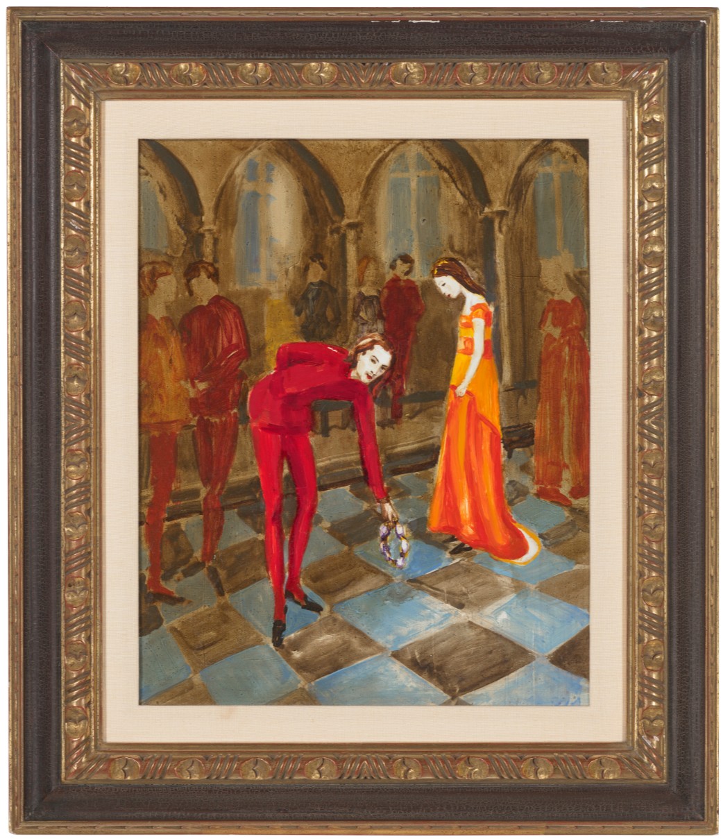
ELIZABETH PEYTON (B. 1965)
The Origin of the Order of the Garter, 1995
Oil on panel
20×16 inches (50.8 x 40.6 cm)
Signed and dated ‘Elizabeth Peyton 1995’ (on the reverse)
George Condo
Pink and Yellow Sweep, 2011
Christie’s New-York: 14 May 2025
Estimated: USD 1,500,000 – 2,000,000
USD 2,288,500
GEORGE CONDO (B. 1957), Pink and Yellow Sweep | Christie’s
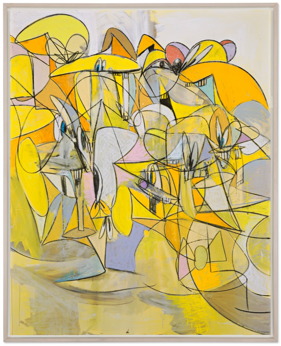
GEORGE CONDO (B. 1957)
Pink and Yellow Sweep, 2011
Acrylic, charcoal and pastel on linen
85×68 inches (215.9 x 172.7 cm)
Signed and dated ‘Condo 2011’ (upper left)
George Condo’s Pink and Yellow Sweep is an intoxicating example of the artist’s ability to coax emotional tension by mixing together figuration and abstraction. In this 2011 painting, a series of animated eyes stare out through an amalgamation of nebulous shapes.
“I wanted to capture the characters in these paintings at the extreme height of whatever moment they’re in—in that static moment of chaos—and to picture them as abstract compositions that are set in destitute places and isolated rooms. Everything takes place in a relatively impoverished kind of situation.”
Crystallizing a moment of energy and chaos, paintings such as Pink and Yellow Sweep freeze time and represent a convergence of physical matter and kinetic energy.
At first glance, one is confronted with a mix of swooping lines that intersect and connect as they form abstract shapes that give body to the applications of paint underneath. Washes of yellow and pale pink are cut with areas of white, black, and gray-blue that push against each other in Condo’s active canvas. Taking shape in this turmoil, a host of faces and figures yearn to make themselves known. The artist renders pairs of eyes, toothy grins, and floppy ears amid his curvilinear marks so that seemingly random shapes are transformed by our own pareidolia into manic visages. Paintings such as the present example are indicative of Condo’s larger interest in transitory realms between action and reaction, the real world and representation.
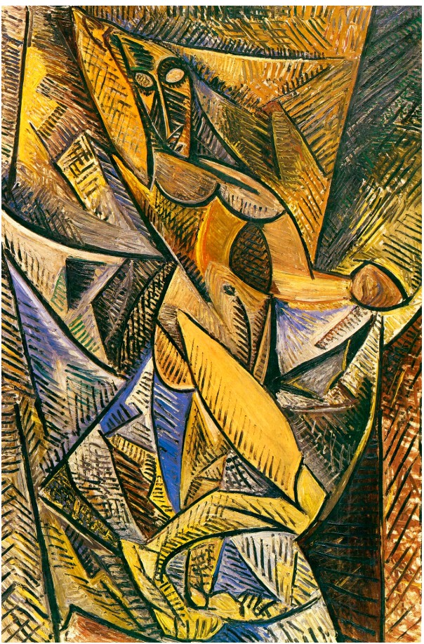
Pablo Picasso, Dance of the Veils, 1907. St. Hermitage, Petersburg.
© 2025 Estate of Pablo Picasso / Artists Rights Society (ARS), New York.
Condo’s oeuvre is rife with allusions to the history of art, and the artist himself consciously mines the styles of his forebearers in order to reposition and question the nature of painting. In the late 1980s, he introduced figures from the tradition of Spanish court portraiture into his bizarre realms as a means of further probing their psychological contexts. Likewise, he often references artists like Pablo Picasso and Joan Miró as he recontextualizes the legacies of Cubist and Surrealist painting. Condo’s affinity for Picasso is especially revelatory in works like Pink and Yellow Sweep as he seeks to depict multiple moments, angles, and fields of vision in one two-dimensional plane.
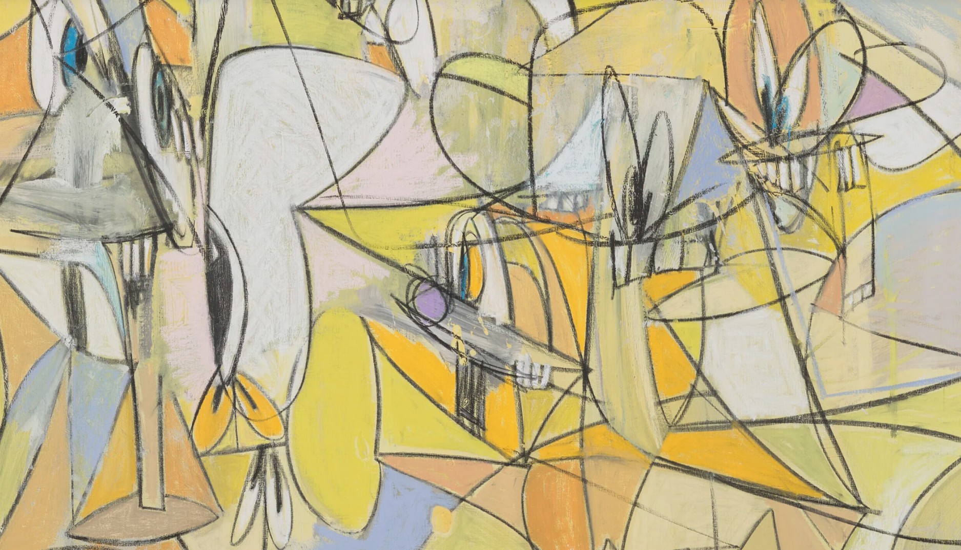
“My painting is all about this interchangeability of languages in art, where one second you might feel the background has the shading and tonalities you would see in a Rembrandt portrait, but the subject is completely different and painted like some low-culture, transgressive mutation of a comic strip”
The multifaceted approaches of analytical cubism merge with cartoon exaggeration and a knack for instilling emotional fervor in each stroke of the brush. Combined, these elements coalesce into a potent treatise on the continued growth and evolution of the painted image.
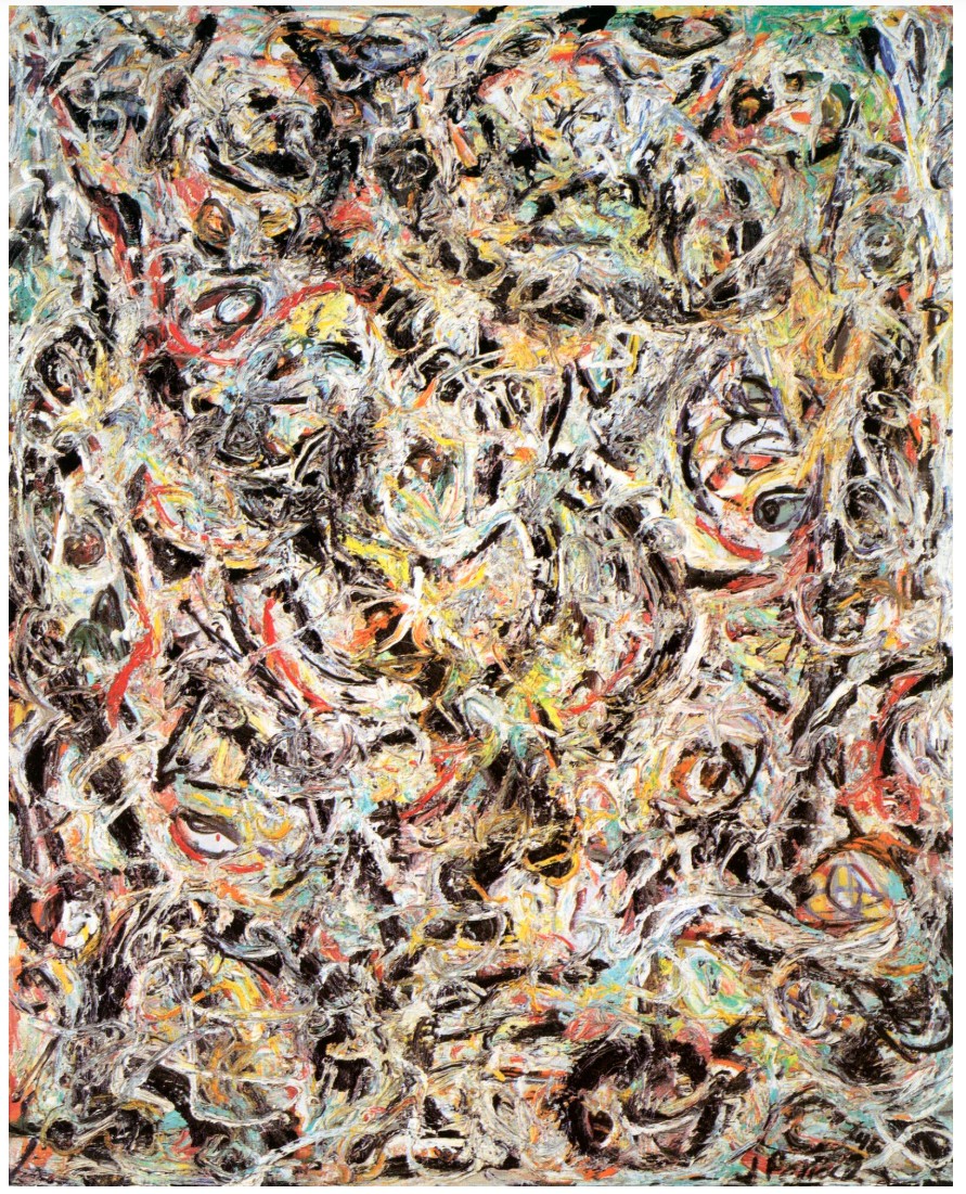
Jackson Pollock, Eyes in the Heat (Sounds in the Grass Series), 1946. Peggy Guggenheim Foundation, Venice.
© 2025 The Pollock-Krasner Foundation / Artists Rights Society (ARS), New York.
As a highly accomplished example of George Condo’s unique style of painting, Pink and Yellow Sweep is an important contribution to the resurgence in figurative painting. A generation of contemporary painters such as John Currin, Glenn Brown and Lisa Yuskavage have all acknowledged a debt of gratitude to Condo, for appreciating the traditions of painting, while not being suffocated by them, and in turn, developing a whole new set of rules and practices. Condo uses his inimitable technique to reassess centuries of painterly tradition in a radical new way, and by combining the past with a more contemporaneous narrative, paintings such as this have done much to reinvigorate figurative painting and return the human figure to its central position in the modern art historical canon.
Maja Vestida, 2005
Sotheby’s New-York: 16 May 2025
Estimated: USD 700,000 – 1,000,000
USD 889,000
Maja Vestida | Contemporary Day Auction | 2025 | Sotheby’s
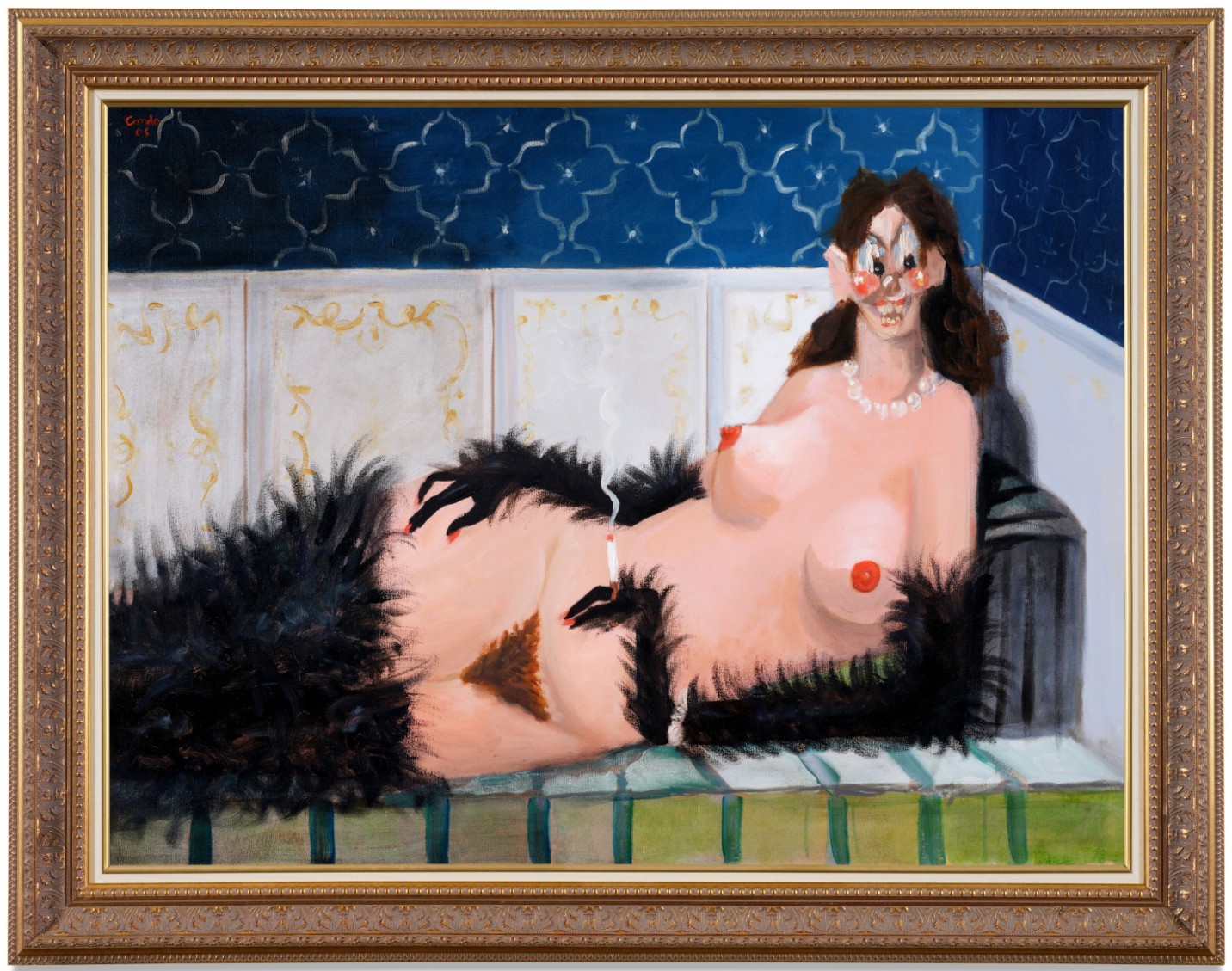
GEORGE CONDO (b. 1967)
Maja Vestida, 2005
Oil on canvas in artist’s chosen frame
37 1/4 x 47 1/8 inches (94.6 x 119.7 cm)
Signed and dated 05 (upper left)
Signed, titled and dated 05 (on the reverse)
With a blend of provocation and wit, George Condo’s Maja Vestida offers a mischievous and psychologically charged homage to one of art history’s most iconic reclining nudes: Francisco Goya’s La Maja Vestida from circa 1800–1807. Refracted through Condo’s singularly surreal and visceral aesthetic, the work stands as a bold intervention in the lineage of portraiture, uniting classical precedent with the grotesque, the erotic, and the absurd.
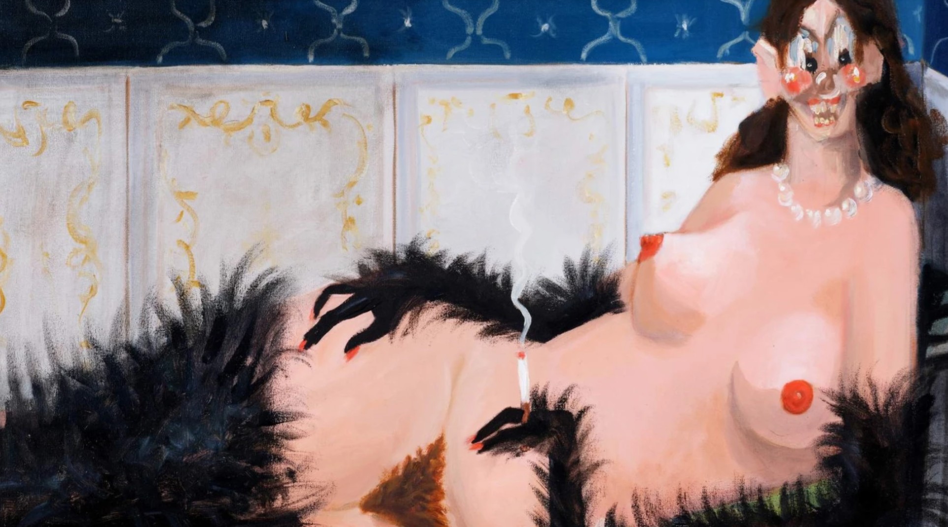
Rather than simply reinterpreting Goya’s composition, Condo fractures it—recasting the reclining figure as an uncanny amalgam of desire, theatricality, and psychic unrest. Draped in a voluminous black fur and sprawled provocatively across a divan, the woman stares out with brazen confidence, her form marked by exaggerated features and unsettling detail. Animistic hands, seemingly fused with the fur, clutch a burning cigarette as smoke curls into the air. Condo’s brushwork shifts fluidly between expressive painterliness and satirical distortion, amplifying the tension between beauty and madness, reverence and parody. The face, as ever in Condo’s portraits, becomes the locus of psychic drama. Disfigured yet uncannily expressive, the sitter’s features are a riot of competing expressions and stylistic registers: bulbous eyes peer outward from a mask-like visage; a manic grin is paired with a vacant stare. Her pearl necklace and delicately coiffed hair suggest bourgeois refinement, while her animal-like limbs and exaggerated anatomy teeter on the edge of the grotesque. This tension between the civilized and the primal lies at the heart of Condo’s practice—a recurring meditation on the dualities of human nature.
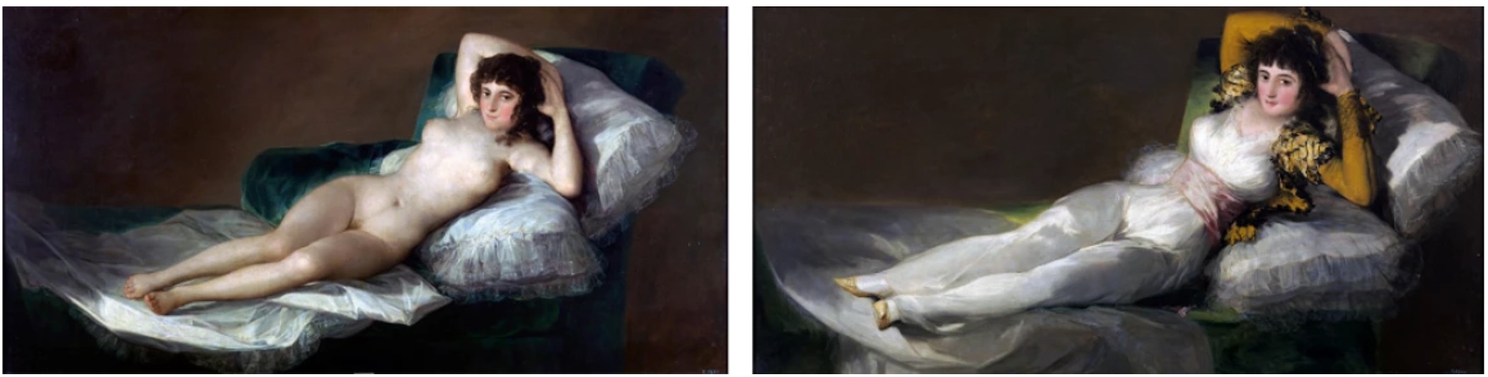
Left: Francisco Goya, La maja desnuda, 1797-1800. Museo del Prado, Madrid.
Right: Francisco Goya, La maja vestida, 1798-1805. Museo del Prado, Madrid.
The painting’s title, Maja Vestida (“The Clothed Maja”), is itself a sly provocation, as the subject here is provocatively naked save for her fur wrap. Condo’s inversion of Goya’s title points to his ongoing fascination with the collapse of binaries: clothed and nude, classical and contemporary, sacred and profane. In Goya’s original works—the Maja Desnuda and Maja Vestida—the figure remains largely identical in pose and gaze, her two states of undress offered as a moral and aesthetic paradox. In Condo’s hands, this paradox becomes even more unstable, transformed into a carnivalesque tableau of fragmented identity and performed eroticism.
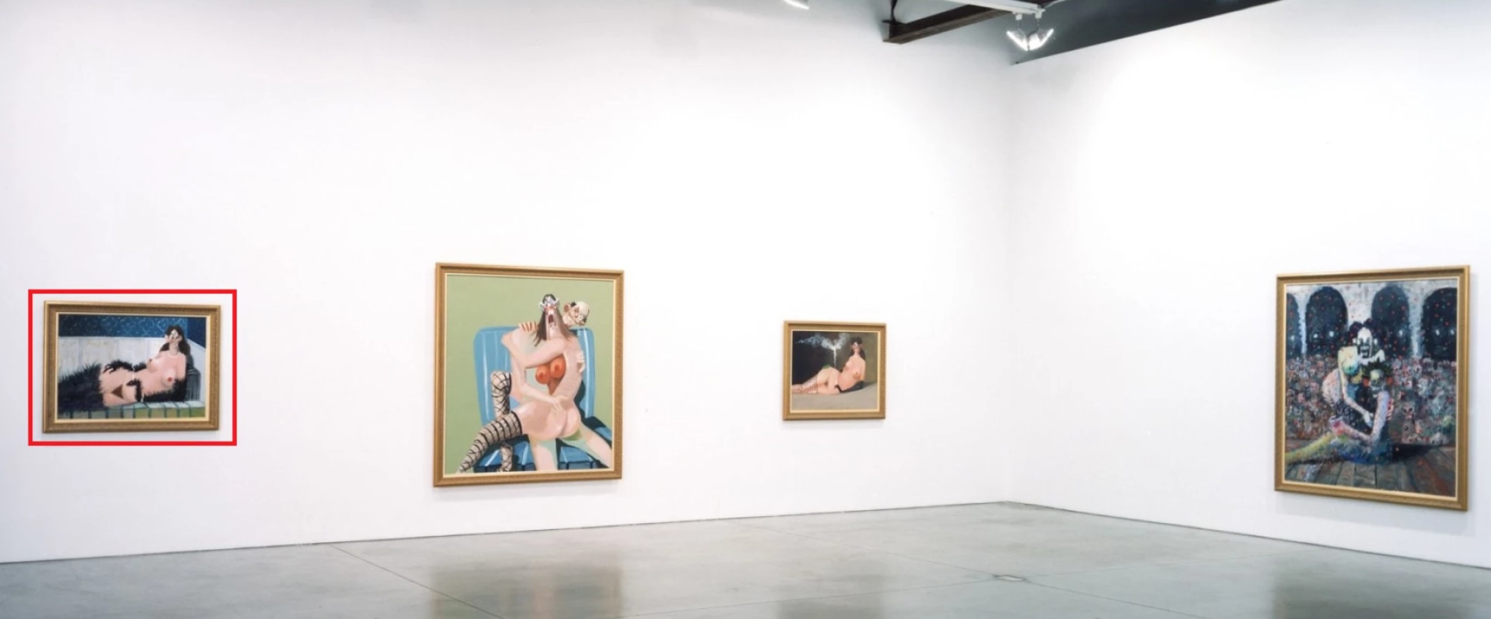
The present work installed in Existential Portraits at Luhring Augustine, New York, May – June 2006.
Art © 2025 George Condo / Artists Rights Society (ARS), New York
Painted at the height of Condo’s engagement with psychological portraiture, Maja Vestida exemplifies his Existential Portraits series, in which the artist probed the depths of human consciousness through imagined sitters rendered in his inimitable “Artificial Realism.” Condo has long cited an interest in his Cubist predecessors, layering multiple emotional states and stylistic vocabularies within a single figure. In this sense, Maja Vestida is less a depiction of a woman than a kaleidoscopic embodiment of contradictions—sensuality and anxiety, comedy and horror, form and formlessness.
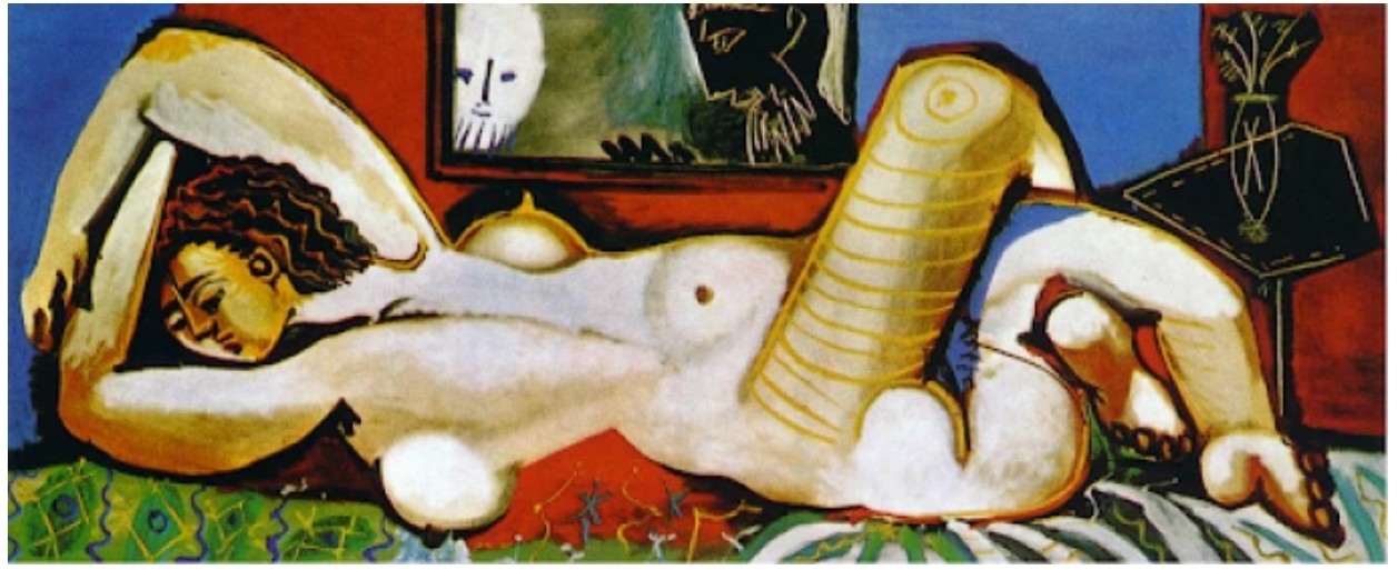
Pablo Picasso, Susanna and the Elders, 1955. Museo Picasso Málaga.
Art © 2025 Estate of Pablo Picasso / Artists Rights Society (ARS), New York
The setting itself contributes to the surreal charge of the composition. Ornamental wallpaper in cobalt and gold evokes an opulent, almost Moorish interior, while the tiling beneath the chaise longue adds a cold, clinical edge to the otherwise theatrical mise-en-scène. The space feels at once lavish and claustrophobic—a dreamscape where the boundaries of time and place dissolve. Condo’s chromatic dexterity is on full display: from the warm tonalities of the flesh to the glistening whites of her jewelry and teeth, the palette oscillates between opulence and decay. Ultimately, Maja Vestida is a masterful distillation of Condo’s enduring preoccupations: the tension between beauty and monstrosity, the artifice of portraiture, and the fractured nature of modern subjectivity. In its bold confrontation with the past—and its unflinching look at the raw interiority of the human form—Maja Vestida captures Condo at his most provocative, and his most profound.
Mental States Blue Corner, 2000
Sotheby’s New-York: 16 May 2025
Estimated: USD 400,000 – 600,000
USD 444,500
Mental States Blue Corner | Contemporary Day Auction | 2025 | Sotheby’s
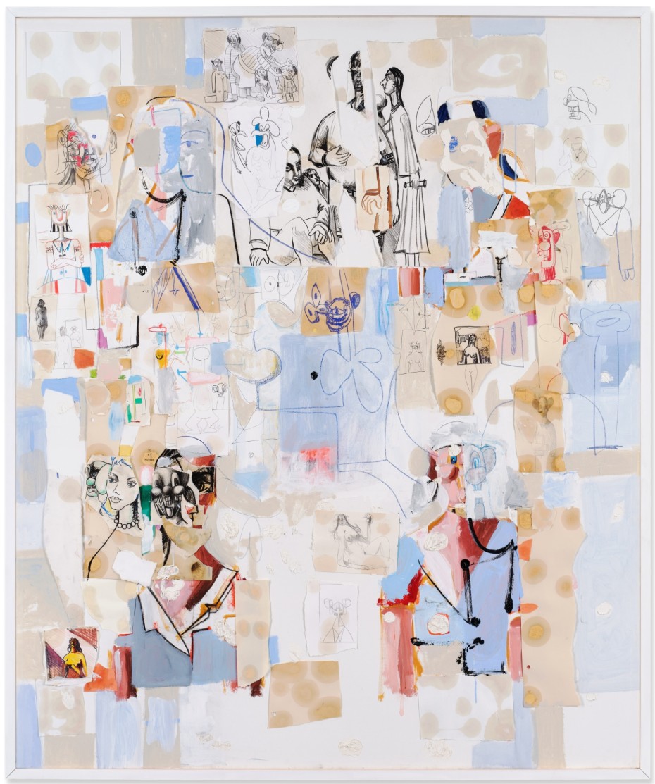
GEORGE CONDO (b. 1957)
Mental States Blue Corner, 2000
Oil, ink, graphite and paper collage on canvas
72×60 inches (182.9 x 152.4 cm)
Signed, titled and dated Nov. 2000 (on the reverse)
Smiling Faces, 2019
Sotheby’s New-York: 16 May 2025
Estimated: USD 80,000 – 120,000
USD 177,800
Smiling Faces | Contemporary Day Auction | 2025 | Sotheby’s
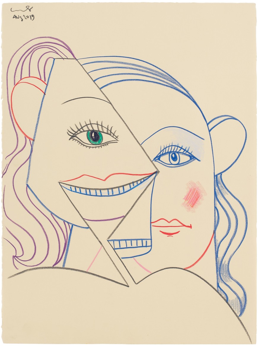
GEORGE CONDO (b. 1957)
Smiling Faces, 2019
Wax crayon on paper
30×22 inches (76.2 x 55.9 cm)
Signed and dated Aug 2019 (upper left)
“The most consistent thing in my work is this idea of humanity. Of finding a way to represent the human consciousness in the representation through a portrait. That portrait could represent not only the exterior appearance of that person, but what’s going through their mind and what emotional states could be happening to them and within them.”
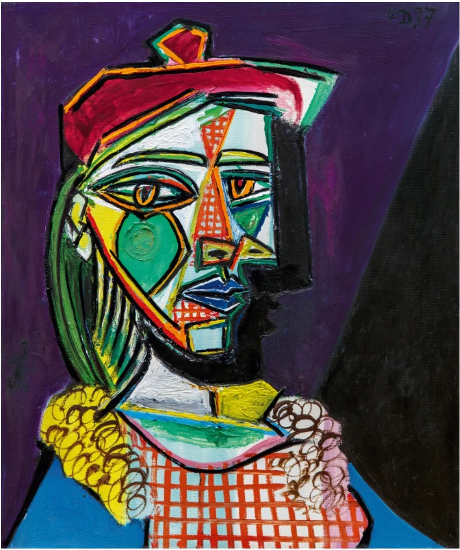
Pablo Picasso, FEMME AU BÉRET ET À LA ROBE QUADRILLÉE (MARIE-THÉRÈSE WALTER), 1937. Sold at Sotheby’s for $61.9 million. Private Collection. Art © 2023 Estate of Pablo Picasso / Artists Rights Society (ARS), New York
Grace, 1993
Phillips New-York: 14 May 2025
Estimated: USD 50,000 – 70,000
USD 133,350
George Condo Modern & Contemporary Art Day Sale, Afternoon Session
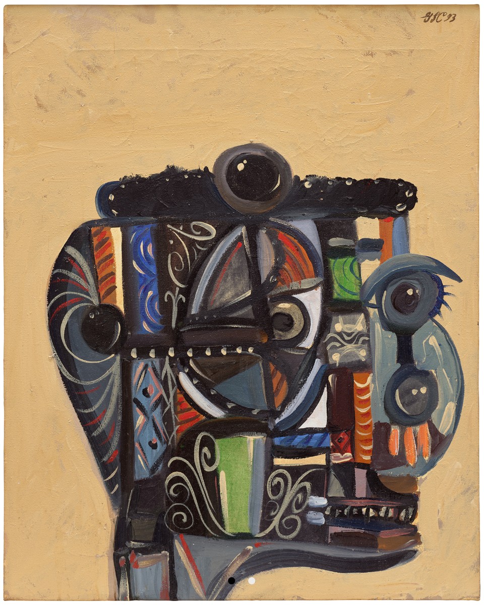
Grace, 1993
Oil on canvas
Signed, titled and dated “Condo 93 “Grace”” on the reverse
The Endless Journey, 2022
Sotheby’s New-York: 16 May 2025
Estimated: USD 1,500,000 – 2,000,000
WITHDRAWN
The Endless Journey | Contemporary Day Auction | 2025 | Sotheby’s
GEORGE CONDO (b. 1957)
The Endless Journey, 2022
Acrylic, oil stick and metallic paint on linen
82×84 inches (208.3 x 213.4 cm)
Signed and dated Sept 22, 2022 (upper left)
Social Media, 2017
Phillips New-York: 13 May 2025
Estimated: USD 2,500,000 – 3,500,000
PASSED
George Condo Modern & Contemporary Art Evening Sale
Damien Hirst
Veil of Life Everlasting, 2017
Christie’s New-York: 14 May 2025
Estimated: USD 1,500,000 – 2,000,000
USD 2,228,000
DAMIEN HIRST (B. 1965), Veil of Life Everlasting | Christie’s
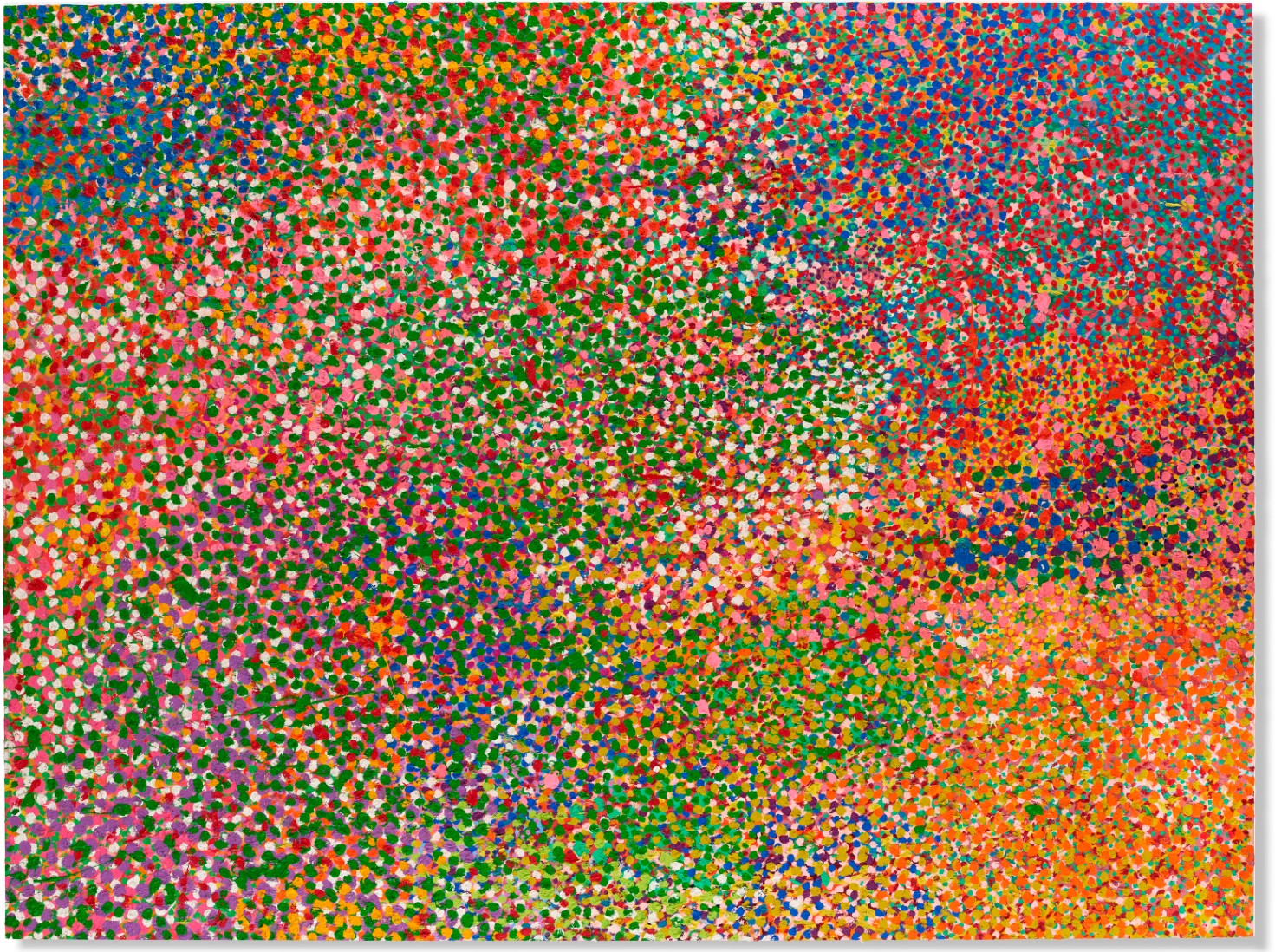
DAMIEN HIRST (B. 1965)
Veil of Life Everlasting, 2017
Oil on canvas
Installation orientation variable
108×144 inches (274.3 x 365.8 cm)
Signed, titled and dated ‘Damien Hirst Veil of Life Everlasting 2017’ (on the reverse)
Spanning over nine feet in height and almost twelve feet in width, Damien Hirst’s Veil of Life Everlasting is a monumental, prismatic canvas from the artist’s celebrated series of Veils. Executed between 2017 and 2019, the paintings which comprise the Veils, and an accompanying series of works on paper, were the first of several recent series by the artist—who typically relies on a team of assistants to support his prodigious artistic output—to be painted entirely by Hirst’s hand. The Veils present an evolution of the artist’s career-long exploration of chromatics, seriality, and human mortality. They recall the Visual Candy paintings of the early 1990s, which had paid homage to Hirst’s embattled draw towards artists like Willem de Kooning and Chaïm Soutine.
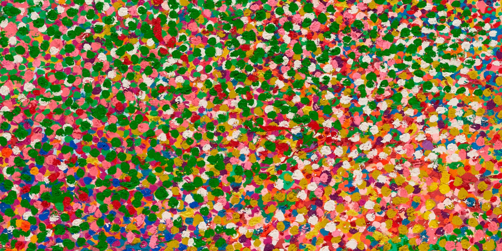
“My heart felt like I was into ’50s gestural painting at the time, and my head was in Minimalism and the consumer world.”
For many years the latter took precedence, exemplified in the Spot Paintings’ rigid, obsessive arrangements of random color, which had endeavored to bring order into the chaos of human existence. The Veils, which are allowed to be hung in any orientation, are inspired by Georges Seurat’s pointillist canvases and the Impressionist paintings of Claude Monet They constitute a triumphant surrender to the unfettered joy of gesture.
In Veil of Life Everlasting a confetti-like eruption of paint cascades across the surface of the work, in the series’ signature palette of magenta and carmine, verdant green, cobalt violet, assorted blues—Prussian, cerulean and ultramarine—as well as cadmium orange and red, and Naples yellow. Atop layers of color which vie and yield to one another to forge an undulating, immersive pictorial field, verdant green impasto daubs are scattered abundantly across large portions of the work’s surface. Beneath, hues of pink and orange collide with deep flashes of blue. Despite the allover effect, evocative of Jackson Pollock’s drip paintings, there is remarkable variety in the scale and density of each daub; some are tiny, precisely placed flecks, while others—thick and encrusted—bare the echo of a heavily laden brush. In places, excess paint falls in delicate trails across the canvas. The effect is evocative of a hazy sunset scene glimpsed through gently billowing foliage, as an intense, rosy light refracts on water and scatters into bright white flashes.
Claude Monet, The Water-Lily Pond, 1899. National Gallery, London.
The Veils were envisioned as a limited series from their point of conception, and they respond to and inform one another. Working across many canvases simultaneously in his vast, bright London studio, Hirst would prime each in one block of color before building up layer upon layer of paint. He moved freely around the studio carrying a hand-mixed tin of paint, scattering tiny flecks across the surface of each canvas.
“I have a selection of colors I love and use over and over again. They are like sweet shop colors and the colors of fruit and flowers; they are my go-to colors.”
For the series, Hirst used a longer-than-normal bristle brush, about two and a half feet long. The physical space this enforced between artist and artwork allowed Hirst to maintain distance and perspective, as the mystical process of optical mixing transpired on the canvas in front of him.
Gustav Klimt, Roses Under the Trees, circa 1905. Musée d’Orsay, Paris.
The allusion to immortality in the title of the present work speaks to Hirst’s extraordinary and life-long obsession with death. The theme of mortality haunts the artist’s wider oeuvre and is felt keenly in the Veils, despite their chromatic vivacity. The canvas contains a vastitude; the sublime is revealed within paint.
“They are a battle with the idea of death. The infinite series I made at the beginning of my career was a way for me to not face that. It’s a great way to imagine that you will last forever—even though you won’t … maybe in my Spot paintings I was hiding from my own mortality.”
In this way, the Veils become a metaphor for life itself—which blooms with ephemeral splendor. In one sense Veil of Life Everlasting captures Hirst’s acceptance of death, his ultimate inability to broach the threshold between mortal and immortal life. Yet it simultaneously gestures towards another kind of immortality, embedded deep within the recesses of painting itself.
1-Chloro-2, 4-Dinitrobenzene, 1997
Christie’s New-York: 14 May 2025
Estimated: USD 600,000 – 800,000
USD 529,200
DAMIEN HIRST (B. 1965), 1-Chloro-2, 4-Dinitrobenzene | Christie’s
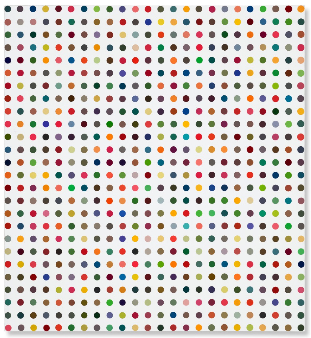
DAMIEN HIRST (B. 1965)
1-Chloro-2, 4-Dinitrobenzene, 1997
Household gloss on canvas
130×120 cm (51 1/4 x 47 1/4 inches)
Executed in 1997, the year that Damien Hirst and the Young British Artists (YBAs) cemented their stellar rise with the ground-breaking “Sensation” exhibition at London’s Royal Academy, 1-Chloro-2, 4 -Dinitrobenzene is from one of Contemporary art’s most iconic series of paintings. The effect of this exceptional spot painting is visually gratifying, vibrant and uplifting, while also being ingeniously original. In an oeuvre that has consistently interrogated fundamental belief systems, Hirst’s spot paintings are characteristic of his ability to challenge long-held artistic conventions.
“I wanted to find a way to use color in paintings that wasn’t expressionism. I was taught by painters who believed that as an artist you paint how you feel and I believed in that for a long time. And then I lost faith in it and wanted to create a system where whatever decisions you make within a painting, the paintings end up happy. And I came up with spot paintings.”
Hirst made his first spot painting in 1986, and included two in Freeze (1988), the exhibition organized and curated by Hirst which was pivotal in the genesis of the YBAs. In 1991, he made the first spot painting on canvas, having previously painted them directly onto walls. 1-Chloro-2, 4 -Dinitrobenzene forms part of the ‘Pharmaceutical’ series of spot paintings made between 1986 and 2011. Each painting in the series follows the same guidelines: each spot must be hand-painted in household gloss, and while the dimensions of the spots might vary, the gaps between them must be the same dimension of the spots themselves. Yet despite the strictness of the format, the colors defy expectations by refusing to fall into a pattern.
Ellsworth Kelly, Spectrum I, 1953. © Ellsworth Kelly Foundation.
This scientific approach to painting is demonstrated also in Hirst’s method of titling them after the medicine listed in a pharmaceutical company catalogue. The artist’s fascination with drug companies stemmed from a desire to “convince the people around me that [art] was worth believing in. And then I noticed that they were believing in medicine in exactly the same way that I wanted them to believe in art” (D. Hirst, “Explore Damien Hirst’s Pharmacy,” online [accessed: 4/8/2025]). It was an important realization, eventually leading Hirst to think of painting almost like “sculptures of paintings,” he has said. The methodical rigor he went on to devise was intended to echo the “drug companies’ scientific approach to life,” he has said. “Art doesn’t purport to have all the answers; the drug companies do. Hence the title of the series, the Pharmaceutical Paintings, and the individual titles of the paintings themselves… Art is like medicine, it can heal. Yet I’ve always been amazed at how many people believe in medicine but don’t believe in art, without questioning either.”’
(D. Hirst, quoted in D. Hirst, I want to spend the rest of my life everywhere, with everyone, one to one, always, forever, now, London 1997, p. 246).
Arg-Glu, 1994
Christie’s New-York: 15 May 2025
Estimated: USD 200,000 – 300,000
USD 315,000
DAMIEN HIRST (B. 1965), Arg-Glu | Christie’s
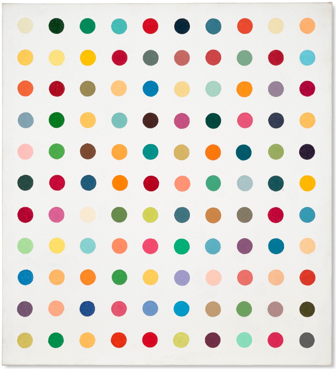
DAMIEN HIRST (B. 1965)
Arg-Glu, 1994
Household gloss on canvas
23×21 inches (58.4 x 53.3 cm)
Signed ‘D. Hirst’ (on the reverse)
Untitled, 2000
Christie’s New-York: 15 May 2025
Estimated: USD 150,000 – 200,000
USD 378,000
DAMIEN HIRST (B. 1965), Untitled | Christie’s
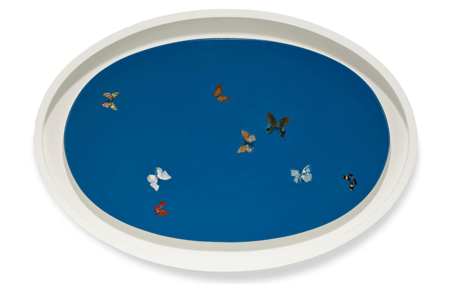
DAMIEN HIRST (B. 1965)
Untitled, 2000
Butterflies and household gloss on canvas
30 1/2 x 48 1/2 inches (76.4 x 122.2 cm)
Matthew (The Twelve Disciples), 1994
Christie’s New-York: 15 May 2025
Estimated: USD 250,000 – 350,000
USD 252,000
DAMIEN HIRST (B. 1965), Matthew (The Twelve Disciples) | Christie’s
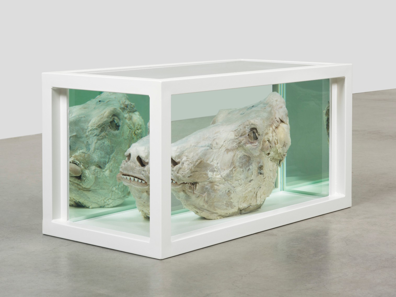
DAMIEN HIRST (B. 1965)
Matthew (The Twelve Disciples), 1994
Steel, glass, formaldehyde solution and a bull’s head
18 1/8 x 36 1/4 x 18 1/8 inches (46x92x46 cm)
Damned If You Don’t, Damned If You Do, 2005
Phillips New-York: 14 May 2025
Estimated: USD 300,000 – 400,000
USD 304,800
Damien Hirst Modern & Contemporary Art Day Sale, Afternoon Session
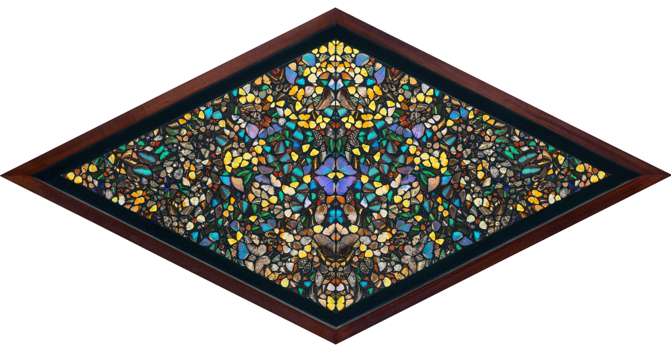
Damien Hirst’s Damned If You Don’t, Damned If You Do, 2005 is an object of both sumptuous beauty and existential confrontation. Made with real butterfly wings encased in industrial gloss, the work belongs to one of the artist’s most iconic series. In a diamond format spanning eight feet across, its formal symmetry, kaleidoscopic arrangement and reflective details immediately evoke spiritual allure. Within its delicate, jewel-like shimmer lies a meditation on mortality, belief, and the paradox of preserving life through death.
“I am interested in realism. I want art to be life but it never can be.”
Damned If You Don’t, Damned If You Do is poly-referential but nonspecific, evoking universalities regarding life, death and spirituality that bridge eastern and western culture, religion and science, and life and death. Most substantial is the work’s use of the butterfly. Frequently associated with transformation and resurrection in Christian symbology, the butterfly offers an ideal conduit for Hirst’s exploration of spirituality. His use of real butterfly wings viscerally emphasizes their fragility and impermanence; while butterflies typically only live for two weeks, the wings within the artwork, in essence, live on. The natural iridescence of the wings furthermore recalls the spiritual effect of light coming through stained glass, as in ecclesiastical windows.
Tiffany Studios, designed by Louis C. Tiffany, Magnolias and Irises, c. 1908. The Metropolitan Museum of Art, New York.
Image: © The Metropolitan Museum of Art/Art Resource/Scala, Florence
With an emphasis on lavender and golden hues, the present example recalls the Tiffany Studios window Magnolias and Irises, circa 1908, in the permanent collection of the Metropolitan Museum of Art, New York. In Magnolias and Irises, meticulously arranged, organically shaped panels of hand-cut glass depict the River of Life. Rendered with astonishing delicacy, Tiffany used the mediums of glass and light to evoke the divine. Hirst’s butterfly works nod to centuries of stained-glass windows while invoking a Postmodern detachment. Both Hirst’s and Tiffany’s works offer windows into transcendence, but whereas Tiffany relies on nature as a symbol of divine promise, Hirst captures nature at the moment of its demise, preserving it as evidence of impermanence. The result is a secular reliquary, shimmering with both reverence and irony. The title Damned If You Don’t, Damned If You Do underscores this existential ambiguity. A fatalistic play on the familiar idiom, it is a gesture both cynical and spiritual, reinforcing the dualities at the heart of Hirst’s practice. He creates tension by presenting luminous creatures but also foregrounding their downfall. The wings are radiant, but fixed—caught mid-flight and suspended in paint. Beauty, here, is not transcendent but terminal. Akin to the tradition of vanitas paintings, Damned If You Don’t, Damned If You Do powerfully confronts mortality, devotion and the desire to eternalize the fleeting.
Dimethyl-Dichlorosilane, 2008-2011
Phillips New-York: 14 May 2025
Estimated: USD 80,000 – 120,000
USD 165,100
Damien Hirst Modern & Contemporary Art Day Sale, Afternoon Session
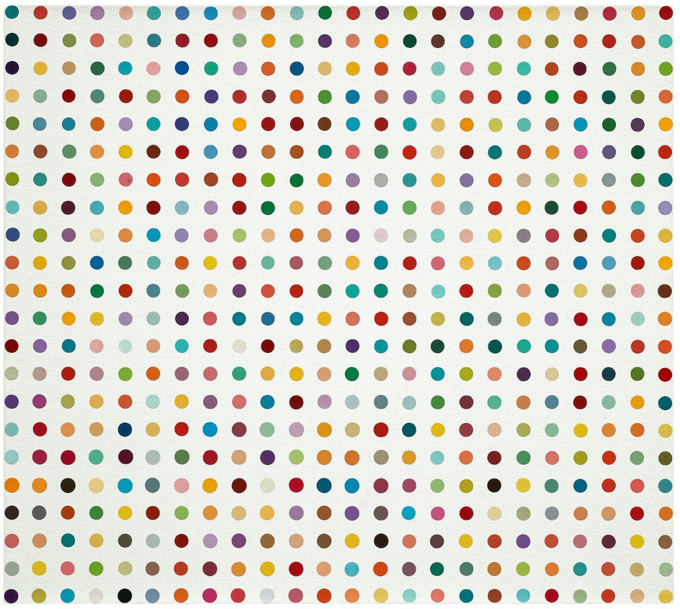
Signed and stamped with the artist’s stamp “Damien Hirst” on the stretcher
Christopher Wool
Untitled, 2011
Christie’s New-York: 15 May 2025
Estimated: USD 700,000 – 1,000,000
USD 882,000
CHRISTOPHER WOOL (B. 1955), Untitled | Christie’s
CHRISTOPHER WOOL (B. 1955)
Untitled, 2011
Silkscreen ink on linen
120×96 inches (304.8 x 243.8 cm)
Signed, inscribed and dated ‘WOOL 2011 P623’ (on the reverse)
Signed again and dated again ‘WOOL 2011’ (on the overlap)
Christopher Wool’s Untitled is a commanding and significant work that exemplifies the artist’s mastery of abstraction. First presented at the 54th Venice Biennale, the monumental painting is characterized by a field of deep, inky black that progressively fades into earthy hues. Dynamic, static-like lines traverse the canvas, dividing the surface into quadrants. The deep black pigment gives the biomorphic patterns a tangible sense of presence as two cellular-like shapes on the upper and lower left side seem to be dividing, suggesting an organic process of development and change.
Untitled was created through a highly complex and multidimensional process that seamlessly blends digital manipulation with traditional artistic techniques. Wool began by photographing a selection of small old drawings, magnifying them to an enormous scale. This enlargement revealed intricate details, which were then reduced to individual, painstakingly rendered dots. These dots were transferred onto a linen canvas through a meticulous silkscreen printing process. Once the initial impression was complete, the surface of the canvas was carefully painted over, which resulted in subtly altering the texture and form of the original image. The work was then photographed once again, and this time, Photoshop was employed to apply a series of intricate digital modifications and enhancements. The resulting artwork is the product of this fusion of old and new methods, creating a sense of depth and complexity that is both captivating and enigmatic. The layered nature of this process, with its multiple stages of transformation, lends the painting a unique, mysterious allure, as it becomes increasingly difficult to trace the exact steps of Wool’s creative journey. The combination of these contrasting techniques not only adds richness to the final composition, but also invites viewers to consider the boundaries between the physical and the digital in the realm of contemporary art.
While Wool first rose to fame with his text paintings from the late 1980s, Untitled highlights the artist’s deep interest in pure abstraction. By the early 2000s, Wool had started to create his renowned “Grey Paintings,” which are distinguished by their vast, monochromatic fields. His early work in abstraction experimented with floral motifs and vivid hues. This approach subsequently underwent a significant transformation resulting in the series of large-scale paintings of which the present work is a part, debuting at the 2011 Venice Biennale. Distinguished by their dense texture, physicality, and intricacy, combined with the compositions’ biomorphic elements, these paintings convey an almost dreamy quality, encouraging reflection as they appear to be pulsing with life. Wool’s consistent investigation of abstraction is memorialized in the present work, which offers a distinctive blend of conventional artistic methods and modern technical advancements. While the segmented divisions and organic shapes give the work a sense of movement and alteration, the stark black tones and rudimentary surface conjure up a raw, industrial sensibility. The painting’s fragmented and unexpected composition demonstrates the strength of Wool’s abstract visual lexicon, expertly balancing harmony and tension.
Untitled, 1997
Christie’s New-York: 14 May 2025
Estimated: USD 800,000 – 1,200,000
USD 1,008,000
CHRISTOPHER WOOL (B. 1955), Untitled | Christie’s
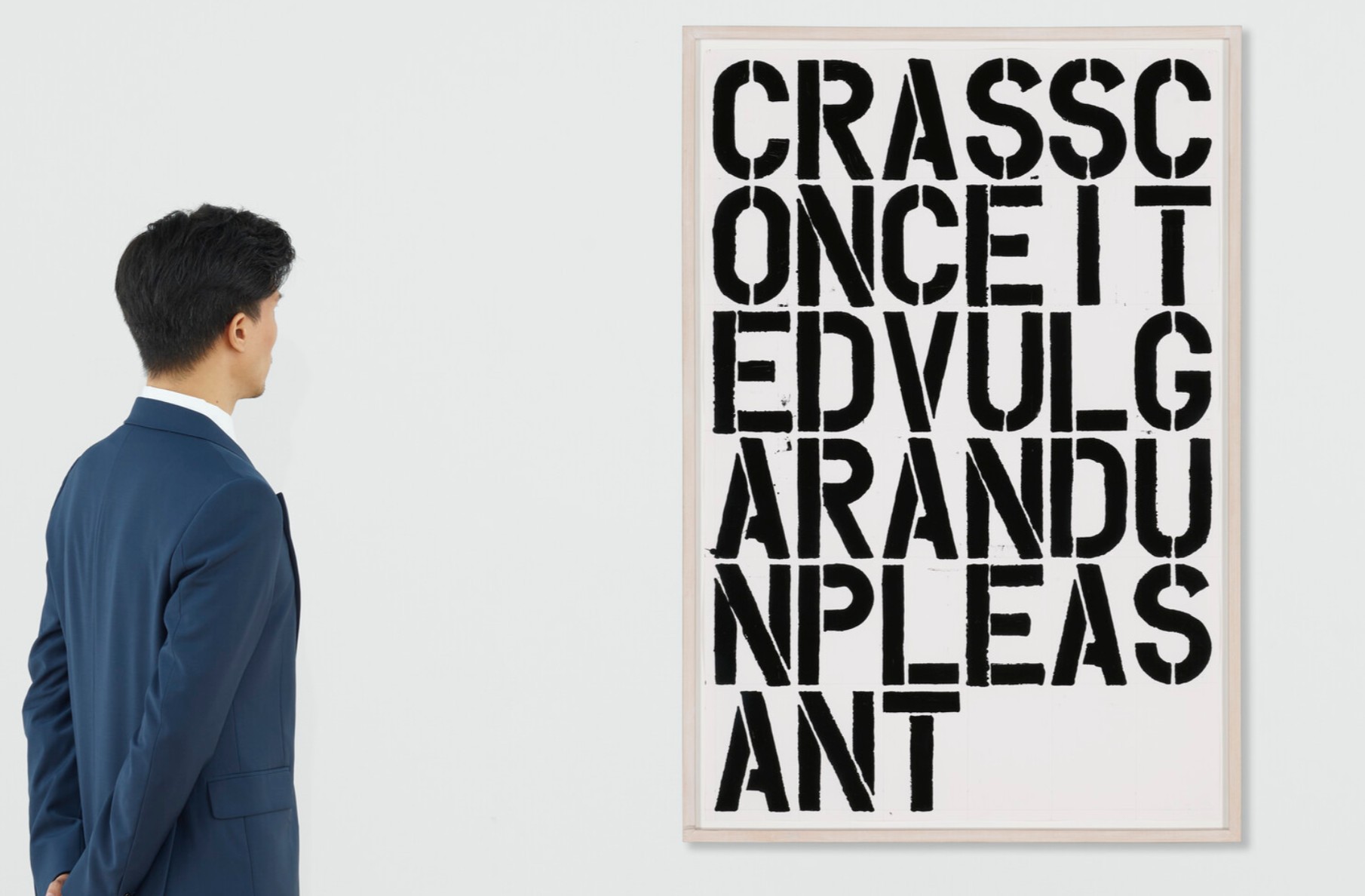
CHRISTOPHER WOOL (B. 1955)
Untitled, 1997
Alkyd and graphite on paper
38 1/2 x 26 inches (97.8 x 66 cm)
Signed and dated ‘Wool 1997’ (on a label affixed to the reverse)
Untitled, 2004
Phillips New-York: 14 May 2025
Estimated: USD 750,000 – 1,000,000
USD 399,999
Christopher Wool Modern & Contemporary Art Day Sale, Afternoon Session
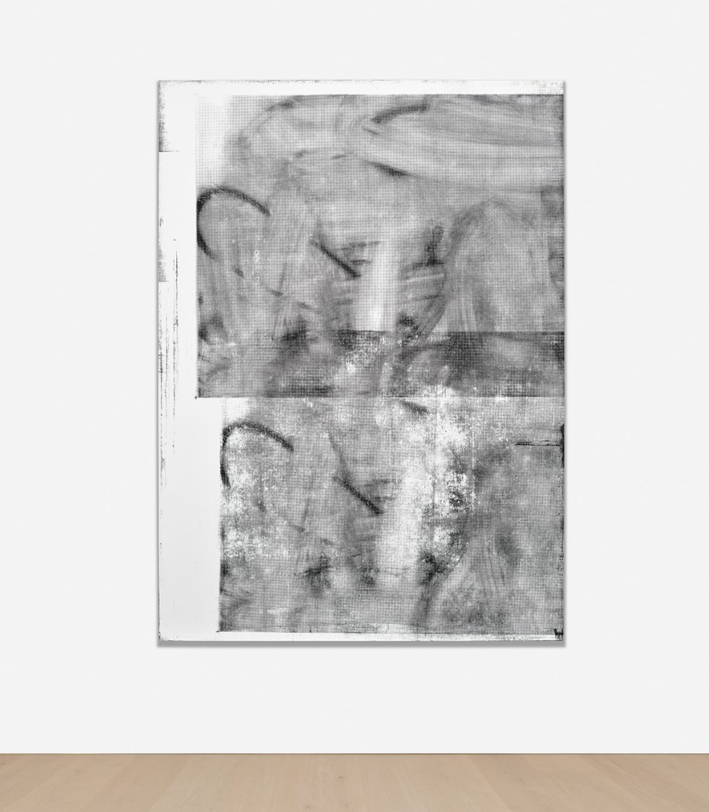
Untitled, 2004
Silkscreen ink on linen
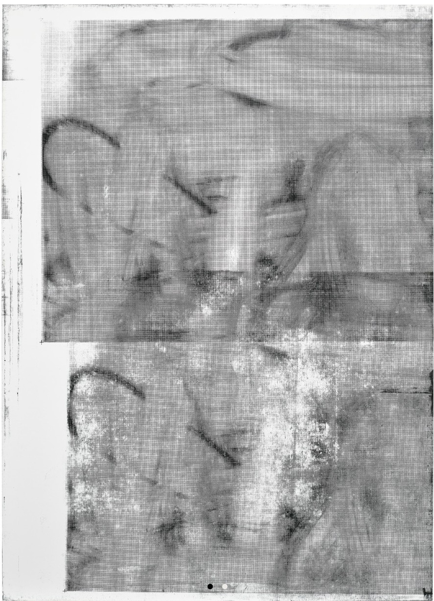
Wool’s work embodies the idea of palimpsest. His layered process includes applying sweeping gestures with a spray gun, using solvents to strip back its application in an additional layer of mark making, and then translating that image via silkscreen into a uniquely rendered canvas. Crucial to Wool’s work is self-referentiality, a distinguishing formal and conceptual process in which he repeatedly references his own works. This serves as a metaphor for the endless recycling of forms and information in a media-obsessed society saturated with visual signification. The notion of palimpsest also connects Wool’s work to graffiti and street art. As a young artist in 1980s New York, Wool was active amongst the counterculture and punk scenes, and his work distinctively reflects the literal and visual vocabulary of the city. In many ways his process relates directly to the lifecycle of street art: layers accumulate over time, tags are repeatedly executed in new sites, and attempts at erasure sometimes fail, leaving behind ghost images.
“I became more interested in ‘how to paint it’ than ‘what to paint.”
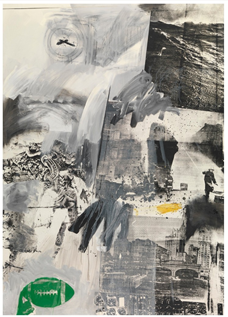
Robert Rauschenberg,Tideline, 1963. Artwork: © 2025 Robert Rauschenberg Foundation / Artists Rights Society (ARS), New York
Untitled, 1989
Sotheby’s New-York: 16 May 2025
Estimated: USD 400,000 – 600,000
USD 508,000
Untitled | Contemporary Day Auction | 2025 | Sotheby’s
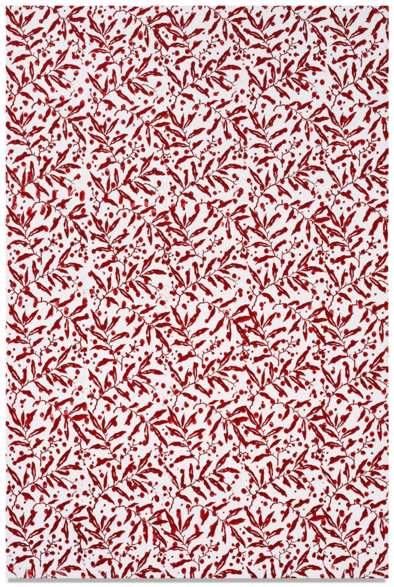
CHRISTOPHER WOOL (b. 1955)
Untitled, 1989
Enamel on aluminum
36×24 inches (91.4 x 61 cm)
Signed, dated 1989 and numbered S45 (on the reverse)
Untitled, 1993
Christie’s New-York: 15 May 2025
Estimated: USD 500,000 – 700,000
USD 579,600
CHRISTOPHER WOOL (B. 1955), Untitled | Christie’s
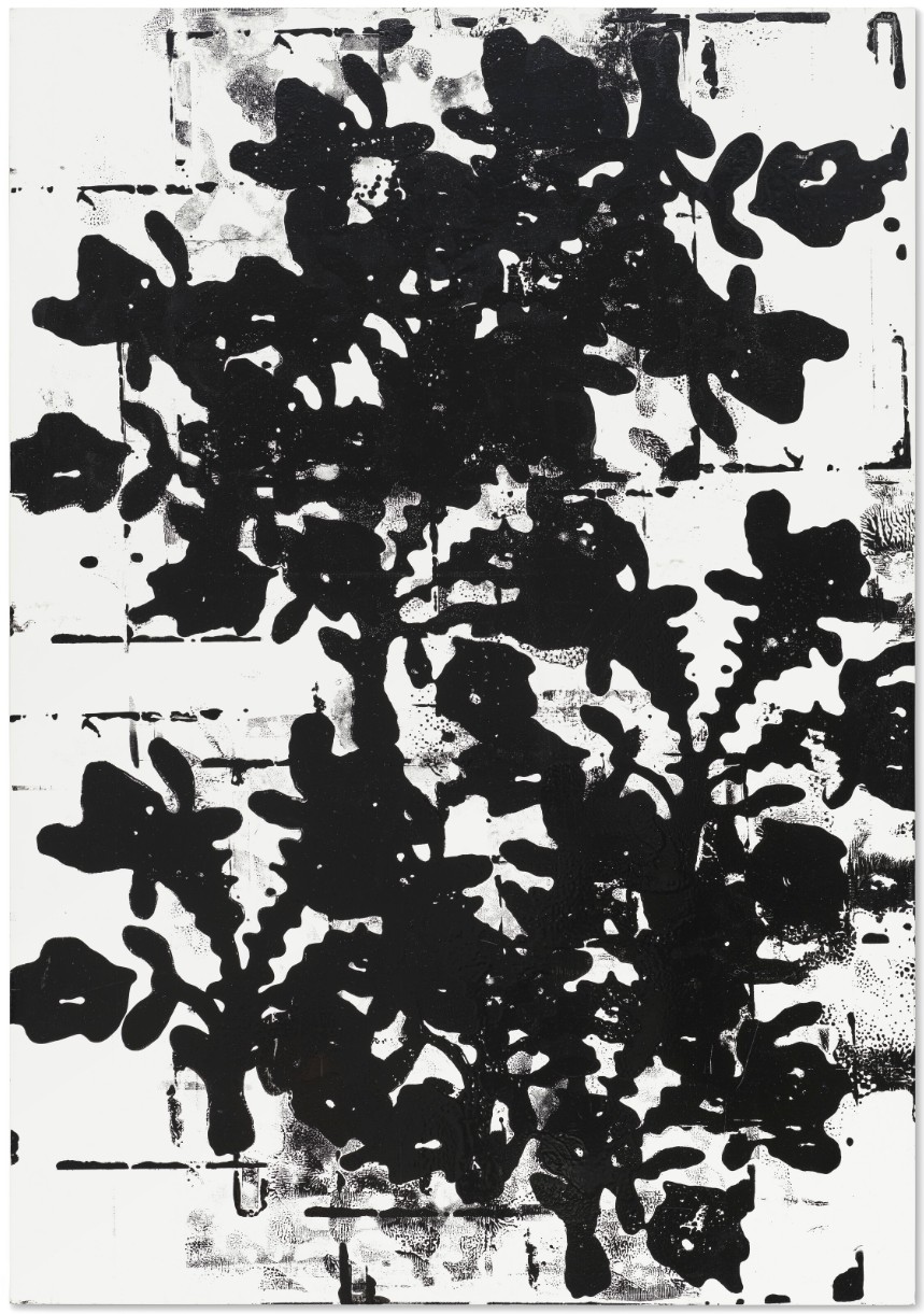
CHRISTOPHER WOOL (B. 1955)
Untitled, 1993
Enamel on aluminum
43×30 inches (109.2 x 76.2 cm)
Signed, inscribed and dated ‘WOOL 1993 (S107)’ (on the reverse)
Untitled, 1988
Christie’s New-York: 14 May 2025
Estimated: USD 3,500,000 – 5,500,000
WITHDRAWN
CHRISTOPHER WOOL (B. 1955), Untitled | Christie’s
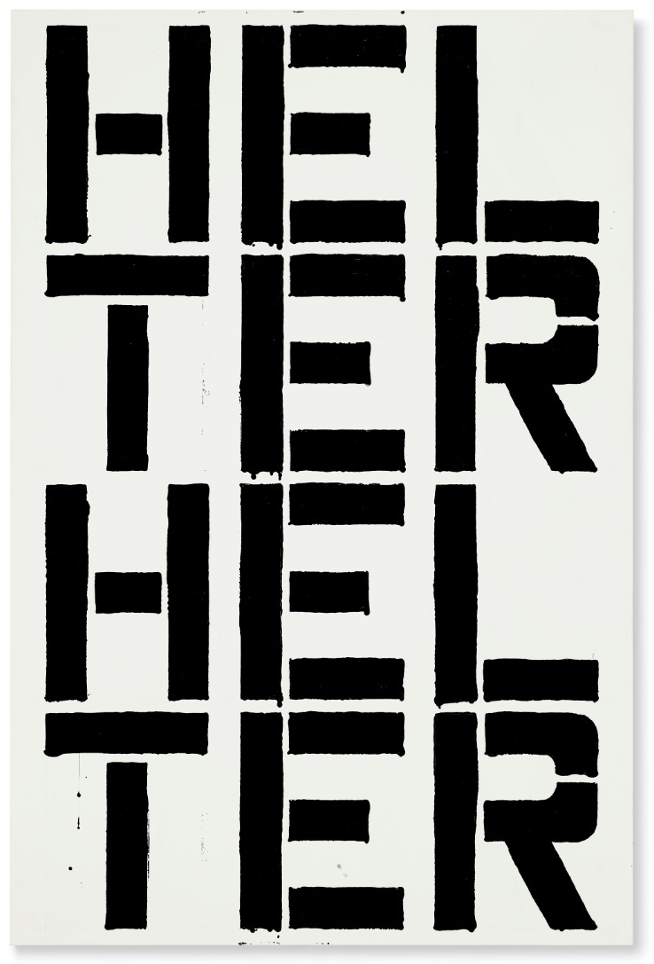
CHRISTOPHER WOOL (B. 1955)
Untitled, 1988
Enamel and Flashe on aluminum
48×32 inches (121.9 x 81.2 cm)
Signed and dated ‘WOOL 1988’ (on the reverse)
Defiantly confronting the viewer with full force, the message rendered across Christopher Wool’s Untitled is the ultimate anarchic statement of his striking output. Combining raw language and materials from the streets, Wool drags the grit of the post-punk urban abyss into the rarified history of fine art. Like many artists of his generation, Wool’s work is governed by mass media and a kaleidoscopic world of appropriation, resulting in a dynamic interplay of borrowed imagery and layered meanings that challenge his audience to navigate a maze of cultural references. His Word paintings unfold as a palimpsest of language, urbanity, and form — blending spoken, phonetic, poetic, and everyday expressions. Alluding to the phrase “helter skelter,” a term synonymous with chaos and disorder, Untitled’s HELTER HELTER swiftly navigates across a vast plain of cultural boundaries — from The Beatles’ jubilant song, to the cult teachings of Charles Manson, to MoCA Los Angeles’ heralded survey of Contemporary art in the 1990s.
One of the rawest rock ‘n’ roll tracks within The Beatles catalog, Helter Skelter was born out of Paul McCartney’s deliberate attempt to create a song as loud and unrefined as possible. Akin to Wool’s own method of cultural appropriation, McCartney borrowed the title of Helter Skelter from a spiraling fairground ride where revelers would climb a tower and slide down the exterior. The ride became a metaphor in McCartney’s mind, symbolizing a descent from the heights of success — “the rise and fall of the Roman Empire,” as McCartney described it (P. McCartney, quoted in B. Miles, Paul McCartney: Many Years from Now, New York, 1998). Noted for both its “proto-metal roar” and “unique textures,” the 23rd track from The Beatles eponymous LP — more affectionately known as The White Album — is often credited by music historians to be a key influence on the development of heavy metal.
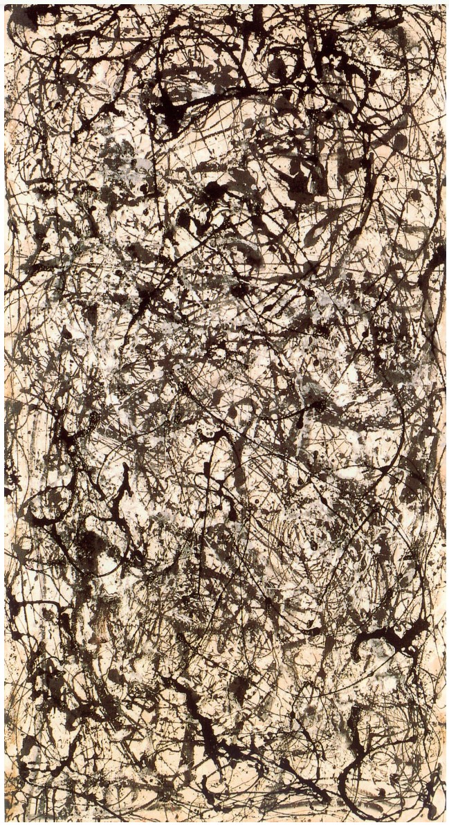
Jackson Pollock, Number 26A, Black and White, 1948. Musée National d’Art Moderne, Centre Georges Pompidou, Paris.
© 2025 The Pollock-Krasner Foundation / Artists Rights Society (ARS), New York.
This playful yet foreboding metaphor took on a different meaning when Manson adopted the song as an anthem for his apocalyptic vision, twisting its message to fit his own radical ideology of revolution and violence. McCartney later reflected on the term’s sinister transformation, stating, “You could have thought of it as a rather cute title but it’s since taken on all sorts of ominous overtones because Manson picked it up as an anthem, and since then quite a few punk bands have done it because it is a raunchy rocker” (Ibid.). This unsettling shift in meaning likely intrigued Wool, aligning with his interest in language’s fluidity and the subversion of seemingly straightforward phrases — a theme explored in other works like Apocalypse Now (1988) and The Show is Over (1990).
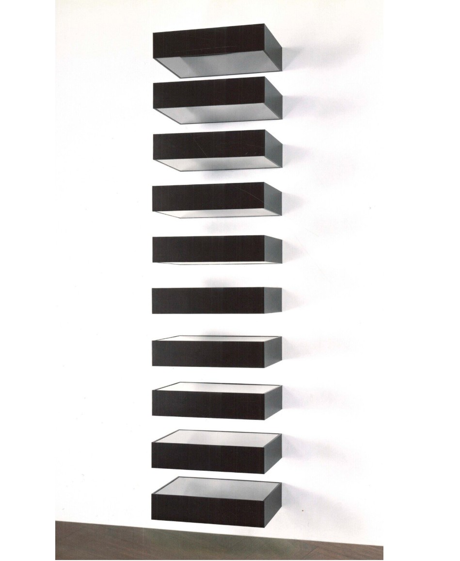
Donald Judd, Untitled, 1990. © 2025 Judd Foundation / Artists Rights Society (ARS), New York.
Untitled crackles with inherent contradictions, balancing anarchic undertones with a meticulously choreographed execution. While the painting’s subject evokes a sense of impending doom, its formal composition remains strikingly controlled: columns of stenciled letters align with sharp precision, the central “E” acting as a visual anchor flanked by rhythmic patterns of “HTHT” and “LRLR” on either side. This tension between order and disorder mirrors the paradox at the core of Wool’s practice. As with Untitled his Word paintings often reverberated with layered meanings, their impact heightened by an anti-literal approach to language. Rather than presenting words as cohesive units, Wool dissects them into isolated letters, scattering them across a pictorial grid. This fragmentation destabilizes the clarity of language, transforming familiar words into visual puzzles — a bold reminder of language’s inherent instability and the slippery nature of meaning.
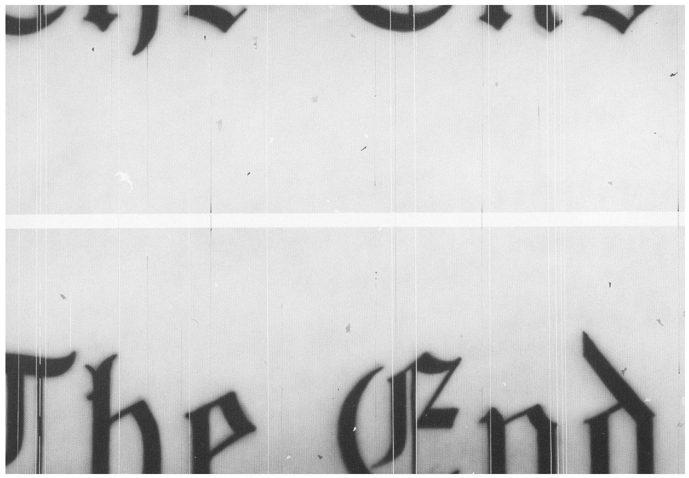
Ed Ruscha, The End, 1991. Museum of Modern Art, New York. © Ed Ruscha.
Wool’s paintings are especially revelatory given the art historical landscape from which they emerged. When he began his word paintings in 1981, Wool was knowingly rebelling against the prevailing artistic current. That same year, influential art critic and historian Douglas Crimp published his now-famous essay, The End of Painting, declaring the medium obsolete. Wool embraced the so-called impossibility of painting, pushing its boundaries by seeking inspiration beyond the traditional art world — in the raw, unfiltered language of the streets. Untitled captures this tension, its disjointed phrases and brutalist typography balancing between structure and anarchy. By stripping words of their context, Wool reduces language to stark, surreal fragments that resonate with unsettling intensity. Like a shout in the dark or a message scrawled in haste, his work challenges us to extract meaning from the chaos — or simply to stand before it, uncertain and uneasy.
Jean-Michel Basquiat
Baby Boom, 1982
Christie’s New-York: 14 May 2025
Estimated: USD 20,000,000 – 30,000,000
USD 24,310,000
JEAN-MICHEL BASQUIAT (1960-1988), Baby Boom | Christie’s
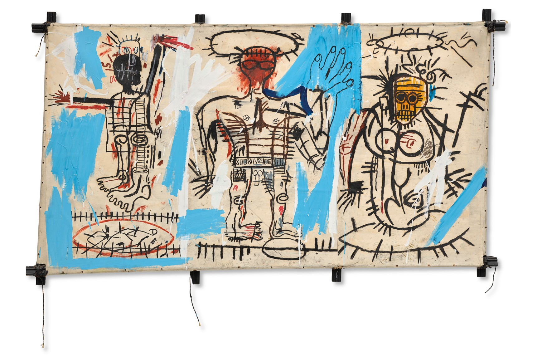
JEAN-MICHEL BASQUIAT (1960-1988)
Baby Boom, 1982
Acrylic, oilstick and paper collage on canvas mounted on tied wood supports
49×84 inches (125 x 213.5 cm)
Signed, titled and dated ‘‘Baby Boom’ Jean-Michel Basquiat Aug. 1982’’ (on the reverse)
Painted in 1982, Baby Boom is one of the most significant works in Jean-Michel Basquiat’s early oeuvre. Exhibited in his now legendary show at New York’s Fun Gallery that same year, it is a work that helped to establish his reputation as one of the most revolutionary artists of the twentieth century. Depicting three figures, and rendered using Basquiat’s unique iconography, the painting also utilizes one of the artist’s hand-made supports. Constructed using discarded pieces of wood tied together with string, these unique supports attest to Basquiat’s revolutionary spirit. Identified by the Whitney Museum of American Art curator Richard D. Marshall as a representation of the artist together with his mother and father, Baby Boom becomes a particularly poignant example of the artist’s famed autobiographical paintings. A mark of this importance can be seen in its inclusion in many of Basquiat’s most important retrospective exhibitions, including those organized by the Brooklyn Museum of Art in 2005, the Fondation Beyeler and the Museé d’Art moderne d la Ville de Paris in 2010 (where it was illustrated on the cover of the catalogue), and the Fondation Louis Vuitton in 2019. In the same collection for the past twenty-five years, Baby Boom stands as a pivotal work in the canon of one of the twentieth-century’s most important and influential artists.
Across this expansive canvas, Basquiat renders three of his iconic figures. Comprised of fundamental gestures executed in oilstick, they are highly sophisticated drawings of the human figure. The central character is distinguished by its highly complex portrayal, in common with the most distinguished paintings in the artist’s oeuvre. Standing tall, with the right arm raised in an outsized greeting, this substantial figure is an exemplar of what curator Dieter Buchhart called Basquiat’s “existential line” (D. Buchhart, “Jean-Michel Basquiat: The Existential Line,” in Jean-Michel Basquiat, exh.cat., Fondation Louis Vuitton, Paris, 2018, p. 16). It traces out precise details of the figure, both skeletal and muscular and even what appears to be the individual motifs on a decorative belt.
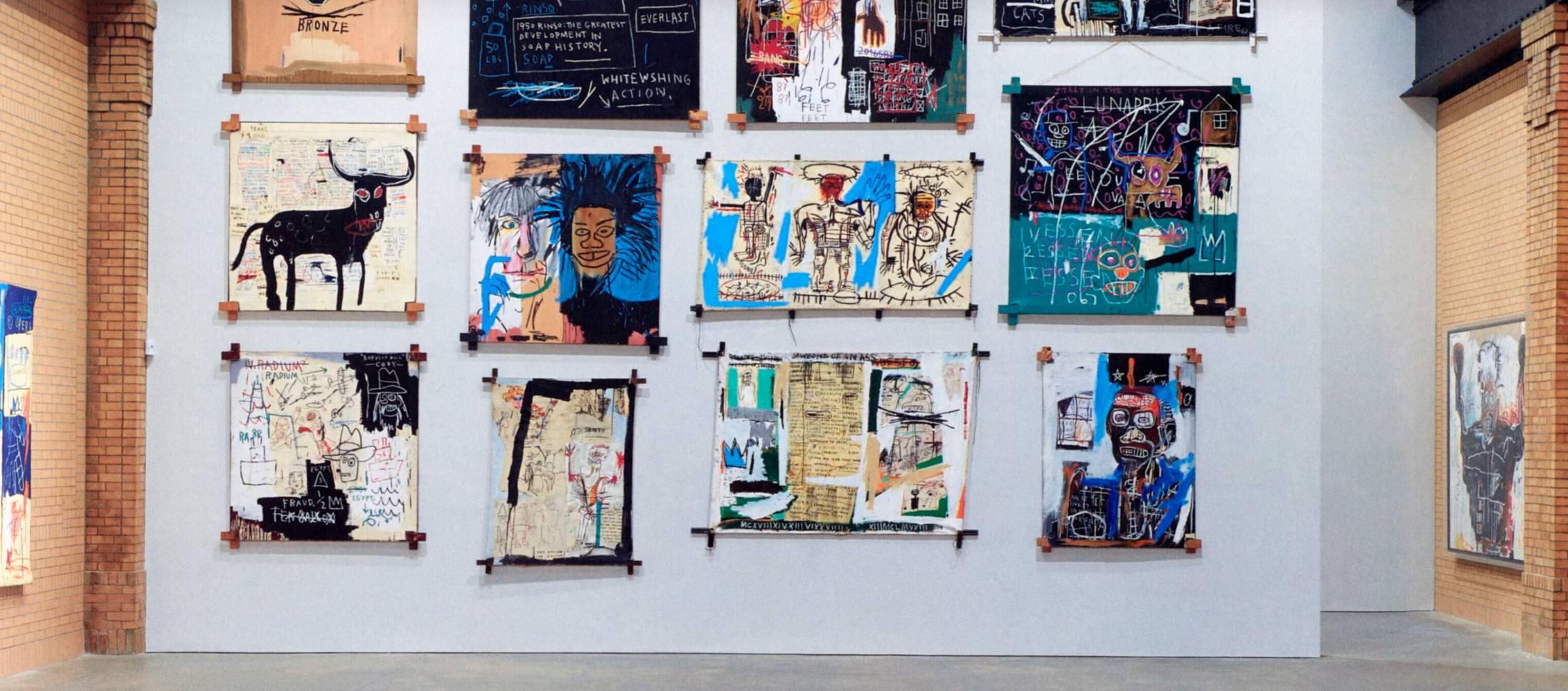
Installation view, Jean-Michel Basquiat, March 6 – May 14, 2019, Brant Foundation, New York (present lot illustrated). Photo: Tom Powel Imaging. Artwork: © Estate of Jean-Michel Basquiat. Licensed by Artestar, New York.
On the right of the canvas is a figure which is clearly female. While overall less intensively worked than the central figure, in this figure Basquiat concentrates his efforts on the head, as he does with many of his most accomplished paintings. On a foundation of yellow pigment, the artist draws the piercing gaze of a pair of dark eyes. Together with the flared nostrils and excited smile, this is by far the most expressive face of the trio, with the torso and arms of this vigorously depicted figure are finished to a high degree of animated detail.
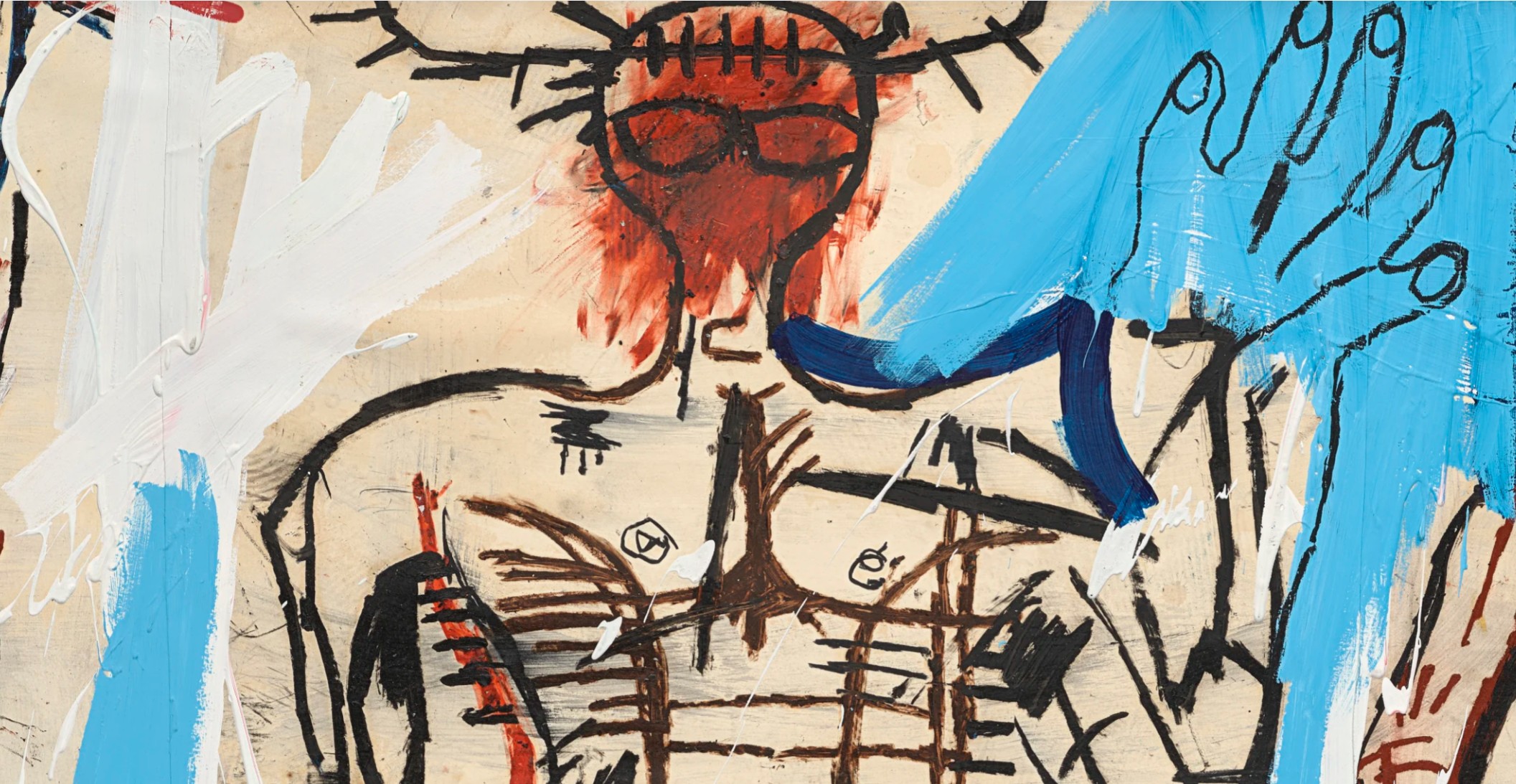
The final figure, on the left, is a rendering of a smaller, almost childlike, figure. Arguably a self-portrait, the complex depiction of the face and body is in keeping with other representations that are thought to be of the artist himself. This figure is dominated by two large feet, drawn as if separated from the body. The dislocated nature of these limbs recalls Leonardo da Vinci’s notebooks of anatomical drawings, while also recalling the childhood injuries that Basquiat received after being hit by a car, and the subsequent gift of a copy of Gray’s Anatomy that he was given as a child to keep him occupied in hospital. Basquiat traces out the silhouettes of his figure using a complex array of thick black outlines and more sophisticated graphic marks. The substantial passages of black oilstick mark out the heads and limbs, while a more intricate pattern of grids fills out the torso. This figure is further animated by flourishes of vibrant red that adorn the limbs and body. Elsewhere, the composition is embellished with generous flourishes of blue and white acrylic paint.
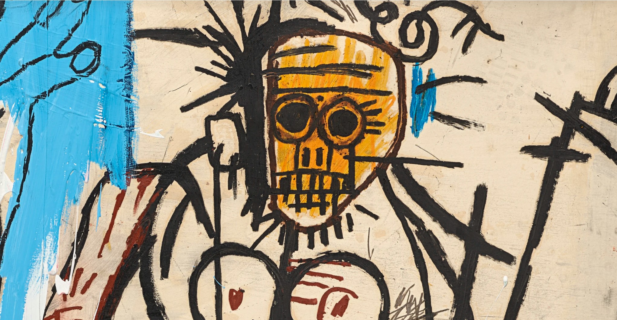
In the catalogue to his 1999 Basquiat retrospective organized by Museo Civico Castel Nuovo in Naples, the curator Richard D. Marshall identifies Baby Boom as a family portrait of the artist with his parents. “The title refers to the increased birth rate and family growth in America after 1950,” Marshall writes,” and the painting shows a prominent, skeletal-like father figure in the center, flanked by his mother on the right side, and the child artist at the left—all three figures crowned with the reverential and respectful halo” (R. D. Marshall, in A. B. Oliva, Basquiat A Napoli, exh. cat., Museo Civico Castel Nuovo, Naples, 1999, p. 46).
Gerard and Jean-Michel Basquiat, New York, 1985. Photo: Zindman / Fremont.
As such this is a rare painting. Although Basquiat often alludes to himself in his paintings, and occasionally to father- and mother-like figures, it is rare to see all three in one painting. Although Basquiat had a challenging youth, his parents were central to his life. He was born the second of four children to Matilde Basquiat (neé Andrades) and Gérard Basquiat. His father was born in Port-au-Prince, Haiti, and his mother was born in Brooklyn to Puerto Rican parents. His mother instilled in Basquiat a love of art, taking him to museums as a child and encouraging him to become a junior member of the Brooklyn Museum of Art. At the age of seven, Basquiat was hit by a car while playing in the street, and while convalescing in hospital his mother brought him a copy of the medical reference book, Gray’s Anatomy. This would prove to be far-sighted, as Basquiat’s later anatomical drawings would become one of the defining aspects of his career. After his mother and father separated when Basquiat was just seven, Basquiat and his two younger sisters were raised by their father. While Basquiat’s relationship with Gérard was complicated, Basquiat senior remained an important and influential part of his son’s life, as his gallerist Annina Nosei attested.
Frida Kahlo, My Grandparents, My Parents and I, 1936. Museum of Modern Art, New York. © 2025 Banco de México Diego Rivera Frida Kahlo Museums Trust, Mexico, D.F. / Artists Rights Society (ARS), New York.
In addition to its personal iconography, Baby Boom is also a remarkable example of the unique structures Basquiat often adopted as his supports. From his earliest days as a street artist, he had sequestered a wide range of objects and materials to use as surfaces for his paintings: from walls and wooden doors, to more unusual surfaces such as radiators and refrigerators, the artist embraced any and every surface as a place to make his mark. In the present work Basquiat, constructed this support consisting of strips of wood that are more often used as a dado or chair rail in interior decoration, tied together with pieces of string. Dividing the canvas support into three ‘sections’ recalls the altarpieces of the European Northern Renaissance. Art historian Fred Hoffman argues that these ‘multi-panel’ structures are a deliberate, rather than inadvertent choice. It is designed to link his work to that of the Renaissance masters, and the gravity of the themes and issues they were tackling. The critic John Berger points out the altarpiece was originally planned to encompass the totality of life and provide an explanation of the world. In that context, the present work becomes a votive experience, and like its predecessors that drew people from the temporal to the spiritual, Basquiat’s work helps to explain his vision of the world and proposes that the viewer approach his subject with a degree of reverential submission.
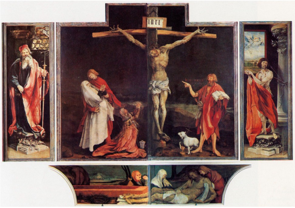
Matthias Grünewald and Niclaus of Haguenau, Isenheim Altarpiece, 1512-1516. Musée Unterlinden, Colmar.
This unusual format has few equals in twentieth-century art. Francis Bacon was among the celebrated proponents of this format, although both conceptually and philosophically they differ from Basquiat’s work. The British artist’s multi-paneled paintings often imply the passage of time or some form of linear transformation, whereas Basquiat’s paintings reveal all their meanings at once. Executed in 1982, Baby Boom was included in Basquiat’s now legendary show at the FUN Gallery in New York. Started in 1981 by Patti Astor and Bill Selling on East 10th Street on the city’s Lower East Side, the gallery soon became known for showing a new generation of street artists. The first gallery in the East Village, it quickly emerged as the place where art, hip hop, and breakdancing came together, attracting the city’s hippest and coolest crowd. According to Astor, when she first met Basquiat, the artist was homeless but the pair soon struck up a strong friendship which resulted in her offering him a show at the gallery. Basquiat built custom walls in the space for his show of about 30 works, many of which featured custom supports. Astor claimed that this show was the only formal show where the artist was totally free, and felt that it contained some of his best work ever. Baby Boom belongs to a special group of paintings created in that summer and fall of 1982, shortly after Basquiat’s solo exhibitions with Annina Nosei in New York and Larry Gagosian in Los Angeles. Many of these works, which include the earliest iteration of Basquiat’s now iconic exposed stretcher bars, were then exhibited at FUN Gallery in November 1982, establishing its reputation as one of the most consequential art exhibitions in a generation. In the chronology of Basquiat’s life, he regarded this raw and ambitiously creative period as the zenith of his career.
Untitled, 1981
Sotheby’s New-York: 15 May 2025
Estimated: USD 10,000,000 – 15,000,000
USD 16,365,000
Untitled | The Now and Contemporary Evening Auction | 2025 | Sotheby’s
JEAN-MICHEL BASQUIAT (1960 – 1988)
Untitled, 1981
Oilstick on paper
50 1/4 x 63 7/8 inches (127.6 x 160 cm)
Signed (on the reverse)
An incendiary image of warrior, deity, artist, and hero erupts in technicolor in Untitled from 1981, in which Jean-Michel Basquiat prophetically manifests the invention, innovation, and staggering appetite for creation that would drive the rest of his career. Executed in 1981, the critical year which heralded his ascent from SAMO ©, the street provocateur, to the prodigy of the mainstream art world—during which time he also began producing artworks under his own name—Untitled powerfully asserts the clairvoyant vision of a figure predicting their own victory: aflame, unblinking, and crowned with a triumphal laurel wreath. Spanning more than five feet in width, the composition swells with the sheer enormity of the sheet, so heavily and repeatedly worked that it bears the full-throttle voltage of the artist’s best paintings. Treasured for more than three decades in the same private collection and virtually unseen by the public since its acquisition in 1989, Untitled stands vivid and alive, as vital now as it was at the moment of execution. Here, at just twenty years of age, Basquiat encodes Untitled with a kind of hieroglyphic power as he composes a mythology of his own invention, and, in doing so, simultaneously reifies and anticipates one of his most iconic proclamations: “I’m not a real person. I’m a legend.” (Jean-Michel Basquiat quoted in: Anthony Haden-Guest, “Burning Out”, Vanity Fair, November 1988, p. 197)
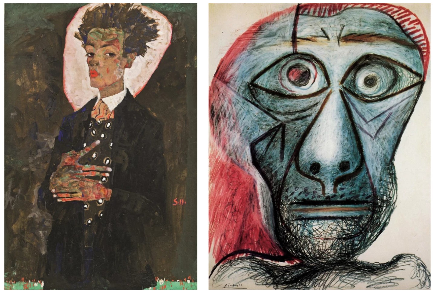
Left: Egon Schiele, Self-Portrait with Peacock Waistcoat, Standing, 1911. Private Collection. Image © Fine Art Images / Bridgeman Images. Right: Pablo Picasso, Self Portrait Facing Death, 1972. Fuji Television Gallery, Tokyo. Image © Fine Art Images / © Succession Picasso/DACS, London 2025 / Bridgeman Images. Art © 2025 Estate of Pablo Picasso / Artists Rights Society (ARS), New York
At the very core of Basquiat’s electric yet calamitously brief career was a spectacularly lucid iconographical infrastructure, one anchored by the signs and signals through which Basquiat communicated his worldview and personal history. Untitled sees Basquiat wrestle with the symbolic vernacular he would engage and expand throughout his career, among them antiquity and the self. Layer upon frenzied layer of emerald, vermilion, and turquoise oilstick burst forth like both flames and feathers, spraying a resplendent, chromatic kaleidoscope onto the ivory field of Basquiat’s sheet. With its clawed fingers, the lone figure resembles Aztec depictions of Quetzalcoatl, the feathered serpent god of creation and knowledge, while his outstretched arm compositionally echoes God’s posture in Michelangelo’s The Creation of Adam—both symbolic representations of the inception of man. Through these themes Basquiat tapped into the raw and unconcealed, exuding a palpable sense of confidence as he fashions a singularly victorious creature, perhaps alluding to a vision of his own future and legacy: a man on the verge of stardom, reborn as artist and icon. Around the figure Basquiat plots gauges, compasses, and charts, all of which are so furiously articulated they read like a frenzied oracle for his future, like a speedometer revealing Basquiat’s creative force accelerating beyond measure, malfunctioning in the face of Basquiat’s caustic, chaotic, and revolutionary pictures. 1981 represented a moment of meteoric rise and catalytic change for Basquiat. Executed in the throes of this metamorphosis, Untitled is legible as a parable of this transformation and the celebrity that would follow in 1982.
Gravestone, 1987
Property from the Collection of Enrico Navarra
Sotheby’s New-York: 15 May 2025
Estimated: USD 6,000,000 – 8,000,000
USD 5,174,000
Gravestone | The Now and Contemporary Evening Auction | 2025 | Sotheby’s
JEAN-MICHEL BASQUIAT (1960 – 1988)
Gravestone, 1987
Acrylic and oilstick on three hinged wood panels
57x69x22 inches (144.8 x 175 x 56 cm)
Signed and titled (on the reverse)
Shocked and devastated by the tragic, unexpected death of Andy Warhol in February 1987, Jean-Michel Basquiat immediately turned back to his practice, creating among the most urgent, impassioned, and defining works of his mature oeuvre: Gravestone. Emblazoned twice with the word PERISHABLE, Gravestone represents a watershed moment of reflection and reckoning in Basquiat’s personal life and artistic development. Shattered by the loss of his friend and former collaborator, Basquiat paid homage to Warhol through a profound reconstitution of the artistic idiom that defined his early found support works of the early 1980s before his meteoric critical ascension. Here, Basquiat fashions three wooden panels together, realizing a pseudo-altarpiece in metallic hues which operates as both a tribute to Warhol and an existential commentary on the transience of life. An extraordinary and poetic monument and radically self-conscious expression of his own mortality, Gravestone from 1987 is utterly singular in Basquiat’s revolutionary oeuvre.
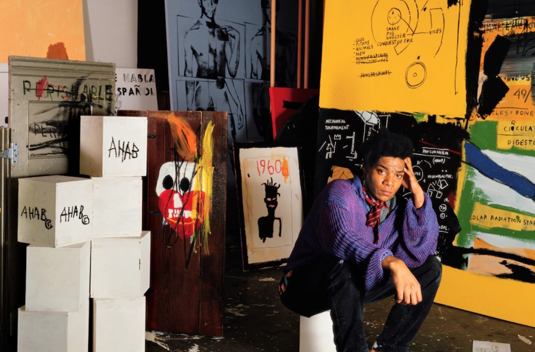
The present with the artist in his Grand Street studio, New York, 1987.
Photo by Tseng Kwong Chi © Muna Tseng Dance Projects, Inc. Art © Estate of Jean-Michel Basquiat. Licensed by Artestar, New York
Employing three hinged found-wood panels as his support, two a stunning metallic and one a mahogany that calls attention to the medium itself, Basquiat evokes a canonical art historical model—the triptych altarpiece—and reconstructs the historical and religious gravitas with which it is associated. Basquiat’s work harkens back to iconic Renaissance examples of this tripartite format, conjuring the metaphysical juxtaposition of heaven and hell in Hieronymus Bosch’s The Garden of Earthly Delights, the solemnity of the Mérode Altarpiece, and the sobriety and magnificence of the polyptych Ghent Altarpiece as well as contemporary reconstitutions of the format in the works of Francis Bacon and others. Although overt religious references seldom appear in Basquiat’s oeuvre, here, we see the artist foreground the cross in commemoration of Warhol’s personal history, a devout Catholic, and the role of religious iconography in Warhol’s own practice, particularly his final decade.
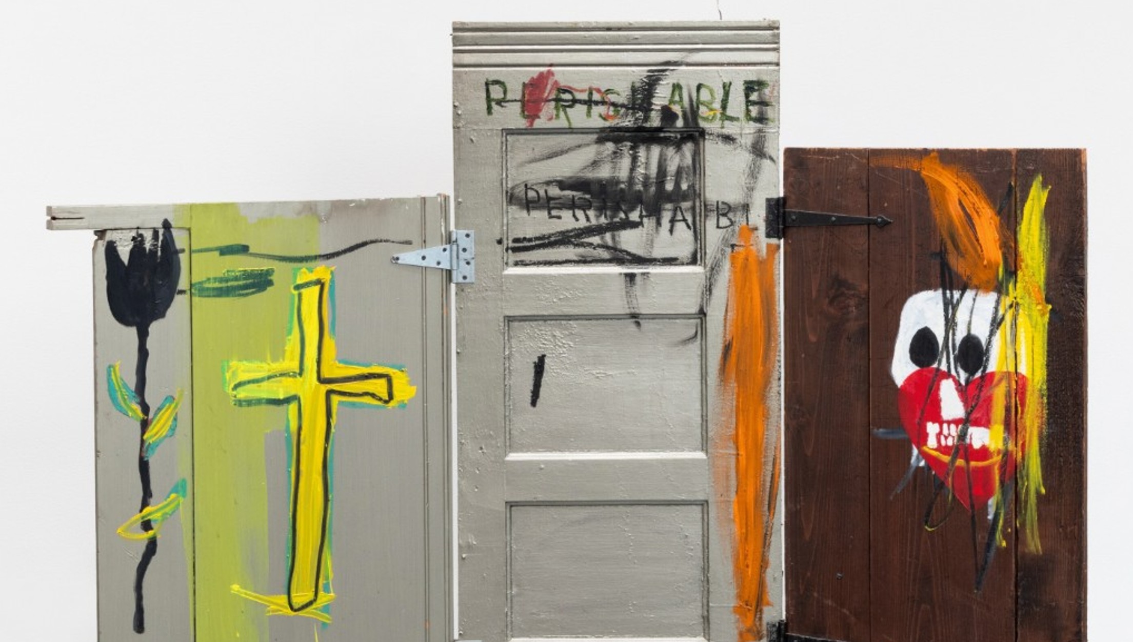
Evoking the great triptychs of the art historical canon, Basquiat’s composition suggests a dichotomy between redemption and reckoning with the inevitability of mortality. Basquiat adorns the leftmost panel with a beaming yellow cross, evoking Warhol’s iconic large-scale crosses of the 1980s and a black tulip. The skull and heart on the rightmost panel operate as memento mori—the perennial reminder of the impermanence of mortal existence and the constant threat of death which Basquiat inserts throughout his oeuvre. Richard D. Marshall writes of the motif: “Basquiat used painterly gesture on canvas, most often depicting skeletal figures and masklike faces that signal his obsession with mortality, and imagery derived from his street existence…” (Richard Marshall, “Repelling Ghosts,” in: Exh., Cat., New York, Whitney Museum of American Art (and traveling), Jean-Michel Basquiat, 1992, p. 15) The central panel of Gravestone is emblazoned twice with the word PERISHABLE. Utilizing erasure as a form of reinforcement, Basquiat scrawls over the second PERISHABLE as well as over the skull and heart, emphasizing the most salient features of his composition. Merging iconography from his own practice with that of Warhol’s, Basquiat eternalizes their collaboration and foregrounds the obsession with tragedy and fascination with mortality that permeates each of their respective work.
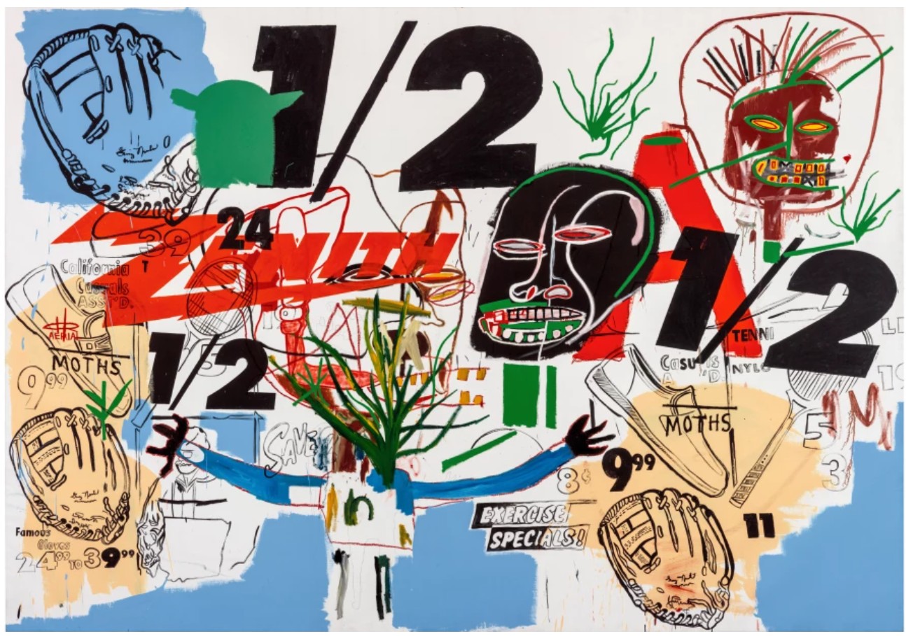
Andy Warhol and Jean-Michel Basquiat, Untitled, 1984. Private Collection. Sold at Sotheby’s New York in May 2024 for $19.4 million. Art © 2025 Andy Warhol Foundation for the Visual Arts / Artists Rights Society (ARS), New York. © Estate of Jean-Michel Basquiat. Licensed by Artestar, New York
When Basquiat and Warhol were first introduced to one another in 1982, Basquiat was a young street artist working as SAMO, who had only just emerged into the mainstream, and Warhol had already reigned the New York art scene for two decades. Bruno Bischofberger orchestrated the fateful introduction, which would change the course of each of their careers independently and permanently intertwine their legacies. Warhol recalled in a diary entry in October 1982: “Down to meet Bruno Bischofberger (cab $7.50). He brought Jean-Michel Basquiat with him. He’s the kid who used the name ‘Samo’ when he used to sit on the sidewalk in Greenwich Village and paint T-shirts…he was just one of those kids who drove me crazy…” (Andy Warhol quoted in: Pat Hackett, ed., The Andy Warhol Diaries, New York 1989, p. 462) During this infamous encounter, as Bischofberger recalls, “…Basquiat asked Warhol if he could hand the camera over to me to take a double portrait of the two artists, so he gave me his camera and I made a few shots of the two together, in his name… Basquiat did not want to stay and said goodbye… one, at most one and half hours later, when Basquiat’s assistant appeared with a 150 x 150-centimeter work on canvas, still completely wet, a double portrait depicting Warhol and Basquiat… The painting was titled Dos Cabezas.” (Bruno Bischofberger, “Collaborations—Reflections on the Experiences with Basquiat, Clemente, and Warhol” in: Exh. Cat., Paris, Donation Louis Vuitton, Basquiat X Warhol: Painting 4 Hands, 2023, p. 69) This watershed day not only inaugurated a revolutionary artistic dialogue, and eventual partnership, but also a personal relationship which would propel each of their careers.
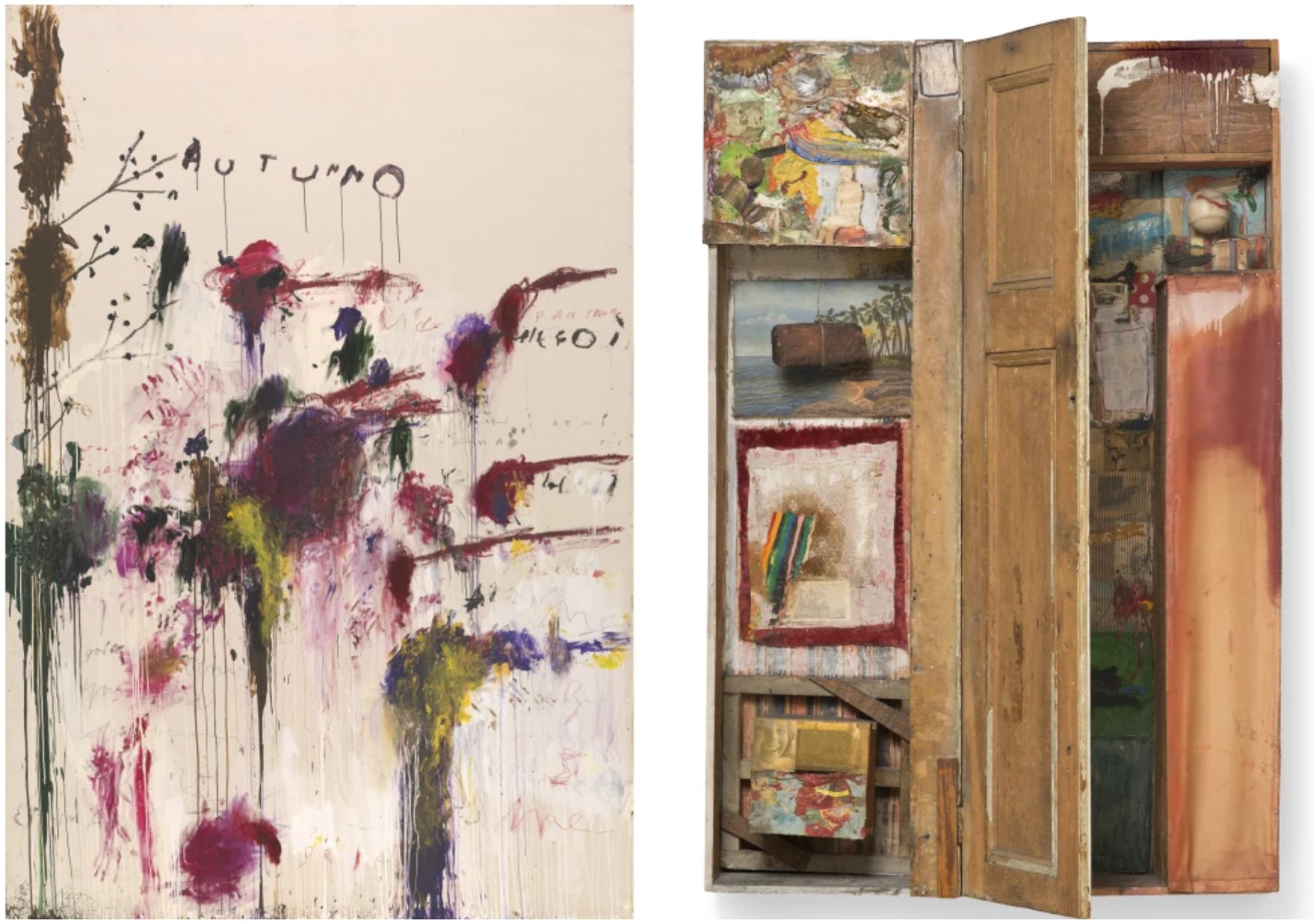
Left: Cy Twombly, Quattro Stagioni: Autunno, 1993-5. Tate Gallery, London. Image © Tate, London / Art Resource, NY. Art © 2025 Cy Twombly Foundation. Right: Robert Rauschenberg, Interview, 1955. The Museum of Contemporary Art, Los Angeles. Image © Brian Forrest, courtesy The Museum of Contemporay Art Los Angeles. Art © 2025 Robert Rauschenberg Foundation
Channeling the explosive energy and electric charge of downtown New York through a radical visual vernacular, Basquiat offered a fresh and contrarian perspective that exhilarated Warhol; and Warhol offered Basquiat access to a vast network that cemented his critical ascendancy. As fellow artist Ronnie Cutrone recalled, “Their relationship was symbiotic… Jean-Michel gave Andy a rebellious image again.” (Ronnie Cutrone quoted in: Victor Bockris, Warhol: The Biography, Cambridge 2003, pp. 461-62) Between 1984-85, their relationship was immortalized in a series of paintings first exhibited at Tony Shafrazi Gallery in which the artists fused their practices, adding illustrations in sequence to produce joint paintings which would become known as the Collaborations. While distinctly executed in Basquiat’s visual vernacular, Gravestone also functions as an extension of this groundbreaking series. Basquiat borrows one of Warhol’s motifs, the cross, and positions it in dialogue with his own: the skull. (Dieter Buchhart, “Basquiat x Warhol: A Dialogue in Contradictions in: Exh. Cat., Paris, Donation Louis Vuitton, Basquiat X Warhol: Painting 4 Hands, 2023, 27)
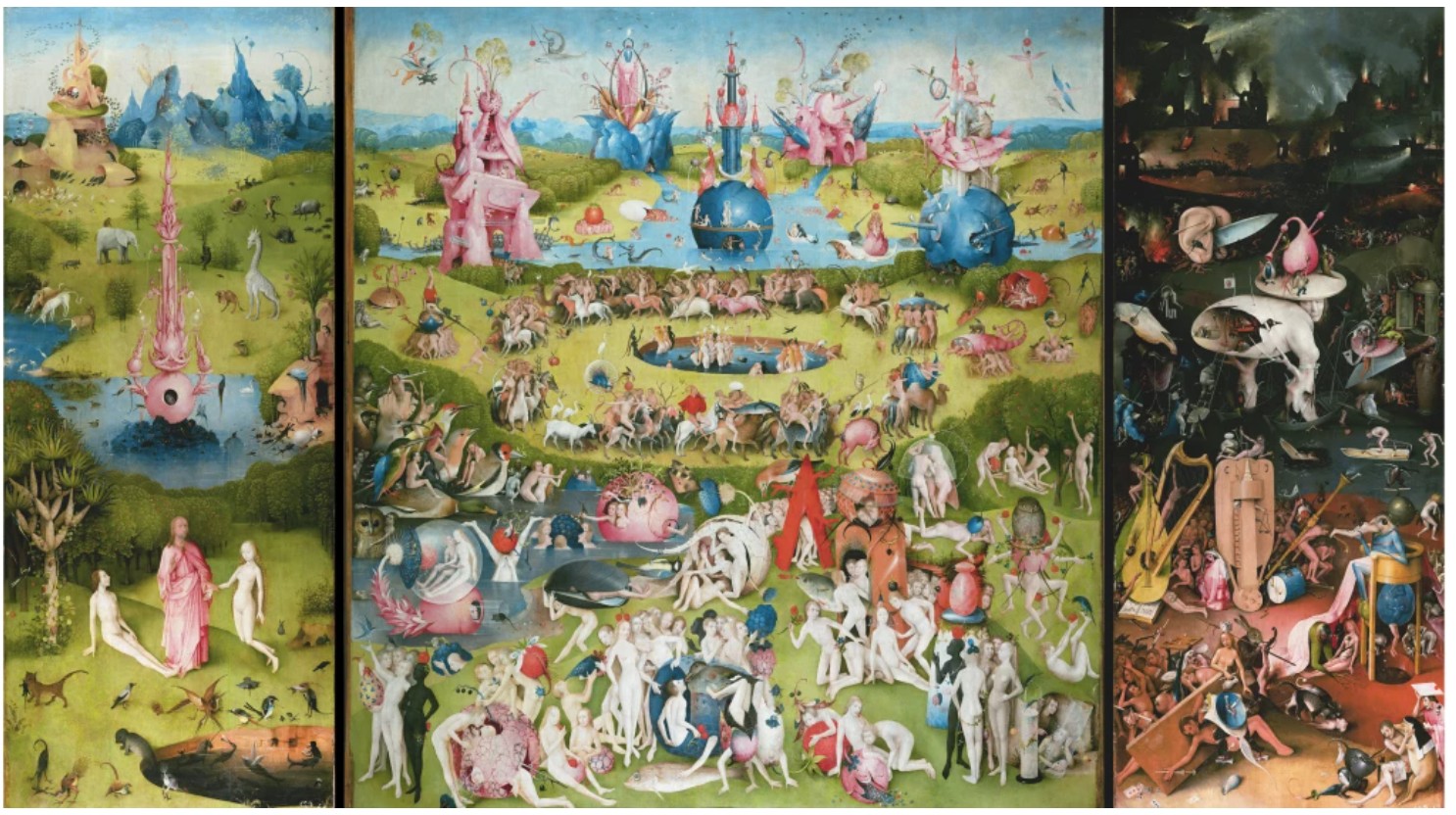
Hieronymus Bosch, The Garden of Earthly Delights, 1490-1500. Museo Nacional del Prado, Madrid. Image © Bridgeman Images
Gravestone harkens back to Basquiat’s earlier works in which the artist often utilized found objects as his supports, building upon the exploration of media and representation central to Jasper Johns’ Neo-Dada works and Robert Rauschenberg’s Combines. Like Johns and Rauschenberg, Basquiat dissolved the arbitrary boundaries between painting and sculpture, recontextualizing found materials within his compositions. But unlike his predecessors who operate with subversive intentions to recontextualize the mundane, Basquiat’s use of found supports derives from an essential and irrepressible need for expression. Gravestone, like the artist’s seminal early works, Pork (1981), Untitled (Refrigerator) (1981) or Portrait of the Artist as a Young Derelict (1982), epitomize Basquiat’s idiosyncratic methodology and the urgency of his production, transgressing the arbitrary boundaries of materiality in Contemporary art. Perhaps awakened to his own mortality at the death of Warhol, Basquiat turned back to his foundational years and the form of production that characterized his practice before he encountered Warhol. Further testifying to the significance of Gravestone, the work was acquired by celebrated collector, dealer, scholar, and editor of the artist’s catalogue raisonné, Enrico Navarra, in 2002. First exhibited at Galerie Yvon Lambert in Paris the year after its execution in 1988, Gravestone is a triumph of Basquiat’s singular artistic practice and a seminal monument to one of the greatest symbiotic relationships of Contemporary art.
Untitled, 1984
Phillips New-York: 13 May 2025
Estimated: USD 4,500,000 – 6,500,000
USD 6,594,000
Jean-Michel Basquiat Modern & Contemporary Art Evening Sale
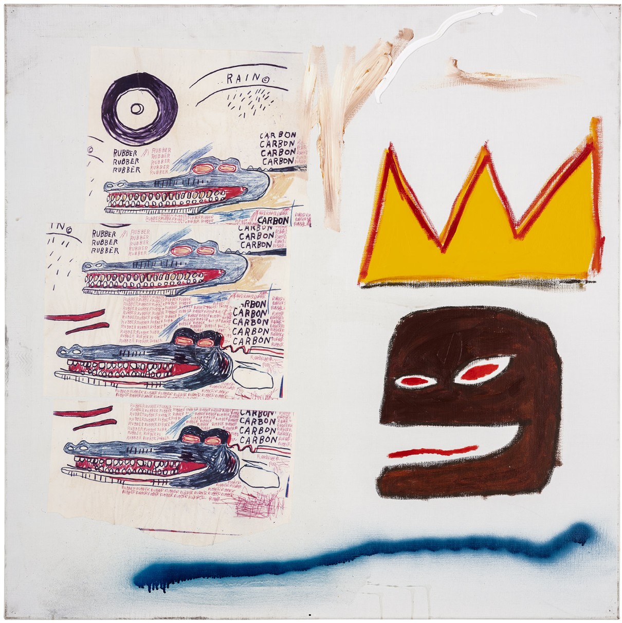
Painted in 1984, Untitled exemplifies Jean-Michel Basquiat’s raw, gestural power, painterly prowess and his extraordinary ability to unify seemingly disparate themes within a single, electrified surface. Showcasing his distinctive iconography—including the crown, textual devices, animal imagery, and references to popular culture—the painting is richly imbued with biographical symbolism and encapsulates many of the core themes that define Basquiat’s revolutionary practice. Combining collage, acrylic, and spray paint, Untitled serves as an investigation into texture, color, and meaning, seamlessly fusing Basquiat’s signature visual language with urgent social and political commentary.
“I collected very early on… Art was, seriously, the only thing I’d ever wanted to own. It has always been for me a stable nourishment.”
David Bowie, 1998
Formerly part of the collection of David Bowie, one of the most influential cultural icons of his generation, this important painting boasts stellar provenance, having been first owned by perhaps Basquiat’s most important champion, Bruno Bischofberger. Untitled was painted in 1984 in Kungsträdgården, Stockholm, where Basquiat was working in a temporary studio belonging to Norwegian artist Knut Swane. During his time in Sweden, Basquiat created an important group of paintings with the assistance of gallerist Stellan Holm, whom he had first met earlier that year in New York. Of these, only five works—including the present painting—feature Basquiat’s iconic crown motif. Holm would later become a close associate of both Basquiat and Andy Warhol, underscoring his presence at a pivotal moment in Basquiat’s career. Untitled belongs to this important suite of works, others of which were gifted to close friends and collaborators such as Francesco, Alba, Nina, and Chiara Clemente.
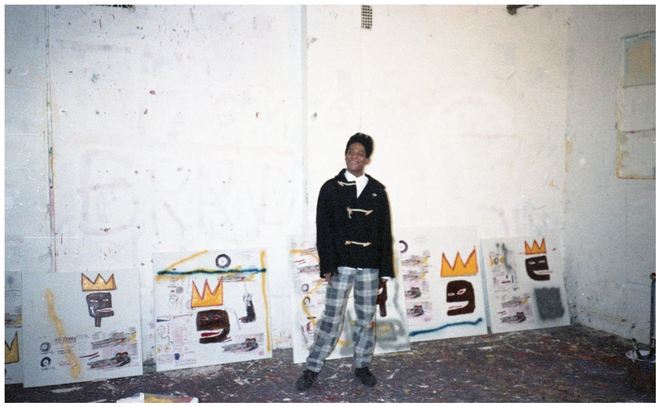
The artist in Knut Swane’s studio, 1984. Photograph by Stellan Holm. The present work seen here, second from the right. Image: © Stellan Holm, Artwork: © Estate of Jean-Michel Basquiat. Licensed by Artestar, New York
Leading up to 1984, Basquiat had held solo exhibitions in New York and Tokyo, was included in the Whitney Biennial, and had begun collaborations with Clemente and Warhol. These milestones, combined with the independence of renting his own studio from Warhol at 57 Great Jones Street in the summer of 1983, resulted in a period of rich artistic output, career validation, and international recognition. While his genius was increasingly recognized by the institutional art world, Basquiat’s work remained fundamentally rooted in the alternative street culture of 1980s New York, of which he was both a product and a pioneer. Among the first to successfully transpose the rebellious spirit of graffiti into the realm of fine art, Basquiat preserved its immediacy and ideological urgency. Untitled exemplifies this duality. Melding the spontaneous gestures of spray paint with the physicality of thick acrylic, the painting bridges the divide between the unrefined and the refined, the ephemeral and the enduring.
“Basquiat’s great strength is his ability to merge his absorption of imagery from the streets, the newspapers, and TV with the spiritualism of his Haitian heritage, injecting both into a marvelously intuitive understanding of the language of modern painting.”
Jeffrey Deitch
Basquiat’s voice was deeply shaped by his heritage and environment. Of Haitian and Puerto Rican descent, and coming of age in a society still deeply divided along racial lines, Basquiat consistently gave space to those traditionally excluded from historical narratives. Among his most powerful motifs is the Black figure, which asserts a proud, defiant presence in Untitled with its almond-shaped red eyes and playfully open mouth. The artist’s early encounters with museums left a lasting impression—he observed that art history overwhelmingly privileged white subjects, relegating Black figures to the margins, if they appeared at all. Through his portraits of Black athletes, musicians, and cultural icons, Basquiat redefined the canon, elevating those once overlooked to positions of protagonists and heroes.
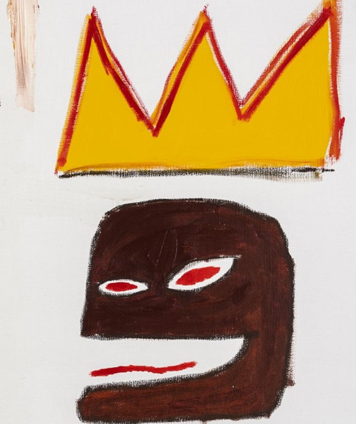
In Untitled, a disembodied head floats in an ambiguous space, punctuated by the kind of oversized yellow crown that first appeared in Basquiat’s 1981 homage to Pablo Picasso, Red Kings. In a 1983 interview with art world figure Henry Geldzahler, Basquiat famously described his artistic subject matter as “Royalty, heroism, and the streets,” a characterization that resonates powerfully in the present painting. The crown in Untitled embodies this ethos, asserting both triumph and vulnerability in a realm where cultural power is constantly negotiated. Francesco Clemente’s reflection on Basquiat’s crowns further illuminates their symbolic weight: “Jean Michel’s crown has three peaks, for his three royal lineages: the poet, the musician, the great boxing champion. Jean measured his skill against all he deemed strong, without prejudice as to their taste or age.”
Dominating the lefthand side of Untitled is a column of four crocodile heads, drawn across various collaged panels. Juxtaposed against the human head on the right—which visually functions as a mask with its cut-out eyes—these reptilian forms evoke Voodoo imagery and allude to Basquiat’s Haitian heritage. At the same time, the crocodile motif may also reference the emblematic logo of the men’s clothing brand Izod Lacoste, which reached peak popularity in the late 1970s and early 1980s. Characteristic of Basquiat’s ability to hybridize symbols, the crocodiles in Untitled operate as cryptic ciphers, merging classical references with elements of popular culture. Variations of this motif also appear in his collaborative work with Andy Warhol, such as Crocodile, 1981.
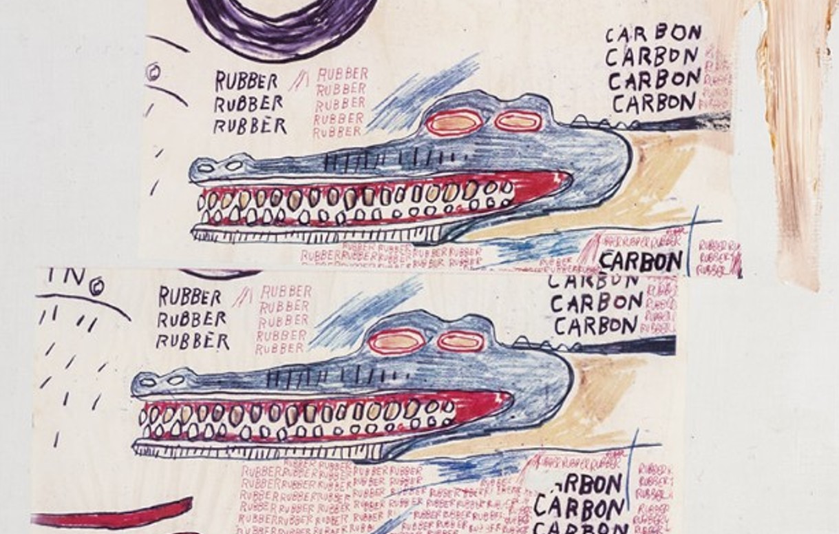
Basquiat’s repetition of words and imagery in Untitled lends both symbolic and hypnotic weight—echoing the strategies of Warhol while infusing his paintings with additional political charge. The inclusion of the black tire in this painting hints at broader narratives: during World War II, rubber became a militarized commodity in the United States, leading to widespread rationing and civilian scarcity. Yet the history of rubber stretches deeper, its extraction intimately tied to colonial violence, labor abuses, and environmental degradation—concerns Basquiat channels with piercing clarity. The repeated word “CARBON” further alludes to the material’s fraught positionality, being simultaneously ubiquitous in nature and highly coveted in its crystalline form.
In the words of Richard D. Marshall, “Basquiat’s paintings of 1982-1985 reveal a confluence of his many interests and energies, and their actual contents—the words—describe the subjects of importance to Basquiat. He continually selected and injected into his works words which held charged references and meanings—particularly to his deep-rooted concerns about race, human rights, the creation of power and wealth, and the control and valuation of natural, elements, animals, and produce—all this in addition to references to his ethnic heritage [and] popular culture.” In Untitled, these concerns coalesce into a vivid, almost frenetic visual language that demands active engagement from the viewer.’
Untitled, 1985-1986
Phillips New-York: 13 May 2025
Estimated: USD 1,500,000 – 2,000,000
USD 2,964,000
Jean-Michel Basquiat Modern & Contemporary Art Evening Sale
Untitled, 1985-1986
Oilstick and crayon on paper
Executed between 1985 and 1986, Jean-Michel Basquiat’s Untitled offers a vivid view into the artist’s energetic, imaginative, and ingenious mind. This work illustrates a vibrant symphony of densely layered motifs and symbols characteristic of Basquiat’s multifaceted practice. A masterful blend of figuration and abstraction sprawls across the page like cryptic runes from an undiscovered world, reflecting Basquiat’s diverse interests: anatomical charts, bebop and jazz, language fragments, and semiotic structures. He merges image and text, revealing and concealing meaning, lifting iconography from its usual context and layering it with crossed-out and repeated fragments. Basquiat’s works on paper possess a raw immediacy that allows his creative brilliance to emerge unfiltered. The limitations of the medium—where overpainting is not possible—make works like this a direct and unmediated record of the artist’s visionary thinking. In Untitled, Basquiat’s partial erasures and incomplete passages highlight the rapidity of his process, yielding a dynamic and deeply personal artifact. The work’s distinctive, freeform articulations stand as enduring traces of a brief but incandescent life.
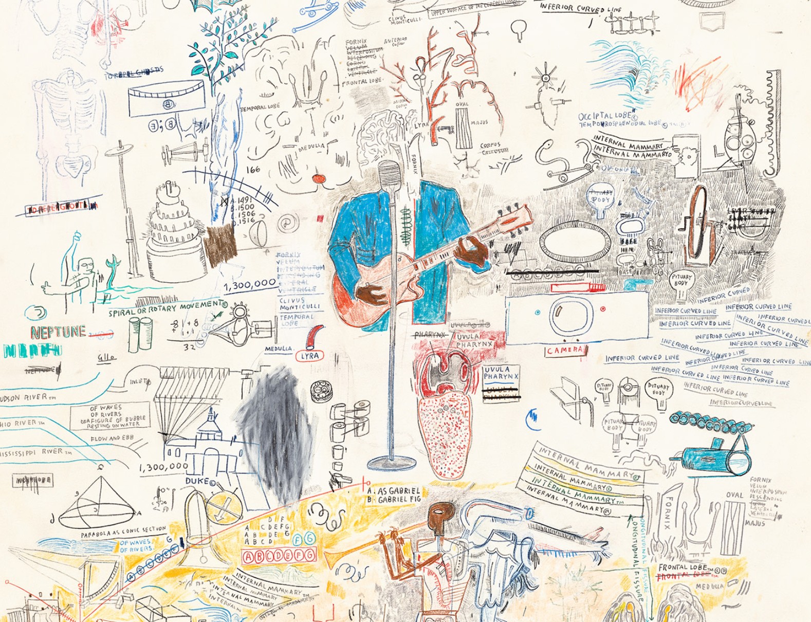
A thrilling rediscovery never before offered at auction, Untitled stands as a large-scale, intricately layered work that captures the expansive scope of Basquiat’s imagination and his relentless drive to innovate across disciplines. Notably, the painting was formerly in the collection of Willi Smith, the most high-profile Black fashion designer of the 1980s and founder of the influential label WilliWear. Often credited with pioneering a form of proto-streetwear—what Smith himself called “street couture”—he revolutionized fashion by creating accessible, collaborative, youth-driven designs that blurred the lines between art, performance, and everyday life. A creative force who worked with artists such as Christo and Jeanne-Claude, Nam June Paik, Keith Haring, and Spike Lee, Smith embodied a spirit of boundary-crossing innovation that resonates with Basquiat’s own artistic ethos. In Smith’s eclectic and visionary collection, Basquiat’s Untitled found a fitting home, bridging two groundbreaking talents who reshaped the cultural landscape of their time. Untitled revisits techniques Basquiat explored after his engagement with Xerox-based art. By 1983, collage became central to his process as he integrated photocopies into his paintings. The photocopier became such a vital tool that he acquired a personal color machine for his studio. Inspired by William S. Burroughs’ “cut-up” technique, Basquiat spliced and reassembled fragments into layered compositions enhanced with text, symbols, and imagery. Notably, this work reappears in four significant large-scale paintings: Harlem paper product, 1987; Icarus Esso, 1986; Dogman, 1986; and Untitled, 1984-1985.
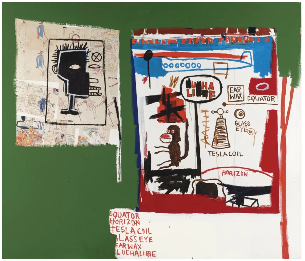
Jean-Michel Basquiat, Harlem paper product, 1987. Private Collection.
Artwork: © Estate of Jean-Michel Basquiat. Licensed by Artestar, New York
The present drawing represents a confident assertion of Basquiat’s draftsmanship and instinctive storytelling. The frenetic energy in his works on paper, evident in Untitled, differs from that of his paintings—here, expression is immediate, raw, and intense. Drawing was Basquiat’s most direct mode of translating his thoughts. Evocative of Cy Twombly—whom he admired—Basquiat’s marks suggest a proto-handwriting, an elusive language suspended between legibility and pure symbolism. Through recursive anatomy, television, history, and Black culture, Basquiat constructed a symbolic system all his own.
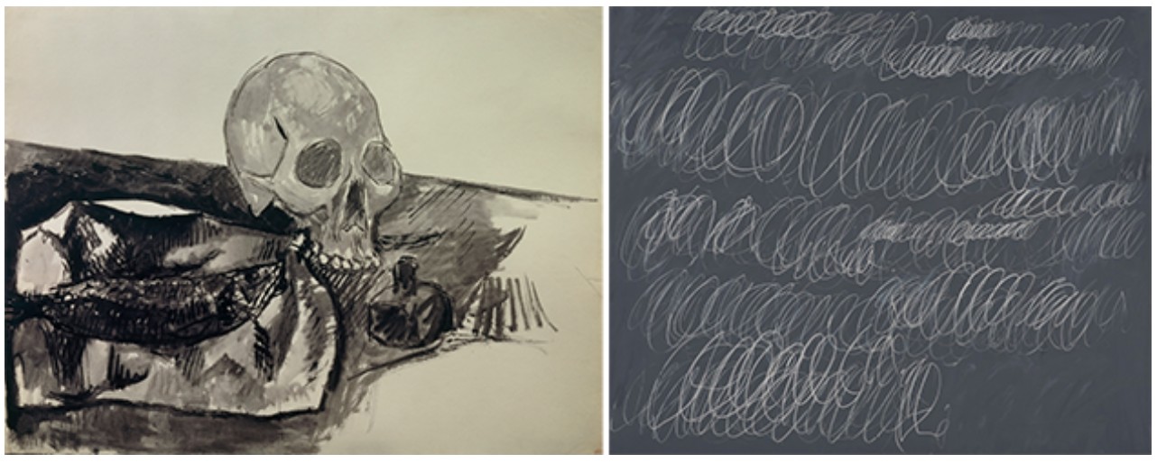
[Left] Pablo Picasso, Still life: fish, skull and inkwell, Paris, spring-summer 1908. Musée national Picasso, Paris. Artwork: © 2025 Estate of Pablo Picasso / Artists Rights Society (ARS), New York
[Right] Cy Twombly, Untitled, 1967. Museum of Contemporary Art, Los Angeles. Artwork: © Cy Twombly Foundation
The visual intensity of Untitled reflects Basquiat’s drive and meteoric success. The work displays his mature visual lexicon: a densely worked surface where incised oilstick marks create rich textural dimensions. Using both rapid gestures and precise detail, Basquiat blends text and image. Shifting between black, white, and color, he maps anatomy—the brain’s “FORNIX” and “LYRA”—and the torso of a guitar player, detailed but with a scribbled spinal column. In neuroanatomy, “Lyra” refers to a structure within the fornix, its name inspired by a triangular harp. This subtle reference—tied to Basquiat’s fascination with anatomy and music—exemplifies his ability to fuse scientific and artistic domains. His mother, Mathilde, nurtured these dual interests, introducing him to museums and gifting him Gray’s Anatomy (1878) after a childhood car accident. This event, which resulted in the removal of his spleen, profoundly influenced his recurring interest in the human body.
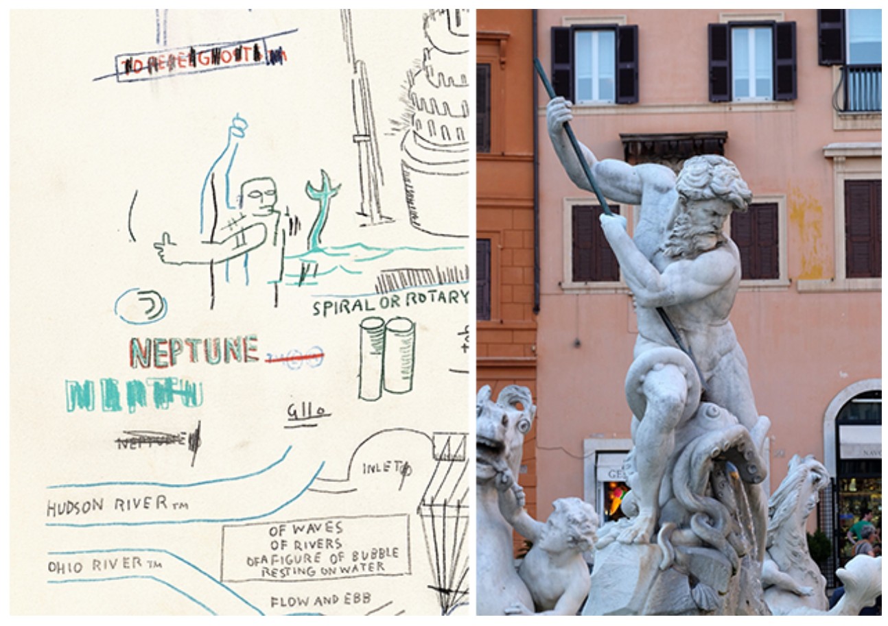
[Left] Detail of the present work.
[Right] Piazza Navona, Fountain of Neptune in Rome, Italy. Image: Panther Media GmbH / Alamy Stock Photo
In Untitled, detailed renderings of the throat and jaw highlight Basquiat’s stream-of-consciousness style—a careful balance of urgency and coherence. While anatomically investigative, the work also autobiographically surveys Basquiat’s oeuvre, referencing pieces such as the Brooklyn Museum’s Back of the Neck, 1983; Horn Players, 1983, at the Broad, Los Angeles; Jawbone of an Ass, 1982; and Monticello, 1986. Shared across these are themes of deconstructed anatomy, Black musicians, and biblical references. In Jawbone of an Ass, the title derives from Samson’s legendary feat—a gesture of strength and divine favor—reflecting Basquiat’s engagement with spiritual and mythological content. Here, Neptune is also depicted, identified by the label “NEPTUNE” and a figure with classical attributes, reinforcing mythic themes.
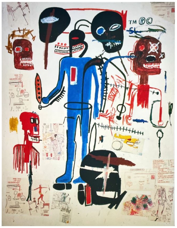
Jean-Michel Basquiat, Dogman, 1986. Private Collection. Artwork: © Estate of Jean-Michel Basquiat. Licensed by Artestar, New York
Historical and technical references further permeate Untitled. A bat wing in the lower half mirrors Leonardo da Vinci’s studies of flight, reflecting Basquiat’s polymathic interests. Inspired by Henry Dreyfuss’ Symbol Sourcebook (1972), Basquiat incorporated graphic and engineering symbols—visible here in the circular mechanical diagrams paired with river names like “MISSISSIPPI,” “OHIO,” and “HUDSON.” The repetition of “FLOW AND EBB” and “OF WAVES // OF RIVERS” links anatomy, myth, and machinery to a hydrodynamic metaphor of movement and memory.
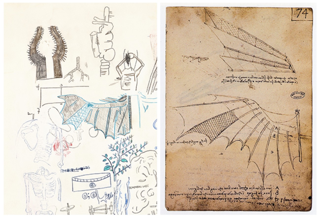
[Left] Detail of the present work.
[Right] Study of wing articulation. From da Vinci’s notebooks, circa 1487 – 1490. Image: Gravure Francaise / Alamy Stock Photo
Trademark and copyright symbols—ubiquitous in Basquiat’s work—appear throughout, referencing authorship and ownership. These markings also echo his graffiti roots and his use of the SAMO tag. The work’s central figures—a trumpet player labeled “AS GABRIEL // GABRIEL FIG.” and a guitarist in a blue suit—connect Basquiat to music and spirituality. The archangel Gabriel, associated with the trumpet and divine announcements, may also serve as a metaphor for the artist himself—a messenger, performer, witness, or even avatar. The central guitarist, faceless save for a floating brain, evokes sound through color and gesture. Capitalized words across the composition suggest rhythm, while scribbled-out passages heighten textual ambiguity, mirroring the improvisational spirit of jazz. Repetition, a core technique in both Basquiat’s work and jazz, reinforces this connection.
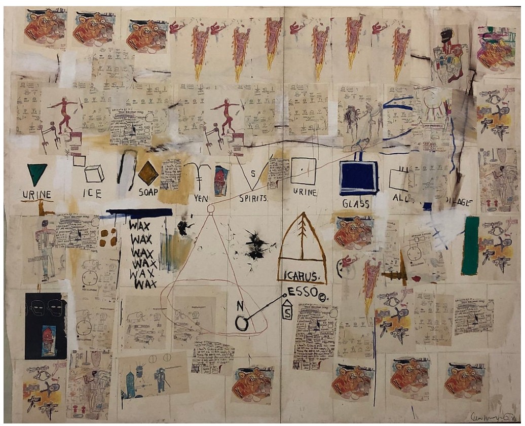
Jean-Michel Basquiat, Icarus Esso, 1986. Private Collection. Artwork: © Estate of Jean-Michel Basquiat. Licensed by Artestar, New York
Created during a pivotal period in the artist’s short yet prolific career, Untitled captures Basquiat’s creative expansion and growing confidence in his role as an artist, at a time when he was gaining international recognition and staging major museum exhibitions. In 1985, Basquiat experienced a landmark year, marked by a major show at the prestigious Mary Boone Gallery, a New York Times Magazine cover feature, and a collaborative exhibition with Andy Warhol.
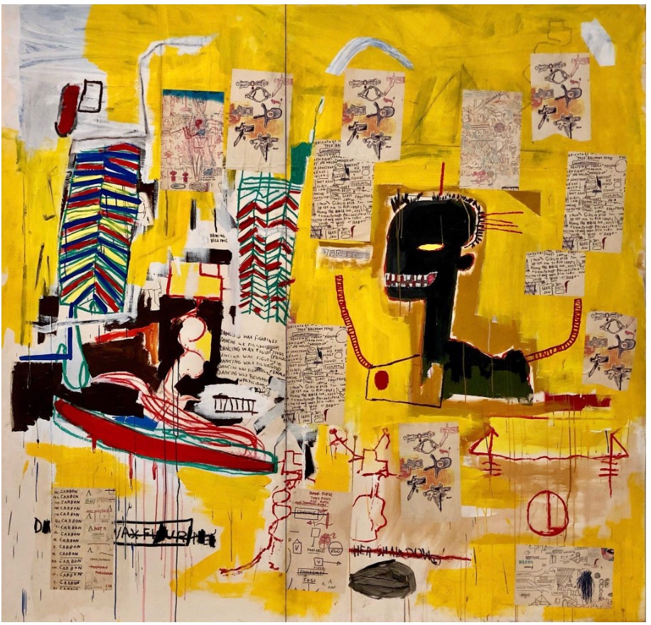
Jean-Michel Basquiat, Untitled, 1984-1985. Private Collection. Artwork: © Estate of Jean-Michel Basquiat. Licensed by Artestar, New York
The desire to communicate through his art while resisting categorization is powerfully evident in Untitled, where the artist’s unbounded curiosity and exceptional storytelling unfold across the page. An exquisite example of Basquiat’s signature Neo-Expressionist style and his commitment to reimagining the myths of past and present, Untitled—with its scrawled anatomical renderings and lyrical text—serves as both a mirror of his career to that point and a portrait of his imaginative, restless mind.
Foo, 1982
Sotheby’s New-York: 16 May 2025
Estimated: USD 600,000 – 800,000
USD 1,972,000
Foo | Contemporary Day Auction | 2025 | Sotheby’s
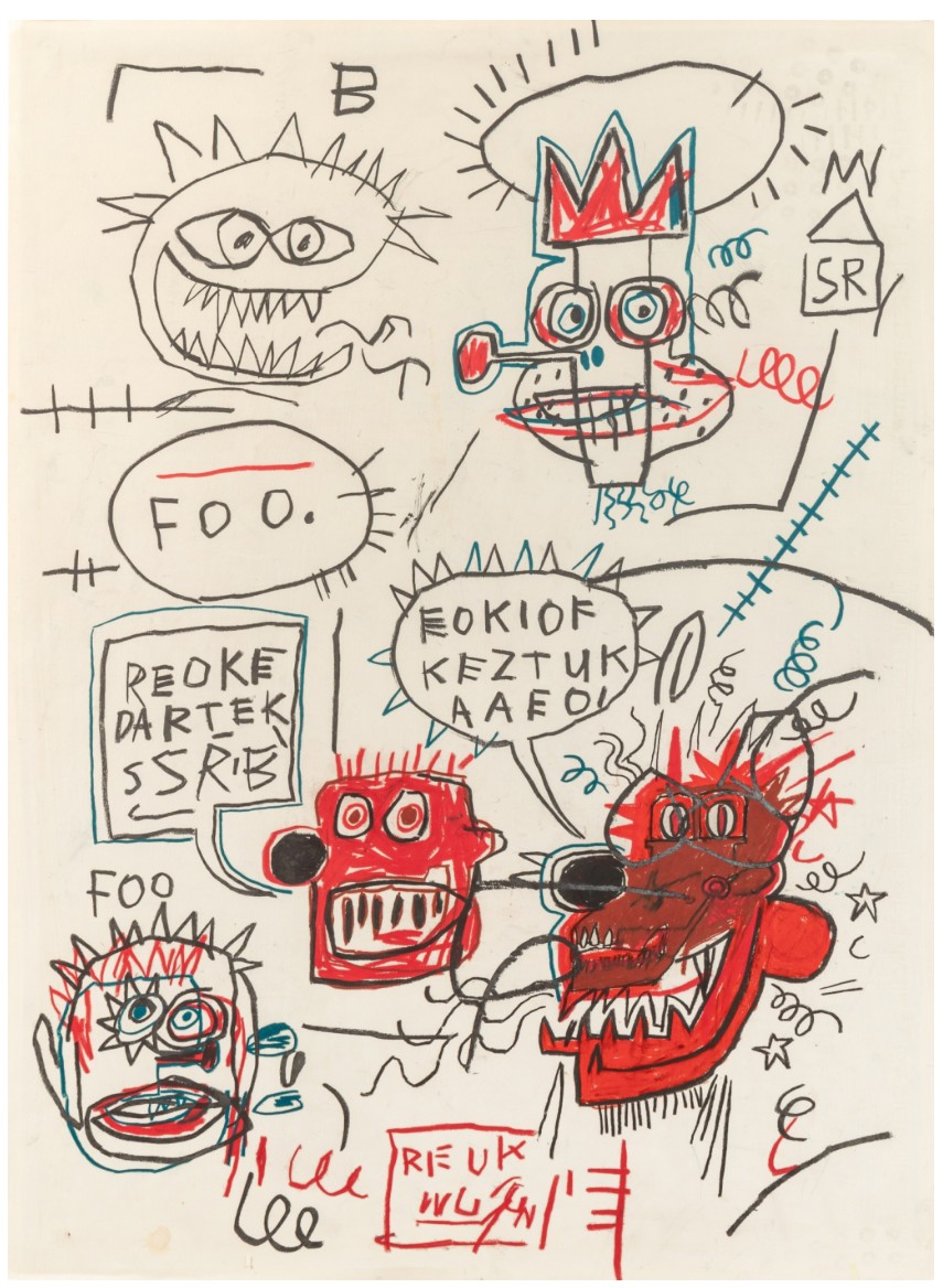
JEAN-MICHEL BASQUIAT (1960 – 1988)
Foo, 1982
Oil stick on paper
30×22 inches (76.2 x 55.9 cm)
Signed (on the verso)
Executed at the pinnacle of Jean-Michel Basquiat’s career and illustrating a masterful combination of symbols, diagrams and words that are instantly recognizable features of his oeuvre, Untitled offers a glimpse into the artist’s energetic, imaginative and ingenious mind. Executed during an intense period of rapid evolution in his work, Foo captures the artist’s transition from his origins as a graffiti artist in New York City to a celebrated figure in the contemporary art scene. Foo is a vibrant reflection of the artist’s distinctive visual language, capturing the raw energy and inventive genius that would define his meteoric rise in the art world.
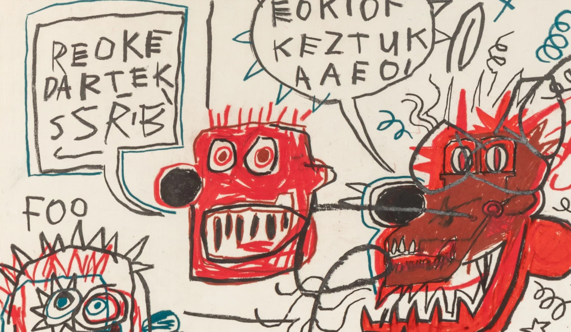
In Foo, Basquiat uses oil stick to create an intricate spread of his signature motifs, blending chaotic text with figures and abstract elements to form an enigmatic, almost symphonic, arrangement. Central to the composition are five distinct heads, some of the most instantly recognizable and important motifs of Basquiat’s oeuvre. The clown-like figure in the top right, crowned with a three-pointed diadem, stands as a defining image, with a protruding nose, eyes, and spring-like lines on the right that suggest a toy clown that jumps out of a box. This figure introduces a sense of absurdity, characteristic of Basquiat’s playful engagement with identity and iconography.
Two other figures in the composition wear crown-like shapes that echo the crown of thorns, further evoking religious and historical symbols. This recurring symbol draws attention to Basquiat’s unflinching exploration of authority, race, and identity, while also invoking a wider cultural history that incorporates elements of Christian iconography. These references, intertwined with Basquiat’s contemporary imagery, reflect his unique ability to bridge the gap between art history, popular culture, and the complex realities of Black identity.
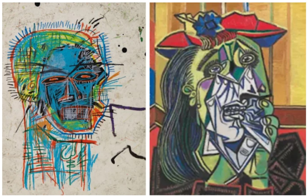
Left: Jean-Michel Basquiat, Untitled (Head), 1982. Sold at Sotheby’s New York, June 2020, for $15.1 million.
Right: Pablo Picaso, The Weeping Woman, 1937
The Tate, London. Art © 2020 Estate of Pablo Picasso / Artists Rights Society (ARS), New York
All figures in Basquiat’s oeuvre are depicted without bodies, focusing singularly on different representations of the head. This emphasis on the head is central to his work, capturing both the external and psychological complexities of human identity. Describing the singular importance of the head within Basquiat’s art in terms highly reminiscent of the present work, Phoebe Hoban reflects: “Start with the head. (He painted them obsessively). The hair was a focal point…Next, the eyes. There was that look… People said his eyes could eat through your face, see right through you, zap you like the x-ray vision of his comic book heroes” (Phoebe Hoban, Basquiat: A Quick Killing in Art, London 1998, p. IX). This fixation on the head reveals Basquiat’s recognition of its universal relatability, allowing viewers to see themselves within the work. By using the intensity of his line, the suppressed energy of his compositions, and the exuberance of his color, Basquiat creates a space where his audience can experience a degree of catharsis. In the case of Foo, the scorching gaze, bared teeth, and fiercely delineated physiognomy express a profound emotional intensity. This intensity reflects Fred Hoffman’s description of Basquiat’s keen observation of the psycho-spiritual states of being: “What drew Basquiat almost obsessively to the depiction of the human head was his fascination with the face as a passageway from exterior physical presence into the hidden realities of man’s psychological and mental realms… they not only peer out as if seeing, but also invite the viewer to penetrate within” (Exh. Cat., New York, Acquavella Galleries, Jean-Michel Basquiat Drawing: Works from the Schorr Family Collection, 2014, p. 74). Through this relentless focus on the head, Basquiat crafts a visual language that simultaneously confronts and invites, challenging the viewer to engage with the deeper, hidden layers of the human psyche.
Leonardo da Vinci, Superficial anatomy of the shoulder and neck (recto),c.1510
Basquiat’s integration of text into his work is a defining characteristic, and in Foo, the artist weaves language, part poetry, part cipher, seamlessly into the composition. Often, Basquiat’s words are not straightforward statements, but rather fragmented thoughts, rambling letters, and cryptic symbols, functioning as both a visual element and a means of communication. Through the fluidity of his text, Basquiat engages with the complexities of communication and perception, challenging the viewer to decode its meaning while simultaneously embracing the ambiguity.
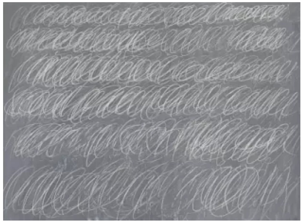
Cy Twombly, Untitled (New York City), 1970. Private Collection. Sold Sotheby’s New York in November 2015 for $70.5 million Art
© Cy Twombly Foundation
Unlike Basquiat’s larger-scale paintings, the frenetic energy of his works on paper—such as Foo—captures a sense of raw immediacy. Working on paper, an unforgiving medium that offers little opportunity for overpainting or revision, allowed Basquiat to express his creative thoughts in their purest form. This unfiltered approach to creation is part of what makes his works on paper so compelling—they stand as tangible records of the artist’s distinctive and unrestrained way of thinking. A self-taught artist, Basquiat possessed an innate understanding of composition and an unparalleled ability to fuse different iconographies, creating a personal lexicon that speaks to both contemporary popular culture and the art historical canon. In Foo, we see the full breadth of his creative potential—his use of symbolism, text, and figure is unencumbered, reflecting his unshakable confidence as an artist during a period when his career was accelerating internationally. With museum exhibitions worldwide and a growing recognition of his genius, Basquiat’s work during this period offers a glimpse into the artistic mind of an emerging master.
Foo encapsulates the essence of Basquiat’s artistic vision, a dynamic, multifaceted piece that invites viewers into his imaginative world. Through its bold motifs, the piece offers insight into the artist’s restlessness and unyielding curiosity, establishing it as a crucial moment in Basquiat’s career. As such, Foo is not just a work of art; it is a direct testament to the artist’s creative brilliance and his enduring legacy in contemporary art.
Untitled, 1981
Sotheby’s New-York: 16 May 2025
Estimated: USD 700,000 – 900,000
USD 660,400
Untitled | Contemporary Day Auction | 2025 | Sotheby’s
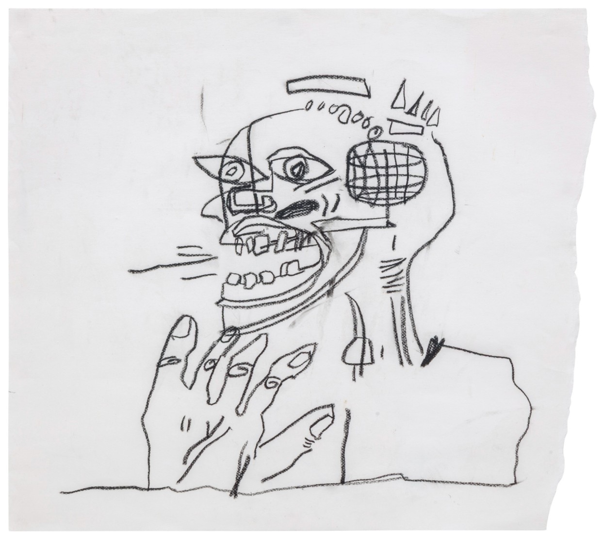
JEAN-MICHEL BASQUIAT (1960 – 1988)
Untitled, 1981
Oil stick on paper
20×22 inches (50.8 x 55.9 cm)
Signed (on the reverse)
Accompanied by a certificate of authenticity
Issued by the Authentication Committee of the Estate of Jean-Michel Basquiat
Executed in the catalytic year of 1981, Untitled captures a moment of raw, electrifying genesis in Jean-Michel Basquiat’s meteoric ascent from downtown street provocateur to international art icon. Rendered in his signature oil stick on paper, the composition distills many of the core visual motifs that would come to define his brief yet seismic career. The skeletal head, contorted in an expression of ecstatic aggression, is unmistakably Basquiat—simultaneously grotesque and magnetic, gesturing toward both anatomical study and symbolic mask. Yet what distinguishes this particular work is not only its early articulation of the now-mythic iconography of the skull and crown, but also its incorporation of a detailed, exaggerated anatomical hand—an element rarely seen in isolation and handled here with fierce urgency.
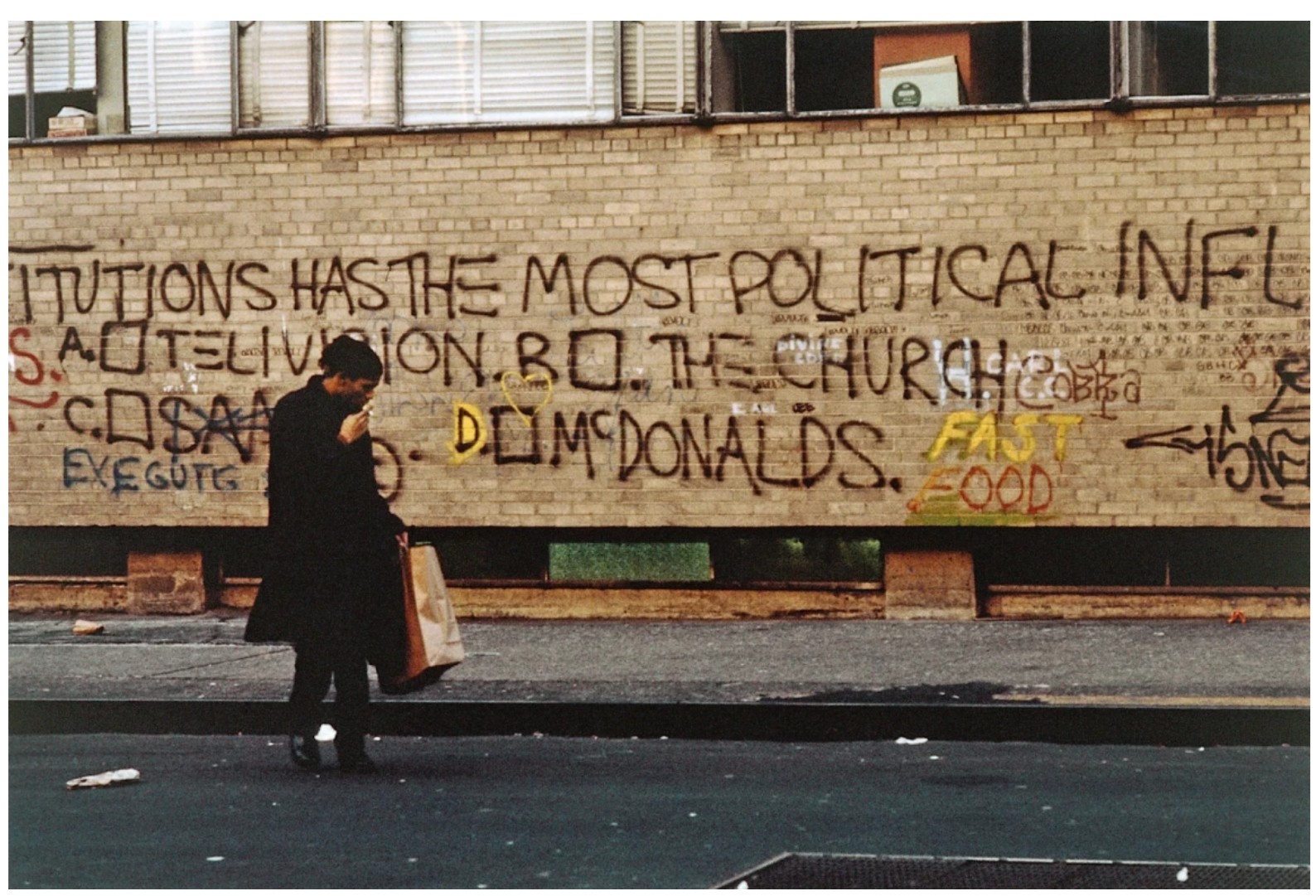
Jean-Michel Basquiat on the set of Downtown 81. Photo © Edo Bertoglio
Untitled emerges from a critical turning point in Basquiat’s practice: the year he transitioned from the peripheries of New York’s art world into its very center. 1981 marked the year of many exhibitions that brought Basquiat into the spotlight, including Diego Cortez’s watershed “New York/New Wave” show at MoMA PS1, and his debut solo exhibition later that year in Modena, Italy. This was also the period in which Basquiat began consistently exploring human anatomy, drawing from both textbook illustrations and the visceral traditions of Renaissance and Baroque medical diagrams. In this light, the inclusion of the hand—each finger articulated with rhythmic loops and calligraphic contour—serves as both corporeal symbol and expressive cipher. It reaches upward, grasping toward the figure of the skull, merging the living and the dead in one.
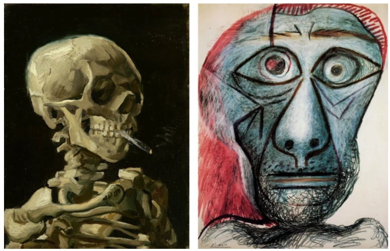
Left: Vincent van Gogh, Head of a Skeleton with a Burning Cigarette, 1886. Van Gogh Museum, Amsterdam.
Right: Pablo Picasso, Self Portrait Facing Death, 1972. Fuji Television Gallery, Tokyo. Art © 2025 Estate of Pablo Picasso / Artists Rights Society (ARS), New York
The head itself—distorted, howling, divided into compartments—resonates with the fractured identity that Basquiat explored throughout his oeuvre. His treatment of the skull, an enduring motif drawn equally from African masks, jazz iconography, and anatomical charts, here functions as a cipher for multiple identities: blackness and whiteness, beauty and decay, knowledge and madness. With elements of the visage abstracted into geometric forms—a lattice grid over the ear, expressive gashes suggesting both violence and exultation—Basquiat presents a diagram of the psyche, not merely a likeness. As in his most powerful heads of this period, the face is both portrait and mask, a double exposure of interior truth and exterior performance.
Notably, the crown—here represented in suggestive linear marks and rhythmic dashes above the skull—makes an embryonic appearance. It foreshadows what would soon become Basquiat’s most iconic symbol: a three-pointed halo of authority, majesty, and martyrdom. In 1981, these symbols had not yet hardened into canon; they were in flux, volatile and potent, raw emblems forged in real time. In Untitled, we witness the very moment of their formation, the volatile aesthetic and cultural energies condensing into a lexicon that would echo across contemporary art for decades.
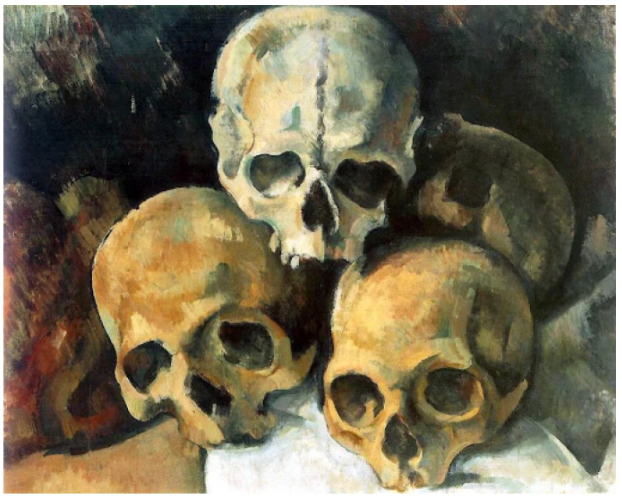
Paul Cézanne, Pyramid of Skulls, c. 1901. Private Collection.
Executed with confident immediacy, Untitled is a pure distillation of Basquiat’s graphic power. The artist’s deft use of oil stick—a medium he favored for its tactile intensity and drawing immediacy—imbues the surface with a visceral physicality. The irregularities of pressure, the erratic linework, the ghostly smudging around the jaw and throat all speak to the urgency of the act of creation. Like a jazz solo or a spontaneous poem, the drawing exists in a suspended moment between control and chaos. In its synthesis of emerging iconography and rare anatomical detail, Untitled stands as a signal work from a pivotal year in Basquiat’s career. It embodies the restless intelligence and radical self-invention that would come to define his legacy. More than a preparatory sketch or study, the work is a standalone expression of Basquiat’s fully formed visual language—direct, unfiltered, and incandescent with meaning.
Sotheby’s New-York: 16 May 2025
Estimated: USD 100,000 – 150,000
USD 444,500
Untitled | Contemporary Day Auction | 2025 | Sotheby’s
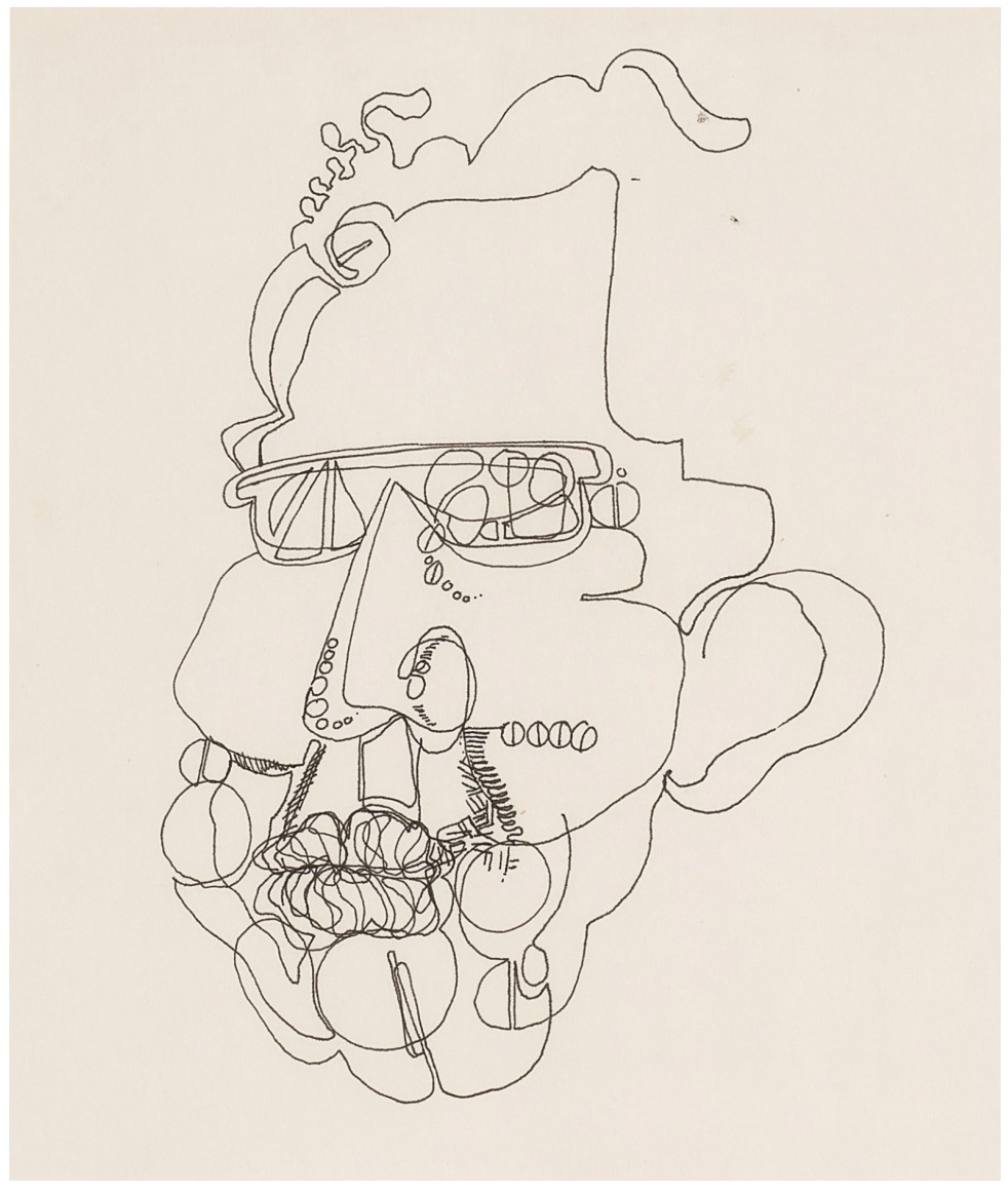
JEAN-MICHEL BASQUIAT (1960 – 1988)
Untitled, 1978
Ink on paper
Sight: 9 3/4 x 8 inches (24.8 by 20.3 cm)
Sheet: 13 7/8 x 11 inches (35.2 by 27.9 cm)
Accompanied by a certificate of authenticity
Issued by the Authentication Committee of the Estate of Jean-Michel Basquiat
Executed when Jean-Michel Basquiat was just eighteen years old, Untitled from 1978 is a rare and revelatory early work that foreshadows the explosive visual vocabulary that would come to define his mature career. Rendered in a continuous, trembling line with a ballpoint pen, the drawing captures a distorted, composite head—a subject that would become a cornerstone of Basquiat’s iconography and a key vehicle for his exploration of identity, intellect, race, and inner life. As one of the earliest known depictions of the head in Basquiat’s oeuvre, Untitled offers a crucial entry point into a motif that would remain central throughout his life. From early notebook drawings to his monumental canvases of the 1980s, the head served as a recurring site of meaning: an index of intellect and agency, a mask, a skull, a battlefield of historical memory. In later works, heads would appear crowned, x-rayed, diagrammed, or flayed—simultaneously heroic and haunted.
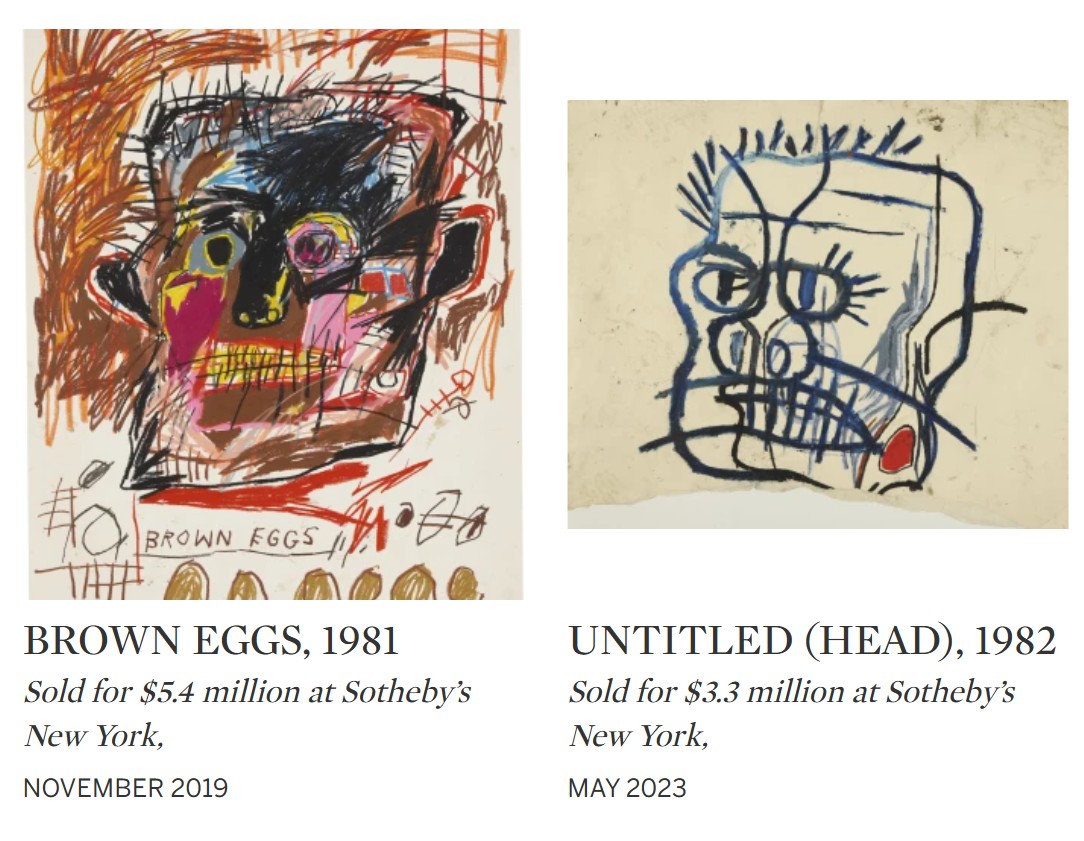
Even in its nascent form, the head in Untitled reveals Basquiat’s preternatural command of expressive mark-making and formal improvisation. The figure is both schematic and charged with psychological density: a jagged profile is superimposed with bulging lips, exposed teeth, clenched fists, tubes, and spirals. The lines pulse with nervous energy, coiling and unspooling into an almost anatomical delirium. Spectacles sit askew above a fractured nose, while internal mechanisms—reminiscent of musculature, wiring, or dental work—evoke both the physical and symbolic complexity of the human figure. This is not a likeness but an x-ray of consciousness: unfiltered, restless, and deeply alive.
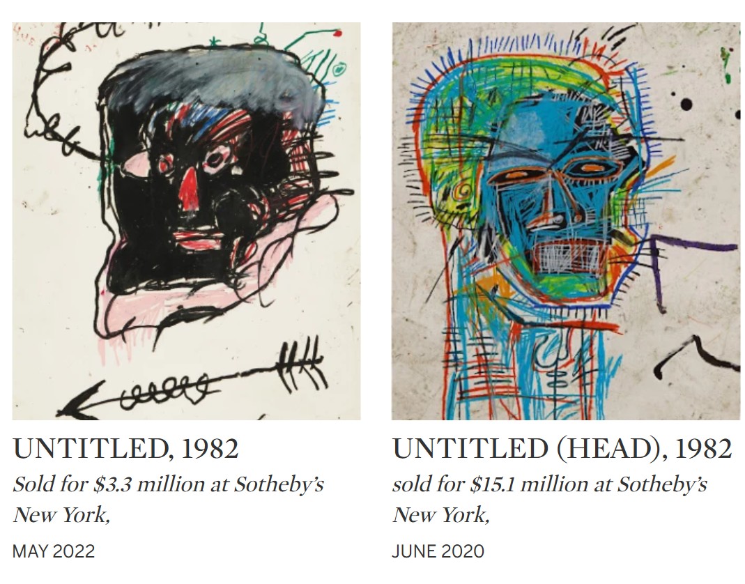
Jean-Michel Basquiat’s skull motif is one of his most iconic and enduring symbols throughout his meteoric rise to cultural and critical acclaim. The symbol of the skull reflects Basquiat’s deep engagement with themes of identity, mortality, and the African diaspora. Often depicted in a raw, almost anatomical style, the skull is not just a memento mori but a complex representation of Black life and struggle. In works like Untitled, Basquiat blends energetic draftsmanship, using the skull to confront the viewer with the realities of death, history, and cultural erasure. Entirely fresh to the market, this early example by Basquiat has never before appeared at auction, having been directly acquired from the artist the very year it was created. It resided in the same private collection for over twenty years, making this an exceedingly rare and prescient example of Basquiat’s genius.
Untitled (from Tuxedo), circa 1983
Phillips New-York: 14 May 2025
Estimated: USD 20,000 – 30,000
USD 342,900
Jean-Michel Basquiat Modern & Contemporary Art Day Sale, Morning Session
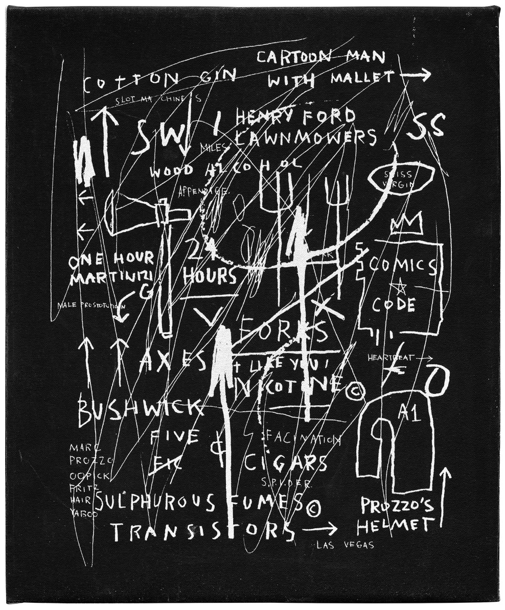
Untitled (from Tuxedo), circa 1983
Silkscreen on canvas
Created circa 1983, Jean-Michel Basquiat’s Untitled (from Tuxedo) is a small test that the artist made when creating Tuxedo, a monumental silkscreen on canvas work printed in an edition of 10. These “tests” are akin to prototypes, in which Basquiat explored the various placements of his screened text and imagery for the large-scale work. The present lot and the larger Tuxedo embody the artist’s connections to the graffiti and street scenes of downtown New York in the 1980s, frequent subjects within the artist’s oeuvre. This canvas was formerly in the collection of Joel Stearns, a printer who frequently collaborated with Basquiat on his silkscreened editions, including Tuxedo.
Untitled (Ape), 1984
Christie’s New-York: 15 May 2025
Estimated: USD 500,000 – 700,000
USD 504,000
JEAN-MICHEL BASQUIAT (1960-1988), Untitled (Ape) | Christie’s
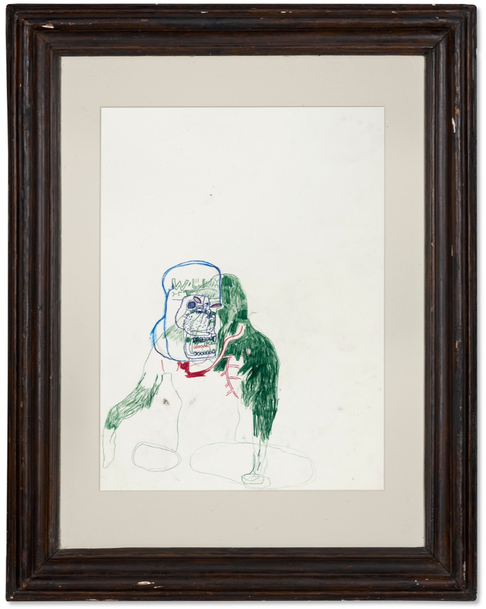
JEAN-MICHEL BASQUIAT (1960-1988)
Untitled (Ape), 1984
Oilstick and colored pencil on paper
30 x 22 1/4 inches (76.2 x 56.5 cm)
Signed and dated ‘Jean-Michel Basquiat 84’ (on the reverse)
Registered in the Authentication Committee of the Estate of Jean-Michel Basquia
Under transaction number 60740
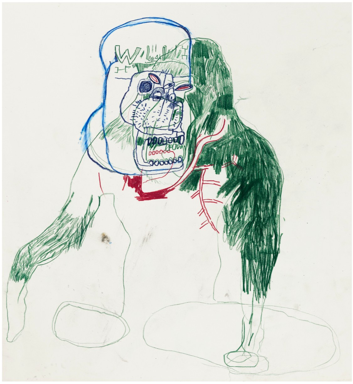
Untitled, 1982
Christie’s New-York: 15 May 2025
Estimated: USD 300,000 – 500,000
USD 390,600
JEAN-MICHEL BASQUIAT (1960-1988), Untitled | Christie’s
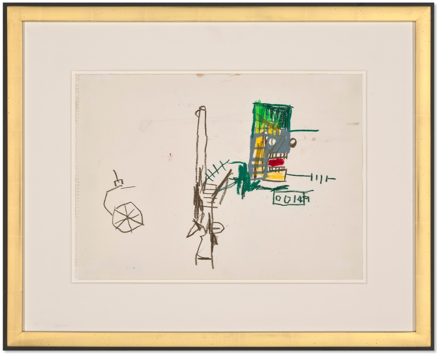
JEAN-MICHEL BASQUIAT (1960-1988)
Untitled, 1982
Oilstick on paper
12 1/2 x 17 1/4 inches (31.8 x 43.8 cm)
Accompanied by a certificate of authenticity
Issued by the Authentication Committee for the Estate of Jean-Michel Basquiat
Keith Haring
Two works: (i-ii) Untitled, 1984
Phillips New-York: 14 May 2025
Estimated: USD 700,000 – 1,000,000
USD 698,500
Keith Haring Modern & Contemporary Art Day Sale, Morning Session
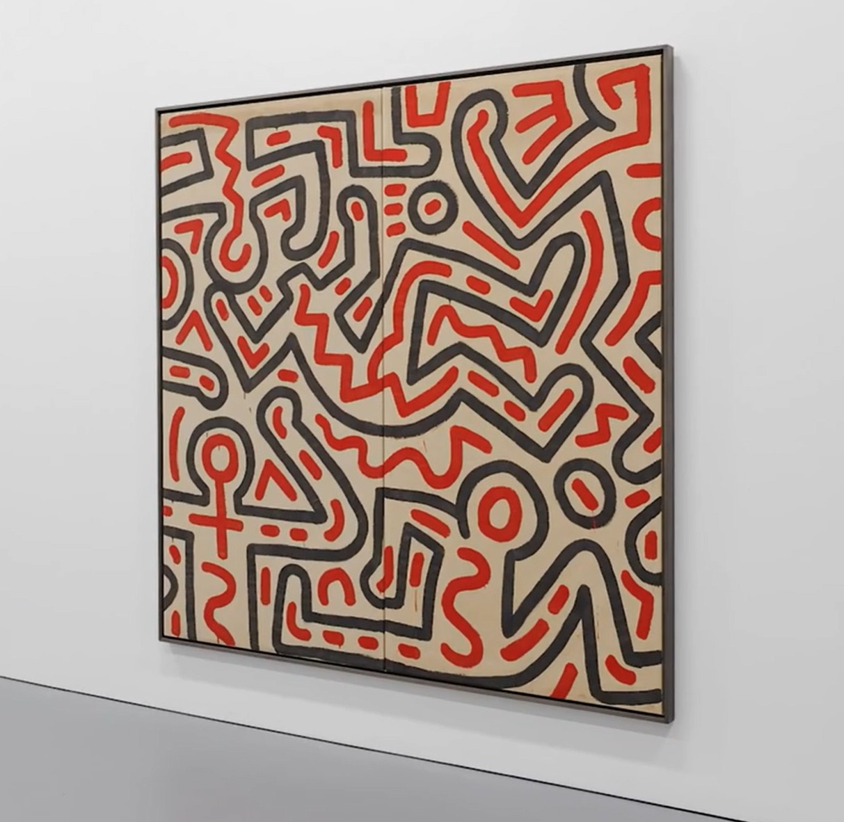
(ii) 89 1/8 x 45 inches (226.4 x 114.3 cm)
Overall: 89 1/8 x 90 3/8 inches (226.4 x 229.6 cm)
Jumbled together in a kind of jigsaw puzzle, Keith Haring’s iconographic compositions create their own dynamic mode of visual choreography. Outlined in bold, inky black lines and filled with energetic red zigzags, the figures in these two Untitled works from 1984, recall a fast-paced music score, embodying the power of dance and performance. The present works hail from a commission Haring took on to do the set design for Secret Pastures, a ballet piece produced by Bill T. Jones and Arnie Zane. Rendered in a larger-than-life scale, the two panels originally formed a tent-like structure on the stage, which the dancers wove in and out of as it spun and rolled across the performance. These works are uniquely vivid examples of Haring’s connection to dance and its relationship to the human body, expressed through his instantly recognizable visual language. United again, the two works now form a large-scale diptych. Another diptych from the commission is housed in the Nakamura Keith Haring Collection, Hokuto.
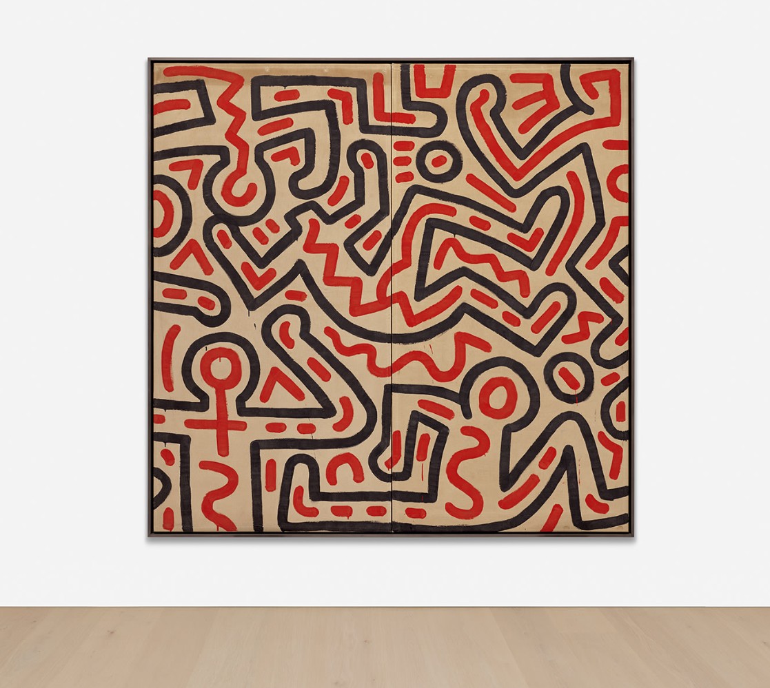
A renowned figure in 1980s New York and a celebrated choreographer and dancer still today, Bill T. Jones collaborated with Haring multiple times throughout the artist’s short career. Their first collaboration was for a series of photographs by Tseng Kwong Chi, in which Haring painted directly onto Jones’ body with broad, gestural brushstrokes. Their partnership deepened with the 1982 performance Long Distance, where Jones danced to the rhythms and sounds of Haring’s brushstrokes while he painted the backdrop live on stage. This success resulted in their collaboration in November of 1984 for Secret Pastures, a dance performance at the Brooklyn Academy of Music. Choreographed by Jones and Arnie Zane, with costume design by Willi Smith and set design by Haring, the performance explored themes of race, sexuality, and the AIDS epidemic – all subjects that were central to Haring’s artistic practice. Beyond its striking visual impact, these two paintings document a key moment of interdisciplinary collaboration that would mark Haring’s already successful career.
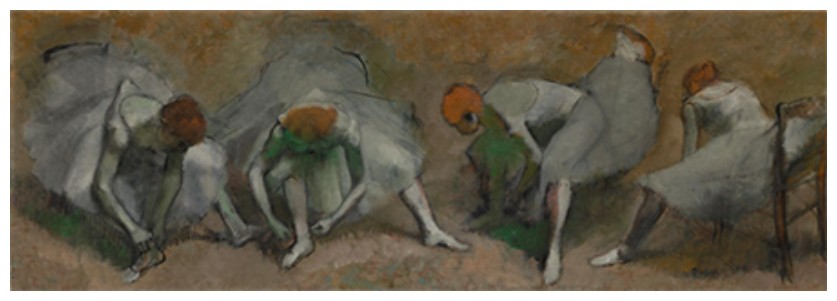
Edgar Degas, Frieze of Dancers, circa 1895. The Cleveland Museum of Art
Image: The Cleveland Museum of Art, Gift of the Hanna Fund, 1946.83
The figures in the present work seem to be dancing themselves – arms lifted, bodies in motion, and one figure in the lower right even stretching into a full split. Frozen mid-dance, the figures mimic the “angular, sharp, and sexually evocative movements” of the dancers in Secret Pastures. Here, dance not only provides the context for the work, but also becomes embedded within the figures themselves, creating a “dance within a dance.” Distorting themselves into seemingly impossible angles, Haring’s figures in the present works evoke the movements of breakdancing and voguing; forms rooted in the hip-hop and queer communities which surrounded the artist and his contemporaries. Reflecting on these inspirations, Haring noted “a lot of my inspiration was coming out to watching breakdancers, so my drawings started spinning on their heads and twisting and turning all around.” The dancers in the two Untitled works, like those throughout his oeuvre, reflect a connection to the vibrancy of the music and dance cultures of New York in the 1980s, merging Haring’s graphic style with the pulse of the city’s music and dance scenes.
Baby, 1982
Christie’s New-York: 15 May 2025
Estimated: USD 500,000 – 700,000
USD 630,000
KEITH HARING (1958-1990), Baby | Christie’s
KEITH HARING (1958-1990)
Baby, 1982
Enamel on metal
34 1/2 x 40 x 3 inches (87.6 x 101.6 x 7.6 cm)
Signed, dedicated and dated ‘FOR ANDY K. Haring Sept. 27 – 82’ (on the reverse)
Previously owned by Andy Warhol, this painted wall sculpture is an excellent example of Keith Haring’s 3-D sensibility and graphic genius. The baby motif immediately became Haring’s most iconic image in 1981 and 1982, during his meteoric rise to fame.
“The reason that the ‘baby’ has become my logo or signature is that it is the purest and most positive experience of human existence. Children are color-blind and still free of all the complications, greed and hatred that will slowly be instilled in them through life.”
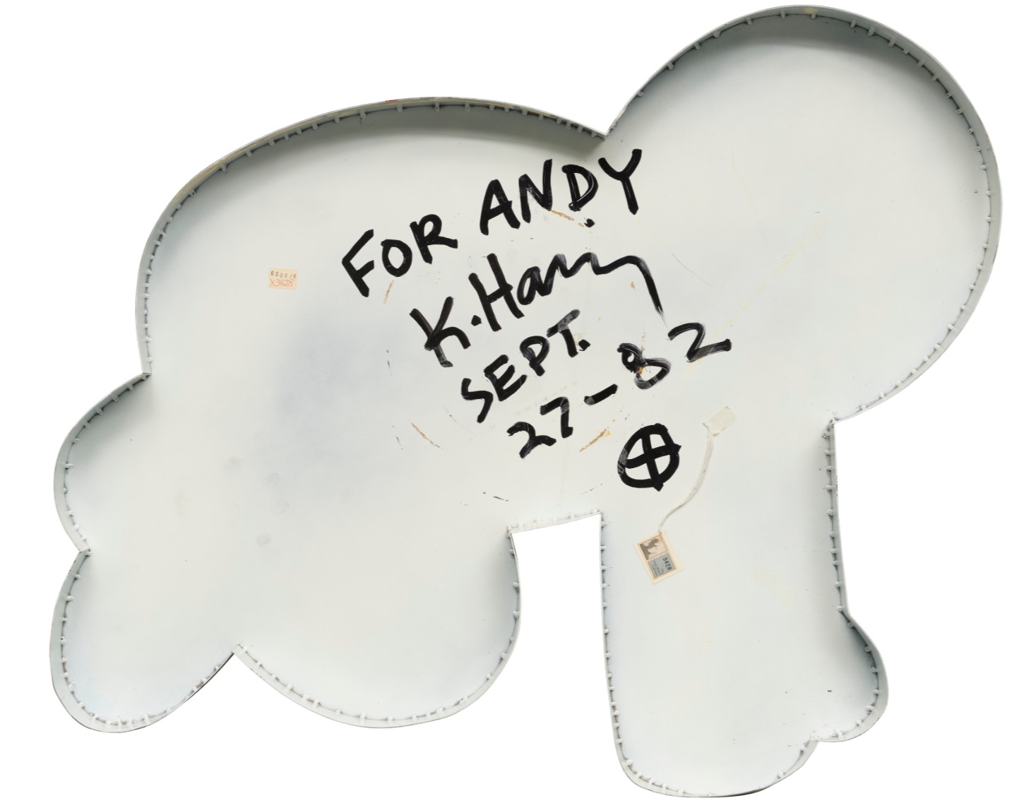
The present artwork is constructed of welded metal, with a glossy white surface and painted with shiny black enamel. When viewed on the wall, the depth and scale of the sculpture are impressive. It is a perfectly refined iteration of Haring’s art, in its most iconic form. Having resided in the same private collection since 1988, the present owner acquired the work from Andy Warhol’s estate auction. The work still bears its iconic Andy Warhol Collection tag on the reverse.
Red Dog, 1986-87
Christie’s New-York: 15 May 2025
Estimated: USD 200,000 – 300,000
USD 403,200
KEITH HARING (1958-1990), Red Dog | Christie’s
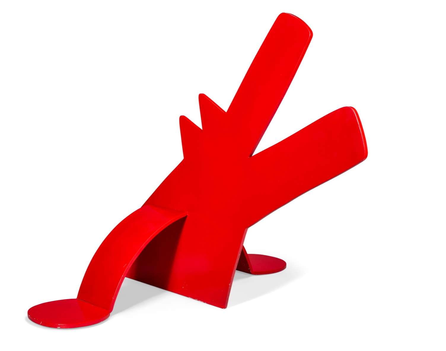
KEITH HARING (1958-1990)
Red Dog, 1986-87
Painted steel
37 1/2 x 50 x 41 inches (91.4 x 127 x 104.1 cm)
This work is number one from an edition of three
Coming directly from the estate of Keith Haring’s late mother, this iconic sculpture was displayed prominently at the Haring home in Kutztown, Pennsylvania, for years, before being loaned to the Reading Public Museum in Reading, Pennsylvania, where it was exhibited among works from the museum’s permanent collection.
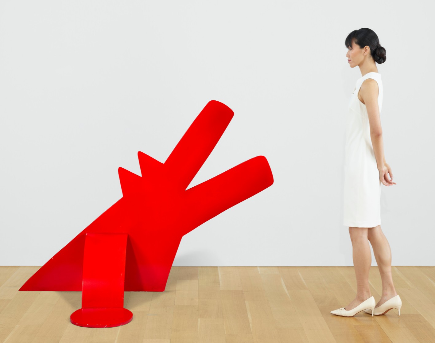
While living in New York and traveling the world, Keith Haring maintained frequent contact with his family in Kutztown, and regularly sent home artworks, letters, and gifts. The present work was executed in 1986-87, during a period of renewed interest in sculpture for Haring. The previous year he had a solo exhibition of painted steel sculptures at Leo Castelli Gallery in New York, where he reimagined his most enduring and iconic motifs in three-dimensional form. To create the sculptures for the Castelli exhibition, Haring first made aluminum models and then fabricated the steel works at Lippincott Sculpture foundry in Connecticut. Red Dog is a prime example of Haring’s playful and inventive genius translated to sculpture in the round. Poised on two legs, the barking dog projects itself through the floor, appearing both animated and benevolent, almost like a dog greeting it’s owner.
Untitled, 1984
Christie’s New-York: 15 May 2025
Estimated: USD 350,000 – 450,000
USD 567,000
KEITH HARING (1958-1990), Untitled | Christie’s
KEITH HARING (1958-1990)
Untitled, 1984
DayGlo and acrylic on canvas
19 1/8 x 19 1/8 inches (48.6 x 48.6 cm)
Signed, inscribed, dedicated and dated twice
‘FOR GRANDMA + GRANDPA DEC 29 1984 N.Y.C. MERRY CHRISTMAS + HAPPY NEW YEAR LOVE, KEITH 1984’
(on the overlap)
Coming directly from the estate of Keith Haring’s late mother, this painting hung prominently in the Haring home in Kutztown, Pennsylvania for decades. The canvas was originally a gift from Keith to his grandparents during the Christmas holiday of 1984, and subsequently passed to Keith’s mother, Joan Haring. Emblazoned with the Haring surname at the bottom, across the crawling baby, which is arguably symbolic of Keith himself, the painting represents the artist’s enduring connection with his family and home in Pennsylvania at the peak of his fame in New York. The two large figures with linked heads may represent Keith’s grandparents, as the painting is fondly dedicated ‘For Grandma + Grandpa’ on the reverse.
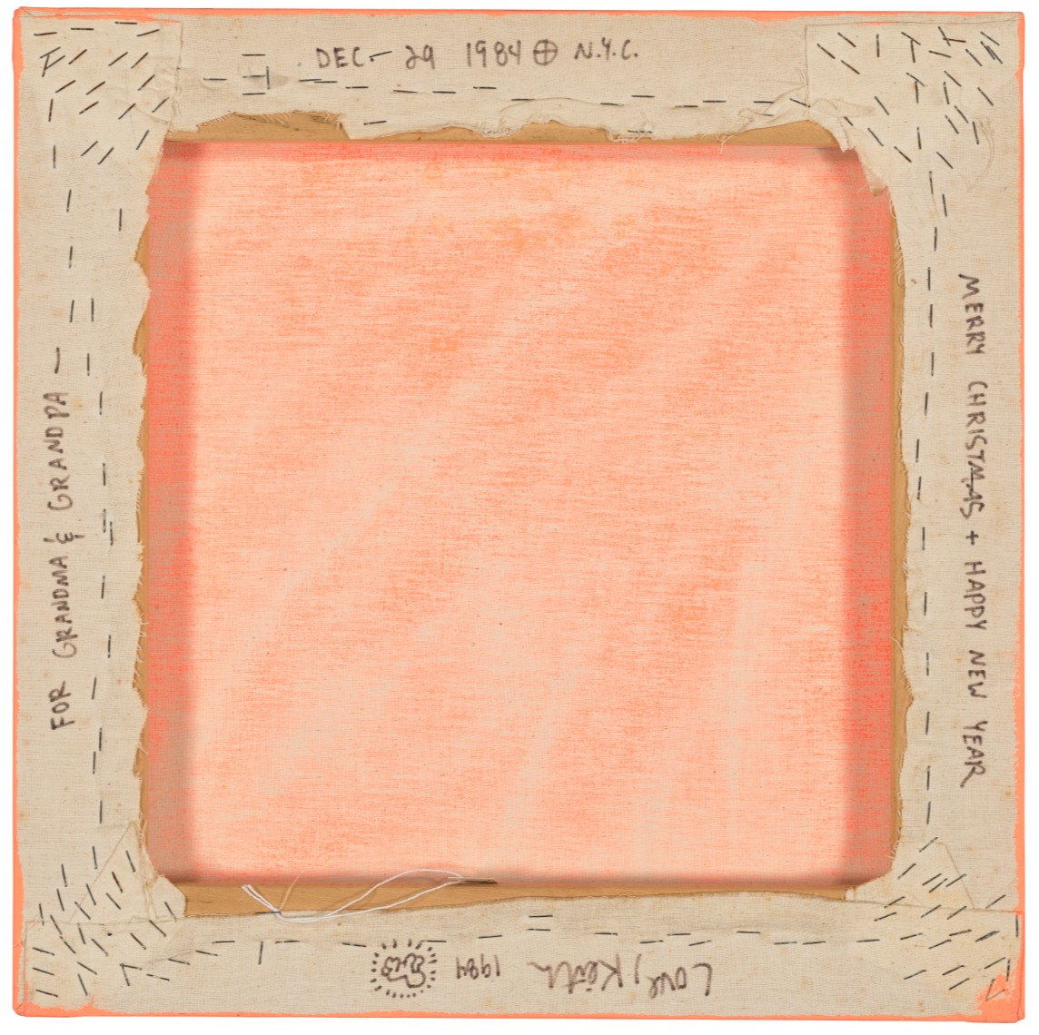
While living in New York and traveling the world, Haring maintained a regular connection with his family, and he frequently sent artwork, letters and gifts home to Kutztown. This work, in addition to being an iconic DayGlo canvas, has the unique importance of being emblematic of the Haring family. It is an iconic example of the artist’s virtuosic graphic skill, with special provenance and a touching inscription on the reverse, making it a one-of-a-kind example of the artist’s paintings.
Untitled (Snake), 1983
Christie’s New-York: 15 May 2025
Estimated: USD 180,000 – 250,000
USD 252,000
KEITH HARING (1958-1990), Untitled (Snake) | Christie’s
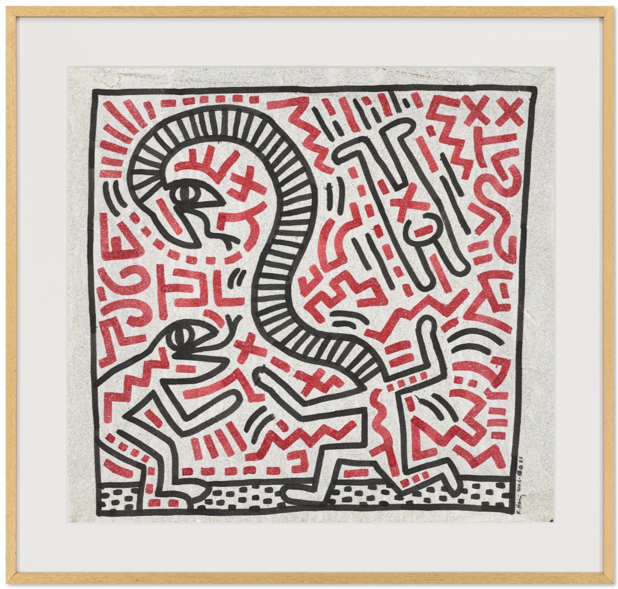
KEITH HARING (1958-1990)
Untitled (Snake), 1983
Sumi ink on Japanese pearlescent paper
24 1/2 x 26 inches (61.6 x 66 cm)
Signed and dated ‘K. Haring JAN. 6- 83’ (lower right)
Keith Haring’s deep connection to Tokyo and the Watari-um Museum marked a pivotal chapter in his artistic career—one that left a lasting imprint on his work and on Japan’s cultural landscape. His first visit to the country in 1983 on the invitation of Galerie Watari marked Keith’s first ever exhibition in Japan and proved transformative, igniting his creative vision and forging a meaningful relationship with the city of Tokyo. During this visit, Haring created Untitled and Untitled (Snake), two significant works commissioned by Galerie Watari. These works remained part of the Watari-um’s collection for decades, reflecting Haring’s deep connection to both Tokyo and the museum. Now, after many years as part of the Watari-um’s collection, these works will continue to serve the museum—albeit in a different form—as they are entrusted for sale to help realize essential renovations, ensuring the institution’s future while honoring its past.
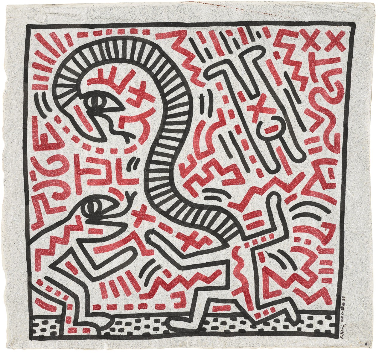
The Watari-um Museum of Contemporary Art, founded in 1990 as a private institution, was envisioned and established by Shizuko Watari, who served as its first director. She played a pivotal role in introducing major international artists—such as Andy Warhol, Donald Judd, and Keith Haring—to Japanese audiences. The museum’s striking architecture, designed by Swiss architect Mario Botta, features a façade resembling a bird in flight, symbolizing its forward-looking approach to contemporary art. From the beginning, the Watari-um has collaborated with leading curators including Harold Szeemann and Jan Hoet to present international contemporary exhibitions. The museum has also prioritized nurturing the local contemporary art scene, especially by introducing young Japanese artists to a broader audience. Shizuko Watari’s approach to curation was guided more by instinct than by a fixed program.
Untitled, 1983
Christie’s New-York: 15 May 2025
Estimated: USD 100,000 – 150,000
USD 214,200
KEITH HARING (1958-1990), Untitled | Christie’s
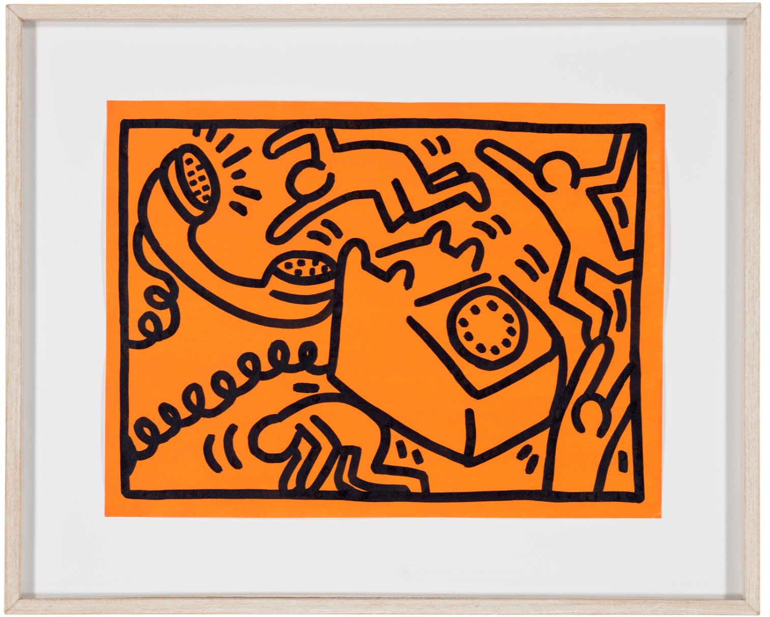
KEITH HARING (1958-1990)
Untitled, 1983
Sumi ink and acrylic on paper
15 1/2 x 20 3/4 inches (40×53 cm)
Signed, inscribed and dated ‘K. Haring Feb. 28 – 83 TOKYO’ (on the reverse)
Haring’s first exhibition in Japan, held at Galerie Watari in 1983, marked a major milestone in his career. During this trip, he collaborated with graffiti artist Angel Ortiz (LA2) to create a vibrant mural on the interior and exterior of ON SUNDAYS, a building adjacent to the gallery. This mural, which captured the bold and energetic spirit of Haring’s style, became an iconic part of Tokyo’s urban landscape. When the building was dismantled in 2018, the mural was carefully preserved, a testament to its cultural significance. The success of Haring’s initial visit led to his return to Tokyo in 1986 to open his second Pop Shop. Though short-lived, the Tokyo Pop Shop had a significant influence on Japanese pop culture. More than a retail space, it embodied Haring’s belief that art should be accessible to all. Through items like T-shirts and buttons, he communicated themes of social activism, love, and equality. Haring’s relationship with the Watari-um and his time in Tokyo helped shape both his artistic evolution and his global legacy. His engagement with Japanese culture and his collaborations with the museum left a lasting impression that continues to resonate in the art world and popular culture today.
Untitled, 1988
Sotheby’s New-York: 16 May 2025
Estimated: USD 150,000 – 200,000
USD 190,500
Untitled | Contemporary Day Auction | 2025 | Sotheby’s
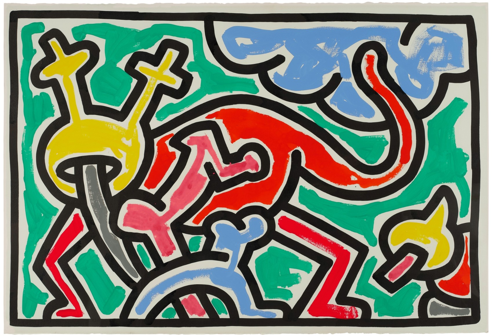
KEITH HARING (1958 – 1990)
Untitled, 1988
Gouache and sumi ink on paper
40 1/2 x 59 1/2 inches (102.9 x 151.1 cm)
Signed and dated Oct 30 1988 (on the verso)
Richard Prince
Man Crazy Nurse, 2002-03
Selections from the Collection of Barbara Gladstone
Sotheby’s New-York: 15 May 2025
Estimated: USD 4,000,000 – 6,000,000
USD 3,967,200
Man Crazy Nurse | Selections from The Collection of Barbara Gladstone | Contemporary Art | Sotheby’s
RICHARD PRINCE (b. 1949)
Man Crazy Nurse, 2002-03
Acrylic and inkjet on canvas
80×52 inches (203.2 x 132.1 cm)
Signed, titled and dated 2002-2003 (on the overlap)
Set against a flaming vermilion background, emblazoned with gestural strokes of yellow and gushing drips of white pigment, Richard Prince’s Man-Crazy Nurse is a seminal example of the artist’s conceptual apogee in the Nurse paintings from 2002-08. Prince’s femme fatale protagonist explores and exploits the melodramatic pulp fiction stereotype, encapsulating the audacious subversion of authorship, identity, and authenticity at the heart of Prince’s practice. Executed in 2002-03, Man-Crazy Nurse belongs to the artist’s original and acclaimed suite of Nurse paintings exhibited at Barbara Gladstone Gallery in the fall of 2003. The series marks a climax of the narrative arc of Prince’s conceptual program which begins with his iconic Cowboys in the 1980s, by which the artist contends with notions of originality through appropriation and witty interrogations of mythical cultural archetypes. Inspired by the cover art and titles of pulp fiction romance novellas from the 1950s-80s, which the artist collects avidly, the Nurse paintings deconstruct the trope of the seductive female nurse as a symbol of eroticism and objectification.
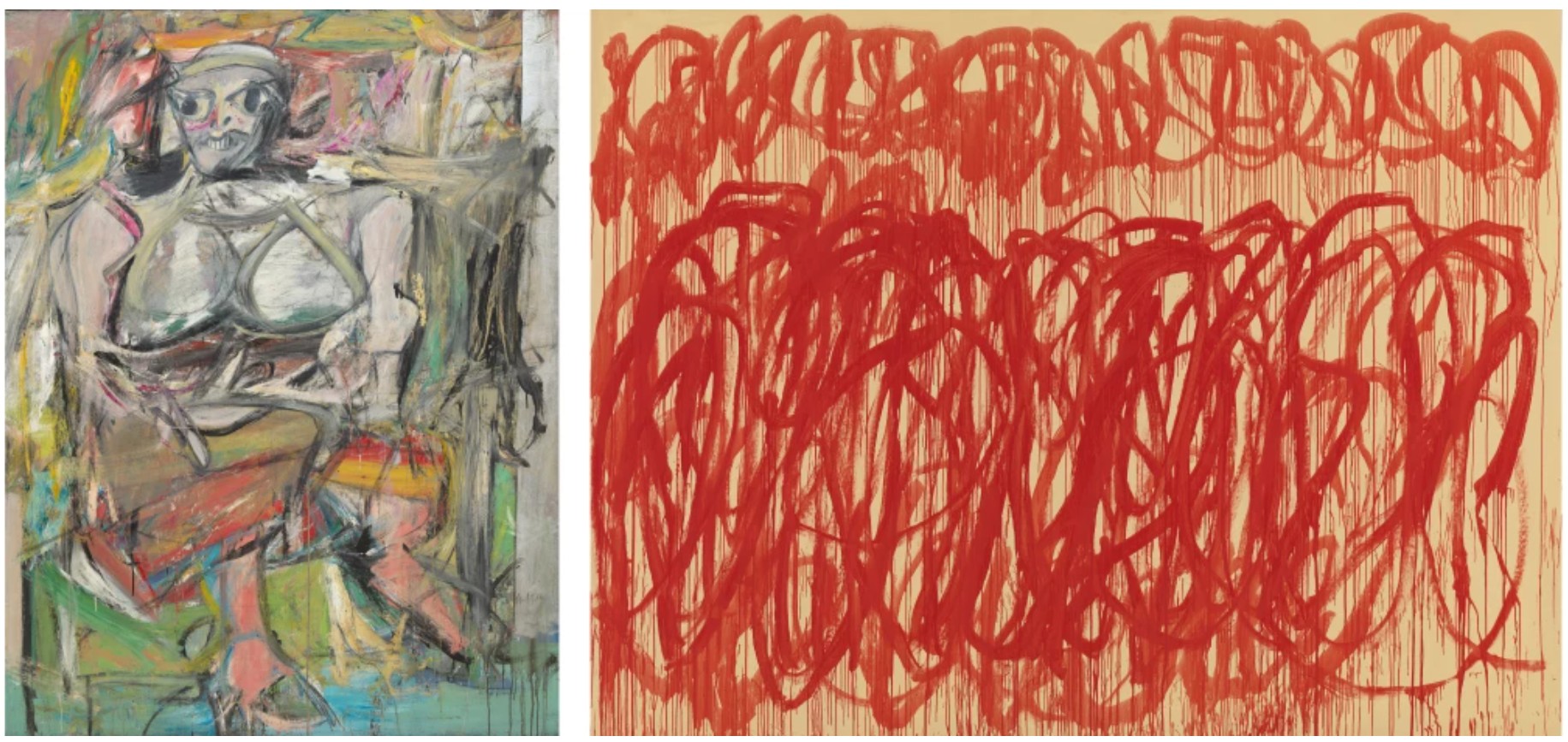
Left: Willem de Kooning, Woman I, 1950-52. The Museum of Modern Art, New York. Image © The Museum of Modern Art/Licensed by SCALA / Art Resource, NY. Art © 2025 The Willem de Kooning Foundation / Artists Rights Society (ARS), New York. Right: Cy Twombly, Untitled (Bacchus), 2005. Museum Brandhorst, Munich. Image © bpk Bildagentur / Museum Brandhorst / Art Resource, NY. Art © Cy Twombly Foundation
Prince’s series offers a transgressive scrutiny of the Pop bombshell precedent popularized in Andy Warhol’s celebrities and Roy Lichtenstein’s comic heroines, probing the polarities of desire and fear, thwarting the author’s original narrative. Further testament to the import of the present work, following its inclusion at the seminal Barbara Gladstone Gallery exhibition, Man-Crazy Nurse was featured in Prince’s mid-career survey, Spiritual America at the Solomon R. Guggenheim Museum, New York in 2007. Prince’s Man-Crazy Nurse emerges from a scorching red expanse; her starched-white uniform glowing against streaming yellow drips. The text “MAN-CRAZY NURSE” appears seared above the anonymous figure, whose facial features have been concealed by a surgical mask. In the creation of this work, Prince appropriated the cover art from one of romance novelist Peggy Gaddis’s fantasy tale, Man-Crazy Nurse. The original cover art features a sultry, red-lipped nurse in counterpoise, glancing over her shoulder at a suited man gaping in her direction, characteristic of a flourishing pulp fiction subgenre revolving around sexualized female nurses. Above the title, the introductory text reads: “Doctors and patients couldn’t resist this…”
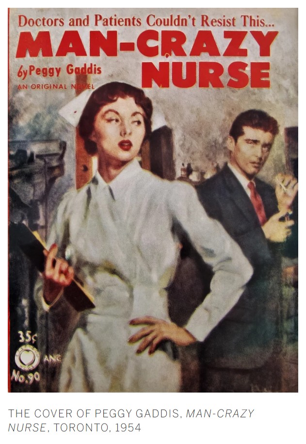
In Prince’s rendition, the Man-Crazy Nurse of Gaddis’ escapist novella takes a provocative and startling twist. Prince eliminates the male character from the scene: recontextualizing the nurse’s ostensibly seductive, enticing posture to one of aggression and even menace. Skeins of red pigment shroud her clipboard and red drips of pigment trinkle down her forehead evoking blood. Her face melts into a blur of pigment behind her mask, which afforded Prince a way of “making it all the same and getting rid of the personality.” (the artist quoted in: Glenn O’Brien, “Richard Prince,” Interview Magazine, December 2008 – January 2009, p. 201) Simultaneously seductive and sinister, the Nurse paintings create a compelling dichotomy that blurs the line between innocence and vice, desire and fear.
Killer Nurse, 2009-2010
Phillips New-York: 13 May 2025
Estimated: USD 3,000,000 – 4,000,000
USD 3,206,000
Richard Prince Modern & Contemporary Art Evening Sale
Killer Nurse, 2009-2010
Acrylic and inkjet on canvas
Suspenseful and psychologically charged, Richard Prince’s Killer Nurse, 2009–2010 stands as a striking exemplar of the artist’s iconic “Nurse” series, in which fetish, gender, authorship, and the American cultural subconscious are all interrogated through the borrowed façade of pulp fiction. Since the 1970s, Prince has pursued a distinctly subversive practice, appropriating familiar imagery—cowboys, biker girls, jokes—to expose the inner mechanics of desire and identity. In Killer Nurse, a lone masked figure stares from the canvas, set against a swirling storm of crimson and pink, beneath a sharply rendered title that hovers like neon signage from a slasher film. The visual experience evokes contradiction: the painting is seductive yet sinister, theatrical yet subdued, intimate yet evasive. Through calculated manipulation of appropriated imagery, Prince transforms a genre cliché into a loaded symbol of social anxiety and voyeuristic desire.
“Some people say the nurse paintings are all about desire—but isn’t that more to do with their proximity to life and death? Isn’t that why we find nurses sexy—because they embody this ultimate contradiction?”
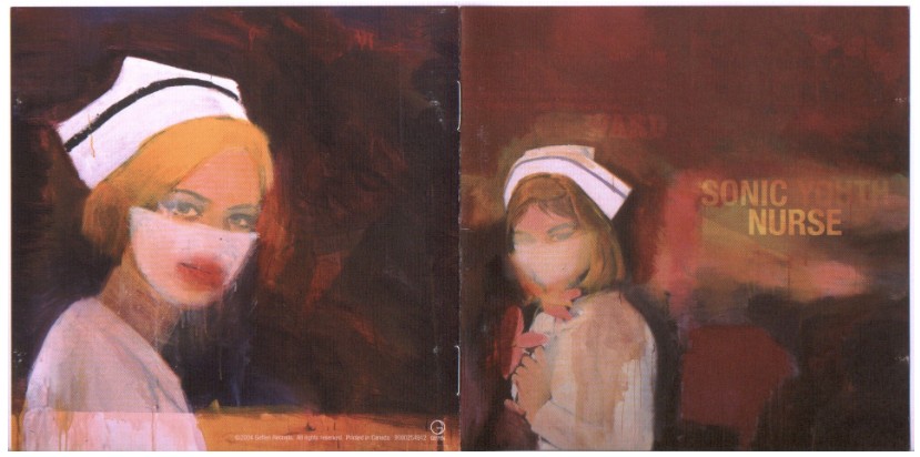 Sonic Youth’s Sonic Nurse 2004 album cover featuring a selection of Richard Prince’s “Nurse” paintings as cover art.
Artwork: © Richard Prince. Courtesy of the artist and Gladstone
Widely considered one of Prince’s most seminal bodies of work, the “Nurse” paintings have been exhibited extensively, including in his mid-career retrospective at the Solomon R. Guggenheim Museum, New York; the Walker Art Center, Minneapolis; and the Serpentine Gallery, London in 2007 and 2008. Works from the series are held in major institutional collections such as the Whitney Museum of American Art, New York; the Rubell Museum, Miami; and the Art Bridges Foundation, Bentonville, Arkansas. Nowhere in Prince’s oeuvre are the tensions between appropriation and authorship, seduction and subversion, more vividly staged than in the “Nurse” paintings. In Killer Nurse, he uses the language of pulp to expose the architecture of desire itself—its projections, its stereotypes, and its power to both mask and reveal.
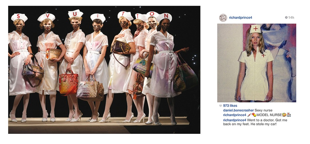
[Left] Model dressed in Prince-inspired nurse outfit for Louis Vuitton Spring 2008 Ready-to-Wear Collection runway show. Image: Abaca Press / Alamy Stock Photo
[Right] Instagram painting of Kate Moss by Richard Prince from 2014. Artwork: © Richard Prince. Courtesy of the artist and Gladstone
Created beginning in 2002, the “Nurse” paintings marked a shift in Prince’s method of appropriation. Rather than re-photographing pre-existing images as in his earlier work, Prince digitally scanned the covers of vintage pulp romance novels from his personal library, enlarged them, and transferred them to canvas via inkjet. He then applied vigorous layers of acrylic paint, obscuring much of the original illustration while enhancing its expressive charge. As seen in Killer Nurse, Prince’s sweeping brushwork and gestural overpainting efface nearly all identifying details from the source material—no background elements remain, and the book’s original title is replaced by his own stark, fabricated headline. This obliteration of authorial source epitomizes Prince’s long-standing effort to undermine notions of originality. He once described publicity images as “authorless pictures, too good to be true, art-directed and over-determined and pretty much like film stills, psychologically hyped-up and having nothing to do with the way art pictures were traditionally ‘put’ together.” In Killer Nurse, Prince manipulates this type of “authorless” image to both indulge and unravel the fantasy it projects.
“I’m painting nurses. I like their hats. Their aprons. Their shoes. My mother was a nurse. My sister was a nurse. My grandmother and two cousins were nurses. I collect ‘nurse’ books. Paperbacks. You can’t miss them. They’re all over the airport. I like the words ‘nurse’, ‘nurses’, ‘nursing’. I’m recovering.”
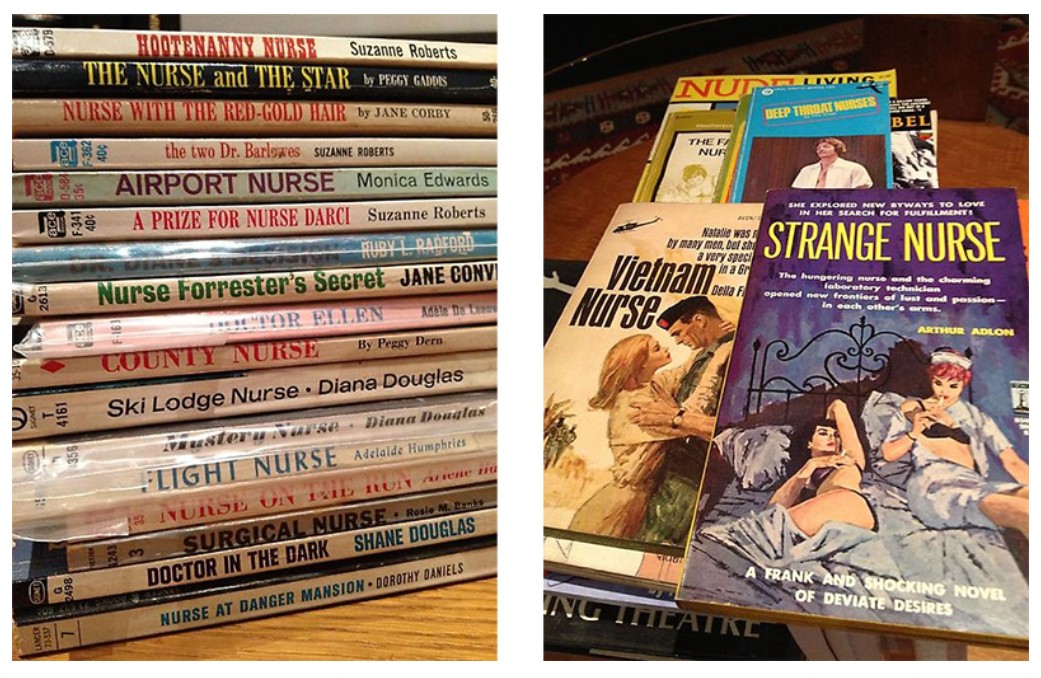
[Left and Right] A selection of nurse-related books from the artist’s personal collection. Image: © Richard Prince. Courtesy of the artist and Gladstone
Rather than offering a nostalgic homage to pulp, Prince seizes on the genre’s exploitative tendencies—particularly its melodramatic, oversexed depictions of women in positions of care. Since his early career as a member of the Pictures Generation, coming to artistic maturity alongside figures like Cindy Sherman and Sherrie Levine, Prince has consistently interrogated the ways in which gender, sexuality, and identity are framed by media and cultural narrative. Here, the “Killer Nurse”—fetishized, infantilized, sexualized—becomes a conduit for Prince’s examination of the Madonna/whore dichotomy. Just as he deconstructed masculine myths in his “Cowboys” series beginning in the 1980s, the “Nurse” paintings turn toward feminine archetypes—framing these subjects not as individuals, but as templates of desire, and then proceeding to destabilize those very projections through erasure, distortion, and exaggeration.
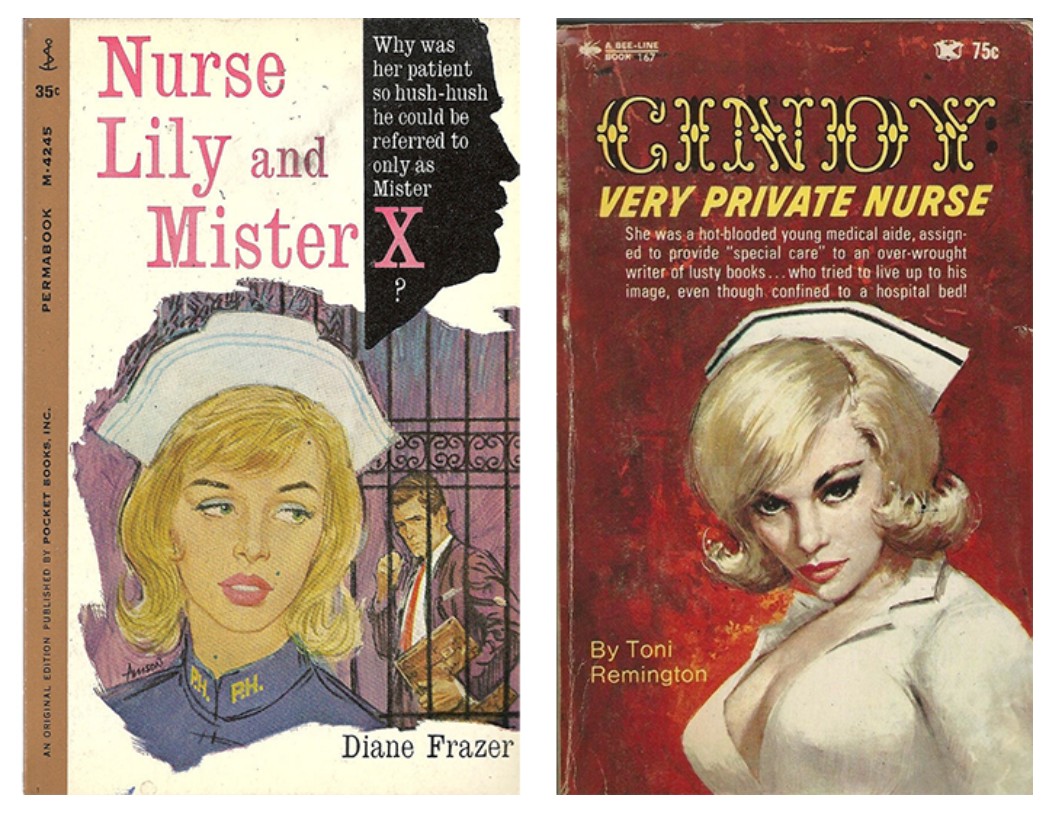
[Left] Cover of Nurse Lily and Mister X by Diane Frazer, 1961. Original illustration by unknown artist.
[Right] Cover of Cindy: A Very Private Nurse by Toni Remington, 1967. Original illustration by unknown artist.
While some works in the series clearly mimic the covers of identifiable pulp novels, Killer Nurse is more elusive. No details of the original cover peek through, and “Killer Nurse” does not correspond to any known title. Still, the hotly flushed background and film noir ambiance echo the cover of Toni Remington’s 1967 novella Cindy: A Very Private Nurse, while the figure’s pose, expressive eyebrows, and sidelong glance recall Diane Frazer’s Nurse Lily and Mister X from 1961, in which the protagonist stares warily at a shadowy male figure. On the novel’s back cover, the tone of suspense is explicit: “Lily’s professional smile was frozen on her lips… [T]his was a man who had terrorized the White House, a man even the President was said to be afraid of…”ii In Killer Nurse, Prince removes the male antagonist altogether, heightening the tension by allowing only the trace of a presence. The narrative is now one of isolation and mystery, with the nurse left to occupy a space of psychological intensity on her own.
“With the Nurse paintings… I wanted to do something just white; I wasn’t really interested in the figures so much. I was interested in writing down next to the figure what could happen to you; it became very depressing all the things that could happen… But before I put them away, I made a mistake painting all this white—this is when I say I get lucky. After I had wiped some off the painting, it looked like a mask on the nurse’s face and suddenly it was one of those moments. When I noticed that I realized that was going to be my contribution to the image, to put a mask on these various nurse illustrations. It was a way of unifying and also talking about identity.”
Central to this destabilization is the surgical mask—applied thickly and confidently, as if with a wide brush—that conceals the nurse’s nose and mouth entirely, rendering her silent. Prince has said the masks were a way of “making it all the same and getting rid of the personality.” In this example, Prince sunders the nurse into a smudged pastiche of her original: her eyes are hyperbolized with rich kohl and dense eyelashes, her side-swept pin-up bangs are looser and more blunt, and her made-up lips and signature mole are completely erased by the addition of the mask. But in the act of erasure, the mask paradoxically intensifies her presence. Her heavily made-up eyes become the focal point of the composition—unreadable yet rapt, absorbed by something we, the viewer, cannot see. The crimson paint that drips below the mask like blood or tears further evokes violence, vulnerability, and the gothic overtones of slasher cinema. Prince plays with this ambiguity deliberately. “Some people say the nurse paintings are all about desire—but isn’t that more to do with their proximity to life and death? Isn’t that why we find nurses sexy—because they embody this ultimate contradiction?” he once remarked. The image flirts with stereotype but subverts it through distortion, concealment, and excess. The added mask silences but also spotlights; the Killer Nurse is both vixen and victim, caregiver and threat.
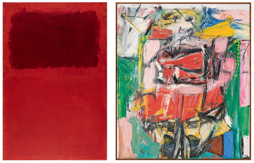
[Left] Mark Rothko, Untitled (Maroon Over Red), 1968. Pennsylvania Academy of Fine Arts. Artwork: © 1998 Kate Rothko Prizel & Christopher Rothko / Artists Rights Society (ARS), New York
[Right] Willem de Kooning, Woman VI, 1953. Carnegie Museum of Art, Philadelphia. Image: Carnegie Museum of Art, Pittsburgh, PA / Art Resource, NY, Artwork: © 2025 The Willem de Kooning Foundation / Artists Rights Society (ARS), New York
The expressive brushwork and color palette place Killer Nurse in conversation with mid-century abstraction. The stormy background, with its luminous fields of overlapping red and magenta, recalls the chromatic sublime of Mark Rothko, while the aggressive, almost violent handling of the paint gestures toward Willem de Kooning’s Women of the late 1940s and early 1950s—works often read as chaotic assaults on the female form. Prince, who paid direct homage to the postwar master in his “de Kooning” series from 2008–2009, adopts a similar push-pull dynamic of attraction and repulsion—invoking painterly machismo while subtly undermining it. His choice of subject—a figure coded as feminine, vulnerable, eroticized—is layered with irony. He deliberately assumes the position of the chauvinist, only to negate it through parody. By appropriating and overwriting these images with gestural abstraction, Prince collapses the boundaries between high art and kitsch, mass media and modernism, seduction and critique.
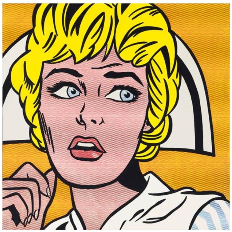
Roy Lichtenstein, Nurse, 1964. Private Collection, Sold for $95,365,000 at Christie’s New York in 2015.
Artwork: © Estate of Roy Lichtenstein.
At the same time, Prince embraces the Pop strategies of isolation and recontextualization employed by artists such as Andy Warhol and Roy Lichtenstein, who transformed the faces of film stars and comic-book heroines into cool, stylized icons. But unlike his Pop predecessors—whose renderings were marked by ironic detachment—Prince teases out the volatile undercurrents of latent sexuality and buried desire that simmer beneath the surface of these dime-store narratives. His “Nurses” are not flat or aloof, but raw, unstable, and fraught with psychological tension. The figure in Killer Nurse glows with the butter-yellow warmth of her hair and the scrubbed-pink tenderness of her skin, offset by the cool contrast of her eyes and the shadowy void that envelops her. Paint drips down the canvas like wet tears or blood, amplifying the emotional intensity. In Prince’s hands, the nurse becomes a cipher for broader cultural anxieties. The painting’s theatricality, suspense, and stylized violence evoke not only pulp fiction, but also film noir and horror cinema. Occupying a liminal space between beauty and dread, comfort and fear, Killer Nurse reveals how cultural narratives shape desire and distort perception. By manipulating found imagery, Prince exposes the mechanics of mass media and the archetypes it recycles. He lures the viewer with a familiar trope, only to confront them with its instability and artifice. In doing so, Killer Nurse stands as a haunting and essential work—one that seduces, provokes, and resists resolution, much like the masked figure at its center.
Are You Kidding?, 1988
Selections from the Collection of Barbara Gladstone
Sotheby’s New-York: 15 May 2025
Estimated: USD 2,500,000 – 3,500,000
USD 3,527,000
RICHARD PRINCE (b. 1949)
Are You Kidding?, 1988
Acrylic and silkscreen on canvas
56 x 89 1/2 inches (142.2 x 226.1 cm)
Signed, titled and dated 1988 (on the overlap)
Are You Kidding? is a paradigmatic example of the deadpan, candid satire that defines Richard Prince’s iconic Monochromatic Joke series. Yellow sans serif text stretches edge to edge across the cobalt blue expanse of Are You Kidding?, situating the blunt joke in a monochrome expanse. The scale of the joke relative to the canvas implies an irreverent delivery style or Whitney Darrow cartoons that first inspired the artist in the mid-1980s. Prince began his Monochromatic Joke series in 1985 during a five-month stay in Los Angeles. The artist soon moved from handwritten reproductions of jokes to silkscreen paintings on canvas, wryly asserting ‘low’ culture’ into the ‘high’ art backdrop and expanding his exploration of the categorically quotidian subject on the proverbial canvas. Prince’s offbeat jokes unnerve the viewer, creating a simultaneous uncanny sensation of humor and wariness over the acknowledgment of humor. Prince’s Monochromatic Jokes are among the artist’s most acclaimed series within his diverse and expansive oeuvre, capturing the acerbic wit and renegade force that drives his practice.
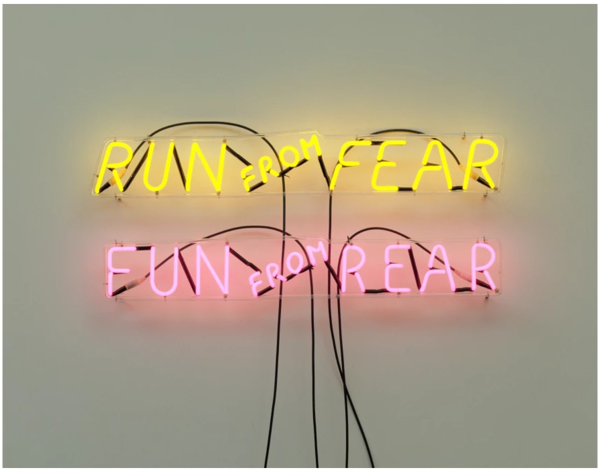
BRUCE NAUMAN, RUN FROM FEAR, FUN FROM REAR, 1972. MUSEUM OF CONTEMPORARY ART, CHICAGO. Image © Bridgeman Images. ART © 2020 BRUCE NAUMAN / ARTISTS RIGHTS SOCIETY (ARS), NEW YORK
Executed in 1988, Are You Kidding? is a large-scale exemplar of Prince’s iconic series. As Lisa Phillips observed, “[Prince] understood that in these jokes and cartoons, there were recurring patterns and subversive, often inflammatory content. They dealt with taboos.” (Lisa Phillips quoted in: Exh. Cat., New York, Whitney Museum of American Art (and traveling), Richard Prince, 1992-93, p. 42) The anonymous punchline of the present painting reads: I’m always kidding about my wife says the bartender. “Everytime I introduce her to anybody, they say, “Are you Kidding?”
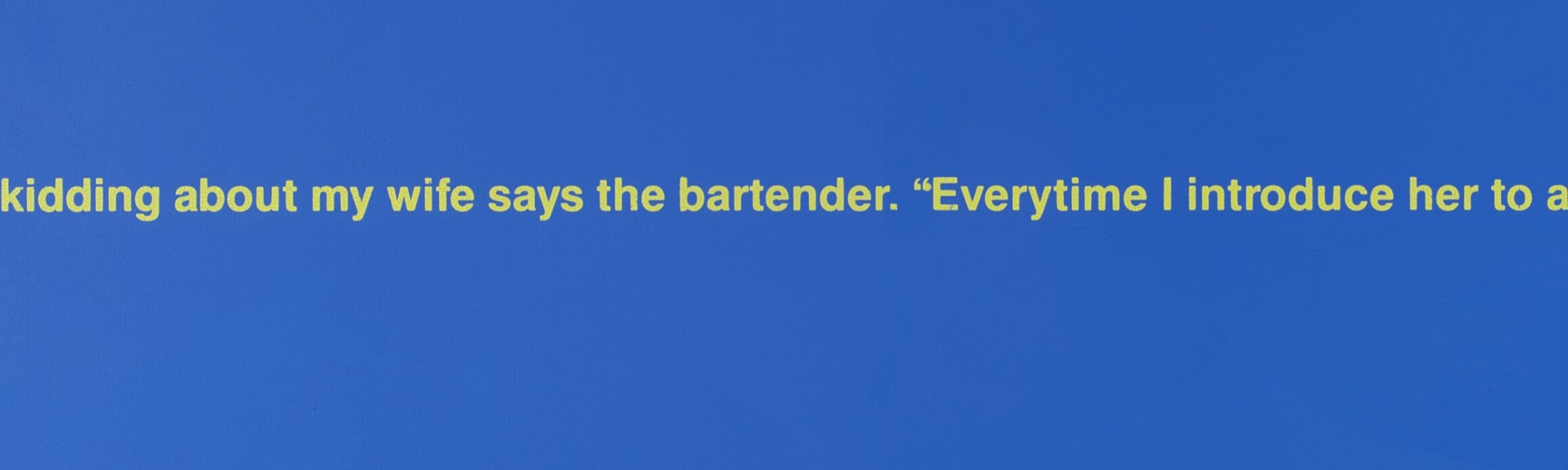
The text runs left to right across the serene blue composition like a metaphorical knife through the space. Prince’s text-based work differs from that of other Contemporary artists, like Ed Ruscha, who employed text to a semiotic end; instead, Prince’s text operates as a vehicle for his appropriated statement. A provocative ‘anti-masterpiece,’ the present work is an amalgamation of hard-edge abstraction and off-color wit, all in the name of subverting the serious. The painting uncovers distasteful attitudes and clandestine tensions typically scrubbed from proper social interactions. Alienated from its original context, Prince’s unattributed one-liner becomes the subject matter of his painting, further challenging the parameters of authorship, ownership, and the definitions of painting.
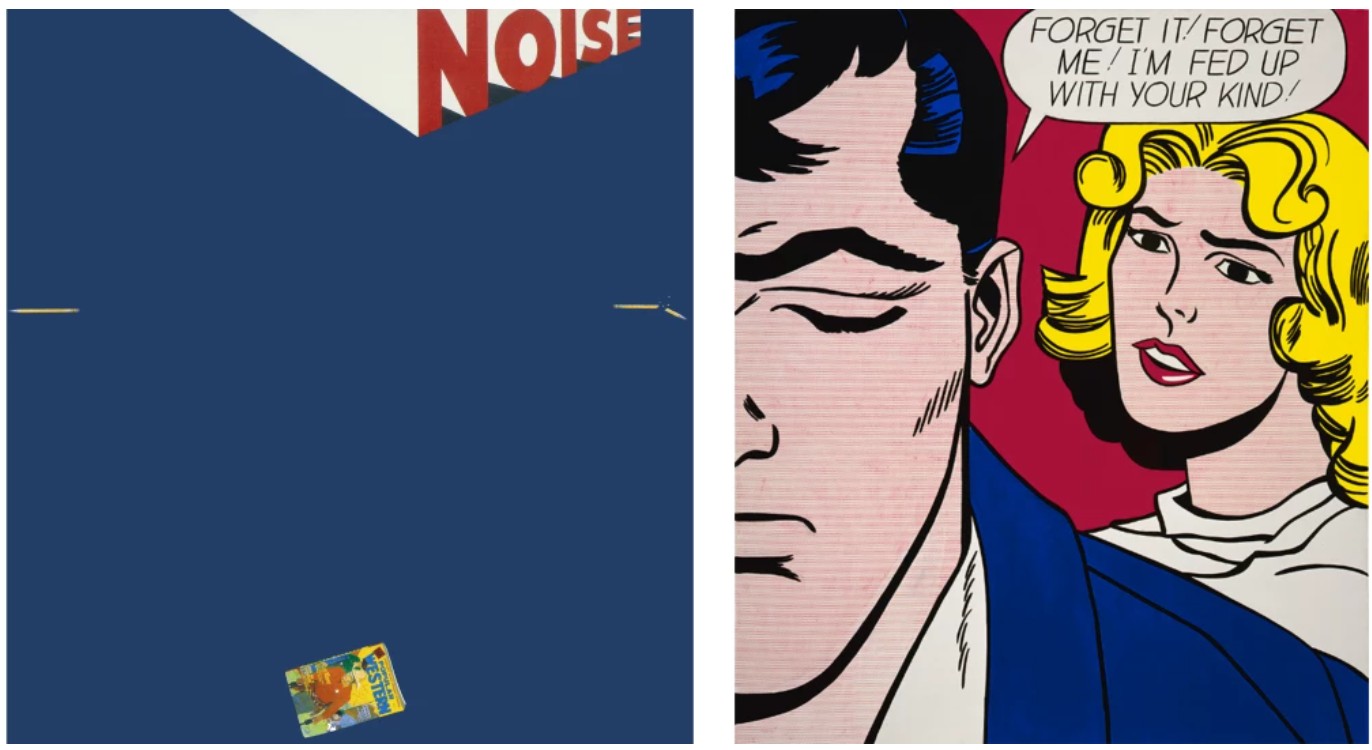
Left: Ed Ruscha, Noise, Pencil, Broken Pencil, Cheap Western, 1963. Virginia Museum of Fine Arts, Richmond. Art © Ed Ruscha. |
Right: Roy Lichtenstein, Forget It! Forget Me!, 1962. Rose Art Museum, Brandeis University, Waltham. Art © Estate of Roy Lichtenstein
Following his iconic Cowboys of the early 1980s, Prince’s radical Monochromatic Joke series advances the artist’s exploration of appropriation and transgressive mixing of ‘low’ and ‘high’ culture through painting. In his practice, Prince overtly quotes from mainstream visual culture but takes his sources out of context, recalibrating their meaning. In the Monochromatic Jokes, Prince presents his unattributed punchlines without image or protagonist and devoid of context using vibrant text and backgrounds. As Nancy Spector describes, “Prince embraced rebellion as a state of mind. The generational belief in challenging authority as a way of life–a necessity born in antiwar marches on Washington, race riots throughout the United States, and student protests around the world–informs the very fabric of his art.” (Nancy Spector, “Nowhere Man,” in: Exh. Cat., New York, Solomon R. Guggenheim Museum (and traveling), Richard Prince: Spiritual America, 2007-08, p. 22) Following Prince’s earliest handwritten transcriptions of jokes and cartoons, Prince soon extinguished any trace of illustration or the artist’s hand. He then used silkscreen techniques to transpose language on his canvases, accentuating the phrases as his subject matter. Prince’s composition directly challenged the reigning expressionist fervor of the 1980s with the antithesis of the Neo-Expressionist style.
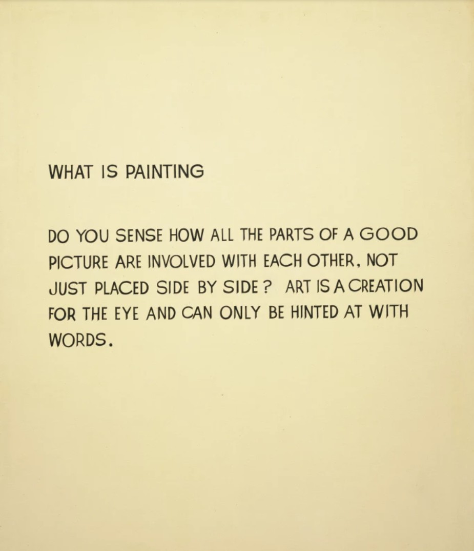
John Baldessari, What Is Painting, 1968. The Museum of Modern Art, New York.
Image © The Museum of Modern Art/Licensed by SCALA / Art Resource, NY. Art © 2025 John Baldessari
Disarmingly immediate, Are You Kidding? is a prodigious example of the Monochromatic Joke series, which bluntly isolates issues of sexuality, race and class in the form of ostensibly playful one-liners. Through his intentionally provocative compositions, Prince exposes a society built on malevolence and perversity. Prince’s Jokes are inherently self-reflexive, making the viewer complicit in unsavory, ‘low brow’ culture. At the same time, these unattributed and unsigned puns–quoted without license and represented in a pragmatic manner–make a damning indictment of the notions of authorship and originality that the art world deems sacrosanct. Through the Monochromatic Jokes, Prince cleverly subverts the serious and somewhat self-important modes of abstraction popularized in the cultural zeitgeist and further turns the mirror on American society and the viewer themself.
Untitled (Cowboy), 2013
Christie’s New-York: 15 May 2025
Estimated: USD 1,200,000 – 1,800,000
WITHDRAWN
RICHARD PRINCE (B. 1949), Untitled (Cowboy) | Christie’s
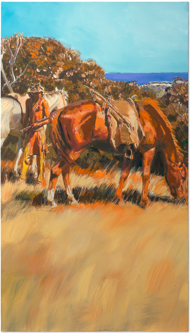
RICHARD PRINCE (B. 1949)
Untitled (Cowboy), 2013
Inkjet and acrylic on canvas
79 1/4 x 45 inches (201.3 x 114.3 cm)
Signed and dated ‘Richard Prince 2013’ (on the overlap)
Richard Prince’s Untitled (Cowboy) is a prominent example of the American artist’s most classic and important subject. A mature innovation on his first significant artistic project, the present work functions as an autobiographical homage, reflecting back across his groundbreaking career. Hijacking the cowboy motif from its circulation in American popular culture, Prince re-presents the image as his own, injecting the work with imaginative musings and gestural touches. In doing so, he destabilizes the original symbolic value of the image, forever altering its reception.
With the Cowboy series’ focus on an ordinary, vernacular symbol—repeated incessantly—Prince establishes a deliberate sense of redundancy that wreaks havoc on the viewer’s perception of reality. At once, he elevates the mundane to the realm of high art while encouraging audiences to reconsider their relationship to the American visual tradition. Wielding the power to appropriate and reformulate images into original works, Prince extends the artistic legacy of Andy Warhol, bridging the American vernacular with fine art in a poignant critique of national mythologies, politics, and masculinity.
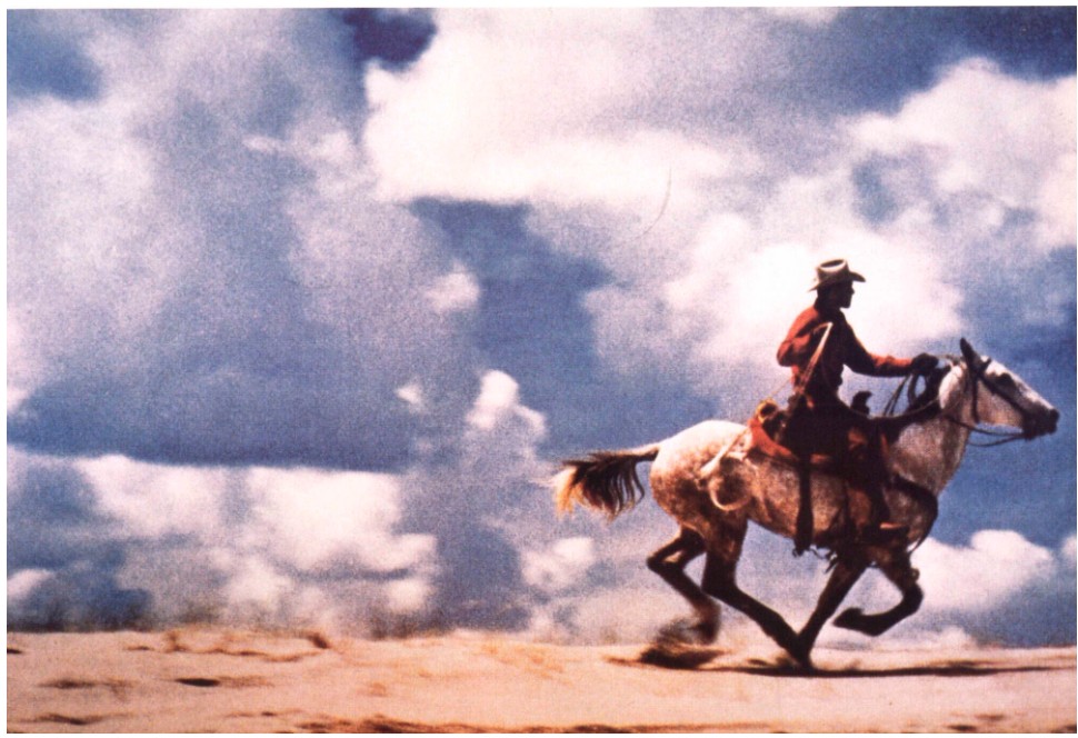
Richard Prince, Untitled (Cowboy), 1989. Metropolitan Museum of Art, New York. © Richard Prince.
Prince developed a novel artistic process to create Untitled (Cowboy), utilizing technological advances to evolve the original method he used to make his early cowboys. Beginning with a salvaged source image, he rephotographed it, then printed the captured image onto canvas using inkjet technology. He finished the composition with painterly swaths of acrylic paint, inserting his own artistic intent onto the tableau and recontextualizing the piece into a unique painting. His intervention thus reframes the source image to become, paradoxically, more itself than in its original form—a reproduction of a painted image—resurrecting the material from its protean origins to the exalted status of a painted masterpiece.
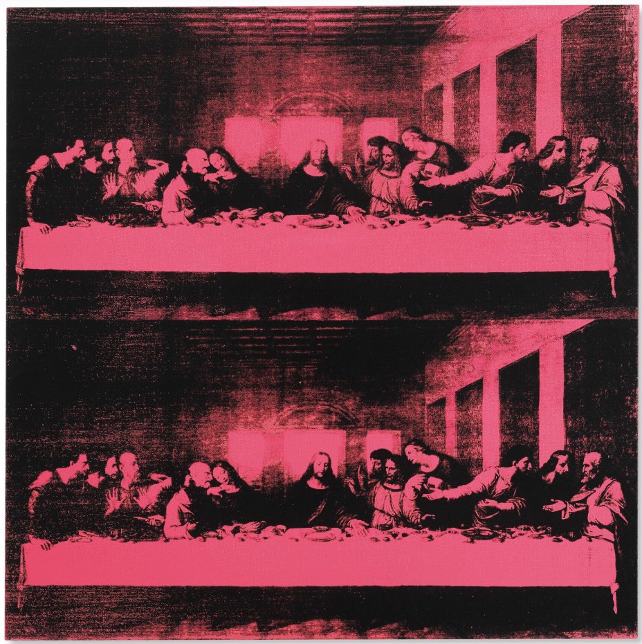
Andy Warhol, Last Supper, 1986. © 2025 Andy Warhol Foundation for the Visual Arts / Artists Rights Society (ARS), New York.
Prince’s vision here recalls Warhol’s appropriative silkscreens—particularly the Last Supper series—which similarly take a cheap reproduction of an original (Leonardo’s famed fresco) and reframe it into a form closer to its iconic origin. Prince’s method speaks directly to Walter Benjamin’s theory of the “aura,” as outlined in his essay The Work of Art in the Age of Mechanical Reproduction. Benjamin argues that mechanical reproductions strip artworks of their authenticity and potency. By revivifying a reproduced image in a painterly context, Prince reimbues Untitled (Cowboy) with a potent and all-too-relevant aura.
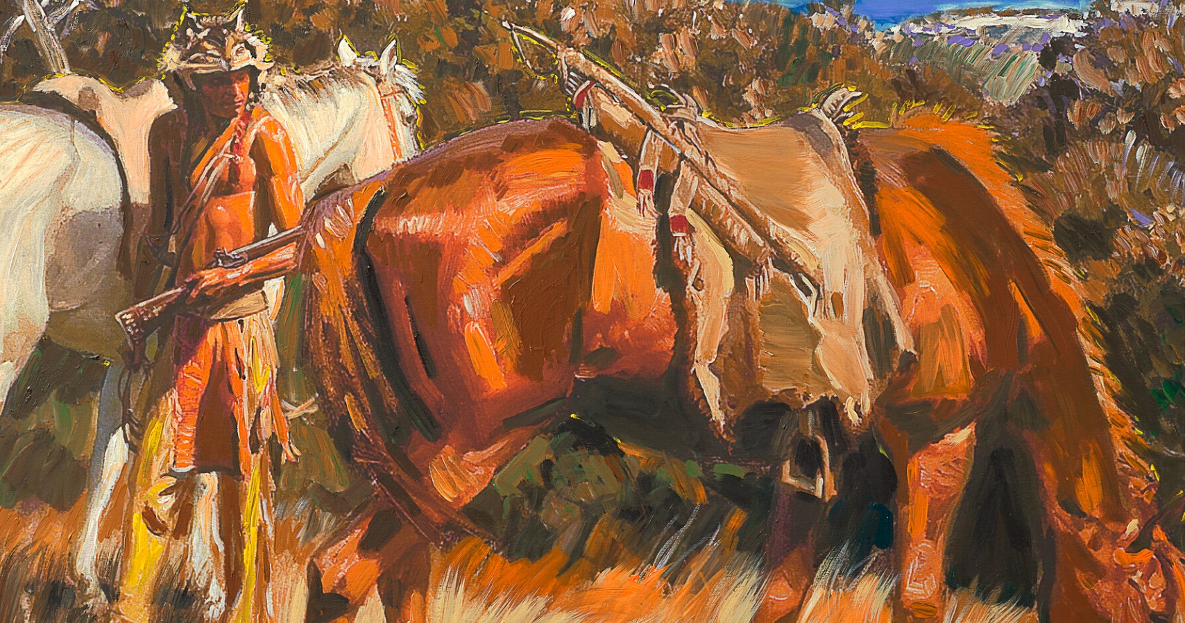
Prince first developed his appropriative method while working in the basement of Time Life magazine, where he tore out advertisements from magazine issues to send to advertisers as proof of publication. Immersed in the detritus of American consumerism—literally standing amid the visual vernacular—Prince began photographing the reproduced images in these ads. This practice coincided with the rise of the Marlboro Man: a 45-year campaign by Philip Morris to rebrand Marlboro filtered cigarettes, originally marketed to women, by injecting them with a rugged masculinity via associations with cowboys and the vast American West—despite growing awareness of smoking’s health risks. The campaign’s success ingrained a swaggering masculinity into popular images of the West. Prince’s ongoing appropriation of this imagery functions as both critique and self-reflection. He positions the cowboy as a surrogate self-portrait, emphasizing his own brand of artistic machismo.
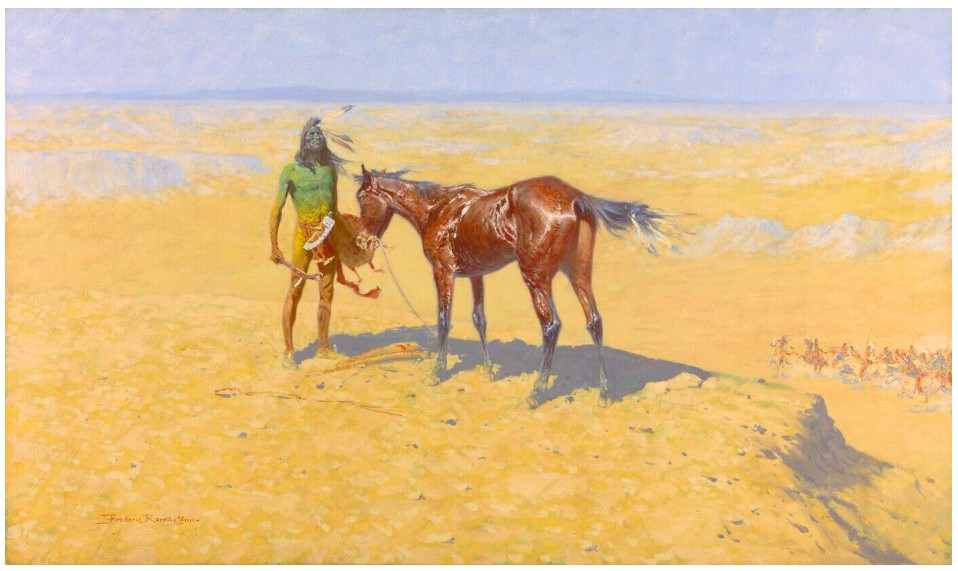
Frederic Remington, Ridden Down, 1905-1906. Amon Carter Museum of American Art, Fort Worth, Texas.
The source image for Untitled (Cowboy) evokes the mythic Western visions of artists like Frederic Remington and Charles M. Russell, whose paintings of lone horsemen amid sweeping landscapes helped define the stereotypical cowboy. Repackaged as a consumable commercial image by a book publisher, the source both mirrored and perpetuated the romanticized myth of the West as a vast wilderness populated by solitary, masculine figures. Prince’s gestural strokes of paint clash meaningfully with the source image’s flatness—his expressionist marks introducing emotion where the original image lacks it. Richard Prince’s continual revitalization of his iconic Cowboys has preserved the series’ relevance through shifting cultural landscapes since its inception in the 1980s. The works function simultaneously as palimpsests of America’s visual past and as critiques of its most enduring myths. Untitled (Cowboy) stands as a lasting flourish within this tradition, carrying Prince’s iconic subject into the discourses of the twenty-first century.
Untitled, 2020
Sotheby’s New-York: 16 May 2025
Estimated: USD 600,000 – 800,000
USD 762,000
Untitled | Contemporary Day Auction | 2025 | Sotheby’s
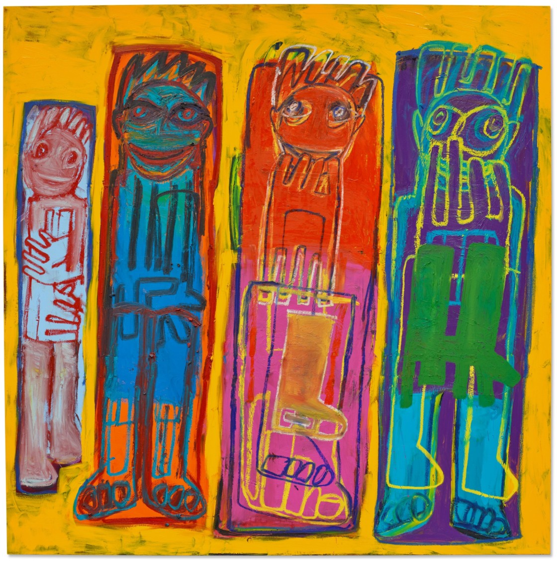
RICHARD PRINCE (b. 1949)
Untitled, 2020
Acrylic and oil stick on canvas
71 3/4 x 71 1/2 inches (182.2 x 181.6 cm)
Signed and dated 2020 (on the reverse)
Vibrant, unruly, and unmistakably subversive, Richard Prince’s Untitled from 2020 exemplifies the artist’s enduring fascination with outsider aesthetics and his ceaseless interrogation of authorship, identity, and popular culture. Rendered in vivid hues of orange, pink, turquoise, and acid yellow, the painting features five totemic figures whose wide-set eyes, claw-like fingers, and bristling hair evoke the raw power of tribal iconography and the unfiltered spontaneity of a matured artist. The composition brims with a frenetic, electric energy, fusing raw immediacy with a knowing nod to art history and countercultural motifs.
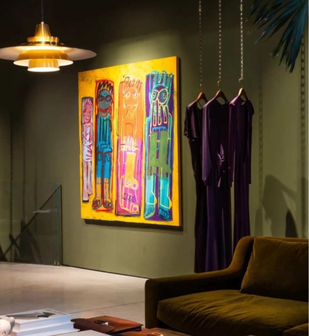
The present work installed in a preview exhibition at Victoria Beckham’s flagship store, London.
Part of the artist’s recent body of work following his Super Group and Hippie Drawings series, Untitled emerges from Prince’s ongoing exploration of drawing as both a mode of personal expression and a vehicle for cultural critique. In these works, Prince channels the spirit of outsider and folk art, reappropriating its visual language to question the boundaries between the sophisticated and the naïve, the authentic and the performed. As with the Hippie Drawings that prefigured this approach, Prince’s figures are often cast in theatrical poses—exaggerated, strange, and entirely unconcerned with naturalism.
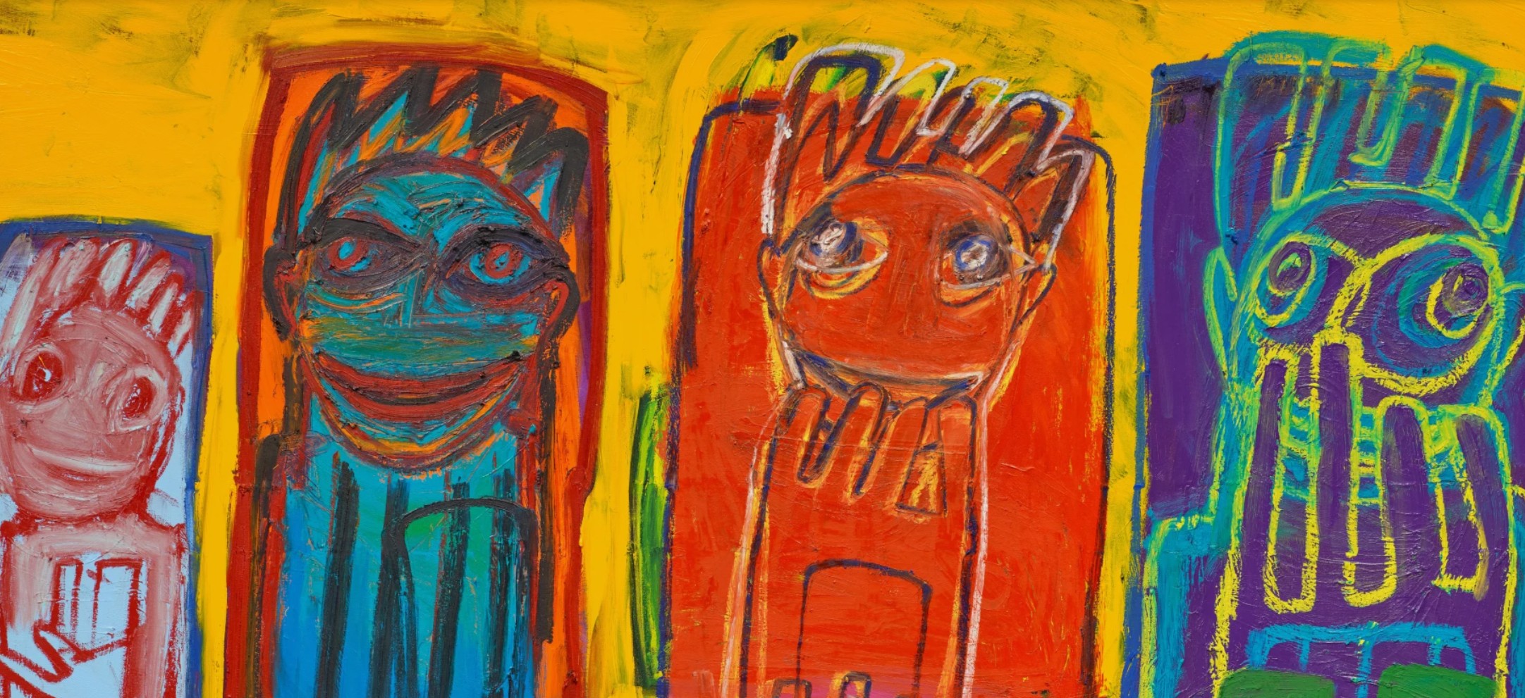
This act of reworking is central to Untitled, in which Prince layers thick outlines and solid blocks of color to evoke the handmade and the instinctual. Each figure is set within a bold, vertical band of contrasting color—red, violet, blue, magenta—evoking the dynamic structure of comic book panels. The vivid hues and graphic outlines heighten the sense of individuality while maintaining a cohesive, almost narrative rhythm across the canvas. The forms are purposefully uneven and asymmetrical; hands and feet dangle with exaggerated weight, while the eyes—doubled in some figures—convey a sense of manic glee or knowing absurdity. These characters appear suspended in their own psychological or narrative states, yet they coexist with one another in a compressed, frontal alignment, like a band of misfits or a modern tribal procession.
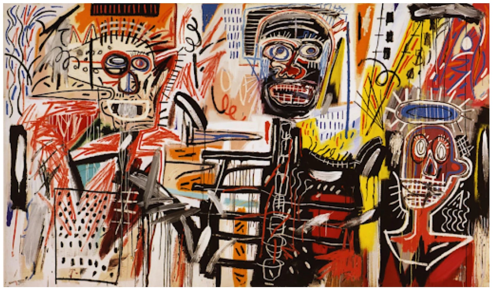
Jean-Michel Basquiat, Phillistines, 1982. Private Collection. Art © 2025 Estate of Jean-Michel Basquiat. Licensed by Artestar, New York
Despite their apparent spontaneity, Prince’s figures are carefully composed. The overall canvas is held together by a punchy chromatic logic: the fiery background binds the composition in a visual hum, while each figure’s interior palette plays off its neighbors with deliberate discord. The image flattens the space entirely, eliminating any hierarchy between foreground and background. The gestural marks of oil stick—a medium associated with drawing more than painting—heighten the sense of immediacy, suggesting a return to childhood scribble or cave painting, filtered through the lens of postmodern appropriation. Prince’s embrace of the crude and the cartoonish finds precedent in his earlier “joke” and Nurse paintings, but the recent figure works mark a distinct turn inward, where figuration becomes a mirror for psychological play. In this sense, Untitled aligns with the expressive impulses of artists like Jean Dubuffet, Philip Guston, and even Jean-Michel Basquiat—painters who used the absurd and grotesque to tap into deeper emotional and societal currents. Yet Prince’s approach is uniquely reflexive: rather than claiming direct emotion or social protest, he filters everything through a veil of distance, irony, and layered identity.
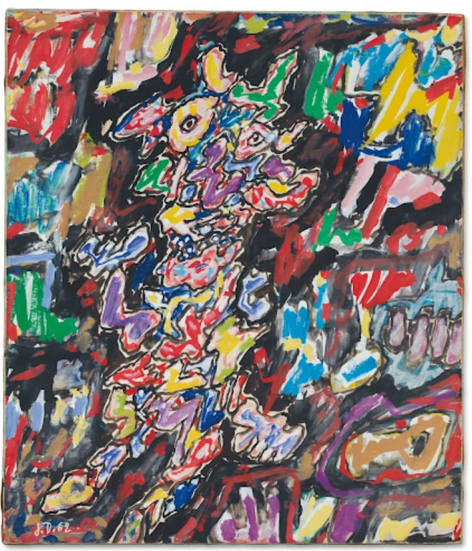
Jean Dubuffet, Personnage et paysage, 1962. Private Collection. Art © 2025 Artists Rights Society (ARS), New York / ADAGP, Paris
In contrast to his earlier photographic appropriations or text-based jokes, these works place the artist’s hand front and center, yet still retain his signature ambivalence. The figures may appear playful or monstrous, childlike or menacing—it is precisely this ambiguity that grants the work its staying power. In Untitled, Prince offers a painting that is as irreverent as it is sincere, as chaotic as it is tightly choreographed. It stands as a testament to his restless visual imagination and his refusal to settle into a singular style or message. Here, the artist doesn’t just blur boundaries—he redraws them entirely.
Untitled (cowboy), 2016
Christie’s New-York: 14 May 2025
Estimated: USD 700,000 – 1,000,000
USD 1,502,000
RICHARD PRINCE (B. 1949), Untitled (cowboy) | Christie’s
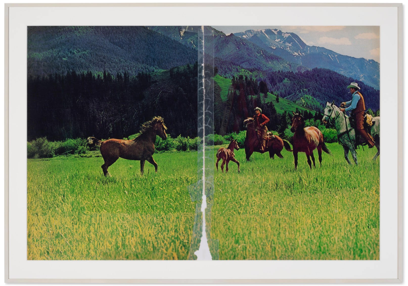
RICHARD PRINCE (B. 1949)
Untitled (cowboy), 2016
Chromogenic print
60×90 inches (152.4 x 228.6 cm)
Signed, numbered and dated ‘R Prince 2016 1⁄2’ (on a label affixed to the reverse)
This work is number one from an edition of two
One of the most enduring motifs of his career, the cowboy has proven to be an endless fascination for Richard Prince. Evoking the bucolic splendor of the mythic American West, the cowboy represents rugged masculinity and fierce individualism, a subject the artist has explored for over forty years. In Untitled (Cowboy), Prince returns again to 1980s and ‘90s magazine advertisements for Marlboro cigarettes, leaving their torn edges and tape to expose the original context. In the present work, golden fields of wildflowers are ablaze with the blossoms of early summer, set against a jagged mountain range, where two mounted cowboys confront a wild horse. The tape running the centerfold highlights the origin of the image as a magazine centerfold. Executed in 2016, this work belongs to the artist’s more recent series of Cowboys, debuted at the Los Angeles County Museum of Art (LACMA) in late 2017. From a small edition of two—with the other example from the edition now in LACMA’s permanent collection—the present work brings the awe-inspiring magnificence of the American West directly under the artist’s skillful gaze, triggering a new and exciting interpretation of this classic American archetype.
Richard Prince came of age in the 1970s in New York, where he was working in the tear-sheet department of Time and Life magazines. His job was to clip articles for staff journalists, and in doing so, Prince came to scrutinize the magazine ads in a new light. Fascinated by these luxurious consumer goods, beautiful landscapes and shiny commodities, Prince began to re-photograph the original ads with a 35mm camera, making subtle changes to the imagery by cropping and eliminating the text, and then drastically enlarging its scale. Seen in a new light, these “appropriated” photographs sent shock waves through the art world when they were first exhibited in the early 1980s. Alongside artists like Cindy Sherman and Barbara Kruger, Prince became known as part of the “Pictures Generation,” which essentially revealed that our concept of identity and gender was essentially a false construct invented by the media.
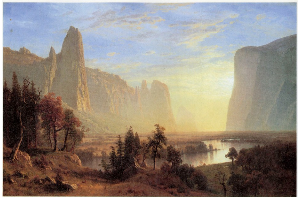
Albert Bierstadt, Yosemite Valley, 1868. Oakland Museum.
Between 1980 and 1992, Prince used this strategy to interrogate the motif of the cowboy, which he found in advertisements for Marlboro cigarettes. These early cowboy photographs essentially set the stage for Prince’s life-long investigation of the motif and everything it conjures in the collective imagination—ruggedness, determination and individualism. Now more than ever, the myth of the cowboy continues to resonate with its complicated yet enduring appeal.
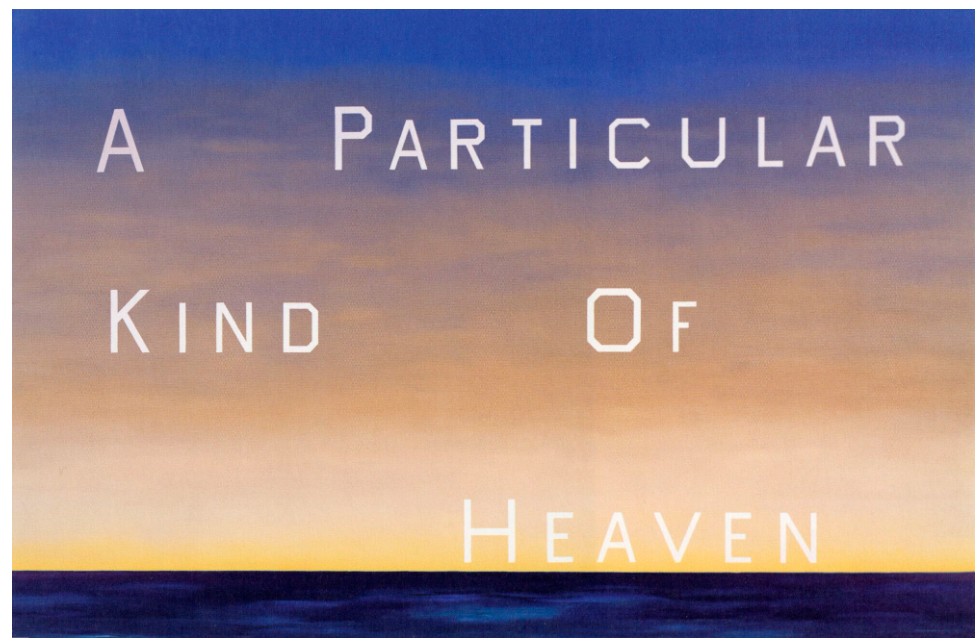
Ed Ruscha, A Particular Kind of Heaven, 1983. Collection Fine Arts Museums of San Francisco, San Francisco. © Ed Ruscha.
Over the years, Richard Prince has returned to the Cowboy motif several times. In 2013, he traveled to iconic landscapes in the West, including Monument Valley, to photograph the landscape himself, which resulted in a series he called Untitled (Original Cowboy). Prior to that, Prince had appropriated the original magazine ads and then altered the image by changing its size, zooming in on certain features that changed the nature of the original image. Around 2015-16, Prince again returned to the 1980s and ‘90s Marlboro ads, but instead of photoshopping out the seam down the middle of the centerfold, he allowed that feature to remain. In the present work, the two tear sheets from the magazine have been torn out, then taped back together. This strong vertical element has the effect of dividing the composition into two parts, with the cowboys on one side, and a single wild horse on the other, symbolizing the difference between the raw, unbridled aspect of nature itself and man’s attempt to contain it. The tape also reminds the viewer that this is still a ploy—an attempt to seduce its reader.
Jeff Koons
Baroque Egg with Bow (Orange/Magenta), 1994-2008
Sotheby’s New-York: 15 May 2025
Estimated: USD 2,500,000 – 3,500,000
USD 2,307,000
Baroque Egg with Bow | The Now and Contemporary Evening Auction | 2025 | Sotheby’s
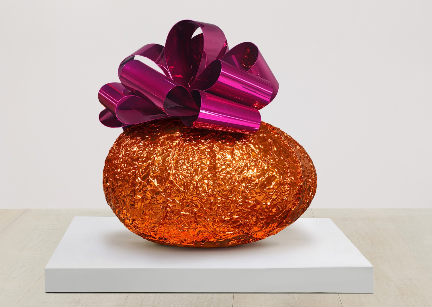
JEFF KOONS (b. 1955)
Baroque Egg with Bow (Orange/Magenta), 1994-2008
Mirror-polished stainless steel with transparent color coating
78 3/8 x 76 3/4 x 76 inches (199x195x193 cm)
This work is one of five uniquely colored variants
Finished in a crinkled, foil-like metallic orange and crowned with a high-gloss magenta bow, Baroque Egg with Bow (Orange/Magenta) exemplifies Jeff Koons’ unparalleled talent for transforming the familiar into the monumental. Modeled after a mass-produced chocolate Easter egg, the sculpture is among the most iconic examples of Koons’ Celebration series—an ongoing project begun in the 1990s that reimagines motifs drawn from childhood, holidays, and rites of passage.
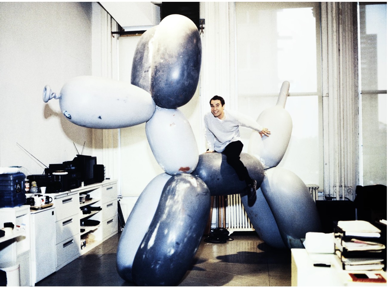
The artist photographed with one of his Balloon Dog sculptures. Photo © Ellen von Unwerth. Art © 2025 Jeff Koons
The egg, long a symbol of fertility and renewal, becomes in Koons’ hands a kaleidoscopic monument to material desire and visual excess. At once joyful and uncanny, the present sculpture is playful in form yet layered with symbolic, historical, and emotional complexity.The symbol of the egg has a deep historical lineage, appearing in religious, philosophical, and artistic traditions spanning centuries. From ancient Egyptian hieroglyphs to the works of artists like Hieronymus Bosch, Diego Velázquez, René Magritte, Salvador Dali and Constantin Brancusi, the ovum has been depicted as a sign of creation and renewal. In Baroque Egg with Bow, Koons invokes that lineage while embedding the object within a contemporary consumer aesthetic. The sculpture’s glistening surface mimics commercial perfection, recalling foil-wrapped candies and high-end packaging. Yet through sheer scale and technical virtuosity, Koons transforms the readymade into something seductive and sublime.
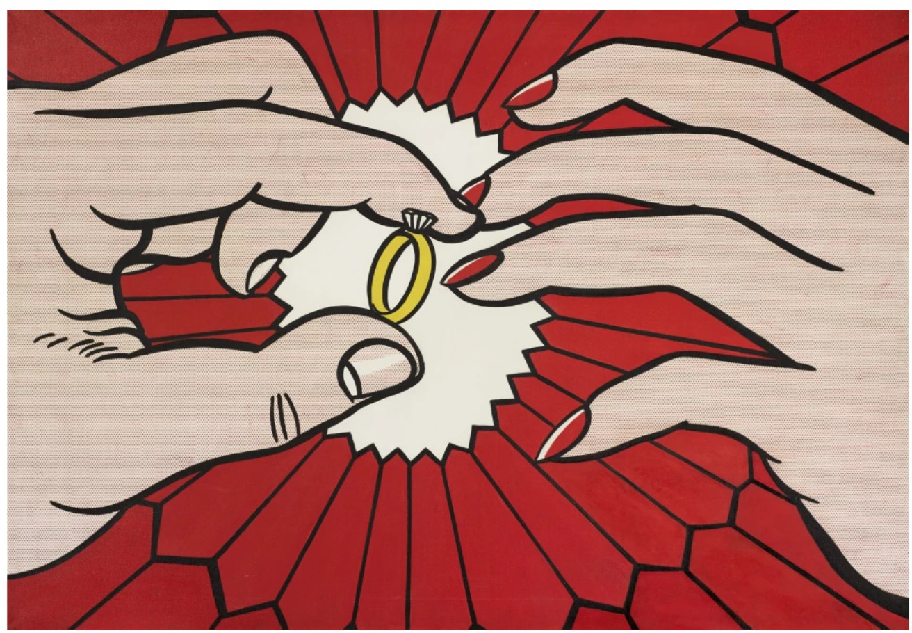
Roy Lichtenstein, The Ring (Engagement), 1962. Private Collection.
Sold at Sotheby’s New York in May 2015 for $41.7 million. Art © Estate of Roy Lichtenstein
While Duchamp’s ready-mades employed unadorned, utilitarian forms, Koons gravitates toward objects already imbued with aesthetic and emotional appeal. In the present work, the egg carries associations not only of childhood innocence, but also of ritual and romance, gift-giving and springtime renewal. The Celebration series, which began in the 1990s, is one of Koon’s most ambitious projects, both in terms of scale and technical execution. The series captures milestones in life and the calendar year—featuring motifs like flowers, toys, cakes, and hearts—to evoke themes of seduction, romance, and reproduction. Each work in the series functions as an archetype—an emotionally charged icon drawn from collective memory. At the same time, Baroque Egg with Bow (Orange/Magenta) reveals Koons’ fascination with art historical grandeur. The bow atop the egg—glossy, ornamental, and perfectly symmetrical—recalls both Rococo confection and the theatrical flourishes of the Baroque.

“I use the Baroque to show the public that we are in the realm of the spiritual, the eternal. The church uses the Baroque to manipulate and seduce, but in return it does give the public a spiritual experience. My work deals in the vocabulary of the Baroque.”
Like a reliquary or altarpiece, the sculpture dazzles, drawing the viewer into an encounter that hovers between reverence and irony.
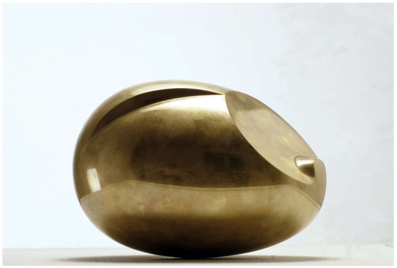
Constantin Brâncuși, The New Born, 1925. Centre Pompidou, Paris.
Image © Luisa Ricciarini / Bridgeman Images. Art © Succession Brancusi – All rights reserved (ARS) 2025
Another key influence on Baroque Egg with Bow (Orange/Magenta) is the opulent craftsmanship of Fabergé eggs. Like Fabergé, Koons demonstrates an obsessive dedication to perfection in his work. The Celebration series marked his return to stainless steel, a medium he had not used since the mid-1980s. By applying transparent color over the polished metal, Koons created an illusion of depth and an “interior life” within his sculptures—an effect that balances the joyous exterior with an underlying complexity. Though the surface shimmers with joy, the emotional core of the series is deeply personal. Celebration followed Koons’ Made in Heaven series and the public collapse of his relationship with Ilona Staller (La Cicciolina), which culminated in a lengthy custody dispute over their son, Ludwig. Against this backdrop, the egg takes on a new dimension—not only a universal symbol of birth and renewal, but also an intimate gesture: a visual message sent across time and distance from father to child. This layering of private narrative and public iconography gives the work its charged emotional tenor.
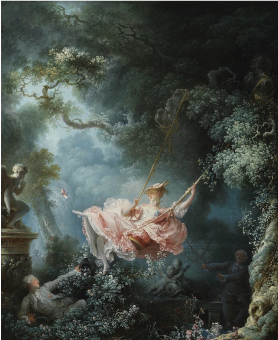
Jean-Honore Fragonard, The Swing, 1767. Wallace Collection, London. Image © Wallace Collection, London, UK / Bridgeman Images
Baroque Egg with Bow (Orange/Magenta) is at once dazzling and sincere, seductive and solemn. Through its polished surface, the viewer encounters a paradox: a luxury object that reflects not only the world around it, but the emotional depths beneath it. In marrying the traditions of Baroque art and Fabergé craft with the tropes of American mass culture, Koons transforms a seasonal confection into a monument of contemporary life—part devotional object, part postmodern artifact. As with much of Koons’ practice, the work leaves the viewer suspended between awe and amusement, caught in the luminous tension between material excess and spiritual longing.
Dolphin Taz Trashcan, 2007-2011
Phillips New-York: 13 May 2025
Estimated: USD 800,000 – 1,200,000
USD 1,391,000
Jeff Koons Modern & Contemporary Art Evening Sale
Executed between 2007 and 2011, Jeff Koons’ Dolphin Taz Trashcan is a masterful orchestration of polychromed aluminum masquerading as an assemblage of feather-light plastic toys. Suspended from a red steel chain, a sleek blue dolphin pool float appears to thrust through a bright blue Looney Tunes-themed swim ring while being enmeshed in a cold, industrial metal trashcan. At first glance, the familiar forms conjure nostalgia, evoking the carefree summers of suburban America, where inflatable toys populate backyard pools and communal swimming areas. Yet beneath its buoyant, playful exterior, the work reveals deeper tensions—between innocence and entrapment, consumerism and transformation, illusion and reality.
“Pool toys are inflatable, just like people. Inflatables really are metaphors for the continuation of life.”
Jeff Koons, Inflatable Flower and Bunny (Tall White and Pink Bunny), 1979. The Broad, Los Angeles. Artwork: © Jeff Koons
“My work is a support system for people to feel good about themselves.”
Part of Koons’ Popeye series Dolphin Taz Trashcan epitomizes his signature fusion of hyperrealism and conceptual rigor. Launched in 2002, the Popeye series comprises both sculptures and paintings that juxtapose brightly colored pool inflatables with stark, unaltered utilitarian objects, forming whimsical compositions that explore notions of self-acceptance and transcendence. Though named after the cartoon character Popeye, the works do not always depict him directly. Rather, they share a common visual language of vibrant vitality, aquatic themes, and a deliberate retrospective approach to image-making. Dolphin Taz Trashcan epitomizes the core concerns of the Popeye series—Koons’ fascination with the interplay between childhood innocence and adult sexuality, the intersection of high and low culture, and the reinvention of kitsch within the avant-garde. More profoundly, it underscores the ephemeral nature of life itself, hinting at both buoyancy and entrapment, playfulness and restriction. The inflatables, though appearing soft and weightless, are meticulously cast in metal, deceiving the eye with their trompe-l’oeil precision. The unaltered trashcan, an ordinary utilitarian object, acts as both a literal and symbolic container, reinforcing themes of restriction and exclusion. Through its surreal juxtaposition, the sculpture distills Koons’ ongoing dialogue with materiality, mass culture, and the complex psychological undertones hidden beneath the surface of the everyday.
Jeff Koons, Chainlink, 2003. Pinault Collection, Paris. Artwork: © Jeff Koons
Koons’ engagement with inflatable objects dates back to 1978, shortly after his arrival in New York City, when he scoured discount shops on the Lower East Side for vinyl toys that he would present alongside mirrors, “parodying the chaste rationality of minimalist sculptures.” His 1986 Rabbit, a cast metal replica of a balloon bunny, furthered this exploration, leading to the Celebration series of the 1990s, from which his iconic Balloon Dog emerged. The Popeye sculptures represent a continuation of this trajectory, transforming ephemeral pool inflatables into heavy, meticulously painted aluminum objects that blur the line between artifice and reality. In Dolphin Taz Trashcan, Koons heightens this deception. The dolphin and swim ring, though appearing lightweight and pliable, are rigid, hard-cast metal. Every seam and ripple mimics the real texture of inflatable plastic, yet their cold, solid nature defies expectation. The trashcan, a functional, industrial object, remains unaltered—a ready-made that contrasts with the hyper realistic falsity of the cast inflatables. This dynamic recalls Marcel Duchamp’s assisted readymades, particularly Bicycle Wheel, 1913, where a familiar object, decontextualized, gains new meaning. Like Duchamp, Koons manipulates material perception, forcing the viewer to question the authenticity of what they see.
Marcel Duchamp, Bicycle Wheel, 1913/1964. Philadelphia Museum of Art. Image: Philadelphia Museum of Art, Gift of Galleria Schwarz, 1964, 1964-175-1, Artwork: © 2025 Association Marcel Duchamp / ADAGP, Paris / Artists Rights Society (ARS), New York
At first glance, the work appears to celebrate the disposable, mass-produced objects of American suburban life. The inflatable dolphin and Looney Tunes swim ring evoke childhood summers spent in backyard pools, scenes of carefree leisure. Yet beneath this cheerful surface lies a more cynical reading. The dolphin’s fixed smile and the grinning face of Taz, emblazoned on the ring, feel eerily performative—mere painted expressions of joy. The trashcan, with its cold, metallic cage, suggests confinement and exclusion, introducing a sinister undercurrent. This contrast between buoyancy and restriction, innocence and entrapment, reflects the contradictions of consumer culture. Koons, often likened to a neo-Warhol, iconizes the banal. But where Andy Warhol’s Pop art glorified celebrity and consumption, Koons probes the artifice of suburban pleasures. It is telling that Koons has expressed that, for him, the title of the Popeye series implied “an eye for Pop”—a phrase that reveals his self-aware stance toward the visual language of mass culture. Much like Warhol’s tributes to popular culture and industrial design in his silkscreens and Brillo Boxes, Koons elevates dollar-store pool toys to the status of fine art, simultaneously celebrating and critiquing their cultural ubiquity.
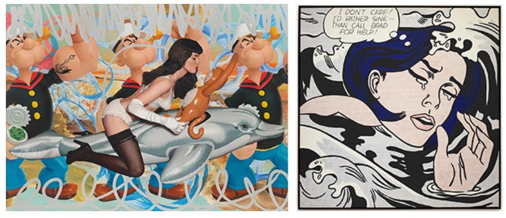
[Left] Jeff Koons, Girl with Dolphin and Monkey Triple Popeye (Seascape), 2010. The Broad, Los Angeles. Artwork: © Jeff Koons
[Right] Roy Lichtenstein, Drowning Girl, 1963. The Museum of Modern Art, New York. Image: © The Museum of Modern Art/Licensed by SCALA / Art Resource, New York, Artwork: © Estate of Roy Lichtenstein
Koons’ fascination with inflatable toys extends beyond childhood nostalgia and openly acknowledges their fetishistic allure. Speaking at the Serpentine Gallery’s debut of the Popeye series in 2009, he quipped that “there is a huge sexual fetish thing on the Web for pool toys” and lamented that it is always a “bit of tragedy if they go soft due to a leak.” This statement recontextualizes Dolphin Taz Trashcan, lending it an underlying erotic charge. The composition reinforces this dual reading. The dolphin, penetrating the swim ring, suggests a phallic motif, while the open-ended trashcan resembles a constraining, metallic passage. The taut ropes and steel chain, typically associated with play, now hint at bondage, submission, and containment. This interplay between soft and hard, freedom and restraint, echoes the fetishization of objects, a theme deeply embedded in the work of Salvador Dalí. His Lobster Telephone, 1936, in which a crustacean’s tail aligns with the mouthpiece of a rotary phone, uses absurdity to heighten sexual innuendo—a strategy Koons similarly employs. Like Duchamp and Dalí, Koons understands the seductive power of the fetish object, both in its sexual and consumerist connotations. Dolphin Taz Trashcan becomes a composite of desires: nostalgia, consumption, play, and repression, all intertwined in a surreal, hyperreal assemblage.
Despite these tensions, Dolphin Taz Trashcan is not wholly cynical. Koons has always positioned his art as a conduit for self-empowerment. “Art is about something you carry around inside yourself,” he has stated. “It’s not about the objects—they’re just carriers of the ability to stimulate and activate the viewer’s mental and physical state.” This idea is reflected in the Popeye series’ namesake: a self-transforming cartoon hero who gains superhuman strength by consuming spinach. The dolphin, seemingly trapped yet cheerfully emerging from its confines, embodies this same resilient optimism. Suspended mid-air, the sculpture suggests movement, as if the dolphin might yet break free. Arthur C. Danto, in discussing Koons’ Popeye works, observed that the animals appear to reassure themselves, thinking, “I’ll get through this!” The bright red chain, though a tether, also functions as a support—Koons’ version of a life preserver. In this sense, Dolphin Taz Trashcan is a metaphor for perseverance, a playful yet profound commentary on survival in a world of constraints.
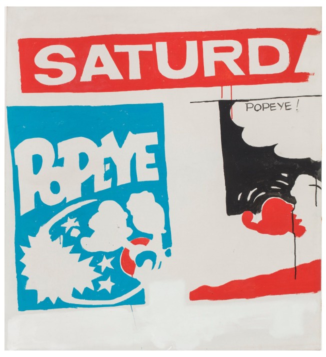
Andy Warhol, Saturday’s Popeye, 1961. The Ludwig Collection, Ludwig Forum für Internationale Kunst, Aachen, Germany. Artwork: © 2025 The Andy Warhol Foundation for the Visual Arts, Inc. / Licensed by Artists Rights Society (ARS), New York
“Popeye is about an image of, ‘I am what I am’. Kind of a symbol of self-acceptance that you have to embrace who you are. Popeye has spinach. Spinach brings about his transcendence, and brings about his power. That’s what art [is]. Art is our spinach.”
Koons’ works neither alienate nor critique; they seek to engage. Dolphin Taz Trashcan literalizes this act of elevation by being suspended from the ceiling, forcing the viewer to look up at an object they might otherwise dismiss. In doing so, Koons democratizes art, making it accessible to all. The mirrored finishes of other inflatables in Koons’ related series—such as the Hybrids, begun around 2003 and featuring puffed-up likenesses of the spinach-guzzling sailor himself, or the Celebration works, which originated in the mid-1990s and span subjects from balloon dogs to tulips—often reflect the viewer, drawing them into the experience. Here, though the objects themselves are not reflective, they function as cultural mirrors—reminding us of our collective past, our consumerist impulses, and our ability to transcend limitations. Dolphin Taz Trashcan is more than a sculptural assemblage; it is an invitation. Whether interpreted as a celebration of childhood, a critique of suburban illusion, or a surrealist exploration of desire, it compels us to see the extraordinary in the ordinary, urging us, like Popeye, to embrace our own transformations.
Lobster Wall Relief, 2012
Christie’s New-York: 15 May 2025
Estimated; USD 300,000 – 500,000
USD 264,600
JEFF KOONS (B. 1955), Lobster Wall Relief | Christie’s
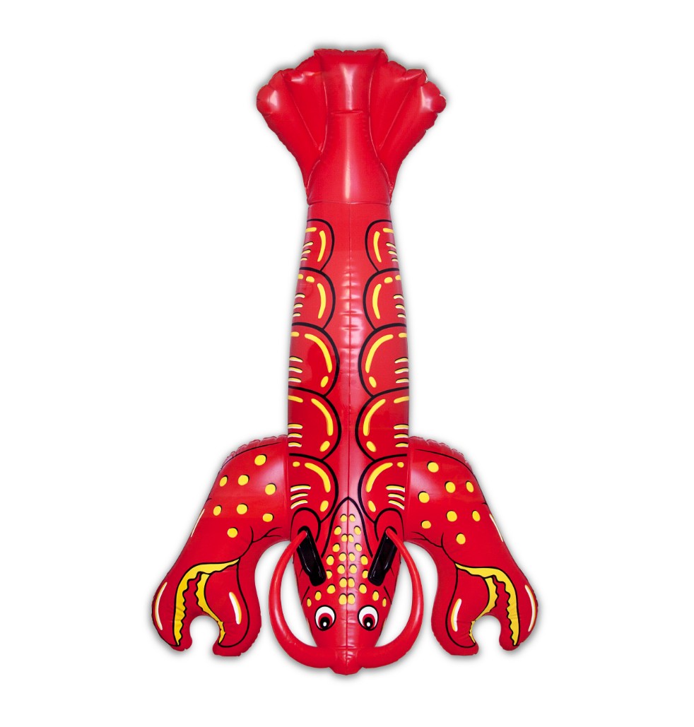
JEFF KOONS (B. 1955)
Lobster Wall Relief, 2012
Inkjet on stainless steel with polychromed edges
78 x 48 3/8 x 1 1/4 inches (198.1 x 122.9 x 3.2 cm)
Signed, numbered and dated ‘Jeff Koons 3⁄3 ’12’ (on the reverse)
This work is number three from an edition of three plus one artist’s proof
Marlene Dumas
Miss January, 1997
Christie’s New-York: 14 May 2025
Estimated: USD 12,000,000 – 18,000,000
MARLENE DUMAS (B. 1953), Miss January | Christie’s
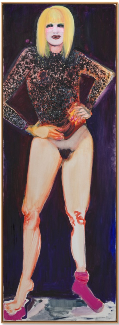
MARLENE DUMAS (B. 1953)
Miss January, 1997
Oil on canvas
280×100 cm (110 1/4 x 39 3/8 inches)
Signed, titled and dated ‘M Dumas Miss January 1997’ (on the reverse)
Alluring yet imposing, Marlene Dumas’s Miss January is the Dutch artist’s towering triumph, standing over nine feet tall. A commensurate masterpiece of virtuoso painterly effect and compelling psychological intensity, the work encapsulates every element of the internationally beloved artist’s iconic style. Radiating confidence, Miss January wears a bedazzled semitransparent top shimmering with a mesmeric display of painterly bravado, specks of black and white impasto suggestively capturing the mesmeric effect of the flashy fabric.
The titular subject stands frontally, hands on hips, her commanding gaze straight ahead. The model is bare from the waist down, save for a solitary sock slipped over her proper left foot. Dumas’s incredible versatility is displayed via the oscillation between the luscious application of paint in some passages, notably around the figure’s face and shirt, compared to the minimalist brushstrokes which articulate the legs.
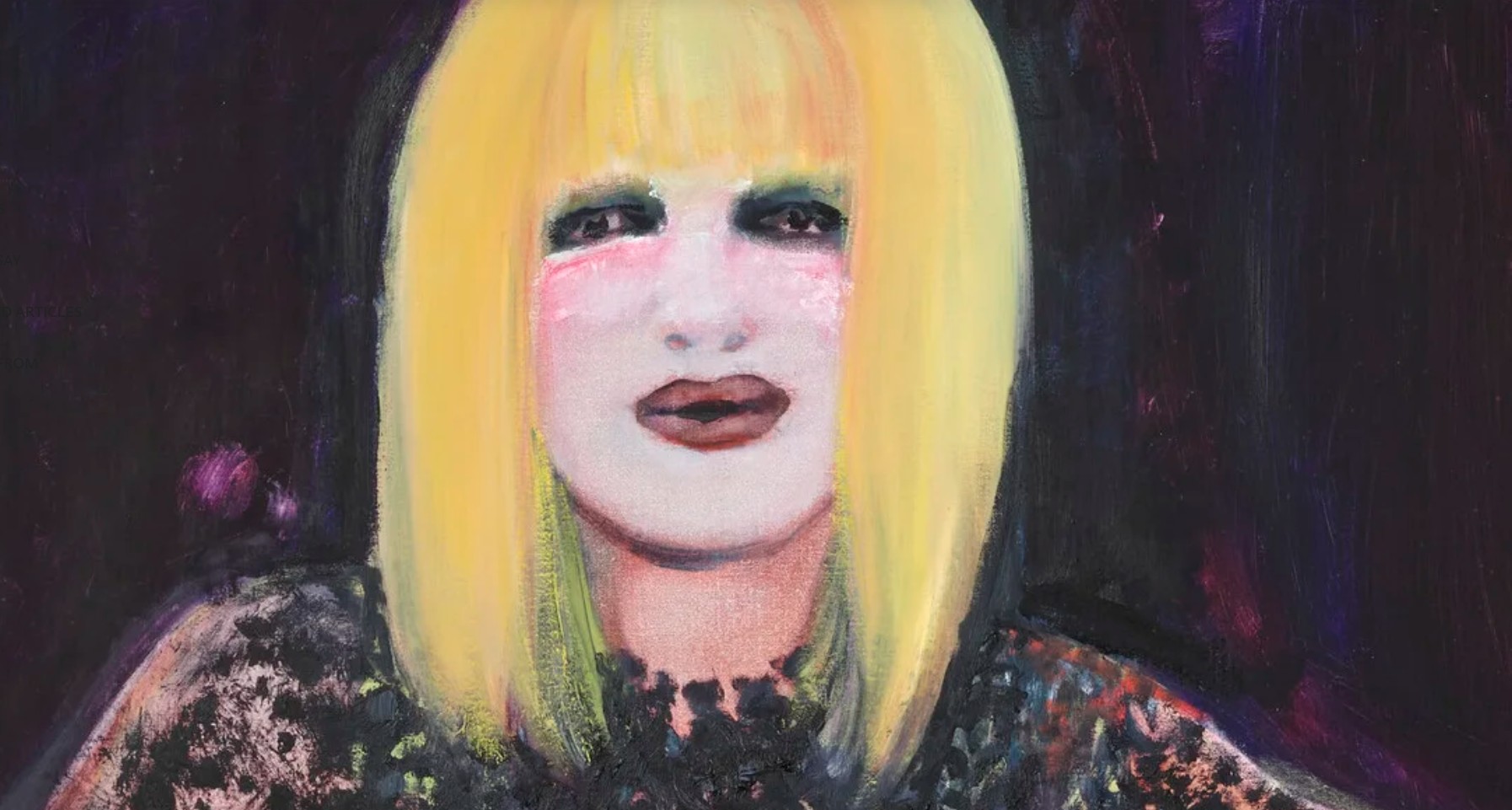
Endowed with a hieratic monumentality and painted with an almost sculptural quality, Miss January perfectly encapsulates curator Emma Bedford’s praise for Dumas’s rare talents: “few artists render flesh more tenderly, more seductively, more exquisitely than Marlene Dumas. Much of the seductive power of her art derives from the attention the artist pays to her medium” (E. Bradford, “Questions of Intimacy and Relations,” in Marlene Dumas: Intimate Relations, exh. cat., Iziko South African National Gallery, Cape Town, 2007, p. 42).
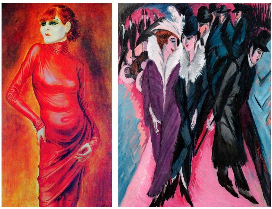
Left: Otto Dix, Portrait of the Dancer Anita Berber, 1925. Kunstmuseum Stuttgart, Germany.
Right: Ernst Ludwig Kirchner, Street, Berlin, 1913. Museum of Modern Art, New York.
Dumas discovers her subjects from printed media, painting from photographs and other found images. For Miss January, the inspiration emerged from a centerfold of a pornographic magazine “of a big-breasted Suzanne Somers look-alike” (“Dutch Master,” W Magazine, June 1, 2008, Online [accessed 4/24/2025]). Commenting on her choice of source image here, Dumas describes, “this feels to me like a creature from outer space. In art there’s always this thing about ‘the other.’ Well, I’m a woman, but this feels to me like some strange creature” (op. cit.). The title is in reference to Playboy’s accolade ‘playmate of the month,’ alluding to the image’s source as a centerfold. She simulates the photographic effects, cropping, blurring, and flattening elements of the composition while compellingly demonstrating the difference between photography and painting, achieving first-hand emotions from second-hand images. Commenting on her subjects, the artist notes that “my people were all shot by a camera, framed, before I painted them. They didn’t know that I’d do this to them. They didn’t know what names I’d call them… They weren’t paid. They weren’t directed” (M. Dumas, quoted in J. Storsve, “Good Lady, you that have your pleasure in exile,” trans. G. Walker, in Marlene Dumas: Nom de Personne/ Name no Names, exh. cat., Centre Pompidou, 2002, p. 27).
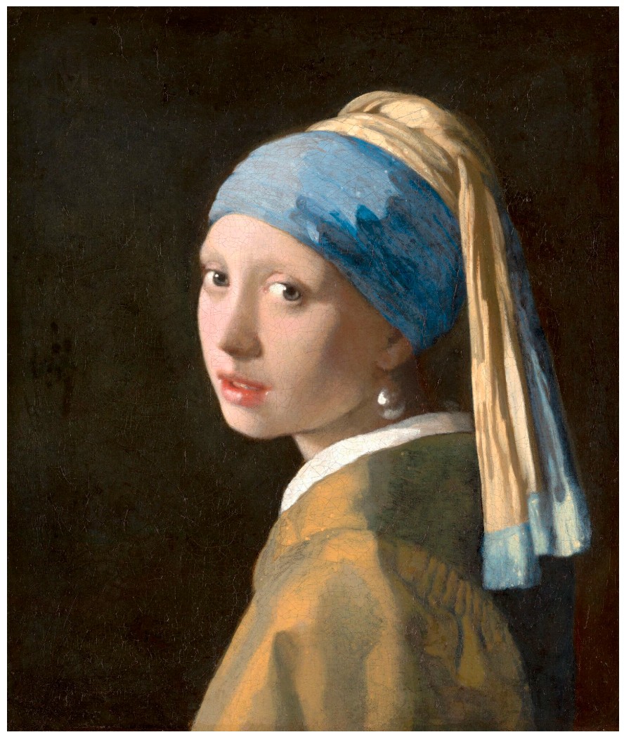
Johannes Vermeer, Girl with a Pearl Earring, circa 1665. Mauritshuis, The Hague.

Edouard Manet, A Bar at the Folies-Bergere, 1881 – 1882. Courtauld Gallery, London.
Marlene Dumas has held a deep fascination with beauty contests from a young age. In a drawing executed when the artist was just ten years old, she drew various contestants wearing sashes bearing the names of the countries they represented. Growing up in South Africa in the 1960s, competitions where young women would be judged on their beauty were immensely popular. Dumas captures this competitive atmosphere in her work, forewarning of its damaging results. The drawing was included on an invitation card for the 1998 solo exhibition Miss World held at Paul Andriesse Gallery in Amsterdam, where the present work was included along with a series of other pin-up images of women. Included in the show’s catalogue was Women, a text written by the artist:
I have painted more women
than men
I paint women for men
I paint women for women
I paint the women of my men.
(Marlene Dumas, Sweet Nothings. Notes and Texts, exh. cat., Galerie Paul Andriesse, Amsterdam, 1998, p. 119).
Dumas’s interest in tackling complicated subjects stems from a spirit of defiance where the artist exercises her right to tackle subjectivities which have long been the preserve of men. Doing so with humor and self-reflexivity, her art is a fearless expression of her view that depicting taboos expose and challenge dehumanizing ideologies, allowing new concepts to develop which identify and address societal rifts. By asserting herself into the art historical tradition of the female nude, spanning from Manet’s Olympia through the erotic figures of Egon Schiele and Otto Dix, Dumas demonstrates how a fresh perspective on the motif potently redirects the original voyeuristic intent of the form into a revelatory discourse on sexuality, guilt and innocence. The forceful stare in Miss January reverses the traditional praxis of viewer as voyeur, undermining the power of the gaze. As Bedford notes, “In tackling the arena of presentation and representation of sexuality, historically the preserve of the male gaze, Dumas subverts the conventional gendered hierarchy” (E. Bedford, op. cit., p. 41).
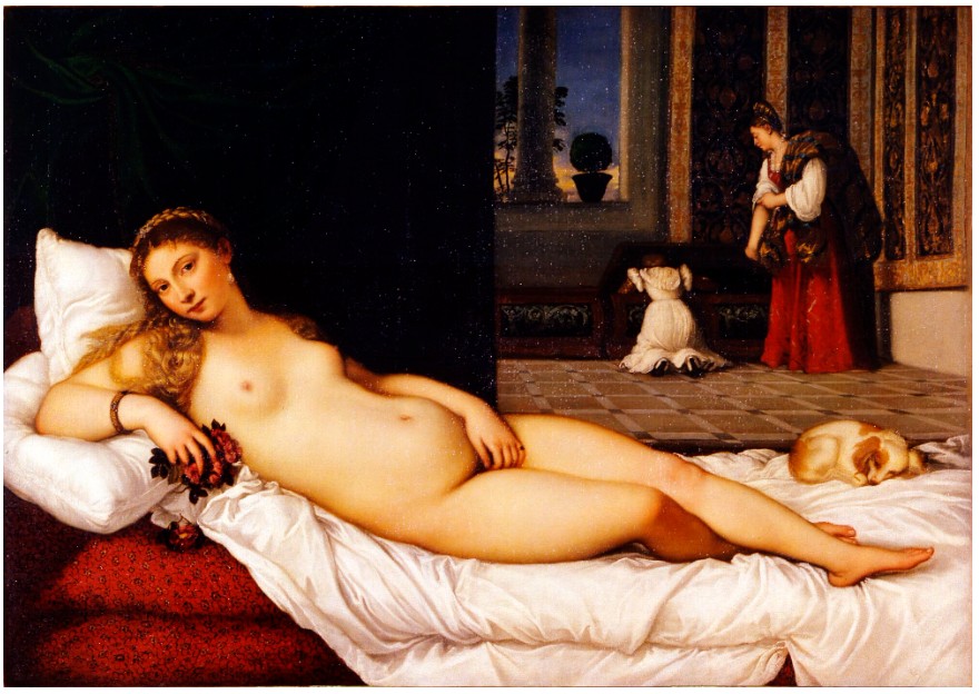
Titian, Venus of Urbino, 1538. Uffizi, Florence.
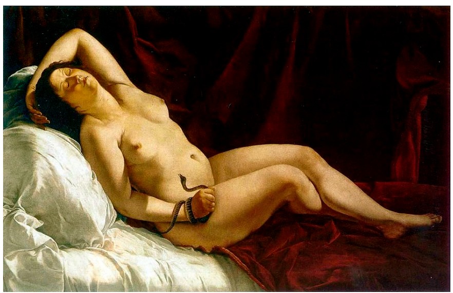
Artemisia Gentileschi, Cleopatra, 1611-1612.
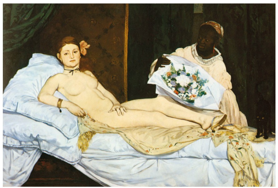
Edouard Manet, Olympia, 1863. Musée d’Orsay, Paris.
Dumas probes the relationship between pornography and erotica as well as between notions of exposure versus concealment, situating her practice between the pornographic tendency to reveal everything and the erotic inclination to conceal. Both elements are present in Miss January. Dumas exposes and centers her subject’s unvarnished genitalia, placed in the very center of the composition, and yet covers her torso and arms. She is at once offering up her model as an object of beauty and delight while simultaneously reflecting on processes of viewing and interpretation. The work is not about bodies and nudity, but the relationships latent within these forms, highlighting the erotic conditions of life rather than the nude or posing figure. Dumas states that “the aim of my work… has always been to arouse in my audience (as well as myself) an experience of empathy with my subject matter” (M. Dumas, quoted in op. cit., p. 43).
Miss January is hugely important to Dumas’s oeuvre, its title referentially alluding back to her childhood drawing Miss World, as well as to her first survey exhibition, Miss Interpreted, and her 1998 work Miss Interpreted, a self-mocking self-portrait where the artist places herself within a beauty contest of interpretations. Another work exhibited at the same exhibition, Misinterpreted, holds a shifted meaning as it combines the title into one single word, the painting thus becoming an image in itself, powerfully visualizing a misunderstanding or misinterpretation. The present work’s monumental scale and iconic subject matter establish the work as Dumas’s magnum opus, triumphantly mastering the female form while defiantly reclaiming the female nude from its male-centric history. Dumas has one foot in the painterly tradition and the other in conceptual art, admiring figures like Philip Guston, Francis Bacon, and Andy Warhol while inserting her practice into the tradition built by artists like Cindy Sherman, Jenny Holzer, and Barbara Kruger. Her overriding concern is on discerning and depicting intimate relations, articulating through paint how one relates with others at interpersonal and global levels, interpreting issues of gender, sexuality, pleasure and pain through this framework. Dumas aims to make her audience an accomplice in the making of meaning in her works, evidenced explicitly in Miss January by her intentional placement of her subject’s genitalia directly at eye-level.
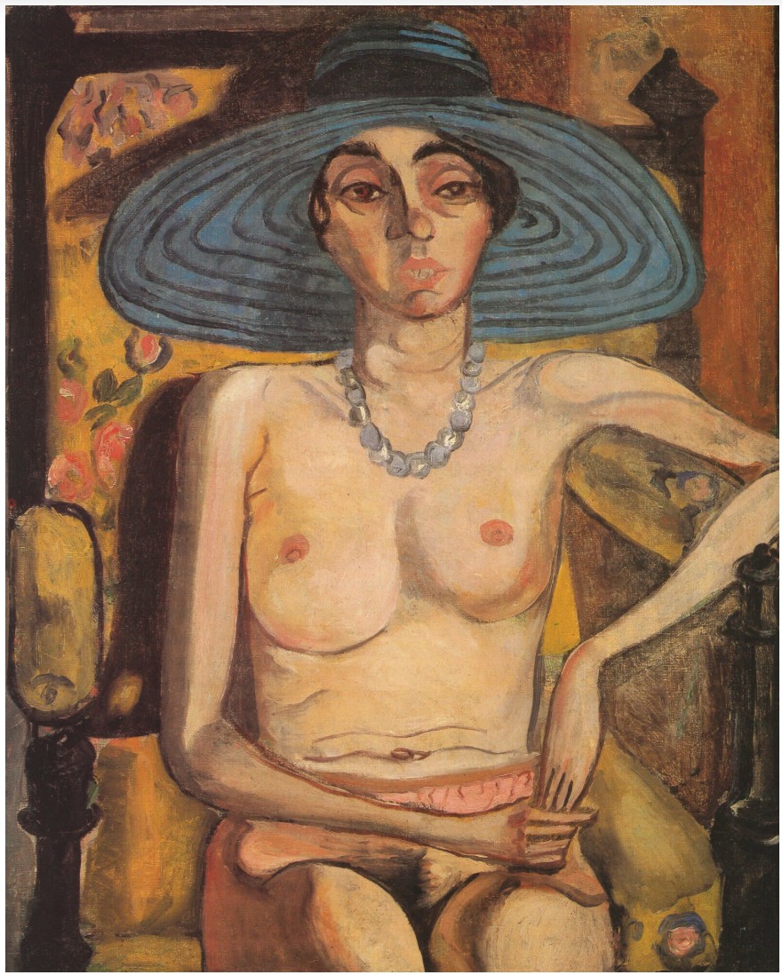
Alice Neel, Rhoda Meyers with Blue Hat, 1930. © The Estate of Alice Neel. Courtesy The Estate of Alice Neel and David Zwirner.
Curator Emma Bedford acclaims how “few artists have provided in figurative painting such a comprehensive and incisive record of the life of contemporary women,” and Dumas has been rightly hailed as one of the most influential painters working today (op. cit., p. 44). Her Magdalena series, which comprises of similar full-length nude paintings of women, were first exhibited at the Netherlands Pavilion at the Venice Biennale in 1995. Dumas’s importance to contemporary art is reflected in her vast exhibition history and inclusion in many institutional collections. She had a celebrated career retrospective at the Stedelijk Museum, Amsterdam in 2014, which then traveled to the Tate Modern, London and the Fondation Beyeler, Basel. A vaunted retrospective of her oeuvre toured the Museum of Contemporary Art, Los Angeles, the Museum of Modern Art, New York, and the Menil Collection, Houston between 2008-2009. In 2022 the Palazzo Grassi in Venice presented Marlene Dumas: open-end, a major solo presentation dedicated to her career. Miss January’s majestic monumentality is testament to the work’s signal importance to both Dumas’s oeuvre as well as to art history writ large. Searingly capturing her subject, Dumas draws upon the long history of the naked female body in art, transforming it into potent, ambiguous metaphor for both herself and her viewer.
POST-WAR ART
Ed Ruscha
That Was Then This Is Now, 1989
Sotheby’s New-York: 15 May 2025
Estimated: USD 7,000,000 – 10,000,000
USD 7,795,000
That Was Then This Is Now | The Now and Contemporary Evening Auction | 2025 | Sotheby’s
ED RUSCHA (b. 1937)
That Was Then This Is Now, 1989
Acrylic on canvas
42×96 inches (106.7 x 243.8 cm)
Signed and dated 1989 (on the reverse)
Signed, titled and dated 1989 (on the stretcher)
Radiating above a celestial yet portent cloudy sky, Ed Ruscha’s iconic and enigmatic text–THAT WAS THEN THIS IS NOW–thunders across the canvas, evoking the cinematic climax of the transient instance between past and present. In an arresting theatrical crescendo, Ruscha masterfully elicits a moment of revolution: glowing white sunlight emanates from behind clusters of stormy clouds, dramatically illuminating an ethereal promise of hope and transformation. Ruscha’s titular phrase That Was Then This Is Now epitomizes a central conceptual concern of the artist’s practice–the enduring friction between nostalgia and reality, before and after, past and present. Executed in 1989, That Was Then This Is Now belongs to a seminal and limited group of sfumato skies painted between 1988-90, including Hell Heaven and Do Az I Do, which provide a conceptual counterpart to the artist’s earlier burning sunrise-sunset paintings of the 70s and 80s. Through a sibylline sky charged in a paradoxical narrative in which past and present conditions are unknown, That Was Then This Is Now entrances the viewer in an elusive yet eternally resonant notion of the ever-changing realities of human existence. Testament to the persisting importance of this theme in Ruscha’s practice, the artist’s recent major career retrospective organized by The Museum of Modern Art, New York and the Los Angeles County Museum of Art paid homage to this theme in its title: Ed Ruscha / Now Then.
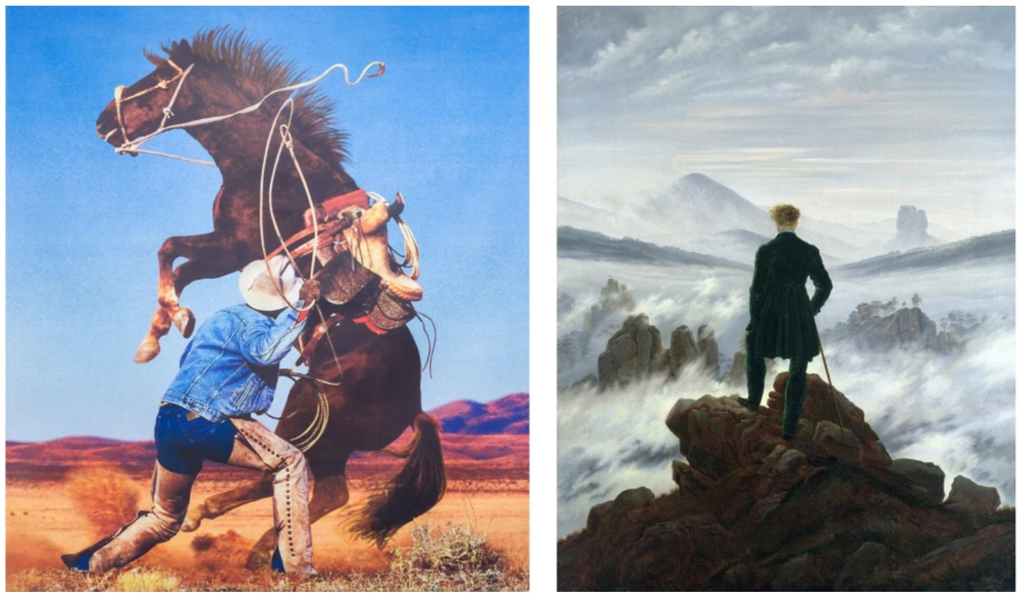
Left: Richard Prince, Untitled (Cowboy), 1999. Astrup Fearnley Museet, Oslo. Art © 2025 Richard Prince. Right: Caspar David Friedrich, The Wanderer above the Sea of Fog, 1818. Hamburger Kunsthalle. Image © Bridgeman Images
An instantly alluring and mystic phrase, That Was Then This Is Now is a paragon of the conceptual rigor and singular engagement with semiotics that have come to define Ruscha’s imitable practice. In bold articulation, Ruscha’s text confronts the viewer with a phrase that is simultaneously triumphant and nostalgic, commanding attention and inspiring reflection. The present work embodies the best of Ruscha’s most celebrated paintings in which imagery and semantics coalesce in a brilliant visual dialogue, probing the reciprocity between image, symbol, and text. Ruscha’s titular painting further invokes the romantic notions of cinema and a bygone Hollywood era, harkening back to the black-and-white movies that the artist recalls watching during his childhood in Oklahoma City. Through expansive text set against an enigmatic grisaille sky, That Was Then This Is Now suggests a sudden theatrical twist in an old Hollywood celluloid film. Furthermore, Ruscha evokes the age-old cinematic trope of the prophetic sky which appears across cinema as foreshadowing for a narrative turning point.
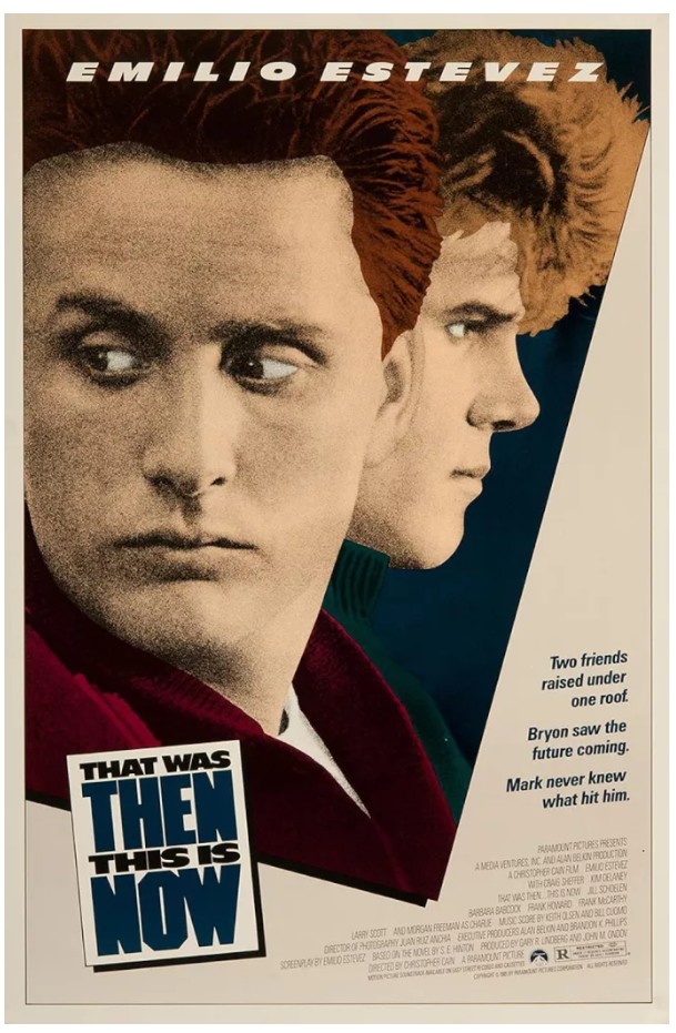
The poster for That Was Then… This Is Now, 1985
Executed in the artist’s iconic typeface, developed and refined in the 1980s, That Was Then This Is Now alludes to a past and present of which the conditions are decidedly unknown. Following Ruscha’s lauded sunrise-sunset paintings of the 70s and 80s, Ruscha’s cloudy sky backdrops evoke a similar concept of ambiguous transformation. The addition of Ruscha’s arresting text challenges the viewer in a moment of redemption or reckoning, even longing for an earlier time. Ruscha’s titular phrase concretizes this conceptual concern in Ruscha’s oeuvre, foreshadowing its increased importance in the artist’s works of the 90s and beyond. Evincing the present work’s paramount significance, Robert Dean and Lisa Turvey observe in the Catalogue Raisonné entry for the work: “The title phrase prefigures a recurrent ‘before and after’ theme in Ruscha’s work of the next two decades.” (Robert Dean and Lisa Turvey, eds., Edward Ruscha: Catalogue Raisonné of the Paintings, 1988-1992, Volume Four: 1988-1992, New York 2009, p. 136 )
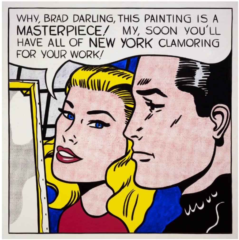
Roy Lichtenstein, Masterpiece, 1962. Private Collection. Art © Estate of Roy Lichtenstein
Working briefly as a commercial artist following his move to Los Angeles in 1956, Ruscha found inspiration in the prospering advertisement industry, Hollywood, and mid-century American pop culture. He was most famously captivated by the colossal billboards lining America’s Western highways, towering monuments to American consumerism which provided a seemingly endless barrage of text and image in striking mélanges of sign and symbol. The highway billboards would uniquely inform Ruscha’s distinctive visual vernacular and brand of Pop, by which he challenged the semiotic function of the written word through beguiling and idiosyncratic compositions. The appropriation of the commonplace and its subsequent transcendence into fine art chimes with Pop art’s greatest ambassadors such as Andy Warhol and Roy Lichtenstein, who worked simultaneously to Ruscha throughout much of the late Twentieth Century, probing the consumer culture as a springboard for artistic expression. That Was Then This is Now harkens back to the cinematic seriality of Warhol’s silkscreens and the hyperbolized drama of Hollywood films in Lichtenstein’s early paintings.
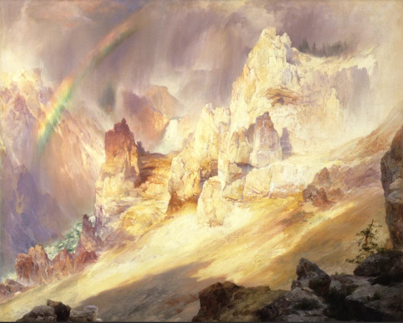
Thomas Moran, Rainbow over the Grand Canyon of the Yellowstone, 1900. Smithsonian American Art Museum, Washington D.C.
Image © Smithsonian American Art Museum, Washington D.C.
Hollywood as a subject runs throughout Ruscha’s career, famously represented by explorations of the Hollywood signs, such as Back of Hollywood from 1977, which famously features a burning orange, sun-soaked sky–cleverly positioned as either, and possibly both, sunrise and sunset. In 1988-90, Ruscha introduced the cloudy sky, an equally enigmatic and operatic backdrop for his compositions. In That Was Then This Is Now, Ruscha’s fateful sky highlights the tension between nostalgia and reality, history and destiny, and; rise and fall that underpin Ruscha’s radical and singular artistic output. Ever prescient and ever apposite, That Was Then This Is Now is a consummate painting in Ruscha’s cherished and iconic oeuvre.
Alvarado to Doheny, 1998
Phillips New-York: 13 May 2025
Estimated: USD 4,000,000 – 6,000,000
USD 4,900,000
Ed Ruscha Modern & Contemporary Art Evening Sale
Ed Ruscha’s text-based art fundamentally reshaped how we view the intersection of imagery and language. A quintessential West Coast artist, Ruscha embraced the visual culture of Los Angeles—its sprawling landscapes, both natural and artificial. This sensibility positioned him as a pioneer of the West Coast Pop Art movement. Drawing influence from artists like Jasper Johns and Robert Rauschenberg, Ruscha made text his lifelong medium, exploring its aesthetic properties and its slippery relationship with imagery. Most recently exhibited the group show, L.A. Story at Hauser & Wirth, the present work is a playful representation of the artist’s most recognizable subject matter and adopted hometown, Los Angeles.
“I’m not really painting mountains, but an idea of mountains.”
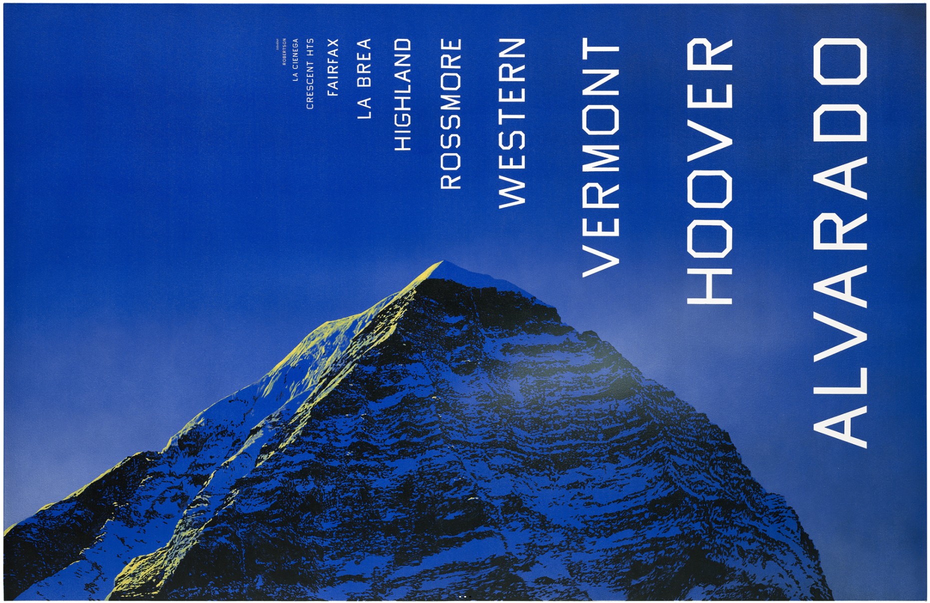
Ruscha often pulls words from memory and mass culture—advertising, print media, billboards—creating a kind of visual dictionary of American life.
“Some [words] are found, ready-made, some are dreams, some come from newspapers. They are finished by blind faith.”
As in the text-based work of his peers, such as Jenny Holzer and Barbara Kruger, Ruscha’s uses this popular language a vehicle for cultural critique. Employing the lexicon of popular media, the artist’s familiar graphics feel at once reassuring and disjunctive within the artist’s compositions, prompting the viewer to question how aesthetics and language present in their everyday media consumption.
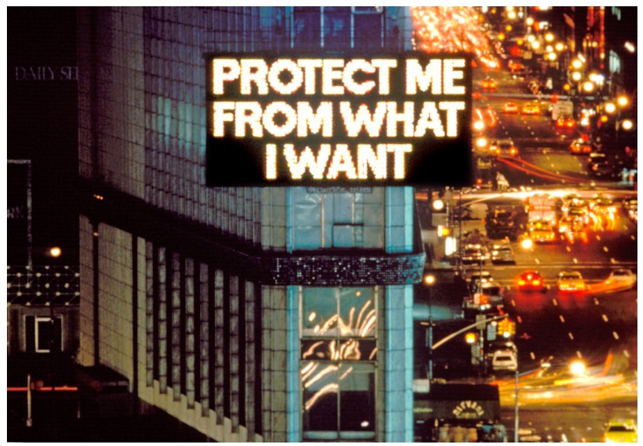
Jenny Holzer, from Survival, 1985. Image: © Jenny Holzer / Art Resource, NY
Artwork: © 2025 Jenny Holzer / Artists Rights Society (ARS), New York
Hollywood—its icons, logos, and mythologies—has long been a staple of Ruscha’s visual language. In Alvarado to Doheny, painted in 1998, the iconic Paramount mountain emerges in crisp, snow-dusted detail. Paramount has used a stylized mountain logo since its founding in 1912, embedding it deeply into the visual language of American cinema. Here, Ruscha’s mountain, though similar, is distinct—more idea than replica—rendered in layers of vivid blue, sunlight grazing its peaks. Across this pristine landscape floats the phrase “Alvarado to Doheny,” stenciled in icy white, stark against the intense azure hue of the sky. The phrase itself is a visual and conceptual puzzle and while the in-painting text refers to the historic streets and surrounding neighborhoods of the Tinseltown area, “Alvarado to Doheny” hints at a quiet, static view of nature—at once artful and disorienting. A keen example of Ruscha’s sharp wit and fluency in word play, his dexterous use of image and text recalls the visual puns employed his Surrealist predecessors.
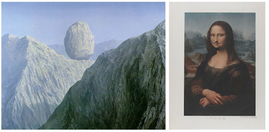
[Left] René Magritte, The Glass Key (La clef de verre), 1959. The Menil Collection, Houston. Artwork: © 2025 C. Herscovici / Artists Rights Society (ARS), New York
[Right] Marcel Duchamp, L.H.O.O.Q. Mona Lisa. 1919 (replica from 1930). Centre Pomidou, Paris. Image: © CNAC/MNAM, Dist. RMN-Grand Palais / Art Resource, NY, Artwork: © 2025 Association Marcel Duchamp / ADAGP, Paris / Artists Rights Society (ARS), New York
Ruscha presents a majestic landscape—an image of the sublime—only to overlay it with mundane typography. The grandeur of the mountain is undermined, or maybe enhanced, by the neutrality of the text.
“They’re not really mountains. They’re ideas of mountains… picturing some sort of unobtainable bliss or glory—rock and ways to fall, dangerous and beautiful.”
His landscapes are informed by photographs, memories of road trips, and imaginative reconfigurations. Rendered with the saturated light and hyperbolic palette, they are reminiscent of the hand painted sets for Hollywood soundstages. They are cinematic in their artificiality—flatter and more theatrical than real.
“I had a notion to make pictures by using words and presenting them in some way and it seemed like a mountain was an archetypal stage set. It was a perfect foil for whatever was happening in the foreground.”
This theatricality is underscored by the text itself. Applied with Ruscha’s custom typeface, “Boy Scout Utility Modern”—a straight-edged, style-less font he invented—the words take on a bureaucratic banality. “If the telephone company was having a picnic and asked one of their employees to design a poster,” he jokes, “this font is what he’d come up with.”iii It’s this tension—between grandeur and plainness, symbolism and absurdity—that defines Alvarado to Doheny. Angular and unbending, the almost mechanical stenciled letterforms dramatically interrupt the placid landscape behind them.
Ruscha has always insisted that the words in his paintings are intentionally void of traditional meaning.
“I like the idea of a word becoming a picture, almost leaving its body, then coming back and becoming a word again.”
For him, words are visual material, capable of evoking emotion purely through color, typeface, and context. “Words have temperatures to me,” he explains. “When they reach a certain point and become hot words, then they appeal to me.”v In Alvarado to Doheny, that temperature is cold—detached, consumerist, ironic.
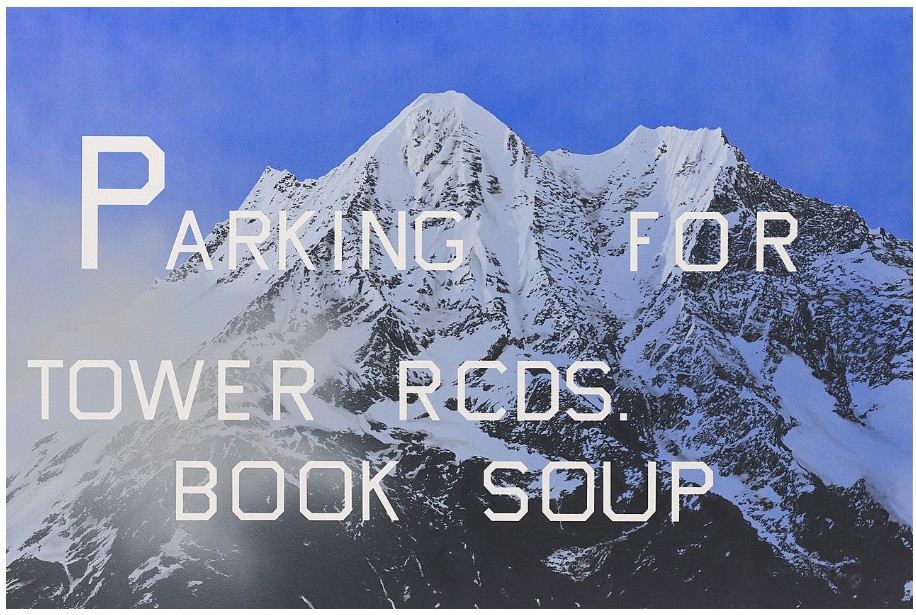
Ed Ruscha, Parking for Tower Rcds. Book Soup, 1999. Solomon R. Guggenheim Museum, New York. Artwork: © Ed Ruscha
Historically, mountains have symbolized the sublime—from Caspar David Friedrich’s romantic landscapes to the majesty of Albert Bierstadt’s Hudson River School imagery and Ansel Adams’ environmental photography. They represent the unreachable, the divine. But Ruscha subverts this tradition. Instead of spiritual awe, he offers slogans and slick surface. Obstructing the statuesque snow caped peak with his stylized white text spelling out the names of active Los Angeles thoroughfares, he undermines the quiet solemnity of the American landscape tradition. This discordant relationship of urbanity and the pastoral, text and image is characteristic of Ruscha’s gleeful irreverence towards semantics. The words seem to hover, disconnected from the landscape, caught in a liminal zone between real and unreal. Even nature, in Ruscha’s hands, becomes another layer of advertising, another image filtered through pop culture and contradiction. Albert Bierstadt, Merced River, Yosemite Valley, 1866. The Metropolitan Museum of Art, New York.
“A lot of my paintings are anonymous backdrops for the drama of words… In a way, they’re words in front of an old Paramount Studios mountain. You don’t have to have a mountain back there—you could have a landscape, a farm. I have a background, foreground. It’s so simple… just meant to support the drama, like the Hollywood sign being held up by sticks.”
Ruscha’s aim is not as much to create a pictorial representation, as it is to create a contrast which provokes the viewer to reconsider their understanding of the relationship between text and image. Ruscha’s irreverent treatment of the mountainous background in the present painting is almost Duchampian; a refashioning of imagery borrowed from the public consciousness in his own vision he challenges visual understanding itself. With Alvarado to Doheny, Ruscha delivers not just an image, but a meditation—a cool, wry critique of how we see, what we read, and the meanings we assign to the seemingly ordinary. In his hands, even the most majestic view becomes a canvas for doubt, irony, and play.
Blast Curtain, 1999
Christie’s New-York: 14 May 2025
Estimated: USD 4,000,000 – 6,000,000
USD 6,616,000
ED RUSCHA (B. 1937), Blast Curtain | Christie’s
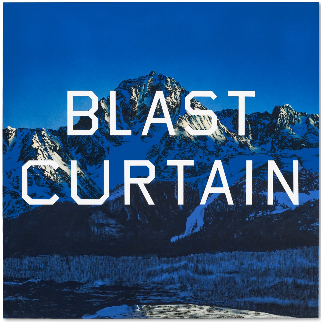
ED RUSCHA (B. 1937)
Blast Curtain, 1999
Acrylic on canvas
64×64 inches (162.6 x 162.6 cm)
Signed and dated ‘Ed Ruscha 1999’ (on the reverse)
Painted in 1999, Blast Curtain is an exquisite early example of the ‘mountain paintings’ that have become one of the most iconic series of paintings in Ed Ruscha’s acclaimed career. In this work, the words “BLAST CURTAIN” are spelled out in pristine ice-white lettering and placed centrally against a vista of sun-kissed, snow-capped peaks, forested plains and a clear blue sky. An intrepid explorer of the territory where language and image meet, it is Ruscha’s choice combinations of words and images that achieve the visual and conceptual dissonance that have distinguished him as one of America’s finest living artists. Testament to their significance within his oeuvre, over a dozen examples of Ruscha’s mountain paintings are included in the world’s most important museum collections including the Museum of Modern Art, New York, the Whitney Museum of American Art, New York and the Tate, London. Blast Curtain was included in a major exhibition of Ruscha’s work in 2000, which toured to museums including Hirshorn Museum, Washington D. C.; Museum of Modern Art Oxford; and Kunstmuseum Wolfsburg.
Despite the sublime beauty of the setting and the flawless execution of the painting, it is the power of words that has consistently motivated Ruscha. The sources for the text he chooses are various, encompassing phrases that he sees while driving, reading the newspapers, watching movies, listening to the radio or that he remembers from dreams. In Blast Curtain, it was the feeling the words evoked in Ruscha that made them memorable. “I like the idea that the anxiety of modern life could be hiding behind any given mountain,” he has said, “and the sounds of the city and everything. ‘Blast Curtain’ comes from those walls, those steel walls that you see at airports to cut down on sound. And I thought that this had to be painted so I could gammer down these words. And then the idea of some kind of fantasy mountains with the palindromic idea began to like say there’s some sort of crazy metaphor for glory.” (E. Ruscha, quoted in G. Adams, “King of pop art”, Independent, 8 October 2011).
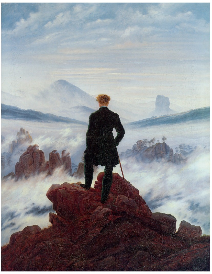
Caspar David Friedrich, The Wanderer above a Sea of Mists, 1818. Hamburger Kunsthalle, Hamburg.
Although Ruscha has worked with natural landscape imagery since the 1980s, he first began to use alpine scenery as a backdrop in 1997. Borrowing and amalgamating imagery from magazine illustrations, postcards and photographs, he chose the mountain setting because of its ability to combine visual drama with cultural ubiquity. “It’s just a setting,” he says. “A theatrical setting that is quite anonymous. It’s immediately recognizable … so that it just lands itself in the world of acceptance” (E. Ruscha, quoted at ibid.) This painting was made by initially spraying a thin layer of acrylic paint onto the canvas, then working the image up with flawless precision using a brush. The text was applied using a stencil, in an angular font that Ruscha devised himself called ‘Boy Scout Utility Modern’. It is unusual for having no curves, and it too has a neutral quality that appeals to Ruscha, who has used it in his work since 1980.
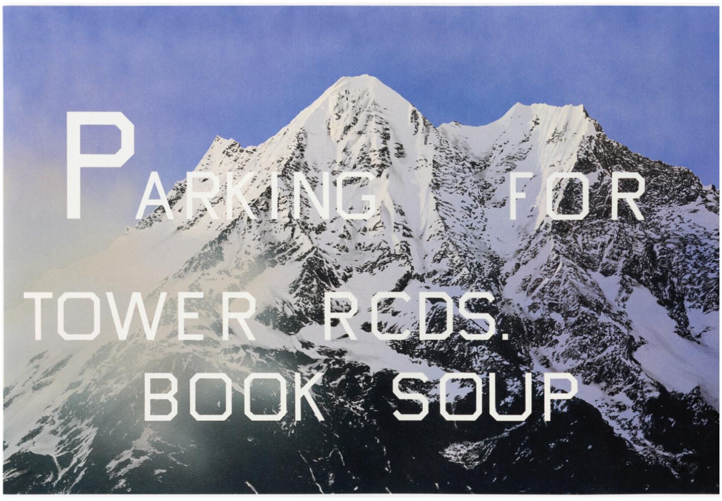
Ed Ruscha, Parking for Tower Rcds. Book Soup, 1999. Solomon R. Guggenheim Museum, New-York
Born in Oklahoma City in 1937, Ruscha moved to Los Angeles in 1956 to study design at Chouinard Art Institute. Although the landscapes that appear in his works are anonymous, they are steeped in the iconography of Hollywood and the vernacular architecture of the city he has for so long called home. He has explained, “A lot of my paintings are anonymous backdrops for the drama of words. In a way, they’re words in front of an old Paramount Studios mountain. You don’t have to have a mountain back there – you could have a landscape, a farm. I have a background, foreground. It’s so simple. And the backgrounds are of no particular character. They’re just meant to support the drama, like the Hollywood sign being held up by sticks” (E. Ruscha quoted in R.D. Marshall, Ed Ruscha, London, 2003, p. 239).
Devil or Angel, 1973
Christie’s New-York: 14 May 2025
Estimated: USD 2,500,000 – 3,500,000
USD 2,954,000
ED RUSCHA (B. 1937), Devil or Angel | Christie’s
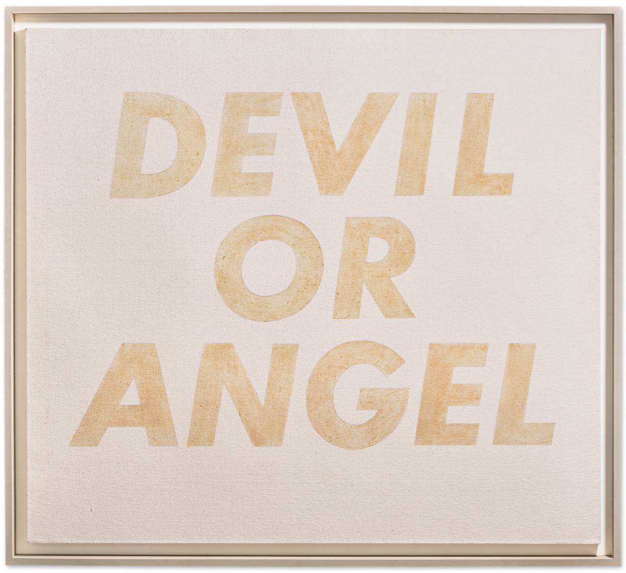
ED RUSCHA (B. 1937)
Devil or Angel, 1973
Red cabbage stain on canvas
54×60 inches (137.2 x 152.4 cm)
Painted in 1973, Devil or Angel is a quintessential example of Ed Ruscha’s early ability to balance aesthetic elegance with wry humor. One of an exceptional series of works the artist made in the late 1960s and early 1970s using organic materials as opposed to traditional paint, the italicized letters that spell out the words “devil or angel” have been formed against a raw white canvas using the colored juice of a red cabbage. The minimal look achieved by the painting’s tight composition and spare formal elements—the single, pale color and the easily legible, quotidian font—conflicts with the freighted meaning of the three words to create a resonant work that cannot be ignored.
Positioning the words centrally on a large, nearly square canvas, Ruscha appears to be posing a bold question to the viewer. Yet, in leaving out the question mark, the text transforms into an enigmatic statement. The mystery is further underlined by the textured, hand-painted quality of the red cabbage stain used to articulate the letters. Its pale pink-orange color feels ephemeral and fragile, which is firmly at odds with the striking biblical imagery evoked by the three words. Ruscha always plays with the relationship between text and image, allowing words to float free of their usual semantic associations. As he has said, combining words and images creates a pivotal “tension [that] is where I live” (E. Ruscha, quoted at “Ed Ruscha and the Art of the Everyday”, online [accessed: 4/8/2025).
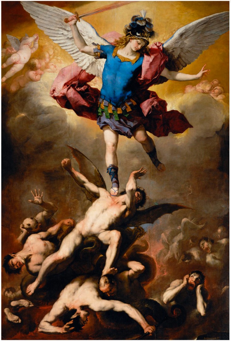
Luca Giordano, The Fall of the Rebel Angel, 1660-1665. Kunsthistorisches Museum, Vienna.
Unusually for Ruscha, whose work is characteristically impersonal, the words featured in Devil or Angel hint at the artist’s own autobiography. Born in 1937 in Oklahoma, Ruscha was raised Roman Catholic. “I am a confirmed atheist today, but the church helped me get where I am,” he told a newspaper in 2021. (E. Ruscha, quoted in M. Wecker, “Ed Ruscha, the most famous Catholic artist few Catholics know, National Catholic Reporter, January 21, 2021) Over the course of Ruscha’s career, he has continued to explore some of the central tenants of the faith in which he was raised in works such as, “Evil” (1973), 99% Angel, 1% Devil, (1983), “51% Angel, 49% Devil” (1984), “Heaven” (1988), “Hell” (1988), “Miracle” (1999) and “The Holy Bible” (2003).
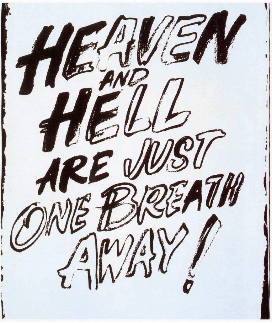
Andy Warhol, Heaven and Hell, circa 1984-86. Andy Warhol Museum, Pittsburgh.
© 2025 The Andy Warhol Foundation for the Visual Arts, Inc. / Licensed by Artists Rights Society (ARS).
The use of non-traditional methods to make Devil or Angel is rooted in a fascination with materials that originated in the artist’s childhood. A friend used Higgins India ink to draw cartoons, and from that moment Ruscha was hooked. “I had a very tactile sensation for that ink; it’s one of the strongest that has affected me as far as my interest in art” (E. Ruscha, quoted at Tate, ibid). This interest was reflected in one of Ruscha’s earliest bodies of work, from which Devil or Angel would emerge. This included Stains, a portfolio of prints made in 1969, which consisted of works made using egg yolk, turpentine, beer, salad dressing, gunpowder and even the artist’s own blood. He went on to make works on linen and canvas, using materials as diverse as Pepto-Bismol and caviar, chocolate and rose petal stain, cilantro stain and egg yolk. Such imaginative combinations and bold experiments speak to Ruscha’s consistent ability take elements from the everyday and rethink them entirely afresh, an impulse that has rightfully positioned him as a central figure in postwar American art.
Yip Yip, 1994
Sotheby’s New-York: 16 May 2025
Estimated: USD 600,000 – 800,000
USD 2,246,000
Yip Yip | Contemporary Day Auction | 2025 | Sotheby’s
ED RUSCHA (b. 1937)
Yip Yip, 1994
Acrylic on canvas
84×60 inches (213.4 x 152.4 cm)
Signed and dated 1994 (on the reverse)
A striking example from Ed Ruscha’s acclaimed Silhouette series, Yip Yip from1994 presents a dramatic portrait of a howling coyote whose high-pitched vocalizations of ‘yip yip’ are palpable through his pose. Amidst a hazy grayscale ether, the animal’s silhouetted visage emerges, creating a visual experience that is at once alluring in the viewer’s proximity to the potentially dangerous creature and unsettling in the surreal quality of the impending dusk that surrounds. The diagonal thrust formed by the upward turn of the coyote’s nose calls to mind the same formal compositional device present in many of Ruscha’s most iconic paintings, including his portrayal of the Hollywood sign and Standard Oil stations from the 1960s, while his use of airbrushing ignited a new direction in his continuously innovative artistic vocabulary. Using an airbrush, Ruscha created an atmosphere reminiscent of the chiaroscuro light of film noir and contrived a low, cinematic vantage point that positions the viewer as silent witness to the scene, akin to a spectator peering upwards at a film in a state of awe or vulnerability.
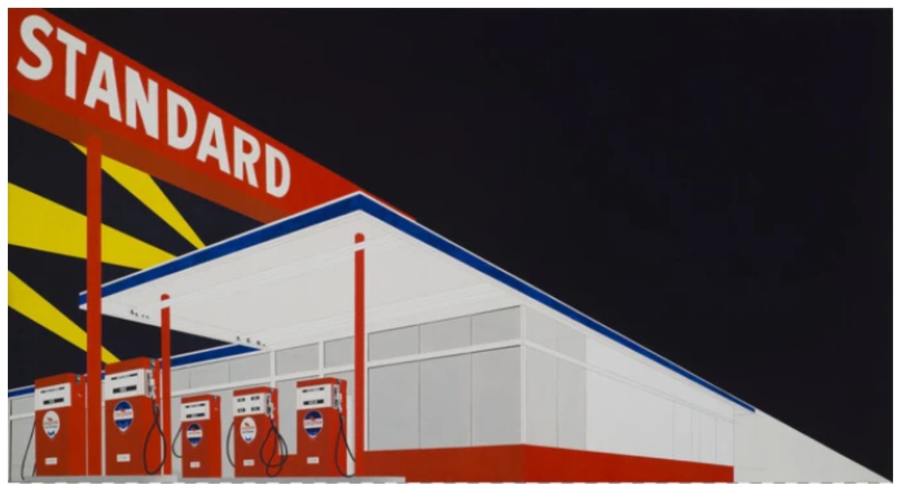
Ed Ruscha, Standard Station, Amarillo, Texas, 1963, Hood Museum of Art, Dartmouth College. IMAGE © Ed Ruscha
Throughout his six-decade-long career, Ed Ruscha has consistently demonstrated his shrewd wit and technical dexterity, yet the artist has reinvented his artistic language throughout his oeuvre, continually producing new bodies of work that solidify his position as one of the most innovative and influential artists of his generation. In contrast to Ruscha’s earlier ‘cool’ paintings, created to echo the slick language of advertising with a sharply delineated hard-edged approach, the velvety aura present in his Silhouette series started in the mid-1980s arose from the artist’s interest in making paintings without any visible brushstrokes. In his quest to explore the creative possibilities afforded by a spray gun, Ruscha deftly achieved an atmospheric softening of focus, making the familiar outline of a coyote appear strange and frightening in the present work.
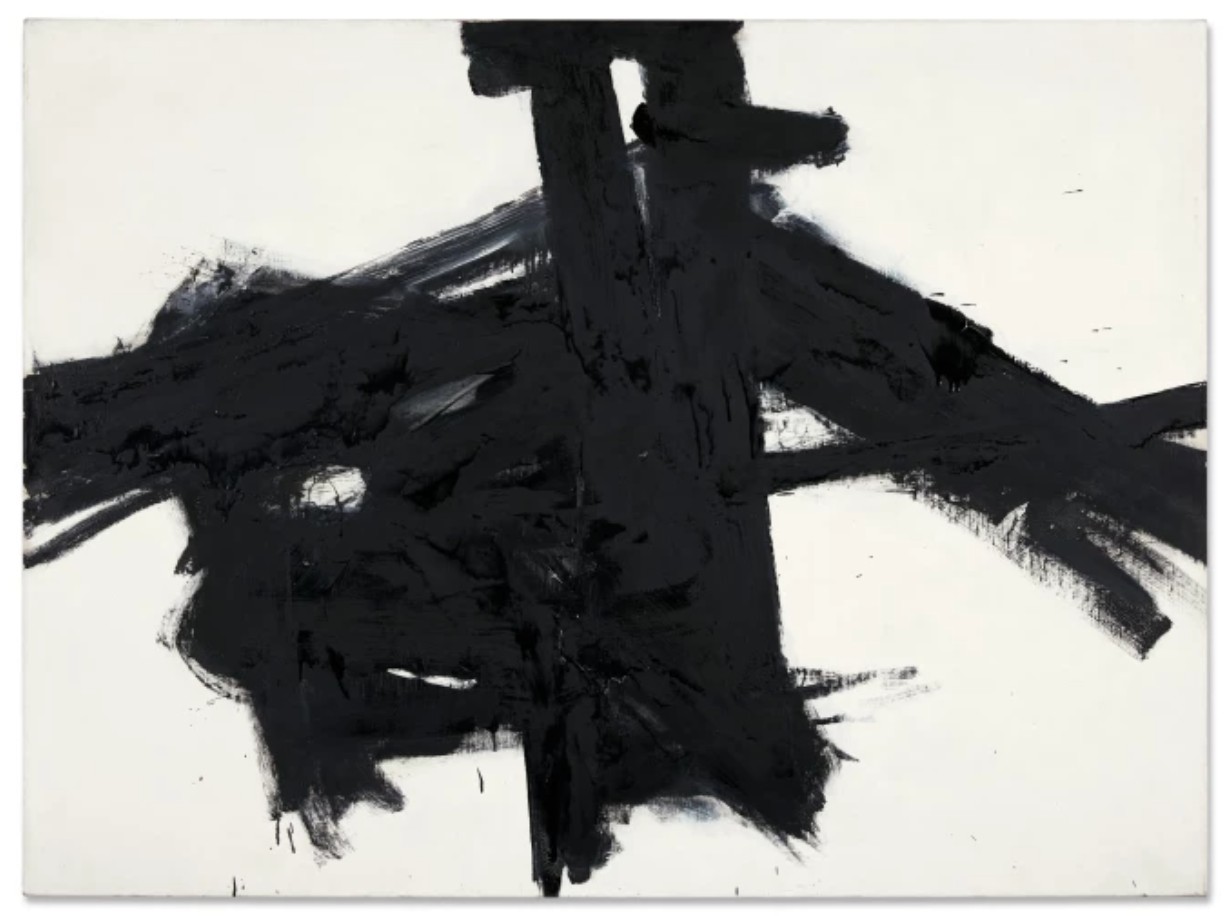
FRANZ KLINE, CROSSTOWN, 1955. PRIVATE COLLECTION.
SOLD AT SOTHEBY’S NEW YORK FOR $12 MILLION ON 15 NOVEMBER 2021.
In his Silhouette series, Ruscha also embraced the challenge of eliminating color to work primarily in the nuances of black and white, citing the art historical precedent of Franz Kline, as well as his lifelong interest in film, as inspiration. This body of work encompasses the nebulous silhouettes of imagery including slipper ships, covered wagons, suburban houses, and animals, which collectively refer to America’s history of westward migration and the subsequent mythic fantasy of the American West, as well as broader themes of memory and the passage of time. The coyote portrayed in the present work connects with Ruscha’s Oklahoma upbringing, a South Central United States locale he left at the age of nineteen to study at the Chouinard Art Institute (now California Institute of the Arts) and his experiences traversing the open road of desert and prairie habits where coyotes are most commonly spotted while photographing his celebrated gas stations. As a canine known for its characteristics of independence and intelligence, the coyote can also be viewed as a surrogate for the trailblazing artist.
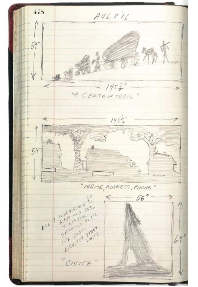
A sketch for the present work illustrated in the artist’s studio notebook, August 1986.
Robert Dean, ed., Edward Ruscha: Catalogue Raisonné of the Paintings, Volume Five: 1993-1997, New York 2012
While Ed Rusha’s exploration of the creative possibilities achieved with a spray gun in his Silhouette series served as an extension of his ongoing exploration with innovative media and methods, ranging from caviar to gunpowder to chocolate, the paintings also serve as an evolution of his longstanding engagement with language and sound. As an evolution and extension from this point, by the mid-1980s, Ruscha found he could also imbue the silent medium of painting with sound without his former reliance on the intermingling of text and image to convey an audible effect. In Yip Yip, Rusha evokes a textual narrative with sound implicitly present, both in the title and coyote’s gesture, serving as an evolution of the artist’s longstanding exploration of the shape, sound and feeling of words.
Ed Ruscha’s Silhouette Series Paintings in Institutional Collections
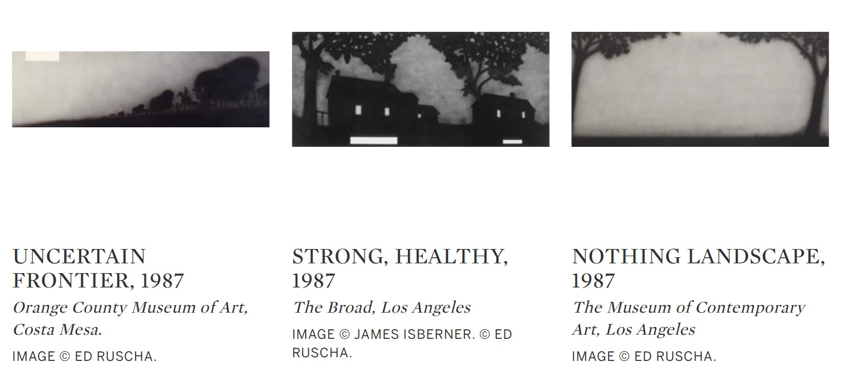
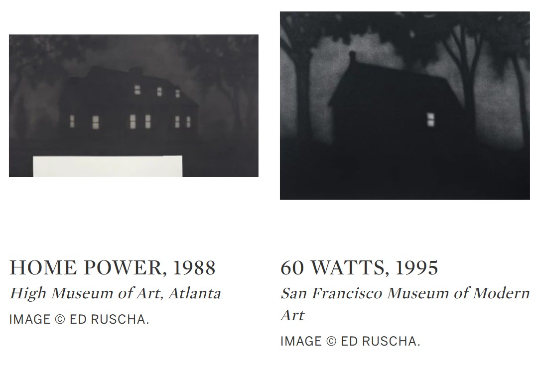
Ed Rusha’s Silhouette series was embraced by the art world at the outset of its creation, serving as a testament to the artist’s perpetual reinvention that defines his artistic legacy. In 1987, the Whitney Museum of American Art, New York selected two Silhouette paintings executed the year prior to include in their Biennial and in 1991, the Museum of Modern Art, New York acquired a similar animal painting from the series, an elephant titled Jumbo, for their permanent collection. In addition to early critical acclaim, the enduring importance of this body of work within the artist’s oeuvre is reinforced by the presence of examples from the series in the collections of The Broad, Los Angeles, the San Francisco Museum of Modern Art; The Museum of Contemporary Art, Los Angeles and the High Museum of Art, Atlanta, among many others.
Dixie Red Seville, 1985
Phillips New-York: 13 May 2025
Estimated: USD 1,800,000 – 2,500,000
USD 1,996,000
Ed Ruscha Modern & Contemporary Art Evening Sale
Known for a body of work that falls between the Pop and Conceptual art movements, Ruscha got his start in advertising before switching to fine art, and like his peers Andy Warhol and Roy Lichtenstein, his commercial beginnings had a strong influence on his art practice. Ruscha engages an advertising sign painter’s signature technique, stenciling, to achieve the crisp juxtaposition of angular text against the wide brushstrokes of sky in Dixie Red Seville. In the present work, Ruscha painted the blue background before applying the red and black text, the inverse of the “reverse-stenciling” technique used on later airbrush works, such as SERIES GOLDIE TBD. Similarly, the large scale and easy legibility of Dixie Red Seville draws on advertising techniques, encouraging the viewer to extrapolate various emotions and meanings from a simple set of words.
Ruscha often found inspiration from phrases glimpsed while driving out west. The diagonal composition of Dixie Red Seville recalls the way in which the highway can seem to run infinitely into the horizon, especially across the flat expanses of the American Southwest. The layered text effect encourages the eye to move along the diagonal axis of the work at least twice, taking in the words, and the shifting sky, repeatedly. With Dixie Red Seville, Ruscha engages modernist preoccupations with the pursuit of flatness and multiplied symbolic meaning on the picture plane, reinterpreted into the mythos of the American Southwest.
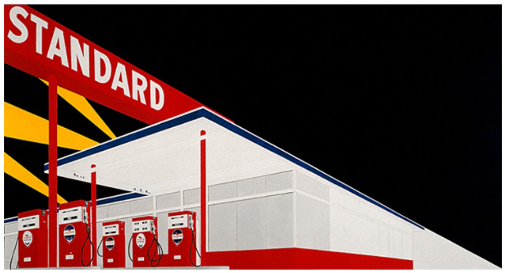
Ed Ruscha, Standard Station, Amarillo, Texas, 1963. Hood Museum of Art, Dartmouth College. Artwork: © Ed Ruscha
The left-to-right diagonal text of Dixie Red Seville gives the work a narrative quality, as well, drawing on some of Ruscha’s earlier, more conceptual work. His 1963 artist’s book, 26 Gasoline Stations, documents every gas station between his mother’s home in Oklahoma City, and Ruscha’s adopted hometown of Los Angeles. The book format implies a narrative continuity—one flips from page to page, presumably moving forward in time, along the course of the quintessentially American road trip out west. Similarly, the movement of the eye from top left to bottom right of Dixie Red Seville suggests narrative and duration, a quality that’s drawn out further through the associations of the painted words.
“I don’t consciously insert [a message] into my work, I like the idea of a word becoming a picture, almost leaving its body,
then coming back and becoming a word again.”
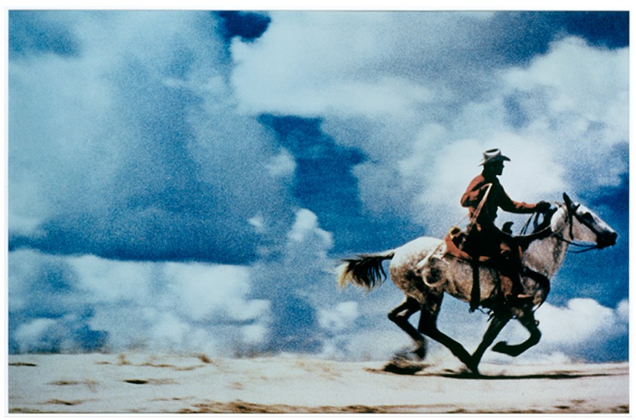
Richard Prince, Untitled (cowboy), 1989. The Metropolitan Museum of Art, New York.
Image: © The Metropolitan Museum of Art / Art Resource, NY, Artwork: © Richard Prince
The multiplying associations of each word in Dixie Red Seville recall the semiotic concept of “floating signifiers,” words whose meanings don’t necessarily refer to a concrete, physical object, and thus can be reinterpreted based on their context. This is certainly the case with Dixie Red Seville; while the words floating against the blue sky may conjure the idea of a Cadillac driving through the South, they are open to interpretation. There is no red Cadillac on the picture plane to tie the words to any particular meaning. This aligns with Ruscha’s philosophy towards his word-paintings as a whole, as he collapses the distinction between meaning and representation, word and image.
Johnny Tomorrow, 1984
Leonard & Louise Riggio: Collected Works
Christie’s New-York: 12 May 2025
Estimated: USD 1,500,000 – 2,000,000
USD 1,008,000
ED RUSCHA (B. 1937), Johnny Tomorrow | Christie’s
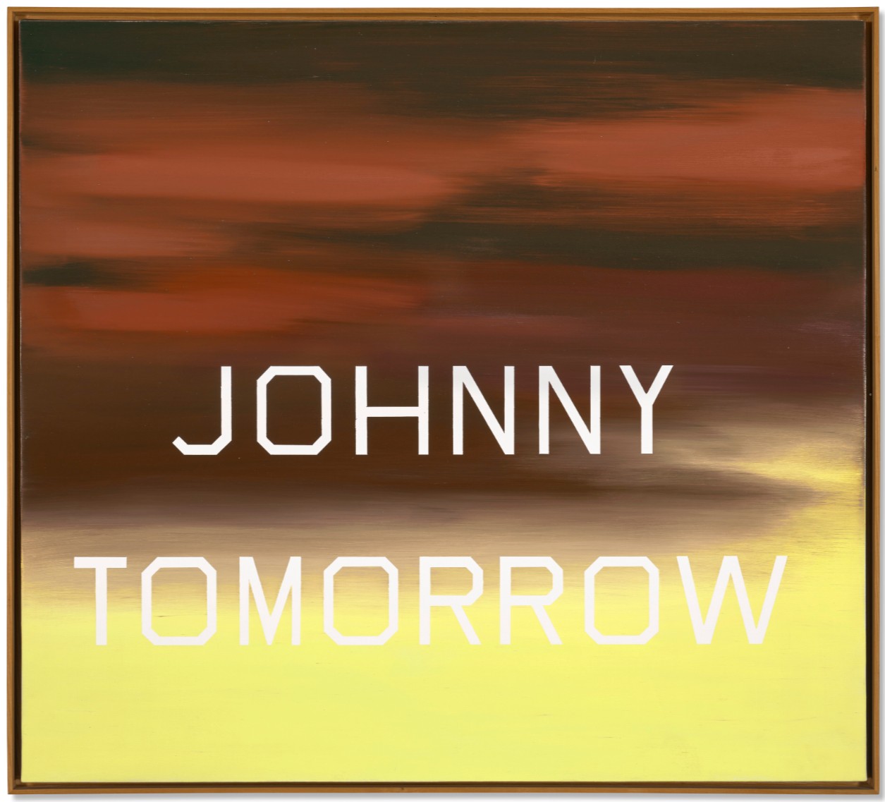
ED RUSCHA (B. 1937)
Johnny Tomorrow, 1984
Oil on canvas
36×40 inches (91.4 x 101.6 cm)
Signed twice, titled and dated twice
‘Ed Ruscha 1984 EDWARD RUSCHA “JOHNNY TOMORROW” 1984’
(on the backing board)
Exacting in execution and masterful in conception, Johnny Tomorrow, emerging from Ed Ruscha’s iconic word paintings, sees the eponymous text suspended cinematically at the center of a twilight sky which transitions into a cream colored foreground, the lower half of “tomorrow” fading poetically into illegibility against its light backdrop. Marking Ruscha’s return to traditional painting within his classic square format, the canvas evinces the lessons learnt from the artist’s novel explorations in unconventional media—which spanned from gunpowder to jelly and chocolate—during the artist’s sojourn from 1968 away from his paintbrush. Ruscha approaches the canvas with a newfound lyricality, attending even more closely to the subtle effects of his materials after years of experimentation. The effects are visually and mentally engaging, the artist himself noting that the present work “scratches at the back of the brain” (quoted in Edward Ruscha: Catalogue Raisonné of the Paintings, Volume Three: 1983-1987, eds. R. Dean and E. Wright, New York, 2007, p. 104).
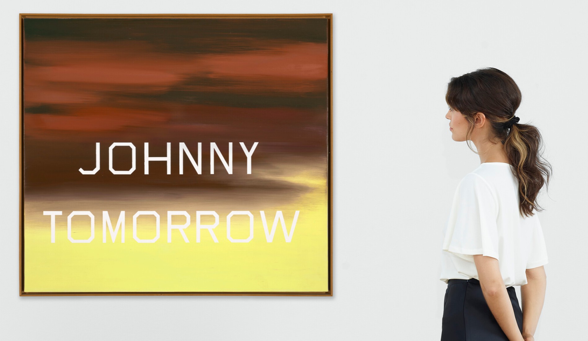
Ruscha deploys an innovative technique composing this image, which he terms “reverse stenciling.” First engaging stenciled letters to demarcate his carefully constructed typefaces across the canvas, Ruscha then painted the composition. After completing the painting, he removed the stencils, revealing his letters as spaces of white gessoed ground in an unreversible, subtractive process. His innovative technique was at once thoroughly contemporary whilst recalling the red-figure Attic vase painters of antiquity, the effect compellingly completing his composition in a single revelatory act establishing Ruscha’s text as a preconceived figure against the painted ground. Ruscha elucidates how he views his meticulous process-based practice separately from the painterly approach of the Abstract Expressionists, describing how “they wanted to collapse the whole art process into one act; I wanted to break it into stages, which I do now. First, whatever I’m going to do is completely premeditated, however off-the-wall it might be. Then it’s executed, you know, fabricated” (quoted in The Works of Ed Ruscha, San Francisco Museum of Art, exh. cat., 1982, p. 27). Ruscha’s premeditated fabrication of Johnny Tomorrow draws from his training as both a graphic artist and aligns with his broader oeuvre; each painting is meticulously planned, with each element drafted in advance in studies. Each word and phrase is carefully chosen, and even the composition of his colors are scientifically articulated in terms of percentages of pigment by the early ages of his drafting process. Ruscha calibrates every part of the composition in advance of the canvas’s priming, his procedure contrasting diametrically to the gestural action painting of the generation before. His innovative procedure-based effort artfully articulates the great American artist’s symphonic character, wherein every element is related thematically and harmonically within and across each work.
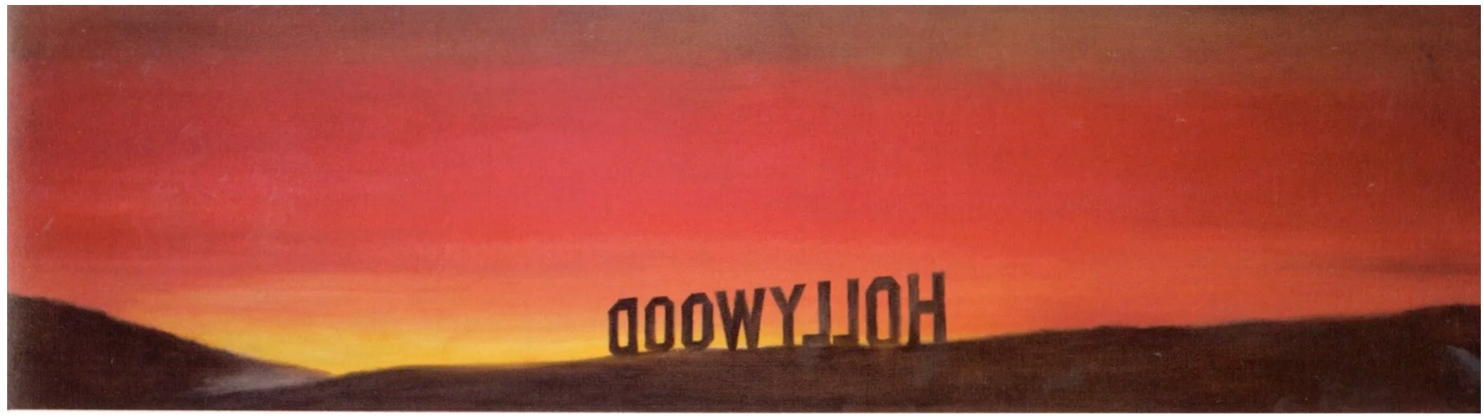
Ed Ruscha, The Back of Hollywood, 1977. Musée d’Art Contemporain, Lyon. © Ed Ruscha.
Johnny Tomorrow evokes in its swarthy upper register the last vestiges of sunlight eking through scattered clouds, the fading light signaling the end of the day poignantly juxtaposing with “tomorrow” to imbue the work with a sense of cyclicality, one day ending anticipating the coming morrow. The mellow cream yellow in the foreground recalls the day’s first illumination as the sun peaks above the horizon, the clarity of tone and form resembling daybreak. Ruscha plays into this association through his strategic placement of “tomorrow” within this dawn-colored passage, establishing a dichotomy between the upper twilight signaling the ending of one day and the lower dawn heralding a new beginning. The artist challenges expectations, evincing what art critic Dave Hickey describes as how his paintings “derive their complexity from their complicity with the world around them… they are complexity itself” (“The Song of the Giant Egress,” in Edward Ruscha: Catalogue Raisonné of the Paintings, Volume Three: 1983-1987, eds. R. Dean and E. Wright, New York, 2007, p. 10).
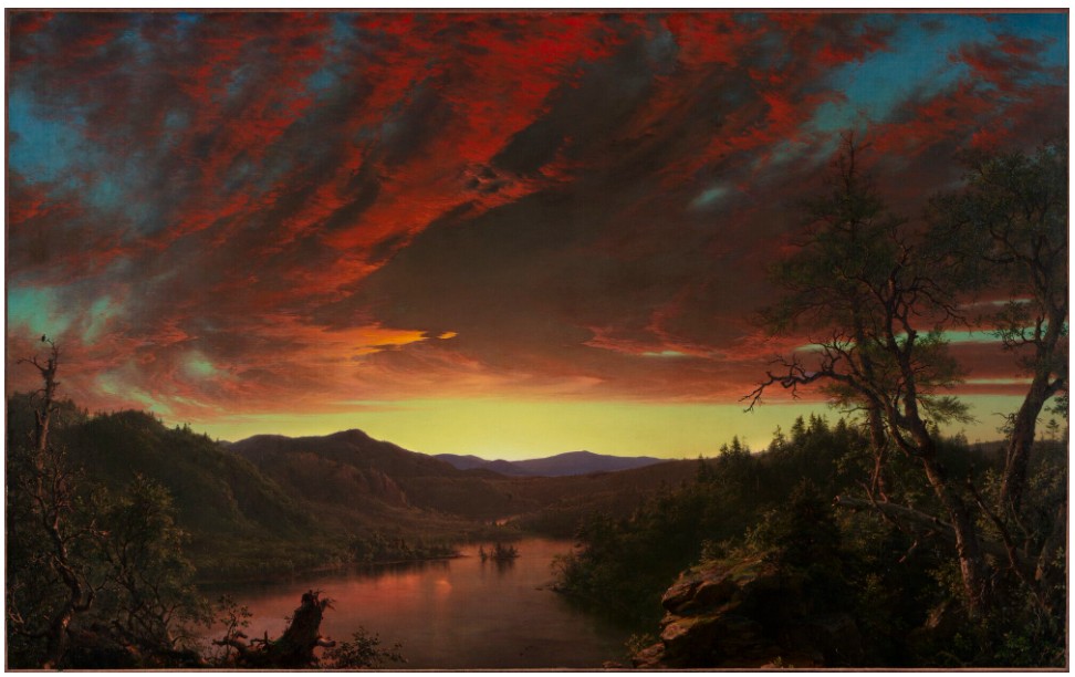
Frederic Edwin Church, Twilight in the Wilderness, 1860. Cleveland Museum of Art.
The titular phrase functions as a multi-referential association toward both a character trait and current American slang, paralleling Ruscha’s contemporaneous increased interested in the participatory, social aspect of his works. The title recalls a bevy of Hollywood movie titles and characters quite apropos for the Los Angeles-based artist: Johnny Apollo (1940), Johnny Eager (1941), Johnny Angel (1945), Johnny O’Clock (1947), Johnny Guitar (1954), Johnny Cool (1963), or Johnny Friendly from On the Waterfront (1954). Implicated into the self-referential obsessions of the Los Angeles film industry, Johnny becomes removed from its original sense as nomenclature, metamorphosizing instead as a character trait replayed “ad infinitum.” A commensurate wordsmith with the poise of a poet, Ruscha simultaneously plays against the slang phrase “Johnny on the spot,” with “Johnny Tomorrow” evoking instead the antithesis of a reliable personage and instead constructing an existentialist figure educing Samuel Beckett’s Godot, a personage always coming, never arriving. Simultaneously serious and cheeky, Johnny Tomorrow elegantly condenses low and high brow culture into a singular tableau, reveling in Ruscha’s mastery of the possibilities of text and the ambiguities of linguistic meaning.
Johnny Tomorrow exhibits the great American artist’s trademark whit and poetic diction, conveying at once technical mastery and an astounding command of language which succinctly captures the American zeitgeist. Ruscha shows with this work a revitalized sense of the cinematic as his unique dialect begins to emphasize a sense of participation with his audience. Reflecting back to his earlier word paintings, Ruscha here signals both the resurgence and the continued development of his celebrated style.
Radar, 1976
Christie’s New-York: 15 May 2025
Estimated: USD 500,000 – 700,000
USD 781,200
ED RUSCHA (B. 1937), Radar | Christie’s
ED RUSCHA (B. 1937)
Radar, 1976
Pastel and graphite on paper
22 1/8 x 28 1/8 inches (56.1 x 71.4 cm)
Signed and dated ‘Edward Ruscha 1976’ (on the reverse)
The End #81, 2009
Phillips New-York: 13 May 2025
Estimated: USD 350,000 – 450,000
USD 406,400
Ed Ruscha Modern & Contemporary Art Evening Sale
Ed Ruscha’s The End #81, 2009, is a powerful final statement. Stark white capital letters sit against a smoky red background, punctuated by gray smudges and streaky white lines. These imperfections resemble dust particles and scratches on old films, evoking the aesthetics of classical Hollywood cinema, an enduring influence in Ruscha’s work. The titular text seems to almost glow, projecting its ominous message in a nearly three-dimensional manner against the otherwise flat picture plane. The artist first introduced the phrase “The End” into his works in 1982, and has revisited it repeatedly throughout his career, imbuing the phrase with a sense of renewal which is unique to his practice. The End #81 poignantly captures the fading allure of a once-glamorous era, highlighting the fleeting and mesmerizing space where the past and present meet.
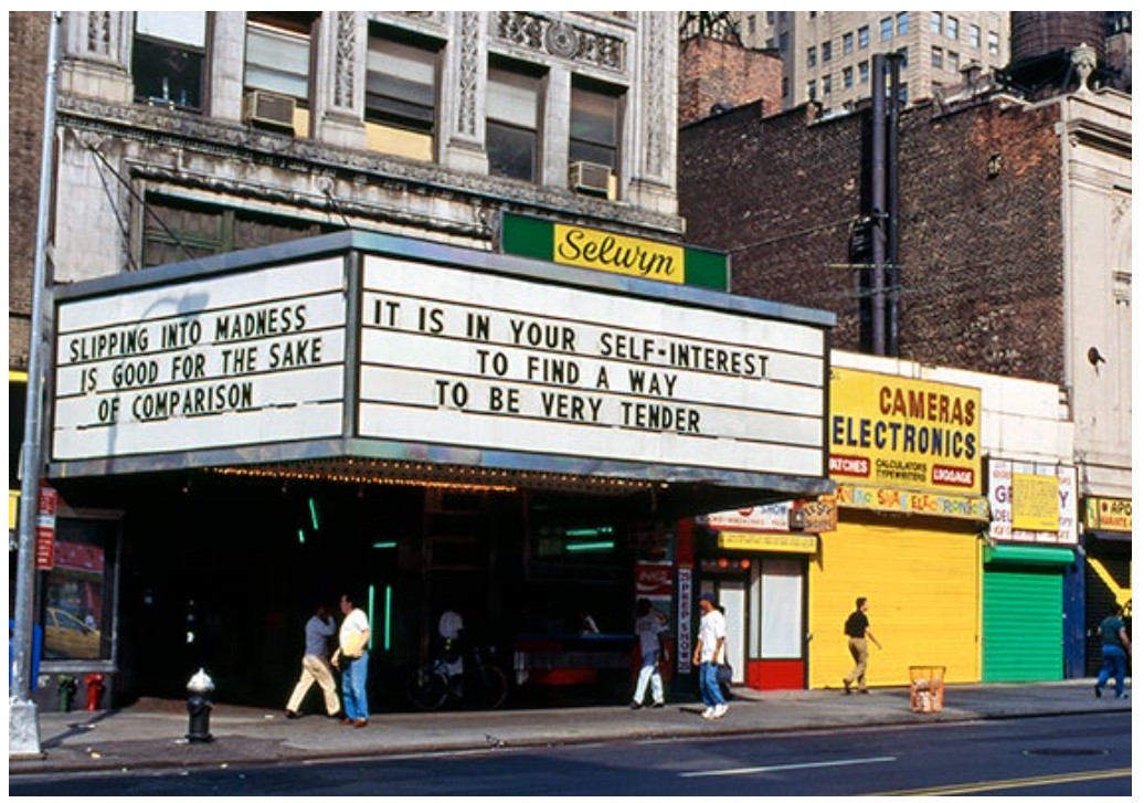
Jenny Holzer, from Truisms, 1977-79; Survival, 1983-85. Theater marquee. Installation: Forty-second Street Art Project, Times Square, New York, 1993. Image: Jenny Holzer / Art Resource, NY, Artwork: © 2025 Jenny Holzer, Artists Rights Society (ARS), New York
Since the 1960s, Ruscha’s works have been informed by his fascination with Old Hollywood storytelling and American consumerism, both of which manifest in the present work. Growing up in Oklahoma watching black and white movies, Ruscha moved to Los Angeles in 1956, drawing inspiration from the city and its place at the center of the booming film industry. Recalling these movies, Ruscha fashioned The End #81 to mimic the final credit projects at the end of a classic movie. “If I’m influenced by the movies,” Ruscha notes, “it’s from way down underneath, not just on the surface. A lot of my paintings are anonymous backdrops for the drama of words… the backgrounds are of no particular character. They’re just meant to support the drama.”
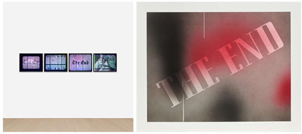
Ed Ruscha, The End, 2016. Artwork: © Ed Ruscha
Ed Ruscha, The End, #45, 2004. Artwork: © Ed Ruscha
Beyond the cinematic references, The End #81 also meditates on the passage and eventual end of time. Projecting a familiar message into the context of the digital age, Ruscha prompts reflection on technological change and the shifting landscape of American culture. As noted by Ana Torok, “Ruscha’s fascination with the materiality of degraded film goes beyond a purely optical preoccupation; it also marks time. When committing this image to canvas, he was struck by the fact that at some point in the future, viewers unfamiliar with the analog medium will no longer comprehend what they are seeing.” Employing once-used visual language, the present work becomes a nostalgic time capsule, preserving the essence of a disappearing era. As Ruscha himself noted on the finality of The End works, “yes, that’s a powerful thing. It’s the end – here it is – the end. It’s a powerful and final kind of thought.”
Gerhard Richter
Korsika (Schiff), 1968
Christie’s New-York: 12 May 2025
Estimated: USD 8,000,000 – 12,000,000
USD 15,245,000
GERHARD RICHTER (B. 1932), Korsika (Schiff) | Christie’s
GERHARD RICHTER (B. 1932)
Korsika (Schiff), 1968
Oil on canvas
86 x 91.1 cm (33 7/8 x 35 7/8 inches)
Signed, inscribed, titled and dated ‘KORSIKA (III) Richter 68’ (on the reverse)
Gerhard Richter’s Korsika (Schiff) belongs to an important group of paintings that established the artist’s landscapes as a pivotal part of his oeuvre. In 1968, Richter painted just three canvases featuring various views of Corsica following a family holiday to the island, with two further canvases painted the following year. Originally intended only as a private project to memorialize a special place for the artist and his family, these landscapes would actually open up new fields of artistic exploration, and encourage the artist’s journey to abstraction. This series is also the first of Richter’s landscapes to be painted in color, with one example from the series—Korsika (House)—in the permanent collection of the Seattle Art Museum.

Set amidst a dramatic landscape of majestic mountains and foreboding skies, a small sailing ship traverses a calm sea. As is typical of this discrete series, the horizon line is placed low in the composition leading to a predominance of sky. Here, dark clouds loom but there is a break in the moody gray large enough to let a shaft of light through to illuminate the sails of the ship (or “Schiff” in Richter’s native German) on the surface of the water. Unlike his earlier black-and-white or monochromatic landscapes, this new series is painted using color pigments—indeed these paintings of Corsica are the first landscapes in which Richter introduced color. In similar innovative fashion, and again in contrast to his earlier landscapes, the hard-edged lines that mark out the different areas of paint have been replaced by differentiating edges of paint that display extreme subtlety and softness, leaving an atmosphere of sublime beauty. Richter’s biographer and director of the Gerhard Richter Archive notes, “Details of the ostensible scene elude the viewer, who, in trying to break through the photographic illusion, encounters a perception impasse: the subject surrenders its illusionism as a scene to be transformed again into a painting” (quoted in Gerhard Richter: A Life in Painting, Chicago, 2002, p. 173).
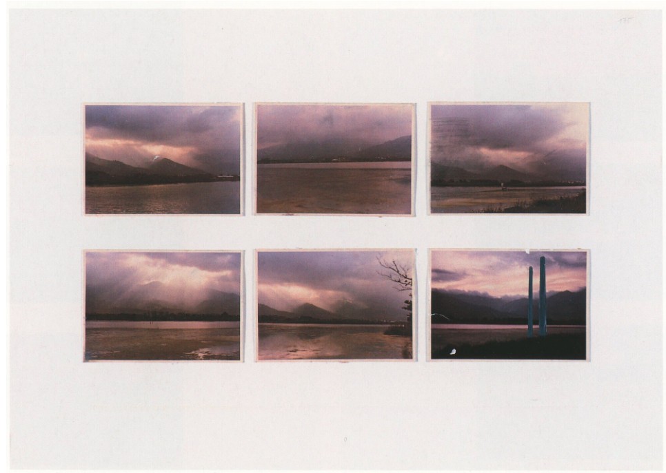
Landschaften, 1969, Atlas Sheet 181 (source image for the present lot). © Gerhard Richter 2025 (0050).
By 1968, Richter was financially secure enough to be able to take his family away on a proper vacation. Together with his wife, Ema, and daughter, Betty, the artist spent two weeks on the Mediterranean island of Corsica. During the trip, Richter took dozens and dozens of photographs of the island’s mountains and coastline. Back in Germany, he selected six photographs which he used as the basis for these paintings. Initially, Richter had intended these to be for his personal enjoyment only, but as he painted he began to realize the physicality of the landscape and decided to investigate further their painterly potential. This line of inquiry would ultimately lead to his iconic Abstraktes Bilder, the series of sweeping abstracts in which the painterly gesture reigns supreme. As the artist’s biographer Dietmar Elger has observed, “In several senses—conceptual, aesthetic, and technical—[Richter’s landscapes] would serve as a bridge from the photo-paintings to the abstract paintings soon to come” (Ibid.).
Caspar David Friedrich, Sea Shore in Moonlight, circa 1835-1836. Hamburger Kunsthalle.
The Korsika paintings were also executed at a time of political and social unrest around the world. 1968 was the year that witnessed the widespread protests, strikes, and civil unrest, from the Prague Spring beginning in January in the Czechoslovak Socialist Republic, to the student and labor-led demonstrations in May in France. Across the Atlantic, there was also widespread dissension at the Democratic National Convention in Chicago in August, following a politically turbulent year in the aftermath of the assassination of Martin Luther King Jr. Richter’s abstracts emerged almost immediately as a discrete motif for the artist, a quiet moment of contemplation in the midst of such chaos and unrest. In making them, Richter was retreating into a rural idyll, away from the urban unrest of the era: “I felt like painting something beautiful,” he said in 1970 (Ibid).
With paintings such as the present work, Richter is following in a grand tradition of German landscape painters. There are strong visual parallels between his work and that of the Romantic painter Casper David Friedrich, currently the subject of a major American retrospective at the Metropolitan Museum of Art in New York. Both artists’ landscapes are characterized by deep-set horizons, a high sky, and a sparse foreground often only populated with an isolated building or object for scale. Despite living more than one hundred years apart, the two share similarities in their personal experiences of the power of nature, as Richter himself says, “A painting by Casper David Friedrich is not a painting of the past. What is past is only the set of circumstances that allowed it to be painted: specific ideologies, for example. Beyond that, if it ‘good,’ it concerns us—transcending ideology—as art that we ostentatiously defend (perceive, show, make). Therefore, ‘today,’ we can paint as Casper David Friedrich did” (Ibid.).
Gerhard Richter, Düsseldorf, 1971. Photo: Angelika Platen / Art Resource, New York.
Korsika (Schiff) belongs to a series that established Richter’s Landscapes as a seminal body of work. He has been painting landscapes for more than half a century and no other motif has absorbed him in quite the same way, yet the actual number of paintings is relatively few. Thus, their importance lies not in their number, but in the prominent position they occupy in his body of work acting as the bridge between the early photorealist paintings with which he made his name and the abstract canvas which have come to dominate the latter part of his career.
Abstraktes Bild, 2009
Leonard & Louise Riggio: Collected Works
Christie’s New-York: 12 May 2025
Estimated: USD 7,000,000 – 10,000,000
USD 8,460,000
GERHARD RICHTER (B. 1932), Abstraktes Bild | Christie’s
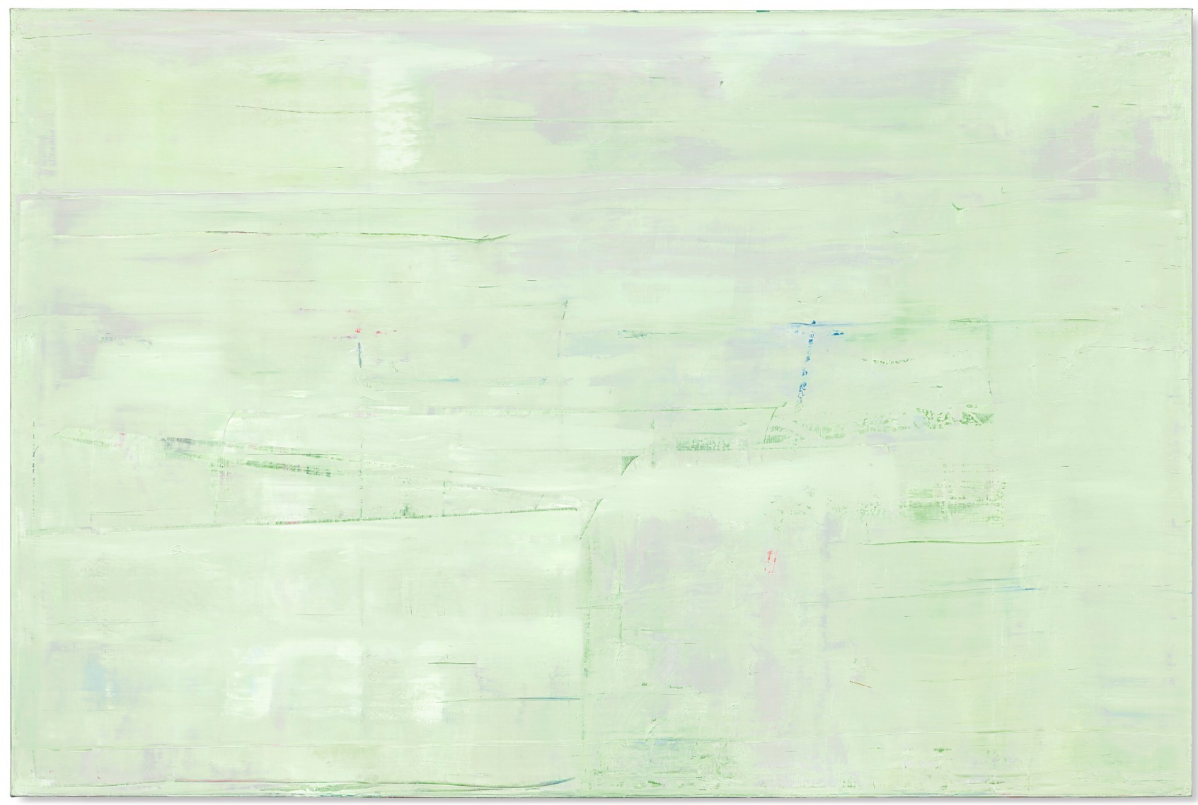
GERHARD RICHTER (B. 1932)
Abstraktes Bild, 2009
Oil on canvas
200×300 cm (78 3/4 x 118 1/8 inches)
Signed, inscribed and dated ‘911-3 Richter 2009’ (on the reverse)
sublime example of Gerhard Richter’s famed abstract paintings, Abstraktes Bild stands at the culmination of almost three decades of painterly exploration. In this large-scale work, expansive sweeps of ethereal pigment envelop a panoramic canvas; an initial consideration announces an almost monochromatic veil of white, but further attention discloses a subtle palette of soft greens, red, blues, pinks and mauves that emerge through the diaphanous upper layer of paint to make themselves visible. The artist began his interrogations of the painted surface in the 1960s with his ‘blurred’ photo paintings, a revolutionary series of works which evolved into his Abstraktes Bilder, the now iconic series of paintings which have come to dominate the latter part of his career. These majestic paintings are celebrated as some of the most visceral and cerebral examinations of what it means to be a painter working today and are now sought after by both major collectors and institutions alike.
The outward simplicity of a painting such as Abstraktes Bild belies the time taken in, and complexity of, its realization.
“A picture like this is painted in different layers, separated by intervals of time. The first layer mostly represents the background, which has a photographic, illusionistic look to it, though done without using photograph. This first, smooth soft-edged paint surface is like a finished picture; but, after a while, I decide that I understand it or have seen enough of it, and in the next stage of painting, I partly destroy it, partly add to it, and so it goes on at intervals, ‘til there is nothing more to do and the picture is finished.”
Gerhard Richter in his studio, 1994. Photo: Benjamin Katz. © 2025 Artists Rights Society (ARS), New York/ VG Bild-kunst, Bonn.
Artwork: © Gerhard Richter 2025 (28032025)
The result is a considered study of how paint is applied to the surface of a canvas and the resulting effects that can be achieved. In this manner it has parallels with Claude Monet’s Waterlilies and meteorological studies of the French countryside, and particularly the haystacks that dotted the landscape. Between 1890 and 1891, he completed almost thirty such paintings in which he made a conscious effort to record the effects of ever shifting light on his subject matter. “I am working very hard,” he wrote to the critic Gustave Geoffroy, “struggling with a series of different effects (haystacks), but at this season the sun sets so fast I cannot follow it…” (C. Monet, online [accessed: 4/3/2025]). In Haystacks (Effects of Snow and Sun) (The Metropolitan Museum of Art, New York), from 1891, the combination of the setting sun refracting off the snowy surface of the haystacks produces a subtle, yet dazzling, use of color which can also be seen in the surface of Abstraktes Bild.
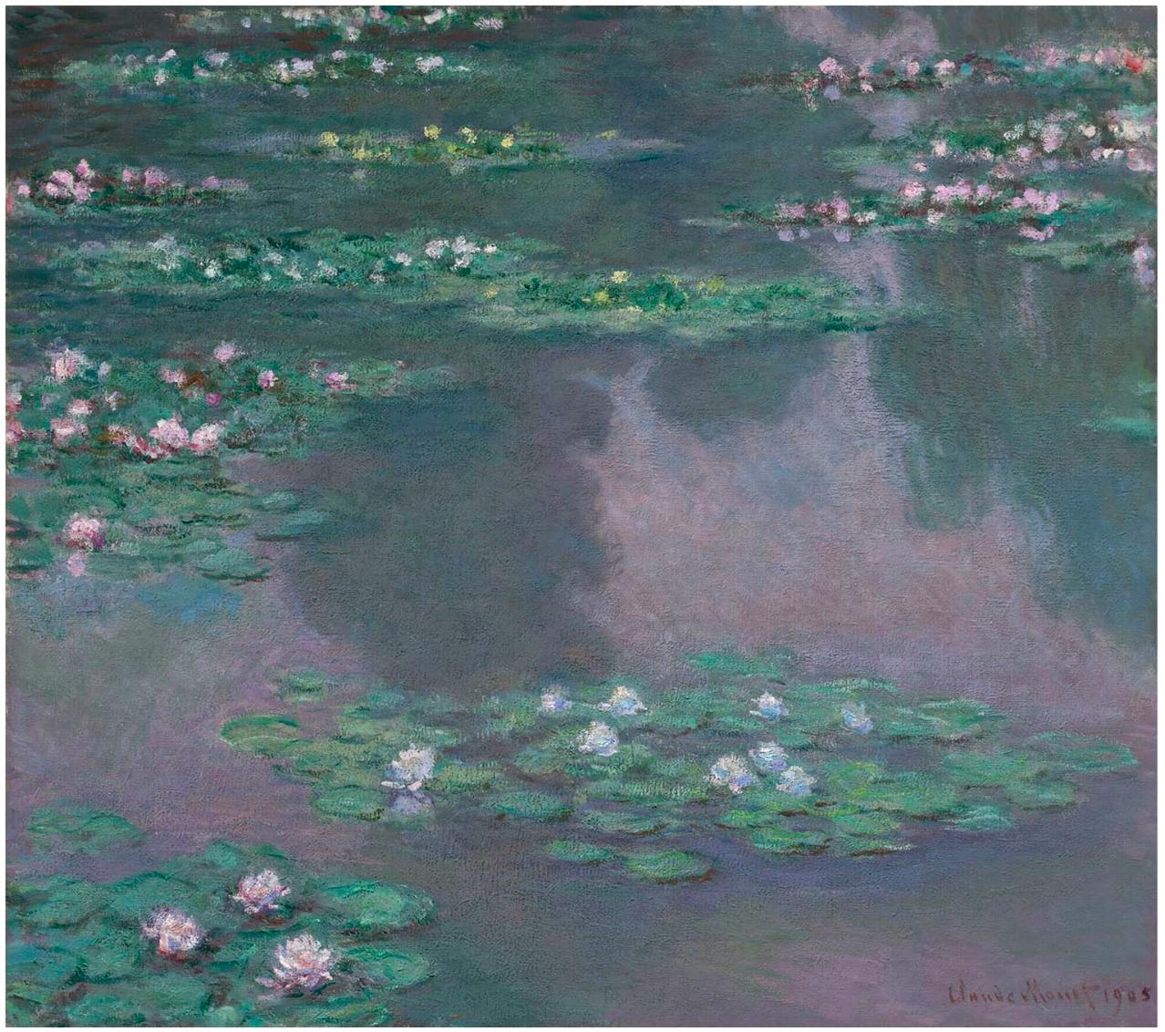
Claude Monet, Nymphéas, 1905. Museum of Fine Arts, Boston.
Painted in a landscape format, the present work can also be considered alongside the established tradition established in the eighteenth century by artists such as the German Romantic painter Casper David Friedrich. He was interested in capturing on canvas the feeling of nature as a place for profound spiritual and emotional encounters. He developed pictorial vistas that emphasized intimacy, open-endedness, and the complexity of an individual’s response and relationship to the natural world. The results were paintings that were meditative, mysterious, and full of wonder. For Richter, the German tradition of a strong, intimate relationship with the landscape still rings true. But belonging to a generation who came of age in the immediate aftermath of World War II, Richter’s approach was to question the response of artist to the resulting horrors; his response was to challenge the cultural hegemony and develop a completely new form of artistic language.
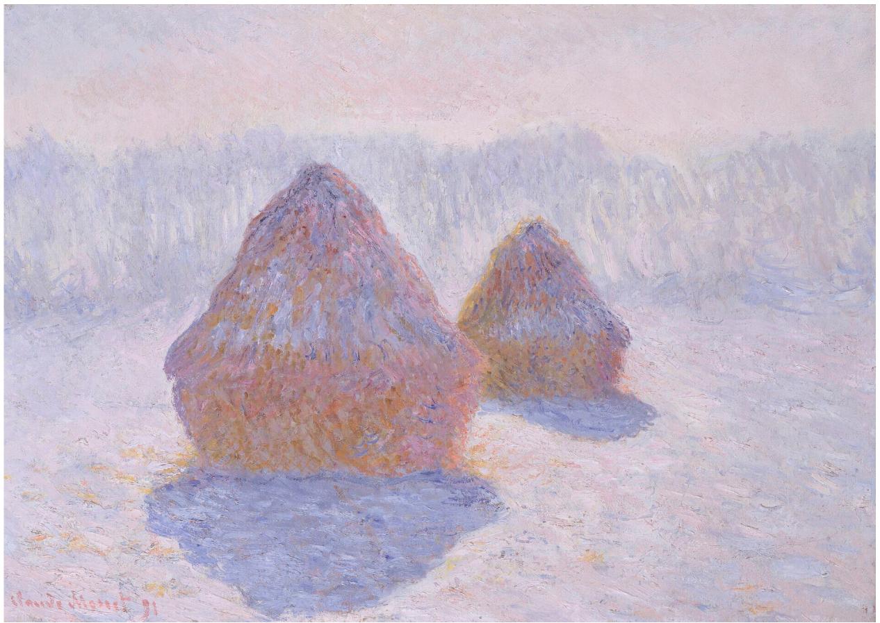
Claude Monet, Haystacks (Effect of Snow and Sun), 1891. Metropolitan Museum of Art, New York.
While aesthetically Richter’s Abstraktes Bilder may recall the work of earlier artists, philosophically and contextually, they differ. Richter has often criticized abstraction because of the “phony reverence” it inspires, declaring, in contrast, that his abstractions were “an assault on the falsity and the religiosity of the way people glorified abstraction” (quoted in interview with B.H.D. Buchloh, 1986, The Daily Practice of Painting: Writings and Interviews 1962-1993, London, 1995, p. 141). Rather than an homage to abstraction, Richter’s abstract pictures address the problems of painting and the difficulties confronting contemporary painters working under the great weight of the history of painting at a moment when many artists had abandoned the medium itself. According to Richter, his abstract works represent “my presence, my reality, my problems, my difficulties and contradictions” (quoted in D. Dietrich, “Gerhard Richter: An Interview,” The Print Collectors Newsletter, 16, no. 4, September-October 1985, p. 128).
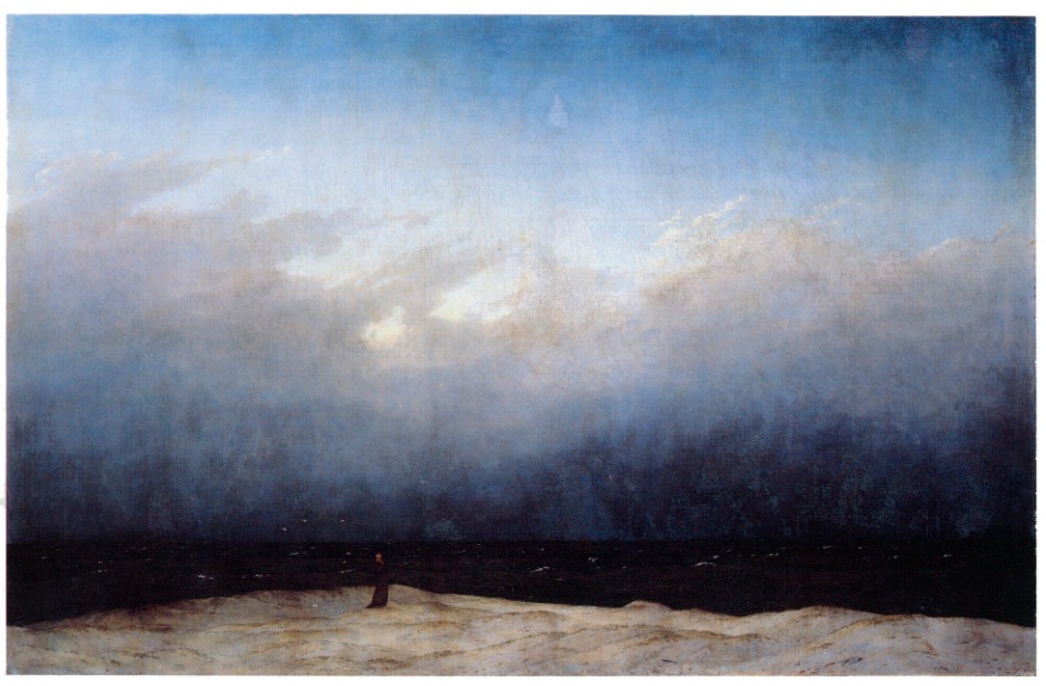
Caspar David Friedrich, The Monk by the Sea, 1808-1810. Alte Nationalgalerie, Berlin.
Thus, Richter’s Abstraktes Bild forms an important part of the artist’s belief about the fundamentals of painting. In both physical and painterly forms it represents the artist’s faith in painting as the highest form of human endeavor. Although they adhere to no known logic or ideology they are created through a carefully thought out and precise accumulation of paint and executed in a thoroughly distinctive process during which Richter deliberately avoids all conventional rules of aesthetics in order to arrive at work that belies pictorial ideology. I can… see my abstracts as metaphors,” Richter has said; they are “pictures that are about a possibility of social coexistence. Looked at in this way, all that I am trying to do in each picture is to bring together the most disparate and mutually contradictory elements, alive and viable, in the greatest possible freedom. No Paradises.” (in an interview with Benjamin Buchloh, 1986, reprinted in Gerhard Richter. Writings 1962-93, London, 1995, p. 166). This deliberate ambiguity is intended to demonstrate that all perception is an illusion. By seemingly providing several layers of conflicting abstract reality, Richter presents a ‘forest-like’ mystery where the viewer quite literally can’t see the wood for the trees. Playing with the surfaces of his abstracts, Richter is in effect exploring them in the same way that he explored the ambiguity of blurring in his photographic paintings of the 1960s. As with these works, Richter is clearly still fascinated with surface and the insight it can provide into the mystery of what lies beneath.
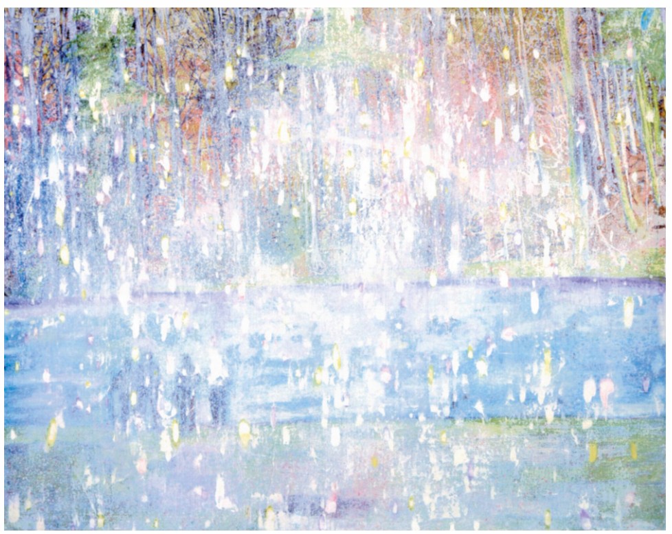
Peter Doig, Cobourg 3+1 more, 1994. Provinzial Rheinland Vericherung, Dusseldorf.
© 2025 Artists Rights Society (ARS), New York / DACS, London.
Characterized by its subtle palette and series of gentle vertical sweeps of pigment, Abstraktes Bild is an essay into the continued relevance of painting within the canon of contemporary art. As one of the postwar period’s most important and innovative painters, Richter continues to explore and challenge the boundaries of the genre. His abstract paintings are often regarded as the pinnacle of his oeuvre and it is with paintings such the present work we can see the culmination of his life-long investigation in to the visual and philosophical nature of perception and understanding.
Abstraktes Bild, 1990
Sotheby’s New-York: 15 May 2025
Estimated: USD 5,000,000 – 7,000,000
USD 6,943,000
Abstraktes Bild | The Now and Contemporary Evening Auction | 2025 | Sotheby’s
GERHARD RICHTER (b. 1932)
Abstraktes Bild, 1990
Oil on canvas
122×102 cm (48 x 40 1/8 inches)
Signed, dated 1990 and numbered 720-4 (on the reverse)
Abstraktes Bild from 1990 is an exemplary testament to Gerhard Richter’s singular artistic voice and unparalleled impact on the legacy of contemporary painting. The present work is among Richter’s iconic Abstrakte Bilder—widely acclaimed as one of the most groundbreaking innovations in abstract art over the last five decades—and foregrounds the artist’s pioneering endeavor to capture a more visceral and fundamental interaction between artist and painting. Diverging from his earlier photorealist paintings in favor of pure abstraction, Richter harnessed the liberating capacities of variegated hues and an entirely innovative technique.
“What I am trying to do in each picture is to bring together the most disparate and mutually contradictory elements, alive and viable, in the greatest possible freedom.”
A paragon of the artist’s epoch-defining series, Abstraktes Bild wholly embodies Gerhard Richter’s conceptual and aesthetic enterprise. Executed in shimmering gunmetal, violet, ruby, and alabaster hues, Abstraktes Bild is further distinguished by its inclusion in the acclaimed 1991 presentation, Gerhard Richter: Mirrors at Anthony d’Offay Gallery, London. Works from this exhibition are lauded among the finest examples in Richter’s prolific oeuvre and are today represented in prestigious public and private collections, including the Tate, London; National Gallery of Victoria, Melbourne; and the Doris and Donald Fisher Collection, San Francisco.
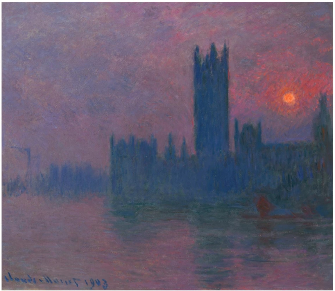
Claude Monet, Parliament, Setting Sun, c. 1900-03. Private Collection. Image © Christie’s Images / Bridgeman Images
A bright alabaster white illuminates the upper right corner of the canvas, shifting across the right edge of the composition, evoking a glimmering moonlight rippling across a gently rippling pond. In stark contrast with this brightness are the horizontal strokes of inky ebony, unfurling across the upper register of the canvas, receding into glimpses of crimson red and golden yellow sporadically peeking out into the picture plane. This interplay of color evokes the slow yet dramatic transformation of celestial vistas—of the midnight sky steadily shrouding the embers of the setting sun—stacked atop the hazy earthly tones of dusty teal, gunmetal, and muted amethyst dancing rhythmically across the canvas. Flickering in and out of our vision are the chance slippages left behind by Richter’s squeegee, punctuating the painting’s textural topography through their staccato ridges, crests, and peaks of impasto, thus unveiling an intense interrogation of the very nature of paint and pigment.
As evidenced by the conceptual rigor and aesthetic complexity of Abstraktes Bild, Richter’s abstract paintings have often been considered the culmination of the manifold lines of artistic and intellectual inquiry the artist has pursued throughout his career. Ceaselessly probing the limits and capabilities of visual cognition, Richter’s paintings have operated under the acute awareness of an innate human urge to locate patterns and construct meaning: “I just wanted to reemphasize my claim that we are not able to see in any other way. We only find paintings interesting because we always search for something that looks familiar to us. … When we don’t find anything, we are frustrated, and that keeps us excited and interested until we have to turn away because we are bored.” (the artist quoted in: Exh. Cat., New York, Museum of Modern Art, Gerhard Richter: Forty Years of Painting, 2002, p. 304) In this sense, Richter presents in Abstraktes Bild an endlessly mesmerizing question, one that compels viewers to persist in their search for understanding while it successfully evades straightforward interpretation. This provocative attitude, along with the expressive energy of the composition, recalls works by titans of abstract art such as Mark Rothko or Clyfford Still, while the dramatic contrast between bright and dark hues hints at a certain sense of the sublime found in Caspar David Friedrich’s German Romantic landscapes or J.M.W. Turner’s sea storms. Much like how these masters expanded the expressive potential of painting, Richter introduces an inimitable artistic vision that realigns our understanding of abstract painting. Intellectually rigorous and captivatingly beautiful, Abstraktes Bild joins art historical predecessors in a rich dialogue redefining the boundaries of representation, illusion, and perception.
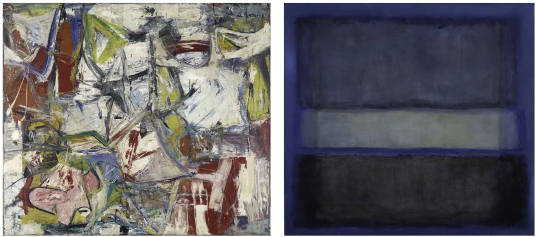
Left: Willem de Kooning, Gotham News, 1955. Buffalo AKG Art Museum. Image © Buffalo AKG Art Museum / Art Resource, NY. Art © 2025 The Willem de Kooning Foundation / Artists Rights Society (ARS), New York. Right: Mark Rothko, White Band No. 27, 1954. Modern Art Museum of Fort Worth. Art © 1998 Kate Rothko Prizel & Christopher Rothko / Artists Rights Society (ARS), New York
Central to Abstraktes Bild’s capacity to deconstruct perception is the squeegee, which Richter uses to unlock compositional complexity, gestural energy, and the influence of serendipity in his canvasses. The traction of the hard-edged squeegee streaks and smears the pigment, at times piling onto and at others eroding away from each other, carrying with them scrapes, smudges, and incisions of various chromatic intensity. The resulting composition is a geologic cross-section of the myriad strata of paint, all varying in their density, viscosity, and color, the conclusion of incalculable permutations of mark-making brought about by the aleatory principles of the squeegee’s application. This painterly process urges the viewer to respond with a visual excavation of sorts, unearthing the vestiges of paint that record every step of the painting’s relentless transformation. Chance and unpredictability lie at the heart of Abstrakte Bilder’s compositions: “I want to end up with a picture that I haven’t planned. This method of arbitrary choice, chance, inspiration and destruction may produce a specific type of picture, but it never produces a predetermined picture… I just want to get something more interesting out of it than those things I can think for myself.” (the artist quoted in: Hubertus Butin and Stefan Gronert, eds., Gerhard Richter: Editions 1965 – 2004: Catalogue Raisonné, Ostfildern-Ruit 2004, p. 36) Whereas abstraction is conventionally understood as a process of simplification or essentialization, Richter brings about a singular artistic vision in taking the opposite direction, underscoring the complexity of his tireless addition and application of layers in his meticulous composition; thus, Abstraktes Bild becomes a kaleidoscopic accumulation of color, a palimpsest that carries the records of the artist’s energetic painterly process.
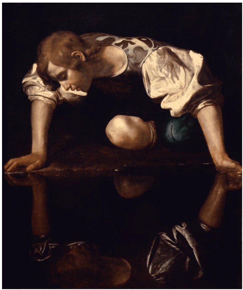
Caravaggio, Narcissus, c. 1597-99. Gallerie Nazionali di Arte Antica, Barberini Corsini, Palazzo Barberini, Rome.
Image © Luisa Ricciarni / Bridgeman Images
Masterfully marrying his control of color with the arbitrary chance of the squeegee, Gerhard Richter underscores his virtuosic command over painting and innovative technique upon the picture plane. Abstraktes Bild foregrounds Richter’s singular capacity to weave together seemingly disparate ventures—astronomical allusions, cerebral interrogations, chromatic experimentation, and more—to create a fabric of visual poetry that expands our conception of painting. A glimmering crescendo of prismatic hues, Abstraktes Bild stands as an emblem of the radical innovation and profound brilliance that solidified Gerhard Richter’s status as a visionary of contemporary art.
Mann mit zwei Kindern, 1966
Phillips New-York: 13 May 2025
Estimated: USD 4,000,000 – 6,000,000
USD 4,174,000
Gerhard Richter Modern & Contemporary Art Evening Sale
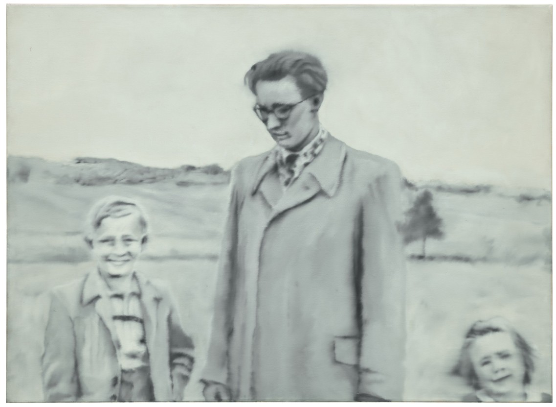
“Contact with like-minded painters – a group means a great deal to me: nothing comes in isolation. We have worked out our ideas largely by talking them through. […] One depends on one’s surroundings. And so the exchange with other artists – and especially the collaboration with Lueg and Polke – matters a lot me: it is part of the input I need.”
Coming to auction for the first time, having previously been held in the personal collection of Dusseldorf-based artist Blinky Palermo, Gerhard Richter’s softly sfumato portrait of his artistic collaborator and close friend Sigmar Polke as a young child alongside members of his family, Mann mit zwei Kindern is a rare and tender ode to friendship, its exceptional provenance only matched by the pedigree of its subject. Undoubtably one of the most art historically significant examples of German postwar master Gerhard Richter’s groundbreaking series of Photo Paintings, Mann mit zwei Kindern offers a unique insight into both the conceptual foundations of Richter’s artistic project, and the spirit of radical experiment and artistic comradery that defined this period of the artist’s prodigious career. Exquisitely executed in a palette of softened grisaille contrasts the work is a triumph of technical precision, Richter’s characteristically blurred brushwork foregrounding the fraught relationship between photography, painting, and objectivity that would prove to be so central to his artistic vision. Wavering between clarity and obscurity, in blurring the image Richter discovered ‘an opportunity to express the fleetingness of our ability to perceive’, a powerful position to be taking in relation to visual culture in the wake of the Second World War, and a profoundly poignant reflection on the ephemerality of memory itself.i Making its debut in the legendary 1966 Polke/Richter exhibition at Galerie h in Hanover, Mann mit zwei Kindern is a towering testament to Richter’s commitment to painting as a medium in the photographic age, deconstructing its core principles and radically expanding its possibilities at this critical juncture in his early career.
As one of the most influential and innovative artists of the late twentieth century, and a defining figure of abstraction, Richter has redefined the limits of painterly representation over the course of his staggering sixty-year career. Born in Dresden in 1932, the artist came of age in the long shadow of the Second World War, his childhood inflected with the burdensome history and ideological zealotry of both Nazism and the Soviet Union. Originally enrolling in the Dresden Academy of Fine Arts in 1951, Richter’s early training was as a mural painter, limited by the stylistic and thematic parameters of Soviet Realism. Like Polke, Richter fled Soviet-occupied East Germany early, relocating to Düsseldorf in 1961 where he encountered a staggeringly different way of life characterized by a proliferation of consumer goods, embrace of diverse and international art movements, and more open-minded critique of socio-cultural issues.
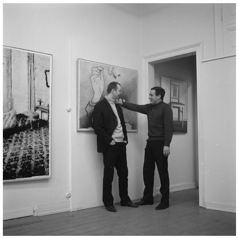
Sigmar Polke and Gerhard Richter in der Galerie h, Hanover, 1966. Image: Gerhard Richter Archiv, Artwork: © Gerhard Richter 2025 (19022025) / © 2025 Estate of Sigmar Polke / Artists Rights Society (ARS), New York / VG Bild-Kunst, Bonn, Germany.
With its muted tones and blurred pictorial treatment, Mann mit zwei Kindern is supremely representative of this richly inventive and productive period of the artist’s career, evolving out of the ‘Capitalist Realism’ movement he developed with the likes of Polke, Konrad Lueg, and Manfred Kuettner during their time as students at the Kunstakademie Düsseldorf in the early 1960s. A deliberately ironic response to state-sponsored idealisation of the people and their leaders that fed into Social Realism on the one hand, and the encroaching hegemony of American abstraction which did not seem to deal in any meaningful way with people or history on the other, Capitalist Realism provided these young artists with a means of responding to Pop’s preoccupation with a media-driven and commodity-saturated visual culture with an irony and critical distance specific to the German postwar experience.
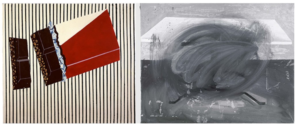
[Left] Sigmar Polke, Schokoadenbild, 1964, Glenstone, Potomac, Maryland. Artwork: © 2025 Estate of Sigmar Polke / Artists Rights Society (ARS), New York / VG Bild-Kunst, Bonn, Germany.
[Right] Gerhard Richter, Tisch, 1962. Private Collection. Image/Artwork: © Gerhard Richter 2025 (0022).
While Polke turned to everyday objects such as bars of soap, chocolate bars, and socks in his early compositions as a means of articulating the specific conditions of Germany’s postwar economic recovery and identity, Richter’s appropriation of photographs speaks to a shared commitment to finding a newly direct and objective way of representing the world, intersecting with and critiquing both American Pop Art and German postwar consciousness. Where Polke’s early painting and Stoffbilder works interact more robustly with the familiar vernacular of American Pop as established by the likes of Andy Warhol and Roy Lichenstein, Richter turned away from the languages and motifs of advertising and consumerism in favour of the photographic image and its assumed relationship to notions of objective truth. Despite the divergent directions that they would take their respective practices in the coming years, in these early years the two were deeply connected, Richter reflecting on their joint 1966 Galerie h exhibition and associated collaborative artist’s book project years later and musing that at that moment “I was as close to Polke as with nobody before.”
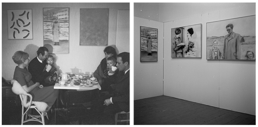
[Left] Gerhard Richter and Sigmar Polke drinking coffee with their families, 1966. Image: Gerhard Richter Archiv, Artwork: © Gerhard Richter 2025 (19022025) / © 2025 Estate of Sigmar Polke / Artists Rights Society (ARS), New York / VG Bild-Kunst, Bonn, Germany.
[Right] Installation shot of Polke/Richter at Galerie h, Hanover in 1996 featuring the present work. Image: Gerhard Richter Archiv, Artwork: © Gerhard Richter 2025 (19022025) / © 2025 Estate of Sigmar Polke / Artists Rights Society (ARS), New York / VG Bild-Kunst, Bonn, Germany.
“[…] everyone has produced his own ‘devotional pictures’: these are the likenesses of family and friends, preserved in remembrance of them.”
Taking press images and family photo albums as his source material and going on to compile an encyclopedic store book of this material in his Atlas, Richter created his first Photo Painting in 1962, finding in his enlarged reproductions of photographs in oil a perfect device for exposing the illusory nature of both photography and painting’s claims to verisimilitude. In a manner which would go on to define Richter’s approach to the twined questions of perception and truth this first photorealist work, Tisch, combines multiple painterly approaches, our reading of the sharply defined and immediately legible form of the table complicated and confounded by the fluid overpainting, a technique sophisticatedly developed in the present work. Retaining something of the unique quality of the photograph, in his painterly translations of these images Richter establishes a kind of visual equivalence, his idiosyncratic blurring of the image allowing the artist “to make everything equally important and equally unimportant.” Oscillating between figuration and abstraction, Richter’s treatment in this early painting undoes the more descriptive or depictive qualities with which Realism has conventionally been associated, emphasizing instead the ultimately inscrutable and unknowable nature of reality itself.
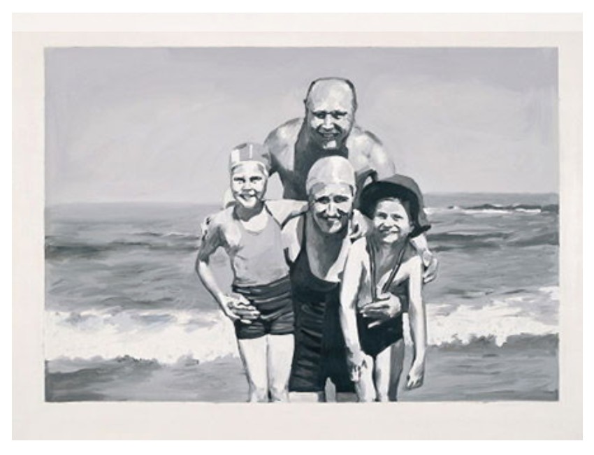
Gerhard Richter, Familie am Meer, 1964. Sylvia and Ulrich Stroher Collection, Museum Kuppersmuhle fur Moderne Kunst, Duisburg. Image/Artwork: © Gerhard Richter 2025 (0023).
Although Richter’s use of photographic source material is varied and expansive, his paintings related to group family portraits are strikingly rare, representing only fifteen of the Photo Paintings produced between 1962 and 1971, most of which are now held in prestigious institutional collections worldwide. Its source image taken from the Polke family album from the 1950s, here we see the artist as a young boy, smiling and standing proudly beside his older brother Joannes (Hans) and younger sister Dorothea (Dorle). Referring to these family snapshots Richter has described the ubiquitous family photo album as its own mode of devotional imagery, captured, collected, and carefully preserved for future generations. Familiar and utterly ordinary, these amateur photographs confirm to certain visual codes in their arrangement and presentation, Richter embracing the universality of these snapshots and amplifying the sense of their inherent artificiality through his painterly treatment of the subject.
Hans Polke (middle) with his siblings Sigmar (left) and Dorle (right), early 1950s.
Image: © Archive of Anna Polke-Stiftung, Cologne.
Frequently referenced in discussions of this smaller suite of Family paintings, the 1964 painting Familie am Meer, exhibited alongside the present work in the major 2019 group show, Baselitz – Richter – Polke – Kiefer: Die jungen Jahre der Alten Meister exemplifies Richter’s fascination with these images, and their profound relevance to his broader artistic project. Ostensibly an everyday image of a family enjoying a day out on the seaside borrowed from the familial photo albums of his first wife, Marianne Eufinger, a darker history lay just beneath the surface of those smiling faces. As Richter was to discover, after joining the SS in 1935, Marianne’s father, the smiling Professor Heinrich Eufinger performed some nine hundred forced sterilizations on women incarcerated in asylums, including at the clinic where Richter’s own aunt had suffered a similar fate. As Richter has eloquently described, what attracted him to this particular image was precisely its universality, and its exposure of the inscrutability and fallibility of appearances. As the artist explains: “I was particularly struck by the two arms [of Heinrich Eufinger] that contain, as it were, a family. The protective, beaming father […] was the typical representative of a generation of fathers that had experienced an authoritarian upbringing themselves and built their careers in the ‘Third Reich.’” It’s secret history an altogether more unique and personal one, Mann mit zwei Kindern is an exceptionally rare and poignant record of this intense period of artistic collaboration and creative experimentation for these two masters of postwar German painting. Interrogating the inherently untrustworthy nature of images that purport to speak plain truths, in dragging his dry brush across the still-wet surfaces of these works Richter introduces an inscrutable distance between us and the image, making manifest the instabilities and inconsistencies of our notions of memory, truth, and representation itself.
Abstraktes Bild, 1992
Sotheby’s New-York: 16 May 2025
Estimated: USD 1,200,000 – 1,800,000
USD 1,514,000
Abstraktes Bild | Contemporary Day Auction | 2025 | Sotheby’s
GERHARD RICHTER (b. 1932)
Abstraktes Bild, 1992
Oil on canvas
51 x 46.2 cm (20 x 18 1/8 inches)
Signed, dated 1992 and numbered 775-3 (on the reverse)
Executed in resplendent tones of emerald, ruby, mauve, and white, Abstraktes Bild stands among the most compelling achievements in Gerhard Richter’s epoch-defining Abstrakte Bilder series. Painted in 1992, a year widely regarded as a pinnacle in his five-decade engagement with abstraction, this dazzling composition channels the full force of Richter’s mature squeegee technique into a jewel-like canvas of arresting complexity and crystalline precision. One of only four works Richter painted that year at this intimate scale, another of which is housed in the permanent collection of the Sprengel Museum in Hannover, Abstraktes Bild is a rare embodiment of the painter’s extraordinary control over color, texture, and chance.
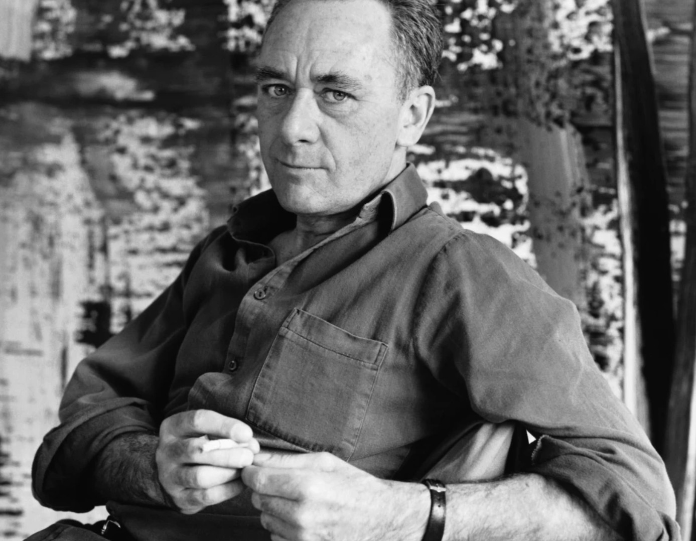
Gerhard Richter in Cologne, 1989. Image © Photo by Chris Felver/Getty Images. Art © Gerhard Richter 2025
The early 1990s marked a particularly fertile period in Richter’s career, culminating in the Golden Lion award at the 1992 Venice Biennale. That same year, he produced a number of major Abstrakte Bilder now held by institutions such as The Museum of Modern Art, New York; Tate, London; and the Fondation Louis Vuitton, Paris. Within this distinguished context, the present work stands out as a model of compositional clarity and philosophical depth. Its vertical format and domestic scale lend the work an architectural intimacy, while the dynamic interplay of layered pigment and effacement generates a quiet, meditative rhythm. It is a painting that rewards slow looking—a surface alive with sedimentary accumulation, glinting color, and tactile interruptions.
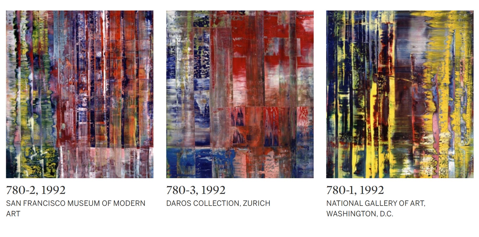
Richter’s abstraction does not emerge from expressive spontaneity but from an intricate process of construction and erasure. With the hard edge of a homemade squeegee, he drags semi-liquid pigment across the canvas in successive layers. Each gesture fuses, dissects, or effaces the colors beneath, yielding a surface that is both immediate and elusive. Brilliant whites stretch across deep purples, while vivid emeralds are buried beneath rich umbers; passages of intense color alternate with subtle veils, producing a sense of simultaneous depth and flatness. This dense chromatic layering destabilizes traditional figure-ground relationships and confounds the eye’s attempts to locate a single point of recession. As viewers, we are forced to continually adjust, our perception undone and remade by every movement across the painting’s luminous skin.
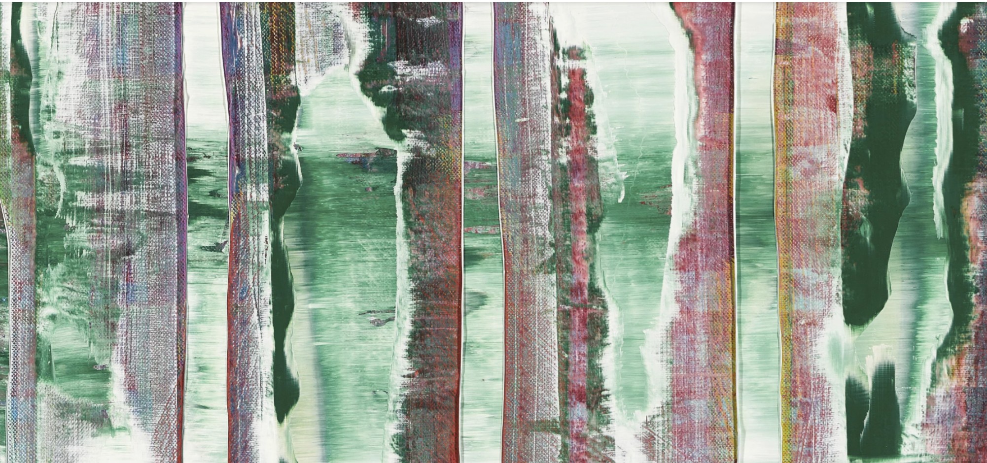
The process by which Abstraktes Bild came into being reflects Richter’s radical embrace of chance. “I want to end up with a picture that I haven’t planned,” the artist explained in 1990. “This method of arbitrary choice, chance, inspiration and destruction… never produces a predetermined picture… I just want to get something more interesting out of it than those things I can think out for myself.” (Gerhard Richter, interview with Dorothea Dietrich, 1990, in Gerhard Richter: Editions 1965-2004, Ostfildern-Ruit, 2004, p. 36). Throughout the execution of Abstraktes Bild, layers of pigment were applied, scraped away, and reworked—sometimes partially, sometimes completely—until the composition arrived at an unexpected yet irrevocable resolution. What appears effortless is in fact the result of cerebral labor, of conscious restraint and relinquishment of control. The squeegee, in Richter’s hands, becomes a paradoxical tool: one of creation and erasure, of intuition and interruption.
“This method of arbitrary choice, chance, inspiration and destruction… never produces a predetermined picture… I just want to get something more interesting out of it than those things I can think out for myself.”
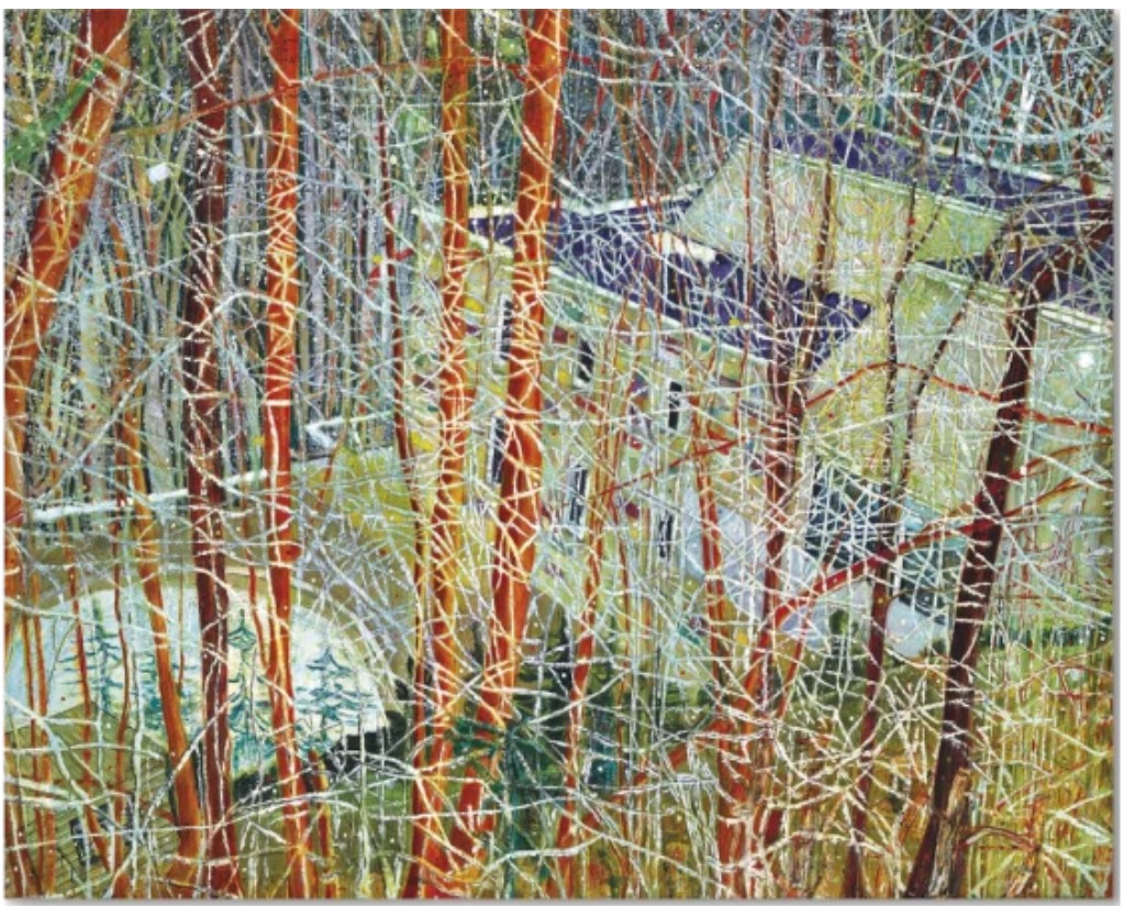
Peter Doig, The Architect’s Home in the Ravine, 1991. Private Collection. Art © 2025 Peter Doig / Artists Rights Society (ARS), New York
In this way, the painting is a record of time. Each accretion and removal leaves a trace, building a topography of touch and thought. Like the palimpsest of a memory that can never be fully retrieved, Abstraktes Bild bears witness to what was, what might have been, and what remains. In this state of flux, the work achieves an intensity that recalls natural phenomena without ever describing them. We are reminded of cascading waterfalls, geological strata, auroras, or stained-glass windows—not through representation, but through resonance. In Richter’s hands, abstraction becomes a form of seeing that bypasses language and opens onto something elemental, even spiritual.
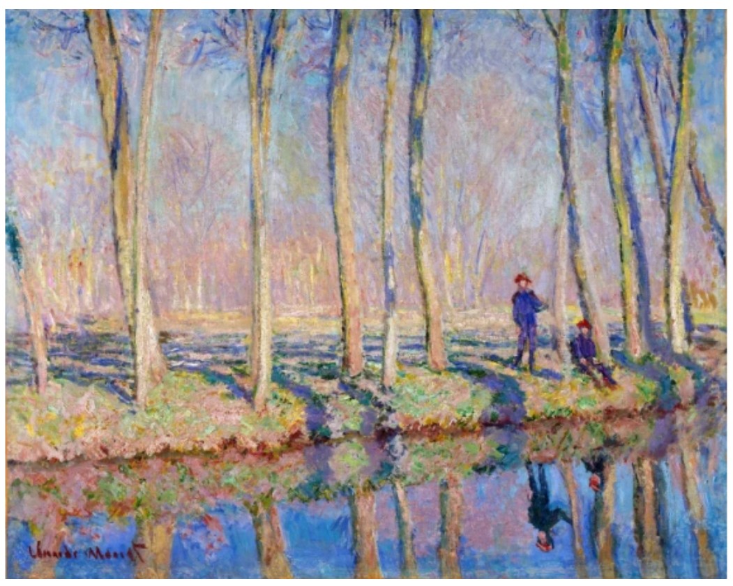
Claude Monet, Jean-Pierre Hoschedé and Michel Monet on the Banks of the Epte, c. 1887 – 1890. National Gallery of Canada, Ottawa.
That these works seem to flicker between abstraction and figuration is no accident. In contrast to the overt referentiality of his earlier photo paintings, Richter’s abstractions elicit an elusive sense of familiarity. Their organic rhythms and chromatic tensions evoke the natural world, while simultaneously refusing the comforts of narrative or symbol. As Birgit Pelzer has argued, Richter’s abstract works “prove that which cannot be articulated” (Birgit Pelzer, in Gerhard Richter: The Daily Practice of Painting, ed. Hans Ulrich Obrist, London, 1995, p. 124). They are not depictions of things, but propositions—acts of philosophical inquiry, where meaning is suspended between appearance and disappearance.
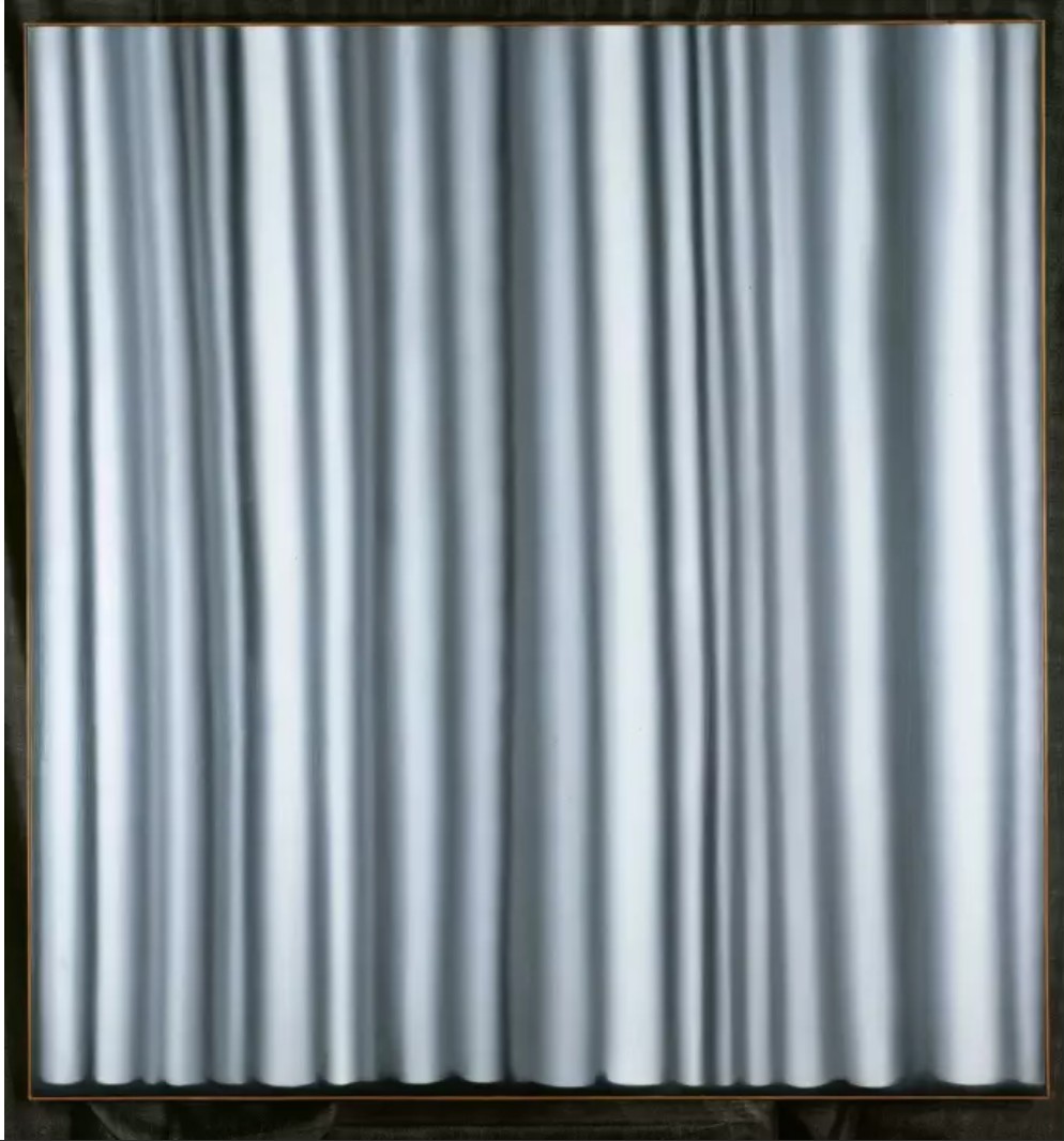
Gerhard Richter, Vorhang III (hell)(Curtain III (Light)), 1965. Nationalgalerie, Staatliche Museen zu Berlin, Berlin.
Art © Gerhard Richter 2025
Indeed, Abstraktes Bild stands as a visual analogue to Richter’s lifelong interrogation of image, memory, and truth. Having lived through the trauma of World War II and the rise and fall of East German communism, Richter has long questioned the reliability of representation. His abstraction does not seek to escape this history, but to confront it obliquely: to test what painting can still mean in an age of media saturation and political fracture. “It’s not about inventing pictures,” Richter once said, “but about finding them” (Gerhard Richter, Notes 1985, in Obrist, The Daily Practice of Painting, p. 119). In this context, Abstraktes Bild is less a picture than a process—an emergent structure in which thought and material collide.
The extraordinary power of Abstraktes Bild lies in this interplay between presence and absence, intuition and control. In its vertical striations and chromatic veils, we glimpse the tension between painterly gesture and visual perception, between surface and depth, opacity and transparency. As Robert Storr has noted, Richter’s abstractions “recast the terms of modernist painting while calling its utopian premises into question” (Robert Storr, Gerhard Richter: Forty Years of Painting, The Museum of Modern Art, New York, 2002). Rather than pursue a single ideal, Richter opens the canvas to contingency, allowing the painting to find its own equilibrium. The result is a work that feels at once meticulous and mysterious, deliberate and divine.
In the canon of contemporary abstraction, Richter’s Abstrakte Bilder represents a turning point—a series that redefined the possibilities of painting at the turn of the millennium. They carry forward the legacy of Abstract Expressionism while dispensing with its mythologies. Their surfaces are dense with memory and thought, and their chromatic intricacy resists simplification. Abstraktes Bild, painted at the height of this pivotal period, encapsulates the restless brilliance of Richter’s achievement. It is not merely a painting, but a field of vision: a shifting constellation of color, time, and perception, forever in motion.
David Hockney
The Twenty-Sixth V.N. Painting, 1992
Estimated: USD 2,500,000 – 3,500,000
USD 2,722,000
Unfolding in a joyous, swirling cacophony of bold, bright color and riotous patten, The Twenty-Sixth V.N. Painting represents a pivotal moment in the impressive and highly inventive seventy-year career of Yorkshire-born artist David Hockney. Executed in 1992, it is the last of a small but highly significant series of twenty-six so-called “Very New Paintings,” the highly personalized “internal landscapes” that had preoccupied the artist over the course of that year. Showcasing his innovative and experimental approach to pictorial and spatial problems, the work represents the culmination of the series – and of the themes that had absorbed Hockney for the previous three decades—synthesizing the chromatic and spatial experiments of his Californian landscapes with his celebrated theatrical set designs, and anticipating the new territories into which he would push landscape painting following his return to Yorkshire at the turn of the century.
“At one side of my little house in Malibu is the Pacific Coast Highway; at the other is the beach. I step out of my kitchen door and there, right there, is the sea. So when I am painting in my studio I am very aware of nature, in its infinity, and of the sea endlessly moving.”
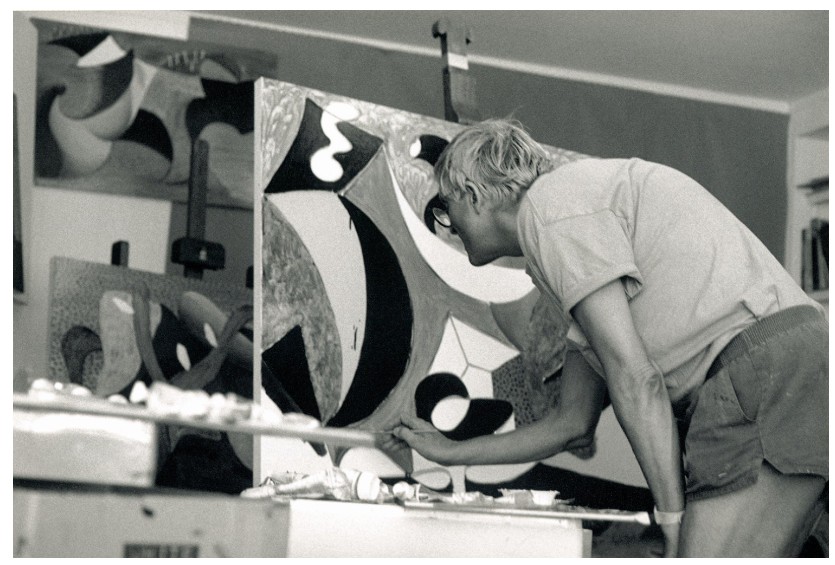
David Hockney in his studio, 1992. Image: Science History Images / Alamy Stock Photo
First exhibited alongside the other twenty-five works from the series in the 1993 show Some Very New Paintings presented by André Emmerich Gallery in New York, examples from this pivotal body of work have featured in every major subsequent retrospective to date, the present painting especially notable for its inclusion in the monographic 2017-2018 exhibition which travelled between Tate Britain in London, The Musée Nationale d’Art Moderne, Centre Georges Pompidou in Paris, and the Metropolitan Museum in New York. Tellingly, in establishing the curatorial parameters for his current and critically acclaimed career retrospective at the Fondation Louis Vuitton, Hockney paid special attention to this pivotal moment in his practice, his Very New Paintings marking at once the close of his long and illustrious California chapter, and the start of a highly inventive and industrious period passed between Yorkshire, London, and Normandy.
In 1988, Hockney relocated from his longtime residence in the Hollywood Hills to a coastal studio in Malibu, framed by the momentum and restless energy of the Ocean on the one side and the hum of the Pacific Coast Highway on the other. It is this centrifugal force that makes itself particularly felt in The Twenty-Sixth V.N. Painting, its patterned passages and complex surface textures bordered by the swooping striated forms of aquamarine and cerulean tones.
“[…] here at the beach I am between two great forces, the mountains and the sea. The mountains were made by a great force of nature, a thrusting force, which calmed in time, leaving them here, grand and peaceful. While below the other thrust continues, the endless movement of the sea. These forces are present, I believe, in the paintings.”
While the work and the larger series to which it belongs share the unmistakable hot tones, vertiginous perspectives, and winding vistas of his celebrated Californian landscapes epitomized by works such as the 1980 Mulholland Drive: The Road to the Studio, it is significant that Hockney did not turn his attention to the ocean until this decisive move, its fluid, mutable surface introducing a powerful, elemental energy to the works made after 1988.
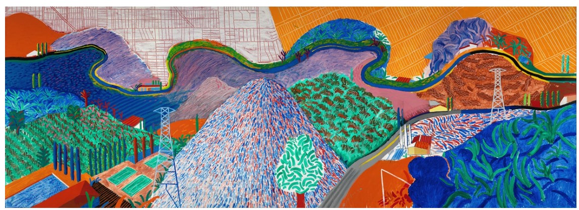
David Hockney, Mulholland Drive: The Road to the Studio, 1980. Los Angeles County Museum of Art.
Image: Richard Schmidt, Artwork: © David Hockney
Pulsating with the same quintessentially Californian energy that the artist had made unmistakably his own over the course of the previous decade, Hockney’s restlessly innovative approach nevertheless makes its presence felt in the Very New Paintings, most forcefully in their spatial complexity and challenge to the pictorial conventions of single point perspective. Although conceding that these Very New Paintings might “seem a jumble to the viewer at first,” Hockney here advocates a slow approach to looking, explaining that “They take time to unfold. They’re a bit mind-boggling, but they are meant to be. The viewer can roam freely within them, finding his or her own space. That’s why there are no figures in them. You construct your own space mentally.”
It was this question of the experience of space and its representation that preoccupied Hockney more and more during the 1980s as his work moved away from the cooly detached and strikingly naturalistic modes that had first secured his reputation as a painter of sun-soaked pools and West Coast playboys
in the 1960s. While these conformed to the traditions of single point perspective with its clear vanishing point, Hockney felt increasingly as though this placed the viewer outside of the composition, failing to capture the movement, depth, and complexity of the act of looking itself.
“I couldn’t play in that space—the one-point perspective was terribly constricting—and it’s only by playing with the space in the years since that I’ve been able to make it clearer. Everything since then has been a progression towards a playful space which moves around and is still clear.”
In their radical challenge to the conventions of fixed, single point perspective, and their introduction of movement and the experience of time into their compositions, the early Cubist experiments of Pablo Picasso and Georges Braque would prove to be an important touchstone in this respect. While Hockney was already in close dialogue with Picasso and applying the lessons of Analytical Cubism to his innovative photocollages in the early 1980s, an important trip back to London in 1983 consolidated these investigations, coinciding with the opening of the first significant exhibition of Cubism in the city, The Essential Cubism: Braque, Picasso and Their Friends, 1907 – 1920 organized by Tate director Alan Bowness and curated by Douglas Cooper and Gary Tinterow. A major event, the exhibition presented the visual history of Cubism together for the first time, and would have a profound impact on Hockney, who returned a purported seven times during his short visit.
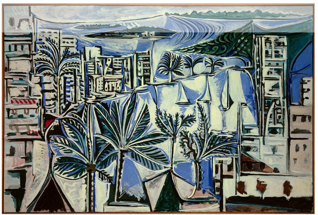
Pablo Picasso, La Baie de Cannes, 1958. Musée Picasso, Paris.
Image: Photo Josse / Scala, Florence, Artwork: © 2025 Estate of Pablo Picasso / Artists Rights Society (ARS), New York
While Hockney’s palette here owes more to the vibrant Fauvist tones of André Derain and Henri Matisse, his careful organization of space and dissection of volumetric form is rooted in the early lessons of Picasso’s Cézannesque landscapes, extended by the artist in his flattened, light-soaked Mediterranean landscapes from the 1950s which, although falling beyond the scope of the 1983 exhibition serve as a compelling reference point here.
“All the work I have done in the theater has been useful to me […] what is most important is using real space. You begin to think spatially much more.”
Synthesizing all of these elements, it was Hockney’s experiences designing theatrical sets for the stage that proved to be “the consistent motor for change through the late 1970s and into the 1980s’, these operatic sets introducing ‘a new experience of space [that] always acknowledged the involvement and emotional response of the audience.” Following his first commission to produce sets and costumes for a 1975 iteration of Igor Stravinsky’s The Rake’s Progress at Glyndebourne, Hockney spent the best part of the following two decades focused on these interdisciplinary projects, even following more directly in Picasso’s footsteps with his 1981 reimagination of Parade, for which the modern master had first designed the avant-garde sets and costumes in 1917.
With the move to Malibu inspiring an energetic return to painting, the sweeping vistas, juxtaposed textures, and concentrated drama of these operatic environments would directly inform Hockney’s painting during this period. In 1991 Hockney was finalising the designs for Puccini’s Turnadot in collaboration with Ian Falconer, travelling to Chicago in July to oversee production. On his return journey, Hockney travelled through Monument Valley and the Grand Canyon in a camper van, the monumental lunar rock formations of that landscape appearing almost immediately in his painting, and would form the basis of both his final set designs for Richard Strauss’ Die Frau ohne Schatten which opened in London’s Royal Opera House the following year, and the highly personalised motifs and more abstract forms of the Very New Paintings.
“The first thing I made for Die Frau, on a small model, was an abstract representation of a river, like a snake. I put little dots on it which were actually derived from the textures that were appearing in these paintings. Turandot is mostly architectural interiors; even the garden, which is nearest to nature is a Chinese garden, stylized, formal, not raw nature. In Die Frau, on the other hand, we are dealing with nature in the wild […] and I knew these paintings were going to influence its design.”
As Hockney explains, while the designs for Turandot had focused on architectural space, the context of Die Frau ohne Schatten allowed him to work with the natural landscape and its forms in a more direct manner, the set designs and paintings working in close dialogue with one another in the realization of his vision. Hockney started the Very New Paintings in earnest immediately after completing work on the Die Frau ohne Schatten commission, works from this cycle of “internal landscapes” gradually becoming more complex, “using different marks and textures to create space, so that the viewer wanders around.”
Capturing the essence and vernacular of the American West, The Twenty-Sixth V.N. Painting showcases the remarkable inventiveness and complexity of Hockney’s vision, the simultaneity of its multiple viewpoints, bold use of non-naturalistic color and pattern, and harmonious balance of forms all working together to under score his fundamental commitment to the question of representation itself. As the last work in this pivotal series, The Twenty-Sixth V.N. Painting is an especially important work, representing the summation – not just of the ideas, themes, and motifs that informed this suite of paintings – but of this entire long chapter in Hockney’s career, laying important foundations for his return to Yorkshire at the end of the decade, and his radical extension of a tradition of landscape painting there.
Terrace Hollywood Hills House with Banana Tree, 1982
Sotheby’s London: 16 May 2025
Estimated: USD 1,200,000 – 1,800,000
USD 2,487,000
WORK ON PAPER
Terrace Hollywood Hills House with Banana Tree | Contemporary Day Auction | 2025 | Sotheby’s
DAVID HOCKNEY (b. 1937)
Terrace Hollywood Hills House with Banana Tree, 1982
Gouache and graphite on paper
51 1/8 x 65 7/8 inches (129.8 by 167.3 cm)
A radiant confluence of color, light, and structured play, Terrace Hollywood Hills House with Banana Tree is a resplendent example of David Hockney’s California-inspired period, one that captures the breezy optimism and architectural allure of Los Angeles in the early 1980s. Executed in 1982, the work reflects Hockney’s masterful command of composition, perspective, and atmosphere, uniting formal rigor with expressive ease. The work has remained in the same private collection for over three decades.
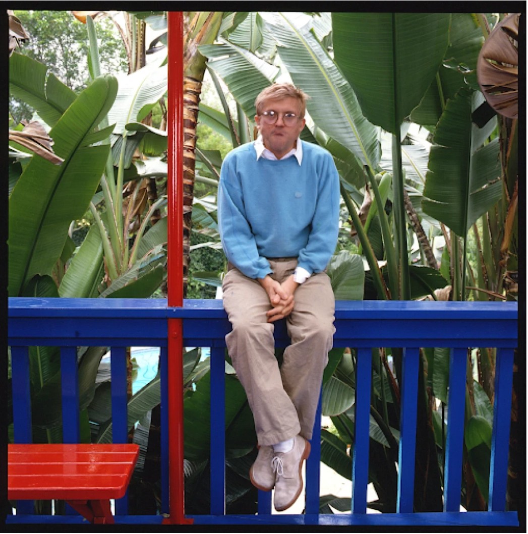
David Hockney on the porch of his Los Angeles home, 1987. Photo © Anthony Barboza/Getty Images
By this time, Hockney had long since relocated to Southern California, a landscape that had become both his muse and his adopted home. The Hollywood Hills, with their undulating terrain, mid-century homes, and technicolor skies, provided fertile ground for the artist’s pursuit of a uniquely Californian modernism. This work, originally exhibited in the groundbreaking traveling show Hockney Paints the Stage, radiates with that very luminance.
“California always affected me with color. Because of the light you see more color, people wear more colorful clothes, you notice it, it doesn’t look garish: there is more color in life here.”
The composition itself is a dialogue between interior and exterior, between natural and architectural elements. On the left, Hockney suggests the cozy interior of a modernist home—a sliver of wooden floorboards, a glowing fireplace, and a grey geometric ceiling above a dramatic blue curtain, rendered in bold diagonal lines. These vibrant theatrical stripes recall not only the artist’s enduring interest in stage design but also the dynamic interplay of movement and stasis that characterizes his best work. The curtains part to reveal a visual cascade of botanical and architectural forms: lush banana leaves thrust upward, while red and green arcs delineate the curve of a terrace leading toward the stylized undulations of a sunlit swimming pool.
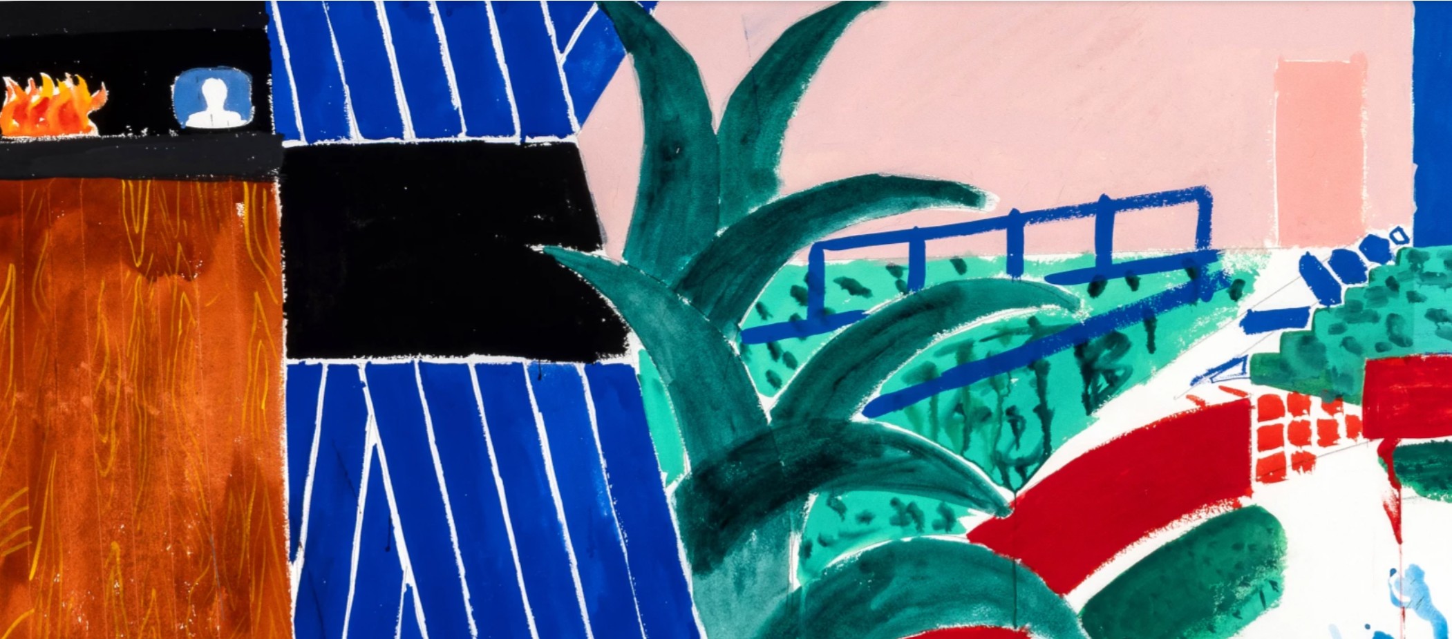
The viewpoint is deliberately fragmented and dynamic, merging multiple perspectives in a single frame—a visual strategy Hockney had been exploring since his photocollages and cubist-inspired experiments of the late 1970s. In this work, the juxtaposition of high and low vantage points serves to flatten the pictorial space while simultaneously suggesting a cinematic sweep across the domestic landscape. The pink stucco wall and blue railings evoke the quintessential aesthetics of Los Angeles domestic architecture, while the vibrant palette—cobalt blue, fire red, poolside aqua—underscores the artist’s confidence in color as a psychological and compositional tool.
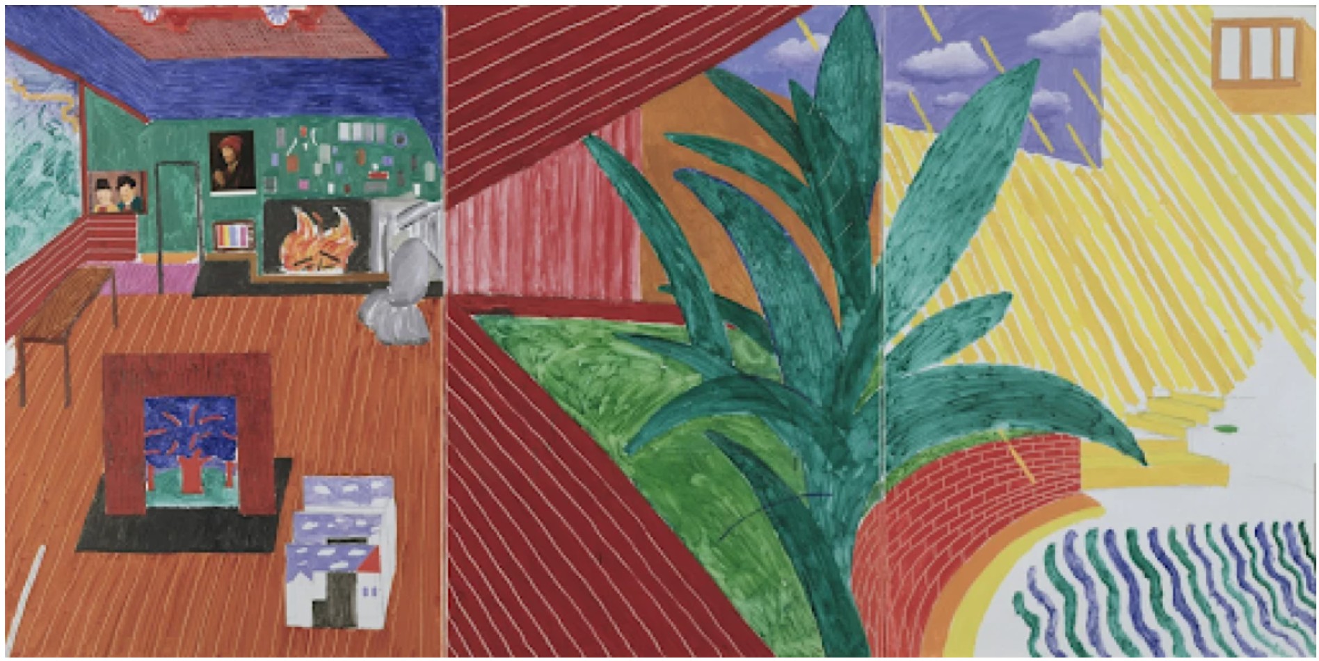
David Hockney, Hollywood Hills House, 1981-1982. Walker Art Center, Minneapolis.
This deliberate flattening and segmentation of space finds a potent art-historical echo in the works of Henri Matisse, whose own use of color fields and interior/exterior contrasts Hockney greatly admired. Yet, unlike Matisse’s often enclosed domestic views, Hockney’s composition opens outward—a gesture of expansiveness both physical and metaphorical. The gestural rendering of water in the pool, composed of rhythmic blue dashes, is one of Hockney’s signature motifs, referencing his iconic swimming pool paintings of the 1960s while recontextualizing them within a looser, more spontaneous medium.
Indeed, Terrace Hollywood Hills House with Banana Tree occupies a fascinating midpoint between Hockney’s crisp early poolside paintings and his later, more abstracted landscapes of Yorkshire. It reflects the artist’s deep engagement with the lived environment, filtered through a modernist lens that combines personal observation with formal invention. The inclusion of the banana tree is more than botanical—it is symbolic, invoking the tropical luxuriance of California living while also serving as a compositional anchor, its sharp green fronds directing the eye back into the layered space of the image.
The theatricality of the composition—with its curtain-like blue stripes and spotlight-bright zones of color—reminds us of Hockney’s parallel career as a stage designer. The work was part of the Hockney Paints the Stage exhibition, a major survey of the artist’s set designs and scenographic sensibility. Considered within this context, Terrace Hollywood Hils House with Banana Tree becomes both a depiction of a lived-in space and a constructed mise-en-scène, a memory as much as a view.
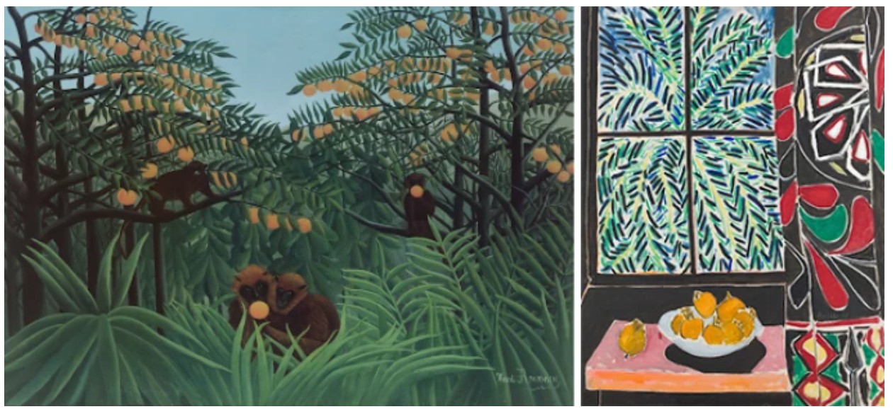
Left: Henri Rousseau, Monkeys in the Jungle (The Tropics), 1910. Private Collection. Image © Bridgeman Images
Right: Henri Matisse, Interior with Egyptian Curtain, 1948. The Phillips Collection, Washington D.C. © 2025 Succession H. Matisse / Artists Rights Society (ARS), New York.
Terrace Hollywood Hills House with Banana Tree captures Hockney at a moment of creative synthesis—where architecture, light, memory, and performance converge. Its layered perspective, chromatic bravura, and embrace of both the theatrical and the quotidian make it a standout among the artist’s celebrated explorations of life under the California sun. This is not merely a view; it is an experience refracted through Hockney’s singular vision, offering the viewer a portal into a world of vivid sensation and formal delight.
Yayoi Kusama
Infinity-Nets [HSO], 2016
Christie’s New-York: 14 May 2025
Estimated: USD 2,500,000 – 3,500,000
USD 3,680,000
YAYOI KUSAMA (B. 1929), Infinity-Nets [HSO] | Christie’s
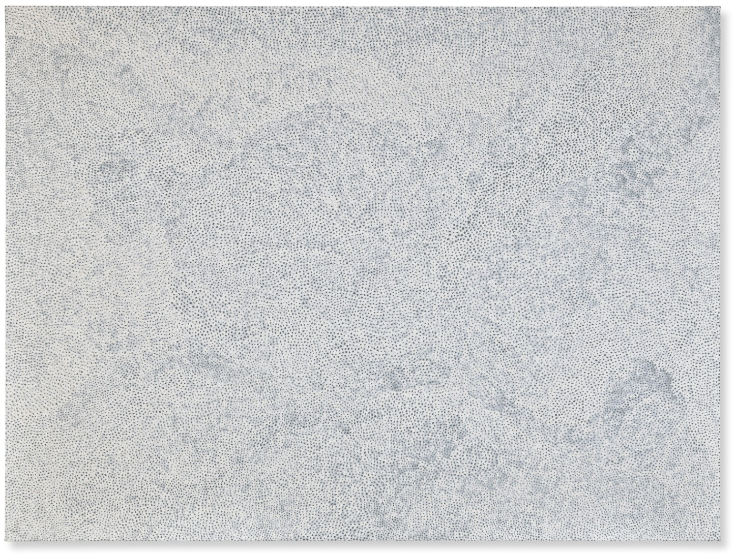
YAYOI KUSAMA (B. 1929)
Infinity-Nets [HSO], 2016
Acrylic on canvas
194×259 cm (76 3/8 x 102 inches)
Signed, titled and dated ‘YAYOI KUSAMA 2016 INFINITY-NETS HSO’ (on the reverse)
Yayoi Kusama’s Infinity-Nets [HSO] is a monumental example from the artist’s iconic series, displaying her unique aptitude for seamlessly melding universal themes with personal experience. Her constellation of white painterly loops and swirls speaks to the vastness of the universe while at the same time being a remarkable record of human endeavor. Speaking about her process, the artist said, “I would cover a canvas with nets, then continue painting them on the table, on the floor, and finally on my own body. As I repeated this process over and over again, the nets began to expand to infinity. I forgot about myself as they enveloped me, clinging to my arms and legs and clothes and filling the entire room…” (Y. Kusama, trans. R. McCarthy, Infinity Net: The Autobiography Of Yayoi Kusama, London 2011, pp. 17-18, and p. 20). Giving form to her own internal compulsions on a grand scale, the present work draws the viewer into her immersive visual world.
Kusama’s paintings are the result of meticulous brushwork on a grand scale. Up close, each individual application of paint is visible in minute detail, and the viewer can follow the artist’s path as she loops meticulously and precisely. The opacity of the stroke shifts as the brush relinquishes the paint and becomes thinner before Kusama dips the bristles and starts again. From afar, this compulsive method of application and re-application results in a gentle visual undulation between dark and light, the surface appearing to billow and move like a cloud.
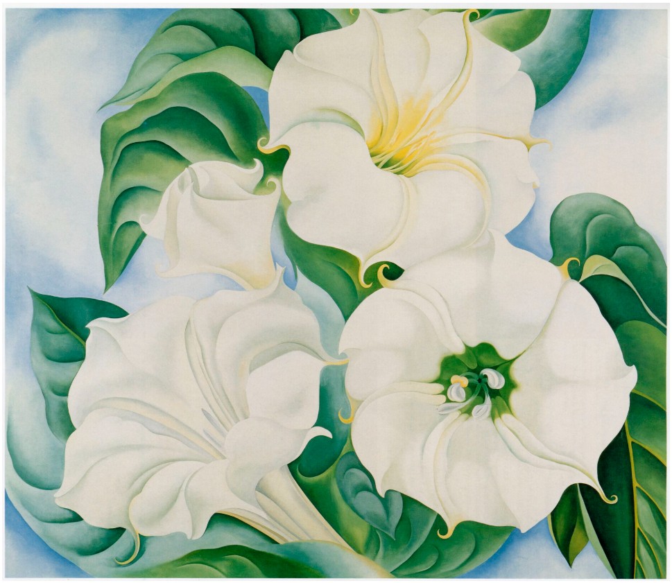
Georgia O’Keeffe, Jimson Weed, 1936. Indianapolis Museum of Art.
© 2025 Georgia O’Keeffe Museum / Artists Rights Society (ARS), New York
Growing up in World War II-era Japan, Kusama turned to art as a means of building a more expansive worldview. In the 1950s, she traveled to the United States, where she began dialogues with artists like the abstract painter Kenneth Callahan and Georgia O’Keeffe. Callahan helped her mount a solo exhibition in Seattle in 1957, and from there the artist moved to New York. It was here that the Infinity Nets first took shape in the form we know today, something that was in stark contrast to the machismo of Abstract Expressionism that dominated the period. Art historian Mignon Nixon asserted that Kusama set out to “replace the expressive gesture with an exhaustive one, pushing painting to its limits of spatial extent and ‘monotony;’ and to obliterate the self, reconceiving contemporary painting from a subjective statement of individual consciousness to ‘nothingness’ on an epic scale” (M. Nixon, “Infinity Politics,” in Yayoi Kusama, exh. cat., London, Tate Modern, 2012, p. 180). Because of the meditative qualities inherent in the production of works like Infinity-Nets [HSO], these canvases become all-encompassing as they both eschew objectification and become deeply emotional experiences at the same time.
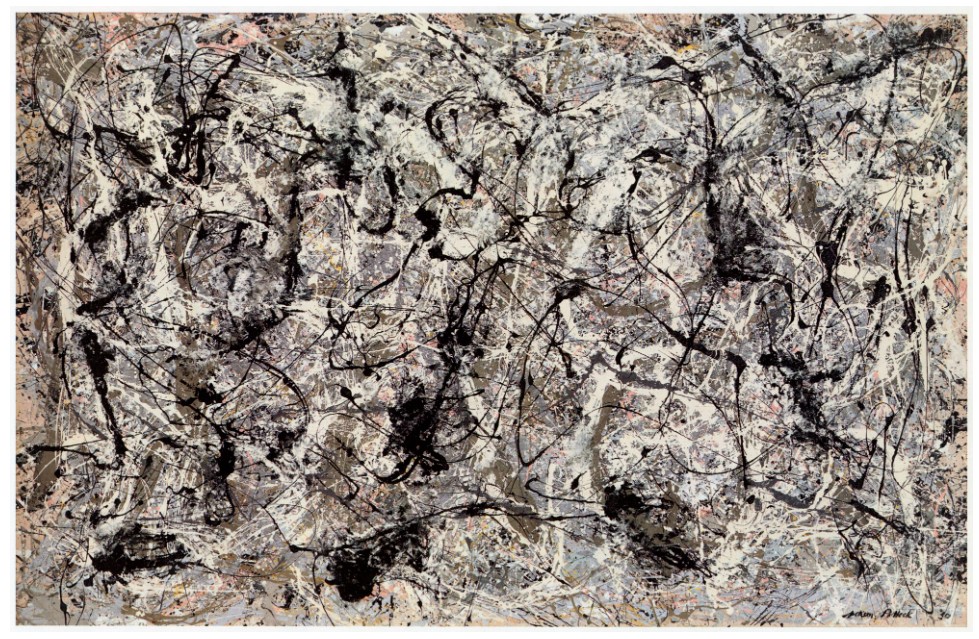
Jackson Pollock, Number 28, 1950, 1950. Metropolitan Museum of Art, New York.
© 2025 The Pollock-Krasner Foundation / Artists Rights Society (ARS), New York.
The paintings were lauded by influential critics such as Dore Ashton and Lucy Lippard, and admired by fellow artists such as Frank Stella and Donald Judd, both of whom were among the first collectors of her work. Judd praised her debut show, saying: “Yayoi Kusama is an original painter. The five…very large paintings in this show are strong, advanced in concept and realized. The effect is both complex and simple” Although he acknowledged Kusama’s connections to Mark Rothko, Clifford Still and Barnett Newman, he also praised her work as “thoroughly independent” (D. Judd, quoted in Donald Judd: Complete Writings 1959-1975, 2005, p. 2).
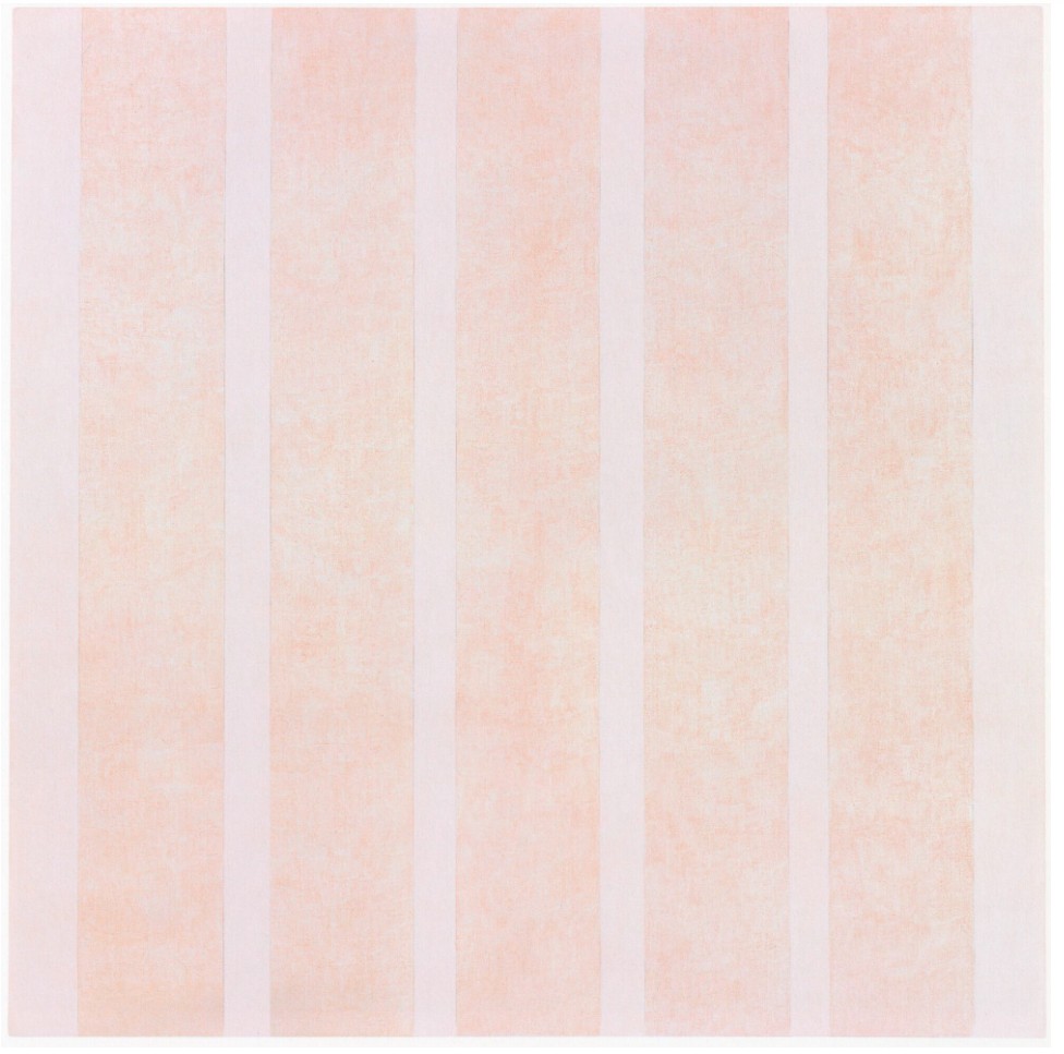
Agnes Martin, Untitled #10, 1975. © 2025 Estate of Agnes Martin / Artists Rights Society (ARS), New York.
Throughout her fifty-year career, Kusama’s work has enjoyed a strong international presence. In addition to representing Japan in both the 1966 and 1993 Venice Biennales, her Infinity Net paintings and installations have been exhibited in numerous museums including the Los Angeles County Museum of Art, Museum of Modern Art, New York, Walker Art Center, Minneapolis, The National Museum of Modern Art, Toyko, Centre Pompidou, Paris, and Museo Centro de Arte, Madrid. In 2012-2013 Kusama was also the subject of a major international retrospective that was organized by Tate Modern, London, which then traveled to the Whitney Museum of American Art, New York.
INFINITY-NETS (FINTTOW), 2007
Christie’s New-York: 15 May 2025
Estimated: USD 500,000 – 700,000
USD 693,000
YAYOI KUSAMA (B. 1929), INFINITY-NETS (FINTTOW) | Christie’s
YAYOI KUSAMA (B. 1929)
INFINITY-NETS (FINTTOW), 2007
Acrylic on canvas
72.7 x 60.6 cm (28 1/2 x 23 5/8 inches)
Signed, titled in English and Japanese and dated
‘Yayoi Kusama 2007 INFINITY-NETS FINTTOW’
(on the reverse)
Yayoi Kusama’s powerful INFINITY-NETS (FINTTOW) hypnotizes the viewer with its glorious web of small marks, each carefully painted with a semi-circle brushstroke, enveloping the viewer in the concept of infinity. The work is an exemplar of Yayoi Kusama’s iconic Infinity Nets series, one of her most visually complex and conceptual body of works. Among her extensive oeuvre, Infinity Nets stand out as particularly important to her development as an artist. In the present work Kusama applies paint in thick white scalloped impasto, giving the surface of the work a three-dimensional, sculptural quality. The rich texture of the dynamic surface allows for the intermittent reflection of light, causing an entrancing visual play between the flat surface of the canvas and the thick swaths of paint. The present work engulfs the viewer in an endless web of obsessive repetition, blurring the lines between the self and the infinite.
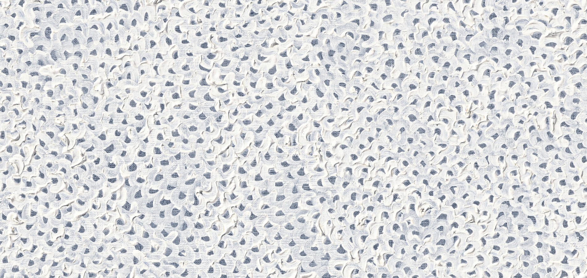
While INFINITY-NETS (FINNTOW) employs a restrained monochromatic palette, it paradoxically produces a kaleidoscopic effect. The deliberate precision of each brushstroke generates fractal-like patterns that subtly guide the viewer’s eye, revealing new visual narratives within the composition. Even within the repetitive structure of Kusama’s technique, these microcosms emerge, reflecting the artist’s exploration of infinity, obsession, and the tension between order and chaos. The thickly applied layers of paint create carefully calculated patterns which bleed onto the edges of the canvas, uninterrupted in their quest to infinity. The painting wrestles with the concept of infinity, a subject which Kusama explores obsessively and compulsively throughout her oeuvre. While Kusama has worked serially in her practice, her periodic return to the Infinity Nets represents an innate need to explore the purest expression of her artistic practice.
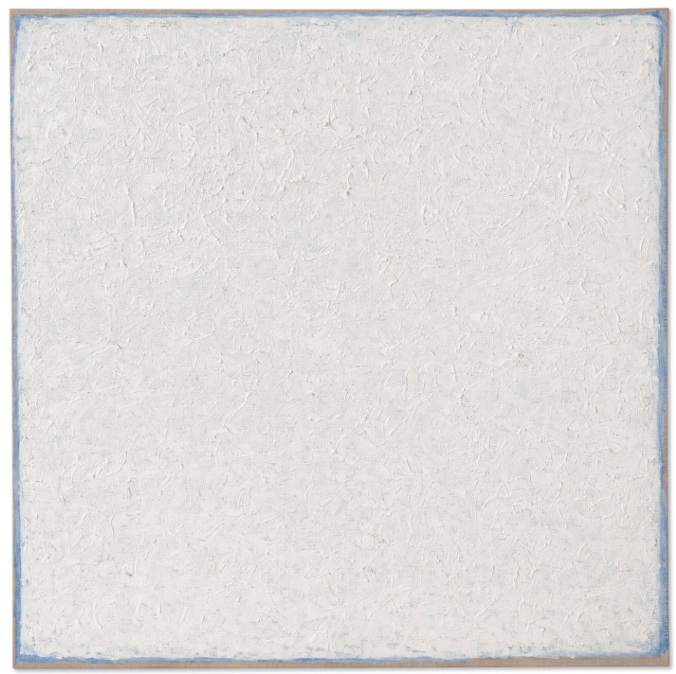
Robert Ryman, Times, 2000. © 2025 Robert Ryman / Artists Rights Society (ARS), New York.
Kusama began her acclaimed Infinity Nets series shortly after arriving in New York City in 1958. Already by 1959, her efforts culminated in her first solo exhibition at the Brata Gallery, an artist-run space in New York City. The exhibition unveiled her enormous Infinity Nets paintings to the public for the first time. The present work, INFINITY-NETS (FINTTOW), is a continuation of this groundbreaking series. Kusama described her Infinity Nets as paintings “without beginning, end, or center. The entire canvas would be occupied by [a] monochromatic net. This endless repetition caused a kind of dizzy, empty, hypnotic feeling” (the artist quoted in Laura Hoptman, Yayoi Kusama, London 2000, p. 103). Kusama constructs her nets with meticulously applied brushstrokes, each following a precise, rhythmic direction that subtly directs the viewer’s eye across the canvas. This repetitive motion creates a visual flow that suggests an endless cycle, reflecting the artist’s meditation on perpetual movement, the infinite, and the obsessive nature of her creative process.
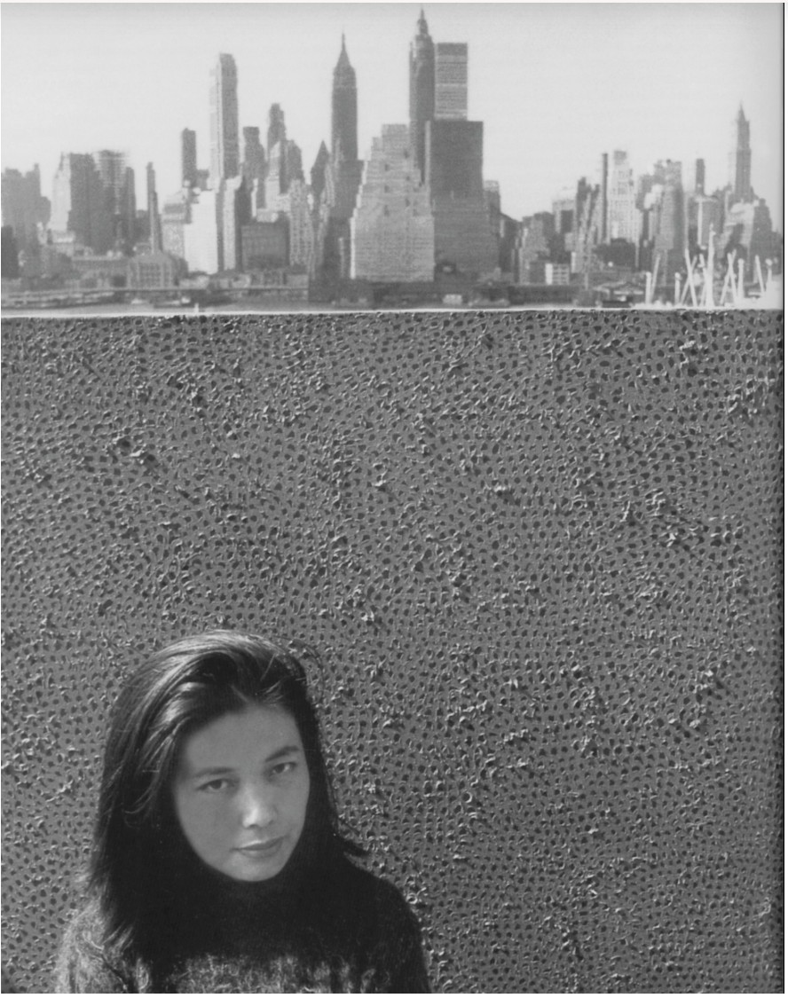
Yayoi Kusama in front of an Infinity Net painting, New York, circa 1961. Artwork: © 2025 Yayoi Kusama. Courtesy Yayoi Kusama Inc.
From an early age, Kusama found comfort in art in dealing with the emotional turmoil she experienced in her childhood. Kusama was plagued by visions of dots and flashes.
“My room, my body, the entire universe was filled with [patterns], my self was eliminated, and I had returned and been reduced to the infinity of eternal time and the absolute of space,” she recalls. “This was not an illusion but reality”
The Infinity Nets are a clear manifestation of these powerful visions; indeed, the Infinity Nets invite the viewer into the artist’s innermost psyche, allowing us to experience a semblance of the surreal environments which adorn some of her earliest childhood memories. Kusama describes the process of painting as obsessive.
“I often suffered episodes of severe neurosis. I would cover a canvas with nets, then continue painting them on the table, on the floor, and finally on my own body. As I repeated this process over and over again, the nets began to expand to infinity. I forgot about myself as they enveloped me, clinging to my arms and legs and clothes and filling the entire room.”
Kusama’s necessary compulsion manifests itself in a deeply personal work of art which, in turn, becomes a transformational experience for the viewer.
Pumpkin, 1990
Phillips New-York: 14 May 2025
Estimated: USD 300,000 – 500,000
USD 381,000
Yayoi Kusama Modern & Contemporary Art Day Sale, Morning Session
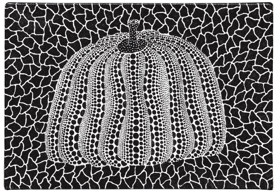
Pumpkin, 1990
Acrylic on canvas
“I adore pumpkins. As my spiritual home since childhood, pumpkins bring about poetic peace in my mind. Pumpkins talk to me, giving off an aura of my sacred mental state. They embody a base for the joy of living shared by all of humankind on earth. It is for the pumpkins that I keep on going.”
The Sea, 1952
Phillips New-York: 14 May 2025
Estimated: USD 180,000 – 250,000
USD 254,000
Yayoi Kusama Modern & Contemporary Art Day Sale, Morning Session
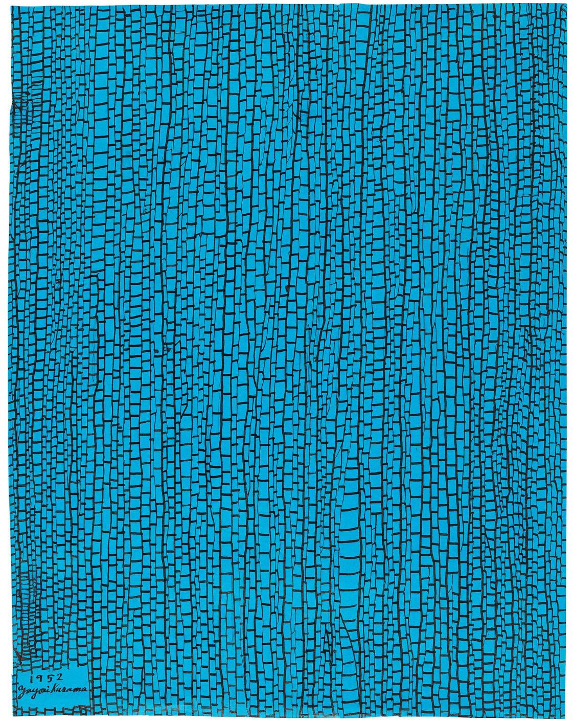 YAYOI KUSAMA
The Sea, 1952
Ink on paper
47 x 35.9 cm (18 1/2 x 14 1/8 inches)
Signed and dated “1952 Yayoi Kusama” lower left
Signed, titled and dated “1952 Yayoi Kusama The Sea [in Japanese]” on the reverse
Pierre Soulages
Peinture 92 x 73 cm, 30 juin 59
Sotheby’s New-York: 13 May 2025
Estimated: USD 3,000,000 – 5,000,000
PASSED
Peinture 92 x 73 cm, 30 juin 59 | Modern Evening Auction | 2025 | Sotheby’s
PIERRE SOULAGES (1919 – 2022)
Peinture 92 x 73 cm, 30 juin 59
Oil on canvas
92×73 cm (36 1/4 x 28 3/4 inches)
Signed Soulages (lower right)
Signed again, titled and dated 30 juin 59 (on the reverse)
Dated again (on the stretcher)
A powerful example of Soulages’ dramatic and gestural painting, Peinture 92 x 73 cm, 30 juin 59 foregrounds his masterful brushstrokes of impassioned color and rich impasto that foreground the dynamic dramatism with an inimitable urgency, attesting to the mastery of expression that defines the artist’s practice. The present work marks a moment of intense creative production in the artist’s celebrated career, the tail end of an eventful decade for the artist’s professional development and creative progression. Following his participation in the 26th Venice Biennale in 1952, Soulages received widespread international acclaim and was included in numerous exhibitions in the United States and Europe, such as his solo exhibition at Gimpel Fils in 1955 or group shows at the Solomon R. Guggenheim Museum, New York in 1959.
Michelangelo Merisi da Caravaggio, The Calling of St. Matthew, c. 1598-1601. Cappella Contarelli, Rome. Image © Bridgeman Images
Emanating in red and black, with glimpses of white and ochre punctuating the canvas, the present work builds up a rhythmic composition that amplifies in a frenzy of intense brushstrokes and color. In a turbulent post-war era punctuated by avant-gardes pioneering abstraction as a language to contend with the human experience, Soulages introduced a singular contribution to the annals of art history with his at once elegant and potent sensibility.
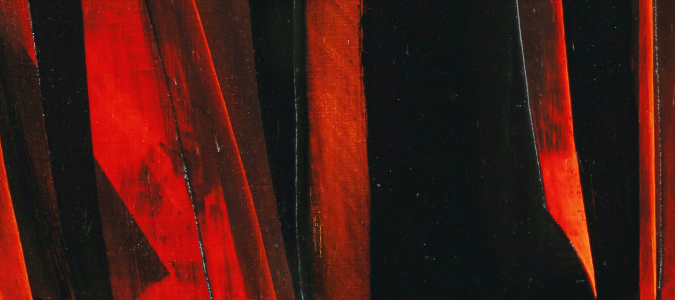
Vigorous stretches of fiery scarlet descend in ribbons from the upper edge of the canvas, scraping into the near-abyssal black that dominates the picture plane. Soulages’ iconic black, variegated in thickness and brushstroke but also resolute in its nonchalance, ever so slightly shapeshifts at the raking of light. In Soulages’ paintings, black pigment operates as a mechanism to bring light to the surface. Through his distinctive technique of layering and scraping away pigment, Soulages released fiery red, ochre, and white pigment from the underlayers of the composition. Shorter strokes of white and auburn brown take the lower half of the canvas, contrasting with the dark background. Soulages’ hand deftly evades our urge to locate identifiable symbols: “I don’t depict. I don’t narrate. I don’t represent. I paint, I present.” (the artist quoted in: Michael Peppiatt, “An Interview with Pierre Soulages,” Art International, November/December 1980) Despite its abstract nature, the visual drama of light and dark contrasting against each other adroitly recalls the chiaroscuro of masters like Caravaggio and Francisco Goya, as the density of the black against the smooth crimson imbues the work with a visual depth that thrusts the vibrant red into the foreground. What is undeniable is that Peinture 92 x 73 cm, 30 juin 59 reaches towards something visceral, deep- seated and emotive; enveloped in a primal mystery, the energetic brushstrokes of the present work magnificently illustrate the artist’s fascination with capturing the visual drama inherent to the modern psyche.
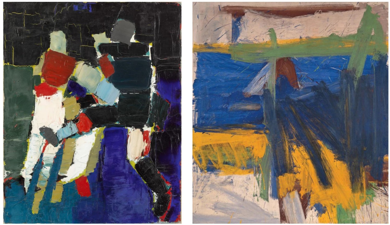
Left: Nicolas de Staël, The Soccer Players (Footballeurs), 1952. Musée Granet, Aix-en-Provence. Image © RMN-Grand Palais / Art Resource, NY. Art © 2025 Artists Rights Society (ARS), New York / ADAGP, Paris.
Right: Willem de Kooning, Ruth’s Zowie, 1957. Private Collection. Art © 2025 The Willem de Kooning Foundation / Artists Rights Society (ARS), New York
This energy that pervades Peinture 92 x 73 cm, 30 juin 59 in part stems from the transformations in technique that the artist experienced throughout the 1950s. Instead of the small brushes with which he would paint his abstract patterns, Soulages introduced palette knives and straightedges that unlocked more bold dynamism in his strokes and harnessed the architectonic and sculptural quality pervasive in the present work. He also employed a tool consisting of a piece of rubber stretched between two thin boards and a long handle, which he used to render variegated fields in the paint as he applied, mixed, and scraped off pigment in one continuous motion. At this time, Soulages also began working with his canvases on the floor, immersing himself in the picture plane by standing atop a bridge-like board laid over the painting. Exuding the results of rigorous technical developments and aesthetic inquiries of the decade often found in Soulages’ most celebrated large-scale paintings, the present work underscores his attempts to liberate himself from concepts like contour, line, and surface, to dive deeper into the world of form and pigment and attain a truly timeless style.
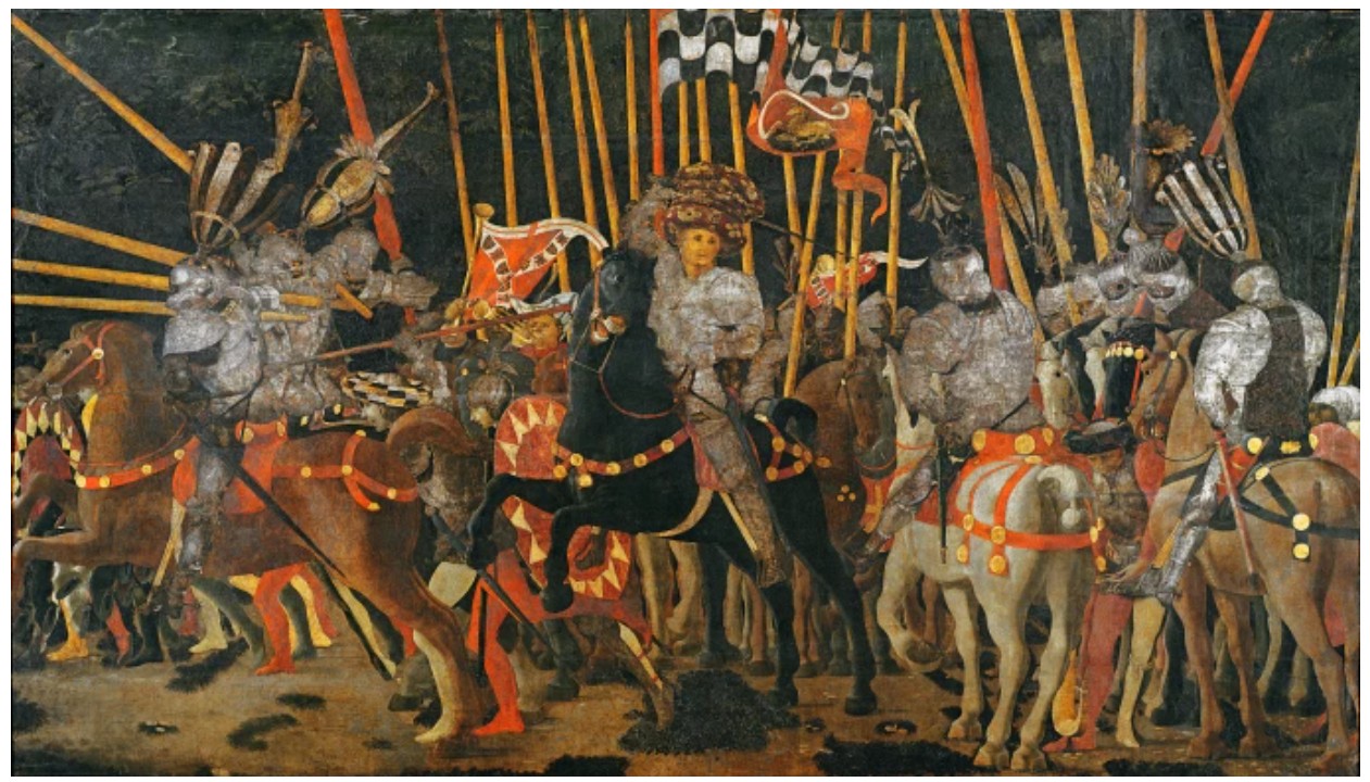
Paolo Uccello,The Battle of San Romano in 1432, c.1456. Louvre, Paris. Image © Bridgeman Images
As much as the innovative technique and vision that Soulages pioneered constituted a radical break with the canon of Western art history, the artist’s penchant for painting something perennial and foundational underscores the extensive influences behind the artist’s practice. The sense of instantaneity pulsating from his methodical work calls to mind the gestural planes of the Abstract Expressionists. The gestural dynamism of Soulages’ work finds parallels in that of New York artists Willem de Kooning and Franz Kline as well as the explosive energy of Chinese-French painter Zao Wou-Ki. Soulages aligns his practice though with some of the earliest and most enduring examples of human expression: prehistoric forms, the cave paintings of Lascaux, even the austere Romanesque church of Sainte-Foy in Conques-en-Rouergue, near his birthplace in the South of France. The purity and resolute force of Soulages’ forms invokes the primal and direct nature of prehistoric renderings. And the architectonic monumentality, volumetric forms, and sense of intangible mystery of Soulages’ paintings can be metaphorically traced to the candlelit interiors of the Romanesque church. The artist himself is acutely aware of this influence, particularly in relation to the role black takes on in his oeuvre: “There are 320 centuries since the known origins of painting, and during thousands of years, men went underground, in the absolute black of grottoes, to paint and paint with black. A fundamental color, black is also the color of origin for painting.” (the artist quoted in: Exh. Cat., New York, Robert Miller Gallery, Pierre Soulages: Outrenoir, 2005, n.p.)
His heavy, linear brushstrokes charged with grace and intention resonate even with the calligraphic traditions and ideographic forms of East Asian calligraphy: “I made line combinations which struck the eye of the beholder as a large form, a large sign which you could take in at a glance and one fine day I realized that the drawings I was doing were reminiscent of Chinese characters.” (the artist quoted in: Françoise Jaunin, Pierre Soulages: Noir lumière, Entretiens avec Françoise Jaunin, Lausanne 2002) Rooted in a rich dialogue between past and present, Peinture 92 x 73 cm, 30 juin 59 is a testament to the masterful balance between the influence of preceding masterpieces and groundbreaking innovation found in Soulages’ architectonic brushstrokes.
“What matters to me is what happens on the canvas. No two brushstrokes are ever the same. Every stroke has its own specific and irreducible attributes: shape, length, thickness, consistency, texture, color, and transparency. Any particular brushstroke establishes a relationship with other forms on the canvas, with the background and with the surface as a whole.”
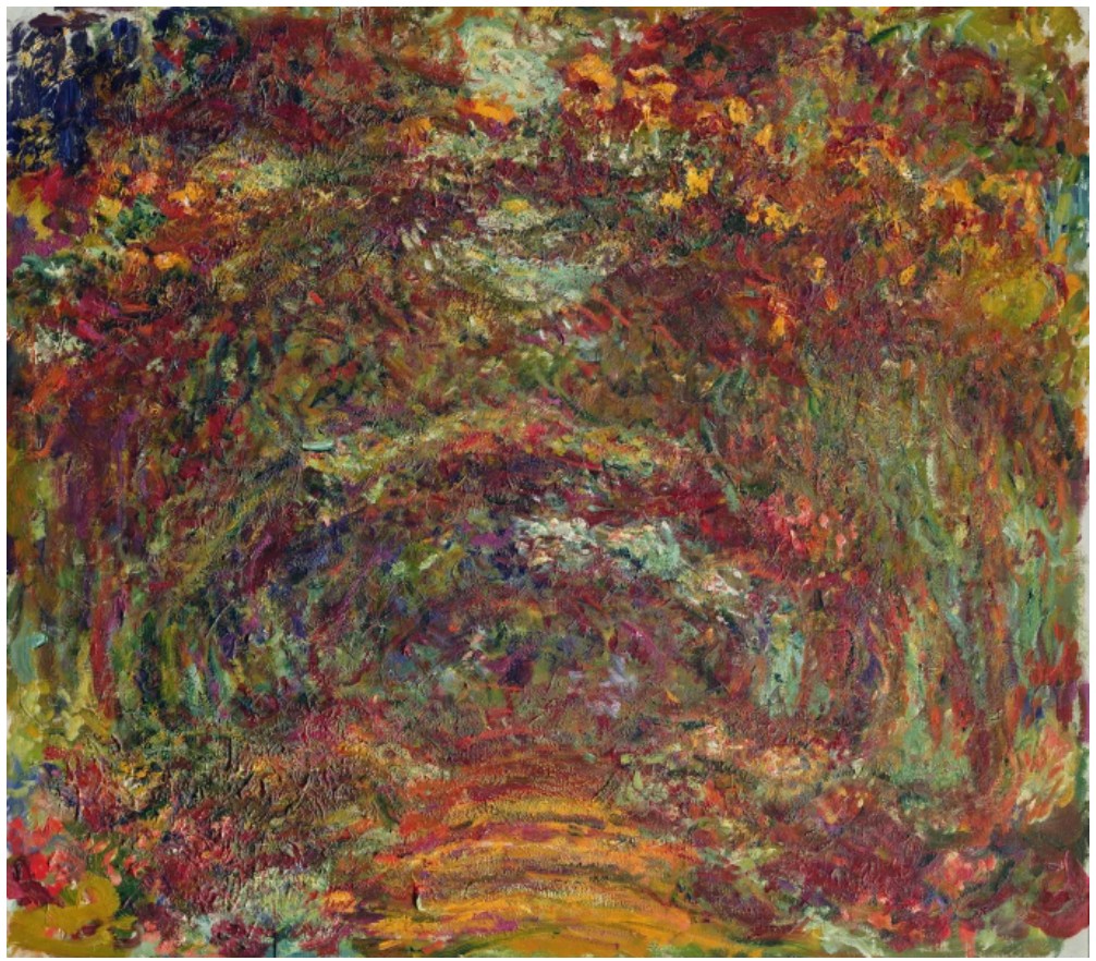
Claude Monet, The Rose Path, Giverny, 1920-22. Musée Marmottan Monet, Paris. Image © Bridgeman Images
Through Peinture 92 x 73 cm, 30 juin 59, in a style simultaneously deeply art historical and wholly innovative, Soulages weaves between raw, visceral emotion and a cerebral interrogation of form. His powerful brushstrokes, in their elusive abstraction, give substance to the ineffable forces engraved into the human experience and reach the viewer in an intimate and emotive fashion. At once instinctive, radical, and immersive, the present work foregrounds the unfading artistic perspective of this modern master.
Roy’s Lichtensteins

Celebrated as one of the defining figures of the Pop art movement, Roy Lichtenstein’s dynamic practice expanded beyond his famous comic strip works, spanning a wide range of styles, media and themes. Following the sale of a select group of works from the Collection of Dorothy and Roy Lichtenstein at Sotheby’s in November 2024, Sotheby’s is pleased to partner with the Lichtenstein family to offer an expanded trove of more than 40 works by the American Pop icon at auction this May. Coming to auction for the first time after remaining in their personal collection for decades, the group of works charts four decades of Lichtenstein’s practice, following his shift from abstract expressionism to Pop art in the 60s, to his exploration of modern art in the 70s, through to his celebrated Reflections series from the 80s, and culminating in his famous interiors and nudes of the 90s. Together, “Roy’s Lichtensteins” form a throughline of the artist’s most introspective examinations of his life and practice: the metaphorical reflections on his own oeuvre, his reflections on other artists and the art historical canon, and his formal explorations of rendering reflections in his work.
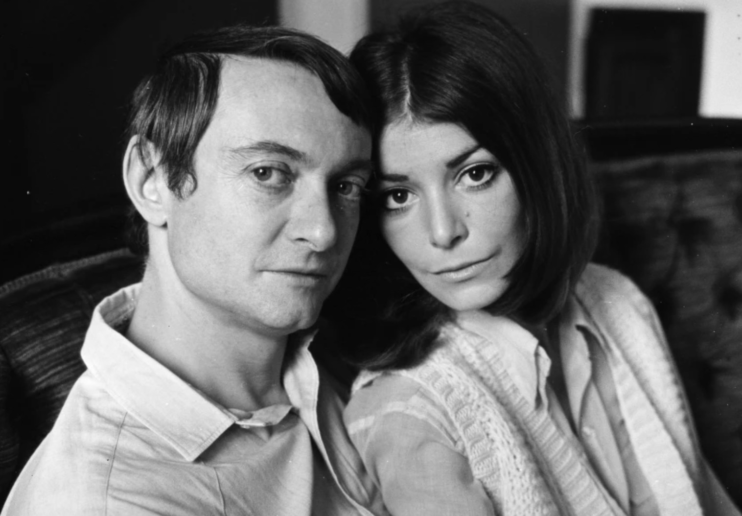
A remarkable grouping of the artist’s output across various media, the group comprises paintings, drawings, sculpture and prints. Among the works on offer are the artist’s investigation of the work of the modernists, surrealists, and others, such as Picasso, Monet, Calder, subjecting them all to his own aesthetic and asserting his place in art history.
A common thread of Lichtenstein’s distinct humor and joie de vivre is woven throughout. Works highlight his more literal takes on reflection and plays on illusion, and elsewhere, drawings and studies mark the genesis for Lichtenstein’s most iconic paintings. Estimated to achieve in excess of $35 million, highlights from the collection will travel to Hong Kong from 18-23 April before returning to New York for pre-sale exhibition ahead of Sotheby’s Contemporary Evening and Day sales this May.
TO READ MORE CLICK BELOW
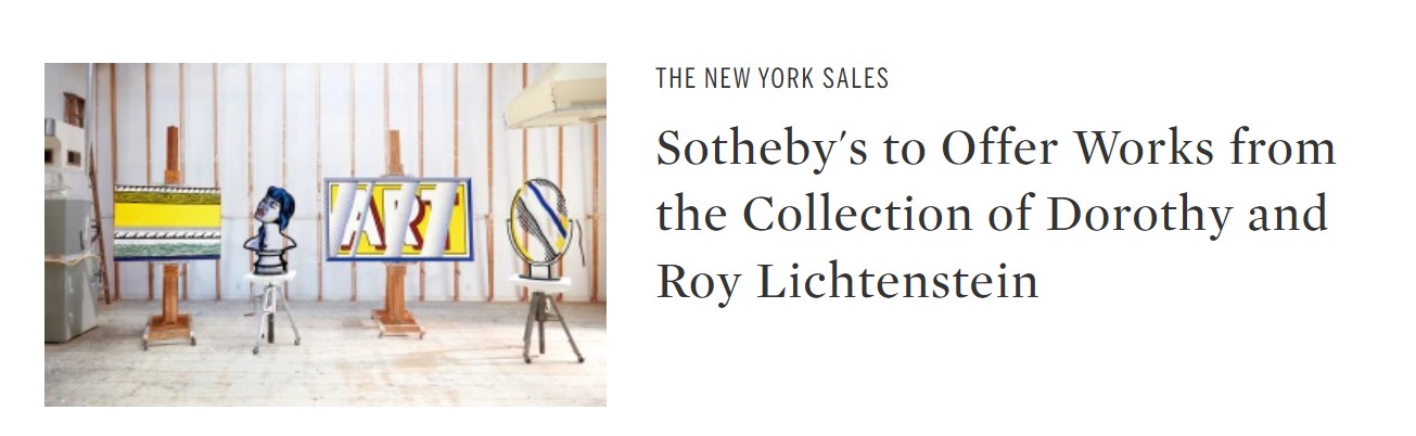
ALSO NOT TO BE MISSED
1. Paintings
Reflections: Art, 1988
Works from the Collection of Dorothy and Roy Lichtenstein
Sotheby’s New-York: 15 May 2025
Estimated: USD 4,000,000 – 6,000,000
USD 5,479,000
Reflections: Art | The Now and Contemporary Evening Auction | 2025 | Sotheby’s
ROY LICHTENSTEIN (1923 – 1997)
Reflections: Art, 1988
Acrylic, oil and graphite on canvas
44 1/2 x 76 1/4 inches (113 x 193.7 cm)
Signed and dated ’88 (on the reverse)
Stretcher Frame with Cross Bars III, 1968
Works from the Collection of Dorothy and Roy Lichtenstein
Sotheby’s New-York: 15 May 2025
Estimated: USD 2,500,000 – 3,500,000
USD 4,930,000
Stretcher Frame with Cross Bars III | The Now and Contemporary Evening Auction | 2025 | Sotheby’s
ROY LICHTENSTEIN (1923 – 1997)
Stretcher Frame with Cross Bars III, 1968
Acrylic, oil and graphite on canvas
48 x 56 1/4 inches (121.9 x 142.9 cm)
Signed and dated ’68 (on the reverse)
Atomic Landscape, 1966
Works from the Collection of Dorothy and Roy Lichtenstein
Sotheby’s New-York: 15 May 2025
Estimated: USD 700,000 – 1,000,000
USD 1,636,000
Atomic Landscape | The Now and Contemporary Evening Auction | 2025 | Sotheby’s
ROY LICHTENSTEIN (1923 – 1997)
Atomic Landscape, 1966
Acrylic, oil and graphite on canvas
14 x 16 1/8 inches (35.6 x 41 cm)
Signed and dated ’66 (on the reverse)
Haystacks, 1968
Works from the Collection of Dorothy and Roy Lichtenstein
Sotheby’s New-York: 16 May 2025
Estimated: USD 400,000 – 600,000
USD 1,392,000
Haystacks | Contemporary Day Auction | 2025 | Sotheby’s
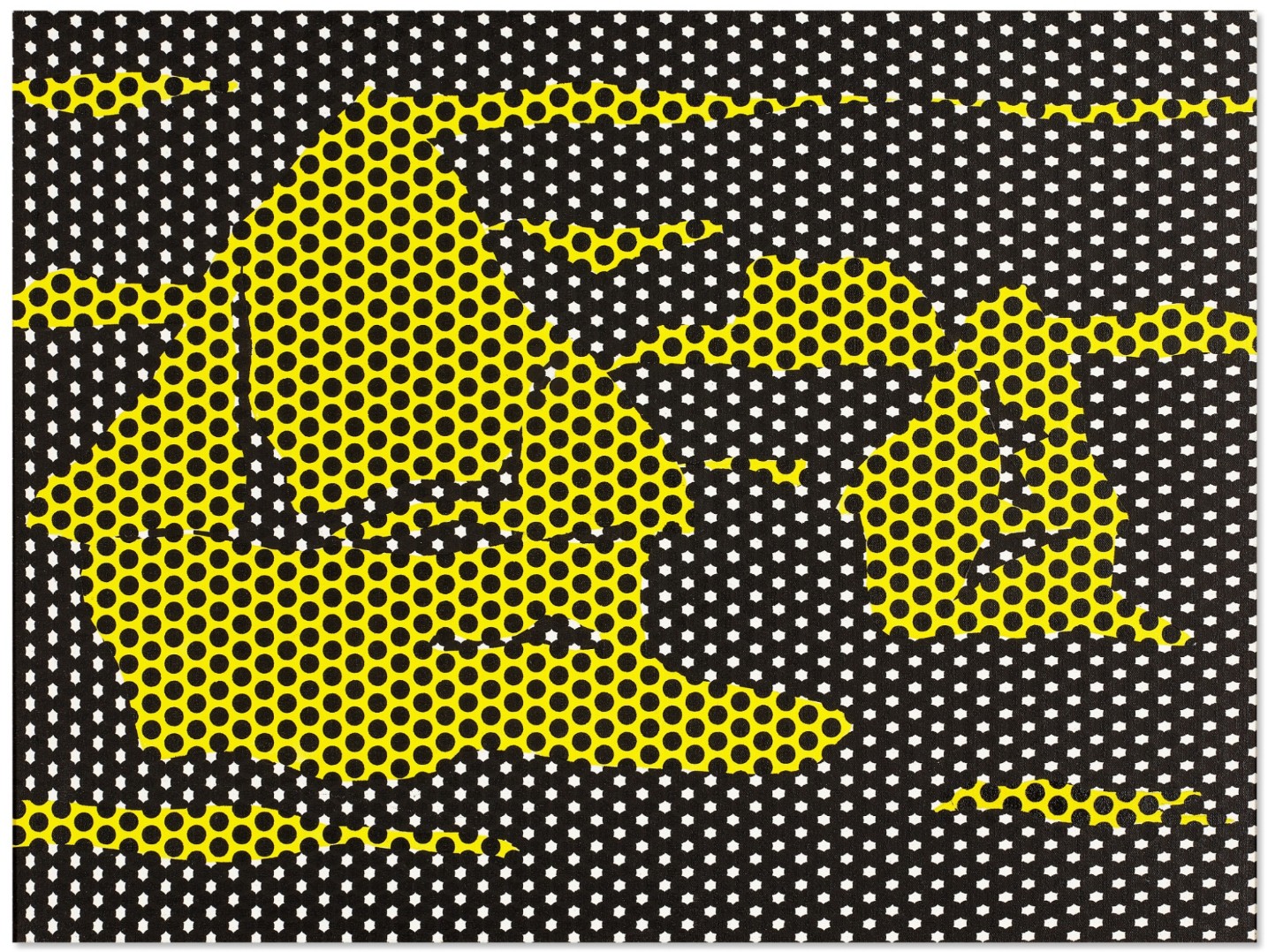
ROY LICHTENSTEIN (1923 – 1997)
Haystacks, 1968
Oil, acrylic and graphite on canvas
18×24 inches (45.7 x 60.9 cm)
Signed, dated ’68 and variously inscribed (on the reverse)
Unfurled (After Morris Louis), 1973
Works from the Collection of Dorothy and Roy Lichtenstein
Sotheby’s New-York: 16 May 2025
Estimated: USD 1,000,000 – 1,500,000
USD 1,392,000
Unfurled (After Morris Louis) | Contemporary Day Auction | 2025 | Sotheby’s
ROY LICHTENSTEIN (1923 – 1997)
Unfurled (After Morris Louis), 1973
Acrylic, oil and graphite on canvas
30 x 36 1/8 inches (76.4 x 91.8 cm)
Signed and dated ’73 (on the reverse)
Entablature, 1975
Works from the Collection of Dorothy and Roy Lichtenstein
Sotheby’s New-York: 16 May 2025
Estimated: USD 500,000 – 700,000
USD 1,079,500
Entablature | Contemporary Day Auction | 2025 | Sotheby’s
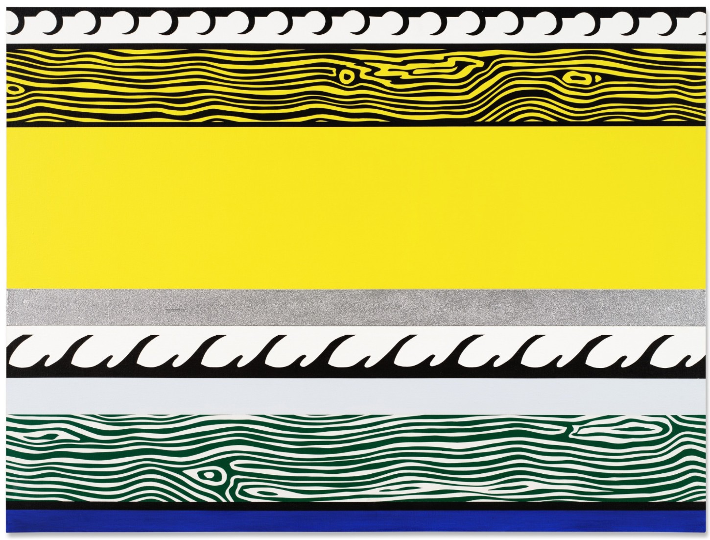
ROY LICHTENSTEIN (1923 – 1997)
Entablature, 1975
Acrylic, sand and graphite on canvas
36 x 48 1/4 inches (96.5 x 122.6 cm)
Signed and dated ’75 (on the reverse)
Untitled, 1960
Works from the Collection of Dorothy and Roy Lichtenstein
Sotheby’s New-York: 16 May 2025
Estimated: USD 200,000 – 300,000
USD 698,500
Untitled | Contemporary Day Auction | 2025 | Sotheby’s
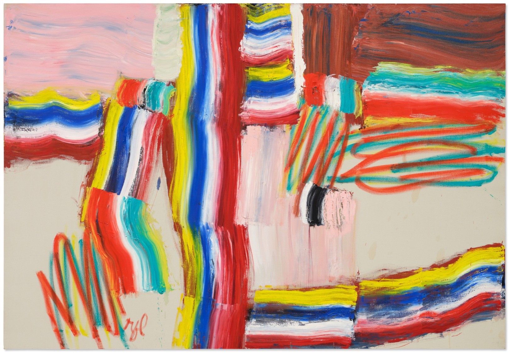
ROY LICHTENSTEIN (1923 – 1997)
Untitled, 1960
Oil and coffee on canvas
48 x 70 1/4 inches (121.9 x 178.4 cm)
Signed with the artist’s initials (lower left)
Dated 1960 (on the reverse)
2. Sculptures
Woman: Sunlight, Moonlight, 1996
Works from the Collection of Dorothy and Roy Lichtenstein
Sotheby’s New-York: 15 May 2025
Estimated: USD 4,000,000 – 6,000,000
USD 4,930,000
Woman: Sunlight, Moonlight | The Now and Contemporary Evening Auction | 2025 | Sotheby’s
ROY LICHTENSTEIN (1923 – 1997)
Woman: Sunlight, Moonlight, 1996
Acrylic on wood
42 3/4 x 26 x 13 5/8 inches (108.6 x 66 x 35.6 cm)
Bonsai Tree, 1993
Works from the Collection of Dorothy and Roy Lichtenstein
Sotheby’s New-York: 15 May 2025
Estimated: USD 1,500,000 – 2,000,000
USD 4,198,000
Bonsai Tree | The Now and Contemporary Evening Auction | 2025 | Sotheby’s
ROY LICHTENSTEIN (1923 – 1997)
Bonsai Tree, 1993
Painted pewter, patinated bronze
50 3/4 x 38 1/2 x 10 1/2 inches (128.9 x 97.8 x 26.7 cm)
Incised with the artist’s signature, numbered 6/6 and dated ’93 (lower edge)
This work is number 6 from an edition of 6 plus 1 artist’s proof
Setting Sun and Sea, 1964
Works from the Collection of Dorothy and Roy Lichtenstein
Sotheby’s New-York: 16 May 2025
Estimated: USD 250,000 – 350,000
USD 1,758,000
Setting Sun and Sea | Contemporary Day Auction | 2025 | Sotheby’s
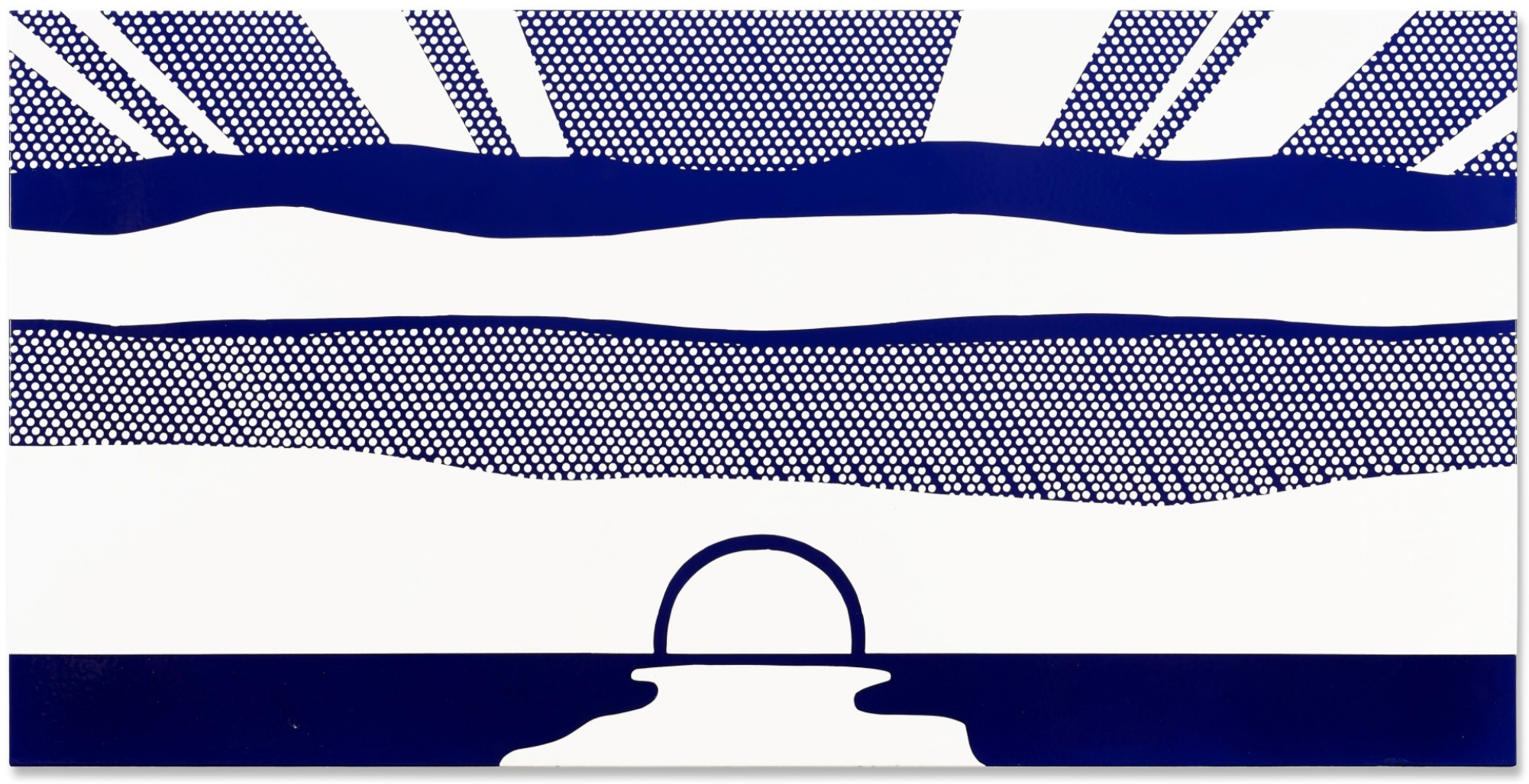
ROY LICHTENSTEIN (1923 – 1997)
Setting Sun and Sea, 1964
Porcelain enamel on steel
36×72 inches (91.4 x 182.9 cm)
Signed (on the reverse)
This work is number 4 from an edition of 5
Woman Contemplating a Yellow Cup, 1995
Works from the Collection of Dorothy and Roy Lichtenstein
Sotheby’s New-York: 16 May 2025
Estimated: USD 1,000,000 – 1,500,000
USD 1,758,000
Woman Contemplating a Yellow Cup | Contemporary Day Auction | 2025 | Sotheby’s
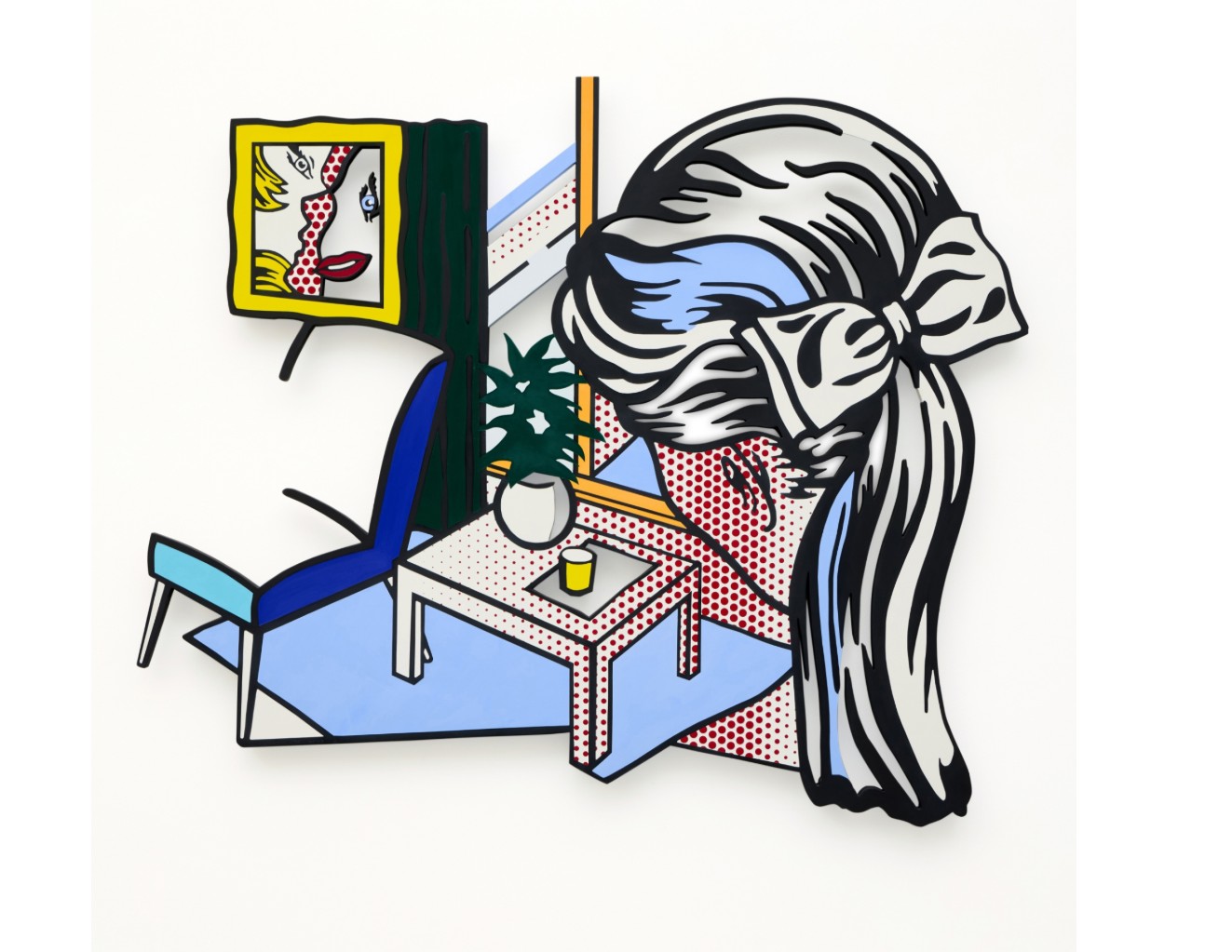
ROY LICHTENSTEIN (1923 – 1997)
Woman Contemplating a Yellow Cup, 1995
Acrylic and pigmented wax on aluminum
71 3/4 x 84 inches (182.2 x 213.4 cm)
Incised with the artist’s signature, date ’95 and number AP 1/2 (lower left)
This work is artist proof 1 of 2 from an edition of 6 plus 2 artist proofs
Mirror I, 1976
Works from the Collection of Dorothy and Roy Lichtenstein
Sotheby’s New-York: 15 May 2025
Estimated: USD 1,000,000 – 1,500,000
USD 1,016,000
Mirror I | The Now and Contemporary Evening Auction | 2025 | Sotheby’s
ROY LICHTENSTEIN (1923 – 1997)
Mirror I, 1976
Painted and patinated bronze
44 1/2 x 25 x 11 5/8 inches (113 x 63.5 x 29.5 cm)
Incised with the artist’s signature, numbered 2/3 and dated ’76 (lower edge)
This work is number 2 from an edition of 3 plus 1 posthumous cast
Small Wall Explosion, 1965
Works from the Collection of Dorothy and Roy Lichtenstein
Sotheby’s New-York: 16 May 2025
Estimated: USD 400,000 – 600,000
USD 812,800
Small Wall Explosion | Contemporary Day Auction | 2025 | Sotheby’s
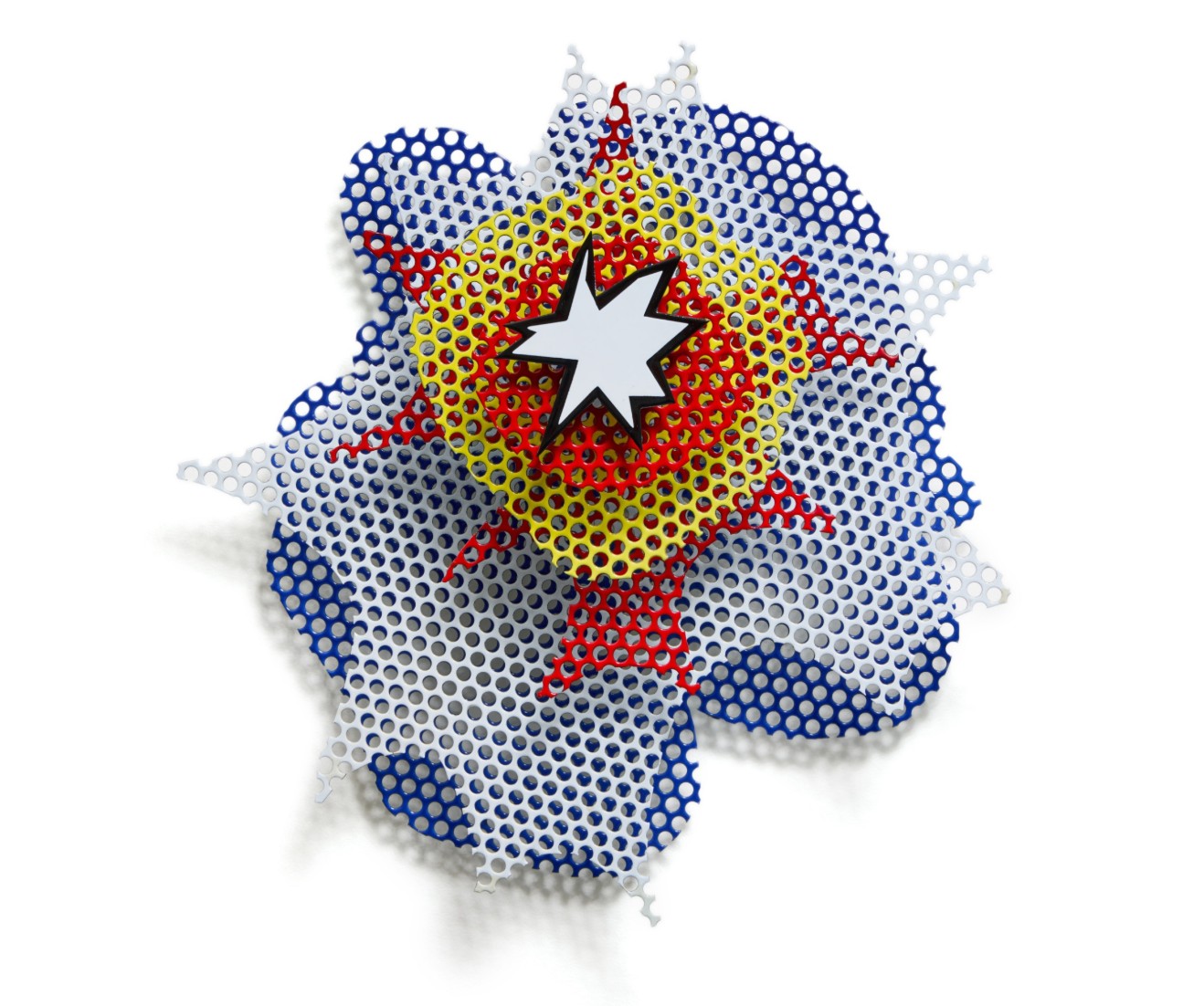
ROY LICHTENSTEIN (1923 – 1997)
Small Wall Explosion, 1965
Porcelain enamel on steel and perforated steel
21 7/8 x 20 1/2 x 7 3/8 inches (55.6 x 52.1 x 18.7 cm)
Signed, dated ’65 and numbered 6/6 (on the reverse)
This work is number 6 from an edition of 6
Surrealist Head II, 1988
Works from the Collection of Dorothy and Roy Lichtenstein
Sotheby’s New-York: 16 May 2025
Estimated: USD 700,000 – 1,000,000
USD 533,400
Surrealist Head II | Contemporary Day Auction | 2025 | Sotheby’s

ROY LICHTENSTEIN (1923 – 1997)
Surrealist Head II, 1988
Painted and patinated bronze
35 1/8 x 14 1/4 x 5 7/8 inches (89.2 x 36.2 x 14.9 cm)
Incised with the artist’s signature, date ’88 and number 0/6 (on the base)
This work is the artist proof from an edition of 6 plus 1 artist proof
Mobile I, 1989
Works from the Collection of Dorothy and Roy Lichtenstein
Sotheby’s New-York: 16 May 2025
Estimated: USD 400,000 – 600,000
USD 533,400
Mobile I | Contemporary Day Auction | 2025 | Sotheby’s
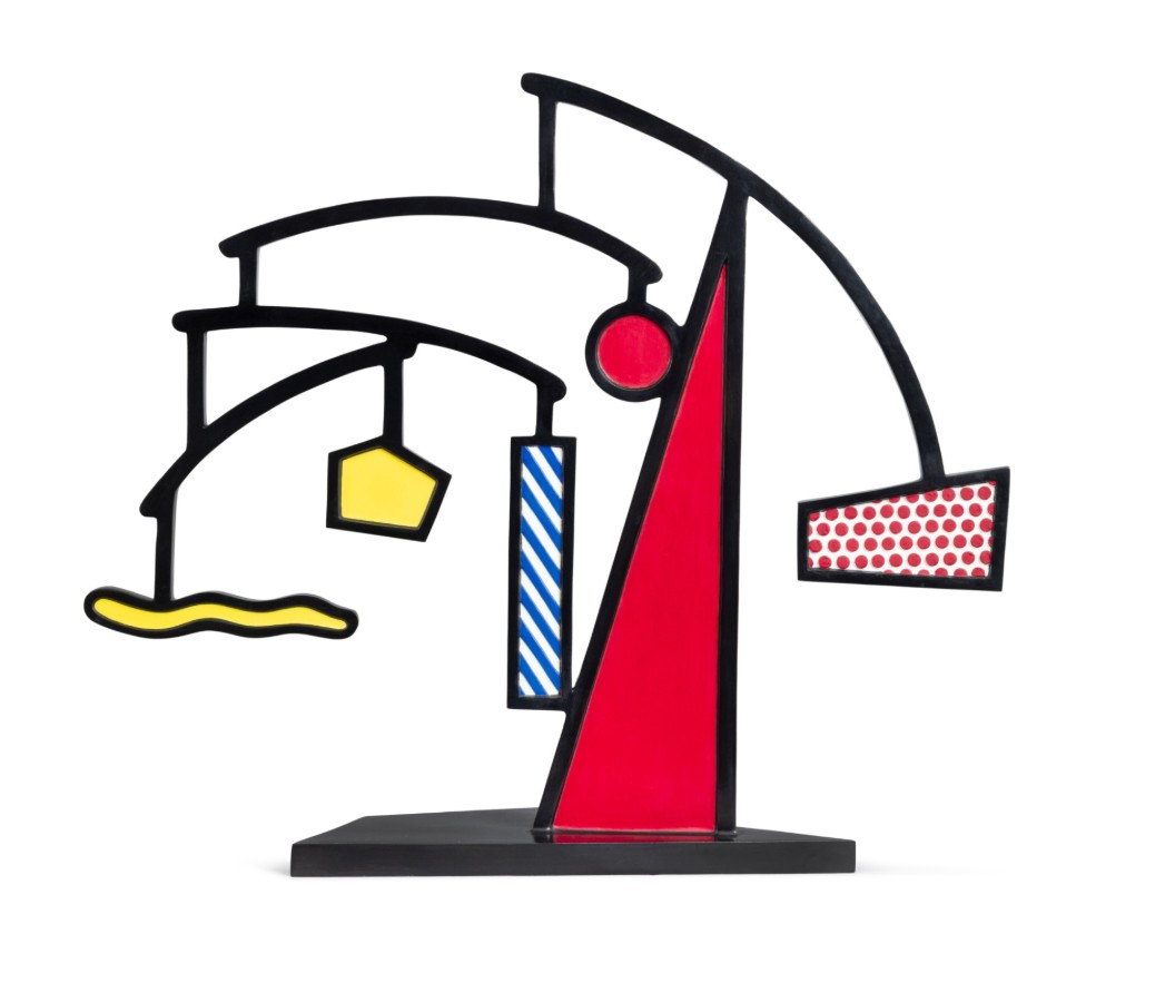
ROY LICHTENSTEIN (1923 – 1997)
Mobile I, 1989
Painted and patinated bronze
30 1/8 x 36 x 10 1/2 inches (76.5 x 91.4 x 26.7 cm)
Incised with the artist’s signature, date ’89 and number 0/6 (on the base)
This work is the artist proof from an edition of 6 plus 1 artist proof
3. Studies
Interior with African Mask (Study), 1990
Works from the Collection of Dorothy and Roy Lichtenstein
Sotheby’s New-York: 16 May 2025
Estimated: USD 800,000 – 1,200,000
USD 2,522,o00
Interior with African Mask (Study) | Contemporary Day Auction | 2025 | Sotheby’s
ROY LICHTENSTEIN (1923 – 1997)
Interior with African Mask (Study), 1990
Sut painted paper, cut printed paper, tape, marker and graphite on board
Image: 34 1/4 x 44 inches (86.8 x 111.8 cm)
Sheet: 38 1/2 x 48 1/4 inches (97.6 x 122.6 cm)
Nudes in Mirror (Study), 1994
Works from the Collection of Dorothy and Roy Lichtenstein
Sotheby’s New-York: 16 May 2025
Estimated: USD 1,000,000 – 1,500,000
USD 2,405,o00
Nudes in Mirror (Study) | The Now and Contemporary Evening Auction | 2025 | Sotheby’s
ROY LICHTENSTEIN (1923 – 1997)
Nudes in Mirror (Study), 1994
Colored pencil and graphite on paper
Image: 12 1/4 x 10 1/4 inches (31.1 x 26 cm)
Sheet: 15 1/4 x 11 3/8 inches (38.7 x 28.9 cm)
Signed and dated ’94 (on the reverse)
Portrait Triptych (Studies), 1974
Works from the Collection of Dorothy and Roy Lichtenstein
Sotheby’s New-York: 16 May 2025
Estimated: USD 1,500,000 – 2,000,000
USD 2,246,000
Portrait Triptych (Studies) | The Now and Contemporary Evening Auction | 2025 | Sotheby’s
ROY LICHTENSTEIN (1923 – 1997)
Portrait Triptych (Studies), 1974
Left and center sheets: colored pencil and graphite on paper
Right sheet: colored pencil, graphite and paper collage on paper
Each sheet: 22×15 inches (55.9 x 37.9 cm)
Each image: approx. 13 1/2 x 10 3/4 inches (34.3 x 27.3 cm)
Each: signed and dated ’74 (on the reverse)
Still Life Tapestry (Study), 1973
Works from the Collection of Dorothy and Roy Lichtenstein
Sotheby’s New-York: 15 May 2025
Estimated: USD 1,000,000 – 1,500,000
USD 2,063,000
Still Life Tapestry (Study) | The Now and Contemporary Evening Auction | 2025 | Sotheby’s
ROY LICHTENSTEIN (1923 – 1997)
Still Life Tapestry (Study), 1973
Cut painted paper, cut printed paper, marker on cut paper, cut paper, marker and graphite on board
Image: 32 5/8 x 24 1/2 inches (82.9 x 62.2 cm)
Board: 34 3/8 x 26 1/4 inches (87.3 x 66.7 cm)
Signed and dated 1973 (lower left)
Water Lily Pond with Reflections (Study), 1992
Works from the Collection of Dorothy and Roy Lichtenstein
Sotheby’s New-York: 16 May 2025
Estimated: USD 500,000 – 700,000
USD 1,941,000
Water Lily Pond with Reflections (Study) | Contemporary Day Auction | 2025 | Sotheby’s
ROY LICHTENSTEIN (1923 – 1997)
Water Lily Pond with Reflections (Study), 1992
Cut painted paper, cut printed paper, aluminum foil, tape, marker and graphite on 2 joined boards
Image: 46 1/8 x 72 1/4 inches (117.2 x 183.5 cm)
Sheet: 60 x 80 1/4 inches (152.4 x 204 cm)
Yellow and Black Brushstroke (Eat Art) (Study), 1970
Works from the Collection of Dorothy and Roy Lichtenstein
Sotheby’s New-York: 16 May 2025
Estimated: USD 400,000 – 600,000
USD 889,000
Yellow and Black Brushstroke (Eat Art) (Study) | Contemporary Day Auction | 2025 | Sotheby’s
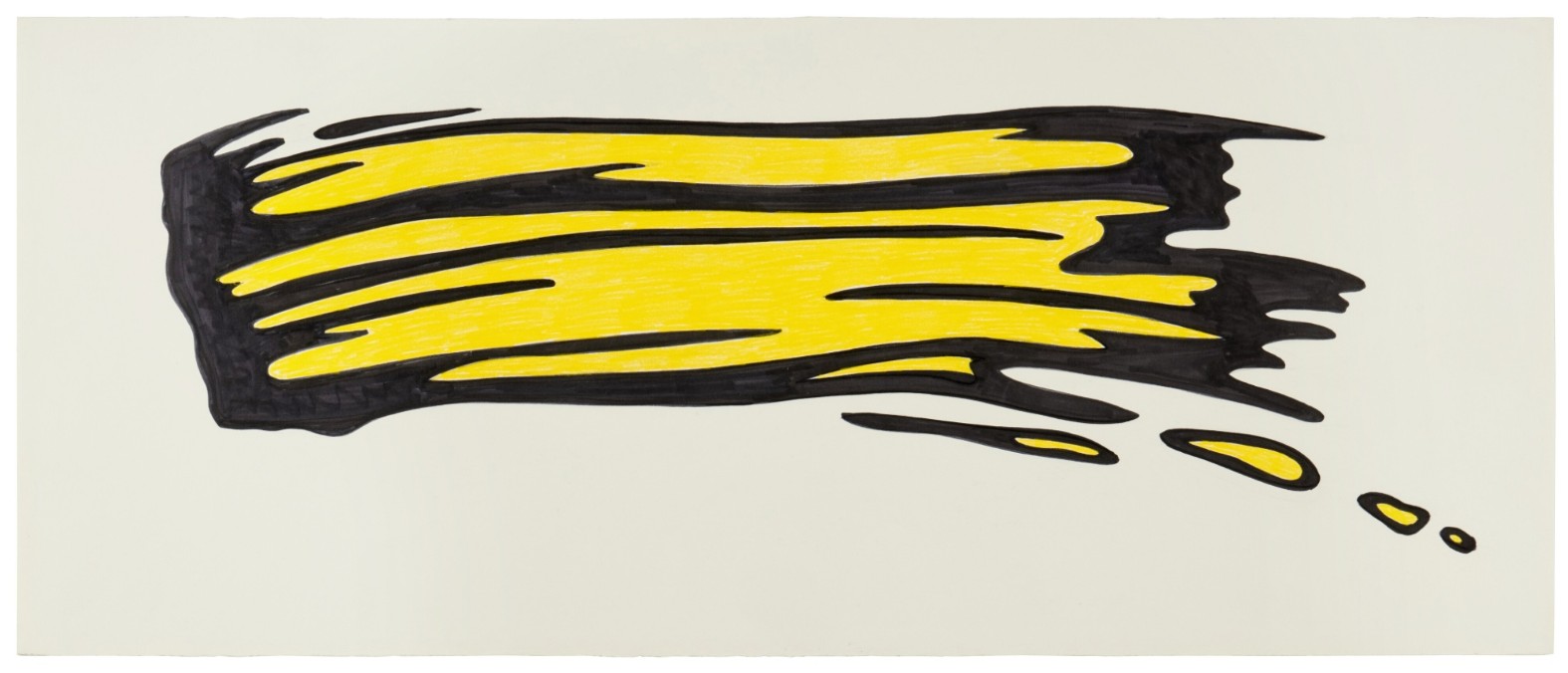
ROY LICHTENSTEIN (1923 – 1997)
Yellow and Black Brushstroke (Eat Art) (Study), 1970
Marker, colored pencil and graphite on paper
17 1/4 x 41 1/2 inches (43.8 x 105.4 cm)
Interior with Swimming Pool Painting (Study), 1992
Works from the Collection of Dorothy and Roy Lichtenstein
Sotheby’s New-York: 16 May 2025
Estimated: USD 400,000 – 600,000
USD 762,000
Interior with Swimming Pool Painting (Study) | Contemporary Day Auction | 2025 | Sotheby’s
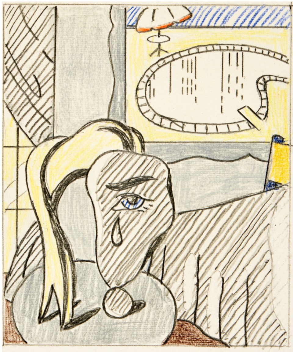
ROY LICHTENSTEIN (1923 – 1997)
Interior with Swimming Pool Painting (Study), 1992
Colored pencil and graphite on paper
Image: 6×5 inches (15.2 x 12.7 cm)
Sheet: 9 7/8 x 6 3/4 inches (25.1 x 17.1 cm)
Signed and dated ’92 (on the verso)
Reflections: Whaaam! (Study), circa 1990
Works from the Collection of Dorothy and Roy Lichtenstein
Sotheby’s New-York: 16 May 2025
Estimated: USD 250,000 – 350,000
USD 660,400
Reflections: Whaaam! (Study) | Contemporary Day Auction | 2025 | Sotheby’s
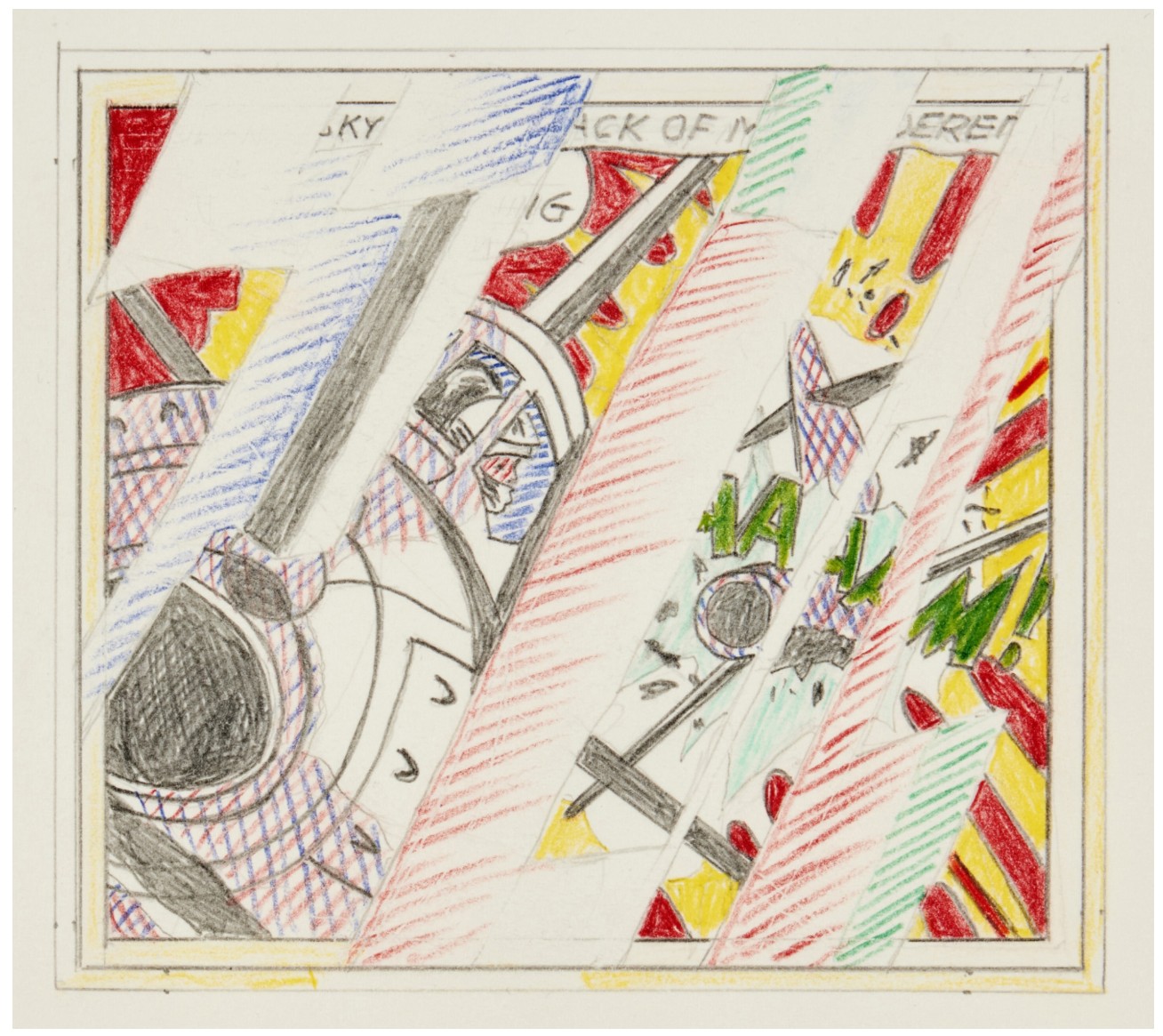
ROY LICHTENSTEIN (1923 – 1997)
Reflections: Whaaam! (Study), circa 1990
Colored pencil and graphite on paper
Image: 5 1/4 x 5 7/8 inches (13.3 x 14.9 cm)
Sheet: 7 1/2 x 10 1/2 inches (19.1 x 26.7 cm)
Roommates (Study), 1993
Works from the Collection of Dorothy and Roy Lichtenstein
Sotheby’s New-York: 16 May 2025
Estimated: USD 600,000 – 800,000
USD 609,600
Roommates (Study) | Contemporary Day Auction | 2025 | Sotheby’s
ROY LICHTENSTEIN (1923 – 1997)
Roommates (Study), 1993
Colored pencil and graphite on paper
Image: 4 7/8 x 3 3/4 inches (12.5 x 9.7 cm)
Sheet: 9 5/8 x 8 inches (24.4 x 20.3 cm)
Signed and dated ’93 (on the verso)
Temple (Study), circa 1964
Works from the Collection of Dorothy and Roy Lichtenstein
Sotheby’s New-York: 16 May 2025
Estimated: USD 350,000 – 450,000
USD 571,500
Temple (Study) | Contemporary Day Auction | 2025 | Sotheby’s
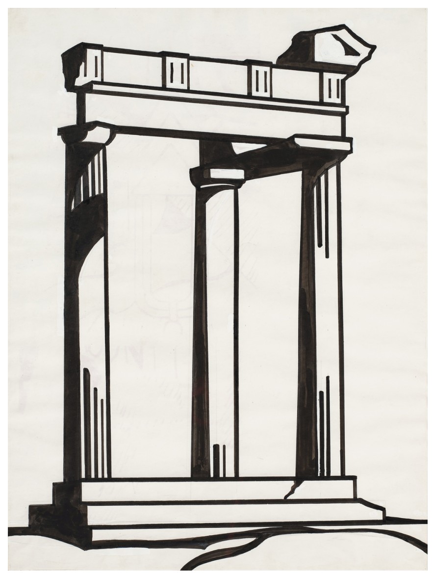
ROY LICHTENSTEIN (1923 – 1997)
Temple (Study), circa 1964
Marker, brush and ink, graphite and gouache on paper
23 7/8 x 17 7/8 inches (60.6 x 45.4 cm)
Titled (Study), 1996
Works from the Collection of Dorothy and Roy Lichtenstein
Sotheby’s New-York: 16 May 2025
Estimated: USD 400,000 – 600,000
USD 533,400
Titled (Study) | Contemporary Day Auction | 2025 | Sotheby’s
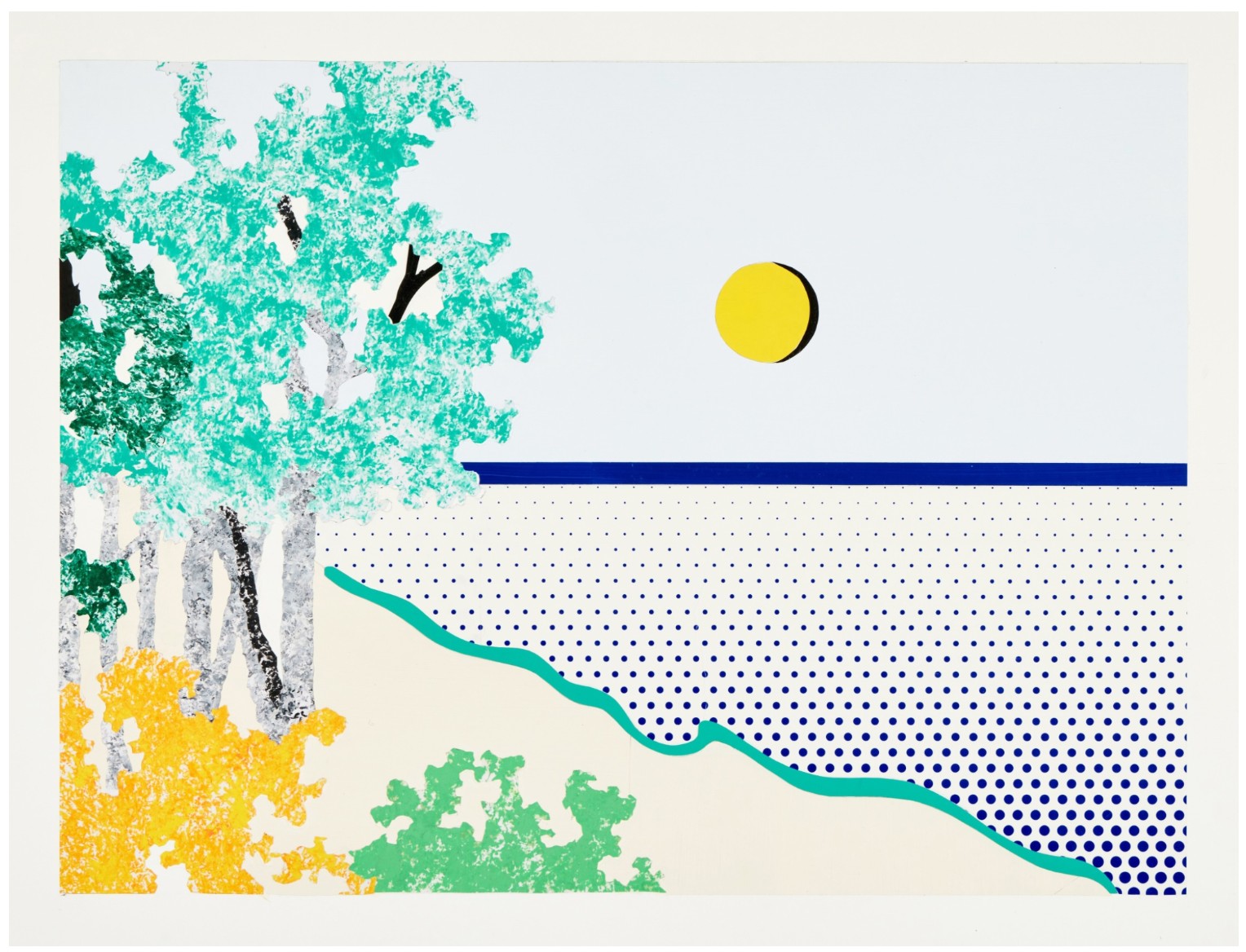
ROY LICHTENSTEIN (1923 – 1997)
Titled (Study), 1996
Cut painted paper, cut printed paper, tape and graphite on board
Image: 24 x 32 1/2 inches (61 x 82.6 cm)
Sheet: 33 1/2 x 42 7/8 inches (85.1 x 108.9 cm)
Yellow Still Life (Study), 1973
Works from the Collection of Dorothy and Roy Lichtenstein
Sotheby’s New-York: 16 May 2025
Estimated: USD 300,000 – 400,000
USD 533,400
Yellow Still Life (Study) | Contemporary Day Auction | 2025 | Sotheby’s
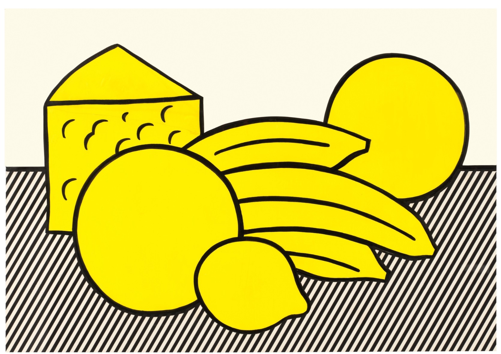
ROY LICHTENSTEIN (1923 – 1997)
Yellow Still Life (Study), 1973
Cut painted paper, acrylic, brush and ink, marker and graphite on board
Image: 25 1/4 x 36 1/2 inches (64.1 x 92.9 cm)
Sheet: 28 1/2 x 39 3/4 inches (72.4 x 101 cm)
Signed and dated ’73 (on the reverse)
Cover Image (The Gun in America) for Time Magazine (Study), circa 1968
Works from the Collection of Dorothy and Roy Lichtenstein
Sotheby’s New-York: 16 May 2025
Estimated: USD 200,000 – 300,000
USD 533,400
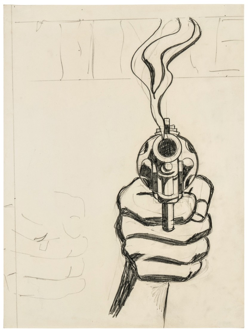
ROY LICHTENSTEIN (1923 – 1997)
Cover Image (The Gun in America) for Time Magazine (Study), circa 1968
Graphite on paper
16 1/4 x 12 1/4 inches (41.3 x 31.1 cm)
Cup and Saucer I (Study), circa 1976
Sotheby’s New-York: 16 May 2025
Estimated: USD 200,000 – 300,000
USD 508,000
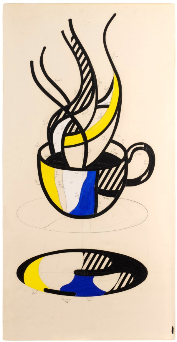
ROY LICHTENSTEIN (1923 – 1997)
Cup and Saucer I (Study), circa 1976
Cut painted paper, acrylic, tape and graphite on foamcore
47 3/4 x 24 1/2 inches (121.3 x 61.9 cm)
Von Karp, 1962
Works from the Collection of Dorothy and Roy Lichtenstein
Sotheby’s New-York: 16 May 2025
Estimated: USD 200,000 – 300,000
USD 508,000
Von Karp | Contemporary Day Auction | 2025 | Sotheby’s
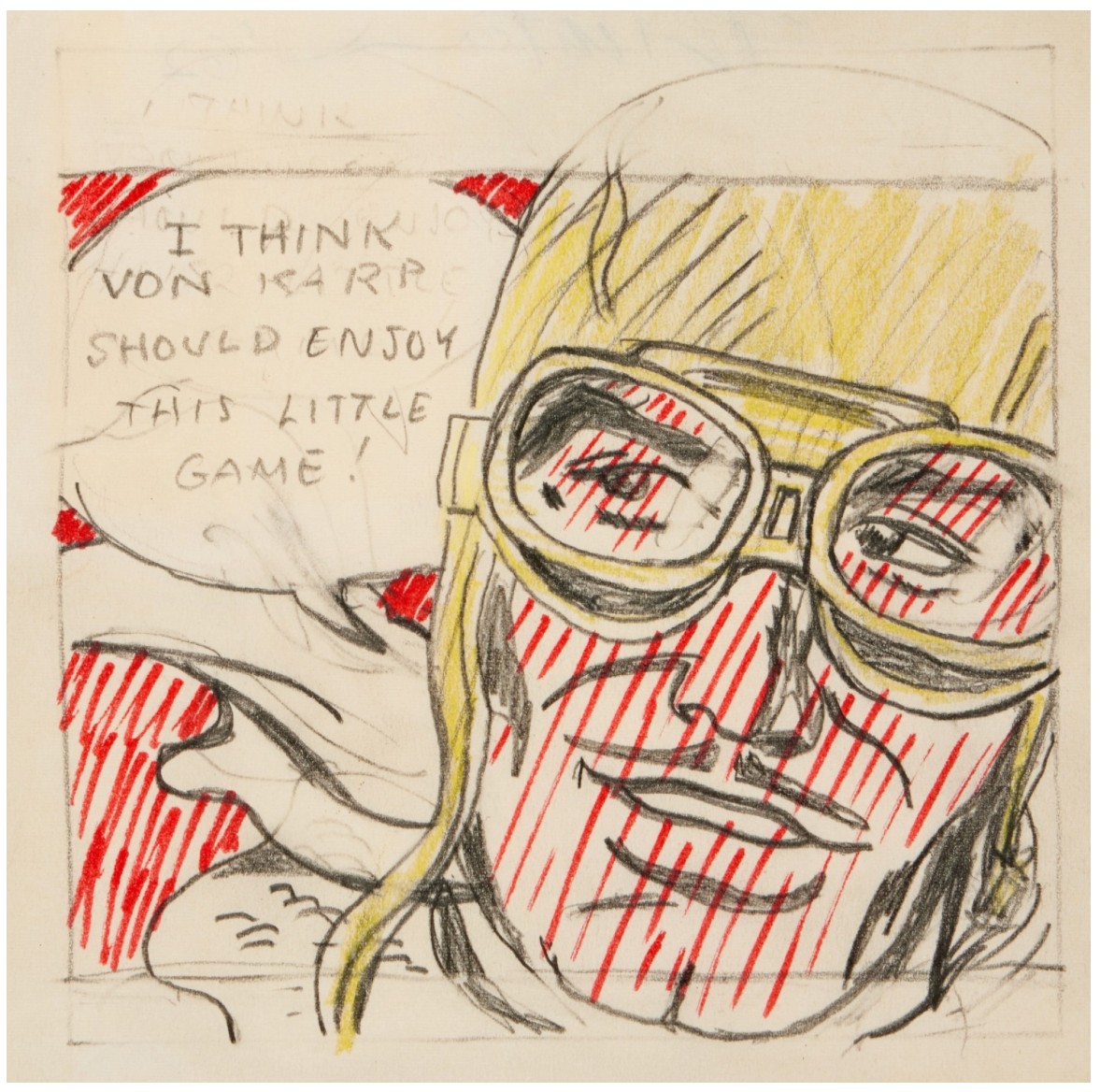
ROY LICHTENSTEIN (1923 – 1997)
Von Karp, 1962
Marker, colored pencil and graphite on paper
Image: 4 7/8 x 4 7/8 inches (12.4 x 12.4 cm)
Sheet: 5 3/4 x 5 5/8 inches (14.6 x 14.3 cm)
Signed and dated ’62 (on the verso)
Still Life Tapestry (Study), 1973
Works from the Collection of Dorothy and Roy Lichtenstein
Sotheby’s New-York: 16 May 2025
Estimated: USD 100,000 – 150,000
USD 406,400
Still Life Tapestry (Study) | Contemporary Day Auction | 2025 | Sotheby’s
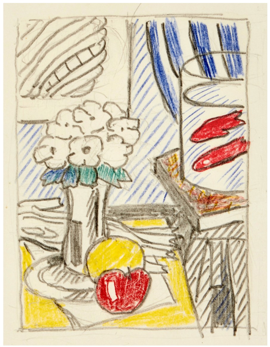
ROY LICHTENSTEIN (1923 – 1997)
Still Life Tapestry (Study), 1973
Colored pencil and graphite on paper
Image: 4 1/4 x 3 1/8 inches (10.8 x 7.9 cm)
Sheet: 8 1/4 x 5 inches (21 x 12.7 cm)
Signed and dated ’73 (on the verso)
Reflections: Art (Study), 1988
Works from the Collection of Dorothy and Roy Lichtenstein
Sotheby’s New-York: 16 May 2025
Estimated: USD 150,000 – 200,000
USD 381,000
Reflections: Art (Study) | Contemporary Day Auction | 2025 | Sotheby’s
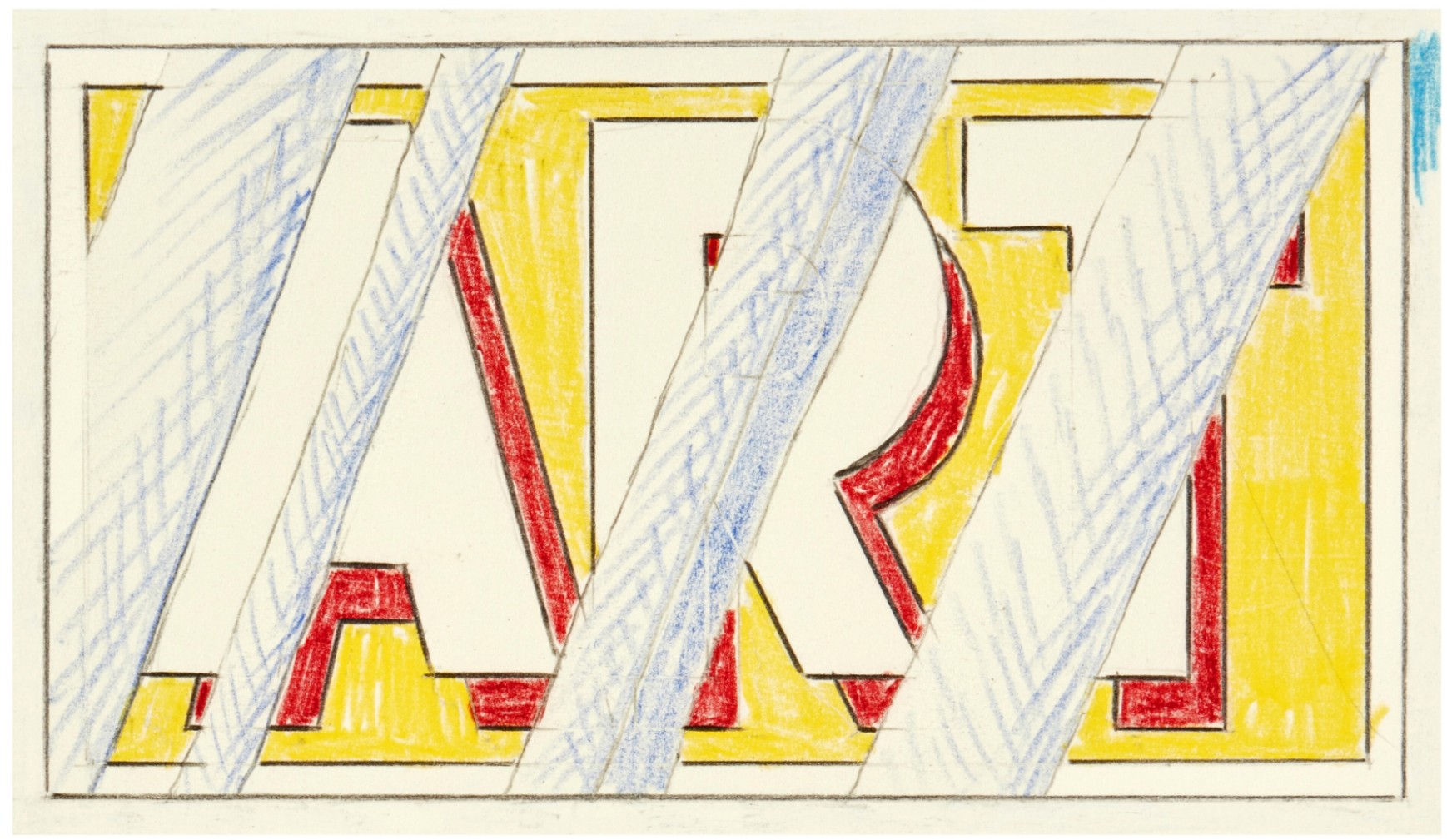
ROY LICHTENSTEIN (1923 – 1997)
Reflections: Art (Study), 1988
Colored pencil and graphite on paper
Image: 4 5/8 x 8 inches (11.7 x 20.3 cm)
Sheet: 10×13 inches (25.4 x 33 cm)
Signed and dated ’88 (on the verso)
Water Lily (Study), 1992
Works from the Collection of Dorothy and Roy Lichtenstein
Sotheby’s New-York: 16 May 2025
Estimated: USD 100,000 – 150,000
USD 342,900
Water Lily (Study) | Contemporary Day Auction | 2025 | Sotheby’s
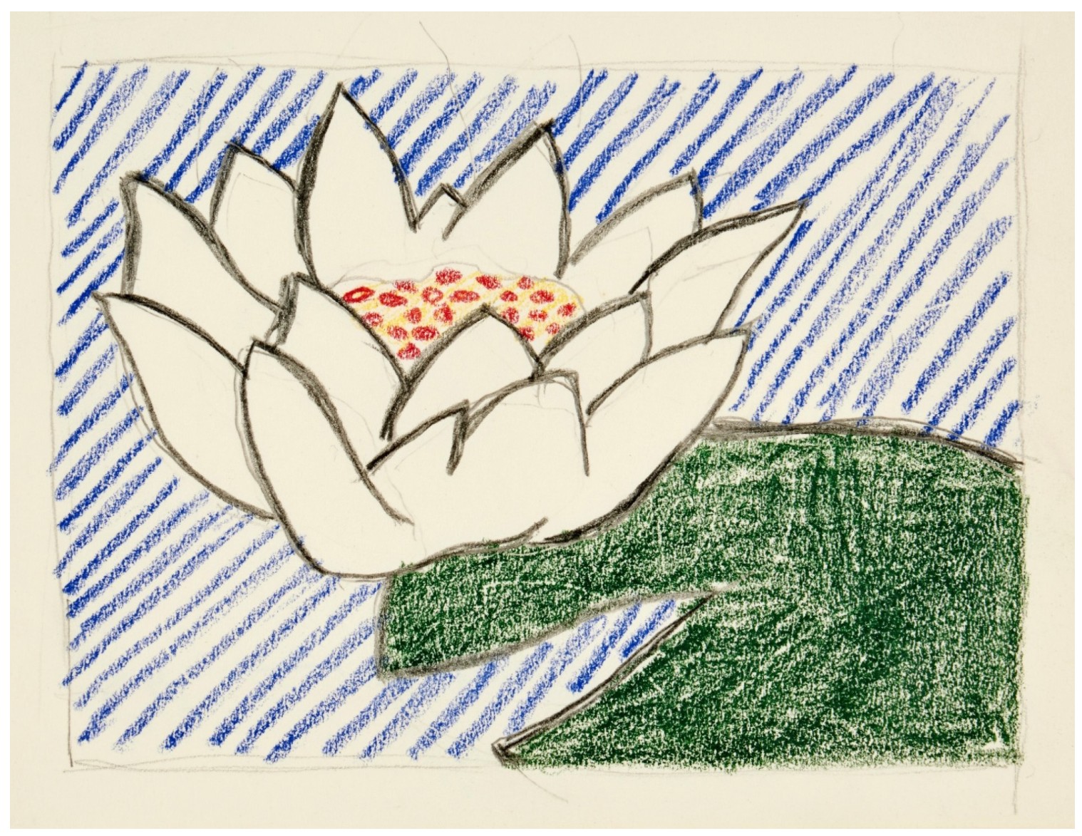
ROY LICHTENSTEIN (1923 – 1997)
Water Lily (Study), 1992
Colored pencil and graphite on paper
Image: 4 1/2 x 6 inches (10.8 x 15.2 cm)
Sheet: 6×8 inches (15.2 x 20.3 cm)
Signed and dated ’92 (on the verso)
Explosion (Study), 1965
Sotheby’s New-York: 16 May 2025
Estimated: USD 80,000 – 120,000
USD 234,950
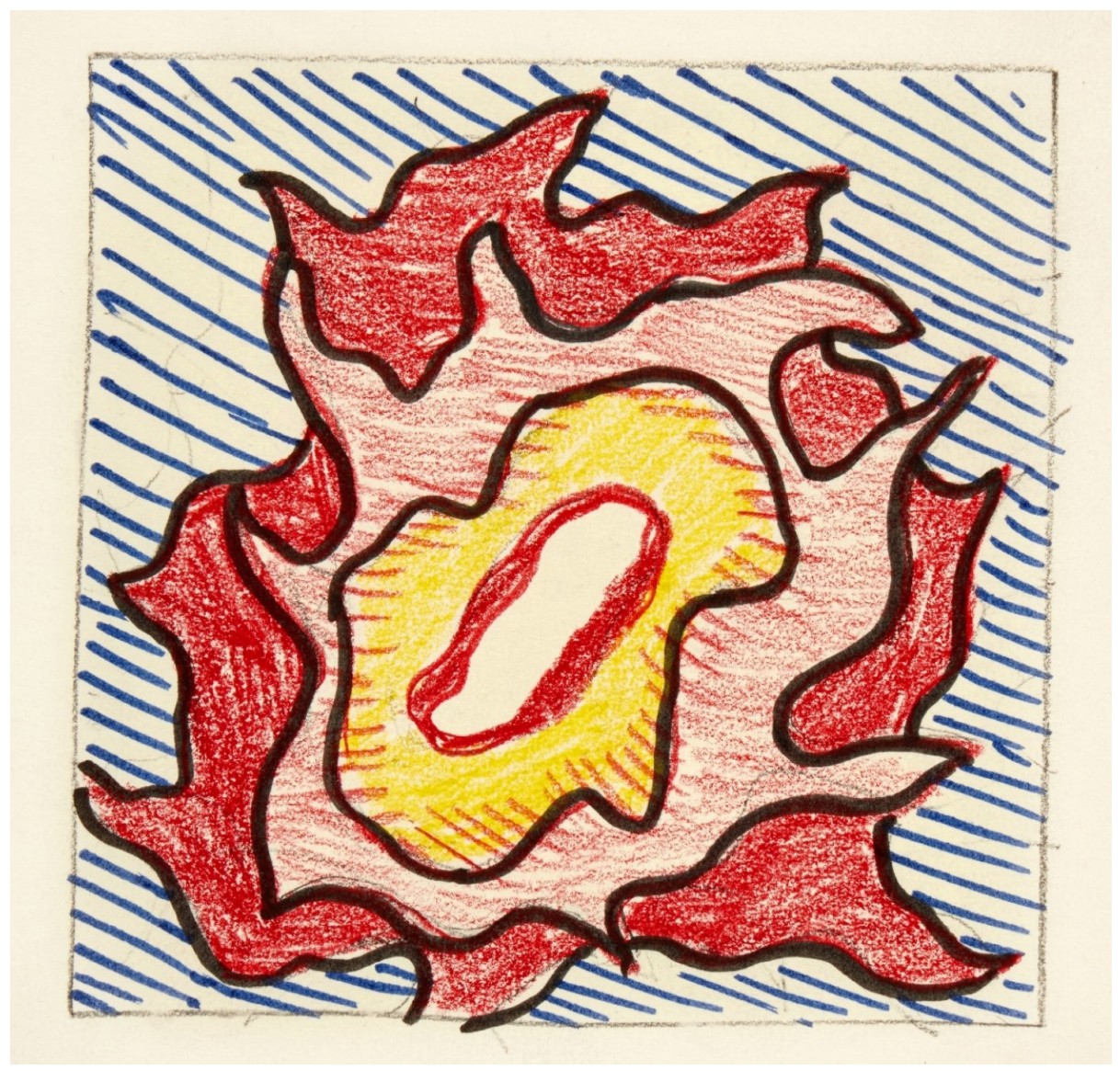
Explosion (Study), 1965
Marker, colored pencil and graphite on paper
Image: 4 3/4 x 4 3/4 inches (12.1 x 12.1 cm)
Sheet: 9×6 inches (22.9 x 15.2 cm)
Roy Lichtenstein
1. Paintings
Reflections: Art, 1988
Works from the Collection of Dorothy and Roy Lichtenstein
Sotheby’s New-York: 15 May 2025
Estimated: USD 4,000,000 – 6,000,000
USD 5,479,000
Reflections: Art | The Now and Contemporary Evening Auction | 2025 | Sotheby’s
ROY LICHTENSTEIN (1923 – 1997)
Reflections: Art, 1988
Acrylic, oil and graphite on canvas
44 1/2 x 76 1/4 inches (113 x 193.7 cm)
Signed and dated ’88 (on the reverse)
For over four decades, Roy Lichtenstein confronted the history of art head on. Whether Piet Mondrian’s grids or Henri Matisse’s dancers, Claude Monet’s cathedrals or Pablo Picasso’s lovers, Lichtenstein scoured the annals of art history for its most powerful and enduring subjects and themes, recasting them in Ben-Day-dotted splendor. It wasn’t until 1988, however, that Lichtenstein—by this time a canonical figure in his own right—turned his attention to a body of masterworks he had yet to reinvent: his earlier paintings. Here, the graphic resonance of the word “ART” thunders in scarlet, ultramarine, and cadmium yellow, disrupting and partially obscuring the composition of his 1962 masterpiece with the searing clamor of Lichtenstein’s reflections. Reflections: Art is one of the first of his seminal, career-defining Reflections series, and the 35 canvases to follow would see Lichtenstein fragment, wrestle, reconsider, and reunite with the most iconic works from his earlier output, complicating his own pictures from decades prior by rendering their surfaces both image and mirror. Other examples from the series reside in international institutional collections, including The Broad, Los Angeles; The Israel Museum, Jerusalem; and Yale University Art Gallery, New Haven, among others. Further testament to its extraordinary significance, Reflections: Art has remained in the treasured personal collection of Dorothy and Roy Lichtenstein since its execution, and on the Lichtenstein Foundation’s website, Reflections: Art serves as the digital icon for the artist’s newly published catalogue raisonné website. If the great feat of Art from 1962 is, as Diane Waldman observed, its ability to question what art is, then Reflections: Art follows suit, acting as both content and contemplation, creation and revisitation, canvas and mirror, probing not only what art is, but who we are in the face of it.
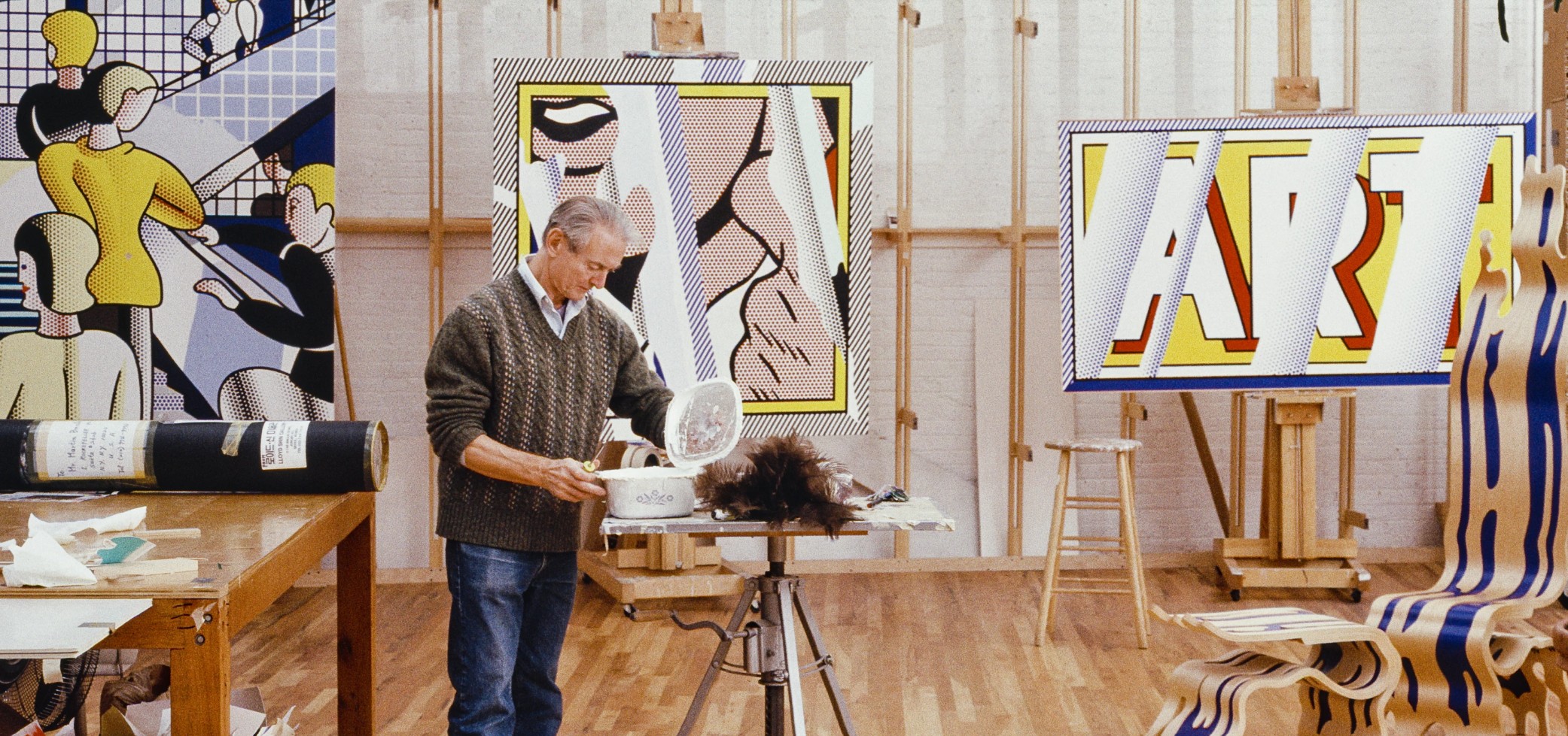
The artist working on the present work in his studio in New York, 1989. Photo © Bob Adelman. Art © Estate of Roy Lichtenstein
Summoning the catalytic intellectual heft of his 1962 painting, Reflections: Art further expands Lichtenstein’s engagement with the concern at the heart of his conceptual enterprise: artmaking itself. Nowhere is this clearer than in his two Art paintings, in both of which its namesakes appear spelled out, capitalized, and articulated in white, black, and two primary colors: art’s very own chromatic building blocks. In Art, Lichtenstein for the first time isolates text alone, as opposed to its subservient role up to this point denoting the Tzing! of a bullet or the Oh, Jeff… of an anguished damsel. Not unlike his Pop contemporaries Ed Ruscha and John Baldessari, Lichtenstein empowers “ART” with the full throttle clarity of its arresting legibility, doubling down on its semiotic subversion with the red “shadow” that elevates text into object, language into art, and colloquialism into critique.
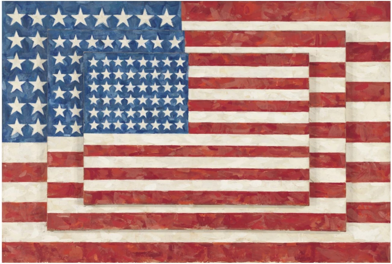
Jasper Johns, Three Flags, 1958. Whitney Museum of American Art, New York. Image © Whitney Museum of American Art / Licensed by Scala / Art Resource, NY. Art © 2025 Jasper Johns / Licensed by VAGA at Artists Rights Society (ARS), NY
Reflections: Art, taking both the 1962 work’s formal and intellectual content as its basis, “compounds the critical complications of this earlier work,” Graham Bader assesses. “Art, of course, had declared its status as art with the most distinctly inartistic of means, screaming this out with the cheapest sort of advertising script—and generating its aesthetic power through precisely the bluntness of this anti-aesthetic gesture. Reflections: Art both backtracks on and intensifies this effect. It subsumes the conceptual reflection at the core of the earlier painting (that is, the centrality of our act of ‘reflecting’ on Art’s aesthetic status to its power as an actual work of art) within a field of material – or at least materially represented – reflective effects.” (Graham Bader quoted in: Exh. Cat., New York, Mitchell-Innes & Nash, Roy Lichtenstein Reflected, 2010, pp. 54, 57)
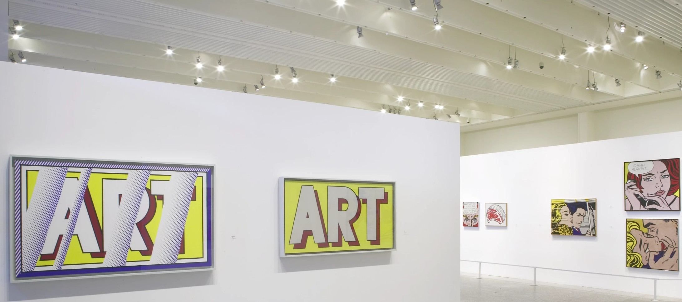
The present work installed in Roy Lichtenstein at Museo Nacional Centro de Arte Reina Sofía, Madrid, June – September 2004.
Art © Estate of Roy Lichtenstein
By this time 65 years old, the Reflections see Lichtenstein perhaps at his most shrewd, and certainly his most confident. Where he had developed his mature style by appropriating popular imagery – the world of comics, cartoons, and advertisements from the Yellow Pages – translating the potence of their illustrative omnipresence onto canvas, Lichtenstein began in the Reflections to appropriate the imagery of his own work.
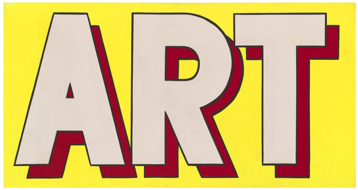
Roy Lichtenstein, Art, 1962. Private Collection. Art © Estate of Roy Lichtenstein
To borrow and manipulate his oeuvre, however, posed an entirely bolder proposition, recognizing – if not asserting – that his own body of work had reached the same stature of universal recognition during his lifetime. The Reflections together represent Lichtenstein’s ultimate Duchampian homage, the attitude and gesture which guided Lichtenstein’s entire career thus far.
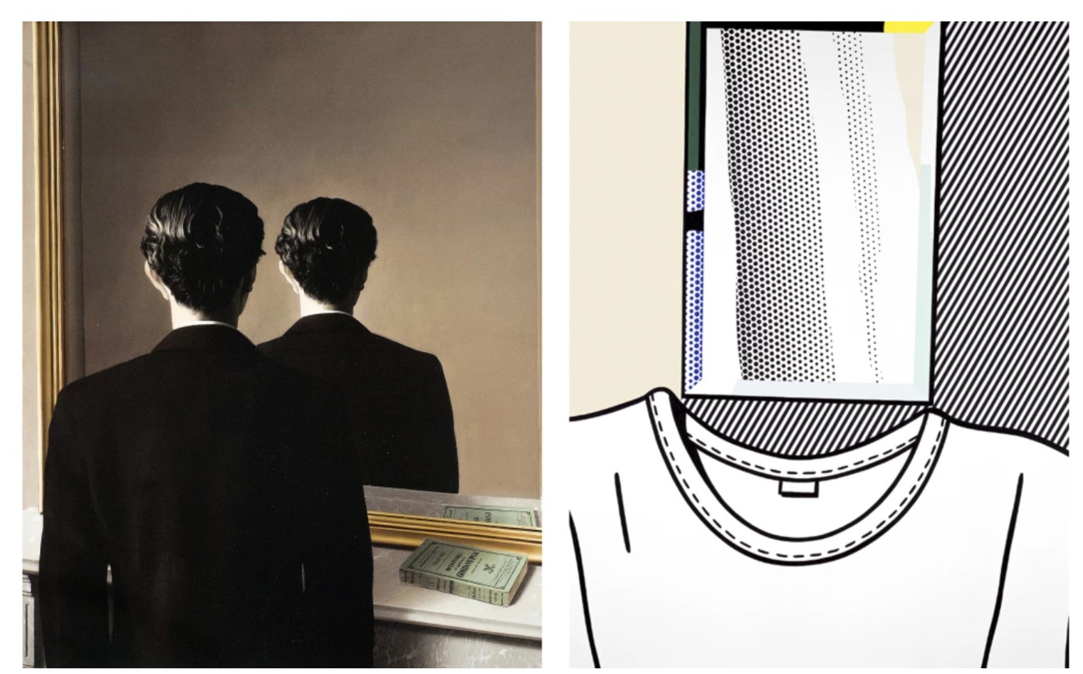
Left: René Magritte, La reproduction interdite, 1937. Museum Bojimans van Beuningen, Rotterdam. Image © Fine Art Images / Bridgeman Images. Art © 2025 C. Herscovici, Brussels / Artists Rights Society (ARS), New York.
Right: Roy Lichtenstein, Self-Portrait, 1978. Private Collection.Art © Estate of Roy Lichtenstein
As Diane Waldman observes, Lichtenstein “took the subject of the mirror as a means of questioning reality and painted his own self-portrait with a mirror as his face. He reflected on his own art and the art of others, incorporating images by Cezanne, Picasso, Matisse, Mondrian, and Leger into his paintings, together with images of Mickey Mouse, cartoon girls, who were all-American beauties, and guys, and household objects taken from comic books, catalogues, advertisements, and the Yellow Pages. His entire body of work was a reflection, an inquiry into his identity and his role as an artist.” (Diane Waldman quoted in: Exh. Cat., Rome, Chiostro del Bramante, Roy Lichtenstein: Riflessi-Reflections, 1999, pp. 17, 19) Thus, his lifelong mission of inspiring in his viewers their own reflections on art comes to a furious, brilliant coda in this canvas, swiftly summarizing a lifetime of creation in one canvas. If Monet’s Nympheas accomplished the miraculous conflation of 3 surfaces into one plane – surface, sky, and underwater – then it is Reflections: Art which furcates the surface even more times over: art as a readymade, as a word, as an artwork, as the canon, and as himself.
In 1988, Roy Lichtenstein inaugurated a series of 36 paintings entitled the Reflections, which featured revisitations of some of the most enduring and iconic works of the artist’s career. Testament to their significance in his oeuvre, examples from the series belong in esteemed institutional collections, illustrated below.
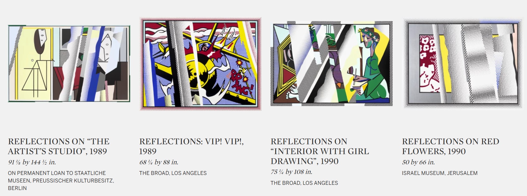
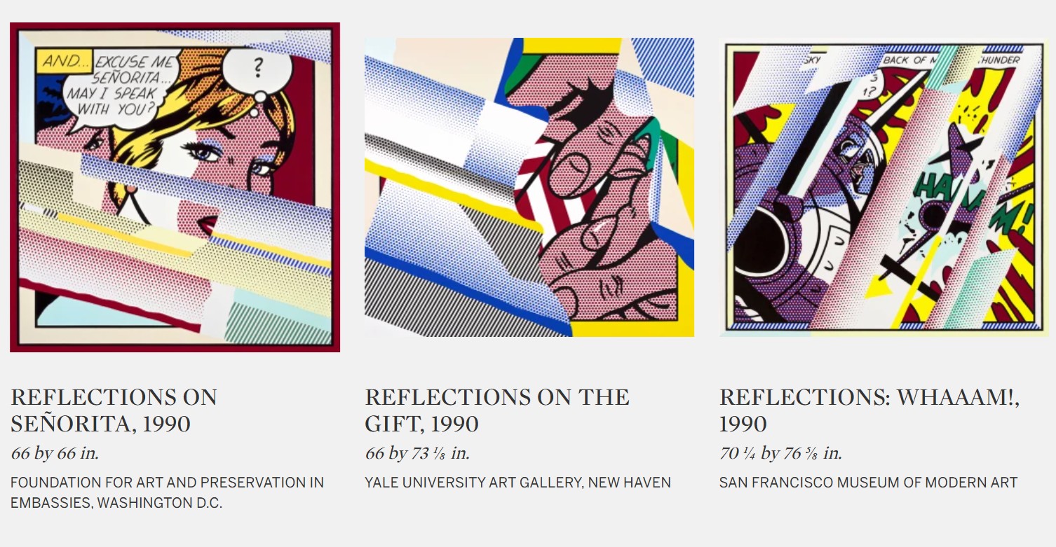
Like his Brushstrokes and their dialogue with Abstract Expressionism, his Stretcher Bars and their parody of Minimalism, Reflections: Art takes aim at Formalism altogether, simultaneously literalizing and dismantling the esoteric veneration of art for art’s sake. Everything that Reflections: Art engages with lies here – and accomplished with an exceptional economy of means. There is no physically reflective quality, only the simulation of it; there is no trompe l’oeuil, only its counterfeit. Laying the concerns of its creation and the terms of its manufacture bare to the viewer, Reflections: Art functions like a portrait of Lichtenstein’s mind, substantiating the lifelong reflections on artmaking that have indelibly refracted the direction of contemporary art as we understand it today.
Stretcher Frame with Cross Bars III, 1968
Works from the Collection of Dorothy and Roy Lichtenstein
Sotheby’s New-York: 15 May 2025
Estimated: USD 2,500,000 – 3,500,000
USD 4,930,000
Stretcher Frame with Cross Bars III | The Now and Contemporary Evening Auction | 2025 | Sotheby’s
ROY LICHTENSTEIN (1923 – 1997)
Stretcher Frame with Cross Bars III, 1968
Acrylic, oil and graphite on canvas
48 x 56 1/4 inches (121.9 x 142.9 cm)
Signed and dated ’68 (on the reverse)
Stretcher Frame with Cross Bars III is a consummate encapsulation of Roy Lichtenstein’s governing artistic inquiry: the investigation of art itself. Engaging with the art historical tradition of trompe l’oeil and challenging the contemporary artistic developments unfolding around him, in Stretcher Frame with Cross Bars III Lichtenstein masterfully challenges the definition of art making and the role of the viewer’s perception in the process. Employing his signature Pop idiom, Lichtenstein renders the surface of his painting to represent its reverse, confronting in a new way the hegemony of Abstract Expressionism and the criterion for artistic subject matter. The present work belongs to a rare and limited suite of eleven Stretcher Frame paintings created between 1967-68.
“I’m interested in this kind of image in the same way as one would develop a classical form… Well, the same thing has been developed in cartoons. It’s not called classical, it’s called a cliché. Well, I’m interested in my work’s redeveloping these classical ways, except that it’s not classical, it’s like a cartoon.”
Roy Lichtenstein and Willi Bongard in front of Stretcher Frame with Cross Bars V, 1967.
Photo © bpk Bildagentur / Art Resource, NY. Art © Estate of Roy Lichtenstein
Immediately following the iconic Brushstroke paintings of 1965-66, the Stretcher Frame works operate as the counterpart to the Brushstrokes, advancing Lichtenstein’s exploration of “art about art” to a new apogee, playfully articulating a transgressive, Duchampian inquiry of art’s boundaries. Held in the Collection of Dorothy and Roy Lichtenstein for nearly six decades, Stretcher Frame with Cross Bars III bears exceptional provenance, as one of the treasured works that Roy and Dorothy maintained for themselves.
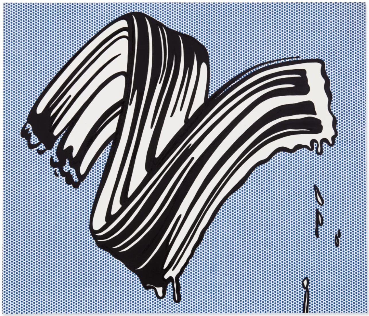
Roy Lichtenstein, White Brushstroke I, 1965. Private Collection.
Sold at Sotheby’s New York in June 2020 for $25.4 million. Art © Estate of Roy Lichtenstein
From the earliest years of Lichtenstein’s practice, he was guided by an investigation of “art about art,” reflecting upon its means of production, its purpose in modern culture, and how its history informs its future. Exploring the visual signs and symbols associated with mass production and comic books, such as flat planes of color, repeated dots to indicate shading, and bold contour lines, Lichtenstein redefined the language of representation in fine art and deconstructed the arbitrary boundaries between “high” and “low.” In the early 1960s, beginning with his comic book-inspired paintings and single-object paintings like Portable Radio or Black Flowers, Lichtenstein developed his signature visual vernacular, instantly recognizable for its Ben-Day dots and bold articulation. Even in these early years, Lichtenstein was keenly attuned to foundational, conceptual concerns of his ostensibly playful and direct compositions. As declared in the eponymous text painting, Art from 1962, his investigation extended beyond a formal aesthetic. In the early 60s following Art, Lichtenstein would engage with the art historical canon, responding to the work of Piet Mondrian and Pablo Picasso as well as Classical architecture. And in 1965-66, the artist would propel his probe of the canon a step further, confronting the weighty legacy of Abstract Expressionism and the very act of painting itself with emphatic and explosive renderings of brushstrokes against precise fields of Ben-Day dots. Immediately following the Brushstrokes, Lichtenstein’s distinct group of eleven Stretcher Frame works tests the parameters of art making and subject matter altogether, representing the conventional “reverse” of a painting and concealing the assumed “front” from view.
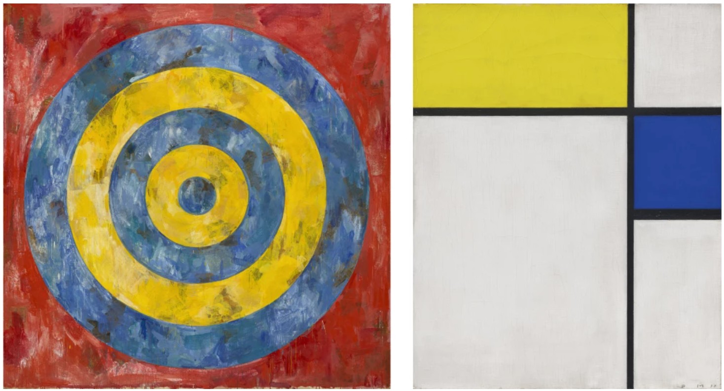
Left: Jasper Johns, Target, 1961. The Art Institute of Chicago. Image © The Art Institute of Chicago / Art Resource, NY. Art © 2025 Jasper Johns / Licensed by VAGA at Artists Rights Society (ARS), NY. Right: Piet Mondrian, Composition with Blue and Yellow, 1932. Philadelphia Museum of Art. Image © The Philadelphia Museum of Art / Art Resource, NY
Masterfully witty and cleverly provocative, in the Stretcher Frame paintings, Lichtenstein not only inverts the viewer’s expectations of reality and representation, but also our conception of a painted canvas. In Stretcher Frame with Cross Bars III, Lichtenstein renders the reverse of a stretched canvas in a trompe l’oeil technique, revealing the undulating overlap of the canvas, four-member wooden stretcher and even the keys used for tightening the canvas at all four corners. The Stretcher Frame paintings are among few series in which the artist deviated from deliberate assertion of two-dimensionality in his compositions and used light and shadow to convey three-dimensionality. Here, Lichtenstein employs his signature black and yellow Ben-Day dots and flat planes of color to delineate the physical depth of the painting’s support. Lichtenstein asserts the tactile objecthood of the painting instead of its traditional purpose as a vehicle for visual language. The viewer’s ability to engage with the “front” of the canvas is denied by the fact that the “correct” side is facing away from the viewer. Instead, the viewer is situated backstage, privy to the mechanics of the machine as an insider in the making of the painting. Unlike much of the artist’s oeuvre in which flatness is asserted unequivocally, here, when contending with decidedly ordinary subject matter, Lichtenstein veers towards greater verisimilitude in his painting. At every juncture, Lichtenstein challenges the viewer’s preconceived expectations of representation, creating a body of work which feels at once familiar and completely extraordinary.
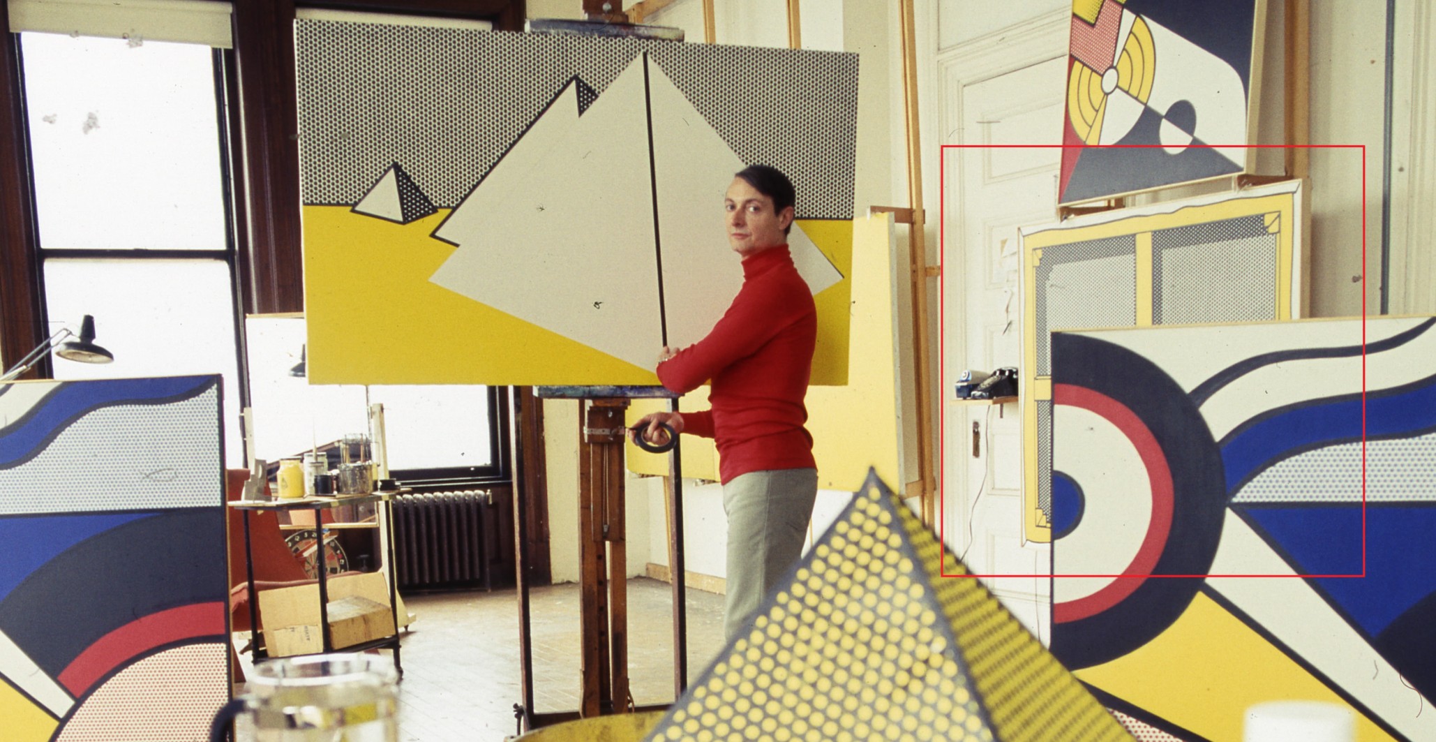
Roy Lichtenstein at work. Photo © Photograph by Snowdon / Trunk Archive. Art © Estate of Roy Lichtenstein
In Stretcher Frame with Cross Bars III, Lichtenstein engages in a captivating dialogue with Surrealism and Dada, in both of which the question of the uncanny relationship between reality and representation is at the center of the movements. Following his investigation of the act of painting through the Brushstrokes, in the Stretcher Frame paintings Lichtenstein contends with art making more broadly repurposing the canonized artistic device of trompe l’oeil through a Pop sensibility. The illusion of Stretcher Frame with Cross Bars III invokes the work of René Magritte, such as his epochal The Treachery of Images from 1929, which deconstructs the illusion of painting and the role of the viewer’s perception in the process. Furthermore, the assertion of the inherent artifice of the picture plane calls to mind the artistic challenges purported in the work of Jasper Johns. In his Target With Four Faces from 1955, Johns introduced the pictorial device at the heart of his own investigations, the target, which begs the viewer to enter a semiotic investigation of reality versus its symbol. Through Stretcher Frame with Cross Bars III, Lichtenstein, too, blurs the lines of reality and representation and the identity of art in the ever-expanding visual culture of post-war contemporary culture.
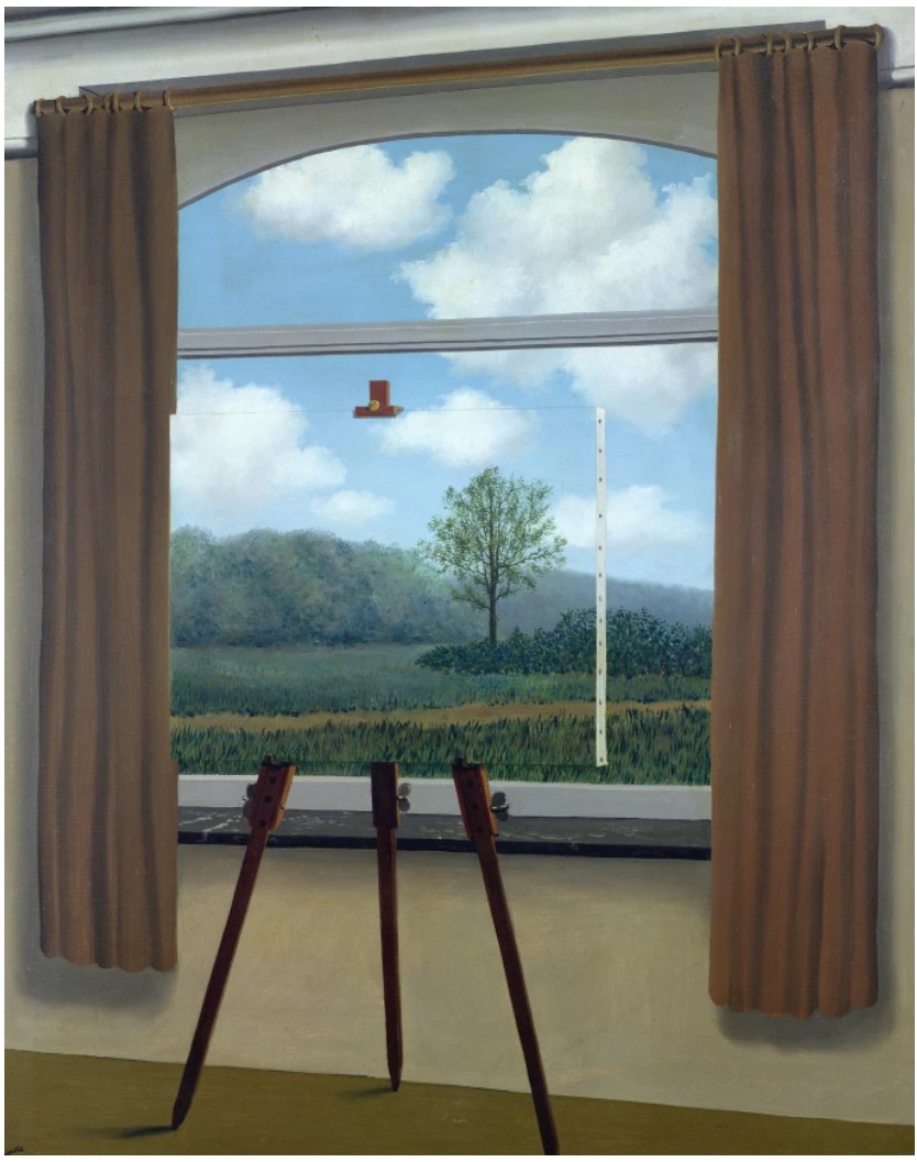
René Magritte, The Human Condition, 1933. National Gallery of Art, Washington D.C.
Image © Bridgeman Images. Art © 2025 C. Herscovici, Brussels / Artists Rights Society (ARS), New York
A paragon of the central artistic inquiries of Lichtenstein’s oeuvre, Stretcher Frame with Cross Bars III bears exceptional conceptual gravitas and the signature graphic punch of Lichtenstein’s best work. Testament to its importance in Lichtenstein’s body of work, the painting has been featured in the artist’s most significant solo exhibitions, including the artist’s early survey (1969-70) organized by the Solomon R. Guggenheim Museum, New York, the artist’s seminal traveling lifetime retrospective (1993-96), and the most recent traveling retrospective of Lichtenstein’s work (2012-13) organized by the Art Institute of Chicago.
Unfurled (After Morris Louis), 1973
Works from the Collection of Dorothy and Roy Lichtenstein
Sotheby’s New-York: 16 May 2025
Estimated: USD 1,000,000 – 1,500,000
USD 1,392,000
Unfurled (After Morris Louis) | Contemporary Day Auction | 2025 | Sotheby’s
ROY LICHTENSTEIN (1923 – 1997)
Unfurled (After Morris Louis), 1973
Acrylic, oil and graphite on canvas
30 x 36 1/8 inches (76.4 x 91.8 cm)
Signed and dated ’73 (on the reverse)
A vivid exercise in homage and transformation, Unfurled (After Morris Louis) reimagines the iconic language of Color Field painting through the lens of Roy Lichtenstein’s distinctive Pop vernacular. Referencing Morris Louis’s celebrated Unfurled series of the early 1960s, Lichtenstein distills the expressive immediacy of poured pigment into a strikingly refined and composed canvas. Executed in 1973, at the height of his post-Pop investigations into the very language of painting, the present work exemplifies Lichtenstein’s strategy of appropriating canonical modernist imagery and recasting it with cool, graphic precision. Testifying to its position as a touchstone within the artist’s mature production, Unfurled (After Morris Louis) was included in the landmark retrospective Roy Lichtenstein: A Retrospective organized by the Art Institute of Chicago and traveling to the Tate Modern and Centre Pompidou. Further confirming the work’s singular significance within the artist’s oeuvre, the present work bears exceptional provenance, coming directly from the estate of the artist.
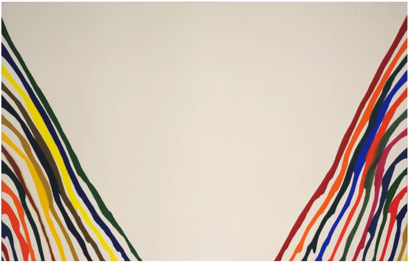
Morris Louis, Beta Lambda, 1961. Museum of Modern Art, New York.
In Unfurled (After Morris Louis), Lichtenstein emulates the sweeping gestures of Louis’s stain technique but replaces their spontaneity with a stylized exactitude. Where Louis allowed thinned acrylic to bleed organically into raw canvas, Lichtenstein renders his painted ribbons with mechanical clarity, imposing order on expression. The background of diagonally arrayed black stripes functions like a screen—a literal and metaphorical ground against which the fluid movement of Color Field painting is held in suspension, reimagined as image. Here, Lichtenstein performs a double maneuver. On one hand, he renders homage, meticulously referencing a landmark of mid-century American abstraction. On the other, he reclaims the gesture through his own syntax of mechanized mark-making. In doing so, he recasts the expressive authenticity of Abstract Expressionism as a codified image—a citation, no longer an act. This act of visual quotation situates Unfurled (After Morris Louis) in direct dialogue with Lichtenstein’s fellow Pop artists like Andy Warhol and Richard Pettibone, who similarly elevated found imagery and art historical source material into the domain of critical play.
Visually, the composition of Unfurled (After Morris Louis) is taut and dynamic. The painting is bisected by two wide vertical arcs of vivid, undulating forms in red, yellow, black, and beige. These forms extend inward from either side of the canvas, framing a dense field of black and white stripes at center. The effect is a visual tension between order and chaos, flatness and illusion, movement and stasis. The tightly controlled palette and Lichtenstein’s signature use of bold outlines transform what was once ethereal into something resolutely graphic, almost architectural. The use of graphite in the work is a subtle yet revealing detail. It evidences Lichtenstein’s underlying draftsmanship and his careful construction of form, even in a piece that ultimately masquerades as effortless.
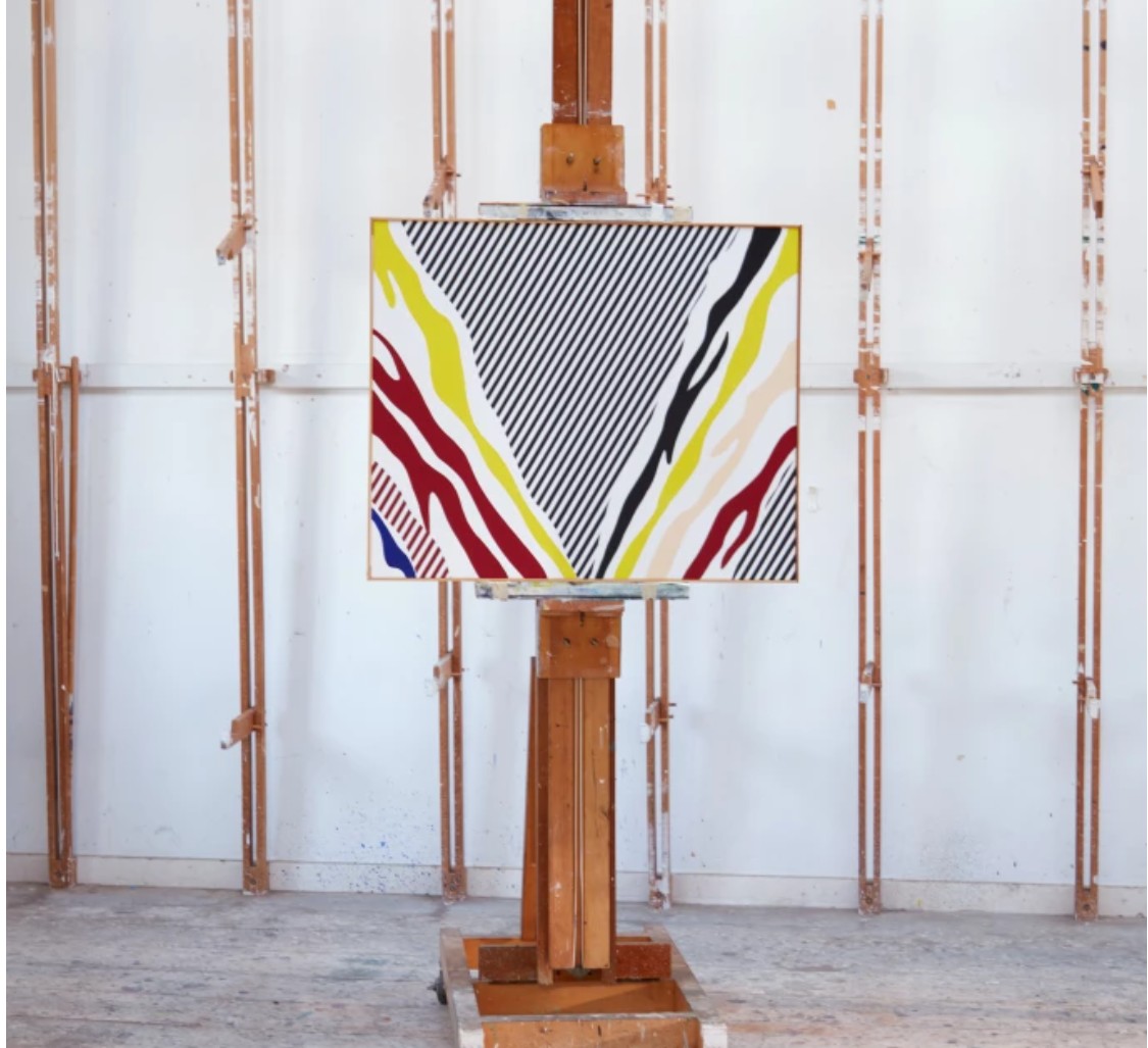
The present work in Lichtenstein’s studio. Art © Estate of Roy Lichtenstein.
Crucially, Lichtenstein’s citations were not merely ironic. They reflected a genuine engagement with his predecessors—a desire to interrogate the myths of originality, authorship, and meaning that undergirded modernist art. Long before he became synonymous with Pop Art, Lichtenstein was an abstract painter, working alongside artists like Willem de Kooning and Franz Kline. This early engagement with gestural abstraction never fully disappeared but was rechanneled, refracted through the lens of satire, semiotics, and cool distance. In Unfurled (After Morris Louis), he both honors and dissects the act of painting. His invocation of Louis is affectionate but forensic, collapsing the divide between reverence and critique. That a small scale canvas could bear so much conceptual weight speaks to the precision and ambition of Lichtenstein’s vision during this period.
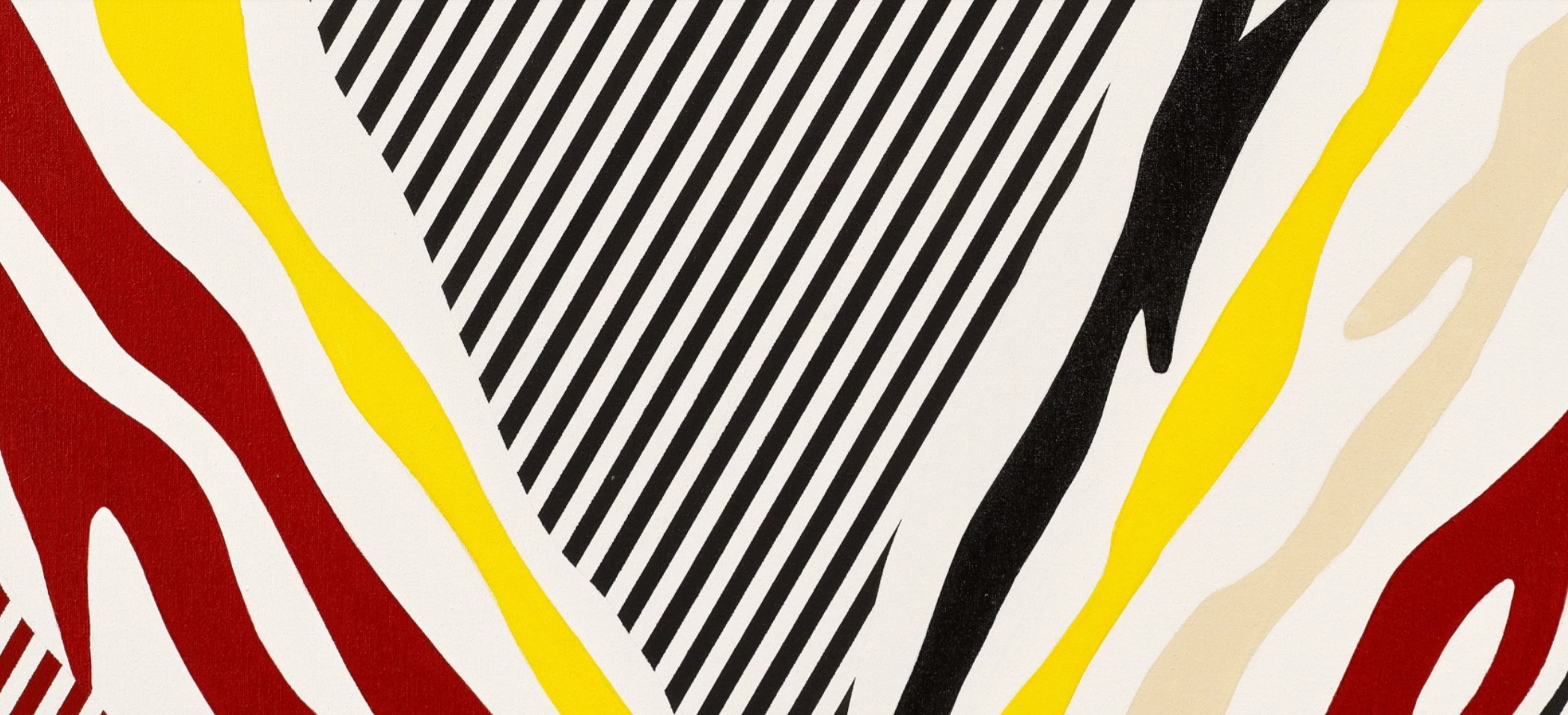
The choice to reinterpret a grand, immersive Louis painting on an intimate scale is also significant. In doing so, Lichtenstein democratizes the sublime, transforming the high drama of Color Field abstraction into something portable, accessible, and stylized. The monumental becomes modular. What was once intended to overwhelm now invites inspection. The reduction in scale acts as a philosophical statement as much as a compositional one: a critique of grandiosity in favor of wry introspection. Ultimately, Unfurled (After Morris Louis) is not merely an image of another painting—it is a painting about painting. It is a statement on the constructed nature of vision, the portability of style, and the enduring dialogue between innovation and imitation. Coming directly from the artist’s estate, this work offers a rare and compelling glimpse into the intellectual rigor and aesthetic wit that defined Lichtenstein’s later practice. In this tightly composed composition, one sees not only a response to Morris Louis, but also an argument for the lasting power of reimagined histories.
Entablature, 1975
Works from the Collection of Dorothy and Roy Lichtenstein
Sotheby’s New-York: 16 May 2025
Estimated: USD 500,000 – 700,000
USD 1,079,500
Entablature | Contemporary Day Auction | 2025 | Sotheby’s
ROY LICHTENSTEIN (1923 – 1997)
Entablature, 1975
Acrylic, sand and graphite on canvas
36 x 48 1/4 inches (96.5 x 122.6 cm)
Signed and dated ’75 (on the reverse)
Roy Lichtenstein’s Entablature from 1975 is an exceptional example from one of the artist’s most conceptually rich and visually distinctive series, the Entablatures. One of only a handful of examples executed in acrylic, graphite and sand on canvas, the painting demonstrates Lichtenstein’s continued engagement with architectural motifs and postmodern strategies of quotation. Rendered in the Pop artist’s signature flat planes, bold lines, and stylized patterning, this work is emblematic of a body of paintings that merge high art with vernacular design, and classical gravitas with the slick visual language of mass production. Distinguished by its formal complexity and material nuance, the present work ranks among the most compelling in the Entablature series, exemplifying Lichtenstein’s ability to synthesize historical reference with cool formal rigor. That the present work comes directly from the collection of Dorothy and Roy Lichtenstein—and includes sand gathered from the Southampton beach near the artist’s Long Island studio—further elevates its historic and personal resonance within Lichtenstein’s acclaimed oeuvre.
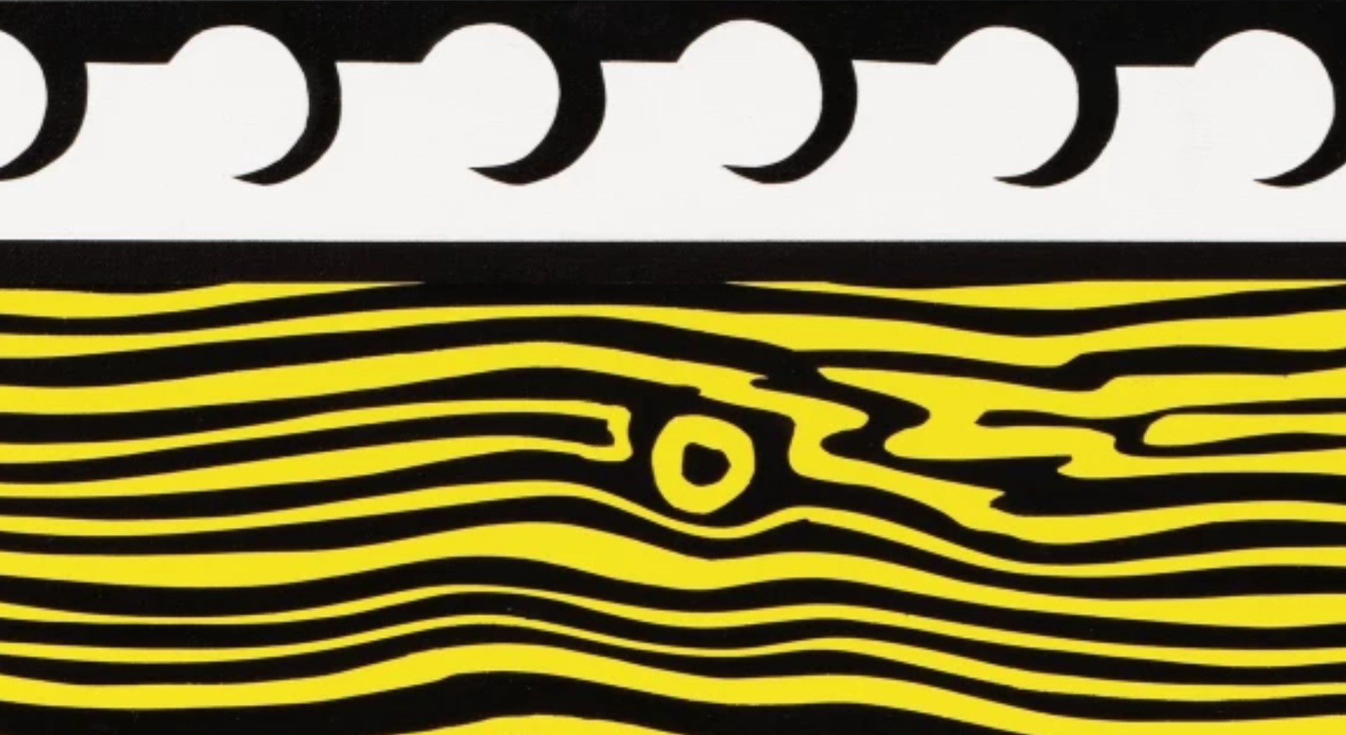
Developed between 1971 and 1976, Lichtenstein’s Entablature series marked a dramatic conceptual shift in the artist’s work. Moving away from comic book panels and consumer advertising, he turned his attention to architectural ornamentation—specifically, the motifs found on American neoclassical facades. Inspired by both Greek and Roman sources and the early 20th-century Beaux-Arts revival as seen in buildings throughout Manhattan, Lichtenstein photographed local architecture and translated its classical entablatures into bold, graphic abstractions. In doing so, he aligned himself with contemporaries like Robert Venturi, whose Learning from Las Vegas from 1972 questioned modernist purity and reclaimed ornament as meaningful cultural expression.
Roy Lichtenstein, Untitled [architecture study], c. 1970-1976, The Whitney Museum of American Art, New York.
Art © Estate of Roy Lichtenstein.
Further underscoring the significance of this body of work within Lichtenstein’s oeuvre, museums such as the Museum of Modern Art, New York, the National Gallery of Art, Washington, D.C., The Broad, Los Angeles and Moderna Museet, Stockholm hold paintings from the Entablature series in their permanent collections. It is a series that scholars have increasingly recognized as critical to understanding Lichtenstein’s post-1960s development—not merely a decorative detour, but a deeply thoughtful exploration of structure, symbol, and the lineage of art history itself.
“Even the Entablatures are meant to be humorous in a way, because they don’t seem to be funny but they mean imperial power or something like that.”
In the present work, the architecture is less a literal referent than a compositional scaffold. Bold bands of yellow, white, silver, and deep blue are punctuated by rhythmic patterns of stylized waves and faux woodgrain, creating a tightly structured but vibrantly playful surface. These motifs, which originally adorned the uppermost sections of buildings, are repurposed here into a linear visual poem—at once austere and exuberant. The use of graphite adds a layer of texture and nuance, while the addition of sand imbues the surface with a tactile immediacy and quiet materialism that anchors the work in physical experience. The sand, collected from the beach near Lichtenstein’s Southampton studio, subtly reinforces the connection between the abstract language of form and the grounded reality of place.
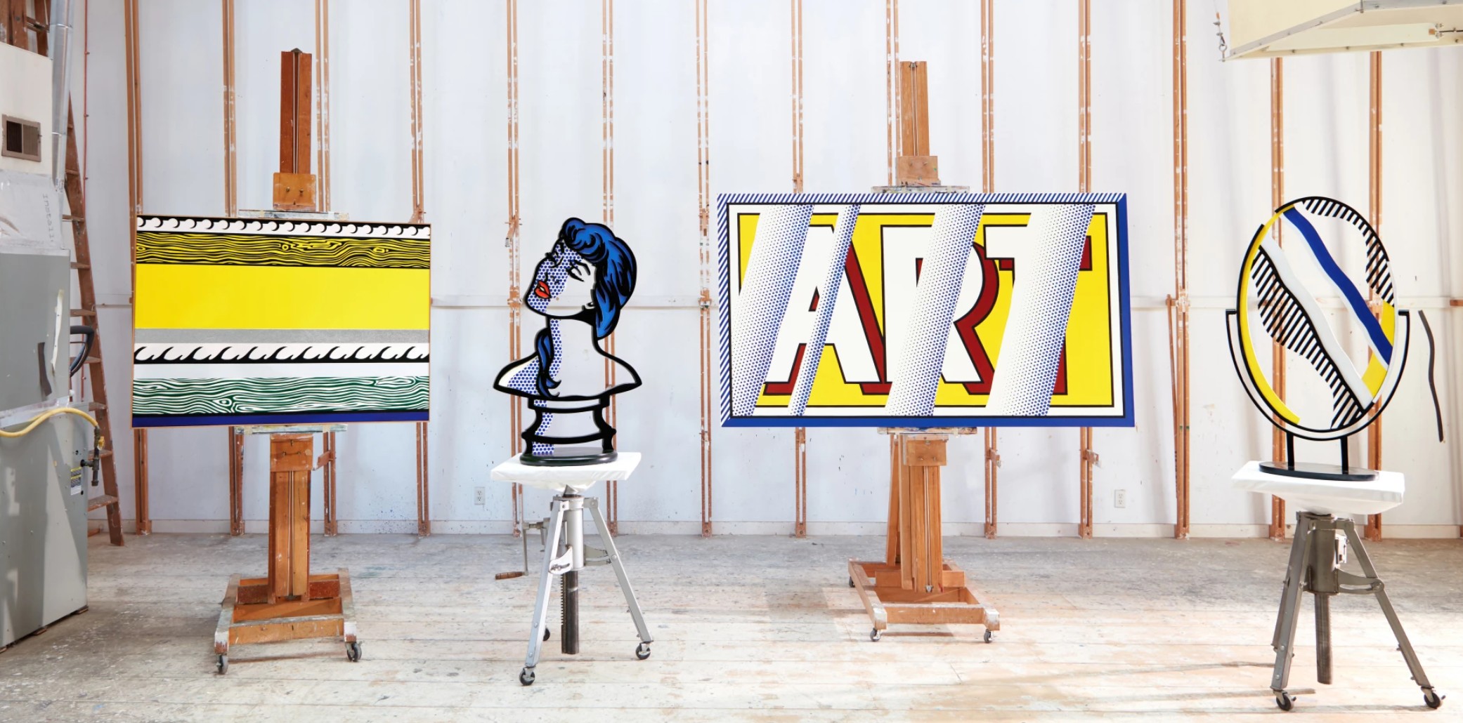
The present work (left) pictured in the artist’s Southampton studio. Art © Estate of Roy Lichtenstein
Though appearing mechanical and hard-edged, Entablature is in fact built through meticulous handwork, a hallmark of Lichtenstein’s career-long negotiation between the hand-drawn and the industrial. Here, the illusion of screen-printed uniformity is subverted by moments of subtle irregularity, particularly in the silver-gray band and its interplay with the graphite texture. The horizontal striations simultaneously suggest ancient stone friezes, mid-century Americana, and modern digital interface. In this way, the painting invites layered readings across time, geography, and media.
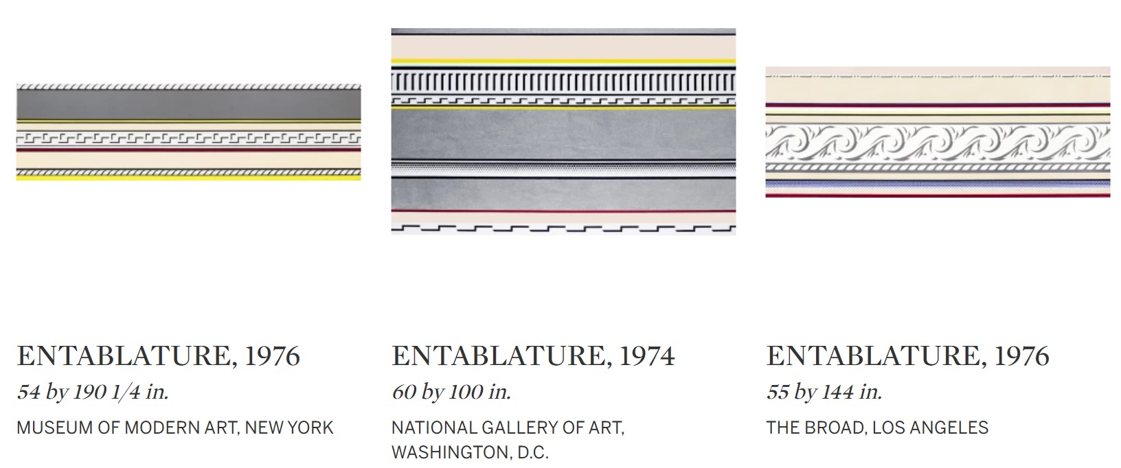
Indeed, Entablature can be understood as both homage and critique—a highly stylized reflection on the nature of image-making and the architectural ideals embedded in American visual culture. At the same time, the painting avoids heavy-handed irony, offering instead a cool elegance and formal satisfaction that rewards extended viewing. Lichtenstein’s controlled aesthetic masks a subversive edge: the transformation of marble into pigment, relief into line, monument into reproducible sign. In this regard, the Entablature series anticipates broader postmodern debates around appropriation, authorship, and style. Lichtenstein treats ornament not as a discardable excess but as a meaningful visual vocabulary—a gesture that resonates with contemporary reevaluations of decoration, craft, and pattern. The current painting, with its pristine surfaces and understated subversion, is thus a quietly powerful meditation on permanence, simulation, and the aesthetics of empire.
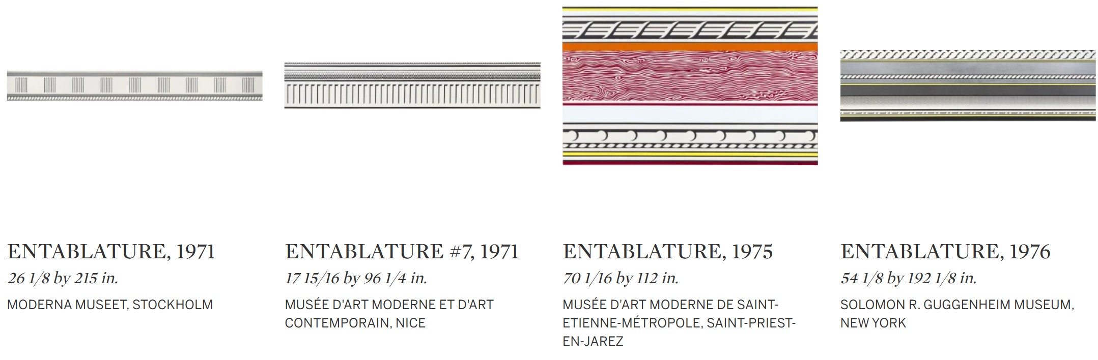
As one of the rare examples from the series that incorporates sand which was brought to his Southampton studio from the local beach this painting possesses a unique material and historical lineage. Entablature stands not only as a key example of Lichtenstein’s architectural investigations but also as a deeply personal work, one that bridges the conceptual rigor of his practice with the sensory world of his studio in Southampton. It is a painting that elegantly straddles the timeless and the timely, the monumental and the playful, the hand-drawn and the mass-produced—an enduring testament to the formal intelligence and cultural savvy of one of America’s most iconic painters.
Haystacks, 1968
Works from the Collection of Dorothy and Roy Lichtenstein
Sotheby’s New-York: 16 May 2025
Estimated: USD 400,000 – 600,000
USD 1,392,000
Haystacks | Contemporary Day Auction | 2025 | Sotheby’s
ROY LICHTENSTEIN (1923 – 1997)
Haystacks, 1968
Oil, acrylic and graphite on canvas
18×24 inches (45.7 x 60.9 cm)
Signed, dated ’68 and variously inscribed (on the reverse)
Roy Lichtenstein’s Haystacks stands as a brilliant act of art historical reflection and conceptual subversion. Executed in 1968, this work is one of only five works reinterpreting the pastoral haystack motif—an image steeped in the traditions of Van Gogh and, most notably, Claude Monet’s Meules series. Yet Lichtenstein approaches this bucolic subject not with the atmosphere and brushy light of Impressionism, but with the crisp visual mechanics of Pop art. First exhibited at The Met in 1969 and later in major international retrospectives, Haystacks has long been recognized as a key moment in Lichtenstein’s dialogue with modernist masters. And yet, it remains deeply original. Through the prism of Pop, Lichtenstein does not replicate Monet—he reanimates him, turning the haystack into a site of conceptual inquiry.
The Haystack paintings. including the present work, arranged in artist’s studio, c. 1969.
Photo: Courtesy RLF Archives. Art © Estate of Roy Lichtenstein.
In Haystacks, Lichtenstein looks backward while pushing forward. His treatment of the rural subject is filtered through his signature graphic style: a flattened composition, bold outlines, a limited palette, and of course, his signature use of Ben-Day dots—a mechanical printing process that here takes the place of dappled paint. Where Monet’s haystacks shift in color and light across seasons and time of day, Lichtenstein’s stack is temporally static, reduced to its essential geometry, stripped of context, and re-rendered in the cool language of mass media. What was once a symbol of agrarian life becomes a printed icon—an agricultural ghost in the industrial age.
The composition is deceptively simple. A horizon line divides a color-blocked landscape. A haystack, abstracted almost to the point of illegibility, rests against it. Lichtenstein’s use of Ben-Day dots throughout the foreground and sky replaces the nuanced atmospheric conditions of Monet with a reproducible texture that flattens both figure and field. This repetition of dots is not merely decorative; it is ideological. It calls attention to the systems of reproduction, visual language, and authorship that Lichtenstein so deftly interrogates. In doing so, Haystacks becomes a meditation on how we view and value the “natural” in a mediated culture.
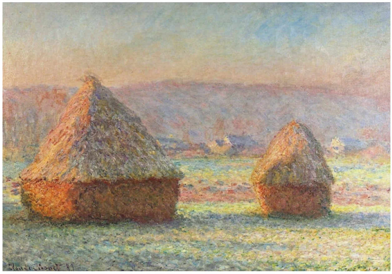
Claude Monet, Les Meules, effect de gelee balance, 1888-89. Hill-stead Museum, Farmington, Connecticut.
Coming directly from the estate of the artist, Haystacks holds particular importance in tracing Lichtenstein’s engagement with the history of painting. This was a period when he began systematically revisiting art historical genres—still life, landscape, abstraction—not to parody them, but to mine their formal structures and transform their painterly conventions into printed ones. His Haystacks are not ironic so much as they are analytical: what remains of Monet after being subjected to the visual lexicon of American consumer culture? Haystacks is both homage and critique, a landscape made anew through the tools of the machine age. In its distillation of vision, it reminds us that history is always being reprocessed—dot by dot, line by line.
Atomic Landscape, 1966
Works from the Collection of Dorothy and Roy Lichtenstein
Sotheby’s New-York: 15 May 2025
Estimated: USD 700,000 – 1,000,000
USD 1,636,000
Atomic Landscape | The Now and Contemporary Evening Auction | 2025 | Sotheby’s
ROY LICHTENSTEIN (1923 – 1997)
Atomic Landscape, 1966
Acrylic, oil and graphite on canvas
14 x 16 1/8 inches (35.6 x 41 cm)
Signed and dated ’66 (on the reverse)
In the early 1960s, as Roy Lichtenstein developed his now-ubiquitous Pop art approach to the imagery of postwar consumer- and mass culture, he dedicated his attention almost entirely on the common object. Beginning in 1961, and continuing in its greatest concentration through 1963, Lichtenstein narrowed the scope of each of his works to the study of a single motif, rendered in its most essentialized, graphic form. In Atomic Landscape, executed just a few years later in 1966, Lichtenstein makes the incisive yet almost mindless substitution of the household good for the eponymous atomic bomb. In this sly elision of subject matter, Lichtenstein signals the commodification of the atomic bomb itself: the transformation of this symbol of cataclysmic disaster into an object manufactured and proliferated by the mass media. In so doing, Lichtenstein engages the viewer in a tantalizing game of association through which he expounds upon the crux of his career-long artistic thesis: the inextricable relationship between the image and its mode of representation.
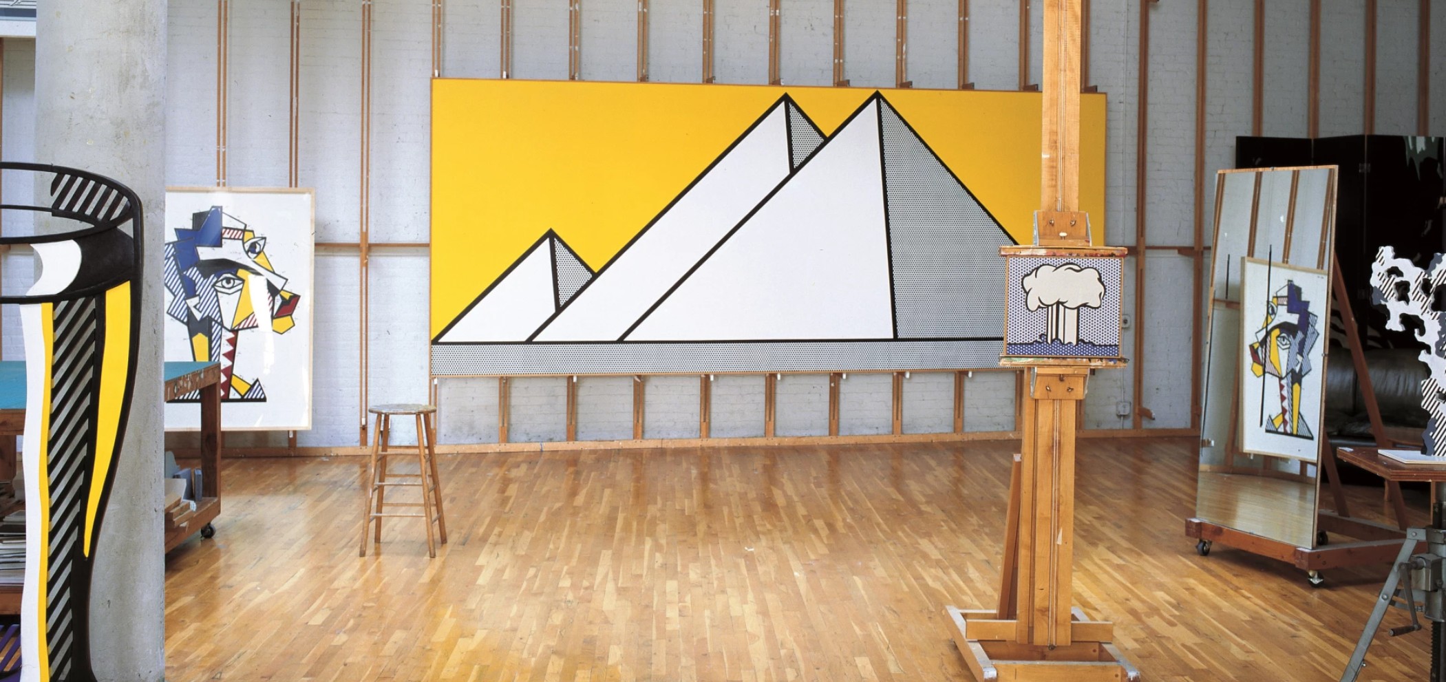
The present work installed in the artist’s studio, 2004. Photo © Eric Boman. Art © Estate of Roy Lichtenstein
As is the case with Atomic Landscape, Lichtenstein’s broader single-subject series conveys consumer society in the form of paradigms. Isolated against solid or half-tone backgrounds, these generic descriptions of household goods are transformed into depersonalized object-types which call upon their reference image as effectively as they dematerialize it. Despite their intimate scale, the austerity of the composition monumentalizes the banality of the commonplace, elevating the commodity to the centrality and grandeur of a portrait. In reducing the image down to its graphic elements, Lichtenstein draws attention to the way in which mass consumption has made the American public fluent in reading signs and symbols as stand-ins for the object being advertised. At the same time, however, Lichtenstein also deconstructs the marketing tactics inherent to this mode of representation. When taken in sequence with this earlier series, Lichtenstein engenders a certain naivete into the mode of presentation within Atomic Landscape which absolves the viewer of their unflinching consumption of the image he presents before them. It is the seeming ease with which he transfers the hard, unsentimental visual language used to describe a peanut butter cup or a ball of twine onto the intrinsically violent motif of the bomb which makes Atomic Landscape so striking.
Sigmar Polke, Palmen, 1968. San Francisco Museum of Modern Art.
Art © Estate of Sigmar Polke / Artists Rights Society (ARS), New York / VG Bild-Kunst, Bonn, Germany
This juxtaposition, which imbues Atomic Landscape with its dynamism, is precisely the same tactic which Lichtenstein explains is at the center of his broader artistic project in these early years: an interest “in using highly charged material… (highly emotional subjects) in a very removed, technical, almost engineering drawing style.” (Exh. Cat., London, Levy Gorvy, Source and Stimulus: Polke, Lichtenstein, Laing, March – April 2018, p. 12) A remarkable testament to his incisive eye for draughtsmanship and his dexterity in the language of commercialized printing, Lichtenstein is able to conjure the unmistakable image of the mushroom cloud through the simple arrangement of negative space within a black outline. In its static simplicity, he likewise captures something of the deafening impact of the bomb itself—an effect akin to the shockwave which paralyzes and silences in the aftermath of the nuclear explosion. Though perhaps inadvertently, Lichtenstein’s ubiquitous Ben-Day dots take on a similarly heightened resonance in the context of the present work. As much as they serve to emulate the mechanical, unsympathetic language of the mass-produced image, the dot likewise serves as an evocation of the atomic particle. The dizzying regularity of their application throughout the sky and the drastic change in the density of their application to the water offers a particularly apt visualization of the behavior of the chemical and energetic explosion that he takes as his subject.
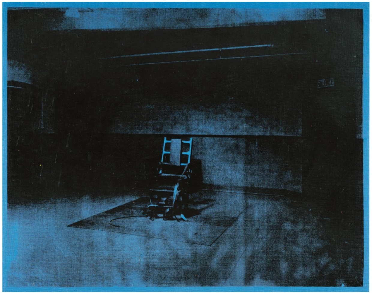
Andy Warhol, Little Electric Chair, 1964-5. Private Collection.
Image © 2025 The Andy Warhol Foundation for the Visual Arts, Inc. / Licensed by DACS, London / Christie’s Images / Bridgeman Images. Art © 2025 Andy Warhol Foundation for the Visual Arts / Artists Rights Society (ARS), New York
Laced throughout Atomic Landscape is an implicit political critique, not, as the artist explains, on foreign or domestic policy so much as it is on the normalization and valorization of violence as expounded by the mass media. The lack of emotional resonance within the work directly correlates to the lack of excess within the composition—a result achieved through Lichtenstein’s use of a generalized reference rather than specific source material. In this generalization, Lichtenstein not only outsources his imagery but his agency over the image as well. In so doing, he creates a critical distance between his subjectivity as an artist and the objectivity of the final work. In his contemporaneous series of Men at War, Lichtenstein similarly appropriates and reproduces mass produced imagery, this time of panels from comics depicting young men in battle. These vignettes at first seem to revel in boyhood fantasies of fearless heroes, exaggerating the intensity and danger of their bravery through the graphic concentration of their action. And yet, when taken out of context of the broader narrative of the long-form comic, these freeze-frames also come to express the violence that constitutes the most destructive aspects of hyperbolic masculinity which these comics, and by extension popular media, stand to promote. Atomic Landscape marks a distillation of this thematic interest down to a representative motif, the explosion, which for Lichtenstein came to increasingly serve as a subject in its own right.
Roy Lichtenstein’s 1960’s landscapes in Museum Collections
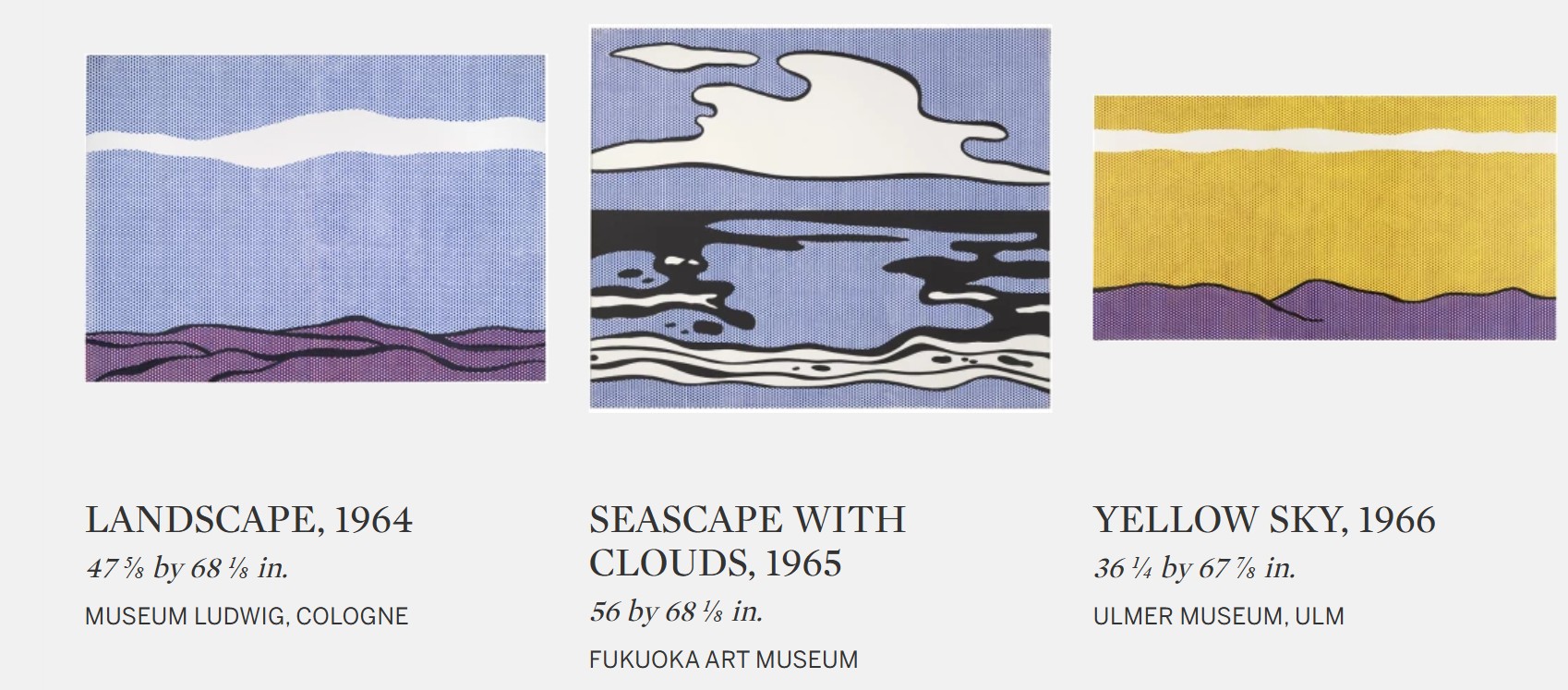
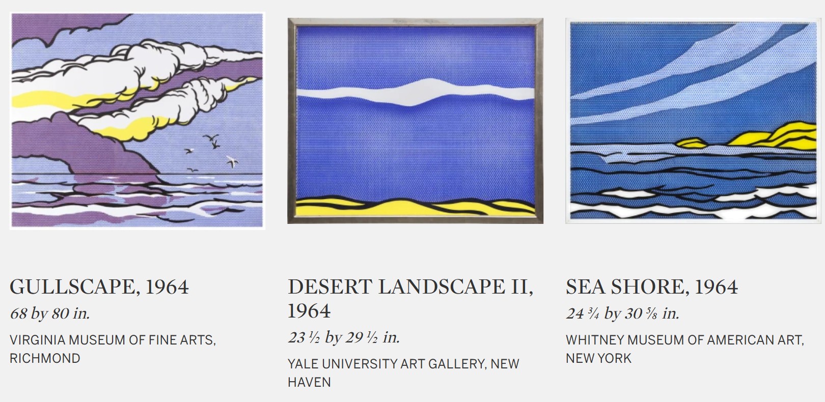
This fascination with our changing relationship to images as brought about by the proliferation of consumerism and a corresponding supersaturated image economy served as the lynchpin for the Pop art movement more broadly. As exemplified in Atomic Landscape, Lichtenstein quickly became adept at creating art which functioned like media: repetitive, impersonal, cool and reserved, yet altogether eye-catching. Here, the commercially derived flatness of his composition signals the reproduced nature of the image-type. As such, the work bears a conceptual kinship with his Pop contemporary Andy Warhol’s famed Death and Disaster series. In Atomic Landscape, as in Atomic Bomb, both artists flatten the sensational, emotional content of the horrific images which they take as subject, reproducing the charged image in the same unflinching mode of address that a newspaper or comic book does. In replicating this effect of popular imagery, both Lichtenstein and Warhol force their viewer to differentiate between the violence of the news and, for example, the glamor of celebrity—all types of consumerism, all presented in the same visual language. And yet unlike Warhol, who adopted the mechanical technique of silkscreening and schematized the idea of reproduction through the gradually distorted repetition of a real image, Lichtenstein works with ersatz stereotypes which admit to being reproductions. Where Warhol numbs his viewer by over-exposing them to an image within the same canvas, Lichtenstein presents them with an image that has already been over-exposed.
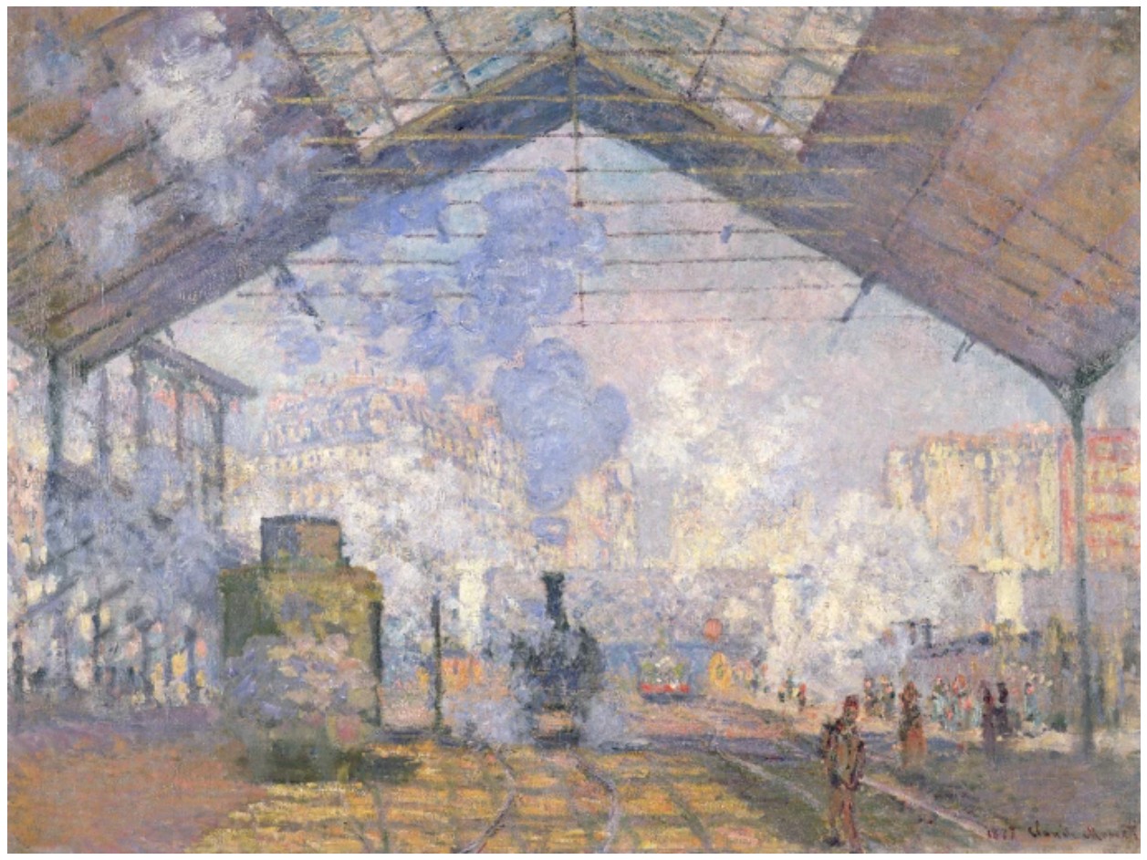
Claude Monet, The Gare St. Lazare, Paris, 1877. Musée d’Orsay, Paris. Image © Bridgeman Images
From Barnett Newman’s reactionary turn away from representational imagery in the face of the overwhelming devastation of the mid-21st century, to Salvador Dalí’s thematized explorations of nuclear fusion and fission, the cultural, scientific and geopolitical impact of the atomic bomb provided the impetus for a myriad of artistic explorations into the subject by Lichtenstein’s contemporaries. Atomic Landscape is a pendant to a slightly larger canvas of the same composition, entitled Atomic Burst, which Lichtenstein produced as his contribution to the 1966 project, Artists’ Tower of Protest. Spearheaded by artists Irving Petlin and Mark di Suvero, the collaborative installation was staged in West Hollywood, Los Angeles, as a protest against US involvement in the Vietnam war. The tower and fence which surrounded it were covered in over four hundred 24-by-24 inch panels, a show of overwhelming support in response to the open call for artists to submit works in support of the cause. However, in its matter-of-fact simplicity, Lichtenstein’s illustration of the atomic bomb is seemingly devoid of any political or subjective commentary. Despite the charged symbolism, the central aim of his work was to call upon, and in turn call out the way in which the proliferating culture of mass-production has desensitized the American public to the emotional resonance of images. In this context, Atomic Landscape comes to stand as a warning, not against the bomb itself, but against a visual culture which has made a stereotype of it.
2. Sculptures
Woman: Sunlight, Moonlight, 1996
Works from the Collection of Dorothy and Roy Lichtenstein
Sotheby’s New-York: 15 May 2025
Estimated: USD 4,000,000 – 6,000,000
USD 4,930,000
Woman: Sunlight, Moonlight | The Now and Contemporary Evening Auction | 2025 | Sotheby’s
ROY LICHTENSTEIN (1923 – 1997)
Woman: Sunlight, Moonlight, 1996
Acrylic on wood
42 3/4 x 26 x 13 5/8 inches (108.6 x 66 x 35.6 cm)
Daring in its conceptual wit and dazzling in execution, Woman: Sunlight, Moonlight stands as a defining statement of Roy Lichtenstein’s sculptural oeuvre and a profound meditation on image, illusion, and form. Executed in 1996, just one year prior to the artist’s unexpected death, Woman: Sunlight, Moonlight is a seminal artwork in the groundbreaking series of flat profile sculptures pioneered by Lichtenstein in the 1990s and is one of two unique examples of the form executed in wood in preparation for the bronze edition of six, the second of which currently resides in the collection of the Whitney Museum of American Art, New York.
Roy Lichtenstein in his studio. Photo © Bob Adelman. Art © Estate of Roy Lichtenstein
Examples from the bronze edition are held in esteemed collections including The Broad in Los Angeles and have been included in over nine major exhibitions including Lichtenstein’s landmark retrospective at the Art Institute of Chicago and the National Gallery of Art, Washington D.C. Bearing exceptional provenance, the present work has remained in the collection of Dorothy and Roy Lichtenstein since its creation. Presented to the public market for the very first time, Woman: Sunlight, Moonlight is a thrilling evocation of Roy Lichtenstein’s singular process and a remarkable opportunity to acquire an innovative and unprecedented masterpiece.
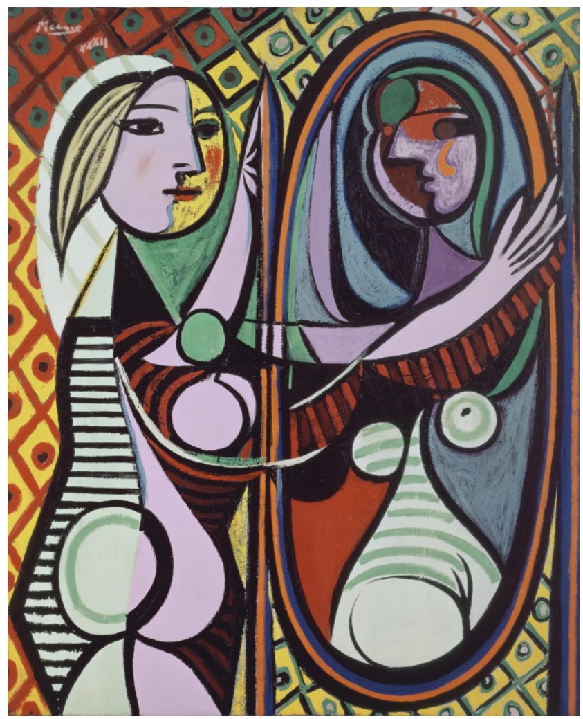
Pablo Picasso, Girl Before a Mirror, 1932. Museum of Modern Art, New York. Image © Succession Picasso/DACS, London 2025 / Bridgeman Images. Art © 2025 Estate of Pablo Picasso / Artists Rights Society (ARS), New York
Executed with Lichtenstein’s signature graphic precision, Woman: Sunlight, Moonlight is a thrilling exploration of the female figure in the artist’s late career as part of his reinterpretation of art history, blending his own celebrated output to create new works of art. Woman: Sunlight, Moonlight presents a stylized female bust rendered in a flat two-sided profile that boldly disrupts sculptural convention. Drawn from the visual vocabulary of 1960s romance comics, in this case the popular romance comic book Secret Hearts, the subject in Woman: Sunlight, Moonlight is at once iconic and archetypal, embodying Lichtenstein’s enduring exploration of mass media’s portrayal of feminine beauty. A pioneer of the Pop Art movement, Lichtenstein gained popularity and acclaim in the early 1960s for his “Girl Paintings” in which he appropriated the cliched archetypes of female beauty from comic books and magazines, brilliantly blurring the boundaries of high and low art. Woman: Sunlight, Moonlight is a triumphant re-emergence of the female figure in the artist’s work after a lengthy period away from the comic-book inspired motif and exemplifies Lichtenstein’s ability to not only contend with art historical precedent and the contemporary pop culture vernacular, but also to reflect upon his own practice across media and time. Woman: Sunlight, Moonlight reimagines its melancholic heroine as a luminous dual sided bust. Split along a central axis, her visage fractures into two distinct moods or opposing atmospheres, one face radiating the warm tones of daylight with vivid reds and canary yellows, and the other immersed in the cool blues of moonlight. Striking and alluring, she is Lichtenstein’s timeless muse, forever poised between the rising sun and the falling night.
“A sculpture from any viewpoint should work the way a drawing works, which is a two-dimensional thing.”
Left: Andy Warhol, Shot Sage Blue Marilyn, 1964. Private Collection. Image © Christie’s Images / © 2025 The Andy Warhol Foundation for the Visual Arts, Inc. / Licensed by DACS, London / Bridgeman Images. Art © 2025 Andy Warhol Foundation for the Visual Arts / Artists Rights Society (ARS), New York. Right: Roy Lichtenstein, Sleeping Girl, 1964. Sold at Sotheby’s New York in May 2012 for $44.9 million. Art © Estate of Roy Lichtenstein
Precise contours and graphic angles animate the surface of Woman: Sunlight, Moonlight with electric tension. Through his iconic Ben-Day dots, bold outlines and graphic color, the artist’s unmistakable visual lexicon is deftly transposed from the canvas to three-dimensional space. From certain angles, the figure appears almost like a cut-out, a drawing sprung into space; while from others, the figure’s profile sharpens into uncanny dimensionality. As the artist himself described, “a sculpture from any viewpoint should work the way a drawing works, which is a two-dimensional thing.” (the artist quoted in: Richard Calvocoressi, Roy Lichtenstein Sculptor, 2013, p. 42) Lichtenstein transforms a traditionally volumetric medium into a site of pictorial experimentation: sharp outlines and clusters of diagonal lines prompt the viewer to conjure depth and mass, suggesting a sense of three-dimensionality despite inherent flatness of the form. Disintegrating and reanimating space simultaneously, Woman: Sunlight, Moonlight furthers the boundaries of the medium, challenging the very substance and definition of sculpture as a necessarily three-dimensional form of expression. As Hal Foster describes, “these pieces exist between painting and sculpture in terms not only of genre but also of structure; where Minimalist objects are neither painting nor sculpture…Pop objects tend to be both-and if most representational painting is a two-dimensional encoding of three-dimensional objects, Lichtenstein reverses the process here, and freezes it somewhere in between.” (Hal Foster, ‘Pop Pygmalion, in: Exh. Cat., London, Gagosian Gallery, Roy Lichtenstein Sculpture, 2005, p. 10) Through exacting precision and controlled simplicity, Lichtenstein collapses the traditional boundaries of painting, drawing, and sculpture into a unified, hybrid form.
Constantin Brâncuși, Mademoiselle Pogany, 1912. Philadelphia Museum of Art. Image © Philadelphia Museum of Art / Gift of Mrs. Rodolphe Meyer de Schauensee, 1933 / Bridgeman Images. Art © Succession Brancusi – All rights reserved (ARS) 2025
Across media and form, Roy Lichtenstein has probed the semiotics of space and perspective, volume and mass, through his distinctive visual lexicon of color and line. A tour de force of visual wit and technical innovation, Woman: Sunlight, Moonlight is both an homage to and an evolution of Lichtenstein’s most enduring motifs rendered with a masterful sense of visual acuity. Flat yet full of volume, light yet monumental in presence, Woman: Sunlight, Moonlight is a triumph of paradox, simultaneously image and object, illusion and structure. A striking meditation on duality, perception, and the language of image-making, Woman: Sunlight, Moonlight is more than a mere translation of two-dimensional imagery, urging the viewer not just to reflect on the material object, but the act of viewing itself.
Bonsai Tree, 1993
Works from the Collection of Dorothy and Roy Lichtenstein
Sotheby’s New-York: 15 May 2025
Estimated: USD 1,500,000 – 2,000,000
USD 4,198,000
Bonsai Tree | The Now and Contemporary Evening Auction | 2025 | Sotheby’s
ROY LICHTENSTEIN (1923 – 1997)
Bonsai Tree, 1993
Painted pewter, patinated bronze
50 3/4 x 38 1/2 x 10 1/2 inches (128.9 x 97.8 x 26.7 cm)
Incised with the artist’s signature, numbered 6/6 and dated ’93 (lower edge)
This work is number 6 from an edition of 6 plus 1 artist’s proof
Serene and refined, Bonsai Tree elegantly evokes the iconic Japanese practice of cultivating serpentine trees in striking forms, embodying Roy Lichtenstein’s career-long synthesis of cross-cultural influences through his distinctive Pop sensibility. The history and masterful artistry of Bonsai in Japan and the similar Chinese tradition of Penjing, which originated approximately 1300 years ago, represent a form of rarefied, controlled beauty through sustained patience and care. Through economy of line and striking three-dimensional composition, Lichtenstein echoes the graceful contours of the Japanese artform in Bonsai Tree. Simultaneously majestic and subtle, expressive and tranquil, Lichtenstein here uses his signature Pop technique and irreverent inquiry both to pay homage to a cultural tradition and to illuminate the frequent generalization of Eastern motifs by Western artists for centuries. In the 1990s, Lichtenstein embarked on his final two major series, Landscapes in the Chinese Style and his Interiors, through both of which he would continue his career-long investigation and reinterpretation of art history and contemporary culture through his distinctive Pop vernacular. Situated between these two series, Bonsai Tree is an exemplar of Lichtenstein’s mature practice and exploration of three-dimensional expression, embodying the radical inquiry and masterful invention of his oeuvre.
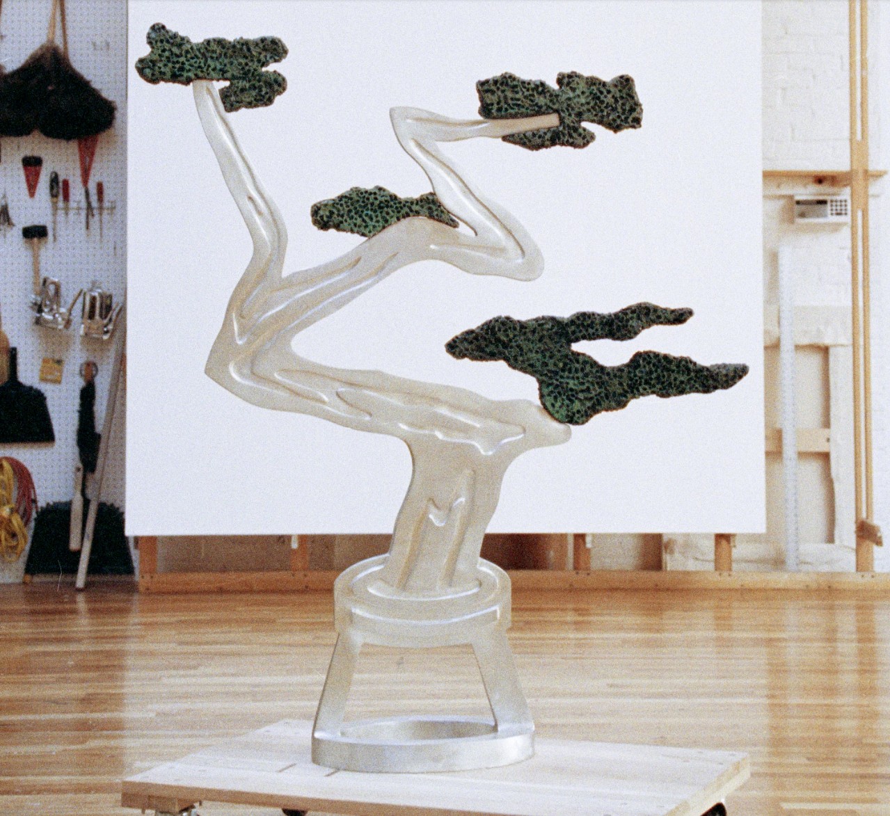
An edition of the present work in progress in the artist’s studio, 1993. Photo © Bob Adelman. Art © Estate of Roy Lichtenstein
In the 1960s, Lichtenstein began his probe of the art historical canon, contending with a range of influences from Pablo Picasso’s Cubism to Piet Mondrian’s abstracted picture planes and the architectural monuments of ancient Egypt and Greece. Lichtenstein reinterpreted and reevaluated these visual icons through the representational systems of contemporary mass media. Applying the visual strategies of comic books and advertisements, Lichtenstein developed his compositions using Ben-Day Dots, bold contour lines, and flat planes of color. In each case, Lichtenstein played with a representational cliche of an artist or cultural iconography, responding to the commodification and proliferation of art as a symbol in the image-saturated culture of the Post-War era.
Vincent van Gogh, Branch of an Almond Tree in Blossom, 1890. Van Gogh Museum, Amsterdam. Image © Art Resource, NY
In 1991, Lichtenstein turned his focus to East Asian art, developing a series of paintings, collages, works on paper and sculptures inspired by the visual tropes of East Asian art in the Western imagination. Lichtenstein’s interest in Chinese art though began almost five decades prior. Stationed in London during World War II, twenty-one-year-old Lichtenstein wrote home to his parents: “I bought a book on Chinese painting, which I could have gotten in New York half the price. I’ll probably send it home with my collection of African masks, as my duffle bag now weighs more than I do, with all the art supplies.” (the artist cited in: Exh. Cat., Hong Kong, Gagosian Gallery, Roy Lichtenstein: Landscapes in the Chinese Style, 2011, p. 7) Later, when Lichtenstein returned to Ohio State University to complete his undergraduate and graduate degrees after the war, he enrolled in classes on East Asian art history. Lichtenstein recalled: “The thing that interested me was the mountains in front of mountains in front of mountains, and huge nature with little people… We all have a vague idea of what Chinese landscape look like—that sense of grandeur the Chinese felt about nature.” (the artist quoted in: Calvin Tomkins, “The Good China,” The New Yorker, 30 September 30 1996 (online))
David Hockney, L’Arbois, Sainte-Maxime, 1968. Private Collection.
Sold at Sotheby’s London in October 2024 for £13.2 million ($17.2 million). Art © 2025 David Hockney
Lichtenstein’s pursuit of East Asian visual tropes through his Landscapes in the Chinese Style series developed in parallel with his iconic Interiors series. Inspired by the domestic interiors illustrated in the Yellow Pages, Lichtenstein’s Interiors featured living rooms, bedrooms and kitchens, which frequently included miniature versions of his own artworks or those from art history. Both series would occupy the artist in his final decade, representing the artist’s continued quest for reinvention and reflection in his mature practice. The present work sits at the nexus of these two seminal series. The image of the Bonsai tree first appears in Lichtenstein’s oeuvre in 1991 in his painting, Interior with Bonsai Tree. Throughout the series, Lichtenstein sought to insert instantly recognizable art historical and cultural symbols in his compositions, creating layered dimensionality and reflecting upon both the canon and his own practice.
“The thing that interested me was the mountains in front of mountains in front of mountains… And the huge nature with little people. We all have a vague idea of what Chinese landscapes look like–that sense of grandeur the Chinese felt about nature. In my paintings, it’s not nature, of course, it’s just dots. But it wasn’t nature when they did it, either. Any painting is so far from the real look. It’s a symbol that reminds you of reality, sometimes, if it does.”
Yves Klein, Blue Sponge, 1959. Solomon R. Guggenheim Museum, New York.
Image © The Solomon R. Guggenheim Foundation / Art Resource, NY. Art © 2025 Artists Rights Society (ARS), New York / ADAGP, Paris
Lichtenstein’s quotations from visual culture are inherent reproductions—reductive representations which stimulate the viewer’s recognition through sparse means. Through refined lines and a voided space, Lichtenstein evokes the presence of the potted Bonsai tree and profoundly disrupts the basis of the sculptural form. Lichtenstein’s Bonsai Tree retains the planar, comic-book-like two-dimensionality of his paintings and drawings but exists as a three-dimensional form. The sponge-like application of pigment in his painting Interior with Bonsai takes on a three-dimensional presence in the present work. The artist blurs the boundaries of the sculptural medium, challenging its very substance and definition. He renders space and volume through absence; in transposing his visual systems and cues, such as bold contours used to convey depth and volume. Bonsai Tree is a superlative example of Lichtenstein’s acclaimed mature sculptural practice, embodying the central artistic explorations of his final decade.
Woman Contemplating a Yellow Cup, 1995
Works from the Collection of Dorothy and Roy Lichtenstein
Sotheby’s New-York: 16 May 2025
Estimated: USD 1,000,000 – 1,500,000
USD 1,758,000
Woman Contemplating a Yellow Cup | Contemporary Day Auction | 2025 | Sotheby’s
ROY LICHTENSTEIN (1923 – 1997)
Woman Contemplating a Yellow Cup, 1995
Acrylic and pigmented wax on aluminum
71 3/4 x 84 inches (182.2 x 213.4 cm)
Incised with the artist’s signature, date ’95 and number AP 1/2 (lower left)
This work is artist proof 1 of 2 from an edition of 6 plus 2 artist proofs
Radiant in color, crisp in line, and striking in scale, Woman Contemplating a Yellow Cup is a masterwork from Roy Lichtenstein’s final decade, in which the Pop icon pushed the boundaries of sculpture with the same formal daring that revolutionized his painting in the 1960s. Translating the graphic clarity of his canvases into a three-dimensional form, the present work exemplifies Lichtenstein’s genius for spatial illusion and narrative suggestion. The composition is a fusion of sculptural relief and pictorial tableau, combining stylized fragments of a woman, a domestic setting, and an implied gaze. His iconic blonde female figure, rendered in profile with her hair tied in a dramatic bow, leans forward into the picture plane—or perhaps into our space—her attention focused on a single yellow cup poised on a pristine white table. Executed in 1995, this work bears exceptional provenance, coming directly from the collection of Dorothy and Roy Lichtenstein.
Lichtenstein’s paints in his studio.
Crafted on shaped aluminum, the work projects outward from the wall, flattening sculptural form into a shallow, illusionistic scene while simultaneously emphasizing its objecthood. It is both a picture and an object. The composition compresses spatial cues—perspective lines, shadows, furniture planes—into a puzzle-like array of contours and Ben-Day dots, a nod to the printing processes of mass media that defined Lichtenstein’s signature aesthetic. The table’s angled legs, the chair’s crisp silhouette, and the stylized foliage in the vase all sit in jarring, stylized harmony with the flatly rendered curtain and window frame.
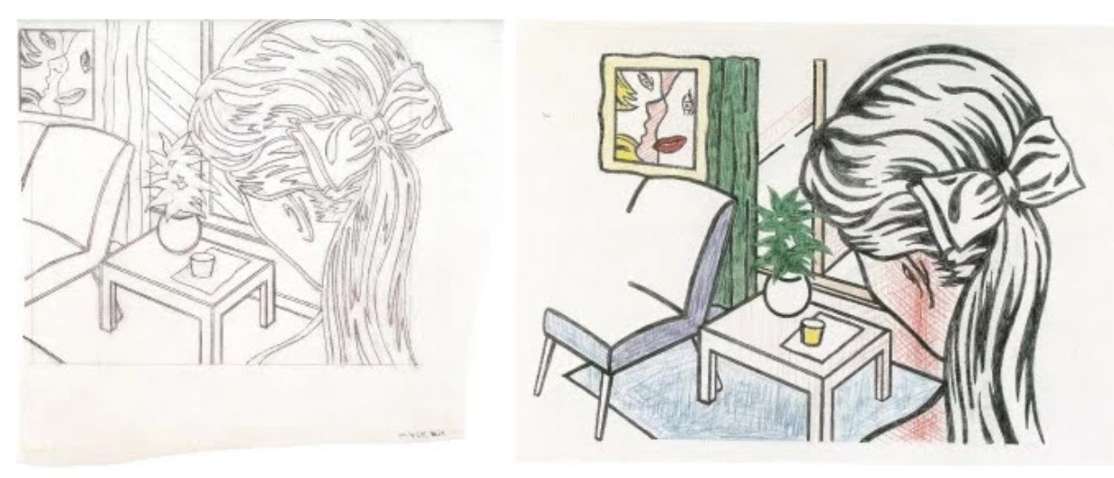
Left: Woman Contemplating a Yellow Cup (Study), 1994. Private Collection. Art © Estate of Roy Lichtenstein. Right: Woman Contemplating a Yellow Cup (Study), 1994. Private Collection. Art © Estate of Roy Lichtenstein.
At the heart of the image, the titular yellow cup gleams like a beacon of domestic stillness and meditative pause. It draws the eye with subtle force, a minimalist gesture around which the entire composition seems to orbit. Like the apple in a Morandi still life or the mirror in a Vermeer interior, the cup becomes a surrogate for contemplation, a quiet object imbued with psychological weight. The woman’s gaze—though we see only its orientation, not her eyes—transforms the scene from passive decor to charged encounter. This blend of psychological nuance and formal stylization was a hallmark of Lichtenstein’s late work, especially his portrayals of women. Revisiting the tropes of 1960s romance comics that catapulted him to fame, Lichtenstein reimagines the female figure not as a caricature of longing or heartbreak but as a complex, self-contained presence. In Woman Contemplating a Yellow Cup, the woman’s interiority is suggested rather than spelled out; she is thoughtful, absorbed, private.
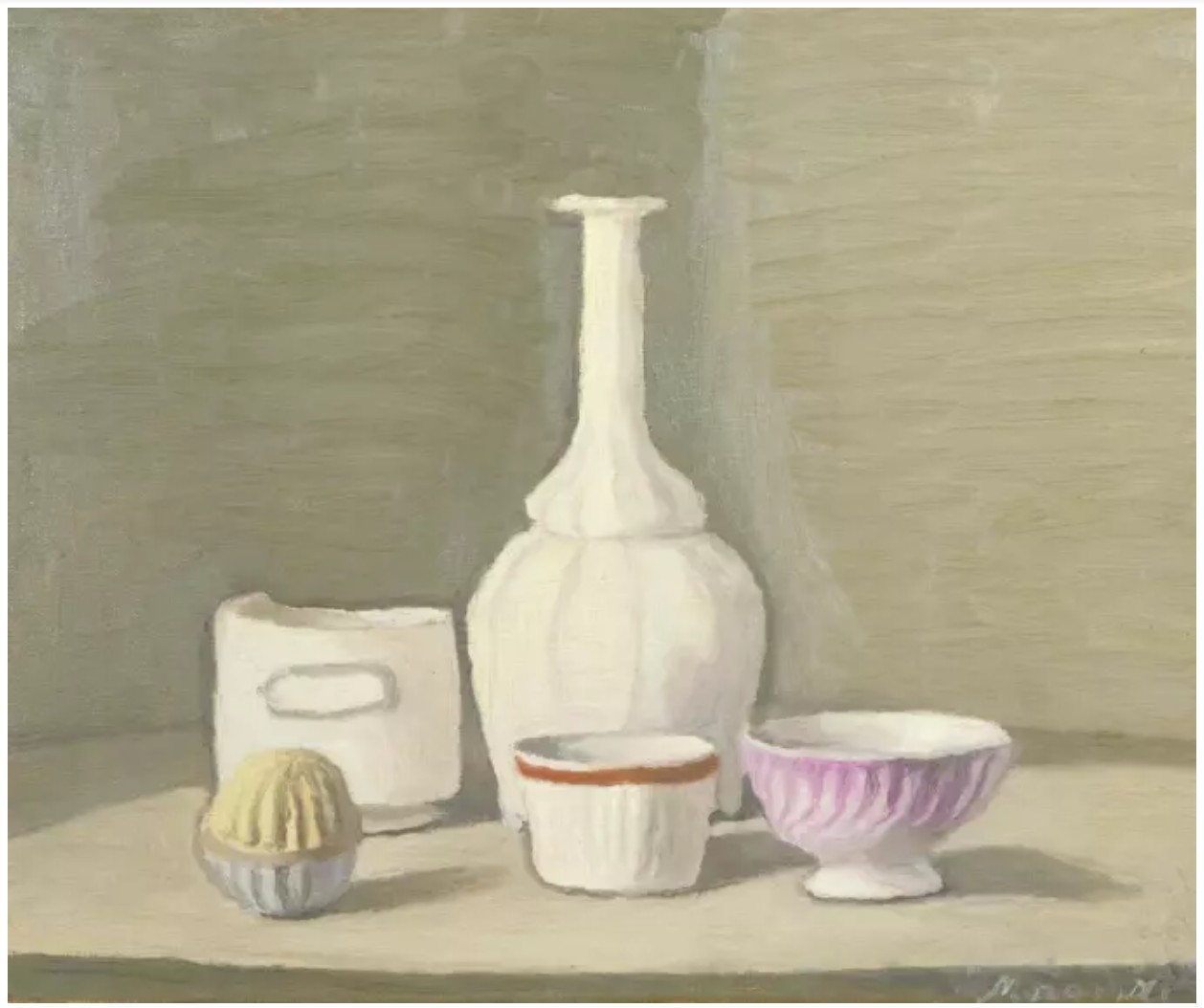
Giorgio Morandi, Still Life, 1946. Tate Modern, London. Art © 2025 Artists Rights Society (ARS), New York/SIAE, Rome/
While the work references 20th-century advertising tropes and interior design imagery, it also draws from a deeper lineage of modernist art history. The crisp angles and compositional play evoke the precision of Fernand Léger, while the motif of a woman seated in contemplation recalls Picasso’s figures from the 1930s. Simultaneously, the spatial dislocation and pictorial fragmentation situate the work squarely within the postmodern condition, where subjectivity is filtered through mediated image culture.
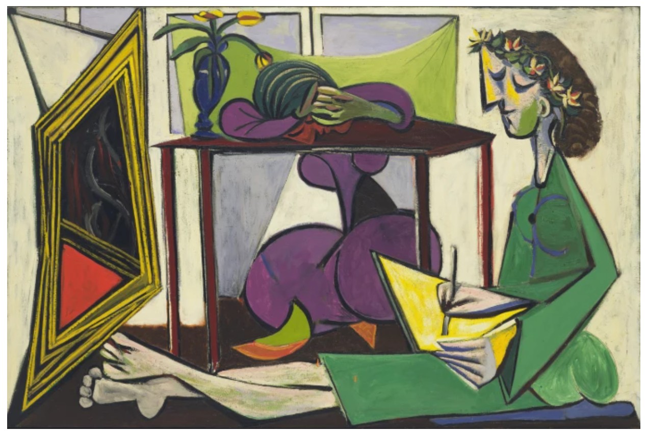
Pablo Picasso, Interior with a Girl Drawing, February 1935.
Museum of Modern Art. © 2025 Estate of Pablo Picasso / Artists Rights Society (ARS), New York
Woman Contemplating a Yellow Cup exemplifies the technical precision and surface perfection that characterized Lichtenstein’s sculptural production. The artist had long experimented with shaped canvases and relief constructions, but these aluminum sculptures from the 1990s mark a culmination of that formal inquiry—rigid, polished, and resolutely graphic. The use of pigmented wax over acrylic adds a subtly lustrous depth, enhancing the visual energy of the surface without compromising its schematic flatness. Standing as both a summation and evolution of Roy Lichtenstein’s extraordinary visual language, Woman Contemplating a Yellow Cup captures Lichtenstein’s enduring fascination with perception, image-making, and the emotional resonance of the everyday object. At once playful and profound, it is a sculpture that mirrors our gaze back at us—inviting us to ponder, to pause, and perhaps, like the woman it depicts, to simply take a moment to contemplate.
Setting Sun and Sea, 1964
Works from the Collection of Dorothy and Roy Lichtenstein
Sotheby’s New-York: 16 May 2025
Estimated: USD 250,000 – 350,000
USD 1,758,000
Setting Sun and Sea | Contemporary Day Auction | 2025 | Sotheby’s
ROY LICHTENSTEIN (1923 – 1997)
Setting Sun and Sea, 1964
Porcelain enamel on steel
36×72 inches (91.4 x 182.9 cm)
Signed (on the reverse)
This work is number 4 from an edition of 5
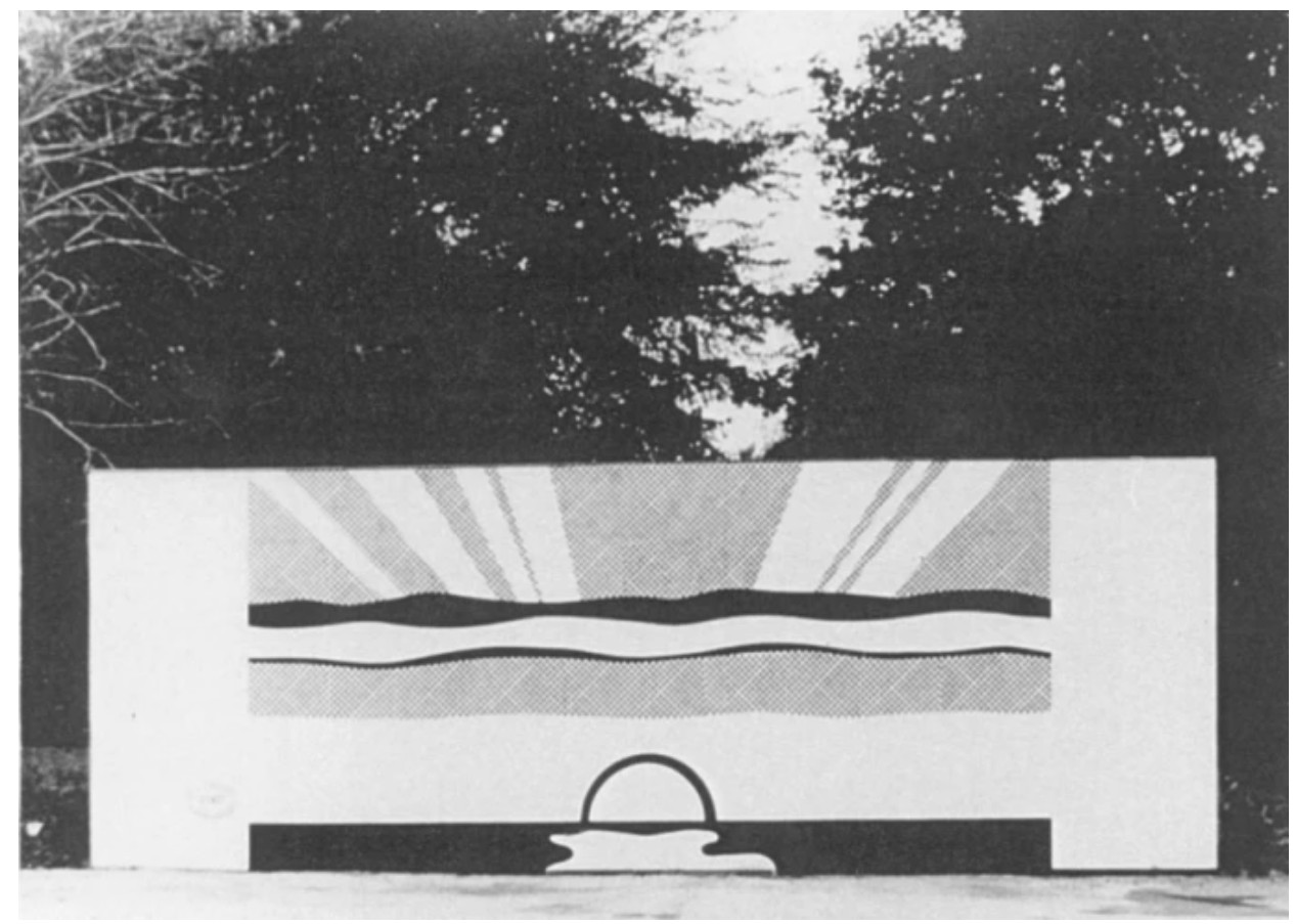
Roy Lichtenstein, Super Sunset Billboard, 1967. Art © Estate of Roy Lichtenstein
“Lichtenstein’s land and seascapes were not simply parodies of commercial sensibilities. They do not pretend to be imaginary, nor did they aspire to simulate. Rather, these works function as phenomena, the playground where seeing and knowing collide, and the place where Lichtenstein situated his practice.”
Clare Bell
Mirror I, 1976
Works from the Collection of Dorothy and Roy Lichtenstein
Sotheby’s New-York: 15 May 2025
Estimated: USD 1,000,000 – 1,500,000
USD 1,016,000
Mirror I | The Now and Contemporary Evening Auction | 2025 | Sotheby’s
ROY LICHTENSTEIN (1923 – 1997)
Mirror I, 1976
Painted and patinated bronze
44 1/2 x 25 x 11 5/8 inches (113 x 63.5 x 29.5 cm)
Incised with the artist’s signature, numbered 2/3 and dated ’76 (lower edge)
This work is number 2 from an edition of 3 plus 1 posthumous cast
A masterful example of Roy Lichtenstein’s career-long investigation of the art and artifice of image-making, Mirror I from 1976 is an elegant manifestation of the artist’s iconic Pop idiom in three-dimensional space. Lichtenstein’s oeuvre is predicated on a semiotic investigation of the ways in which systems of representation allow us to conceptualize and interpret the world around us. Between 1969-72, Lichtenstein produced a limited suite of Mirror paintings, through which he employed his signature visual vernacular to convey reflective surfaces in paint, parodying tropes of mirrored surfaces in art history and contemporary advertising. The series, which became symbolic of the inherent illusion of artistic production, was among the most significant programs of Lichtenstein’s early oeuvre. The motif and conceptual questions of the series reappeared in the artist’s work throughout the remainder of his life, predominantly in his seminal suite of Mirror sculptures from 1976-77, including the present work. Mirror I advances the conceptual and formal concerns of the Mirror paintings, metamorphosing Lichtenstein’s signature visual strategies from the canvas into three-dimensional space.
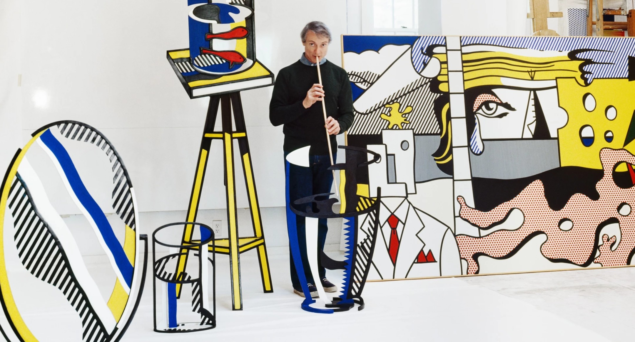
An edition of the present work with the artist in his studio in Southampton, New York, 1977. Photo © The Horst Estate © Conde Nast. For further information please contact The Horst Foundation. Art © Estate of Roy Lichtenstein
Through the 1960s, Lichtenstein contended with the art historical canon, reinterpreting and responding to the likes of Pablo Picasso, Piet Mondrian, Paul Cézanne as well as Classical Greek architecture, Abstract Expressionism, and Surrealism. However in 1969, Lichtenstein initiated an appraisal of one of the most iconic and technically challenging motifs of Western painting since the Renaissance: the mirror. The Mirror series perfectly epitomizes the conflict between reality and illusion that underpins Lichtenstein’s entire oeuvre. Lichtenstein was first inspired by the ways in which advertisers represented windows and mirrors on commercial brochures and in storefront posters, using airbrush-like shading and sharp diagonals to suggest reflections, without actually illustrating a reflection. Then, using his own menu of visual symbols, such as Ben-Day dots, flat planes of color and contour lines, Lichtenstein produced his own painted mirrors. For the artist, the mirror operated as the perfect vehicle for examining the semiotic systems of representation, allowing illusion and artifice to be the true subject matter of the work.
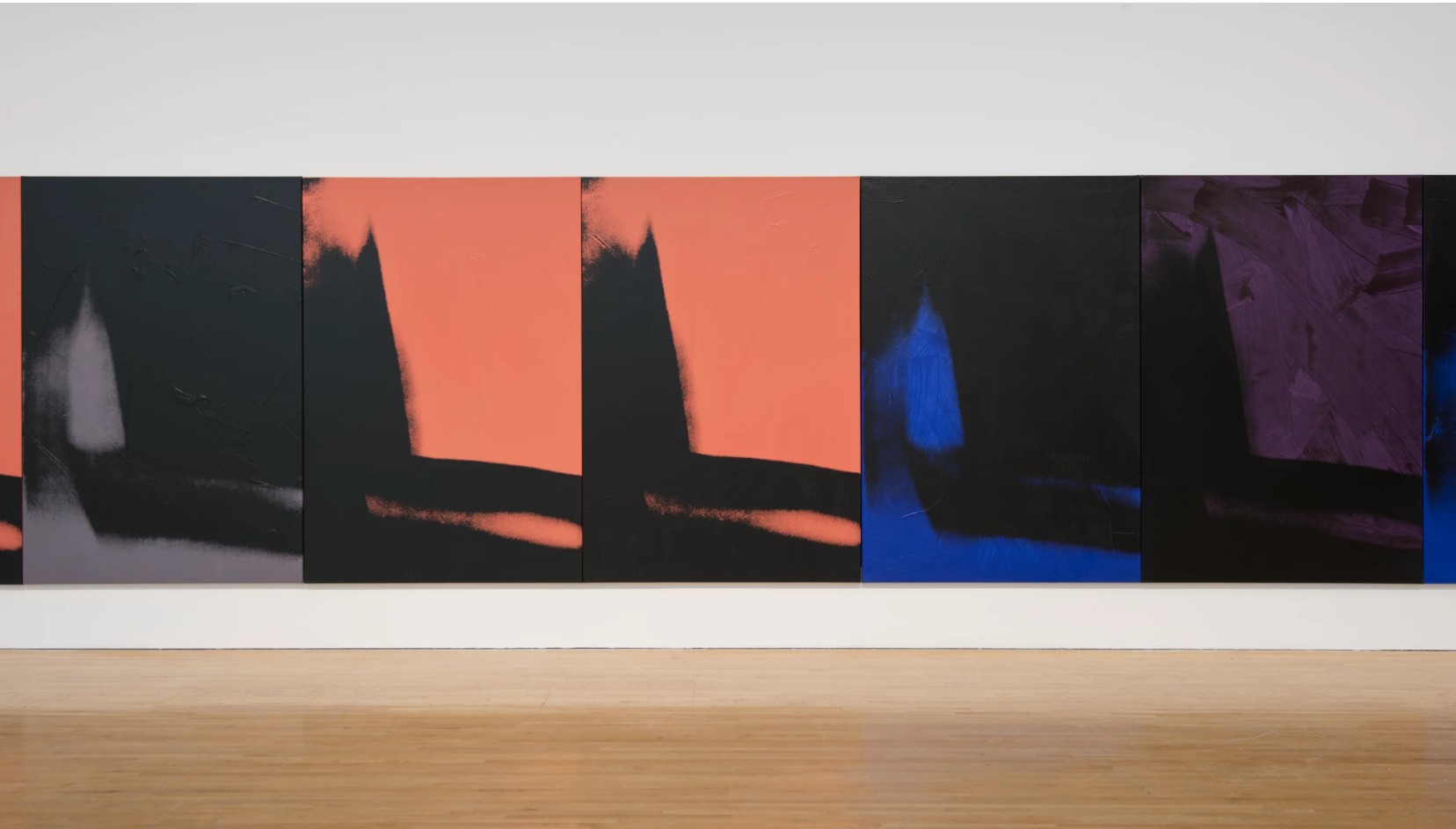
Andy Warhol, Shadows, 1978-79, Dia Art Foundation, New York, installed in Shadows at the Museum of Contemporary Art, Los Angeles, September 2014 – February 2015. Photo © Brian Forrest.
Art © 2025 Andy Warhol Foundation for the Visual Arts / Artists Rights Society (ARS), New York
From Lichtenstein’s earliest forays with three-dimensionality in the mid-1940s through the end of his life in 1997, sculpture occupied a critical place at the center of his oeuvre. In Mirror I, Lichtenstein propels his investigation of illusion and reflection beyond the picture plane, bringing his visual lexicon into the third dimension. In Lichtenstein’s sculptural works, such as Glass I or Goldfish Bowl, he frequently employs the space of a void to signify volume or mass. In Mirror I, Lichtenstein utilizes the space of the void to imply the reflective surface of the mirror. Employing similar visual systems as used in his paintings, such as streaks of blue and yellow alongside bold back hash lines to convey light and shadow, Lichtenstein conveys the notion of reflection. Yet here, the absences also enable the viewer to gaze through the vacant space. In doing so, Lichtenstein contends with the idea of the mirror as a window or portal to convey a new form of meaning and with each installation of the present work, the sculpture takes on a new character.
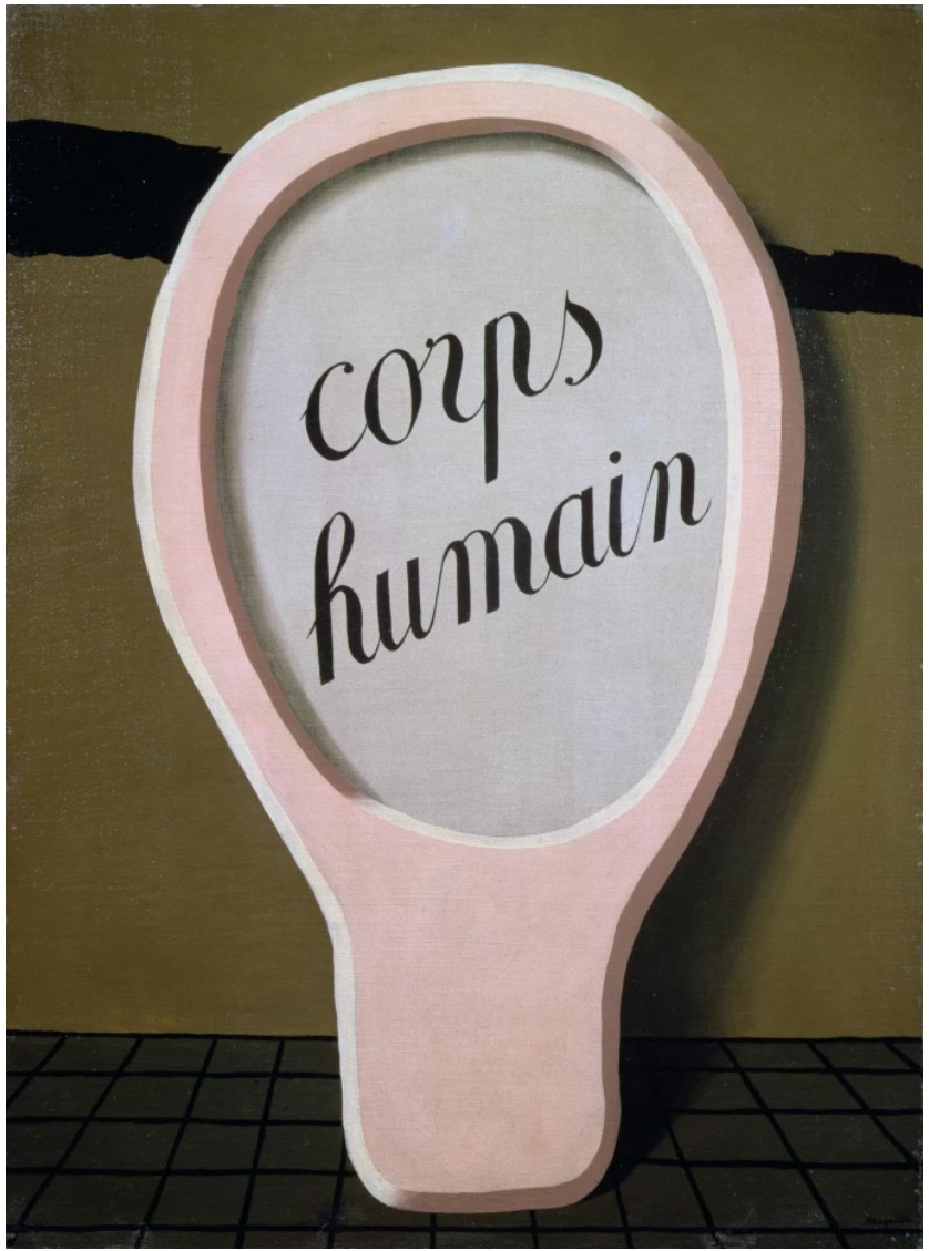
René Magritte, Le Miroir Magique, 1929. Mayor Gallery, London.
Image © Bridgeman Images. Art © 2025 C. Herscovici, Brussels / Artists Rights Society (ARS), New York
Since the Renaissance, the mirror has appeared in the works of esteemed artists as a vehicle to demonstrate mastery of formal technique as well as a form of self-portraiture. Famously, artists such as Parmigianino, Jan van Eyck, and Frida Kahlo have utilized the mirror as a means to insert themselves in the picture plane and contend with ideas of self-perception. The mirror has also operated as a conceptual indicator of the inherent illusion of the picture plane. In van Eyck’s celebrated Arnolfini Portrait from 1434 and Diego Velázquez’s renowned Las Meninas from 1656, the artists use the mirror to anchor the perspective of the viewer and, in doing so, assert the fundamental artificiality of the scene. Engaging with this subject matter, Lichtenstein inserts himself into this art historical narrative, examining the formal and conceptual history of the mirror and reinterpreting it through his own Pop idiom.
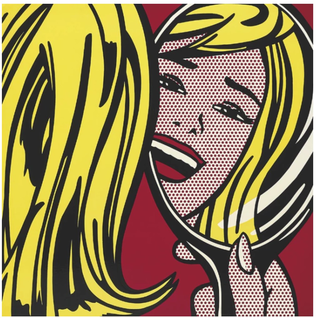
Roy Lichtenstein, Girl in Mirror, c. 1964. Private Collection. Sold at Sotheby’s London in June 2012 for £2.4 million ($3.7 million).
Art © Estate of Roy Lichtenstein
Across media and form, Lichtenstein operates to blur the boundaries and arbitrary parameters of their qualities. He probes the semiotics of space and perspective, volume and mass through his distinctive visual lexicon of color and line. In his sculptural works, he employs the signs and systems of his comic book-inspired paintings, inverting the viewer’s expectations of the medium and yet producing works that feel instantly familiar. Through the elegant contours and bold articulation of Mirror I, Lichtenstein positions himself in dialogue with art history’s canon and the illusion and artifice at its very core.
Small Wall Explosion, 1965
Works from the Collection of Dorothy and Roy Lichtenstein
Sotheby’s New-York: 16 May 2025
Estimated: USD 400,000 – 600,000
USD 812,800
Small Wall Explosion | Contemporary Day Auction | 2025 | Sotheby’s
ROY LICHTENSTEIN (1923 – 1997)
Small Wall Explosion, 1965
Porcelain enamel on steel and perforated steel
21 7/8 x 20 1/2 x 7 3/8 inches (55.6 x 52.1 x 18.7 cm)
Signed, dated ’65 and numbered 6/6 (on the reverse)
This work is number 6 from an edition of 6
Bursting from the wall with comic-book bravado, Roy Lichtenstein’s Small Wall Explosion is a visually arresting and conceptually rich object that encapsulates the artist’s pioneering shift from two-dimensional image-making to sculptural form. Executed in 1965, the work brings Lichtenstein’s fascination with mass media, industrial process, and graphic immediacy into vivid three-dimensional life. Coming directly from the artist’s estate, this rare sculpture stands as both Pop icon and sculptural innovation.
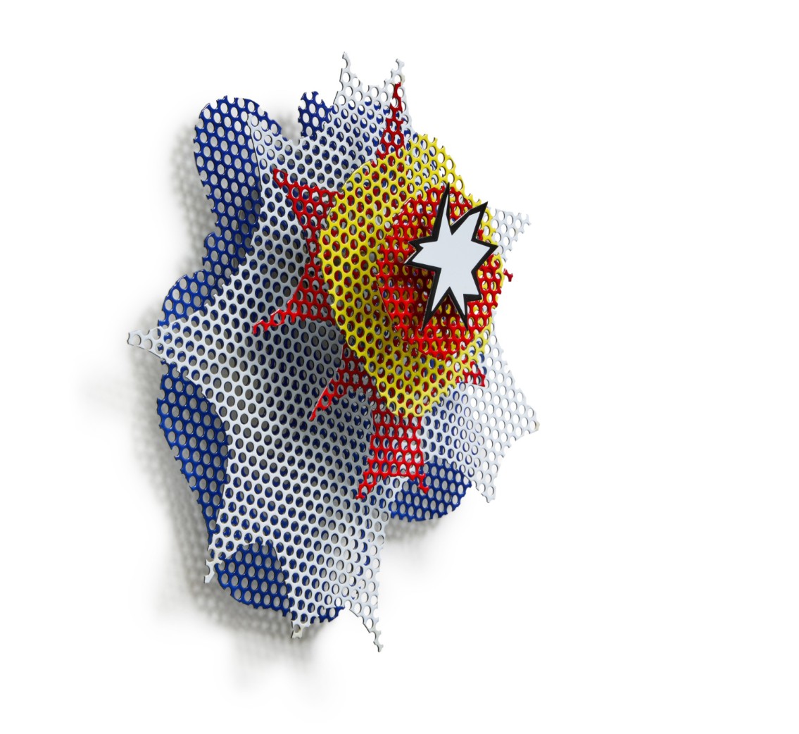
In the early 1960s, Lichtenstein began isolating explosive imagery from war comics, abstracting them into self-contained emblems of impact. By 1965, the year Small Wall Explosion was executed, he had begun transferring these compositions from canvas to sculptural materials—transforming ephemeral comic motifs into enduring objects. This edition of six is among his first forays into fabricated sculpture, translating the immediacy of print into the permanence of enamel and steel. The composition is pure Pop bravura. A jagged red-and-yellow burst radiates from a central point, encased in the bold black outlines and flat fields of color that define Lichtenstein’s visual language. Unlike his painted canvases, here the explosion literally protrudes from the wall. In turning image into object, Lichtenstein makes visible what he once described as the paradox of the comic explosion: a symbol of motion frozen mid-impact, where destruction is rendered harmless through stylization.
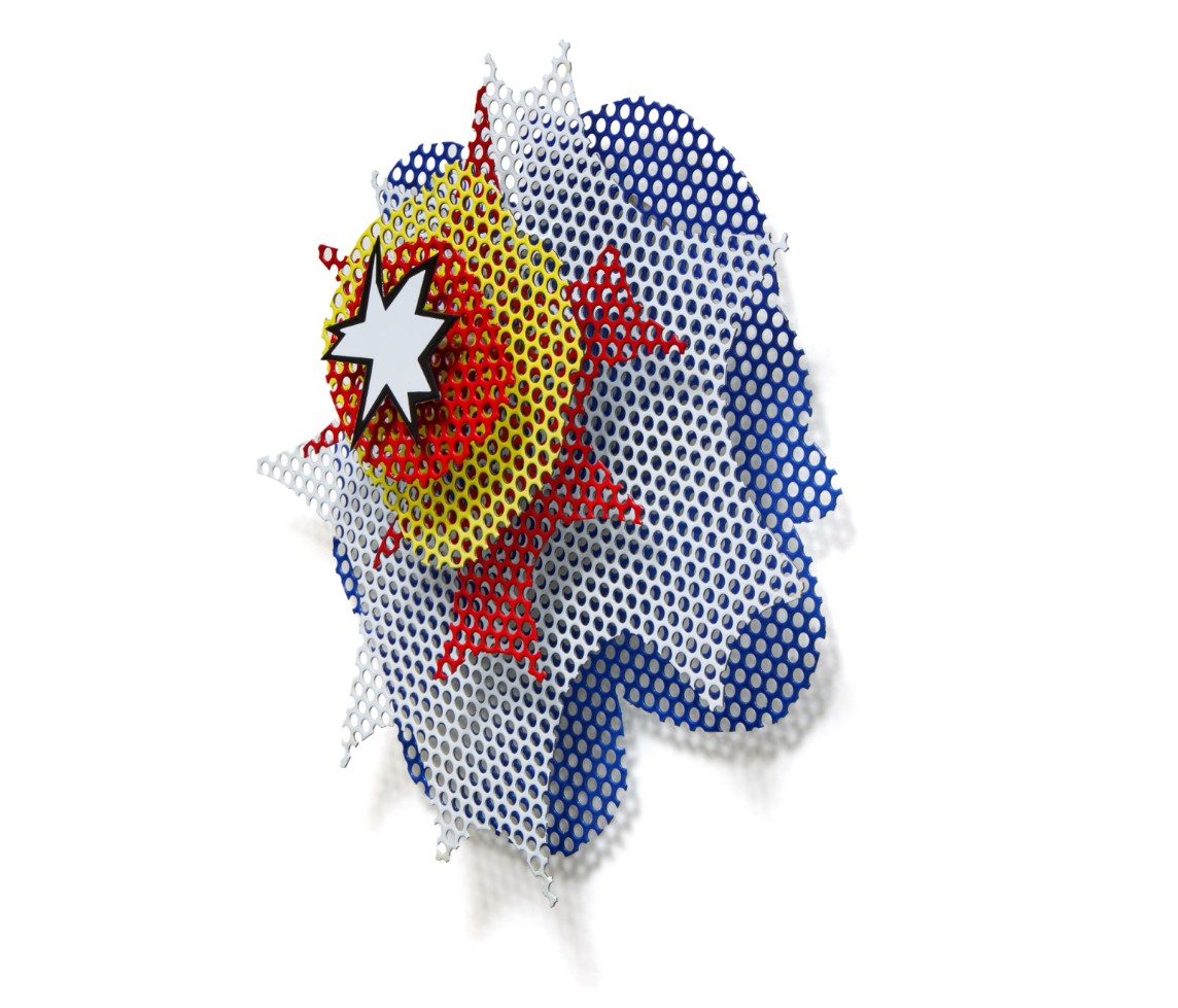
What distinguishes this work, as with all Lichtenstein’s best sculpture, is its friction between content and form. The explosion—traditionally violent, chaotic, and fleeting—is given the cool, clean execution of industrial signage. The use of porcelain enamel, typically associated with commercial displays, reinforces the work’s relationship to advertising, mechanical production, and mid-century Americana. The perforated steel background enhances the illusion of visual vibration, producing a subtle interplay between light and surface that changes as the viewer moves. Small Wall Explosion also represents Lichtenstein’s early and ongoing dialogue with the nature of sculpture itself. Rather than modeling form or mass in the traditional sense, he builds illusion in space—his sculptures are drawings made dimensional. They hover between flatness and volume, icon and object.
Roy Lichtenstein, Small Wall Explosion (Model), c. 1965. Art © Estate of Roy Lichtenstein.
Throughout its extensive exhibition history—including landmark retrospectives at the Guggenheim, the Corcoran, and the Fondazione Vedova—Small Wall Explosion has been celebrated as a pivotal work in the evolution of Pop sculpture. It is a rare moment where painting, drawing, and sculpture converge into a singular visual statement. With its bold visual language, innovative materials, and seminal status, Small Wall Explosion is a quintessential Lichtenstein object: compact yet powerful, playful yet philosophically resonant. Coming from the artist’s own estate, it offers not just outstanding provenance, but a direct link to the studio innovations that helped define an era of American art.
Surrealist Head II, 1988
Works from the Collection of Dorothy and Roy Lichtenstein
Sotheby’s New-York: 16 May 2025
Estimated: USD 700,000 – 1,000,000
USD 533,400
Surrealist Head II | Contemporary Day Auction | 2025 | Sotheby’s
ROY LICHTENSTEIN (1923 – 1997)
Surrealist Head II, 1988
Painted and patinated bronze
35 1/8 x 14 1/4 x 5 7/8 inches (89.2 x 36.2 x 14.9 cm)
Incised with the artist’s signature, date ’88 and number 0/6 (on the base)
This work is the artist proof from an edition of 6 plus 1 artist proof
Brimming with graphic vitality and formal sophistication, Surrealist Head II exemplifies Roy Lichtenstein’s masterful engagement with form at the apex of his sculptural practice. Executed in 1988, the work belongs to a powerful body of three-dimensional explorations that marked the artist’s late career and represents a striking synthesis of his decades-long investigation into style, perception, and art history. Characteristically bold and stylized, Surrealist Head II testifies to Lichtenstein’s enduring fascination with the female form—a subject that served as a recurring touchstone throughout his career and a vital conduit through which he refracted evolving dialogues around representation, desire, and archetype.

Reprising one of his most iconic motifs, the female face here is rendered with elegant, schematic efficiency: a crisp profile view composed entirely of fluid, exaggerated linework and sweeping spiral forms. Unlike the weeping heroines of his early 1960s comic-book paintings, this woman is abstracted to the point of ornament—her jaw sharply zigzagged, her lips a pointed triangle, her coiffure coiled into a sequence of rhythmic golden spirals. At once stylized and exuberant, the yellow silhouette of her hair pulses with energy, offset by the deep black patina of the bronze structure. The contrast evokes the illusion of a flat illustration, yet the physicality of the sculpture grounds it firmly in space.
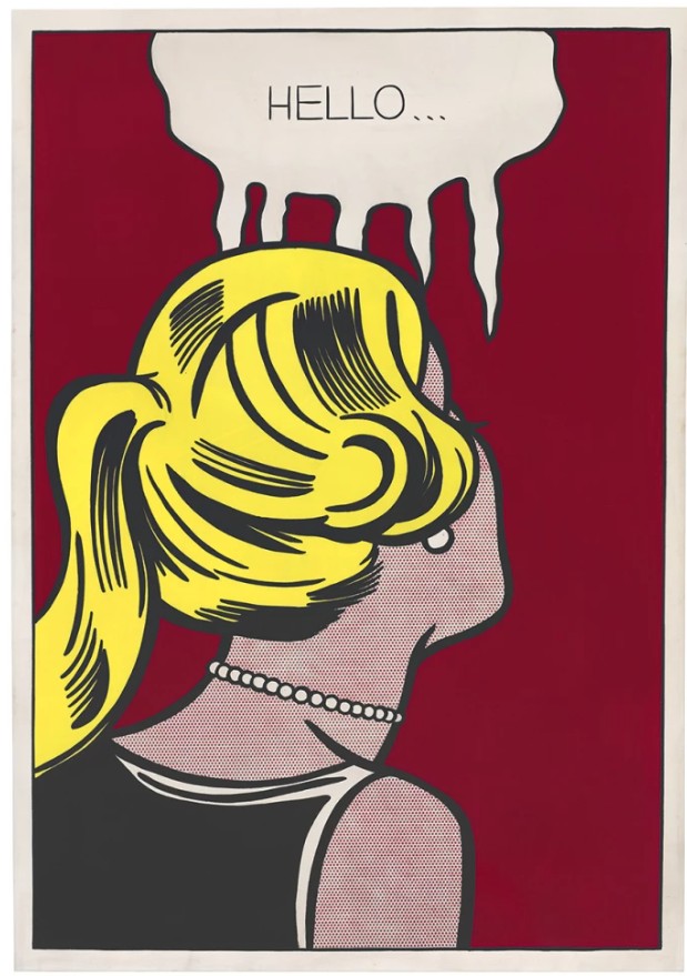
Roy Lichtenstein, Cold Shoulder, 1963. Los Angeles County Museum of Art. Art © Estate of Roy Lichtenstein.
What is most remarkable is the way in which Lichtenstein transforms the volume and mass of a traditional bust into a drawing in space. Surrealist Head II operates less as a three-dimensional object and more as a graphic cutout—its silhouette delineated with such clarity that the sculpture reads like a cartoon glyph extruded into the real world. This playful flatness is central to Lichtenstein’s practice, where the legibility and reproducibility of signs often take precedence over illusionistic depth. The flat yellow plane—painted onto the interior of the hair’s silhouette—becomes a vibrant foil to the black curvilinear armature, casting shadows that subtly animate the surface and recalling the artist’s lifelong fascination with the intersection of light, contour, and perception.
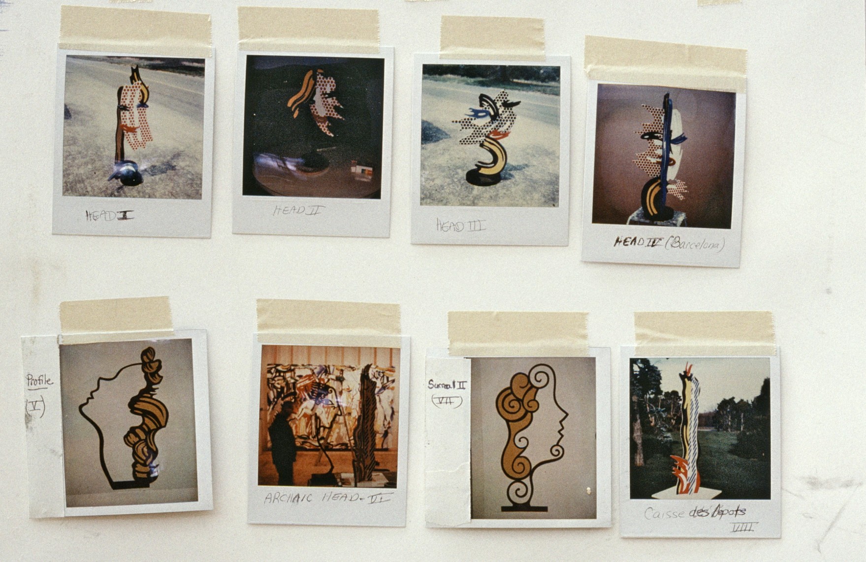
The present work photographed and taped on the wall in Roy Lichtenstein’s studio.
Photo © Bob Adelman. Art © Estate of Roy Lichtenstein.
Throughout the 1980s and early 1990s, Lichtenstein turned to bronze—traditionally the most venerated sculptural medium—to elevate his Pop idiom into a dialogue with classical and modernist tradition. But with Surrealist Head II, he subverts the gravitas of bronze by treating it like a drawn line—supple, looped, and cartoon-like. In doing so, he collapses distinctions between drawing and sculpture, between high and low, between timelessness and trend. While Lichtenstein’s women of the 1960s mined the vernacular of pulp romance and mass media to interrogate the emotional shorthand of pop culture, his late female busts draw on a broader and deeper artistic heritage. With its sculptural contours and stylized elegance, Surrealist Head II echoes the influence of Brancusi’s Sleeping Muse, the classical repose of ancient Greek Kore statues, and the biomorphic eccentricity of Picasso’s surrealist heads. As the title suggests, the present work is part of a dialogue with Surrealism’s inventive approach to form and identity, evoking the genre’s tendency to fracture and recompose the human figure in ways that both reveal and conceal. Yet Lichtenstein’s take is resolutely postmodern: rather than delving into the subconscious, he filters the image through the mechanisms of style and semiotics, emphasizing the aesthetic conventions that shape our collective visual memory.
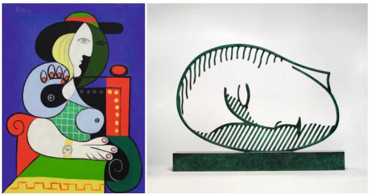
LEFT: Pablo Picasso, Femme à la montre 1932. Private Collection. Sold at Sotheby’s New York in November 2023 for $139.4 million. Art © 2025 Estate of Pablo Picasso / Artists Rights Society (ARS), New York.
RIGHT: Roy Lichtenstein, Sleeping Muse, 1983. Private Collection. Sold at Sotheby’s New York in November 2024 for $4.4 million. Art © Estate of Roy Lichtenstein.
In this light, Surrealist Head II becomes not simply a depiction of a woman, but a meditation on how the idea of “woman” has been encoded, stylized, and repeated across time. Her flowing spirals suggest both stylized hair and abstract embellishment; her sharply edged profile evokes ancient coins, Deco brooches, or 1980s fashion illustrations. It is no coincidence that the entire structure is freestanding yet two-dimensional: Lichtenstein encourages the viewer to circle the piece only to return, again and again, to its frontal graphic punch. Indeed, the stylized femininity of Surrealist Head II can be read as both homage and critique—an acknowledgment of the historical role women have played as muses, allegories, and subjects of idealized beauty in art history. In this regard, Lichtenstein’s sculpture echoes the canon while interrogating its assumptions. His heads are not portraits, but emblems: representations of representation itself. Through their graphic clarity and symbolic reduction, these works examine how far iconic features—spiraling locks, geometric profiles, symmetrical silhouettes—can be pushed into abstraction without losing their effective charge. As a sculpture that traverses eras, cultures, and stylistic boundaries, Surrealist Head II occupies a unique and compelling position within Lichtenstein’s oeuvre. It distills a lifetime of formal inquiry into a singular, commanding object—one that is at once deeply rooted in the past and unmistakably of its time. In its chromatic boldness, rhythmic contours, and conceptual clarity, Surrealist Head II exemplifies the enduring relevance of Lichtenstein’s practice and affirms his place as one of the most visionary artists of the 20th century.
Mobile I, 1989
Works from the Collection of Dorothy and Roy Lichtenstein
Sotheby’s New-York: 16 May 2025
Estimated: USD 400,000 – 600,000
USD 533,400
Mobile I | Contemporary Day Auction | 2025 | Sotheby’s
ROY LICHTENSTEIN (1923 – 1997)
Mobile I, 1989
Painted and patinated bronze
30 1/8 x 36 x 10 1/2 inches (76.5 x 91.4 x 26.7 cm)
Incised with the artist’s signature, date ’89 and number 0/6 (on the base)
This work is the artist proof from an edition of 6 plus 1 artist proof
Roy Lichtenstein’s Mobile I from 1989 is a sculptural tribute to the iconic visual language he developed over decades—but with a playful twist. Referencing Alexander Calder’s mobiles, Lichtenstein here offers a witty reinterpretation of kinetic sculpture through a Pop lens. Yet unlike Calder’s suspended and delicately balanced works, Mobile I is entirely static, its colorful forms locked in place. This purposeful stillness turns the idea of movement into illusion, transforming dynamism into symbol.
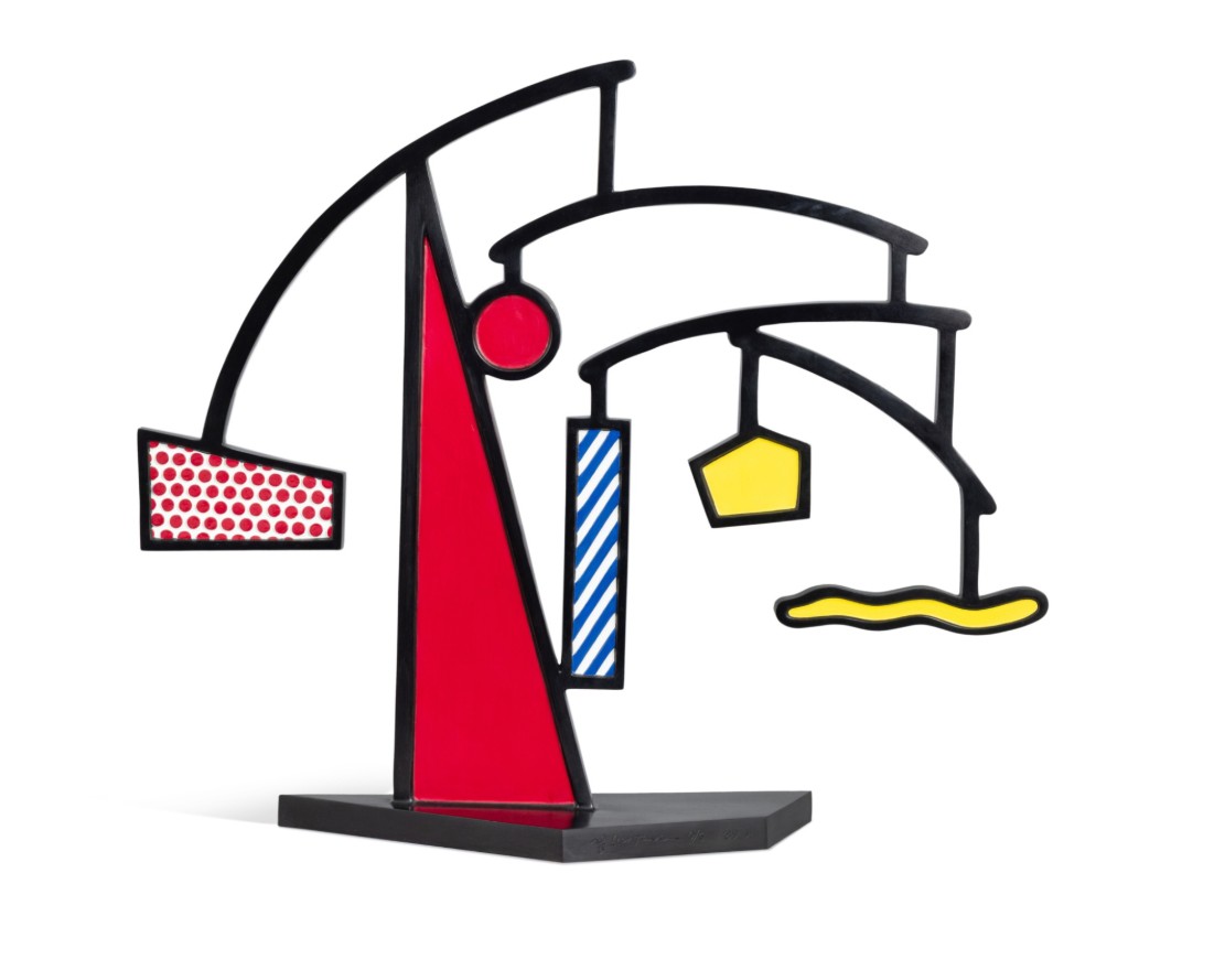
Crafted in painted and patinated bronze, the sculpture’s graphic silhouettes mimic the geometry of a mobile: curving black arms, hovering shapes, and asymmetrical balance. But Lichtenstein flattens and stylizes the composition, using bold black outlines and signature motifs like Ben-Day dots, a red triangle, and striped and wavy forms. These motifs recall not only the artist’s comic-inspired paintings, but also his ongoing interest in abstraction, design, and art historical parody.
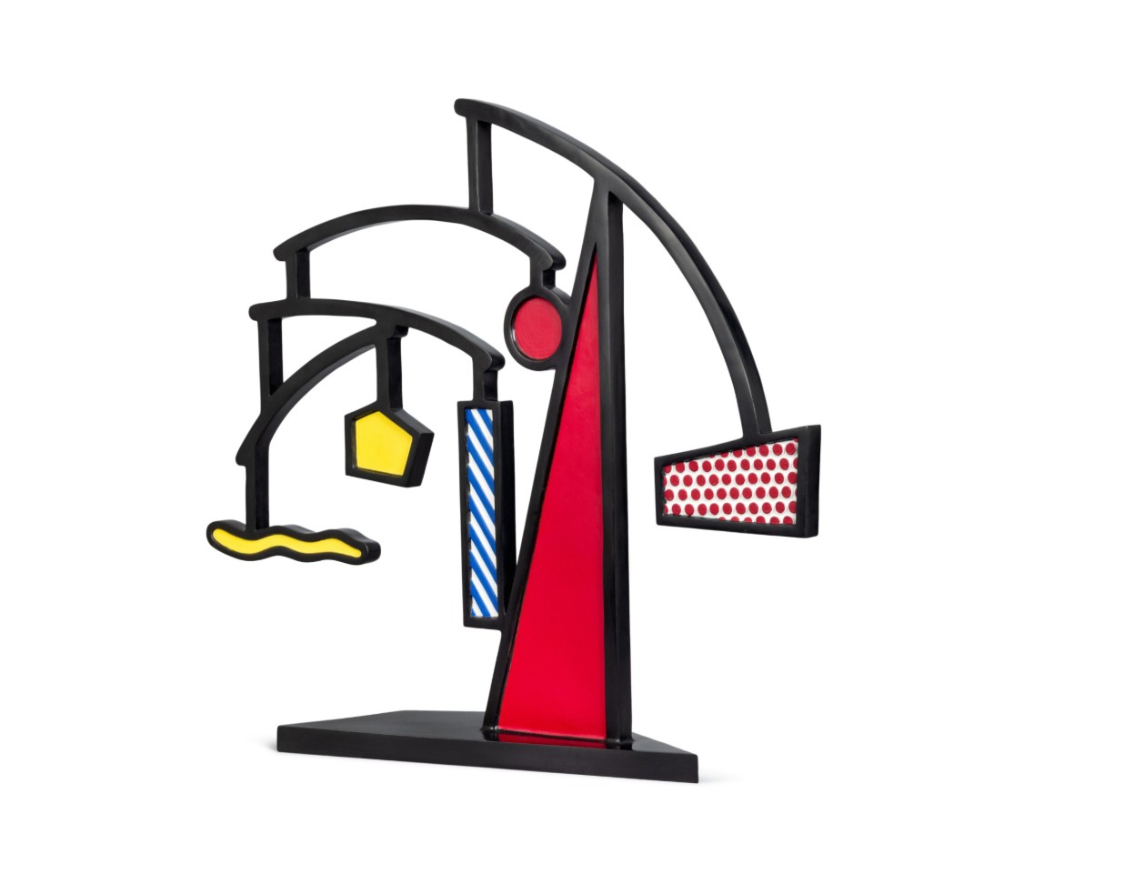
The sculpture becomes a hybrid: part homage, part critique. It celebrates the formal elegance of Calder’s mobiles while subverting their core premise—movement. By rendering a “mobile” in solid bronze, Lichtenstein underscores the theatricality of sculpture as image, turning kinetic delicacy into Pop solidity. As with many of his three-dimensional works, Mobile I functions as a drawing in space, where outline and color supersede mass and weight.
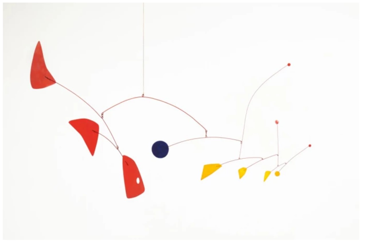
Alexander Calder, Untitled, 1958, © 2020 Calder Foundation, New York / Artists Rights Society (ARS), New York
The Ben-Day dots and color blocking are not merely decorative. They assert Lichtenstein’s ongoing interest in visual reproduction and the tension between fine art and commercial aesthetics. This is a mobile not of balance and physics, but of flatness and stylization. Coming from the estate of the artist, Mobile I has both historical and personal resonance. It represents Lichtenstein’s sculptural practice at a moment of confident late-career synthesis—a moment when past influences, personal style, and playful conceptualism came together in vivid harmony.
3. Studies
Interior with African Mask (Study), 1990
Works from the Collection of Dorothy and Roy Lichtenstein
Sotheby’s New-York: 16 May 2025
Estimated: USD 800,000 – 1,200,000
USD 2,522,o00
Interior with African Mask (Study) | Contemporary Day Auction | 2025 | Sotheby’s
ROY LICHTENSTEIN (1923 – 1997)
Interior with African Mask (Study), 1990
Sut painted paper, cut printed paper, tape, marker and graphite on board
Image: 34 1/4 x 44 inches (86.8 x 111.8 cm)
Sheet: 38 1/2 x 48 1/4 inches (97.6 x 122.6 cm)
Meticulously composed and conceptually rich, Interior with African Mask (Study) from 1990 marks a vital moment in Roy Lichtenstein’s late career, encapsulating his enduring interest in the intersection between modernist art, popular culture, and domestic life. As part of the celebrated Interiors series, this work restates many of the artist’s original Pop concerns, mass media imagery, commercial aesthetics, and the fiction of representation, while simultaneously engaging with deeper questions around cultural appropriation and art historical legacy.
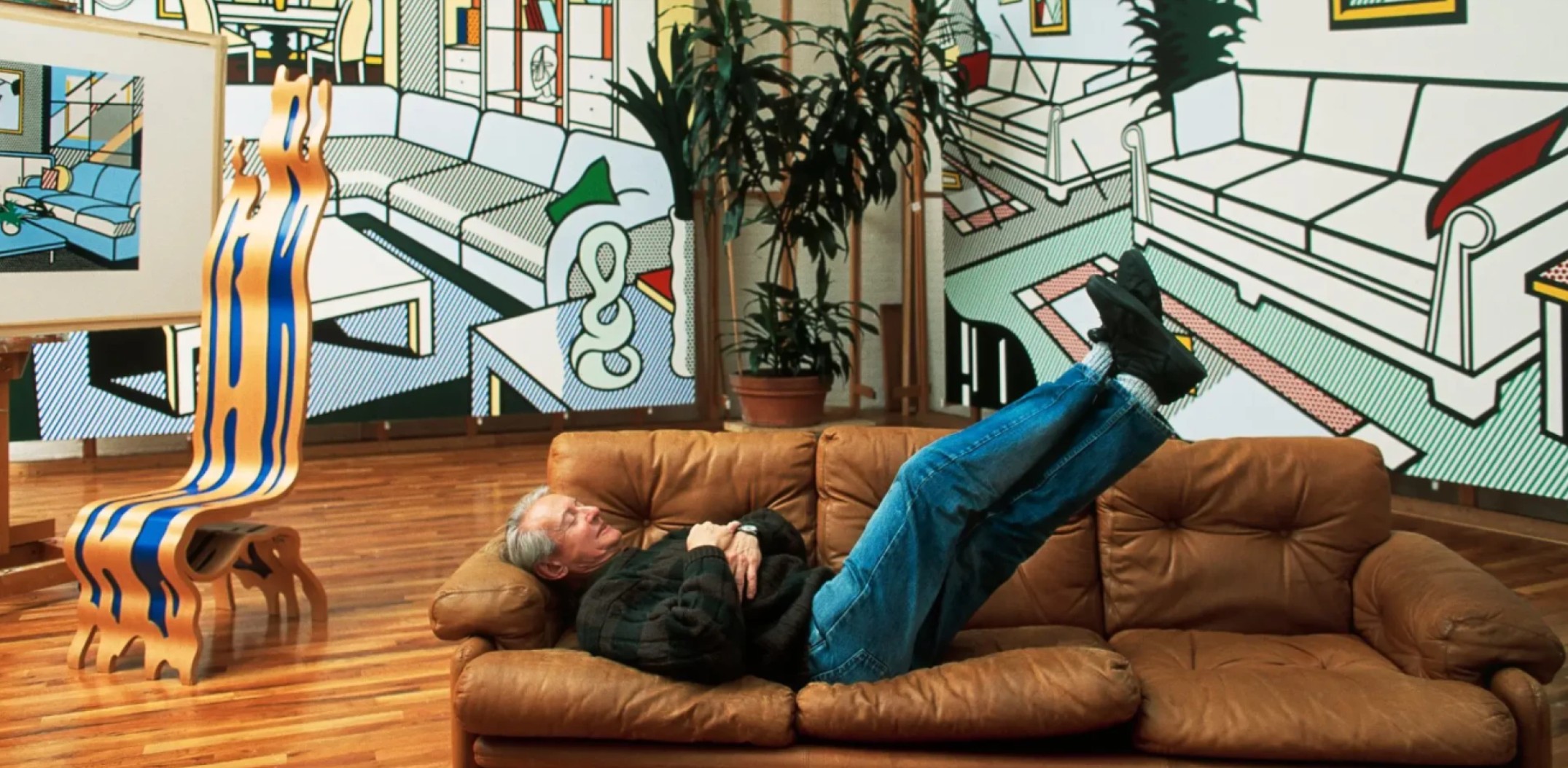
Roy Lichtenstein in his Washington Street studio, 1992. Photo © Thomas Hoepker / Magnum Photos. Art © Estate of Roy Lichtenstein.
Like many works in the Interiors series, Interior with African Mask (Study) was conceived as a preparatory collage for a larger painting. These studies functioned as essential blueprints in Lichtenstein’s process, allowing him to test his visual language of spatial illusion and stylization on a more intimate scale. In this particular study, the artist offers a striking view of an impeccably staged living room. A pristine sectional sofa curves elegantly into the foreground, flanked by angular coffee tables and modular shelving. Every surface, from the patterned rug to the glossy tabletop, bears the unmistakable hallmarks of Lichtenstein’s signature visual lexicon: Ben-Day dots, black outlines, and tightly contained blocks of color.
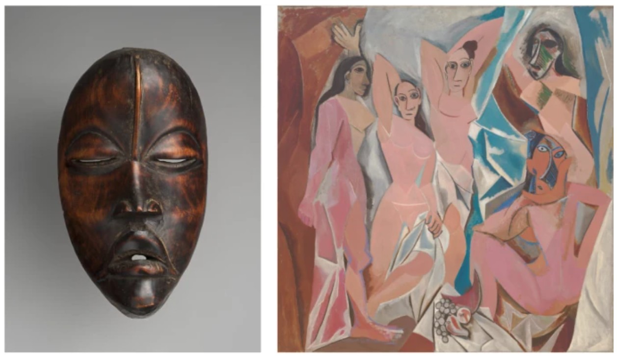
Left: Dan artist, Face Mask, 19th–mid-20th century. The Metropolitan Museum of Art, New York. Right: Pablo Picasso, Les Demoiselles d’Avignon. Paris, June-July 1907. The Museum of Modern Art, New York. © 2025 Estate of Pablo Picasso / Artists Rights Society (ARS), New York
The centerpiece of the composition, and its most poignant visual element, is the African mask displayed on a shelf at center right. While seemingly just another piece of decor within this idealized interior, the mask introduces an important and deliberate tension. It recalls the long history of Western artists, Pablo Picasso foremost among them, who incorporated African art into their own practices. But Lichtenstein’s inclusion of the mask goes beyond homage or citation. By embedding it within a commercialized, hyper-stylized American living room, he highlights how non-Western art has often been stripped of context and reframed as a mere aesthetic object within Euro-American systems of taste.
“I think Picasso is the greatest artist of the twentieth century by far. Is there any real doubt about that? I think he had more just more magic, more insanity, more images, more styles, more productions than any others.”
As Diane Waldman has observed of the broader Interiors series: “In these 1990s Interiors, Lichtenstein restates some of his original concerns. He uses images from the media, such as a bathroom, bedroom, or living room, which still typify our consumer culture, as one reality, and compares and contrasts them with the reality of the art that he depicts on the living room walls – two different levels of illusion… to remind us of the fiction of the painting and suggests that everything is fiction, including reality itself. He conveys the notion that all of art and life is a series of reflections and illusions” (Diane Waldman, Roy Lichtenstein, New York, 1993, p. 309). These spaces, seemingly drawn from design catalogs or lifestyle advertisements, represent not lived environments but aspirational fantasies, visual constructs of domestic perfection. And yet within them, Lichtenstein plants subtle disruptions: a Klein sculpture on a coffee table, a Warhol silkscreen on the wall, or here, a decontextualized African mask. These references both elevate and destabilize the scene, drawing attention to the layered fictions at play.
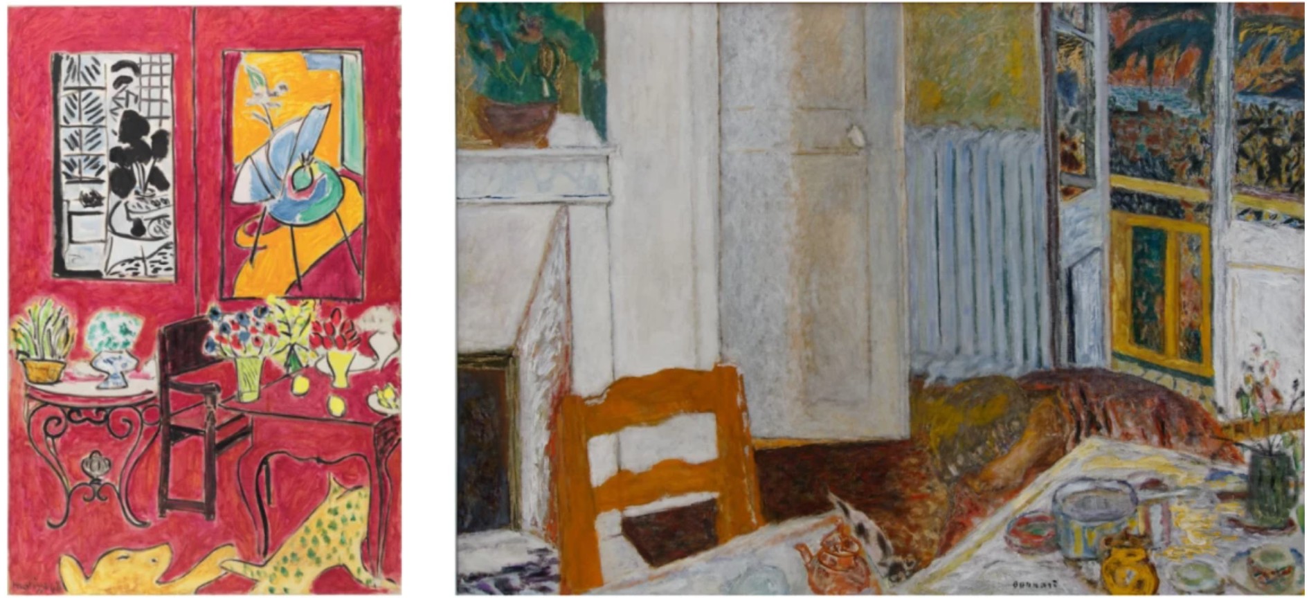
Left: Henri Matisse, Grand Intérieur rouge, spring 1948. Centre national d’art et de culture Georges Pompidou, Paris. Art © 2025 Succession H. Matisse / Artists Rights Society (ARS), New York Right: Pierre Bonnard, Intérieur blanc, 1932. Musée de Grenoble. Art © 2025 Artists Rights Society (ARS), New York / ADAGP, Paris
Lichtenstein’s decision to focus on the domestic interior in the 1990s was not arbitrary. From Bathroom executed 1961 to the monumental Interiors of his final decade, the subject allowed him to revisit and synthesize many of the themes that had preoccupied him for over thirty years. Interior with African Mask (Study) is exemplary in this regard, marrying the visual tropes of advertising with the intellectual rigor of modernist appropriation. It is a work of formal elegance and conceptual provocation, where everything from the placement of a pillow to the inclusion of a sculpture invites closer reflection on art’s place in everyday life. At the same time, this study demonstrates Lichtenstein’s unwavering commitment to the flat, graphic style that defined his oeuvre. The meticulously balanced composition, the interplay of decorative motifs, and the carefully chosen palette all reinforce the artist’s belief in the visual power of simplification and stylization. But rather than flatten meaning, this aesthetic clarity deepens it. By reducing the world to signs and symbols, Lichtenstein prompts viewers to consider how our environments, especially our domestic ones, are coded with values, histories, and ideologies.
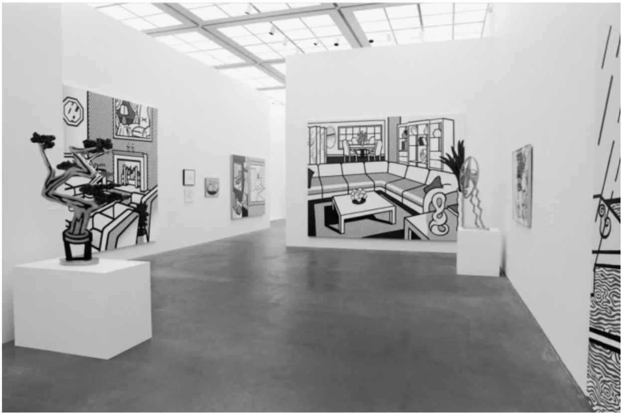
Installation view of MCA Chicago, Roy Lichtenstein: Interiors, July – October 1999.
Photo: James Isberner © MCA Chicago. Art © Estate of Roy Lichtenstein.
Interior with African Mask (Study) stands as a sophisticated meditation on the artifice of modern living and the shifting meanings of cultural objects within it. It exemplifies the intelligence and irony that define Lichtenstein’s greatest works, offering not only a visual delight but a critical lens through which to view the aesthetics of everyday life. Within its elegant lines and polished surfaces lies a profound inquiry into how art is made, displayed, and ultimately consumed. Beautifully rendered and deeply reflective, Interior with African Mask (Study) deserves to be counted among the most significant works of the Interiors suite, an incisive dialogue between Pop and modernism, decoration and depth, surface and substance.
Nudes in Mirror (Study), 1994
Works from the Collection of Dorothy and Roy Lichtenstein
Sotheby’s New-York: 16 May 2025
Estimated: USD 1,000,000 – 1,500,000
USD 2,405,o00
Nudes in Mirror (Study) | The Now and Contemporary Evening Auction | 2025 | Sotheby’s
ROY LICHTENSTEIN (1923 – 1997)
Nudes in Mirror (Study), 1994
Colored pencil and graphite on paper
Image: 12 1/4 x 10 1/4 inches (31.1 x 26 cm)
Sheet: 15 1/4 x 11 3/8 inches (38.7 x 28.9 cm)
Signed and dated ’94 (on the reverse)
Nudes in Mirror (Study) is a paragon of Lichtenstein’s exploration of nudes and interiors in the late 1990s, harkening back to the iconic comic book heroines of his 1960s paintings. Transposing the composition through a mirror—a motif that Lichtenstein thoroughly explored in both two- and three-dimensions—offers a moment for reflecting upon Lichtenstein’s celebrated career and his singular visual lexicon. The present work predates a large-scale painting with the same title and composition.
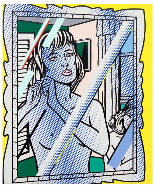
Roy Lichtenstein, Nudes in Mirror, 1994. Private Collection. Art © Estate of Roy Lichtenstein
The last major series before the artist’s death in 1997, the series revisited not only the female nude—a motif so heavily and frequently featured in the Western art historical canon—but also Lichtenstein’s own legacy, foregrounding the ‘reflections’ panels of his titular series of work, taking compositional inspiration from his Interiors of the 1990s, and heralding the return of his comic-book heroines that fueled his meteoric rise to fame in the 1960s. Capturing an intimate interior scene, Nudes in Mirror (Study) presents a captivating perspective into the central themes that weave through Lichtenstein’s artistic legacy.
Roy Lichtenstein’s source material, 1990. Photo © Laurie Lambrecht
A mirror tilted at a slight angle captures two nude female figures in a bedroom scene. Standing up close to the mirror is a short-haired woman with a dreamy gaze, arranging her hair. Lichtenstein places a second figure in the frame, positioned on the other side of the protagonist from the viewer’s point of view; her stare is at once alluring and cryptic, her countenance obscured by the reflection panes yet her locking eyes aloofly acknowledging our presence in this intimate interior space.
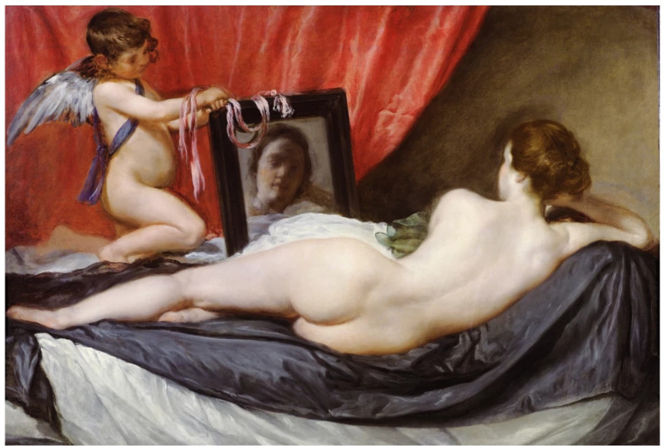
Diego Velázquez, The Toilet of Venus, 1647-51. National Gallery, London. Image © Bridgeman Images
Concepts of object and subject—which have in art history pitted the female nude against the male gaze as the empowered voyeur—are here subtly subverted in Lichtenstein’s distinctly Pop dialect; in Nudes in Mirror (Study), the viewer is placed in the position of the protagonist, as if we gaze back at ourselves. Unlike in his earlier comic book heroine scenes, which often feature male counterparts, Lichtenstein’s Nudes of the 1990s are resolutely sovereign: “The 1990s nudes take pleasure in their own company, without the slightest hint of needing or missing a man. They are not paralyzed by their emotions. In contrast to Lichtenstein’s original romance-comic pictures, this world flourishes exuberantly without men or engagement rings or kisses.” (Avis Berman, “Joy and Bravura and Irreverence” in: Roy Lichtenstein and Images of Women,” Exh. Cat., Kunsthaus Bregenz, Roy Lichtenstein: Classic of the New, 2005, p. 143)
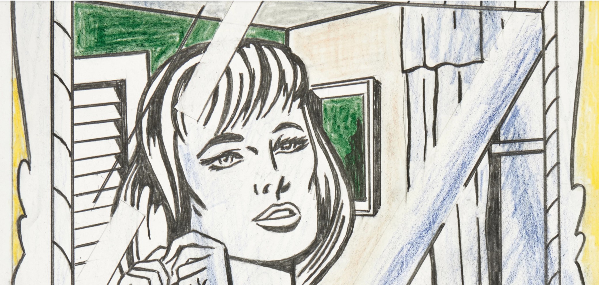
Lichtenstein’s figures display reserved and enigmatic expressions, resisting the viewer’s instinct to find readily comprehensible throughlines of interpretation with a certain emotional and narrative opacity. Despite appropriating the readily recognizable comic strip aesthetic, the artist creates works that are anything but simple and unambiguous; through Nudes in Mirror (Study), he presents a visual puzzle that urges the viewer to reflect on the nature of how femininity is represented in art. By placing the entire composition within a mirror, Lichtenstein positions himself in dialogue with great artistic forebears and invokes the structural mastery found in Diego Velázquez’ The Toilet of Venus, Peter Paul Rubens’ Venus in Front of the Mirror, or Édouard Manet’s A Bar at the Folies-Bergère. This compositional device not only adroitly frames the subjects’ countenances but also insets a degree of separation between the image and the viewer, interrogating themes of introspection and voyeurism with nearly unparalleled dexterity. This interplay between the study and painting reveals Lichtenstein’s continual exploration of form and depth, showcasing how he adapted and refined his techniques in this later phase of his career.
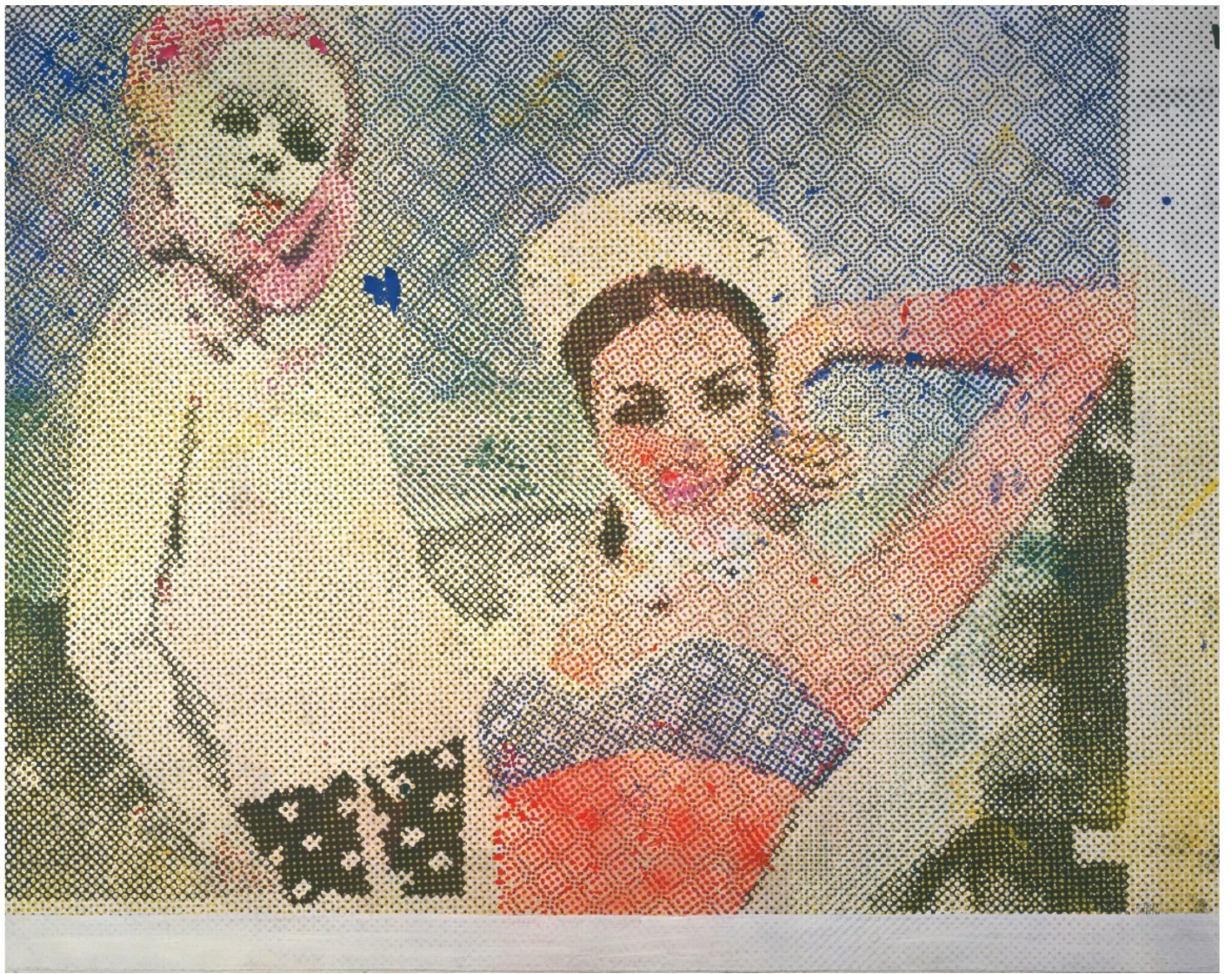
Sigmar Polke, Freundinnen, 1965-6. Stiftung Froehlich, Leinfelden-Echterdingen.
Art © 2025 Estate of Sigmar Polke / Artists Rights Society (ARS), New York / VG Bild-Kunst, Bonn, Germany
Executed in the twilight of his celebrated career, Nudes in Mirror (Study) is an exceptional work that foregrounds his iconic comic book bombshell protagonists along with his career-long exploration of reflections as both a visual device and metaphor for his contemplation upon art history. Through subtle shading and crisp graphite lines, we see a glimpse of Lichtenstein’s masterful creative process, particularly revealed in the intervention of the artist largely concealed in his paintings. Nudes in Mirror (Study) stands as a remarkable act of reflection, not simply carried about the two figures sketched atop the paper, but of Lichtenstein looking back into the decades of his own practice and the centuries of art history before him. An exemplar of Lichtenstein’s mature practice, Nudes in Mirror (Study) epitomizes the artist’s profound understanding of artmaking: “All painters take a personal attitude towards painting. What makes each object in the work is that it is organized by that artist’s vision. The style and the content are also different from anyone else’s. They are unified by the point of view—mine. This is the big tradition of art.” (the artist quoted in: Calvin Tomkins, Roy Lichtenstein: Mural with Blue Brushstroke, New York 1988, p. 42)
The Mirror in Art History
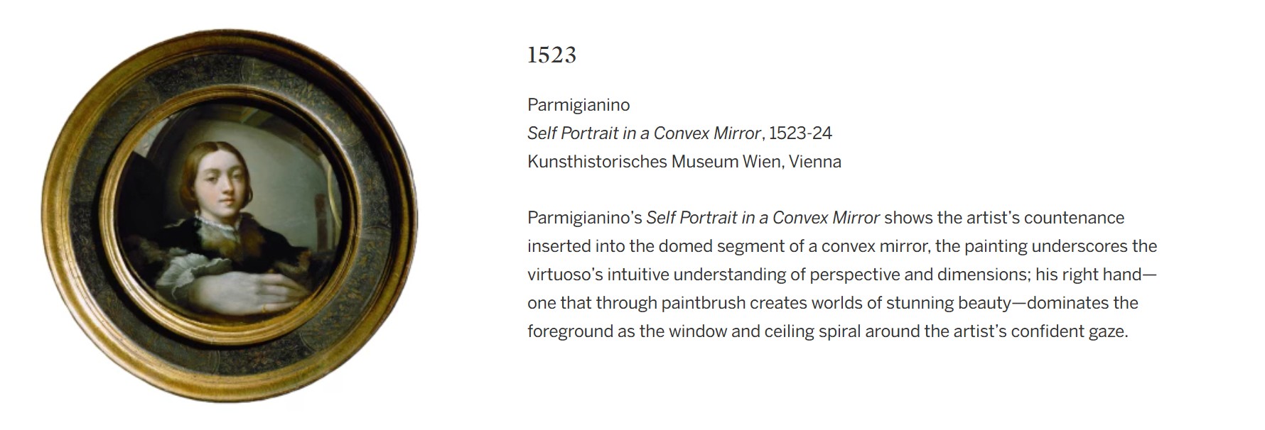
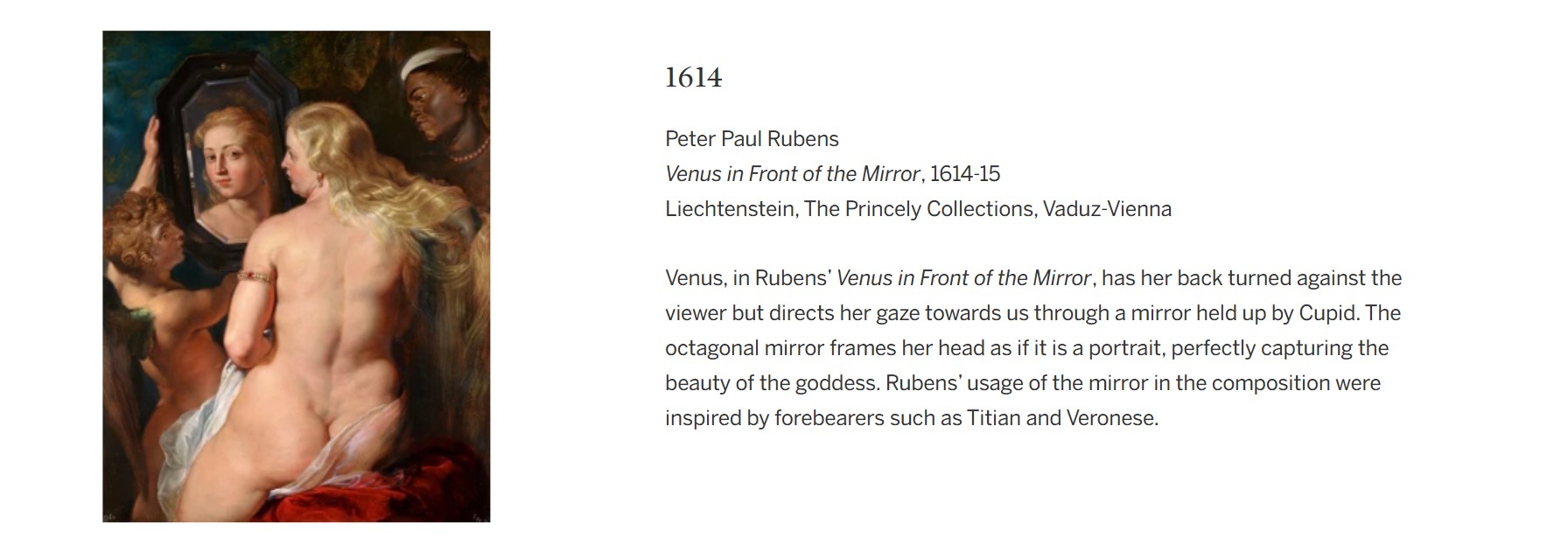
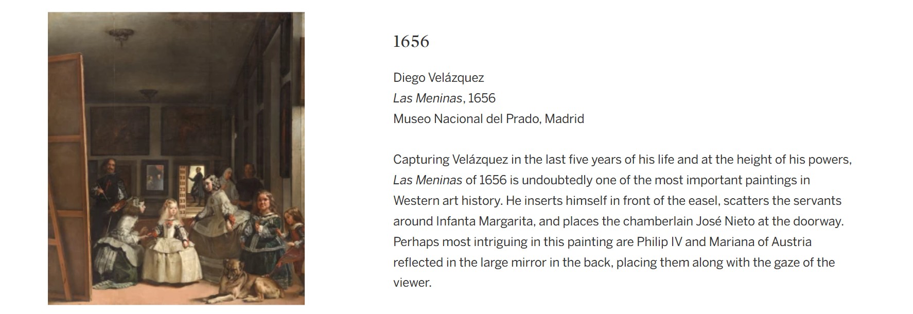
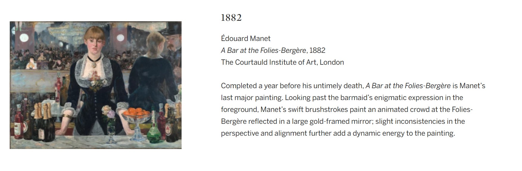
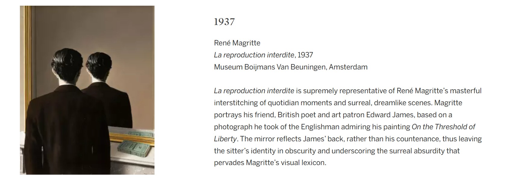
Portrait Triptych (Studies), 1974
Works from the Collection of Dorothy and Roy Lichtenstein
Sotheby’s New-York: 15 May 2025
Estimated: USD 1,500,000 – 2,000,000
USD 2,246,000
Portrait Triptych (Studies) | The Now and Contemporary Evening Auction | 2025 | Sotheby’s
ROY LICHTENSTEIN (1923 – 1997)
Portrait Triptych (Studies), 1974
Left and center sheets: colored pencil and graphite on paper
Right sheet: colored pencil, graphite and paper collage on paper
Each sheet: 22×15 inches (55.9 x 37.9 cm)
Each image: approx. 13 1/2 x 10 3/4 inches (34.3 x 27.3 cm)
Each: signed and dated ’74 (on the reverse)
Roy Lichtenstein’s Portrait Triptych is a sophisticated and deeply reflective 1970s work that reaffirms his position as one of the most innovative and conceptually rigorous artists of the postwar era. Often associated with comic book aesthetics and popular culture, Lichtenstein is here revealed not simply as a painter of Pop, but as a visual thinker profoundly engaged with the history of representation.
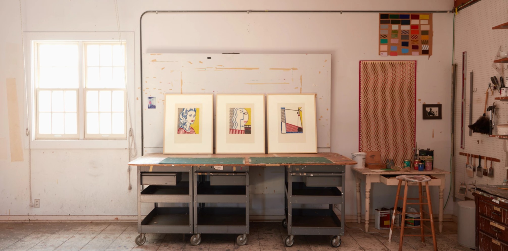
The present work in the artist’s studio, Southampton, New York, 2025. Art © Estate of Roy Lichtenstein
In Portrait Triptych, he revisits one of the most enduring themes in art, the human figure, exploring how it functions as an image. Through a visually striking and intellectually layered progression, Lichtenstein draws on influences ranging from Picasso to Mondrian, from mass media to modernism, reasserting the figure as a site of formal experimentation.
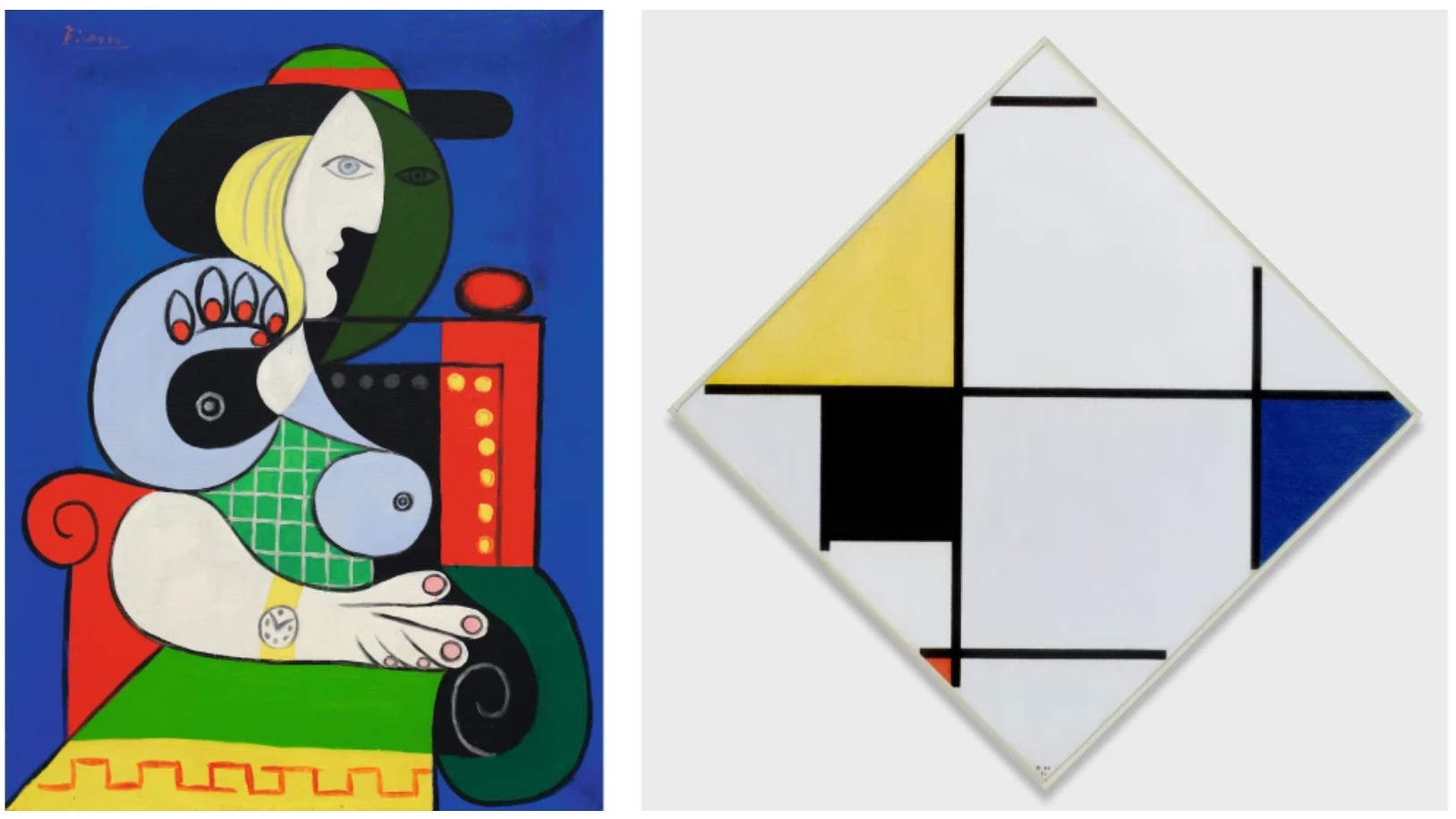
Left: Pablo Picasso, Femme à la montre, 1932. Private Collection. Sold at Sotheby’s New York in November 2023 for $139.4 million. Art © 2025 Estate of Pablo Picasso / Artists Rights Society (ARS), New York. Right: Piet Mondrian, Lozenge Composition with Yellow, Black, Blue, Red, and Gray, 1921. The Art Institute of Chicago. Image © The Art Institute of Chicago / Art Resource, NY
Each of the three panels marks a different stage in the visual deconstruction of the female portrait, a subject that had defined much of Lichtenstein’s early Pop imagery. The left panel features the quintessential Lichtenstein blonde: wide-eyed, red-lipped, framed in graphic lines and Ben-Day dots. She is immaculate, polished, and familiar, a nod to both postwar advertising and golden age Hollywood glamour. In the present work, as in his early 1960s comic-inspired works, Lichtenstein walks a fine line between seduction and critique, presenting the female face as both icon and artifact. The central panel signals a conceptual and formal shift, drawing from Lichtenstein’s sustained engagement with the legacy of Cubism. The face, once whole, is now fragmented: hair rendered in stylized waves, a geometric eye, the line of a nose intersecting with curved planes. The figure becomes a diagram, echoing Picasso’s synthetic portraits while maintaining the clarity and cleanliness of Lichtenstein’s graphic style. In this moment of transition, Lichtenstein invites the viewer to see the portrait not as a representation of a person but as a composition of visual cues.
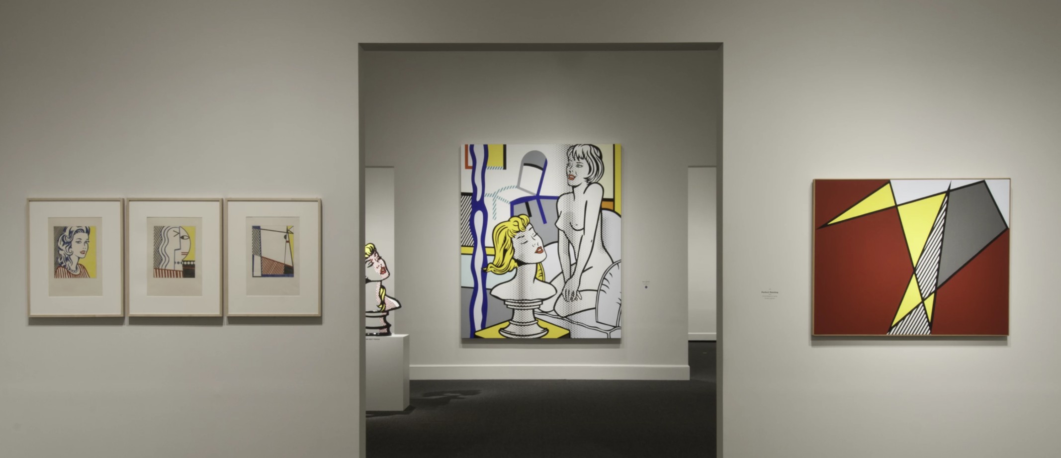
The present work installed in Roy Lichtenstein: A Retrospective at the National Gallery of Art, Washington D.C., October 2012 – January 2013. Photo © National Gallery of Art Archives. Events Images – Exhibitions and Installations. Photograph by Rob Shelley. Courtesy of the National Gallery of Art Archives. Art © Estate of Roy Lichtenstein
By the final panel, the image has fully transformed into abstraction. There is no face or body, only bold diagonal lines, color blocks, and the residual rhythm of the figure. This echoes the logic of the earlier Cow Triptych and Pitcher Triptych, works in which Lichtenstein similarly deconstructs a familiar subject across three stages. These works were directly inspired by Theo van Doesburg’s progressive abstractions, such as Composition VII (The Cow), which in turn linked back to the visual ideals of De Stijl and Mondrian. However, unlike Mondrian’s quest for spiritual equilibrium through pure abstraction, Lichtenstein’s forms carry the ghost of representation: the red stripes recall a blouse, the slanted angles hint at a shoulder or a jawline, and the compositional rhythm continues to echo the body. The idea of transformation through form would take on new life in Lichtenstein’s subsequent Perfect/Imperfect paintings created in the 1980s. These works, which play with the boundaries of the picture plane and the tension between systematic structure and compositional disruption, continue the themes set forth in the triptychs: how images are built, how logic can unravel, and how visual systems can both define and defy expectations.
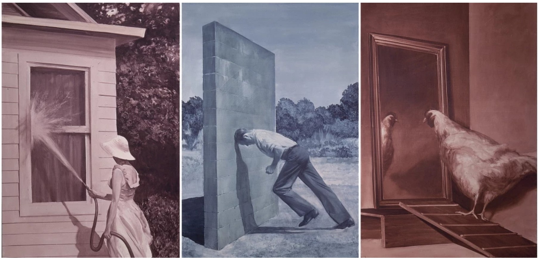
Mark Tansey, A Short History of Modern Painting (Triptych), 1982. Private Collection. Art © 2025 Mark Tansey
This movement from figuration to abstraction mirrors not just a conceptual investigation but the trajectory of Lichtenstein’s own career. The blonde stands as a uniquely striking exemplar of his early Pop period, while the Cubist inflection in the center panel reveals his deep engagement with the modernist canon. The final panel, abstract but referential, foreshadows his late-career interest in the mechanics of image-making. As Hal Foster writes, Lichtenstein “provides an illusionistic image and tricks the eye, but he also breaks the illusion and exposes the trick” (Hal Foster quotes in: Exh. Cat., New York, Gagosian, Roy Lichtenstein: Sculpture, September – October 2005, p. 11). This duality between surface and structure runs through Portrait Triptych. It is not just a portrait of a woman, but a portrait of the image itself.
Still Life Tapestry (Study), 1973
Works from the Collection of Dorothy and Roy Lichtenstein
Sotheby’s New-York: 15 May 2025
Estimated: USD 1,000,000 – 1,500,000
USD 2,063,000
Still Life Tapestry (Study) | The Now and Contemporary Evening Auction | 2025 | Sotheby’s
ROY LICHTENSTEIN (1923 – 1997)
Still Life Tapestry (Study), 1973
Cut painted paper, cut printed paper, marker on cut paper, cut paper, marker and graphite on board
Image: 32 5/8 x 24 1/2 inches (82.9 x 62.2 cm)
Board: 34 3/8 x 26 1/4 inches (87.3 x 66.7 cm)
Signed and dated 1973 (lower left)
Still Life Tapestry (Study) is a meticulously crafted example of Roy Lichtenstein’s pioneering Pop style, teeming with references to the art historical canon. The present work embodies Lichtenstein’s enduring engagement with one of the most significant art historical icons of the twentieth century, Henri Matisse; taking inspiration from the Modernist master’s Goldfish from 1912, Lichtenstein furthers the art historical tradition of the still life with his iconic compositional arrangement and visual lexicon. In true Pop fashion, Still Life Tapestry (Study) subverts the depth and tonality typically ascribed to a quotidian still life through bold primary colors and Ben-Day dots, blurring the supposed boundaries between ‘commercial’ and ‘fine’ art. An exceptionally profound work from one of the twentieth century’s most celebrated artists, Still Life Tapestry (Study) simultaneously pays homage to the history of artistic precedent while also challenging the very foundations upon which it rests.
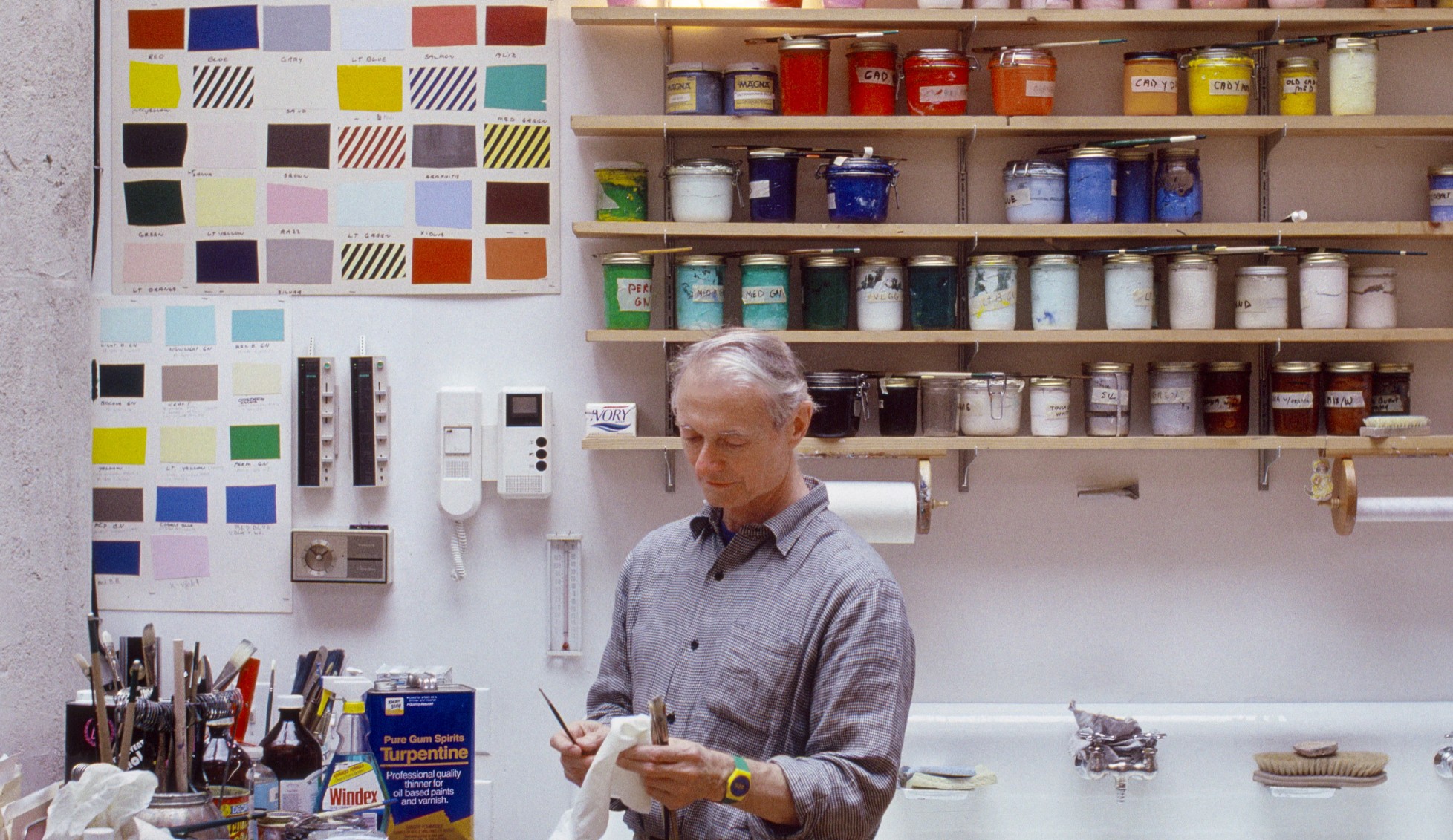
A bouquet of white flowers in a vase, a red apple with a glossy sheen, blue curtains draped into manifold pleats, and tables rendered in a vibrant yellow take center stage in Still Life Tapestry (Study). Emerging from the right hand corner is a cylindrical fish tank with two red fish, a clear reference to Matisse’s Goldfish. Confidently recontextualizing the tradition of still life painting with his signature visual lexicon, Lichtenstein balances between a harmonious dialogue with the tenets of modernism and a distinctly contemporary sensibility, inserting the artificiality and reproducibility of the modern-day image into the “high culture” of fine art. Thus, the present work destabilizes the very depth, form, and figuration that viewers come to expect from an orthodox still life work.
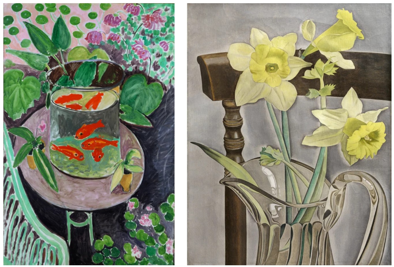
Left: Henri Matisse, The Goldfish, 1912. Pushkin Museum, Moscow. Image © Succession H. Matisse / Bridgeman Images. Art © 2025 Succession H. Matisse / Artists Rights Society (ARS), New York. Right: Lucian Freud, Daffodils and Celery, 1947-8. Private Collection. Image © The Lucian Freud Archive. All Rights Reserved 2025 / Bridgeman Images
Whether it be Dutch still lifes of resounding symbolic profundity, Cubist still lifes that wrestle with the limits of representation, or contemporary still lifes by contemporaries like David Hockney and Lucian Freud, the present work engages within a sincere conversation that interrogates the capacities and limits of the genre. Undeniably a metonym for the scaffolding principles of art history, the still life takes on a new role in Lichtenstein’s work and becomes a physical embodiment of the reflection on art history that defines the artist’s mature practice.
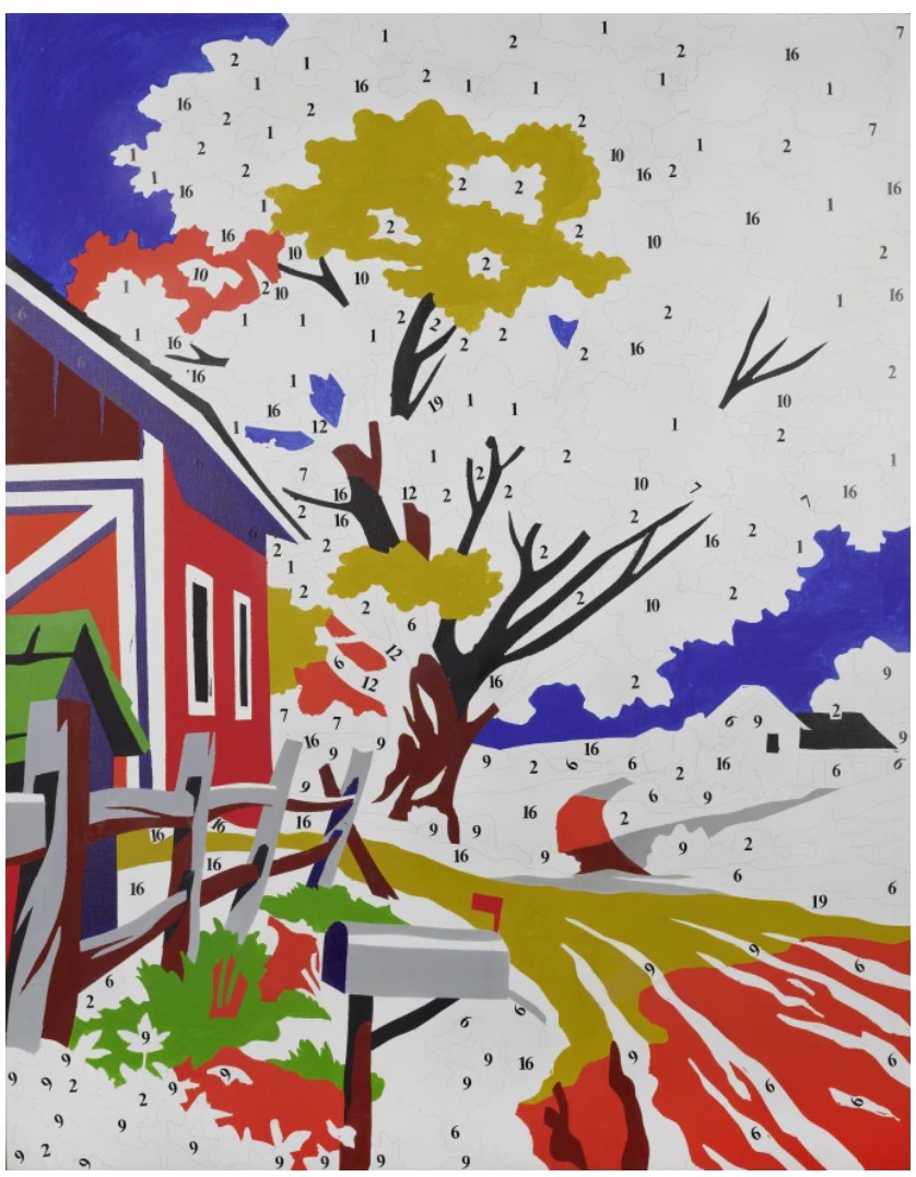
Andy Warhol, Do It Yourself (Landscape), 1962. Museum Ludwig, Cologne. Image © bpk Bildagentur / Museum Ludwig / Britta Schlier / Art Resource, NY. Art © 2025 Andy Warhol Foundation for the Visual Arts / Artists Rights Society (ARS), New York
Famously fascinated with commercialized aesthetics and images, Lichtenstein brings his exacting and alluring composition to Still Life Tapestry (Study) by transforming the flowers, fruit, and fish, vividly swathed in vibrant colors into referential symbols of their real-life counterparts. From the popping glint of the apple’s shine to the boldly outlined flower petals, the effect of the work on the viewer becomes one of arresting significance, mediated through such resoundingly digestible symbols. The present work is designed for tapestries manufactured in an edition of 8; for almost every monumental painting or multiple, Lichtenstein would first create a preparatory collage like the present work. Using a variety of materials such as cut painted paper, printed paper, marker, and pencil, Lichtenstein developed the original composition which he would enlarge into his desired proportions.
Roy Lichtenstein creating a collage. Photo © Bob Adelman. Art © Estate of Roy Lichtenstein
The artist has previously emphasized how important these collages are to his creative process.
“I do a lot of [collaging] in the paintings. I start something and keep adding to it—putting pieces of paper down temporarily and looking at the image. Because to do all those graduated dots and dotted areas and diagonal areas and then take them off and redo the painting is punishing work… it’s just much easier to try it out first in collage to get everything I want.”
Still Life Tapestry (Study) opens a portal for the viewer to parse through not only centuries of the Western art historical canon, but Lichtenstein’s meticulous, exacting, and expressive creative process that underlies his iconic praxis.
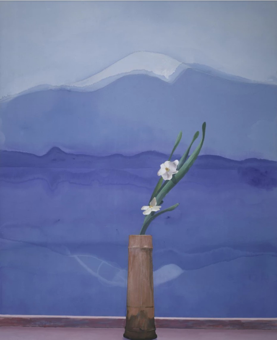
Image © The Metropolitan Museum of Art. Image source: Art Resource, NY. Art © 2025 David Hockney
Offered for the first time on the public market, Still Life Tapestry (Study) is an exemplary work from Lichtenstein’s formidable oeuvre. Belying the meticulously crafted nature of Lichtenstein’s layered creative process, this study is a rare look into the creative process of an incredible artist. Poignant and powerful, this collage speaks to Lichtenstein’s intuitive understanding of the phenomenal potential of popular imagery and his capacity to, more than any artist of his generation, realign the cipher of that imagery to unveil verities behind popular culture.
Roommates (Study), 1993
Works from the Collection of Dorothy and Roy Lichtenstein
Sotheby’s New-York: 16 May 2025
Estimated: USD 600,000 – 800,000
USD 609,600
Roommates (Study) | Contemporary Day Auction | 2025 | Sotheby’s
ROY LICHTENSTEIN (1923 – 1997)
Roommates (Study), 1993
Colored pencil and graphite on paper
Image: 4 7/8 x 3 3/4 inches (12.5 x 9.7 cm)
Sheet: 9 5/8 x 8 inches (24.4 x 20.3 cm)
Signed and dated ’93 (on the verso)
Roy Lichtenstein’s Roommates (Study) offers a rare and intimate glimpse into the artist’s late-career process as he revisited the comic-inspired heroines that first catapulted him to fame in the 1960s. Rendered in graphite and colored pencil, this preparatory drawing forms the conceptual foundation for his 1994 screenprint Roommates, part of the celebrated Nudes series that would ultimately become the final major body of work done by the artist before his death in 1997. Intimately scaled yet saturated with Lichtenstein’s trademark visual vocabulary, the work exemplifies the artist’s fastidious approach to the process of production, distilled into an image that saw the artist revisit one of the dominant themes in the history of art: the nude.

Lichtenstein’s wall in his studio. Art © Estate of Roy Lichtenstein
Though women had long been a central component of Lichtenstein’s practice from the 1960s onwards, the Nudes marked the first time that Lichtenstein would explore the hallowed subject of the female nude. Whereas Lichtenstein’s paintings of women in the 1960s relied heavily upon melodramatic and romantic scenes of damsels in distress, his 1990s Nudes depict women of an entirely new generation, exuding a quiet, self-assured confidence that is unconcerned by the voyeuristic gaze brought upon by the viewer.
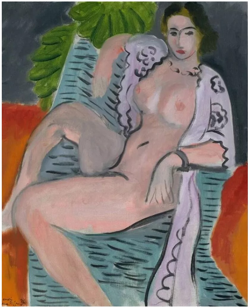
Henri Matisse, Draped Nude, 1936. Tate, London. Art © 2025 Succession H. Matisse / Artists Rights Society (ARS), New York.
In Roommates (Study), two female figures inhabit the composition separated both emotionally and figuratively. Offering no explicit narrative and allowing the ambiguity of the scene to flourish, the figure in the foreground turns toward the viewer with a gaze of subtle concern and contemplation while the nude figure behind her lounges casually, reading on the bed. Extending Lichtenstein’s career-long interest in depicting domesticity, rendering interior scenes that drew upon popular American culture and periodicals like Architectural Digest, the figures’ surroundings in Roommates (Study) is relatively bare yet carefully composed with elements that drew upon both his own corpus and that of the art historical canon. On the wall behind the lounging nude, Lichtenstein’s rendition of a painting by the De Stijl movement’s founder Theo van Doesburg hangs to the left of one of Lichtenstein’s own mirror paintings, while a potted plant in the lower right foreground—one of the artist’s recurring motifs—softens the space’s linear rigidity with organic form.
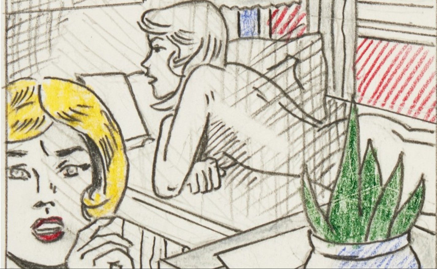
Throughout his career, Lichtenstein remained deeply engaged with Modernist questions — the relationship between subject and artist, the fleeting nature of reality, and the expressive possibilities of line, light, and color. His late Nudes series parallels Picasso’s own creative outpouring during the Marie-Thérèse period of the late 1920s and early ’30s, when Picasso produced a prolific body of work inspired by his youthful muse. Similarly, Lichtenstein’s 1990s Nudes represent a culmination of his dialogue with Modernism.
The present work also offers a rare glimpse into many of the formal processes that Lichtenstein undertook while creating suites of compositional studies that would seek to resolve questions of layout, coloring, and visual effect, laying the groundwork for compositional elements like his signature use of Ben-Day dots. As art historian Bernice Rose remarks, “The studies carry another code, to indicate areas of dots in color in the paintings” (Bernice Rose, Exh. Cat., New York, The Museum of Modern Art, The Drawings of Roy Lichtenstein, 1987, p. 31). The diagonal lines and crosshatching throughout the composition were used by Lichtenstein to signify where he would employ his dots in the finished product, resulting in a kind of Pop Art chiaroscuro — one that adds both depth and dimension while maintaining the flatness of the composition.
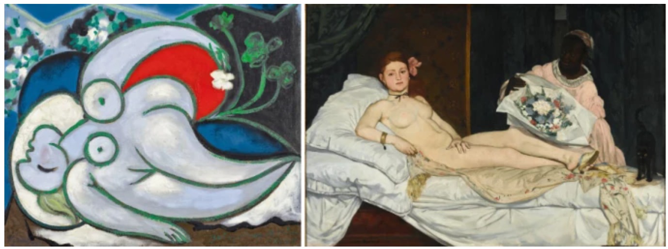
Left: Pablo Picasso, Reclining Nude, 1932, Musée National d’Art Moderne, Centre Georges Pompidou, Paris. Art © 2025 Estate of Pablo Picasso / Artists Rights Society (ARS), New York. Right: Edouard Manet, Olympia, 1863, Musée d’Orsay, Paris.
Embodying the triumphant return to the iconic comic-book heroines of the early 1960s, Lichtenstein’s Roommates (Study) combine the artist’s vibrant Pop Art sensibility with one of the most storied subjects of the art historical canon. In its economy of line, compositional clarity, and psychological nuance, it encapsulates the essence of his late style: reflective, formally rigorous, and unmistakably his own. As a standalone work, it holds its own as a jewel-like insight into one of Pop’s most intellectually complex practitioners—and a crucial artifact of one of his last and most reflective bodies of work.
Interior with Swimming Pool Painting (Study), 1992
Works from the Collection of Dorothy and Roy Lichtenstein
Sotheby’s New-York: 16 May 2025
Estimated: USD 400,000 – 600,000
USD 762,000
Interior with Swimming Pool Painting (Study) | Contemporary Day Auction | 2025 | Sotheby’s
ROY LICHTENSTEIN (1923 – 1997)
Interior with Swimming Pool Painting (Study), 1992
Colored pencil and graphite on paper
Image: 6×5 inches (15.2 x 12.7 cm)
Sheet: 9 7/8 x 6 3/4 inches (25.1 x 17.1 cm)
Signed and dated ’92 (on the verso)
Delicate in scale yet conceptually rich, Roy Lichtenstein’s Interior with Swimming Pool Painting (Study) (1992) offers an intimate glimpse into the artist’s creative process during the final decade of his life. Executed in colored pencil and graphite, this refined drawing is a preparatory study for Lichtenstein’s painting Interior with Swimming Pool, now held in a private collection. Coming directly from the Estate of the artist, this work is distinguished not only by its rarity, but by its exceptional provenance—providing a direct connection to the artist’s hand and studio practice.
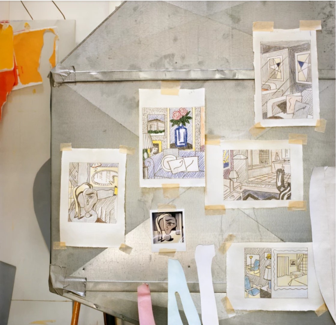
Roy Lichtenstein’s drawings and sketches, including the present work at left, in his studio, 1992.
Photo © Laurie Lambrecht. Art © Estate of Roy Lichtenstein
The drawing belongs to Lichtenstein’s celebrated Interiors series, begun in the early 1990s, which reimagined domestic spaces as arenas for visual play and historical reference. Combining design motifs, art historical citations, and Pop formalism, these works are constructed as layered images-within-images, where paintings hang on walls within paintings, and domestic furnishings become stylized symbols. Interior with Swimming Pool stands out in the series for its surreal juxtaposition of a modernist interior and an imagined poolscape visible through a picture window or possibly an art piece. In the present study, Lichtenstein reduces the composition to its essential forms with precision and economy. A stylized, fragmented figure with flowing yellow hair and a prominent tear occupies the foreground—likely referencing Picasso’s Weeping Woman (1937), a recurring source in Lichtenstein’s late work. Behind her, the setting is demarcated by tightly controlled lines and areas of color, suggesting architectural space. A window or painting reveals the schematic outline of a pool and tiled patio rendered in Lichtenstein’s iconic linear shorthand.
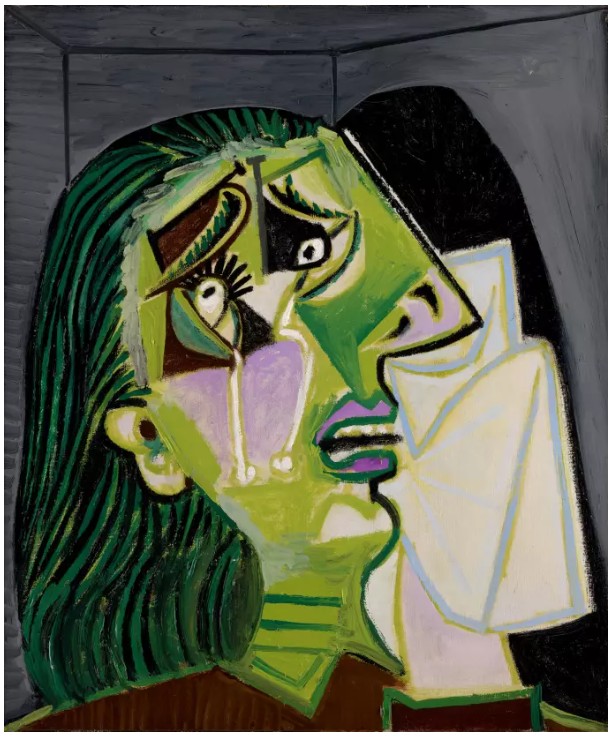
Pablo Picasso, Femme en pleurs, 1937. National Gallery of Victoria, Melbourne.
Bridgeman Images. Art © 2025 Estate of Pablo Picasso / Artists Rights Society (ARS), New York
The use of colored pencil and graphite lends the study a sense of immediacy and directness; the artist’s hand is palpable. The drawing reveals how the artist meticulously planned compositional balance, the distribution of line, and the integration of borrowed imagery. This aspect of the work deepens its significance: far from a spontaneous sketch, it is a compositional blueprint, critical to the development of a major painting. It captures the moment where concept meets execution.
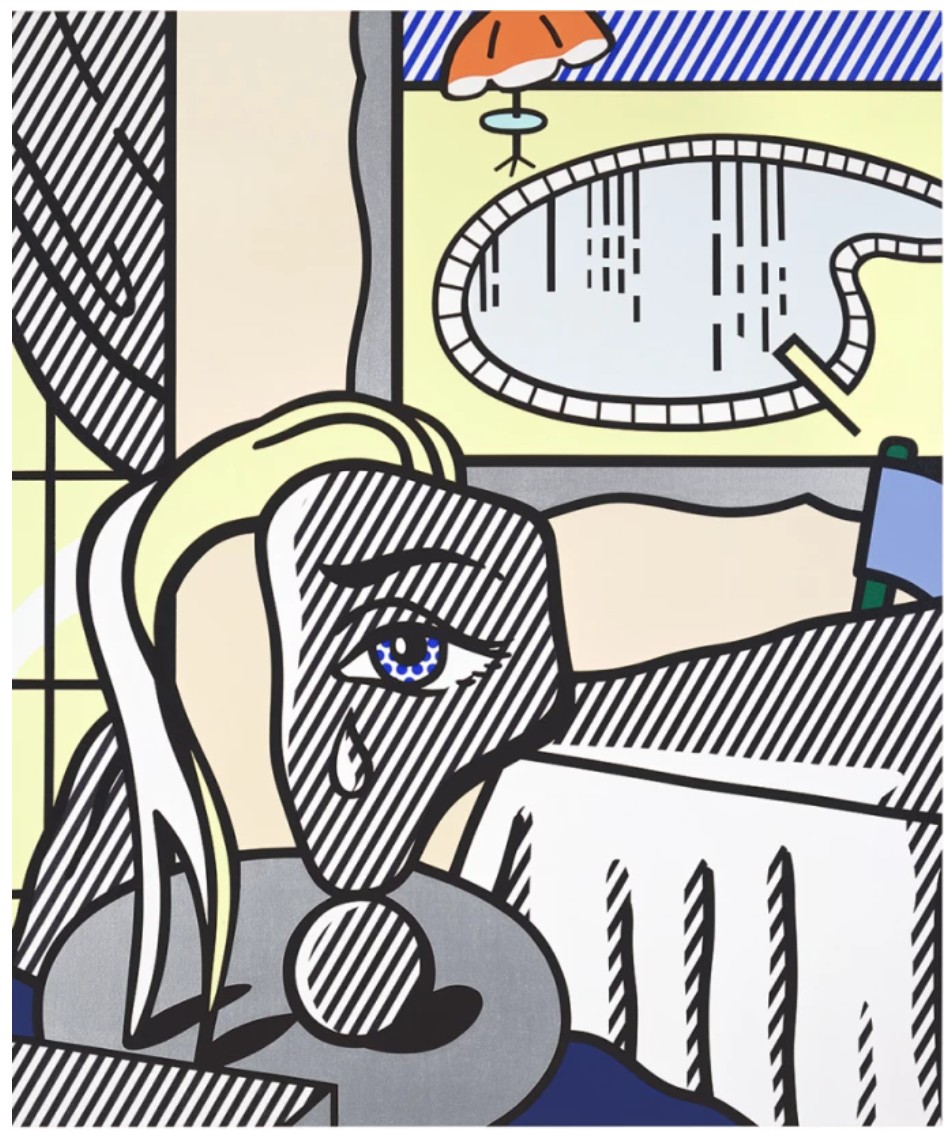
Roy Lichtenstein, Interior with Swimming Pool Painting, 1992. Private Collection. Art © Estate of Roy Lichtenstein.
Thematically, the work is as much about looking as it is about making. The interior becomes a frame for reflection—on the history of modernism, on domestic life, and on the constructed nature of perception. By placing the swimming pool within the window or framed image, Lichtenstein plays with the boundary between reality and representation. The viewer is invited not just to observe, but to decode the layers of visual language at play. Studies like Interior with Swimming Pool Painting (Study) serve as keystones in understanding Lichtenstein’s method: how he rehearsed and revised visual ideas before translating them into final paintings. With its rare estate provenance and connection to a significant late work, this drawing is not only a refined example of Lichtenstein’s draftsmanship but also a poignant artifact of his lifelong dialogue with art history and the visual world around him.
Water Lily Pond with Reflections (Study), 1992
Works from the Collection of Dorothy and Roy Lichtenstein
Sotheby’s New-York: 16 May 2025
Estimated: USD 500,000 – 700,000
USD 1,941,000
Water Lily Pond with Reflections (Study) | Contemporary Day Auction | 2025 | Sotheby’s
ROY LICHTENSTEIN (1923 – 1997)
Water Lily Pond with Reflections (Study), 1992
Cut painted paper, cut printed paper, aluminum foil, tape, marker and graphite on 2 joined boards
Image: 46 1/8 x 72 1/4 inches (117.2 x 183.5 cm)
Sheet: 60 x 80 1/4 inches (152.4 x 204 cm)
A captivating fusion of precision, playfulness, and homage, Roy Lichtenstein’s Water Lily Pond with Reflections (Study) from 1992 reveals the artist’s meticulous working process and deep conceptual engagement with art history. As a preparatory collage for a series of Water Lily screenprints on aluminum, the study embodies the dual meaning of the term “reflections”: both as an optical phenomenon—light shimmering off a pond—and as a gesture of looking back at the legacy of painting itself, specifically that of Claude Monet.
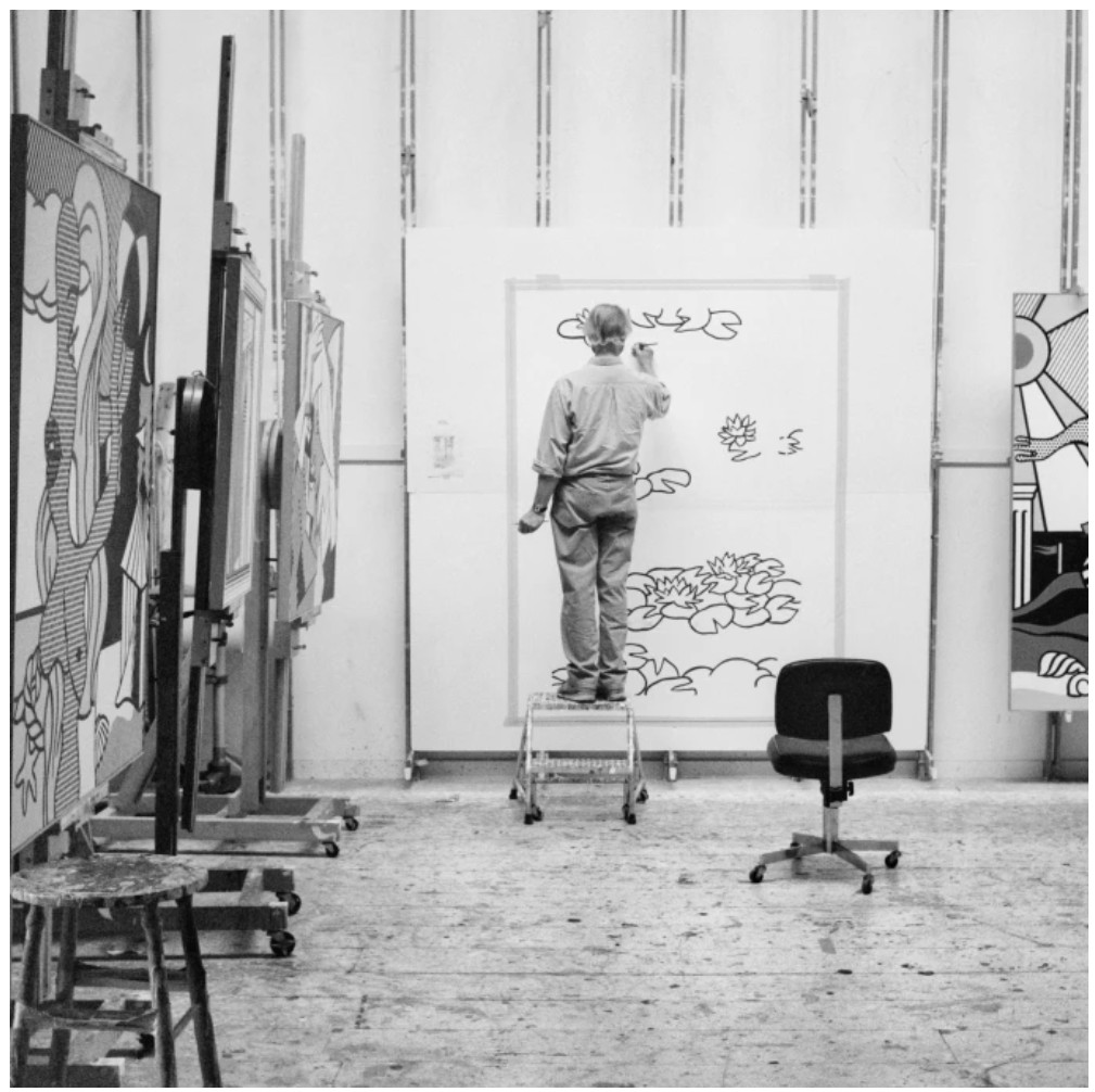
Roy Lichtenstein working on Water Lilies with Japanese Bridge, 1992. Photo © Laurie Lambrecht. Art © Estate of Roy Lichtenstein
Rendered in cut painted paper, aluminum foil, marker, and graphite, this large-scale work demonstrates Lichtenstein’s layered approach to composition. Far from being a spontaneous sketch, the collage is an architected surface, in which each wave, shadow, and abstracted lily pad is placed with deliberation. The inclusion of aluminum foil—which mimics the reflective sheen of the final prints—adds a literal brilliance, creating a dynamic surface that catches and redirects ambient light, enhancing the theme of reflection both physically and conceptually. The present work, coming directly from the artist’s estate, offers not only outstanding provenance but also a rare insight into Lichtenstein’s studio practice in the final decade of his life. Here, the hand is visible through the taped edges, cut contours, and layers of collage—a contrast to the mechanical polish of his finished aluminum panels. It reminds us that Lichtenstein, often associated with the cool detachment of Pop Art, was in fact a meticulous craftsman who maintained deep respect for the act of making.
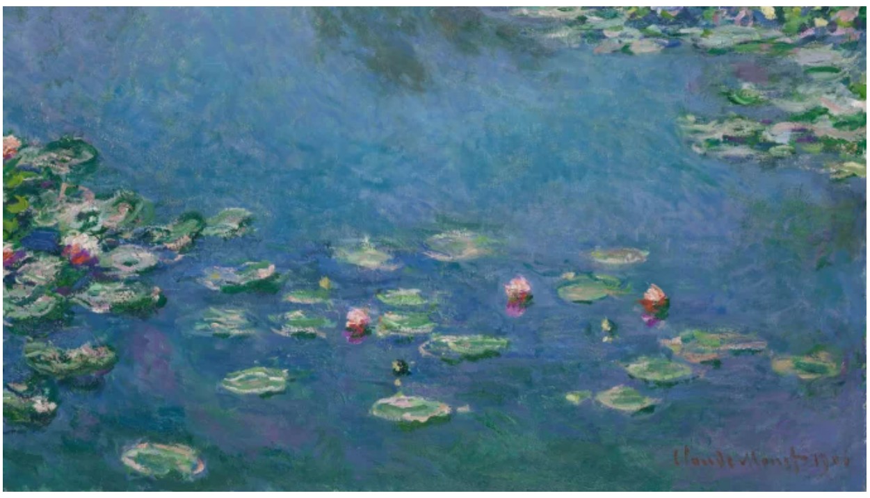
Detail of Claude Monet, Water Lilies, 1906, Art Institute of Chicago.
With Water Lily Pond with Reflections (Study), Lichtenstein enters into a transhistorical dialogue with Monet, whose own Nymphéas canvases represent one of the most iconic achievements in Impressionism. Where Monet dissolved form into light and atmosphere, Lichtenstein reconstructs nature into stylized symbols: the water surface becomes a grid of waves, the lilies sharp-edged motifs, the ripples mathematically clean. Yet this is no parody. Rather, it is an affectionate reinterpretation that celebrates the sensual qualities of light, surface, and visual pleasure through the language of Pop abstraction.
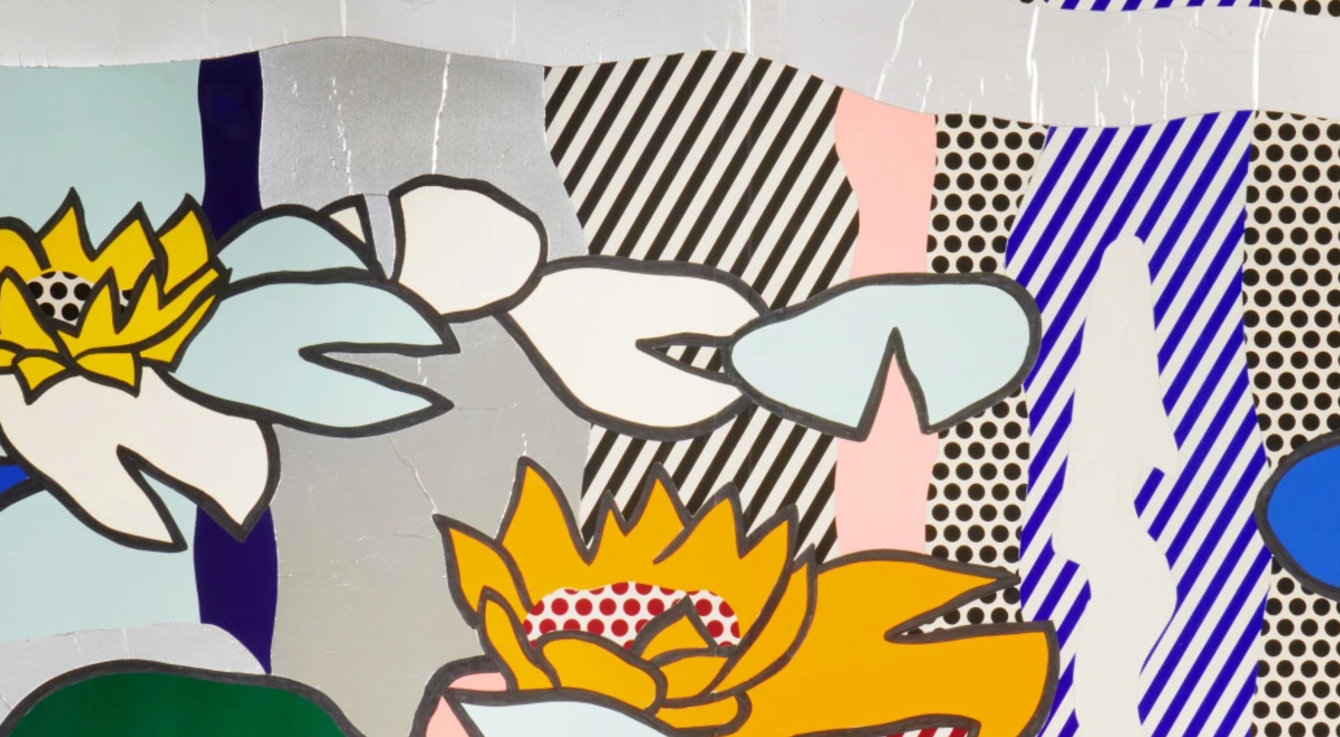
As with other late collages and print studies, the painting synthesizes several key threads in Lichtenstein’s career: the appropriation of art historical source material, the tension between hand and machine, and the transformation of painterly gesture into sign. In this case, his palette—bright yellows, blues, and greens—feels both natural and artificial, echoing both commercial graphics and the vibrant palettes of Monet’s garden at Giverny. Ultimately, Water Lily Pond with Reflections (Study) is a brilliant meditation on seeing and translating. It showcases Lichtenstein’s ability to abstract nature into visual codes while honoring the emotional resonance of the natural world. At once a preparatory work and a finished aesthetic object in its own right, it reflects the artist’s late-career mastery, bringing together humor, homage, and high craft into perfect harmony.
Cover Image for Art About Art Book (Study), 1978
Works from the Collection of Dorothy and Roy Lichtenstein
Sotheby’s New-York: 16 May 2025
Estimated: USD 300,000 – 400,000
USD 635,000
Cover Image for Art About Art Book (Study) | Contemporary Day Auction | 2025 | Sotheby’s
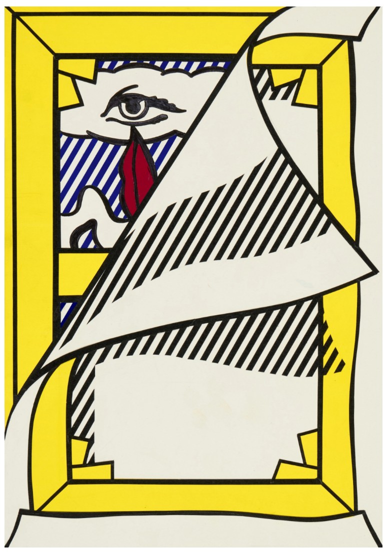
ROY LICHTENSTEIN (1923 – 1997)
Cover Image for Art About Art Book (Study), 1978
Sut painted paper, cut printed paper, tape, marker, colored pencil and graphite on board
22 5/8 x 17 1/8 inches (57.5 x 43.5 cm)
Offering a glimpse into the meticulous preparatory process that began nearly all of his artwork, Roy Lichtenstein’s Cover Image for Art About Art Book (Study) is a masterful representation of the artist’s near constant exploration of the painted surface through the lens of art history, whether it be his own art or that of other modern masters.
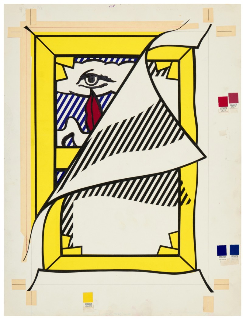
A study for the cover of the publication and a limited run of posters that accompanied the 1978 exhibition Art About Art at the Whitney Museum of American Art, the present work was commissioned to serve as the representative image of an exhibition that looked at the work of contemporary American artists who take as their subject other art.
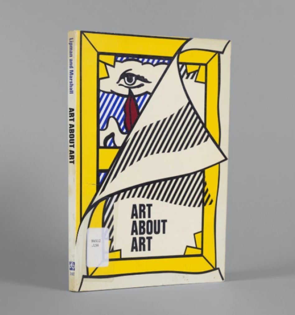
Roy Lichtenstein, Cover Image for Art About Art Book, 1978. Art © Estate of Roy Lichtenstein
True to the premise of the exhibition, Lichtenstein’s cover is doubly referential in that is tied not only to a period of art history – Surrealism, a subject of which Lichtenstein devoted an entire series of paintings to during the same period – and his own art, alluding to his body of Stretcher Frame paintings that engage with the tradition of trompe l’oeil and the nature of painting itself by depicting the back of stretched canvases and their bars, emphasizing their tactile objecthood rather than their traditional purpose of conveying a visual message. In the present rendition, the frame is being peeled away to reveal a Surrealist landscape beneath, wherein a biomorphic cloud evokes the form of an eye and a floating pair of red lips appear transformed as a teardrop, yet another reference to Lichtenstein’s own oeuvre and his Crying Girl paintings of the early 1960s.
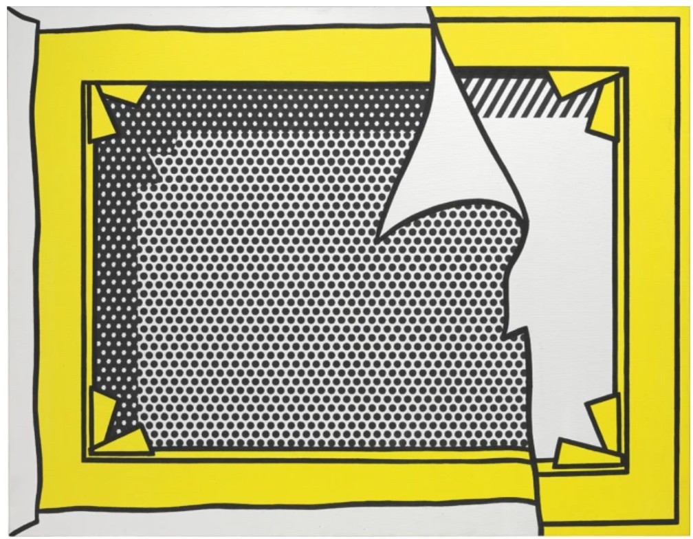
Roy Lichtenstein, Stretcher Frame Revealed Beneath Painting of a Stretcher Frame, 1973.
Private Collection. Art © Estate of Roy Lichtenstein
Emphasizing Lichtenstein’s fastidious commitment to process, the work features many of the elements that the artist would have used in his preparation for the final image to consider questions of layout, color and visual effect. Situated among meticulously placed taped sections and Pantone color swatches, the image reveals itself as an enduring reminder of Lichtenstein’s unparalleled ability to render surfaces densely layered with his interest in querying the art historical canon and constant exploration of the ways of seeing.
Cover Image (The Gun in America) for Time Magazine (Study), circa 1968
Works from the Collection of Dorothy and Roy Lichtenstein
Sotheby’s New-York: 16 May 2025
Estimated: USD 200,000 – 300,000
USD 533,400
ROY LICHTENSTEIN (1923 – 1997)
Cover Image (The Gun in America) for Time Magazine (Study), circa 1968
Graphite on paper
16 1/4 x 12 1/4 inches (41.3 x 31.1 cm)
Executed at the height of Roy Lichtenstein’s mature period, Cover Image (the Gun in America) [Study] is a rare and profoundly resonant work on paper that captures the artist’s response to one of the most turbulent moments in modern American history. Commissioned by Time Magazine in June 1968, in the immediate aftermath of the assassinations of Martin Luther King Jr. and Robert F. Kennedy, this graphite study was the genesis for one of Lichtenstein’s most politically charged images. Presented here is the artist’s preparatory drawing for what would become the cover of Time’s June 1968 issue—a stark and jarring depiction of a revolver aimed directly at the viewer, symbolic of the national reckoning with gun violence and its grip on the American psyche.
Cover Image (The Gun in America) for Time Magazine, 1968. Art © Estate of Roy Lichtenstein.
The present work is rendered with the formal clarity and compositional economy that define Lichtenstein’s practice, here distilled to its most visceral and confrontational essence. The exaggerated hand, clenched tightly around the revolver, thrusts forward in dramatic foreshortening—a dynamic visual device that places the viewer uncomfortably in the line of fire. Wisps of smoke rise in stylized arcs from the barrel, evoking both the fleeting aftermath of violence and Lichtenstein’s deep-rooted interest in the visual language of comic books and commercial printing. Yet unlike the detached irony of his earlier works, this image is charged with immediacy and urgency, its raw linework amplifying the intensity of the subject.
Lichtenstein’s choice to address the subject of gun violence—rare in a body of work more typically associated with pop culture, romance comics, and art historical pastiche—marks a critical moment in his oeuvre. Cover Image (the Gun in America) [Study] stands apart as a searing commentary on contemporary social unrest, drawing visual parallels to agitational propaganda as well as the frontal monumentality of Baroque religious painting.
The enduring relevance of this image was affirmed thirty years later, when Time Magazine reprised Lichtenstein’s composition for the cover of its July 6, 1998 issue, under the headline “Still Under the Gun.” As both a work of remarkable graphic power and a document of its time, this study encapsulates Lichtenstein’s singular ability to merge high art with mass communication. A rare and historically significant work on paper, it stands as a testament to the artist’s critical engagement with the cultural and political fabric of the American experience.
Reflections: Art (Study), 1988
Works from the Collection of Dorothy and Roy Lichtenstein
Sotheby’s New-York: 16 May 2025
Estimated: USD 150,000 – 200,000
USD 381,000
Reflections: Art (Study) | Contemporary Day Auction | 2025 | Sotheby’s
ROY LICHTENSTEIN (1923 – 1997)
Reflections: Art (Study), 1988
Colored pencil and graphite on paper
Image: 4 5/8 x 8 inches (11.7 x 20.3 cm)
Sheet: 10×13 inches (25.4 x 33 cm)
Signed and dated ’88 (on the verso)
A revelatory insight into Roy Lichtenstein’s creative process, Reflections: Art (Study) is a pivotal preparatory work for one of the most significant paintings of his late career—Reflections on Art from 1988. This drawing marks the inception of the artist’s groundbreaking Reflections series, a suite of 35 paintings in which Lichtenstein reimagines and refracts the most iconic imagery of his own visual lexicon. As the very first in the series, Reflections on Art launched a bold self-inquiry into the nature of image-making, perception, and the art historical canon—here distilled in graphite into a single resonant word: ART.
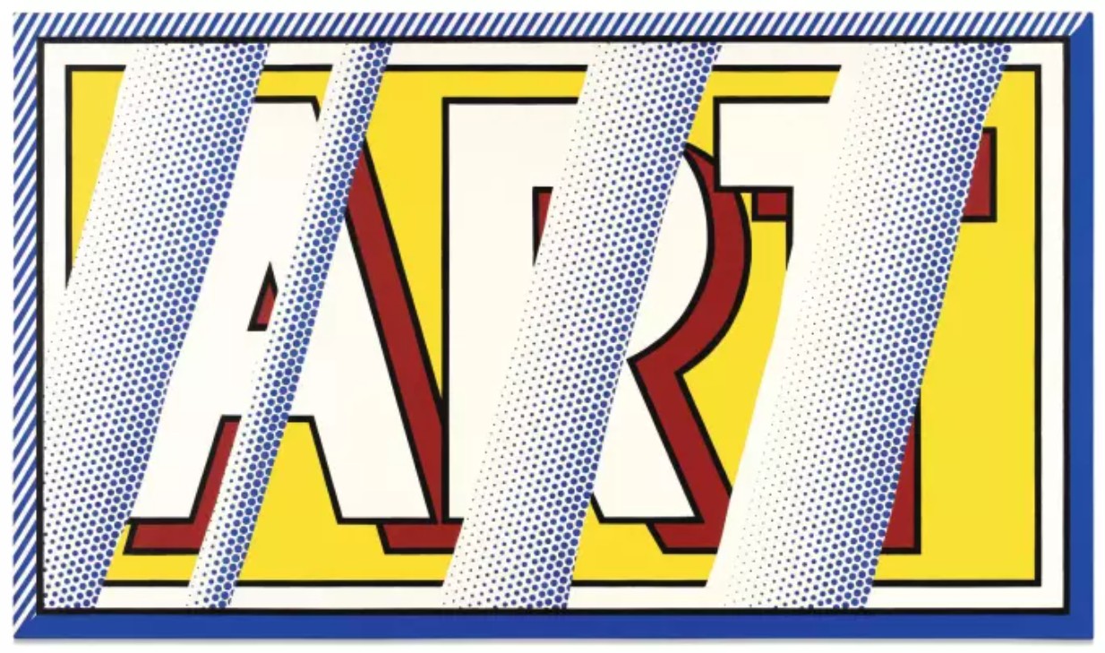
Roy Lichtenstein, Reflections: Art, 1988. Art © Estate of Roy Lichtenstein.
This intimate study captures Lichtenstein at a moment of both reflection and reinvention. Rendered in the thin, pensive strokes of colored pencil and graphite, it stages the visual conceit that would animate the finished canvas—bold, graphic lettering overlaid with diagonal, semi-transparent striations that evoke glassy reflections. These illusionistic bands, hand-shaded in blue, do not merely obscure the text beneath; they transform it, suggesting a conceptual tension between the legibility of the word and the distortion of its surface. The result is both meditative and meta: a drawing about the act of seeing, a sketch about how we apprehend the thing we call “art.”
Perhaps even more than the painting, Reflections: Art (Study) underscores Lichtenstein’s meticulous commitment to process. Long before paint ever touched canvas, he would produce a suite of compositional studies to resolve questions of layout, contrast, and optical effect. Reflections: Art (Study) exemplifies his precision and thoughtfulness: the dynamic framing, the interplay of color and void, and the subtle inflections of light all reveal a mind actively calibrating both content and illusion. It is here, in this modest sheet, that the idea crystallizes—art as image, as object, and as self-aware fiction. If the final painting invites viewers to consider what art is, Reflections: Art (Study) invites us to consider how art is made. In tracing the genesis of an image that would inaugurate one of Lichtenstein’s most conceptually layered series, this drawing offers not only a glimpse into the artist’s creative practice but also into his enduring mission: to inspire, in the viewer, a reflection on the nature of art itself.
Reflections: Whaaam! (Study), circa 1990
Works from the Collection of Dorothy and Roy Lichtenstein
Sotheby’s New-York: 16 May 2025
Estimated: USD 250,000 – 350,000
USD 660,400
Reflections: Whaaam! (Study) | Contemporary Day Auction | 2025 | Sotheby’s
ROY LICHTENSTEIN (1923 – 1997)
Reflections: Whaaam! (Study), circa 1990
Colored pencil and graphite on paper
Image: 5 1/4 x 5 7/8 inches (13.3 x 14.9 cm)
Sheet: 7 1/2 x 10 1/2 inches (19.1 x 26.7 cm)
“Lichtenstein conveyed the notion that all art and life is a series of reflections and illusions.”
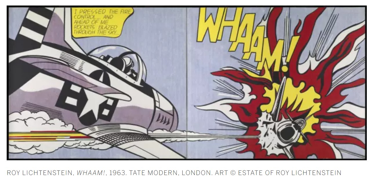
Temple (Study), circa 1964
Works from the Collection of Dorothy and Roy Lichtenstein
Sotheby’s New-York: 16 May 2025
Estimated: USD 350,000 – 450,000
USD 571,500
Temple (Study) | Contemporary Day Auction | 2025 | Sotheby’s
ROY LICHTENSTEIN (1923 – 1997)
Temple (Study), circa 1964
Marker, brush and ink, graphite and gouache on paper
23 7/8 x 17 7/8 inches (60.6 x 45.4 cm)
“I’m never drawing the object itself; I’m only drawing a depiction of the object
A kind of crystallized symbol of it.”
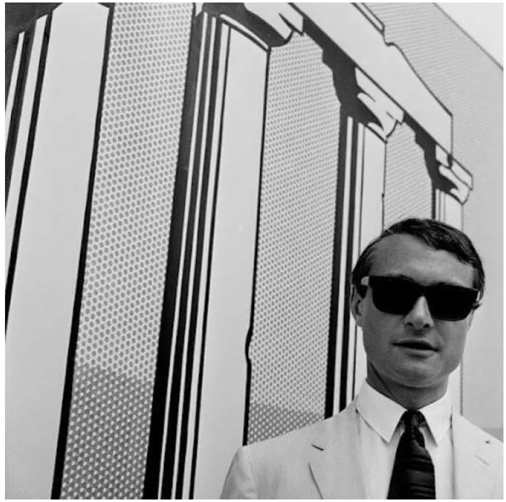
Roy Lichtenstein at the 33rd Venice Biennale, 1966. Photo by Erhard Whermann. Art © Estate of Roy Lichtenstein
Yellow and Black Brushstroke (Eat Art) (Study), 1970
Works from the Collection of Dorothy and Roy Lichtenstein
Sotheby’s New-York: 16 May 2025
Estimated: USD 400,000 – 600,000
USD 889,000
Yellow and Black Brushstroke (Eat Art) (Study) | Contemporary Day Auction | 2025 | Sotheby’s
ROY LICHTENSTEIN (1923 – 1997)
Yellow and Black Brushstroke (Eat Art) (Study), 1970
Marker, colored pencil and graphite on paper
17 1/4 x 41 1/2 inches (43.8 x 105.4 cm)
“Visible brushstrokes in a painting convey a sense of grand gesture. But, in my hands, the brushstroke becomes a depiction of the grand gesture. So the contradiction between what I’m portraying and how I’m portraying it is sharp. The brushstroke became very important for my work.”
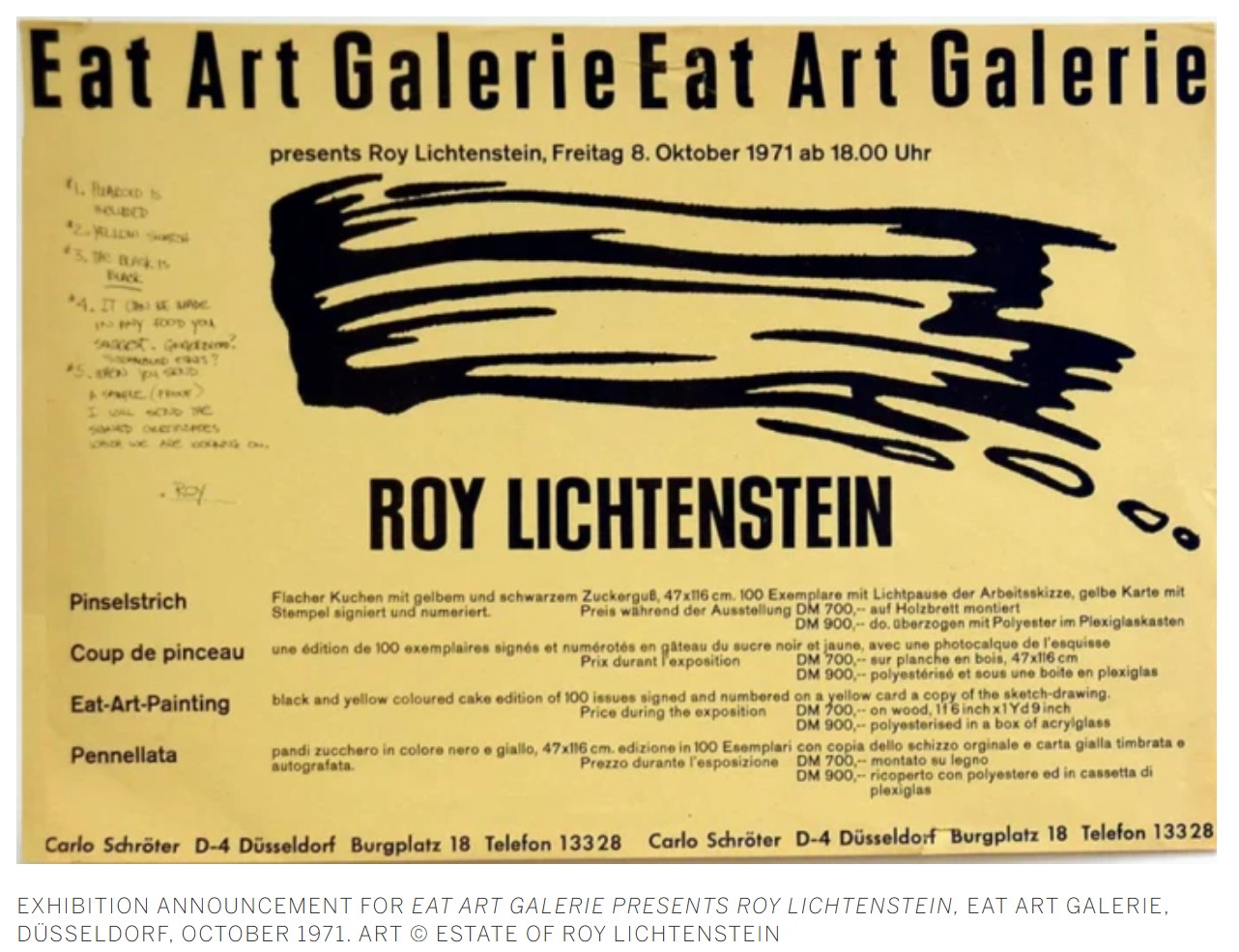
Titled (Study), 1996
Works from the Collection of Dorothy and Roy Lichtenstein
Sotheby’s New-York: 16 May 2025
Estimated: USD 400,000 – 600,000
USD 533,400
Titled (Study) | Contemporary Day Auction | 2025 | Sotheby’s
ROY LICHTENSTEIN (1923 – 1997)
Titled (Study), 1996
Cut painted paper, cut printed paper, tape and graphite on board
Image: 24 x 32 1/2 inches (61 x 82.6 cm)
Sheet: 33 1/2 x 42 7/8 inches (85.1 x 108.9 cm)
“By stressing the artificiality of the comic-strip derived landscape, Lichtenstein proposed a new form of landscape painting. The predetermined fiction of the comic strip enabled him to present the illusionistic image of the landscape in terms that confirm the fictive reality of the picture plane.”
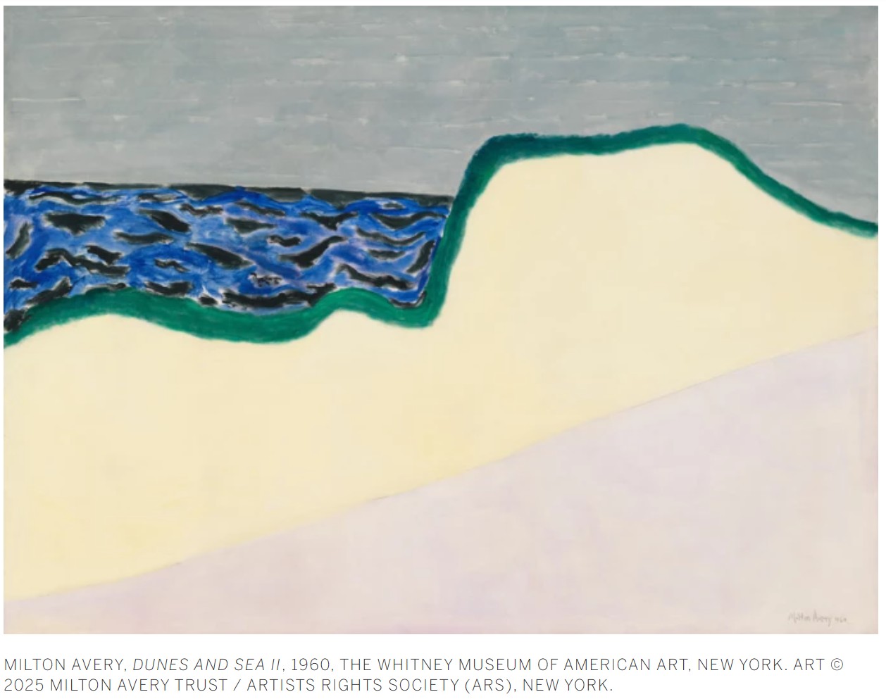
Water Lily (Study), 1992
Works from the Collection of Dorothy and Roy Lichtenstein
Sotheby’s New-York: 16 May 2025
Estimated: USD 100,000 – 150,000
USD 342,900
Water Lily (Study) | Contemporary Day Auction | 2025 | Sotheby’s
ROY LICHTENSTEIN (1923 – 1997)
Water Lily (Study), 1992
Colored pencil and graphite on paper
Image: 4 1/2 x 6 inches (10.8 x 15.2 cm)
Sheet: 6×8 inches (15.2 x 20.3 cm)
Signed and dated ’92 (on the verso)
“When I did paintings based on Monet’s I realized everyone would think that Monet was someone I could never do because his work has no outlines and it’s so Impressionistic. It’s laden with incredible nuance and a sense of the different times of day and it’s just completely different from my art. So, I don’t know, I smiled at the idea of making a mechanical Monet.”
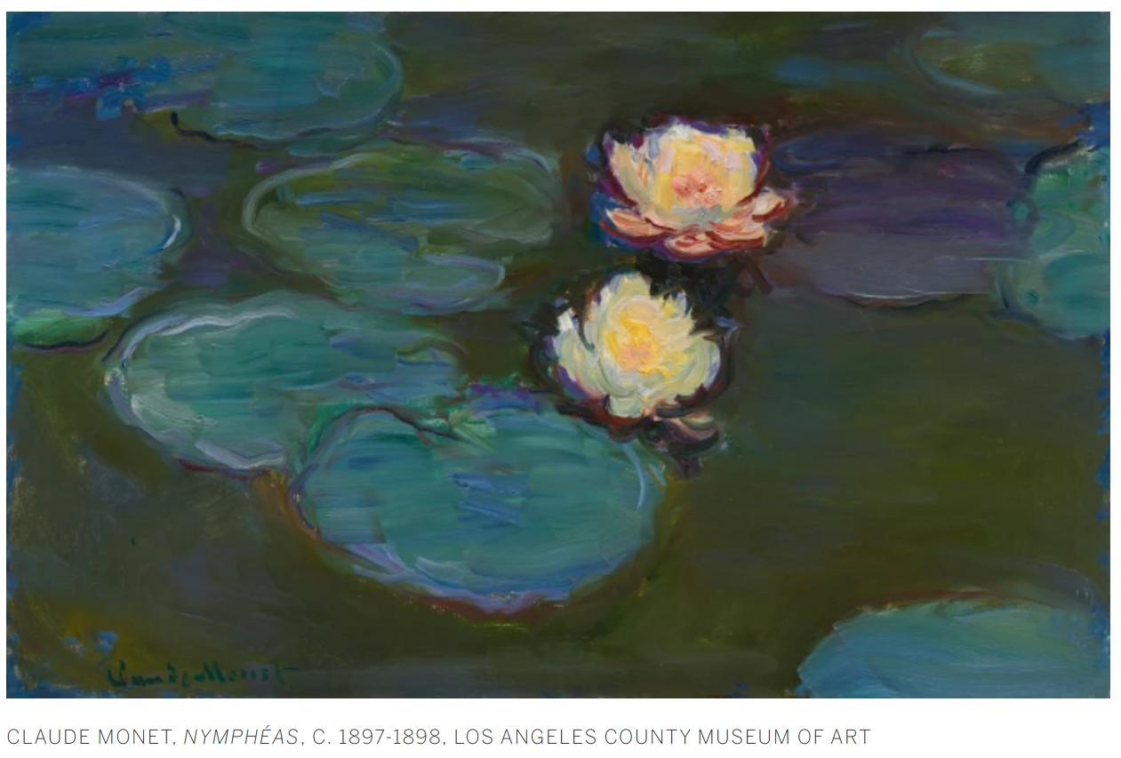
Still Life Tapestry (Study), 1973
Works from the Collection of Dorothy and Roy Lichtenstein
Sotheby’s New-York: 16 May 2025
Estimated: USD 100,000 – 150,000
USD 406,400
Still Life Tapestry (Study) | Contemporary Day Auction | 2025 | Sotheby’s
ROY LICHTENSTEIN (1923 – 1997)
Still Life Tapestry (Study), 1973
Colored pencil and graphite on paper
Image: 4 1/4 x 3 1/8 inches (10.8 x 7.9 cm)
Sheet: 8 1/4 x 5 inches (21 x 12.7 cm)
Signed and dated ’73 (on the verso)
“When we think of still lifes, we think of paintings that have a certain atmosphere or ambience. My still life paintings have none of those qualities, they just have pictures of certain things that are in a still life, like lemons and grapefruits and so forth. It’s not meant to have the usual still life meaning.”
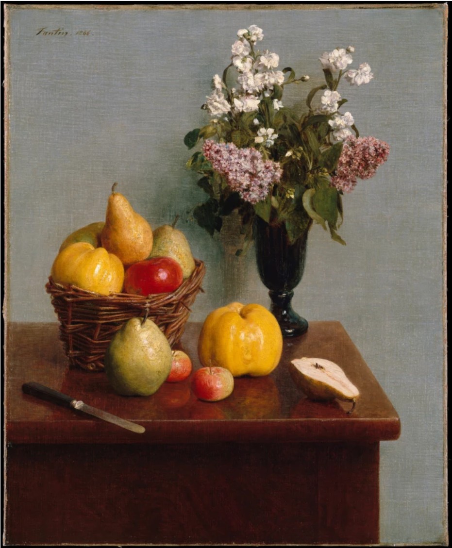
Henri Fantin-Latour, Still Life with Flowers and Fruit, 1866, The Metropolitan Museum of Art, New York
Yellow Still Life (Study), 1973
Works from the Collection of Dorothy and Roy Lichtenstein
Sotheby’s New-York: 16 May 2025
Estimated: USD 300,000 – 400,000
USD 533,400
Yellow Still Life (Study) | Contemporary Day Auction | 2025 | Sotheby’s
ROY LICHTENSTEIN (1923 – 1997)
Yellow Still Life (Study), 1973
Cut painted paper, acrylic, brush and ink, marker and graphite on board
Image: 25 1/4 x 36 1/2 inches (64.1 x 92.9 cm)
Sheet: 28 1/2 x 39 3/4 inches (72.4 x 101 cm)
Signed and dated ’73 (on the reverse)
“Lichtenstein remains an artist of absorbing contradictions. His inventiveness is rooted in imitation; he transformed the very idea of borrowing into a profoundly generative, conceptual position, one that alters the trajectory of Modernism, and beyond.”
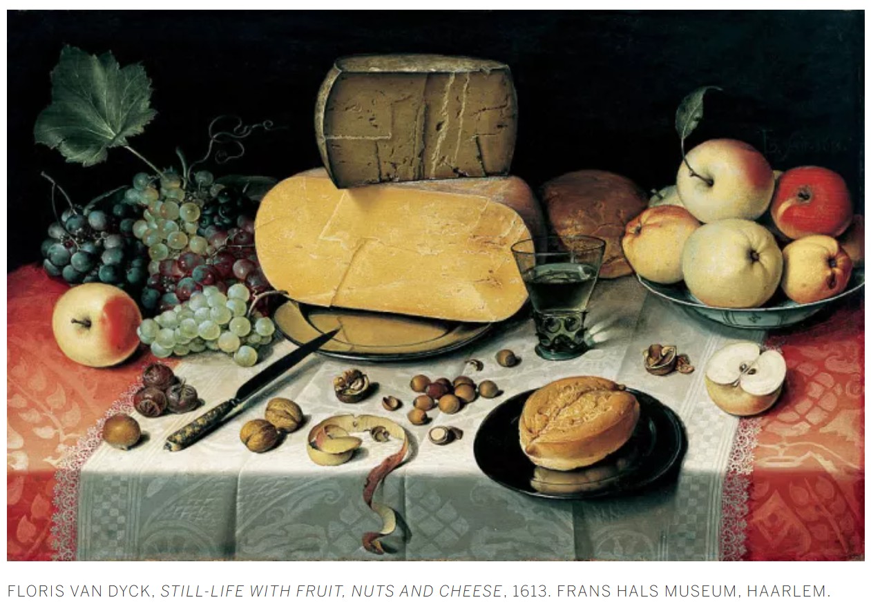
Cup and Saucer I (Study), circa 1976
Sotheby’s New-York: 16 May 2025
Estimated: USD 200,000 – 300,000
USD 508,000
ROY LICHTENSTEIN (1923 – 1997)
Cup and Saucer I (Study), circa 1976
Cut painted paper, acrylic, tape and graphite on foamcore
47 3/4 x 24 1/2 inches (121.3 x 61.9 cm)
“Among the things most important to Lichtenstein about the sketches and studies is the sense of wholeness that is developed through repeated drawing.”
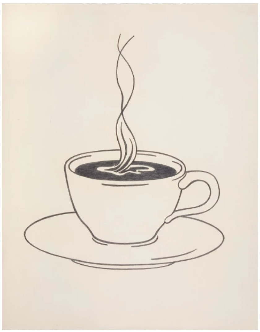
Explosion (Study), 1965
Sotheby’s New-York: 16 May 2025
Estimated: USD 80,000 – 120,000
USD 234,950
Explosion (Study), 1965
Marker, colored pencil and graphite on paper
Image: 4 3/4 x 4 3/4 inches (12.1 x 12.1 cm)
Sheet: 9×6 inches (22.9 x 15.2 cm)
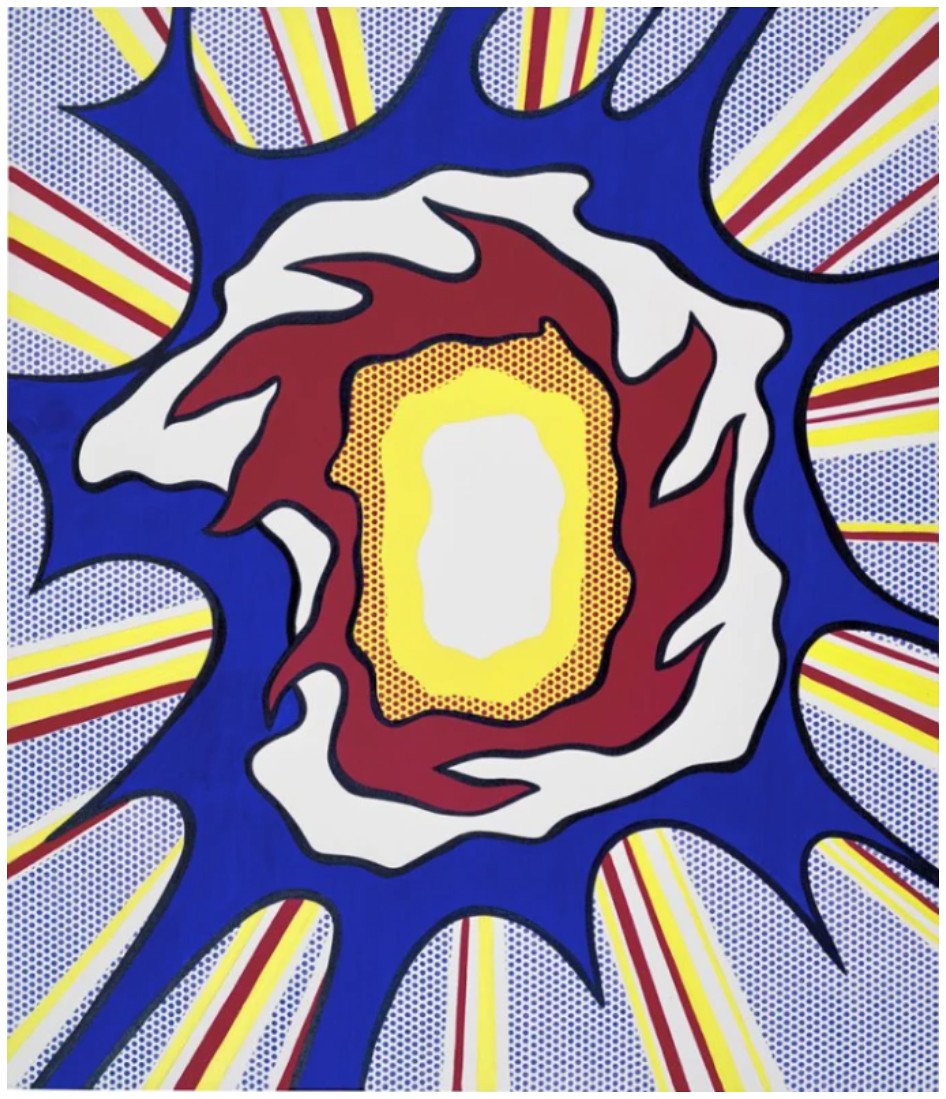
Von Karp, 1962
Works from the Collection of Dorothy and Roy Lichtenstein
Sotheby’s New-York: 16 May 2025
Estimated: USD 200,000 – 300,000
USD 508,000
Von Karp | Contemporary Day Auction | 2025 | Sotheby’s
ROY LICHTENSTEIN (1923 – 1997)
Von Karp, 1962
Marker, colored pencil and graphite on paper
Image: 4 7/8 x 4 7/8 inches (12.4 x 12.4 cm)
Sheet: 5 3/4 x 5 5/8 inches (14.6 x 14.3 cm)
Signed and dated ’62 (on the verso)
“I shifted into the style of cartoon books with a more serious content such as ‘Armed Forces at War’…I was very excited about, and very interested in, the highly emotional content yet detached impersonal handling of love, hate, war, etc., in these cartoon images.”
Cartoon source for the present work
Brushstrokes in Flight, 1983
Christie’s New-York: 15 May 2025
Estimated: USD 700,000 – 1,000,000
USD 882,000
ROY LICHTENSTEIN (1923-1997), Brushstrokes in Flight | Christie’s
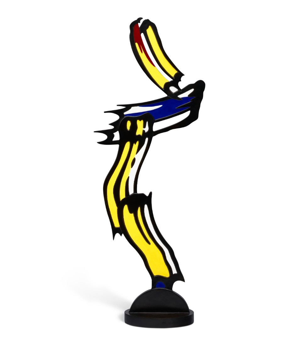
ROY LICHTENSTEIN (1923-1997)
Brushstrokes in Flight, 1983
Painted and patinated bronze
55 1/4 x 21 x 10 inches (140.3 x 53.3 x 25.4 cm)
Incised with the artist’s signature, number and date ‘5⁄6 rf Lichtenstein ’83’ (on the base)
This work is number five from an edition of six plus one posthumous cast
Roy Lichtenstein’s iconic sculpture Brushstrokes in Flight (1983) stands as a testament to the artist’s brilliance as a Pop Art pioneer, seamlessly blending his signature wit with an unrelenting drive to challenge and redefine artistic conventions. In Lichtenstein’s Brushstrokes series of paintings, his signature flat, comic book style—drawing inspiration from American comic books and pulp magazines—is utilized to depict the brushstrokes of an abstract painting. The present work is an expansion on the series, one in which Lichtenstein shifts mediums and disciplines, moving from painting to sculpture.
In this strikingly satirical piece, at once parody and tribute, Lichtenstein represents the bold, gestural brushstrokes of the Abstract Expressionist painters in his characteristic Pop Art style. Thick, animated brushstrokes careen from the sculpture’s base, rendered in bright colors and bold outlines, as though they’ve been lifted from the pages of a pulp magazine. Here, Lichtenstein is at his best, producing an insightful amalgam of two seemingly diametrically opposed postwar American art movements—taking the gestural brushstroke and rendering it in an entirely different medium. Depicting an abstract painting in such an archly mannered, ironic style constitutes a serious feat of both imagination and technique on Lichtenstein’s part. Brushstrokes in Flight is a testament to the unbridled creative impulse and sharp intellect behind the works of a Pop Art master.
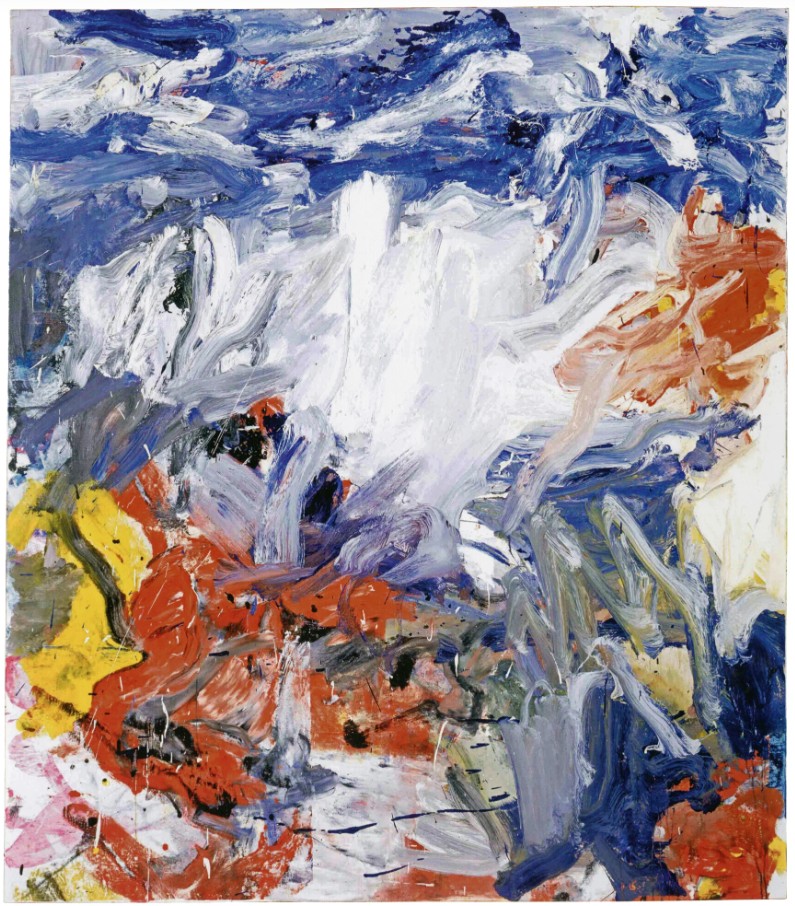
Willem de Kooning, Untitled V, 1977. Albright-Knox Art Gallery, Buffalo.
Artwork: © 2025 The Willem de Kooning Foundation / Artists Rights Society (ARS)
The strongly gestural brushstrokes depicted in the present work emerge from the sculpture’s base, at first glance embodying the expressive will of an action painter in the vein of Jackson Pollock, Willem de Kooning, or Franz Kline. One is reminded of the totemic qualities of the modernist sculptures in Brâncuși’s Bird in Space series—the abstract forms of which parallel those in the present work. Notably, Lichtenstein paid direct homage to an iconic Brâncuși sculpture with his Paintings with Sleeping Muse, also from 1983. In Brushstrokes in Flight, the brushstrokes are made three-dimensional, rising up to become vertical figures in space. The artist’s dry wit is on full display—here, Lichtenstein transforms the gestural brushstrokes of abstract painting into a literal totem or monument, acknowledging their status as art historical and cultural signifiers while simultaneously poking fun at their semi-hallowed status.
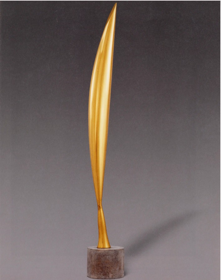
Constantin Brancusi, Bird in Space, 1928. Museum of Modern Art, New York.
This conceptual transposition of dimensions bears resemblance to, though not necessarily the visual characteristics of, the works of Pop sculptor Claes Oldenburg, whose creations magnify quotidian objects to monumental scales. It is this “both-and” quality intrinsic to Pop sculpture that Brushstrokes in Flight encapsulates most compellingly—the dual gesture of tribute to and critique of Abstract Expressionism and broader art historical motifs. Brushstrokes in Flight operates simultaneously as a playful deconstruction and a reverent celebration, embodying the high-low dialectics that render Lichtenstein’s oeuvre so captivating. Ultimately, Brushstrokes in Flight transcends mere visual pun; it asserts the enduring power of Pop Art to reconstruct and recontextualize the lexicon of art history and cultural iconography.
Brushstroke Head IV, 1987-1988
Christie’s New-York: 15 May 2025
Estimated: USD 600,000 – 800,000
USD 756,000
ROY LICHTENSTEIN (1923-1997), Brushstroke Head IV | Christie’s
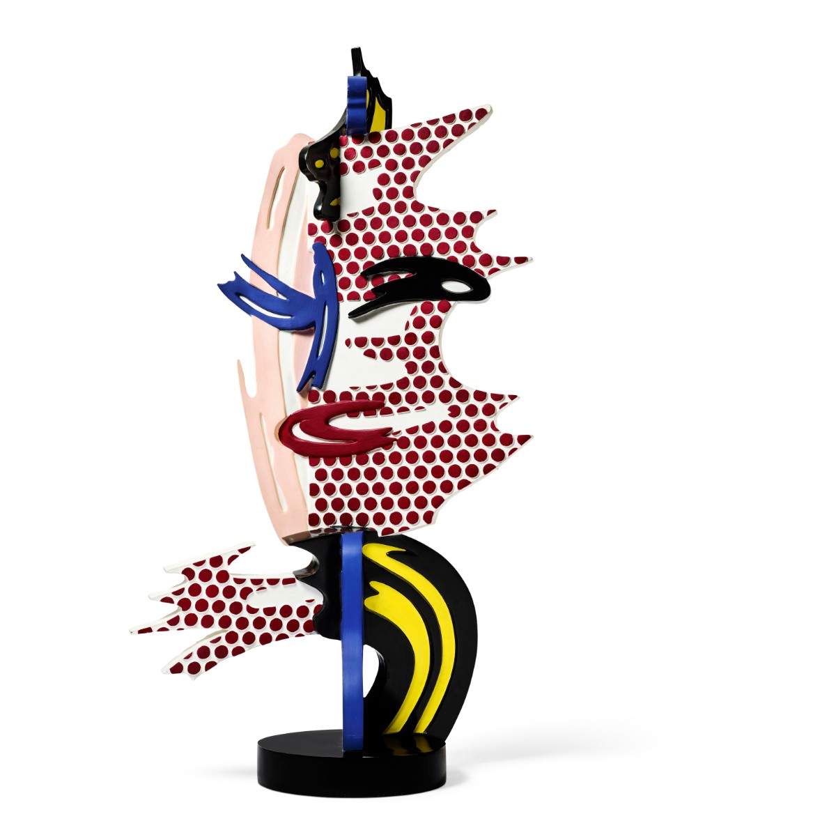
ROY LICHTENSTEIN (1923-1997)
Brushstroke Head IV, 1987-1988
Painted and patinated bronze
43 1/4 x 23 5/8 x 11 3/4 inches (110 x 60 x 29.9 cm)
Incised with the artist’s signature, number, date and foundry mark ‘1⁄6 rf Lichtenstein 87’ (on the base)
Conceived in 1987 and cast in 1988, this work is number one from an edition of six plus one artist’s proof
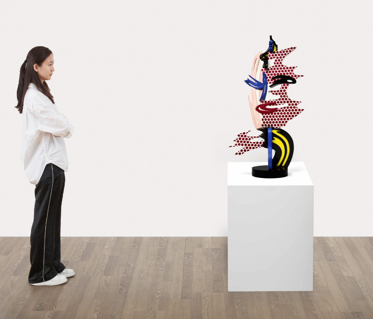
The Kiss, 1962
Christie’s New-York: 12 May 2025
Estimated: USD 7,000,000 – 9,000,000
USD 5,495,000
ROY LICHTENSTEIN (1923-1997), The Kiss | Christie’s
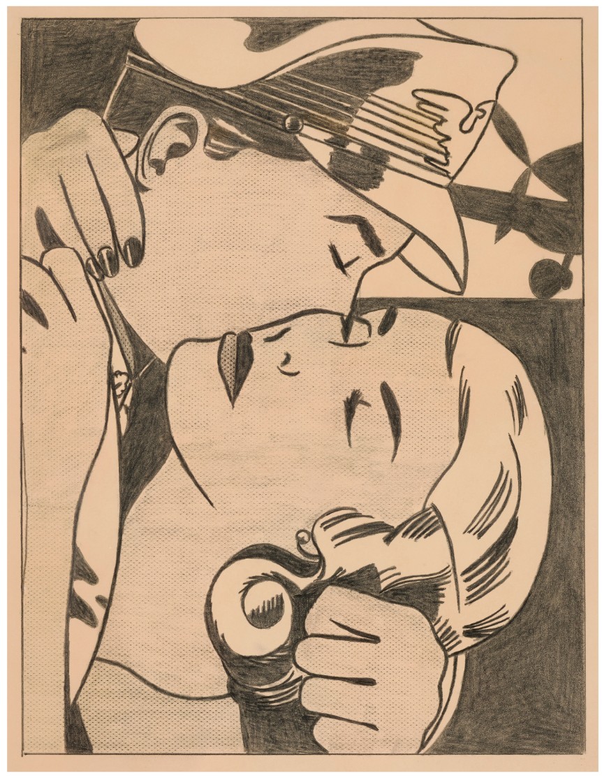
ROY LICHTENSTEIN (1923-1997)
The Kiss, 1962
Graphite on paper
Image: 18 1/2 x 14 inches (47 x 35.6 cm)
Sheet: 21 x 16 1/4 inches (53.3 x 41.2 cm)
Signed and dated ‘rf Lichtenstein ’62’ (on the reverse)
With commanding linear clarity and graphic intensity, Roy Lichtenstein’s The Kiss is a striking masterpiece heralding the beginning of the American Pop artist’s famed mature style. One of the few highly-finished independent presentation drawings made by the artist, The Kiss is also one of the first instances of Lichtenstein’s iconic Ben-Day dot patterns, magisterially used to indicate light and shadow across the couple’s faces, unveiling the artistic process which would later inform his most important works. Executed in graphite pencil, The Kiss is a rare opportunity to examine the hand of an otherwise mechanically pristine artist. Initially acquired directly from the artist by his friend, the prominent art critic and curator David Whitney, the work has been a highlight of several prestigious collections. The related painting, which follows a similar composition, has similarly been prodigiously exhibited, making the image one of the most well-known from the artist’s oeuvre. The impact of Lichtenstein’s first drawings on the art world were immediate.
The fervent embrace between the pilot and the woman is searingly rendered, the intimate moment poignantly encapsulated within the contours of the composition. Here, Lichtenstein created an entirely new system of drawing by synthesizing two apparently diametrical opposites, bringing together a parody of Pablo Picasso’s graphic drawing with the uniform representational drawing made by commercial illustrators for comic books and popular ads. Lichtenstein ingeniously translates an image taken from a comic into a complex composition, elevating the protean subject to the status of high art. The artist eliminates any extraneous detail, completely flattening the image against the paper sheet, doing without perspective or illusionistic natural space to focus intensely on the internal drama between the two figures. His carefully adjusted framing edges, compressing the composition into a cropped close-up, makes the image appear more the a film still than a cartoon.
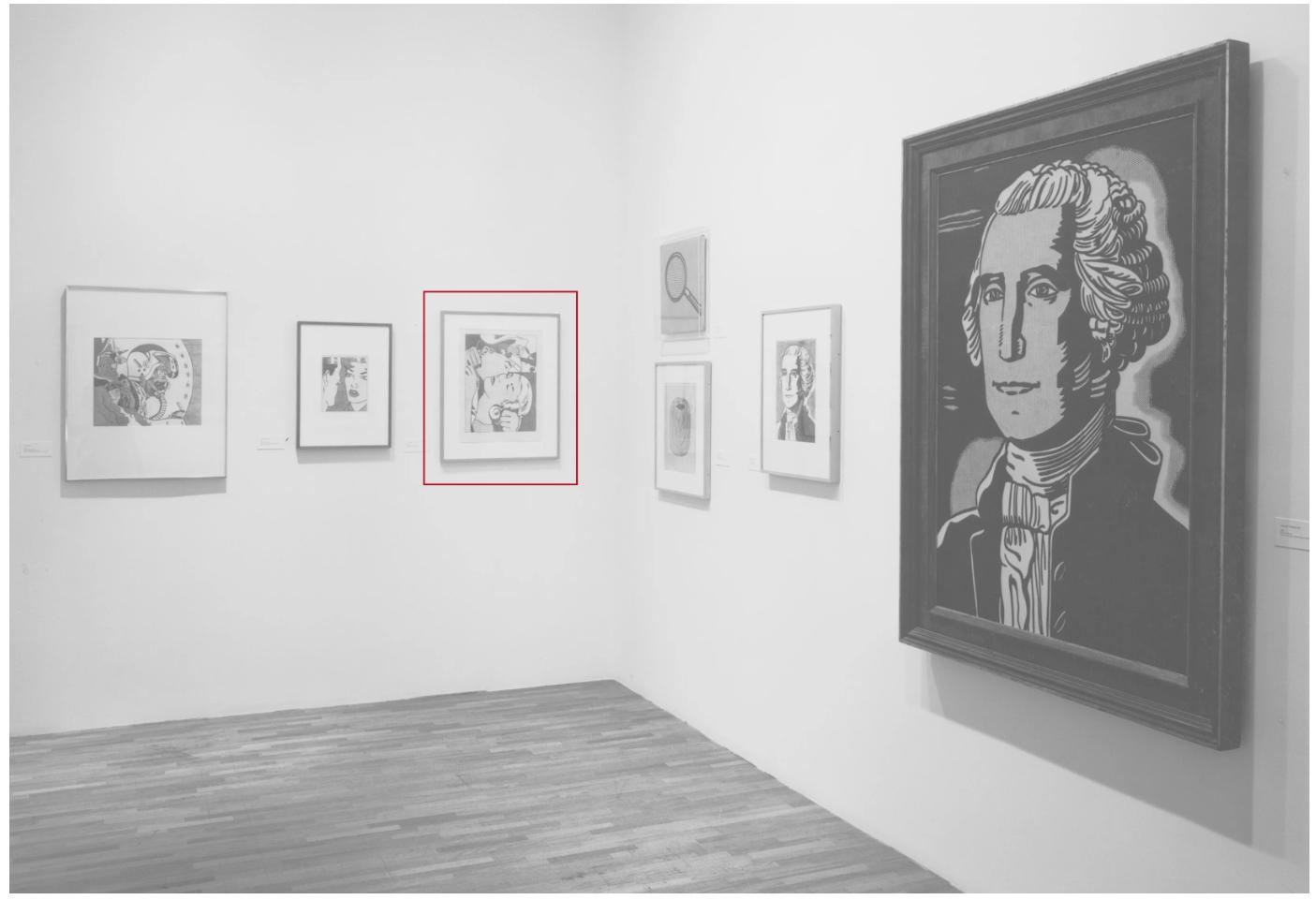
Installation view, The Drawings of Roy Lichtenstein, March-June 1987. Museum of Modern Art, New York (present lot illustrated). Photo: © The Museum of Modern Art/Licensed by SCALA / Art Resource, NY. Artwork: © Estate of Roy Lichtenstein.
Lichtenstein’s bold innovation in Pop Art reexamined representational drawing, one of the most established aspects of the Western artistic tradition, into a radical exercise, parodying the traditional forms which it illustrated with a certain ironic and humorous aloofness. The probing, hard-edge lines and sharp edges in the work reveal Lichtenstein first working out the style and technique which he would later adapt across his entire oeuvre.
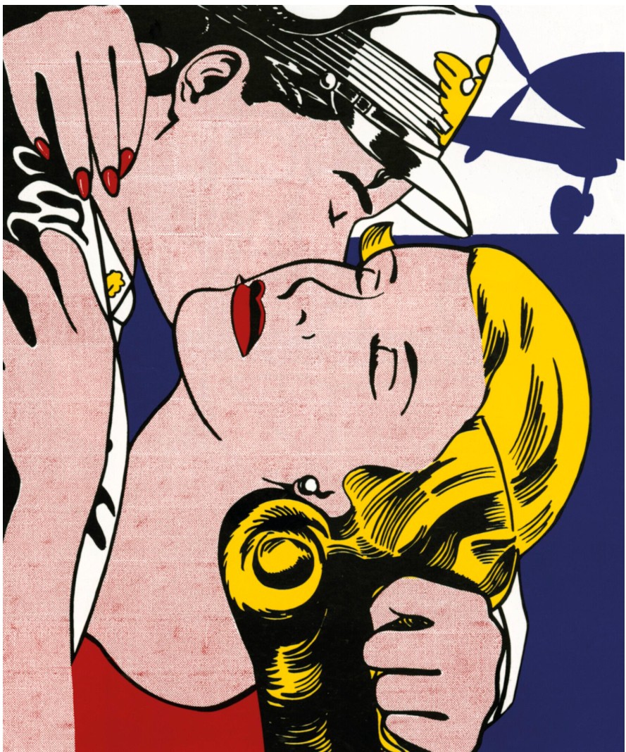
Roy Lichtenstein, The Kiss, 1961. Private collection. © Estate of Roy Lichtenstein.
Amid the many linear and textural inventions evinced in The Kiss, the tightly weaved lines and patterns spread across both visages are perhaps the most important. The artist had first experimented with recreating the Ben-Day dots from comic books the prior year, rubbing a dog-grooming brush dipped in ink over a sheet of aluminum drilled through with holes. He was discontented with his first attempts, desiring for their effect to appear less hand-made and more mechanical. His innovation here is using a frottage technique, placing the paper over a window screen and rubbing the graphite into the grains of the paper, thus creating the pattern. Varying the pressure on his tool allowed him to create subtle changes in tone, the effortless appearance of the result acquired through a great degree of precision and experimentation.
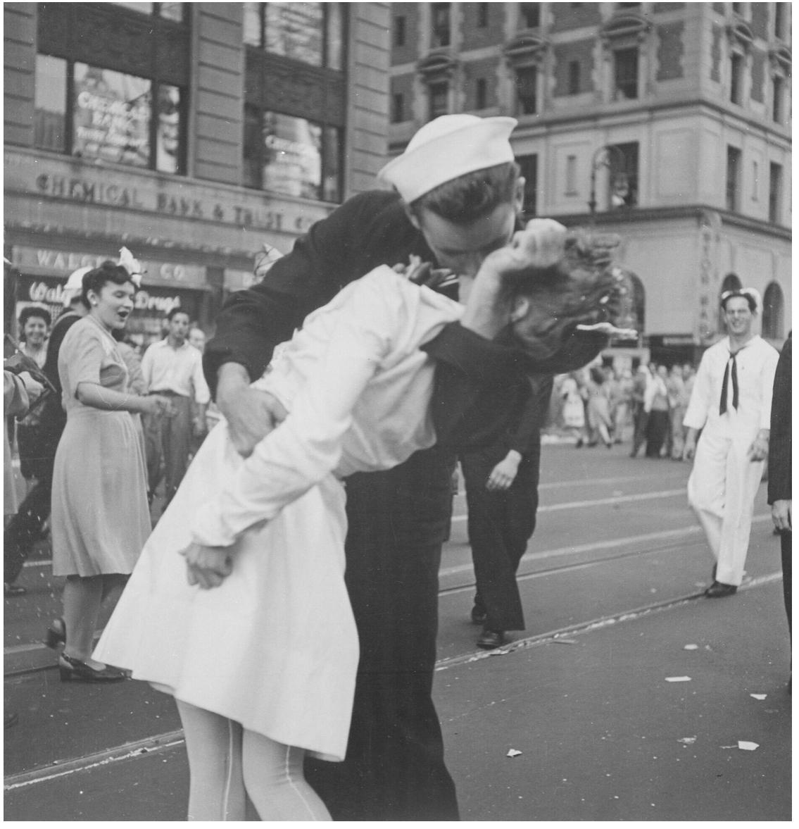
Victor Jorgensen, New York City celebrating the surrender of Japan. They threw anything and kissed anybody in Times Square, 1945. National Archives at College Park, Maryland.
The subject matter is of great import to the artist, and functions both as a broadly autobiographical gesture and as a unifying motif across several of his drawings. Lichtenstein had trained as a U.S. Army pilot during World War II before being transferred to make cartoons for the Army magazine. Pilots are a recurring motif in both his first drawings and across his career, appearing in Jet Pilot (1962, Yale University Art Gallery, New Haven), as well as the paintings Brattata (1962, Tehran Museum of Contemporary Art) and Wham! (1963, Tate Modern, London). While the other works focus more on the action of flying, The Kiss removes the pilot from his plane, seen only as a two-dimensional form barely abutting the upper right. Lichtenstein was exacting in his choice of materials, utilizing only the highest quality supplies in contrast to his cheaply produced source images. The Kiss is on neutral toned white hot pressed Arches paper, which had a smooth texture and refined finish which allowed him to create his precise images. Its thickness and quality meant that the support withstood the heavily reinforced pencil lines, scraping, and frottage which entailed his intense drawing technique.
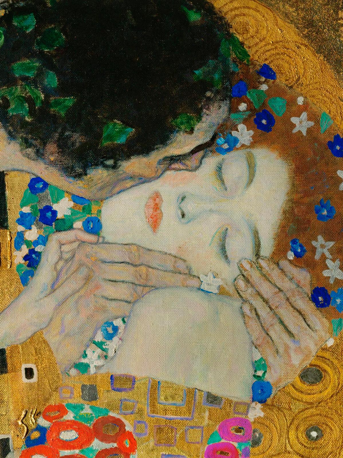
Gustav Klimt, The Kiss (detail), 1907-1908. Österreichische Galerie Belvedere, Vienna.
The Kiss, along with Lichtenstein’s other early drawings, had a vast impact on the course of the artist’s career as well as on the development of Pop Art. The work is perhaps most important in the way that it exposes the artistry which lays latent behind all of the artist’s works, but is often obscured in his larger paintings.
Andy Warhol
The Last Supper, 1986
Leonard & Louise Riggio: Collected Works
Christie’s New-York: 12 May 2025
Estimated: USD 6,500,000 – 8,500,000
USD 7,068,000
ANDY WARHOL (1928-1987), The Last Supper | Christie’s
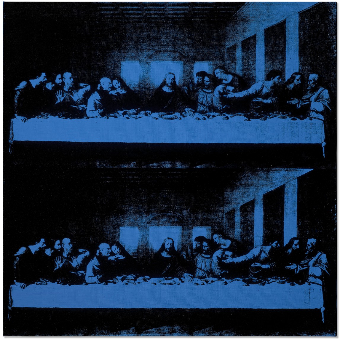
ANDY WARHOL (1928-1987)
The Last Supper, 1986
Acrylic and silkscreen ink on canvas
40×40 inches (101.6 x 101.6 cm)
Stamped with the artist’s signature ‘Andy Warhol ©’ (on the overlap)
Signed and inscribed by Frederick Hughes
‘I certify that this is an original painting by Andy Warhol completed by him in 1986 Frederick Hughes’
(on the overlap)
Andy Warhol’s The Last Supper is the artist’s ultimate statement, culminating as both the apogee of a lifetime of creativity and final series in the titan of twentieth-century art’s highly influential oeuvre. The painting sees Warhol revisiting and meditating on both his long and varied career as well as the broader history of art. His creative engagement and dialogue with Leonardo da Vinci’s iconic masterpiece asserts his prominence in the art historical canon and serves as a powerful reiteration of the principles and techniques which served Warhol’s entire artistic enterprise. The series was first exhibited to the public in Milan at Warhol-Il Cenacolo in 1987, where over thirty thousand people passed through the exhibition to catch a glimpse of the new masterpiece of twentieth-century art shown across the street from Santa Maria delle Grazie, the convent where Leonardo’s original fresco remains in situ. This would be the final lifetime exhibition for Warhol, who died just a month after the opening, and provides a fitting swansong to the artist’s storied life.
Leonardo’s early masterpiece became an obsession for Warhol, who produced an astounding quantity of preparatory material for the work, fabricating prints, engravings, drawings, screenprints, and even sculptural models in order to deconstruct and reimagine Leonardo’s tableau. The repetitious methods used in obsessively copying and altering the source material reenacts Leonardo’s own struggles with his fresco. The present work follows from Warhol’s previous silkscreen series of celebrities created two decades prior in the choice of an iconic, instantly recognizable subject, however the artist is here using the silkscreen technique not merely as a means of reproduction but as a tool for deconstruction, each replication serving to penetrate the innovative formal structure of the old master. Warhol presents the work as a double image, stacking two duplicated Last Suppers on a single canvas. This achieves a deliberate conceptual manipulation of perspective, reinterpreting Leonardo’s inventive use of one-point linear perspective into a multiplicity of perspectival effects. Leonardo’s careful perspectival construction placing Jesus at the absolute center of the composition is undermined and challenged by Warhol’s double image, which destabilizes and decenters these effects.
Leonardo da Vinci, The Last Supper, 1495-1497, Santa Maria della Grazie, Milan
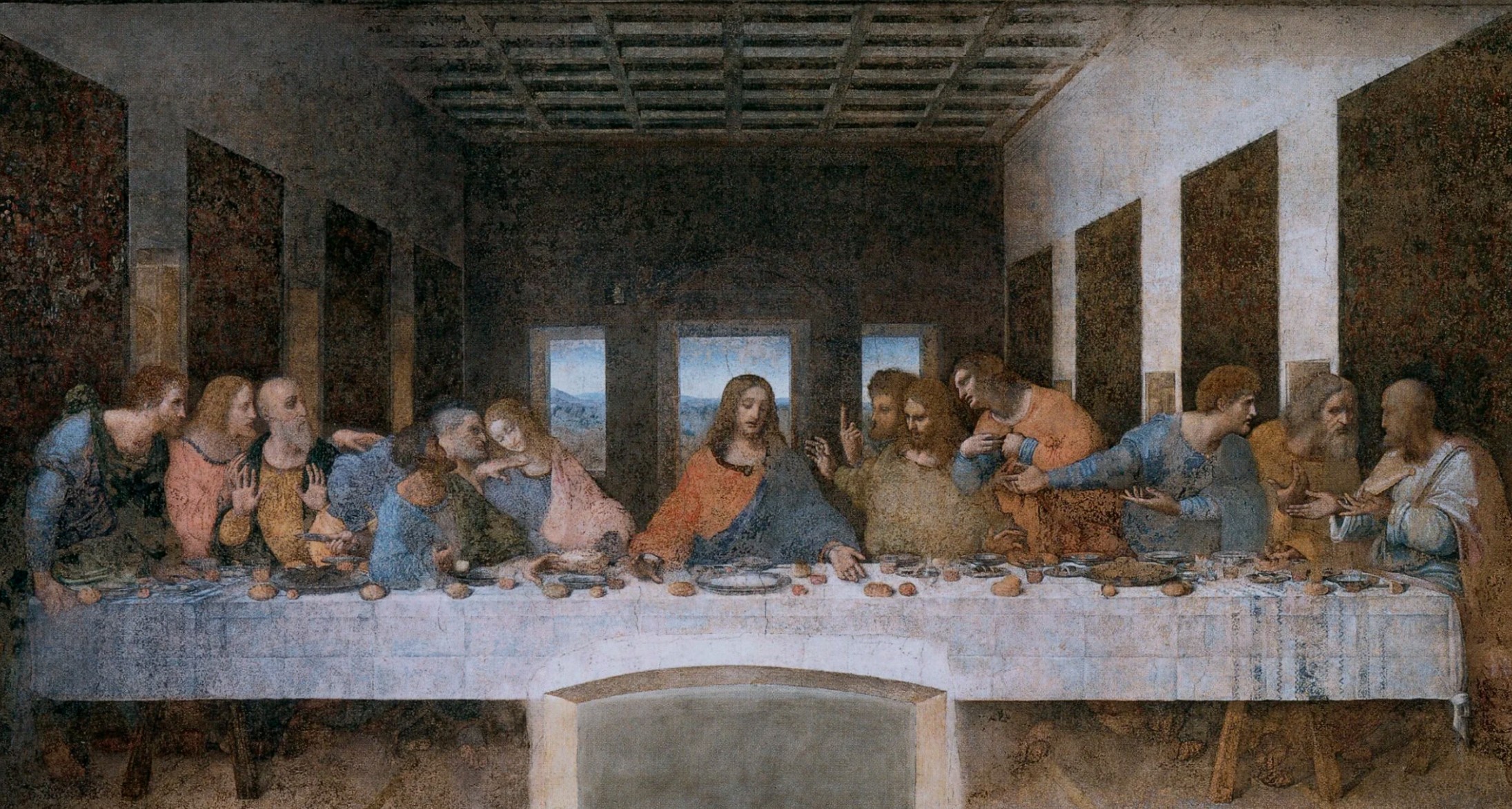
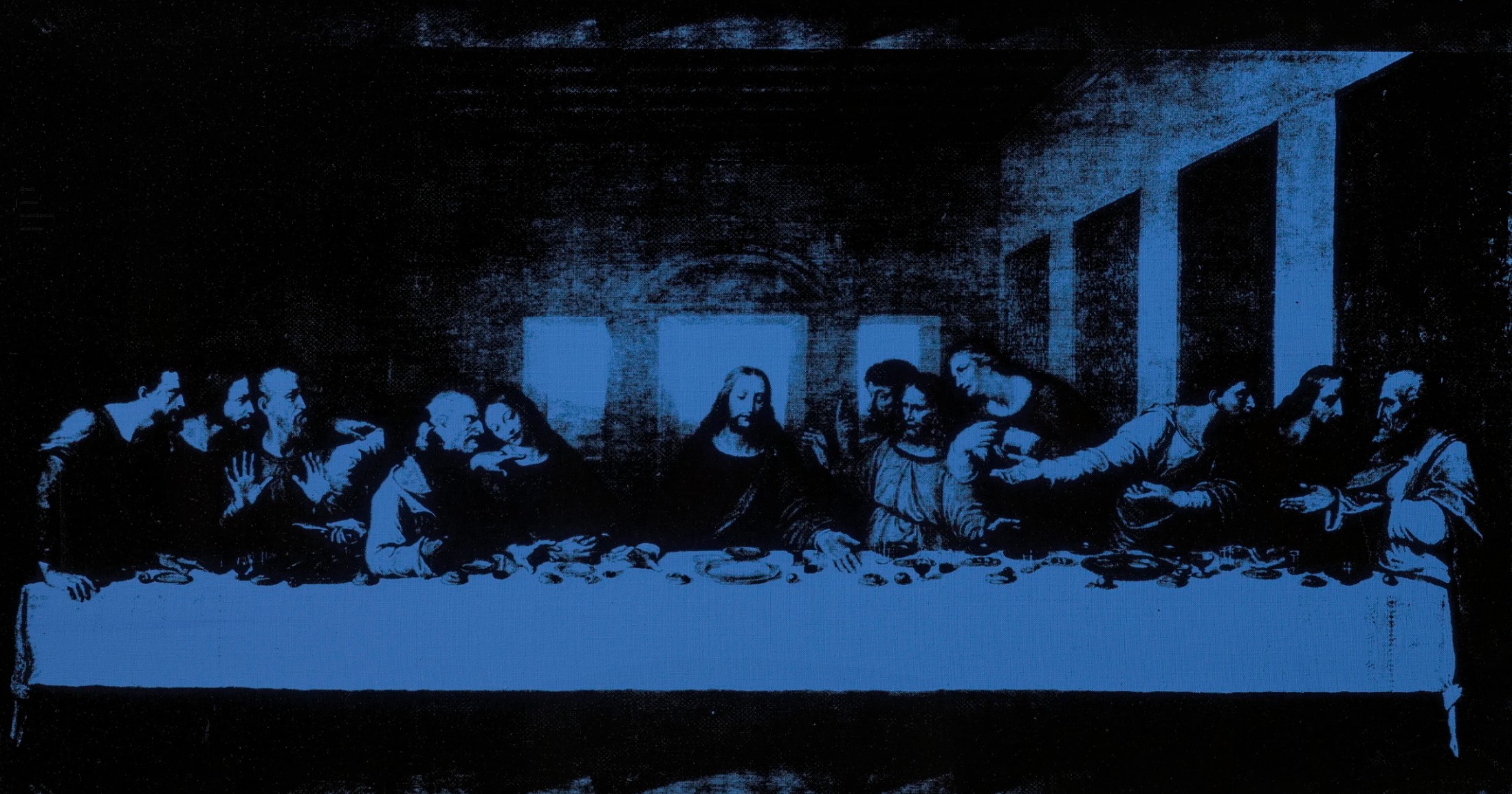
Leonardo’s Last Supper is Warhol’s ideal subject, as a decade after completion the fresco had already deteriorated due to unsuitable experimental binding method as to no longer reflect the glory of the original work. Centuries of restoration and conservation exist alongside thousands of copies of the works, create a cacophonous array of related images all purporting to represent an idealized yet nonexistent referent. The masterpiece is thus studied and understood more from copies than from the faded original fresco, a fact emphasized through Warhol’s choice of source material for The Last Supper: an amateur photograph of a widely-circulated nineteenth-century engraving of the work placed upon a blue field. Warhol’s employment of blue pigment harmonizes the composition while fracturing the atmospheric effect Leonardo achieves in the original fresco, flattening the composition. The present work is thus a duplicated interpretation of a reproduction of a copy of the original, its very relation to the original a vivid assessment in the ways art becomes iconic through the dissemination of copies. Through these many intermediaries, Warhol is able to access and analyze Leonardo’s technique and structure in a way analogous to an art historian.
Andy Warhol with Pope John Paul II, Vatican City, 1980. Photo: The Vatican Museum, Vatican City, Foto Felici.
It is fitting that Warhol’s last silkscreen project would return to Leonardo da Vinci, as one of his first silkscreen works produced in the 1960s were of the Florentine master’s Mona Lisa. Beyond the symmetry of initiating and terminating his decades-long exploration of silkscreens with works after Leonardo, The Last Supper is also notable for its religious overtones, depicting Jesus’s last night before his crucifixion. Warhol himself was religious, attending mass weekly, and the theological component of Leonardo’s work must have moved the artist. Warhol’s interpretation of a sacred image reveals how a deeply spiritual work can be transmuted into an astute comment on popular culture through the endless effects of mechanical reproduction, recalling Walter Benjamin’s theory of how an artwork’s aura is devalued through reproduction. Warhol’s masterful reinterpretation of the theme reestablishes an auratic function to The Last Supper, powerfully infusing Leonardo’s inventions with Warhol’s insights to create a trans-historical dialogue reflective of temporalities and resolutions. This powerful artistic message is further amplified by its status as a work in Warhol’s final series, becoming artist’s definitive statement.
Mao, 1973
Leonard & Louise Riggio: Collected Works
Christie’s New-York: 12 May 2025
Estimated: USD 4,500,000 – 6,500,000
USD 4,648,000
ANDY WARHOL (1928-1987), Mao | Christie’s
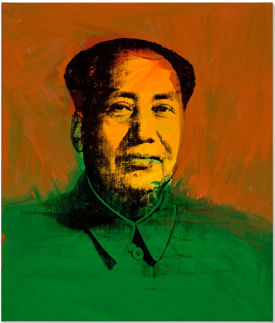
ANDY WARHOL (1928-1987)
Mao, 1973
Acrylic and silkscreen ink on linen
40×34 inches (101.6 x 86.4 cm)
Stamped three times with the Estate of Andy Warhol stamp
Stamped five times with the Andy Warhol Foundation for the Visual Arts, Inc. stamp
Numbered ‘PA 80.021’ (on the overlap and on the stretcher)
Andy Warhol’s portrait of the Chinese Communist leader Mao Zedong is one of the artist’s most effecting treatise on the power of the image. When the present work was painted in 1973, its subject was the leader of the world’s most populous nation, a country closing in on one billion people. As the Chairman of the Chinese Communist Party, Chairman of the People’s Republic of China, and Chairman of the Central Military Commission, Mao’s official portrait would have been ever-present: from posters to billboards, and from official photographs to his famous ‘Little Red Book’, he was everywhere. Together with Marilyn Monroe, Elizabeth Taylor, and Elvis, Mao entered Warhol’s pantheon of people whom he committed to canvas and became one of his most inspired. As legendary Museum of Modern Art curator Kynaston McShine noted “If Warhol can be regarded as an artist of strategy, his choice of Mao as a subject—as the ultimate star—was brilliant. The image of Mao… is probably the one recognized by more of the earth’s population than any other—a ready-made icon representing absolute political and cultural power. In Warhol’s hands, this image could be considered ominously and universally threatening, or a parody or both” (K. McShine, Andy Warhol Retrospective, exh. cat., Museum of Modern Art, New York, 1989, p. 19).
Warhol’s Mao canvases marked a return to painting for an artist who had spent much of the previous few years concentrating on his film projects. It is perhaps fitting then that these portraits are among the most painterly of his career. Rendering his subject’s features in bold, black silkscreen inks, Warhol also lavished the painting with a series of energetic brushstrokes which are especially evident in the broad, loose, gestural marks beneath the screened image. In the present work, Mao’s face is rendered in bold yellow orange azo and indo orange red pigments, complemented by permanent deep green jacket. Coupled with the silkscreen of Mao, these subjective interjections of energetic expression add a touch of subversion towards a collective regime that proscribed individual artistic creativity. The present work is one of only four of the 1973 paintings in which the orientation of the face has been reversed when compared with those that make up the rest of the series (two of these four are in the collection of the Andy Warhol Museum, Pittsburgh). The painting was acquired directly from the artist’s estate and has remained in the present owner’s collection for over twenty-five years.
Having already immortalized Hollywood celebrities, the decision to depict a political leader might have seemed an unusual one for the artist. Warhol was a resolutely non-political person, indeed he once said “I went to vote once, but I got too scared. I couldn’t decide who to vote for” (A. Warhol, quoted by G. O’Brien, Interview, June 1977), so it is unlikely that he was making any ideological statements in his decision to paint his images of Mao. In fact the idea for these works appears to have come from the gallery owner Bruno Bischofberger. As Warhol’s friend Bob Colacello recalled “it began with an idea from Bruno…, who had been pushing Andy to get back to painting, as had Fred [Hughes]. Bruno’s idea was that Andy should paint the most important figure of the twentieth century.” The first name that came up was Albert Einstein who, in Colacello’s words, “was responsible for both the technological richness and technological terror of life in this century.” Andy had a different idea, “I was just reading life in Life magazine that the most famous person in the world was Chairman Mao. Shouldn’t it be the most famous person, Bruno?” (B. Colacello & A. Warhol, quoted by S. King-Nero & N. Printz (eds.), The Andy Warhol Catalogue Raisonné, Paintings and Sculpture 1970-1974, vol 3, London, 2010, p. 165).

Source material for Andy Warhol’s Mao series, circa 1950s. © 2025 The Andy Warhol Foundation for the Visual Arts, Inc. / Licensed by Artists Rights Society (ARS).
While Warhol was initially captivated by the idea of reproducing an image that had become pervasive, his choice of the Communist leader ran in parallel with the artist’s own investigations into the power of images in modern culture. Ironically, both Mao and Warhol understood the power of that an image could have, and just like the Chinese leader Warhol’s rendition of an authoritarian ruler was anchored in the media’s power to create, canonize and commodify personas for collective absorption. While Warhol’s earlier logo-like representation of movie stars and consumer products such as Coca-Cola bottles and Campbell’s Soup cans reflected the ethos of American capitalism and the publicity machinations that underpinned it, Warhol’s Mao reveals the centrally controlled propaganda apparatus of Chinese communism. Mao’s physiognomy was propagated via billboards, posters and pamphlets throughout China; indeed, Warhol derived the silk-screen image for Mao from an official state portrait in the Little Red Book (officially titled Quotations from Chairman Mao Tse-Tung), the widely circulated collection of the leader’s ideology.
Diamond Dust Shoes, 1980
Christie’s New-York: 12 May 2025
Estimated: USD 3,000,000 – 5,000,000
USD 2,954,000
ANDY WARHOL (1928-1987), Diamond Dust Shoes | Christie’s
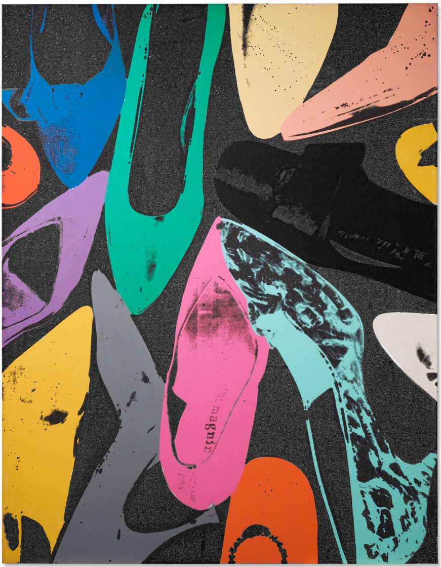
ANDY WARHOL (1928-1987)
Diamond Dust Shoes, 1980
Acrylic, silkscreen ink and diamond dust on canvas
90×70 inches (228.6 x 177.8 cm)
A career-defining work of rare elegance, Diamond Dust Shoes embodies the glamour of Andy Warhol’s New York City at the turn of the 1980s. Its larger-than-life scale mirrors Warhol’s own grand presence, which fueled the art world as we know it today. In a fabulously literal gesture, diamond dust is actually sprinkled upon his vibrant pigments, calling to mind the transcendent sparkle of Dorothy’s ruby slippers or the glowing personalities of Studio 54. Diamond Dust Shoes is an important later work that would help define Warhol’s artistic output before his untimely death in 1987. Exhibited in his epochal 1989 retrospective at the Museum of Modern Art, New York, it distills the entirety of his career, from his beginnings in illustration to the increasingly intimate, autobiographical subject matter of his inventive final years.
“I’m doing shoes because I’m going back to my roots.
In fact, I think maybe I should do nothing but shoes from now on.”
Diamond Dust Shoes, which shines like Warhol’s silver-coated Factory, represents a career-long love of fashion, luxury, and beauty that resonates in our contemporary moment.
The present work has all the opulence suggested by its name. Warhol fills the seven-and-a-half foot by nearly six-foot canvas with his characteristically Pop colors, which are set off by the dark background. The shoes transform into rays emitted by a disco ball or luminescent jewelry. We can see one shoe bearing the monogram of I. Magnin, a storied West Coast luxury brand. The other pumps are brandless, allowing them to become archetypes or pure bursts of pigment. Warhol includes grey, white, and black shoes to complement the brightness of the scene, and each heel, while separated from its pair, feels interconnected. Diamond Dust Shoes therefore exhibits the fantastical, rich disco colors that originated in New York in the 1970s, while reminding us of the icons of monochromatic dressing, from Coco Chanel’s little black dress to Carolina Herrera’s crisp, white dress shirts. Like the ruby slippers of The Wizard of Oz, Diamond Dust Shoes establishes a place for itself within an indispensable sartorial history.
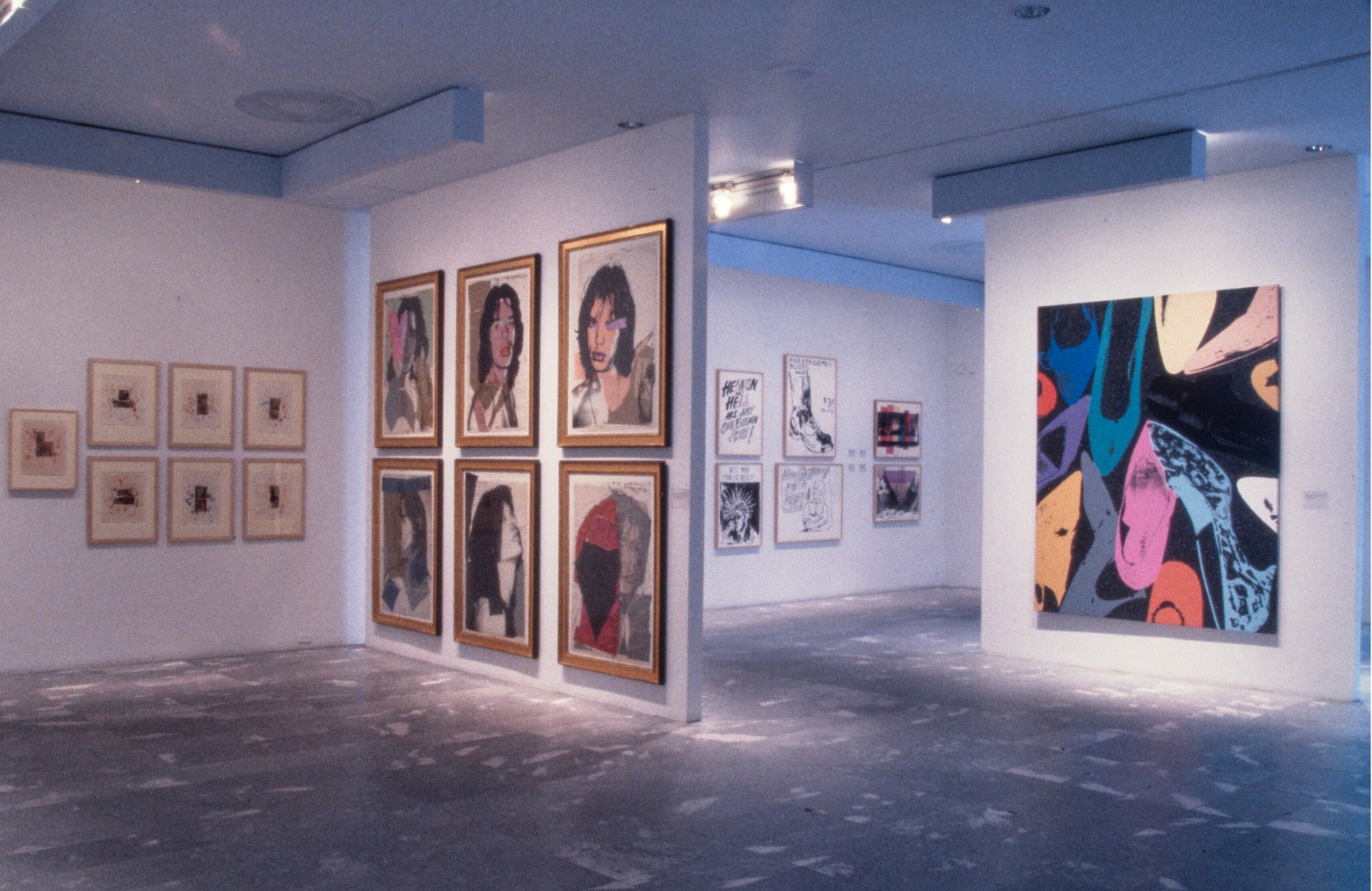
Installation view, Andy Warhol: A Retrospective, February–May 1989. Museum of Modern Art, New York (present lot illustrated). Photo: © The Museum of Modern Art/Licensed by SCALA / Art Resource, NY. Artwork: © 2025 The Andy Warhol Foundation for the Visual Arts, Inc. / Licensed by Artists Rights Society (ARS)
In Diamond Dust Shoes, Warhol pays homage to and reformulates the advertorials that helped launch his career. Rather than being lined up or worn, the heels are partially inside and outside the frame and arranged as if cast off after a party. Warhol finds sumptuousness in this uninhibited arrangement. This unique approach emerged from a storied collaboration that captures the community of artists and designers that comprised New York’s downtown art scene. The Diamond Dust Shoes series began as an advertising commission from Warhol’s friend Roy Halston Frowick, known as Halston. Halston, one of fashion’s most legendary designers, was best known for creating the unmistakable pillbox hat worn by Jacqueline Kennedy at her husband’s inauguration, which would also find its way into Warhol’s silkscreens.
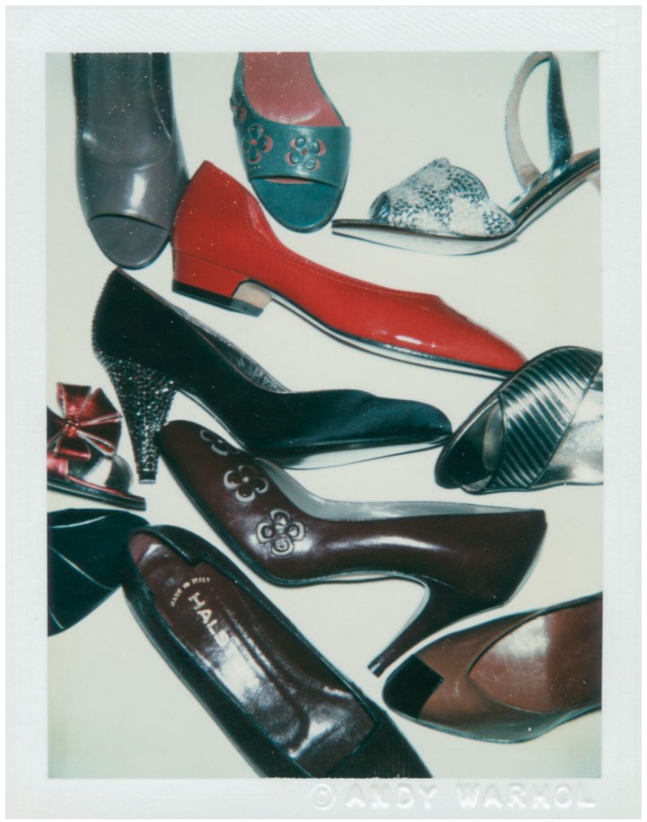
Andy Warhol, Shoes, 1980. © 2025 The Andy Warhol Foundation for the Visual Arts, Inc. / Licensed by Artists Rights Society (ARS).
The artist Victor Hugo, Halston’s boyfriend and a regular at Warhol’s Factory, brought over a bag of shoes, and when his studio manager dumped them on the floor, Warhol liked their unplanned beauty. He then added in shoes from his own collection and photographed them against white paper, which became the source material for the Diamond Dust Shoe series. The photographs were then silkscreened and coated with diamond dust upon the drying pigment. With Warhol’s characteristically interdisciplinary style, this multi-step process combined painting, photography, and printmaking. This labor paid off with a luxurious sheen like the glossy pages of Vogue. Diamond Dust Shoe thus becomes a monument to Warhol’s foundational merging of art and fashion. As co-founder of the Andy Warhol Foundation, Vincent Fremont observes, “The merger of women’s shoes and diamond dust was a perfect fit… Andy created the Diamond Dust Shoe paintings just as the disco, lamé and stilettos of Studio 54 had captured the imagination of the Manhattan glitterati. Andy, who had been in the vanguard of the New York club scene since the early 60s, once again reflected the times he was living in through his paintings” (V. Fremont in Diamond Dust Shoes, exh. cat., New York, Gagosian Gallery, 1999, pp. 8–9). In Diamond Dust Shoe, we experience Warhol’s life and times in all their glory.
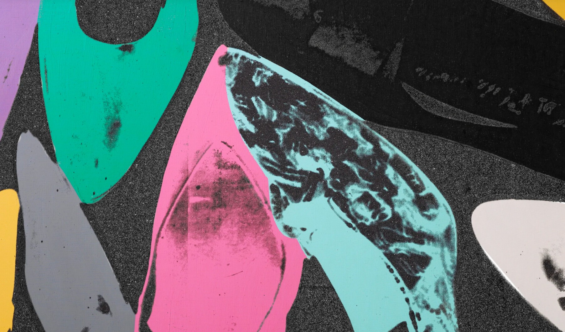
Shoes inspired Warhol for much of his career. They were not only a source of luxury, but also of familiarity and comfort.
“There are three things that always look very beautiful to me:
my same good pair of old shoes that don’t hurt, my own bedroom, and U.S. Customs on the way back home.”
Perhaps this fondness came from his early work in advertising. In the 1950s, Warhol worked for Vogue, Harper’s Bazaar, and the shoemaker I. Miller and Sons, often creating illustrations for footwear advertisements and editorials. Interestingly, the first stiletto heel, according to many accounts, was invented in 1954 by the designer Roger Vivier for Christian Dior. Warhol was always one to absorb the latest trends. His unique style was quickly noticed, and helped set his career up for the massive success that would soon come his way. In addition to this technical skill and delicate eye, there is something tender and youthful in Warhol’s early shoe illustrations. We might therefore see Diamond Dust Shoes as nostalgic for a time before all the fame and riches. Shoes therefore provide a throughline from the beginning of Warhol’s career to his later years. Diamond Dust Shoes is the product of Warhol’s constantly developing visual style, and the final form of his decades-long observation of a dazzling and lavish milieu—indeed, a milieu that he helped to sustain.
Jean-Honoré Fragonard, The Happy Accidents of the Swing (detail), 1767. Wallace Collection, London.
Diamond Dust Shoes proves the perennial allure and influence of Warhol’s oeuvre. Simultaneously a member of punk and elite social scenes, he used fashion as a means of self-presentation, from the joyous delicacy of his advertising work to the present lot, which shows him at his most opulent. Warhol sought to democratize that opulence and allow each viewer to find and appreciate their own beauty. As he once opined, “If everyone isn’t beautiful, then no one is.” Above all, Diamond Dust Shoes is a timeless work of art that takes on the permanence of its unique media. Though his work is often known for its ephemerality, Warhol’s addition of diamond dust lends a permanence, as if he resolved to remain elegant and enchanting forever—not just for a proverbial 15 minutes. In Diamond Dust Shoes, he accomplishes this goal. It is no mistake that Warhol turned increasingly to self-portraits in his late career. Diamond Dust Shoes could be an abstract self-portrait—an image of the obsession, aspiration, and taste that would characterize his unparalleled career.
Self-Portrait, 1966
Christie’s New-York: 12 May 2025
Estimated: USD 4,000,000 – 6,000,000
USD 4,285,000
ANDY WARHOL (1928-1987), Self-Portrait | Christie’s
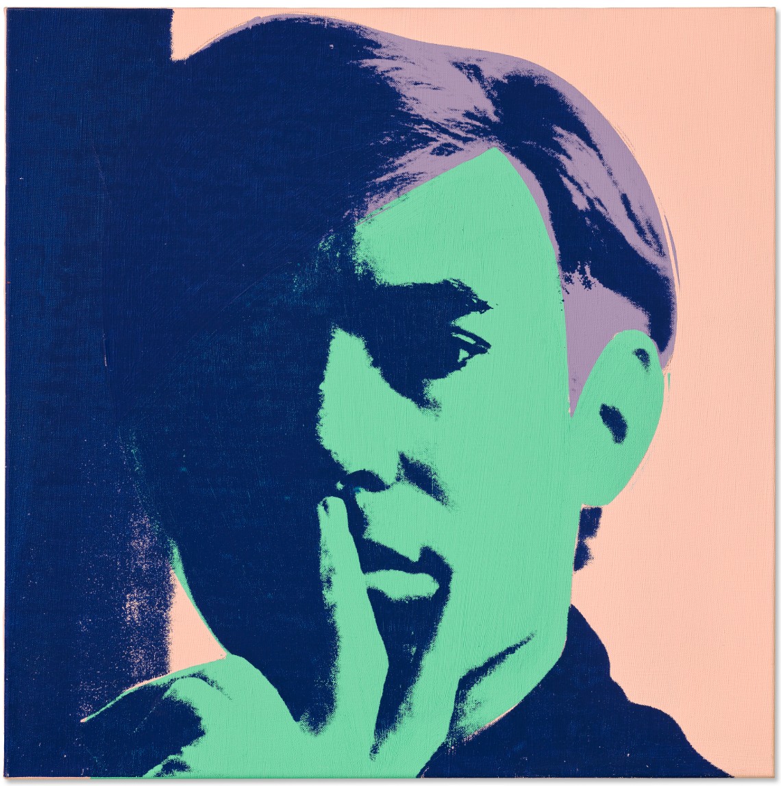
ANDY WARHOL (1928-1987)
Self-Portrait, 1966
Acrylic, silkscreen ink and graphite on linen
22 1/8 x 22 1/8 inches (56.2 x 56.2 cm)
Signed and dated ‘Andy Warhol 66’ (on the reverse)
Signed again and dated again ‘Andy Warhol 1966’ (on a canvas strip affixed to the stretcher)
Andy Warhol stares out from the surface of the canvas in this striking self-portrait from 1966. With his features partly hidden by the veil of dark shadow that falls across his face, the present work becomes the ultimate rendition of an artist who much preferred being behind the camera than in front of it. Belonging to arguably his most well-known series of his self-portraiture, it shows Warhol at the height of his artistic powers. It belongs to the third series of self-portraits that the artist had completed up to this point, and is the most complex in its daring and complex use of color. The alternating layers of bold pigments cause the surface to resonate with visual intensity, and it is with these self-portraits that Warhol finally harnesses the supremacy of color with thrilling effect.
With his chin resting on the palm of his hand, Warhol appears to be caught in a moment of deep reflection, yet his direct stare engages the audience directly. Unlike his previous two series of self-portraits, in which a younger Warhol appears to avoiding this direct form of engagement, in the present work he appears to have gained enough confidence to accept a degree of self-reflection. As the critic and Warhol scholar David Bourdon points out, this series was pivotal in marking the maturity of the artist: “They marked a new development in his portraiture with increased emphasis on garish, non-natural color and avoidance of flesh tones… The bold, jarring colors called attention to this face while simultaneously cancelling out most of his recognizable features. The self-portraits offered no detailed information about either his physiognomy or his psychological state; instead, they present him as a detached, shadowy, and elusive voyeur” (D. Bourdon, Warhol, New York, 1995, p. 250).
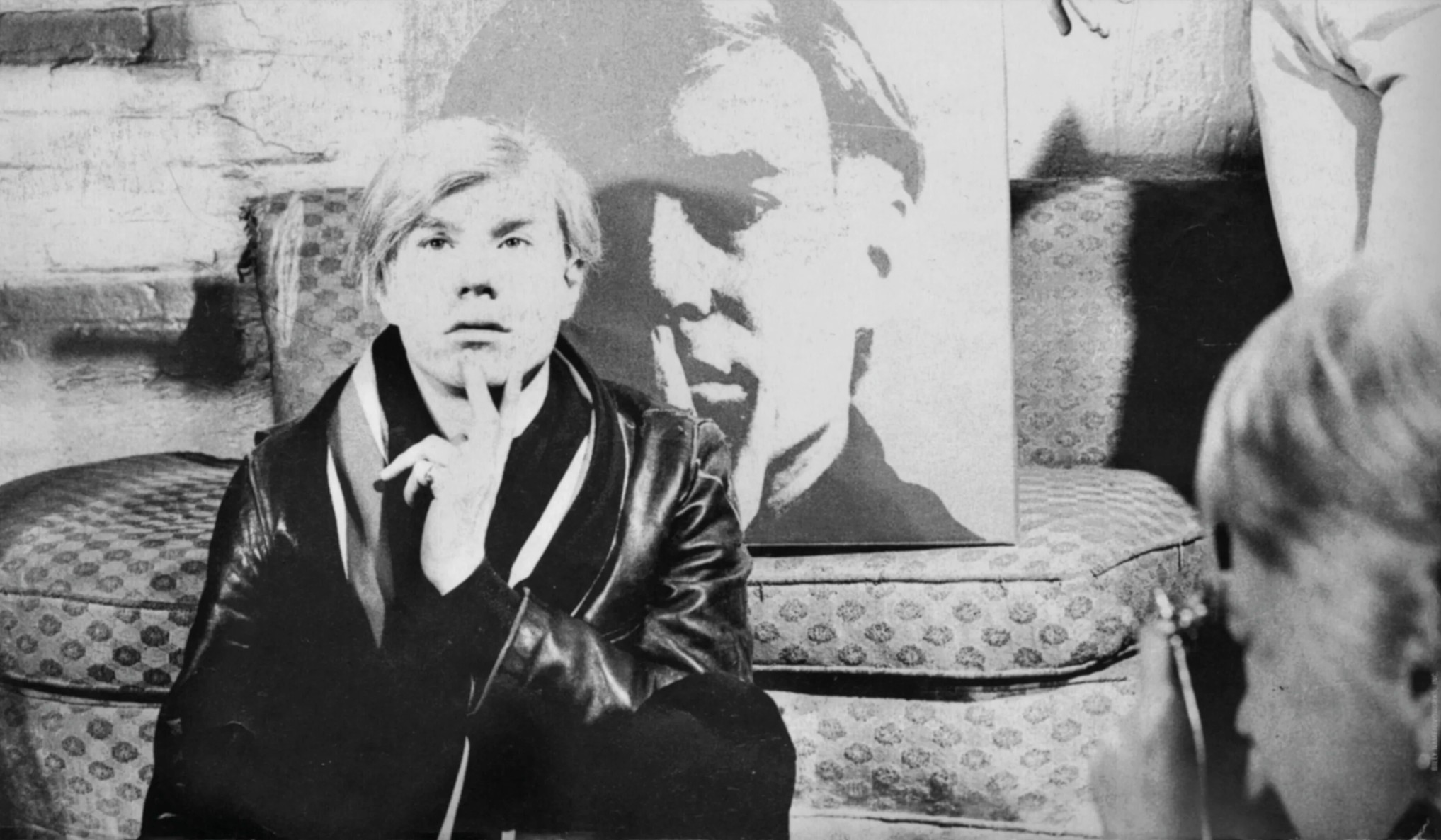
Andy Warhol with Self-Portrait (1967). Photo: Billy Name © 2025 Billy Name Estate / Artists Rights Society (ARS), New York. Artwork: © 2025 The Andy Warhol Foundation for the Visual Arts, Inc. / Licensed by Artists Rights Society (ARS).
Self-Portrait also displays Warhol’s increasingly sophisticated use of color. Here, he employs planes of light and dark blues, a soft purple and a pigment described in the catalogue raisonné as Napthol red light (a pale pink) to heighten the drama inherent in this particular self-portrait. Thus, it is not only the dramatic lighting, but also the juxtaposition of these different tones that adds to the visual tension. The critic John Coplans writes: “Warhol’s instinct for color is not so much vulgar as theatrical. He often suffuses the whole surface of a canvas with a single color to gain an effect of what might be termed colored light. It is difficult to use any of the traditional categories in discussing Warhol’s usage, which bends toward `non-art’ color… It is sometimes inert, always amorphous, and pervades the surface… In other paintings Warhol moves into what may best be described as a range of psychedelic coloration. For the most part his color is bodiless and flat and is invariably acted on by black, which gives it a shrill tension. Further, the color is often too high-keyed to be realistic, yet it fits into a naturalistic image. This heightens the unreality of the image, though the blacks he so often uses roughen the color and denude it of sweetness” (J. Coplans, Andy Warhol, New York, 1970, pp. 51-52).
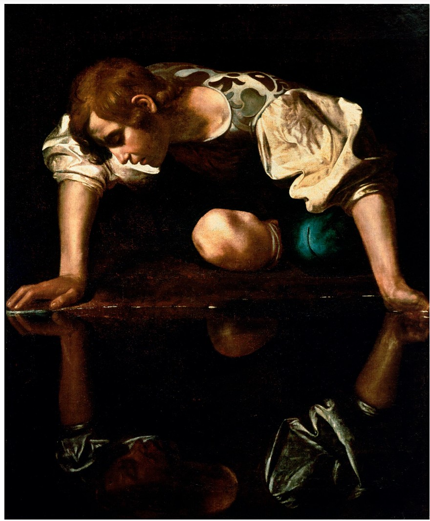
Caravaggio, Narcissus, circa 1597-1599. Galleria Nazionale d’Arte Antica, Rome.
The 1966 self-portraits became a turning point for Warhol. Finally amongst the images of the rich and famous or the press images of death and disaster, he had become a celebrity in his own right, an element in his own visual repertoire. By this time, Warhol was the central figure in both the New York art world and the wider social scene and had become an icon, a constant and glamorous figure who frequented the city’s art galleries, celebrity parties, and nightclubs. Self-Portrait is as much about self-presentation—and self-celebration—as anything else. Here, he gazes out of the picture with an intense driven air. His pose tells of the thinker, the intellectual. This is a man who was single-handedly turning preconceptions upside down, a revolutionary, the pioneer of Pop. Beginning in 1964, and lasting until 1984, Warhol’s self-portraits bookended his career, and now that he was known, a recognized face, it was only fitting that he should have enshrined himself amongst his pantheon of cultural gods. Not only does Self-Portrait capture Warhol, but it also captures the spirit of the age. The incongruous colors that he has used harness a mixture of the darkness of the Velvet Underground’s music and the psychedelia of the 1960s. The presentation of the image reminds us of billboards. High culture and popular culture are being combined to create a contemporary cocktail of an image. Thus, Self-Portrait resonates with the brooding energy and life of its age.
Flowers, 1964
Sotheby’s New-York: 15 May 2025
Estimated: USD 1,000,000 – 1,500,000
USD 4,076,000
Flowers | The Now and Contemporary Evening Auction | 2025 | Sotheby’s
ANDY WARHOL (1928 – 1987)
Flowers, 1964
Acrylic and silkscreen ink on canvas
24×24 inches (61×61 cm)
Signed and dated 64 (on the overlap)
An elegantly rendered icon of Pop, Flowers from 1964 deftly embodies the enduring influence and captivating beauty of Andy Warhol’s artistic practice, merging popular culture and fine art to interrogate familiar aesthetics of mass media, art history and advertising. Here, Warhol takes as his subject among the most storied genres in art history: the floral still life. In spite of its archetypal subject, apparent chromatic vibrancy, and joyous composition, Flowers fervently embodies Warhol’s preoccupation with transience and mortality, seriality and mass production, subjects preceded by his Death and Disaster series and extended through the skulls, shadows, and self-portraits of his mature corpus.
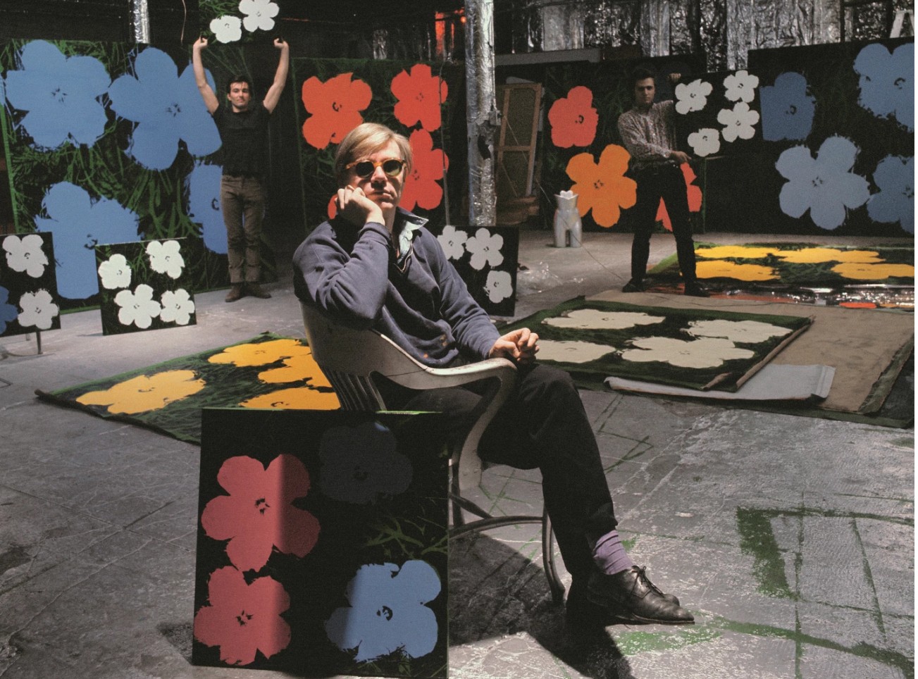
ANDY WARHOL, PHILIP FAGAN AND GERARD MALANGA, NEW YORK, 1964. PHOTO UGO MULAS © UGO MULAS HEIRS. ALL RIGHTS RESERVED. ART © 2025 Andy Warhol Foundation for the Visual Arts / Artists Rights Society (ARS), New York
The constellation of crimson, orange, and lilac hibiscus, each depicted in a crisply rendered silkscreen, set against an abstracted backdrop of blades of emerald grass, make the present work a particularly striking example of one of Warhol’s most beloved and renowned series.
In the summer of 1964, Warhol produced a series of canvases portraying his iconic Flowers, executing canvases portraying this composition in formats measuring eighty-two, forty-eight- and twenty-four-inches square, intended for an exhibition with his new dealer Leo Castelli to open in New York in November. Employing his archetypical appropriation of mass-produced source material, Warhol’s Flowers series comes from a sequence of photographs in the June 1964 issue of Modern Photography. The original images accompanied an article about different Kodak processors. They featured a glossy fold-out showing the same photograph, taken by executive editor Patricia Caulfield, repeated to illustrate chromatic variations corresponding to the various chemical processes. The seriality of the images undoubtedly appealed to Warhol’s acute sensitivity to repetition and mechanization, though rather than transfer the entire magazine page with four rectangular pictures of flowers, he isolated and cropped a square composition that included four flowers from one of the reproduced photos. This crop was then transferred onto acetate, and its tonal range was polarized to increase sharpness and provide the optimal template for the silkscreen mechanical to be made. Warhol chose the square format because of the four possible orientations available.
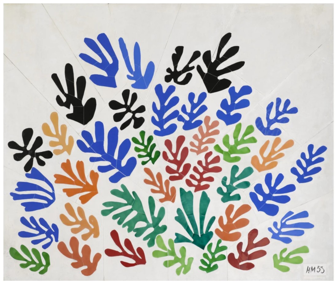
Henri Matisse, La Gerbe, 1953. Los Angeles County Museum of Art. Image © 2025 Museum Associates / LACMA.
Licensed by Art Resource, NY. Art © 2025 Succession H. Matisse / Artists Rights Society (ARS), New York
Whilst Warhol’s previous series—Death and Disaster—exploited photographs of car crashes, the electric chair and suicide, the Flowers seem to be distanced from this morbidity with their bright palette. In their decadent palette and ostensibly decorative aesthetic, Warhol also seems to borrow from the Modernist innovations of Henri Matisse, who in La Gerbe considered the floral subject as a vehicle for chromatic exploration and formal abstraction. Yet, the motif of the hibiscus is laden with tragedy that permeates Warhol’s entire oeuvre. Hibiscuses signify beauty, and especially the fleeting nature of beauty and fame, a symbolic meaning that wouldn’t have escaped Warhol. Warhol first approached the flowers at the suggestion of the legendary Henry Geldzahler, then assistant curator at the Metropolitan Museum of Art, who encouraged the artist to engage directly in the art historical tradition of still-life painting. The Flowers became metaphors for a generation that changed artistically, socially and politically in a supremely important decade. The flower motif’s resounding significance in the history of art, from the Dutch Vanitas to Claude Monet’s water lilies to Van Gogh’s sunflowers, also proved a fitting, intellectual subject for the Pop idiom he had explosively introduced earlier that decade. Warhol also borrows from the Modernist innovations of Henri Matisse, who in La Gerbe considered the floral subject as a vehicle for chromatic exploration and formal abstraction.
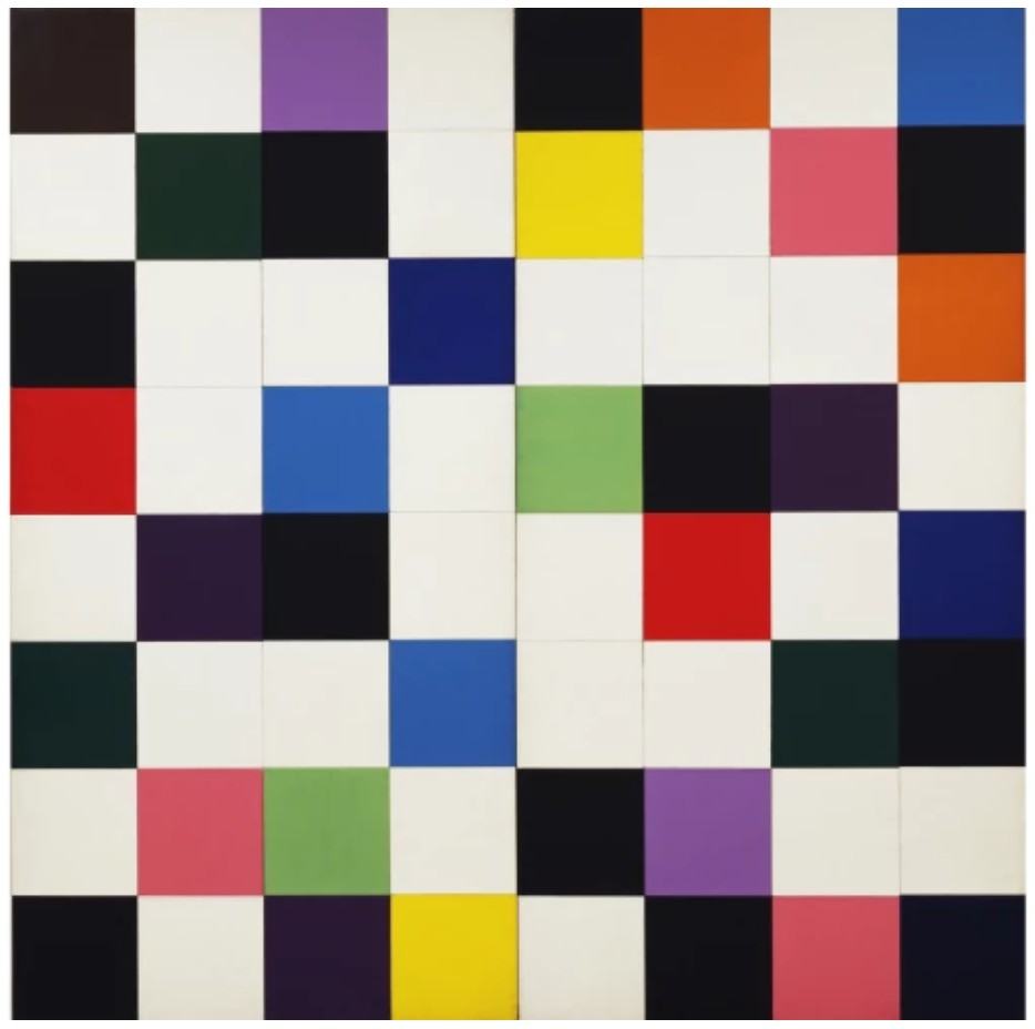
Ellsworth Kelly, Colors for a Large Wall, 1951. The Museum of Modern Art, New York.
Image © The Museum of Modern Art/Licensed by SCALA / Art Resource, NY. Art © Ellsworth Kelly Foundation
Measuring just twenty-four by twenty-four inches, Flowers is a spectacular feat distinguished from the group by its crisply rendered screen and vivid, highly saturated color, giving the image an unparalleled clarity and graphic force. In sum, delivering Warhol’s most enduring inquiries—death, mass production and beauty—the Flowers transformed the practice of still life painting and ignited the key debate of appropriation for the post-modern era. As John Coplans notes, “What is incredible about the best of the flower paintings…is that they present a distillation of much of the strength of Warhol’s art – the flash of beauty that suddenly becomes tragic under the viewer’s gaze. The garish and brilliantly colored flowers always gravitate toward the surrounding blackness and finally end in a sea of morbidity. No matter how much one wishes these flowers to remain beautiful they perish under one’s gaze, as if haunted by death.” (John Coplans, Andy Warhol, New York 1978, p. 52).
Flowers, 1964
Selections from The Collection of Barbara Gladstone
Sotheby’s New-York: 15 May 2025
Estimated: USD 1,000,000 – 1,500,000
USD 3,832,000
Flowers | Selections from The Collection of Barbara Gladstone | Contemporary Art | Sotheby’s
ANDY WARHOL (1928 – 1987)
Flowers, 1964
Acrylic and silkscreen ink on canvas
24×24 inches (61×61 cm)
Signed and dated 1964 twice (on the reverse)
One of only four known examples from the series to feature inky black blossoms against a vivid green ground, Andy Warhol’s Flowers is a rare and striking iteration of one of the artist’s most iconic motifs. Profoundly elegant in its 24-inch scale, Flowers is distinguished for its poignant simplicity, iconic palette, and extraordinary provenance, having been held in the collection of Barbara Gladstone.
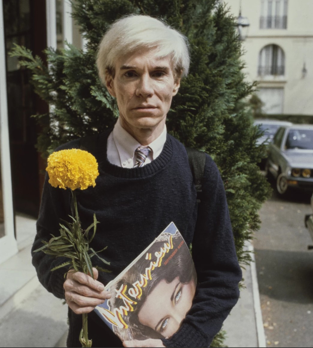
The artist with a flower at the Deauville American Film Festival, 1981. Photo © Steve Wood/Popperfoto via Getty Images
Created in 1964— the same year as his landmark debut at Leo Castelli Gallery—this work belongs to the celebrated series that helped cement Warhol’s position at the forefront of American Pop Art. Based on a photograph by Patricia Caulfield, first published in Modern Photography, the image was cropped, flattened, and silkscreened onto canvas in a gesture of transformation that pushed the still life genre firmly into the age of mechanical reproduction. Executed at a pivotal moment in the artist’s career and marked by its extreme rarity, Flowers stands as a poignant reflection of a generation and a masterwork of postmodern appropriation.
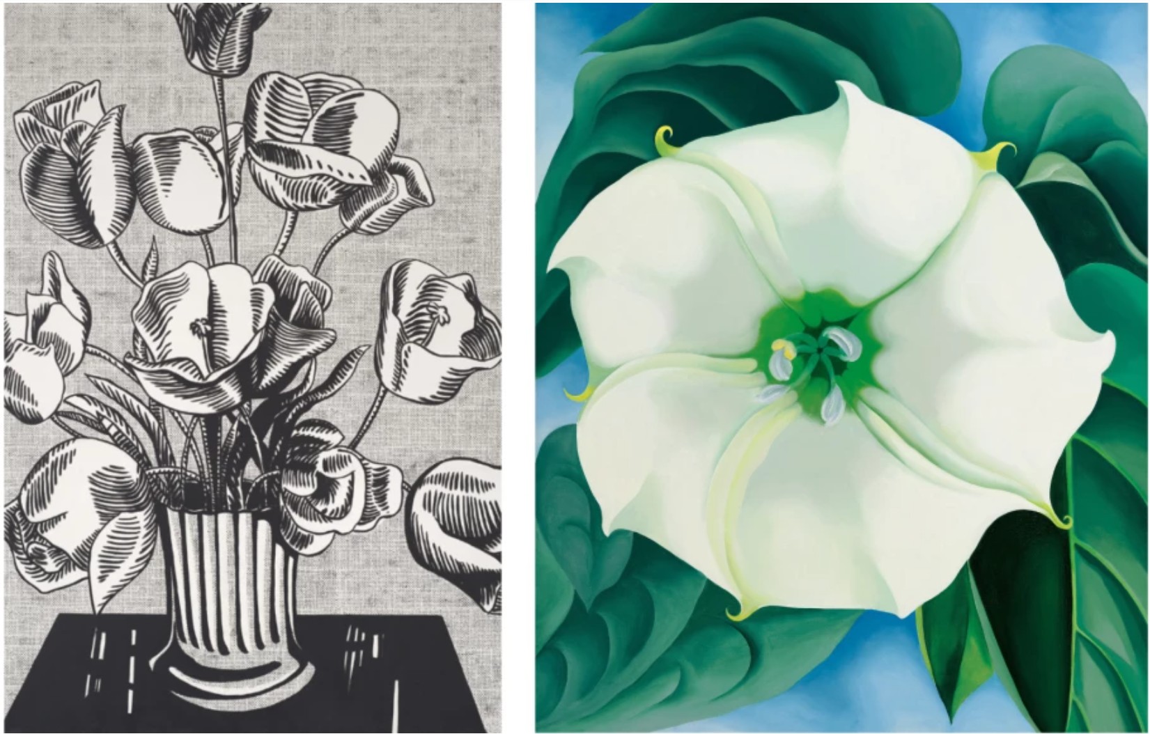
Left: Roy Lichtenstein, Black Flowers, 1961. The Broad, Los Angeles. Art © Estate of Roy Lichtenstein. Right: Georgia O’Keeffe, Jimson Weed/White Flower No. 1, 1932. Private Collection. Sold at Sotheby’s New York in November 2014 for $44.4 million. Art © 2025 Georgia O’Keeffe Museum / Artists Rights Society (ARS), New York
The Flowers series emerged at the suggestion of curator Henry Geldzahler, who encouraged Warhol to engage with the art historical tradition of still life painting. Warhol responded with a body of work that recasts the classical Vanitas through a Pop lens—serial, synthetic, and hauntingly detached. While visually seductive, the present work also carries a sense of impermanence and loss, underscoring Warhol’s preoccupations with mortality, beauty, and repetition. Directly following his Death and Disaster series and anticipating the shadows, skulls, and self-portraits of his later years, Flowers delivers Warhol’s most enduring themes with clarity and force. The Flowers create “a virtual, painful stillness,” notes Heiner Bastian. “Since they seemingly only live on the surface, in the stasis of their coloration, they also initiate only the one metamorphosis which is a fundamental tenet of Warhol’s work: moments in a notion of transience. The flower pictures were for Everyman, they embodied Warhol’s power of concretization, the shortest possible route to stylization, both open to psychological interpretation and an ephemeral symbol. But the flowers…were also to be read as metaphors for the flowers of death. Warhol’s Flowers resist every philosophical transfiguration as effectively as the pictures of disasters and catastrophes which they now seem ever closer to.” (Heiner Bastian cited in: Exh. Cat., Berlin, Neue Nationalgalerie, Andy Warhol: Retrospective, 2002, p. 33)
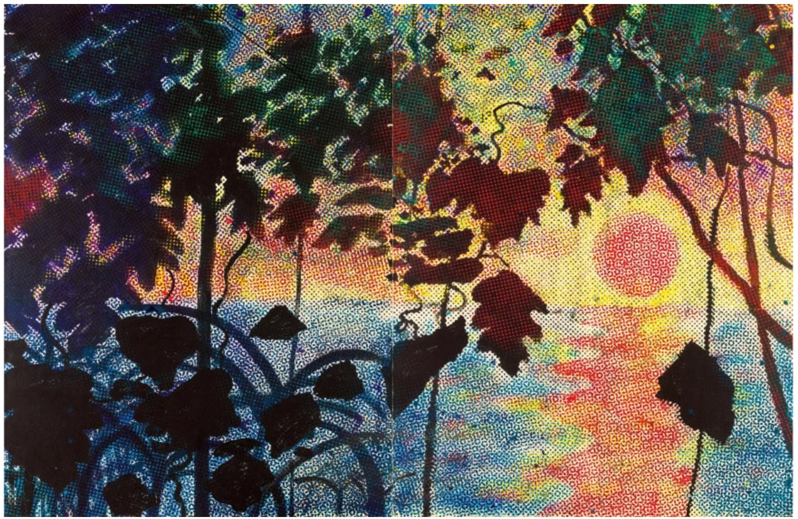
Sigmar Polke, Dschungel (Jungle), 1967. Private Collection. Sold at Sotheby’s New York in May 2015 for $27.1 million. Art © 2025 Estate of Sigmar Polke / Artists Rights Society (ARS), New York / VG Bild-Kunst, Bonn, Germany
Exuberant now but soon to perish, the Flowers are Warhol’s confrontation of the art historical lineage he so tirelessly worked to become a part of, and Late Four-Foot Flowers serves as a metaphor for the fleeting transience of everything Warhol loved: beauty, greatness, and celebrity. During the over half-century since their creation, Warhol’s Flowers have infiltrated our global consciousness as the emblem of classic American Pop; their imagery acts as a metaphor for a generation that changed not only artistic but also social and political topographies in a supremely transformative decade. As is mythologized in art history, during the summer of 1964, he created canvases in square formats measuring 82, 48, and 24 inches, respectively, intended for a show with his new dealer Leo Castelli due to open in New York in November of that year. Michael Lobel emphasizes this exhibition’s significance: “The show, his first with the gallery, represented a career milestone, since his first attempt at showing with Castelli, in 1961, had been met with rejection… Now he was joining the gallery that represented the cream of the crop of American vanguard art, including such leading lights as Robert Rauschenberg, Jasper Johns and Frank Stella” (Michael Lobel, ‘In Transition: Warhol’s Flowers’ in: Exhibition Catalogue, New York, Eykyn Maclean, Andy Warhol Flowers, 2012, n.p.). The creation of his enigmatic flower paintings thus marked the apogee of artistic recognition for Warhol and truly served to carve out his position as a colossal force amongst a pantheon of artistic luminaries. The epitome of elegance, captivating black flowers set upon matte black and emerald ground, the present work is an icon of Andy Warhol’s inimitable practice.
Cagney, 1964
Leonard & Louise Riggio: Collected Works
Christie’s New-York: 12 May 2025
Estimated: USD 2,500,000 – 3,500,000
USD 2,349,000
ANDY WARHOL (1928-1987), Cagney | Christie’s
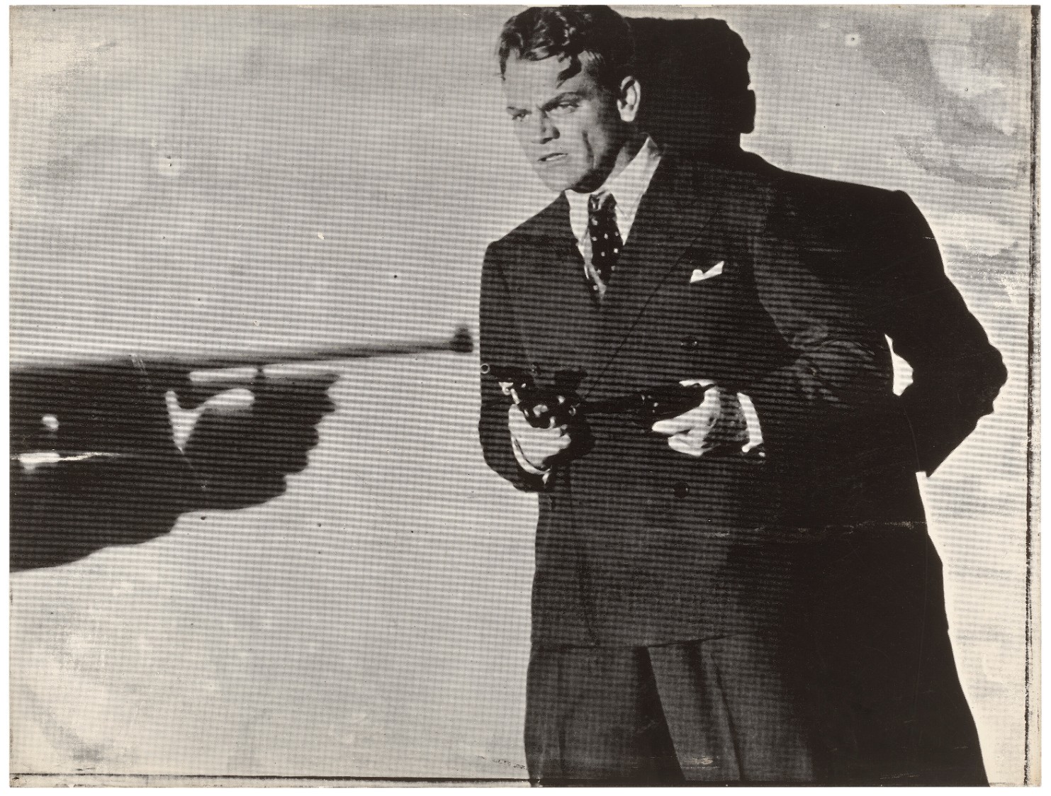
ANDY WARHOL (1928-1987)
Cagney, 1964
Silkscreen ink on paper laid down on paper
30 3/8 x 40 inches (77.2 x 101.5 cm)
Signed and dated ‘Andy Warhol 64’ (on the reverse)
One of only seven known unique works on paper that Warhol made using this particular screen (the only canvas version resides in the collection Staatliche Museen zu Berlin, Nationalgalerie, Collection Marx, Berlin), the origins of the source image that Andy used to produce this work has recently been thrown into question. For many years scholars assumed that the source image was a publicity photo used to promote Cagney’s 1931 movie, The Public Enemy. This was an idea propagated to some extent by Warhol himself who mentioned the film not only to the dealer Heiner Bastian but also to Rainer Crone in the 1960s and whose book, Andy Warhol, became the original de facto early catalogue raisonne̒. This “fact” made its way into an early Warhol catalogue raisonne̒ of prints and even the prestigious catalogue raisonne̒ of paintings and has subsequently been repeated by many other publications. However, research by Wendy Weitman, in preparation for her 1999 exhibition, Pop Impressions Europe/USA: Prints and Multiples from the Museum of Modern Art, has revealed that the source actually comes from the 1938 classic Angles with Dirty Faces (J. Brody, “Andy Warhol’s Cagney Prints,” Print Quarterly, XXVI, 2009, p. 146). Of the seven known versions on paper, four are in public institutions including the collection of the The Museum of Modern Art, New York.
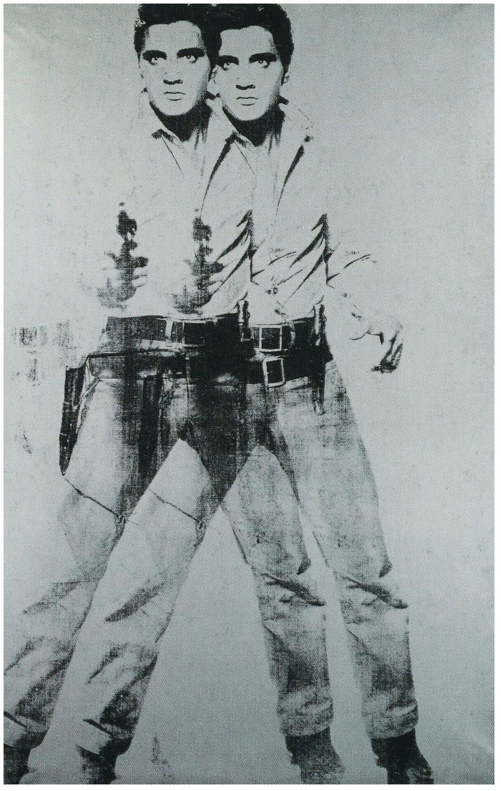 Andy Warhol, Double Elvis, 1963. The Museum of Modern Art, New York.
© 2025 The Andy Warhol Foundation for the Visual Arts, Inc. / Licensed by Artists Rights Society (ARS).
Searching for a way of exploring his ideas about art, celebrity and popular culture Warhol had developed his silkscreen process in 1962. He appreciated the instant electricity and underlying artificiality it generated; the inky superimpositions of the photo-derived screens epitomized Pop with their brand-like distinctness. The finished quality also alludes to the glamour of the “silver screen,” an association that would have meant a lot to Warhol who spent the happiest moments of his childhood in Depression-era Pittsburgh at his local cinema watching his favorite film stars on the big screen. The physical qualities inherent in the process also represent some of Warhol’s ideas about celebrity. Some intended effects insinuate a physical dissolution that evokes a fleeting presence, indicating the transience of fame: “The silkscreened image, reproduced whole, has the character of an involuntary imprint. It is a memorial in the sense that it resembles memory—sometimes vividly present, sometimes elusive, always open to embellishment as well as loss” (T. Crow, “Saturday Disasters: Trace and Reference in Early Warhol,” After the Party: Andy Warhol Works 1956-1986, exh. cat., Irish Museum of Modern Art, Dublin, 1997, p. 22). Warhol’s link between fame and nostalgia is the very basis of these works, which are often generated from old photographs: indeed the one used to create Cagney, for example, is a press photograph issued by the UPI wire service and predates Warhol’s version by several decades.

Andy Warhol in the documentary film Exhibition, produced by Lane Slate, 1963. Courtesy of the Andy Warhol Museum, Pittsburgh. Artwork: © 2025 The Andy Warhol Foundation for the Visual Arts, Inc. / Licensed by Artists Rights Society (ARS).
In many ways, the figure of James Cagney acts almost as Warhol’s alter-ego. Warhol’s choice of composition here is interesting as he crops the original source image to exclude the much larger and domineering figure of Cagney’s machine gun wielding opponent. By removing this ominous presence, Warhol in many ways shifts the balance of power back to Cagney and portrays him as the protagonist rather than the antagonist. Just as he would do with his iconic portraits of Marlon Brando, the Cagney figure was perhaps the type of person that Warhol always wanted to be. Well known for being painfully shy and uncomfortable about his own appearance, Warhol must have admired the tough, confident characters that Cagney and Brando portrayed and secretly wished that he could have possessed some of their bravado and charisma.
Andy Warhol at the Factory, New York, 1964. Photo: © Gerard Malanga.
Begun in 1963, the Cagney series, with its depiction of gun violence, proved to be particularly prescient for Warhol during this period. Working from his home at 1342 Lexington Avenue in New York on November 22, 1963, Warhol and Gerald Malanga were silkscreening The Kiss (Bela Lugosi) when news of John F. Kennedy Jr.’s assassination broke. Like the rest of the nation, Warhol was deeply affected by these events and would himself become involved in two gun incidents. Once, in September 1964, when fellow artist Dorothy Podber shot through a stack of Marilyn paintings that Warhol had in his studio and, more seriously, in 1968 when radical feminist Valerie Solanas appeared at the Factory and shot at him and at his friends. Though three shots were fired at the artist, a single bullet had ricocheted through his spleen, liver, pancreas, esophagus, and both lungs when Solanas had corned the artist underneath his desk, holding the gun against his flesh. Warhol himself gave an account of this incident that nearly ended his life.
Andy Warhol filming Taylor Mead’s Ass at the Factory, New York, 1964. Photo: Fred W. McDarrah.
Ever ambiguous, in Cagney Warhol manages to present us with something that contains the possibility of death and violence yet at the same time celebrates the glamour of Hollywood and the silver screen. As with so much of Warhol’s work, it contains an intriguing duality that portrays two conflicting emotions. It is a thrillingly opaque picture that today continues to confront, defy and engage its viewer and it is perhaps for this reason that Warhol’s Cagney works sets an enticing precedent for much of what was to follow.
Double Torso, 1966
Phillips New-York: 14 May 2025
Estimated: USD 450,000 – 650,000
USD 584,200
Andy Warhol Modern & Contemporary Art Day Sale, Morning Session
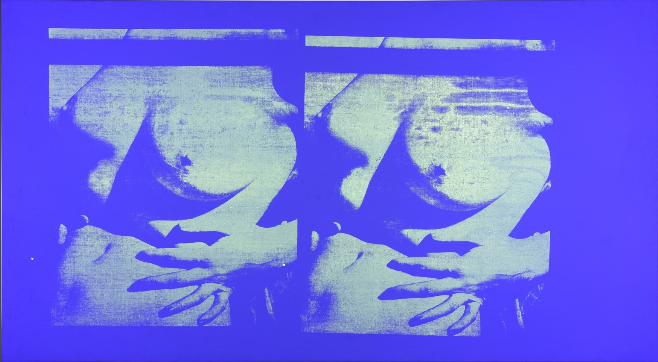
Double Torso, 1966
Fluorescent ink on linen
At first glance, Andy Warhol’s Double Torso, 1966, appears to be a ghostly, white canvas – muted and unassuming under natural light. However, when viewed under ultraviolet light, the composition comes to life, revealing a duplicated image of a woman’s nude torso. The present work was commissioned by Playboy Magazine as part of a feature called The Playmate as Fine Art; an editorial published in January 1967 which featured the works of 11 other prominent artists of the time, including Salvador Dalí, Larry Rivers, James Rosenquist and Tom Wesselmann.
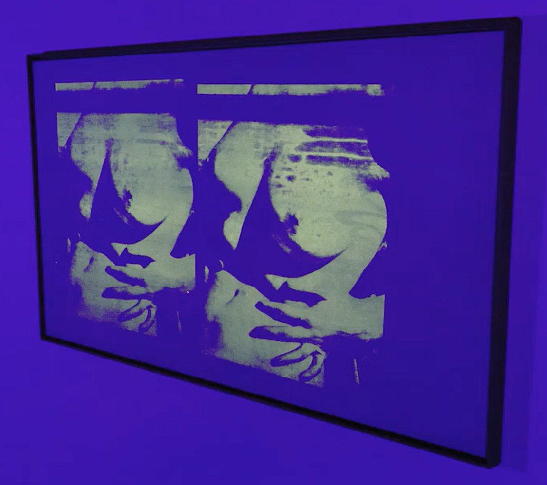
Using a photograph taken by Playboy to create the screen, Warhol created Double Torso during the 1960s alongside two other ultraviolet paintings – one of which is currently in the collection of the Norton Simon Museum of Art, Pasadena, and the third whose location is unknown; the painting may have been lost or inadvertently destroyed due to its supposed blankness under regular light. Exhibited extensively since 1972, the present work reflects Warhol’s innovation in silkscreen and continual experimentation with his materials, elevating the viewing experience of painting to each end of the visual spectrum.
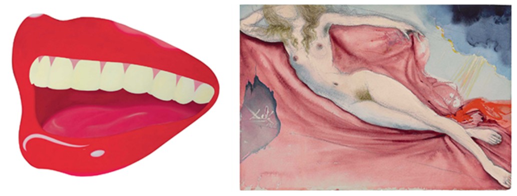
[Left] Tom Wesselmann, Mouth #8, 1966. Created for The Playmate as Fine Art. Artwork: © 2025 Estate of Tom Wesselmann / Artists Rights Society (ARS), New York
[Right] Salvador Dali, Playmate after Rokeby Venus, 1966. Created for The Playmate as Fine Art. Artwork: © 2025 Salvador Dalí, Gala-Salvador Dalí Foundation / Artists Rights Society (ARS), New York
“My next series will be of pornographic pictures. They will look blank. When you turn on the lights, then you see them… if a cop came in, you could just flick out the lights or turn on the regular lights – how could you say that was pornography?”
The present work and the ultraviolet paintings as a whole were not Warhol’s first or last foray into the depiction of the nude. In addition to his early 1960s erotic films, Warhol is well known for two series begun in the late 1970s, Torsos and Sex Parts, each depicting close-up images of male bodies and genitalia. Many of these works, as with Double Torso, were created during a sexual revolution in America, and rather than abiding by the increasing restrictions on graphic imagery, Warhol embraced sexuality, forefronting it in his paintings, prints, and films. Using ultraviolet light to mask the female nude, Warhol asks the viewer to question their feelings towards sex.
“what’s pornography anyway? The muscle magazines are pornography, but they’re really not. They teach us how to have good bodies. They’re the fashion magazines of Forty-Second Street – that more people read.”
Double Torso may have been created for the Playboy feature, but it also allowed the artist to impose his own commentary on the censorship laws banning pornography in the 1960s. Criticizing the notions of what could or could not be seen, Warhol truly turns this idea on its head, presenting an image which is at once visible and invisible, depending on lighting. Fascinated with technology and continually experimenting with various methods during his career, Warhol was a pioneer of the use of ultraviolet light in his art, pushing the boundaries of traditional media and engaging with new visual effects. The employment of ultraviolet light allowed Warhol to further explore his ongoing preoccupation with visibility and perception – how we see, what we choose to look at, and what remains hidden until brought to light. Indeed, ultraviolet light became another tool in Warhol’s visual vocabulary, linking spectacle, sensation and social commentary in Double Torso.
The Last Supper, 1986
Christie’s New-York: 15 May 2025
Estimated: USD 200,000 – 300,000
USD 453,600
ANDY WARHOL (1928-1987), The Last Supper | Christie’s
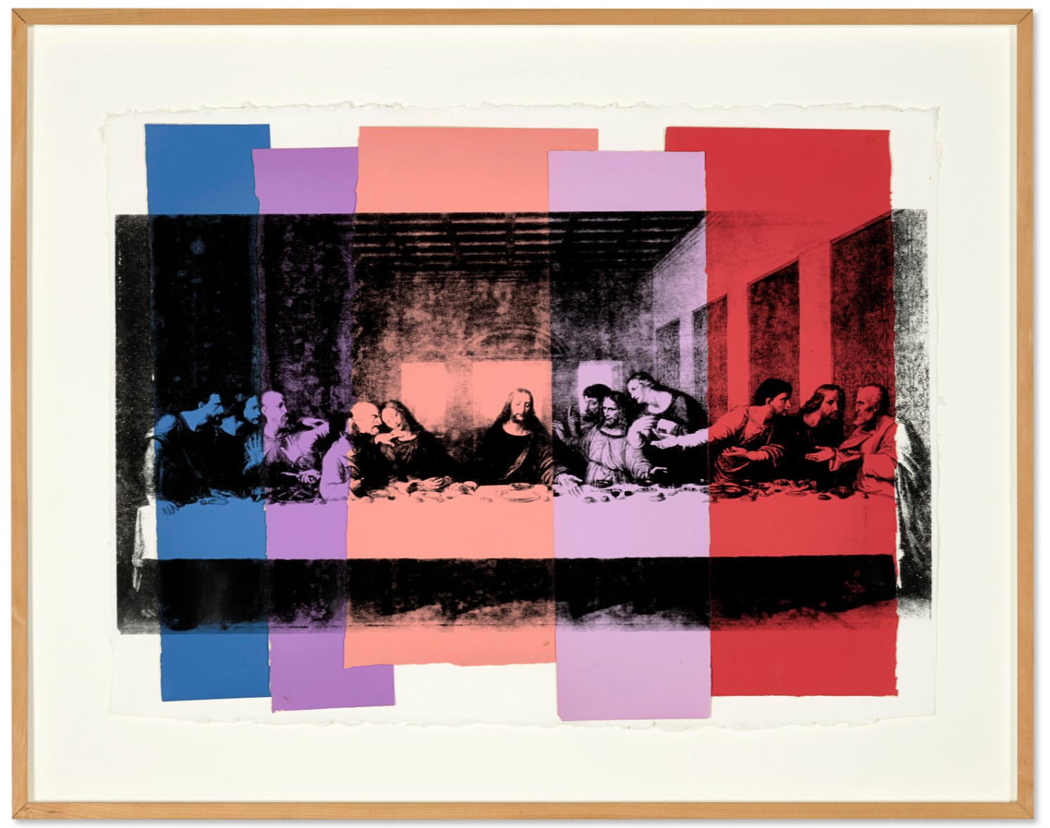
ANDY WARHOL (1928-1987)
The Last Supper, 1986
Silkscreen ink and colored paper collage on paper
23 5/8 x 31 3/8 inches (60×80 cm)
Stamped with the Estate of Andy Warhol and the Andy Warhol Foundation for the Visual Arts, Inc. stamps
Numbered ‘VF 40.026’ (on the reverse)
Ballet Slippers [Three Works], 1981
Christie’s New-York: 15 May 2025
Estimated: USD 300,000 – 500,000
USD 453,600
ANDY WARHOL (1928-1987), Ballet Slippers [Three Works] | Christie’s
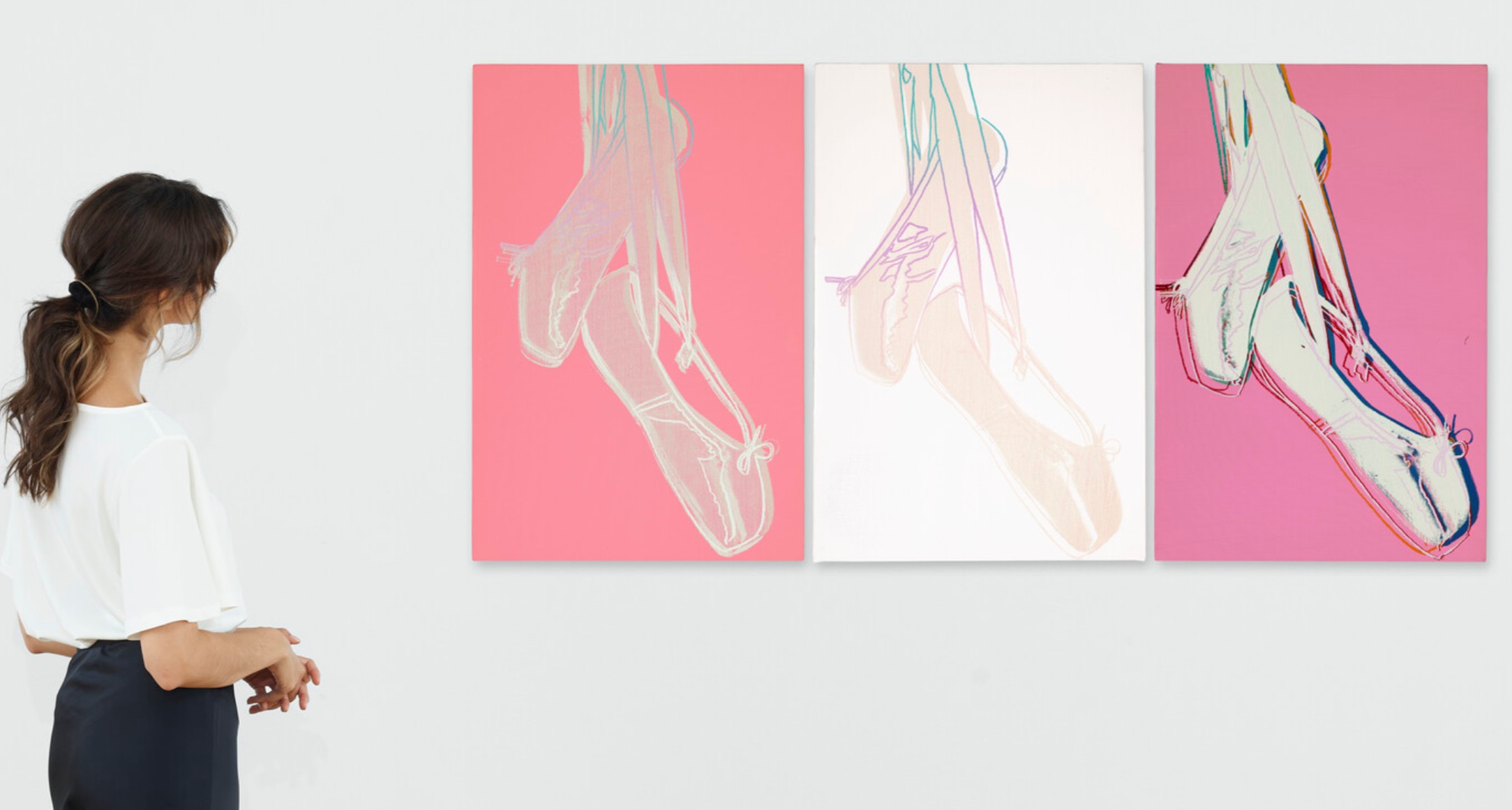
ANDY WARHOL (1928-1987)
Ballet Slippers [Three Works], 1981
Acrylic and silkscreen ink on canvas
Each: 30×20 inches (76.2 x 50.8 cm)
Each signed and dated ‘Andy Warhol 1981’ (on the overlap)
Chris Evert [Sixteen Works], 1977
Sotheby’s New-York: 16 May 2025
Estimated: USD 400,000 – 600,000
USD 355,600
Chris Evert [Sixteen Works] | Contemporary Day Auction | 2025 | Sotheby’s
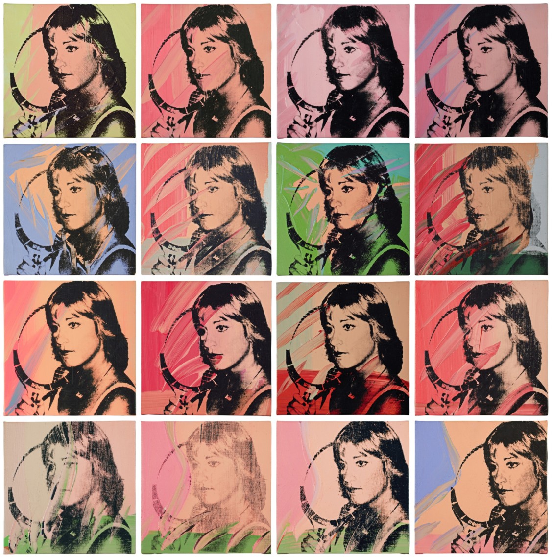
ANDY WARHOL (1928 – 1987)
Chris Evert [Sixteen Works], 1977
Acrylic and silkscreen ink on canvas in 16 parts
Each: 10×10 inches (25.4 x 25.4 cm)
Variously stamped by the Estate of Andy Warhol and the Andy Warhol Authentication Board and variously
Numbered on the reverse
Commissioned by the art collector Richard L. Weisman, Andy Warhol’s athlete series was born out of his benefactor’s desire to unite his seemingly disparate interests of art and sports. Warhol, who saw himself as a chronicler of contemporary culture loved the idea, sensing that athletes were on the verge of becoming a hot new category of celebrity, and believed athletes were “so exciting, so intelligent and so attractive.” (New York Times, December 11, 1977, Page 217)
The resulting series of multi-colored, 40 x 40 in. acrylic and silkscreen ink on canvas paintings encompassed just eight portraits of 10 different athletes that were handpicked by Weisman. The artworks featured sports stars included boxer Muhammad Ali, basketball player Kareem Abdul-Jabbar, golfer jack Nicklaus, tennis ace Chris Evert, and six others. One portrait went to each subject, one portrait of each subject went to Warhol, and the remaining works—60 in total—were put up for sale.
Between March and November 1977, Warhol travelled around the United States with his polaroid camera to photograph each featured athletes. Back in his New York studio, he transferred the photographs to canvas using his signature technique of silkscreen on colorfully painted canvasses.
Featuring sixteen small panels painted in colorful peach toned acrylic with red, pink, green, and blue accents, in Chris Evert [Sixteen Works], Warhol depicted the legendary tennis star in black silkscreen ink at a three quarter profile, with her racquet in hand. Evert is one of just two women featured in the series, and the only tennis player. She was the number one ranked women’s player in the world in 1977 when Warhol photographed her.
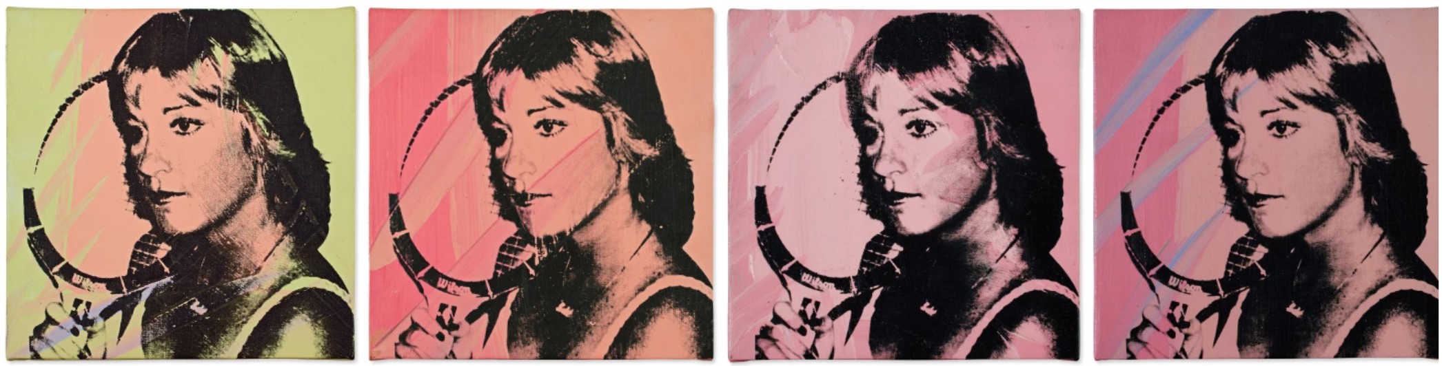
Warhol did the present work in a new style that combines sixteen 10 x 10 in. paintings arranged in a grid format collectively measuring 40 x 40 in. According to a 1977 diary entry, Warhol wrote that Weisman got angry about this new creative direction. “He was in a nervous mood, and when he saw that I was doing a new style of painting, he got upset, he didn’t like that I did the Chrissie Evert in lots of little pictures instead of big ones.” A. Warhol quoted in N. Printz and S. King-Nero, eds., The Andy Warhol Catalogue Raisonne: Paintings 1976-1978, vol. 5A, New York, 2018, p. 405). Warhol ultimately produced just two of these sets of sixteen paintings, one of which includes the present lot.
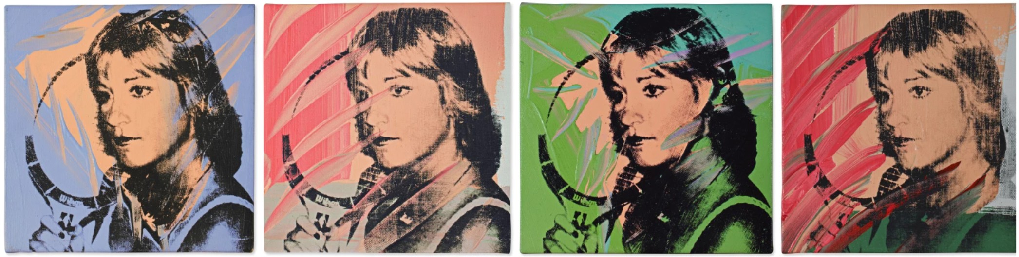
The paintings from Warhol’s athlete series represent some of his most accomplished works of his later years. Chris Evert [Sixteen Works] is particularly distinguished artwork because it is one of the few paintings from the athletes series in which he explores his preoccupation with seriality, which was a fundamental component of his approach to pop art.
Man Ray [Two Works], 1974
Sotheby’s New-York: 16 May 2025
Estimated: USD 200,000 – 300,000
USD 355,600
Man Ray [Two Works] | Contemporary Day Auction | 2025 | Sotheby’s
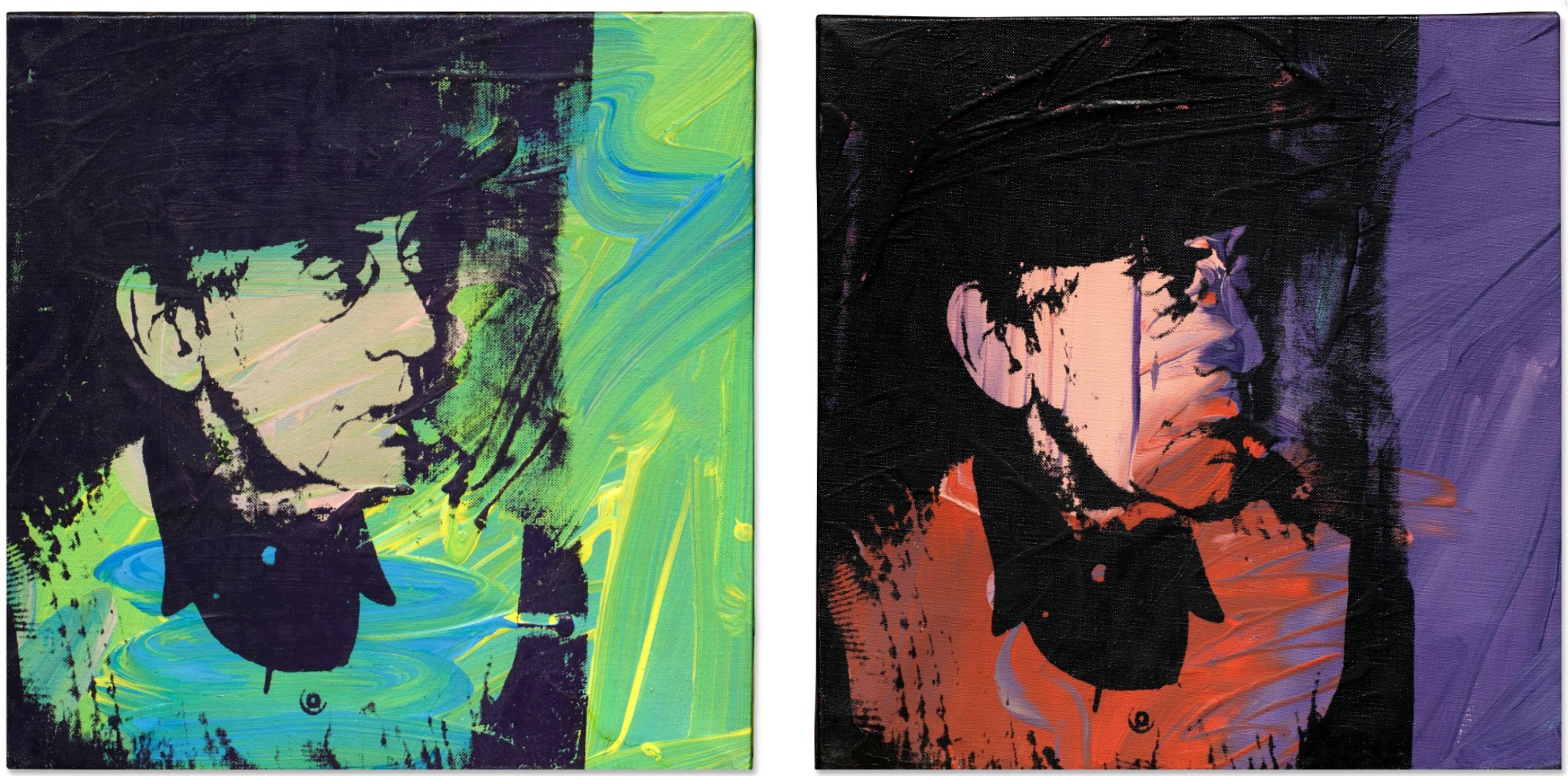
ANDY WARHOL (1928 – 1987)
Man Ray [Two Works], 1974
Acrylic and silkscreen ink on canvas in 2 parts
Each: 13×13 inches (33×33 cm)
Signed and dated 74 (on the reverse of each)
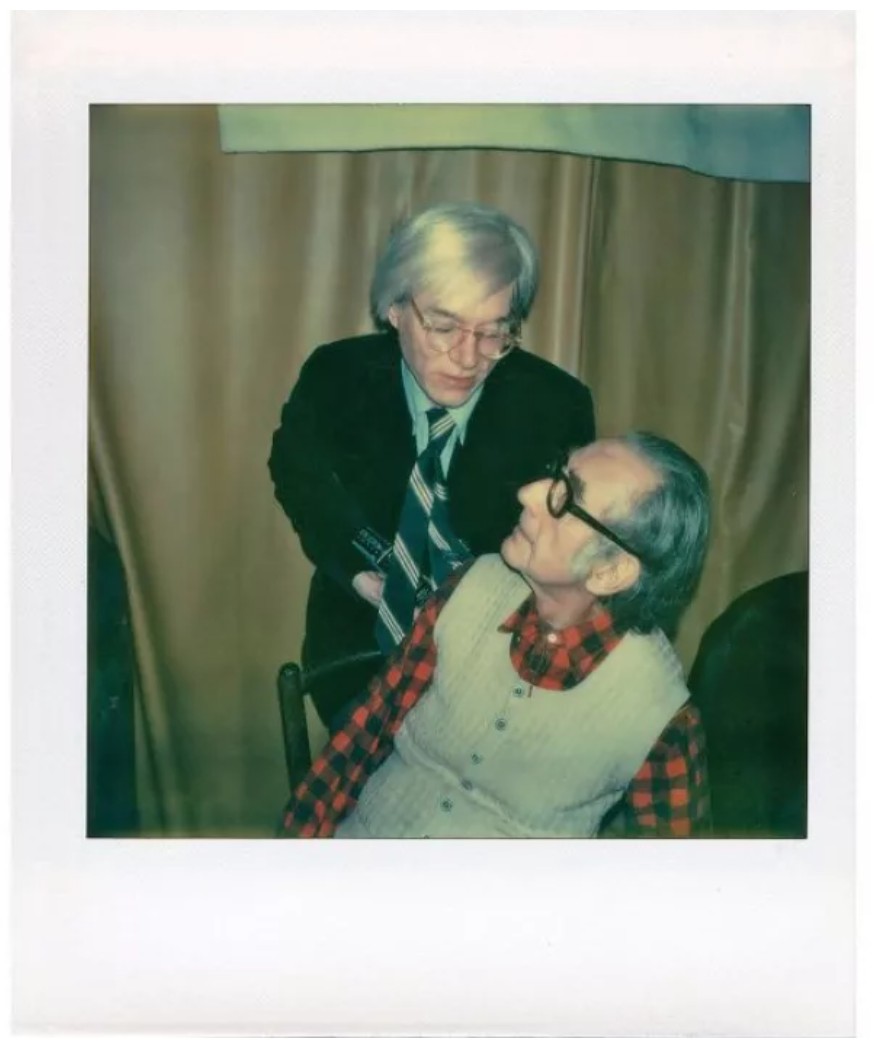
Polaroid of Andy Warhol and Man Ray. Image © The Andy Warhol Foundation for the Visual Arts, Inc.
“I took a SX-70 and then I put in a whole roll and I got ten… ten pictures of that and then he put a cigar in his mouth… And actually the cigar was bigger than he was because he’d… he’d gotten very… very bent over. And he looked like he was always far out but uh… I think it was just because he was bent over… I had him smoke the cigar.”
Flowers, 1964
Sotheby’s New-York: 16 May 2025
Estimated: USD 180,000 – 250,000
USD 355,600
Flowers | Contemporary Day Auction | 2025 | Sotheby’s
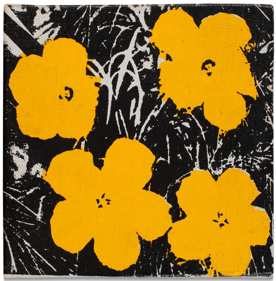
ANDY WARHOL (1928 – 1987)
Flowers, 1964
Acrylic and silkscreen ink on canvas
5×5 inches (12.7 x 12.7 cm)
Signed and dated 64 (on the overlap)
Stamped by the Estate of Andy Warhol and the Andy Warhol Foundation for the Visual Arts, Inc.
Numbered A102.015 on the overlap
Rod Gilbert, 1977
Christie’s New-York: 15 May 2025
Estimated: USD 200,000 – 300,000
USD 327,600
ANDY WARHOL (1928-1987), Rod Gilbert | Christie’s
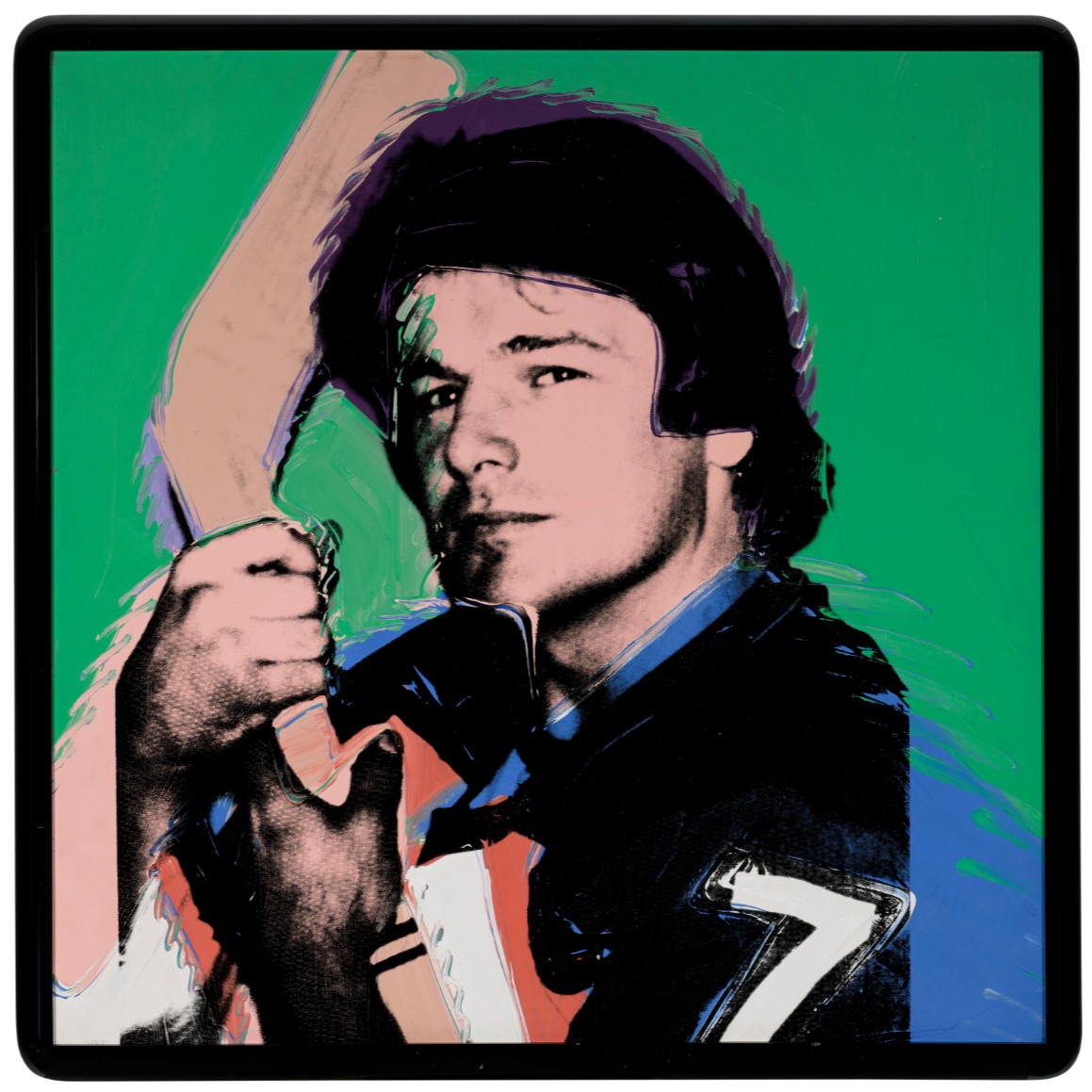
ANDY WARHOL (1928-1987)
Rod Gilbert, 1977
Acrylic and silkscreen ink on canvas
40×40 inches (101.6 x 101.6 cm)
Signed ‘Andy Warhol ©’ (on the overlap)
Signed by Rod Gilbert (on the overlap)
Terrier, 1983
Sotheby’s New-York: 16 May 2025
Estimated: USD 150,000 – 200,000
USD 254,000
Terrier | Contemporary Day Auction | 2025 | Sotheby’s
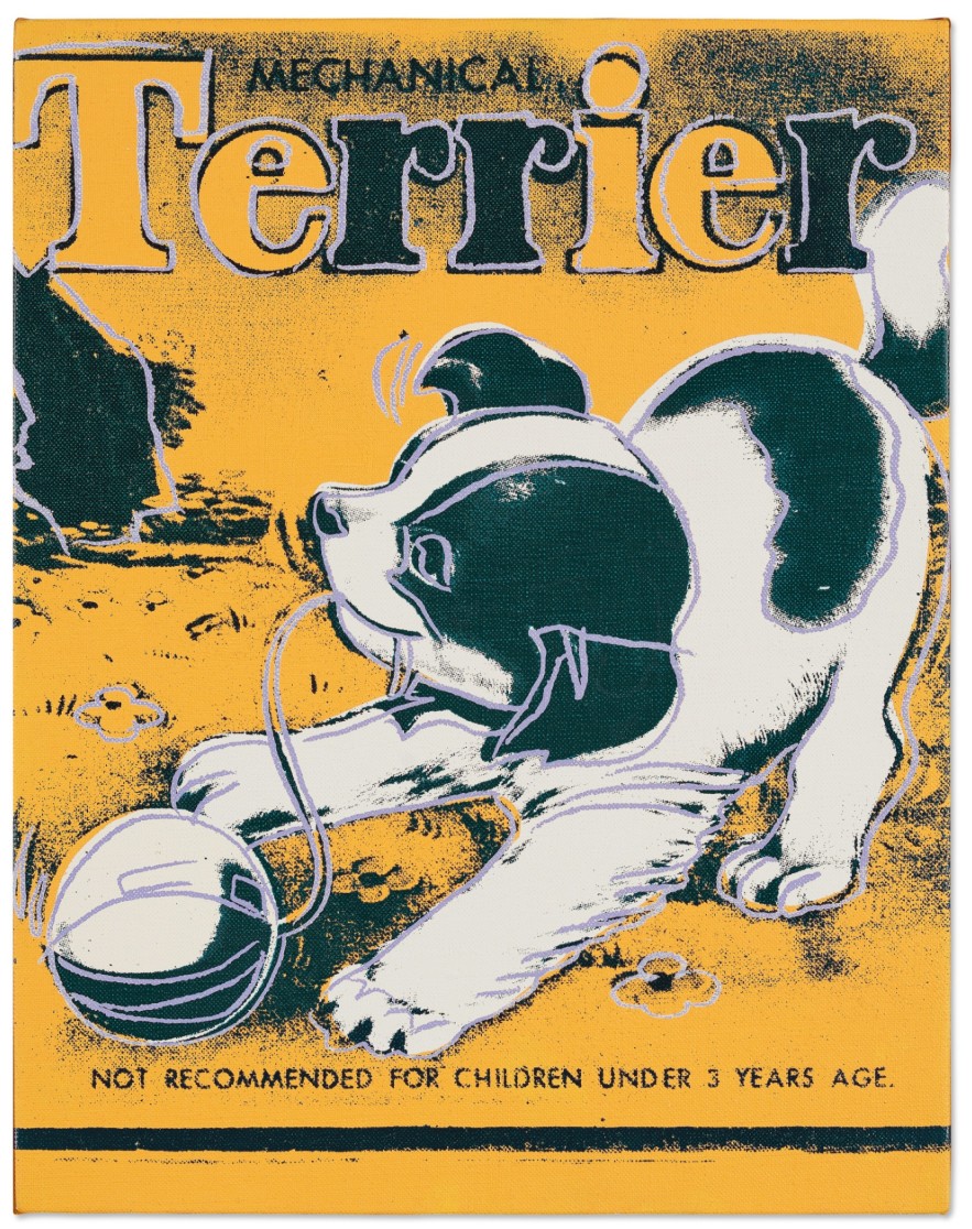
ANDY WARHOL (1928 – 1987)
Terrier, 1983
Acrylic and silkscreen ink on canvas
14×11 inches (35.6 x 27.9 cm)
Stamped by the Estate of Andy Warhol and by the Andy Warhol Foundation for the Visual Arts, Inc.
Numbered PA 20.059 on the overlap and on the stretcher
Shadow, 1977
Christie’s New-York: 15 May 2025
Estimated: USD 80,000 – 120,000
USD 214,200
ANDY WARHOL (1928-1987), Shadow | Christie’s
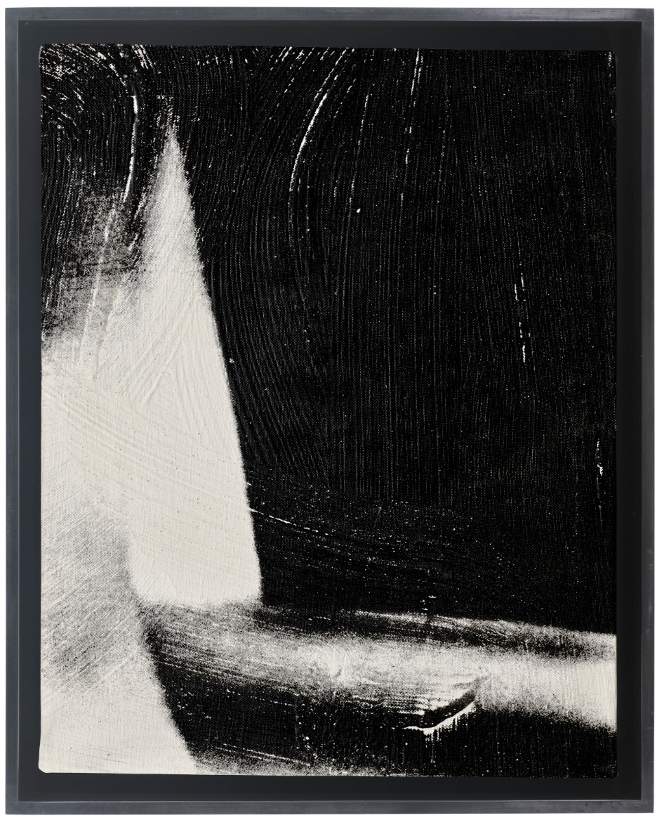
ANDY WARHOL (1928-1987)
Shadow, 1977
Acrylic and silkscreen ink on canvas
14×11 inches (35.6 x 27.9 cm)
Signed and dedicated ‘To Graziella Andy Warhol’ (on the overlap)
Ship, 1983
Sotheby’s New-York: 16 May 2025
Estimated: USD 150,000 – 200,000
USD 190,500
Ship | Contemporary Day Auction | 2025 | Sotheby’s
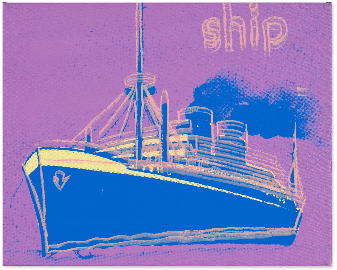
ANDY WARHOL (1928 – 1987)
Ship, 1983
Acrylic and silkscreen ink on canvas
11×14 inches (27.9 x 35.6 cm)
Signed (on the overlap)
Numbered PA20.097 on the stretcher
Mineola Motorcycle, circa 1985-1986
Christie’s New-York: 15 May 2025
Estimated: USD 80,000 – 120,000
USD 138,600
ANDY WARHOL (1928-1987), Mineola Motorcycle | Christie’s
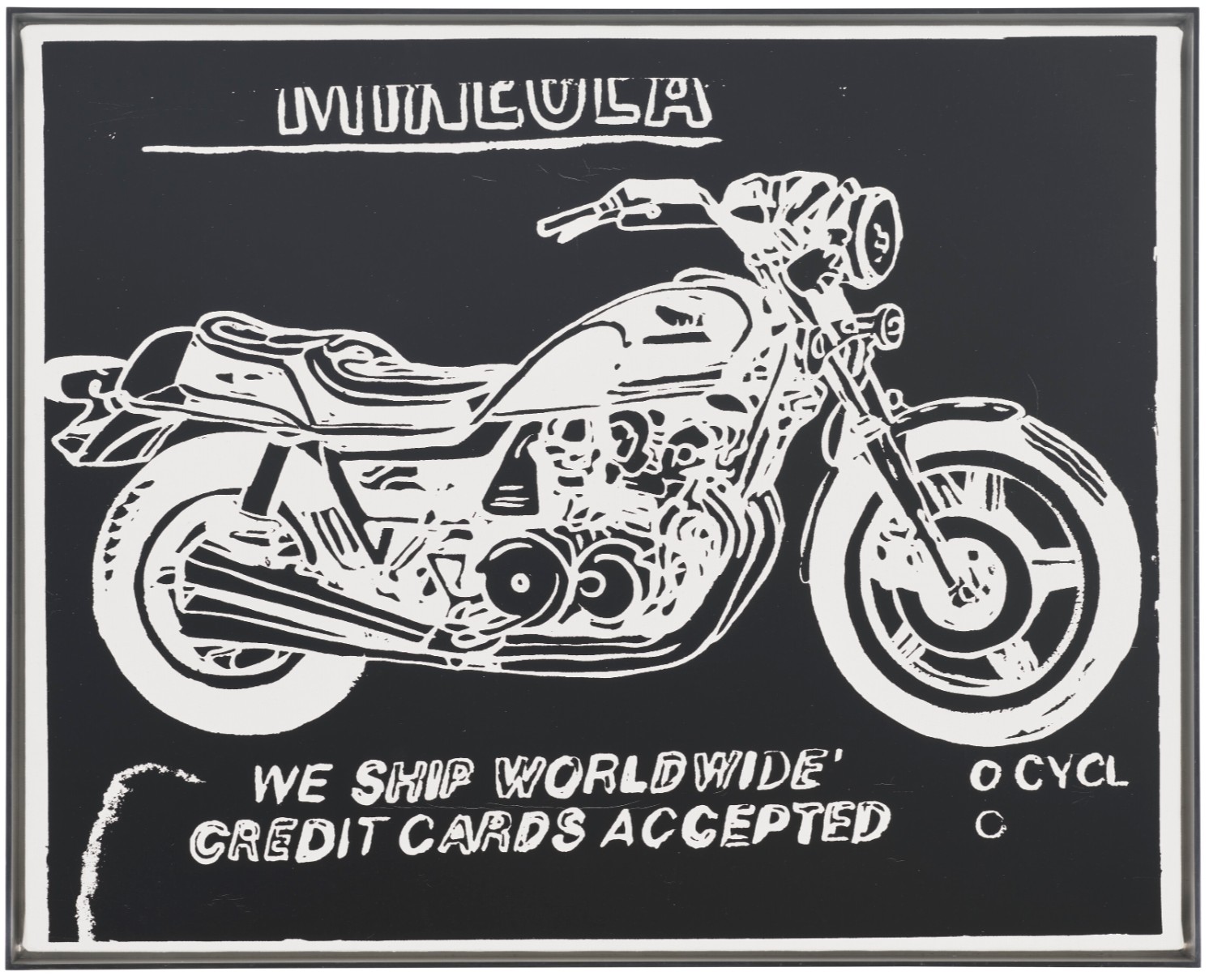
ANDY WARHOL (1928-1987)
Mineola Motorcycle, circa 1985-1986
Acrylic and silkscreen ink on canvas
16×20 inches (40.6 x 50.8 cm)
Stamped with the Estate of Andy Warhol and the Andy Warhol Foundation for the Visual Arts, Inc. stamps
Numbered ‘VF PA10.328 (on the overlap)
Numbered again ‘PA10.328’ (on the stretcher)
Big Electric Chair, 1967-1968
Christie’s New-York: 12 May 2025
Estimate on Request
WITHDRAWN
ANDY WARHOL (1928-1987), Big Electric Chair | Christie’s
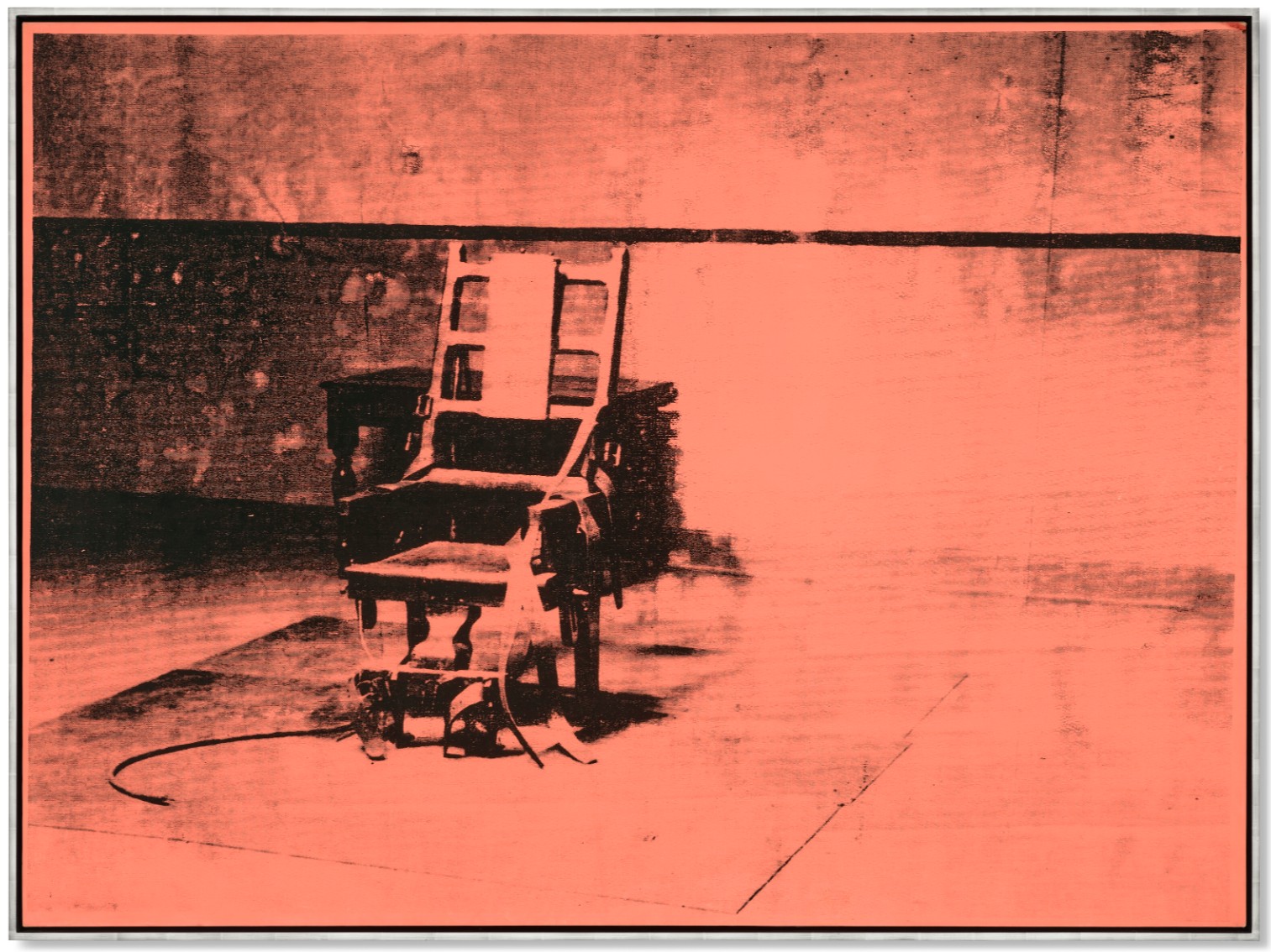
ANDY WARHOL (1928-1987)
Big Electric Chair, 1967-1968
Acrylic and silkscreen ink on canvas
54×74 inches (137.2 x 188 cm)
Andy Warhol’s Big Electric Chair is one of the most important paintings of the artist’s career. In addition to being the ultimate manifestation of both the visual and conceptual intensity of Warhol’s best work, this particular example has also played a central role in establishing his reputation as one of the twentieth-century’s most celebrated artists. It was included in the two most important exhibitions of Warhol’s career: the artist’s first major European retrospective, organized by Stockholm’s Moderna Museet in 1968, and his first U.S. institutional exhibition, at the Pasadena Art Museum, in 1970. After the Stockholm show it was acquired by the legendary collectors Roger Matthys and Hilda Colle. This groundbreaking couple did much to establish the status of Pop Art (and contemporary art in general) in Europe, and Big Electric Chair became the centerpiece of their world-famous collection. As part of their stewardship, they continued to loan the painting to other important retrospectives, ensuring it became one of the artist’s most celebrated works. The sustained level of interest in this painting by both museum curators, major collectors, and art audiences alike is testament to its venerated place within Warhol’s extensive body of work.
Often obsessed with celebrity and popular culture, in truth Warhol’s best paintings contain multiple layers of meaning imbedded within their silkscreened images. Big Electric Chair perfectly captures this often complex aspect of his work. In addition to its obvious references, the large-scale canvas can also be read as a significant still-life that reflects an alternative view of America. Dating back to Roman times, still lifes have portrayed everyday objects as having adopted different meanings that adapt to their time. Following his portrayals of Campbell’s Soup Cans and Coca-Cola bottles that symbolized the democratizing nature of the American Dream, with his Big Electric Chair, Warhol embarks on what has become his ultimate still life, a defiant painting that truly reflects the modern age.

Andy Warhol and Pontus Hultén in Warhol’s first solo exhibition at Moderna Museet in 1968 (present lot illustrated).
Photo: Nils-Göran Hökby, courtesy of Moderna Museet.
Artwork: © 2025 The Andy Warhol Foundation for the Visual Arts, Inc. / Licensed by Artists Rights Society (ARS).
Warhol’s Big Electric Chair paintings have been described by the legendary Metropolitan Museum of Art curator Henry Geldzahler as the most powerful paintings in Pop Art (B. Gopnik, Warhol, New York, 2020, p. 605). This reputation was garnered, in part, from its inclusion in one the artist’s most important early retrospectives. Organized by the Moderna Museet in Stockholm in 1968, and later traveling extensively throughout Europe, the exhibition featured his Big Electric Chair paintings, largescale versions of his iconic Flower canvases, and a large display of his Brillo Boxes. The legendary dealer Ileana Sonnabend described the assembled works as “the most important international show in Europe” (I. Sonnabend, ibid. p. 605), and of the twelve Big Electric Chairs that were included in the Stockholm show, nine are now in major international institutional collections.
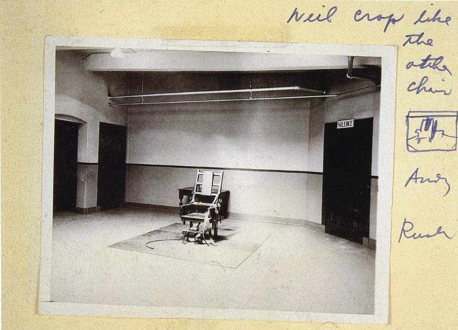
Source image for Electric Chair series, featuring a sketch on the side of the crop format for the Big Electric Chair series. Archives of the Andy Warhol Museum, Pittsburgh.
This is a highly cropped version of an image Warhol had used before. Beginning as early as 1963 with Orange Disaster #5 (The Solomon. R. Guggenheim Museum, New York), the artist had selected this image for a number of canvases that formed the basis of what became known as his Death and Disaster series. Yet in the present work, Warhol has altered the image radically, eliminating much of the apparatus that makes his earlier incarnations so chilling. Gone are the doors that lead into empty dark rooms beyond, and gone are the portentous signs above them that demand SILENCE. Missing too are the utility pipes that hang from the ceiling. Instead, we are left with just the chair, its silhouetted form emitting an eerie sense of quiet. The lack of ephemera and atmosphere encourages considered reflection on the object that stands before us. In addition to the succinct depiction of its subject, the clarity of the screen in the present work makes this a standout in the series. Warhol’s decision to leave this particular example untarnished by the flourishes that too often disrupt the composition of the other examples, adds a potency to this particular work. Some of the contradictions inherent in the original source image are most clearly visible in this work, such as the utilitarian details of the electric chair which sit in stark contrast to the decorative nature of the wooden table which lurks in the shadows behind it.
The present work is also a standout from the series of fourteen Big Electric Chairs in that it is the only canvas from the series in which Warhol screens the image solely with black silkscreen ink against a single color ground. This simplicity enhances the depth of the shadows when contrasted with the brightness of the chair’s highlights, both working in concert to clearly denote the anatomy of the chair in all its haunting detail. In each of the other examples, he experiments with using different colored inks to portray the subject of his painting. In other examples, the artist sometimes uses a combination of high-keyed pigments, but many of these appear to obscure the subject of Warhol’s painting rather than portraying the cool crispness of the subject as in the present work.
Joan Mitchell
Petit Matin, 1982
Christie’s New-York: 15 May 2025
Estimated: USD 2,500,000 – 3,500,000
JOAN MITCHELL (1925-1992), Petit Matin | Christie’s
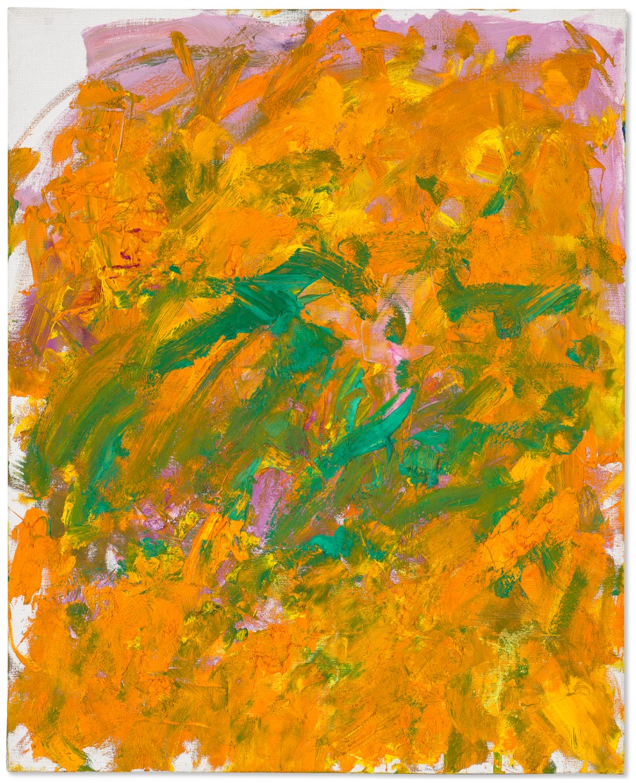
JOAN MITCHELL (1925-1992)
Petit Matin, 1982
Oil on canvas
100×80 cm (39 1/4 x 31 3/4 inches)
Signed ‘Joan Mitchell’ (lower right)
Held in the same private collection for over thirty years, Joan Mitchell’s Petit Matin (1982) is a dazzling breakthrough work, brimming with the radiant oranges, lush greens and bursts of fuchsia that characterize the vibrant, colorful palette that she adopted in the early 1980s. This densely painted composition is a masterclass in Joan Mitchell’s unique language of color and gestural lyricality—distinct characteristics which would come to define the artist’s most ambitious and visually arresting paintings. Absorbed in the daily rhythms of life at La Tour, her sprawling French country estate, the bucolic splendor of Vétheuil is keenly felt in her palette.
“Petit Matin” refers to the early morning hours when the sun cracks over the horizon with first light. As an artist who routinely painted long into the wee hours of the night accompanied by Mozart’s melodies, Mitchell spent many “blue dawns” watching the sunrise at La Tour. In 1982, she devoted a small series to the subject, which she titled Petit Matin. This body of work in many ways anticipates the Grande Vallée suite that would emerge the following year. As the curator Katy Siegel has called them, these “exquisite small canvases” rank among “the most sheerly beautiful of her career” (K. Siegel, “La Vie en Rose,” in Joan Mitchell, exh. cat., San Francisco Museum of Modern Art, 2020, p. 296).
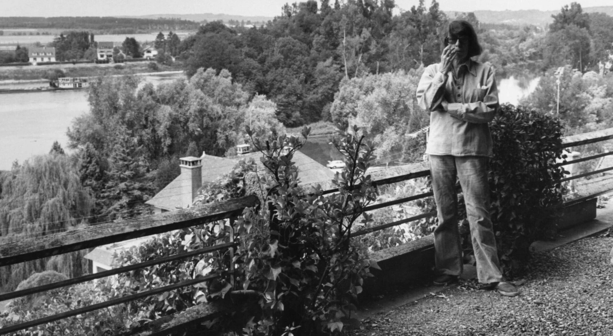
Joan Mitchell at La Tour, Vétheuil, 1984. Photo: Édouard Boubat. © Estate of Édouard Boubat / Artists Rights Society (ARS), New York.
Brimming with a bountiful exuberance, the present lot is a renaissance of color and dynamism, evocative perhaps of a flowering garden at the height of spring on a warm, sunny day. Throughout her career, Mitchell used color symbolically, and despite the challenges that plagued her personal life, she seemed determined to turn toward the joyous colors of the natural world. In 1981, Mitchell’s beloved friend and psychiatrist, Edrita Fried, passed away, and in 1982, her sister Sally died after a prolonged battle with cancer. And yet, as stated by the French critic Michel Waldberg “The magnificence of painting reaches its zenith…in the 1980s, [it’s] as if something, in her, had come to the surface” (M. Waldberg, Joan Mitchell, Paris, 1992, p. 55). Petit Matin synthesizes a lifetime of experience and intimate personal memories. It embodies all the fullness of life—its pain and pathos, sorrows and joy—in its glistening, kaleidoscopic display.
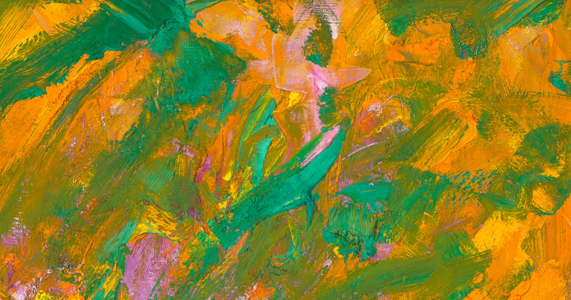
Using a loaded brush, Mitchell paints in thick, vigorous strokes, leaving visible areas of impasto as a record of her work. Beneath the orange is a violet underlayer – perhaps an allusion to the early morning dawn evoked by the painting’s title. Areas of emerald green paint have been added to the surface in flickering, light-filled strokes, which adds yet another reference to the natural world. In Mitchell’s hands, orange recalls the sunflowers that grew in her gardens in Vétheuil, and is reminiscent of her earlier Sunflower (1969), which was influenced by van Gogh, an artist Mitchell had admired since her days at the Art Institute of Chicago. In the case of the present lot, Mitchell’s almost otherworldly color sensibilities allow Petit Matin to emerge as a celebration of the natural world, with an impact that rivals only that which she achieves on larger canvases.
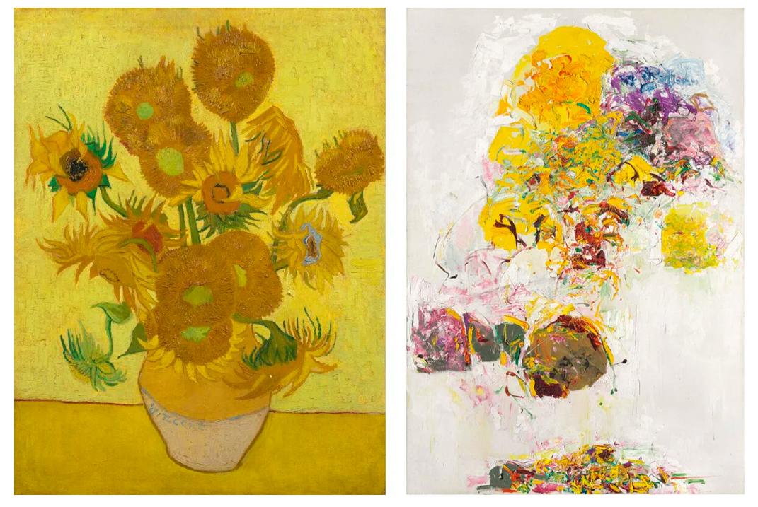
Left: Vincent van Gogh, Sunflowers, 1889. Van Gogh Museum, Amsterdam.
Right: Joan Mitchell Sunflower, 1969. Metropolitan Museum of Art. © Estate of Joan Mitchell.
Indeed, Mitchell found solace in the daily rhythms of La Tour, a lush, two-acre property, that inspired Claude Monet while he was living there between 1878 and 1881. The gentle rhythm of the seasons found their release in paintings like Petit Matin, and similarly, in paintings named after the hours of the day and the weather that punctuated them: Rain (1989); No Rain (1976); Little Rain (1989); as well as Hours (1989); Afternoon (1969-70); and Noon (c. 1970). Throughout her career, Joan Mitchell never sought to slavishly mimic nature or render its exact likeness. Instead, she aimed to capture the emotional spirit of the landscapes that were evoked in her.
“I carry my landscapes around inside me. I could certainly never mirror nature. I would like more to paint what it leaves me with.”
Indeed, her paintings of this era convey the impression of a remembered landscape, be it the sparkling blue of the Mediterranean, or the particular yellow of the sunflowers that she planted at Vétheuil, much like Twombly did in his beloved Gaeta botanical gardens. In the early 1980s Mitchell was offered her very first museum exhibition in France, which would take place at the Musée d’Art Moderne de la Ville de Paris in 1982, the same year Petit Matin was painted. Spurred on by the invitation, being the first female American artist to exhibit at the institution, Mitchell tackled the project with a new sense of confidence, made manifest in the dramatically increased scale of the paintings exhibited. This display of her work cemented her status in France and Europe, which led to numerous acquisitions of her work by French private and public institutions in the following years.
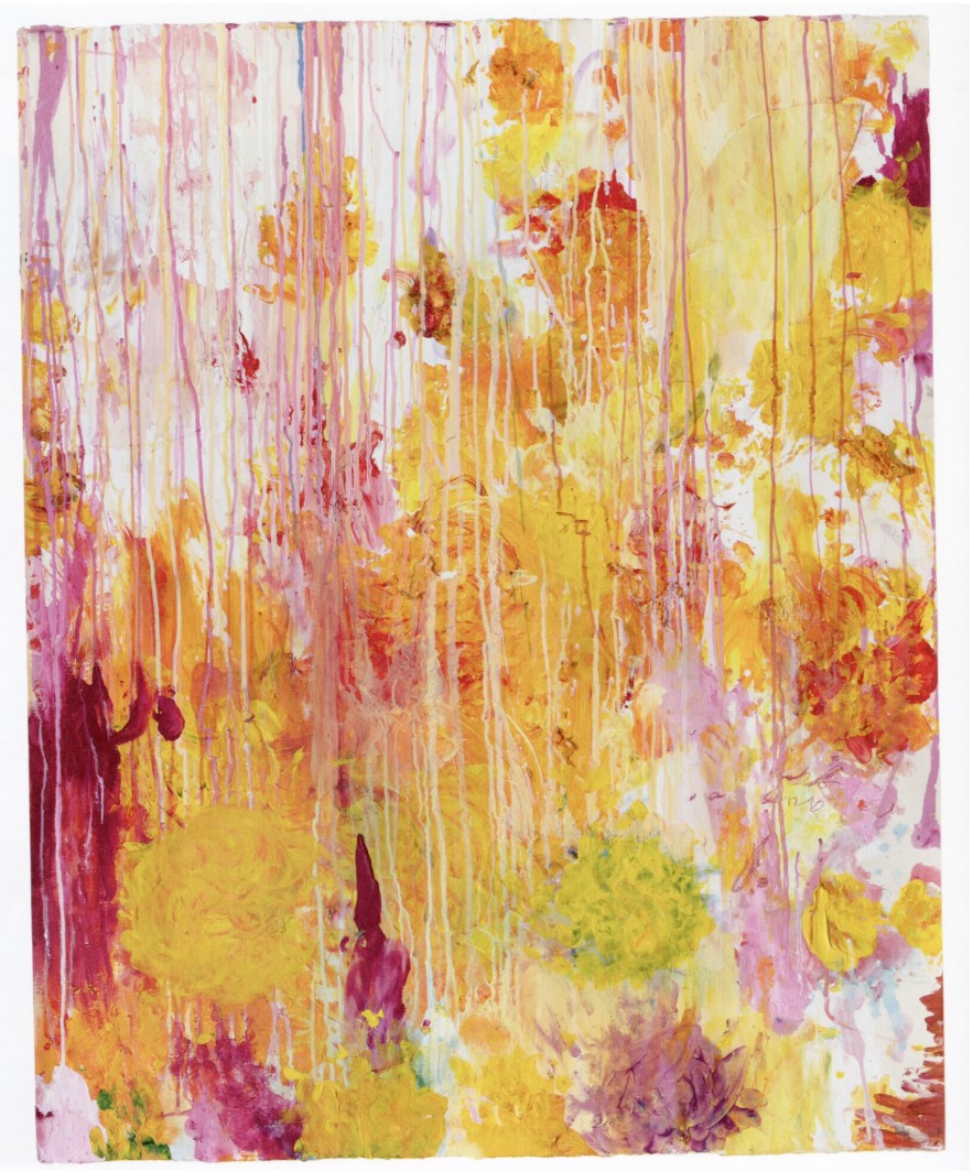
Cy Twombly, Untitled, 2001. Museum of Modern Art, New York. © Cy Twombly Foundation.
Though unmistakably abstract, the radiant oranges, emerald greens, and soft mauves dancing across the canvas in Petit Matin summon a world teeming with life, intoxicating in its beauty and energy. Yet, the energy captured within Petit Matin is not confined to the inspiration drawn from the artist’s gardens. It pulses with an inner force— with ambitious, exuberant painterly marks that sweep across the canvas with a determination and physicality that stretches far beyond the painting’s physical edge. A striking testament to Joan Mitchell’s continued artistic prowess, Petit Matin embodies her mastery over her craft and the passion with which she wielded her brush. Anticipating the triumphant body of work known as the Grande Vallée paintings of the following year, Petit Matin is a commanding display of some of the most sought-after qualities to be found in Mitchell’s paintings, especially those created during the prolific latter half of her artistic career.
Series July 25 (V), 1966
Christie’s New-York: 14 May 2025
Estimated: USD 500,000 – 700,000
USD 1,320,700
JOAN MITCHELL (1925-1992), Series July 25 (V) | Christie’s
JOAN MITCHELL (1925-1992)
Series July 25 (V), 1966
Oil on canvas
13×14 inches (33 x 35.5 cm)
Signed ‘J. Mitchell’ (lower right)
This beautiful painting is one of five known works from a series titled Series July 25, which Joan Mitchell painted in 1966 following the untimely passing of Frank O’Hara. O’Hara’s death, after being struck by a car on Fire Island, was a devastating loss to the artistic community in New York City. Not only was he the leading poet of the New York School, he was also an influential art critic for Art News, and a curator of paintings and sculpture at the Museum of Modern Art. As Larry Rivers said in his eulogy for O’Hara, at the poet’s funeral two days after his passing, “Frank O’Hara was my best friend. There are at least sixty people in New York who thought Frank O’Hara was their best friend.” In many ways, Joan Mitchell likely considered herself part of that sixty.
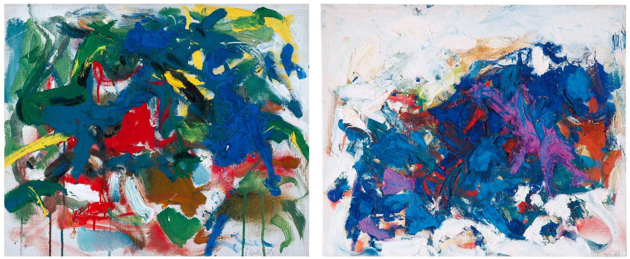
Left: Joan Mitchell, Series July 25 I, 1966. Gibbes Museum, Charleston. © Estate of Joan Mitchell, New York. Image courtesy of The Gibbes Museum of Art / Carolina Art Association.
Right: Joan Mitchell, Series July 25 IV, 1966. © Estate of Joan Mitchell, New York.
Since they first met in the early 1950s, O’Hara was a constant inspiration to Joan Mitchell. They were artists in arms, intellectual companions, and close friends. Mitchell titled numerous paintings after poems by O’Hara, before and after his death, including Crow Hill (1966) and To the Harbormaster (1957). Joan grew up in the society of poets, thanks to her mother, and she felt clearly comfortable in the proximity of O’Hara’s wit and intellect. As Patricia Albers wrote in her biography of Mitchell, “Frank was as devoted to painting, including Joan’s, as Joan was to poetry, very much including that of ‘Genius Frank’. His selfless generosity and marvelous outpourings of affection touched her. In some ways they were alike: both drank prodigiously, adored New York, relished playing the irritator, and shifted the energy of a room when they entered” (P. Albers, Joan Mitchell: Lady Painter, New York, 2011, p. 308).
The Series July 25 paintings are all approximately the same size, and at one point or another passed through Martha Jackson Gallery, where Joan began showing in 1968 after breaking away from Eleanor Ward’s Stable Gallery. Other examples include Series July 25 (I), which resides in the collection of The Gibbes Museum of Art, and Series July 25 (IV), which sold at Sotheby’s in 2016.
MODERN ART
Willem de Kooning
Woman and Child, circa 1967-1968
Leonard & Louise Riggio: Collected Works
Christie’s New-York: 12 May 2025
Estimated: USD 4,000,000 – 6,000,000
USD 7,128,500
WILLEM DE KOONING (1904-1997), Woman and Child | Christie’s
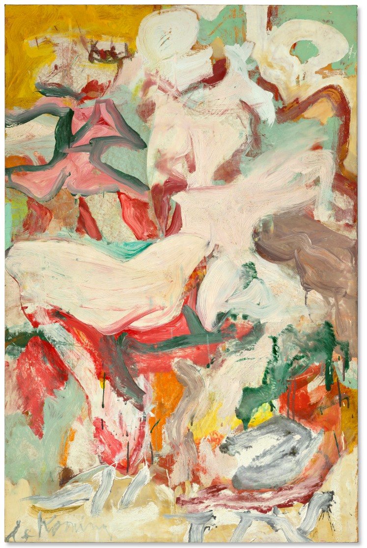
WILLEM DE KOONING (1904-1997)
Woman and Child, circa 1967-1968
Oil on paper mounted on canvas
55×36 inches (139.7 x 91.4 cm)
Signed ‘de Kooning‘ (lower left)
Dedicated ‘to Emilie with Love’ (on the reverse)
With its flowing ribbons of color and broad painterly gestures, Willem de Kooning’s Woman and Child is a superlative example of the artist’s distinct style of figurative painting. Taking a subject which has been a continuous source of inspiration for much of art history, de Kooning infuses it with the distinct sense of dynamic energy that distinguished Abstract Expressionism. The figures resonate with a degree of sensual energy that is found only in the most successful of the artist’s paintings from this particular period as he worked to produce a newer, more vital, series of almost intuitive marks. Acquired directly from the artist by his lover and muse Emilie Kilgore, this painting held a special place in de Kooning’s oeuvre as, when Kilgore selected the work, the artist said approvingly, “That’s a very good one!” Famously critical of his own paintings, this comment provides a ringing endorsement of this particular example of his new style of Woman painting.
Set amidst a landscape of lush greens and warm yellows, the figure of a woman and child are rendered in a series of rapidly executed and expressive brushstrokes. As de Kooning’s heavily laden brush traverses the canvas he manifests the figures out of passages of rich impasto; fleshly limbs are fashioned out of strokes of pale white and pink, while fields of red help to accentuate the sensual nature of the female figure. Elsewhere, a litany of different paint handling techniques—from scumbling to expressive Pollock-like drips—contribute to the highly expressive surface.
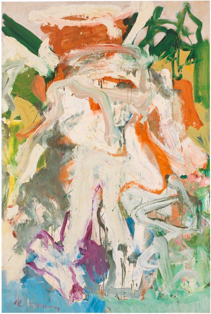
Willem de Kooning, Woman in Landscape III, 1968. Whitney Museum of American Art, New York.
© The Willem de Kooning Foundation / Artists Rights Society (ARS), New York and DACS, London 2025.
Photo: © Whitney Museum of American Art / Licensed by Scala / Art Resource, NY.
In contrast to de Kooning’s earlier depictions of women from the 1950s, these later paintings possess a much more sophisticated approach to the painting of the female figure. By this point in his career, the artist was spending more time in the bucolic surroundings of Springs, Long Island, and this manifested itself clearly in his more open compositions. The 1960s were also abundant with innovation in terms of the materials he used in the studio as he had developed expertise in introducing new and various media in his oil paints. He produced significant results by including water (which added a unique volume and viscosity to the paint), safflower oil (significantly extending drying time, and thus, malleability and working time), and large amounts of white paint (producing high degrees of luminosity), all of which can be seen in the present work.
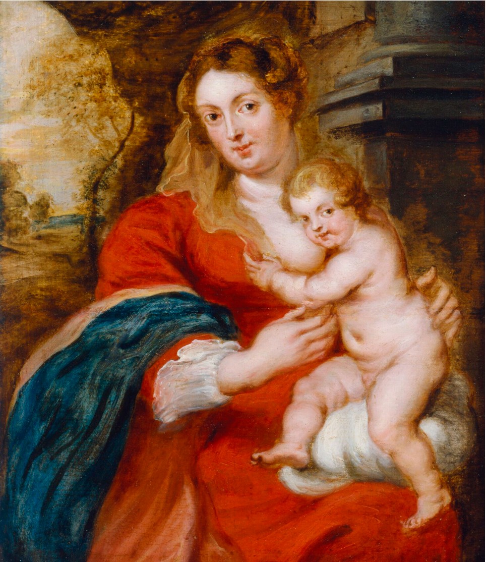
Peter Paul Rubens, Madonna and Child, 17th century. Dulwich Picture Gallery, London.
Thus, Woman and Child is a prime example of the individualism and dynamism associated with de Kooning’s output of the 1960s, evidencing that his engagement with the female figure worked to transcend the tension between picture and event, observation and genre. De Kooning’s sensuous paintings of women provoke what it means to depict elementally and radicality: “I have no opinion on women… I do not particularly stress the masculine or feminine viewpoint. I am concerned only with human values” (S. de Hirsch, quoted in “A Talk with de Kooning,” Intro Bulletin: A Literary Newspaper of the Arts 1, no. 1, October 1955, pp. 1 & 3).
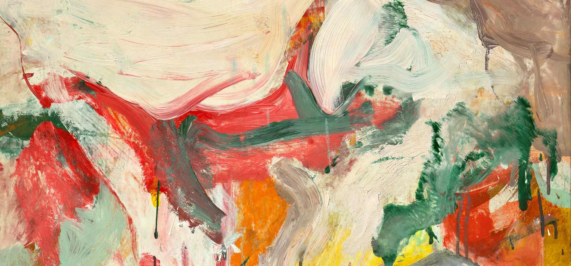
De Kooning’s depictions of women are among some of the most iconic works of the postwar period. The paint’s physicality and the way in which it has been applied, the color and the gestural sweeps and play of this tactile and, in de Kooning’s hand, seemingly infinitely pliable medium, powerfully evoke the artist’s own sensual and sexually charged response to women, their bodies, their skin and their features. The maternal nature of this work marks a somewhat softer depiction of women than some of his more high-octane representations. Unlike his earlier Picasso-esque grotesque representations of women, the abundance of soft, pink tones in Woman and Child is prompted not so much by fear, but more a wry and benevolent sense of warmth and affection.
Two Figures in Dunes, 1968
Sotheby’s New-York: 13 May 2025
Estimated: USD 1,500,000 – 2,000,000
USD 3,222,000
Two Figures in Dunes | Modern Evening Auction | 2025 | Sotheby’s
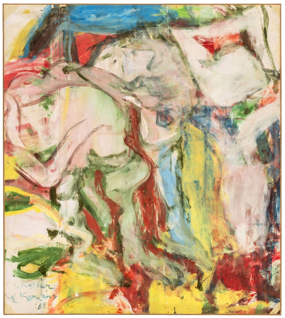
WILLEM DE KOONING (1904 – 1997)
Two Figures in Dunes, 1968
Oil on paper mounted on canvas
41 3/8 x 37 inches (105.1 x 94 cm)
Signed de Kooning, dated 68 and inscribed to Arthur (lower left)
Encapsulating the artistic awakening that followed Willem de Kooning’s relocation from the city to the coast, Two Figures in Dunes from 1968 exhibits the sublime gesture and radiant luminosity of the artist’s celebrated works of the late 1960s. Gestural passages of sun-kissed yellow and fleshy pinks dance with seaside blues and celadon greens, mingling in a masterful Arcadian symphony. While de Kooning’s paintings of the 1950s are characterized by the muscular dynamism and unfettered force of his urban environs, his works from the late 1960s, following his move to Long Island display a sublime painterly bravura and melodic lyricism informed by the enchanting natural tranquility of his new shoreside town. Beaming with chromatic intensity and nuanced layers of painterly gesture, Two Figures in Dunes displays an essence of discovery and profound beauty surrounding the artist’s studio in Springs, but retains the exploration of figuration central to the artist’s earlier seminal Woman paintings. Testament to the importance of Two Figures in Dunes, the work was held in the personal collection of renowned collector Walter P. Chrysler, Jr. and has been held in the same private family collection for the last thirty-one years.
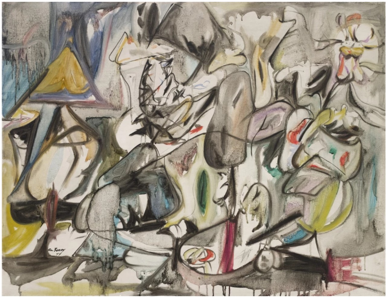
Arshile Gorky, The Leaf of the Artichoke is an Owl, 1944. The Museum of Modern Art, New York. Image © The Museum of Modern Art/Licensed by SCALA / Art Resource, NY. Art © 2025 The Arshile Gorky Foundation / Artists Rights Society (ARS), New York
In 1963, after spending much of his early career in Manhattan, de Kooning retreated to the seaside, settling in a new home and studio in Springs, a small hamlet in East Hampton, Long Island. The transition from the bustling streets of Manhattan and oppressive architecture to the unadulterated, serene beauty of Springs profoundly influenced de Kooning’s practice, unlocking new aesthetic inspiration. De Kooning’s works of the 1950s were grounded in the psychological intensity and speed of the urban landscape that surrounded him. In the artist’s seminal Woman paintings of that time, the viewer is confronted with the aggression, energy and momentum of the city in the mid century.
“When I moved into this house, everything seemed self-evident. The space, the light, the trees – I just accepted it without thinking about it much. Now I look around with new eyes. I think it’s all a kind of miracle.”
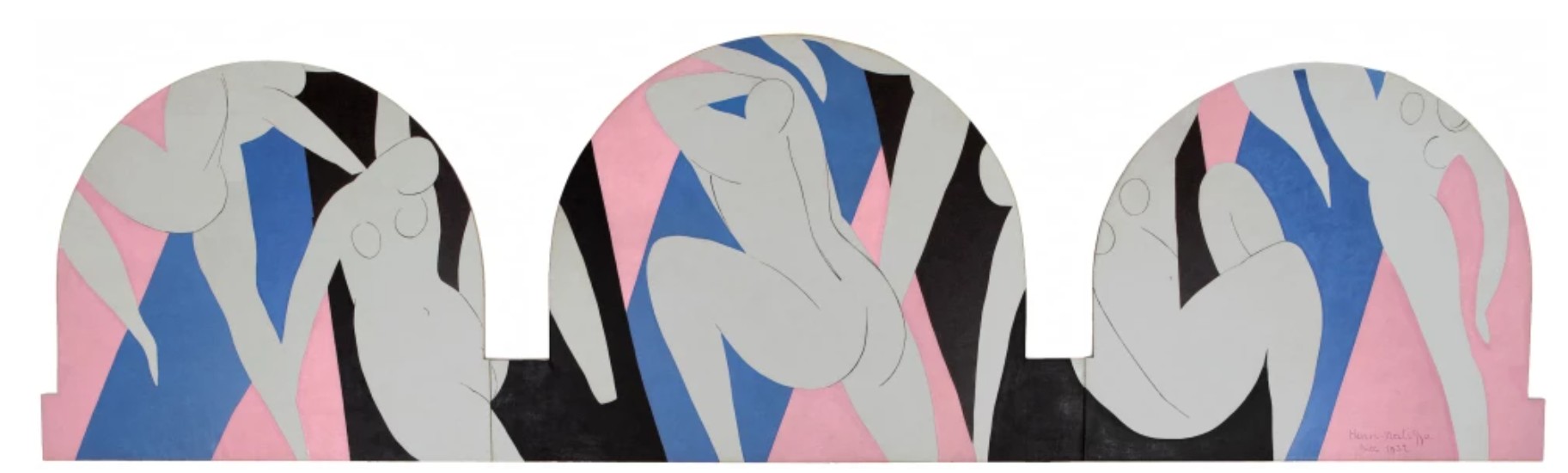
Henri Matisse, The Dance, 1931-33. Musée d’Art Moderne, Paris. Image © Paris Musées, musée d’Art moderne, Dist. RMN-Grand Palais / image ville de Paris/ Art Resource, NY. 2025 Succession H. Matisse / Artists Rights Society (ARS), New York
Liberated from the confines of urban architecture, de Kooning was engulfed in the luminous, coastal sanctuary of Springs. His works of this time adopted a newfound euphoric harmony, buoyed by the majestic light of his new environs.
“I got into painting in the atmosphere I wanted to be in. It was like the reflection of light. I reflected upon the reflections on the water, like the fishermen do.”
Two Figures in Dunes captures this bucolic virtue through organic strokes of sage greens which flow alongside oceanic blue. Mid-day sunlight radiates through de Kooning’s forms, demonstrating the artist’s unparalleled capacity to capture atmospheric grandeur through oil paint. From edge to edge, de Kooning draws the viewer’s gaze, entrancing us in the Edenic choreography of nature. The chromatic exploration and fluid grace of Two Figures in Dunes attest to the profound influence of Post-Impressionist master Henri Matisse on de Kooning’s practice. As seen in the graceful forms and alluring tones in masterful paintings like La Danse from 1931-33, Matisse’s revolutionary investigations of impassioned coloration and effervescent light boldly emerge in de Kooning’s celebrated paintings of the 1960s.
“The women I paint now are very friendly and pastoral, like my landscapes, and not so aggressive. Women are the symbol of civilization, like the Venus of Willendorf.”
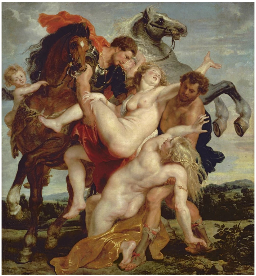
Peter Paul Rubens, The Rape of the Daughters of Leucippus, 1618. Alte Pinakothek, Munich. Image © Bridgeman Images
Through de Kooning’s fluid forms and transcendent gesture, the vestige of the figure simultaneously dissipates into abstraction and subtly reemerges. Conveying both a sense of improvisation and control, de Kooning’s passages display an unbridled freedom and quietly suggest the presence of the figure. Swathes of fleshy pinks in sensuous undulating forms stretch across the composition at times suggesting limbs and then melting into polychromatic ribbons of color. The earlier ferocity of the artist’s Woman paintings of the 1950s has dissolved into a lyrical synthesis of light and color.
“I believe in paradoxes, not going with it, but going against it. The figure is nothing unless you can twist it around like a strange miracle, unless it’s like a paradox, it is like nothing. A figure is a mystery, it’s like a psychedelic tree.”
Two Figures in Dunes is a paradigmatic example of de Kooning’s celebrated capacity to imbue his abstractions with a profound sensation of life. De Kooning’s Two Figures in Dunes conveys a simultaneous visual instantaneity and carefully calibrated balance of coloration and form. Distinguished by its chromatic palette and lyrical composition, Two Figures in Dunes exemplifies the ambitious invention and aesthetic discovery of de Kooning’s works of the 1960s, through which he harnessed the majestic and ever-entrancing beauty of the natural world.
Paging Woman, 1964
Sotheby’s New-York: 16 May 2025
Estimated: USD 500,000 – 700,000
USD 1,143,000
Paging Women | Contemporary Day Auction | 2025 | Sotheby’s
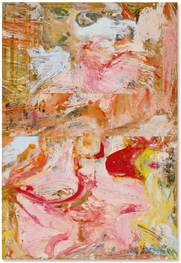
WILLEM DE KOONING (1904 – 1997)
Paging Woman, 1964
Oil on newsprint mounted on board
43 7/8 x 29 7/8 inches (111.4 x 75.9 cm)
Signed (lower right)
A riotous collision of effervescent gesture and technical inquisition, Willem de Kooning’s Paging Woman from 1964 bridges the raw figuration of his 1950s work with the luminous abstractions of the final two decades of his career. The present work is personified through its vivacious palette, compounding blushing pinks, fleshy creams, fair ochres, and arterial reds that effectuates a collaged composition as vibrant as it is complex. The gesture is immediate and visceral; paint is not applied so much as smeared, clawed, and swept across the surface with muscular grace. Amidst the rapturous brushtrokes lies an unmistakable semblance of the human figure–leering eyes, shocks of blonde hair, curves suggestive of hips of shoulders–emblematic of de Kooning’s formidable Women of the 1950s but with renewed bravura. Executed a year after moving to East Hampton, these seminal newsprint paintings became iconic landmarks of postwar art, completely remastering de Kooning’s investigation of the female figure.
“The figure is nothing unless you twist it around like a strange miracle.”
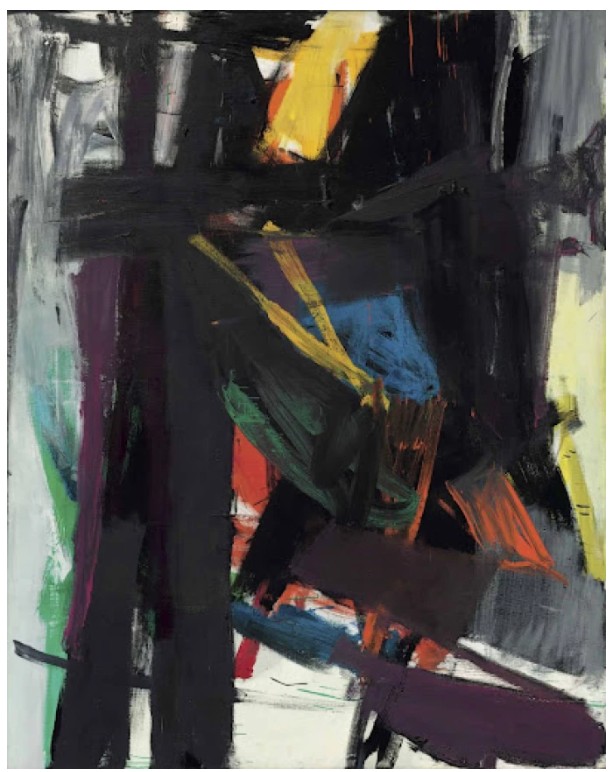
Franz Kline, King Oliver, 1958, Private Collection.
Image © Bridgeman Images. Art © 2025 Franz Kline / Artists Rights Society (ARS), New York
De Kooning’s relocation marked a shift in which process and environment became paramount, radically transforming his approach to both figuration and abstraction. The instantaneous metamorphosis of his practice reflects the pronounced impact East Hampton had on de Kooning—much like the revolutionary shifts he underwent the previous decade in New York City. The legendary curator Diane Waldman was attuned to this change, tracing de Kooning’s choice “to reject the abstract landscapes which had occupied him in the city during the late 1950’s and early 60’s just at the moment he moved to the country may seem unusual. But this was merely one change in direction in a complicated artistic evolution marked by numerous transitions from figurative to abstract” (Diane Waldman, Willem de Kooning in East Hampton, exh. cat. Guggenheim Museum, New York, 1978, p. 11). This turnpike in de Kooning’s oeuvre is particularly compelling and evident in Paging Woman, where the female form–perhaps his most recognizable contribution to art history–is reborn through this stylistic overhaul. Even at their most abstracted, de Kooning’s women become legible signs to track his progressions from abstraction to representation, and vice versa. And while hardly restrained, comparatively to his earlier work the florid color scheme and meticulously composed newsprint of Paging Woman make visible the impact of place and process on the Women of the 1960s.
“Flesh was the reason oil paint was invented.”
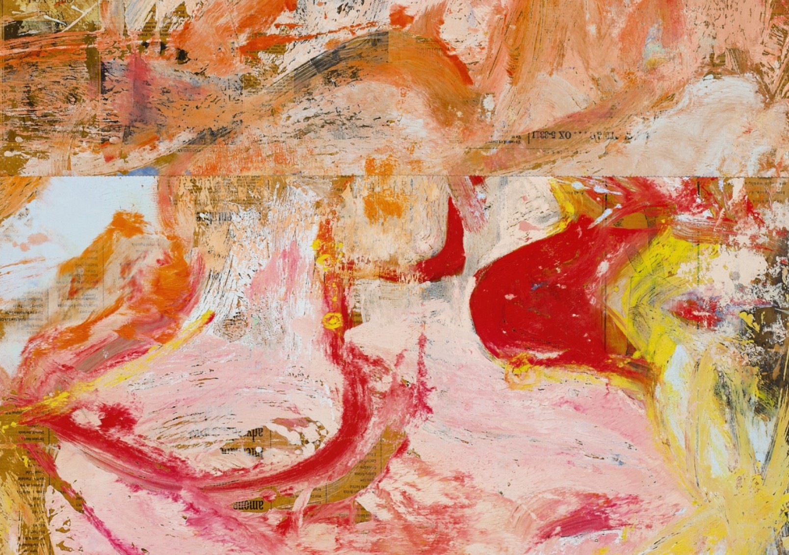
Refreshed by the bucolic environment, Paging Woman embodies the artist’s endeavor to capture the essence of his new home. Rather than depicting landscapes literally, de Kooning focused on integrating the atmospheric qualities of the natural world–such as light and memory–into his paintings. Of this new methodology de Kooning explained “Now I go … and search for a new image of the landscape. And I love the puddles. When I see a puddle, I stare into it. Later, I don’t paint a puddle, but the image it calls up within me. All the images inside are from nature anyway” (George Dickerson, Transcript of an Interview with Willem de Kooning, September 3, 1964: 6, Thomas B Hess Papers, Archives of American Art, Smithsonian Institution, Washington, D.C.). Just as abstraction was a conduit for city dwelling for de Kooning, the sumptuous and variegated surface of Paging Woman is evocative of his bucolic surroundings. The macabre greys and incising blacks of Woman I or the gruesome double images of Woman and Bicycle dissipate in favor of more benevolent, even mystical, depictions of women. Paging Woman inherits a delicate palette indicative of the forgiving coastline of East Hampton, and the distortions of the figure’s form are less destructive in their conception. The abstraction in this instance is more experimental than wry, with the visible seams of the newsprint revealing the intimate relationship between artist and medium.
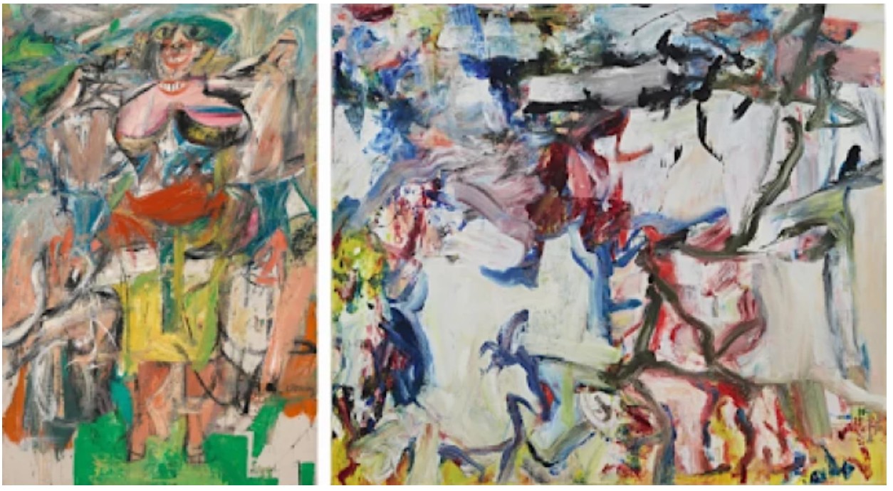
Left: Willem de Kooning, Woman and Bicycle, 1952–53, Whitney Museum of American Art. Image © Whitney Museum of American Art / Licensed by Scala / Art Resource, NY. Art © 2025 The Willem de Kooning Foundation / Artists Rights Society (ARS), New York.
Right: Willem de Kooning, Untitled XXII, 1977. Private Collection. Sold at Sotheby’s New York in November 2019 for $30.1 million. Art © 2025 The Willem de Kooning Foundation / Artists Rights Society (ARS), New York
The 1960s would usher in technical advancements in de Kooning’s practice as he integrated paper and revised his oil paint formula to abstract his figures with infinite manifestations. The figure of Paging Woman is labyrinthine, assembled together by layers of painted newsprint, in which the paper edges expose the artist’s ruminative working method. Paper liberated de Kooning from the constraints of the canvas, allowing him to rework his forms, at times cutting out successful elements and repasting them elsewhere. Paging Woman is trisected by such collages, dividing the initial newsprint forms from each other while underscoring brushwork that attends to the whole of the painting. De Kooning’s use of paper lends a sense of immediacy and intimacy; exposing the closeness of the artist to the surface, as though invited into the raw process of creation itself. This decade also marks de Kooning’s switch to safflower oil for his paints, which afforded him extended liquidity especially when working across multiple surfaces. This wet-on-wet strategy proved essential for these paintings, maintaining a sophisticated cohesion even for works as incandescent as Paging Woman. Armed with these ingenious strategies, de Kooning’s relentless investigation of the female form realized unprecedented achievements in both abstract and representational art. A tour de force of de Kooning’s everchanging style, the titular Paging Woman is not merely rendered; she is summoned, layered into existence through motion and memory.
Pablo Picasso
Femme à la coiffe d’Arlésienne sur fond vert (Lee Miller), 1937
Leonard & Louise Riggio: Collected Works
Christie’s New-York: 12 May 2025
Estimated: USD 20,000,000 – 30,000,000
USD 28,010,000
PABLO PICASSO (1881-1973), Femme à la coiffe d’Arlésienne sur fond vert (Lee Miller) | Christie’s
PABLO PICASSO (1881-1973)
Femme à la coiffe d’Arlésienne sur fond vert (Lee Miller), 1937
Oil and Ripolin on canvas
81 x 65.1 cm (31 7/8 x 25 5/8 inches)
Dated and numbered ‘2 septembre 37 II’ (on the stretcher)
Painted in Mougins on 2 September 1937
Painted in a resplendent array of vibrant tones, Femme à la coiffe d’Arlésienne sur fond vert (Lee Miller) is one of an important series of seven portraits that Pablo Picasso painted of the celebrated American photographer Lee Miller over the course of a sun-filled sojourn during the summer of 1937. This was a landmark year within Picasso’s career, marked by an intense surge of creativity in response to contemporary events, which saw the creation of some of his most important works: Guernica (Zervos, vol. 9, no. 65; Museo Nacional Centro de Arte Reina Sofía, Madrid) was completed in the spring, while the haunting La femme qui pleure (Zervos, vol. 9, no. 73; Tate, London) reached its final iteration in the fall. Alongside these monumental works, a dazzling array of portraits occupied Picasso’s imagination, ranging from sensuous depictions of Marie-Thérèse Walter, to highly charged portrayals of Dora Maar, and boldly colored images of close friends and acquaintances. Most notable are the dynamic series of paintings Picasso created of the group of Surrealist artists, photographers and writers he spent the summer with in the south of France that year, each a testament to the highly creative environment and fruitful friendships that underpinned this trip.
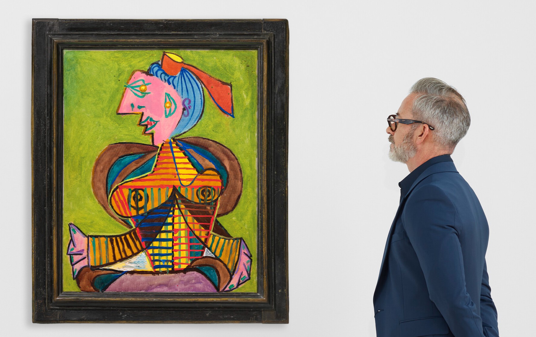
The artist had departed Paris just two weeks after he presented the finished Guernica at the Exposition Universelle, traveling with Maar to Mougins—a small, hilltop village overlooking the Mediterranean—in search of sunshine and respite. Here, they joined the poet Paul Eluard and his wife Nusch, Man Ray and Ady Fidelin, the British Surrealist Eileen Agar and her husband the writer Joseph Bard, and Roland Penrose and his new partner, Lee Miller. Man Ray later recalled, “We all stayed at a pension hotel, the Hôtel Vaste Horizon, back in the country in Mougins, above Antibes… After a morning on the beach and a leisurely lunch, we retired to our respective rooms for a siesta and perhaps love making. But we worked, too. In the evening Eluard read us his latest poem, Picasso showed us his starry-eyed portrait of Dora” (quoted in Picasso and the Camera, exh. cat., Gagosian, New York, 2014, p. 231).
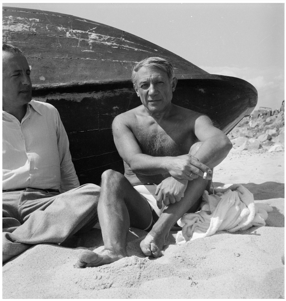
Paul Eluard and Pablo Picasso on the beach in Juan-les-pins, France, September 1937. Photograph by Eileen Agar. © Tate
Miller had only met Penrose a few months before the Mougins trip, following her return to Paris, a city she adored and had called home for several years during the early 1930s. She had first visited the French capital in 1925, aged 18, and was immediately intoxicated by the world of art and bohemianism that she found there. Upon returning to New York, she was discovered by the publishing magnate, Condé Nast, who encouraged her to pursue a modeling career, leading to her appearance on the cover of Vogue in March 1927. Soon, however, Miller decided she would “rather take a picture than be one,” and set out for the French capital again in 1929, armed with an introduction to Man Ray from Edward Steichen and an ambition to become a photographer herself. She met the American Surrealist photographer by chance in a café. “I told him boldly that I was his new student,” she later recalled. “He said he didn’t take students, and anyway he was leaving Paris for his holiday. I said, I know, I’m going with you—and I did” (quoted in A. Penrose, The Lives of Lee Miller, London, 1999, p. 25).
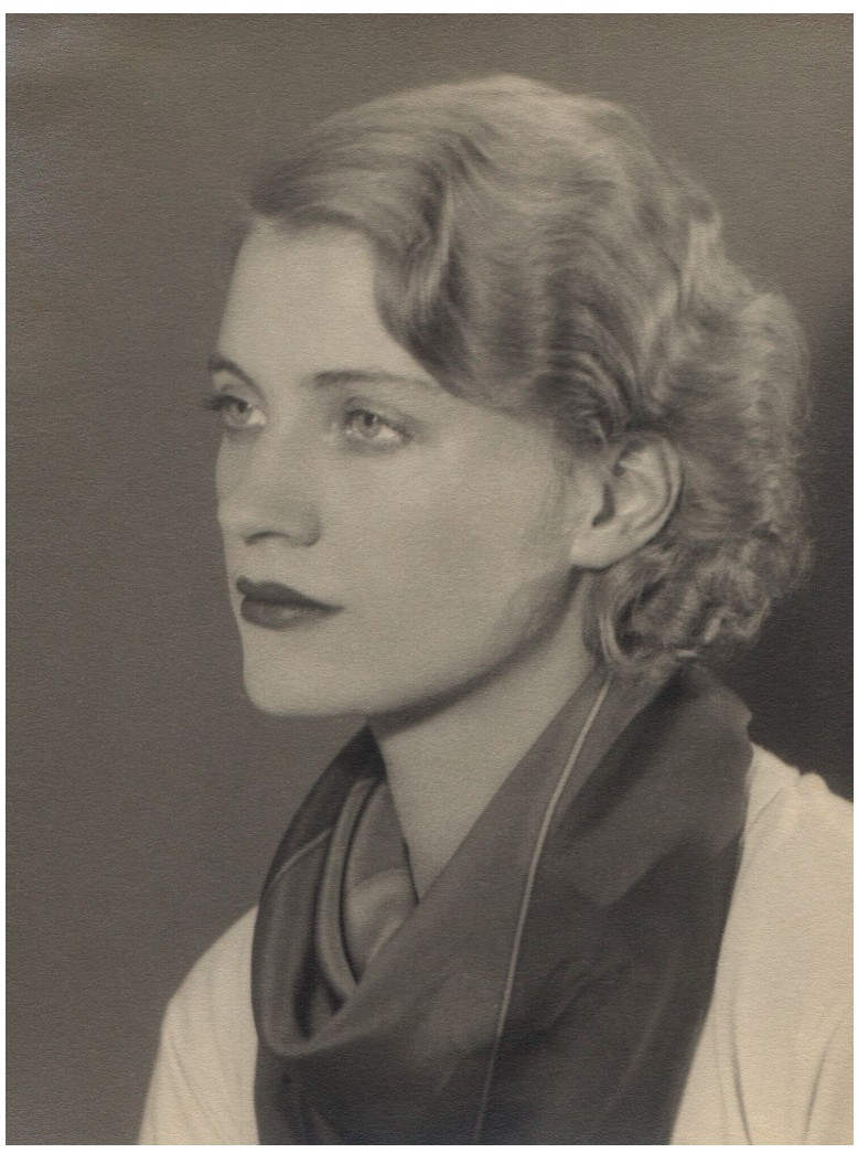
Lee Miller, Self-portrait, 1930. © Lee Miller Archives, England 2025. All rights reserved. leemiller.co.uk
Man Ray agreed to Miller’s request, and the pair soon became lovers. While she posed for him frequently, the two also collaborated on innovative photography projects—most famously developing the solarization technique together. After almost a year working in his studio, Miller began to take on her own projects, and in 1932 she left Man Ray and returned home to New York, where she set up her own photography studio. The lure of Paris did not wane however, and finally in 1937 she arrived once more in the city, and was immediately re-immersed in the Surrealist world she had once inhabited. Attending a fancy-dress ball alongside the likes of Max Ernst, Georges Bataille, and gallerist Julien Levy, she was introduced to Penrose, who had come, together with Ernst, dressed as a beggar. “Blond, blue-eyed and responsive she seemed to enjoy the abysmal contrast between her elegance and my own slum-like horror,” Penrose later wrote (quoted in ibid., p. 74).
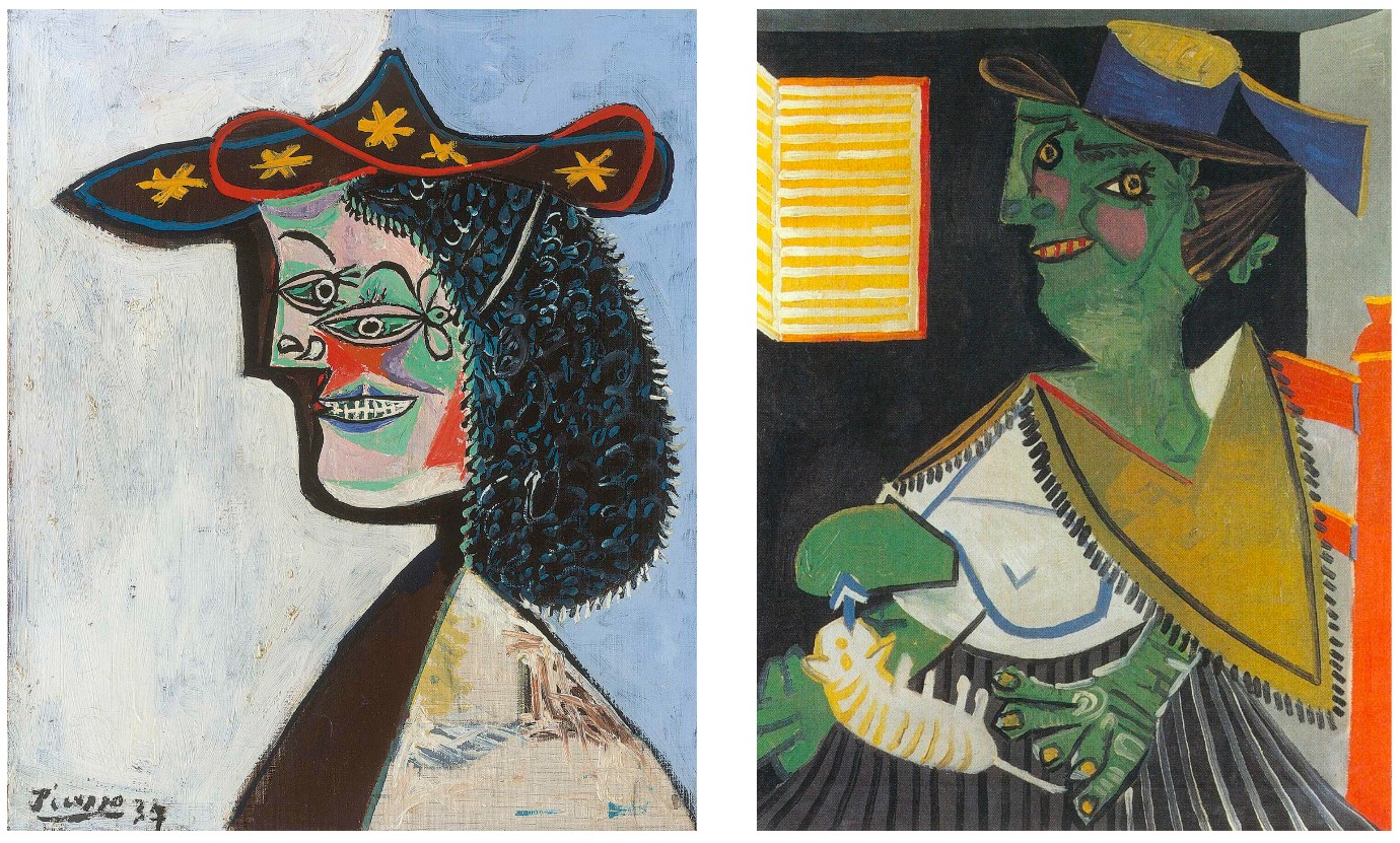
LEFT: Pablo Picasso, Tête de femme (Nusch Eluard), 1937. Museum Berggruen, Berlin. © 2025 Estate of Pablo Picasso / Artists Rights Society (ARS), New York
RIGHT: Pablo Picasso, La femme au chat (Portrait cryptique de Paul Eluard), 30 August 1937. Collection Hersaint. © 2025 Estate of Pablo Picasso / Artists Rights Society (ARS), New York.
Two weeks later, Penrose and Miller returned to his native England together and the pair traveled with Man Ray and Ady Fidelin to Truro, in Cornwall, where they met up with the Eluards, Ernst and Leonora Carrington, as well as Herbert Read, E.L.T Mesens, and Agar. A month later, many of this coterie of writers, artists and poets regathered, this time in Mougins, where they were joined by Picasso and Maar. Far removed from the ever worsening political situation in Europe, Mougins offered them an escape, and the group spent a carefree, creatively fertile and liberating summer together. Evocative photographs taken by Miller, Maar and Agar immortalize this summer sojourn, recording the languorous lunches, days spent on the beach, meandering adventures through the surrounding countryside, and conversations beneath the striped shadows cast by the cane trellis of the hotel terrace.
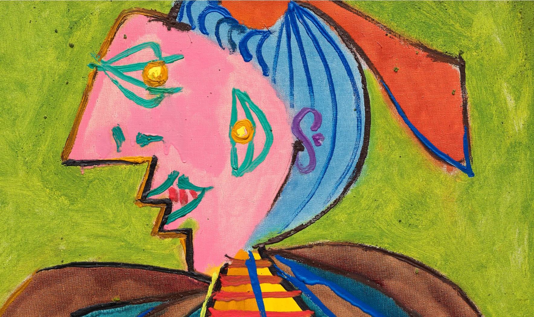
Using his hotel room as a make-shift studio, Picasso painted numerous color-filled portraits of his companions over the course of this vacation, driven by what Penrose has described as “a diabolical playfulness” (Picasso: His Life and Work, London, 1958, p. 279). Nusch was depicted wearing an elaborate Niçoise hat in Portrait de Nusch Eluard (Museum Berggruen, Berlin), her face covered in garish make-up, while Paul was transformed into a fantastical female peasant in La femme au chat (Zervos, vol. 8, no. 373; Private collection). Picasso doesn’t appear to have painted these works from life but rather, having absorbed the likeness and character of his chosen sitter during the hours they spent together during the group’s activities and outings, translating their likeness through his own, unique pictorial language, to create a humorous caricature-like image. Miller became Picasso’s primary focus towards the end of the summer—the artist was said to have been captivated by her classical beauty, her striking intellect and her deeply creative spirit. Beginning in early September, he commenced a group of seated portraits, each of which show Miller in the quintessential Arlésienne costume, featuring most prominently the ribbon-trimmed headdress.
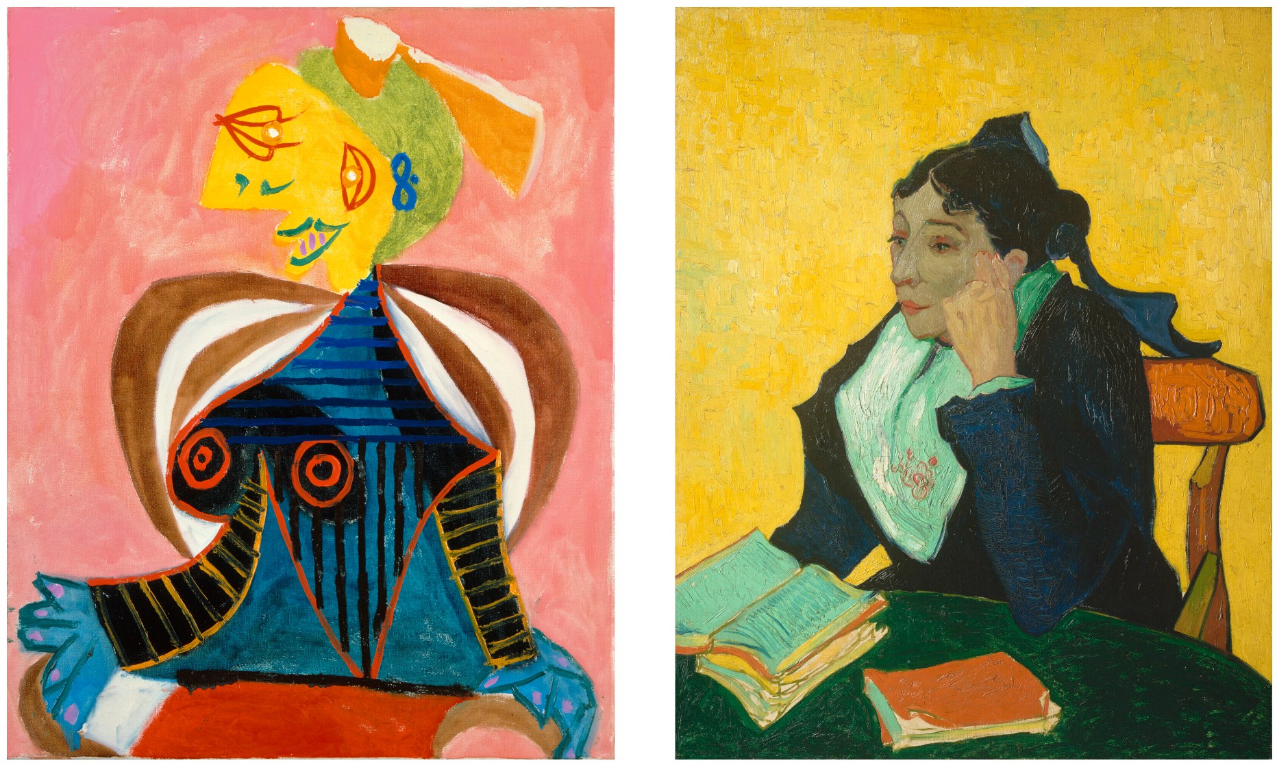
Pablo Picasso, L’Arlésienne, 1937. Musée Réattu, Arles. © 2025 Estate of Pablo Picasso / Artists Rights Society (ARS), New York. Photo: Scala / Art Resource, NY.
Vincent van Gogh, L’Arlésienne, 1888. The Metropolitan Museum of Art, New York.
The artist appears to have relished the very act of painting in these works, boldly exploring and playing with the materiality of his paints. In Femme à la coiffe d’Arlésienne sur fond vert (Lee Miller) Picasso transforms Miller through a vibrant, fantastical palette—her torso is recorded in a colorful weave of linear stripes of pigment, the thick strokes of paint deliberately allowed to drip freely, recording an impression of the speed and energy with which Picasso attacked the canvas. Penrose, describing his first encounter with one of these paintings of Miller, explained: “On a bright pink background Lee appeared in profile, her face a brilliant yellow like the sun with no modeling. Two smiling eyes and a green mouth were placed on the same side of the face, and her breasts seemed like the sails of ships filled with a joyous breeze. It was an astonishing likeness. An agglomeration of Lee’s qualities of exuberant vitality and vivid beauty put together in such a way that it was undoubtedly her but with none of the conventional attributions of a portrait” (ibid., p. 109).
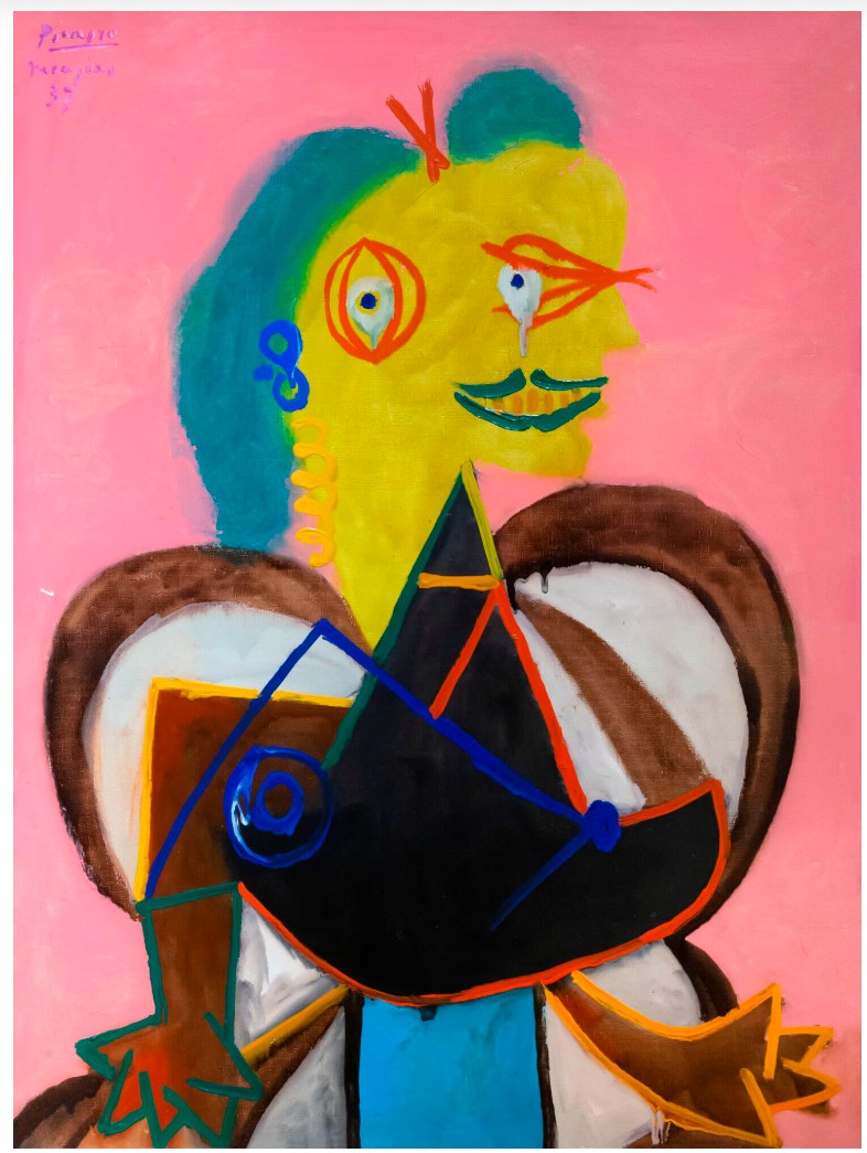
Pablo Picasso, L’Arlésienne, 1937. Scottish National Gallery of Modern Art, Edinburgh. © 2025 Estate of Pablo Picasso / Artists Rights Society (ARS), New York.
While Picasso’s decision to dress Miller (and also Paul Eluard) in the traditional costume of the Arlésienne may have been prompted by the local festivals taking place in Mougins, Arles and Nice that summer, the works also clearly pay homage to Vincent van Gogh’s series of striking portraits depicting Madame Ginoux from 1888, the owner of the Café de la Gare in Arles. While Picasso had long revered Van Gogh’s visceral, expressionistic take on the world, the Exposition Universelle of 1937 had included a large exhibition of Impressionist, Post-Impressionist and modern art together. Here, Picasso was able to regard his own work in the same context as Van Gogh, prompting him perhaps to return once again to the Dutch master’s work for inspiration, aided by postcard reproductions of several of Van Gogh’s compositions. It was also during this pivotal summer of 1937 that Picasso learned that he, like Van Gogh, had been branded a “degenerate artist” by Hitler, and that the Nazis had begun to confiscate works, including his own, from German museums and collections. By deliberately invoking and appropriating the work of Van Gogh, Picasso appears to not only pay homage to the artist, but also demonstrate, in the face of derision, their shared status as defiant trailblazers of avant-garde art.
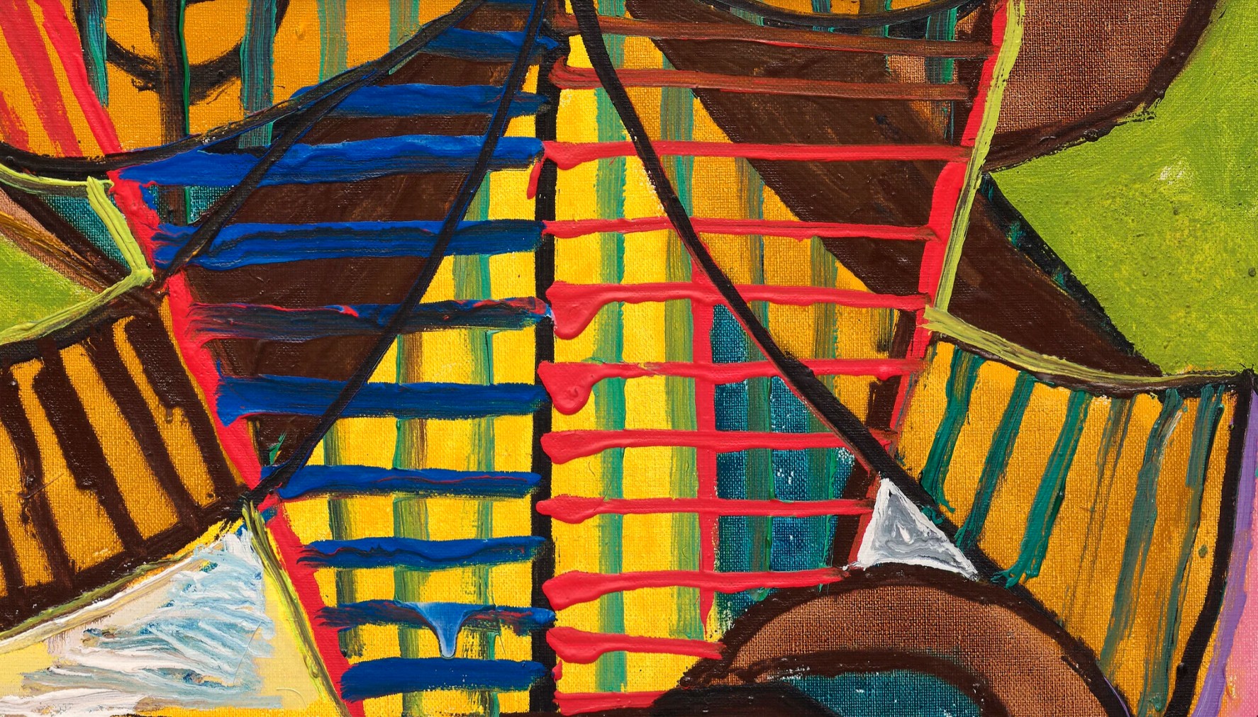
While Picasso and Miller remained close following the summer of 1937, the outbreak of the Second World War two years later cut off all contact between the two. Picasso remained in Paris for much of the conflict, holed up in his Left Bank studio, while Miller initially returned to England with Penrose, before becoming a photojournalist for Condé Nast. In 1944 she received her accreditation from the US Army and became one of only a handful of female combat war correspondents to cover the front-lines of the war in Europe. With an unflinching eye, she recorded the siege of Saint-Malo, fighting in Alsace, and later, Hitler’s apartment in Munich, as well as the liberation of the concentration camps of Dachau and Buchenwald.
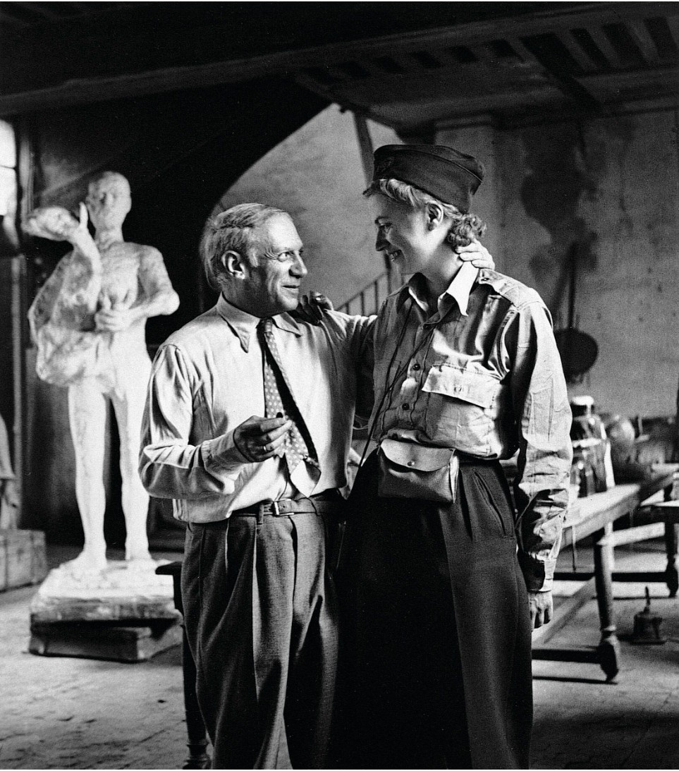
Picasso and Lee Miller in his studio, 7 rue des Grands-Augustins, Paris, 1944. Photograph by Lee Miller. Photo: © Lee Miller Archives, England 2025. All rights reserved. www.leemiller.co.uk. © 2025 Estate of Pablo Picasso / Artists Rights Society (ARS), New York.
It was while covering the chaos that followed the Liberation of Paris that she set out to find news of Picasso, racing through streets littered with still smoking tanks to reach the artist’s studio. “Picasso and I fell into each other’s arms,” Miller wrote in her dispatch from Paris, “and between laughter and tears, we incoherently exchanged news about friends and their work, and looked at his new pictures, some of them painted while the Battle of Paris raged” (“In Paris… Picasso Still at Work” in Vogue, vol. 104, no. 7, 15 October 1944, p. 98). The artist’s joy at the Liberation and being reunited with his old friend can be palpably felt in the photographs from their meeting, the most iconic of which sees the artist embracing Miller in her uniform, gazing adoringly up at her face in apparent disbelief at her presence.=
Homme assis, 1969
Sotheby’s New-York: 13 May 2025
Estimated: USD 12,000,000 – 18,000,000
USD 15,100,000
Homme assis | Modern Evening Auction | 2025 | Sotheby’s
PABLO PICASSO (1881 – 1973)
Homme assis, 1969
Oil and Ripolin on canvas
129.9 x 97.2 cm (51 1/8 x 38 1/4 inches)
Signed Picasso (lower right)
Dated 10.12.69. (on the reverse)
In 1966, recuperating from stomach surgery, Pablo Picasso was bedridden for months and unable to work. He turned to his favorite classic literature to fill the time, re-reading Spanish Golden Age epics, novels by Dickens and Balzac, and plays by Shakespeare. It was Dumas’ The Three Musketeers, however, that truly captivated the artist; the bold and spirited heroes resonated deeply with Picasso, who read and reread the novel until he knew it by heart. According to Pierre Daix, as soon as the artist was back on his feet, “he wanted to know whether his creative powers had been affected. The Mousquetaires series… with its evocation of an entire world, was part of this rediscovery and recovery of self” (Picasso: Life and Art, New York, 1987, p. 363).
“I have less and less time, and I have more and more to say.”
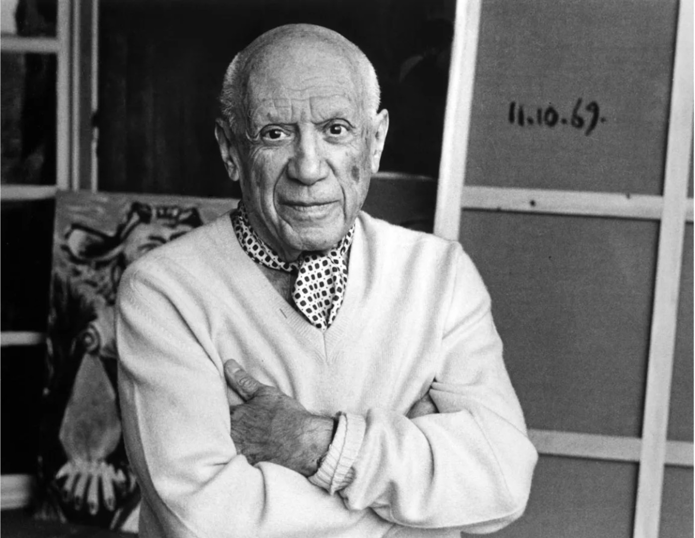
Picasso in his Mougins studio, 1969. Photograph © Lucien CLERGUE / saif images
© 2025 Estate of Pablo Picasso / Artists Rights Society (ARS), New York
By 1969, the sword-wielding, swashbuckling musketeer had become the central character of his late oeuvre, serving as a powerful psychological avatar through which the artist reflected on his enduring vitality, virility, and creative spirit in the final chapter of his life. That year, the artist began working on a series of large-format canvases on this theme. Among the most sophisticated and abstract of the series is Homme assis. Towering over 50 inches in height, this commanding depiction of a seated musketeer—distinguished by his sweeping mustache and extravagant hat—embodies Picasso’s relentless innovation even in his most mature years. While evoking the sun-drenched memories of his Mediterranean past, the composition transforms these recollections into bold abstract motifs and vibrant blocks of color. One of Picasso’s most strikingly graphic works, the piece juxtaposes a meticulously rendered black-and-white face with dynamic bursts of yellow, green, and blue. The stark contrasts, expressive brushwork, and electrifying color fields distill the image to its very essence, amplifying its intensity and impact.
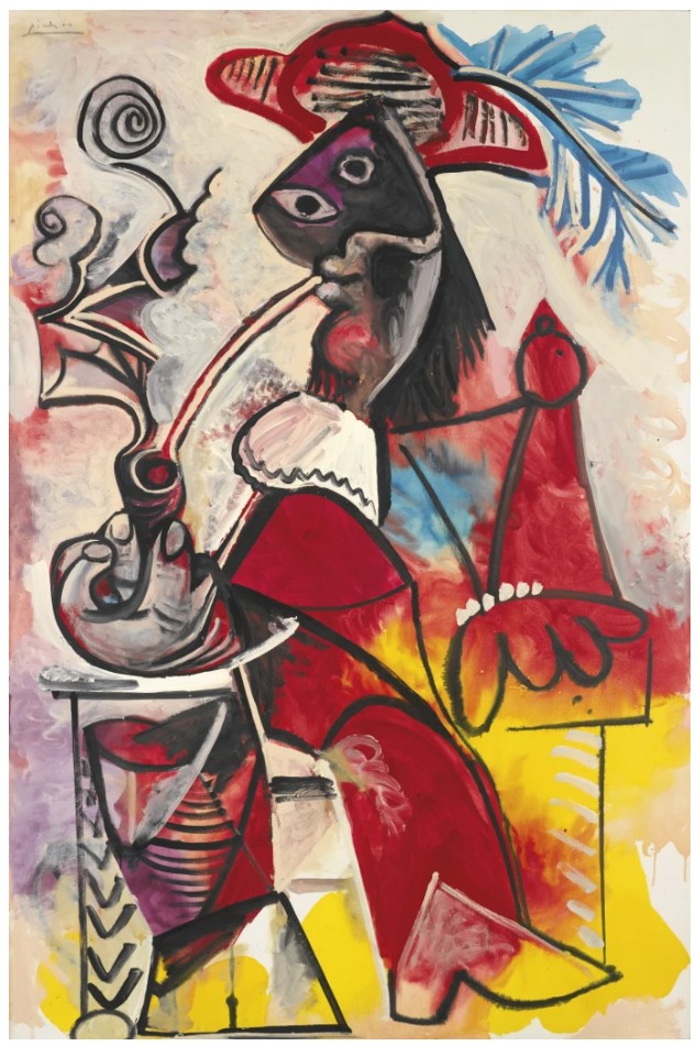
Pablo Picasso, Mousquetaire à la pipe, 5 March 1969, sold: Sotheby’s, New York, November 2013 for $31 million
© 2025 Estate of Pablo Picasso / Artists Rights Society (ARS), New York
Even in his final years, Picasso remained at the vanguard of artistic experimentation, demonstrating that true clarity and power arise not from refinement, but from raw, unfiltered expression. As John Richardson observed, “The surface of the late paintings has a freedom, a plasticity, that was never there before; they are more spontaneous, more expressive, and more instinctive than virtually all his previous work” (Exh. Cat., London, Tate Gallery, Late Picasso, Paintings, Sculpture, Drawings, Prints 1953-1972,1988, pp. 31-34). Included in his landmark 1970 exhibition at Avignon’s Palais des Papes—chosen by the artist himself for the site’s historicity and which became a posthumous exhibition when he died in April 1973—the present work exemplifies Picasso’s indefatigable creativity and reflections on his own legacy. It also helped define the artist’s legacy just following his death.
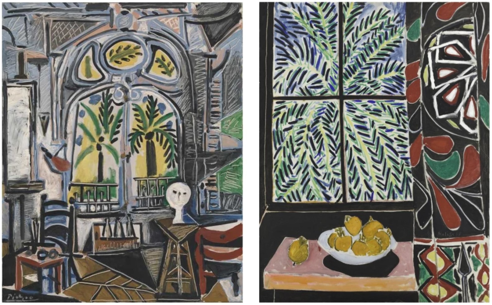
Left: Pablo Picasso, L’Atelier de La Californie IV, 1955, Tate Modern, London © 2025 Estate of Pablo Picasso / Artists Rights Society (ARS), New York
Right: Henri Matisse, Intérieur au rideau égyptien, 1948, The Phillips Collection, Washington D.C. © 2025 Succession H. Matisse / Artists Rights Society (ARS), New York
Color plays a crucial role in Homme assis, not only in its immediate impact but in its deep connection to Picasso’s past, particularly his years at La Californie in the 1950s. The bright, sunlit hues—yellows, blues, and greens—harken back to the Mediterranean light that filled his Cannes studio, where he painted surrounded by lush plants and sweeping sea views. The architecture of La Californie, a Belle Époque villa with large arched windows, often acted as a natural framing device within his compositions, a technique that finds an echo in Homme assis.
The three circular forms in the upper left of the painting correspond to architectural elements from his studio, much like how Henri Matisse, one of Picasso’s greatest rivals and inspirations, used window motifs in works such as Intérieur au rideau égyptien where palm trees frame the interior scene. Here, Picasso similarly incorporates a structural rhythm that links the background to the figure, suggesting both an enclosed studio space and the open expanse of nature beyond. The bursts of color surrounding the musketeer seem to vibrate with the energy of the Côte d’Azur, imbuing the painting with a sense of place and memory. Even as Picasso confronted his own mortality in these late works, he infused them with the vitality of his surroundings, transforming personal recollection into pure, exuberant color.
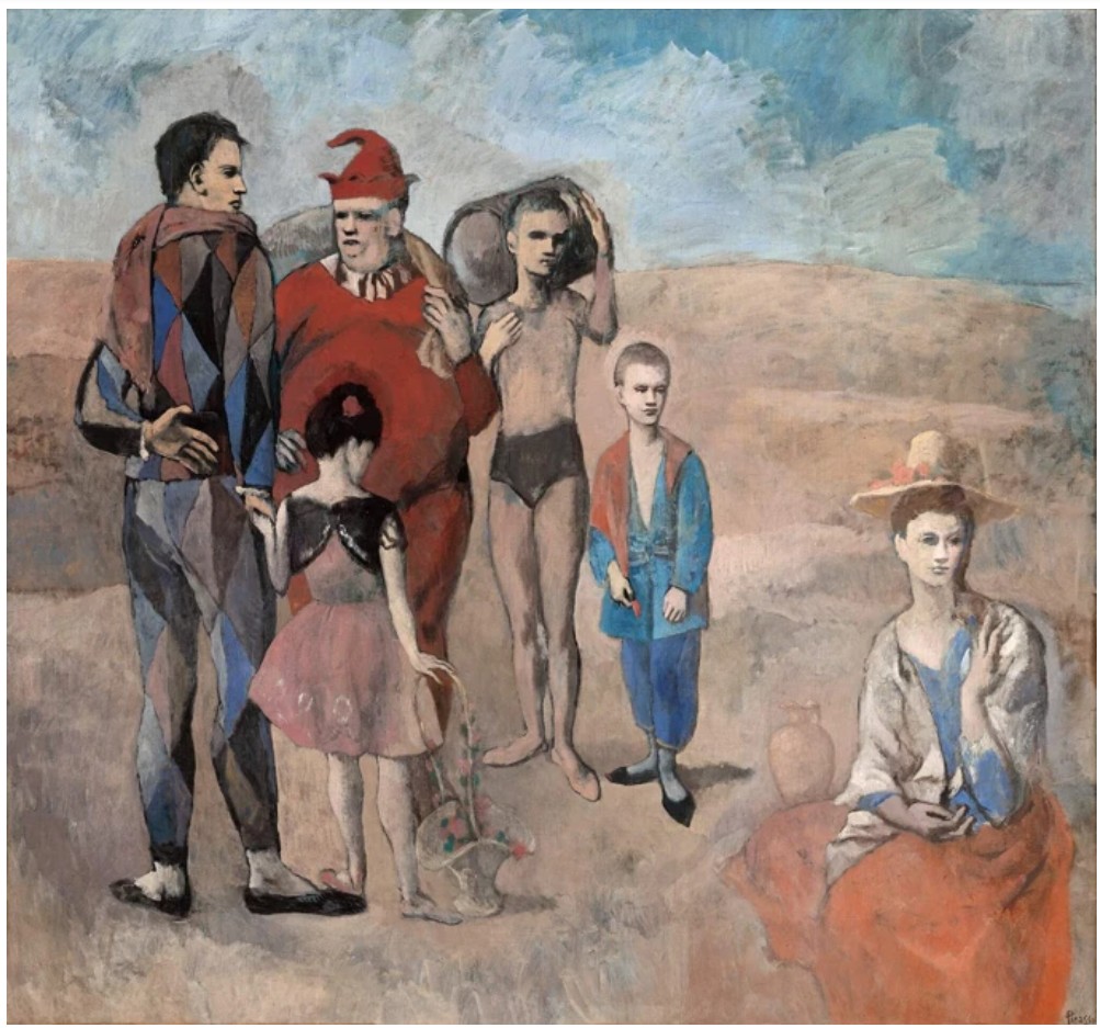
Pablo Picasso, Famille de Saltimbanques, 1905, National Gallery of Art, Washington, D.C.
© 2025 Estate of Pablo Picasso / Artists Rights Society (ARS), New York
Picasso’s use of veiled self-depictions in his work can be traced back to his earliest masterpieces. Beginning in his Blue and Rose periods, melancholy saltimbanques and harlequins populated his compositions. Later, he would add minotaurs and bullfighters to his repertoire of alter egos—each representing different aspects of Picasso’s personality and different stages of his life. As Marie-Laure Bernadac observed: “If woman was depicted in all her aspects in Picasso’s art, man always appeared in disguise or in a specific role, painter at work or a musketeer…Picasso seldom depicted himself directly, choosing instead to have thematic characters personify him” (Brigitte Léal, Christine Piot, and Marie-Laure Bernadac, The Ultimate Picasso, New York, 2000, p. 457). Ultimately, it was the glorious musketeer through which the artist expressed his vitality, erotic desires, mortal anxiety, and, of course, his ambition to be remembered as the great master that he was.
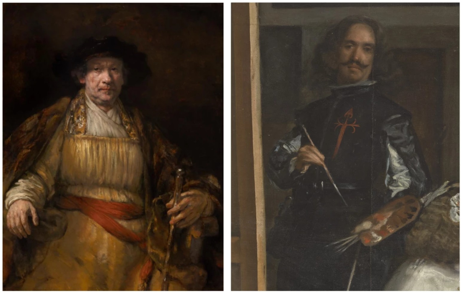
Left: Rembrandt van Rijn Self-Portrait, 1658,
The Frick Collection, New York
Right: Diego Velázquez. Las Meninas (detail), 1656. Museo Nacional del Prado, Madrid
For an artist whose trajectory was marked by constant exploration and creativity, Picasso recognized the importance of his last years as a defining period of his entire career. Turning to artistic masters of the past, particularly seventeenth-century artists Rembrandt and Velázquez, Picasso used the musketeer as his own return to the golden age of painting, enabling him to pay homage to his influences and insert himself into the narrative. “In old age,” John Richardson noted, “Picasso would admit to being very conscious of old masters breathing down his neck. Far from being bothered by this, he was so secure in his genius that he conjured master after master into the heart of his work and had his way with them” (A Life of Picasso: The Early Years, London, 1992, vol. 1, p. 185).
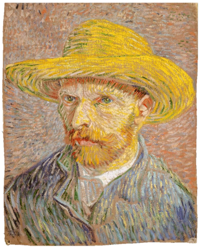
Vincent van Gogh, Autoportrait au chapeau de paille, 1887, The Metropolitan Museum of Art, New York
Among these influences, it was Rembrandt with whom Picasso engaged most profoundly during the 1960s. He increasingly identified with the Dutch master, who, like Picasso, enjoyed a long career and often inserted himself into his compositions. Picasso was particularly drawn to Rembrandt’s sketches and prints, with his wife, Jacqueline Roque, revealing to André Malraux that it was this art that inspired the musketeers. Influenced by Rembrandt’s self-portraits, which confront mortality, Picasso’s musketeers also displayed enormous complexity: the amorous lover, the brave adventurer, the pomp and power of their stature, and the transience of their roles. Picasso was also inspired by more modern masters; Vincent van Gogh became the artist’s “patron saint,” and Picasso frequently evoked him with admiration and compassion. In particular, the bright yellow elements around the musketeer’s hat reference van Gogh’s affinity for the color. Homme assis alludes to Van Gogh’s 1887 Self-Portrait with a Straw Hat, captured in the yellow hat, the chiaroscuro of the face, and the focused gaze. By blending this homage with the musketeer, Picasso makes a powerful statement about his artistic legacy.
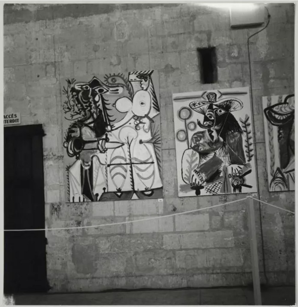
The present work in the 1970 exhibition Pablo Picasso: 1969-1970 at the Palais des Papes
© 2025 Estate of Pablo Picasso / Artists Rights Society (ARS), New York
While the iconography of Homme assis finds its roots in years past, Picasso’s painterly style aligns with the formalist concerns of the Post-War abstract masters. Rendered on a soaring scale, Picasso paints the present work with vigor and full gestures, some areas emerging as abstract motifs in the background and lower register, while others dissolve into pure abstraction. The broad, flat fields of color recall the work of Hans Hofmann, while the work’s stark graphic quality and use of negative and positive space bring to mind the compositions of Franz Kline, whose paintings give equal importance to both the white and black areas of the canvas, rather than treating the white as merely negative space.
Even after completing Homme assis, Picasso continued painting at a fervent pace, completing 167 paintings between January 1969 and January 1970. His impetus to create as much as possible before the end inspired Christian Zervos to organize the 1970 exhibition at the Palais des Papes in Avignon. Amidst the Gothic arches and trefoil windows at what was the birth of the papacy, the exhibition featured all of Picasso’s work from the prior year, allowing visitors to experience the year alongside the artist and to live vicariously through him. In this monumental presentation of his great late oeuvre, Picasso’a Homme assis was flanked by Homme et femme, executed a week after the present work, and now in the collection of the Los Angeles County Museum of Art.
Mère et enfant, 1922
Leonard & Louise Riggio: Collected Works
Christie’s New-York: 12 May 2025
Estimated: USD 9,000,000 – 12,000,000
USD 7,310,000
PABLO PICASSO (1881-1973), Mère et enfant | Christie’s
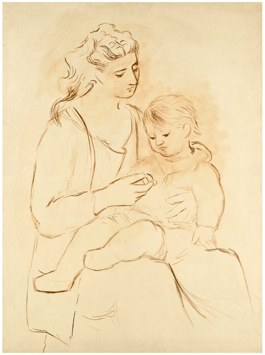
PABLO PICASSO (1881-1973)
Mère et enfant, 1922
Oil on canvas
130.2 x 96.8 cm (51 1/4 x 38 1/8 inches)
Painted in Dinard in summer 1922
Pablo Picasso spent the summer of 1922 with his wife, Olga Khokhlova, and their infant son Paul in Dinard, a fashionable seaside resort at the mouth of the river Rance, popular due to its relative proximity to Paris. The summer proved immensely fruitful for the artist, who produced more than sixty oil paintings and nearly two hundred drawings between June and September, ranging from tender portraits of his small family, to landscape sketches and Cubist still lifes. Perhaps the most evocative of this group of works are a series of classicized female figures, both ethereal and monumental, which recall the idealized features of Quattrocento Madonnas or sculptural Hellenistic goddesses. Their coiffures are parted in the middle and gently waved, redolent of antique statuary, with sharp brows and heavy lidded eyes that appeared as though carved from stone. Mère et enfant, painted at the height of that contented summer, demonstrates the manner in which these figures are both gracious and enigmatic—like sculptures come to quiet, contemplative life. The present work exemplifies Picasso’s incomparable ability to distill and synthesize a wealth of pictorial and thematic possibilities in his work, as he quarried from the art of the past in the years following the First World War, to reach an innovative artistic idiom fully his own.
Picasso’s initial first-hand encounter with the Mediterranean’s art historical heritage coincided with his meeting and courting of Olga, a Ukrainian-born ballerina then at the apex of her career with the Ballets Russes. The two had both traveled to Rome in February 1917 to prepare and rehearse Serge Diaghilev’s premiere production of the ballet Parade. While designing the stage sets and costumes for the show, and in the company of his friends, the writer Jean Cocteau and the choreographer Léonide Massine, Picasso sojourned to Naples to view the excavated remains of ancient Pompeii. Massine later recalled: “Picasso was thrilled by the majestic ruins, and climbed endlessly over broken columns to stand staring at fragments of Roman statuary” (quoted in J. Clair, ed., Picasso, 1917-1924: The Italian Journey, exh. cat., Palazzo Grassi, Venice, 1998, pp. 79-80).
“To me there is no past or future in my art. If a work of art cannot live always in the present it must not be considered at all. The art of the Greeks, of the Egyptians, of the great painters who lived in other times, is not an art of the past; perhaps it is more alive today than it ever was.”
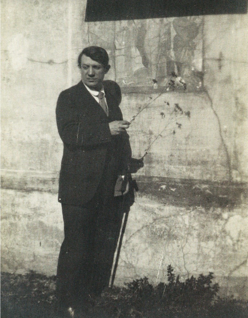
Picasso in Pompeii, 1917. Photograph by Jean Cocteau. © 2025 Estate of Pablo Picasso / Artists Rights Society (ARS), New York.
Picasso examined the surviving artworks on display at the Museo Archeologico Nazionale in Naples, where he likely saw the Farnese Juno—now thought to be the goddess Diana, a Roman copy after a Greek sculpture carved in the fifth century BCE. The sculpture became the source of many regal female figures Picasso depicted in subsequent years, often fused with Olga’s delicate features across numerous pages and canvases. The artist also seized the opportunity to study examples of ancient fresco paintings: a photograph taken by Cocteau shows Picasso pointing to a mural of Bacchus and Silenus. Evidently struck by what he saw, he brought home postcards of this and other Pompeiian wall paintings, now housed at the Musée Picasso in Paris. The muted, terracotta palette of the present work might suggest the earthy tones of ancient fresco techniques. Before returning to Paris, Picasso also visited Florence, where he admired the masterpieces at the Gallerie degli Uffizi’s iconic Sala dei Primitivi, including paintings by Raphael and sculptures by Michelangelo.
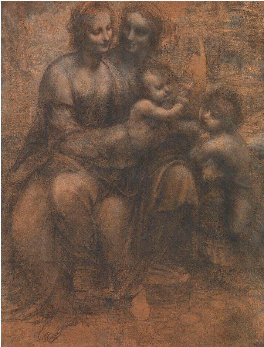
Leonardo da Vinci, The Virgin and Child with Saint Anne and the Infant Saint John the Baptist (‘The Burlington House Cartoon’), 1507-1508. National Gallery, London.
Shortly before embarking on his voyage to Italy in 1917, Picasso traversed two distinct stylistic avenues, moving effortlessly between a late synthetic Cubist manner and a more naturalistic, classically modulated mode of figuration which Olga would come to embody in his oeuvre. While champions of each approach strove to discredit his efforts in the other, the seemingly contrasting notions of Cubism and Classicism appeared to Picasso to be dual sides of the same coin—the culmination of Western art in its most provocative, modern form, ever generating potent dialects of representation from which dazzlingly transformative ideas could burst forth. Picasso had produced classicized drawings as early as 1914, and following the 1918 Armistice, his ongoing exploration of Classicism as a means of expanding the parameters of contemporary art gained new impetus. Now, the European avant-garde to which he belonged embraced an ethos of renewal linked to a heightened awareness of and reverence for tradition. Adhering to le rappel à l’ordre—the “call to order,” as coined by Cocteau—artists increasingly rejected modern conventions in favor of looking to the past, from classical antiquity to the Italian Renaissance to the great French masters of the previous centuries, notably Nicolas Poussin, Jacques-Louis David, and Jean Auguste Dominique Ingres. In the eyes of these artistic circles, the humanistic cultural imperative of these periods could heal the wounds that four years of gruesome carnage had inflicted on the modern world, thus satisfying a yearning for veritable rebirth into a period of unity, stability, and harmony.
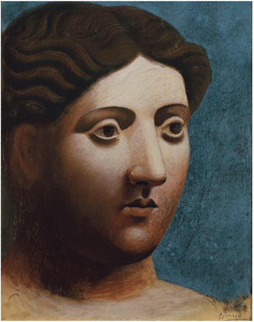
Pablo Picasso, Tête de femme, 1921. Fondation Beyeler, Riehen.
Artwork: © 2025 Estate of Pablo Picasso / Artists Rights Society (ARS), New York. Photo: AKG Images.
Picasso and Olga married in July 1918, after having postponed the nuptials from May due to an injury that briefly debilitated Olga. The newlyweds took an apartment in the trendy rue la Boétie, which had become the center of the Parisian art trade, allowing them to enter a new stage in their lives—Picasso as a celebrated member of the beau mode, and Olga in her role as a celebrity’s wife. In February 1921, they welcomed their only child together, a son named Paulo Joseph. Not long after, Picasso began to explore intimate and tender depictions of his new family. Until that point, Olga had often been transformed into a Greco-Roman goddess in her husband’s art—her features exaggerated volumetrically to mythological proportions, or depicted as a divinely beautiful Italian Madonna, or a Spanish matron in a lace mantilla. Now, aspects of each were consolidated to capture the poignancy of the maternity scenes in which the new mother becomes a timeless model of ennobled feminine grace.
Olga and Paul Picasso, 1921. Musée national Picasso, Paris. Photo: © RMN-Grand Palais / Art Resource, NY.
In Mère et enfant, Olga gazes at her young son as he sits serenely in her lap, an impenetrable look on her refined features, captured in a striking monochrome palette. Her head is bowed in silent contemplation, as though caught in a moment of reverie, appearing as venerated and impregnable as any classical deity or Renaissance Virgin. Rather than displaying an exacting likeness, the work is an affectionate idealization, showcasing the subtle power of expression that Picasso summoned through the urbane style of portraiture his wife inspired. Olga’s features are subtly distorted, the space between her eyes widened and her lips minimized. Picasso must have used an exceptionally fine brush in his treatment of the two figures, creating the impression that the work was executed in ink on aged paper rather than painted in oils on canvas. While clearly evoking the various sources that so inspired Picasso at this juncture of his career, the work defies exact identification with any specific antique or classical example.
René Magritte
L’empire des lumières, 1949
Leonard & Louise Riggio: Collected Works
Christie’s New-York: 12 May 2025
Estimates on Request
USD 34,910,000
RENE MAGRITTE (1898-1967), L’empire des lumières | Christie’s
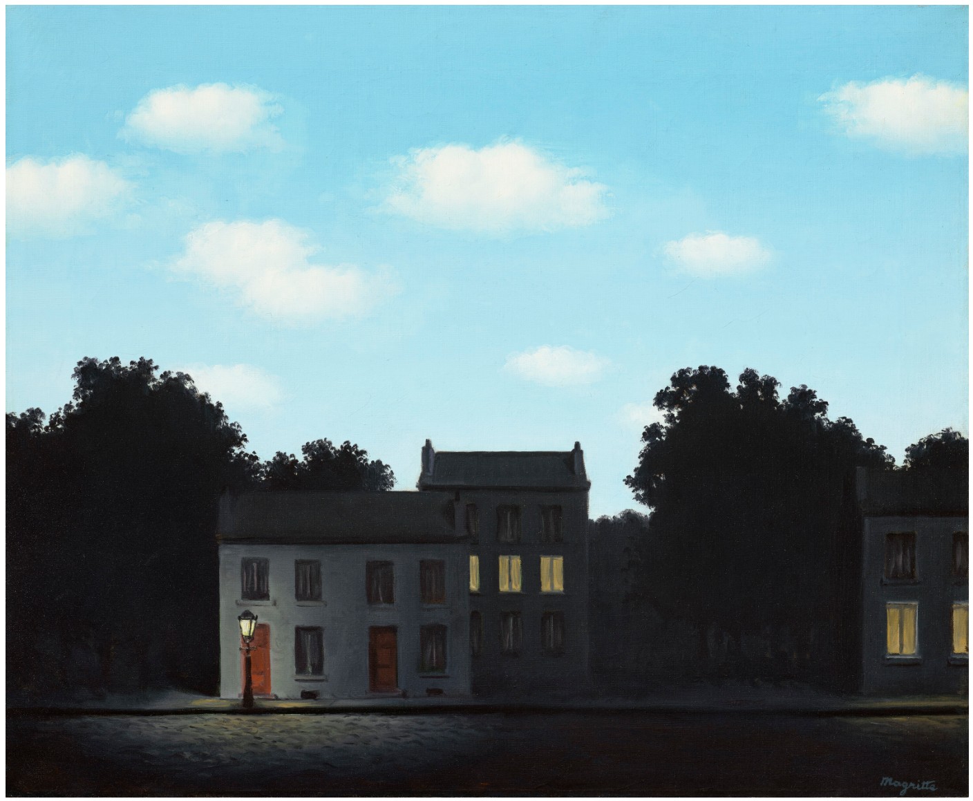
RENE MAGRITTE (1898-1967)
L’empire des lumières, 1949
Oil on canvas
48.2 x 58.7 cm (19 x 23 1/8 inches)
Signed ‘Magritte’ (lower right)
Sated and titled ‘”L’EMPIRE des LUMIÈRES” 1949’ (on the reverse)
In 1949, René Magritte placed a new canvas upon the easel in his studio in Brussels, and set out to explore an intriguing, mysterious idea that had been percolating in his imagination for several years. This was a landmark moment in the artist’s career, marking the arrival of a motif that would quickly become one of the most celebrated and iconic subjects within the Belgian Surrealist’s oeuvre—the L’empire des lumières. A decade earlier, while staying with the collector Edward James in London during the spring of 1937, Magritte had given a presentation at Roland Penrose’s London Gallery in which he discussed “certain features peculiar to words, images and real objects” (quoted in D. Sylvester, ed., op. cit., 1993, p. 53). In one example early in the discussion, the artist cited the opening line of André Breton’s poem L’Aigrette, from Terre de clair (1923): “If only the sun would shine tonight” (ibid.). This intriguing proposition stuck in Magritte’s mind, and grew into the L’empire des lumières works, the deceptively simple concept offering an elegant summation of his unique form of Surrealism, which revels in unexpected contradictions.
The first in this acclaimed series, the present painting establishes the core elements of the theme. Here, a row of ordinary suburban houses are bathed in deep shadows, the surrounding trees and shrubbery almost disappearing into darkness, while above the blue expanse of a day-lit sky stretches over the rooftops, soft white clouds drifting through the atmosphere. At first glance the painting appears to simply present a familiar street scene in the crepuscular light of dusk or dawn. Yet, on further inspection the intensity of the darkness, combined with the soft glow of the streetlamp and the lights from within the houses, suggests two opposing timelines exist simultaneously within the scene—here, both night and day are visible, the two colliding unexpectedly in a single moment. This idea would prove extremely fruitful for Magritte, and he would go on to create a total of sixteen further versions in oil on the theme over the following fifteen years, with several more iterations in gouache, each variation subtly different from the next as he probed and examined its poetic potential.
“This intense personal interest in night and day is a feeling of admiration and astonishment.”
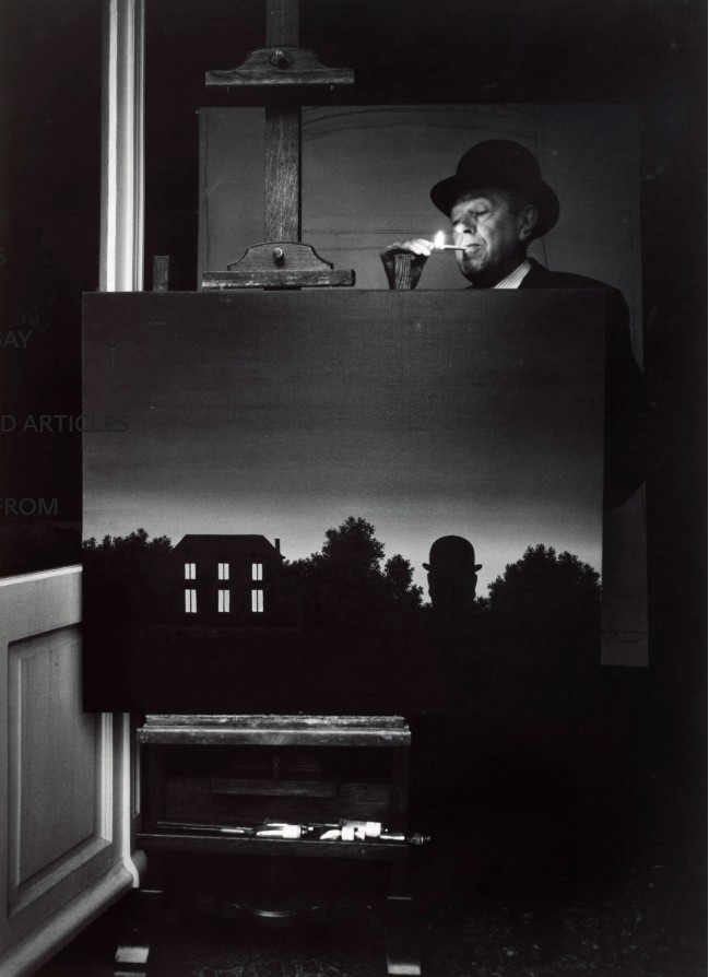
René Magritte, 1967. Photo: Marcel Broodthaers. © 2025 Artists Rights Society (ARS), New York / SABAM, Brussels / The Art Institute of Chicago / Art Resource, NY. Artwork: © 2025 C. Herscovici, London / Artists Rights Society (ARS), New York.
Alongside Breton’s poem, the L’empire des lumières paintings hark back to a gouache Magritte executed in 1938, titled Le Poison (Sylvester, no. 1142; Museum Boijmans Van Beuningen, Rotterdam), where a row of buildings took on the appearance of the night sky, dotted with constellations of stars and a delicate crescent moon, transforming the bricks and mortar streetscape into an evocative, otherworldly vision of the cosmos. In many ways, Le Poison was a continuation of Magritte’s ongoing fascination with translating and transforming the sky. From his earliest Surrealist paintings it had been a recurring character in his work, its familiarity allowing him to investigate the world of appearances, and question our understanding of its properties. In L’empire des lumières, the sky once again becomes an essential tool in Magritte’s arsenal to disrupt and challenge expectations. Simplifying the concept explored in Le Poison, the artist creates a composition that is all the more unsettling for its quiet strangeness. The setting is a well-maintained, bourgeois quarter of town, not dissimilar to the location of Magritte’s own home in Brussels, executed with a delicate precision and attention to detail that only reinforces the uncanniness of the juxtaposition of night and day.
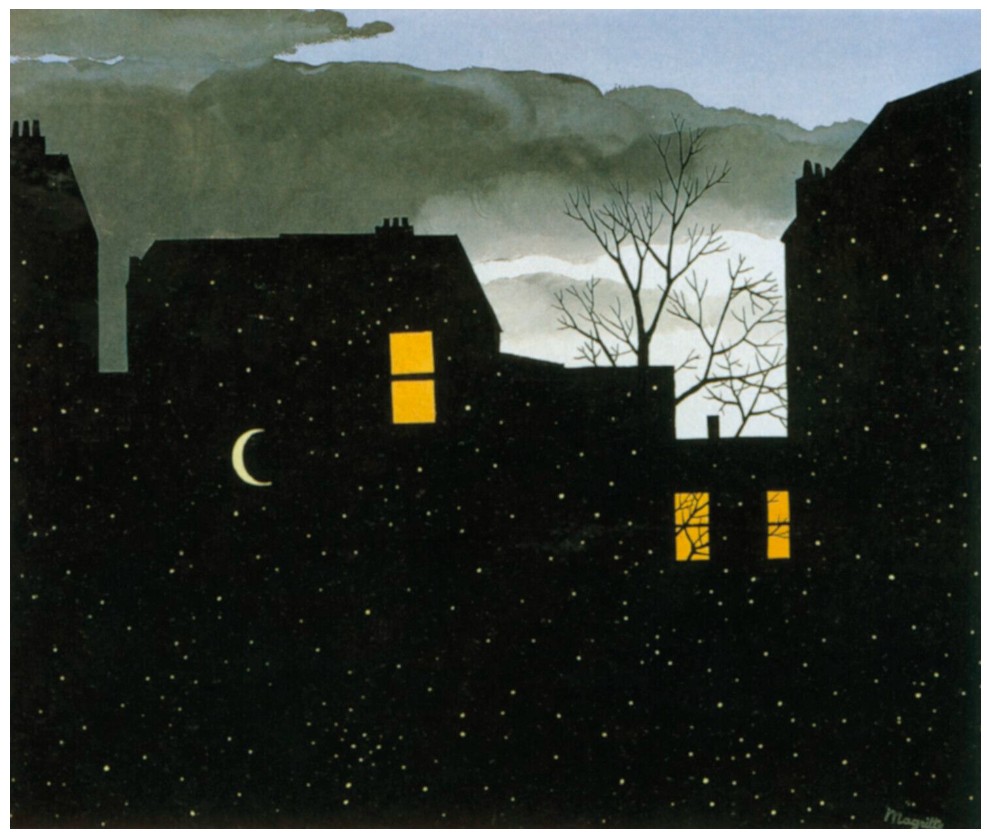
René Magritte, Le Poison, 1938 or 1939. Museum Boijmans Van Beuningen, Rotterdam.
© 2025 C. Herscovici / Artists Rights Society (ARS), New York.
Magritte discussed the idea behind his L’empire des lumières paintings in a commentary written for a 1956 television program, later published in the exhibition catalogue Peintres belges de l’imaginaire, Grand Palais, Paris, 1972: “For me, the conception of a picture is an idea of one thing or of several things which can be realized visually in my painting. Obviously, all ideas are not ideas for paintings. Naturally, an idea must be sufficiently stimulating for me to get down to painting the thing or things that inspired the idea. The conception of a painting, that is, the idea, is not visible in the painting: an idea cannot be seen by the eyes. What is depicted in the painting is what is visible to the eye, the thing or things that had to inspire the idea. So, in the painting L’empire des lumières are things I had an idea about—to be precise, a nocturnal landscape and a sky above in broad daylight. The landscape evokes night and the sky evokes day. This evocation of day and night seems to me to have the power to surprise and enchant us. I call this power ‘poetry.’ I believe this evocation has such a ‘poetic’ power because, among other reasons, I have always been keenly interested in night and in day, although I’ve never had a preference for one or the other. This intense personal interest in night and day is a feeling of admiration and astonishment” (“L’empire des lumières” April 1956; reproduced in K. Rooney and E. Plattner, eds., René Magritte: Selected Writings, Richmond, 2018, p. 167).
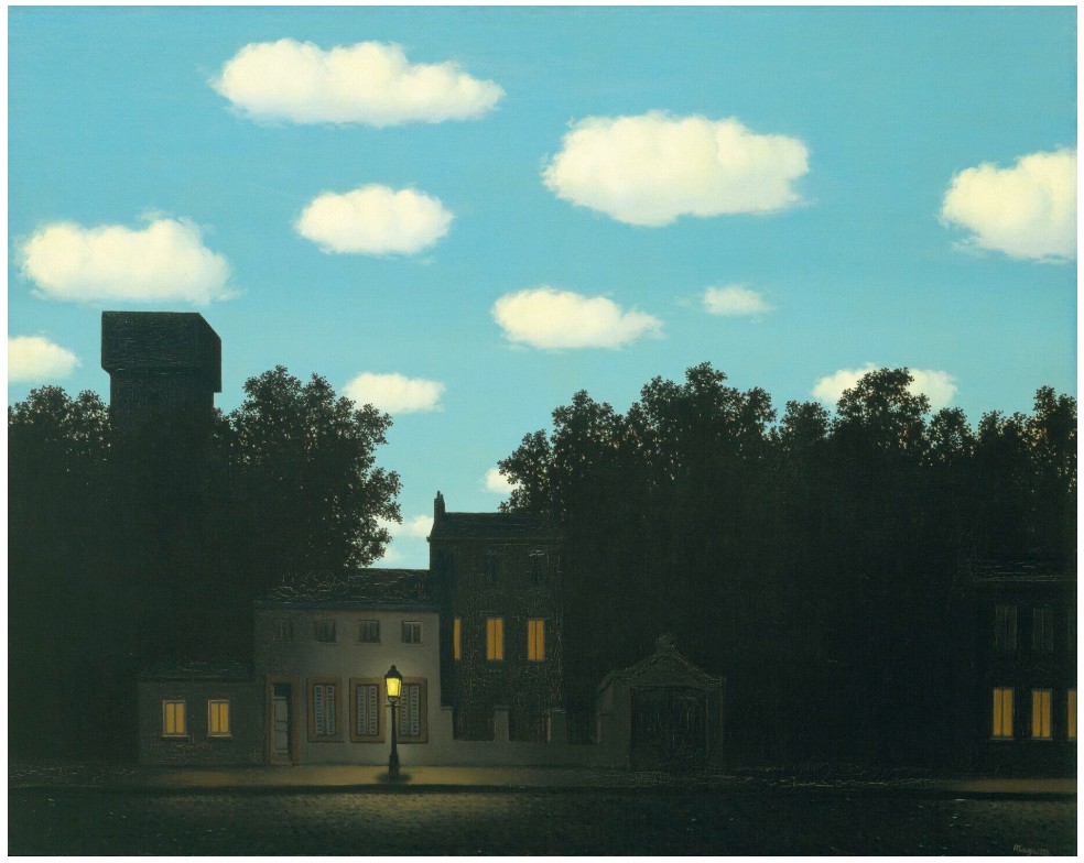
René Magritte, L’empire des lumières, 1950. The Museum of Modern Art, New York. © 2025 C. Herscovici / Artists Rights Society (ARS), New York. Digital Image: © The Museum of Modern Art / Licensed by SCALA / Art Resource, New York.
After the present work’s completion, the image continued to reverberate through Magritte’s imagination, and had a profound impact on his own conception of reality: “After I had painted L’empire des lumières,” the artist explained in 1966, “I got the idea that night and day exist together, that they are one. This is reasonable, or at the very least it’s in keeping with our knowledge: in the world night always exists at the same time as day. (Just as sadness always exists in some people at the same time as happiness in others). But such ideas are not poetic. What is poetic is the visible image of the picture” (ibid., no. 111).
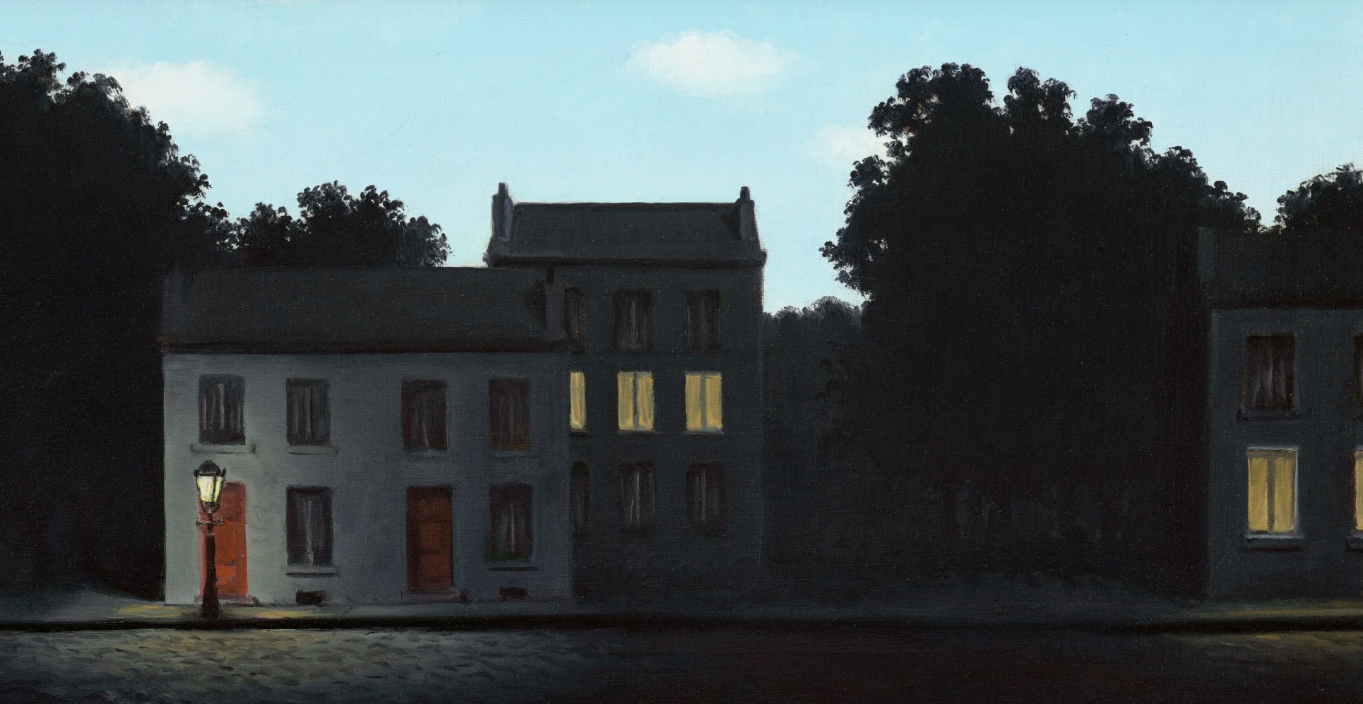
The subject proved incredibly popular with the artist’s collectors, leading to a number of direct commissions for new versions. However, Magritte was adamant that each work should evolve naturally from his own artistic pondering, writing to his dealer Alexander Iolas “I have to find a way of justifying the replica in my own mind” (quoted in C. Greenberg and D. Pih, eds., Magritte A-Z, London, 2011, p. 49). In each iteration he made subtle alterations, experimenting with the particulars of the scene, amplifying different aspects of the landscape, subtly adjusting the colors of the sky or the density of the clouds, even expanding the sense of space and recession within the picture. Different architectural styles were adopted in some versions, providing unexpected hints as to the location of the setting, or the socio-economic status of the residents, while the towering trees that surround the building began to take on a distinct sense of individuality and character from one canvas to the next.
Les droits de l’homme, 1947-1948
Leonard & Louise Riggio: Collected Works
Christie’s New-York: 12 May 2025
Estimated: USD 15,000,000 – 20,000,000
USD 15,935,000
RENE MAGRITTE (1898-1967), Les droits de l’homme | Christie’s
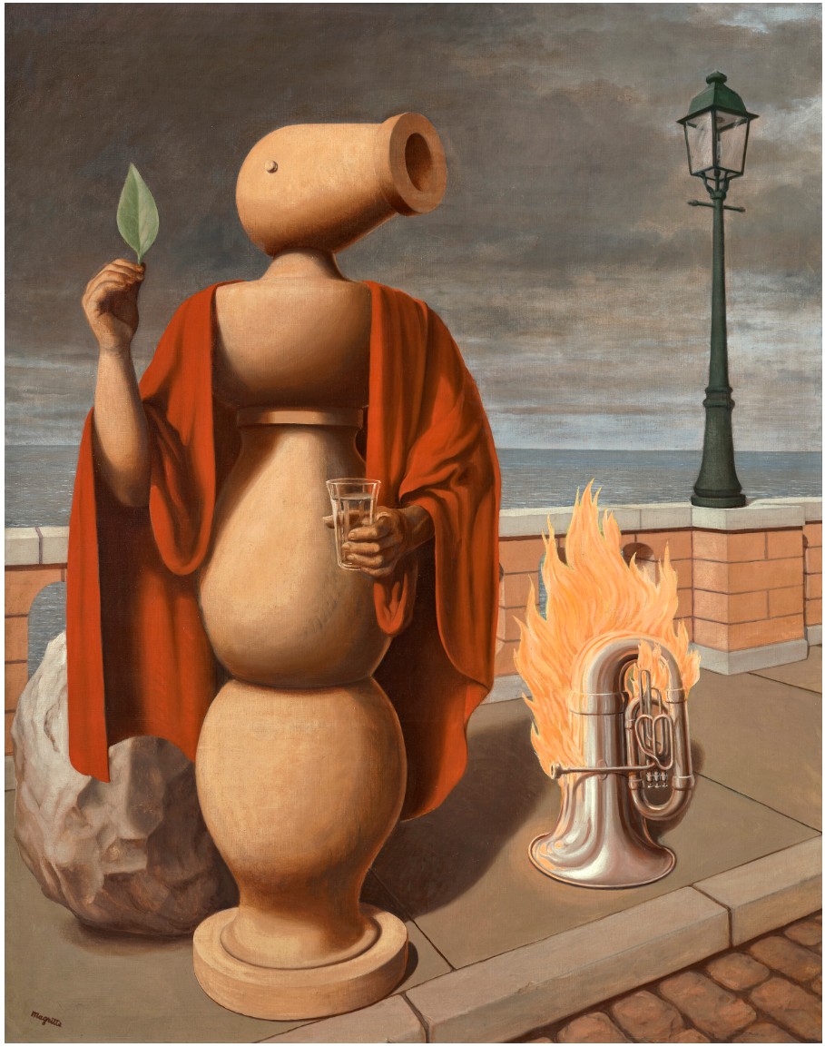
RENE MAGRITTE (1898-1967)
Les droits de l’homme, 1947-1948
Oil on canvas
144.8 x 114.6 cm (57 x 45 1/8 inches)
Signed ‘Magritte’ (lower left)
Dated and titled ‘”LES DROITS DE L’HOMME” 1947-1948’ (on the reverse)
In 1948, while musing on the purpose of the titles he assigned to his paintings, René Magritte proclaimed: “I think the best title for a picture is a poetic one. In other words, a title consistent with the more or less lively emotion we feel when we look at the picture” (“On Titles,” 1948; in K. Rooney and E. Plattner, eds., René Magritte: Selected Writings, Richmond, 2018, p. 115). Across a series of handwritten manuscripts—now preserved in the Archives of Contemporary Art in Belgium and collectively known as “On Titles”—the artist offered a collection of short statements on some of his recent work. Among these brief notes, Magritte wrote about Les droits de l’homme: “Here, man is reminded of his right to act on objects and change the world” (ibid., p. 114).
Invoking the French translation of Thomas Paine’s seminal treatise, The Rights of Man, as well as H.G. Wells’s radical 1940 manifesto on universal human rights in the face of war, the painting presents an enigmatic, uncanny scene, in which an inanimate object is brought to life, in order to deliver a speech. Completed on 16 January 1948 and included in a series of solo exhibitions that year, Les droits de l’homme is a testament to Magritte’s unique approach to Surrealism in the aftermath of the Second World War, as he sought to depict “the most ordinary reality in such a way that this immediate reality loses its tame or terrifying character and presents itself with mystery” (quoted in H. Torczyner, Magritte: Ideas and Images, New York, 1977, p. 203).
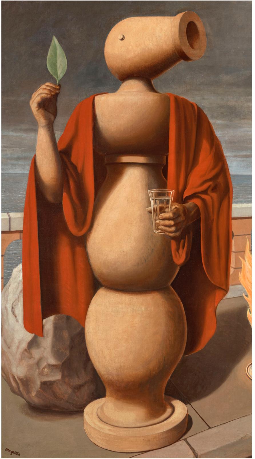
At the heart of the composition stands a variation on one of Magritte’s iconic leitmotifs, the mysterious bilboquet. This object had first made its appearance in the artist’s Surrealist paintings of the mid-1920s, taking inspiration from a popular handheld game of the same name, known in many cultures throughout the world. The bilboquet typically consists of a ball with a hole bored into it, which fits on a spike at the top of a wooden stick shaped to fit the hand, and is attached to the handle by a string. In a test of dexterity, the player must fling the ball upward, and then try to catch it on the spike as often as possible within a designated period of time. In Magritte’s interpretations of this object, the wooden baton takes on numerous different roles within his surreal compositions: in Portrait de Georgette Magritte (Sylvester, no. 76; Musée national d’art moderne, Centre Georges Pompidou, Paris), for example, the bilboquet remains true-to-scale, its familiar shape offering a stabilizing support to the empty wooden picture-frame that leans against it.
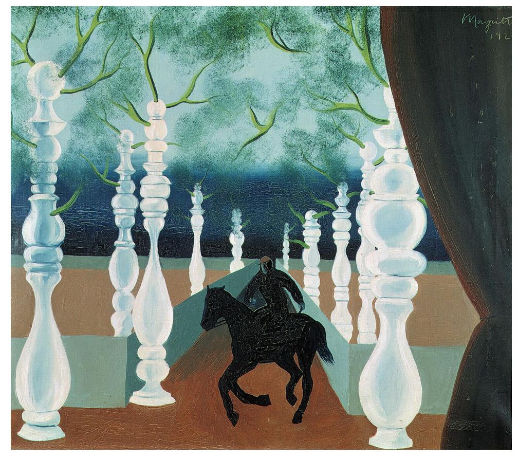
René Magritte, Le jockey perdu, 1926. Private collection. © 2025 C. Herscovici / Artists Rights Society (ARS), New York.
Photo: Bridgeman-Giraudon / Art Resource, NY.
However, in Le jockey perdu (Sylvester, no. 81; Private collection) rows and rows of bilboquets appear as towering tree-trunks, creating a strange man-made forest, while in works such as La naissance de l’idole (Sylvester, no. 89; Private collection) and Le Rencontre (Sylvester, no. 99; Kunstsammlung Nordrhein-Westfalen, Dusseldorf), Magritte anthropomorphizes the wooden object, adding an eye, a hand or an arm to the bilboquet, transforming it into an unsettling quasi-human presence, at once animate and inanimate. The artist would refer to the bilboquets simply as his “wooden figures,” and they are in many ways reminiscent of Giorgio de Chirico’s strange, inanimate mannequins—trovatori, muse, and more—that populated his Metaphysical works.
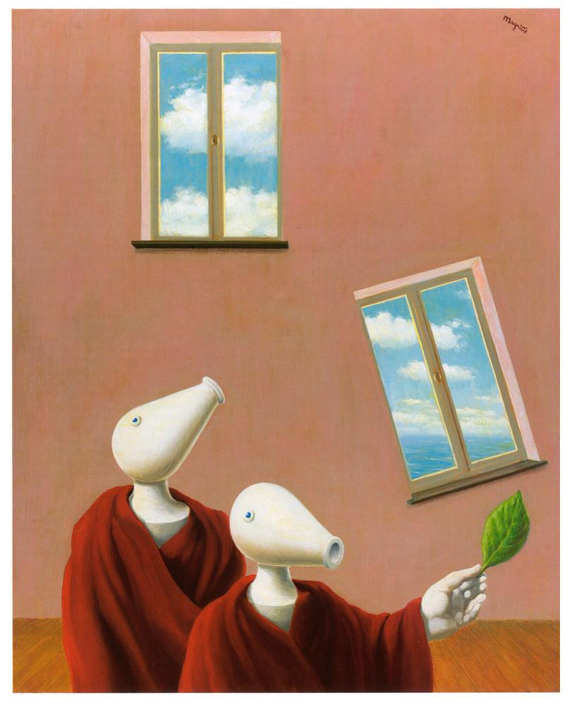
René Magritte, Les rencontres naturelles, 1945. Musées Royaux des Beaux- Arts de Belgique, Brussels.
© 2025 C. Herscovici / Artists Rights Society (ARS), New York.
By the 1940s, the bilboquet had evolved into a distinctly figurative presence—in 1945 Magritte further enhanced the effect, playing with its silhouette to create more pronounced curves, adding naturalistically rendered arms and hands that often gesture animatedly, and, perhaps most notably, elongating the spherical shape of the ball atop the handle into a bulbously spouted form that comes to represent a proudly elevated head. The squat shape of the bilboquet’s newly formed mouth and snout also recalls a nineteenth-century mortar, an artillery piece used for hurling explosive shells in steep trajectories over the walls of fortifications. The content of wartime newsreels may have suggested this allusion to Magritte—in some pictures where the artist has employed this form, the mouth of the bilboquet actually bursts forth in flames, like a cannon being fired (Sylvester, no. 626; Private collection). Described by Harry Torczyner as an “anthropoid bilboquet,” these new characters seem eager to show off their gift of speech, and they usually appear, as seen here, draped in a richly-hued red cloak, and adopting a formal and declamatory stance, bringing to mind a noble orator or statesman (ibid., p. 152).
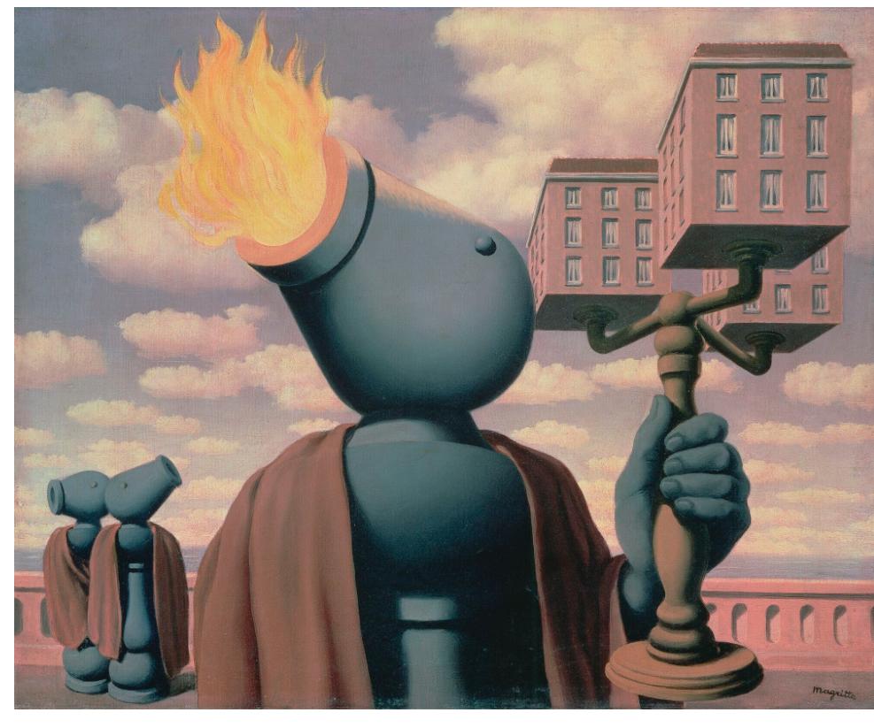
René Magritte, Le Cicérone, 1947. Private collection.
© 2025 C. Herscovici / Artists Rights Society (ARS), New York. Photo: Bridgeman Images.
In Les droits de l’homme, one such speaker stands alone on a well-lit thoroughfare, seemingly life-size and imposing, a gentle seascape and overcast sky serving as a serene backdrop. The uncanny quality of the scene is heightened by the strange pairing of objects that flank this central character—to the left and partially tucked away behind the bilboquet’s cloak is a roughly hewn boulder, while to the right, a tuba is dramatically engulfed in flames on the pavement. As the bilboquet delivers its speech, it holds a glass of water in one hand, while the other raises a small leaf by way of a prop, perhaps a visual aide to something this mysterious character is attempting to explain to an unseen audience. When combined with the title, this subtle gesture creates the impression that the bilboquet is delivering a profound message to his audience, perhaps a political statement or a call to action, a meditation on nature maybe, or an attempt to dissect the meaning of reality and man’s place within it. However, the subject of the bilboquet’s speech and its intentions ultimately remain a mystery to us, its impassioned proclamations left an unknowable enigma for the viewer to ponder.
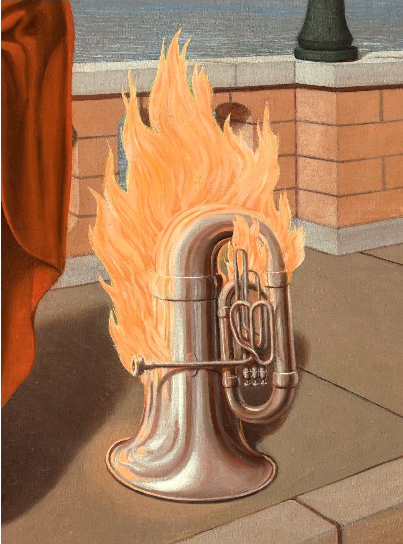
In this way, Les droits de l’homme, as with so much of Magritte’s work, defies any clear, logical explanation. Throughout his life, the artist repeatedly refuted the myriad of psychological and biographical interpretations that sought to decode the meaning of his work, maintaining time and again that it was the image alone that mattered. “I have nothing to express!” he once exclaimed, “I simply search for images, and invent and invent… only the image counts, the inexplicable and mysterious image, since all is mystery in our life” (quoted in M. Blots, “Silhouette: René Magritte” in La Métropole, 2 July 1951; in K. Rooney and E. Plattner, eds., op. cit., 2018, p. 138).
Indeed, when Les droits de l’homme was included in a touring exhibition of America in 1960-1961, Magritte lamented the strange, seemingly arbitrary interpretations that had been attached to the painting by various critics: “A recent experience has made me realize the gap between one intelligence and another,” he wrote in a letter to André Bosmans. “I have just heard an ‘explanation’ of one of my pictures, Les droits de l’homme. It appears that the fire in my picture is Prometheus’s fire, but also a symbol of war! The figure holding the leaf is a representation of peace—the leaf is an olive leaf!! … But I won’t go on, because the imagination of painting enthusiasts is inexhaustible, but very banal, these enthusiasts being entirely devoid of inspiration…” (letter to A. Bosmans, 20 September 1961; quoted in D. Sylvester, ed., op. cit., 1993, p. 396).
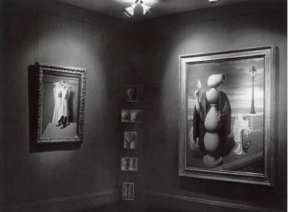
Les droits de l’homme on view at the exhibition “René Magritte,” at the Hugo Gallery, New York, May 1948.
© 2025 C. Herscovici / Artists Rights Society (ARS), New York.
Letters from the late 1940s between Magritte and his principle dealer in America, Alexander Iolas, reveal that, having failed to find a buyer when initially shown at exhibition in 1948, the artist was eager for Les droits de l’homme to be offered directly to The Museum of Modern Art in New York for a discounted sum. However, despite Iolas’s efforts and numerous overtures on the artist’s behalf—which included a generous offer for the painting to be gifted to the museum’s collections by John and Dominique de Menil—Les droits de l’homme remained with the dealer, and was instead sold to Iolas’s accountant, Irving Abbey. When it last appeared at auction at Christie’s in March 1984, the painting achieved a new record price for a painting by Magritte.
La Traversée difficile, 1963
Sotheby’s New-York: 13 May 2025
Estimated: USD 10,000,000 – 15,000,000
USD 10,040,000
La Traversée difficile | Modern Evening Auction | 2025 | Sotheby’s
RENE MAGRITTE (1898 – 1967)
La Traversée difficile, 1963
Oil on canvas
81.3 x 100.2 cm (32 x 39 1/2 inches)
Signed Magritte (lower left)
Titled (on the reverse)
Themes of vision and perception, as well as the re-imagining or fragmentation of the human figure, were instrumental to Surrealist philosophy and a primary mode of artistic experimentation throughout René Magritte’s oeuvre. Yet in no work is his investigation into the matrix of visual perception more dynamically engaged than in his 1963 canvas, La Traversée difficile. From the bilboquet, to the cyclopic eye and the suited-figure, the present work is a triumphant tour-de-force of the artist’s most iconic and recurrent motifs. With them, Magritte weaves together an image which oscillates between beguiling metaphor and exacting critique, brought to life in the incomparably matter-of-fact painterly language for which he has come to be so celebrated.
Magritte first ideated the theme explored in La Traversée difficile in a work by the same name executed nearly forty years earlier in 1926. In this earlier version, Magritte paints only one figure, a bilboquet, situated within a close interior which teleports away from the viewer at an exaggerated steep perspective. Despite the anthropomorphic addition of the single eye on the bilboquet’s “head”, the totem appears distinctly inanimate amidst the other architectural elements which fill the room. In 1963, Magritte makes the decisive choice to reimagine the totemic object in the guise of a suited figure, a motif which stands among the most iconic within his visual lexicon; perhaps most importantly, the eye overtakes the head entirely. The bilboquet becomes a secondary actor, something of an anthropomorphic echo to the human body in the foreground which further confuses the sense of comfortability with the composition as a whole.
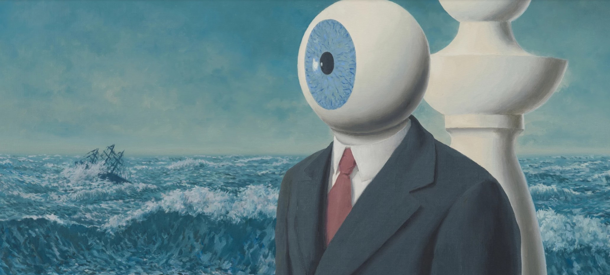
In title alone, the work presages a kind of crisis of the human condition or mind. As with many of Magritte’s works, the title is left invitingly yet intentionally ambiguous, a kind of multifarious non-sequitur which implies yet does not define its meaning. The “difficult journey” to which Magritte here refers can on the one hand be read explicitly, in the tumultuous stormy seascape, whose waves violently crown and crash above the stone baluster dividing the fore- and backgrounds. The crashing waves in the present work were modeled after the marine painter Wartan Mahokian’s La Vague, a postcard of which Magritte kept in his studio and referenced in numerous compositions. Just below the horizon, Magritte poignantly includes a ship being overtaken by the white-capped waters, offering both an iconographic and thematic echo of a recurring theme within the epic works of the 19th century Romantics. Whereas in the 1926 composition, Magritte leaves ambiguous whether this vignette is seen through a window or a painting, here the ocean encroaches onto the scene, rising like a wall behind the protagonists. In Magritte’s paintings more generally, the ocean often represents a sense of mystery, abyss, or the unknown, symbolizing the vastness and unknowability of existence. It can also depict alienation or a longing for escape, and in some cases, can be interpreted as a metaphor for the subconscious mind, where feelings and emotions are hidden. As such, the cataclysmic seascape in the present work portends a metaphysical journey as well, a harbinger of a crisis of perception which proliferates upon consideration of the other elements within the composition.
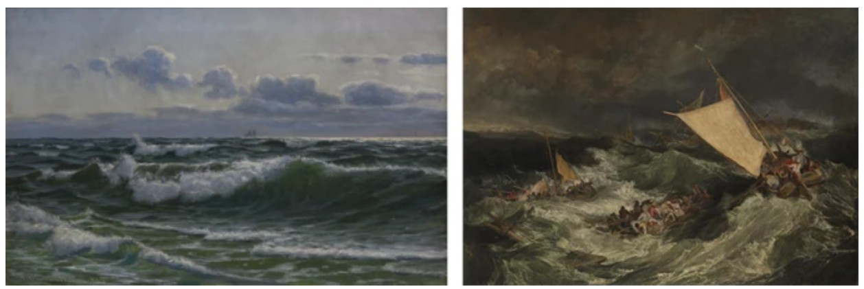
Left: Vartan Makhokhian, Sea View, 1905, National Gallery of Armenia, Yerevan
Right: Joseph Mallord William Turner, The Shipwreck, 1805, Tate Britain, London
Magritte invariably employed the suited figure as a cipher for the generic, everyday man, here with a head supplanted by a cyclopic, all-seeing eye. While this form of “faceless man” famously appeared throughout the artist’s works from the 1960s (see fig. 4), what makes La Traversée difficile so intriguing in their context is that the eye does not simply hide but rather replaces the head entirely. A few years later, in 1965, Magritte would go on to explain that his preoccupation for these works lay with our pressing fascination to see beyond the world of appearances. As he describes, “there is an interest in that which is hidden and which the visible does not show us” (quoted in Harry Torczyner, Magritte: Ideas and Images, New York 1977, p. 172). But in creating a hybrid between the thing which hides, the eye, and the thing which is hidden, the figure’s head, Magritte collapses any possibility to see beyond either element. Whereas in Son of Man, Magritte leaves enough visual detail for the viewer to comfortably assume that the head remains intact behind the apple which obscures it, here they have no such reassurance. Where the eye peeks out from behind the apple in Son of Man, it here overtakes, and the head undergoes an irreconcilable transformation which no amount of mental agility can undo. What we are left to grapple with is our expectation of a head, as we know it to look, and the way it appears presented before us on the canvas.
“At least it hides the face partly well, so you have the apparent face, the apple, hiding the visible but hidden, the face of the person. It’s something that happens constantly. Everything we see hides another thing, we always want to see what is hidden by what we see. There is an interest in that which is hidden and which the visible does not show us. This interest can take the form of a quite intense feeling, a sort of conflict, one might say, between the visible that is hidden and the visible that is present.”
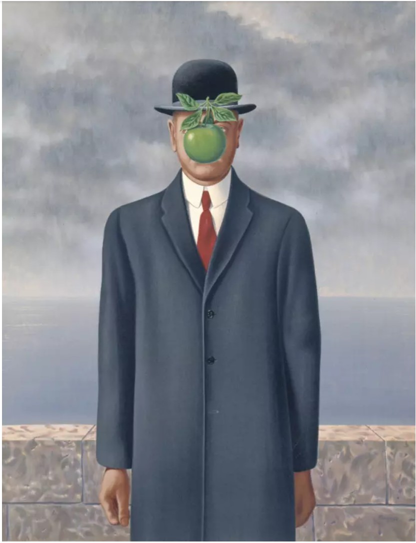 René Magritte, The Son of Man, 1964, Private Collection.
© 2025 C. HERSCOVICI, BRUSSELS / ARTISTS RIGHTS SOCIETY (ARS), NEW YORK
The conception of the eye as a (dis)embodied actor finds precedent in earlier works from Magritte’s oeuvre. David Sylvester suggests that the choice of imagery may have been inspired by Odilon Redon’s Le Fantome (see fig. 5). The macabre and often uncanny imagery which courses throughout Redon’s work is often acknowledged as precursor to Surrealism more broadly, but the imagery in his 1878 drawing bears a particularly striking similarity to Magritte’s first iterations on the theme. As is viscerally felt within the present work, the effect of this anatomical isolation was two fold. On the one hand, by removing all extraneous features from the figure’s face, Magritte poises the imposing, cyclopic eye as an omniscient, all-seeing power.
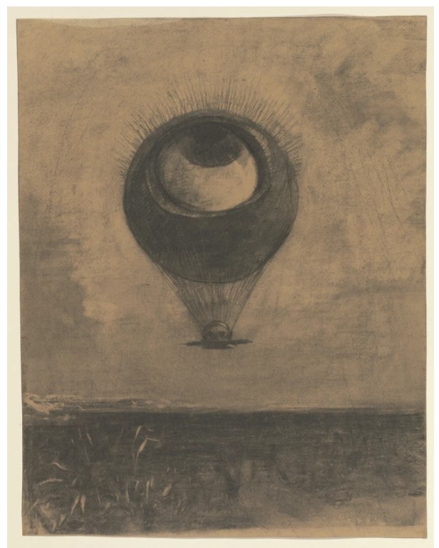
Odilon Redon, Eye-Balloon (Œil-ballon), 1878, Museum of Modern Art, New York
In both his 1937 canvas, Le Monde poétique, and his 1929 canvas, The False Mirror, the eye serves as the protagonist. In the former, the round pupil and bright white which surrounds it work to convey a sense of shock at the sight of the viewer. Already positioned as an adversary, the viewer is made to feel the scrutiny of the eye’s unbroken, frontal gaze. In the latter, the eye and what it sees become enmeshed, and the viewer in turn becomes involved in a mysterious and oblique reflection, a tangential feedback loop. For Magritte, the painted eye had a poignant psychoanalytical significance, particularly in its capacity to invoke self-reflection, or perhaps even abjection, on the part of the viewer. As Belgian writer and surrealist Marcel Lecomte observed; “often, these objects seem to be looking at us. What event are they waiting for, unless it is that of the mystery of their meeting on the same canvas, the mystery of their close combined identity? Then they exert all their restrained tension on us, all their charm, all their mute confidence. And so there is a secret movement between the painted and the spectator; what the objects represent leads us back towards ourselves (Exh. Cat., London, The South Bank Centre, Magritte, 1992, p. 37).
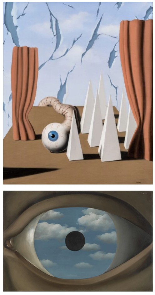
René Magritte, Le Monde poétique, 1937, sold: Sotheby’s, New York, November 2023 for: $1.9 million. © 2025 C. HERSCOVICI, BRUSSELS / ARTISTS RIGHTS SOCIETY (ARS), NEW YORK
René Magritte, The False Mirror, 1929, Museum of Modern Art, New York. © 2025 C. HERSCOVICI, BRUSSELS / ARTISTS RIGHTS SOCIETY (ARS), NEW YORK
Magritte’s subversion of the fundamental properties of anatomy were an extension of his fascination with “Objective Stimulus,” a term he applied to those instances in which he replaced an object familiar to a particular context with one related to it, but out of place. The shock of dissonance where one expects there to be consonance, Magritte realized, was all the more unsettling than the reverse. This framework was something of a departure from the prevailing Surrealist preoccupation with the revelatory potential held within the combination of disparate objects. With it, however, Magritte opened a trove of new pictorial and conceptual possibility. When dissected into its component parts, all of the elements Magritte uses to describe the figure are to be expected of a portrait. In other words, it is not the eye that is shocking but the way the eye appears. And in transforming the eye into the very thing which inhibits our ability to see the figure as we expect it to appear, Magritte raises a tantalizing paradox between vision and perception.
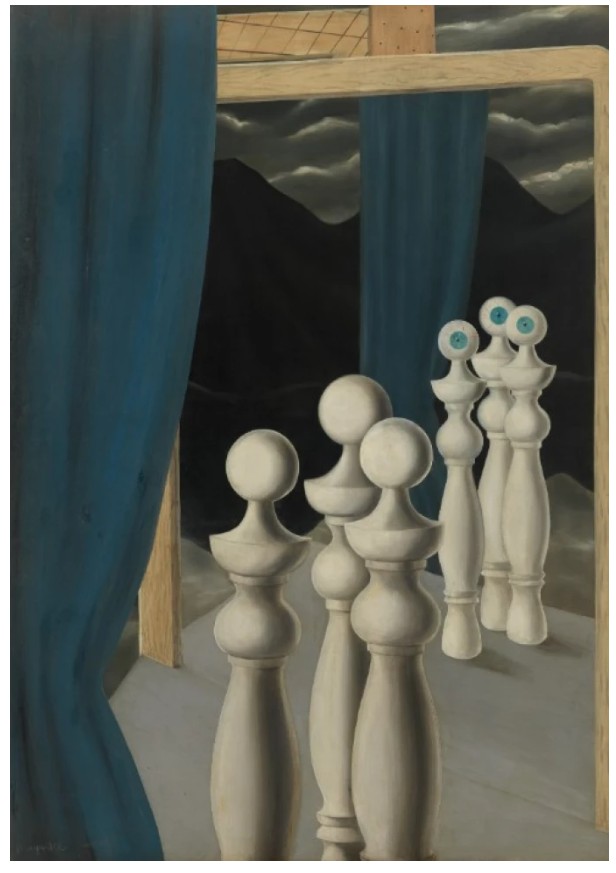
René Magritte, La rencontre, 1926, Kunstsammlung Nordrhein-Westfalen.
© 2025 C. HERSCOVICI, BRUSSELS / ARTISTS RIGHTS SOCIETY (ARS), NEW YORK
Once established in the central figure alone, this crisis of viewership is further complicated by the introduction of a second: the totemic figure of the bilboquet. First emerging in the artist’s work around 1926, the bilboquet began to take on an increasing anthropomorphic character in the 1940s. This evolution toyed with the term’s dual meaning, invoking the Surrealist penchant for wordplay: as a noun, Bilboquet refers to a popular stick-and-ball game by the same name, and as a proper noun, it also refers to a character from the circus troupe of Saltimbanques, archetypes of which would surface in the works of artists ranging from Daumier to Picasso. The ambiguous and unassuming bilboquet likely appealed to Magritte for its potential transfigurations; its form was phallic as well as evocative of the bishop in a chess set—a game often seen by the Surrealists as a psychoanalytic metaphor for life. As Ann Umland expounds, “It was a form with multivalent connotations, ranging from mannequins to balusters or table legs to chess pieces, and it would become one of Magritte’s stock elements, a distinctive ‘type’ that could be multiplied, resized and repositioned ad infinitum, each time slightly differently, posing a provocative challenge to prevailing definitions of originality in art” (Exh. Cat., New York, The Museum of Modern Art, The Mystery of the Ordinary, 2013, p. 28). In the present work, the form’s human qualities are amplified through its doubling with the suited-figure which stands before it. In their composition parallel, Magritte calls upon the way that its chiseled, curvilinear form echoes the shape and presence of the human physique.
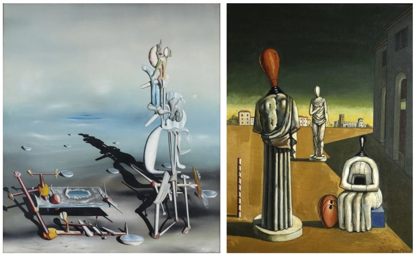
Left: Yves Tanguy, Divisibilité indéfinie (Indefinite Divisibility), 1942, Buffalo AKG Art Museum
Right: Girogio de Chirico, The Morning of the Muses, 1972, Fondazione Giorgio e Isa de Chirico, Rome
This anthropomorphizing impulse was a recurrent theme throughout the broader Surrealist movement, particularly for those artists working in a visual language which deferred to but ultimately reinvented the visual material of our lived reality. In the work of Yves Tanguy, for example, his organic, distantly familiar visual language confers on the central elements a visceral materiality which lends to their personification, and extends so far as to influence our reading of the immaterial skyscape as having an anthropomorphic quality as well. And yet, caught somewhere between liquid and solid, the shapes still elude categorization or neat description, thus heightening the feeling that Tanguy’s paintings occupy a world adjacent to but separate from our own. Giorgio de Chirico’s iconography moves closer to Magritte’s project in the distinctly figurative tenor of his motifs. In his 1972 canvas, The Morning of the Muses, de Chirico explores the same idea of doubling which Magritte here forefronts. The juxtaposition between the impersonal yet uncanny faceless mannequin heads and the ornate classical bodies on which they are positioned likewise inspires a deeply metaphysical dilemma in the viewer. In La Traversée difficile, the distinctly human quality of both the suited-figure and its bilboquet shadow ultimately confuse a linear sense of personhood, and in turn work to show the bifurcated, or rather duplicitous nature of self perception.
Mark Rothko
No. 4 (Two Dominants) [Orange, Plum, Black], 1950-51
Christie’s New-York: 12 May 2025
Estimate on Request
USD 37,785,000
MARK ROTHKO (1903-1970), No. 4 (Two Dominants) [Orange, Plum, Black] | Christie’s
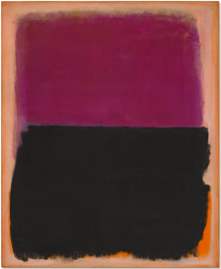
MARK ROTHKO (1903-1970)
No. 4 (Two Dominants) [Orange, Plum, Black], 1950-51
Oil on canvas
67 x 54 3/4 inches (170.2 x 139.1 cm)
Signed twice and dated ‘MARK ROTHKO MARK ROTHKO 1951’ (on the reverse)
Dating from a pivotal moment in Mark Rothko’s career, No. 4 (Two Dominants) [Orange, Plum, Black] captures the flowering of the singular artistic vision that would come to define his oeuvre. Painted between 1950 and 1951, during one of Abstract Expressionism’s most rich and fertile creative periods, it is an early example of the iconic distilled color fields that would fuel the artist’s practice until his death in 1970. Upon a shimmering orange and yellow ground, two zones of deep saturated color vie for dominance: a vast swathe of opulent purple, overlaid by a jagged band of black. The hues shift and mutate within the viewer’s field of vision, transformed by the force of their companions; the backdrop glows like an otherworldly halo of light, pushing each field into dramatic relief. Unveiled in Rothko’s final exhibition with Betty Parsons in 1951, and subsequently included in the landmark group show 15 Americans at The Museum of Modern Art, New York, in 1952, the work has since remained largely unseen in public, shown on just one other occasion in 1973. It bears witness to the birth of a language that stands today among the twentieth century’s most powerful explorations of human experience.
The year 1950 marked a significant milestone in Rothko’s output. Moving away from his early Surrealist-inspired practice, the artist began to simplify the compositional structure of his paintings in 1949, distilling the irregular patches of his first “Multiforms” to cleaner bands of color. By the time of the present work, Rothko had reduced the number of hovering rectangular fields to two or three, stacked on top of one another against a colored backdrop. This strategy, which would subsequently become synonymous with his oeuvre, brought about an important shift in his approach, allowing him to conceive his color fields as “actors” who played out the grand, sweeping polarities of human emotion. His subjects—“ tragedy, ecstasy, doom and so on”—were conveyed through the sheer drama of color and paint alone, allowing the dynamics of friction, tension and revelation to come into sharper and more visceral focus.
“The progression of a painter’s work, as it travels in time from point to point, will be toward clarity: toward the elimination of all obstacles between the painter and the idea, and between the idea and the observer…
To achieve clarity is, inevitably, to be understood.”
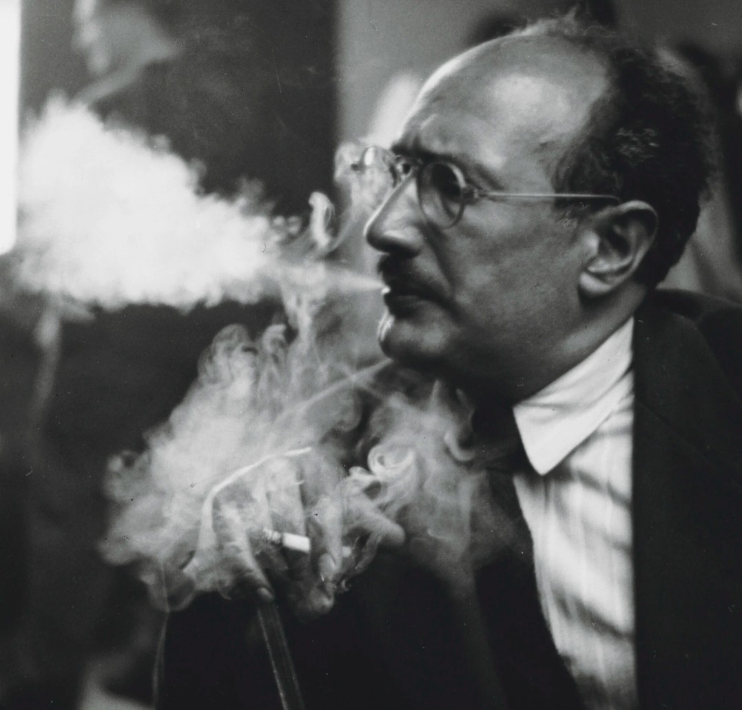
Mark Rothko, California School of Fine Arts, circa 1950. Photo: William Heick.
The present work captures the moment that this idea visibly beginning to take hold in Rothko’s output. As the title suggests, it stages a dialogue between “two dominants,” pitting intense, saturated hues in counterpoint. Rothko’s purple field shifts between red, blue and pink overtones, with dense passages of paint giving way to thin, translucent layers that blur to a delicate miasma at the edges. The black field cuts across its expanse with a sharp horizontal line, leaving—at the left hand side—a faint suggestion that the purple might continue beneath it. A bluish mauve hue quivers at the point of their interface, like a tide forged from the clash of opposing energies. The black itself appears to gravitate downwards, with strong vertical brushwork impelling it to loosen its grip upon the purple. In contrast to the layer above, its edges are deliberate and angular— fraying at the bottom like a swathe of velvet—while light dances across its charred contours in flickering formations. The source of this luminosity is revealed below, in the form of a vivid orange flame that threatens to incinerate the entire composition. As the eye scans the work’s glowing perimeter, it transforms from a portrait of darkness into one of searing light: the terror of the abyss becomes the warmth of salvation.
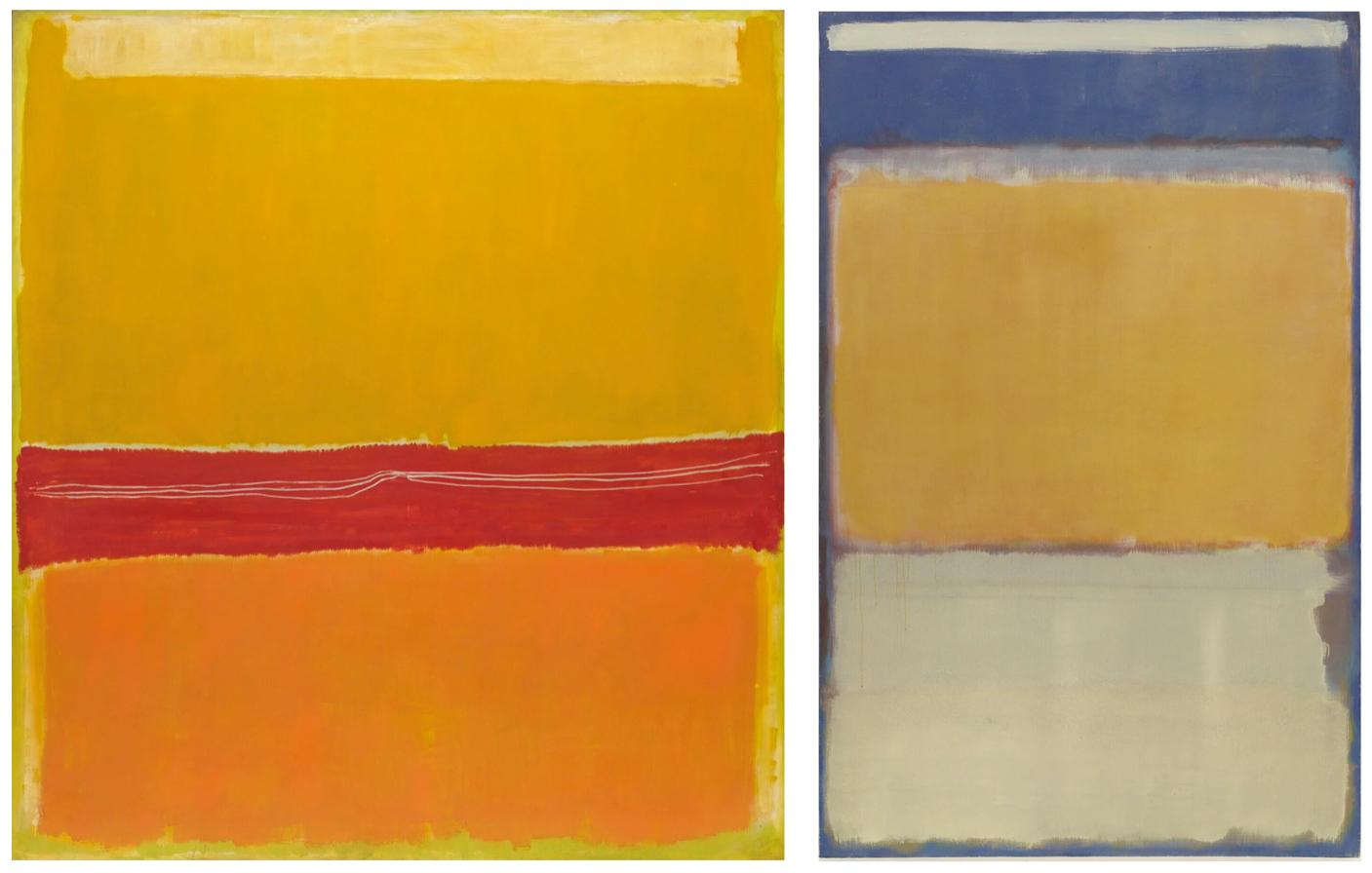
Left: Mark Rothko, No. 5/No. 22, 1950. Museum of Modern Art, New York. © 1998 Kate Rothko Prizel & Christopher Rothko / Artists Rights Society (ARS), New York. Photo: © The Museum of Modern Art / Licensed by SCALA / Art Resource, NY.
Right: Mark Rothko, No. 10, 1950. Museum of Modern Art, New York. © 1998 Kate Rothko Prizel & Christopher Rothko / Artists Rights Society (ARS), New York. Photo: © The Museum of Modern Art / Licensed by SCALA / Art Resource, NY.
Rothko’s 1951 exhibition—his fifth and last with Parsons—marked the culmination of this transformative period. Since its founding in 1946, the gallery on East 57th Street had become a hub for Abstract Expressionism, extending the legacy of Peggy Guggenheim’s Art of This Century Gallery. Parsons had showed Clyfford Still in 1947, Jackson Pollock in 1948 and Barnett Newman in 1950, as well as debuting Rothko’s “Multiforms” in 1949: she would come to refer to these artists her “four horsemen of the apocalypse”. As David Anfam has written, “There was something apt about the fact that this was [Rothko’s] last show there, because it concluded what the first had begun—the trajectory of the work from its exploratory premises in the mid 1940s to a complete flowering by the end of 1950” (Mark Rothko: The Works on Canvas, New Haven and London, 1998, p. 71). Exhibited alongside the present work were paintings now held in major institutions, including No. 10, 1950 and No. 5/No. 22, 1950 (both held in The Museum of Modern Art, New York), as well as No. 15 (Untitled), 1951 (National Gallery of Art, Washington D.C.).
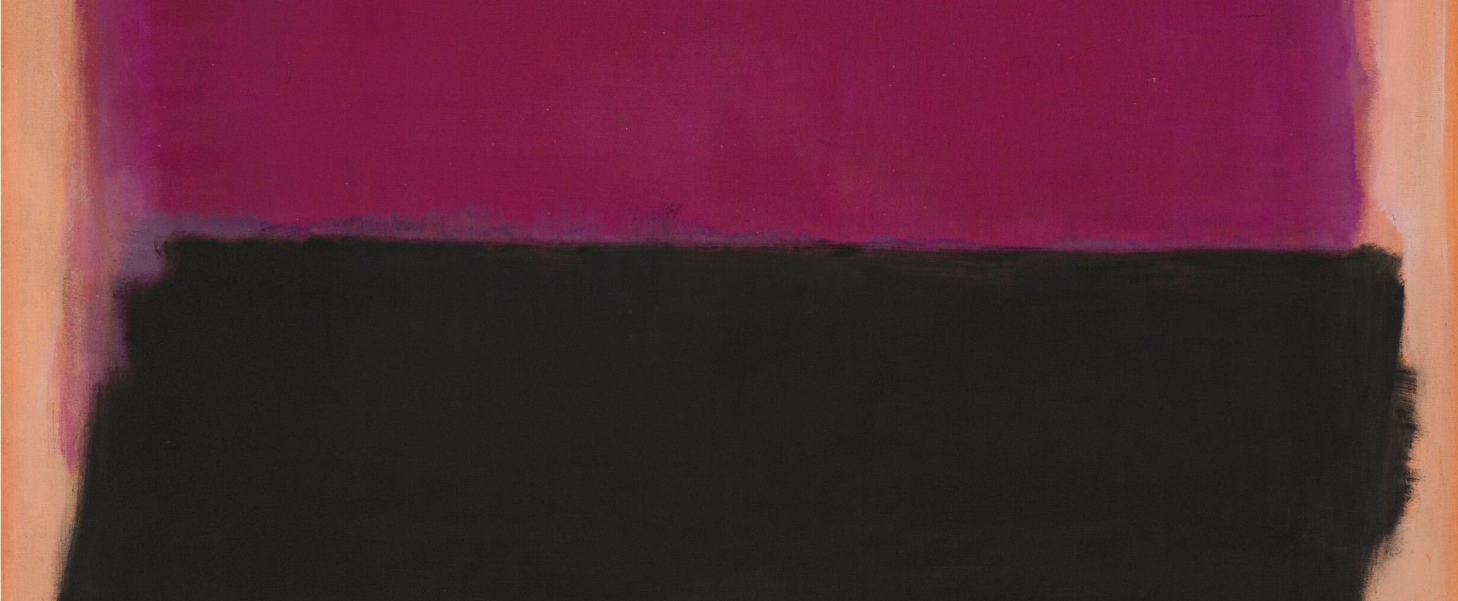
The activity around Parsons’s gallery during this period was indicative of a broader phenomenon: namely, the gradual emergence of New York as the new center of the global art world. The present work takes its place within this context, situated against a backdrop of flourishing creative euphoria that set the stage for Abstract Expressionism’s growing international acclaim during the 1950s. Still had made his New York debut in 1946—the same year that the term Abstract Expressionism was coined by the critic Robert Coates—and by 1948 had established the pillars of his mature language. Pollock immersed himself in his drip paintings between 1947 and 1950, while Newman painted his first “zip” painting, Onement, I, in 1948. In 1949, Robert Motherwell inaugurated his Elegy for the Spanish Republic series; the following year, Willem de Kooning began his landmark suite of Women. The distillation of Rothko’s signature style during this period was thus part of a wider consolidation of various major strands of Abstract Expressionism, each seeking a transcendental purpose for painting in the wake of the World War II. As Newman famously surmised, “Instead of making cathedrals out of Christ, man, or ‘life,’ we are making it out of ourselves, out of our own feelings” (“The Sublime is Now,” 1948, reproduced in H. B. Chipp (ed.), Theories of Modern Art, Los Angeles, 1984, p. 553).
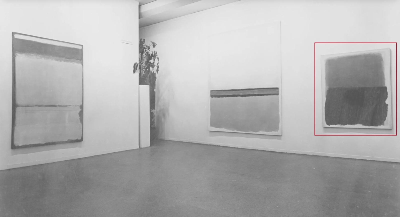
Installation view, 15 Americans, April 9 – July 27, 1952, Museum of Modern Art, New York (present lot illustrated). Photo: © The Museum of Modern Art/Licensed by SCALA / Art Resource, NY.
Artwork: © 1998 Kate Rothko Prizel & Christopher Rothko / Artists Rights Society (ARS), New York.
The 1952 exhibition at The Museum of Modern Art—part of a series in operation since 1929—bore witness to this momentum. Rothko showed eight works in a dedicated room, where the present painting took its place diagonally opposite No. 10, freshly acquired by the museum from the 1951 Betty Parsons exhibition. Major works by Clyfford Still were joined by masterpieces by Jackson Pollock, including his celebrated Autumn Rhythm (Number 30), 1950 (The Metropolitan Museum of Art, New York) and Number 7, 1950 (The Museum of Modern Art, New York). The exhibition was curated by Dorothy C. Miller, who would subsequently mastermind the museum’s seminal touring show The New American Painting in 1958. This historic group exhibition, which travelled to eight major European countries, radically transformed the perception of American art across the Atlantic, inspiring a host of young painters in its wake. The show featured many of the artists included in 15 Americans, among them Rothko himself, and was arguably indebted to the revelations of its 1952 predecessor.
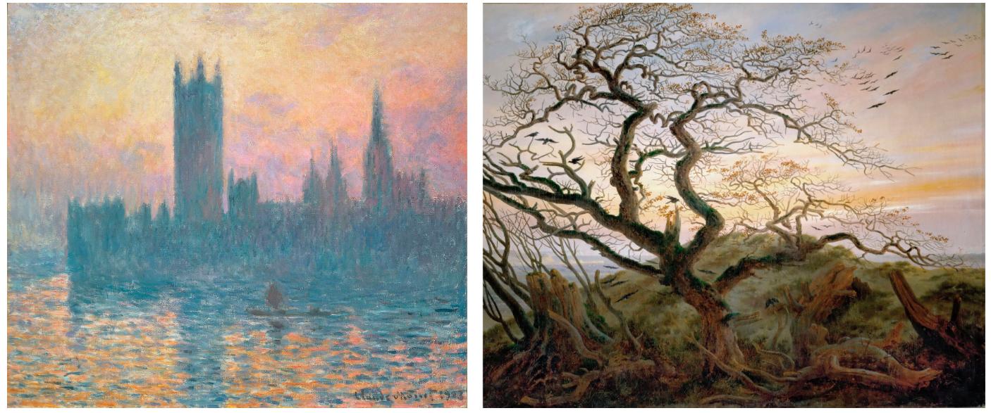
Left: Claude Monet, The Houses of Parliament, Sunset, 1903. National Gallery of Art, Washington, D.C.
Right: Caspar David Friedrich, The Tree of Crows, 1822. Musée du Louvre, Paris.
The present work hints at some of the grounds upon which critics began to historicize Abstract Expressionism during this early period. The movement’s dematerialized approach to color and light prompted comparison with the late works of Claude Monet: an artist whose dramatic flaming sunsets and seemingly infinite bodies of water are invoked in the present work’s fiery, luminous depths. Others, notably the critic Robert Rosenblum, found ancestral links in the Romantic period, specifically in relation to the concept of the “sublime”. Where artists such as Caspar David Friedrich had sought to capture the overwhelming majesty of the natural world, Rothko and his contemporaries strove to induce the same intoxicating sensations through abstract color and form alone: the artist’s friend Murray Israel reported that “Rothko said that he wanted a presence, so when you turned your back to the painting, you would feel that presence the way you feel the sun on your back” (quoted in J.E.B. Breslin, Mark Rothko: A Biography, New York, 1993, p. 275). The artist’s fascination with the dialogue between “Apollonian” order and “Dionysian” chaos—informed by his readings of the nineteenth- century philosopher Friedrich Nietzsche—is particularly palpable in the present work: the sensation of steady, illuminating warmth is held in tension with the looming, nocturnal shadow that threatens to engulf it.
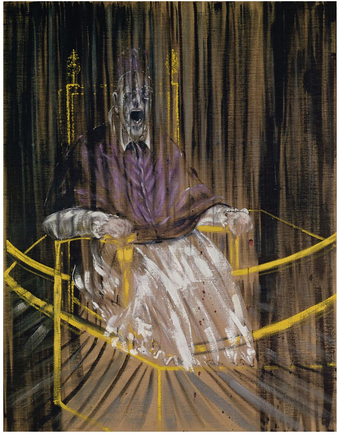
Francis Bacon, Study after Velazquez’s Portrait of Pope Innocent X, 1953. Des Moines Art Center.
© The Estate of Francis Bacon. All rights reserved / DACS, London / ARS, New York 2025.
Rothko’s use of light also owes much to his engagement with the work of the Old Masters: notably Rembrandt, whom he counted among his favorite artists. His juxtaposition of colors in the present work, and his fascination with the contrast between light and dark hues, evinces a deep awareness of chiaroscuro and the Dutch master’s modelling of three-dimensional space. The zones of color advance and recede as the viewer’s eye moves across the surface, bound together in a slow, sacred dance. Rothko was also drawn to the grand spiritual narratives contained within many Old Master works, and in 1950 had been captivated by Fra Angelico’s frescoes in the Convent of San Marco in Florence. Tellingly, a variation on the present work’s luxuriant purple tone would reappear in his own landmark suite of fresco-like paintings for the Houston Chapel in Texas, oscillating between strains of plum, maroon and black. The same mercurial spectrum dominated his Seagram Murals during the late 1950s, themselves inspired by the blind windows in Michelangelo’s Laurentian Library. Interestingly, Francis Bacon’s contemporaneous series of Papal portraits, similarly forged in the light of the Old Masters, would also anchor themselves around the polarities of purple and black, their existential angst illuminated by piercing beams of light.
Clyfford Still, Untitled, 1958. Art Institute of Chicago. © 2025 City & County of Denver, Courtesy Clyfford Still Museum / Artists Rights Society (ARS), New York. Photo: The Art Institute of Chicago / Art Resource, NY.
Despite his conscious rejection of figuration, many of Rothko’s works quiver with architectural hints of the human form. Much like Still’s jagged color fields or Newman’s “zips”—both of which flicker with traces of lone standing figures— his vertically-stacked bands harbour a curiously anthropomorphic quality. Still’s work, in particular, had an important impact on the evolution of Rothko’s mature language during the late 1940s: the present work’s black color field bears witness of this lineage, jutting into space in the manner of Still’s craggy terrains. Though both artists wholeheartedly embraced abstraction, their arrangements of color, shape and texture were fundamentally linked to human experience, mirroring the conflicts, resolutions, ambiguities and fluctuations that define our emotional response to the world. “I think of my pictures as dramas,” Rothko once said, “the shapes in the pictures are the performers. They begin as an unknown adventure in an unknown space” (“The Romantics were Prompted,” Possibilities No. 1, Winter 1947-1948). The present work captures the inception of this mysterious voyage into the void, marking the moment at which Rothko’s forms began to take on a life of their own.
Untitled, 1968
Leonard & Louise Riggio: Collected Works
Christie’s New-York: 12 May 2025
Estimated: USD 8,000,000 – 12,000,000
USD 8,460,000
MARK ROTHKO (1903-1970), Untitled | Christie’s
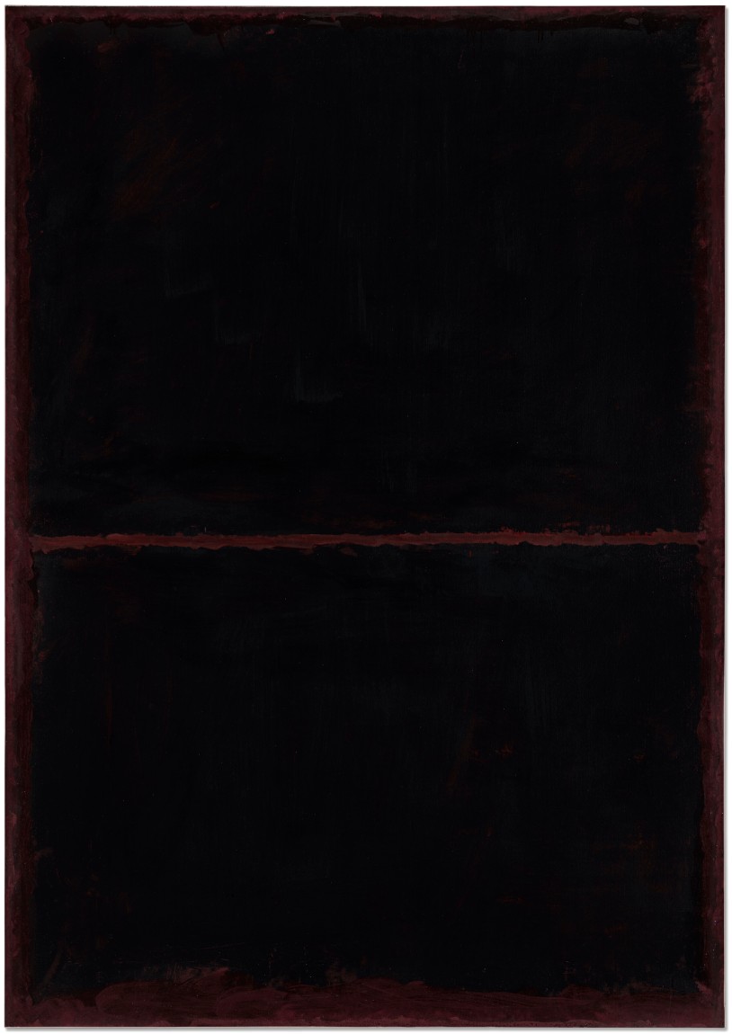
MARK ROTHKO (1903-1970)
Untitled, 1968
Acrylic on paper laid down on panel
57 7/8 x 40 3/4 inches (147 x 103.5 cm)
Mark Rothko’s Untitled is an evocative painting from an important period in the artist’s career. Executed shortly before his death in 1970, it is an exemplar from a series of works which he produced following the important Seagram Murals. Rothko radically reappraised his earlier style after completing this important commission, paring down his compositional structure and employing a dark, atmospheric palette that exudes a striking tonal proximity. As such, Untitled fully articulates Rothko’s practice during this important period, fully embodying his existentialist philosophy and reflective of the full measure of his acclaimed career to reveal the enduring possibilities of painting as a meaningful practice in light of modernity.
Evoking a sober sensuality, Untitled’s two rectangular panes of dark pigment rest like veils over a ground of hazy dark amber. Demanding a close and committed engagement, the work slowly reveals itself to the viewer, with the complexities of the surface slowly emerging whilst layers previously obscured come into being in an intricate play of painterly sprezzatura. Paradoxically, despite its dark palette, the work radiates with an internal light, animating the space of the speculator’s encounter. The velvety interaction between the black and amber fields establish a perceptual challenge enabling the artist’s articulated brushstrokes to dryly confront the viewer.
Mark Rothko, Red on Maroon (Seagram Building series), 1959. Tate, London.
Artwork: © 2025 Kate Rothko Prizel & Christopher Rothko / Artists Rights Society (ARS), New York.
Rothko shifted his working practice from the large oil canvases typical of the 1950s toward working with smaller acrylic works on paper after suffering an aneurism in April 1968, the evolution in materials allowing him a greater dexterity in making variations; the planar nature of the paper surface similarly led Rothko to dramatically reevaluate the relationship between the artwork and the support. The artist allows his paint to thin and drip in some areas, notably at the top of the work, accentuating the disparity between paint fields and between paint and paper. The signature horizontal line of thick maroon pigment bisecting the work functions as a liminal interval between the work’s two dark zones, thrusting a transient stasis upon his visual field.
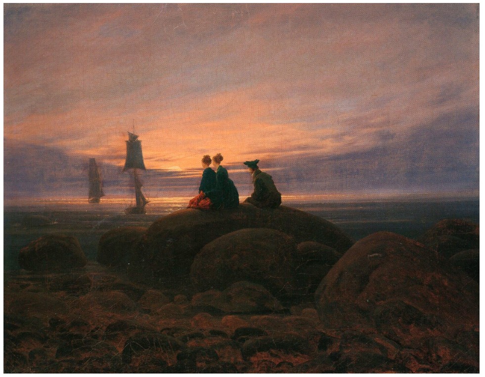
Caspar David Friedrich, Moon Rising Over the Sea, 1822. Alte Nationalgalerie, Berlin.
The dark palette typical of Rothko’s final works have sometimes been erroneously ascribed to the artist’s failing health and long bouts of depression; this analysis fails to fully consider how this extraordinary body of work marks a consciously radical point of departure for the artist in which he reevaluates his entire oeuvre, reinterpreting his earlier tableaux to challenge one last time the existentialist struggle against his own painterly praxis. Representing what he regarded as the ultimate realization of abstract painting, Rothko employs his blacks and swarthy dark pigments against the conception of legibility, resolutely rejecting the validity of symbolism in order to fully explore the opacity of vision itself. Rothko’s close confidant, the critic Dore Ashton, describes this darkening palette as an “exasperation at the general misinterpretation of his earlier work—especially the effusive yellow, orange and pinks of three years back. He seems to be saying in these new foreboding works that he was never painting luxe, calme, and volupté, if we had only known it!” (D. Ashton, “Art,” Arts and Architecture 75, no. 4, April 1958, p. 8).
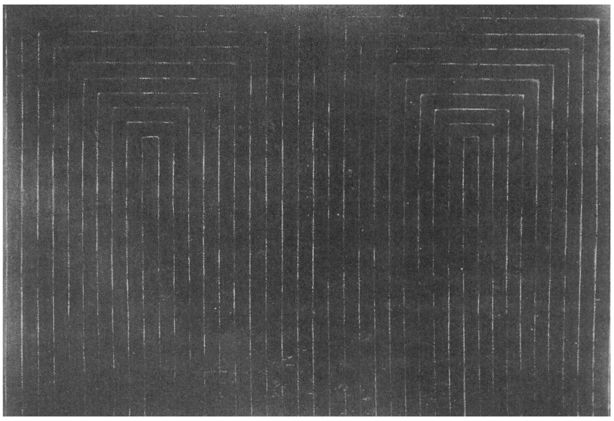
Frank Stella, Marriage of Reason and Squalor, 1959. Saint Louis Art Museum. © 2025 Frank Stella / Artists Rights Society (ARS), New York.
Not merely a departure from his earlier polychrome canvases, Rothko here dismantles their logic, regenerating an aesthetic theory of abstract modernism at the same time as the foundations of this school seemed most at threat. Just as Kazmir Malevich’s Black Square utilizes the color black to proclaim the birth of modernist painting, Rothko returns to black in order to regenerate the movement, allowing his austere pigments to resonate across a full range of sensual possibilities. Untitled reverberates with the theory of the German philosopher Theodor Adorno, who writes how the ideal of blackness was necessary for art to “survive in the context of extremity and darkness, which is social reality” and that “blackness too—the antithesis of the fraudulent sensuality of culture’s facade—has a sensuous appeal” (T. Adorno, Aesthetic Theory, London, 1997, p. 59). Rothko employs his shades of black against the societal and aesthetic challenges erupting in the late 1960s, the work rejecting external participation in order to fully withdraw into itself. The work operates on a similar level as Frank Stella’s Black Paintings in their subversion of spatial illusion and rejection of referents, while Rothko’s masterful manipulation of his layers of black paint recall Ad Reinhardt’s skill in imbuing apparently monochrome canvases with barely perceptible geometric forms.
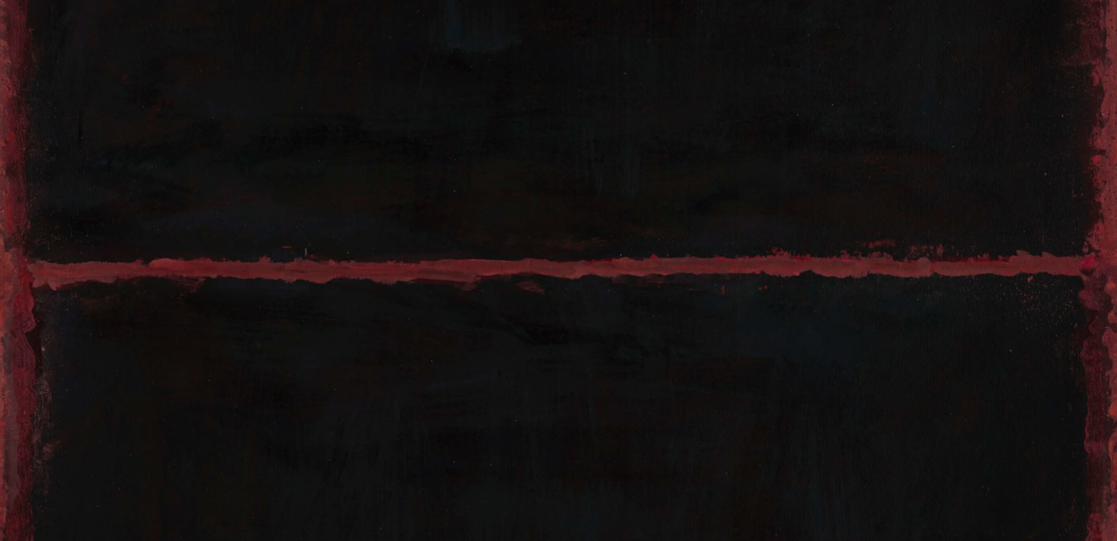
Rothko thus employs his restricted, opaque palette not as a delineation of his personal travails but as an invocation of the overwhelming grandeur which guided his idiosyncratic aesthetic theory. Untitled is in deep conversation with Rothko’s contemporaries, defending the legacy of the Abstract Expressionists through a revitalized rejuvenation of the artist’s style. The American director Stanley Kubrick employs a similar stylistic conceit in his contemporaneous film 2001: A Space Odyssey, employing Monoliths—black cuboids symbolizing the enigmatic and transcendent absolute, a negation countering human consciousness—as a significant plot driver. That Rothko and Kubrick both coincidentally employed the color black in order to raise humanistic queries in an antagonistic age demonstrates that Untitled is conversant with the milieu from which it emerged, its style and composition aligned more so with its times than with the artist’s internal turmoil. That the Rolling Stones’ rock anthem “Paint it Black” came out just two years prior intensifies the sense of Rothko’s canny parallelism with the wider avant-garde.
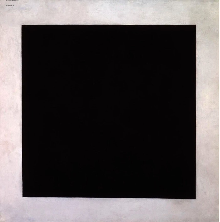
Kazimir Malevich, Black Square, circa 1923. The State Russian Museum, Saint Petersburg.
Untitled probes the spectator, exuding into their space and demanding their close scrutiny; only with close engagement does the work begin to reveal itself. A paean to abstract painting, Rothko here advances the conception of what paint could achieve while revitalizing and reimagining his own artistic vocabulary to stray abreast of social and artistic developments. While retaining the awesome aura associated with his practice, the present work propels Rothko’s signature distinctive painterly style into a new era in order to strike precisely at his uncompromising aesthetic theory.
Untitled, 1968
Sotheby’s New-York: 13 May 2025
Estimated: USD 3,500,000 – 5,000,000
USD 4,930,000
Untitled | Modern Evening Auction | 2025 | Sotheby’s
MARK ROTHKO (1903 – 1970)
Untitled, 1968
Oil on paper laid down on canvas
24 x 17 3/4 inches (60.1 x 45.1 cm)
Signed Mark Rothko and dated 1968 (on the reverse)
Emanating an ethereal, incandescent, and mystical quality, as if internally illuminated, Untitled is a paragon of Rothko’s mature corpus of paintings on paper. Juxtaposing a brilliant, frothy cloud of white against an atmospheric black form, Rothko generates a sense of sublime paradox charged with psychological intensity. A superb encapsulation of the best of Rothko’s mounted paintings on paper, Untitled exemplifies Rothko’s distinctive mastery of technique and form, as he maximizes the emotive impact of his composition through a restrained palette. Dating to a transformative period in Rothko’s career in which paintings on paper became the central focus of his practice, Untitled is a jewel-like paradigm of the philosophical and artistic pursuits of the artist’s final years. The dramatic tension between the upper and lower registers conjures the existential transience and spiritual force conveyed in Rothko’s most successful works. Untitled entrances the viewer in a transcendent field of white and black, evoking the majestic allure of his monumental paintings.
“Painting a picture is not a form of self-expression. It is, like any other art, a language by which you communicate something about the world.”
The artist, 1949. Photo by William Heick
Distinguished by the delicate balance between its upper and lower registers, Untitled is an exquisite example of Rothko’s command of composition and paint. The diaphanous upper form hovers in a graceful balance, delineated by the artist’s gauzy, elegant brushstrokes. Below, a luminescent white cloud radiates, giving the work a sense of profound weightlessness. The white haze from the lower register appears to rise into the upper form, like an atmospheric gaseous substance. Small spatters of the white paint sprinkle the lower edge of the black form like a constellation of stars. Rothko achieves this divine ethereality through a nuanced feathering technique, eliminating hard edges from his compositions in favor of a subtle blending of pigment. Rothko’s signature technique differentiated him from other Abstract Expressionist peers, who revolutionized abstract painting through their own means. The gentle accumulation of layers of oil paint in the present work mirrors the exacting process used in Rothko’s monumental paintings, in which the thoughtful accretion of pigment realizes a magnificent sense of depth and transcendence. The edges of Rothko’s forms are suspended in halos which afford his painted surfaces a heavenly aura. Thereby, his paintings at once evoke stillness and motion, as if the pigments on the surface have been freshly applied yet are eternally fixed.
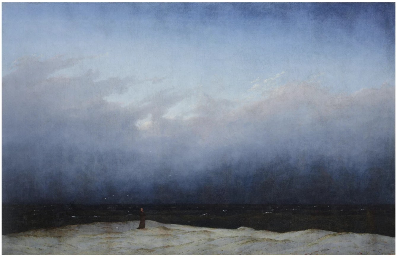
Caspar David Friedrich, Monk by the Sea, 1808-10. Staatliche Museen zu Berlin, Nationalgalerie.
Image © bpk Bildagentur / Nationalgalerie / Andres Kilger / Art Resource, NY
The present work dates to a critical period in Rothko’s career, in which he experienced a wave of unrelenting creativity and devoted his practice primarily to paintings on paper. In the spring of 1968, Rothko fell ill and was thereafter advised by his doctors to avoid handling large, heavy canvases. At this counsel, Rothko shifted his focus to the versatile medium of paper, exploring the absolute limits of painting in the media. Rothko’s artistic ambition reached its apex in his final years, resulting in a body of works on paper as evocative and pensive as any of his works that came before. Untitled conjures the contemplative serenity and immersive magnetism of Rothko’s large-scale paintings, yet its intimate scale encourages a highly personal form of inspection and intrigue. Untitled is exemplary of the best of Rothko’s signature practice, encapsulating the pursuit of form and light which characterizes his oeuvre. Rothko’s works on paper, which he worked on intermittently throughout his career and with the greatest concentration in his final two years, embody his keen awareness of pigment and technique as the consummate painter. These key works demonstrate Rothko’s availability to engross the viewer, even while working on a smaller physical scale. As Kaywin Feldman has observed: “The paintings on paper, simply put, transform our understanding of Rothko. His enduring relationship with paper yielded the same mesmerizing range of effects and moods seen in his canvases: radiant, sombre, serene, and cataclysmic.” (Kaywin Feldman, in: Exh. Cat., Washington D.C., National Gallery of Art; Norway; The National Museum of Art, Architecture, and Design, Mark Rothko: Paintings on Paper, 2023-24, p. 7) Though he produced paintings on paper throughout his career, those produced in the late 1960s epitomize his emotional fortitude and technical mastery, enrapturing the viewer through his transcendent technique.
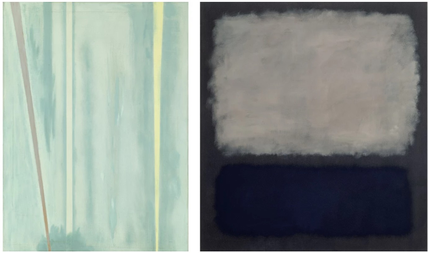
Barnett Newman, The Beginning, 1946. Art Institute of Chicago. Image © Art Institute of Chicago / Through prior gift of Mr. and Mrs. Carter H. Harrison / Bridgeman Images. Art © 2025 Barnett Newman Foundation / Artists Rights Society (ARS), New York.
Mark Rothko, Blue and Gray, 1962. Fondation Beyeler, Riehen. Art © 1998 Kate Rothko Prizel & Christopher Rothko / Artists Rights Society (ARS), New York
The final few years of Rothko’s life were preceded by one of his greatest artistic legacies, the paintings he executed for the Chapel at the University of St. Thomas, Houston, Texas, commissioned by Dominique and John de Menil. For the project, Rothko completed twenty-three paintings, fourteen of which were ultimately installed in the Chapel in 1971, completed shortly after the artist’s passing in 1970. With creative agency over the commission, Rothko embarked on a series of paintings in darker, meditative hues. This proclivity towards darker compositions carried forth in many of his final paintings on paper, including Untitled, which exudes a unique and profound emotional depth and spiritual force. Untitled exemplifies the vital concerns which would occupy Rothko throughout his career: form and light. Here, the artist pares down his palette to black and white, controlling his palette to explore the inherent tension and optical potential of his composition to its limits.
Gerhard Richter, Study for Clouds (Contre-jour), 1970. Private Collection.
Sold at Sotheby’s London in June 2022 for £11.2 million ($13.6 million). Art © 2025 Gerhard Richter
Bearing exceptional provenance, Rothko’s Untitled has been held in the same prestigious European collection for over twenty years. The work was first featured in the collection of esteemed Italian gallerist Carla Panicali, who was gifted the work by Rothko himself. In the 1960s, Panicali headed the Roman headquarters for Marlborough Gallery, representing a range of influential post-war Contemporary artists, including Lucio Fontana and Alberto Burri, as well as American Abstract Expressionist artists Robert Motherwell and Rothko. A profound example of Rothko’s seminal paintings on paper, Untitled is distinguished by its simultaneous depth of field and incandescent brilliance. The present work embodies the profound emotional fortitude of the artist’s final period, described by Waldman as a mature aesthetic zenith: “Now he had left behind all that spoke of the carnate, the concrete. He had reached the farther shore of art.” (Diane Waldman, in: Exh. Cat., New York, The Solomon R. Guggenheim Museum, Mark Rothko, 1903-1970: A Retrospective, 1978, p. 69).
Heads, 1941-1942
Christie’s New-York: 15 May 2025
Estimated: USD 600,000 – 800,000
USD 630,000
MARK ROTHKO (1903-1970), Heads | Christie’s
MARK ROTHKO (1903-1970)
Heads, 1941-1942
Oil on canvas
20 1/8 x 28 inches (51 x 71.1 cm)
Mark Rothko’s Heads (1941-1942) stands as a rare and captivating example from a pivotal moment in the artist’s career, when he was forging a path between figuration and abstraction, myth and psychology. This work belongs to a small and historically significant series from the early 1940s in which Rothko depicted heads in a mythological or religious narrative—an essential bridge between his early figurative practice and the revolutionary abstract idiom that would later define his career. Rare to market, Heads remained in the esteemed personal collection of the artist’s first wife, Edith Sachar, until her death. The painting is one of few select works from this important body of work to remain in private hands, with almost all of other examples housed in the permanent collection of National Gallery in Washington, D.C. Rothko’s work from this time of intense experimentation and philosophical inquiry, sprung from the upheaval of World War II, would ultimately lead him to the luminous fields of color that define his mature work. Through a compelling blend of surrealist influence, mythological reference and emotional depth, Heads provides a profound insight into Rothko’s evolving aesthetic and ideological concerns.

Left: Mark Rothko, Untitled, 1941-1942. National Gallery of Art, Washington, D.C. © 1998 Kate Rothko Prizel & Christopher Rothko / Artists Rights Society (ARS), New York.
Second from Left: Mark Rothko, Untitled, 1941-1942. National Gallery of Art, Washington, D.C. © 1998 Kate Rothko Prizel & Christopher Rothko / Artists Rights Society (ARS), New York.
Center: Mark Rothko, Untitled, 1940-1941. National Gallery of Art, Washington, D.C. © 1998 Kate Rothko Prizel & Christopher Rothko / Artists Rights Society (ARS), New York.
Second from Right: Mark Rothko, Antigone, 1939-1940. National Gallery of Art, Washington, D.C. © 1998 Kate Rothko Prizel & Christopher Rothko / Artists Rights Society (ARS), New York.
Right: Mark Rothko, The Omen of the Eagle, 1942. National Gallery of Art, Washington, D.C. © 1998 Kate Rothko Prizel & Christopher Rothko / Artists Rights Society (ARS), New York.
Domineering the composition is a humanoid form comprised of an amalgam of prominent features—eyes, noses, lips—painted in the style of an ancient Greek or Roman deity. These attributes coalesce and melt into one another on one muted green face. The creature rests atop a chevron platform that recalls a ritualistic altar or a Surrealist stage. Beneath this elevated presentation lies a bundle of contorted limbs—hands, legs and feet—an echo of Philip Guston’s figurative work which suggests both a physical and symbolic dismemberment. Gazing beyond the right edge of the canvas is a bearded figure of marble, spectral, and gesturing upward, evoking the grandeur of Greco-Roman statuary and guiding the eye beyond the confines of the canvas.
The composition of the present work reveals Rothko’s burgeoning interest in spatial structure and color dynamics. While still engaged with the figure, he organizes the composition with a striking geometric logic. The picture plane is broken into discrete bands of space, foreshadowing the structural clarity of his later abstract works. Large passages of washy, atmospheric color define the background, replacing traditional linework and anchoring the surreal forms in an emotional and spatial field. Even at this early stage, Rothko demonstrates a sophisticated understanding of how color and spatial arrangement can evoke psychological and emotional depth.
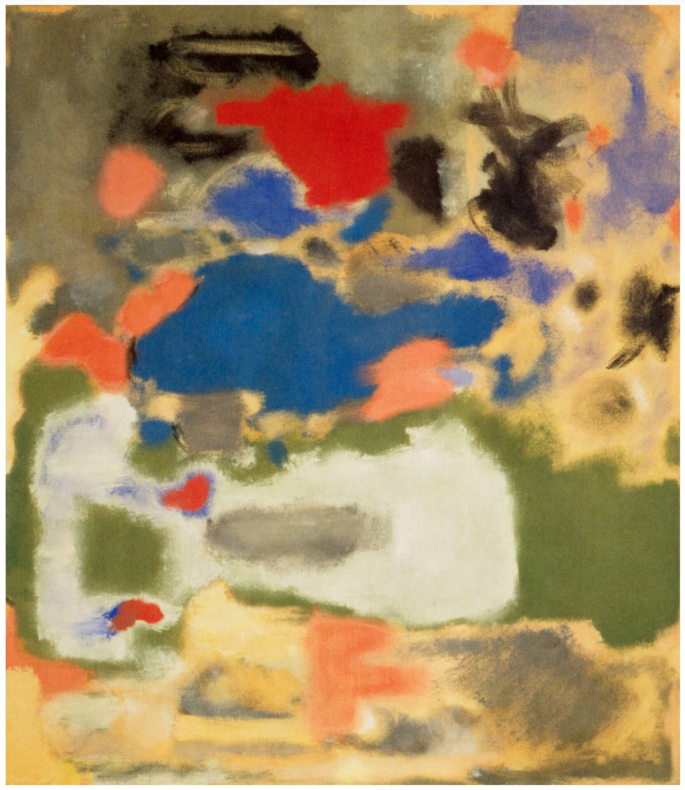
Mark Rothko, Untitled, 1947. © 1998 Kate Rothko Prizel & Christopher Rothko / Artists Rights Society (ARS), New York.
As explained by David Anfam, the iconography of the early 1940s was cultivated by Leonardo’s Last Supper, “From Leonardo come the tiered layout, the frieze of multi-directional heads, the play of body language against shadows and the box-like architectural settings of the early 1940s: again, the drama occurs in a room” (D. Anfam, Mark Rothko: The Works on Canvas: Catalogue Raisonné, New Haven and London, 1998, p. 51). By the time Rothko painted Heads, he had become increasingly persuaded of the indispensable role of myth in revitalizing a spiritually diminished society, that he found in the Old Masters. These innovations would soon crystallize into the Multiforms of the mid-1940s and eventually, his iconic Color Field paintings.
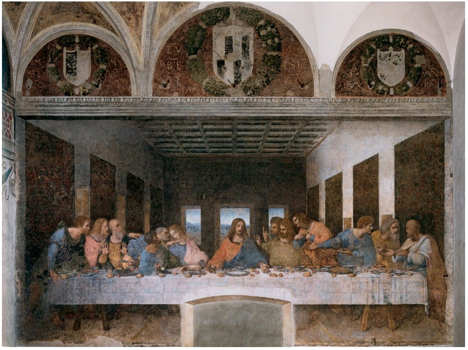
Leonardo da Vinci, The Last Supper, 1495-1497. Santa Maria della Grazie, Milan.
At once haunting and majestic, Heads exemplifies Rothko’s deepening engagement with mythology and the unconscious during this transitionary period. Drawing inspiration from Nietzsche’s The Birth of Tragedy, the writings of Carl Jung and the Greek tragedians, Rothko believed that myth had the capacity to redeem a spiritually depleted modern world. Here, Rothko turns to classical myth as a universal language capable of speaking to what he described as the “tragic and timeless” aspects of the human experience. The early 1940s, too, marked a dramatic transformation in Rothko’s personal practice. Having emigrated from Russia as a child and arriving in New York at age 20 after dropping out of Yale, he pursued artistic training at the Parsons School of Design and the Art Students League. It was under the mentorship of Max Weber that Rothko began to view painting not merely as craft, but as a legitimate vehicle for modern philosophical and spiritual expression. This shift coincided with his increasing exposure to European Surrealists such as Salvador Dalí and Max Ernst, whose exploration of dreams, the unconscious, and irrationality deeply resonated with him. Alongside close friend, collaborator and mentor Adolph Gottlieb, Rothko embraced a new visual language rooted in myth, ritual and so called ‘primitive’ symbols—eschewing traditional narrative in favor of archetypal imagery and emotionally resonant forms.
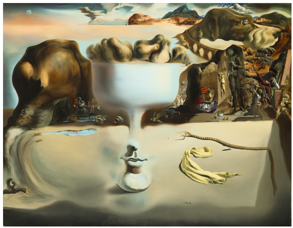
Salvador Dalí, Apparition of face and fruit-dish on a beach, 1938. Wadsworth Atheneum Museum of Art, Hartford.
© 2025 Salvador Dalí, Fundació Gala-Salvador Dalí / Artists Rights Society (ARS), New York.
Rothko’s adoption of biomorphic and totemic forms during this period placed him within a hybrid space between Surrealism, abstraction, and automatism. In the years following this important series, Rothko’s career would be landmarked by the artist’s first major solo exhibition of Surrealist-inspired paintings at Peggy Guggenheim’s ‘Art of This Century’ gallery in 1945—a transformative event that placed Rothko at the forefront of the burgeoning New York School. Heads, along with its companion pieces, is a foundational statement of Rothko’s belief in the emotional and spiritual potential of painting.
Claude Monet
Peupliers au bord de l’Epte, crépuscule, 1891
Christie’s New-York: 12 May 2025
Estimated: USD 30,000,000 – 50,000,000
USD 42,960,000
CLAUDE MONET (1840-1926), Peupliers au bord de l’Epte, crépuscule | Christie’s
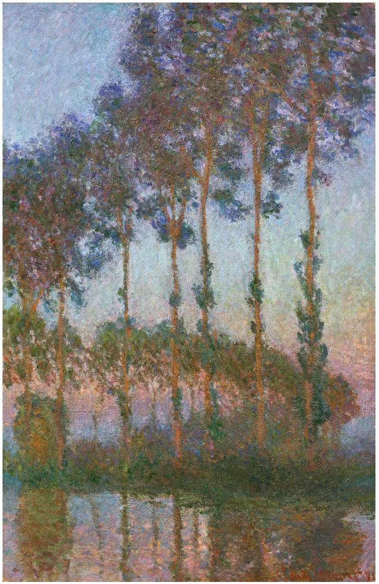
CLAUDE MONET (1840-1926)
Peupliers au bord de l’Epte, crépuscule, 1891
Oil on canvas
100 x 65.1 cm (39 3/8 x 25 5/8 inches)
Signed and dated ‘Claude Monet 91’ (lower right)
Bathed in the intense pink hues of the setting sun, Claude Monet’s Peupliers au bord de l’Epte, crépuscule is a masterful study of the dramatic play of light that transforms the landscape as day gives way to night. One of just four works from the artist’s acclaimed Peupliers series to specify a particular time of day in their titles, the composition appears through a richly worked network of vivid color, each layer of pigment and touch of the brush carefully chosen to convey the nuances and dynamism of the fading light, which Monet observed while working en plein air before his motif. Across this concentrated sequence of paintings focusing on the poplar tree, Monet embraces a bold, instinctive approach to facture and color that almost hovers on the edge of abstraction, offering a startlingly prescient vision of the landscape that anticipates many of the developments that transformed art-making through the twentieth century. Formerly owned by the pioneering Impressionist dealer Paul Durand-Ruel—in whose family it remained until 1955—the painting has been held in the same private collection for the past sixty-five years.
Across the group of two dozen works that make up the Peupliers series (Wildenstein, nos. 1291-1313), Monet focused on the slender, towering form of the poplar tree, an iconic and instantly recognizable element within the surrounding countryside. He had come across a picturesque stretch of these trees planted on the edge of the river Epte just a few kilometers from his home in Giverny during the spring of 1891, and spent much of the rest of the year studying their changing character under various atmospheric conditions. Each created from almost exactly the same vantage point, near a spot where the Epte bends back on itself twice to create a distinctive S-shape, the resulting compositions are a powerful showcase of the artist’s bourgeoning serial technique, which would come to define Monet’s output across the final three decades of his career.
“You have to know how to seize just the right moment in a landscape instantaneously, because that particular moment will never come again, and you’re always wondering if the impression you got was truthful.”
Claude Monet at Giverny, 1889. Photograph by Theodore Robinson. Fondation Wildenstein, Paris.
A common feature within the French countryside during the nineteenth century, poplars were typically found lining the entrance routes to grand châteaux, or standing along rural roads as windshields for tilled fields, while land owners around the country planted them as a form of fencing to demarcate property boundaries. Lithe and elegant, they grew quickly—generally twenty-five to thirty feet in a decade—making them a popular investment for speculators, while their ability to quickly absorb large amounts of water made them a perfect addition to river banks as protection against flooding. Moreover, following the French Revolution, the poplar had become a symbol of liberty, largely due to its name, which derived from the Latin populus, meaning both “people” and “popular.” By 1793, sixty thousand poplars had been planted in France, and hundreds of broadsides were issued featuring the tree as a symbol of the new republic. Ceremonial plantings were common on important anniversaries, most notably in 1889 to mark the centenary of the Revolution, and the tree was seen as an emblem of the stability, beauty and fecundity of rural France within the public imagination.
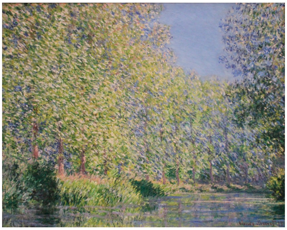
Claude Monet, Un tournant de l’Epte, 1888. The Philadelphia Museum of Art.
Poplars had been a favorite motif of Monet’s since the beginnings of his painterly career—in one of his earliest known compositions, Vue prise à Rouelles (1858, Wildenstein, no. 1; Marunuma Art Park, Asaka) a bank of poplars occupies the center of the composition, their slender forms rising above the surrounding vegetation to draw the eye towards the middle distance. Similarly, the trees abound in a number of the artist’s views of Argenteuil and Vétheuil, while the sequence of paintings devoted to the verdant meadows that emerged following his move to Giverny in 1883 most often featured a row of regularly spaced poplars along the edge of the field. While they appear in the background of nearly half of the artist’s Meules paintings, it was not until his fortuitous discovery of the sweeping row of poplars along the Epte that Monet took the opportunity to focus on the slender silhouettes of these trees fully, bringing them in from the edge of the landscape to the foreground of his paintings, and granting them a new prominence and monumentality in the process.
Claude Monet, Vue prise à Rouelles, 1858. Marunuma Art Park, Asaka. Photo: Bridgeman Images.
Anchoring his view in the natural topography of the river, as it winds its way through the countryside, in these works Monet presents a dynamic view of the poplars along the water’s edge . Most of the series focuses on a screen of tall, slender poplars in the foreground, while behind, looping away along the river bank, the rest of the trees generate a striking arabesque pattern as they follow the water. In Peupliers au bord de l’Epte, crépuscule, rather than looking directly at the poplars, Monet turned slightly to the left to accentuate the sweeping, diagonal progression of the trees, generating a vivid sense of depth within the painting, as the eye follows their line from right to left and back again, before they disappear into the distance in a flurry of foliage. The lower portion of the canvas is devoted to the rippling surface of the water, filled with the reflections of the tree trunks, which seem to softly dematerialize before the eye, offering a striking contrast to the strong, upright forms of the poplars themselves.
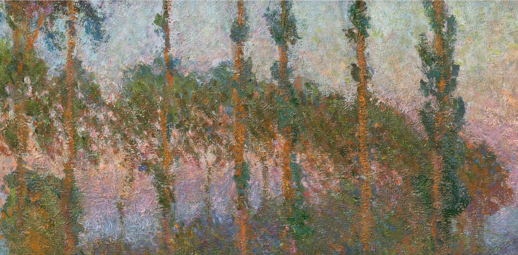
The low vantage point, just slightly above the level of the water, suggests that the artist worked from the bateau atelier that he had built during his years at Argenteuil. This ingeniously modified, modest row boat allowed the artist to bring multiple canvases, painting supplies, and even an easel with him to his chosen site. Each morning, rather than walking from his home in Giverny, Monet was able to set off from his gardens, rowing directly to this section of the river via a tributary that ran through his property. Once he reached the poplars, he anchored the boat in the center of the river Epte and set to work. Looking up at the trees from the deck of the boat, Monet sought to capture an impression of their vertiginous profiles, accentuating the height and verticality of the trees by elongating the poplars and their reflections so that they filled the entire stretch of his canvas.
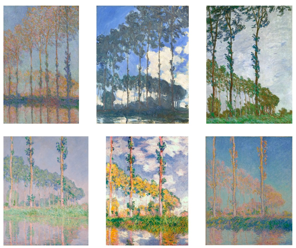
However, just as he was fully immersed in this intriguing new motif, Monet received word that the village of Limetz, which owned the trees along the Epte, intended to sell the bank of poplars at an upcoming auction. They had been planted on communal land as a cash crop, and by June 1891 had reached an appropriate height for harvest. The artist appealed directly to the local mayor to delay the sale, but to no avail, and in a letter of 28 July, Monet lamented that there remained “quantities of new canvases which I must finish” (quoted in J. House, Monet: Nature into Art, New Haven, 1986, p. 201). It was only on the day of the auction itself that he came up with a solution, striking an agreement with a local timber merchant in a last ditch effort to preserve the view. “I asked him how high a price he expected to pay,” Monet later told a biographer, “promising to make up the difference if the bid went over his amount, on the condition that he would buy the trees for me and leave them standing for a few more months” (quoted in P.H. Tucker, Claude Monet: Life and Art, New Haven and London, 1997, p. 146).
The arrangement proved successful—when the gavel came down, Monet and the lumber merchant were co-owners of the poplars, with the artist proclaiming, “my wallet felt the damage” (quoted in D. Wildenstein, Monet, or the Triumph of Impressionism, Cologne, 1996, p. 280). The venture provided Monet with a reprieve, allowing him to complete the full series of Peupliers paintings over the course of the ensuing months, during which he charted the changing colors of the autumnal foliage as they swept through the landscape, and the seasonal shifts in the weather, which brought overcast skies and brisk winds that buffeted the trees wildly.
The thick, verdant foliage and warm tones of Peupliers au bord de l’Epte, crépuscule appear to suggest that the view was captured at the height of the trees’ summer growth, and was perhaps one of the paintings Monet was anxious to finish before the impending auction. The painting is particularly remarkable within the series for its extraordinary appreciation of the nuances of changing light, capturing the moment when the sun descends and casts the sky aglow with a resplendent play of vibrant, yet soft, color. A delicately variegated band of pink, peach, blue and purple hues cuts across the middle of the canvas, almost directly in line with the tops of the trees in the middle-distance, the short touches of pigment generating an almost pointillist effect, as they mix and intermingle in carefully structured layers of gently shifting tones. These colors are echoed not only in the reflections in the river, but also within the spray of foliage, and along the barks of the trees, emphasizing the manner in which the final, rich orange rays of the sun transformed the entire landscape with their warmth. In this way, the painting reveals a new level of accuracy in Monet’s observations of the precise nature of light, its dynamic, vibrating surface revealing the hours, days, and weeks he had spent observing the poplars at this particular moment of the day.
Piet Mondrian
Composition with Large Red Plane, Bluish Gray, Yellow, Black and Blue, 1922
Leonard & Louise Riggio: Collected Works
Christie’s New-York: 12 May 2025
Estimate on Request
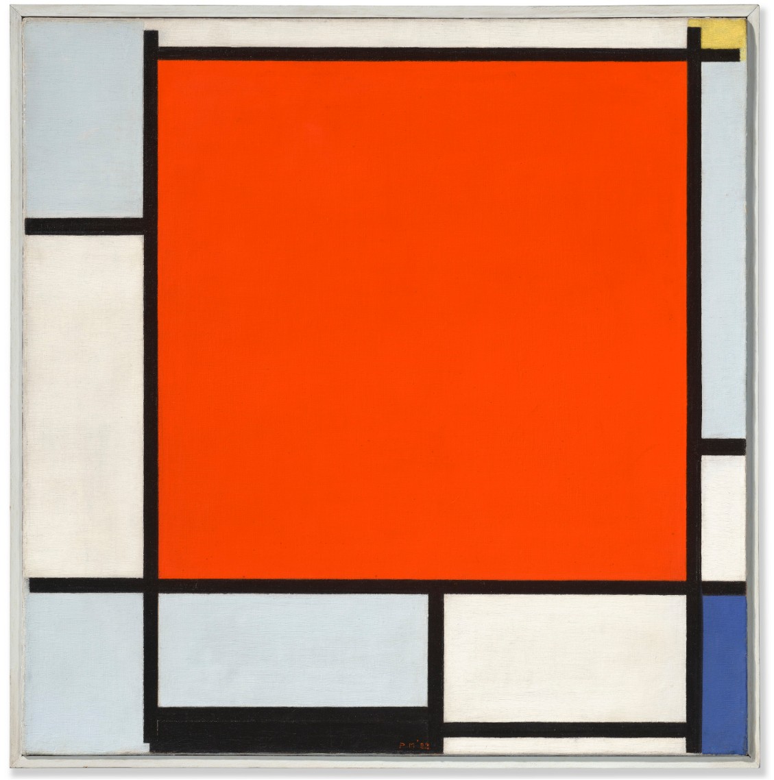
PIET MONDRIAN (1872-1944)
Composition with Large Red Plane, Bluish Gray, Yellow, Black and Blue, 1922
Oil on canvas
54 x 53.3 cm (21 1/4 x 21 inches)
Signed with initials and dated ‘PM ’22’ (lower center)
Painted in Paris in 1922
Painted in 1922, Composition with Large Red Plane, Bluish Gray, Yellow, Black and Blue encapsulates the purity, elegance and extreme rigor of Piet Mondrian’s revolutionary mature aesthetic. It was during the early 1920s, while living in Paris, that Mondrian solidified and explored fully the potential of Neo-Plasticism, the ground-breaking approach to abstraction he had pioneered towards the end of the First World War. Using only the fundamental elements of painting—the straight line, primary colors and the three non-colors of black, white and gray—Mondrian believed that he could create an idealized pictorial form of pure equilibrium that would reintegrate a fundamental sense of beauty into life. “The task today, then, is to create a direct expression of beauty—clear and as far as possible ‘universal’,” Mondrian wrote. “It will be a purely plastic beauty, that is, beauty expressed exclusively through lines, planes or volumes and through color—a beauty without natural form and without representation. It is purely abstract art” (“Purely Abstract Art”; reproduced in H. Holtzman and M.S. James, The New Art—The New Life: The Collected Writings of Piet Mondrian, London, 1986, p. 199).
When he left the Netherlands for Paris in June 1919, Mondrian was still using a modular grid and gradated color as the basis of his work. During his first year in France, however, his art underwent a radical transformation—restricting himself to purely abstract rules of geometry and color, he began to use a refined visual language of squares or rectangles of primary hues, set in white fields and bounded by intersecting straight lines. Intended to evoke principles of balance and harmony, these works marked a key breakthrough in his pursuit of “a true vision of reality,” and by the end of 1920, Mondrian had painted his first genuinely Neo-Plastic composition. Over the course of the subsequent two years, he executed more than thirty paintings using this radically reduced pictorial vocabulary—approximately one-fifth of his total Neo-Plastic output—testing and exploring its limits.
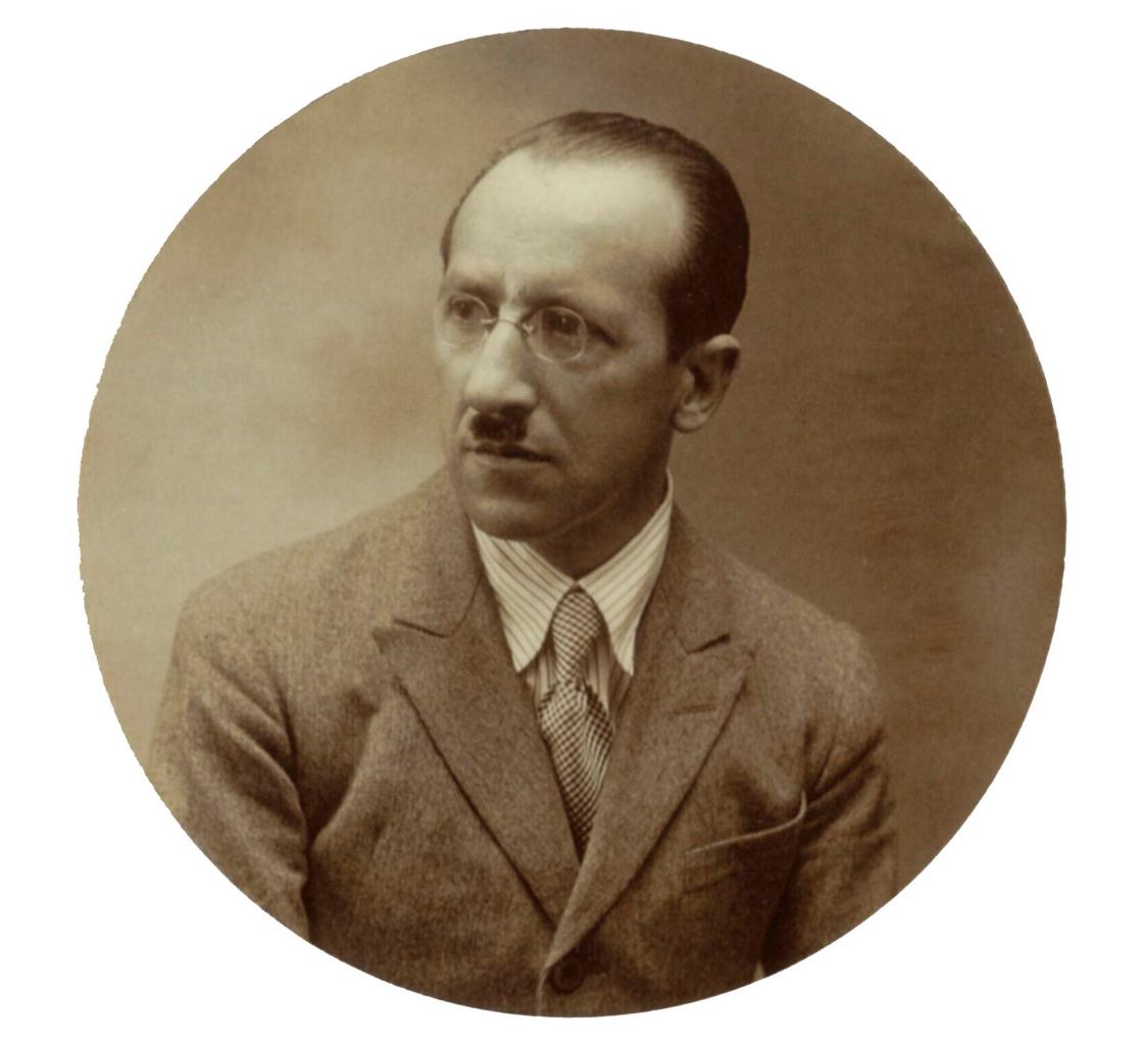
Piet Mondrian, circa 1922. Photographer unknown.
However, Mondrian was surprised to find his bold new idiom stood in stark contrast to the prevailing trends of the rappel à l’ordre then sweeping through the European art world, which favored a return to figuration and classical ideals. Nevertheless, he remained unswerving in his devotion to the theories of Neo-Plasticism, relentlessly pursuing and promoting its potential as a thoroughly modern pictorial language to fellow artists, collectors and gallerists. As a result, he attracted attention from several key figures in the Parisian art world, most notably the dealer Léonce Rosenberg, who published Mondrian’s text Neo-Plasticism in French translation in January 1921, and included several of his recent paintings in a well-attended group exhibition three months later.
Mondrian completely immersed himself in his art during this pivotal period, working intensively and using the core concepts of Neo-Plasticism within the arrangement and form of his own living space. In his apartment and studio at 26 rue du Départ, where he moved in October 1921, he covered the white walls with primary colored, geometric cardboard shapes, arranged, like in his paintings, according to his carefully worked-out Neo-Plastic principles. He painted all the objects in the studio, including the few pieces of furniture he had and his treasured gramophone player, in bright primary hues, so as to create what he described as “a new design for living.” Entering from the dark hallway, the bright, immaculately ordered space astonished visitors—Alexander Calder, recalling his pivotal first visit to the studio, wrote of the impact this experience had on his creative imagination: “It was a very exciting room… I suggested to Mondrian that perhaps it would be fun to make these rectangles oscillate. And he, with a very serious countenance, said: ‘No, it is not necessary, my painting is already very fast.’ …This one visit gave me a shock that started things. Though I had often heard the word ‘modern’ before, I did not consciously know or feel the term ‘abstract.’ So now, at thirty-two, I wanted to paint and work in the abstract” (Calder: An Autobiography with Pictures, New York, 1966, p. 113).
Another visitor to the rue du Départ was the artist, critic and author of one of the first monographs on Mondrian, Michel Seuphor, who wrote a detailed account of how the artist used the space. “The room was quite large, very bright, with a very high ceiling,” Seuphor recounted. “Mondrian had divided it irregularly, utilizing for this purpose a large black-painted cupboard, which was partly hidden by an easel long out of service; the latter was covered with big gray and white pasteboards. Another easel rested against the large rear wall whose appearance changed often, for Mondrian applied to it his Neo-Plastic virtuosity. The second easel was completely white, and used only for showing finished canvases. The actual work was done on the table. It stood in front of the large window facing the rue du Départ, and was covered with a canvas waxed white and nailed to the underside of the boards. I often surprised Mondrian there, armed with a ruler and ribbons of transparent paper, which he used for measuring. I never saw him with any other working tool…” (Piet Mondrian: Life and Work, New York, 1955, pp. 158-160).
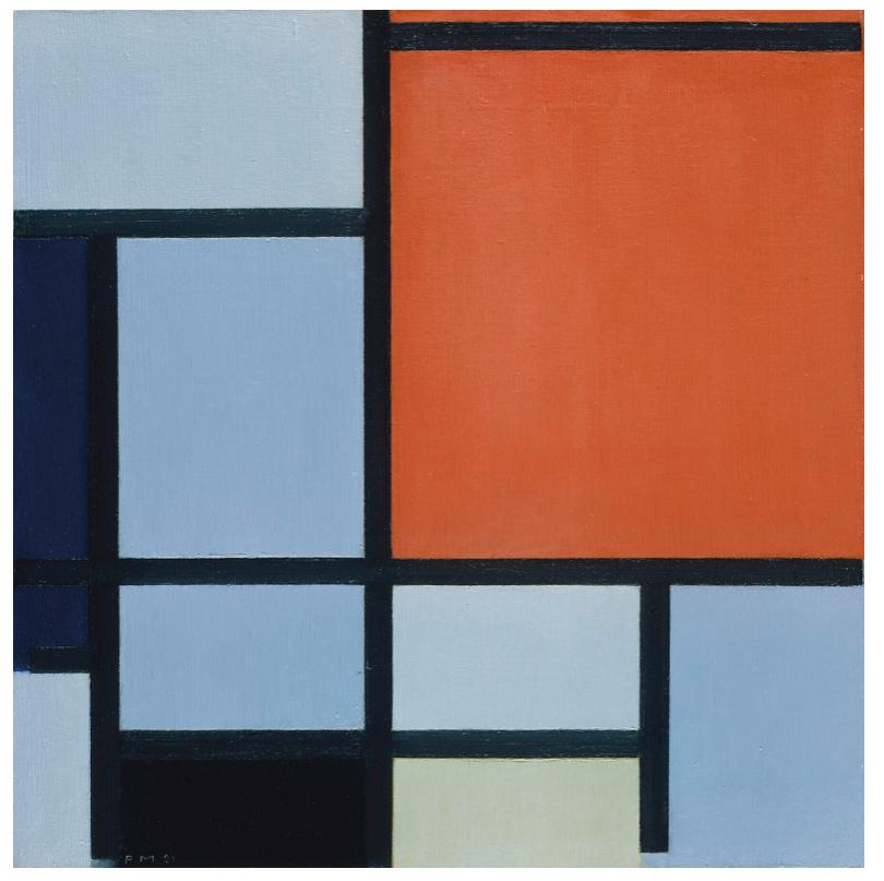
Piet Mondrian, Composition, 1921. The Metropolitan Museum of Art, New York.
Photo: © The Metropolitan Museum of Art / Art Resource, New York.
It was here, in the midst of this carefully designed and restrained studio space, that Mondrian began work on Composition with Large Red Plane, Bluish Gray, Yellow, Black and Blue in 1922. By this time, Mondrian had defined the essential elements of his Neo-Plastic visual idiom, and spent much of that year working to further refine his ideas. Using primarily square format canvases, he experimented and played with the internal dynamics of his compositions, adjusting the arrangement of the grid, the thickness of his dividing lines, the saturation of color and the placement of various elements within the boundaries of the canvas. Filled with a dynamic internal energy, in which each line, each plane, each color is brought to life by its relationship to the other elements within the painting, Composition with Large Red Plane, Bluish Gray, Yellow, Black and Blue proves just how dynamic Mondrian’s restrained artistic language could be. As John Milner explained: “all that changes [in Mondrian’s work] is the number of elements, the proportions of the parts, and the rhythm they establish. This was enough for Mondrian. Here were the fundamentals of his paintings. Their relationships stood for all that existed, and he could see in those infinite relationships the visual evidence of his view of the world, his own cosmology” (Mondrian, London, 1992, p. 163).
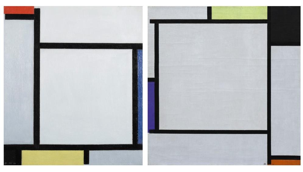
Left: Piet Mondrian, Composition with Red, Blue, Black, Yellow and Gray, 1921. Kunstmuseum den Haag. Photo: © Kunstmuseum den Haag / Bridgeman Images.
Right: Piet Mondrian, Tableau 2, 1922. The Solomon R. Guggenheim Museum, New York. Artwork: © 2025 Mondrian / Holtzman Trust. Photo: © The Solomon R. Guggenheim Foundation / Art Resource, NY.
Despite their apparent simplicity, works such as Composition with Large Red Plane, Bluish Gray, Yellow, Black and Blue are based on a complex system of balance and imbalance, symmetry and asymmetry, that the artist arrived at intuitively, through careful and prolonged contemplation before his works. The principle focus of the canvas is the vibrant red square, which is the largest and most prominent form within the composition, positioned just slightly off-center. The surrounding planes are executed in subtly different tones of white and gray, while pops of yellow, black and vibrant blue, are arranged towards the edges of the canvas. The black lines dividing these planes of color vary slightly in width, lending a subtle sense of depth and dynamism to the grid, with the thicker lines granted a greater power and solidity within the composition than their counterparts.
Having said this, unlike other compositions from this period where these black lines appear to continue infinitely beyond the space of the canvas, in Composition with Large Red Plane, Bluish Gray, Yellow, Black and Blue they appear to taper off towards the edge in places, allowing the bright primary colors they border to interact directly with their neighboring planes of white or gray. This is most noticeable in the upper right corner of the composition, where tiny slivers of soft yellow pigment float freely into the adjoining spaces, creating an unexpected impression of delicate layering and three-dimensionality within the canvas.

Piet Mondrian, Composition with Yellow, Blue, and Blue-White, 1922. The Menil Collection, Houston. © 2025 Mondrian / Holtzman Trust.
Composition with Large Red Plane, Bluish Gray, Yellow, Black and Blue was acquired directly from Mondrian in the year it was painted by the poet, and founding member of De Stijl, Antony Kok. An innovative writer with an interest in new modes of expression, most notably experimental klankpoëzie or sound poetry, Kok was quickly absorbed into the circle of avant-garde artists and intellectuals around Theo van Doesburg, following their meeting in 1914. Kok came to play an important role in the establishment of the group’s periodical, De Stijl, contributing numerous articles and poems on the subject of modern life and art to the magazine. During these years he also became close to Mondrian, and he remained an important comrade and confidante for the artist through the early 1920s following his return to Paris. Writing to Van Doesburg in April 1922, Mondrian detailed a recent visit from the poet, during which he had purchased a painting from him—“I spent some particularly pleasant days with Kok,” he wrote “…it cheered me up to meet a kindred spirit once again at last. He has a clear vision…” (quoted in J.M. Joosten, op. cit., 1998, p. 305).
Further correspondence from later that year reveals that Mondrian was in fact working on two separate pictures for Kok at this time—Composition with Yellow, Blue, and Blue-White (Joosten, no. B143; The Menil Collection, Houston), and the present work, Composition with Large Red Plane, Bluish Gray, Yellow, Black and Blue. According to a letter dated August 1922, one of Kok’s works was finished quite quickly, but the artist was still pondering over the second painting, which he continued to do to the end of the year. The two works appear to have been delivered to Kok the following spring, and remained with him until the early 1950s, at which point Nelly van Doesburg acted as a broker for the poet during one of her visits to New York. She sold a total of four paintings by Mondrian from Kok’s collection to a series of important American buyers, including John Streep, John L. Senior Jr. and Jean and Dominique de Menil. Composition with Large Red Plane, Bluish Gray, Yellow, Black and Blue was sold to Henri-Georges Doll at this time, and is the last of this quartet of paintings formerly in Kok’s collection to remain in private hands.