WORK IN PROGRESS
Timeline
Sotheby’s
Contemporary Evening Auction
9 October 2024
Contemporary Evening Auction | 2024 | Sotheby’s (sothebys.com)
Contemporary Day Auction
10 October 2024
Contemporary Day Auction | 2024 | Sotheby’s (sothebys.com)
Christie’s
20th/21st Century London Evening Sale
9 October 2024
20th / 21st Century: London Evening Sale (christies.com)
Impressionist and Modern Art Day Sale
10 October 2024
Impressionist and Modern Art Day Sale (christies.com)
Post-War and Contemporary Art Day Sale
10 October 2024
Post-War and Contemporary Art Day Sale (christies.com)
Phillips
Modern and Contemporary Art Evening Sale
10 October 2024
Modern & Contemporary Art Evening Sale: London Auction October 2024 (phillips.com)
Modern and Contemporary Art Day Sale
11 October 2024
Modern & Contemporary Art Day Sale: London Auction October 2024 (phillips.com)
Sotheby’s
Contemporary Evening Auction
9 October 2024
Contemporary Evening Auction | 2024 | Sotheby’s (sothebys.com)
Total:
GBP 37,582,816 / USD 49,233,489
22 Lots
# Lots Sold: 18
# Lots Unsold: 4
Sell-Through Rate: 81.8%
Top Lot:
GBP 13,150,000 / USD 17,226,500
12 Lots sold for over GBP 1 million
GBP 34,138,816 (90.8% of total)
Lots Sold
Above Estimates: 5 (23%)
Within Estimates: 10 (45%)
Below Estimates: 3 (14%)
Unsold: 4 (18%)
#1. DAVID HOCKNEY
L’Arbois, Sainte-Maxime, 1968
Sotheby’s London: 9 October 2024
Estimated: GBP 7,000,000 – 10,000,000
GBP 13,150,000 / USD 17,226,500
L’Arbois, Sainte-Maxime | Contemporary Evening Auction | 2024 | Sotheby’s (sothebys.com)
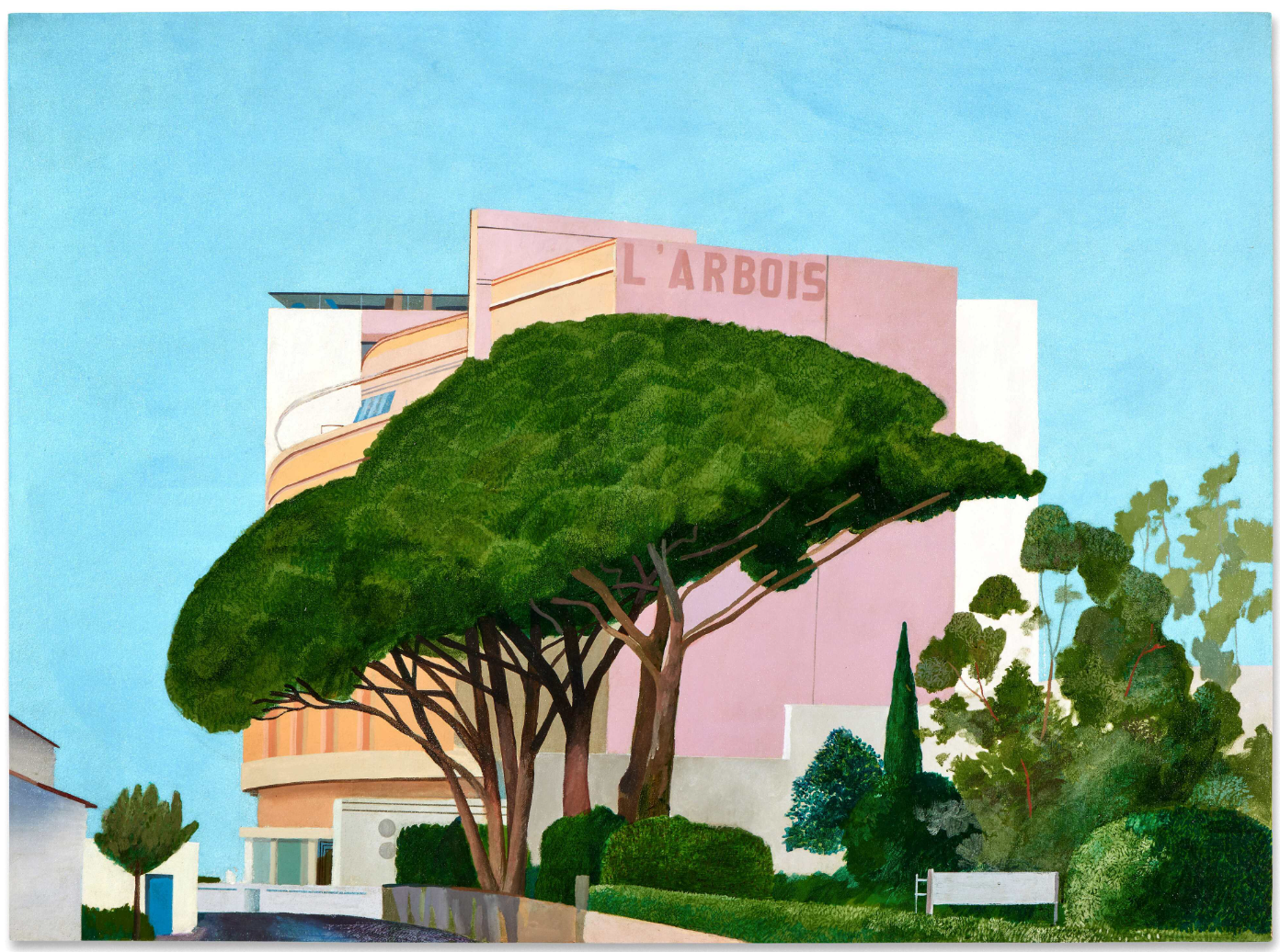
DAVID HOCKNEY (b. 1937)
L’Arbois, Sainte-Maxime, 1968
Acrylic on canvas
113×153 cm (44×60 inches)
Signed and dated 1968 (on the reverse)
#2. WILLEM DE KOONING
Untitled, 1987
Sotheby’s London: 9 October 2024
Estimated: GBP 3,000,000 – 4,000,000
GBP 3,165,000 / USD 4,146,150
Untitled | Contemporary Evening Auction | 2024 | Sotheby’s (sothebys.com)
WILLEM DE KOONING (1904 – 1997)
Untitled, 1987
Oil on canvas
77×88 inches (195.6 x 223.5 cm)
Dated ’87 (on the stretcher)
#3. CHRISTOPHER WOOL
Untitled, 2009
Sotheby’s London: 9 October 2024
Estimated: GBP 2,200,000 – 2,800,000
GBP 2,880,000 / USD 3,772,800
Untitled | Contemporary Evening Auction | 2024 | Sotheby’s (sothebys.com)
CHRISTOPHER WOOL (b. 1955)
Untitled, 2009
Enamel on linen
104×78 inches (264.1 x 198.1 cm)
Signed, dated 2009 and numbered (P579) (on the overlap)
Signed, dated 2009 and numbered (P579) (on the backing board)
#4. ALEXANDER CALDER
Quinze Feuilles Noires, 1961
Sotheby’s London: 9 October 2024
Estimated: GBP 2,000,000 – 3,000,000
GBP 2,700,000 / USD 3,537,000
Quinze Feuilles Noires | Contemporary Evening Auction | 2024 | Sotheby’s (sothebys.com)
ALEXANDER CALDER (1898 – 1976)
Quinze Feuilles Noires, 1961
Sheet metal, wire and paint
54x125x88 inches (137.1 x 317.5 x 223.5 cm)
Inscribed 1 N (with diagram), 2 Forward Side, 3 Forward CA 61,
4 Left, 4 right, 5 right, 5 left (on various elements)
#5. LUCIAN FREUD
Child with a Toy Dog, 1956
Sotheby’s London: 9 October 2024
Estimated: GBP 1,500,000 – 2,000,000
GBP 1,980,000 / USD 2,593,800
Child with a Toy Dog | Contemporary Evening Auction | 2024 | Sotheby’s (sothebys.com)
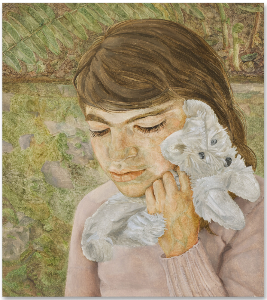
LUCIAN FREUD (1922 – 2011)
Child with a Toy Dog, 1956
Oil on canvas
37×35 cm (14 1/2 x 13 3/4 inches)
This work will be included in the forthcoming catalogue raisonné of Lucian Freud paintings under cat. 120
#6. BRIDGET RILEY
Gaillard 2, 1989
Sotheby’s London: 9 October 2024
Estimated: GBP 1,500,000 – 2,000,000
GBP 1,920,000 / USD 2,515,200
Gaillard 2 | Contemporary Evening Auction | 2024 | Sotheby’s (sothebys.com)
BRIDGET RILEY (b. 1931)
Gaillard 2, 1989
Oil on linen
164 x 227.5 cm (64 5/8 x 89 5/8 inches)
Signed and dated 89 (on the right turnover edge)
Signed, titled and dated 1989 (on the overlap)
Signed, titled and dated 1989 (on the stretcher)
#7. ANDY WARHOL
Eggs, 1982
Sotheby’s London: 9 October 2024
Estimated: GBP 2,200,000 – 3,200,000
GBP 1,800,000 / USD 2,358,000
Eggs | Contemporary Evening Auction | 2024 | Sotheby’s (sothebys.com)
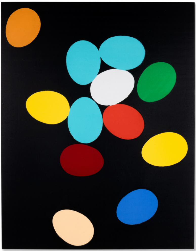
ANDY WARHOL (1928 – 1987)
Eggs, 1982
Acrylic and silkscreen ink on canvas
90×70 inches (228.6 x 177.8 cm)
Stamped by the Estate of Andy Warhol and by the Andy Warhol Foundation for the Visual Arts, Inc.
Numbered PO40.086 three times (on the overlap)
#8. ADRIAN GHENIE
St. Christopher, 2018
Sotheby’s London: 9 October 2024
Estimated: GBP 1,500,000 – 2,000,000
GBP 1,740,000 / USD 2,279,400
St. Christopher | Contemporary Evening Auction | 2024 | Sotheby’s (sothebys.com)
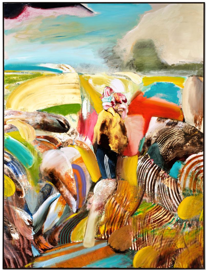
ADRIAN GHENIE (b. 1977)
St. Christopher, 2018
Oil on canvas
240.7 x 180 cm (94 3/4 x 70 7/8 inches)
Signed and dated 2018 (on the reverse)
#9. MATTHEW WONG
Moonlight Mile, 2017
Sotheby’s London: 9 October 2024
Estimated: GBP 1,200,000 – 1,800,000
GBP 1,563,816 / USD 2, 048,599
Moonlight Mile | Contemporary Evening Auction | 2024 | Sotheby’s (sothebys.com)
MATTHEW WONG (1984 – 2019)
Moonlight Mile, 2017
Acrylic on canvas
26×58 inches (66 x 147.3 cm)
Signed, titled and dated 2017 in Chinese (on the reverse)
BANKSY
Vest, 2019
Sotheby’s London: 9 October 2024
Estimated: GBP 200,000 – 300,000
GBP 780,000 / USD 1,021,800
Vest | Contemporary Evening Auction | 2024 | Sotheby’s (sothebys.com)

BANKSY (b. 1974)
Vest, 2019
Acrylic on canvas, velcro and Plastazte foam
45x43x32 cm (17 3/4 x 16 7/8 x 12 5/8 inches)
Signed and numbered 1 (on the reverse)
This work is number 1 from an edition of 5
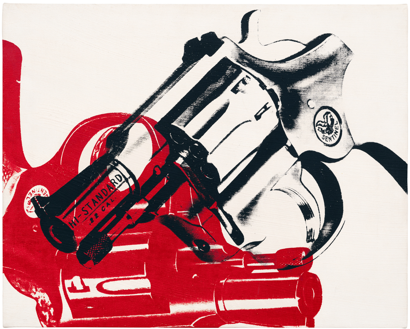
ANDY WARHOL
Self-Portrait, 1963-64
Sotheby’s London: 9 October 2024
Estimated: GBP 3,000,000 – 4,000,000
PASSED
Self-Portrait | Contemporary Evening Auction | 2024 | Sotheby’s (sothebys.com)
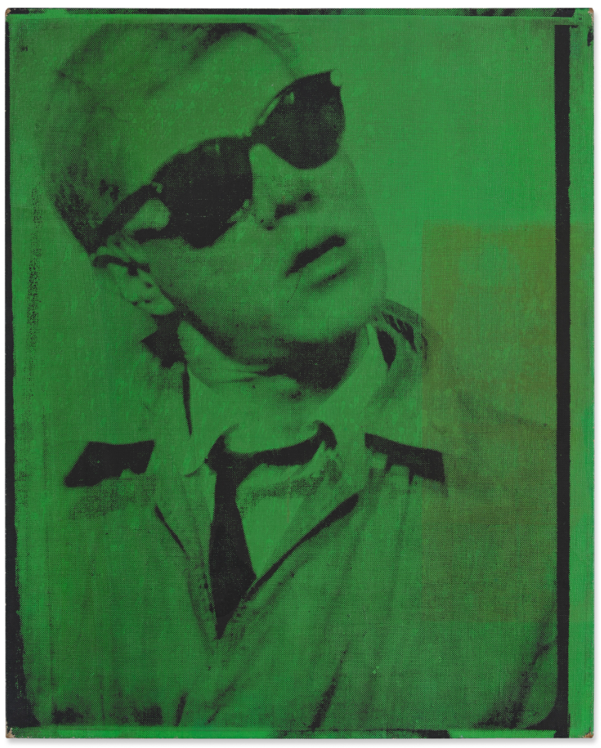
ANDY WARHOL (1928 – 1987)
Self-Portrait, 1963-64
Acrylic and silkscreen ink on canvas
20 x 16 1/4 inches (51.1 x 41.3 cm)
Stamped by the Estate of Andy Warhol and by the Andy Warhol Foundation for the Visual Arts, Inc.
Numbered PO40.086 three times (on the overlap)
YOSHITOMO NARA
Broken Heart Bench, 2006-07
Sotheby’s London: 9 October 2024
Estimated: GBP 2,500,000 – 3,500,000
PASSED
Broken Heart Bench | Contemporary Evening Auction | 2024 | Sotheby’s (sothebys.com)
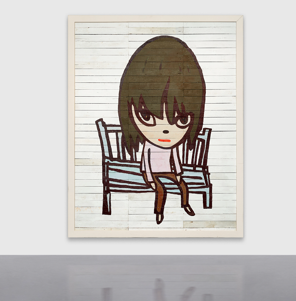
YOSHITOMO NARA (b. 1959)
Broken Heart Bench, 2006-07
Acrylic on wood, in artist’s frame
287 x 227.3 cm (113 x 89 1/2 inches)
Signed twice and dated 2006 and 2007 (on the reverse)
Contemporary Day Auction
26 June 2024
#1. ANDY WARHOL
Dollar Sign, 1982
Sotheby’s London: 10 October 2024
Estimated: GBP 450,000 – 650,000
GBP 690,000 / USD 903,900
Dollar Sign | Contemporary Day Auction | 2024 | Sotheby’s (sothebys.com)
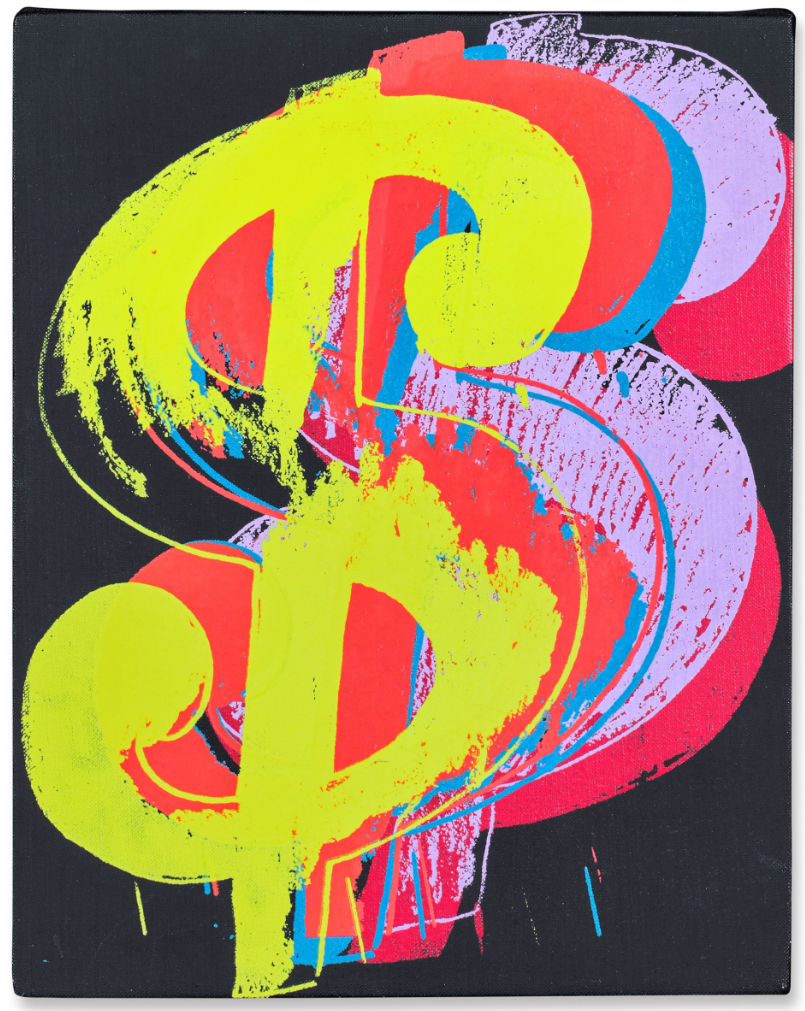
ANDY WARHOL (1928 – 1987)
Dollar Sign, 1982
Acrylic and silkscreen ink on canvas
14 x 10 7/8 inches (35.4 x 27.8 cm)
Signed and dated 82 (on the overlap)
Stamped by the Estate of Andy Warhol and the Andy Warhol Foundation for the Visual Arts, Inc.
Numbered A106.17 on the overlap
#2. YAYOI KUSAMA
Night of Stars (TWOSA), 2007
Sotheby’s London: 10 October 2024
Estimated: GBP 250,000 – 350,000
GBP 420,000 / USD 602,600
Night of Stars (TWOSA) | Contemporary Day Auction | 2024 | Sotheby’s (sothebys.com)
YAYOI KUSAMA (b. 1929)
Night of Stars (TWOSA), 2007
Urethane resin on canvas
194×194 cm (76 3/8 x 76 3/8 inches)
Signed, titled and dated 2007 (on the stretcher)
Christie’s
20th/21st Century London Evening Sale
9 October 2024
20th / 21st Century: London Evening Sale (christies.com)
On 9 October 2024, Christie’s 20th/21st Century: London Evening Sale realized £83,832,250 / €97,556,260 / $107,147,925. The result, up 83 per cent on last October’s total of £44,691,420, and with sell-through rates of 96 per cent by value and 89 per cent by lot, cements the auction’s central role in the capital’s Frieze Week season.
Bidders from 23 countries competed for 52 lots across the curated sale. Split by region, 50 per cent of buyers were from Europe, the Middle East and Africa, while 28 per cent came from the USA and 22 per cent from Asia. Christie’s unique 20/21 programme — showcasing works by modern innovators and contemporary icons — continued to attract new, younger clients, with 23 per cent of buyers being millennials or younger.
#1. LUCIAN FREUD
Ria, Naked Portrait, 2006-2007
Christie’s London: 9 October 2024
Estimated: GBP 10,000,000 – 15,000,000
GBP 11,810,000 / USD 15,471,100
LUCIAN FREUD (1922-2011), Ria, Naked Portrait | Christie’s (christies.com)
LUCIAN FREUD (1922-2011)
Ria, Naked Portrait, 2006-2007
Oil on canvas
87×163 cm (34 1/4 x 64 1/8 inches)
#2. JEFF KOONS
Balloon Monkey (Blue), 2006-2013
Christie’s London: 9 October 2024
Estimated: GBP 6,500,000 – 10,000,000
GBP 7,555,000 / USD 9,897,050
JEFF KOONS (B. 1955), Balloon Monkey (Blue) | Christie’s (christies.com)

JEFF KOONS (B. 1955)
Balloon Monkey (Blue), 2006-2013
Mirror-polished stainless steel with transparent color coating
150x126x235 inches (381 x 320 x 596.9 cm)
Executed in 2006-2013, this work is one of five unique versions (Red, Yellow, Blue, Magenta, Orange)
#3. DAVID HOCKNEY
More Woldgate Timber, October 13th 2009, 2009
Christie’s London: 9 October 2024
Estimated: GBP 3,800,000 – 5,500,000
GBP 4,638,000 / USD 6,075,780
DAVID HOCKNEY (B. 1937), More Woldgate Timber, October 13th 2009 | Christie’s (christies.com)
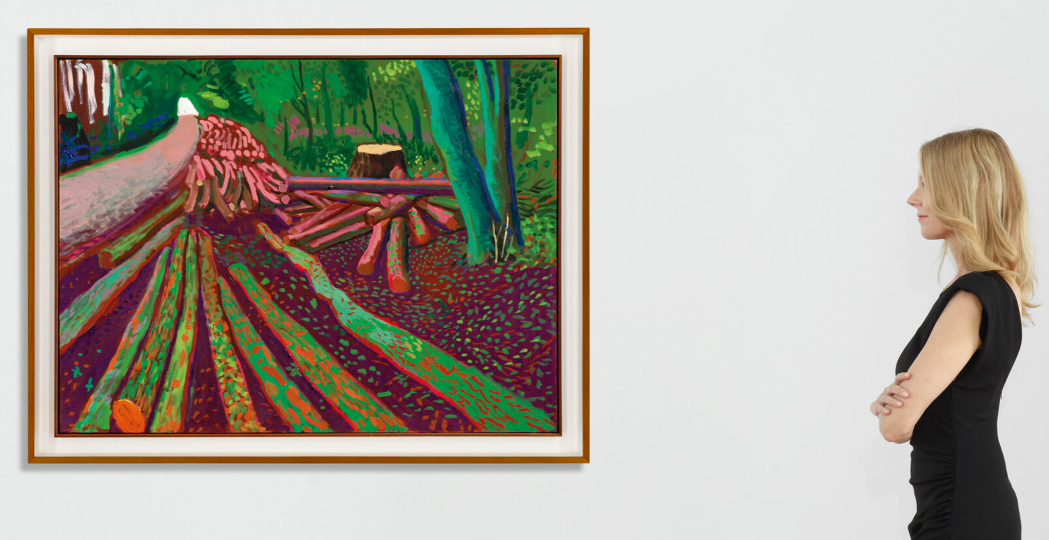
DAVID HOCKNEY (B. 1937)
More Woldgate Timber, October 13th 2009, 2009
Oil on canvas
36×48 inches (91.5 x 122 cm)
Signed and dated ‘David Hockney Oct 2009’ (on the reverse)
#4. RICHARD PRINCE
Hurricane Nurse, 2004
Christie’s London: 9 October 2024
Estimated: GBP 3,500,000 – 5,500,000
GBP 4,184,250 / USD 5,481,368
RICHARD PRINCE (B. 1949), Hurricane Nurse | Christie’s (christies.com)
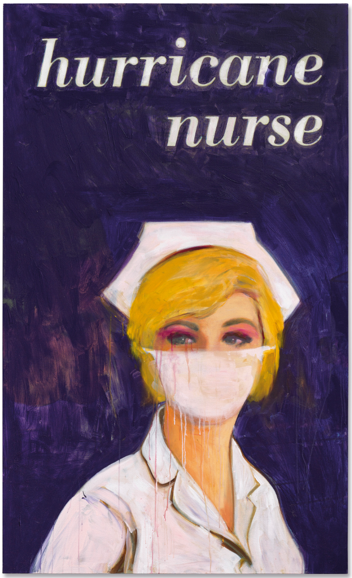
RICHARD PRINCE (B. 1949)
Hurricane Nurse, 2004
Acrylic and inkjet on canvas
69 1/8 x 42 inches (175.5 x 106.8 cm)
Signed, titled and dated ‘R Prince 2004 “Hurricane Nurse”’ (on the overlap)
#5. WILLEM DE KOONING
Untitled XVIII, 1986
Christie’s London: 9 October 2024
Estimated: GBP 4,000,000 – 6,000,000
GBP 3,488,500 / USD 4,569,935
WILLEM DE KOONING (1904-1997), Untitled XVIII | Christie’s (christies.com)
WILLEM DE KOONING (1904-1997)
Untitled XVIII, 1986
Oil on canvas
70 1/8 x 80 1/4 inches (178 x 203.7 cm)
Signed ‘de Kooning’ (on the stretcher)
#6. LUCIAN FREUD
Head of a Woman, 1992
Christie’s London: 9 October 2024
Estimated: GBP 3,000,000 – 5,000,000
GBP 3,428,000 / USD 4,490,680
LUCIAN FREUD (1922-2011), Head of a Woman | Christie’s (christies.com)
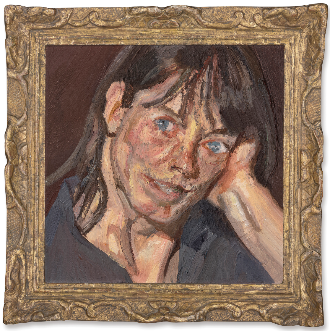
LUCIAN FREUD (1922-2011)
Head of a Woman, 1992
Oil on canvas
10×10 inches (25.3 x 25.3 cm)
#7. ED RUSCHA
Start Over Please, 2015
Christie’s London: 9 October 2024
Estimated: GBP 2,000,000 – 3,000,000
GBP 3,186,000 / USD 4,173,660
ED RUSCHA (B. 1937), Start Over Please | Christie’s (christies.com)
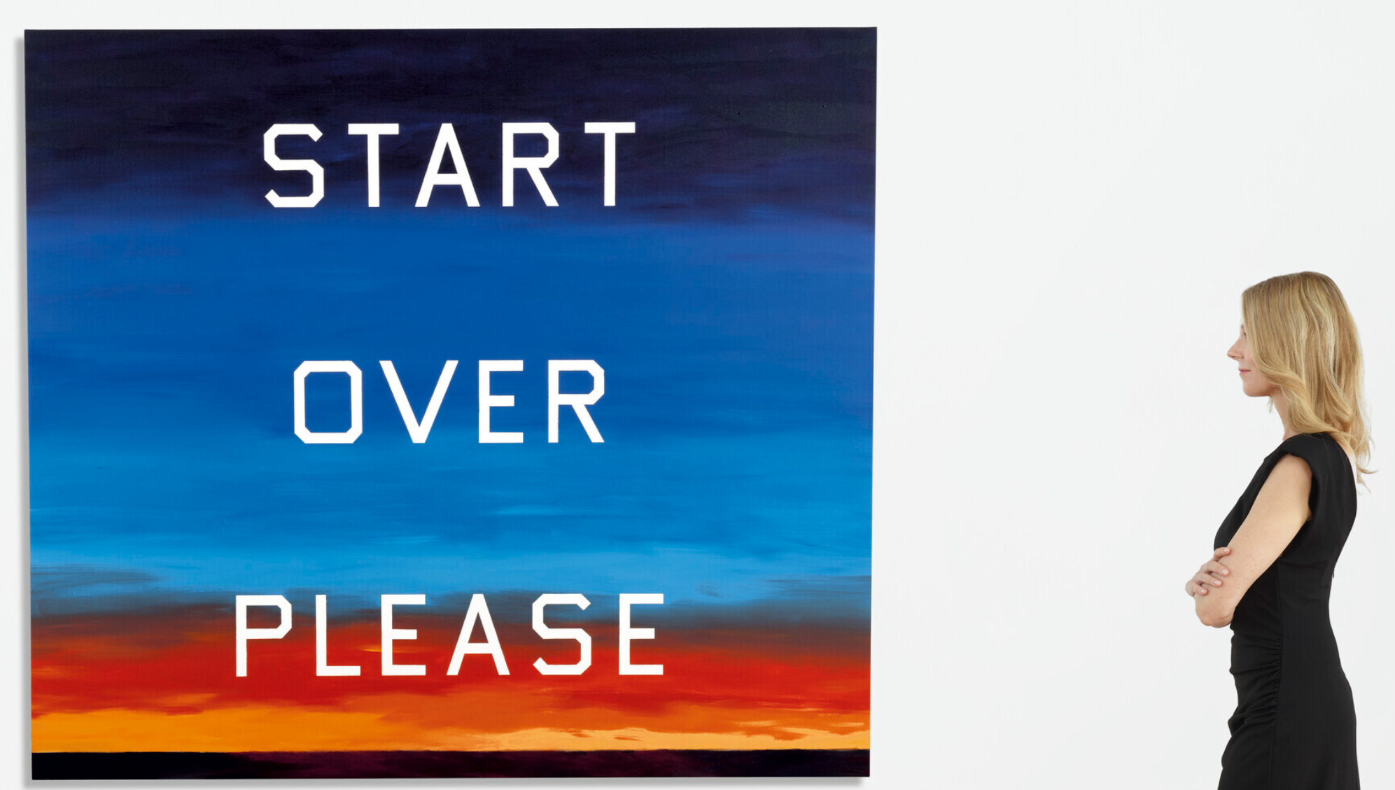
ED RUSCHA (B. 1937)
Start Over Please, 2015
Oil on canvas
64×72 inches (162.7 x 183 cm)
Signed and dated ‘Ed Ruscha 2015’ (on the reverse)
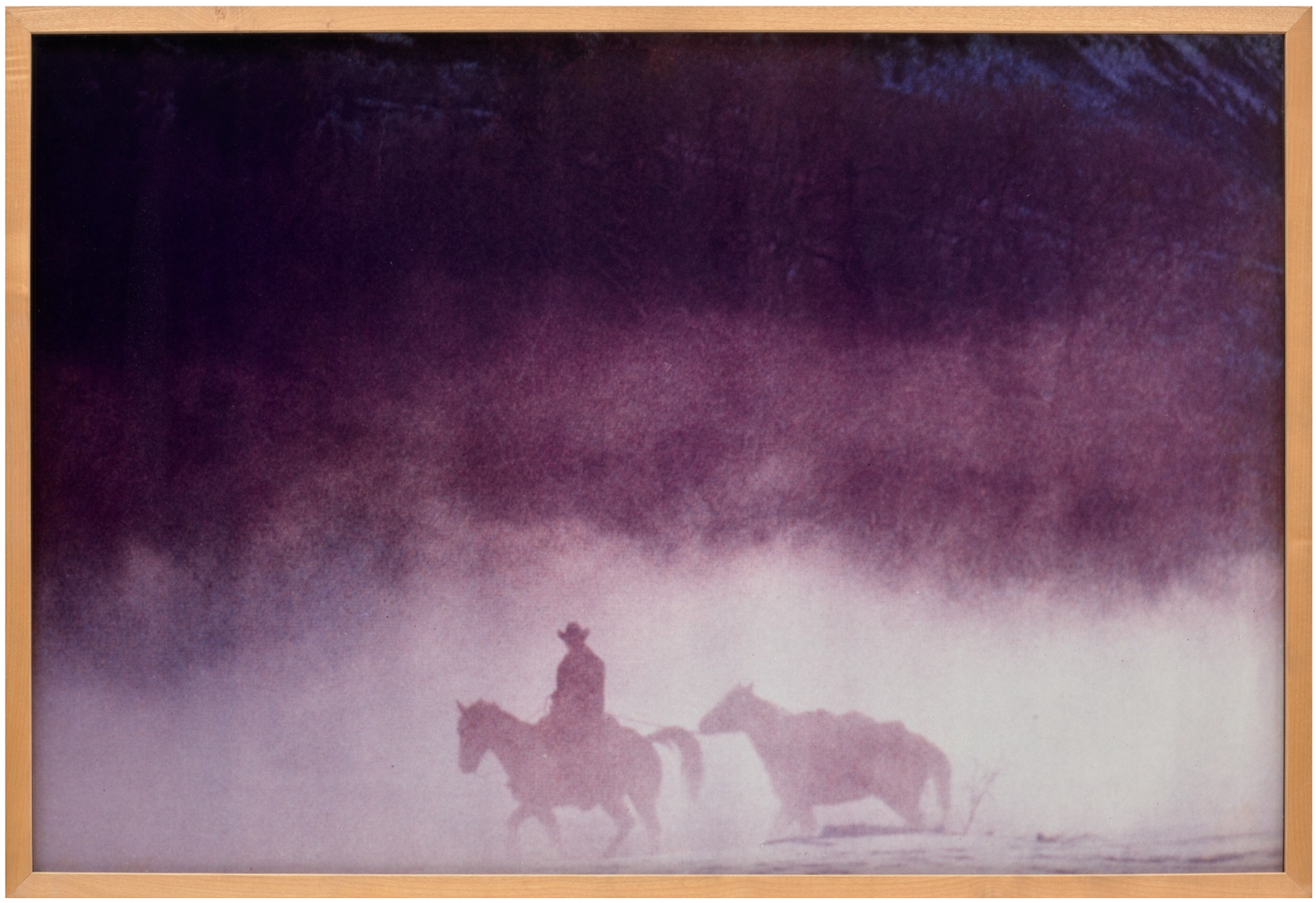
RICHARD PRINCE
Untitled (Cowboy), 1997
Christie’s London: 9 October 2024
Estimated: GBP 1,200,000 – 1,800,000
GBP 2,097,000 / USD 2,747,070
RICHARD PRINCE (B. 1949), Untitled (Cowboy) | Christie’s
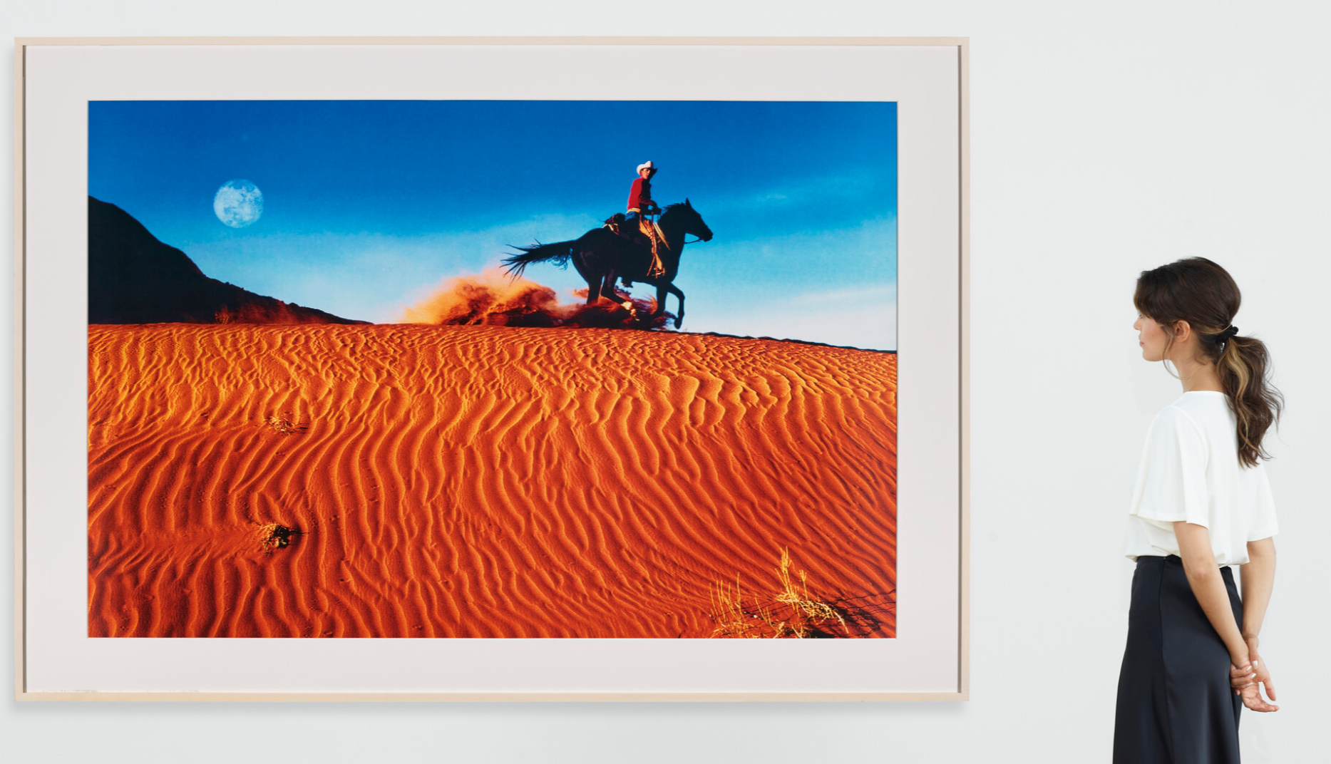
RICHARD PRINCE (B. 1949)
Untitled (Cowboy), 1997
Ektacolour print
Image: 50 x 75 3/8 inches (127 x 191.6 cm)
Signed, numbered and dated ‘RPrince 1⁄2 1997’ (upper right margin)
Signed, numbered and dated ‘RPrince 1⁄2 1997’ (on the reverse)
This work is number one from an edition of two plus one artist’s proof
YAYOI KUSAMA
INFINITY-NETS (ORUSB), 2014
Christie’s London: 9 October 2024
Estimated: GBP 600,000 – 900,000
GBP 781,200 / USD 1,023,372
YAYOI KUSAMA (B. 1929), INFINITY-NETS (ORUSB) | Christie’s (christies.com)
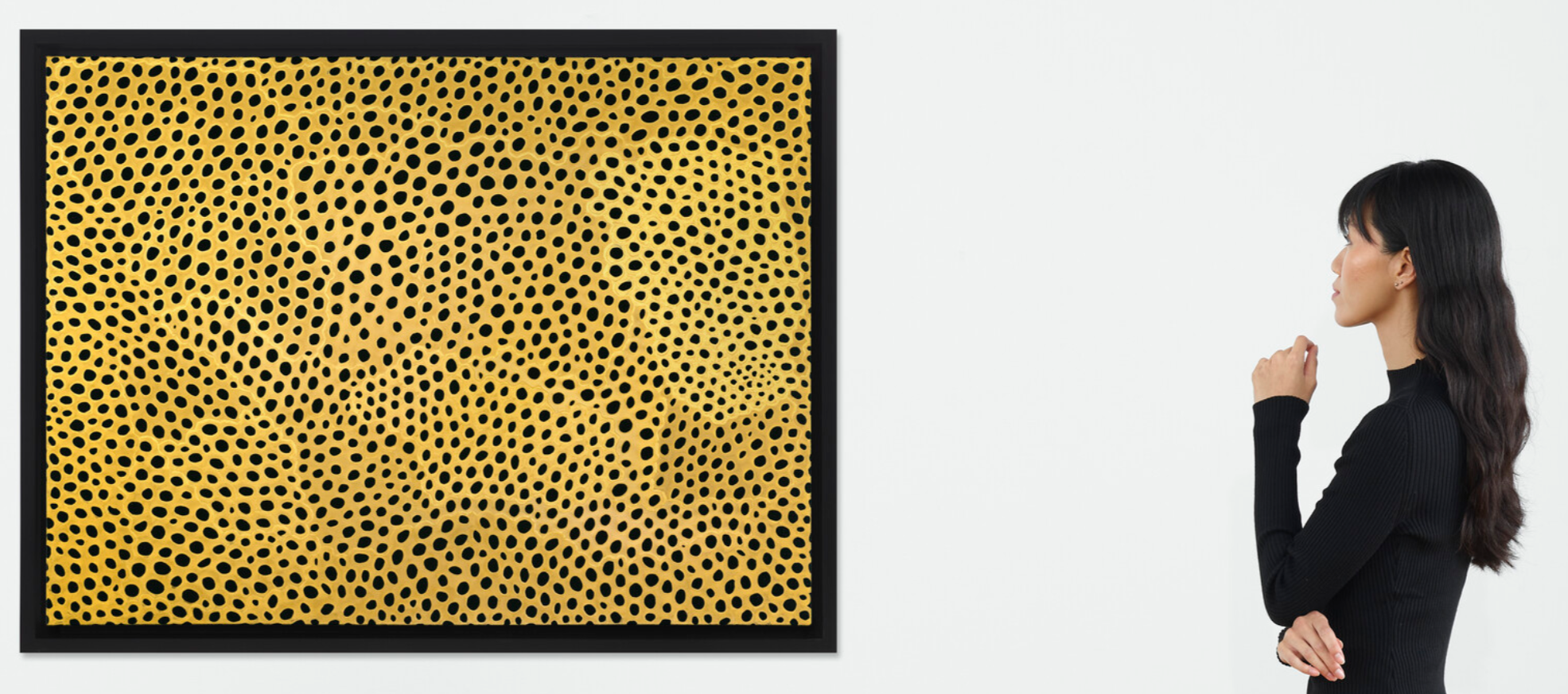
YAYOI KUSAMA (B. 1929)
INFINITY-NETS (ORUSB), 2014
Acrylic on canvas
97 x 130.5 cm (38 1/4 x 51 3/8 inches)
Signed, titled and dated ‘ORUSB INFINITY-NETS YAYOI KUSAMA 2014’ (on the reverse)
Post-War and Contemporary Art Day Sale
10 October 2024
Post-War and Contemporary Art Day Sale (christies.com)
#1. ANDY WARHOL
Vesuvius, 1985
Christie’s London: 10 October 2024
Estimated: GBP 300,000 – 500,000
GBP 604,800 / USD 792,288
ANDY WARHOL (1928-1987), Vesuvius | Christie’s (christies.com)
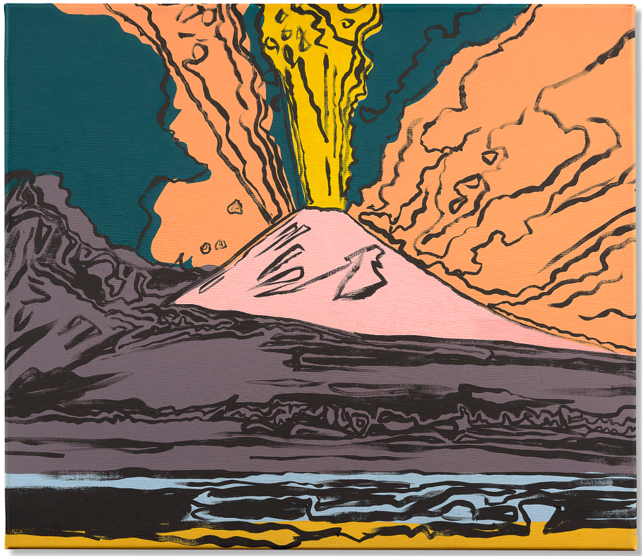
ANDY WARHOL (1928-1987)
Vesuvius, 1985
Acrylic on canvas
28 x 32 1/8 inches (71 x 81.5 cm)
Signed and dated ‘Andy Warhol 85’ (on the overlap)
#2. SEAN SCULLY
Fire, 2006
Christie’s London: 10 October 2024
Estimated: GBP 500,000 – 800,000
GBP 567,000 / USD 742,770
SEAN SCULLY (B. 1945), Fire | Christie’s (christies.com)
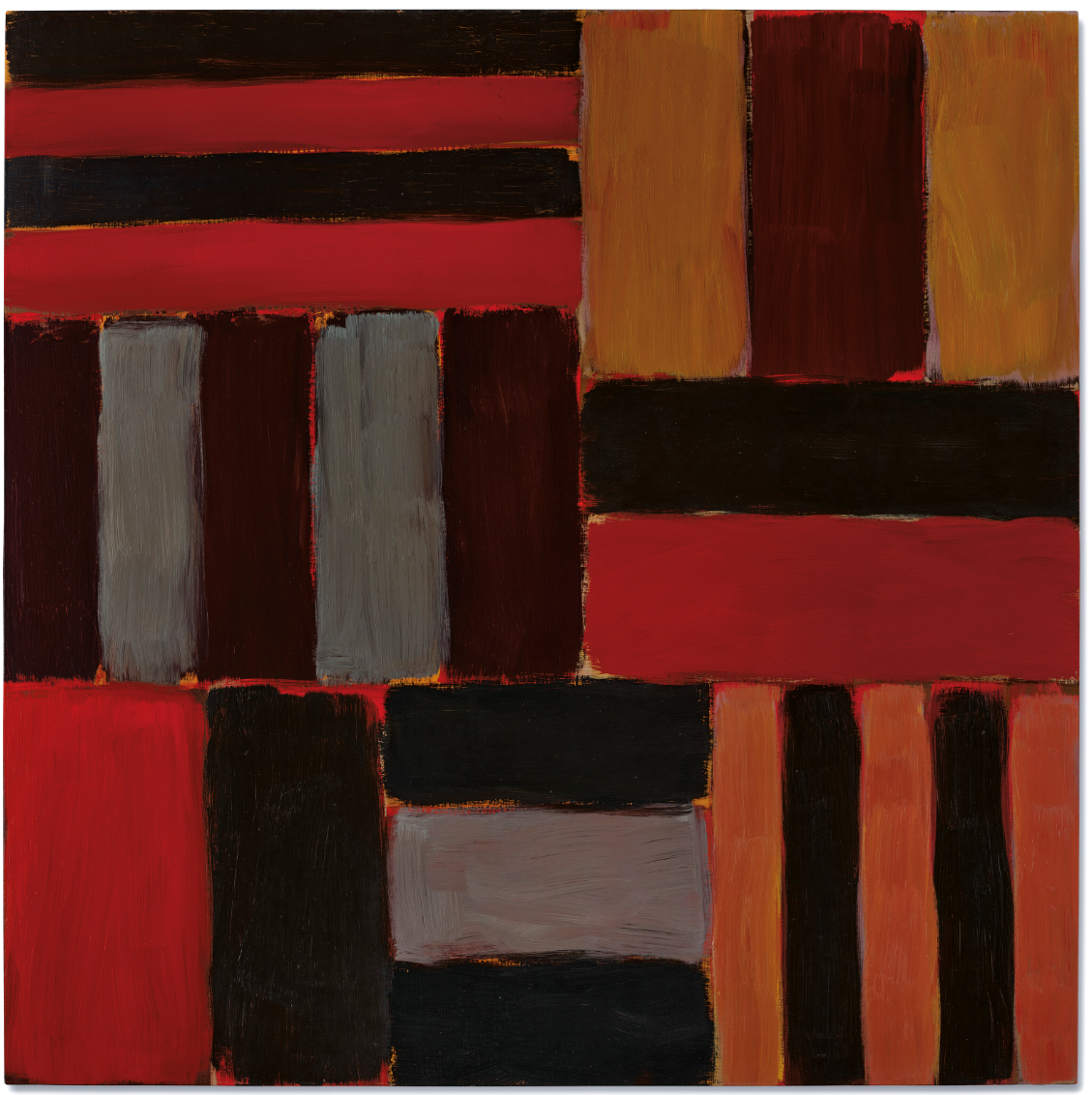
SEAN SCULLY (B. 1945)
Fire, 2006
Oil on linen
63×63 inches (160.2 x 160.2 cm)
Signed, titled and dated ‘Sean Scully 5.06 FIRE’ (on the reverse)
#3. ALI BANISADR
They Build It Up Just To Burn It Back Down, 2013
Christie’s London: 10 October 2024
Estimated: GBP 280,000 – 380,000
GBP 567,000 / USD 742,770
ALI BANISADR (B. 1976), They Build It Up Just To Burn It Back Down | Christie’s (christies.com)
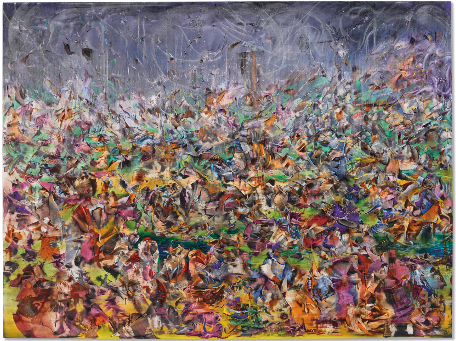
ALI BANISADR (B. 1976)
They Build It Up Just To Burn It Back Down, 2013
Oil on linen
66×88 inches (167.7 x 223.5 cm)
Signed and dated ‘Ali BANISADR 2013’ (on the overlap)
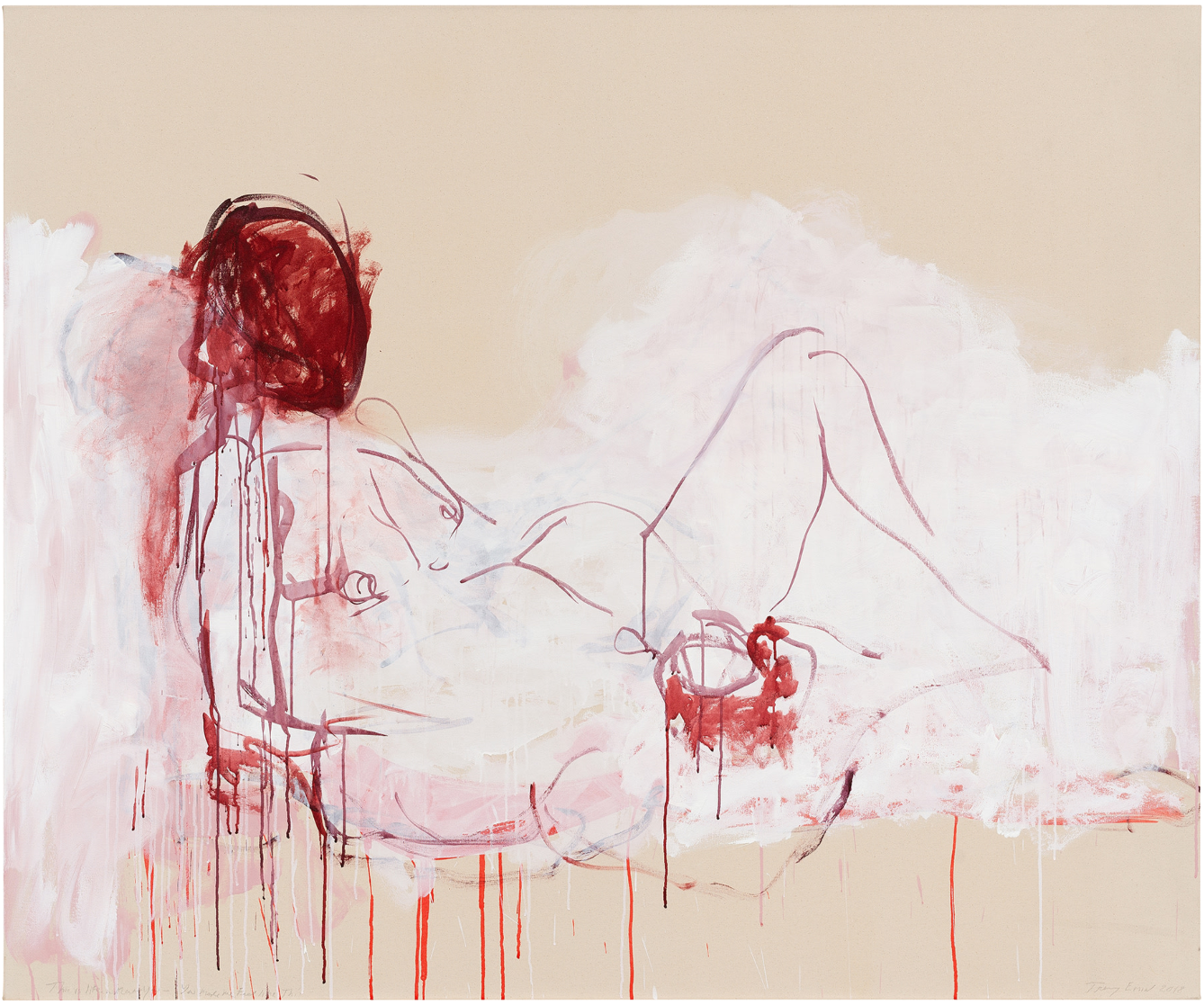
#4. TRACEY EMIN
The Shower, 2019
Christie’s London: 10 October 2024
Estimated: GBP 300,000 – 500,000
GBP 504,000 / USD 660,240
TRACEY EMIN (B. 1963), The Shower | Christie’s (christies.com)
TRACEY EMIN (B. 1963)
The Shower, 2019
Acrylic on canvas
72×48 inches (183×122 cm)
Signed and dated ‘Tracey Emin 2019’ (lower right)
Titled ‘The Shower’ (lower left)
ANDY WARHOL
Dollar Sign, 1982
Christie’s London: 10 October 2024
Estimated: GBP 250,000 – 350,000
GBP 252,000 / USD 330,120
ANDY WARHOL (1928-1987), Dollar Sign | Christie’s (christies.com)
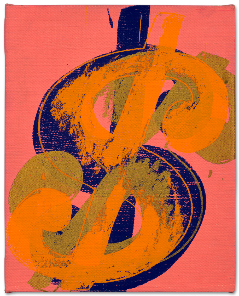
ANDY WARHOL (1928-1987)
Dollar Sign, 1982
Acrylic and silkscreen ink on canvas
10 x 8 1/8 inches (25.5 x 20.5 cm)
Signed and dedicated ‘Andy Warhol to Evelyn’ (on the overlap)
YAYOI KUSAMA
DOTS Accumulation, (ABC), 1999
Christie’s London: 10 October 2024
Estimated: GBP 120,000 – 180,000
GBP 151,200 / USD 198,072
YAYOI KUSAMA (B. 1929), DOTS Accumulation, (ABC) | Christie’s (christies.com)
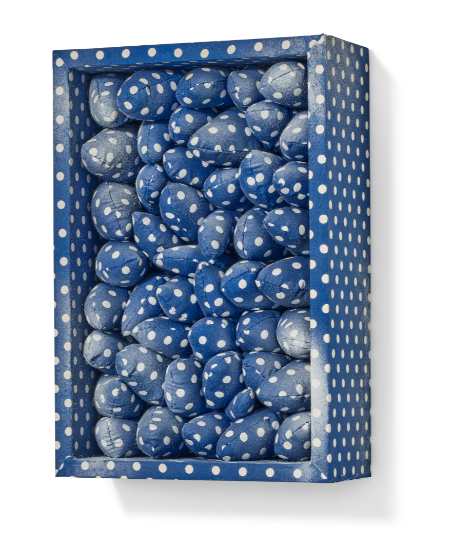
YAYOI KUSAMA (B. 1929)
DOTS Accumulation, (ABC), 1999
Sewn, stuffed fabric and spray paint in fabric-lined wooden box
31.3 x 21.1 x 9.7 cm (12 3/8 x 8 1/4 x 3 7/8 inches)
Signed, titled, titled in Japanese and dated ‘YAYOI KUSAMA 1999 (DOTS) (ABC)’ (on the underside)
KEITH HARING
Untitled, 1981
Christie’s London: 10 October 2024
Estimated: GBP 130,000 – 180,000
GBP 189,000 / USD 247,950
KEITH HARING (1958-1990), Untitled | Christie’s
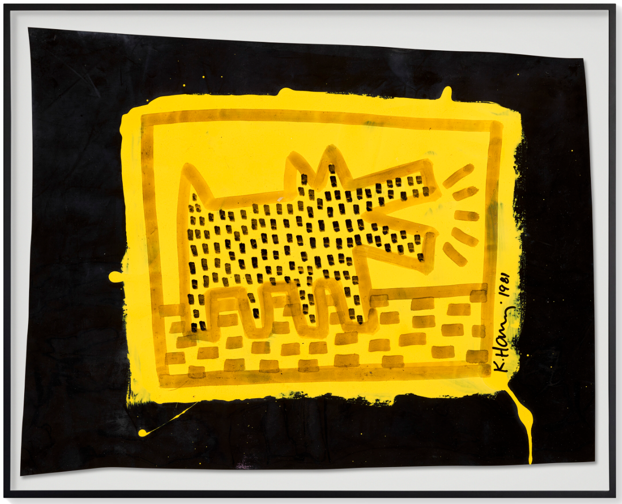
KEITH HARING (1958-1990)
Untitled, 1981
Acrylic on vinyl
19 1/3 x 24 1/2 inches (49 x 62.2 cm)
Signed and dated ‘K.Haring. 1981’ (lower right)
KEITH HARING
Untitled, 1984
Christie’s London: 10 October 2024
Estimated: GBP 50,000 – 70,000
GBP 126,000 / USD 165,060
KEITH HARING (1958-1990), Untitled | Christie’s
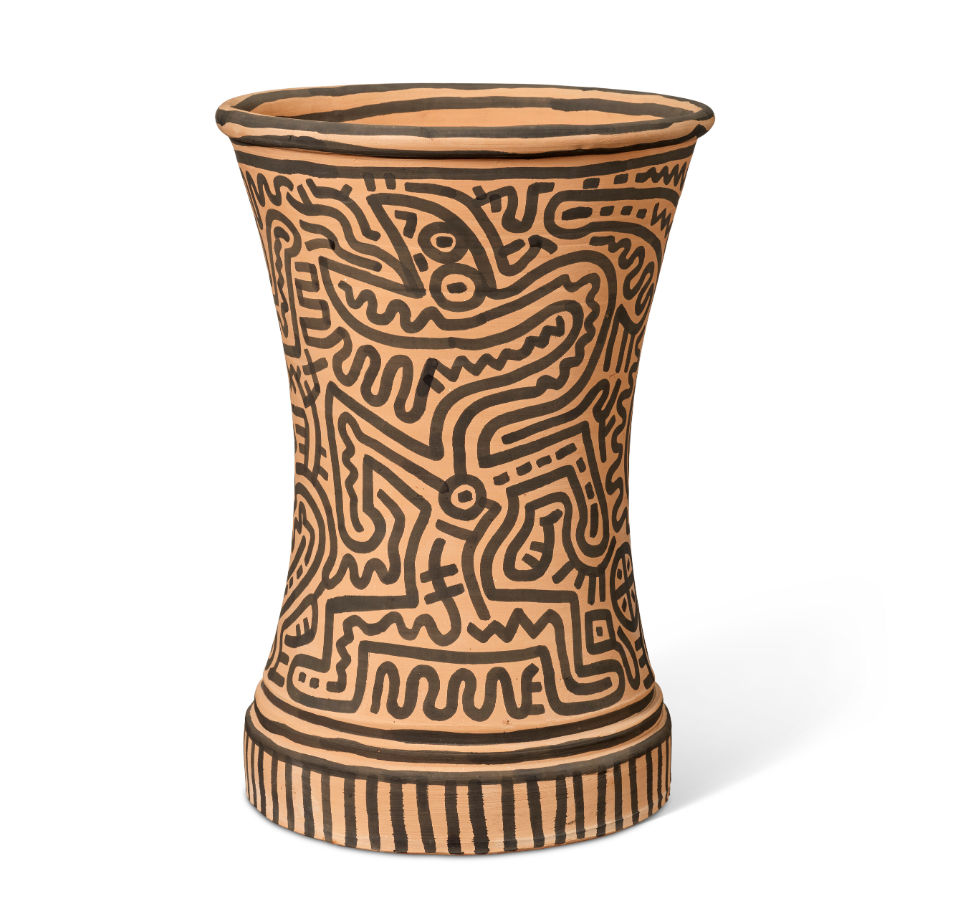
KEITH HARING (1958-1990)
Untitled, 1984
Ink on terracotta
18 7/8 x 13 3/8 x 13 3/8 inches (48x34x34 cm)
Signed and dated ‘K. Haring May 26 1984’ (on the underside)
ANDY WARHOL
Lenin, 1986
Christie’s London: 10 October 2024
Estimated: GBP 350,000 – 550,000
WITHDRAWN
ANDY WARHOL (1928-1987), Lenin | Christie’s (christies.com)
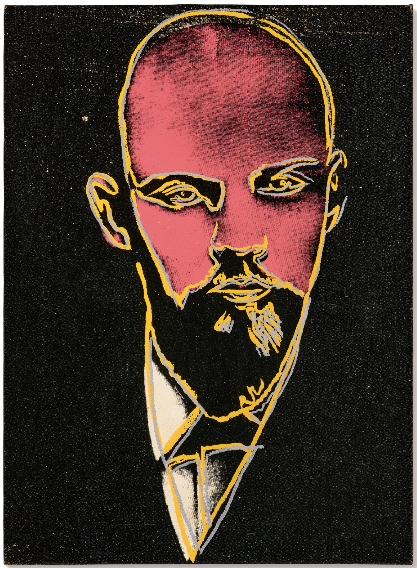
ANDY WARHOL (1928-1987)
Lenin, 1986
Acrylic and silkscreen ink on canvas
22 1/8 x 15 7/8 inches (56 x 40.6 cm)
Signed and dated ‘Andy Warhol 86’ (on the overlap)
Phillips
Modern and Contemporary Art Evening Sale
10 October 2024
Modern & Contemporary Art Evening Sale: London Auction October 2024 (phillips.com)
Total:
GBP 15,132,040 / USD 19,822,972
34 Lots
# Lots Withdrawn: 3
# Lots Sold: 24
# Lots Unsold: 7
Sell-Through Rate: 77.4%
#1. DAVID HOCKNEY
Path Through Wheat Field, July, 2005
Phillips London: 10 October 2024
Estimated: GBP 2,000,000 – 3,000,000
GBP 3,315,000 / USD 4,342,650
David Hockney – Modern & Contemporary… Lot 6 October 2024 | Phillips
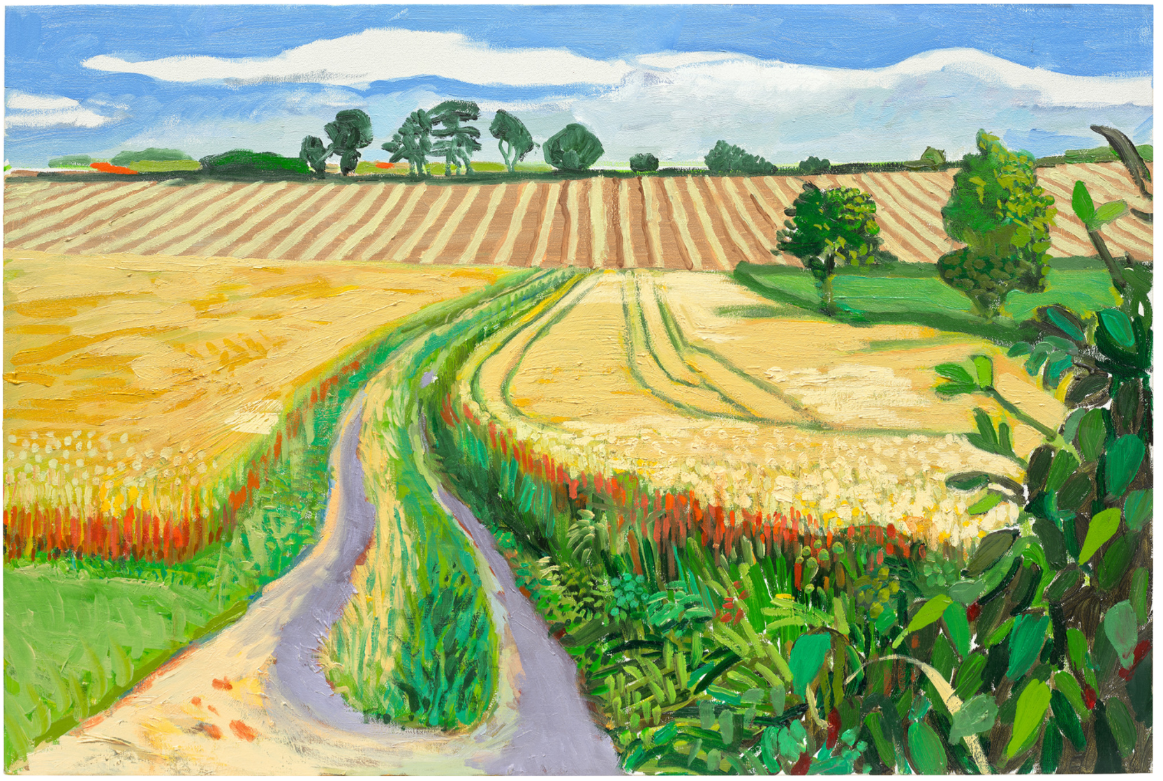
DAVID HOCKNEY
Path Through Wheat Field, July, 2005
Oil on canvas
61.1 x 91.4 cm (24 x 35 7/8 inches)
Signed and dated ‘David Hockney July 22 – 4 Aug 05’ on the reverse
#2. YAYOI KUSAMA
Pumpkin (M), 2016
Phillips London: 10 October 2024
Estimated: GBP 2,000,000 – 3,000,000
GBP 1,984,000 / USD 2,599,040
Yayoi Kusama – Modern & Contemporary … Lot 9 October 2024 | Phillips
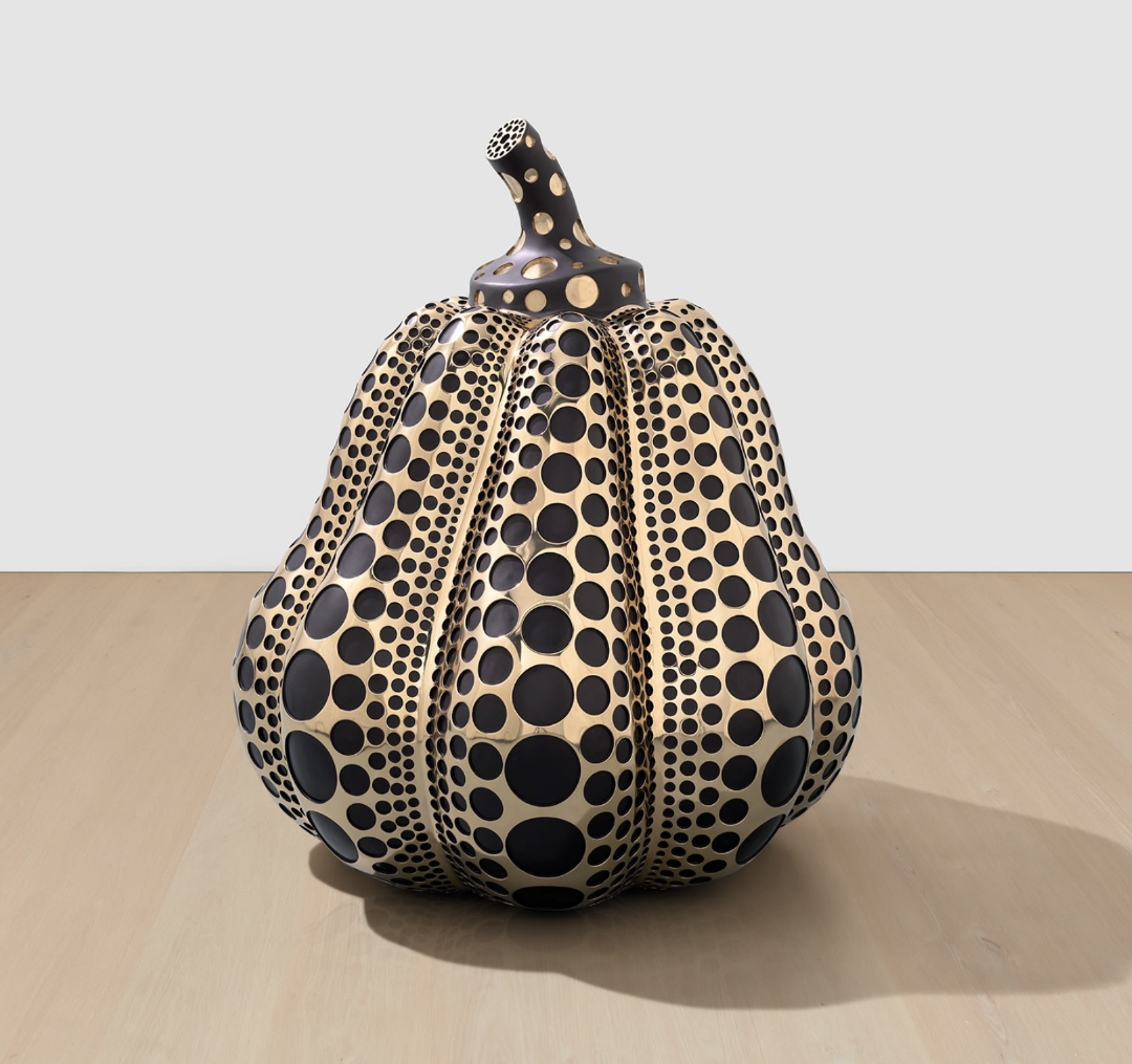
YAYOI KUSAMA
Pumpkin (M), 2016
Mirror polished bronze
100.2 x 80.2 x 77.5 cm (39 1/2 x 31 5/8 x 30 1/2 inches)
Incised with the artist’s signature ‘Yayoi Kusama’ lower part
Executed in 2016, this work is number 7 from an edition of 8 plus 2 artist’s proofs
#3. ANDY WARHOL
Portrait of Princess Diana, 1982
Phillips London: 10 October 2024
Estimated: GBP 1,200,000 – 1,800,000
GBP 1,258,000 / USD 1,647,980
Andy Warhol – Modern & Contemporary … Lot 11 October 2024 | Phillips
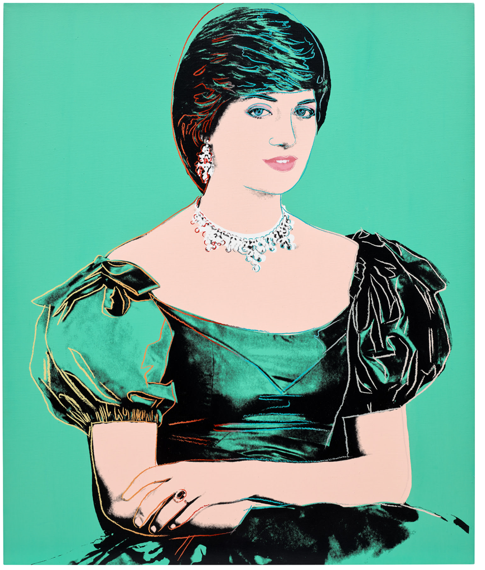
ANDY WARHOL
Portrait of Princess Diana, 1982
Synthetic polymer paint and silkscreen ink on canvas
50 1/8 x 42 inches (127.4 x 106.8 cm)
Signed and dated ‘Andy Warhol 82’
Stamped with the Estate of Andy Warhol and the Andy Warhol Foundation for the Visual Arts, Inc. stamps
Numbered ‘P050.190’ on the overlap
#4. TRACEY EMIN
This is life without you – You made me Feel like This, 2018
Phillips London: 10 October 2024
Estimated: GBP 600,000 – 800,000
GBP 889,000 / USD 1,164,590
Tracey Emin – Modern & Contemporary A… Lot 5 October 2024 | Phillips
TRACEY EMIN
This is life without you – You made me Feel like This, 2018
Acrylic on canvas
60×72 inches (152.4 x 182.8 cm)
Titled ‘This is life without you – You made me Feel like This’ lower left
Signed and dated ‘Tracey Emin 2018’ lower right
#5. LUCIO FONTANA
Concetto spaziale, Attese, 1967
Phillips London: 10 October 2024
Estimated: GBP 800,000 – 1,200,000
GBP 889,000 / USD 1,164,590
Lucio Fontana – Modern & Contemporar… Lot 25 October 2024 | Phillips
LUCIO FONTANA
Concetto spaziale, Attese, 1967
Waterpaint on canvas
81.8 x 65.1 cm (32 1/4 x 25 5/8 inches)
Signed and titled ‘l. Fontana / “Concetto Spaziale” / ATTESE / Cinzia aveva una minigonna veramente sessy…’ on the reverse
#6.LIU YE
Girl and Piggy, 1999
Estimated: GBP 800,000 – 1,200,000
GBP 749,300 / USD 981,583
LIU YE
Girl and Piggy, 1999
Acrylic on linen
62×52 cm (24 3/8 x 20 1/2 inches)
Signed [in Pinyin] and dated ‘Liu.YE 1999’ lower right
#7. BANKSY
Untitled (Fuck the Police), 2000
Phillips London: 10 October 2024
Estimated: GBP 500,000 – 700,000
GBP 635,000 / USD 831,850
Banksy – Modern & Contemporary Art E… Lot 14 October 2024 | Phillips

BANKSY
Untitled (Fuck the Police), 2000
Spray paint and acrylic on board
121.9 x 122.1 cm (47 7/8 x 48 1/8 inches)
Stenciled with the artist’s tag ‘BANKSY’ lower right
#8. ANDREAS GURSKY
New York, Mercantile Exchange, 2000
Phillips London: 10 October 2024
Estimated: GBP 250,000 – 350,000
GBP 609,600 / USD 798,576
Andreas Gursky – Modern & Contempora… Lot 23 October 2024 | Phillips
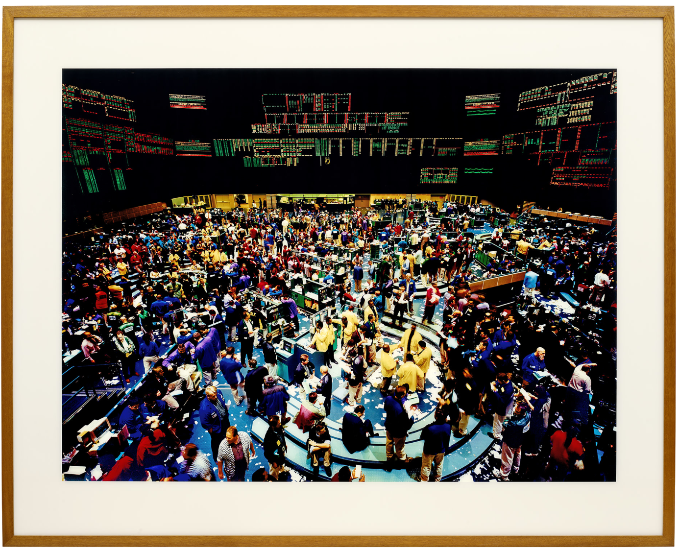
ANDREAS GURSKY
New York, Mercantile Exchange, 2000
C-print face-mounted to Plexiglas, in artist’s frame
Image: 157 x 210.8 cm (61 3/4 x 82 7/8 inches)
Overall: 206.7 x 257.2 cm (81 3/8 x 101 1/4 inches)
Signed, titled, numbered and dated ‘N.Y. Mercantile Exchange 2000 4/6 Andreas Gursky’ on the reverse
Signed, titled and numbered ‘N.Y. Exchange 4/6 Andreas Gursky’ on the backing board
Executed in 2000, this work is number 4 from an edition of 6.
ANDY WARHOL
Guns, 1981
Phillips London: 10 October 2024
Estimated: GBP 450,000 – 650,000
GBP 571,500 / USD 748,665
Andy Warhol – Modern & Contemporary … Lot 28 October 2024 | Phillips
ANDY WARHOL
Guns, 1981
Synthetic polymer paint and silkscreen ink on canvas
16×20 inches (40.6 x 50.5 cm)
Signed and dated ‘Andy Warhol 81’
Stamped with the Andy Warhol Foundation for Visual Arts, Inc. stamp
Numbered ‘A101.984’ on the overlap
BANKSY
Rat and Heart, 2014
Phillips London: 10 October 2024
Estimated: GBP 300,000 – 500,000
GBP 317,500 / USD 415,925
Banksy – Modern & Contemporary Art E… Lot 34 October 2024 | Phillips

BANKSY
Rat and Heart, 2014
Spray paint and emulsion on board, in artist’s frame
27×36 cm (10 5/8 x 14 1/8 inches)
Signed and dedicated ‘Thanks Slik ! BANKSY’ on the reverse
ANDY WARHOL
Portrait of Prince Charles, 1982
Phillips London: 10 October 2024
Estimated: GBP 1,000,000 – 1,500,000
PASSED
Andy Warhol – Modern & Contemporary … Lot 12 October 2024 | Phillips
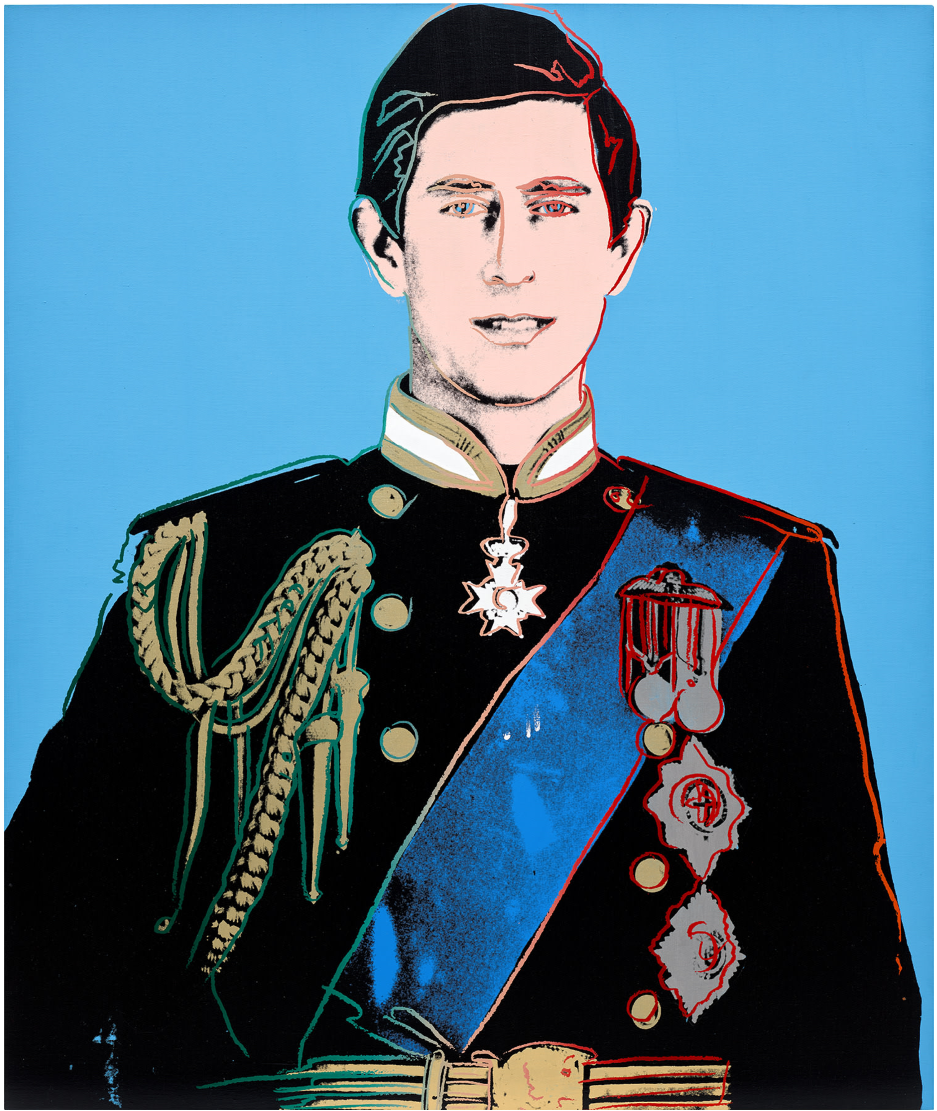
ANDY WARHOL
Portrait of Prince Charles, 1982
Synthetic polymer paint and silkscreen ink on canvas
50 1/8 x 41 7/8 inches (127.3 x 106.4 cm)
Signed and dated ‘Andy Warhol 82’
Stamped with the Estate of Andy Warhol and the Andy Warhol Foundation for the Visual Arts, Inc. stamps
Numbered ‘P050.189’ on the overlap
Modern and Contemporary Art Day Sale
11 October 2024
Modern & Contemporary Art Day Sale: London Auction October 2024 (phillips.com)
#1. KAWS
UNTITLED, 2015
Phillips London: 11 October 2024
Estimated: GBP 250,000 – 350,000
GBP 862,000 / USD 998,500
KAWS – Modern & Contemporary Art Da… Lot 120 October 2024 | Phillips
KAWS
UNTITLED, 2015
Acrylic on canvas
96 1/8 x 96 1/8 inches (244×244 cm)
Signed and dated ‘KAWS.. 15’ on the reverse
#2. KAWS
COMPANION (PASSING THROUGH), 2011
Phillips London: 11 October 2024
Estimated: GBP 120,000 – 180,000
GBP 406,400 / USD 532,384
KAWS – Modern & Contemporary Art Da… Lot 139 October 2024 | Phillips
KAWS
COMPANION (PASSING THROUGH), 2011
Painted bronze
48 x 25 1/4 x 27 1/8 inches (122x64x69 cm)
Executed in 2011, this work is number 7 from an edition of 10 plus 2 artist’s proofs
#3. DANIEL RICHTER
White Horse – Pink Flag, 2004
Phillips London: 11 October 2024
Estimated: GBP 220,000 – 350,000
GBP 260,350 / USD 341,059
Daniel Richter – Modern & Contempor… Lot 126 October 2024 | Phillips
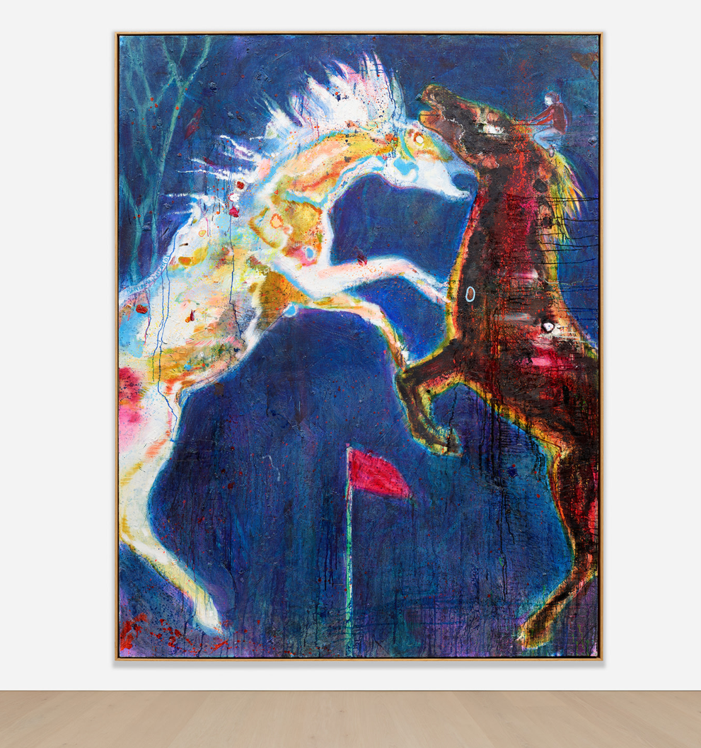
DANIEL RICHTER
White Horse – Pink Flag, 2004
Oil on canvas
85 7/8 x 66 1/4 inches (218.3 x 168.2 cm)
Signed ‘DANIEL RICHTER’ centre left
Signed and titled ‘White Horse – Pink Flag Daniel Richter’ on the reverse
#4. PER KIRKEBY
Herbst (Autumn), 2006
Phillips London: 11 October 2024
Estimated: GBP 150,000 – 200,000
GBP 254,000 / USD 332,740
Per Kirkeby – Modern & Contemporary… Lot 123 October 2024 | Phillips
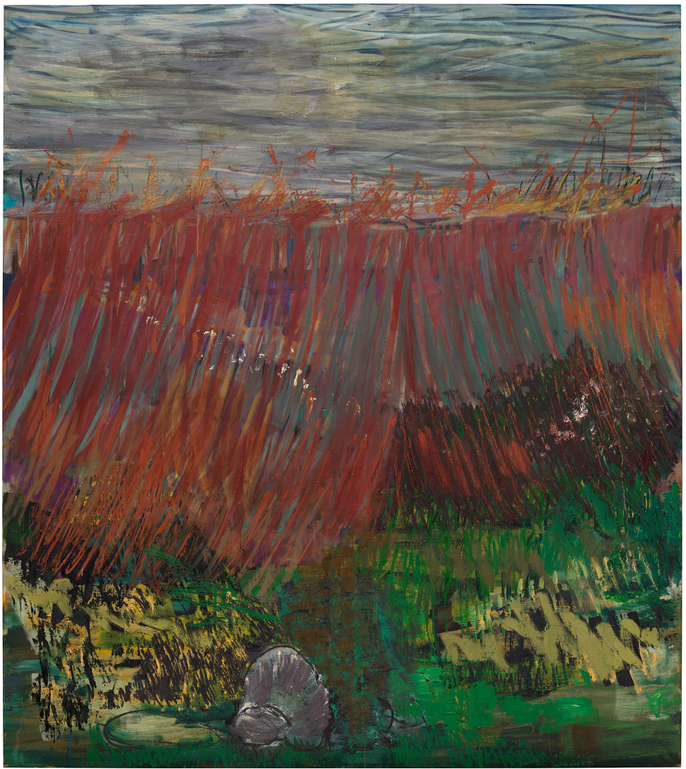
PER KIRKEBY
Herbst (Autumn), 2006
Oil on canvas
225×200 cm (88 5/8 x 78 3/4 inches)
#5. KEHINDE WILEY
Sleep, 2022
Phillips London: 11 October 2024
Estimated: GBP 150,000 – 200,000
GBP 254,000 / USD 332,740
Kehinde Wiley – Modern & Contempora… Lot 141 October 2024 | Phillips
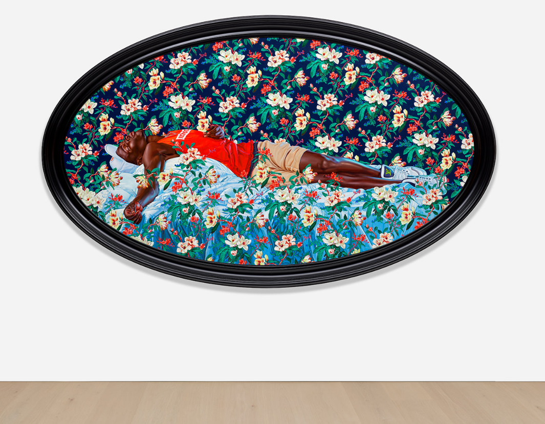
KEHINDE WILEY
Sleep, 2022
Oil on canvas, in artist’s frame
Overall: 70 7/8 x 118 1/2 inches (180×301 cm)
Signed and dated ‘Kehinde Wiley 2022’ on the reverse
#6. DAMIEN HIRST
Untitled (Birthday Card), 1999
Phillips London: 11 October 2024
Estimated: GBP 250,000 – 350,000
GBP 254,000 / USD 332,740
Damien Hirst – Modern & Contemporar… Lot 151 October 2024 | Phillips
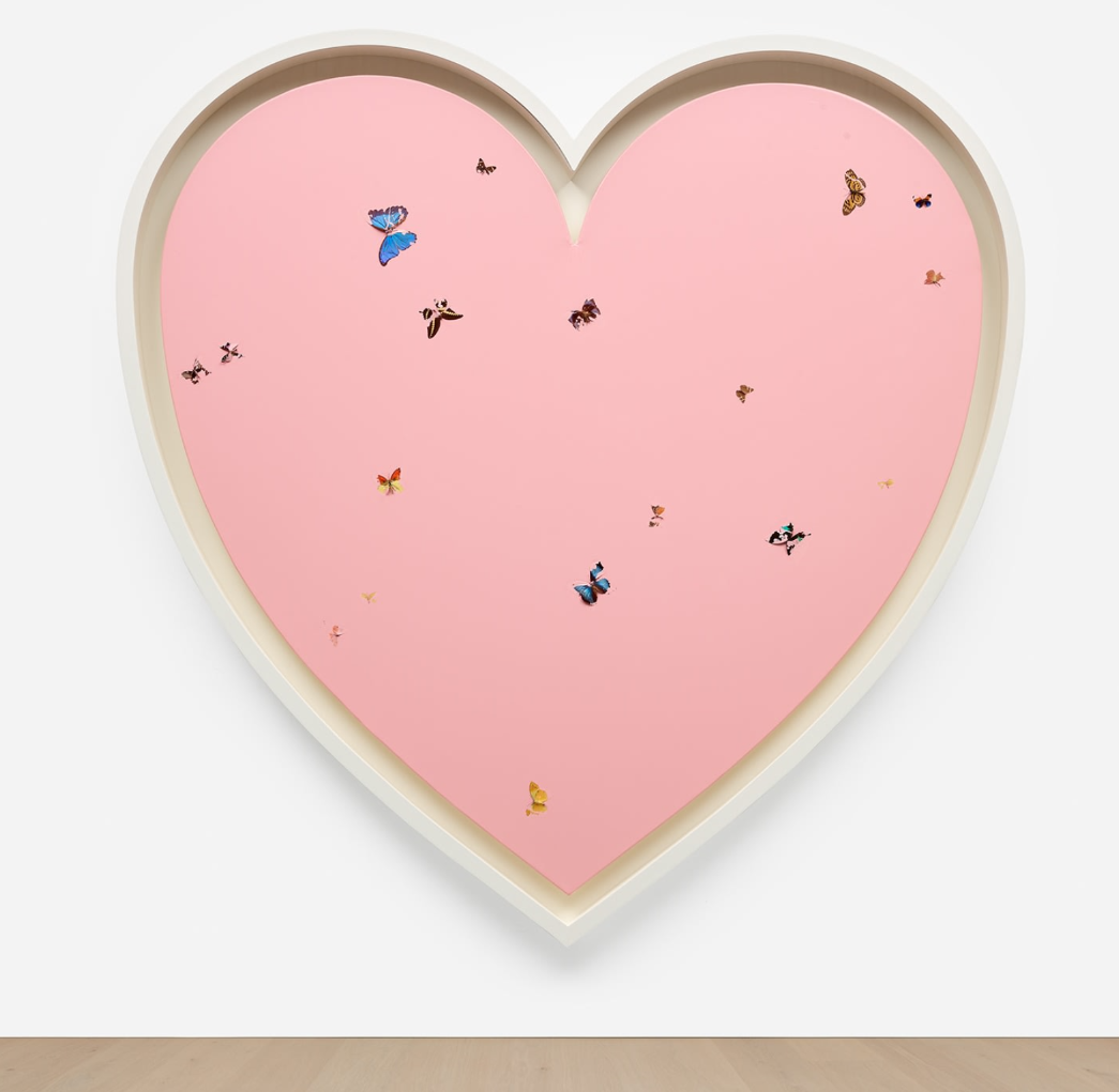
DAMIEN HIRST
Untitled (Birthday Card), 1999
Household gloss and butterflies on canvas
84 x 84 1/2 inches (213.5 x 214.5 cm)
Signed ‘D Hirst’ on the stretcher
Signed, titled and dated ”Untitled (Birthday Card)’ 1999 Damien Hirst’ on the reverse
#7. RICHARD PRINCE
Untitled (Cowboys), 1986
Phillips London: 11 October 2024
Estimated: GBP 120,000 – 180,000
GBP 241,300 / USD 316,103
Richard Prince – Modern & Contempor… Lot 121 October 2024 | Phillips
RICHARD PRINCE
Untitled (Cowboys), 1986
Ektacolor print mounted to foamcore
26 7/8 x 40 inches (68.5 x 101.6 cm)
Executed in 1986, this work is number 1 from an edition of 2
KEITH HARING
Untitled (Two Dancing Figures), 1987
Phillips London: 10 October 2024
Estimated: GBP 150,000 – 200,000
GBP 165,100 / USD 216,281
Keith Haring – Modern & Contemporar… Lot 119 October 2024 | Phillips

KEITH HARING
Untitled (Two Dancing Figures), 1987
Polyurethane enamel on aluminum
18 3/4 x 26 5/8 x 18 7/8 inches (47.6 x 67.5 x 48 cm)
Incised with the artist’s signature, number and date ‘K. Haring 1987 8/10’ on the base
This work is number 8 from an edition of 10 plus 2 artist’s proofs
PART III: FOCUS
Focus: Ultra-Contemporary
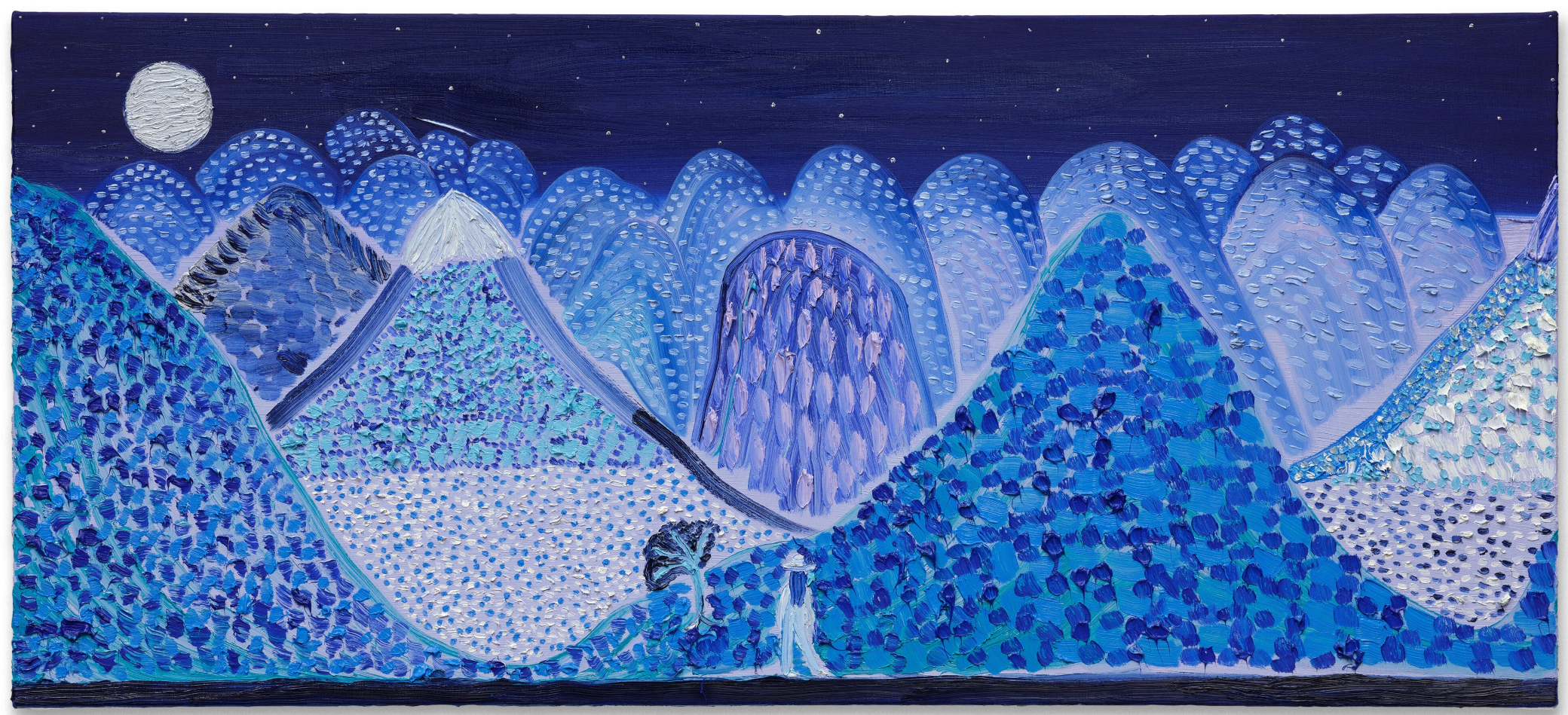
MATTHEW WONG
Moonlight Mile, 2017
Sotheby’s London: 9 October 2024
Estimated: GBP 1,200,000 – 1,800,000
GBP 1,563,816 / USD 2, 048,599
Moonlight Mile | Contemporary Evening Auction | 2024 | Sotheby’s (sothebys.com)
MATTHEW WONG (1984 – 2019)
Moonlight Mile, 2017
Acrylic on canvas
26×58 inches (66 x 147.3 cm)
Signed, titled and dated 2017 in Chinese (on the reverse)
Dazzling, emotionally compelling, and executed in an exquisitely rendered melancholy veil of blue, Moonlight Mile from 2017 epitomizes the stark beauty and self-exploration that distinguishes Matthew Wong’s remarkable oeuvre. A mesmerizing harmony of stylistic grace, tonal vibrancy, and raw sentiment, Wong weaves a rhapsody of cobalts and azures into a tranquil, star-studded topography, motionless save one figure trekking his dreamscape. Reflective of the innate poignancy of his works, Moonlight Mile is an articulation of Wong’s emotions, and typifies the immediate and intimate resonance of his paintings.
“I would like my paintings to have something in them people across the spectrum can find things they identify with. I do believe that there is inherent loneliness or melancholy to much of contemporary life.”
It is this remarkable emotive quality that distinguishes Wong’s practice within the vaunted bastion of landscape painting. Herein, Moonlight Mile – exemplifying Wong’s Blue Paintings, which the artist worked on from 2017 until his untimely passing in 2019 at the age of thirty five – is a particularly poignant example of the artist’s emotive aesthetic talent.
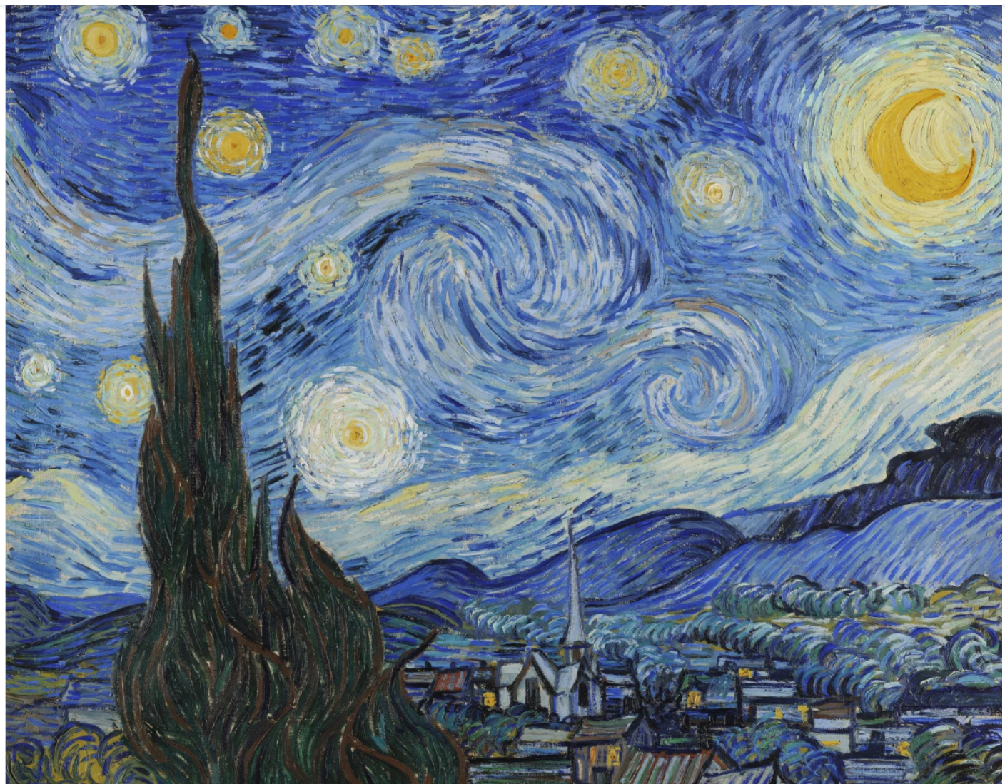
Vincent Van Gogh, The Starry Night, 1889. Museum of Modern Art , New York. Licensed by SCALA / Art Resource, NY
Working directly from tubes of paint, Wong would allow creative impulses to carry his hand, drawing arabesques in varying strokes and daubs which elicit myriad sensations of presence and movement across the canvas. The bespeckled skyline is disrupted by striking mountains rendered in impastoes of blue, purple, metallic silver, and black. Situated within this central point is his omnipresent lone traveller, cipher or a stand-in for the viewer in this ineffably poignant and engulfing landscape. A pictorial device developed by Caspar David Friedrich in his canonically poignant Romantic landscapes, this lone figure seen from the back (coined the rückenfigur) offers a vehicle to convey an intimation of our insignificance and vulnerability when confronted with sublime, awesome expanse and power of nature. Redolent of the visual lyricism of Vincent van Gogh, the sensuousness of Gustave Klimt, the emotively potent Pablo Picasso, and the Romantic tradition of Friedrich, Midnight Mile synthesizes endless references and articulates an enchantingly vulnerable, immersive, and acutely alluring image rich in chromatic, spatial, and psychological complexities.
This painting offers an extraordinary consolidation and extension of a long tradition of landscape painting by crafting a menagerie of dreamscapes of unfathomable breadth and anchoring them all to the bittersweet pas seul of existence. Moonlight Mile is a tender, enchanting composition that meditates on the liminal space between the fantastical and the real.
ADRIAN GHENIE
St. Christopher, 2018
Sotheby’s London: 9 October 2024
Estimated: GBP 1,500,000 – 2,000,000
GBP 1,740,000 / USD 2,279,400
St. Christopher | Contemporary Evening Auction | 2024 | Sotheby’s (sothebys.com)
ADRIAN GHENIE (b. 1977)
St. Christopher, 2018
Oil on canvas
240.7 x 180 cm (94 3/4 x 70 7/8 inches)
Signed and dated 2018 (on the reverse)
A sumptuous melee of abstraction and figuration suggestive of a reverie half-remembered, Adrian Ghenie’s St. Christopher from 2018 is a monumental masterpiece that exemplifies the artist’s unique ability to meld past and present with historical iconography into a brooding dreamlike haze. Drawing upon a wide array of influences within the canon of twentieth-century art history, St. Christopher is demonstrative of Ghenie’s unmistakable virtuosic handling of paint and brush to explore the contradictions and paradoxes of a contemporary world. Utilizing the artist’s honed technique of paint application via palette knife and scraping back thick layers of the medium, such a method instils the surface of St. Christopher with a teasingly tangible dynamic surface, one that appears spontaneous and in a constant variegated state of flux.
Woven into Ghenie’s oeuvre is a profound engagement with the intertwined histories of art and cinema. The influence of Francis Bacon is unmistakable in the painterly violence he inflicts upon his subjects, while the abstract textures recall Gerhard Richter’s squeegeed surfaces, creating a visceral interplay of form and distortion. Ghenie’s compositions are further steeped in cinematic tension, drawing inspiration from the dark atmospheres of David Lynch and Alfred Hitchcock. Indeed, an eerie, suspenseful energy permeates his fluid, expressionistic command of pigment; underscored by the spectre of Vincent van Gogh – whose 1889 self-portrait famously made Ghenie physically ill when he first encountered it in the Musée d’Orsay. Inviting comparison with Edvard Munch’s Self-Portrait in Hell (1903), as well as the self-portraits of Egon Schiele and Ernst Ludwig Kirchner, who depicted themselves as soldiers and martyrs in order to confront the anxieties of their times, Ghenie’s thoughtful invocations of art history’s titans are not merely acts of homage, but radical reinterpretations that push the emotive and formal boundaries of painting, a testament to his status as one of the greatest painters of a generation.
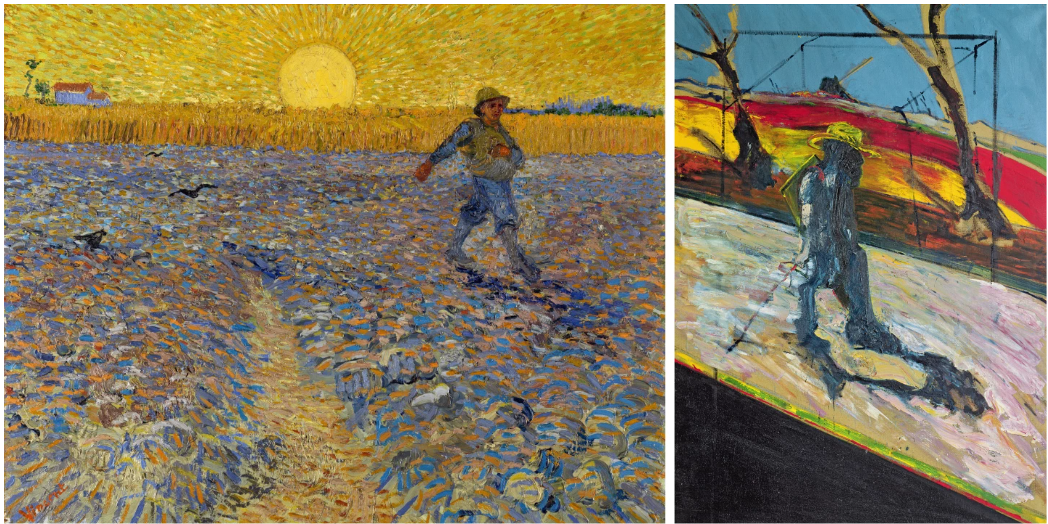
Left: Vincent van Gogh, The Sower, 1888 Kröller-Müller Museum, Otterlo, Image: © Bridegman images
Right: Francis Bacon, Study for a Portrait of Van Gogh II, 1957, Tate Gallery, London, Image: © The Estate of Francis Bacon. All rights reserved. DACS 2024
Reflecting Ghenie’s technical virtuosity, aesthetic complexity, and the historic gravity of his subject matter, St. Christopher appears to drift in and out of focus reflecting the artist’s ongoing exploration of history, identity, and collective memory. Situating his protagonist within a psychedelic quais-landscape, Ghenie’s vague insinuations of figuration and reality give way to a swirling vortex of pure unadulterated pigment, in which sky and cloud turn to land and sea, and rolling hills and pathways reject categorisation, collapsing into a kaleidoscopic dreamscape. Standing out as a steadfast guardian within Catholic tradition, Saint Christopher is revered as the patron saint of pilgrims. His iconic image, carrying the infant Christ across a treacherous river, has become synonymous with protection and guidance for centuries. Recognised by Christian denominations as the patron saint of travelers, as well as martyr who was killed by the Roman emperor in the third century, Saint. Christopher has historically been depicted opposite the south door of churches and in various religious illustrations as a giant with a child on his shoulder and a staff in one hand, often leaning forward into the journey ahead. Catapulting the Patron Saint to the present day, one painted element is conspicuous in Saint Christopher’s leg: three parallel bands most commonly associated with athleticwear; similar to the discrete Adidas symbol on a figure’s shoe in Ghenie’s Rest on the Flight into Egypt from 2016, housed in the collection of the Los Angeles Museum of Contemporary Art. Both fragments of materiality ground the present work in the reality of present day voyagers, or often those immigrating or seeking refuge. The theme of migration is a central pillar of Ghenie’s oeuvre, deeply influencing his exploration of historical trauma, displacement, and the shifting identities of individuals and societies in the face of political and cultural upheavals.
“Migration was used by artists in the Renaissance and the Baroque era as an excuse to paint landscapes. The church would never pay for just a landscape, so the landscape had to be a background for a biblical scene in front.”
Reflecting his own experiences of displacement, St. Christopher can be viewed as a self-portrait. Born in Romania under the Communist regime of Nicolae Ceaușescu, Ghenie’s early life was marked by the repression, surveillance, and censorship characteristic of a totalitarian state. This oppressive environment ultimately forced Ghenie and his family to relocate to Berlin, a city that itself bears the scars of a turbulent and divided past. The impact of these formative experiences is deeply embedded in Ghenie’s work, as he continuously interrogates how the traumas of the past – particularly those of the troubled 20th Century – continue to infiltrate, impact and shape the present.
“I’m not a history painter, but I am fascinated by what happened in the twentieth century and how it continues to shape today. I don’t feel any obligation to tell this to the world, but for me the twentieth century was a century of humiliation – and through my painting, I’m still trying to understand this.”
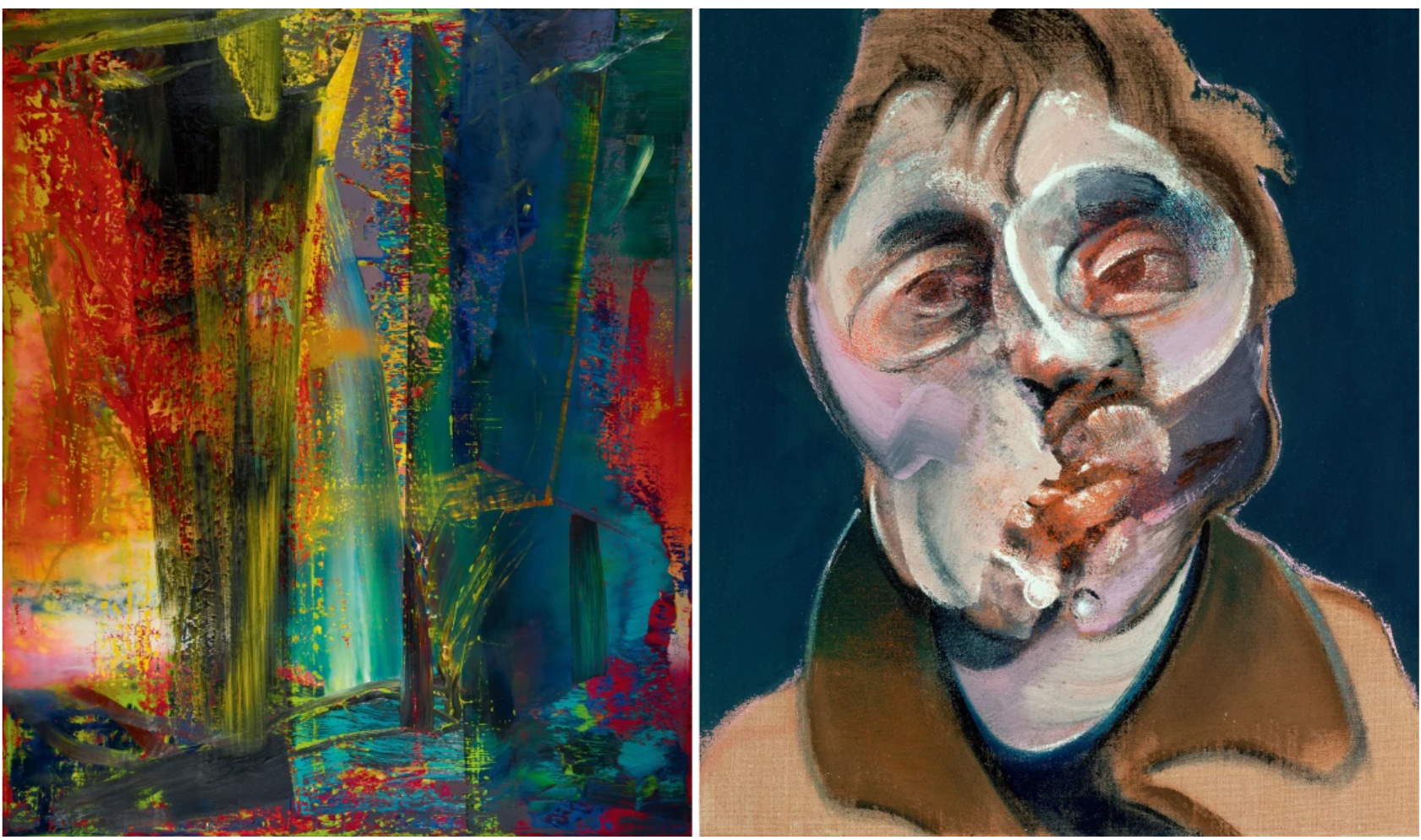
LEFT: Gerhard Richter, Abstraktes Bild, 1986, Image © 2024 Gerhard Richter
RIGHT: Francis Bacon, Self-Portrait,1969 Private Collection, Image: © Bridgeman Images
Ghenie’s reinterpretation of Saint Christopher thus becomes a powerful symbol of hope and resilience in the face of overwhelming adversity. There is a poignant, powerful catharsis achieved in his brand of hallucinatory portraiture, and from Ghenie’s deconstruction of the image emerges a rebuilt understanding: his paintings narrate his personal grapplings with tyrannical horror, and today stand as historiographic interventions.
JADÉ FADOJUTIMI
Let’s take a walk on a tangent, 2018
Christie’s London: 10 October 2024
Estimated: GBP 300,000 – 500,000
PASSED
JADÉ FADOJUTIMI (B. 1993), Let’s take a walk on a tangent | Christie’s (christies.com)
JADÉ FADOJUTIMI (B. 1993)
Let’s take a walk on a tangent, 2018
Oil on canvas, in two parts
Overall: 210×300 cm (82 7/8 x 118 1/2 inches)
Each: signed twice, titled and dated ‘Jadé Fadojutimi Nov ’18 ‘Let’s take a walk on a tangent” (on the reverse)
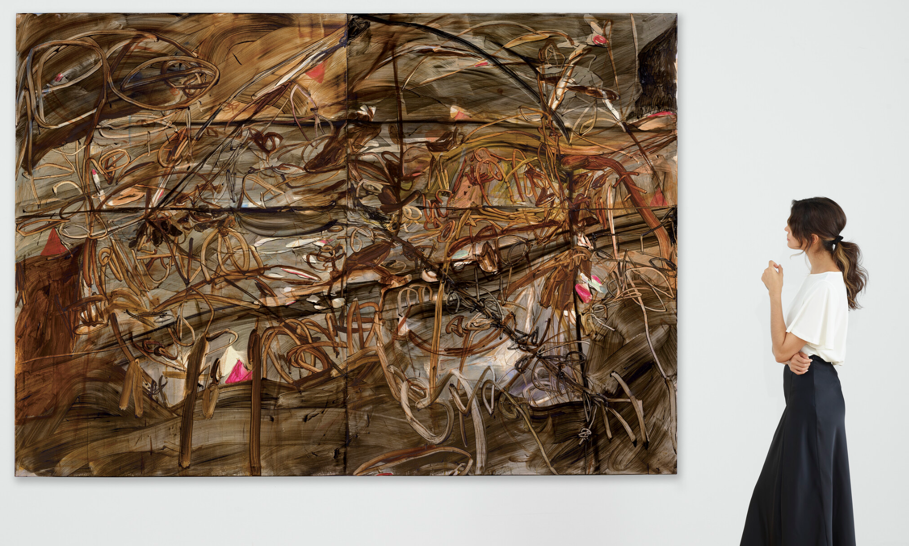
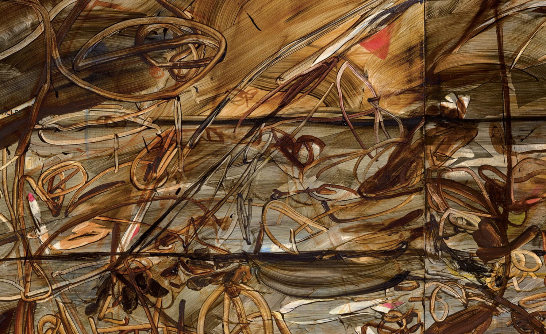
Jadé Fadojutimi’s Let’s take a walk on a tangent (2018) invites the viewer on a fantastical journey. Across its two joined canvases—together spanning three meters across—loops, tangles and sweeps of pigment combine in a vast forest of translucent color. Fadojutimi’s brushstrokes cluster in branches and tendrils, their glassy arabesques moving through a spectrum of ochre, burnt umber and sienna. Bright pink flashes and a bluish clearing puncture the palette of rich, earthy tones. Included as part of the artist’s showing in the 2021 Liverpool Biennial, The Stomach and the Port—an exhibition that centered around our physical and emotional relationships to our environment—it exemplifies her intuitive, organic world-building. Fadojutimi explores her feelings, memories and studio surroundings through abstracted form and layered, luminous color.
Fadojutimi was born in London and studied at the Slade School of Art and the Royal College of Art. After graduating with an MA in 2017 she began a swift rise to acclaim. In 2021—the same year she exhibited the present work at the Liverpool Biennial—the Tate acquired one of her paintings, making her the youngest artist to have joined its collection. She was the subject of a solo museum show at the Hepworth Wakefield in Liverpool the following year. Always drawn to color, Fadojutimi grew up fascinated by fashion, anime, and video games. These influences led her to understand tone, space, and pattern in her own way. Her paintings are born of an esoteric and introspective process. In her studio, she recreates aspects of her childhood bedroom, surrounded by clothing, old toys, and her writings. She listens to movie soundtracks, letting herself be guided by the music’s intense emotional swell. Absorbed and rephrased, all of these sources and stimuli find their way into her work.
Jan Brueghel the Elder, Allegory of Earth, circa 1611. Galleria Doria Pamphilj, Rome. Photo: Luisa Ricciarini / Bridgeman Images.
The free-ranging, exploratory quality of Fadojutimi’s practice is reflected in the title of Let’s take a walk on a tangent. Much like her writings—she often pauses as she paints to jot down notes, pinning them to her studio wall—her titles allow her to question her own process, and offer viewers ways to enter her paintings. Here, her gliding brushstrokes conjure forked pathways and new lines of thought. Some seem to leap effortlessly from one point to another; others wander in more erratic, digressive directions, as if working through an obsession or lingering on a point of interest. Brilliant, flashbulb colors illuminate the space like new ideas. A vivid synthesis of emotion, intuition and observation, Let’s take a walk on a tangent beckons us irresistibly into Fadojutimi’s world.
BANKSY
Vest, 2019
Sotheby’s London: 9 October 2024
Estimated: GBP 200,000 – 300,000
GBP 780,000 / USD 1,021,800
Vest | Contemporary Evening Auction | 2024 | Sotheby’s (sothebys.com)
BANKSY (b. 1974)
Vest, 2019
Acrylic on canvas, velcro and Plastazte foam
45x43x32 cm (17 3/4 x 16 7/8 x 12 5/8 inches)
Signed and numbered 1 (on the reverse)
This work is number 1 from an edition of 5
A poignant and provocative work, Banksy’s Vest from 2019 fuses patriotism with the realities of violence sweeping a nation, rendering it an unforgettable reflection on the fractured state of British identity. One of only five in existence, Vest belongs to Banksy’s Gross Domestic Product homewares line, which was first displayed in a shopfront in Croydon in South London in 2019, to comment on the impending commercialization of the Banksy brand. Addressing the stark realities of the United Kingdom’s surge in knife crime, the present work is a striking reinterpretation of the traditional John Bull gentleman’s waistcoat – an item long associated with British society, from the working class to the elite. Vest is a piece of armor incorporating a genuine, former police-issue bullet proof vest capable of stopping rounds from a gun. An object associated with law and order, or worn from fear and paranoia, Vest is adorned with a black, white, and blue Union Jack, however, the iconographic somber tones are disrupted by a rusty red hue suggestive of dried blood. This subtle yet powerful insinuation of threat to life evokes a sense of mourning, marking Vest as a chilling emblem of Britain’s present moment.
Ever the anti-establishment artist, Banksy chose one of the biggest platforms in music to disseminate his message: Glastonbury Festival. During his historic 2019 Pyramid Stage headline performance, British grime musician, singer-songwriter, and multi-award-winning artist Stormzy donned one of Banksy’s Vests, injecting a potent layer of visual tension into his electrifying set. Like Banksy, Stormzy used his platform to highlight systemic injustices, particularly the targeting of young Black men by a biased judicial system, as well as endemic surges in knife crime and widespread political unrest.

Stormzy on stage at Glastonbury Festival, 2019. Courtesy: Instagram
His performance was visually punctuated by the stark imagery of the words “knife crime” projected behind him, alongside an excerpt from a speech by MP David Lammy, emphasizing the pressing issues plaguing the nation. In Stormzy’s hands, Banksy’s Vest transcended its utilitarian function, becoming a charged statement criticizing the fractured state of Britain. Amid the spectacle of his performance, Vest encapsulated the tension between strength and vulnerability, hope and despair, standing as a banner of a divided nation, where national identity is both celebrated and contested. A testament to its gravitas as a piece of cultural history, Stormzy’s vest is today housed in and displayed at the London Design Museum.

Here lies the central paradox of Banksy’s work: it operates both inside and outside of the establishment, it skirts the boundary between good and bad taste, and courts mass appeal whilst commenting on potentially marginalizing political and cultural issues. Utilizing a mainstream framework, such as Glastonbury, that employs an ironic critical distance, Banksy is able to effectively approach a complicated and multifaceted discussion that prompts us to rethink our assumptions and, perhaps, even resist them.
BANKSY
Untitled (Fuck the Police), 2000
Phillips London: 10 October 2024
Estimated: GBP 500,000 – 700,000
GBP 635,000 / USD 831,850
Banksy – Modern & Contemporary Art E… Lot 14 October 2024 | Phillips
BANKSY
Untitled (Fuck the Police), 2000
Spray paint and acrylic on board
121.9 x 122.1 cm (47 7/8 x 48 1/8 inches)
Stenciled with the artist’s tag ‘BANKSY’ lower right
Irreverent, bold and responsive to the ever-evolving socio-political landscape, Untitled (Fuck the Police) exemplifies the clarity and wit of Banksy’s guerilla art approach. With gritted teeth and hands tightly clasping his baton, the police officer scornfully stares beyond the borders of the picture. As if just having arrived at the scene, the perpetrator has evaded capture, leaving the bemused officer comically juxtaposed with the brazen red text: ‘Fuck the Police’. Satirizing familiar elements of popular culture to create novel, subversive imagery, the police force is among the motifs that Banksy has repeatedly returned to and ridiculed. Working under the cover of darkness and adopting an anonymous persona to avoid arrest, by its very nature Banksy’s graffiti has and continues to entangle the artist with law enforcement: a criminality that the street artist responds to with derisive irony. Executed in 2000, the present work represents an early example of Banksy’s iconic policemen rendered in the artist’s signature black-and-white stencil technique: an organization that Banksy has continued to playfully mock since Untitled (Fuck the Police). Usually caught unaware, Banksy’s police are accompanied by poodles rather than guard dogs (Graffiti Area, 2003), mocked by children with paper bags (Police Sniper and Paper Bag Boy, 2007) or most notoriously, depicted in moments of unexpected intimacy (Kissing Coppers, 2004).
Banksy came of age within the political turbulence and strong countercultural impulses of the 1980s in Bristol, a historic port town where graffiti, community activism, rave culture, and American hip-hop’s raw social critique had gained increasing popularity. Simple, direct, and carrying a deeper message about power, police brutality, and the oppressed condition of those living under authoritarian structures, Banksy’s slogan here directly echoes N.W.A’s powerful 1988 track ‘F*k Tha Police’ and its exposure of the injustices faced daily by young Black men in urban communities, and fits within a broader landscape of hip-hop’s outspoken and revolutionary treatment of these themes from artists including Public Enemy and KRS-One. Among a generation that was fundamentally anti-establishment, Banksy witnessed, alongside the Hartcliffe and Poll Tax Riots, draconian police measures like Operation Anderson in Bristol. At the time of the largest anti-graffiti crackdown, on the 20 March 1989, police conducted seventy-two raids on suspected graffiti artists’ homes. It was because of similar encounters with the police that at eighteen Banksy conceived his signature stencil method. In flight from officers, the artist noticed the stenciled plate on the fuel tank beneath the vehicle he was hiding: ‘I realised I had to cut my painting time in half or give it up altogether’. From the very outset of his career, Banksy’s work was closely entangled with the police, graffiti – a fundamentally illegal act – offering a platform and a means of speaking truth to power and undermining the very structures that seek to maintain order on their terms.
BANKSY
Rat and Heart, 2014
Phillips London: 10 October 2024
Estimated: GBP 300,000 – 500,000
GBP 317,500 / USD 415,925
Banksy – Modern & Contemporary Art E… Lot 34 October 2024 | Phillips
BANKSY
Rat and Heart, 2014
Spray paint and emulsion on board, in artist’s frame
27×36 cm (10 5/8 x 14 1/8 inches)
Signed and dedicated ‘Thanks Slik ! BANKSY’ on the reverse
Amongst Banksy’s familiar menagerie of animal avatars, no other creature reflects the furtive, underground activities of the street artist more than the much-maligned rat. Fundamentally urban, rats, like graffiti artists, move through the city largely unseen, attracting derision and penalty from a society that looks at them with a mixture of fear and loathing. Despite being forced underground, as products of these modern, urban societies, the rat also reflects certain unpleasant truths about the endless competition and consumerism that characterizes late-stage capitalism, and those that are oppressed and exploited by such systems. Here, the titular rat has gnawed away at the board ground to reveal the shape of a heart, a metaphor perhaps for the love and kindness that we could all find if we looked below the surface, and a reminder that even the most unloved and misunderstood are deserving and capable of affection. Given the long-standing association between the rat and contagion we might even interpret this gesture as a call to arms, to let this more positive, affirming message of love and reconciliation spread through all levels of society.

Appearing in a range of different guises and often under slogans such as ‘Welcome to Hell’, ‘Tonight the Streets are Ours’, and ‘Get Out While You Can’, Banksy’s rats are messengers from the underworld, carrying stark warnings about the injustices and exploitation of modern life, felt especially keenly by those at the margins. In this respect, they also belong to a longer history of social critique, notably evoked by Albert Camus as carriers of a deeper, moral malaise in La Peste and as a vehicle for exploring humanity’s capacity for brutality in H.P. Lovecraft. For psychoanalyst Sigmund Freud, they presented a compelling model for psychodynamic feelings of gnawing guilt and shame provoked by displaced but intrusive taboo thoughts in one of his more famous case studies. In all cases, it is the rat’s uncomfortable proximity to us that makes them such powerful carriers of our repressed fears and desires.

Hieronymus Bosch, The Garden of Earthly Delights, central panel (detail), 1490-1500, Museo del Prado, Madrid
Tellingly, in the context of street art, the rat has also been a prominent motif for French graffiti artist and ‘Father of stencil art’ Blek le Rat since the very outset of his career in 1981. Credited as the first artist to develop stencil graffiti away from basic lettering to incorporate more complex imagery, it was the rat – ‘the only free animal in the city’ – that the artist first took to the streets of Paris. For both Banksy and Blek le Rat the rodent personifies the covert operations of the street artist, working under cover of darkness and under constant threat from authorities who deem them to be a public menace, associations compounded by the appealing wordplay existing between ‘art’ and ‘rat’. The rat, like the street artist can expose uncomfortable truths about the world we live in and the systems that structure it, and yet Banksy’s stenciled rats also represent a playful and mischievous aspect of the artist’s guerilla activities, appearing frequently in dialogue with existing street furniture and signage, even making a chaotic and light-hearted appearance in the artist’s own home during the throes of the various pandemic lockdowns.
Focus: Contemporary Art
JEFF KOONS
Balloon Monkey (Blue), 2006-2013
Christie’s London: 9 October 2024
Estimated: GBP 6,500,000 – 10,000,000
GBP 7,555,000 / USD 9,897,050
JEFF KOONS (B. 1955), Balloon Monkey (Blue) | Christie’s (christies.com)
JEFF KOONS (B. 1955)
Balloon Monkey (Blue), 2006-2013
Mirror-polished stainless steel with transparent color coating
150x126x235 inches (381 x 320 x 596.9 cm)
Executed in 2006-2013, this work is one of five unique versions (Red, Yellow, Blue, Magenta, Orange)
A majestic vision seven years in the making, Balloon Monkey (Blue) (2006-2013) sees Jeff Koons’s sculptural practice reach extraordinary new heights of formal splendor, technical achievement and sheer, awe-inspiring impact. Its seductive form, monumental scale and reflective, opulently colored surface—all precision-crafted to seemingly impossible levels of flawlessness and finish—capture the essence of his work, which employs the iconography of childhood innocence to expose the deep drives of desire and joy that animate our relationship with art. The present sculpture is one of five unique versions of Balloon Monkey, each formed of mirror-polished stainless steel with a transparent color coating: the others are red, magenta, yellow, and orange. They are the very largest of Koons’s balloon-animal works. Developing the vocabulary of the Celebration series—which included the artist’s first inflatable colossus, the iconic Balloon Dog (1994-2000)—Balloon Monkey (Blue) arrives at an apex of glossy, weightless perfection. Sweeping six meters from head to tail and standing almost four meters high, it towers like a sphinx or totem, an ephemeral plaything transformed into a sublime, otherworldly object of worship. The work was included in Jeff Koons: Now, his major 2016 survey exhibition at Damien Hirst’s Newport Street Gallery in London, and more recently in Jeff Koons: Shine at Palazzo Strozzi, Florence.
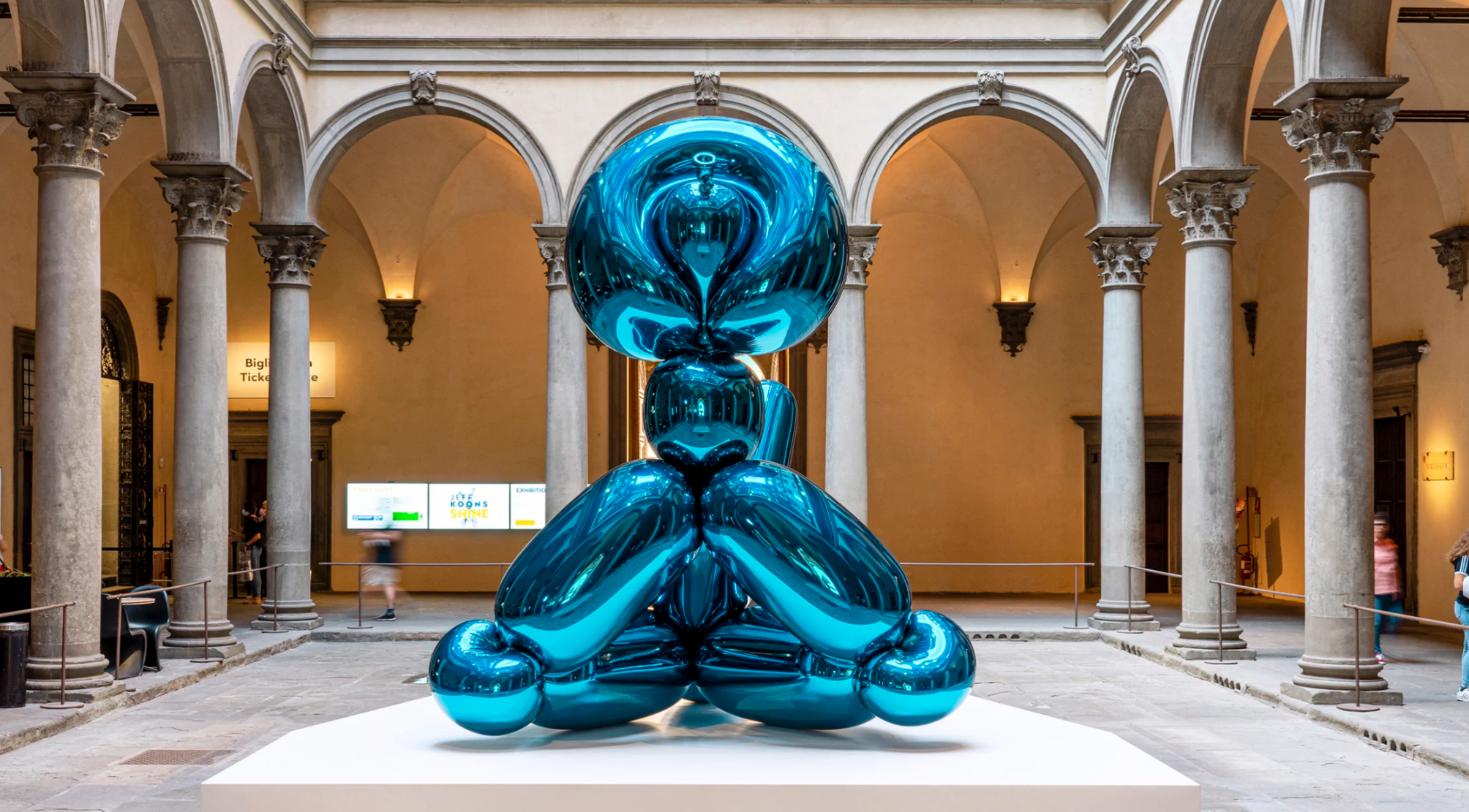
The present lot installed in Jeff Koons: Shine, Palazzo Strozzi, Florence, 2021. © Jeff Koons.
The themes of air, breath and inflation have long been central to Koons’s practice. He began to explore blow-up objects as early as 1979 with his Inflatables, which found counterparts in the encased, fluorescently-lit vacuum cleaners he exhibited as The New the following year. The Equilibrium series of 1985 included basketballs suspended in tanks of water, and unnerving flotation devices made of heavy bronze. His iconic stainless steel Rabbit, a direct ancestor to the twisted balloon animals, appeared in 1986; the Balloon Dog arrived as part of the large-scale Celebration series commenced in the early 1990s, which reimagined objects associated with milestones such as birthdays, Easter and Valentine’s Day. Alongside Balloon Swan (2004-2011) and Balloon Rabbit (2005-2010), Balloon Monkey represents an evolution of these works, developing their exuberant spirit and complex, confounding presence. Beyond their sensual play between lightness and weight, fragility and strength, Koons sees the inflatables as metaphors for the human condition.
“I think it comes about just defining this balance of interior/exterior’. You breathe in and you inflate. You pull the external realm into yourself, and you inflate. Breath is a symbol of life energy. When you exhale, it returns to the exterior, that’s a symbol of almost your last breath.”
That something so seemingly childish can speak to these grand, existential ideas is a revelation: Balloon Monkey (Blue) is a union of the sublime and the ridiculous, transcending our every aesthetic assumption. Its very physical presence is hallucinogenic. As if by magic, the most fleeting of objects has become an immaculate, gleaming titan in several tons of stainless steel. This miraculous spectacle is the result of an extraordinary devotion to precision, purity and integrity. Using a balloon twisted into the shape of a monkey, Koons and his team of fabricators used bespoke white-light and CT scanning technologies to create a finely-tuned computerized model, before engaging in an intricate multi-step process of casting, three-dimensional milling, polishing and painting—involving much trial and error, and thousands of hours of work—in the pursuit of the final, faultless sculpture.
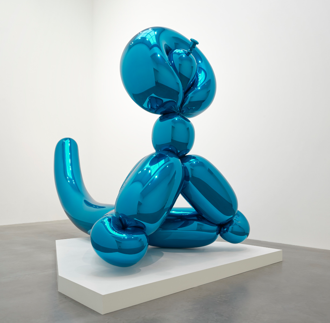
“My art has always used sex as a direct communication line to the viewer. The surface of my stainless steel pieces is pure sex and gives an object both a masculine and a feminine side: the weight of the steel engages with the femininity of the reflective surface.”
With its pyramidal structure and swooping, cantilevered tail, Balloon Monkey (Blue) can be seen as an abstract, almost architectural presence. Its clean lines and space-age geometries recall the work of Constantin Brâncuși, the father of modernist sculpture. Its form contains multiple layers of abstraction, from monkey to balloon representation to monument, as if distilled from reality to a metaphysical ideal. Koons strives for a sense of ‘objectivity’ and universality through the pure, hyper-polished facture of his works, which appear never to have been touched by mortal hands. In doing so, he uncovers something of the erotic charge that lies at the heart of our sensual interactions with the world. The monkey’s swelling, phallic tail and orifical creases and curves are not incidental: like the lingam and yoni statues of ancient Hindu tradition, it invokes both masculine and feminine aspects of sexuality. Koons encourages the viewer to embrace and enjoy these elements of life without guilt, returning to a state of prelapsarian wonder.
RICHARD PRINCE
Hurricane Nurse, 2004
Christie’s London: 9 October 2024
Estimated: GBP 3,500,000 – 5,500,000
GBP 4,184,250 / USD 5,481,368
RICHARD PRINCE (B. 1949), Hurricane Nurse | Christie’s (christies.com)
RICHARD PRINCE (B. 1949)
Hurricane Nurse, 2004
Acrylic and inkjet on canvas
69 1/8 x 42 inches (175.5 x 106.8 cm)
Signed, titled and dated ‘R Prince 2004 “Hurricane Nurse”’ (on the overlap)
Held in the same private collection since 2006, Hurricane Nurse (2004) is among the most compelling and atmospheric of Richard Prince’s Nurse paintings: the series which has come to be seen as his definitive body of work. The cover of Peggy Gaddis’s pulpy ’60s romance novel, whose title adorns the painting, has its trim brunette off-kilter in the gale. Prince’s heroine is instead a blonde woman standing poker-straight, staring fixedly at something just over the viewer’s left shoulder. Drips of color run from the nurse’s surgical mask and her electric-pink eyeshadow; gold flashes shimmer through the translucent, painterly brushwork of the purple background, perhaps portending the gathering of storm clouds behind her.
Roy Lichtenstein, Nurse, 1964. Private Collection. Artwork: © Estate of Roy Lichtenstein/DACS 2024.
Prince’s Nurse paintings are all riffs on dime-store romances in the artist’s prodigious library. He exhibited the first of them at Barbara Gladstone Gallery, New York, in 2003; critical appreciation was fueled by Sonic Youth’s adaptation of Nurse of Greenmeadow (2002) for the cover of their album Sonic Nurse in 2004. The Nurse series is now generally considered to be the most complex culmination of the doctored appropriations from mass culture Prince has been executing since 1977—a brilliant development from his earlier appropriations of magazine photographs using practices of ‘re-photography’ he pioneered alongside fellow artists of the 1980s Pictures Generation such as Cindy Sherman and Barbara Kruger. Perhaps especially, it continues along a trail blazed with the Girlfriend pictures (1993), of young women snapped semi-nude next to Harley Davidsons lifted from American biker magazines: another genre of roleplay fetish.
Andy Warhol, Shot Sage Blue Marilyn, 1964. Private Collection. Artwork: © 2024 The Andy Warhol Foundation for the Visual Arts, Inc. / Licensed by DACS, London.
The earliest Nurse paintings employed faithful reproductions of the figures on the book covers, which Prince would scan before transferring them with inkjet printing onto the canvas. These figures were dislocated from their original surroundings, their faces concealed to a greater or lesser degree with a mask and other alterations imposed by Prince’s gestural brushwork, but their poses essentially unaltered. Created the year after the Gladstone show, Hurricane Nurse takes its composition from a different source than the title: perhaps another Peggy Gaddis novel; perhaps somewhere else entirely. Cropped just below the shoulders, the tight focus on the woman’s head and its isolation against a dark, featureless background achieves an intimation of her interiority, the intensity of which is scarcely matched by any other painting in the series.
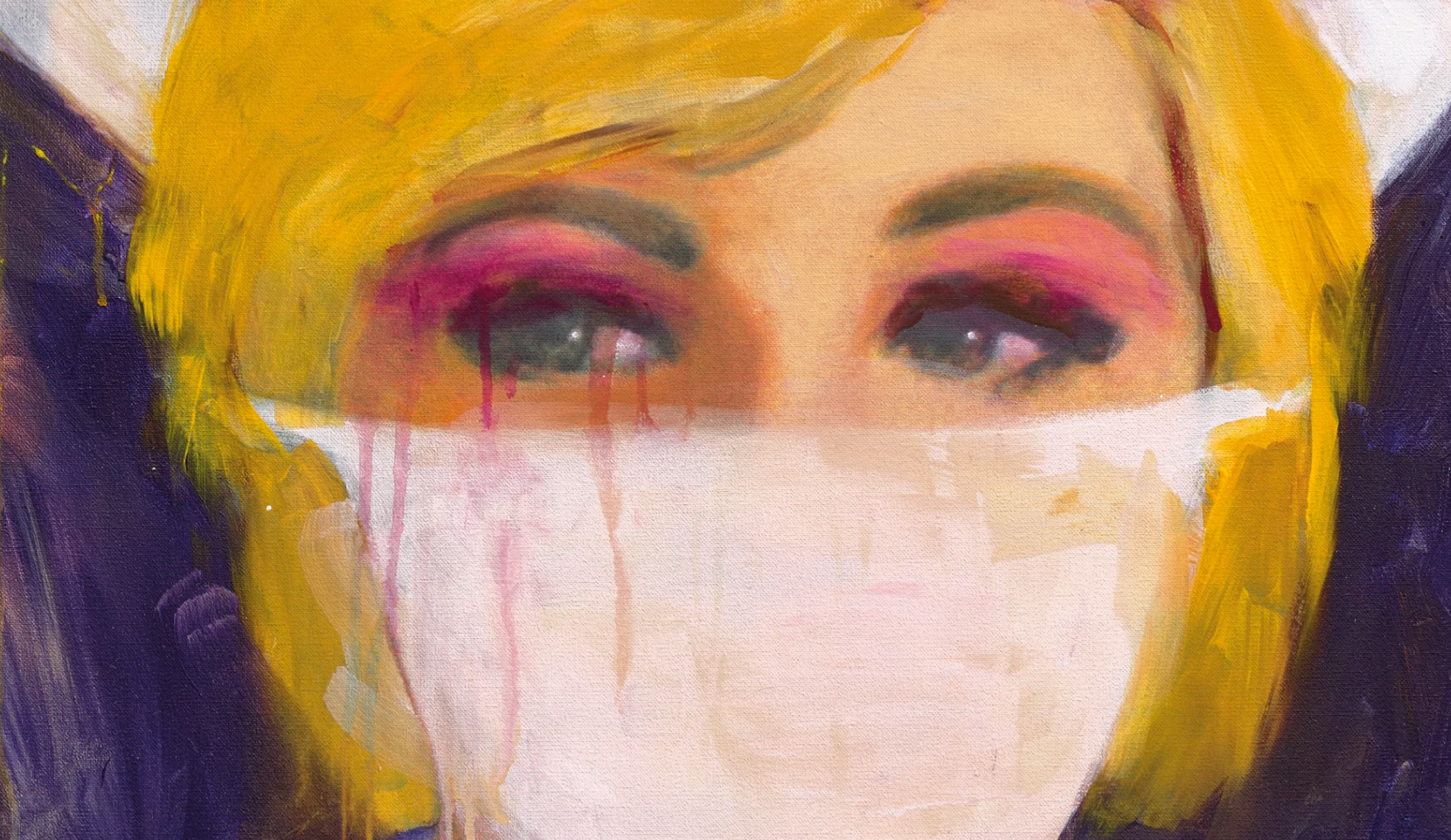
The Nurse paintings tend either to emphasize the figure, hugged by a close-fitting uniform, or else, when they confine themselves to head and shoulders, to introduce a note of slasher-film horror—in School Nurse (2005), lipstick-red paint bleeds profusely through the mask and from what appears to be a gash above the eyebrow. Hurricane Nurse, instead, appears collected, composed. Her eyes are like an inversion of the old saw about the Mona Lisa—they resolutely avoid you around the room—while the dispassionateness of her gaze and gait brings to mind Vermeer. Yet this impression is complicated by the lurid eyeshadow, and the mask: another reversal, for where other Nurses’ masks disrupt their straightforward presentation as subjects to titillate the male gaze, conferring on them an unknowable, interior world, the mask of Hurricane Nurse leaves us uncertain whether or not our impression of her composure is, in fact, the lie. Perhaps what the mask conceals is a coquettish smile—but then again, perhaps not.
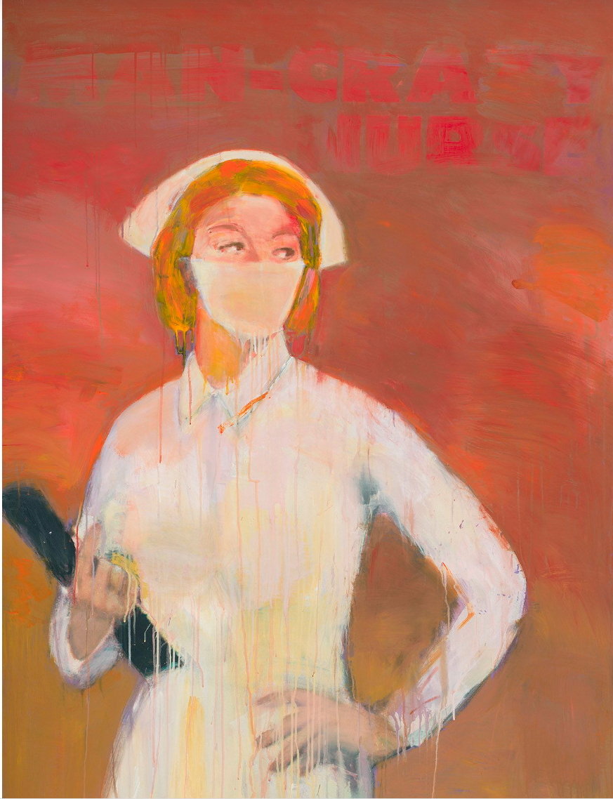
Richard Prince, Man Crazy Nurse #3, 2003. Whitney Museum of American Art, New York. Artwork: © Richard Prince. Digital Image: Whitney Museum of American Art / Licensed by Scala.
“After I had wiped some off the painting, it looked like a mask on the nurse’s face and suddenly it was one of those moments. When I noticed that I realized that was going to be my contribution to the image, to put a mask on these various nurse illustrations. It was a way of unifying and also talking about identity … they seemed to hit some kind of nerve, and it goes back to the fact that I do believe everybody needs a nurse.”
Hurricane Nurse is an outstanding testament to the intricacy of Prince’s career-long investigation of the mechanics of fetishizations, the shallowness of the models of gender made and sold by the mass media, and the degree to which consumers, aroused in spite of themselves, are complicit in their proliferation. It stands at the midway of his career to date, advancing the appropriative tactics of his early ‘re-photography’ and complicating of the use of text inaugurated in his ‘joke paintings’ of the 1980s. Prince has continued to explore these themes in new directions since, creating risqué riffs on the Abstract Expressionism of Willem de Kooning and Jackson Pollock, and diving into the murky image-world of Instagram.
CHRISTOPHER WOOL
Untitled, 2009
Sotheby’s London: 9 October 2024
Estimated: GBP 2,200,000 – 2,800,000
GBP 2,880,000 / USD 3,772,800
Untitled | Contemporary Evening Auction | 2024 | Sotheby’s (sothebys.com)
CHRISTOPHER WOOL (b. 1955)
Untitled, 2009
Enamel on linen
104×78 inches (264.1 x 198.1 cm)
Signed, dated 2009 and numbered (P579) (on the overlap)
Signed, dated 2009 and numbered (P579) (on the backing board)
Lattice-like structures of broad scrubbings, ghost-like residues, and half concealed arabesques form an endless imbrication of doing and undoing in Untitled, a painting that exemplifies Christopher Wool’s defiance of the traditional conventions of painting. Representing an antiheroic paradigm in the art of mark-unmaking, the present work belongs to Wool’s Gray Paintings; oxymoronic images of definitive uncertainty in which addition is levied by subtraction to depict the ultimate post-modern condition: doubt. Extending from Wool’s dynamic series of abstract monochrome paintings that began in the early 1980s, Untitled was created through a refined enamel technique, in which works from the series simultaneously expose both their construction and deconstruction.
“I became more interested in ‘how to paint it’ than ‘what to paint.”
Untitled thus reflects the artist’s iconic breakdown of formal systems, with abstract forms obliterated under layers of chaotic overpainting, celebrating process as the primary means of production. Untitled is a monumental and eloquent essay on lightness and abstract fluency. By administering an inscrutable, yet symbiotic, cycle of doing and undoing, Wool creates a space in which free-hand chaotic lines, nebulous shapes, and indistinct forms co-exist in remarkable aesthetic and emotive cohesion. Poignantly borne of conceptual doubt and pictorial denial, Untitled is an overwhelming affirmation of paintings’ critical agency.
YOSHITOMO NARA
Broken Heart Bench, 2006-07
Sotheby’s London: 9 October 2024
Estimated: GBP 2,500,000 – 3,500,000
PASSED
Broken Heart Bench | Contemporary Evening Auction | 2024 | Sotheby’s (sothebys.com)
YOSHITOMO NARA (b. 1959)
Broken Heart Bench, 2006-07
Acrylic on wood, in artist’s frame
287 x 227.3 cm (113 x 89 1/2 inches)
Signed twice and dated 2006 and 2007 (on the reverse)
Yoshitomo Nara’s Broken Heart Bench from 2006-07 captures the artist’s signature visual power that harnesses and juxtaposes tropes of innocence and sedition. Simultaneously rebellious and reflective, the young girl’s olive eyes narrow into a menacing glare, her lips taught with tension in a singular red line in angst or anger. Boldly rendered upon a ground of painted wooden panels almost 10 feet in height, Nara’s archetypal child is concurrently innocent and violent, docile and unruly; traits that illustrate the radical potential of subversive and anarchic youth. Youthful naiveté is undercut by defiance, write large on a monumental scale.
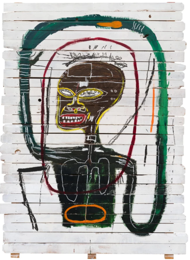
Jean-Michel Basquiat, Flexible, 1984. Private Collection. Art © Estate of Jean-Michel Basquiat, licensed by Artestar
Imbued with a graphic and material immediacy that echoes Jean-Michel Basquiat’s iconic painting Flexible from 1984, Nara’s Broken Heart Bench belongs to the artist’s celebrated Billboard Paintings. With it’s emblematic motif, it is the first and original major work from an iconic small series of five iterations, of which there are three additional monochromatic paintings on wood, including Broken Heart Bench (New Castle Version) and Broken Heart Bench (Aomori Version), both from 2008. A testament to its calibre as a major work by the artist, Broken Heart Bench was a focal point of lin Baracke (+graf/YNG) in 2007 and exhibited at the GEM Museum of Contemporary Art, The Hague the following year.
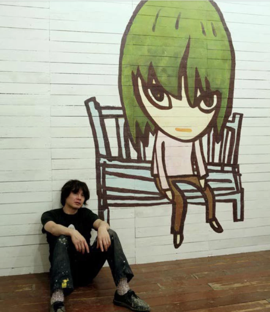
The artist with the present work, installed in Yoshitomo Nara + graf: Berlin Baracke, Galerie Zink, Berlin, 2007. Art © Yoshitomo Nara
Representing a career-long fascination for the artist, the small girl is the utter embodiment of Nara’s pursuit and exploration of themes of solitude, rebellion and innocence: characteristics that define the very essence of childhood. The present figure’s assertive expression disarms the viewer, asking Nara’s audience to wonder what caused this child such melancholy or sorrow. The combination of youthful features with complex emotional expression culminates in a sense of unease: Nara’s young girl harbours a self-possession and knowing-ness beyond her ostensible years. Art historian Kristin Chambers observes that, through his portraits of children, “Nara captures the tension between innocence and experience, physical isolation and mental freedom, containment and independence” (Kristin Chambers,ed., Yoshitomo Nara: Nothing Ever Happens, Cleveland 2008, p. 10). By embracing seemingly paradoxical elements, Nara captures the nuance of human experience in the many faceted expressions of his subject.
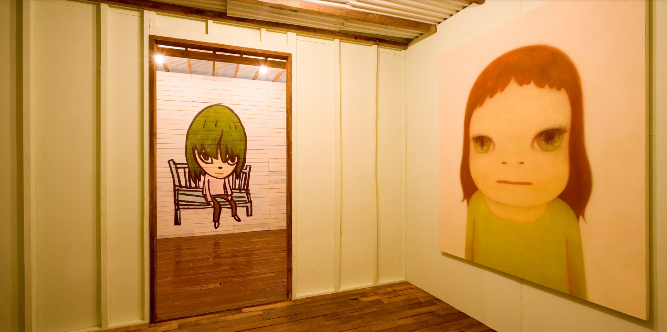
The present work installed in Yoshitomo Nara + Graf: Into the Luminous Halo Around Us, GEM museum of contemporary art, The Hague, 2007. Art © Yoshitomo Nara
Representing a career-long fascination for the artist, the small girl is the utter embodiment of Nara’s pursuit and exploration of themes of solitude, rebellion and innocence: characteristics that define the very essence of childhood. The present figure’s assertive expression disarms the viewer, asking Nara’s audience to wonder what caused this child such melancholy or sorrow. The combination of youthful features with complex emotional expression culminates in a sense of unease: Nara’s young girl harbors a self-possession and knowing-ness beyond her ostensible years. By embracing seemingly paradoxical elements, Nara captures the nuance of human experience in the many faceted expressions of his subject. Melded with the influence of Japanese historical and youth culture, the canon of Western Modern masters can be detected as an important stimulus for Nara. Broken Heart Bench and Nara’s flattened and rounded aesthetic bears a resemblance in atmosphere and simplicity of line to Amedeo Modigliani’s later paintings of young girls. Nara has often declared his life-long admiration of Modigliani’s portraits, and images of Nara’s studio reveal that postcards of Modigliani’s work are often displayed as an inspiration for the artist. Known for his development of the modernist style, Modigliani’s oeuvre featured characters with exaggerated elongated features, which many have come to understand as the artist’s meditations on the illnesses in humanity drawn from his own ailment-laden life. In many ways, the girl’s plainness and somberness are precisely the characteristics that make her relatable to viewers, constituting a ubiquitous representation of youth – albeit one instilled with sadness, itself an underlying and dissident emotion that is perpetuated in Nara’s cartoon-like portraits.
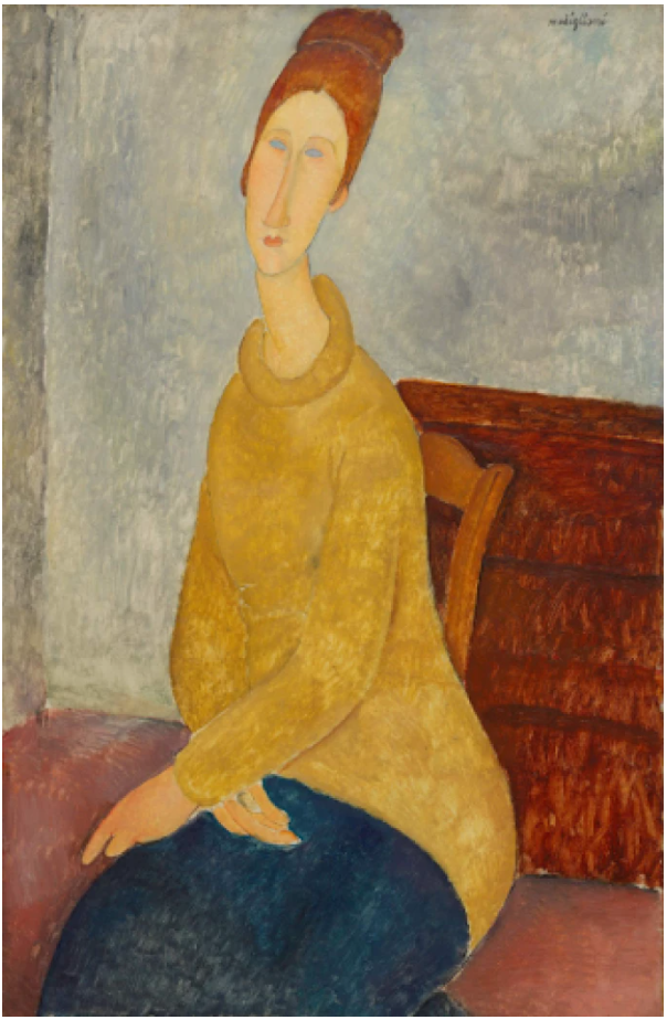
Amedeo Modigliani, Jeanne Hébuterne with Yellow Sweater, 1918-19. Solomon R. Guggenheim Museum, New York.
Image: Art Resource, NY/ Scala, Florence
Coded with an array of autobiographical and historical references, Nara’s heroine meets our eyes with a penetrating gaze, confronting the self and revealing a rebellious nature within. The artist’s subject serves as a confrontational talisman for disenchanted youth; his little girls are not doing as they ought, and that dissonance exposes a collective expectation on culturally acceptable behavior – that is, in a demure, innocent, childlike, and pliable fashion. Nara’s fiercely expressive character leaves the viewer a feeling haunted and considering how innocence can be exploited as an illusion. In his depictions of girls, Nara captures a universal revolutionary spirit that resonates on a truly global scale. Tender and transfixing, the present work is a stunning testament to the unparalleled emotionality and captivating sincerity that situates Nara as Japan’s most internationally acclaimed living painter.
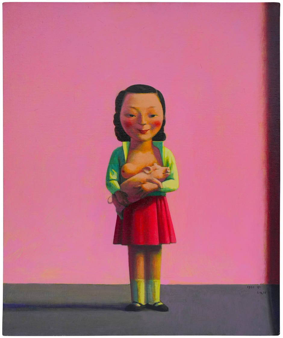
LIU YE
Girl and Piggy, 1999
Estimated: GBP 800,000 – 1,200,000
GBP 749,300 / USD 981,583
LIU YE
Girl and Piggy, 1999
Acrylic on linen
62×52 cm (24 3/8 x 20 1/2 inches)
Signed [in Pinyin] and dated ‘Liu.YE 1999’ lower right
Standing silently in an otherwise empty, brightly-hued space, the protagonist at the center of Girl and Piggy has a remarkable sense of gravity, mesmerizing viewers with her steady gaze and enigmatic smile. Utterly captivating, the strangely serene and highly stylized character holds a small pig to her bare chest in a disarmingly familiar gesture of maternal care, a dreamlike tableau typical of contemporary Chinese artist Liu Ye. Inspired in part by a childhood love of fairy tales and informed by both the visual culture of revolutionary era China and the artist’s formative early artistic training in Europe, Liu Ye’s bright, bold, and balanced compositions are populated with symbols and motifs from his own personal iconographic universe. Richly allusive and untethered from the bounds of time and place, these works provoke a thrilling sense of mystery and imaginative freedom in the viewer. In the arrangement of the central figure and her adoption of a pose typically associated with the Western art historical tradition of the Vigo Lactans or ‘Nursing Madonna’ we can also begin to trace the depth of Liu Ye’s engagement with the rich traditions of early Northern European painting, and his adoption of these motifs into his own, highly idiosyncratic visual vocabulary. Both the nursing Madonna and the pig motif have reappeared across Liu Ye’s work, although their symbology and personal significance for the artist remains mysterious. Auspicious creatures in Chinese culture, pigs are typically associated with wealth, happiness, and good fortune, and are noted for their close relationship to humans as domesticated creatures. Although more typically associated with gluttony and unmannered behaviors in Western contexts, the pig has also been a prominent character within European folklore, notably in the well-known Romanian fairy tale ‘The Enchanted Pig’ in which a Princess submits to prophesy in marrying a pig, to find he is in fact a prince cursed to occupy the animal’s form by day.
“The pig in Chinese tradition is a lucky animal, even if a little stupid, since it symbolizes the abundance of money and an abundance of food […] At first this appears a materialistic juxtaposition with the Pope, symbol of Christianity with its vows of poverty and selflessness until one recalls the opulence of the Catholic Church.”
Left: Jean Fouquet, Virgin and Child Surrounded by Angels, circa 1452, right wing of the diptych, Royal Museum of Fine Arts, Antwerp
Right: René Magritte, Abstract Idea, 1966, Tokyo Fuji Art Museum. Image: Tokyo Fuji Art Museum / Bridgeman Images, Artwork: © ADAGP, Paris and DACS, London 2024
While in its Western art historical contexts the nursing Madonna is understood to represent divine love and the sacrifice of the Son of God, its unexpected evocation here in relation to a small piglet strikes a note of humorous absurdity that seems more in keeping with Surrealism’s stark juxtaposition of visual signifiers and the fertile possibilities for new, associative meanings generated by these unexpected combinations. Liu Ye had ample exposure to such works during his four-year studies at the Hochschule der Künste in Berlin, and it is worth noting that the present work was executed in 1999, shortly after he completed a six-month residency at the Rijksakademie in Amsterdam. Acknowledging the importance of these experiences in developing his distinctive visual language, Liu Ye has explained: ‘In my earlier days, my art was more about the imaginary. At that time, I was influenced by Italian Metaphysical Art and Surrealism; René Magritte is one of my favorite artists.’ Balancing compositional serenity with narrative ambiguity, Girl and Piggy is a paradigmatic example of Liu Ye’s celebrated oeuvre, playfully exploring the disjunction between outward appearance and our interior, often contradictory states of being. Animated by bold, brightly-hued colors and a wealth of privately symbolic motifs, Girl and Piggy exemplifies the artist’s broader project and the perceptive description of how ‘Complexity and richness can be described in simple and concise language.’
SEAN SCULLY
Fire, 2006
Christie’s London: 10 October 2024
Estimated: GBP 500,000 – 800,000
SEAN SCULLY (B. 1945), Fire | Christie’s (christies.com)
SEAN SCULLY (B. 1945)
Fire, 2006
Oil on linen
63×63 inches (160.2 x 160.2 cm)
Signed, titled and dated ‘Sean Scully 5.06 FIRE’ (on the reverse)
A large-scale and emotive work in oil on canvas, Sean Scully’s Fire (2006) exemplifies the artist’s career-long obsession with light: a motif which infuses his entire body of work. Each swathe of paint contributes to a patina of gently undulating form accrued through color, the artist’s favored ‘layered and intimate surface’ (S. Scully, ‘A Note on the Heroic American Traditions’ in F. Ingleby (ed.), Sean Scully. Resistance and Persistence: Selected Writings, p. 233). Precise chromatic blocks are applied atop an underlayer of bright paint, glimpsed through the gaps between: the effect is of light seeping through cracks in a wall. Every stage in the lifecycle of Fire’s titular theme is traceable, from the bright sparks of kindling which peep between blocks and beams, to the saturated orange of a roaring flame, which mellows to deep red and eventually turns to ember, and finally—through ash grey and black tones—an evocation of what remains when fire has burnt itself through. Fire forms part of Scully’s celebrated and expansive ‘Wall of Light’ series, examples of which are held in the Metropolitan Museum of Art, New York, the Modern Art Museum of Fort Worth, Texas, and the Irish Museum of Modern Art, Dublin. Concurrent with the first exhibition of the present work in London in 2006, a major museum presentation of Scully’s ‘Wall of Light’ series was staged at the Metropolitan Museum of Art, New York.
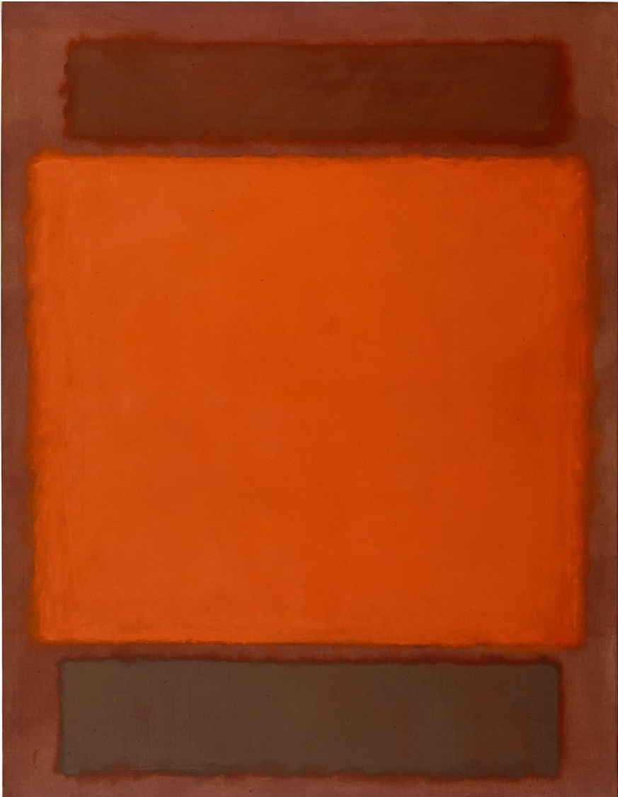
Mark Rothko, Orange, Brown, 1965. Detroit Institute of Art, Detroit. Artwork: © Mark Rothko, DACS, London 2024. Photo: © Detroit Institute of Arts, Founders Society Purchase, W. Hawkins Ferry Fund, 65.8 / Bridgeman Images.
Scully’s ‘Wall of Light’ series first emerged from a visit to the walls of Zihuetanejo, Mexico, in 1983. An iterant emigrant who was born in Ireland, raised in England, and established his career in the United States, Scully was drawn to these ancient markers of living and dwelling. The summer prior to the present work’s completion, Scully had visited the Aran Islands off the coast of Ireland, on the westernmost frontier of Europe. This trip extended a long-standing fascination with anonymous traces of human activity. He was moved by the simple dry-stone walls which delineate the landscape.
“I nominate them as Art because of their unremitting austere repetitive variety.”
While earlier works comprised blocks of a constant height and width, Fire is notable for the variation between slim bands and broad panels of color, perhaps in response to the irregularity of the Aran walls. The cool, crisp light of Ireland and the variegated grey of these walls also inspired a considered use of black and ash-grey tones in works from this period, which was novel to the wider ‘Wall of Light’ series and imbues Fire with solemnity and depth. Here, color imitates an earthbound light, sustained and reinvigorated as the sun moulds and remoulds the built world. Articulated through color, light and gesture, Fire and the wider ‘Wall of Light’ series involve an abstraction of human endeavor.
For Scully, bringing each painting to life is a time-consuming and gradual process. He begins with sketches, grasping for new variations and patterns, before drawing his outline, like Matisse, with carbon attached to the end of a stick. From this early stage, the form is fixed. Thin washes of colour follow, slowly built up through a process of trial and response. The final layer is painted wet on wet, which gives his work both freshness and monumentality. As paint fuses and morphs upon the canvas, it becomes object-like, something profound and totemic. Scully holds a deep reverence for the autonomy of his medium, conceiving of the relationship between painter and paint as a symbiotic one. ‘I use oil paint because it has a disobedient and mysterious nature’, he writes; ‘… It engages issues of alchemy and mystery that resist the deadening ambition of the modern world to control everything, absolutely’ (S. Scully, quoted in F. Ingleby (ed.), Sean Scully. Resistance and Persistence: Selected Writings, p. 78).
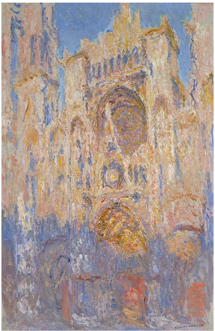
Claude Monet, Cathédrale de Rouen, effet de soleil, fin de journée (Rouen Cathedral, Sun Effect, End of Day), 1892. Musée Marmottan Monet, Paris. Photo: Bridgeman Images.
Scully’s engagement with modernism resists that same ambition. His practice lies uneasily in the realm of abstraction, evoking the compositional structure of the grid while challenging its rigidity. The imperfections which emerge through the hand of the artist impart a tenderness of touch, an enduring echo of the artist and his vision of art in our contemporary moment. It is this intervention of the artist’s hand that distinguishes Scully’s mature practice. Upon moving to New York in the 1970s, Scully had first responded to the city’s prevailing Minimalist tendencies, exemplified in the work of artists such as Donald Judd. Ultimately, however, he came to identify more closely with the concerns of artists such as Barnett Newman and Mark Rothko, who espoused a more poetic, emotional approach to abstraction. Scully shares with the latter a compulsion to layer light on dark, dark on light; the effect is whole and self-contained. In Rothko, he writes, ‘the figure and the ground, the sky and the sea, as well as all the experiences the artist has lived and all the stories he would like to tell, are distilled into rectangles that have the solemnity of the stones of Stonehenge’ (S. Scully, ‘Rothko. Bodies of Light’ in ibid., p. 80). Here, again, Scully identifies a poetry and poignancy within ancient structures, and the ways they bear witness to practices of mark-making and to their unknown makers. Traces of human touch, of lingering light, infuse Scully’s practice with timeless gravitas. In Fire, the grand drama of painting is laid bare.
ANDREAS GURSKY
New York, Mercantile Exchange, 2000
Phillips London: 10 October 2024
Estimated: GBP 250,000 – 350,000
GBP 609,600 / USD 798,576
Andreas Gursky – Modern & Contempora… Lot 23 October 2024 | Phillips
ANDREAS GURSKY
New York, Mercantile Exchange, 2000
C-print face-mounted to Plexiglas, in artist’s frame
Image: 157 x 210.8 cm (61 3/4 x 82 7/8 inches)
Overall: 206.7 x 257.2 cm (81 3/8 x 101 1/4 inches)
Signed, titled, numbered and dated ‘N.Y. Mercantile Exchange 2000 4/6 Andreas Gursky’ on the reverse
Signed, titled and numbered ‘N.Y. Exchange 4/6 Andreas Gursky’ on the backing board
Executed in 2000, this work is number 4 from an edition of 6
Created in 2000 at the turn of a new millennium that would be governed by the laws of capital, exchange, and a networked, globalized economy like never before, German photographer Andreas Gursky’s New York, Mercantile Exchange is an immersive, defining image of our times. Impressively scaled, chromatically dazzling, and brimming with all of the taught energy and frantic vitality of the stock exchange floor, the work belongs to the artist’s most iconic and important series, that took these engine rooms of global trade and commerce as their subject. As an artist whose work oscillates between the documentary and a searching, perceptive understanding of the systems and networks that govern contemporary life, the scenes of complex chaos captured across The Stock Exchanges series have become synonymous with both the artist’s project and the ideology of late capitalism itself. Gursky first embarked on The Stock Exchanges series in 1990, traveling over three different continents and documenting the invisible but rapid acceleration of globalized financial networks over a twenty-year period through ten distinct images taken in Tokyo, Hong Kong, Singapore, Chicago, New York, and Kuwait. Given the rate of technological change and the radical implications of this on the speed and flow of global capital during this decisive period, the works from this series provide a fascinating historical document of the acceleration of bonds between finance, technology, and modernity. Nevertheless, although sleek wireless devices replaced awkward, large white cubicles and monitors in ever-more immediate, virtual transactions, the high-stakes human drama and emotional intensity of these mercantile spaces remains unchanged. In his uncanny ability to ‘distil the specific characteristics of a certain culture, the mindset of a generation, or the zeitgeist of an era’ into visually complex and richly detailed compositions, Gursky’s New York, Mercantile Exchange resonates unexpectedly with the unruly panoramas of contemporary 16th-century life by the likes of Pieter Bruegel the Elder.
Pieter Bruegel the Elder, The Fight Between Carnival and Lent, 1559, Kunsthistorisches Museum, Vienna. Image: DeAgostini Picture Library/Scala, Florence
As in The Stock Exchanges, Bruegel’s careful attention to the rich panoply of life in busy market scenes generates a pictorial tension between the individual and the collective, the artist showing us the messy noise of contemporary life played out on both macro and micro levels simultaneously. Like Bruegel, Gursky adopts a slightly elevated perspective, so that while the immersive scale of the work draws us into the frenzied activity of the composition, we are able to take in both the full composition and localized detail concurrently. Our eye pulled rapidly across the surface as it seeks out patterns in the colorful groupings of neon yellow, navy, red, and purple jackets, we register the complex simultaneity of the composition, its multiple characters at once anonymous and individualized and introducing a very human narrative into the more schematic vision of these invisible networks of power.
KEITH HARING
Untitled (Two Dancing Figures), 1987
Phillips London: 10 October 2024
Estimated: GBP 150,000 – 200,000
GBP 165,100 / USD 216,281
Keith Haring – Modern & Contemporar… Lot 119 October 2024 | Phillips
KEITH HARING
Untitled (Two Dancing Figures), 1987
Polyurethane enamel on aluminum
18 3/4 x 26 5/8 x 18 7/8 inches (47.6 x 67.5 x 48 cm)
Incised with the artist’s signature, number and date ‘K. Haring 1987 8/10’ on the base
This work is number 8 from an edition of 10 plus 2 artist’s proofs
“A painting, to a certain extent, is still the illusion of a material. But once you cut that out of the steel and stand it up, it’s a real thing, (…) It has this sense of permanence, of reality, that it will exist much longer than I ever will, so it’s a kind of immortality.”
Manifesting form, rhythm and unrestrained movement, Keith Haring’s iconographic compositions generate their own mode of visual choreography, their repeating motifs and pronounced internal patterns closely aligned to music and the embodied power of dance and performance. Untitled (Two Dancing Figures) was executed in 1987, at a key moment in the artist’s career as he rapidly became one of the most celebrated figures within the New York art world. Offering up a dynamic and energetic display of the iconic forms that propelled the artist to worldwide fame, the present work brings the joyful, colorful movement of his graffitied figures into three dimensions. Haring first began to produce works in aluminum in the mid-1980s at the suggestion of his gallerist Tony Shafrazi: “Put your alphabet in the landscape, in the real world”. He would debut these sculptures at the Leo Castelli Gallery in New York in 1985, continuing from that point to refine and enhance his sculptural practice. The present work is an elegant example of Haring’s multifaceted, ever-evolving practice, a marker of his broader cultural and aesthetic sensitivity.
Untitled (Two Dancing Figures) consists of two enamel-coated aluminum figures, one yellow and one red, attached to a single base. Both move in step, their left legs lifted, while their arms interlock behind their backs; the result is a sculpture of joy and harmony yet also compositional precision, a core aspect of Keith Haring’s varied practice. The present work is strongly influenced by the urban environment of New York, most notably in its evocation of the movement and freedom of dance. Arriving in the city in 1978, the music and nightclub scene proved influential: “All kinds of new things were starting. In music, it was the punk and New Wave scenes… And there was the club scene – the Mudd Club and Club 57, at St. Mark’s Place, in the basement of a Polish church, which became our hangout, a clubhouse, where we could do whatever we wanted”. This sensitivity to sensation, time and place informs all of Haring’s works, enlivening form and color through a bold spontaneity.
Arm in arm, the two brightly lacquered, dancing figures of the present work contain a dynamism reminiscent of Alexander Calder’s mobiles yet propound a profoundly humanist message. In this sense, they realize Haring’s belief that “the contemporary artist has a responsibility to continue to celebrate humanity”. Haring also made a monumental version of this sculpture measuring almost four meters tall and three meters wide. Intended as a more public sculpture, this variant reflects his roots in the graffiti scene and urban culture of New York. Simultaneously spontaneous yet studied, Untitled (Two Dancing Figures) superbly encapsulates Haring’s ability to distil form and movement to a more essential yet lyrical kind of figuration that remains uniquely his own.
Focus: Post-War
1. David Hockney
L’Arbois, Sainte-Maxime, 1968
Sotheby’s London: 9 October 2024
Estimated: GBP 7,000,000 – 10,000,000
GBP 13,150,000 / USD 17,226,500
L’Arbois, Sainte-Maxime | Contemporary Evening Auction | 2024 | Sotheby’s (sothebys.com)
DAVID HOCKNEY (b. 1937)
L’Arbois, Sainte-Maxime, 1968
Acrylic on canvas
113×153 cm (44×60 inches)
Signed and dated 1968 (on the reverse)
Executed at a critical moment in the development of David Hockney’s remarkable career, L’Arbois, Sainte-Maxime of 1968 is a work of pivotal significance that brilliantly embodies the artist’s masterful synthesis of photography, painting, and drawing. The present work is an impressively scaled example of Hockney’s celebrated series of pictures inspired by the South of France, exquisitely rendering the landscape and architecture of the French Riviera in brilliant colour. Directly following his sun-drenched Californian swimming pools and preceding his meticulously rendered double portraits, the burgeoning naturalism of the present work heralds a new direction in Hockney’s practice that would bring forth some of the most iconic and acclaimed masterworks of his career. The work belongs to a group of four paintings based on photographs that Hockney took during a European sojourn with his companion Peter Schlesinger during the autumn of 1968. Together they visited the home of Oscar-winning film director Tony Richardson in the south of France, near St. Tropez; the same trip inspired the artist’s 1972 masterpiece, Portrait of an Artist (Pool with Two Figures). Hockney travelled all around the area of Richardson’s home, and began to use photography in earnest, not merely for snapshots, but for visual information that would help him with his compositions. He voraciously photographed the rolling hills and sparkling sea of Saint-Tropez, and also in the nearby town of Sainte-Maxime, the inspiration for the present work. Together with the other paintings from this period, L’Arbois, Sainte-Maxime represents Hockney’s first serious use of his own photographs as inspiration – a watershed moment that has continued to influence his practice even today. Confronted with deeply pigmented forms of luscious foliage set against the elegant geometry of modernist architecture, we are transported to a space that is at once an aesthetically seductive and finely composed mise-en-scène: informed by photographic, cinematic, and art historical precedent, this is a perfect expression of Hockney’s unique Pop dialect.
The present work in the artist’s studio, 1968. Photo: Chris Smith.
Painted shortly after the success of Hockney’s celebrated run of five solo exhibitions in 1966, L’Arbois, Sainte-Maxime belongs to an era of burgeoning popularity for the young English artist. As early as 1963, Hockney had been making trips abroad, creating graphic journals of his visits. His first adventure was to Egypt, at the invitation of London’s The Sunday Times, where he sketched numerous drawings in graphite and coloured pencils of the city of Cairo and the various hotels in which he stayed. This desire to visually record the fruits of his wanderlust has remained with the artist, and is as potent today as it was over sixty years ago. Hockney’s move to Los Angeles at the end of 1963 resulted in a series of shifts in his style, technique and a more open embrace and declaration of his own unique visual vocabulary. He began to use the more elastic medium of acrylic paint, rather than oil, and started to use photography for purposes of documentation (whether cataloguing portraits, male nudes, shadows or swimming pools). He became much more sophisticated in his attention to playful composition and, especially, the way light and shadow served to flatten rather than give dimension to his deliberately compressed surfaces. His paintings of California life catapulted the artist onto the international art stage, to the extent that he was celebrated with no fewer than five solo exhibitions in 1966. It was in 1966 that Hockney met Peter Schlesinger, a young Californian art student who would become Hockney’s closest companion and favorite model. Painted at the height of Hockney’s romance with Schlesinger, the present work speaks to a time of both personal and professional fulfilment.
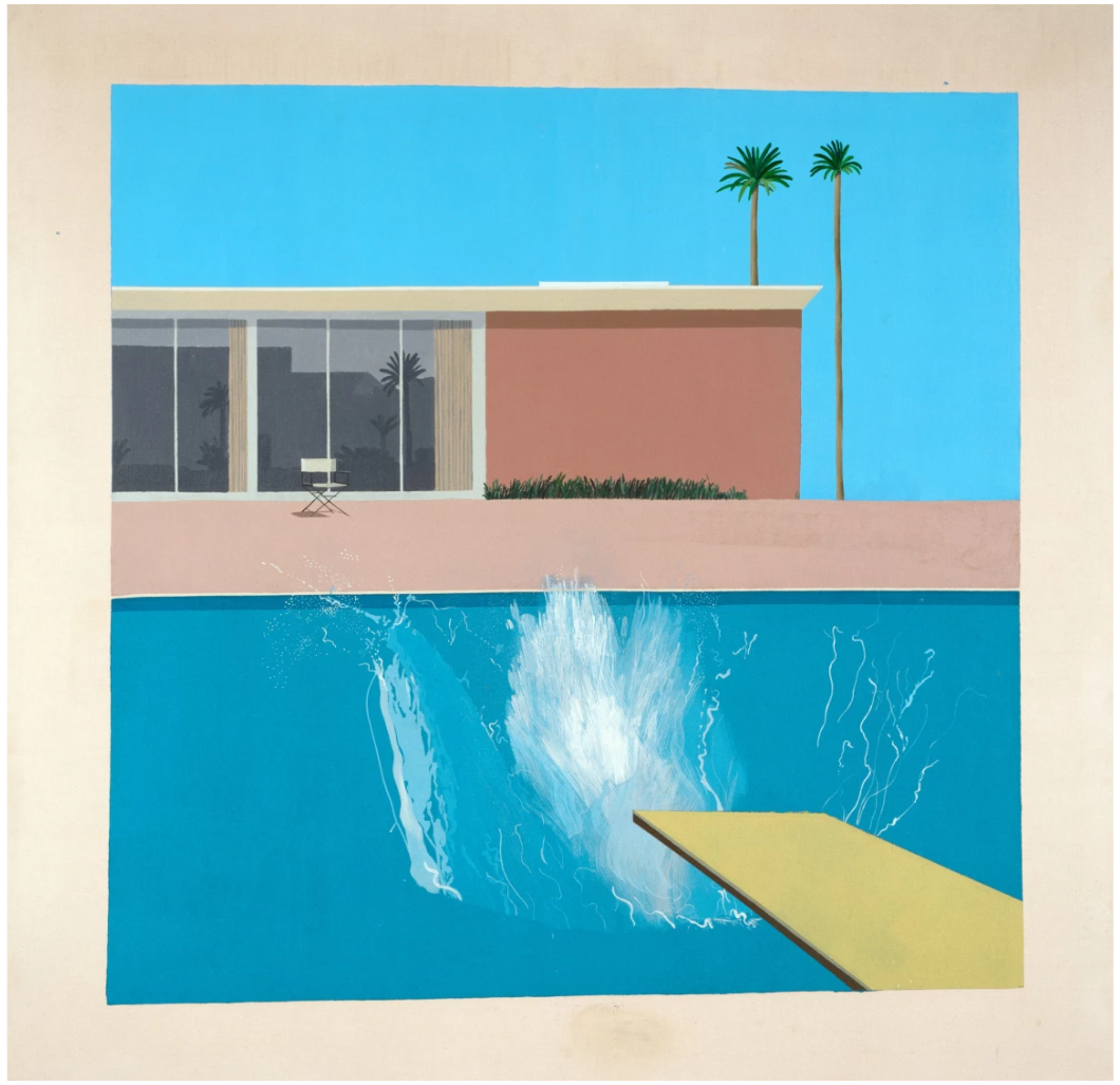
David Hockney, A Bigger Splash, 1967. Tate, London. © David Hockney
In 1968 Hockney and Schlesinger returned to London, where Schlesinger was enrolled at the Slade School of Art. Peter Webb notes, though, that by October 1968 “… the couple were traveling again, this time to the film director Tony Richardson’s home in the south of France … [Hockney] discovered that they shared not only common roots and a northern sense of humor but also a love of sunshine and the clear light of the south” (Peter Webb, Portrait of David Hockney, New York 1988, p. 100). Having started seriously to pursue photography as not only an autonomous means of artistic expression, but also as an instrument to further develop his draughtsmanship and painterly techniques, Hockney explored the area around Richardson’s home extensively photographing scenes and vistas in the nearby town of Sainte-Maxime. It was here that the artist’s lifelong love affair with France began; he would return again and again over the decades, ultimately settling in Normandy in the late 2010s. The Hotel L’Arbois, which inspired the present work, sits directly on the waterfront, across the bay from Saint-Tropez; Hockney’s chosen view intriguingly ignores the sparkling sea lying just to the left and focuses instead on the crisp linear architecture and verdant stone pine tree. The meticulous detail of the composition markedly signals a new direction for the next phase of Hockney’s career, which would result in the celebrated suite of double portraits that now mark the apex of his career: Christopher Isherwood and Don Bachardy (1968, Private Collection); Henry Geldzahler and Christopher Scott (1969, Private Collection); and Mr and Mrs Clark and Percy (1970-71, Tate, London).
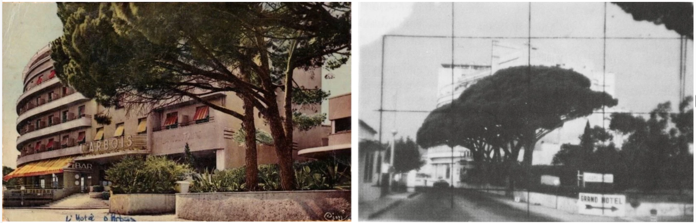
Left: Travel postcard picturing L’Arbois, circa 1950s.
Right: David Hockney, source photograph for the present work, 1968. © David Hockney
The original source for this work is a developed photograph squared up for ease of transition to canvas, reminiscent of the working processes of the Old Masters in which a cartoon drawing would be transferred to canvas by blowing charcoal through pinholes in the paper sheet. For Hockney, such a process had a profound effect on his subsequent paintings. He notes that “in a way [that] was when the naturalism in the pictures began to get stronger… In America, it was the period when photo-realism was becoming known, and I was slightly interested in it… it was similar to using a photograph from Physique Pictorial, doing an interpretation of a photograph” (David Hockney in Nikos Stangos, ed., David Hockney by David Hockney, 2nd ed., New York 1988, p. 160). Furthermore, an extant drawing based on the photograph illustrates the development of Hockney’s composition, with the central tree clearly emerging as the primary focus from the outset. In that drawing, the leaves and branches are emphatically worked up with shiny layers of graphite accretions, contrasting radically with the delicately hatched-in architectural backdrop. In the final composition, the present canvas, Hockney’s exquisite attention to detail and superbly executed surface retells the determination of his constant endeavor to create a new painterly idiom. Indeed, the prominent, richly textured trees in the foreground are rendered with the fidelity of a portrait study, presaging the artist’s later preoccupation with the Yorkshire landscape and the many imposing trees as subjects in his works of the early 2000s.
In addition to his own photography and drawing, Hockney here also plays with preconceptions associated with the grand tradition of landscape painting, and specifically the ground-breaking developments of the Twentieth Century in which the genre’s legacy had been confronted, appropriated, and re-invented. From the flattening of the perspectival picture plane and attention to surface schema pioneered by Henri Matisse with such revolutionary Fauvist pictures as Les toits de Collioure, 1905, to Ed Ruscha’s dramatically simplified renderings that portray quotidian structures as actors in urban dramas such as his Standard Stations of the early 1960s, L’Arbois, Sainte-Maxime continues this interrogation of everyday scenes to recast the apparently banal as complex images that invite profound contemplation on the nature of visual cognition and perception. Indeed, Matisse’s work in particular resonates with Hockney’s landscapes, given the French master’s similar fascination with the coastal towns in the south of France, from Collioure to Nice. An abiding influence on Hockney, Matisse’s use of bold, unmodulated color and vigorous, simplified forms can be traced throughout the British artist’s career, from his early realistic pictures such as A Bigger Splash of 1967 (Tate, London) all the way through to his later, more abstracted works such as Garrowby Hill (2017, Private Collection). In these works, as in L’Arbois, Sainte-Maxime, although the art of photography remains an important stage in the construction of the work, the viewer is made most aware of Hockney’s skill and intervention as a painter.
Henri Matisse, View Of Collioure, circa 1905. Hermitage, St. Petersburg.
Image: Bridgeman Images. Art © Succession H. Matisse/ DACS 2024 Bridgeman Images
Within L’Arbois, Sainte-Maxime, the acute precision of line that belongs to the draughtsman and the photographer is aligned with the painter’s sensitivity to colour, here flattened to the point that colour becomes an abstract building block in itself. This is a painting that majestically declares Hockney’s embrace of three artistic disciplines which, in isolation, he stands commended but, in terms of his synthetic process and unification of photography, painting and drawing, he is almost unique in post-war art. However, above all else, the present painting explores the relationship between painting and photography – a pursuit which propelled much of Hockney’s practice in the later 1960s and into the 1970s. As Marco Livingstone notes, the present work reveals Hockney’s fascination with the technical possibilities offered by the camera, and that he “did allow himself for a moment to be seduced by what he discovered with it” (Marco Livingstone, David Hockney, 3rd ed., London 1996, p. 116). Here, shadows are conspicuously missing, serving to flatten the surface, allowing Hockney to emphasise the effects of strong sunlight on pure planes of colour. The artist has also removed any extraneous detail, so that the focus remains entirely on the trees and the way they obscure the hotel beyond. Devoid of human figures, the composition is built from coordinated patterns of form, into which we as viewers are inextricably drawn. Indeed, as Livingstone again elaborated, “Unconsciously, perhaps, a sense of isolation emerges, not so much the sombre melancholia of Giorgio de Chirico’s metaphysical paintings as a feeling of aloneness as induced by Edward Hopper’s pictures of deserted American city streets” (Marco Livingstone in: Peter Webb, Portrait of David Hockney, London 1988, p. 83). Here the composition and subject invite an extraordinary interaction with the painting: willingly we enter Hockney’s narrative while also remaining acutely conscious of its meticulous construction through the purely formal elements of line and color.
More Woldgate Timber, October 13th 2009, 2009
Christie’s London: 9 October 2024
Estimated: GBP 3,800,000 – 5,500,000
GBP 4,638,000 / USD 6,075,780
DAVID HOCKNEY (B. 1937), More Woldgate Timber, October 13th 2009 | Christie’s (christies.com)
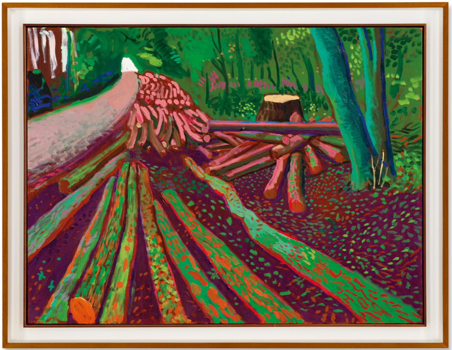
DAVID HOCKNEY (B. 1937)
More Woldgate Timber, October 13th 2009, 2009
Oil on canvas
36×48 inches (91.5 x 122 cm)
Signed and dated ‘David Hockney Oct 2009’ (on the reverse)
More Woldgate Timber, October 13th 2009 is a radiant love letter to David Hockney’s native Yorkshire landscape. In a vibrant palette of emerald greens, warm reds and earthy browns, the artist depicts a bank of felled trees leading along a wooded pathway, receding in perspectival swoop to a distant glimpse of bright white sky. The forest is alive with color, from greens of every shade to flashes of pink and shadows figured in cool, cobalt blue. The leaf litter shimmers with Pointillist brilliance. The artist had made repeated visits home in the years leading up to his mother’s death in 1999, and was struck by the ever-changing splendor of his native county. Returning in 2004, he began to work outdoors, channeling the influence of Constable, van Gogh, Monet and Turner as he captured the shifting light and seasons across several successive years. Saturated with the same life-affirming glow as his Californian paintings, More Woldgate Timber, October 13th 2009 is a vivid elegy to home.
Hockney was born further west in Bradford, but felt closely connected to the East Riding of Yorkshire. As a boy, he had spent two summers working on farms during the harvest there, admiring the beauty of its rolling hills and valleys. Although he would return to Yorkshire at various points throughout his career, it was not until the late 1990s that he began to paint it—initially at the request of his friend Jonathan Silver, who was battling the final stages of cancer at the time. Silver’s death in 1997, closely followed by that of Hockney’s mother, would ultimately give rise to a newfound yearning for northern England. Hockney toured Norway, Iceland, Spain and Italy during the early 2000s, before realizing that he was simply ‘painting views … sight-seeing’. Returning to Yorkshire in 2004, he began to depict his surroundings again.
“I was painting the land, land that I myself had worked. I had dwelt in those fields, so that out there, seeing, for me, necessarily came steeped in memory.”
Vincent van Gogh, Trees and Undergrowth, 1887. Van Gogh Museum, Amsterdam. Digital Image: Bridgeman Images.
More Woldgate Timber, October 13th 2009 is one of a group of paintings depicting Woldgate, a forested stretch of road that leads west from Bridlington. Driving down this pathway one day in 2009, Hockney saw two dead trees. Undecided whether to paint them then or to wait until summer, when he next returned he found them cut down. He sketched the trunks en plein air and then painted them from memory in his studio. A week later he returned to see many more felled trees, this time with timber stacked along the roadside. This striking vista led to a number of paintings, including the monumental Winter Timber, which employed a dreamlike, Fauvist palette of blues, purples and yellows. With its more naturalistic tones, the present work poignantly captures the scene’s sense of an organic life-cycle: the bare stump and the felled trees, merging with the forest floor; the lush vitality of the living greenery beyond; and the new growth, in vibrant specks of green, that bursts forth from the earth.
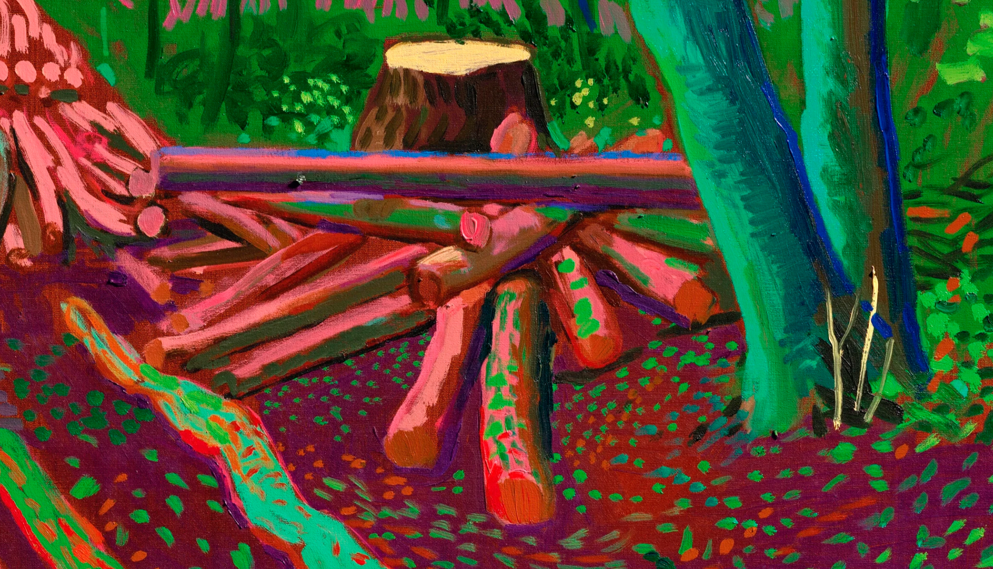
Hockney’s portraits, often depicting the same subjects over many years, reveal the intimacies and evolutions of his personal relationships. His landscapes display a similar affinity with the Yorkshire soil, bearing witness to his nuanced engagement with the changing seasons. Bare, snow-covered branches in one painting might elsewhere be seen bejeweled with young leaves, or bursting into spectacular spring blossom. It is arguably in the cool, deep green autumn calm seen in the present work, however, that Hockney’s vision is at its most sensitive. In California, Hockney had missed the thrill of the changing seasons. Back in Yorkshire, they seemed more beautiful and vital than ever before. Alive with the richness of change, More Woldgate Timber, October 13th 2009 captures Hockney’s home turf as a place of familiarity and wonder.
Path Through Wheat Field, July, 2005
Phillips London: 10 October 2024
Estimated: GBP 2,000,000 – 3,000,000
GBP 3,315,000 / USD 4,342,650
David Hockney – Modern & Contemporary… Lot 6 October 2024 | Phillips
DAVID HOCKNEY
Path Through Wheat Field, July, 2005
Oil on canvas
61.1 x 91.4 cm (24 x 35 7/8 inches)
Signed and dated ‘David Hockney July 22 – 4 Aug 05’ on the reverse
Suffused with a warm, summer light, energized and amplified by fluid strokes of bright, joyous colour, David Hockney’s Path Through Wheat Field, July is a tender paean to the dramatic landscape of the artist’s childhood, and to the long tradition of landscape painting itself. Completely fresh to the market, the present work was painted in 2005 following Hockney’s return to his native Yorkshire and marks a period of remarkable creative re-invention and innovation as the artist approached his seventieth year. Included in significant exhibitions such as the major travelling survey of his landscape painting David Hockney: A Bigger Picture, the work is an important, early example of the pivotal cycle of paintings in oil. Working at a prodigious rate and painting en plein air, in this series Hockney recorded the passing of the seasons in the rolling hills and valleys beyond Bridlington over the course of a year, masterfully translating the chromatic intensity and sophisticated spatial logic of his Californian landscapes into the golden fields and verdant hedgerows of his homeland, capturing both the rich natural beauty of the Wolds and Hockney’s deep, personal connection to this place.
Born in the industrial town of Bradford, West Yorkshire in 1937, Hockney enthusiastically recalls the summers spent as a teenager working the fields around Bridlington, stooking corn for harvest and collecting the chaff. Traversing the vast, undulating terrain by bicycle daily the young Hockney was intimately familiar with its winding paths and sudden, dramatic vistas, just as he would have been with the rhythmic passing of the seasons and shifting weather patterns. Although California provided the backdrop and inspiration for some of his most iconic pictures, the strong physical and emotional presence of the Yorkshire Wolds never really left him, and can perhaps even be traced beneath the roving, panoramic scenes of the Hollywood Hills and Pacific Coast Highway that he captured with the carefully observant and eager eye of the outsider in the 1980s.
David Hockney, Mulholland Drive: The Road to the Studio, 1980, Los Angeles County Museum of Art. Image: Richard Schmidt, Artwork: © David Hockney
It wasn’t until the artist approached sixty that he turned more consciously to the rolling landscape of his childhood, his more frequent return visits to Bridlington in East Yorkshire in the late 1990s driven largely by bonds of family and friendship following the decline of his mother’s health and the terminal diagnosis of his close friend the gallerist Jonathan Silver. Taking long drives with his mother out across the Wolds from Bridlington he found himself enchanted once again by the lilting landscape, a sensation cemented even further in the winding, panoramic drives out west to Wetherby, where Silver continued to gently press Hockney to turn his painterly attention to the contoured landscape of the Wolds. Returning to California with Silver’s words laying heavy on his mind he began painting these scenes from memory, producing a small but highly significant suite of 6 paintings – examples of which include the 1998 canvas Garrowby Hill, now held within the permanent collection of the Museum of Fine Arts, Boston – that set the trajectory for his triumphant return to the North of England – and to easel painting. As Marco Livingstone has sensitively put it, ‘It was through friendship, devotion to family and a sense of loss that Hockney came to paint Yorkshire and, through this prolonged love letter to his native land, to understand the depths of his feeling for his country and explicitly for the north of England, where his roots are as deep and firm as those of the trees he has expended such affectionate and respectful attention.’
Experimenting first in watercolour, Hockney quickly discovered the rich possibilities and variety afforded by this subject, and by 2005 following his more permanent relocation to Bridlington, his distinctive silhouette could be seen working in all weathers across East Yorkshire, setting up his easel and working at speed on the roadside. As the Impressionists had worked en plein air to record the subtle shifts in light and colour offered by different times of day and passing seasons, Hockney took himself to task, even modifying his 4×4 to accommodate the sometimes vast canvases and paint palettes just as Claude Monet had constructed his own studio boat to allow him to paint his panoramic views of the Seine and the specific play of light on the water’s surface that would have been inaccessible otherwise.
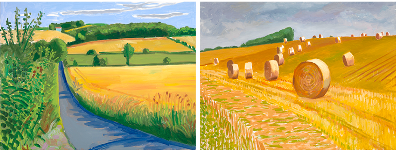
Left: David Hockney, Rudston to Langtoft, 30 July, 2005, 2005, Private Collection. Image: Richard Schmidt, Artwork: © David Hockney
Right: David Hockney, Untitled Harvest, 2005, Private Collection. Image: Richard Schmidt, Artwork: © David Hockney
Although perhaps an unexpected subject for a contemporary painter more often associated with Pop and portraiture, Hockney’s turn to a more traditional mode of landscape painting places him firmly in a long line of artists for whom the abundant natural beauty of their immediate surroundings presented certain pictorial challenges and rewards. In the context of British painting, Hockney’s Yorkshire landscapes resonate with the bucolic scenes of the Dedham Vale so memorably captured by John Constable, and it was the occasion of a major retrospective of the artist the year after the current work’s execution that emboldened Hockney to try his hand at working en plein air at a more expansive scale, sometimes combining multiple canvases to depict a single, vast scene. In terms of colour, dynamism, and the sheer joy provoked by these natural surroundings, the influence of Post-Impressionist Vincent van Gogh is especially pronounced across Hockney’s Yorkshire paintings, notably in the rich golden cornfields and meandering sense of line that is so powerfully realized in Path Through Wheat Field, July.
Left: John Constable, The Cornfield, 1826, The National Gallery, London. Image: © The National Gallery, London/Scala, Florence
Right: Vincent van Gogh, Wheat Field with Cypresses, 1889, The Metropolitan Museum of Art, New York. Image: © The Metropolitan Museum of Art, New York, Purchase, The Annenberg Foundation Gift, 1993
Combining memory, emotion, and sensation, in these evocative canvases Hockney also applied the lessons taken from a deepening fascination with the question of optics and its relationship to pictorial space that the artist had explored across photocollages, book-length studies on the use of optical aids by Old Masters, and his own experiments with a vintage camera lucida. Like van Gogh before him Hockney was really looking at this landscape and the shifting qualities of light and weather across it, quickly realizing the inadequacies of photography for capturing the more complex sense of depth and spatial reality that the eye could perceive out on the Wolds. Although deeply interested in photography, Hockney recognized an important distinction between the camera’s tendency to keep the viewer at a remove, to flatten space, and stop time and the slower, more individualized experience of looking with the eye. As Hockney has said, with these works, his primary intention was to ‘convey the experience of space’, an experience that is not only perceptual but draws on feeling, memory, and embodied sensation. For Hockney, there could be no other place to pursue this project than Yorkshire or, as the artist put it himself: ‘Around Bridlington, I was painting the land, land that I myself had worked. I had dwelt in those fields, so that out there, seeing, for me, necessarily came steeped in memory.’
2. Andy Warhol
Eggs, 1982
Sotheby’s London: 9 October 2024
Estimated: GBP 2,200,000 – 3,200,000
GBP 1,800,000 / USD 2,358,000
Eggs | Contemporary Evening Auction | 2024 | Sotheby’s (sothebys.com)
ANDY WARHOL (1928 – 1987)
Eggs, 1982
Acrylic and silkscreen ink on canvas
90×70 inches (228.6 x 177.8 cm)
Stamped by the Estate of Andy Warhol and by the Andy Warhol Foundation for the Visual Arts, Inc.
Numbered PO40.086 three times (on the overlap)
Monumental in scale and rigorous in conceptual wit, Andy Warhol’s Eggs from 1982 is a graphically impactful and cleverly inventive expression of the artist’s perpetual experimentation within his own unique brand of imagery. During the last decade of his life, Warhol produced various bodies of work that explored the boundaries of abstraction; his Shadows (1978), Rorschachs (1984), and Camouflages (1986) had no central subject, a notable departure from his earlier works, yet still featured immediately recognisable imagery. Visually, these works appeared to be the antithesis of Warhol’s pop-culture fascination, yet conceptually they were in perfect harmony. With these paintings, often executed on a mural-like scale as in the present example, Warhol examines the purely formal qualities of shape and colour in a way he had not done before. Yet his embrace of abstraction was never without playful references to the real and figurative. Here, the titular eggs are rendered in flat planes of colour against a vast black ground; their outsize, ovoid forms teeter on the edge of abstraction, yet still retain enough reference to their real-life counterparts to remain recognizable. At once playful and erudite, newly experimental and still quintessentially Warholian, Eggs is a rare and masterful iteration of the Pop master’s inimitable praxis.
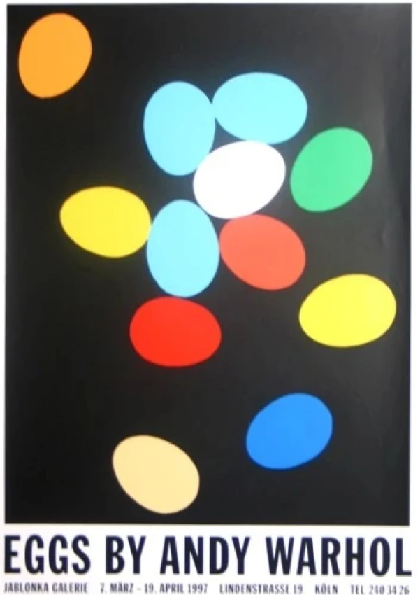
The present work illustrated on the exhibition poster for Eggs by Andy Warhol: Paintings, Polaroids and Dessert Drawings, Jablonka Galerie, Cologne, 1997. Art © 2024 The Andy Warhol Foundation for the Visual Arts, Inc. / Licensed by DACS, London.
Having announced his departure from painting in favour of filmmaking in 1965, Warhol returned to the medium in the 1970s, encouraged by his circle of younger painters including Jean-Michel Basquiat and Keith Haring. His renewed interest in paint also marked a period of experimentation with subject matter as well as the process of painting itself. Using imagery from the early days of his career, such as the greeting cards that inspired the present work, Warhol investigated abstraction and colour field painting through his own visual vernacular. The Eggs began as small-scale Easter gifts for friends and family, but evolved into a complex interrogation of painting in Warhol’s voracious search for new ideas. As Vincent Fremont explained, “The Egg paintings are an example of a successful idea that he expanded upon… Andy took the simple idea of making an egg painting and manipulating the image, making it larger. The egg became an abstract shape by simply changing the size of the image. The paintings were first 14 x 11” then Andy enlarged them to 90 x 70”…” (Vincent Fremont, “Andy Warhol’s Egg Paintings,” Exh. Cat., Cologne, Jablonka Galerie, Eggs by Andy Warhol, 1997, p. 26).
As with much of Warhol’s later output, the source imagery for Eggs began with Polaroid photographs taken by the artist. Fremont describes: “Andy took many Polaroid pictures of eggs in his studio. He and his art assistants, Ronnie Cutrone and Jay Shriver organized different set-ups against a black seamless background. Andy used a special Polaroid camera with a flash that could be adjusted for different angles. The different uses of the flash would manipulate the curve and shape of the egg or make the eggs look like flat white ovals. Polaroids were taken of the eggs both in and out of the carton. Patterns and designs were made with the eggs. In the end, after all the experimentation, the flat white ovals were the image Andy chose for his painting series. The Polaroid of a group of eggs spread out in what appears to be in a random manner was Andy’s final choice” (Ibid., pp. 26-27). Blown up to many times their original size and re-coloured in bright, candy-like hues, the oval forms take on the guise of abstraction, resembling the Hard Edge painting of Ellsworth Kelly or Frank Stella. And yet, their literal photographic origin still positions them firmly within Warhol’s Pop idiom.
As the universal visual referent of birth and creation, the egg has a longstanding history as a potent symbol in the iconographical lexicon of human history. For millennia it has acted as a sign of fertility and hope, representing the cycle of regeneration and new life. From the graphic sign of femininity in Egyptian hieroglyphs to its symbolic depiction by canonical artists such as Hieronymus Bosch, Piero della Francesca, Diego Velázquez, René Magritte, Salvador Dalí, Constantin Brancusi, Marcel Broodthaers and Lucio Fontana, imagery of the ovum has long delivered variously esoteric semiotic interpretations associated with the origin of the world. In drawing upon an image as richly allusive as the egg and then reducing it to abstraction, Warhol wittily references a reduction of the entirety of art history and appropriates the reigning painterly mode of the time into his own unique style. As Fremont concludes, “What is fascinating about the Egg paintings, is that the artist is working through ideas on his own, creating art that was not commissioned… Andy was able to experiment with the shape of the egg as a literal and abstract form without any outside pressure.” He continues, “The subject matter of an egg as a painting series is humorous as well as intriguing. Once again, Andy has made us look at a common object, a hen’s egg, and see it differently. Andy’s eggs become abstract form” (Ibid., p. 27).
Portrait of Princess Diana, 1982
Phillips London: 10 October 2024
Estimated: GBP 1,200,000 – 1,800,000
GBP 1,258,000 / USD 1,647,980
Andy Warhol – Modern & Contemporary … Lot 11 October 2024 | Phillips
ANDY WARHOL
Portrait of Princess Diana, 1982
Synthetic polymer paint and silkscreen ink on canvas
50 1/8 x 42 inches (127.4 x 106.8 cm)
Signed and dated ‘Andy Warhol 82’
Stamped with the Estate of Andy Warhol and the Andy Warhol Foundation for the Visual Arts, Inc. stamps
Numbered ‘P050.190’ on the overlap
Coming to auction together for the first time having previously been held in the esteemed collection of author and Conservative deputy chairman, Jeffrey Archer, Andy Warhol’s Portrait of Prince Charles and Portrait of Princess Diana exemplify the singular directness and immediacy of the artist’s Pop portraits. Executed with a decorative sense of line, and incorporating printed elements derived from drawings accented with electrifying flashes of bright, neon color, Portrait of Princess Diana is highly characteristic of Warhol’s late work in both stylistic and thematic terms. Simplified to its essential pictorial elements, the economic but expressive depiction of the young and radiantly beautiful Lady Diana Spencer perfectly captures the openness and warmth that would come in later years to define her as the ‘People’s Princess’, and connects Warhol’s early investigations into fame, beauty, and tragedy with questions of social hierarchy and political authority posed by his late portraits.
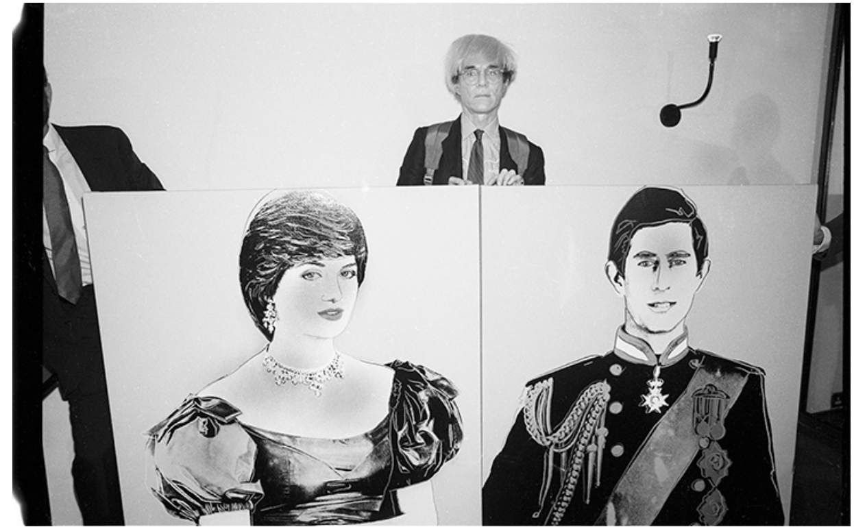
Christopher Makos, Andy Warhol with Portrait of Princess Diana and Portrait of Prince Charles, 1982. Image: © Christopher Makos, Artwork: © 2024 The Andy Warhol Foundation for the Visual Arts, Inc. / Licensed by DACS, London
While his portraits of the 1970s take on a more painterly appearance, the hand of the artist present in passages of heavy impasto and finger-painted elements, in the 1980s Warhol returned to the bold color contrasts of his defining Pop portraits of Marilyn Monroe, Elizabeth Taylor, and Jackie Kennedy. As in these iconic images of timeless feminine beauty, Portrait of Princess Diana exemplifies the artist’s unique ability to select and isolate images that not only distill the captivating essence of his subjects but transcend their own historical moment to define an age. While Marilyn embodied the combination of glamour and tragedy that would become synonymous with the age of celebrity, as First Lady, Jackie represented America’s own equivalent of the Modern Royal family, her vivacity, beauty, and faultless sense of style elevating her to an ideal of dutiful femininity for many American women echoed in the popular conception of Diana some decades later. While his earlier silkscreened portraits bear the unmistakable marks of the decidedly mechanical processes of their production, Warhol’s approach in these later works is more delicate, embellishing his surfaces with bold lines and decorative elements in neon colors. Visually alluring, these additions also emphasize the artificiality of the image, just as the non-naturalistic colors of his earliest portraits had before.
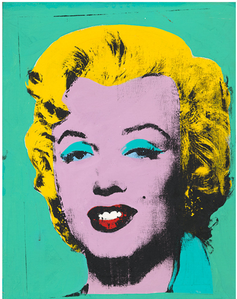
Andy Warhol, Green Marilyn, 1962, National Gallery of Art, Washington, D.C. Image: National Gallery of Art, Washington, D.C.,Gift of William C. Seitz and Irma S. Seitz, in Honor of the 50th Anniversary of the National Gallery of Art, 1990.139.1, Artwork: © 2024 The Andy Warhol Foundation for the Visual Arts, Inc. / Licensed by DACS, London
In an important distinction however, Warhol’s depictions of Marilyn and Jackie were always already tinged with tragedy, memento mori pieces that were created shortly after the shocking and untimely deaths of Monroe and President Kennedy that Warhol would retrospectively link to the somewhat bleaker portrait of American culture explored in his Death and Disaster series. As in the haunting presentiment that now seems loaded in Diana’s comment ‘I’d like to be a queen of people’s hearts, in people’s hearts, but I don’t see myself being queen of this country’, the profound poignancy of Warhol’s Portrait of Princess Diana would only develop over time. As the years passed, the press focused increasingly on her loneliness and isolation in the later years of her marriage while continuing to emphasize the kindness and love that she showed her people. This crystallized the popular image of her, which is now forever shadowed by the tragic events that led to her shocking death in Paris in 1997, and the national outpouring of grief that followed. Like Marilyn, in Portrait of Princess Diana we now find the perfect confluence of celebrity, beauty, disaster, and mass media that so fascinated the artist, and are so deeply woven in his approach to the icon in the modern day. More than any other figure in the Royal Family, Diana’s youth, grace, and beauty captured the hearts and minds of the public, marking her as undoubtably one of the most iconic and adored women of the late 20th century. As Warhol so perceptively anticipated decades before, the rise of media technologies and the cult of celebrity ensured that Diana’s image was widely circulated throughout the 1980s and ’90s, making her universally recognizable and blurring the boundaries between public image and the more complex contradictions of private life. It is perhaps this tension that initially drew Warhol to Diana, speaking as it does so directly to his own, long-standing fascination with the tensions between beauty and tragedy, glamour, and the darker underside of celebrity.
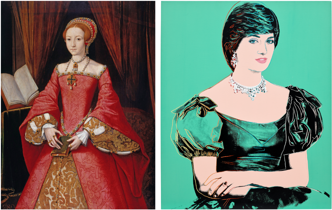
Left: William Scrotts (attributed to), Elizabeth I when a Princess, circa 1546, Royal Collection Trust, London
Right: The present work
Generating enormous public interest, the engagement of Charles and Diana was played out like a fairytale in the press, Lord Snowdon’s official engagement portrait appropriated by Warhol here reproduced and distributed worldwide. Presenting the couple in formal dress and arranged against an antique tapestry backdrop, the photograph retains much of the visual iconography associated with Royal Portraiture, the depiction of a young Diana especially resonating with well-known portraits of a young Elizabeth I prior to her ascension. The mechanisms of the image and the nature of its circulation must certainly have struck Warhol, bearing certain immediate comparisons to the functioning of publicity by film studios in the promotion of new releases and leading stars. Emphasizing the forward-looking modernity and optimism represented by the couple at the time, Warhol radically updates the more conventional arrangement of the official photograph, adopting the format of the casting call ‘headshot’ and dramatically cutting and cropping the image to focus more closely on the head and shoulders of Diana. Nevertheless, in sharpening our focus in this way, Warhol’s unmistakably modern image reflects back on the traditions of Royal portraiture, his decorative embellishments drawing particular attention to the placement of her hands, the elegant line of her neck and shoulders, rich fabrics and fine jewelry, all highly symbolic and charged elements used to iconographic effect in traditional court portraiture. One of only four Princess Diana works in this format, the rich green tones employed by Warhol here echo the dress and backdrop of Snowdon’s original photograph, connecting the present work even more directly with this image of a youthful and hopeful Diana.
Dollar Sign, 1982
Sotheby’s London: 10 October 2024
Estimated: GBP 450,000 – 650,000
GBP 690,000 / USD 903,900
Dollar Sign | Contemporary Day Auction | 2024 | Sotheby’s (sothebys.com)
ANDY WARHOL (1928 – 1987)
Dollar Sign, 1982
Acrylic and silkscreen ink on canvas
14 x 10 7/8 inches (35.4 x 27.8 cm)
Signed and dated 82 (on the overlap)
Stamped by the Estate of Andy Warhol and the Andy Warhol Foundation for the Visual Arts, Inc.
Numbered A106.17 on the overlap
Executed nearly two decades after his first series of Money Paintings, Andy Warhol’s present Dollar Sign from 1982 marks the pinnacle of the artist’s career-long engagement with consumerism and the visual language of American capitalism. Drawing parallels to his earlier iconic works, which used motifs such as the Coca-Cola logo and the famous Campbell’s Soup Cans, Warhol isolates here the ultimate symbol of wealth: the dollar sign. By reducing the subject to this single, potent emblem, Warhol transcends his earlier explorations of commerce, focusing not on the objects that can be bought but on the symbol of the exchange itself. In Dollar Sign, the currency becomes a logo, an abstract representation of both the American Dream and more broadly, of wealth.
In this exceptional example from the series, Warhol presents five distinct impressions of the dollar sign, overlapping in vibrant, contrasting colours against a deep black background. The richness of the paint and the vivid palette of yellow, orange, blue, purple, and red screens create a dynamic visual interplay, amplifying the intensity of the symbol. The boldness and clarity of the motif, combined with the large size of the screens filling almost the entire plane of the canvas, elevate this work above others in the same series.
Unlike much of Warhol’s oeuvre, which feature imagery from mass media and celebrity photographs, the Dollar Sign series is based on Warhol’s own hand-drawn depiction of the dollar symbol. Unable to find an existing image that met his exacting standards, Warhol created his own, demonstrating his often-overlooked skills as a draughtsman. The sketchy, gestural quality of the dollar sign in Dollar Sign harkens back to Warhol’s early career as a commercial illustrator, a role that allowed him to break into the New York art scene.
Vesuvius, 1985
Christie’s London: 10 October 2024
Estimated: GBP 300,000 – 500,000
GBP 604,800 / USD 792,288
ANDY WARHOL (1928-1987), Vesuvius | Christie’s (christies.com)
ANDY WARHOL (1928-1987)
Vesuvius, 1985
Acrylic on canvas
28 x 32 1/8 inches (71 x 81.5 cm)
Signed and dated ‘Andy Warhol 85’ (on the overlap)
Standing out within an oeuvre renowned for silkscreen printing, Andy Warhol’s hand-painted series Vesuvius is a climactic ode to the art-historical sublime. Conceived for an acclaimed exhibition at Museo di Capodimonte in Naples in 1985, the series depicts the city’s volcanic landmark at the cataclysmic moment of eruption. The episode is rendered in brilliant psychedelic color: Warhol wanted to give each unique painting ‘the impression of having been painted just one minute after the eruption’ (A. Warhol quoted in S. Cassani, ed., Vesuvius by Warhol, exh. cat. Museo di Capodimonte, Naples 1985, p. 36). In the present example, a pale-pink Vesuvius rises from a vivid purple, turquoise, and lilac landscape. It spews a dazzling plume of yellow into a peach-orange sky. Among the original series of sixteen paintings, the present work is one of only eight executed at this scale and is marked by the use of dramatic dark outlines. Resembling contour lines on a map, their finely brushed execution displays the deftness of Warhol’s painterly hand.
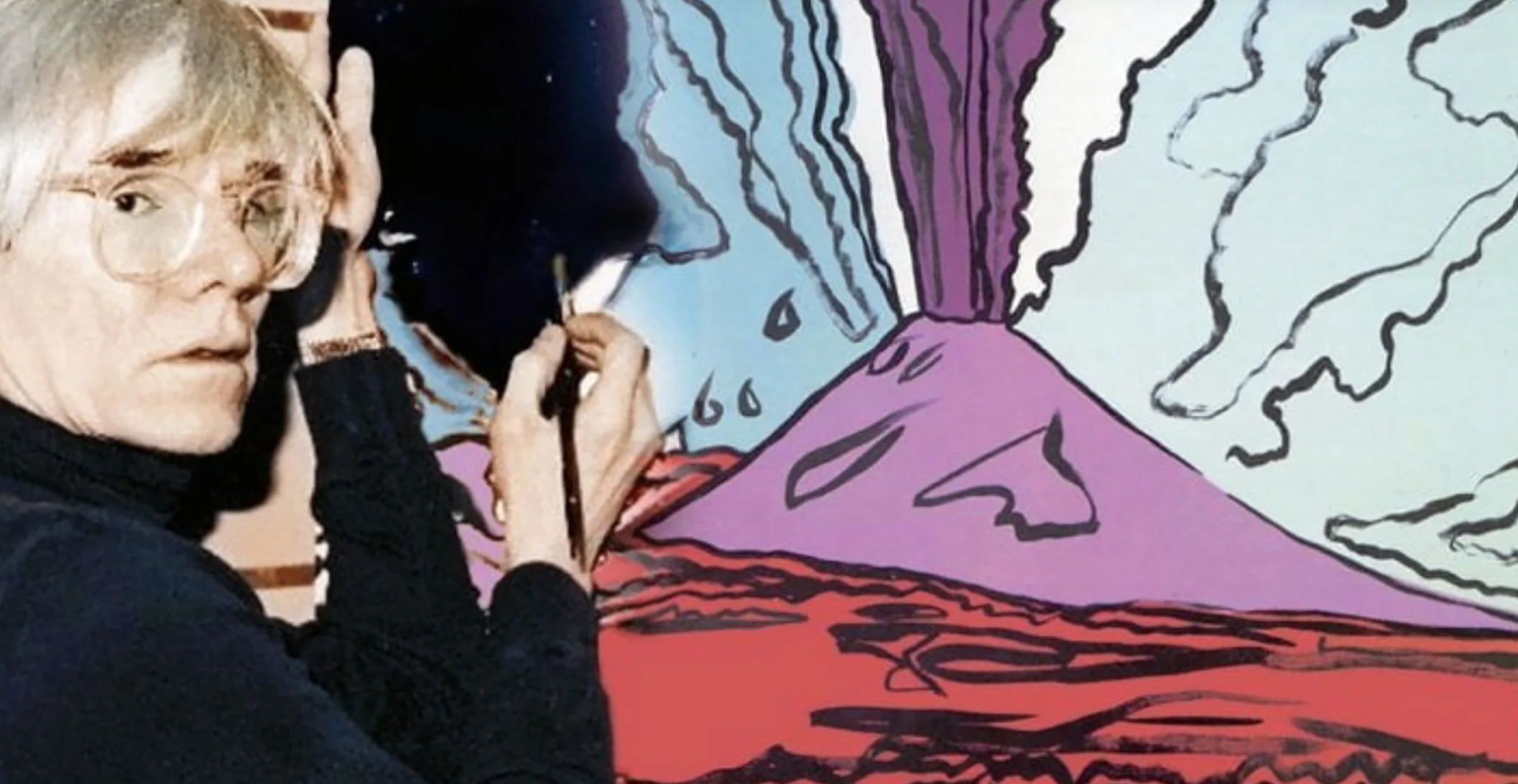
Aside from being an iconic image rich in historical cues, Vesuvius is an ode to Naples. Warhol had first visited the southern Italian city in 1975 at the invitation of the gallerist Lucio Amelio—from whose gallery the present work was acquired—and often compared it to New York with its vibrant, bustling streets and active drag scene. Where Manhattan is defined by its soaring skyscrapers, the Gulf of Naples is landmarked by its very own Mount Vesuvius. It had once razed Pompeii and Herculaneum to the ground in one of history’s deadliest eruptions, and Warhol was captivated by its distant, towering presence. Naples was also a city that held personal significance for the artist: it was here that he first met Joseph Beuys, the mystical titan of post-war German art, in the spring of 1980. The city, writes Michele Bonuomo, was the ideal setting for this meeting of ‘the two most extreme souls of contemporary art … in Naples one can meet to represent and consume impossible passions, always hovering between earth and sky, ecstasy and nightmare’ (M. Bonuomo in ibid., p. 33).
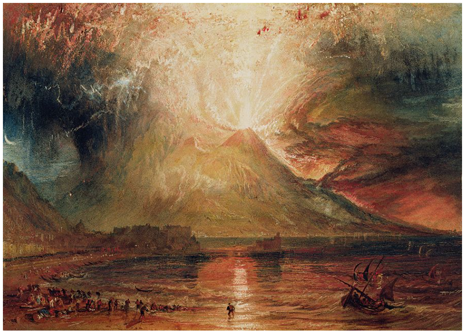
Joseph Mallord William Turner, Vesuvius in Eruption, 1817-1820. Yale Center for British Art, New Haven. Photo: Bridgeman Images.
Warhol’s approach to the subject of Vesuvius speaks to the Romantic painterly tradition, and follows a long line of art-historical depictions including works by J. M. W. Turner and Joseph Wright of Derby. Debuted at the Museo di Capodimonte—the original host institution of the series which has maintained a revered program of Old Master exhibitions since it opened—the Vesuvius paintings revel in this sublime visual language. Edmund Burke’s theory of the sublime, published in 1757, concerns the point where beauty and terror become adjacent. ‘When danger or pain press too nearly, they are incapable of giving any delight, and are simply terrible’, he wrote, ‘but at certain distances, and with certain modifications, they may be, and they are delightful, as we every day experience’ (E. Burke, A Philosophical Enquiry into the Origins of our Ideas of the Sublime and Beautiful, Oxford 1990, p. 37). The terrific power of the natural world is powerfully exhibited by features such as Vesuvius, whose visual grace is matched by its threat of oblivion. Warhol was certainly at home in a city like Naples, but what undoubtedly set it apart was the buzzing vitality that played out within the shadow of potential destruction.
Exhibition poster, Andy Warhol. Joseph Beuys at Lucio Amelio Gallery, Naples, April 1980. Digital Image: Tate/ARTISTS ROOMS.
Warhol had long been fascinated by the spectacle of death, and the macabre realities of contemporary life. His depiction of the erupting volcano presents a continuation of this obsession. Where his Death and Disaster series of the 1960s was concerned with commonplace cases of tragedy such as traffic collisions, suicides, and fatal city accidents—and appropriated images from newspaper pages and police archives—Vesuvius represents a unique, near-mythological endpoint. As a permanent, looming feature of the landscape, it is a visceral reminder of the brevity of our time on earth. Renowned for his ability to fuse terror and beauty, it is little wonder that Warhol joked for a plane to be sent for him the next time Vesuvius erupted so that he could ‘finally have the chance to paint it from life’ (A. Warhol quoted in ibid., p. 35).
Guns, 1981
Phillips London: 10 October 2024
Estimated: GBP 450,000 – 650,000
GBP 571,500 / USD 748,665
Andy Warhol – Modern & Contemporary … Lot 28 October 2024 | Phillips
ANDY WARHOL
Guns, 1981
Synthetic polymer paint and silkscreen ink on canvas
16×20 inches (40.6 x 50.5 cm)
Signed and dated ‘Andy Warhol 81’
Stamped with the Andy Warhol Foundation for Visual Arts, Inc. stamp
Numbered ‘A101.984’ on the overlap
A powerful and blunt symbol of the violence that continues to characterize so much of our modern world, Andy Warhol’s Guns combines the artist’s astute understanding of the iconographic power of everyday, consumer items with his own, more complex relationship to questions of mortality and death. With a forensic detachment, Warhol magnifies and closely crops the titular objects here, the source image reproduced and rotated so that the two pistols appear interlocked with one another, emphasized through simple but stark contrasts of red, black, and white. Created in 1981, the present work belongs to Warhol’s late series of Guns paintings, examples of which now reside in the permanent collections of major institutions including the Tate Collection in London and the San Francisco Museum of Modern Art. Closely related to the contemporaneous Knife paintings and the more conceptual Oxidation and Shadow paintings, this late series highlights Warhol’s profound sensitivity to images, and his singular ability to transform them into powerful, provocative symbols of an American post-war landscape shaped by commodity consumption, the cult of celebrity, and the strangely intertwined existence of glamour, tragedy, and everyday violence. Even in Warhol’s iconic images of Marilyn Monroe or Jackie Kennedy, tragedy and violence operate in direct dialogue with beauty and fame, connections made all the more explicit when the artist first embarked on his Death and Disaster series in 1962, just months before completing his first silkscreened portraits of Monroe. Taken from a sensational front-page tabloid headline, 129 Die in Crash marked the beginning of this important series, and inaugurated the critical role played by thematic treatments of death and violence in Warhol’s practice as serially repeated images of car crashes, race riots, and electric chairs took their place alongside the smiling faces of celebrities and Campbell’s Soup cans.
Andy Warhol, Electric Chair (Red), 1964, The Philadelphia Museum of Art. Image: Philadelphia Museum of Art, Gift of Mr. and Mrs. David N. Pincus, 1979, Artwork: © The Andy Warhol Foundation for the Visual Arts, Inc. / Licensed by DACS, London
Although Warhol’s childhood had been marked by sickness and physical frailty, in 1968 the artist suffered a shocking confrontation with gun violence and his own mortality when he was shot at close range by Valerie Solanas, the radical feminist and Factory-goer whose SCUM Manifesto called for ‘civic-minded, responsible, thrill-seeking females’ to ‘overthrow the government, eliminate the money system, institute complete automation and eliminate the male sex.’ Near-fatal, this assassination attempt would haunt Warhol for the rest of his life, leaving him deeply scarred in both physical and psychological terms, twinned conditions sensitively captured in Alice Neel’s moving 1970 portrait, and in his own series of Skulls from 1976.
“As I was putting the phone down, I heard a loud exploding noise and whirled around: I saw Valerie pointing a gun at me and I realized she’d just fired it. I said “No! No, Valerie! Don’t do it!” and she shot at me again. I dropped down to the floor as if I’d been hit I didn’t know if I actually was or not. I tried to crawl under the desk. She moved in closer, fired again, and then I felt horrible, horrible pain, like a cherry bomb exploding inside me.”
As Victor Bockris has suggested, the pistol depicted here and in other works from the series created little over a decade after the attack is in fact ‘the same snub-nosed .32 that Valerie Solanas had shot him with.’ Taken together, the Guns paintings thus stand as a powerful record of individual and collective trauma, touching not only on Warhol’s own experience, but as representative of the shocking acts of violence that punctuated the last decades of the 20th century with assassination attempts on presidents, prominent civil rights activists, and cultural icons like John Lennon. If movie stars and the cult of celebrity defined Warhol’s idea of 20th-century glamour, his images of the tools of violence – electric chairs, knives, guns – draw out the darker underside of the so-called ‘American century’, evoking Warhol’s familiar visual language of fetishized everyday commodities to expose the banality and ubiquity of this violence lurking just beneath the surface. Tellingly, Warhol had originally envisioned presenting his Guns and Knives alongside his Dollar Sign paintings at the Leo Castelli Gallery in January 1982; although the former were removed from the show at the last minute, the close conceptual connections made by the artist between these distinct bodies of work speaks powerfully to Warhol’s vision of contemporary American culture and the convergence of money, consumerism, power, and violence.
Dollar Sign, 1982
Christie’s London: 10 October 2024
Estimated: GBP 250,000 – 350,000
GBP 252,000 / USD 330,120
ANDY WARHOL (1928-1987), Dollar Sign | Christie’s (christies.com)
ANDY WARHOL (1928-1987)
Dollar Sign, 1982
Acrylic and silkscreen ink on canvas
10 x 8 1/8 inches (25.5 x 20.5 cm)
Signed and dedicated ‘Andy Warhol to Evelyn’ (on the overlap)
Iconic, audacious, and unmistakable, Andy Warhol’s Dollar Sign (1982) is emblazoned with the symbol of the American dream. One of the Pop artist’s most celebrated late series, the vivid dollar sign encapsulates his masterful exploration of the visual language of desire. Here, it is tripled in deep purple, vermillion and gleaming gold against a searing fuchsia backdrop. Warhol gifted the present work to its owner, Professor Evelyn Welch, on the occasion of her wedding in 1982. It has remained in her collection ever since. A Renaissance scholar who studied at Harvard University before moving to the United Kingdom in 1981, Welch encountered Warhol in New York’s nightlife scene: he was a friend of her brother, the actor and filmmaker John Stockwell. She is the mother of the musician Florence Welch.
Warhol’s fascination with money can be traced throughout his career. His very first silkscreened works, created in the early 1960s, were based on his own hand-drawn images of one- and two-dollar bills. He once observed that ‘American money is very well designed, really. I like it better than any other kind of money’ (A. Warhol, quoted in The Philosophy of Andy Warhol: From A to B and back again, Orlando 1975, p. 137). In the 1980s Dollar Sign series, Warhol distilled the dollar to its essential and ubiquitous signifier. Printing onto canvas, he paralleled the mass-production of paper currency itself. Yet the works’ facture was nuanced and varied. Instead of copying a readymade image, Warhol created different silkscreens from his own drawings of the dollar sign. These variously reproduced the symbol’s outline or filled it with solid or partial, scribbled color. He overlaid multiple screenprints at dynamic angles—giving the effect of movement or shadow—and in an array of vibrant tonal combinations.
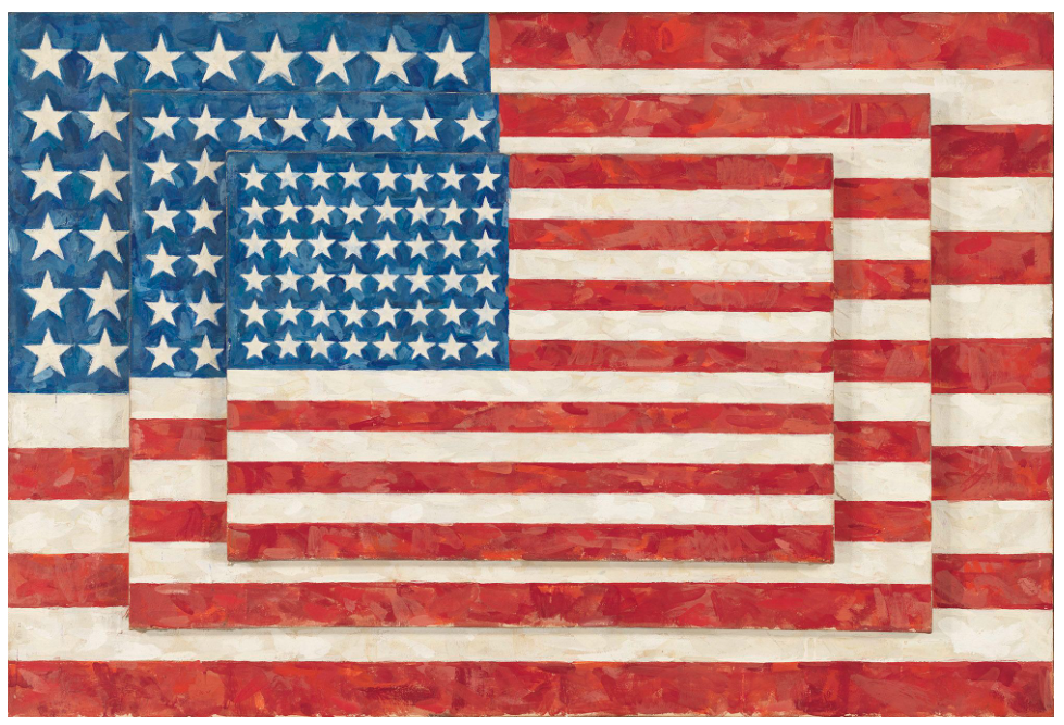
Jasper Johns, Three Flags, 1958. Whitney Museum of American Art, New York. Artwork: © Jasper Johns / VAGA, New York / DACS, London 2024. Digital Image: Whitney Museum of American Art / Licensed by Scala.
The Dollar Sign paintings were first exhibited at the Castelli Gallery, then the epicentre of the New York art scene, in 1982. Reflecting on the show, Warhol’s close friend and art critic David Bourdon said that they ‘appeared as prophetic emblems of the huge amounts of money that would pour into the art world during the following years’. They hung as ‘brazen, perhaps insolent reminders that pictures by brand-name artists are metaphors for money, a situation that never troubled [Warhol]’ (D. Bourdon, Warhol, New York 1989, p. 384). What’s more, the works coincided with the neoliberal ‘Reaganomic’ policies launched by President Ronald Reagan at the beginning of the 1980s. Warhol’s emblem shines like a beacon of economic growth. With its opulent golden paint, the present work nods to bullion and gold standards, while also evoking the gilded haloes of Byzantine icons and saints. Exalted to the realm of the sacred, Warhol’s dollar sign seems to satirically herald modern-day capitalism as America’s preferred ideological system, or indeed its faith. Other examples from the series are held in notable international collections including Tate, London; the Museum of Contemporary Art, Amsterdam; and the Musée d’Art Moderne et d’Art Contemporain, Nice.
Self-Portrait, 1963-64
Sotheby’s London: 9 October 2024
Estimated: GBP 3,000,000 – 4,000,000
PASSED
Self-Portrait | Contemporary Evening Auction | 2024 | Sotheby’s (sothebys.com)
ANDY WARHOL (1928 – 1987)
Self-Portrait, 1963-64
Acrylic and silkscreen ink on canvas
20 x 16 1/4 inches (51.1 x 41.3 cm)
Stamped by the Estate of Andy Warhol and by the Andy Warhol Foundation for the Visual Arts, Inc.
Numbered PO40.086 three times (on the overlap)
Emerging from the momentous and revolutionary first series of self-portraits Andy Warhol created, Self-Portrait is a rare and exquisite jewel. One of only nine single panel iterations from 1963-64, the present work is further distinguished as the only example painted in emerald green. Befitting its importance, this example has been exhibited in major retrospectives of the artist’s work around the world, including Tate Modern, London; Astrup Fearnley Museum, Oslo; the Grand Palais, Paris; and Corcoran Gallery, Washington, D.C., among others. Through Self-Portrait and its concise series, Warhol first discovered the endless possibilities of using his own image as a subject; this marked a watershed moment that reverberated throughout his oeuvre. Renowned until this time for his candid depictions of popular celebrities such as Marilyn Monroe, Elizabeth Taylor, and Elvis, it was with the present series that Warhol joined their number and irrevocably transformed himself into an icon: the ultimate paragon of the golden era of Pop. With the 25-cent photobooth strip as his inspiration, Warhol deliberately chose a source that was ordinary, commonplace, and readily available to the public. Through his painterly alchemy and experimental processes, he took this “object of the banal” and elevated it to “high art” – a meditation on identity and image as playful and ironic as it is intimate and authentic. Warhol portrays himself as a mysterious character; wearing a trench coat and dark glasses, he dons the quintessential spy’s disguise, masking his features whilst purporting to reveal them. Hidden behind his sunglasses, he is the epitome of cool. Brimming with immediacy, vivacity, and sleek conceptual cool, Self-Portrait encapsulates the key themes and contradictions that have come to define Warhol’s iconic and enduring legacy.
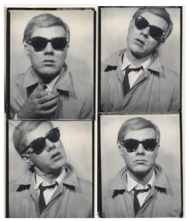
Andy Warhol, Photobooth Self Portrait, 1963.
Image: © The Andy Warhol Foundation for the Visual Arts, Inc. / Licensed by DACS/ London 2024
This seminal series of self-portraits originated at the behest of renowned Detroit collector Florence Barron, who had visited Warhol’s studio in 1963 with Ivan Karp, legendary dealer at the Leo Castelli Gallery, in order to discuss the commission of her own portrait. At the time, Warhol’s fame was buoyed by successful solo exhibitions at the Ferus Gallery in Los Angeles and the Stable Gallery in New York, and Barron wanted her own portrait rendered in his signature style. However, Karp managed to persuade both artist and patron that a self-portrait would be even more appropriate. The dealer, convinced that a self-portraiture series would propel Warhol to new heights, had been trying to persuade the artist for some time: “You know, people want to see you. Your looks are responsible for a certain part of your fame – they feed the imagination” (Ivan Karp cited in: Carter Ratcliff, Andy Warhol, New York 1983, p. 52). The resulting discovery of his own image as source material proved a critical moment for Warhol, ultimately becoming a theme that he would revisit and rework throughout his career.
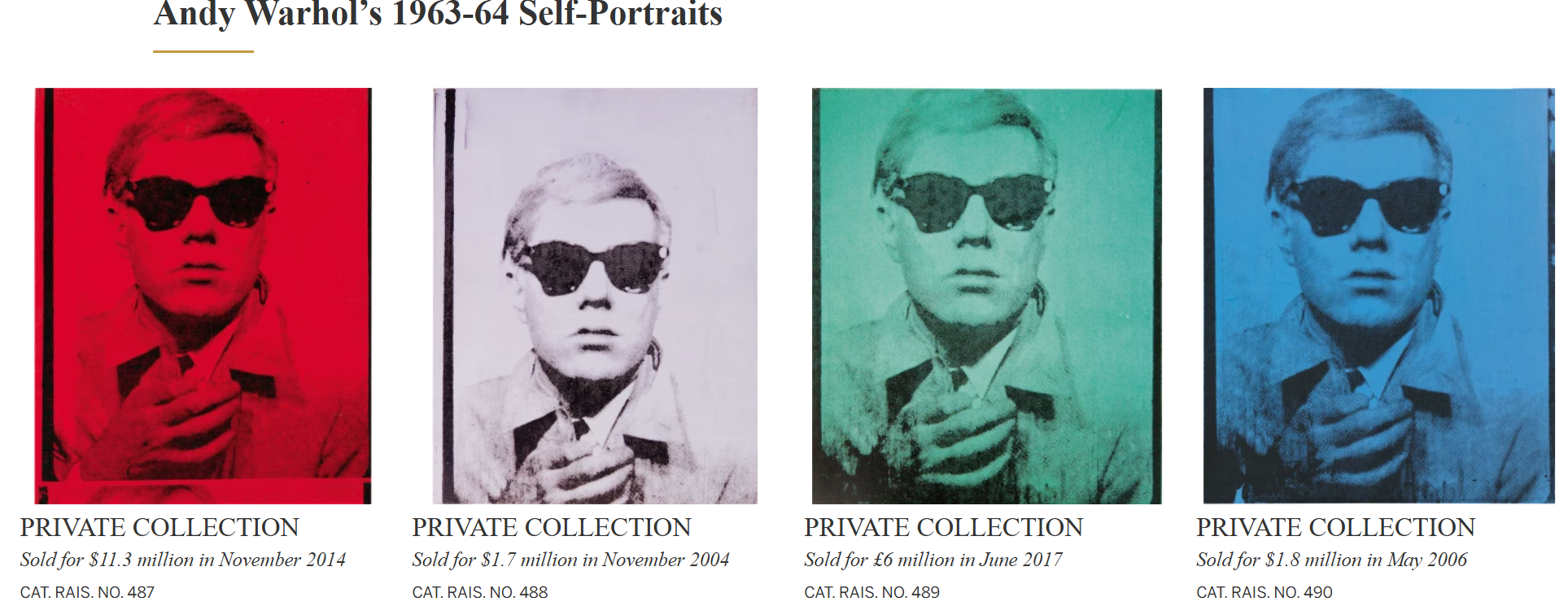
Working from the simple source material of a photo-booth strip of black and white photographs, Warhol translated these candid, even kitschy shots into dynamic and bold new representations. He had first made use of the photo-booth portrait earlier in 1963, when he was commissioned by Harper’s Bazaar to illustrate an article, providing photographs from a Times Square Photomat of such subjects as painter Larry Poons, curator Henry Geldzahler, and composer La Monte Young. Soon after, Warhol decided to use this new medium to create a portrait of Ethel Scull, the famous New York collector. The resultant painting is now one of the most celebrated works of Warhol’s early career, jointly owned by the Whitney Museum of American Art and the Metropolitan Museum of Art. Years later, Scull described how, to create it, Warhol had taken her to a seedy amusement arcade on 42nd Street: “We were running from one booth to another, and he took all these pictures and they were drying all over the place… I was so pleased. I think I’ll go there for all my pictures from now on” (Ethel Scull cited in: Exh. Cat., Hamburg, Hamburger Kunsthalle, Andy Warhol: Photography, 1999, p. 89).
Left: Vincent van Gogh, Self Portrait with Bandaged Ear, 1889. Courtauld Institute of Art, London. Image: Bridgeman Images.
Right: Pablo Picasso, Self Portrait, 1907. Narodni Muzeum, Prague. Image: © Succession Picasso/DACS, London 2024
These miniature portraits from corner store photo-booths perfectly suited Warhol’s vision for a new type of art to suit the Pop era: they were mechanical, democratic, and quintessentially all-American. They are redolent of the Campbell’s soup cans and Coca-Cola bottles that had previously dominated his praxis, with their format just as recognizable to the average American, and their predetermined, automatically produced format was devoid of any trace of the artist’s hand.
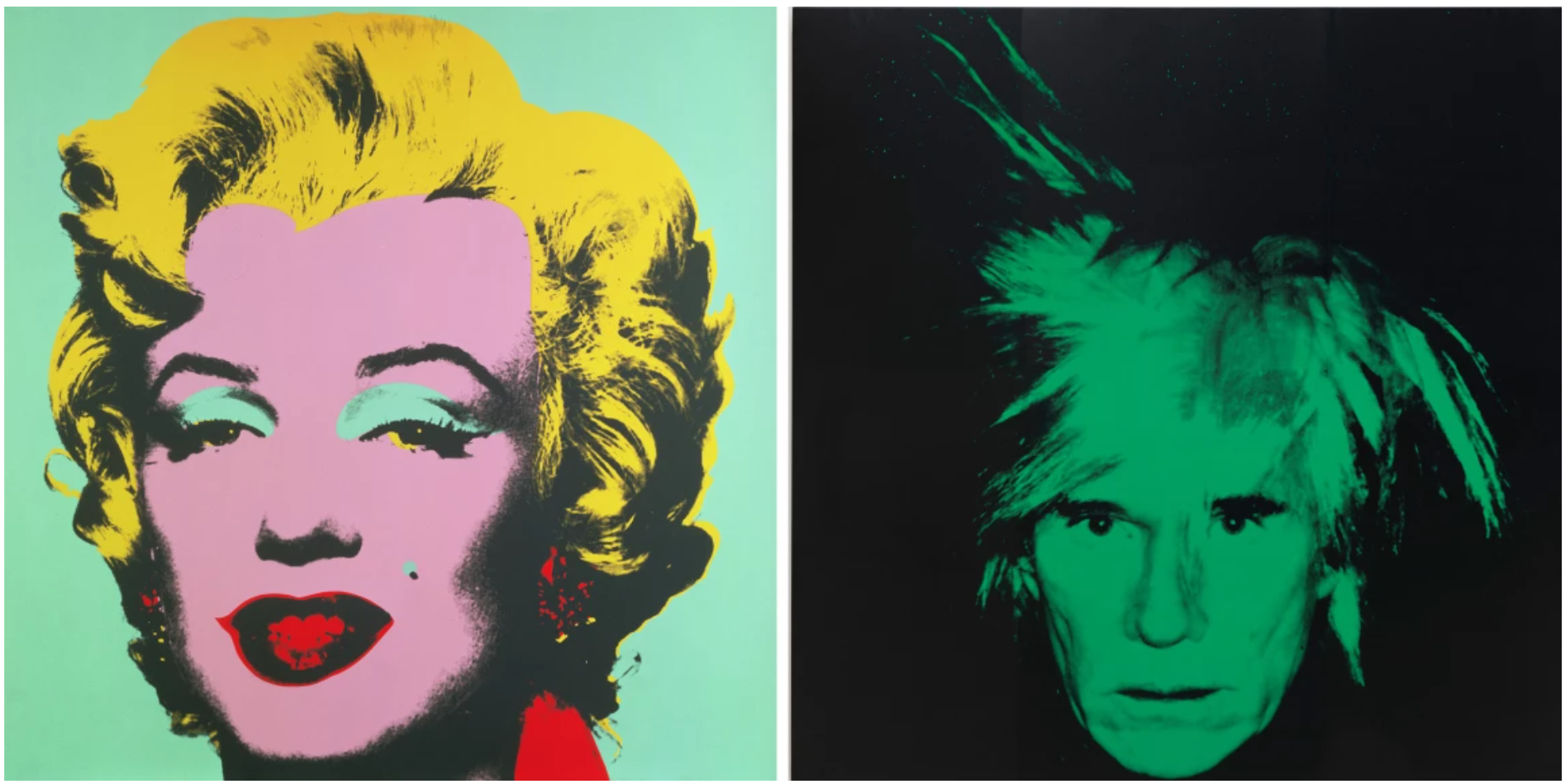
Left: Andy Warhol, Marilyn, 1967. Hamburger Kunsthalle, Hamburg. Image: © The Andy Warhol Foundation for the Visual Arts, Inc. / Licensed by DACS/ London 2024
Right: Andy Warhol, Self Portrait, 1986. Metropolitan Museum of Art, New York. Image: © The Andy Warhol Foundation for the Visual Arts, Inc. / Licensed by DACS/ London 2024
Presaging the Polaroid portraits that populated his 1970s output, the photo-booth strips pushed Warhol further into exploring seriality, a conceptual hallmark of his practice. Moreover, in appropriating the quotidian, machine-made product – essentially a found object bearing no semblance of artistic gesture – Warhol engages Marcel Duchamp’s concept of the readymade. In the present work, the strip is cut down to a single frame, yet it still bears traces of its original format: the black borders frame the composition, while thin bands of the above and below snaps are just visible along the top and bottom edges. By including these markers, Warhol foregrounds his mechanical method, making his means of production as much a subject as his own likeness.
“If you want to know about Andy Warhol, then just look at the surface of my pictures, my movies and me and there I am: there’s nothing in between.”
More than any artist before him, Warhol’s image, identity, and cultural persona were inextricably bound to his art, making the self-portraits some of the richest and most engaging in his oeuvre. Witnessing the conjunction of Warhol’s celebrity subject matter and his personal fame, the self-portraits result in an ironic layering of subject and author. In the present work, Warhol – the archetypal aloof, dispassionate voyeur – becomes the subject of our scrutiny, resulting in a complex play on seeing and being seen. Indeed, his self-portraits are the ultimate example of the irony inherent to his oeuvre: openly acknowledging the artifice and deception inherent in any form of representation, Warhol presents himself as a constructed fiction, an affected and contrived public image.
Portrait of Prince Charles, 1982
Phillips London: 10 October 2024
Estimated: GBP 1,000,000 – 1,500,000
PASSED
Andy Warhol – Modern & Contemporary … Lot 12 October 2024 | Phillips
ANDY WARHOL
Portrait of Prince Charles, 1982
Synthetic polymer paint and silkscreen ink on canvas
50 1/8 x 41 7/8 inches (127.3 x 106.4 cm)
Signed and dated ‘Andy Warhol 82’
Stamped with the Estate of Andy Warhol and the Andy Warhol Foundation for the Visual Arts, Inc. stamps
Numbered ‘P050.189’ on the overlap
Coming to auction together for the first time having previously been held in the esteemed collection of author and Conservative deputy chairman, Jeffrey Archer, Andy Warhol’s Portrait of Prince Charles and Portrait of Princess Diana exemplify the singular directness and immediacy of the artist’s Pop portraits. Executed with a decorative sense of line, and incorporating printed elements derived from drawings accented with electrifying flashes of bright, neon color, Portrait of Prince Charles is highly characteristic of Warhol’s late work in both stylistic and thematic terms. Simplified to its essential pictorial elements, the economic but expressive depiction of the future King of England here recalls avid collector Archer’s description of the artist as ‘unquestionably the great American draughtsman of the latter half of the century’ and establishes the intersection of fame, social hierarchy, and political authority that would preoccupy the artist towards the end of his career, notably in his 1985 Reigning Queens series which prominently featured bold, iconographic portraits of Charles’ mother, the late Queen Elizabeth II.
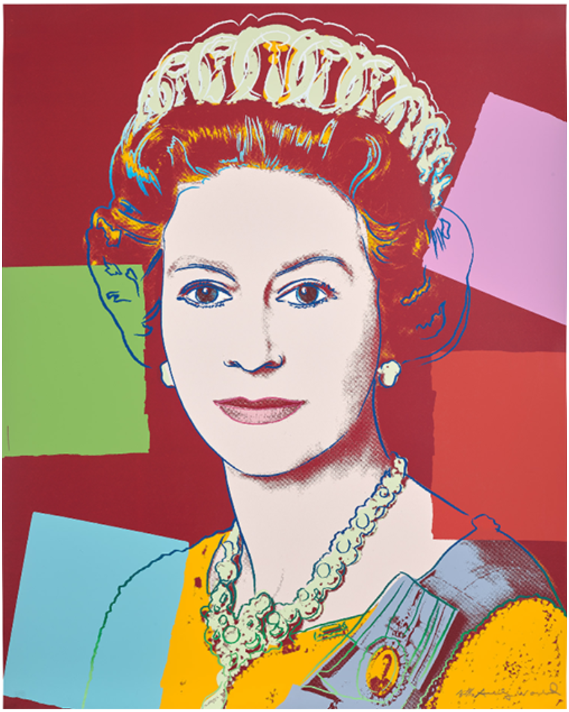
Andy Warhol, Queen Elizabeth II of the United Kingdom, from Reigning Queens, 1985.
Artwork: © 2024 The Andy Warhol Foundation for the Visual Arts, Inc. / Licensed by DACS, London
Throughout the long history of Royal portraiture, artists have grappled with the symbolism of reigning monarchs and their heirs, negotiating the relationship between image and more abstract concepts including power, nationhood, and political stability. More than any other artist of the 20th century, Warhol understood the uniquely representational forms and functions of portraiture in this respect and was deeply sensitive to the ways in which our relationship to this mode of painting and the figures depicted might shift and change in our own image-saturated age. While historically, loyal subjects might have only encountered the likeness of their sovereign rulers in public sculptures, grand paintings, or imprinted on coins, the speed of technological change over the course of the 20th century brought with it a proliferation of visual culture, with official portraits, paparazzi images, and news reports bringing the British monarchy closer to its public than ever before. Executed in 1982, just one year after the sensational wedding of the then Prince Charles to the young Lady Diana Spencer, Portrait of Prince Charles and its sister painting, Portrait of Princess Diana sit comfortably alongside Warhol’s earliest and iconic portraits of Marilyn Monroe, Elvis Presley, and James Dean in its symbolic power and bold use of color – a testament to the artist’s uncanny ability to select and isolate images that define an age. The engagement of Charles and Diana in 1981 generated enormous public interest, preceded by weeks of speculation in the press before the official – televised – announcement. Informal and unguarded, the way in which this young couple presented themselves signaled a new, modern, and altogether more glamourous chapter in the history of the British Royal family, chiming with the spirit of hopeful optimism for the future that best characterized the period. The couple’s courtship was played out like a fairytale in the press leading up to the wedding day, which was itself televised to over 750 million viewers worldwide.
Lord Snowdon, Official Engagement portrait of Charles and Diana, 1981. Image: © Snowdon / Camera Press
Lord Snowdon’s official and widely circulated engagement portrait of the couple reinforced these narratives. Arranged in front of an antique hanging tapestry the young and glamorously beautiful Lady Diana Spencer appears in a voluminous emerald-green formal dress, her arms folded demurely in her lap. In contrast to the seated Diana, Charles stands protectively behind her in full naval regalia, his arm rested on the back of her chair. Reproduced and distributed worldwide, the portrait officially announced the couple as future leading Royals, in what for Warhol must have had certain resonances with the circulation of publicity shots used by film studios in the promotion of their new releases and leading stars. Indeed, while Snowdon’s photograph emphasizes the continuation of tradition in both pictorial and dynastic contexts, Warhol’s silkscreened portraits amplify the forward-looking modernity represented by the couple. Cutting, cropping, and enlarging the image so as to focus more closely on the head and shoulders of each figure, Warhol’s decorative embellishments further emphasize the disjunction between reality and artifice, allowing the ‘synthetic nature of creating an icon [to assert] itself as part of the pictorial argument.’
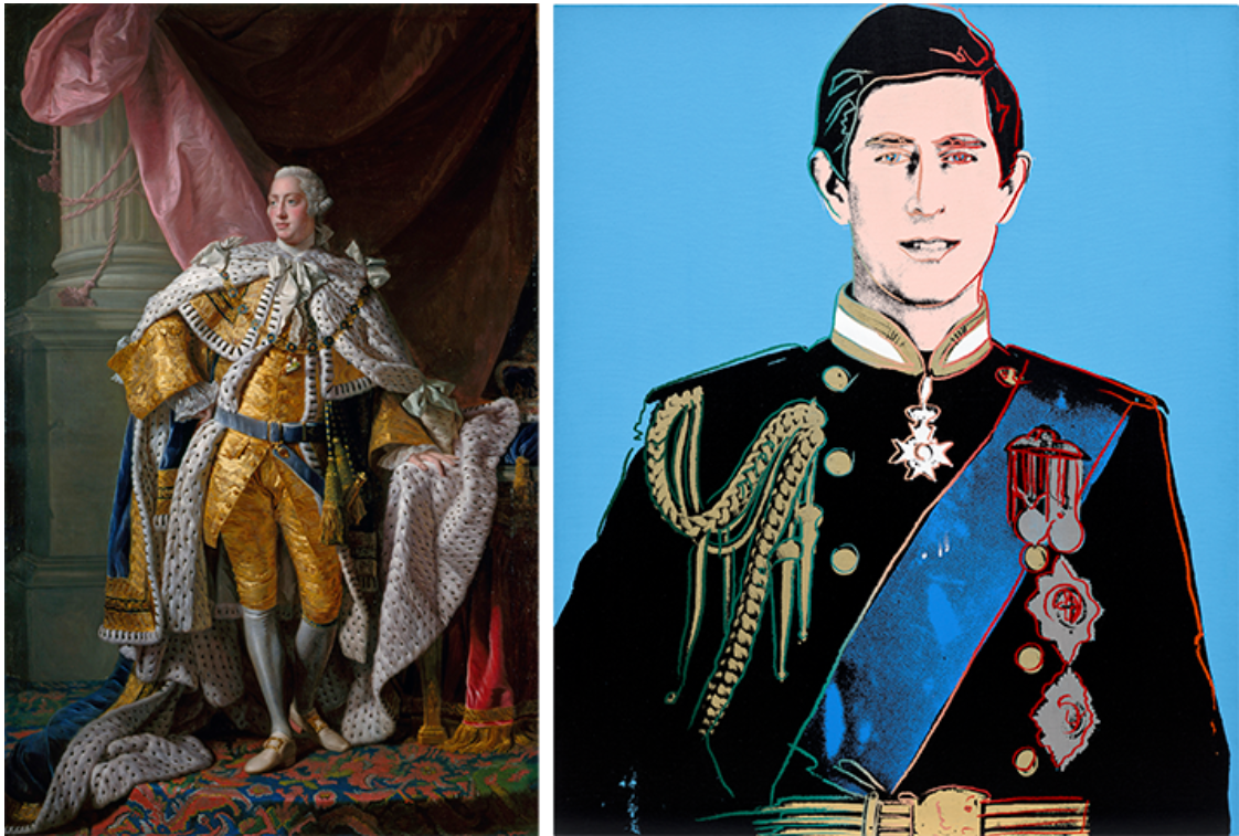
Left: Allan Ramsay, George III (1738-1820), circa 1761-62, Royal Collection Trust, London
Right: The present work
The culmination of a lifetime’s study into the power of portraiture, Warhol’s roster of celebrities had soared to ‘ever loftier, international heights’ during the 1970s, but it is with the portraits of Charles and Diana that Warhol reached ‘the ultimate top, meeting the most daunting of court-portrait challenges.’ As Robert Rosenblum details, Warhol owned high-quality copies of Alan Ramsay’s coronation portraits of George III and Queen Charlotte, and we can certainly see the lessons in communicating Royal grace and majesty taken by Warhol here. One of only four canvases to feature the then Prince of Wales, the rich blue present here in Portrait of Prince Charles speaks to the ‘blue blood’ pedigree of its subject, an optimistic statement about legacy and the future of the British monarchy seemingly embodied by this young, charming couple. Although history would take quite a different course, the recent ascension of Charles to the throne, and the much-discussed unveiling of his first, official portrait as reigning monarch by Jonathan Yeo reaffirms the dynastic vision captured by Warhol here, and portraiture’s preeminent power in communicating this.
Lenin, 1986
Christie’s London: 10 October 2024
Estimated: GBP 350,000 – 550,000
WITHDRAWN
ANDY WARHOL (1928-1987), Lenin | Christie’s (christies.com)
ANDY WARHOL (1928-1987)
Lenin, 1986
Acrylic and silkscreen ink on canvas
22 1/8 x 15 7/8 inches (56 x 40.6 cm)
Signed and dated ‘Andy Warhol 86’ (on the overlap)
Completed just months before his death in 1987, Andy Warhol’s Lenin (1986) is a striking, bold portrait of the political revolutionary. His holographic form, face glowing dusky pink, emerges from a black backdrop. Vivid outlines—traced twice in silver and bright yellow, their off-register silhouettes vibrating—delineate his features. Scant geometric forms indicate his shirt collar. As with his images of other public figures such as Marilyn Monroe and Queen Elizabeth I, Warhol emphasizes the most arresting details of his subject’s face: Lenin’s pointed beard and piercing stare are electric against the darkness. The result is a compelling, otherworldly depiction of one of the most influential and notorious figures of the twentieth century.
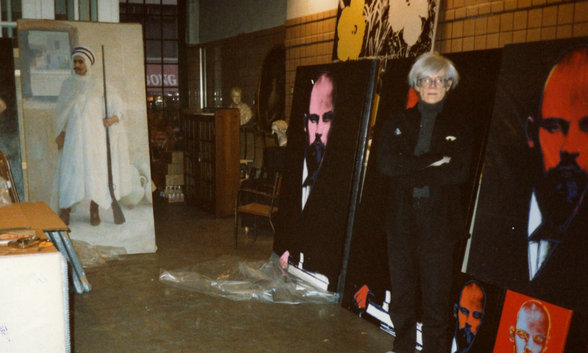
Andy Warhol in his studio with a series of Lenin works, February 1987. Artwork: © 2024 The Andy Warhol Foundation for the Visual Arts, Inc. / Licensed by DACS, London. © Photographer Bernd Klüser, 1987.
To create his silkscreened painting, Warhol used an image of Lenin taken at the close of the nineteenth century, which portrays the young revolutionary as a confident intellectual. The photograph was first shown to Warhol by the gallerist Bernd Klüser. In the early 1980s, Klüser and Warhol were working to develop a new collaborative project for which Warhol would move away from icons of Americana. Warhol, Klüser recalled, wanted to be ‘confronted with an image which went against the grain of his usual preoccupations. By virtue of both its content and formal quality, the photograph of Lenin seemed ideal for the purpose’ (B. Klüser, quoted in Lenin by Andy Warhol, Munich 1987, p. 68). Intriguingly, this source image had in fact already been doctored long before it was brought to Warhol’s attention. Lenin was initially photographed amongst a larger group of his peers in the Russian Social Democratic Labour Party. After they turned against him, Lenin had them scrubbed from the picture, leaving his own image alone.
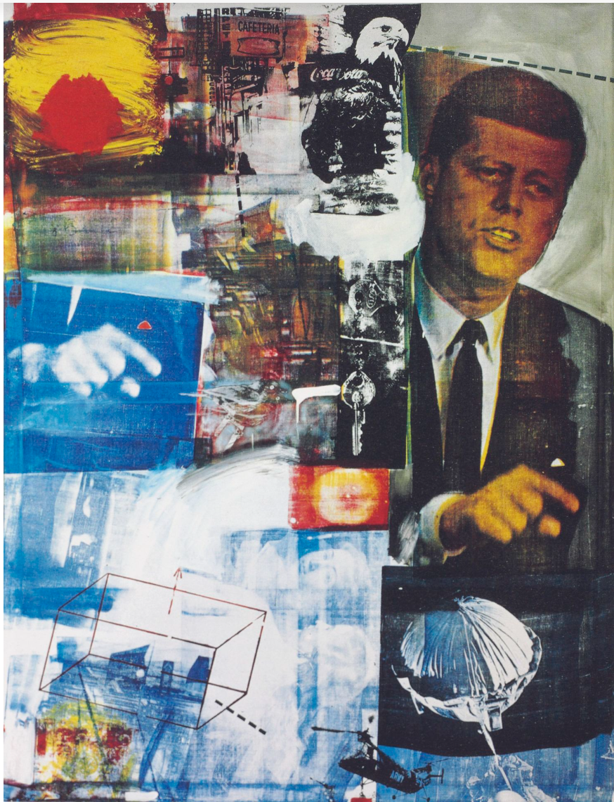
Robert Rauschenberg, Buffalo II, 2019. Private Collection.
Artwork: © Robert Rauschenberg Foundation/VAGA at ARS, NY and DACS, London 2024.
Committed to mining popular culture for his iconography, by the 1980s Warhol had made portraits of movie stars, athletes, criminals, artists and the authoritarian Chinese leader Mao Zedong. He shrewdly exposed the power of mass media to create, canonize, and commodify personas for the purpose of collective absorption. Where his representations of American celebrities reflected the consumerist image apparatus of capitalism, Lenin draws from the centrally controlled propaganda machine in Soviet Russia. In doing so, Warhol highlights the ways in which the West has also received and relied upon these same symbols. Giving the picture of Lenin a searing new life, he lays bare the ways in which an image’s meaning is constructed, manipulated and reappraised across time.
3. Other Artists
LUCIAN FREUD (1922-2011)
Ria, Naked Portrait, 2006-2007
Christie’s London: 9 October 2024
Estimated: GBP 10,000,000 – 15,000,000
LUCIAN FREUD (1922-2011), Ria, Naked Portrait | Christie’s (christies.com)
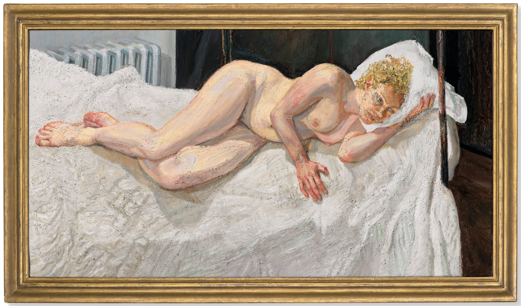
LUCIAN FREUD (1922-2011)
Ria, Naked Portrait, 2006-2007
Oil on canvas
87×163 cm (34 1/4 x 64 1/8 inches)
Ria, Naked Portrait (2006-2007) is a late masterpiece by one of the twentieth century’s greatest painters. A woman reclines naked on a wrought-iron bed made with quilted cream sheets. Her face, cushioned and silhouetted against a pristine white pillow, bears the distinctive hand of Lucian Freud’s celebrated mature style and is framed by fantastic daubs of warm golden curls. The sitter is Ria Kirby, an art handler whom Freud had met at the Victoria & Albert Museum on the occasion of his joint exhibition with Frank Auerbach in 2006. Their sittings, which took place over a marathon stretch of sixteen months—seven evenings a week and up to five hours at a time—culminated in this single, thrilling portrait. Invigorated by the commercial and reputational success of his partnership with New York art dealer William Acquavella in 1992, Freud unleashed newfound artistic fervor in his late career. Ambition oozed into all aspects of his practice: from the volume of paintings and etchings he produced to the sheer monumentality of his canvases. Ria, Naked Portrait was his widest to date, stretching well over five feet across. Testament to its significance, the painting would later hang alone in the final room of the National Portrait Gallery’s landmark exhibition Lucian Freud Portraits in 2012. The show, which was five years in the making and opened just one year after the artist’s death, was the most popular ticketed exhibition in the gallery’s history.
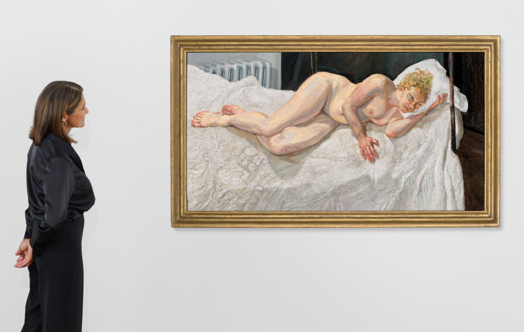
Ria Kirby approached Freud while hanging his pictures at the V&A. An aspiring painter herself, she had previously studied at the Camberwell College of Arts, she expressed her admiration for his work. And so it was arranged. Kirby agreed, and within twenty-four hours she was in Freud’s studio on Kensington Church Street with a cup of tea. Kirby was, by Freud’s famously demanding criteria, a perfect sitter: punctual, congenial, and impressively committed. She would arrive promptly to the studio at 6:30pm after her day’s work at the museum. It was Freud’s second scheduled slot of the day; these later ‘night paintings’ were executed in artificial light from four hanging bulbs, which the artist could individually dim and control. The pair worked symbiotically, and took only four evenings off within the sixteen-month period.
Diego Velázquez, The Toilet of Venus (‘The Rokeby Venus’), circa, 1647-1651. National Gallery, London. Photo: Bridgeman Images.
Freud began with painting Kirby’s face, as was the case with many of his late portraits including those of Leigh Bowery and Martin Gayford, and progressed outwards to capture each aspect of the composition in exquisite detail. He required his sitters’ presence even when rendering the background or peripheral elements of his pictures. The present image is a tapestry of whorled, painterly patches of color and texture. Kirby’s flushed skin is built from an intricate variety of hues—the warm, pink blushes of her hands and feet, touches of pale Naples yellow over her stomach and hips, and bluish shadows of her forearms and thighs—as well as the tactile grain of Freud’s favored Cremnitz White. Behind her, a radiator and blue-paneled screen offer glimpses of the artist’s simply furnished West London studio. These densely-worked areas—in which a polyphony of pigments pulsate with life—comprise one of Freud’s defining legacies to painting. He was captivated by time’s betrayal of the human body, the indelible marks it leaves on skin and flesh.
Edouard Manet, Olympia, 1863. Musée d’Orsay, Paris. Digital Image: Photo Scala, Florence.
For Kirby, the sessions soon became therapeutic, meditative, and often surprisingly entertaining. Hungry after many hours of work, the two would go out to Clarke’s in Kensington or the Wolseley in Mayfair, Freud dined at the latter haunt almost every night in his final years. Outside of the studio, the artist’s insatiable observation continued. Together, the pair people-watched and discussed the strange and bemusing characters who spilled in and out of the restaurant rooms. While he was painting Kirby’s portrait, Freud was in the process of selecting artworks by John Constable, whom he deeply admired, for a major exhibition at the National Portrait Gallery in 2009. Indeed, the subject of the reclining female nude draws from a rich pedigree of art historical precedents from Giorgione, Titian, and Velázquez—the latter’s ‘Rokeby Venus’ (1647-51) was one of Freud’s favorite paintings at the National Gallery, to Manet, whose stiff Olympia (1863) also lies atop elaborate swathes of stark-white bedlinen.
Lucian Freud, Benefits Supervisor Sleeping, 1995. Private Collection.
Artwork and photo: © The Lucian Freud Archive. All Rights Reserved 2024 / Bridgeman Images.
“Being naked has to do with making a more complete portrait, a naked body is somehow more permanent, more factual. When someone is naked there is in effect nothing to be hidden. Not everyone wants to be that honest about themselves, that means I feel an obligation to be equally honest in how I represent them. It is a matter of responsibility, in a way I don’t want the painting to come from me, I want it to come from them. It can be extraordinary how much you can learn from someone by looking very carefully at them without judgement.”
Kirby, naked and lying on her side, relaxes and sinks into a comfortable position on the mattress. Her fair, translucent limbs bend and wrap around themselves on pale sheets. Her right hand gently presses into a sunken hold while her left clutches beneath the pillow for support. Over many hours in this pose, her body seems to coalesce with the bed, softly weighing and impressing upon its crumpled surface.
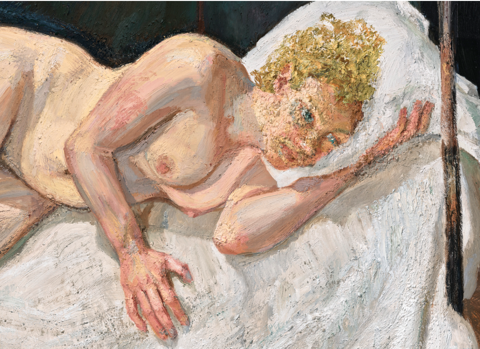
As time passed, Freud found the work’s end ever more difficult to ascertain. Photographs taken by his assistant David Dawson during these years show that most of the painting was finished by the autumn of 2006, and for months Kirby suspected each sitting might be her last. Freud, however, would continue to find areas to revise, perfect and fine-tune until well into the following year. This painstaking process, involving countless revisions and consecutive sessions spent mixing pigments for just a single brushstroke to be added, was typical of the artist’s mature style, which saw surfaces built to near-sculptural impasto. In Ria, Naked Portrait, we witness some 2,400 hours of observation solidify into high relief. The surface terrain—buttery and thick in some areas, coarse and calcified in others—is testament to this remarkably long gestation. The portrait was finally completed in 2007. This same year, Freud was the subject of the acclaimed retrospective, curated by Catherine Lampert, which began at the Irish Museum of Modern Art, Dublin and toured to the Louisiana Museum of Modern Art, Denmark and the Gemeentemuseum, The Hague. Marking the apex of Freud’s dazzling late fame, Ria, Naked Portrait lays bare the enthralling exchange between the painter and his sitter, and is a tour de force of the art-historical portrait tradition.
LUCIAN FREUD (1922-2011)
Head of a Woman, 1992
Christie’s London: 9 October 2024
Estimated: GBP 3,000,000 – 5,000,000
LUCIAN FREUD (1922-2011), Head of a Woman | Christie’s (christies.com)
LUCIAN FREUD (1922-2011)
Head of a Woman, 1992
Oil on canvas
10×10 inches (25.3 x 25.3 cm)
Lucian Freud had a complicated relationship with the works of art he kept in his house (just as he had with everything with which he came into contact). He never wanted to think of himself as a collector, and yet by the end of his life he lived amidst what could only reasonably be called a collection, including works by Auerbach, Bacon, Corot, Constable, Degas, Rodin and Cézanne. For years, there was one picture of his own included in this array of masterpieces: Head of a Woman (1992). In his Kensington house it hung, small, yet powerful, in the hall on the left, near a large and splendid Auerbach. Tenderness is not perhaps a quality everybody associates with Lucian’s works, yet some of his pictures have it. This one unquestionably does. It is an intensely intimate picture, not dominated by the artist’s gaze (which critics often like to discuss), but by her shining, grey-blue eyes. You feel she must have been looking at the painter with extreme intentness, giving him perhaps quite as close a scrutiny as he was giving her.
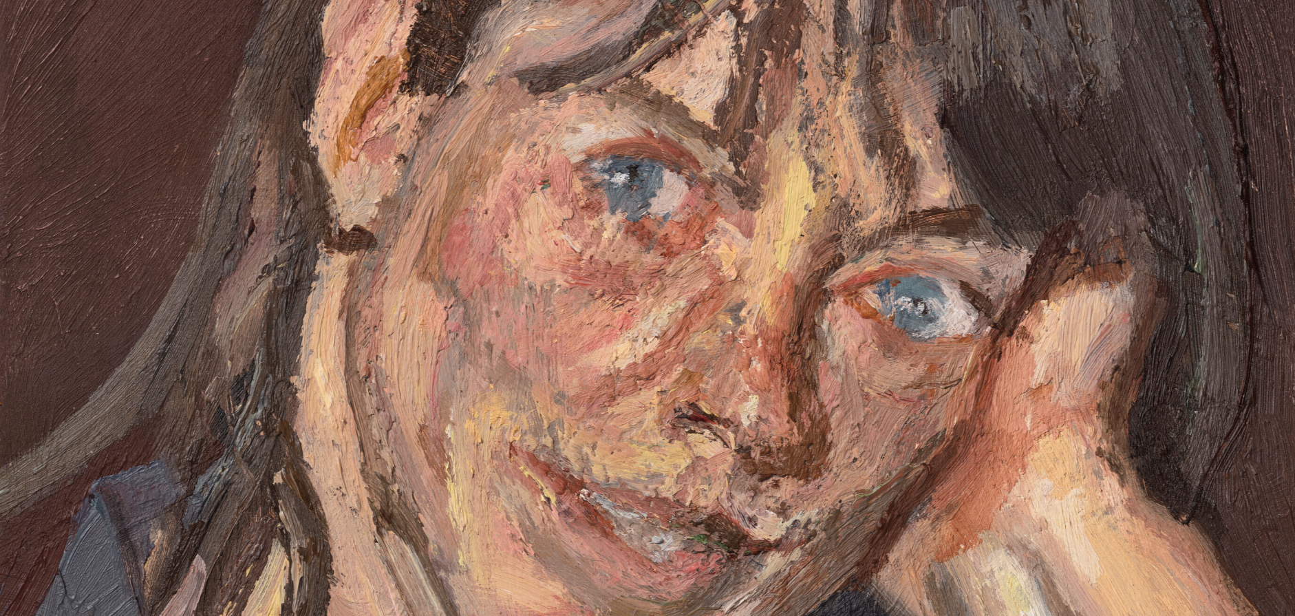
Head of a Woman has, in a high degree, the masterly painterliness which characterized Freud’s later decades. Viewed from close up, the face is a mosaic of colors (beige, purple, grey, brown) applied in vigorous, chunky strokes. But pull away a little, and this patchwork becomes delicate, living flesh. In general Freud had an aversion to seeing his own pictures after they were finished. He described how, when he went to visit people who owned his paintings and etchings, he ‘couldn’t blame’ them for hanging these possessions on their walls. On the other hand, he didn’t want to dwell on them himself, and this was, again, for complex reasons.
LUCIAN FREUD
Child with a Toy Dog, 1956
Sotheby’s London: 9 October 2024
Estimated: GBP 1,500,000 – 2,000,000
GBP 1,980,000 / USD 2,593,800
Child with a Toy Dog | Contemporary Evening Auction | 2024 | Sotheby’s (sothebys.com)
LUCIAN FREUD (1922 – 2011)
Child with a Toy Dog, 1956
Oil on canvas
37×35 cm (14 1/2 x 13 3/4 inches)
This work will be included in the forthcoming catalogue raisonné of Lucian Freud paintings under cat. 120
A meticulously rendered and tenderly intimate portrait, Child with a Toy Dog profoundly declares Lucian Freud’s utter mastery over the medium of paint. Executed in 1956, this jewel-like depiction of the artist’s young daughter Annie encapsulates the intensity of purpose, observation, and technical virtuosity that has marked Freud as a titan of his generation.
Indeed, the extraordinary degree of psychological intensity and penetrating observational analysis with which he approached his later subjects can be traced to the thrilling exactitude of vision and venerable draughtsmanship that characterizes early works like the present. Carefully selecting his models from his close friends and family, Freud’s work is enriched by its often intimate and autobiographical content, and throughout his long career he has painted his children with singular attentiveness and consistency. Like Freud’s remarkable series of self-portraits which record not only his maturing features but also his constantly evolving style, so too the portraits of his children provide a compelling and insightful lens through which to examine the artist’s work. Exquisitely realised in near-forensic detail from careful yet confident strokes of pigment, the extreme care taken as a painter suggests a similar tenderness felt as a father. Child with a Toy Dog is thus a significant and superlative example of the concentrated energy and painterly command that have come to characterise Freud’s uncompromising and incomparable career.
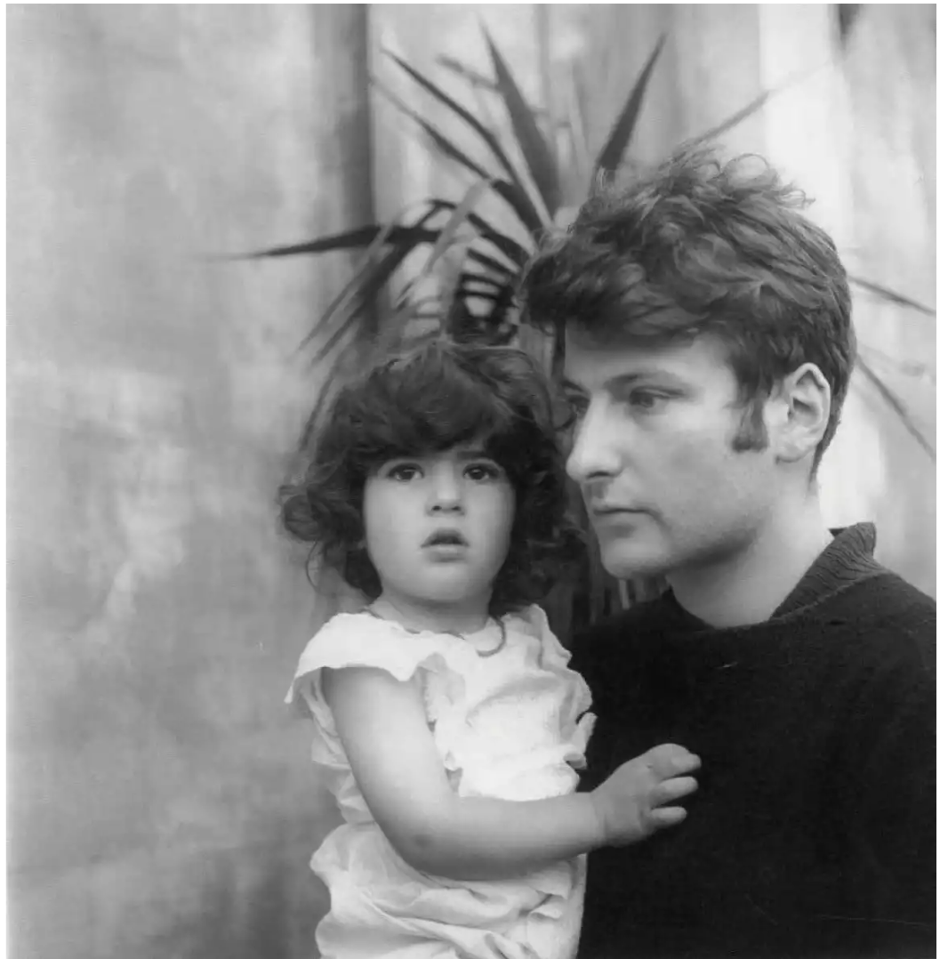
Lucian Freud with his daughter Annie in 1950, photographed by Cecil Beaton. © The Cecil Beaton Studio Archive
Painted in the garden of Coombe Priory, the weekend house near Coombe that Freud shared with his second wife, Caroline Blackwood, Child with a Toy Dog depicts the artist’s daughter Annie, the child from his first marriage to Kitty Garman. Although only about six or seven years old when the portrait was painted, Annie here has the mature and strong features of her mother who features in some of Freud’s most memorable and powerful portraits such as Girl with a Kitten. Some fifty years later, the model reflected: “It is great to see this lovely painting again and remember what it was like to sit for it. At the time I was intrigued by the blues and greens my father saw in my face… I think that he knew that I found sitting for the picture quite demanding. To keep me entertained he told me a story in serial form, in which I was a child stowaway on board an ocean liner. I carried a magical dog in a small suitcase. In particular, I remember that I arrived seconds late for the sailing, and as the ship began to move, I leaped dauntlessly from the dockside, suitcase in hand, onto the deck and so began my journey. Remembering this story, I have the sense that my father saw me as somehow heroic and that, fifty years on, that feeling has been preserved” (Annie Freud in an interview with Sotheby’s, December 2005).
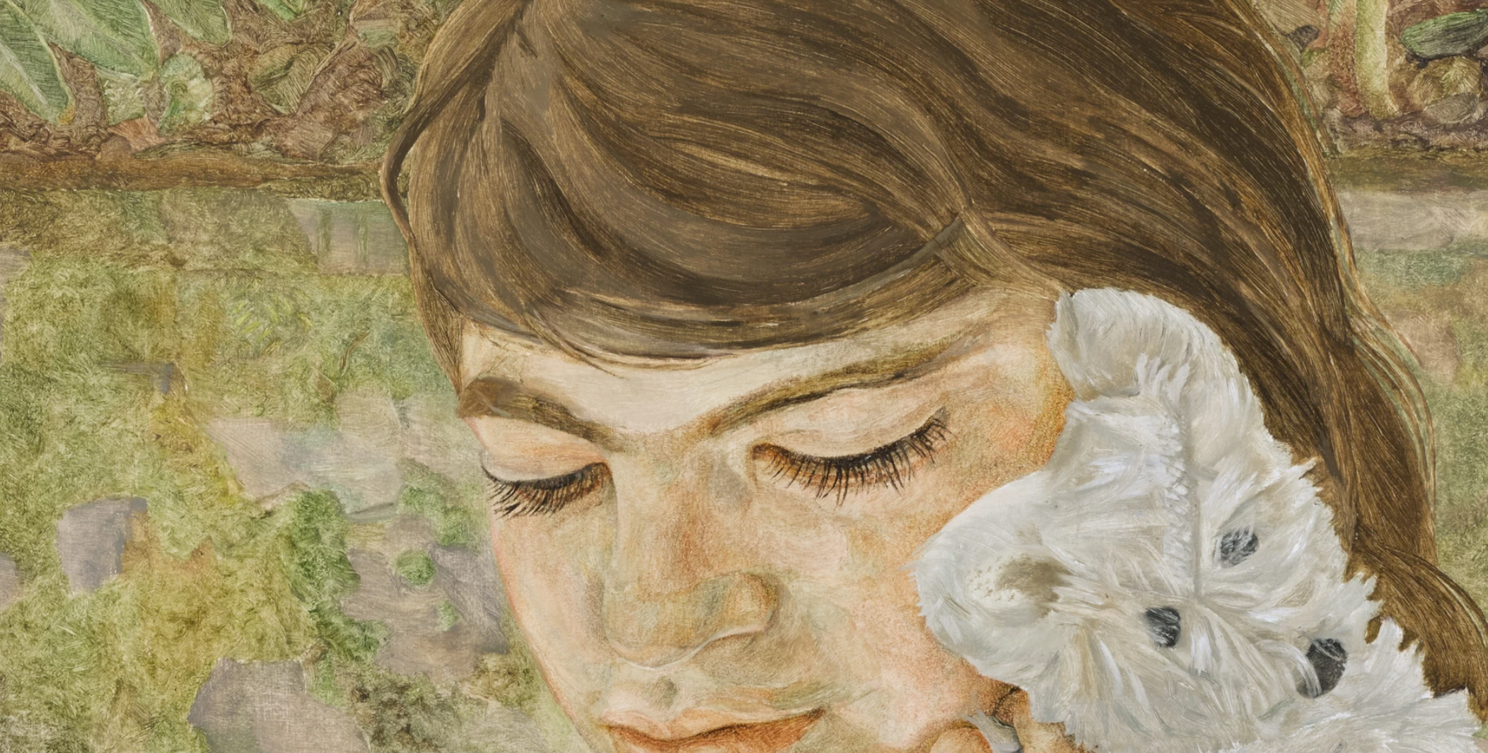
This portrait occupies an important place within Freud’s oeuvre and marks the seminal moment of transition from his early Ingriste linearity to the fuller and more confident mature style of his 1960s portraits. Two years earlier, Freud had represented Britain at the Venice Biennale to great critical acclaim alongside Francis Bacon and Ben Nicholson, and here we see him exploring new aesthetic and technical possibilities in paint. The fullness of Annie’s form and the passages of fluid brushwork in her hair and forehead reflect not only an advance in Freud’s confidence as a portraitist, but also the recent changes to his working process. At the suggestion of his friend Francis Bacon, in 1954 Freud began to paint standing up and swapped his fine sable brushes for a harsher and more expressive hog-hair. Freud was a great admirer of Bacon’s work for its ability to “unlock the valves of feeling” through sweeping brushstrokes loaded with paint; as Freud explained, “I wanted to develop something that was unknown to me” (the artist cited in Exh. Cat., Venice, Museo Correr, Lucian Freud, 2005, p. 35). Importantly these changes allowed Freud to measure himself better against the subject, to move the paint around with more energy and emphasis, and to achieve a clearer feeling of shape and form. The contours of Annie’s face and hand here are bathed in a translucent light here and there is a heightened physicality and presence to the figure that moulds itself from the individual minute accents of Freud’s brush.
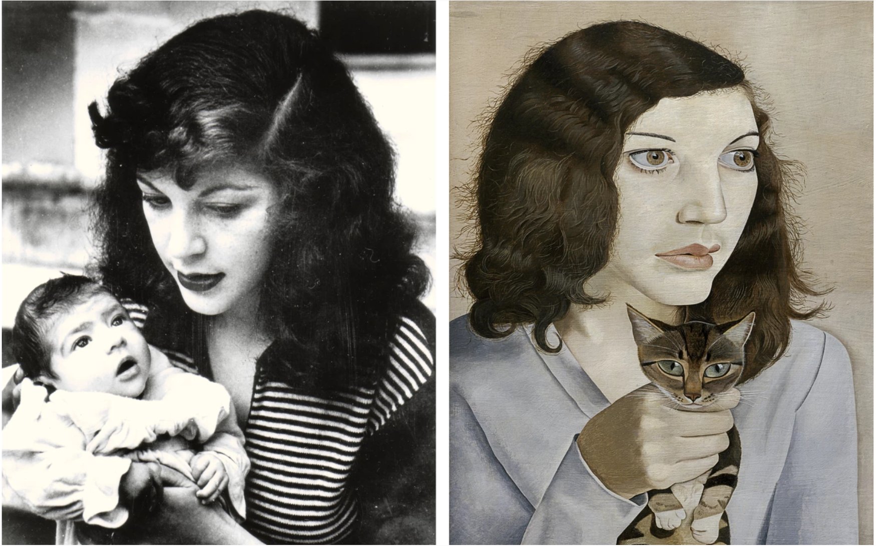
LEFT: Kitty Garman with her daughter Annie in 1948. Photo © Annie Freud.
RIGHT: Lucian Freud, Girl with a Kitten, 1947. Tate, London. Art © 2022 Lucian Freud Archive – All Rights Reserved
As with his other sitters, Freud’s way of getting to know his children has always been through paint. There is a sense of tenderness here that is evoked through the intimacy of Annie’s pose and the artist’s almost touching viewpoint as he hovers over her. However, he is careful never to stray into overtly sentimental tenderness, and it is a golden rule of Freud’s portraiture not to be indulgent with his subject matter. In painting his friends, lovers, or daughters, he paints what he sees, not what they want him to see, and maintains the same degree of emotional detachment.
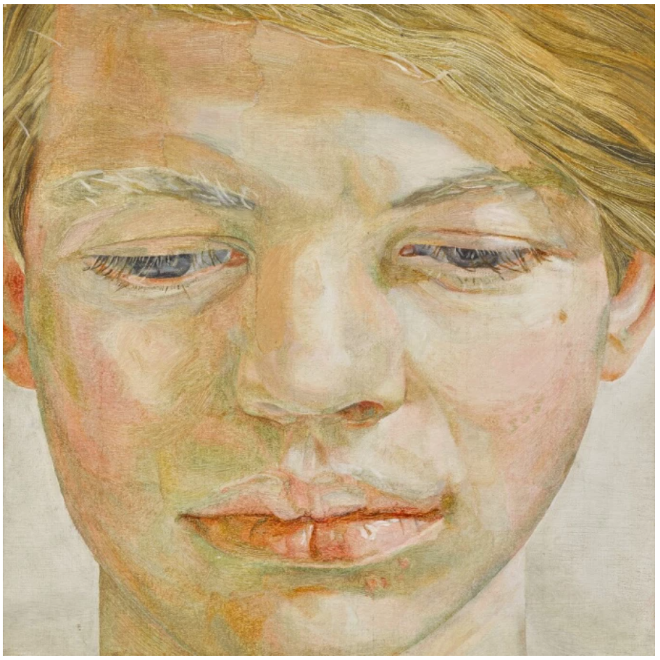
LUCIAN FREUD, Head of a Boy, 1956. Private Collection. Sold Sotheby’s London, March 2019, for £5.8 million.
Art © 2022 Lucian Freud Archive – All Rights Reserved
A passionate observer of reality, Freud’s desire to paint is driven by his obsessive fascination with form and texture. Here his notorious painterly curiosity emanates from the assiduous devotion he invests in every minute detail. Focusing on his daughter’s youthful face with an intense, almost microscopic scrutiny, each individual hair of her eyelashes has been lovingly traced across the canvas with the finest brush. There is a tremendous vitality and feeling of warmth to the skin of her face and hand that radiates from the delicate brushstrokes and infinite subtle hues of white, pink, and orange. As is characteristic of Freud’s best work, there is a feeling of completeness to the composition that emerges from the harmonious fusion of parts and the objective equality of detail invested in each area of the painting. The texture of the toy dog that Annie affectionately clasps to her chest, and the soft folds of her diaphanous white jumper sleeve are rendered with as much study and precision as her visage.
ED RUSCHA (B. 1937)
Start Over Please, 2015
Christie’s London: 9 October 2024
Estimated: GBP 2,000,000 – 3,000,000
GBP 3,186,000 / USD 4,173,660
ED RUSCHA (B. 1937), Start Over Please | Christie’s (christies.com)
ED RUSCHA (B. 1937)
Start Over Please, 2015
Oil on canvas
64×72 inches (162.7 x 183 cm)
Signed and dated ‘Ed Ruscha 2015’ (on the reverse)
The title of Ed Ruscha’s Start Over Please (2015) is emblazoned in white across a six-foot-wide inferno of a sky. Its three monosyllabic words resound with percussive force at the surface of the canvas, each crisp capitalized letter equally spaced on three horizontal lines. The text is an uncanny presence. It straddles the sky and spans its vivid gradient: from the smouldering orange sun beneath the horizon line, to blue and deeper blue, and the darkling stratospheric depths. The words form a strange pattern of crescents and lines, like mappings of synthetic constellations. It is a characteristically enigmatic painting by the Los Angeles-based artist, who for the last seven decades has explored the combination of images, words, epigrams, and the potent aesthetics of American consumer culture. Ruscha’s art—which spans painting, drawing, collage, photography, and books—is as playful as it is deadpan and as straightforward as it is inscrutable. The present painting belongs to a body of works begun in the 1980s that feature superimposed statements against sublime landscapes. Whether an electrifying dawn or an apocalyptic night, ‘Start Over Please’ reads like an inevitable cue, beckoning the viewer to act.
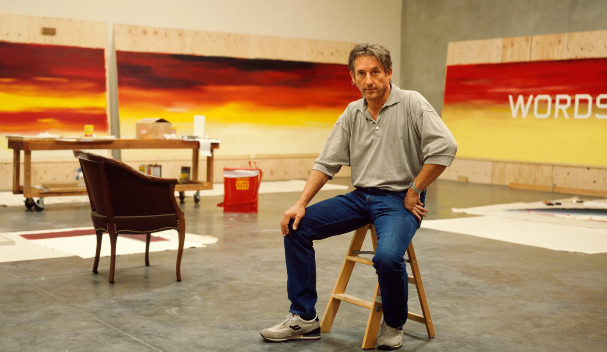
985. Photo: Evelyn Hofer/Getty Images. Artwork: © Ed Ruscha.
Since his first job as a layout artist in a Los Angeles advertising agency, Ruscha has explored a wide range of elaborate typographies in his art: from Garamond and Old English Gothic, to trompe-l’oeil letters formed of curlicued ribbons, foam, liquid spills, and stains. In the early 1980s he designed a font of his own, called Boy Scout Utility Modern. It is a capitalised and undecorated sans-serif letterform with shaved, angular edges in place of rounded curves, and has come to be the artist’s signature typeface. Ruscha deems it an appropriately neutral and inexpressive vessel for his free-standing statements. ‘Some people wear shoes that say something; some people wear shoes that don’t say anything’, he explained. ‘I use a type face that doesn’t say anything’ (E. Ruscha quoted in E. King, ‘Ed Ruscha on Paper: A view on the spirit and letter of the pop-art pioneer’, Interwoven, 2018).
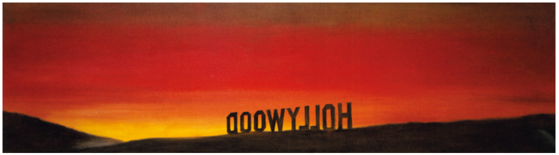
Ed Ruscha, The Back of Hollywood, 1977. Collection Musée d’Art Contemporain, Lyon. Artwork: © Ed Ruscha.
Boy Scout Utility Modern shares the truncated style of Ruscha’s much beloved ‘Hollywood’ sign. He had once joked that the iconic cultural landmark, glimpsed from his studio window, was his personal smog meter. On fair days it is visible from a distance of up to fifteen miles away. He drew its white cut-out letters for the first time in 1967, and the sign has since become as recognised in his oeuvre as it is in Los Angeles. Ruscha’s sensibility for words as they appear in landscape—viewed obliquely, through atmosphere and mists, or cast into dramatic perspectives—can be traced to his earliest works. His photographic books of the 1960s document the billboards, gas stations, road signs, and store signs that punctuated his drives between Oklahoma City and California on the US 66—gleaming, man-made markers in America’s sweeping Western flatlands. ‘Words are pattern-like’, Ruscha says, ‘and in their horizontality across the canvas, they answer my investigation into landscape’ (E. Ruscha quoted in B. Blistène, ‘Conversation with Ed Ruscha’, in Edward Ruscha, exh. cat. Museum Boijmans Van Beuningen, Rotterdam 1990, n.p.).
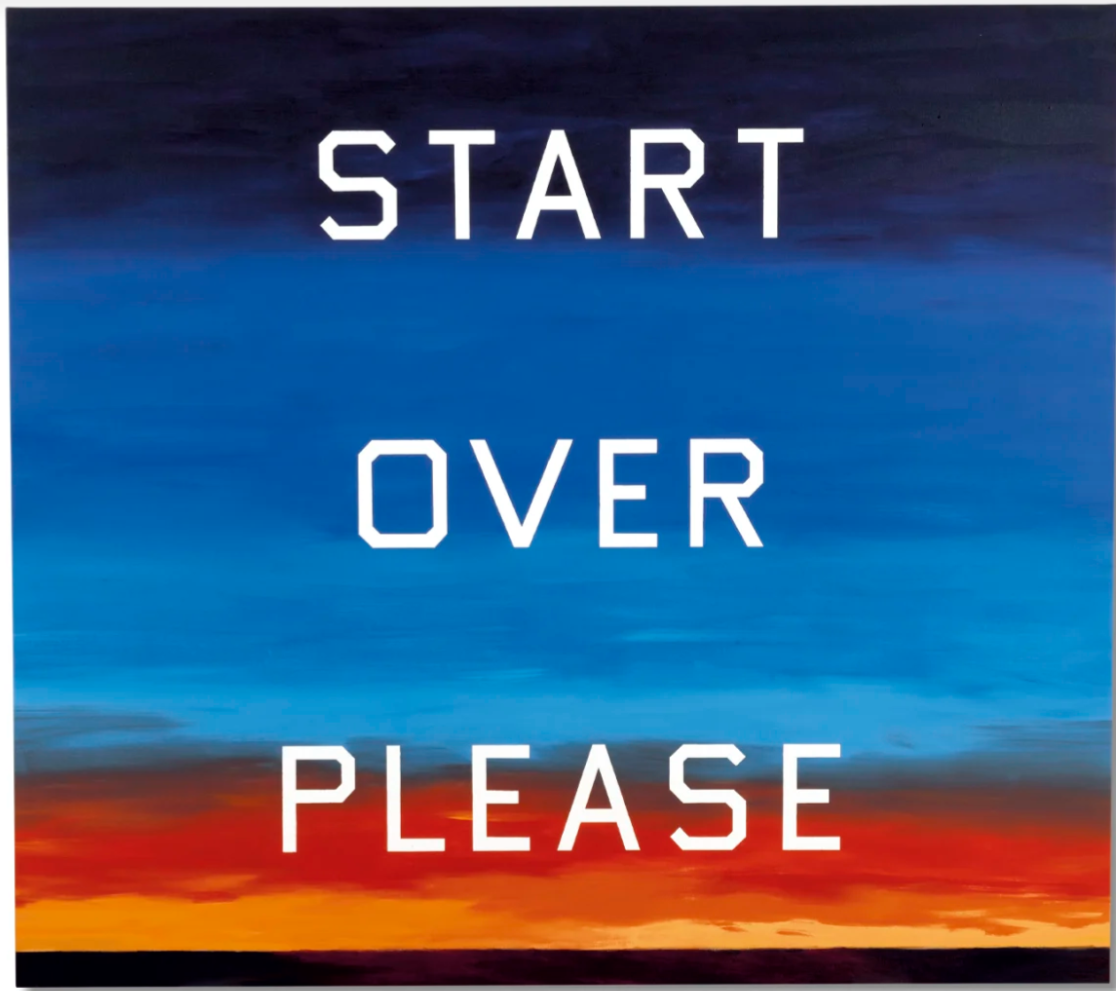
Ruscha’s shift to simplified, unembellished typography in the 1980s correlated with his adoption of more sophisticated phraseology and development of backgrounds as real, figurative spaces. While in his previous works words float in abstract space like specimens under a microscope—their ‘objectness’ and texture amplified—the present painting forms part of a series of works in which enigmatic statements are composed flatly against spectacular landscapes. Here, the words ‘Start Over Please’ are cleanly extracted from their background, pulled from the vivid skyline to the surface of the canvas to create two disjunct spatial planes. The landscape is at once the text’s foil and support.
Ed Ruscha, Pay Nothing Until April, 2003. Tate, London. Artwork: © Ed Ruscha. Photo: © Tate, ARTIST ROOMS.
Start Over Please invokes a cycle of beginnings and ends. Words roll over the blazing backdrop like the credits of a film or the blinking ‘Game Over’ message in a video game. It is a masterful illusion of narrative, which Ruscha tacitly implies yet seldom reveals. The painting exists in dialogue with a series of Ruscha’s works that incorporates the related phrase ‘The End’. Examples are held in the Tate Collection and the Museum of Modern Art, New York.
YAYOI KUSAMA
Pumpkin (M), 2016
Phillips London: 10 October 2024
Estimated: GBP 2,000,000 – 3,000,000
Yayoi Kusama – Modern & Contemporary … Lot 9 October 2024 | Phillips
YAYOI KUSAMA
Pumpkin (M), 2016
Mirror polished bronze
100.2 x 80.2 x 77.5 cm (39 1/2 x 31 5/8 x 30 1/2 inches)
Incised with the artist’s signature ‘Yayoi Kusama’ lower part
Executed in 2016, this work is number 7 from an edition of 8 plus 2 artist’s proofs
Without doubt one of the most immediately recognizable motifs in contemporary art, the polka-dot covered pumpkin sits at the very heart of Japanese artist Yayoi Kusama’s incredible 70-year practice, appearing across her work in paintings, sculpture, and immersive installations. Profoundly personal, Kusama’s affinity with the misshapen gourd is rooted deeply in the artist’s biography and is closely tied to the patterns of infinite repetition and accumulation that best define her practice. Beautifully realized here in undulating bronze, the exceptional free-standing sculpture captures the jovial vitality of the pumpkin, Kusama’s meticulously executed polka-dot design enlivening its voluptuously curved surface and acknowledging its esteemed place in her creative universe. So deeply enmeshed with Kusma’s biography and practice, the pumpkin is utterly synonymous with the artist herself, employed both as a universally recognized signature and a richly rewarding mode of self-representation that is most readily evoked in the freestanding sculptures.
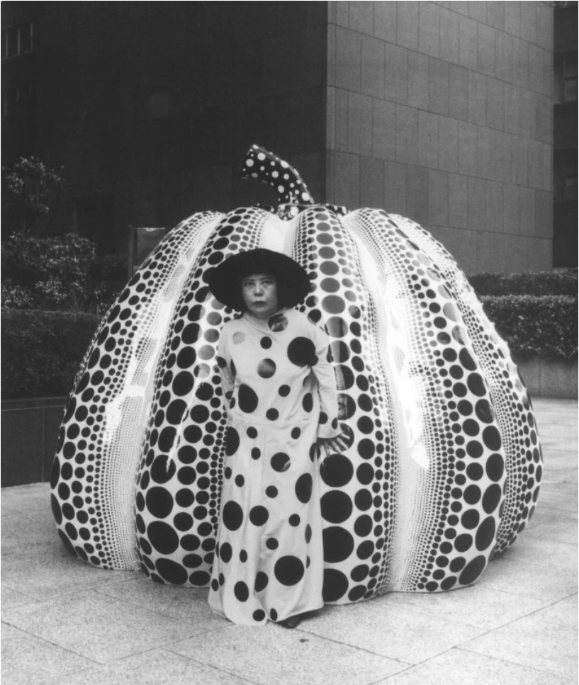
Yayoi Kusama with a Pumpkin sculpture in Fukuoka, Japan, 1994. Image/Artwork: © YAYOI KUSAMA
Standing at just over a meter high, Pumpkin (M) is a rare domestically scaled example of Kusama’s bronze pumpkins embodying the ‘fertile self-enclosure and radical openness to others’ that best defines her sculptural practice and installations. Following the ungainly curves and swollen form of the gourd itself, Kusama’s idiosyncratic polka-dot design flows in waves across its pronounced contours, recalling the bold, graphic qualities of Pop’s serial approach to everyday consumer items as well as the sophisticated geometries and emphasis on pattern and visual sensation explored in Op Art. Working with this yielding organic form, Kusama moves beyond naturalistic representation, animating each of these three-dimensional pieces with a vitality and personality all of their own.
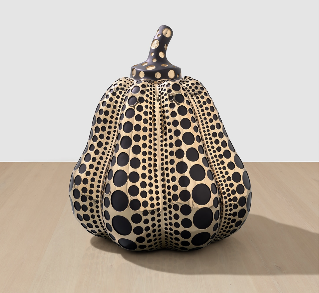
Although Kusama first started rendering large-scale pumpkins in fiberglass in the 1990s, it is with these later stunningly reflective bronze pieces Kusama approaches the immersive, interactive experiences of her mirrored environments. Created in 2016 for the artist’s installation Yayoi Kusama: Sculptures, Paintings & Mirror Rooms with Victoria Miro in London, the lustrous, mirror-polished Pumpkin (M) is amongst the first created by the artist, with other examples from the same edition having since been included in some of Kusama’s most significant exhibitions of recent years, including those held at the Tel Aviv Museum of Art and PHI Foundation, Québec. Examples of Kusama’s monumental open-air pumpkin sculptures continue to move and enchant viewers, as was seen most famously in the international reaction to the typhoon damage sustained by the first and most beloved of these pieces, originally installed at the Benesse Art Site on Naoshima Island. Most recently, Kusama unveiled her tallest bronze sculpture to date this year, the 6-metre-high Pumpkin now permanently installed in Kensington Gardens, London. A stunning example of the artist’s most beloved and deeply personal motif, Pumpkin (M) speaks to Kusama’s genuine love for the gourd, and her desire to share this joy with her viewers.
YAYOI KUSAMA (B. 1929)
INFINITY-NETS (ORUSB), 2014
Christie’s London: 9 October 2024
Estimated: GBP 600,000 – 900,000
YAYOI KUSAMA (B. 1929), INFINITY-NETS (ORUSB) | Christie’s (christies.com)
YAYOI KUSAMA (B. 1929)
INFINITY-NETS (ORUSB), 2014
Acrylic on canvas
97 x 130.5 cm (38 1/4 x 51 3/8 inches)
Signed, titled and dated ‘ORUSB INFINITY-NETS YAYOI KUSAMA 2014’ (on the reverse)
A brilliant golden lattice weaves over a deep black background in Yayoi Kusama’s INFINITY-NETS (ORUSB). Painted in 2014 and spanning almost a meter and a half in width, it is a shimmering example of the artist’s career-defining series. Repeated, looping brushstrokes define a constellation of small irregular apertures over the painting’s surface. The effect is of illusory motion: each blackened spot seems to pulsate and contract in a spectacle of sprawling organic form. Begun in the late 1950s, following the artist’s move to New York, the Infinity Nets represent in part the phantasmagoria Kusama experienced as a child. In these visions, kaleidoscopic dots, flowers and webs would proliferate, consuming her surroundings. Though drawing parallels to the prevailing aesthetics of Abstract Expressionism and Minimalism, these paintings marked a breakthrough into new, personal territory for the artist, and would signal one of her greatest painterly achievements.
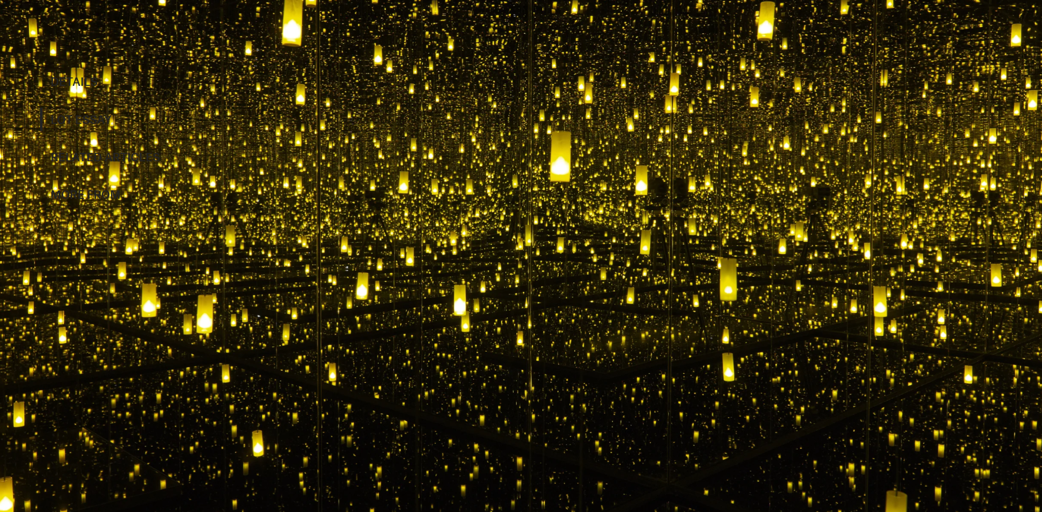
Yayoi Kusama, Aftermath of Obliteration of Eternity, 2009. Museum of Fine Arts, Houston. Artwork: © Yayoi Kusama. Courtesy of David Zwirner, New York; Ota Fine Arts, Tokyo / Singapore / Shanghai; Victoria Miro, London / Venice; YAYOI KUSAMA Inc. Photo: Museum of Fine Arts, Houston / Museum purchase funded by the Caroline Wiess Law Accessions Endowment Fund / Bridgeman Images.
Born in Japan in 1929, Kusama has spent the majority of her career exploring the perceptual possibilities of art. Through her emotionally turbulent childhood, she found relief in the natural world and art-making. Her early years in the rural provincial town of Matsumoto were marked by formative visits to local greenhouses, and the expansive meadows of her grandparents’ plant nursery. The present work, while retaining total abstraction with its vivid spotted pattern, conjures these rich memories and observations. Its many apertures evoke pods, seeds, sunflower heads, and cells, while its strict duo chrome palette of golden yellow and black recalls a protagonist in Kusama’s oeuvre: her beloved polka-dotted pumpkin. The polka dot abounds not only in her paintings, but also her sculptures, mirrored installations, walls, floors, and even the bodies of participants in her iconic ‘happenings’ of the 1960s.
The painting invokes an endless accumulation of form, and is testament to an equally painstaking, repetitious process of production. Kusama began to work on the series obsessively throughout the 1960s, losing herself in their spiraling mirages and often working uninterrupted for up to forty or fifty hours at a time. Though labor-intensive, this facture afforded Kusama temporary respite from her continued psychological torments and the troubles of the physical world. She has continued to create Infinity Nets with relentless vigor across the decades. Painted in 2014 at the age of 86—the year in which her retrospective Infinite Obsession drew record-breaking numbers of visitors across South and Central America—the present work expresses the series’ interminable relevance to the artist.
Gustav Klimt, The Stoclet Frieze (detail: Expectation, The Tree of Life, and Fulfilment), circa 1905-1909. Museum für angewandte Kunst (MAK), Vienna. Photo: © Superstock / Bridgeman Images.
When Kusama exhibited her Infinity Nets for the first time at Brata Gallery in 1959, she quickly drew the attention of critics and artists of the New York scene. Donald Judd, who later became a close friend, was among the first to write about them. He admired their systematic, additive concept—it was indeed one that his own burgeoning Minimalism shared—and likened their sublime emotive powers to the all-over paintings of Abstract Expressionists Mark Rothko, Clyfford Still and Barnett Newman. Born from potent forces of meditation and self-transcendence, the hallucinatory fields lay bare the web of Kusama’s inner world. Form dissolves into shimmering, all-consuming sensation, and caught within the net of the present work, the viewer is invited to contemplate a solace of eternity and immateriality.
YAYOI KUSAMA (B. 1929)
DOTS Accumulation, (ABC), 1999
Christie’s London: 10 October 2024
Estimated: GBP 120,000 – 180,000
YAYOI KUSAMA (B. 1929), DOTS Accumulation, (ABC) | Christie’s (christies.com)
YAYOI KUSAMA (B. 1929)
DOTS Accumulation, (ABC), 1999
Sewn, stuffed fabric and spray paint in fabric-lined wooden box
31.3 x 21.1 x 9.7 cm (12 3/8 x 8 1/4 x 3 7/8 inches)
Signed, titled, titled in Japanese and dated ‘YAYOI KUSAMA 1999 (DOTS) (ABC)’ (on the underside)
Fusing the bright colors and alluring surfaces of Pop art with an evocation of the infinite, DOTS Accumulation, (ABC) (1999) is instantly recognizable as the work of the iconic Japanese artist Yayoi Kusama. It comprises a wooden box lined with fabric, filled with ovoid protrusions of stuffed fabric. It is compact as an ex-voto, and hung on the wall like an offering. Every visible surface is blue and covered in white polka-dots; a mist of white spray-paint accentuates its dimensional relief. Kusama is concerned with accumulations of repeated marks and forms, a practice inspired by the hallucinations she has experienced since childhood. In her sculptural ‘accumulations’, initiated in 1962, tuberous biomorphic forms proliferate over objects in a similarly psychedelic manner.
Polka dots are the symbol of the spiritual peace and love, and the starting point of all of hopes and thoughts. While there is Dots, there is Kusama”
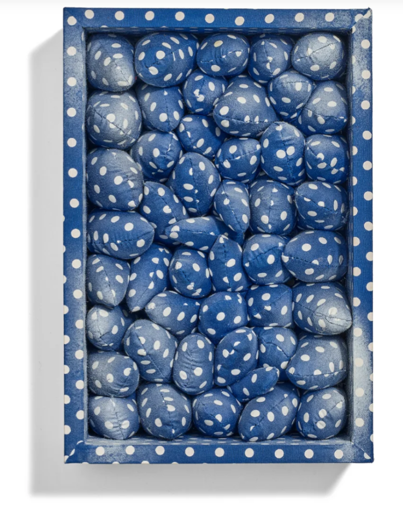
Polka-dots have been Kusama’s signature since the 1950s. She has since covered all manner of surfaces—canvases and paper, floors and walls, sculptures, chairs, household objects, and even naked human bodies—in its endless pattern. For Kusama, the dot is a rich, multi-faceted symbol. ‘A polka-dot,’ the artist says, ‘has the form of the sun, which is a symbol of the energy of the whole world and our living life, and also the form of the moon, which is calm. Round, soft, colourful, senseless and unknowing. Polka-dots become movement’ (Y. Kusama, Manhattan Suicide Addict, 1978, Tokyo, p. 124). DOTS Accumulation, (ABC) is a concentrated dose of Kusama’s cosmic practice.
Focus: Modern Art
WILLEM DE KOONING
Untitled XVIII, 1986
Christie’s London: 9 October 2024
Estimated: GBP 4,000,000 – 6,000,000
GBP 3,488,500 / USD 4,569,935
WILLEM DE KOONING (1904-1997), Untitled XVIII | Christie’s (christies.com)
WILLEM DE KOONING (1904-1997)
Untitled XVIII, 1986
Oil on canvas
70 1/8 x 80 1/4 inches (178 x 203.7 cm)
Signed ‘de Kooning’ (on the stretcher)
Held since 2008 in the collection of Eric Clapton, Untitled XVIII (1986) is a magisterial late work by Willem de Kooning. In his final decade of painting, de Kooning’s works reached a new serenity and purity, defined by radiant white surfaces intercut with sinuous, graphic lines of primary color. Untitled XVIII’s ribbons of red interlock and overlap to create a dynamic sense of space, conjuring hints of figure and landscape. Sections of lilac, yellow and jade green, glowing like stained glass, suffuse the painting with sunlit warmth. Its slopes, undulations, right-angles and sharp edges appear purposeful and poised. The white is flushed with underlayers of red, and finely textured with deliberate, directional brushstrokes. De Kooning would begin compositions of this period by projecting passages of previous drawings onto a canvas, tracing them in charcoal and rearranging and breaking up their patterns. The results recalled aspects of the biomorphic, largely black-and-white abstractions with which he had first made his name in the 1940s. In other ways, the artist was in entirely new territory, embracing a luminous palette and spare, buoyant structure that lent his late works a remarkable lightness and clarity. Shortly after Untitled XVIII was painted, it was given a prominent place in the 1987 Whitney Biennial.
De Kooning’s late blooming was the last in a succession of stylistic shifts across his six-decade career. His seminal 1940s abstractions had been followed by the infamous Woman series of 1950 to 1953. The scrambled pictorial energy of this early period reflected the frenetic atmosphere of post-war New York City, and made de Kooning a central figure in the development of Abstract Expressionism. Following his 1963 move from Manhattan to East Hampton, Long Island—where he would remain for the rest of his life—he moved onto more open, broad-brushed, verdant compositions that reflected his rural surroundings, with female figures making a bucolic return. The 1970s saw him build up a still more fluid, variegated and heavily-worked impasto in works like … Whose Name Was Writ in Water (1975, Solomon R. Guggenheim Museum, New York), which drew upon the tempestuous Atlantic sea and sky. It was around 1981—following the intervention of his wife Elaine, who had moved nearby to help wean him off a dangerous dependency on alcohol—that the spare, lyrical majesty of the ‘late’ abstractions emerged. He would continue to develop this mode until ill health forced him to stop painting towards the end of the 1980s. He died, aged ninety-two, in 1997.
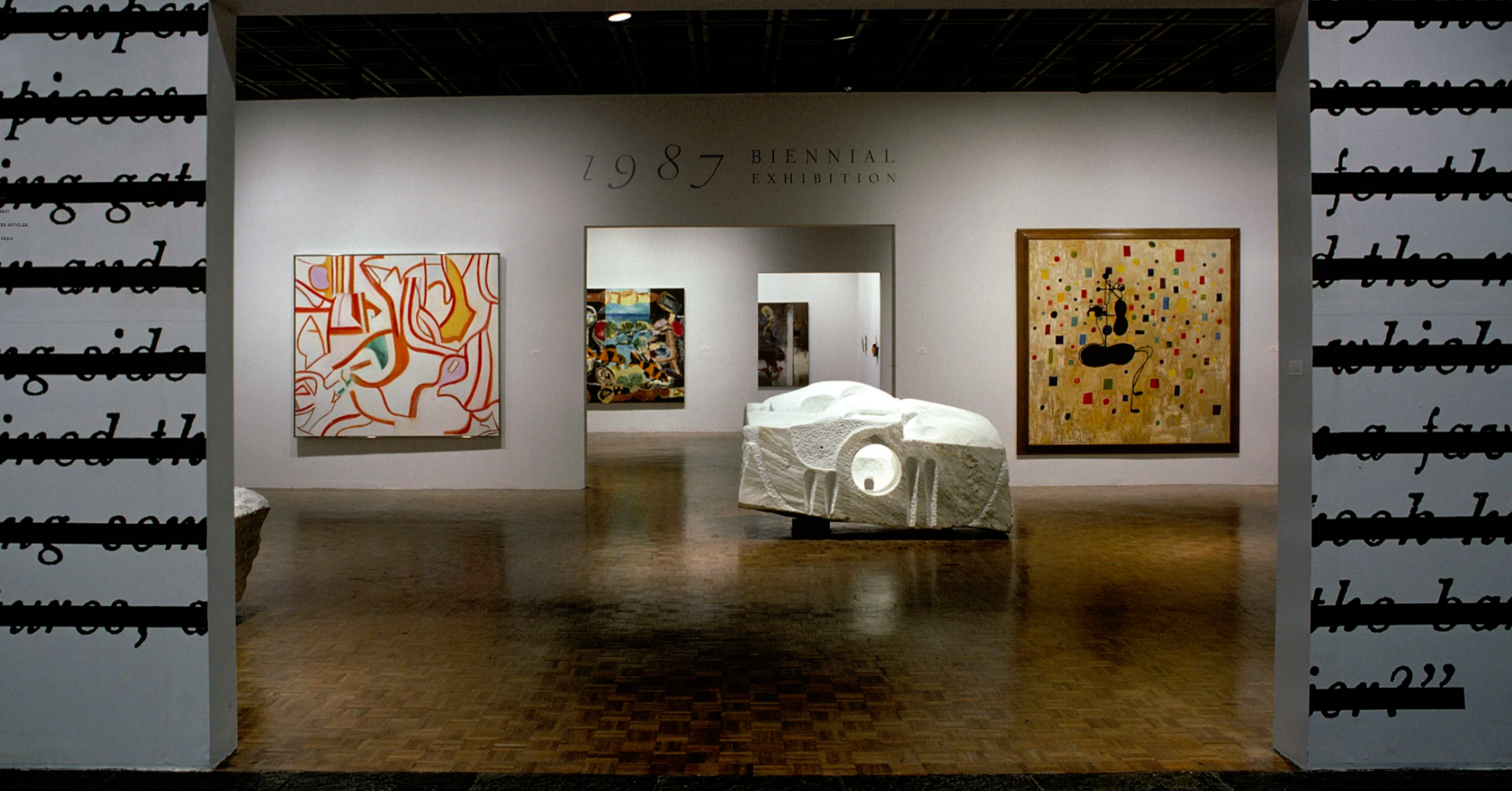
Installation view, 1987 Biennial Exhibition, Whitney Museum of American Art, New York, 1987. From left to right: Joseph Kosuth, Zero & Not, 1986; Willem de Kooning, Untitled XVIII, 1986; Louise Bourgeois, Nature Study, 1986; George Condo, Black Insect, 1986. Artwork: © Joseph Kosuth, Louise Bourgeois, George Condo, DACS, London 2024. Photo: Geoffrey Clements / Whitney Museum of American Art.
The beginning of the 1980s saw de Kooning visibly distilling the saturated, effusive compositions of his previous decade. He layered, sanded and scraped back lucent planes of white whose edges were defined by shimmering, whiplash traces of primary-colored line. As the more emphatic, skeletal structure of works like the present took shape, it was clear that de Kooning had found a new way of working. No longer employing dashing, muscular and loaded directional brushstrokes, he instead built line up using multiple additive marks, often, as in the present work, retreading and expanding on a single contour. What he had lost in athletic vigor the paintings gained in their visible rigor, laying bare the fierce compositional command that had underpinned even his most explosive earlier works. The restraint of Untitled XVIII does not reflect a fading away, but a consciously achieved minimalism.
It has often been remarked that these late works’ presiding spirit is no longer that of Picasso or Cézanne—whose Cubist atomization of form and tightly-structured surfaces had heavily informed de Kooning’s outlook—but Henri Matisse. The monumental ‘cut-outs’ that Matisse developed in the final chapter of his own career reflected his undying commitment to color, line and formal invention. With scissors and paper, he created a radical, economical pictorial vocabulary that would have huge impact on subsequent generations of painters. Matisse’s earlier work was also playing on de Kooning’s mind during the 1980s. Tom Ferrara, the artist’s assistant from 1979 to 1987, recalled that he ‘would refer often to Matisse’s Dance (1909), making a gesture with his hand as he gently waved upward to evoke the rhythm and freedom of movement in the painting’ (G. Garrels, ‘Three Toads in the Garden: Line, Color and Form’, in Willem de Kooning: the Late Paintings, the 1980s, exh. cat. San Francisco Museum of Modern Art, San Francisco 1996, p. 15). That work’s brilliant, balanced color-fields and interlaced linear figures might be seen to echo in Untitled XVIII.
Henri Matisse, Dance (I), 1909. Museum of Modern Art, New York.
Artwork: © Succession H. Matisse / DACS 2024. Digital Image: The Museum of Modern Art, New York/Scala, Florence.
With its own complexities of rhythm and movement, it is apt that the present painting has spent the past sixteen years in the collection of a musician. Eric Clapton—one of the great guitarists of his generation—has also owned abstract masterpieces by Gerhard Richter. Richter has referenced the music of Bach and John Cage in his Abstrakte Bilder, and has spoken of a musical quality in their structure and composition. Like de Kooning’s late works, they gesture towards unseen realities and quiver with hints at figuration while remaining self-sufficient, autonomous and enigmatic. For his part, de Kooning frequently listened to Stravinsky, Beethoven, Khachaturian and Bach as he worked, and, in the 1980s, was introduced to the new-wave band Talking Heads by his younger assistants. If the heyday of Abstract Expressionism was associated with the gestural, improvisatory energy of jazz, de Kooning’s stately late work approaches the grand, controlled virtuosity of Bach’s Brandenburg Concertos, which the journalist Curtis Bill Pepper heard blasting out from the artist’s studio in 1983. Untitled XVIII remains a lucid, controlled performance in color and light, exemplifying the shining mastery of his final act.
WILLEM DE KOONING
Untitled, 1987
Sotheby’s London: 9 October 2024
Estimated: GBP 3,000,000 – 4,000,000
GBP 3,165,000 / USD 4,146,150
Untitled | Contemporary Evening Auction | 2024 | Sotheby’s (sothebys.com)
WILLEM DE KOONING (1904 – 1997)
Untitled, 1987
Oil on canvas
77×88 inches (195.6 x 223.5 cm)
Dated ’87 (on the stretcher)
Willem de Kooning’s Untitled emerges from a corpus of haunting abstractions, created with the finesse of an artist at the height of his confidence and painterly abilities. Following four decades of incessantly groundbreaking modernist innovation and enveloping the themes and aesthetic impulses of his entire oeuvre, this light, lyrical arabesque of colour and form held together by energetic line fully embodies the boldly reinvented style that dominated the last decade of de Kooning’s life, now celebrated as his “Late Period.” Executed in 1987, Untitled is paramount among the canvases of this decade for its chromatic vibrancy, compositional dynamism, and bewitching beauty. Distinguished by its striking palette of orange, gold, and violet, the present work crystallizes the numerous investigations into painterly mark-making that defined the artist’s inimitable corpus within a single, exquisite canvas. Befitting its importance, this work was included in the major exhibition of the artist’s late paintings at the Museum of Modern Art, New York, in 1997.
Willem de Kooning in his Long Island studio, 1985.
Image: © The Willem de Kooning Foundation / Artists Rights Society (ARS), New York and DACS, London 2024
Untitled is a truly superb exemplar of the unique painterly method de Kooning applied to his compositions of the 1980s. While at first glance the lyrical tangerine, mauve, and yellow zones appear to be floating upon a pristine white ground, their indomitable elegance and ethereal lightness was in fact achieved through de Kooning’s judicious application of cool white oil pigment atop a churning surface of chromatic intensity. As such, the graceful organization of hued forms in Untitled was revealed by way of excavation as opposed to accumulation, the result being one of profound aesthetic and technical innovation from an artist in the final decades of his prodigious career. Here, the buoyant graceful lines of de Kooning’s abstract calligraphy are utterly sensual, and nowhere is his grand ability as a colorist more poetically asserted than in these late masterpieces, with their reduced and expressive palette.
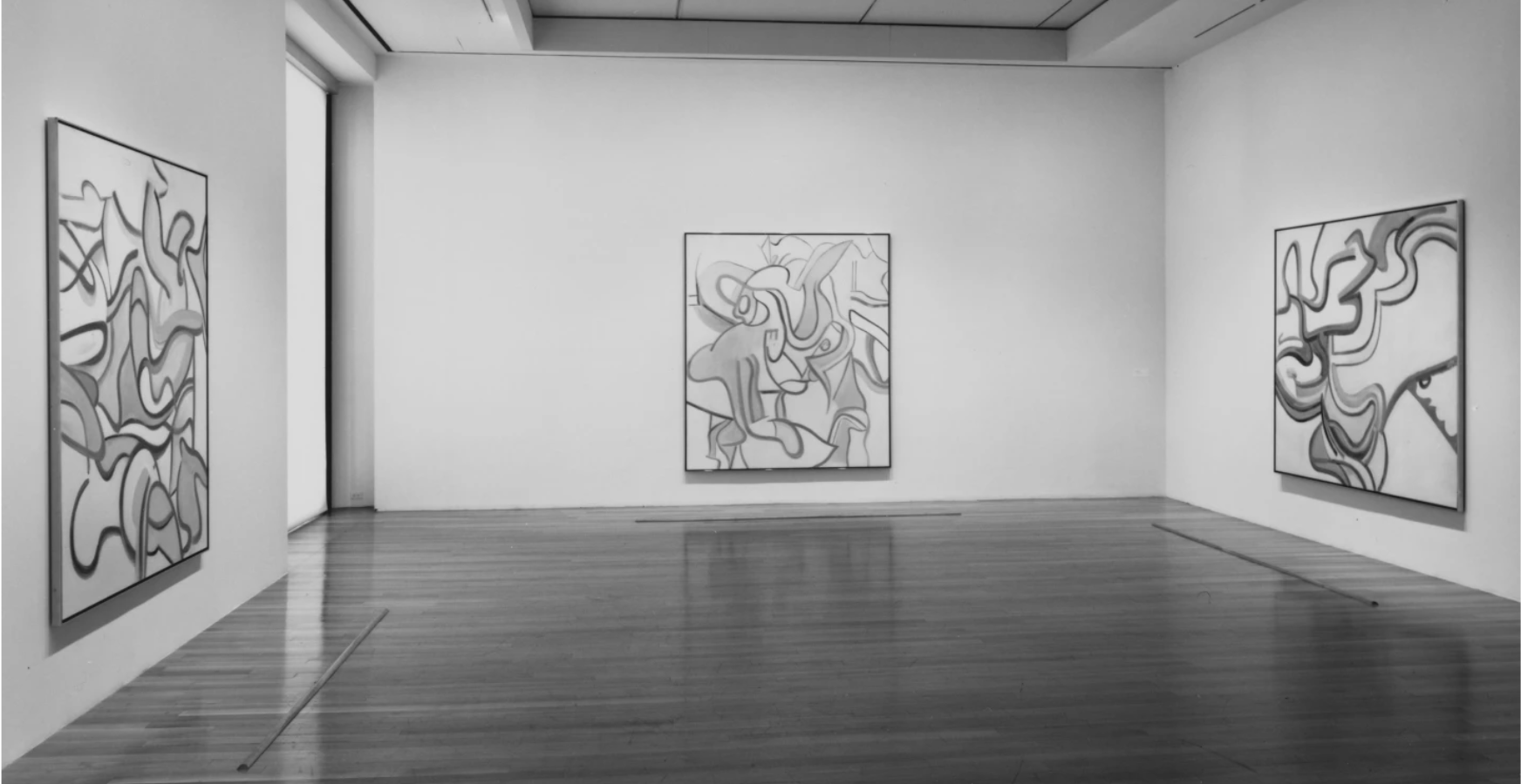
The present work (far right) installed in Willem de Kooning: The Late Paintings, 1980s, Museum of Modern Art, New York, 1997.
Image: © The Willem de Kooning Foundation / Artists Rights Society (ARS), New York and DACS, London 2024
His late paintings echo the formal invention of his lifelong influence Arshile Gorky, and the vibrant late cut-outs of Henri Matisse. Indeed, de Kooning seeks to “cut up” or pull familiar forms apart, sometimes dynamically setting them in motion and other times allowing them to float gently across a deep, projected space. Untitled showcases exceptional crispness, contrasting with the heavily painted earlier works that often combined a kaleidoscopic range of pigment as well as various mediums, such as oil paint and pastels, thickly layered with brushes and palette knives. Here, executed with exquisite looseness of brushwork, the cascading lines describe a spatial openness and delicate balance that produce a choreographed rhythm. Converging the simplicity and the dynamic equilibrium of late Piet Mondrian with the organic lyricism of Claude Monet, Untitled XVI represents an imaginary volumetric terrain that unfolds, warps, inflates and collapses with breathtaking, indomitable elegance and delicacy, channeling the old power of bulging, twisting planes and sculptural contour of Tintoretto and Peter Paul Rubens.