Timeline
Sotheby’s
Modern and Contemporary Evening Auction
25 June 2024
Contemporary Day Auction
including the Ralph I Goldenberg Collection
26 June 2024
Phillips
Modern and Contemporary Art Evening and Day Sale
27 June 2024
Modern & Contemporary Art: Evening & Day Sale: London June 2024 (phillips.com)
Christie’s
Modern and Contemporary Art Evening and Day Sale
27 June 2024
Post-War to Present (christies.com)
Sotheby’s
Modern and Contemporary Evening Auction
25 June 2024

Total:
GBP 83,618,832 / USD 106,028,679
55 Lots
3 Lots Withdrawn
5 Lots Passed
46 Lots Sold
Sell-Through Rate: 90.2%
Top Lot:
GBP 16,016,832 / USD 20,309,343
19 Lots sold for more than GBP 1 million
GBP 68,366,832
81.8% of the Total
Above Estimates: 20 Lots (39%)
Within Estimates: 16 Lots (31%)
Below Estimated: 10 Lots (20%)
Unsold: 5 Lots (10%)

#1. Jean-Michel Basquiat
Sotheby’s London: 25 June 2024
Estimated: GBP 15,000,000 – 20,000,000
GBP 16,016,832 / USD 20,309,343
JEAN-MICHEL BASQUIAT (1960 – 1988)
Portrait of the Artist as a Young Derelict, 1982
Oil, oil stick, and acrylic on wood and metal
80×82 inches (203.2 x 208.3 cm)
Signed, titled and dated 1982 (on the reverse of the left panel)
#2. Pablo Picasso
Sotheby’s London: 25 June 2024
Estimated: GBP 10,000,000 – 15,000,000
GBP 10,730,000 / USD 13,605,040
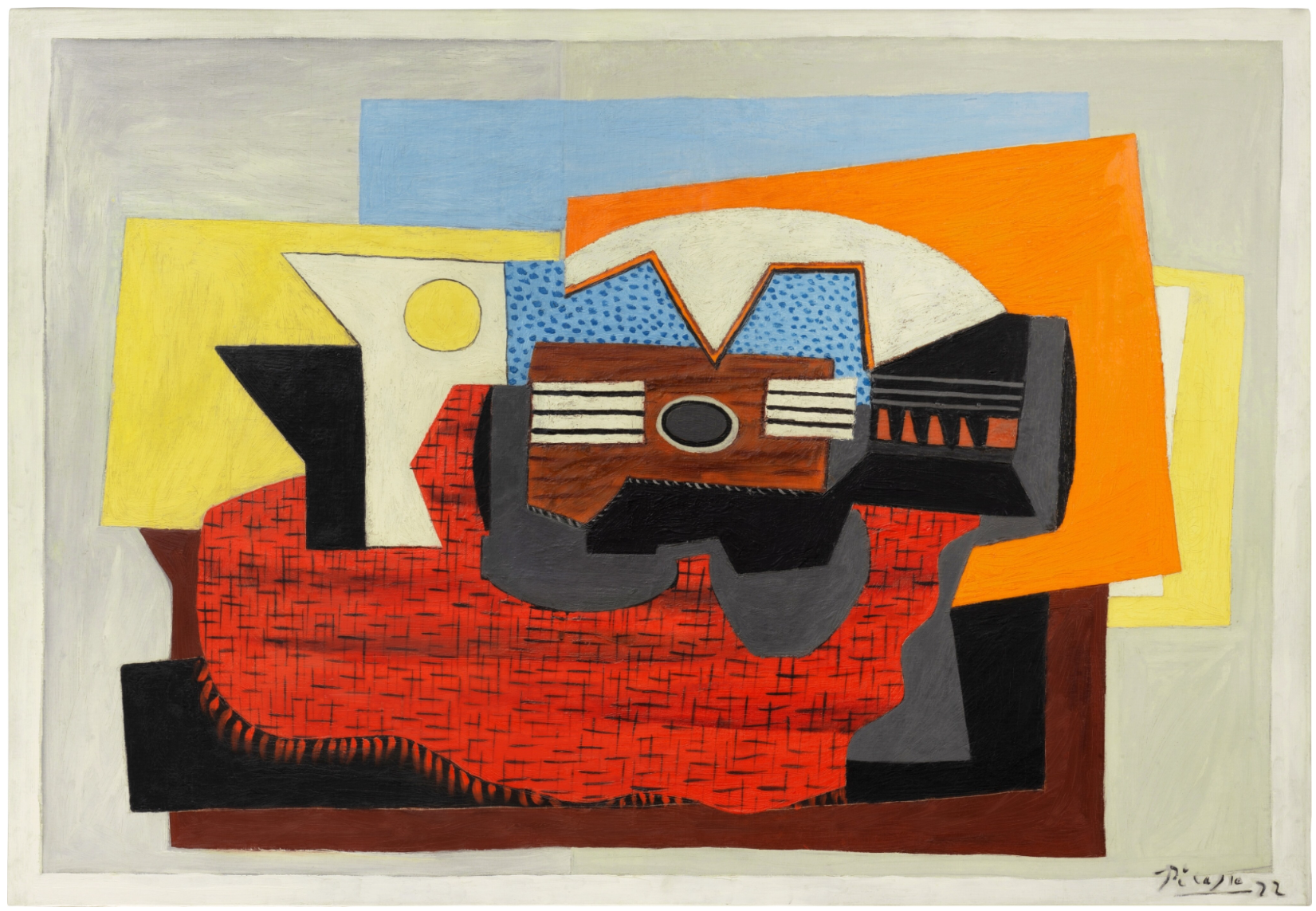
PABLO PICASSO (1881 – 1973)
Guitare sur un tapis rouge, 1922
Oil on canvas
80.7 x 116.3 cm (31 3/4 x 45 3/4 inches)
Signed Picasso and dated 22 (lower right)
#3. Pierre Auguste Renoir
Sotheby’s London: 25 June 2024
Estimated: GBP 2,000,000 – 3,000,000
GBP 6,880,000 / USD 8,723,840
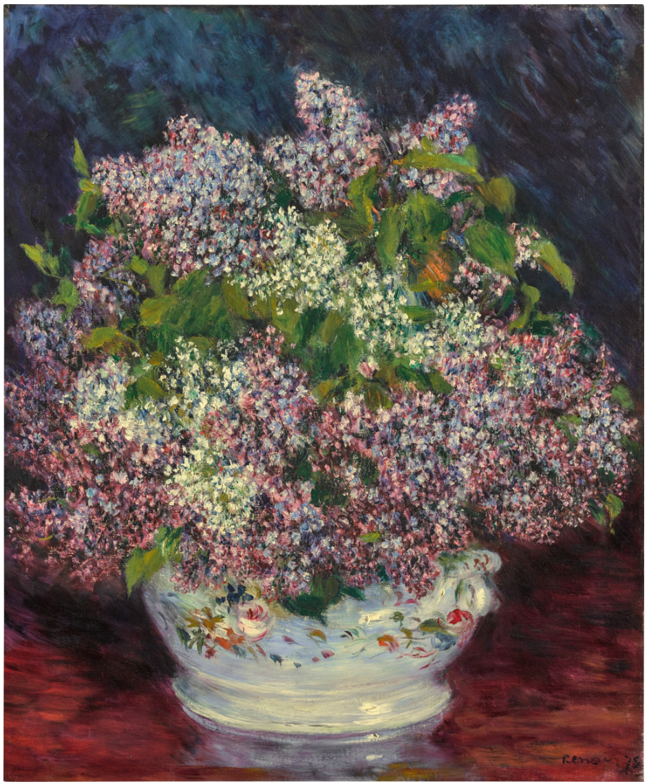
PIERRE AUGUSTE RENOIR (1841 – 1919)
Bouquet de lilas, 1878
Oil on canvas
65.4 x 53.8 cm (25 3/4 x 21 1/8 inches)
Signed Renoir and dated 78 (lower right)
#4. Pablo Picasso
Sotheby’s London: 25 June 2024
Estimated: GBP 3,500,000 – 5,000,000
GBP 5,760,000 / USD 7,303,680
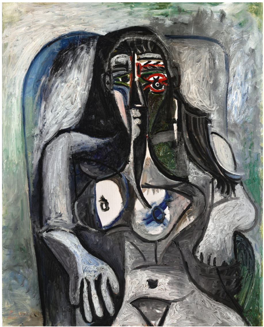
PABLO PICASSO (1881 – 1973)
Nu assis, 1960
Oil on canvas
100×81 cm (39 3/8 x 31 7/8 inches)
Signed Picasso (lower left); dated 23.4.60. (on the reverse)
#5. Lucio Fontana
Sotheby’s London: 25 June 2024
Estimated: GBP 2,500,000 – 3,500,000
GBP 4,080,000 / USD 5,173,440
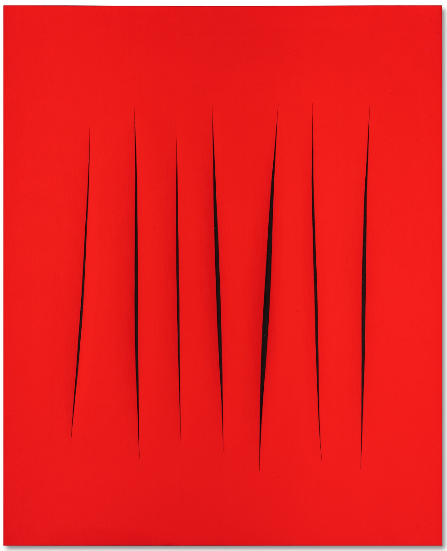
LUCIO FONTANA (1899 – 1968)
Concetto spaziale, attese, 1966
Waterpaint on canvas
100.5 x 81 cm (39 5/8 x 31 7/8 inches)
Signed, titled and inscribed Oggi vado a pranzo col premio Nobel e amico Quasimodo (on the reverse)

Yayoi Kusama
Sotheby’s London: 25 June 2024
Estimated: GBP 900,000 – 1,200,000
GBP 1,140,000 / USD 1,445,520
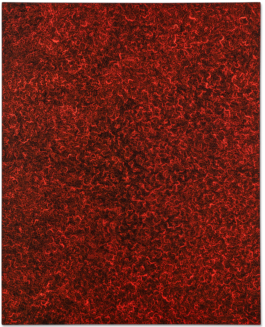
YAYOI KUSAMA (b. 1929)
The Sea in the Evening Glow (B) Facing the Imminent Death, 1990
Acrylic on canvas
161.5 x 130.5 cm (63 5/8 x 51 3/8 inches)
Signed, titled in Japanese and dated 1990 (on the reverse)
Gerhard Richter
Sotheby’s London: 25 June 2024
Estimated: GBP 900,000 – 1,200,000
GBP 1,140,000 / USD 1,445,520
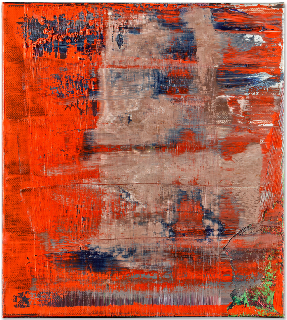
GERHARD RICHTER (b. 1932)
Abstraktes Bild, 1998
Oil on canvas
50×45 cm (20 1/8 x 17 3/4 inches)
Signed, dated 1998 and numbered 850-5 (on the reverse)
Jonas Wood
Sotheby’s London: 25 June 2024
Estimated: GBP 1,000,000 – 1,500,000
GBP 1,110,000 / USD 1,407,480
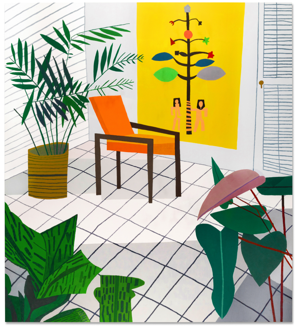
JONAS WOOD (b. 1977)
Untitled (Drawing Rally), 2011
Oil and acrylic on canvas
98 x 88 1/4 inches (249×224 cm)
Signed, titled and dated 2011 (on the reverse)
Elizabeth Peyton
Sotheby’s London: 25 June 2024
Estimated: GBP 300,000 – 600,000
GBP 384,000 / USD 486,912
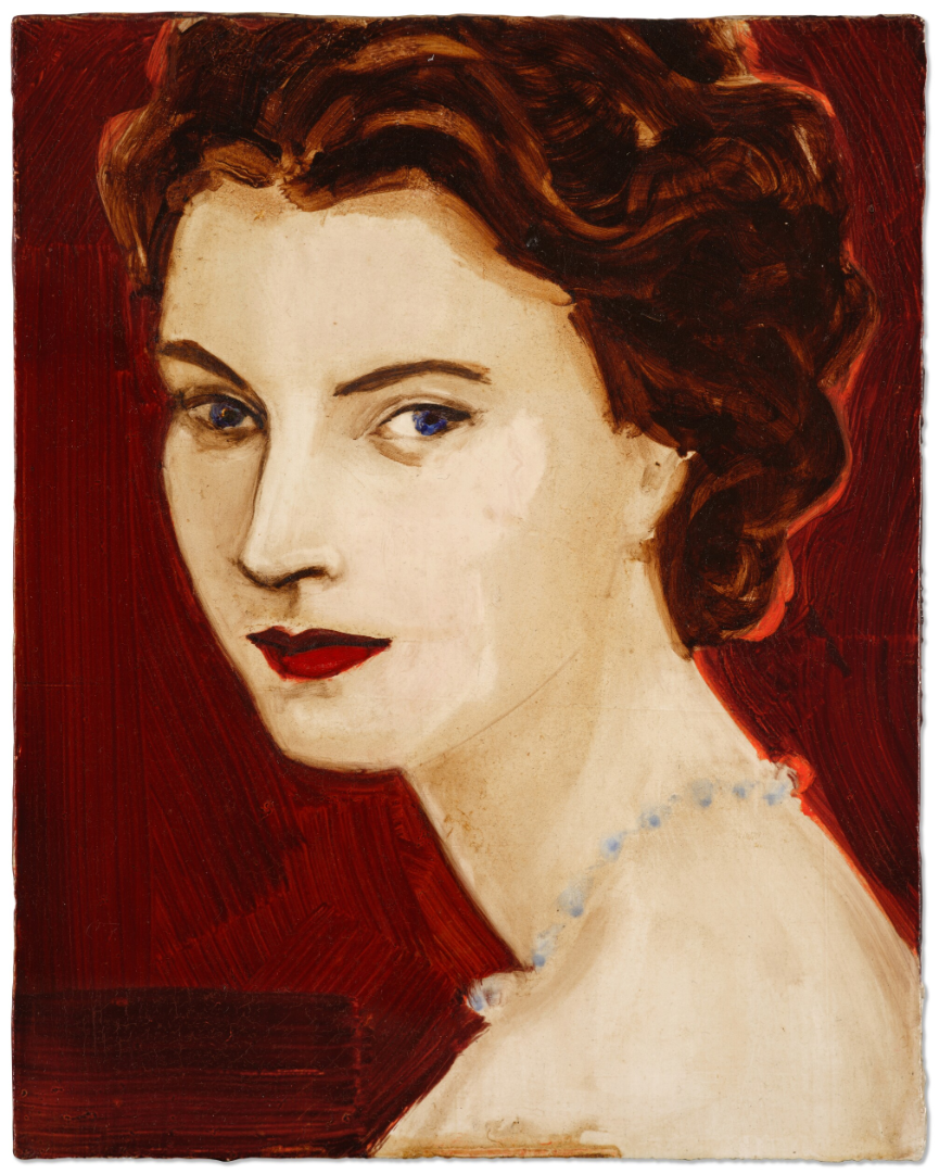
ELIZABETH PEYTON (b. 1965)
Queen Elizabeth II, 1995
Oil on board
10 1/8 x 8 inches (25.8 x 20.5 cm)
Contemporary Day Auction
including the Ralph I Goldenberg Collection
26 June 2024
#1. Robert Indiana
Sotheby’s London: 26 June 2024
Estimated: GBP 400,000 – 600,000
GBP 1,260,000 / USD 1,597,680
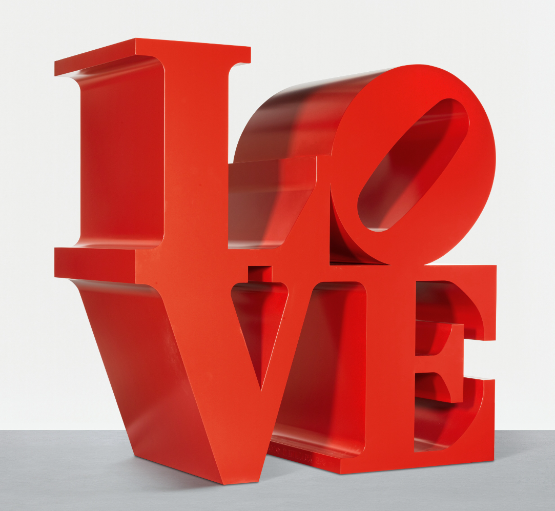
ROBERT INDIANA (1928 – 2018)
LOVE (Red Outside Red Inside), 1966-2000
Painted aluminum
72x72x36 inches (182.9 x 182.9 x 91.4 cm)
Stamped with the artist’s name, dated 1966-2000 and numbered 3/6 (towards the base)
Conceived in 1966 and executed in 2000, this work is number 3 from an edition of 6 plus 4 artist’s proofs
#2. Laura Owens
Sotheby’s London: 26 June 2024
Estimated: GBP 250,000 – 350,000
GBP 528,000 / USD 669,504
LAURA OWENS (b. 1970)
Untitled, 2000
Acrylic and oil on canvas
112 x 71 3/4 inches (284.8 x 182.4 cm)
Signed, titled and dated 2000 (on the reverse)
Andy Warhol
Sotheby’s London: 26 June 2024
Estimated: GBP 400,000 – 600,000
GBP 456,000 / USD 578,208
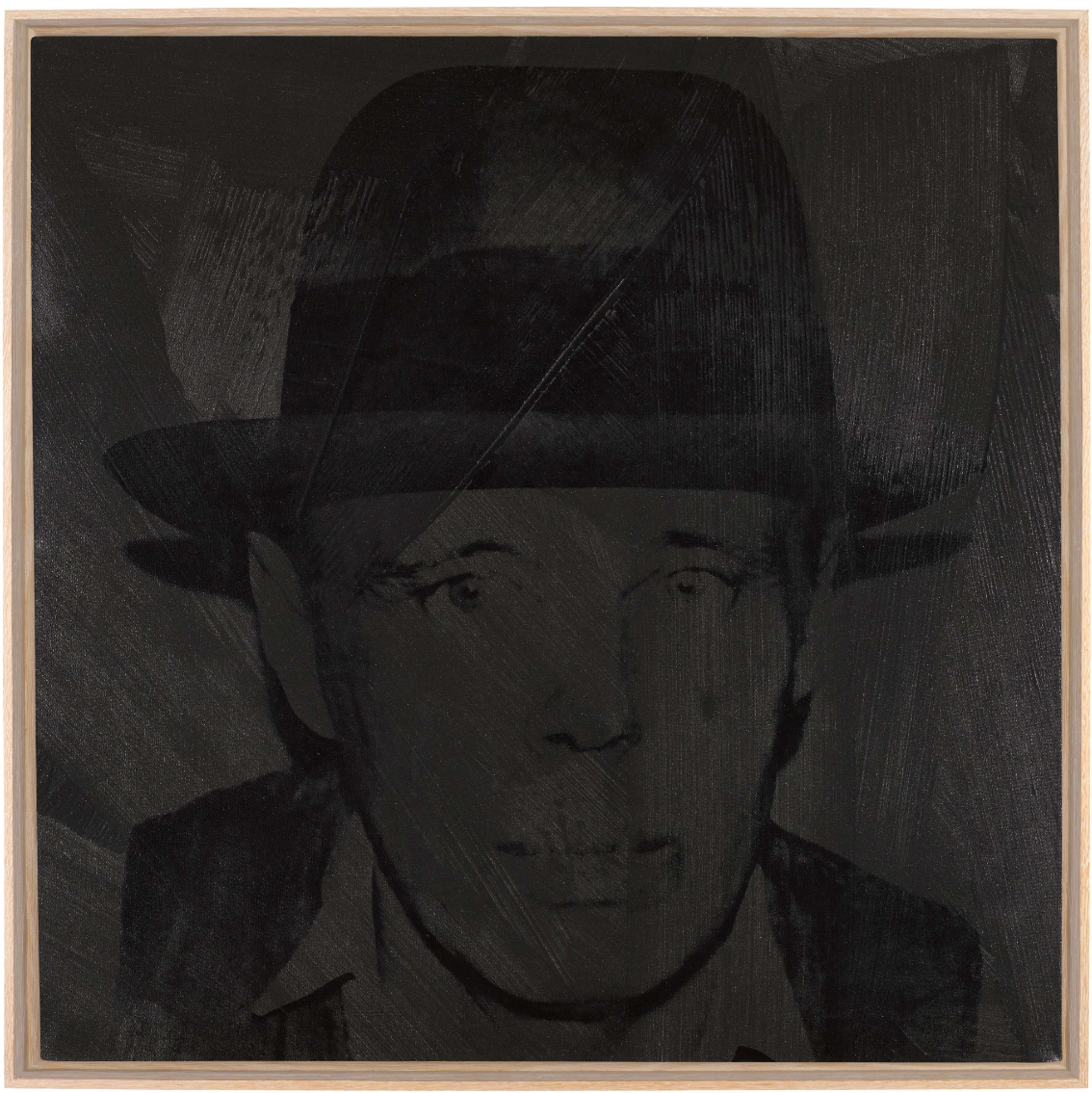
ANDY WARHOL (1928 – 1987)
Joseph Beuys, 1980
Acrylic and silkscreen ink on canvas
40×40 inches (101.6 x 101.6 cm)
Signed and dated 1980 (on the reverse)
Yayoi Kusama
Sotheby’s London: 26 June 2024
Estimated: GBP 200,000 – 300,000
GBP 300,000 / USD 380,400
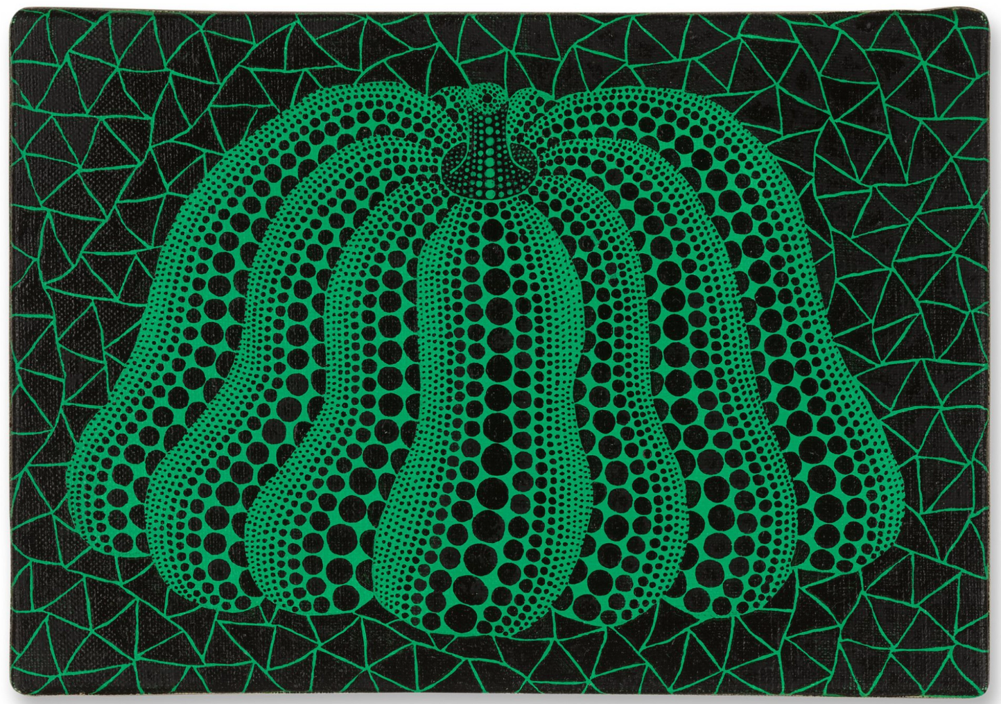
YAYOI KUSAMA (b. 1929)
A Pumpkin (TWX), 2003
Acrylic on canvas
15.4 x 22.5 cm (7 1/2 x 9 inches)
Signed, titled and dated 2003 (on the reverse)
Andy Warhol
Sotheby’s London: 26 June 2024
Estimated: GBP 80,000 – 120,000
GBP 156,000 / USD 197,808
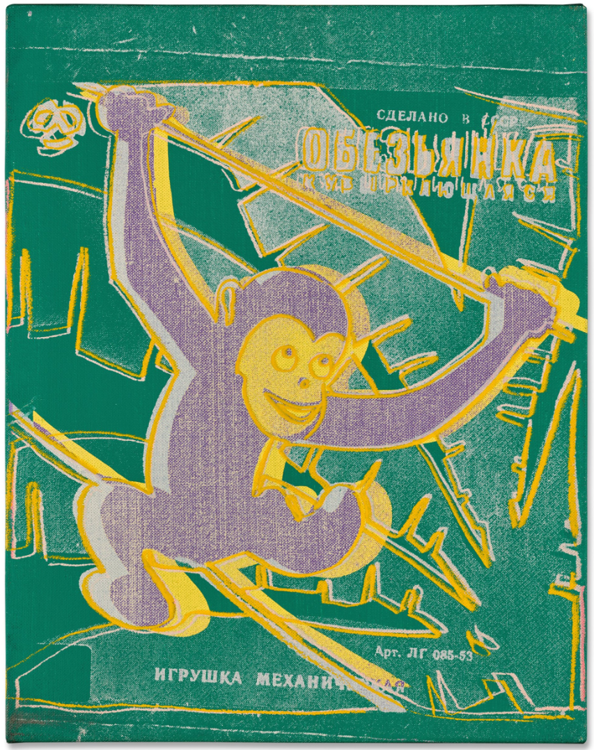
ANDY WARHOL (1928 – 1987)
Monkey, 1983
Acrylic and silkscreen ink on canvas
14×11 inches (35.5 x 27.9 cm)
Signed and dated 83 (on the overlap)
Fragile, 1962
Sotheby’s London: 26 June 2024
Estimated: GBP 100,000 – 150,000
GBP 156,000 / USD 197,808
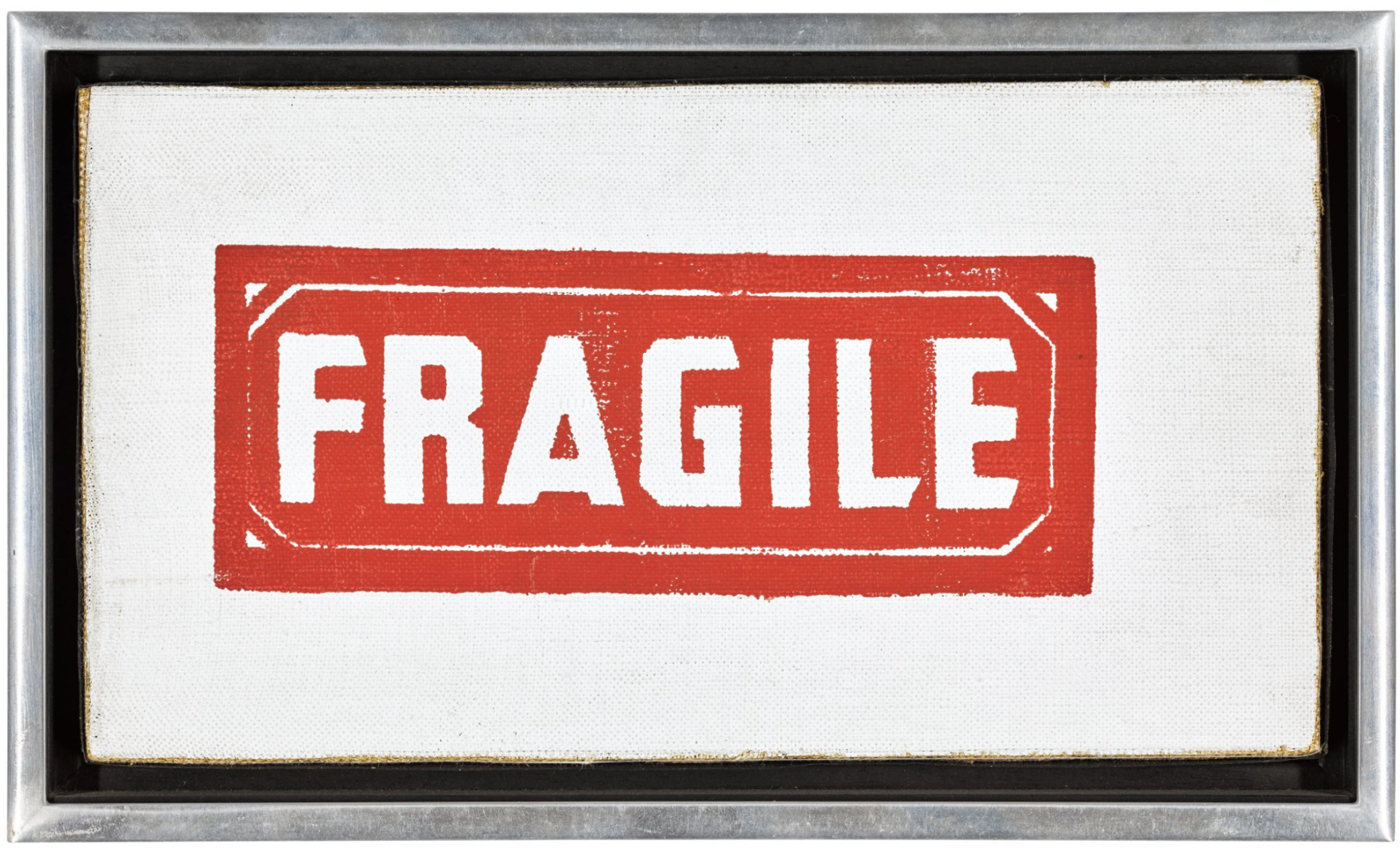
ANDY WARHOL (1928 – 1987)
Fragile, 1962
Silkscreen ink and graphite on linen laid down on canvas
5 1/4 x 9 1/2 inches (13.5 x 24 cm)
Phillips
Modern and Contemporary Art Evening and Day Sale
27 June 2024
Modern & Contemporary Art: Evening & Day Sale: London June 2024 (phillips.com)
Total:
GBP 13,054,965 / USD 16,553,696
136 Lots
42 Lots Passed
94 Lots Sold
Sell-Through Rate: 69.1%
Top Lot:
GBP 1,016,000 / USD 1,288,288
1 Lot sold for more than GBP 1 million
Above Estimates: 25 Lots (18%)
Within Estimates: 44 Lots (32%)
Below Estimated: 25 Lots (18%)
Unsold: 42 Lots (31%)
#1. George Condo
Phillips London: 27 June 2024
Estimated: GBP 700,000 – 900,000
GBP 1,016,000 / USD 1,288,288
George Condo – Modern & Contemporary Art… Lot 8 June 2024 | Phillips
GEORGE CONDO
Green and Purple Head Composition, 2018
Acrylic, charcoal, pastel and pigment stick on linen, in artist’s frame
56 1/8 x 52 1/4 inches (142.7 x 132.6 cm)
Signed and dated ‘George Condo 4/22/18’ upper left
#2. Lynette Yiadom-Boakye
Phillips London: 27 June 2024
Estimated: GBP 900,000 – 1,500,000
GBP 952,500 / USD 1,207,770
https://www.phillips.com/detail/lynette-yiadomboakye/UK010424/5
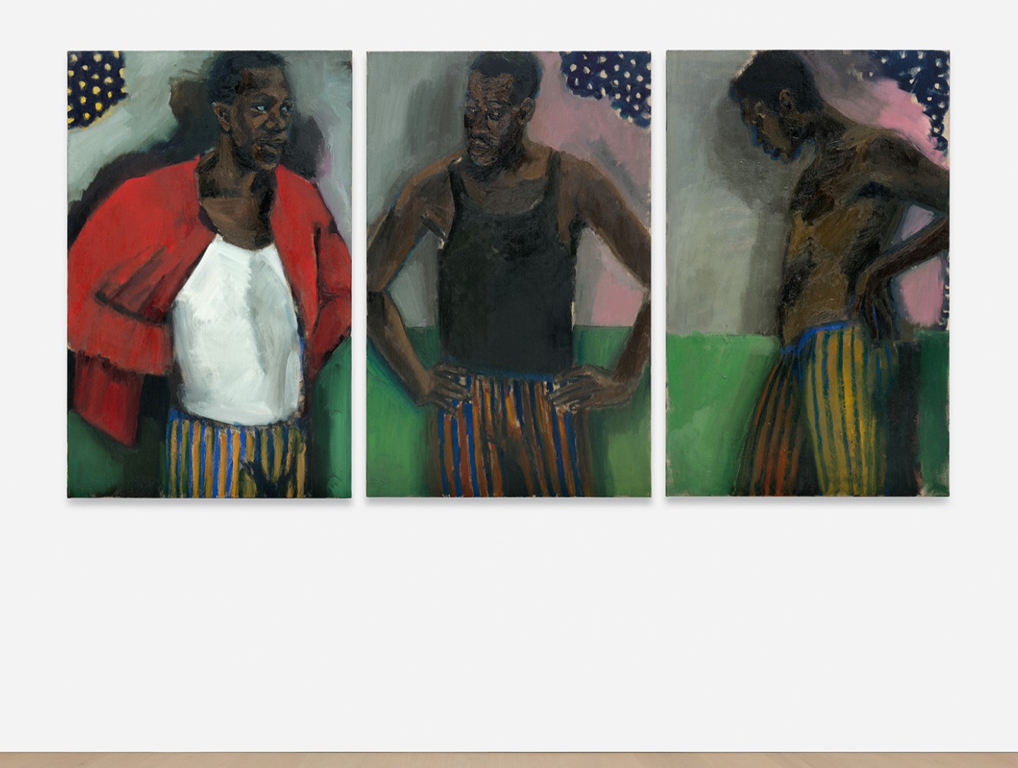
LYNETTE YIADOM-BOAKYE
Minotaur To Matador, 2022
Oil on linen, triptych
Each: 109.8 x 70.3 cm (43 1/4 x 27 5/8 inches)
Overall: 109.8 x 220 cm (43 1/4 x 86 5/8 inches)
Signed, titled and dated ‘Minotaur To Matador 2022 Lynette Yiadom-Boakye’ on the reverse of each part
#3. Andy Warhol
Phillips London: 27 June 2024
Estimated: GBP 450,000 – 650,000
GBP 850,900 / USD 1,078,941
https://www.phillips.com/detail/andy-warhol/UK010424/17

ANDY WARHOL
Campbell’s Soup, 1986
Acrylic and silkscreen ink on canvas
72×60 inches (182.9 x 152.4 cm)
Signed and dated ‘Andy Warhol 86’ on the overlap
#4. Damien Hirst
Phillips London: 27 June 2024
Estimated: GBP 500,000 – 700,000
GBP 685,800 / USD 869,594
https://www.phillips.com/detail/damien-hirst/UK010424/18

DAMIEN HIRST
Creed, 2006
Butterflies and household gloss on canvas
Diameter: 96 inches (243.8 cm)
Stamped with the artist’s stamp, titled and dated ”Creed’ 2006 HIRST’ on the reverse
#5. Andreas Gursky
Phillips London: 27 June 2024
Estimated: GBP 400,000 – 600,000
GBP 546,100 / USD 692,455
https://www.phillips.com/detail/andreas-gursky/UK010424/13
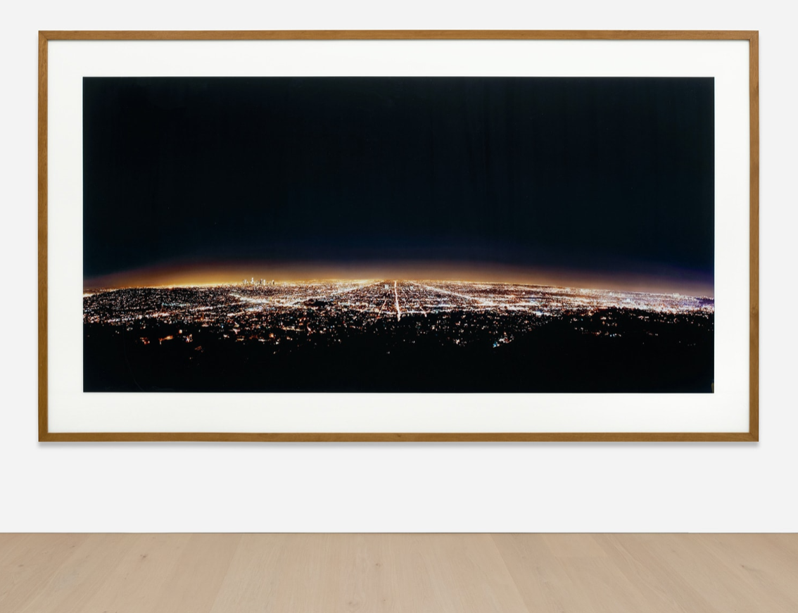
ANDREAS GURSKY
Los Angeles, 1998
Cibachrome print face mounted to Plexiglas in artist’s frame
Image: 158.3 x 316.5 cm (62 3/8 x 124 5/8 inches)
Overall: 206.9 x 362 cm (81 1/2 x 142 1/2 inches)
Signed, titled, numbered and dated ‘Los Angeles ’98 6/6 Andreas Gursky’ on the reverse
Executed in 1998, this work is number 6 from an edition of 6.
George Condo
Phillips London: 27 June 2024
Estimated: GBP 400,000 – 600,000
GBP 508,000 / USD 644,144
https://www.phillips.com/detail/george-condo/UK010424/20
GEORGE CONDO
Seated Bather, 2005
Oil on canvas, in artist’s frame
60 7/8 x 53 7/8 inches (154.5 x 137 cm)
Signed and dated ‘Condo 05’ upper left
David Hockney
Phillips London: 27 June 2024
Estimated: GBP 280,000 – 350,000
GBP 406,400 / USD 515,315
David Hockney – Modern & Contemporary Ar… Lot 7 June 2024 | Phillips
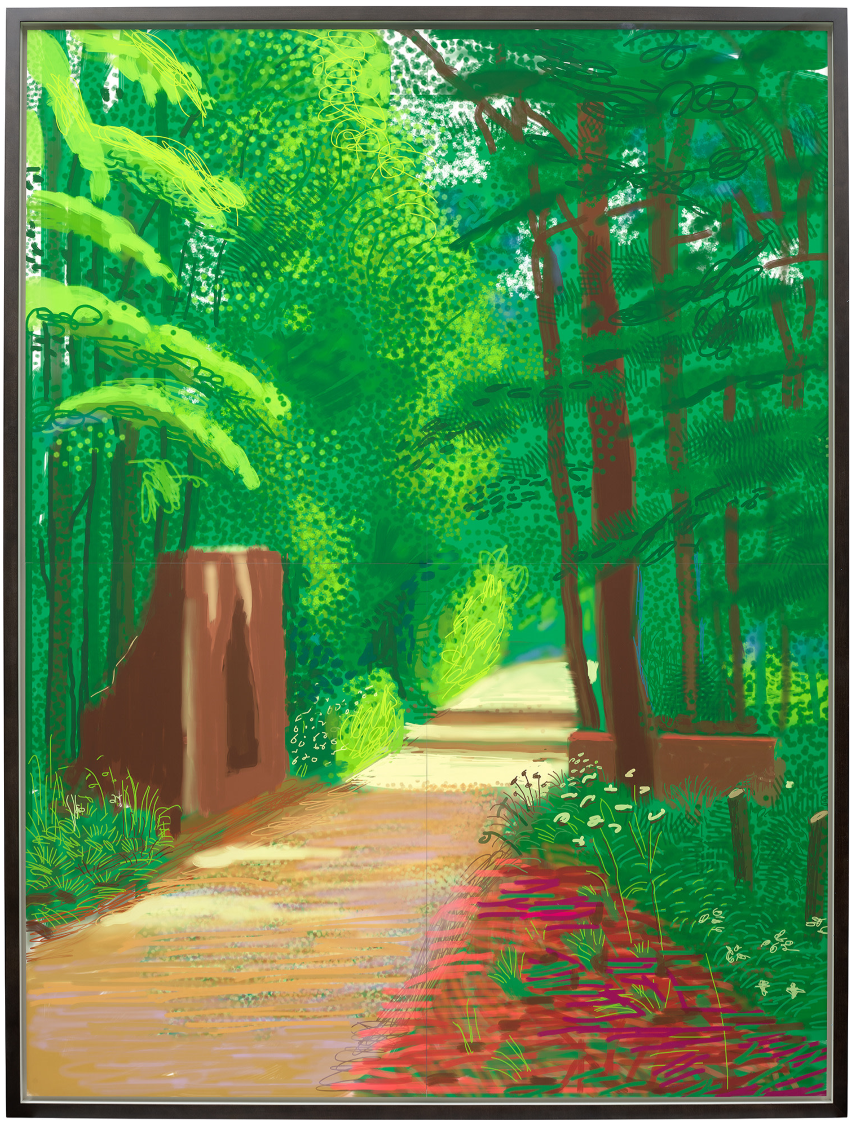
DAVID HOCKNEY
The Arrival of Spring in Woldgate, East Yorkshire in 2011 (twenty eleven) – 2 June, 2011
iPad drawing printed on four sheets of paper, mounted on four sheets of Dibond
Each: 117.5 x 88.3 cm (46 1/4 x 34 3/4 inches)
Overall: 235 x 166.7 cm (92 1/2 x 65 5/8 inches)
Signed, numbered and dated ‘David Hockney 5/10 2011’ lower right
Keith Haring
Phillips London: 27 June 2024
Estimated: GBP 400,000 – 600,000
GBP 317,500 / USD 402,590
Keith Haring – Modern & Contemporary Ar… Lot 16 June 2024 | Phillips
KEITH HARING
The Garden of Radio Delight/The Beach (double-sided), 1984
Acrylic on tarp, double-sided
75 1/2 x 187 7/8 inches (191.8 x 477.5 cm)
Andy Warhol
Phillips London: 27 June 2024
Estimated: GBP 300,000 – 500,000
GBP 317,500 / USD 402,590
https://www.phillips.com/detail/andy-warhol/UK010424/33
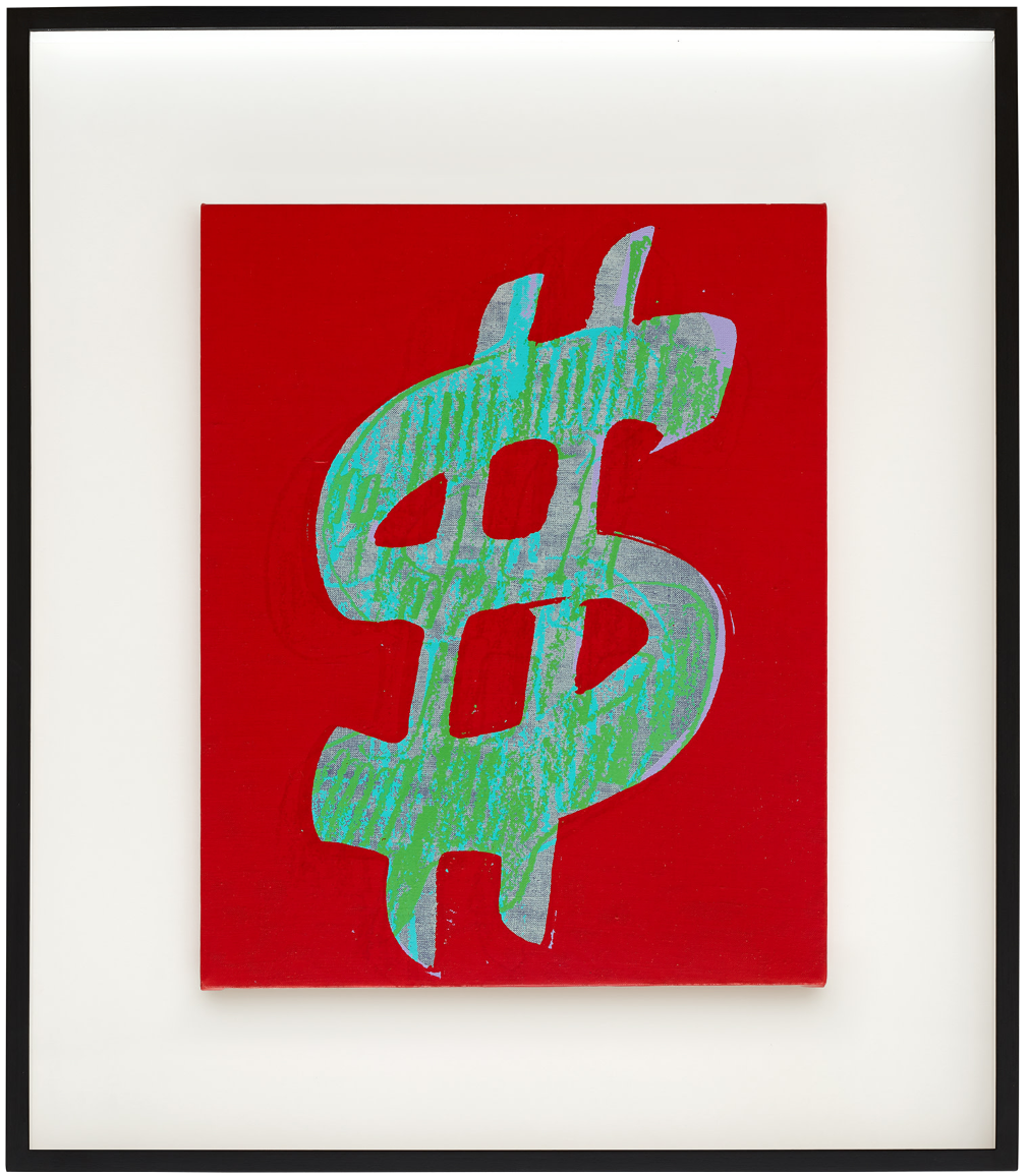
ANDY WARHOL
Dollar Sign, 1981
Acrylic and silkscreen ink on canvas
20 x 15 7/8 inches (50.8 x 40.6 cm)
Stamped with the Estate of Andy Warhol and the Andy Warhol Foundation for the Visual Arts, Inc. stamps
Numbered ‘PA30.086’ on the overlap
Stamped with the Andy Warhol Foundation for the Visual Arts, Inc. stamp on the reverse
KAWS
Phillips London: 27 June 2024
Estimated: GBP 200,000 – 300,000
GBP 304,800 / USD 386,486
https://www.phillips.com/detail/kaws/UK010424/63

KAWS
Untitled, 2013
Acrylic on canvas
Diameter: 96 inches (243.9 cm)
Salvo
Phillips London: 27 June 2024
Estimated: GBP 80,000 – 120,000
GBP 215,900 / USD 273,761
https://www.phillips.com/detail/salvo/UK010424/30
SALVO
La Valle, 2004
Oil on canvas
90×120 cm (35 3/8 x 47 1/4 inches)
Signed and titled ‘Salvo “LA VALLE”‘ on the reverse
Registered in the Archivio Salvo, Turin, under the number Q0143-04
Andy Warhol
Phillips London: 27 June 2024
Estimated: GBP 120,000 – 180,000
GBP 184,150 / USD 233,502
https://www.phillips.com/detail/andy-warhol/UK010424/32
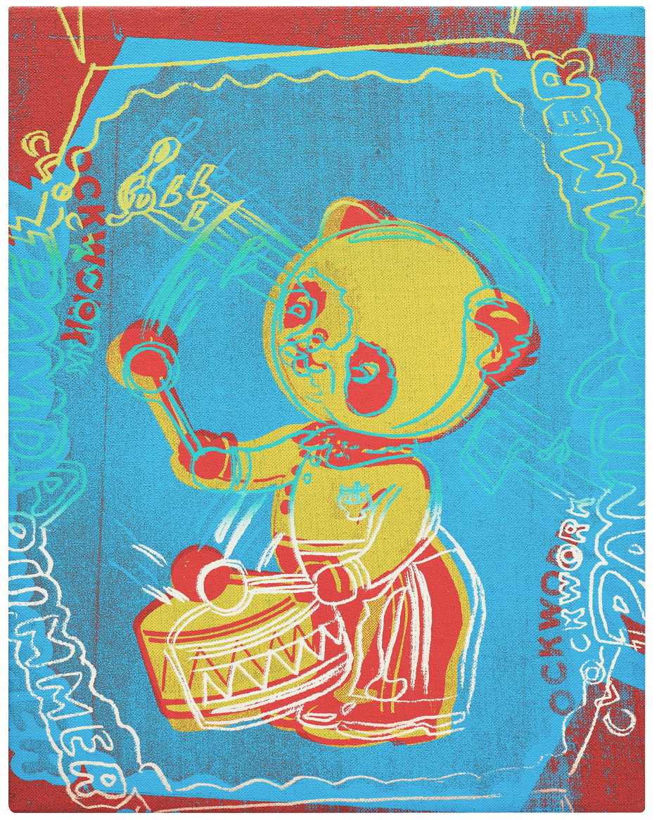
ANDY WARHOL
Panda Drummer (Toy Series), 1983
Acrylic and silkscreen ink on canvas
14 x 10 7/8 inches (35.6 x 27.9 cm)
Signed and dated ‘Andy Warhol 83’
Stamped by The Andy Warhol Foundation for the Visual Arts, Inc., New York
And numbered ‘A117.09’ on the overlap
Marilyn Monroe (Marilyn), circa 1978
Phillips London: 27 June 2024
Estimated: GBP 120,000 – 180,000
GBP 152,400 / USD 193,243
https://www.phillips.com/detail/andy-warhol/UK010424/35
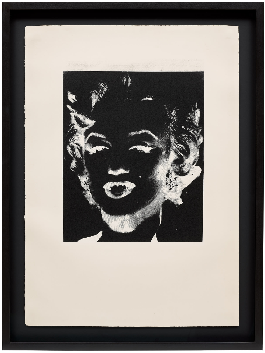
ANDY WARHOL
Marilyn Monroe (Marilyn), circa 1978
Silkscreen ink on paper
Image: 17×14 inches (43.2 x 35.6 cm)
Sheet: 30 1/2 x 21 5/8 inches (77.5 x 55 cm)
Stamped ‘© Andy Warhol’ on the reverse
Christie’s
Post-War to Present
27 June 2024
Post-War to Present (christies.com)
Total:
GBP 10,367,028 / USD 13,145,392
55 Lots
3 Lots Withdrawn
5 Lots Passed
46 Lots Sold
Sell-Through Rate: 90.2%
Top Lot:
GBP 16,016,832 / USD 20,309,343
19 Lots sold for more than GBP 1 million
GBP 68,366,832
81.8% of the Total
Above Estimates: 20 Lots (39%)
Within Estimates: 16 Lots (31%)
Below Estimated: 10 Lots (20%)
Unsold: 5 Lots (10%)
#1. Lynette Yiadom-Boakye
Christie’s London: 27 June 2024
Estimated: GBP 600,000 – 800,000
GBP 567,000 / USD 718,956
https://www.christies.com/en/lot/lot-6492262?ldp_breadcrumb=back
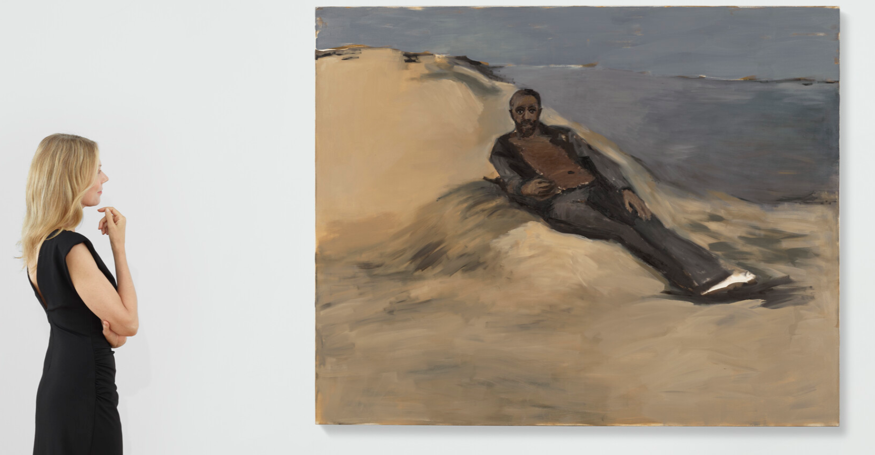
LYNETTE YIADOM-BOAKYE (B. 1977)
5am, Cadiz, 2009
Oil on canvas
63 x 78 3/4 inches (160×200 cm)
Signed with the artist’s initials, titled and dated ‘LYB 2009 5am Cadiz’ (on the reverse)
#2. Alighiero Boetti
Christie’s London: 27 June 2024
Estimated: GBP 250,000 – 350,000
GBP 529,200 / USD 671,026
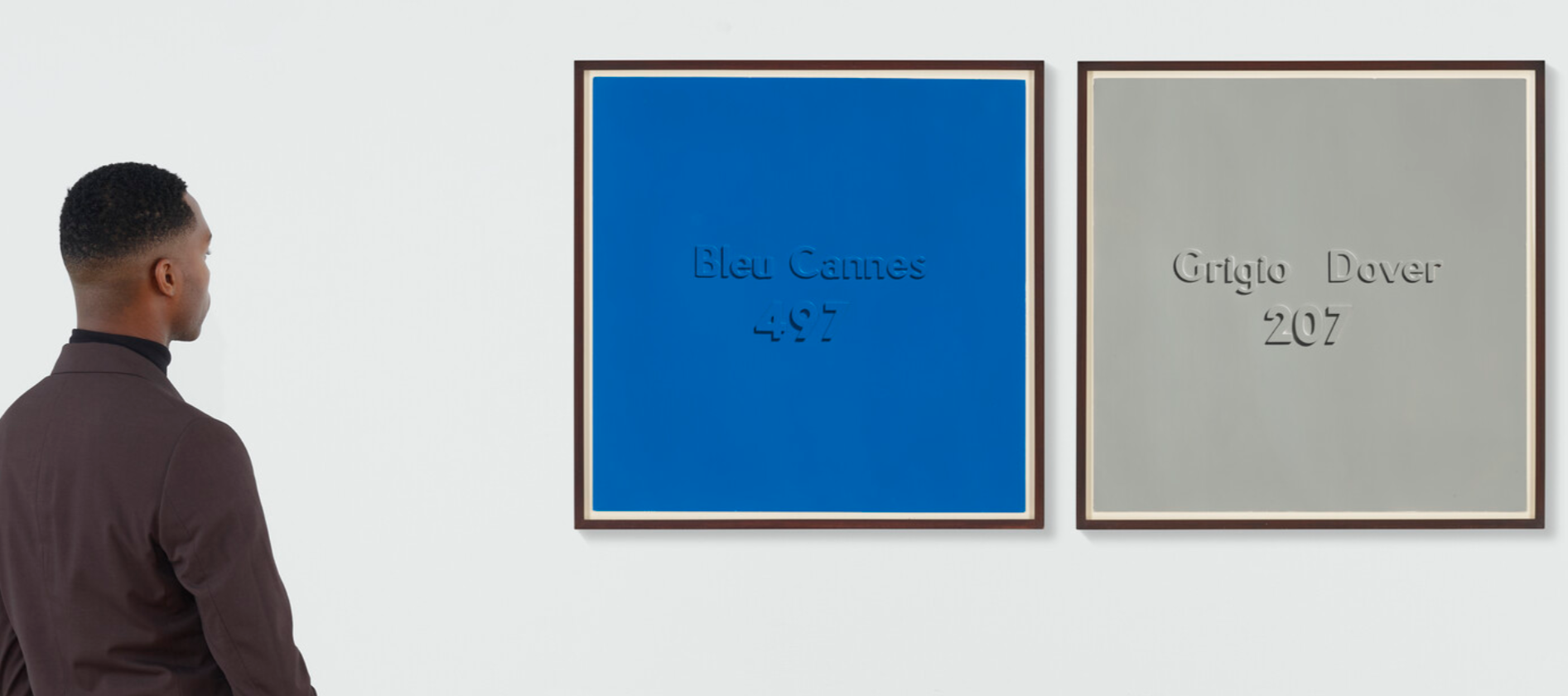
ALIGHIERO BOETTI (1940-1994)
(i) Bleu Cannes 497; (ii) Grigio Dover 207, 1967
Industrial varnish and cork on card
70.5 x 70.5 cm (27 3/4 x 27 3/4 inches)
#4. Gunther Forg
Christie’s London: 27 June 2024
Estimated: GBP 400,000 – 600,000
GBP 441,000 / USD 559,188
GUNTHER FORG (1952-2013) (christies.com)
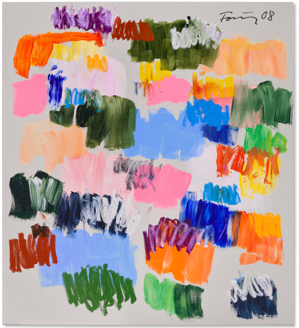
GÜNTHER FÖRG (1952-2013)
Untitled, 2008
Oil and acrylic on canvas
61 1/8 x 55 1/4 inches (155.4 x 140.2 cm)
Signed and dated ‘Förg 08’ (upper right)
JADÉ FADOJUTIMI
Christie’s London: 27 June 2024
Estimated: GBP 250,000 – 350,000
GBP 277,200 / USD 351,490
JADÉ FADOJUTIMI (B. 1993) (christies.com)
JADÉ FADOJUTIMI (B. 1993)
She’s Distressed, 2019
Oil on canvas
175.5 x 165.5 cm (69 1/8 x 65 1/8 inches)
Signed twice and dated ‘Jadé Fadojutimi March ’19’ (on the reverse)
Yoshitomo Nara
Christie’s London: 27 June 2024
Estimated: GBP 120,000 – 180,000
GBP 252,000 / USD 319,536
https://www.christies.com/en/lot/lot-6492257
YOSHITOMO NARA (B. 1959)
Untitled, 2007
Colored pencil on colored paper
41.9 x 29.6 cm (16 1/2 x 11 5/8 inches)
Signed in Japanese (on the reverse)
Scott Kahn
Christie’s London: 27 June 2024
Estimated: GBP 80,000 – 120,000
GBP 138,600 / USD 175,745
SCOTT KAHN (B. 1946) (christies.com)
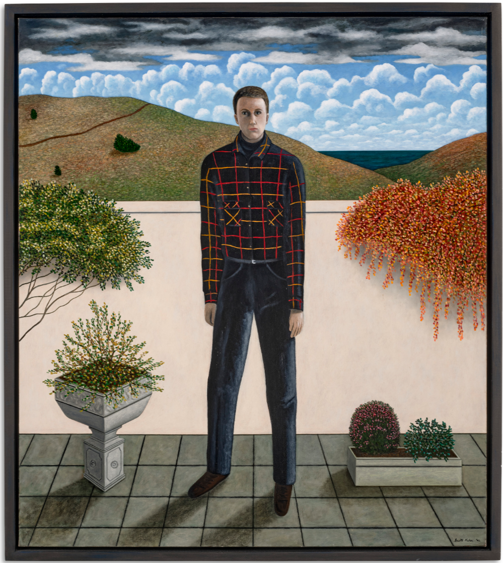
SCOTT KAHN (B. 1946)
On the Patio, 1992
Oil on canvas
34 1/4 x 30 1/8 inches (87 x 76.5 cm)
Signed and dated ‘Scott Kahn 92’ (lower right)
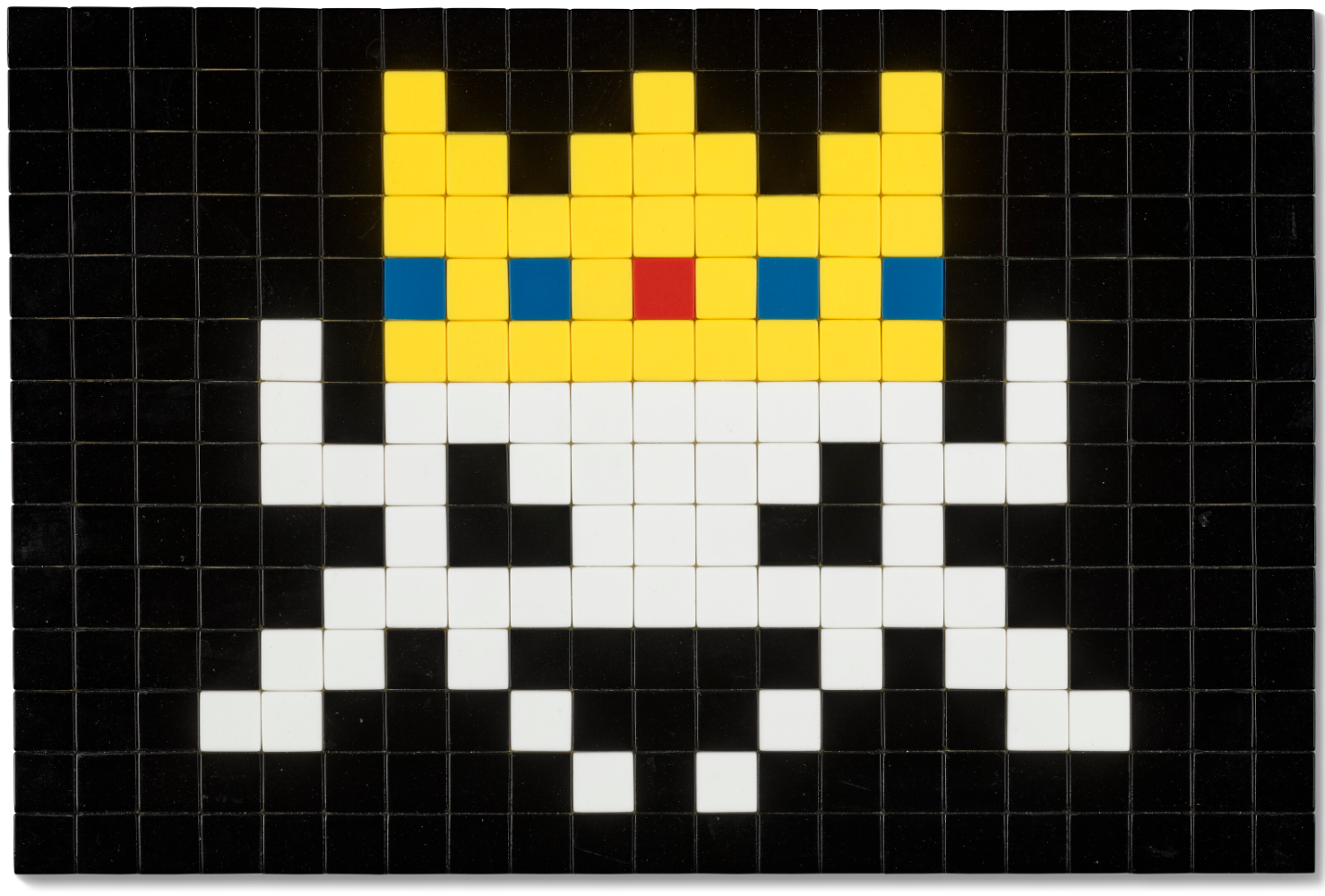
Invader
Christie’s London: 27 June 2024
Estimated: GBP 60,000 – 80,000
GBP 81,900 / USD 103,849
https://www.christies.com/en/lot/lot-6492334
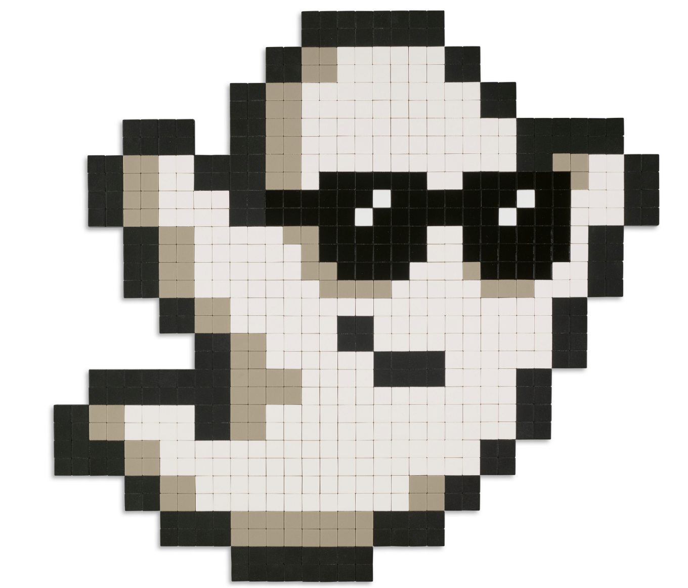
INVADER (B. 1969)
Alias LA-177, 2018
Ceramic tiles on Perspex
74.9 x 79.7 cm (29 1/2 x 31 3/8 inches)
Incised with the artist’s monogram and title ‘LA-177’ (on the reverse)
Invader
Christie’s London: 27 June 2024
Estimated: GBP 45,000 – 55,000
GBP 40,320 / USD 51,126
https://www.christies.com/en/lot/lot-6492332
INVADER (B. 1969)
Alias VRS_08, 2017-2019
Ceramic tiles on Perspex
33.5 x 49.8 cm (13 1/4 x 19 5/8 inches)
Incised with the artist’s monogram, title and date ‘VRS_08 19’ (on the reverse)
PART III: FOCUS
Focus: Ultra-Contemporary
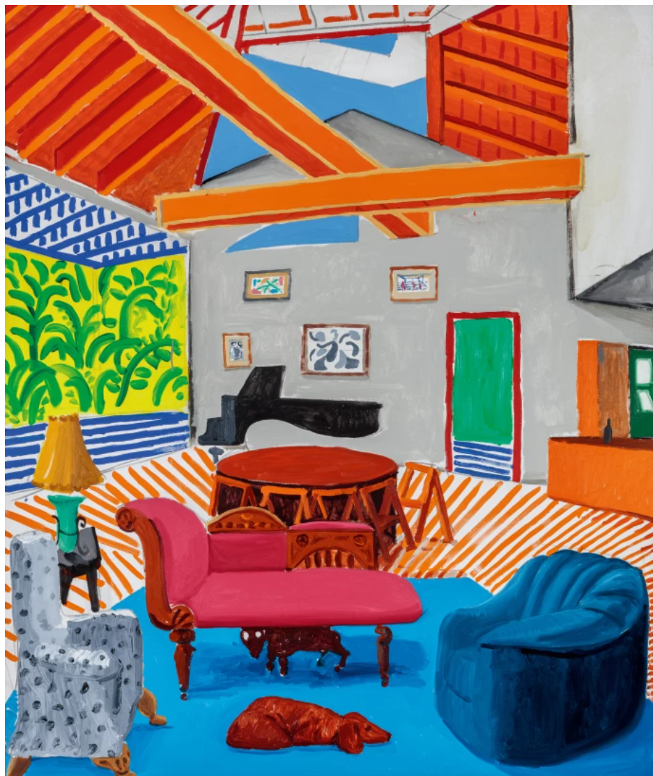
Jonas Wood
Sotheby’s London: 25 June 2024
Estimated: GBP 1,000,000 – 1,500,000
GBP 1,110,000 / USD 1,407,480
JONAS WOOD (b. 1977)
Untitled (Drawing Rally), 2011
Oil and acrylic on canvas
98 x 88 1/4 inches (249×224 cm)
Signed, titled and dated 2011 (on the reverse)
Rendered with graphic patterning and bold perspective, Untitled (Drawing Rally) from 2011 is a vibrant exemplar of Jonas Wood’s renowned corpus of potted flora in an intimate domestic space. Employing artistic tropes of flattened colors and spatial distortion recalling French Modernist painting, Wood lends this quiet still life a striking playfulness. Through the visual framework of outstretched plant leaves, the viewer is drawn into the room to experience an illusion of depth created by Wood’s radically simplified articulation of pattern; a space expertly constructed as if it extended beyond the edges of the canvas. Adapted from a 2009 ink and pencil drawing of the same scene, and later translated into an editioned silk scarf, the present work features many of the artist’s favored motifs. With intricately detailed brushwork and bright planes of color set on an immense scale, Untitled (Drawing Rally) presents a fresh take on contemporary life where the seemingly mundane is elevated to the extraordinary.
Executed in 2011, Untitled (Drawing Rally) employs many of the artist’s best-known techniques and symbols. His painterly style is a playful yet rigorous interrogation of the traditional representational challenge of capturing three-dimensional forms on the flat picture plane.. Untitled (Drawing Rally) is a particularly arresting example: the entirely monochromatic room is depicted with stark linearity, lending added visual potency to the boldly-hued plants, chair, and painting. Centered on the empty chair, this domestic scene gestures at portraiture, the implied absent presence referencing similar imagery from throughout art history, from Diego Velasquez to Vincent Van Gogh to David Hockney. Set on an impressive, enveloping scale, each vivid element becomes its own spectacle, resulting in a composition which draws the viewer’s eye in an endless circle.
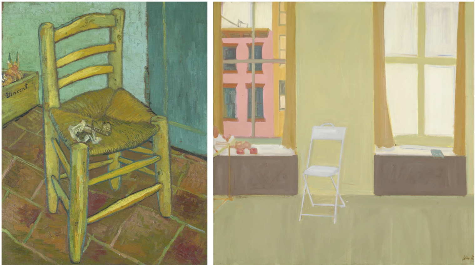
VINCENT VAN GOGH, VINCENT’S CHAIR, 1888 / NATIONAL GALLERY, LONDON / IMAGE: © BRIDGEMAN IMAGES
ALEX KATZ, FOLDING CHAIR, 1959 / NATIONAL GALLERY OF ART, WASHINGTON, D.C. / ARTWORK: © ALEX KATZ/VAGA AT ARS, NY AND DACS, LONDON 2024
Wood’s visual vernacular is marked by a photo-based approach. Like Henri Matisse’s late process of cutting gouache-painted paper into a wide range of shapes and rearranging them into new compositions, Wood works from a personal archive of photographs and found imagery, making sketches and studies before creating preliminary collages. The cut-and-pasted preparatory studies are then filtered through various layers of drawing until he arrives at his final composition.
This fragmentary method is, in essence, a synthesized perception of time and space; as a result, the final works vibrate with an energetic rhythm and fantastical harmony. Here, a depiction of Adam and Eve – one of the most iconic scenes in the Western canon – is juxtaposed with Wood’s own signature plants, a frequent motif inspired by the potted plants and foliage in his Los Angeles home and studio. Geometric and saturated, yet aesthetically sharp, the assembled imagery encapsulates the familiar style and iconography of Jonas Wood’s lexicon, taking quotidian objects and snapshots and translating them into highly stylized, blockish forms on a large scale. Blurring the line between reality and fiction, familiar objects and simplified scenery appear to be a somewhat faithful portrayal of an ordinary interior, yet this distorted translation evokes an imagined realm.
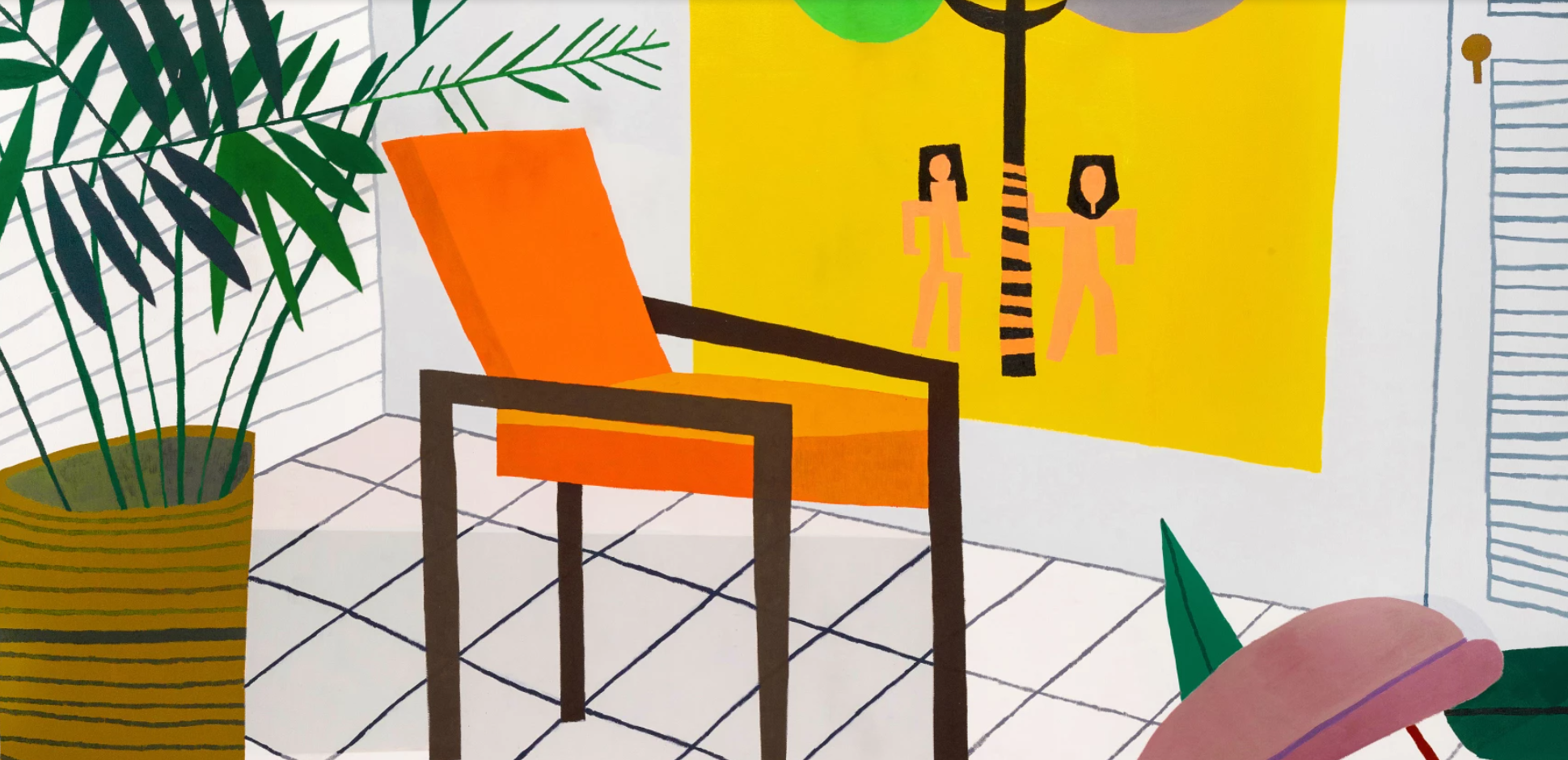
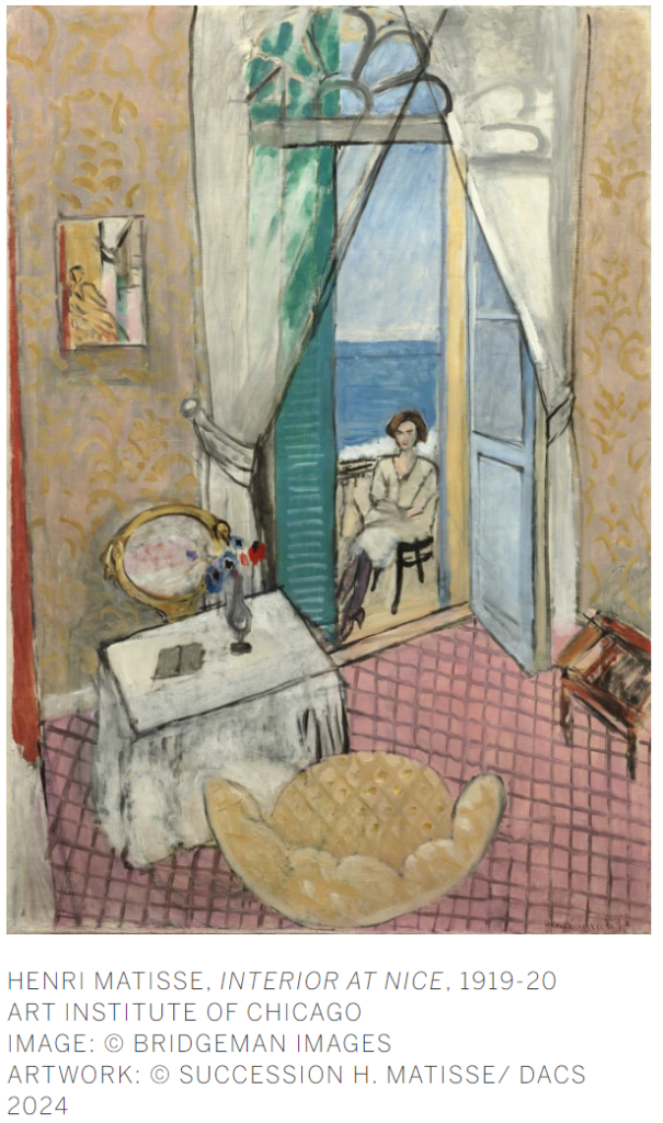
Over the past two decades, Wood has carved out his own distinctive and critically lauded aesthetic that is embedded in a rich network of art-historical reference. The impact of Cubism is evident in his work’s conflation of multiple perspectives, while his focus on the quotidian as well as the cheerful gaiety of his palette invokes the language of Pop art, evoking in particular David Hockney’s domesticated landscapes and gardens. Amongst these influences, the present work is further ingrained in the Modernist style, with expressive mark-making and patterning akin to the interiors of Henri Matisse, in particular works like Interior at Nice (1919), with its starkly rendered angular space, cross-hatched flooring, and horizontal window shutters.
“Hockney was a big, big influence on me. He has that Renaissance ability to paint from life but he’s also an inventor,” says Wood. “But I love Picasso and Braque and Matisse and Vuillard… And the thing about Hockney or Alex Katz or Lucian Freud or any of those people that I’m super into, they were into those modern painters, too. So I get to look at Matisse or Picasso through their work”
Evincing his depth of art historical knowledge and frequent sampling from his contemporaries, Wood combines these myriad references into a rich tapestry of personal and canonical allusion.
DAVID HOCKNEY, MONTCALM INTERIOR WITH 2 DOGS, 1988
Although Untitled (Drawing Rally) is a painting of everyday life, its manipulation and experimentation with the perception of space, volume, flatness, and depth expands its scope, aligning it with the most iconic elements of Wood’s unique visual language. Indeed, the present work represents such a quintessential expression of Wood’s signature style that the artist specifically chose Untitled (Drawing Rally) to be illustrated on a limited-edition foulard, one of which was worn by his wife, ceramic artist Shio Kusaka, to celebrate their anniversary. Oscillating between figurative still-life and abstraction, balanced at the nuanced threshold at which representation disintegrates into sheer pattern of form and color, the present work epitomizes the very best of Wood’s oeuvre.
Lynette Yiadom-Boakye
Phillips London: 27 June 2024
Estimated: GBP 900,000 – 1,500,000
GBP 952,500 / USD 1,207,770
https://www.phillips.com/detail/lynette-yiadomboakye/UK010424/5
LYNETTE YIADOM-BOAKYE
Minotaur To Matador, 2022
Oil on linen, triptych
Each: 109.8 x 70.3 cm (43 1/4 x 27 5/8 inches)
Overall: 109.8 x 220 cm (43 1/4 x 86 5/8 inches)
Signed, titled and dated ‘Minotaur To Matador 2022 Lynette Yiadom-Boakye’ on the reverse of each part
A contemporary master of static drama and narrative ambiguity, Turner Prize nominated Lynette Yiadom-Boakye’s portraits continue to push against the boundaries of the genre, engaging with its rich history while challenging certain expectations and assumptions. Executed in 2022, Minotaur to Matador is an exceptional example of Yiadom-Boakye’s technical precision, remarkable painterly fluency, and virtuoso command of color and tone, its triptych format a striking and unusual pictorial device used by the artist here to powerful effect.
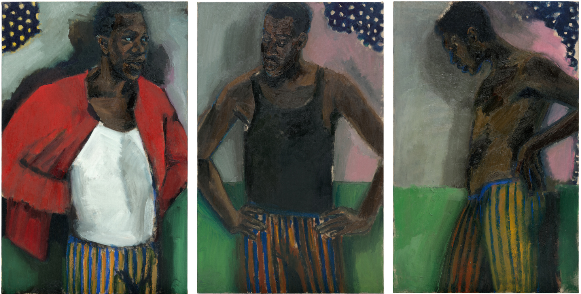
Originating in the Middle Ages, triptychs are most typically associated with religious subjects, depicting Biblical stories and originally functioning as devotional aids for a mostly illiterate lay congregation. Offering a powerful means of visualizing the teaching of Christianity, the triptych form also enabled the inclusion of multiple narrative elements and characters into a single work. Enigmatic and alluring, Minotaur to Matador updates this visual language, introducing a strikingly cinematic quality to the presentation of the figure across three panels here, subtle changes in pose and dress anchored in the recurring bold striped pattern of the subject’s trousers and unusually brightly rendered background.
Robert Campin, The Mérode Altarpiece (The Annunciation Triptych), circa 1427-1432, The Metropolitan Museum of Art, New York. Image: © The Metropolitan Museum of Art, New York, The Cloisters Collection, 1956, 56.70a-c
Executed in stunning contrasts of cadmium red, brilliant blues, and iridescent gold tones against a softly shifting backdrop of warmer greys and pinks, the work’s chromatic consistency reinforces this sense of narrative progression, the tripartite structure providing a visual analogue to the typical narrative structure of beginning, middle, and end. The title too seems to imply a transition from one state to another – charting an evolution from mythic beast to human master that works on both physical and psychological levels here. Cutting against the grain, the transition implied by the title encourages us to read the triptych from right to left, following the protagonist from a state of undress through to his transformation into civilized ‘Matador’, theatrically emphasized in the open sweep of his brilliantly red jacket. With the head of a bull and the body of a man, the Minotaur is a creature from classical mythology, incarcerated at the center of a complex subterranean labyrinth by the order of King Minos of Crete. A story of cruelty, lust, and the consequences for disobeying the will of the Gods, the Minotaur’s creation was the result of an unnatural union between a bull and Minos’ wife Parsiphaë, bewitched by Poseidon as punishment for the King’s refusal to sacrifice the majestic creature in his honor. Typically depicted as a ferocious beast who feasted on human flesh, it was the young Theseus who eventually triumphed over the creature with the help of Minos’ daughter Ariadne. A foundational myth of western civilisation, the Minotaur also lends itself to more psychological interpretations, often taken to symbolise the repressed fears and desires dwelling in the dark labyrinth of our subconscious. Given these contexts, Yiadom-Boakye’s Minotaur to Matador seems to quietly dramatize this conflict, charting a path from our raw, animalistic selves to the self-possession and mastery of the Matador, who slays the wild animal in a dramatic, performative fashion.
 Édouard Manet, The Bullfight, 1864-65, The Frick Collection, New York. Image: The Picture Art Collection / Alamy Stock Photo
While the figure of the Matador has a long art historical legacy including works by Francisco Goya, Édouard Manet, and Francis Bacon, the exchange between the figures of Minotaur and Matador were most profoundly explored across the career of modern master Pablo Picasso, appearing amongst his very earliest and latest works. Heavily autobiographical, Picasso treated the Minotaur as a potent symbol of masculine virility and brutality, featuring prominently in his erotically charged paintings from the 1920s and beyond. Dramatizing the internal struggle between civilized man and wild beast, Picasso appropriated the potent symbolism of the mythical creature as a means of exploring the irrationality of the unconscious and of working through his own, turbulent love affairs of the period. Deeply embedded in the culture of his native Andalusia, Picasso was an avid fan of bullfighting, and of the stark contrasts between beauty and horror, dance and violence that the spectacle presented. Although Picasso turned to these sources throughout his career, the figure of the Matador made a significant and sustained appearance towards the end of his life, the older painter aligning himself with the skilled, heroic, and triumphant bullfighter who exists so closely to the line that divides life from death. Drawing on these rich art historical dialogues, Yiadom-Boyake takes a more subtle approach, her serene composition evading the brutality and overt eroticism of Picasso’s treatment of the motif in favor of a more ambiguous and quietly introspective tone. Liberated from the need to tell specific truths about individuals limited by real-world constraints, through her confident brushstrokes, rich palette, and Baroque flourishes Yiadom-Boakye creates a world apart, not in order to simply insert Black bodies into space historically occupied almost exclusively by representations of Whiteness – although they certainly challenge on this point – but to open up an expansive space of imaginative possibility and infinitude, not within the canvas itself, but within the imaginative exchange between artist, painting, and viewer.
JADÉ FADOJUTIMI
Christie’s London: 27 June 2024
Estimated: GBP 250,000 – 350,000
GBP 277,200 / USD 351,490
JADÉ FADOJUTIMI (B. 1993) (christies.com)
JADÉ FADOJUTIMI (B. 1993)
She’s Distressed, 2019
Oil on canvas
175.5 x 165.5 cm (69 1/8 x 65 1/8 inches)
Signed twice and dated ‘Jadé Fadojutimi March ’19’ (on the reverse)
With its sparks, flurries and ribbons of color tangling in a space of clear sunlit yellow, She’s Distressed (2019) is a radiant example of Jadé Fadojutimi’s abstract practice. Slender, marbled strokes, glowing through a spectrum of complementary purple and golden tones, weave and dance around the picture’s luminous core, while elongated shapes—speckled like cells under a microscope—float weightlessly in the foreground. The work captures the distinctly personal language that has propelled Fadojutimi to international acclaim in recent years. Experiencing moods as colors, she has described her works as ‘windows to the self’ and ‘emotive environments,’ building them up in glowing, translucent layers that interface with her own feelings, memories and experiences. Her intuitive, organic process can be richly felt in the present work, whose forms seem to grow, branch and flutter by their own volition.
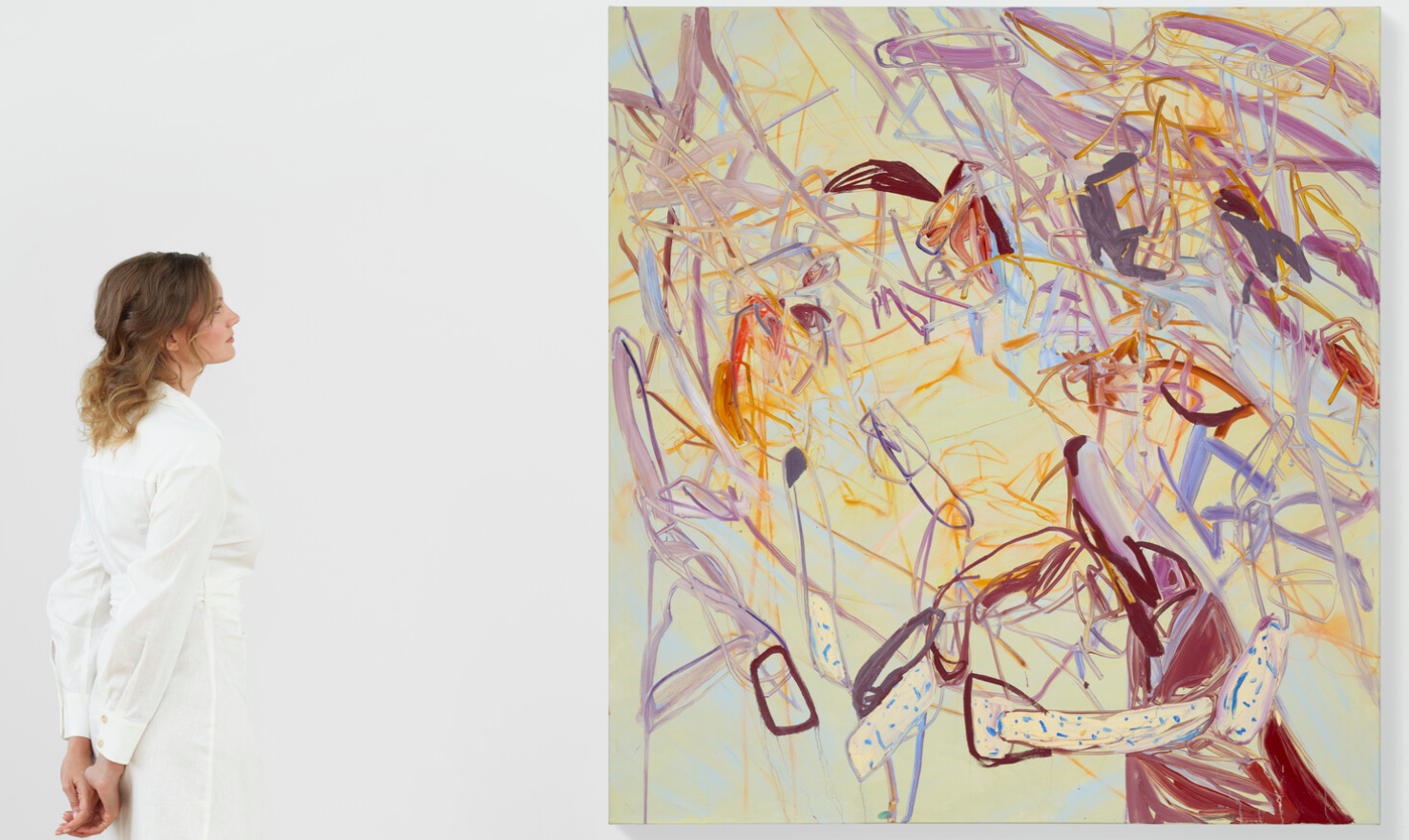
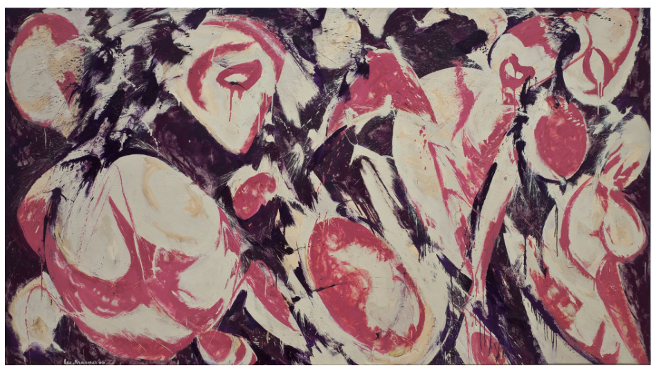
During her time at art school Fadojutimi came to admire other artists, ranging from Joan Mitchell, Claude Monet, Lee Krasner and Henri Matisse to contemporary painters including Phoebe Unwin, Laura Owens and Amy Sillman. Many of these figures share something of her synaesthetic approach to the canvas, with sound, touch, speed and other phenomena informing their handling of pigment.
“Whilst I’m painting, the harmonious unity of my senses becomes apparent. They muddle together, chitter-chattering about their newfound warmth as though it’s their first connection. This first meeting seems to happen almost every day.”
Fadojutimi writes in parallel with her painting, and her works’ oblique, poetic titles reflect their sense of play, experimentation and flux. If She’s Distressed alludes to any emotive turmoil in its excited upheaval of forms, it is also many things at once: an ever-changing inner landscape expressed through her miraculous, self-defining language of color.
Focus: Contemporary Art
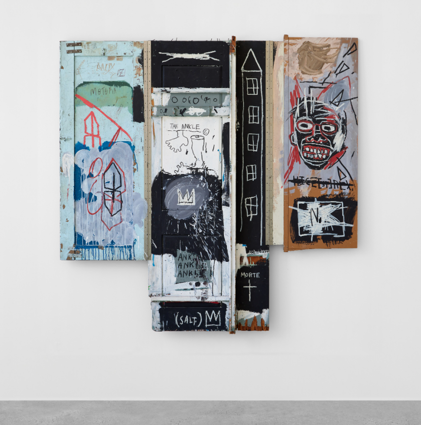
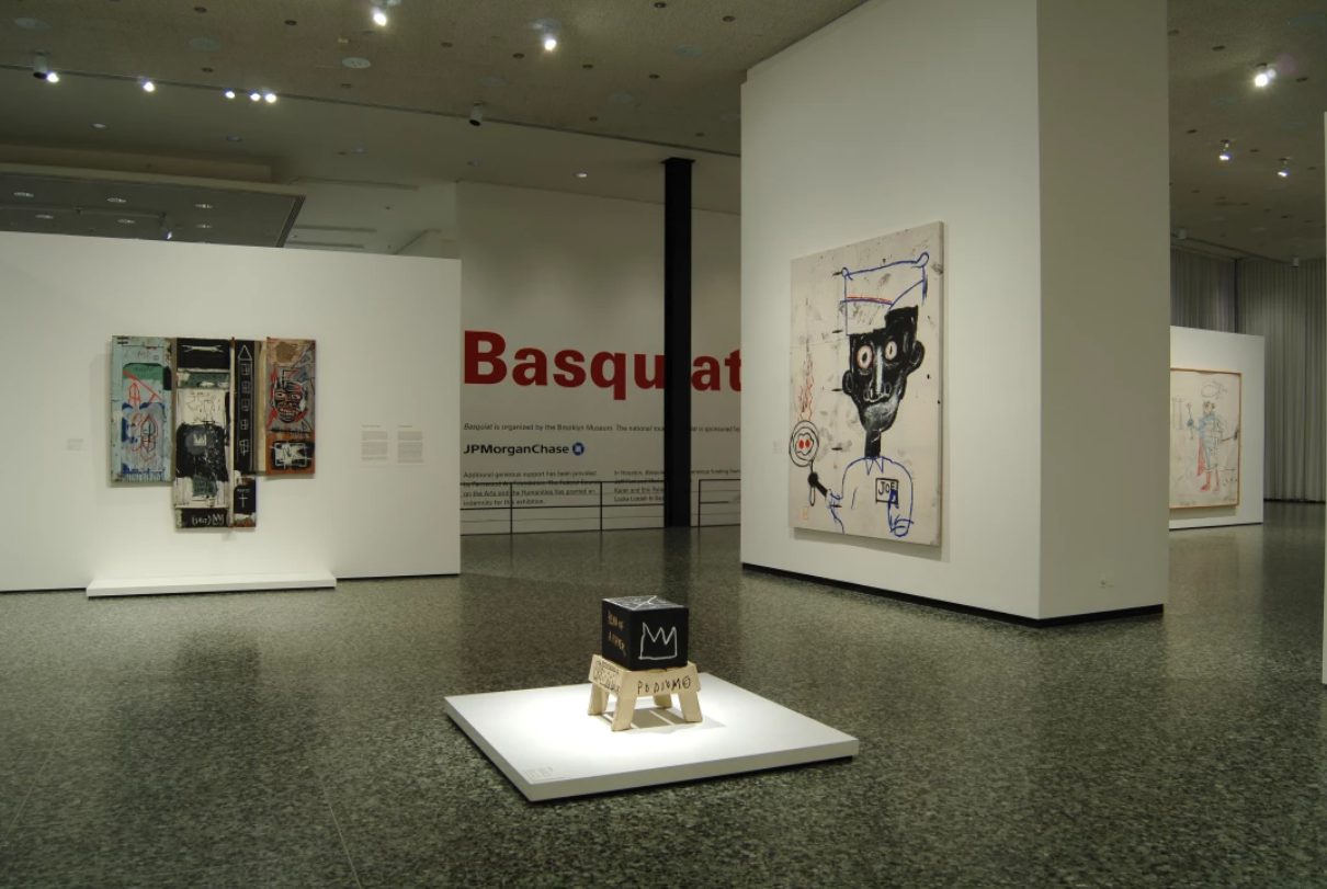
Jean-Michel Basquiat
Sotheby’s London: 25 June 2024
Estimated: GBP 15,000,000 – 20,000,000
GBP 16,016,832 / USD 20,309,343
JEAN-MICHEL BASQUIAT (1960 – 1988)
Portrait of the Artist as a Young Derelict, 1982
Oil, oil stick, and acrylic on wood and metal
80×82 inches (203.2 x 208.3 cm)
Signed, titled and dated 1982 (on the reverse of the left panel)
Pulsating with raw energy and a compelling visceral strength, Portrait of the Artist as a Young Derelict is a masterpiece of Jean-Michael Basquiat’s oeuvre, painted when the artist was at the magisterial height of his creative powers. Reminiscent of a Renaissance altarpiece in its imposing scale and triptych format, this is a seminal and utterly unique construction; through this devotional totem the artist seeks to ennoble the street and enshrine himself and his graffiti artist peers as heroes and martyrs.
Befitting its importance, the work is widely referenced in literature and has been included in several major exhibitions worldwide, including the artist’s 1992 retrospective at the Whitney Museum of American Art, New York; solo exhibitions at the Museum of Contemporary Art, Los Angeles; Museum of Fine Arts, Houston; and Fondation Beyeler, Basel; and most recently, Jean-Michel Basquiat at Fondation Louis Vuitton in Paris in 2018. It was painted for the artist’s pivotal exhibition at Fun Gallery in the crucial year of 1982, and it belongs to a select group of compelling works that utilize quotidian objects as support for the artist’s expressionistic vision, articulately synthesizing a wealth of divergent influences into a cohesive magnum opus.
THE PRESENT WORK INSTALLED IN BASQUIAT, MUSEUM OF FINE ARTS, HOUSTON, 2005
Appropriating found materials including a domestic door – an object which Basquiat cited as one of his earliest painted surfaces prior to his commercial success – the artist orchestrates an emotively complex and richly self-referential representation of his experience as a Black artist navigating the transition from living on the street to fame and fortune. Executed with the swift facility of graffiti and the masterful ingenuity of a painterly virtuoso, this work is a consummate example of Basquiat’s genius for sampling and synthesizing the cultural tumult of a very modern kind of existence.
Befitting its importance, the work is widely referenced in literature and has been included in several major exhibitions worldwide, including the artist’s 1992 retrospective at the Whitney Museum of American Art, New York; solo exhibitions at the Museum of Contemporary Art, Los Angeles; Museum of Fine Arts, Houston; and Fondation Beyeler, Basel; and most recently, Jean-Michel Basquiat at Fondation Louis Vuitton in Paris in 2018. It was painted for the artist’s pivotal exhibition at Fun Gallery in the crucial year of 1982, and it belongs to a select group of compelling works that utilize quotidian objects as support for the artist’s expressionistic vision, articulately synthesizing a wealth of divergent influences into a cohesive magnum opus. Appropriating found materials including a domestic door – an object which Basquiat cited as one of his earliest painted surfaces prior to his commercial success – the artist orchestrates an emotively complex and richly self-referential representation of his experience as a Black artist navigating the transition from living on the street to fame and fortune. Executed with the swift facility of graffiti and the masterful ingenuity of a painterly virtuoso, this work is a consummate example of Basquiat’s genius for sampling and synthesizing the cultural tumult of a very modern kind of existence.
Though maintaining the spontaneity of graffiti in its paroxysmal execution, by the time this work was created in 1982 (when the artist was just 22 years old), Basquiat had fully transitioned from street to studio. With few resources other than sheer determination, within just four years the young artist progressed from intermittent bouts of homelessness and the ubiquitous dissemination of his “SAMO” graffiti tag across the city, to being introduced to an enamored art world as “The Radiant Child” through René Ricard’s seminal Artforum article of December 1981. Basquiat’s early success provided him with the confidence to be more ambitious in scale, structure, and technique, as evidenced by the large-scale format and richly complex surface of Portrait. However, he maintained close ties to his artist peers who continued as graffitists; as Hoffman again notes, “For Basquiat, graffiti was not only part of his artistic foundation, but also a culture he continued to embrace and support… While Basquiat’s techniques result in a highly resolved and compelling pictorial composition, aspects of this work are strongly reminiscent of the actions of the graffitist. Reinforced by Basquiat’s reference to the urban milieu in his depiction of a skyscraper on the right edge of the central panel, Portrait of the Artist as a Young Derelict may be seen as Basquiat’s tribute to his fellow artist[s] and [their] radical undertaking” (Ibid., pp. 211-212).
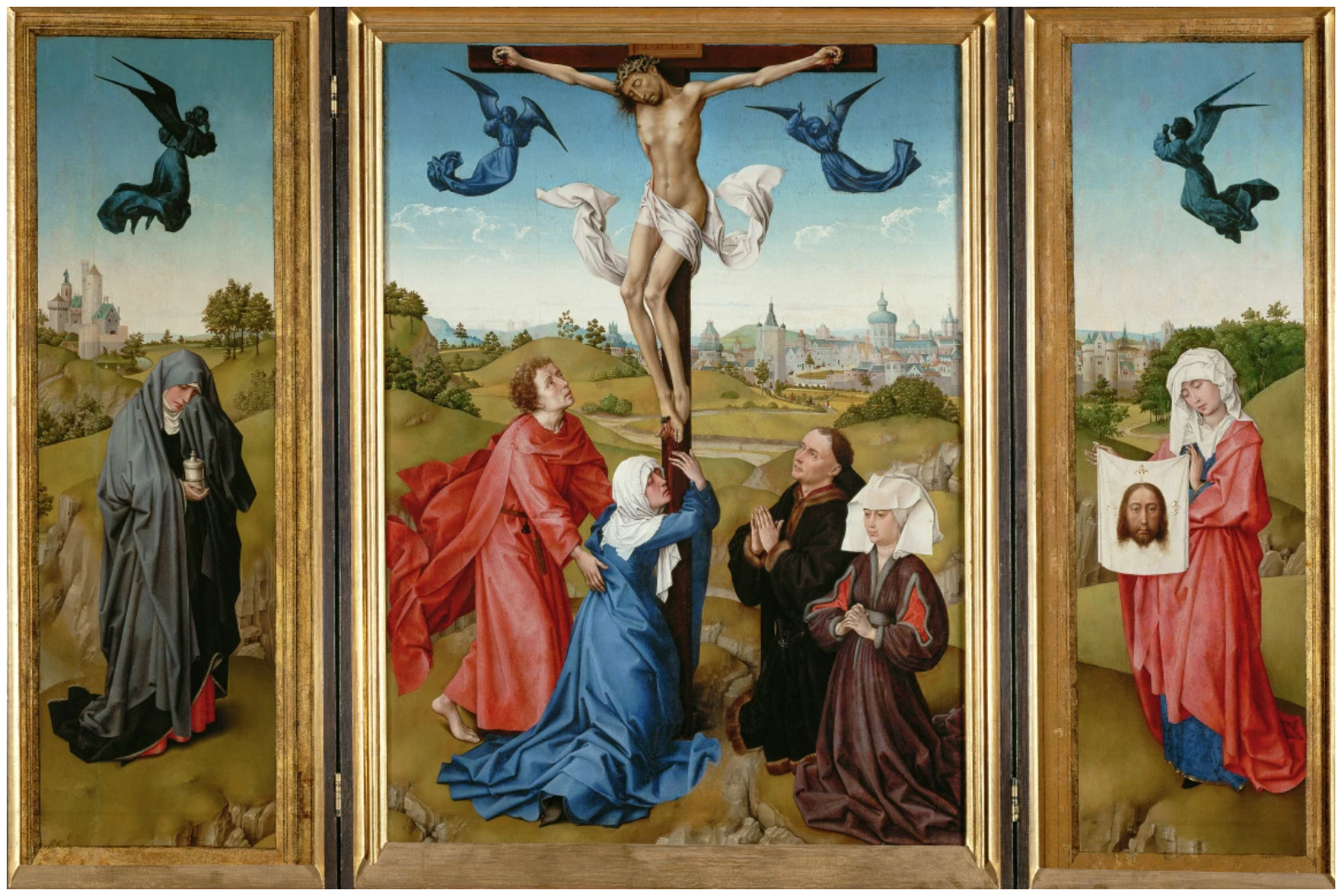
ROGIER VAN DER WEYDEN, TRIPTYCH: THE CRUCIFIXION, CIRCA 1440. KUNSTHISTORISCHES MUSEUM WIEN. IMAGE: © KUNSTHISTORISCHES MUSEUM WIEN, GEMÄLDEGALERIE
Executed on three found panels joined with hinges, the unique structure of Portrait draws upon Basquiat’s extraordinary familiarity with centuries of tradition by echoing the time-honored format of the tripartite altarpiece, and references the religious and political powers that were associated with them. Assembled from discarded wood – including a once-functional door complete with coat hooks – the quotidian materials are thus elevated to the status of worshipped icon. Basquiat noted how “the first paintings” he ever made were on the ad-hoc surfaces of doors and windows.
“I used the window shape as a frame and I just put the painting on the glass part and on doors I found on the street.”
Even after his transition to studio artist, doors and shutters became favored supports for the artist’s visions throughout the rest of his career; thus the present work undoubtedly references his earlier involvement in graffiti culture through the intentional use of found media. Recalling the makeshift aesthetic of Rauschenberg’s revered Combine paintings, here a variety of sources and materials are collaged onto the wooden panels, evoking the frenetic strata of stimuli that characterized the metropolitan cacophony of Basquiat’s New York surrounds.
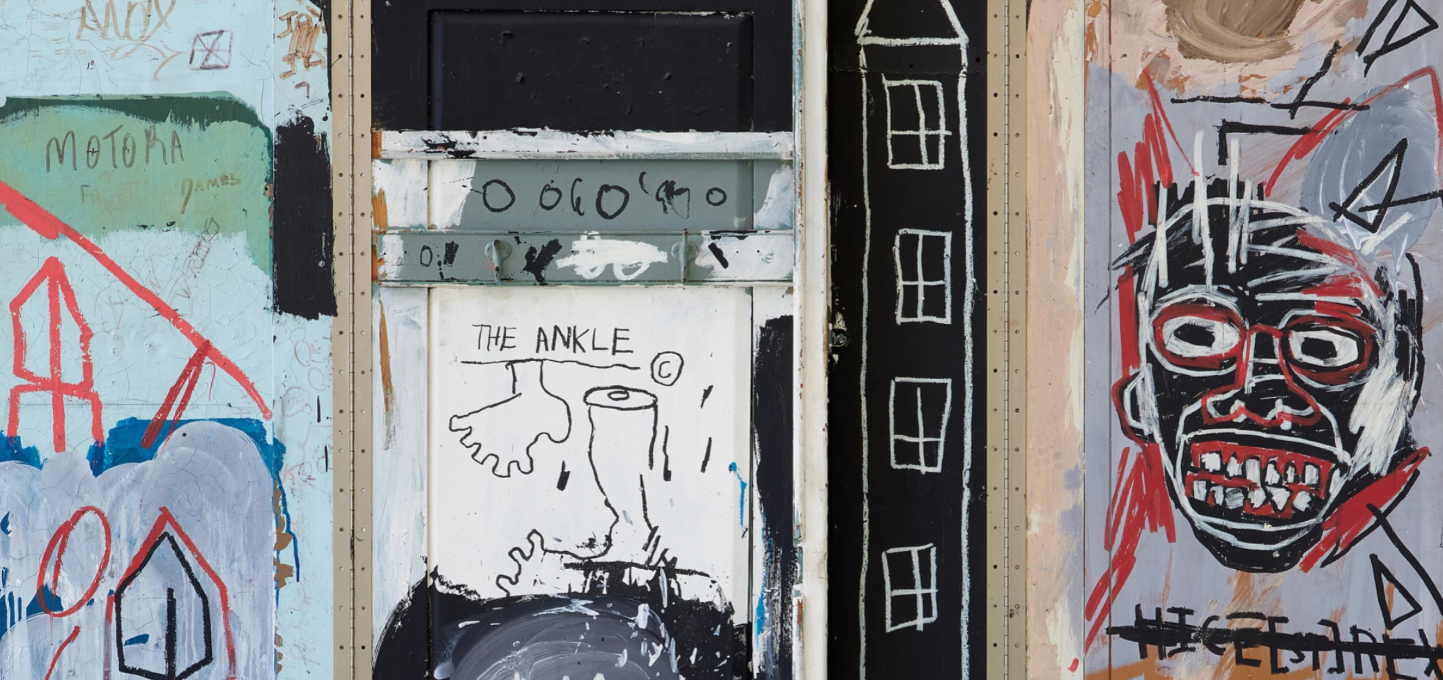
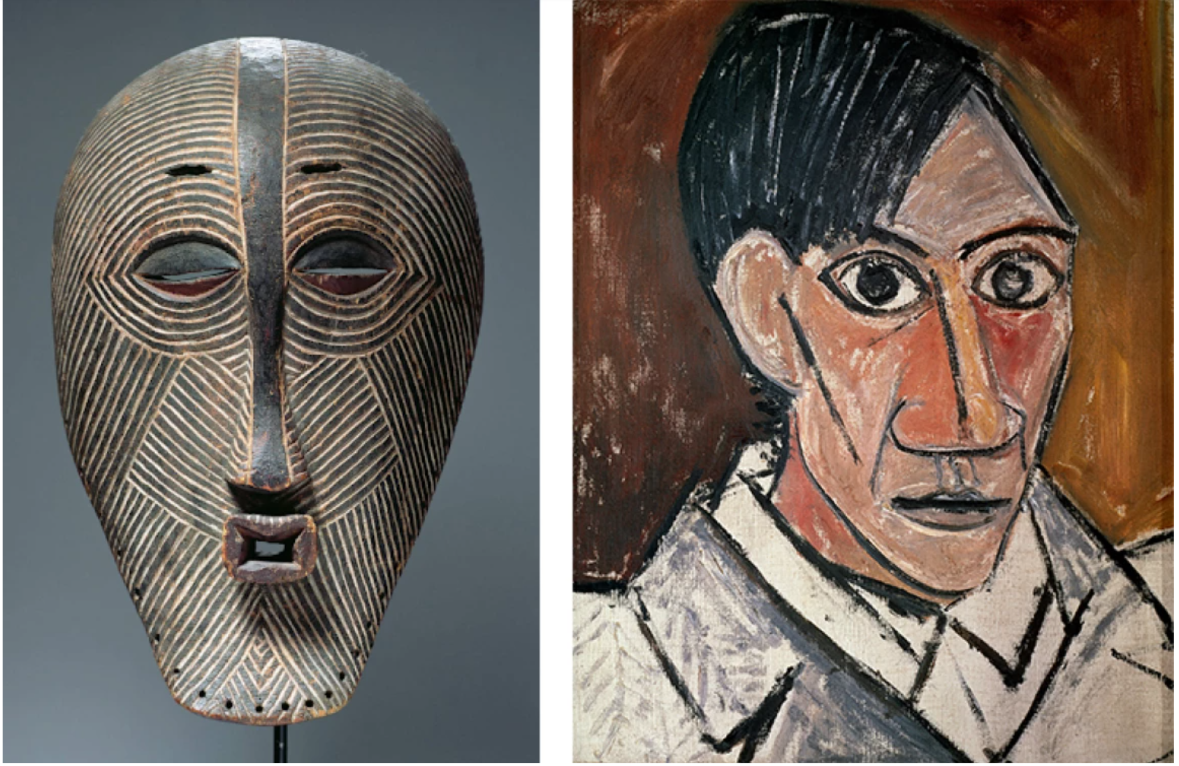
Art for Basquiat was a means of self-discovery and a voyage into the troubled depths of his own identity. Born in Brooklyn in 1960 to a Haitian father and New York Puerto Rican mother, Basquiat’s mixed ethnic heritage instilled in him the mentality of an outsider and with it a rebellious freedom that invigorates his art. He absorbed influences and references from both the Western and African traditions of his roots, from voodoo and tribal rituals, African masks and mysticism to Renaissance genre painting and Modern painters like Pablo Picasso and Cy Twombly, all the way to contemporary street slang and sports and musical stars of American pop culture. With a typically post-modern flair, Basquiat cut and pasted, mixed and matched these diverse and often conflicting elements of his identity to construct powerfully vital and evocative psychological portraits. In the present example, he inserts one of his characteristic mask-like faces, a dreadlocked, shamanistic portrait that confronts our gaze with wide, glaring eyes and gritted teeth. Inserted into the alter-like construction, the head becomes deified, even Christ-like: taken as the titular “artist,” set amongst the chaotic melee of street and graffiti references, the portrait can be read as a Romantic celebration of the street artist as martyr. Read alongside the central, haloed symbol of the three-pointed crown – one of Basquiat’s defining and most recognizable motifs – there is little doubt that this modern-day altar is intended to enshrine the bohemian spirit of the tortured artist as a fallen hero.
This reading is underscored by the panoply of words and phrases that adorn the surface of Portrait. For instance, under the red and black portrait: “HICE[ST]REX,” a Latin phrase for “Here is the King,” directly referring to the crucifixion of Jesus in the New Testament. The bracketed “[ST]” – a classic abbreviation – reinforces Basquiat’s self-proclamation as King of the Street, at once celebrating his graffiti heritage as he ascends to a new throne in the wider commercial art world, while also once again positioning the artist as a martyr. Coupled with the white cross and inscription “MORTE” on the center panel, Basquiat underlines the tragic destiny of the street artist. Risking arrest, harm, even death – as in the case of the artist’s friend Michael Stewart, a young Black graffitist who was killed while in custody of the New York City police – these artists were seen as outsiders and threats.
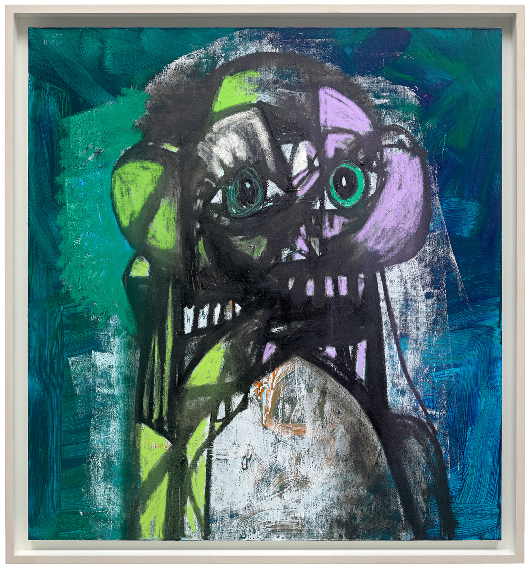
George Condo
Phillips London: 27 June 2024
Estimated: GBP 700,000 – 900,000
GBP 1,016,000 / USD 1,288,288
George Condo – Modern & Contemporary Art… Lot 8 June 2024 | Phillips
GEORGE CONDO
Green and Purple Head Composition, 2018
Acrylic, charcoal, pastel and pigment stick on linen, in artist’s frame
56 1/8 x 52 1/4 inches (142.7 x 132.6 cm)
Signed and dated ‘George Condo 4/22/18’ upper left
A perennial art-world provocateur, approaching art with protean force and spontaneity, Purple and Green Head Composition embodies the range, verve, and potency inherent to George Condo’s canvases. Belonging to Condo’s celebrated Drawing Paintings first commenced in 2008, Purple and Green Head Composition articulates the artist’s ongoing dialogue with his retinue of strangely familiar, grotesque characters. Through his committed and close examination of art historical tradition and the human psyche, Condo expresses his unique vision of ‘psychological cubism’ as a means of pursuing construction through fragmentation.
“I like to think about Picasso […] because he took a bicycle seat and a pair of handlebars and made a bull’s head: he re-configured a manmade thing into a natural thing. What I’ve done is the reverse, I’ve turned it back into a bicycle.”
Frenetic and fluorescent, with staccato strokes of charcoal and pastel, Condo schematically outlines the bust of a figure. Across the richly layered painterly surface, flashes of lilac and lime green radiate from the blue and white ground, the animated surface speaking to the composition’s latent energy and dynamism. A composition that resembles the geometric constructions of Analytical Cubism and the visceral impastos of Abstract Expressionists, Condo aspires for his work to be ‘the sum of everything that ever happened before [him]’. Unconventionally combining paint with the velocity and immediacy afforded by drawing, as Francis Picabia or Phillip Guston had relentlessly experimented with a range of styles, Condo re-energizes historical references to create a distinct, personal language.
“I describe what I do as psychological cubism. Picasso painted a violin from four different perspectives at one moment. I do the same with psychological states.”
Beginning with his ‘fake’ Old Masters in the early 1980s, to explorations of Pop Art and Surrealism, in Purple and Green Head Composition Condo uses the vocabulary of Cubism to reflect on the multifaceted, antithetical emotional states which are part of the human condition. Defined by the artist as ‘psychological cubism’, Condo challenges the ostensible empiricism of perceived reality since ‘people create artificial representations of themselves as their sole identity’. From the reverberating tangle, fractured features of a face materialize: flared teeth, exaggerated ears, and prominent eyes. These physiognomic characteristics are instantly recognizable as belonging to Condo’s crazed, ‘antipodal beings’, apparitions that repeatedly resurface across the artist’s oeuvre to express spheres of the consciousness. Through prismatic planes of color and incandescent surface, in Purple and Green Head Composition beauty, horror, ecstasy and despair are revealed simultaneously, ranges of emotions that are all the more compellingly human.
George Condo
Phillips London: 27 June 2024
Estimated: GBP 400,000 – 600,000
GBP 508,000 / USD 644,144
https://www.phillips.com/detail/george-condo/UK010424/20
GEORGE CONDO
Seated Bather, 2005
Oil on canvas, in artist’s frame
60 7/8 x 53 7/8 inches (154.5 x 137 cm)
Signed and dated ‘Condo 05’ upper left
In a period when the discipline of figurative painting was eclipsed by advances in conceptual art and abstraction, George Condo revitalized the medium through a careful and humorous appropriation of Old and Modern Masters fused with Pop culture references and reimagined in the artist’s highly distinctive visual style. Like his contemporaries Keith Haring and Jean-Michel Basquiat, Condo worked to combine stylistically representational and abstract elements, developing a mode of ‘Artificial Realism’ that was entirely his own. Swerving between Baroque theatricality, Cubist experiments in simultaneity and form, and Surrealist juxtaposition, Condo’s wildly inventive portraits are freed from the constraints of physical or anatomical likeness, populated by a host of strange figures characterized by exaggerated overbites, oversized ears, and bulging eyes – ‘Antipodal Beings’ from the far-flung edges of psychological experience. Often taking on the menial roles of butler, maid, chauffeur, or janitor, this strange cast of characters allowed Condo to visually expose the tensions between the composed face a subject might have to present to the world, and the more complex internal feelings shifting beneath the surface, embodying ‘the despair, the heartache, the love and the happiness of any of us.’ Such a strikingly original approach to notions of simultaneity also emphasizes the supreme influence of the great modern master Pablo Picasso on Condo’s work over the years
“Any great artist is a sum total of the artists who came before him. Picasso’s ‘Seated Bather’ comes straight out of Renoir and there’s reference to David and ‘Le Déjeuner sur l’herbe’ by Manet. It’s an identity thing – everybody wants to feel like an individual, but we’re part of a continuum, whether we like it or not.”
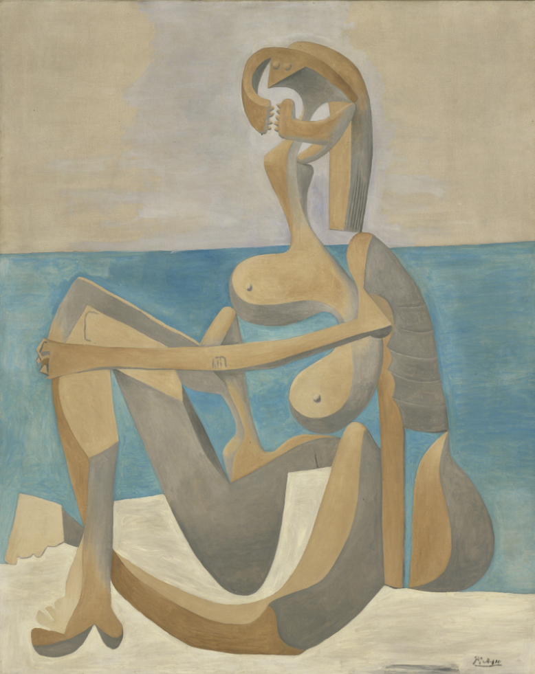
Pablo Picasso, Seated Bather, 1930, The Metropolitan Museum of Art
https://www.moma.org/collection/works/78721
Painted in 2005, Seated Bather takes these connections even further, drawing immediate compositional comparisons to Picasso’s pivotal series of nude bathers from the late 1920s and early 1930s. Although the motif of the nude bather had been a recurrent feature across Picasso’s oeuvre, his stylistic approach during this important period combined Cubist and more Surrealist elements with great dexterity and novelty. Applying a similar stylistic approach, Condo’s Seated Bather stands in a particularly close compositional relationship to Picasso’s Seated Bather from 1930, now held in the permanent collection of The Metropolitan Museum of Art in New York. In both paintings, a single, female figure sits in profile, alone against a sparse backdrop of sky, sea, and sand. In both, the angularity of the figure is exaggerated through the arrangement of the sitter’s limbs and the sharp contrast established between the bended knee and softer, more rounded forms. Just as Picasso fractured the body to reach a deeper understanding of its volumetric form, drawing himself into dialogue with both classical art and modern modes of experimentation, Condo’s similarly amalgamative approach has enabled the artist to pursue the complex and contradictory realities of our psychological lives.
Damien Hirst
Phillips London: 27 June 2024
Estimated: GBP 500,000 – 700,000
GBP 685,800 / USD 869,594
https://www.phillips.com/detail/damien-hirst/UK010424/18
DAMIEN HIRST
Creed, 2006
Butterflies and household gloss on canvas
Diameter: 96 inches (243.8 cm)
Stamped with the artist’s stamp, titled and dated ”Creed’ 2006 HIRST’ on the reverse
Embodying the transient beauty of life, the motif of the butterfly has proved foundational to British artist Damien Hirst’s practice, anchoring his investigations into systems of knowledge including religion, science, and myth. A sophisticated example of the artist’s celebrated Mandala paintings, Creed adopts a mosaic arrangement, assembled with a luminous range of vivid purples, cobalt blue, yellows, and whites set against a turquoise gloss ground. The work refers back to the very outset of Hirst’s career, butterflies being the focus of his debut solo exhibition In and Out of Love. Held over two floors in a former travel agency on Woodstock Street, London in 1991, Hirst’s original installation presented a dramatic and controversial staging of the life-cycle of the butterfly. On the ground floor, Hirst attached pupae to five white canvases, carefully timing the hatching for the exhibition’s opening, while downstairs the delicate bodies of expired butterflies were fixed across eight monochrome canvases. Trays of cigarette butts accompanied the series, juxtaposed with nourishing sugar water for the live specimens upstairs. An elegant symbol condensing Hirst’s conflicted and complex feelings on mortality, the butterfly combines beauty and decay alongside notions of resurrection and transcendence, a paradox succinctly summarized by the artist’s comment that ‘the death of an insect […] has this really optimistic beauty of a wonderful thing’.
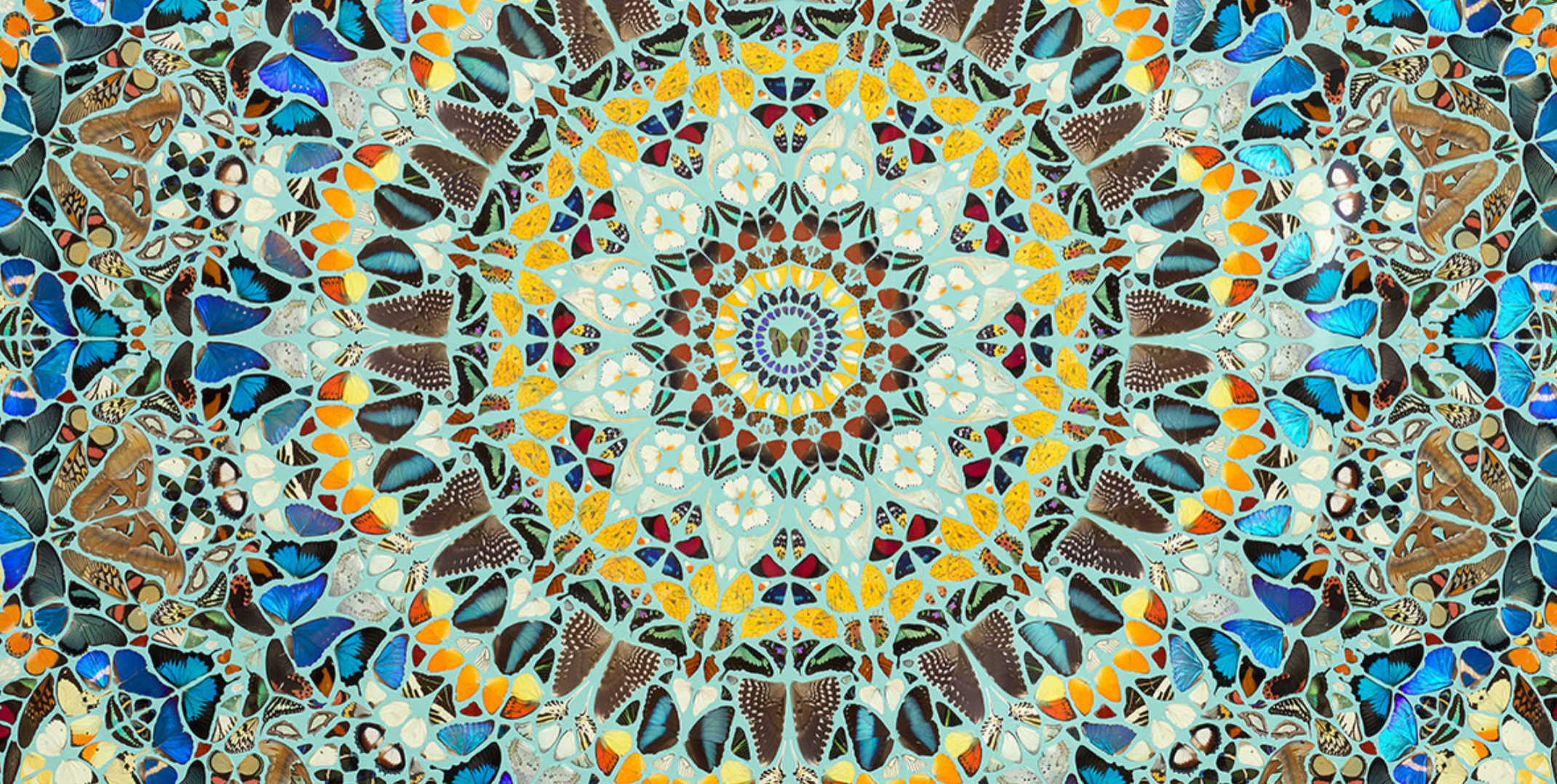
In continuing his exploration of life and death, Hirst began his intricately patterned paintings using butterfly wings in 2001. Inspired by Victorian lepidopterologist’s arrangement of winged insects, the Kaleidoscope series foregrounded aesthetic concerns alongside the spiritual and philosophical potential of the butterfly. Associations between the butterfly and the transmigration of the soul have been well established across diverse belief systems and cultures, the mythological goddess of the soul – Psyche – even lending her name to the formal Greek term for the delicate creature. As is evident across this series of works, the mimetic organization, tondo format, translucency, and vivid hues of the present work recalls the stained-glass rose windows in Gothic cathedrals across Europe. Undoubtably derived from Hirst’s Catholic upbringing, the emphasis on symmetry and harmonized patterning might also remind the viewer of the mandala in religions like Hinduism and Buddhism, typically emblematic of the cosmos. As the mandala is used in meditative rituals, in Creed the composition centers on a single butterfly from which the pattern seems to emanate and shift before the viewer’s eyes, a process of looking that encourages introspection and self-reflection. The title itself has overt religious connotations, referencing short statements of faith passed through universal religions, Hirst evoking a mode of spiritualism to encompass all belief systems, achieved through the sheer resplendence of the butterfly, even in death.
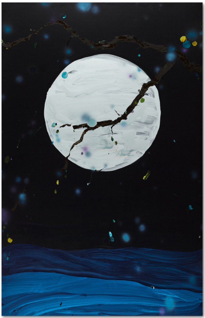
Laura Owens
Sotheby’s London: 26 June 2024
Estimated: GBP 250,000 – 350,000
GBP 528,000 / USD 669,504
LAURA OWENS (b. 1970)
Untitled, 2000
Acrylic and oil on canvas
112 x 71 3/4 inches (284.8 x 182.4 cm)
Signed, titled and dated 2000 (on the reverse)
For over twenty years, Los Angeles based Laura Owens has pioneered an innovative approach to painting, establishing herself as one of the most influential artists of her generation. This is vividly evident in the present composition, executed in 2000. Depicting an enchanted nightscape, the painting serves as an ode to her bold and experimental style, which challenges traditional notions of figuration and abstraction by drawing inspiration from the nightscapes of the Old Masters. Through the decision to leave her work untitled, Owens also invites the viewers to fully experience the work at their own pace offering both aspects of the familiar world and a glimpse of a universe that is entirely unpredictable and imaginative.
Owens emerged on the Los Angeles art scene in the mid-1990s, a period when painting was often viewed with skepticism by art critics. Her early canvases challenged traditional painterly abstraction by incorporating whimsical personal references, doodles, and common craft materials. These works often reflect her keen interest in the spatial relationship between paintings and their environments, using illusionistic techniques that extend the planes of walls and floors into her compositions. Owens’s unique blend of high art with everyday elements marks a significant shift in contemporary painting, making her a key figure in its resurgence during this era.

Owens’s work deliberately mixes techniques and traditions, creating compositions that transgress the boundaries between fine and folk art. This coexistence of styles and motifs is central to Owen’s acclaimed early oeuvre, laying the groundwork for the painterly transformations in her later works. Owens’s innovative spirit and commitment to pushing the boundaries of painting continue to influence and inspire a new generation of artists. Her work both challenges the conventions of the medium but also invites viewers to reconsider the possibilities of contemporary art in an increasingly digital and interconnected world.
Owens’s work is held in many prominent public art collections, including the Art Institute of Chicago; Museum of Modern Art, New York; Museum of Contemporary Art, Los Angeles; Los Angeles County Museum of Art; Guggenheim Museum, New York; Whitney Museum of American Art, New York. In 2003 she had her first survey exhibition at the Museum of Contemporary Art, Los Angeles. She subsequently held solo exhibitions at prestigious institutions, including Kunsthalle Zürich (2006); Camden Arts Centre, London (2006); Bonnefanten Museum, Maastricht (2007); Kunstmuseum Bonn (2011); Secession, Vienna (2015); Whitney Museum of American Art (2017); and the Museum of Contemporary Art, Los Angeles (2018). Each exhibition displayed different aspects of Owens’ evolving and experimental practice.
Gunther Forg
Christie’s London: 27 June 2024
Estimated: GBP 400,000 – 600,000
GBP 441,000 / USD 559,188
GUNTHER FORG (1952-2013) (christies.com)
GÜNTHER FÖRG (1952-2013)
Untitled, 2008
Oil and acrylic on canvas
61 1/8 x 55 1/4 inches (155.4 x 140.2 cm)
Signed and dated ‘Förg 08’ (upper right)
Across a cool pale-grey ground, flurries of peach, orange, blue, deep green, crimson, yellow and white marks cluster in varying degrees of impasto. Painted in 2008, Untitled is an exceptionally vivid example of Günther Förg’s celebrated series of Tupfenbilder or ‘Spot Paintings’, which he executed between 2007 and 2009 in some of the final years of his life. Abandoning the heavy supports he had gravitated towards in the 1990s—volatile materials such as lead, wood and copper—his ‘spot paintings’ are markedly light and sensuous. They mark a jubilant celebration of painting itself—of pigment, brushwork, texture and viscosity. Here, each spot is a single, gleaming note amidst a triumphant chorus of technicolour. ‘One cannot even begin to appraise the effect of floating, dancing colours’, wrote Dutch art historian Rudi Fuchs. ‘Their sparkling behaviour, elusive as light on splashing water’ (R. Fuchs, Günther Förg: Back and Forth, Cologne 2008, pp. 9-10). Uninhibited and joyous, Untitled stands as a visual record of the artist’s late approach to painting as play.

Förg rose to prominence in the 1980s, amidst a climate in which his German contemporaries had pronounced the death of painting. Many sought to dismantle the medium’s core tenets, stripping away centuries of art historical convention and tradition in often irreverent or subversive ways. Förg charted his own course. Drawing inspiration from Gerhard Richter, Robert Ryman, and Blinky Palermo, he delighted in the material qualities of paint and questioned the nature of the picture plane. His earlier works had invited comparisons to the ‘Colour Field’ painters Mark Rothko and Barnett Newman. Where his Abstract Expressionist predecessors had positioned abstraction as a portal to cerebral, metaphysical realms, however, Förg’s work maintained roots in the world around him. ‘Newman and Rothko attempted to rehabilitate in their works a unity and an order that for them had been lost’, he said, ‘For me, abstract art today is what one sees and nothing more’ (G. Förg, quoted in Günther Förg: Painting/Sculpture/Installation, exh. cat. Newport Harbor Art Museum, Newport Beach 1989, p. 6).
The ‘Spot Paintings’ were in part inspired by photographs that Förg had seen of Francis Bacon’s studio, where blank walls and doors had functioned like an enormous mixing palette, bearing the haphazard traces of his workings. Vibrant splodges of pigment remain where he wiped excess paint from his brushes, clustering into abstract compositions of their own. Förg had himself been making watercolours at his desk during this time, using white sheets of paper to blot his brush between strokes. Pleased by these markings—the appearance of pure, unworked colour—he turned his attention to a series of large canvases. The present work is an especially accomplished example of Förg’s lyricism. The brushwork is distinctly notational and, evoking Cy Twombly’s scribble-like inscriptions, clusters of color seem to record the artist’s innermost thoughts, to track his discoveries as he finds them.
Cy Twombly, Lepanto VII, 2001. Museum Brandhorst, Munich. Artwork: © Cy Twombly Foundation. Photo: Scala, Florence/bpk, Bildagentur für Kunst, Kultur und Geschichte, Berlin.
The present painting demonstrates Förg’s close attention to the relationship between form, shape and color—what the artist called ‘the intermingling of the expressive and the rational’ and deemed to be the most fascinating aspect of painting (G. Förg, quoted in D. Dietrich, ‘An Interview with Günther Förg’, The Print Collector’s Newsletter, vol. 20, no. 3, August 1989, p. 84). A close reader of art history, he was strongly influenced by Modernism, its proclivity for hard-edged geometry and clean, rectilinear structures. One is reminded of Piet Mondrian’s gridded, primary-colour compositions when looking at Förg’s oeuvre. Untitled, however, relishes in playful abandon. Released from constriction, Förg creates a painting about painting, and, as Gavin Delahunty has observed, ‘In the Spot paintings, Förg, for the first time, makes us absolutely aware of Förg’ (G. Delahunty, ‘Günther Förg: Apparitions of Modernism’, in ibid., p. 72).
Keith Haring
Phillips London: 27 June 2024
Estimated: GBP 400,000 – 600,000
GBP 317,500 / USD 402,590
Keith Haring – Modern & Contemporary Ar… Lot 16 June 2024 | Phillips
KEITH HARING
The Garden of Radio Delight/The Beach (double-sided), 1984
Acrylic on tarp, double-sided
75 1/2 x 187 7/8 inches (191.8 x 477.5 cm)
This work is 1 of 2 unique tarps created for the Bill T. Jones / Arnie Zane Dance Company’s production of Secret Pasture which premiered at the Brooklyn Academy of Music on 15 November 1984.
Emphasizing form, vitality, and unrestrained movement, Keith Haring’s iconographic compositions generate their own mode of visual choreography, their repeating motifs and pronounced internal rhythms closely aligned to musical pattern and the embodied power of dance and performance. Although these elements had been well-established in the artist’s work before the 1890s, Haring’s first meeting with the legendary choreographer and dancer Bill T. Jones and his partner Arnie Zane proved to be decisive, allowing him to harness the dynamic energy of his practice and harness its collaborative potential. Executed in 1984 on an enormous, immersive scale as part of Haring’s stage designs for Secret Pastures, The Garden of Radio Delight/The Beach is a record of this friendship, and the interdisciplinary collaborations produced by Haring, Jones, and Zane during this fruitful period.
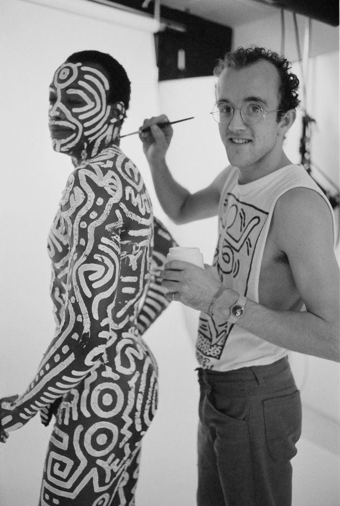
The year before the present work’s execution, Haring had infamously painted Jones’ entire body in the simplified, bold patterns that had become synonymous with the artist’s unmistakable visual style found across his subway graffiti, designs, and immersive environments. Capturing the spirit of sexual liberation, freedom of expression, and provocative challenges to established discussions between so-called high and low culture that best characterized the era, Haring approached Jones with the idea for the project to coincide with the opening of his exhibition at Fraser Gallery in London. While the event itself shocked audiences, the documentation of this performance in film by Arnie Zane and in a series of photographs by Tseng Kwong Chi continued to reverberate and define an era, forming the basis of a second exhibition at Tony Shafrazi Gallery, and going on to become one of the most iconic and reproduced images of the 1980s.
Following a non-linear narrative focused on the divide between modern and more primitive modes of experience and exploring themes related to race, politics, economics, and sexuality, Secret Pastures was commissioned by the Brooklyn Academy of Music and premiered by The Bill T. Jones / Arnie Zane Dance Company in the November of that year. A truly immersive, collaborative project, the 90-minute performance set Jones and Zane’s choreography against a score by art-rock composer Peter Gordon and his Love of Life Orchestra, blending Haring’s set designs with androgynous costumes by Smith and striking hair and makeup by Marcel Fieve. Undermining stereotypes related to gender and race, the performance featured Jones and Zane as the ‘fabricated man’ and ‘professor’ respectively, alongside a further eleven ensemble characters executing ‘angular, sharp, and sexually evocative movements, punctuating Gordon’s percussive, punk-inflected score and Haring’s iconographic homoerotic drawings on stage.’
Reimaging artistic collaboration as a radical mode of artistic freedom and expanding notions of embodiment, experience, and culture, Haring’s stage designs for Secret Pastures were critically praised, although the artist would only go on to produce one more major work for a theatrical performance, The Marriage of Heaven and Hell, produced in the same year. Bold, brightly colored, and full of vitality, The Garden of Radio Delight/The Beach not only represents a major work by the artist at the peak of his career, but documents an important artistic moment in the 1980s, embodying the radically collaborative, punk spirit at the heart of these performances.
Elizabeth Peyton
Sotheby’s London: 25 June 2024
Estimated: GBP 300,000 – 600,000
GBP 384,000 / USD 486,912
ELIZABETH PEYTON (b. 1965)
Queen Elizabeth II, 1995
Oil on board
10 1/8 x 8 inches (25.8 x 20.5 cm)
One of the most influential artists in the field of contemporary figurative painting, Peyton is lauded for her paintings of cultural icons and close friends that have reinvigorated portraiture, imbuing the subjects with an intimacy and familiarity that resonates with a strong romantic devotion. Intimately scaled and rendered in lush, sensual crimson brushstrokes, the present work depicts a young Queen Elizabeth II, without the crown jewels, in a relaxed rendering of Her Royal Highness. The present work sees the masterfully skilled blending of soft blurred hues, almost dreamlike and transient in application, yet sharpened by Peyton’s precise and expressive marks. Fluid washes of richly toned pigment coalesce to portray the Queen of England in a familiar and accessible depiction, in which there is a luminosity and emotive precision to the present work that is so quintessentially Peyton.
GEORGE GOWER, ELIZABETH I (ARMADA PORTRAIT), CIRCA 1588.
IMAGE: © BRIDGEMAN IMAGES WOBURN ABBEY, BEDFORDSHIRE 2024
At a time when the contemporary art world deemed figurative painting archaic, Peyton’s work filled a fresh and innovative niche through her particular brand of romanticized realism and the unironic treatment of her subjects. A subject that continues to intrigue her, Peyton has created images of royalty throughout her career, both historical and current, such as Louis XIV, King Ludwig II of Bavaria, and Prince Harry, with portraits from this series in major public collections including Prince Harry and Prince William, 1999 (Centre Georges Pompidou, Paris), and Prince Harry in Westminster Abbey, London, November 1997, 1998 (Kunstmuseum Wolfsburg, Wolfsburg). As in her numerous other portraits of friends and loved ones, the artist paints with broad strokes and spare details that make the sitter seem hazy, perhaps untouchable, yet there is an air of familiarity that creates a powerfully atmospheric impact for the viewer.
“Making art is making something live forever. Human beings especially – we can’t hold on to them in any way. Painting is a way of holding onto things and making things go on through time.”
Emerging in the 1990s, Peyton captivated the art world with her portraits of friends, celebrities and historical figures; she captured the cultural iconography of the age with an intimate feminine gaze and vivid palette, a style that would come to define the artist’s later oeuvre and which helped to usher in a return to figuration. Often drawn from media sources, Peyton chooses her subjects with great care, only selecting those she admires or for whom she feels an affinity. There is an inherent sense of narrative present in these works, pulsating with nostalgia, imbued with romance and sometimes fraught with angst. Peyton’s devotional portraits, with their unique visual lexicon of highly-coloured features, intimate composition and diminutive scale, are reminiscent of Byzantine icon paintings, commenting on the present-day hero worship of celebrity in our image-drenched culture. Inspired by the studio portraiture of Nadar, Alfred Stieglitz and Robert Mapplethorpe, who all photographed their friends and intimates, and frequently compared to Andy Warhol, Peyton’s representations of iconic images of contemporary celebrities pay tribute to the way in which portraiture can celebrate a person.
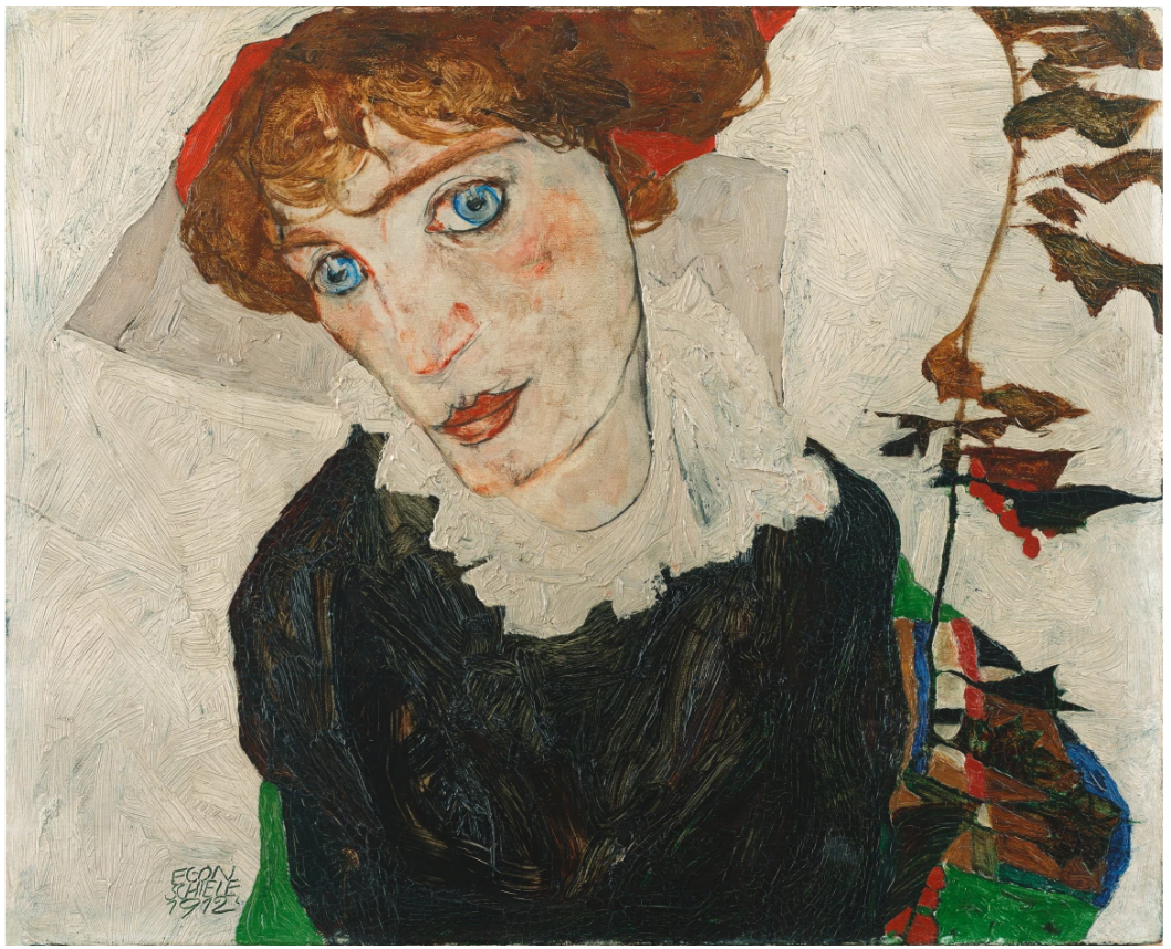
EGON SCHIELE, PORTRAIT OF WALLY NEUZIL, 1912. IMAGE: © BRIDGEMAN IMAGES LEOPOLD MUSEUM, VIENNA 2024
By taking her source photograph from the shared repertoire of our image-saturated culture, Peyton lends a certain familiarity and intimacy to the work which the viewer can share. Even if we do not recognize the specific source, we feel as though we do, as though this moment somehow shares in our own nostalgic personal histories.
“There is no separation for me between people I know through their music or photos and someone I know personally. The way I perceive them is very similar, in that there’s no difference between certain qualities that I find inspiring in them.”
Queen Elizabeth II joins a highly personal pantheon of subjects which includes Sid Vicious, Kurt Cobain, Liam Gallagher, Jarvis Cocker, and friends from her bohemian art circle, as well as literary and historical figures including Honoré de Balzac. Painting without hegemony – both her close friends and figures in the public eye – there is a democratization at play in Peyton’s technique that blurs social boundaries. Peyton’s oeuvre thus presents a parallel aristocracy equally worthy of depiction, which responds in an intensely personal way to individuals whose lives and actions she deems heroic, noble and inspirational.
Scott Kahn
Christie’s London: 27 June 2024
Estimated: GBP 80,000 – 120,000
GBP 138,600 / USD 175,745
SCOTT KAHN (B. 1946) (christies.com)
SCOTT KAHN (B. 1946)
On the Patio, 1992
Oil on canvas
34 1/4 x 30 1/8 inches (87 x 76.5 cm)
Signed and dated ‘Scott Kahn 92’ (lower right)
Painted in 1992, On the Patio is a rare and exciting work by Scott Kahn in which he turns to himself as his predominant subject. Dressed in dark clothes—a red and yellow plaid shirt, black turtleneck and black jeans—and backlit by low afternoon sunlight, Kahn’s contrapposto pose cuts a striking silhouette against a gleaming patio wall. The human figure features infrequently within the artist’s work. Taking inspiration from his immediate environment, Kahn believes that his paintings—comprised of mostly landscapes, interiors and still lifes—each function in part as self-portraits. ‘My work is driven and inspired by my life as I live it’, he has said. ‘I paint from life as a way of understanding myself and the world around me’ (S. Kahn quoted in ‘Artist Spotlight: Scott Kahn’, Bridgeman Images, 7 December 2021, online). As is characteristic of the Massachusetts-born painter’s work, the details of his surroundings prickle with life. On the Patio presents a vivid tableau of self-exploration.
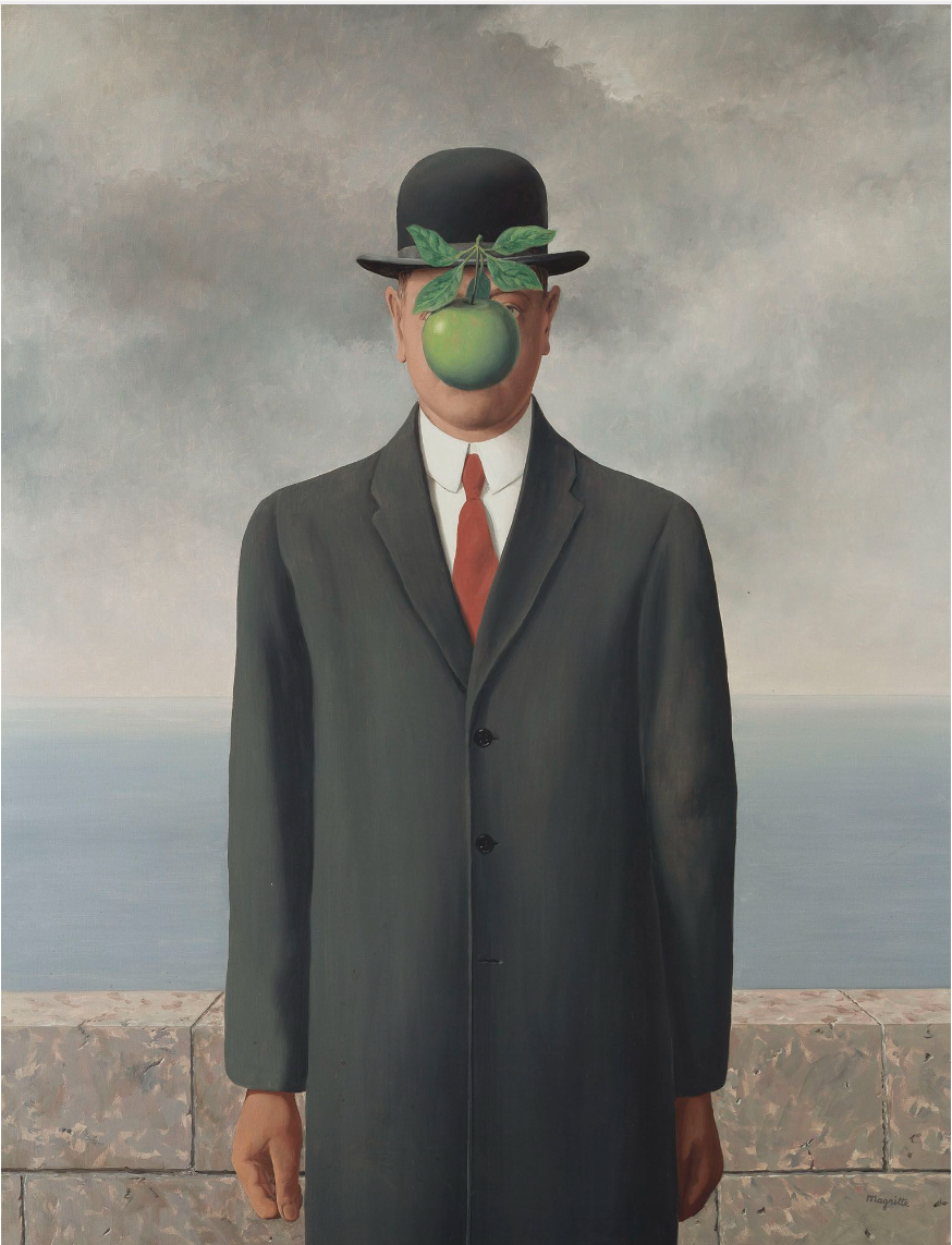
René Magritte, The Son of Man, 1964. Private Collection. Artwork: © René Magritte, DACS, London 2024.
Born in Massachusetts in 1947, Kahn studied Fine Arts at the University of Pennsylvania and Rutgers University. As a student he was an abstract painter. He enrolled at the Art Students League in New York in 1968 where he studied under Theodoros Stamos and encountered first-generation Abstract Expressionists such as Mark Rothko. Later moving to Sag Harbor in Long Island, and inspired by the abounding natural beauty, however, Kahn turned to figuration as his principal means of expression. ‘There I began to paint from life’, he recalled. ‘This was my true education’ (S. Kahn quoted in ‘Artist Spotlight: Scott Kahn’, Bridgeman Images, 7 December 2021, online). Kahn’s paintings are testament to his painstaking observation of detail. Here, the infinitesimal leaves and buds of his surrounding potted plants are rendered with exquisite care. To the right of the canvas, a flowering bush cascades down the patio wall in daubs of pink and yellow oil paint that are as jubilant as confetti. His technique owes much to the late nineteenth-century innovations of Impressionism and Pointillism—artists such as Seurat, Degas, Bonnard and van Gogh—as does his aspiration to capture effect, atmosphere, and sensation.
With his signature blend of realism and magical realism, Kahn’s work also carries strong parallels with the Surrealism of artists such as René Magritte. Indeed, the present painting bears strange, uncanny elements. Dramatic grey storm clouds hover and brew over the artist’s figure, contrasting with the sharp, flat sunlight. The artist’s sombre garb and rigid pose seem to displace him from his warm surroundings, fracturing place and time. Kahn enjoys layering imagery and symbolism from memory, dreams and his imagination into his compositions. With a career spanning almost six decades, the artist has recently achieved explosive global recognition and critical success at the age of seventy. Here, with no landmark or feature to ground us in reality besides a glimpse of a faraway sea, On the Patio is cloaked in mystery.
Andreas Gursky
Phillips London: 27 June 2024
Estimated: GBP 400,000 – 600,000
GBP 546,100 / USD 692,455
https://www.phillips.com/detail/andreas-gursky/UK010424/13
ANDREAS GURSKY
Los Angeles, 1998
Cibachrome print face mounted to Plexiglas in artist’s frame
Image: 158.3 x 316.5 cm (62 3/8 x 124 5/8 inches)
Overall: 206.9 x 362 cm (81 1/2 x 142 1/2 inches)
Signed, titled, numbered and dated ‘Los Angeles ’98 6/6 Andreas Gursky’ on the reverse
Executed in 1998, this work is number 6 from an edition of 6
Expansive and electric, Andreas Gursky’s dizzying panorama of Los Angeles captures the artist’s ongoing interest in forms of collective existence, in his pursuit for ‘the encyclopaedia of life’. With other examples of the edition housed in The Broad, Los Angeles and the Harvard Museums, Cambridge, in Los Angeles, Gursky chronicles the dramatic transformations in our urban age, challenging the boundaries of our perceived reality. After his formal education and a switch to digital photography, Gursky began to adopt the expansive format seen in the monumental Los Angeles and to manipulate his images postproduction. For Gursky, ‘electronic picture processing’ allowed him ‘to emphasise the formal elements that will enhance the picture, or, for example, to apply a picture concept that in real terms of perspective would be impossible to realise’. By referencing reality, Gursky could achieve a higher form of ‘truth’.
“I have never been interested in people, but instead exclusively in the human species and its environment.”
Captured from a vertiginous viewpoint in the hills of the valley at night, in Los Angeles Gursky compresses the foreground, reducing the vast urban sprawl to a glowing, delicate web. The pictorial field is dominated by the deep black sky and the traces of humanity, contained in pockets of hyperclarity. Re-imagining our collective imagination of the City of Angels, Gursky creates a mythically broad space that seems on the cusp of obliteration, skyscrapers emerging from the subtle impression of the earth’s curved surface, figured as a faint glimmer in the left half of the composition. Consciously borrowing from German Romantic notions of the sublime, like the infinite landscapes of Caspar David Friedrich, Gursky creates a space beyond visual comprehension. In this way, through photographs of Hong Kong, Paris, Manhattan and beyond, Gursky chronicles the ever-evolving urban landscapes in the contemporary world and humanity’s place within it.
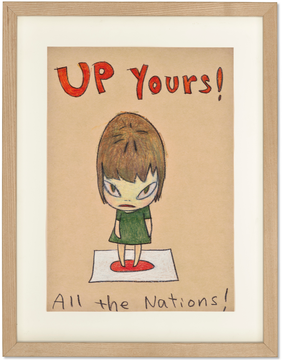
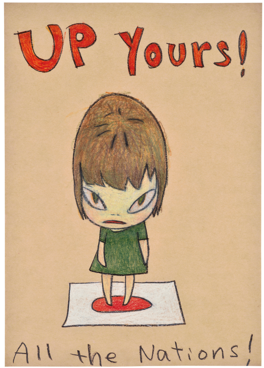
Yoshitomo Nara
Christie’s London: 27 June 2024
Estimated: GBP 120,000 – 180,000
GBP 252,000 / USD 319,536
https://www.christies.com/en/lot/lot-6492257
YOSHITOMO NARA (B. 1959)
Untitled, 2007
Colored pencil on colored paper
41.9 x 29.6 cm (16 1/2 x 11 5/8 inches)
Signed in Japanese (on the reverse)
With her short cropped hair, dark green dress and rebellious energy, the girl in Untitled (2007) emits the youthful defiance that has come to typify works by Yoshitomo Nara. He is widely celebrated for his paintings and coloured pencil drawings of juvenile, cartoonish characters with large gazing eyes and endearing personalities. They inhabit imagined and insouciant paper worlds, brandish absurd objects and props—knives, sprouts, cigarettes, and electric guitars—and express a wide range of capricious, childlike emotion. Stern and somewhat sulky, our subject hovers in indeterminate space. She stands upon a Japanese flag with her small feet positioned perfectly over its crimson sun. Emblazoned around her miniature figure are the words ‘Up Yours!’, and, ‘All the Nations!’. As an advocate of peace, questions of nationhood, conflict and world politics weave through Nara’s art in such pithy phrases and symbols. Exhibited at the Centro de Arte Contemporáneo de Málaga—the first show of the artist’s work in Spain in 2007-2008—the present work was one of twenty coloured pencil drawings hung along the final wall of the gallery.
Born in 1959 in Japan’s rural Aomori Prefecture, Nara’s youth was marked by his country’s rapid post-war economic development and an influx of Western pop-culture, from Disney animation to punk and rock and roll. The artist expresses heartfelt nostalgia for the retro media—record-sleeves and comic books—that offered escapism from an otherwise solitary childhood.
“Of course if you think back to the ’70s, information moved very differently. There was no Internet obviously and even the release date of albums in Japan could be delayed as much as six months … I would just sit there, listen to the music, look at the art on the cover and I think I really developed my imagination through that.”
This sensitivity to the worn, tactile quality of objects is triumphant in his art today and distinguishes him from the likes of Takashi Murakami and his Superflat movement. Untitled bears the enlivening traces of artist’s hand, present in the rough ‘outside-the-line’ scribbles that imply the girl’s messy hair. Bracketed with Nara’s unfiltered, handwritten text, the image feels distinctly personal, like a secret note exchanged between friends.
“I loved to draw every day and the scrawled sketches, never shown to anybody, started piling up. Like journal entries reflecting the events of each day, they sometimes intersected [with] memories from the past. My little everyday world became a trigger for the imagination, and I learned to develop and capture the imagery that arose.”
As early as his time at Aichi Prefectural University of Fine Arts in the 1980s, Nara began to draw onto envelopes, cardboard, and scraps of found paper. He continued these explorations at the prestigious Kunstakademie Düsseldorf where, under the tutorship of German Neo-Expressionist painter A. R. Penck, he was encouraged to work fluidly between painting and drawing. Mischievous, cute, and quietly ferocious, the present work attests to the enduring appeal of Nara’s little rebels.
Focus: Post-War
1. Yayoi Kusama
The Sea in the Evening Glow (B) Facing the Imminent Death, 1990
Sotheby’s London: 25 June 2024
Estimated: GBP 900,000 – 1,200,000
GBP 1,140,000 / USD 1,445,520
YAYOI KUSAMA (b. 1929)
The Sea in the Evening Glow (B) Facing the Imminent Death, 1990
Acrylic on canvas
161.5 x 130.5 cm (63 5/8 x 51 3/8 inches)
Signed, titled in Japanese and dated 1990 (on the reverse)
The scintillatingly complex surface of The Sea in the Evening Glow (B) Facing the Imminent Death is seemingly quintessential Yayoi Kusama, yet there is a singularity reverberating from the dizzying crimson picture plane. Executed in 1990, the present work emerges as a profound extension of Kusama’s renowned Infinity Net series, adjacent in its repetitive and obsessive rendering of lines that never connect. This marked a pivotal time in which Kusama embraced acrylic paint, a medium that allowed her to explore and highlight contrasting hues with greater fluidity and precision.
This transition in medium paralleled a thematic evolution in Kusama’s work in which she began to incorporate organic imagery – star dust, trees, the sea, and other natural elements – drawing direct inspiration from the natural world. Venerating the sea and sun, and the rhythmic and repetitive nature of the solar system in bringing about life, which inevitably results in death, the present work connects with nature to convey a message of regeneration. An auspicious color in Japanese culture, red symbolizes the healing lifeforce of the sun, while symbolizing notions of authority, strength and sacrifice. This period of experimentation and growth resulted in works that, while new in their subjects and techniques, retained the stylistic essence of the Infinity Net series. (B) Facing the Imminent Death thus stands as a testament to Kusama’s dynamic exploration of form and color, bridging her past innovations alongside her unique and evolving artistic enterprises.
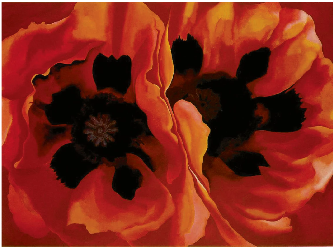
GEORGIA O’KEEFE, ORIENTAL POPPIES, 1928 / ARTWORK: © GEORGIA O’KEEFFE MUSEUM / DACS 2024
References to the sea found in Kusama’s Sea in the Evening Glow series, and particularly her 1950-60s net paintings, memorialize the artist’s crossing over the pacific to the United States. Before moving to New York in the late 1950s, Kusama sought the advice of American abstract artist Georgia O’Keeffe: she sent O’Keeffe examples of her early work – surreal yet anthropomorphic watercolor pieces – and the two artists began a correspondence that would last until the end of O’Keeffe’s life; indeed, for Kusama, their exchange was the deciding factor in her choice to emigrate in late 1957. Indeed Kusama’s life has been a journey between two worlds, Japan and the United States, marked by personal upheaval and enduring psychiatric challenges. Despite these adversities, her unparalleled oeuvre has remained remarkably cohesive and visionary. When Kusama relocated to New York in 1958, the artist plunged into the pulsating centre of the city’s art scene. Her immersive white paintings quickly garnered attention and acclaim, evolving into the iconic Infinity Nets series that would define a significant part of her career.
This period in New York was transformative for Kusama. Immersed in the avant-garde milieu, she forged a unique path, blending influences from her Japanese heritage with the cutting-edge developments of the Western art world. The Infinity Nets, characterized by their meticulous repetition and hypnotic rhythms, reflect Kusama’s profound engagement with themes of infinity and self-obliteration. These works not only solidified her reputation but also laid the foundation for her continuing exploration of immersive environments and organic forms.
In the late 1960s, Kusama began orchestrating public Happenings across New York. These performances, often explicit and involving nudity, catapulted Kusama into the limelight, cementing her sudden notoriety. However, by the early 1970s, Kusama chose to return to Japan, aiming to introduce her radical performance art to her homeland. The hypersexual Happenings she staged in Tokyo in 1970 and 1971 were met with condemnation and indifference from the Japanese public. Over the following years, Kusama found herself oscillating between Japan and the United States, feeling a profound sense of estrangement from both cultures. Despite her extensive time in each location, the artist never fully belonged to either. This pervasive sense of otherness and cultural alienation profoundly shaped her existence in both countries. In 1973, Kusama left New York permanently. Struggling with persistent hallucinations and mental health conditions, she admitted herself to a psychiatric hospital in Tokyo, where she continues to reside. This environment provided the stability and security she needed, fostering a prolific and vigorous period of art-making. Within this secure setting, Kusama revisited many themes and series from her 1960s oeuvre, including the iconic Infinity Nets. Her time at the hospital marked a renaissance in her creativity, underscoring her resilience and enduring influence in the art world.
AGNES MARTIN, UNTITLED, 1964 / PRIVATE COLLECTION
IMAGE: © THE ART INSTITUTE OF CHICAGO / ART RESOURCE, NY
ARTWORK: © AGNES MARTIN FOUNDATION, NEW YORK / DACS 2024
1988, two years prior to the inception of The Sea in the Evening Glow (B) Facing the Imminent Death, marked a turning point for the artist when she was honored with a retrospective at Fukuoka’s Kitakyushu Municipal Museum of Art, followed by another major exhibition in 1989 at the Center for International Contemporary Arts in New York. These exhibitions revitalized Kusama’s international acclaim, a stature she has maintained and thrived in over the subsequent decades. The Sea in the Evening Glow (B) Facing the Imminent Death thus heralds Kusama’s re-emergence at the forefront of the art world.
A Pumpkin (TWX), 2003
Sotheby’s London: 26 June 2024
Estimated: GBP 200,000 – 300,000
GBP 300,000 / USD 380,400
YAYOI KUSAMA (b. 1929)
A Pumpkin (TWX), 2003
Acrylic on canvas
15.4 x 22.5 cm (7 1/2 x 9 inches)
Signed, titled and dated 2003 (on the reverse)
The present work is a manifest to the unequivocally consummate and technically impeccable archetype of Kusama’s oeuvre – a testament to the legendary artist’s astonishing dedication to art and creation. Arguably the most celebrated living female artist today, responsible for revolutionizing Abstraction, Expression, Emotionalism, Pop Art and Minimalism, Kusama’s phenomenal oeuvre transgresses paradigms in all fields and media. Between the 1980s and 1990s, Kusama began to incorporate pumpkins into her dot-motif paintings, drawings and prints, in line with her return to works with richer narrative content as opposed to the stark austere aesthetic of her 1960s infinity nets. Embodying an iconic, charismatic and highly personal motif, Kusama’s pumpkins are as universally emblematic of her oeuvre as the Campbell’s soup can was to Andy Warhol’s. The pumpkin is deeply central to the artist’s core psyche, stemming from a vivid hallucination from her childhood.
“The first time I ever saw a pumpkin was when I was in elementary school and went with my grandfather to visit a big seed-harvesting ground…and there it was: a pumpkin the size of a man’s head… It immediately began speaking to me in a most animated manner.”
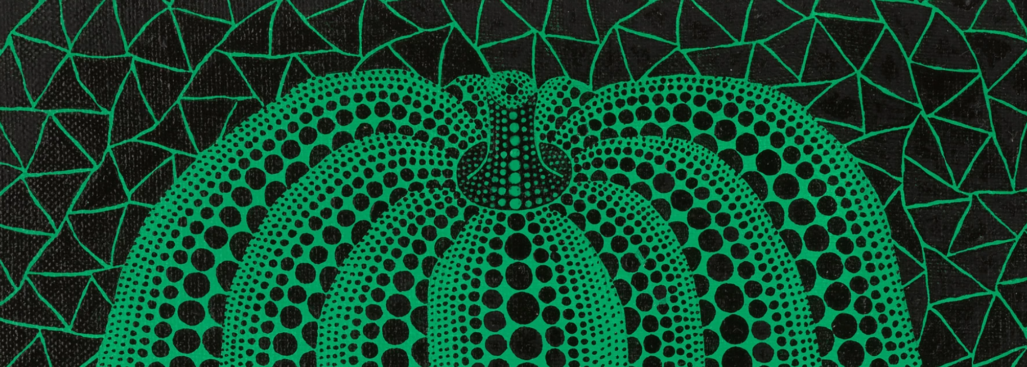
Pumpkin (TWX) presents a green and black rendition of Kusama’s iconic pumpkins. Developed to mature perfection through decades of near-obsessive production and reproduction, each of these distinct elements reflect a different segment within Kusama’s expansive aesthetic philosophy whilst coming together to create a dazzlingly hypnotic visual narrative – one that evokes strong associations with the formal reduction of Minimalism, the repetitive symbolism of Pop and the hypnotic illusions of Op Art. Surreal and fantastical, Kusama’s pumpkin paintings exhibit extraordinary dexterity in skill and execution as well as the single-minded meticulous vision that defines the artist’s career – all the while being deeply personal and indexical, representing a wholly epic extension of Kusama’s legacy in contemporary art and culture.
Functioning as both an allegory and a form of self-portraiture, Kusama’s pumpkin as an uncanny yet benign and nurturing subject exudes peace, serenity, life and vigor. Traditionally a symbol of fertility, the pumpkin also gives one a feeling of abundance, joy, triumph and reward – not unlike the feelings one would experience when reaping one’s harvest after an arduous season of work. In 1993, after almost two decades of a retreated presence from the international art world, Kusama was invited to be the first solo artist and first woman ever to grace the Japanese pavilion at the 45th Venice Biennale. For this momentous occasion she constructed Mirror Room (Pumpkin), consuming a section of the pavilion in an immersive floor-to-ceiling extravaganza of black-on-yellow polka dots. At its center was a dazzling mirrored room filled with pumpkin sculptures, echoing her seminal 1966 Infinity Mirror Room—Love Forever installation whilst grandly introducing the theme of the pumpkin. The pumpkin thus stands as a symbol of triumph for the artist’s international resurgence and rise to global eminence.
2. Andy Warhol
Campbell’s Soup, 1986
Phillips London: 27 June 2024
Estimated: GBP 450,000 – 650,000
GBP 850,900 / USD 1,078,941
https://www.phillips.com/detail/andy-warhol/UK010424/17
ANDY WARHOL
Campbell’s Soup, 1986
Acrylic and silkscreen ink on canvas
72×60 inches (182.9 x 152.4 cm)
Signed and dated ‘Andy Warhol 86’ on the overlap
Universally recognized as one of the most significant, iconic images of the twentieth century, Campbell’s Soup exemplifies the industry, ingenuity, and exceptional achievement of Andy Warhol: a contribution to artmaking that continues to hold the public imagination today. Executed in 1986,Campbell’s Soup revisits the image that launched Warhol’s career, demonstrating the virtuosity, wit, and irreverence that continued to characterize the Pop artist’s visual language before his premature death a year later. The construction of serial imagery emerged soon after Warhol moved to New York at the age of twenty-one, laying the foundations for his revolutionary 1962 exhibition. Relocating to the city in 1949 after he had graduated from the Carnegie Technical Institute (now Carnegie Mellon University), Warhol initially secured a role working as a commercial illustrator. Working for clients in the fashion, television, liquor and pharmaceutical industries, Warhol became well versed in the importance of selecting direct, tantalizing iconography for advertising, replicating images through ‘blotted line’ and establishing the mechanisms that would become so fundamental to his later practice. As Warhol began to serialize his work, he projected and traced a photograph by Edward Wallowitch to create the first of his near identical compositions featuring a Campbell soup can. Capturing the imagination of dealer Irving Blum, after visiting Warhol’s studio in 1962 Blum resolved to mount a solo exhibition for the artist at his Ferus Gallery in Los Angeles that same summer. Installing thirty-two separate panels of all the varieties of Campbell soup then available, Warhol had radically altered the trajectory of contemporary art and unwittingly launched his meteoric rise to fame, well-established by the execution of the present Campbell’s Soup.
“I used to drink it. I used to have the same lunch everyday for twenty years, I guess, the same thing over and over again.”
In this manner, works from this series take on subtly autobiographic dimensions, the artist radically complicating the boundaries between art, commerce, and the everyday through his appropriation of the popular consumable’s branding. Installing each of the canvases on white mouldings that circulated the perimeter of Blum’s gallery, cleverly imitating the display of consumer objects in a supermarket, Warhol reconsidered the original function and meaning of the ‘banal’. Revisiting these ideas in Campbell’s Soup, Warhol followed in the tradition of avant-garde artists such as Marcel Duchamp, whose Readymades challenged the critical apparatus and content of ‘high art’. Building on these provocative principles, Warhol elevated the inconspicuous and everyday elements of popular culture as a source of inspiration and as worthy subjects of postwar American art.
“If you take a Campbell’s soup can and repeat it fifty times you are not interested in the retinal image. What interests you is the concept that wants to put fifty Campbell’s soup cans on a canvas.”
Marcel Duchamp
Following his inaugural gallery solo show dedicated to Pop paintings, Warhol developed his earlier interest in minimizing the presence of the artist’s hand in the work, deploying a method that was itself used in the production of food packaging: his signature photographic silkscreen technique. Fittingly, the series to which the present work belongs was commenced after the artist was approached by Campbell’s directly, inviting him to commemorate their new ‘soup-in-a-box’ line. In contrast to the unembellished simplicity of his original canvases, in Campbell’s Soup Warhol combined the flatness of his earlier compositions with the sculptural forms of his earliest Campbell Soup Boxes. Created over twenty years later and utilizing more playful, vibrant color combinations, the canvas embodies Warhol’s careful use of color, layering, and form to create texture and illusory depth. Flashes of yellow, green, and blue outlining the text and central image juxtapose with the more distinctive Campbell’s red and white. At the height of his technical and commercial success, in Campbell’s Soup Warhol consciously underlined the increasing commoditization of art and the significance of popular culture in art history: a career that begins and ends with Campbell’s.
Joseph Beuys, 1980
Sotheby’s London: 26 June 2024
Estimated: GBP 400,000 – 600,000
GBP 456,000 / USD 578,208
ANDY WARHOL (1928 – 1987)
Joseph Beuys, 1980
Acrylic and silkscreen ink on canvas
40×40 inches (101.6 x 101.6 cm)
Signed and dated 1980 (on the reverse)
A powerful example of Andy Warhol’s renowned silkscreen portraits, the present work achieves a remarkable fusion of resemblance and individuality. Andy Warhol and Joseph Beuys, the towering figures of post-war art in America and Germany, first met at an exhibition opening at Galerie Hans Meyer in Düsseldorf in May 1979. Reflecting on the moment, David Galloway recalled: “For those who witnessed their approach across the polished granite floor, it carried the ceremonial weight of two rival popes meeting in Avignon” (David Galloway, “Beuys and Warhol: Aftershocks,” Art in America, July 1988, p. 121).
Andy Warhol pioneered the Pop Art movement and revolutionized the New York City art scene with his iconic depictions of consumer culture and mass media imagery. Starting in the early 1960s, his work explored the relationship between advertising, fame and artistic expression through a multitude of media. Beuys was a legend in his own right, and a pioneer of conceptual art who used unconventional materials and performance to convey his ideas. Working as a teacher, performance artist and theorist, Beuys’s work reflected concepts of humanism, sociology, and his strong belief that art possesses the power to affect social and political change. The two artists crossed paths multiple times after their initial encounter, most notably during the installation of Beuys’s major retrospective at the Solomon R. Guggenheim Museum in New York in November 1979. It was on this occasion that the idea for this celebrated series of portraits was initiated. Beuys then visited Warhol’s studio, The Factory, to have his picture taken, coincidentally arriving at the very moment when Georgia O’Keeffe was being photographed. Warhol relied on his Polaroid Big Shot camera to immortalize the timeless image of Beuys in his distinctive and iconic felt hat and sleeveless jacket. These Polaroid photographs subsequently became the foundation for a series of screen-printed portraits created between 1980 and 1986.
The present portrait is both mysterious and alluring, with Warhol’s stylistic choice to paint over the black silkscreen with black paint, forcing the viewer to lean into the canvas. The work is an archetypal example of Warhol’s silkscreen printing process.
“You pick a photograph, blow it up, transfer it in glue onto silk, and then roll ink across it so the ink goes through the silk but not through the glue. That way you get the same image, slightly different each time.”
Once silkscreened, Warhol further added sweeps of expressive brushwork, embedding a sense of dynamism and energy through the textured surface thus building on a painterly dimension onto the flatness of the silkscreen. Despite the black monochrome surface, the subject of the present composition is instantly recognizable – with his unwavering gaze and stark physiognomy, Beuys directly confronts the viewer. However, the tone of the work widely departs from Warhol’s shimmering and glamorous portraits from the 1970s, such as his famous depictions of Marilyn Monroe. By 1980, the year in which the present work was executed, Warhol had indeed shifted his interest to the psychological intensity of his sitter, perhaps the reason why he also developed a strong interest in Beuys. Replacing the fluorescent flashiness of Warhol’s 1970s celebrity portraiture, Joseph Beuys explores instead a deeper plane of existence.
The first exhibition of Warhol’s portraits of Beuys took place at Galleria Lucio Amelio in Naples in April 1980 – this was the very first time when the different iterations of such portraits appeared together. This groundbreaking moment marked the beginning of the official association between the two iconic figures. Testifying to their importance, other iterations of Beuys’s portraits by Warhol are held in the permanent collections of prestigious museums worldwide, including Tate Modern in London, the Museum of Modern Art in New York and Louisiana Museum of Art in Denmark.
Monkey, 1983
Sotheby’s London: 26 June 2024
Estimated: GBP 80,000 – 120,000
GBP 156,000 / USD 197,808
ANDY WARHOL (1928 – 1987)
Monkey, 1983
Acrylic and silkscreen ink on canvas
14×11 inches (35.5 x 27.9 cm)
Signed and dated 83 (on the overlap)
Pop Art unequivocally revolutionized art’s purview by challenging traditional subject matter in order to give artistic form to the pillars of modern consumer society: news, celebrity, advertising, and products. As the pioneer of this movement, Andy Warhol deftly traversed all four of these image fields with his legendary silkscreen paintings. In the present vibrant Monkey from 1983, Warhol elevates an emblem of consumerism, in this case a toy monkey, to the realm of high art and in doing so exposes the artistry and power of the carefully crafted symbols themselves. In his use of recognizable graphics, Warhol extends upon Marcel Duchamp’s legacy of the readymade, and remixes cultural signifiers for his own aesthetic ends. Imbued with an inherent dynamism, the small-scale paintings in particular celebrate childhood delight.
Monkey has its origins in Warhol’s enduring friendship with Zurich gallerist Bruno Bischofberger. In 1965, Bischofberger curated a groundbreaking exhibition featuring Warhol’s works alongside luminaries including Roy Lichtenstein, Claes Oldenburg, and Tom Wesselman, marking a pivotal moment in European Pop Art history. A decade later, in 1982, Bischofberger commissioned Warhol once again, this time requesting a series of paintings aimed at children, destined for display in his Zurich showroom. Warhol’s response was the Toy Paintings; a collection of silkscreened canvases depicting his cherished tin toy collection. When unveiled at Bischofberger’s gallery in 1983, the paintings transformed the space into a playful realm. The works hung at a height conducive to a toddler’s view, inviting young eyes to explore, whilst accompanying adults were required to stoop or sit to fully appreciate the artworks. Indeed, within Monkey, one senses the artist embracing the boundless freedom of childhood with infectious delight.
Panda Drummer (Toy Series), 1983
Phillips London: 27 June 2024
Estimated: GBP 120,000 – 180,000
GBP 184,150 / USD 233,502
https://www.phillips.com/detail/andy-warhol/UK010424/32
ANDY WARHOL
Panda Drummer (Toy Series), 1983
Acrylic and silkscreen ink on canvas
14 x 10 7/8 inches (35.6 x 27.9 cm)
Signed and dated ‘Andy Warhol 83’
Stamped by The Andy Warhol Foundation for the Visual Arts, Inc., New York
And numbered ‘A117.09’ on the overlap
A quintessentially Warholian image, Panda Drummer (Toy Series) exemplifies the artist’s unique ability to appropriate powerful symbols of popular postwar culture, using them at once to celebrate this age of commodity consumption and to provoke a more astute cultural commentary on these social forces. Depicting a wind-up panda toy with an endearingly childish palette of primary colors and expressionistic lines which energize its infinite stream of drumming, the work taps into a tender and joyful nostalgia which works on both an individual and collective level.
Throughout his career, Warhol remained fascinated by popular culture, consumer objects, and the celebrity icons of the age, producing a body of work that itself shaped the visual landscape of the second half of the 20th century in profound ways. The image of the panda drummer was conceived to form part of a series of toy paintings, Pictures for Children, commissioned by art dealer Bruno Bischofberger for an exhibition at his Zurich gallery in 1983. In traditional Warholian style, he depicts the toys with a commercial flair, where the flat broad planes of color and prominent contours emulate the aesthetics of their boxes and packaging. However, offering a rare glimpse of sentimentality, the subjects are sourced from Warhol’s own extensive collection of vintage toys which he had built as a child and continued to assemble in adulthood. The artist had suffered with chronic illness for much of his early life and spent long periods bedbound, a time spent reading comic books and magazines which proved to have an enduring influence on his later artmaking. Lost in a delightfully simple world of play removed from our own, Warhol’s charming drumming panda is animated by an immediately recognizable and infectious joy. Although made for children, the work is truly inclusive, encouraging the viewer – and the artist himself – to return to the escapist freedoms and comforts of childhood imagination.
Fragile, 1962
Sotheby’s London: 26 June 2024
Estimated: GBP 100,000 – 150,000
GBP 156,000 / USD 197,808
ANDY WARHOL (1928 – 1987)
Fragile, 1962
Silkscreen ink and graphite on linen laid down on canvas
5 1/4 x 9 1/2 inches (13.5 x 24 cm)
Executed in 1962, the present work marks a pivotal moment in Andy Warhol’s artistic evolution, where he left behind the gestural touch of the artist in favor of the controlled, mechanical impact of the silkscreen. Fragile belongs to one of Warhol’s first bodies of works, the Shipping Label series. The series comprises only 16 works where the artist presents shipping and handling labels across a monochrome canvas, either in single or repeated formats. Acquired in 1985, the present composition has been held in the Ralph I. Goldenberg Collection for over 38 years. Departing from traditional hand-painting or stamping techniques, Warhol opted for small silkscreens to achieve the repetitive effect seen in his Shipping Label series. In the present work, Warhol started with a pencil sketch to meticulously draft a template. Subsequently, he applied the silkscreen onto the canvas, precisely replicating the size of a real shipping stamp and embedding the reproduced label. The adoption of silkscreening marked the culmination of Warhol’s pursuit, meeting both his desired aesthetic and establishing a direct connection with the original source.
“In August ’62 I started doing silkscreens. The rubber-stamp method I’d been using to repeat images suddenly seemed too homemade; I wanted something stronger that gave more of an assembly-line effect. With silkscreening, you pick a photograph, blow it up, transfer it in glue onto silk, and then roll ink across it so the ink goes through the silk but not through the glue. That way you get the same image, slightly different each time. It was all so simple-quick and chancy. I was thrilled with it.”
1962, the year the present work was executed, was undoubtedly one of the most decisive years of Warhol’s career, propelling him onto the global stage through two groundbreaking exhibitions. His first-ever solo show took place at Ferus Gallery, Los Angeles, and his debut in New York happened at Stable Gallery. Unlike fellow Pop artists such as Roy Lichtenstein, who appropriated the Ben-day dots of comic books, Warhol meticulously hand-painted commonplace objects like dollar bills, advertisements, newspaper clippings, and his iconic Campbell Soup Cans, which made their debut at the acclaimed Ferus exhibition. Yet, unsatisfied by this manual approach, in 1962 he introduced rubber-stamps to affect a mechanical replication reminiscent of machine production, exemplified in his S + H Green Stamps and Airmail series.
ANDY WARHOL AT THE STABLE GALLERY, NEW YORK, 1964
IMAGE: © KEN HEYMAN/BLACK STAR
ARTWORK: © 2024 ANDY WARHOL FOUNDATION FOR THE VISUAL ARTS/ DACS, LONDON
Despite the differences in subject matter, Warhol’s use of repetition and multiples across his body of work wielded a profound effect, simultaneously amplifying and commercializing the significance of his subjects. While the serial imagery of consumer goods like Coca-Cola bottles or Campbell’s Soup cans hinted at consumerism and mass production, Warhol elevated these everyday items to the realm of high art. In contrast to the bold, expressive brushstrokes of his Abstract Expressionist peers, Warhol displayed some delicacy, care and mechanical precision in his materials, preserving the individuality of each “fragile” stamp while adhering to a factory-like efficiency.
“Everybody looks alike and acts alike, and we’re getting more and more that way. I think everybody should be a machine…the reason I’m painting this way is that I want to be a machine.”
A signifier of something precious and valuable, Fragile serves as a prime example of Warhol’s playful appropriation of quotidian imagery. With his relentlessly repetitive compositions, the artist simultaneously intensified and played down the intended impact and meaning of his images whether celebrity portraits, dollar bills, or shipping labels. For example, in other works from the Fragile series, he recurrently displayed the label across the canvas. His intention was to limit his artistic intervention by abbreviating the creative act to a simple choice of source image and color. In Fragile we see Warhol pioneering and perfecting his craft; an important and transitional work that paved the way for the artist’s full immersion into an almost entirely mechanized mode of painterly production.
3. Other Artists
David Hockney
Phillips London: 27 June 2024
Estimated: GBP 280,000 – 350,000
GBP 406,400 / USD 515,315
David Hockney – Modern & Contemporary Ar… Lot 7 June 2024 | Phillips
DAVID HOCKNEY
The Arrival of Spring in Woldgate, East Yorkshire in 2011 (twenty eleven) – 2 June, 2011
iPad drawing printed on four sheets of paper, mounted on four sheets of Dibond
Each: 117.5 x 88.3 cm (46 1/4 x 34 3/4 inches)
Overall: 235 x 166.7 cm (92 1/2 x 65 5/8 inches)
Signed, numbered and dated ‘David Hockney 5/10 2011’ lower right
Widely regarded as Britain’s greatest living painter, The Arrival of Spring in Woldgate, East Yorkshire in 2011 – 2 June 2011 demonstrates the virtuosity, inventiveness, and clarity of approach that best characterizes David Hockney’s mature practice. Continuously investigating the capabilities of technology to realize his vision, Hockney’s spirited rendering of the Yorkshire landscape is both intimately attuned to the phenomena of the natural world and the forces of memory, tenderly embodying the romance and tragedy of life itself. After two decades in Southern California, where Hockney realized his sun-lit, iconic images of the West Coast, the artist’s return to the rolling foothills of East Yorkshire prompted an unprecedented period of artistic re-invention. Visiting for the summer of 1997 to see his terminally ill friend Jonathan Silver, Hockney’s renewed exposure to the verdant, rolling scenery through the daily drives from his mother’s home in Bridlington heralded the beginning of his Yorkshire landscapes.
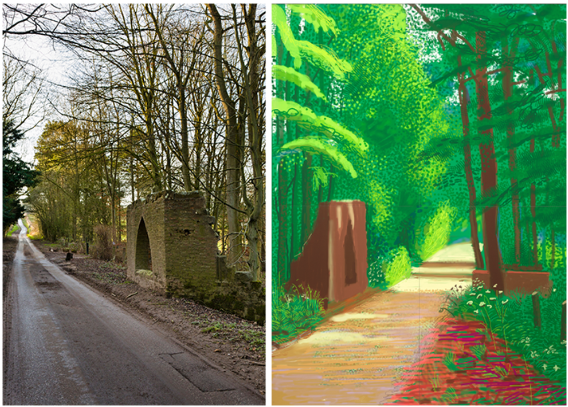
Woldgate Woods, East Yorkshire England. Image: Mark Buckle / Alamy Stock Photo
A place of increasing emotional intensity following the death of his mother in 1999, Hockney moved to Bridlington full time in 2005, close to his sister Margaret. The garlanded, isolated landscape of the small seaside town on the Yorkshire coast would provide a fertile atmosphere for Hockney to commence his pioneering Arrival of Spring series in 2011. Comprised of fifty-one iPad drawings and a related, monumental painting executed over thirty-two canvases, Hockney painted along a single-track road running between Bridlington and Kilham. Recording the cycle of the seasons, commencing on the 1st January with winter, the present work concludes the expansive series. Caught at the final moment before the unfolding of the summer, Hockney captures the intensity and incandescence still found in late spring. Immersive in scale and rich in texture, the bright, lively renderings of green, red, and brown exude abundance and volume, flickers of light dancing between the leaves.
Using unorthodox and novel mediums to communicate his vision from the onset of his career, The Arrival of Spring in Woldgate, East Yorkshire in 2011 – 2 June 2011 demonstrates Hockney’s perpetual enthusiasm in approaching new technologies of image-making. The artist has spoken powerfully about the weekly trips taken with his father to the cinema, where ‘The screen, as if by magic, was opening up the wall to you, it showed you another world’. As if catalyzed by film, already in the 1960s Hockney began to use the camera, purchasing a polaroid in 1964 whose images served as references for his paintings.
“Technology always has contributed to art.
The brush itself is a piece of technology isn’t it?”
From photocollages to prints made using his color photocopier during the early 1980s, Hockney commenced digital drawing in 1987 as he was invited, alongside several others, to create drawings using the Quantel Paintbox. Continuing to experiment with the Apple Macintosh in 1991, the artist was initially frustrated by each software’s limitations.
“It wasn’t as fast as your hand. For a draughtsman, that’s no good – if you’re drawing a line and the ink isn’t there, or if you’ve finished and the drawing was still being done.”
Yet, with the advent of the iPhone and then the iPad (that Hockney was among the first to acquire in 2010), technology finally caught up with Hockney’s aspirations. As in the present work, Hockney was able to work using his screen en plein air, enabling the artist to capture shifting effects of light and weather with immediacy. Evidence of the enthusiasm with which Hockney has approached new technologies throughout his career, The Arrival of Spring in Woldgate, East Yorkshire in 2011 – 2 June 2011 reflects the artist’s capacity to enchant, innovate, and surprise.
Robert Indiana
Sotheby’s London: 26 June 2024
Estimated: GBP 400,000 – 600,000
GBP 1,260,000 / USD 1,597,680
ROBERT INDIANA (1928 – 2018)
LOVE (Red Outside Red Inside), 1966-2000
Painted aluminum
72x72x36 inches (182.9 x 182.9 x 91.4 cm)
Stamped with the artist’s name, dated 1966-2000 and numbered 3/6 (towards the base)
Conceived in 1966 and executed in 2000, this work is number 3 from an edition of 6 plus 4 artist’s proofs
LOVE (Red Inside Red Outside) is an iconic example from Robert Indiana’s most celebrated body of work. First conceived in 1965 as a Christmas card design commissioned by the Museum of Modern Art, New York, LOVE has since become an instantly recognizable iconography.

An emblem of the 1960s idealism, Indiana’s masterful graphics align with the giants of Pop art such as Ed Ruscha and Roy Lichtenstein, embracing the ideas of repetition and seriality that came to define the era. The present work, casted in an edition of 6, is executed in its classic red color, one of the most striking renditions of this iconic series.
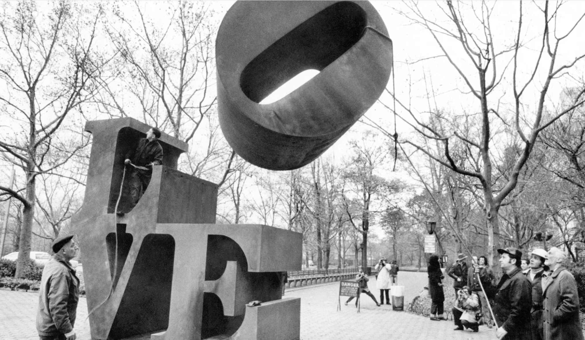
ROBERT INDIANA WITH HIS LOVE SCULPTURE IN CENTRAL PARK, NEW YORK CITY, IN 1971.
IMAGE: © GETTY IMAGES / JACK MITCHELL
ARTWORK: © 2024 MORGAN ART FOUNDATION LTD. / ARTISTS RIGHTS SOCIETY (ARS), NEW YORK
Throughout his career, Indiana has been fascinated by the importance of signs within American visual culture and their ability to encapsulate intangible meanings, desires, and emotions through language reduced to the subtle placement of minimal but straightforward and accessible words. Realizing the potential of language in graphic art, Indiana sought to emulate this simplicity of transmission within his own work, condensing his personal experiences into contemporary signage. LOVE is the first instance in which the artist edited the subject of his art to a single word, yet the immediacy and directness of this commanding message does not preclude a wealth of possible meanings and connotations; its simplicity belies that signs are never neutral, nor empty.
Often looking at commercial signage for inspiration, the present work was inspired by the stenciled lettering seen on the packaging and billboards of Indiana’s childhood. Having spent his early years moving from town to town and spending much of that time on the road, the road-signs of the highways left a lasting impression on the artist. Looking at the ways graphic letters and numbers acquire beauty as shapes and silhouettes when separated from their meaning, LOVE brings to focus the weight, balance and shape of each letter as they are neatly stacked on top of each other in a bold topographical design. The expressive red is used here not just for its symbolic association with love and passion but, when combined with Indiana’s typeface, graphic design and simplified stacked format, to communicate the universal emotion tied to a single word in an immediate and direct way, becoming an icon of contemporary art in the process.
Focus: Modern Art
Guitare sur un tapis rouge, 1922
Sotheby’s London: 25 June 2024
Estimated: GBP 10,000,000 – 15,000,000
GBP 10,730,000 / USD 13,605,040
PABLO PICASSO (1881 – 1973)
Guitare sur un tapis rouge, 1922
Oil on canvas
80.7 x 116.3 cm (31 3/4 x 45 3/4 inches)
Signed Picasso and dated 22 (lower right)
A celebration of color and form, Picasso’s Guitare sur un tapis rouge from 1922 epitomizes the artist’s bold stylistic evolution in the years following the First World War. Drawing on the Cubist idiom that he had pioneered alongside Braque from 1909-10, Picasso’s still lifes from the subsequent decade are characterized by a vibrant positivity and a newfound appreciation of color indicative of the artist’s ongoing interest in the formal potential of this subject.
Picasso’s development of Cubism remains among the pivotal moments of art history, and the period around 1912 – when he shifted from the complex, fragmented imagery of Analytic Cubism to the simpler shapes and brighter colours of Synthetic Cubism – would prove particularly influential. The flattening of the image, interrogation of two and three-dimensional space and use of collage elements would all inform later artistic developments from the assemblages of Dada through to the use of ‘low’ art objects and images in Pop Art. The guitar proved the perfect vehicle for these experiments, becoming the archetypal motif of Picasso’s Cubism. As Anne Umland writes, the “manipulation of objects – many of which, like the guitar, define volumes (other musical instruments, bottles, wineglasses, cups), although they lack its extreme planarity – may have helped to compel a new visual vocabulary that was at once pictorial and sculptural in motivation and affect” (A. Umland, in Exh. Cat., New York, The Museum of Modern Art, Picasso: Guitars 1912-1914, 2011, p. 22). The interplay and subversion of sculptural and pictorial was the real breakthrough of this second phase of Cubism and was most powerfully expressed in Picasso’s three-dimensional cardboard constructions of guitars and in the now famous sheet-metal versions that he created in 1914.
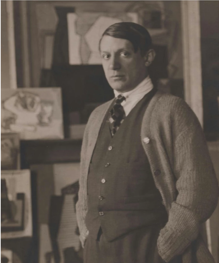
This preoccupation with space and volume would continue despite the hiatus created by the advent of the First World War. The outbreak of war saw the dispersal of the group of artists – Picasso, Braque and the Section d’Or Cubists Gris, Metzinger, Delaunay – who had been associated with the movement, and although Picasso continued to work during these years his style moves between Cubist compositions and more naturalistic portraits and sketches documenting everyday life. This more naturalistic style began to dominate in the years after the war as Picasso – along with many of his contemporaries – embraced the rappel a l’ordre and focused his energies on classical subjects and compositions that – whether figures of still lifes – emphasised balance and order (fig. 3).
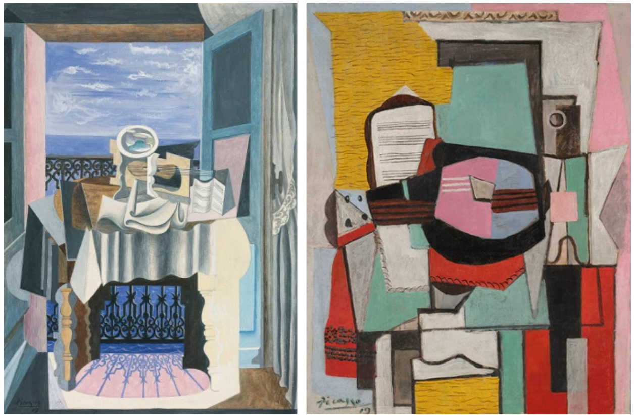
FIG. 3, PABLO PICASSO, NATURE MORTE DEVANT UNE FENÊTRE À SAINT-RAPHAËL, 1919, GOUACHE AND GRAPHITE ON PAPER, STAATLICHEN MUSEEN, BERLIN © SUCCESSION PICASSO/DACS, LONDON 2024
FIG. 4, PABLO PICASSO, GUITARE SUR UN TABLE, 1919, OIL ON CANVAS, SOLD: SOTHEBY’S NEW YORK, NOVEMBER 2022, $37 MILLION © SUCCESSION PICASSO/DACS, LONDON 2024
Painted four years after the end of the First World War, Guitare sur un tapis rouge underscores Picasso’s ability to adapt the radical visual language of Cubism to this new style without compromising his interrogation of pictorial space. Throughout this period Picasso’s approach to Cubism was evolving and the present work marks a shift in his output from what Josep Palau i Fabre termed ‘Linear Cubism’ – more sombre works dominated by grid-like lines (fig. 5) – to the large-scale, vibrantly coloured compositions of 1924 which to some degree mark the high point of his post-war Cubism (fig. 6). Jean Sunderland Boggs describes these later works as “generous and sometimes even exuberant, presumably an expression of prosperity, his domestic contentment, his sexual satisfaction, and a general happiness” (Exh. Cat., The Cleveland Museum of Art, Picasso & Things, 1992, p. 199).
This happiness is shared in the present work, which combines bold planes of red, orange and yellow around the central guitar motif. The detailing in the fretwork of the guitar and the texture of the red rug is typical of these works and indicates a more playful approach on Picasso’s part. The objects have an anthropomorphic tendency too, which contributes to the more lively atmosphere in the still lifes from this post-war period. Throughout these years, Picasso was moving constantly back and forth between the language of Cubism in these still lifes and the classically-inspired forms of the figures that were his other preoccupation. Yet in these radically different styles it is possible to track a kind of co-dependent development too. As Josep Palau i Fabre notes, the full modeling of the neo-classical figures seems to have pushed Picasso towards an ever more pronounced flatness in the Cubist works: “The flatness of these works is far more radical than that of ten years before. Then, in order to obtain it, the artist still had to struggle to overcome some of the notions he had learnt about painterly procedures. Not now. Now the solutions emerged of their own accord; indeed, they were not even solutions, for the artist’s idiom had become fully consolidated” (Josep Palau i Fabre, Picasso: From the Ballets to Drama (1917-1926), Barcelona, 1999, p. 292).
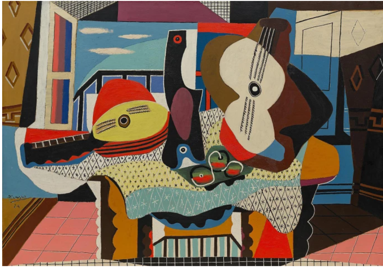
PABLO PICASSO, MANDOLINE ET GUITARE, 1924, OIL AND SAND ON CANVAS, SOLOMON R. GUGGENHEIM MUSEUM, NEW YORK © SUCCESSION PICASSO/DACS, LONDON 2024
In particular, Palau i Fabre observes how although depth is eradicated in favor of rigid two-dimensionality, the naturalistic nature of some of these flat elements force the eye to establish perspective. In the present work this is realized through the red rug which is placed under the guitar and achieves the effect of transforming the entirely flat yellow and orange forms behind into a table top. It is this kind of formal experiment that reveals Picasso’s Cubist work of the 1920s to be not so much the final act of the twentieth century’s greatest artistic movement, but the clear and confident expression of a new visual language and one that he would continue to explore for much of the rest of his life.
The importance of this work within Picasso’s œuvre is reflected in its provenance. It was first acquired by the celebrated dealer and collector Paul Rosenberg. Rosenberg played a major role in promoting European Modernism in the United States and may be that it was as part of these efforts that the work was sold to Walter P. Chrysler Jr., son of the founder of the Chrysler Corporation. Chrysler Jr. began collecting when he was only fourteen and after his junior year at Dartmouth in 1931 undertook a grand tour of Europe spending time in Paris where he met many of the artists he would go on to collect, including Picasso. At some point after this, the work entered the collection of Paul Odo Willert (1909-1998). What little is known about Willert paints a fascinating picture. He lived between Europe, England and the United States in the 1930s and 40s. In 1934 he married Brenda Pearson, the daughter of the 2nd Viscount Cowdray; they lived in the USA where he worked for the New York branch of the Oxford University Press before moving back to Europe in the late 1930s, Durng the war, Willert was posted to Paris working first on “propaganda” missions and then as air attaché with the RAF. They had a wide circle of intellectual and influential friends ranging from Franklin D. and Eleanor Roosevelt to the writer Arthur Koestler and philosopher A.J. Ayer. Willert lent the painting generously throughout his life, first in 1940 to the exhibition at The Museum of Modern Art in New York and then to two important exhibitions at the Tate Gallery London in the 1960s and 70s, including their feted 1960 Picasso retrospective which was the largest exhibition of the artist ever held in England attracting half a million visitors.
Pablo Picasso
Sotheby’s London: 25 June 2024
Estimated: GBP 3,500,000 – 5,000,000
GBP 5,760,000 / USD 7,303,680
PABLO PICASSO (1881 – 1973)
Nu assis, 1960
Oil on canvas
100×81 cm (39 3/8 x 31 7/8 inches)
Signed Picasso (lower left); dated 23.4.60. (on the reverse)
Painted in 1960, when Picasso was seventy-nine, Nu assis belongs to an important group of works from the artist’s so-called ‘late period’. Characterized by a raw energy, gestural application of paint and recourse to archetypal subject matter, these paintings have experienced a significant critical reappraisal over the past few decades and are now rightly seen as the final flourish of one of the greatest artists of the twentieth century.
The enigmatic female nude at the centre of this composition was, as in the majority of his late portraits, inspired by the ever-present figure of Jacqueline. Picasso’s representations of Jacqueline constitute the largest group of images of any of the women in his life, and these final years of his career have been fittingly termed “l’époque Jacqueline”. The couple first met in 1952 at the pottery studio in Vallauris, where Picasso was working on his ceramics, while he was still living with the mother of his two children, Françoise Gilot. By 1954, Françoise had left, and Jacqueline’s unmistakable angular profile and raven hair began to appear in Picasso’s paintings. Jacqueline reportedly never posed for the artist, but his wild imagination provided bountiful situational and stylistic modes from throughout the artistic canon for his muse, whose appearance he believed could embody any woman and all women.
As Estrella de Diego describes: “Jacqueline appeared at a perfect moment in the life of Picasso, an older man who was beginning to be overwhelmed by many things, from his family life to his success, as [Roland] Penrose explained. And as a result of a casual encounter, which recalls that between Rossetti and Elizabeth Siddal, a shop assistant before she posed for the English artist, Jacqueline came to embody – from the abstract to the concrete, from portraits to representations of the essence of woman – each and every one of the characters Picasso needed, as he had always done in the past, to activate the pictorial formulae that corresponded to his enduring obsessions” (E. de Diego in Exh. Cat., Málaga, Museo Picasso, Picasso, Musas y Modelos, 2006, p. 30).
Over the course of 1960 Picasso would turn to her as subject on numerous occasions, creating a group of portraits that share the same palette predominated by tones of grey, black and ochre (figs. 2-4). At the time Picasso and Jacqueline were living at the Château de Vauvenargues near Mont Sainte-Victoire in Provence which was their home between 1959-62. Perhaps the proximity to this Cézannian landscape predicated the shift from the brighter colours of the late 1950s to this subtler mode. Certainly, there is a sensitivity to sculptural form and tonal contrasts in this group of paintings that shares an affinity with Cézanne’s body of portraiture (fig. 5).
Indeed, this period saw Picasso consistently evoking the great artists of the past in his own art; painting works inspired by Diego Velázquez, Rembrandt van Rijn, El Greco and Francisco Goya (fig. 6). This focus on the Old Masters was a pointed affirmation of his place in the revered lineage of the great figures within art historical canon. Works such as the 1962 Femme au chien (fig. 7) show Picasso deliberately evoking the traditional portrait format of a seated woman surrounded by the accoutrements of her life. Nu assis shows him summoning a parallel artistic tradition – that of the female nude – and through an energetic, scrawling application of paint imbuing it with an expressive immediacy.
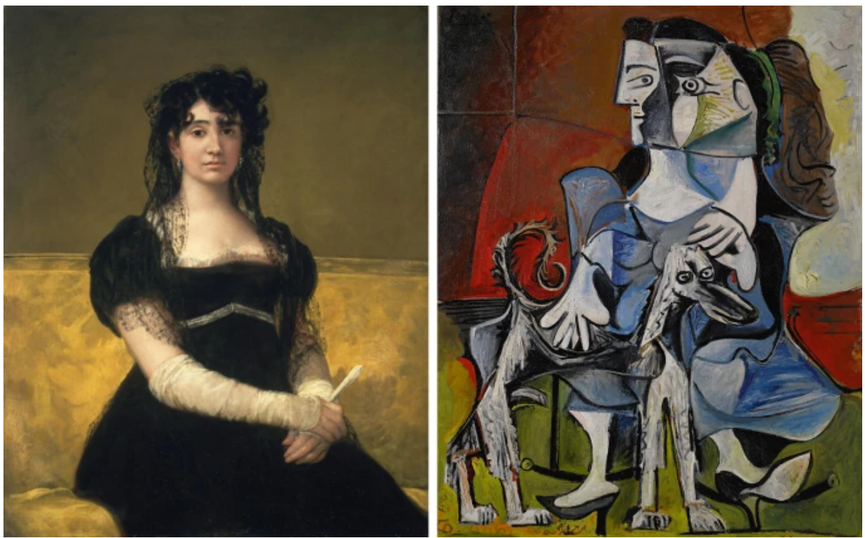
FRANCISCO JOSÉ DE GOYA Y LUCIENTES, DOÑA ANTONIA ZÁRATE, 1805, OIL ON CANVAS, NATIONAL GALLERY OF IRELAND, DUBLIN / PABLO PICASSO, FEMME AU CHIEN, OIL ON CANVAS, 1962, SOLD: SOTHEBY’S NEW YORK, MAY 2019, $54.9 MILLION © SUCCESSION PICASSO/DACS, LONDON 2024
In his discussion of Picasso’s late works, David Sylvester identifies this “raw vitality” as linking them to the early masterpiece, Demoiselles d’Avignon: “The resemblance of figures in the Demoiselles and in late Picasso to masked tribal dancers is as crucial as their scale in giving them a threatening force. It is irrelevant whether or not particular faces or bodies are based on particular tribal models: what matters is the air these personages have of coming from a world more primitive, possibly more cannibalistic and certainly more elemental than ours. Despite the rich assortment of allusions to paintings in the Renaissance tradition, the treatment of space rejects that tradition in favor of an earlier one, the flat unperspectival space of, say, medieval Catalan frescoes… At twenty-five, Picasso’s raw vitality was already being enriched by the beginnings of an encyclopaedic awareness of art; at ninety, his encyclopaedic awareness of art was still being enlivened by a raw vitality” (D. Sylvester, in Exh. Cat., London, Tate Gallery, Late Picasso: Paintings, Sculpture, Drawings, Prints, 1953-1972, 1988, p. 144).
This vitality is an essential part of these late works. In Nu assis the paint is applied with frenzied energy, scrawled in sgraffito gestures, scumbled and worked to create a tactile surface. The splashes of colour – blue, red, green – serve as focal points that emphasise the hieratic frontality of the figure. Picasso contrasts the strong, angular lines of her face with softer curves conjuring both seriousness and sensuality. The result is a portrait of immense expression and vigour – one that underlines the powerful impact of Picasso’s work in the final decades of his life.
Bouquet de lilas, 1878
Sotheby’s London: 25 June 2024
Estimated: GBP 2,000,000 – 3,000,000
GBP 6,880,000 / USD 8,723,840
PIERRE AUGUSTE RENOIR (1841 – 1919)
Bouquet de lilas, 1878
Oil on canvas
65.4 x 53.8 cm (25 3/4 x 21 1/8 inches)
Signed Renoir and dated 78 (lower right)
Executed in 1878, Bouquet de lilas belongs to the period of Pierre-Auguste Renoir’s most accomplished floral compositions, considered among the most refined still lifes of his œuvre. Over the course of his career, Renoir executed around 600 still lifes, the depictions of flowers undoubtedly his preferred subject within the genre. His first dedicated forays into still lifes date to the 1860s. One of the main reasons behind this was the rediscovery by Renoir, alongside fellow young artists coming into prominence around that time, of Jean-Baptiste-Siméon Chardin (1699-1779), one of the most important French still life artists of the eighteenth century. Chardin’s output, celebrated during his lifetime, had been practically forgotten by the early nineteenth century; towards the mid-nineteenth century, however, his work underwent an important reassessment.
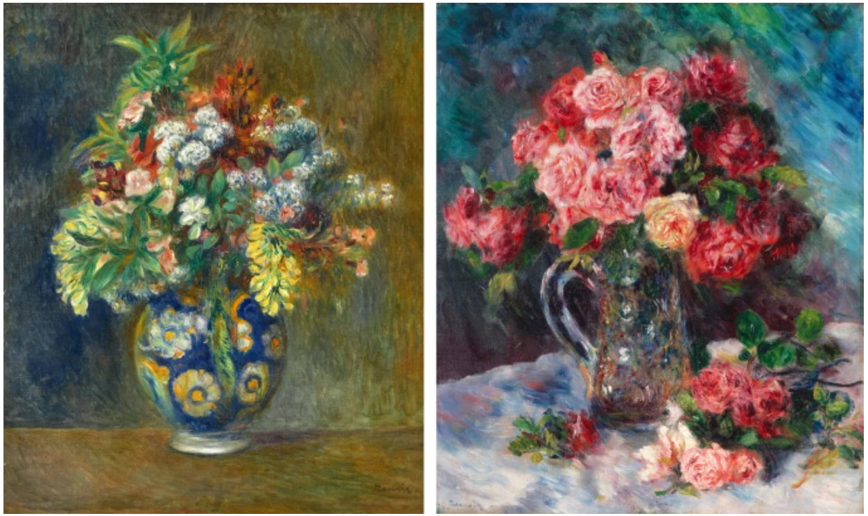
PIERRE-AUGUSTE RENOIR, FLEURS DANS UN VASE, CIRCA 1878, OIL ON CANVAS. SOLD: SOTHEBY’S LONDON, MARCH 2024, $2.5 MILLION
PIERRE-AUGUSTE RENOIR, ROSES DANS UN VASE DE CRISTAL, CIRCA 1879, OIL ON CANVAS. SOLD: SOTHEBY’S NEW YORK, MAY 2024, $3.2 MILLION
A further important motive for Renoir in dedicating his efforts to still lifes during this period was the rapidly growing popularity of this genre among collectors. However, perhaps the most overriding reason behind Renoir’s continued dedication to this subject matter was the technical and artistic freedom that the painting of flowers afforded him.
“Painting flowers is a form of mental relaxation. I do not need the concentration that I need when I am faced with a model. When I am painting flowers I can experiment boldly with tones and values without worrying about destroying the whole painting. I would not dare to do that with a figure because I would be afraid of spoiling everything. The experience l gain from these experiments can then be applied to my paintings.”
In Bouquet de lilas Renoir manages to strike a perfect balance between technical virtuosity and bold experimentation. The way the artist depicts the luscious bunch of lilacs is incredibly intricate. Each flower is jewel-like in its execution, with Renoir paying close attention to the play of light on their delicate petals and the difference in hue between the budding and in bloom flowers. At the same time, Renoir masterfully captures the atmosphere created by the bouquet in the space it occupies. The lilacs form an airy, cloud-like vision on the surface of the canvas that perfectly conveys the essence of these widely loved, delicately fragrant harbingers of spring.
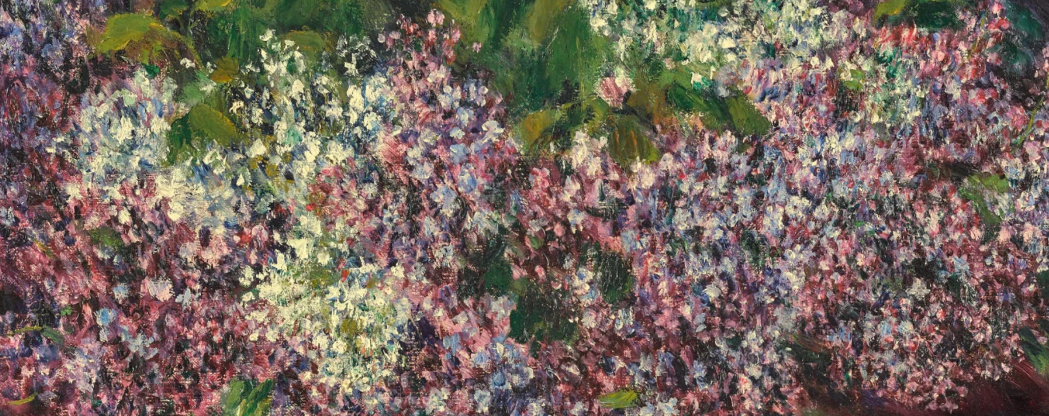
Renoir achieves a particularly successful composition here by juxtaposing the dainty flowers and the ceramic vase, which, although light in color, provides an important weight to the bottom half of the composition. The detail and skill with which the vase and its ornament are depicted reference Renoir’s initial training as a porcelain painter in his hometown of Limoges in the 1850s. The loosely applied brushstrokes denoting the background make the flowers stand out and take centre stage within the composition. At the same time, the energetic brushwork imbues the work with a sense of vibrancy and immediacy that is very much unlike the static, academic still-lifes that contemporary audiences would have been used to seeing at the Salon. Coming to auction for the first time in almost forty years, Bouquet de lilas is one of the most accomplished still-lifes by Renoir from a critical period within the artist’s œuvre and a wonderful, vivid statement of his Impressionist style.
Lucio Fontana
Sotheby’s London: 25 June 2024
Estimated: GBP 2,500,000 – 3,500,000
GBP 4,080,000 / USD 5,173,440
LUCIO FONTANA (1899 – 1968)
Concetto spaziale, attese, 1966
Waterpaint on canvas
100.5 x 81 cm (39 5/8 x 31 7/8 inches)
Signed, titled and inscribed Oggi vado a pranzo col premio Nobel e amico Quasimodo (on the reverse)
A window to a celestial realm beyond the cosmos, Lucio Fontana’s Concetto spaziale, attese from 1966 is an exemplar of the artist’s tagli series: genre-defining action paintings globally recognized to have shaped the cultural canon of western art history with immeasurable magnitude. Slashed, perforated, and passionately performative with a palpable vitality, seven exquisitely executed slashes disrupt a homogenous red picture plane. Rendered in the most powerful of pigments, this sensuous scarlet painting alludes to passion, danger, violence, and lust, while simultaneously signaling an alternate reality: a sublime spatio-temporal investigation that sought to understand man’s physical and philosophical positioning in the universe, which until then was uncharted and boundless.
“With the slash I invented a formula that I don’t think I can perfect. I managed with this formula to give the spectator an impression of spatial calm, of cosmic rigor, of serenity in infinity.”
Previously held in the esteemed collection of Hans and Ursula Hahn, Concetto spaziale, attese was first exhibited during Fontana’s lifetime in 1967 in Dusseldorf, alongside other notable paintings, sculptures, and drawings from private collections in Germany. Indeed, the present work’s dichotomous sculptural materiality, the boldness of its composition, in tandem with its unrivalled conceptualism, imbues Concetto spaziale, attese with an awe inspiring quality, demanding from its viewers a deeper contemplation and introspection.
LEFT: CARAVAGGIO, SAINT JOHN THE BAPTIST, 1604 / NELSON-ATKINS MUSEUM OF ART, KANSAS CITY
RIGHT: MARK ROTHKO, LIGHT RED OVER BLACK, 1957 / TATE, LONDON / IMAGE: © TATE, LONDON
ARTWORK: © 1998 KATE ROTHKO PRIZEL & CHRISTOPHER ROTHKO ARS, NY AND DACS, LONDON
First begun in the autumn of 1958, the tagli occupied Fontana until his death in 1968, and as such bear witness to the surge in scientific breakthroughs that lead to the epochal Space Race of the mid-twentieth century. Capturing technological advancements on the political world stage, via a theatrical crimson curtain, the present work traces the scientific trajectory of Albert Einstein’s 1916 Theory of Relativity and Ernest Rutherford’s 1919 atom-splitting experiment, to Georges Lemaître’s 1931 proposal of the Big Bang Theory, Robert Oppenheimer’s 1939 speculations on black holes, the 1967 Soviet launch of Sputnik, and culminating in man’s inaugural voyage into space with Yuri Gagarin’s historic journey in 1961. Some fifteen years prior to this culturally historic event, Fontana professed his first manifesto in 1946, the Manifesto Blanco: an artistic theory putting forth the revolutionary tagli (cuts), and its predecessor the buchi (holes). It is within this academic framework that Fontana presented the notion of Spazialismo, or Spatialism: an intellectual theory that sought to engage technology and find expression for a fourth dimension in art, that of space-time.
LUCIO FONTANA, 1960 / IMAGE/ARTWORK: © LUCIO FONTANA/SIAE/DACS, LONDON 2024 ********/BPK / SCALA
According to art historian Jan van der Marck, during the preparation of an exhibition at the Galerie Stadler in Paris in 1958-59, reportedly Fontana had such disdain for his overly textured canvases that he slashed a painting out of pure frustration. The actual premiere of the tagli is said to have taken place at the Galleria del Naviglio in February 1959, a month before the Paris event. Mysterious in its infancy, the ceaselessly engaging tagli present teasingly tangible and visceral surfaces, that define a superior materiality and a mass of material as an expression of matter itself. A mechanical and irreversible act, the unyielding, metallic edge of the blade neatly splits the canvas with an action similar to that of a guillotine. Choreographed by the blade, the immediacy of Fontana’s singular descending gesture is frozen in time, while the sequence and quantity of slashes creates a natural rhythm and musicality as the cuts bend, flex and lyrically dance across the surface, leading to an anthropomorphic reading of the canvas. The syncopated progression of the incisions amplifies the absorbing darkness, creating dusky voids and shadowy fissures, through which Fontana instilled his canvases with a profound sense of objecthood, rupturing the conventions of the picture plane, and in turn transcending the customary aesthetic principles of two-dimensional easel painting.
BARNETT NEWMAN, VIR HEROICUS SUBLIMIS, 1950-51 / THE MUSEUM OF MODERN ART, NEW YORK
IMAGE: © 2024 THE MUSEUM OF MODERN ART, NEW YORK/ SCALA, FLORENCE
ARTWORK: © THE BARNETT NEWMAN FOUNDATION, NEW YORK / DACS, LONDON 2024 NEWMAN, BARNETT (1905-1970)/¬©DIG. IMAGE MOMA, NEW YORK/SC
Fontana frequently tagged the reverse of his works with inscriptions, occasionally showcasing quirky arithmetic or stream-of-consciousness reflections from his daily life. A personal encounter documented by the artist, Concetto spaziale, attese is annotated with: “Today I am going to lunch with the Nobel Prize and friend Quasimodo,” referencing the artist’s association with the esteemed Italian poet and translator Salvatore Quasimodo, with whom he collaborated. Along with Giuseppe Ungaretti and Eugenio Montale, Quasimodo was one of the foremost Italian poets of the twentieth century, winning the Nobel Prize in Literature in 1959, a controversial accolade at the time owing to the poet’s deep-rooted ties to the Communist Party. Frequenting Milan’s infamous Bar Jamaica – a legendary and culturally significant establishment akin to Studio 54 in Manhattan in the 1970s – Fontana and Quasimodo would drink and converse with some of the brightest and most eccentric European minds of a generation, including artists Piero Manzoni and Enrico Baj, novelists Luciano Bianciardi and Dino Buzzati, as well as poet Allen Ginsberg.