WORK IN PROGRESS
Introduction
In 1964, Roy Lichtenstein began painting landscapes. This important turning point marked the first of his concerted efforts in producing a series. Indeed, his landscapes–time-honored art historical traditions in themselves–afforded him the opportunity to explore its depiction as an artificial construct, using the formal devices he had introduced in his early comic strip paintings. Contrary to historical conventions, Lichtenstein’s landscapes questioned the fundamental verity of landscape as genre, and denied nature’s reality altogether, offering instead a different view of landscape–as a product of the mass media. With their source in comic books, Lichtenstein’s landscapes were twice removed from nature. His vision was a radically simplified and altered facsimile in which basic elements – shapes, volumes, light and shade – were presented in shorthand version. To deprive his landscape of roots in reality, he used a non-naturalistic palette of black, white and primary colors, drawing out their contrasts through the juxtapositions of solid color and Ben Day dot patterns that were enclosed in stylized demarcations. Lichtenstein bent nature to design, transforming organic forms into geometric ones and random structures into orderly compositions. Since the graphic flatness of comic books insisted on their fiction, the use of this predetermined setup enabled Lichtenstein to forgo the inveterate illusionism of the landscape genre in art and conform instead to the ineluctable reality of the flat plane of the canvas.
Auction Results
#1. Sunrise, 1965
Christie’s New-York: 12 November 2014
Estimated: USD 12,000,000 – 18,000,000
USD 16,405,000
Roy Lichtenstein (1923-1997), Sunrise | Christie’s
ROY LICHTENSTEIN (1923-1997)
Sunrise, 1965
Oil, Magna and graphite on canvas
36 1/8 x 68 3/8 inches (91.7 x 173.6 cm)
Signed and dated ‘rf Lichtenstein 1965’ (on the reverse)
#2. Sinking Sun, 1964
Sotheby’s New-York: 10 May 2006
Estimate on Request
USD 15,696,000

ROY LICHTENSTEIN
Sinking Sun, 1964
Oil and magna on canvas
68×80 inches (172.7 x 203.2 cm)
Signed and dated 64 on the reverse
#4. Landscape with Column, 1965
Christie’s New-York: 16 May 2007
Estimated: USD 1,500,000 – 2,500,000
USD 4,744,000
Roy Lichtenstein (1923-1997) , Landscape with Column | Christie’s
ROY LICHTENSTEIN (1923-1997)
Landscape with Column, 1965
Oil and magna on canvas
48 x 68 1/8 inches (121.9 x 173 cm)
Signed and dated ‘rf Lichtenstein 1965’ (on the reverse)
#5. Purple Range, 1966
Sotheby’s New-York: 13 May 2024
Estimated: USD 3,000,000 – 4,000,000
USD 3,690,000
Purple Range | Contemporary Evening Auction | 2024 | Sotheby’s (sothebys.com)

ROY LICHTENSTEIN (1923 – 1997)
Purple Range, 1966
Acrylic, oil and graphite on canvas
36×48 inches (91.4 x 121.9 cm)
Signed and dated ’66 (on the reverse)
Atomic Landscape, 1966
Works from the Collection of Dorothy and Roy Lichtenstein
Sotheby’s New-York: 15 May 2025
Estimated: USD 700,000 – 1,000,000
USD 1,636,000
Atomic Landscape | The Now and Contemporary Evening Auction | 2025 | Sotheby’s
ROY LICHTENSTEIN (1923 – 1997)
Atomic Landscape, 1966
Acrylic, oil and graphite on canvas
14 x 16 1/8 inches (35.6 x 41 cm)
Signed and dated ’66 (on the reverse)
Eventide, 1964
Christie’s New-York: 10 November 2022
Estimated: USD 600,000 – 800,000
USD 1,380,000
ROY LICHTENSTEIN (1923-1997) (christies.com)
ROY LICHTENSTEIN (1923-1997)
Eventide, 1964
Oil and Magna on canvas
30 x 35 7/8 inches (76.2 x 91.1 cm)
Signed and dated ‘rf Lichtenstein ’64’ (on the reverse)
Sunrise, 1965
Sunrise, 1965
Christie’s New-York: 12 November 2014
Estimated: USD 12,000,000 – 18,000,000
USD 16,405,000
Roy Lichtenstein (1923-1997), Sunrise | Christie’s
ROY LICHTENSTEIN (1923-1997)
Sunrise, 1965
Oil, Magna and graphite on canvas
36 1/8 x 68 3/8 inches (91.7 x 173.6 cm)
Signed and dated ‘rf Lichtenstein 1965’ (on the reverse)
Provenance
Ileana Sonnabend, Paris
Edward Power, London
Acquavella Gallery, New York
Private collection, New York
Sonnabend Gallery, New York and Paris
Phillis Goldman, New York
Jeffrey Deitch, New York
Private Collection, Japan, 1989
L & M Arts, New York
Acquired from the above by the present owner
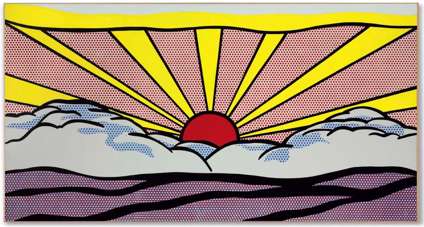
Although well-known for his paintings that drew their subject matter from the melodrama played out between the covers of mass-market comic books, Roy Lichtenstein’s landscapes are an important part of his early oeuvre and did much to help develop and enunciate his iconic Pop language. Painted in 1965, Sunrise is one of a select group of landscapes that Lichtenstein painted incorporating his strong, bold lines and passages of high-keyed color together with his signature Ben-Day dots to capture the ethereal emotions and sensations conjured up by the warm rays of the rising sun. This rare example is the only one of the six sunrise works to have been executed as a painting, the others all having been fabricated in a variety of media ranging from screenprint on silk to porcelain enamel on perforated steel.
Both physically and metaphorically, the majestic red sun that emerges from the nest of cumulus white clouds lies at the very center of this painting. Not only does its searing core act as the focal point of the entire composition, it also becomes the source of many of the other elements that make up this painting. From the warm yellow rays of light that radiate out from the center to the blankets of dark shadow that cover the ground and the peaks of the clouds, Lichtenstein’s sun—much like the real thing—is the sustainer of all things. By the time he painted Sunrise, Lichtenstein’s graphic language had become so advanced that he was able to convey some of the most subtly nuanced areas of light and shadow to greater effect here than in many of his earlier works. The strong rays of the early morning sun are demarcated by solid bands of yellow tones deftly constrained by borders of black paint. In the lower portions of the canvas areas of red Ben-Day dots offer up a sensation of warm, hazy sunshine while passages of blue Ben-Day dots add a sense of depth and volume to the fluffy white cloud. Finally the artist makes a rare foray into chiaroscuro by laying down an area of red dots, overlaid with blue dots, to produce a passage of deeper shadow, a method that directly imitates the two-color printing process of early mass-commercial printing that energized Lichtenstein’s painting so much.
Despite his desire to emulate the techniques of mass-production, Lichtenstein’s paintings from this period are remarkable in their complexity and display of the artist’s manual dexterity. Sunrise followed in this tradition, as all of the artist’s parodies of commercial printing were, in fact, painstakingly undertaken by hand. The initial stage of any Lichtenstein painting would involve the artist tracing the outline of his most recent study, which he projected onto the surface of the canvas. Close examination of the surface of Sunrise reveals traces of these delicate lines—lines that were so important to the artist that he once admitted “A lot of time is taken up with the drawing part and there’s more work on the drawing part than is probably apparent” (R. Lichtenstein, quoted by J. A. Ramírez, “Lichtenstein, In Process,” in Roy Lichtenstein: Beginning to End, exh. cat., Fundación Juan March, Madrid, 2007, p. 28). Lichtenstein would then mask off areas using tape before arranging pieces of collaged paper containing the colors he required or the density of Ben-Day dots he needed before finally settling on the required structure of the painting. It was only after he pronounced himself satisfied with the composition that he began the painstaking process of applying the paint to the surface of the canvas.
Even though Lichtenstein’s reductive painterly method expertly conveys the searing heat and brightness of the morning sun, his concern was not to reproduce reality but to investigate the way these graphical tropes convey the feelings and emotions that they do. Lichtenstein found that landscapes provided a good example of how generalized references to a style are often used rather than the specific original itself. For example, images of sunrises and sunsets are prevalent in Art Deco design with expanding beams radiating from a fat, low sun, the curved form of the clouds produced by large expanses of color. As Lichtenstein stated “I am removed from the emotions I am depicting, because they are usually ironic or even silly…. The emotions I deal with are placement and a kinesthetic sense of position and color, character of shape, and that sort of thing” (R. Lichtenstein, quoted by R. Fine, “Your Makeup is Your Freedom; Your Purpose is Your Control,” in Roy Lichtenstein: Beginning to End, exh. cat., Fondación Juan March, Madrid, 2007, p. 27).
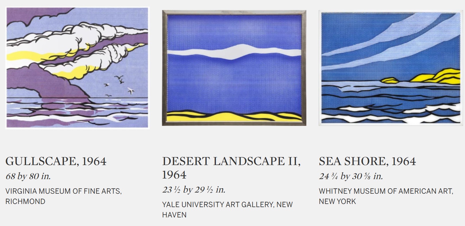
The landscape genre was one of the first topics that Lichtenstein turned to following his iconic comic-inspired Girl paintings of 1964, and one that he would return to with some regularity. He was drawn to clichéd or dated subjects, and the genre of landscape seemed appealingly remote from avant-garde concerns. While their subject matter seems unlike Lichtenstein’s early Pop Art comic paintings, his painted landscapes were, in fact, appropriated from the backgrounds of cartoon scenes. Lichtenstein used the same durable halftone dots but here distilled the compositions down to the most basic pictorial elements. The results progress from more overtly representational works like the present lot to almost completely abstract works like the blue Seascape (1964). Over time, the black outlines present in Sunrise disappear completely, leaving bands of solid color and massed groupings of dots to define the pictorial space—ocean, mountains, sky.
In choosing this particular motif, Lichtenstein harnesses the universality of the sun within the human psyche. Unlike his Girl paintings, which featured the distinctly American concept of the teenager, the sun possesses universal appeal. For millennia it has been at the center of human civilization and because of its long recognized role in supporting life on Earth, many societies have imbued it with a prominent role in their religious customs. In the Western tradition, the Greeks worshipped the mythical sun god Helios, who wore a shining crown and rode across the sky in a chariot turning night into day as he went. The Romans then adapted this fabled figure into their mythology as Sol, whose festival was celebrated in December 21st (the Winter Solstice). The worship of the sun in the Eastern custom can trace its roots back to the ancient Egyptians who identified the Sun with Ra, one of their major deities. In Hindu religious texts, the sun is noted as the only visible form of God that can be seen every day and many religious texts referred to the sun as a king, who rides on a chariot of seven horses.
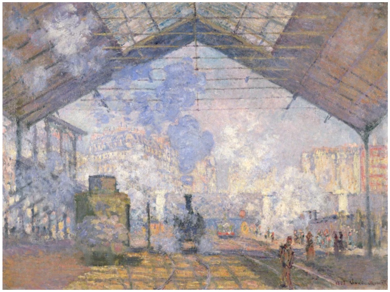
Although Lichtenstein took his inspiration for Sunrise directly from one of the landscapes he had seen in a comic book, in choosing this particular subject, he was joining a pantheon of artists who recognized the power of this particular motif to stir the emotions. From J.M.W. Turner to Claude Monet, from Edvard Munch to Edwin Church, the celebration of the sun and its quasi-spirituality has long been a lucrative trope for generations of artists. However, Lichtenstein’s approach was different, according to critic Lawrence Alloway “The Landscapes and Mountains combine Lichtenstein’s abiding concern with cliché, in relation to the time-binding property of art, the presence of the past on the present, with his increasing interest in color and unified imagery. The fact these different preoccupations are balanced unobtrusively is typical of Lichtenstein’s self-evaluative but reserved demeanor” (L. Alloway, Lichtenstein, New York, 1983, p. 53).
Lichtenstein recognized that what he was doing was revolutionary in the Western art tradition, but saw parallels in art from further afield. “I think that what we’re doing is something that hasn’t been done in Europe,” he said “but then European artists also were doing things that weren’t done before in their own tradition. I think that even Oriental art fits into this tradition in the sense that there’s a different stylistic aspect to it” (R. Lichtenstein, interviewed by J. Jones, October 5, 1965, quoted by G. Barker (ed.), October Files: Roy Lichtenstein, Cambridge, 2009, pp. 17-18). This interest in the artistic traditions of Asia dates back to Lichtenstein’s days as a student. In the thesis for his Master’s Degree at Ohio State University he included a poem by the 12th century Chinese poet and painter Ma Yuan, whose refined landscapes often contained a peaceful symmetry that can also be found in Lichtenstein’s landscapes. Yuan was highly regarded for the reductive nature of his Chinese landscapes, and his paintings are characterized by the use of bold thick lines and the inclusion of only the most essential compositional elements, qualities that have strong parallels in Lichtenstein’s work.
In no other genre was Lichtenstein as experimental with materials and media in his quest to create illusionistic optical effects. Seashore (1964), painted in reverse on the back of multiple, layered sheets of Plexiglass, projects a sense of depth. Seascape (1965) and Pink Seascape (1965) utilize the reflective surface of Rowlux, a lenticular plastic that conveys the impression of movement, even liquidity, when viewed at different angles. Perforated Seascape #1 (Blue) (1965), a work of enamel on steel, further heightens the sense of movement through the moiré pattern created by its layered construction. In these scenic works, Lichtenstein conveyed the indeterminate essence of light and water, or stylized them through exaggerated curves or straight lines, creating the impression of a landscape in a remarkably economical manner.
With its myriad of rich historical and cultural associations, artists throughout history have gained inspiration from the sun but none have managed to capture the intensity of its rays in such a dynamic way as Roy Lichtenstein. By depicting such an omnipresent motif in such a contemporary way, Lichtenstein forces us to challenge the centuries-old rules of visual communication in a way that had never really been done before. By rendering something seemingly so familiar and simple, in such a new and revolutionary way, Lichtenstein was establishing a new visual language for the multi-media generation, as the artist himself pointed out, “There is something humorous about doing a sunset in a solidified way, especially the rays, because a sunset has little or no specific form. It is like the explosions they are never really perceived as defined shapes” (R. Lichtenstein, quoted in J. Coplans, “Talking with Roy Lichtenstein,” Artforum, 5, no. 9, May 1967, pp. 34-39). Just as with his iconic Girl paintings, the reconceptualization of history is what lies at the very heart of Lichtenstein’s work. With Sunrise, Lichtenstein contributes to the legacy of art history in his inimitable and ironic fashion. Here, his subject matter enabled him to make a knowing and witty nod to art-historical precedents, including that of his own paintings that were by this time gaining critical recognition. The result is a complex amalgamation of appropriation that exemplified new approaches to visual practice in the post-modern era.
Sinking Sun, 1964
Sinking Sun, 1964
Sotheby’s New-York: 10 May 2006
Estimate on Request
USD 15,696,000
ROY LICHTENSTEIN
Sinking Sun, 1964
Oil and magna on canvas
68×80 inches (172.7 x 203.2 cm)
Signed and dated 64 on the reverse
Provenance
Leo Castelli Gallery, New York (LC# 176)
Ferus Gallery, Los Angeles
Mr. and Mrs. Dennis Hopper, Los Angeles (acquired from the above in October 1964)
Brooke Hayward Hopper, Los Angeles
Acquired by the present owner from the above circa 1974
One of the defining works of Roy Lichtenstein’s stellar career, Sinking Sun is an authoritative masterpiece which occupies a peerless position both within the artist’s prodigious oeuvre and within the wider context of American Pop Art. Executed in 1964, it stands at the apogee of the comic strip paintings which shot Lichtenstein to international fame in the early 1960s. Bold in ambition and scale, Sinking Sun demonstrates the artist’s complete mastery of the mechanics of impact that he culled from the mass-media and witnesses the distillation of his instantly recognisable, highly distinctive comic-book-derived iconography that he honed in the earlier comic strip paintings. The centerpiece of the Roy Lichtenstein: Landscapes exhibition at the Leo Castelli Gallery in 1964, Sinking Sun was acquired by Dennis and Brooke Hopper and for many years was the crown jewel of their collection, gracing the walls of their home at 1712 North Crescent Heights, Los Angeles – the literal backdrop to one of the most well-known celebrity duos of 1960s America. An iconic image of a quintessentially American landscape full of hope and nostalgia, Sinking Sun has itself become an icon of the cultural landscape from which it originated.
Alongside Andy Warhol, Lichtenstein’s espousal of the prosaic commonplace of popular culture – both in style and frame of reference – and his alchemy of the mass-produced visual qualities of ‘base’ commercial images into poetic pictorial elements worthy of Fine Art, is unequivocally one of the most original innovations and crowning achievements of twentieth-century art practice. Sinking Sun is the endpoint of Lichtenstein’s most acclaimed and sustained body of work, painted between 1961 and 1965, which looked to the low-brow, vapid, cult comic literature to provide both its imagery and its stylistic blueprint. Jettisoning the emphasis on the artist’s touch – the indexical link to the artist that had played such a vital role in the semiotics of Abstract Expressionism – Lichtenstein, alongside Warhol, sought a pictorial vocabulary embedded in modes of mechanical reproduction. Like Gustave Courbet a century earlier, Lichtenstein sought freedom from what he deemed to be the dominant and academic mode of painting of the day through recourse to vulgar subject matter presented in a vernacular style on a pedestal formerly reserved for high art. In so doing he forced a critical reappraisal of the aesthetic potential of the quotidian modes of commercial illustration.
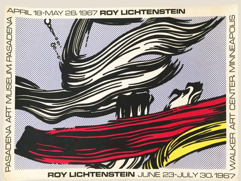
Unlike Warhol, who pioneered the silkscreen process to transfer his images to canvas, Lichtenstein at the start magnified and transferred his images by hand in a painstaking process that insistently removed all the expressionistic detail of brushwork, further divesting the image of naturalistic representation by heightening the heavy stylization of the comic book source. “I want my painting to look as if it has been programmed. I want to hide the record of my hand.” (Roy Lichtenstein interviewed by John Coplans cited in Exh. Cat. Pasadena, Art Museum, Roy Lichtenstein, 1967, p.12). This systematic and detached process invited accusations from Lichtenstein’s hostile critics of image duplication: the rote copying of arbitrarily gleaned trite images. However, Lichtenstein never copied an image wholesale and it is in the subtle manipulation of the images that Lichtenstein’s true genius lies. As the artist comments, the difference is often not great but it is crucial: “It becomes a very exaggerated, a very compelling symbol that has almost nothing to do with the original”. (Ibid, p. 12) As one can see by examining the comic book page for Heart Throbs, a DC Superman National Comics issue in comparison to the Sussex, another 1964 Landscape painting, the artist did not borrow a comic panel in its entirety. He would slice out a cropped section – in this case the horizon of rolling hills, clouds and sky – that is glimpsed behind the dialogue balloons of a couple in deep discussion. The horizon is a distant detail in the overall image, but Lichtenstein sliced it from the page and focused on this edited image for his composition. In a similar manner, Lichtenstein chose to highlight the upper right corner of a comic panel from another issue of Heart Throbs for the composition of the romantic painting Kiss with Clouds (1964). In this case, the image of a kissing couple is truncated so that we see their closed eyes but not their lips, with the background of sky and clouds playing a more prominent role in the composition than in the original comic panel. Such conscious artistic choices denote the high level of thought and careful consideration that Lichtenstein brought to the image he chose to convey on canvas, contradicting any notion that his was a rote selection of given images.
What fascinated Lichtenstein about the comic strip subject matter was the disjunction between their exaggerated emotional content and the rigid conventionality of their style. “I was very excited about and interested in the highly emotional content yet detached, impersonal handling of love, hate, war etc., in these cartoon images… It is an intensification, a stylistic intensification of the excitement which the subject matter has for me; but the style is, as you say, cool. One of the things a cartoon does is to express violent emotion and passion in a completely mechanical and removed style”. (Roy Lichtenstein interviewed by G. R. Swenson cited in Exh. Cat., London, Tate Gallery, Roy Lichtenstein, 1968, p.9) It is this fundamental paradox between subject and style, an ongoing concern throughout Lichtenstein’s entire oeuvre, which the artist interrogated with such aplomb in the comic-strip works.
Like the artist’s greatest works of the period, Sinking Sun harnessed the rigorous stylistic order and overwhelming graphic clarity of the comic strip while simultaneously mimicing the modes of mechanical reproduction. Lichtenstein’s palette is reduced to the core primary colours of red, yellow and blue which are kept as close as possible in feeling, texture and pitch to those used in advertising. As the artist has said: “I use colour in the same way as line. I want it oversimplified – anything that could be vaguely red becomes red. It is mock insensitivity. Actual colour adjustment is achieved through manipulation of size, shape and juxtaposition”. (Ibid, p. 12) The extensive use of the regularised Benday dot throughout the broad expanse of the picture plane simulates on a monumental scale a specific type of widely used printing technology. Diagrammatic to the extreme, the composition is articulated by the use of bold black highly legible outlines which dramatically define and separate the four horizontal registers of land, horizon, cloud and sky. In places, the Benday dot is liberated from this containing black line and the artist uses the white ground to evoke volume, as in the curvilinear forms of the billowing cumulus cloud, which recall the ebbing waves of Drowning Girl of the previous year.
Unlike many of his works from this period which adapted and modified a specific source image or combined multiple sources into a single image, Sinking Sun depicts a generic, clichéd image that verges on the kitsch. Clearly derived from the comic strip, this traditional topos of romantic literature is conventionally depicted in the final frame of both romance and war comic strips, drawing the plot to a close and symbolizing closure and the restoration of order and harmony. This is not an actual landscape, rather it is the stereotype of a fictive landscape – one that is quintessentially optimistic and American. The cliche of `riding off into the sunset’ spoke of the promise of happiness and success, as well as the providential abundance of the American frontier and the American dream. Because the stereotype is so strong and so indelibly ingrained into a shared public consciousness, we readily recognise the image just as the beholder instantly recognises the landscape in Temple of Apollo, painted the same year, even if they have never visited Greece. By reducing all extraneous pictorial detail and traces of narrative to an absolute minimum (note the absence of gulls here that are present in other landscapes of the same period), Lichtenstein bestows on Sinking Sun an emblematic fixity that transcends the here and now to create a monolithic image of monumental and enduring presence. What is so powerful in Lichtenstein’s most accomplished paintings is that they are more like comics than the originals from which they derive. Through Lichtenstein’s process of manipulation and reframing, his image of the closing sunset comes closer to the Platonic ideal of comic book style than the comic book source. So powerful is Sinking Sun that it has been subsumed back into the media from which it originated as the hyperbolic archetype of the comic strip genre.
However, Lichtenstein’s primary interest in the motif of the landscape resides in the jarring tension established between the synthetic style and the natural phenomena that is being depicted, which pushes to its logical conclusion the disjunction between the object and its representation that is at the core of his practice. As the artist has stated: “There is something humorous about doing a sunset in a solidified way, especially the rays, because a sunset has little or no specific form. It is like the explosions. It’s true that they may have some kind of form at any particular moment, but they are never really perceived as defined shape… It makes something ephemeral completely concrete.” (Lichtenstein interviewed by John Coplans cited in Exh. Cat., Pasadena, Art Museum, Roy Lichtenstein, 1967, p. 15). Even though the source image is a derivative of the comic strip, it is a strictly three dimensional motif that undergoes the same formulaic process of simplification and schematization as the more overtly two-dimensional comic-strip images. The rolling hills and expanse of sky, with all its permutations of light and dark, shadow and reflection, are reduced to a flat amalgam of lines, shapes and colours; its nuanced organic forms become rigid and geometric and nature’s disorder is ironed out to become a highly structured arrangement. Lichtenstein has abstracted nature into his own synthetic construct: while traditional landscape painters rely on a willing suspension of belief, asking the beholder – at least for a moment – to accept the representation as the scene itself, Lichtenstein, by contrast, stresses the artificiality of the representation, urging us to recall not the natural landscape but a generic landscape as depicted in the mass media.
Above all it is in the rendering of a three-dimensional landscape in a two-dimensional graphic style with its tenacious insistence on ineluctable flatness of the picture plane that silences his antagonistic critics in demonstrating his engagement with the same formal concerns that had been the overbearing preoccupation of his greatest ancestors. As Diane Waldman has commentated, “Sinking Sun, an obvious cliché of a landscape, is among the most successful of [Lichtenstein’s] landscape paintings, largely because it strikes such an effective balance among its subject, the conventions of the comic strip and the demands of pure painting. By stressing the artificiality of the comic-strip derived landscape, Lichtenstein proposed a new form of landscape painting. The predetermined fiction of the comic strip enabled him to present the illusionistic image of the landscape in terms that confirm the fictive reality of the picture plane. As he had in the past, Lichtenstein was able to subvert the representational subject matter by belying its reality and conforming instead to the reality of a reproduction and, ultimately, the even more fundamental reality of the canvas.” (Exh. Cat., New York, Solomon R. Guggenheim Museum, Roy Lichtenstein, 1994, p. 131).
Standing at the intersection of popular culture and high art, Sinking Sun aptly demonstrates the facility with which Lichtenstein negotiated between Fine Art and images of common currency. In a large part the initial potency of Sinking Sun derived from the cultural shock of scrutinizing for the first time a spectacle so common that we have always closed our eyes to it; Lichtenstein’s skill resided in his ability to unlock the beauty within the pictorial conventions of ubiquitous, everyday images. However, like Jasper John’s Flag, itself a metaphorical landscape of stars, sky and limitless American horizons, Sinking Sun has become a timeless American icon, as fresh and compelling today as it was to its original audience. Exceptional for its rarity, Sinking Sun is one of the few unequivocal cultural landmarks of the twentieth century, making this the rarest of auction moments.
Landscape with Column, 1965
Landscape with Column, 1965
Christie’s New-York: 16 May 2007
Estimated: USD 1,500,000 – 2,500,000
USD 4,744,000
Roy Lichtenstein (1923-1997) , Landscape with Column | Christie’s
ROY LICHTENSTEIN (1923-1997)
Landscape with Column, 1965
Oil and magna on canvas
48 x 68 1/8 inches (121.9 x 173 cm)
Signed and dated ‘rf Lichtenstein 1965’ (on the reverse)
Provenance
Galerie Ileana Sonnabend, Paris
Acquired from the above by the present owner, 1965
The extreme abstraction of Landscape with Column is readily apparent; indeed, only the titular column–itself truncated by the edge of the canvas–can be considered wholly representational. Bisected by an incisive black line, the composition distills into two horizontal rectangular expanses of primary color. Ben day dots take unprecedented autonomy in the dual use of red and blue screens in the uppermost area, which doubles into the airiness of “sky,” while a uniform plane of yellow in the lowermost area renders a solid “ground.” The effect is optical rather than illusionistic; the red and blue sections alternately advance and recede, while the yellow lower half draws attention to the flatness of the surface. Compared to the sweep of an actual landscape, Landscape with Column stages most of its content as a close-up in two dimensions.
Complete abstraction is staved off by the presence of the column, whose cleverly foreshortened form signals the recession of three-dimensional form, in two-dimensional space. Receding into the “non-space” of Landscape with Column, the depiction of the column is particularly jarring. Its evident truncation suggests continuation beyong the frame of the canvas. Used in illusionistic depictions to connote the reality beyond the “reality” of the canvas, such a pictorial convention makes little sense in the anti-illusionism of Landscape with Column. However, it wittily conveys the banter between two and three dimensions that lies at the heart of Lichtenstein’s enterprise.
Far from exhaustive, the artist’s rendering of the titular column is notational. The viewer identifies the form as a column only because the painting’s title references it. Stripped of its nomenclature, this abstract form takes on other associations. Pointed obliquely at the viewer, its partial revelation assumes a sinister aura quite unlike the benign grandeur associated to ancient ruins. Conversely, its circular end is reminiscent of the barrel of a gun. Even within a subset of classical landscapes, Landscape with Column is rooted to the iconic depictions of fighter planes in works such as Whaaam, 1963 and As I Opened Fire, 1964.
The first of his classical landscapes, Temple of Apollo, 1964, was inspired by the wallpaper that adorned his favorite Greek restaurant – one that featured repeated silver stenciled images of the Parthenon. The artist was amused by the fact that a shorthand sign comprising a few ancient columns, reproduced and mass-produced into a kitsch object, could immediately convey an entire ancient culture and the notion of “civilization”. Compared to the vaunted attachments placed on ruins – the rare and extant fragments of our past – his depiction employed the technique of cheap and easy industrial manufacture – an extension of civilizing process. Landscape with Column has an even sharper edge on the ramifications of “civilization”: the visual double-entendre of the column’s allusion to the barrel of a gun conflate the past with present and brings the different ends of “progress” into full focus.
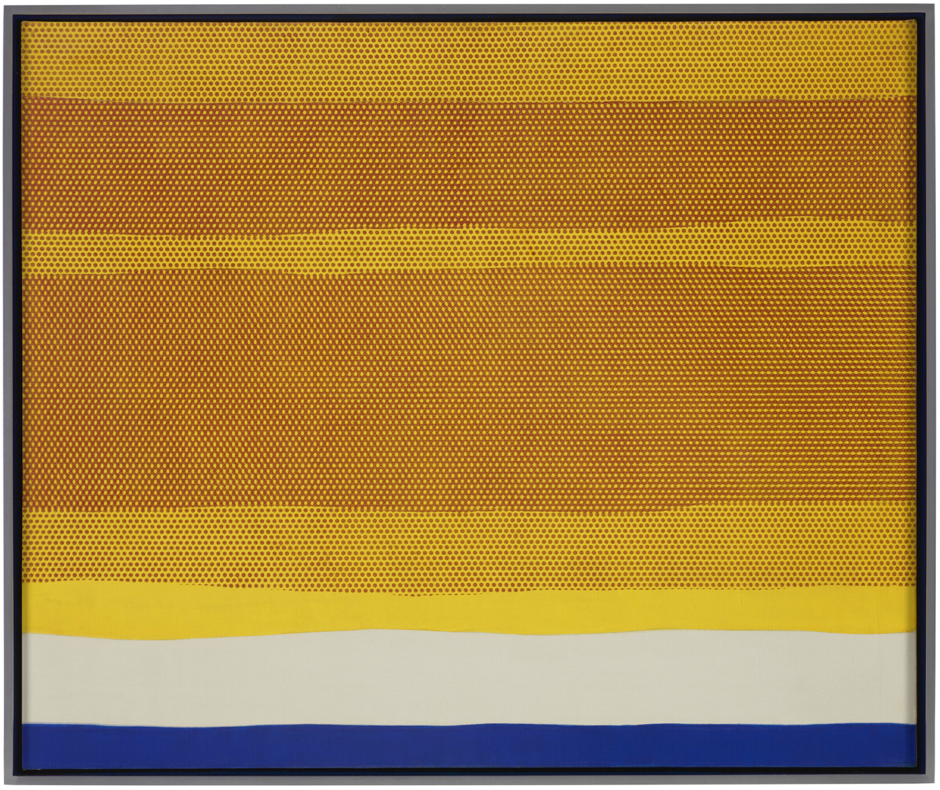
Purple Range, 1966
Purple Range, 1966
Sotheby’s New-York: 13 May 2024
Estimated: USD 3,000,000 – 4,000,000
USD 3,690,000
Purple Range | Contemporary Evening Auction | 2024 | Sotheby’s (sothebys.com)
ROY LICHTENSTEIN (1923 – 1997)
Purple Range, 1966
Acrylic, oil and graphite on canvas
36×48 inches (91.4 x 121.9 cm)
Signed and dated ’66 (on the reverse)
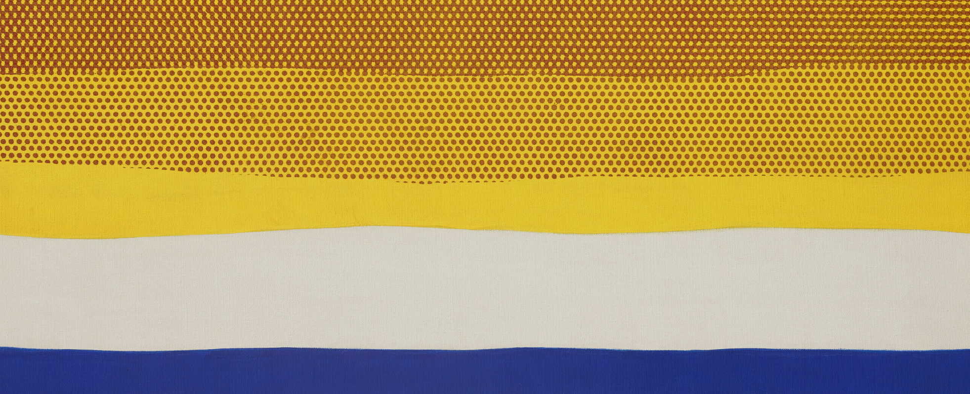
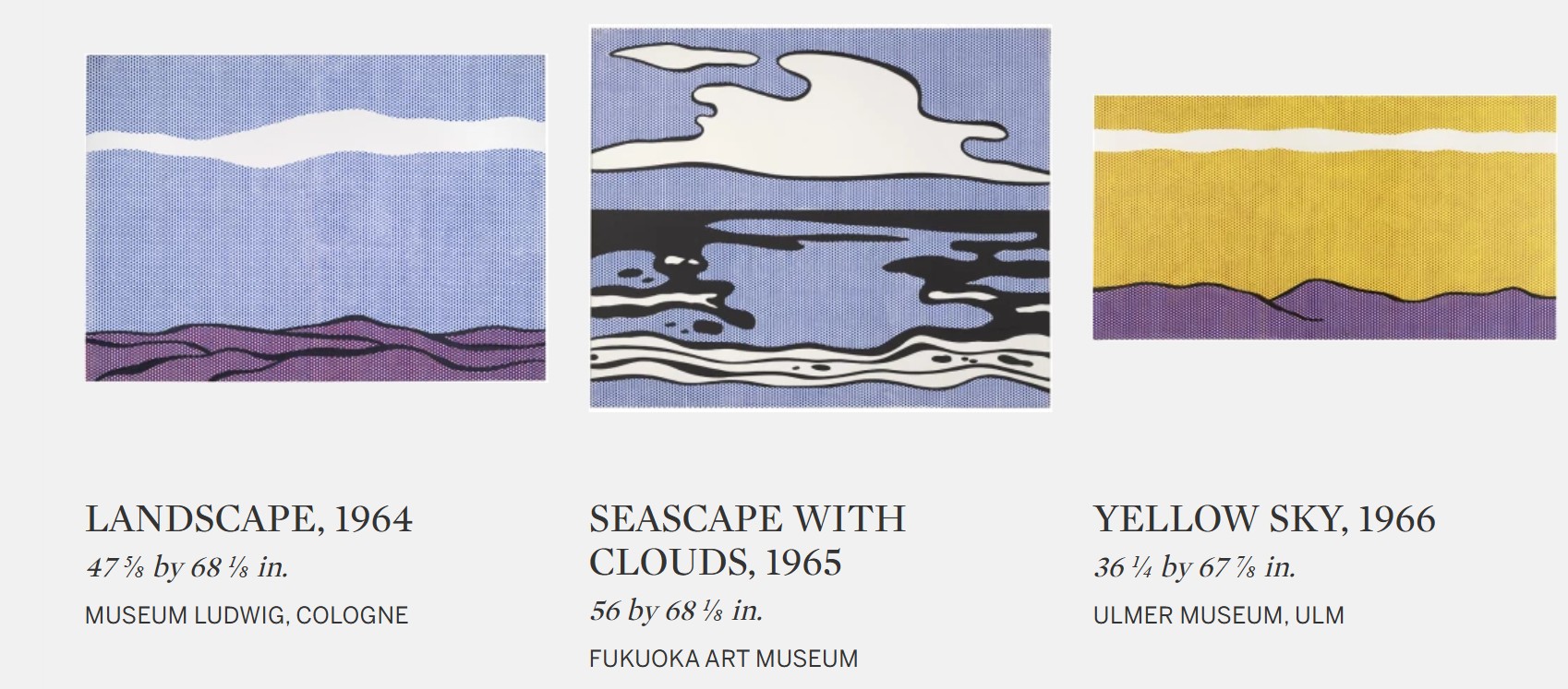
Roy Lichtenstein’s Purple Range is a highly sophisticated example of the Landscape series that was pivotal in defining the artist’s signature Pop idiom. Executed in 1966, Purple Range dates to the first decade of Lichtenstein’s mature output, during which he pioneered his signature Pop aesthetic, appropriating comic books and the language of mass printing. Only a few years prior, Lichtenstein’s paintings of blonde comic-inspired bombshells launched the artist into international acclaim; the present work sees Lichtenstein take the same language of commercial imagery and apply it to landscape. One of Lichtenstein’s earliest and most revisited subject matters that would form the foundation of his Pop vision, the landscape signified the sentiment of a mythical American ideal, as embodied by the saturated, cinematic atmosphere in Purple Range. Testifying to the significance of his landscapes, other examples are held in prestigious international museums, such as Whitney Museum of American Art, New York; Museum Ludwig, Cologne; Fondation Louis Vuitton, Paris, including Purple Range’s sister work, Yellow Sky from 1966, held in the collection of Museum Ulm in Germany. With its keyed-up primary hues, elegantly bolded lines, and trademark Ben-Day dots, Purple Range encapsulates the enduring potency of Lichtenstein’s signature Pop aesthetic and visual language, whilst showcasing the inventive mind of an artist at the zenith of his extraordinary career.

ROY LICHTENSTEIN AND LEO CASTELLI, C. 1960S. PHOTO UGO MULAS © UGO MULAS HEIRS, ALL RIGHTS RESERVED. ART © ESTATE OF ROY LICHTENSTEIN
Purple Range’s illusory depth is both inventively sleek and deeply moving: the regimented execution of Ben-Day recalls techniques of mechanical reproduction, while the expansive sky evokes a sense of imposing grandeur. In the pointillist tradition of Seurat, Lichtenstein conjures an elegantly articulated purple strip spanning across the bottom quarter of the canvas, which serves as a source of gravity for the ephemeral vastness evoked by the undulating yellow sky above, which is punctuated by dots of red. By employing the dot patterning commonly used in printing imagery, known as Ben-Day dots, Lichtenstein emphasizes the industrial mode through which his pop culture icons are transmuted. Demonstrating Lichtenstein’s interest in the mechanics of Ben-Day dots to produce nuanced hues of color from the primary shades, the purple we see in the present work is constructed of blue and red points. Lichtenstein alternates the dots such that they create an optical illusion and read to the viewer as purple; closer inspection reveals the artifice inherent to its production as the purple breaks down into its primary components of blue and red.

Drawing inspiration from concurrent, increasingly predominant Minimalist tastes in New York City, Purple Range offers a graphic reduction of familiar architectonic landscapes: the rolling hills and expanse of sky, with all its permutations of light and dark, shadow and reflection, become a flat amalgam of lines, shapes and color. Meanwhile, its nuanced organic forms become rigid and geometric, as if nature’s disorder is ironed out to become a highly composed arrangement. In doing so, Purple Range exemplifies one of the most important innovations of Lichtenstein’s career: the creation of a wholly original visual lexicon, befitting the consumerist modern era of the late 20th century by drawing from a rich compendium of art historical references and ultimately culminates in a captivating homage to the past.

Nostalgic and filmic, the topography of Purple Range elicits lost vistas of the Western epic, of lone rangers and pioneering adventurers, while retaining its formal sophistication. As a landscape, Purple Range presents a moment of quiet and contemplation, yet it nonetheless speaks strongly to his interest in popular culture as a meditation on art production as it is inflected by mass consumption. In 1966, the same year as the present work, Lichtenstein asserted his conviction that “almost all of the landscape, all of our environment seems to be made, partially, of a desire to sell products. This is the landscape that I am interested in portraying” (the artist in conversation with Alan Solomon quoted in: Graham Bader, “Emptied Gesture: Roy Lichtenstein’s “Brushstrokes,” Artforum, Summer 2011 (online)).

As evidence of his intention to “make a beautiful sky that would stop your eye as you went by a store,” Purple Range depicts a clichéd image that verges on the kitsch (Ibid). Purple Range is not an actual landscape, but rather the stereotype of a fictive landscape – one that is quintessentially optimistic and American. It draws on images on the providential abundance of the American frontier and the American dream, indelibly ingrained into a shared public consciousness. By reducing all extraneous pictorial detail and traces of narrative to an absolute minimum, Lichtenstein bestows on Purple Range an emblematic fixity that transcends the here and now to create a monolithic image of monumental and enduring presence. Through Lichtenstein’s process of manipulation and reframing, his image of the lone mountain ridge comes closer to the Platonic ideal of comic book style than the comic book source itself. Purple Range is an exemplar of Roy Lichtenstein’s 1960s praxis: a bold, graphic depiction of an instantly recognizable subject, executed in the chromatic saturation of popular comic books.
Eventide, 1964
Eventide, 1964
Christie’s New-York: 10 November 2022
Estimated: USD 600,000 – 800,000
USD 1,380,000
ROY LICHTENSTEIN (1923-1997) (christies.com)
ROY LICHTENSTEIN (1923-1997)
Eventide, 1964
Oil and Magna on canvas
30 x 35 7/8 inches (76.2 x 91.1 cm)
Signed and dated ‘rf Lichtenstein ’64’ (on the reverse)
One of the artist’s most conceptually compelling works, Eventide captures a rare meditative pause — a moment of contemplation that is further emphasized when compared to Roy Lichtenstein’s otherwise bold oeuvre of 1960s paintings inspired by America’s post-war consumer boom. This unique work epitomizes Lichtenstein’s – and Pop Art’s -enduring exploration of the connections between popular culture and fine art. Eventide’s structural elements appear as an easily digestible landscape; however, upon close examination, the viewer is immediately allured into the intricate details of each Ben-Day dots. Lichtenstein championed this dot painting technique — derivative of the mechanical printing method invented by Benjamin Day in the late-nineteenth century — to capture the qualities of color and texture, as seen in comic books. Working with stencils, the artist would produce rows of larger-than-life Ben-Day dots, each made to look mechanically reproduced. Despite his explicit imitation of the process of mechanical reproduction, the viewer is still able to revel in the captivating traces of the artist’s hand. Lichtenstein would diligently fill in each and every dot by hand; the dots are individually characterized by their subtle yet nuanced imperfections, engendering an intimate relationship between the artist and the artwork, and in turn, the artwork and, in turn, the viewer.

In addition to its visual prowess, Eventide’s illustrious provenance enriches Lichtenstein’s significant connection to the American zeitgeist of the 1960s. For almost twenty years, it was a core part of television mogul Douglas Cramer’s art collection. Cramer was an innovative television producer, creating iconic television series such as Wonder Woman, The Brady Bunch, and Batman, in which he integrated Lichtenstein’s trademark Pop Art style. Eventide’s illusory depth is at once disconcerting and deeply moving: the regimented execution of Ben-Day dots conjures feelings of industrial alienation while the expansive sky arouses a sense of oscillating movement. Lichtenstein’s convergence of two distinct modes of mark-making — uniting the quasi-pointillist sky with flattened strips of unmodulated color — imbues the composition with a heightened intrigue. The blue and light pewter strips spanning across the bottom quarter of the canvas ground the work; they operate as a source of gravity for the ephemeral vastness aroused by the undulating red and yellow horizon. The landscape’s horizon, intimated by the stylistic transition from flat strips of paint to the field Ben-Day dots, anchors the painting in reality. It draws the viewer’s focus back to the painting’s surface, foregrounding the flatness of the canvas.
A hypnotic progression of receding shadows, the alternating bands of red and yellow dots are likewise referential to mass media, recalling the early two-color technique of mass-commercial printing. Eventide exemplifies Lichtenstein’s intellectual exploration of semiotics. In referencing the iconic sign of landscape as an alternative to its symbolic significance, the artist once again directs our attention to the reality of this work as an object whose evocative presence depends on its cultural relevance.
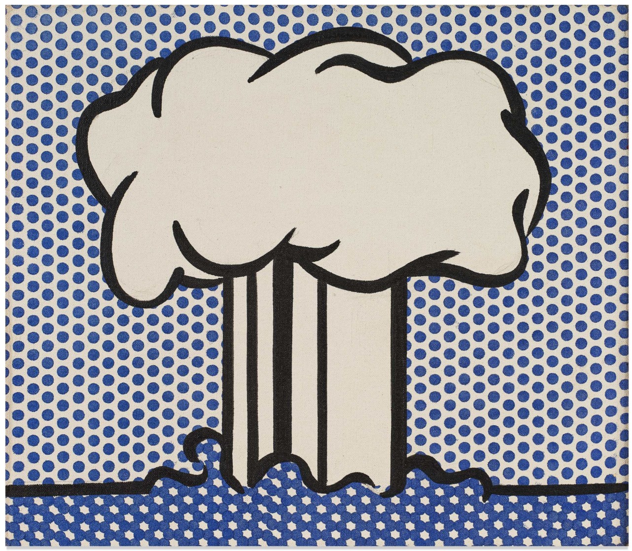
Atomic Landscape, 1966
Atomic Landscape, 1966
Works from the Collection of Dorothy and Roy Lichtenstein
Sotheby’s New-York: 15 May 2025
Estimated: USD 700,000 – 1,000,000
USD 1,636,000
Atomic Landscape | The Now and Contemporary Evening Auction | 2025 | Sotheby’s
ROY LICHTENSTEIN (1923 – 1997)
Atomic Landscape, 1966
Acrylic, oil and graphite on canvas
14 x 16 1/8 inches (35.6 x 41 cm)
Signed and dated ’66 (on the reverse)
In the early 1960s, as Roy Lichtenstein developed his now-ubiquitous Pop art approach to the imagery of postwar consumer- and mass culture, he dedicated his attention almost entirely on the common object. Beginning in 1961, and continuing in its greatest concentration through 1963, Lichtenstein narrowed the scope of each of his works to the study of a single motif, rendered in its most essentialized, graphic form. In Atomic Landscape, executed just a few years later in 1966, Lichtenstein makes the incisive yet almost mindless substitution of the household good for the eponymous atomic bomb. In this sly elision of subject matter, Lichtenstein signals the commodification of the atomic bomb itself: the transformation of this symbol of cataclysmic disaster into an object manufactured and proliferated by the mass media. In so doing, Lichtenstein engages the viewer in a tantalizing game of association through which he expounds upon the crux of his career-long artistic thesis: the inextricable relationship between the image and its mode of representation.

The present work installed in the artist’s studio, 2004. Photo © Eric Boman. Art © Estate of Roy Lichtenstein
As is the case with Atomic Landscape, Lichtenstein’s broader single-subject series conveys consumer society in the form of paradigms. Isolated against solid or half-tone backgrounds, these generic descriptions of household goods are transformed into depersonalized object-types which call upon their reference image as effectively as they dematerialize it. Despite their intimate scale, the austerity of the composition monumentalizes the banality of the commonplace, elevating the commodity to the centrality and grandeur of a portrait. In reducing the image down to its graphic elements, Lichtenstein draws attention to the way in which mass consumption has made the American public fluent in reading signs and symbols as stand-ins for the object being advertised. At the same time, however, Lichtenstein also deconstructs the marketing tactics inherent to this mode of representation. When taken in sequence with this earlier series, Lichtenstein engenders a certain naivete into the mode of presentation within Atomic Landscape which absolves the viewer of their unflinching consumption of the image he presents before them. It is the seeming ease with which he transfers the hard, unsentimental visual language used to describe a peanut butter cup or a ball of twine onto the intrinsically violent motif of the bomb which makes Atomic Landscape so striking.
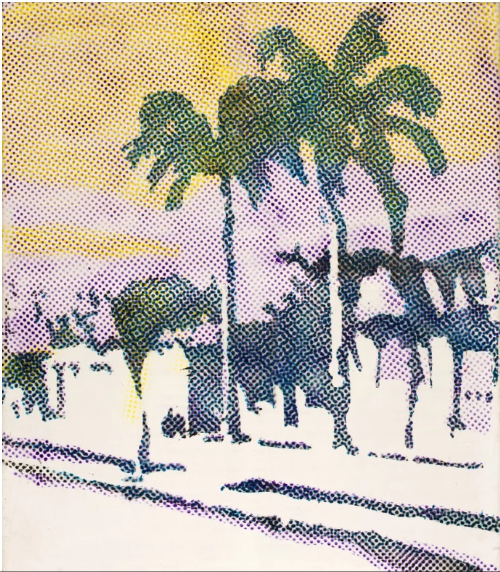
Sigmar Polke, Palmen, 1968. San Francisco Museum of Modern Art.
Art © Estate of Sigmar Polke / Artists Rights Society (ARS), New York / VG Bild-Kunst, Bonn, Germany
This juxtaposition, which imbues Atomic Landscape with its dynamism, is precisely the same tactic which Lichtenstein explains is at the center of his broader artistic project in these early years: an interest “in using highly charged material… (highly emotional subjects) in a very removed, technical, almost engineering drawing style.” (Exh. Cat., London, Levy Gorvy, Source and Stimulus: Polke, Lichtenstein, Laing, March – April 2018, p. 12) A remarkable testament to his incisive eye for draughtsmanship and his dexterity in the language of commercialized printing, Lichtenstein is able to conjure the unmistakable image of the mushroom cloud through the simple arrangement of negative space within a black outline. In its static simplicity, he likewise captures something of the deafening impact of the bomb itself—an effect akin to the shockwave which paralyzes and silences in the aftermath of the nuclear explosion. Though perhaps inadvertently, Lichtenstein’s ubiquitous Ben-Day dots take on a similarly heightened resonance in the context of the present work. As much as they serve to emulate the mechanical, unsympathetic language of the mass-produced image, the dot likewise serves as an evocation of the atomic particle. The dizzying regularity of their application throughout the sky and the drastic change in the density of their application to the water offers a particularly apt visualization of the behavior of the chemical and energetic explosion that he takes as his subject.
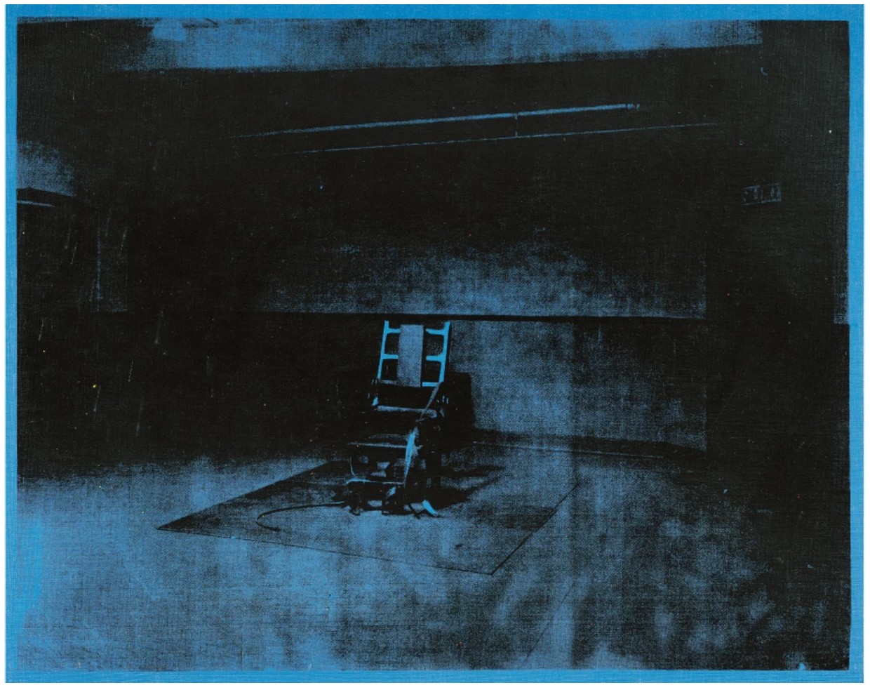
Andy Warhol, Little Electric Chair, 1964-5. Private Collection.
Image © 2025 The Andy Warhol Foundation for the Visual Arts, Inc. / Licensed by DACS, London / Christie’s Images / Bridgeman Images. Art © 2025 Andy Warhol Foundation for the Visual Arts / Artists Rights Society (ARS), New York
Laced throughout Atomic Landscape is an implicit political critique, not, as the artist explains, on foreign or domestic policy so much as it is on the normalization and valorization of violence as expounded by the mass media. The lack of emotional resonance within the work directly correlates to the lack of excess within the composition—a result achieved through Lichtenstein’s use of a generalized reference rather than specific source material. In this generalization, Lichtenstein not only outsources his imagery but his agency over the image as well. In so doing, he creates a critical distance between his subjectivity as an artist and the objectivity of the final work. In his contemporaneous series of Men at War, Lichtenstein similarly appropriates and reproduces mass produced imagery, this time of panels from comics depicting young men in battle. These vignettes at first seem to revel in boyhood fantasies of fearless heroes, exaggerating the intensity and danger of their bravery through the graphic concentration of their action. And yet, when taken out of context of the broader narrative of the long-form comic, these freeze-frames also come to express the violence that constitutes the most destructive aspects of hyperbolic masculinity which these comics, and by extension popular media, stand to promote. Atomic Landscape marks a distillation of this thematic interest down to a representative motif, the explosion, which for Lichtenstein came to increasingly serve as a subject in its own right.
Roy Lichtenstein’s 1960’s landscapes in Museum Collections
This fascination with our changing relationship to images as brought about by the proliferation of consumerism and a corresponding supersaturated image economy served as the lynchpin for the Pop art movement more broadly. As exemplified in Atomic Landscape, Lichtenstein quickly became adept at creating art which functioned like media: repetitive, impersonal, cool and reserved, yet altogether eye-catching. Here, the commercially derived flatness of his composition signals the reproduced nature of the image-type. As such, the work bears a conceptual kinship with his Pop contemporary Andy Warhol’s famed Death and Disaster series. In Atomic Landscape, as in Atomic Bomb, both artists flatten the sensational, emotional content of the horrific images which they take as subject, reproducing the charged image in the same unflinching mode of address that a newspaper or comic book does. In replicating this effect of popular imagery, both Lichtenstein and Warhol force their viewer to differentiate between the violence of the news and, for example, the glamor of celebrity—all types of consumerism, all presented in the same visual language. And yet unlike Warhol, who adopted the mechanical technique of silkscreening and schematized the idea of reproduction through the gradually distorted repetition of a real image, Lichtenstein works with ersatz stereotypes which admit to being reproductions. Where Warhol numbs his viewer by over-exposing them to an image within the same canvas, Lichtenstein presents them with an image that has already been over-exposed.
Claude Monet, The Gare St. Lazare, Paris, 1877. Musée d’Orsay, Paris. Image © Bridgeman Images
From Barnett Newman’s reactionary turn away from representational imagery in the face of the overwhelming devastation of the mid-21st century, to Salvador Dalí’s thematized explorations of nuclear fusion and fission, the cultural, scientific and geopolitical impact of the atomic bomb provided the impetus for a myriad of artistic explorations into the subject by Lichtenstein’s contemporaries. Atomic Landscape is a pendant to a slightly larger canvas of the same composition, entitled Atomic Burst, which Lichtenstein produced as his contribution to the 1966 project, Artists’ Tower of Protest. Spearheaded by artists Irving Petlin and Mark di Suvero, the collaborative installation was staged in West Hollywood, Los Angeles, as a protest against US involvement in the Vietnam war. The tower and fence which surrounded it were covered in over four hundred 24-by-24 inch panels, a show of overwhelming support in response to the open call for artists to submit works in support of the cause. However, in its matter-of-fact simplicity, Lichtenstein’s illustration of the atomic bomb is seemingly devoid of any political or subjective commentary. Despite the charged symbolism, the central aim of his work was to call upon, and in turn call out the way in which the proliferating culture of mass-production has desensitized the American public to the emotional resonance of images. In this context, Atomic Landscape comes to stand as a warning, not against the bomb itself, but against a visual culture which has made a stereotype of it.
Seascapes
Landscape, 1965
Phillips New-York: 12 March 2024
Estimated: USD 70,000 – 100,000
USD 63,500
Roy Lichtenstein – New Now New York Lot 29 March 2024 | Phillips
ROY LICHTENSTEIN
Landscape, 1965
Rowlux collage on board
14 x 20 7/8 inches (35.6 x 53 cm)
Signed and dated “rf Lichtenstein 1965” on the reverse
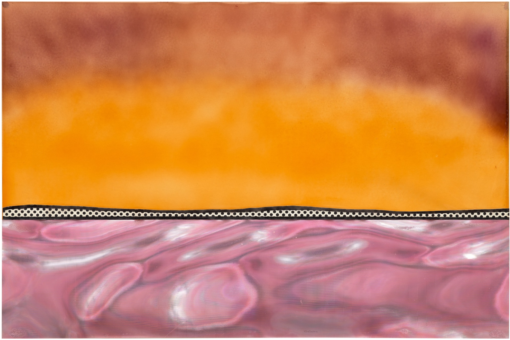
Roy Lichtenstein’s Landscape marries the warmth of an untamed ocean sunset with aspects of industrial consumerist culture. Executed in 1965 during his landscape period, the work is an amalgamation of iridescent pinks and oranges with Lichtenstein’s signature vocabulary of Ben-Day dots and black outlines. Most ingeniously, however, the artist’s usage of Rowlux in Landscape’s bottom third – a shiny plastic sheeting originally employed for highway signage – creates ever-changing surfaces when viewed from different angles. As a central player of the American postwar Pop Art movement, Lichtenstein is most recognizable for his tongue-in-cheek works based on mass-culture imagery. In a series of collages from 1964-1966, Lichtenstein sought to grow beyond comic book motifs, and turned his graphic visual language towards images of nature — one of the earliest genres he employed and one he returned to consistently.
As Clare Bell of the Lichtenstein Foundation has further pointed out, Lichtenstein explicitly stated that he wanted his landscapes to look ‘vulgar’; in this manner, we can see Lichtenstein’s approach to landscape as intentionally unrefined. Lichtenstein’s landscapes are also unique in their lack of spatial recession and their collaged materials, the textural properties of which mimic those evoked by the landscape itself. “Lichtenstein considered Rowlux ‘a sort of ready-made nature… [its] brilliant reflections… like real water reflecting real sunlight,’ rendering it the perfect material with which to articulate the tension between two- and three-dimensional space.” Lichtenstein’s 1960s landscape series would go on to directly influence his film Three Landscapes in 1971: a testament to the artist’s interest in cinema and dedication to cross media experimentation. Thus, Landscape serves as a seminal example of Lichtenstein’s ability to translate popular culture into striking art objects via abstraction.
Collage for Seascape, 1964
Phillips New-York: 16 May 2023
Estimated: USD 70,000 – 100,000
USD 101,600
Roy Lichtenstein – 20th Century & Conte… Lot 161 May 2023 | Phillips
ROY LICHTENSTEIN
Collage for Seascape, 1964
Rowlux and painted paper collage
17×22 inches (43.2 x 55.9 cm)
Signed and dated “rf Lichtenstein 1964” on the reverse of the painted sheet
This work is the original study for Roy Lichtenstein’s print Seascape from the New York Ten portfolio
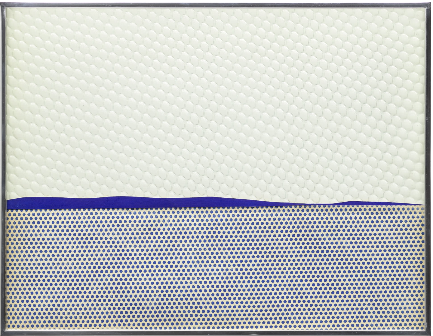
Roy Lichtenstein’s Collage for Seascape is a preparatory study for the New York Ten Portfolio, envisioned and published by Rosa Esman’s Tanglewood Press in 1965. Described by Rosa as a mix of “op and pop” artists, the portfolio included editioned works by ten New York-based artists whose artistic practices both differed from and complemented one another. In addition to Oldenburg and Lichtenstein, the portfolio included works by Tom Wesselmann, Richard Anuszkiewicz, Jim Dine, Helen Frankenthaler, Nicholas Krushenick, Robert Kulicke, Mon Levinson, and George Segal. Each artist created an editioned print of 100 using just three colors, and the portfolio was a huge success, with all prints selling out within six months. This collage is an intimate representation of Lichtenstein’s graphic practice and his affinity for using appropriated design and imagery in his works. Textured Rowlux is placed atop a horizon line of blue pigment, beneath which lies an ocean of his signature Benday dots. The result is Lichtenstein’s own, stylized interpretation of a seascape, as imagined by the Pop pioneer.
Seascape #16, 1966
Phillips Hong-Kong: 7 June 2021
Estimated: HKD 550,000 – 750,000
HKD 693,000 / USD 89,313
Roy Lichtenstein – 20th Century & Cont… Lot 187 June 2021 | Phillips

ROY LICHTENSTEIN
Seascape #16, 1966
Rowlux, Mylar and cut-and-pasted printed paper on board, originally with motorised lamp
22×24 inches (56×61 cm)
Signed and dated ‘rf Lichtenstein ’66’ on the reverse
Pop Art was an era-defining movement of postwar America, and Roy Lichtenstein one of its central players. With his instantly recognizable, tongue-in-cheek artworks based on mass culture imagery, Lichtenstein triumphantly challenged the traditions of fine art and instilled a new form of ‘anti-art’ in the canon of art history. In the mid-1960s, wanting to grow beyond the comic book motifs that had brought him to prominence, Lichtenstein turned his formal graphic vocabulary of Ben-Day dots, black outlines, and pure, unmodulated color towards creating a series of sublime images of the sea and sky, a theme he returned to repeatedly over the course of four decades. These imaginary landscapes and seascapes were pared down to a series of essential lines and moiré textures representing the horizon line, streaks of cloud and gently rippling waves. Abstraction freed Lichtenstein to experiment with materials and optical effects, coinciding with the dazzling rise of the Op Art, a movement which first emerged in 1964.
Bridget Riley, Fall, 1963 © Bridget Riley 2020
Seascape #16 is one of the seminal works of this era. Central to Lichtenstein’s radical series of seascapes, landscapes, and even moonscapes, was the use of Rowlux and Mylar, shiny sheets of plastic that created the illusion of unstable, shifting surfaces at different angles. Originally used for highway signage, Lichtenstein was drawn to their iridescent, almost holographic quality that mimicked the shimmering and ephemeral effects of light and water. First discovered by Lichtenstein in a novelty store, their industrial, ready-made nature appealed to Lichtenstein’s innate sense of creativity. Lichtenstein also gave free rein to his long-held fascination with kinetics, incorporating backlights and electric motors into many works of this period to add a fourth dimension to the viewer’s experience.
Seascape #16 was considered important enough to be included in Lichtenstein’s first museum survey, a retrospective in 1967 which started at the Pasadena Art Museum and traveled to the Walker Art Center, Minneapolis. In 2015 a collaboration between Guild Hall and the Roy Lichtenstein Foundation, “Roy Lichtenstein: Between Sea and Sky”, further profiled the artist’s exploration of the land- and seascapes genre. Today Lichtenstein’s sculptures and paintings are regarded as generational icons.