WORK IN PROGRESS
Introduction
In the 1940s and 1950s, American artists followed the modernist example of abandoning traditional artistic genres and styles in favor of reexaminations that shattered long-held tenets and startled the art audience and critics. Realistic subject matter, such as still-lifes, landscapes and figuration, gave way to abstraction in many forms that expressed the inner impulse of the artist in response to the society around him. Younger artists of the 1960s, Roy Lichtenstein key among them, were no less eager to find their own radical aesthetic means to challenge the style championed by the generation before them, in this case de Kooning, Pollock, Rothko and the other giants of the New York School. With a great sense of irony, many chose to subvert the equation, turning it on its head with a puckish sense of wit and independence. In the case of Lichtenstein, he returned to the realism of painting people and things, eschewing the emotive spirit of Surrealism in favor of the conceptualism of Dada, allowing him to investigate the mechanics of painting. Like Marcel Duchamp, he would question the nature of art by choosing subject matter from the everyday, thus becoming one of the founders of American Pop art. Lichtenstein collected and collated imagery from the plethora of printed sources available to American consumerist society in the economic hey-day of the late 1950s and 1960s – from the comic strips, magazines, newspapers and the copious world of print advertising.
Lichtenstein is acknowledged as the master of graphic clarity and a genius of image appropriation who crafted Pop art masterpieces that redefined the boundaries between High and Low art through an ironic interplay of popular culture and fine art. Along with the beautiful blondes of the romance comics and the explosive narrative of the war and adventure comics, the domestic object paintings are rendered onto Lichtenstein’s canvases with the most modern and graphic means, stressing their artificiality and their source by co-opting the same illustrative methods. With his invention of the Benday dot as his signature technique, coupled with the bold contour lines and reductive palette that he preferred, Lichtenstein created works that acknowledge the two-dimensionality of the image source and of the canvas surface.
In the paintings of the early 1960s, Lichtenstein would retain the cartoonist or commercial artist’s means for suggesting spatial depth. But in the early, more hand-painted canvases such as the present work and Girl with Ball (1961, The Museum of Modern Art, New York) Lichtenstein’s choice of a reduced color palette and his use of a flattened, Benday-dotted ground, purge any standard form of perspective or spatial depth from the painting. In the 2005 catalogue for the Kunsthaus Bregenz exhibition of the art’s work, Michael Lobel noted the extent to which these early Pop paintings illuminated Lichtenstein’s close study of commercial printing techniques. “Much has been made of Lichtenstein’s reduction of palette to black, white and the three primaries (red, yellow and blue) which is related not only to the standardized colors of mechanical printing but also to the chromatic reduction pursued by such earlier modernist painters as Piet Mondrian. In his earliest Pop-object paintings, Lichtenstein experimented with various color combinations within this reduced chromatic range.
Auction Results
#1. Ice Cream Soda, 1962
Sotheby’s New-York: 9 November 2010
Estimated: USD 12,000,000 – 18,000,000
USD 14,082,500
ROY LICHTENSTEIN
Ice Cream Soda, 1962
Oil on canvas
64 3/4 x 32 1/8 inches (164.5 x 81.7 cm)
Signed and dated ’62 on the reverse
#2. Hot Dog, 1964
Christie’s New-York: 12 November 2014
Estimated: USD 1,500,000 – 2,000,000
USD 4,421,000
Roy Lichtenstein (1923-1997), Hot Dog | Christie’s
ROY LICHTENSTEIN (1923-1997)
Hot Dog, 1964
Graphite, brush and India ink, pochoir and lithographic rubbing crayon on Japanese paper
26 1/2 x 50 inches (67.3 x 127 cm)
Signed and dated ‘rf Lichtenstein ’64’ (lower right)
#3. Cup of Coffee, 1961
Christie’s London: 15 June 2013
Estimated: GBP 1,500,000 – 2,000,000
GBP 2,805,875 / USD 4,325,070
ROY LICHTENSTEIN (1923-1997) , Cup of Coffee | Christie’s
ROY LICHTENSTEIN (1923-1997)
Cup of Coffee, 1961
Oil on canvas
19 7/8 x 16 inches (50.5 x 40.5 cm)
Signed and dated ‘Rf Lichtenstein ’61’ (on the reverse)
#4. The Ring, 1962
Christie’s New-York: 13 May 2008
Estimated: USD 3,000,000 – 4,000,000
USD 3,401,000
Roy Lichtenstein (1923-1997) , The Ring | Christie’s
ROY LICHTENSTEIN (1923-1997)
The Ring, 1962
Oil on canvas
14×14 inches (35.6 x 35.6 cm)
Signed, titled and dated ‘rf Lichtenstein ’62 “THE RING”‘ (on the reverse and on the overlap)
#5. Cherry Pie, 1962
Christie’s New-York: 10 November 2010
Estimated: USD 4,000,000 – 5,500,000
USD 3,218,500
Roy Lichtenstein , Cherry Pie | Christie’s
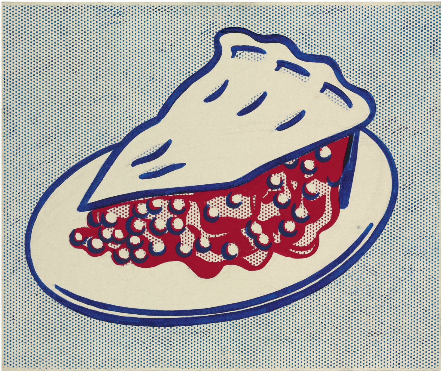
ROY LICHTENSTEIN
Cherry Pie, 1962
Oil and graphite on canvas
20 1/8 x 24 inches (51.1 x 61 cm)
Signed and dated ‘rf Lichtenstein ’62’ (on the reverse)
#6. Keds, 1962
Sotheby’s New-York: 14 November 2012
Estimated: USD 2,200,000 – 2,800,000
USD 2,602,500
WORK ON PAPER
Roy Lichtenstein (1923-1997) , Keds | Christie’s
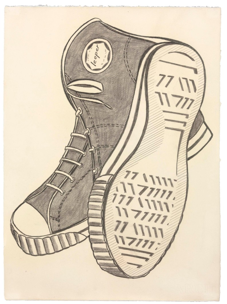
ROY LICHTENSTEIN (1923-1997)
Keds, 1962
Frottage and graphite on paper
22 3/8 x 16 3/8 inches (56.8 x 41.6 cm)
Signed and dated ‘rf Lichtenstein ’62’ (on the reverse)
Mustard on White, 1963
Christie’s London: 14 November 2012
Estimated: GBP 1,000,000 – 1,500,000
USD 962,500 / USD 1,299,800
Roy Lichtenstein (1923-1997), Mustard on White | Christie’s
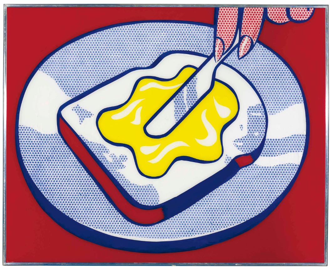
ROY LICHTENSTEIN (1923-1997)
Mustard on White, 1963
Magna on Plexiglas
24 1/2 x 30 1/2 inches (62.3 x 77.5 cm)
Peanut Butter Cup, 1962
Sotheby’s New-York: 4 March 2025
Estimated: GBP 1,000,000 – 1,500,000
GBP 1,019,000 / USD 1,304,320
Peanut Butter Cup | Modern & Contemporary Evening Auction | 2025 | Sotheby’s
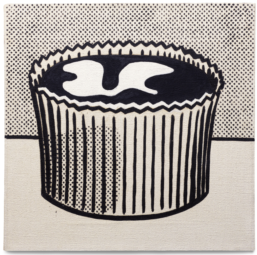
ROY LICHTENSTEIN (1923 – 1997)
Peanut Butter Cup, 1962
Oil on canvas
14×14 inches (35.6 x 35.6 cm)
Titled (on the overlap)
Signed and dated ’62 (on the reverse)
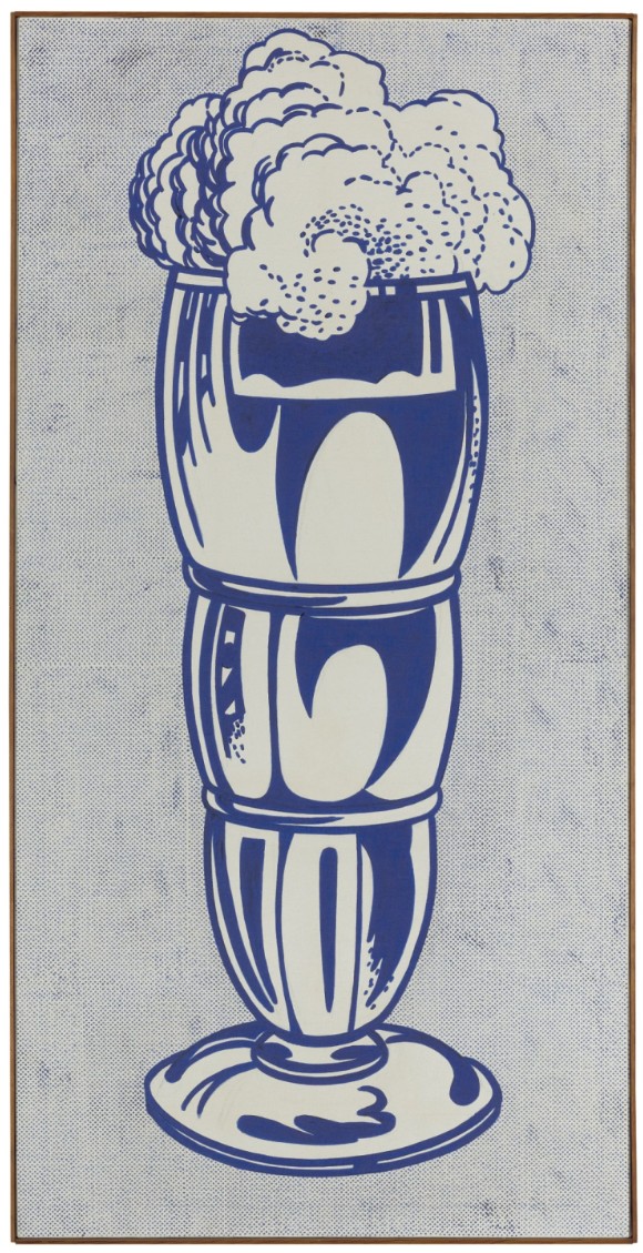
Ice Cream Soda, 1962
Ice Cream Soda, 1962
Sotheby’s New-York: 9 November 2010
Estimated: USD 12,000,000 – 18,000,000
USD 14,082,500
ROY LICHTENSTEIN
Ice Cream Soda, 1962
Oil on canvas
64 3/4 x 32 1/8 inches (164.5 x 81.7 cm)
Signed and dated ’62 on the reverse
Provenance
Leo Castelli Gallery, New York (LC# 34)
Acquired by the present owner from the above in March 1962
Ice Cream Soda, from 1962, is a momentous example of the masterpieces that Lichtenstein painted in the early 1960s that are now part of our cultural heritage. Sourced as a Duchampian “ready-made”, such found imagery had little association with narrative subject matter or painterly mark-making, allowing Lichtenstein to render the act of making art the ultimate subject of his oeuvre. Through both technique, composition and subject, Ice Cream Soda is a stunning example of the single-object still-lifes that are the essence of Lichtenstein as a Pop innovator.
Lichtenstein is acknowledged as the master of graphic clarity and a genius of image appropriation who crafted Pop art masterpieces that redefined the boundaries between High and Low art through an ironic interplay of popular culture and fine art. Along with the beautiful blondes of the romance comics and the explosive narrative of the war and adventure comics, the domestic object paintings such as Ice Cream Soda are rendered onto Lichtenstein’s canvases with the most modern and graphic means, stressing their artificiality and their source by co-opting the same illustrative methods. With his invention of the Benday dot as his signature technique, coupled with the bold contour lines and reductive palette that he preferred, Lichtenstein created works that acknowledge the two-dimensionality of the image source and of the canvas surface. In the paintings of the early 1960s, such as Ice Cream Soda, Lichtenstein would retain the cartoonist or commercial artist’s means for suggesting spatial depth, as in the deep blue curves and swirls that denote reflections on the soda glass, and chose to portray the foaming head of soda and ice cream as spilling over the front rim of the glass. But in the early, more hand-painted canvases such as the present work and Girl with Ball (1961, The Museum of Modern Art, New York) Lichtenstein’s choice of a reduced color palette and his use of a flattened, Benday-dotted ground, purge any standard form of perspective or spatial depth from the painting. In the 2005 catalogue for the Kunsthaus Bregenz exhibition of the art’s work, Michael Lobel noted the extent to which these early Pop paintings illuminated Lichtenstein’s close study of commercial printing techniques. “Much has been made of Lichtenstein’s reduction of palette to black, white and the three primaries (red, yellow and blue) which is related not only to the standardized colors of mechanical printing but also to the chromatic reduction pursued by such earlier modernist painters as Piet Mondrian. In his earliest Pop-object paintings, Lichtenstein experimented with various color combinations within this reduced chromatic range. For instance, at times he used blue as a substitute for black, as in such paintings as Peanut Butter Cup and Ice Cream Soda. In a 1967 interview Lichtenstein commented on this substitution, which he claimed to have derived from a common practice in commercial art: ‘I like the idea of blue and white very much because a lot of commercial artists use it to get a free color. Blue does for black as well; it is an economic thing. So I liked the idea of an apparent economic reason for making one color work as two colors.’ ” (Exh. Cat., Bregenz, Kunsthaus Bregenz, Roy Lichtenstein – Classic of the New, 2005, p. 20)
His single-object paintings of 1961 to 1963, including the present work and Golf Ball, Tire (The Museum of Modern Art, New York) and Curtains (St. Louis Art Museum), all from 1962, are the purest form of image-making to be found anywhere in Lichtenstein’s oeuvre. With the impact of a logo, sign-post or religious icon, they reduce consumer and mass culture to a common denominator. While artists such as Johns might choose “found” images as a means to focus on the formal properties of paint, Rauschenberg, Lichtenstein and Warhol were fully aware that the viewer’s preconceptions of objects would be as integral a part of their perception of the work as color, composition or technique. Whether Warhol culled images from advertising as in Telephone [2] or movie fan magazines as in his Marilyn portraits, the impact and undercurrents of the subjects was a cornerstone of his aesthetic intent. The frothy, inviting subject of Ice Cream Soda has a strong cultural resonance, particularly for Lichtenstein’s audience of the 1950s and 1960s. The soda fountain – whether in a local luncheonette, diner or drugstore – was a social magnet, particularly for the teens and adolescents. Norman Rockwell’s The Soda Jerk appeared on an August 1953 cover of The Saturday Evening Post as one of the artist’s quintessential depictions of Middle America. The glow of young innocence, the spark of flirtation and the requisite family dog all speak of the ease and prosperity of young America, especially as experienced by the youths and teenagers unaffected by the war years of the previous decades. The ice cream soda itself was invented in Philadelphia in the 1870s during that city’s sesquicentennial when a vendor wanted to attract more customers to his stand – another example of American innovation and ingenuity.
The Pop-object paintings also are a harbinger of the 1980s Still-life paintings to come and an early indication of Lichtenstein’s ultimate subject: art about art. In the coming decades, Lichtenstein would engage with the traditional genres abandoned by his 20th century predecessors in order to grapple with the meaning and purpose of art. Just as Old Master Dutch still-life’s are a coded and symbolic representation of the mores or class or life styles of their owners, Lichtenstein understood that the objects of our time and our surroundings have loaded meanings that can be rendered in a distant and graphic manner but may never be empty of reference. The multi-faceted meaning of subject matter, whether overt or subtle – and the dialectic about the place of art between Low and High culture is certainly a terrain still well traveled by artists of today, such as Jeff Koons.
Lichtenstein’s pre-Pop paintings of the 1950s had been exhibited in New York, but it was not until the paintings of 1960 and 1961 that his work came to the attention of a gallery poised to catapult itself and its artists to the forefront of American Art. The suave and shrewd Leo Castelli made his mark as curator of the avant-garde Ninth Street show in 1951 that was the result of a protest by the New York School artists against juried exhibitions of the day. Castelli did not open his own gallery until February 1957. By early 1958, Jasper Johns and Robert Rauschenberg joined the gallery and were given solo shows, making Castelli’s gallery the ambition of aspiring young painters. The painter and proponent of Happenings, Allan Kaprow, arranged a meeting for Lichtenstein with Ivan Karp, the director of Castelli’s gallery and soon Castelli gave Lichtenstein the first of many shows at his gallery. Ice Cream Soda was acquired in March 1962 from the Castelli gallery, the same month as the artist’s inaugural show, and has remained in the same collection since that time.
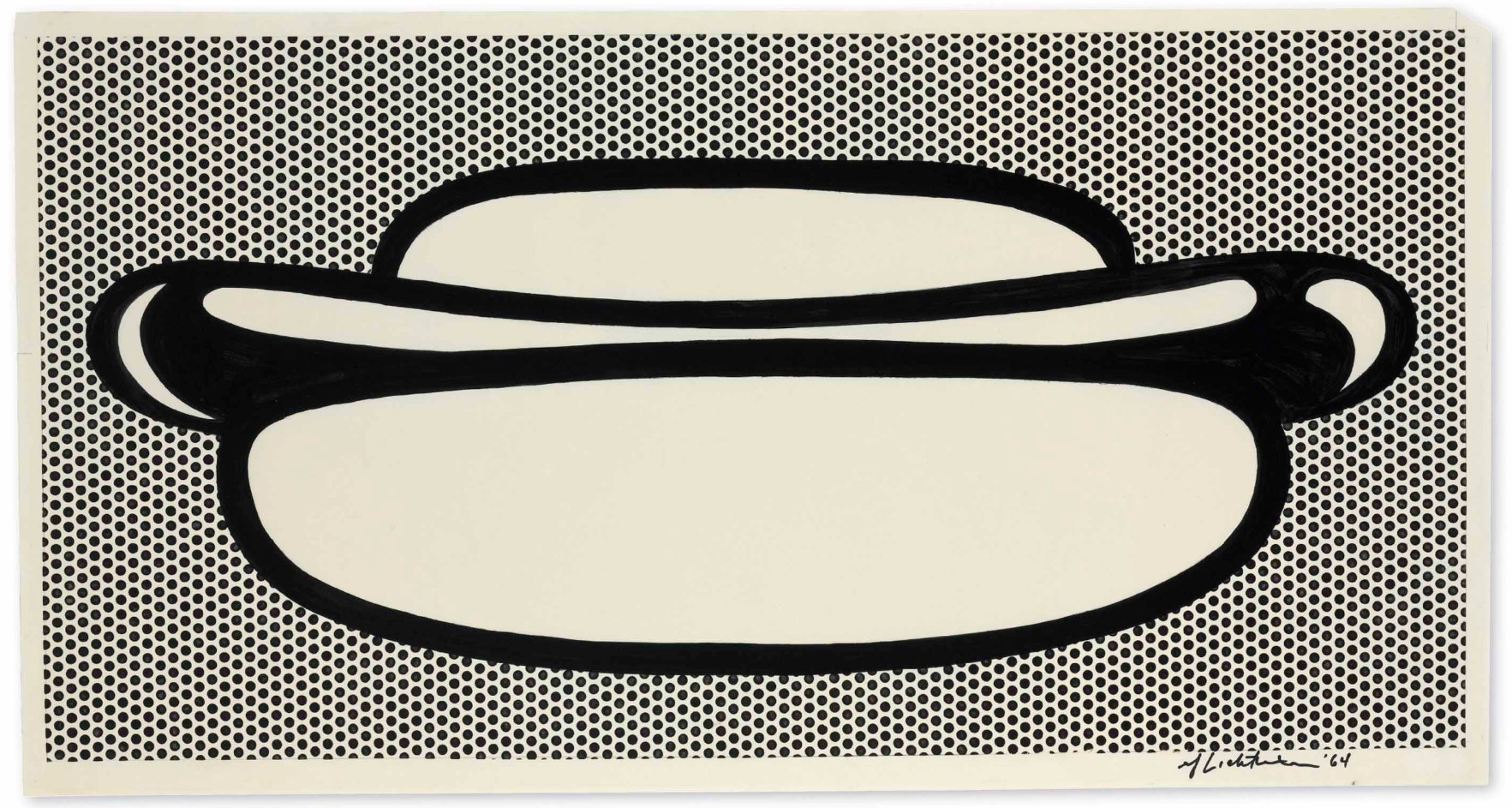
Hot Dog, 1964
Hot Dog, 1964
Christie’s New-York: 12 November 2014
Estimated: USD 1,500,000 – 2,000,000
USD 4,421,000
WORK ON PAPER
Roy Lichtenstein (1923-1997), Hot Dog | Christie’s
ROY LICHTENSTEIN (1923-1997)
Hot Dog, 1964
Graphite, brush and India ink, pochoir and lithographic rubbing crayon on Japanese paper
26 1/2 x 50 inches (67.3 x 127 cm)
Signed and dated ‘rf Lichtenstein ’64’ (lower right)
Provenance
Acquired directly from the artist by the present owner, mid 1960s
Distinguished by its crisp, clean lines and the visual purity of the Ben-Day dots, Roy Lichtenstein’s master drawing Hot Dog is one of the most impressive works of the artist’s early career. Executed in 1964, this large-scale work is a superlative example of the way in which Lichtenstein distilled the visual cacophony of mass culture and consumerism of the postwar period into his own iconic Pop Art language. Drawn entirely by hand, Hot Dog celebrates an American icon, which, along with Coca-Cola, came to signify the promise of the American dream. Ubiquitous and consumed in the millions, the hot dog was the perfect symbol of American values in the boom years of the 1950s, and the instantly recognizable form of the iconic foodstuff proved to be the perfect subject matter for Lichtenstein’s new language of art. Lichtenstein took the archetypal silhouette of this familiar product, and using the signs and symbols of mass communication, turned the humble hot dog into high art, thus celebrating not only the commonality of the object itself, but also how the nature of the image retains its importance in the age of mechanical reproduction.
Measuring over four feet across, Hot Dog is among Lichtenstein’s largest works on paper. Set against a background of the artist’s hand-produced Ben-Day dots, Lichtenstein portrays the familiar outline of a succulent frankfurter placed in a plump, fluffy bread bun. Rendered entirely in India ink, the form of the hot dog (its shape, volume and surface, etc.) is produced by the skillful and elegant movement of Lichtenstein’s ink-laden brush as it moves across the surface of the paper. His chose of support for this work—delicate Japanese paper—is an unusual one for the artist as he usually preferred the thicker Arches paper. In addition, Lichtenstein’s decision to render this image with brush and ink is another example of this work’s rarity among his finished drawings, as most of them are completed in graphite pencil (along with lithographic crayon for the Ben-Day dots). Whatever his chosen material, although clearly mimicking the process of mechanical reproduction, delightful traces of the artist’s hand can still be seen throughout Hot Dog.
Food provided a particularly fertile range of subject matter for Lichtenstein. As the American economy rebounded after the war, mass-produced and pre-packaged food became an increasingly important status symbol for the American consumer. Lichtenstein responded in 1962 with a series of works on paper that all featured food, beginning with Baked Potato (The Museum of Modern Art, New York), followed by Bread and Jam, 1963 (The Sonnabend Collection) and the all-American Cherry Pie. In 1964 he produced his first work featuring a hot dog, a subject which he would return to a number of times over the next year or so, producing a number of editioned pieces in porcelain enamel on steel.
For Roy Lichtenstein, the art of drawing was as important to his artistic output as his painting practice was. His perfectly rendered black-and-white drawings and exquisite studies were the places where he first expressed his unique visual language—a language that rewrote the rules of representation and became the foundation for one of the most important artistic movements of the 20th century. For such a prolific artist, though, the number of drawings within his oeuvre is remarkably small and from 1963 onwards most of Lichtenstein’s works on paper were either preparatory works for his larger paintings or one of a select number of black-and-white drawings that were independent finished pieces, such as the present work.
Drawing had played an important role in Lichtenstein’s early artistic education. He received a thorough and rigorous training under the auspices of the influential professor Hoyt L. Sherman at Ohio State University. In his book Drawing by Seeing, Sherman espoused a new approach to drawing: “Students must develop an ability to see familiar objects in terms of visual qualities, and they must develop this ability to the degree that old associations with such objects will have only a secondary or a submerged role during the seeing-and-drawing act” (H. L. Sherman, quoted by B. Rose, The Drawings of Roy Lichtenstein, exh. cat., Museum of Modern Art, New York, 1987, p. 29). This theory of drawing was reinforced by his use of what Hoyt’s called his “flash room”— a darkened room where images of objects were briefly flashed onto a screen for the students to copy. Teaching drawing in this manner proved to be extremely influential for Lichtenstein as it forced him to focus his attention on the most important visual aspects of an object’s structure, and not to become distracted by extraneous matters, such as unnecessary decoration.
The tradition of still life drawing is one which dates back many centuries, but, in a major step forward, Lichtenstein drew not directly from life, but from magazine and newspaper adverts that had already reduced the complexity of the original due to the reductive nature of the printing process. Either taken directly from an advertisement, such as Alka Seltzer, 1966 (The Art Institute of Chicago), to more stylized interpretations, such as the present work, his use of commercial imagery was inspired by the proliferation of the consumer culture that he saw around him during the America boom years of the 1950s and 1960s. Lichtenstein’s vocabulary emphasized the simple contour of line drawings, a move that although seen as inherently modern did have some historical precedence. As Bernice Rose, the Curator of the Department of Drawings at the Museum of Modern Art in New York, points out, works such as Hot Dog created a new drawing system out of a synthesis of two apparent opposites; the essentially “graphic” drawing of Picasso, which bends, distorts, and at times parodies prior conventions of representation, and a more straightforward version of representational drawing taken from mass-produced printed sources.
One of only a select number of drawings from this important period of the artist’s development, Hot Dog provides an excellent opportunity to witness firsthand the technical and compositional skill of an artist who was able to turn a straightforward and utilitarian line drawing into an object of simple beauty and high art. It marks the triumphal culmination of the artist’s reductive practice of representing an image in terms of the symbolic language of its formal composition, drawn from the proliferation of advertising and graphic imagery that proliferated during the economic book of the postwar years. As Isabelle Deveraux notes, his finished drawings “represent the most original contribution of Pop Art to the history of drawing” (I. Deveraux, “Baked Potatoes, Hot Dogs and Girls’ Romances: Roy Lichtenstein’s Master Drawings,” Ibid., p. 15).
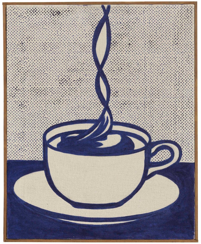
Cup of Coffee, 1961
Cup of Coffee, 1961
Christie’s London: 15 June 2013
Estimated: GBP 1,500,000 – 2,000,000
GBP 2,805,875 / USD 4,325,070
ROY LICHTENSTEIN (1923-1997) , Cup of Coffee | Christie’s
ROY LICHTENSTEIN (1923-1997)
Cup of Coffee, 1961
Oil on canvas
19 7/8 x 16 inches (50.5 x 40.5 cm)
Signed and dated ‘Rf Lichtenstein ’61’ (on the reverse)
Provenance
Leo Castelli Gallery, New York.
Galleria dell’Ariete, Milan.
Private Collection, Milan.
Acquired from the above by the present owners circa 1970.
‘I like the idea of blue and white very much because a lot of commercial artists use it to get a free color. Blue does for black as well; it is an economic thing. So I liked the idea of an apparent economic reason for making one color work as two colors… Of course when these things are done in painting it has another meaning because, obviously, they are not expedient. That has its humor, but it also has other aspects in that a form has been developed that is recognizable to the society’
(R. Lichtenstein, quoted in J. Coplans, ‘Talking with Roy Lichtenstein’, in Artforum, May 1967, pp. 34-39).
In its graphic intensity and striking array of indigo blue Benday dots, Cup of Coffee is one of the earliest examples of the visually unified Pop image that would go on to inform the growth of Roy Lichtenstein’s entire oeuvre. Executed in 1961, the same ground breaking year as his first, now-iconic images such as Look Mickey, National Gallery of Art, Washington, D.C. and Girl with Ball, Museum of Modern Art, New York, Cup of Coffee is a crucial marker of the advent of Pop Art in America. Executed at a time when the American art scene was still dominated by Abstract Expressionism, Lichtenstein’s radical pop imagery changed the way in which we perceive art. This work forms part of a series of single-objects that represented quintessential American life – a coffee cup, a piece of pie – and were sourced from mass-produced newsprint ads. Executed in a blue and white monochrome, Lichtenstein creates an iconographic symbol of American life. Rendered in a clean graphic style, Cup of Coffee embodies all of the elements that would go on to define Lichtenstein’s practice and represents one of his first experiments with the Benday dots that would become synonymous with the artist himself. Imitated from Benday screens, the artist’s meticulously hand-painted dots are more impressionistic in their variegated application, and the contours less emphatic than they would become in later paintings. With the remnants of the artist’s graphic markings and underlying pencil drafts peeking through the painterly surface, Cup of Coffee reveals much of the pictorial craft that lies at the very centre of Lichtenstein’s paintings. What would at first seem out of place in Lichtenstein’s practice, the just discernible brushstrokes show an artist who was still clearly fascinated by the painterly dialogue of abstraction which he had been engaged in since 1957. In this way, Cup of Coffee bridges Lichtenstein’s previous investigations in Abstract Expressionism and his now legendary appropriation of mechanically-produced pop. Taken on by Leo Castelli’s prestigious New York gallery that same year, by 1962 Lichtenstein had established himself as a leader in the American art world.
Considering his prevailing interest in the iconography of American life, the ubiquitous image of a steaming ‘Cup of Joe’ was a natural icon for Lichtenstein to adopt. The image is rooted in the Diner-culture of the 1940s and 50s found across the country and was depicted in film and television. With the diner perhaps finding its most famous iteration in art history in Edward Hopper’s Nighthawks, the experience of drinking a cup of coffee at the counter was one that every American could immediately relate to. With Lichtenstein’s interest in universal imagery, the pictures found on diner menus and ads became a natural starting point for his investigations. Indeed Lichtenstein told Lawrence Alloway in 1962 that the source image for another painting from this period, Ice Cream Soda, 1962 ‘came from the menu of a diner in New Jersey’ (L. Alloway, Lichtenstein, New York 1983, p. 19).
At the core of Lichtenstein’s paintings of objects is a drive to simplify representational art so that it could distill the visual impact of contemporary abstract painting. Lichtenstein employs Benday dots to inform this aim: ‘when I started to work with dots, they were a comment on printing,’ Lichtenstein explained, ‘at the same time, it’s all dots and lines and color. It’s abstract. I can see what the subject is doing, but I don’t care’ (R. Lichtenstein, quoted in ‘Interview with Bob Adelman’, The Art of Roy Lichtenstein: Mural with Blue Brush Brushstroke, London 1994, p. 82). Set against a network of fine dots applied by hand, Lichtenstein uses this abstract pictorial device in order to denote depth and shading in his figurative subjects. In Cup of Coffee the artist employs the dots to define the space beyond the cup, allowing the curling wisps of wafting steam from the hot coffee to obscure them. Limiting his palette to primary colors, Lichtenstein exaggerated the limitations of mechanical reproduction, which became as much the subject of the painting as the object itself. ‘I like the idea of blue and white very much because a lot of commercial artists use it to get a free color. Blue does for black as well; it is an economic thing. So I liked the idea of an apparent economic reason for making one color work as two colors… Of course when these things are done in painting it has another meaning because, obviously, they are not expedient. That has its humor, but it also has other aspects in that a form has been developed that is recognizable to the society’ (R. Lichtenstein, quoted in J. Coplans, ‘Talking with Roy Lichtenstein’, in Artforum, May 1967, pp. 34-39).
By 1961, Lichtenstein had been painting for more than fifteen years, playing with the media and structures of European modernism through subject-matter rooted in Americana. In 1957, while Lichtenstein was living in Ohio, he began to dabble with Abstract Expressionism, using comic book designs as the formal basis for these paintings. The watershed moment that changed the course of Lichtenstein’s career and anointed him as one of the inventors of Pop Art was his move back to the New York City area when he took a teaching position at Douglass College, the women’s branch of Rutger’s University in northern New Jersey in 1960. It was this move that enabled Lichtenstein to re-engage with the New York art scene. Of this return to New York Lichtenstein explained: ‘I was more aware of the Happenings of Oldenburg, Dine, Whitman, and Kaprow. I knew Kaprow well; we were colleagues at Rutgers. I didn’t see many Happenings, but they seemed concerned with the American industrial scene. They also brought up in my mind the whole question of the object and merchandising’ (R. Lichtenstein, quoted in J. Coplans, ‘Talking with Roy Lichtenstein’, in Artforum, May 1967, pp. 34-39). An art critic and pioneer in performance art, through his ‘Happenings’, Allan Kaprow called for an art that celebrated the everyday, particularly by directing attention to the common object in 1958: ‘Objects of every sort are materials for the new art: paint, chairs, food, electric and neon lights, smoke, water, old socks, a dog, movies, a thousand other things that will be discovered by the present generation of artists. Not only will these bold creators show us, as if for the first time, the world we have always had about us, but ignored, but they will disclose entirely unheard of happenings and events, found in garbage cans, police files, hotel lobbies, seen in store windows and on the streets, and sensed in dreams and horrible accidents. An odor of crushed strawberries, a letter from a friend or a billboard selling Drano… all will become materials for this new concrete art’ (A. Kaprow, ‘The Legacy of Jackson Pollock’, in Art News, vol. 57, no. 6, October 1958, pp. 55-57).
With these new ideas finding resonance in conjunction with his recent investigations into Abstract Expressionism, Lichtenstein conceived of a radical style based on industrial printing. In a Cup of Coffee Lichtenstein has stripped back his palette, utilising the Benday dots of newsprint imagery. Despite the radical, unorthodox and shocking nature of his appropriation of mass-media imagery as the subject matter of his art in the early 1960s, Lichtenstein’s handling of such pictures is situated within a larger painterly context. Lichtenstein was attracted by the simple mechanics of cartoon representation, in the way that the strength of an abstracted line could convey an eyebrow, for example. He ultimately sought this same quality of line in his own work, promoting a ‘blending’ of sorts with his own Abstract Expressionist style. Yet in his adoption of a lean, flat way of painting that defined the picture plane as finite, Lichtenstein’s abstracted gestures opposed the spatial play of Abstract Expressionism. Undercutting the emotion supposedly engendered in the gesture of brushwork, Lichtenstein instead presented how abstract shapes could be manipulated to signal certain associative meanings. Indeed upon viewing this abstracted pictorial form conceived by Lichtenstein, there is a surprise and shock in the realisation of the power that a simple, artificial mode of representation such that Cup of Coffee was based upon, could convey. Indeed, we can see this very idea of ‘trying to use the interesting visual qualities of these things or to comment on the visual qualities’ manifested in his rendering of the curling wisp of steam rising from the coffee cup’ (R. Lichtenstein, quoted in D. Waldman, ‘Lichtenstein interviewed by Diane Waldman’, Roy Lichtenstein, London 1971, p. 26).
Lichtenstein’s attraction to the anonymous, stock imagery of small adverts found in newspapers and mail-order catalogues advocating the ‘new and improved’ side of American advertising meant that an image of a steaming Cup of Coffee was just the sort of cliché image that he would find appealing. Lichtenstein revelled in the possibilities inherent in generic mass-media imagery to become an abstracted sign of sorts through the process of enlargement. ‘An important part of recent painting may be that it seems to symbolize ‘thing’ – ‘frankfurter’, ‘circle’, ‘stripe’, after generations of art which symbolized relationships’ Lichtenstein explained, ‘Johns and Rauschenberg understood this so well. The power lies in how it is conceived, not in what it is made to symbolize’ (R. Lichtenstein, quoted in D. Waldman, ‘Lichtenstein interviewed by Diane Waldman’, Roy Lichtenstein, London 1971, p. 27).
For Lichtenstein and Jasper Johns as well, this affinity for stock designs left the structure of their works open to the exploration of visuality and perception on multiple levels. Of this idea Johns noted that for him, ‘it all began with my painting a picture of an American Flag. Using this design took care of a great deal for me because I didn’t have to design it… That gave me room to work on other levels’ (J. Johns, quoted in ‘His Heart Belongs to Dada’, in Time Magazine, no. 73, 4 May 1959, p. 58). Lichtenstein did not make straight copies of commercial sources as a blanket rejection of the more gestured, painterly renderings of the abstract art which had come to dominate art in America. Instead in his abstracted handling of his semi-mechanised single-object images like Cup of Coffee, Lichtenstein challenged the aesthetic orthodoxy of the time that was still permeated by the spiritual and conceptual ambitions of Abstract Expressionism. As Lichtenstein explains the genesis of his oeuvre, ‘I came to Pop by way of Expressionism – by abandoning my own taste in this direction’ (R. Lichtenstein, quoted in D. Waldman, ‘Lichtenstein interviewed by Diane Waldman’, in Roy Lichtenstein, London 1971, p. 26).
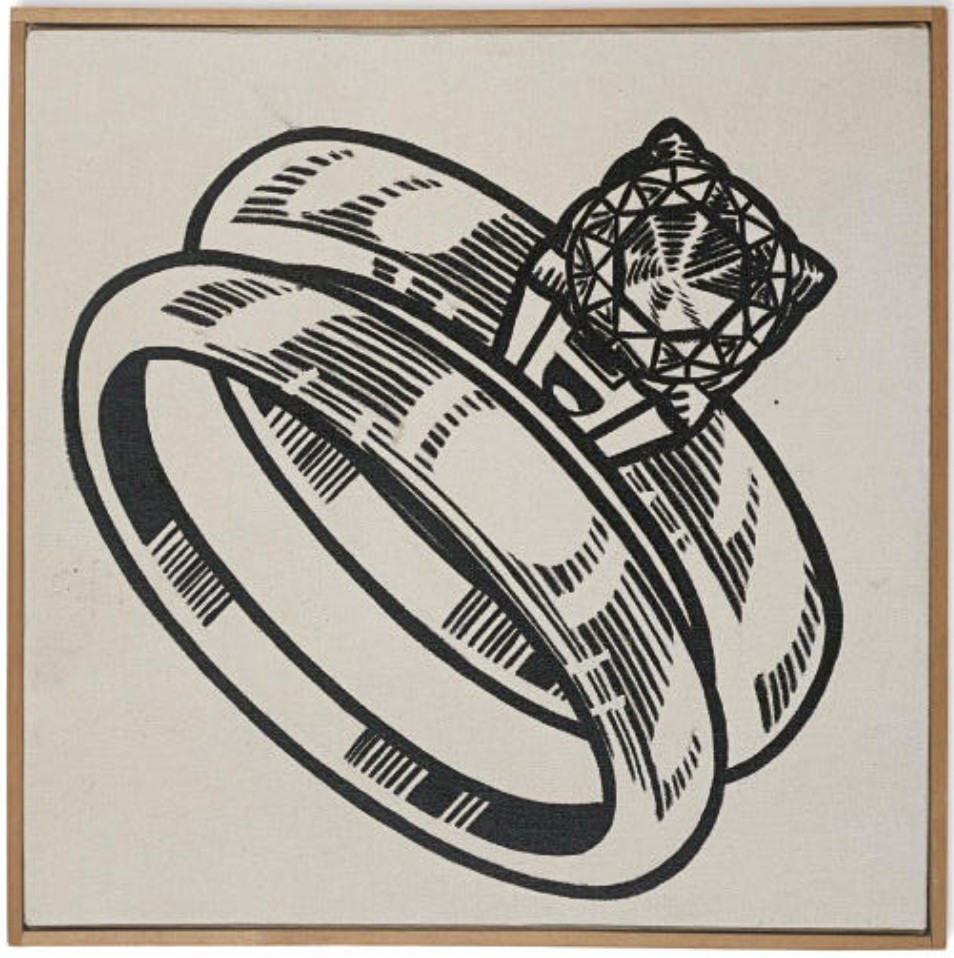
The Ring, 1962
The Ring, 1962
Christie’s New-York: 13 May 2008
Estimated: USD 3,000,000 – 4,000,000
USD 3,401,000
Roy Lichtenstein (1923-1997) , The Ring | Christie’s
ROY LICHTENSTEIN (1923-1997)
The Ring, 1962
Oil on canvas
14×14 inches (35.6 x 35.6 cm)
Signed, titled and dated ‘rf Lichtenstein ’62 “THE RING”‘ (on the reverse and on the overlap)
Provenance
Leo Castelli Gallery, New York
The Estate of Mr. Jon Nicholas Streep
Anon. sale; Christie’s, New York, 10 May 1983, lot 60
Gagosian Gallery, Los Angeles
Acquired from the above by the present owner
Executed in 1962, only a year after Roy Lichtenstein had begun to create what would soon become his hallmark images culled from cartoons and other popular media, The Rings is an early and important painting that helped to herald him in as a major innovator of modern art. Already in his late thirties when he suddenly turned against the subjectivity and romantic otherworldliness that had become attached to painting, Lichtenstein purposefully adopted a controlled, repetitive production method to reflect; he reevaluated the reality of art. The Rings forms part of a group of paintings produced between 1961-1962, that focused on solitary household objects such as sneakers, hot dogs and golf balls, in which Lichtenstein defined and solidified his ideas.
It was in 1962 that Lichtenstein truly consolidated his style, and exhibited his works for the first time with the Leo Castelli Gallery. This marked his quick and sudden entry into the controversial role of a Pop art figurehead. Lichtenstein’s return to blatant representation signaled a crisis of major proportions to an art world then dominated by painterly abstraction. By presenting real objects from the type of mass media that cultured people despised, Lichtenstein appeared to be launching an assault on the sacred universalism that abstract painting held dear. Added to this insult was his hand painted replication of benday dots, which eschewed romantic traditions of the artist’s personal touch by mirroring the mechanized production techniques of cheap merchandizing. With paintings like The Rings, which presents an engagement ring and wedding ring as if they were lifted directly from the pages of a product catalogue for prospective bridegrooms, Lichtenstein asserted his interest was not real objects, but pictures that were already codified as signs. The rings depicted in this painting retain the particular form of a real object, yet Lichtenstein deliberately enhances their artificiality to convey that pictures are entirely fictional — a concept that modernizes and extends upon Rene Magritte’s paradoxical painting of a pipe (La trahison des images, 1928-9).
An art that addressed itself to semiotics was unfamiliar in the early 1960s and Lichtenstein’s radical appropriation of banal, everyday advertisements for his celebrated single object paintings serve to examine the way images are marketed in advertising as guides to life. Unlike Warhol, whom he would first meet through the Castelli Gallery in 1961, Lichtenstein chose to present objects devoid of logos or salesmanship, avoiding the branding aspect of commercial imagery and removing the items from their original context to achieve the pictorial completeness and absoluteness he desired. Without contextualization, Lichtenstein’s single object paintings, such as The Rings, are frustratingly incomplete, disrupting our desire for narrative, forcing the viewer to analyze the image on its own terms.
For Lichtenstein, an artist who had developed a concern for form through years of working within an Abstract Expressionist mode of painting, the relation of a mark or an object to the picture plane was of utmost importance. Asserting the picture plane as a static, finite zone was his main motivation and nowhere is this more emphatically stated than in his single object series, which avoid the narrative and temporal qualities of his comic based works. Paintings like The Rings underline his overriding concern with formalism and the idea of spatiality in two dimensional art, which he qualified by stating: “I think that these objects, the golf ball, the frankfurter, and so on, there is an anti-Cubist composition. You pick an object and put it on a blank ground. I was interested in non-Cubist composition. The idea is contrary to the major direction of art since the early Renaissance, which has more and more symbolized the integration of ‘figure’ and ‘ground'”(R. Lichtenstein, quoted in J. Coplans, Roy Lichtenstein: An Interview, Stedelijk Museum Amsterdam, Cat. No. 424, 1967). The tension between figure and ground in The Rings is its major strength. The objects depicted retain their original, legible identity but their scale and flatness pushes them to the limits of abstraction. Executed before the artist began using projectors to assist with the enlargement of his imagery, the stark, centralized illustration of two rings occupy the picture plane emblematically, their monumental presence having attained something from the impact of minimalist art. Using the benday process to systematize his mark-making into standardized units, Lichtenstein destroys any sense of depth by diffusing the contours of the rings with small dots, thereby reconciling the object with the flat plane on which it is placed. “I think that every mark you make, every line you put down, can’t bear relationships to representation or representational space at the moment it is being put down”, Lichtenstein explained of the then shocking automation of his painting practice, “It has to be divorced from that and become part of the painting space. This must be true whether the work is abstract or representational” (R. Lichtenstein cited in D. Waldman, Roy Lichtenstein, London, 1971, p.26).
The enlistment of parody complicates the reading of Lichtenstein’s work, but by reproducing the reproduced he aims to draw attention to the way people are compelled to apply meaning and value to the most basic signs. Just as Marcel Duchamp had challenged the notion of authorship by placing readymade items in a gallery context, Lichtenstein challenged the notion of “high” and “low” art by making the re-presentation of commercial art his work’s explicit focus. Lichtenstein reconfigures objects like those in The Rings by suppressing or exaggerating certain aspects of the found image, turning them into Platonic ideals, or what the artist calls, “a powerful cliché” which he has subjected to his own conceptual ends. Although we maybe tempt to read greater meaning into these objects, particularly with wedding rings, inherently loaded with social significance, this work differs vastly from other paintings from this period that could conceivably be put into a sequence or theme, such as The Engagement Ring (1961) and The Ring (1962). These two works feature soap-operatic moments of proposals between two comic book couples. In the former painting, a pensive blonde looks quizzically at her dashing beau and stammers, “It’s…it’s not an engagement ring. Is it?”, whilst the latter features a close-up on a man’s hand at the point of sliding a ring onto his fiancée’s finger. Unlike these distinctly narrative paintings, The Rings’ bold, isolated form removes it from symbolic associations, thereby moving away from real life and toward pure art. In this way, this groundbreaking work fulfils Lichtenstein’s aims to be neither abstract nor realistic, but to establish a new form of art based on the analysis of signs and sign systems.
Cherry Pie, 1962
Cherry Pie, 1962
Christie’s New-York: 10 November 2010
Estimated: USD 4,000,000 – 5,500,000
USD 3,218,500
Roy Lichtenstein , Cherry Pie | Christie’s
ROY LICHTENSTEIN
Cherry Pie, 1962
Oil and graphite on canvas
20 1/8 x 24 inches (51.1 x 61 cm)
Signed and dated ‘rf Lichtenstein ’62’ (on the reverse)
Provenance
Leo Castelli Gallery, New York
Dwan Gallery, Los Angeles
Anthony Berlant, Los Angeles
Irving Blum, Los Angeles
Anon. sale; Sotheby’s, New York, 26 October 1972, lot 45
Sydney and Francis Lewis, Richmond
By descent to the previous owner
Acquired from the above by the present owner
Cherry Pie is an important early example of the unique visual iconography that has come to embody Roy Lichtenstein’s rich career. Composed with his signature use of Benday dots and bold outlines, Lichtenstein renders the image of the pie with confident authority, a clear demonstration of the artist’s unique sense of pictorial completeness that became the main constituent of his mature art. In Cherry Pie, Lichtenstein pays homage Americana. From the formal qualities of his newly acquired artistic style to the painting’s subject matter, the work is an unfettered examination of American life and the contradictory social messages inherent in American culture at the time. Lichtenstein and his fellow Pop artists sought to suspend the art historical norms that had dominated for centuries – unique versus reproduced, original versus copy and high art versus mass culture – and replace them with a new visual language. Relishing this challenge, Lichtenstein first began subverting the style that he borrowed from comic-books that frequented grocery store checkouts. His crisp, stencil-like pictures formed a stark contrast with the deliberately, painterly, and thus revered, creations of his predecessors. The entire notion of mark-making was flagrantly and joyously undermined in Lichtenstein’s works, they became “pseudo-gestural”, depictions of chance effects and vigorous brushstrokes that were in reality highly controlled.
The source image for Cherry Pie comes from the pages of a Dick Tracy comic book. In it the eponymous hero is being shown a selection of art works. One of the paintings, titled Piece, is a canvas depicting a slice of pie. On closer examination, Dick Tracy realizes that the painting is visual trick, a tromp l’oeil in which the top crust of pie is actually a separate piece of canvas that lifts up. By executing this work in his comic-book style Lichtenstein performs his own tromp l’oeil of sorts, using high-art techniques to replicate the style of mass-production.
This visual slight-of-hand is central to much of Lichtenstein’s best work, of which Cherry Pie is a superb example. Superficially, the uncomplicated aesthetics of the bountiful slice of fruit pie, bursting with its ripe cherry filling could be regarded simply as an artistic appropriation of the rapidly expanding mass-market media. But, by rendering the object in a patriotic color-scheme of red, white and blue, Lichtenstein adds a further dimension to the work. This wholesome image of Americana could have been taken straight from the pages of Life magazine, of an America where dutiful housewives spent their days baking homemade pies to be consumed by their adoring families. But just as Jasper Johns’ Flag uses an emblematic American motif to offer a critique of American society, Lichtenstein’s works can also be read as having a deep-seated duality that challenges their seemingly straight-forward outward appearance.
Just like the pie in the original Dick Tracy cartoon, lifting the surface of Lichtenstein’s Cherry Pie reveals an unexpected interior. Outwardly, the work purports to show a quintessential symbol of American values, a homemade pie; individual and unique and packed with wholesome fruit. But by the early 1960s American society, along with their eating habits, were changing. A rapid growth in the industrialization of food, mass produced and ready to eat, was part of the post-war consumer boom. American society was changing and the outwardly simple image of Cherry Pie reflects Lichtenstein’s deeper reflections on a deeper set of social changes.
It was certainly true that Lichtenstein was also attacking the art world and the received notions of what should and should not constitute art. Most of his artistic schooling had been dominated by the then prevailing Abstract Expressionism, and Lichtenstein’s controlled reproduction of found images jarred with that in almost every way. He essentially removed any evidence of the artist from his work. The economy of line with which Cherry Pie has been rendered appears as some sort of assault on Abstract Expressionism. However, it was not only that movement that Lichtenstein targeted, but the whole snobbery of aesthetics. In enshrining this work in oils, Lichtenstein essentially provided an apotheosis for an image created commercially.
‘I’m interested in the kind of image in the same way that one would develop a classical form, an ideal head for instance. Some people don’t really believe in this any more, but that was the idea, in a way, of classical work: ideal figures of people and godlike people. Well, the same thing has been developed in cartoons. It’s not called classical, it’s called a clich©e. Well, I’m interested in my work’s redeveloping these classical ways, except that it’s not classical, it’s like a cartoon’ (R. Lichtenstein, quoted in D. Sylvester, Interviews with American Artists, London, 2002, p. 226).
Just as important to Lichtenstein as the subject matter was the process by which it was rendered. As the artist himself stated in 1995, ‘My use of evenly repeated dots and diagonal lines and uninflected color areas suggest that my work is right where it is, definitely not a window into the world. The enlargement of these comic book devices make obvious that we take for reality configurations that are very abstract. I do this partly because I don’t think the importance of the art has anything to do with the importance of the subject matter. I think importance resides more in the unity of the composition and in the inventiveness of perception’ (quoted in Roy Lichtenstein Beginning to End, Fundacin Juan March, Madrid, 2007, p. 128).
Roy Lichtenstein’s early canvases, such as Cherry Pie, are among his most significant works. Stylistically innovative it acts as a mirror reflecting back the changing values of the society which sparked its creation. A pioneer of Pop art, one of Lichtenstein’s greatest legacies is beginning the dismantling of the traditional boundaries between high and low art. In doing so, he raised questions about not only the values of art in modern society but also he questions the wider values of that society as well.
Keds, 1962
Keds, 1962
Sotheby’s New-York: 14 November 2012
Estimated: USD 2,200,000 – 2,800,000
USD 2,602,500
WORK ON PAPER
Roy Lichtenstein (1923-1997) , Keds | Christie’s
ROY LICHTENSTEIN (1923-1997)
Keds, 1962
Frottage and graphite on paper
22 3/8 x 16 3/8 inches (56.8 x 41.6 cm)
Signed and dated ‘rf Lichtenstein ’62’ (on the reverse)
Provenance
Leo Castelli Gallery, New York
Dr. Arthur C. Carr, New York, 1970
Margo Leavin Gallery, Los Angeles and Vivian Horan, New York, 1978
Acquired from the above by the present owner
With its crisp, clean lines and unique blend of figurative and abstract elements, this beautifully rendered drawing by Roy Lichtenstein marks the arrival of the artist’s mature style. Before 1962 Lichtenstein drew with delicate simplicity, but in that year he began a highly sophisticated series of works in which he selected a diverse range of source material, introducing a richer variety of techniques to his more and more detailed compositions. The source image for Keds is an advertisement for a popular brand of sneakers that appeared in the Washington Post the previous year. In this drawing Lichtenstein switches the composition of the original advertisement to expose the underside of the shoe, giving a greater degree of prominence to the abstract markings on the underside of the sole. When combined with the elegant contours of the shoe itself, the jagged hatchings become even more pronounced, a juxtaposition that is lost in the original advertisement.
Lichtenstein used a number of different techniques to reproduce the look of mechanical reproduction that he required for Keds. Although as early as 1964 the artist used an opaque projector to beam images of his chosen subject onto a canvas, it seems likely that in the case of Keds he traced the images directly from the original advertisement. Then, with a series of heavily penciled contour lines, Lichtenstein would strengthen the original underdrawing, using a softer and darker graphite pencil to produce the skeletal outlines which would define the body of the shoe. In order to produce his trademark Ben-Day dots, he relied on a technique called frottage. This consisted of placing the paper sheet over a textured surface, then rubbing a graphite pencil across the surface. This procedure produced a series of regular dots, but also allowed traces of the artist’s hand to be seen in the shaded areas as subtle changes in pressure during the rubbing process can be detected as Lichtenstein moved his hand across the surface of the work. Lichtenstein employed this particular technique for only a short period during 1962, but it saw him producing some of most exquisite drawings including, The Kiss and Bratatat (Minneapolis Institute of Art).
Lichtenstein’s drawings, including the present lot, recently received a major retrospective at New York’s Morgan Library and Museum, which revealed anew their quality and significance. The New York Times art critic, Roberta Smith, underscores the importance with which these works are now viewed, by stating, “the artist’s hand is everywhere, adjusting the density of the dots from faint to dark (sometimes by doubling them up), filling in areas so that even finer lines have a slightly chiseled, insistent roughness, and making useful discoveries…What is perhaps most striking is his determination to have the entire sheet of paper come alive and register as a whole. This electricity unifies nearly all his paintings, edge to edge, with a bracing combination of the familiar and the abstract that still has few equals in modern art” (R. Smith, “Following The Dots Around the City,” New York Times, 24 September 2010, p. C33).
In addition to this work on paper, Lichtenstein also produced a painting with an almost identical pair of shoes a year earlier in 1961 (Robert B. Mayer Family Collection, Chicago). This painting had a great effect on Ed Ruscha, who on returning from an extended trip to Europe visited Leo Castelli to show him his work. While visiting the gallery, Ivan Karp showed Ruscha Lichtenstein’s Keds painting and the younger artist had what he regarded as an epiphany, realizing that ordinary, everyday objects could become the legitimate subject of high art. This encounter left a tremendous impression on Ruscha and would propel him in a direction that would come to define much of his career.
Keds is an important work which takes its place at the very heart of Roy Lichtenstein’s Pop revolution. One of only a select number of drawings from this important period of the artist’s development, it provides an excellent opportunity to witness first-hand the technical and compositional skill of an artist who was able to turn a straightforward and utilitarian line drawing into an object of simple beauty and high art. It marks the triumphal culmination of the artist’s reductive practice of representing an image in terms of the symbolic language of its formal composition, drawn from the proliferation of advertising and graphic imagery that proliferated during the economic boom of the post-war years. As Isabelle Deveraux, the curator of the recent critically acclaimed retrospective of Lichtenstein’s Black-and-White Drawings at the Morgan Library and Museum in New York notes, his finished drawings “represent the most original contribution of Pop Art to the history of drawing” (I. Deveraux, “Baked Potatoes, Hot Dogs and Girls Romances: Roy Lichtenstein’s Master Drawings,” in Roy Lichtenstein: The Black-and-White Drawings 1961-68, exh. cat., Morgan Library and Museum, New York, 2011, p. 15).
Peanut Butter Cup, 1962
Peanut Butter Cup, 1962
Sotheby’s New-York: 4 March 2025
Estimated: GBP 1,000,000 – 1,500,000
GBP 1,019,000 / USD 1,304,320
Peanut Butter Cup | Modern & Contemporary Evening Auction | 2025 | Sotheby’s
ROY LICHTENSTEIN (1923 – 1997)
Peanut Butter Cup, 1962
Oil on canvas
14×14 inches (35.6 x 35.6 cm)
Titled (on the overlap)
Signed and dated ’62 (on the reverse)
Created during the most pivotal and critically lauded moment in Roy Lichtenstein’s inimitable career, Peanut Butter Cup from 1962 is an early Pop art masterpiece, in which the artist’s signature Ben Day dots lend this mass-market sweet treat a bold visual power. Recognized as a master of graphic clarity and a genius of image appropriation, Lichtenstein redefined the boundary between ‘high’ and ‘low’ art through an ironic interplay of popular culture, everyday objects and fine art. Alongside similar monochrome object paintings of the early 1960s – such as Portable Radio (1961, San Francisco Museum of Modern Art), Bread in Bag (1961, Städtisches Museum, Mönchengladbach), Tire (1962, Museum of Modern Art, New York), and The Grip (1962, Museum of Contemporary Art, Los Angeles) – Peanut Butter Cup is a seminal example of the artist’s pioneering aesthetic, in which he wittily appropriated comic book imagery and the language of mass printing. These single object paintings from 1961 to 1962 mark the precise moment of conception for Lichtenstein’s entire mature praxis, the earliest iteration of his now legendary aesthetic.
“I’m never drawing the object itself; I’m only drawing a depiction of the object – a kind of crystallized symbol of it.”
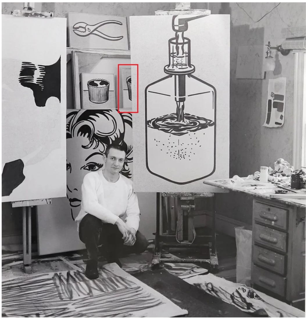
The artist in his studio in front of the present work, 1962. Photo: Ben Martin. Art © Estate of Roy Lichtenstein/DACS 2025
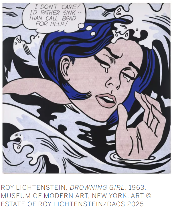
Underscoring its importance, the present work was painted at the same moment as many of Lichtenstein’s most iconic masterpieces, indelibly stamped on Western cultural consciousness: Girl with Ball (1961, MoMA, New York), Masterpiece (1962, sold for $165 million in 2017), and Drowning Girl (1963, MoMA, New York), among many others. Sourced from mass-printed imagery constructed from industrially-produced dots, these early compositions can be seen as Lichtenstein’s witty retort to the visual mechanics of artistic creation, as well as an ironic riposte to the burgeoning Minimalist movement. Sourced as a Duchampian ‘ready-made,’ such found imagery had little association with narrative subject matter or painterly mark-making, allowing Lichtenstein to render the act of making art the ultimate subject of his oeuvre. Having remained in the same private collection for over 60 years, since it was acquired by distinguished Australian collector and philanthropist John Kaldor shortly after it was painted, the present work is a rare and significant exemplar of the artist’s praxis. Indeed, the artist favored this image so much that he created a second example in blue; that sister painting is today held in the renowned Sonnabend Collection. With its bold monochrome palette, starkly rendered lines, and trademark Ben Day dots, Peanut Butter Cup encapsulates the essence of Lichtenstein as a Pop innovator, and showcases the inventive mind of an artist at the apex of his extraordinary career.

Painted in 1962, Peanut Butter Cup marks a breakthrough year for Lichtenstein, when the fundamental attributes of his Pop art style crystalized into its mature form. At the time, Lichtenstein was creating a series of black-and-white paintings of common household objects, using simple, crisp black outlines and Ben Day dots, along with some of his earliest comic book paintings. This moment marks the beginning of Lichtenstein’s interest in replicating the look of the half-tone printing process, in which he appropriated the Ben Day dots for his own purposes. His single-object paintings of 1961 to 1963, epitomised by the current example, are the purest form of image-making to be found anywhere in Lichtenstein’s oeuvre. With all the visual impact of a logo, sign-post or religious icon, they reduce consumer and mass culture to a common denominator. While artists such as Jasper Johns might choose ‘found’ images as a means to focus on the formal properties of paint, others like Robert Rauschenberg, Andy Warhol, and Lichtenstein were fully aware that the viewer’s preconceptions of objects would be as integral a part of their perception of the work as color, composition or technique. The sugary, inviting subject of Peanut Butter Cup has a strong cultural resonance, particularly for Lichtenstein’s audience of the 1960s. By 1956, Reese’s Peanut Butter Cups were among the most popular sweets in America, with sales worth today’s equivalent of $125 million; by 1963, after merging with the Hershey Company, peanut butter cups were Hershey’s top seller. Advertisements to “Try them chilled or frozen!” were ingrained in the American consciousness, a staple of every five-and-dime and corner store. Like Warhol’s Soup Cans, Lichtenstein’s Peanut Butter Cup defamiliarizes a mundane, instantly recognizable image by elevating it to the realm of a fine art still life.
The least conspicuous yet the most subliminally impactful of Lichtenstein’s method is his economic and extremely subtle editorship of the readymade source. Lichtenstein collected and collated imagery from the plethora of printed sources available to American consumerist society in the economic hey-day of the late 1950s and 1960s – from the comic strips, magazines and newspapers to the copious world of print advertising. The present work features the brilliantly economic rendition of a consumer product, enlarged and exhibited devoid of context.
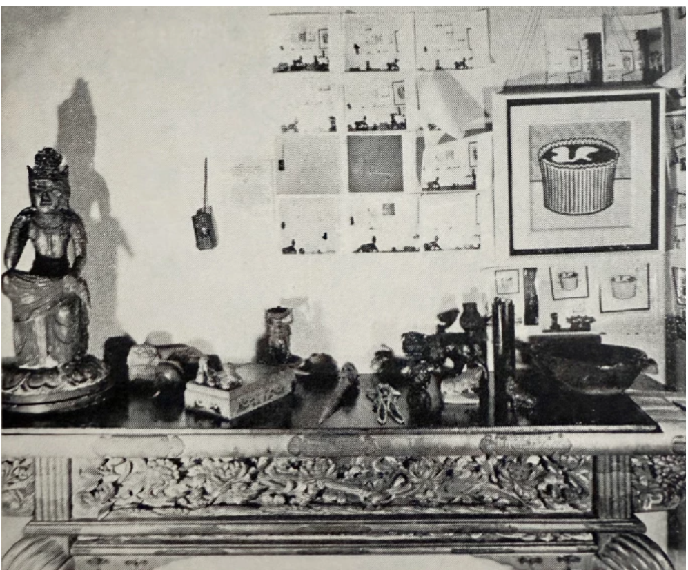
The present work installed in John Kaldor’s Australia home, as published in Art & Australia, 1971. Image © Art & Australia.
Here, the titular candy is rendered purely in a configuration of lines and dots, effectively demonstrating the tension inherent in the illusion of depth and volume against the two-dimensional picture plane. Adding to the effect is the radically simplified palette, inspired by the standardized colours of mechanical printing as well as the chromatic reduction pursued by early Modernists such as Piet Mondrian. Lichtenstein constructs his image using the most rudimentary visual building blocks – line, dot, and hue – at once presenting an immediately recognizable object while also hinting at the boundaries of abstraction. Concisely contoured in bold lines, afloat above a regularized Ben Day-dotted ground, the magnified form of a popular child’s sweet imposes upon the viewer all the dignities of a still-life and the efficiency of advertising’s visual vocabulary.
By reducing all extraneous pictorial detail and traces of narrative to an absolute minimum, Lichtenstein bestows on Peanut Butter Cup an emblematic fixity that transcends specificity and temporality to create a monolithic image of monumental and enduring presence. Through Lichtenstein’s process of manipulation and reframing, his image of the solitary chocolate candy becomes a universal emblem for mass consumer culture. Peanut Butter Cup is an exemplar of Lichtenstein’s early 1960s praxis: a bold, graphic depiction of an instantly recognizable subject, executed in the classic comic book style that became his hallmark and cemented him as a master of twentieth century art history. The present work thus stands as a quintessential masterwork of Pop painting.