In 1962, as the potency of mass media reached new heights in America, Warhol began to silkscreen the photographs of destruction he discovered in the newspapers, marking the beginnings of his Death and Disaster series. Drawing upon the photographs of atomic bombs, airplane crashes, car accidents and other tragedies presented as highly quotidian in the media, Warhol fearlessly probed a dark side of American society to produce a body of work that would serve as a modern allegory of the mass media age, when images of violence had dissolved into repetitive banality that most preferred not to acknowledge. With his revolutionary mastery over the medium of silkscreen, then a primarily commercial and industrial technique, Warhol conjured the nightmare of the accidents in graphic brutality while simultaneously neutralizing their impact by way of replication. At the same time, his very technique invoked the same power of the mass media on which he was commenting, affording him a certain distance from his subject.
“When you see a gruesome picture over and over again, it doesn’t really have any effect…It’s not that I feel sorry for them, it’s just that people go by and it doesn’t really matter to them that someone unknown was killed so I thought it would be nice for these unknown people to be remembered.”
Introduction
Having been rooted in heroic tales of immigration, American history evolved over two centuries through narratives of migration and ceaseless movement. Whether by horse, stagecoach, steam train or the automobile, this vast continental expanse was traversed by countless generations in the quest for opportunity and betterment. In the Twentieth Century there came to be no more potent symbol of the freedom and independence that are such monolithic cornerstones of the American Dream than the automobile.
When Andy Warhol started his seminal Death and Disaster series in 1963, 44% of Americans owned a motor vehicle, nearly double the number of just twenty years before. Seven years prior in 1956, the US Congress had authorized the largest and most ambitious public works enterprise of the postwar era: a nationwide interstate highway system comprising over 40,000 miles of high-speed roadways. And in the 18 years between the end of the Second World War and 1963, more than 620,000 Americans died in automobile accidents, on average almost one hundred people per day and more than the totals of all American casualties in the First and Second World Wars combined. Looming like an ever-present, seemingly indiscriminate scythe over Middle America’s new golden age of economic prosperity and everything it stood for, the car crash had quietly become the primal, devastating threat to an entire way of life.
This series’ execution belongs to an extraordinary shift in this most iconic of artistic careers, during which Warhol revolutionized the terms of popular visual culture. The ideal of the seminal Death and Disaster series, which was one of the most provocative, confrontational and brilliant projects undertaken by any artist in the transformative decade of the 1960s, this canvas epitomizes the monumental themes of Warhol’s career: namely an unprecedented artistic interrogation into the agencies of mass-media, celebrity and death. With deafening resonance, Warhol’s Car Crashes exclaim an immediately harrowing and intensely violent scenario: the instant aftermath of a brutal car crash. And now, the great symbols of 1950s and 1960s America, a facilitator of individualism and a key signifier of social mobility, the automobile, becomes the devastating delivery system of indiscriminate fatality.
The Car Crash paintings that Warhol made between late 1962 and early 1964, form the most varied and extensive group of pictures in his seminal series of Death and Disaster paintings. Drawing on six different documentary source photographs each outlining six separate, horrific and increasingly bizarre fatal accidents, Warhol’s Car Crashes remain among the most powerful, challenging and provocative paintings made by any artist in the Post-War era.
“The car crash turns the American dream into a nightmare.”
Throughout his life, Warhol lived with a nearly obsessive dread of accidental death, and his fascination with car crashes, in particular, both enthralled and terrified him. During his lifetime, he amassed a graphic collection of high-contrast press photographs of car crashes that were often too gruesome to be published, and he readily admitted to an irrational fear of the driver of the car he happened to be riding in falling asleep at the wheel. Several of Warhol’s Death and Disaster paintings were based on newspaper photos from tabloid-style publications like the National Enquirer or the New York Daily Mirror, but he was also drawn to the more graphic photographs taken from the scene of crimes, suicides or accidents that were never widely circulated.
“Did you see the Enquirer last week? It had “The Wreck that Made Cops Cry”—a head cut in half, the arms and hands just lying there. It’s sick, but I’m sure it happens all the time. I’ve met a lot of cops recently. They take pictures of everything, only it’s almost impossible to get pictures from them.”
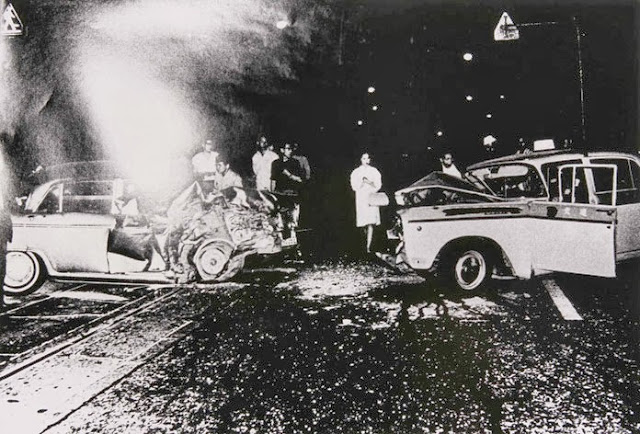
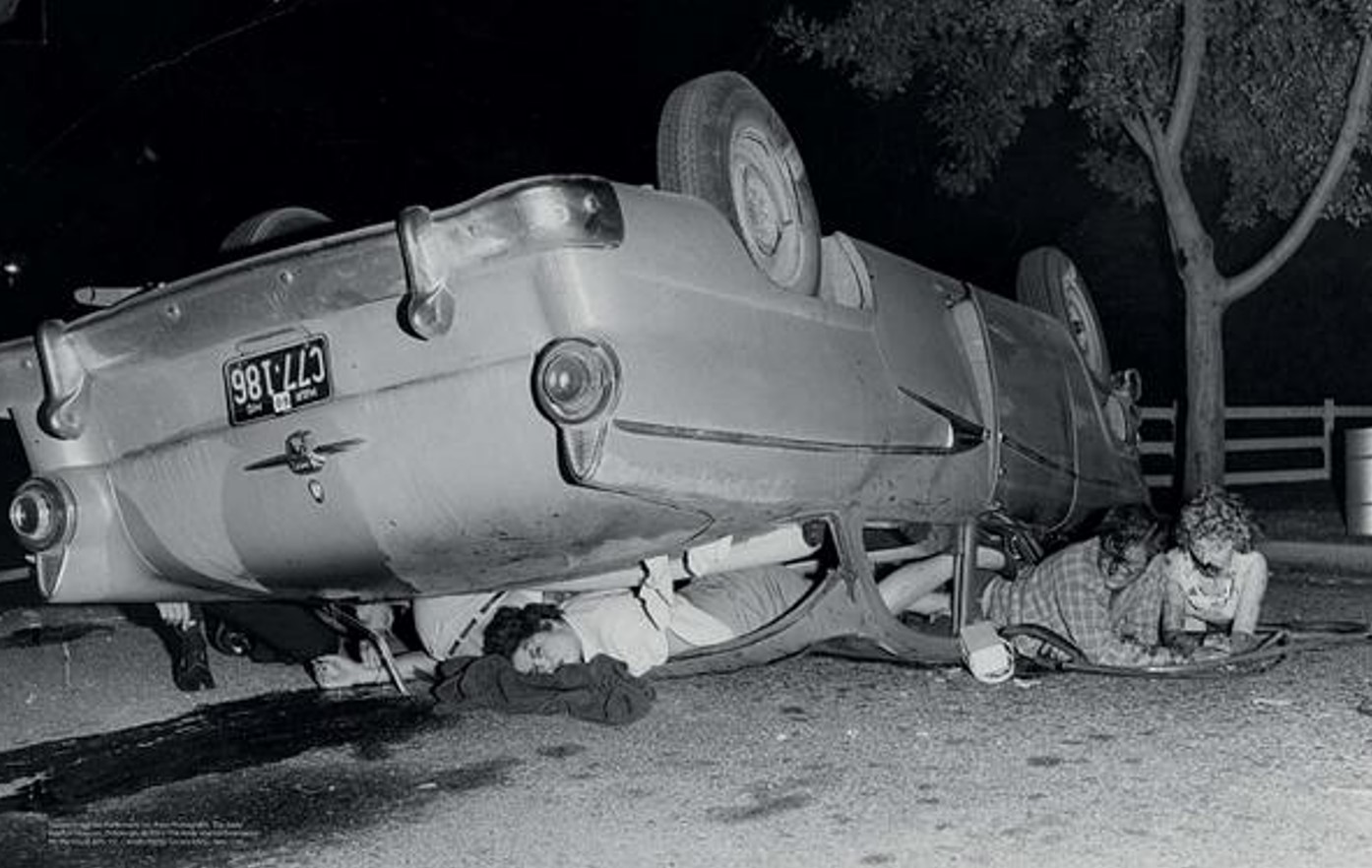
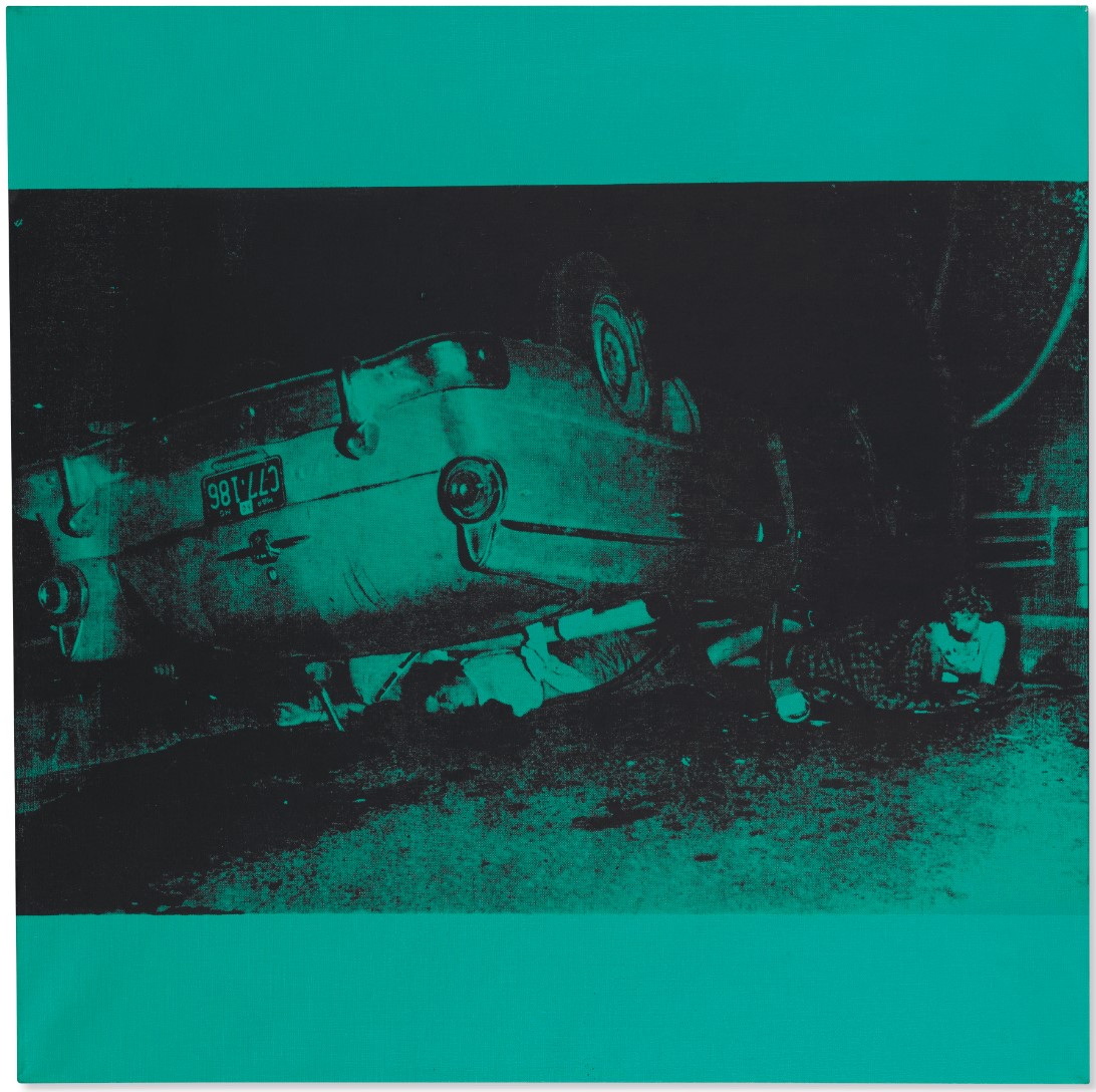
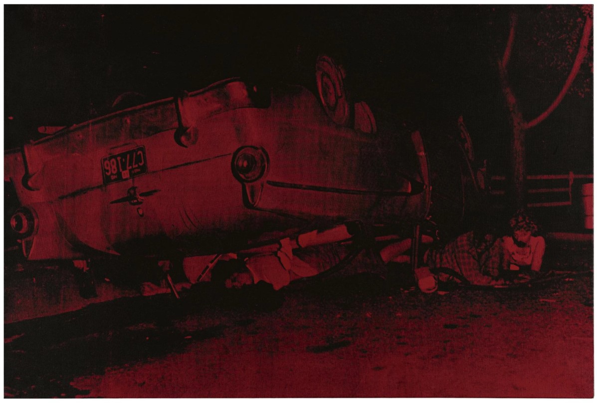
Warhol and his studio assistant Gerard Malanga scoured New York’s bookshops in search of these more lurid photos, and in the case of Five Deaths on Turquoise, found a news photograph that had been issued by the UPI wire service. The picture’s caption reads in part: “Two Die in Collision. Los Angeles, Calif.: Three Survivors of a car-truck collision, pinned beneath their overturned automobile, wait to be freed by rescue squads here, June 17th. Two other passengers in the car, both sailors from the USS Maddox at San Diego, were killed.”
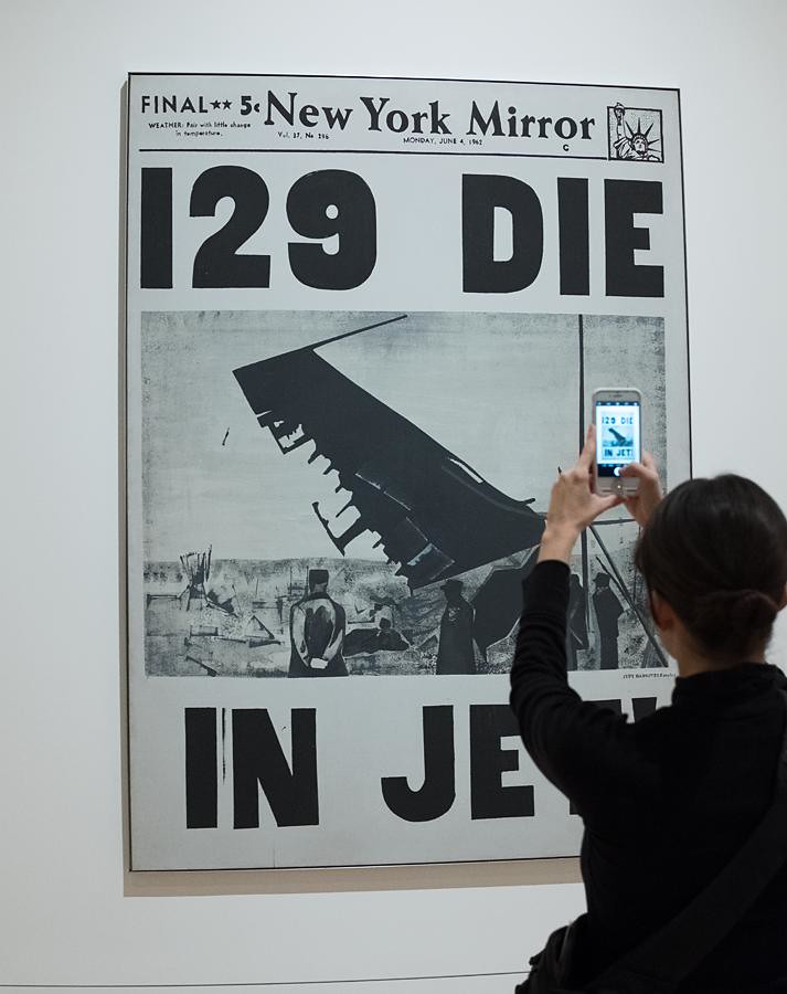
The prurient detail which is displayed in this 1963 painting demonstrates Warhol’s increasing interest during this period with mortality. Indeed, although his earlier paintings of Marilyn Monroe and Elizabeth Taylor were both trigged by the tragic experiences which happened to the actresses (Monroe’s suicide in 1962 and Taylor’s near fatal illness in 1961), it is only with these early Disaster paintings that his increasing interest in death becomes blatantly apparent. His curiosity had been sparked in 1962 when the curator Henry Galdzahler had suggested that Warhol paint the darker side of American life. His first foray into the subject was a work titled 129 Die in which he painted the front page of the New Mirror newspaper with the splash headline ‘129 DIE IN JET!.’ The following year, around the time Five Deaths on Orange was painted, Warhol explained the origins of his fascination with death to Gene Swenson.
“It was Labor Day, and every time you turned on the radio, some said something like ‘Four Million people are going to die.’ That started it. But when you see an image over and over again, it doesn’t really have any effect. The death series I did was divided into two parts: the first on famous deaths and the second on people who nobody had ever heard of and I thought that people should think about some time….It’s not that I feel sorry for them and it doesn’t really matter to them that someone unknown was killed, so I thought it would be nice for these unknown people to be remembered.”
In the post-war economic boom that swept much of the United States after World War Two, the automobile was celebrated as a thing of beauty—a symbol of the prosperity and social mobility that the American Dream promised. In cities like Los Angeles, the automobile had become the dominant cultural phenomenon around which much of the newly classified concept of leisure time was played out. By depicting the results of a momentary lapse in concentration when lives can be changed forever, Warhol also showed that the American dream can become a nightmare in the blink of an eye, a drama that was being played out with alarming monotony across the country. By choosing these unknown victims, Warhol brought home the fragility of life to a wider audience. That a few moments earlier all five occupants of the car were enjoying a night out is what makes this image all the more shocking, a tangible example of the fragility of life and how it can all turn on a dime.
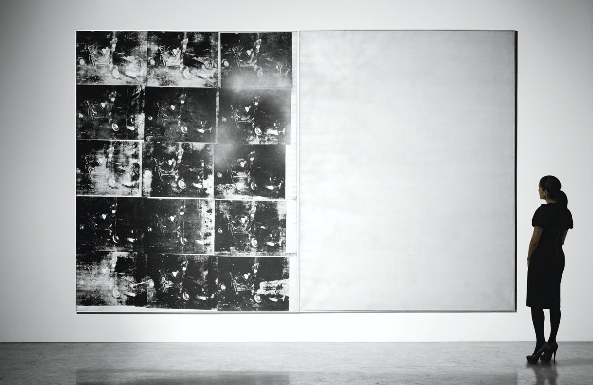
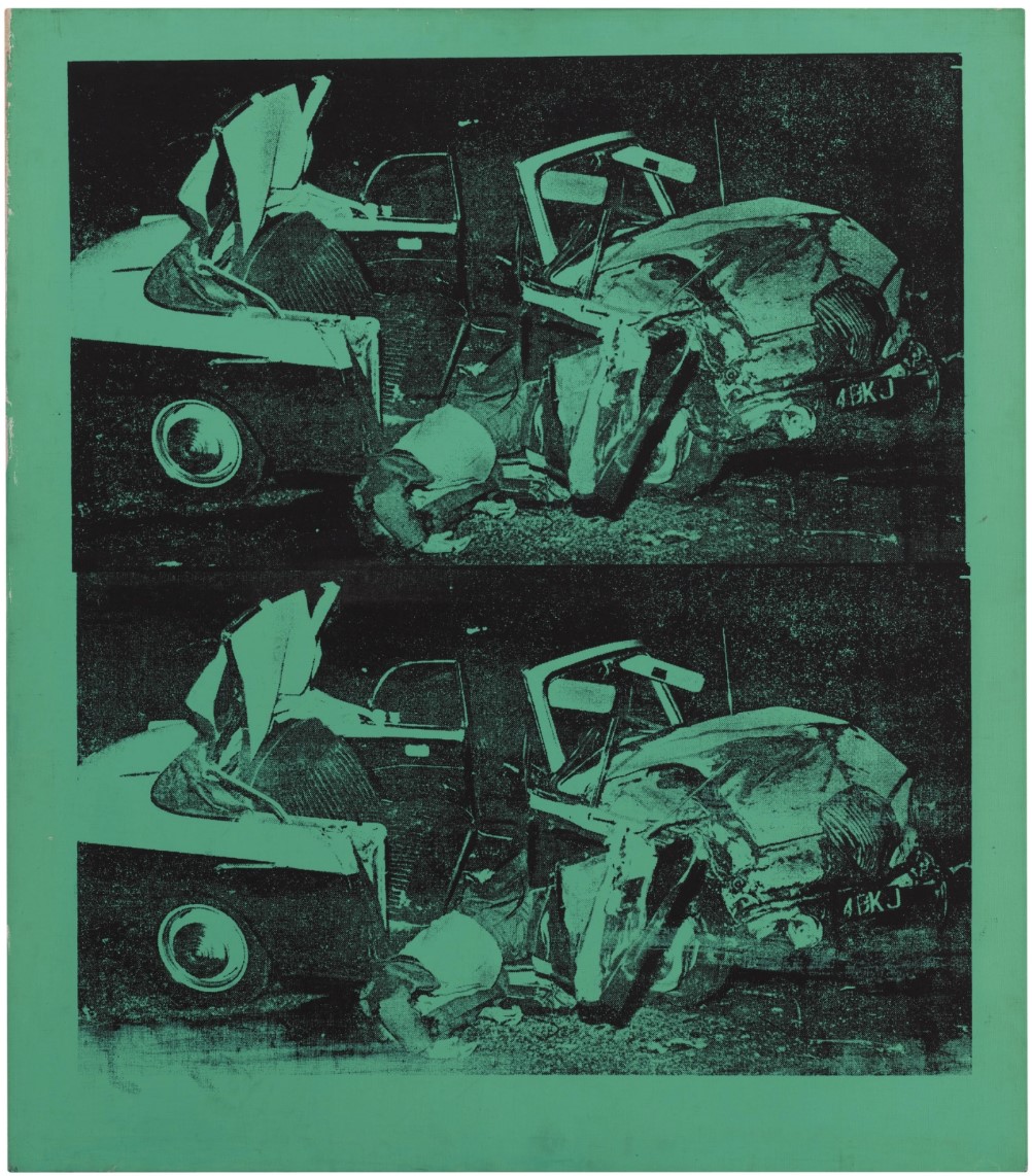
Silver Car Crash (Double Disaster)
Silver Car Crash (Double Disaster), 1963
Sotheby’s New-York: 13 November 2013
Estimate on Request
USD 105,445,000
ANDY WARHOL
Silver Car Crash (Double Disaster), 1963
Silkscreen ink and silver spray paint on canvas, in two parts
Overall: 105 x 164.2 inches (267.4 x 417.1 cm)
Left: signed twice and dated 63 on the overlap
Right: signed and dated 63 on the overlap
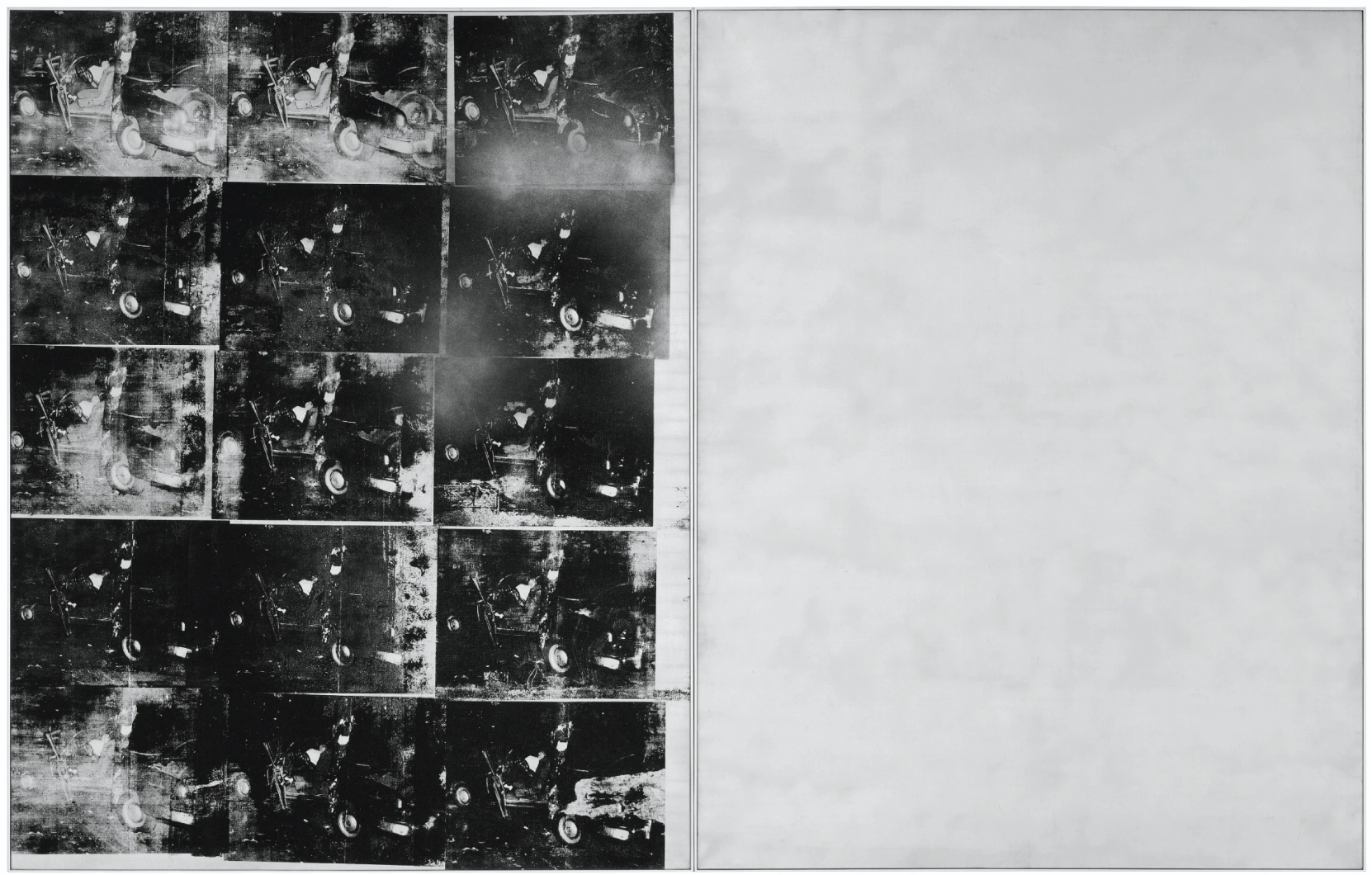
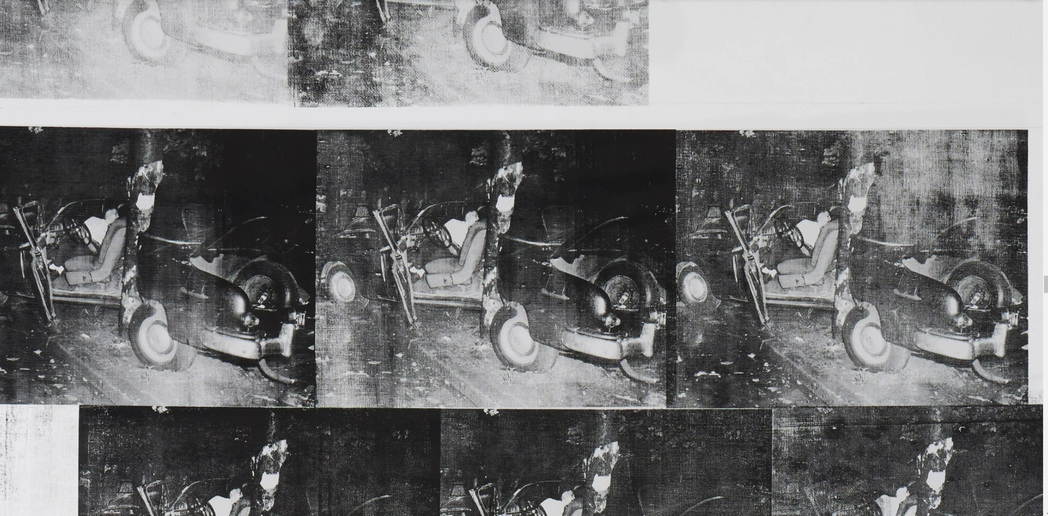
To stand in front of this work of art is to bear witness to events that exist beyond description: it is to be in the presence of something phenomenal. To contemplate the sheer vastness of its achievement is to enter a realm of experience rarely encountered in Art History. Enlisting the dimensions of a specific narrative to achieve a fundamental human universality, this work belongs to that rarest elite of historic masterpieces which have occasionally altered our deepest perception. Like its illustrious forbears of the epic History Painting genre, this work stands as both the most astute allegory of its era and the vital mirror to our present. Here exists something utterly essential, something that has always been and always will be integral to our human story.
Here is an arena that exists both inside and outside of the present, a place where time seems suspended. It is the proposition of both a definitive end and an unending beginning. On the left there is the final instant: the permanent flash where the possibilities of existence have been extinguished. Freedom and independence lie lifeless in wreckage as definitive lament to the hopes of the future. All this is repeated over and over and each version is unique: the tragic occurrence and recurrence is never identical. Yet however the reel of life differs, here is the moment that it is conclusively severed. The screen turns blank. On the right there is an ever-shifting silver ocean of promise: a reflection to our ever-changing current experience. The specific, unalterable finality of the past meets the abstract, permanent continuity of the present. Stories told give way to stories as yet untold.
Andy Warhol, Car Crash Fourteen Times, Museum of Modern Art, New-York
Andy Warhol created Silver Car Crash (Double Disaster) in the summer of 1963, at the turn of his thirty-fifth birthday. Composed of two canvases, each over eight feet high and together spanning in excess of thirteen feet, it ranked among the most monumental and ambitious works he had ever undertaken. Indeed, there exist only three other Car Crash paintings of remotely comparable scale: Orange Car Crash 14 Times, the Museum of Modern Art, New York; Black and White Disaster #4, Kunstmuseum Basel; and Orange Car Crash, Museum Moderner Kunst Stiftung Ludwig, Vienna. It represents the zenith of the Death and Disaster corpus, a body of work that was then Warhol’s total focus, and which surely remains his most significant and enduring contribution to the course of Art History. In this groundbreaking year Warhol successively produced the series that comprise this seminal canon, which today read as a roll call of almost unfathomable artistic accomplishment: Suicides, Black and White Disaster, Early Serial Disasters, Silver Electric Chairs, Red Explosion, Tunafish Disasters, Race Riots, Burning Cars, 5 Deaths and Late Disasters.
Of all the paintings in this spectacular outpouring of compulsive innovation, Silver Car Crash (Double Disaster) is truly exceptional. It is one of only seven in the monumental, double-canvas format: in addition to the three Car Crashes mentioned above are Red Disaster, Museum of Fine Arts, Boston, Blue Electric Chair and Mustard Race Riot. As denoted by the corresponding titles, Silver Car Crash (Double Disaster) stands out from this pantheon of immense Death and Disaster works for its exceptional silver color, providing the expansive surface with a constantly adjusting, reflective quality that is absent from the single-color acrylic grounds of the other paintings. The incomparable nature of Silver Car Crash (Double Disaster) is further confirmed by the remarkable heritage of its provenance. Three venerated collectors have previously owned this painting: Gian Enzo Sperone, Charles Saatchi and Thomas Ammann, each of whose eminent collections famously included some of the most outstanding artworks of the Twentieth Century. Subsequently this painting has been held in the same private collection for the past quarter of a century and has been publicly exhibited only once in that time, at the Fondation Beyeler in 2000.
The source was an unidentified newspaper photograph, and despite the horror of the scene before him, the photojournalist nevertheless intuitively cropped the image through the view finder to engender narrative and provide an aesthetically satisfying picture according to compositional convention. Warhol selectively accentuated lights and darks on this photograph to intensify the contrast of the reproduction on the screen when he ordered his mechanical, in order to improve its legibility as well as enhance the compositional polarization of the image. In purely formal terms, the composition is bifurcated in two by the vertical tree or telephone pole that proved the automobile’s undoing, invoking both the double take and before and after narratives in our reception. Our eye is drawn to travel side to side, up and down, and diagonally between the four principal arenas of pictorial data.
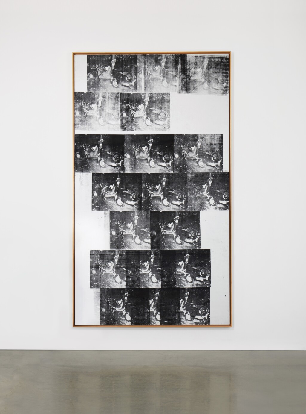
White Disaster (White Car Crash 19 Times)
White Disaster [White Car Crash 19 Times], 1963
Sotheby’s New-York: 16 November 2022
Estimate on Request
USD 85,350,500
White Disaster [White Car Crash 19 Times] | Contemporary Evening Auction | 2022 | Sotheby’s
ANDY WARHOL
White Disaster [White Car Crash 19 Times], 1963
Silkscreen ink and graphite on primed canvas
144 ¾ x 82 ⅞ inches (367.7 x 210.5 cm)
A monumental altarpiece for the modern age, Andy Warhol’s White Disaster (White Car Crash 19 Times) from 1963 stands amongst the most radical and haunting artistic achievements of the twentieth century. Soaring above the viewer, Warhol’s towering canvas draws the viewer inward with an irresistible magnetism, while the white canvas emits a faintly miraculous glow, as if illuminated from within or perhaps above. Against the pure white, the dark rows of images, stacked and repeated with unerring purpose, draw our gaze ever upward in an experience of ascension: it is there that we are compelled to consider an image that is at once familiar and strange, personal and universal, beautiful yet terrible.
Across 19 overlapping frames, White Disaster (White Car Crash 19 Times) reveals the concerns which lie at the very heart of Warhol’s legendary artistic oeuvre: an unprecedented confrontation of life, death, and celebrity within our mass-media world, and the harrowing necessity of navigating a present in between. Executed in stark black and white pigment, Warhol memorializes a moment of anonymous, yet transformational tragedy. The repeated image, at times starkly crisp and at others hazily blurred, transcends specificity to become hauntingly universal, revealing to us the essential instant, the singular moment, that defines our human narrative. Painted in the 1960s—amongst the most culturally, socially and artistically transformative decades of the last hundred years—White Disaster (White Car Crash 19 Times) captures the dual promise and perils of the modern age, where constant motion can become eternal stillness in a moment. This is a History Painting for the modern era: a vital allegory of existence in the contemporary age that remains as incisive a cultural mirror for today as it was for the moment of its creation.
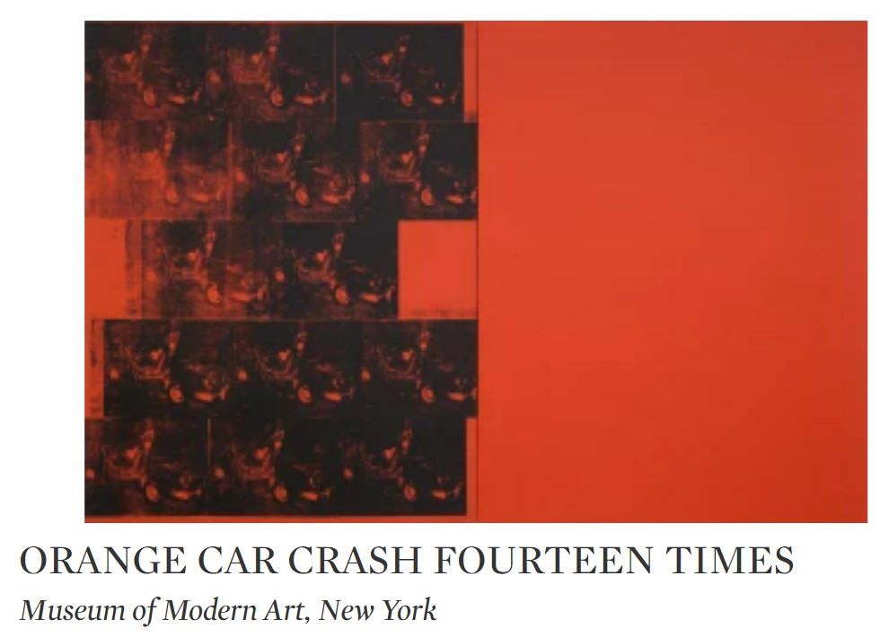
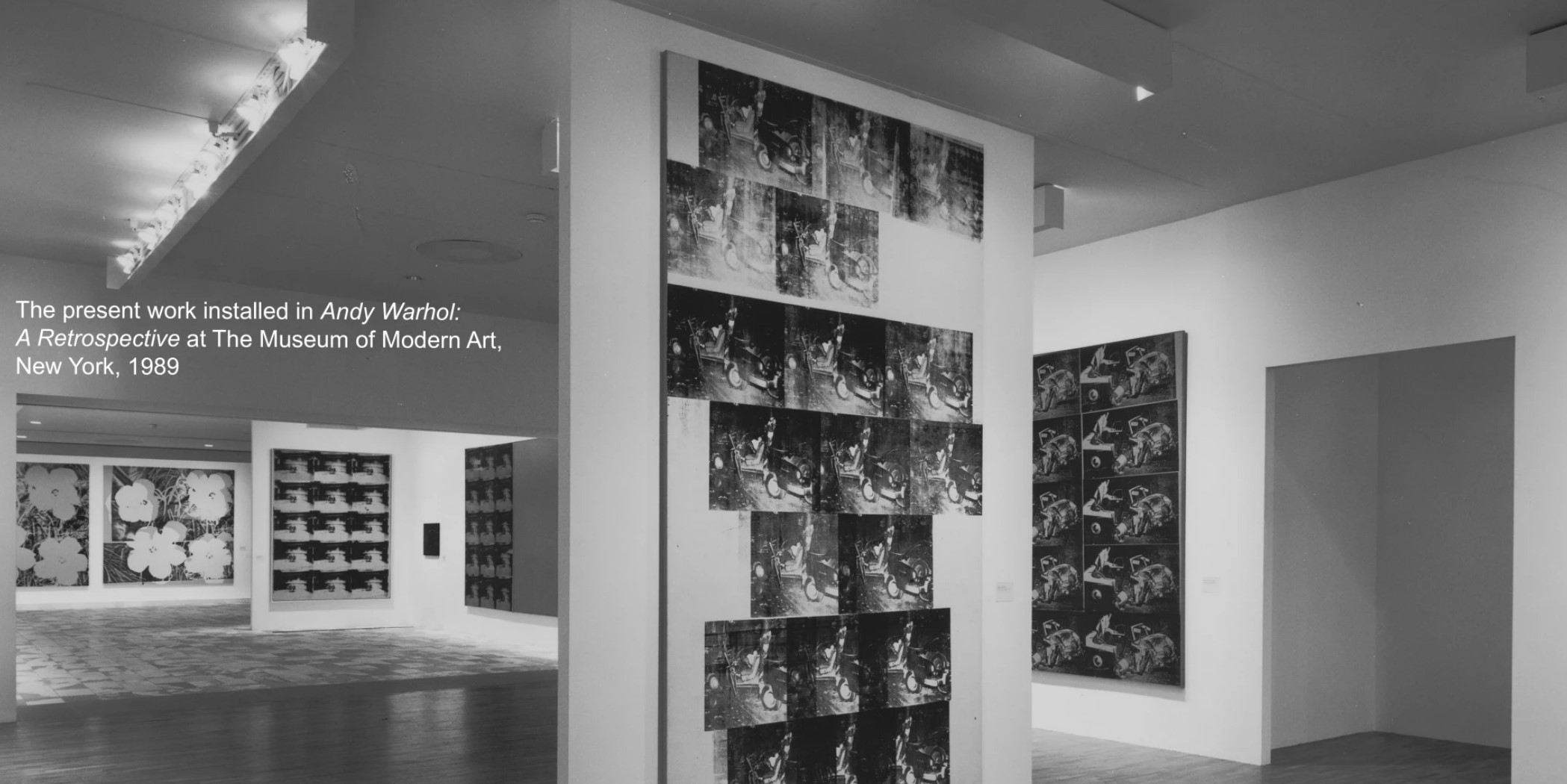
Within White Disaster (White Car Crash 19 Times), Warhol’s imprints of a fatal collision reel across a canvas spanning over twelve feet high and six feet across, marking it as the largest and most ambitious single-panel Car Crash painting that Warhol ever executed. It represents the zenith of the Death and Disaster corpus, a body of work that was then Warhol’s total focus and remains his most significant and enduring contribution to the course of Art History. The present work is one of only three large-scale Death and Disaster paintings which bear this impression of the crash, alongside Silver Car Crash (Double Disaster) and Orange Car Crash Fourteen Times, in the Museum of Modern Art in New York.
Testifying to the work’s seminal importance within Warhol’s career, the painting has been widely exhibited in Warhol’s most pivotal museum retrospectives, including his important early survey at the Pasadena Art Museum, Tate Museum in London, and Whitney Museum of American Art in New York in 1970-1971; his retrospective at the Museum of Modern Art in New York, Art Institute of Chicago, and Centre Georges Pompidou in Paris, among other travelling locations, in 1989-1990; the important exhibition Pop Art at the Royal Academy of Arts in London, Museum Ludwig in Cologne, and Museo Nacional Centro de Arte Reina Sofía in Madrid in 1991-1992; and most recently, the acclaimed exhibition ANDY WARHOL/SUPERNOVA: Stars, Deaths, and Disasters, 1962-1964 at the Walker Art Center in Minneapolis and other travelling locations in 2005-2006, amongst notable other exhibitions. The incomparable impact of White Disaster (White Car Crash 19 Times) as one of the most significant momento moris of modern art history is further confirmed by its legendary provenance: the present work originally belonged to New York’s Stable Gallery, where Warhol debuted his first solo Pop exhibition in New York City in November 1962, only a few months prior to the execution of the present work, and it has since passed through the respectively venerable collections of gallerists Heiner Friedrich and Thomas Ammann.
Green Car Crash (Green Burning Car I)
Green Car Crash (Green Burning Car I), 1963
Christie’s New-York: 15 May 2007
Estimated: USD 25,000,000 – 35,000,000
USD 71,720,000
Andy Warhol (1928-1987) , Green Car Crash (Green Burning Car I) | Christie’s
ANDY WARHOL
Green Car Crash (Green Burning Car I), 1963
Synthetic polymer, silkscreen ink and acrylic on linen
90 x 80 inches (228.6 x 203.2 cm)
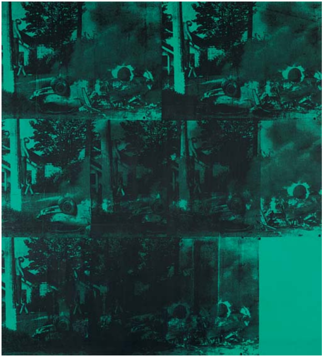
Green Car Crash (Green Burning Car I) is one of the masterpieces from this series. It is an unforgettable painting that makes multiple use of what is arguably the most extraordinary, strange and disturbing source image of all those used in Warhol’s famous Death and Disaster paintings. Describing more than just the scene of a car crash, this large electric green colored painting is a haunting work whose macabre and endlessly puzzling imagery startles with its stark and repetitive photographic presentation of a mundane suburban street shockingly transformed into a horrific disaster scene bordering on that of a surrealistic nightmare.
Silkscreened over a phthalo green background, Green Car Crash (Green Burning Car I) is a unique, seemingly mechanically colored work that belongs to a series of five paintings all made in the summer of 1963 and once known as the “burning car” paintings, that use the same source photograph. The other four paintings, White Disaster I (Staatsgalerie Stuttgart), White Disaster II (Museum für Moderne Kunst Frankfurt am Main), White Burning Car III (Andy Warhol Museum, Pittsburg) and the smaller image, White Burning Car Twice, are all executed solely in the newsprint-like tones of black and white. The extraordinary source image used by all these imposing and famous pictures was taken by photographer John Whitehead and inserted, apparently arbitrarily, into an article on racial integration that appeared in the June 3 issue of Newsweek in 1963. The caption that accompanied the photograph in the magazine described the photograph and the scene it records as follows: “End of the Chase: Pursued by a state trooper investigating a hit-and-run accident, commercial fisherman Richard J. Hubbard, 24, sped down a Seattle street at more than 60 mph, overturned, and hit a utility pole. The impact hurled him from the car, impaling him on a climbing spike. He died 35 minutes later in hospital.”
The photograph used in these paintings describes therefore, a freak accident. Like the black irony implicit behind Warhol’s later Ambulance Disaster paintings showing the horrific and fatal result of a collision between two ambulances returning from the same crash scene, or the terrifying and almost comic minimalism of Foot and Tire, one of the key features of Green Car Crash (Green Burning Car I) is the truly strange and exceptional nature of its imagery. In one freakish instant, a peaceful suburban street has been transformed into a horrifying scene of hell. It was this truly unique moment of reality, this peculiar moment of transition, when all values were transformed, life extinguished into death, the banal and the mundane into the exceptional and extraordinary – that particularly fascinated Warhol in many of the Car Crash images he chose, captivating his imagination at precisely the same time that it also terrified him. As David Bourdon has recalled, all throughout his life Warhol had an acute terror of unpredictable and indiscriminate death – something which, by his own admission led to such things as a perpetual and irrational fear of the driver of whatever car he happened to be in falling asleep at the wheel. Deeply conscious of the ever-presence of death, Warhol was mesmerised by the shallow fleeting transience of life and the thin, fragile intensity of reality – the way in which things could be here one minute and gone the next. Something of this existential transience is implicit within the shallow photographic realism Warhol offered up in his paintings through the silkscreen technique. It is an element that is particularly emphasized in his Death and Disaster series and nowhere more so than in the “burning car” crash pictures such as Green Car Crash (Green Burning Car I).
Using the shallowness and apparent objectivity of the photographic image and the ease of repetition provided by the silkscreen process, Warhol sought in these works to explore the power and potency of such horrific images of man merged with machine. Running the same image repetitively across a brightly colored monochrome canvas in such a way that the eye becomes accustomed to its sequential and even patterned rhythm or play of form, Warhol not only sanitizes his imagery and makes it familiar, but he abstracts it, transforming its horrific and shocking power into something banal and vacant. In subsequent Car Crash images, such as 5 Deaths, it is less the abstract and more the strange, bizarre, almost unreality of the photographic image and the accident itself, that appears to capture Warhol’s attention and which his paintings focus upon. Verging on surrealism, Green Car Crash (Green Burning Car I) is the ultimate example of this other tendency in Warhol’s Car Crash paintings. Like something from David Lynch’s Twin Peaks or Blue Velvet, where the charming and banal idyll of a suburban community is shown to be nothing more than a shallow artifice of respectable surface appearance beneath which there lurks a darker reality of horror and depravity, Green Car Crash (Green Burning Car I) reveals a very real but similar rift in the world of appearances. And it does so with all the gritty realism and mechanical style of an illicit movie or a film noir.
This extraordinary contrast, captured in this photograph, between the mundane normality of everyday suburbia and the exceptional violence and tragedy that periodically strikes at its heart pictorially describes exactly what Warhol wished to express in the Death and Disaster series about the extraordinary tragedies and horrors occurring to ordinary people on a daily basis. Extraordinary tragedies and events that ‘go by’, Warhol said, completely unnoticed. It was no doubt for this reason that, in this work alone of the five ‘burning car’ crash paintings, Warhol has concentrated on the specific part of the photograph showing the impaled figure and the passer-by, repeating this segment of the source photo in a triple sequence both at the center and in the bottom row of the painting.
Painted sometime in either June or July of 1963, Green Car (Green Burning Car I) was one of the first paintings that Warhol made with the help of his new assistant Gerard Malanga. It was made as part of Warhol’s preparation for his winter show at the Sonnabend Gallery in Paris. This exhibition Warhol originally intended to be called “Death in America,” and was to include images of the darker side of the U.S. in the aim of pleasing the French intellectuals whom Warhol had been led to believe would not welcome his earlier “Pop” images drawn from the country’s overtly consumerist culture. With its central image of disaster taking place in the heart of an all-American suburban landscape, Green Car Crash (Green Burning Car I) was one of the key paintings to be exhibited at this exhibition which subsequently opened to much acclaim in Paris in January 1964.
Green Disaster (Green Disaster Twice)
Green Disaster (Green Disaster Twice), 1963
Sotheby’s New-York: 13 November 2012
Estimate on Request
USD 15,202,500
ANDY WARHOL
Green Disaster (Green Disaster Twice), 1963
Acrylic and silkscreen ink on canvas
48 x 41.7 inches (121.9 x 106 cm)
Designated in Georg Frei and Neil Printz’s 2002 catalogue raisonné as one of the very first of Andy Warhol’s “car crash” paintings, Green Disaster (Green Disaster Twice) of 1963 is an historic paradigm of Pop Art from the heart of a breathtaking moment in twentieth-century Art History. This work’s execution in January – February 1963 belongs to an extraordinary shift in this most iconic of artistic careers, during which Warhol revolutionized the terms of popular visual culture. The ideal of the seminal Death and Disaster series, which was one of the most provocative, confrontational and brilliant projects undertaken by any artist in the transformative decade of the 1960s, this canvas epitomizes the monumental themes of Warhol’s career: namely an unprecedented artistic interrogation into the agencies of mass-media, celebrity and death. Warhol made just four paintings based on the specific car crash photograph that is repeated twice in the present work. One of these, Green Disaster #2 is now housed in the Museum für Moderne Kunst, Frankfurt while another, Orange Car Crash, is in the Museum Moderner Kunst Stiftung Ludwig, Vienna. As the very incipit of this legendary series, perhaps the most notorious and challenging of his entire illustrious oeuvre, Green Disaster (Green Disaster Twice) is truly a foundational masterpiece of one of the most influential artists of the last century.
With deafening resonance Green Disaster (Green Disaster Twice) exclaims an immediately harrowing and intensely violent scenario: the instant aftermath of a brutal car crash. Within the composition the unmistakable corporeal outline of a single body is slung out of the vehicle’s passenger side door and thrown towards the viewer. The elbow of its crooked arm points directly towards us, almost as if in a final, last-gasp accusatory gesture against our morbid voyeurism. The metallic expanse of the vehicle’s massive form accentuates the flesh-and-blood mortality of its ill-fated passenger. Intertwined with the deformed metal superstructure and jointly sprawled across the asphalt concrete is this twisted victim: man and machine having become fused together through mundane catastrophe. In more metaphorical terms, the harsh division between the gleaming automobile with glistening chrome and polished hubcap on the left, and the spectacularly crushed grille, wing and bonnet on the right is mediated by the strewn body, unfortunately caught at the precise point between organized construction and chaotic destruction. Thus one of the great symbols of 1950s and 1960s America, a facilitator of individualism and a key signifier of social mobility, the automobile, becomes the devastating delivery system of indiscriminate fatality. As Neil Printz relates, “the car crash turns the American dream into a nightmare” (Neil Printz in: Exh. Cat.,Houston, Menil Collection, Andy Warhol: Death and Disasters, 1988, p. 16).
Green Disaster (Green Disaster Twice) offers the nightmare, but also concurrently normalizes this dystopian vision of sanitized suburban brutality. As ever with Warhol’s oeuvre, import is incited not only by subject, but also by method, process and context. Silkscreened on phthalo green, the notionally horrific and terrifying subject matter is revealed through the patterned gradations of anonymous dots against a determinedly anti-naturalistic hue that has been extracted straight out of the gaudy, attention-grabbing chromatic vernacular of mass-media advertising. In addition, Warhol faithfully reproduces the composition of the photojournalist, replicating the foreign aesthetic of a found image. The nature of this rendering is strategically impersonal. Hopps succinctly describes that “Warhol took for granted the notion that the obvious deployment of traditional rendering need not be revealed or employed, thereby expunging manual bravura from his work.” (Walter Hopps, in Exh. Cat., Houston, The Menil Collection, Andy Warhol: Death and Disasters, 1988, p. 7) In Green Disaster (Green Disaster Twice) the mechanical silk-screen dot and absence of manual bravura silence the subject, at once evoking the production of newsprint photojournalism and the unceasing everyday phenomenon that the car crash had itself become.
Five Deaths
Warhol painted Five Deaths between the months of August and September of 1963, during a truly seminal moment in which he produced some of the most celebrated paintings of his career. In this groundbreaking year Warhol successfully painted the iconic works that now make up his inimitable canon: Suicides, Black and White Disaster, Early Serial Disasters, Silver Electric Chairs, Red Explosion, Tunafish Disasters, Race Riots, Burning Cars, Five Deaths as well as Liz, Elvis and the photo booth self-portraits. During this time, Warhol’s home on Lexington Avenue could no longer accommodate the number of paintings being produced, so in early 1963 he began to rent out a two-story firehouse on East 87th Street. He used the top floor as a studio and the bottom floor was kept as an empty gallery, and Five Deaths that were painted in lurid hues of various sizes. Those works were painted in preparation for Warhol’s Winter show at the Sonnabend Gallery in Paris.
“My show in Paris is going to be called ‘Death in America.’ I’ll show the electric-chair paintings and the dogs in Birmingham and car wrecks and some suicide pictures”
Ileana Sonnabend
The Sonnabend exhibit was intended to depict the darker side of America with the expressed aim of appeasing a French audience that Warhol believed would not entirely welcome his Pop paintings of soup cans and celebrities. With its central image of disaster taking place along the American highway landscape,
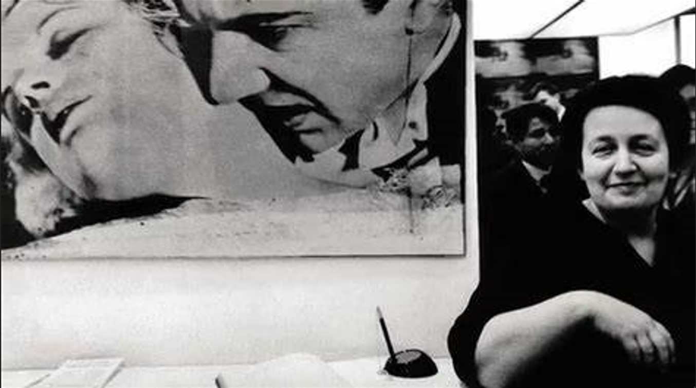
Five Deaths on Orange was acquired directly from the Stable Gallery by the renowned gallerist Ileana Sonnabend and has been on extended loan to the Baltimore Museum of Art since 1985. Sonnabend met Warhol as early as 1962 and became an early champion of his work, curating some of Warhol’s most important early shows at her Paris gallery including Death and Disasters (1964), Flowers (1965), and Thirteen Most Wanted Men (1967). The pair became two of the central figures of the art world in the 1960s—each knew their strengths and played to them. Between them, they formed a powerful partnership; Sonnabend knew that knowledge was power and used her awareness of the art market to great effect, while Warhol—ever the gossip—loved knowing everything about everybody. “These two, Ileana and Andy, were consummate role players, and over time the roles they played became who they were. Shrewd and intellectually nimble, both exploited their pronounced stylistic eccentricities to constant advantage” (B. Richardson, ‘Ileana & Andy: A Story in Counterpoint,’ Warhol from the Sonnabend Collection, exh. cat., Gagosian Gallery, New York, 2009, p. 11).
5 Deaths, 1963
Sotheby’s London: 5 October 2017
GBP 2,200,000 – 3,200,000
GBP 968,750
ANDY WARHOL
5 Deaths, 1963
Acrylic and silkscreen ink on canvas
20 1/8 x 30 inches (51.1 x 76.2 cm)
Stamped by the Estate of Andy Warhol and the Andy Warhol Foundation for the Visual Arts
Numbered PA67.022 on the overlap
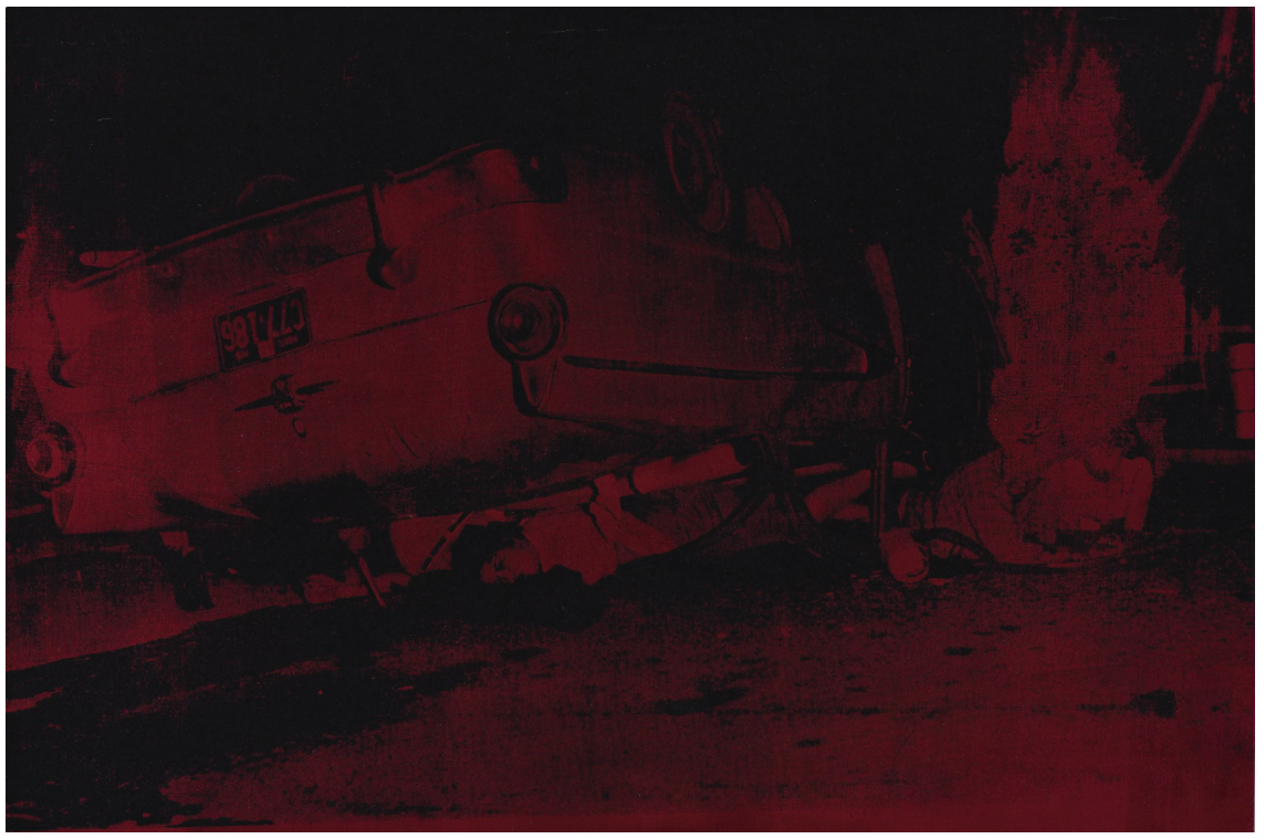
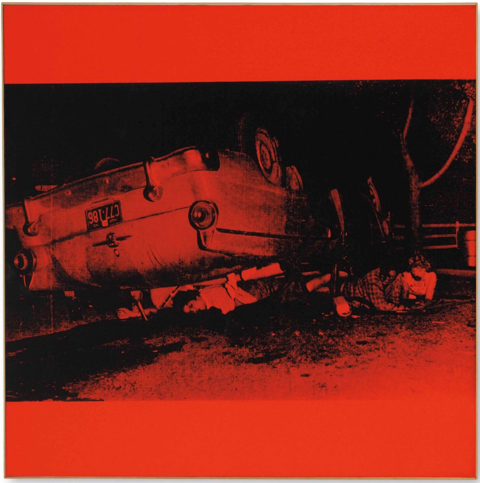
Andy Warhol’s 5 Deaths, executed between August and September 1963, belongs to the seminal Death and Disaster series, one of the most important and influential bodies of work to emerge from the Pop era. Positioned at the center of this canon, 5 Deaths represents Warhol’s inquisition into two monumental themes: the relationship between permanence and transience, and the cause and effect of celebrity. Significantly, the present work is one of the first examples of Warhol’s use of Alizarin Crimson, a color he greatly favored in the 1970s. The poignancy of this unusual hue seeping through the black screen lends a mystery and unique edge to the composition, the powerful dark tones colluding on the surface of his canvas to create a deeply luxurious chromatic coalition whilst concomitantly imparting a dark sense of intrigue.
The atrocity here is highly quotidian; it is a thoroughly everyday catastrophe, typical of what Walter Hopps calls the “unpredictable choreography of death” amongst the “banality of everyday disasters” (Walter Hopps quoted in: Exh. Cat., Houston, The Menil Collection, Andy Warhol: Death and Disasters, 1988, p. 9). Warhol, himself obsessively fixated with the fragility of existence, here scrutinizes the public face of a private disaster and questions why anonymous victims are elevated to celebrity through their flirtation with death.
Within the painting, the corporeal indications of five bodies are discernible: the man and woman emerging from the car’s windows at the right of the image; the woman staring starkly out through the car’s rear windscreen; the rear view of a body’s trunk behind her; and the ominous hand drooping behind the car’s rear wing at the left of the image. The undercarriage and main chassis of the stylised two-tonne automobile are cleanly silhouetted against the night sky. That this metallic expanse seemingly remains largely unscathed emphasises the vehicle’s massive form and accentuates the crushing effect of its weight on its mangled window frames and occupants. Intertwined with the deformed metal superstructure, jointly sprawled across the asphalt concrete, are the twisted human bodies: man and machine fused through mundane catastrophe. Thus one of the great symbols of 1950s and 1960s America, a facilitator of individualism and a key signifier of social mobility, the automobile, becomes the devastating spectre of indiscriminate fatality. As Neil Printz relates, “the car crash turns the American dream into a nightmare” (Neil Printz, ‘Painting Death in America’, in: ibid, p.16).
Although 5 Deaths offers the nightmare, it concurrently normalises a dystopian vision of sanitised suburban brutality. As ever with Warhol’s oeuvre, import is incited not only by subject, but also by method, process, and context. Silkscreened on Alizarin Crimson, the notionally horrific and terrifying subject matter is revealed through the patterned gradations of anonymous printing dots. The nature of this rendering is strategically impersonal: the mechanical silkscreen dot and absence of a painterly hand desensitise the subject, at once evoking the mass production of newsprint photojournalism and the unceasing everyday phenomenon that the car crash had itself become. In addition, Warhol faithfully reproduces the composition of the photojournalist, replicating the foreign aesthetic of a found image. The source for 5 Deaths was an 8 by 10 inch glossy black-and-white photograph distributed by United Press International, and discovered by Warhol’s assistant Gerard Malanga amongst piles of news agency photos in a bookstore on 7th Avenue and 23rd Street. Despite the horror of the scene before him, the photojournalist has cropped the image through the view finder to engender narrative and provide an aesthetically satisfying picture according to compositional convention.
It is also important to remember that contemporaneous with the Death and Disaster works are Warhol’s iconic portraits of James Dean, Marilyn Monroe, Elizabeth Taylor, and Jackie Kennedy: four superstars touched by death and disaster. Fame through death captivated Warhol, who himself wrote: “I never understood why when you died, you didn’t just vanish and everything could just keep going the way it was, only you just wouldn’t be there” (Andy Warhol quoted in: ibid., p.17). The potential for a private tragedy to catapult anonymity into the glare of the public arena and the uncertain interplay between anonymous suffering and broadcast exposure of personal bereavement are pervading themes permanently locked into 5 Deaths. Brilliantly capturing the central concerns of the most influential artist from the post-war era in a stunning palette of Alizarin Crimson, 5 Deaths is in every way an iconic example of Andy Warhol’s practice. Characterized by its powerful visual language and crucially important engagement with the influences of contemporary technology, the work stands as a powerful reminder of the significance of the artist’s practice even five decades later.
Five Deaths on Turquoise, 1963
Christie’s New-York: 10 May 2015
Estimated: USD 8,000,000 – 10,000,000
USD 9,797,000
Andy Warhol (1928-1987), Five Deaths on Turquoise | Christie’s
ANDY WARHOL
Five Deaths on Turquoise, 1963
Acrylic and silkscreen ink on canvas
30×30 inches (76.2 x 76.2 cm)
Five Deaths on Turquoise relates to the key paintings exhibited at Sonnabend that opened to much acclaim in Paris in January of 1964. Compared with others in the series, the exceptional execution of the screened image and its perfectly centered, square format allows Five Deaths on Turquoise to stand apart from contemporaneous works in the series. After the exhibition, the painting remained in The Ileana and Michael Sonnabend Collection for decades and was on extended loan to the Baltimore Museum of Art beginning in 1986. In Five Deaths on Turquoise, Warhol captures the extraordinary contrast that results when an otherwise ordinary joyride turns into horrific tragedy, and in doing so, he captures the fleeting ephemerality of life and the thin, fragile line that marks the division between life and death.
Five Deaths, 1963
Christie’s London: 30 June 2015
Estimated: GBP 2,200,000 – 2,800,000
GBP 3,890,500
Andy Warhol (1928-1987), Five Deaths | Christie’s
ANDY WARHOL
Five Deaths, 1963
Acrylic and silkscreen ink on linen
20.4 x 30 inches (51.8 x 77 cm)
The present work belongs to the second run of paintings from the 5 Deaths screen, comprising seven single-unit works. Warhol had completed the first set of paintings earlier in 1963, and these comprise multiple repetitions on the same canvas. However, after his experimentation with multiple canvases in the groundbreaking Ethel Scull commission, in the second run he broke the equation between image multiplication and canvas size by creating individual works which could be reconfigured and variously hinged together, either side by side or top to bottom.
A grotesque choreography of the inevitable, Five Deaths is a modern-day vanitas, a work that captures the macabre irony of life and its ill-fated end. Throughout his life, Warhol cultivated an obsessive dread of accidental death, and the car crash, in particular, both enthralled and terrified him. Over the course of his career, he amassed a graphic collection of high-contrast press photographs of car crashes that were often too gruesome to be published, and he readily admitted to a fear of drivers falling asleep at the wheel.
Five Deaths on Orange, 1963
Christie’s New-York: 11 November 2014
Estimated: USD 8,000,000 – 12,000,000
USD 11,365,000
Andy Warhol (1928-1987), Five Deaths on Orange | Christie’s
ANDY WARHOL
Five Deaths on Orange, 1963
Acrylic and silkscreen ink on linen
30.2 x 30.2 inches (76.6 x 76.6 cm)
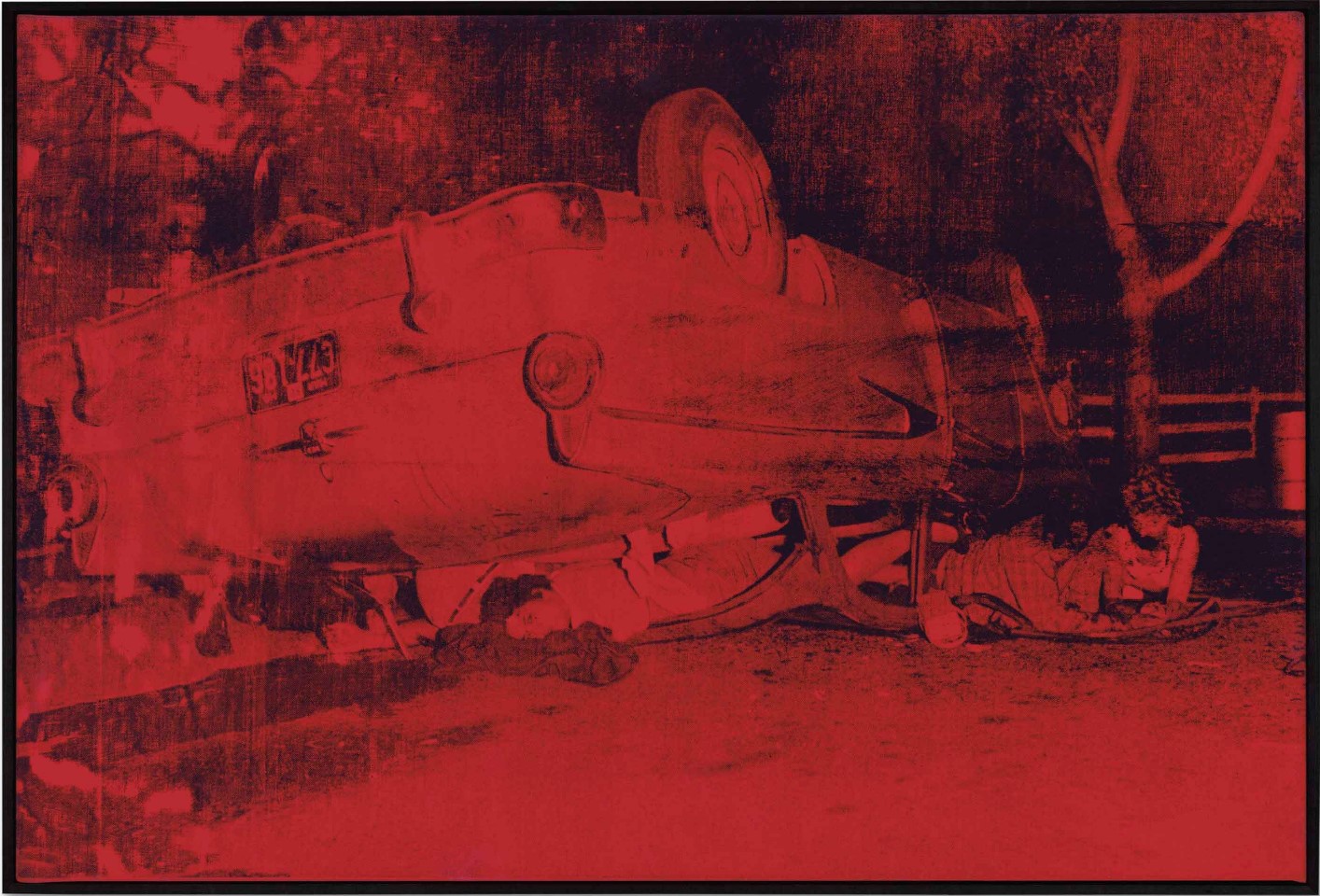
One of Andy Warhol’s most celebrated Death and Disaster paintings, Five Deaths on Orange shows the bloody aftermath of a fatal automobile accident, containing within its forthrightness the power and prurience of Warhol’s use of imagery. Encapsulated in this canvas is Warhol’s entire philosophy of art and life: a celebration of beauty, violence, modernity and the ever-present Spector of death. These are timeless attributes that have been celebrated throughout art history, yet through Warhol’s eyes they appear with the potency and significance that is unparalleled within modern painting. Once owned by the legendary gallerist Ileana Sonnabend, this painting has remained in the same private collection for the past thirty years, and despite half a century passing since its creation, the haunting nature of this single image has not relinquished any of its impact, and in today’s media saturated world still has the power to induce a powerful visceral reaction in those who see it.
With its intense color and shocking imagery, Five Deaths on Orange becomes an authoritative essay on the power of the image in modern society. The image Warhol used pulls no punches in its gruesome depiction of the scene of an accident. The upturned vehicle, flipped over on a country road, entombs three of its victims inside its metal structure. In the center of the picture a female passenger lies in a pool of blood, her vacant gaze staring out at the viewer as if in a cry for help. Behind her, the twisted body of her male companion lies motionless, and to the left the anonymous hand of another victim hangs from the car’s dark interior. Out of this mangle of metal and bodies however, two other figures emerge, bloodied and in obvious shock as they crawl away from their lifeless companions. Adding to the evocative nature of Five Deaths on Orange is the clarity of this particular canvas, which lays out the details of the scene in exacting detail from the expressions on the victim’s faces to the pattern on the man’s plaid shirt and even the individual leaves on the tree that blocks the car’s path. This, together with the unscreened passages of vibrant color that run across the upper and lower edges of the painting, heightens the tension contained within the picture, almost forcing the viewer to lean in for a closer, more considered, examination of the gruesome scene that Warhol lays out before us.
5 Deaths, 1963
Christie’s New-York: 14 November 2012
Estimated: USD 6,000,000 – 9,000,000
USD 8,146,500
Andy Warhol (1928-1987) , 5 Deaths | Christie’s
ANDY WARHOL
5 Deaths, 1963
Silkscreen ink and acrylic on canvas
44×33 inches (111.8 x 83.8 cm)
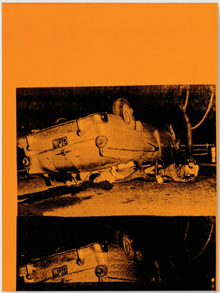
In the present work, Warhol screens two images of a California car crash. One of these screens, striking in its clarity, is placed centrally within the canvas, bordered by a large swath of orange canvas at the top, and a second version of the image below. Unlike other examples of this particular screen, the remarkable clarity of this particular screening brings home the brutality of the scene we are witnessing. The vertical composition of the screens, one stacked on top of another, calls attention to Warhol’s increasing interest in the medium of film. Although by the time 5 Deaths was painted in 1963 Warhol had been investigating the impact of repeated images for a while, this particular painting is a rare example of his use of repetition only on the vertical axis as opposed to the ‘all-over’ grid of his earlier Death and Disaster works. In 5 Deaths, this vertically recalls a film strip as its passes through the projector and by including an expanse of unscreened canvas in the upper portion of the work, Warhol simulates (intentionally or not) the interruption of the projection-as though the film has become stuck-bringing the scene to a juddering, abrupt halt. In this way, it might be argued that Warhol is drawing our attention not only to the artifice inherent in the reproduction of such images, but also to the fragility inherent in life itself.
5 Deaths, 1963
Sotheby’s London: 1 July 2008
Estimated: GBP 1,500,000 – 2,200,000
GBP 1,609,250
 ANDY WARHOL
5 Deaths, 1963
Acrylic and silkscreen ink on canvas
20.1 x 30 inches (51.1 x 76.2 cm)
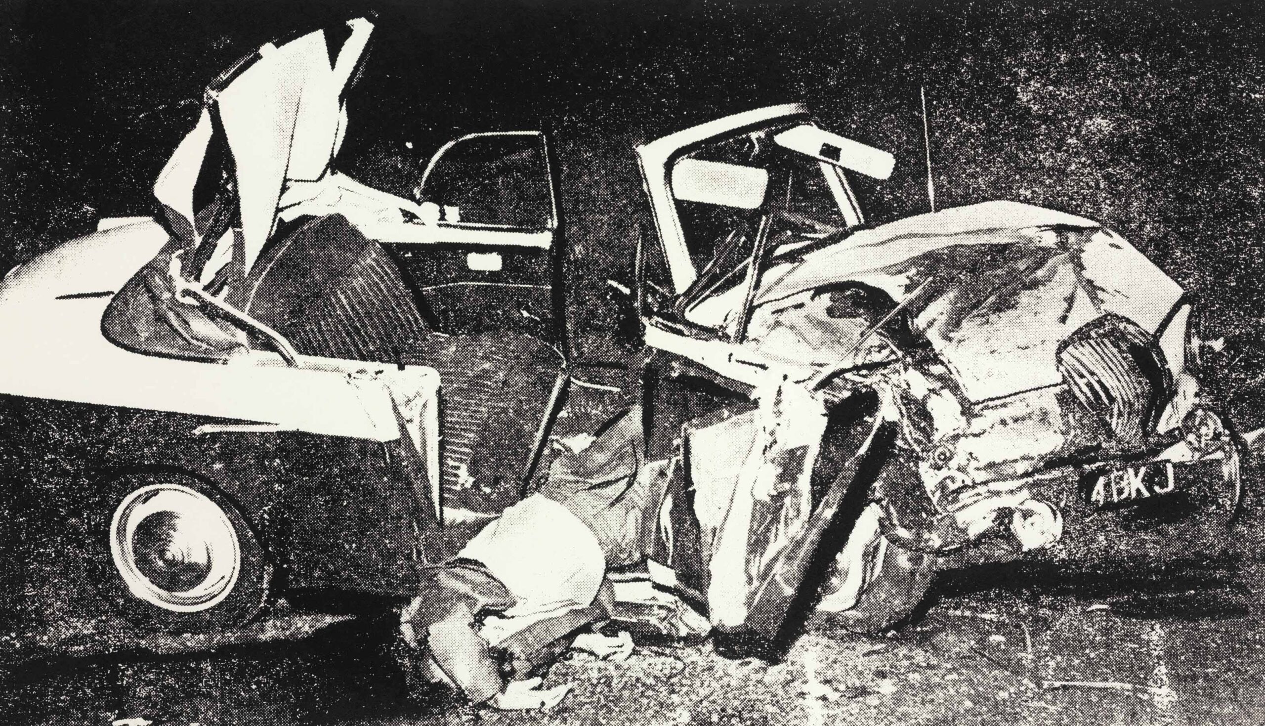
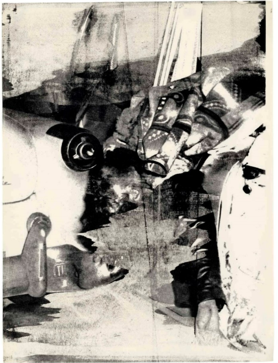
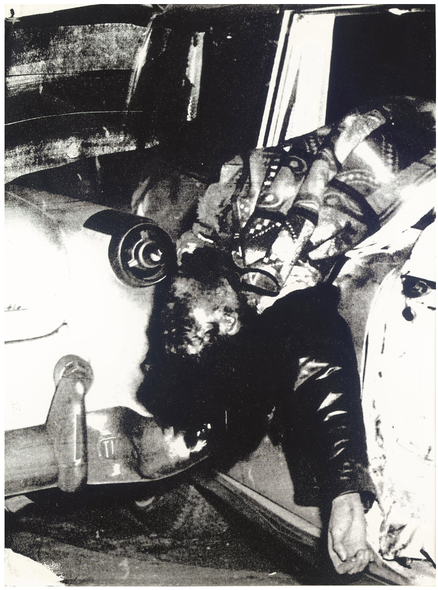
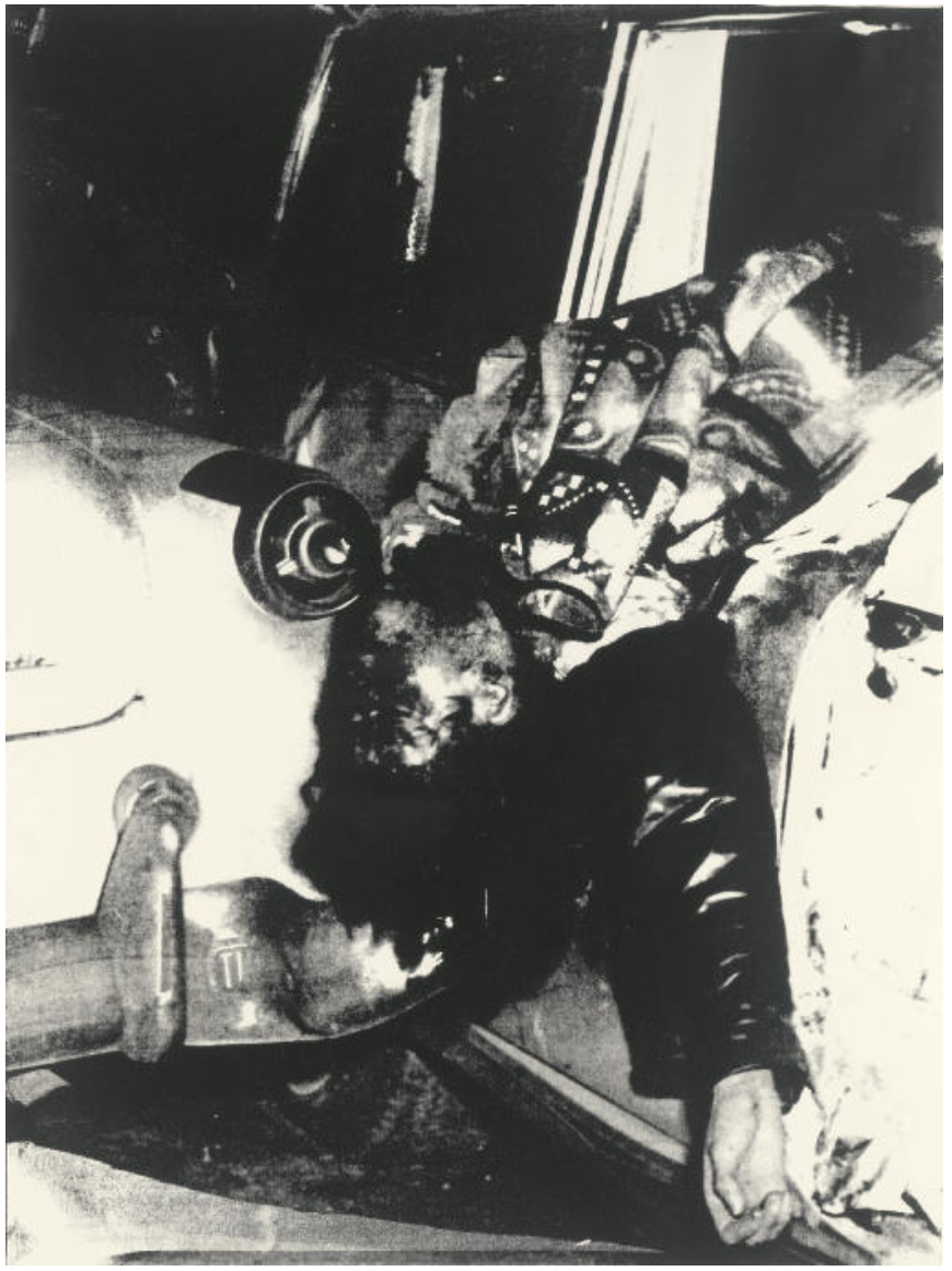
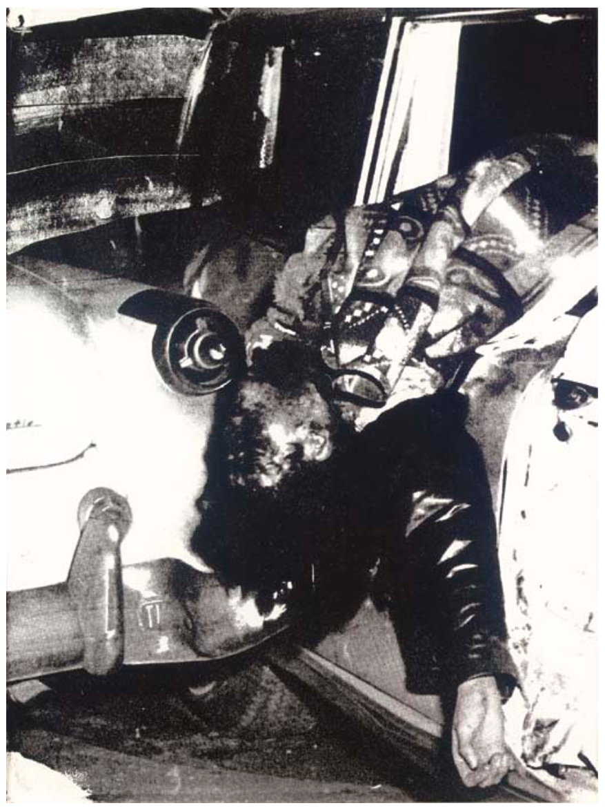
Ambulance Disaster
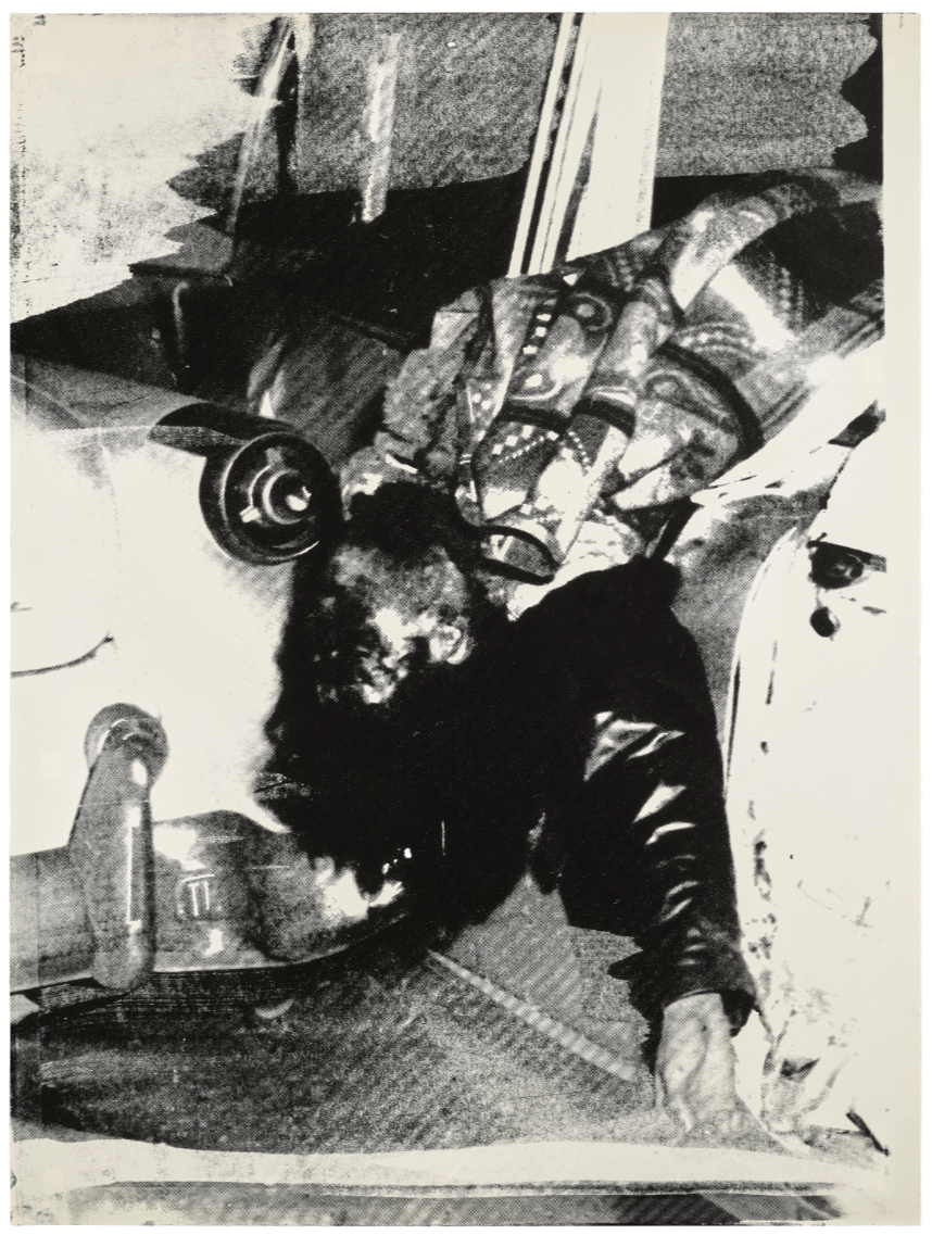
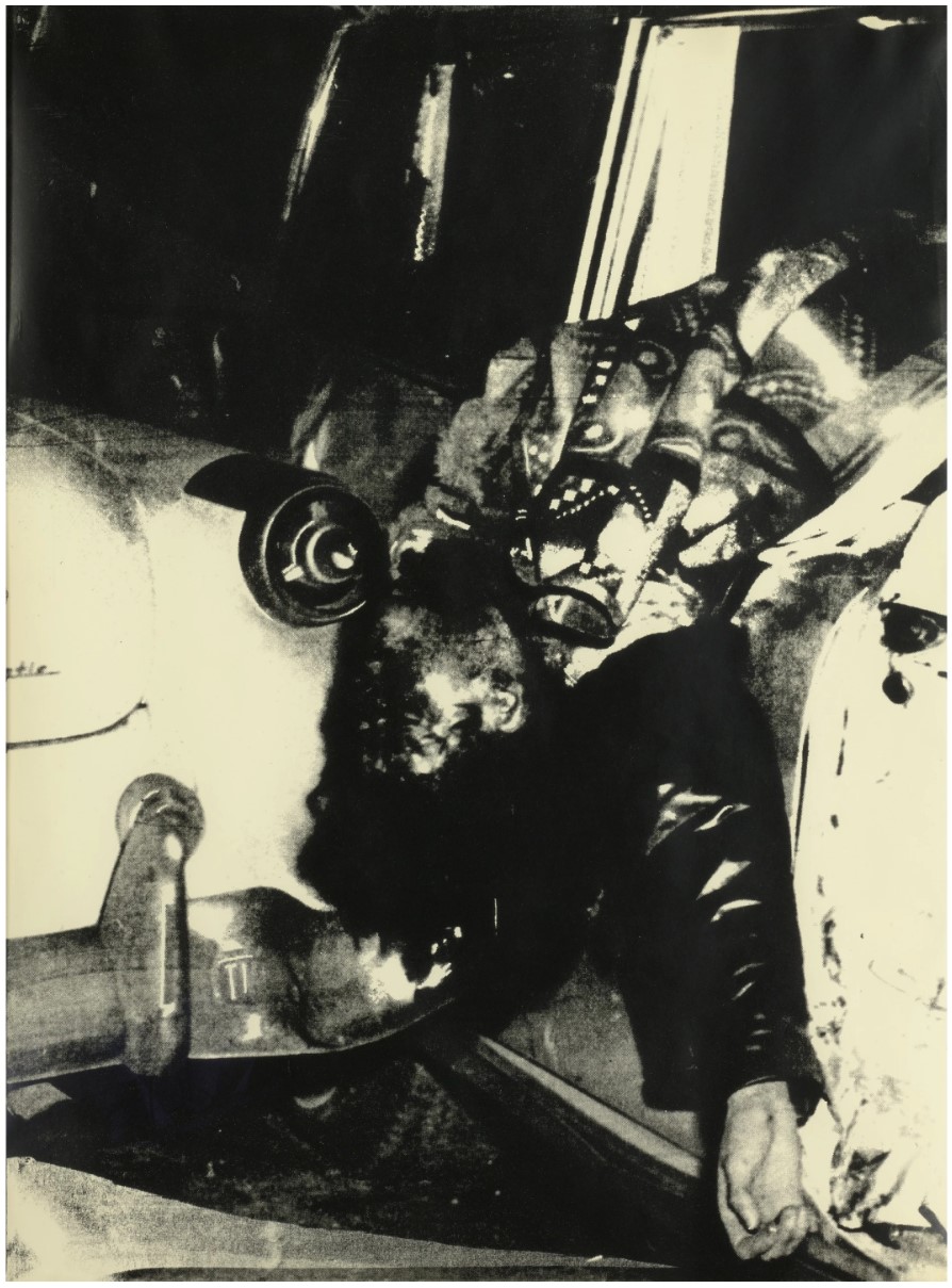
Warhol based the image on a United Press International photograph of traffic accident in Chicago on January 9, 1960, which foreshadowed the extensive use of media-derived images that would become one of the important hallmarks of his career. Working on a monumental scale, Warhol heightened the image’s raw power by exaggerating its strong contrasts of light and dark. Choosing to execute this work on Strathmore drawing paper, Warhol transferred the image into the realm of high art while preserving an echo of the pulpy texture of its original newspaper context. Warhol’s graphic transformation of this image emphasizes its ambiguity, as only slowly through its murky shadows does the upturned head of the partially covered corpse become legible. Cropping the original photo to focus on the victim draped across the image– like an anonymous modern-day Pietà– Warhol created a powerful work of art that continues to shock.
“My show in Paris is going to be called ‘Death in America.’ I’ll show the electric-chair pictures and the dogs in Birmingham and car wrecks and some suicide pictures”
In January 1964, Andy Warhol had his first solo show in Europe, at the Galerie Ileana Sonnabend in Paris, where he exhibited his Death and Disasters series.
Ambulance Disaster, circa 1963
Christie’s New-York: 22 November 2024
Estimated: USD 400,000 – 600,000
USD 441,000
ANDY WARHOL (1928-1987), Ambulance Disaster | Christie’s
ANDY WARHOL (1928-1987)
Ambulance Disaster, circa 1963
Silkscreen ink on paper
40 x 30 1/8 inches (101.7 x 76.4 cm)
Stamped with the Estate of Andy Warhol and the Andy Warhol Foundation for the Visual Arts, Inc. stamps and numbered ‘UP 67.05’ (on the reverse)
Between 1962 and 1964, when Andy Warhol was making his most iconic and important works on canvas, he simultaneously created a small group of silkscreened works on Strathmore Drawing paper. Each work was silkscreened by hand, using the same silkscreens Warhol employed on his canvases, creating a unique image that retained the graininess and immediacy of the often shocking source imagery. Of the five silkscreen images Warhol chose to render on paper, three were from his “Death and Disaster” series. These are Race Riot, Suicide, and Ambulance Disaster.
The motif of car crashes and car accidents is one that Warhol returned to throughout the seminal period of production that occurred between 1962 and 1964. This motif is best realized in masterpieces such as Green Car Crash (Green Burning Car I), 1963, and the large Ambulance Disaster, 1964, belonging to the Andy Warhol Museum in Pittsburg. The car crash paintings encompass many of the themes that fascinated Warhol and inspired his best works: mortality, voyeurism, and the consumption of mass-media. These horrific images might seem to be an unlikely subject for art, but with through Warhol’s perceptive eye, they become material for some of the most challenging and provocative paintings made by any artist in the post-war era.
“The Disasters constitute a key moment in [Warhol’s] work. Suddenly the sassy young man, who had burst on the scene with images of Campbell’s Soup, Coca-Cola, dollar bills, and movie stars, was turning his attention to the death-obsessed underbelly of American life. These paintings must have been a tremendous shock when they first appeared, revealing that Pop Art was much more than an ironic joke for Warhol. With the Disasters, Warhol succeeded in separating himself from the other Pop artists, who, for the most part, continued to occupy themselves with the mechanics of mass-market image-making. He defined himself as an artist operating on a truly ambitious stage, willing to take on the big issues of human existence -mortality, the randomness of life and death, and the impersonal cruelty of state power. By so doing, he created a link for himself to not only the pessimistic humanism of Goya and Picasso, but, more importantly, to Abstract Expressionism and its existential and metaphysical concerns -concerns which had been mostly abandoned by the artists of the 60s”
(P. Halley, “Fifteen Little Electric Chairs,” Andy Warhol Little Electric Chair Paintings, exh. cat. Stellan Holm Gallery, New York, 2001, p. 40).
The source image of Ambulance Disaster is an undated UPI photograph that documents the accidental collision of two ambulances that were returning from a car crash in Chicago. As the Warhol catalogue raisonné notes in the entry on the Ambulance Disaster paintings, the “two vehicles intended to save the lives had themselves becomes instruments of death.” The irony and can’t-look-away horror of the story, and of the image of the young woman thrown lifelessly from the ambulance window, represent Warhol at his darkest and most pure.
Ambulance Disaster, circa 1963
Estimated: USD 600,000 – 800,000
USD 962,500
 ANDY WARHOL
Ambulance Disaster, circa 1963
Silkscreen ink on paper
40×30 inches (101.6 x 76.2 cm)
Stamped by the Estate of Andy Warhol and the Andy Warhol Foundation for the Visual Arts, Inc. Numbered UP 67.02 on the reverse
Andy Warhol’s ability to transform artistic creation into something more immediate and commercial forever altered the landscape of Contemporary art. Having begun his career as a commercial draftsmen, his eye was constantly attuned to imagery which would readily capture the attention and focus of the viewer. He did not, however, confine himself to such saccharine sentimentality so often found in mass media, and his Death and Disaster works stand as a testament to confront such darkness in his work. Ambulance Disaster is a prime example of Warhol’s work which would confront the nature of death, its simultaneous aspects of anonymity and fame, and the ability of the popular press to generalize a very specific and unique occurrence in the life of that (former) person. The “disaster” in question here occurred when two ambulances rushing from the scene of an accident collided en route to the hospital. Warhol’s use of the silkscreen, an easily reproduced medium, takes the dehumanization of the original news photograph one step further. Both his choice of subject material and his technique inform the viewer of this quality of contemporary media which provides a brief fifteen minutes of fame, but too late for the deceased who has had to pay with her life.
For Warhol, death represented something that was at once a very individual experience but it became something of a genre when manifested in so gruesome a fashion as to make the headlines. Each car crash is a very particular occurrence even while it is itself only once. Similarly, the silkscreen technique allows many similar variations to be made of a work but no two are identical. This work in particular, with its close cropping, is a variation of an earlier larger work of the same image. This smaller and more immediate treatment lends a poignant and arresting graphic quality which transforms this tragedy/genre painting into the contemporary high-art which Warhol popularized so determinedly.
Ambulance Disaster, circa 1963
Christie’s London: 1 July 2014
GBP 380,000 – 450,000
GBP 578,500
ANDY WARHOL
Ambulance Disaster, circa 1963
Silkscreen ink on paper
40×30 inches (101.6 x 76.2 cm)
Stamped with The Estate of Andy Warhol stamp and the Andy Warhol Foundation for the Visual Arts Stamp and numbered ‘UP.67.01’ (on the reverse)
Executed circa 1963, Ambulance Disaster is one of the two iterations on paper documented in the catalogue raisonné of a subject which fascinated Warhol during this time. In this imprinting of the harrowing subject-matter, Warhol’s nuanced presentation captures snippets of tangible details which come in and out of focus through the slippages and idiosyncrasies of his chosen medium. ‘Mishaps occurred often… uneven inking, and off-registration [giving] the works a painterly appearance that seemed at odds with the uniformity achievable through commercial uses of silkscreen’ (A. Danto, ‘Warhol and the Politics of Prints, in F. Feldman and J. Schellmann (eds.), Andy Warhol Prints: A Catalogue Raisonné 1962-1987, Milan 2003, p. 22).
The motif of the grisly car-crash are among Warhol’s most powerful and disturbing pictures, reflecting the artist’s deep-seated horror of physical violence and his profound dread of accidental death. Warhol’s Ambulance Disaster is a particularly powerful example of Warhol’s fascination with the representation of death and disaster in popular culture. Warhol’s fascination with the image continued, as he created several Ambulance Disaster paintings on canvas. Warhol based his image on a United Press International photograph of a traffic accident in Chicago on January 9, 1960. Warhol heightened the image’s raw power by exaggerating its strong contrasts of light and dark and by closely cropping in on the shockage footage of the victim draped down the car door. Warhol takes the landscape documentary image and sharply narrows our focus on the trauma to such an extent that ultimately we are offered a starkly vertical image that our eye initially reads as near-abstract, only for the ordeal to slowly materialize from the inked imprint. Warhol’s graphic transformation of this image emphasizes its ambiguity, as only slowly through its murky shadows does the upturned head of the partially covered body become legible.
Ambulance Disaster, circa 1963
Christie’s New-York: 15 May 2011
Estimated: USD 400,000 – 600,000
USD 1,022,500
Andy Warhol (1928-1987) , Ambulance Disaster | Christie’s
ANDY WARHOL (1928-1987)
Ambulance Disaster, circa 1963
Silkscreen ink on paper
40×30 inches (101.6 x 76.2 cm)
Stamped with the Estate of Andy Warhol and the Andy Warhol Foundation for the Visual Arts, Inc., stamps
Numbered ‘UP67.08’ (on the reverse)
“The Disasters constitute a key moment in [Warhol’s] work. Suddenly the sassy young man, who had burst on the scene with images of Campbell’s Soup, Coca-Cola, dollar bills, and movie stars, was turning his attention to the death-obsessed underbelly of American life. These paintings must have been a tremendous shock when they first appeared, revealing that Pop Art was much more than an ironic joke for Warhol. With the Disasters, Warhol succeeded in separating himself from the other Pop artists, who, for the most part, continued to occupy themselves with the mechanics of mass-market image-making. He defined himself as an artist operating on a truly ambitious stage, willing to take on the big issues of human existence -mortality, the randomness of life and death, and the impersonal cruelty of state power. By so doing, he created a link for himself to not only the pessimistic humanism of Goya and Picasso, but, more importantly, to Abstract Expressionism and its existential and metaphysical concerns -concerns which had been mostly abandoned by the artists of the 60s”
P. Halley, “Fifteen Little Electric Chairs,” Andy Warhol Little Electric Chair Paintings
Warhol devoted much of the year 1963 to producing images of profound violence and morbidity. Many of the source images that Warhol used were found in movie magazines or cheap tabloids, while others were provided by friends who had access to police or news-agency photographs. Warhol’s subjects, like the present work Ambulance Disaster are graphic and disturbing; bodies are scattered among mangled vehicles throughout the scenes not yet covered by the discreet white coroner’s sheet. The images, some have argued, reflect Warhol’s own fear and fascination with accidental death. Yet the mechanical process of replicating the image, and the monotonous repetitive application of the screen desensitizes the viewer to tragedy. The works, however banal their presentation, commodify American violence.
Ambulance Disaster, circa 1963
Christie’s New-York: 13 November 2007
Estimated: USD 1,000,000 – 1,500,000
USD 825,000
Andy Warhol (1928-1987) , Ambulance Disaster | Christie’s
ANDY WARHOL (1928-1987)
Ambulance Disaster, circa 1963
Silkscreen ink on paper
40×30 inches (101.6 x 76.2 cm)
Stamped with the Estate of Andy Warhol and the Andy Warhol Foundation for the Visual Arts, Inc., stamps
Numbered ‘VF 67.02’ (on the reverse)
In the early 1960’s, when Warhol was making his breakthrough photo-based silkscreen works on canvas, he created a small group of black and white works on paper, only 13 of which are known, including Cagney, Suicide, The Kiss (Bela Lugosi), Race Riot, a number of images based on his films, and the present lot, Ambulance Disaster. Warhol had a direct and personal involvement with the creation of these early works; only a small number were executed for each image, and each is different in some way, generally in terms of ink saturation and cropping. One can see Warhol working through the possibilities of the medium in these breakthrough screenprints, developing some of the major themes that he would explore for the rest of his career. Andy Warhol’s Ambulance Disaster is a rare example, and is an especially powerful example of Warhol’s fascination with the representation of death and disaster in popular culture. Warhol’s fascination with the image continued, as he created several major paintings after the Ambulance Disaster subject.
Among the later additions to the “death series,” Warhol’s 1963 silk-screen on paper, Ambulance Disaster, is a case in point: originally a comprehensively framed, emphatically horizontal UPI image, Warhol’s tight vertical close-up crops the car’s side-door markings and, with them, omits the telltale detail that, indeed, an “AMBULANCE SER[VICE]” has crashed. More concisely than anywhere else in his oeuvre, Warhol’s image pits the indisputable fact of photography (the woman is surely dead) against its narrative ambiguity (although not from this crash, but a prior one). For all the allure of photography’s purchase on reality, its meaning, by contrast, is a lure– invested in the odd textual detail, explanatory caption or, as here, the title. Yet this “SILENCE” (as Warhol emphasizes the death-chamber sign in the electric-chair paintings) is also the genius of the “death series” as a whole: how it eschews representing death, according to painterly habit and formula that invariably dramatize and normally ennoble it, in favor of presenting death, like photography, as the brute fact it is.
Ambulance Disaster, circa 1963
Christie’s New-York: 15 May 2003
Estimated: USD 180,000 – 220,000
USD 209,100
Andy Warhol (1928-1987) , Ambulance Disaster | Christie’s
ANDY WARHOL (1928-1987)
Ambulance Disaster, circa 1963
Synthetic polymer and silkscreen ink on paper
40×30 inches (101.6 x 76.2 cm)
Stamped with the Estate of Andy Warhol and the Andy Warhol Foundation for the Visual Arts stamps
Numbered UP67.08 (on the reverse)
This work is unique
Warhol devoted much of the year 1963 to producing images of profound violence and morbidity. Many of the source images that Warhol used were found in movie magazines or cheap tabloids, while others were provided by friends who had access to police or news-agency photographs. Warhol’s subjects, like the present work Ambulance Disaster are graphic and disturbing; bodies are scattered among mangled vehicles throughout the scenes not yet covered by the discreet white coroner’s sheet. The images, some have argued, reflect Warhol’s own fear and fascination with accidental death. Yet the mechanical process of replicating the image, and the monotonous repetitive application of the screen desensitizes the viewer to tragedy. The works, however banal their presentation, commodify American violence.
Other Car Crashes
Christie’s New-York: 12 November 2013
USD 365,000
Car Crash, circa 1978
Silkscreen ink on paper
35 x 45 inches (88.9 x 114.3 cm)
Tunafish Disaster
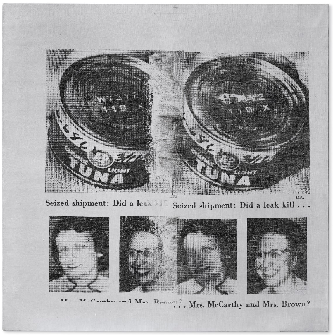
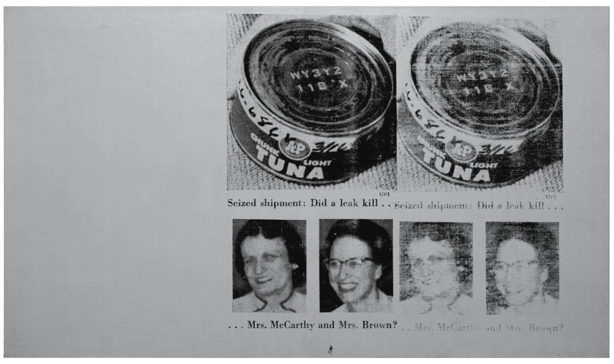
In March of 1963, two suburban housewives outside Detroit, Michigan, ate a lunch of tuna fish sandwiches as they watched their children play. Shortly thereafter, they were taken ill, driven to the hospital, and later died. Their cause of death? Botulism poisoning from a tainted can of A&P brand “chunk light” tuna. A few weeks later, a photograph displaying the two victims, identified as Mrs. McCarthy and Mrs. Brown, appeared in the April 1, 1963 edition of Newsweek alongside the infamous can that unwittingly led to their demise. The ordinariness of the two women, both middle-aged and unremarkable in appearance, appealed to Andy Warhol, who captured their image in a group of large-scale silver paintings he called the Tunafish Disasters.
Created just one year after his iconic series of Campbell’s Soup Cans, the Tunafish Disasters are important works from a key moment in Pop art history. They belong to the seminal Death and Disaster series that consumed Warhol for most of 1963, as he prepared for his major European debut at Ileana Sonnabend’s Paris Gallery, an exhibition called “Death in America.” Conceived as a series, the Tunafish Disasters illustrate Warhol’s commitment to revealing the underlying anxiety of Cold War America, while demonstrating his obsession with his own mortality. Consisting of only eleven paintings, the Tunafish Disasters are emblematic of Warhol’s best work, and linger with a ghostly beauty that belies the tragic ordinariness of the events that inspired them.
Tunafish Disaster illustrates the particular unease underlying the collective society’s “faith” in a system that prided itself on efficiency, wholesomeness and goodness in 1950s and ‘60s postwar America. The abundant supply of consumer goods that Warhol so effectively championed in his earlier work—Campbell’s soup, Coca-Cola, even the humble dollar bill—was dependent upon faith in a reliable system that produced them with an unerring sameness. The flipside of Warhol’s Campbell’s Soup Cans was Tunafish Disaster, which exposes the breakdown of that same system when it went disastrously awry. Together with news photographs of suicide victims, car crashes, race riots and the atom bomb, Tunafish Disaster joins with the everyday horrors depicted in Warhol’s seminal Death and Disasters series. The series illustrates the real anxieties that are part and parcel with modern life, and hints at the underlying anxiousness that pervaded the era of the Cold War.
Warhol was himself deeply afraid of his own death, but he smoothed over such fears by creating a persona that was cool and detached; he also understood the media’s role in anesthetizing the American public to tragedy and violence. In his portraits of Marilyn Monroe and Jackie Kennedy, Warhol seized upon the media’s coverage of famous celebrity deaths, which often recycled the same few tragic photographs, broadcast in an endless loop. Warhol continued this theme in the Death and Disaster series, focusing instead on the victims who became instant celebrities because of the unusual or frightful aspects of their death.
“When you see a gruesome picture over and over again, it doesn’t really have any effect. …and I thought people should think about them some time. …It’s not that I feel sorry for them, it’s just that people go by and it doesn’t really matter to them that someone unknown was killed.”
In Tunafish Disaster, Warhol allows the chilling effect of the deadly can of tunafish to loom large over the entire scene, creating an aura of death that is heightened by the sheer size of the canvas itself and his use of silver paint. He zooms in on the “A&P” brand tuna can, which has been photographed from an overhead angle to allow the serial numbers imprinted on the top of its lid to linger in deadly proof of its contamination. The two victims—Mrs. Margaret McCarthy and Mrs. Colette Brown—are relegated to smaller photographs positioned just beneath the large can of tuna. Each display the trappings of an unremarkable suburban existence, and smile obliviously in photographs that bear no indication of their tragic fate. Warhol further accentuates the haunting specter of the scene by blowing up the source image to larger-than-life proportions, as if to convey the nightmarish importance of the story that is illustrated by its original caption: “Seized shipment: Did a leak kill… Mrs. McCarthy and Mrs. Brown?”
The impetus for Warhol’s Death and Disaster series was originally presented to him by the critic Henry Geldzahler, who discussed the direction for Warhol’s next great body of work while they lunched together in June of 1962. “That’s enough affirmation of life,” Geldzahler said. “It’s enough affirmation of soup and Coke bottles. Maybe everything isn’t always so fabulous in America. It’s time for some death. This is what’s really happening,” he said, showing Warhol a copy of the New York Mirror featuring the wreckage of a recent plane crash with the headline “129 Die in Jet” (H. Geldzahler, quoted in V. Bockris, The Life and Death of Andy Warhol, London, 1989, p. 169). The suggestion dovetailed neatly with Warhol’s own anxieties and fears, as well as provided a solution for his European debut. Warhol had begun amassing a collection of crime photos along with the celebrity head shots he used for his portraits of Marilyn and Liz as early as the 1950s, and he understood the bizarre role that death played in creating celebrity, saying “death can really make you look like a star” (A. Warhol, quoted in P. Gidal, Andy Warhol: Films and Paintings, New York, 1971, p. 38).
As the Warhol scholar Neil Printz has pointed out, the Tunafish Disasters are the only group of paintings within the Death and Disaster series for which Warhol consistently employed a silver background across all eleven paintings of the series. Printz explains that Warhol’s use of silver personifies the bizarre scenario in which both victims died: The “Tunafish disasters might not be the first silver paintings, but they are the first in which the silver color is material to the subject” (N. Printz, quoted in G. Frei & N. Printz, eds., The Andy Warhol Catalogue Raisonne: Paintings and Sculpture 1961-1963, vol. 01, New York, 2002, p. 342). Printz also suggests that Warhol may have used silver to mimic the mechanized and industrial nature of death in his Death and Disaster paintings, whether by electrocution, as in the Electric Chair series, or by the effects of an industrially-produced tin can.
Whatever his intention, it is clear that the color silver was important to the artist at the time, having embarked on a series of silver portraits shortly thereafter, consisting of legendary actors of the “silver screen,” such as Marlon Brando, James Cagney, Liz Taylor in Cleopatra, and the famous series of Ferus Type Elvises. Whereas these later paintings featured spray-painted silver from an aerosol can, the Tunafish Disasters demonstrate hand-painted silver backgrounds where the subtle evidence of Warhol’s hand is revealed to tantalizing effect. Looking back, Warhol explained, “Silver was the future, it was spacy—the astronauts wore silver suits… And silver was also the past—the Silver Screen—Hollywood actresses photographed in silver sets. And maybe more than anything, silver was narcissism—mirrors were backed with silver” (A. Warhol & P. Hackett, quoted in Popism: The Warhol Sixties, Orlando, 1980, p. 83).
Tunafish Disaster, 1963
Sotheby’s New-York: 17 May 2024
Estimated: USD 600,000 – 800,000
USD 482,600
Tunafish Disaster | Contemporary Day Auction | 2024 | Sotheby’s (sothebys.com)

ANDY WARHOL (1928 – 1987)
Tunafish Disaster, 1963
Silkscreen ink and silver paint on canvas
41×22 inches (104.1 x 55.9 cm)
Stamped twice by the Estate of Andy Warhol and by the Andy Warhol Foundation for the Visual Arts, Inc.
Numbered PA57.016 on the overlap
Hailling from Andy Warhol’s legendary Death and Disaster series from 1962, Tunafish Disaster is a work of power, beauty and tragedy. This silver canvas brilliantly illuminates how the agents of mass media – replication and multiplication — both undermine and anesthetize the significance of their subjects, here emblematized as a quotidian catastrophe. The subject of this canvas reveals Warhol’s pre-occupation with the contradictions inherent in public and private despair. Having both tragically died from food poisoning after eating contaminated tuna, the previously anonymous Mrs. McCarthy and Mrs. Brown were thrown into the public spotlight, providing Warhol with the perfect subject to critique the relationship between death and celebrity with his infamous silkscreen. “Death can really make you look like a star,” Warhol said of this disturbing relationship. (A. Warhol, quoted in P. Gidal, Andy Warhol: Films and Paintings, New York, 1971, p. 38). The source for the Tunafish Disaster series came from a page of the April 1, 1963 edition of Newsweek, which detailed the epitome of what Walter Hopps called the “unpredictable choreography of death” amongst the “banality of everyday disasters.” (Walter Hopps in Exh. Cat., Houston, The Menil Collection, Andy Warhol: ‘Death and Disasters’, 1988, p. 9).

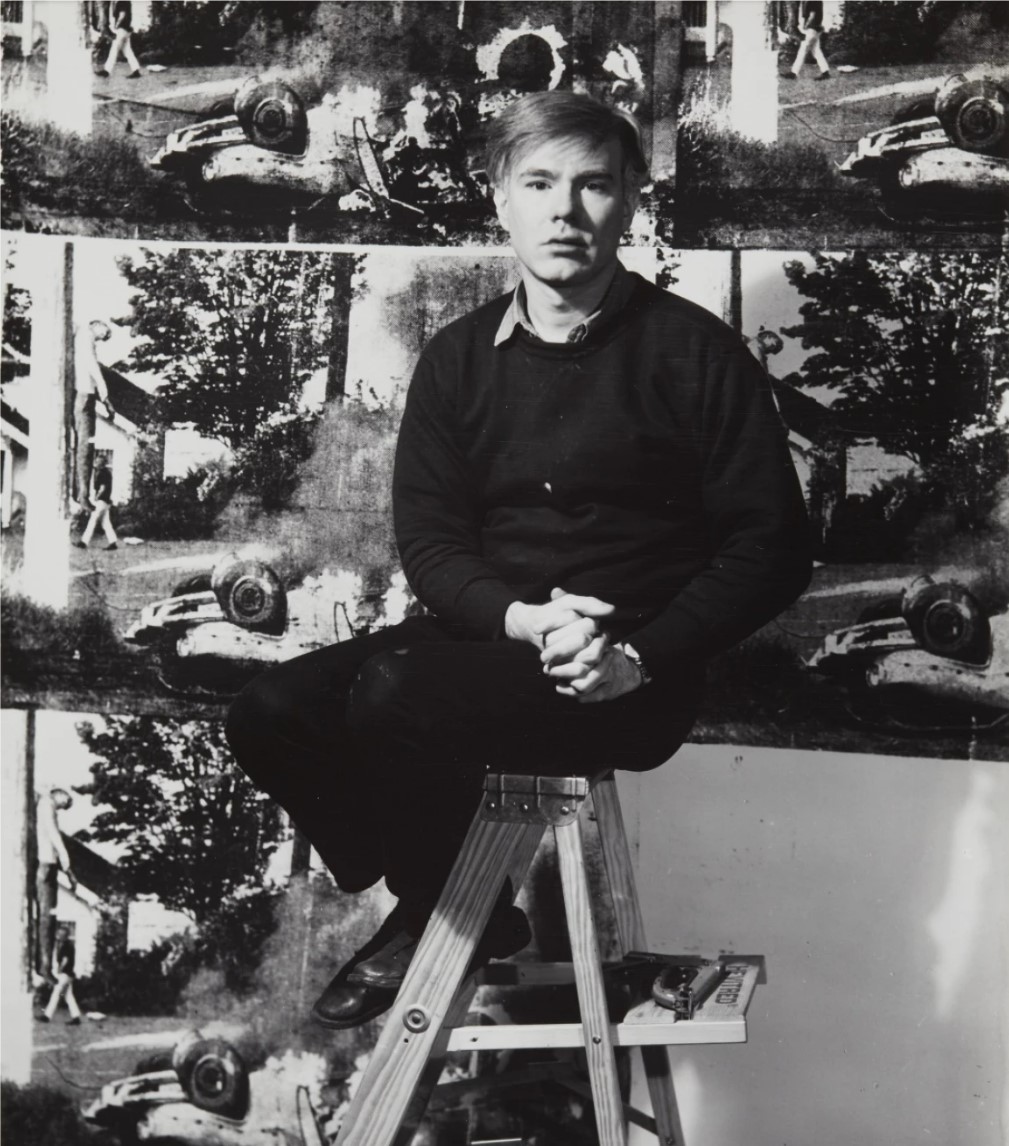
ANDY WARHOL PHOTOGRAPHED IN 1965 BY JOHN D. (PH) SHIFF. IMAGE © LEO BAECK INSTITUTE
Executed in 1963, the present work is uniquely representative of the bridge between Warhol’s fascination with the decade’s consumerist objects, such as the Campbell Soup Cans and Coca Cola Bottle, and his most renowned Death and Disaster Series, which ripped headlines and images from American newspapers of everyday tragedies. Whereas Warhol had satirically glorified the soup can, Coca Cola and coffee products as champions of consumerist advertising, here the tins of tuna are grotesquely transformed from trophies of branding to the carriers of death and, in a bizarre turn of fate, the facilitators of celebrity. The present work features both the fatal tuna can and the smiling faces of its victims, presenting a haunting composite of a contemporary narrative. Using his newly developed photographic silkscreen process in which he combined hand paint with photographic silkscreen printed images, Warhol created only eleven Tunafish Disaster works that vary on this newspaper clipping.
The Tunafish Disaster works are distinguished among the entire Death and Disaster corpus by being silkscreened exclusively on silver backgrounds. Georg Frei and Neil Printz have signaled the importance of this inaugural focus on a single metallic color: “The Tunafish Disasters…are the first in which the silver color is material to the subject” (Georg Frei and Neil Printz, Eds., The Andy Warhol Catalogue Raisonné, Vol. I, Paintings and Sculptures 1961-1963, New York 2002, p. 342). Tunafish Disaster is the direct descendent of a group of four Silver Disaster Electric Chair paintings, and the direct predecessor to Warhol’s first silver portraits, Silver Marlon and Silver Liz as Cleopatra. The present work thereby establishes a crucial emphasis on the silver color that would define Warhol’s output for the rest of his career. Unlike the preceding Electric Chairs, however, which carry clear shadows of brushstrokes, the silver paint here was applied by hand to be solid and opaque, eradicating the remnants of authorship and moving closer to Warhol’s impersonal mechanical ideal. Warhol’s pioneering method divests the work of any authorial voice and desensitizes the subject by evoking the mass production of newsprint photojournalism. By developing this technique and by faithfully reproducing the alien aesthetic of a found image, Warhol recruits the technical process to interrogate ideas of authorship and authenticity. Tunafish Disaster in this way has a unique relationship to its reproduction, making it one of Warhol’s most striking efforts to understand the relationship between the victims of these tragedies, the mass media, and the public.

PABLO PICASSO, GUERNICA, 1937. MUSEO REINA SOFÍA, MADRID, SPAIN. IMAGE © SUCCESSION PICASSO/DACS, LONDON 2024 / BRIDGEMAN IMAGES. ART © 2024 ESTATE OF PABLO PICASSO / ARTISTS RIGHTS SOCIETY (ARS), NEW YORK
In keeping with his most iconic work, celebrity, tragedy and the spectre of death are center stage for this work. By reproducing a mass-produced subject and using the silver color of the tunafish can, Warhol exhibits the playful irony between form and subject that is characteristic of so many of his works and serves as a critique of the paradoxical nature of American consumer culture. Scrutinizing the public face of a private disaster, Tunafish Disaster questions how anonymous victims are elevated to notoriety via the exceptional conditions of their demise, or as Crow describes, “the repetition of the crude images does draw attention to the awful banality of the accident and to the tawdry exploitation by which we come to know the misfortunes of strangers” (Ibid). The faces of ordinary women become at once serialized and memorialized, denoting both their banality and their individual humanity. The uncertain interplay between anonymous suffering and the broadcast exposure of loss is here locked into the lamina of silkscreen ink. Tunafish Disaster continues to stand as a testament to Warhol’s powerful integration of aesthetic experimentation and the central thematic concerns of his career, remaining part of one of the most important body of works of the twentieth century.
Tunafish Disaster, 1963
Christie’s New-York: 15 November 2018
Estimated: USD 4,000,000 – 6,000,000
USD 5,937,500
Andy Warhol (1928-1987), Tunafish Disaster | Christie’s
ANDY WARHOL
Tunafish Disaster, 1963
Silkscreen ink and silver paint on linen
52×52 inches (132.1 x 132.1 cm)
Signed and dated ‘Andy Warhol 1963’ (on the reverse)
In Tunafish Disaster, the precision of Warhol’s newly minted silkscreen process is writ large, rendered with delicacy and care to produce a flawless matrix of perfectly registered dots registered upon a hand-painted silver backdrop. Warhol would have silkscreened the painting by hand, and in this painting he chooses to crop out the text from the original article in order to focus more fully on its compelling imagery. He must have been drawn to the high-contrast legibility of the original UPI press photograph, since he used similar photographs distributed by UPI in several other Death and Disaster paintings. In the present Tunafish Disaster, Warhol repeats the silkscreened image twice, presenting two identical “twin” versions side-by-side. Rather than overlap, he allows the two images to delicately fade into each other, creating a ghostly blur that would become a key feature of a later series—the Ferus type Elvis paintings he would begin shortly thereafter. The effect of repeating the original source image has the unusual quality of both reinforcing the grim details of the poisoning while simultaneously distancing the viewer from the event, which is accentuated even further by the ethereal silver background. Hand-painted by the artist using care to render a fully uniform coat, the resulting painting is one of only two Tunafish Disaster painting featuring a perfectly square format. This key feature serves to frame the central imagery that’s at once easily legible and subtly terrifying.
Mrs. McCarthy and Mrs. Brown (Tunafish Disaster), 1963
Sotheby’ London: 25 June 2009
Estimated: GBP 3,500,000 – 4,500,000
GBP 3,737,250
ANDY WARHOL
Mrs. McCarthy and Mrs. Brown (Tunafish Disaster), 1963
Silver paint and silkscreen ink on canvas
45.2 x 78.7 inches (114.9 x 200 cm)
Exceptionally rare and paramount to Warhol’s legendary Death and Disaster series, Mrs. McCarthy and Mrs. Brown (Tunafish Disaster) is one of the great historic paradigms of Pop Art from the heart of a breathtaking moment in twentieth century Art History. This stunning silver, two metre wide canvas brilliantly illuminates how the agents of mass media, replication and multiplication, undermine and anaesthetise the significance of their subjects, here emblematised as a quotidian catastrophe. Having both tragically died from food poisoning after eating contaminated tins of tuna, the previously anonymous Mrs. McCarthy and Mrs. Brown were thrown into the public spotlight, providing Warhol with the perfect subject to critique the relationship between death and celebrity with his infamous silkscreen.
This work’s execution in April 1963 took place at the height of an extraordinary shift in this most iconic of artistic careers, during which Andy Warhol revolutionised the terms of visual culture in the western world. Mrs. McCarthy and Mrs. Brown provides the perfect link between the seminal Death and Disaster Suicides, Car Crashes, and Electric Chairs; the celebrity portraits of Marilyn Monroe, Elvis Presley, Marlon Brando and Elizabeth Taylor; and the immortal Campbell Soup Cans and Coca Cola Bottles, all of which were executed within a few months of the Tunafish works in an explosive outpouring of astonishing artistic invention. Warhol’s exceptional aptitude to seize the most potent images of his time defines him as the consummate twentieth century history painter and Mrs. McCarthy and Mrs. Brown is central to this formidably stimulating and provocative body of work.
Warhol created only eleven Tunafish Disaster paintings and this elite group has consistently attracted high acclaim since its inception. It is telling of the high opinion Warhol held for this series that in 1964 he presented one to Walter Chrysler, one of America’s leading art collectors and benefactors who had helped develop the Museum of Modern Art in the 1930s. Cy Twombly was also especially drawn to this series, exchanging one of his own paintings for a Tunafish Disaster in the 1960s, which remains in his collection to this day. Furthermore, another version now resides in the esteemed Daros Collection in Switzerland.
The Tunafish Disaster works are exceptional among the entire Death and Disaster corpus by being silkscreened exclusively on silver backgrounds and Georg Frei and Neil Printz have signalled the importance of this inaugural focus on a single metallic colour: “The Tunafish Disasters…are the first in which the silver color is material to the subject” (Georg Frei and Neil Printz, Eds., The Andy Warhol Catalogue Raisonné, Vol. I, Paintings and Sculptures 1961-1963, New York 2002, p. 342). Mrs. McCarthy and Mrs. Brown is the direct descendent of a group of four Silver Disaster Electric Chair paintings, and the direct predecessor to Warhol’s first silver portraits, Silver Marlon and Silver Liz as Cleopatra. However, unlike the preceding Electric Chairs, which carry clear shadows of brushstrokes, the silver paint here was applied by hand to be solid and opaque, eradicating the remnants of authorship and moving closer to Warhol’s impersonal mechanical ideal. Immediately following the Tunafish paintings, Warhol embarked on the monumental series of Silver Elvis paintings (from early May) and the Silver Liz paintings (from June) that were made together for the renowned Ferus Gallery show organised by Irving Blum for September 1963. As one of the foremost Tunafish works, Mrs. McCarthy and Mrs. Brown thereby established a crucial emphasis on the silver colour that would define Warhol’s output for the legendary Ferus exhitbition and beyond.
The present work is unique in the series as the only painting to have its own title rather than the Tunafish Disaster label. The name of this work rather affirms the narrative of Mrs. McCarthy and Mrs. Brown, the two housewives from a Detroit suburb who became victims of a freak catastrophe. The source for the Tunafish paintings came from a page of the 1st April 1963 edition of Newsweek, which detailed the epitome of what Walter Hopps calls the “unpredictable choreography of death” amongst the “banality of everyday disasters” (Walter Hopps cited in: Exhibition Catalogue, Houston, The Menil Collection, Andy Warhol: ‘Death and Disasters’, 1988, p. 9). From the Newsweek article, Warhol created two screens: one including both the imagery and all the text; and one as a detail of the tuna can and the two subjects at the centre of the page. Using the latter he created Mrs. McCarthy and Mrs. Brown, which does not include the main body of text but narrates the story much more visually through the images and their captions alone.
Mrs. McCarthy and Mrs. Brown also represents one of the very first and most successful instances of Warhol’s device of a compositional absence. He had first incorporated this in the four silver Electric Chairs, where a negative space comparable to the silkscreened area was left as a solid colour. In this painting Warhol creates a triptych effect by leaving an absent expanse of silver at the left that is the same width as each of the two screen impressions, thus providing a visual analogy to themes of impermanence, transience and loss. This compositional device was to become a staple trademark for many subsequent works, such as the Double Elvis now in the Seattle Art Museum and five of the Silver Liz works, where a monochrome panel is added to create a certain diptych effect.
Mrs. McCarthy and Mrs. Brown further provides the subject for an extraordinarily neat progression from Warhol’s celebrated Campbell Soup Can, Coca Cola Bottle and Martinson Coffee Can paintings of the previous year to the Death and Disaster canon. Whereas Warhol had satirically glorified the soup, Coke and coffee products as champions of consumerist advertising, here the tins of tuna are grotesquely transformed from trophies of branding to the carriers of death and, in a bizarre turn of fate, the facilitators of celebrity. As Thomas Crow has observed, a year after the soup and coffee cans, “an A&P brand can of tuna commemorates a moment when the supermarket promise of safe and abundant packaged food was disastrously broken” (Thomas Crow, “Saturday Disasters: Trace and Reference in Early Warhol”, in: Art in America, May 1987, p. 135).
Confronted by the tragedy of death and its incongruous by-product of celebrity, the progenitor of Pop – Andy Warhol – anaesthetised the news story zeitgeistthrough the effects of replication and multiplication, so undermining the manipulative potentiality of mass media. In keeping with his very best work, celebrity, tragedy and the spectre of death inhabit every pore of this silkscreened painting. This compelling work stands as a treatise on the emotional conditioning inherent to mass culture. Scrutinizing the public face of a private disaster, Mrs. McCarthy and Mrs. Brown questions how anonymous victims are elevated to notoriety via the exceptional conditions of their demise, or as Crow describes, “the repetition of the crude images does draw attention to the awful banality of the accident and to the tawdry exploitation by which we come to know the misfortunes of strangers” (Ibid). The uncertain interplay between anonymous suffering and the broadcast exposure of bereavement and loss is here locked into the lamina of silkscreen ink.
Warhol was disturbed by the media’s potential to manipulate but simultaneously he celebrated the power of the icon. Thus at the same time this painting encapsulates portraiture as biography and it acts as a memorial to the anonymous victims by eulogising their story to the realm of high art. Like a tomb to the Unknown Soldier, Warhol enlists the simulacra of these two strangers to commemorate all casualties of mass culture in a newly homogenised society. Their smiling faces of a lost domestic tranquillity will hereafter always re-tell their tragedy. Indeed, as Warhol himself explained in the famous contemporaneous interview with Gene Swenson: “when you see a gruesome picture over and over again, it doesn’t really have any effect…It’s not that I feel sorry for them, it’s just that people go by and it doesn’t really matter to them that someone unknown was killed so I thought it would be nice for these unknown people to be remembered” (Gene Swenson, “What is Pop Art?”, Artnews 62, November 1963, pp. 60-61).
A true Pop Art original, Mrs. McCarthy and Mrs. Brown recounts the most exquisite technical masterwork, with the regimented dots of the screen perfectly registered on the flawless flat silver picture plane. Warhol’s pioneering method divests the work of any authorial voice and desensitizes the subject by evoking the mass production of newsprint photojournalism. The beaming faces snapped in a private sphere of existence are reduced to a prefabricated schema of dots, and ironically in both newspaper image and unique silkscreen, these personal lives are starkly disassembled for mass consumption. Via the manner and method of their execution, these images narrate a story that has been prepared and packaged for the insatiable appetite of a mass audience, just like a Campbell soup can, Coca Cola bottle or A&P tin of “Chunk Light” tuna. By developing this technique and by faithfully reproducing the alien aesthetic of a found image, Warhol recruits the technical process to interrogate issues of authorship and authenticity.
In the top tier of the extraordinary Tunafish paintings, Mrs. McCarthy and Mrs. Brown is a work of real art historical significance. Conceptually it summates every thematic strand of the Death and Disasters and manifests the logical bridge with Warhol’s portraits of celebrities who were similarly touched by tragedy. Aesthetically it should be seen as the prototype for the silver Liz and Elvis paintings that immediately followed, as well as some of Warhol’s greatest artistic achievements that continued this extremely early employment of the compositional void. Extraordinary in scale, having been created on a roll of silver-painted canvas on the floor of Warhol’s Firehouse studio at East 87th Street, Mrs. McCarthy and Mrs. Brown will forever symbolize the crucial moment when formative experiments matured into sensational masterpieces at the source of the epic artistic journey of Warhol’s career.
Tunafish Disaster, 1963
Sotheby’s New-York: 11 November 2009
Estimated: USD 1,500,000 – 2,000,000
USD 1,202,500
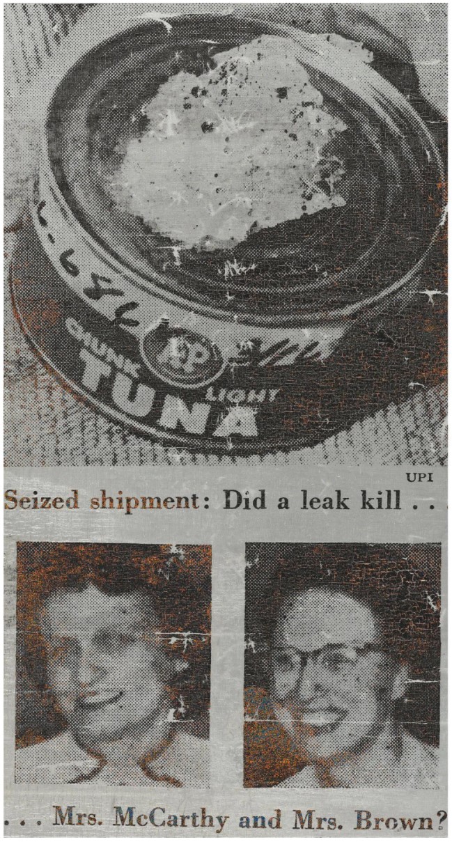
ANDY WARHOL
Tunafish Disaster, 1963
Silkscreen ink and silver paint on canvas
411/4 x 22 inches (104.8 x 55.9 cm)
Visual aesthetics, rigorous use of composition and astute choice of subject matter come together in Andy Warhol’s Tunafish Disaster from 1963, creating a work of power, beauty and tragedy. After decades of modernist abstraction, Pop Art re-established representation and found imagery to painting, reflecting the contemporary world in which it thrived via electronic and print media. Tunafish Disaster is an outstanding example of the artist’s Death and Disaster series that reveals Warhol’s pre-occupation with the contradictions inherent in public and private despair. This stunning silver canvas brilliantly illuminates how the agents of mass media, replication and multiplication, undermine the significance of their subjects. Having both tragically died from food poisoning after eating contaminated tins of tuna, the previously anonymous Mrs. McCarthy and Mrs. Brown were thrown into the public spotlight, providing Warhol with the perfect subject to critique the relationship between death and celebrity in his infamous silkscreen. Having been created on a roll of silver-painted canvas on the floor of Warhol’s Firehouse studio at East 87th street, this work will forever symbolize the crucial moment when formative experiments matured into sensational masterpieces.
In the 1960s, for the first time in art history, items such as advertisements, movie stills, magazines and newspaper photographs played a dominant role in artists’ creative thinking. Often the same photograph or video clip was shown repeatedly in periodicals and on television screens, inuring the public to certain images no matter how potent their content. The irony of this appealed to Warhol, who subtly used this brand of imagery to infuse raw emotion into his subject matter. The source for the Tunafish Disaster series came from a page of the April 1, 1963 edition of Newsweek, which detailed the epitome of what Walter Hopps called the “unpredictable choreography of death” amongst the “banality of everyday disasters.” (Walter Hopps in Exh. Cat., Houston, The Menil Collection, Andy Warhol: ‘Death and Disasters’, 1988, p. 9) From the article, Warhol created two screens: one including both the imagery and all the text; and one as a detail of the tuna can and the two subjects at the center of the page. Using the latter, he created the present work, which does not include the main body of text but narrates the story much more visually through the images and their captions alone.
Tunafish Disaster encapsulates portraiture as biography and it acts as a memorial to the anonymous victims by eulogizing their story to the realm of high art. Conceptually it summarizes every thematic element of the Death and Disasters and manifests the logical bridge with Warhol’s portraits of celebrities who were similarly touched by tragedy. It further provides the subject for an extraordinarily neat progression from the artist’s celebrated Campbell Soup Can, Coca Cola Bottle and Martinson Coffee Can paintings of the previous year to the Death and Disaster canon – where once products were champions of consumerist advertising, here the tins of tuna are transformed from trophies of branding to the agents of death and, in a bizarre turn of fate, the facilitators of celebrity.