Like so many of the finest of Warhol’s works, Coca-Cola leaves the question of whether it is an act of cultural criticism or an embracing of the emptiness and banality of contemporary culture wholly open. The viewer is both encouraged and left free to make of the image whatever they want it to be. It was this openness by new but seemingly familiar and instantly recognizable means that made this work seem so revelatory and portentous to those like De Antonio and Ivan Karp when they first saw it. It is also this openness to all interpretation combined with the surprising simplicity or nakedness of its imagery that allows the work to continue to resonate. Reflecting the slick mechanized impersonality of modern culture like a mirror, Coca Cola is a sensual and seductive icon of ‘pop’ in all its sugary sweetness and vacant banality.
Introduction
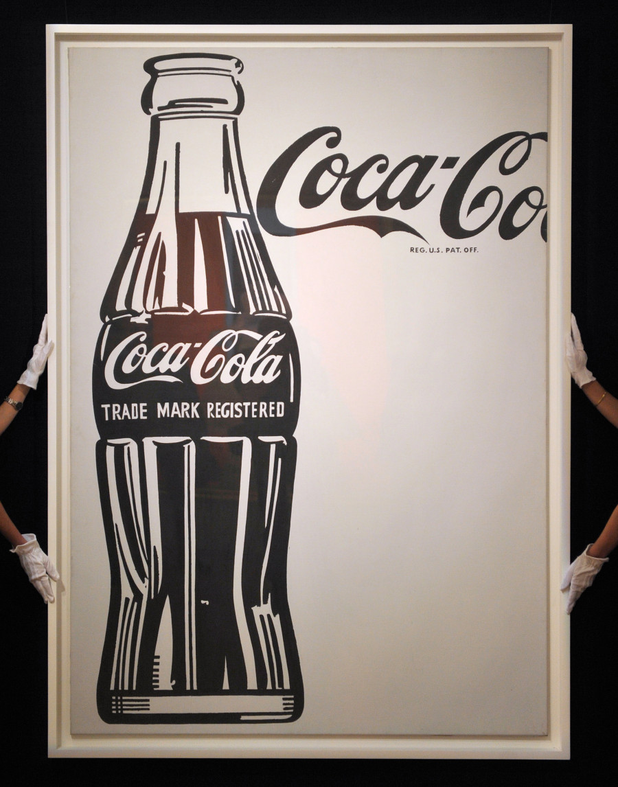
A large, sleekly executed, black and white and very human-scaled portrait of the famously curvaceous Coca-Cola bottle, Coca-Cola is one of the first great icons of American Pop Art as well as being the painting that set Warhol on his creative path. Painted in early 1962, it is the cool aesthetic, the impersonal, near style-less, almost mechanical means of representation and the stand-alone nature of this commonplace consumer product on the blank canvas that so distinguishes this work. The very first clean-cut, hard-edged, stand-alone image in what was soon to become a Warholian pantheon of famous names and brands, this stark, simple, elegant and towering form of an instantly recognizable commodity and its famous logo is one that stands alongside that of the Campbell’s Soup Can or the figures of Elvis Presley and Marilyn Monroe as a quintessential icon of America and the twentieth century.
“What’s great about this country is that America started the tradition where the richest consumers buy essentially the same things as the poorest.
You can be watching TV and see Coca-Cola, and you know that the President drinks Coke, Liz Taylor drinks Coke, and just think, you can drink Coke, too.
A Coke is a Coke and no amount of money can get you a better Coke than the one the bum on the corner is drinking. All the Cokes are the same and all the Cokes are good. Liz Taylor knows it, the President knows it, the bum knows it, and you know it”
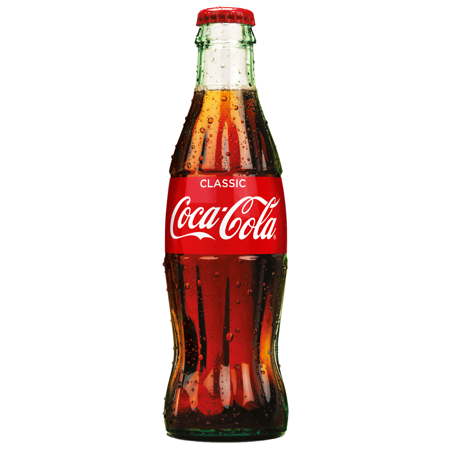
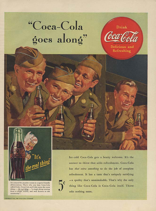
A classic of design, first created in 1915 by Raymond Lowey Associates, the famous pinched-waist Coke bottle was a familiar and comforting presence in daily American life having graced every bar, soda fountain and supermarket in the country for over forty years. Promoted ferociously throughout the Second World War as a “little piece of home” accompanying the G.I.s wherever they were posted, it had become a symbol of America-the-land-of-plenty all over the world. In 1956, however, the Coca-Cola company had introduced the first Coke cans to the market and many thought that the days of the glass Coke bottle might well be numbered. So, in addition to Warhol’s original decision to paint a Coke bottle from a 1940s Coke advertisement, there may, as with his telephone and typewriter, have been a strong element of nostalgia implicit in his decision to paint this elegant but also perhaps disappearing classic of popular culture. In 1961 however, Coca-Cola introduced a new version of its pinched-waist bottle to the market-one that for the first time carried its new trademark from the U.S. Patent and Trademark Office. It was this newly patented, up-to-the-minute, bottle, complete with registered trademark, that Warhol painted in his second, third and fourth Coca Cola bottle paintings.
Like his other black and white paintings of clearly defined and distinctly singular objects, Warhol’s decision to paint such a well-known and distinctive object as a Coke bottle, was a deliberate assertion of the validity of figurative subject matter as an image in painting. This was a clearly thought-out response to what was the then-prevailing tendency in American art of Abstract Expressionism, where such a concept was considered taboo. Indeed, with their zip-like borders and their concentration on an elegant division of black and white areas of the canvas, paintings such as Telephone, and Coca-Cola can even, in this context, be regarded as quirky figurative responses to the large black and white canvases that artists like Franz Kline and Barnett Newman were making in the late 1950s and early 1960s.
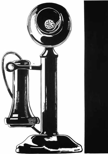 Telephone, 1961
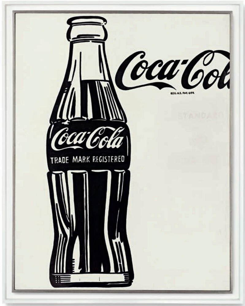
For Warhol, more than all of those around him, was keenly aware that it was not in fact an object he had represented in Coca Cola at all, but an ad-man’s drawing of that object. All of Warhol’s black and white paintings of singular commodities, from the telephone to the television set had been based on advertising images, on pictures that were graphically distorted in order to represent these products looking their most desirable. Warhol’s appropriation of the ready-made object was not like Duchamp’s or Rauschenberg’s therefore. It was not an appropriation of the object itself but an appropriation of its faked, public or celebrity image. It was this veneer, this illusion of the world of advertising that was the real subject of Warhol’s work. And this is something that is made clear in Coca-Cola (3) by the partial inclusion of the company logo alongside the stylized graphic representation of the 1961 bottle. Its inclusion reveals that the image of the bottle too, albeit familiar and recognizable, is an illusion, an artifice and an advertising tool.
Warhol’s painting of Coca-Cola coincides with a period when, for the first time, criticism of the kind of advertising techniques employed by big corporations like Coca-Cola was steadily mounting. During the Second World War the soft drink had been promoted ferociously in many countries, accompanying the American G.I.s wherever they had been posted and marketed alongside them as a symbol of Western freedom and the pleasures this afforded. In the aftermath of the war, however, the company and its logo, which suddenly seemed to be appearing everywhere, came to be seen by many as less a badge of freedom than a propagandistic banner of American Imperialism. Warhol recognized the power that the Coke brand had in modern society, not only in its ubiquitous nature, later developing the image of the Coke bottle into a persuasive image of mass-production.

Like so many of the finest of Warhol’s works, Coca-Cola leaves the question of whether it is an act of cultural criticism or an embracing of the emptiness and banality of contemporary culture wholly open. The viewer is both encouraged and left free to make of the image whatever they want it to be. It was this openness by new but seemingly familiar and instantly recognizable means that made this work seem so revelatory and portentous to those like De Antonio and Ivan Karp when they first saw it. It is also this openness to all interpretation combined with the surprising simplicity or nakedness of its imagery that allows the work to continue to resonate. Reflecting the slick mechanized impersonality of modern culture like a mirror, Coca Cola is a sensual and seductive icon of ‘pop’ in all its sugary sweetness and vacant banality.
Coca-Cola
Coca-Cola (3), 1962
Christie’s New-York: 12 November 2013
Estimated: USD 40,000,000 – 60,000,000
USD 57,285,000
Andy Warhol (1928-1987), Coca-Cola [3] | Christie’s
ANDY WARHOL
Coca-Cola (3), 1962
Casein on cotton
69 3/8 x 54 inches (176.2 x 137.2 cm)
Signed ‘Andy Warhol’ (on the turning edge)
Coca-Cola (3) is the second of the two paintings that Warhol described in this now famous recollection of the genesis of his Pop Art style. In retrospect, it seems both fitting and auspicious, that such a defining breakthrough moment in Warhol’s life and work should have begun with a painting of what is literally a “bottle of pop.” A large, sleekly executed, black and white and very human-scaled portrait of the famously curvaceous Coca-Cola bottle, Coca-Cola (3) is one of the first great icons of American Pop Art as well as being the painting that set Warhol on his creative path. Painted in early 1962, it is the cool aesthetic, the impersonal, near style-less, almost mechanical means of representation and the stand-alone nature of this commonplace consumer product on the blank canvas that so distinguishes this work. The very first clean-cut, hard-edged, stand-alone image in what was soon to become a Warholian pantheon of famous names and brands, this stark, simple, elegant and towering form of an instantly recognizable commodity and its famous logo is one that stands alongside that of the Campbell’s Soup Can or the figures of Elvis Presley and Marilyn Monroe as a quintessential icon of America and the twentieth century.
Coca-Cola (3) is one of four paintings of single Coca-Cola bottles that Warhol made between late 1961 and the summer of 1962. The first of these, Coca-Cola (1) is a comparatively small painting that depicts a Coke bottle and the disc logo in the company’s original trademark colors of red and white and has a strange curtain-like border running down the right-hand side of the work. The image Warhol has chosen as the basis of this work derives from an old Coca-Cola advertisement of 1947. Executed in a deliberately loose and dripped oil paint and crayon and only lightly sketched in places as if to merely suggest the image rather than render it fully or complete, this small sketchy, red and white canvas has all the visual appearance of an ad-man’s draft. It is the only Coke bottle painting to be based on this distinctly retro 1940s advertisement; the other three paintings all derive from a different, undated, but seemingly more modern, black and white advert that appeared in the Pittsburg magazine Byzantine Catholic World–a periodical that it is likely to have belonged to Warhol’s mother. Warhol’s second Coca-Cola painting, Coca-Cola (2) (now in the Andy Warhol Museum, Pittsburg) is another “sketchy” version, being a larger, six-foot high work that depicts the Coke bottle and part of its logo in a similarly “arty” brush-stroked manner and, as in the first version, again includes a vaguely sketched curtain running down its right-hand side. This is the work that Warhol presented alongside Coca-Cola (3) to De Antonio and remembers him calling it “a piece of shit, simply a little bit of everything.” In his own memoirs De Antonio also described this painting as a Coke bottle “lined with the brushy strokes of Tenth Avenue failure, second generation Abstract Expressionism” advising Warhol to “burn it” (Note: Emile de Antonio, “Marx and Warhol” a variant draft quoted in Branden W. Joseph “1962,”, October Spring 2010, no. 132. p. 130).
Executed on a similarly large, human-sized scale, Coca-Cola (3) is the work in which the cold, impersonal, machine-like objectivity that would come to distinguish so much of Warhol’s later art can first be discerned. In this painting Warhol has removed all extraneous detail to concentrate solely on the iconic image of the famous bottle and the logo, which is cropped as it runs over the edge of the large, white, portrait-shaped canvas. Painted carefully by hand, directly onto the blank canvas, in accordance with a projected image of the advert, without first making any preliminary pencil drawing, Warhol has focused directly and only on the sign-like motif of the bottle and its celebrated logo, rendering both in a smooth, impersonal manner devoid of any visible brushstroke or sense of peinture. Originally, Warhol had also included the words “Standard” and “King Size” that appeared under the Coca-Cola logo in the advert, but later, evidently recognizing the solitary iconic power of his image, he has painted these words out using a white that has still allowed them to remain partially visible as pentimenti.
It was this isolating aspect of Coca-Cola (3) that so appealed to Gene R. Swenson who, on first seeing it not long after it was painted, immediately included it in an article he was then writing for ARTnews to be titled ‘The New American Sign Painters’. In this article, one of the very first commentaries on the then emerging American Pop movement, Coca-Cola (3) was illustrated alongside paintings such as Roy Lichtenstein’s Engagement Ring and James Rosenquist’s I Love You with My Ford, while Swenson argued that “the shape, size and color of its presentation” characterized a newly emerging “attitude towards objects to which we seldom pay conscious attention, but which make up the preconceptions of our everyday visual experience.” (Gene R. Swenson, “The New American Sign Painters,”ARTnews, Sept. 1962, p. 61).
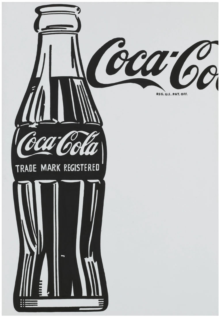
The last of Warhol’s single Coke bottle paintings, Coca-Cola (4) was painted sometime after Coca-Cola (3) in the summer of 1962 and is, to all intent and purpose, a slightly larger reworking or second version of it. Almost identical in composition, save for a cropping of the letter ‘l’ on the Coca-Cola logo and the absence of any pentimenti, Warhol appears to have executed this work for either the Stable Gallery or the Ferus Gallery, perhaps both. (According to Rainer Crone’s catalogue raisonné, Coca-Cola (4) bears the provenance of both Stable and Ferus galleries).
Warhol’s impeccable choice of subject matter in selecting the Coca-Cola bottle as the first of what was to become a prolonged series of trademark icons in his work–running from Campbell’s Soup to Brillo, Kellogg’s, Heinz and General Electric-should also be considered in the context of his other paintings of this early proto-pop period. Coca-Cola (3) is one of a series of predominantly black and white paintings of subjects drawn from the world of cheap newspaper advertising at this time that included illustrations for television sets, refrigerators and physical self-improvement products in the form of wigs and nose-jobs for example. In particular, in some works from this period, such as that of his repeated paintings of singular consumer products–the telephone and the typewriter–Warhol had been drawn to particularly nostalgic images, painting a noticeably old-fashioned, stand-up telephone and an illustration of an out-moded 1930s typewriter. In some respects too, Warhol, as he was to do in his choice of the Campbell’s Soup Can, which recalled for him the comfort and security of his childhood lunches with his mother in Pittsburg, may have been prompted by a sense of nostalgia in his decision to paint the Coke bottle.
A classic of design, first created in 1915 by Raymond Lowey Associates, the famous pinched-waist Coke bottle was a familiar and comforting presence in daily American life having graced every bar, soda fountain and supermarket in the country for over forty years. Promoted ferociously throughout the Second World War as a “little piece of home” accompanying the G.I.s wherever they were posted, it had become a symbol of America-the-land-of-plenty all over the world. In 1956, however, the Coca-Cola company had introduced the first Coke cans to the market and many thought that the days of the glass Coke bottle might well be numbered. So, in addition to Warhol’s original decision to paint a Coke bottle from a 1940s Coke advertisement, there may, as with his telephone and typewriter, have been a strong element of nostalgia implicit in his decision to paint this elegant but also perhaps disappearing classic of popular culture. In 1961 however, Coca-Cola introduced a new version of its pinched-waist bottle to the market-one that for the first time carried its new trademark from the U.S. Patent and Trademark Office. It was this newly patented, up-to-the-minute, bottle, complete with registered trademark, that Warhol painted in his second, third and fourth Coca Cola bottle paintings.
Coca-Cola [4], 1962
Sotheby’s New-York: 9 November 2010
Estimated: USD 20,000,000 – 25,000,000
USD 35,362,500
ANDY WARHOL
Coca-Cola [4], 1962
Acrylic, pencil and Letraset on canvas
81.7 x 56.7 inches (207.6 x 144.1 cm)
Signed and dated 62 on the reverse
Despite Warhol’s great success as a commercial artist, his true interest was a career in fine art. With his earliest Pop paintings, such as Coca-Cola [4] [Large Coca-Cola] from 1962, Warhol pays homage to his previous work in the advertising realm – reprocessing a powerful commercial image and elevating it to the realm of High Art. Just as Roy Lichtenstein’s painting of women based on cartoon images was a cheeky reference to the stodgy genre of portraiture, the cursive logo and patent registration for Coca-Cola floats like a narrative bubble next to the “figure” of Warhol’s bottle. With this “portrait” of commerce, Warhol examined and highlighted the relationship between big business – the market – and the public through this enlarged icon of consumerism. Warhol took an egalitarian view of advertising and consumerism, “What’s grand about this country is that America started the tradition where the richest consumers buy essentially the same thing as the poorest…you can know that the President drinks Coke, Liz Taylor drinks Coke, and, just think, you can drink Coke too. A Coke is a Coke and no amount of money can get you a better Coke.” (Andy Warhol, The Philosophy of Andy Warhol, New York, 1975, pp. 100-101)
Throughout his career Warhol made wry commentary on the debate between originality and reproduction, the role of the artist, and the modern condition of repetitive imagery. Warhol’s early black and white Pop paintings expose the reality of banal objects. The Coca-Cola bottle was a perfect subject for Warhol – ordinary, yet pervasive as a mass produced object, the Coca-Cola bottle is loaded with provocative symbolism of the capitalism of America. Andy Warhol’s deadpan depictions of objects such as the Coca Cola bottle have become wedded in the American imagination, a serendipitous intersection of art and commercial branding that resulted in a landmark moment in American popular culture and a sea-change in the way contemporary art was made. The Coke bottle was so ubiquitous it was an ideal vehicle for Warhol to document the consumerist impulses which permeated the very fabric of his age.
Warhol’s painting was clearly a reaction to the work of Jasper Johns and Robert Rauschenberg whose works used everyday motifs and materials from the urban world to provoke debate between representation and perception. Rauschenberg also incorporated Coke bottles in his work, specifically in his Combine Coca-Cola Plan from 1958. Heiner Bastian notes that Warhol “must have seen that Rauschenberg’s works operated according to a hierarchy-free maxim which regarded the physical, extra-aesthetic object and the painterly gesture as the ‘only subject’, and that in Rauschenberg’s works the material of the everyday urban world was a suitable vehicle for unadulterated, free communication.” (Exh. Cat., Berlin, Neue Nationalgalerie (and travelling), Andy Warhol Retrospective, 2001, p. 22) Bastian goes on to note that Warhol’s works, “address the question of ordinariness on the level of the least remarkable, insignificant mass products very differently from the ways favored by Johns and Rauschenberg.” (Ibid, p. 22)
The present work is the last of four paintings of individual Coca-Cola bottles. For all four of these works Warhol used source imagery from advertisements. Three of the paintings, including the present work, appear to be based on an ad from the Pittsburgh Byzantine Catholic World. The first two canvases from this series, competed in 1961, are gestural and border on unfinished in appearance, retaining vestiges of the expressionist hegemony of the earlier 1950s generation of painters. Coca-Cola [2], now in the collection of the Andy Warhol Museum in Pittsburgh, in particular, presents a brushier rendition of the black and white depiction of the subject. In his 1980 manuscript, POPism: The Warhol ’60’s, the artist recalls a visit to his studio by Emile de Antonio, a documentary film director and producer and a close friend of Warhol. For the art community, de Antonio’s most significant film was Painters Painting from 1972 that chronicled the art scene with interviews and studio visits with many artists of the day. De Antonio introduced Warhol to his first major dealer, Eleanor Ward of Stable Gallery in New York. Yet his most critical contribution to the art world and to Pop art was his auspicious visit to the home of his friend, Andy :
“At five o’clock one particular afternoon the doorbell rang and De came in and sat down. I poured Scotch for us, and then I went over to where two paintings I’d done, each about six feet high and three feet wide, were propped, facing the wall. I turned them around and placed them side by side against the wall and then I backed away to take a look at them myself. One of them was a Coke bottle with Abstract Expressionist hash marks halfway up the side. The second one was just a stark, outlined Coke bottle in black and white. I didn’t say a thing to De. I didn’t have to – he knew what I wanted to know. ‘Well, look, Andy,’ he said after staring at them for a couple of minutes. ‘One of these is a piece of shit, simply a little bit of everything. The other is remarkable – it’s our society, it’s who we are, it’s absolutely beautiful and naked, and you ought to destroy the first one and show the other.'” (Andy Warhol and Pat Hackett, POPism: The Warhol ’60s, New York, 1980, pp. 5-6)
From their earliest moments, the importance and demand for the graphically pure black and white rendition of the Coke bottle subject was clear. Coca-Cola [4] was purchased almost immediately after its completion by distinguished art patrons Mr. and Mrs. Melvin Hirsh of Beverly Hills, and exhibited as early as 1963. The painting was acquired from Irving Blum’s Ferus Gallery which was the site of Warhol’s first solo exhibition, the infamous Campbell’s Soup Can show in July and August 1964. From this first great public notice of his Pop style, the apparent simplicity and naiveté of Warhol’s work, and the initial criticism of it as too readily recognizable or literal to qualify as art, has long since been refuted and confounded in spectacular fashion. As one who appreciated irony, Warhol could enjoy the controversy that attended his ultimate recognition and success, as well as his deeply significant influence on contemporaries and younger artists that followed him in the 20th century.
The third and fourth paintings from this series, executed in 1962, are virtually identical, however, when Warhol returned to the subject for the fourth time, he produced a more monumental version – the present work is almost a foot taller than the third Coca-Cola painting. There are a few differences between the present image and its source advertisement. In the ad, the Coca-Cola trademark is hovering above the bottle where as in the painting the position is lower relative to the bottle. Warhol projected his source image onto his canvases and it is likely that Warhol painted this work in two stages – due to the repositioning and sizing of the trademark and the bottle. Coca-Cola [3] lacks the underdrawing of Coca-Cola [4], perhaps explained by the different mediums used for the works; the less soluble casein medium for the former, and acrylic paint for the later. The acrylic paint dried more quickly and required Warhol to be prepared before executing the work. Warhol additionally planned for this painting with preparatory drawings (see Lot 18). Like other black and white paintings, such as Where’s your Rupture, 1961, the Coke bottle paintings are cool, sober images, isolated on the artist’s canvas. These early paintings also share the use of source material in the printed form rather than the source photographs that would eventually be used in Warhol’s work.
The present work has a less free-hand style than Coca-Cola [1] and Coca-Cola [2], emphasized by the use of Letraset letters for the patent notice. Warhol’s move to the more mechanical is reflective of the innovative silkscreen work he was experimenting with at the time – the medium that would eventually lead the artist’s studio to be christened the “Factory”. The silkscreen technique allowed Warhol to create a seriality in his works that defines the artist’s most fertile years. The present work is a direct antecedent to the artist’s silkscreen paintings – Warhol would again choose the image of the Coke bottle in his large scale multiple screened work, 210 Coca-Cola Bottles also from 1962. Warhol would eventually favor the mass production possibilities of the silkscreen to distance himself from the traditional role of the artist and to create works of repeated imagery, again employing an aesthetic style in keeping with the media-drenched society of the mid-20th century. Warhol with the iconic Coca-Cola [4], was in the nascent stages of developing the ironic and detached manner in which his choice of technique and style would serve as wry comment on his subject matter.
Coke Bottles
One of the most enduring Pop icons for over a century, the Coca-Cola bottles, with their form and typeface, were the perfect readymade for Warhol’s pop sensibility. The artist admitted that when he first engaged with the Coke bottle subject he “still wasn’t sure if you could completely remove all the hand gesture from art and become noncommittal, anonymous.”
Two Coke Bottles, 1962
Phillips New-York: 26 May 2019
Estimated: USD 1,500,000 – 2,000,000
USD 1,580,000
Andy Warhol – 20th Century & Contemporary… Lot 4 May 2019 | Phillips
ANDY WARHOL
Two Coke Bottles, 1962
Silkscreen ink on canvas
13×9 inches (33 x 22.9 cm)
signed, dedicated and dated “to Todd with love / Andy Warhol 62” on the overlap
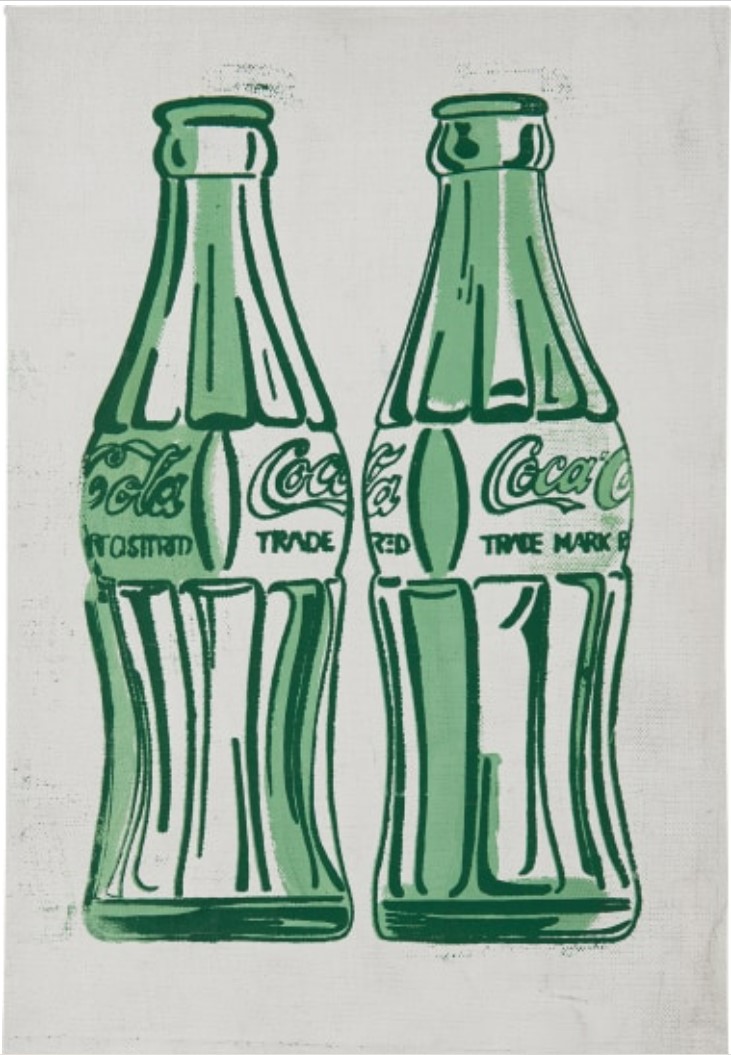
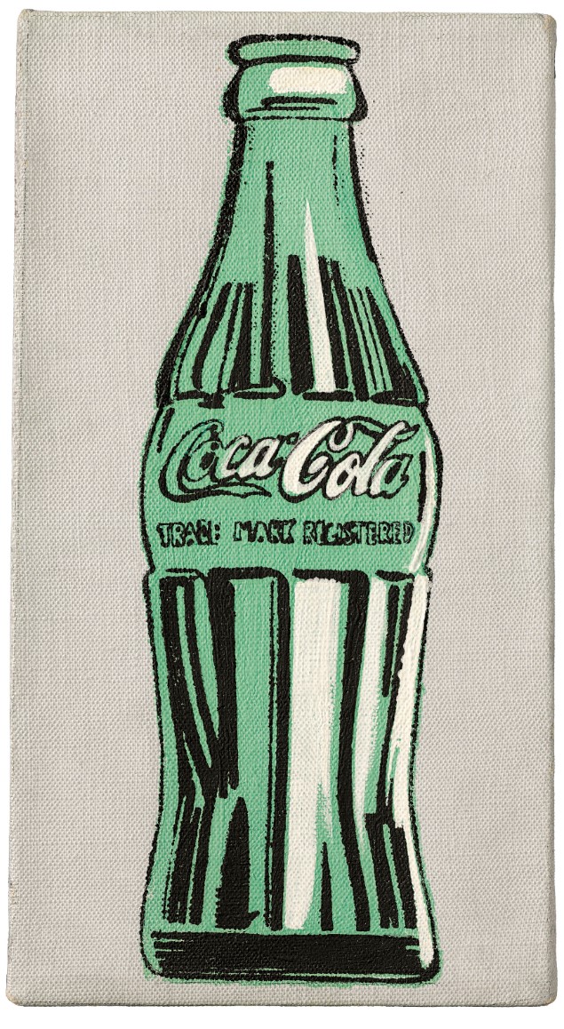
In the intimately scaled Two Coke Bottles, 1962, Andy Warhol inducts America’s most ubiquitous soft drink into his celestial hall of Pop Art fame. Delineating the iconic curves of the familiar glass bottle with the cool objective clarity of his at the time newly conceived silkscreen technique, Warhol aligns the pervasive symbolism of the Coca-Cola brand with the cast of legendary celebrities he was immortalizing at the time including Elvis Presley and Marilyn Monroe. Through Warhol’s leveling eye, the quotidian objects of daily life become icons that capture the very essence of contemporary society. Painted amongst Warhol’s earliest silkscreen paintings in the pivotal year of 1962, Two Coke Bottles evinces a defining moment when the artist irrevocably eliminated the schism between popular culture and high art. Two Coke Bottles witnesses not only the birth of a revolutionary stylistic idiom but also the birth of Pop Art itself. It is likely that Warhol created fewer than ten green Coca-Cola bottle canvases with compositions ranging from single vessels to vast multiplied vistas, such as the monumental Green Coca-Cola Bottles, 1962, Whitney Museum of American Art, New York, therefore making these works particularly rare. Conceived from three different silkscreens which depicted the bottle from three different perspectives, the present work utilizes a profile and three-quarter view.
The present work was initially gifted by Warhol to Todd Brassner, a New York collector who amassed some of Warhol’s finest works before dying tragically in a fire last year. Throughout the 1960s and 1970s, Brassner served as both a friend and a dealer to Warhol, credited with selling some of his most iconic pieces. There are two other known 1962 paintings of single Coca-Cola bottles rendered in brown and black ink previously owned by Brassner, both made in the same intimate scale of the present work. After being passed from Todd to his father Jules, also an art dealer, Two Coke Bottles went on to reside in the prestigious Miles and Shirley Fiterman Collection where it has remained ever since.
Coke Bottle, 1962
Christie’s London: 2 October 2017
Estimated: GBP 1,800,000 – 2,500,000
GBP 1,928,750
Andy Warhol (1928-1987), Coke Bottle | Christie’s
ANDY WARHOL
Coke Bottle, 1962
Silkscreen ink, acrylic and ballpoint pen on linen
11.1 x 6 inches (28.3 x 15.2 cm)
Executed in June-July 1962, Coke Bottle is a stunning encapsulation of Andy Warhol’s breakthrough to silk-screening, and a rare early iteration of one of his most iconic motifs. The related serial works 210 Coca Cola Bottles and Green Coca-Cola Bottles are held in the Daros Collection, Switzerland and the Whitney Museum of American Art, New York. The unmistakable image of an empty Coke bottle is brought to glinting, graphic life in black silkscreen ink, with hand-painting in pale green and white. Uniquely among the ten works of this series, a blue ballpoint outline visible beneath the paint layer indicates that the green was likely applied without the guidance of a preliminary screen; the white highlights, shining out in bright contrast to the greyer ground, were painted on after the impression of the black line screen was made. These nuanced manual elements provide a pivotal link between the fine draughtsman ship of Warhol’s early work as a commercial illustrator and the fully photomechanical process that would begin with his screenprint Baseball in August 1962. Capturing Warhol’s alchemy of mass culture into fine art in one vital and potent image, this extraordinarily important work represents nothing less than a turning point in twentieth century culture: Warhol had discovered the method that would dominate his oeuvre for the next twenty-five years, and the age of Pop art had arrived.
Commenced shortly after Warhol made his very first silkscreens (the Dollar Bill series of March-April that same year), the Coke Bottle works show the first branded consumer object that he ever depicted in this medium – they predate even his Campbell’s Soup cans, which were all fully hand-painted until 1964. Coke Bottle is also linked to two seminal large-scale Coca Cola bottles, Coca-Cola (2) and (3), both painted early in 1962, which share the present work’s source image of an advertisement in Warhol’s mother’s Pittsburgh Byzantine Catholic World newspaper. There could hardly be a more apt origin for one of the artist’s defining subjects. His lifting of material from the medium of printed advertising represented a dramatic sea change in the way fine art was made, transforming the mass-produced image of a mass-produced object from ubiquitous and unnoticed presence into charged, confrontational symbol. Yet the newspaper’s link with Warhol’s mother’s (and his own) Byzantine Catholicism highlights a further dimension of his treatment of the Coke bottle.
Works on Paper
Coca-Cola, 1962
Christie’s New-York: 18 May 2018
Estimated: USD 700,000 – 1,000,000
USD 732,500
Andy Warhol (1928-1987), Coca-Cola | Christie’s
REPEAT SALE
Coca-Cola, 1962
Sotheby’s New-York: 9 November 2010
Estimated: USD 1,000,000 – 1,500,000
USD 1,482,500
ANDY WARHOL (1928-1987)
Coca-Cola, 1962
Graphite and ink on paper
24 x 17 7/8 inches (60.9 x 45.4 cm)
Signed twice and dated twice ‘ANDY WARHOL/62 Andy Warhol/1962’ (on the reverse)
“What’s great about this country is that America started the tradition where the richest consumers buy essentially the same things as the poorest. You can be watching the TV and see Coca-Cola, and you know that the President drinks Coke, Liz Taylor drinks coke, and just think, you can drink Coke, too.”
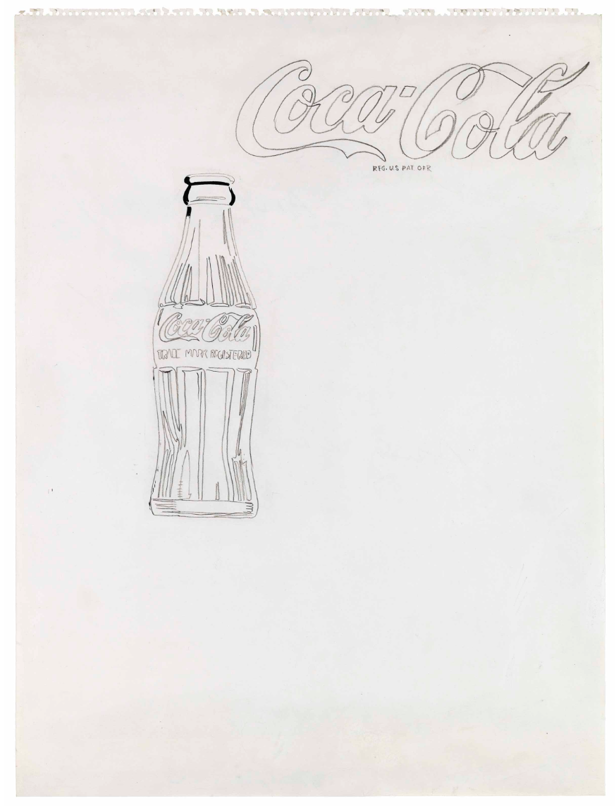
Hand drawn and depicting that quintessential 20th century American consumer product the classic, curvaceous glass Coca-Cola bottle, this 1962 work by Andy Warhol signals the beginning of the Pop Art master’s entry into superstar art status. Using pencil and ink, the tools of his earlier career as a commercial artist, Warhol drew this study for what would become Coca-Cola 4, the last of his single Coke bottle paintings, painted during the summer of 1962. The iconic power of the solitary image determines the composition, with its extraordinary focus on a trademark American consumer-culture icon that would launch Warhol in the direction that came to define his entire career. Organized across a modest-sized sheet of paper, Warhol sets off the instantly recognizable curvilinear forms of the iconic Coca-Cola bottle in the top left quarter of the picture frame. The bottle floats across the pictorial space as a single image, dramatically stripped of extraneous flourish or distracting context. The swirling calligraphic script of the Coca-Cola brand name drifts across the picture plane above and to the top right of the famous pop bottle form, with the sinuous shapes of the letters registering as image as much as they do text, to be looked at, not just read.
The expertly hand-worked aspects of the present drawing, with the varying intensity of the graphite and ink—darker in some areas, lighter in others—evidence Warhol’s process of drawing across the paper support, as do the pencil-work shadings that define the iconic bottle’s contours. Here, Warhol leaves out all unnecessary details of context or scene, to focus entirely on the image of the famous bottle and the elegant script. Beyond the pencil and ink medium, what stands out most significantly here is Warhol’s depiction of his subject. The artist’s single, stand-alone portrayals of Coke bottles were the first clean and straightforward, hard-edged images of iconic consumer products in what would become a distinctive and recognized parade of famous brands and packages, set off by Warhol’s unique approach.
In concept, Warhol employs an impersonal objectivity combined with a direct gaze that would so boldly and dramatically set his later work apart from the other art of this era. He renders the world-famous bottle and its celebrated logo as sign and symbol in a smooth, impartial manner, less a depiction of an actual object than as an image of an image. Yet the work is also highly figurative, and, along with that of other Pop artists, this approach offered a counterpoint to the then-dominant abstract style of painting, asserting that realistic portrayal of the figure could once again be a vital art practice. The rendering of Coca-Cola in monochromatic black and white links the drawing with the commercial art predecessors that inspired it, the inexpensive and ubiquitous monochrome newspaper advertisements that typically depicted household items like television sets, refrigerators and consumer staples for the kitchen cupboard. These advertisements portrayed in simple lines and contours, a single item removed from any context, focusing attention purely on its form.
As the original study for Coca-Cola [4], 1962, the present work is the extant chronicle of the genesis of American Pop Art. It is both an exquisite drawing and historic artefact that records the poised moment when Pop fully evolved and started fundamentally to affect an entire generation. If Andy Warhol is considered the progenitor of American Pop, Coca-Cola [4] can be seen as the seed of the movement that revolutionized contemporary art practice. Executed in 1962, the present drawing shows the artist’s first experiments with the ideas that would occupy him for the rest of his career. It is one of the earliest recorded drawings in the catalogue raisonné, identified by Georg Frei and Neil Printz as the preparatory study for the Coca-Cola painting executed between May and June 1962 and over two meters tall. Indeed, it is the only known extant drawing for the ensuing series of multiple Coca-Colas, another defining body of work within the artist’s oeuvre.
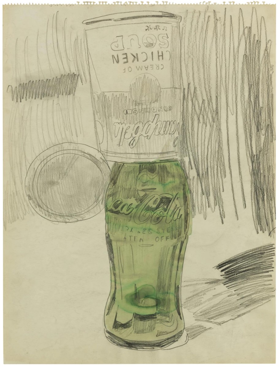
Campbell’s Soup Can Over Coke Bottle, 1962
Sotheby’s New-York: 15 May 2007
USD 2,840,000
 ANDY WARHOL
Campbell’s Soup Can Over Coke Bottle, 1962
Graphite and watercolor on sketch pad paper
23.5 x 17.7 inches (59.7 x 45.1 cm)
Campbell’s Soup Can Over Coke Bottle is a wonderful combination of two of Warhol’s most emblematic sources for his early paintings based on commercial objects and products. This work comes from the collection of Mary Moore Denison of Detroit whose passion for the arts began with her educational experience at the Kingswood School Cranbrook. Mrs. Denison was involved with the school for over 50 years, and at The Cranbrook Academy of Art, she was for over three decades an officer and member of the Board of Governors and the Womens Committee. As a civic leader, Mrs. Denison was involved in many Detroit organizations, including The Detroit Institute of Arts, where she was a Trustee Emeritus and board member of the Founders Society, the Friends of Modern Art, the Junior Council and the Modern Decorative Arts Committee. Her roles in the larger community also included Artistic Director of the Detroit Artist Market, Director of Detroit Focus Gallery, and co-founder and board member of the Meadowbrook Art Gallery. Mrs. Denison met Warhol when she accompanied Leo Castelli and the Detroit dealer Franklin Siden to the artist’s studio.