No. F.C.H., 1960
Oil on canvas
76.2×66 cm (30×26 inches)
Titled, dated and signed ‘ No. F. C. H. 1960 YAYOI KUSAMA’ (on the reverse)
Provenance
Paula Cooper Gallery, New York, USA
Private Collection, New York, USA
Senior and Shopmaker Gallery, New York, USA
Acquired from the above, thence by decent to current owner
Christie’s Hong-Kong: 26 May 2018
HKD 26,500,000 / USD 3,377,861
Source: Christie’s
YAYOI KUSAMA (JAPAN, B. 1929) (christies.com)
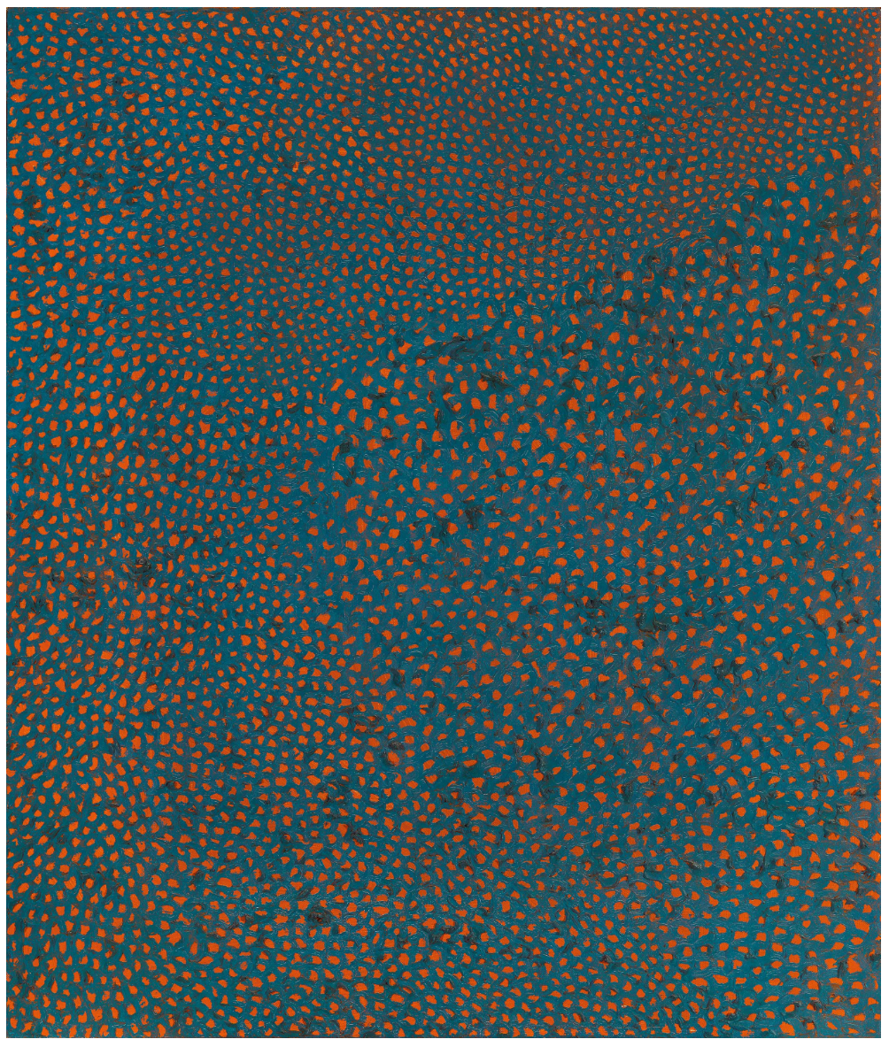
In the late 1990s, the Los Angeles County Museum of Art and the Japan Foundation jointly organized the solo exhibition, Love Forever: Yayoi Kusama, 1958-1968/In Full Bloom: Yayoi Kusama, Years In Japan, with generous support from the Museum of Modern Art, New York. This historic exhibition toured in both the United States and Japan and acknowledged Yayoi Kusama’s influence on the development of American art in the 1960s, opened the door to Post-Minimalism, and inspired many influential artists that came after her. No. F. C. H. is one of eleven Infinity Net paintings that were exhibited as part of the retrospective, and after completing the touring exhibitions in the United States and Japan, it was acquired by a private collector and has not appeared in the market since. Painted in 1960, this oil painting can be traced back to the early period of this iconic series. It is widely recognized as a milestone work that serves as the foundation of Kusama’s later artistic development, a true masterpiece.
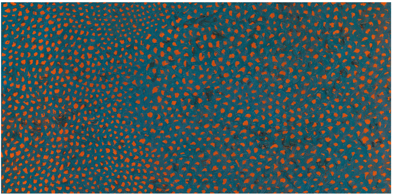
Works in the Infinity Net series often utilize high contrast colors such as black and red, yellow and black, or green and black. The gravity of the black brings out the brilliance of the color of the net, and as a result the relationship between the top and bottom layers is apparent. No. F. C. H. does not repeat this direct visual effect. Yayoi Kusama first painted the entire canvas a brilliant shade of burnt orange, then layered short arcs of teal blue over the top. As a color, orange is typically used on the subject in the foreground, but Kusama’s unorthodox use of orange as a background color heightens the tension between the orange and the blue. Both tones are equally prominent as there is no apparent power imbalance between them, and visually one cannot easily determine the dominant-subordinate relationship. The two colors crisscross against each other as they encourage the viewer’s gaze to wander across the picture plane, and the rich visual stimulation is akin to the use of color in pointillism. Complex tones may be broken down into primary colours constituents, and only upon close inspection does one realise that complex hues are made of dots of other colours. Seen at any distance, this is a painting that brims with vibrant hues. Yayoi Kusama skilfully combines two intensely contrasting colours, creating a thrillingly dramatic tension within the painted image. The holes of the net in No. F. C. H. vary in size, and their movements change dynamically. This effect is reminiscent of the visual illusions used in op art. Op art uses rigid, scientific designs to combine shapes and colour into meticulously executed compositions that confound the viewer. Yet Kusama’s treatment of surface is the exact opposite. The presence of her hand as the artist is strongly felt, and every brushstroke is filled with life.